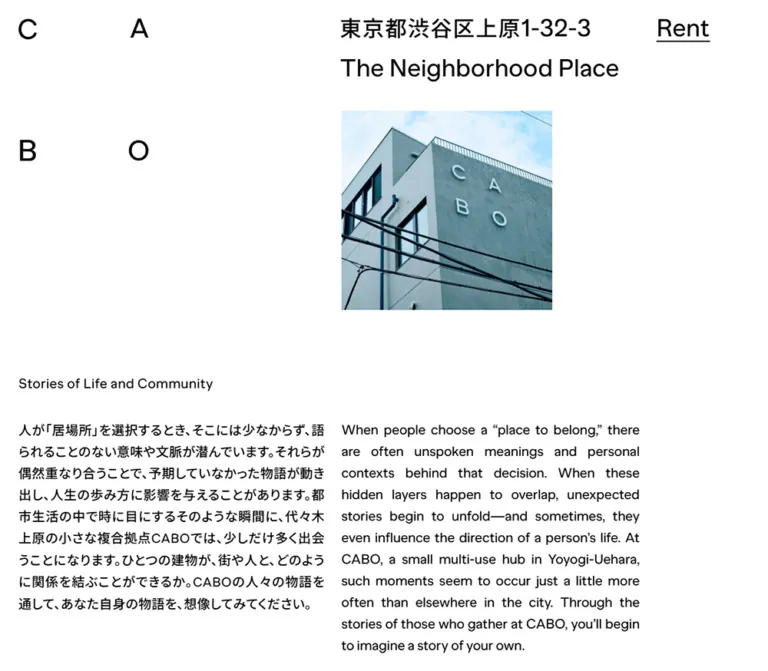
DESIGN REFERENCE
CABO|代々木上原の複合拠点
建物の構造を思わせる部屋番号のナビゲーションと、分解されたロゴが特徴。白黒の配色、大きな余白、日英併記の文章で、代々木上原の人と場所のつながりを伝えるサイト。
オリジナルサイトを見るCABO — Style Reference
A neighborhood building translated into a bilingual editorial index.
Website: cabo-uehara.jp Original URL: https://cabo-uehara.jp/ Final URL: https://cabo-uehara.jp/ Theme: white canvas, black typography and architectural linework Inspected: September 12, 2026, 05:49 JST; supplied browser retrieval timestamp: September 11, 2026, 20:49:32.490 UTC. Viewports: desktop 1440 × 1000 CSS pixels; mobile 390 × 844 CSS pixels. Scope: the current CABO homepage, including its opening photograph, bilingual introduction, room directory, events copy, neighborhood statement, access information, map, and footer. Five supplied captures show desktop opening, intermediate, and bottom positions, plus mobile opening and bottom positions. Some sections are documented primarily through the rendered DOM. Room stories and Creative Team details were not opened.
CABO presents a small multi-use hub in Yoyogi-Uehara through the spatial language of its building. Four widely separated letters form the identity. An address and the phrase “The Neighborhood Place” sit near the middle of the desktop canvas, while an underlined Rent link occupies a separate right-hand position. A modest photograph introduces the actual building without filling the screen.
The page combines generous white space with substantial, medium-weight text. Japanese and English run beside each other on desktop and stack on mobile. Room numbers, stepped architectural outlines, and a schematic neighborhood map make navigation feel connected to a physical address. Structure comes from position, typography, and lines; the captured interface has no general card, shadow, or colored-button system.
The scrolled captures retain identity elements and selected room numbers over later content. This layering is a distinctive observation, but it also produces visible collisions. A reusable implementation should distinguish the spatial idea from the readability problems present in these captured states.
How to Read This Reference
- Measured values come from the supplied rendered DOM, computed styles, and element rectangles. Fractional measurements are rounded to two decimal places in tables.
- Visual estimates describe screenshot geometry or appearance for elements without recorded computed styles, including the large identity, room labels, photograph, and map.
- Derived values are calculations from recorded rectangles, such as paragraph gaps and distances between sections.
- Recommended additions and the Quick Start are implementation guidance. Their layout formulas, breakpoint, semantic elements, and accessibility treatments are not claimed as original source code.
- Coordinate conventions: DOM section positions are document coordinates. Positions read from screenshots are viewport coordinates at the captured scroll position.
- Font evidence: the recorded font-family values establish declared stacks. They do not independently identify the font file used for every rendered glyph.
- Interaction limits: scrolling is represented by the supplied captures. No link activation, room selection, hover, keyboard navigation, or panel-opening sequence was supplied.
Tokens — Colors
Default Palette
| Name | Value | Suggested token | Evidence and role |
|---|---|---|---|
| Canvas White | #ffffff |
--color-canvas |
Measured BODY background: rgb(255, 255, 255). Main page surface. |
| Text Black | #000000 |
--color-ink |
Measured text and link color: rgb(0, 0, 0). Identity, copy, navigation, and utility labels. |
| Transparent Content | transparent |
— | Sampled sections, paragraphs, and anchors have transparent backgrounds, allowing one continuous white surface. |
| Architectural Ink | Near black; exact stroke color unmeasured | Reuse --color-ink in an adaptation |
Thin building outlines, street geometry, arrows, and map location marker. The map lines appear slightly softer than the text. |
The photograph introduces pale sky blue, cyan-gray plaster, and dark window and cable details. These are image colors, not verified interface tokens. Keep them inside the photography rather than promoting them into button fills or section backgrounds.
No alternate theme, dark-mode control, or palette-switching behavior is evidenced. The sampled sections have no separate surface colors.
Tokens — Typography
Japanese Text
- Recorded family:
"Noto Sans JP", sans-serif. - Recorded body default:
16px, weight400; most visible editorial and utility copy overrides this to weight500. - Editorial paragraphs:
21px / 35pxon desktop and17px / 30pxon mobile. - Tracking:
0.44pxdesktop and0.34pxmobile for the main Japanese paragraphs. - Character: substantial strokes and generous leading. The text feels closer to an editorial statement than a small interface caption.
Latin Text
- Recorded family:
"MNKY Banana Grotesk", "Noto Sans JP", sans-serif. - Recorded weight:
500on sampled English headings, paragraphs, Rent, Instagram, and Contact. - Editorial paragraphs:
22px / 35pxdesktop and18px / 30pxmobile. - Tracking: main English paragraphs use
-0.22pxdesktop and-0.18pxmobile, equivalent to-0.01emat their respective sizes. - Character: a plain, rounded grotesk with enough weight to hold its own beside Japanese text and architectural lines.
The HTML root reports Times, but the sampled visible content overrides that root family. Times is not the reference face for the interface.
Identity and Room Numbers
The four CABO letters act as separate spatial markers, arranged C/A above B/O. Their exact element type and font declaration were not supplied. Preserve the separated construction rather than treating the wordmark as ordinary tracked text.
The address, English descriptor, and room numbers are much larger than section headings. Only Rent has a directly measured large-type declaration. The other sizes below are visual estimates.
Type Scale
| Role | Desktop | Mobile | Tracking and evidence |
|---|---|---|---|
| Rent | 40px / 40px, weight 500 |
27px / 27px, weight 500 |
Normal tracking; measured |
| Section heading | 22px / 35px, weight 500 |
18px / 30px, weight 500 |
0.44px desktop; normal mobile; measured |
| Japanese editorial paragraph | 21px / 35px, weight 500 |
17px / 30px, weight 500 |
0.44px / 0.34px; measured |
| English editorial paragraph | 22px / 35px, weight 500 |
18px / 30px, weight 500 |
-0.22px / -0.18px; measured |
| Japanese directory instruction | 20px / 35px |
17px / 29px |
0.2px; measured |
| English directory instruction | 22px / 35px |
17px / 29px |
-0.22px; measured |
| Japanese access copy | 20px / 35px |
17px / 30px |
0.44px / 0.34px; measured |
| English access copy | 20px / 35px |
18px / 30px |
0.44px / -0.18px; measured |
| Events Instagram link | 22px / 35px |
18px / 30px |
0.44px / 0.36px; measured |
| Footer links | 22px / 22px |
18px / 18px |
-0.22px in both samples; measured |
| CABO identity letters | Approximately 48px |
Approximately 30px |
Visual estimate; rendering medium unverified |
| Large Japanese address | Approximately 36px |
Approximately 24px |
Visual estimate; exact weight unverified |
| Large English descriptor | Approximately 40px |
Approximately 27px |
Visual estimate |
| Selected room labels | Approximately 40px |
Approximately 27px |
Visual estimate; thin underline |
The body and section-heading scales are intentionally close. Hierarchy comes largely from spacing and placement. Increasing every heading to a conventional oversized display scale would weaken that relationship.
Tokens — Spacing & Shapes
Spacing character: large structural intervals surrounding tightly organized text. There is no evidence of one universal spacing unit.
The only supplied custom property is --vh: 10px on desktop and 8.44px on mobile. Both equal one percent of the respective viewport height. Its use in individual layout rules was not supplied; it does not establish a root-font scaling system.
Spacing Scale
| Use | Desktop | Mobile | Evidence |
|---|---|---|---|
| Editorial left inset | 30px |
17px |
Measured section x-position |
| Directory outside inset | 15px |
7px |
Measured section x-position |
| Footer horizontal inset | 30px |
15px |
Measured footer rectangle |
| Gap between Japanese and English columns | 27px |
Stacked | Derived from paragraph rectangles |
| Gap between stacked language paragraphs | — | 10px |
Derived repeatedly from paragraph rectangles |
| Intro heading to paragraph | 40px |
15px |
Derived from heading bottom and paragraph top |
| Other editorial heading to paragraph | 20px |
15px |
Derived for events and neighborhood sections |
| Intro end to directory start | 100px |
100px |
Derived from section rectangles |
| Directory end to events start | 200px |
200px |
Derived from section rectangles |
| Neighborhood copy end to access start | 200px |
40px |
Derived from section rectangles |
| Access section end to footer start | 120px |
120px |
Derived from section rectangles |
| Photograph bottom to intro section | About 102px |
About 101px |
Screenshot estimate combined with measured intro position |
Do not treat every distance between recorded text sections as empty space. The evidence does not visually document every intervening portion of the long page.
Border Radius and Linework
| Element | Treatment | Evidence |
|---|---|---|
| Sampled sections and links | 0px radius |
Measured |
| Opening photograph | Square corners, no visible frame | Screenshot observation |
| Building diagram | Thin, straight outlines with repeated stepped diagonals | Screenshot observation |
| Map | Thin street and block lines, dotted station alignment | Screenshot observation |
| Location marker | Solid black circle | Screenshot observation |
| Link underline | Approximately 1–2px |
Visual estimate; exact decoration properties unavailable |
| Diagram strokes | Approximately 1–2px |
Visual estimate; exact SVG or CSS declarations unavailable |
Layout Measurements
| Element | Desktop 1440 × 1000 | Mobile 390 × 844 | Status |
|---|---|---|---|
| Document height | 4598px |
5299px |
Measured |
| Intro section | x 30, y 656.45, width 1170.59, height 425px |
x 17, y 537.30, width 317.59, height 837px |
Measured |
| Japanese intro paragraph | x 30, width 578.30px |
x 17, width 317.59px |
Measured |
| English intro paragraph | x 635.30, width 565.30px |
x 17, width 317.59px |
Measured |
| Directory section | x 15, y 1181.45, width 1410, height 970px |
x 7, y 1474.30, width 376, height 744px |
Measured container; not necessarily the drawing bounds |
| Events section | x 30, y 2351.45, width 1170.59px |
x 17, y 2418.30, width 320.59px |
Measured |
| Neighborhood section | x 30, y 3210.70, width 1170.59px |
x 17, y 3871.31, width 320.59px |
Measured |
| Access section | x 30, y 3675.70, width 1199.59px |
x 17, y 4417.31, width 356px |
Measured |
| Footer | x 30, y 4427.81, width 1380, height 170px |
x 15, y 5238.72, width 360, height 60px |
Measured |
| Opening photograph | Approximately x 636, y 180, 396 × 374px |
Approximately x 125, y 200, 249 × 236px |
Screenshot estimate |
| Access map | Approximately 594 × 632px |
Approximately 356 × 379px |
Screenshot estimate |
Components
Distributed Identity
Role: establish CABO as both a name and a set of spatial coordinates.
The identity is distributed across the page instead of sitting inside a compact navigation bar. On desktop, C and B align around x 30; A and O align around x 240. The upper and lower letter rows are roughly 176px apart. The large address begins around x 635, with “The Neighborhood Place” beneath it. Rent begins at measured x 1227.59, y 25.
On mobile, C/B remain near x 17, while A/O move to approximately x 74. The address begins near x 125 and wraps into two lines. Rent sits at x 316.33, y 16, with a measured 58.67px width. The English descriptor also wraps into two lines below the address.
The identity stays visible in later desktop and mobile captures, suggesting fixed, sticky, or scroll-managed positioning. The supplied element styles do not establish which mechanism implements it. The large English descriptor remains visible in the desktop bottom capture but is not visible in the mobile bottom capture.
Rent Link
Role: direct access to rental information.
A large black text link with a fine underline, no surrounding box, no fill, and no icon. Its recorded destination is a Notion RENT page. The page does not use Rent as a large central conversion block; it remains one precise utility position in the overall composition.
The measured type is 40px / 40px desktop and 27px / 27px mobile, weight 500. Hover appearance, focus appearance, and whether the destination opens in a new tab were not tested.
Opening Photograph
Role: connect the abstract identity to the physical building.
A nearly square photograph shows the corner of CABO from below. Separate C/A/B/O facade letters echo the page identity. Pale sky, gray-blue walls, dark window frames, and diagonal overhead cables give the otherwise monochrome interface its main visible color.
At desktop size, the photograph starts around 44% of the viewport width and occupies about 27.5% of the viewport. On mobile, it begins around 32% of the viewport and extends almost to the right inset. Its approximate aspect ratio remains 1.06:1.
There is no visible caption, border, rounded corner, or overlaid headline. The image does not span the full viewport.
Bilingual Editorial Section
Role: explain CABO through readable narrative rather than a series of promotional cards.
The component contains a small English section heading followed by Japanese and English paragraphs. The introductory heading is “Stories of Life and Community.” Desktop paragraphs share a top edge at y 731.45, with a 27px horizontal gap. Their widths are similar but not identical: approximately 578px Japanese and 565px English.
The Japanese paragraph uses 21px / 35px; the English uses 22px / 35px. English word spacing appears justified in the desktop capture, although text-align was not included in the computed-style sample. Its visual effect is a strong rectangular text block.
On mobile, both paragraphs become display: block, occupy the same approximately 318px width, and appear Japanese first, English second. A 10px interval separates them. The first section heading is only slightly larger than Japanese copy and the same size as English copy.
Architectural Room Directory
Role: organize resident stories around room numbers and the building's spatial structure.
The recorded section contains 24 room numbers. A thin building outline uses horizontal floor lines, vertical divisions, and a repeated stair profile toward the right side. Underlined numbers act as prominent navigation affordances. Tenant names accompany selected numbers in the desktop text evidence.
| Number group | Recorded order | Named entries in the desktop evidence |
|---|---|---|
| 400s | 401, 402, 400, 403, 404, 406 |
401 Stillwater; 403 Knot for Inc. |
| 300s | 302, 303, 305, 307, 300, 310 |
307 Carpenter&Stone |
| 200s | 201, 202, 203, 204, 200, 205 |
205 St.Cat |
| 100s | 101, 102, 103, 104, 105, 106 |
No.; City Light Book; Hosokuras; New Classic Tortilla Club; Leafmania; Ukiyo |
The page explicitly instructs visitors to select a room number to read its story. However, the supplied link inventory does not include room destinations, and no selection was exercised. Article presentation, navigation history, loading, close controls, and selected states remain unverified.
Mobile visible-text evidence omits the tenant names while retaining the room numbers; the fuller section text still contains those names. This supports a compact mobile presentation, without proving the exact hiding mechanism. An unnamed room does not establish vacancy or inactivity.
Persistent Room-Number Layer
Role: maintain a spatial index while later material scrolls into view.
The intermediate and bottom desktop captures retain the same selected room-number positions: 401 and 403 around y 527, 307 around y 663, 205 around y 799, and the 100-series row around y 934. These are approximate screenshot positions, not computed top values.
In the mobile bottom capture, 401/403 appear near y 408, 307 near y 513, 205 near y 618, and the 100-series row near y 722. The position of 106 remains separated from 101–105, echoing the wider break in the building arrangement.
This is not visually a conventional bottom toolbar. The numbers occupy several vertical levels and overlap the map and editorial content in the supplied states. The exact pinning interval, z-index, scroll formula, and relationship to the full directory were not recorded.
Directory Instructions and Creative Team Copy
Role: explain the story index and identify the site as a collaboration within CABO.
The original page includes the instruction “Select a Room number to Read its Story,” a Creative Team label, and the statement “This web site was created by teams of CABO.” That general statement is supported by the inspected page.
The element dump contains overlapping instruction and team-copy rectangles, and some mobile instruction text is absent from the visible-text summary. These records do not establish the switching sequence or whether the blocks are intended to appear together. Creative Team activation and named production details were not inspected. Tenant names elsewhere in the directory should not be converted into production credits.
Events and Activities
Role: describe local markets, rooftop screenings, music, and activities associated with the building.
“CABO Events and Activities” uses the same bilingual editorial component. A Japanese update label sits above an underlined Instagram link. The account destination is recorded as https://www.instagram.com/cabo_uehara/.
The supplied English paragraph repeats part of the introductory “place to belong” text rather than directly translating the adjacent Japanese events paragraph. Preserve this distinction when describing the current page. Translation alignment is an editorial improvement for a new implementation.
Several elements in this section have a measured 0.6s ease-in-out transition declaration. The property being animated and its trigger were not supplied.
Neighborhood Statement
Role: explain the relationship between working, living, playing, and the local area.
“The Neighborhood Place” appears again as a modest section heading followed by bilingual paragraphs. Its typography matches the introduction and events sections. Desktop copy remains in two columns; mobile copy is stacked.
This section is documented through the rendered DOM, rather than a dedicated supplied screenshot. Its paragraphs also carry a measured 0.6s ease-in-out transition declaration, but the resulting effect is unverified.
Access Block and Schematic Map
Role: make the physical location understandable with a short address, walking directions, and a simplified neighborhood diagram.
Desktop uses two regions: address and directions on the left, map on the right. The text column is approximately 577px wide. The map begins near x 637 and is approximately 594px wide.
The text contains the postal address, an English address, Google Map with a right-pointing arrow, and the instruction that CABO is a 30-second walk from the south exit of Yoyogi Uehara Station. The Google Map anchor has a recorded maps short-link destination.
The map uses irregular blocks, diagonal streets, a dotted station alignment labeled “Yoyogi-Uehara Sta.”, and a single solid black location dot. It has no visible commercial map controls, colored road hierarchy, or surrounding card.
Mobile stacks the address and directions above a nearly full-width map. The map occupies about 356 × 379px, with approximately 40px between the end of the directions and the map. Its location dot is around 17px in diameter, compared with roughly 29px on desktop, consistent with the drawing scaling as a whole. These marker sizes are visual estimates.
Footer
Role: close the page with identity, social access, copyright, and contact.
The desktop footer spans 1380px with a 30px left inset. CABO occupies an upper position, followed by Instagram at the left, copyright toward the middle, and Contact with a right arrow at the far right.
Mobile reorganizes this into two rows and two columns: CABO / Instagram, then Contact / copyright. The second column starts at approximately x 175. The recorded footer is 360px wide and 60px high.
The literal copyright text is “2025 all rights reserved.” This is page content, not the inspection date. Contact points to a Google Forms URL; the form itself was not inspected.
Tokens — Motion & Interaction
| Treatment | Evidence | What can be concluded |
|---|---|---|
| Events heading, paragraphs, and update text | Computed 0.6s ease-in-out |
A 600ms eased transition is declared on these elements. Property, trigger, and visual path are unknown. |
| Neighborhood paragraphs | Computed 0.6s ease-in-out |
Same measured duration and easing; resulting effect unverified. |
| Identity persistence | Same upper-page identity visible in later screenshots | A persistent visual layer is supported. Fixed, sticky, and scripted implementations cannot be distinguished. |
| Selected room-number persistence | Repeated positions in desktop intermediate/bottom captures; corresponding mobile positions | Spatial navigation survives into later page regions. Exact movement and activation rules are unknown. |
| Rent, Instagram, Google Map, Contact | Visible links and recorded href values | Navigation destinations are evidenced; click outcomes and opening mode were not tested. |
| Room-story selection | Visible room numbers and explanatory copy | An intended story-selection affordance is evidenced; the resulting interface is not. |
| Sampled CSS animations | animation: none on sampled elements |
No animation is declared on those specific sampled nodes. This does not exclude animations elsewhere. |
| Other transition samples | Value reported as all, without timing evidence |
Insufficient to infer an animated effect or duration. |
The capture process waited for document readiness, image decoding, and layout/text stability within bounded timeouts. Perpetual animations were paused during readiness checks and resumed afterward. These still captures therefore cannot establish that the experience is entirely static, nor do they provide motion choreography.
For an adaptation, use restraint. A 600ms content fade is a possible recommended interpretation of the recorded timing, but it must be labeled as new behavior. There is no evidence supporting parallax photography, spring animation, cursor effects, scroll snapping, or animated room selection.
Surfaces
| Layer | Appearance | Function |
|---|---|---|
| Page canvas | Flat white | Continuous background across sections |
| Editorial content | Black text on transparent elements | Narrative structure without cards |
| Identity layer | Large black letters and text | Persistent orientation and brand recognition |
| Architectural layer | Thin near-black outlines | Building and neighborhood organization |
| Navigation marks | Underlined black words and numbers | Compact action affordances |
| Photograph | Full-color rectangular image | Physical context and the main visible color source |
| Map marker | Solid black circle | Location emphasis within otherwise open linework |
No general elevation system is visible. The identity and room labels sit over other content without an opaque backing surface in the supplied scrolled captures.
Imagery
Architectural Photography
Use a real exterior image that explains the place: facade lettering, building material, windows, sky, and surrounding infrastructure. The observed image looks upward at a corner, allowing diagonal cables to cut across otherwise rectilinear architecture. Its cyan-gray cast is restrained and naturally connected to the building.
Preserve the near-square crop, square corners, and small desktop footprint. A full-bleed image, a heavily darkened text overlay, or a decorative rounded mask would change the opening composition.
Architectural Drawings
The building outline and location map connect the site to practical spatial information. Their visual economy is essential: thin strokes, open white interiors, few labels, and one filled location dot.
The map is schematic rather than a dense geographic screenshot. The floor illustration has a stronger repeated horizontal rhythm and a distinctive stair profile. Use separate drawings for these roles; they communicate different scales of place.
Observed Asset References
| Asset | Evidence | Asset-path status |
|---|---|---|
| CABO exterior photograph | Desktop and mobile opening captures | Image URL and native dimensions not supplied |
| Building outline with stairs | Intermediate desktop capture | Asset medium and source path not supplied |
| Neighborhood access map | Desktop and mobile bottom captures | Asset medium and source path not supplied |
| Right-pointing arrows | Google Map and Contact in captures | SVG, font glyph, or other implementation not established |
| Four-letter identity | All supplied captures | Text versus vector implementation not established |
The map and building drawing are suitable candidates for SVG in a new implementation, but their original format was not confirmed. The recorded font stacks can be reused when the corresponding font assets are available; font-file URLs were not supplied.
Layout & Responsive Behavior
Desktop Composition
The page is broadly full-width and left anchored. Editorial sections occupy approximately 81.3% of the viewport width, leaving a substantial right-side reserve. Their left edge is 30px, not the edge of a centered narrow reading container.
The opening photograph and the second editorial column share approximately the same x-axis near 635px. Rent occupies a farther-right position. This repeated alignment ties the opening identity to the content below.
The room directory is wider than the editorial text, reaching from x 15 to x 1425. Its outline and scattered labels extend the architectural idea across almost the whole viewport.
Mobile Composition
Mobile preserves the asymmetry rather than merely shrinking the desktop page:
- The logo letters retain two rows while their horizontal separation contracts sharply.
- The address and descriptor wrap; Rent remains independently aligned near the right edge.
- The photograph grows from about 27.5% to about 64% of viewport width and stays offset to the right.
- Bilingual paragraphs stack while retaining generous
30pxline height. - Editorial text remains narrower than the available page width: approximately
318–321px, with a17pxleft inset and roughly52–55pxof space at the right. - The access map expands to the available
356pxwidth. - The footer becomes a compact two-column, two-row arrangement.
Responsive Comparison
| Relationship | Desktop | Mobile |
|---|---|---|
| Intro language layout | Side by side | Japanese above English |
| Intro height | 425px |
837px |
| Main copy line height | 35px |
30px |
| Rent size | 40px |
27px |
| Opening image | Approximately 396 × 374px |
Approximately 249 × 236px |
| Directory container width | 1410px |
376px |
| Access layout | Text and map beside each other | Text above map |
| Neighborhood-to-access interval | 200px |
40px |
| Footer arrangement | Broad horizontal distribution | Two columns, two rows |
The two samples do not reveal the original breakpoint or its interpolation rules. The Quick Start uses 48rem as a recommended breakpoint, calibrated to these endpoints.
Captured Overlap and Readability
The intermediate desktop capture places 401 over the events heading and 307 across English body text. The mobile bottom capture places persistent identity/address text over the access address, while room numbers cross the map. These are visible results in the supplied evidence. Their intent, possible transitional nature, and behavior at other scroll positions are unknown.
For a new implementation, keep the floor-like arrangement but reserve clear space for readable content. Options include confining room controls to the building section, providing a compact persistent index, or changing the persistent layer when it reaches access information. Those are recommendations, not observed source behavior.
Do’s and Don’ts
Do
- Use a pure white canvas and black interface typography.
- Treat the four CABO letters as individual spatial anchors.
- Align the opening image with the desktop English-copy region.
- Keep Rent as a prominent underlined text link in its own right-hand position.
- Preserve medium-weight Japanese and English text with generous line height.
- Keep desktop bilingual columns and mobile language stacking.
- Use room numbers and architectural linework as the organizing metaphor.
- Preserve the wider break before room 106 in spatial directory treatments.
- Keep the opening photograph modest on desktop and larger, right-offset on mobile.
- Use a simple schematic map with one strong location marker.
- Distinguish evidenced navigation affordances from untested article behavior.
Don’t
- Don’t turn the homepage into a generic sequence of feature cards and conversion banners.
- Don’t collapse the identity into a tightly tracked CABO wordmark.
- Don’t center every element inside one conventional maximum-width container.
- Don’t introduce pill buttons, rounded panels, drop shadows, gradients, or decorative background colors.
- Don’t use the photograph’s blue tones as an invented brand action color.
- Don’t replace the room directory with anonymous image tiles.
- Don’t infer vacancy from rooms without visible tenant names.
- Don’t assume a room selection opens a modal, drawer, or separate page.
- Don’t copy overlapping navigation into an adaptation without addressing text legibility.
- Don’t infer production responsibilities from the tenant list.
Recommended Implementation Additions
These are recommendations for a new implementation, not verified features of the original site:
- Give the separated identity one accessible name, such as CABO, while preventing assistive technology from announcing four disconnected decorative letters.
- Implement room destinations as real links when they navigate to stories. Include the tenant name in the accessible label when known, even if the mobile visual treatment shows only the room number.
- Provide a linear room list alongside any spatial diagram so the information remains usable without interpreting coordinates.
- Preserve visible underlines and add a clear keyboard focus indicator. Increase hit areas independently of the visible type size.
- Keep persistent labels clear of body copy and map labels. Test intermediate scroll positions, not only the top and bottom of the document.
- Use language attributes for Japanese and English paragraphs. Review the events translation so paired columns describe the same subject.
- Supply meaningful alternative text for the building photograph. Keep the written address and station directions available independently of the map.
- Respect reduced-motion preferences if adding reveals or scroll-managed transitions.
- Test at additional widths, increased text size, and mobile safe areas. Only two viewport sizes are evidenced here.
Agent Prompt Guide
Quick Color Reference
- Canvas:
#ffffff. - Text and links:
#000000. - Architectural drawings: thin near-black lines on white.
- Location marker: solid black circle.
- Photography: restrained sky blue and cyan-gray building tones, confined to the image.
- Action treatment: underlined text, with no filled CTA surface.
Overall Prompt
“Create a bilingual website for a small neighborhood building inspired by CABO. Use a white canvas, black medium-weight typography, separated C/A/B/O identity letters, a large address near the middle of the desktop page, and an underlined Rent link at the far right. Place a modest near-square exterior photograph below the address, aligned with the right-hand editorial column. Set Japanese and English narrative copy in two desktop columns with generous 35px leading, then stack them on mobile with 30px leading. Organize resident stories through room numbers and thin architectural outlines with a stair profile. Finish with a schematic neighborhood map and a sparse text footer. Preserve the spatial character while keeping navigation clear of readable content.”
Example Component Prompts
- Opening identity: “Arrange C and A above B and O with unusually large spacing. Place the building address and The Neighborhood Place on a separate axis around 44% of desktop width. Put Rent at the far right as a large underlined black text link. Use no colored header surface.”
- Bilingual story section: “Create a white editorial section with a 22px medium-weight English heading, a Japanese paragraph at 21px, and an English paragraph at 22px. Use 35px line height and a 27px desktop column gap. On mobile, stack the languages at 17px and 18px with 30px leading and a 10px paragraph gap.”
- Room directory: “Build a spatial room index using thin black building outlines, horizontal floor divisions, and a stepped stair profile. Place underlined room numbers at meaningful positions, with tenant names where available. Provide semantic links and a readable linear alternative.”
- Access section: “Pair a short bilingual address and walking directions with a white schematic map. Draw irregular blocks and diagonal streets in thin near-black lines, mark the station with a dotted alignment, and locate the building with one filled black circle. Stack text over the map on mobile.”
- Footer: “Create a sparse white footer with CABO, an underlined Instagram link, plain copyright text, and Contact followed by a thin right arrow. Spread these across desktop width and rearrange them into two rows and two columns on mobile.”
Quick Start
CSS Custom Properties
This is a recommended implementation calibrated to the two supplied viewports. It uses CSS Grid in place of the measured inline-block paragraph layout. The percentage widths, large identity sizes, image geometry, and 48rem breakpoint are approximations; the recorded paragraph sizes, line heights, and principal spacing values are retained.
The identity is attached to the opening area in this starter, and room links remain inside their diagram. The original scrolled captures retain those elements over later content. Reproducing that persistence requires additional behavior and collision testing.
Use a .cabo-page wrapper with .identity, an .opening image region, .editorial sections, a .building-directory, .access, and .footer. Each editorial section contains an h2 and a .language-pair with lang='ja' and lang='en' paragraphs. The directory expects a supplied drawing inside .floor-plan; percentage room coordinates belong in --room-x and --room-y on each room link.
:root {
  /* Measured interface palette */
  --color-canvas: #ffffff;
  --color-ink: #000000;

  /* Recorded family stacks; provide font files separately */
  --font-jp: 'Noto Sans JP', sans-serif;
  --font-en: 'MNKY Banana Grotesk', 'Noto Sans JP', sans-serif;
  --weight-copy: 500;

  /* Measured editorial typography */
  --text-jp: 21px;
  --text-en: 22px;
  --text-heading: 22px;
  --text-rent: 40px;
  --leading-copy: 35px;
  --tracking-jp: 0.44px;
  --tracking-heading: 0.44px;

  /* Measured spacing anchors */
  --page-inset: 30px;
  --diagram-inset: 15px;
  --column-gap: 27px;
  --section-gap: 200px;
  --footer-gap: 120px;

  /* Recommended geometry calibrated to the captures */
  --editorial-width: 81.3vw;
  --content-axis: 44.12vw;
  --photo-width: 27.5vw;
  --text-brand: 48px;
  --text-address: 36px;
  --text-room: 40px;
  --rule-width: 1.5px;
  --radius-surface: 0px;

  /* Recorded timing; animated property was not supplied */
  --content-transition: 600ms ease-in-out;
}

* {
  box-sizing: border-box;
}

body {
  margin: 0;
  color: var(--color-ink);
  background: var(--color-canvas);
  font-family: var(--font-jp);
  font-size: 16px;
}

.cabo-page {
  position: relative;
}

.cabo-page a {
  color: inherit;
  text-decoration-thickness: 1px;
  text-underline-offset: 0.14em;
}

.identity {
  position: absolute;
  inset: 0 0 auto;
  height: 240px;
  font-weight: var(--weight-copy);
}

.wordmark {
  position: absolute;
  top: 25px;
  left: var(--page-inset);
  display: grid;
  grid-template-columns: repeat(2, 1em);
  column-gap: 162px;
  row-gap: 128px;
  margin: 0;
  font-family: var(--font-en);
  font-size: var(--text-brand);
  font-weight: 500;
  line-height: 1;
}

.identity-copy {
  position: absolute;
  top: 25px;
  left: var(--content-axis);
}

.identity-address {
  margin: 0;
  font-size: var(--text-address);
  font-weight: 700;
  line-height: 1.2;
}

.identity-tagline {
  margin: 17px 0 0;
  font-family: var(--font-en);
  font-size: var(--text-rent);
  line-height: 1.1;
}

.rent {
  position: absolute;
  top: 25px;
  left: 85.25vw;
  font-family: var(--font-en);
  font-size: var(--text-rent);
  line-height: 1;
}

.mobile-break {
  display: none;
}

.opening {
  padding-block: 180px 102px;
}

.building-photo {
  display: block;
  width: var(--photo-width);
  aspect-ratio: 396 / 374;
  margin: 0 0 0 var(--content-axis);
  object-fit: cover;
  border-radius: var(--radius-surface);
}

.editorial {
  width: min(
    var(--editorial-width),
    calc(100% - 2 * var(--page-inset))
  );
  margin-inline-start: var(--page-inset);
}

.editorial h2 {
  margin: 0 0 20px;
  font-family: var(--font-en);
  font-size: var(--text-heading);
  font-weight: var(--weight-copy);
  line-height: var(--leading-copy);
  letter-spacing: var(--tracking-heading);
}

.intro h2 {
  margin-bottom: 40px;
}

.language-pair {
  display: grid;
  grid-template-columns: 1.023fr 1fr;
  gap: var(--column-gap);
}

.language-pair p {
  margin: 0;
  font-family: var(--font-jp);
  font-size: var(--text-jp);
  font-weight: var(--weight-copy);
  line-height: var(--leading-copy);
  letter-spacing: var(--tracking-jp);
}

.language-pair [lang='en'] {
  font-family: var(--font-en);
  font-size: var(--text-en);
  letter-spacing: -0.01em;
  text-align: justify;
}

.building-directory {
  margin: 100px var(--diagram-inset) 0;
}

.floor-plan {
  position: relative;
}

.floor-plan > svg,
.access-map {
  display: block;
  width: 100%;
  height: auto;
}

.floor-plan > svg [stroke] {
  vector-effect: non-scaling-stroke;
}

.room-link {
  position: absolute;
  left: var(--room-x, 0%);
  top: var(--room-y, 0%);
  font-family: var(--font-en);
  font-size: var(--text-room);
  font-weight: var(--weight-copy);
  line-height: 1;
}

.building-directory + .editorial {
  margin-top: var(--section-gap);
}

.access {
  display: grid;
  grid-template-columns: 1fr 1.03fr;
  gap: 30px;
  width: 83.305vw;
  margin: var(--section-gap) 0 0 var(--page-inset);
}

.access-copy {
  font-size: 20px;
  font-weight: var(--weight-copy);
  line-height: 35px;
  letter-spacing: 0.44px;
}

.access-copy p {
  margin: 0;
}

.access-copy [lang='en'],
.map-link {
  font-family: var(--font-en);
}

.map-link {
  display: block;
}

.access-copy .directions {
  margin-top: 60px;
}

.footer {
  display: grid;
  grid-template-columns: 29.5% 1fr auto;
  grid-template-areas:
    'brand brand brand'
    'social copyright contact';
  row-gap: 38px;
  margin: var(--footer-gap) 30px 0;
  padding-bottom: 86px;
  font-family: var(--font-en);
  font-size: 22px;
  font-weight: var(--weight-copy);
  line-height: 1;
  letter-spacing: -0.22px;
}

.footer-brand { grid-area: brand; }
.footer-social { grid-area: social; }
.footer-copyright { grid-area: copyright; }
.footer-contact { grid-area: contact; }

/* Recommended focus treatment */
.cabo-page :focus-visible {
  outline: 2px solid currentColor;
  outline-offset: 4px;
}

/* Optional adaptation: opacity is a recommended property choice */
.cabo-page [data-reveal] {
  transition: opacity var(--content-transition);
}

/* Recommended breakpoint, not an observed source breakpoint */
@media (max-width: 48rem) {
  :root {
    --text-jp: 17px;
    --text-en: 18px;
    --text-heading: 18px;
    --text-rent: 27px;
    --leading-copy: 30px;
    --tracking-jp: 0.34px;
    --tracking-heading: normal;
    --page-inset: 17px;
    --diagram-inset: 7px;
    --editorial-width: 82.2vw;
    --content-axis: 32.05vw;
    --photo-width: calc(100vw - var(--content-axis) - 16px);
    --text-brand: 30px;
    --text-address: 24px;
    --text-room: 27px;
  }

  .identity {
    height: 170px;
  }

  .wordmark {
    top: 16px;
    column-gap: 27px;
    row-gap: 59px;
  }

  .identity-copy {
    top: 16px;
    right: 16px;
  }

  .identity-address {
    max-width: 155px;
    line-height: 32px;
  }

  .identity-tagline {
    margin-top: 22px;
    line-height: 34px;
  }

  .rent {
    top: 16px;
    right: 15px;
    left: auto;
  }

  .mobile-break {
    display: initial;
  }

  .opening {
    padding-top: 200px;
  }

  .intro {
    --editorial-width: 81.44vw;
  }

  .editorial h2,
  .intro h2 {
    margin-bottom: 15px;
  }

  .language-pair {
    grid-template-columns: 1fr;
    gap: 10px;
  }

  .access {
    grid-template-columns: 1fr;
    gap: 40px;
    width: calc(100% - 2 * var(--page-inset));
    margin-top: 40px;
  }

  .access-copy {
    font-size: 17px;
    line-height: 30px;
    letter-spacing: 0.34px;
  }

  .access-copy [lang='en'],
  .map-link {
    font-size: 18px;
    letter-spacing: -0.01em;
  }

  .access-copy .directions {
    margin-top: 40px;
  }

  .footer {
    grid-template-columns: 44.5% 1fr;
    grid-template-areas:
      'brand social'
      'contact copyright';
    row-gap: 22px;
    margin-inline: 15px;
    padding-bottom: env(safe-area-inset-bottom, 0px);
    font-size: 18px;
  }
}

@media (prefers-reduced-motion: reduce) {
  .cabo-page [data-reveal] {
    transition: none;
  }
}
The stylesheet establishes the opening geometry, bilingual copy, access layout, and footer. Supply the actual photograph and drawings separately. Room coordinates must correspond to the supplied diagram, and room-story behavior requires its own implementation. The starter does not encode the observed document heights as fixed page lengths.
Tailwind v4 Token Mapping
Optional aliases for a project already using Tailwind v4. These map the custom properties above and do not imply that the original site uses Tailwind.
@theme inline {
  --color-canvas: #ffffff;
  --color-ink: #000000;

  --font-japanese: var(--font-jp);
  --font-latin: var(--font-en);

  --text-copy-ja: var(--text-jp);
  --text-copy-en: var(--text-en);
  --text-section: var(--text-heading);
  --text-rental: var(--text-rent);
  --text-room-number: var(--text-room);

  --spacing-page: var(--page-inset);
  --spacing-diagram: var(--diagram-inset);
  --spacing-language-gap: var(--column-gap);
  --spacing-section: var(--section-gap);
  --spacing-footer-gap: var(--footer-gap);

  --radius-surface: 0px;
}
Sources & Evidence
- Inspected original page: CABO. Original and final URL are identical; the supplied browser record reports HTTP
200and page title CABO. - Capture time: September 11, 2026,
20:49:32.490 UTC, equivalent to September 12, 2026,05:49:32.490 JST. - Desktop evidence: three supplied
1440 × 1000captures showing the opening, an intermediate events/building state, and access/footer content. Recorded document height:4598px. - Mobile evidence: two supplied
390 × 844captures showing the opening and access/footer content. Recorded document height:5299px. - Rendered DOM and computed styles: sampled BODY, sections, headings, paragraphs, links, footer rectangles, font stacks, sizes, weights, line heights, letter spacing, backgrounds, and transitions. The only supplied custom property is
--vh. - Navigation evidence: recorded destinations for Rent, Instagram, Google Map, and Contact. No destination was opened as part of this analysis.
- Inspection limits: no complete stylesheet, image source inventory, vector markup, font files, room-story state, Creative Team panel, hover/focus sequence, motion recording, or additional breakpoint samples were supplied. Delayed content and unexercised interactions remain unverified.
This reference describes the current page represented by the supplied browser evidence. Screenshot estimates, measured values, and implementation recommendations are identified separately throughout.
# CABO — Style Reference

> A neighborhood building translated into a bilingual editorial index.

**Website:** [cabo-uehara.jp](https://cabo-uehara.jp/)
**Original URL:** https://cabo-uehara.jp/
**Final URL:** https://cabo-uehara.jp/
**Theme:** white canvas, black typography and architectural linework
**Inspected:** September 12, 2026, 05:49 JST; supplied browser retrieval timestamp: September 11, 2026, 20:49:32.490 UTC.
**Viewports:** desktop 1440 × 1000 CSS pixels; mobile 390 × 844 CSS pixels.
**Scope:** the current CABO homepage, including its opening photograph, bilingual introduction, room directory, events copy, neighborhood statement, access information, map, and footer. Five supplied captures show desktop opening, intermediate, and bottom positions, plus mobile opening and bottom positions. Some sections are documented primarily through the rendered DOM. Room stories and Creative Team details were not opened.

CABO presents a small multi-use hub in Yoyogi-Uehara through the spatial language of its building. Four widely separated letters form the identity. An address and the phrase “The Neighborhood Place” sit near the middle of the desktop canvas, while an underlined Rent link occupies a separate right-hand position. A modest photograph introduces the actual building without filling the screen.

The page combines generous white space with substantial, medium-weight text. Japanese and English run beside each other on desktop and stack on mobile. Room numbers, stepped architectural outlines, and a schematic neighborhood map make navigation feel connected to a physical address. Structure comes from position, typography, and lines; the captured interface has no general card, shadow, or colored-button system.

The scrolled captures retain identity elements and selected room numbers over later content. This layering is a distinctive observation, but it also produces visible collisions. A reusable implementation should distinguish the spatial idea from the readability problems present in these captured states.

## How to Read This Reference

- **Measured values** come from the supplied rendered DOM, computed styles, and element rectangles. Fractional measurements are rounded to two decimal places in tables.
- **Visual estimates** describe screenshot geometry or appearance for elements without recorded computed styles, including the large identity, room labels, photograph, and map.
- **Derived values** are calculations from recorded rectangles, such as paragraph gaps and distances between sections.
- **Recommended additions** and the Quick Start are implementation guidance. Their layout formulas, breakpoint, semantic elements, and accessibility treatments are not claimed as original source code.
- **Coordinate conventions:** DOM section positions are document coordinates. Positions read from screenshots are viewport coordinates at the captured scroll position.
- **Font evidence:** the recorded font-family values establish declared stacks. They do not independently identify the font file used for every rendered glyph.
- **Interaction limits:** scrolling is represented by the supplied captures. No link activation, room selection, hover, keyboard navigation, or panel-opening sequence was supplied.

## Tokens — Colors

### Default Palette

| Name | Value | Suggested token | Evidence and role |
| --- | --- | --- | --- |
| Canvas White | `#ffffff` | `--color-canvas` | Measured BODY background: `rgb(255, 255, 255)`. Main page surface. |
| Text Black | `#000000` | `--color-ink` | Measured text and link color: `rgb(0, 0, 0)`. Identity, copy, navigation, and utility labels. |
| Transparent Content | `transparent` | — | Sampled sections, paragraphs, and anchors have transparent backgrounds, allowing one continuous white surface. |
| Architectural Ink | Near black; exact stroke color unmeasured | Reuse `--color-ink` in an adaptation | Thin building outlines, street geometry, arrows, and map location marker. The map lines appear slightly softer than the text. |

The photograph introduces pale sky blue, cyan-gray plaster, and dark window and cable details. These are image colors, not verified interface tokens. Keep them inside the photography rather than promoting them into button fills or section backgrounds.

No alternate theme, dark-mode control, or palette-switching behavior is evidenced. The sampled sections have no separate surface colors.

## Tokens — Typography

### Japanese Text

- **Recorded family:** `"Noto Sans JP", sans-serif`.
- **Recorded body default:** `16px`, weight `400`; most visible editorial and utility copy overrides this to weight `500`.
- **Editorial paragraphs:** `21px / 35px` on desktop and `17px / 30px` on mobile.
- **Tracking:** `0.44px` desktop and `0.34px` mobile for the main Japanese paragraphs.
- **Character:** substantial strokes and generous leading. The text feels closer to an editorial statement than a small interface caption.

### Latin Text

- **Recorded family:** `"MNKY Banana Grotesk", "Noto Sans JP", sans-serif`.
- **Recorded weight:** `500` on sampled English headings, paragraphs, Rent, Instagram, and Contact.
- **Editorial paragraphs:** `22px / 35px` desktop and `18px / 30px` mobile.
- **Tracking:** main English paragraphs use `-0.22px` desktop and `-0.18px` mobile, equivalent to `-0.01em` at their respective sizes.
- **Character:** a plain, rounded grotesk with enough weight to hold its own beside Japanese text and architectural lines.

The HTML root reports Times, but the sampled visible content overrides that root family. Times is not the reference face for the interface.

### Identity and Room Numbers

The four CABO letters act as separate spatial markers, arranged C/A above B/O. Their exact element type and font declaration were not supplied. Preserve the separated construction rather than treating the wordmark as ordinary tracked text.

The address, English descriptor, and room numbers are much larger than section headings. Only Rent has a directly measured large-type declaration. The other sizes below are visual estimates.

### Type Scale

| Role | Desktop | Mobile | Tracking and evidence |
| --- | --- | --- | --- |
| Rent | `40px / 40px`, weight `500` | `27px / 27px`, weight `500` | Normal tracking; measured |
| Section heading | `22px / 35px`, weight `500` | `18px / 30px`, weight `500` | `0.44px` desktop; normal mobile; measured |
| Japanese editorial paragraph | `21px / 35px`, weight `500` | `17px / 30px`, weight `500` | `0.44px` / `0.34px`; measured |
| English editorial paragraph | `22px / 35px`, weight `500` | `18px / 30px`, weight `500` | `-0.22px` / `-0.18px`; measured |
| Japanese directory instruction | `20px / 35px` | `17px / 29px` | `0.2px`; measured |
| English directory instruction | `22px / 35px` | `17px / 29px` | `-0.22px`; measured |
| Japanese access copy | `20px / 35px` | `17px / 30px` | `0.44px` / `0.34px`; measured |
| English access copy | `20px / 35px` | `18px / 30px` | `0.44px` / `-0.18px`; measured |
| Events Instagram link | `22px / 35px` | `18px / 30px` | `0.44px` / `0.36px`; measured |
| Footer links | `22px / 22px` | `18px / 18px` | `-0.22px` in both samples; measured |
| CABO identity letters | Approximately `48px` | Approximately `30px` | Visual estimate; rendering medium unverified |
| Large Japanese address | Approximately `36px` | Approximately `24px` | Visual estimate; exact weight unverified |
| Large English descriptor | Approximately `40px` | Approximately `27px` | Visual estimate |
| Selected room labels | Approximately `40px` | Approximately `27px` | Visual estimate; thin underline |

The body and section-heading scales are intentionally close. Hierarchy comes largely from spacing and placement. Increasing every heading to a conventional oversized display scale would weaken that relationship.

## Tokens — Spacing & Shapes

**Spacing character:** large structural intervals surrounding tightly organized text. There is no evidence of one universal spacing unit.

The only supplied custom property is `--vh`: `10px` on desktop and `8.44px` on mobile. Both equal one percent of the respective viewport height. Its use in individual layout rules was not supplied; it does not establish a root-font scaling system.

### Spacing Scale

| Use | Desktop | Mobile | Evidence |
| --- | --- | --- | --- |
| Editorial left inset | `30px` | `17px` | Measured section x-position |
| Directory outside inset | `15px` | `7px` | Measured section x-position |
| Footer horizontal inset | `30px` | `15px` | Measured footer rectangle |
| Gap between Japanese and English columns | `27px` | Stacked | Derived from paragraph rectangles |
| Gap between stacked language paragraphs | — | `10px` | Derived repeatedly from paragraph rectangles |
| Intro heading to paragraph | `40px` | `15px` | Derived from heading bottom and paragraph top |
| Other editorial heading to paragraph | `20px` | `15px` | Derived for events and neighborhood sections |
| Intro end to directory start | `100px` | `100px` | Derived from section rectangles |
| Directory end to events start | `200px` | `200px` | Derived from section rectangles |
| Neighborhood copy end to access start | `200px` | `40px` | Derived from section rectangles |
| Access section end to footer start | `120px` | `120px` | Derived from section rectangles |
| Photograph bottom to intro section | About `102px` | About `101px` | Screenshot estimate combined with measured intro position |

Do not treat every distance between recorded text sections as empty space. The evidence does not visually document every intervening portion of the long page.

### Border Radius and Linework

| Element | Treatment | Evidence |
| --- | --- | --- |
| Sampled sections and links | `0px` radius | Measured |
| Opening photograph | Square corners, no visible frame | Screenshot observation |
| Building diagram | Thin, straight outlines with repeated stepped diagonals | Screenshot observation |
| Map | Thin street and block lines, dotted station alignment | Screenshot observation |
| Location marker | Solid black circle | Screenshot observation |
| Link underline | Approximately `1–2px` | Visual estimate; exact decoration properties unavailable |
| Diagram strokes | Approximately `1–2px` | Visual estimate; exact SVG or CSS declarations unavailable |

### Layout Measurements

| Element | Desktop 1440 × 1000 | Mobile 390 × 844 | Status |
| --- | --- | --- | --- |
| Document height | `4598px` | `5299px` | Measured |
| Intro section | x `30`, y `656.45`, width `1170.59`, height `425px` | x `17`, y `537.30`, width `317.59`, height `837px` | Measured |
| Japanese intro paragraph | x `30`, width `578.30px` | x `17`, width `317.59px` | Measured |
| English intro paragraph | x `635.30`, width `565.30px` | x `17`, width `317.59px` | Measured |
| Directory section | x `15`, y `1181.45`, width `1410`, height `970px` | x `7`, y `1474.30`, width `376`, height `744px` | Measured container; not necessarily the drawing bounds |
| Events section | x `30`, y `2351.45`, width `1170.59px` | x `17`, y `2418.30`, width `320.59px` | Measured |
| Neighborhood section | x `30`, y `3210.70`, width `1170.59px` | x `17`, y `3871.31`, width `320.59px` | Measured |
| Access section | x `30`, y `3675.70`, width `1199.59px` | x `17`, y `4417.31`, width `356px` | Measured |
| Footer | x `30`, y `4427.81`, width `1380`, height `170px` | x `15`, y `5238.72`, width `360`, height `60px` | Measured |
| Opening photograph | Approximately x `636`, y `180`, `396 × 374px` | Approximately x `125`, y `200`, `249 × 236px` | Screenshot estimate |
| Access map | Approximately `594 × 632px` | Approximately `356 × 379px` | Screenshot estimate |

## Components

### Distributed Identity

**Role:** establish CABO as both a name and a set of spatial coordinates.

The identity is distributed across the page instead of sitting inside a compact navigation bar. On desktop, C and B align around x `30`; A and O align around x `240`. The upper and lower letter rows are roughly `176px` apart. The large address begins around x `635`, with “The Neighborhood Place” beneath it. Rent begins at measured x `1227.59`, y `25`.

On mobile, C/B remain near x `17`, while A/O move to approximately x `74`. The address begins near x `125` and wraps into two lines. Rent sits at x `316.33`, y `16`, with a measured `58.67px` width. The English descriptor also wraps into two lines below the address.

The identity stays visible in later desktop and mobile captures, suggesting fixed, sticky, or scroll-managed positioning. The supplied element styles do not establish which mechanism implements it. The large English descriptor remains visible in the desktop bottom capture but is not visible in the mobile bottom capture.

### Rent Link

**Role:** direct access to rental information.

A large black text link with a fine underline, no surrounding box, no fill, and no icon. Its recorded destination is a Notion RENT page. The page does not use Rent as a large central conversion block; it remains one precise utility position in the overall composition.

The measured type is `40px / 40px` desktop and `27px / 27px` mobile, weight `500`. Hover appearance, focus appearance, and whether the destination opens in a new tab were not tested.

### Opening Photograph

**Role:** connect the abstract identity to the physical building.

A nearly square photograph shows the corner of CABO from below. Separate C/A/B/O facade letters echo the page identity. Pale sky, gray-blue walls, dark window frames, and diagonal overhead cables give the otherwise monochrome interface its main visible color.

At desktop size, the photograph starts around 44% of the viewport width and occupies about 27.5% of the viewport. On mobile, it begins around 32% of the viewport and extends almost to the right inset. Its approximate aspect ratio remains `1.06:1`.

There is no visible caption, border, rounded corner, or overlaid headline. The image does not span the full viewport.

### Bilingual Editorial Section

**Role:** explain CABO through readable narrative rather than a series of promotional cards.

The component contains a small English section heading followed by Japanese and English paragraphs. The introductory heading is “Stories of Life and Community.” Desktop paragraphs share a top edge at y `731.45`, with a `27px` horizontal gap. Their widths are similar but not identical: approximately `578px` Japanese and `565px` English.

The Japanese paragraph uses `21px / 35px`; the English uses `22px / 35px`. English word spacing appears justified in the desktop capture, although `text-align` was not included in the computed-style sample. Its visual effect is a strong rectangular text block.

On mobile, both paragraphs become `display: block`, occupy the same approximately `318px` width, and appear Japanese first, English second. A `10px` interval separates them. The first section heading is only slightly larger than Japanese copy and the same size as English copy.

### Architectural Room Directory

**Role:** organize resident stories around room numbers and the building's spatial structure.

The recorded section contains 24 room numbers. A thin building outline uses horizontal floor lines, vertical divisions, and a repeated stair profile toward the right side. Underlined numbers act as prominent navigation affordances. Tenant names accompany selected numbers in the desktop text evidence.

| Number group | Recorded order | Named entries in the desktop evidence |
| --- | --- | --- |
| 400s | `401, 402, 400, 403, 404, 406` | 401 Stillwater; 403 Knot for Inc. |
| 300s | `302, 303, 305, 307, 300, 310` | 307 Carpenter&Stone |
| 200s | `201, 202, 203, 204, 200, 205` | 205 St.Cat |
| 100s | `101, 102, 103, 104, 105, 106` | No.; City Light Book; Hosokuras; New Classic Tortilla Club; Leafmania; Ukiyo |

The page explicitly instructs visitors to select a room number to read its story. However, the supplied link inventory does not include room destinations, and no selection was exercised. Article presentation, navigation history, loading, close controls, and selected states remain unverified.

Mobile visible-text evidence omits the tenant names while retaining the room numbers; the fuller section text still contains those names. This supports a compact mobile presentation, without proving the exact hiding mechanism. An unnamed room does not establish vacancy or inactivity.

### Persistent Room-Number Layer

**Role:** maintain a spatial index while later material scrolls into view.

The intermediate and bottom desktop captures retain the same selected room-number positions: 401 and 403 around y `527`, 307 around y `663`, 205 around y `799`, and the 100-series row around y `934`. These are approximate screenshot positions, not computed top values.

In the mobile bottom capture, 401/403 appear near y `408`, 307 near y `513`, 205 near y `618`, and the 100-series row near y `722`. The position of 106 remains separated from 101–105, echoing the wider break in the building arrangement.

This is not visually a conventional bottom toolbar. The numbers occupy several vertical levels and overlap the map and editorial content in the supplied states. The exact pinning interval, z-index, scroll formula, and relationship to the full directory were not recorded.

### Directory Instructions and Creative Team Copy

**Role:** explain the story index and identify the site as a collaboration within CABO.

The original page includes the instruction “Select a Room number to Read its Story,” a Creative Team label, and the statement “This web site was created by teams of CABO.” That general statement is supported by the inspected page.

The element dump contains overlapping instruction and team-copy rectangles, and some mobile instruction text is absent from the visible-text summary. These records do not establish the switching sequence or whether the blocks are intended to appear together. Creative Team activation and named production details were not inspected. Tenant names elsewhere in the directory should not be converted into production credits.

### Events and Activities

**Role:** describe local markets, rooftop screenings, music, and activities associated with the building.

“CABO Events and Activities” uses the same bilingual editorial component. A Japanese update label sits above an underlined Instagram link. The account destination is recorded as `https://www.instagram.com/cabo_uehara/`.

The supplied English paragraph repeats part of the introductory “place to belong” text rather than directly translating the adjacent Japanese events paragraph. Preserve this distinction when describing the current page. Translation alignment is an editorial improvement for a new implementation.

Several elements in this section have a measured `0.6s ease-in-out` transition declaration. The property being animated and its trigger were not supplied.

### Neighborhood Statement

**Role:** explain the relationship between working, living, playing, and the local area.

“The Neighborhood Place” appears again as a modest section heading followed by bilingual paragraphs. Its typography matches the introduction and events sections. Desktop copy remains in two columns; mobile copy is stacked.

This section is documented through the rendered DOM, rather than a dedicated supplied screenshot. Its paragraphs also carry a measured `0.6s ease-in-out` transition declaration, but the resulting effect is unverified.

### Access Block and Schematic Map

**Role:** make the physical location understandable with a short address, walking directions, and a simplified neighborhood diagram.

Desktop uses two regions: address and directions on the left, map on the right. The text column is approximately `577px` wide. The map begins near x `637` and is approximately `594px` wide.

The text contains the postal address, an English address, Google Map with a right-pointing arrow, and the instruction that CABO is a 30-second walk from the south exit of Yoyogi Uehara Station. The Google Map anchor has a recorded maps short-link destination.

The map uses irregular blocks, diagonal streets, a dotted station alignment labeled “Yoyogi-Uehara Sta.”, and a single solid black location dot. It has no visible commercial map controls, colored road hierarchy, or surrounding card.

Mobile stacks the address and directions above a nearly full-width map. The map occupies about `356 × 379px`, with approximately `40px` between the end of the directions and the map. Its location dot is around `17px` in diameter, compared with roughly `29px` on desktop, consistent with the drawing scaling as a whole. These marker sizes are visual estimates.

### Footer

**Role:** close the page with identity, social access, copyright, and contact.

The desktop footer spans `1380px` with a `30px` left inset. CABO occupies an upper position, followed by Instagram at the left, copyright toward the middle, and Contact with a right arrow at the far right.

Mobile reorganizes this into two rows and two columns: CABO / Instagram, then Contact / copyright. The second column starts at approximately x `175`. The recorded footer is `360px` wide and `60px` high.

The literal copyright text is “2025 all rights reserved.” This is page content, not the inspection date. Contact points to a Google Forms URL; the form itself was not inspected.

## Tokens — Motion & Interaction

| Treatment | Evidence | What can be concluded |
| --- | --- | --- |
| Events heading, paragraphs, and update text | Computed `0.6s ease-in-out` | A 600ms eased transition is declared on these elements. Property, trigger, and visual path are unknown. |
| Neighborhood paragraphs | Computed `0.6s ease-in-out` | Same measured duration and easing; resulting effect unverified. |
| Identity persistence | Same upper-page identity visible in later screenshots | A persistent visual layer is supported. Fixed, sticky, and scripted implementations cannot be distinguished. |
| Selected room-number persistence | Repeated positions in desktop intermediate/bottom captures; corresponding mobile positions | Spatial navigation survives into later page regions. Exact movement and activation rules are unknown. |
| Rent, Instagram, Google Map, Contact | Visible links and recorded href values | Navigation destinations are evidenced; click outcomes and opening mode were not tested. |
| Room-story selection | Visible room numbers and explanatory copy | An intended story-selection affordance is evidenced; the resulting interface is not. |
| Sampled CSS animations | `animation: none` on sampled elements | No animation is declared on those specific sampled nodes. This does not exclude animations elsewhere. |
| Other transition samples | Value reported as `all`, without timing evidence | Insufficient to infer an animated effect or duration. |

The capture process waited for document readiness, image decoding, and layout/text stability within bounded timeouts. Perpetual animations were paused during readiness checks and resumed afterward. These still captures therefore cannot establish that the experience is entirely static, nor do they provide motion choreography.

For an adaptation, use restraint. A 600ms content fade is a possible recommended interpretation of the recorded timing, but it must be labeled as new behavior. There is no evidence supporting parallax photography, spring animation, cursor effects, scroll snapping, or animated room selection.

## Surfaces

| Layer | Appearance | Function |
| --- | --- | --- |
| Page canvas | Flat white | Continuous background across sections |
| Editorial content | Black text on transparent elements | Narrative structure without cards |
| Identity layer | Large black letters and text | Persistent orientation and brand recognition |
| Architectural layer | Thin near-black outlines | Building and neighborhood organization |
| Navigation marks | Underlined black words and numbers | Compact action affordances |
| Photograph | Full-color rectangular image | Physical context and the main visible color source |
| Map marker | Solid black circle | Location emphasis within otherwise open linework |

No general elevation system is visible. The identity and room labels sit over other content without an opaque backing surface in the supplied scrolled captures.

## Imagery

### Architectural Photography

Use a real exterior image that explains the place: facade lettering, building material, windows, sky, and surrounding infrastructure. The observed image looks upward at a corner, allowing diagonal cables to cut across otherwise rectilinear architecture. Its cyan-gray cast is restrained and naturally connected to the building.

Preserve the near-square crop, square corners, and small desktop footprint. A full-bleed image, a heavily darkened text overlay, or a decorative rounded mask would change the opening composition.

### Architectural Drawings

The building outline and location map connect the site to practical spatial information. Their visual economy is essential: thin strokes, open white interiors, few labels, and one filled location dot.

The map is schematic rather than a dense geographic screenshot. The floor illustration has a stronger repeated horizontal rhythm and a distinctive stair profile. Use separate drawings for these roles; they communicate different scales of place.

### Observed Asset References

| Asset | Evidence | Asset-path status |
| --- | --- | --- |
| CABO exterior photograph | Desktop and mobile opening captures | Image URL and native dimensions not supplied |
| Building outline with stairs | Intermediate desktop capture | Asset medium and source path not supplied |
| Neighborhood access map | Desktop and mobile bottom captures | Asset medium and source path not supplied |
| Right-pointing arrows | Google Map and Contact in captures | SVG, font glyph, or other implementation not established |
| Four-letter identity | All supplied captures | Text versus vector implementation not established |

The map and building drawing are suitable candidates for SVG in a new implementation, but their original format was not confirmed. The recorded font stacks can be reused when the corresponding font assets are available; font-file URLs were not supplied.

## Layout & Responsive Behavior

### Desktop Composition

The page is broadly full-width and left anchored. Editorial sections occupy approximately 81.3% of the viewport width, leaving a substantial right-side reserve. Their left edge is `30px`, not the edge of a centered narrow reading container.

The opening photograph and the second editorial column share approximately the same x-axis near `635px`. Rent occupies a farther-right position. This repeated alignment ties the opening identity to the content below.

The room directory is wider than the editorial text, reaching from x `15` to x `1425`. Its outline and scattered labels extend the architectural idea across almost the whole viewport.

### Mobile Composition

Mobile preserves the asymmetry rather than merely shrinking the desktop page:

- The logo letters retain two rows while their horizontal separation contracts sharply.
- The address and descriptor wrap; Rent remains independently aligned near the right edge.
- The photograph grows from about 27.5% to about 64% of viewport width and stays offset to the right.
- Bilingual paragraphs stack while retaining generous `30px` line height.
- Editorial text remains narrower than the available page width: approximately `318–321px`, with a `17px` left inset and roughly `52–55px` of space at the right.
- The access map expands to the available `356px` width.
- The footer becomes a compact two-column, two-row arrangement.

### Responsive Comparison

| Relationship | Desktop | Mobile |
| --- | --- | --- |
| Intro language layout | Side by side | Japanese above English |
| Intro height | `425px` | `837px` |
| Main copy line height | `35px` | `30px` |
| Rent size | `40px` | `27px` |
| Opening image | Approximately `396 × 374px` | Approximately `249 × 236px` |
| Directory container width | `1410px` | `376px` |
| Access layout | Text and map beside each other | Text above map |
| Neighborhood-to-access interval | `200px` | `40px` |
| Footer arrangement | Broad horizontal distribution | Two columns, two rows |

The two samples do not reveal the original breakpoint or its interpolation rules. The Quick Start uses `48rem` as a recommended breakpoint, calibrated to these endpoints.

### Captured Overlap and Readability

The intermediate desktop capture places 401 over the events heading and 307 across English body text. The mobile bottom capture places persistent identity/address text over the access address, while room numbers cross the map. These are visible results in the supplied evidence. Their intent, possible transitional nature, and behavior at other scroll positions are unknown.

For a new implementation, keep the floor-like arrangement but reserve clear space for readable content. Options include confining room controls to the building section, providing a compact persistent index, or changing the persistent layer when it reaches access information. Those are recommendations, not observed source behavior.

## Do’s and Don’ts

### Do

- Use a pure white canvas and black interface typography.
- Treat the four CABO letters as individual spatial anchors.
- Align the opening image with the desktop English-copy region.
- Keep Rent as a prominent underlined text link in its own right-hand position.
- Preserve medium-weight Japanese and English text with generous line height.
- Keep desktop bilingual columns and mobile language stacking.
- Use room numbers and architectural linework as the organizing metaphor.
- Preserve the wider break before room 106 in spatial directory treatments.
- Keep the opening photograph modest on desktop and larger, right-offset on mobile.
- Use a simple schematic map with one strong location marker.
- Distinguish evidenced navigation affordances from untested article behavior.

### Don’t

- Don’t turn the homepage into a generic sequence of feature cards and conversion banners.
- Don’t collapse the identity into a tightly tracked CABO wordmark.
- Don’t center every element inside one conventional maximum-width container.
- Don’t introduce pill buttons, rounded panels, drop shadows, gradients, or decorative background colors.
- Don’t use the photograph’s blue tones as an invented brand action color.
- Don’t replace the room directory with anonymous image tiles.
- Don’t infer vacancy from rooms without visible tenant names.
- Don’t assume a room selection opens a modal, drawer, or separate page.
- Don’t copy overlapping navigation into an adaptation without addressing text legibility.
- Don’t infer production responsibilities from the tenant list.

## Recommended Implementation Additions

These are recommendations for a new implementation, not verified features of the original site:

- Give the separated identity one accessible name, such as CABO, while preventing assistive technology from announcing four disconnected decorative letters.
- Implement room destinations as real links when they navigate to stories. Include the tenant name in the accessible label when known, even if the mobile visual treatment shows only the room number.
- Provide a linear room list alongside any spatial diagram so the information remains usable without interpreting coordinates.
- Preserve visible underlines and add a clear keyboard focus indicator. Increase hit areas independently of the visible type size.
- Keep persistent labels clear of body copy and map labels. Test intermediate scroll positions, not only the top and bottom of the document.
- Use language attributes for Japanese and English paragraphs. Review the events translation so paired columns describe the same subject.
- Supply meaningful alternative text for the building photograph. Keep the written address and station directions available independently of the map.
- Respect reduced-motion preferences if adding reveals or scroll-managed transitions.
- Test at additional widths, increased text size, and mobile safe areas. Only two viewport sizes are evidenced here.

## Agent Prompt Guide

### Quick Color Reference

- Canvas: `#ffffff`.
- Text and links: `#000000`.
- Architectural drawings: thin near-black lines on white.
- Location marker: solid black circle.
- Photography: restrained sky blue and cyan-gray building tones, confined to the image.
- Action treatment: underlined text, with no filled CTA surface.

### Overall Prompt

“Create a bilingual website for a small neighborhood building inspired by CABO. Use a white canvas, black medium-weight typography, separated C/A/B/O identity letters, a large address near the middle of the desktop page, and an underlined Rent link at the far right. Place a modest near-square exterior photograph below the address, aligned with the right-hand editorial column. Set Japanese and English narrative copy in two desktop columns with generous 35px leading, then stack them on mobile with 30px leading. Organize resident stories through room numbers and thin architectural outlines with a stair profile. Finish with a schematic neighborhood map and a sparse text footer. Preserve the spatial character while keeping navigation clear of readable content.”

### Example Component Prompts

1. **Opening identity:** “Arrange C and A above B and O with unusually large spacing. Place the building address and The Neighborhood Place on a separate axis around 44% of desktop width. Put Rent at the far right as a large underlined black text link. Use no colored header surface.”
2. **Bilingual story section:** “Create a white editorial section with a 22px medium-weight English heading, a Japanese paragraph at 21px, and an English paragraph at 22px. Use 35px line height and a 27px desktop column gap. On mobile, stack the languages at 17px and 18px with 30px leading and a 10px paragraph gap.”
3. **Room directory:** “Build a spatial room index using thin black building outlines, horizontal floor divisions, and a stepped stair profile. Place underlined room numbers at meaningful positions, with tenant names where available. Provide semantic links and a readable linear alternative.”
4. **Access section:** “Pair a short bilingual address and walking directions with a white schematic map. Draw irregular blocks and diagonal streets in thin near-black lines, mark the station with a dotted alignment, and locate the building with one filled black circle. Stack text over the map on mobile.”
5. **Footer:** “Create a sparse white footer with CABO, an underlined Instagram link, plain copyright text, and Contact followed by a thin right arrow. Spread these across desktop width and rearrange them into two rows and two columns on mobile.”

## Quick Start

### CSS Custom Properties

This is a recommended implementation calibrated to the two supplied viewports. It uses CSS Grid in place of the measured inline-block paragraph layout. The percentage widths, large identity sizes, image geometry, and `48rem` breakpoint are approximations; the recorded paragraph sizes, line heights, and principal spacing values are retained.

The identity is attached to the opening area in this starter, and room links remain inside their diagram. The original scrolled captures retain those elements over later content. Reproducing that persistence requires additional behavior and collision testing.

Use a `.cabo-page` wrapper with `.identity`, an `.opening` image region, `.editorial` sections, a `.building-directory`, `.access`, and `.footer`. Each editorial section contains an `h2` and a `.language-pair` with `lang='ja'` and `lang='en'` paragraphs. The directory expects a supplied drawing inside `.floor-plan`; percentage room coordinates belong in `--room-x` and `--room-y` on each room link.

```css
:root {
  /* Measured interface palette */
  --color-canvas: #ffffff;
  --color-ink: #000000;

  /* Recorded family stacks; provide font files separately */
  --font-jp: 'Noto Sans JP', sans-serif;
  --font-en: 'MNKY Banana Grotesk', 'Noto Sans JP', sans-serif;
  --weight-copy: 500;

  /* Measured editorial typography */
  --text-jp: 21px;
  --text-en: 22px;
  --text-heading: 22px;
  --text-rent: 40px;
  --leading-copy: 35px;
  --tracking-jp: 0.44px;
  --tracking-heading: 0.44px;

  /* Measured spacing anchors */
  --page-inset: 30px;
  --diagram-inset: 15px;
  --column-gap: 27px;
  --section-gap: 200px;
  --footer-gap: 120px;

  /* Recommended geometry calibrated to the captures */
  --editorial-width: 81.3vw;
  --content-axis: 44.12vw;
  --photo-width: 27.5vw;
  --text-brand: 48px;
  --text-address: 36px;
  --text-room: 40px;
  --rule-width: 1.5px;
  --radius-surface: 0px;

  /* Recorded timing; animated property was not supplied */
  --content-transition: 600ms ease-in-out;
}

* {
  box-sizing: border-box;
}

body {
  margin: 0;
  color: var(--color-ink);
  background: var(--color-canvas);
  font-family: var(--font-jp);
  font-size: 16px;
}

.cabo-page {
  position: relative;
}

.cabo-page a {
  color: inherit;
  text-decoration-thickness: 1px;
  text-underline-offset: 0.14em;
}

.identity {
  position: absolute;
  inset: 0 0 auto;
  height: 240px;
  font-weight: var(--weight-copy);
}

.wordmark {
  position: absolute;
  top: 25px;
  left: var(--page-inset);
  display: grid;
  grid-template-columns: repeat(2, 1em);
  column-gap: 162px;
  row-gap: 128px;
  margin: 0;
  font-family: var(--font-en);
  font-size: var(--text-brand);
  font-weight: 500;
  line-height: 1;
}

.identity-copy {
  position: absolute;
  top: 25px;
  left: var(--content-axis);
}

.identity-address {
  margin: 0;
  font-size: var(--text-address);
  font-weight: 700;
  line-height: 1.2;
}

.identity-tagline {
  margin: 17px 0 0;
  font-family: var(--font-en);
  font-size: var(--text-rent);
  line-height: 1.1;
}

.rent {
  position: absolute;
  top: 25px;
  left: 85.25vw;
  font-family: var(--font-en);
  font-size: var(--text-rent);
  line-height: 1;
}

.mobile-break {
  display: none;
}

.opening {
  padding-block: 180px 102px;
}

.building-photo {
  display: block;
  width: var(--photo-width);
  aspect-ratio: 396 / 374;
  margin: 0 0 0 var(--content-axis);
  object-fit: cover;
  border-radius: var(--radius-surface);
}

.editorial {
  width: min(
    var(--editorial-width),
    calc(100% - 2 * var(--page-inset))
  );
  margin-inline-start: var(--page-inset);
}

.editorial h2 {
  margin: 0 0 20px;
  font-family: var(--font-en);
  font-size: var(--text-heading);
  font-weight: var(--weight-copy);
  line-height: var(--leading-copy);
  letter-spacing: var(--tracking-heading);
}

.intro h2 {
  margin-bottom: 40px;
}

.language-pair {
  display: grid;
  grid-template-columns: 1.023fr 1fr;
  gap: var(--column-gap);
}

.language-pair p {
  margin: 0;
  font-family: var(--font-jp);
  font-size: var(--text-jp);
  font-weight: var(--weight-copy);
  line-height: var(--leading-copy);
  letter-spacing: var(--tracking-jp);
}

.language-pair [lang='en'] {
  font-family: var(--font-en);
  font-size: var(--text-en);
  letter-spacing: -0.01em;
  text-align: justify;
}

.building-directory {
  margin: 100px var(--diagram-inset) 0;
}

.floor-plan {
  position: relative;
}

.floor-plan > svg,
.access-map {
  display: block;
  width: 100%;
  height: auto;
}

.floor-plan > svg [stroke] {
  vector-effect: non-scaling-stroke;
}

.room-link {
  position: absolute;
  left: var(--room-x, 0%);
  top: var(--room-y, 0%);
  font-family: var(--font-en);
  font-size: var(--text-room);
  font-weight: var(--weight-copy);
  line-height: 1;
}

.building-directory + .editorial {
  margin-top: var(--section-gap);
}

.access {
  display: grid;
  grid-template-columns: 1fr 1.03fr;
  gap: 30px;
  width: 83.305vw;
  margin: var(--section-gap) 0 0 var(--page-inset);
}

.access-copy {
  font-size: 20px;
  font-weight: var(--weight-copy);
  line-height: 35px;
  letter-spacing: 0.44px;
}

.access-copy p {
  margin: 0;
}

.access-copy [lang='en'],
.map-link {
  font-family: var(--font-en);
}

.map-link {
  display: block;
}

.access-copy .directions {
  margin-top: 60px;
}

.footer {
  display: grid;
  grid-template-columns: 29.5% 1fr auto;
  grid-template-areas:
    'brand brand brand'
    'social copyright contact';
  row-gap: 38px;
  margin: var(--footer-gap) 30px 0;
  padding-bottom: 86px;
  font-family: var(--font-en);
  font-size: 22px;
  font-weight: var(--weight-copy);
  line-height: 1;
  letter-spacing: -0.22px;
}

.footer-brand { grid-area: brand; }
.footer-social { grid-area: social; }
.footer-copyright { grid-area: copyright; }
.footer-contact { grid-area: contact; }

/* Recommended focus treatment */
.cabo-page :focus-visible {
  outline: 2px solid currentColor;
  outline-offset: 4px;
}

/* Optional adaptation: opacity is a recommended property choice */
.cabo-page [data-reveal] {
  transition: opacity var(--content-transition);
}

/* Recommended breakpoint, not an observed source breakpoint */
@media (max-width: 48rem) {
  :root {
    --text-jp: 17px;
    --text-en: 18px;
    --text-heading: 18px;
    --text-rent: 27px;
    --leading-copy: 30px;
    --tracking-jp: 0.34px;
    --tracking-heading: normal;
    --page-inset: 17px;
    --diagram-inset: 7px;
    --editorial-width: 82.2vw;
    --content-axis: 32.05vw;
    --photo-width: calc(100vw - var(--content-axis) - 16px);
    --text-brand: 30px;
    --text-address: 24px;
    --text-room: 27px;
  }

  .identity {
    height: 170px;
  }

  .wordmark {
    top: 16px;
    column-gap: 27px;
    row-gap: 59px;
  }

  .identity-copy {
    top: 16px;
    right: 16px;
  }

  .identity-address {
    max-width: 155px;
    line-height: 32px;
  }

  .identity-tagline {
    margin-top: 22px;
    line-height: 34px;
  }

  .rent {
    top: 16px;
    right: 15px;
    left: auto;
  }

  .mobile-break {
    display: initial;
  }

  .opening {
    padding-top: 200px;
  }

  .intro {
    --editorial-width: 81.44vw;
  }

  .editorial h2,
  .intro h2 {
    margin-bottom: 15px;
  }

  .language-pair {
    grid-template-columns: 1fr;
    gap: 10px;
  }

  .access {
    grid-template-columns: 1fr;
    gap: 40px;
    width: calc(100% - 2 * var(--page-inset));
    margin-top: 40px;
  }

  .access-copy {
    font-size: 17px;
    line-height: 30px;
    letter-spacing: 0.34px;
  }

  .access-copy [lang='en'],
  .map-link {
    font-size: 18px;
    letter-spacing: -0.01em;
  }

  .access-copy .directions {
    margin-top: 40px;
  }

  .footer {
    grid-template-columns: 44.5% 1fr;
    grid-template-areas:
      'brand social'
      'contact copyright';
    row-gap: 22px;
    margin-inline: 15px;
    padding-bottom: env(safe-area-inset-bottom, 0px);
    font-size: 18px;
  }
}

@media (prefers-reduced-motion: reduce) {
  .cabo-page [data-reveal] {
    transition: none;
  }
}
```

The stylesheet establishes the opening geometry, bilingual copy, access layout, and footer. Supply the actual photograph and drawings separately. Room coordinates must correspond to the supplied diagram, and room-story behavior requires its own implementation. The starter does not encode the observed document heights as fixed page lengths.

### Tailwind v4 Token Mapping

Optional aliases for a project already using Tailwind v4. These map the custom properties above and do not imply that the original site uses Tailwind.

```css
@theme inline {
  --color-canvas: #ffffff;
  --color-ink: #000000;

  --font-japanese: var(--font-jp);
  --font-latin: var(--font-en);

  --text-copy-ja: var(--text-jp);
  --text-copy-en: var(--text-en);
  --text-section: var(--text-heading);
  --text-rental: var(--text-rent);
  --text-room-number: var(--text-room);

  --spacing-page: var(--page-inset);
  --spacing-diagram: var(--diagram-inset);
  --spacing-language-gap: var(--column-gap);
  --spacing-section: var(--section-gap);
  --spacing-footer-gap: var(--footer-gap);

  --radius-surface: 0px;
}
```

## Sources & Evidence

- **Inspected original page:** [CABO](https://cabo-uehara.jp/). Original and final URL are identical; the supplied browser record reports HTTP `200` and page title CABO.
- **Capture time:** September 11, 2026, `20:49:32.490 UTC`, equivalent to September 12, 2026, `05:49:32.490 JST`.
- **Desktop evidence:** three supplied `1440 × 1000` captures showing the opening, an intermediate events/building state, and access/footer content. Recorded document height: `4598px`.
- **Mobile evidence:** two supplied `390 × 844` captures showing the opening and access/footer content. Recorded document height: `5299px`.
- **Rendered DOM and computed styles:** sampled BODY, sections, headings, paragraphs, links, footer rectangles, font stacks, sizes, weights, line heights, letter spacing, backgrounds, and transitions. The only supplied custom property is `--vh`.
- **Navigation evidence:** recorded destinations for Rent, Instagram, Google Map, and Contact. No destination was opened as part of this analysis.
- **Inspection limits:** no complete stylesheet, image source inventory, vector markup, font files, room-story state, Creative Team panel, hover/focus sequence, motion recording, or additional breakpoint samples were supplied. Delayed content and unexercised interactions remain unverified.

This reference describes the current page represented by the supplied browser evidence. Screenshot estimates, measured values, and implementation recommendations are identified separately throughout.