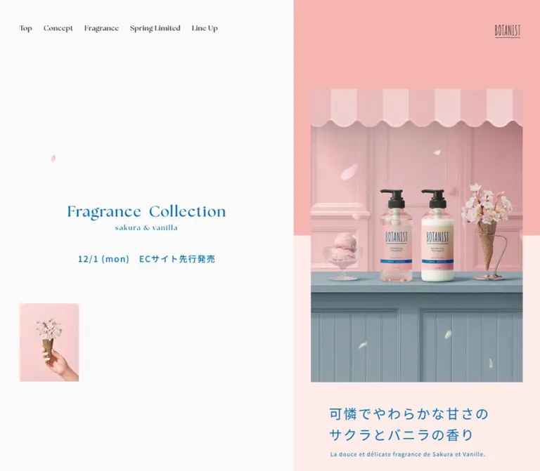
DESIGN REFERENCE
BOTANIST|フレグランスコレクション サクラとバニラの香り
サクラ色とブルーを組み合わせ、アイスクリームショップを思わせる商品写真で香りを表現。デスクトップの左右分割構成と、モバイルの縦長構成が特徴の季節限定コレクションページ。
オリジナルサイトを見るBOTANIST / Sakura & Vanilla Fragrance Collection — Style Reference
A spring fragrance presented as a quiet ice-cream-shop window: blossom pink, blue lettering, and carefully staged bottles.
Website: BOTANIST — Sakura & Vanilla Fragrance Collection Original URL: https://botanistofficial.com/special/limited/26spring/ Final URL: https://botanistofficial.com/special/limited/26spring/ Theme: light, with pastel photographic scenes and section-specific color fields; no theme selector was evidenced. Inspected: September 12, 2026, at 13:13:54.980 UTC / 22:13:54.980 JST. Viewports: desktop 1440 × 1000 and mobile 390 × 844 CSS pixels. Scope: the current seasonal collection page, including its opening composition, persistent desktop identity area, concept narrative, fragrance stages, ingredient panels, product lineup, campaign copy, and closing/footer compositions. Purchase-detail structures and mobile navigation were examined through supplied DOM evidence; their open states were not exercised.
The page builds its identity through a specific photographic world. Pink wall moldings and a scalloped striped awning surround shampoo and treatment bottles on a muted blue counter. An ice-cream coupe and cherry blossoms arranged in a waffle cone turn the fragrance into a small sensory story. Blue typography connects the interface to the bottle labels, while generous empty space prevents the pastel palette from becoming visually crowded.
At desktop size, the page divides evenly into a persistent identity area on the left and a long content stream on the right. The left side holds navigation, a centered collection lockup, and small supporting imagery; later captures also show footer utilities and a photographic background there. On mobile, the identity moves into the opening scene, navigation contracts to a small menu control, and content occupies the full width. Square ingredient and product panels coexist with compact pill-shaped purchase controls.
How to Read This Reference
- Measured means a value appears in the supplied rendered DOM, computed styles, custom properties, or element rectangles. RGB values have been converted directly to hexadecimal.
- Calculated means arithmetic applied to those measurements, such as deriving a grid gap or a content gutter.
- Visual estimate means an approximate dimension or color judged from the original-page captures. Estimated colors were not sampled with a pixel picker.
- Recommendation means an implementation choice for reuse. It does not establish existing behavior.
- Descriptive token names in this document are aliases. Original custom properties are identified explicitly.
- The desktop images show an opening composition, an intermediate ingredient section, and a later composition with footer utilities. Mobile images show the opening and the page bottom. Exact scroll offsets were not supplied.
- DOM content can include offscreen or inactive elements. A recorded rectangle does not prove that a menu or purchase panel was visible.
Tokens — Colors
Measured Interface Palette
| Name | Value | Suggested token | Evidenced role |
|---|---|---|---|
| Warm White | #fbfafa |
--color-canvas |
Body background and product-card button backgrounds |
| Collection Blue | #006db3 |
--color-blue |
Opening Japanese copy, concept text, purchase control, and campaign links |
| Fragrance Blue | #357dab |
--color-fragrance |
Fragrance section heading and scent descriptions |
| Blossom Rose | #d78189 |
--color-rose |
Feature 01 text, ingredient metadata, numbering, and several fragrance navigation states |
| Muted Blue | #699aaf |
--color-action-fill |
Filled campaign-jump link |
| Charcoal | #323232 |
--color-text |
Navigation, ingredient explanations, and product information |
| Lineup Gray | #f3f1f1 |
--color-lineup |
Product lineup section background |
| White | #ffffff |
--color-white |
Reversed section text and retailer-link backgrounds in the purchase-panel DOM |
| Label Pink | #fadce0 |
--color-label |
Variant labels within inactive purchase-detail structures |
| Annotation Gray | #888888 |
--color-muted |
Small supporting annotation in the campaign interlude |
The blue is an identity color as well as an action color. It appears in narrative copy and large introductory text, so blue alone does not distinguish a clickable element. Purchase actions gain clarity from their cart icon, outline, capsule shape, and persistent placement.
Photographic and Background Approximations
| Name | Visual estimate | Suggested token | Use and limitation |
|---|---|---|---|
| Shop Pink | approximately #f5b6b2 |
--color-shop-pink |
Broad upper opening field; exact background declaration was not supplied |
| Pale Blush | approximately #ffedeb |
--color-pale-blush |
Lower opening field behind the introductory copy |
| Footer Blue | approximately #78a3b2 |
--color-footer |
Mobile footer surface; keep separate from the measured campaign-button blue |
Photographic pinks and blues contain lighting, texture, and shadow. These three approximations are useful surrounding-surface colors, not a replacement for the image palette. The opening color division is a hard boundary; softness comes from the photograph and its pastel tones.
Tokens — Typography
Japanese Body and Utility Text
Source stack: "Noto Sans JP", "ヒラギノ角ゴ ProN W3", meiryo, sans-serif through --mh--font-family--base.
The supplied computed styles use this stack for Japanese narrative copy, ingredient information, product labels, and purchase controls. Regular text is 400; the source token named bold is 500. Tracking is commonly 0.1em, with generous line heights of 1.6, 1.9, or 2.2 depending on the role.
The resulting texture is open and calm. Body copy has deliberate line breaks and room between lines, while functional labels remain compact.
English Editorial Headings
Source stack: "the-seasons", sans-serif through --mh--font-family--en.
Navigation, section labels, category headings, and ingredient numerals declare this family with weight 700, usually 1.1 line height and 0.05em tracking. The captures show a serif appearance with delicate stroke contrast. Preserve the declared weight rather than assuming that the visual delicacy means a light font weight.
Font loading requests and licensing were not inspected. The computed family stack identifies the declaration; it does not independently verify every downloaded font file.
Brand and Collection Lockups
The narrow BOTANIST mark measures approximately 51 × 27.19px at both inspected sizes. The collection title is also presented as a coordinated lockup: a larger serif-style “Fragrance Collection” line over a smaller “sakura & vanilla” line.
The collection lockup container measures 320 × 52.69px on desktop and 328.63 × 54.11px on mobile. Its wrapper inherits the Japanese body stack, which does not establish the typeface or font size of the visible lockup artwork. Its internal asset format and lettering implementation were not supplied. Use an authorized lockup asset when available, or label a text recreation as an approximation.
Type Scale
Values below are measured computed styles. Sizes are desktop / mobile; line height is expressed as a multiplier when consistent.
| Role | Size | Weight | Line height | Tracking |
|---|---|---|---|---|
| Body | 17.29 / 13px |
400 |
1.9 |
0.1em |
| Concept narrative | 17.29 / 13px |
400 |
2.2 |
0.1em |
| Desktop navigation / offscreen mobile menu links | 14 / 18px |
700 |
1.1 |
0.05em |
| Concept and Line Up section labels | 19.95 / 15px |
700 |
1.1 |
0.05em |
| Feature labels | 17.29 / 13px |
700 |
1.1 |
0.05em |
| Feature statements | 22.61 / 17px |
400 |
1.6 |
0.1em |
| Opening Japanese statement | 27 / 20px |
400 |
1.6 |
0.1em |
| Opening French supporting line | 11 / 8px |
400 |
1.6 |
0.1em |
| Fragrance and Spring Limited English headings | 23 / 17px |
700 |
1.1 |
0.05em |
| Paired Japanese section headings | 23 / 17px |
500 |
1.6 |
0.1em |
| Fragrance stage links | 19.95 / 15px |
700 |
1.1 |
0.05em |
| Fragrance descriptions | 18 / 14px |
400 |
1.6 |
0.1em |
| Fragrance ingredient names | 29 / 24px |
400 |
1.6 |
0.1em |
| Ingredient metadata | 16 / 13px |
400 |
1.6 |
0.1em |
| Ingredient numerals | 29 / 20px |
700 |
1.1 |
0.05em |
| Ingredient statement | 26 / 19px |
400 |
1.6 |
0.1em |
| Ingredient supporting copy | 14 / 12px |
400 |
1.6 |
0.1em |
| Ingredient footnotes | 11 / 10px |
400 |
1.6 |
0.1em |
| Product category headings | 34.58 / 26px |
700 |
1.1 |
0.05em |
| Purchase button | 14 / 11px |
400 |
1.6 |
1.729 / 1.3px |
| Retailer links in inactive panels | 16 / 13px |
500 |
1.6 |
0.1em |
The measured root size changes from 13.3px to 10px; several desktop values are consequently 1.33 times their mobile equivalents. Other roles use different ratios, and mobile menu text becomes larger. A single global scaling factor would not reproduce the page.
Tokens — Spacing & Shapes
Source Spacing Scale
| Source property | Desktop | Mobile |
|---|---|---|
--mh--space--x2s |
10px |
5px |
--mh--space--xs |
20px |
10px |
--mh--space--sm |
30px |
15px |
--mh--space--md |
40px |
20px |
--mh--space--lg |
50px |
25px |
--mh--space--xl |
60px |
30px |
--mh--space--x2l |
70px |
35px |
--mh--space--x3l |
80px |
40px |
Padding tokens follow a separate scale. For example, --mh--padding--sm changes from 30px to 20px, while --mh--padding--md changes from 40px to 30px. Do not halve every padding value simply because the spacing scale halves.
Layout Measurements
| Element | Desktop 1440 × 1000 | Mobile 390 × 844 | Evidence |
|---|---|---|---|
| Identity-side width | 720px, source 50% |
0px |
Measured source token and layout |
| Main content region | x=720, width 720px |
x=0, width 390px |
Measured |
| Main start after opening | y=1000px |
y=844px |
Measured |
| Standard outer content frame | 500px |
100% |
Source token |
| Standard inner gutter | 33.33px |
6.67%, approximately 26px |
Source token and measured positions |
| Standard reading width | 433.34px |
338px |
Measured |
| Opening photograph | approximately 430 × 596px, at (865, 202) |
approximately 264 × 365px, at (63, 230) |
Visual estimates |
| Collection lockup | 320 × 52.69px, at approximately (200, 473.66) |
328.63 × 54.11px, at approximately (30.69, 211.19) |
Measured |
| Ingredient panel width | approximately 500px |
approximately 338px |
Desktop capture and DOM alignment |
| Ingredient inner content | 410px, inset 45px |
286px, inset 26px |
Measured |
| Product card | approximately 213.35 × 267.90px |
166.5 × 205.75px |
Measured |
| Product grid gap | approximately 6.65px |
5px |
Calculated from card rectangles |
| Purchase button | 126 × 42px |
90 × 28px |
Measured |
| Mobile menu control | Not visible | 24 × 24px at (20, 21.5) |
Measured |
| Header height token | 0px |
67px |
Source token; desktop chrome still occupies a full-view header structure |
| Document height | approximately 17,594px |
approximately 14,292px |
Supplied browser measurements |
The desktop reading width is nested: a 500px frame sits inside the 720px right half, and an additional 33.33px gutter on each side produces 433.34px of text width. Mobile keeps the inner-gutter idea but removes the desktop identity column.
Shape Vocabulary
| Element | Treatment | Evidence |
|---|---|---|
| Photographs | Square corners | Visible captures |
| Ingredient panels | White rectangles with a fine rose divider | Visible desktop capture; divider estimated at 1px |
| Product cards | 0px radius |
Computed |
| Purchase button | 999px radius |
Computed |
| Filled campaign jump | Capsule; approximately 336.48 × 74.47px desktop and 253 × 56px mobile |
Computed |
| Retailer links | Capsules, 215 × 52px desktop and approximately 143.2 × 37px mobile |
Inactive-panel DOM |
| Campaign thumbnail | Small circular image holder | Visible captures |
There is no visible general-purpose shadow elevation system in the supplied captures. Separation comes from background changes, straight image edges, whitespace, and thin outlines.
Components
Persistent Desktop Identity Area
Role: hold the collection identity in view while the right-hand story progresses.
The left half is initially warm white. Six English navigation links sit near its top-left corner, the collection lockup is centered around the viewport midpoint, and a small portrait photograph sits near the lower-left corner. In later captures, social utilities and legal links appear beneath that small photograph.
An intermediate capture shows the same left-side title and navigation over a large product-lineup photograph. The products sit low in the frame, leaving a quiet pink area behind the title. This supports a state-dependent photographic identity surface, but the exact trigger and transition were not recorded.
Reusable anatomy: full-height side surface → optional photographic background → navigation → centered lockup → small editorial image → footer utilities. Keep the title's clear space even when introducing a background photograph.
Global Navigation and Brand Mark
Role: provide section access with very little visual chrome.
Desktop links read Top, Concept, Fragrance, Spring Limited, Line Up, and Campaign. Their measured top position is 50px, with the first link at 40px from the left. A calculated 23px gap separates adjacent link boxes. They are plain text anchors with no filled navigation surface.
The BOTANIST mark sits 40px from the right and 50px from the top on desktop. On mobile it moves to a 20px right inset and approximately 20px top inset, retaining its 51px width.
Mobile presents a two-line menu glyph at the upper left. The six menu links remain in the DOM, positioned beyond the right edge of the viewport. Their vertical spacing and 18px English type support an off-canvas menu structure. Opening direction, backdrop appearance, dismissal behavior, and keyboard handling remain unverified.
Opening Composition
Role: introduce the fragrance through a product still life and a short sensory statement.
The desktop opening fills the right half of the first viewport. A centered portrait photograph crosses a horizontal division between stronger pink above and pale blush below. The visible image runs from approximately y=202 to y=798. Beneath it, the Japanese statement begins at measured y=840:
“可憐でやわらかな甘さの / サクラとバニラの香り”
A small French line follows. Both are blue and left-aligned within the lower portion of the right column. The photograph is centered, but the text begins farther left than the photograph; this offset is part of the composition.
On mobile, the collection lockup moves above and partly across the photograph's awning. It begins near y=211, while the image starts around y=230. The image occupies about 67.7% of the viewport width. The Japanese statement begins near y=625, and the small supporting line sits beneath it. The stronger pink field ends around y=440, passing behind the photograph rather than aligning with its bottom edge.
Concept Narrative
Role: explain the fragrance through a short, atmospheric story.
The Concept label is followed by the Japanese lead “春の香りは、物語を纏う。” and two widely separated narrative passages. Text stays blue, uses 2.2 line height, and preserves authored line breaks. The measured reading widths are 433.34px on desktop and 338px on mobile.
The section occupies approximately 1566px of desktop document height and 1153px on mobile. Large intervals between passages belong to its paced editorial structure. Intervening image content is not fully represented by the supplied element sample, so those intervals should not automatically become arbitrary blank spacers in a new implementation.
Feature Vignettes
Role: introduce fragrance and seasonal care as two distinct benefits.
Feature 01 uses rose text; Feature 02 uses blue. Each combines a small English label, a visual area, and a two-line Japanese statement. Their section padding alternates: 48px on the left or right at desktop size, and 26px on mobile.
The recorded section bounds slightly overlap vertically: approximately 19.2px on desktop and 10.4px on mobile. Child positions also extend beyond simple padded alignment. These measurements support a staggered editorial arrangement, although the underlying transforms were not supplied. Preserve alternating placement and restrained overlap instead of imposing identical centered cards.
Fragrance Stage
Role: explain how the fragrance changes from opening notes to its lasting sweetness.
A paired heading combines Fragrance with “香り立ちの変化”. Three anchors, visually labeled TOP, MIDDLE, and LAST, target dedicated fragment IDs. The associated content identifies strawberry, sakura and muguet, and vanilla.
The whole section measures exactly three inspected viewport heights: 3000px on desktop and 2532px on mobile. All three sets of scent captions share the same recorded coordinates in each DOM snapshot. Together, these facts support staged or overlapping presentation; the precise pinning and transition behavior was not exercised.
The vanilla portion visible above the ingredient section uses soft-focus botanical imagery behind centered blue text. Its sensory description is smaller than the ingredient name. Keep the background atmosphere broad and the copy concise.
Implementation guidance: use the three real fragment targets, preserve a readable static sequence when motion is disabled, and verify any active-link behavior separately. The mobile snapshot shows the first anchor blue and the other two rose; the desktop snapshot records all three rose, so a universal active-state rule cannot be recovered from these samples alone.
Spring Limited Ingredient Panel
Role: turn ingredient information into an orderly, readable insert within the pink scene.
The section begins with centered white Spring Limited and “春限定配合成分” headings. The first visible panel is a square-cornered white rectangle approximately 500px wide. Its anatomy is particularly reusable:
- A top metadata row places the uppercase ingredient label at left and the large serif number
01at right. - A generously separated content block introduces the ingredient in a two-line Japanese statement.
- A smaller two-line benefit explanation follows.
- A wide cherry-blossom photograph fills the lower content width.
- A thin rose rule separates the next panel.
The desktop metadata row has approximately 20px side insets; the main content uses 45px, producing a 410px inner width. On mobile these become approximately 10.4px and 26px, with 286px for the main content.
The first panel identifies “ソメイヨシノ” and its fermented extract. The second is numbered 02 and introduces SPRING BARRIER COMPLEX. White footnotes follow on the surrounding pink background. Keep explanatory footnotes connected to the ingredient claims rather than moving them into unrelated footer copy.
Campaign Interlude
Role: connect the sensory story to the social campaign before the product lineup.
The DOM records a rose-colored Japanese hashtag statement, a small supporting annotation, and a filled muted-blue capsule linking to #campaign. The capsule combines a two-line instruction with a broad horizontal shape: approximately 336.48 × 74.47px on desktop and 253 × 56px on mobile.
Its measured fill is #699aaf, with white text and a background-color transition of 0.3s. The complete interlude composition was not captured, so its surrounding artwork and transition should not be invented from the text sample.
Product Lineup
Role: make the collection variants and prices easy to compare after the narrative sections.
The lineup changes to a light gray background. A small blue Line Up label precedes larger charcoal English category headings: Shampoo & Treatment, Out Bath, and Body Soap. Each category has one Japanese explanatory line or a short two-line statement.
Product entries are actual buttons. Their recorded content contains a variant name, tax-inclusive price, and More. The complete card's visual artwork was not shown in the supplied screenshots; the DOM establishes its button semantics, dimensions, padding, and text structure.
The grid retains two columns at both inspected widths. Shampoo and treatment has three variant buttons, leaving one second-row position unused. Out Bath and Body Soap each have two entries. Desktop cards measure approximately 213.35 × 267.90px; mobile cards measure 166.5 × 205.75px. Their top/bottom padding changes from 13.3 / 26.6px to 10 / 20px.
Use square, warm-white surfaces with tight gutters. Keep the variant, price, and detail affordance together inside one control. Product-image sizing in a recreation must be calibrated with actual assets because the image rectangles were not provided.
Purchase Control and Detail Structures
Role: maintain access to buying options without dominating the editorial page.
The persistent “購入する” button combines a small cart icon and text inside a thin blue capsule. Its measured desktop position is 20px from the right and bottom; on mobile it is 10px from the right and 16px from the bottom. The visible mobile control is only 90 × 28px.
The DOM includes a collection purchase structure and separate product-detail structures with Close buttons. They contain a product or collection heading, a pale pink variant label, supporting product information, and retailer links for 公式ストア, Rakuten, Amazon, and Yahoo!.
These structures had zero-height section wrappers in the sampled page state. Their children still produced computed rectangles, including a 700px desktop header region and a 338px mobile header region. Retailer links form two columns with 10px gaps. This is useful anatomy evidence, but it does not verify an open modal's backdrop, animation, focus behavior, or successful navigation.
Persistent Campaign Strip
Role: keep the campaign destination available while browsing.
Later desktop captures show a pale blue strip attached to the bottom-right edge of the left identity area. Its visible footprint is approximately 295 × 69px. A circular product thumbnail sits beside two lines of blue campaign copy.
At the mobile page bottom, a white strip approximately 60px high spans the viewport. The campaign link sits at the left and the purchase capsule at the right. The DOM measures the campaign link itself at approximately 242.78 × 40px, with a 40px image column and an 8px gap.
The opening mobile capture shows only the purchase button, while the later footer capture includes the campaign strip. The reveal threshold was not supplied. Treat the visible link rectangle and the surrounding strip as separate measurements, and do not infer an exact desktop wrapper position from the initial DOM's alternate link coordinates.
Campaign Details
Role: explain the giveaway and its entry process.
The rendered text includes a two-item prize set for twenty recipients, an application period, prize details, two numbered entry steps, an X link, and terms. The stated application period is December 1–14, 2025, which precedes the September 2026 inspection. Those dates remain part of the currently served copy; present-time campaign availability was not verified.
The supplied element sample does not establish a complete visual layout for this section. Reuse its clear information order, while distinguishing any newly designed campaign cards or terms disclosure from observed styling.
Closing Scene and Footer
Role: return to the main photographic identity and provide compact brand utilities.
A later desktop capture fills the right half with the original product still life, enlarged from the opening's inset window. The left half retains the centered collection lockup and shows a small photograph above social and legal utilities. The transition between these compositions was not recorded.
On mobile, the closing photograph flows into a solid muted-blue footer. The footer image shows vertically stacked CONTACT, COMPANY, and PRIVACY POLICY links at the left, with copyright at the upper right. Near the bottom, three utility icons sit at the left and a portrait photograph of a hand holding the blossom-filled cone sits at the right, approximately 104 × 138px.
The utility group contains X, Instagram, and a copy control identified as COPY in the DOM. Clipboard feedback was not tested. The fixed white campaign strip overlays the lowest part of this footer view.
Tokens — Motion & Interaction
Measured Transition Declarations
| Target | Declaration | What the evidence establishes |
|---|---|---|
| Collection lockup transform | 1.2s cubic-bezier(0.1, 0.7, 0.4, 1) |
A transform transition is declared; its trigger and key positions were not supplied |
| Collection lockup width | 0.9s cubic-bezier(0.1, 0.7, 0.4, 1) |
Width changes can ease over this duration |
| Collection lockup color | 0.3s, delayed 0.9s |
Delayed color transition is declared |
| Header opacity | 0.3s |
Header opacity can transition |
| Brand heading color | 0.6s |
Color transition is declared |
| Navigation-link color | 0.3s |
Color feedback is defined; the destination hover color was not sampled |
| Purchase control | 0.3s |
Transition timing is present; before/after styles were not exercised |
| Filled campaign link | background-color 0.3s |
Background-color feedback is defined |
| Inactive detail-section wrapper | 0s linear 0.6s |
A delayed, zero-duration change exists; this does not establish the visible panel animation |
Source Motion Inventory
Duration tokens are 0.3s, 0.6s, 0.9s, and 1.2s. The easing inventory contains:
easecubic-bezier(0.1, 0.7, 0.4, 1)cubic-bezier(0.03, 0.9, 0.15, 1)cubic-bezier(0.88, 0.14, 0.87, 0.86)cubic-bezier(0.3, 0.1, 0.36, 1.15)
Only the lockup's association with the second curve is directly present in the sampled component transitions. Do not assign every available curve to a fabricated interaction.
Visual Motion Evidence and Limits
Petals appear across photographs and foreground areas, with different placements in the captures. This suggests a decorative motion layer, but still images do not establish speed, trajectory, loop length, rendering technology, or which petals are already embedded in the photography.
The changing desktop background, enlarged closing photograph, and shared fragrance-stage coordinates support an experience with visual state changes. No continuous recording or interaction trace was provided to recover the full choreography.
The browser preparation process waited for finite motion and image readiness, temporarily paused perpetual animation during checks, and then resumed it. That procedure does not prove that every delayed reveal had completed. Likewise, generic transition: all entries without a useful duration are not evidence of an animated effect.
Recommendation: preserve a readable static composition first. Add gentle decorative movement only when it can be disabled, and avoid making section access depend on a specific animation frame.
Surfaces
| Surface | Appearance | Function |
|---|---|---|
| Desktop identity canvas | Warm white, sometimes replaced by a product photograph | Persistent collection recognition |
| Opening field | Stronger pink above pale blush | Frames the centered product still life |
| Editorial content | Spacious color fields and photographic interludes | Paces the fragrance story |
| Ingredient insert | White, square corners, rose metadata and fine rule | Separates factual explanation from atmosphere |
| Lineup section | #f3f1f1 with #fbfafa buttons |
Establishes a quiet comparison area |
| Purchase control | Transparent blue outline capsule | Persistent buying affordance |
| Campaign jump | Solid muted blue with white text | Larger in-content campaign action |
| Mobile footer | Estimated muted blue with white utilities | Closes the photographic story |
| Purchase-detail labels | Pale pink rectangular tags in the DOM | Identifies a variant within the inactive detail structure |
The scalloped edge belongs to the shop awning in the imagery. It is not evidence for a general scalloped card or section-divider system.
Imagery
The principal image is a staged product still life with a near-frontal viewpoint. Two pump bottles sit on a blue counter against pink paneling. The props carry the fragrance concept: pink ice cream at left and cherry blossoms in a waffle cone at right. Soft shadows and photographic texture keep the scene tactile.
The supporting images extend the same world through a hand-held blossom cone, a small café-chair scene, a fuller product lineup, and close-up cherry blossoms. These are editorial inserts with distinct crops, not interchangeable stock-photo placeholders.
Observed Image References
No image URLs or asset filenames were included in the supplied evidence. The following references identify visible compositions only.
| Composition | Where visible | Reuse guidance |
|---|---|---|
| Two bottles, pink awning, ice cream, and blossom cone | Desktop opening, mobile opening, enlarged closing scene | Preserve the relation between bottles, props, and blue counter |
| Full product lineup on a blue counter | Intermediate desktop identity area | Keep bottles low enough to leave quiet space behind the central lockup |
| Hand holding a blossom-filled cone | Desktop supporting image and mobile footer | Use a small portrait crop with square corners |
| Café chair and street setting | Intermediate desktop supporting image | Treat as a secondary editorial detail; its cycling behavior is unverified |
| Cherry-blossom close-up | First ingredient panel | Use a broad rectangular crop with natural photographic detail |
| Soft-focus vanilla imagery | Fragrance section portion above ingredients | Retain atmospheric blur behind readable blue captions |
| Cart and utility symbols | Purchase control and footer | Use restrained linework and verified brand symbols |
Do not recreate labels with distorted generated text. Product packaging and brand marks require accurate, authorized artwork. For product comparison images, preserve full bottle silhouettes; for decorative scenery, use intentional crops. Standard photographic rendering is appropriate—pixelated rendering would conflict with the observed image treatment.
Layout & Responsive Behavior
Desktop: Identity Beside a Narrow Story
The main stream occupies the right 50% of the viewport. Most reading content remains inside a centered 500px frame, with 433.34px available for paragraphs and product grids. The resulting 110px outer margins within the right half are calculated from (720 − 500) / 2.
The identity panel's navigation and central lockup remain at consistent screen positions across the desktop captures. A fixed or equivalent persistent implementation is supported visually; the exact source positioning rule was not included in the computed-style sample.
The right-side story is deliberately long. Its measured fragrance section alone spans three viewport heights. Preserve the narrow column and editorial pacing when extending the page, while allowing text and images to determine ordinary content-section heights.
Mobile: A Full-Width Narrative
At 390px, the side-width token becomes zero and the content frame becomes 100%. The standard 6.67% gutter creates approximately 26px on each side. Body text becomes 13px; the product grid still has two columns.
The collection lockup relocates into the opening scene and becomes slightly wider in absolute pixels than its desktop counterpart. The brand mark retains its size. This is selective recomposition rather than a uniformly reduced desktop layout.
The footer becomes an in-flow blue section, and the campaign/purchase utilities consolidate along the bottom edge. Reserve enough final-page space to keep footer controls reachable when the fixed strip is visible.
Breakpoints and Unverified Ranges
The source exposes breakpoint values of 375, 500, 768, 940, 1240, and 1680px. The supplied evidence does not identify the media-query conditions that activate every layout change. Only 1440px and 390px were inspected.
The Quick Start uses 940px as a recommended switch between its two layout modes because it appears in the source inventory. This is not a recovered breakpoint rule. Test tablet widths, landscape phones, text zoom, and short desktop windows separately.
The source also exposes --vh values of 10px and 8.44px, matching one percent of the inspected viewport heights. Its update mechanism was not supplied. The adaptation uses small viewport units for the opening and allows content to grow rather than forcing clipping.
Do’s and Don’ts
Do
- Preserve the desktop half-width identity area and narrow right-hand reading stream.
- Move the collection lockup into the mobile opening composition.
- Combine blossom pink with a clear blue text accent and muted blue photographic furniture.
- Use the measured serif heading family and Japanese sans-serif stack where available and licensed.
- Keep the lockup distinct from ordinary body typography.
- Maintain generous narrative line height and deliberate Japanese line breaks.
- Use square white ingredient panels with separate metadata and body insets.
- Keep product grids at two columns at the inspected desktop and phone sizes.
- Reserve capsule shapes for purchase, retailer, and campaign controls.
- Preserve product-label fidelity and the small supporting editorial photographs.
- Distinguish visible capture states from inactive DOM structures.
Don’t
- Don’t replace the split desktop composition with a centered full-width marketing stack.
- Don’t enlarge every English heading into an oversized headline.
- Don’t use the collection lockup wrapper's inherited font size to recreate its visible lettering.
- Don’t apply rounded corners and shadows to every photograph or product panel.
- Don’t replace the photographed awning with a repeated decorative UI motif throughout the page.
- Don’t assume every blue text element is a link.
- Don’t introduce a third product-grid column simply because the viewport is wide.
- Don’t infer a carousel, automatic tab rotation, scroll snapping, or a motion library from shared stage coordinates.
- Don’t invent modal backdrops or hover-state colors and present them as observed.
- Don’t describe the retained 2025 campaign copy as proof that entries remain open.
- Don’t turn visual color estimates into claims of exact source values.
Recommended Implementation Additions
These are recommendations for a new implementation, not verified features of the original page:
- Enlarge the interactive areas around the
24pxmobile menu glyph and28px-high purchase capsule to at least44px, preserving their small visible shapes. - Increase essential mobile text where needed. The observed
8pxsupporting line and10pxfootnotes should not become the only place important information appears. - Check contrast for white text on pastel pink and muted blue. Use a darker local surface or darker text for essential small copy when necessary.
- Give the menu and any purchase dialogs explicit accessible names, predictable focus handling, and an Escape dismissal path. Return focus to the opening control.
- Use real links for retailer destinations and section anchors. Keep complete product buttons keyboard-operable.
- Provide reduced-motion behavior that removes drifting decoration and presents the fragrance stages in a readable sequence.
- Include bottom safe-area clearance and ensure the campaign strip cannot cover legal links or the last actionable item.
- Load fonts deliberately and preserve image dimensions to avoid shifting the carefully aligned lockup and product scene.
- Use responsive image sources for large photographs, while retaining sharp packaging labels and consistent crops.
- Represent campaign availability as maintained content, including an ended state when the advertised period has passed.
Agent Prompt Guide
Quick Color Reference
- Main canvas: measured
#fbfafa. - Main narrative and purchase blue: measured
#006db3. - Fragrance copy: measured
#357dab. - Ingredient metadata and first feature accent: measured
#d78189. - Filled campaign action: measured
#699aaf. - Product-section background: measured
#f3f1f1. - Surrounding opening pink and blush: estimated
#f5b6b2and#ffedeb. - Mobile footer: estimated
#78a3b2.
Overall Prompt
“Create a seasonal beauty collection page using a quiet pink ice-cream-shop photographic setting, blue typography, and generous editorial space. At desktop width, reserve the left half for persistent navigation, a centered collection lockup, and small supporting imagery; place the long story in the right half, with a 500px content frame and approximately 433px reading width. On a 390px phone, use a full-width story with 26px gutters, a small top-left menu glyph, and a 51px brand mark at the upper right. Move the collection lockup over the opening photograph. Pair delicate serif English headings with tracked Japanese sans-serif copy. Use square white ingredient panels, compact two-column product buttons, and small blue outline purchase capsules. Keep unverified animation and dialog behavior separate from the static design.”
Example Component Prompts
- Opening scene: “Place a portrait product still life across a horizontal pink-to-pale-blush boundary. Center the photograph, then offset a two-line blue Japanese fragrance statement slightly farther left beneath it. On mobile, overlap the collection lockup with the photograph's upper awning. Use accurate supplied bottle and brand artwork.”
- Ingredient panel: “Create a square white ingredient insert on a pink photographic field. Put rose uppercase metadata at the upper left and a rose serif number at the upper right. Use a deeper inset for the Japanese statement, small benefit copy, and wide botanical photograph. Desktop widths: 500px outer and 410px inner; phone widths: 338px outer and 286px inner.”
- Product lineup: “Use a warm light-gray section with a small blue section label and large charcoal serif category headings. Keep two columns on both desktop and mobile. Each square warm-white button contains a product visual, variant name, tax-inclusive price, and More. Use narrow gutters and no card shadow.”
- Mobile footer: “Continue the final product photograph into a muted-blue footer. Stack legal links at the upper left, align small copyright at the upper right, and place utility icons opposite a small portrait blossom-cone photograph near the bottom. Reserve room for a fixed white campaign strip and a blue outline purchase capsule.”
- Motion adaptation: “Begin with a complete static page. Where state changes are implemented, use the evidenced 1.2-second transform and 0.9-second width transitions for the collection lockup. Treat petal movement and fragrance-stage choreography as new behavior requiring specification and a reduced-motion fallback.”
Quick Start
CSS Custom Properties
This is a reusable adaptation, not extracted source CSS. It keeps a conventional root font size and uses the measured endpoint values directly. The pink/background estimates, 940px layout switch, hero viewport formulas, product-image slots, and larger invisible purchase target are recommendations.
Use .identity-panel and .site-header beside a .story-column containing the opening and main sections. Place .content-inner inside .content-frame. Product and ingredient images require real authorized assets; no original asset paths were supplied. A purchase button uses an inner .purchase-control__visual span to keep its visible capsule small while enlarging the hit area. Menu, dialog, and campaign-strip state controllers require separate implementation.
The English font fallback below is intentionally serif, a recommended adaptation of the source's sans-serif fallback. Declaring a font family does not load it.
:root {
  /* Measured interface colors */
  --color-canvas: #fbfafa;
  --color-blue: #006db3;
  --color-fragrance: #357dab;
  --color-rose: #d78189;
  --color-action-fill: #699aaf;
  --color-text: #323232;
  --color-lineup: #f3f1f1;
  --color-white: #ffffff;
  --color-label: #fadce0;

  /* Visual estimates, not sampled source colors */
  --color-shop-pink: #f5b6b2;
  --color-pale-blush: #ffedeb;
  --color-footer: #78a3b2;

  --font-jp: 'Noto Sans JP', 'ヒラギノ角ゴ ProN W3', meiryo, sans-serif;
  --font-en: 'the-seasons', serif;
  --text-body: 13px;
  --text-section: 15px;
  --text-category: 26px;
  --text-hero: 20px;
  --text-support: 8px;
  --leading-body: 1.9;
  --leading-story: 2.2;
  --tracking-jp: 0.1em;
  --tracking-en: 0.05em;

  --side-width: 0px;
  --frame-width: 100%;
  --inner-pad: 6.6667%;
  --product-gap: 5px;
  --category-gap: 57.2px;
  --product-pad-top: 10px;
  --product-pad-bottom: 20px;
  --product-min-height: 205.75px;
  --packshot-height: 110px;
  --radius-pill: 999px;

  --motion-feedback: 0.3s;
  --motion-lockup: 1.2s;
  --motion-width: 0.9s;
  --ease-lockup: cubic-bezier(0.1, 0.7, 0.4, 1);
  --safe-bottom: env(safe-area-inset-bottom, 0px);
}

* { box-sizing: border-box; }

body {
  margin: 0;
  color: var(--color-text);
  background: var(--color-canvas);
  font-family: var(--font-jp);
  font-size: var(--text-body);
  line-height: var(--leading-body);
  letter-spacing: var(--tracking-jp);
}

img { display: block; max-width: 100%; }
button, a { -webkit-tap-highlight-color: transparent; }
button { font: inherit; letter-spacing: inherit; }
a { color: inherit; }
[hidden] { display: none !important; }

.story-column {
  width: calc(100% - var(--side-width));
  margin-inline-start: var(--side-width);
}

.content-frame {
  width: min(100%, var(--frame-width));
  margin-inline: auto;
}

.content-inner { padding-inline: var(--inner-pad); }
.identity-panel { display: none; }

.site-header {
  position: fixed;
  inset: 0 0 auto;
  z-index: 30;
  height: 67px;
  pointer-events: none;
  transition: opacity var(--motion-feedback);
}

.site-header a,
.site-header button { pointer-events: auto; }

.brand-mark {
  position: absolute;
  top: 20px;
  right: 20px;
  width: 51px;
}

.desktop-nav { display: none; }

/* Recommended larger target around the observed small glyph */
.menu-control {
  position: absolute;
  top: 11.5px;
  left: 10px;
  width: 44px;
  height: 44px;
  padding: 0;
  border: 0;
  color: var(--color-text);
  background: transparent;
  cursor: pointer;
}

.menu-control::before,
.menu-control::after {
  content: '';
  position: absolute;
  left: 10px;
  width: 24px;
  height: 1px;
  background: currentColor;
}

.menu-control::before { top: 19px; }
.menu-control::after { top: 25px; }

.hero {
  position: relative;
  isolation: isolate;
  min-height: 100svh;
  padding-block: 27.1svh 48px;
  background: var(--color-pale-blush);
  color: var(--color-blue);
}

.hero::before {
  content: '';
  position: absolute;
  z-index: -1;
  inset: 0 0 auto;
  height: 52.13svh;
  background: var(--color-shop-pink);
}

.hero-lockup {
  position: absolute;
  top: 25.02svh;
  left: 50%;
  width: 84.263%;
  margin: 0;
  transform: translateX(-50%);
}

.hero-lockup img,
.identity-lockup img { width: 100%; }

.hero-photo {
  width: 67.69%;
  max-width: 430px;
  aspect-ratio: 430 / 596;
  margin-inline: auto;
  object-fit: cover;
  border-radius: 0;
}

.hero-copy { margin: 30px 6.4% 0; }

.hero-message {
  margin: 0;
  font-size: var(--text-hero);
  font-weight: 400;
  line-height: 1.6;
}

.hero-support {
  margin: 5px 0 0 2px;
  font-size: var(--text-support);
  line-height: 1.6;
}

.section-label,
.category-title {
  margin: 0;
  font-family: var(--font-en);
  font-weight: 700;
  line-height: 1.1;
  letter-spacing: var(--tracking-en);
}

.section-label {
  color: var(--color-blue);
  font-size: var(--text-section);
}

.story-copy {
  color: var(--color-blue);
  line-height: var(--leading-story);
}

.category-title { font-size: var(--text-category); }
.category-description { margin: 4px 0 0; line-height: 1.6; }

.limited-section {
  padding-block: 40px 73px;
  background: var(--color-shop-pink);
}

.ingredient-stack {
  width: calc(100% - 13.3334%);
  max-width: 500px;
  margin-inline: auto;
}

.ingredient-card {
  background: var(--color-white);
  border-bottom: 1px solid var(--color-rose);
  border-radius: 0;
}

.ingredient-card__meta {
  display: flex;
  align-items: center;
  justify-content: space-between;
  gap: 12px;
  padding: 9px 10.4px 0;
  color: var(--color-rose);
  font-size: 13px;
  line-height: 1.6;
  text-transform: uppercase;
}

.ingredient-card__number {
  font-family: var(--font-en);
  font-size: 20px;
  font-weight: 700;
  line-height: 1.1;
  letter-spacing: var(--tracking-en);
}

.ingredient-card__body { padding: 49px 26px 21px; }

.ingredient-card__title {
  margin: 0;
  font-size: 19px;
  font-weight: 400;
  line-height: 1.6;
}

.ingredient-card__description {
  margin: 12px 0 0;
  font-size: 12px;
  line-height: 1.6;
}

/* Recommended image ratio based on the visible desktop crop */
.ingredient-card__image {
  width: 100%;
  aspect-ratio: 16 / 9;
  margin-top: 20px;
  object-fit: cover;
}

.lineup-section {
  padding-block: 26px 64px;
  background: var(--color-lineup);
}

.product-group + .product-group {
  margin-top: var(--category-gap);
}

.product-grid {
  display: grid;
  grid-template-columns: repeat(2, minmax(0, 1fr));
  gap: var(--product-gap);
  margin-top: 31.2px;
}

.product-card {
  display: grid;
  align-content: start;
  width: 100%;
  min-width: 0;
  min-height: var(--product-min-height);
  padding: var(--product-pad-top) 0 var(--product-pad-bottom);
  border: 0;
  border-radius: 0;
  color: var(--color-text);
  background: var(--color-canvas);
  text-align: center;
  line-height: 1.6;
  cursor: pointer;
}

/* Image-slot heights are adaptation choices, not measured assets */
.product-card__image {
  width: 100%;
  height: var(--packshot-height);
  object-fit: contain;
}

.product-card__name,
.product-card__price,
.product-card__more { margin: 0; }

.campaign-jump {
  display: flex;
  align-items: center;
  justify-content: center;
  width: min(253px, 100%);
  min-height: 56px;
  padding-inline: 25px;
  border-radius: var(--radius-pill);
  color: var(--color-white);
  background: var(--color-action-fill);
  font-size: 12px;
  font-weight: 500;
  line-height: 1.6;
  text-align: center;
  text-decoration: none;
  transition: background-color var(--motion-feedback);
}

/* The visual remains 28px high inside a 44px interactive area */
.purchase-control {
  position: fixed;
  right: 10px;
  bottom: calc(8px + var(--safe-bottom));
  z-index: 50;
  display: grid;
  place-items: center;
  min-height: 44px;
  padding: 0;
  border: 0;
  color: var(--color-blue);
  background: transparent;
  cursor: pointer;
}

.purchase-control__visual {
  display: flex;
  align-items: center;
  justify-content: center;
  gap: 5px;
  width: 90px;
  height: 28px;
  border: 1px solid currentColor;
  border-radius: var(--radius-pill);
  font-size: 11px;
  line-height: 1.6;
}

.campaign-strip {
  position: fixed;
  inset: auto 0 0;
  z-index: 40;
  min-height: calc(60px + var(--safe-bottom));
  padding: 10px 120px calc(10px + var(--safe-bottom)) 10px;
  color: var(--color-blue);
  background: var(--color-white);
}

.campaign-strip__link {
  display: grid;
  grid-template-columns: 40px minmax(0, 1fr);
  align-items: center;
  gap: 8px;
  max-width: 243px;
  text-decoration: none;
  font-size: 12px;
  line-height: 1.5;
  letter-spacing: 0;
}

.campaign-strip__image {
  width: 40px;
  height: 40px;
  border-radius: 50%;
  object-fit: cover;
}

.mobile-footer {
  display: grid;
  grid-template-columns: 1fr 1fr;
  gap: 40px 20px;
  padding: 70px 6.6667% calc(70px + var(--safe-bottom));
  color: var(--color-white);
  background: var(--color-footer);
}

.footer-legal { display: grid; gap: 12px; }
.footer-legal a { text-decoration: none; }
.footer-copyright { margin: 0; text-align: right; font-size: 9px; }
.footer-social { display: flex; align-self: end; gap: 30px; }
.footer-photo { width: 104px; justify-self: end; }

:focus-visible {
  outline: 2px solid var(--color-blue);
  outline-offset: 4px;
}

/* Recommended switch; exact source media-query behavior is unknown */
@media (min-width: 940px) {
  :root {
    --side-width: 50%;
    --frame-width: 500px;
    --inner-pad: 33.33px;
    --text-body: 17.29px;
    --text-section: 19.95px;
    --text-category: 34.58px;
    --text-hero: 27px;
    --text-support: 11px;
    --product-gap: 6.65px;
    --category-gap: 73.33px;
    --product-pad-top: 13.3px;
    --product-pad-bottom: 26.6px;
    --product-min-height: 267.9px;
    --packshot-height: 145px;
  }

  .identity-panel {
    position: fixed;
    inset: 0 auto 0 0;
    display: block;
    width: var(--side-width);
    background: var(--color-canvas);
  }

  .identity-lockup {
    position: absolute;
    top: 50%;
    left: 50%;
    width: 320px;
    margin: 0;
    color: var(--color-blue);
    transform: translate(-50%, -50%);
    transition:
      transform var(--motion-lockup) var(--ease-lockup),
      width var(--motion-width) var(--ease-lockup),
      color 0.3s 0.9s;
  }

  .identity-postcard {
    position: absolute;
    left: 40px;
    bottom: 163px;
    width: 120px;
  }

  .identity-footer {
    position: absolute;
    left: 40px;
    bottom: 50px;
    font-size: 13px;
  }

  .site-header { height: 0; }
  .brand-mark { top: 50px; right: 40px; }
  .menu-control, .hero-lockup, .mobile-footer { display: none; }

  .desktop-nav {
    position: absolute;
    top: 50px;
    left: 40px;
    display: flex;
    gap: 23px;
    font-family: var(--font-en);
    font-size: 14px;
    font-weight: 700;
    line-height: 1.1;
    letter-spacing: var(--tracking-en);
  }

  .desktop-nav a {
    text-decoration: none;
    transition: color var(--motion-feedback);
  }

  .hero { padding-top: 20.2svh; }
  .hero::before { height: 50svh; }
  .hero-photo { width: min(430px, calc(100% - 52px)); }
  .hero-copy {
    margin-top: 42px;
    margin-inline: max(26px, calc((100% - 514px) / 2));
  }
  .hero-support { margin-top: 10px; }

  .limited-section { padding-block: 100px; }
  .ingredient-card__meta { padding: 14.5px 20px 0; font-size: 16px; }
  .ingredient-card__number { font-size: 29px; }
  .ingredient-card__body { padding: 50.6px 45px 50px; }
  .ingredient-card__title { font-size: 26px; }
  .ingredient-card__description { margin-top: 10px; font-size: 14px; }

  .lineup-section { padding-block: 48px 115px; }
  .product-grid { margin-top: 40px; }
  .campaign-jump { width: 336.48px; min-height: 74.47px; font-size: 15.96px; }

  .purchase-control { right: 20px; bottom: 19px; }
  .purchase-control__visual { width: 126px; height: 42px; font-size: 14px; }

  .campaign-strip {
    right: auto;
    left: calc(50% - 295px);
    width: 295px;
    min-height: 69px;
    padding: 10px;
    background: #dce7eb;
  }
}

/* Recommended fallback for separately implemented decorative motion */
@media (prefers-reduced-motion: reduce) {
  html { scroll-behavior: auto; }
  .identity-lockup,
  .site-header,
  .desktop-nav a,
  .campaign-jump { transition: none; }
  .decorative-petals { display: none; }
}
The CSS intentionally leaves content visible without animation. It does not recreate unverified fragrance pinning, menu transitions, or purchase-dialog behavior. The desktop campaign-strip fill #dce7eb is also an approximation of the visible supporting surface.
Tailwind v4 Token Mapping
Optional mapping for an implementation already using Tailwind v4. This does not identify the original site's framework. Define the properties above first.
@theme inline {
  --color-spring-canvas: var(--color-canvas);
  --color-spring-blue: var(--color-blue);
  --color-spring-rose: var(--color-rose);
  --color-spring-fragrance: var(--color-fragrance);
  --color-spring-action: var(--color-action-fill);
  --color-spring-lineup: var(--color-lineup);
  --color-spring-pink: var(--color-shop-pink);
  --color-spring-blush: var(--color-pale-blush);

  --font-editorial: var(--font-en);
  --font-japanese: var(--font-jp);

  --text-spring-body: var(--text-body);
  --text-spring-section: var(--text-section);
  --text-spring-category: var(--text-category);
  --text-spring-hero: var(--text-hero);

  --spacing-spring-grid: var(--product-gap);
  --spacing-spring-category: var(--category-gap);
  --radius-spring-action: var(--radius-pill);
}
Sources & Evidence
- Original and final page: BOTANIST — Sakura & Vanilla Fragrance Collection. The supplied browser report records HTTP
200and no URL change. - Inspection timestamp: September 12, 2026,
13:13:54.980 UTC, equivalent to22:13:54.980 JST. - Original-page visual captures: three desktop images at
1440 × 1000and two mobile images at390 × 844, covering the opening, an intermediate ingredient view, and closing/footer compositions. - Rendered evidence: page text, anchor destinations, source custom properties, computed font/color/spacing/transition values, and element rectangles at both viewport sizes. Reported document heights are approximately
17,594pxand14,292px. - Evidenced section targets:
#top,#concept,#fragrance,#limited,#lineup, and#campaign, with#fragrance_top,#fragrance_middle, and#fragrance_lastfor scent stages. - Inspection preparation: the supplied browser process waited for load, visible image decoding, finite animation readiness, and sampled layout/text stability. Perpetual animation was temporarily paused during readiness checks and resumed afterward. SharedWorkers and service workers were disabled.
- Limitations: no menu-open, purchase-panel-open, hover, keyboard, clipboard, or checkout interaction was exercised in the supplied evidence. Exact scroll offsets, complete animation choreography, image asset paths, font-loading requests, and intermediate responsive widths were not provided. Several purchase structures were inactive despite producing child rectangles.
This reference describes the current page served at the inspected URL. Measurements, visual estimates, and implementation recommendations are explicitly separated throughout.
# BOTANIST / Sakura & Vanilla Fragrance Collection — Style Reference

> A spring fragrance presented as a quiet ice-cream-shop window: blossom pink, blue lettering, and carefully staged bottles.

**Website:** [BOTANIST — Sakura & Vanilla Fragrance Collection](https://botanistofficial.com/special/limited/26spring/)
**Original URL:** https://botanistofficial.com/special/limited/26spring/
**Final URL:** https://botanistofficial.com/special/limited/26spring/
**Theme:** light, with pastel photographic scenes and section-specific color fields; no theme selector was evidenced.
**Inspected:** September 12, 2026, at 13:13:54.980 UTC / 22:13:54.980 JST.
**Viewports:** desktop 1440 × 1000 and mobile 390 × 844 CSS pixels.
**Scope:** the current seasonal collection page, including its opening composition, persistent desktop identity area, concept narrative, fragrance stages, ingredient panels, product lineup, campaign copy, and closing/footer compositions. Purchase-detail structures and mobile navigation were examined through supplied DOM evidence; their open states were not exercised.

The page builds its identity through a specific photographic world. Pink wall moldings and a scalloped striped awning surround shampoo and treatment bottles on a muted blue counter. An ice-cream coupe and cherry blossoms arranged in a waffle cone turn the fragrance into a small sensory story. Blue typography connects the interface to the bottle labels, while generous empty space prevents the pastel palette from becoming visually crowded.

At desktop size, the page divides evenly into a persistent identity area on the left and a long content stream on the right. The left side holds navigation, a centered collection lockup, and small supporting imagery; later captures also show footer utilities and a photographic background there. On mobile, the identity moves into the opening scene, navigation contracts to a small menu control, and content occupies the full width. Square ingredient and product panels coexist with compact pill-shaped purchase controls.

## How to Read This Reference

- **Measured** means a value appears in the supplied rendered DOM, computed styles, custom properties, or element rectangles. RGB values have been converted directly to hexadecimal.
- **Calculated** means arithmetic applied to those measurements, such as deriving a grid gap or a content gutter.
- **Visual estimate** means an approximate dimension or color judged from the original-page captures. Estimated colors were not sampled with a pixel picker.
- **Recommendation** means an implementation choice for reuse. It does not establish existing behavior.
- Descriptive token names in this document are aliases. Original custom properties are identified explicitly.
- The desktop images show an opening composition, an intermediate ingredient section, and a later composition with footer utilities. Mobile images show the opening and the page bottom. Exact scroll offsets were not supplied.
- DOM content can include offscreen or inactive elements. A recorded rectangle does not prove that a menu or purchase panel was visible.

## Tokens — Colors

### Measured Interface Palette

| Name | Value | Suggested token | Evidenced role |
| --- | --- | --- | --- |
| Warm White | `#fbfafa` | `--color-canvas` | Body background and product-card button backgrounds |
| Collection Blue | `#006db3` | `--color-blue` | Opening Japanese copy, concept text, purchase control, and campaign links |
| Fragrance Blue | `#357dab` | `--color-fragrance` | Fragrance section heading and scent descriptions |
| Blossom Rose | `#d78189` | `--color-rose` | Feature 01 text, ingredient metadata, numbering, and several fragrance navigation states |
| Muted Blue | `#699aaf` | `--color-action-fill` | Filled campaign-jump link |
| Charcoal | `#323232` | `--color-text` | Navigation, ingredient explanations, and product information |
| Lineup Gray | `#f3f1f1` | `--color-lineup` | Product lineup section background |
| White | `#ffffff` | `--color-white` | Reversed section text and retailer-link backgrounds in the purchase-panel DOM |
| Label Pink | `#fadce0` | `--color-label` | Variant labels within inactive purchase-detail structures |
| Annotation Gray | `#888888` | `--color-muted` | Small supporting annotation in the campaign interlude |

The blue is an identity color as well as an action color. It appears in narrative copy and large introductory text, so blue alone does not distinguish a clickable element. Purchase actions gain clarity from their cart icon, outline, capsule shape, and persistent placement.

### Photographic and Background Approximations

| Name | Visual estimate | Suggested token | Use and limitation |
| --- | --- | --- | --- |
| Shop Pink | approximately `#f5b6b2` | `--color-shop-pink` | Broad upper opening field; exact background declaration was not supplied |
| Pale Blush | approximately `#ffedeb` | `--color-pale-blush` | Lower opening field behind the introductory copy |
| Footer Blue | approximately `#78a3b2` | `--color-footer` | Mobile footer surface; keep separate from the measured campaign-button blue |

Photographic pinks and blues contain lighting, texture, and shadow. These three approximations are useful surrounding-surface colors, not a replacement for the image palette. The opening color division is a hard boundary; softness comes from the photograph and its pastel tones.

## Tokens — Typography

### Japanese Body and Utility Text

**Source stack:** `"Noto Sans JP", "ヒラギノ角ゴ ProN W3", meiryo, sans-serif` through `--mh--font-family--base`.

The supplied computed styles use this stack for Japanese narrative copy, ingredient information, product labels, and purchase controls. Regular text is `400`; the source token named bold is `500`. Tracking is commonly `0.1em`, with generous line heights of `1.6`, `1.9`, or `2.2` depending on the role.

The resulting texture is open and calm. Body copy has deliberate line breaks and room between lines, while functional labels remain compact.

### English Editorial Headings

**Source stack:** `"the-seasons", sans-serif` through `--mh--font-family--en`.

Navigation, section labels, category headings, and ingredient numerals declare this family with weight `700`, usually `1.1` line height and `0.05em` tracking. The captures show a serif appearance with delicate stroke contrast. Preserve the declared weight rather than assuming that the visual delicacy means a light font weight.

Font loading requests and licensing were not inspected. The computed family stack identifies the declaration; it does not independently verify every downloaded font file.

### Brand and Collection Lockups

The narrow BOTANIST mark measures approximately `51 × 27.19px` at both inspected sizes. The collection title is also presented as a coordinated lockup: a larger serif-style “Fragrance Collection” line over a smaller “sakura & vanilla” line.

The collection lockup container measures `320 × 52.69px` on desktop and `328.63 × 54.11px` on mobile. Its wrapper inherits the Japanese body stack, which does **not** establish the typeface or font size of the visible lockup artwork. Its internal asset format and lettering implementation were not supplied. Use an authorized lockup asset when available, or label a text recreation as an approximation.

### Type Scale

Values below are measured computed styles. Sizes are desktop / mobile; line height is expressed as a multiplier when consistent.

| Role | Size | Weight | Line height | Tracking |
| --- | --- | --- | --- | --- |
| Body | `17.29 / 13px` | `400` | `1.9` | `0.1em` |
| Concept narrative | `17.29 / 13px` | `400` | `2.2` | `0.1em` |
| Desktop navigation / offscreen mobile menu links | `14 / 18px` | `700` | `1.1` | `0.05em` |
| Concept and Line Up section labels | `19.95 / 15px` | `700` | `1.1` | `0.05em` |
| Feature labels | `17.29 / 13px` | `700` | `1.1` | `0.05em` |
| Feature statements | `22.61 / 17px` | `400` | `1.6` | `0.1em` |
| Opening Japanese statement | `27 / 20px` | `400` | `1.6` | `0.1em` |
| Opening French supporting line | `11 / 8px` | `400` | `1.6` | `0.1em` |
| Fragrance and Spring Limited English headings | `23 / 17px` | `700` | `1.1` | `0.05em` |
| Paired Japanese section headings | `23 / 17px` | `500` | `1.6` | `0.1em` |
| Fragrance stage links | `19.95 / 15px` | `700` | `1.1` | `0.05em` |
| Fragrance descriptions | `18 / 14px` | `400` | `1.6` | `0.1em` |
| Fragrance ingredient names | `29 / 24px` | `400` | `1.6` | `0.1em` |
| Ingredient metadata | `16 / 13px` | `400` | `1.6` | `0.1em` |
| Ingredient numerals | `29 / 20px` | `700` | `1.1` | `0.05em` |
| Ingredient statement | `26 / 19px` | `400` | `1.6` | `0.1em` |
| Ingredient supporting copy | `14 / 12px` | `400` | `1.6` | `0.1em` |
| Ingredient footnotes | `11 / 10px` | `400` | `1.6` | `0.1em` |
| Product category headings | `34.58 / 26px` | `700` | `1.1` | `0.05em` |
| Purchase button | `14 / 11px` | `400` | `1.6` | `1.729 / 1.3px` |
| Retailer links in inactive panels | `16 / 13px` | `500` | `1.6` | `0.1em` |

The measured root size changes from `13.3px` to `10px`; several desktop values are consequently 1.33 times their mobile equivalents. Other roles use different ratios, and mobile menu text becomes larger. A single global scaling factor would not reproduce the page.

## Tokens — Spacing & Shapes

### Source Spacing Scale

| Source property | Desktop | Mobile |
| --- | --- | --- |
| `--mh--space--x2s` | `10px` | `5px` |
| `--mh--space--xs` | `20px` | `10px` |
| `--mh--space--sm` | `30px` | `15px` |
| `--mh--space--md` | `40px` | `20px` |
| `--mh--space--lg` | `50px` | `25px` |
| `--mh--space--xl` | `60px` | `30px` |
| `--mh--space--x2l` | `70px` | `35px` |
| `--mh--space--x3l` | `80px` | `40px` |

Padding tokens follow a separate scale. For example, `--mh--padding--sm` changes from `30px` to `20px`, while `--mh--padding--md` changes from `40px` to `30px`. Do not halve every padding value simply because the spacing scale halves.

### Layout Measurements

| Element | Desktop 1440 × 1000 | Mobile 390 × 844 | Evidence |
| --- | --- | --- | --- |
| Identity-side width | `720px`, source `50%` | `0px` | Measured source token and layout |
| Main content region | `x=720`, width `720px` | `x=0`, width `390px` | Measured |
| Main start after opening | `y=1000px` | `y=844px` | Measured |
| Standard outer content frame | `500px` | `100%` | Source token |
| Standard inner gutter | `33.33px` | `6.67%`, approximately `26px` | Source token and measured positions |
| Standard reading width | `433.34px` | `338px` | Measured |
| Opening photograph | approximately `430 × 596px`, at `(865, 202)` | approximately `264 × 365px`, at `(63, 230)` | Visual estimates |
| Collection lockup | `320 × 52.69px`, at approximately `(200, 473.66)` | `328.63 × 54.11px`, at approximately `(30.69, 211.19)` | Measured |
| Ingredient panel width | approximately `500px` | approximately `338px` | Desktop capture and DOM alignment |
| Ingredient inner content | `410px`, inset `45px` | `286px`, inset `26px` | Measured |
| Product card | approximately `213.35 × 267.90px` | `166.5 × 205.75px` | Measured |
| Product grid gap | approximately `6.65px` | `5px` | Calculated from card rectangles |
| Purchase button | `126 × 42px` | `90 × 28px` | Measured |
| Mobile menu control | Not visible | `24 × 24px` at `(20, 21.5)` | Measured |
| Header height token | `0px` | `67px` | Source token; desktop chrome still occupies a full-view header structure |
| Document height | approximately `17,594px` | approximately `14,292px` | Supplied browser measurements |

The desktop reading width is nested: a `500px` frame sits inside the `720px` right half, and an additional `33.33px` gutter on each side produces `433.34px` of text width. Mobile keeps the inner-gutter idea but removes the desktop identity column.

### Shape Vocabulary

| Element | Treatment | Evidence |
| --- | --- | --- |
| Photographs | Square corners | Visible captures |
| Ingredient panels | White rectangles with a fine rose divider | Visible desktop capture; divider estimated at `1px` |
| Product cards | `0px` radius | Computed |
| Purchase button | `999px` radius | Computed |
| Filled campaign jump | Capsule; approximately `336.48 × 74.47px` desktop and `253 × 56px` mobile | Computed |
| Retailer links | Capsules, `215 × 52px` desktop and approximately `143.2 × 37px` mobile | Inactive-panel DOM |
| Campaign thumbnail | Small circular image holder | Visible captures |

There is no visible general-purpose shadow elevation system in the supplied captures. Separation comes from background changes, straight image edges, whitespace, and thin outlines.

## Components

### Persistent Desktop Identity Area

**Role:** hold the collection identity in view while the right-hand story progresses.

The left half is initially warm white. Six English navigation links sit near its top-left corner, the collection lockup is centered around the viewport midpoint, and a small portrait photograph sits near the lower-left corner. In later captures, social utilities and legal links appear beneath that small photograph.

An intermediate capture shows the same left-side title and navigation over a large product-lineup photograph. The products sit low in the frame, leaving a quiet pink area behind the title. This supports a state-dependent photographic identity surface, but the exact trigger and transition were not recorded.

**Reusable anatomy:** full-height side surface → optional photographic background → navigation → centered lockup → small editorial image → footer utilities. Keep the title's clear space even when introducing a background photograph.

### Global Navigation and Brand Mark

**Role:** provide section access with very little visual chrome.

Desktop links read `Top`, `Concept`, `Fragrance`, `Spring Limited`, `Line Up`, and `Campaign`. Their measured top position is `50px`, with the first link at `40px` from the left. A calculated `23px` gap separates adjacent link boxes. They are plain text anchors with no filled navigation surface.

The BOTANIST mark sits `40px` from the right and `50px` from the top on desktop. On mobile it moves to a `20px` right inset and approximately `20px` top inset, retaining its `51px` width.

Mobile presents a two-line menu glyph at the upper left. The six menu links remain in the DOM, positioned beyond the right edge of the viewport. Their vertical spacing and `18px` English type support an off-canvas menu structure. Opening direction, backdrop appearance, dismissal behavior, and keyboard handling remain unverified.

### Opening Composition

**Role:** introduce the fragrance through a product still life and a short sensory statement.

The desktop opening fills the right half of the first viewport. A centered portrait photograph crosses a horizontal division between stronger pink above and pale blush below. The visible image runs from approximately `y=202` to `y=798`. Beneath it, the Japanese statement begins at measured `y=840`:

“可憐でやわらかな甘さの / サクラとバニラの香り”

A small French line follows. Both are blue and left-aligned within the lower portion of the right column. The photograph is centered, but the text begins farther left than the photograph; this offset is part of the composition.

On mobile, the collection lockup moves above and partly across the photograph's awning. It begins near `y=211`, while the image starts around `y=230`. The image occupies about `67.7%` of the viewport width. The Japanese statement begins near `y=625`, and the small supporting line sits beneath it. The stronger pink field ends around `y=440`, passing behind the photograph rather than aligning with its bottom edge.

### Concept Narrative

**Role:** explain the fragrance through a short, atmospheric story.

The `Concept` label is followed by the Japanese lead “春の香りは、物語を纏う。” and two widely separated narrative passages. Text stays blue, uses `2.2` line height, and preserves authored line breaks. The measured reading widths are `433.34px` on desktop and `338px` on mobile.

The section occupies approximately `1566px` of desktop document height and `1153px` on mobile. Large intervals between passages belong to its paced editorial structure. Intervening image content is not fully represented by the supplied element sample, so those intervals should not automatically become arbitrary blank spacers in a new implementation.

### Feature Vignettes

**Role:** introduce fragrance and seasonal care as two distinct benefits.

`Feature 01` uses rose text; `Feature 02` uses blue. Each combines a small English label, a visual area, and a two-line Japanese statement. Their section padding alternates: `48px` on the left or right at desktop size, and `26px` on mobile.

The recorded section bounds slightly overlap vertically: approximately `19.2px` on desktop and `10.4px` on mobile. Child positions also extend beyond simple padded alignment. These measurements support a staggered editorial arrangement, although the underlying transforms were not supplied. Preserve alternating placement and restrained overlap instead of imposing identical centered cards.

### Fragrance Stage

**Role:** explain how the fragrance changes from opening notes to its lasting sweetness.

A paired heading combines `Fragrance` with “香り立ちの変化”. Three anchors, visually labeled `TOP`, `MIDDLE`, and `LAST`, target dedicated fragment IDs. The associated content identifies strawberry, sakura and muguet, and vanilla.

The whole section measures exactly three inspected viewport heights: `3000px` on desktop and `2532px` on mobile. All three sets of scent captions share the same recorded coordinates in each DOM snapshot. Together, these facts support staged or overlapping presentation; the precise pinning and transition behavior was not exercised.

The vanilla portion visible above the ingredient section uses soft-focus botanical imagery behind centered blue text. Its sensory description is smaller than the ingredient name. Keep the background atmosphere broad and the copy concise.

**Implementation guidance:** use the three real fragment targets, preserve a readable static sequence when motion is disabled, and verify any active-link behavior separately. The mobile snapshot shows the first anchor blue and the other two rose; the desktop snapshot records all three rose, so a universal active-state rule cannot be recovered from these samples alone.

### Spring Limited Ingredient Panel

**Role:** turn ingredient information into an orderly, readable insert within the pink scene.

The section begins with centered white `Spring Limited` and “春限定配合成分” headings. The first visible panel is a square-cornered white rectangle approximately `500px` wide. Its anatomy is particularly reusable:

1. A top metadata row places the uppercase ingredient label at left and the large serif number `01` at right.
2. A generously separated content block introduces the ingredient in a two-line Japanese statement.
3. A smaller two-line benefit explanation follows.
4. A wide cherry-blossom photograph fills the lower content width.
5. A thin rose rule separates the next panel.

The desktop metadata row has approximately `20px` side insets; the main content uses `45px`, producing a `410px` inner width. On mobile these become approximately `10.4px` and `26px`, with `286px` for the main content.

The first panel identifies “ソメイヨシノ” and its fermented extract. The second is numbered `02` and introduces `SPRING BARRIER COMPLEX`. White footnotes follow on the surrounding pink background. Keep explanatory footnotes connected to the ingredient claims rather than moving them into unrelated footer copy.

### Campaign Interlude

**Role:** connect the sensory story to the social campaign before the product lineup.

The DOM records a rose-colored Japanese hashtag statement, a small supporting annotation, and a filled muted-blue capsule linking to `#campaign`. The capsule combines a two-line instruction with a broad horizontal shape: approximately `336.48 × 74.47px` on desktop and `253 × 56px` on mobile.

Its measured fill is `#699aaf`, with white text and a background-color transition of `0.3s`. The complete interlude composition was not captured, so its surrounding artwork and transition should not be invented from the text sample.

### Product Lineup

**Role:** make the collection variants and prices easy to compare after the narrative sections.

The lineup changes to a light gray background. A small blue `Line Up` label precedes larger charcoal English category headings: `Shampoo & Treatment`, `Out Bath`, and `Body Soap`. Each category has one Japanese explanatory line or a short two-line statement.

Product entries are actual buttons. Their recorded content contains a variant name, tax-inclusive price, and `More`. The complete card's visual artwork was not shown in the supplied screenshots; the DOM establishes its button semantics, dimensions, padding, and text structure.

The grid retains two columns at both inspected widths. Shampoo and treatment has three variant buttons, leaving one second-row position unused. Out Bath and Body Soap each have two entries. Desktop cards measure approximately `213.35 × 267.90px`; mobile cards measure `166.5 × 205.75px`. Their top/bottom padding changes from `13.3 / 26.6px` to `10 / 20px`.

Use square, warm-white surfaces with tight gutters. Keep the variant, price, and detail affordance together inside one control. Product-image sizing in a recreation must be calibrated with actual assets because the image rectangles were not provided.

### Purchase Control and Detail Structures

**Role:** maintain access to buying options without dominating the editorial page.

The persistent “購入する” button combines a small cart icon and text inside a thin blue capsule. Its measured desktop position is `20px` from the right and bottom; on mobile it is `10px` from the right and `16px` from the bottom. The visible mobile control is only `90 × 28px`.

The DOM includes a collection purchase structure and separate product-detail structures with `Close` buttons. They contain a product or collection heading, a pale pink variant label, supporting product information, and retailer links for `公式ストア`, `Rakuten`, `Amazon`, and `Yahoo!`.

These structures had zero-height section wrappers in the sampled page state. Their children still produced computed rectangles, including a `700px` desktop header region and a `338px` mobile header region. Retailer links form two columns with `10px` gaps. This is useful anatomy evidence, but it does not verify an open modal's backdrop, animation, focus behavior, or successful navigation.

### Persistent Campaign Strip

**Role:** keep the campaign destination available while browsing.

Later desktop captures show a pale blue strip attached to the bottom-right edge of the left identity area. Its visible footprint is approximately `295 × 69px`. A circular product thumbnail sits beside two lines of blue campaign copy.

At the mobile page bottom, a white strip approximately `60px` high spans the viewport. The campaign link sits at the left and the purchase capsule at the right. The DOM measures the campaign link itself at approximately `242.78 × 40px`, with a `40px` image column and an `8px` gap.

The opening mobile capture shows only the purchase button, while the later footer capture includes the campaign strip. The reveal threshold was not supplied. Treat the visible link rectangle and the surrounding strip as separate measurements, and do not infer an exact desktop wrapper position from the initial DOM's alternate link coordinates.

### Campaign Details

**Role:** explain the giveaway and its entry process.

The rendered text includes a two-item prize set for twenty recipients, an application period, prize details, two numbered entry steps, an X link, and terms. The stated application period is December 1–14, 2025, which precedes the September 2026 inspection. Those dates remain part of the currently served copy; present-time campaign availability was not verified.

The supplied element sample does not establish a complete visual layout for this section. Reuse its clear information order, while distinguishing any newly designed campaign cards or terms disclosure from observed styling.

### Closing Scene and Footer

**Role:** return to the main photographic identity and provide compact brand utilities.

A later desktop capture fills the right half with the original product still life, enlarged from the opening's inset window. The left half retains the centered collection lockup and shows a small photograph above social and legal utilities. The transition between these compositions was not recorded.

On mobile, the closing photograph flows into a solid muted-blue footer. The footer image shows vertically stacked `CONTACT`, `COMPANY`, and `PRIVACY POLICY` links at the left, with copyright at the upper right. Near the bottom, three utility icons sit at the left and a portrait photograph of a hand holding the blossom-filled cone sits at the right, approximately `104 × 138px`.

The utility group contains X, Instagram, and a copy control identified as `COPY` in the DOM. Clipboard feedback was not tested. The fixed white campaign strip overlays the lowest part of this footer view.

## Tokens — Motion & Interaction

### Measured Transition Declarations

| Target | Declaration | What the evidence establishes |
| --- | --- | --- |
| Collection lockup transform | `1.2s cubic-bezier(0.1, 0.7, 0.4, 1)` | A transform transition is declared; its trigger and key positions were not supplied |
| Collection lockup width | `0.9s cubic-bezier(0.1, 0.7, 0.4, 1)` | Width changes can ease over this duration |
| Collection lockup color | `0.3s`, delayed `0.9s` | Delayed color transition is declared |
| Header opacity | `0.3s` | Header opacity can transition |
| Brand heading color | `0.6s` | Color transition is declared |
| Navigation-link color | `0.3s` | Color feedback is defined; the destination hover color was not sampled |
| Purchase control | `0.3s` | Transition timing is present; before/after styles were not exercised |
| Filled campaign link | `background-color 0.3s` | Background-color feedback is defined |
| Inactive detail-section wrapper | `0s linear 0.6s` | A delayed, zero-duration change exists; this does not establish the visible panel animation |

### Source Motion Inventory

Duration tokens are `0.3s`, `0.6s`, `0.9s`, and `1.2s`. The easing inventory contains:

- `ease`
- `cubic-bezier(0.1, 0.7, 0.4, 1)`
- `cubic-bezier(0.03, 0.9, 0.15, 1)`
- `cubic-bezier(0.88, 0.14, 0.87, 0.86)`
- `cubic-bezier(0.3, 0.1, 0.36, 1.15)`

Only the lockup's association with the second curve is directly present in the sampled component transitions. Do not assign every available curve to a fabricated interaction.

### Visual Motion Evidence and Limits

Petals appear across photographs and foreground areas, with different placements in the captures. This suggests a decorative motion layer, but still images do not establish speed, trajectory, loop length, rendering technology, or which petals are already embedded in the photography.

The changing desktop background, enlarged closing photograph, and shared fragrance-stage coordinates support an experience with visual state changes. No continuous recording or interaction trace was provided to recover the full choreography.

The browser preparation process waited for finite motion and image readiness, temporarily paused perpetual animation during checks, and then resumed it. That procedure does not prove that every delayed reveal had completed. Likewise, generic `transition: all` entries without a useful duration are not evidence of an animated effect.

**Recommendation:** preserve a readable static composition first. Add gentle decorative movement only when it can be disabled, and avoid making section access depend on a specific animation frame.

## Surfaces

| Surface | Appearance | Function |
| --- | --- | --- |
| Desktop identity canvas | Warm white, sometimes replaced by a product photograph | Persistent collection recognition |
| Opening field | Stronger pink above pale blush | Frames the centered product still life |
| Editorial content | Spacious color fields and photographic interludes | Paces the fragrance story |
| Ingredient insert | White, square corners, rose metadata and fine rule | Separates factual explanation from atmosphere |
| Lineup section | `#f3f1f1` with `#fbfafa` buttons | Establishes a quiet comparison area |
| Purchase control | Transparent blue outline capsule | Persistent buying affordance |
| Campaign jump | Solid muted blue with white text | Larger in-content campaign action |
| Mobile footer | Estimated muted blue with white utilities | Closes the photographic story |
| Purchase-detail labels | Pale pink rectangular tags in the DOM | Identifies a variant within the inactive detail structure |

The scalloped edge belongs to the shop awning in the imagery. It is not evidence for a general scalloped card or section-divider system.

## Imagery

The principal image is a staged product still life with a near-frontal viewpoint. Two pump bottles sit on a blue counter against pink paneling. The props carry the fragrance concept: pink ice cream at left and cherry blossoms in a waffle cone at right. Soft shadows and photographic texture keep the scene tactile.

The supporting images extend the same world through a hand-held blossom cone, a small café-chair scene, a fuller product lineup, and close-up cherry blossoms. These are editorial inserts with distinct crops, not interchangeable stock-photo placeholders.

### Observed Image References

No image URLs or asset filenames were included in the supplied evidence. The following references identify visible compositions only.

| Composition | Where visible | Reuse guidance |
| --- | --- | --- |
| Two bottles, pink awning, ice cream, and blossom cone | Desktop opening, mobile opening, enlarged closing scene | Preserve the relation between bottles, props, and blue counter |
| Full product lineup on a blue counter | Intermediate desktop identity area | Keep bottles low enough to leave quiet space behind the central lockup |
| Hand holding a blossom-filled cone | Desktop supporting image and mobile footer | Use a small portrait crop with square corners |
| Café chair and street setting | Intermediate desktop supporting image | Treat as a secondary editorial detail; its cycling behavior is unverified |
| Cherry-blossom close-up | First ingredient panel | Use a broad rectangular crop with natural photographic detail |
| Soft-focus vanilla imagery | Fragrance section portion above ingredients | Retain atmospheric blur behind readable blue captions |
| Cart and utility symbols | Purchase control and footer | Use restrained linework and verified brand symbols |

Do not recreate labels with distorted generated text. Product packaging and brand marks require accurate, authorized artwork. For product comparison images, preserve full bottle silhouettes; for decorative scenery, use intentional crops. Standard photographic rendering is appropriate—pixelated rendering would conflict with the observed image treatment.

## Layout & Responsive Behavior

### Desktop: Identity Beside a Narrow Story

The main stream occupies the right `50%` of the viewport. Most reading content remains inside a centered `500px` frame, with `433.34px` available for paragraphs and product grids. The resulting `110px` outer margins within the right half are calculated from `(720 − 500) / 2`.

The identity panel's navigation and central lockup remain at consistent screen positions across the desktop captures. A fixed or equivalent persistent implementation is supported visually; the exact source positioning rule was not included in the computed-style sample.

The right-side story is deliberately long. Its measured fragrance section alone spans three viewport heights. Preserve the narrow column and editorial pacing when extending the page, while allowing text and images to determine ordinary content-section heights.

### Mobile: A Full-Width Narrative

At `390px`, the side-width token becomes zero and the content frame becomes `100%`. The standard `6.67%` gutter creates approximately `26px` on each side. Body text becomes `13px`; the product grid still has two columns.

The collection lockup relocates into the opening scene and becomes slightly wider in absolute pixels than its desktop counterpart. The brand mark retains its size. This is selective recomposition rather than a uniformly reduced desktop layout.

The footer becomes an in-flow blue section, and the campaign/purchase utilities consolidate along the bottom edge. Reserve enough final-page space to keep footer controls reachable when the fixed strip is visible.

### Breakpoints and Unverified Ranges

The source exposes breakpoint values of `375`, `500`, `768`, `940`, `1240`, and `1680px`. The supplied evidence does not identify the media-query conditions that activate every layout change. Only `1440px` and `390px` were inspected.

The Quick Start uses `940px` as a **recommended** switch between its two layout modes because it appears in the source inventory. This is not a recovered breakpoint rule. Test tablet widths, landscape phones, text zoom, and short desktop windows separately.

The source also exposes `--vh` values of `10px` and `8.44px`, matching one percent of the inspected viewport heights. Its update mechanism was not supplied. The adaptation uses small viewport units for the opening and allows content to grow rather than forcing clipping.

## Do’s and Don’ts

### Do

- Preserve the desktop half-width identity area and narrow right-hand reading stream.
- Move the collection lockup into the mobile opening composition.
- Combine blossom pink with a clear blue text accent and muted blue photographic furniture.
- Use the measured serif heading family and Japanese sans-serif stack where available and licensed.
- Keep the lockup distinct from ordinary body typography.
- Maintain generous narrative line height and deliberate Japanese line breaks.
- Use square white ingredient panels with separate metadata and body insets.
- Keep product grids at two columns at the inspected desktop and phone sizes.
- Reserve capsule shapes for purchase, retailer, and campaign controls.
- Preserve product-label fidelity and the small supporting editorial photographs.
- Distinguish visible capture states from inactive DOM structures.

### Don’t

- Don’t replace the split desktop composition with a centered full-width marketing stack.
- Don’t enlarge every English heading into an oversized headline.
- Don’t use the collection lockup wrapper's inherited font size to recreate its visible lettering.
- Don’t apply rounded corners and shadows to every photograph or product panel.
- Don’t replace the photographed awning with a repeated decorative UI motif throughout the page.
- Don’t assume every blue text element is a link.
- Don’t introduce a third product-grid column simply because the viewport is wide.
- Don’t infer a carousel, automatic tab rotation, scroll snapping, or a motion library from shared stage coordinates.
- Don’t invent modal backdrops or hover-state colors and present them as observed.
- Don’t describe the retained 2025 campaign copy as proof that entries remain open.
- Don’t turn visual color estimates into claims of exact source values.

## Recommended Implementation Additions

These are recommendations for a new implementation, not verified features of the original page:

- Enlarge the interactive areas around the `24px` mobile menu glyph and `28px`-high purchase capsule to at least `44px`, preserving their small visible shapes.
- Increase essential mobile text where needed. The observed `8px` supporting line and `10px` footnotes should not become the only place important information appears.
- Check contrast for white text on pastel pink and muted blue. Use a darker local surface or darker text for essential small copy when necessary.
- Give the menu and any purchase dialogs explicit accessible names, predictable focus handling, and an Escape dismissal path. Return focus to the opening control.
- Use real links for retailer destinations and section anchors. Keep complete product buttons keyboard-operable.
- Provide reduced-motion behavior that removes drifting decoration and presents the fragrance stages in a readable sequence.
- Include bottom safe-area clearance and ensure the campaign strip cannot cover legal links or the last actionable item.
- Load fonts deliberately and preserve image dimensions to avoid shifting the carefully aligned lockup and product scene.
- Use responsive image sources for large photographs, while retaining sharp packaging labels and consistent crops.
- Represent campaign availability as maintained content, including an ended state when the advertised period has passed.

## Agent Prompt Guide

### Quick Color Reference

- Main canvas: measured `#fbfafa`.
- Main narrative and purchase blue: measured `#006db3`.
- Fragrance copy: measured `#357dab`.
- Ingredient metadata and first feature accent: measured `#d78189`.
- Filled campaign action: measured `#699aaf`.
- Product-section background: measured `#f3f1f1`.
- Surrounding opening pink and blush: estimated `#f5b6b2` and `#ffedeb`.
- Mobile footer: estimated `#78a3b2`.

### Overall Prompt

“Create a seasonal beauty collection page using a quiet pink ice-cream-shop photographic setting, blue typography, and generous editorial space. At desktop width, reserve the left half for persistent navigation, a centered collection lockup, and small supporting imagery; place the long story in the right half, with a 500px content frame and approximately 433px reading width. On a 390px phone, use a full-width story with 26px gutters, a small top-left menu glyph, and a 51px brand mark at the upper right. Move the collection lockup over the opening photograph. Pair delicate serif English headings with tracked Japanese sans-serif copy. Use square white ingredient panels, compact two-column product buttons, and small blue outline purchase capsules. Keep unverified animation and dialog behavior separate from the static design.”

### Example Component Prompts

1. **Opening scene:** “Place a portrait product still life across a horizontal pink-to-pale-blush boundary. Center the photograph, then offset a two-line blue Japanese fragrance statement slightly farther left beneath it. On mobile, overlap the collection lockup with the photograph's upper awning. Use accurate supplied bottle and brand artwork.”
2. **Ingredient panel:** “Create a square white ingredient insert on a pink photographic field. Put rose uppercase metadata at the upper left and a rose serif number at the upper right. Use a deeper inset for the Japanese statement, small benefit copy, and wide botanical photograph. Desktop widths: 500px outer and 410px inner; phone widths: 338px outer and 286px inner.”
3. **Product lineup:** “Use a warm light-gray section with a small blue section label and large charcoal serif category headings. Keep two columns on both desktop and mobile. Each square warm-white button contains a product visual, variant name, tax-inclusive price, and More. Use narrow gutters and no card shadow.”
4. **Mobile footer:** “Continue the final product photograph into a muted-blue footer. Stack legal links at the upper left, align small copyright at the upper right, and place utility icons opposite a small portrait blossom-cone photograph near the bottom. Reserve room for a fixed white campaign strip and a blue outline purchase capsule.”
5. **Motion adaptation:** “Begin with a complete static page. Where state changes are implemented, use the evidenced 1.2-second transform and 0.9-second width transitions for the collection lockup. Treat petal movement and fragrance-stage choreography as new behavior requiring specification and a reduced-motion fallback.”

## Quick Start

### CSS Custom Properties

This is a reusable adaptation, not extracted source CSS. It keeps a conventional root font size and uses the measured endpoint values directly. The pink/background estimates, `940px` layout switch, hero viewport formulas, product-image slots, and larger invisible purchase target are recommendations.

Use `.identity-panel` and `.site-header` beside a `.story-column` containing the opening and main sections. Place `.content-inner` inside `.content-frame`. Product and ingredient images require real authorized assets; no original asset paths were supplied. A purchase button uses an inner `.purchase-control__visual` span to keep its visible capsule small while enlarging the hit area. Menu, dialog, and campaign-strip state controllers require separate implementation.

The English font fallback below is intentionally `serif`, a recommended adaptation of the source's `sans-serif` fallback. Declaring a font family does not load it.

```css
:root {
  /* Measured interface colors */
  --color-canvas: #fbfafa;
  --color-blue: #006db3;
  --color-fragrance: #357dab;
  --color-rose: #d78189;
  --color-action-fill: #699aaf;
  --color-text: #323232;
  --color-lineup: #f3f1f1;
  --color-white: #ffffff;
  --color-label: #fadce0;

  /* Visual estimates, not sampled source colors */
  --color-shop-pink: #f5b6b2;
  --color-pale-blush: #ffedeb;
  --color-footer: #78a3b2;

  --font-jp: 'Noto Sans JP', 'ヒラギノ角ゴ ProN W3', meiryo, sans-serif;
  --font-en: 'the-seasons', serif;
  --text-body: 13px;
  --text-section: 15px;
  --text-category: 26px;
  --text-hero: 20px;
  --text-support: 8px;
  --leading-body: 1.9;
  --leading-story: 2.2;
  --tracking-jp: 0.1em;
  --tracking-en: 0.05em;

  --side-width: 0px;
  --frame-width: 100%;
  --inner-pad: 6.6667%;
  --product-gap: 5px;
  --category-gap: 57.2px;
  --product-pad-top: 10px;
  --product-pad-bottom: 20px;
  --product-min-height: 205.75px;
  --packshot-height: 110px;
  --radius-pill: 999px;

  --motion-feedback: 0.3s;
  --motion-lockup: 1.2s;
  --motion-width: 0.9s;
  --ease-lockup: cubic-bezier(0.1, 0.7, 0.4, 1);
  --safe-bottom: env(safe-area-inset-bottom, 0px);
}

* { box-sizing: border-box; }

body {
  margin: 0;
  color: var(--color-text);
  background: var(--color-canvas);
  font-family: var(--font-jp);
  font-size: var(--text-body);
  line-height: var(--leading-body);
  letter-spacing: var(--tracking-jp);
}

img { display: block; max-width: 100%; }
button, a { -webkit-tap-highlight-color: transparent; }
button { font: inherit; letter-spacing: inherit; }
a { color: inherit; }
[hidden] { display: none !important; }

.story-column {
  width: calc(100% - var(--side-width));
  margin-inline-start: var(--side-width);
}

.content-frame {
  width: min(100%, var(--frame-width));
  margin-inline: auto;
}

.content-inner { padding-inline: var(--inner-pad); }
.identity-panel { display: none; }

.site-header {
  position: fixed;
  inset: 0 0 auto;
  z-index: 30;
  height: 67px;
  pointer-events: none;
  transition: opacity var(--motion-feedback);
}

.site-header a,
.site-header button { pointer-events: auto; }

.brand-mark {
  position: absolute;
  top: 20px;
  right: 20px;
  width: 51px;
}

.desktop-nav { display: none; }

/* Recommended larger target around the observed small glyph */
.menu-control {
  position: absolute;
  top: 11.5px;
  left: 10px;
  width: 44px;
  height: 44px;
  padding: 0;
  border: 0;
  color: var(--color-text);
  background: transparent;
  cursor: pointer;
}

.menu-control::before,
.menu-control::after {
  content: '';
  position: absolute;
  left: 10px;
  width: 24px;
  height: 1px;
  background: currentColor;
}

.menu-control::before { top: 19px; }
.menu-control::after { top: 25px; }

.hero {
  position: relative;
  isolation: isolate;
  min-height: 100svh;
  padding-block: 27.1svh 48px;
  background: var(--color-pale-blush);
  color: var(--color-blue);
}

.hero::before {
  content: '';
  position: absolute;
  z-index: -1;
  inset: 0 0 auto;
  height: 52.13svh;
  background: var(--color-shop-pink);
}

.hero-lockup {
  position: absolute;
  top: 25.02svh;
  left: 50%;
  width: 84.263%;
  margin: 0;
  transform: translateX(-50%);
}

.hero-lockup img,
.identity-lockup img { width: 100%; }

.hero-photo {
  width: 67.69%;
  max-width: 430px;
  aspect-ratio: 430 / 596;
  margin-inline: auto;
  object-fit: cover;
  border-radius: 0;
}

.hero-copy { margin: 30px 6.4% 0; }

.hero-message {
  margin: 0;
  font-size: var(--text-hero);
  font-weight: 400;
  line-height: 1.6;
}

.hero-support {
  margin: 5px 0 0 2px;
  font-size: var(--text-support);
  line-height: 1.6;
}

.section-label,
.category-title {
  margin: 0;
  font-family: var(--font-en);
  font-weight: 700;
  line-height: 1.1;
  letter-spacing: var(--tracking-en);
}

.section-label {
  color: var(--color-blue);
  font-size: var(--text-section);
}

.story-copy {
  color: var(--color-blue);
  line-height: var(--leading-story);
}

.category-title { font-size: var(--text-category); }
.category-description { margin: 4px 0 0; line-height: 1.6; }

.limited-section {
  padding-block: 40px 73px;
  background: var(--color-shop-pink);
}

.ingredient-stack {
  width: calc(100% - 13.3334%);
  max-width: 500px;
  margin-inline: auto;
}

.ingredient-card {
  background: var(--color-white);
  border-bottom: 1px solid var(--color-rose);
  border-radius: 0;
}

.ingredient-card__meta {
  display: flex;
  align-items: center;
  justify-content: space-between;
  gap: 12px;
  padding: 9px 10.4px 0;
  color: var(--color-rose);
  font-size: 13px;
  line-height: 1.6;
  text-transform: uppercase;
}

.ingredient-card__number {
  font-family: var(--font-en);
  font-size: 20px;
  font-weight: 700;
  line-height: 1.1;
  letter-spacing: var(--tracking-en);
}

.ingredient-card__body { padding: 49px 26px 21px; }

.ingredient-card__title {
  margin: 0;
  font-size: 19px;
  font-weight: 400;
  line-height: 1.6;
}

.ingredient-card__description {
  margin: 12px 0 0;
  font-size: 12px;
  line-height: 1.6;
}

/* Recommended image ratio based on the visible desktop crop */
.ingredient-card__image {
  width: 100%;
  aspect-ratio: 16 / 9;
  margin-top: 20px;
  object-fit: cover;
}

.lineup-section {
  padding-block: 26px 64px;
  background: var(--color-lineup);
}

.product-group + .product-group {
  margin-top: var(--category-gap);
}

.product-grid {
  display: grid;
  grid-template-columns: repeat(2, minmax(0, 1fr));
  gap: var(--product-gap);
  margin-top: 31.2px;
}

.product-card {
  display: grid;
  align-content: start;
  width: 100%;
  min-width: 0;
  min-height: var(--product-min-height);
  padding: var(--product-pad-top) 0 var(--product-pad-bottom);
  border: 0;
  border-radius: 0;
  color: var(--color-text);
  background: var(--color-canvas);
  text-align: center;
  line-height: 1.6;
  cursor: pointer;
}

/* Image-slot heights are adaptation choices, not measured assets */
.product-card__image {
  width: 100%;
  height: var(--packshot-height);
  object-fit: contain;
}

.product-card__name,
.product-card__price,
.product-card__more { margin: 0; }

.campaign-jump {
  display: flex;
  align-items: center;
  justify-content: center;
  width: min(253px, 100%);
  min-height: 56px;
  padding-inline: 25px;
  border-radius: var(--radius-pill);
  color: var(--color-white);
  background: var(--color-action-fill);
  font-size: 12px;
  font-weight: 500;
  line-height: 1.6;
  text-align: center;
  text-decoration: none;
  transition: background-color var(--motion-feedback);
}

/* The visual remains 28px high inside a 44px interactive area */
.purchase-control {
  position: fixed;
  right: 10px;
  bottom: calc(8px + var(--safe-bottom));
  z-index: 50;
  display: grid;
  place-items: center;
  min-height: 44px;
  padding: 0;
  border: 0;
  color: var(--color-blue);
  background: transparent;
  cursor: pointer;
}

.purchase-control__visual {
  display: flex;
  align-items: center;
  justify-content: center;
  gap: 5px;
  width: 90px;
  height: 28px;
  border: 1px solid currentColor;
  border-radius: var(--radius-pill);
  font-size: 11px;
  line-height: 1.6;
}

.campaign-strip {
  position: fixed;
  inset: auto 0 0;
  z-index: 40;
  min-height: calc(60px + var(--safe-bottom));
  padding: 10px 120px calc(10px + var(--safe-bottom)) 10px;
  color: var(--color-blue);
  background: var(--color-white);
}

.campaign-strip__link {
  display: grid;
  grid-template-columns: 40px minmax(0, 1fr);
  align-items: center;
  gap: 8px;
  max-width: 243px;
  text-decoration: none;
  font-size: 12px;
  line-height: 1.5;
  letter-spacing: 0;
}

.campaign-strip__image {
  width: 40px;
  height: 40px;
  border-radius: 50%;
  object-fit: cover;
}

.mobile-footer {
  display: grid;
  grid-template-columns: 1fr 1fr;
  gap: 40px 20px;
  padding: 70px 6.6667% calc(70px + var(--safe-bottom));
  color: var(--color-white);
  background: var(--color-footer);
}

.footer-legal { display: grid; gap: 12px; }
.footer-legal a { text-decoration: none; }
.footer-copyright { margin: 0; text-align: right; font-size: 9px; }
.footer-social { display: flex; align-self: end; gap: 30px; }
.footer-photo { width: 104px; justify-self: end; }

:focus-visible {
  outline: 2px solid var(--color-blue);
  outline-offset: 4px;
}

/* Recommended switch; exact source media-query behavior is unknown */
@media (min-width: 940px) {
  :root {
    --side-width: 50%;
    --frame-width: 500px;
    --inner-pad: 33.33px;
    --text-body: 17.29px;
    --text-section: 19.95px;
    --text-category: 34.58px;
    --text-hero: 27px;
    --text-support: 11px;
    --product-gap: 6.65px;
    --category-gap: 73.33px;
    --product-pad-top: 13.3px;
    --product-pad-bottom: 26.6px;
    --product-min-height: 267.9px;
    --packshot-height: 145px;
  }

  .identity-panel {
    position: fixed;
    inset: 0 auto 0 0;
    display: block;
    width: var(--side-width);
    background: var(--color-canvas);
  }

  .identity-lockup {
    position: absolute;
    top: 50%;
    left: 50%;
    width: 320px;
    margin: 0;
    color: var(--color-blue);
    transform: translate(-50%, -50%);
    transition:
      transform var(--motion-lockup) var(--ease-lockup),
      width var(--motion-width) var(--ease-lockup),
      color 0.3s 0.9s;
  }

  .identity-postcard {
    position: absolute;
    left: 40px;
    bottom: 163px;
    width: 120px;
  }

  .identity-footer {
    position: absolute;
    left: 40px;
    bottom: 50px;
    font-size: 13px;
  }

  .site-header { height: 0; }
  .brand-mark { top: 50px; right: 40px; }
  .menu-control, .hero-lockup, .mobile-footer { display: none; }

  .desktop-nav {
    position: absolute;
    top: 50px;
    left: 40px;
    display: flex;
    gap: 23px;
    font-family: var(--font-en);
    font-size: 14px;
    font-weight: 700;
    line-height: 1.1;
    letter-spacing: var(--tracking-en);
  }

  .desktop-nav a {
    text-decoration: none;
    transition: color var(--motion-feedback);
  }

  .hero { padding-top: 20.2svh; }
  .hero::before { height: 50svh; }
  .hero-photo { width: min(430px, calc(100% - 52px)); }
  .hero-copy {
    margin-top: 42px;
    margin-inline: max(26px, calc((100% - 514px) / 2));
  }
  .hero-support { margin-top: 10px; }

  .limited-section { padding-block: 100px; }
  .ingredient-card__meta { padding: 14.5px 20px 0; font-size: 16px; }
  .ingredient-card__number { font-size: 29px; }
  .ingredient-card__body { padding: 50.6px 45px 50px; }
  .ingredient-card__title { font-size: 26px; }
  .ingredient-card__description { margin-top: 10px; font-size: 14px; }

  .lineup-section { padding-block: 48px 115px; }
  .product-grid { margin-top: 40px; }
  .campaign-jump { width: 336.48px; min-height: 74.47px; font-size: 15.96px; }

  .purchase-control { right: 20px; bottom: 19px; }
  .purchase-control__visual { width: 126px; height: 42px; font-size: 14px; }

  .campaign-strip {
    right: auto;
    left: calc(50% - 295px);
    width: 295px;
    min-height: 69px;
    padding: 10px;
    background: #dce7eb;
  }
}

/* Recommended fallback for separately implemented decorative motion */
@media (prefers-reduced-motion: reduce) {
  html { scroll-behavior: auto; }
  .identity-lockup,
  .site-header,
  .desktop-nav a,
  .campaign-jump { transition: none; }
  .decorative-petals { display: none; }
}
```

The CSS intentionally leaves content visible without animation. It does not recreate unverified fragrance pinning, menu transitions, or purchase-dialog behavior. The desktop campaign-strip fill `#dce7eb` is also an approximation of the visible supporting surface.

### Tailwind v4 Token Mapping

Optional mapping for an implementation already using Tailwind v4. This does not identify the original site's framework. Define the properties above first.

```css
@theme inline {
  --color-spring-canvas: var(--color-canvas);
  --color-spring-blue: var(--color-blue);
  --color-spring-rose: var(--color-rose);
  --color-spring-fragrance: var(--color-fragrance);
  --color-spring-action: var(--color-action-fill);
  --color-spring-lineup: var(--color-lineup);
  --color-spring-pink: var(--color-shop-pink);
  --color-spring-blush: var(--color-pale-blush);

  --font-editorial: var(--font-en);
  --font-japanese: var(--font-jp);

  --text-spring-body: var(--text-body);
  --text-spring-section: var(--text-section);
  --text-spring-category: var(--text-category);
  --text-spring-hero: var(--text-hero);

  --spacing-spring-grid: var(--product-gap);
  --spacing-spring-category: var(--category-gap);
  --radius-spring-action: var(--radius-pill);
}
```

## Sources & Evidence

- **Original and final page:** [BOTANIST — Sakura & Vanilla Fragrance Collection](https://botanistofficial.com/special/limited/26spring/). The supplied browser report records HTTP `200` and no URL change.
- **Inspection timestamp:** September 12, 2026, `13:13:54.980 UTC`, equivalent to `22:13:54.980 JST`.
- **Original-page visual captures:** three desktop images at `1440 × 1000` and two mobile images at `390 × 844`, covering the opening, an intermediate ingredient view, and closing/footer compositions.
- **Rendered evidence:** page text, anchor destinations, source custom properties, computed font/color/spacing/transition values, and element rectangles at both viewport sizes. Reported document heights are approximately `17,594px` and `14,292px`.
- **Evidenced section targets:** `#top`, `#concept`, `#fragrance`, `#limited`, `#lineup`, and `#campaign`, with `#fragrance_top`, `#fragrance_middle`, and `#fragrance_last` for scent stages.
- **Inspection preparation:** the supplied browser process waited for load, visible image decoding, finite animation readiness, and sampled layout/text stability. Perpetual animation was temporarily paused during readiness checks and resumed afterward. SharedWorkers and service workers were disabled.
- **Limitations:** no menu-open, purchase-panel-open, hover, keyboard, clipboard, or checkout interaction was exercised in the supplied evidence. Exact scroll offsets, complete animation choreography, image asset paths, font-loading requests, and intermediate responsive widths were not provided. Several purchase structures were inactive despite producing child rectangles.

This reference describes the current page served at the inspected URL. Measurements, visual estimates, and implementation recommendations are explicitly separated throughout.