
DESIGN REFERENCE
日本経済大学 福岡キャンパス MY CAMPUS|受験生向け情報サイト
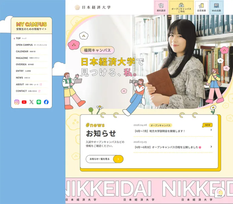
青空色の固定サイドナビとクリーム色の本文に、学生写真、手描き風イラスト、ノートのリング装飾を組み合わせた大学の受験生向けサイト。パステルカラーと縁取り文字で親しみやすさを演出し、スマートフォンでは主要手続きを画面下部に固定しています。
オリジナルサイトを見るMY CAMPUS / Japan University of Economics — Style Reference
A campus guide assembled from blue sky, pastel stationery, student portraits, and illustrated friends.
Website: mycampus.jue.ac.jp Original URL: https://mycampus.jue.ac.jp/ Final URL: https://mycampus.jue.ac.jp/ Status: HTTP 200; the supplied evidence reports no URL change. Theme: a light, multicolor interface; no theme selector was established. Inspected: September 12, 2026, through supplied browser evidence retrieved at 12:13:55.333 UTC / 21:13:55.333 JST. Viewports: 1440 × 1000 desktop and 390 × 844 mobile, in CSS pixels. Scope: the current homepage of the university's prospective-student information site. Three desktop captures show the opening, the lower statistics section, and the social/calendar/footer area. Two mobile captures show the opening and the social/calendar area. Rendered text and sampled computed styles extend through additional homepage sections. Linked pages, application services, and opened navigation states were not inspected.
MY CAMPUS uses the visual vocabulary of a school notebook without making the information feel handwritten. Cream and white surfaces hold dark, orderly Japanese text. Thin charcoal outlines connect those surfaces to flat illustrations of students, flowers, clouds, books, and campus buildings. Yellow highlights important words and the ends of action buttons; pink supplies friendly emphasis and oversized statistics. A large, naturally lit library portrait gives the opening a recognizable human subject.
The desktop composition is unusually asymmetric. A broad blue field occupies the left side, carrying a small persistent navigation panel, while the scrolling content fills the right side. On a phone, the content takes the full width, the portrait becomes tall, the main copy becomes vertical, and four admissions utilities move to a persistent bottom strip. This is a substantial information homepage with news, events, academic information, admissions resources, and student publishing—not merely an opening promotional composition.
How to Read This Reference
- Computed means a value explicitly present in the supplied computed-style or custom-property evidence.
- Measured means a supplied browser bounding rectangle. These dimensions describe the rendered element and can include scaling applied above it.
- Estimated means a visual approximation from the current-page captures. Decorative outlines, some radii, and image placement fall into this category.
- Calculated means arithmetic using supplied measurements; it is not an additional browser test.
- Recommended means an implementation choice for a new project. The CSS, accessibility additions, and proposed breakpoint behavior are adaptations.
- Semantic token names are reference aliases unless a source variable is explicitly identified.
Computed typography and rendered geometry are not interchangeable here. For example, a desktop heading has a computed 56px line height but a measured 63px rectangle. On mobile, a 42px line height corresponds to approximately 43.67px. Several values are consistent with the source's viewport ratios, but the consuming scale or zoom declarations were not supplied. Do not reproduce the site by applying one global multiplier to every element.
Tokens — Colors
Default Palette
| Name | Value | Reference token / source evidence | Role and confidence |
|---|---|---|---|
| Sky Blue | #7cb5e3 |
--campus-sky; source --s-color-c19ee310 |
Computed body background; the broad desktop navigation field |
| Notebook Cream | #fef7d9 |
--campus-cream; source --s-color-6fb51895 |
Computed main background; opening, news surroundings, departments, and the visible social area |
| White Paper | #ffffff |
--campus-white; source --color-white |
Computed desktop header, news links, and event section; visibly used for cards |
| Charcoal Ink | #444444 |
--campus-ink; source --color-black |
Computed navigation labels, most headings, body copy, and metric units; visual reference for fine outlines |
| Deep Text | #333333 |
--campus-text-strong |
Computed news heading and introductory text; a small variation within the dark text system |
| Sun Yellow | #ffcd00 |
--campus-yellow; source --color-yellow |
Source token; visibly used for outlined headline emphasis and button end caps |
| Soft Yellow | #ffeb99 |
--campus-lemon; source --color-light-yellow |
Computed reservation tile, news category badge, and highlights-section background |
| Pale Pink | #ffd9e4 |
--campus-blush; source --color-palePink |
Computed document-request tile, repeated identity strip, and statistics background |
| Candy Pink | #ff93b1 |
--campus-pink; source --color-pink |
Computed statistic numbers and event navigation buttons; visually consistent with the mobile ribbon |
| Powder Blue | #cbe7f4 |
--campus-powder; source --s-color-d4aa7339 |
Computed web-application tile; visually consistent with illustration panels |
| Muted Date Ink | rgba(68, 68, 68, 0.5) |
--campus-muted-source; source --s-color-1599c928 |
Computed news-date color; approximately #a2a2a2 when composited on white |
| Footer Green | Approximately #66aa88 |
--campus-footer-estimate |
Visual estimate only; the broad green footer in the desktop bottom capture |
The palette is organized by area and function. Blue identifies the outer desktop setting; cream carries the long reading surface; pink and soft yellow divide major content groups. Saturated yellow is concentrated in short highlights and action details. The interface remains readable because ordinary text stays charcoal rather than inheriting the decorative pastel colors.
Additional Declared Colors
The source also exposes #fffbec, #f9779b, and rgba(68, 68, 68, 0.8). Their presence is verified, but the supplied samples do not establish a distinct visible component role for each. Keep them outside the essential palette unless a later inspection identifies their usage.
The turquoise calendar banner and the social-platform logos introduce additional image colors. Treat those as content artwork rather than expanding the global UI palette around them.
Tokens — Typography
Japanese Interface Text
Observed family: Noto Sans JP.
The source declares --font-jap: "Noto Sans JP", sans-serif, and sampled headings, descriptions, utility captions, course lists, and statistics use that family. Regular text uses weight 400; much explanatory and factual text uses 500; headings and action labels use 700.
The impression is clear and contemporary. The playful character comes from color, outlines, artwork, and composition rather than an ornamental body typeface.
English Navigation and Dates
Observed family: Raleway.
Desktop labels such as TOP, OPEN CAMPUS, and MAGAZINE use weight 700. News dates also use Raleway at weight 700. The mobile menu caption uses 11px type with 1.1px tracking.
A separate source token declares Inter, 'Noto Sans JP', but the sampled interface does not establish a specific visible role for Inter. Do not assign all English text to it by assumption.
Identity and Outlined Lettering
The university identity combines a fine gold emblem with a widely spaced Japanese inscription. The MY CAMPUS wordmark, the hero slogan, and decorative hashtag headings have distinctive outlined treatments in the captures.
The supplied samples do not establish the font or construction method of all this lettering. In particular, the hero slogan is visually present but absent from the ordinary extracted page text. It could be artwork or separately rendered content; that mechanism is unverified. Use approved identity artwork when available, and avoid identifying the university inscription as a particular font.
Type Scale
Values below are computed CSS values unless marked estimated. They should not be confused with final painted glyph height.
| Role | Desktop | Mobile | Weight / line height / tracking | Notes |
|---|---|---|---|---|
| Sidebar subtitle | 17px | Sidebar absent in closed state | 500 / 25.5px / 0.68px | Noto Sans JP; measured desktop box height 22.38px |
| English sidebar label | 16px | Closed menu contents uninspected | 700 / 24px / normal | Raleway; measured desktop line box about 21.06px |
| Japanese sidebar translation | Approximately 8–9px visually | Unverified | Not sampled | Visibly secondary to the English label |
| Utility tile caption | 12px | 12px | 500 / 14.4px / normal | Reservation text occupies two lines |
| Mobile menu caption | Hidden in desktop capture | 11px | 700 / 15.4px / 1.1px | Raleway, white on pink artwork |
| Standard section heading | 40px | Usually 30px | 700 / 1.4 / 0.05em | Verified for news, highlights, statistics, and departments |
| Event section heading | 40px | 40px | 700 / 56px / 2px | An observed mobile exception to the usual 30px heading |
| Introductory copy | 14px | 14px | 400 or 500 / 21px / normal | Weight depends on section |
| Highlight title | 18px | 18px | 700 / 27px / normal | Examples include the SD program and scholarship support |
| News date | 14px | 14px | 700 / 18.2px / normal | Raleway, with 50% charcoal opacity |
| News badge | 12px | 12px | 500 / 18px / normal | Soft-yellow capsule |
| Pill action label | 12px | 12px | 700 / 14.4px / normal | Measured control height varies by context |
| Large statistic | 65px | 60px | 500 / 1 / normal | Employment, startups, graduates, library, and founding number |
| Compact desktop statistic | 48px | 60px | 500 / 1 / normal | Overseas partners and international figures grow when stacked |
| Metric unit | Usually 28px; 20px in compact groups | Usually 24px | 500 / 1–1.5 / 0.05em | The mobile employment percent symbol is 26px |
| Founding context | 36px | 24px | 500 / 1 / 0.05em | Words surrounding the large number |
| Department name | 20px | 16px | 700 / 1.4 / normal | Sampled economics department |
| Course list | 14px | 13px | 500 / 1.5 / normal | Sampled economics and commerce lists |
| Campus label | 12px | 11px in sampled economics entries | 500 / 1.5 / normal | Some mobile business entries retain 12px |
| Decorative hashtag | Approximately 28–32px visually | Approximately 22–26px visually | Outlined yellow lettering | Exact family, weight, and stroke width unverified |
Use the contrast between compact explanatory text and large medium-weight numbers. Increasing every number to a heavy bold weight would change the airy, outlined appearance.
Tokens — Spacing & Shapes
Spacing Scale
The source uses several local scales rather than a demonstrated universal spacing unit.
| Use | Computed value | Rendered evidence or interpretation |
|---|---|---|
| Badge padding | 2px 10px |
News badge measures about 76.23 × 24.75px desktop and 70.45 × 22.88px mobile |
| Desktop utility tile inset | 6px 6px 7px |
A fine dashed rectangle is visibly inset inside each tile |
| Mobile utility tile inset | 5px 6px 6px |
Compact stamp-like treatment retained in the dock |
| News item internal gap | 8px | Separates metadata from the headline |
| News item bottom padding | 20px | Provides breathing room before the yellow dotted rule |
| Pill left padding / gap | 20px / 20px | Text segment precedes a separate colored end cap |
| News section padding | 30px 80px 50px desktop; 30px 30px 50px mobile |
Desktop side clearance is visually about 90px after scaling |
| Statistics section padding | 60px 80px desktop; 40px 30px mobile |
Wide illustrated fact groups become a long mobile sequence |
| Department section padding | 80px desktop; 40px 30px mobile |
Desktop content-heading width is 843.75px |
| Major section gap | Commonly 40px | Highlights use 60px on mobile; statistics use 30px on mobile |
| Highlights vertical padding | 80px desktop; 40px mobile | Stronger desktop breathing room |
Border Radius and Linework
| Element | Shape | Evidence |
|---|---|---|
| Desktop navigation panel | Approximately 17px corners | Visual estimate; thin charcoal perimeter |
| News notebook | Approximately 12–16px corners | Visual estimate; white face and offset yellow backing |
| Statistics cards | Approximately 22px corners | Visual estimate from the lower desktop capture |
| Illustration panels | Approximately 16px corners | Visual estimate; powder-blue fill |
| Pill actions | 9999px radius |
Computed |
| News category badge | 999px radius |
Computed |
| Event navigation buttons | 999px radius |
Computed |
| Utility tiles | Square outer corners | Computed radius 0; dashed inner frame |
| Mobile menu | Bookmark ribbon with a notched bottom | Visible artwork extends below its 64px button rectangle |
| Hero | Large curves at opposing corners | Visual observation; precise mask path unverified |
| Footer | Large rounded upper-left corner | Visual estimate, approximately 70px in the desktop capture |
Most UI outlines look approximately 1px thick at the supplied image sizes. Character illustrations use stronger, slightly irregular contours, around 1.5–2px visually. These are estimates; border-width and illustration-stroke declarations were not included.
Layout Measurements
| Element | Desktop at 1440 × 1000 | Mobile at 390 × 844 | Evidence |
|---|---|---|---|
| Main column | x = 416.25px; width = 1023.75px | x = 0; width = 390px | Measured |
| Outer blue field | 416.25px wide, about 28.91% of viewport | Covered by full-width main surface | Calculated from main rectangle |
| Persistent header | 1023.75 × 90px | 390 × 64px | Measured; persistence visible across captures |
| University logo link | 219.38 × 31.95px at x = 472.5px | 195 × 28.41px at x = 15px | Measured |
| Sidebar panel | Approximately x = 66px, y = 104px, 252 × 555px | Absent from the closed mobile view | Visual estimate |
| Sidebar link | Usually 208.28 × 39.59px | Unverified | Measured; news row is about 42.14px high |
| Social link box | Approximately 31.61px square | Closed-menu equivalent unverified | Measured desktop |
| Utility widths | 90 / 156.70 / 90 / 91.20px | 78 / 156 / 78 / 78px | Measured, in displayed order |
| Utility height | 90px | 81.11px | Measured |
| Mobile dock top | Not applicable | y = 762.89px | Measured; flush with viewport bottom |
| Mobile menu button | Not visibly used | x = 315px; 60 × 64px | Measured; ribbon reaches about y = 77px visually |
| Visible hero region | From header bottom to news start: about 573.42px | About 531px below the header | Calculated/estimated; hero itself was not sampled |
| News text columns | Intro width 246.38px; item width 482.88px | Shared text width 284.03px | Measured |
| News list action | 228.98 × 47.25px | 211.83 × 43.67px | Measured |
| Event detail action | 160.63 × 36px | 148.64 × 33.27px | Measured |
| Lower full-width fact card | Approximately 844 × 364px | Enclosing card rectangle unavailable | Visual estimate |
| Social grid | Approximately 596px wide; three columns | Approximately 328px wide; three columns | Visual estimate |
| Calendar banner | Approximately 410 × 155px | Approximately 328 × 123px | Visual estimate |
| Document height | 10437.45px | 13005.14px | Measured at capture time |
Components
Desktop Navigation Panel
Role: persistent wayfinding across a long information homepage.
A white panel floats within the blue field, leaving substantial blue space around it. Its cream top compartment contains the yellow-and-pink outlined MY CAMPUS wordmark and the Japanese audience descriptor. A thin horizontal line divides identity from navigation.
The body contains nine links. Bold English names lead, followed by much smaller Japanese translations. Yellow dotted rules separate the rows. The active TOP row has a small pink diamond at the left; some external destinations have small pink external-link marks. The observed OVERSEA label should be preserved when documenting the source.
Five recognizable social icons form a final row: Instagram, YouTube, X, LINE, and Facebook. Their own brand colors remain intact. The panel stays in the same position across the three desktop captures. A fixed implementation matches that appearance, although its positioning declaration was not sampled.
University Header
Role: maintain institutional identity and immediate access to admissions tasks.
On desktop, a white 90px strip spans only the main column. The logo is left aligned; four utility tiles sit at the right. The measured logo-link width is 219.38px. Its fine gold emblem and restrained inscription provide an institutional counterweight to the illustrated page.
The mobile header is 64px high with a 195px logo at a 15px left inset. The sampled header element itself has a transparent background, while the screenshot shows a white identity area. The white appearance therefore should not be attributed solely to that element's computed background.
Admissions Utility Tiles
Role: expose recurring practical actions throughout the visit.
Each tile has a colored rectangular outer area, an inset dashed outline, a small illustrated icon, and a centered Japanese caption. The four actions are 資料請求, オープンキャンパス ご予約, 合否発表, and Web出願.
The fills follow a stable sequence: pale pink, soft yellow, white, and powder blue. Icons depict documents, a campus building, a folder/document, and a laptop. The reservation tile is wider because its caption needs two lines.
Desktop tiles are about 90px tall. Mobile moves the same four functions into an 81.11px bottom dock, with an exact measured width ratio of 1 : 2 : 1 : 1. This unequal allocation is a defining responsive detail; four equal-width cells would compress the reservation wording unnecessarily.
The rendered links establish destinations on the university's main site and admissions services. Their downstream forms and results pages were not opened.
Mobile Menu Ribbon
Role: replace the large desktop wayfinding panel with a compact navigation entry.
A pink bookmark shape hangs from the upper-right edge. White horizontal lines sit above the small tracked menu label. A charcoal contour and a notched lower edge make it feel like stationery rather than a standard square hamburger button.
The button rectangle is 60 × 64px, positioned 15px from the right. Its decorative ribbon extends roughly 13px farther down. The opened menu, close icon, animation, focus behavior, and scroll locking were not captured. A new implementation must define these explicitly.
Portrait Hero
Role: introduce the campus through a person and an aspirational message.
The desktop hero is a broad library photograph with the subject on the right, holding a brown book. The left half is bright and subdued enough to support the two-line slogan 日本経済大学で 見つける、私。. The university name is yellow, much of the remaining lettering is white, and the personal emphasis is pink; thin dark outlines keep the words connected to the illustration style.
Above the slogan, 福岡キャンパス appears inside a small rounded badge with a soft yellow-to-pink treatment. Large curved yellow and pink bands trace opposing edges of the photographic composition. Small flowers and three illustrated figures overlap the image perimeter. The central camera-holding figure reaches toward the notebook below, linking sections visually.
On mobile, the composition is rebuilt. The photograph becomes tall, the subject fills most of the right and lower area, and the slogan runs in vertical columns near the upper left. The campus badge also becomes vertical. Two standing figures remain prominent near the lower left and right; the desktop central camera figure is not visible in this mobile opening.
Use an art-directed image arrangement or carefully tuned crops. Uniformly shrinking the desktop composition would lose the face, the book, and the reading order of the slogan.
News Notebook
Role: surface current updates immediately after the portrait.
A white rounded panel sits on a slightly offset yellow backing, both bounded by fine dark lines. Four illustrated binding rings cross its top edge. Flowers and stems emerge around the binding, while a character overlaps the area above it. The effect is a notebook page resting within the cream canvas.
Desktop anatomy consists of a left introduction and a right list. The left side contains an outlined yellow #news label, a bold お知らせ heading, short explanatory copy, and a pill link. The right side contains two update rows: date and optional category above the headline, a small right chevron, and a yellow dotted bottom rule.
The current entries are dated 2026.08.17 and 2026.06.27. Those dates document the captured content, not the inspection date.
On mobile, the introduction comes first, followed by both news rows and then the centered list action. The measured news-section height increases from 420.5px to 579.23px. Text remains live in the rendered evidence; the stationery treatment should surround it rather than replace the entire component with an image.
Split Pill Link
Role: provide a repeated, recognizable action treatment.
The main segment is white with a thin charcoal outline and dark bold text. A saturated-yellow rounded cap occupies the right end. Local continuation actions show a chevron; the Instagram action shows an external-link symbol. The cap has its own visible contour, making it read as a joined piece of the control.
The source gives these links a 9999px outer radius, 20px left padding, and a 20px internal gap. The news variant is about 229 × 47px desktop and 212 × 44px mobile. The visible Instagram variant is larger on desktop, approximately 308 × 56px, and about 260 × 44px on mobile.
This is a family of related controls rather than a single universal fixed size. Keep the label readable and let longer actions determine the main segment's width.
Repeated Identity Strip
Role: separate the opening/news area from subsequent content.
The DOM establishes a pale-pink section containing six repeated university-name captions. It measures 158.56px high on desktop and 114.02px on mobile. The captions use Noto Sans JP at 14px, weight 700, with unusually wide 16.8px letter spacing.
Several repeated items extend beyond the viewport horizontally. This establishes an overflow composition, but does not by itself prove an animated marquee. The complete strip is outside the supplied current-page screenshots, so its larger graphic treatment and travel behavior remain unverified.
Event Rail
Role: browse upcoming campus visits and admissions events.
The event section has a computed white background and contains four entries. Each entry includes an event title, date, location, and 詳しく見る link. The small 日程 and 開催地 labels have white pill backgrounds and 12px medium-weight type.
The measured positions establish a horizontal arrangement: matching desktop labels are separated by approximately 824.06px, while mobile entries are separated by approximately 313.30px. Two pink capsule buttons appear below the rail in the DOM, measuring approximately 54.88 × 30.13px desktop and 50.84 × 27.97px mobile.
The section is not shown in the supplied screenshots. Its detailed card imagery and borders cannot be described confidently. Navigation buttons are present, but click response, swipe support, looping, and autoplay were not demonstrated. In a new implementation, keep each date/location pair and its action together and provide explicit previous/next names.
Campus Highlights Rail
Role: introduce five reasons to explore the university.
The computed soft-yellow section contains career support, qualification incentives, entertainment studies, overseas study support, and clubs. Each entry pairs a 14px explanation with an 18px bold title. Horizontal positions extend beyond the viewport on both desktop and mobile.
Some text rectangles show small geometric deviations consistent with tilted ancestors, but the actual transform values were not supplied. Do not assign a specific rotation or wobble animation from these rectangles alone. The sampled mobile section uses 40px vertical padding and a 60px gap, preserving space around one prominent item at a time.
Illustrated Statistics
Role: make institutional facts approachable and easy to scan.
A pale-pink field with a fine white square grid supports white rounded fact surfaces. Large pink numbers have thin dark outlines, while contextual words and units stay charcoal. Flat illustrations often sit inside powder-blue rounded panels above or beside the number. Small pink circles near card corners reinforce the pinned-paper motif.
The lower desktop screenshot directly shows a two-card row for graduate count and library holdings, followed by a full-width founding card. That founding card pairs a large illustration on the left with the number and explanatory copy on the right. The visible illustration features two people framing a yellow campus building, small clouds, and diamond-shaped sparkles.
Other desktop rectangles establish two-column and three-column factual alignments. These include employment/startups and a compact international group. The enclosing borders for every upper group are not visible in the supplied captures, so do not assume that every metric has an identical standalone card.
Mobile changes the sampled metrics into a vertical sequence. The first two large values use 60px type. Figures that use 48px in compact desktop groups also become 60px on mobile. Body text commonly spans 284.03px. The section grows from 2922.56px to 4712.30px.
Preserve each number's unit, qualifying language, and data-as-of note. These are university claims reproduced by the page, not independently verified statistics.
Department Directory
Role: connect the overview to specific study options.
The section returns to cream and groups six departments under two faculties. Each department presents its name, applicable campuses, a course list, and a detail link to the university's main website. The sampled department name changes from 20px desktop to 16px mobile, while courses change from 14px to 13px.
The mobile rectangles confirm a vertical sequence of department entries. The whole section grows from 1659.38px desktop to 2873.39px mobile. Only its opening heading is visible in the desktop middle capture; card imagery, complete borders, and all desktop column relationships remain outside the visual evidence.
For reuse, retain faculty grouping and campus labels as separate information levels. Course lists should remain selectable text and should accommodate departments with different list lengths.
Admissions Guide and Student Magazine
Role: continue from campus discovery into practical preparation and student perspectives.
The rendered text includes admissions schedules, tuition, scholarships, past questions, online applications, and a separate group for international applicants. It also includes a substantial magazine collection with categories, article titles, and dates, followed by a more-articles link.
This establishes the homepage's information architecture, but not a complete visual specification for these sections. Repeated category strings and many extracted articles do not prove that every item is simultaneously visible in a grid. Do not invent pagination, filtering, masonry, or carousel behavior for the magazine from text extraction alone.
Instagram and Calendar
Role: offer a final view of current campus activity and an entry to the annual calendar.
The mobile social area shows an outlined yellow #sns label, a large dark Instagram heading, and one short explanatory line. A loose soft-yellow looping stroke decorates the upper right. Six square posts form a three-column, two-row grid with narrow cream gutters. The same three-column arrangement is visible on desktop, at a larger size.
The post artwork is dense and current: portraits, event posters, a QR-code graphic, and a group photograph. Some tiles carry white video/reel marks. Preserve these as content images rather than copying their typography into the surrounding interface.
A centered split pill follows the grid. Below it, substantial cream space leads to a turquoise calendar banner. The banner combines large yellow Japanese lettering, white clouds, small seasonal decorations, and circular campus photographs. It links to the calendar route. Approximate dimensions are 410 × 155px desktop and 328 × 123px mobile, preserving a roughly 2.65:1 ratio.
Desktop Footer
Role: close the long page while retaining the illustrated campus atmosphere.
A green field begins with a large rounded upper-left corner. Seated students overlap the left edge; a standing student overlaps the right. Small white and pink flowers continue the hero's visual vocabulary. Centered white text provides the privacy link and ©2025 Japan University of Economics.
A Back to TOP control appears in a white speech bubble near the upper right. Its click behavior and scroll duration were not tested. The mobile capture ends around the calendar area, and the mobile rendered link set does not establish an equivalent footer/privacy presentation. Do not infer the desktop footer's mobile arrangement.
Tokens — Motion & Interaction
| Treatment | Evidence | What can be stated |
|---|---|---|
| General element transitions | Computed 0.3s cubic-bezier(0.4, 0.4, 0, 1) on many elements |
A common transition declaration exists; its actual state changes were not exercised |
| Event controls and content | Computed 0.2s cubic-bezier(0.4, 0.4, 0, 1) |
A shorter transition is available in the event area; slide duration is not established |
| Body background | Computed background 0.5s cubic-bezier(0.4, 0.4, 0, 1) |
Background changes can transition; a trigger or color-changing sequence was not observed |
| Gradient-related properties | Many transitions name --g-angle, --g-color-*, and --g-position-* |
These declarations are not proof of visible animated gradients |
| Sampled CSS animations | Sampled elements report animation: none |
No named animation was established on those elements; descendants, pseudo-elements, assets, or scripts may behave differently |
| Persistent chrome | Same desktop sidebar/header and mobile header/dock positions across captures | Persistent placement is visually supported; sticky versus fixed source implementation is not identified |
| Horizontal event/highlight content | Repeated items have increasing x positions beyond the viewport | A horizontal layout is supported; autoplay, drag, snap, and looping remain unverified |
| Menu ribbon | A real button and closed state are present | Open-state presentation, transition, dismissal, and focus behavior are unverified |
| Pill and news links | Rendered anchors and destination URLs are supplied | Navigation intent is supported; hover appearance and destination behavior are untested |
| Back-to-top bubble | Visible in the desktop footer capture | Its intended action is legible; implementation and timing are untested |
The browser collection allowed at least five seconds for the initial observation and waited for finite motion and layout stability within bounded time limits. Perpetual animations were paused during readiness checks and resumed afterward. These procedures improve capture stability, but static results do not establish the full motion system.
Recommended motion language: use the observed 200–300ms easing for small color changes and short control feedback. Keep the portrait, numbers, and body copy readable at rest. If adding an illustrated sway or moving identity strip, label it as new behavior and provide a reduced-motion/static alternative. No count-up animation, parallax, or hero slideshow should be claimed from this evidence.
Surfaces
| Layer | Appearance | Purpose |
|---|---|---|
| Desktop outer setting | Flat sky blue with outlined white clouds | Separates persistent navigation from the content journey |
| Main reading canvas | Flat warm cream | Holds the portrait, stationery details, departments, and social content |
| Institutional header | White appearance, restrained logo | Stable identity above the colorful page |
| Navigation and fact surfaces | White, thin charcoal perimeter, rounded corners | Organizes dense information with the same line language as the illustrations |
| News backing | Saturated-yellow offset layer | Suggests stacked paper; a hard graphic offset rather than soft elevation |
| Statistics setting | Pale pink with fine white square grid | Makes a large factual section feel like a workbook |
| Utility controls | Four flat pastel rectangles with inset dashed frames | Keeps practical actions distinct and persistent |
| Illustration panels | Powder blue with rounded corners | Frames flat educational illustrations |
| Footer | Green with overlapping characters | Creates a friendly visual endpoint |
There is no demonstrated general system of blurred shadows, glass layers, or glossy elevation. Separation comes from background changes, outlines, white paper surfaces, and selected overlaps. The small campus badge has a soft mixed-color treatment, but broad gradients are not the page's dominant surface language.
Imagery
Photography
The hero uses natural library light, shelves as context, and a close portrait with a visible book. Its neutral whites and browns allow yellow, pink, and blue UI elements to remain clear. The subject's face is the focal point; the left side is reserved for wording on desktop and for vertical lettering on mobile.
Social posts retain their original visual density and varied colors. The calendar banner uses small circular photographs as part of an illustrated composition. These image roles should stay distinct: a calm opening portrait, lively social thumbnails, and a designed calendar graphic.
Illustration Language
Characters have rounded faces, simple eyes, rosy cheeks, oversized hands or shoes, and relaxed student poses. Clothing uses flat areas of sky blue, pink, yellow, green, and white. Fine charcoal outlines make their shapes readable against both cream and photography.
Decorations include irregular five-lobed flowers, small yellow centers, daisies with stems, clover, puffy clouds, diamond sparkles, looping strokes, and notebook binding rings. Their placement matters: they cross card and section boundaries, so the page feels assembled from related pieces.
Use a coherent commissioned illustration set or authorized original artwork. Generic emoji, unrelated icon packs, or newly generated characters with different outlines will not reproduce this relationship.
Observed Asset References
No original image src values or asset filenames were included in the supplied evidence. The references below identify visual assets without inventing downloadable paths.
| Asset | Current-page evidence | Reuse guidance |
|---|---|---|
| University emblem and inscription | Desktop and mobile headers | Preserve aspect ratio and fine detail; provide a meaningful home-link name |
| MY CAMPUS wordmark | Desktop navigation panel | Use approved artwork; outlined lettering is part of identity |
| Library portrait | Both opening captures | Prepare desktop and portrait compositions with explicit focal placement |
| Hero figures and flowers | Both opening captures | Keep decorative layers independent of photograph cropping where possible |
| Notebook binding and stems | Desktop and mobile news opening | Let artwork protrude without clipping the interactive content |
| Founding illustration | Desktop statistics capture | Flat campus scene in a powder-blue rounded panel |
| Social thumbnails | Desktop and mobile lower captures | Maintain square crops and the observed three-column arrangement |
| Calendar banner | Desktop and mobile lower captures | Preserve the full banner rather than cropping its lettering |
| Footer characters | Desktop bottom capture | Anchor to the green surface edge; mobile use remains a new decision |
Use normal high-quality image rendering. Nothing in the evidence suggests deliberately pixelated photography or illustrations.
Layout & Responsive Behavior
Desktop Structure
At 1440px wide, the content starts at x = 416.25px and fills the remaining 1023.75px. The header follows this right-hand column rather than spanning the blue field. Inner sections commonly have about 90px of rendered horizontal clearance, leaving an approximately 844px working width.
The sidebar is visually persistent and smaller than its blue setting. Long-page content changes beneath the persistent header. Some figures cross the main column's left edge, so clipping the entire main element would remove observed artwork. Clip the photographic mask and horizontal rails locally instead.
The content order is portrait, news, repeated identity strip, events, campus highlights, statistics, departments, admissions resources, magazine, Instagram, calendar, and desktop footer. Some of these sections are known primarily from rendered text and computed styles, as described above.
Mobile Restructuring
At 390px wide, the main column begins at zero. The blue sidebar setting disappears from the visible reading area. A 64px header and an approximately 81px bottom dock provide persistent access to identity, navigation, and admissions tasks.
The opening photograph occupies roughly 531px below the header. Its text changes orientation and its figures are repositioned. The news panel retains its rings and backing while stacking its contents. Typical section margins are approximately 31px in the rendered capture; text inside white panels begins around x = 53px.
Statistics become sequential blocks with large 60px numbers. Academic entries stack and use smaller department/course typography. The Instagram grid remains three columns, with approximately 102px square tiles and 10–12px gaps. The calendar expands to nearly the full inset width.
The fixed dock overlays scrolling content: in the opening capture it covers part of the news area at the viewport bottom. A new implementation should reserve sufficient end-of-document space and scroll padding so every control can be brought above it.
Scaling and Breakpoint Evidence
The source exposes these viewport-related expressions:
--ratio-lower: tan(atan2(1440px, 1280px));
--ratio-nav: tan(atan2(1440px, 1640px));
--ratio-sp-lower: tan(atan2(390px, 375px));
Their calculated values are 1.125, approximately 0.87805, and 1.04 respectively. The ratios help explain why computed values and measured rectangles differ. They do not reveal every selector that consumes them, nor prove a single scaling model for the whole page.
A max-width: 1140px media query appears in the supplied breakpoint-dependent line-break rules. The full shell-switching media rules were not supplied. Using 1140px as the desktop/mobile switch in the Quick Start is therefore a recommendation, not a verified source breakpoint for every component.
Only the two reported viewport sizes were inspected. Tablet, narrow desktop, landscape phone, browser zoom, and enlarged-text behavior remain unverified.
Do’s and Don’ts
Do
- Preserve the desktop relationship between the broad sky-blue field, compact navigation panel, and right-hand content column.
- Use cream
#fef7d9, charcoal#444444, and white as the reading foundation. - Use pale pink and soft yellow to organize large sections; reserve saturated yellow for short emphasis and action details.
- Keep the utility order and the mobile dock's 1:2:1:1 width allocation.
- Recompose the hero for mobile with a tall portrait and vertical Japanese copy.
- Keep notebook rings, flowers, and figures outside the content's clipping boundary.
- Pair large pink outlined numbers with dark units and nearby explanatory notes.
- Use Noto Sans JP for sampled Japanese roles and Raleway for the established navigation/date roles.
- Retain the three-column social grid at the inspected mobile width.
- Preserve the distinction between local continuation chevrons and external-link symbols.
Don't
- Don't center the entire desktop homepage in a conventional symmetric container.
- Don't reduce the information architecture to a hero and one application button.
- Don't shrink the complete desktop hero into the phone layout.
- Don't give all four mobile utility actions equal widths.
- Don't apply a single global scale inferred from one text rectangle.
- Don't replace thin outlines and hard paper offsets with heavy blurred shadows.
- Don't turn every pastel color into a text color or an equally prominent action fill.
- Don't replace identity artwork with a guessed font or illustrations with unrelated emoji.
- Don't assume every extracted magazine item is simultaneously visible.
- Don't invent carousel autoplay, animated counters, parallax, or an opened menu appearance.
- Don't treat every mobile heading as 30px; the supplied event heading remains 40px.
- Don't copy statistical claims into a new project without validating their meaning and date.
Recommended Implementation Additions
These are recommendations for a new implementation, not verified original-site features.
- Use semantic links for destinations and buttons for menu or rail controls. Avoid nesting a button inside a link when recreating the event controls.
- Give logo, social, arrow, and external-link controls accessible names. A blank extracted link label does not establish whether an accessible name exists on the original.
- Add visible charcoal focus outlines. Use
aria-expandedandaria-controlson the menu trigger, and restore focus when its panel closes. - Make essential touch targets at least 44px high. Several measured event/detail controls are only about 28–36px high.
- Increase muted date contrast for a new build;
#666666on white is a useful replacement for the observed 50% charcoal. Keep decorative pastel text from carrying essential instructions alone. - Include bottom safe-area padding, document-end clearance, and scroll margins for the persistent mobile dock and header.
- Provide a readable text equivalent for the hero slogan even if its visual rendering uses artwork. Give decorative figures empty alternatives and remove them from the reading order.
- Reserve image dimensions and use appropriate desktop/mobile sources for the large portrait. Load below-the-fold social and article imagery without destabilizing layout.
- Keep facts, units, footnotes, and reference dates in the same content record. The captured library headline says
約18万冊, while its body mentions約10万冊; reconcile this discrepancy before reusing the copy. - Ensure privacy information remains reachable on mobile; an equivalent mobile footer was not established by the supplied evidence.
- Supply reduced-motion behavior for any newly implemented moving strips, rails, or decorative motion, and keep all content available in the static state.
Agent Prompt Guide
Quick Color Reference
- Desktop outer field:
#7cb5e3. - Main canvas:
#fef7d9. - Cards and institutional header:
#ffffff. - Text and outlines: primarily
#444444, with#333333in sampled news text. - Action caps and headline emphasis:
#ffcd00. - Reservation tile and highlight section:
#ffeb99. - Document tile and statistics setting:
#ffd9e4. - Statistics and pink accents:
#ff93b1. - Application tile and illustration-panel reference:
#cbe7f4. - Footer green: a visual estimate near
#66aa88, not a measured source token.
Overall Prompt
“Create a Japanese university information homepage inspired by MY CAMPUS. At a 1440px desktop viewport, reserve about 29% of the width for a sky-blue field containing a compact persistent white navigation panel. Place the long cream content column to its right. Use Noto Sans JP for Japanese UI, Raleway for English navigation and dates, fine charcoal outlines, pastel section backgrounds, and white paper cards. Open with a bright library portrait on the right and outlined yellow, white, and pink Japanese copy on the left. Add a few coherent student illustrations and flower motifs that overlap section edges. Follow with a ring-bound news notebook, events, university facts, academic information, admissions links, student publishing, and social content. On mobile, use a tall portrait, vertical hero copy, a pink bookmark menu, and a persistent four-action bottom dock with 1:2:1:1 columns. Keep unverified motion static unless explicitly requested.”
Example Component Prompts
- News notebook: “Build a white news panel with a fine charcoal outline, rounded corners, a hard yellow offset backing, and four decorative binding rings. Put a yellow outlined
#newslabel,お知らせ, and short copy in the desktop left column; place two dated news links with yellow dotted separators on the right. Stack the introduction, list, and action on mobile. Keep all news content as live text.” - Utility dock: “Create four icon-over-label admissions links with pale-pink, soft-yellow, white, and powder-blue fills. Add inset dashed frames. At 390px wide use 78px, 156px, 78px, and 78px cells, approximately 81px tall before safe-area adjustments. Reserve the wider cell for
オープンキャンパス ご予約.” - Fact surface: “Create an educational fact panel on a pale-pink square-grid background. Use white paper, a thin charcoal perimeter, approximately 22px corners, small pink pin dots, and a flat campus illustration on powder blue. Set the main number in medium-weight Noto Sans JP, pink with a fine dark outline, and keep units and explanatory text charcoal. Stack the composition on mobile.”
- Mobile hero: “Art-direct a tall library portrait with the face toward the upper right and a book visible below. Position vertical Japanese headline columns in the clear left area. Trace large opposing corners with narrow soft-yellow and pale-pink arcs. Place two small student illustrations near the lower edges without covering the face or essential text.”
- Social ending: “Use a cream social section with an outlined yellow
#snslabel, a dark Instagram heading, a loose yellow loop decoration, and six square posts in three columns. Add a white pill with a yellow external-link cap, then generous vertical space and a wide turquoise illustrated calendar banner.”
Quick Start
CSS Custom Properties
This is a practical adaptation, not recovered production CSS. Exact palette values come from the supplied source tokens. Desktop proportions follow the 1440px capture; decorative geometry is approximate. A conventional root size is retained. The 1140px shell breakpoint, accessible focus styles, safer muted text, and minimum touch targets are recommendations.
Provide authorized logo, portrait, and illustration assets separately. The classes below do not create those assets or implement menu/carousel JavaScript.
:root {
  /* Source-backed palette */
  --campus-sky: #7cb5e3;
  --campus-cream: #fef7d9;
  --campus-white: #fff;
  --campus-ink: #444;
  --campus-text-strong: #333;
  --campus-yellow: #ffcd00;
  --campus-lemon: #ffeb99;
  --campus-blush: #ffd9e4;
  --campus-pink: #ff93b1;
  --campus-powder: #cbe7f4;
  --campus-muted-source: rgb(68 68 68 / 50%);

  /* Recommended readable metadata color */
  --campus-muted: #666;

  /* Observed font families; load licensed font files separately */
  --font-japanese: 'Noto Sans JP', sans-serif;
  --font-english: 'Raleway', sans-serif;
  --text-body: 14px;
  --text-caption: 12px;
  --text-section: 40px;
  --text-stat: 65px;
  --leading-body: 1.5;
  --leading-section: 1.4;

  /* Approximate rendered geometry */
  --rail-width: 28.90625vw;
  --header-height: 90px;
  --dock-height: 81px;
  --section-inset: clamp(56px, 6.25vw, 100px);
  --paper-radius: 16px;
  --fact-radius: 22px;
  --rule: 1px;
  --safe-bottom: env(safe-area-inset-bottom, 0px);
  --ease-campus: cubic-bezier(0.4, 0.4, 0, 1);
  --motion-control: 200ms;
  --motion-standard: 300ms;
}

* { box-sizing: border-box; }

html {
  scroll-padding-top: calc(var(--header-height) + 16px);
}

body {
  margin: 0;
  color: var(--campus-ink);
  background: var(--campus-sky);
  font-family: var(--font-japanese);
  font-size: var(--text-body);
  line-height: var(--leading-body);
}

a { color: inherit; }
button { font: inherit; }
img { display: block; max-width: 100%; }

.campus-main {
  min-width: 0;
  margin-inline-start: var(--rail-width);
  padding-block-start: var(--header-height);
  background: var(--campus-cream);
}

/* Keep overflowing illustrations visible; clip individual media only. */
.campus-section {
  position: relative;
  padding: 70px var(--section-inset);
  scroll-margin-block-start: calc(var(--header-height) + 16px);
}

.campus-rail {
  position: fixed;
  inset: 0 auto 0 0;
  width: var(--rail-width);
  overflow-y: auto;
  padding-block-end: 24px;
}

.rail-card {
  width: 60.54%;
  margin: 104px 0 0 15.86%;
  border: var(--rule) solid var(--campus-ink);
  border-radius: 17px;
  background: var(--campus-white);
  overflow: hidden;
}

.rail-card__brand {
  padding: 26px 20px 20px;
  text-align: center;
  background: var(--campus-cream);
  border-bottom: var(--rule) solid var(--campus-ink);
}

.rail-card__links { padding: 8px 26px; }

.rail-link {
  display: flex;
  align-items: center;
  gap: 8px;
  min-height: 44px;
  border-bottom: 1px dotted var(--campus-lemon);
  text-decoration: none;
}

.rail-link__english {
  font: 700 14px/1.5 var(--font-english);
}

/* Increased from the visually tiny source translations. */
.rail-link__japanese { font-size: 10px; }

.rail-socials {
  display: flex;
  justify-content: space-between;
  padding: 18px;
}

.rail-socials a {
  display: grid;
  place-items: center;
  min-width: 32px;
  min-height: 44px;
}

.rail-socials img { width: 28px; }

.campus-header {
  position: fixed;
  z-index: 30;
  inset: 0 0 auto var(--rail-width);
  display: flex;
  align-items: center;
  justify-content: space-between;
  height: var(--header-height);
  padding-inline: clamp(24px, 3.90625vw, 64px);
  background: var(--campus-white);
}

.campus-logo { width: 219px; flex: none; }
.campus-menu { display: none; }

.utility-nav {
  position: fixed;
  z-index: 40;
  top: 0;
  right: clamp(24px, 3.90625vw, 64px);
  display: grid;
  grid-template-columns: 90px 157px 90px 91px;
  min-height: 90px;
}

.utility-link {
  position: relative;
  display: flex;
  flex-direction: column;
  align-items: center;
  justify-content: center;
  gap: 3px;
  min-width: 0;
  padding: 8px;
  color: var(--campus-ink);
  font-size: 12px;
  font-weight: 500;
  line-height: 1.2;
  text-align: center;
  text-decoration: none;
  background: var(--tile-fill, var(--campus-white));
}

.utility-link::before {
  content: '';
  position: absolute;
  inset: 6px;
  border: 1px dashed rgb(68 68 68 / 45%);
  pointer-events: none;
}

.utility-link img { width: 30px; height: 30px; object-fit: contain; }
.utility-link--request { --tile-fill: var(--campus-blush); }
.utility-link--visit { --tile-fill: var(--campus-lemon); }
.utility-link--apply { --tile-fill: var(--campus-powder); }

.hero {
  position: relative;
  isolation: isolate;
  aspect-ratio: 1023.75 / 573.42;
}

/* Approximate mask: final artwork should determine the curves. */
.hero__frame {
  position: absolute;
  inset: 0;
  overflow: hidden;
  border-radius: 25% 0 25% 0 / 45% 0 45% 0;
  background: var(--campus-white);
}

.hero__photo {
  width: 100%;
  height: 100%;
  object-fit: cover;
  object-position: 70% center;
}

.hero__veil {
  position: absolute;
  inset: 0;
  background: linear-gradient(90deg, #fff 0%, rgb(255 255 255 / 80%) 27%, transparent 60%);
}

.hero__copy {
  position: absolute;
  z-index: 2;
  inset: 33% auto auto 9%;
  max-width: 55%;
}

.hero__title {
  margin: 14px 0 0;
  font-size: clamp(36px, 3.7vw, 56px);
  font-weight: 700;
  line-height: 1.25;
  color: var(--campus-white);
  -webkit-text-stroke: 1px var(--campus-ink);
  paint-order: stroke fill;
}

.hero__title strong { color: var(--campus-yellow); }
.hero__title em { color: var(--campus-pink); font-style: normal; }

.campus-badge {
  display: inline-block;
  padding: 5px 20px;
  border: 1px solid var(--campus-ink);
  border-radius: 999px;
  background: linear-gradient(150deg, var(--campus-lemon), var(--campus-blush));
}

.hero__decoration {
  position: absolute;
  z-index: 3;
  pointer-events: none;
}

.section-kicker {
  margin: 0;
  color: var(--campus-yellow);
  font: 700 30px/1.2 var(--font-english);
  letter-spacing: 0.05em;
  -webkit-text-stroke: 1px var(--campus-ink);
  paint-order: stroke fill;
}

.section-title {
  margin: 6px 0 10px;
  font-size: var(--text-section);
  font-weight: 700;
  line-height: var(--leading-section);
  letter-spacing: 0.05em;
}

.news-section { padding-block: 34px 56px; }

.notebook {
  position: relative;
  display: grid;
  grid-template-columns: minmax(0, 246px) minmax(0, 1fr);
  grid-template-areas: 'intro list' 'more list';
  gap: 40px 45px;
  padding: 48px 34px 34px;
  border: 1px solid var(--campus-ink);
  border-radius: var(--paper-radius);
  background: var(--campus-white);
  box-shadow: 14px 12px 0 var(--campus-yellow), 15px 13px 0 var(--campus-ink);
}

.notebook__intro { grid-area: intro; }
.notebook__intro p:last-child { margin-bottom: 0; }
.notebook__list { grid-area: list; margin: 0; padding: 0; list-style: none; }
.notebook__more { grid-area: more; justify-self: start; }

/* Supply a decorative ring illustration with an empty alternative. */
.notebook__binding {
  position: absolute;
  inset: -16px 14% auto;
  width: 72%;
  pointer-events: none;
}

.news-item {
  display: grid;
  grid-template-columns: minmax(0, 1fr) auto;
  gap: 8px 16px;
  padding-block: 0 20px;
  border-bottom: 1px dotted var(--campus-yellow);
  text-decoration: none;
}

.notebook__list li + li { margin-top: 20px; }
.news-item__meta { display: flex; flex-wrap: wrap; align-items: center; gap: 10px; }
.news-item__date { color: var(--campus-muted); font: 700 14px/1.3 var(--font-english); }
.news-item__title { grid-column: 1; margin: 0; }
.news-item__arrow { grid-column: 2; grid-row: 1 / 3; align-self: center; }

.category-pill {
  padding: 2px 10px;
  border-radius: 999px;
  font-size: 12px;
  background: var(--campus-lemon);
}

.pill-link {
  display: inline-flex;
  align-items: stretch;
  gap: 20px;
  width: fit-content;
  max-width: 100%;
  min-height: 47px;
  padding-inline-start: 20px;
  border: 1px solid var(--campus-ink);
  border-radius: 9999px;
  color: var(--campus-ink);
  background: var(--campus-white);
  text-decoration: none;
}

.pill-link__label {
  align-self: center;
  padding-block: 8px;
  font-size: 12px;
  font-weight: 700;
  line-height: 1.4;
}

.pill-link__cap {
  display: grid;
  place-items: center;
  flex: 0 0 60px;
  margin: -1px;
  border: 1px solid var(--campus-ink);
  border-radius: 999px;
  color: var(--campus-ink);
  background: var(--campus-yellow);
}

/* Suggested mixed layout; upper source card boundaries are unverified. */
.facts-section {
  background-color: var(--campus-blush);
  background-image:
    linear-gradient(rgb(255 255 255 / 30%) 1px, transparent 1px),
    linear-gradient(90deg, rgb(255 255 255 / 30%) 1px, transparent 1px);
  background-size: 22px 22px;
}

.facts-grid { display: grid; grid-template-columns: repeat(6, minmax(0, 1fr)); gap: 34px; }
.fact-card { grid-column: span 3; padding: 34px; border: 1px solid var(--campus-ink); border-radius: var(--fact-radius); background: #fff; }
.fact-card--third { grid-column: span 2; padding-inline: 20px; }
.fact-card--wide { grid-column: 1 / -1; }
.fact-card--split { display: grid; grid-template-columns: 1fr 1fr; align-items: center; gap: 34px; }
.fact-card__art { width: 100%; border-radius: 16px; background: var(--campus-powder); }
.fact-card__value { margin-block: 18px; font-size: var(--text-stat); font-weight: 500; line-height: 1; color: var(--campus-pink); -webkit-text-stroke: 1px var(--campus-ink); paint-order: stroke fill; }
.fact-card__unit { font-size: 28px; color: var(--campus-ink); -webkit-text-stroke: 0; }

.social-grid {
  display: grid;
  grid-template-columns: repeat(3, minmax(0, 1fr));
  gap: 12px;
  max-width: 596px;
  margin: 40px auto;
}

.social-grid img { width: 100%; aspect-ratio: 1; object-fit: cover; }
.social-more { display: flex; justify-content: center; }
.calendar-link { display: block; width: min(100%, 410px); margin: 90px auto 0; }
.calendar-link img { width: 100%; height: auto; border-radius: 8px; }

/* Recommended feedback; source hover appearance was not captured. */
@media (hover: hover) {
  .pill-link__cap { transition: background-color var(--motion-control) var(--ease-campus); }
  .pill-link:hover .pill-link__cap { background: var(--campus-lemon); }
  .rail-link:hover { text-decoration: underline; text-underline-offset: 4px; }
}

:where(a, button):focus-visible {
  outline: 3px solid var(--campus-ink);
  outline-offset: 4px;
}

@media (max-width: 1140px) {
  :root {
    --rail-width: 0px;
    --header-height: 64px;
    --section-inset: 30px;
    --text-section: 30px;
    --text-stat: 60px;
  }

  html { scroll-padding-bottom: calc(var(--dock-height) + var(--safe-bottom) + 20px); }
  .campus-main { padding-bottom: calc(var(--dock-height) + var(--safe-bottom) + 24px); }
  .campus-rail { display: none; }
  .campus-header { inset-inline-start: 0; padding-inline: 15px; }
  .campus-logo { width: 195px; }
  .campus-section { padding-block: 40px; }
  .news-section { padding-block: 32px 54px; }

  /* The outer/inner polygons create an approximate outlined bookmark. */
  .campus-menu {
    position: relative;
    isolation: isolate;
    display: grid;
    align-content: start;
    justify-items: center;
    gap: 7px;
    align-self: flex-start;
    width: 60px;
    height: 64px;
    padding: 16px 10px 0;
    border: 0;
    color: #fff;
    background: transparent;
    font: 700 11px/1.4 var(--font-english);
    letter-spacing: 0.1em;
    cursor: pointer;
  }

  .campus-menu::before,
  .campus-menu::after {
    content: '';
    position: absolute;
    z-index: -1;
    inset: 0 0 -13px;
    clip-path: polygon(0 0, 100% 0, 100% 100%, 50% 86%, 0 100%);
    background: var(--campus-ink);
  }

  .campus-menu::after { inset: 0 1px -11px; background: var(--campus-pink); }
  .campus-menu__lines { width: 34px; height: 15px; border-block: 1px solid currentColor; }

  .utility-nav {
    inset: auto 0 0;
    grid-template-columns: 1fr 2fr 1fr 1fr;
    min-height: 0;
    padding-bottom: var(--safe-bottom);
    background: var(--campus-white);
  }

  .utility-link { min-height: var(--dock-height); }
  .hero { aspect-ratio: 390 / 531; }
  .hero__frame { border-radius: 48% 0 42% 0 / 28% 0 28% 0; }
  .hero__veil { display: none; }
  .hero__copy { inset: 15% auto auto 12%; display: flex; flex-direction: row-reverse; align-items: flex-start; gap: 8px; max-width: 40%; }
  .hero__title { margin: 0; writing-mode: vertical-rl; font-size: 30px; line-height: 1.25; }
  .campus-badge { writing-mode: vertical-rl; padding: 10px 4px; font-size: 12px; }
  .section-kicker { font-size: 24px; }
  .section-title--event { font-size: 40px; }

  .notebook {
    grid-template-columns: minmax(0, 1fr);
    grid-template-areas: 'intro' 'list' 'more';
    gap: 30px;
    padding: 34px 21px;
    box-shadow: 3px 5px 0 var(--campus-yellow), 4px 6px 0 var(--campus-ink);
  }

  .notebook__more { justify-self: center; }
  .pill-link { min-height: 44px; }
  .facts-grid { grid-template-columns: minmax(0, 1fr); gap: 30px; }
  .fact-card, .fact-card--third, .fact-card--wide { grid-column: auto; padding: 24px 21px; }
  .fact-card--split { grid-template-columns: minmax(0, 1fr); gap: 20px; }
  .fact-card__unit { font-size: 24px; }
  .social-grid { gap: 11px; }
  .calendar-link { margin-top: 84px; }
}

@media (prefers-reduced-motion: reduce) {
  .pill-link__cap { transition: none; }
  html { scroll-behavior: auto; }
  /* Also disable any separately implemented decorative or rail motion. */
}
The yellow action-cap icon uses charcoal in this adaptation for clearer contrast; the captured source often uses a white symbol. The minimum navigation and action heights also intentionally prioritize usability over exact pixel matching.
A minimal split-pill structure is:
<a class="pill-link" href="/news">
  <span class="pill-link__label">お知らせ一覧を見る</span>
  <span class="pill-link__cap" aria-hidden="true">›</span>
</a>
For the notebook, assign its introduction, list, and final link to .notebook__intro, .notebook__list, and .notebook__more. Their source order should remain introduction, updates, action; the desktop grid handles the two-column visual arrangement.
Tailwind v4 Token Mapping
Optional aliases for a project already using Tailwind v4. This does not claim the original site uses Tailwind. Define the variables above first.
@theme inline {
  --color-campus-sky: var(--campus-sky);
  --color-campus-cream: var(--campus-cream);
  --color-campus-white: var(--campus-white);
  --color-campus-ink: var(--campus-ink);
  --color-campus-yellow: var(--campus-yellow);
  --color-campus-lemon: var(--campus-lemon);
  --color-campus-blush: var(--campus-blush);
  --color-campus-pink: var(--campus-pink);
  --color-campus-powder: var(--campus-powder);
  --font-campus-japanese: var(--font-japanese);
  --font-campus-english: var(--font-english);
  --text-campus-body: 14px;
  --text-campus-caption: 12px;
  --text-campus-section: var(--text-section);
  --text-campus-stat: var(--text-stat);
  --radius-campus-paper: var(--paper-radius);
  --radius-campus-fact: var(--fact-radius);
  --spacing-campus-inset: var(--section-inset);
}
Sources & Evidence
- MY CAMPUS homepage: original and final inspected URL, reported HTTP 200, current-page screenshots, rendered text, link destinations, custom properties, and sampled computed styles supplied with this task.
- Capture record: September 12, 2026; retrieval timestamp 12:13:55.333 UTC / 21:13:55.333 JST. Desktop viewport 1440 × 1000; mobile viewport 390 × 844. Reported document heights were approximately 10437px and 13005px respectively.
- Visual coverage: desktop opening, lower statistics, and social/calendar/footer; mobile opening and social/calendar. Exact offsets for the non-opening captures were not supplied. The initial mobile DOM has a small approximately 2px document offset.
- Structural coverage: rendered text establishes the wider homepage sequence, including events, campus highlights, departments, admissions resources, and magazine content. Sampled element geometry supports selected responsive changes but does not document every enclosing component.
- Interaction coverage: the collection traversed the page through scrolling. Persistent chrome is visible across captures. No supplied click traces demonstrate menu opening, rail navigation, hover states, application submission, or back-to-top behavior.
- Readiness limitations: bounded load, motion, stability, and image-decoding waits were used. Delayed content may still be absent. Perpetual animations were temporarily paused during readiness checks; SharedWorkers and service workers were disabled.
- Implementation limitations: no complete stylesheet, image asset URLs, font-file load report, full breakpoint map, or production-credit block from the inspected page was supplied. No additional browsing, commands, file inspection, or runtime testing was performed for this reference.
This document describes the current homepage supported by the supplied original-page evidence. Computed values, rendered measurements, visual estimates, and proposed implementation choices remain explicitly distinguished.
# MY CAMPUS / Japan University of Economics — Style Reference

> A campus guide assembled from blue sky, pastel stationery, student portraits, and illustrated friends.

**Website:** [mycampus.jue.ac.jp](https://mycampus.jue.ac.jp/)
**Original URL:** https://mycampus.jue.ac.jp/
**Final URL:** https://mycampus.jue.ac.jp/
**Status:** HTTP 200; the supplied evidence reports no URL change.
**Theme:** a light, multicolor interface; no theme selector was established.
**Inspected:** September 12, 2026, through supplied browser evidence retrieved at 12:13:55.333 UTC / 21:13:55.333 JST.
**Viewports:** 1440 × 1000 desktop and 390 × 844 mobile, in CSS pixels.
**Scope:** the current homepage of the university's prospective-student information site. Three desktop captures show the opening, the lower statistics section, and the social/calendar/footer area. Two mobile captures show the opening and the social/calendar area. Rendered text and sampled computed styles extend through additional homepage sections. Linked pages, application services, and opened navigation states were not inspected.

MY CAMPUS uses the visual vocabulary of a school notebook without making the information feel handwritten. Cream and white surfaces hold dark, orderly Japanese text. Thin charcoal outlines connect those surfaces to flat illustrations of students, flowers, clouds, books, and campus buildings. Yellow highlights important words and the ends of action buttons; pink supplies friendly emphasis and oversized statistics. A large, naturally lit library portrait gives the opening a recognizable human subject.

The desktop composition is unusually asymmetric. A broad blue field occupies the left side, carrying a small persistent navigation panel, while the scrolling content fills the right side. On a phone, the content takes the full width, the portrait becomes tall, the main copy becomes vertical, and four admissions utilities move to a persistent bottom strip. This is a substantial information homepage with news, events, academic information, admissions resources, and student publishing—not merely an opening promotional composition.

## How to Read This Reference

- **Computed** means a value explicitly present in the supplied computed-style or custom-property evidence.
- **Measured** means a supplied browser bounding rectangle. These dimensions describe the rendered element and can include scaling applied above it.
- **Estimated** means a visual approximation from the current-page captures. Decorative outlines, some radii, and image placement fall into this category.
- **Calculated** means arithmetic using supplied measurements; it is not an additional browser test.
- **Recommended** means an implementation choice for a new project. The CSS, accessibility additions, and proposed breakpoint behavior are adaptations.
- Semantic token names are reference aliases unless a source variable is explicitly identified.

Computed typography and rendered geometry are not interchangeable here. For example, a desktop heading has a computed 56px line height but a measured 63px rectangle. On mobile, a 42px line height corresponds to approximately 43.67px. Several values are consistent with the source's viewport ratios, but the consuming scale or zoom declarations were not supplied. Do not reproduce the site by applying one global multiplier to every element.

## Tokens — Colors

### Default Palette

| Name | Value | Reference token / source evidence | Role and confidence |
| --- | --- | --- | --- |
| Sky Blue | `#7cb5e3` | `--campus-sky`; source `--s-color-c19ee310` | Computed body background; the broad desktop navigation field |
| Notebook Cream | `#fef7d9` | `--campus-cream`; source `--s-color-6fb51895` | Computed main background; opening, news surroundings, departments, and the visible social area |
| White Paper | `#ffffff` | `--campus-white`; source `--color-white` | Computed desktop header, news links, and event section; visibly used for cards |
| Charcoal Ink | `#444444` | `--campus-ink`; source `--color-black` | Computed navigation labels, most headings, body copy, and metric units; visual reference for fine outlines |
| Deep Text | `#333333` | `--campus-text-strong` | Computed news heading and introductory text; a small variation within the dark text system |
| Sun Yellow | `#ffcd00` | `--campus-yellow`; source `--color-yellow` | Source token; visibly used for outlined headline emphasis and button end caps |
| Soft Yellow | `#ffeb99` | `--campus-lemon`; source `--color-light-yellow` | Computed reservation tile, news category badge, and highlights-section background |
| Pale Pink | `#ffd9e4` | `--campus-blush`; source `--color-palePink` | Computed document-request tile, repeated identity strip, and statistics background |
| Candy Pink | `#ff93b1` | `--campus-pink`; source `--color-pink` | Computed statistic numbers and event navigation buttons; visually consistent with the mobile ribbon |
| Powder Blue | `#cbe7f4` | `--campus-powder`; source `--s-color-d4aa7339` | Computed web-application tile; visually consistent with illustration panels |
| Muted Date Ink | `rgba(68, 68, 68, 0.5)` | `--campus-muted-source`; source `--s-color-1599c928` | Computed news-date color; approximately `#a2a2a2` when composited on white |
| Footer Green | Approximately `#66aa88` | `--campus-footer-estimate` | Visual estimate only; the broad green footer in the desktop bottom capture |

The palette is organized by area and function. Blue identifies the outer desktop setting; cream carries the long reading surface; pink and soft yellow divide major content groups. Saturated yellow is concentrated in short highlights and action details. The interface remains readable because ordinary text stays charcoal rather than inheriting the decorative pastel colors.

### Additional Declared Colors

The source also exposes `#fffbec`, `#f9779b`, and `rgba(68, 68, 68, 0.8)`. Their presence is verified, but the supplied samples do not establish a distinct visible component role for each. Keep them outside the essential palette unless a later inspection identifies their usage.

The turquoise calendar banner and the social-platform logos introduce additional image colors. Treat those as content artwork rather than expanding the global UI palette around them.

## Tokens — Typography

### Japanese Interface Text

**Observed family:** `Noto Sans JP`.

The source declares `--font-jap: "Noto Sans JP", sans-serif`, and sampled headings, descriptions, utility captions, course lists, and statistics use that family. Regular text uses weight 400; much explanatory and factual text uses 500; headings and action labels use 700.

The impression is clear and contemporary. The playful character comes from color, outlines, artwork, and composition rather than an ornamental body typeface.

### English Navigation and Dates

**Observed family:** `Raleway`.

Desktop labels such as `TOP`, `OPEN CAMPUS`, and `MAGAZINE` use weight 700. News dates also use Raleway at weight 700. The mobile `menu` caption uses 11px type with 1.1px tracking.

A separate source token declares `Inter, 'Noto Sans JP'`, but the sampled interface does not establish a specific visible role for Inter. Do not assign all English text to it by assumption.

### Identity and Outlined Lettering

The university identity combines a fine gold emblem with a widely spaced Japanese inscription. The MY CAMPUS wordmark, the hero slogan, and decorative hashtag headings have distinctive outlined treatments in the captures.

The supplied samples do not establish the font or construction method of all this lettering. In particular, the hero slogan is visually present but absent from the ordinary extracted page text. It could be artwork or separately rendered content; that mechanism is unverified. Use approved identity artwork when available, and avoid identifying the university inscription as a particular font.

### Type Scale

Values below are computed CSS values unless marked estimated. They should not be confused with final painted glyph height.

| Role | Desktop | Mobile | Weight / line height / tracking | Notes |
| --- | --- | --- | --- | --- |
| Sidebar subtitle | 17px | Sidebar absent in closed state | 500 / 25.5px / 0.68px | Noto Sans JP; measured desktop box height 22.38px |
| English sidebar label | 16px | Closed menu contents uninspected | 700 / 24px / normal | Raleway; measured desktop line box about 21.06px |
| Japanese sidebar translation | Approximately 8–9px visually | Unverified | Not sampled | Visibly secondary to the English label |
| Utility tile caption | 12px | 12px | 500 / 14.4px / normal | Reservation text occupies two lines |
| Mobile menu caption | Hidden in desktop capture | 11px | 700 / 15.4px / 1.1px | Raleway, white on pink artwork |
| Standard section heading | 40px | Usually 30px | 700 / 1.4 / 0.05em | Verified for news, highlights, statistics, and departments |
| Event section heading | 40px | 40px | 700 / 56px / 2px | An observed mobile exception to the usual 30px heading |
| Introductory copy | 14px | 14px | 400 or 500 / 21px / normal | Weight depends on section |
| Highlight title | 18px | 18px | 700 / 27px / normal | Examples include the SD program and scholarship support |
| News date | 14px | 14px | 700 / 18.2px / normal | Raleway, with 50% charcoal opacity |
| News badge | 12px | 12px | 500 / 18px / normal | Soft-yellow capsule |
| Pill action label | 12px | 12px | 700 / 14.4px / normal | Measured control height varies by context |
| Large statistic | 65px | 60px | 500 / 1 / normal | Employment, startups, graduates, library, and founding number |
| Compact desktop statistic | 48px | 60px | 500 / 1 / normal | Overseas partners and international figures grow when stacked |
| Metric unit | Usually 28px; 20px in compact groups | Usually 24px | 500 / 1–1.5 / 0.05em | The mobile employment percent symbol is 26px |
| Founding context | 36px | 24px | 500 / 1 / 0.05em | Words surrounding the large number |
| Department name | 20px | 16px | 700 / 1.4 / normal | Sampled economics department |
| Course list | 14px | 13px | 500 / 1.5 / normal | Sampled economics and commerce lists |
| Campus label | 12px | 11px in sampled economics entries | 500 / 1.5 / normal | Some mobile business entries retain 12px |
| Decorative hashtag | Approximately 28–32px visually | Approximately 22–26px visually | Outlined yellow lettering | Exact family, weight, and stroke width unverified |

Use the contrast between compact explanatory text and large medium-weight numbers. Increasing every number to a heavy bold weight would change the airy, outlined appearance.

## Tokens — Spacing & Shapes

### Spacing Scale

The source uses several local scales rather than a demonstrated universal spacing unit.

| Use | Computed value | Rendered evidence or interpretation |
| --- | --- | --- |
| Badge padding | `2px 10px` | News badge measures about 76.23 × 24.75px desktop and 70.45 × 22.88px mobile |
| Desktop utility tile inset | `6px 6px 7px` | A fine dashed rectangle is visibly inset inside each tile |
| Mobile utility tile inset | `5px 6px 6px` | Compact stamp-like treatment retained in the dock |
| News item internal gap | 8px | Separates metadata from the headline |
| News item bottom padding | 20px | Provides breathing room before the yellow dotted rule |
| Pill left padding / gap | 20px / 20px | Text segment precedes a separate colored end cap |
| News section padding | `30px 80px 50px` desktop; `30px 30px 50px` mobile | Desktop side clearance is visually about 90px after scaling |
| Statistics section padding | `60px 80px` desktop; `40px 30px` mobile | Wide illustrated fact groups become a long mobile sequence |
| Department section padding | 80px desktop; `40px 30px` mobile | Desktop content-heading width is 843.75px |
| Major section gap | Commonly 40px | Highlights use 60px on mobile; statistics use 30px on mobile |
| Highlights vertical padding | 80px desktop; 40px mobile | Stronger desktop breathing room |

### Border Radius and Linework

| Element | Shape | Evidence |
| --- | --- | --- |
| Desktop navigation panel | Approximately 17px corners | Visual estimate; thin charcoal perimeter |
| News notebook | Approximately 12–16px corners | Visual estimate; white face and offset yellow backing |
| Statistics cards | Approximately 22px corners | Visual estimate from the lower desktop capture |
| Illustration panels | Approximately 16px corners | Visual estimate; powder-blue fill |
| Pill actions | `9999px` radius | Computed |
| News category badge | `999px` radius | Computed |
| Event navigation buttons | `999px` radius | Computed |
| Utility tiles | Square outer corners | Computed radius 0; dashed inner frame |
| Mobile menu | Bookmark ribbon with a notched bottom | Visible artwork extends below its 64px button rectangle |
| Hero | Large curves at opposing corners | Visual observation; precise mask path unverified |
| Footer | Large rounded upper-left corner | Visual estimate, approximately 70px in the desktop capture |

Most UI outlines look approximately 1px thick at the supplied image sizes. Character illustrations use stronger, slightly irregular contours, around 1.5–2px visually. These are estimates; border-width and illustration-stroke declarations were not included.

### Layout Measurements

| Element | Desktop at 1440 × 1000 | Mobile at 390 × 844 | Evidence |
| --- | --- | --- | --- |
| Main column | x = 416.25px; width = 1023.75px | x = 0; width = 390px | Measured |
| Outer blue field | 416.25px wide, about 28.91% of viewport | Covered by full-width main surface | Calculated from main rectangle |
| Persistent header | 1023.75 × 90px | 390 × 64px | Measured; persistence visible across captures |
| University logo link | 219.38 × 31.95px at x = 472.5px | 195 × 28.41px at x = 15px | Measured |
| Sidebar panel | Approximately x = 66px, y = 104px, 252 × 555px | Absent from the closed mobile view | Visual estimate |
| Sidebar link | Usually 208.28 × 39.59px | Unverified | Measured; news row is about 42.14px high |
| Social link box | Approximately 31.61px square | Closed-menu equivalent unverified | Measured desktop |
| Utility widths | 90 / 156.70 / 90 / 91.20px | 78 / 156 / 78 / 78px | Measured, in displayed order |
| Utility height | 90px | 81.11px | Measured |
| Mobile dock top | Not applicable | y = 762.89px | Measured; flush with viewport bottom |
| Mobile menu button | Not visibly used | x = 315px; 60 × 64px | Measured; ribbon reaches about y = 77px visually |
| Visible hero region | From header bottom to news start: about 573.42px | About 531px below the header | Calculated/estimated; hero itself was not sampled |
| News text columns | Intro width 246.38px; item width 482.88px | Shared text width 284.03px | Measured |
| News list action | 228.98 × 47.25px | 211.83 × 43.67px | Measured |
| Event detail action | 160.63 × 36px | 148.64 × 33.27px | Measured |
| Lower full-width fact card | Approximately 844 × 364px | Enclosing card rectangle unavailable | Visual estimate |
| Social grid | Approximately 596px wide; three columns | Approximately 328px wide; three columns | Visual estimate |
| Calendar banner | Approximately 410 × 155px | Approximately 328 × 123px | Visual estimate |
| Document height | 10437.45px | 13005.14px | Measured at capture time |

## Components

### Desktop Navigation Panel

**Role:** persistent wayfinding across a long information homepage.

A white panel floats within the blue field, leaving substantial blue space around it. Its cream top compartment contains the yellow-and-pink outlined MY CAMPUS wordmark and the Japanese audience descriptor. A thin horizontal line divides identity from navigation.

The body contains nine links. Bold English names lead, followed by much smaller Japanese translations. Yellow dotted rules separate the rows. The active `TOP` row has a small pink diamond at the left; some external destinations have small pink external-link marks. The observed `OVERSEA` label should be preserved when documenting the source.

Five recognizable social icons form a final row: Instagram, YouTube, X, LINE, and Facebook. Their own brand colors remain intact. The panel stays in the same position across the three desktop captures. A fixed implementation matches that appearance, although its positioning declaration was not sampled.

### University Header

**Role:** maintain institutional identity and immediate access to admissions tasks.

On desktop, a white 90px strip spans only the main column. The logo is left aligned; four utility tiles sit at the right. The measured logo-link width is 219.38px. Its fine gold emblem and restrained inscription provide an institutional counterweight to the illustrated page.

The mobile header is 64px high with a 195px logo at a 15px left inset. The sampled header element itself has a transparent background, while the screenshot shows a white identity area. The white appearance therefore should not be attributed solely to that element's computed background.

### Admissions Utility Tiles

**Role:** expose recurring practical actions throughout the visit.

Each tile has a colored rectangular outer area, an inset dashed outline, a small illustrated icon, and a centered Japanese caption. The four actions are `資料請求`, `オープンキャンパス ご予約`, `合否発表`, and `Web出願`.

The fills follow a stable sequence: pale pink, soft yellow, white, and powder blue. Icons depict documents, a campus building, a folder/document, and a laptop. The reservation tile is wider because its caption needs two lines.

Desktop tiles are about 90px tall. Mobile moves the same four functions into an 81.11px bottom dock, with an exact measured width ratio of **1 : 2 : 1 : 1**. This unequal allocation is a defining responsive detail; four equal-width cells would compress the reservation wording unnecessarily.

The rendered links establish destinations on the university's main site and admissions services. Their downstream forms and results pages were not opened.

### Mobile Menu Ribbon

**Role:** replace the large desktop wayfinding panel with a compact navigation entry.

A pink bookmark shape hangs from the upper-right edge. White horizontal lines sit above the small tracked `menu` label. A charcoal contour and a notched lower edge make it feel like stationery rather than a standard square hamburger button.

The button rectangle is 60 × 64px, positioned 15px from the right. Its decorative ribbon extends roughly 13px farther down. The opened menu, close icon, animation, focus behavior, and scroll locking were not captured. A new implementation must define these explicitly.

### Portrait Hero

**Role:** introduce the campus through a person and an aspirational message.

The desktop hero is a broad library photograph with the subject on the right, holding a brown book. The left half is bright and subdued enough to support the two-line slogan `日本経済大学で 見つける、私。`. The university name is yellow, much of the remaining lettering is white, and the personal emphasis is pink; thin dark outlines keep the words connected to the illustration style.

Above the slogan, `福岡キャンパス` appears inside a small rounded badge with a soft yellow-to-pink treatment. Large curved yellow and pink bands trace opposing edges of the photographic composition. Small flowers and three illustrated figures overlap the image perimeter. The central camera-holding figure reaches toward the notebook below, linking sections visually.

On mobile, the composition is rebuilt. The photograph becomes tall, the subject fills most of the right and lower area, and the slogan runs in vertical columns near the upper left. The campus badge also becomes vertical. Two standing figures remain prominent near the lower left and right; the desktop central camera figure is not visible in this mobile opening.

Use an art-directed image arrangement or carefully tuned crops. Uniformly shrinking the desktop composition would lose the face, the book, and the reading order of the slogan.

### News Notebook

**Role:** surface current updates immediately after the portrait.

A white rounded panel sits on a slightly offset yellow backing, both bounded by fine dark lines. Four illustrated binding rings cross its top edge. Flowers and stems emerge around the binding, while a character overlaps the area above it. The effect is a notebook page resting within the cream canvas.

Desktop anatomy consists of a left introduction and a right list. The left side contains an outlined yellow `#news` label, a bold `お知らせ` heading, short explanatory copy, and a pill link. The right side contains two update rows: date and optional category above the headline, a small right chevron, and a yellow dotted bottom rule.

The current entries are dated 2026.08.17 and 2026.06.27. Those dates document the captured content, not the inspection date.

On mobile, the introduction comes first, followed by both news rows and then the centered list action. The measured news-section height increases from 420.5px to 579.23px. Text remains live in the rendered evidence; the stationery treatment should surround it rather than replace the entire component with an image.

### Split Pill Link

**Role:** provide a repeated, recognizable action treatment.

The main segment is white with a thin charcoal outline and dark bold text. A saturated-yellow rounded cap occupies the right end. Local continuation actions show a chevron; the Instagram action shows an external-link symbol. The cap has its own visible contour, making it read as a joined piece of the control.

The source gives these links a 9999px outer radius, 20px left padding, and a 20px internal gap. The news variant is about 229 × 47px desktop and 212 × 44px mobile. The visible Instagram variant is larger on desktop, approximately 308 × 56px, and about 260 × 44px on mobile.

This is a family of related controls rather than a single universal fixed size. Keep the label readable and let longer actions determine the main segment's width.

### Repeated Identity Strip

**Role:** separate the opening/news area from subsequent content.

The DOM establishes a pale-pink section containing six repeated university-name captions. It measures 158.56px high on desktop and 114.02px on mobile. The captions use Noto Sans JP at 14px, weight 700, with unusually wide 16.8px letter spacing.

Several repeated items extend beyond the viewport horizontally. This establishes an overflow composition, but does not by itself prove an animated marquee. The complete strip is outside the supplied current-page screenshots, so its larger graphic treatment and travel behavior remain unverified.

### Event Rail

**Role:** browse upcoming campus visits and admissions events.

The event section has a computed white background and contains four entries. Each entry includes an event title, date, location, and `詳しく見る` link. The small `日程` and `開催地` labels have white pill backgrounds and 12px medium-weight type.

The measured positions establish a horizontal arrangement: matching desktop labels are separated by approximately 824.06px, while mobile entries are separated by approximately 313.30px. Two pink capsule buttons appear below the rail in the DOM, measuring approximately 54.88 × 30.13px desktop and 50.84 × 27.97px mobile.

The section is not shown in the supplied screenshots. Its detailed card imagery and borders cannot be described confidently. Navigation buttons are present, but click response, swipe support, looping, and autoplay were not demonstrated. In a new implementation, keep each date/location pair and its action together and provide explicit previous/next names.

### Campus Highlights Rail

**Role:** introduce five reasons to explore the university.

The computed soft-yellow section contains career support, qualification incentives, entertainment studies, overseas study support, and clubs. Each entry pairs a 14px explanation with an 18px bold title. Horizontal positions extend beyond the viewport on both desktop and mobile.

Some text rectangles show small geometric deviations consistent with tilted ancestors, but the actual transform values were not supplied. Do not assign a specific rotation or wobble animation from these rectangles alone. The sampled mobile section uses 40px vertical padding and a 60px gap, preserving space around one prominent item at a time.

### Illustrated Statistics

**Role:** make institutional facts approachable and easy to scan.

A pale-pink field with a fine white square grid supports white rounded fact surfaces. Large pink numbers have thin dark outlines, while contextual words and units stay charcoal. Flat illustrations often sit inside powder-blue rounded panels above or beside the number. Small pink circles near card corners reinforce the pinned-paper motif.

The lower desktop screenshot directly shows a two-card row for graduate count and library holdings, followed by a full-width founding card. That founding card pairs a large illustration on the left with the number and explanatory copy on the right. The visible illustration features two people framing a yellow campus building, small clouds, and diamond-shaped sparkles.

Other desktop rectangles establish two-column and three-column factual alignments. These include employment/startups and a compact international group. The enclosing borders for every upper group are not visible in the supplied captures, so do not assume that every metric has an identical standalone card.

Mobile changes the sampled metrics into a vertical sequence. The first two large values use 60px type. Figures that use 48px in compact desktop groups also become 60px on mobile. Body text commonly spans 284.03px. The section grows from 2922.56px to 4712.30px.

Preserve each number's unit, qualifying language, and data-as-of note. These are university claims reproduced by the page, not independently verified statistics.

### Department Directory

**Role:** connect the overview to specific study options.

The section returns to cream and groups six departments under two faculties. Each department presents its name, applicable campuses, a course list, and a detail link to the university's main website. The sampled department name changes from 20px desktop to 16px mobile, while courses change from 14px to 13px.

The mobile rectangles confirm a vertical sequence of department entries. The whole section grows from 1659.38px desktop to 2873.39px mobile. Only its opening heading is visible in the desktop middle capture; card imagery, complete borders, and all desktop column relationships remain outside the visual evidence.

For reuse, retain faculty grouping and campus labels as separate information levels. Course lists should remain selectable text and should accommodate departments with different list lengths.

### Admissions Guide and Student Magazine

**Role:** continue from campus discovery into practical preparation and student perspectives.

The rendered text includes admissions schedules, tuition, scholarships, past questions, online applications, and a separate group for international applicants. It also includes a substantial magazine collection with categories, article titles, and dates, followed by a more-articles link.

This establishes the homepage's information architecture, but not a complete visual specification for these sections. Repeated category strings and many extracted articles do not prove that every item is simultaneously visible in a grid. Do not invent pagination, filtering, masonry, or carousel behavior for the magazine from text extraction alone.

### Instagram and Calendar

**Role:** offer a final view of current campus activity and an entry to the annual calendar.

The mobile social area shows an outlined yellow `#sns` label, a large dark `Instagram` heading, and one short explanatory line. A loose soft-yellow looping stroke decorates the upper right. Six square posts form a three-column, two-row grid with narrow cream gutters. The same three-column arrangement is visible on desktop, at a larger size.

The post artwork is dense and current: portraits, event posters, a QR-code graphic, and a group photograph. Some tiles carry white video/reel marks. Preserve these as content images rather than copying their typography into the surrounding interface.

A centered split pill follows the grid. Below it, substantial cream space leads to a turquoise calendar banner. The banner combines large yellow Japanese lettering, white clouds, small seasonal decorations, and circular campus photographs. It links to the calendar route. Approximate dimensions are 410 × 155px desktop and 328 × 123px mobile, preserving a roughly 2.65:1 ratio.

### Desktop Footer

**Role:** close the long page while retaining the illustrated campus atmosphere.

A green field begins with a large rounded upper-left corner. Seated students overlap the left edge; a standing student overlaps the right. Small white and pink flowers continue the hero's visual vocabulary. Centered white text provides the privacy link and `©2025 Japan University of Economics`.

A `Back to TOP` control appears in a white speech bubble near the upper right. Its click behavior and scroll duration were not tested. The mobile capture ends around the calendar area, and the mobile rendered link set does not establish an equivalent footer/privacy presentation. Do not infer the desktop footer's mobile arrangement.

## Tokens — Motion & Interaction

| Treatment | Evidence | What can be stated |
| --- | --- | --- |
| General element transitions | Computed `0.3s cubic-bezier(0.4, 0.4, 0, 1)` on many elements | A common transition declaration exists; its actual state changes were not exercised |
| Event controls and content | Computed `0.2s cubic-bezier(0.4, 0.4, 0, 1)` | A shorter transition is available in the event area; slide duration is not established |
| Body background | Computed `background 0.5s cubic-bezier(0.4, 0.4, 0, 1)` | Background changes can transition; a trigger or color-changing sequence was not observed |
| Gradient-related properties | Many transitions name `--g-angle`, `--g-color-*`, and `--g-position-*` | These declarations are not proof of visible animated gradients |
| Sampled CSS animations | Sampled elements report `animation: none` | No named animation was established on those elements; descendants, pseudo-elements, assets, or scripts may behave differently |
| Persistent chrome | Same desktop sidebar/header and mobile header/dock positions across captures | Persistent placement is visually supported; sticky versus fixed source implementation is not identified |
| Horizontal event/highlight content | Repeated items have increasing x positions beyond the viewport | A horizontal layout is supported; autoplay, drag, snap, and looping remain unverified |
| Menu ribbon | A real button and closed state are present | Open-state presentation, transition, dismissal, and focus behavior are unverified |
| Pill and news links | Rendered anchors and destination URLs are supplied | Navigation intent is supported; hover appearance and destination behavior are untested |
| Back-to-top bubble | Visible in the desktop footer capture | Its intended action is legible; implementation and timing are untested |

The browser collection allowed at least five seconds for the initial observation and waited for finite motion and layout stability within bounded time limits. Perpetual animations were paused during readiness checks and resumed afterward. These procedures improve capture stability, but static results do not establish the full motion system.

**Recommended motion language:** use the observed 200–300ms easing for small color changes and short control feedback. Keep the portrait, numbers, and body copy readable at rest. If adding an illustrated sway or moving identity strip, label it as new behavior and provide a reduced-motion/static alternative. No count-up animation, parallax, or hero slideshow should be claimed from this evidence.

## Surfaces

| Layer | Appearance | Purpose |
| --- | --- | --- |
| Desktop outer setting | Flat sky blue with outlined white clouds | Separates persistent navigation from the content journey |
| Main reading canvas | Flat warm cream | Holds the portrait, stationery details, departments, and social content |
| Institutional header | White appearance, restrained logo | Stable identity above the colorful page |
| Navigation and fact surfaces | White, thin charcoal perimeter, rounded corners | Organizes dense information with the same line language as the illustrations |
| News backing | Saturated-yellow offset layer | Suggests stacked paper; a hard graphic offset rather than soft elevation |
| Statistics setting | Pale pink with fine white square grid | Makes a large factual section feel like a workbook |
| Utility controls | Four flat pastel rectangles with inset dashed frames | Keeps practical actions distinct and persistent |
| Illustration panels | Powder blue with rounded corners | Frames flat educational illustrations |
| Footer | Green with overlapping characters | Creates a friendly visual endpoint |

There is no demonstrated general system of blurred shadows, glass layers, or glossy elevation. Separation comes from background changes, outlines, white paper surfaces, and selected overlaps. The small campus badge has a soft mixed-color treatment, but broad gradients are not the page's dominant surface language.

## Imagery

### Photography

The hero uses natural library light, shelves as context, and a close portrait with a visible book. Its neutral whites and browns allow yellow, pink, and blue UI elements to remain clear. The subject's face is the focal point; the left side is reserved for wording on desktop and for vertical lettering on mobile.

Social posts retain their original visual density and varied colors. The calendar banner uses small circular photographs as part of an illustrated composition. These image roles should stay distinct: a calm opening portrait, lively social thumbnails, and a designed calendar graphic.

### Illustration Language

Characters have rounded faces, simple eyes, rosy cheeks, oversized hands or shoes, and relaxed student poses. Clothing uses flat areas of sky blue, pink, yellow, green, and white. Fine charcoal outlines make their shapes readable against both cream and photography.

Decorations include irregular five-lobed flowers, small yellow centers, daisies with stems, clover, puffy clouds, diamond sparkles, looping strokes, and notebook binding rings. Their placement matters: they cross card and section boundaries, so the page feels assembled from related pieces.

Use a coherent commissioned illustration set or authorized original artwork. Generic emoji, unrelated icon packs, or newly generated characters with different outlines will not reproduce this relationship.

### Observed Asset References

No original image `src` values or asset filenames were included in the supplied evidence. The references below identify visual assets without inventing downloadable paths.

| Asset | Current-page evidence | Reuse guidance |
| --- | --- | --- |
| University emblem and inscription | Desktop and mobile headers | Preserve aspect ratio and fine detail; provide a meaningful home-link name |
| MY CAMPUS wordmark | Desktop navigation panel | Use approved artwork; outlined lettering is part of identity |
| Library portrait | Both opening captures | Prepare desktop and portrait compositions with explicit focal placement |
| Hero figures and flowers | Both opening captures | Keep decorative layers independent of photograph cropping where possible |
| Notebook binding and stems | Desktop and mobile news opening | Let artwork protrude without clipping the interactive content |
| Founding illustration | Desktop statistics capture | Flat campus scene in a powder-blue rounded panel |
| Social thumbnails | Desktop and mobile lower captures | Maintain square crops and the observed three-column arrangement |
| Calendar banner | Desktop and mobile lower captures | Preserve the full banner rather than cropping its lettering |
| Footer characters | Desktop bottom capture | Anchor to the green surface edge; mobile use remains a new decision |

Use normal high-quality image rendering. Nothing in the evidence suggests deliberately pixelated photography or illustrations.

## Layout & Responsive Behavior

### Desktop Structure

At 1440px wide, the content starts at x = 416.25px and fills the remaining 1023.75px. The header follows this right-hand column rather than spanning the blue field. Inner sections commonly have about 90px of rendered horizontal clearance, leaving an approximately 844px working width.

The sidebar is visually persistent and smaller than its blue setting. Long-page content changes beneath the persistent header. Some figures cross the main column's left edge, so clipping the entire main element would remove observed artwork. Clip the photographic mask and horizontal rails locally instead.

The content order is portrait, news, repeated identity strip, events, campus highlights, statistics, departments, admissions resources, magazine, Instagram, calendar, and desktop footer. Some of these sections are known primarily from rendered text and computed styles, as described above.

### Mobile Restructuring

At 390px wide, the main column begins at zero. The blue sidebar setting disappears from the visible reading area. A 64px header and an approximately 81px bottom dock provide persistent access to identity, navigation, and admissions tasks.

The opening photograph occupies roughly 531px below the header. Its text changes orientation and its figures are repositioned. The news panel retains its rings and backing while stacking its contents. Typical section margins are approximately 31px in the rendered capture; text inside white panels begins around x = 53px.

Statistics become sequential blocks with large 60px numbers. Academic entries stack and use smaller department/course typography. The Instagram grid remains three columns, with approximately 102px square tiles and 10–12px gaps. The calendar expands to nearly the full inset width.

The fixed dock overlays scrolling content: in the opening capture it covers part of the news area at the viewport bottom. A new implementation should reserve sufficient end-of-document space and scroll padding so every control can be brought above it.

### Scaling and Breakpoint Evidence

The source exposes these viewport-related expressions:

```css
--ratio-lower: tan(atan2(1440px, 1280px));
--ratio-nav: tan(atan2(1440px, 1640px));
--ratio-sp-lower: tan(atan2(390px, 375px));
```

Their calculated values are 1.125, approximately 0.87805, and 1.04 respectively. The ratios help explain why computed values and measured rectangles differ. They do not reveal every selector that consumes them, nor prove a single scaling model for the whole page.

A `max-width: 1140px` media query appears in the supplied breakpoint-dependent line-break rules. The full shell-switching media rules were not supplied. Using 1140px as the desktop/mobile switch in the Quick Start is therefore a recommendation, not a verified source breakpoint for every component.

Only the two reported viewport sizes were inspected. Tablet, narrow desktop, landscape phone, browser zoom, and enlarged-text behavior remain unverified.

## Do’s and Don’ts

### Do

- Preserve the desktop relationship between the broad sky-blue field, compact navigation panel, and right-hand content column.
- Use cream `#fef7d9`, charcoal `#444444`, and white as the reading foundation.
- Use pale pink and soft yellow to organize large sections; reserve saturated yellow for short emphasis and action details.
- Keep the utility order and the mobile dock's 1:2:1:1 width allocation.
- Recompose the hero for mobile with a tall portrait and vertical Japanese copy.
- Keep notebook rings, flowers, and figures outside the content's clipping boundary.
- Pair large pink outlined numbers with dark units and nearby explanatory notes.
- Use Noto Sans JP for sampled Japanese roles and Raleway for the established navigation/date roles.
- Retain the three-column social grid at the inspected mobile width.
- Preserve the distinction between local continuation chevrons and external-link symbols.

### Don't

- Don't center the entire desktop homepage in a conventional symmetric container.
- Don't reduce the information architecture to a hero and one application button.
- Don't shrink the complete desktop hero into the phone layout.
- Don't give all four mobile utility actions equal widths.
- Don't apply a single global scale inferred from one text rectangle.
- Don't replace thin outlines and hard paper offsets with heavy blurred shadows.
- Don't turn every pastel color into a text color or an equally prominent action fill.
- Don't replace identity artwork with a guessed font or illustrations with unrelated emoji.
- Don't assume every extracted magazine item is simultaneously visible.
- Don't invent carousel autoplay, animated counters, parallax, or an opened menu appearance.
- Don't treat every mobile heading as 30px; the supplied event heading remains 40px.
- Don't copy statistical claims into a new project without validating their meaning and date.

## Recommended Implementation Additions

These are recommendations for a new implementation, not verified original-site features.

- Use semantic links for destinations and buttons for menu or rail controls. Avoid nesting a button inside a link when recreating the event controls.
- Give logo, social, arrow, and external-link controls accessible names. A blank extracted link label does not establish whether an accessible name exists on the original.
- Add visible charcoal focus outlines. Use `aria-expanded` and `aria-controls` on the menu trigger, and restore focus when its panel closes.
- Make essential touch targets at least 44px high. Several measured event/detail controls are only about 28–36px high.
- Increase muted date contrast for a new build; `#666666` on white is a useful replacement for the observed 50% charcoal. Keep decorative pastel text from carrying essential instructions alone.
- Include bottom safe-area padding, document-end clearance, and scroll margins for the persistent mobile dock and header.
- Provide a readable text equivalent for the hero slogan even if its visual rendering uses artwork. Give decorative figures empty alternatives and remove them from the reading order.
- Reserve image dimensions and use appropriate desktop/mobile sources for the large portrait. Load below-the-fold social and article imagery without destabilizing layout.
- Keep facts, units, footnotes, and reference dates in the same content record. The captured library headline says `約18万冊`, while its body mentions `約10万冊`; reconcile this discrepancy before reusing the copy.
- Ensure privacy information remains reachable on mobile; an equivalent mobile footer was not established by the supplied evidence.
- Supply reduced-motion behavior for any newly implemented moving strips, rails, or decorative motion, and keep all content available in the static state.

## Agent Prompt Guide

### Quick Color Reference

- Desktop outer field: `#7cb5e3`.
- Main canvas: `#fef7d9`.
- Cards and institutional header: `#ffffff`.
- Text and outlines: primarily `#444444`, with `#333333` in sampled news text.
- Action caps and headline emphasis: `#ffcd00`.
- Reservation tile and highlight section: `#ffeb99`.
- Document tile and statistics setting: `#ffd9e4`.
- Statistics and pink accents: `#ff93b1`.
- Application tile and illustration-panel reference: `#cbe7f4`.
- Footer green: a visual estimate near `#66aa88`, not a measured source token.

### Overall Prompt

“Create a Japanese university information homepage inspired by MY CAMPUS. At a 1440px desktop viewport, reserve about 29% of the width for a sky-blue field containing a compact persistent white navigation panel. Place the long cream content column to its right. Use Noto Sans JP for Japanese UI, Raleway for English navigation and dates, fine charcoal outlines, pastel section backgrounds, and white paper cards. Open with a bright library portrait on the right and outlined yellow, white, and pink Japanese copy on the left. Add a few coherent student illustrations and flower motifs that overlap section edges. Follow with a ring-bound news notebook, events, university facts, academic information, admissions links, student publishing, and social content. On mobile, use a tall portrait, vertical hero copy, a pink bookmark menu, and a persistent four-action bottom dock with 1:2:1:1 columns. Keep unverified motion static unless explicitly requested.”

### Example Component Prompts

1. **News notebook:** “Build a white news panel with a fine charcoal outline, rounded corners, a hard yellow offset backing, and four decorative binding rings. Put a yellow outlined `#news` label, `お知らせ`, and short copy in the desktop left column; place two dated news links with yellow dotted separators on the right. Stack the introduction, list, and action on mobile. Keep all news content as live text.”
2. **Utility dock:** “Create four icon-over-label admissions links with pale-pink, soft-yellow, white, and powder-blue fills. Add inset dashed frames. At 390px wide use 78px, 156px, 78px, and 78px cells, approximately 81px tall before safe-area adjustments. Reserve the wider cell for `オープンキャンパス ご予約`.”
3. **Fact surface:** “Create an educational fact panel on a pale-pink square-grid background. Use white paper, a thin charcoal perimeter, approximately 22px corners, small pink pin dots, and a flat campus illustration on powder blue. Set the main number in medium-weight Noto Sans JP, pink with a fine dark outline, and keep units and explanatory text charcoal. Stack the composition on mobile.”
4. **Mobile hero:** “Art-direct a tall library portrait with the face toward the upper right and a book visible below. Position vertical Japanese headline columns in the clear left area. Trace large opposing corners with narrow soft-yellow and pale-pink arcs. Place two small student illustrations near the lower edges without covering the face or essential text.”
5. **Social ending:** “Use a cream social section with an outlined yellow `#sns` label, a dark Instagram heading, a loose yellow loop decoration, and six square posts in three columns. Add a white pill with a yellow external-link cap, then generous vertical space and a wide turquoise illustrated calendar banner.”

## Quick Start

### CSS Custom Properties

This is a practical adaptation, not recovered production CSS. Exact palette values come from the supplied source tokens. Desktop proportions follow the 1440px capture; decorative geometry is approximate. A conventional root size is retained. The 1140px shell breakpoint, accessible focus styles, safer muted text, and minimum touch targets are recommendations.

Provide authorized logo, portrait, and illustration assets separately. The classes below do not create those assets or implement menu/carousel JavaScript.

```css
:root {
  /* Source-backed palette */
  --campus-sky: #7cb5e3;
  --campus-cream: #fef7d9;
  --campus-white: #fff;
  --campus-ink: #444;
  --campus-text-strong: #333;
  --campus-yellow: #ffcd00;
  --campus-lemon: #ffeb99;
  --campus-blush: #ffd9e4;
  --campus-pink: #ff93b1;
  --campus-powder: #cbe7f4;
  --campus-muted-source: rgb(68 68 68 / 50%);

  /* Recommended readable metadata color */
  --campus-muted: #666;

  /* Observed font families; load licensed font files separately */
  --font-japanese: 'Noto Sans JP', sans-serif;
  --font-english: 'Raleway', sans-serif;
  --text-body: 14px;
  --text-caption: 12px;
  --text-section: 40px;
  --text-stat: 65px;
  --leading-body: 1.5;
  --leading-section: 1.4;

  /* Approximate rendered geometry */
  --rail-width: 28.90625vw;
  --header-height: 90px;
  --dock-height: 81px;
  --section-inset: clamp(56px, 6.25vw, 100px);
  --paper-radius: 16px;
  --fact-radius: 22px;
  --rule: 1px;
  --safe-bottom: env(safe-area-inset-bottom, 0px);
  --ease-campus: cubic-bezier(0.4, 0.4, 0, 1);
  --motion-control: 200ms;
  --motion-standard: 300ms;
}

* { box-sizing: border-box; }

html {
  scroll-padding-top: calc(var(--header-height) + 16px);
}

body {
  margin: 0;
  color: var(--campus-ink);
  background: var(--campus-sky);
  font-family: var(--font-japanese);
  font-size: var(--text-body);
  line-height: var(--leading-body);
}

a { color: inherit; }
button { font: inherit; }
img { display: block; max-width: 100%; }

.campus-main {
  min-width: 0;
  margin-inline-start: var(--rail-width);
  padding-block-start: var(--header-height);
  background: var(--campus-cream);
}

/* Keep overflowing illustrations visible; clip individual media only. */
.campus-section {
  position: relative;
  padding: 70px var(--section-inset);
  scroll-margin-block-start: calc(var(--header-height) + 16px);
}

.campus-rail {
  position: fixed;
  inset: 0 auto 0 0;
  width: var(--rail-width);
  overflow-y: auto;
  padding-block-end: 24px;
}

.rail-card {
  width: 60.54%;
  margin: 104px 0 0 15.86%;
  border: var(--rule) solid var(--campus-ink);
  border-radius: 17px;
  background: var(--campus-white);
  overflow: hidden;
}

.rail-card__brand {
  padding: 26px 20px 20px;
  text-align: center;
  background: var(--campus-cream);
  border-bottom: var(--rule) solid var(--campus-ink);
}

.rail-card__links { padding: 8px 26px; }

.rail-link {
  display: flex;
  align-items: center;
  gap: 8px;
  min-height: 44px;
  border-bottom: 1px dotted var(--campus-lemon);
  text-decoration: none;
}

.rail-link__english {
  font: 700 14px/1.5 var(--font-english);
}

/* Increased from the visually tiny source translations. */
.rail-link__japanese { font-size: 10px; }

.rail-socials {
  display: flex;
  justify-content: space-between;
  padding: 18px;
}

.rail-socials a {
  display: grid;
  place-items: center;
  min-width: 32px;
  min-height: 44px;
}

.rail-socials img { width: 28px; }

.campus-header {
  position: fixed;
  z-index: 30;
  inset: 0 0 auto var(--rail-width);
  display: flex;
  align-items: center;
  justify-content: space-between;
  height: var(--header-height);
  padding-inline: clamp(24px, 3.90625vw, 64px);
  background: var(--campus-white);
}

.campus-logo { width: 219px; flex: none; }
.campus-menu { display: none; }

.utility-nav {
  position: fixed;
  z-index: 40;
  top: 0;
  right: clamp(24px, 3.90625vw, 64px);
  display: grid;
  grid-template-columns: 90px 157px 90px 91px;
  min-height: 90px;
}

.utility-link {
  position: relative;
  display: flex;
  flex-direction: column;
  align-items: center;
  justify-content: center;
  gap: 3px;
  min-width: 0;
  padding: 8px;
  color: var(--campus-ink);
  font-size: 12px;
  font-weight: 500;
  line-height: 1.2;
  text-align: center;
  text-decoration: none;
  background: var(--tile-fill, var(--campus-white));
}

.utility-link::before {
  content: '';
  position: absolute;
  inset: 6px;
  border: 1px dashed rgb(68 68 68 / 45%);
  pointer-events: none;
}

.utility-link img { width: 30px; height: 30px; object-fit: contain; }
.utility-link--request { --tile-fill: var(--campus-blush); }
.utility-link--visit { --tile-fill: var(--campus-lemon); }
.utility-link--apply { --tile-fill: var(--campus-powder); }

.hero {
  position: relative;
  isolation: isolate;
  aspect-ratio: 1023.75 / 573.42;
}

/* Approximate mask: final artwork should determine the curves. */
.hero__frame {
  position: absolute;
  inset: 0;
  overflow: hidden;
  border-radius: 25% 0 25% 0 / 45% 0 45% 0;
  background: var(--campus-white);
}

.hero__photo {
  width: 100%;
  height: 100%;
  object-fit: cover;
  object-position: 70% center;
}

.hero__veil {
  position: absolute;
  inset: 0;
  background: linear-gradient(90deg, #fff 0%, rgb(255 255 255 / 80%) 27%, transparent 60%);
}

.hero__copy {
  position: absolute;
  z-index: 2;
  inset: 33% auto auto 9%;
  max-width: 55%;
}

.hero__title {
  margin: 14px 0 0;
  font-size: clamp(36px, 3.7vw, 56px);
  font-weight: 700;
  line-height: 1.25;
  color: var(--campus-white);
  -webkit-text-stroke: 1px var(--campus-ink);
  paint-order: stroke fill;
}

.hero__title strong { color: var(--campus-yellow); }
.hero__title em { color: var(--campus-pink); font-style: normal; }

.campus-badge {
  display: inline-block;
  padding: 5px 20px;
  border: 1px solid var(--campus-ink);
  border-radius: 999px;
  background: linear-gradient(150deg, var(--campus-lemon), var(--campus-blush));
}

.hero__decoration {
  position: absolute;
  z-index: 3;
  pointer-events: none;
}

.section-kicker {
  margin: 0;
  color: var(--campus-yellow);
  font: 700 30px/1.2 var(--font-english);
  letter-spacing: 0.05em;
  -webkit-text-stroke: 1px var(--campus-ink);
  paint-order: stroke fill;
}

.section-title {
  margin: 6px 0 10px;
  font-size: var(--text-section);
  font-weight: 700;
  line-height: var(--leading-section);
  letter-spacing: 0.05em;
}

.news-section { padding-block: 34px 56px; }

.notebook {
  position: relative;
  display: grid;
  grid-template-columns: minmax(0, 246px) minmax(0, 1fr);
  grid-template-areas: 'intro list' 'more list';
  gap: 40px 45px;
  padding: 48px 34px 34px;
  border: 1px solid var(--campus-ink);
  border-radius: var(--paper-radius);
  background: var(--campus-white);
  box-shadow: 14px 12px 0 var(--campus-yellow), 15px 13px 0 var(--campus-ink);
}

.notebook__intro { grid-area: intro; }
.notebook__intro p:last-child { margin-bottom: 0; }
.notebook__list { grid-area: list; margin: 0; padding: 0; list-style: none; }
.notebook__more { grid-area: more; justify-self: start; }

/* Supply a decorative ring illustration with an empty alternative. */
.notebook__binding {
  position: absolute;
  inset: -16px 14% auto;
  width: 72%;
  pointer-events: none;
}

.news-item {
  display: grid;
  grid-template-columns: minmax(0, 1fr) auto;
  gap: 8px 16px;
  padding-block: 0 20px;
  border-bottom: 1px dotted var(--campus-yellow);
  text-decoration: none;
}

.notebook__list li + li { margin-top: 20px; }
.news-item__meta { display: flex; flex-wrap: wrap; align-items: center; gap: 10px; }
.news-item__date { color: var(--campus-muted); font: 700 14px/1.3 var(--font-english); }
.news-item__title { grid-column: 1; margin: 0; }
.news-item__arrow { grid-column: 2; grid-row: 1 / 3; align-self: center; }

.category-pill {
  padding: 2px 10px;
  border-radius: 999px;
  font-size: 12px;
  background: var(--campus-lemon);
}

.pill-link {
  display: inline-flex;
  align-items: stretch;
  gap: 20px;
  width: fit-content;
  max-width: 100%;
  min-height: 47px;
  padding-inline-start: 20px;
  border: 1px solid var(--campus-ink);
  border-radius: 9999px;
  color: var(--campus-ink);
  background: var(--campus-white);
  text-decoration: none;
}

.pill-link__label {
  align-self: center;
  padding-block: 8px;
  font-size: 12px;
  font-weight: 700;
  line-height: 1.4;
}

.pill-link__cap {
  display: grid;
  place-items: center;
  flex: 0 0 60px;
  margin: -1px;
  border: 1px solid var(--campus-ink);
  border-radius: 999px;
  color: var(--campus-ink);
  background: var(--campus-yellow);
}

/* Suggested mixed layout; upper source card boundaries are unverified. */
.facts-section {
  background-color: var(--campus-blush);
  background-image:
    linear-gradient(rgb(255 255 255 / 30%) 1px, transparent 1px),
    linear-gradient(90deg, rgb(255 255 255 / 30%) 1px, transparent 1px);
  background-size: 22px 22px;
}

.facts-grid { display: grid; grid-template-columns: repeat(6, minmax(0, 1fr)); gap: 34px; }
.fact-card { grid-column: span 3; padding: 34px; border: 1px solid var(--campus-ink); border-radius: var(--fact-radius); background: #fff; }
.fact-card--third { grid-column: span 2; padding-inline: 20px; }
.fact-card--wide { grid-column: 1 / -1; }
.fact-card--split { display: grid; grid-template-columns: 1fr 1fr; align-items: center; gap: 34px; }
.fact-card__art { width: 100%; border-radius: 16px; background: var(--campus-powder); }
.fact-card__value { margin-block: 18px; font-size: var(--text-stat); font-weight: 500; line-height: 1; color: var(--campus-pink); -webkit-text-stroke: 1px var(--campus-ink); paint-order: stroke fill; }
.fact-card__unit { font-size: 28px; color: var(--campus-ink); -webkit-text-stroke: 0; }

.social-grid {
  display: grid;
  grid-template-columns: repeat(3, minmax(0, 1fr));
  gap: 12px;
  max-width: 596px;
  margin: 40px auto;
}

.social-grid img { width: 100%; aspect-ratio: 1; object-fit: cover; }
.social-more { display: flex; justify-content: center; }
.calendar-link { display: block; width: min(100%, 410px); margin: 90px auto 0; }
.calendar-link img { width: 100%; height: auto; border-radius: 8px; }

/* Recommended feedback; source hover appearance was not captured. */
@media (hover: hover) {
  .pill-link__cap { transition: background-color var(--motion-control) var(--ease-campus); }
  .pill-link:hover .pill-link__cap { background: var(--campus-lemon); }
  .rail-link:hover { text-decoration: underline; text-underline-offset: 4px; }
}

:where(a, button):focus-visible {
  outline: 3px solid var(--campus-ink);
  outline-offset: 4px;
}

@media (max-width: 1140px) {
  :root {
    --rail-width: 0px;
    --header-height: 64px;
    --section-inset: 30px;
    --text-section: 30px;
    --text-stat: 60px;
  }

  html { scroll-padding-bottom: calc(var(--dock-height) + var(--safe-bottom) + 20px); }
  .campus-main { padding-bottom: calc(var(--dock-height) + var(--safe-bottom) + 24px); }
  .campus-rail { display: none; }
  .campus-header { inset-inline-start: 0; padding-inline: 15px; }
  .campus-logo { width: 195px; }
  .campus-section { padding-block: 40px; }
  .news-section { padding-block: 32px 54px; }

  /* The outer/inner polygons create an approximate outlined bookmark. */
  .campus-menu {
    position: relative;
    isolation: isolate;
    display: grid;
    align-content: start;
    justify-items: center;
    gap: 7px;
    align-self: flex-start;
    width: 60px;
    height: 64px;
    padding: 16px 10px 0;
    border: 0;
    color: #fff;
    background: transparent;
    font: 700 11px/1.4 var(--font-english);
    letter-spacing: 0.1em;
    cursor: pointer;
  }

  .campus-menu::before,
  .campus-menu::after {
    content: '';
    position: absolute;
    z-index: -1;
    inset: 0 0 -13px;
    clip-path: polygon(0 0, 100% 0, 100% 100%, 50% 86%, 0 100%);
    background: var(--campus-ink);
  }

  .campus-menu::after { inset: 0 1px -11px; background: var(--campus-pink); }
  .campus-menu__lines { width: 34px; height: 15px; border-block: 1px solid currentColor; }

  .utility-nav {
    inset: auto 0 0;
    grid-template-columns: 1fr 2fr 1fr 1fr;
    min-height: 0;
    padding-bottom: var(--safe-bottom);
    background: var(--campus-white);
  }

  .utility-link { min-height: var(--dock-height); }
  .hero { aspect-ratio: 390 / 531; }
  .hero__frame { border-radius: 48% 0 42% 0 / 28% 0 28% 0; }
  .hero__veil { display: none; }
  .hero__copy { inset: 15% auto auto 12%; display: flex; flex-direction: row-reverse; align-items: flex-start; gap: 8px; max-width: 40%; }
  .hero__title { margin: 0; writing-mode: vertical-rl; font-size: 30px; line-height: 1.25; }
  .campus-badge { writing-mode: vertical-rl; padding: 10px 4px; font-size: 12px; }
  .section-kicker { font-size: 24px; }
  .section-title--event { font-size: 40px; }

  .notebook {
    grid-template-columns: minmax(0, 1fr);
    grid-template-areas: 'intro' 'list' 'more';
    gap: 30px;
    padding: 34px 21px;
    box-shadow: 3px 5px 0 var(--campus-yellow), 4px 6px 0 var(--campus-ink);
  }

  .notebook__more { justify-self: center; }
  .pill-link { min-height: 44px; }
  .facts-grid { grid-template-columns: minmax(0, 1fr); gap: 30px; }
  .fact-card, .fact-card--third, .fact-card--wide { grid-column: auto; padding: 24px 21px; }
  .fact-card--split { grid-template-columns: minmax(0, 1fr); gap: 20px; }
  .fact-card__unit { font-size: 24px; }
  .social-grid { gap: 11px; }
  .calendar-link { margin-top: 84px; }
}

@media (prefers-reduced-motion: reduce) {
  .pill-link__cap { transition: none; }
  html { scroll-behavior: auto; }
  /* Also disable any separately implemented decorative or rail motion. */
}
```

The yellow action-cap icon uses charcoal in this adaptation for clearer contrast; the captured source often uses a white symbol. The minimum navigation and action heights also intentionally prioritize usability over exact pixel matching.

A minimal split-pill structure is:

```html
<a class="pill-link" href="/news">
  <span class="pill-link__label">お知らせ一覧を見る</span>
  <span class="pill-link__cap" aria-hidden="true">›</span>
</a>
```

For the notebook, assign its introduction, list, and final link to `.notebook__intro`, `.notebook__list`, and `.notebook__more`. Their source order should remain introduction, updates, action; the desktop grid handles the two-column visual arrangement.

### Tailwind v4 Token Mapping

Optional aliases for a project already using Tailwind v4. This does not claim the original site uses Tailwind. Define the variables above first.

```css
@theme inline {
  --color-campus-sky: var(--campus-sky);
  --color-campus-cream: var(--campus-cream);
  --color-campus-white: var(--campus-white);
  --color-campus-ink: var(--campus-ink);
  --color-campus-yellow: var(--campus-yellow);
  --color-campus-lemon: var(--campus-lemon);
  --color-campus-blush: var(--campus-blush);
  --color-campus-pink: var(--campus-pink);
  --color-campus-powder: var(--campus-powder);
  --font-campus-japanese: var(--font-japanese);
  --font-campus-english: var(--font-english);
  --text-campus-body: 14px;
  --text-campus-caption: 12px;
  --text-campus-section: var(--text-section);
  --text-campus-stat: var(--text-stat);
  --radius-campus-paper: var(--paper-radius);
  --radius-campus-fact: var(--fact-radius);
  --spacing-campus-inset: var(--section-inset);
}
```

## Sources & Evidence

- [MY CAMPUS homepage](https://mycampus.jue.ac.jp/): original and final inspected URL, reported HTTP 200, current-page screenshots, rendered text, link destinations, custom properties, and sampled computed styles supplied with this task.
- **Capture record:** September 12, 2026; retrieval timestamp 12:13:55.333 UTC / 21:13:55.333 JST. Desktop viewport 1440 × 1000; mobile viewport 390 × 844. Reported document heights were approximately 10437px and 13005px respectively.
- **Visual coverage:** desktop opening, lower statistics, and social/calendar/footer; mobile opening and social/calendar. Exact offsets for the non-opening captures were not supplied. The initial mobile DOM has a small approximately 2px document offset.
- **Structural coverage:** rendered text establishes the wider homepage sequence, including events, campus highlights, departments, admissions resources, and magazine content. Sampled element geometry supports selected responsive changes but does not document every enclosing component.
- **Interaction coverage:** the collection traversed the page through scrolling. Persistent chrome is visible across captures. No supplied click traces demonstrate menu opening, rail navigation, hover states, application submission, or back-to-top behavior.
- **Readiness limitations:** bounded load, motion, stability, and image-decoding waits were used. Delayed content may still be absent. Perpetual animations were temporarily paused during readiness checks; SharedWorkers and service workers were disabled.
- **Implementation limitations:** no complete stylesheet, image asset URLs, font-file load report, full breakpoint map, or production-credit block from the inspected page was supplied. No additional browsing, commands, file inspection, or runtime testing was performed for this reference.

This document describes the current homepage supported by the supplied original-page evidence. Computed values, rendered measurements, visual estimates, and proposed implementation choices remain explicitly distinguished.