DESIGN REFERENCE
サンフロロシステム|フッ素樹脂シートライニング専門メーカー
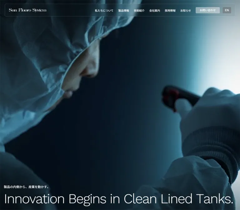
深いネイビーと白を基調に、工場・設備写真、細身の英字、青緑のグラデーションを組み合わせたコーポレートサイト。大きな余白、半透明の追従ヘッダー、整然としたリンク群が特徴。
オリジナルサイトを見るSun Fluoro System — Style Reference
Industrial precision expressed through deep navy, luminous teal, generous space, and fine English typography.
Original URL: https://www.sunfluoro.co.jp/ Final URL: https://www.sunfluoro.co.jp/ Response: HTTP 200; the supplied inspection reports no URL change. Theme: alternating dark and light sections, with teal accents and gradients. No selectable color theme was evidenced. Inspected: September 12, 2026, Japan Standard Time. The supplied retrieval timestamp is September 11, 2026, at 20:25:05.207 UTC, equivalent to September 12 at 05:25:05.207 JST. Viewports: 1440 × 1000 desktop and 390 × 844 mobile, in CSS pixels. Scope: the current Japanese corporate homepage, including its opening, About Us, lining explanation, Products, Technology, Company, Recruit, Column, News, contact invitation, and footer. Three desktop and two mobile captures supplement rendered text, link destinations, element rectangles, custom properties, and computed styles. Linked pages and the open mobile menu were not inspected.
Sun Fluoro System presents a specialist industrial manufacturer through unusually spacious compositions. A nearly black navy establishes depth, while white sections expose crisp photography and thin dividers. Teal provides the main atmospheric accent. Small Japanese navigation labels sit beside lightweight English text, and the decorative company wordmark gives the otherwise restrained interface a distinctive identity.
The homepage balances brand presentation with a substantial corporate directory. Product and technology explanations lead into company information, recruitment, articles, news, and contact access. Its structure remains that of a corporate homepage with multiple destinations. The strongest reusable features are the persistent inset header, broad changes between dark and white surfaces, asymmetric desktop text placement, simple arrow links, and the navy-to-teal footer.
How to Read This Reference
- Measured values come from the supplied rendered DOM, computed styles, or recorded element rectangles. Measurements are rounded where extra precision would not be useful.
- Observed descriptions refer to visible features in the supplied captures. A screenshot confirms appearance at a particular state, not the mechanism that produced it.
- Estimated values are visual approximations, particularly for unsampled text spans, image bounds, gradient colors, and the header's frosted treatment.
- Recommended values and behaviors are implementation choices for a reusable adaptation. They are not claims about the original CSS.
- Token names introduced here are descriptive aliases unless explicitly identified as source custom properties.
- Parent styles are not child styles. The recorded heading and anchor styles do not necessarily describe their nested English text, Japanese text, logo graphics, or arrow decorations.
- Responsive evidence is direct but limited to two widths. Desktop and mobile were both captured; the original breakpoint rules were not supplied.
The initial desktop capture contains a large plain navy field, while the initial mobile capture contains blue industrial imagery. The mobile headline is present in the rendered document below the first screen. Neither observation establishes a failed page, a deliberate permanent blank hero, or a particular video implementation.
Tokens — Colors
Default Palette
| Name | Value | Source or implementation token | Role and evidence |
|---|---|---|---|
| Industrial Navy | #091b25 |
Source --color; alias --sfs-ink |
Measured default text color and footer background; visually matches the dark opening field |
| White | #ffffff |
Source --color-white, --color-bg; alias --sfs-white |
Measured body and Company background; reversed text on dark sections |
| Teal Gradient Stop | #0096a4 |
Recorded inside several source gradients; alias --sfs-teal |
Source accent color associated with the site's teal gradient vocabulary; not a measured flat fill for every teal region |
| Lining Teal | #3aa9b3 |
Opaque stop in source --gr-lining-card |
Recorded gradient color; useful for related accent surfaces |
| Cool Gray | #cdd1d3 |
Source --color-gray-CD; alias --sfs-rule |
Available source neutral; a suitable reconstruction token for the visible light dividers, whose exact border color was not sampled |
| Pale Gray | #e6e8e9 |
Source --color-gray-E6 |
Available subtle neutral; assignment to a specific photographed component is unverified |
| Secondary Text | #46505d |
Source --link-hover-color and secondary RGB value |
Recorded secondary/hover color; the relevant hover states were not exercised |
| Utility Blue | #0e7ae0 |
Source --color-submit-bg |
Computed skip-link color and a recorded submit token; it is not the dominant visible contact-button color |
| White Veil | rgba(255,255,255,.44) |
Measured desktop contact-link background | Initial header contact button over the dark opening |
| White Tint | rgba(255,255,255,.2) |
Source --color-white-20 |
Measured initial mobile menu-button background |
| Quiet Recruitment Fill | rgba(53,68,69,.07) |
Source --color-gray-35-07 |
Measured recruitment-link background over its underlying section |
The colored wordmark visibly combines magenta and violet. Its exact colors were not supplied as computed values. Preserve the authorized logo artwork rather than deriving new brand colors from a visual approximation.
The global property collection also contains generic editor palettes and shadow presets. Their presence does not establish that those colors or shadows appear in the homepage design.
Gradients and Transparency
The following are recorded source definitions. Their names suggest intended uses, but the supplied element samples do not establish every application.
| Source property | Recorded definition | Interpretation |
|---|---|---|
--gr-diagonal |
linear-gradient(-125deg, rgba(89,153,159,1) 0%, rgba(0,150,164,.2) 100%) |
Muted teal transitioning into a translucent teal stop |
--gr-lining-card |
linear-gradient(220deg, rgba(58,169,179,1) 0%, rgba(0,150,164,.5) 100%) |
More saturated teal surface treatment |
--gr-products-top |
radial-gradient(64.69% 125.19% at 35.31% 2.97%, #fff 14.42%, #f3fbfb 43.86%, #e0f2f4 77.33%, #cae7ea 100%) |
Very pale white-to-aqua atmosphere |
--gr-products-sp |
linear-gradient(-90deg, rgba(9,27,37,0) 0%, rgba(9,27,37,.72) 49%, rgba(9,27,37,1) 100%) |
A source gradient suitable for protecting text over imagery; its precise rendered placement is unverified |
Visually observed: the contact panel has a pale-to-medium teal treatment, and the footer develops from navy into bright teal toward its bottom. The scrolled header has a translucent, frosted appearance. The precise contact/footer gradient definitions and header blur radius were not supplied.
Recommended reconstruction: use a restrained teal gradient for contact, a separate vertical navy-to-teal gradient for the footer, and one translucent header layer. Do not reuse a single gradient indiscriminately across every section.
Tokens — Typography
Japanese Interface and Body Copy
- Measured primary family:
Noto Sans JP. - Recorded fallback sequence:
yakuhanjp, system UI fonts, Helvetica Neue, Hiragino families, Yu Gothic, Verdana, Meiryo,M+ 1p, and sans-serif. - Measured weights:
400for normal copy and navigation;600for several heading containers and article titles. - Source weight variables:
--font-normal: 400and--font-bold: 600. - Character: clear, restrained Japanese sans-serif with generous paragraph leading. Weight changes establish hierarchy without making the page visually heavy.
The root element reports 17.0672px at both inspected widths. That is a measured result, not evidence of a particular viewport formula. Most important text roles have their own sizes. Do not multiply every component by a guessed fluid root scale.
English Labels and Utility Text
- Measured family:
Work Sans, followed by the Japanese/system stack. - Measured weight:
300forView more,Features, and the privacy link;400for the language control and category tags. - Measured tracking:
-0.682688pxon the sampled English-style elements at both widths. - Character: fine strokes, open forms, and gently tightened spacing. English labels are often lighter than the surrounding Japanese text.
The large English hero and contact lettering are visually consistent with this vocabulary, but their individual child-span computed styles were not included. Using Work Sans Light for those roles is a supported design adaptation, not an independently measured font assignment.
Company Wordmark
The wordmark is a graphic with high-contrast serif letterforms and distinctive overlapping flourishes. A white version appears over the opening, and a magenta/violet version appears in scrolled headers and on the white footer plate.
No wordmark font name was supplied. The font family computed on its surrounding heading or link does not identify the graphic's lettering.
Type Scale
| Role | Desktop | Mobile | Weight / leading | Evidence status |
|---|---|---|---|---|
| Body default | 17.07px |
17.07px |
400 / 1.6 |
Measured |
| Primary desktop navigation | 14.93px |
Hidden in captured mobile state | 400 / 1.6 |
Measured |
| Header contact label | 13.87px |
Hidden in captured mobile state | 400 / 1 |
Measured |
| Language label | 16px |
16px |
400 / 1 |
Measured; visibly uppercase EN |
| About body | 16px |
16px |
400 / 1.9 |
Measured |
| About statement | 23.87px |
21.33px |
600 / 1.9 |
Measured |
| Products and Technology body | 15.86px |
15.47px |
400 / 2.2 |
Measured |
| Features body | 17.07px |
16px |
400 / 2.7 |
Measured; unusually spacious leading |
| Recruitment body | 15.45px |
13.87px |
400 / 2.2 |
Measured |
| Bilingual section-heading container | 24px |
20px |
600 / 1.6 |
Measured parent style; nested text can override it |
View more |
20.27px |
20.27px |
300 / 1.6 |
Measured |
| Article title | 16px |
16px |
600 / 1.3 |
Measured |
| Article category | 12.8px |
12.8px |
400 / 1 |
Measured |
| Footer primary links | 19.2px |
Not rendered as visible links | 400 / 1.6 |
Measured desktop |
| Footer secondary links | 14.93px |
Not rendered as visible links | 400 / 1.6 |
Measured desktop |
| Accreditation caption | 13.42px |
11.73px |
400 / 1.4 |
Measured |
| Privacy link | 14.93px |
14.93px |
300 / 1.6 |
Measured |
| Large English hero | Approximately 74–78px |
Child size not visually available in the opening capture | Light appearance | Desktop visual estimate; recommend 36px for the evidenced two-line mobile arrangement |
Large Contact Us |
Approximately 50px |
Approximately 38px |
Light appearance | Visual estimates |
The hero heading container itself reports 26px desktop and 24px mobile. Those values do not describe the oversized English child visible on desktop. Likewise, the contact anchor's 17.07px parent style does not describe its large English text.
Tokens — Spacing & Shapes
Overall density: spacious section composition with compact header controls and straightforward navigation rows.
The design mixes fixed pixel details with changing content widths. There is no evidence that all spacing derives from one uniform eight-point system.
Spacing Scale
| Use | Desktop | Mobile | Evidence |
|---|---|---|---|
| Header outer padding | 20px 25px |
10px |
Measured |
| Common page inset | 20px |
20px |
Repeated recorded coordinates |
| Desktop navigation gap | Approximately 40px |
Not applicable | Calculated from adjacent link bounds |
| Recruitment-card gap | 15px |
15px |
Calculated from card positions |
| Recruitment-card padding | 20px |
15px |
Measured |
| Company column gap | 40px |
Single-column flow | Desktop screenshot and recorded text-column bounds |
| Company-link padding | 25px 10px |
25px 10px |
Measured |
| Column image gap | 30px horizontally |
Approximately 50px between one article title and the next image |
Calculated from recorded rectangles |
| Features section padding | 400px 0 200px |
200px 0 150px |
Measured |
| Technology section padding | Approximately 191px 0 |
Approximately 107px 0 |
Measured |
| Company section padding | 40px 0 70px |
30px 0 100px |
Measured |
| Recruitment section padding | 350px 0 150px |
250px 0 100px |
Measured |
| Footer top padding | 150px |
60px |
Measured |
Large section padding is part of the visual rhythm. It should not be confused with equally large gaps inside ordinary UI components.
Border Radius
| Element | Value | Evidence |
|---|---|---|
| Initial mobile menu button | 3px |
Measured |
| Header contact and language buttons | 4px |
Measured |
| Article category label | 4px |
Measured |
| Recruitment links | 5px |
Measured |
| Footer logo plate | 6px |
Measured |
| Article image links and news entry | 8px |
Measured |
| Technology, Company, and Recruit section tops | 10px 10px 0 0 |
Measured |
| Header inner panel | Approximately 6px |
Visual estimate |
| Contact and company photography corners | Approximately 8px |
Visual estimate |
Roundness stays modest. Large sections often have only their upper corners softened. The interface does not use pill-shaped primary navigation or heavily rounded card shells.
Layout Measurements
| Element | Desktop at 1440 × 1000 | Mobile at 390 × 844 |
|---|---|---|
| Full document | Approximately 9685.28px high |
Approximately 11512.55px high |
| Header outer rectangle | 1440 × 105px |
390 × 70px |
| Header inner panel | Approximately 1390 × 65px |
Approximately 370 × 50px |
| Header logo-link allocation | 382 × 24px |
Approximately 259.41 × 17.84px |
| Visible wordmark artwork | Approximately 240px wide |
Approximately 180px wide |
| Mobile menu control | Not visible | 40 × 40px, at x=332.5, y=16 |
| Hero heading rectangle | y=854.91, height 125.09px |
y=1548.31, height 119.69px |
| About copy column | 560px wide, starting at x=743.39 |
350px wide, starting at x=20 |
| Products copy column | 500px wide, starting at x=136.61 |
350px wide, starting at x=20 |
| Technology copy column | 443px wide, starting at x=806.52 |
298px wide, starting at x=46 |
| Company navigation column | 680px wide, starting at x=740 |
350px wide, starting at x=20 |
| Company link rectangle | Approximately 680 × 86.13px |
Approximately 350 × 80.72px |
| Recruitment link | Approximately 537.08 × 133px |
350 × 96px |
| Article image link | 360 × 360px |
350 × 350px |
| News entry | Approximately 429 × 195.89px |
Approximately 290 × 169.19px |
| Contact text-column width | 637.5px |
300px |
| Footer logo plate | 310 × 48.75px |
310 × 48.75px |
| Footer section | Approximately 740.30px high |
Approximately 554.44px high |
Allocated logo-link width is substantially larger than the visible wordmark. Using the link rectangle as the graphic width would stretch the identity incorrectly.
Components
Persistent Inset Header
Role: maintain corporate navigation, language access, and identity throughout the long homepage.
On desktop, the header sits inside a 25px horizontal and 20px vertical outer inset. Its visible panel is about 65px tall. The white wordmark occupies the left, followed by six Japanese navigation destinations, a compact contact button, and an EN control.
The visible navigation labels are 私たちについて, 製品情報, 技術紹介, 会社案内, 採用情報, and お知らせ. Their recorded link text contains duplicate copies, but the screenshots show one visible label each. Render one accessible label per link; the duplicates do not establish a second navigation row or a verified text-roll animation.
Two visual states are evidenced:
- Opening: white identity and navigation over navy or blue imagery, with a faint panel edge on desktop. Contact uses a translucent white fill; the desktop language control uses a darker translucent fill.
- Scrolled captures: colored identity, dark navigation text, a pale translucent panel, and a dark contact button. The background appears softened through the panel.
The header remains at the top of the supplied middle and footer captures. This supports persistent overlay behavior, but its exact positioning rule and state-change threshold were not recorded.
Mobile Header
Role: retain the essential header functions within a narrow viewport.
The desktop navigation and header contact button disappear from the visible mobile layout. The header retains the wordmark, an unboxed EN link, and a 40px square menu button containing three thin horizontal lines.
The menu button has the recorded label メニューを開閉する. Its initial background is rgba(255,255,255,.2) with a 3px radius. In the footer capture, the button appears dark against the pale header panel.
The menu was not opened. Its overlay geometry, animation, focus behavior, and dismissal methods are unverified.
Opening and Hero Statement
Role: establish scale and industrial atmosphere before introducing the company.
The desktop capture places the statement near the bottom of the first viewport, with a 20px horizontal inset. A small Japanese line, 製品の内側から、産業を動かす。, sits above the large English sentence, Innovation Begins in Clean Lined Tanks. The heading container uses a 10px gap.
The English line runs almost the entire desktop width in thin white lettering. There is no visible oversized conversion button in this opening composition; contact remains available in the header.
On mobile, the rendered text breaks after Innovation Begins. Its heading rectangle ends at approximately 1668px, which equals two inspected viewport heights minus 20px. This is consistent with an opening composition around two screens tall, although the original height rule was not supplied. The initial 844px-tall mobile image therefore shows blue imagery and the header without the headline.
Do not encode the blank desktop capture as the intended permanent media asset. For an adaptation, provide a reliable navy fallback and preserve the text independently of media readiness.
Bilingual Section Heading
Role: identify a destination in both Japanese and English without overwhelming its content.
The visible Company section demonstrates a small English eyebrow preceded by a tiny square, followed by a larger Japanese label. The English lettering is light; the Japanese label is more prominent. The parent heading rectangles measure about 70.69px tall on desktop and 58.02px on mobile.
The DOM text order places Japanese before English, while the Company screenshot visually presents English above Japanese. Use the visible hierarchy as the reference, and keep accessible reading order coherent. Child-span sizes and ordering rules were not included in the measurements.
About Us Narrative
Role: explain why internal equipment protection matters.
The section uses white text and a long, open composition. On desktop, the main narrative occupies a 560px column toward the right within a wider centered region. It contains a two-line statement, three separate paragraphs, and a View more link.
Paragraph text measures 16px / 1.9. The statement measures approximately 23.87px / 1.9 at weight 600. The spacing between paragraphs is roughly 30px in the recorded mobile layout.
On mobile, the narrative becomes a 350px column with 20px side margins. There is substantial vertical separation between the section label and the statement. The provided images do not show the intervening About content closely enough to assign a specific image or animation to that space.
Lining Explanation / Features
Role: introduce the specialist process in accessible language before the product destinations.
This section contains Features, an English question about fluoro-resin lining, a Japanese explanation title, body copy, and a centered View more link. The paragraph leading is exceptionally open: approximately 46.08px on desktop and 43.20px on mobile.
The desktop paragraph gives a fuller explanation of chemical resistance and equipment protection. The mobile rendered text uses a shorter version. This is an observed content adaptation, not merely narrower wrapping of the desktop paragraph.
The section's measured padding decreases from 400px above and 200px below on desktop to 200px above and 150px below on mobile. Preserve its deliberate pause in the page rhythm, while making any further reduction an explicit usability recommendation.
Products Introduction
Role: connect the process explanation to the product directory.
The desktop text block is 500px wide at x=136.61; its heading, paragraph, and View more share that left alignment. The complete section measures 660px high. The paragraph uses approximately 15.86px / 2.2.
On mobile, the copy expands to the usual 350px content width and the section becomes approximately 1009.81px tall. The supplied samples do not identify the associated media element's bounds or file. A reconstruction should not invent a particular tank arrangement solely from the section name.
Technology Feature
Role: give the technical proposition a darker, more immersive treatment.
The desktop middle capture shows a blue-toned photograph of a person wearing protective clothing, with a dark translucent text panel on the right. Fine borders separate the panel without a heavy shadow. The photographed equipment environment and navy overlay create depth while preserving white text.
The paragraph starts at x=806.52 and measures 443px wide. The surrounding panel is approximately 585px wide by visual estimation. The section has measured 10px upper corner radii and approximately 191px vertical padding.
On mobile, the section heading uses the normal 20px page inset, while the technical paragraph is inset farther to x=46, producing a 298px text column. This nested inset is a distinctive detail: the panel's copy should not automatically align with every other mobile paragraph.
Company Directory
Role: provide direct access to company information through a calm, legible directory.
A full-width white section begins with 10px rounded upper corners. On desktop, a large photograph fills the left column, while a heading and seven ruled navigation rows occupy the right. Both columns are approximately 680px wide, separated by 40px.
The photograph shows a bright office interior, a broad expanse of ceiling, glass partitions, and partial company signage toward the lower left. That generous architectural crop is part of the composition; it is not a tightly framed logo photograph.
The heading begins about 61px below the section top. A substantial blank interval separates it from the first navigation row. Each row has 25px 10px padding, a thin horizontal divider, a Japanese label, and a simple right arrow near the far edge. The recorded row rectangle is about 86px tall, with roughly another pixel between consecutive rows.
The destinations are greeting, philosophy, quality, social contribution, history, company outline, and locations. These are ordinary page or fragment links, not evidenced accordion toggles.
On mobile, the heading and link list occupy the full 350px content width. The first link begins approximately 517px below the heading's top, leaving space for intervening content. A heading–image–links stack is a reasonable reconstruction, but the supplied mobile images do not directly show that middle section's photo placement.
Recruitment Section and Destination Cards
Role: combine an employment message with direct access to recruitment topics.
The section uses white text, a large opening gap, and four bilingual destination cards. On desktop, the cards form two columns and two rows. Each measures approximately 537 × 133px, with 15px gutters, 20px inner padding, and 5px corner radii.
Each card is a flex container with a measured 20px internal gap. The evidence does not identify every nested graphic, so do not assume a specific icon or thumbnail anatomy. The verified content pairs Japanese labels with Message, Data, Questionnaire, and Requirement.
On mobile, the four cards become a single stack of 350 × 96px rows with 15px padding and gaps. The recruitment statement uses a deliberate two-line mobile break, and the body text decreases to approximately 13.87px with 30.51px leading.
Column Article Track
Role: expose recent technical and company-initiative content.
The desktop DOM places square image links in a horizontal sequence at x=65, 455, 845, and 1235, continuing beyond the viewport. Images are 360px square with 30px gaps and 8px corner radii. Nine article entries appear in the supplied desktop rendered content.
Below each image, the date and category occupy a metadata region, followed by a semibold Japanese title. The category uses 12.8px text, 6px 12px 3px padding, and a 4px radius. Article titles use 16px / 1.3 at weight 600 and have recorded rectangles about two lines tall. Those rectangles alone do not prove the exact truncation method.
The horizontal geometry supports an article rail. Dragging, autoplay, arrow controls, and carousel pagination were not exercised and should not be asserted.
On mobile, three article entries are rendered in a vertical list. Their images measure 350 × 350px, and the next article image begins about 50px after the preceding title rectangle. This is a material layout and content-count change, not simply a narrower desktop rail.
News Entry
Role: provide concise corporate updates separately from longer articles.
One news item is present in the supplied content, with the date 2026.03.31 and a site-renewal announcement. Its anchor measures approximately 429 × 196px on desktop and 290 × 169px on mobile, with an 8px radius.
Desktop padding is 30px 20px 70px; mobile padding is 20px 15px 65px. The sampled anchor background is transparent. The surrounding surface and any decorative border were not visually captured closely enough to specify them as measured values.
The section's View more sits toward the right on desktop and at the left content inset on mobile.
Arrow Link
Role: create a consistent, restrained route to deeper content.
The repeated View more link uses Work Sans at approximately 20.27px, weight 300, and -0.68px tracking. Its recorded width is approximately 164px, including 70px right padding reserved for the arrow treatment.
In the visible Technology region, the arrow sits inside a small, softly rounded outlined square, visually about 36px. Keep the text and arrow as one link. The arrow box should not become a separate keyboard stop.
The large contact action uses the same directional language at a larger scale: an approximately 60px outlined square beside oversized Contact Us text.
Contact Invitation
Role: offer a clear route to the inquiry page at the end of the content sequence.
On desktop, the contact area pairs a teal panel on the left with a bright industrial equipment photograph on the right. The visible outer inset is approximately 25px, the gap approximately 15px, and each half approximately 687.5px wide.
The left panel contains a bilingual section label, a short Japanese invitation, and a large action aligned toward its lower-right area. The action combines お問い合わせはこちら, Contact Us, and the outlined arrow square. It links to /contact/; no form is shown or tested on the homepage.
On mobile, the teal panel is 350px wide with 20px outer margins. The heading and paragraph use approximately 25px inner side padding, yielding a 300px text column. The photographed desktop companion panel is absent from the supplied mobile footer view.
Footer Identity and Sitemap
Role: close the page with corporate identity, contact details, accreditation information, and navigational depth.
The footer begins in navy and becomes teal toward the bottom. Its white wordmark plate measures exactly 310 × 48.75px in both inspected layouts, has 6px rounded corners, and contains a link with 10px padding.
Below the plate are the address, telephone number, an Intertek ISO 9001:2015 mark visible in the capture, and a small explanatory caption referencing Intertek and UKAS. The badge appears approximately 75 × 94px; that size is a screenshot estimate. It is an accreditation graphic, not a production credit or general-purpose decorative icon.
The desktop footer places identity information at the left and four navigation groups to the right. Primary links are about 19.2px; nested links are about 14.93px. Tiny square markers distinguish major destinations. A thin rule separates the bottom legal row, with copyright on the left and Privacy policy on the right.
The visible mobile footer omits the desktop sitemap. It retains the identity, address, telephone, badge, caption, privacy link, and copyright. The legal items stack with privacy first, followed by copyright. Footer top padding contracts from 150px to 60px.
Tokens — Motion & Interaction
| Treatment | Recorded value or visible evidence | What is established |
|---|---|---|
| Section headings and selected paragraphs | opacity 1.5s cubic-bezier(.165,.84,.44,1) and matching transform transition |
Transition declarations exist; initial offset, trigger threshold, and replay policy were not supplied |
| Header contact link | Color and background over 0.3s cubic-bezier(.215,.61,.355,1) |
Computed transition definition; hover result not exercised |
| Language control | Color, background, and opacity over the same 0.3s curve |
Computed definition |
| Recruitment links | Background over 0.5s cubic-bezier(.19,1,.22,1) |
Computed definition; exact destination background not supplied |
| Article category links | Color and background over 0.5s cubic-bezier(.165,.84,.44,1) |
Computed definition |
| Article titles | Color and opacity over the same 0.5s curve |
Computed definition |
| Header visual state | White identity at the opening; colored identity and pale panel in scrolled captures | State difference observed; trigger and transition timing unverified |
| Opening imagery | Blue imagery appears in the mobile opening capture | A still frame is available; playback, looping, audio, and media element type are unverified |
| Mobile menu | A menu button and its label are recorded | Open/close behavior was not exercised |
| Article rail | Desktop items extend horizontally beyond the viewport | Layout is evidenced; dragging or automatic progression is unverified |
Many elements report animation: none, but they also declare transitions. This does not establish an entirely static experience. Conversely, a transition declaration does not prove that a particular animation played during capture.
The source includes several easing variables, including back and exponential curves. Only curves assigned to sampled elements are treated as component evidence here.
Recommended motion adaptation: preserve the long, gently decelerating content reveal and shorter control feedback. Use a small, explicitly chosen reveal displacement rather than inventing a dramatic original movement. Keep content visible by default so incomplete JavaScript cannot leave entire sections blank.
Surfaces
| Layer | Appearance | Purpose |
|---|---|---|
| Opening field | Deep navy, with blue imagery in the mobile capture | Establishes atmosphere and makes fine white lettering prominent |
| Dark feature section | Blue industrial photograph with dark overlay/panel | Supports technical storytelling and readable reversed copy |
| Light content field | White with navy text | Makes corporate information and photography easy to scan |
| Company directory | White, subtly rounded section top, fine rules | Organizes many destinations without a heavy card grid |
| Recruitment destinations | Very subtle translucent fill and 5px radius |
Groups bilingual links while retaining the section atmosphere |
| Scrolled header | Pale translucent panel with a frosted appearance | Keeps navigation readable above changing backgrounds |
| Contact panel | Pale-to-medium teal gradient with white text | Creates a distinct final invitation |
| Footer | Navy developing into teal | Connects corporate detail with the site's accent palette |
| Wordmark plate | Solid white with 6px radius |
Protects the colored identity against the dark footer |
There is no strong, repeated shadow-elevation system visible in the captures. Structure comes primarily from surface contrast, image crops, thin borders, and spacing. Do not mistake editor shadow presets in the property collection for an instruction to add card shadows.
Imagery
The confirmed photographic language is industrial and architectural: blue-toned protective clothing, bright metal equipment, blue structural rails, white office surfaces, and glass partitions. These images connect technical capability with a clean working environment.
Use large photographic fields and preserve useful negative space. The Company crop leaves a substantial ceiling area above the signage. The contact photograph emphasizes equipment geometry and the contrast between silver metal, white surfaces, and blue rails. The Technology crop supports reversed text through its dark blue treatment.
The opening mobile image is soft and abstract enough that its exact subject should not be described more specifically than the evidence allows. Do not infer a particular production process or video sequence from a single blurred frame.
Observed Asset References
No downloadable image, video, logo, or font-file URLs were supplied. The following records asset roles only; it does not invent original filenames.
| Asset role | Visible evidence | Reuse guidance |
|---|---|---|
| White horizontal wordmark | Desktop and mobile openings | Use the authorized white artwork over dark backgrounds |
| Magenta/violet horizontal wordmark | Scrolled headers and footer plate | Preserve the graphic's proportions and internal lettering |
| Opening blue imagery | Mobile opening | Provide an appropriate poster/fallback; media behavior needs separate verification |
| Protective-clothing photograph | Upper part of the desktop middle capture | Retain the blue tonality and text-safe dark region |
| Company interior photograph | Left half of the Company section | Preserve architectural space and partial signage in the crop |
| Industrial equipment photograph | Right half of the desktop contact area | Favor real equipment detail and bright, clean lighting |
| Accreditation badge | Desktop and mobile footers | Reuse only when factually applicable and authorized |
| Article media | Square link containers measured in the DOM | Actual article-image subjects are not established by the supplied captures |
Photography and wordmark artwork carry much of this site's identity. CSS can reproduce the surfaces and layout, but generic stock symbols cannot replace the specific industrial and architectural material.
Layout & Responsive Behavior
The homepage alternates between near-full-width regions and more constrained editorial columns. It does not use one universal maximum width. Examples include the 1166.78px About heading region, the 500px Products text column, the 680px Company columns, and the 1310px lower-content heading region beginning at x=65.
At 390px, many sections converge on a 350px content width with 20px side margins. Technology and contact add their own internal insets. This produces consistency without eliminating component-specific geometry.
Measured Section Extents
| Section | Desktop height | Mobile height | Responsive significance |
|---|---|---|---|
| Opening and About combined | 2006.66px |
3087px |
Mobile contains a much taller opening and narrower narrative flow |
| Features | 1211.72px |
808.27px |
Reduced padding and shorter mobile copy |
| Products | 660px |
1009.81px |
Substantially taller mobile composition |
| Technology | 821.08px |
728px |
Reduced section padding and a narrower text panel |
| Company | 981.56px |
1238.55px |
Desktop two-column directory becomes a longer mobile flow |
| Recruit | 1348px |
1451.88px |
Four destination cards stack on mobile |
| Footer | 740.30px |
554.44px |
Mobile removes the visible sitemap and reduces top padding |
Direct Responsive Observations
- Desktop navigation becomes a wordmark/language/menu header on mobile.
- The hero sentence has a two-line mobile text arrangement and sits below the first screen in the recorded document.
- Features uses a shorter mobile paragraph.
- The Products paragraph changes from a
500pxdesktop block to a350pxmobile block. - Technology retains an additional internal copy inset, producing a
298pxmobile paragraph. - Recruitment links change from a two-by-two arrangement to four stacked rows.
- The desktop article rail becomes three vertically stacked mobile articles.
- The contact photograph is not present in the supplied mobile contact/footer view.
- The desktop footer sitemap is absent from the rendered mobile links and mobile capture.
- The footer logo plate keeps its
310pxwidth across both viewports.
No tablet, landscape-phone, or intermediate-width capture was supplied. The Quick Start uses recommended breakpoints rather than claiming to recover the original media queries.
Do’s and Don’ts
Do
- Anchor the palette in the measured navy
#091b25and white#ffffff. - Reserve teal for atmospheric transitions, contact emphasis, and related accent surfaces.
- Pair Noto Sans JP body copy with the measured lightweight Work Sans utility typography.
- Keep the distinctive wordmark as artwork with separate light and colored versions.
- Preserve the inset persistent header and its contrasting opening/scrolled appearances.
- Use broad changes of surface and deliberate vertical space to pace the corporate story.
- Keep company destinations as ruled rows with restrained right arrows.
- Retain square article media and the evidenced desktop/mobile layout distinction.
- Preserve the compact footer logo plate and the simpler mobile footer.
- Keep text readable independently of image or animation readiness.
- Treat measurements of parent containers separately from nested visible lettering.
Don’t
- Don’t flatten the corporate homepage into a single-purpose campaign page.
- Don’t replace all sections with identical rounded cards and drop shadows.
- Don’t use bright utility blue as the default visible contact treatment.
- Don’t recolor the entire interface magenta or violet merely because those colors appear in the wordmark.
- Don’t use a generic serif font to approximate the company logo.
- Don’t shrink all mobile text proportionally from the desktop layout; several measured roles keep the same size.
- Don’t keep the desktop article rail unchanged on mobile when matching the captured page.
- Don’t reproduce duplicated extracted navigation strings as duplicated visible labels.
- Don’t treat company fragment links as accordion controls without interaction evidence.
- Don’t claim autoplay, parallax, menu animation, or slider behavior from still images and property names.
- Don’t make the desktop opening permanently blank to imitate one capture state.
- Don’t invent asset filenames, font-file URLs, or production credits.
Recommended Implementation Additions
These are recommendations for a new implementation, not verified features of the original page:
- Keep meaningful hero text available immediately, with a static media fallback. If business priorities favor faster orientation, shorten the approximately two-screen mobile opening as an explicit departure from the reference.
- Provide descriptive accessible names for repeated
View morelinks, such as the destination section name, while retaining the visible label. - Preserve a working skip link and add a clearly visible keyboard focus treatment on both dark and light surfaces.
- Implement the menu with an exposed expanded state, reliable focus handling, Escape dismissal, and focus return. The original menu's behavior has not been verified.
- Consider a
44pxeffective touch target for the observed40pxmenu button and small language link. - Check white text against the lightest contact-gradient region and every media frame. Darken the local backing where necessary rather than depending only on a text shadow.
- Offer reduced-motion behavior that reveals all content without translation. If moving media is used, provide an appropriate reduced-motion alternative.
- Keep the accreditation caption and mobile recruitment copy readable; consider a larger minimum size than the smallest measured source values.
- Preserve access to the complete article archive when the homepage shows fewer mobile entries.
- Use meaningful text alternatives for equipment and company imagery, and empty alternatives for genuinely decorative images.
- Build the visual article rail with keyboard-operable navigation if it becomes interactive; do not infer that a particular carousel library is required.
Agent Prompt Guide
Quick Color Reference
- Main ink and dark field: measured
#091b25. - Light field and reversed text: measured
#ffffff. - Teal vocabulary: source gradient stops
#0096a4and#3aa9b3. - Fine light rules: source neutral
#cdd1d3is a suitable reconstruction choice; the exact visible divider color is unverified. - Initial desktop contact button: measured
rgba(255,255,255,.44). - Initial mobile menu fill: measured
rgba(255,255,255,.2). - Scrolled header: pale translucent/frosted appearance; exact alpha and blur are reconstruction choices.
- Contact and footer gradients: match their distinct observed directions and contrast, without claiming an exact recovered formula.
Overall Prompt
“Create a Japanese industrial manufacturer's corporate homepage inspired by the current Sun Fluoro System reference. Use deep navy #091b25, white content sections, restrained teal gradients, Noto Sans JP body copy, and lightweight Work Sans English labels. Place a persistent inset header above the content, with a white identity over the opening and a colored identity on a pale translucent panel in scrolled states. Use expansive photographic regions, a large thin English opening statement, generous vertical spacing, asymmetric desktop text columns, a white company directory with ruled arrow links, bilingual recruitment destinations, square article images, and a teal contact panel above a navy-to-teal footer. At 390px, use 20px content margins, compact header controls, stacked recruitment links and articles, and a simplified footer. Treat supplied measurements as authoritative and label unverified media, hover, menu, and breakpoint choices.”
Example Component Prompts
- Header: “Build an inset persistent corporate header. At 1440px, use 20px vertical and 25px horizontal outer padding around a roughly 65px panel. Place a graphic wordmark left, six compact Japanese links, a 32px-high contact control, and an EN control. Add an explicit scrolled state with dark text and a pale translucent backing. On narrow screens show the wordmark, EN, and a 40px square menu button. Do not invent the menu's original open animation.”
- Company directory: “Create a white section with 10px rounded upper corners, 20px side insets, and two 680px desktop columns separated by 40px at a 1440px viewport. Place a large architectural photograph left and a small bilingual heading above seven ruled links right. Keep substantial space before the first row, around 86px row height, simple right arrows, and no card shadows.”
- Recruitment links: “Create four bilingual recruitment links on a dark section. Use a two-by-two desktop layout with approximately 537 × 133px cards, 15px gaps, 20px padding, a 5px radius, and very subtle translucent fills. At 390px, stack 350 × 96px rows with 15px padding. Preserve one accessible link per destination.”
- Article section: “Use a desktop horizontal track of 360px square image links with 30px gaps, followed by date/category metadata and 16px semibold Japanese titles. At 390px, show three stacked entries with 350px square media and approximately 50px separation after each title. Implement any interactive track controls as new functionality, since the original behavior is unverified.”
- Contact and footer: “Pair a pale teal contact panel with bright industrial equipment photography on desktop. Combine a small Japanese invitation, thin oversized Contact Us lettering, and a 60px outlined arrow square. Below, build a navy-to-teal footer with a 310px white logo plate, contact details, an applicable accreditation mark, and a four-group desktop sitemap. Simplify the mobile footer to identity and legal information.”
Quick Start
CSS Custom Properties
This is a reusable CSS adaptation, not recovered source code. Pixel tokens preserve the measured component sizes without depending on the original root font size. Hero display sizes, contact/footer gradients, header blur, reveal distance, image crops, and breakpoints are explicitly recommended approximations.
Use authorized image and logo assets and load the named fonts separately. No asset URLs were supplied. The header expects application code to update data-scrolled; the optional reveal classes also require separate state management. Content remains visible without that enhancement.
:root {
  /* Measured colors and recorded source palette values */
  --sfs-ink: #091b25;
  --sfs-white: #ffffff;
  --sfs-teal: #0096a4;
  --sfs-lining-teal: #3aa9b3;
  --sfs-rule: #cdd1d3;
  --sfs-white-20: rgba(255, 255, 255, .2);
  --sfs-white-44: rgba(255, 255, 255, .44);
  --sfs-recruit-fill: rgba(53, 68, 69, .07);

  /* Declared families with a shortened fallback stack */
  --sfs-font-jp: 'Noto Sans JP', yakuhanjp, -apple-system,
    BlinkMacSystemFont, 'Helvetica Neue', 'Hiragino Sans',
    'Yu Gothic', Meiryo, sans-serif;
  --sfs-font-en: 'Work Sans', var(--sfs-font-jp);
  --sfs-weight-light: 300;
  --sfs-weight-normal: 400;
  --sfs-weight-strong: 600;
  --sfs-tracking-en: -.682688px;
  --sfs-text-base: 17.0672px;
  --sfs-text-body: 16px;
  --sfs-text-nav: 14.9338px;
  --sfs-text-more: 20.2673px;
  --sfs-text-category: 12.8004px;

  /* Repeated measured geometry */
  --sfs-gutter: 20px;
  --sfs-gap-small: 15px;
  --sfs-gap-wide: 40px;
  --sfs-radius-control: 4px;
  --sfs-radius-card: 8px;
  --sfs-radius-section: 10px;
  --sfs-story-width: 1166.78px;

  /* Measured transition definitions */
  --sfs-ease-reveal: cubic-bezier(.165, .84, .44, 1);
  --sfs-ease-control: cubic-bezier(.215, .61, .355, 1);
  --sfs-ease-card: cubic-bezier(.19, 1, .22, 1);
  --sfs-duration-reveal: 1.5s;
  --sfs-duration-control: .3s;
  --sfs-duration-card: .5s;

  /* Visual reconstruction choices, not measured source fills */
  --sfs-contact-gradient: linear-gradient(110deg, #78c3cb, #4fb0ba);
  --sfs-footer-gradient: linear-gradient(
    180deg, #091b25 45%, #075563 76%, #0096a4 100%
  );
  --sfs-glass-fill: rgba(255, 255, 255, .58);
  --sfs-glass-blur: 12px;
}

.sfs-site,
.sfs-site * {
  box-sizing: border-box;
}

.sfs-site {
  margin: 0;
  color: var(--sfs-ink);
  background: var(--sfs-white);
  font: var(--sfs-weight-normal) var(--sfs-text-base) / 1.6
    var(--sfs-font-jp);
}

.sfs-site a {
  color: inherit;
  text-decoration: none;
}

.sfs-site button {
  font: inherit;
}

.sfs-site img {
  display: block;
  max-width: 100%;
}

.sfs-site :focus-visible {
  outline: 2px solid currentColor;
  outline-offset: 5px;
}

.sfs-container {
  width: calc(100% - 2 * var(--sfs-gutter));
  max-width: var(--sfs-story-width);
  margin-inline: auto;
}

.sfs-copy {
  font-size: var(--sfs-text-body);
  line-height: 1.9;
}

.sfs-copy p + p {
  margin-top: 30px;
}

.sfs-header {
  position: fixed;
  inset: 0 0 auto;
  z-index: 50;
  padding: 20px 25px;
  color: var(--sfs-white);
}

.sfs-header__bar {
  display: flex;
  align-items: center;
  gap: 40px;
  min-height: 65px;
  padding: 0 20px;
  border: 1px solid var(--sfs-white-20);
  border-radius: 6px;
}

.sfs-brand {
  flex: 1;
  min-width: 0;
}

.sfs-brand img {
  width: 240px;
  height: auto;
}

.sfs-logo--color {
  display: none !important;
}

.sfs-primary-nav,
.sfs-header__actions {
  display: flex;
  align-items: center;
}

.sfs-primary-nav {
  gap: 40px;
  font-size: var(--sfs-text-nav);
  white-space: nowrap;
}

.sfs-header__actions {
  gap: 15px;
}

.sfs-header__contact,
.sfs-language {
  display: inline-flex;
  align-items: center;
  justify-content: center;
  min-height: 32px;
  border-radius: var(--sfs-radius-control);
  transition:
    color var(--sfs-duration-control) var(--sfs-ease-control),
    background var(--sfs-duration-control) var(--sfs-ease-control);
}

.sfs-header__contact {
  padding-inline: 20.48px;
  background: var(--sfs-white-44);
  font-size: 13.8671px;
  line-height: 1;
  white-space: nowrap;
}

.sfs-language {
  padding-inline: 11.947px;
  background: rgba(107, 107, 107, .44);
  font: 400 16px / 1 var(--sfs-font-en);
  letter-spacing: var(--sfs-tracking-en);
  text-transform: uppercase;
}

.sfs-menu {
  display: none;
  align-items: center;
  justify-content: center;
  width: 40px;
  height: 40px;
  padding: 0;
  border: 1px solid var(--sfs-white-20);
  border-radius: 3px;
  color: var(--sfs-white);
  background: var(--sfs-white-20);
  cursor: pointer;
}

.sfs-header[data-scrolled='true'] {
  color: var(--sfs-ink);
}

.sfs-header[data-scrolled='true'] .sfs-header__bar {
  background: rgba(255, 255, 255, .92);
}

.sfs-header[data-scrolled='true'] .sfs-logo--white {
  display: none;
}

.sfs-header[data-scrolled='true'] .sfs-logo--color {
  display: block !important;
}

.sfs-header[data-scrolled='true'] .sfs-header__contact,
.sfs-header[data-scrolled='true'] .sfs-menu {
  color: var(--sfs-white);
  background: var(--sfs-ink);
}

@supports (backdrop-filter: blur(1px)) {
  .sfs-header[data-scrolled='true'] .sfs-header__bar {
    background: var(--sfs-glass-fill);
    backdrop-filter: blur(var(--sfs-glass-blur));
  }
}

.sfs-hero {
  position: relative;
  display: flex;
  align-items: flex-end;
  min-height: 100vh;
  min-height: 100svh;
  padding: 20px;
  overflow: hidden;
  color: var(--sfs-white);
  background: var(--sfs-ink);
}

.sfs-hero__media {
  position: absolute;
  inset: 0;
  width: 100%;
  height: 100%;
  object-fit: cover;
}

.sfs-hero__title {
  position: relative;
  z-index: 1;
  display: grid;
  gap: 10px;
  width: 100%;
  margin: 0;
}

.sfs-hero__jp {
  font-size: 16px;
  font-weight: 400;
  line-height: 1.5;
}

.sfs-hero__en {
  font-family: var(--sfs-font-en);
  font-size: clamp(36px, 5.28vw, 76px);
  font-weight: 300;
  line-height: 1.2;
  letter-spacing: var(--sfs-tracking-en);
}

.sfs-mobile-break {
  display: none;
}

.sfs-section-title {
  display: grid;
  gap: 5px;
  margin: 0;
}

.sfs-section-title__en {
  display: flex;
  align-items: center;
  gap: 8px;
  font: 300 16px / 1.6 var(--sfs-font-en);
  letter-spacing: var(--sfs-tracking-en);
}

.sfs-section-title__en::before {
  content: '';
  width: 5px;
  height: 5px;
  background: currentColor;
}

/* Nested heading sizes approximate the visible hierarchy. */
.sfs-section-title__jp {
  font-size: 28px;
  font-weight: 400;
  line-height: 1.4;
}

.sfs-more {
  display: inline-flex;
  align-items: center;
  gap: 34px;
  min-height: 36px;
  font: 300 var(--sfs-text-more) / 1.6 var(--sfs-font-en);
  letter-spacing: var(--sfs-tracking-en);
}

.sfs-arrow {
  display: inline-grid;
  flex: 0 0 auto;
  place-items: center;
  width: 36px;
  height: 36px;
  border: 1px solid currentColor;
  border-radius: 4px;
}

.sfs-arrow svg {
  width: 18px;
  height: 18px;
  fill: none;
  stroke: currentColor;
  stroke-width: 1;
}

.sfs-company {
  display: grid;
  grid-template-columns: repeat(2, minmax(0, 1fr));
  grid-template-areas: 'media title' 'media links';
  column-gap: 40px;
  row-gap: 150px;
  padding: 40px 20px 70px;
  border-radius: 10px 10px 0 0;
  color: var(--sfs-ink);
  background: var(--sfs-white);
}

.sfs-company__media {
  position: relative;
  grid-area: media;
  min-height: 650px;
  overflow: hidden;
  border-radius: 8px;
}

.sfs-company__media img {
  position: absolute;
  inset: 0;
  width: 100%;
  height: 100%;
  object-fit: cover;
}

.sfs-company__title {
  grid-area: title;
  margin-top: 20px;
}

.sfs-company__links {
  grid-area: links;
}

.sfs-company__link {
  display: flex;
  align-items: center;
  justify-content: space-between;
  gap: 20px;
  min-height: 87px;
  padding: 25px 10px;
  border-top: 1px solid var(--sfs-rule);
  font-size: 22px;
  line-height: 1.6;
}

.sfs-recruit-grid {
  display: grid;
  grid-template-columns: repeat(2, minmax(0, 1fr));
  gap: 15px;
  max-width: 1089.17px;
  margin-inline: auto;
}

.sfs-recruit-card {
  display: flex;
  align-items: center;
  gap: 20px;
  min-height: 133px;
  padding: 20px;
  border-radius: 5px;
  background: var(--sfs-recruit-fill);
  transition: background .5s var(--sfs-ease-card);
}

.sfs-article-track {
  display: flex;
  gap: 30px;
  overflow-x: auto;
  padding-inline: 65px;
}

.sfs-article {
  flex: 0 0 360px;
  min-width: 0;
}

.sfs-article__image {
  display: block;
  aspect-ratio: 1;
  overflow: hidden;
  border-radius: 8px;
}

.sfs-article__image img {
  width: 100%;
  height: 100%;
  object-fit: cover;
}

.sfs-article__meta {
  display: flex;
  align-items: center;
  justify-content: space-between;
  gap: 12px;
  margin-top: 20px;
}

.sfs-article__category {
  padding: 6px 12px 3px;
  border-radius: 4px;
  font: 400 var(--sfs-text-category) / 1 var(--sfs-font-en);
  letter-spacing: var(--sfs-tracking-en);
}

.sfs-article__title {
  margin: 12px 0 0;
  font-size: 16px;
  font-weight: 600;
  line-height: 1.3;
}

.sfs-contact {
  display: grid;
  grid-template-columns: repeat(2, minmax(0, 1fr));
  gap: 15px;
  padding-inline: 25px;
  background: var(--sfs-ink);
}

.sfs-contact__panel {
  display: flex;
  flex-direction: column;
  min-height: 450px;
  padding: 35px 25px;
  border-radius: 8px;
  color: var(--sfs-white);
  background: var(--sfs-contact-gradient);
}

.sfs-contact__copy {
  font-size: 17.0672px;
  line-height: 1.5;
}

.sfs-contact__action {
  display: flex;
  align-items: center;
  align-self: flex-end;
  gap: 30px;
  margin-top: auto;
}

.sfs-contact__label {
  display: block;
  font-size: 16px;
  line-height: 1.5;
}

.sfs-contact__en {
  display: block;
  font: 300 50px / 1.1 var(--sfs-font-en);
  letter-spacing: var(--sfs-tracking-en);
}

.sfs-contact__action .sfs-arrow {
  width: 60px;
  height: 60px;
  border-color: var(--sfs-white-20);
}

.sfs-contact__image {
  width: 100%;
  height: 100%;
  min-height: 450px;
  object-fit: cover;
  border-radius: 8px;
}

.sfs-footer {
  color: var(--sfs-white);
  background: var(--sfs-footer-gradient);
}

.sfs-footer__body {
  display: grid;
  grid-template-columns: 460px minmax(0, 1fr);
  padding: 150px 20px 195px;
}

.sfs-footer__logo {
  display: flex;
  align-items: center;
  width: min(310px, 100%);
  min-height: 48.75px;
  padding: 10px;
  border-radius: 6px;
  background: var(--sfs-white);
}

.sfs-footer__sitemap {
  display: grid;
  grid-template-columns: repeat(4, minmax(0, 1fr));
}

.sfs-footer__legal {
  display: flex;
  align-items: center;
  justify-content: space-between;
  gap: 12px;
  min-height: 90px;
  padding: 25px 20px;
  border-top: 1px solid currentColor;
  font: 300 14.9338px / 1.6 var(--sfs-font-en);
  letter-spacing: var(--sfs-tracking-en);
}

/* Enhancement only: unenhanced content stays visible. */
.sfs-reveal {
  opacity: 1;
  transform: none;
}

.sfs-motion-ready .sfs-reveal {
  transition:
    opacity var(--sfs-duration-reveal) var(--sfs-ease-reveal),
    transform var(--sfs-duration-reveal) var(--sfs-ease-reveal);
}

.sfs-motion-ready .sfs-reveal.is-pending {
  opacity: 0;
  transform: translateY(20px);
}

/* Recommended header breakpoint, not a recovered source rule. */
@media (max-width: 1200px) {
  .sfs-header {
    padding: 10px;
  }

  .sfs-header__bar {
    gap: 15px;
    min-height: 50px;
    padding-inline: 7px;
  }

  .sfs-brand img {
    width: 180px;
  }

  .sfs-primary-nav,
  .sfs-header__contact {
    display: none;
  }

  .sfs-header__actions {
    gap: 20px;
  }

  .sfs-language {
    min-height: 16px;
    padding: 0;
    background: transparent;
  }

  .sfs-menu {
    display: inline-flex;
  }

  .sfs-footer__body {
    grid-template-columns: 340px minmax(0, 1fr);
  }
}

/* Recommended content breakpoint, not a recovered source rule. */
@media (max-width: 800px) {
  .sfs-hero {
    /* Approximation of the recorded mobile headline position. */
    min-height: 200vh;
    min-height: 200svh;
  }

  .sfs-hero__jp {
    font-size: 14px;
    line-height: 1.6;
  }

  .sfs-hero__en {
    font-size: 36px;
  }

  .sfs-mobile-break {
    display: initial;
  }

  .sfs-section-title__jp {
    font-size: 24px;
  }

  .sfs-company {
    grid-template-columns: minmax(0, 1fr);
    grid-template-areas: 'title' 'media' 'links';
    row-gap: 30px;
    padding: 30px 20px 100px;
  }

  .sfs-company__title {
    margin-top: 0;
  }

  .sfs-company__media {
    min-height: 400px;
  }

  .sfs-company__link {
    min-height: 81px;
    font-size: 19px;
  }

  .sfs-recruit-grid {
    grid-template-columns: minmax(0, 1fr);
  }

  .sfs-recruit-card {
    min-height: 96px;
    gap: 15px;
    padding: 15px;
  }

  .sfs-article-track {
    display: grid;
    gap: 50px;
    overflow: visible;
    padding-inline: 20px;
  }

  .sfs-article {
    width: 100%;
  }

  .sfs-contact {
    grid-template-columns: minmax(0, 1fr);
    padding-inline: 20px;
  }

  .sfs-contact__panel {
    min-height: 390px;
    padding: 30px 25px;
  }

  .sfs-contact__copy {
    font-size: 16px;
  }

  .sfs-contact__action {
    gap: 30px;
  }

  .sfs-contact__label {
    font-size: 14px;
  }

  .sfs-contact__en {
    font-size: clamp(28px, 9.74vw, 38px);
  }

  .sfs-contact__image,
  .sfs-footer__sitemap {
    display: none;
  }

  .sfs-footer__body {
    display: block;
    padding: 60px 20px 100px;
  }

  .sfs-footer__legal {
    align-items: flex-start;
    flex-direction: column;
    gap: 6px;
  }

  .sfs-footer__privacy {
    order: -1;
  }
}

@media (prefers-reduced-motion: reduce) {
  .sfs-motion-ready .sfs-reveal,
  .sfs-motion-ready .sfs-reveal.is-pending {
    opacity: 1;
    transform: none;
    transition: none;
  }

  .sfs-header__contact,
  .sfs-language,
  .sfs-recruit-card {
    transition: none;
  }
}
Component wiring: use one link for each .sfs-more or contact action, with a decorative arrow marked aria-hidden. Place the Company's media wrapper, bilingual heading, and navigation list in the corresponding grid areas. Put article images, metadata, and titles inside individual article containers. Choose the mobile article count in the content layer; the CSS intentionally does not hide an arbitrary set of entries.
The visible logo dimensions, some internal heading sizes, arrow outlines, contact-panel minimum heights, and mobile Company image height are reconstruction choices. Supply real content and verify wrapping before treating the CSS as a pixel-matched implementation.
Tailwind v4 Token Mapping
Optional mapping for projects already using Tailwind v4. Define the custom properties above first. This is an implementation convenience, not evidence that the original website uses Tailwind.
@theme inline {
  --color-industrial-ink: var(--sfs-ink);
  --color-industrial-white: var(--sfs-white);
  --color-industrial-teal: var(--sfs-teal);
  --color-industrial-rule: var(--sfs-rule);

  --font-japanese: var(--sfs-font-jp);
  --font-english: var(--sfs-font-en);

  --text-site-body: var(--sfs-text-body);
  --text-site-nav: var(--sfs-text-nav);
  --text-site-more: var(--sfs-text-more);
  --text-site-category: var(--sfs-text-category);

  --spacing-page-inset: 20px;
  --spacing-card-gap: 15px;
  --spacing-column-gap: 40px;

  --radius-site-control: 4px;
  --radius-site-card: 8px;
  --radius-site-section: 10px;

  --ease-site-reveal: var(--sfs-ease-reveal);
  --ease-site-control: var(--sfs-ease-control);
}
Sources & Evidence
- Inspected original and final page: Sun Fluoro System. Both supplied URLs are identical; the reported response is HTTP 200.
- Capture date: supplied retrieval timestamp
2026-09-11T20:25:05.207Z, corresponding to September 12, 2026, at 05:25:05.207 JST. Individual screenshot timestamps were not separately supplied. - Desktop evidence: 1440 × 1000 CSS-pixel viewport; opening, middle Company/Technology boundary, and contact/footer captures; rendered document height approximately
9685.28px. - Mobile evidence: 390 × 844 CSS-pixel viewport; opening and contact/footer captures; rendered document height approximately
11512.55px. - Rendered evidence: page text, visible link inventories, element rectangles, computed typography and spacing, transition declarations, and global custom properties at both widths.
- Recorded navigation destinations: homepage links point to About, lining explanation, Products, Technology, Company fragments, locations, recruitment destinations, Column, News, Contact, the English version, and privacy information. These destinations were identified from the homepage; their page designs and behavior were not independently inspected.
- Inspection procedure: the supplied browser observation waited for document readiness, relevant finite animations, sampled layout/text stability, and visible image decoding within stated limits. Scrolling traversed intermediate positions. Perpetual animations were paused during readiness checks and resumed afterward. SharedWorkers and service workers were disabled.
- Limitations: still captures do not establish media playback, hover outcomes, menu-open appearance, drag behavior, focus management, reduced-motion support, or the original breakpoint formulas. Asset URLs, nested styles for several large text spans, and exact header blur/gradient application were not supplied. Some element rectangles can include reserved layout space rather than tight visible text bounds.
This reference describes the supplied current homepage evidence. Measured values, visual estimates, and implementation recommendations are distinguished throughout; unsupplied intermediate views and interactions remain unverified.
# Sun Fluoro System — Style Reference

> Industrial precision expressed through deep navy, luminous teal, generous space, and fine English typography.

**Original URL:** [https://www.sunfluoro.co.jp/](https://www.sunfluoro.co.jp/)
**Final URL:** [https://www.sunfluoro.co.jp/](https://www.sunfluoro.co.jp/)
**Response:** HTTP 200; the supplied inspection reports no URL change.
**Theme:** alternating dark and light sections, with teal accents and gradients. No selectable color theme was evidenced.
**Inspected:** September 12, 2026, Japan Standard Time. The supplied retrieval timestamp is September 11, 2026, at 20:25:05.207 UTC, equivalent to September 12 at 05:25:05.207 JST.
**Viewports:** 1440 × 1000 desktop and 390 × 844 mobile, in CSS pixels.
**Scope:** the current Japanese corporate homepage, including its opening, About Us, lining explanation, Products, Technology, Company, Recruit, Column, News, contact invitation, and footer. Three desktop and two mobile captures supplement rendered text, link destinations, element rectangles, custom properties, and computed styles. Linked pages and the open mobile menu were not inspected.

Sun Fluoro System presents a specialist industrial manufacturer through unusually spacious compositions. A nearly black navy establishes depth, while white sections expose crisp photography and thin dividers. Teal provides the main atmospheric accent. Small Japanese navigation labels sit beside lightweight English text, and the decorative company wordmark gives the otherwise restrained interface a distinctive identity.

The homepage balances brand presentation with a substantial corporate directory. Product and technology explanations lead into company information, recruitment, articles, news, and contact access. Its structure remains that of a corporate homepage with multiple destinations. The strongest reusable features are the persistent inset header, broad changes between dark and white surfaces, asymmetric desktop text placement, simple arrow links, and the navy-to-teal footer.

## How to Read This Reference

- **Measured** values come from the supplied rendered DOM, computed styles, or recorded element rectangles. Measurements are rounded where extra precision would not be useful.
- **Observed** descriptions refer to visible features in the supplied captures. A screenshot confirms appearance at a particular state, not the mechanism that produced it.
- **Estimated** values are visual approximations, particularly for unsampled text spans, image bounds, gradient colors, and the header's frosted treatment.
- **Recommended** values and behaviors are implementation choices for a reusable adaptation. They are not claims about the original CSS.
- **Token names** introduced here are descriptive aliases unless explicitly identified as source custom properties.
- **Parent styles are not child styles.** The recorded heading and anchor styles do not necessarily describe their nested English text, Japanese text, logo graphics, or arrow decorations.
- **Responsive evidence is direct but limited to two widths.** Desktop and mobile were both captured; the original breakpoint rules were not supplied.

The initial desktop capture contains a large plain navy field, while the initial mobile capture contains blue industrial imagery. The mobile headline is present in the rendered document below the first screen. Neither observation establishes a failed page, a deliberate permanent blank hero, or a particular video implementation.

## Tokens — Colors

### Default Palette

| Name | Value | Source or implementation token | Role and evidence |
| --- | --- | --- | --- |
| Industrial Navy | `#091b25` | Source `--color`; alias `--sfs-ink` | Measured default text color and footer background; visually matches the dark opening field |
| White | `#ffffff` | Source `--color-white`, `--color-bg`; alias `--sfs-white` | Measured body and Company background; reversed text on dark sections |
| Teal Gradient Stop | `#0096a4` | Recorded inside several source gradients; alias `--sfs-teal` | Source accent color associated with the site's teal gradient vocabulary; not a measured flat fill for every teal region |
| Lining Teal | `#3aa9b3` | Opaque stop in source `--gr-lining-card` | Recorded gradient color; useful for related accent surfaces |
| Cool Gray | `#cdd1d3` | Source `--color-gray-CD`; alias `--sfs-rule` | Available source neutral; a suitable reconstruction token for the visible light dividers, whose exact border color was not sampled |
| Pale Gray | `#e6e8e9` | Source `--color-gray-E6` | Available subtle neutral; assignment to a specific photographed component is unverified |
| Secondary Text | `#46505d` | Source `--link-hover-color` and secondary RGB value | Recorded secondary/hover color; the relevant hover states were not exercised |
| Utility Blue | `#0e7ae0` | Source `--color-submit-bg` | Computed skip-link color and a recorded submit token; it is not the dominant visible contact-button color |
| White Veil | `rgba(255,255,255,.44)` | Measured desktop contact-link background | Initial header contact button over the dark opening |
| White Tint | `rgba(255,255,255,.2)` | Source `--color-white-20` | Measured initial mobile menu-button background |
| Quiet Recruitment Fill | `rgba(53,68,69,.07)` | Source `--color-gray-35-07` | Measured recruitment-link background over its underlying section |

The colored wordmark visibly combines magenta and violet. Its exact colors were not supplied as computed values. Preserve the authorized logo artwork rather than deriving new brand colors from a visual approximation.

The global property collection also contains generic editor palettes and shadow presets. Their presence does not establish that those colors or shadows appear in the homepage design.

### Gradients and Transparency

The following are recorded source definitions. Their names suggest intended uses, but the supplied element samples do not establish every application.

| Source property | Recorded definition | Interpretation |
| --- | --- | --- |
| `--gr-diagonal` | `linear-gradient(-125deg, rgba(89,153,159,1) 0%, rgba(0,150,164,.2) 100%)` | Muted teal transitioning into a translucent teal stop |
| `--gr-lining-card` | `linear-gradient(220deg, rgba(58,169,179,1) 0%, rgba(0,150,164,.5) 100%)` | More saturated teal surface treatment |
| `--gr-products-top` | `radial-gradient(64.69% 125.19% at 35.31% 2.97%, #fff 14.42%, #f3fbfb 43.86%, #e0f2f4 77.33%, #cae7ea 100%)` | Very pale white-to-aqua atmosphere |
| `--gr-products-sp` | `linear-gradient(-90deg, rgba(9,27,37,0) 0%, rgba(9,27,37,.72) 49%, rgba(9,27,37,1) 100%)` | A source gradient suitable for protecting text over imagery; its precise rendered placement is unverified |

**Visually observed:** the contact panel has a pale-to-medium teal treatment, and the footer develops from navy into bright teal toward its bottom. The scrolled header has a translucent, frosted appearance. The precise contact/footer gradient definitions and header blur radius were not supplied.

**Recommended reconstruction:** use a restrained teal gradient for contact, a separate vertical navy-to-teal gradient for the footer, and one translucent header layer. Do not reuse a single gradient indiscriminately across every section.

## Tokens — Typography

### Japanese Interface and Body Copy

- **Measured primary family:** `Noto Sans JP`.
- **Recorded fallback sequence:** `yakuhanjp`, system UI fonts, Helvetica Neue, Hiragino families, Yu Gothic, Verdana, Meiryo, `M+ 1p`, and sans-serif.
- **Measured weights:** `400` for normal copy and navigation; `600` for several heading containers and article titles.
- **Source weight variables:** `--font-normal: 400` and `--font-bold: 600`.
- **Character:** clear, restrained Japanese sans-serif with generous paragraph leading. Weight changes establish hierarchy without making the page visually heavy.

The root element reports `17.0672px` at both inspected widths. That is a measured result, not evidence of a particular viewport formula. Most important text roles have their own sizes. Do not multiply every component by a guessed fluid root scale.

### English Labels and Utility Text

- **Measured family:** `Work Sans`, followed by the Japanese/system stack.
- **Measured weight:** `300` for `View more`, `Features`, and the privacy link; `400` for the language control and category tags.
- **Measured tracking:** `-0.682688px` on the sampled English-style elements at both widths.
- **Character:** fine strokes, open forms, and gently tightened spacing. English labels are often lighter than the surrounding Japanese text.

The large English hero and contact lettering are visually consistent with this vocabulary, but their individual child-span computed styles were not included. Using Work Sans Light for those roles is a supported design adaptation, not an independently measured font assignment.

### Company Wordmark

The wordmark is a graphic with high-contrast serif letterforms and distinctive overlapping flourishes. A white version appears over the opening, and a magenta/violet version appears in scrolled headers and on the white footer plate.

No wordmark font name was supplied. The font family computed on its surrounding heading or link does not identify the graphic's lettering.

### Type Scale

| Role | Desktop | Mobile | Weight / leading | Evidence status |
| --- | --- | --- | --- | --- |
| Body default | `17.07px` | `17.07px` | `400 / 1.6` | Measured |
| Primary desktop navigation | `14.93px` | Hidden in captured mobile state | `400 / 1.6` | Measured |
| Header contact label | `13.87px` | Hidden in captured mobile state | `400 / 1` | Measured |
| Language label | `16px` | `16px` | `400 / 1` | Measured; visibly uppercase `EN` |
| About body | `16px` | `16px` | `400 / 1.9` | Measured |
| About statement | `23.87px` | `21.33px` | `600 / 1.9` | Measured |
| Products and Technology body | `15.86px` | `15.47px` | `400 / 2.2` | Measured |
| Features body | `17.07px` | `16px` | `400 / 2.7` | Measured; unusually spacious leading |
| Recruitment body | `15.45px` | `13.87px` | `400 / 2.2` | Measured |
| Bilingual section-heading container | `24px` | `20px` | `600 / 1.6` | Measured parent style; nested text can override it |
| `View more` | `20.27px` | `20.27px` | `300 / 1.6` | Measured |
| Article title | `16px` | `16px` | `600 / 1.3` | Measured |
| Article category | `12.8px` | `12.8px` | `400 / 1` | Measured |
| Footer primary links | `19.2px` | Not rendered as visible links | `400 / 1.6` | Measured desktop |
| Footer secondary links | `14.93px` | Not rendered as visible links | `400 / 1.6` | Measured desktop |
| Accreditation caption | `13.42px` | `11.73px` | `400 / 1.4` | Measured |
| Privacy link | `14.93px` | `14.93px` | `300 / 1.6` | Measured |
| Large English hero | Approximately `74–78px` | Child size not visually available in the opening capture | Light appearance | Desktop visual estimate; recommend `36px` for the evidenced two-line mobile arrangement |
| Large `Contact Us` | Approximately `50px` | Approximately `38px` | Light appearance | Visual estimates |

The hero heading container itself reports `26px` desktop and `24px` mobile. Those values do not describe the oversized English child visible on desktop. Likewise, the contact anchor's `17.07px` parent style does not describe its large English text.

## Tokens — Spacing & Shapes

**Overall density:** spacious section composition with compact header controls and straightforward navigation rows.

The design mixes fixed pixel details with changing content widths. There is no evidence that all spacing derives from one uniform eight-point system.

### Spacing Scale

| Use | Desktop | Mobile | Evidence |
| --- | --- | --- | --- |
| Header outer padding | `20px 25px` | `10px` | Measured |
| Common page inset | `20px` | `20px` | Repeated recorded coordinates |
| Desktop navigation gap | Approximately `40px` | Not applicable | Calculated from adjacent link bounds |
| Recruitment-card gap | `15px` | `15px` | Calculated from card positions |
| Recruitment-card padding | `20px` | `15px` | Measured |
| Company column gap | `40px` | Single-column flow | Desktop screenshot and recorded text-column bounds |
| Company-link padding | `25px 10px` | `25px 10px` | Measured |
| Column image gap | `30px` horizontally | Approximately `50px` between one article title and the next image | Calculated from recorded rectangles |
| Features section padding | `400px 0 200px` | `200px 0 150px` | Measured |
| Technology section padding | Approximately `191px 0` | Approximately `107px 0` | Measured |
| Company section padding | `40px 0 70px` | `30px 0 100px` | Measured |
| Recruitment section padding | `350px 0 150px` | `250px 0 100px` | Measured |
| Footer top padding | `150px` | `60px` | Measured |

Large section padding is part of the visual rhythm. It should not be confused with equally large gaps inside ordinary UI components.

### Border Radius

| Element | Value | Evidence |
| --- | --- | --- |
| Initial mobile menu button | `3px` | Measured |
| Header contact and language buttons | `4px` | Measured |
| Article category label | `4px` | Measured |
| Recruitment links | `5px` | Measured |
| Footer logo plate | `6px` | Measured |
| Article image links and news entry | `8px` | Measured |
| Technology, Company, and Recruit section tops | `10px 10px 0 0` | Measured |
| Header inner panel | Approximately `6px` | Visual estimate |
| Contact and company photography corners | Approximately `8px` | Visual estimate |

Roundness stays modest. Large sections often have only their upper corners softened. The interface does not use pill-shaped primary navigation or heavily rounded card shells.

### Layout Measurements

| Element | Desktop at 1440 × 1000 | Mobile at 390 × 844 |
| --- | --- | --- |
| Full document | Approximately `9685.28px` high | Approximately `11512.55px` high |
| Header outer rectangle | `1440 × 105px` | `390 × 70px` |
| Header inner panel | Approximately `1390 × 65px` | Approximately `370 × 50px` |
| Header logo-link allocation | `382 × 24px` | Approximately `259.41 × 17.84px` |
| Visible wordmark artwork | Approximately `240px` wide | Approximately `180px` wide |
| Mobile menu control | Not visible | `40 × 40px`, at `x=332.5`, `y=16` |
| Hero heading rectangle | `y=854.91`, height `125.09px` | `y=1548.31`, height `119.69px` |
| About copy column | `560px` wide, starting at `x=743.39` | `350px` wide, starting at `x=20` |
| Products copy column | `500px` wide, starting at `x=136.61` | `350px` wide, starting at `x=20` |
| Technology copy column | `443px` wide, starting at `x=806.52` | `298px` wide, starting at `x=46` |
| Company navigation column | `680px` wide, starting at `x=740` | `350px` wide, starting at `x=20` |
| Company link rectangle | Approximately `680 × 86.13px` | Approximately `350 × 80.72px` |
| Recruitment link | Approximately `537.08 × 133px` | `350 × 96px` |
| Article image link | `360 × 360px` | `350 × 350px` |
| News entry | Approximately `429 × 195.89px` | Approximately `290 × 169.19px` |
| Contact text-column width | `637.5px` | `300px` |
| Footer logo plate | `310 × 48.75px` | `310 × 48.75px` |
| Footer section | Approximately `740.30px` high | Approximately `554.44px` high |

Allocated logo-link width is substantially larger than the visible wordmark. Using the link rectangle as the graphic width would stretch the identity incorrectly.

## Components

### Persistent Inset Header

**Role:** maintain corporate navigation, language access, and identity throughout the long homepage.

On desktop, the header sits inside a `25px` horizontal and `20px` vertical outer inset. Its visible panel is about `65px` tall. The white wordmark occupies the left, followed by six Japanese navigation destinations, a compact contact button, and an `EN` control.

The visible navigation labels are `私たちについて`, `製品情報`, `技術紹介`, `会社案内`, `採用情報`, and `お知らせ`. Their recorded link text contains duplicate copies, but the screenshots show one visible label each. Render one accessible label per link; the duplicates do not establish a second navigation row or a verified text-roll animation.

Two visual states are evidenced:

- **Opening:** white identity and navigation over navy or blue imagery, with a faint panel edge on desktop. Contact uses a translucent white fill; the desktop language control uses a darker translucent fill.
- **Scrolled captures:** colored identity, dark navigation text, a pale translucent panel, and a dark contact button. The background appears softened through the panel.

The header remains at the top of the supplied middle and footer captures. This supports persistent overlay behavior, but its exact positioning rule and state-change threshold were not recorded.

### Mobile Header

**Role:** retain the essential header functions within a narrow viewport.

The desktop navigation and header contact button disappear from the visible mobile layout. The header retains the wordmark, an unboxed `EN` link, and a `40px` square menu button containing three thin horizontal lines.

The menu button has the recorded label `メニューを開閉する`. Its initial background is `rgba(255,255,255,.2)` with a `3px` radius. In the footer capture, the button appears dark against the pale header panel.

The menu was not opened. Its overlay geometry, animation, focus behavior, and dismissal methods are unverified.

### Opening and Hero Statement

**Role:** establish scale and industrial atmosphere before introducing the company.

The desktop capture places the statement near the bottom of the first viewport, with a `20px` horizontal inset. A small Japanese line, `製品の内側から、産業を動かす。`, sits above the large English sentence, `Innovation Begins in Clean Lined Tanks.` The heading container uses a `10px` gap.

The English line runs almost the entire desktop width in thin white lettering. There is no visible oversized conversion button in this opening composition; contact remains available in the header.

On mobile, the rendered text breaks after `Innovation Begins`. Its heading rectangle ends at approximately `1668px`, which equals two inspected viewport heights minus `20px`. This is consistent with an opening composition around two screens tall, although the original height rule was not supplied. The initial 844px-tall mobile image therefore shows blue imagery and the header without the headline.

Do not encode the blank desktop capture as the intended permanent media asset. For an adaptation, provide a reliable navy fallback and preserve the text independently of media readiness.

### Bilingual Section Heading

**Role:** identify a destination in both Japanese and English without overwhelming its content.

The visible Company section demonstrates a small English eyebrow preceded by a tiny square, followed by a larger Japanese label. The English lettering is light; the Japanese label is more prominent. The parent heading rectangles measure about `70.69px` tall on desktop and `58.02px` on mobile.

The DOM text order places Japanese before English, while the Company screenshot visually presents English above Japanese. Use the visible hierarchy as the reference, and keep accessible reading order coherent. Child-span sizes and ordering rules were not included in the measurements.

### About Us Narrative

**Role:** explain why internal equipment protection matters.

The section uses white text and a long, open composition. On desktop, the main narrative occupies a `560px` column toward the right within a wider centered region. It contains a two-line statement, three separate paragraphs, and a `View more` link.

Paragraph text measures `16px / 1.9`. The statement measures approximately `23.87px / 1.9` at weight `600`. The spacing between paragraphs is roughly `30px` in the recorded mobile layout.

On mobile, the narrative becomes a `350px` column with `20px` side margins. There is substantial vertical separation between the section label and the statement. The provided images do not show the intervening About content closely enough to assign a specific image or animation to that space.

### Lining Explanation / Features

**Role:** introduce the specialist process in accessible language before the product destinations.

This section contains `Features`, an English question about fluoro-resin lining, a Japanese explanation title, body copy, and a centered `View more` link. The paragraph leading is exceptionally open: approximately `46.08px` on desktop and `43.20px` on mobile.

The desktop paragraph gives a fuller explanation of chemical resistance and equipment protection. The mobile rendered text uses a shorter version. This is an observed content adaptation, not merely narrower wrapping of the desktop paragraph.

The section's measured padding decreases from `400px` above and `200px` below on desktop to `200px` above and `150px` below on mobile. Preserve its deliberate pause in the page rhythm, while making any further reduction an explicit usability recommendation.

### Products Introduction

**Role:** connect the process explanation to the product directory.

The desktop text block is `500px` wide at `x=136.61`; its heading, paragraph, and `View more` share that left alignment. The complete section measures `660px` high. The paragraph uses approximately `15.86px / 2.2`.

On mobile, the copy expands to the usual `350px` content width and the section becomes approximately `1009.81px` tall. The supplied samples do not identify the associated media element's bounds or file. A reconstruction should not invent a particular tank arrangement solely from the section name.

### Technology Feature

**Role:** give the technical proposition a darker, more immersive treatment.

The desktop middle capture shows a blue-toned photograph of a person wearing protective clothing, with a dark translucent text panel on the right. Fine borders separate the panel without a heavy shadow. The photographed equipment environment and navy overlay create depth while preserving white text.

The paragraph starts at `x=806.52` and measures `443px` wide. The surrounding panel is approximately `585px` wide by visual estimation. The section has measured `10px` upper corner radii and approximately `191px` vertical padding.

On mobile, the section heading uses the normal `20px` page inset, while the technical paragraph is inset farther to `x=46`, producing a `298px` text column. This nested inset is a distinctive detail: the panel's copy should not automatically align with every other mobile paragraph.

### Company Directory

**Role:** provide direct access to company information through a calm, legible directory.

A full-width white section begins with `10px` rounded upper corners. On desktop, a large photograph fills the left column, while a heading and seven ruled navigation rows occupy the right. Both columns are approximately `680px` wide, separated by `40px`.

The photograph shows a bright office interior, a broad expanse of ceiling, glass partitions, and partial company signage toward the lower left. That generous architectural crop is part of the composition; it is not a tightly framed logo photograph.

The heading begins about `61px` below the section top. A substantial blank interval separates it from the first navigation row. Each row has `25px 10px` padding, a thin horizontal divider, a Japanese label, and a simple right arrow near the far edge. The recorded row rectangle is about `86px` tall, with roughly another pixel between consecutive rows.

The destinations are greeting, philosophy, quality, social contribution, history, company outline, and locations. These are ordinary page or fragment links, not evidenced accordion toggles.

On mobile, the heading and link list occupy the full `350px` content width. The first link begins approximately `517px` below the heading's top, leaving space for intervening content. A heading–image–links stack is a reasonable reconstruction, but the supplied mobile images do not directly show that middle section's photo placement.

### Recruitment Section and Destination Cards

**Role:** combine an employment message with direct access to recruitment topics.

The section uses white text, a large opening gap, and four bilingual destination cards. On desktop, the cards form two columns and two rows. Each measures approximately `537 × 133px`, with `15px` gutters, `20px` inner padding, and `5px` corner radii.

Each card is a flex container with a measured `20px` internal gap. The evidence does not identify every nested graphic, so do not assume a specific icon or thumbnail anatomy. The verified content pairs Japanese labels with `Message`, `Data`, `Questionnaire`, and `Requirement`.

On mobile, the four cards become a single stack of `350 × 96px` rows with `15px` padding and gaps. The recruitment statement uses a deliberate two-line mobile break, and the body text decreases to approximately `13.87px` with `30.51px` leading.

### Column Article Track

**Role:** expose recent technical and company-initiative content.

The desktop DOM places square image links in a horizontal sequence at `x=65`, `455`, `845`, and `1235`, continuing beyond the viewport. Images are `360px` square with `30px` gaps and `8px` corner radii. Nine article entries appear in the supplied desktop rendered content.

Below each image, the date and category occupy a metadata region, followed by a semibold Japanese title. The category uses `12.8px` text, `6px 12px 3px` padding, and a `4px` radius. Article titles use `16px / 1.3` at weight `600` and have recorded rectangles about two lines tall. Those rectangles alone do not prove the exact truncation method.

The horizontal geometry supports an article rail. Dragging, autoplay, arrow controls, and carousel pagination were not exercised and should not be asserted.

On mobile, three article entries are rendered in a vertical list. Their images measure `350 × 350px`, and the next article image begins about `50px` after the preceding title rectangle. This is a material layout and content-count change, not simply a narrower desktop rail.

### News Entry

**Role:** provide concise corporate updates separately from longer articles.

One news item is present in the supplied content, with the date `2026.03.31` and a site-renewal announcement. Its anchor measures approximately `429 × 196px` on desktop and `290 × 169px` on mobile, with an `8px` radius.

Desktop padding is `30px 20px 70px`; mobile padding is `20px 15px 65px`. The sampled anchor background is transparent. The surrounding surface and any decorative border were not visually captured closely enough to specify them as measured values.

The section's `View more` sits toward the right on desktop and at the left content inset on mobile.

### Arrow Link

**Role:** create a consistent, restrained route to deeper content.

The repeated `View more` link uses Work Sans at approximately `20.27px`, weight `300`, and `-0.68px` tracking. Its recorded width is approximately `164px`, including `70px` right padding reserved for the arrow treatment.

In the visible Technology region, the arrow sits inside a small, softly rounded outlined square, visually about `36px`. Keep the text and arrow as one link. The arrow box should not become a separate keyboard stop.

The large contact action uses the same directional language at a larger scale: an approximately `60px` outlined square beside oversized `Contact Us` text.

### Contact Invitation

**Role:** offer a clear route to the inquiry page at the end of the content sequence.

On desktop, the contact area pairs a teal panel on the left with a bright industrial equipment photograph on the right. The visible outer inset is approximately `25px`, the gap approximately `15px`, and each half approximately `687.5px` wide.

The left panel contains a bilingual section label, a short Japanese invitation, and a large action aligned toward its lower-right area. The action combines `お問い合わせはこちら`, `Contact Us`, and the outlined arrow square. It links to `/contact/`; no form is shown or tested on the homepage.

On mobile, the teal panel is `350px` wide with `20px` outer margins. The heading and paragraph use approximately `25px` inner side padding, yielding a `300px` text column. The photographed desktop companion panel is absent from the supplied mobile footer view.

### Footer Identity and Sitemap

**Role:** close the page with corporate identity, contact details, accreditation information, and navigational depth.

The footer begins in navy and becomes teal toward the bottom. Its white wordmark plate measures exactly `310 × 48.75px` in both inspected layouts, has `6px` rounded corners, and contains a link with `10px` padding.

Below the plate are the address, telephone number, an Intertek ISO 9001:2015 mark visible in the capture, and a small explanatory caption referencing Intertek and UKAS. The badge appears approximately `75 × 94px`; that size is a screenshot estimate. It is an accreditation graphic, not a production credit or general-purpose decorative icon.

The desktop footer places identity information at the left and four navigation groups to the right. Primary links are about `19.2px`; nested links are about `14.93px`. Tiny square markers distinguish major destinations. A thin rule separates the bottom legal row, with copyright on the left and `Privacy policy` on the right.

The visible mobile footer omits the desktop sitemap. It retains the identity, address, telephone, badge, caption, privacy link, and copyright. The legal items stack with privacy first, followed by copyright. Footer top padding contracts from `150px` to `60px`.

## Tokens — Motion & Interaction

| Treatment | Recorded value or visible evidence | What is established |
| --- | --- | --- |
| Section headings and selected paragraphs | `opacity 1.5s cubic-bezier(.165,.84,.44,1)` and matching `transform` transition | Transition declarations exist; initial offset, trigger threshold, and replay policy were not supplied |
| Header contact link | Color and background over `0.3s cubic-bezier(.215,.61,.355,1)` | Computed transition definition; hover result not exercised |
| Language control | Color, background, and opacity over the same `0.3s` curve | Computed definition |
| Recruitment links | Background over `0.5s cubic-bezier(.19,1,.22,1)` | Computed definition; exact destination background not supplied |
| Article category links | Color and background over `0.5s cubic-bezier(.165,.84,.44,1)` | Computed definition |
| Article titles | Color and opacity over the same `0.5s` curve | Computed definition |
| Header visual state | White identity at the opening; colored identity and pale panel in scrolled captures | State difference observed; trigger and transition timing unverified |
| Opening imagery | Blue imagery appears in the mobile opening capture | A still frame is available; playback, looping, audio, and media element type are unverified |
| Mobile menu | A menu button and its label are recorded | Open/close behavior was not exercised |
| Article rail | Desktop items extend horizontally beyond the viewport | Layout is evidenced; dragging or automatic progression is unverified |

Many elements report `animation: none`, but they also declare transitions. This does not establish an entirely static experience. Conversely, a transition declaration does not prove that a particular animation played during capture.

The source includes several easing variables, including back and exponential curves. Only curves assigned to sampled elements are treated as component evidence here.

**Recommended motion adaptation:** preserve the long, gently decelerating content reveal and shorter control feedback. Use a small, explicitly chosen reveal displacement rather than inventing a dramatic original movement. Keep content visible by default so incomplete JavaScript cannot leave entire sections blank.

## Surfaces

| Layer | Appearance | Purpose |
| --- | --- | --- |
| Opening field | Deep navy, with blue imagery in the mobile capture | Establishes atmosphere and makes fine white lettering prominent |
| Dark feature section | Blue industrial photograph with dark overlay/panel | Supports technical storytelling and readable reversed copy |
| Light content field | White with navy text | Makes corporate information and photography easy to scan |
| Company directory | White, subtly rounded section top, fine rules | Organizes many destinations without a heavy card grid |
| Recruitment destinations | Very subtle translucent fill and `5px` radius | Groups bilingual links while retaining the section atmosphere |
| Scrolled header | Pale translucent panel with a frosted appearance | Keeps navigation readable above changing backgrounds |
| Contact panel | Pale-to-medium teal gradient with white text | Creates a distinct final invitation |
| Footer | Navy developing into teal | Connects corporate detail with the site's accent palette |
| Wordmark plate | Solid white with `6px` radius | Protects the colored identity against the dark footer |

There is no strong, repeated shadow-elevation system visible in the captures. Structure comes primarily from surface contrast, image crops, thin borders, and spacing. Do not mistake editor shadow presets in the property collection for an instruction to add card shadows.

## Imagery

The confirmed photographic language is industrial and architectural: blue-toned protective clothing, bright metal equipment, blue structural rails, white office surfaces, and glass partitions. These images connect technical capability with a clean working environment.

Use large photographic fields and preserve useful negative space. The Company crop leaves a substantial ceiling area above the signage. The contact photograph emphasizes equipment geometry and the contrast between silver metal, white surfaces, and blue rails. The Technology crop supports reversed text through its dark blue treatment.

The opening mobile image is soft and abstract enough that its exact subject should not be described more specifically than the evidence allows. Do not infer a particular production process or video sequence from a single blurred frame.

### Observed Asset References

No downloadable image, video, logo, or font-file URLs were supplied. The following records asset roles only; it does not invent original filenames.

| Asset role | Visible evidence | Reuse guidance |
| --- | --- | --- |
| White horizontal wordmark | Desktop and mobile openings | Use the authorized white artwork over dark backgrounds |
| Magenta/violet horizontal wordmark | Scrolled headers and footer plate | Preserve the graphic's proportions and internal lettering |
| Opening blue imagery | Mobile opening | Provide an appropriate poster/fallback; media behavior needs separate verification |
| Protective-clothing photograph | Upper part of the desktop middle capture | Retain the blue tonality and text-safe dark region |
| Company interior photograph | Left half of the Company section | Preserve architectural space and partial signage in the crop |
| Industrial equipment photograph | Right half of the desktop contact area | Favor real equipment detail and bright, clean lighting |
| Accreditation badge | Desktop and mobile footers | Reuse only when factually applicable and authorized |
| Article media | Square link containers measured in the DOM | Actual article-image subjects are not established by the supplied captures |

Photography and wordmark artwork carry much of this site's identity. CSS can reproduce the surfaces and layout, but generic stock symbols cannot replace the specific industrial and architectural material.

## Layout & Responsive Behavior

The homepage alternates between near-full-width regions and more constrained editorial columns. It does not use one universal maximum width. Examples include the `1166.78px` About heading region, the `500px` Products text column, the `680px` Company columns, and the `1310px` lower-content heading region beginning at `x=65`.

At 390px, many sections converge on a `350px` content width with `20px` side margins. Technology and contact add their own internal insets. This produces consistency without eliminating component-specific geometry.

### Measured Section Extents

| Section | Desktop height | Mobile height | Responsive significance |
| --- | --- | --- | --- |
| Opening and About combined | `2006.66px` | `3087px` | Mobile contains a much taller opening and narrower narrative flow |
| Features | `1211.72px` | `808.27px` | Reduced padding and shorter mobile copy |
| Products | `660px` | `1009.81px` | Substantially taller mobile composition |
| Technology | `821.08px` | `728px` | Reduced section padding and a narrower text panel |
| Company | `981.56px` | `1238.55px` | Desktop two-column directory becomes a longer mobile flow |
| Recruit | `1348px` | `1451.88px` | Four destination cards stack on mobile |
| Footer | `740.30px` | `554.44px` | Mobile removes the visible sitemap and reduces top padding |

### Direct Responsive Observations

- Desktop navigation becomes a wordmark/language/menu header on mobile.
- The hero sentence has a two-line mobile text arrangement and sits below the first screen in the recorded document.
- Features uses a shorter mobile paragraph.
- The Products paragraph changes from a `500px` desktop block to a `350px` mobile block.
- Technology retains an additional internal copy inset, producing a `298px` mobile paragraph.
- Recruitment links change from a two-by-two arrangement to four stacked rows.
- The desktop article rail becomes three vertically stacked mobile articles.
- The contact photograph is not present in the supplied mobile contact/footer view.
- The desktop footer sitemap is absent from the rendered mobile links and mobile capture.
- The footer logo plate keeps its `310px` width across both viewports.

No tablet, landscape-phone, or intermediate-width capture was supplied. The Quick Start uses recommended breakpoints rather than claiming to recover the original media queries.

## Do’s and Don’ts

### Do

- Anchor the palette in the measured navy `#091b25` and white `#ffffff`.
- Reserve teal for atmospheric transitions, contact emphasis, and related accent surfaces.
- Pair Noto Sans JP body copy with the measured lightweight Work Sans utility typography.
- Keep the distinctive wordmark as artwork with separate light and colored versions.
- Preserve the inset persistent header and its contrasting opening/scrolled appearances.
- Use broad changes of surface and deliberate vertical space to pace the corporate story.
- Keep company destinations as ruled rows with restrained right arrows.
- Retain square article media and the evidenced desktop/mobile layout distinction.
- Preserve the compact footer logo plate and the simpler mobile footer.
- Keep text readable independently of image or animation readiness.
- Treat measurements of parent containers separately from nested visible lettering.

### Don’t

- Don’t flatten the corporate homepage into a single-purpose campaign page.
- Don’t replace all sections with identical rounded cards and drop shadows.
- Don’t use bright utility blue as the default visible contact treatment.
- Don’t recolor the entire interface magenta or violet merely because those colors appear in the wordmark.
- Don’t use a generic serif font to approximate the company logo.
- Don’t shrink all mobile text proportionally from the desktop layout; several measured roles keep the same size.
- Don’t keep the desktop article rail unchanged on mobile when matching the captured page.
- Don’t reproduce duplicated extracted navigation strings as duplicated visible labels.
- Don’t treat company fragment links as accordion controls without interaction evidence.
- Don’t claim autoplay, parallax, menu animation, or slider behavior from still images and property names.
- Don’t make the desktop opening permanently blank to imitate one capture state.
- Don’t invent asset filenames, font-file URLs, or production credits.

## Recommended Implementation Additions

These are recommendations for a new implementation, not verified features of the original page:

- Keep meaningful hero text available immediately, with a static media fallback. If business priorities favor faster orientation, shorten the approximately two-screen mobile opening as an explicit departure from the reference.
- Provide descriptive accessible names for repeated `View more` links, such as the destination section name, while retaining the visible label.
- Preserve a working skip link and add a clearly visible keyboard focus treatment on both dark and light surfaces.
- Implement the menu with an exposed expanded state, reliable focus handling, Escape dismissal, and focus return. The original menu's behavior has not been verified.
- Consider a `44px` effective touch target for the observed `40px` menu button and small language link.
- Check white text against the lightest contact-gradient region and every media frame. Darken the local backing where necessary rather than depending only on a text shadow.
- Offer reduced-motion behavior that reveals all content without translation. If moving media is used, provide an appropriate reduced-motion alternative.
- Keep the accreditation caption and mobile recruitment copy readable; consider a larger minimum size than the smallest measured source values.
- Preserve access to the complete article archive when the homepage shows fewer mobile entries.
- Use meaningful text alternatives for equipment and company imagery, and empty alternatives for genuinely decorative images.
- Build the visual article rail with keyboard-operable navigation if it becomes interactive; do not infer that a particular carousel library is required.

## Agent Prompt Guide

### Quick Color Reference

- Main ink and dark field: measured `#091b25`.
- Light field and reversed text: measured `#ffffff`.
- Teal vocabulary: source gradient stops `#0096a4` and `#3aa9b3`.
- Fine light rules: source neutral `#cdd1d3` is a suitable reconstruction choice; the exact visible divider color is unverified.
- Initial desktop contact button: measured `rgba(255,255,255,.44)`.
- Initial mobile menu fill: measured `rgba(255,255,255,.2)`.
- Scrolled header: pale translucent/frosted appearance; exact alpha and blur are reconstruction choices.
- Contact and footer gradients: match their distinct observed directions and contrast, without claiming an exact recovered formula.

### Overall Prompt

“Create a Japanese industrial manufacturer's corporate homepage inspired by the current Sun Fluoro System reference. Use deep navy #091b25, white content sections, restrained teal gradients, Noto Sans JP body copy, and lightweight Work Sans English labels. Place a persistent inset header above the content, with a white identity over the opening and a colored identity on a pale translucent panel in scrolled states. Use expansive photographic regions, a large thin English opening statement, generous vertical spacing, asymmetric desktop text columns, a white company directory with ruled arrow links, bilingual recruitment destinations, square article images, and a teal contact panel above a navy-to-teal footer. At 390px, use 20px content margins, compact header controls, stacked recruitment links and articles, and a simplified footer. Treat supplied measurements as authoritative and label unverified media, hover, menu, and breakpoint choices.”

### Example Component Prompts

1. **Header:** “Build an inset persistent corporate header. At 1440px, use 20px vertical and 25px horizontal outer padding around a roughly 65px panel. Place a graphic wordmark left, six compact Japanese links, a 32px-high contact control, and an EN control. Add an explicit scrolled state with dark text and a pale translucent backing. On narrow screens show the wordmark, EN, and a 40px square menu button. Do not invent the menu's original open animation.”
2. **Company directory:** “Create a white section with 10px rounded upper corners, 20px side insets, and two 680px desktop columns separated by 40px at a 1440px viewport. Place a large architectural photograph left and a small bilingual heading above seven ruled links right. Keep substantial space before the first row, around 86px row height, simple right arrows, and no card shadows.”
3. **Recruitment links:** “Create four bilingual recruitment links on a dark section. Use a two-by-two desktop layout with approximately 537 × 133px cards, 15px gaps, 20px padding, a 5px radius, and very subtle translucent fills. At 390px, stack 350 × 96px rows with 15px padding. Preserve one accessible link per destination.”
4. **Article section:** “Use a desktop horizontal track of 360px square image links with 30px gaps, followed by date/category metadata and 16px semibold Japanese titles. At 390px, show three stacked entries with 350px square media and approximately 50px separation after each title. Implement any interactive track controls as new functionality, since the original behavior is unverified.”
5. **Contact and footer:** “Pair a pale teal contact panel with bright industrial equipment photography on desktop. Combine a small Japanese invitation, thin oversized Contact Us lettering, and a 60px outlined arrow square. Below, build a navy-to-teal footer with a 310px white logo plate, contact details, an applicable accreditation mark, and a four-group desktop sitemap. Simplify the mobile footer to identity and legal information.”

## Quick Start

### CSS Custom Properties

This is a reusable CSS adaptation, not recovered source code. Pixel tokens preserve the measured component sizes without depending on the original root font size. Hero display sizes, contact/footer gradients, header blur, reveal distance, image crops, and breakpoints are explicitly recommended approximations.

Use authorized image and logo assets and load the named fonts separately. No asset URLs were supplied. The header expects application code to update `data-scrolled`; the optional reveal classes also require separate state management. Content remains visible without that enhancement.

```css
:root {
  /* Measured colors and recorded source palette values */
  --sfs-ink: #091b25;
  --sfs-white: #ffffff;
  --sfs-teal: #0096a4;
  --sfs-lining-teal: #3aa9b3;
  --sfs-rule: #cdd1d3;
  --sfs-white-20: rgba(255, 255, 255, .2);
  --sfs-white-44: rgba(255, 255, 255, .44);
  --sfs-recruit-fill: rgba(53, 68, 69, .07);

  /* Declared families with a shortened fallback stack */
  --sfs-font-jp: 'Noto Sans JP', yakuhanjp, -apple-system,
    BlinkMacSystemFont, 'Helvetica Neue', 'Hiragino Sans',
    'Yu Gothic', Meiryo, sans-serif;
  --sfs-font-en: 'Work Sans', var(--sfs-font-jp);
  --sfs-weight-light: 300;
  --sfs-weight-normal: 400;
  --sfs-weight-strong: 600;
  --sfs-tracking-en: -.682688px;
  --sfs-text-base: 17.0672px;
  --sfs-text-body: 16px;
  --sfs-text-nav: 14.9338px;
  --sfs-text-more: 20.2673px;
  --sfs-text-category: 12.8004px;

  /* Repeated measured geometry */
  --sfs-gutter: 20px;
  --sfs-gap-small: 15px;
  --sfs-gap-wide: 40px;
  --sfs-radius-control: 4px;
  --sfs-radius-card: 8px;
  --sfs-radius-section: 10px;
  --sfs-story-width: 1166.78px;

  /* Measured transition definitions */
  --sfs-ease-reveal: cubic-bezier(.165, .84, .44, 1);
  --sfs-ease-control: cubic-bezier(.215, .61, .355, 1);
  --sfs-ease-card: cubic-bezier(.19, 1, .22, 1);
  --sfs-duration-reveal: 1.5s;
  --sfs-duration-control: .3s;
  --sfs-duration-card: .5s;

  /* Visual reconstruction choices, not measured source fills */
  --sfs-contact-gradient: linear-gradient(110deg, #78c3cb, #4fb0ba);
  --sfs-footer-gradient: linear-gradient(
    180deg, #091b25 45%, #075563 76%, #0096a4 100%
  );
  --sfs-glass-fill: rgba(255, 255, 255, .58);
  --sfs-glass-blur: 12px;
}

.sfs-site,
.sfs-site * {
  box-sizing: border-box;
}

.sfs-site {
  margin: 0;
  color: var(--sfs-ink);
  background: var(--sfs-white);
  font: var(--sfs-weight-normal) var(--sfs-text-base) / 1.6
    var(--sfs-font-jp);
}

.sfs-site a {
  color: inherit;
  text-decoration: none;
}

.sfs-site button {
  font: inherit;
}

.sfs-site img {
  display: block;
  max-width: 100%;
}

.sfs-site :focus-visible {
  outline: 2px solid currentColor;
  outline-offset: 5px;
}

.sfs-container {
  width: calc(100% - 2 * var(--sfs-gutter));
  max-width: var(--sfs-story-width);
  margin-inline: auto;
}

.sfs-copy {
  font-size: var(--sfs-text-body);
  line-height: 1.9;
}

.sfs-copy p + p {
  margin-top: 30px;
}

.sfs-header {
  position: fixed;
  inset: 0 0 auto;
  z-index: 50;
  padding: 20px 25px;
  color: var(--sfs-white);
}

.sfs-header__bar {
  display: flex;
  align-items: center;
  gap: 40px;
  min-height: 65px;
  padding: 0 20px;
  border: 1px solid var(--sfs-white-20);
  border-radius: 6px;
}

.sfs-brand {
  flex: 1;
  min-width: 0;
}

.sfs-brand img {
  width: 240px;
  height: auto;
}

.sfs-logo--color {
  display: none !important;
}

.sfs-primary-nav,
.sfs-header__actions {
  display: flex;
  align-items: center;
}

.sfs-primary-nav {
  gap: 40px;
  font-size: var(--sfs-text-nav);
  white-space: nowrap;
}

.sfs-header__actions {
  gap: 15px;
}

.sfs-header__contact,
.sfs-language {
  display: inline-flex;
  align-items: center;
  justify-content: center;
  min-height: 32px;
  border-radius: var(--sfs-radius-control);
  transition:
    color var(--sfs-duration-control) var(--sfs-ease-control),
    background var(--sfs-duration-control) var(--sfs-ease-control);
}

.sfs-header__contact {
  padding-inline: 20.48px;
  background: var(--sfs-white-44);
  font-size: 13.8671px;
  line-height: 1;
  white-space: nowrap;
}

.sfs-language {
  padding-inline: 11.947px;
  background: rgba(107, 107, 107, .44);
  font: 400 16px / 1 var(--sfs-font-en);
  letter-spacing: var(--sfs-tracking-en);
  text-transform: uppercase;
}

.sfs-menu {
  display: none;
  align-items: center;
  justify-content: center;
  width: 40px;
  height: 40px;
  padding: 0;
  border: 1px solid var(--sfs-white-20);
  border-radius: 3px;
  color: var(--sfs-white);
  background: var(--sfs-white-20);
  cursor: pointer;
}

.sfs-header[data-scrolled='true'] {
  color: var(--sfs-ink);
}

.sfs-header[data-scrolled='true'] .sfs-header__bar {
  background: rgba(255, 255, 255, .92);
}

.sfs-header[data-scrolled='true'] .sfs-logo--white {
  display: none;
}

.sfs-header[data-scrolled='true'] .sfs-logo--color {
  display: block !important;
}

.sfs-header[data-scrolled='true'] .sfs-header__contact,
.sfs-header[data-scrolled='true'] .sfs-menu {
  color: var(--sfs-white);
  background: var(--sfs-ink);
}

@supports (backdrop-filter: blur(1px)) {
  .sfs-header[data-scrolled='true'] .sfs-header__bar {
    background: var(--sfs-glass-fill);
    backdrop-filter: blur(var(--sfs-glass-blur));
  }
}

.sfs-hero {
  position: relative;
  display: flex;
  align-items: flex-end;
  min-height: 100vh;
  min-height: 100svh;
  padding: 20px;
  overflow: hidden;
  color: var(--sfs-white);
  background: var(--sfs-ink);
}

.sfs-hero__media {
  position: absolute;
  inset: 0;
  width: 100%;
  height: 100%;
  object-fit: cover;
}

.sfs-hero__title {
  position: relative;
  z-index: 1;
  display: grid;
  gap: 10px;
  width: 100%;
  margin: 0;
}

.sfs-hero__jp {
  font-size: 16px;
  font-weight: 400;
  line-height: 1.5;
}

.sfs-hero__en {
  font-family: var(--sfs-font-en);
  font-size: clamp(36px, 5.28vw, 76px);
  font-weight: 300;
  line-height: 1.2;
  letter-spacing: var(--sfs-tracking-en);
}

.sfs-mobile-break {
  display: none;
}

.sfs-section-title {
  display: grid;
  gap: 5px;
  margin: 0;
}

.sfs-section-title__en {
  display: flex;
  align-items: center;
  gap: 8px;
  font: 300 16px / 1.6 var(--sfs-font-en);
  letter-spacing: var(--sfs-tracking-en);
}

.sfs-section-title__en::before {
  content: '';
  width: 5px;
  height: 5px;
  background: currentColor;
}

/* Nested heading sizes approximate the visible hierarchy. */
.sfs-section-title__jp {
  font-size: 28px;
  font-weight: 400;
  line-height: 1.4;
}

.sfs-more {
  display: inline-flex;
  align-items: center;
  gap: 34px;
  min-height: 36px;
  font: 300 var(--sfs-text-more) / 1.6 var(--sfs-font-en);
  letter-spacing: var(--sfs-tracking-en);
}

.sfs-arrow {
  display: inline-grid;
  flex: 0 0 auto;
  place-items: center;
  width: 36px;
  height: 36px;
  border: 1px solid currentColor;
  border-radius: 4px;
}

.sfs-arrow svg {
  width: 18px;
  height: 18px;
  fill: none;
  stroke: currentColor;
  stroke-width: 1;
}

.sfs-company {
  display: grid;
  grid-template-columns: repeat(2, minmax(0, 1fr));
  grid-template-areas: 'media title' 'media links';
  column-gap: 40px;
  row-gap: 150px;
  padding: 40px 20px 70px;
  border-radius: 10px 10px 0 0;
  color: var(--sfs-ink);
  background: var(--sfs-white);
}

.sfs-company__media {
  position: relative;
  grid-area: media;
  min-height: 650px;
  overflow: hidden;
  border-radius: 8px;
}

.sfs-company__media img {
  position: absolute;
  inset: 0;
  width: 100%;
  height: 100%;
  object-fit: cover;
}

.sfs-company__title {
  grid-area: title;
  margin-top: 20px;
}

.sfs-company__links {
  grid-area: links;
}

.sfs-company__link {
  display: flex;
  align-items: center;
  justify-content: space-between;
  gap: 20px;
  min-height: 87px;
  padding: 25px 10px;
  border-top: 1px solid var(--sfs-rule);
  font-size: 22px;
  line-height: 1.6;
}

.sfs-recruit-grid {
  display: grid;
  grid-template-columns: repeat(2, minmax(0, 1fr));
  gap: 15px;
  max-width: 1089.17px;
  margin-inline: auto;
}

.sfs-recruit-card {
  display: flex;
  align-items: center;
  gap: 20px;
  min-height: 133px;
  padding: 20px;
  border-radius: 5px;
  background: var(--sfs-recruit-fill);
  transition: background .5s var(--sfs-ease-card);
}

.sfs-article-track {
  display: flex;
  gap: 30px;
  overflow-x: auto;
  padding-inline: 65px;
}

.sfs-article {
  flex: 0 0 360px;
  min-width: 0;
}

.sfs-article__image {
  display: block;
  aspect-ratio: 1;
  overflow: hidden;
  border-radius: 8px;
}

.sfs-article__image img {
  width: 100%;
  height: 100%;
  object-fit: cover;
}

.sfs-article__meta {
  display: flex;
  align-items: center;
  justify-content: space-between;
  gap: 12px;
  margin-top: 20px;
}

.sfs-article__category {
  padding: 6px 12px 3px;
  border-radius: 4px;
  font: 400 var(--sfs-text-category) / 1 var(--sfs-font-en);
  letter-spacing: var(--sfs-tracking-en);
}

.sfs-article__title {
  margin: 12px 0 0;
  font-size: 16px;
  font-weight: 600;
  line-height: 1.3;
}

.sfs-contact {
  display: grid;
  grid-template-columns: repeat(2, minmax(0, 1fr));
  gap: 15px;
  padding-inline: 25px;
  background: var(--sfs-ink);
}

.sfs-contact__panel {
  display: flex;
  flex-direction: column;
  min-height: 450px;
  padding: 35px 25px;
  border-radius: 8px;
  color: var(--sfs-white);
  background: var(--sfs-contact-gradient);
}

.sfs-contact__copy {
  font-size: 17.0672px;
  line-height: 1.5;
}

.sfs-contact__action {
  display: flex;
  align-items: center;
  align-self: flex-end;
  gap: 30px;
  margin-top: auto;
}

.sfs-contact__label {
  display: block;
  font-size: 16px;
  line-height: 1.5;
}

.sfs-contact__en {
  display: block;
  font: 300 50px / 1.1 var(--sfs-font-en);
  letter-spacing: var(--sfs-tracking-en);
}

.sfs-contact__action .sfs-arrow {
  width: 60px;
  height: 60px;
  border-color: var(--sfs-white-20);
}

.sfs-contact__image {
  width: 100%;
  height: 100%;
  min-height: 450px;
  object-fit: cover;
  border-radius: 8px;
}

.sfs-footer {
  color: var(--sfs-white);
  background: var(--sfs-footer-gradient);
}

.sfs-footer__body {
  display: grid;
  grid-template-columns: 460px minmax(0, 1fr);
  padding: 150px 20px 195px;
}

.sfs-footer__logo {
  display: flex;
  align-items: center;
  width: min(310px, 100%);
  min-height: 48.75px;
  padding: 10px;
  border-radius: 6px;
  background: var(--sfs-white);
}

.sfs-footer__sitemap {
  display: grid;
  grid-template-columns: repeat(4, minmax(0, 1fr));
}

.sfs-footer__legal {
  display: flex;
  align-items: center;
  justify-content: space-between;
  gap: 12px;
  min-height: 90px;
  padding: 25px 20px;
  border-top: 1px solid currentColor;
  font: 300 14.9338px / 1.6 var(--sfs-font-en);
  letter-spacing: var(--sfs-tracking-en);
}

/* Enhancement only: unenhanced content stays visible. */
.sfs-reveal {
  opacity: 1;
  transform: none;
}

.sfs-motion-ready .sfs-reveal {
  transition:
    opacity var(--sfs-duration-reveal) var(--sfs-ease-reveal),
    transform var(--sfs-duration-reveal) var(--sfs-ease-reveal);
}

.sfs-motion-ready .sfs-reveal.is-pending {
  opacity: 0;
  transform: translateY(20px);
}

/* Recommended header breakpoint, not a recovered source rule. */
@media (max-width: 1200px) {
  .sfs-header {
    padding: 10px;
  }

  .sfs-header__bar {
    gap: 15px;
    min-height: 50px;
    padding-inline: 7px;
  }

  .sfs-brand img {
    width: 180px;
  }

  .sfs-primary-nav,
  .sfs-header__contact {
    display: none;
  }

  .sfs-header__actions {
    gap: 20px;
  }

  .sfs-language {
    min-height: 16px;
    padding: 0;
    background: transparent;
  }

  .sfs-menu {
    display: inline-flex;
  }

  .sfs-footer__body {
    grid-template-columns: 340px minmax(0, 1fr);
  }
}

/* Recommended content breakpoint, not a recovered source rule. */
@media (max-width: 800px) {
  .sfs-hero {
    /* Approximation of the recorded mobile headline position. */
    min-height: 200vh;
    min-height: 200svh;
  }

  .sfs-hero__jp {
    font-size: 14px;
    line-height: 1.6;
  }

  .sfs-hero__en {
    font-size: 36px;
  }

  .sfs-mobile-break {
    display: initial;
  }

  .sfs-section-title__jp {
    font-size: 24px;
  }

  .sfs-company {
    grid-template-columns: minmax(0, 1fr);
    grid-template-areas: 'title' 'media' 'links';
    row-gap: 30px;
    padding: 30px 20px 100px;
  }

  .sfs-company__title {
    margin-top: 0;
  }

  .sfs-company__media {
    min-height: 400px;
  }

  .sfs-company__link {
    min-height: 81px;
    font-size: 19px;
  }

  .sfs-recruit-grid {
    grid-template-columns: minmax(0, 1fr);
  }

  .sfs-recruit-card {
    min-height: 96px;
    gap: 15px;
    padding: 15px;
  }

  .sfs-article-track {
    display: grid;
    gap: 50px;
    overflow: visible;
    padding-inline: 20px;
  }

  .sfs-article {
    width: 100%;
  }

  .sfs-contact {
    grid-template-columns: minmax(0, 1fr);
    padding-inline: 20px;
  }

  .sfs-contact__panel {
    min-height: 390px;
    padding: 30px 25px;
  }

  .sfs-contact__copy {
    font-size: 16px;
  }

  .sfs-contact__action {
    gap: 30px;
  }

  .sfs-contact__label {
    font-size: 14px;
  }

  .sfs-contact__en {
    font-size: clamp(28px, 9.74vw, 38px);
  }

  .sfs-contact__image,
  .sfs-footer__sitemap {
    display: none;
  }

  .sfs-footer__body {
    display: block;
    padding: 60px 20px 100px;
  }

  .sfs-footer__legal {
    align-items: flex-start;
    flex-direction: column;
    gap: 6px;
  }

  .sfs-footer__privacy {
    order: -1;
  }
}

@media (prefers-reduced-motion: reduce) {
  .sfs-motion-ready .sfs-reveal,
  .sfs-motion-ready .sfs-reveal.is-pending {
    opacity: 1;
    transform: none;
    transition: none;
  }

  .sfs-header__contact,
  .sfs-language,
  .sfs-recruit-card {
    transition: none;
  }
}
```

**Component wiring:** use one link for each `.sfs-more` or contact action, with a decorative arrow marked `aria-hidden`. Place the Company's media wrapper, bilingual heading, and navigation list in the corresponding grid areas. Put article images, metadata, and titles inside individual article containers. Choose the mobile article count in the content layer; the CSS intentionally does not hide an arbitrary set of entries.

The visible logo dimensions, some internal heading sizes, arrow outlines, contact-panel minimum heights, and mobile Company image height are reconstruction choices. Supply real content and verify wrapping before treating the CSS as a pixel-matched implementation.

### Tailwind v4 Token Mapping

Optional mapping for projects already using Tailwind v4. Define the custom properties above first. This is an implementation convenience, not evidence that the original website uses Tailwind.

```css
@theme inline {
  --color-industrial-ink: var(--sfs-ink);
  --color-industrial-white: var(--sfs-white);
  --color-industrial-teal: var(--sfs-teal);
  --color-industrial-rule: var(--sfs-rule);

  --font-japanese: var(--sfs-font-jp);
  --font-english: var(--sfs-font-en);

  --text-site-body: var(--sfs-text-body);
  --text-site-nav: var(--sfs-text-nav);
  --text-site-more: var(--sfs-text-more);
  --text-site-category: var(--sfs-text-category);

  --spacing-page-inset: 20px;
  --spacing-card-gap: 15px;
  --spacing-column-gap: 40px;

  --radius-site-control: 4px;
  --radius-site-card: 8px;
  --radius-site-section: 10px;

  --ease-site-reveal: var(--sfs-ease-reveal);
  --ease-site-control: var(--sfs-ease-control);
}
```

## Sources & Evidence

- **Inspected original and final page:** [Sun Fluoro System](https://www.sunfluoro.co.jp/). Both supplied URLs are identical; the reported response is HTTP 200.
- **Capture date:** supplied retrieval timestamp `2026-09-11T20:25:05.207Z`, corresponding to September 12, 2026, at 05:25:05.207 JST. Individual screenshot timestamps were not separately supplied.
- **Desktop evidence:** 1440 × 1000 CSS-pixel viewport; opening, middle Company/Technology boundary, and contact/footer captures; rendered document height approximately `9685.28px`.
- **Mobile evidence:** 390 × 844 CSS-pixel viewport; opening and contact/footer captures; rendered document height approximately `11512.55px`.
- **Rendered evidence:** page text, visible link inventories, element rectangles, computed typography and spacing, transition declarations, and global custom properties at both widths.
- **Recorded navigation destinations:** homepage links point to About, lining explanation, Products, Technology, Company fragments, locations, recruitment destinations, Column, News, Contact, the English version, and privacy information. These destinations were identified from the homepage; their page designs and behavior were not independently inspected.
- **Inspection procedure:** the supplied browser observation waited for document readiness, relevant finite animations, sampled layout/text stability, and visible image decoding within stated limits. Scrolling traversed intermediate positions. Perpetual animations were paused during readiness checks and resumed afterward. SharedWorkers and service workers were disabled.
- **Limitations:** still captures do not establish media playback, hover outcomes, menu-open appearance, drag behavior, focus management, reduced-motion support, or the original breakpoint formulas. Asset URLs, nested styles for several large text spans, and exact header blur/gradient application were not supplied. Some element rectangles can include reserved layout space rather than tight visible text bounds.

This reference describes the supplied current homepage evidence. Measured values, visual estimates, and implementation recommendations are distinguished throughout; unsupplied intermediate views and interactions remain unverified.