DESIGN REFERENCE
トーヨーエナジー株式会社|コーポレートサイト
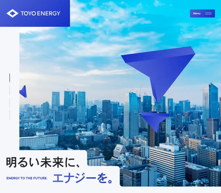
鮮やかなブルーと都市写真、折り紙のような立体図形が印象的な企業サイト。段差のある切り抜き、大きな欧文見出し、広い余白で事業・会社情報・採用情報を構成しています。
オリジナルサイトを見るTOYO ENERGY — Style Reference
A bright city panorama framed by cobalt geometry, stepped cutouts, and spacious corporate typography.
Website: www.toyo-e.co.jp Original URL: https://www.toyo-e.co.jp/ Final URL: https://www.toyo-e.co.jp/ Theme: a cool, light canvas with blue feature areas and a dark navy recruitment section; no theme selector was evidenced. Inspected: September 13, 2026, JST, using the supplied browser evidence. The recorded retrieval timestamp is September 12, 2026, at 17:00:29.701 UTC, equivalent to September 13 at 02:00:29.701 JST. Viewports: 1440 × 1000 and 390 × 844 CSS pixels. Scope: the current corporate homepage: opening visual, About us, Business, Company, News, Recruit, Contact, persistent navigation, and footer. Visual coverage includes the desktop opening, a Company-area scroll position, the Contact/footer area, and mobile opening/footer captures. Rendered DOM and computed-style evidence covers additional sections at both widths. Linked pages and open-menu states were not inspected.
TOYO ENERGY presents its energy trading business through a combination of metropolitan photography and abstract blue forms. The opening image supplies scale and optimism; the interface supplies order. Deep blue actions, dark navy text, small Japanese labels, and large Raleway section names sit on an almost-white background. Fine rules organize information without turning every content group into a card.
The most distinctive geometry is the stepped edge. Pale caption surfaces interrupt the opening photograph, and the blue section boundary changes level through softened corners. Folded, faceted shapes echo the angular brand mark. These motifs connect a dramatic opening to otherwise restrained company information, news, recruitment, and contact navigation.
How to Read This Reference
- Measured means a value appears in the supplied rendered DOM, computed styles, or embedded CSS excerpt. Measurements are CSS pixels unless stated otherwise.
- Calculated means a value is derived from supplied measurements, such as a content width or an alpha-composited color.
- Estimated means a visual approximation from the current-page captures. Estimated colors were not sampled with a pixel tool.
- Recommended means implementation guidance for an adaptation, including the Quick Start. It does not establish a feature of the original website.
- Token names are descriptive aliases unless explicitly identified as source custom properties.
- Element rectangles can differ from declared font sizes and line heights. The 62px-high desktop English-heading rectangles, for example, accompany an actual
88pxfont size and88pxline height. - Extracted text includes offscreen category panels, repeated carousel entries, and embedded CSS. Those repetitions are not additional visible homepage sections.
Tokens — Colors
Default Palette
| Name | Value | Suggested token | Evidence and role |
|---|---|---|---|
| Cool Canvas | #f6f7fa |
--color-canvas |
Measured body and footer background at both widths; also visually matches the pale margins and caption surfaces |
| Navy Ink | #2a2f4e |
--color-ink |
Measured Japanese text and English section headings; also the measured Recruit section background |
| Action Blue | #142fc6 |
--color-blue |
Measured link accents, active news filters, carousel controls, and news badges |
| Declared Brand Blue | #263eca |
--color-brand |
Source custom property --s-color-15b63426: #263ecaff; its precise assignment to every painted surface is not supplied |
| White | #ffffff |
--color-white |
Measured reversed text and inactive news filters; visible desktop navigation tray |
| Secondary Ink | rgba(42, 47, 78, 0.6) |
--color-muted |
Measured company descriptions and mobile footer sublinks |
| Date Ink | rgba(42, 47, 78, 0.5) |
--color-date |
Measured news dates |
| Blue Tint | rgba(20, 47, 198, 0.1) |
--color-blue-tint |
Measured background of the small NEWS badge |
| Gradient Highlight | approximately #4e5ddd |
--color-blue-light |
Estimated lighter blue for recreating the visible logo-panel, button, and Contact gradients |
| Quiet Rule | approximately rgba(42, 47, 78, 0.1) |
--color-rule |
Recommended approximation of the faint visible dividers; their computed border colors were not supplied |
Secondary Ink over Cool Canvas calculates to approximately #7c7f93; Date Ink calculates to #9093a4. These are flattened equivalents for that background, not additional source colors. Preserve alpha colors where the same text can appear over different surfaces.
Palette Behavior
Blue has several jobs: brand identity, navigation emphasis, broad feature backgrounds, geometric imagery, and selected categories. It is not confined to a single conversion button. Navy supports readable text and gives the recruitment area a separate visual register.
The captures show gradients running from a lighter periwinkle blue toward saturated blue. Exact gradient angles, stops, and per-element assignments are unavailable. A reusable approximation is linear-gradient(110deg, #4e5ddd, #142fc6), explicitly a recommendation.
Several visible blue components report a transparent background on their sampled outer element. Nested layers, background images, or pseudo-elements can supply the visible fill. Do not translate a transparent wrapper into a visually transparent button.
The cyan sky belongs to the imagery. It is not evidenced as a general UI accent. Likewise, the root loading-color variables do not establish the normal page palette.
Tokens — Typography
Raleway — English Headings and Utilities
- Measured family:
Raleway. - Source variable:
--s-font-e7a49695. - Measured weight:
600for section names, Menu, carousel labels, category filters, and badges. - Character: broad, clean letterforms with a lighter visual presence than the bold Japanese copy.
- Main heading treatment:
88px / 88pxon desktop and44px / 44pxon mobile, with-0.02emtracking.
Use this family for the large English section names and compact Latin utilities. The brand wordmark is separate artwork; its lettering should not be reconstructed by simply typing the company name in Raleway.
Noto Sans JP — Japanese Content
- Measured family:
Noto Sans JP. - Source variable:
--s-font-6892ffad. - Measured weights:
700for headings and primary navigation;500for descriptive copy, dates, and secondary links. - Tracking: frequently
0.05em, with normal tracking on selected controls and recruitment copy. - Body rhythm: a generous
2line-height ratio in the main descriptive paragraphs.
The sampled HTML and BODY elements inherit Times, and many layout wrappers report generic sans-serif. The visible text children explicitly use Raleway or Noto Sans JP. Those wrapper defaults should not guide the visual typography system.
Type Scale
All values in this table are measured.
| Role | Desktop size / line height | Mobile size / line height | Weight | Tracking |
|---|---|---|---|---|
| English section name | 88 / 88px |
44 / 44px |
Raleway 600 | -0.02em |
| Japanese section eyebrow | 14 / 14px |
13 / 13px |
Noto Sans JP 700 | 0.05em |
| About statement | 40 / 64px |
24 / 38.4px |
Noto Sans JP 700 | 0.05em |
| Recruitment statement | 44 / 66px |
24 / 36px |
Noto Sans JP 700 | Normal |
| Main descriptive paragraph | 18 / 36px |
14 / 28px |
Noto Sans JP 500 | Usually 0.05em; Recruit uses normal |
| Desktop navigation | 14 / 14px |
Hidden in supplied mobile state | Noto Sans JP 700 | Normal |
| Menu caption | 13 / 13px |
13 / 13px |
Raleway 600 | 0.03em |
| Business number | 13 / 13px |
10 / 10px |
Raleway 600 | Normal |
| Business title | 24 / 26.4px |
17 / 18.7px |
Noto Sans JP 700 | 0.05em |
| Prev / Next caption | 13 / 13px |
12 / 12px |
Raleway 600 | Normal |
| Company row title | 24 / 36px |
20 / 30px |
Noto Sans JP 700 | 0.05em |
| Company row description | 14 / 21px |
13 / 19.5px |
Noto Sans JP 500 | 0.05em |
| Company row action | 14 / 14px |
13 / 13px |
Noto Sans JP 700 | 0.05em |
| Main section action | 14 / 14px |
14 / 14px |
Noto Sans JP 700 | Normal |
| News filter | 15 / 15px |
13 / 13px |
Raleway 600 | Normal |
| News title | 18 / 27px |
15 / 22.5px |
Noto Sans JP 700 | 0.05em |
| News badge | 11 / 11px |
11 / 11px |
Raleway 600 | Normal |
| News date | 13 / 13px |
13 / 13px |
Noto Sans JP 500 | Normal |
| Footer primary link | 16 / 16px |
15 / 15px |
Noto Sans JP 700 | 0.05em |
| Footer identity/address | 14 / 24.5px |
13 / 22.75px |
Noto Sans JP 500 | 0.05em |
Slogan and Wordmark Limitations
The captures show the slogan 明るい未来に、 エナジーを。 with the small English line ENERGY TO THE FUTURE.. Its font properties were not captured, and the slogan does not appear as ordinary text in the supplied text extraction. Its implementation as text, vector artwork, or another asset remains unverified.
Visually estimated Japanese slogan sizes are approximately 56px in the desktop opening, 70–72px in the desktop footer, and 36px on mobile. Treat these as matching targets, not source declarations. Preserve the arrangement: a dark first phrase above a second row containing small English text at left and the blue Japanese phrase at right.
Tokens — Spacing & Shapes
The design combines small, precise control spacing with unusually generous section spacing. A practical adaptation can use an 8px-oriented scale, but the source also contains values such as 42px gutters, 115px Contact padding, and 150px section padding. There is no evidence of one universal spacing unit.
Spacing Scale
| Use | Desktop | Mobile | Status |
|---|---|---|---|
| Standard content side gutter | 42px |
24px |
Measured |
| Contact outer side gutter | 42px |
12px |
Measured |
| Opening image left gutter | Approximately 96px |
Approximately 24px |
Estimated from captures |
| Menu internal horizontal padding | 16px |
16px |
Measured |
| Menu label/icon gap | 24px |
24px |
Measured |
| Gaps between desktop navigation links | 48px |
Not applicable | Calculated from link rectangles |
| Company row vertical padding | 32px |
32px |
Measured |
| Company image/content gap | 32px |
24px |
Measured |
| News row padding | 48px 24px |
24px 0 |
Measured |
| News filter gap | 8px vertically |
4px horizontally |
Calculated |
| About top/bottom padding | 128px / 80px |
64px / 40px |
Measured |
| Business top/bottom padding | 150px / 170px |
110px / 128px |
Measured |
| Company top padding | 160px |
56px |
Measured |
| News top/bottom padding | 200px / 100px |
72px / 64px |
Measured |
| Contact section top padding | 160px |
54px |
Measured |
| Contact card padding | 80px 115px |
48px 24px |
Measured |
| Footer top/bottom padding | 120px / 80px |
64px / 40px |
Measured |
On mobile, the About statement, paragraph, and action are separated by measured 40px intervals. Desktop copy is more staggered: the statement occupies a broad right column, while the following paragraph is narrower and pushed farther right.
Border Radius
| Element | Value | Status |
|---|---|---|
| Menu button | 4px |
Measured at both widths |
| Opening logo panel | Bottom-right 4px desktop; 8px mobile; other corners square |
Measured |
| Company row wrapper | 0 |
Measured |
| Business link wrapper | 0 |
Measured |
| Main section-action wrapper | 0 |
Measured; inner painted geometry is not fully captured |
| Footer Contact button | 4px |
Measured on mobile; desktop appearance is consistent |
| Large Contact card | 8px desktop; 16px mobile |
Measured |
| News filters and badges | 128px |
Measured; produces pills at their actual heights |
| Stepped section/caption corners | Approximately 16–24px |
Estimated |
| Small arrow tile | Approximately 4px |
Estimated from captures |
Use rounded corners selectively. Broad sections retain straight edges; a few corners soften the transitions. Pills are concentrated in news categorization, not applied to all navigation or actions.
Layout Measurements
| Element | Desktop | Mobile | Evidence |
|---|---|---|---|
| Opening section | 1440 × 1000px |
390 × 844px |
Measured; equals the inspected viewport |
| Standard content width | 1356px |
342px |
Measured |
| Opening logo panel | 347 × 133px |
188 × 72.47px |
Measured |
| Logo artwork space inside opening panel | 267 × 43px |
Approximately 152 × 24.47px |
Calculated after padding |
| Menu button | 124 × 40px |
124 × 40px |
Measured |
| Menu button position | x: 1278, y: 48 |
x: 242, y: 20 |
Measured at opening |
| White desktop navigation tray | Approximately 743 × 56px, starting near x: 667, y: 40 |
Not shown | Estimated; distinct from the larger header wrapper |
| Main section action | 327 × 72px |
245 × 56px |
Measured |
| Business slide wrapper | 456 × 464px |
302 × 302px |
Measured; includes 16px right padding |
| Individual carousel control | 98 × 232px |
75 × 61px |
Measured |
| Company link row | 657.59 × 185px |
342 × 185px |
Measured |
| Company thumbnail | Approximately 120 × 120px |
Approximately 80 × 80px |
Desktop visual estimate; mobile width derived from content offset and gap |
| News filter | 214 × 40px |
Content-sized, 29px high |
Measured |
| News article row | 1012 × 124px |
342 × 109.5px, or 132px for the captured two-line title |
Measured |
| Contact card | 1356 × 439px |
366 × 386px |
Measured |
| Footer wordmark link | 400 × 64px |
244 × 39.03px |
Measured |
| Footer Contact button | Approximately 208 × 64px |
159.69 × 56px |
Desktop estimate; mobile measured |
Components
Opening Brand Panel
Role: establish identity without using a conventional full-width header background.
A blue gradient rectangle is attached to the upper-left viewport edge. The white symbol and wordmark sit inside an asymmetrically padded panel: desktop padding is 45px 48px 45px 32px; mobile padding is 24px 24px 24px 12px.
Only the bottom-right corner is rounded. The panel overlaps the image rather than reserving a separate horizontal header row. It is absent from the supplied lower-page scroll captures, while navigation remains visible at the upper right.
Use an authorized brand asset for both the white opening mark and the blue footer mark. Preserve the diamond-like symbol, internal negative space, and wordmark proportions.
Persistent Navigation and Menu Button
Role: provide access to the site's main corporate destinations throughout a long homepage.
At desktop width, five Japanese links sit in a white tray: 私たちについて, 事業内容, 採用情報, お知らせ, and お問い合わせ. A blue Menu button completes the right edge. The tray floats over the current section, leaving substantial open space between it and the logo panel.
The Menu button contains a 13px Raleway caption and a thin three-line icon approximately 32px wide. Its 124 × 40px size is unchanged on mobile. The mobile state removes the five-link tray and positions Menu 20px from the top and 24px from the right.
The upper-right controls remain in the same visible position in the supplied scrolled captures. This supports persistent positioning, although the exact position declaration was not supplied.
Each desktop navigation link contains two text copies: a navy label and a blue label 19px lower, within a 15px-high link rectangle. This suggests a clipped label-swap treatment. The hover trigger and actual animated result were not exercised. A new implementation should expose only one accessible name even if it duplicates a visual label.
Full-Viewport Opening Visual
Role: communicate the scale and future-facing character of the business before introducing its services.
The opening fills the inspected viewport. A metropolitan panorama occupies most of the frame, with a pale left gutter and an overlapping slogan at the lower left. The desktop photograph includes Tokyo Tower and surrounding buildings. The mobile crop emphasizes a tall column of cyan sky above a dense cityscape.
Current mobile imagery includes several blue folded forms at different apparent depths. One enters from the left over the buildings; another sits high against the sky. Their planes have distinct blue shading and sharp edges.
The desktop capture has a broad bright wash across the center and right, with another scene partially discernible at the far right. Its cause and sequence are unverified. It may represent a particular media or transition state; the supplied evidence does not establish a permanent white overlay, a loading failure, or a specific rendering technology.
Four thin vertical indicators appear in the desktop left gutter. Their visible tracks are approximately 48px high with 12px gaps. Their count does not independently prove the number of slides, and their click behavior is unknown. No equivalent indicator rail is visible in the supplied mobile opening.
Stepped Slogan Surface
Role: keep the brand statement readable while integrating it with the photograph.
The first Japanese phrase occupies a pale block with a rounded upper-right corner. Below it, a wider pale block carries the English line at left and the blue Japanese phrase at right. The image remains visible beyond each step.
In the desktop opening, the upper block is approximately 432px wide and the lower block approximately 594px wide. On mobile they are approximately 284px and 353px wide. These are visual estimates, not extracted CSS dimensions.
The small English line stays subordinate and breaks into two lines on mobile. Preserve the shaped surface and relative alignment; a centered headline laid directly over the photograph would change the composition.
For an adaptation, two overlapping content-sized surfaces provide a simple approximation. Use a responsive SVG mask or carefully constructed corner pieces when the concave joins need to match precisely. Essential wording should remain available as accessible text.
Bilingual Section Heading
Role: give each section a recognizable navigational landmark.
A small Japanese eyebrow sits above a much larger English title. A flattened blue diamond precedes the eyebrow on light sections; reversed treatments appear on colored backgrounds. In the Company capture, a fine horizontal rule spans the heading column above the label.
The large English names include About us, Business, Company, News, Recruit, and Contact. They share the measured 88px desktop and 44px mobile scale, 600 weight, and negative tracking.
Light-section headings generally align with the 42px desktop or 24px mobile gutter. Business is offset farther right on desktop to align with its slide track. Recruit centers its heading. Contact uses the card's inner inset. Reuse the typography while retaining these contextual alignments.
About Statement and Supporting Copy
Role: explain the company before presenting its business categories.
The desktop statement begins around x: 767px in a 630px column. Below it, the supporting paragraph begins around x: 975px and is approximately 423px wide. The action aligns to the right content edge. This stagger creates a deliberate progression from broad statement to narrower explanation.
On mobile, the statement and paragraph both occupy the full 342px content width at x: 24px. The statement decreases from 40px to 24px, and paragraph text from 18px to 14px. The action remains right aligned within this column.
The section footprint is much taller than the text alone. The supplied visual captures do not establish all imagery or reserved space in this section, so its measured height should not be reproduced as an unexplained blank spacer.
Business Carousel
Role: provide separate entrances to five business areas.
The rendered entries link to petroleum products, LPG, electricity, lubricating oil, and environmental products. Each link combines a small English number such as Business 01, an image-backed region evidenced by embedded background-image CSS, and a bold Japanese title.
On desktop, the track starts at x: 270px. Slides advance in measured 456px increments, including 16px right padding. Two large Prev/Next controls stack vertically at x: 42px, each 98px wide and 232px high, matching the total 464px slide height.
On mobile, the first slide begins at x: 24px, and the next begins at x: 326px, leaving a portion of the next slide within the viewport. Prev and Next move beneath the track and sit side by side in 75 × 61px boxes.
The source excerpt includes a clip-path fragment involving a 145 × 38px upper-left region. The complete clipping polygon was not supplied. Title rectangles occupy narrow regions toward the lower right, but their writing mode was not included in the sampled properties. Exact image subjects, masks, and text orientation require a complete section capture before precise reproduction.
Repeated item identifiers and different captured starting orders are consistent with a carousel implementation. They do not verify autoplay, swipe support, loop timing, or the result of pressing either control.
Company Navigation Rows
Role: link to company information and locations through compact editorial rows.
The Company section contains two linked rows: 会社概要 and 拠点情報. Each row includes a square thumbnail, a bold Japanese title, a muted explanatory line, and a blue 詳しく見る action with a small arrow tile.
Desktop rows are approximately 658px wide, leaving substantial space to their right. They use 32px vertical padding, 16px horizontal padding, and a 32px thumbnail gap. The first visible thumbnail shows four people outdoors with buildings behind them. Fine horizontal rules provide separation; the row itself has no rounded outer container.
On mobile, rows remain image-and-text compositions rather than stacking the thumbnail above the copy. The inferred thumbnail width becomes 80px, the gap becomes 24px, and text begins at x: 128px. The action moves below the description inside the text column. Row height remains 185px in both supplied states.
An embedded CSS excerpt defines a 556 / 741 aspect ratio for a right-side image container and begins a related :has(...) rule. The current desktop Company capture shows a blank right field. The complete image-change rule and its visible outcome are unverified; do not invent a photograph to fill that area or claim that hover swapping was observed.
News Filters and Article Rows
Role: distinguish announcements and recruitment-related content without leaving the homepage.
Three category links use the labels ALL, NEWS, and RECRUIT and target category fragments on the homepage. The captured ALL state is filled Action Blue with white text; other filters are white with navy text.
Desktop filters form a vertical 214px-wide column. The article list begins at x: 386px, leaving a calculated 130px gap between filters and list. Each article row places its bold title on the left and compact category/date metadata at the far right.
On mobile, the filters become content-sized horizontal pills with 4px gaps. The list moves below them. Article titles appear above a metadata row, separated by a measured 19px gap. The first long title occupies two lines; the embedded mobile CSS explicitly clamps applicable headings to two lines.
The NEWS badge is approximately 53 × 19px, using 11px Raleway, 4px vertical and 10px horizontal padding, and a pale blue fill. Dates remain 13px on both widths. These are quiet metadata elements, not separate calls to action.
Multiple category panels exist side by side in the extracted DOM, including offscreen copies. Treat them as alternate states, not three visible news lists. Category activation and panel transitions were not tested.
Section Actions and Arrow Tiles
Role: connect summary content to deeper pages.
About, Business, News, and Recruit use action wrappers measuring 327 × 72px on desktop and 245 × 56px on mobile. Their labels stay at 14px. The Business overview label is blue in the measured state; the other sampled overview labels are white.
The compact footer Contact action is visibly a blue gradient rectangle with white text and a lighter square containing a right arrow. It measures about 208 × 64px on desktop and a measured 159.69 × 56px on mobile. The arrow tile is approximately 32px square.
Keep the arrow as a distinct small visual unit. Do not assume the zero radius of a large action's outer wrapper defines every inner painted layer. The Quick Start provides a simplified filled-action adaptation based on the clearly visible footer treatment.
Recruitment Section
Role: give employment content a substantial, distinct place within the corporate homepage.
The measured section background is Navy Ink. The English heading, Japanese invitation, supporting paragraph, and action use white. Desktop content is centered in a roughly 440px column, with a three-line statement at 44px / 66px.
Mobile retains the centered heading and three-line invitation at 24px / 36px, while the paragraph expands to the 342px content width at 14px / 28px. The section remains tall: approximately 1188px on mobile, compared with 1145px on desktop.
An embedded mobile CSS excerpt assigns recruit-loop01 30s linear infinite to recruitment images. The complete keyframes and image subjects were not supplied, so direction, travel distance, and exact arrangement remain unknown. This is evidence of a declared image loop, not a verified description of its full motion.
Contact Feature Card
Role: provide a broad, unmistakable entrance to the contact page.
The entire card is a link to /contact. It combines a small Japanese eyebrow, large Contact heading, and short explanatory copy over a blue gradient. The current desktop capture shows a faint triangular line pattern and large folded blue forms across the right side.
Desktop dimensions are 1356 × 439px, with 80px vertical and 115px horizontal padding. Text starts at x: 157px. Mobile dimensions are 366 × 386px, with a 12px outer gutter and 48px × 24px padding; text starts at x: 36px.
The corner radius increases from 8px to 16px on mobile. Preserve this broader-than-body card width: its mobile outer gutter is half the normal 24px content gutter. The supplied mobile screenshot shows only the card's bottom, so its complete mobile decorative composition is not visually established.
Footer
Role: combine company identity, a usable sitemap, and a final brand statement.
The footer continues the cool canvas. Desktop places the blue wordmark and company address on the left, two navigation groups on the right, and the large slogan below the identity area. A thin vertical divider separates the broad identity region from navigation; its lower visible segment is blue. Privacy and copyright sit near the bottom right.
Primary navigation is bold; business subcategories, interview, and entry links are smaller and muted. A gradient Contact button sits in the right-hand group. The footer identifies トーヨーエナジー株式会社 and shows an Osaka address, independently supporting the page identity.
Mobile reorders the composition into identity, two adjacent sitemap columns, a horizontal divider, the slogan, and a final legal row. It does not collapse the sitemap into an accordion in the supplied state. The blue wordmark becomes 244px wide, while the Menu button remains visible at the upper right of the scrolled capture.
Tokens — Motion & Interaction
Recorded Motion Values
| Treatment | Supplied value | What the evidence establishes |
|---|---|---|
| Common element transitions | 0.3s cubic-bezier(0.4, 0.4, 0, 1) |
Declared across navigation, labels, rows, and many wrappers; individual state changes were not exercised |
| Body background transition | 0.5s cubic-bezier(0.4, 0.4, 0, 1) |
A declared background transition; trigger and visible outcome unknown |
| Business Prev / Next | 0.4s cubic-bezier(0.4, 0.4, 0, 1) |
Control transition declaration, not carousel travel duration |
| Business link transform | cubic-bezier(0.58, 0.21, 0.41, 0.96) |
Transform easing appears in the shorthand; no nonzero duration is shown |
| Contact card, desktop | 1.4s cubic-bezier(0.4, 0.4, 0, 1) |
Measured transition declaration |
| Contact card, mobile | 0.3s cubic-bezier(0.4, 0.4, 0, 1) |
Measured transition declaration |
| Recruitment images | recruit-loop01 30s linear infinite |
Declared in the supplied mobile CSS excerpt; full keyframes unavailable |
The common transition lists also name gradient angle, color, and stop-position properties. This establishes that those properties can transition; it does not identify each component's exact gradient or prove that all of them animate during normal viewing.
Interaction Evidence and Limits
- Observed across captures: persistent upper-right navigation, mobile navigation reduction, and changed layout at different widths.
- Present in DOM: Menu and carousel buttons; linked business, company, article, recruitment, and contact destinations; news category fragment links.
- Present in CSS excerpts: paired navigation labels, a body overflow lock when a modal exists, a recruitment image loop, and partial pagination/image-related rules.
- Unverified: open-menu appearance, keyboard focus management, hover results, carousel autoplay or drag behavior, news category switching, hero media sequencing, and reduced-motion support.
The many sampled animation: none values apply to those particular elements. They do not prove a static page: descendant images, pseudo-elements, and other media are outside parts of the sample.
For an adaptation, retain short controlled UI transitions and keep large decorative motion separate from content layout. Any newly chosen hero drift, image reveal, or menu transition must be documented as a design decision rather than a measured source behavior.
Surfaces
| Layer | Appearance | Purpose |
|---|---|---|
| Main canvas | Solid #f6f7fa |
A continuous quiet field for company information and news |
| Desktop navigation tray | White, lightly rounded, no prominent visible shadow | Legibility over changing page sections |
| Opening caption | Canvas-colored stepped blocks | Separates wording from the photograph while retaining an integrated shape |
| Blue feature areas | Saturated blue gradient with subtle geometric texture | Business/Contact emphasis and brand continuity |
| Recruitment field | Measured #2a2f4e with white type |
A distinct employment section |
| Information rows | Canvas/transparent wrappers with fine rules | Compact navigational and editorial structure |
| Category filters | White or solid blue pills | Explicit category state |
| News badges | 10% blue tint with blue lettering | Small metadata classification |
| Arrow tiles | Light blue or translucent white squares | A consistent directional cue |
No prominent card-shadow hierarchy is visible in the supplied captures. Separation comes from large color changes, gutters, rules, shaped edges, and image cropping. Faceted artwork creates depth within imagery rather than elevating the entire interface.
Imagery
Use three complementary image roles: expansive urban context, small human/company thumbnails, and abstract faceted brand forms. The opening city image is cool and luminous, with saturated cyan sky and blue-toned architecture. It provides a broad environmental setting rather than depicting an individual energy product.
The blue forms resemble folded arrows or origami fragments. Their identity comes from angular silhouettes, a few clearly shaded planes, and variation in scale. Avoid turning them into smooth blobs or glossy spheres. In the Contact area, large forms share a blue field with a very faint triangular grid.
Photography remains sharp and continuous-toned. There is no evidence for pixelation or halftone processing. The Company thumbnail uses a compact square crop, while the opening image is heavily reframed between desktop and mobile.
Observed Asset References
| Asset role | Available reference | Verified information / limitation |
|---|---|---|
| White opening logo | Desktop opening and mobile opening captures | Symbol, wordmark, reversed color, and panel proportions are visible; asset URL unavailable |
| Blue footer logo | Desktop and mobile footer captures | Positive-color version is visible; link dimensions are measured |
| City panorama | Desktop and mobile opening captures | Urban skyline and cyan sky are visible; full media URL and media type are unavailable |
| Folded blue forms | Current mobile opening and desktop Contact captures | Faceted appearance is visible; rendering method and motion are unverified |
| Company thumbnail | Desktop Company capture | Four people with an urban background; approximately square 120px display crop |
| Company and location image files | Mobile embedded background-image declarations | Truncated filenames include a 240x240 marker; complete URLs and decoded intrinsic dimensions are unavailable |
| Petroleum business image | Mobile embedded background-image declaration | Truncated filename includes a 638x850 marker; its subject was not shown in the supplied captures |
| Recruitment images | Embedded image-animation rule | An image loop is declared; subjects, count, and complete asset paths are unavailable |
No complete image URLs were supplied for these assets. Do not reconstruct a downloadable URL from a truncated filename. Obtain authorized image files separately when implementing the visual system.
Layout & Responsive Behavior
Page Structure and Footprint
The homepage is a long corporate index, with links to deeper information throughout. It is not organized around a single form or campaign conversion.
| Section | Desktop top / height | Mobile top / height |
|---|---|---|
| Opening | 0 / 1000px |
0 / 844px |
| About us | 1000 / 1945.84px |
844 / 1434.53px |
| Business | 2945.84 / 1189px |
2278.53 / 874px |
| Company | 4134.84 / 900px |
3152.53 / 572px |
| News | 5034.84 / 1198px |
3724.53 / 907.5px |
| Recruit | 6232.84 / 1145px |
4632.03 / 1187.77px |
| Contact section, including top spacing | 7377.84 / 599px |
5819.80 / 440px |
| Footer | 7976.84 / 696.56px |
6259.80 / 796.86px |
These are measured capture-state rectangles. Total document heights are approximately 8673.41px and 7056.66px. They are records of this content and state, not recommended fixed section heights. Descendants can extend beyond section rectangles, and large areas may reserve space for media or effects not fully represented in the captures.
Confirmed Responsive Changes
| Pattern | Desktop | Mobile |
|---|---|---|
| Navigation | Five-link white tray plus Menu | Menu alone |
| Opening identity | Large attached panel | Smaller attached panel; same visual hierarchy |
| English section scale | 88px |
44px |
| About content | Staggered right-side statement and paragraph | One full-width text column |
| Business controls | Tall vertical pair left of slides | Small horizontal pair below slides |
| Company row action | Toward row's right edge | Below description in text column |
| News categories | Vertical fixed-width column | Horizontal content-sized pills |
| News metadata | Right of title | Under title |
| Contact width | Standard content gutter | Wider than body, using 12px outer gutters |
| Footer | Broad identity left, sitemap right | Identity above two sitemap columns, slogan below |
The source excerpts contain a max-width: 1140px breakpoint for responsive line-break handling and a separate 1141–1366px adjustment for part of the About layout. They do not establish every component's breakpoint. The Quick Start uses 1140px as a recommended navigation cutoff and a separate recommended 767px mobile layout cutoff; only the supplied endpoint layouts are verified.
The mobile opening remains viewport-height rather than becoming a short banner. The footer also retains substantial brand space. Preserve those large framing moments while allowing text and content sections to grow naturally at zoomed or intermediate widths.
Do’s and Don’ts
Do
- Use Cool Canvas
#f6f7fa, Navy Ink#2a2f4e, and Action Blue#142fc6as the main structural colors. - Pair Raleway 600 English headings with Noto Sans JP 500/700 Japanese text.
- Preserve the 88px-to-44px English heading change at the inspected desktop/mobile endpoints.
- Keep the opening logo attached to the upper-left edge and navigation floating at the upper right.
- Preserve the stepped caption shape, including the small English line beside the second Japanese phrase.
- Use angular folded imagery and subtle triangular textures to connect major blue areas.
- Build company information and news as navigable rows with restrained metadata.
- Preserve a partial next business slide on mobile and place its controls below the track.
- Keep the mobile footer sitemap visible in two columns.
- Treat the wider mobile Contact card and its larger radius as intentional component-specific behavior.
- Keep source measurements, visual estimates, and new interaction decisions distinguishable in implementation notes.
Don’t
- Don't flatten the entire homepage into a generic centered hero and repeated card grid.
- Don't use pure white for every background; the cool canvas is a defining part of the design.
- Don't replace the brand's blue with cyan merely because the sky is cyan.
- Don't turn every button into a pill or apply large radii to the information rows.
- Don't eliminate the Japanese eyebrows when reusing the large English headings.
- Don't scale the whole desktop layout proportionally onto a phone; several components change arrangement.
- Don't treat repeated carousel and category text in the DOM as duplicate visible content.
- Don't hardcode the desktop hero's bright wash as a permanent overlay without further evidence.
- Don't infer a particular animation library, video format, or 3D renderer from the folded forms.
- Don't invent the missing Company right-side image or unobserved recruitment image subjects.
- Don't convert the recorded document and section heights into rigid layout constraints.
Recommended Implementation Additions
These are recommendations for a new implementation, not verified features of the original site:
- Give the logo link an accessible company/home name, and expose the slogan as meaningful text even when using artwork for its visual rendering.
- Connect Menu to an accessible navigation panel with an explicit expanded state, keyboard access, and predictable focus return. Its open design requires a separate specification.
- Use semantic headings for section names. The inspected large English labels are paragraph elements; their visual appearance can be retained with a clearer document outline.
- Keep interactive targets comfortably usable. The measured 40px Menu height and 29px mobile news pills can receive larger hit areas without enlarging the visible paint.
- Verify contrast for the small, low-opacity dates and footer sublinks. Increase their opacity if needed while preserving the hierarchy.
- Provide a static or paused alternative for persistent decorative motion, especially the declared recruitment image loop.
- Keep inactive category panels and carousel clones out of keyboard navigation and the accessibility tree when they are not intended to be available.
- Avoid making essential copy depend on a reveal animation completing. Reserve image dimensions and keep content usable if media cannot load.
- Test Japanese line breaks and the two-line news clamp at intermediate widths and increased text size. Preserve the full article title in its accessible link name.
Agent Prompt Guide
Quick Color Reference
- Main canvas:
#f6f7fa. - Main text and recruitment background:
#2a2f4e. - Actions, active filters, and link accents:
#142fc6. - Additional measured source brand token:
#263eca. - Reversed text and navigation tray:
#ffffff. - Secondary text: navy at 60% opacity; dates use 50% in the source.
- Approximate gradient for an adaptation:
110deg,#4e5dddto#142fc6; angle and highlight are not measured source values.
Overall Prompt
“Create a Japanese energy-company corporate homepage using a cool near-white canvas #f6f7fa, navy text #2a2f4e, and saturated blue #142fc6. Pair Raleway 600 English section names with Noto Sans JP Japanese content. Begin with a viewport-height city panorama, an attached blue logo panel at the upper left, and floating navigation at the upper right. Place the Japanese brand statement on two stepped pale surfaces at the lower left, with a small English line alongside the second phrase. Continue through an asymmetric About section, a blue business carousel, company navigation rows, categorized news, a navy recruitment section, a broad blue Contact card, and a substantial sitemap footer. Use folded geometric artwork, fine rules, small arrow tiles, and generous section spacing. On mobile, use 24px body gutters, 44px English headings, carousel controls below the slides, stacked news metadata, and a two-column footer sitemap. Specify new interactions separately from the evidenced visual design.”
Example Component Prompts
- Header and opening: “Place a 347 × 133px blue gradient logo panel at the upper-left edge of a desktop city-image opening. Put five 14px bold Japanese navigation links in a floating white tray at the upper right, ending with a 124 × 40px Menu control. On a 390px phone, reduce the brand panel to 188 × 72.47px and retain only Menu at top 20px/right 24px. Use authorized logo artwork.”
- Section heading: “Build a light-section heading with a fine top rule, a small flattened blue diamond, a 14px Japanese eyebrow, and an 88px Raleway 600 English name with -0.02em tracking. On mobile use a 13px eyebrow and 44px English name. Keep the heading aligned to the section's own gutter.”
- Company row: “Create a pale, rule-separated company link row with a 120px square thumbnail, a 24px bold Japanese title, muted 14px description, and a blue detail action with a 32px arrow tile. On mobile use an 80px thumbnail, 24px image gap, 20px title, and move the action beneath the description. Use one link for the complete row.”
- Business track: “Build a blue business-category track using 456 × 464px desktop slide wrappers with 16px right padding. Stack two 98 × 232px controls to the left. On mobile use 302 × 302px wrappers, show part of the next item, and place two 75 × 61px controls below. Obtain the full source image-mask and title-orientation reference before matching those details.”
- News: “Use a 214px vertical category column beside a broad article list on desktop. Selected category pills are blue with white Raleway text; inactive pills are white. Use 18px bold Japanese article titles and tiny pale-blue NEWS badges. On mobile place content-sized category pills above the list and move badge/date metadata below each 15px title.”
- Contact and footer: “Create a large blue gradient Contact link with a subtle triangular grid and folded blue forms away from the copy. Use an 88px English title, generous padding, and an 8px radius on desktop; use a 44px title, 12px outer gutters, and a 16px radius on mobile. Follow it with a pale footer containing the blue wordmark, company address, a visible two-column sitemap, and the stepped brand slogan.”
Quick Start
CSS Custom Properties
This is a reusable visual adaptation, not the original stylesheet. Exact measured colors, font roles, control sizes, and endpoint values are retained where practical. Gradient construction, rule opacity, slogan typography, intermediate breakpoints, and simplified surface geometry are recommendations or estimates as identified above.
Load authorized Raleway and Noto Sans JP font files separately. Supply logo and photographic assets through your project's markup. This CSS does not provide the unobserved menu panel, carousel logic, category switching, or media animation.
:root {
  /* Measured colors */
  --color-canvas: #f6f7fa;
  --color-ink: #2a2f4e;
  --color-blue: #142fc6;
  --color-brand: #263eca;
  --color-white: #fff;
  --color-muted: rgba(42, 47, 78, 0.6);
  --color-date: rgba(42, 47, 78, 0.5);
  --color-blue-tint: rgba(20, 47, 198, 0.1);

  /* Estimated or recommended surface approximations */
  --color-blue-light: #4e5ddd;
  --color-rule: rgba(42, 47, 78, 0.1);
  --brand-fill: linear-gradient(110deg, var(--color-blue-light), var(--color-blue));

  /* Measured families; generic fallbacks are additions */
  --font-jp: 'Noto Sans JP', sans-serif;
  --font-latin: 'Raleway', sans-serif;
  --text-section: 88px;
  --text-eyebrow: 14px;
  --text-body: 18px;
  --text-lead: 40px;
  --text-company: 24px;
  --text-news: 18px;
  --tracking-jp: 0.05em;
  --tracking-display: -0.02em;

  /* Reusable measured endpoint values */
  --gutter: 42px;
  --contact-gutter: 42px;
  --thumb-size: 120px;
  --row-gap: 32px;
  --action-width: 327px;
  --action-height: 72px;
  --radius-control: 4px;
  --radius-contact: 8px;
  --radius-pill: 128px;
  --space-8: 8px;
  --space-16: 16px;
  --space-24: 24px;
  --space-32: 32px;
  --space-40: 40px;
  --space-48: 48px;
  --space-64: 64px;
  --space-80: 80px;
  --space-128: 128px;
  --space-160: 160px;

  /* Measured easing and common transition duration */
  --ease-ui: cubic-bezier(0.4, 0.4, 0, 1);
  --duration-ui: 300ms;
}

* { box-sizing: border-box; }

.toyo-page {
  margin: 0;
  background: var(--color-canvas);
  color: var(--color-ink);
  font-family: var(--font-jp);
  font-weight: 500;
}

.toyo-page img { display: block; max-width: 100%; }
.toyo-page button { font: inherit; cursor: pointer; }
.toyo-page a { color: inherit; }

.content-shell {
  width: calc(100% - 2 * var(--gutter));
  margin-inline: auto;
}

/* Opening brand panel: use the white logo asset inside. */
.brand-panel {
  position: absolute;
  z-index: 20;
  inset: 0 auto auto 0;
  width: 347px;
  padding: 45px 48px 45px 32px;
  border-radius: 0 0 4px 0;
  background: var(--brand-fill);
}

.brand-panel img { width: 267px; height: auto; }

/* The tray geometry is a screenshot-based approximation. */
.nav-tray {
  position: fixed;
  z-index: 30;
  top: 40px;
  right: 30px;
  display: flex;
  align-items: center;
  gap: 40px;
  padding: 8px 8px 8px 40px;
  border-radius: 4px;
  background: var(--color-white);
}

.primary-nav { display: flex; align-items: center; gap: 48px; }
.primary-nav a {
  font: 700 14px/1 var(--font-jp);
  text-decoration: none;
  transition: color var(--duration-ui) var(--ease-ui);
}

.menu-toggle {
  display: flex;
  align-items: center;
  gap: 24px;
  width: 124px;
  height: 40px;
  padding: 13px 16px;
  border: 0;
  border-radius: var(--radius-control);
  background: var(--brand-fill);
  color: var(--color-white);
}

.menu-toggle__label {
  font: 600 13px/1 var(--font-latin);
  letter-spacing: 0.03em;
}

.menu-toggle__lines {
  flex: 0 0 32px;
  height: 12px;
  background:
    linear-gradient(currentColor, currentColor) top / 100% 1px no-repeat,
    linear-gradient(currentColor, currentColor) center / 100% 1px no-repeat,
    linear-gradient(currentColor, currentColor) bottom / 100% 1px no-repeat;
}

/* Static opening adaptation; no unverified media sequence. */
.hero {
  position: relative;
  isolation: isolate;
  display: flex;
  align-items: flex-end;
  min-height: 100svh;
  padding-block: 180px 32px;
}

.hero__media {
  position: absolute;
  z-index: -1;
  inset: 0 0 32px 96px;
  overflow: hidden;
}

.hero__media img {
  width: 100%;
  height: 100%;
  object-fit: cover;
  object-position: center;
}

/* Estimated slogan type and simplified stepped surfaces. */
.slogan { max-width: 100%; }
.slogan__first {
  display: table;
  max-width: 100%;
  margin: 0;
  padding: 16px 32px 0;
  border-radius: 0 20px 0 0;
  background: var(--color-canvas);
  font: 700 56px/1.35 var(--font-jp);
}

.slogan__second {
  display: flex;
  align-items: center;
  gap: 24px;
  width: fit-content;
  max-width: 100%;
  padding: 16px 32px 8px;
  border-radius: 0 20px 0 0;
  background: var(--color-canvas);
}

.slogan__english {
  flex-shrink: 0;
  color: var(--color-blue);
  font: 600 16px/1.2 var(--font-latin);
}

.slogan__accent {
  color: var(--color-blue);
  font: 700 56px/1.2 var(--font-jp);
}

/* Use semantic headings with these visual classes. */
.section-heading--ruled {
  padding-top: 48px;
  border-top: 1px solid currentColor;
}

.section-eyebrow {
  display: flex;
  align-items: center;
  gap: 12px;
  margin: 0 0 24px;
  font: 700 var(--text-eyebrow)/1 var(--font-jp);
  letter-spacing: var(--tracking-jp);
}

.section-eyebrow::before {
  content: '';
  flex: 0 0 24px;
  height: 10px;
  background: var(--color-blue);
  clip-path: polygon(0 50%, 50% 0, 100% 50%, 50% 100%);
}

.section-title {
  margin: 0;
  font: 600 var(--text-section)/1 var(--font-latin);
  letter-spacing: var(--tracking-display);
}

.section-heading--reversed { color: var(--color-white); }
.section-heading--reversed .section-eyebrow::before { background: currentColor; }

.lead-copy {
  font: 700 var(--text-lead)/1.6 var(--font-jp);
  letter-spacing: var(--tracking-jp);
}

.body-copy {
  font: 500 var(--text-body)/2 var(--font-jp);
  letter-spacing: var(--tracking-jp);
}

/* Simplified action based on the visible filled-button family. */
.toyo-page .action-link {
  display: flex;
  align-items: center;
  justify-content: space-between;
  gap: 24px;
  width: min(var(--action-width), 100%);
  min-height: var(--action-height);
  padding: 16px 24px;
  border-radius: var(--radius-control);
  background: var(--brand-fill);
  color: var(--color-white);
  font: 700 14px/1.4 var(--font-jp);
  text-decoration: none;
}

.arrow-box {
  display: grid;
  place-items: center;
  flex: 0 0 32px;
  width: 32px;
  height: 32px;
  border-radius: 4px;
  background: rgba(255, 255, 255, 0.16);
}

/* Native horizontal overflow is an adaptation, not verified source behavior. */
.business-track {
  display: flex;
  overflow-x: auto;
  padding-block: 8px;
  scroll-snap-type: x proximity;
}

.business-slide {
  flex: 0 0 456px;
  height: 464px;
  padding-right: 16px;
  scroll-snap-align: start;
}

.business-slide__media { width: 100%; height: 100%; object-fit: cover; }
.business-controls { display: flex; flex-direction: column; }
.business-controls button {
  width: 98px;
  height: 232px;
  border: 0;
  background: var(--color-blue);
  color: rgba(255, 255, 255, 0.75);
  font: 600 13px/1 var(--font-latin);
}

.company-links { width: 48.5%; }
.company-row {
  display: grid;
  grid-template-columns: var(--thumb-size) minmax(0, 1fr) auto;
  align-items: center;
  gap: var(--row-gap);
  min-height: 185px;
  padding: 32px 16px;
  border-top: 1px solid var(--color-rule);
  text-decoration: none;
}

.company-row__image {
  width: var(--thumb-size);
  aspect-ratio: 1;
  object-fit: cover;
  border-radius: 4px;
}

.company-row__title {
  margin: 0;
  font: 700 var(--text-company)/1.5 var(--font-jp);
  letter-spacing: var(--tracking-jp);
}

.company-row__description {
  margin: 11px 0 0;
  color: var(--color-muted);
  font: 500 14px/1.5 var(--font-jp);
  letter-spacing: var(--tracking-jp);
}

.company-row__more {
  display: flex;
  align-items: center;
  gap: 8px;
  color: var(--color-blue);
  font: 700 14px/1 var(--font-jp);
  letter-spacing: var(--tracking-jp);
}

.company-row__more .arrow-box { background: var(--color-blue-tint); }

.news-layout {
  display: grid;
  grid-template-columns: 214px minmax(0, 1fr);
  gap: 130px;
}

.news-filters { display: flex; flex-direction: column; gap: 8px; }
.news-filter {
  display: flex;
  align-items: center;
  min-height: 40px;
  padding: 0 20px;
  border-radius: var(--radius-pill);
  background: var(--color-white);
  font: 600 15px/1 var(--font-latin);
  text-decoration: none;
}

.toyo-page .news-filter[aria-current='true'] {
  background: var(--color-blue);
  color: var(--color-white);
}

.news-list { margin: 0; padding: 0; list-style: none; }
.news-row {
  display: flex;
  align-items: center;
  justify-content: space-between;
  gap: 160px;
  padding: 48px 24px;
  border-bottom: 1px solid var(--color-rule);
  text-decoration: none;
}

.news-row__title {
  min-width: 0;
  margin: 0;
  font: 700 var(--text-news)/1.5 var(--font-jp);
  letter-spacing: var(--tracking-jp);
}

.news-row__meta { display: flex; align-items: center; gap: 11px; white-space: nowrap; }
.news-badge {
  padding: 4px 10px;
  border-radius: var(--radius-pill);
  background: var(--color-blue-tint);
  color: var(--color-blue);
  font: 600 11px/1 var(--font-latin);
}
.news-date { color: var(--color-date); font: 500 13px/1 var(--font-jp); }

.recruit-section {
  padding: 200px var(--gutter);
  background: var(--color-ink);
  color: var(--color-white);
  text-align: center;
}
.recruit-section .section-eyebrow { justify-content: center; }
.recruit-section .lead-copy { max-width: 440px; margin: 50px auto; font-size: 44px; line-height: 1.5; letter-spacing: normal; }
.recruit-section .body-copy { max-width: 440px; margin-inline: auto; text-align: left; letter-spacing: normal; }
.recruit-section .action-link { margin: 56px auto 0; }

.contact-shell { margin: 160px var(--contact-gutter) 0; }
.toyo-page .contact-card {
  position: relative;
  display: block;
  min-height: 439px;
  padding: 80px 115px;
  overflow: hidden;
  border-radius: var(--radius-contact);
  background: var(--brand-fill);
  color: var(--color-white);
  text-decoration: none;
}
.contact-card .body-copy { max-width: 440px; margin-top: 64px; }

/* Footer grid is a responsive approximation of the captured arrangement. */
.site-footer {
  display: grid;
  grid-template-columns: minmax(0, 1.6fr) minmax(320px, 1fr);
  gap: 80px;
  padding-block: 120px 80px;
}
.footer-logo { width: 400px; max-width: 100%; }
.footer-address { margin-top: 17px; font: 500 14px/1.75 var(--font-jp); letter-spacing: 0.05em; }
.footer-nav {
  display: grid;
  grid-template-columns: 1fr 1fr;
  gap: 48px;
  padding-left: 64px;
  border-left: 1px solid var(--color-rule);
}
.footer-nav__group { display: flex; flex-direction: column; align-items: flex-start; gap: 32px; }
.footer-nav a { font: 700 16px/1.4 var(--font-jp); text-decoration: none; }
.footer-nav .footer-sublink { color: var(--color-muted); font-size: 14px; font-weight: 500; }
.footer-signature { max-width: 670px; }
.footer-legal { display: flex; flex-wrap: wrap; justify-content: space-between; align-self: end; gap: 16px; font-size: 13px; color: var(--color-muted); }

/* Recommended hover and keyboard treatments. */
@media (hover: hover) {
  .primary-nav a:hover,
  .company-row:hover .company-row__title,
  .news-row:hover .news-row__title { color: var(--color-blue); }
}

.toyo-page :focus-visible {
  outline: 3px solid var(--color-blue);
  outline-offset: 4px;
  box-shadow: 0 0 0 4px var(--color-white);
}

/* Recommended navigation cutoff; exact component breakpoint is unverified. */
@media (max-width: 1140px) {
  .primary-nav { display: none; }
  .nav-tray { top: 20px; right: 24px; padding: 0; background: transparent; }
  .news-layout { gap: 48px; }
  .news-row { gap: 40px; }
  .company-links { width: 100%; }
}

/* Recommended mobile breakpoint using the measured 390px endpoint. */
@media (max-width: 767px) {
  :root {
    --text-section: 44px;
    --text-eyebrow: 13px;
    --text-body: 14px;
    --text-lead: 24px;
    --text-company: 20px;
    --text-news: 15px;
    --gutter: 24px;
    --contact-gutter: 12px;
    --thumb-size: 80px;
    --row-gap: 24px;
    --action-width: 245px;
    --action-height: 56px;
    --radius-contact: 16px;
  }

  .brand-panel { width: 188px; padding: 24px 24px 24px 12px; border-bottom-right-radius: 8px; }
  .brand-panel img { width: 152px; }
  .hero { padding-bottom: 0; }
  .hero__media { inset: 0 0 0 24px; }
  .slogan__first { padding: 16px 20px 0; font-size: clamp(28px, 9.23vw, 36px); }
  .slogan__second { gap: 24px; padding: 12px 24px 6px; }
  .slogan__english { width: 90px; font-size: 13px; }
  .slogan__accent { font-size: clamp(28px, 9.23vw, 36px); }
  .section-heading--ruled { padding-top: 32px; }
  .section-eyebrow { margin-bottom: 20px; }
  .section-eyebrow::before { flex-basis: 18px; height: 8px; }

  .business-slide { flex-basis: 302px; height: 302px; }
  .business-controls { flex-direction: row; margin-top: 24px; }
  .business-controls button { width: 75px; height: 61px; font-size: 12px; }

  .company-row { grid-template-columns: 80px minmax(0, 1fr); gap: 0 24px; padding: 32px 0; }
  .company-row__image { grid-column: 1; grid-row: 1 / 3; }
  .company-row__description { margin-top: 7px; font-size: 13px; }
  .company-row__more { grid-column: 2; margin-top: 24px; font-size: 13px; }

  .news-layout { grid-template-columns: minmax(0, 1fr); gap: 32px; }
  .news-filters { flex-direction: row; flex-wrap: wrap; gap: 4px; }
  .news-filter { min-height: 29px; padding: 8px 12px; font-size: 13px; }
  .news-row { flex-direction: column; align-items: flex-start; gap: 19px; padding: 24px 0; }
  .news-row__title { display: -webkit-box; overflow: hidden; -webkit-box-orient: vertical; -webkit-line-clamp: 2; }

  .recruit-section { padding-block: 112px 128px; }
  .recruit-section .lead-copy { margin-block: 40px; font-size: 24px; }
  .recruit-section .action-link { margin-top: 40px; }

  .contact-shell { margin-top: 54px; }
  .toyo-page .contact-card { min-height: 386px; padding: 48px 24px; }
  .contact-card .body-copy { margin-top: 40px; }

  .site-footer { grid-template-columns: minmax(0, 1fr); gap: 56px; padding-block: 64px 40px; }
  .footer-logo { width: 244px; }
  .footer-address { font-size: 13px; }
  .footer-nav { grid-template-columns: 104px minmax(0, 1fr); gap: 9px; padding: 0; border: 0; }
  .footer-nav__group { gap: 24px; }
  .footer-nav a { font-size: 15px; }
  .footer-nav .footer-sublink { font-size: 13px; }
  .footer-signature { padding-top: 56px; border-top: 1px solid var(--color-rule); }
  .footer-signature .slogan__first { padding-inline: 0; }
  .footer-signature .slogan__second { padding-inline: 0; }
}

/* Recommended protection for motion added by the implementing project. */
@media (prefers-reduced-motion: reduce) {
  .toyo-page *, .toyo-page *::before, .toyo-page *::after {
    animation: none !important;
    transition: none !important;
    scroll-behavior: auto !important;
  }
}
Use .company-row as a single anchor containing its image, an information wrapper, and a noninteractive .company-row__more span. Use each .news-row as an article link, with title and metadata siblings. The .arrow-box can contain an accessible-hidden inline arrow SVG. Do not nest additional links or buttons inside these row links.
The starter intentionally leaves the source's incomplete image masks and media effects unspecified. Its two slogan surfaces approximate the stepped geometry; authorized artwork or a dedicated mask is needed for exact corner joins. The CSS has not been executed or visually tested as part of this evidence-only analysis.
Tailwind v4 Token Mapping
Optional aliases for a project already using Tailwind v4. This does not claim that the original website uses Tailwind. Define the custom properties above first.
@theme inline {
  --color-canvas: #f6f7fa;
  --color-ink: #2a2f4e;
  --color-action: #142fc6;
  --color-brand: #263eca;
  --color-muted: rgba(42, 47, 78, 0.6);
  --color-blue-tint: rgba(20, 47, 198, 0.1);

  --font-japanese: var(--font-jp);
  --font-display: var(--font-latin);

  --text-section-heading: var(--text-section);
  --text-section-label: var(--text-eyebrow);
  --text-description: var(--text-body);
  --text-statement: var(--text-lead);
  --text-company-title: var(--text-company);
  --text-news-title: var(--text-news);

  --spacing-page-gutter: var(--gutter);
  --spacing-contact-gutter: var(--contact-gutter);
  --spacing-company-thumb: var(--thumb-size);
  --spacing-action-height: var(--action-height);

  --radius-control: 4px;
  --radius-contact-panel: var(--radius-contact);
  --radius-category: 128px;
  --ease-brand: cubic-bezier(0.4, 0.4, 0, 1);
}
Sources & Evidence
- TOYO ENERGY homepage: supplied current-page browser evidence records HTTP 200, with identical original and final URLs. The page title, footer identity, navigation destinations, and business content support the corporate-homepage scope.
- Capture date: recorded retrieval
2026-09-12T17:00:29.701Z, equivalent to September 13, 2026, at 02:00:29.701 JST. Individual screenshot timestamps were not supplied. - Desktop evidence: 1440 × 1000 CSS-pixel viewport; opening, Company-area, and Contact/footer captures; rendered text, links, element rectangles, computed typography/colors, and selected embedded CSS. Document height approximately 8673.41px.
- Mobile evidence: 390 × 844 CSS-pixel viewport; opening and footer captures; rendered text, links, element rectangles, computed typography/colors, and selected embedded CSS. Document height approximately 7056.66px.
- Collection method: the supplied browser process observed the initial page for at least five seconds and checked document load, finite animation readiness, sampled geometry/text stability, and visible image decoding within stated time limits. It traversed intermediate scroll positions; perpetual animations were temporarily paused for readiness checks and resumed. SharedWorkers and service workers were disabled.
- Interaction coverage: scrolling and viewport-dependent states are represented. No supplied action trace establishes Menu opening, carousel control activation, category changes, or hover outcomes. CSS declarations are reported separately from tested interaction results.
- Limitations: only selected visual positions and sampled style properties were supplied. Complete asset URLs, full keyframes, all pseudo-element styles, and several media regions are unavailable. Readiness checks do not prove semantic completeness or exclude later content changes. No additional browsing, commands, or file inspection were performed for this reference.
This document describes the current homepage represented by the supplied original-site evidence. Its measured values are reference points; estimated geometry and recommended implementation additions are explicitly separated from verified source details.
# TOYO ENERGY — Style Reference

> A bright city panorama framed by cobalt geometry, stepped cutouts, and spacious corporate typography.

**Website:** [www.toyo-e.co.jp](https://www.toyo-e.co.jp/)
**Original URL:** https://www.toyo-e.co.jp/
**Final URL:** https://www.toyo-e.co.jp/
**Theme:** a cool, light canvas with blue feature areas and a dark navy recruitment section; no theme selector was evidenced.
**Inspected:** September 13, 2026, JST, using the supplied browser evidence. The recorded retrieval timestamp is September 12, 2026, at 17:00:29.701 UTC, equivalent to September 13 at 02:00:29.701 JST.
**Viewports:** 1440 × 1000 and 390 × 844 CSS pixels.
**Scope:** the current corporate homepage: opening visual, About us, Business, Company, News, Recruit, Contact, persistent navigation, and footer. Visual coverage includes the desktop opening, a Company-area scroll position, the Contact/footer area, and mobile opening/footer captures. Rendered DOM and computed-style evidence covers additional sections at both widths. Linked pages and open-menu states were not inspected.

TOYO ENERGY presents its energy trading business through a combination of metropolitan photography and abstract blue forms. The opening image supplies scale and optimism; the interface supplies order. Deep blue actions, dark navy text, small Japanese labels, and large Raleway section names sit on an almost-white background. Fine rules organize information without turning every content group into a card.

The most distinctive geometry is the stepped edge. Pale caption surfaces interrupt the opening photograph, and the blue section boundary changes level through softened corners. Folded, faceted shapes echo the angular brand mark. These motifs connect a dramatic opening to otherwise restrained company information, news, recruitment, and contact navigation.

## How to Read This Reference

- **Measured** means a value appears in the supplied rendered DOM, computed styles, or embedded CSS excerpt. Measurements are CSS pixels unless stated otherwise.
- **Calculated** means a value is derived from supplied measurements, such as a content width or an alpha-composited color.
- **Estimated** means a visual approximation from the current-page captures. Estimated colors were not sampled with a pixel tool.
- **Recommended** means implementation guidance for an adaptation, including the Quick Start. It does not establish a feature of the original website.
- Token names are descriptive aliases unless explicitly identified as source custom properties.
- Element rectangles can differ from declared font sizes and line heights. The 62px-high desktop English-heading rectangles, for example, accompany an actual `88px` font size and `88px` line height.
- Extracted text includes offscreen category panels, repeated carousel entries, and embedded CSS. Those repetitions are not additional visible homepage sections.

## Tokens — Colors

### Default Palette

| Name | Value | Suggested token | Evidence and role |
| --- | --- | --- | --- |
| Cool Canvas | `#f6f7fa` | `--color-canvas` | Measured body and footer background at both widths; also visually matches the pale margins and caption surfaces |
| Navy Ink | `#2a2f4e` | `--color-ink` | Measured Japanese text and English section headings; also the measured Recruit section background |
| Action Blue | `#142fc6` | `--color-blue` | Measured link accents, active news filters, carousel controls, and news badges |
| Declared Brand Blue | `#263eca` | `--color-brand` | Source custom property `--s-color-15b63426: #263ecaff`; its precise assignment to every painted surface is not supplied |
| White | `#ffffff` | `--color-white` | Measured reversed text and inactive news filters; visible desktop navigation tray |
| Secondary Ink | `rgba(42, 47, 78, 0.6)` | `--color-muted` | Measured company descriptions and mobile footer sublinks |
| Date Ink | `rgba(42, 47, 78, 0.5)` | `--color-date` | Measured news dates |
| Blue Tint | `rgba(20, 47, 198, 0.1)` | `--color-blue-tint` | Measured background of the small `NEWS` badge |
| Gradient Highlight | approximately `#4e5ddd` | `--color-blue-light` | Estimated lighter blue for recreating the visible logo-panel, button, and Contact gradients |
| Quiet Rule | approximately `rgba(42, 47, 78, 0.1)` | `--color-rule` | Recommended approximation of the faint visible dividers; their computed border colors were not supplied |

Secondary Ink over Cool Canvas calculates to approximately `#7c7f93`; Date Ink calculates to `#9093a4`. These are flattened equivalents for that background, not additional source colors. Preserve alpha colors where the same text can appear over different surfaces.

### Palette Behavior

Blue has several jobs: brand identity, navigation emphasis, broad feature backgrounds, geometric imagery, and selected categories. It is not confined to a single conversion button. Navy supports readable text and gives the recruitment area a separate visual register.

The captures show gradients running from a lighter periwinkle blue toward saturated blue. Exact gradient angles, stops, and per-element assignments are unavailable. A reusable approximation is `linear-gradient(110deg, #4e5ddd, #142fc6)`, explicitly a recommendation.

Several visible blue components report a transparent `background` on their sampled outer element. Nested layers, background images, or pseudo-elements can supply the visible fill. Do not translate a transparent wrapper into a visually transparent button.

The cyan sky belongs to the imagery. It is not evidenced as a general UI accent. Likewise, the root loading-color variables do not establish the normal page palette.

## Tokens — Typography

### Raleway — English Headings and Utilities

- **Measured family:** `Raleway`.
- **Source variable:** `--s-font-e7a49695`.
- **Measured weight:** `600` for section names, Menu, carousel labels, category filters, and badges.
- **Character:** broad, clean letterforms with a lighter visual presence than the bold Japanese copy.
- **Main heading treatment:** `88px / 88px` on desktop and `44px / 44px` on mobile, with `-0.02em` tracking.

Use this family for the large English section names and compact Latin utilities. The brand wordmark is separate artwork; its lettering should not be reconstructed by simply typing the company name in Raleway.

### Noto Sans JP — Japanese Content

- **Measured family:** `Noto Sans JP`.
- **Source variable:** `--s-font-6892ffad`.
- **Measured weights:** `700` for headings and primary navigation; `500` for descriptive copy, dates, and secondary links.
- **Tracking:** frequently `0.05em`, with normal tracking on selected controls and recruitment copy.
- **Body rhythm:** a generous `2` line-height ratio in the main descriptive paragraphs.

The sampled `HTML` and `BODY` elements inherit Times, and many layout wrappers report generic sans-serif. The visible text children explicitly use Raleway or Noto Sans JP. Those wrapper defaults should not guide the visual typography system.

### Type Scale

All values in this table are measured.

| Role | Desktop size / line height | Mobile size / line height | Weight | Tracking |
| --- | --- | --- | --- | --- |
| English section name | `88 / 88px` | `44 / 44px` | Raleway 600 | `-0.02em` |
| Japanese section eyebrow | `14 / 14px` | `13 / 13px` | Noto Sans JP 700 | `0.05em` |
| About statement | `40 / 64px` | `24 / 38.4px` | Noto Sans JP 700 | `0.05em` |
| Recruitment statement | `44 / 66px` | `24 / 36px` | Noto Sans JP 700 | Normal |
| Main descriptive paragraph | `18 / 36px` | `14 / 28px` | Noto Sans JP 500 | Usually `0.05em`; Recruit uses normal |
| Desktop navigation | `14 / 14px` | Hidden in supplied mobile state | Noto Sans JP 700 | Normal |
| Menu caption | `13 / 13px` | `13 / 13px` | Raleway 600 | `0.03em` |
| Business number | `13 / 13px` | `10 / 10px` | Raleway 600 | Normal |
| Business title | `24 / 26.4px` | `17 / 18.7px` | Noto Sans JP 700 | `0.05em` |
| Prev / Next caption | `13 / 13px` | `12 / 12px` | Raleway 600 | Normal |
| Company row title | `24 / 36px` | `20 / 30px` | Noto Sans JP 700 | `0.05em` |
| Company row description | `14 / 21px` | `13 / 19.5px` | Noto Sans JP 500 | `0.05em` |
| Company row action | `14 / 14px` | `13 / 13px` | Noto Sans JP 700 | `0.05em` |
| Main section action | `14 / 14px` | `14 / 14px` | Noto Sans JP 700 | Normal |
| News filter | `15 / 15px` | `13 / 13px` | Raleway 600 | Normal |
| News title | `18 / 27px` | `15 / 22.5px` | Noto Sans JP 700 | `0.05em` |
| News badge | `11 / 11px` | `11 / 11px` | Raleway 600 | Normal |
| News date | `13 / 13px` | `13 / 13px` | Noto Sans JP 500 | Normal |
| Footer primary link | `16 / 16px` | `15 / 15px` | Noto Sans JP 700 | `0.05em` |
| Footer identity/address | `14 / 24.5px` | `13 / 22.75px` | Noto Sans JP 500 | `0.05em` |

### Slogan and Wordmark Limitations

The captures show the slogan `明るい未来に、 エナジーを。` with the small English line `ENERGY TO THE FUTURE.`. Its font properties were not captured, and the slogan does not appear as ordinary text in the supplied text extraction. Its implementation as text, vector artwork, or another asset remains unverified.

Visually estimated Japanese slogan sizes are approximately `56px` in the desktop opening, `70–72px` in the desktop footer, and `36px` on mobile. Treat these as matching targets, not source declarations. Preserve the arrangement: a dark first phrase above a second row containing small English text at left and the blue Japanese phrase at right.

## Tokens — Spacing & Shapes

The design combines small, precise control spacing with unusually generous section spacing. A practical adaptation can use an 8px-oriented scale, but the source also contains values such as 42px gutters, 115px Contact padding, and 150px section padding. There is no evidence of one universal spacing unit.

### Spacing Scale

| Use | Desktop | Mobile | Status |
| --- | --- | --- | --- |
| Standard content side gutter | `42px` | `24px` | Measured |
| Contact outer side gutter | `42px` | `12px` | Measured |
| Opening image left gutter | Approximately `96px` | Approximately `24px` | Estimated from captures |
| Menu internal horizontal padding | `16px` | `16px` | Measured |
| Menu label/icon gap | `24px` | `24px` | Measured |
| Gaps between desktop navigation links | `48px` | Not applicable | Calculated from link rectangles |
| Company row vertical padding | `32px` | `32px` | Measured |
| Company image/content gap | `32px` | `24px` | Measured |
| News row padding | `48px 24px` | `24px 0` | Measured |
| News filter gap | `8px` vertically | `4px` horizontally | Calculated |
| About top/bottom padding | `128px / 80px` | `64px / 40px` | Measured |
| Business top/bottom padding | `150px / 170px` | `110px / 128px` | Measured |
| Company top padding | `160px` | `56px` | Measured |
| News top/bottom padding | `200px / 100px` | `72px / 64px` | Measured |
| Contact section top padding | `160px` | `54px` | Measured |
| Contact card padding | `80px 115px` | `48px 24px` | Measured |
| Footer top/bottom padding | `120px / 80px` | `64px / 40px` | Measured |

On mobile, the About statement, paragraph, and action are separated by measured 40px intervals. Desktop copy is more staggered: the statement occupies a broad right column, while the following paragraph is narrower and pushed farther right.

### Border Radius

| Element | Value | Status |
| --- | --- | --- |
| Menu button | `4px` | Measured at both widths |
| Opening logo panel | Bottom-right `4px` desktop; `8px` mobile; other corners square | Measured |
| Company row wrapper | `0` | Measured |
| Business link wrapper | `0` | Measured |
| Main section-action wrapper | `0` | Measured; inner painted geometry is not fully captured |
| Footer Contact button | `4px` | Measured on mobile; desktop appearance is consistent |
| Large Contact card | `8px` desktop; `16px` mobile | Measured |
| News filters and badges | `128px` | Measured; produces pills at their actual heights |
| Stepped section/caption corners | Approximately `16–24px` | Estimated |
| Small arrow tile | Approximately `4px` | Estimated from captures |

Use rounded corners selectively. Broad sections retain straight edges; a few corners soften the transitions. Pills are concentrated in news categorization, not applied to all navigation or actions.

### Layout Measurements

| Element | Desktop | Mobile | Evidence |
| --- | --- | --- | --- |
| Opening section | `1440 × 1000px` | `390 × 844px` | Measured; equals the inspected viewport |
| Standard content width | `1356px` | `342px` | Measured |
| Opening logo panel | `347 × 133px` | `188 × 72.47px` | Measured |
| Logo artwork space inside opening panel | `267 × 43px` | Approximately `152 × 24.47px` | Calculated after padding |
| Menu button | `124 × 40px` | `124 × 40px` | Measured |
| Menu button position | `x: 1278, y: 48` | `x: 242, y: 20` | Measured at opening |
| White desktop navigation tray | Approximately `743 × 56px`, starting near `x: 667, y: 40` | Not shown | Estimated; distinct from the larger header wrapper |
| Main section action | `327 × 72px` | `245 × 56px` | Measured |
| Business slide wrapper | `456 × 464px` | `302 × 302px` | Measured; includes `16px` right padding |
| Individual carousel control | `98 × 232px` | `75 × 61px` | Measured |
| Company link row | `657.59 × 185px` | `342 × 185px` | Measured |
| Company thumbnail | Approximately `120 × 120px` | Approximately `80 × 80px` | Desktop visual estimate; mobile width derived from content offset and gap |
| News filter | `214 × 40px` | Content-sized, `29px` high | Measured |
| News article row | `1012 × 124px` | `342 × 109.5px`, or `132px` for the captured two-line title | Measured |
| Contact card | `1356 × 439px` | `366 × 386px` | Measured |
| Footer wordmark link | `400 × 64px` | `244 × 39.03px` | Measured |
| Footer Contact button | Approximately `208 × 64px` | `159.69 × 56px` | Desktop estimate; mobile measured |

## Components

### Opening Brand Panel

**Role:** establish identity without using a conventional full-width header background.

A blue gradient rectangle is attached to the upper-left viewport edge. The white symbol and wordmark sit inside an asymmetrically padded panel: desktop padding is `45px 48px 45px 32px`; mobile padding is `24px 24px 24px 12px`.

Only the bottom-right corner is rounded. The panel overlaps the image rather than reserving a separate horizontal header row. It is absent from the supplied lower-page scroll captures, while navigation remains visible at the upper right.

Use an authorized brand asset for both the white opening mark and the blue footer mark. Preserve the diamond-like symbol, internal negative space, and wordmark proportions.

### Persistent Navigation and Menu Button

**Role:** provide access to the site's main corporate destinations throughout a long homepage.

At desktop width, five Japanese links sit in a white tray: `私たちについて`, `事業内容`, `採用情報`, `お知らせ`, and `お問い合わせ`. A blue Menu button completes the right edge. The tray floats over the current section, leaving substantial open space between it and the logo panel.

The Menu button contains a `13px` Raleway caption and a thin three-line icon approximately `32px` wide. Its `124 × 40px` size is unchanged on mobile. The mobile state removes the five-link tray and positions Menu 20px from the top and 24px from the right.

The upper-right controls remain in the same visible position in the supplied scrolled captures. This supports persistent positioning, although the exact `position` declaration was not supplied.

Each desktop navigation link contains two text copies: a navy label and a blue label 19px lower, within a 15px-high link rectangle. This suggests a clipped label-swap treatment. The hover trigger and actual animated result were not exercised. A new implementation should expose only one accessible name even if it duplicates a visual label.

### Full-Viewport Opening Visual

**Role:** communicate the scale and future-facing character of the business before introducing its services.

The opening fills the inspected viewport. A metropolitan panorama occupies most of the frame, with a pale left gutter and an overlapping slogan at the lower left. The desktop photograph includes Tokyo Tower and surrounding buildings. The mobile crop emphasizes a tall column of cyan sky above a dense cityscape.

Current mobile imagery includes several blue folded forms at different apparent depths. One enters from the left over the buildings; another sits high against the sky. Their planes have distinct blue shading and sharp edges.

The desktop capture has a broad bright wash across the center and right, with another scene partially discernible at the far right. Its cause and sequence are unverified. It may represent a particular media or transition state; the supplied evidence does not establish a permanent white overlay, a loading failure, or a specific rendering technology.

Four thin vertical indicators appear in the desktop left gutter. Their visible tracks are approximately 48px high with 12px gaps. Their count does not independently prove the number of slides, and their click behavior is unknown. No equivalent indicator rail is visible in the supplied mobile opening.

### Stepped Slogan Surface

**Role:** keep the brand statement readable while integrating it with the photograph.

The first Japanese phrase occupies a pale block with a rounded upper-right corner. Below it, a wider pale block carries the English line at left and the blue Japanese phrase at right. The image remains visible beyond each step.

In the desktop opening, the upper block is approximately 432px wide and the lower block approximately 594px wide. On mobile they are approximately 284px and 353px wide. These are visual estimates, not extracted CSS dimensions.

The small English line stays subordinate and breaks into two lines on mobile. Preserve the shaped surface and relative alignment; a centered headline laid directly over the photograph would change the composition.

For an adaptation, two overlapping content-sized surfaces provide a simple approximation. Use a responsive SVG mask or carefully constructed corner pieces when the concave joins need to match precisely. Essential wording should remain available as accessible text.

### Bilingual Section Heading

**Role:** give each section a recognizable navigational landmark.

A small Japanese eyebrow sits above a much larger English title. A flattened blue diamond precedes the eyebrow on light sections; reversed treatments appear on colored backgrounds. In the Company capture, a fine horizontal rule spans the heading column above the label.

The large English names include About us, Business, Company, News, Recruit, and Contact. They share the measured `88px` desktop and `44px` mobile scale, `600` weight, and negative tracking.

Light-section headings generally align with the 42px desktop or 24px mobile gutter. Business is offset farther right on desktop to align with its slide track. Recruit centers its heading. Contact uses the card's inner inset. Reuse the typography while retaining these contextual alignments.

### About Statement and Supporting Copy

**Role:** explain the company before presenting its business categories.

The desktop statement begins around `x: 767px` in a `630px` column. Below it, the supporting paragraph begins around `x: 975px` and is approximately `423px` wide. The action aligns to the right content edge. This stagger creates a deliberate progression from broad statement to narrower explanation.

On mobile, the statement and paragraph both occupy the full 342px content width at `x: 24px`. The statement decreases from `40px` to `24px`, and paragraph text from `18px` to `14px`. The action remains right aligned within this column.

The section footprint is much taller than the text alone. The supplied visual captures do not establish all imagery or reserved space in this section, so its measured height should not be reproduced as an unexplained blank spacer.

### Business Carousel

**Role:** provide separate entrances to five business areas.

The rendered entries link to petroleum products, LPG, electricity, lubricating oil, and environmental products. Each link combines a small English number such as `Business 01`, an image-backed region evidenced by embedded background-image CSS, and a bold Japanese title.

On desktop, the track starts at `x: 270px`. Slides advance in measured 456px increments, including 16px right padding. Two large Prev/Next controls stack vertically at `x: 42px`, each 98px wide and 232px high, matching the total 464px slide height.

On mobile, the first slide begins at `x: 24px`, and the next begins at `x: 326px`, leaving a portion of the next slide within the viewport. Prev and Next move beneath the track and sit side by side in 75 × 61px boxes.

The source excerpt includes a clip-path fragment involving a 145 × 38px upper-left region. The complete clipping polygon was not supplied. Title rectangles occupy narrow regions toward the lower right, but their writing mode was not included in the sampled properties. Exact image subjects, masks, and text orientation require a complete section capture before precise reproduction.

Repeated item identifiers and different captured starting orders are consistent with a carousel implementation. They do not verify autoplay, swipe support, loop timing, or the result of pressing either control.

### Company Navigation Rows

**Role:** link to company information and locations through compact editorial rows.

The Company section contains two linked rows: `会社概要` and `拠点情報`. Each row includes a square thumbnail, a bold Japanese title, a muted explanatory line, and a blue `詳しく見る` action with a small arrow tile.

Desktop rows are approximately 658px wide, leaving substantial space to their right. They use 32px vertical padding, 16px horizontal padding, and a 32px thumbnail gap. The first visible thumbnail shows four people outdoors with buildings behind them. Fine horizontal rules provide separation; the row itself has no rounded outer container.

On mobile, rows remain image-and-text compositions rather than stacking the thumbnail above the copy. The inferred thumbnail width becomes 80px, the gap becomes 24px, and text begins at `x: 128px`. The action moves below the description inside the text column. Row height remains 185px in both supplied states.

An embedded CSS excerpt defines a `556 / 741` aspect ratio for a right-side image container and begins a related `:has(...)` rule. The current desktop Company capture shows a blank right field. The complete image-change rule and its visible outcome are unverified; do not invent a photograph to fill that area or claim that hover swapping was observed.

### News Filters and Article Rows

**Role:** distinguish announcements and recruitment-related content without leaving the homepage.

Three category links use the labels ALL, NEWS, and RECRUIT and target category fragments on the homepage. The captured ALL state is filled Action Blue with white text; other filters are white with navy text.

Desktop filters form a vertical 214px-wide column. The article list begins at `x: 386px`, leaving a calculated 130px gap between filters and list. Each article row places its bold title on the left and compact category/date metadata at the far right.

On mobile, the filters become content-sized horizontal pills with 4px gaps. The list moves below them. Article titles appear above a metadata row, separated by a measured 19px gap. The first long title occupies two lines; the embedded mobile CSS explicitly clamps applicable headings to two lines.

The `NEWS` badge is approximately 53 × 19px, using 11px Raleway, 4px vertical and 10px horizontal padding, and a pale blue fill. Dates remain 13px on both widths. These are quiet metadata elements, not separate calls to action.

Multiple category panels exist side by side in the extracted DOM, including offscreen copies. Treat them as alternate states, not three visible news lists. Category activation and panel transitions were not tested.

### Section Actions and Arrow Tiles

**Role:** connect summary content to deeper pages.

About, Business, News, and Recruit use action wrappers measuring 327 × 72px on desktop and 245 × 56px on mobile. Their labels stay at 14px. The Business overview label is blue in the measured state; the other sampled overview labels are white.

The compact footer Contact action is visibly a blue gradient rectangle with white text and a lighter square containing a right arrow. It measures about 208 × 64px on desktop and a measured 159.69 × 56px on mobile. The arrow tile is approximately 32px square.

Keep the arrow as a distinct small visual unit. Do not assume the zero radius of a large action's outer wrapper defines every inner painted layer. The Quick Start provides a simplified filled-action adaptation based on the clearly visible footer treatment.

### Recruitment Section

**Role:** give employment content a substantial, distinct place within the corporate homepage.

The measured section background is Navy Ink. The English heading, Japanese invitation, supporting paragraph, and action use white. Desktop content is centered in a roughly 440px column, with a three-line statement at `44px / 66px`.

Mobile retains the centered heading and three-line invitation at `24px / 36px`, while the paragraph expands to the 342px content width at `14px / 28px`. The section remains tall: approximately 1188px on mobile, compared with 1145px on desktop.

An embedded mobile CSS excerpt assigns `recruit-loop01 30s linear infinite` to recruitment images. The complete keyframes and image subjects were not supplied, so direction, travel distance, and exact arrangement remain unknown. This is evidence of a declared image loop, not a verified description of its full motion.

### Contact Feature Card

**Role:** provide a broad, unmistakable entrance to the contact page.

The entire card is a link to `/contact`. It combines a small Japanese eyebrow, large Contact heading, and short explanatory copy over a blue gradient. The current desktop capture shows a faint triangular line pattern and large folded blue forms across the right side.

Desktop dimensions are 1356 × 439px, with 80px vertical and 115px horizontal padding. Text starts at `x: 157px`. Mobile dimensions are 366 × 386px, with a 12px outer gutter and 48px × 24px padding; text starts at `x: 36px`.

The corner radius increases from 8px to 16px on mobile. Preserve this broader-than-body card width: its mobile outer gutter is half the normal 24px content gutter. The supplied mobile screenshot shows only the card's bottom, so its complete mobile decorative composition is not visually established.

### Footer

**Role:** combine company identity, a usable sitemap, and a final brand statement.

The footer continues the cool canvas. Desktop places the blue wordmark and company address on the left, two navigation groups on the right, and the large slogan below the identity area. A thin vertical divider separates the broad identity region from navigation; its lower visible segment is blue. Privacy and copyright sit near the bottom right.

Primary navigation is bold; business subcategories, interview, and entry links are smaller and muted. A gradient Contact button sits in the right-hand group. The footer identifies `トーヨーエナジー株式会社` and shows an Osaka address, independently supporting the page identity.

Mobile reorders the composition into identity, two adjacent sitemap columns, a horizontal divider, the slogan, and a final legal row. It does not collapse the sitemap into an accordion in the supplied state. The blue wordmark becomes 244px wide, while the Menu button remains visible at the upper right of the scrolled capture.

## Tokens — Motion & Interaction

### Recorded Motion Values

| Treatment | Supplied value | What the evidence establishes |
| --- | --- | --- |
| Common element transitions | `0.3s cubic-bezier(0.4, 0.4, 0, 1)` | Declared across navigation, labels, rows, and many wrappers; individual state changes were not exercised |
| Body background transition | `0.5s cubic-bezier(0.4, 0.4, 0, 1)` | A declared background transition; trigger and visible outcome unknown |
| Business Prev / Next | `0.4s cubic-bezier(0.4, 0.4, 0, 1)` | Control transition declaration, not carousel travel duration |
| Business link transform | `cubic-bezier(0.58, 0.21, 0.41, 0.96)` | Transform easing appears in the shorthand; no nonzero duration is shown |
| Contact card, desktop | `1.4s cubic-bezier(0.4, 0.4, 0, 1)` | Measured transition declaration |
| Contact card, mobile | `0.3s cubic-bezier(0.4, 0.4, 0, 1)` | Measured transition declaration |
| Recruitment images | `recruit-loop01 30s linear infinite` | Declared in the supplied mobile CSS excerpt; full keyframes unavailable |

The common transition lists also name gradient angle, color, and stop-position properties. This establishes that those properties can transition; it does not identify each component's exact gradient or prove that all of them animate during normal viewing.

### Interaction Evidence and Limits

- **Observed across captures:** persistent upper-right navigation, mobile navigation reduction, and changed layout at different widths.
- **Present in DOM:** Menu and carousel buttons; linked business, company, article, recruitment, and contact destinations; news category fragment links.
- **Present in CSS excerpts:** paired navigation labels, a body overflow lock when a modal exists, a recruitment image loop, and partial pagination/image-related rules.
- **Unverified:** open-menu appearance, keyboard focus management, hover results, carousel autoplay or drag behavior, news category switching, hero media sequencing, and reduced-motion support.

The many sampled `animation: none` values apply to those particular elements. They do not prove a static page: descendant images, pseudo-elements, and other media are outside parts of the sample.

For an adaptation, retain short controlled UI transitions and keep large decorative motion separate from content layout. Any newly chosen hero drift, image reveal, or menu transition must be documented as a design decision rather than a measured source behavior.

## Surfaces

| Layer | Appearance | Purpose |
| --- | --- | --- |
| Main canvas | Solid `#f6f7fa` | A continuous quiet field for company information and news |
| Desktop navigation tray | White, lightly rounded, no prominent visible shadow | Legibility over changing page sections |
| Opening caption | Canvas-colored stepped blocks | Separates wording from the photograph while retaining an integrated shape |
| Blue feature areas | Saturated blue gradient with subtle geometric texture | Business/Contact emphasis and brand continuity |
| Recruitment field | Measured `#2a2f4e` with white type | A distinct employment section |
| Information rows | Canvas/transparent wrappers with fine rules | Compact navigational and editorial structure |
| Category filters | White or solid blue pills | Explicit category state |
| News badges | 10% blue tint with blue lettering | Small metadata classification |
| Arrow tiles | Light blue or translucent white squares | A consistent directional cue |

No prominent card-shadow hierarchy is visible in the supplied captures. Separation comes from large color changes, gutters, rules, shaped edges, and image cropping. Faceted artwork creates depth within imagery rather than elevating the entire interface.

## Imagery

Use three complementary image roles: expansive urban context, small human/company thumbnails, and abstract faceted brand forms. The opening city image is cool and luminous, with saturated cyan sky and blue-toned architecture. It provides a broad environmental setting rather than depicting an individual energy product.

The blue forms resemble folded arrows or origami fragments. Their identity comes from angular silhouettes, a few clearly shaded planes, and variation in scale. Avoid turning them into smooth blobs or glossy spheres. In the Contact area, large forms share a blue field with a very faint triangular grid.

Photography remains sharp and continuous-toned. There is no evidence for pixelation or halftone processing. The Company thumbnail uses a compact square crop, while the opening image is heavily reframed between desktop and mobile.

### Observed Asset References

| Asset role | Available reference | Verified information / limitation |
| --- | --- | --- |
| White opening logo | Desktop opening and mobile opening captures | Symbol, wordmark, reversed color, and panel proportions are visible; asset URL unavailable |
| Blue footer logo | Desktop and mobile footer captures | Positive-color version is visible; link dimensions are measured |
| City panorama | Desktop and mobile opening captures | Urban skyline and cyan sky are visible; full media URL and media type are unavailable |
| Folded blue forms | Current mobile opening and desktop Contact captures | Faceted appearance is visible; rendering method and motion are unverified |
| Company thumbnail | Desktop Company capture | Four people with an urban background; approximately square 120px display crop |
| Company and location image files | Mobile embedded background-image declarations | Truncated filenames include a `240x240` marker; complete URLs and decoded intrinsic dimensions are unavailable |
| Petroleum business image | Mobile embedded background-image declaration | Truncated filename includes a `638x850` marker; its subject was not shown in the supplied captures |
| Recruitment images | Embedded image-animation rule | An image loop is declared; subjects, count, and complete asset paths are unavailable |

No complete image URLs were supplied for these assets. Do not reconstruct a downloadable URL from a truncated filename. Obtain authorized image files separately when implementing the visual system.

## Layout & Responsive Behavior

### Page Structure and Footprint

The homepage is a long corporate index, with links to deeper information throughout. It is not organized around a single form or campaign conversion.

| Section | Desktop top / height | Mobile top / height |
| --- | --- | --- |
| Opening | `0 / 1000px` | `0 / 844px` |
| About us | `1000 / 1945.84px` | `844 / 1434.53px` |
| Business | `2945.84 / 1189px` | `2278.53 / 874px` |
| Company | `4134.84 / 900px` | `3152.53 / 572px` |
| News | `5034.84 / 1198px` | `3724.53 / 907.5px` |
| Recruit | `6232.84 / 1145px` | `4632.03 / 1187.77px` |
| Contact section, including top spacing | `7377.84 / 599px` | `5819.80 / 440px` |
| Footer | `7976.84 / 696.56px` | `6259.80 / 796.86px` |

These are measured capture-state rectangles. Total document heights are approximately 8673.41px and 7056.66px. They are records of this content and state, not recommended fixed section heights. Descendants can extend beyond section rectangles, and large areas may reserve space for media or effects not fully represented in the captures.

### Confirmed Responsive Changes

| Pattern | Desktop | Mobile |
| --- | --- | --- |
| Navigation | Five-link white tray plus Menu | Menu alone |
| Opening identity | Large attached panel | Smaller attached panel; same visual hierarchy |
| English section scale | `88px` | `44px` |
| About content | Staggered right-side statement and paragraph | One full-width text column |
| Business controls | Tall vertical pair left of slides | Small horizontal pair below slides |
| Company row action | Toward row's right edge | Below description in text column |
| News categories | Vertical fixed-width column | Horizontal content-sized pills |
| News metadata | Right of title | Under title |
| Contact width | Standard content gutter | Wider than body, using 12px outer gutters |
| Footer | Broad identity left, sitemap right | Identity above two sitemap columns, slogan below |

The source excerpts contain a `max-width: 1140px` breakpoint for responsive line-break handling and a separate `1141–1366px` adjustment for part of the About layout. They do not establish every component's breakpoint. The Quick Start uses 1140px as a recommended navigation cutoff and a separate recommended 767px mobile layout cutoff; only the supplied endpoint layouts are verified.

The mobile opening remains viewport-height rather than becoming a short banner. The footer also retains substantial brand space. Preserve those large framing moments while allowing text and content sections to grow naturally at zoomed or intermediate widths.

## Do’s and Don’ts

### Do

- Use Cool Canvas `#f6f7fa`, Navy Ink `#2a2f4e`, and Action Blue `#142fc6` as the main structural colors.
- Pair Raleway 600 English headings with Noto Sans JP 500/700 Japanese text.
- Preserve the 88px-to-44px English heading change at the inspected desktop/mobile endpoints.
- Keep the opening logo attached to the upper-left edge and navigation floating at the upper right.
- Preserve the stepped caption shape, including the small English line beside the second Japanese phrase.
- Use angular folded imagery and subtle triangular textures to connect major blue areas.
- Build company information and news as navigable rows with restrained metadata.
- Preserve a partial next business slide on mobile and place its controls below the track.
- Keep the mobile footer sitemap visible in two columns.
- Treat the wider mobile Contact card and its larger radius as intentional component-specific behavior.
- Keep source measurements, visual estimates, and new interaction decisions distinguishable in implementation notes.

### Don’t

- Don't flatten the entire homepage into a generic centered hero and repeated card grid.
- Don't use pure white for every background; the cool canvas is a defining part of the design.
- Don't replace the brand's blue with cyan merely because the sky is cyan.
- Don't turn every button into a pill or apply large radii to the information rows.
- Don't eliminate the Japanese eyebrows when reusing the large English headings.
- Don't scale the whole desktop layout proportionally onto a phone; several components change arrangement.
- Don't treat repeated carousel and category text in the DOM as duplicate visible content.
- Don't hardcode the desktop hero's bright wash as a permanent overlay without further evidence.
- Don't infer a particular animation library, video format, or 3D renderer from the folded forms.
- Don't invent the missing Company right-side image or unobserved recruitment image subjects.
- Don't convert the recorded document and section heights into rigid layout constraints.

## Recommended Implementation Additions

These are recommendations for a new implementation, not verified features of the original site:

- Give the logo link an accessible company/home name, and expose the slogan as meaningful text even when using artwork for its visual rendering.
- Connect Menu to an accessible navigation panel with an explicit expanded state, keyboard access, and predictable focus return. Its open design requires a separate specification.
- Use semantic headings for section names. The inspected large English labels are paragraph elements; their visual appearance can be retained with a clearer document outline.
- Keep interactive targets comfortably usable. The measured 40px Menu height and 29px mobile news pills can receive larger hit areas without enlarging the visible paint.
- Verify contrast for the small, low-opacity dates and footer sublinks. Increase their opacity if needed while preserving the hierarchy.
- Provide a static or paused alternative for persistent decorative motion, especially the declared recruitment image loop.
- Keep inactive category panels and carousel clones out of keyboard navigation and the accessibility tree when they are not intended to be available.
- Avoid making essential copy depend on a reveal animation completing. Reserve image dimensions and keep content usable if media cannot load.
- Test Japanese line breaks and the two-line news clamp at intermediate widths and increased text size. Preserve the full article title in its accessible link name.

## Agent Prompt Guide

### Quick Color Reference

- Main canvas: `#f6f7fa`.
- Main text and recruitment background: `#2a2f4e`.
- Actions, active filters, and link accents: `#142fc6`.
- Additional measured source brand token: `#263eca`.
- Reversed text and navigation tray: `#ffffff`.
- Secondary text: navy at 60% opacity; dates use 50% in the source.
- Approximate gradient for an adaptation: `110deg`, `#4e5ddd` to `#142fc6`; angle and highlight are not measured source values.

### Overall Prompt

“Create a Japanese energy-company corporate homepage using a cool near-white canvas `#f6f7fa`, navy text `#2a2f4e`, and saturated blue `#142fc6`. Pair Raleway 600 English section names with Noto Sans JP Japanese content. Begin with a viewport-height city panorama, an attached blue logo panel at the upper left, and floating navigation at the upper right. Place the Japanese brand statement on two stepped pale surfaces at the lower left, with a small English line alongside the second phrase. Continue through an asymmetric About section, a blue business carousel, company navigation rows, categorized news, a navy recruitment section, a broad blue Contact card, and a substantial sitemap footer. Use folded geometric artwork, fine rules, small arrow tiles, and generous section spacing. On mobile, use 24px body gutters, 44px English headings, carousel controls below the slides, stacked news metadata, and a two-column footer sitemap. Specify new interactions separately from the evidenced visual design.”

### Example Component Prompts

1. **Header and opening:** “Place a 347 × 133px blue gradient logo panel at the upper-left edge of a desktop city-image opening. Put five 14px bold Japanese navigation links in a floating white tray at the upper right, ending with a 124 × 40px Menu control. On a 390px phone, reduce the brand panel to 188 × 72.47px and retain only Menu at top 20px/right 24px. Use authorized logo artwork.”
2. **Section heading:** “Build a light-section heading with a fine top rule, a small flattened blue diamond, a 14px Japanese eyebrow, and an 88px Raleway 600 English name with -0.02em tracking. On mobile use a 13px eyebrow and 44px English name. Keep the heading aligned to the section's own gutter.”
3. **Company row:** “Create a pale, rule-separated company link row with a 120px square thumbnail, a 24px bold Japanese title, muted 14px description, and a blue detail action with a 32px arrow tile. On mobile use an 80px thumbnail, 24px image gap, 20px title, and move the action beneath the description. Use one link for the complete row.”
4. **Business track:** “Build a blue business-category track using 456 × 464px desktop slide wrappers with 16px right padding. Stack two 98 × 232px controls to the left. On mobile use 302 × 302px wrappers, show part of the next item, and place two 75 × 61px controls below. Obtain the full source image-mask and title-orientation reference before matching those details.”
5. **News:** “Use a 214px vertical category column beside a broad article list on desktop. Selected category pills are blue with white Raleway text; inactive pills are white. Use 18px bold Japanese article titles and tiny pale-blue NEWS badges. On mobile place content-sized category pills above the list and move badge/date metadata below each 15px title.”
6. **Contact and footer:** “Create a large blue gradient Contact link with a subtle triangular grid and folded blue forms away from the copy. Use an 88px English title, generous padding, and an 8px radius on desktop; use a 44px title, 12px outer gutters, and a 16px radius on mobile. Follow it with a pale footer containing the blue wordmark, company address, a visible two-column sitemap, and the stepped brand slogan.”

## Quick Start

### CSS Custom Properties

This is a reusable visual adaptation, not the original stylesheet. Exact measured colors, font roles, control sizes, and endpoint values are retained where practical. Gradient construction, rule opacity, slogan typography, intermediate breakpoints, and simplified surface geometry are recommendations or estimates as identified above.

Load authorized Raleway and Noto Sans JP font files separately. Supply logo and photographic assets through your project's markup. This CSS does not provide the unobserved menu panel, carousel logic, category switching, or media animation.

```css
:root {
  /* Measured colors */
  --color-canvas: #f6f7fa;
  --color-ink: #2a2f4e;
  --color-blue: #142fc6;
  --color-brand: #263eca;
  --color-white: #fff;
  --color-muted: rgba(42, 47, 78, 0.6);
  --color-date: rgba(42, 47, 78, 0.5);
  --color-blue-tint: rgba(20, 47, 198, 0.1);

  /* Estimated or recommended surface approximations */
  --color-blue-light: #4e5ddd;
  --color-rule: rgba(42, 47, 78, 0.1);
  --brand-fill: linear-gradient(110deg, var(--color-blue-light), var(--color-blue));

  /* Measured families; generic fallbacks are additions */
  --font-jp: 'Noto Sans JP', sans-serif;
  --font-latin: 'Raleway', sans-serif;
  --text-section: 88px;
  --text-eyebrow: 14px;
  --text-body: 18px;
  --text-lead: 40px;
  --text-company: 24px;
  --text-news: 18px;
  --tracking-jp: 0.05em;
  --tracking-display: -0.02em;

  /* Reusable measured endpoint values */
  --gutter: 42px;
  --contact-gutter: 42px;
  --thumb-size: 120px;
  --row-gap: 32px;
  --action-width: 327px;
  --action-height: 72px;
  --radius-control: 4px;
  --radius-contact: 8px;
  --radius-pill: 128px;
  --space-8: 8px;
  --space-16: 16px;
  --space-24: 24px;
  --space-32: 32px;
  --space-40: 40px;
  --space-48: 48px;
  --space-64: 64px;
  --space-80: 80px;
  --space-128: 128px;
  --space-160: 160px;

  /* Measured easing and common transition duration */
  --ease-ui: cubic-bezier(0.4, 0.4, 0, 1);
  --duration-ui: 300ms;
}

* { box-sizing: border-box; }

.toyo-page {
  margin: 0;
  background: var(--color-canvas);
  color: var(--color-ink);
  font-family: var(--font-jp);
  font-weight: 500;
}

.toyo-page img { display: block; max-width: 100%; }
.toyo-page button { font: inherit; cursor: pointer; }
.toyo-page a { color: inherit; }

.content-shell {
  width: calc(100% - 2 * var(--gutter));
  margin-inline: auto;
}

/* Opening brand panel: use the white logo asset inside. */
.brand-panel {
  position: absolute;
  z-index: 20;
  inset: 0 auto auto 0;
  width: 347px;
  padding: 45px 48px 45px 32px;
  border-radius: 0 0 4px 0;
  background: var(--brand-fill);
}

.brand-panel img { width: 267px; height: auto; }

/* The tray geometry is a screenshot-based approximation. */
.nav-tray {
  position: fixed;
  z-index: 30;
  top: 40px;
  right: 30px;
  display: flex;
  align-items: center;
  gap: 40px;
  padding: 8px 8px 8px 40px;
  border-radius: 4px;
  background: var(--color-white);
}

.primary-nav { display: flex; align-items: center; gap: 48px; }
.primary-nav a {
  font: 700 14px/1 var(--font-jp);
  text-decoration: none;
  transition: color var(--duration-ui) var(--ease-ui);
}

.menu-toggle {
  display: flex;
  align-items: center;
  gap: 24px;
  width: 124px;
  height: 40px;
  padding: 13px 16px;
  border: 0;
  border-radius: var(--radius-control);
  background: var(--brand-fill);
  color: var(--color-white);
}

.menu-toggle__label {
  font: 600 13px/1 var(--font-latin);
  letter-spacing: 0.03em;
}

.menu-toggle__lines {
  flex: 0 0 32px;
  height: 12px;
  background:
    linear-gradient(currentColor, currentColor) top / 100% 1px no-repeat,
    linear-gradient(currentColor, currentColor) center / 100% 1px no-repeat,
    linear-gradient(currentColor, currentColor) bottom / 100% 1px no-repeat;
}

/* Static opening adaptation; no unverified media sequence. */
.hero {
  position: relative;
  isolation: isolate;
  display: flex;
  align-items: flex-end;
  min-height: 100svh;
  padding-block: 180px 32px;
}

.hero__media {
  position: absolute;
  z-index: -1;
  inset: 0 0 32px 96px;
  overflow: hidden;
}

.hero__media img {
  width: 100%;
  height: 100%;
  object-fit: cover;
  object-position: center;
}

/* Estimated slogan type and simplified stepped surfaces. */
.slogan { max-width: 100%; }
.slogan__first {
  display: table;
  max-width: 100%;
  margin: 0;
  padding: 16px 32px 0;
  border-radius: 0 20px 0 0;
  background: var(--color-canvas);
  font: 700 56px/1.35 var(--font-jp);
}

.slogan__second {
  display: flex;
  align-items: center;
  gap: 24px;
  width: fit-content;
  max-width: 100%;
  padding: 16px 32px 8px;
  border-radius: 0 20px 0 0;
  background: var(--color-canvas);
}

.slogan__english {
  flex-shrink: 0;
  color: var(--color-blue);
  font: 600 16px/1.2 var(--font-latin);
}

.slogan__accent {
  color: var(--color-blue);
  font: 700 56px/1.2 var(--font-jp);
}

/* Use semantic headings with these visual classes. */
.section-heading--ruled {
  padding-top: 48px;
  border-top: 1px solid currentColor;
}

.section-eyebrow {
  display: flex;
  align-items: center;
  gap: 12px;
  margin: 0 0 24px;
  font: 700 var(--text-eyebrow)/1 var(--font-jp);
  letter-spacing: var(--tracking-jp);
}

.section-eyebrow::before {
  content: '';
  flex: 0 0 24px;
  height: 10px;
  background: var(--color-blue);
  clip-path: polygon(0 50%, 50% 0, 100% 50%, 50% 100%);
}

.section-title {
  margin: 0;
  font: 600 var(--text-section)/1 var(--font-latin);
  letter-spacing: var(--tracking-display);
}

.section-heading--reversed { color: var(--color-white); }
.section-heading--reversed .section-eyebrow::before { background: currentColor; }

.lead-copy {
  font: 700 var(--text-lead)/1.6 var(--font-jp);
  letter-spacing: var(--tracking-jp);
}

.body-copy {
  font: 500 var(--text-body)/2 var(--font-jp);
  letter-spacing: var(--tracking-jp);
}

/* Simplified action based on the visible filled-button family. */
.toyo-page .action-link {
  display: flex;
  align-items: center;
  justify-content: space-between;
  gap: 24px;
  width: min(var(--action-width), 100%);
  min-height: var(--action-height);
  padding: 16px 24px;
  border-radius: var(--radius-control);
  background: var(--brand-fill);
  color: var(--color-white);
  font: 700 14px/1.4 var(--font-jp);
  text-decoration: none;
}

.arrow-box {
  display: grid;
  place-items: center;
  flex: 0 0 32px;
  width: 32px;
  height: 32px;
  border-radius: 4px;
  background: rgba(255, 255, 255, 0.16);
}

/* Native horizontal overflow is an adaptation, not verified source behavior. */
.business-track {
  display: flex;
  overflow-x: auto;
  padding-block: 8px;
  scroll-snap-type: x proximity;
}

.business-slide {
  flex: 0 0 456px;
  height: 464px;
  padding-right: 16px;
  scroll-snap-align: start;
}

.business-slide__media { width: 100%; height: 100%; object-fit: cover; }
.business-controls { display: flex; flex-direction: column; }
.business-controls button {
  width: 98px;
  height: 232px;
  border: 0;
  background: var(--color-blue);
  color: rgba(255, 255, 255, 0.75);
  font: 600 13px/1 var(--font-latin);
}

.company-links { width: 48.5%; }
.company-row {
  display: grid;
  grid-template-columns: var(--thumb-size) minmax(0, 1fr) auto;
  align-items: center;
  gap: var(--row-gap);
  min-height: 185px;
  padding: 32px 16px;
  border-top: 1px solid var(--color-rule);
  text-decoration: none;
}

.company-row__image {
  width: var(--thumb-size);
  aspect-ratio: 1;
  object-fit: cover;
  border-radius: 4px;
}

.company-row__title {
  margin: 0;
  font: 700 var(--text-company)/1.5 var(--font-jp);
  letter-spacing: var(--tracking-jp);
}

.company-row__description {
  margin: 11px 0 0;
  color: var(--color-muted);
  font: 500 14px/1.5 var(--font-jp);
  letter-spacing: var(--tracking-jp);
}

.company-row__more {
  display: flex;
  align-items: center;
  gap: 8px;
  color: var(--color-blue);
  font: 700 14px/1 var(--font-jp);
  letter-spacing: var(--tracking-jp);
}

.company-row__more .arrow-box { background: var(--color-blue-tint); }

.news-layout {
  display: grid;
  grid-template-columns: 214px minmax(0, 1fr);
  gap: 130px;
}

.news-filters { display: flex; flex-direction: column; gap: 8px; }
.news-filter {
  display: flex;
  align-items: center;
  min-height: 40px;
  padding: 0 20px;
  border-radius: var(--radius-pill);
  background: var(--color-white);
  font: 600 15px/1 var(--font-latin);
  text-decoration: none;
}

.toyo-page .news-filter[aria-current='true'] {
  background: var(--color-blue);
  color: var(--color-white);
}

.news-list { margin: 0; padding: 0; list-style: none; }
.news-row {
  display: flex;
  align-items: center;
  justify-content: space-between;
  gap: 160px;
  padding: 48px 24px;
  border-bottom: 1px solid var(--color-rule);
  text-decoration: none;
}

.news-row__title {
  min-width: 0;
  margin: 0;
  font: 700 var(--text-news)/1.5 var(--font-jp);
  letter-spacing: var(--tracking-jp);
}

.news-row__meta { display: flex; align-items: center; gap: 11px; white-space: nowrap; }
.news-badge {
  padding: 4px 10px;
  border-radius: var(--radius-pill);
  background: var(--color-blue-tint);
  color: var(--color-blue);
  font: 600 11px/1 var(--font-latin);
}
.news-date { color: var(--color-date); font: 500 13px/1 var(--font-jp); }

.recruit-section {
  padding: 200px var(--gutter);
  background: var(--color-ink);
  color: var(--color-white);
  text-align: center;
}
.recruit-section .section-eyebrow { justify-content: center; }
.recruit-section .lead-copy { max-width: 440px; margin: 50px auto; font-size: 44px; line-height: 1.5; letter-spacing: normal; }
.recruit-section .body-copy { max-width: 440px; margin-inline: auto; text-align: left; letter-spacing: normal; }
.recruit-section .action-link { margin: 56px auto 0; }

.contact-shell { margin: 160px var(--contact-gutter) 0; }
.toyo-page .contact-card {
  position: relative;
  display: block;
  min-height: 439px;
  padding: 80px 115px;
  overflow: hidden;
  border-radius: var(--radius-contact);
  background: var(--brand-fill);
  color: var(--color-white);
  text-decoration: none;
}
.contact-card .body-copy { max-width: 440px; margin-top: 64px; }

/* Footer grid is a responsive approximation of the captured arrangement. */
.site-footer {
  display: grid;
  grid-template-columns: minmax(0, 1.6fr) minmax(320px, 1fr);
  gap: 80px;
  padding-block: 120px 80px;
}
.footer-logo { width: 400px; max-width: 100%; }
.footer-address { margin-top: 17px; font: 500 14px/1.75 var(--font-jp); letter-spacing: 0.05em; }
.footer-nav {
  display: grid;
  grid-template-columns: 1fr 1fr;
  gap: 48px;
  padding-left: 64px;
  border-left: 1px solid var(--color-rule);
}
.footer-nav__group { display: flex; flex-direction: column; align-items: flex-start; gap: 32px; }
.footer-nav a { font: 700 16px/1.4 var(--font-jp); text-decoration: none; }
.footer-nav .footer-sublink { color: var(--color-muted); font-size: 14px; font-weight: 500; }
.footer-signature { max-width: 670px; }
.footer-legal { display: flex; flex-wrap: wrap; justify-content: space-between; align-self: end; gap: 16px; font-size: 13px; color: var(--color-muted); }

/* Recommended hover and keyboard treatments. */
@media (hover: hover) {
  .primary-nav a:hover,
  .company-row:hover .company-row__title,
  .news-row:hover .news-row__title { color: var(--color-blue); }
}

.toyo-page :focus-visible {
  outline: 3px solid var(--color-blue);
  outline-offset: 4px;
  box-shadow: 0 0 0 4px var(--color-white);
}

/* Recommended navigation cutoff; exact component breakpoint is unverified. */
@media (max-width: 1140px) {
  .primary-nav { display: none; }
  .nav-tray { top: 20px; right: 24px; padding: 0; background: transparent; }
  .news-layout { gap: 48px; }
  .news-row { gap: 40px; }
  .company-links { width: 100%; }
}

/* Recommended mobile breakpoint using the measured 390px endpoint. */
@media (max-width: 767px) {
  :root {
    --text-section: 44px;
    --text-eyebrow: 13px;
    --text-body: 14px;
    --text-lead: 24px;
    --text-company: 20px;
    --text-news: 15px;
    --gutter: 24px;
    --contact-gutter: 12px;
    --thumb-size: 80px;
    --row-gap: 24px;
    --action-width: 245px;
    --action-height: 56px;
    --radius-contact: 16px;
  }

  .brand-panel { width: 188px; padding: 24px 24px 24px 12px; border-bottom-right-radius: 8px; }
  .brand-panel img { width: 152px; }
  .hero { padding-bottom: 0; }
  .hero__media { inset: 0 0 0 24px; }
  .slogan__first { padding: 16px 20px 0; font-size: clamp(28px, 9.23vw, 36px); }
  .slogan__second { gap: 24px; padding: 12px 24px 6px; }
  .slogan__english { width: 90px; font-size: 13px; }
  .slogan__accent { font-size: clamp(28px, 9.23vw, 36px); }
  .section-heading--ruled { padding-top: 32px; }
  .section-eyebrow { margin-bottom: 20px; }
  .section-eyebrow::before { flex-basis: 18px; height: 8px; }

  .business-slide { flex-basis: 302px; height: 302px; }
  .business-controls { flex-direction: row; margin-top: 24px; }
  .business-controls button { width: 75px; height: 61px; font-size: 12px; }

  .company-row { grid-template-columns: 80px minmax(0, 1fr); gap: 0 24px; padding: 32px 0; }
  .company-row__image { grid-column: 1; grid-row: 1 / 3; }
  .company-row__description { margin-top: 7px; font-size: 13px; }
  .company-row__more { grid-column: 2; margin-top: 24px; font-size: 13px; }

  .news-layout { grid-template-columns: minmax(0, 1fr); gap: 32px; }
  .news-filters { flex-direction: row; flex-wrap: wrap; gap: 4px; }
  .news-filter { min-height: 29px; padding: 8px 12px; font-size: 13px; }
  .news-row { flex-direction: column; align-items: flex-start; gap: 19px; padding: 24px 0; }
  .news-row__title { display: -webkit-box; overflow: hidden; -webkit-box-orient: vertical; -webkit-line-clamp: 2; }

  .recruit-section { padding-block: 112px 128px; }
  .recruit-section .lead-copy { margin-block: 40px; font-size: 24px; }
  .recruit-section .action-link { margin-top: 40px; }

  .contact-shell { margin-top: 54px; }
  .toyo-page .contact-card { min-height: 386px; padding: 48px 24px; }
  .contact-card .body-copy { margin-top: 40px; }

  .site-footer { grid-template-columns: minmax(0, 1fr); gap: 56px; padding-block: 64px 40px; }
  .footer-logo { width: 244px; }
  .footer-address { font-size: 13px; }
  .footer-nav { grid-template-columns: 104px minmax(0, 1fr); gap: 9px; padding: 0; border: 0; }
  .footer-nav__group { gap: 24px; }
  .footer-nav a { font-size: 15px; }
  .footer-nav .footer-sublink { font-size: 13px; }
  .footer-signature { padding-top: 56px; border-top: 1px solid var(--color-rule); }
  .footer-signature .slogan__first { padding-inline: 0; }
  .footer-signature .slogan__second { padding-inline: 0; }
}

/* Recommended protection for motion added by the implementing project. */
@media (prefers-reduced-motion: reduce) {
  .toyo-page *, .toyo-page *::before, .toyo-page *::after {
    animation: none !important;
    transition: none !important;
    scroll-behavior: auto !important;
  }
}
```

Use `.company-row` as a single anchor containing its image, an information wrapper, and a noninteractive `.company-row__more` span. Use each `.news-row` as an article link, with title and metadata siblings. The `.arrow-box` can contain an accessible-hidden inline arrow SVG. Do not nest additional links or buttons inside these row links.

The starter intentionally leaves the source's incomplete image masks and media effects unspecified. Its two slogan surfaces approximate the stepped geometry; authorized artwork or a dedicated mask is needed for exact corner joins. The CSS has not been executed or visually tested as part of this evidence-only analysis.

### Tailwind v4 Token Mapping

Optional aliases for a project already using Tailwind v4. This does not claim that the original website uses Tailwind. Define the custom properties above first.

```css
@theme inline {
  --color-canvas: #f6f7fa;
  --color-ink: #2a2f4e;
  --color-action: #142fc6;
  --color-brand: #263eca;
  --color-muted: rgba(42, 47, 78, 0.6);
  --color-blue-tint: rgba(20, 47, 198, 0.1);

  --font-japanese: var(--font-jp);
  --font-display: var(--font-latin);

  --text-section-heading: var(--text-section);
  --text-section-label: var(--text-eyebrow);
  --text-description: var(--text-body);
  --text-statement: var(--text-lead);
  --text-company-title: var(--text-company);
  --text-news-title: var(--text-news);

  --spacing-page-gutter: var(--gutter);
  --spacing-contact-gutter: var(--contact-gutter);
  --spacing-company-thumb: var(--thumb-size);
  --spacing-action-height: var(--action-height);

  --radius-control: 4px;
  --radius-contact-panel: var(--radius-contact);
  --radius-category: 128px;
  --ease-brand: cubic-bezier(0.4, 0.4, 0, 1);
}
```

## Sources & Evidence

- [TOYO ENERGY homepage](https://www.toyo-e.co.jp/): supplied current-page browser evidence records HTTP 200, with identical original and final URLs. The page title, footer identity, navigation destinations, and business content support the corporate-homepage scope.
- **Capture date:** recorded retrieval `2026-09-12T17:00:29.701Z`, equivalent to September 13, 2026, at 02:00:29.701 JST. Individual screenshot timestamps were not supplied.
- **Desktop evidence:** 1440 × 1000 CSS-pixel viewport; opening, Company-area, and Contact/footer captures; rendered text, links, element rectangles, computed typography/colors, and selected embedded CSS. Document height approximately 8673.41px.
- **Mobile evidence:** 390 × 844 CSS-pixel viewport; opening and footer captures; rendered text, links, element rectangles, computed typography/colors, and selected embedded CSS. Document height approximately 7056.66px.
- **Collection method:** the supplied browser process observed the initial page for at least five seconds and checked document load, finite animation readiness, sampled geometry/text stability, and visible image decoding within stated time limits. It traversed intermediate scroll positions; perpetual animations were temporarily paused for readiness checks and resumed. SharedWorkers and service workers were disabled.
- **Interaction coverage:** scrolling and viewport-dependent states are represented. No supplied action trace establishes Menu opening, carousel control activation, category changes, or hover outcomes. CSS declarations are reported separately from tested interaction results.
- **Limitations:** only selected visual positions and sampled style properties were supplied. Complete asset URLs, full keyframes, all pseudo-element styles, and several media regions are unavailable. Readiness checks do not prove semantic completeness or exclude later content changes. No additional browsing, commands, or file inspection were performed for this reference.

This document describes the current homepage represented by the supplied original-site evidence. Its measured values are reference points; estimated geometry and recommended implementation additions are explicitly separated from verified source details.