DESIGN REFERENCE
大坪電気株式会社|青い軌道と現場写真がつなぐコーポレートサイト
淡いブルーの背景に現場写真と立体的なリングを重ね、設備技術を親しみやすく伝える企業サイト。発光感のある会社案内カード、英字見出し、濃紺のフッターが特徴。
オリジナルサイトを見るOhtsubo Electric — Style Reference
Field-team photography wrapped in a luminous blue orbit, with sculptural navigation and generous breathing room.
Website / Original URL: www.ohtsubo-e.com Final URL: https://www.ohtsubo-e.com/ Theme: light content canvas with pale blue gradients and a navy footer; no theme selector was evidenced. Inspected: September 13, 2026, at 02:12 JST. The supplied retrieval timestamp is September 12, 2026, at 17:12:17.291 UTC. Viewports: 1440 × 1000 and 390 × 844 CSS pixels. Scope: the current corporate homepage. Visual captures cover the desktop opening, Company section, desktop footer, mobile opening, and lower mobile footer. Rendered text and selected computed element records additionally cover About, Business, Project, News, recruitment, and contact content. Linked pages and activated menu, carousel, or project-detail states were not inspected.
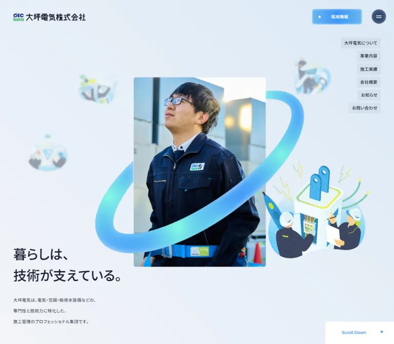
Ohtsubo Electric combines the credibility of real construction-site photography with an approachable illustration system. A portrait photograph of helmeted field staff sits near the center of the opening composition. A thick turquoise-to-blue elliptical ribbon passes around it, while small illustrated workers and equipment float in the surrounding pale space. Dark Japanese copy anchors the lower left. The effect connects technical infrastructure with the people who build and maintain it.
The rest of the homepage is a substantial corporate information system: company values, services, completed projects, organizational resources, news, recruitment, and contact routes. Large English section names provide visual rhythm; Japanese labels and descriptions carry the practical information. Three distinctive Company cards turn abstract blue objects into navigation. A broad navy footer closes the page with an address, grouped site links, and another contact opportunity.
The most reusable relationships are the contrast between documentary photography and imaginative technical illustration, between oversized English headings and compact Japanese text, and between softly illuminated controls and mostly flat content surfaces.
How to Read This Reference
- Measured means explicitly present in the supplied computed styles, element rectangles, or custom properties. Measurements are CSS pixels unless otherwise stated.
- Calculated means arithmetic from those measurements. Small differences can result from browser rounding.
- Estimated means judged from the original-page screenshots. Shadow recipes, illustration colors, and image bounds are not stylesheet measurements.
- Recommended means guidance for a new implementation. The Quick Start is an adaptation, not recovered original source code.
- Source units: the page uses an unusually small root size. This document calls one original
rem1u. At the inspected desktop width,1u = 1px; at the mobile width,1u = 1.04px. - Visibility matters: the element export includes menu content and offscreen carousel duplicates. A nonzero rectangle does not establish that an element was visibly painted in the captured state.
- Evidence limits: no commands, additional browsing, or file inspection were used for this reference. Observations come from the supplied original-page captures and rendered evidence.
The recorded document widths are 1425px and 375px, while their viewports are 1440px and 390px. This consistent 15px difference is compatible with reserved scrollbar space. The mobile capture is still a 390 × 844 viewport, not a separate 375px viewport test.
Tokens — Colors
Default Palette
| Name | Value | Source / implementation token | Role and evidence |
|---|---|---|---|
| Cool Canvas | #F8F9FB |
Source --color-bg-white; alias --canvas |
Measured body and main background; visible across the Company section |
| Technical Ink | #1B2134 |
Source --color-black; alias --ink |
Measured Japanese copy, navigation text, and content headings |
| Action Blue | #3D95FA |
Source --color-blue; alias --blue |
Measured labels, links, section subtitles, and control accents |
| Soft Blue | #68B8ED |
Stop in --color-blue-btn-grad |
Measured gradient endpoint; gives controls their lighter outer color |
| Footer Navy | #314A70 |
Source --color-black-light; alias --navy |
Measured mobile footer background; visually consistent with the desktop footer |
| White | #FFFFFF |
Source --color-white |
Reversed footer text, recruitment-button text, and light control surfaces |
| Utility Gray | #EDEEF1 |
Source --color-bg-gray; alias --utility |
Measured background of mobile news category links |
| Rule Gray | #DDDDDD |
Source --color-border-gray; alias --rule |
Declared neutral border token; individual border placement is not fully exported |
| Hero Light | #F2F4F8 |
First stop in --color-bg-grad |
Measured source gradient endpoint |
| Hero Blue | #DBE9F6 |
Second stop in --color-bg-grad |
Measured source gradient endpoint |
| Navigation Tint | rgba(27, 33, 52, 0.05) |
Measured chip background | Slight darkening behind the six desktop hero links |
| Badge Tint | rgba(27, 33, 52, 0.1) |
Measured mobile news badge background | Compact NEWS and BLOG metadata surfaces |
The orbit and illustrations add turquoise, mint, and small yellow-green details. Their exact asset colors were not supplied. Approximate turquoise #65DDE3 and mint #89E9D8 are reasonable illustration-production recommendations, not measured interface tokens. Keep these colors inside artwork rather than expanding the general UI palette.
Gradient Treatments
| Treatment | Exact supplied value | Application and limits |
|---|---|---|
| Pale background | linear-gradient(45deg, #F2F4F8, #DBE9F6) |
Declared source token; visually consistent with the opening background |
| Blue control | linear-gradient(90deg, #68B8ED 0%, #3D95FA 50%, #68B8ED) |
Declared source token; matches the luminous blue recruitment control |
| White control | linear-gradient(90deg, #E7F2FE 0%, #FFFFFF 50%, #E7F2FE) |
Declared source token for a cooler white treatment; complete element mapping was not supplied |
| Dark text treatment | linear-gradient(135deg, #2F66A9, #1B2134 50%, #1B2134) |
Declared as --color-text-grad; application to specific visible text was not established |
Gradients are local and purposeful. The hero uses an almost atmospheric change in background color. Buttons concentrate blue around a clear label. The illustrated objects use richer shading and grain than the surrounding interface.
Theme Behavior
The light canvas and navy footer coexist within one page. They are section treatments, not evidence of selectable light and dark modes. The header remains visible over both regions in the supplied captures.
Tokens — Typography
Japanese Text
- Measured source stack:
"Noto Sans JP", "Noto Sans JP Fallback". - Weights:
400for descriptive copy;500for the hero statement, company-card titles, service headings, and many navigation labels. - Character: straightforward, compact Japanese sans serif, with medium-weight emphasis rather than very heavy display lettering.
- Tracking: descriptive copy commonly uses about
0.05em; the desktop hero rail uses0.03em. - Line spacing: explanatory paragraphs use generous line heights, commonly
1.8or2.
The body itself computes to a line height of 1, but individual prose elements override it. Do not use the body line-height measurement as the default for new paragraphs.
English Labels and Headings
- Declared source stack:
"Poppins", "Poppins Fallback". - Directly measured examples: Company-card labels, service category labels, mobile About-card labels, and the large mobile footer Contact label.
- Common label weight:
500. - Measured footer display weight:
300. - Tracking: the supplied English utility class sets letter spacing to
0; measured English labels also show normal spacing.
The large Company heading has the rounded geometric appearance associated with this English system. Its child text node was not included in the computed export, so its exact font size and weight remain unmeasured. The parent H2's reported 16px size is not a reliable measurement of the visibly large word.
The fallback family names are declarations from the original page, not independently identified typefaces to download. Load the verified primary families in a new project and supply appropriate local fallbacks.
Type Scale
| Role | Desktop | Mobile | Weight / leading | Evidence |
|---|---|---|---|---|
| Body base | 16px |
16.64px |
400 / 1 |
Measured; individual components override this |
| Hero statement | 48px |
33.28px |
500 / 1.35 |
Measured; source scale changes from 48u to 32u |
| Hero description | 15px |
14.56px |
400 / 2 |
Measured; tracking 0.75px and 0.728px |
| Desktop hero navigation | 15px |
Not shown | 500 / 1 |
Measured; tracking 0.45px |
| Large English section name | Approximately 72px |
Not directly measured | Visually light | Desktop screenshot estimate only |
| Business statement | 44px |
No corresponding mobile record | 500 / 1.3 |
Measured; tracking 3.2px |
| Service English category | 14px |
Not established | 500 / 1 |
Measured Poppins |
| Service Japanese title | 28px |
Not established | 500 / 1 |
Measured |
| Service paragraph | 15px |
Not established | 400 / 1.8 |
Measured |
| Project title | 20px |
18.72px |
500 / 1.2 |
Measured |
| Company English label | 14px |
14.56px |
500 / 1 |
Measured Poppins |
| Company Japanese title | 20px |
20.8px |
500 / 1 |
Measured |
| Mobile About-card label | — | 13.52px |
500 / 1 |
Measured Poppins |
| Mobile About-card title | — | 18.72px |
500 / 1.75 |
Measured; tracking 1.04px |
| Mobile news category link | — | 14.56px |
500 / 1 |
Measured Noto Sans JP, despite the English labels |
| Mobile recruitment statement | — | 29.12px |
500 / 1.5 |
Measured; tracking 1.456px |
| Upper mobile footer Contact | — | 41.6px |
300 / 1 |
Measured Poppins |
The smaller Contact heading in the lower footer screenshot is a separate component. It should not inherit the 41.6px measurement of the footer's opening Contact heading.
Copy Composition
The opening statement is deliberately short and split into two lines:
暮らしは、 技術が支えている。
Its supporting paragraph explains the company's electrical, air-conditioning, and water-services expertise. Keep the statement separate from its explanation and preserve a substantial gap between them. Actual paragraph rectangles contain more vertical space than a simple count of nominal line heights would suggest; the detailed inline structure was not exported.
The source places the logo in an H1 and the opening statement in a paragraph. That is an observed semantic structure, not a requirement for an adaptation. A new implementation can give the meaningful page statement an appropriate heading while preserving the visual composition.
Tokens — Spacing & Shapes
Responsive Unit
The active source root formulas are:
/* Observed desktop branch */
--liquid-htmlroot: calc(100vw / 1440);

/* Observed mobile branch */
--liquid-htmlroot: calc(100vw / 375);
At 1440px, one original rem equals 1px. At 390px, it equals 1.04px. The smaller document width does not change the viewport-based calculation.
Other mobile-related variables are present, including a 750-unit design ratio. Their presence does not establish that they control the sampled elements. The active root size and computed rectangles are the stronger evidence.
Spacing Scale
| Use | Desktop source / result | Mobile source / result | Status |
|---|---|---|---|
| Header height | 120u = 120px |
80u ≈ 83.2px |
Measured token and element |
| Section top spacing | 150u = 150px |
80u = 83.2px |
Measured token |
| Section bottom spacing | 160u = 160px |
80u = 83.2px |
Measured token |
| Page top spacing | 160u = 160px |
80u = 83.2px |
Measured token |
| Page bottom spacing | 200u = 200px |
104u = 108.16px |
Measured token |
| Hero horizontal padding | 48px |
24.96px |
Measured |
| Hero vertical padding | 56px top and bottom |
41.6px top, 110.24px bottom |
Measured; does not describe all internal artwork positioning |
| Standard content width | 1228px |
341.72px |
Measured section-heading and card-region widths |
| Standard content left edge | 98.5px |
16.64px |
Measured |
| Company grid gap | Approximately 52px |
Approximately 24.95px vertically |
Calculated from card rectangles |
| Heading-to-Company-card gap | 80px |
Approximately 41.59px |
Calculated |
| Hero rail item spacing | 8px |
Not shown | Calculated from 39px items at 47px intervals |
| Mobile About-card gap | — | Approximately 41.59px |
Calculated |
These are component-specific dimensions, not proof that every gap belongs to a universal eight-point grid.
Border Radius
| Element | Desktop | Mobile | Evidence |
|---|---|---|---|
| Small source radius | 8px |
8.32px |
--border-radius-s: 8rem |
| Large source radius | 80px |
41.6px |
Source changes from 80rem to 40rem |
| Header recruitment link | 8px |
Not visible | Computed |
| Menu control | Circle, 52px diameter |
Circle, approximately 49.91px diameter |
Computed |
| Hero navigation chips | 4px |
Not visible | Computed |
| Company link outer box | 8px |
8.32px |
Computed; internal cutout geometry differs |
| Company label cutout | Approximately 20px at its upper-right corner |
Not visually captured | Desktop screenshot estimate |
| Service/list links | 100px pill radius |
104px on measured project/news list links |
Computed |
| Footer upper corners | Not directly exported | 41.6px |
Computed mobile footer |
Layout Measurements
| Element | Desktop | Mobile | Basis |
|---|---|---|---|
| Total document height | Approximately 9578px |
Approximately 9193px |
Recorded document heights |
| Hero section | 1440 × 1000px |
390 × 928.39px |
Computed rectangles |
| Logo | 260 × 30px |
187.19 × 21.59px |
Computed link/H1 rectangles |
| Hero photograph | Approximately 478 × 684px |
Approximately 248 × 355px |
Screenshot estimates |
| Hero statement box | 390.95 × 153.19px |
340.09 × 107.69px |
Computed rectangles |
| Section heading wrapper | 99px high |
Approximately 61.70px high |
Computed; not the individual English glyph size |
| Company card | Approximately 374.66 × 446.58px |
341.72 × 407.33px |
Computed |
| Company label text region | 250px wide |
260px wide |
Computed; consistent with 250u |
| Project card | 343px wide, typically 473–497px high |
255.83px wide, sampled heights 340.66–385.56px |
Computed; content-dependent heights |
| Mobile footer | — | 375 × 2082.28px |
Computed |
Components
Persistent Header
Role: keep identity and navigation access available throughout a long corporate homepage.
The desktop header is transparent, 120px high, with the logo at (48, 45). A luminous recruitment link sits at (1129, 32) and measures 180 × 56px. Its white label, 採用情報, is preceded by a small white dot. A separate circular navy menu control measures 52 × 52px at (1340, 34) and contains two short white horizontal strokes.
The recruitment control uses a softly illuminated blue treatment. The menu circle has a darker center and a lighter edge. Exact shadow and radial-gradient recipes were not exported; these appearances are screenshot observations.
On mobile, the logo moves to approximately (12.47, 30.80) and shrinks to 187.19 × 21.59px. The menu stays near 50px in diameter at the upper right. The recruitment CTA is not visible in the mobile opening. Header persistence is supported by its repeated position in the scrolled captures, although the export does not include the CSS position property.
The supplied lower mobile footer capture shows the dark header logo over navy content, where it has less visual separation. For an adaptation, provide an approved light logo variant or a contrasting header surface when crossing dark sections.
Desktop Hero Navigation
Role: compact direct routes to the main corporate information areas.
Six individually sized links form a right-aligned vertical rail beneath the header. Labels include 大坪電気について, 事業内容, 施工実績, 会社概要, お知らせ, and お問い合わせ.
Each chip uses 15px medium Japanese type, 12px padding, a 4px radius, and a 5% ink tint. The first chip begins at y = 136px; items are 39px high with an 8px gap. Their right edges align at approximately x = 1377px, while their left edges depend on text length.
These are links to routes such as /feature, /service, and /contact, not evidence of same-page section scrolling. The rail is absent from the mobile opening.
Hero Photograph and Orbit
Role: introduce technical competence through people, then connect the photograph to the broader illustration system.
The desktop photograph occupies a tall rounded rectangle around (481, 158), approximately 478 × 684px. It shows two helmeted field staff working with a tablet inside an unfinished building. Steel framing, exposed services, dark uniforms, and visible tools ground the composition in actual site work.
A thick elliptical ribbon moves visually around the photograph: some sections disappear behind it, while a bright foreground segment crosses the lower portion of the image. Blue, cyan, and mint shading gives the ribbon volume. Fine grain prevents it from looking like a perfectly smooth vector stroke.
Small technical illustrations surround the central group. The sharp upper-right illustration shows workers handling equipment; smaller, blurred illustrations on the left create apparent depth. The mobile opening shows a different field-team composition and a prominent lower-right equipment illustration. The evidence does not establish whether the different photographs result from responsive selection, time, or another mechanism.
Layer anatomy for reuse:
- Pale background gradient.
- Distant illustrated scenes with deliberately reduced sharpness.
- Rear orbit segment.
- Portrait photograph.
- Foreground orbit segment.
- Nearby worker/equipment illustration.
- Copy and navigation on clear, readable layers.
Preserve actual occlusion. Placing one complete opaque ellipse above the photograph would cover the staff incorrectly; placing it entirely behind the photograph would remove the characteristic wrapping effect.
Hero Copy and Scroll Cue
Role: express the company's purpose and invite further exploration.
The desktop statement begins at x = 48px, with its measured box starting near y = 641.81px. It is 48px, medium weight, and set as two lines. The supporting paragraph starts at y = 827px, uses 15px text with 30px line height, and stays within the same approximately 391px-wide column.
This places the message beside the lower half of the image rather than above it in a conventional centered masthead. Keep the surrounding space generous; the text is an anchor, not a panel laid over a tinted photograph.
A white Scroll Down block enters the lower-right corner of the desktop capture at approximately (1173, 920). Blue text and a blue dot sit inside it. Its complete bounding box and activation behavior were not recorded. Scroll Down also appears in the mobile text extract, but the cue is outside the supplied 844px-high opening screenshot.
On mobile, the artwork comes first. The statement begins near y = 573.77px, followed by the description at y = 706.41px. The measured hero extends below the first viewport to about 928.39px; it is not a fully contained 844px screen.
Bilingual Section Heading
Role: provide a recurring visual landmark across the long page.
A large, light English word sits above a smaller blue Japanese subtitle. In the Company screenshot, a small tilted blue oval appears to the upper left of the text. It echoes the hero orbit without repeating the full illustration.
The desktop heading wrapper is 99px high and aligns to the main content start at x = 98.5px. The English Company word is approximately 72px by visual estimation. The wrapper's measured 16px inherited font size must not be substituted for that display size.
Mobile wrappers are approximately 61.70px high and include 31.2px of left padding. This indicates room for the heading ornament, but the exact mobile ornament and display-letter dimensions were not visually captured.
About Introduction and Links
Role: explain the company and distribute visitors to strengths, identity, and anniversary content.
The desktop layout is asymmetrical. The introductory paragraph is a narrow 375px column at x = 951.5px. Beneath it, the three links occupy wider 588px rows starting at x = 738.5px. Each row measures 103px high, uses padding of 32px 0 20px 32px, and has an 8px upper-left radius. The rows are separated by 20px.
Each combines an English label with a Japanese title: Strength, Identity, and Anniversary. A background-color transition is declared for these desktop links.
On mobile, the introduction becomes approximately 341.72px wide. Three image-bearing links then stack vertically, each approximately 341.72 × 263.44px, with about 41.59px between them. Their Poppins labels use 13.52px type; Japanese titles use 18.72px type and a generous 32.76px line height.
The supplied screenshots do not show this section's complete artwork. Its desktop balance and mobile structure are documented from the DOM, not an invented image composition.
Business Presentation
Role: organize electrical, air-conditioning, sanitary, and interior services.
The desktop section combines a bilingual heading, a 44px Japanese statement, links to the service overview and training center, a four-item numbered category list, and co-located service descriptions.
Measured service/list links are 71px high with a pill radius. The two overview links differ in width according to their labels: approximately 205.81px and 294px. Prev and Next controls are 72 × 72px, white, with blue 12px bold labels, an 8px internal gap, and an 8px radius.
The service-description area is 360px wide at x = 926.5px. Its hierarchy is a blue 14px English category, a 28px Japanese title, then a 15px paragraph with 27px line height. The four numbered categories use a 24px gap between number and title.
The overlapping panel coordinates and navigation controls support a slide-based presentation, but no slide change was exercised in the evidence. Do not invent autoplay, swipe behavior, transition distance, or timing.
The mobile rendered-text sequence goes from About to Project and does not include the Business section. No corresponding mobile Business geometry is supplied. Whether that omission is intentional, conditional, or related to delayed content is unverified. Service links remain available in the mobile site navigation and footer.
Project Carousel and Cards
Role: demonstrate completed work and provide access to project information.
The desktop Project header pairs its title at the left with a pill-shaped route to the project index at the right. Large Next and Prev button boxes, each 160 × 160px, occupy a vertical control region toward the left of the project strip.
Project entries are buttons rather than ordinary destination anchors in the exported DOM. Each groups imagery, a Japanese project title, a completion year, and facility-category metadata. Desktop cards are 343px wide with a calculated 32px inter-card gap. Their title region is 310px wide and uses 20px medium type with a 24px line height.
On mobile, cards are approximately 255.83px wide with a measured 24px horizontal gap. The first visible card starts near x = 24.94px; the next begins near x = 304.77px, leaving a partial neighboring card in view. Titles use 18.72px type and a 22.464px line height. The project-index link appears below the strip instead of beside the heading.
Ten distinct projects repeat three times in the supplied DOM, including offscreen items at large negative and positive coordinates. This is consistent with loop-supporting carousel duplication. It should not be interpreted as thirty different projects or thirty vertical content cards.
Additional project metadata and Close text exist in aggregated section content. No opened detail state was captured, so a modal layout, focus behavior, or dismissal animation cannot be documented as observed.
Company Resource Cards
Role: make company information, organizational resources, and partner downloads visually distinct and easy to enter.
This is the clearest reusable card system in the supplied captures. Three cards occupy a 1228px-wide desktop row, each approximately 374.66 × 446.58px, separated by 52px.
Each card contains:
- A small blue parenthesized index near the upper-left corner.
- A large blue sculptural illustration centered in an approximately square upper region.
- A pale surface with a subtle blue illuminated edge.
- A canvas-colored label area cut into the lower-left edge.
- A small blue English label above a darker Japanese title.
- A circular blue arrow at the lower right, visually about 48px in diameter.
The three illustrations are specific: a thick ring with an orbital loop for Company, a connected node structure for Organization, and overlapping sheets or frames for Download. All share blue shading, bright edge highlights, and a fine granular texture.
The labels are Company / 会社概要, Organization / 組織図・労働安全衛生方針, and Download / 協力会社の皆様へ. The Japanese titles use 20px medium type; English labels use 14px Poppins. Their text region is 250px wide on desktop.
The lower-left cutout is part of the silhouette. The card's blue edge continues down the right-hand extension around the arrow, while the label area visually joins the page background. Avoid replacing this with a conventional rectangle containing a separate white footer.
On mobile, the cards become one column. Each is approximately 341.72 × 407.33px, with a 24.95px vertical gap. The label width becomes 260px because its source unit scales to 1.04px. Text does not shrink proportionally with the narrower card: the Japanese title measures 20.8px.
Photographic Transition
Role: change the visual rhythm between the resource cards and later content.
The bottom of the desktop Company capture reveals the beginning of a broad navy region with strongly rounded upper corners and photography visible at its left and right edges. The desktop text extract includes Life is supported by technology. between Company and News.
Only the top fragment of this region is visually supplied. Its complete image arrangement, text placement, and any movement are not established. Preserve it as evidence of a larger photographic transition rather than inventing a full banner from the fragment.
News Categories and Rows
Role: present current updates with a compact date/category/title hierarchy.
The categories ALL, NEWS, and BLOG are anchors with distinct destinations: /news, /news/category/news, and /news/category/oem. They should be documented as navigation links, not verified client-side filtering tabs.
Mobile category links have a #EDEEF1 background, approximately 39.5px height, 8.32px radius, and padding of 12.48px 18.72px. Their typography is measured as Noto Sans JP at 14.56px, even though the labels are English.
Each news row groups a date, a small blue category label on a tinted background, and a Japanese title. Mobile badges use 13.52px medium text, padding of 4.16px 9.36px, and a 4.16px radius. Rows occupy the 341.72px content width, use 24.96px bottom padding, and are separated by approximately 24.95px. Longer titles increase row height rather than being forced into identical cards.
The supplied entries include dates from July and August 2026. Their exact text is content, not a design token. Preserve the dated-list structure when replacing it.
Recruitment Feature
Role: give prospective employees a substantial, dedicated route within the corporate homepage.
The rendered evidence identifies a large recruitment feature that is itself a link to /recruit. On mobile, its outer box is approximately 953.98px high. It contains a bilingual heading, a three-line Japanese invitation, and explanatory copy.
The mobile invitation uses 29.12px medium type, a 43.68px line height, and 1.456px tracking. The description returns to 14.56px type with a 29.12px line height.
The complete feature artwork is not included in the supplied screenshots. Do not infer a photo layout from the hero or other sections. If reproducing the large linked region, avoid nesting additional interactive links inside the enclosing anchor.
Contact and Footer
Role: provide a clear ending with both contact access and comprehensive corporate navigation.
The footer is a full-width #314A70 field. The mobile element explicitly has 41.6px upper corner radii and 83.2px top and bottom padding. It begins with a large Contact label in 41.6px, weight-300 Poppins, followed by white Japanese explanatory text and a broad Get in Touch link region.
The desktop lower-footer screenshot shows a wide breadcrumb-like strip above the main information. Below it, the company logo and address occupy the left, while three navigation groups occupy the right. Primary links are white; secondary links and address details use a muted blue-gray appearance. The exact muted color or opacity was not exported.
The original page identifies the company as 大坪電気株式会社 and includes its headquarters address and © Ohtsubo Electric Co., Ltd.. These are original-page identity statements.
A second, smaller Contact component sits under the right-side navigation. It combines an English heading, one explanatory sentence, a tall arrow tile at the right, and a thin bottom rule. The desktop arrow tile appears approximately 54 × 97px; these are screenshot estimates, not computed values.
In the lower mobile capture, recruitment links occupy a narrow left text region, long labels wrap, and privacy, the smaller Contact block, and copyright follow. The Contact block spans almost the full content width, with a tall arrow tile at the right. This crop does not establish the complete arrangement of every earlier mobile footer navigation group.
Page Top is a real button in the mobile DOM, approximately 125.13 × 58.22px, pairing an outlined arrow control with a label. Its click result and scrolling animation were not exercised.
Menu Content and Layering
The DOM includes an extensive menu tree with corporate, service, recruitment, map, and contact links. Desktop menu entries have their own 20px primary-link measurements; mobile entries include wrapping groups. These are different from the visible hero rail and footer navigation.
No open-menu screenshot or activation trace was provided. Positive menu-link rectangles must not be treated as proof that the overlay was open over the hero.
The supplied source layer tokens are 8000 for navigation, 10003 for the menu overlay, 10004 for header and menu, and 10005 for the menu button. They establish intended stacking priority, not a verified opening animation or accessibility model.
Tokens — Motion & Interaction
| Element or treatment | Supplied declaration | What is established |
|---|---|---|
| Menu button | transform 0.3s ease-out |
Transform changes have a declared transition; trigger and transform values are unknown |
| Desktop hero chips | color 0.3s ease-out, background-color 0.3s ease-out |
Color feedback is defined; end-state colors were not captured |
| Desktop About links | background-color 0.3s ease-out |
Background changes are anticipated |
| Business Prev/Next | color 0.3s ease-out, background-color 0.3s ease-out |
Control feedback is defined; slide movement is not measured |
| Business numbered items | opacity 0.3s cubic-bezier(0.25, 1, 0.5, 1) |
Short opacity feedback is declared |
| Service and index links | color 0.3s ease-out |
Link color changes are declared |
| Mobile news rows | border-color 0.3s ease-out |
Border feedback is declared |
| Menu contact region | border-bottom 0.3s ease-out |
Applies to the exported menu contact element; not automatically the footer component |
| Hero orbit and illustrations | No usable timing supplied | Static layered appearance is visible; rotation, floating, and parallax are unverified |
| Project carousel | Repeated cards and navigation controls | Carousel structure is supported; autoplay, drag, and wrap behavior are untested |
The capture process waited for initial content and traversed intermediate scroll positions. It temporarily paused perpetual animations during readiness checks and then resumed them. This is a capture procedure, not evidence of a particular animation on the orbit or illustrations.
Many sampled elements report animation: none. That does not rule out animated descendants, pseudo-elements, or JavaScript-driven movement. Likewise, a generic computed transition: all without useful duration and state information is not a measured motion specification.
Skeleton keyframe text appears inside extracted aggregate content, but no loading skeleton is shown in the supplied settled screenshots. Do not reproduce those implementation strings as visible page content.
Recommended motion direction: retain the measured 300ms ease-out vocabulary for small control feedback. If new decorative motion is added, make it restrained, separately configurable, and explicitly an enhancement. Do not present invented orbit rotation or scroll parallax as original behavior.
Surfaces
| Layer | Appearance | Structural role |
|---|---|---|
| Main canvas | Flat cool off-white | Holds most editorial and corporate content |
| Opening field | Very pale diagonal blue gradient | Unifies the photograph, illustrations, and surrounding negative space |
| Navigation chip | Low-opacity ink tint | Makes short text links legible without heavy button framing |
| Recruitment control | Blue gradient with soft edge illumination | Strongest small persistent action |
| Menu circle | Navy center with a softly lit perimeter | Distinct utility control |
| Company card | Near-canvas face, fine blue illumination, sculptural artwork | Navigation object with a custom lower silhouette |
| News utility surface | Neutral gray fill | Separates categories and small metadata |
| Footer | Solid navy with white and muted light text | Creates a clear final region and supports a dense site map |
This is not a general system of floating white cards with large gray shadows. Most structure comes from spacing, typography, imagery, and color changes. Soft illumination is concentrated on selected controls and the Company resource cards.
The visible glow recipes were not included in the computed export. Any inset shadows in the Quick Start are approximations.
Imagery
The original-page captures combine three visual families:
- Documentary field photography: helmeted staff, dark uniforms, tablets, tools, and exposed building infrastructure. Keep faces, hands, and working context visible. Crop around the task, not merely around a generic portrait.
- Technical worker illustrations: small people interacting with equipment, pipes, and installation systems. Their forms are approachable and simplified, with navy clothing, blue equipment, white helmets, and occasional lime accents.
- Abstract blue objects: rings, connected nodes, and layered sheets. These function as symbolic navigation graphics rather than product renders.
The grain belongs primarily to the illustrated material. Photography remains clear and natural; body text and backgrounds remain clean. Distant illustrated scenes are visibly blurred, while the central photograph and important labels are sharp.
Observed Asset References
No original image URLs, filenames, or native dimensions were included in the supplied evidence. The following inventory identifies visible roles without inventing asset paths.
| Asset role | Original-page evidence | Treatment |
|---|---|---|
| Header identity | Desktop and mobile header captures | Compact multicolor mark with dark Japanese company name |
| Footer identity | Desktop footer capture | Light wordmark suitable for navy background |
| Desktop hero photograph | Opening desktop capture | Tall rounded crop of field staff using a tablet |
| Mobile hero photograph | Opening mobile capture | Tall crop with a different field-team composition |
| Orbital ribbon | Both opening captures | Thick blue/cyan/mint ellipse with front/back occlusion and fine texture |
| Worker/equipment scenes | Both opening captures | Transparent-looking illustrated groups, with sharp and blurred depth layers |
| Company ring object | Desktop Company capture | Blue sculptural ring surrounded by a thinner loop |
| Organization object | Desktop Company capture | Connected blue nodes and structural lines |
| Download object | Desktop Company capture | Overlapping blue sheets and rectangular frames |
| Lower photographic transition | Bottom edge of Company capture | Partial photos around a broad rounded navy region |
Use approved original assets when available. If creating replacements, match the lighting, grain, proportions, and subject matter across the whole illustration set. CSS can reproduce the card silhouette and layout, but it cannot supply the site-specific character of the worker scenes or photographs.
Layout & Responsive Behavior
Desktop Composition
The opening is a full-height composition at the recorded 1000px viewport height. Its photo is near the horizontal center; copy occupies the lower left; utilities occupy the upper right. The image and orbit provide the visual center of gravity without requiring a centered headline.
Most following sections use a 1228px content region, centered within the 1425px document width. This produces measured 98.5px side margins. Large section gaps and substantial blank areas give the sculptural illustrations room to stand out.
About uses a narrow paragraph and wider link rows toward the right. Company uses three equal cards. Projects use a horizontally extended strip rather than a static three-column gallery. The footer shifts to a broad identity area beside multiple navigation groups.
Mobile Changes
| Area | Observed mobile change | Evidence limit |
|---|---|---|
| Header | Smaller logo, approximately 50px menu button, no visible recruitment CTA | No menu-open state |
| Hero | Artwork precedes copy; headline becomes 33.28px; section exceeds one viewport | Photo-selection and animation mechanism unknown |
| Hero rail | Not visible | Its absence does not remove navigation from the full site |
| Main content | Approximately 341.72px wide with 16.64px side insets | Hero and header use different inset systems |
| About | Full-width introduction and three stacked image links | Complete artwork not visually captured |
| Business | Missing from mobile rendered text and supplied geometry | Intentional omission versus conditional rendering unverified |
| Projects | Narrow horizontal cards with a partial next item; index link below | Swipe and autoplay not tested |
| Company | One card per row; approximately 24.95px vertical gaps | Card layout measured in DOM rather than a mobile Company screenshot |
| News | Compact category links and rows that grow with title wrapping | Client-side filtering not demonstrated |
| Footer | Smaller top corner radii, full-width contact treatment, wrapping link text | Complete early footer grouping not shown in the crop |
The mobile Company titles are slightly larger in CSS pixels than the desktop titles because the same 20u value scales to 20.8px. Responsive behavior is therefore not simply a uniform reduction of every desktop dimension.
The supplied source exposes desktop and mobile unit formulas but not the exact media-query boundary. Tablet layouts and intermediate widths were not inspected. The 48rem breakpoint in the Quick Start is a recommendation.
Implementation Implications
Keep image positions and page structure responsive independently. A tall mobile photograph can retain its visual impact while the copy moves below it. Scale decorative artwork separately from readable text, and let long Japanese titles wrap without colliding with arrows.
Do not reproduce the captured 15px gutter as an intentional blank stripe. Prefer widths based on the available content area and test fixed header controls against the actual viewport, scrollbar behavior, and safe-area insets.
Do’s and Don’ts
Do
- Keep
#F8F9FB,#1B2134,#3D95FA, and#314A70as the primary structural colors. - Use real field-team photography to establish technical credibility.
- Preserve the orbital ribbon's foreground/background relationship with the photo.
- Give the hero enough negative space for the image, illustrations, and copy to remain individually legible.
- Pair the verified Japanese and English font systems according to their roles.
- Use large English section names with smaller blue Japanese subtitles.
- Preserve the Company cards' lower-left cutout and lower-right arrow extension.
- Keep the three blue resource illustrations stylistically consistent.
- Preserve desktop asymmetry and make deliberate mobile changes rather than shrinking the entire page.
- Keep projects horizontal and treat repeated DOM entries as carousel structure.
- Distinguish route links, action buttons, and untested interaction affordances.
- Use a substantial navy footer with clearly ranked primary and secondary information.
Don’t
- Don't reduce this corporate homepage to a single conversion-focused landing page.
- Don't replace the hero with a full-bleed dark photograph and centered white slogan.
- Don't flatten the orbit into a thin outline or place the entire ring above the staff.
- Don't substitute unrelated stock illustrations for the technical worker scenes.
- Don't spread mint and lime across navigation, badges, and text merely because they appear in artwork.
- Don't turn every section into an elevated white card.
- Don't treat the Company card as a simple rectangle with a conventional footer strip.
- Don't use the inherited H2 measurement as the size of the large English display word.
- Don't copy source
remnumbers into a stylesheet with a normal 16px root. - Don't assume Business is intentionally unavailable on mobile based only on this extract.
- Don't invent autoplay, parallax, menu transitions, or project-modal behavior.
- Don't carry the dark header logo across navy content without reviewing its visibility.
Recommended Implementation Additions
These are improvements for a new implementation, not verified original-site features:
- Give the image-based home link and icon-only menu control explicit accessible names. Expose menu expansion state and implement focus return when closing an overlay.
- Use appropriate heading semantics for the page statement and section hierarchy while preserving the visual design.
- Provide visible keyboard focus. Small blue text and white text on the lighter parts of blue gradients need contrast checks before reuse.
- Keep decorative orbit and worker layers out of the accessibility tree when they add no information beyond the accompanying content. Prevent those layers from intercepting pointer events.
- Preserve service information through a mobile-accessible route even if the desktop Business presentation is omitted or simplified.
- Provide keyboard-operable project navigation and prevent cloned carousel items from creating repeated focus stops or duplicate IDs.
- If project details use an overlay, provide an accessible heading, a clear close control, Escape dismissal, and appropriate focus management.
- Maintain a practical minimum text size rather than allowing viewport-derived units to shrink prose indefinitely.
- Review 39px category and navigation targets against a recommended 44px minimum touch area, using extra hit area where needed.
- Reserve image aspect ratios, use responsive image sources, and prioritize the visible hero photograph. Keep decorative asset loading from shifting copy.
- Offer reduced-motion behavior for any added carousel automation or decorative animation.
- Test transparent fixed headers over light and dark sections, wrapped Japanese titles, zoomed text, and short mobile landscape viewports.
Agent Prompt Guide
Quick Color Reference
- Main canvas:
#F8F9FB. - Main text:
#1B2134. - Action and English-label blue:
#3D95FA. - Blue control gradient:
#68B8ED → #3D95FA → #68B8ED. - Hero background:
45deg,#F2F4F8 → #DBE9F6. - Footer:
#314A70, with white primary text. - Quiet utility surfaces:
#EDEEF1or a low-opacity ink tint. - Turquoise, mint, and lime: confined mainly to illustrations; exact asset colors are unmeasured.
Overall Prompt
“Create a Japanese corporate homepage for a building-services contractor, inspired by Ohtsubo Electric's current visual system. Use a cool off-white canvas, dark navy Japanese text in Noto Sans JP, large geometric English section names in Poppins, and bright blue labels. Build an asymmetrical opening with a tall photograph of field staff, a thick textured blue-to-mint orbital ribbon passing behind and in front of the photograph, and small technical worker illustrations. Place a short two-line Japanese statement at the lower left, a luminous blue recruitment link at the upper right, and a separate navy circular menu button. Continue with corporate information, projects, sculptural resource cards, news, recruitment, and a spacious navy footer. On mobile, put the artwork above the copy, stack resource cards, and retain readable text. Treat decorative motion and uninspected states as separate implementation decisions.”
Example Component Prompts
- Hero: “A pale diagonal blue background with a centered portrait of helmeted field staff using a tablet. Wrap a broad cyan-and-blue orbital ribbon around the portrait with real front/back occlusion. Add a sharp worker-and-equipment illustration near the right edge and faint distant scenes to the left. Put dark Japanese copy at the lower left. Preserve open space and clear faces.”
- Header: “A transparent desktop header with a compact Japanese company wordmark at left, a 180 × 56px softly illuminated blue recruitment link near the right, and a separate 52px navy circular menu button with two white strokes. On mobile, use an approximately 187px-wide wordmark and a 50px menu control.”
- Company card: “A pale blue-edged navigation card with a large grain-textured blue object above, a small parenthesized blue index at top left, and a canvas-colored cutout at bottom left. Put a 14px Poppins label above a 20px Japanese title inside the cutout. Keep a circular blue arrow in the remaining lower-right extension. Use three matching illustrations: orbital ring, connected nodes, and layered sheets.”
- Project strip: “A horizontal sequence of project buttons containing imagery, Japanese titles, completion years, and facility categories. Use 343px desktop cards and approximately 256px mobile cards with a partial next card visible. Place the project-index link below the strip on mobile. Keep navigation accessible without assuming autoplay.”
- News: “A restrained dated news list on cool off-white. Use compact gray category links labeled ALL, NEWS, and BLOG, followed by rows containing a date, a small blue category badge, and a wrapping Japanese title. Separate rows with spacing and a fine rule instead of deep shadows.”
- Footer: “A broad navy footer with rounded upper corners, a large light English Contact heading, and generous white Japanese copy. Follow with company identity, address, grouped navigation, and a smaller contact row with a tall arrow tile. Use a light logo variant and let Japanese labels wrap cleanly on mobile.”
Quick Start
CSS Custom Properties
This CSS keeps a conventional browser root size and introduces --u for source-inspired proportions. Palette values and the 300ms control timing come from supplied source evidence. Unit caps, the 48rem breakpoint, shadow recipes, display-heading sizes, minimum text sizes, and unmeasured layout details are recommendations.
The hero requires complementary front and rear orbit assets with matching bounds. A single unsplit illustration cannot reproduce the observed occlusion. Load Noto Sans JP and Poppins separately; no font files or original image URLs were supplied.
:root {
  /* Exact colors from supplied source properties */
  --canvas: #f8f9fb;
  --ink: #1b2134;
  --blue: #3d95fa;
  --soft-blue: #68b8ed;
  --navy: #314a70;
  --white: #fff;
  --utility: #edeef1;
  --rule: #ddd;
  --hero-gradient: linear-gradient(45deg, #f2f4f8, #dbe9f6);
  --blue-gradient: linear-gradient(
    90deg, #68b8ed 0%, #3d95fa 50%, #68b8ed 100%
  );

  /* Verified primary families; generic fallbacks are additions */
  --font-ja: 'Noto Sans JP', sans-serif;
  --font-en: 'Poppins', sans-serif;

  /* Adapted scaling: caps are recommendations */
  --u: clamp(0.8px, calc(100vw / 1440), 1.2px);
  --content-width: calc(1228 * var(--u));
  --content-inset: calc(16 * var(--u));
  --header-height: calc(120 * var(--u));
  --section-space: calc(150 * var(--u));
  --radius-small: calc(8 * var(--u));
  --radius-large: calc(80 * var(--u));
  --text-body: max(0.875rem, calc(15 * var(--u)));
  --text-label: max(0.8125rem, calc(14 * var(--u)));
  --control-motion: 300ms ease-out;

  /* Visual approximations, not recovered shadow declarations */
  --card-glow: inset 0 0 9px rgb(61 149 250 / 28%);
  --button-glow: inset 0 0 9px rgb(255 255 255 / 65%);
}

* {
  box-sizing: border-box;
}

body {
  margin: 0;
  color: var(--ink);
  background: var(--canvas);
  font-family: var(--font-ja);
  font-size: 1rem;
  line-height: 1.8;
}

img {
  display: block;
  max-width: 100%;
}

button,
a {
  -webkit-tap-highlight-color: transparent;
}

button {
  font: inherit;
}

.container {
  width: min(
    var(--content-width),
    calc(100% - 2 * var(--content-inset))
  );
  margin-inline: auto;
}

.section {
  margin-block-start: var(--section-space);
  scroll-margin-top: calc(var(--header-height) + 1rem);
}

.site-header {
  position: fixed;
  inset: 0 0 auto;
  z-index: 10004;
  display: flex;
  align-items: center;
  gap: calc(32 * var(--u));
  height: var(--header-height);
  padding-inline: calc(48 * var(--u));
}

.site-brand {
  display: block;
  width: calc(260 * var(--u));
  flex: none;
}

.recruit-link {
  display: flex;
  align-items: center;
  justify-content: center;
  gap: calc(36 * var(--u));
  width: calc(180 * var(--u));
  min-height: calc(56 * var(--u));
  margin-inline-start: auto;
  border-radius: var(--radius-small);
  color: var(--white);
  background: var(--blue-gradient);
  box-shadow: var(--button-glow);
  font-size: 1rem;
  font-weight: 500;
  text-decoration: none;
}

.recruit-link::before {
  content: '';
  width: calc(8 * var(--u));
  aspect-ratio: 1;
  border-radius: 50%;
  background: currentColor;
}

.menu-button {
  display: grid;
  place-content: center;
  gap: 5px;
  flex: none;
  width: calc(52 * var(--u));
  aspect-ratio: 1;
  padding: 0;
  border: 0;
  border-radius: 50%;
  color: var(--white);
  background: var(--navy);
  box-shadow: inset 0 0 12px rgb(255 255 255 / 30%);
  cursor: pointer;
  transition: transform var(--control-motion);
}

.menu-button span {
  width: 20px;
  height: 2px;
  background: currentColor;
}

.hero {
  position: relative;
  isolation: isolate;
  display: flex;
  align-items: flex-end;
  min-height: 100svh;
  padding: calc(56 * var(--u)) calc(48 * var(--u));
  overflow: clip;
  background: var(--hero-gradient);
}

.hero-media {
  position: absolute;
  top: 50%;
  left: 50%;
  z-index: 1;
  isolation: isolate;
  width: min(calc(478 * var(--u)), 42vw);
  aspect-ratio: 7 / 10;
  transform: translate(-50%, -50%);
}

.hero-photo {
  position: relative;
  z-index: 2;
  width: 100%;
  height: 100%;
  border-radius: var(--radius-small);
  object-fit: cover;
}

.orbit {
  position: absolute;
  inset: -10% -40%;
  width: 180%;
  max-width: none;
  height: 120%;
  object-fit: contain;
  pointer-events: none;
}

.orbit--back {
  z-index: 1;
}

.orbit--front {
  z-index: 3;
}

.hero-scene {
  position: absolute;
  top: 12%;
  right: 10%;
  z-index: 2;
  width: calc(320 * var(--u));
  pointer-events: none;
}

.hero-copy {
  position: relative;
  z-index: 3;
  width: calc(391 * var(--u));
  max-width: 100%;
}

.hero-title {
  display: grid;
  gap: 0.5em;
  margin: 0;
  font-size: max(2rem, calc(48 * var(--u)));
  font-weight: 500;
  line-height: 1.35;
}

.hero-description {
  margin: calc(32 * var(--u)) 0 0;
  font-size: var(--text-body);
  line-height: 2;
  letter-spacing: 0.05em;
}

.hero-nav {
  position: absolute;
  top: calc(136 * var(--u));
  right: calc(48 * var(--u));
  z-index: 8000;
  display: grid;
  justify-items: end;
  gap: calc(8 * var(--u));
}

.hero-nav a {
  padding: calc(12 * var(--u));
  border-radius: calc(4 * var(--u));
  color: var(--ink);
  background: rgb(27 33 52 / 5%);
  font-size: var(--text-body);
  font-weight: 500;
  line-height: 1;
  letter-spacing: 0.03em;
  text-decoration: none;
  transition:
    color var(--control-motion),
    background-color var(--control-motion);
}

.section-heading {
  position: relative;
  margin: 0;
  font-weight: 400;
}

.section-heading::before {
  content: '';
  position: absolute;
  top: 0;
  left: calc(-43 * var(--u));
  width: calc(38 * var(--u));
  height: calc(15 * var(--u));
  border: calc(4 * var(--u)) solid var(--blue);
  border-radius: 50%;
  transform: rotate(-48deg);
}

.section-heading__en {
  display: block;
  font-family: var(--font-en);
  font-size: calc(72 * var(--u));
  font-weight: 300;
  line-height: 1.1;
  letter-spacing: 0;
}

.section-heading__ja {
  display: block;
  margin-top: calc(8 * var(--u));
  color: var(--blue);
  font-size: max(1rem, calc(18 * var(--u)));
  font-weight: 500;
  line-height: 1.4;
}

.company-grid {
  display: grid;
  grid-template-columns: repeat(3, minmax(0, 1fr));
  gap: calc(52 * var(--u));
  margin-top: calc(80 * var(--u));
}

.company-card {
  position: relative;
  isolation: isolate;
  display: block;
  aspect-ratio: 374.66 / 446.58;
  border-radius: var(--radius-small);
  color: var(--ink);
  text-decoration: none;
}

.company-card::before {
  content: '';
  position: absolute;
  inset: 0;
  z-index: -1;
  border-radius: inherit;
  box-shadow: var(--card-glow);
}

.company-card__index {
  position: absolute;
  top: calc(24 * var(--u));
  left: calc(22 * var(--u));
  color: var(--blue);
  font-family: var(--font-en);
  font-size: var(--text-label);
}

.company-card__art {
  position: absolute;
  top: 8%;
  left: 11%;
  width: 78%;
  height: 70%;
  object-fit: contain;
}

.company-card__label {
  position: absolute;
  bottom: 0;
  left: 0;
  width: min(
    calc(250 * var(--u)),
    calc(100% - 72 * var(--u))
  );
  padding: calc(22 * var(--u)) calc(4 * var(--u)) 0 0;
  border-top-right-radius: calc(20 * var(--u));
  background: var(--canvas);
}

.company-card__en {
  display: block;
  color: var(--blue);
  font-family: var(--font-en);
  font-size: var(--text-label);
  font-weight: 500;
  line-height: 1;
}

.company-card__title {
  display: block;
  margin-top: calc(16 * var(--u));
  font-size: max(1rem, calc(20 * var(--u)));
  font-weight: 500;
  line-height: 1.3;
  overflow-wrap: anywhere;
}

.company-card__arrow {
  position: absolute;
  right: calc(16 * var(--u));
  bottom: calc(16 * var(--u));
  display: grid;
  place-items: center;
  width: calc(48 * var(--u));
  aspect-ratio: 1;
  border-radius: 50%;
  color: var(--white);
  background: var(--blue-gradient);
  box-shadow: var(--button-glow);
  transition: transform var(--control-motion);
}

.news-categories {
  display: flex;
  flex-wrap: wrap;
  gap: calc(8 * var(--u));
}

.news-categories a {
  padding: calc(12 * var(--u)) calc(18 * var(--u));
  border-radius: var(--radius-small);
  color: var(--ink);
  background: var(--utility);
  font-size: var(--text-label);
  font-weight: 500;
  line-height: 1;
  text-decoration: none;
}

.news-row {
  display: grid;
  grid-template-columns: calc(160 * var(--u)) minmax(0, 1fr);
  gap: calc(32 * var(--u));
  padding-block: calc(24 * var(--u));
  border-bottom: 1px solid var(--rule);
  color: var(--ink);
  text-decoration: none;
  transition: border-color var(--control-motion);
}

.news-meta {
  display: flex;
  align-items: baseline;
  gap: calc(12 * var(--u));
  font-size: var(--text-label);
}

.news-badge {
  padding: calc(4 * var(--u)) calc(9 * var(--u));
  border-radius: calc(4 * var(--u));
  color: var(--blue);
  background: rgb(27 33 52 / 10%);
  font-size: max(0.8125rem, calc(13 * var(--u)));
  font-weight: 500;
  line-height: 1;
}

.site-footer {
  padding-block: calc(80 * var(--u));
  border-radius: var(--radius-large) var(--radius-large) 0 0;
  color: var(--white);
  background: var(--navy);
}

.footer-main {
  display: grid;
  grid-template-columns: 1fr 1fr;
  gap: calc(48 * var(--u));
}

.footer-links {
  display: grid;
  grid-template-columns: repeat(3, minmax(0, 1fr));
  gap: calc(24 * var(--u));
}

.site-footer a {
  color: inherit;
}

.footer-secondary {
  /* Recommended opacity; original value was not exported */
  color: rgb(255 255 255 / 70%);
}

.footer-contact {
  display: flex;
  align-items: center;
  justify-content: space-between;
  gap: calc(24 * var(--u));
  padding-block: calc(32 * var(--u));
  border-bottom: 1px solid rgb(255 255 255 / 20%);
  text-decoration: none;
}

.footer-contact__arrow {
  display: grid;
  place-items: center;
  flex: none;
  width: calc(54 * var(--u));
  min-height: calc(96 * var(--u));
  border-radius: calc(4 * var(--u));
  background: rgb(255 255 255 / 5%);
}

@media (hover: hover) {
  /* Recommended end states; source transition timing is retained */
  .hero-nav a:hover {
    color: var(--white);
    background: var(--navy);
  }

  .company-card:hover .company-card__arrow {
    transform: translateX(3px);
  }

  .news-row:hover {
    border-color: var(--blue);
  }
}

@media (max-width: 48rem) {
  :root {
    --u: clamp(0.85px, calc(100vw / 375), 1.2px);
    --header-height: calc(80 * var(--u));
    --section-space: calc(80 * var(--u));
    --radius-large: calc(40 * var(--u));
    --text-body: max(0.875rem, calc(14 * var(--u)));
  }

  .site-header {
    justify-content: space-between;
    padding-inline: max(calc(12 * var(--u)), env(safe-area-inset-left));
  }

  .site-brand {
    width: calc(180 * var(--u));
  }

  .menu-button {
    width: calc(48 * var(--u));
  }

  .recruit-link,
  .hero-nav {
    display: none;
  }

  .hero {
    display: block;
    min-height: 0;
    padding: calc(170 * var(--u)) calc(24 * var(--u))
      calc(106 * var(--u));
  }

  .hero-media {
    position: relative;
    top: auto;
    left: auto;
    width: min(calc(238 * var(--u)), 100%);
    margin-inline: auto;
    transform: none;
  }

  .hero-scene {
    top: calc(462 * var(--u));
    right: 0;
    width: calc(130 * var(--u));
  }

  .hero-copy {
    width: auto;
    margin-top: calc(40 * var(--u));
  }

  .hero-title {
    font-size: max(1.875rem, calc(32 * var(--u)));
  }

  .hero-description {
    margin-top: calc(24 * var(--u));
  }

  .section-heading {
    padding-left: calc(30 * var(--u));
  }

  .section-heading::before {
    left: 0;
    width: calc(24 * var(--u));
    height: calc(10 * var(--u));
    border-width: calc(3 * var(--u));
  }

  .section-heading__en {
    font-size: calc(40 * var(--u));
  }

  .company-grid {
    grid-template-columns: 1fr;
    gap: calc(24 * var(--u));
    margin-top: calc(40 * var(--u));
  }

  .news-row {
    grid-template-columns: 1fr;
    gap: calc(12 * var(--u));
  }

  /* Recommended complete mobile footer arrangement */
  .footer-main,
  .footer-links {
    grid-template-columns: 1fr;
  }
}

:where(a, button):focus-visible {
  outline: 3px solid currentColor;
  outline-offset: 5px;
}

@media (prefers-reduced-motion: reduce) {
  html {
    scroll-behavior: auto;
  }

  .menu-button,
  .hero-nav a,
  .company-card__arrow,
  .news-row {
    transition: none;
  }

  .orbit,
  .hero-scene {
    animation: none !important;
  }
}
Minimal Component Markup
The asset filenames below are integration placeholders, not observed original paths. Replace them with approved imagery. The front and rear orbit files must use the same artboard and contain complementary parts of the ribbon. Text-leading and hover details in this example are accessible adaptations rather than exact original inline styling.
<section class='hero' aria-labelledby='page-statement'>
  <div class='hero-media'>
    <img class='orbit orbit--back'
      src='/assets/your-orbit-back.webp' alt=''>
    <img class='hero-photo'
      src='/assets/your-field-team.webp'
      alt='Field staff reviewing a tablet at a construction site'>
    <img class='orbit orbit--front'
      src='/assets/your-orbit-front.webp' alt=''>
  </div>

  <img class='hero-scene'
    src='/assets/your-equipment-illustration.webp' alt=''>

  <div class='hero-copy'>
    <h1 class='hero-title' id='page-statement' lang='ja'>
      <span>暮らしは、</span>
      <span>技術が支えている。</span>
    </h1>
    <p class='hero-description' lang='ja'>
      大坪電気は、電気・空調・給排水設備などの、
      専門性と技術力に特化した、
      施工管理のプロフェッショナル集団です。
    </p>
  </div>
</section>

<a class='company-card' href='/company'>
  <span class='company-card__index' aria-hidden='true'>(01)</span>
  <img class='company-card__art'
    src='/assets/your-company-ring.webp' alt=''>
  <span class='company-card__label'>
    <span class='company-card__en' lang='en'>Company</span>
    <span class='company-card__title' lang='ja'>会社概要</span>
  </span>
  <span class='company-card__arrow' aria-hidden='true'>→</span>
</a>
The CSS provides the visual shell. Menu state, project navigation, focus management, image selection, and any optional animation require separate implementation. The full mobile footer grouping in the CSS is a recommendation because only part of the original mobile footer was visually captured.
Tailwind v4 Token Mapping
Optional aliases for a project already using Tailwind v4. These do not imply that the original website uses Tailwind. Define the custom properties above first.
@theme inline {
  --color-canvas: var(--canvas);
  --color-ink: var(--ink);
  --color-action: var(--blue);
  --color-footer: var(--navy);
  --color-utility: var(--utility);
  --color-rule: var(--rule);

  --font-japanese: var(--font-ja);
  --font-english: var(--font-en);

  --text-copy: var(--text-body);
  --text-caption: var(--text-label);

  --spacing-unit: var(--u);
  --spacing-section: var(--section-space);
  --spacing-content: var(--content-width);

  --radius-control: var(--radius-small);
  --radius-section: var(--radius-large);
}
Sources & Evidence
- Ohtsubo Electric — current corporate homepage: supplied original-page screenshots, rendered text, link destinations, selected element rectangles, computed styles, and custom properties. Original and final URLs are identical; the supplied HTTP status is 200.
- Capture time:
2026-09-12T17:12:17.291Z, equivalent to September 13, 2026, at 02:12:17.291 JST. - Desktop inspection: 1440 × 1000 CSS-pixel viewport; recorded document width 1425px and height approximately 9578px. Visual captures show the opening, Company resources, and lower footer.
- Mobile inspection: 390 × 844 CSS-pixel viewport; recorded document width 375px and height approximately 9193px. Visual captures show the opening and lower footer. Additional responsive geometry comes from the supplied rendered DOM.
- Recorded preparation: initial observation lasted at least five seconds; captures waited for document load, relevant finite animation completion, sampled layout/text stability, and visible image decoding within stated time limits. Scrolling traversed intermediate positions. These procedures do not prove that all delayed content or interaction states were present.
- Interaction limits: no supplied click, hover-state, drag, menu-open, modal-open, or navigation-result trace establishes the behavior of those controls. Transition declarations are documented separately from tested actions.
- Asset and style limits: original asset URLs, native image dimensions, full pseudo-element styles, shadow declarations, exact responsive breakpoints, and all heading-child styles were not supplied. SharedWorkers and service workers were disabled during the recorded inspection.
This reference describes the current homepage represented by the supplied original-page evidence. Measurements, visual estimates, and recommended adaptations are labeled separately throughout.
# Ohtsubo Electric — Style Reference

> Field-team photography wrapped in a luminous blue orbit, with sculptural navigation and generous breathing room.

**Website / Original URL:** [www.ohtsubo-e.com](https://www.ohtsubo-e.com/)
**Final URL:** [https://www.ohtsubo-e.com/](https://www.ohtsubo-e.com/)
**Theme:** light content canvas with pale blue gradients and a navy footer; no theme selector was evidenced.
**Inspected:** September 13, 2026, at 02:12 JST. The supplied retrieval timestamp is September 12, 2026, at 17:12:17.291 UTC.
**Viewports:** 1440 × 1000 and 390 × 844 CSS pixels.
**Scope:** the current corporate homepage. Visual captures cover the desktop opening, Company section, desktop footer, mobile opening, and lower mobile footer. Rendered text and selected computed element records additionally cover About, Business, Project, News, recruitment, and contact content. Linked pages and activated menu, carousel, or project-detail states were not inspected.

Ohtsubo Electric combines the credibility of real construction-site photography with an approachable illustration system. A portrait photograph of helmeted field staff sits near the center of the opening composition. A thick turquoise-to-blue elliptical ribbon passes around it, while small illustrated workers and equipment float in the surrounding pale space. Dark Japanese copy anchors the lower left. The effect connects technical infrastructure with the people who build and maintain it.

The rest of the homepage is a substantial corporate information system: company values, services, completed projects, organizational resources, news, recruitment, and contact routes. Large English section names provide visual rhythm; Japanese labels and descriptions carry the practical information. Three distinctive Company cards turn abstract blue objects into navigation. A broad navy footer closes the page with an address, grouped site links, and another contact opportunity.

The most reusable relationships are the contrast between documentary photography and imaginative technical illustration, between oversized English headings and compact Japanese text, and between softly illuminated controls and mostly flat content surfaces.

## How to Read This Reference

- **Measured** means explicitly present in the supplied computed styles, element rectangles, or custom properties. Measurements are CSS pixels unless otherwise stated.
- **Calculated** means arithmetic from those measurements. Small differences can result from browser rounding.
- **Estimated** means judged from the original-page screenshots. Shadow recipes, illustration colors, and image bounds are not stylesheet measurements.
- **Recommended** means guidance for a new implementation. The Quick Start is an adaptation, not recovered original source code.
- **Source units:** the page uses an unusually small root size. This document calls one original `rem` **1u**. At the inspected desktop width, `1u = 1px`; at the mobile width, `1u = 1.04px`.
- **Visibility matters:** the element export includes menu content and offscreen carousel duplicates. A nonzero rectangle does not establish that an element was visibly painted in the captured state.
- **Evidence limits:** no commands, additional browsing, or file inspection were used for this reference. Observations come from the supplied original-page captures and rendered evidence.

The recorded document widths are 1425px and 375px, while their viewports are 1440px and 390px. This consistent 15px difference is compatible with reserved scrollbar space. The mobile capture is still a **390 × 844 viewport**, not a separate 375px viewport test.

## Tokens — Colors

### Default Palette

| Name | Value | Source / implementation token | Role and evidence |
| --- | --- | --- | --- |
| Cool Canvas | `#F8F9FB` | Source `--color-bg-white`; alias `--canvas` | Measured body and main background; visible across the Company section |
| Technical Ink | `#1B2134` | Source `--color-black`; alias `--ink` | Measured Japanese copy, navigation text, and content headings |
| Action Blue | `#3D95FA` | Source `--color-blue`; alias `--blue` | Measured labels, links, section subtitles, and control accents |
| Soft Blue | `#68B8ED` | Stop in `--color-blue-btn-grad` | Measured gradient endpoint; gives controls their lighter outer color |
| Footer Navy | `#314A70` | Source `--color-black-light`; alias `--navy` | Measured mobile footer background; visually consistent with the desktop footer |
| White | `#FFFFFF` | Source `--color-white` | Reversed footer text, recruitment-button text, and light control surfaces |
| Utility Gray | `#EDEEF1` | Source `--color-bg-gray`; alias `--utility` | Measured background of mobile news category links |
| Rule Gray | `#DDDDDD` | Source `--color-border-gray`; alias `--rule` | Declared neutral border token; individual border placement is not fully exported |
| Hero Light | `#F2F4F8` | First stop in `--color-bg-grad` | Measured source gradient endpoint |
| Hero Blue | `#DBE9F6` | Second stop in `--color-bg-grad` | Measured source gradient endpoint |
| Navigation Tint | `rgba(27, 33, 52, 0.05)` | Measured chip background | Slight darkening behind the six desktop hero links |
| Badge Tint | `rgba(27, 33, 52, 0.1)` | Measured mobile news badge background | Compact NEWS and BLOG metadata surfaces |

The orbit and illustrations add turquoise, mint, and small yellow-green details. Their exact asset colors were not supplied. Approximate turquoise `#65DDE3` and mint `#89E9D8` are reasonable **illustration-production recommendations**, not measured interface tokens. Keep these colors inside artwork rather than expanding the general UI palette.

### Gradient Treatments

| Treatment | Exact supplied value | Application and limits |
| --- | --- | --- |
| Pale background | `linear-gradient(45deg, #F2F4F8, #DBE9F6)` | Declared source token; visually consistent with the opening background |
| Blue control | `linear-gradient(90deg, #68B8ED 0%, #3D95FA 50%, #68B8ED)` | Declared source token; matches the luminous blue recruitment control |
| White control | `linear-gradient(90deg, #E7F2FE 0%, #FFFFFF 50%, #E7F2FE)` | Declared source token for a cooler white treatment; complete element mapping was not supplied |
| Dark text treatment | `linear-gradient(135deg, #2F66A9, #1B2134 50%, #1B2134)` | Declared as `--color-text-grad`; application to specific visible text was not established |

Gradients are local and purposeful. The hero uses an almost atmospheric change in background color. Buttons concentrate blue around a clear label. The illustrated objects use richer shading and grain than the surrounding interface.

### Theme Behavior

The light canvas and navy footer coexist within one page. They are section treatments, not evidence of selectable light and dark modes. The header remains visible over both regions in the supplied captures.

## Tokens — Typography

### Japanese Text

- **Measured source stack:** `"Noto Sans JP", "Noto Sans JP Fallback"`.
- **Weights:** `400` for descriptive copy; `500` for the hero statement, company-card titles, service headings, and many navigation labels.
- **Character:** straightforward, compact Japanese sans serif, with medium-weight emphasis rather than very heavy display lettering.
- **Tracking:** descriptive copy commonly uses about `0.05em`; the desktop hero rail uses `0.03em`.
- **Line spacing:** explanatory paragraphs use generous line heights, commonly `1.8` or `2`.

The body itself computes to a line height of `1`, but individual prose elements override it. Do not use the body line-height measurement as the default for new paragraphs.

### English Labels and Headings

- **Declared source stack:** `"Poppins", "Poppins Fallback"`.
- **Directly measured examples:** Company-card labels, service category labels, mobile About-card labels, and the large mobile footer Contact label.
- **Common label weight:** `500`.
- **Measured footer display weight:** `300`.
- **Tracking:** the supplied English utility class sets letter spacing to `0`; measured English labels also show normal spacing.

The large Company heading has the rounded geometric appearance associated with this English system. Its child text node was not included in the computed export, so its exact font size and weight remain unmeasured. The parent H2's reported 16px size is not a reliable measurement of the visibly large word.

The fallback family names are declarations from the original page, not independently identified typefaces to download. Load the verified primary families in a new project and supply appropriate local fallbacks.

### Type Scale

| Role | Desktop | Mobile | Weight / leading | Evidence |
| --- | --- | --- | --- | --- |
| Body base | `16px` | `16.64px` | `400 / 1` | Measured; individual components override this |
| Hero statement | `48px` | `33.28px` | `500 / 1.35` | Measured; source scale changes from `48u` to `32u` |
| Hero description | `15px` | `14.56px` | `400 / 2` | Measured; tracking `0.75px` and `0.728px` |
| Desktop hero navigation | `15px` | Not shown | `500 / 1` | Measured; tracking `0.45px` |
| Large English section name | Approximately `72px` | Not directly measured | Visually light | Desktop screenshot estimate only |
| Business statement | `44px` | No corresponding mobile record | `500 / 1.3` | Measured; tracking `3.2px` |
| Service English category | `14px` | Not established | `500 / 1` | Measured Poppins |
| Service Japanese title | `28px` | Not established | `500 / 1` | Measured |
| Service paragraph | `15px` | Not established | `400 / 1.8` | Measured |
| Project title | `20px` | `18.72px` | `500 / 1.2` | Measured |
| Company English label | `14px` | `14.56px` | `500 / 1` | Measured Poppins |
| Company Japanese title | `20px` | `20.8px` | `500 / 1` | Measured |
| Mobile About-card label | — | `13.52px` | `500 / 1` | Measured Poppins |
| Mobile About-card title | — | `18.72px` | `500 / 1.75` | Measured; tracking `1.04px` |
| Mobile news category link | — | `14.56px` | `500 / 1` | Measured Noto Sans JP, despite the English labels |
| Mobile recruitment statement | — | `29.12px` | `500 / 1.5` | Measured; tracking `1.456px` |
| Upper mobile footer Contact | — | `41.6px` | `300 / 1` | Measured Poppins |

The smaller Contact heading in the lower footer screenshot is a separate component. It should not inherit the 41.6px measurement of the footer's opening Contact heading.

### Copy Composition

The opening statement is deliberately short and split into two lines:

> 暮らしは、
> 技術が支えている。

Its supporting paragraph explains the company's electrical, air-conditioning, and water-services expertise. Keep the statement separate from its explanation and preserve a substantial gap between them. Actual paragraph rectangles contain more vertical space than a simple count of nominal line heights would suggest; the detailed inline structure was not exported.

The source places the logo in an H1 and the opening statement in a paragraph. That is an observed semantic structure, not a requirement for an adaptation. A new implementation can give the meaningful page statement an appropriate heading while preserving the visual composition.

## Tokens — Spacing & Shapes

### Responsive Unit

The active source root formulas are:

```css
/* Observed desktop branch */
--liquid-htmlroot: calc(100vw / 1440);

/* Observed mobile branch */
--liquid-htmlroot: calc(100vw / 375);
```

At 1440px, one original `rem` equals 1px. At 390px, it equals 1.04px. The smaller document width does not change the viewport-based calculation.

Other mobile-related variables are present, including a 750-unit design ratio. Their presence does not establish that they control the sampled elements. The active root size and computed rectangles are the stronger evidence.

### Spacing Scale

| Use | Desktop source / result | Mobile source / result | Status |
| --- | --- | --- | --- |
| Header height | `120u = 120px` | `80u ≈ 83.2px` | Measured token and element |
| Section top spacing | `150u = 150px` | `80u = 83.2px` | Measured token |
| Section bottom spacing | `160u = 160px` | `80u = 83.2px` | Measured token |
| Page top spacing | `160u = 160px` | `80u = 83.2px` | Measured token |
| Page bottom spacing | `200u = 200px` | `104u = 108.16px` | Measured token |
| Hero horizontal padding | `48px` | `24.96px` | Measured |
| Hero vertical padding | `56px` top and bottom | `41.6px` top, `110.24px` bottom | Measured; does not describe all internal artwork positioning |
| Standard content width | `1228px` | `341.72px` | Measured section-heading and card-region widths |
| Standard content left edge | `98.5px` | `16.64px` | Measured |
| Company grid gap | Approximately `52px` | Approximately `24.95px` vertically | Calculated from card rectangles |
| Heading-to-Company-card gap | `80px` | Approximately `41.59px` | Calculated |
| Hero rail item spacing | `8px` | Not shown | Calculated from 39px items at 47px intervals |
| Mobile About-card gap | — | Approximately `41.59px` | Calculated |

These are component-specific dimensions, not proof that every gap belongs to a universal eight-point grid.

### Border Radius

| Element | Desktop | Mobile | Evidence |
| --- | --- | --- | --- |
| Small source radius | `8px` | `8.32px` | `--border-radius-s: 8rem` |
| Large source radius | `80px` | `41.6px` | Source changes from `80rem` to `40rem` |
| Header recruitment link | `8px` | Not visible | Computed |
| Menu control | Circle, `52px` diameter | Circle, approximately `49.91px` diameter | Computed |
| Hero navigation chips | `4px` | Not visible | Computed |
| Company link outer box | `8px` | `8.32px` | Computed; internal cutout geometry differs |
| Company label cutout | Approximately `20px` at its upper-right corner | Not visually captured | Desktop screenshot estimate |
| Service/list links | `100px` pill radius | `104px` on measured project/news list links | Computed |
| Footer upper corners | Not directly exported | `41.6px` | Computed mobile footer |

### Layout Measurements

| Element | Desktop | Mobile | Basis |
| --- | --- | --- | --- |
| Total document height | Approximately `9578px` | Approximately `9193px` | Recorded document heights |
| Hero section | `1440 × 1000px` | `390 × 928.39px` | Computed rectangles |
| Logo | `260 × 30px` | `187.19 × 21.59px` | Computed link/H1 rectangles |
| Hero photograph | Approximately `478 × 684px` | Approximately `248 × 355px` | Screenshot estimates |
| Hero statement box | `390.95 × 153.19px` | `340.09 × 107.69px` | Computed rectangles |
| Section heading wrapper | `99px` high | Approximately `61.70px` high | Computed; not the individual English glyph size |
| Company card | Approximately `374.66 × 446.58px` | `341.72 × 407.33px` | Computed |
| Company label text region | `250px` wide | `260px` wide | Computed; consistent with `250u` |
| Project card | `343px` wide, typically `473–497px` high | `255.83px` wide, sampled heights `340.66–385.56px` | Computed; content-dependent heights |
| Mobile footer | — | `375 × 2082.28px` | Computed |

## Components

### Persistent Header

**Role:** keep identity and navigation access available throughout a long corporate homepage.

The desktop header is transparent, 120px high, with the logo at `(48, 45)`. A luminous recruitment link sits at `(1129, 32)` and measures `180 × 56px`. Its white label, `採用情報`, is preceded by a small white dot. A separate circular navy menu control measures `52 × 52px` at `(1340, 34)` and contains two short white horizontal strokes.

The recruitment control uses a softly illuminated blue treatment. The menu circle has a darker center and a lighter edge. Exact shadow and radial-gradient recipes were not exported; these appearances are screenshot observations.

On mobile, the logo moves to approximately `(12.47, 30.80)` and shrinks to `187.19 × 21.59px`. The menu stays near 50px in diameter at the upper right. The recruitment CTA is not visible in the mobile opening. Header persistence is supported by its repeated position in the scrolled captures, although the export does not include the CSS `position` property.

The supplied lower mobile footer capture shows the dark header logo over navy content, where it has less visual separation. For an adaptation, provide an approved light logo variant or a contrasting header surface when crossing dark sections.

### Desktop Hero Navigation

**Role:** compact direct routes to the main corporate information areas.

Six individually sized links form a right-aligned vertical rail beneath the header. Labels include `大坪電気について`, `事業内容`, `施工実績`, `会社概要`, `お知らせ`, and `お問い合わせ`.

Each chip uses 15px medium Japanese type, 12px padding, a 4px radius, and a 5% ink tint. The first chip begins at `y = 136px`; items are 39px high with an 8px gap. Their right edges align at approximately `x = 1377px`, while their left edges depend on text length.

These are links to routes such as `/feature`, `/service`, and `/contact`, not evidence of same-page section scrolling. The rail is absent from the mobile opening.

### Hero Photograph and Orbit

**Role:** introduce technical competence through people, then connect the photograph to the broader illustration system.

The desktop photograph occupies a tall rounded rectangle around `(481, 158)`, approximately `478 × 684px`. It shows two helmeted field staff working with a tablet inside an unfinished building. Steel framing, exposed services, dark uniforms, and visible tools ground the composition in actual site work.

A thick elliptical ribbon moves visually around the photograph: some sections disappear behind it, while a bright foreground segment crosses the lower portion of the image. Blue, cyan, and mint shading gives the ribbon volume. Fine grain prevents it from looking like a perfectly smooth vector stroke.

Small technical illustrations surround the central group. The sharp upper-right illustration shows workers handling equipment; smaller, blurred illustrations on the left create apparent depth. The mobile opening shows a different field-team composition and a prominent lower-right equipment illustration. The evidence does not establish whether the different photographs result from responsive selection, time, or another mechanism.

**Layer anatomy for reuse:**

1. Pale background gradient.
2. Distant illustrated scenes with deliberately reduced sharpness.
3. Rear orbit segment.
4. Portrait photograph.
5. Foreground orbit segment.
6. Nearby worker/equipment illustration.
7. Copy and navigation on clear, readable layers.

Preserve actual occlusion. Placing one complete opaque ellipse above the photograph would cover the staff incorrectly; placing it entirely behind the photograph would remove the characteristic wrapping effect.

### Hero Copy and Scroll Cue

**Role:** express the company's purpose and invite further exploration.

The desktop statement begins at `x = 48px`, with its measured box starting near `y = 641.81px`. It is 48px, medium weight, and set as two lines. The supporting paragraph starts at `y = 827px`, uses 15px text with 30px line height, and stays within the same approximately 391px-wide column.

This places the message beside the lower half of the image rather than above it in a conventional centered masthead. Keep the surrounding space generous; the text is an anchor, not a panel laid over a tinted photograph.

A white Scroll Down block enters the lower-right corner of the desktop capture at approximately `(1173, 920)`. Blue text and a blue dot sit inside it. Its complete bounding box and activation behavior were not recorded. Scroll Down also appears in the mobile text extract, but the cue is outside the supplied 844px-high opening screenshot.

On mobile, the artwork comes first. The statement begins near `y = 573.77px`, followed by the description at `y = 706.41px`. The measured hero extends below the first viewport to about `928.39px`; it is not a fully contained 844px screen.

### Bilingual Section Heading

**Role:** provide a recurring visual landmark across the long page.

A large, light English word sits above a smaller blue Japanese subtitle. In the Company screenshot, a small tilted blue oval appears to the upper left of the text. It echoes the hero orbit without repeating the full illustration.

The desktop heading wrapper is 99px high and aligns to the main content start at `x = 98.5px`. The English Company word is approximately 72px by visual estimation. The wrapper's measured 16px inherited font size must not be substituted for that display size.

Mobile wrappers are approximately 61.70px high and include 31.2px of left padding. This indicates room for the heading ornament, but the exact mobile ornament and display-letter dimensions were not visually captured.

### About Introduction and Links

**Role:** explain the company and distribute visitors to strengths, identity, and anniversary content.

The desktop layout is asymmetrical. The introductory paragraph is a narrow 375px column at `x = 951.5px`. Beneath it, the three links occupy wider 588px rows starting at `x = 738.5px`. Each row measures 103px high, uses padding of `32px 0 20px 32px`, and has an 8px upper-left radius. The rows are separated by 20px.

Each combines an English label with a Japanese title: Strength, Identity, and Anniversary. A background-color transition is declared for these desktop links.

On mobile, the introduction becomes approximately 341.72px wide. Three image-bearing links then stack vertically, each approximately `341.72 × 263.44px`, with about 41.59px between them. Their Poppins labels use 13.52px type; Japanese titles use 18.72px type and a generous 32.76px line height.

The supplied screenshots do not show this section's complete artwork. Its desktop balance and mobile structure are documented from the DOM, not an invented image composition.

### Business Presentation

**Role:** organize electrical, air-conditioning, sanitary, and interior services.

The desktop section combines a bilingual heading, a 44px Japanese statement, links to the service overview and training center, a four-item numbered category list, and co-located service descriptions.

Measured service/list links are 71px high with a pill radius. The two overview links differ in width according to their labels: approximately 205.81px and 294px. Prev and Next controls are `72 × 72px`, white, with blue 12px bold labels, an 8px internal gap, and an 8px radius.

The service-description area is 360px wide at `x = 926.5px`. Its hierarchy is a blue 14px English category, a 28px Japanese title, then a 15px paragraph with 27px line height. The four numbered categories use a 24px gap between number and title.

The overlapping panel coordinates and navigation controls support a slide-based presentation, but no slide change was exercised in the evidence. Do not invent autoplay, swipe behavior, transition distance, or timing.

The mobile rendered-text sequence goes from About to Project and does not include the Business section. No corresponding mobile Business geometry is supplied. Whether that omission is intentional, conditional, or related to delayed content is unverified. Service links remain available in the mobile site navigation and footer.

### Project Carousel and Cards

**Role:** demonstrate completed work and provide access to project information.

The desktop Project header pairs its title at the left with a pill-shaped route to the project index at the right. Large Next and Prev button boxes, each `160 × 160px`, occupy a vertical control region toward the left of the project strip.

Project entries are buttons rather than ordinary destination anchors in the exported DOM. Each groups imagery, a Japanese project title, a completion year, and facility-category metadata. Desktop cards are 343px wide with a calculated 32px inter-card gap. Their title region is 310px wide and uses 20px medium type with a 24px line height.

On mobile, cards are approximately 255.83px wide with a measured 24px horizontal gap. The first visible card starts near `x = 24.94px`; the next begins near `x = 304.77px`, leaving a partial neighboring card in view. Titles use 18.72px type and a 22.464px line height. The project-index link appears below the strip instead of beside the heading.

Ten distinct projects repeat three times in the supplied DOM, including offscreen items at large negative and positive coordinates. This is consistent with loop-supporting carousel duplication. It should not be interpreted as thirty different projects or thirty vertical content cards.

Additional project metadata and Close text exist in aggregated section content. No opened detail state was captured, so a modal layout, focus behavior, or dismissal animation cannot be documented as observed.

### Company Resource Cards

**Role:** make company information, organizational resources, and partner downloads visually distinct and easy to enter.

This is the clearest reusable card system in the supplied captures. Three cards occupy a 1228px-wide desktop row, each approximately `374.66 × 446.58px`, separated by 52px.

Each card contains:

- A small blue parenthesized index near the upper-left corner.
- A large blue sculptural illustration centered in an approximately square upper region.
- A pale surface with a subtle blue illuminated edge.
- A canvas-colored label area cut into the lower-left edge.
- A small blue English label above a darker Japanese title.
- A circular blue arrow at the lower right, visually about 48px in diameter.

The three illustrations are specific: a thick ring with an orbital loop for Company, a connected node structure for Organization, and overlapping sheets or frames for Download. All share blue shading, bright edge highlights, and a fine granular texture.

The labels are `Company / 会社概要`, `Organization / 組織図・労働安全衛生方針`, and `Download / 協力会社の皆様へ`. The Japanese titles use 20px medium type; English labels use 14px Poppins. Their text region is 250px wide on desktop.

The lower-left cutout is part of the silhouette. The card's blue edge continues down the right-hand extension around the arrow, while the label area visually joins the page background. Avoid replacing this with a conventional rectangle containing a separate white footer.

On mobile, the cards become one column. Each is approximately `341.72 × 407.33px`, with a 24.95px vertical gap. The label width becomes 260px because its source unit scales to 1.04px. Text does not shrink proportionally with the narrower card: the Japanese title measures 20.8px.

### Photographic Transition

**Role:** change the visual rhythm between the resource cards and later content.

The bottom of the desktop Company capture reveals the beginning of a broad navy region with strongly rounded upper corners and photography visible at its left and right edges. The desktop text extract includes Life is supported by technology. between Company and News.

Only the top fragment of this region is visually supplied. Its complete image arrangement, text placement, and any movement are not established. Preserve it as evidence of a larger photographic transition rather than inventing a full banner from the fragment.

### News Categories and Rows

**Role:** present current updates with a compact date/category/title hierarchy.

The categories ALL, NEWS, and BLOG are anchors with distinct destinations: `/news`, `/news/category/news`, and `/news/category/oem`. They should be documented as navigation links, not verified client-side filtering tabs.

Mobile category links have a `#EDEEF1` background, approximately 39.5px height, 8.32px radius, and padding of `12.48px 18.72px`. Their typography is measured as Noto Sans JP at 14.56px, even though the labels are English.

Each news row groups a date, a small blue category label on a tinted background, and a Japanese title. Mobile badges use 13.52px medium text, padding of `4.16px 9.36px`, and a 4.16px radius. Rows occupy the 341.72px content width, use 24.96px bottom padding, and are separated by approximately 24.95px. Longer titles increase row height rather than being forced into identical cards.

The supplied entries include dates from July and August 2026. Their exact text is content, not a design token. Preserve the dated-list structure when replacing it.

### Recruitment Feature

**Role:** give prospective employees a substantial, dedicated route within the corporate homepage.

The rendered evidence identifies a large recruitment feature that is itself a link to `/recruit`. On mobile, its outer box is approximately 953.98px high. It contains a bilingual heading, a three-line Japanese invitation, and explanatory copy.

The mobile invitation uses 29.12px medium type, a 43.68px line height, and 1.456px tracking. The description returns to 14.56px type with a 29.12px line height.

The complete feature artwork is not included in the supplied screenshots. Do not infer a photo layout from the hero or other sections. If reproducing the large linked region, avoid nesting additional interactive links inside the enclosing anchor.

### Contact and Footer

**Role:** provide a clear ending with both contact access and comprehensive corporate navigation.

The footer is a full-width `#314A70` field. The mobile element explicitly has 41.6px upper corner radii and 83.2px top and bottom padding. It begins with a large Contact label in 41.6px, weight-300 Poppins, followed by white Japanese explanatory text and a broad Get in Touch link region.

The desktop lower-footer screenshot shows a wide breadcrumb-like strip above the main information. Below it, the company logo and address occupy the left, while three navigation groups occupy the right. Primary links are white; secondary links and address details use a muted blue-gray appearance. The exact muted color or opacity was not exported.

The original page identifies the company as `大坪電気株式会社` and includes its headquarters address and `© Ohtsubo Electric Co., Ltd.`. These are original-page identity statements.

A second, smaller Contact component sits under the right-side navigation. It combines an English heading, one explanatory sentence, a tall arrow tile at the right, and a thin bottom rule. The desktop arrow tile appears approximately `54 × 97px`; these are screenshot estimates, not computed values.

In the lower mobile capture, recruitment links occupy a narrow left text region, long labels wrap, and privacy, the smaller Contact block, and copyright follow. The Contact block spans almost the full content width, with a tall arrow tile at the right. This crop does not establish the complete arrangement of every earlier mobile footer navigation group.

Page Top is a real button in the mobile DOM, approximately `125.13 × 58.22px`, pairing an outlined arrow control with a label. Its click result and scrolling animation were not exercised.

### Menu Content and Layering

The DOM includes an extensive menu tree with corporate, service, recruitment, map, and contact links. Desktop menu entries have their own 20px primary-link measurements; mobile entries include wrapping groups. These are different from the visible hero rail and footer navigation.

No open-menu screenshot or activation trace was provided. Positive menu-link rectangles must not be treated as proof that the overlay was open over the hero.

The supplied source layer tokens are `8000` for navigation, `10003` for the menu overlay, `10004` for header and menu, and `10005` for the menu button. They establish intended stacking priority, not a verified opening animation or accessibility model.

## Tokens — Motion & Interaction

| Element or treatment | Supplied declaration | What is established |
| --- | --- | --- |
| Menu button | `transform 0.3s ease-out` | Transform changes have a declared transition; trigger and transform values are unknown |
| Desktop hero chips | `color 0.3s ease-out, background-color 0.3s ease-out` | Color feedback is defined; end-state colors were not captured |
| Desktop About links | `background-color 0.3s ease-out` | Background changes are anticipated |
| Business Prev/Next | `color 0.3s ease-out, background-color 0.3s ease-out` | Control feedback is defined; slide movement is not measured |
| Business numbered items | `opacity 0.3s cubic-bezier(0.25, 1, 0.5, 1)` | Short opacity feedback is declared |
| Service and index links | `color 0.3s ease-out` | Link color changes are declared |
| Mobile news rows | `border-color 0.3s ease-out` | Border feedback is declared |
| Menu contact region | `border-bottom 0.3s ease-out` | Applies to the exported menu contact element; not automatically the footer component |
| Hero orbit and illustrations | No usable timing supplied | Static layered appearance is visible; rotation, floating, and parallax are unverified |
| Project carousel | Repeated cards and navigation controls | Carousel structure is supported; autoplay, drag, and wrap behavior are untested |

The capture process waited for initial content and traversed intermediate scroll positions. It temporarily paused perpetual animations during readiness checks and then resumed them. This is a capture procedure, not evidence of a particular animation on the orbit or illustrations.

Many sampled elements report `animation: none`. That does not rule out animated descendants, pseudo-elements, or JavaScript-driven movement. Likewise, a generic computed `transition: all` without useful duration and state information is not a measured motion specification.

Skeleton keyframe text appears inside extracted aggregate content, but no loading skeleton is shown in the supplied settled screenshots. Do not reproduce those implementation strings as visible page content.

**Recommended motion direction:** retain the measured 300ms ease-out vocabulary for small control feedback. If new decorative motion is added, make it restrained, separately configurable, and explicitly an enhancement. Do not present invented orbit rotation or scroll parallax as original behavior.

## Surfaces

| Layer | Appearance | Structural role |
| --- | --- | --- |
| Main canvas | Flat cool off-white | Holds most editorial and corporate content |
| Opening field | Very pale diagonal blue gradient | Unifies the photograph, illustrations, and surrounding negative space |
| Navigation chip | Low-opacity ink tint | Makes short text links legible without heavy button framing |
| Recruitment control | Blue gradient with soft edge illumination | Strongest small persistent action |
| Menu circle | Navy center with a softly lit perimeter | Distinct utility control |
| Company card | Near-canvas face, fine blue illumination, sculptural artwork | Navigation object with a custom lower silhouette |
| News utility surface | Neutral gray fill | Separates categories and small metadata |
| Footer | Solid navy with white and muted light text | Creates a clear final region and supports a dense site map |

This is not a general system of floating white cards with large gray shadows. Most structure comes from spacing, typography, imagery, and color changes. Soft illumination is concentrated on selected controls and the Company resource cards.

The visible glow recipes were not included in the computed export. Any inset shadows in the Quick Start are approximations.

## Imagery

The original-page captures combine three visual families:

1. **Documentary field photography:** helmeted staff, dark uniforms, tablets, tools, and exposed building infrastructure. Keep faces, hands, and working context visible. Crop around the task, not merely around a generic portrait.
2. **Technical worker illustrations:** small people interacting with equipment, pipes, and installation systems. Their forms are approachable and simplified, with navy clothing, blue equipment, white helmets, and occasional lime accents.
3. **Abstract blue objects:** rings, connected nodes, and layered sheets. These function as symbolic navigation graphics rather than product renders.

The grain belongs primarily to the illustrated material. Photography remains clear and natural; body text and backgrounds remain clean. Distant illustrated scenes are visibly blurred, while the central photograph and important labels are sharp.

### Observed Asset References

No original image URLs, filenames, or native dimensions were included in the supplied evidence. The following inventory identifies visible roles without inventing asset paths.

| Asset role | Original-page evidence | Treatment |
| --- | --- | --- |
| Header identity | Desktop and mobile header captures | Compact multicolor mark with dark Japanese company name |
| Footer identity | Desktop footer capture | Light wordmark suitable for navy background |
| Desktop hero photograph | Opening desktop capture | Tall rounded crop of field staff using a tablet |
| Mobile hero photograph | Opening mobile capture | Tall crop with a different field-team composition |
| Orbital ribbon | Both opening captures | Thick blue/cyan/mint ellipse with front/back occlusion and fine texture |
| Worker/equipment scenes | Both opening captures | Transparent-looking illustrated groups, with sharp and blurred depth layers |
| Company ring object | Desktop Company capture | Blue sculptural ring surrounded by a thinner loop |
| Organization object | Desktop Company capture | Connected blue nodes and structural lines |
| Download object | Desktop Company capture | Overlapping blue sheets and rectangular frames |
| Lower photographic transition | Bottom edge of Company capture | Partial photos around a broad rounded navy region |

Use approved original assets when available. If creating replacements, match the lighting, grain, proportions, and subject matter across the whole illustration set. CSS can reproduce the card silhouette and layout, but it cannot supply the site-specific character of the worker scenes or photographs.

## Layout & Responsive Behavior

### Desktop Composition

The opening is a full-height composition at the recorded 1000px viewport height. Its photo is near the horizontal center; copy occupies the lower left; utilities occupy the upper right. The image and orbit provide the visual center of gravity without requiring a centered headline.

Most following sections use a 1228px content region, centered within the 1425px document width. This produces measured 98.5px side margins. Large section gaps and substantial blank areas give the sculptural illustrations room to stand out.

About uses a narrow paragraph and wider link rows toward the right. Company uses three equal cards. Projects use a horizontally extended strip rather than a static three-column gallery. The footer shifts to a broad identity area beside multiple navigation groups.

### Mobile Changes

| Area | Observed mobile change | Evidence limit |
| --- | --- | --- |
| Header | Smaller logo, approximately 50px menu button, no visible recruitment CTA | No menu-open state |
| Hero | Artwork precedes copy; headline becomes 33.28px; section exceeds one viewport | Photo-selection and animation mechanism unknown |
| Hero rail | Not visible | Its absence does not remove navigation from the full site |
| Main content | Approximately 341.72px wide with 16.64px side insets | Hero and header use different inset systems |
| About | Full-width introduction and three stacked image links | Complete artwork not visually captured |
| Business | Missing from mobile rendered text and supplied geometry | Intentional omission versus conditional rendering unverified |
| Projects | Narrow horizontal cards with a partial next item; index link below | Swipe and autoplay not tested |
| Company | One card per row; approximately 24.95px vertical gaps | Card layout measured in DOM rather than a mobile Company screenshot |
| News | Compact category links and rows that grow with title wrapping | Client-side filtering not demonstrated |
| Footer | Smaller top corner radii, full-width contact treatment, wrapping link text | Complete early footer grouping not shown in the crop |

The mobile Company titles are slightly larger in CSS pixels than the desktop titles because the same `20u` value scales to 20.8px. Responsive behavior is therefore not simply a uniform reduction of every desktop dimension.

The supplied source exposes desktop and mobile unit formulas but not the exact media-query boundary. Tablet layouts and intermediate widths were not inspected. The 48rem breakpoint in the Quick Start is a recommendation.

### Implementation Implications

Keep image positions and page structure responsive independently. A tall mobile photograph can retain its visual impact while the copy moves below it. Scale decorative artwork separately from readable text, and let long Japanese titles wrap without colliding with arrows.

Do not reproduce the captured 15px gutter as an intentional blank stripe. Prefer widths based on the available content area and test fixed header controls against the actual viewport, scrollbar behavior, and safe-area insets.

## Do’s and Don’ts

### Do

- Keep `#F8F9FB`, `#1B2134`, `#3D95FA`, and `#314A70` as the primary structural colors.
- Use real field-team photography to establish technical credibility.
- Preserve the orbital ribbon's foreground/background relationship with the photo.
- Give the hero enough negative space for the image, illustrations, and copy to remain individually legible.
- Pair the verified Japanese and English font systems according to their roles.
- Use large English section names with smaller blue Japanese subtitles.
- Preserve the Company cards' lower-left cutout and lower-right arrow extension.
- Keep the three blue resource illustrations stylistically consistent.
- Preserve desktop asymmetry and make deliberate mobile changes rather than shrinking the entire page.
- Keep projects horizontal and treat repeated DOM entries as carousel structure.
- Distinguish route links, action buttons, and untested interaction affordances.
- Use a substantial navy footer with clearly ranked primary and secondary information.

### Don’t

- Don't reduce this corporate homepage to a single conversion-focused landing page.
- Don't replace the hero with a full-bleed dark photograph and centered white slogan.
- Don't flatten the orbit into a thin outline or place the entire ring above the staff.
- Don't substitute unrelated stock illustrations for the technical worker scenes.
- Don't spread mint and lime across navigation, badges, and text merely because they appear in artwork.
- Don't turn every section into an elevated white card.
- Don't treat the Company card as a simple rectangle with a conventional footer strip.
- Don't use the inherited H2 measurement as the size of the large English display word.
- Don't copy source `rem` numbers into a stylesheet with a normal 16px root.
- Don't assume Business is intentionally unavailable on mobile based only on this extract.
- Don't invent autoplay, parallax, menu transitions, or project-modal behavior.
- Don't carry the dark header logo across navy content without reviewing its visibility.

## Recommended Implementation Additions

These are improvements for a new implementation, not verified original-site features:

- Give the image-based home link and icon-only menu control explicit accessible names. Expose menu expansion state and implement focus return when closing an overlay.
- Use appropriate heading semantics for the page statement and section hierarchy while preserving the visual design.
- Provide visible keyboard focus. Small blue text and white text on the lighter parts of blue gradients need contrast checks before reuse.
- Keep decorative orbit and worker layers out of the accessibility tree when they add no information beyond the accompanying content. Prevent those layers from intercepting pointer events.
- Preserve service information through a mobile-accessible route even if the desktop Business presentation is omitted or simplified.
- Provide keyboard-operable project navigation and prevent cloned carousel items from creating repeated focus stops or duplicate IDs.
- If project details use an overlay, provide an accessible heading, a clear close control, Escape dismissal, and appropriate focus management.
- Maintain a practical minimum text size rather than allowing viewport-derived units to shrink prose indefinitely.
- Review 39px category and navigation targets against a recommended 44px minimum touch area, using extra hit area where needed.
- Reserve image aspect ratios, use responsive image sources, and prioritize the visible hero photograph. Keep decorative asset loading from shifting copy.
- Offer reduced-motion behavior for any added carousel automation or decorative animation.
- Test transparent fixed headers over light and dark sections, wrapped Japanese titles, zoomed text, and short mobile landscape viewports.

## Agent Prompt Guide

### Quick Color Reference

- Main canvas: `#F8F9FB`.
- Main text: `#1B2134`.
- Action and English-label blue: `#3D95FA`.
- Blue control gradient: `#68B8ED → #3D95FA → #68B8ED`.
- Hero background: `45deg`, `#F2F4F8 → #DBE9F6`.
- Footer: `#314A70`, with white primary text.
- Quiet utility surfaces: `#EDEEF1` or a low-opacity ink tint.
- Turquoise, mint, and lime: confined mainly to illustrations; exact asset colors are unmeasured.

### Overall Prompt

“Create a Japanese corporate homepage for a building-services contractor, inspired by Ohtsubo Electric's current visual system. Use a cool off-white canvas, dark navy Japanese text in Noto Sans JP, large geometric English section names in Poppins, and bright blue labels. Build an asymmetrical opening with a tall photograph of field staff, a thick textured blue-to-mint orbital ribbon passing behind and in front of the photograph, and small technical worker illustrations. Place a short two-line Japanese statement at the lower left, a luminous blue recruitment link at the upper right, and a separate navy circular menu button. Continue with corporate information, projects, sculptural resource cards, news, recruitment, and a spacious navy footer. On mobile, put the artwork above the copy, stack resource cards, and retain readable text. Treat decorative motion and uninspected states as separate implementation decisions.”

### Example Component Prompts

1. **Hero:** “A pale diagonal blue background with a centered portrait of helmeted field staff using a tablet. Wrap a broad cyan-and-blue orbital ribbon around the portrait with real front/back occlusion. Add a sharp worker-and-equipment illustration near the right edge and faint distant scenes to the left. Put dark Japanese copy at the lower left. Preserve open space and clear faces.”
2. **Header:** “A transparent desktop header with a compact Japanese company wordmark at left, a 180 × 56px softly illuminated blue recruitment link near the right, and a separate 52px navy circular menu button with two white strokes. On mobile, use an approximately 187px-wide wordmark and a 50px menu control.”
3. **Company card:** “A pale blue-edged navigation card with a large grain-textured blue object above, a small parenthesized blue index at top left, and a canvas-colored cutout at bottom left. Put a 14px Poppins label above a 20px Japanese title inside the cutout. Keep a circular blue arrow in the remaining lower-right extension. Use three matching illustrations: orbital ring, connected nodes, and layered sheets.”
4. **Project strip:** “A horizontal sequence of project buttons containing imagery, Japanese titles, completion years, and facility categories. Use 343px desktop cards and approximately 256px mobile cards with a partial next card visible. Place the project-index link below the strip on mobile. Keep navigation accessible without assuming autoplay.”
5. **News:** “A restrained dated news list on cool off-white. Use compact gray category links labeled ALL, NEWS, and BLOG, followed by rows containing a date, a small blue category badge, and a wrapping Japanese title. Separate rows with spacing and a fine rule instead of deep shadows.”
6. **Footer:** “A broad navy footer with rounded upper corners, a large light English Contact heading, and generous white Japanese copy. Follow with company identity, address, grouped navigation, and a smaller contact row with a tall arrow tile. Use a light logo variant and let Japanese labels wrap cleanly on mobile.”

## Quick Start

### CSS Custom Properties

This CSS keeps a conventional browser root size and introduces `--u` for source-inspired proportions. Palette values and the 300ms control timing come from supplied source evidence. Unit caps, the 48rem breakpoint, shadow recipes, display-heading sizes, minimum text sizes, and unmeasured layout details are recommendations.

The hero requires complementary front and rear orbit assets with matching bounds. A single unsplit illustration cannot reproduce the observed occlusion. Load Noto Sans JP and Poppins separately; no font files or original image URLs were supplied.

```css
:root {
  /* Exact colors from supplied source properties */
  --canvas: #f8f9fb;
  --ink: #1b2134;
  --blue: #3d95fa;
  --soft-blue: #68b8ed;
  --navy: #314a70;
  --white: #fff;
  --utility: #edeef1;
  --rule: #ddd;
  --hero-gradient: linear-gradient(45deg, #f2f4f8, #dbe9f6);
  --blue-gradient: linear-gradient(
    90deg, #68b8ed 0%, #3d95fa 50%, #68b8ed 100%
  );

  /* Verified primary families; generic fallbacks are additions */
  --font-ja: 'Noto Sans JP', sans-serif;
  --font-en: 'Poppins', sans-serif;

  /* Adapted scaling: caps are recommendations */
  --u: clamp(0.8px, calc(100vw / 1440), 1.2px);
  --content-width: calc(1228 * var(--u));
  --content-inset: calc(16 * var(--u));
  --header-height: calc(120 * var(--u));
  --section-space: calc(150 * var(--u));
  --radius-small: calc(8 * var(--u));
  --radius-large: calc(80 * var(--u));
  --text-body: max(0.875rem, calc(15 * var(--u)));
  --text-label: max(0.8125rem, calc(14 * var(--u)));
  --control-motion: 300ms ease-out;

  /* Visual approximations, not recovered shadow declarations */
  --card-glow: inset 0 0 9px rgb(61 149 250 / 28%);
  --button-glow: inset 0 0 9px rgb(255 255 255 / 65%);
}

* {
  box-sizing: border-box;
}

body {
  margin: 0;
  color: var(--ink);
  background: var(--canvas);
  font-family: var(--font-ja);
  font-size: 1rem;
  line-height: 1.8;
}

img {
  display: block;
  max-width: 100%;
}

button,
a {
  -webkit-tap-highlight-color: transparent;
}

button {
  font: inherit;
}

.container {
  width: min(
    var(--content-width),
    calc(100% - 2 * var(--content-inset))
  );
  margin-inline: auto;
}

.section {
  margin-block-start: var(--section-space);
  scroll-margin-top: calc(var(--header-height) + 1rem);
}

.site-header {
  position: fixed;
  inset: 0 0 auto;
  z-index: 10004;
  display: flex;
  align-items: center;
  gap: calc(32 * var(--u));
  height: var(--header-height);
  padding-inline: calc(48 * var(--u));
}

.site-brand {
  display: block;
  width: calc(260 * var(--u));
  flex: none;
}

.recruit-link {
  display: flex;
  align-items: center;
  justify-content: center;
  gap: calc(36 * var(--u));
  width: calc(180 * var(--u));
  min-height: calc(56 * var(--u));
  margin-inline-start: auto;
  border-radius: var(--radius-small);
  color: var(--white);
  background: var(--blue-gradient);
  box-shadow: var(--button-glow);
  font-size: 1rem;
  font-weight: 500;
  text-decoration: none;
}

.recruit-link::before {
  content: '';
  width: calc(8 * var(--u));
  aspect-ratio: 1;
  border-radius: 50%;
  background: currentColor;
}

.menu-button {
  display: grid;
  place-content: center;
  gap: 5px;
  flex: none;
  width: calc(52 * var(--u));
  aspect-ratio: 1;
  padding: 0;
  border: 0;
  border-radius: 50%;
  color: var(--white);
  background: var(--navy);
  box-shadow: inset 0 0 12px rgb(255 255 255 / 30%);
  cursor: pointer;
  transition: transform var(--control-motion);
}

.menu-button span {
  width: 20px;
  height: 2px;
  background: currentColor;
}

.hero {
  position: relative;
  isolation: isolate;
  display: flex;
  align-items: flex-end;
  min-height: 100svh;
  padding: calc(56 * var(--u)) calc(48 * var(--u));
  overflow: clip;
  background: var(--hero-gradient);
}

.hero-media {
  position: absolute;
  top: 50%;
  left: 50%;
  z-index: 1;
  isolation: isolate;
  width: min(calc(478 * var(--u)), 42vw);
  aspect-ratio: 7 / 10;
  transform: translate(-50%, -50%);
}

.hero-photo {
  position: relative;
  z-index: 2;
  width: 100%;
  height: 100%;
  border-radius: var(--radius-small);
  object-fit: cover;
}

.orbit {
  position: absolute;
  inset: -10% -40%;
  width: 180%;
  max-width: none;
  height: 120%;
  object-fit: contain;
  pointer-events: none;
}

.orbit--back {
  z-index: 1;
}

.orbit--front {
  z-index: 3;
}

.hero-scene {
  position: absolute;
  top: 12%;
  right: 10%;
  z-index: 2;
  width: calc(320 * var(--u));
  pointer-events: none;
}

.hero-copy {
  position: relative;
  z-index: 3;
  width: calc(391 * var(--u));
  max-width: 100%;
}

.hero-title {
  display: grid;
  gap: 0.5em;
  margin: 0;
  font-size: max(2rem, calc(48 * var(--u)));
  font-weight: 500;
  line-height: 1.35;
}

.hero-description {
  margin: calc(32 * var(--u)) 0 0;
  font-size: var(--text-body);
  line-height: 2;
  letter-spacing: 0.05em;
}

.hero-nav {
  position: absolute;
  top: calc(136 * var(--u));
  right: calc(48 * var(--u));
  z-index: 8000;
  display: grid;
  justify-items: end;
  gap: calc(8 * var(--u));
}

.hero-nav a {
  padding: calc(12 * var(--u));
  border-radius: calc(4 * var(--u));
  color: var(--ink);
  background: rgb(27 33 52 / 5%);
  font-size: var(--text-body);
  font-weight: 500;
  line-height: 1;
  letter-spacing: 0.03em;
  text-decoration: none;
  transition:
    color var(--control-motion),
    background-color var(--control-motion);
}

.section-heading {
  position: relative;
  margin: 0;
  font-weight: 400;
}

.section-heading::before {
  content: '';
  position: absolute;
  top: 0;
  left: calc(-43 * var(--u));
  width: calc(38 * var(--u));
  height: calc(15 * var(--u));
  border: calc(4 * var(--u)) solid var(--blue);
  border-radius: 50%;
  transform: rotate(-48deg);
}

.section-heading__en {
  display: block;
  font-family: var(--font-en);
  font-size: calc(72 * var(--u));
  font-weight: 300;
  line-height: 1.1;
  letter-spacing: 0;
}

.section-heading__ja {
  display: block;
  margin-top: calc(8 * var(--u));
  color: var(--blue);
  font-size: max(1rem, calc(18 * var(--u)));
  font-weight: 500;
  line-height: 1.4;
}

.company-grid {
  display: grid;
  grid-template-columns: repeat(3, minmax(0, 1fr));
  gap: calc(52 * var(--u));
  margin-top: calc(80 * var(--u));
}

.company-card {
  position: relative;
  isolation: isolate;
  display: block;
  aspect-ratio: 374.66 / 446.58;
  border-radius: var(--radius-small);
  color: var(--ink);
  text-decoration: none;
}

.company-card::before {
  content: '';
  position: absolute;
  inset: 0;
  z-index: -1;
  border-radius: inherit;
  box-shadow: var(--card-glow);
}

.company-card__index {
  position: absolute;
  top: calc(24 * var(--u));
  left: calc(22 * var(--u));
  color: var(--blue);
  font-family: var(--font-en);
  font-size: var(--text-label);
}

.company-card__art {
  position: absolute;
  top: 8%;
  left: 11%;
  width: 78%;
  height: 70%;
  object-fit: contain;
}

.company-card__label {
  position: absolute;
  bottom: 0;
  left: 0;
  width: min(
    calc(250 * var(--u)),
    calc(100% - 72 * var(--u))
  );
  padding: calc(22 * var(--u)) calc(4 * var(--u)) 0 0;
  border-top-right-radius: calc(20 * var(--u));
  background: var(--canvas);
}

.company-card__en {
  display: block;
  color: var(--blue);
  font-family: var(--font-en);
  font-size: var(--text-label);
  font-weight: 500;
  line-height: 1;
}

.company-card__title {
  display: block;
  margin-top: calc(16 * var(--u));
  font-size: max(1rem, calc(20 * var(--u)));
  font-weight: 500;
  line-height: 1.3;
  overflow-wrap: anywhere;
}

.company-card__arrow {
  position: absolute;
  right: calc(16 * var(--u));
  bottom: calc(16 * var(--u));
  display: grid;
  place-items: center;
  width: calc(48 * var(--u));
  aspect-ratio: 1;
  border-radius: 50%;
  color: var(--white);
  background: var(--blue-gradient);
  box-shadow: var(--button-glow);
  transition: transform var(--control-motion);
}

.news-categories {
  display: flex;
  flex-wrap: wrap;
  gap: calc(8 * var(--u));
}

.news-categories a {
  padding: calc(12 * var(--u)) calc(18 * var(--u));
  border-radius: var(--radius-small);
  color: var(--ink);
  background: var(--utility);
  font-size: var(--text-label);
  font-weight: 500;
  line-height: 1;
  text-decoration: none;
}

.news-row {
  display: grid;
  grid-template-columns: calc(160 * var(--u)) minmax(0, 1fr);
  gap: calc(32 * var(--u));
  padding-block: calc(24 * var(--u));
  border-bottom: 1px solid var(--rule);
  color: var(--ink);
  text-decoration: none;
  transition: border-color var(--control-motion);
}

.news-meta {
  display: flex;
  align-items: baseline;
  gap: calc(12 * var(--u));
  font-size: var(--text-label);
}

.news-badge {
  padding: calc(4 * var(--u)) calc(9 * var(--u));
  border-radius: calc(4 * var(--u));
  color: var(--blue);
  background: rgb(27 33 52 / 10%);
  font-size: max(0.8125rem, calc(13 * var(--u)));
  font-weight: 500;
  line-height: 1;
}

.site-footer {
  padding-block: calc(80 * var(--u));
  border-radius: var(--radius-large) var(--radius-large) 0 0;
  color: var(--white);
  background: var(--navy);
}

.footer-main {
  display: grid;
  grid-template-columns: 1fr 1fr;
  gap: calc(48 * var(--u));
}

.footer-links {
  display: grid;
  grid-template-columns: repeat(3, minmax(0, 1fr));
  gap: calc(24 * var(--u));
}

.site-footer a {
  color: inherit;
}

.footer-secondary {
  /* Recommended opacity; original value was not exported */
  color: rgb(255 255 255 / 70%);
}

.footer-contact {
  display: flex;
  align-items: center;
  justify-content: space-between;
  gap: calc(24 * var(--u));
  padding-block: calc(32 * var(--u));
  border-bottom: 1px solid rgb(255 255 255 / 20%);
  text-decoration: none;
}

.footer-contact__arrow {
  display: grid;
  place-items: center;
  flex: none;
  width: calc(54 * var(--u));
  min-height: calc(96 * var(--u));
  border-radius: calc(4 * var(--u));
  background: rgb(255 255 255 / 5%);
}

@media (hover: hover) {
  /* Recommended end states; source transition timing is retained */
  .hero-nav a:hover {
    color: var(--white);
    background: var(--navy);
  }

  .company-card:hover .company-card__arrow {
    transform: translateX(3px);
  }

  .news-row:hover {
    border-color: var(--blue);
  }
}

@media (max-width: 48rem) {
  :root {
    --u: clamp(0.85px, calc(100vw / 375), 1.2px);
    --header-height: calc(80 * var(--u));
    --section-space: calc(80 * var(--u));
    --radius-large: calc(40 * var(--u));
    --text-body: max(0.875rem, calc(14 * var(--u)));
  }

  .site-header {
    justify-content: space-between;
    padding-inline: max(calc(12 * var(--u)), env(safe-area-inset-left));
  }

  .site-brand {
    width: calc(180 * var(--u));
  }

  .menu-button {
    width: calc(48 * var(--u));
  }

  .recruit-link,
  .hero-nav {
    display: none;
  }

  .hero {
    display: block;
    min-height: 0;
    padding: calc(170 * var(--u)) calc(24 * var(--u))
      calc(106 * var(--u));
  }

  .hero-media {
    position: relative;
    top: auto;
    left: auto;
    width: min(calc(238 * var(--u)), 100%);
    margin-inline: auto;
    transform: none;
  }

  .hero-scene {
    top: calc(462 * var(--u));
    right: 0;
    width: calc(130 * var(--u));
  }

  .hero-copy {
    width: auto;
    margin-top: calc(40 * var(--u));
  }

  .hero-title {
    font-size: max(1.875rem, calc(32 * var(--u)));
  }

  .hero-description {
    margin-top: calc(24 * var(--u));
  }

  .section-heading {
    padding-left: calc(30 * var(--u));
  }

  .section-heading::before {
    left: 0;
    width: calc(24 * var(--u));
    height: calc(10 * var(--u));
    border-width: calc(3 * var(--u));
  }

  .section-heading__en {
    font-size: calc(40 * var(--u));
  }

  .company-grid {
    grid-template-columns: 1fr;
    gap: calc(24 * var(--u));
    margin-top: calc(40 * var(--u));
  }

  .news-row {
    grid-template-columns: 1fr;
    gap: calc(12 * var(--u));
  }

  /* Recommended complete mobile footer arrangement */
  .footer-main,
  .footer-links {
    grid-template-columns: 1fr;
  }
}

:where(a, button):focus-visible {
  outline: 3px solid currentColor;
  outline-offset: 5px;
}

@media (prefers-reduced-motion: reduce) {
  html {
    scroll-behavior: auto;
  }

  .menu-button,
  .hero-nav a,
  .company-card__arrow,
  .news-row {
    transition: none;
  }

  .orbit,
  .hero-scene {
    animation: none !important;
  }
}
```

### Minimal Component Markup

The asset filenames below are integration placeholders, not observed original paths. Replace them with approved imagery. The front and rear orbit files must use the same artboard and contain complementary parts of the ribbon. Text-leading and hover details in this example are accessible adaptations rather than exact original inline styling.

```html
<section class='hero' aria-labelledby='page-statement'>
  <div class='hero-media'>
    <img class='orbit orbit--back'
      src='/assets/your-orbit-back.webp' alt=''>
    <img class='hero-photo'
      src='/assets/your-field-team.webp'
      alt='Field staff reviewing a tablet at a construction site'>
    <img class='orbit orbit--front'
      src='/assets/your-orbit-front.webp' alt=''>
  </div>

  <img class='hero-scene'
    src='/assets/your-equipment-illustration.webp' alt=''>

  <div class='hero-copy'>
    <h1 class='hero-title' id='page-statement' lang='ja'>
      <span>暮らしは、</span>
      <span>技術が支えている。</span>
    </h1>
    <p class='hero-description' lang='ja'>
      大坪電気は、電気・空調・給排水設備などの、
      専門性と技術力に特化した、
      施工管理のプロフェッショナル集団です。
    </p>
  </div>
</section>

<a class='company-card' href='/company'>
  <span class='company-card__index' aria-hidden='true'>(01)</span>
  <img class='company-card__art'
    src='/assets/your-company-ring.webp' alt=''>
  <span class='company-card__label'>
    <span class='company-card__en' lang='en'>Company</span>
    <span class='company-card__title' lang='ja'>会社概要</span>
  </span>
  <span class='company-card__arrow' aria-hidden='true'>→</span>
</a>
```

The CSS provides the visual shell. Menu state, project navigation, focus management, image selection, and any optional animation require separate implementation. The full mobile footer grouping in the CSS is a recommendation because only part of the original mobile footer was visually captured.

### Tailwind v4 Token Mapping

Optional aliases for a project already using Tailwind v4. These do not imply that the original website uses Tailwind. Define the custom properties above first.

```css
@theme inline {
  --color-canvas: var(--canvas);
  --color-ink: var(--ink);
  --color-action: var(--blue);
  --color-footer: var(--navy);
  --color-utility: var(--utility);
  --color-rule: var(--rule);

  --font-japanese: var(--font-ja);
  --font-english: var(--font-en);

  --text-copy: var(--text-body);
  --text-caption: var(--text-label);

  --spacing-unit: var(--u);
  --spacing-section: var(--section-space);
  --spacing-content: var(--content-width);

  --radius-control: var(--radius-small);
  --radius-section: var(--radius-large);
}
```

## Sources & Evidence

- [Ohtsubo Electric — current corporate homepage](https://www.ohtsubo-e.com/): supplied original-page screenshots, rendered text, link destinations, selected element rectangles, computed styles, and custom properties. Original and final URLs are identical; the supplied HTTP status is 200.
- **Capture time:** `2026-09-12T17:12:17.291Z`, equivalent to September 13, 2026, at 02:12:17.291 JST.
- **Desktop inspection:** 1440 × 1000 CSS-pixel viewport; recorded document width 1425px and height approximately 9578px. Visual captures show the opening, Company resources, and lower footer.
- **Mobile inspection:** 390 × 844 CSS-pixel viewport; recorded document width 375px and height approximately 9193px. Visual captures show the opening and lower footer. Additional responsive geometry comes from the supplied rendered DOM.
- **Recorded preparation:** initial observation lasted at least five seconds; captures waited for document load, relevant finite animation completion, sampled layout/text stability, and visible image decoding within stated time limits. Scrolling traversed intermediate positions. These procedures do not prove that all delayed content or interaction states were present.
- **Interaction limits:** no supplied click, hover-state, drag, menu-open, modal-open, or navigation-result trace establishes the behavior of those controls. Transition declarations are documented separately from tested actions.
- **Asset and style limits:** original asset URLs, native image dimensions, full pseudo-element styles, shadow declarations, exact responsive breakpoints, and all heading-child styles were not supplied. SharedWorkers and service workers were disabled during the recorded inspection.

This reference describes the current homepage represented by the supplied original-page evidence. Measurements, visual estimates, and recommended adaptations are labeled separately throughout.