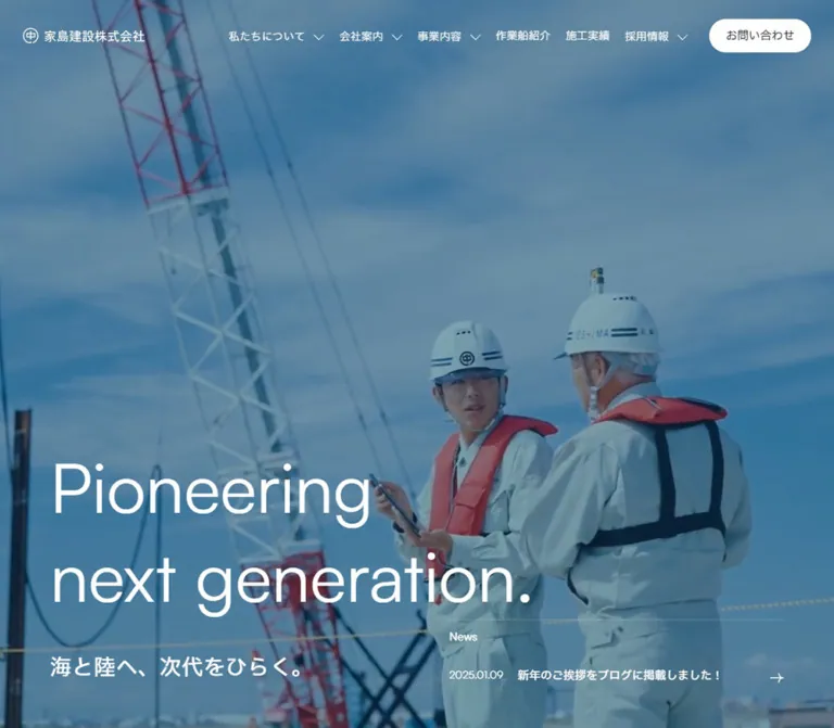
DESIGN REFERENCE
家島建設株式会社|港湾・土木・地盤改良の総合建設会社
深いネイビーとトープ、淡いブルーを基調に、現場写真と大きな英字見出しを配置したコーポレートサイト。左右にずらした採用コンテンツと、横方向に展開する船舶・施工実績の構成が特徴。
オリジナルサイトを見るIeshima Construction — Style Reference
Maritime scale, quiet typography, and human stories framed in navy and warm taupe.
Website: ieshima.co.jp Original URL: https://ieshima.co.jp/ Final URL: https://ieshima.co.jp/ Theme: white, pale sky blue, and deep navy sections; no user-selectable theme was evidenced. Inspected: September 13, 2026, Japan Standard Time. The supplied inspection record was retrieved at 03:56:56 JST, corresponding to September 12, 2026, 18:56:56 UTC. Viewports: 1440 × 1000 and 390 × 844 CSS pixels. Scope: the current corporate homepage, including its opening state, mobile hero, desktop recruitment composition, desktop and mobile footer, and rendered DOM measurements throughout the homepage. Linked detail pages, navigation panels, and forms were not separately inspected.
Ieshima Construction presents its engineering work through a restrained combination of operational imagery, large English headings, and smaller Japanese explanations. Deep navy supplies weight; warm taupe softens the dark areas; a pale blue recruitment field gives employee photography room to breathe. Most text is regular weight. Scale, alignment, and space establish hierarchy more often than heavy type or decorative containers.
This is a substantial corporate gateway. Its content connects business divisions, working vessels, completed projects, company information, recruitment, news, and inquiries. The distinctive rhythm comes from changing spatial arrangements: a viewport-filling opening composition, numbered business links, horizontal content rails, an extended sequence of alternating recruitment photographs, compact blog rows, and a broad contact-and-directory footer.
How to Read This Reference
- Measured values come from the supplied rendered DOM, computed styles, and element rectangles. Dimensions are CSS pixels unless otherwise stated.
- Observed visually describes the five original-page captures: three desktop states and two mobile states. Screenshot-derived dimensions and type sizes are marked as estimates.
- Derived values are calculations from recorded measurements, such as converting an RGB variable to hexadecimal or calculating a gap between adjacent items.
- Recommended values are implementation choices for a new build. They are not claims about the original stylesheet.
- Named tokens are reusable aliases. Original custom-property names are identified explicitly.
- The first desktop capture shows only the brand on a dark field. The desktop hero underneath is represented by DOM evidence, not a completed desktop hero screenshot.
- Some sampled headings contain independently styled children or clipped duplicate labels. A parent heading's computed font size does not establish the size of every visible word inside it.
- No additional browsing, command execution, or file inspection was performed for this reference.
Tokens — Colors
Default Palette
| Name | Value | Source evidence | Reusable token | Role |
|---|---|---|---|---|
| Deep Navy | #101a22 |
Source --color, --color-submit-bg; computed Cases background |
--color-ink |
Main text on light sections; dark section and footer appearance |
| Warm Taupe | #b2a295 |
Source --color-brown; computed Cases and contact text |
--color-taupe |
Display text, supporting text, and navigation within dark areas |
| Pale Sky | #e1eaf2 |
Derived from source --color-skyblue-rgb: 225, 234, 242; recruitment capture |
--color-sky |
Broad recruitment background |
| White | #ffffff |
Source --color-bg, --color-white; computed body and carousel controls |
--color-paper |
Light surfaces, reversed text, and white circular controls |
| Pill Navy | #172531 |
Computed collection-link background: rgb(23, 37, 49) |
--color-pill |
Filled View all and View more links |
| Secondary Slate | #46505d |
Source --color-secondary, --link-hover-color |
--color-secondary |
Available secondary/link-hover color; specific hover results were not captured |
The central dark pairing is Warm Taupe on Deep Navy. It appears in the contact area, footer directory, and computed project section. Preserve this warmer text color instead of automatically making all dark-section text white.
The visible recruitment field is pale blue even though the sampled section element reports a transparent background. The same distinction occurs in the footer. The visible surface can belong to a containing layer or another rendered element; a transparent section declaration does not make the finished section white.
Supporting Source Tokens
| Source token | Value | Interpretation |
|---|---|---|
--color-blue |
#245ca6 |
Declared blue; a dominant flat application of this color was not established in the supplied captures |
--color-submit-bg-hover |
#182632 |
Declared submit-hover color; do not conflate it with the measured #172531 collection-pill fill |
--color-gray-light |
#eeeeee |
Available neutral; also declared for input borders, whose actual forms were not inspected |
--color-gray |
#f0f0f2 |
Available neutral; no major visible section assignment established |
The extracted properties also include generic editor palettes, gradients, and shadow presets. Their presence does not establish their use in the homepage design. They should not become a rainbow palette or an elevation system in a recreation.
Tokens — Typography
Satoshi and IBM Plex Sans JP — Computed Family Stack
The computed body stack begins with Satoshi, followed by IBM Plex Sans JP and yakuhanjp, then system and Japanese sans-serif fallbacks. The supplied stack also includes Helvetica Neue, Hiragino families, Yu Gothic, Verdana, Meiryo, and M+ 1p.
This supports a Latin-first sans-serif system with Japanese fallback coverage. It does not independently verify downloaded font files or the font used for every individual glyph. Use the named families when legitimately available, and test fallback rendering rather than assuming identical metrics.
The visible English display text is spacious and regular in weight. Japanese navigation and content labels stay compact. Avoid applying the sampled H2 parent's semibold weight to every large English title: the recruitment capture clearly shows a much lighter display treatment than that parent declaration implies.
Weight and Tracking
- Source regular:
--font-normal: 400. - Source medium:
--font-medium: 500. - Source bold alias:
--font-bold: 600; this site's named bold token is semibold numerically. - Navigation and hero Japanese tracking: measured at
0.03em. - Collection-link tracking: measured at
0.01em. - Ship-caption tracking: measured at
0.03em. - Most remaining sampled text uses normal letter spacing.
Type Scale
| Role | Desktop | Mobile | Weight | Evidence and implementation note |
|---|---|---|---|---|
| Body | 16px / 25.6px |
14px / 22.4px |
400 |
Measured; a 1.6 base line height |
| Main navigation | 16px / 25.6px |
Replaced by menu control | 400 |
Measured, with 0.48px tracking |
| Desktop submenu links | 14px / 22.4px |
Open panel unverified | 400 |
Computed submenu entries; visibility and opening behavior were not tested |
| Header contact label | 15px / 24px |
No separate pill in the supplied mobile header | 400 |
Measured desktop link |
| Hero Japanese H1 | 28px / 44.8px |
20px / 32px |
500 |
Measured; 0.03em tracking |
| Hero English display | Not sampled independently | Approximately 46–48px |
Visually regular | Mobile visual estimate; desktop size must remain a reconstruction choice |
| Shared section-heading parent | 26px / 41.6px |
24px / 38.4px |
600 |
Measured parent only; combined heading boxes are 140px and 80px high |
| Recruitment English display | Approximately 80px |
Not visually captured | Visually regular | Desktop estimate; separate from the parent H2 size |
| Business links | 22px / 35.2px |
14px / 22.4px |
400 |
Measured, with different desktop/mobile component layouts |
| Collection pills | 18px / 28.8px |
12px / 19.2px |
400 |
Measured; 0.01em tracking |
| Ship category headings | 18px / 30.6px |
12px / 20.4px |
400 |
Measured; desktop white, mobile navy |
| Recruitment captions | 20px / 32px |
15px / 24px |
400 |
Measured; visible wrapper heights are smaller than these line boxes |
| Case titles | 16px / 28.8px |
14px / 25.2px |
400 |
Measured; 1.8 line height |
| Case categories | 14px / 22.4px |
13px / 20.8px |
400 |
Measured; compact inline metadata |
| Blog titles | 16px / 28.8px |
16px / 28.8px |
400 |
Measured; mobile titles retain desktop size and wrap |
| Contact display link | 80px / 128px |
40px / 64px |
400 |
Measured on the anchor; inner text layout affects its final rectangle |
| Contact paragraph | 15px / 27px |
14px / 25.2px |
400 |
Measured; 0.03em tracking |
| Footer primary links | 20px / 32px |
Not present in the visible mobile footer | 500 |
Measured for Home and About |
Wordmarks and Icons
The header wordmark occupies an asset-like link area, with an outlined circular emblem beside the Japanese company name. Its H1 wrapper uses a 1px computed font size, so that declaration must not be treated as the visible logo typography.
Material Symbols Outlined is declared as an icon-family token. The evidence does not identify which visible arrows or other marks use that font. Reproduce the observed thin strokes and directional shapes without assigning an unsupported icon source.
Tokens — Spacing & Shapes
The site uses several different horizontal alignments. Header, hero, main content, and footer do not share one universal gutter. Keeping those differences helps preserve the original composition.
Layout Measurements
| Element | Desktop at 1440px | Mobile at 390px | Status |
|---|---|---|---|
| Header height | 94px |
78px |
Measured; mobile source token --header-height-md: 78px |
| Header side inset | 50px |
25px |
Measured from brand and control positions |
| Header brand link | 200 × 26px |
126 × 26px |
Measured; mobile H1 wrapper is wider than the actual link |
| Main content inset | 75px |
20px |
Measured across multiple section headings |
| Main content width | 1290px |
350px |
Derived from measured insets |
| Hero Japanese copy left edge | 86.39px |
20px |
Measured; desktop value equals approximately 6vw |
| Footer side inset | 57.59px |
15.59px |
Measured; 4vw accounts for both observed values |
| Header contact link | 134 × 44px |
Not separately displayed | Measured rectangle; visibly pill shaped |
| Collection pill | 260 × 68.80px |
160 × 51.19px |
Measured |
| Ship control diameter | 108px |
40px |
Measured, circular |
| Ship item link box | 264.33 × 354px |
171 × 259.42px |
Measured; includes the item composition, not a verified image-only box |
| Ship item gap | 15px |
8px |
Derived from successive item positions |
| Case item link box | 430 × 420.69px |
315 × 342.55px |
Measured |
| Case item gap | 45px |
25px |
Derived from successive item positions |
| Recruitment link box | 480 × 374px |
297.5 × 237.53px |
Measured |
| Footer contact link width | 766.55px |
358.81px |
Measured |
| Footer height | 1112.09px |
762.63px |
Measured; not recommended as a fixed height |
Spacing Scale
| Use | Desktop | Mobile | Interpretation |
|---|---|---|---|
| Navigation label to chevron | 10px |
Not applicable in closed header | Measured flex gap |
| Business-link vertical padding | 30px |
16px |
Measured |
| Collection-pill padding | 20px 50px 20px 35px |
16px 40px 16px 14px |
Measured; extra right space accommodates direction indication |
| About section top/bottom padding | 150px / 200px |
130px / 75px |
Measured |
| Business and Ships top padding | 148px |
Approximately 64.23px |
Measured; responsive source formula was not supplied |
| Cases top/bottom padding | 110px / 170px |
Approximately 54.77px / 87.18px |
Measured |
| Blog top/bottom padding | 170px / 140px |
Approximately 77.94px / 47.94px |
Measured |
| Contact-link bottom to paragraph top | 60px |
40px |
Derived from element rectangles |
| Mobile recruitment item separation | Not transferable from the scrolled capture | 56px |
Derived between consecutive mobile link boxes |
These values describe an intentionally spacious page. They do not imply that every gap belongs to a single modular spacing scale. Use small local gaps for controls and metadata, with much larger section-specific intervals.
Border Radius and Edges
| Element | Treatment | Evidence |
|---|---|---|
| Recruitment photographs | Square corners | Original desktop capture |
| Ship and case link boxes | 0px radius |
Computed |
| Collection pills | 47px radius |
Computed |
| Carousel controls | 50% radius |
Computed |
| Header contact button | Full pill silhouette | Visual; its sampled anchor itself reports zero radius, suggesting styling on another layer |
| Contact divider | Approximately 1px horizontal rule |
Visual estimate |
| Mobile menu | Three thin horizontal strokes, approximately 28px wide |
Visual estimate; the button box is measured separately |
Components
Application Header
Role: persistent company identity and access to the site's main destinations.
On desktop, the brand sits at x = 50px, while the first navigation group begins around x = 466.78px. Navigation proceeds through company context, business, ships, cases, and recruitment before reaching the compact contact pill at the right. Several groups carry a small downward chevron.
The original captures show different surface states: navy text on a white header over recruitment, and white navigation over the dark desktop footer. The mobile hero has white branding and menu strokes over imagery; the mobile footer capture retains a white header with navy controls. Preserve these combinations rather than applying one global inversion rule to every viewport.
The header remains visible at the top in the supplied scrolled captures. Its exact positioning mechanism and the trigger for surface changes were not supplied. A fixed header with explicit surface states is a practical implementation recommendation.
Navigation Groups and Mobile Menu Control
Role: expose a broad corporate information architecture without crowding the closed header.
The rendered desktop structure includes submenu groups for About-related content, Company, Business, and Recruit. Recorded submenu links are 220px wide, use 14px text, and have 12px vertical padding. These measurements establish the link treatment, not the full panel's appearance or activation method.
At 390px, the desktop navigation is absent from the visible page output. A 40 × 78px menu button occupies x = 325px, leaving a 25px outer inset. Its supplied text label is メニューを開閉する.
No open mobile menu, dropdown hover, keyboard sequence, or dismissal interaction was captured. A new implementation should give each trigger a real expanded state and associate it with its controlled region. If a category also navigates, use a link and an adjacent disclosure button instead of nesting interactive elements.
Opening Splash
Role: a captured opening-like identity state; its precise loading behavior is unverified.
The first desktop image consists of a full navy field with a small, muted taupe company mark centered near (720, 500). There is no visible spinner, percentage, progress bar, or accompanying explanation.
Later captures and the rendered homepage content establish that this is not the entire site. The evidence does not establish its duration, exit animation, or whether it was waiting for media. Preserve the restrained appearance if implementing an opening state, but make content availability independent of an indefinitely blocking overlay.
Hero and Introductory Copy
Role: introduce the company's direction through an immersive worksite visual and bilingual statement.
The current mobile capture fills the visible screen with a close crop of blue work clothing and a person's arm. The image has an overall blue treatment. White branding sits at the top, and the copy sits low and left with a 20px inset:
Pioneeringnext generation.海と陸へ、次代をひらく。
The English copy is regular-weight sans-serif, visually about 46–48px, and breaks into two deliberate lines. The Japanese H1 is measured at 20px / 32px, weight 500. Its recorded bottom edge is about 51px above the mobile viewport bottom.
On desktop, the hero section is measured at 1440 × 1000px. The Japanese copy has a 6vw-equivalent inset and ends 60px above the viewport bottom. The English display child was not independently sampled, so its exact desktop type size is unknown.
The introduction repeats the bilingual statement and explains the company's integrated port-construction capability. It links to /about/. Its text is computed white, but no original capture establishes the complete introductory background composition. Avoid inventing its imagery.
News Teaser
Role: add a current editorial entry without competing with the main statement.
Desktop DOM places a 440px-wide white-text news block at the lower right of the hero. A small News heading sits above a row containing a date and linked Japanese title. The heading and title use 15px semibold text, and the link reserves 30px at the right.
On mobile, the visible text order and element measurements place News in its own section after the introduction. The title becomes 13px / 20.8px, regular weight, within the 350px content area. Do not force the desktop news block into the already occupied mobile hero.
The displayed article date is content data. It is not a design token or the inspection date.
Business Index
Role: route users to four operating divisions.
The desktop structure contains four numbered links: 船舶事業, 土木工事業, 地盤改良事業, and 海外事業. The measured right-hand column begins at approximately x = 858.69px and is 506.30px wide. Each link is about 95.19px high, with 22px text and 30px vertical padding.
At 390px, the business links form a two-column, two-row composition. Each box is 167.5px wide; the column gap is 15px; left edges are 20px and 202.5px. The mobile boxes are approximately 200px high and use 14px text. This is a structural change from the desktop link list.
The exact business imagery is not visible in the supplied original captures. Retain the measured numbering, hierarchy, and responsive arrangement without inventing particular photographs or hover-driven image swaps.
Collection Pill
Role: a consistent route from homepage previews to complete collections or company information.
The sampled View all and View more links use warm taupe on #172531, a 47px radius, and deliberately unequal horizontal padding. Desktop pills are 260px wide and approximately 69px tall. Mobile pills shrink to 160px wide and approximately 51px tall, with 12px labels.
The DOM often contains a repeated label, such as View allView all, while captures show a single readable label in comparable link treatments. This may support a clipped transition construction, but its animation was not recorded. Use one accessible name even if visual duplicate layers are introduced.
Ship Introduction Rail
Role: showcase the company's vessel and equipment categories.
The section combines the bilingual heading Ship introduction / 作業船/重機紹介, a collection pill, previous/next buttons, and horizontally positioned category items. Five unique categories repeat in the DOM: pile drivers, dredgers, floating docks, reclaimer ships, and sand carriers. The repeated anchors should not be interpreted as additional unique categories.
Desktop item boxes are approximately 264.33 × 354px with 15px gaps. Category headings are white and inset approximately 30px from the left and 27px from the top. Mobile boxes are 171px wide with 8px gaps, and category headings become navy 12px text at the top of the item composition.
The navigation controls change from 108px white circles on desktop to 40px circles at the mobile viewport edges. Previous and Next labels exist in the supplied button text, although their computed visual font size is zero.
The offscreen item positions, duplicates, and controls establish a carousel structure. Autoplay, swipe support, wraparound behavior, and the result of pressing either control remain unverified.
Cases Rail
Role: provide concrete project evidence through dated, categorized entries.
The Cases section has a measured navy background and taupe foreground. Its heading and collection pill precede a horizontal sequence of six recorded projects.
Desktop project links are 430px wide, separated by 45px. The first three left edges are 75px, 550px, and 1025px; the third extends beyond the viewport. On mobile, links are 315px wide, separated by 25px, with the second starting at 360px. The geometry preserves a preview of the next item rather than turning all projects into a vertical phone list.
Within each entry, date and category information precede a Japanese title. Title text starts 30px inside the desktop card and 20px inside the mobile card. Category links are independently represented in the DOM and use compact, unfilled text treatments.
The exact project-image crops and rail interactions were not captured visually. A native horizontal scroller is a suitable accessible adaptation, but it should be labeled as an implementation choice rather than the source mechanism.
Company Introduction
Role: connect operational capability with company history and identity.
The rendered section contains Company / 会社案内, a short company-history paragraph, and a View more link to /company/. The heading is computed white. Its desktop content starts at x = 120px, while mobile uses the common 20px inset.
This area should maintain the spacious bilingual hierarchy established elsewhere. Background imagery, transitions, and the full visual composition were not included in the original captures, so the evidence supports its structure and typography more strongly than its art direction.
Recruitment Photo Sequence
Role: present people and working conditions as a substantial part of the corporate story.
This is the most distinctive fully visible section. A large regular-weight Recruit heading and smaller 採用情報 label occupy the center of a pale blue field. Landscape photographs alternate far left and far right, leaving a broad central corridor.
The desktop staff-interview photograph shows a helmeted worker wearing an orange safety vest, with yellow industrial equipment and sky behind him. A subsequent right-hand photograph shows a smiling person indoors. Captions sit below the square-cornered images, centered and unboxed.
Measured desktop link boxes are 480px wide, alternating between x = 75px and x = 885px. This leaves a 330px horizontal corridor between the two image columns. The visible staff photograph is approximately 480 × 330px; a 16:11 image ratio is consistent with that capture.
Mobile retains the alternating alignment. Cards are 297.5px wide inside a 350px content area: exactly 85% of that area's width. They alternate between x = 20px and x = 72.5px, with 56px between successive link boxes. This is a single vertical sequence with offset edges, not two simultaneous narrow columns.
The image ratio above would produce a mobile image approximately 204.53px high. Combined with a 15px caption gap and an 18px visible caption wrapper, it accounts for the measured 237.53px link box. This is a derived reconstruction, not an independently sampled image style.
The scrolled desktop capture places the central title among later photographs, while the initial DOM coordinates place the heading before the sequence. Scroll-dependent positioning is consistent with the evidence, but the exact sticky, transform, or pinning implementation is unknown. Do not copy raw document Y coordinates as a finished animation timeline.
Recruitment Entry Feature
Role: conclude the recruitment sequence with a distinct application destination.
After six recruitment links, the page presents a short invitation and an entry link containing Join our team and Entry. The link box is measured at 720 × 500px, centered on desktop, and 390 × 390px on mobile.
This confirms a larger feature area than the standard collection pill. Its artwork and motion are not visible in the supplied original captures. Keep it separate in the component hierarchy without inventing an image treatment.
Blog Rows
Role: offer recent company activity in a compact editorial format.
Desktop layout assigns approximately 311.25px to the heading region and 963.75px to the row list, with a 15px interval. Three entries are recorded. Each desktop row is approximately 225.28px high, and consecutive rows are separated by a 1px interval.
At 390px, the heading and rows use the full 350px content width. Rows are approximately 140.48px high. The title begins 124px inside each mobile row, preserving a left media region and a right text region. The precise thumbnail dimensions were not sampled.
Blog titles remain 16px / 28.8px on mobile, while category labels reduce to 13px. This selective preservation of title size is worth retaining. The View all pill moves from below the desktop list to the mobile heading area.
Contact Invitation
Role: make inquiry access prominent through typography and space.
The desktop contact area occupies the footer's right region, beginning around x = 615.84px, with a thin top rule and a large Contact us link. A delicate right-pointing arrow sits at the far end. The label is measured at 80px, regular weight; the supporting paragraph is 15px / 27px, taupe, with 60px between the link box and paragraph.
Mobile expands this composition across the footer's 358.81px inner width. The display label becomes 40px, the paragraph becomes 14px / 25.2px, and the intervening gap becomes 40px. The arrow remains on the same line as the display label.
The link goes to /contact/. There is no form in the inspected footer itself.
Corporate Footer
Role: close the page with office information and desktop navigation depth.
The desktop footer is a large navy field. Its upper-left area contains a portrait-format photograph of two company flags against a blue sky, shown at approximately 271 × 352px in the capture. The contact invitation occupies the upper-right area.
Below, the company mark and two office blocks occupy the left. A five-column directory occupies the right, grouping Home/About, Business, Company, Recruit, and other primary destinations. English group labels are larger than the small Japanese sublinks. A low utility line contains copyright, an external link, YouTube access, and Privacy Policy.
The inspected original page identifies the company as 家島建設株式会社 and includes Himeji headquarters and Kobe office information. These are original-page identity findings.
On mobile, the visible footer simplifies to contact, the company mark, vertically stacked office information, and centered copyright. The flag photograph, directory columns, and desktop utility links are absent from the supplied mobile visible text and capture. Their availability in an untested menu or elsewhere is unknown.
Tokens — Motion & Interaction
Measured Transition Declarations
| Element or treatment | Recorded value | What is established |
|---|---|---|
| Logo heading wrapper | 0.4s cubic-bezier(0.165, 0.84, 0.44, 1) |
A transition is configured; the changing property and trigger were not demonstrated |
| Desktop navigation color | color 0.3s cubic-bezier(0.165, 0.84, 0.44, 1) |
Short eased color transition |
| Submenu-link color | color 0.4s cubic-bezier(0.39, 0.575, 0.565, 1) |
Sine-like color easing on sampled submenu links |
| Ship previous/next controls | 0.4s cubic-bezier(0.19, 1, 0.22, 1) |
Configured transition; hover or pressed result unverified |
| Case and blog category-link color | color 0.3s cubic-bezier(0.19, 1, 0.22, 1) |
Short eased color transition |
The source defines many additional easing variables. A definition alone does not establish a visible use, so the complete easing library should not be presented as a verified motion specification.
Observed States and Limits
| Evidence | Interpretation | Unverified detail |
|---|---|---|
| Brand-only desktop opening capture | A distinct opening-like state exists in the supplied sequence | Loading dependency, duration, and exit animation |
| Worksite imagery behind mobile hero copy | A photographic/media background is visible | Whether this frame is video, playback settings, audio, and loop duration |
| Header stays at the top in scrolled captures | Persistent navigation appearance | Fixed versus sticky implementation and state-change thresholds |
| Recruitment heading appears between alternating images | Spatial composition changes with the inspected scroll state | Pinning, parallax, movement distances, and timing |
| Repeated labels and clipped-looking rectangles | Multiple visual text layers may be involved | Rollover direction, animation duration, and assistive-technology exposure |
| Repeated ship categories and offscreen rail items | Carousel-like content organization | Autoplay, dragging, looping, and button outcomes |
Many sampled nodes report animation: none, while their transition field is simply all. Neither observation proves that the overall page is static: JavaScript, descendants, pseudo-elements, or media can behave differently. Conversely, transition: all without an evidenced duration is not enough to specify an animation.
For a new implementation, reuse the measured short color easings. Treat any reveal, image zoom, hero playback, or sticky-heading behavior as a separately specified feature. Reduced-motion support should include actual media handling; disabling CSS transitions alone cannot pause a video.
Surfaces
| Surface | Appearance | Structural purpose |
|---|---|---|
| Opening field | Deep navy with a small muted brand | Quiet identity presentation |
| Mobile hero | Full-bleed, blue-toned worksite imagery with white text | Immersive introduction |
| Light content areas | White with navy typography | Clear informational hierarchy |
| Recruitment | Pale blue with navy type and rectangular photography | Spacious employee-focused storytelling |
| Cases | Deep navy with taupe type | A distinct band for project evidence |
| Collection links | Slightly lighter navy pills with taupe labels | Repeated collection navigation |
| Footer | Deep navy, taupe typography, fine rules | Contact and corporate directory |
There is no visually established general-purpose shadow system. Separation comes from section color, image edges, thin rules, spacing, and a few rounded controls. Keep photographs and content entries square while reserving strong rounding for action links and circular navigation controls.
Imagery
Photography should communicate work at a human and operational scale. The original captures show work clothing, safety equipment, a worker in an industrial setting, an indoor portrait, and flags against the sky. Blue uniforms and sky connect naturally with the surrounding palette; orange and yellow appear as real equipment colors within photography.
The hero image is cropped tightly to fill a tall phone screen. Recruitment imagery provides more contextual landscape compositions and leaves captions outside the image. The footer flag photograph is portrait-oriented and functions as a small visual anchor within a much larger dark field.
Do not turn the orange safety vest or yellow machinery into additional global UI accent colors. Keep natural operational colors in the photographs. The measured UI palette remains restrained.
Observed Asset References
No image src, video URL, logo resource path, or font-file URL was supplied. The following references describe observed roles, not downloadable asset locations.
| Asset role | Original evidence | Geometry or treatment | Certainty |
|---|---|---|---|
| Company wordmark and circular emblem | Opening, header, and footer captures | Monochrome variants; header links measured at 200px and 126px wide |
Appearance and link dimensions observed; file type unknown |
| Hero worksite visual | Mobile hero capture | Tight full-screen crop, blue cast, white text overlay | Visible frame observed; medium and overlay method unknown |
| Staff interview photograph | Desktop recruitment capture | Worker, orange vest, yellow equipment; approximately 480 × 330px |
Visual estimate supported by surrounding link geometry |
| Recruitment message portrait | Lower-right portion of desktop recruitment capture | Smiling person indoors, landscape framing | Partial image observed |
| Company flags | Desktop footer capture | Portrait crop, approximately 271 × 352px |
Visual estimate |
| Ship, case, and blog media | Corresponding rendered link structures | Media regions implied by composition | Specific artwork and resource paths not supplied |
Use authorized original assets when available. For new photography, preserve real work environments, credible safety equipment, natural expressions, and crops that leave the intended text regions readable.
Layout & Responsive Behavior
Page Structure
The recorded homepage sequence is hero, introduction, business, ships, cases, company, recruitment, blog, a textless section, and footer. Mobile additionally exposes News as a separate section after the introduction.
The recorded document height is approximately 18,558px on desktop and 11,151px on mobile. These are inspection results, not layout targets. Long staged regions and responsive content arrangements contribute to the difference.
The introduction starts at y = 2500px on desktop and y = 2110px on mobile. Both equal 2.5 times the corresponding viewport height. That is evidence of viewport-related staging, but the underlying CSS or scroll-controller formula was not supplied.
A textless section before the footer measures 4543px high on desktop and approximately 249.56px on mobile. Its visual contents and timeline are not established. Do not recreate it as an arbitrary empty spacer.
Responsive Changes
| Area | Desktop behavior | Mobile behavior |
|---|---|---|
| Header | Full navigation and contact pill, 94px high |
Brand and menu control, 78px high |
| Hero | Japanese statement and separate lower-right news block in DOM | Low-left bilingual copy; news moved into later content |
| Business | Four large links in a right-side column | Four compact boxes in a two-column arrangement |
| Ships | Larger horizontal items and 108px controls |
Two 171px items fit the main inner width with an 8px gap; controls become 40px |
| Cases | 430px horizontal entries with 45px gaps |
315px entries with 25px gaps and a next-item preview |
| Recruitment | 480px photographs alternate across a wide central corridor |
85%-width items continue alternating left and right |
| Blog | Heading beside a broad row list; collection link below | Heading above rows; collection link moved into heading area |
| Footer | Flag photograph, contact, office columns, directory, utilities | Contact, brand, stacked offices, centered copyright |
Geometry Caveats
The mobile snapshot records the hero section itself as 1440 × 1000px, despite a 390 × 844px viewport and a visually phone-filling crop. The mobile Japanese H1 also reports a much wider rectangle than the visible viewport. These may reflect a retained or independently sized media/staging layer, but the cause was not supplied.
Do not copy a 1440px width onto a new mobile page. Use the mobile screenshot to establish the visible composition, keep the document free of unintended horizontal overflow, and confine deliberate overflow to media layers or content rails.
Only two widths were inspected. Exact breakpoints and intermediate tablet layouts are unknown. The Quick Start uses an explicitly recommended 80rem desktop breakpoint, which gives the full navigation enough room; it is not a recovered source breakpoint.
Do’s and Don’ts
Do
- Preserve the deep navy
#101a22, warm taupe#b2a295, and pale blue#e1eaf2relationship. - Pair large regular-weight English headings with smaller Japanese labels.
- Keep separate gutter rules for the header, hero, main content, and footer.
- Use square photography and unboxed captions for recruitment.
- Retain the alternating recruitment alignment on mobile.
- Preserve horizontal continuation cues for ship and case content.
- Distinguish the small header contact pill from the large footer contact link.
- Keep blog titles readable at the measured
16pxmobile size. - Use authentic worksite imagery and let equipment colors remain part of the photographs.
- Make navigation and project discovery as important as recruitment and contact access.
- Label reconstruction choices when source timing, imagery, or breakpoints are unknown.
Don't
- Don't collapse the homepage into a generic single-offer landing page.
- Don't turn every preview into a rounded, shadowed card.
- Don't use semibold type for every large English heading because a parent H2 reports weight
600. - Don't make the mobile recruitment stream a uniform full-width stack or a cramped two-column grid.
- Don't interpret repeated carousel entries as distinct services.
- Don't expose duplicate decorative link labels as duplicate accessible names.
- Don't copy editor gradient and shadow presets into the visible design system.
- Don't substitute pure black and generic gray for the navy and taupe pairing.
- Don't infer autoplay, smooth scrolling, parallax, or menu behavior from a still image alone.
- Don't hardcode recorded document heights or unexplained blank regions.
- Don't treat the initial logo-only desktop state as the completed homepage.
Recommended Implementation Additions
These are recommendations for a new implementation, not verified features of the original page:
- Preserve the existing skip-link concept and ensure it becomes clearly visible on keyboard focus.
- Give the brand link a useful accessible name, and use semantic headings for actual page content rather than reproducing the logo wrapper's
1pxtypography. - Separate category navigation links from disclosure buttons; expose
aria-expandedand keyboard dismissal on menus. - Give mobile carousel controls at least a
44pxhit area, even if the visible circle remains40px. - Make every horizontal rail keyboard reachable and usable without dragging. Avoid a rail that requires autoplay to expose content.
- Keep essential legal and contact destinations reachable on mobile, even when the desktop footer directory is removed.
- Provide a stable hero poster and explicit reduced-motion handling if background video or scroll staging is implemented.
- Ensure an opening overlay cannot indefinitely block the already available document.
- Allow captions and project titles to wrap under text zoom instead of preserving a clipped mask at all costs.
- Test text contrast against changing hero frames and test small taupe text at its actual rendered opacity.
- Use responsive image sources, reserve media dimensions, and defer below-the-fold photography appropriately.
Agent Prompt Guide
Quick Color Reference
- Main ink and dark field:
#101a22. - Dark-area typography:
#b2a295. - Recruitment field:
#e1eaf2. - Light surfaces and reversed hero labels:
#ffffff. - Collection-pill fill:
#172531. - Supporting source link color:
#46505d; actual hover outcomes were not captured. - Structural accents: fine rules and directional arrows, not colored badges or shadows.
Overall Prompt
“Create a Japanese construction-company homepage inspired by the observed Ieshima Construction design. Use deep navy #101a22, warm taupe #b2a295, white, and a pale blue recruitment field #e1eaf2. Pair large regular-weight English section headings with smaller Japanese labels, using Satoshi and IBM Plex Sans JP when available. Build a substantial corporate information structure covering business divisions, working vessels, project evidence, company information, recruitment, blog updates, and contact. Use square worksite photography, horizontal vessel and project rails, restrained navy collection pills, and a spacious contact footer. Recruitment photographs must alternate left and right around a broad desktop center and retain offset alignment on mobile. Treat unverified media playback and scroll effects as separate optional specifications.”
Example Component Prompts
- Header: “Build a persistent corporate header with a Japanese wordmark at left, six compact navigation groups, thin disclosure chevrons, and a 134 × 44px contact pill. Provide white-surface and transparent-media states. On a 390px phone, use a 78px header with a 126px brand and a three-line menu control.”
- Recruitment: “Create a pale blue recruitment section with a large regular-weight Recruit title, a small Japanese subtitle, and square-cornered landscape photographs. At 1440px, use 480px-wide items alternating between 75px and 885px left edges. At 390px, use 297.5px-wide items alternating between 20px and 72.5px, with 56px vertical separation. Captions remain outside the images.”
- Cases: “Create a deep navy project section with warm taupe headings, dates, category links, and Japanese project titles. Use a horizontal sequence of 430px entries with 45px desktop gaps, changing to 315px entries with 25px gaps on a 390px phone. Preserve a glimpse of the next project and provide accessible navigation.”
- Collection pill: “Create a warm-taupe View all link on
#172531, with a 47px radius and room for a directional arrow. Desktop dimensions are approximately 260 × 69px with 18px text; mobile dimensions are 160 × 51px with 12px text. Use one accessible label.” - Contact footer: “Create a deep navy footer with taupe typography and a thin top rule above a large Contact us link. Use 80px display text on desktop and 40px on mobile. Desktop includes a portrait flag photograph, office information, and a five-column directory; mobile prioritizes contact, brand, stacked offices, and copyright. Keep essential legal destinations accessible elsewhere.”
Quick Start
CSS Custom Properties
This is a usable adaptation, not the original stylesheet. Exact palette values, measured control sizes, and representative endpoint geometry are preserved. Fluid formulas, the 80rem breakpoint, native rail scrolling, hero display size, and sticky recruitment heading are recommended reconstruction choices.
The font declarations do not download fonts. Supply authorized font files and imagery separately. The hero media layer may contain an image or a video, but playback and menu state require their own implementation.
:root {
  /* Source-supported palette */
  --color-ink: #101a22;
  --color-taupe: #b2a295;
  --color-sky: #e1eaf2;
  --color-paper: #ffffff;
  --color-pill: #172531;
  --color-secondary: #46505d;

  /* Observed family names with a shortened fallback stack */
  --font-sans: 'Satoshi', 'IBM Plex Sans JP', yakuhanjp,
    -apple-system, BlinkMacSystemFont, 'Helvetica Neue',
    'Hiragino Sans', 'Yu Gothic', Meiryo, sans-serif;
  --weight-regular: 400;
  --weight-medium: 500;
  --weight-semibold: 600;

  /* Mobile endpoint tokens */
  --text-body: 14px;
  --text-section: 40px;
  --text-section-label: 14px;
  --text-contact: 40px;
  --text-pill: 12px;
  --text-recruit-caption: 15px;
  --leading-body: 1.6;
  --leading-copy: 1.8;

  --header-height: 78px;
  --header-inset: 25px;
  --brand-width: 126px;
  --content-inset: 20px;
  --hero-inset: 20px;
  --footer-inset: 4vw;
  --pill-width: 160px;
  --radius-pill: 47px;
  --rail-gap: 25px;
  --ship-gap: 8px;
  --ship-width: calc((100vw - 48px) / 2);

  /* Recorded easing curves; use only on specified properties */
  --ease-quart-out: cubic-bezier(.165, .84, .44, 1);
  --ease-expo-out: cubic-bezier(.19, 1, .22, 1);
  --ease-sine-out: cubic-bezier(.39, .575, .565, 1);

  /* Recommended rule opacity, not a sampled source value */
  --rule-dark: rgb(16 26 34 / 18%);
  --rule-light: rgb(178 162 149 / 40%);
}

* {
  box-sizing: border-box;
}

body {
  margin: 0;
  color: var(--color-ink);
  background: var(--color-paper);
  font: var(--weight-regular) var(--text-body) /
    var(--leading-body) var(--font-sans);
}

img {
  display: block;
  max-width: 100%;
}

a {
  color: inherit;
}

button {
  font: inherit;
}

.container {
  width: calc(100% - 2 * var(--content-inset));
  margin-inline: auto;
}

.section-title {
  margin: 0;
  font-weight: var(--weight-regular);
}

.section-title__en {
  display: block;
  font-size: var(--text-section);
  line-height: 1.2;
}

.section-title__ja {
  display: block;
  margin-top: 10px;
  font-size: var(--text-section-label);
  line-height: 1.6;
}

/* Recommended fixed implementation of the observed persistent header */
.site-header {
  position: fixed;
  inset: 0 0 auto;
  z-index: 50;
  display: flex;
  align-items: center;
  justify-content: space-between;
  height: var(--header-height);
  padding-inline: var(--header-inset);
  color: var(--color-ink);
  background: var(--color-paper);
}

.site-header[data-surface='media'] {
  color: var(--color-paper);
  background: transparent;
}

.site-brand {
  display: block;
  flex: none;
  width: var(--brand-width);
}

.site-brand img {
  width: 100%;
  height: auto;
}

.site-nav {
  display: none;
}

.menu-toggle {
  display: grid;
  place-items: center;
  width: 44px;
  height: var(--header-height);
  padding: 0;
  border: 0;
  color: inherit;
  background: transparent;
}

.menu-glyph {
  display: grid;
  align-content: space-between;
  width: 28px;
  height: 15px;
}

.menu-glyph > span {
  height: 1px;
  background: currentColor;
}

/* Recommended visible hero crop; no fixed desktop width on phones */
.hero {
  position: relative;
  isolation: isolate;
  min-height: 100svh;
  overflow: clip;
  color: var(--color-paper);
  background: var(--color-ink);
}

.hero__media,
.hero__shade {
  position: absolute;
  inset: 0;
  z-index: -1;
}

.hero__media > :is(img, video) {
  width: 100%;
  height: 100%;
  object-fit: cover;
}

.hero__shade {
  /* Tune against the actual media; source overlay opacity is unknown. */
  background: rgb(16 26 34 / 24%);
}

.hero__copy {
  position: absolute;
  right: var(--hero-inset);
  bottom: 6svh;
  left: var(--hero-inset);
}

.hero__display {
  margin: 0;
  font-size: clamp(40px, 11.8vw, 46px);
  font-weight: 400;
  line-height: 1.2;
}

.hero__tagline {
  margin: 24px 0 0;
  font-size: 20px;
  font-weight: 500;
  line-height: 1.6;
  letter-spacing: .03em;
}

.hero__news {
  display: none;
}

.pill {
  display: inline-flex;
  align-items: center;
  justify-content: space-between;
  gap: 16px;
  width: var(--pill-width);
  min-height: 51.2px;
  padding: 16px 40px 16px 14px;
  border-radius: var(--radius-pill);
  color: var(--color-taupe);
  background: var(--color-pill);
  font-size: var(--text-pill);
  line-height: 1.6;
  letter-spacing: .01em;
  text-decoration: none;
  transition: color 300ms var(--ease-quart-out);
}

.business-links {
  display: grid;
  grid-template-columns: repeat(2, minmax(0, 1fr));
  gap: 0 15px;
}

.business-link {
  min-width: 0;
  padding-block: 16px;
  border-bottom: 1px solid var(--rule-dark);
  text-decoration: none;
}

/* Native scrolling is an adaptation, not the identified source mechanism. */
.rail {
  display: flex;
  gap: var(--rail-gap);
  overflow-x: auto;
  padding-inline: var(--content-inset);
  scroll-padding-inline: var(--content-inset);
  scroll-snap-type: x proximity;
}

.case-card {
  flex: 0 0 min(315px, calc(100vw - 60px));
  min-width: 0;
  scroll-snap-align: start;
}

.cases {
  padding-block: 55px 87px;
  color: var(--color-taupe);
  background: var(--color-ink);
}

.case-card__body {
  padding: 20px;
}

.case-card__meta {
  display: flex;
  flex-wrap: wrap;
  gap: 5px 12px;
  font-size: 13px;
}

.case-card__title {
  margin: 12px 0 0;
  font-size: 14px;
  font-weight: 400;
  line-height: 1.8;
}

.ship-rail {
  gap: var(--ship-gap);
}

.ship-card {
  position: relative;
  flex: 0 0 var(--ship-width);
  scroll-snap-align: start;
  text-decoration: none;
}

.ship-card__title {
  margin: 0 0 10px;
  color: var(--color-ink);
  font-size: 12px;
  font-weight: 400;
  line-height: 1.7;
  letter-spacing: .03em;
}

.rail-control {
  display: grid;
  place-items: center;
  width: 44px;
  height: 44px;
  padding: 0;
  border: 0;
  border-radius: 50%;
  color: var(--color-ink);
  background: var(--color-paper);
  transition: color 400ms var(--ease-expo-out);
}

.recruit {
  padding-block: 83px 90px;
  background: var(--color-sky);
}

.recruit-list {
  display: grid;
  gap: 56px;
  margin: 74px 0 0;
  padding: 0;
  list-style: none;
}

.recruit-list > li {
  width: 85%;
}

.recruit-list > li:nth-child(even) {
  justify-self: end;
}

.recruit-card {
  display: block;
  text-align: center;
  text-decoration: none;
}

.recruit-card img {
  width: 100%;
  aspect-ratio: 16 / 11;
  object-fit: cover;
  border-radius: 0;
}

.recruit-card__caption {
  display: block;
  margin-top: 15px;
  font-size: var(--text-recruit-caption);
  /* Compact visible-line adaptation; allow wrapping instead of clipping. */
  line-height: 1.2;
}

.site-footer {
  padding: 85px var(--footer-inset) 72px;
  color: var(--color-taupe);
  background: var(--color-ink);
}

.footer-contact__link {
  display: flex;
  align-items: center;
  justify-content: space-between;
  gap: 20px;
  padding-top: 20px;
  border-top: 1px solid var(--rule-light);
  font-size: var(--text-contact);
  font-weight: 400;
  line-height: 1.2;
  text-decoration: none;
}

.footer-contact__arrow {
  flex: none;
  width: 36px;
  height: 36px;
}

.footer-contact p {
  margin: 40px 0 0;
  font-size: 14px;
  line-height: 1.8;
  letter-spacing: .03em;
}

.footer-flag,
.footer-directory {
  display: none;
}

.footer-lower {
  margin-top: 120px;
}

.footer-brand {
  width: 180px;
}

.footer-offices {
  display: grid;
  gap: 16px;
  margin-top: 36px;
}

.footer-offices address {
  font-style: normal;
  line-height: 1.8;
}

.footer-bottom {
  margin-top: 64px;
  font-size: 13px;
  text-align: center;
}

:where(a, button):focus-visible {
  outline: 2px solid currentColor;
  outline-offset: 5px;
}

.skip-link {
  position: fixed;
  top: 12px;
  left: 12px;
  z-index: 100;
  padding: 12px 16px;
  color: var(--color-ink);
  background: var(--color-paper);
  transform: translateY(-180%);
}

.skip-link:focus {
  transform: none;
}

@media (hover: hover) {
  .pill:hover {
    /* Recommended hover result; the original result was not captured. */
    color: var(--color-paper);
  }
}

/* Recommended breakpoint; only the two recorded endpoints were inspected. */
@media (min-width: 80rem) {
  :root {
    --text-body: 16px;
    --text-section: 80px;
    --text-section-label: 18px;
    --text-contact: 80px;
    --text-pill: 18px;
    --text-recruit-caption: 20px;
    --header-height: 94px;
    --header-inset: 50px;
    --brand-width: 200px;
    --content-inset: clamp(60px, 5.20833vw, 100px);
    --hero-inset: 6vw;
    --pill-width: 260px;
    --rail-gap: 45px;
    --ship-gap: 15px;
    --ship-width: 264.33px;
  }

  .section-title__ja {
    margin-top: 16px;
  }

  .site-header[data-surface='dark'] {
    color: var(--color-paper);
    background: transparent;
  }

  .site-nav {
    display: flex;
    align-items: center;
    gap: clamp(24px, 2.78vw, 40px);
    margin-left: auto;
    font-size: 16px;
    letter-spacing: .03em;
  }

  .site-nav a {
    text-decoration: none;
  }

  .header-contact {
    display: grid;
    place-items: center;
    min-width: 134px;
    min-height: 44px;
    padding: 10px 13px;
    border-radius: 999px;
    color: var(--color-paper);
    background: var(--color-ink);
    font-size: 15px;
    letter-spacing: normal;
  }

  .site-header:is([data-surface='media'], [data-surface='dark'])
    .header-contact {
    color: var(--color-ink);
    background: var(--color-paper);
  }

  .menu-toggle {
    display: none;
  }

  .hero__display {
    /* Desktop display size is recommended, not independently measured. */
    font-size: clamp(96px, 7.78vw, 120px);
  }

  .hero__tagline {
    font-size: 28px;
  }

  .hero__news {
    position: absolute;
    right: 6vw;
    bottom: 6svh;
    display: grid;
    gap: 27px;
    width: 440px;
  }

  .hero__news h2 {
    margin: 0;
    font-size: 15px;
    font-weight: 600;
    line-height: 24px;
  }

  .pill {
    min-height: 68.8px;
    padding: 20px 50px 20px 35px;
  }

  .business-links {
    grid-template-columns: minmax(0, 1fr);
    width: 39.25%;
    margin-left: auto;
  }

  .business-link {
    padding-block: 30px;
    font-size: 22px;
  }

  .cases {
    padding-block: 110px 170px;
  }

  .case-card {
    flex-basis: 430px;
  }

  .case-card__body {
    padding: 30px;
  }

  .case-card__meta {
    font-size: 14px;
  }

  .case-card__title {
    font-size: 16px;
  }

  .ship-card__title {
    position: absolute;
    top: 27px;
    left: 30px;
    z-index: 1;
    color: var(--color-paper);
    font-size: 18px;
  }

  .rail-control {
    width: 108px;
    height: 108px;
  }

  .recruit {
    padding-block: 10px 180px;
  }

  .recruit-heading {
    /* Optional reconstruction of the observed central heading composition. */
    position: sticky;
    top: 28vh;
    z-index: 2;
    width: max-content;
    max-width: 100%;
    margin-inline: auto;
    text-align: center;
    pointer-events: none;
  }

  .recruit-list {
    gap: 0;
    margin-top: 48px;
  }

  .recruit-list > li {
    width: min(480px, 37.21%);
  }

  .recruit-card__caption {
    margin-top: 20px;
  }

  .site-footer {
    padding-top: 8vw;
    padding-bottom: 100px;
  }

  .footer-top,
  .footer-lower {
    display: grid;
    grid-template-columns: 40% minmax(0, 1fr);
    column-gap: 2.14%;
  }

  .footer-flag {
    display: block;
    width: min(271px, 100%);
    margin: 0;
  }

  .footer-flag img {
    width: 100%;
    aspect-ratio: 271 / 352;
    object-fit: cover;
  }

  .footer-contact {
    grid-column: 2;
  }

  .footer-contact__arrow {
    width: 48px;
    height: 48px;
  }

  .footer-contact p {
    margin-top: 60px;
    font-size: 15px;
  }

  .footer-lower {
    margin-top: 100px;
    align-items: end;
  }

  .footer-directory {
    display: grid;
    grid-template-columns: repeat(5, minmax(0, 1fr));
    gap: 16px;
  }

  .footer-directory a {
    text-decoration: none;
  }

  .footer-offices {
    grid-template-columns: repeat(2, minmax(0, 1fr));
    gap: 30px;
  }

  .footer-bottom {
    display: flex;
    justify-content: space-between;
    align-items: center;
    margin-top: 120px;
    text-align: left;
  }
}

@media (prefers-reduced-motion: reduce) {
  .pill,
  .rail-control {
    transition: none;
  }

  .recruit-heading {
    position: static;
  }

  .rail {
    scroll-behavior: auto;
  }
}
Example Markup
The arrow below is a simple replacement shape, not a recovered original asset. It uses the same open, unboxed directional role.
<h2 class='section-title'>
  <span class='section-title__en' lang='en'>Recruit</span>
  <span class='section-title__ja' lang='ja'>採用情報</span>
</h2>

<a class='pill' href='/ship/'>
  <span>View all</span>
  <span aria-hidden='true'>→</span>
</a>

<div class='footer-contact'>
  <a class='footer-contact__link' href='/contact/'>
    <span>Contact us</span>
    <svg class='footer-contact__arrow' viewBox='0 0 40 40'
      aria-hidden='true' focusable='false'>
      <path d='M3 20H35M26 10L36 20L26 30'
        fill='none' stroke='currentColor' stroke-width='1.5' />
    </svg>
  </a>
  <p lang='ja'>
    家島建設へのご相談やご質問は<br>
    こちらのフォームよりお気軽にお問い合わせください。
  </p>
</div>
A .recruit-heading should contain only the heading, with the alternating .recruit-list as its following sibling inside the same section. Place .case-card elements inside .rail, and .ship-card elements inside .rail.ship-rail. Use .footer-top for the flag/contact pair and .footer-lower for the office/directory pair.
The CSS intentionally does not manufacture a loading timeline, duplicate-label animation, hidden mobile menu panel, or autoplay carousel. Those features need explicit behavior, accessible states, and testing before being added.
Tailwind v4 Token Mapping
Optional mapping for projects already using Tailwind v4. These aliases do not imply that the original site uses Tailwind. Define the properties above first.
@theme inline {
  --color-ieshima-ink: var(--color-ink);
  --color-ieshima-taupe: var(--color-taupe);
  --color-ieshima-sky: var(--color-sky);
  --color-ieshima-paper: var(--color-paper);
  --color-ieshima-pill: var(--color-pill);

  --font-ieshima: var(--font-sans);
  --text-ieshima-body: var(--text-body);
  --text-ieshima-section: var(--text-section);
  --text-ieshima-contact: var(--text-contact);
  --text-ieshima-pill: var(--text-pill);

  --spacing-ieshima-inset: var(--content-inset);
  --spacing-ieshima-header: var(--header-height);
  --radius-ieshima-pill: var(--radius-pill);
}
Sources & Evidence
- Inspected original website: Ieshima Construction homepage. Original and final URLs are identical; the supplied response status is HTTP 200.
- Inspection record: retrieved September 12, 2026, at
18:56:56.409Z, corresponding to September 13 at03:56:56.409JST. Individual screenshot timestamps were not supplied. - Desktop evidence, 1440 × 1000 CSS pixels: a brand-only opening capture, a recruitment-section capture, a footer capture, and rendered text, links, custom properties, computed styles, and element rectangles throughout the homepage.
- Mobile evidence, 390 × 844 CSS pixels: a hero capture, a footer capture, and corresponding rendered DOM/style measurements throughout the homepage.
- Inspection procedure supplied with the record: initial observation lasted at least five seconds; readiness checks considered document loading, visible-image decoding, finite animations, and sampled layout/text stability. Scrolling traversed intermediate viewports. Perpetual animations were paused during readiness checks and resumed afterward. SharedWorkers and service workers were disabled.
- Interaction limits: no click results, open navigation panels, form behavior, carousel operation, keyboard traversal, reduced-motion state, or time-resolved media sequence was supplied. Readiness checks do not prove that every delayed visual or scroll scene completed.
- Resource limits: image paths, video URLs, font binaries, full stylesheet rules, and script logic were not supplied. Linked destinations are recorded homepage navigation evidence; they were not independently analyzed.
This reference describes the current inspected corporate homepage. Measurements are specific to the supplied capture states. Visual estimates, derived geometry, and recommended implementation behavior are identified separately so they can be reused without being mistaken for recovered source code.
# Ieshima Construction — Style Reference

> Maritime scale, quiet typography, and human stories framed in navy and warm taupe.

**Website:** [ieshima.co.jp](https://ieshima.co.jp/)
**Original URL:** https://ieshima.co.jp/
**Final URL:** https://ieshima.co.jp/
**Theme:** white, pale sky blue, and deep navy sections; no user-selectable theme was evidenced.
**Inspected:** September 13, 2026, Japan Standard Time. The supplied inspection record was retrieved at 03:56:56 JST, corresponding to September 12, 2026, 18:56:56 UTC.
**Viewports:** 1440 × 1000 and 390 × 844 CSS pixels.
**Scope:** the current corporate homepage, including its opening state, mobile hero, desktop recruitment composition, desktop and mobile footer, and rendered DOM measurements throughout the homepage. Linked detail pages, navigation panels, and forms were not separately inspected.

Ieshima Construction presents its engineering work through a restrained combination of operational imagery, large English headings, and smaller Japanese explanations. Deep navy supplies weight; warm taupe softens the dark areas; a pale blue recruitment field gives employee photography room to breathe. Most text is regular weight. Scale, alignment, and space establish hierarchy more often than heavy type or decorative containers.

This is a substantial corporate gateway. Its content connects business divisions, working vessels, completed projects, company information, recruitment, news, and inquiries. The distinctive rhythm comes from changing spatial arrangements: a viewport-filling opening composition, numbered business links, horizontal content rails, an extended sequence of alternating recruitment photographs, compact blog rows, and a broad contact-and-directory footer.

## How to Read This Reference

- **Measured** values come from the supplied rendered DOM, computed styles, and element rectangles. Dimensions are CSS pixels unless otherwise stated.
- **Observed visually** describes the five original-page captures: three desktop states and two mobile states. Screenshot-derived dimensions and type sizes are marked as estimates.
- **Derived** values are calculations from recorded measurements, such as converting an RGB variable to hexadecimal or calculating a gap between adjacent items.
- **Recommended** values are implementation choices for a new build. They are not claims about the original stylesheet.
- **Named tokens** are reusable aliases. Original custom-property names are identified explicitly.
- The first desktop capture shows only the brand on a dark field. The desktop hero underneath is represented by DOM evidence, not a completed desktop hero screenshot.
- Some sampled headings contain independently styled children or clipped duplicate labels. A parent heading's computed font size does not establish the size of every visible word inside it.
- No additional browsing, command execution, or file inspection was performed for this reference.

## Tokens — Colors

### Default Palette

| Name | Value | Source evidence | Reusable token | Role |
| --- | --- | --- | --- | --- |
| Deep Navy | `#101a22` | Source `--color`, `--color-submit-bg`; computed Cases background | `--color-ink` | Main text on light sections; dark section and footer appearance |
| Warm Taupe | `#b2a295` | Source `--color-brown`; computed Cases and contact text | `--color-taupe` | Display text, supporting text, and navigation within dark areas |
| Pale Sky | `#e1eaf2` | Derived from source `--color-skyblue-rgb: 225, 234, 242`; recruitment capture | `--color-sky` | Broad recruitment background |
| White | `#ffffff` | Source `--color-bg`, `--color-white`; computed body and carousel controls | `--color-paper` | Light surfaces, reversed text, and white circular controls |
| Pill Navy | `#172531` | Computed collection-link background: `rgb(23, 37, 49)` | `--color-pill` | Filled `View all` and `View more` links |
| Secondary Slate | `#46505d` | Source `--color-secondary`, `--link-hover-color` | `--color-secondary` | Available secondary/link-hover color; specific hover results were not captured |

The central dark pairing is **Warm Taupe on Deep Navy**. It appears in the contact area, footer directory, and computed project section. Preserve this warmer text color instead of automatically making all dark-section text white.

The visible recruitment field is pale blue even though the sampled section element reports a transparent background. The same distinction occurs in the footer. The visible surface can belong to a containing layer or another rendered element; a transparent section declaration does not make the finished section white.

### Supporting Source Tokens

| Source token | Value | Interpretation |
| --- | --- | --- |
| `--color-blue` | `#245ca6` | Declared blue; a dominant flat application of this color was not established in the supplied captures |
| `--color-submit-bg-hover` | `#182632` | Declared submit-hover color; do not conflate it with the measured `#172531` collection-pill fill |
| `--color-gray-light` | `#eeeeee` | Available neutral; also declared for input borders, whose actual forms were not inspected |
| `--color-gray` | `#f0f0f2` | Available neutral; no major visible section assignment established |

The extracted properties also include generic editor palettes, gradients, and shadow presets. Their presence does not establish their use in the homepage design. They should not become a rainbow palette or an elevation system in a recreation.

## Tokens — Typography

### Satoshi and IBM Plex Sans JP — Computed Family Stack

The computed body stack begins with `Satoshi`, followed by `IBM Plex Sans JP` and `yakuhanjp`, then system and Japanese sans-serif fallbacks. The supplied stack also includes Helvetica Neue, Hiragino families, Yu Gothic, Verdana, Meiryo, and M+ 1p.

This supports a Latin-first sans-serif system with Japanese fallback coverage. It does not independently verify downloaded font files or the font used for every individual glyph. Use the named families when legitimately available, and test fallback rendering rather than assuming identical metrics.

The visible English display text is spacious and regular in weight. Japanese navigation and content labels stay compact. Avoid applying the sampled H2 parent's semibold weight to every large English title: the recruitment capture clearly shows a much lighter display treatment than that parent declaration implies.

### Weight and Tracking

- **Source regular:** `--font-normal: 400`.
- **Source medium:** `--font-medium: 500`.
- **Source bold alias:** `--font-bold: 600`; this site's named bold token is semibold numerically.
- **Navigation and hero Japanese tracking:** measured at `0.03em`.
- **Collection-link tracking:** measured at `0.01em`.
- **Ship-caption tracking:** measured at `0.03em`.
- Most remaining sampled text uses normal letter spacing.

### Type Scale

| Role | Desktop | Mobile | Weight | Evidence and implementation note |
| --- | --- | --- | --- | --- |
| Body | `16px / 25.6px` | `14px / 22.4px` | `400` | Measured; a `1.6` base line height |
| Main navigation | `16px / 25.6px` | Replaced by menu control | `400` | Measured, with `0.48px` tracking |
| Desktop submenu links | `14px / 22.4px` | Open panel unverified | `400` | Computed submenu entries; visibility and opening behavior were not tested |
| Header contact label | `15px / 24px` | No separate pill in the supplied mobile header | `400` | Measured desktop link |
| Hero Japanese H1 | `28px / 44.8px` | `20px / 32px` | `500` | Measured; `0.03em` tracking |
| Hero English display | Not sampled independently | Approximately `46–48px` | Visually regular | Mobile visual estimate; desktop size must remain a reconstruction choice |
| Shared section-heading parent | `26px / 41.6px` | `24px / 38.4px` | `600` | Measured parent only; combined heading boxes are `140px` and `80px` high |
| Recruitment English display | Approximately `80px` | Not visually captured | Visually regular | Desktop estimate; separate from the parent H2 size |
| Business links | `22px / 35.2px` | `14px / 22.4px` | `400` | Measured, with different desktop/mobile component layouts |
| Collection pills | `18px / 28.8px` | `12px / 19.2px` | `400` | Measured; `0.01em` tracking |
| Ship category headings | `18px / 30.6px` | `12px / 20.4px` | `400` | Measured; desktop white, mobile navy |
| Recruitment captions | `20px / 32px` | `15px / 24px` | `400` | Measured; visible wrapper heights are smaller than these line boxes |
| Case titles | `16px / 28.8px` | `14px / 25.2px` | `400` | Measured; `1.8` line height |
| Case categories | `14px / 22.4px` | `13px / 20.8px` | `400` | Measured; compact inline metadata |
| Blog titles | `16px / 28.8px` | `16px / 28.8px` | `400` | Measured; mobile titles retain desktop size and wrap |
| Contact display link | `80px / 128px` | `40px / 64px` | `400` | Measured on the anchor; inner text layout affects its final rectangle |
| Contact paragraph | `15px / 27px` | `14px / 25.2px` | `400` | Measured; `0.03em` tracking |
| Footer primary links | `20px / 32px` | Not present in the visible mobile footer | `500` | Measured for Home and About |

### Wordmarks and Icons

The header wordmark occupies an asset-like link area, with an outlined circular emblem beside the Japanese company name. Its H1 wrapper uses a `1px` computed font size, so that declaration must not be treated as the visible logo typography.

`Material Symbols Outlined` is declared as an icon-family token. The evidence does not identify which visible arrows or other marks use that font. Reproduce the observed thin strokes and directional shapes without assigning an unsupported icon source.

## Tokens — Spacing & Shapes

The site uses several different horizontal alignments. Header, hero, main content, and footer do not share one universal gutter. Keeping those differences helps preserve the original composition.

### Layout Measurements

| Element | Desktop at 1440px | Mobile at 390px | Status |
| --- | --- | --- | --- |
| Header height | `94px` | `78px` | Measured; mobile source token `--header-height-md: 78px` |
| Header side inset | `50px` | `25px` | Measured from brand and control positions |
| Header brand link | `200 × 26px` | `126 × 26px` | Measured; mobile H1 wrapper is wider than the actual link |
| Main content inset | `75px` | `20px` | Measured across multiple section headings |
| Main content width | `1290px` | `350px` | Derived from measured insets |
| Hero Japanese copy left edge | `86.39px` | `20px` | Measured; desktop value equals approximately `6vw` |
| Footer side inset | `57.59px` | `15.59px` | Measured; `4vw` accounts for both observed values |
| Header contact link | `134 × 44px` | Not separately displayed | Measured rectangle; visibly pill shaped |
| Collection pill | `260 × 68.80px` | `160 × 51.19px` | Measured |
| Ship control diameter | `108px` | `40px` | Measured, circular |
| Ship item link box | `264.33 × 354px` | `171 × 259.42px` | Measured; includes the item composition, not a verified image-only box |
| Ship item gap | `15px` | `8px` | Derived from successive item positions |
| Case item link box | `430 × 420.69px` | `315 × 342.55px` | Measured |
| Case item gap | `45px` | `25px` | Derived from successive item positions |
| Recruitment link box | `480 × 374px` | `297.5 × 237.53px` | Measured |
| Footer contact link width | `766.55px` | `358.81px` | Measured |
| Footer height | `1112.09px` | `762.63px` | Measured; not recommended as a fixed height |

### Spacing Scale

| Use | Desktop | Mobile | Interpretation |
| --- | --- | --- | --- |
| Navigation label to chevron | `10px` | Not applicable in closed header | Measured flex gap |
| Business-link vertical padding | `30px` | `16px` | Measured |
| Collection-pill padding | `20px 50px 20px 35px` | `16px 40px 16px 14px` | Measured; extra right space accommodates direction indication |
| About section top/bottom padding | `150px / 200px` | `130px / 75px` | Measured |
| Business and Ships top padding | `148px` | Approximately `64.23px` | Measured; responsive source formula was not supplied |
| Cases top/bottom padding | `110px / 170px` | Approximately `54.77px / 87.18px` | Measured |
| Blog top/bottom padding | `170px / 140px` | Approximately `77.94px / 47.94px` | Measured |
| Contact-link bottom to paragraph top | `60px` | `40px` | Derived from element rectangles |
| Mobile recruitment item separation | Not transferable from the scrolled capture | `56px` | Derived between consecutive mobile link boxes |

These values describe an intentionally spacious page. They do not imply that every gap belongs to a single modular spacing scale. Use small local gaps for controls and metadata, with much larger section-specific intervals.

### Border Radius and Edges

| Element | Treatment | Evidence |
| --- | --- | --- |
| Recruitment photographs | Square corners | Original desktop capture |
| Ship and case link boxes | `0px` radius | Computed |
| Collection pills | `47px` radius | Computed |
| Carousel controls | `50%` radius | Computed |
| Header contact button | Full pill silhouette | Visual; its sampled anchor itself reports zero radius, suggesting styling on another layer |
| Contact divider | Approximately `1px` horizontal rule | Visual estimate |
| Mobile menu | Three thin horizontal strokes, approximately `28px` wide | Visual estimate; the button box is measured separately |

## Components

### Application Header

**Role:** persistent company identity and access to the site's main destinations.

On desktop, the brand sits at `x = 50px`, while the first navigation group begins around `x = 466.78px`. Navigation proceeds through company context, business, ships, cases, and recruitment before reaching the compact contact pill at the right. Several groups carry a small downward chevron.

The original captures show different surface states: navy text on a white header over recruitment, and white navigation over the dark desktop footer. The mobile hero has white branding and menu strokes over imagery; the mobile footer capture retains a white header with navy controls. Preserve these combinations rather than applying one global inversion rule to every viewport.

The header remains visible at the top in the supplied scrolled captures. Its exact positioning mechanism and the trigger for surface changes were not supplied. A fixed header with explicit surface states is a practical implementation recommendation.

### Navigation Groups and Mobile Menu Control

**Role:** expose a broad corporate information architecture without crowding the closed header.

The rendered desktop structure includes submenu groups for About-related content, Company, Business, and Recruit. Recorded submenu links are `220px` wide, use `14px` text, and have `12px` vertical padding. These measurements establish the link treatment, not the full panel's appearance or activation method.

At 390px, the desktop navigation is absent from the visible page output. A `40 × 78px` menu button occupies `x = 325px`, leaving a `25px` outer inset. Its supplied text label is `メニューを開閉する`.

No open mobile menu, dropdown hover, keyboard sequence, or dismissal interaction was captured. A new implementation should give each trigger a real expanded state and associate it with its controlled region. If a category also navigates, use a link and an adjacent disclosure button instead of nesting interactive elements.

### Opening Splash

**Role:** a captured opening-like identity state; its precise loading behavior is unverified.

The first desktop image consists of a full navy field with a small, muted taupe company mark centered near `(720, 500)`. There is no visible spinner, percentage, progress bar, or accompanying explanation.

Later captures and the rendered homepage content establish that this is not the entire site. The evidence does not establish its duration, exit animation, or whether it was waiting for media. Preserve the restrained appearance if implementing an opening state, but make content availability independent of an indefinitely blocking overlay.

### Hero and Introductory Copy

**Role:** introduce the company's direction through an immersive worksite visual and bilingual statement.

The current mobile capture fills the visible screen with a close crop of blue work clothing and a person's arm. The image has an overall blue treatment. White branding sits at the top, and the copy sits low and left with a `20px` inset:

- `Pioneering`
- `next generation.`
- `海と陸へ、次代をひらく。`

The English copy is regular-weight sans-serif, visually about `46–48px`, and breaks into two deliberate lines. The Japanese H1 is measured at `20px / 32px`, weight `500`. Its recorded bottom edge is about `51px` above the mobile viewport bottom.

On desktop, the hero section is measured at `1440 × 1000px`. The Japanese copy has a `6vw`-equivalent inset and ends `60px` above the viewport bottom. The English display child was not independently sampled, so its exact desktop type size is unknown.

The introduction repeats the bilingual statement and explains the company's integrated port-construction capability. It links to `/about/`. Its text is computed white, but no original capture establishes the complete introductory background composition. Avoid inventing its imagery.

### News Teaser

**Role:** add a current editorial entry without competing with the main statement.

Desktop DOM places a `440px`-wide white-text news block at the lower right of the hero. A small `News` heading sits above a row containing a date and linked Japanese title. The heading and title use `15px` semibold text, and the link reserves `30px` at the right.

On mobile, the visible text order and element measurements place News in its own section after the introduction. The title becomes `13px / 20.8px`, regular weight, within the `350px` content area. Do not force the desktop news block into the already occupied mobile hero.

The displayed article date is content data. It is not a design token or the inspection date.

### Business Index

**Role:** route users to four operating divisions.

The desktop structure contains four numbered links: `船舶事業`, `土木工事業`, `地盤改良事業`, and `海外事業`. The measured right-hand column begins at approximately `x = 858.69px` and is `506.30px` wide. Each link is about `95.19px` high, with `22px` text and `30px` vertical padding.

At 390px, the business links form a two-column, two-row composition. Each box is `167.5px` wide; the column gap is `15px`; left edges are `20px` and `202.5px`. The mobile boxes are approximately `200px` high and use `14px` text. This is a structural change from the desktop link list.

The exact business imagery is not visible in the supplied original captures. Retain the measured numbering, hierarchy, and responsive arrangement without inventing particular photographs or hover-driven image swaps.

### Collection Pill

**Role:** a consistent route from homepage previews to complete collections or company information.

The sampled `View all` and `View more` links use warm taupe on `#172531`, a `47px` radius, and deliberately unequal horizontal padding. Desktop pills are `260px` wide and approximately `69px` tall. Mobile pills shrink to `160px` wide and approximately `51px` tall, with `12px` labels.

The DOM often contains a repeated label, such as `View allView all`, while captures show a single readable label in comparable link treatments. This may support a clipped transition construction, but its animation was not recorded. Use one accessible name even if visual duplicate layers are introduced.

### Ship Introduction Rail

**Role:** showcase the company's vessel and equipment categories.

The section combines the bilingual heading `Ship introduction` / `作業船/重機紹介`, a collection pill, previous/next buttons, and horizontally positioned category items. Five unique categories repeat in the DOM: pile drivers, dredgers, floating docks, reclaimer ships, and sand carriers. The repeated anchors should not be interpreted as additional unique categories.

Desktop item boxes are approximately `264.33 × 354px` with `15px` gaps. Category headings are white and inset approximately `30px` from the left and `27px` from the top. Mobile boxes are `171px` wide with `8px` gaps, and category headings become navy `12px` text at the top of the item composition.

The navigation controls change from `108px` white circles on desktop to `40px` circles at the mobile viewport edges. Previous and Next labels exist in the supplied button text, although their computed visual font size is zero.

The offscreen item positions, duplicates, and controls establish a carousel structure. Autoplay, swipe support, wraparound behavior, and the result of pressing either control remain unverified.

### Cases Rail

**Role:** provide concrete project evidence through dated, categorized entries.

The Cases section has a measured navy background and taupe foreground. Its heading and collection pill precede a horizontal sequence of six recorded projects.

Desktop project links are `430px` wide, separated by `45px`. The first three left edges are `75px`, `550px`, and `1025px`; the third extends beyond the viewport. On mobile, links are `315px` wide, separated by `25px`, with the second starting at `360px`. The geometry preserves a preview of the next item rather than turning all projects into a vertical phone list.

Within each entry, date and category information precede a Japanese title. Title text starts `30px` inside the desktop card and `20px` inside the mobile card. Category links are independently represented in the DOM and use compact, unfilled text treatments.

The exact project-image crops and rail interactions were not captured visually. A native horizontal scroller is a suitable accessible adaptation, but it should be labeled as an implementation choice rather than the source mechanism.

### Company Introduction

**Role:** connect operational capability with company history and identity.

The rendered section contains `Company` / `会社案内`, a short company-history paragraph, and a `View more` link to `/company/`. The heading is computed white. Its desktop content starts at `x = 120px`, while mobile uses the common `20px` inset.

This area should maintain the spacious bilingual hierarchy established elsewhere. Background imagery, transitions, and the full visual composition were not included in the original captures, so the evidence supports its structure and typography more strongly than its art direction.

### Recruitment Photo Sequence

**Role:** present people and working conditions as a substantial part of the corporate story.

This is the most distinctive fully visible section. A large regular-weight `Recruit` heading and smaller `採用情報` label occupy the center of a pale blue field. Landscape photographs alternate far left and far right, leaving a broad central corridor.

The desktop staff-interview photograph shows a helmeted worker wearing an orange safety vest, with yellow industrial equipment and sky behind him. A subsequent right-hand photograph shows a smiling person indoors. Captions sit below the square-cornered images, centered and unboxed.

Measured desktop link boxes are `480px` wide, alternating between `x = 75px` and `x = 885px`. This leaves a `330px` horizontal corridor between the two image columns. The visible staff photograph is approximately `480 × 330px`; a `16:11` image ratio is consistent with that capture.

Mobile retains the alternating alignment. Cards are `297.5px` wide inside a `350px` content area: exactly `85%` of that area's width. They alternate between `x = 20px` and `x = 72.5px`, with `56px` between successive link boxes. This is a single vertical sequence with offset edges, not two simultaneous narrow columns.

The image ratio above would produce a mobile image approximately `204.53px` high. Combined with a `15px` caption gap and an `18px` visible caption wrapper, it accounts for the measured `237.53px` link box. This is a derived reconstruction, not an independently sampled image style.

The scrolled desktop capture places the central title among later photographs, while the initial DOM coordinates place the heading before the sequence. Scroll-dependent positioning is consistent with the evidence, but the exact sticky, transform, or pinning implementation is unknown. Do not copy raw document Y coordinates as a finished animation timeline.

### Recruitment Entry Feature

**Role:** conclude the recruitment sequence with a distinct application destination.

After six recruitment links, the page presents a short invitation and an entry link containing `Join our team` and `Entry`. The link box is measured at `720 × 500px`, centered on desktop, and `390 × 390px` on mobile.

This confirms a larger feature area than the standard collection pill. Its artwork and motion are not visible in the supplied original captures. Keep it separate in the component hierarchy without inventing an image treatment.

### Blog Rows

**Role:** offer recent company activity in a compact editorial format.

Desktop layout assigns approximately `311.25px` to the heading region and `963.75px` to the row list, with a `15px` interval. Three entries are recorded. Each desktop row is approximately `225.28px` high, and consecutive rows are separated by a `1px` interval.

At 390px, the heading and rows use the full `350px` content width. Rows are approximately `140.48px` high. The title begins `124px` inside each mobile row, preserving a left media region and a right text region. The precise thumbnail dimensions were not sampled.

Blog titles remain `16px / 28.8px` on mobile, while category labels reduce to `13px`. This selective preservation of title size is worth retaining. The `View all` pill moves from below the desktop list to the mobile heading area.

### Contact Invitation

**Role:** make inquiry access prominent through typography and space.

The desktop contact area occupies the footer's right region, beginning around `x = 615.84px`, with a thin top rule and a large `Contact us` link. A delicate right-pointing arrow sits at the far end. The label is measured at `80px`, regular weight; the supporting paragraph is `15px / 27px`, taupe, with `60px` between the link box and paragraph.

Mobile expands this composition across the footer's `358.81px` inner width. The display label becomes `40px`, the paragraph becomes `14px / 25.2px`, and the intervening gap becomes `40px`. The arrow remains on the same line as the display label.

The link goes to `/contact/`. There is no form in the inspected footer itself.

### Corporate Footer

**Role:** close the page with office information and desktop navigation depth.

The desktop footer is a large navy field. Its upper-left area contains a portrait-format photograph of two company flags against a blue sky, shown at approximately `271 × 352px` in the capture. The contact invitation occupies the upper-right area.

Below, the company mark and two office blocks occupy the left. A five-column directory occupies the right, grouping Home/About, Business, Company, Recruit, and other primary destinations. English group labels are larger than the small Japanese sublinks. A low utility line contains copyright, an external link, YouTube access, and Privacy Policy.

The inspected original page identifies the company as `家島建設株式会社` and includes Himeji headquarters and Kobe office information. These are original-page identity findings.

On mobile, the visible footer simplifies to contact, the company mark, vertically stacked office information, and centered copyright. The flag photograph, directory columns, and desktop utility links are absent from the supplied mobile visible text and capture. Their availability in an untested menu or elsewhere is unknown.

## Tokens — Motion & Interaction

### Measured Transition Declarations

| Element or treatment | Recorded value | What is established |
| --- | --- | --- |
| Logo heading wrapper | `0.4s cubic-bezier(0.165, 0.84, 0.44, 1)` | A transition is configured; the changing property and trigger were not demonstrated |
| Desktop navigation color | `color 0.3s cubic-bezier(0.165, 0.84, 0.44, 1)` | Short eased color transition |
| Submenu-link color | `color 0.4s cubic-bezier(0.39, 0.575, 0.565, 1)` | Sine-like color easing on sampled submenu links |
| Ship previous/next controls | `0.4s cubic-bezier(0.19, 1, 0.22, 1)` | Configured transition; hover or pressed result unverified |
| Case and blog category-link color | `color 0.3s cubic-bezier(0.19, 1, 0.22, 1)` | Short eased color transition |

The source defines many additional easing variables. A definition alone does not establish a visible use, so the complete easing library should not be presented as a verified motion specification.

### Observed States and Limits

| Evidence | Interpretation | Unverified detail |
| --- | --- | --- |
| Brand-only desktop opening capture | A distinct opening-like state exists in the supplied sequence | Loading dependency, duration, and exit animation |
| Worksite imagery behind mobile hero copy | A photographic/media background is visible | Whether this frame is video, playback settings, audio, and loop duration |
| Header stays at the top in scrolled captures | Persistent navigation appearance | Fixed versus sticky implementation and state-change thresholds |
| Recruitment heading appears between alternating images | Spatial composition changes with the inspected scroll state | Pinning, parallax, movement distances, and timing |
| Repeated labels and clipped-looking rectangles | Multiple visual text layers may be involved | Rollover direction, animation duration, and assistive-technology exposure |
| Repeated ship categories and offscreen rail items | Carousel-like content organization | Autoplay, dragging, looping, and button outcomes |

Many sampled nodes report `animation: none`, while their transition field is simply `all`. Neither observation proves that the overall page is static: JavaScript, descendants, pseudo-elements, or media can behave differently. Conversely, `transition: all` without an evidenced duration is not enough to specify an animation.

For a new implementation, reuse the measured short color easings. Treat any reveal, image zoom, hero playback, or sticky-heading behavior as a separately specified feature. Reduced-motion support should include actual media handling; disabling CSS transitions alone cannot pause a video.

## Surfaces

| Surface | Appearance | Structural purpose |
| --- | --- | --- |
| Opening field | Deep navy with a small muted brand | Quiet identity presentation |
| Mobile hero | Full-bleed, blue-toned worksite imagery with white text | Immersive introduction |
| Light content areas | White with navy typography | Clear informational hierarchy |
| Recruitment | Pale blue with navy type and rectangular photography | Spacious employee-focused storytelling |
| Cases | Deep navy with taupe type | A distinct band for project evidence |
| Collection links | Slightly lighter navy pills with taupe labels | Repeated collection navigation |
| Footer | Deep navy, taupe typography, fine rules | Contact and corporate directory |

There is no visually established general-purpose shadow system. Separation comes from section color, image edges, thin rules, spacing, and a few rounded controls. Keep photographs and content entries square while reserving strong rounding for action links and circular navigation controls.

## Imagery

Photography should communicate work at a human and operational scale. The original captures show work clothing, safety equipment, a worker in an industrial setting, an indoor portrait, and flags against the sky. Blue uniforms and sky connect naturally with the surrounding palette; orange and yellow appear as real equipment colors within photography.

The hero image is cropped tightly to fill a tall phone screen. Recruitment imagery provides more contextual landscape compositions and leaves captions outside the image. The footer flag photograph is portrait-oriented and functions as a small visual anchor within a much larger dark field.

Do not turn the orange safety vest or yellow machinery into additional global UI accent colors. Keep natural operational colors in the photographs. The measured UI palette remains restrained.

### Observed Asset References

No image `src`, video URL, logo resource path, or font-file URL was supplied. The following references describe observed roles, not downloadable asset locations.

| Asset role | Original evidence | Geometry or treatment | Certainty |
| --- | --- | --- | --- |
| Company wordmark and circular emblem | Opening, header, and footer captures | Monochrome variants; header links measured at `200px` and `126px` wide | Appearance and link dimensions observed; file type unknown |
| Hero worksite visual | Mobile hero capture | Tight full-screen crop, blue cast, white text overlay | Visible frame observed; medium and overlay method unknown |
| Staff interview photograph | Desktop recruitment capture | Worker, orange vest, yellow equipment; approximately `480 × 330px` | Visual estimate supported by surrounding link geometry |
| Recruitment message portrait | Lower-right portion of desktop recruitment capture | Smiling person indoors, landscape framing | Partial image observed |
| Company flags | Desktop footer capture | Portrait crop, approximately `271 × 352px` | Visual estimate |
| Ship, case, and blog media | Corresponding rendered link structures | Media regions implied by composition | Specific artwork and resource paths not supplied |

Use authorized original assets when available. For new photography, preserve real work environments, credible safety equipment, natural expressions, and crops that leave the intended text regions readable.

## Layout & Responsive Behavior

### Page Structure

The recorded homepage sequence is hero, introduction, business, ships, cases, company, recruitment, blog, a textless section, and footer. Mobile additionally exposes News as a separate section after the introduction.

The recorded document height is approximately `18,558px` on desktop and `11,151px` on mobile. These are inspection results, not layout targets. Long staged regions and responsive content arrangements contribute to the difference.

The introduction starts at `y = 2500px` on desktop and `y = 2110px` on mobile. Both equal `2.5` times the corresponding viewport height. That is evidence of viewport-related staging, but the underlying CSS or scroll-controller formula was not supplied.

A textless section before the footer measures `4543px` high on desktop and approximately `249.56px` on mobile. Its visual contents and timeline are not established. Do not recreate it as an arbitrary empty spacer.

### Responsive Changes

| Area | Desktop behavior | Mobile behavior |
| --- | --- | --- |
| Header | Full navigation and contact pill, `94px` high | Brand and menu control, `78px` high |
| Hero | Japanese statement and separate lower-right news block in DOM | Low-left bilingual copy; news moved into later content |
| Business | Four large links in a right-side column | Four compact boxes in a two-column arrangement |
| Ships | Larger horizontal items and `108px` controls | Two `171px` items fit the main inner width with an `8px` gap; controls become `40px` |
| Cases | `430px` horizontal entries with `45px` gaps | `315px` entries with `25px` gaps and a next-item preview |
| Recruitment | `480px` photographs alternate across a wide central corridor | `85%`-width items continue alternating left and right |
| Blog | Heading beside a broad row list; collection link below | Heading above rows; collection link moved into heading area |
| Footer | Flag photograph, contact, office columns, directory, utilities | Contact, brand, stacked offices, centered copyright |

### Geometry Caveats

The mobile snapshot records the hero section itself as `1440 × 1000px`, despite a `390 × 844px` viewport and a visually phone-filling crop. The mobile Japanese H1 also reports a much wider rectangle than the visible viewport. These may reflect a retained or independently sized media/staging layer, but the cause was not supplied.

Do not copy a `1440px` width onto a new mobile page. Use the mobile screenshot to establish the visible composition, keep the document free of unintended horizontal overflow, and confine deliberate overflow to media layers or content rails.

Only two widths were inspected. Exact breakpoints and intermediate tablet layouts are unknown. The Quick Start uses an explicitly recommended `80rem` desktop breakpoint, which gives the full navigation enough room; it is not a recovered source breakpoint.

## Do’s and Don’ts

### Do

- Preserve the deep navy `#101a22`, warm taupe `#b2a295`, and pale blue `#e1eaf2` relationship.
- Pair large regular-weight English headings with smaller Japanese labels.
- Keep separate gutter rules for the header, hero, main content, and footer.
- Use square photography and unboxed captions for recruitment.
- Retain the alternating recruitment alignment on mobile.
- Preserve horizontal continuation cues for ship and case content.
- Distinguish the small header contact pill from the large footer contact link.
- Keep blog titles readable at the measured `16px` mobile size.
- Use authentic worksite imagery and let equipment colors remain part of the photographs.
- Make navigation and project discovery as important as recruitment and contact access.
- Label reconstruction choices when source timing, imagery, or breakpoints are unknown.

### Don't

- Don't collapse the homepage into a generic single-offer landing page.
- Don't turn every preview into a rounded, shadowed card.
- Don't use semibold type for every large English heading because a parent H2 reports weight `600`.
- Don't make the mobile recruitment stream a uniform full-width stack or a cramped two-column grid.
- Don't interpret repeated carousel entries as distinct services.
- Don't expose duplicate decorative link labels as duplicate accessible names.
- Don't copy editor gradient and shadow presets into the visible design system.
- Don't substitute pure black and generic gray for the navy and taupe pairing.
- Don't infer autoplay, smooth scrolling, parallax, or menu behavior from a still image alone.
- Don't hardcode recorded document heights or unexplained blank regions.
- Don't treat the initial logo-only desktop state as the completed homepage.

## Recommended Implementation Additions

These are recommendations for a new implementation, not verified features of the original page:

- Preserve the existing skip-link concept and ensure it becomes clearly visible on keyboard focus.
- Give the brand link a useful accessible name, and use semantic headings for actual page content rather than reproducing the logo wrapper's `1px` typography.
- Separate category navigation links from disclosure buttons; expose `aria-expanded` and keyboard dismissal on menus.
- Give mobile carousel controls at least a `44px` hit area, even if the visible circle remains `40px`.
- Make every horizontal rail keyboard reachable and usable without dragging. Avoid a rail that requires autoplay to expose content.
- Keep essential legal and contact destinations reachable on mobile, even when the desktop footer directory is removed.
- Provide a stable hero poster and explicit reduced-motion handling if background video or scroll staging is implemented.
- Ensure an opening overlay cannot indefinitely block the already available document.
- Allow captions and project titles to wrap under text zoom instead of preserving a clipped mask at all costs.
- Test text contrast against changing hero frames and test small taupe text at its actual rendered opacity.
- Use responsive image sources, reserve media dimensions, and defer below-the-fold photography appropriately.

## Agent Prompt Guide

### Quick Color Reference

- Main ink and dark field: `#101a22`.
- Dark-area typography: `#b2a295`.
- Recruitment field: `#e1eaf2`.
- Light surfaces and reversed hero labels: `#ffffff`.
- Collection-pill fill: `#172531`.
- Supporting source link color: `#46505d`; actual hover outcomes were not captured.
- Structural accents: fine rules and directional arrows, not colored badges or shadows.

### Overall Prompt

“Create a Japanese construction-company homepage inspired by the observed Ieshima Construction design. Use deep navy `#101a22`, warm taupe `#b2a295`, white, and a pale blue recruitment field `#e1eaf2`. Pair large regular-weight English section headings with smaller Japanese labels, using Satoshi and IBM Plex Sans JP when available. Build a substantial corporate information structure covering business divisions, working vessels, project evidence, company information, recruitment, blog updates, and contact. Use square worksite photography, horizontal vessel and project rails, restrained navy collection pills, and a spacious contact footer. Recruitment photographs must alternate left and right around a broad desktop center and retain offset alignment on mobile. Treat unverified media playback and scroll effects as separate optional specifications.”

### Example Component Prompts

1. **Header:** “Build a persistent corporate header with a Japanese wordmark at left, six compact navigation groups, thin disclosure chevrons, and a 134 × 44px contact pill. Provide white-surface and transparent-media states. On a 390px phone, use a 78px header with a 126px brand and a three-line menu control.”
2. **Recruitment:** “Create a pale blue recruitment section with a large regular-weight Recruit title, a small Japanese subtitle, and square-cornered landscape photographs. At 1440px, use 480px-wide items alternating between 75px and 885px left edges. At 390px, use 297.5px-wide items alternating between 20px and 72.5px, with 56px vertical separation. Captions remain outside the images.”
3. **Cases:** “Create a deep navy project section with warm taupe headings, dates, category links, and Japanese project titles. Use a horizontal sequence of 430px entries with 45px desktop gaps, changing to 315px entries with 25px gaps on a 390px phone. Preserve a glimpse of the next project and provide accessible navigation.”
4. **Collection pill:** “Create a warm-taupe View all link on `#172531`, with a 47px radius and room for a directional arrow. Desktop dimensions are approximately 260 × 69px with 18px text; mobile dimensions are 160 × 51px with 12px text. Use one accessible label.”
5. **Contact footer:** “Create a deep navy footer with taupe typography and a thin top rule above a large Contact us link. Use 80px display text on desktop and 40px on mobile. Desktop includes a portrait flag photograph, office information, and a five-column directory; mobile prioritizes contact, brand, stacked offices, and copyright. Keep essential legal destinations accessible elsewhere.”

## Quick Start

### CSS Custom Properties

This is a usable adaptation, not the original stylesheet. Exact palette values, measured control sizes, and representative endpoint geometry are preserved. Fluid formulas, the `80rem` breakpoint, native rail scrolling, hero display size, and sticky recruitment heading are recommended reconstruction choices.

The font declarations do not download fonts. Supply authorized font files and imagery separately. The hero media layer may contain an image or a video, but playback and menu state require their own implementation.

```css
:root {
  /* Source-supported palette */
  --color-ink: #101a22;
  --color-taupe: #b2a295;
  --color-sky: #e1eaf2;
  --color-paper: #ffffff;
  --color-pill: #172531;
  --color-secondary: #46505d;

  /* Observed family names with a shortened fallback stack */
  --font-sans: 'Satoshi', 'IBM Plex Sans JP', yakuhanjp,
    -apple-system, BlinkMacSystemFont, 'Helvetica Neue',
    'Hiragino Sans', 'Yu Gothic', Meiryo, sans-serif;
  --weight-regular: 400;
  --weight-medium: 500;
  --weight-semibold: 600;

  /* Mobile endpoint tokens */
  --text-body: 14px;
  --text-section: 40px;
  --text-section-label: 14px;
  --text-contact: 40px;
  --text-pill: 12px;
  --text-recruit-caption: 15px;
  --leading-body: 1.6;
  --leading-copy: 1.8;

  --header-height: 78px;
  --header-inset: 25px;
  --brand-width: 126px;
  --content-inset: 20px;
  --hero-inset: 20px;
  --footer-inset: 4vw;
  --pill-width: 160px;
  --radius-pill: 47px;
  --rail-gap: 25px;
  --ship-gap: 8px;
  --ship-width: calc((100vw - 48px) / 2);

  /* Recorded easing curves; use only on specified properties */
  --ease-quart-out: cubic-bezier(.165, .84, .44, 1);
  --ease-expo-out: cubic-bezier(.19, 1, .22, 1);
  --ease-sine-out: cubic-bezier(.39, .575, .565, 1);

  /* Recommended rule opacity, not a sampled source value */
  --rule-dark: rgb(16 26 34 / 18%);
  --rule-light: rgb(178 162 149 / 40%);
}

* {
  box-sizing: border-box;
}

body {
  margin: 0;
  color: var(--color-ink);
  background: var(--color-paper);
  font: var(--weight-regular) var(--text-body) /
    var(--leading-body) var(--font-sans);
}

img {
  display: block;
  max-width: 100%;
}

a {
  color: inherit;
}

button {
  font: inherit;
}

.container {
  width: calc(100% - 2 * var(--content-inset));
  margin-inline: auto;
}

.section-title {
  margin: 0;
  font-weight: var(--weight-regular);
}

.section-title__en {
  display: block;
  font-size: var(--text-section);
  line-height: 1.2;
}

.section-title__ja {
  display: block;
  margin-top: 10px;
  font-size: var(--text-section-label);
  line-height: 1.6;
}

/* Recommended fixed implementation of the observed persistent header */
.site-header {
  position: fixed;
  inset: 0 0 auto;
  z-index: 50;
  display: flex;
  align-items: center;
  justify-content: space-between;
  height: var(--header-height);
  padding-inline: var(--header-inset);
  color: var(--color-ink);
  background: var(--color-paper);
}

.site-header[data-surface='media'] {
  color: var(--color-paper);
  background: transparent;
}

.site-brand {
  display: block;
  flex: none;
  width: var(--brand-width);
}

.site-brand img {
  width: 100%;
  height: auto;
}

.site-nav {
  display: none;
}

.menu-toggle {
  display: grid;
  place-items: center;
  width: 44px;
  height: var(--header-height);
  padding: 0;
  border: 0;
  color: inherit;
  background: transparent;
}

.menu-glyph {
  display: grid;
  align-content: space-between;
  width: 28px;
  height: 15px;
}

.menu-glyph > span {
  height: 1px;
  background: currentColor;
}

/* Recommended visible hero crop; no fixed desktop width on phones */
.hero {
  position: relative;
  isolation: isolate;
  min-height: 100svh;
  overflow: clip;
  color: var(--color-paper);
  background: var(--color-ink);
}

.hero__media,
.hero__shade {
  position: absolute;
  inset: 0;
  z-index: -1;
}

.hero__media > :is(img, video) {
  width: 100%;
  height: 100%;
  object-fit: cover;
}

.hero__shade {
  /* Tune against the actual media; source overlay opacity is unknown. */
  background: rgb(16 26 34 / 24%);
}

.hero__copy {
  position: absolute;
  right: var(--hero-inset);
  bottom: 6svh;
  left: var(--hero-inset);
}

.hero__display {
  margin: 0;
  font-size: clamp(40px, 11.8vw, 46px);
  font-weight: 400;
  line-height: 1.2;
}

.hero__tagline {
  margin: 24px 0 0;
  font-size: 20px;
  font-weight: 500;
  line-height: 1.6;
  letter-spacing: .03em;
}

.hero__news {
  display: none;
}

.pill {
  display: inline-flex;
  align-items: center;
  justify-content: space-between;
  gap: 16px;
  width: var(--pill-width);
  min-height: 51.2px;
  padding: 16px 40px 16px 14px;
  border-radius: var(--radius-pill);
  color: var(--color-taupe);
  background: var(--color-pill);
  font-size: var(--text-pill);
  line-height: 1.6;
  letter-spacing: .01em;
  text-decoration: none;
  transition: color 300ms var(--ease-quart-out);
}

.business-links {
  display: grid;
  grid-template-columns: repeat(2, minmax(0, 1fr));
  gap: 0 15px;
}

.business-link {
  min-width: 0;
  padding-block: 16px;
  border-bottom: 1px solid var(--rule-dark);
  text-decoration: none;
}

/* Native scrolling is an adaptation, not the identified source mechanism. */
.rail {
  display: flex;
  gap: var(--rail-gap);
  overflow-x: auto;
  padding-inline: var(--content-inset);
  scroll-padding-inline: var(--content-inset);
  scroll-snap-type: x proximity;
}

.case-card {
  flex: 0 0 min(315px, calc(100vw - 60px));
  min-width: 0;
  scroll-snap-align: start;
}

.cases {
  padding-block: 55px 87px;
  color: var(--color-taupe);
  background: var(--color-ink);
}

.case-card__body {
  padding: 20px;
}

.case-card__meta {
  display: flex;
  flex-wrap: wrap;
  gap: 5px 12px;
  font-size: 13px;
}

.case-card__title {
  margin: 12px 0 0;
  font-size: 14px;
  font-weight: 400;
  line-height: 1.8;
}

.ship-rail {
  gap: var(--ship-gap);
}

.ship-card {
  position: relative;
  flex: 0 0 var(--ship-width);
  scroll-snap-align: start;
  text-decoration: none;
}

.ship-card__title {
  margin: 0 0 10px;
  color: var(--color-ink);
  font-size: 12px;
  font-weight: 400;
  line-height: 1.7;
  letter-spacing: .03em;
}

.rail-control {
  display: grid;
  place-items: center;
  width: 44px;
  height: 44px;
  padding: 0;
  border: 0;
  border-radius: 50%;
  color: var(--color-ink);
  background: var(--color-paper);
  transition: color 400ms var(--ease-expo-out);
}

.recruit {
  padding-block: 83px 90px;
  background: var(--color-sky);
}

.recruit-list {
  display: grid;
  gap: 56px;
  margin: 74px 0 0;
  padding: 0;
  list-style: none;
}

.recruit-list > li {
  width: 85%;
}

.recruit-list > li:nth-child(even) {
  justify-self: end;
}

.recruit-card {
  display: block;
  text-align: center;
  text-decoration: none;
}

.recruit-card img {
  width: 100%;
  aspect-ratio: 16 / 11;
  object-fit: cover;
  border-radius: 0;
}

.recruit-card__caption {
  display: block;
  margin-top: 15px;
  font-size: var(--text-recruit-caption);
  /* Compact visible-line adaptation; allow wrapping instead of clipping. */
  line-height: 1.2;
}

.site-footer {
  padding: 85px var(--footer-inset) 72px;
  color: var(--color-taupe);
  background: var(--color-ink);
}

.footer-contact__link {
  display: flex;
  align-items: center;
  justify-content: space-between;
  gap: 20px;
  padding-top: 20px;
  border-top: 1px solid var(--rule-light);
  font-size: var(--text-contact);
  font-weight: 400;
  line-height: 1.2;
  text-decoration: none;
}

.footer-contact__arrow {
  flex: none;
  width: 36px;
  height: 36px;
}

.footer-contact p {
  margin: 40px 0 0;
  font-size: 14px;
  line-height: 1.8;
  letter-spacing: .03em;
}

.footer-flag,
.footer-directory {
  display: none;
}

.footer-lower {
  margin-top: 120px;
}

.footer-brand {
  width: 180px;
}

.footer-offices {
  display: grid;
  gap: 16px;
  margin-top: 36px;
}

.footer-offices address {
  font-style: normal;
  line-height: 1.8;
}

.footer-bottom {
  margin-top: 64px;
  font-size: 13px;
  text-align: center;
}

:where(a, button):focus-visible {
  outline: 2px solid currentColor;
  outline-offset: 5px;
}

.skip-link {
  position: fixed;
  top: 12px;
  left: 12px;
  z-index: 100;
  padding: 12px 16px;
  color: var(--color-ink);
  background: var(--color-paper);
  transform: translateY(-180%);
}

.skip-link:focus {
  transform: none;
}

@media (hover: hover) {
  .pill:hover {
    /* Recommended hover result; the original result was not captured. */
    color: var(--color-paper);
  }
}

/* Recommended breakpoint; only the two recorded endpoints were inspected. */
@media (min-width: 80rem) {
  :root {
    --text-body: 16px;
    --text-section: 80px;
    --text-section-label: 18px;
    --text-contact: 80px;
    --text-pill: 18px;
    --text-recruit-caption: 20px;
    --header-height: 94px;
    --header-inset: 50px;
    --brand-width: 200px;
    --content-inset: clamp(60px, 5.20833vw, 100px);
    --hero-inset: 6vw;
    --pill-width: 260px;
    --rail-gap: 45px;
    --ship-gap: 15px;
    --ship-width: 264.33px;
  }

  .section-title__ja {
    margin-top: 16px;
  }

  .site-header[data-surface='dark'] {
    color: var(--color-paper);
    background: transparent;
  }

  .site-nav {
    display: flex;
    align-items: center;
    gap: clamp(24px, 2.78vw, 40px);
    margin-left: auto;
    font-size: 16px;
    letter-spacing: .03em;
  }

  .site-nav a {
    text-decoration: none;
  }

  .header-contact {
    display: grid;
    place-items: center;
    min-width: 134px;
    min-height: 44px;
    padding: 10px 13px;
    border-radius: 999px;
    color: var(--color-paper);
    background: var(--color-ink);
    font-size: 15px;
    letter-spacing: normal;
  }

  .site-header:is([data-surface='media'], [data-surface='dark'])
    .header-contact {
    color: var(--color-ink);
    background: var(--color-paper);
  }

  .menu-toggle {
    display: none;
  }

  .hero__display {
    /* Desktop display size is recommended, not independently measured. */
    font-size: clamp(96px, 7.78vw, 120px);
  }

  .hero__tagline {
    font-size: 28px;
  }

  .hero__news {
    position: absolute;
    right: 6vw;
    bottom: 6svh;
    display: grid;
    gap: 27px;
    width: 440px;
  }

  .hero__news h2 {
    margin: 0;
    font-size: 15px;
    font-weight: 600;
    line-height: 24px;
  }

  .pill {
    min-height: 68.8px;
    padding: 20px 50px 20px 35px;
  }

  .business-links {
    grid-template-columns: minmax(0, 1fr);
    width: 39.25%;
    margin-left: auto;
  }

  .business-link {
    padding-block: 30px;
    font-size: 22px;
  }

  .cases {
    padding-block: 110px 170px;
  }

  .case-card {
    flex-basis: 430px;
  }

  .case-card__body {
    padding: 30px;
  }

  .case-card__meta {
    font-size: 14px;
  }

  .case-card__title {
    font-size: 16px;
  }

  .ship-card__title {
    position: absolute;
    top: 27px;
    left: 30px;
    z-index: 1;
    color: var(--color-paper);
    font-size: 18px;
  }

  .rail-control {
    width: 108px;
    height: 108px;
  }

  .recruit {
    padding-block: 10px 180px;
  }

  .recruit-heading {
    /* Optional reconstruction of the observed central heading composition. */
    position: sticky;
    top: 28vh;
    z-index: 2;
    width: max-content;
    max-width: 100%;
    margin-inline: auto;
    text-align: center;
    pointer-events: none;
  }

  .recruit-list {
    gap: 0;
    margin-top: 48px;
  }

  .recruit-list > li {
    width: min(480px, 37.21%);
  }

  .recruit-card__caption {
    margin-top: 20px;
  }

  .site-footer {
    padding-top: 8vw;
    padding-bottom: 100px;
  }

  .footer-top,
  .footer-lower {
    display: grid;
    grid-template-columns: 40% minmax(0, 1fr);
    column-gap: 2.14%;
  }

  .footer-flag {
    display: block;
    width: min(271px, 100%);
    margin: 0;
  }

  .footer-flag img {
    width: 100%;
    aspect-ratio: 271 / 352;
    object-fit: cover;
  }

  .footer-contact {
    grid-column: 2;
  }

  .footer-contact__arrow {
    width: 48px;
    height: 48px;
  }

  .footer-contact p {
    margin-top: 60px;
    font-size: 15px;
  }

  .footer-lower {
    margin-top: 100px;
    align-items: end;
  }

  .footer-directory {
    display: grid;
    grid-template-columns: repeat(5, minmax(0, 1fr));
    gap: 16px;
  }

  .footer-directory a {
    text-decoration: none;
  }

  .footer-offices {
    grid-template-columns: repeat(2, minmax(0, 1fr));
    gap: 30px;
  }

  .footer-bottom {
    display: flex;
    justify-content: space-between;
    align-items: center;
    margin-top: 120px;
    text-align: left;
  }
}

@media (prefers-reduced-motion: reduce) {
  .pill,
  .rail-control {
    transition: none;
  }

  .recruit-heading {
    position: static;
  }

  .rail {
    scroll-behavior: auto;
  }
}
```

### Example Markup

The arrow below is a simple replacement shape, not a recovered original asset. It uses the same open, unboxed directional role.

```html
<h2 class='section-title'>
  <span class='section-title__en' lang='en'>Recruit</span>
  <span class='section-title__ja' lang='ja'>採用情報</span>
</h2>

<a class='pill' href='/ship/'>
  <span>View all</span>
  <span aria-hidden='true'>→</span>
</a>

<div class='footer-contact'>
  <a class='footer-contact__link' href='/contact/'>
    <span>Contact us</span>
    <svg class='footer-contact__arrow' viewBox='0 0 40 40'
      aria-hidden='true' focusable='false'>
      <path d='M3 20H35M26 10L36 20L26 30'
        fill='none' stroke='currentColor' stroke-width='1.5' />
    </svg>
  </a>
  <p lang='ja'>
    家島建設へのご相談やご質問は<br>
    こちらのフォームよりお気軽にお問い合わせください。
  </p>
</div>
```

A `.recruit-heading` should contain only the heading, with the alternating `.recruit-list` as its following sibling inside the same section. Place `.case-card` elements inside `.rail`, and `.ship-card` elements inside `.rail.ship-rail`. Use `.footer-top` for the flag/contact pair and `.footer-lower` for the office/directory pair.

The CSS intentionally does not manufacture a loading timeline, duplicate-label animation, hidden mobile menu panel, or autoplay carousel. Those features need explicit behavior, accessible states, and testing before being added.

### Tailwind v4 Token Mapping

Optional mapping for projects already using Tailwind v4. These aliases do not imply that the original site uses Tailwind. Define the properties above first.

```css
@theme inline {
  --color-ieshima-ink: var(--color-ink);
  --color-ieshima-taupe: var(--color-taupe);
  --color-ieshima-sky: var(--color-sky);
  --color-ieshima-paper: var(--color-paper);
  --color-ieshima-pill: var(--color-pill);

  --font-ieshima: var(--font-sans);
  --text-ieshima-body: var(--text-body);
  --text-ieshima-section: var(--text-section);
  --text-ieshima-contact: var(--text-contact);
  --text-ieshima-pill: var(--text-pill);

  --spacing-ieshima-inset: var(--content-inset);
  --spacing-ieshima-header: var(--header-height);
  --radius-ieshima-pill: var(--radius-pill);
}
```

## Sources & Evidence

- **Inspected original website:** [Ieshima Construction homepage](https://ieshima.co.jp/). Original and final URLs are identical; the supplied response status is HTTP 200.
- **Inspection record:** retrieved September 12, 2026, at `18:56:56.409Z`, corresponding to September 13 at `03:56:56.409` JST. Individual screenshot timestamps were not supplied.
- **Desktop evidence, 1440 × 1000 CSS pixels:** a brand-only opening capture, a recruitment-section capture, a footer capture, and rendered text, links, custom properties, computed styles, and element rectangles throughout the homepage.
- **Mobile evidence, 390 × 844 CSS pixels:** a hero capture, a footer capture, and corresponding rendered DOM/style measurements throughout the homepage.
- **Inspection procedure supplied with the record:** initial observation lasted at least five seconds; readiness checks considered document loading, visible-image decoding, finite animations, and sampled layout/text stability. Scrolling traversed intermediate viewports. Perpetual animations were paused during readiness checks and resumed afterward. SharedWorkers and service workers were disabled.
- **Interaction limits:** no click results, open navigation panels, form behavior, carousel operation, keyboard traversal, reduced-motion state, or time-resolved media sequence was supplied. Readiness checks do not prove that every delayed visual or scroll scene completed.
- **Resource limits:** image paths, video URLs, font binaries, full stylesheet rules, and script logic were not supplied. Linked destinations are recorded homepage navigation evidence; they were not independently analyzed.

This reference describes the current inspected corporate homepage. Measurements are specific to the supplied capture states. Visual estimates, derived geometry, and recommended implementation behavior are identified separately so they can be reused without being mistaken for recovered source code.