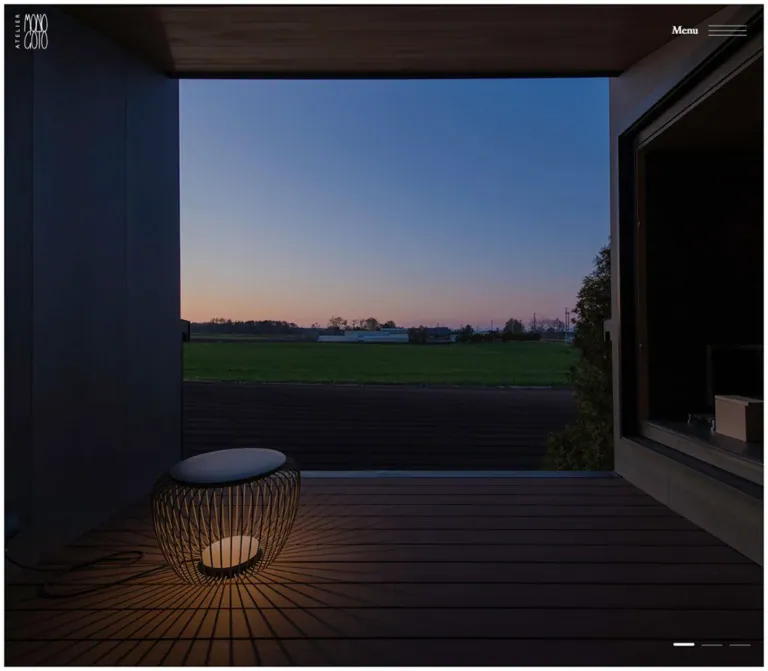
DESIGN REFERENCE
アトリエモノゴト|建築写真と余白が主役の公式サイト
画面いっぱいの建築写真に、小さなロゴと明朝系の文字を重ねた建築設計事務所のサイト。細い白枠、横棒のスライド表示、大きな余白を取った案内・連絡先エリアが特徴です。
オリジナルサイトを見るAtelier Monogoto — Style Reference
Full-height architectural photographs, a fine white perimeter, and serif information placed across generous empty space.
Website: atelier-monogoto.jp Original URL: https://atelier-monogoto.jp/ Final URL: https://atelier-monogoto.jp/ Theme: white informational surfaces with charcoal text; white identity and controls over photography. Inspected: September 13, 2026, at 02:43:51 JST; supplied retrieval timestamp: September 12, 2026, at 17:43:51.157 UTC. Viewports: desktop 1440 × 1000 CSS pixels; mobile 390 × 844 CSS pixels. Scope: the current architecture studio homepage: opening photographic gallery, Salon de Monogoto feature, and lower navigation, studio information, and contact composition. Three desktop captures and two mobile captures were supplied, together with rendered DOM and computed-style evidence. Linked pages and an opened Menu state were not inspected.
Atelier Monogoto introduces its architectural practice through space, light, and ordinary life. The opening photograph fills almost the entire viewport: timber ceiling boards, glazed openings, a round table, a seated person, and dogs establish the scale of the room. A narrow white perimeter and a small white wordmark provide almost all the surrounding interface. The next photographed section presents Salon de Monogoto with a modest serif title and Japanese explanatory copy at the lower left.
The lower section changes to an uninterrupted white canvas. On desktop, a large wordmark occupies the upper left, navigation occupies the upper right, and the studio description and journal information sit near the bottom. On mobile, the composition becomes bottom weighted: navigation, description, and address stack beneath a large empty upper area, while a small wordmark sits beside the contact details. This is an architecture studio homepage with portfolio and editorial destinations, rather than a conventional sequence of promotional cards.
How to Read This Reference
- Measured values come from the supplied rendered DOM, computed styles, custom properties, or document dimensions. Decimal values below are generally rounded to two places.
- Visual estimates describe screenshot geometry where no matching element measurement was supplied, including the photographic perimeter, menu-line dimensions, and pagination spacing.
- Calculated values evaluate an observed formula or describe a relationship between measured dimensions. They are not additional browser measurements.
- Recommendations describe a reusable implementation. The CSS Quick Start interpolates selected measured endpoints and uses an explicitly chosen breakpoint; it is not recovered source CSS.
- Visibility matters: the DOM includes repeated navigation and information groups inside the header and main content. A nonzero rectangle does not prove that an element was visible in the photographed state. The white lower section is directly captured; an opened Menu is not.
- Typography evidence identifies declared and computed font stacks. It does not independently establish which font file rendered every glyph.
Tokens — Colors
Visible Core Palette
| Name | Value | Source / suggested alias | Role and evidence |
|---|---|---|---|
| White Canvas | #ffffff |
Source --color-bg; alias --color-canvas |
Measured body background and visible lower information section; also the fine perimeter around photographs |
| Charcoal Text | #46464f |
Source --color-txt, --color-main, --color-link, --color-secondary; alias --color-ink |
Measured lower-section text, links, and identity color |
| Reversed White | #ffffff |
Measured header and feature text color; alias --color-on-photo |
Wordmark, Menu, project title, supporting copy, and visible gallery marks over photographs |
| Inactive Gallery Mark | currentColor at 0.3 opacity |
Source --swiper-pagination-bullet-inactive-color and --swiper-pagination-bullet-inactive-opacity |
A translucent version of the foreground color; its apparent gray depends on the photograph underneath |
| Active Gallery Mark | currentColor at 1 opacity |
Source --swiper-pagination-color and --swiper-pagination-bullet-opacity |
Fully opaque white mark in the photographed opening state |
The interface is essentially white and charcoal. Timber browns, snow whites, blue sky, and amber window light belong to the photography. They should not become a collection of unrelated UI accent colors.
Declared Supporting Colors
These values exist in the supplied custom properties, but their presence does not establish that each appears in the captured homepage.
| Name | Source value | Evidence boundary |
|---|---|---|
| Deeper Charcoal | #202024 |
Declared by --color-primary, --color-sub, and --color-hover; a resulting hover state was not captured |
| Orange Red | #e84022 |
Declared accent, warning, and active-input color; no prominent red CTA or warning is visible in the inspected sections |
| Olive Overlay | #4a4520 |
Declared by --color-overlay; application, opacity, and blend mode were not supplied |
| Weak Text | color-mix(in srgb, #46464f 50%, transparent) |
Declared weak-text token; do not substitute an opaque gray without considering its background |
| Fine Line | color-mix(in srgb, #46464f 20%, transparent) |
Declared line token; the visible directory does not use a prominent divider system |
| Disabled Gray | #999 |
Declared disabled-state color; no disabled control was inspected |
Some supplied corner-SVG variables contain #f7f4ee. That embedded asset color is not evidence of a cream homepage background or rounded photographic panels. The captured informational canvas is white.
The photographs appear relatively dark beneath their white interface details. The evidence does not separate photographic exposure from any applied shading. Do not assign the declared olive overlay an invented opacity or blend mode.
Tokens — Typography
Primary Serif Stack
Computed family: TsuMinPr6RB-JansonTextPro55R, GalliardPro-Roman, serif.
The same stack appears on the body, navigation links, Menu button, project feature, journal rows, and studio description. The source assigns it to --font-ja, --font-en, --font-primaly, and --font-primaly-r; the spelling of the latter source variables is preserved here.
The result combines restrained Latin serif labels with Japanese Mincho-style text. Most sampled elements use weight 400, including the large navigation and project title. Menu uses 500. The visual hierarchy comes mainly from size, position, and space, rather than heavy weights or uppercase tracking.
Use the declared faces only when available and appropriately licensed. A generic serif fallback is a practical adaptation, but will change line wrapping and glyph proportions. The root HTML element reports Times; that is not the computed family of the visible page content.
Secondary Stacks — Declared Only
--font-secondary:NeueFrutigerWorld-Book, UDKakugoC80Pro-R, sans-serif.--system-fonts:Noto Sans JP, sans-serif.
Neither stack was measured on the visible text components described here. Do not make sans-serif typography the primary treatment simply because these tokens exist.
Type Scale
Each size pair is font size / line height, in CSS pixels. All listed text uses normal letter spacing in the supplied measurements.
| Role | Desktop | Mobile | Weight | Evidence |
|---|---|---|---|---|
| Body default | 16 / 28.80 |
16 / 28.80 |
400 |
Computed body styles |
| Main inherited text | 14.74 / 29.48 |
13.05 / 26.10 |
400 |
Computed main element; component overrides take precedence |
| Menu label | 14 / 16.10 |
14 / 16.10 |
500 |
Visible button in both opening captures |
| Main directory link | 26.15 / 39.23 |
22.12 / 33.17 |
400 |
Visible lower-section links |
| Secondary Salon directory link | 16.15 / 24.23 |
12.12 / 18.17 |
400 |
Visible lower-section link |
| Salon feature title | 35.42 / 51.36 |
18.48 / 26.80 |
400 |
Desktop capture and both DOM snapshots; mobile feature not pictured |
| Salon feature description | 19.23 / 33.65 |
14.15 / 24.75 |
400 |
Desktop capture and both DOM snapshots |
| Lower studio description | 19.23 / 38.45 |
14.15 / 28.29 |
400 |
Visible in both lower-section captures |
| Company and address line | 14.61 / 29.23 |
12.07 / 24.15 |
400 |
Visible in both lower-section captures |
| Journal row | 13.69 / 23.96 |
13.02 / 22.78 |
400 |
Desktop lower section; mobile value belongs to the unexercised header group |
| Copyright | 11.38 / 22.77 |
10.04 / 18.07 |
400 |
Desktop lower section; mobile value belongs to the header group |
The studio description uses a particularly open 2 line-height ratio in the lower section. The feature description is tighter at 1.75. Navigation uses 1.5, with additional space between links.
The wordmark is separate artwork with extremely narrow, elongated letters and a vertical ATELIER label. Its form should not be recreated by stretching ordinary serif text.
Tokens — Spacing & Shapes
Spacing character: compact interface details around very large photographic and blank fields. The evidence does not establish a universal four- or eight-pixel spacing scale.
Observed Fluid Variables
/* Source formulas supplied in the rendered evidence */
--docPadding: clamp(30px, 27.0967741935px + 0.8064516129vw, 40px);
--gh-height: clamp(80px, 75.3846153846px + 1.2820512821vw, 100px);
| Variable | At 1440px wide | At 390px wide | Interpretation |
|---|---|---|---|
--docPadding |
38.71px, calculated |
30.24px, calculated |
Shared document-padding token; individual wrappers can add other offsets |
--gh-height |
93.85px, calculated |
80.38px, calculated |
Header-related dimension; the complete sampled header includes a viewport-sized navigation structure |
--vh |
10px, measured |
8.44px, measured |
One hundredth of the supplied viewport height at capture time |
The feature's measured left inset is consistent with the approximately 6px photographic perimeter plus --docPadding: about 44.71px on desktop and 36.24px on mobile. The lower directory has different measured margins; do not apply --docPadding as its complete outer inset.
Spacing and Geometry
| Use | Desktop | Mobile | Status |
|---|---|---|---|
| White photographic perimeter | About 6px |
About 6px |
Visual estimate |
| Small wordmark top / left | 20px / 20px |
20px / 20px |
Measured anchor position |
| Small wordmark box | 53.84 × 53.84px |
40.38 × 40.38px |
Measured |
| Menu label-to-lines gap | 25.38px |
15.29px |
Measured flex gap |
| Menu button box | 124.55 × 31.06px |
92.92 × 20.30px |
Measured; these dimensions are not a recommended minimum touch target |
| Three-line menu symbol width | About 62px |
About 41px |
Visual estimate |
| Directory horizontal inset | 64.61px |
30.95px |
Measured left edge; right edge is symmetrical in the lower composition |
| Directory link start-to-start interval | 58.84px |
49.73px |
Calculated from measured rectangles |
| Directory link gap after line box | About 19.61px |
About 16.58px |
Calculated; approximately 0.75em |
| Gap before smaller Salon link | About 26.15px |
About 22.11px |
Calculated; approximately one main-navigation em |
| Journal date-to-title gap | 27.38px |
26.04px in header DOM |
Measured flex gap; mobile header visibility unverified |
| Pagination mark width | 30px |
30px |
Source property |
| Pagination inactive / active height | 2px / 4px |
2px / 4px |
Source properties |
| Pagination corner radius | 2px |
2px |
Source property |
| Photographs and visible text surfaces | Square | Square | Screenshot appearance and sampled zero-radius text elements |
There is no visible card elevation system. White space, image boundaries, text scale, and alignment provide separation.
Layout Measurements
| Element | Desktop | Mobile |
|---|---|---|
| Document extent | 1440 × 3000px |
390 × 2532px |
| Viewport-height relationship | Exactly 3 × 1000px |
Exactly 3 × 844px |
| Visible opening image area | Approximately 1428 × 988px |
Approximately 378 × 832px |
| Lower main-navigation anchor | x 1066.44, y 81.53 |
x 30.95, y 332.00 |
| Lower main-navigation link width | 308.95px |
328.09px |
| Studio-description box | 642.89px wide, starting near y 767.98 |
260.08px wide, starting near y 637.84 |
| Lower wordmark | 109.22px square at x 64.61, y 81.53 |
41.92px square at x 317.13, y 760.94 |
| Contact block start | x 64.61, y 891.44 |
x 30.95, y 758.17 |
Coordinates describe their corresponding captured section, not a claim that all these elements appear together in the initial viewport. The three-viewport document extent supports the observed three-stage composition; it does not reveal the original scroll-controller implementation.
Components
Opening Photographic Gallery
Role: introduce the practice through built space before presenting detailed information.
Use a photograph that occupies nearly the full viewport, with a fine white perimeter and square corners. The captured room contains strong ceiling lines, a white masonry wall, dark furniture, floor tiles, and a bright snowy exterior. These architectural lines supply the composition; the interface remains small and peripheral.
Place the white wordmark at the upper left, Menu at the upper right, and four short gallery marks near the lower right. The supplied opening desktop and mobile captures do not show a marketing headline or explanatory paragraph over this room photograph. Keep that image-led opening distinct from the captioned Salon feature.
The pagination and Swiper variables support identifying this as a gallery/slideshow interface. The evidence does not establish autoplay, slide order, swipe support, loop behavior, or the total underlying asset count beyond the four visible marks.
Over-image Identity and Menu
Role: maintain recognizable identity and access to navigation without covering the photographs.
The small wordmark is a home link with the accessible text アトリエモノゴト一級建築士事務所 in the supplied DOM. Its box begins at 20px, 20px at both viewports. It grows from about 40px square on mobile to 54px on desktop.
Menu is a real button containing a 14px, weight-500 serif label and a separate three-line symbol. The lines are long, thin, and evenly spaced. There is no filled pill, visible border, or card behind the control.
The measured button begins at approximately x 1281.61, y 33.84 on desktop and x 276.70, y 20.38 on mobile. Its label remains the same size while the gap and symbol shrink.
The identity and control appear over both photographed desktop sections. The lower white capture does not show the same small header arrangement. These observations do not establish a globally fixed or sticky header.
Linear Gallery Pagination
Role: communicate the current photograph with minimal visual weight.
Four horizontal marks appear in the original opening captures. The second mark is the active one. Source properties specify a constant 30px width, a 2px inactive height, a 4px active height, and 2px rounding. Activity is communicated through thickness and opacity, not a different accent hue or a longer bar.
The visible gaps are approximately 10px; the row spans roughly 150px. These are screenshot estimates. The source's generic pagination offsets do not by themselves explain the final container placement, so use the captured lower-right alignment as the visual reference.
Click handling and keyboard behavior were not exercised. For a new implementation, preserve the thin visible marks inside larger, clearly named interactive targets.
Salon de Monogoto Feature
Role: introduce a specific experimental house and link to its project page.
The desktop section uses a near-full-screen exterior photograph at blue hour. Dark vertical cladding and the sloping building outline contrast with warm interior light behind a large window. It has the same fine perimeter and restrained over-image identity as the opening photograph.
At the lower left, stack:
- The serif link
Salon de Monogoto, followed by a small right-pointing arrow. - A generous but compact title-to-description gap.
- Japanese explanatory copy describing the Otaru house, its relationship with Hokkaido's natural environment, and an invitation to visit.
The title is measured at 35.42px / 1.45 on desktop. The description is 19.23px / 1.75 and forms three visual lines in the desktop capture. The title is an inline anchor inside a paragraph in the supplied DOM; a semantic heading is a recommended improvement for a new implementation.
The link destination is the Salon de Monogoto project, observed in the homepage DOM. That destination page was not inspected.
Mobile DOM measurements reduce the title to 18.48px and description to 14.15px, with a content width of about 317.53px. No mobile photograph of this feature was supplied, so its exact mobile focal point and final visual wrapping remain unverified.
Lower Directory Navigation
Role: provide the site's primary destinations in a quiet, spacious closing composition.
The main list contains About, Works, Projects, Journal, and Contact. A smaller Salon de Monogoto link follows after additional separation. These are ordinary text links without containers, badges, underlines in the resting capture, or large action-button fills.
On desktop, the list starts near the upper right, at x 1066.44. Its links use 26.15px type, 1.5 line height, and approximately 0.75em gaps. The smaller Salon link uses 16.15px type. The left side of this upper region contains only the large wordmark.
On mobile, the list moves to the left margin and begins near y 332px. Main links remain substantial at 22.12px; the Salon link becomes 12.12px. The empty area above this list is a defining part of the captured composition, not space that needs filling with a headline.
Studio Introduction, Contact, and Relocated Wordmark
Role: explain the practice and make location and contact information available.
The introduction identifies the practice as an architectural design office based in Sapporo and describes an approach grounded in climate, environment, and human activity. It is set as an unboxed Japanese paragraph, with a loose 2 line-height ratio.
On desktop, it occupies the lower left with a measured width of 642.89px. Below it is a smaller line containing the company name, address, and telephone number, separated by slashes. The original page directly identifies the operator as 株式会社アトリエモノゴト. The address is a map link; the supplied links do not establish a telephone link.
On mobile, the description and contact details use a narrower 260.08px column, even though the navigation above spans about 328px. This leaves room for the wordmark at the lower right. The wordmark shrinks from 109.22px square on desktop to 41.92px square on mobile and moves from the upper-left identity position to the contact area.
Treat this as an intentional reorganization of hierarchy. Simply scaling the desktop two-column arrangement would miss the mobile composition.
Journal Rows and Social Signature
Role: show recent activity and external social destinations without creating a dense footer.
The desktop lower-right area contains three journal links. Each row pairs a compact date with a Japanese title. The date occupies about 80.27px, followed by a 27.38px gap. Type is 13.69px / 1.75, and row starts are approximately 42.38px apart.
The date is visually separated into year, month, and day. Keep the date and title together as one linked entry. There are no thumbnails, category pills, or visible row dividers in the captured list.
Below the rows, small Instagram and Facebook symbols precede © 2025 Atelier Monogoto. The measured desktop icon boxes are approximately 22.77px square, and the copyright is 11.38px serif text. The displayed year is source content, not the inspection year.
Journal rows, social symbols, and copyright are absent from the captured mobile lower section. Related content remains in the mobile header DOM, but its opened visibility was not tested. Do not describe those destinations as absent from the entire mobile site.
Header Navigation Structure — DOM Evidence Only
The header contains another set of the main links, Salon link, journal rows, social links, introduction, and wordmark. Its sampled text color is white, while the visible lower section uses charcoal. Some elements also have opacity and transform transitions.
This supports the existence of a separate header navigation structure. It does not verify a menu-opening animation, panel background, close icon, scroll lock, focus trap, or exact overlay layout. An implementation should define these behaviors explicitly instead of treating the white lower-section screenshot as an opened menu.
Tokens — Motion & Interaction
| Treatment | Supplied value | What is established |
|---|---|---|
| General links | color 0.5s, opacity 0.5s, background-color 0.5s |
Computed transition declaration; no resulting hover state was captured |
| Small logo wrapper | opacity 0.5s |
An opacity transition is available |
| Menu button | 0.2s for box-shadow, background, color, opacity, and border color |
Computed property transitions; not evidence of a visible shadow or menu-opening duration |
| Main content | opacity 0.5s |
Computed transition; trigger and choreography unverified |
| Selected header information groups | transform 0.5s linear, opacity 0.5s linear |
Measured on repeated header content; not a recording of its entrance |
| Gallery wrapper easing | cubic-bezier(.65,0,.35,1) |
Declared Swiper timing-function token; duration and transition mode were not supplied |
| Icon-related tokens | translateX(-4px) and a token mentioning 0.15s cubic-bezier(0.17,0.84,0.44,1) |
Source variables only; no applied arrow displacement or hover trajectory was verified |
| Sampled CSS animations | none |
All supplied element animation fields report none; this does not exclude script-driven motion |
The capture process included at least five seconds of initial observation and waited for finite motion and layout stability within bounded time limits. Perpetual animation was temporarily paused during readiness checks and resumed. Static captures therefore cannot establish carousel cadence, transition sequencing, or the absence of delayed behavior.
The different room and Salon photographs belong to different captured homepage sections; they are not proof of a slideshow transition. Likewise, a computed transition: all without timing evidence is not proof of visible animation.
For reuse, keep motion restrained. The measured 200ms control transitions and 500ms link/content transitions provide useful reference durations. Any proposed gallery dissolve, menu entrance, autoplay interval, or scroll snapping must be treated as a new implementation decision.
Surfaces
| Layer | Appearance | Purpose |
|---|---|---|
| Outer canvas | Pure white | Frames the photographs and becomes the lower informational background |
| Photographic field | Square-edged, almost full viewport | Carries the architecture, atmosphere, and visual hierarchy |
| Over-image interface | White text and thin linework on a transparent surface | Keeps identity and navigation visible with little obstruction |
| Feature caption | Unboxed white serif text | Connects a photographed project with its description and destination |
| Lower directory | Charcoal typography on uninterrupted white | Organizes navigation, studio information, journal entries, and contact details |
| Header navigation | Present in DOM; opened surface unverified | Requires separate interaction specification |
Avoid adding general-purpose card backgrounds, floating glass panels, deep shadows, or rounded image masks. The captured design relies on large flat fields and carefully placed content.
Imagery
The photography should convey actual spatial relationships. In the opening image, the ceiling leads toward the glazing, the table and person establish scale, and the dogs connect the interior to everyday life and the snowy exterior. The composition is architectural without removing evidence of habitation.
The Salon image provides a different atmosphere: a dark timber exterior under saturated evening blue, with warm light revealing the rooms inside. Its large window and strong roof edge remain the primary geometry behind the caption.
For new work, select photographs with meaningful depth, material texture, and room for small perimeter controls. Retain natural photographic detail. Do not pixelate, apply illustration effects, or flatten every image into the same artificial color grade.
Cropping
The desktop room image is wide; the mobile version becomes a tall crop. The mobile capture retains the seated person near the left edge, the indoor dog toward the right, and the timber ceiling and window structure. Much of the desktop horizontal context disappears.
This appearance is consistent with cover-style cropping, but object-fit, background sizing, and focal-point declarations were not included in the supplied element sample. Use object-fit: cover as a recommended starting point, then verify the focal point for each photograph. The evidence does not establish whether separate mobile files are used.
Observed Asset References
| Asset | Original-page evidence | Available implementation detail |
|---|---|---|
| Winter interior photograph | Desktop opening capture and mobile opening capture | Same recognizable scene at two aspect ratios; asset URL and native dimensions not supplied |
| Salon exterior photograph | Second desktop capture | Blue-hour facade with warm window light; asset URL not supplied |
| Atelier Monogoto wordmark | Photographic headers and both lower-section captures | White and charcoal appearances; measured boxes available; file format and URL not supplied |
| Menu symbol | Both opening captures and desktop Salon capture | Three thin horizontal lines; construction method not supplied |
| Project arrow | Desktop Salon title | Small right-pointing line symbol; asset implementation not supplied |
| Social symbols | Desktop lower section | Instagram and Facebook identities; no icon-library attribution established |
Use authorized original imagery and identity artwork when available. No image filename, downloadable asset path, or photographer credit can be recovered from the supplied evidence.
Layout & Responsive Behavior
Three Viewport-scale Sections
The desktop document height is 3000px at a 1000px viewport height. Mobile is 2532px at 844px, again exactly three viewport heights. Together with the captures and DOM, this supports a sequence of opening gallery, Salon feature, and lower information section.
Preserve the change of pace between these stages: image without explanatory copy, image with a project caption, then a spacious typographic directory. The supplied evidence does not establish mandatory snapping, scroll interception, or animated transitions between sections.
Desktop Composition
The white lower section distributes content toward four areas: large identity at upper left, navigation at upper right, studio information at lower left, and journal/social information at lower right. Its center remains largely empty.
The measured left and right content widths are approximately 643px and 309px, with substantial space between them. A grid is a useful implementation recommendation, but the original parent grid or flex declaration was not supplied.
Mobile Composition
The upper photograph keeps its narrow white perimeter. The small logo shrinks; Menu retains its 14px label while its line symbol and internal gap become smaller.
The lower section changes more substantially. Navigation begins around 39% of the viewport height, the studio paragraph follows beneath it, and the contact line sits near the bottom. The small wordmark aligns beside that contact area. Desktop journal and social details are not present in this captured lower composition.
Main navigation falls only from 26.15px to 22.12px, preserving its prominence. The feature title falls more sharply, from 35.42px to 18.48px. Mobile adaptation therefore does not use a single uniform scale factor.
Implementation Boundaries
Only two viewport widths were supplied. The exact breakpoint, tablet arrangement, landscape behavior, browser-toolbar handling, and safe-area rules are unknown. The observed --vh values record capture-time viewport dimensions but do not prove how they are updated.
For a new implementation, use viewport-scale minimum heights with natural content expansion. Test short screens and enlarged text before enforcing fixed section heights. The Quick Start uses an 800px breakpoint as a recommendation, not as a claim about the original site.
Do’s and Don’ts
Do
- Let full-height architectural photography carry the opening impression.
- Preserve the fine white perimeter and square photographic corners.
- Use
#ffffffand#46464fas the core interface pair. - Keep the small wordmark, Menu label, and three-line symbol unobtrusive over photographs.
- Preserve the serif stack, regular weights, and generous Japanese line height.
- Make the active gallery mark thicker and more opaque while retaining its
30pxwidth. - Keep the Salon feature caption near the lower left and distinguish it from the uncaptioned opening image.
- Preserve the desktop lower section's broad central emptiness.
- Reorganize the mobile lower section around a left-aligned list, narrow description, and small lower-right wordmark.
- Check every photographic crop at both supplied aspect ratios.
Don’t
- Don't turn the homepage into a generic hero, benefit-card grid, and oversized CTA sequence.
- Don't fill the white lower section with decoration merely because it has empty space.
- Don't promote the declared orange-red token into a dominant homepage action color.
- Don't replace the wordmark with condensed or stretched ordinary text.
- Don't use heavy sans-serif headings or exaggerated tracking throughout.
- Don't turn the gallery marks into large circles, numbered badges, or an unrelated accent-colored progress bar.
- Don't add rounded panels, glass effects, or a general shadow system.
- Don't assume that header DOM content was visible or that the lower white section is an opened menu.
- Don't invent autoplay, swipe behavior, parallax, hover motion, or scroll snapping from static captures.
- Don't infer photographic asset paths or production credits that are absent from the original-page evidence.
Recommended Implementation Additions
These are recommendations for a new implementation, not verified original-site features:
- Give Menu an explicit expanded state and controlled-navigation relationship. If the navigation is modal, define closing, focus placement, focus return, and background interaction behavior.
- Keep thin pagination marks inside larger targets. Provide slide names or numbers and a selected state; expose only the active slide's interactive content to keyboard users.
- If the gallery advances automatically, provide pause control and a reduced-motion/static option. Do not add autoplay solely because Swiper variables exist.
- Add visible keyboard focus treatments that work over both photographs and the white directory.
- Keep white labels readable across every selected image. Start with image choice and focal placement; use per-image shading only where required and label it as an adaptation.
- Use semantic headings for the featured project and descriptive alternative text for meaningful photographs. Preserve the home link's accessible identity.
- Let sections grow with translated copy, enlarged text, and short viewports. Avoid clipping the bottom-weighted mobile contact area.
- Maintain mobile access to journal and social destinations even when they are omitted from the lower-section composition.
Agent Prompt Guide
Quick Color Reference
- Main canvas and photographic perimeter:
#ffffff. - Informational text, links, and dark wordmark:
#46464f. - Over-image identity and labels:
#ffffff. - Inactive gallery marks: foreground color at
30%opacity. - Active gallery mark: foreground color at full opacity,
4pxhigh. - Supporting deep charcoal token:
#202024, with actual hover appearance unverified. - Keep timber, snow, evening blue, and amber light in the photography rather than translating them into colorful interface components.
Overall Prompt
“Create an architecture studio homepage inspired by Atelier Monogoto. Organize it into three viewport-scale sections: an almost full-screen architectural gallery, a captioned experimental-house feature, and a spacious white navigation/contact section. Use a fine approximately 6px white photographic perimeter, a small artwork wordmark at the upper left, and a 14px serif Menu label with three long hairlines at the upper right. Place four short white pagination marks near the lower right; the active mark is thicker, not wider. Use white and charcoal #46464f for the interface, regular serif typography, and generous Japanese line height. On desktop, distribute lower-section identity, navigation, studio copy, and journal details around a large empty center. On mobile, place the navigation and studio information toward the bottom, with a small wordmark beside the contact details. Use meaningful architectural photography and verify focal crops. Specify menu and gallery behavior separately; do not infer unobserved motion.”
Example Component Prompts
- Photographic opening: “A viewport-height architectural room photograph with a 6px white perimeter, square corners, a small white wordmark at x20/y20, and a restrained serif Menu control. Keep the room free of a large promotional headline. Add four 30px horizontal gallery marks at the lower right, with a 4px active mark and 2px translucent inactive marks.”
- Salon feature: “A full-height blue-hour photograph of a timber house, framed in white. Place a regular serif project title and small right arrow at the lower left, followed by three measured lines of Japanese explanatory copy on desktop. Use approximately 35px title and 19px body text; reduce them to approximately 18.5px and 14px on mobile.”
- Desktop directory: “A white architecture-studio directory with charcoal serif text. Place a 109px artwork wordmark at the upper left and five 26px navigation links at the upper right. Add a smaller project link below. Anchor a loose Japanese studio paragraph and contact line near the lower left, and three compact dated journal rows plus social symbols near the lower right. Keep the center empty.”
- Mobile directory: “At 390 × 844, retain a large blank upper area and begin a left-aligned 22px serif navigation list around y332. Follow it with a 260px-wide Japanese studio paragraph and small contact details. Place a roughly 42px wordmark to the right of the contact block. Allow the section to grow when content or text size requires it.”
Quick Start
CSS Custom Properties
This is a reusable approximation of the measured appearance. It preserves the observed padding and header-variable formulas, while type interpolations, directory layout, and the breakpoint are recommendations. It does not reproduce an unverified menu animation or carousel engine.
Use .photo-scene for each photographic section, with an inset .scene-frame containing .scene-image and optional .scene-copy. Put the wordmark, Menu button, and pagination inside the scene as separate controls. The lower .directory contains .directory-brand, .directory-nav, .directory-about, .directory-contact, .directory-news, and .directory-meta.
Use actual links and buttons, supply authorized image and wordmark assets, and connect Menu and gallery state with application logic. The optional --photo-shade defaults to zero because original overlay compositing was not measured. Pagination targets below are intentionally larger than the screenshot marks, widening their overall row.
:root {
  /* Measured core colors */
  --color-canvas: #ffffff;
  --color-ink: #46464f;
  --color-on-photo: #ffffff;

  /* Observed computed stack; requires available, licensed faces */
  --font-editorial: 'TsuMinPr6RB-JansonTextPro55R',
    'GalliardPro-Roman', serif;

  /* Observed source formulas */
  --document-padding: clamp(
    30px, 27.0967741935px + 0.8064516129vw, 40px
  );
  --header-height: clamp(
    80px, 75.3846153846px + 1.2820512821vw, 100px
  );

  /* Recommended interpolation between measured endpoints */
  --text-nav: clamp(22.115px, 20.6154px + 0.384615vw, 26.154px);
  --text-subnav: clamp(12.115px, 10.6154px + 0.384615vw, 16.154px);
  --text-feature: clamp(18.484px, 12.1935px + 1.612903vw, 35.419px);
  --text-body: clamp(14.145px, 12.2581px + 0.483871vw, 19.226px);
  --text-contact: clamp(12.073px, 11.129px + 0.241932vw, 14.613px);
  --directory-inline: clamp(
    30.953px, 18.452px + 3.20536vw, 64.609px
  );

  /* Screenshot estimate and measured gallery geometry */
  --photo-frame: 6px;
  --gallery-mark-width: 30px;
  --gallery-mark-height: 2px;
  --gallery-mark-active-height: 4px;
  --gallery-mark-radius: 2px;

  /* Measured transition durations; application is an adaptation */
  --motion-control: 200ms;
  --motion-link: 500ms;
  --gallery-easing: cubic-bezier(.65, 0, .35, 1);
}

* {
  box-sizing: border-box;
}

body {
  margin: 0;
  color: var(--color-ink);
  background: var(--color-canvas);
  font-family: var(--font-editorial);
  font-size: 16px;
  font-weight: 400;
  line-height: 1.8;
}

a {
  color: inherit;
  text-decoration: none;
  transition:
    color var(--motion-link),
    opacity var(--motion-link),
    background-color var(--motion-link);
}

button {
  font: inherit;
}

.photo-scene {
  position: relative;
  min-block-size: 100vh;
  min-block-size: 100svh;
  color: var(--color-on-photo);
  background: var(--color-canvas);
  isolation: isolate;
}

.scene-frame {
  position: absolute;
  inset: var(--photo-frame);
  overflow: hidden;
  border-radius: 0;
  background: #202024;
}

.scene-image {
  display: block;
  inline-size: 100%;
  block-size: 100%;
  object-fit: cover;
  object-position: var(--photo-position, 50% 50%);
}

.scene-frame::after {
  content: '';
  position: absolute;
  inset: 0;
  pointer-events: none;
  background: rgb(0 0 0 / var(--photo-shade, 0));
}

.scene-brand {
  position: absolute;
  z-index: 2;
  inset-block-start: 20px;
  inset-inline-start: 20px;
  inline-size: calc(var(--header-height) - 40px);
  aspect-ratio: 1;
}

.scene-brand img,
.directory-brand img {
  display: block;
  inline-size: 100%;
  block-size: 100%;
  object-fit: contain;
}

.menu-trigger {
  position: absolute;
  z-index: 2;
  inset-block-start: 20px;
  inset-inline-end: 20px;
  display: flex;
  align-items: center;
  gap: clamp(15.29px, 11.5385px + 0.961538vw, 25.38px);
  min-block-size: 44px;
  padding: 0;
  border: 0;
  border-radius: 0;
  color: inherit;
  background: transparent;
  font-size: 14px;
  font-weight: 500;
  line-height: 1.15;
  cursor: pointer;
  transition: opacity var(--motion-control);
}

.menu-lines {
  display: grid;
  gap: clamp(4px, 0.5vw, 7px);
  inline-size: clamp(41px, 33.2px + 2vw, 62px);
}

.menu-lines > span {
  display: block;
  block-size: 1px;
  background: currentColor;
  opacity: 0.7;
}

.scene-pager {
  position: absolute;
  z-index: 2;
  inset-inline-end: 20px;
  inset-block-end: 14px;
  display: flex;
}

.pager-button {
  display: grid;
  place-items: center;
  inline-size: 44px;
  block-size: 44px;
  padding: 0;
  border: 0;
  color: inherit;
  background: transparent;
  cursor: pointer;
}

.pager-button::before {
  content: '';
  inline-size: var(--gallery-mark-width);
  block-size: var(--gallery-mark-height);
  border-radius: var(--gallery-mark-radius);
  background: currentColor;
  opacity: 0.3;
}

.pager-button[aria-current='true']::before {
  block-size: var(--gallery-mark-active-height);
  opacity: 1;
}

.scene-copy {
  position: absolute;
  z-index: 1;
  inset-inline: var(--document-padding);
  inset-block-end: var(--document-padding);
}

.scene-title {
  margin: 0 0 24px;
  font-size: var(--text-feature);
  font-weight: 400;
  line-height: 1.45;
}

.scene-title a {
  display: inline-flex;
  align-items: baseline;
  gap: 0.4em;
}

.scene-description {
  margin: 0;
  font-size: var(--text-body);
  line-height: 1.75;
  overflow-wrap: anywhere;
}

.directory {
  display: grid;
  grid-template-columns: minmax(0, 1fr) minmax(280px, 309px);
  grid-template-rows: auto 1fr auto auto;
  column-gap: clamp(48px, 24.93vw, 359px);
  row-gap: 17px;
  min-block-size: 100vh;
  min-block-size: 100svh;
  padding: 81.53px var(--directory-inline);
  color: var(--color-ink);
  background: var(--color-canvas);
}

.directory-brand {
  grid-area: 1 / 1;
  inline-size: 109.22px;
  aspect-ratio: 1;
}

.directory-nav {
  grid-area: 1 / 2;
  font-size: var(--text-nav);
  line-height: 1.5;
}

.directory-nav ul {
  display: grid;
  gap: 0.75em;
  margin: 0;
  padding: 0;
  list-style: none;
}

.directory-nav a {
  display: block;
}

.directory-subnav {
  margin-block-start: 1em;
}

.directory-subnav a {
  font-size: var(--text-subnav);
  line-height: 1.5;
}

.directory-about {
  grid-area: 3 / 1;
  align-self: end;
  max-inline-size: 642.89px;
  margin: 0;
  font-size: var(--text-body);
  line-height: 2;
}

.directory-contact {
  grid-area: 4 / 1;
  align-self: end;
  margin: 0;
  font-size: var(--text-contact);
  line-height: 2;
  overflow-wrap: anywhere;
}

.directory-news {
  grid-area: 3 / 2;
  align-self: end;
  display: grid;
  gap: 18.42px;
  margin: 0;
  padding: 0;
  list-style: none;
  font-size: 13.692px;
  line-height: 1.75;
}

.journal-link {
  display: grid;
  grid-template-columns: 80.27px minmax(0, 1fr);
  gap: 27.38px;
}

.journal-link time {
  white-space: nowrap;
}

.directory-meta {
  grid-area: 4 / 2;
  display: flex;
  align-items: center;
  gap: 19px;
  margin: 0;
  font-size: 11.385px;
  line-height: 2;
}

/* Recommended keyboard treatment, absent from supplied captures */
:where(a, button):focus-visible {
  outline: 2px solid currentColor;
  outline-offset: 5px;
}

/* Recommended breakpoint; the original breakpoint was not supplied */
@media (max-width: 800px) {
  .directory {
    grid-template-columns: minmax(0, 1fr) 41.92px;
    grid-template-rows: minmax(0, 1fr) auto auto auto;
    column-gap: 26.05px;
    row-gap: 16px;
    padding: 41.14px var(--directory-inline);
  }

  .directory-nav {
    grid-area: 2 / 1 / 3 / -1;
  }

  .directory-about {
    grid-area: 3 / 1;
    max-inline-size: 260.08px;
    margin-block-start: 17.48px;
  }

  .directory-contact {
    grid-area: 4 / 1;
    max-inline-size: 260.08px;
  }

  .directory-brand {
    grid-area: 4 / 2;
    align-self: end;
    inline-size: 41.92px;
  }

  /* Mirrors the lower mobile capture, not the untested header menu */
  .directory-news,
  .directory-meta {
    display: none;
  }
}

/* Recommended expansion for long captions or short viewports */
.photo-scene.is-content-led .scene-frame {
  position: relative;
  inset: auto;
  min-block-size: calc(100svh - 2 * var(--photo-frame));
  margin: var(--photo-frame);
  display: flex;
  align-items: flex-end;
  padding: max(120px, 20svh) var(--document-padding)
    var(--document-padding);
}

.photo-scene.is-content-led .scene-image {
  position: absolute;
  inset: 0;
}

.photo-scene.is-content-led .scene-copy {
  position: relative;
  inset: auto;
  inline-size: 100%;
}

@media (prefers-reduced-motion: reduce) {
  .menu-trigger,
  a {
    transition: none;
  }

  /* Also disable automatic gallery movement in application logic. */
}
Use .is-content-led on a captioned scene when natural expansion is needed. Its dimensions are an accessibility-oriented adaptation rather than a measured original layout. Mobile removal of the lower journal/social blocks assumes those destinations remain available elsewhere in the completed navigation.
Tailwind v4 Token Mapping
Optional mapping for an implementation that already uses Tailwind v4. This is not evidence that the original site uses Tailwind. Define the custom properties above first.
@theme inline {
  --color-canvas: #ffffff;
  --color-ink: #46464f;
  --color-on-photo: #ffffff;

  --font-editorial: 'TsuMinPr6RB-JansonTextPro55R',
    'GalliardPro-Roman', serif;

  --text-directory: var(--text-nav);
  --text-directory-secondary: var(--text-subnav);
  --text-project: var(--text-feature);
  --text-studio: var(--text-body);
  --text-address: var(--text-contact);

  --spacing-photo-frame: var(--photo-frame);
  --spacing-document-inset: var(--document-padding);
  --spacing-directory-inset: var(--directory-inline);
  --radius-gallery-mark: 2px;
}
Sources & Evidence
- Atelier Monogoto homepage: original and final URL, HTTP
200, rendered text, link destinations, element rectangles, computed typography, colors, transitions, and supplied custom properties. - Capture timestamp: September 12, 2026,
17:43:51.157 UTC, corresponding to September 13, 2026,02:43:51.157 JST. - Desktop evidence:
1440 × 1000CSS pixels; document height3000px; captures of the opening interior gallery, Salon feature, and lower white directory/contact section. - Mobile evidence:
390 × 844CSS pixels; document height2532px; captures of the opening interior gallery and lower white directory/contact section. Mobile Salon typography and content are supported by DOM evidence only. - Observed destinations: About, Works, Projects, Journal, Contact, the Salon project, three journal entries, Instagram, Facebook, and the address map link. Their presence in the homepage DOM does not constitute inspection of the destination pages.
- Inspection limits: the supplied process awaited document load, finite motion, layout/text stability, and image decoding within bounded limits, and traversed intermediate scroll positions. SharedWorkers and service workers were disabled. No supplied action sequence verifies Menu opening, link hovering, pagination activation, keyboard operation, autoplay, swipe gestures, or a specific scroll-snapping mechanism.
- Asset and stylesheet limits: no complete image manifest, native photo dimensions, ancestor layout rules, font-file audit, or exact responsive breakpoint was supplied. Custom-property presence alone is not proof of visible usage.
This reference describes the current homepage supported by the supplied original-page evidence. Measured values, screenshot estimates, calculated relationships, and recommended implementation choices are identified separately throughout.
# Atelier Monogoto — Style Reference

> Full-height architectural photographs, a fine white perimeter, and serif information placed across generous empty space.

**Website:** [atelier-monogoto.jp](https://atelier-monogoto.jp/)
**Original URL:** https://atelier-monogoto.jp/
**Final URL:** https://atelier-monogoto.jp/
**Theme:** white informational surfaces with charcoal text; white identity and controls over photography.
**Inspected:** September 13, 2026, at 02:43:51 JST; supplied retrieval timestamp: September 12, 2026, at 17:43:51.157 UTC.
**Viewports:** desktop 1440 × 1000 CSS pixels; mobile 390 × 844 CSS pixels.
**Scope:** the current architecture studio homepage: opening photographic gallery, Salon de Monogoto feature, and lower navigation, studio information, and contact composition. Three desktop captures and two mobile captures were supplied, together with rendered DOM and computed-style evidence. Linked pages and an opened Menu state were not inspected.

Atelier Monogoto introduces its architectural practice through space, light, and ordinary life. The opening photograph fills almost the entire viewport: timber ceiling boards, glazed openings, a round table, a seated person, and dogs establish the scale of the room. A narrow white perimeter and a small white wordmark provide almost all the surrounding interface. The next photographed section presents Salon de Monogoto with a modest serif title and Japanese explanatory copy at the lower left.

The lower section changes to an uninterrupted white canvas. On desktop, a large wordmark occupies the upper left, navigation occupies the upper right, and the studio description and journal information sit near the bottom. On mobile, the composition becomes bottom weighted: navigation, description, and address stack beneath a large empty upper area, while a small wordmark sits beside the contact details. This is an architecture studio homepage with portfolio and editorial destinations, rather than a conventional sequence of promotional cards.

## How to Read This Reference

- **Measured** values come from the supplied rendered DOM, computed styles, custom properties, or document dimensions. Decimal values below are generally rounded to two places.
- **Visual estimates** describe screenshot geometry where no matching element measurement was supplied, including the photographic perimeter, menu-line dimensions, and pagination spacing.
- **Calculated** values evaluate an observed formula or describe a relationship between measured dimensions. They are not additional browser measurements.
- **Recommendations** describe a reusable implementation. The CSS Quick Start interpolates selected measured endpoints and uses an explicitly chosen breakpoint; it is not recovered source CSS.
- **Visibility matters:** the DOM includes repeated navigation and information groups inside the header and main content. A nonzero rectangle does not prove that an element was visible in the photographed state. The white lower section is directly captured; an opened Menu is not.
- **Typography evidence** identifies declared and computed font stacks. It does not independently establish which font file rendered every glyph.

## Tokens — Colors

### Visible Core Palette

| Name | Value | Source / suggested alias | Role and evidence |
| --- | --- | --- | --- |
| White Canvas | `#ffffff` | Source `--color-bg`; alias `--color-canvas` | Measured body background and visible lower information section; also the fine perimeter around photographs |
| Charcoal Text | `#46464f` | Source `--color-txt`, `--color-main`, `--color-link`, `--color-secondary`; alias `--color-ink` | Measured lower-section text, links, and identity color |
| Reversed White | `#ffffff` | Measured header and feature text color; alias `--color-on-photo` | Wordmark, Menu, project title, supporting copy, and visible gallery marks over photographs |
| Inactive Gallery Mark | `currentColor` at `0.3` opacity | Source `--swiper-pagination-bullet-inactive-color` and `--swiper-pagination-bullet-inactive-opacity` | A translucent version of the foreground color; its apparent gray depends on the photograph underneath |
| Active Gallery Mark | `currentColor` at `1` opacity | Source `--swiper-pagination-color` and `--swiper-pagination-bullet-opacity` | Fully opaque white mark in the photographed opening state |

The interface is essentially white and charcoal. Timber browns, snow whites, blue sky, and amber window light belong to the photography. They should not become a collection of unrelated UI accent colors.

### Declared Supporting Colors

These values exist in the supplied custom properties, but their presence does not establish that each appears in the captured homepage.

| Name | Source value | Evidence boundary |
| --- | --- | --- |
| Deeper Charcoal | `#202024` | Declared by `--color-primary`, `--color-sub`, and `--color-hover`; a resulting hover state was not captured |
| Orange Red | `#e84022` | Declared accent, warning, and active-input color; no prominent red CTA or warning is visible in the inspected sections |
| Olive Overlay | `#4a4520` | Declared by `--color-overlay`; application, opacity, and blend mode were not supplied |
| Weak Text | `color-mix(in srgb, #46464f 50%, transparent)` | Declared weak-text token; do not substitute an opaque gray without considering its background |
| Fine Line | `color-mix(in srgb, #46464f 20%, transparent)` | Declared line token; the visible directory does not use a prominent divider system |
| Disabled Gray | `#999` | Declared disabled-state color; no disabled control was inspected |

Some supplied corner-SVG variables contain `#f7f4ee`. That embedded asset color is not evidence of a cream homepage background or rounded photographic panels. The captured informational canvas is white.

The photographs appear relatively dark beneath their white interface details. The evidence does not separate photographic exposure from any applied shading. Do not assign the declared olive overlay an invented opacity or blend mode.

## Tokens — Typography

### Primary Serif Stack

**Computed family:** `TsuMinPr6RB-JansonTextPro55R, GalliardPro-Roman, serif`.

The same stack appears on the body, navigation links, Menu button, project feature, journal rows, and studio description. The source assigns it to `--font-ja`, `--font-en`, `--font-primaly`, and `--font-primaly-r`; the spelling of the latter source variables is preserved here.

The result combines restrained Latin serif labels with Japanese Mincho-style text. Most sampled elements use weight `400`, including the large navigation and project title. Menu uses `500`. The visual hierarchy comes mainly from size, position, and space, rather than heavy weights or uppercase tracking.

Use the declared faces only when available and appropriately licensed. A generic `serif` fallback is a practical adaptation, but will change line wrapping and glyph proportions. The root HTML element reports Times; that is not the computed family of the visible page content.

### Secondary Stacks — Declared Only

- `--font-secondary`: `NeueFrutigerWorld-Book, UDKakugoC80Pro-R, sans-serif`.
- `--system-fonts`: `Noto Sans JP, sans-serif`.

Neither stack was measured on the visible text components described here. Do not make sans-serif typography the primary treatment simply because these tokens exist.

### Type Scale

Each size pair is **font size / line height**, in CSS pixels. All listed text uses normal letter spacing in the supplied measurements.

| Role | Desktop | Mobile | Weight | Evidence |
| --- | --- | --- | --- | --- |
| Body default | `16 / 28.80` | `16 / 28.80` | `400` | Computed body styles |
| Main inherited text | `14.74 / 29.48` | `13.05 / 26.10` | `400` | Computed main element; component overrides take precedence |
| Menu label | `14 / 16.10` | `14 / 16.10` | `500` | Visible button in both opening captures |
| Main directory link | `26.15 / 39.23` | `22.12 / 33.17` | `400` | Visible lower-section links |
| Secondary Salon directory link | `16.15 / 24.23` | `12.12 / 18.17` | `400` | Visible lower-section link |
| Salon feature title | `35.42 / 51.36` | `18.48 / 26.80` | `400` | Desktop capture and both DOM snapshots; mobile feature not pictured |
| Salon feature description | `19.23 / 33.65` | `14.15 / 24.75` | `400` | Desktop capture and both DOM snapshots |
| Lower studio description | `19.23 / 38.45` | `14.15 / 28.29` | `400` | Visible in both lower-section captures |
| Company and address line | `14.61 / 29.23` | `12.07 / 24.15` | `400` | Visible in both lower-section captures |
| Journal row | `13.69 / 23.96` | `13.02 / 22.78` | `400` | Desktop lower section; mobile value belongs to the unexercised header group |
| Copyright | `11.38 / 22.77` | `10.04 / 18.07` | `400` | Desktop lower section; mobile value belongs to the header group |

The studio description uses a particularly open `2` line-height ratio in the lower section. The feature description is tighter at `1.75`. Navigation uses `1.5`, with additional space between links.

The wordmark is separate artwork with extremely narrow, elongated letters and a vertical ATELIER label. Its form should not be recreated by stretching ordinary serif text.

## Tokens — Spacing & Shapes

**Spacing character:** compact interface details around very large photographic and blank fields. The evidence does not establish a universal four- or eight-pixel spacing scale.

### Observed Fluid Variables

```css
/* Source formulas supplied in the rendered evidence */
--docPadding: clamp(30px, 27.0967741935px + 0.8064516129vw, 40px);
--gh-height: clamp(80px, 75.3846153846px + 1.2820512821vw, 100px);
```

| Variable | At 1440px wide | At 390px wide | Interpretation |
| --- | --- | --- | --- |
| `--docPadding` | `38.71px`, calculated | `30.24px`, calculated | Shared document-padding token; individual wrappers can add other offsets |
| `--gh-height` | `93.85px`, calculated | `80.38px`, calculated | Header-related dimension; the complete sampled header includes a viewport-sized navigation structure |
| `--vh` | `10px`, measured | `8.44px`, measured | One hundredth of the supplied viewport height at capture time |

The feature's measured left inset is consistent with the approximately `6px` photographic perimeter plus `--docPadding`: about `44.71px` on desktop and `36.24px` on mobile. The lower directory has different measured margins; do not apply `--docPadding` as its complete outer inset.

### Spacing and Geometry

| Use | Desktop | Mobile | Status |
| --- | --- | --- | --- |
| White photographic perimeter | About `6px` | About `6px` | Visual estimate |
| Small wordmark top / left | `20px / 20px` | `20px / 20px` | Measured anchor position |
| Small wordmark box | `53.84 × 53.84px` | `40.38 × 40.38px` | Measured |
| Menu label-to-lines gap | `25.38px` | `15.29px` | Measured flex gap |
| Menu button box | `124.55 × 31.06px` | `92.92 × 20.30px` | Measured; these dimensions are not a recommended minimum touch target |
| Three-line menu symbol width | About `62px` | About `41px` | Visual estimate |
| Directory horizontal inset | `64.61px` | `30.95px` | Measured left edge; right edge is symmetrical in the lower composition |
| Directory link start-to-start interval | `58.84px` | `49.73px` | Calculated from measured rectangles |
| Directory link gap after line box | About `19.61px` | About `16.58px` | Calculated; approximately `0.75em` |
| Gap before smaller Salon link | About `26.15px` | About `22.11px` | Calculated; approximately one main-navigation em |
| Journal date-to-title gap | `27.38px` | `26.04px` in header DOM | Measured flex gap; mobile header visibility unverified |
| Pagination mark width | `30px` | `30px` | Source property |
| Pagination inactive / active height | `2px / 4px` | `2px / 4px` | Source properties |
| Pagination corner radius | `2px` | `2px` | Source property |
| Photographs and visible text surfaces | Square | Square | Screenshot appearance and sampled zero-radius text elements |

There is no visible card elevation system. White space, image boundaries, text scale, and alignment provide separation.

### Layout Measurements

| Element | Desktop | Mobile |
| --- | --- | --- |
| Document extent | `1440 × 3000px` | `390 × 2532px` |
| Viewport-height relationship | Exactly `3 × 1000px` | Exactly `3 × 844px` |
| Visible opening image area | Approximately `1428 × 988px` | Approximately `378 × 832px` |
| Lower main-navigation anchor | `x 1066.44, y 81.53` | `x 30.95, y 332.00` |
| Lower main-navigation link width | `308.95px` | `328.09px` |
| Studio-description box | `642.89px` wide, starting near `y 767.98` | `260.08px` wide, starting near `y 637.84` |
| Lower wordmark | `109.22px` square at `x 64.61, y 81.53` | `41.92px` square at `x 317.13, y 760.94` |
| Contact block start | `x 64.61, y 891.44` | `x 30.95, y 758.17` |

Coordinates describe their corresponding captured section, not a claim that all these elements appear together in the initial viewport. The three-viewport document extent supports the observed three-stage composition; it does not reveal the original scroll-controller implementation.

## Components

### Opening Photographic Gallery

**Role:** introduce the practice through built space before presenting detailed information.

Use a photograph that occupies nearly the full viewport, with a fine white perimeter and square corners. The captured room contains strong ceiling lines, a white masonry wall, dark furniture, floor tiles, and a bright snowy exterior. These architectural lines supply the composition; the interface remains small and peripheral.

Place the white wordmark at the upper left, Menu at the upper right, and four short gallery marks near the lower right. The supplied opening desktop and mobile captures do not show a marketing headline or explanatory paragraph over this room photograph. Keep that image-led opening distinct from the captioned Salon feature.

The pagination and Swiper variables support identifying this as a gallery/slideshow interface. The evidence does not establish autoplay, slide order, swipe support, loop behavior, or the total underlying asset count beyond the four visible marks.

### Over-image Identity and Menu

**Role:** maintain recognizable identity and access to navigation without covering the photographs.

The small wordmark is a home link with the accessible text `アトリエモノゴト一級建築士事務所` in the supplied DOM. Its box begins at `20px, 20px` at both viewports. It grows from about `40px` square on mobile to `54px` on desktop.

Menu is a real button containing a `14px`, weight-`500` serif label and a separate three-line symbol. The lines are long, thin, and evenly spaced. There is no filled pill, visible border, or card behind the control.

The measured button begins at approximately `x 1281.61, y 33.84` on desktop and `x 276.70, y 20.38` on mobile. Its label remains the same size while the gap and symbol shrink.

The identity and control appear over both photographed desktop sections. The lower white capture does not show the same small header arrangement. These observations do not establish a globally fixed or sticky header.

### Linear Gallery Pagination

**Role:** communicate the current photograph with minimal visual weight.

Four horizontal marks appear in the original opening captures. The second mark is the active one. Source properties specify a constant `30px` width, a `2px` inactive height, a `4px` active height, and `2px` rounding. Activity is communicated through thickness and opacity, not a different accent hue or a longer bar.

The visible gaps are approximately `10px`; the row spans roughly `150px`. These are screenshot estimates. The source's generic pagination offsets do not by themselves explain the final container placement, so use the captured lower-right alignment as the visual reference.

Click handling and keyboard behavior were not exercised. For a new implementation, preserve the thin visible marks inside larger, clearly named interactive targets.

### Salon de Monogoto Feature

**Role:** introduce a specific experimental house and link to its project page.

The desktop section uses a near-full-screen exterior photograph at blue hour. Dark vertical cladding and the sloping building outline contrast with warm interior light behind a large window. It has the same fine perimeter and restrained over-image identity as the opening photograph.

At the lower left, stack:

1. The serif link `Salon de Monogoto`, followed by a small right-pointing arrow.
2. A generous but compact title-to-description gap.
3. Japanese explanatory copy describing the Otaru house, its relationship with Hokkaido's natural environment, and an invitation to visit.

The title is measured at `35.42px / 1.45` on desktop. The description is `19.23px / 1.75` and forms three visual lines in the desktop capture. The title is an inline anchor inside a paragraph in the supplied DOM; a semantic heading is a recommended improvement for a new implementation.

The link destination is [the Salon de Monogoto project](https://atelier-monogoto.jp/projects/salon-de-monogoto/), observed in the homepage DOM. That destination page was not inspected.

Mobile DOM measurements reduce the title to `18.48px` and description to `14.15px`, with a content width of about `317.53px`. No mobile photograph of this feature was supplied, so its exact mobile focal point and final visual wrapping remain unverified.

### Lower Directory Navigation

**Role:** provide the site's primary destinations in a quiet, spacious closing composition.

The main list contains About, Works, Projects, Journal, and Contact. A smaller Salon de Monogoto link follows after additional separation. These are ordinary text links without containers, badges, underlines in the resting capture, or large action-button fills.

On desktop, the list starts near the upper right, at `x 1066.44`. Its links use `26.15px` type, `1.5` line height, and approximately `0.75em` gaps. The smaller Salon link uses `16.15px` type. The left side of this upper region contains only the large wordmark.

On mobile, the list moves to the left margin and begins near `y 332px`. Main links remain substantial at `22.12px`; the Salon link becomes `12.12px`. The empty area above this list is a defining part of the captured composition, not space that needs filling with a headline.

### Studio Introduction, Contact, and Relocated Wordmark

**Role:** explain the practice and make location and contact information available.

The introduction identifies the practice as an architectural design office based in Sapporo and describes an approach grounded in climate, environment, and human activity. It is set as an unboxed Japanese paragraph, with a loose `2` line-height ratio.

On desktop, it occupies the lower left with a measured width of `642.89px`. Below it is a smaller line containing the company name, address, and telephone number, separated by slashes. The original page directly identifies the operator as `株式会社アトリエモノゴト`. The address is a map link; the supplied links do not establish a telephone link.

On mobile, the description and contact details use a narrower `260.08px` column, even though the navigation above spans about `328px`. This leaves room for the wordmark at the lower right. The wordmark shrinks from `109.22px` square on desktop to `41.92px` square on mobile and moves from the upper-left identity position to the contact area.

Treat this as an intentional reorganization of hierarchy. Simply scaling the desktop two-column arrangement would miss the mobile composition.

### Journal Rows and Social Signature

**Role:** show recent activity and external social destinations without creating a dense footer.

The desktop lower-right area contains three journal links. Each row pairs a compact date with a Japanese title. The date occupies about `80.27px`, followed by a `27.38px` gap. Type is `13.69px / 1.75`, and row starts are approximately `42.38px` apart.

The date is visually separated into year, month, and day. Keep the date and title together as one linked entry. There are no thumbnails, category pills, or visible row dividers in the captured list.

Below the rows, small Instagram and Facebook symbols precede `© 2025 Atelier Monogoto.` The measured desktop icon boxes are approximately `22.77px` square, and the copyright is `11.38px` serif text. The displayed year is source content, not the inspection year.

Journal rows, social symbols, and copyright are absent from the captured mobile lower section. Related content remains in the mobile header DOM, but its opened visibility was not tested. Do not describe those destinations as absent from the entire mobile site.

### Header Navigation Structure — DOM Evidence Only

The header contains another set of the main links, Salon link, journal rows, social links, introduction, and wordmark. Its sampled text color is white, while the visible lower section uses charcoal. Some elements also have opacity and transform transitions.

This supports the existence of a separate header navigation structure. It does not verify a menu-opening animation, panel background, close icon, scroll lock, focus trap, or exact overlay layout. An implementation should define these behaviors explicitly instead of treating the white lower-section screenshot as an opened menu.

## Tokens — Motion & Interaction

| Treatment | Supplied value | What is established |
| --- | --- | --- |
| General links | `color 0.5s, opacity 0.5s, background-color 0.5s` | Computed transition declaration; no resulting hover state was captured |
| Small logo wrapper | `opacity 0.5s` | An opacity transition is available |
| Menu button | `0.2s` for box-shadow, background, color, opacity, and border color | Computed property transitions; not evidence of a visible shadow or menu-opening duration |
| Main content | `opacity 0.5s` | Computed transition; trigger and choreography unverified |
| Selected header information groups | `transform 0.5s linear, opacity 0.5s linear` | Measured on repeated header content; not a recording of its entrance |
| Gallery wrapper easing | `cubic-bezier(.65,0,.35,1)` | Declared Swiper timing-function token; duration and transition mode were not supplied |
| Icon-related tokens | `translateX(-4px)` and a token mentioning `0.15s cubic-bezier(0.17,0.84,0.44,1)` | Source variables only; no applied arrow displacement or hover trajectory was verified |
| Sampled CSS animations | `none` | All supplied element animation fields report none; this does not exclude script-driven motion |

The capture process included at least five seconds of initial observation and waited for finite motion and layout stability within bounded time limits. Perpetual animation was temporarily paused during readiness checks and resumed. Static captures therefore cannot establish carousel cadence, transition sequencing, or the absence of delayed behavior.

The different room and Salon photographs belong to different captured homepage sections; they are not proof of a slideshow transition. Likewise, a computed `transition: all` without timing evidence is not proof of visible animation.

For reuse, keep motion restrained. The measured `200ms` control transitions and `500ms` link/content transitions provide useful reference durations. Any proposed gallery dissolve, menu entrance, autoplay interval, or scroll snapping must be treated as a new implementation decision.

## Surfaces

| Layer | Appearance | Purpose |
| --- | --- | --- |
| Outer canvas | Pure white | Frames the photographs and becomes the lower informational background |
| Photographic field | Square-edged, almost full viewport | Carries the architecture, atmosphere, and visual hierarchy |
| Over-image interface | White text and thin linework on a transparent surface | Keeps identity and navigation visible with little obstruction |
| Feature caption | Unboxed white serif text | Connects a photographed project with its description and destination |
| Lower directory | Charcoal typography on uninterrupted white | Organizes navigation, studio information, journal entries, and contact details |
| Header navigation | Present in DOM; opened surface unverified | Requires separate interaction specification |

Avoid adding general-purpose card backgrounds, floating glass panels, deep shadows, or rounded image masks. The captured design relies on large flat fields and carefully placed content.

## Imagery

The photography should convey actual spatial relationships. In the opening image, the ceiling leads toward the glazing, the table and person establish scale, and the dogs connect the interior to everyday life and the snowy exterior. The composition is architectural without removing evidence of habitation.

The Salon image provides a different atmosphere: a dark timber exterior under saturated evening blue, with warm light revealing the rooms inside. Its large window and strong roof edge remain the primary geometry behind the caption.

For new work, select photographs with meaningful depth, material texture, and room for small perimeter controls. Retain natural photographic detail. Do not pixelate, apply illustration effects, or flatten every image into the same artificial color grade.

### Cropping

The desktop room image is wide; the mobile version becomes a tall crop. The mobile capture retains the seated person near the left edge, the indoor dog toward the right, and the timber ceiling and window structure. Much of the desktop horizontal context disappears.

This appearance is consistent with cover-style cropping, but `object-fit`, background sizing, and focal-point declarations were not included in the supplied element sample. Use `object-fit: cover` as a recommended starting point, then verify the focal point for each photograph. The evidence does not establish whether separate mobile files are used.

### Observed Asset References

| Asset | Original-page evidence | Available implementation detail |
| --- | --- | --- |
| Winter interior photograph | Desktop opening capture and mobile opening capture | Same recognizable scene at two aspect ratios; asset URL and native dimensions not supplied |
| Salon exterior photograph | Second desktop capture | Blue-hour facade with warm window light; asset URL not supplied |
| Atelier Monogoto wordmark | Photographic headers and both lower-section captures | White and charcoal appearances; measured boxes available; file format and URL not supplied |
| Menu symbol | Both opening captures and desktop Salon capture | Three thin horizontal lines; construction method not supplied |
| Project arrow | Desktop Salon title | Small right-pointing line symbol; asset implementation not supplied |
| Social symbols | Desktop lower section | Instagram and Facebook identities; no icon-library attribution established |

Use authorized original imagery and identity artwork when available. No image filename, downloadable asset path, or photographer credit can be recovered from the supplied evidence.

## Layout & Responsive Behavior

### Three Viewport-scale Sections

The desktop document height is `3000px` at a `1000px` viewport height. Mobile is `2532px` at `844px`, again exactly three viewport heights. Together with the captures and DOM, this supports a sequence of opening gallery, Salon feature, and lower information section.

Preserve the change of pace between these stages: image without explanatory copy, image with a project caption, then a spacious typographic directory. The supplied evidence does not establish mandatory snapping, scroll interception, or animated transitions between sections.

### Desktop Composition

The white lower section distributes content toward four areas: large identity at upper left, navigation at upper right, studio information at lower left, and journal/social information at lower right. Its center remains largely empty.

The measured left and right content widths are approximately `643px` and `309px`, with substantial space between them. A grid is a useful implementation recommendation, but the original parent grid or flex declaration was not supplied.

### Mobile Composition

The upper photograph keeps its narrow white perimeter. The small logo shrinks; Menu retains its `14px` label while its line symbol and internal gap become smaller.

The lower section changes more substantially. Navigation begins around `39%` of the viewport height, the studio paragraph follows beneath it, and the contact line sits near the bottom. The small wordmark aligns beside that contact area. Desktop journal and social details are not present in this captured lower composition.

Main navigation falls only from `26.15px` to `22.12px`, preserving its prominence. The feature title falls more sharply, from `35.42px` to `18.48px`. Mobile adaptation therefore does not use a single uniform scale factor.

### Implementation Boundaries

Only two viewport widths were supplied. The exact breakpoint, tablet arrangement, landscape behavior, browser-toolbar handling, and safe-area rules are unknown. The observed `--vh` values record capture-time viewport dimensions but do not prove how they are updated.

For a new implementation, use viewport-scale minimum heights with natural content expansion. Test short screens and enlarged text before enforcing fixed section heights. The Quick Start uses an `800px` breakpoint as a recommendation, not as a claim about the original site.

## Do’s and Don’ts

### Do

- Let full-height architectural photography carry the opening impression.
- Preserve the fine white perimeter and square photographic corners.
- Use `#ffffff` and `#46464f` as the core interface pair.
- Keep the small wordmark, Menu label, and three-line symbol unobtrusive over photographs.
- Preserve the serif stack, regular weights, and generous Japanese line height.
- Make the active gallery mark thicker and more opaque while retaining its `30px` width.
- Keep the Salon feature caption near the lower left and distinguish it from the uncaptioned opening image.
- Preserve the desktop lower section's broad central emptiness.
- Reorganize the mobile lower section around a left-aligned list, narrow description, and small lower-right wordmark.
- Check every photographic crop at both supplied aspect ratios.

### Don’t

- Don't turn the homepage into a generic hero, benefit-card grid, and oversized CTA sequence.
- Don't fill the white lower section with decoration merely because it has empty space.
- Don't promote the declared orange-red token into a dominant homepage action color.
- Don't replace the wordmark with condensed or stretched ordinary text.
- Don't use heavy sans-serif headings or exaggerated tracking throughout.
- Don't turn the gallery marks into large circles, numbered badges, or an unrelated accent-colored progress bar.
- Don't add rounded panels, glass effects, or a general shadow system.
- Don't assume that header DOM content was visible or that the lower white section is an opened menu.
- Don't invent autoplay, swipe behavior, parallax, hover motion, or scroll snapping from static captures.
- Don't infer photographic asset paths or production credits that are absent from the original-page evidence.

## Recommended Implementation Additions

These are recommendations for a new implementation, not verified original-site features:

- Give Menu an explicit expanded state and controlled-navigation relationship. If the navigation is modal, define closing, focus placement, focus return, and background interaction behavior.
- Keep thin pagination marks inside larger targets. Provide slide names or numbers and a selected state; expose only the active slide's interactive content to keyboard users.
- If the gallery advances automatically, provide pause control and a reduced-motion/static option. Do not add autoplay solely because Swiper variables exist.
- Add visible keyboard focus treatments that work over both photographs and the white directory.
- Keep white labels readable across every selected image. Start with image choice and focal placement; use per-image shading only where required and label it as an adaptation.
- Use semantic headings for the featured project and descriptive alternative text for meaningful photographs. Preserve the home link's accessible identity.
- Let sections grow with translated copy, enlarged text, and short viewports. Avoid clipping the bottom-weighted mobile contact area.
- Maintain mobile access to journal and social destinations even when they are omitted from the lower-section composition.

## Agent Prompt Guide

### Quick Color Reference

- Main canvas and photographic perimeter: `#ffffff`.
- Informational text, links, and dark wordmark: `#46464f`.
- Over-image identity and labels: `#ffffff`.
- Inactive gallery marks: foreground color at `30%` opacity.
- Active gallery mark: foreground color at full opacity, `4px` high.
- Supporting deep charcoal token: `#202024`, with actual hover appearance unverified.
- Keep timber, snow, evening blue, and amber light in the photography rather than translating them into colorful interface components.

### Overall Prompt

“Create an architecture studio homepage inspired by Atelier Monogoto. Organize it into three viewport-scale sections: an almost full-screen architectural gallery, a captioned experimental-house feature, and a spacious white navigation/contact section. Use a fine approximately 6px white photographic perimeter, a small artwork wordmark at the upper left, and a 14px serif Menu label with three long hairlines at the upper right. Place four short white pagination marks near the lower right; the active mark is thicker, not wider. Use white and charcoal #46464f for the interface, regular serif typography, and generous Japanese line height. On desktop, distribute lower-section identity, navigation, studio copy, and journal details around a large empty center. On mobile, place the navigation and studio information toward the bottom, with a small wordmark beside the contact details. Use meaningful architectural photography and verify focal crops. Specify menu and gallery behavior separately; do not infer unobserved motion.”

### Example Component Prompts

1. **Photographic opening:** “A viewport-height architectural room photograph with a 6px white perimeter, square corners, a small white wordmark at x20/y20, and a restrained serif Menu control. Keep the room free of a large promotional headline. Add four 30px horizontal gallery marks at the lower right, with a 4px active mark and 2px translucent inactive marks.”
2. **Salon feature:** “A full-height blue-hour photograph of a timber house, framed in white. Place a regular serif project title and small right arrow at the lower left, followed by three measured lines of Japanese explanatory copy on desktop. Use approximately 35px title and 19px body text; reduce them to approximately 18.5px and 14px on mobile.”
3. **Desktop directory:** “A white architecture-studio directory with charcoal serif text. Place a 109px artwork wordmark at the upper left and five 26px navigation links at the upper right. Add a smaller project link below. Anchor a loose Japanese studio paragraph and contact line near the lower left, and three compact dated journal rows plus social symbols near the lower right. Keep the center empty.”
4. **Mobile directory:** “At 390 × 844, retain a large blank upper area and begin a left-aligned 22px serif navigation list around y332. Follow it with a 260px-wide Japanese studio paragraph and small contact details. Place a roughly 42px wordmark to the right of the contact block. Allow the section to grow when content or text size requires it.”

## Quick Start

### CSS Custom Properties

This is a reusable approximation of the measured appearance. It preserves the observed padding and header-variable formulas, while type interpolations, directory layout, and the breakpoint are recommendations. It does not reproduce an unverified menu animation or carousel engine.

Use `.photo-scene` for each photographic section, with an inset `.scene-frame` containing `.scene-image` and optional `.scene-copy`. Put the wordmark, Menu button, and pagination inside the scene as separate controls. The lower `.directory` contains `.directory-brand`, `.directory-nav`, `.directory-about`, `.directory-contact`, `.directory-news`, and `.directory-meta`.

Use actual links and buttons, supply authorized image and wordmark assets, and connect Menu and gallery state with application logic. The optional `--photo-shade` defaults to zero because original overlay compositing was not measured. Pagination targets below are intentionally larger than the screenshot marks, widening their overall row.

```css
:root {
  /* Measured core colors */
  --color-canvas: #ffffff;
  --color-ink: #46464f;
  --color-on-photo: #ffffff;

  /* Observed computed stack; requires available, licensed faces */
  --font-editorial: 'TsuMinPr6RB-JansonTextPro55R',
    'GalliardPro-Roman', serif;

  /* Observed source formulas */
  --document-padding: clamp(
    30px, 27.0967741935px + 0.8064516129vw, 40px
  );
  --header-height: clamp(
    80px, 75.3846153846px + 1.2820512821vw, 100px
  );

  /* Recommended interpolation between measured endpoints */
  --text-nav: clamp(22.115px, 20.6154px + 0.384615vw, 26.154px);
  --text-subnav: clamp(12.115px, 10.6154px + 0.384615vw, 16.154px);
  --text-feature: clamp(18.484px, 12.1935px + 1.612903vw, 35.419px);
  --text-body: clamp(14.145px, 12.2581px + 0.483871vw, 19.226px);
  --text-contact: clamp(12.073px, 11.129px + 0.241932vw, 14.613px);
  --directory-inline: clamp(
    30.953px, 18.452px + 3.20536vw, 64.609px
  );

  /* Screenshot estimate and measured gallery geometry */
  --photo-frame: 6px;
  --gallery-mark-width: 30px;
  --gallery-mark-height: 2px;
  --gallery-mark-active-height: 4px;
  --gallery-mark-radius: 2px;

  /* Measured transition durations; application is an adaptation */
  --motion-control: 200ms;
  --motion-link: 500ms;
  --gallery-easing: cubic-bezier(.65, 0, .35, 1);
}

* {
  box-sizing: border-box;
}

body {
  margin: 0;
  color: var(--color-ink);
  background: var(--color-canvas);
  font-family: var(--font-editorial);
  font-size: 16px;
  font-weight: 400;
  line-height: 1.8;
}

a {
  color: inherit;
  text-decoration: none;
  transition:
    color var(--motion-link),
    opacity var(--motion-link),
    background-color var(--motion-link);
}

button {
  font: inherit;
}

.photo-scene {
  position: relative;
  min-block-size: 100vh;
  min-block-size: 100svh;
  color: var(--color-on-photo);
  background: var(--color-canvas);
  isolation: isolate;
}

.scene-frame {
  position: absolute;
  inset: var(--photo-frame);
  overflow: hidden;
  border-radius: 0;
  background: #202024;
}

.scene-image {
  display: block;
  inline-size: 100%;
  block-size: 100%;
  object-fit: cover;
  object-position: var(--photo-position, 50% 50%);
}

.scene-frame::after {
  content: '';
  position: absolute;
  inset: 0;
  pointer-events: none;
  background: rgb(0 0 0 / var(--photo-shade, 0));
}

.scene-brand {
  position: absolute;
  z-index: 2;
  inset-block-start: 20px;
  inset-inline-start: 20px;
  inline-size: calc(var(--header-height) - 40px);
  aspect-ratio: 1;
}

.scene-brand img,
.directory-brand img {
  display: block;
  inline-size: 100%;
  block-size: 100%;
  object-fit: contain;
}

.menu-trigger {
  position: absolute;
  z-index: 2;
  inset-block-start: 20px;
  inset-inline-end: 20px;
  display: flex;
  align-items: center;
  gap: clamp(15.29px, 11.5385px + 0.961538vw, 25.38px);
  min-block-size: 44px;
  padding: 0;
  border: 0;
  border-radius: 0;
  color: inherit;
  background: transparent;
  font-size: 14px;
  font-weight: 500;
  line-height: 1.15;
  cursor: pointer;
  transition: opacity var(--motion-control);
}

.menu-lines {
  display: grid;
  gap: clamp(4px, 0.5vw, 7px);
  inline-size: clamp(41px, 33.2px + 2vw, 62px);
}

.menu-lines > span {
  display: block;
  block-size: 1px;
  background: currentColor;
  opacity: 0.7;
}

.scene-pager {
  position: absolute;
  z-index: 2;
  inset-inline-end: 20px;
  inset-block-end: 14px;
  display: flex;
}

.pager-button {
  display: grid;
  place-items: center;
  inline-size: 44px;
  block-size: 44px;
  padding: 0;
  border: 0;
  color: inherit;
  background: transparent;
  cursor: pointer;
}

.pager-button::before {
  content: '';
  inline-size: var(--gallery-mark-width);
  block-size: var(--gallery-mark-height);
  border-radius: var(--gallery-mark-radius);
  background: currentColor;
  opacity: 0.3;
}

.pager-button[aria-current='true']::before {
  block-size: var(--gallery-mark-active-height);
  opacity: 1;
}

.scene-copy {
  position: absolute;
  z-index: 1;
  inset-inline: var(--document-padding);
  inset-block-end: var(--document-padding);
}

.scene-title {
  margin: 0 0 24px;
  font-size: var(--text-feature);
  font-weight: 400;
  line-height: 1.45;
}

.scene-title a {
  display: inline-flex;
  align-items: baseline;
  gap: 0.4em;
}

.scene-description {
  margin: 0;
  font-size: var(--text-body);
  line-height: 1.75;
  overflow-wrap: anywhere;
}

.directory {
  display: grid;
  grid-template-columns: minmax(0, 1fr) minmax(280px, 309px);
  grid-template-rows: auto 1fr auto auto;
  column-gap: clamp(48px, 24.93vw, 359px);
  row-gap: 17px;
  min-block-size: 100vh;
  min-block-size: 100svh;
  padding: 81.53px var(--directory-inline);
  color: var(--color-ink);
  background: var(--color-canvas);
}

.directory-brand {
  grid-area: 1 / 1;
  inline-size: 109.22px;
  aspect-ratio: 1;
}

.directory-nav {
  grid-area: 1 / 2;
  font-size: var(--text-nav);
  line-height: 1.5;
}

.directory-nav ul {
  display: grid;
  gap: 0.75em;
  margin: 0;
  padding: 0;
  list-style: none;
}

.directory-nav a {
  display: block;
}

.directory-subnav {
  margin-block-start: 1em;
}

.directory-subnav a {
  font-size: var(--text-subnav);
  line-height: 1.5;
}

.directory-about {
  grid-area: 3 / 1;
  align-self: end;
  max-inline-size: 642.89px;
  margin: 0;
  font-size: var(--text-body);
  line-height: 2;
}

.directory-contact {
  grid-area: 4 / 1;
  align-self: end;
  margin: 0;
  font-size: var(--text-contact);
  line-height: 2;
  overflow-wrap: anywhere;
}

.directory-news {
  grid-area: 3 / 2;
  align-self: end;
  display: grid;
  gap: 18.42px;
  margin: 0;
  padding: 0;
  list-style: none;
  font-size: 13.692px;
  line-height: 1.75;
}

.journal-link {
  display: grid;
  grid-template-columns: 80.27px minmax(0, 1fr);
  gap: 27.38px;
}

.journal-link time {
  white-space: nowrap;
}

.directory-meta {
  grid-area: 4 / 2;
  display: flex;
  align-items: center;
  gap: 19px;
  margin: 0;
  font-size: 11.385px;
  line-height: 2;
}

/* Recommended keyboard treatment, absent from supplied captures */
:where(a, button):focus-visible {
  outline: 2px solid currentColor;
  outline-offset: 5px;
}

/* Recommended breakpoint; the original breakpoint was not supplied */
@media (max-width: 800px) {
  .directory {
    grid-template-columns: minmax(0, 1fr) 41.92px;
    grid-template-rows: minmax(0, 1fr) auto auto auto;
    column-gap: 26.05px;
    row-gap: 16px;
    padding: 41.14px var(--directory-inline);
  }

  .directory-nav {
    grid-area: 2 / 1 / 3 / -1;
  }

  .directory-about {
    grid-area: 3 / 1;
    max-inline-size: 260.08px;
    margin-block-start: 17.48px;
  }

  .directory-contact {
    grid-area: 4 / 1;
    max-inline-size: 260.08px;
  }

  .directory-brand {
    grid-area: 4 / 2;
    align-self: end;
    inline-size: 41.92px;
  }

  /* Mirrors the lower mobile capture, not the untested header menu */
  .directory-news,
  .directory-meta {
    display: none;
  }
}

/* Recommended expansion for long captions or short viewports */
.photo-scene.is-content-led .scene-frame {
  position: relative;
  inset: auto;
  min-block-size: calc(100svh - 2 * var(--photo-frame));
  margin: var(--photo-frame);
  display: flex;
  align-items: flex-end;
  padding: max(120px, 20svh) var(--document-padding)
    var(--document-padding);
}

.photo-scene.is-content-led .scene-image {
  position: absolute;
  inset: 0;
}

.photo-scene.is-content-led .scene-copy {
  position: relative;
  inset: auto;
  inline-size: 100%;
}

@media (prefers-reduced-motion: reduce) {
  .menu-trigger,
  a {
    transition: none;
  }

  /* Also disable automatic gallery movement in application logic. */
}
```

Use `.is-content-led` on a captioned scene when natural expansion is needed. Its dimensions are an accessibility-oriented adaptation rather than a measured original layout. Mobile removal of the lower journal/social blocks assumes those destinations remain available elsewhere in the completed navigation.

### Tailwind v4 Token Mapping

Optional mapping for an implementation that already uses Tailwind v4. This is not evidence that the original site uses Tailwind. Define the custom properties above first.

```css
@theme inline {
  --color-canvas: #ffffff;
  --color-ink: #46464f;
  --color-on-photo: #ffffff;

  --font-editorial: 'TsuMinPr6RB-JansonTextPro55R',
    'GalliardPro-Roman', serif;

  --text-directory: var(--text-nav);
  --text-directory-secondary: var(--text-subnav);
  --text-project: var(--text-feature);
  --text-studio: var(--text-body);
  --text-address: var(--text-contact);

  --spacing-photo-frame: var(--photo-frame);
  --spacing-document-inset: var(--document-padding);
  --spacing-directory-inset: var(--directory-inline);
  --radius-gallery-mark: 2px;
}
```

## Sources & Evidence

- [Atelier Monogoto homepage](https://atelier-monogoto.jp/): original and final URL, HTTP `200`, rendered text, link destinations, element rectangles, computed typography, colors, transitions, and supplied custom properties.
- **Capture timestamp:** September 12, 2026, `17:43:51.157 UTC`, corresponding to September 13, 2026, `02:43:51.157 JST`.
- **Desktop evidence:** `1440 × 1000` CSS pixels; document height `3000px`; captures of the opening interior gallery, Salon feature, and lower white directory/contact section.
- **Mobile evidence:** `390 × 844` CSS pixels; document height `2532px`; captures of the opening interior gallery and lower white directory/contact section. Mobile Salon typography and content are supported by DOM evidence only.
- **Observed destinations:** About, Works, Projects, Journal, Contact, the Salon project, three journal entries, Instagram, Facebook, and the address map link. Their presence in the homepage DOM does not constitute inspection of the destination pages.
- **Inspection limits:** the supplied process awaited document load, finite motion, layout/text stability, and image decoding within bounded limits, and traversed intermediate scroll positions. SharedWorkers and service workers were disabled. No supplied action sequence verifies Menu opening, link hovering, pagination activation, keyboard operation, autoplay, swipe gestures, or a specific scroll-snapping mechanism.
- **Asset and stylesheet limits:** no complete image manifest, native photo dimensions, ancestor layout rules, font-file audit, or exact responsive breakpoint was supplied. Custom-property presence alone is not proof of visible usage.

This reference describes the current homepage supported by the supplied original-page evidence. Measured values, screenshot estimates, calculated relationships, and recommended implementation choices are identified separately throughout.