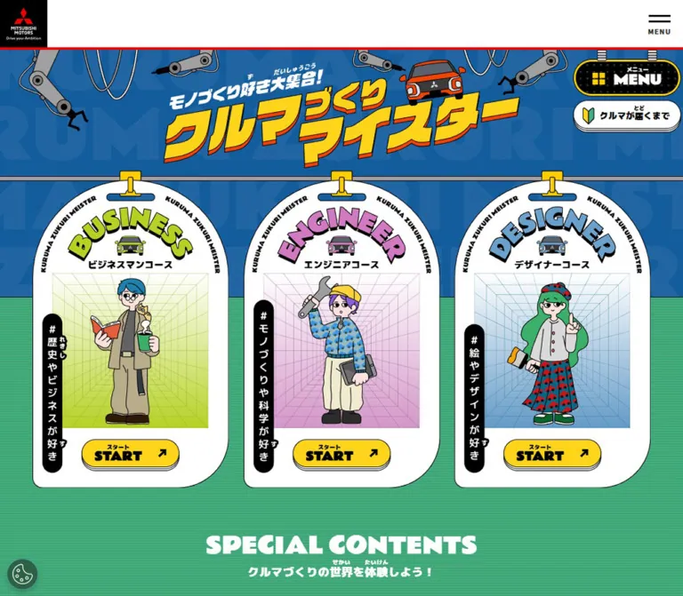
DESIGN REFERENCE
クルマづくりマイスター|三菱自動車
クルマづくりを楽しく学べる子ども向けコンテンツサイト。工場やゲーム機、ノートを模したイラストに、黄色のボタンと力強い文字を組み合わせています。
オリジナルサイトを見るMitsubishi Motors / クルマづくりマイスター — Style Reference
A colorful car-making workshop where games, notebooks, and illustrated signs become navigation.
Original URL: mitsubishi-motors.com/jp/sustainability/contribution/people/kids/
Final URL: Same educational hub
Theme: saturated illustrated environments, yellow actions, and a white-and-black corporate frame; no selectable theme was observed.
Inspected: September 12, 2026. Supplied retrieval timestamp: 2026-09-12T12:44:06.480Z, or 21:44:06.480 JST.
Viewports: 1440 × 1000 desktop and 390 × 844 mobile, in CSS pixels.
Scope: the current Japanese educational content hub, including its desktop loading view, visible mobile title, desktop activity and resource sections, persistent navigation controls, corporate footer, and cookie notice. Course links and expanded-navigation geometry are documented from rendered DOM evidence, with their visual and interaction limitations identified below.
This is a children's learning hub within the Mitsubishi Motors corporate website. Its information architecture offers three courses, four special activities, supplementary learning resources, and routes for students, parents, and teachers. The design presents these choices as objects in an illustrated workshop: a handheld game console, a spiral notebook, a fan of collectible cards, and freestanding signs.
Crisp black outlines hold together an unusually broad palette. Yellow pill buttons recur across green, blue, pink, cream, and navy surroundings. Heavy English display lettering and Japanese labels with reading aids make the experience feel energetic and approachable. The corporate header and footer retain a separate visual language: restrained sans-serif text, white or black surfaces, and red accents.
The first desktop capture remains in a loading state, while later captures expose substantial content farther down the page. The initial mobile capture reveals the illustrated title but has a large cookie notice covering the lower screen. These limitations particularly affect the initial course area; its completed composition cannot be established from the inspected original-page images.
How to Read This Reference
- Measured means a supplied rendered DOM rectangle, computed style, or declared custom property. Tables round most dimensions to two decimal places.
- Visual estimate means an approximation from an original-page screenshot. Estimated colors were not sampled with a pixel tool.
- DOM-only identifies elements whose styles or geometry were supplied but whose visible state was not demonstrated in a screenshot.
- Recommendation identifies implementation guidance, including the reusable CSS. It is not a claim about existing behavior.
- Token names introduced here are descriptive aliases unless an original custom property is explicitly named.
- Offscreen rectangles and extracted navigation text do not establish that those elements were visible, interactive, or in their final position.
Tokens — Colors
Measured Palette
| Name | Value | Suggested token | Evidence and role |
|---|---|---|---|
| Action Yellow | #FFD41A |
--color-action |
Computed background of START, PLAY, ENTER, home, and audience-resource links |
| Menu Yellow | #FECE00 |
--color-menu-rim |
Computed background of the illustrated local MENU button; forms its yellow outer treatment |
| Outline Black | #000000 |
--color-ink |
Main content text, footer background, and cookie buttons; black linework also dominates the illustrations |
| Surface White | #FFFFFF |
--color-white |
Corporate header, process link, reversed text, and white visual surfaces |
| Resource Lime | #B6D124 |
--color-lime |
Computed SDGs sign background |
| Resource Pink | #D179C1 |
--color-pink |
Computed future-of-cars sign background; visually related pink appears on the console |
| Resource Blue | #6BA0CC |
--color-resource-blue |
Computed environmental-resource sign background |
| Resource Gray | #D8D8D8 |
--color-resource-gray |
Computed traffic-safety sign background |
| Navigation Slate | #383952 |
--color-nav-slate |
Computed course-link background inside the local navigation structure; DOM-only in this inspection |
| Corporate Red | #ED0000 |
--color-corporate-red |
Source --color_primaryRed; also computed on the Cookie Policy link |
| Corporate Text | #333333 |
--color-corporate-text |
Source --color_textDefalt; computed corporate body and back-to-top text |
Estimated Illustration Colors
These colors help recreate the environments when original artwork is unavailable. They are approximations, not recovered source tokens.
| Name | Approximation | Suggested token | Visible use |
|---|---|---|---|
| Workshop Blue | #1C609B |
--color-workshop-blue |
Loading and title environment, with oversized lighter background lettering |
| Activity Green | #46AB83 |
--color-activity-green |
Activity-section field with fine horizontal texture |
| Floor Navy | #1D3955 |
--color-floor-navy |
Broad curved floor beneath the supplementary-resource signs |
| Notebook Paper | #F7F4DF |
--color-notebook-paper |
Layered notebook sheets with fine ruled lines |
| Console Screen | #556579 |
--color-console-screen |
Muted blue-gray screen behind the yellow racing title |
Color Behavior
Color changes by environment and object. The shared action yellow ties these regions together, while black outlines preserve separation between neighboring saturated colors. White outlined title lettering provides contrast on the activity illustrations.
The red corporate divider is visually evident, but its border color was not included in the sampled computed properties. Using the declared corporate red for a reconstruction is a reasonable recommendation, not a measured border-color claim.
The source also declares general corporate grays and a slider-related blue. Their presence does not make them primary colors of the visible educational experience.
Tokens — Typography
Japanese Content — M PLUS 1p
- Measured family:
"M PLUS 1p", sans-serifwithin the main educational content. - Measured weights:
400on the main container and900on course labels, Japanese action labels, resource titles, and explanatory captions. - Character: dense, sturdy Japanese sans-serif lettering with strong silhouettes.
- Reading aids: small Japanese readings appear above selected words and English actions. Their extra height is part of the component anatomy.
- Implementation alias:
--font-kids.
English Display Labels — Rammetto One
- Measured family:
"Rammetto One", sans-serifon START, PLAY, ENTER, and mobile section headings. - Measured weights: action elements report
900; the sampled section headings report400. - Character: broad, heavy, compact letterforms with a playful display quality.
- Implementation alias:
--font-display.
Computed weight does not establish which font files loaded or whether the browser synthesized a heavier appearance. The supplied evidence does not include font-file requests.
Corporate Shell — Noto Sans Japanese
- Measured family:
"Noto Sans Japanese", sans-serifon the corporate header, footer, and cookie controls. - Weights: generally
400, with700on major footer links and600on cookie buttons. - Implementation alias:
--font-corporate.
The source declares an --font_MMC stack containing MMCFont, but that declaration is not proof that MMCFont renders the sampled elements. Likewise, the HTML element's Times fallback is not the visible design's primary typeface.
Type Scale
Sizes and line heights below are measured CSS values. Readings above labels can make the complete text box taller than the main line height.
| Role | Desktop size / line height | Mobile size / line height | Weight and detail |
|---|---|---|---|
| Corporate MENU label | 10 / 10px |
10 / 10px |
400; compact utility text |
| Japanese course label | 19.69 / 29.53px |
13.52 / 20.80px |
900; course elements were offscreen |
| START / PLAY / ENTER | 23.91 / 23.91px |
14.56 / 14.56px |
Computed 900, Rammetto One |
| Floating process-link label | 18.28 / 26.72px |
10.40 / 18.72px |
900, M PLUS 1p |
| Resource-sign title | 23.91 / 36.56px |
14.56 / 26px |
900; mobile labels occupy two lines |
| Student / parent resource action | 23.91 / 23.91px |
17.68 / 17.68px |
900; readings add vertical space |
| Loading message | 30.94 / 46.41px |
17.68 / 26.52px |
900; mobile value is DOM-only |
| SPECIAL / OTHER CONTENTS | Not sampled | 27.04 / 27.04px |
400, Rammetto One |
| Section explanatory caption | Not sampled | 14.56 / 21.84px |
900, M PLUS 1p |
| Major corporate-footer link | 16 / 27px |
16 / 27px |
700 |
| Footer social link | 14 / 24px |
14 / 24px |
400, approximately |
| Footer legal link | 14 / 24px |
13 / 22.28px |
400, approximately |
| Cookie button | 13.008 / 15.61px |
Same | 600, 0.01em tracking |
| Cookie Policy link | 13.008 / 19.512px |
Same | 700, underlined visually |
Resource titles, loading text, and mobile section captions use approximately 0.02em tracking. Many action labels explicitly use normal tracking. The corporate body reports 0.04em tracking.
Graphic Lettering
The main title and activity titles have illustration-specific outlines, slants, and offset color layers. The H1's computed 16px is not the visual size of its wordmark. Its measured box is approximately 840.94 × 267.19px on desktop and 390 × 124.80px on mobile.
Preserve supplied title artwork when available. Ordinary text with a stroke can approximate the treatment, but it will not reproduce the custom letter shapes, accompanying car, or industrial composition.
Tokens — Spacing & Shapes
Density: large illustrated objects with tightly integrated labels and controls. Spacing separates activities; it is not dominated by paragraph blocks.
Scaling: the supplied values contain many fractional pixels, but the underlying page-specific formulas and breakpoints were not provided. Mobile measurements frequently align with a 390 / 375 = 1.04 scale, consistent with the declared mobile design width of 375. This is a numerical observation, not proof of a universal scaling rule.
Measured Geometry
| Element | Desktop | Mobile | Notes |
|---|---|---|---|
| Corporate header | 80px high |
56px high |
Includes the visible lower divider |
| Logo and corporate-menu boxes | 76 × 76px |
53 × 53px |
Flush to opposite viewport edges |
| Local MENU | 225 × 77.34px |
107.11 × 43.67px |
Distinct from the corporate hamburger |
| Local MENU radius | 39.38px |
21.84px |
Rounded outer capsule |
| Local MENU inner padding | 4.22px |
3.12px |
Measured button padding |
| Process link | 225 × 59.06px |
133.11 × 37.44px |
Moves from below MENU to its left |
| Standard activity action | 202.50 × 59.06px |
119.59 × 35.36px |
START, PLAY, ENTER |
| Standard action horizontal padding | 25.31px |
14.56px |
Measured CSS padding |
| Resource-sign face | 285.47 × 217.97px |
164.31 × 152.88px |
Excludes the full illustrated stand composition |
| Resource-sign radius | 21.09px |
15.60px |
Rounded sign face |
| Audience-resource action | 399.38 × 84.38px |
348.39 × 62.39px |
Two across on desktop; stacked on mobile |
| Audience-action horizontal padding | 28.13px |
31.20px |
Mobile retains generous text inset |
| Cookie button height | 41.61px |
41.61px |
Mobile buttons expand to 350px wide |
| Cookie close target | 44 × 44px |
44 × 44px |
Visible glyph is smaller than its target |
Most yellow and white action links report a 1000px radius. This is a pill-making convention, not an instruction to render visibly oversized curves.
Measured Spacing Relationships
| Relationship | Desktop | Mobile |
|---|---|---|
| Local MENU right clearance | 13.36px |
5.20px |
| Local MENU below corporate header | 19.69px |
10.39px |
| Process-link separation from MENU | 8.44px vertically |
5.20px horizontally |
| Supplementary-sign outer margin | 77.34px |
20.81px |
| Supplementary-sign column gap | 47.81px |
19.75px |
| Supplementary-sign row gap | Not applicable | 23.91px |
| Outer signs' downward stagger | 42.19px |
No stagger in sampled coordinates |
| Audience-resource action gap | 40.78px horizontally |
20.80px vertically |
| Mobile cookie-action gap | — | 16px |
The corporate custom properties include --gap: 24px, --gap_sp: 12px, and inner paddings of 40px and 20px. These are declared corporate tokens; they do not explain every gap in the illustrated content.
Outline and Depth
Original-page images show fine black contours, approximately 1–2px at the inspected desktop scale, around much of the artwork. Buttons have multiple crisp lower edges that suggest stacked plates. The notebook uses visibly offset sheets, while the console uses a darker offset side wall.
These are visual observations. Border widths and shadow declarations for these objects were not supplied. Use hard, small offsets when approximating them; blur would change their character.
Components
Corporate Header
Role: persistent corporate identity and global navigation.
A white full-width strip contains a black Mitsubishi Motors logo block at the far left and a compact two-line hamburger with MENU beneath it at the far right. A red divider closes the bottom edge. The middle remains largely empty.
The header stays at the top of the supplied scrolled captures. At 1440px wide it measures 80px, despite a separate source token declaring a 130px corporate desktop-header variant. Use the active measured size for this reference. The mobile header measures 56px.
The global menu's open state was not inspected.
Local MENU and Process Link
Role: navigation within the learning experience.
The local MENU is an illustrated hanging sign: a yellow rounded rim, black patterned interior, white heavy lettering, a yellow four-square symbol, a small Japanese reading, and short mechanical supports above it. Its shape and position clearly distinguish it from the corporate hamburger.
On desktop, MENU occupies a 225px-wide capsule near the upper-right corner of the content. The white クルマが届くまで process link is positioned beneath it in the initial DOM geometry. On mobile, that link moves to MENU's left, forming a compact horizontal pair below the corporate header.
The local MENU remains visible in the lower-page captures. The white process link is visible in the initial mobile capture but absent from the supplied lower-page views; its precise visibility rule was not measured.
DOM-only expanded structure: COURSE contains the three course routes; SPECIAL contains four activities; OTHER contains supplementary resources and audience links. On desktop the measured groups occupy several columns. On mobile the course and special links form wide stacks, with the supplementary links grouped into two narrower columns below. The complete open-menu appearance, focus behavior, and scroll containment were not demonstrated.
Title Environment and Loading View
Role: establishes the workshop identity and communicates initial preparation.
The visible mobile title combines yellow Japanese lettering, red offset depth, black outlines, a small orange-red car, a white introductory phrase, and surrounding robot arms. Large low-contrast English letters extend beyond the blue background's edges.
In the first desktop image, a blue loading view appears beneath the corporate header. It includes oversized repeating background lettering, a small blue-haired illustrated head above the status area, and bold white ローディング中... text. The loading message measures approximately 30.94px with a 46.41px line height.
The supplied captures establish the existence of these states, but not the duration or sequence of the complete entrance. Do not interpret the loading view as the hub's permanent content arrangement.
Course Entry Links
Role: provides routes into business, engineering, and design learning content.
The original-page DOM confirms three course destinations and corresponding START links. Course labels use heavy M PLUS 1p, while START uses Rammetto One and the shared yellow pill treatment.
All sampled primary-course rectangles have negative horizontal positions. The mobile content order also differs from the desktop extraction. This is consistent with a translated or transitional track, but it does not establish a carousel, swipe behavior, autoplay, or the completed visible arrangement.
The separate course links inside local navigation have measured dark-slate tile surfaces: approximately 365.63 × 91.41px on desktop and 327.61 × 67.59px on mobile. These menu tiles must not be mistaken for the primary course presentation.
Section Heading Pair
Role: divides the activity and supplementary-resource environments.
The DOM identifies SPECIAL CONTENTS and OTHER CONTENTS, each followed by a short Japanese explanatory line. On mobile the English heading is Rammetto One at 27.04px / 1, with a heavy Japanese caption at 14.56px / 1.5 beneath it. Both are white.
Use a compact centered heading group with enough line spacing for the small readings above Japanese words. Desktop heading measurements were not supplied, so a desktop size requires a separately labeled design choice.
Shared Yellow Action
Role: makes activity entry points recognizable across differently shaped illustrations.
The anatomy is consistent:
- A yellow pill with a fine black contour.
- A compact Japanese reading above the main action word.
- A heavy START, PLAY, or ENTER label.
- A black diagonal up-right arrow toward the right edge.
- Several crisp lower edges creating a shallow stacked appearance.
Desktop activity links measure 202.50 × 59.06px; mobile links measure 119.59 × 35.36px. Audience-resource links use the same family at larger widths and with Japanese main labels.
The arrows accompany internal page links. They do not, by themselves, indicate an external website or a new window.
Virtual Factory Panel
Role: entry to vfactory/.
The upper portion of the middle desktop capture shows a broad factory illustration, including a conveyor, cars, machine structures, and black-and-yellow hazard stripes along the edges. A centered yellow START link sits inside the scene.
Only part of this panel is visible in that screenshot, so the complete title and upper composition should not be reconstructed from it. Its desktop action is measured at approximately x=618.75px. The mobile DOM places its action around x=135.20px, consistent with a centered action in a single-column section.
Quiz Motor-Race Console
Role: entry to motorracing/ and a playful interactive-looking object within the hub.
A large pink handheld console occupies the left side of the desktop activity layout. Its dark outer screen frame encloses a muted blue-gray display with slanted yellow Japanese lettering and a small racing-flag motif. A darker side edge, cable details, and projecting hardware make it feel like a tangible device.
The lower controls include a directional pad at left, the yellow PLAY link near the center, and numbered circular buttons at right. The DOM supplies four directional button elements and two additional button elements. Their actions were not tested; no gameplay, keyboard behavior, sound, or screen response can be claimed.
The desktop circular controls measure about 50.63px across; mobile equivalents measure about 29.11px. Some mobile directional buttons are only about 16.63–24.95px wide, which is relevant when planning larger accessible hit areas.
Car Research Notebook
Role: entry to schoolproject/.
To the right of the console sits a landscape spiral notebook. Cream ruled pages are layered over darker offset sheets. Colored bookmarks project from the upper edge, dark binding loops run down the right side, and a large magnifying glass overlaps the lower-right corner.
The title クルマの自由研究 uses white graphic lettering with black contours and a blue offset layer. A yellow START link sits below the title on the paper surface.
Preserve the overlap between the notebook and magnifier. The component's identity comes from the complete object silhouette, not just a rounded cream rectangle.
My Card Gallery
Role: entry to cardgallery/.
A fan of blue cards appears beneath the notebook in the desktop composition. Each card has a pale edge and darker printed detail. The large white title spans across the fan with black outlining and an orange-red lower offset. A yellow ENTER link sits beneath the title.
The lower portion is obscured by the cookie notice in the supplied desktop image. Card count, complete lower silhouette, and any hover or fan animation are therefore not established.
Supplementary-Resource Signs
Role: links to SDGs, future mobility, environmental initiatives, and traffic-safety content.
Four colored sign faces sit on illustrated gray posts and bases. Their colors are lime, pink, blue, and gray. Small circular fasteners, black contours, rounded corners, and offset lower edges give the signs a manufactured appearance.
Desktop uses four columns, with the first and fourth faces approximately 42.19px lower than the middle pair. A light-blue grid forms the upper environment; a large navy curved floor extends below the signs.
Mobile DOM measurements establish a two-by-two arrangement. Titles change to two lines with substantial line height for readings. The measured mobile sign face is 164.31 × 152.88px.
Student and Adult Resource Links
Role: direct routes to the student consultation area and information for parents and teachers.
Two broad yellow pills sit beneath the signs. Their labels are 小学生自動車相談室 and 保護者の方・学校の先生方へ, with small readings above selected words and a diagonal arrow at the right.
Desktop places both links side by side near the center. Illustrated people flank the group, and a small yellow cat appears on the navy floor. Mobile stacks the links at nearly the full content width.
These links are more prominent than routine footer links and still belong to the illustrated educational experience.
Back-to-Top Strip and Corporate Footer
Role: closes the learning environment and reconnects it to corporate navigation.
A gray strip approximately 67px high contains the centered ページ上部へ戻る link and upward chevron. A red edge separates it from the black footer.
Desktop presents six major corporate categories in a horizontal row, followed by social links and smaller legal navigation. The footer measures approximately 337.98px high with 30px 50px padding.
Mobile changes the major categories into full-width rows about 54px high, separated by thin rules and ending in red arrows. Social links occupy two columns. The footer grows to approximately 844.91px high, with measured outer padding of 25px 20px 30px.
The original-page footer includes © MITSUBISHI MOTORS CORPORATION. All rights reserved. No production-credit statement was identified in the supplied original-page evidence.
Cookie Notice
Role: persistent consent interface over the page.
A white, thinly outlined panel is attached to the bottom of every supplied original-page screenshot. It contains English explanatory text, an underlined red Cookie Policy link, three black buttons, and a gray close glyph.
Desktop uses a horizontal composition: text at left, Cookie Settings / Reject All Cookies / Accept All Cookies toward the right, and the close target at the far edge. The panel occupies approximately the bottom 166px, or 16.6% of the viewport.
Mobile moves the buttons into three full-width rows beneath the text. The panel begins around y=341px and occupies approximately 503px, or 59.6% of the viewport. Buttons measure 350 × 41.61px, with 16px gaps.
This panel has a major effect on the observed mobile layout: it conceals most of the initial course region and much of the lower-page view. Its controls were not activated, so dismissal, preference persistence, and settings-panel behavior remain unverified.
Tokens — Motion & Interaction
The evidence supplies transition declarations, static captures, and a scrolling inspection procedure. It does not supply a recording of individual hover, menu, or game interactions.
| Element | Measured declaration | What is established | What remains unverified |
|---|---|---|---|
| Local MENU | width 1s, height 1s, border-radius 1s |
A size-and-shape transition is defined | Trigger, intermediate geometry, and open-state appearance |
| Yellow and white pill links | transform 0.17s |
Short transform feedback is defined | Translation direction, scale, hover and press values |
| Supplementary signs | transform 0.3s |
Transform feedback is defined | Whether the sign lifts, tilts, or otherwise moves |
| Special links inside local navigation | 0.3s |
A transition duration is reported | Property-specific behavior and visible result |
| Shared corporate token | --transition-time: 0.3s |
A duration token exists | Which additional visible elements consume it |
| Primary course area | Offscreen measured positions | Content is positioned outside the visible horizontal region in the samples | Final entrance, cycling, dragging, or autoplay |
| Loading view | Visible desktop state | A loading presentation exists | Duration, progress model, character animation, and exit sequence |
| Console controls | Button elements and visible controls | Directional and numbered controls exist | Their effects, sound, and playable behavior |
Many sampled elements report animation: none. This does not rule out animation on descendants, pseudo-elements, image assets, or JavaScript-driven transforms. Similarly, a bare transition: all is not evidence of visible motion without a duration and state change.
Recommended adaptation: use brief 170ms feedback for actions and 300ms feedback for sign objects. A small upward hover movement and downward press movement fit the hard-edged construction, but those specific movements are proposed values. Provide a static reduced-motion state and ensure that learning links remain usable if decorative animation fails.
Surfaces
| Layer | Appearance | Structural purpose |
|---|---|---|
| Corporate header | White, black logo block, red lower edge | Corporate identity and global navigation |
| Title / loading environment | Blue with oversized low-contrast lettering | Sets the workshop theme |
| Activity environment | Green with fine horizontal texture | Connects factory, console, notebook, and cards |
| Illustrated objects | Flat color, black contours, overlapping parts | Makes each activity recognizable |
| Supplementary environment | Light-blue grid above a curved navy floor | Stages signs, people, and audience links |
| Action surface | Yellow pill with crisp stacked lower edges | Shared entry-point language |
| Corporate footer | Black with white text and rules | Dense corporate navigation |
| Cookie notice | White outlined panel over the viewport | Consent controls, visually separate from the learning content |
Depth comes from object overlaps, outlined edges, and small hard offsets. There is no demonstrated general system of blurred card elevation or translucent glass panels.
Imagery
The inspected content uses flat, cartoon-like illustration with precise black contours. Mechanical subjects include robot arms, a conveyor, hazard stripes, cars, cables, and handheld-game hardware. Everyday learning objects include ruled paper, bookmarks, books, and a magnifier.
Characters have expressive faces, distinctive hair colors, patterned clothing, and relaxed poses. The lower desktop view shows a person in a yellow cap and patterned blue top, a green-haired person holding a book, a blue-haired person with glasses, and a small yellow cat. They act as visual companions around navigation rather than as isolated portrait thumbnails.
Textures vary by environment: oversized cropped lettering on blue, fine horizontal lines on green, a light grid behind the resource signs, notebook ruling, and repeated printing on the blue cards. These textures are subordinate to labels and object silhouettes.
Do not apply pixelated image rendering globally. The artwork's observed character is crisp contour drawing, not deliberately enlarged bitmap pixels. Use sharp, adequately sized assets and preserve their aspect ratios.
Observed Asset References
No original image URLs or asset filenames were included in the supplied evidence. The following table identifies artwork by its visible role without inventing paths or formats.
| Artwork | Original-page evidence | Implementation implication |
|---|---|---|
| Mitsubishi Motors logo | Desktop and mobile headers | Preserve the supplied corporate artwork and its black square field |
| Main title and robot arms | Initial mobile capture | Treat the composition as artwork with an accessible heading equivalent |
| Blue-haired loading face | Initial desktop capture | A loading illustration is verified; its animation is not |
| Factory scene | Upper part of the middle desktop capture | Full source asset needs separate verification |
| Pink game console | Middle desktop capture | Retain screen, controls, side depth, and cable details |
| Notebook and magnifier | Middle desktop capture | Preserve layered sheets and overlapping magnifier |
| Blue card fan | Middle desktop capture | Preserve card angles and title overlap; lower edge is obscured |
| Resource signs and characters | Lower desktop capture | Preserve the relationship between signs, floor, and people |
CSS can reproduce layout, typography, buttons, and approximate textures. The illustrated machines, people, title lettering, and object silhouettes require appropriate artwork.
Layout & Responsive Behavior
The page is a vertically scrolling document. Its corporate header and local MENU remain visible at the top of the supplied scrolled views, while the cookie notice stays attached to the bottom. These overlays should not be confused with the document's main content height.
| Measurement | Desktop | Mobile |
|---|---|---|
| Document height | 3773.48px |
3876.55px |
| Main element height | 3288.50px |
2908.64px |
| Main start | 80px below document top |
56px below document top |
| Footer height | 337.98px |
844.91px |
The mobile document is slightly taller even though its main element is shorter, largely because the corporate footer becomes much taller. The source's --content-height custom property differs from the measured mobile main height; use the actual rectangle when describing that element.
Confirmed Adaptations
- Navigation: the process link moves from below the local MENU to its left. Both controls become much smaller.
- Special activities: desktop places the console at left with notebook and gallery at right. Mobile DOM coordinates place the factory, console, notebook, and gallery actions in a vertical sequence.
- Supplementary signs: four desktop columns become two mobile columns. Desktop stagger disappears in the sampled mobile geometry.
- Audience links: two desktop pills become two full-width stacked mobile links.
- Resource text: one-line desktop titles become two-line mobile labels, with increased line height relative to font size.
- Corporate footer: a horizontal category row becomes full-width stacked rows; social links become two columns.
- Cookie notice: a short horizontal panel becomes a tall panel with three stacked actions.
Responsive Limits
The supplied mobile screenshots expose the title and corporate footer, but the consent panel obscures the activity and resource regions. Their mobile reflow is supported by DOM geometry rather than complete visual confirmation.
No intermediate viewport was inspected, and the source media-query thresholds were not supplied. The Quick Start's 48rem breakpoint is a recommendation. Do not extrapolate a single proportional desktop-to-mobile scaling formula from these two samples.
The initial course arrangement requires separate verification. Its negative horizontal coordinates should not be treated as final content positions in a new implementation.
Do’s and Don’ts
Do
- Keep the educational hub's illustrated world distinct from the corporate header and footer.
- Use the measured
#FFD41Afor shared activity actions and#FECE00for the local MENU rim. - Pair heavy M PLUS 1p Japanese labels with Rammetto One English display labels.
- Reserve vertical room for readings above Japanese words and action labels.
- Preserve the console, notebook, card fan, and sign silhouettes as meaningful navigation objects.
- Use crisp black contours and shallow hard offsets to establish depth.
- Keep arrows aligned consistently at the right side of action pills.
- Reflow the resource signs into two mobile columns and stack the audience links.
- Account for both top navigation layers and the bottom consent panel.
- Identify loading, offscreen, obscured, and DOM-only evidence explicitly.
Don’t
- Don't turn this multi-route learning hub into a single conversion funnel.
- Don't replace every illustrated activity with an identical generic card.
- Don't derive the completed course presentation from offscreen measurements.
- Don't claim swipe, autoplay, playable console behavior, sound, or a menu-opening sequence without interaction evidence.
- Don't use the H1's computed 16px as the visual wordmark size.
- Don't substitute a generic sans-serif for all of the distinctive English labels.
- Don't apply blur shadows, glass effects, or global pixelated rendering to the illustration system.
- Don't treat diagonal arrows on internal routes as proof of new-window navigation.
- Don't assume the declared 130px corporate header is active at the inspected desktop width.
- Don't let decorative scaling shrink the effective mobile hit areas without review.
Recommended Implementation Additions
These are proposed improvements for a new implementation, not verified original-site features:
- Give the corporate and educational menus distinct accessible names and expose each menu's expanded state.
- Keep inactive menu content out of keyboard navigation. If an expanded menu blocks the page, implement appropriate focus handling and restoration.
- Give repeated START links destination-specific accessible names, such as Start car research.
- Use semantic ruby markup where appropriate for Japanese readings, and test text enlargement for collisions.
- Increase small mobile action and console-control hit areas to at least 44 × 44px without unnecessarily enlarging their visible artwork.
- Provide accessible heading text for graphic titles. Inspect accessible names for illustrated links whose extracted text is empty before drawing conclusions about their accessibility.
- Reserve image dimensions and keep content links available when entrance animation or decorative assets fail.
- Provide reduced-motion behavior for JavaScript-driven movement as well as CSS transitions.
- Consider a localized Japanese consent explanation and a layout that keeps every consent action reachable on short screens. Preserve equal prominence for accept and reject choices.
- Verify course presentation, menu behavior, console effects, and consent dismissal in a separate interaction pass before implementing those details as source-matched behavior.
Agent Prompt Guide
Quick Color Reference
- Shared action fill: measured
#FFD41A. - Local MENU rim: measured
#FECE00. - Resource faces: measured lime
#B6D124, pink#D179C1, blue#6BA0CC, and gray#D8D8D8. - Outlines and main labels: black; reversed labels and corporate header: white.
- Corporate accent: source
#ED0000. - Environment approximations: blue
#1C609B, green#46AB83, navy#1D3955, and cream#F7F4DF. - Depth: thin black contours, overlapping illustration parts, and hard lower offsets.
Overall Prompt
“Create a Japanese children's car-making learning hub with a white corporate header and a separate illustrated local menu. Use blue and green workshop environments, crisp black-outlined machinery, a pink handheld game console, a cream spiral notebook with an overlapping magnifier, and a fan of blue cards. Use M PLUS 1p for heavy Japanese labels and Rammetto One for English action words. Connect the activities with yellow pill links in #FFD41A, small readings above labels, diagonal arrows, and shallow stacked lower edges. Add four colored resource signs over a light grid and curved navy floor. On mobile, stack the special activities, use a two-column resource grid, and stack the two audience links. Treat the initial course composition and untested interactive behavior as requiring further verification.”
Example Component Prompts
- Activity action: “Create a yellow pill link with a fine black outline, a small Japanese reading above START, a heavy Rammetto One label, and a black up-right arrow. Add crisp lower plate edges. Match the observed desktop size of about 202.5 × 59px; use a recommended minimum 44px mobile hit height.”
- Console activity: “Compose a pink handheld game object with a dark frame, blue-gray screen, slanted yellow racing lettering, a directional pad, two colored numbered controls, and a central PLAY link. Preserve the cable details and darker side wall. Keep control effects unspecified until separately verified.”
- Research activity: “Build a cream landscape notebook with fine horizontal ruling, offset paper layers, colored page tabs, dark spiral loops on the right, and a magnifier overlapping the lower-right corner. Place an outlined graphic title above a yellow START link.”
- Resource signs: “Arrange four rounded sign faces in lime, pink, blue, and gray on gray posts above a curved navy floor. Use black outlines, small fasteners, bold Japanese labels with readings, and diagonal arrows. Stagger the outside signs on desktop; use an aligned two-by-two grid on mobile.”
- Navigation pair: “Place a yellow-rimmed black local MENU sign below the corporate header, with white display lettering and a four-square yellow icon. Put the white process link beneath it on desktop and to its left on mobile. Keep this local navigation visually distinct from the corporate hamburger.”
Quick Start
CSS Custom Properties
This is a practical adaptation using a conventional root font size. Measured colors and representative dimensions are retained; estimated environment colors, outline depth, breakpoint selection, hover movement, and desktop section-heading size are recommendations.
The code does not supply fonts or illustration files. It also does not implement menu state, loading logic, console behavior, or consent preferences. Mobile activity actions are intentionally raised from the measured 35.36px height to a recommended 44px minimum.
:root {
  /* Measured colors */
  --color-action: #ffd41a;
  --color-menu-rim: #fece00;
  --color-ink: #000;
  --color-white: #fff;
  --color-lime: #b6d124;
  --color-pink: #d179c1;
  --color-resource-blue: #6ba0cc;
  --color-resource-gray: #d8d8d8;
  --color-nav-slate: #383952;
  --color-corporate-red: #ed0000;
  --color-corporate-text: #333;

  /* Visual approximations for illustrated environments */
  --color-workshop-blue: #1c609b;
  --color-activity-green: #46ab83;
  --color-floor-navy: #1d3955;
  --color-notebook-paper: #f7f4df;

  /* Measured family declarations; font files are separate */
  --font-kids: 'M PLUS 1p', sans-serif;
  --font-display: 'Rammetto One', sans-serif;
  --font-corporate: 'Noto Sans Japanese', sans-serif;

  --header-height: 80px;
  --header-rule: 4px;
  --page-gutter: 66px;
  --stage-max: 1308px;
  --action-width: 202.5px;
  --action-height: 59.06px;
  --action-text: 23.9062px;
  --sign-radius: 21.09px;
  --sign-gap: 47.81px;

  /* Measured durations; movement amounts below are proposed */
  --motion-action: 170ms;
  --motion-object: 300ms;
  --motion-menu: 1s;

  /* Recommended hard-edge depth approximation */
  --plate-shadow:
    0 3px 0 #fff,
    0 4px 0 #000,
    0 6px 0 #fff,
    0 7px 0 #000;
}

* { box-sizing: border-box; }
body { margin: 0; }
[hidden] { display: none !important; }
button, a { -webkit-tap-highlight-color: transparent; }
button { font: inherit; }

.corporate-header {
  position: fixed;
  inset: 0 0 auto;
  z-index: 50;
  display: flex;
  justify-content: space-between;
  height: var(--header-height);
  border-bottom: var(--header-rule) solid var(--color-corporate-red);
  background: var(--color-white);
  font-family: var(--font-corporate);
}

.corporate-logo,
.corporate-menu {
  display: grid;
  place-items: center;
  width: calc(var(--header-height) - var(--header-rule));
  height: calc(var(--header-height) - var(--header-rule));
}

.corporate-logo { background: var(--color-ink); }
.corporate-logo img { display: block; width: 100%; height: auto; }
.corporate-menu { border: 0; background: transparent; font-size: 10px; }

.kids-main {
  margin-top: var(--header-height);
  color: var(--color-ink);
  font-family: var(--font-kids);
  line-height: 1.5;
}

.kids-container {
  width: calc(100% - 2 * var(--page-gutter));
  max-width: var(--stage-max);
  margin-inline: auto;
}

.kids-tools {
  position: fixed;
  z-index: 40;
  top: calc(var(--header-height) + 19.69px);
  right: 13.36px;
  display: flex;
  flex-direction: column;
  align-items: center;
  gap: 8.44px;
}

.local-menu {
  width: 225px;
  height: 77.34px;
  padding: 4.22px;
  border: 0;
  border-radius: 39.38px;
  background: var(--color-menu-rim);
  transition: width var(--motion-menu),
    height var(--motion-menu), border-radius var(--motion-menu);
}

.local-menu__face {
  display: flex;
  align-items: center;
  justify-content: center;
  height: 100%;
  border-radius: inherit;
  color: var(--color-white);
  background: var(--color-ink);
  font-family: var(--font-display);
}

.process-link {
  display: flex;
  align-items: center;
  justify-content: center;
  width: 225px;
  min-height: 59.06px;
  padding-inline: 18.28px;
  border: 1px solid var(--color-ink);
  border-radius: 1000px;
  color: var(--color-ink);
  background: var(--color-white);
  font: 900 18.2812px/1.46 var(--font-kids);
  text-decoration: none;
}

.hero {
  position: relative;
  overflow: hidden;
  background: var(--color-workshop-blue);
}

.hero-title {
  position: relative;
  width: min(100%, 840.94px);
  margin: 0 auto;
}

.hero-title img,
.activity-art {
  display: block;
  width: 100%;
  height: auto;
}

.hero-pattern {
  position: absolute;
  inset: 0;
  overflow: hidden;
  opacity: 0.08;
  color: var(--color-white);
  font: 400 clamp(72px, 10vw, 150px)/1 var(--font-display);
  pointer-events: none;
}

.activities {
  padding-block: 60px 100px;
  background:
    repeating-linear-gradient(
      to bottom,
      transparent 0 2px,
      rgb(0 0 0 / 0.08) 2px 3px
    ),
    var(--color-activity-green);
}

.section-title {
  margin: 0;
  color: var(--color-white);
  text-align: center;
  font: 400 clamp(27.04px, 3vw, 42px)/1 var(--font-display);
}

.section-caption {
  margin: 12px 0 36px;
  color: var(--color-white);
  text-align: center;
  font-weight: 900;
  letter-spacing: 0.02em;
}

.activity-grid {
  display: grid;
  grid-template-columns: repeat(2, minmax(0, 1fr));
  gap: 48px;
}

.activity-object { position: relative; min-width: 0; }
.activity-factory { grid-column: 1 / -1; }
.activity-console { grid-column: 1; grid-row: 2 / span 2; }
.activity-notebook { grid-column: 2; grid-row: 2; }
.activity-gallery { grid-column: 2; grid-row: 3; }

/* Tune this offset to each verified illustration's button area. */
.activity-action {
  position: absolute;
  inset-inline: 0;
  bottom: var(--action-bottom, 8%);
  display: flex;
  justify-content: center;
}

.game-link {
  display: inline-flex;
  align-items: center;
  justify-content: space-between;
  gap: 20px;
  width: var(--action-width);
  min-height: var(--action-height);
  padding: 8px 25.31px;
  border: 1px solid var(--color-ink);
  border-radius: 1000px;
  color: var(--color-ink);
  background: var(--color-action);
  box-shadow: var(--plate-shadow);
  font: 900 var(--action-text)/1 var(--font-display);
  text-decoration: none;
  transition: transform var(--motion-action);
}

.game-link__label { display: grid; justify-items: center; }
.game-link__reading {
  font: 900 0.5em/1.2 var(--font-kids);
}
.game-link__arrow { flex: none; }

.resources {
  padding-block: 60px 100px;
  background: var(--color-floor-navy);
}

.sign-grid {
  display: grid;
  grid-template-columns: repeat(4, minmax(0, 1fr));
  gap: var(--sign-gap);
  max-width: 1285.31px;
  margin-inline: auto;
  padding-bottom: 42.19px;
}

.resource-sign {
  --stagger: 0px;
  min-height: 217.97px;
  border: 1px solid var(--color-ink);
  border-radius: var(--sign-radius);
  color: var(--color-ink);
  background: var(--sign-color, var(--color-resource-gray));
  transform: translateY(var(--stagger));
  transition: transform var(--motion-object);
  text-decoration: none;
}

.resource-sign:nth-child(1),
.resource-sign:nth-child(4) { --stagger: 42.19px; }
.resource-sign--sdgs { --sign-color: var(--color-lime); }
.resource-sign--future { --sign-color: var(--color-pink); }
.resource-sign--environment { --sign-color: var(--color-resource-blue); }

.resource-sign__title {
  margin: 12px;
  text-align: center;
  font: 900 23.9062px/1.53 var(--font-kids);
  letter-spacing: 0.02em;
}

.audience-links {
  display: flex;
  justify-content: center;
  gap: 40.78px;
  margin-top: 48px;
}

.audience-link {
  width: 399.38px;
  min-height: 84.38px;
  padding-inline: 28.13px;
  font-family: var(--font-kids);
}

.corporate-footer {
  padding: 30px 50px;
  color: var(--color-white);
  background: var(--color-ink);
  font: 400 16px/1.6875 var(--font-corporate);
}

.footer-primary {
  display: flex;
  flex-wrap: wrap;
  gap: 32px 60px;
}

.footer-primary a {
  color: inherit;
  font-weight: 700;
  text-decoration: none;
}

.consent-banner {
  position: fixed;
  z-index: 100;
  inset: auto 0 0;
  display: grid;
  grid-template-columns: minmax(0, 760px) auto 44px;
  align-items: center;
  justify-content: space-between;
  gap: 24px;
  padding: 18px 30px 10px;
  border: 1px solid var(--color-ink);
  color: #555;
  background: var(--color-white);
  font: 400 13.008px/19.512px var(--font-corporate);
}

.consent-copy { margin: 0; }
.consent-copy a { color: var(--color-corporate-red); font-weight: 700; }
.consent-actions { display: flex; gap: 16px; }
.consent-actions button {
  min-height: 41.61px;
  padding: 12px 10px;
  border: 0;
  border-radius: 2px;
  color: var(--color-white);
  background: var(--color-ink);
  font: 600 13.008px/15.6096px var(--font-corporate);
  letter-spacing: 0.01em;
}
.consent-close { width: 44px; height: 44px; border: 0; background: none; }

/* Recommended focus and feedback states */
a:focus-visible,
button:focus-visible {
  outline: 3px solid var(--color-ink);
  outline-offset: 4px;
  box-shadow: 0 0 0 7px var(--color-white);
}

@media (hover: hover) {
  .game-link:hover { transform: translateY(-2px); }
  .resource-sign:hover {
    transform: translateY(calc(var(--stagger) - 3px));
  }
}
.game-link:active { transform: translateY(3px); }

/* Recommended breakpoint; source thresholds were not supplied. */
@media (max-width: 48rem) {
  :root {
    --header-height: 56px;
    --header-rule: 3px;
    --page-gutter: 20.8px;
    --action-width: 119.59px;
    --action-height: 44px;
    --action-text: 14.56px;
    --sign-radius: 15.6px;
    --sign-gap: 19.75px;
  }

  .kids-tools {
    top: calc(var(--header-height) + 10.39px);
    right: 5.2px;
    flex-direction: row;
    align-items: flex-start;
    gap: 5.2px;
  }
  .local-menu {
    width: 107.11px;
    height: 44px;
    padding: 3.12px;
    border-radius: 21.84px;
  }
  .process-link {
    order: -1;
    width: 133.11px;
    min-height: 44px;
    padding-inline: 13.52px;
    font-size: 10.4px;
    line-height: 1.8;
  }
  .hero { padding-top: 52px; }
  .activities, .resources { padding-block: 44px 64px; }
  .section-title { font-size: 27.04px; }
  .section-caption { font-size: 14.56px; line-height: 1.5; }
  .activity-grid { grid-template-columns: minmax(0, 1fr); gap: 36px; }
  .activity-object { grid-column: auto; grid-row: auto; }
  .game-link { gap: 12px; padding-inline: 14.56px; }
  .sign-grid {
    grid-template-columns: repeat(2, minmax(0, 1fr));
    row-gap: 23.91px;
    padding-bottom: 0;
  }
  .resource-sign { min-height: 152.88px; }
  .resource-sign:nth-child(n) { --stagger: 0px; }
  .resource-sign__title { font-size: 14.56px; line-height: 26px; }
  .audience-links { flex-direction: column; gap: 20.8px; margin-top: 31.2px; }
  .audience-link {
    width: 100%;
    min-height: 62.39px;
    padding-inline: 31.2px;
    font-size: 17.68px;
  }
  .corporate-footer { padding: 25px 20px 30px; font-size: 15px; }
  .footer-primary { display: block; margin-inline: -20px; }
  .footer-primary a {
    display: block;
    min-height: 54px;
    padding: 13px 56px 13px 32px;
    border-bottom: 1px solid #686d71;
    font-size: 16px;
  }
  .consent-banner {
    grid-template-columns: minmax(0, 1fr);
    gap: 12px;
    max-height: calc(100dvh - var(--header-height));
    overflow-y: auto;
    padding: 46px 19px calc(15px + env(safe-area-inset-bottom, 0px));
  }
  .consent-actions { flex-direction: column; gap: 16px; }
  .consent-actions button { width: 100%; }
  .consent-close { position: absolute; top: 4px; right: 1px; }
}

@media (prefers-reduced-motion: reduce) {
  .kids-main *, .kids-tools * {
    animation: none !important;
    transition: none !important;
  }
  .game-link:hover, .game-link:active { transform: none; }
  .resource-sign:hover { transform: translateY(var(--stagger)); }
}
Example Action Markup
This uses a destination observed in the original-page links. The reading remains visible while the accessible name identifies the specific activity.
<a class="game-link" href="schoolproject/" aria-label="Start car research">
  <span class="game-link__label" aria-hidden="true">
    <span class="game-link__reading" lang="ja">スタート</span>
    <span>START</span>
  </span>
  <span class="game-link__arrow" aria-hidden="true">↗</span>
</a>
Use the activity classes in source order: factory, console, notebook, gallery. Supply each object's verified illustration and tune its action placement. Sign posts, characters, notebook binding, machinery, and custom wordmarks are artwork responsibilities beyond this CSS shell.
Tailwind v4 Token Mapping
Optional aliases for an implementation already using Tailwind v4. This is not evidence that the original website uses Tailwind.
@theme inline {
  --color-action: #ffd41a;
  --color-menu-rim: #fece00;
  --color-ink: #000000;
  --color-resource-lime: #b6d124;
  --color-resource-pink: #d179c1;
  --color-resource-blue: #6ba0cc;
  --color-resource-gray: #d8d8d8;
  --color-corporate-red: #ed0000;

  --font-kids: 'M PLUS 1p', sans-serif;
  --font-display: 'Rammetto One', sans-serif;
  --font-corporate: 'Noto Sans Japanese', sans-serif;

  --radius-sign: var(--sign-radius);
  --radius-action: 1000px;
  --spacing-stage-gutter: var(--page-gutter);
  --spacing-action-width: var(--action-width);
  --text-action: var(--action-text);
}
Sources & Evidence
- Original and final page: Mitsubishi Motors — クルマづくりマイスター. The supplied inspection reports HTTP 200 with no change between original and final URLs.
- Inspection date: September 12, 2026, with bundle retrieval recorded at
2026-09-12T12:44:06.480Z. Separate timestamps for individual screenshots were not provided. - Desktop evidence: three original-page captures at 1440 × 1000 covering the initial loading state, middle activity objects, and lower resources/footer, accompanied by rendered text, links, rectangles, custom properties, and computed styles.
- Mobile evidence: two original-page captures at 390 × 844 covering the title area and corporate footer, accompanied by equivalent rendered DOM evidence across the document. The cookie notice obscures a substantial portion of both screenshots.
- Original-page identity: Mitsubishi Motors branding, the Japanese page title, corporate navigation links, and the footer copyright independently establish the page's corporate identity.
- Observed inspection actions: initial viewing and scrolling through intermediate positions. The supplied readiness procedure waits for document load, finite motion, sampled layout/text stability, and image decoding within bounded time limits. Perpetual animations are paused during readiness checks and resumed afterward.
- Limitations: no independent browsing, command execution, or additional file access was performed for this reference. No hover, menu opening, course entry, console interaction, or consent dismissal was demonstrated. Font files, image source paths, complete stylesheets, media-query thresholds, and production credits were not supplied. Workers were disabled during the provided inspection, and readiness checks do not prove semantic completeness or the absence of delayed content.
All site-specific design findings above come from the supplied current original-page captures and rendered evidence. Estimated colors, accessible enhancements, implementation breakpoints, and CSS interaction states are labeled as adaptations.
# Mitsubishi Motors / クルマづくりマイスター — Style Reference

> A colorful car-making workshop where games, notebooks, and illustrated signs become navigation.

**Original URL:** [mitsubishi-motors.com/jp/sustainability/contribution/people/kids/](https://www.mitsubishi-motors.com/jp/sustainability/contribution/people/kids/)
**Final URL:** [Same educational hub](https://www.mitsubishi-motors.com/jp/sustainability/contribution/people/kids/)
**Theme:** saturated illustrated environments, yellow actions, and a white-and-black corporate frame; no selectable theme was observed.
**Inspected:** September 12, 2026. Supplied retrieval timestamp: `2026-09-12T12:44:06.480Z`, or 21:44:06.480 JST.
**Viewports:** 1440 × 1000 desktop and 390 × 844 mobile, in CSS pixels.
**Scope:** the current Japanese educational content hub, including its desktop loading view, visible mobile title, desktop activity and resource sections, persistent navigation controls, corporate footer, and cookie notice. Course links and expanded-navigation geometry are documented from rendered DOM evidence, with their visual and interaction limitations identified below.

This is a children's learning hub within the Mitsubishi Motors corporate website. Its information architecture offers three courses, four special activities, supplementary learning resources, and routes for students, parents, and teachers. The design presents these choices as objects in an illustrated workshop: a handheld game console, a spiral notebook, a fan of collectible cards, and freestanding signs.

Crisp black outlines hold together an unusually broad palette. Yellow pill buttons recur across green, blue, pink, cream, and navy surroundings. Heavy English display lettering and Japanese labels with reading aids make the experience feel energetic and approachable. The corporate header and footer retain a separate visual language: restrained sans-serif text, white or black surfaces, and red accents.

The first desktop capture remains in a loading state, while later captures expose substantial content farther down the page. The initial mobile capture reveals the illustrated title but has a large cookie notice covering the lower screen. These limitations particularly affect the initial course area; its completed composition cannot be established from the inspected original-page images.

## How to Read This Reference

- **Measured** means a supplied rendered DOM rectangle, computed style, or declared custom property. Tables round most dimensions to two decimal places.
- **Visual estimate** means an approximation from an original-page screenshot. Estimated colors were not sampled with a pixel tool.
- **DOM-only** identifies elements whose styles or geometry were supplied but whose visible state was not demonstrated in a screenshot.
- **Recommendation** identifies implementation guidance, including the reusable CSS. It is not a claim about existing behavior.
- Token names introduced here are descriptive aliases unless an original custom property is explicitly named.
- Offscreen rectangles and extracted navigation text do not establish that those elements were visible, interactive, or in their final position.

## Tokens — Colors

### Measured Palette

| Name | Value | Suggested token | Evidence and role |
| --- | --- | --- | --- |
| Action Yellow | `#FFD41A` | `--color-action` | Computed background of START, PLAY, ENTER, home, and audience-resource links |
| Menu Yellow | `#FECE00` | `--color-menu-rim` | Computed background of the illustrated local MENU button; forms its yellow outer treatment |
| Outline Black | `#000000` | `--color-ink` | Main content text, footer background, and cookie buttons; black linework also dominates the illustrations |
| Surface White | `#FFFFFF` | `--color-white` | Corporate header, process link, reversed text, and white visual surfaces |
| Resource Lime | `#B6D124` | `--color-lime` | Computed SDGs sign background |
| Resource Pink | `#D179C1` | `--color-pink` | Computed future-of-cars sign background; visually related pink appears on the console |
| Resource Blue | `#6BA0CC` | `--color-resource-blue` | Computed environmental-resource sign background |
| Resource Gray | `#D8D8D8` | `--color-resource-gray` | Computed traffic-safety sign background |
| Navigation Slate | `#383952` | `--color-nav-slate` | Computed course-link background inside the local navigation structure; DOM-only in this inspection |
| Corporate Red | `#ED0000` | `--color-corporate-red` | Source `--color_primaryRed`; also computed on the Cookie Policy link |
| Corporate Text | `#333333` | `--color-corporate-text` | Source `--color_textDefalt`; computed corporate body and back-to-top text |

### Estimated Illustration Colors

These colors help recreate the environments when original artwork is unavailable. They are approximations, not recovered source tokens.

| Name | Approximation | Suggested token | Visible use |
| --- | --- | --- | --- |
| Workshop Blue | `#1C609B` | `--color-workshop-blue` | Loading and title environment, with oversized lighter background lettering |
| Activity Green | `#46AB83` | `--color-activity-green` | Activity-section field with fine horizontal texture |
| Floor Navy | `#1D3955` | `--color-floor-navy` | Broad curved floor beneath the supplementary-resource signs |
| Notebook Paper | `#F7F4DF` | `--color-notebook-paper` | Layered notebook sheets with fine ruled lines |
| Console Screen | `#556579` | `--color-console-screen` | Muted blue-gray screen behind the yellow racing title |

### Color Behavior

Color changes by environment and object. The shared action yellow ties these regions together, while black outlines preserve separation between neighboring saturated colors. White outlined title lettering provides contrast on the activity illustrations.

The red corporate divider is visually evident, but its border color was not included in the sampled computed properties. Using the declared corporate red for a reconstruction is a reasonable recommendation, not a measured border-color claim.

The source also declares general corporate grays and a slider-related blue. Their presence does not make them primary colors of the visible educational experience.

## Tokens — Typography

### Japanese Content — M PLUS 1p

- **Measured family:** `"M PLUS 1p", sans-serif` within the main educational content.
- **Measured weights:** `400` on the main container and `900` on course labels, Japanese action labels, resource titles, and explanatory captions.
- **Character:** dense, sturdy Japanese sans-serif lettering with strong silhouettes.
- **Reading aids:** small Japanese readings appear above selected words and English actions. Their extra height is part of the component anatomy.
- **Implementation alias:** `--font-kids`.

### English Display Labels — Rammetto One

- **Measured family:** `"Rammetto One", sans-serif` on START, PLAY, ENTER, and mobile section headings.
- **Measured weights:** action elements report `900`; the sampled section headings report `400`.
- **Character:** broad, heavy, compact letterforms with a playful display quality.
- **Implementation alias:** `--font-display`.

Computed weight does not establish which font files loaded or whether the browser synthesized a heavier appearance. The supplied evidence does not include font-file requests.

### Corporate Shell — Noto Sans Japanese

- **Measured family:** `"Noto Sans Japanese", sans-serif` on the corporate header, footer, and cookie controls.
- **Weights:** generally `400`, with `700` on major footer links and `600` on cookie buttons.
- **Implementation alias:** `--font-corporate`.

The source declares an `--font_MMC` stack containing MMCFont, but that declaration is not proof that MMCFont renders the sampled elements. Likewise, the HTML element's Times fallback is not the visible design's primary typeface.

### Type Scale

Sizes and line heights below are measured CSS values. Readings above labels can make the complete text box taller than the main line height.

| Role | Desktop size / line height | Mobile size / line height | Weight and detail |
| --- | --- | --- | --- |
| Corporate MENU label | `10 / 10px` | `10 / 10px` | `400`; compact utility text |
| Japanese course label | `19.69 / 29.53px` | `13.52 / 20.80px` | `900`; course elements were offscreen |
| START / PLAY / ENTER | `23.91 / 23.91px` | `14.56 / 14.56px` | Computed `900`, Rammetto One |
| Floating process-link label | `18.28 / 26.72px` | `10.40 / 18.72px` | `900`, M PLUS 1p |
| Resource-sign title | `23.91 / 36.56px` | `14.56 / 26px` | `900`; mobile labels occupy two lines |
| Student / parent resource action | `23.91 / 23.91px` | `17.68 / 17.68px` | `900`; readings add vertical space |
| Loading message | `30.94 / 46.41px` | `17.68 / 26.52px` | `900`; mobile value is DOM-only |
| SPECIAL / OTHER CONTENTS | Not sampled | `27.04 / 27.04px` | `400`, Rammetto One |
| Section explanatory caption | Not sampled | `14.56 / 21.84px` | `900`, M PLUS 1p |
| Major corporate-footer link | `16 / 27px` | `16 / 27px` | `700` |
| Footer social link | `14 / 24px` | `14 / 24px` | `400`, approximately |
| Footer legal link | `14 / 24px` | `13 / 22.28px` | `400`, approximately |
| Cookie button | `13.008 / 15.61px` | Same | `600`, `0.01em` tracking |
| Cookie Policy link | `13.008 / 19.512px` | Same | `700`, underlined visually |

Resource titles, loading text, and mobile section captions use approximately `0.02em` tracking. Many action labels explicitly use normal tracking. The corporate body reports `0.04em` tracking.

### Graphic Lettering

The main title and activity titles have illustration-specific outlines, slants, and offset color layers. The H1's computed `16px` is not the visual size of its wordmark. Its measured box is approximately `840.94 × 267.19px` on desktop and `390 × 124.80px` on mobile.

Preserve supplied title artwork when available. Ordinary text with a stroke can approximate the treatment, but it will not reproduce the custom letter shapes, accompanying car, or industrial composition.

## Tokens — Spacing & Shapes

**Density:** large illustrated objects with tightly integrated labels and controls. Spacing separates activities; it is not dominated by paragraph blocks.

**Scaling:** the supplied values contain many fractional pixels, but the underlying page-specific formulas and breakpoints were not provided. Mobile measurements frequently align with a `390 / 375 = 1.04` scale, consistent with the declared mobile design width of 375. This is a numerical observation, not proof of a universal scaling rule.

### Measured Geometry

| Element | Desktop | Mobile | Notes |
| --- | --- | --- | --- |
| Corporate header | `80px` high | `56px` high | Includes the visible lower divider |
| Logo and corporate-menu boxes | `76 × 76px` | `53 × 53px` | Flush to opposite viewport edges |
| Local MENU | `225 × 77.34px` | `107.11 × 43.67px` | Distinct from the corporate hamburger |
| Local MENU radius | `39.38px` | `21.84px` | Rounded outer capsule |
| Local MENU inner padding | `4.22px` | `3.12px` | Measured button padding |
| Process link | `225 × 59.06px` | `133.11 × 37.44px` | Moves from below MENU to its left |
| Standard activity action | `202.50 × 59.06px` | `119.59 × 35.36px` | START, PLAY, ENTER |
| Standard action horizontal padding | `25.31px` | `14.56px` | Measured CSS padding |
| Resource-sign face | `285.47 × 217.97px` | `164.31 × 152.88px` | Excludes the full illustrated stand composition |
| Resource-sign radius | `21.09px` | `15.60px` | Rounded sign face |
| Audience-resource action | `399.38 × 84.38px` | `348.39 × 62.39px` | Two across on desktop; stacked on mobile |
| Audience-action horizontal padding | `28.13px` | `31.20px` | Mobile retains generous text inset |
| Cookie button height | `41.61px` | `41.61px` | Mobile buttons expand to `350px` wide |
| Cookie close target | `44 × 44px` | `44 × 44px` | Visible glyph is smaller than its target |

Most yellow and white action links report a `1000px` radius. This is a pill-making convention, not an instruction to render visibly oversized curves.

### Measured Spacing Relationships

| Relationship | Desktop | Mobile |
| --- | --- | --- |
| Local MENU right clearance | `13.36px` | `5.20px` |
| Local MENU below corporate header | `19.69px` | `10.39px` |
| Process-link separation from MENU | `8.44px` vertically | `5.20px` horizontally |
| Supplementary-sign outer margin | `77.34px` | `20.81px` |
| Supplementary-sign column gap | `47.81px` | `19.75px` |
| Supplementary-sign row gap | Not applicable | `23.91px` |
| Outer signs' downward stagger | `42.19px` | No stagger in sampled coordinates |
| Audience-resource action gap | `40.78px` horizontally | `20.80px` vertically |
| Mobile cookie-action gap | — | `16px` |

The corporate custom properties include `--gap: 24px`, `--gap_sp: 12px`, and inner paddings of `40px` and `20px`. These are declared corporate tokens; they do not explain every gap in the illustrated content.

### Outline and Depth

Original-page images show fine black contours, approximately 1–2px at the inspected desktop scale, around much of the artwork. Buttons have multiple crisp lower edges that suggest stacked plates. The notebook uses visibly offset sheets, while the console uses a darker offset side wall.

These are visual observations. Border widths and shadow declarations for these objects were not supplied. Use hard, small offsets when approximating them; blur would change their character.

## Components

### Corporate Header

**Role:** persistent corporate identity and global navigation.

A white full-width strip contains a black Mitsubishi Motors logo block at the far left and a compact two-line hamburger with MENU beneath it at the far right. A red divider closes the bottom edge. The middle remains largely empty.

The header stays at the top of the supplied scrolled captures. At 1440px wide it measures 80px, despite a separate source token declaring a 130px corporate desktop-header variant. Use the active measured size for this reference. The mobile header measures 56px.

The global menu's open state was not inspected.

### Local MENU and Process Link

**Role:** navigation within the learning experience.

The local MENU is an illustrated hanging sign: a yellow rounded rim, black patterned interior, white heavy lettering, a yellow four-square symbol, a small Japanese reading, and short mechanical supports above it. Its shape and position clearly distinguish it from the corporate hamburger.

On desktop, MENU occupies a 225px-wide capsule near the upper-right corner of the content. The white `クルマが届くまで` process link is positioned beneath it in the initial DOM geometry. On mobile, that link moves to MENU's left, forming a compact horizontal pair below the corporate header.

The local MENU remains visible in the lower-page captures. The white process link is visible in the initial mobile capture but absent from the supplied lower-page views; its precise visibility rule was not measured.

**DOM-only expanded structure:** COURSE contains the three course routes; SPECIAL contains four activities; OTHER contains supplementary resources and audience links. On desktop the measured groups occupy several columns. On mobile the course and special links form wide stacks, with the supplementary links grouped into two narrower columns below. The complete open-menu appearance, focus behavior, and scroll containment were not demonstrated.

### Title Environment and Loading View

**Role:** establishes the workshop identity and communicates initial preparation.

The visible mobile title combines yellow Japanese lettering, red offset depth, black outlines, a small orange-red car, a white introductory phrase, and surrounding robot arms. Large low-contrast English letters extend beyond the blue background's edges.

In the first desktop image, a blue loading view appears beneath the corporate header. It includes oversized repeating background lettering, a small blue-haired illustrated head above the status area, and bold white `ローディング中...` text. The loading message measures approximately 30.94px with a 46.41px line height.

The supplied captures establish the existence of these states, but not the duration or sequence of the complete entrance. Do not interpret the loading view as the hub's permanent content arrangement.

### Course Entry Links

**Role:** provides routes into business, engineering, and design learning content.

The original-page DOM confirms three course destinations and corresponding START links. Course labels use heavy M PLUS 1p, while START uses Rammetto One and the shared yellow pill treatment.

All sampled primary-course rectangles have negative horizontal positions. The mobile content order also differs from the desktop extraction. This is consistent with a translated or transitional track, but it does not establish a carousel, swipe behavior, autoplay, or the completed visible arrangement.

The separate course links inside local navigation have measured dark-slate tile surfaces: approximately `365.63 × 91.41px` on desktop and `327.61 × 67.59px` on mobile. These menu tiles must not be mistaken for the primary course presentation.

### Section Heading Pair

**Role:** divides the activity and supplementary-resource environments.

The DOM identifies SPECIAL CONTENTS and OTHER CONTENTS, each followed by a short Japanese explanatory line. On mobile the English heading is Rammetto One at `27.04px / 1`, with a heavy Japanese caption at `14.56px / 1.5` beneath it. Both are white.

Use a compact centered heading group with enough line spacing for the small readings above Japanese words. Desktop heading measurements were not supplied, so a desktop size requires a separately labeled design choice.

### Shared Yellow Action

**Role:** makes activity entry points recognizable across differently shaped illustrations.

The anatomy is consistent:

1. A yellow pill with a fine black contour.
2. A compact Japanese reading above the main action word.
3. A heavy START, PLAY, or ENTER label.
4. A black diagonal up-right arrow toward the right edge.
5. Several crisp lower edges creating a shallow stacked appearance.

Desktop activity links measure `202.50 × 59.06px`; mobile links measure `119.59 × 35.36px`. Audience-resource links use the same family at larger widths and with Japanese main labels.

The arrows accompany internal page links. They do not, by themselves, indicate an external website or a new window.

### Virtual Factory Panel

**Role:** entry to `vfactory/`.

The upper portion of the middle desktop capture shows a broad factory illustration, including a conveyor, cars, machine structures, and black-and-yellow hazard stripes along the edges. A centered yellow START link sits inside the scene.

Only part of this panel is visible in that screenshot, so the complete title and upper composition should not be reconstructed from it. Its desktop action is measured at approximately x=618.75px. The mobile DOM places its action around x=135.20px, consistent with a centered action in a single-column section.

### Quiz Motor-Race Console

**Role:** entry to `motorracing/` and a playful interactive-looking object within the hub.

A large pink handheld console occupies the left side of the desktop activity layout. Its dark outer screen frame encloses a muted blue-gray display with slanted yellow Japanese lettering and a small racing-flag motif. A darker side edge, cable details, and projecting hardware make it feel like a tangible device.

The lower controls include a directional pad at left, the yellow PLAY link near the center, and numbered circular buttons at right. The DOM supplies four directional button elements and two additional button elements. Their actions were not tested; no gameplay, keyboard behavior, sound, or screen response can be claimed.

The desktop circular controls measure about `50.63px` across; mobile equivalents measure about `29.11px`. Some mobile directional buttons are only about `16.63–24.95px` wide, which is relevant when planning larger accessible hit areas.

### Car Research Notebook

**Role:** entry to `schoolproject/`.

To the right of the console sits a landscape spiral notebook. Cream ruled pages are layered over darker offset sheets. Colored bookmarks project from the upper edge, dark binding loops run down the right side, and a large magnifying glass overlaps the lower-right corner.

The title `クルマの自由研究` uses white graphic lettering with black contours and a blue offset layer. A yellow START link sits below the title on the paper surface.

Preserve the overlap between the notebook and magnifier. The component's identity comes from the complete object silhouette, not just a rounded cream rectangle.

### My Card Gallery

**Role:** entry to `cardgallery/`.

A fan of blue cards appears beneath the notebook in the desktop composition. Each card has a pale edge and darker printed detail. The large white title spans across the fan with black outlining and an orange-red lower offset. A yellow ENTER link sits beneath the title.

The lower portion is obscured by the cookie notice in the supplied desktop image. Card count, complete lower silhouette, and any hover or fan animation are therefore not established.

### Supplementary-Resource Signs

**Role:** links to SDGs, future mobility, environmental initiatives, and traffic-safety content.

Four colored sign faces sit on illustrated gray posts and bases. Their colors are lime, pink, blue, and gray. Small circular fasteners, black contours, rounded corners, and offset lower edges give the signs a manufactured appearance.

Desktop uses four columns, with the first and fourth faces approximately 42.19px lower than the middle pair. A light-blue grid forms the upper environment; a large navy curved floor extends below the signs.

Mobile DOM measurements establish a two-by-two arrangement. Titles change to two lines with substantial line height for readings. The measured mobile sign face is `164.31 × 152.88px`.

### Student and Adult Resource Links

**Role:** direct routes to the student consultation area and information for parents and teachers.

Two broad yellow pills sit beneath the signs. Their labels are `小学生自動車相談室` and `保護者の方・学校の先生方へ`, with small readings above selected words and a diagonal arrow at the right.

Desktop places both links side by side near the center. Illustrated people flank the group, and a small yellow cat appears on the navy floor. Mobile stacks the links at nearly the full content width.

These links are more prominent than routine footer links and still belong to the illustrated educational experience.

### Back-to-Top Strip and Corporate Footer

**Role:** closes the learning environment and reconnects it to corporate navigation.

A gray strip approximately 67px high contains the centered `ページ上部へ戻る` link and upward chevron. A red edge separates it from the black footer.

Desktop presents six major corporate categories in a horizontal row, followed by social links and smaller legal navigation. The footer measures approximately 337.98px high with `30px 50px` padding.

Mobile changes the major categories into full-width rows about 54px high, separated by thin rules and ending in red arrows. Social links occupy two columns. The footer grows to approximately 844.91px high, with measured outer padding of `25px 20px 30px`.

The original-page footer includes `© MITSUBISHI MOTORS CORPORATION. All rights reserved.` No production-credit statement was identified in the supplied original-page evidence.

### Cookie Notice

**Role:** persistent consent interface over the page.

A white, thinly outlined panel is attached to the bottom of every supplied original-page screenshot. It contains English explanatory text, an underlined red Cookie Policy link, three black buttons, and a gray close glyph.

Desktop uses a horizontal composition: text at left, Cookie Settings / Reject All Cookies / Accept All Cookies toward the right, and the close target at the far edge. The panel occupies approximately the bottom 166px, or 16.6% of the viewport.

Mobile moves the buttons into three full-width rows beneath the text. The panel begins around y=341px and occupies approximately 503px, or 59.6% of the viewport. Buttons measure `350 × 41.61px`, with 16px gaps.

This panel has a major effect on the observed mobile layout: it conceals most of the initial course region and much of the lower-page view. Its controls were not activated, so dismissal, preference persistence, and settings-panel behavior remain unverified.

## Tokens — Motion & Interaction

The evidence supplies transition declarations, static captures, and a scrolling inspection procedure. It does not supply a recording of individual hover, menu, or game interactions.

| Element | Measured declaration | What is established | What remains unverified |
| --- | --- | --- | --- |
| Local MENU | `width 1s, height 1s, border-radius 1s` | A size-and-shape transition is defined | Trigger, intermediate geometry, and open-state appearance |
| Yellow and white pill links | `transform 0.17s` | Short transform feedback is defined | Translation direction, scale, hover and press values |
| Supplementary signs | `transform 0.3s` | Transform feedback is defined | Whether the sign lifts, tilts, or otherwise moves |
| Special links inside local navigation | `0.3s` | A transition duration is reported | Property-specific behavior and visible result |
| Shared corporate token | `--transition-time: 0.3s` | A duration token exists | Which additional visible elements consume it |
| Primary course area | Offscreen measured positions | Content is positioned outside the visible horizontal region in the samples | Final entrance, cycling, dragging, or autoplay |
| Loading view | Visible desktop state | A loading presentation exists | Duration, progress model, character animation, and exit sequence |
| Console controls | Button elements and visible controls | Directional and numbered controls exist | Their effects, sound, and playable behavior |

Many sampled elements report `animation: none`. This does not rule out animation on descendants, pseudo-elements, image assets, or JavaScript-driven transforms. Similarly, a bare `transition: all` is not evidence of visible motion without a duration and state change.

**Recommended adaptation:** use brief 170ms feedback for actions and 300ms feedback for sign objects. A small upward hover movement and downward press movement fit the hard-edged construction, but those specific movements are proposed values. Provide a static reduced-motion state and ensure that learning links remain usable if decorative animation fails.

## Surfaces

| Layer | Appearance | Structural purpose |
| --- | --- | --- |
| Corporate header | White, black logo block, red lower edge | Corporate identity and global navigation |
| Title / loading environment | Blue with oversized low-contrast lettering | Sets the workshop theme |
| Activity environment | Green with fine horizontal texture | Connects factory, console, notebook, and cards |
| Illustrated objects | Flat color, black contours, overlapping parts | Makes each activity recognizable |
| Supplementary environment | Light-blue grid above a curved navy floor | Stages signs, people, and audience links |
| Action surface | Yellow pill with crisp stacked lower edges | Shared entry-point language |
| Corporate footer | Black with white text and rules | Dense corporate navigation |
| Cookie notice | White outlined panel over the viewport | Consent controls, visually separate from the learning content |

Depth comes from object overlaps, outlined edges, and small hard offsets. There is no demonstrated general system of blurred card elevation or translucent glass panels.

## Imagery

The inspected content uses flat, cartoon-like illustration with precise black contours. Mechanical subjects include robot arms, a conveyor, hazard stripes, cars, cables, and handheld-game hardware. Everyday learning objects include ruled paper, bookmarks, books, and a magnifier.

Characters have expressive faces, distinctive hair colors, patterned clothing, and relaxed poses. The lower desktop view shows a person in a yellow cap and patterned blue top, a green-haired person holding a book, a blue-haired person with glasses, and a small yellow cat. They act as visual companions around navigation rather than as isolated portrait thumbnails.

Textures vary by environment: oversized cropped lettering on blue, fine horizontal lines on green, a light grid behind the resource signs, notebook ruling, and repeated printing on the blue cards. These textures are subordinate to labels and object silhouettes.

Do not apply pixelated image rendering globally. The artwork's observed character is crisp contour drawing, not deliberately enlarged bitmap pixels. Use sharp, adequately sized assets and preserve their aspect ratios.

### Observed Asset References

No original image URLs or asset filenames were included in the supplied evidence. The following table identifies artwork by its visible role without inventing paths or formats.

| Artwork | Original-page evidence | Implementation implication |
| --- | --- | --- |
| Mitsubishi Motors logo | Desktop and mobile headers | Preserve the supplied corporate artwork and its black square field |
| Main title and robot arms | Initial mobile capture | Treat the composition as artwork with an accessible heading equivalent |
| Blue-haired loading face | Initial desktop capture | A loading illustration is verified; its animation is not |
| Factory scene | Upper part of the middle desktop capture | Full source asset needs separate verification |
| Pink game console | Middle desktop capture | Retain screen, controls, side depth, and cable details |
| Notebook and magnifier | Middle desktop capture | Preserve layered sheets and overlapping magnifier |
| Blue card fan | Middle desktop capture | Preserve card angles and title overlap; lower edge is obscured |
| Resource signs and characters | Lower desktop capture | Preserve the relationship between signs, floor, and people |

CSS can reproduce layout, typography, buttons, and approximate textures. The illustrated machines, people, title lettering, and object silhouettes require appropriate artwork.

## Layout & Responsive Behavior

The page is a vertically scrolling document. Its corporate header and local MENU remain visible at the top of the supplied scrolled views, while the cookie notice stays attached to the bottom. These overlays should not be confused with the document's main content height.

| Measurement | Desktop | Mobile |
| --- | --- | --- |
| Document height | `3773.48px` | `3876.55px` |
| Main element height | `3288.50px` | `2908.64px` |
| Main start | `80px` below document top | `56px` below document top |
| Footer height | `337.98px` | `844.91px` |

The mobile document is slightly taller even though its main element is shorter, largely because the corporate footer becomes much taller. The source's `--content-height` custom property differs from the measured mobile main height; use the actual rectangle when describing that element.

### Confirmed Adaptations

- **Navigation:** the process link moves from below the local MENU to its left. Both controls become much smaller.
- **Special activities:** desktop places the console at left with notebook and gallery at right. Mobile DOM coordinates place the factory, console, notebook, and gallery actions in a vertical sequence.
- **Supplementary signs:** four desktop columns become two mobile columns. Desktop stagger disappears in the sampled mobile geometry.
- **Audience links:** two desktop pills become two full-width stacked mobile links.
- **Resource text:** one-line desktop titles become two-line mobile labels, with increased line height relative to font size.
- **Corporate footer:** a horizontal category row becomes full-width stacked rows; social links become two columns.
- **Cookie notice:** a short horizontal panel becomes a tall panel with three stacked actions.

### Responsive Limits

The supplied mobile screenshots expose the title and corporate footer, but the consent panel obscures the activity and resource regions. Their mobile reflow is supported by DOM geometry rather than complete visual confirmation.

No intermediate viewport was inspected, and the source media-query thresholds were not supplied. The Quick Start's 48rem breakpoint is a recommendation. Do not extrapolate a single proportional desktop-to-mobile scaling formula from these two samples.

The initial course arrangement requires separate verification. Its negative horizontal coordinates should not be treated as final content positions in a new implementation.

## Do’s and Don’ts

### Do

- Keep the educational hub's illustrated world distinct from the corporate header and footer.
- Use the measured `#FFD41A` for shared activity actions and `#FECE00` for the local MENU rim.
- Pair heavy M PLUS 1p Japanese labels with Rammetto One English display labels.
- Reserve vertical room for readings above Japanese words and action labels.
- Preserve the console, notebook, card fan, and sign silhouettes as meaningful navigation objects.
- Use crisp black contours and shallow hard offsets to establish depth.
- Keep arrows aligned consistently at the right side of action pills.
- Reflow the resource signs into two mobile columns and stack the audience links.
- Account for both top navigation layers and the bottom consent panel.
- Identify loading, offscreen, obscured, and DOM-only evidence explicitly.

### Don’t

- Don't turn this multi-route learning hub into a single conversion funnel.
- Don't replace every illustrated activity with an identical generic card.
- Don't derive the completed course presentation from offscreen measurements.
- Don't claim swipe, autoplay, playable console behavior, sound, or a menu-opening sequence without interaction evidence.
- Don't use the H1's computed 16px as the visual wordmark size.
- Don't substitute a generic sans-serif for all of the distinctive English labels.
- Don't apply blur shadows, glass effects, or global pixelated rendering to the illustration system.
- Don't treat diagonal arrows on internal routes as proof of new-window navigation.
- Don't assume the declared 130px corporate header is active at the inspected desktop width.
- Don't let decorative scaling shrink the effective mobile hit areas without review.

## Recommended Implementation Additions

These are proposed improvements for a new implementation, not verified original-site features:

- Give the corporate and educational menus distinct accessible names and expose each menu's expanded state.
- Keep inactive menu content out of keyboard navigation. If an expanded menu blocks the page, implement appropriate focus handling and restoration.
- Give repeated START links destination-specific accessible names, such as Start car research.
- Use semantic ruby markup where appropriate for Japanese readings, and test text enlargement for collisions.
- Increase small mobile action and console-control hit areas to at least 44 × 44px without unnecessarily enlarging their visible artwork.
- Provide accessible heading text for graphic titles. Inspect accessible names for illustrated links whose extracted text is empty before drawing conclusions about their accessibility.
- Reserve image dimensions and keep content links available when entrance animation or decorative assets fail.
- Provide reduced-motion behavior for JavaScript-driven movement as well as CSS transitions.
- Consider a localized Japanese consent explanation and a layout that keeps every consent action reachable on short screens. Preserve equal prominence for accept and reject choices.
- Verify course presentation, menu behavior, console effects, and consent dismissal in a separate interaction pass before implementing those details as source-matched behavior.

## Agent Prompt Guide

### Quick Color Reference

- Shared action fill: measured `#FFD41A`.
- Local MENU rim: measured `#FECE00`.
- Resource faces: measured lime `#B6D124`, pink `#D179C1`, blue `#6BA0CC`, and gray `#D8D8D8`.
- Outlines and main labels: black; reversed labels and corporate header: white.
- Corporate accent: source `#ED0000`.
- Environment approximations: blue `#1C609B`, green `#46AB83`, navy `#1D3955`, and cream `#F7F4DF`.
- Depth: thin black contours, overlapping illustration parts, and hard lower offsets.

### Overall Prompt

“Create a Japanese children's car-making learning hub with a white corporate header and a separate illustrated local menu. Use blue and green workshop environments, crisp black-outlined machinery, a pink handheld game console, a cream spiral notebook with an overlapping magnifier, and a fan of blue cards. Use M PLUS 1p for heavy Japanese labels and Rammetto One for English action words. Connect the activities with yellow pill links in #FFD41A, small readings above labels, diagonal arrows, and shallow stacked lower edges. Add four colored resource signs over a light grid and curved navy floor. On mobile, stack the special activities, use a two-column resource grid, and stack the two audience links. Treat the initial course composition and untested interactive behavior as requiring further verification.”

### Example Component Prompts

1. **Activity action:** “Create a yellow pill link with a fine black outline, a small Japanese reading above START, a heavy Rammetto One label, and a black up-right arrow. Add crisp lower plate edges. Match the observed desktop size of about 202.5 × 59px; use a recommended minimum 44px mobile hit height.”
2. **Console activity:** “Compose a pink handheld game object with a dark frame, blue-gray screen, slanted yellow racing lettering, a directional pad, two colored numbered controls, and a central PLAY link. Preserve the cable details and darker side wall. Keep control effects unspecified until separately verified.”
3. **Research activity:** “Build a cream landscape notebook with fine horizontal ruling, offset paper layers, colored page tabs, dark spiral loops on the right, and a magnifier overlapping the lower-right corner. Place an outlined graphic title above a yellow START link.”
4. **Resource signs:** “Arrange four rounded sign faces in lime, pink, blue, and gray on gray posts above a curved navy floor. Use black outlines, small fasteners, bold Japanese labels with readings, and diagonal arrows. Stagger the outside signs on desktop; use an aligned two-by-two grid on mobile.”
5. **Navigation pair:** “Place a yellow-rimmed black local MENU sign below the corporate header, with white display lettering and a four-square yellow icon. Put the white process link beneath it on desktop and to its left on mobile. Keep this local navigation visually distinct from the corporate hamburger.”

## Quick Start

### CSS Custom Properties

This is a practical adaptation using a conventional root font size. Measured colors and representative dimensions are retained; estimated environment colors, outline depth, breakpoint selection, hover movement, and desktop section-heading size are recommendations.

The code does not supply fonts or illustration files. It also does not implement menu state, loading logic, console behavior, or consent preferences. Mobile activity actions are intentionally raised from the measured 35.36px height to a recommended 44px minimum.

```css
:root {
  /* Measured colors */
  --color-action: #ffd41a;
  --color-menu-rim: #fece00;
  --color-ink: #000;
  --color-white: #fff;
  --color-lime: #b6d124;
  --color-pink: #d179c1;
  --color-resource-blue: #6ba0cc;
  --color-resource-gray: #d8d8d8;
  --color-nav-slate: #383952;
  --color-corporate-red: #ed0000;
  --color-corporate-text: #333;

  /* Visual approximations for illustrated environments */
  --color-workshop-blue: #1c609b;
  --color-activity-green: #46ab83;
  --color-floor-navy: #1d3955;
  --color-notebook-paper: #f7f4df;

  /* Measured family declarations; font files are separate */
  --font-kids: 'M PLUS 1p', sans-serif;
  --font-display: 'Rammetto One', sans-serif;
  --font-corporate: 'Noto Sans Japanese', sans-serif;

  --header-height: 80px;
  --header-rule: 4px;
  --page-gutter: 66px;
  --stage-max: 1308px;
  --action-width: 202.5px;
  --action-height: 59.06px;
  --action-text: 23.9062px;
  --sign-radius: 21.09px;
  --sign-gap: 47.81px;

  /* Measured durations; movement amounts below are proposed */
  --motion-action: 170ms;
  --motion-object: 300ms;
  --motion-menu: 1s;

  /* Recommended hard-edge depth approximation */
  --plate-shadow:
    0 3px 0 #fff,
    0 4px 0 #000,
    0 6px 0 #fff,
    0 7px 0 #000;
}

* { box-sizing: border-box; }
body { margin: 0; }
[hidden] { display: none !important; }
button, a { -webkit-tap-highlight-color: transparent; }
button { font: inherit; }

.corporate-header {
  position: fixed;
  inset: 0 0 auto;
  z-index: 50;
  display: flex;
  justify-content: space-between;
  height: var(--header-height);
  border-bottom: var(--header-rule) solid var(--color-corporate-red);
  background: var(--color-white);
  font-family: var(--font-corporate);
}

.corporate-logo,
.corporate-menu {
  display: grid;
  place-items: center;
  width: calc(var(--header-height) - var(--header-rule));
  height: calc(var(--header-height) - var(--header-rule));
}

.corporate-logo { background: var(--color-ink); }
.corporate-logo img { display: block; width: 100%; height: auto; }
.corporate-menu { border: 0; background: transparent; font-size: 10px; }

.kids-main {
  margin-top: var(--header-height);
  color: var(--color-ink);
  font-family: var(--font-kids);
  line-height: 1.5;
}

.kids-container {
  width: calc(100% - 2 * var(--page-gutter));
  max-width: var(--stage-max);
  margin-inline: auto;
}

.kids-tools {
  position: fixed;
  z-index: 40;
  top: calc(var(--header-height) + 19.69px);
  right: 13.36px;
  display: flex;
  flex-direction: column;
  align-items: center;
  gap: 8.44px;
}

.local-menu {
  width: 225px;
  height: 77.34px;
  padding: 4.22px;
  border: 0;
  border-radius: 39.38px;
  background: var(--color-menu-rim);
  transition: width var(--motion-menu),
    height var(--motion-menu), border-radius var(--motion-menu);
}

.local-menu__face {
  display: flex;
  align-items: center;
  justify-content: center;
  height: 100%;
  border-radius: inherit;
  color: var(--color-white);
  background: var(--color-ink);
  font-family: var(--font-display);
}

.process-link {
  display: flex;
  align-items: center;
  justify-content: center;
  width: 225px;
  min-height: 59.06px;
  padding-inline: 18.28px;
  border: 1px solid var(--color-ink);
  border-radius: 1000px;
  color: var(--color-ink);
  background: var(--color-white);
  font: 900 18.2812px/1.46 var(--font-kids);
  text-decoration: none;
}

.hero {
  position: relative;
  overflow: hidden;
  background: var(--color-workshop-blue);
}

.hero-title {
  position: relative;
  width: min(100%, 840.94px);
  margin: 0 auto;
}

.hero-title img,
.activity-art {
  display: block;
  width: 100%;
  height: auto;
}

.hero-pattern {
  position: absolute;
  inset: 0;
  overflow: hidden;
  opacity: 0.08;
  color: var(--color-white);
  font: 400 clamp(72px, 10vw, 150px)/1 var(--font-display);
  pointer-events: none;
}

.activities {
  padding-block: 60px 100px;
  background:
    repeating-linear-gradient(
      to bottom,
      transparent 0 2px,
      rgb(0 0 0 / 0.08) 2px 3px
    ),
    var(--color-activity-green);
}

.section-title {
  margin: 0;
  color: var(--color-white);
  text-align: center;
  font: 400 clamp(27.04px, 3vw, 42px)/1 var(--font-display);
}

.section-caption {
  margin: 12px 0 36px;
  color: var(--color-white);
  text-align: center;
  font-weight: 900;
  letter-spacing: 0.02em;
}

.activity-grid {
  display: grid;
  grid-template-columns: repeat(2, minmax(0, 1fr));
  gap: 48px;
}

.activity-object { position: relative; min-width: 0; }
.activity-factory { grid-column: 1 / -1; }
.activity-console { grid-column: 1; grid-row: 2 / span 2; }
.activity-notebook { grid-column: 2; grid-row: 2; }
.activity-gallery { grid-column: 2; grid-row: 3; }

/* Tune this offset to each verified illustration's button area. */
.activity-action {
  position: absolute;
  inset-inline: 0;
  bottom: var(--action-bottom, 8%);
  display: flex;
  justify-content: center;
}

.game-link {
  display: inline-flex;
  align-items: center;
  justify-content: space-between;
  gap: 20px;
  width: var(--action-width);
  min-height: var(--action-height);
  padding: 8px 25.31px;
  border: 1px solid var(--color-ink);
  border-radius: 1000px;
  color: var(--color-ink);
  background: var(--color-action);
  box-shadow: var(--plate-shadow);
  font: 900 var(--action-text)/1 var(--font-display);
  text-decoration: none;
  transition: transform var(--motion-action);
}

.game-link__label { display: grid; justify-items: center; }
.game-link__reading {
  font: 900 0.5em/1.2 var(--font-kids);
}
.game-link__arrow { flex: none; }

.resources {
  padding-block: 60px 100px;
  background: var(--color-floor-navy);
}

.sign-grid {
  display: grid;
  grid-template-columns: repeat(4, minmax(0, 1fr));
  gap: var(--sign-gap);
  max-width: 1285.31px;
  margin-inline: auto;
  padding-bottom: 42.19px;
}

.resource-sign {
  --stagger: 0px;
  min-height: 217.97px;
  border: 1px solid var(--color-ink);
  border-radius: var(--sign-radius);
  color: var(--color-ink);
  background: var(--sign-color, var(--color-resource-gray));
  transform: translateY(var(--stagger));
  transition: transform var(--motion-object);
  text-decoration: none;
}

.resource-sign:nth-child(1),
.resource-sign:nth-child(4) { --stagger: 42.19px; }
.resource-sign--sdgs { --sign-color: var(--color-lime); }
.resource-sign--future { --sign-color: var(--color-pink); }
.resource-sign--environment { --sign-color: var(--color-resource-blue); }

.resource-sign__title {
  margin: 12px;
  text-align: center;
  font: 900 23.9062px/1.53 var(--font-kids);
  letter-spacing: 0.02em;
}

.audience-links {
  display: flex;
  justify-content: center;
  gap: 40.78px;
  margin-top: 48px;
}

.audience-link {
  width: 399.38px;
  min-height: 84.38px;
  padding-inline: 28.13px;
  font-family: var(--font-kids);
}

.corporate-footer {
  padding: 30px 50px;
  color: var(--color-white);
  background: var(--color-ink);
  font: 400 16px/1.6875 var(--font-corporate);
}

.footer-primary {
  display: flex;
  flex-wrap: wrap;
  gap: 32px 60px;
}

.footer-primary a {
  color: inherit;
  font-weight: 700;
  text-decoration: none;
}

.consent-banner {
  position: fixed;
  z-index: 100;
  inset: auto 0 0;
  display: grid;
  grid-template-columns: minmax(0, 760px) auto 44px;
  align-items: center;
  justify-content: space-between;
  gap: 24px;
  padding: 18px 30px 10px;
  border: 1px solid var(--color-ink);
  color: #555;
  background: var(--color-white);
  font: 400 13.008px/19.512px var(--font-corporate);
}

.consent-copy { margin: 0; }
.consent-copy a { color: var(--color-corporate-red); font-weight: 700; }
.consent-actions { display: flex; gap: 16px; }
.consent-actions button {
  min-height: 41.61px;
  padding: 12px 10px;
  border: 0;
  border-radius: 2px;
  color: var(--color-white);
  background: var(--color-ink);
  font: 600 13.008px/15.6096px var(--font-corporate);
  letter-spacing: 0.01em;
}
.consent-close { width: 44px; height: 44px; border: 0; background: none; }

/* Recommended focus and feedback states */
a:focus-visible,
button:focus-visible {
  outline: 3px solid var(--color-ink);
  outline-offset: 4px;
  box-shadow: 0 0 0 7px var(--color-white);
}

@media (hover: hover) {
  .game-link:hover { transform: translateY(-2px); }
  .resource-sign:hover {
    transform: translateY(calc(var(--stagger) - 3px));
  }
}
.game-link:active { transform: translateY(3px); }

/* Recommended breakpoint; source thresholds were not supplied. */
@media (max-width: 48rem) {
  :root {
    --header-height: 56px;
    --header-rule: 3px;
    --page-gutter: 20.8px;
    --action-width: 119.59px;
    --action-height: 44px;
    --action-text: 14.56px;
    --sign-radius: 15.6px;
    --sign-gap: 19.75px;
  }

  .kids-tools {
    top: calc(var(--header-height) + 10.39px);
    right: 5.2px;
    flex-direction: row;
    align-items: flex-start;
    gap: 5.2px;
  }
  .local-menu {
    width: 107.11px;
    height: 44px;
    padding: 3.12px;
    border-radius: 21.84px;
  }
  .process-link {
    order: -1;
    width: 133.11px;
    min-height: 44px;
    padding-inline: 13.52px;
    font-size: 10.4px;
    line-height: 1.8;
  }
  .hero { padding-top: 52px; }
  .activities, .resources { padding-block: 44px 64px; }
  .section-title { font-size: 27.04px; }
  .section-caption { font-size: 14.56px; line-height: 1.5; }
  .activity-grid { grid-template-columns: minmax(0, 1fr); gap: 36px; }
  .activity-object { grid-column: auto; grid-row: auto; }
  .game-link { gap: 12px; padding-inline: 14.56px; }
  .sign-grid {
    grid-template-columns: repeat(2, minmax(0, 1fr));
    row-gap: 23.91px;
    padding-bottom: 0;
  }
  .resource-sign { min-height: 152.88px; }
  .resource-sign:nth-child(n) { --stagger: 0px; }
  .resource-sign__title { font-size: 14.56px; line-height: 26px; }
  .audience-links { flex-direction: column; gap: 20.8px; margin-top: 31.2px; }
  .audience-link {
    width: 100%;
    min-height: 62.39px;
    padding-inline: 31.2px;
    font-size: 17.68px;
  }
  .corporate-footer { padding: 25px 20px 30px; font-size: 15px; }
  .footer-primary { display: block; margin-inline: -20px; }
  .footer-primary a {
    display: block;
    min-height: 54px;
    padding: 13px 56px 13px 32px;
    border-bottom: 1px solid #686d71;
    font-size: 16px;
  }
  .consent-banner {
    grid-template-columns: minmax(0, 1fr);
    gap: 12px;
    max-height: calc(100dvh - var(--header-height));
    overflow-y: auto;
    padding: 46px 19px calc(15px + env(safe-area-inset-bottom, 0px));
  }
  .consent-actions { flex-direction: column; gap: 16px; }
  .consent-actions button { width: 100%; }
  .consent-close { position: absolute; top: 4px; right: 1px; }
}

@media (prefers-reduced-motion: reduce) {
  .kids-main *, .kids-tools * {
    animation: none !important;
    transition: none !important;
  }
  .game-link:hover, .game-link:active { transform: none; }
  .resource-sign:hover { transform: translateY(var(--stagger)); }
}
```

### Example Action Markup

This uses a destination observed in the original-page links. The reading remains visible while the accessible name identifies the specific activity.

```html
<a class="game-link" href="schoolproject/" aria-label="Start car research">
  <span class="game-link__label" aria-hidden="true">
    <span class="game-link__reading" lang="ja">スタート</span>
    <span>START</span>
  </span>
  <span class="game-link__arrow" aria-hidden="true">↗</span>
</a>
```

Use the activity classes in source order: factory, console, notebook, gallery. Supply each object's verified illustration and tune its action placement. Sign posts, characters, notebook binding, machinery, and custom wordmarks are artwork responsibilities beyond this CSS shell.

### Tailwind v4 Token Mapping

Optional aliases for an implementation already using Tailwind v4. This is not evidence that the original website uses Tailwind.

```css
@theme inline {
  --color-action: #ffd41a;
  --color-menu-rim: #fece00;
  --color-ink: #000000;
  --color-resource-lime: #b6d124;
  --color-resource-pink: #d179c1;
  --color-resource-blue: #6ba0cc;
  --color-resource-gray: #d8d8d8;
  --color-corporate-red: #ed0000;

  --font-kids: 'M PLUS 1p', sans-serif;
  --font-display: 'Rammetto One', sans-serif;
  --font-corporate: 'Noto Sans Japanese', sans-serif;

  --radius-sign: var(--sign-radius);
  --radius-action: 1000px;
  --spacing-stage-gutter: var(--page-gutter);
  --spacing-action-width: var(--action-width);
  --text-action: var(--action-text);
}
```

## Sources & Evidence

- **Original and final page:** [Mitsubishi Motors — クルマづくりマイスター](https://www.mitsubishi-motors.com/jp/sustainability/contribution/people/kids/). The supplied inspection reports HTTP 200 with no change between original and final URLs.
- **Inspection date:** September 12, 2026, with bundle retrieval recorded at `2026-09-12T12:44:06.480Z`. Separate timestamps for individual screenshots were not provided.
- **Desktop evidence:** three original-page captures at 1440 × 1000 covering the initial loading state, middle activity objects, and lower resources/footer, accompanied by rendered text, links, rectangles, custom properties, and computed styles.
- **Mobile evidence:** two original-page captures at 390 × 844 covering the title area and corporate footer, accompanied by equivalent rendered DOM evidence across the document. The cookie notice obscures a substantial portion of both screenshots.
- **Original-page identity:** Mitsubishi Motors branding, the Japanese page title, corporate navigation links, and the footer copyright independently establish the page's corporate identity.
- **Observed inspection actions:** initial viewing and scrolling through intermediate positions. The supplied readiness procedure waits for document load, finite motion, sampled layout/text stability, and image decoding within bounded time limits. Perpetual animations are paused during readiness checks and resumed afterward.
- **Limitations:** no independent browsing, command execution, or additional file access was performed for this reference. No hover, menu opening, course entry, console interaction, or consent dismissal was demonstrated. Font files, image source paths, complete stylesheets, media-query thresholds, and production credits were not supplied. Workers were disabled during the provided inspection, and readiness checks do not prove semantic completeness or the absence of delayed content.

All site-specific design findings above come from the supplied current original-page captures and rendered evidence. Estimated colors, accessible enhancements, implementation breakpoints, and CSS interaction states are labeled as adaptations.