DESIGN REFERENCE
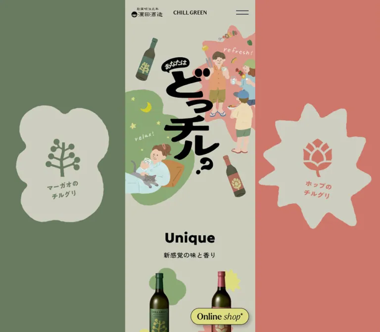
CHILL GREEN「あなたはどっチル?」— 濵田酒造
中央の細い読み物カラムを、くすんだグリーンとコーラルの大きな背景で囲むブランドコンテンツ。手描きイラスト、有機的な吹き出し、体験写真と評価データを組み合わせた親しみやすいデザイン。
オリジナルサイトを見るCHILL GREEN / あなたはどっチル? — Style Reference
A narrow illustrated tasting story, framed by two oversized botanical worlds.
Original URL: https://www.hamadasyuzou.co.jp/chillgreen_brand/review/
Final URL: https://www.hamadasyuzou.co.jp/chillgreen_brand/review/
Theme: light, with muted botanical colors and section-dependent backgrounds.
Inspected: September 12, 2026; supplied evidence retrieved at 13:23:18.697 UTC / 22:23:18.697 JST.
Viewports: desktop 1440 × 1000 and mobile 390 × 844 CSS pixels.
Scope: the current CHILL GREEN brand review page: opening artwork, product comparison, occasion and testimonial content, survey results, related-content links, and footer. Visual captures show the opening, a desktop testimonial scene, and desktop/mobile closing content. Other sections are documented from rendered DOM evidence where noted.
The page presents two botanical barley shochu variants through illustration, flavor descriptions, customer comments, and survey results. Its strongest structural decision is a phone-sized reading column on desktop. At 1440px wide, the central page is only 375px; two 532.5px side regions carry large botanical emblems, testimonial shapes, and eventually full-height lifestyle photography.
Muted olive paper, sage green, dusty coral, and pale yellow make the composition relaxed and approachable. Heavy black Japanese artwork supplies the opening impact. Small bilingual section headings organize a long reading sequence, while photographs and irregular speech bubbles turn customer comments into illustrated scenes. A yellow, outlined “Online shop*” pill remains near the lower-right corner of the reading column.
This is a brand content and review experience with product and shopping links. Its reusable qualities come from the narrow narrative, changing desktop scenery, and integration of illustration with real customer material.
How to Read This Reference
- Measured values come from the supplied rendered DOM rectangles, computed styles, and custom properties. Dimensions use CSS pixels unless stated otherwise.
- Calculated values are arithmetic derived from those measurements or source formulas.
- Estimated values describe visible screenshot appearance. Background hex values, image corner radii, and shadows were not supplied as computed styles and are approximate.
- Recommended values describe the implementation below. They are not claims about the original source.
- Font names are verified computed family declarations. The evidence does not independently establish which font files supplied every rendered glyph.
- The extracted navigation exists in the DOM, but its expanded appearance was not captured. DOM geometry alone does not prove that a menu was visibly open.
- Only the supplied evidence was inspected. Linked destinations, image files, and additional interactions were not accessed.
Tokens — Colors
Default Palette
Token names below are implementation aliases, not original variable names.
| Name | Value | Evidence | Role |
|---|---|---|---|
| Olive Paper | ≈ #cdcebd |
Visual estimate | Opening central canvas and pale organic badges or speech bubbles |
| Maqaw Green | ≈ #697b5e |
Visual estimate | Opening left desktop field and botanical emblem color |
| Hop Coral | ≈ #cc776a |
Visual estimate | Opening right desktop field; both outer fields in the captured hop testimonial scene |
| Soft Sage | ≈ #8eaa75 |
Visual estimate | Relaxation illustration and green testimonial backgrounds |
| Soft Salmon | ≈ #d59585 |
Visual estimate | Central hop testimonial scene |
| Yellow Paper | ≈ #d8d9a0 |
Visual estimate | Closing related-content and footer canvas |
| Action Yellow | ≈ #dddc83 |
Visual estimate for fill | Shop pill and circular TOP control |
| Black Ink | #000000 |
Computed foreground | Main text, illustrated headline, emblems, and fine control outlines |
| Reversed White | #ffffff |
Computed on survey labels | Labels within colored data treatments; also visible in the hop scene heading |
| Quiet Brown | #483937 |
Computed foreground | The neutral “どっちも好き” survey label and value |
The exact value #dddc83 also appears as the computed BODY text color. Most inspected content overrides that inherited color with black. Its use as a button-fill token in this reference is a visual approximation, not a verified fill declaration.
The HTML background is computed black, while the visible page is covered by light surfaces and artwork. Do not use that root declaration as evidence of a dark theme.
Scene Color Relationships
| Captured scene | Center | Desktop sides | Relationship to preserve |
|---|---|---|---|
| Opening | Olive Paper | Green left, coral right | Two flavor identities surround one shared story |
| Hop testimonial | Sage transitioning into salmon | Coral on both sides | Product photograph at left; pale quotation bursts at right |
| Closing content | Yellow Paper | Lifestyle photographs | Quiet, readable center against large photographic framing |
These are section-dependent visual states, not selectable themes. The captures establish that the scenery differs along the page; they do not establish the transition mechanism or timing.
Tokens — Typography
Declared Font Families
Japanese content and utilities: "Zen Kaku Gothic Antique", sans-serif.
This is the computed stack for most paragraphs, subtitles, navigation, survey labels, and footer links. Regular reading text uses weights 400–500; supporting headlines reach 900. Line heights are generous relative to the narrow column.
English section names: "Tilt Warp", sans-serif.
The principal H2 elements use weight 400, 43px size, and a 43px line height. Navigation equivalents use 25px at weight 500. Preserve the supplied capture’s apparent weight rather than assuming a heavier display treatment from the family name.
Related-content titles: "Shippori Mincho B1", serif.
The related-link H3 elements use 20px, weight 600, and a 25px line height. This serif shift gives the closing content an editorial character. The BODY also declares this family, but most central content overrides it.
Artwork and controls: the Japanese opening headline and botanical lettering are visually integrated with artwork. The shop label has a bold serif “Online” and an italic “shop,” but its artwork font is not established by the anchor’s computed family. The visible footer wordmark is also absent from extracted text; do not assign it a font based solely on the surrounding DOM.
Type Scale
| Role | Desktop | Mobile | Weight / line height | Tracking |
|---|---|---|---|---|
| Main English H2 | 43px | 43px | 400 / 43px | 0.43px |
| Navigation English label | 25px | 25px | 500 / 31.25px | 0.25px |
| Navigation Japanese subtitle | 14px | 14px | 500 / 23.8px | 1.4px |
| Main Japanese section subtitle | 18px | 18px | 500 / 27px | 0.9px |
| Narrative H3 | 22px | 22px | 900 / 36.652px | 2.2px |
| Narrative introduction | 15px | 15px | 500 / 24.99px | 1.5px |
| Product comparison body | 15px | 15px | 500 / 25.5px | −0.15px |
| Testimonial quote | 15px | 15.6px | 500 / 27px → 28.08px | −0.01em |
| Product detail link | 18px | 18px | 600 / 30.6px | 0.8px |
| Related-content title | 20px | 20px | 600 / 25px | 1px |
| Related-content description | 14px | 14px | 400 / 24.5px | 0.4662px |
| Footer link | 14px | 14px | 500 / 23.8px | 0.8px |
| Survey/source note | 11px | 11px | 400 / 13.75px | 0.8px |
| Copyright | 12px | 12px | 500 / 24px | 0.8px |
Some artwork-associated text scales by the page-width ratio of 390 / 375 = 1.04. Quotes grow from 15px to 15.6px, and survey labels from approximately 14px to 14.56px. Main headings and ordinary descriptions remain fixed in the two inspected layouts.
Large percentage groups contain nested content. Their parent paragraph’s computed 16px size does not describe the complete visible number treatment. The 96.0% group has a measured bounding box around 149 × 87px on desktop and 154 × 91px on mobile; the individual digit sizes are not supplied.
Tokens — Spacing & Shapes
Responsive Unit
The original keeps a conventional 16px root size. It changes the page-width variable between the inspected layouts:
/* Observed desktop value */
--base--pg-w: 375px;

/* Observed mobile value; scrollbar width was zero */
--base--pg-w: calc(100svw - 0px);

/* Observed relationship */
--base--container-w: calc(var(--base--pg-w) * .9);
For a reusable implementation, --art-unit: calc(var(--page-width) / 375) gives 1px on desktop and 1.04px at the inspected mobile width. Apply it only to elements that should scale with artwork. It is a recommended alias, not an original global spacing unit.
Spacing Scale
| Use | Value | Evidence |
|---|---|---|
| Header identity area | 72px high | Hero begins at y = 72 in both layouts |
| Corporate logo left inset | 18px | Measured relative to the central page |
| Standard inner gutter | 5% of page width | Source container formula |
| Inner gutter, desktop / mobile | 18.75px / 19.5px | Calculated |
| Menu link interval | About 67.05px | Calculated from DOM link positions |
| Gap between menu link boxes | 12px | Calculated from 55.05px link height |
| H2 top padding | 86px | Computed on the principal English H2 elements |
| Related-link vertical gap | 32px | Calculated between successive anchor rectangles |
| Footer top padding | 29.03px / 35.23px | Computed desktop / mobile |
| Footer bottom padding | 90px | Computed in both layouts |
The first H2 box overlaps the end of the hero box by approximately 20.8px, although the visible heading sits below the illustration. Its 86px padding should not be copied as an additional margin after the hero. The Quick Start uses an approximately 65px optical gap instead of recreating unprovided positioning rules.
The source also exposes a heading-height variable:
--base--h2-h: min(
  calc(var(--base--pg-w) * .0666 + 5svh),
  calc(var(--base--pg-w) * .155)
);
It evaluates to 58.125px on desktop and 60.45px on mobile. The corresponding source top-margin multiplier changes from 1.5 to 1.75; the bottom multiplier is 0.5. These variables are not interchangeable with the measured 43px H2 font size or 86px padding.
Border Radius
| Element | Value | Evidence |
|---|---|---|
| Main column and section fields | Square, full-width boundaries | Visual observation; some scene joins use organic artwork |
| Related-content image | Approximately 10–12px | Visual estimate |
| Shop anchor | 47.952px | Computed |
| Visible shop pill | Fully rounded | Visual observation |
| TOP anchor | 50% | Computed |
| Botanical badges and quote bubbles | Custom irregular contours | Visual observation; no mask paths supplied |
Clouds and bursts are artwork shapes, not a universal border-radius system. The maqaw identity uses a soft lobed silhouette; the hop identity uses a more pointed, uneven burst. Maintain that distinction.
Layout Measurements
| Element | Desktop 1440 × 1000 | Mobile 390 × 844 |
|---|---|---|
| Central page | 375px wide, x = 532.5px | 390px wide, x = 0 |
| Outer region on each side | 532.5px | Not visible |
| Standard inner content | 337.5px | 351px |
| Hero H1 box | 375 × 522px | 390 × 542.875px |
| Brand link | 96 × 12px, centered | 96 × 12px, centered |
| Corporate logo link | 90.281 × 28.563px | Same |
| Menu button | 48 × 48px, y = 12px | Same |
| Shop anchor | 184.547 × 52.719px | Same |
| Shop anchor bottom clearance | 18.641px | 18.641px |
| Shop anchor right clearance from page | 9.609px | 9.609px |
| TOP anchor | 88 × 88px | Same |
| Total document height | 15121.844px | 15554.031px |
The visible shop artwork is smaller than its anchor: approximately 168 × 48px in the screenshots. Likewise, the visible TOP circle is approximately 80px inside an 88px anchor. Keep painted geometry separate from the interactive target.
Components
Intro Identity Row and Persistent Menu
Role: connect the campaign artwork to CHILL GREEN and its producer, while keeping section navigation available.
The opening row has the producer logo at the left, a precisely centered CHILL GREEN mark, and a two-line menu icon at the right. It has no enclosing card or visible bottom rule. The hero begins immediately below the 72px identity area.
The brand link is centered independently of the unequal left and right content. Use absolute centering or a three-part layout that preserves the midpoint. The producer logo starts 18px from the central column edge.
The menu button has a 48px square box with 14px 6px padding. Its two horizontal strokes appear about 36px wide. The menu remains in the same upper-right viewport position across the supplied scroll captures; the opening logos are not visible in the later captures. Avoid treating all three elements as a verified opaque fixed header.
Section Navigation
Role: provide shortcuts through a roughly fifteen-thousand-pixel reading sequence.
The rendered DOM contains six bilingual anchor links:
| English label | Japanese label | Target |
|---|---|---|
| Unique | 新感覚の味と香り | #unique |
| Feels good | こんなときにぴったり | #feels_good |
| Real Voice | 体験者の声 | #real_voice |
| Data | みんなの評価 | #data |
| インスタグラム | #instagram |
|
| Related CONTENTs | 関連コンテンツ | #related |
Each anchor groups a 25px English label above a 14px Japanese subtitle. The measured link boxes are about 55px tall with 12px between them. These measurements describe the extracted navigation subtree; its expanded backdrop, entrance animation, close state, and focus behavior are unverified.
Illustrated Opening
Role: introduce the two ways of enjoying the product through one memorable visual question.
The full-width H1 artwork has an approximately 375 / 522 aspect ratio. Heavy black vertical lettering, “あなたはどっチル?”, occupies the center. A relaxed person with a cat appears inside a sage-colored area at lower left; a small social group occupies a salmon area at upper right. A moon, stars, food, drink glasses, and two tilted illustrated bottles complete the composition.
The hero intentionally reaches the central column edges. Preserve the relationship between lettering, people, and irregular color fields instead of separating them into a conventional text-and-image row.
The H1 has no extracted text in the supplied DOM. Its visual lettering should be treated as artwork; the evidence does not identify whether its implementation is an image, SVG, or background composition.
Desktop Ambient Panels
Role: extend the flavor identities into the unused desktop width.
At the opening, the left region is green with a pale, rounded botanical badge. The right is coral with a pale, pointed hop badge. The left badge is visually about 370 × 470px and the right about 450 × 500px at the inspected desktop size; these are estimates of the painted shapes.
In the captured hop testimonial scene, both outer regions are coral. A real bottle sits within the left burst, while three irregular pale quotation shapes occupy the right. Some shapes approach or cross the viewport edge.
At the closing section, the sides show large bottle photographs in social dining settings. The left image has cooler light; the right has warmer highlights. Their large scale gives the narrow footer a photographic surround.
The captures support section-dependent scenery and persistent-looking side framing. They do not prove a particular sticky implementation, parallax effect, or crossfade. A fixed decorative layer is a practical adaptation, with scene changes implemented separately.
Bilingual Section Heading
Role: introduce each major topic without competing with the artwork.
Center an English heading above its Japanese subtitle. Principal English titles use 43px type at a 1:1 line height; subtitles use 18px at 27px. Leave substantial vertical breathing room before the title and a much smaller gap between the two languages.
The scale remains the same at both inspected viewports. The design gains hierarchy through spacing and illustration, rather than enlarging desktop text.
Product Comparison Pair
Role: distinguish the two botanical ingredients and their associated drinking occasions.
The DOM retains two side-by-side text groups inside the narrow page. The maqaw paragraph describes citrus aroma and pepper-like spice; the hop paragraph describes grapefruit-like aroma and bitterness. Each ends with “もっと詳しく” linking to its corresponding product page.
Measured paragraph widths are approximately 135px and 148px, with 15px text and 25.5px line height. The short line lengths and deliberate phrase breaks create compact vertical descriptions. The detail links use 18px, weight 600.
The mobile opening capture shows the tops of the next product bottles below the section title. The complete comparison artwork is not separately captured, so exact bottle-to-copy offsets are unverified. Preserve the evidenced two-column relationship without inventing a larger desktop product grid.
Occasion Sequence
Role: connect flavor to moments of relaxation or refreshment.
“Feels good” follows the comparison and precedes “Real Voice.” Its heading box begins around document y = 1274px on desktop and y = 1304px on mobile; the next principal heading begins around y = 4487px and y = 4639px respectively.
This establishes a substantial visual interval, roughly 3.2–3.3 thousand pixels between heading starts. Detailed scene artwork and interaction behavior within that interval are not supplied in the visible captures. Treat its exact internal composition as an inspection gap.
Testimonial Photo and Speech-Bubble Scene
Role: make customer reactions feel like conversations within a social setting.
The captured hop scene combines a salmon field, an illustrated tilted bottle, a large white two-line product label, a hop emblem, a photograph with an irregular edge, and a pale speech bubble overlapping the photograph. The image of a person holding a drink remains large enough to convey expression and context.
The adjacent green scene ends with a soft, lobed quote bubble. The transition into salmon is wavy, continuing the organic vocabulary across section boundaries.
Quotes are real DOM paragraphs. On desktop they use 15px / 27px; on mobile they scale to 15.6px / 28.08px. Their boxes vary from about 154px to 300px wide in the desktop evidence. They are composed individually, not repeated as identical cards.
Keep text inside a generous central area of each shape. Use masks or layered SVG silhouettes for the contour, while keeping quotation text selectable and responsive. Exact mask geometry and image focal-position rules were not supplied.
Survey Results
Role: add concrete customer response data after the testimonial sequence.
The DOM confirms paired flavor labels, preference percentages, average taste scores, two larger response statements, and a methodology note. The visual chart geometry is not included in the supplied screenshots.
| Survey content | Values present in the page |
|---|---|
| Initial interest from social media | Maqaw 55%; hop 45% |
| Preference after tasting | Maqaw 59%; both 3%; hop 38% |
| Average taste score out of five | Maqaw 4.7; hop 4.5 |
| Fits the respondent’s moment of relaxation | 96.0% |
| Would like to buy again | 97.5% |
These are source-page claims, not independently validated research findings. The note attributes initial interest to campaign comments and the other results to event questionnaires, excluding nonresponses.
Flavor labels are white, while the “both” label uses dark brown. Preserve the actual flavor/value associations. Do not infer a donut chart, bar chart, or animated counter from the text extraction alone.
Persistent Shop Pill
Role: keep the shop destination available throughout the long page.
The control stays aligned with the lower-right corner of the central column on desktop and mobile. It is a pale yellow pill with a thin black outline, a small lower-right shadow, and serif lettering. The word “shop” is italic, and a small asterisk completes the label.
The anchor measures approximately 184.55 × 52.72px in both layouts, with about 18.64px bottom clearance and 9.61px right clearance from the column. Its visible inner pill is approximately 168 × 48px.
The supplied href is https://shochu.life/event/chillgreen25. The destination was not opened. Retain that distinction between the visible shopping label and the uninspected destination experience.
Related-Content Link
Role: connect the review to the broader brand story and event reports.
Five stacked links cover the brand home, hop product, maqaw product, anniversary event, and another customer report. Each consists of a wide image, a serif title, and a compact sans-serif description.
The links occupy the 90% inner container: 337.5px on desktop and 351px on mobile. The visible preview format is approximately 16:9. Image corners are softly rounded, with a restrained shadow. Text sits directly on the yellow page surface; there is no separate white card body.
Use approximately 14px between image and title, then 8–10px before the description. The 32px gap between complete links is calculated from the DOM. Title line count and description wrapping determine each item’s height.
TOP Control and Footer
Role: end the narrative with brand identity, utility links, and a route back to the opening.
A centered circular TOP control appears above the footer. It has an upward chevron, bold serif lettering, a pale yellow fill, a fine black outline, and a subtle shadow. The anchor is 88px square; the painted circle is approximately 80px.
Two black botanical emblems rise from the right side of a thin horizontal rule. Beneath it, six utility links form two columns. The left column contains Instagram, FAQ, and contact; the right contains newsletter, business information, and privacy policy.
A large CHILL GREEN wordmark follows, then the visible copyright “©2025 HAMADA GROUP.” That printed year is page content, not the inspection date. The footer keeps 90px bottom padding, leaving space for the persistent shop control.
The TOP href is the current page URL. The evidence does not establish whether activation performs a scripted scroll or ordinary navigation.
Tokens — Motion & Interaction
| Element or behavior | Evidence | What can be concluded |
|---|---|---|
| Shop and TOP anchors | transform 0.333s cubic-bezier(0.5, 1.75, 0.5, 1) |
A short transform transition with overshoot is defined; trigger and amplitude are unverified |
| Testimonial paragraphs | Transform, opacity, and filter each transition over 0.75s cubic-bezier(0.645, 0.045, 0.355, 1) |
Multi-property transitions are defined; hidden-state values and activation rules are not supplied |
| Maqaw score content | Same 0.75s transitions | A transition is available without the extra delay shown on the hop score |
| Hop score content | Same transitions with 0.25s delay |
A stagger is defined between score treatments |
| Menu button | Visible in multiple scroll captures | Persistent placement is evidenced; open/close behavior was not exercised |
| Anchor navigation | Six section hrefs in DOM | Navigation destinations are known; smooth scrolling is unverified |
| Outer scenery | Different supplied scroll states | Section-dependent backgrounds are visible; interpolation between them is unverified |
| Large percentages | Split text nodes in DOM | Numeric content is present; count-up animation is not established |
Many sampled elements report animation: none. A generic transition: all entry without a nonzero duration is not evidence of a visible animation. Neither observation rules out effects on unlisted elements, pseudo-elements, or scripts.
The capture process waited for finite motion and layout stability within bounded time limits, temporarily pausing perpetual animations during readiness checks. That process does not demonstrate that a perpetual animation existed on this page. No video, hover sequence, menu activation, or keyboard interaction was supplied.
For a new implementation, keep motion secondary to the readable composition. The measured timings can guide short control feedback and staggered reveals, but initial content should remain usable if animation or scripting fails.
Surfaces
| Surface | Appearance | Function |
|---|---|---|
| Central reading canvas | Flat olive or yellow paper | Stable background for artwork and text |
| Desktop ambient fields | Broad green/coral areas or photography | Express the two product identities at desktop scale |
| Testimonial scene | Sage or salmon with organic joins | Group people, flavor, and quotations |
| Speech bubble | Pale custom silhouette | Separate text from photographs without a rectangular card |
| Related-content preview | Rounded photographic rectangle with a small shadow | Identify a linked article or product story |
| Shop / TOP control | Yellow fill, thin black outline, restrained shadow | Distinguish interactive controls |
| Footer divider | Single black horizontal rule | Anchor botanical emblems and organize utility content |
The page has a selective shadow vocabulary. Small shadows belong to controls and preview images; broad content areas remain flat.
Imagery
The opening illustration uses flat, muted color areas, loosely drawn people, simple facial features, and small lifestyle details. Its shapes are friendly and uneven without visible paper-grain processing. The black headline is substantially heavier than the interface typography.
Two recurring botanical symbols connect illustration, bottle labels, side panels, and footer: a branching maqaw mark and a hop-cone mark. Their repeated silhouettes make product identity recognizable even when the surrounding imagery changes.
Photography is natural-color and social: drinks in hand, people reacting, food on tables, and bottle close-ups. The testimonial composition cuts photographs into irregular silhouettes, while related-content previews use ordinary rounded rectangles. Keep those two image treatments distinct.
The closing desktop photographs are intentionally much larger than the reading content. Preserve bottle visibility and the environmental context around them. Do not turn all photography into isolated catalog packshots.
Observed Asset References
No image asset URLs, filenames, or font-file URLs were supplied. The references below identify visible evidence rather than downloadable files.
| Visual asset | Evidence reference | Use |
|---|---|---|
| Opening lettering and lifestyle illustration | Desktop opening and mobile opening captures | Main H1 composition |
| Pale maqaw and hop badges | Desktop opening capture | Outer flavor identities |
| Tilted illustrated hop bottle and emblem | Desktop testimonial capture | Scene identifier |
| Real bottle on a pale burst | Desktop testimonial capture, left region | Product recognition |
| Person holding a drink with irregular photo edge | Desktop testimonial capture, central region | Customer story |
| Two large dining-scene bottle photographs | Desktop closing capture | Ambient photographic framing |
| Customer-report preview with “REAL VOICE” lettering | Desktop and mobile closing captures | Related-content link |
| Black botanical footer marks | Desktop and mobile closing captures | Footer identity |
Use authorized original assets when available. Newly created artwork should preserve the composition and shape roles without pretending to be an extracted source asset. CSS alone cannot reproduce the distinctive lettering, people, and botanical illustrations.
Layout & Responsive Behavior
At 1440px, the central page occupies approximately 26% of the viewport. The remaining width is divided evenly between the two visual side regions. The central content remains a single long reading sequence; it does not expand into a conventional desktop editorial grid.
At 390px, the page fills the viewport, giving the central artwork 15px more width than it has on desktop. The hero therefore grows from 522px to approximately 542.88px tall. Inner content grows from 337.5px to 351px, while the main 43px heading and most body sizes remain unchanged.
A global max-width: 375px would not reproduce the inspected mobile layout. The source switches between a fixed desktop page width and a viewport-wide mobile page. The exact breakpoint is not supplied. The Quick Start uses 768px as a recommendation that reproduces the observed endpoints; intermediate widths need separate testing.
The side panels are absent from the mobile captures. Essential product information continues in the central narrative. When adapting the layout, ensure that any unique text embedded in desktop side artwork is also available to mobile users; only decorative or duplicated material should disappear.
The footer remains two columns on mobile. Related links remain one per row at both widths. The menu and shop targets retain their measured sizes instead of scaling with the illustration.
The mobile document is approximately 432px taller than the desktop document. This reflects mixed scaling and content wrapping, not a uniform enlargement of every section. No tablet, landscape, browser-zoom, or dynamic mobile-toolbar state was supplied.
Do’s and Don’ts
Do
- Preserve the 375px desktop reading column and generous illustrated side regions.
- Let the central page fill the inspected mobile width instead of imposing a universal 375px cap.
- Keep the green and coral flavor identities consistent across symbols, scenes, and bottles.
- Use large custom artwork for the opening question and compact bilingual headings for navigation through the story.
- Combine photographs with individually composed pale quotation shapes.
- Keep quotations and explanatory copy as real text where possible.
- Retain the serif shift in related-content titles and the small serif shopping label.
- Anchor the shop control to the reading column, with clear space around it.
- Use shadows selectively on controls and linked preview images.
- Preserve survey labels, values, and methodology together.
Don’t
- Don’t widen the narrative to fill a desktop content container.
- Don’t turn the desktop layout into three equal content columns.
- Don’t replace the organic badges with identical rounded rectangles.
- Don’t apply bright green, saturated red, or glossy gradients to the muted scene palette.
- Don’t redraw the illustrated Japanese headline with an arbitrary heavy font.
- Don’t give every quote the same width, alignment, and photo crop.
- Don’t treat the root black background or inherited yellow text as the dominant visible page treatment.
- Don’t infer menu animations, parallax, automatic counters, or smooth scrolling from static captures.
- Don’t use chart styles that have not been visually established as if they were original components.
- Don’t allow persistent controls to cover the final links or copyright.
Recommended Implementation Additions
These are recommendations for a new implementation, not verified features of the original page:
- Give the menu button an accessible name and connect its expanded state to the navigation. Keep hidden navigation out of the keyboard sequence.
- Provide meaningful text alternatives for the opening question and product marks; mark purely decorative repeated artwork appropriately.
- Preserve quotation text as DOM content and avoid clipping it when users enlarge text.
- Give shop and TOP controls explicit accessible names even when their visible labels are image-based.
- Add visible keyboard focus and sufficient scroll offset for section targets.
- Check contrast for small coral or sage lettering on pale shapes. Use black for essential reading text where necessary.
- Provide reduced-motion behavior and make content visible without depending on reveal completion.
- Keep survey values readable in a semantic list or table alongside any decorative graphic.
- Add safe-area clearance to fixed controls and preserve at least the observed footer reserve.
- Test the chosen breakpoint, landscape widths, and font-loading fallback before treating the CSS below as a finished reproduction.
Agent Prompt Guide
Quick Color Reference
- Opening paper: approximately
#cdcebd. - Maqaw field: approximately
#697b5e. - Hop field: approximately
#cc776a. - Inner scene colors: approximately
#8eaa75sage and#d59585salmon. - Closing paper: approximately
#d8d9a0. - Action fill: use
#dddc83as an approximation. - Reading text, outlines, and silhouettes:
#000000. - Keep color fields flat; reserve small shadows for controls and preview images.
Overall Prompt
“Create a Japanese botanical drink brand story with a 375px centered reading column on desktop and a full-width column on mobile. Surround the desktop column with oversized green and dusty coral botanical scenery. Use muted olive paper, large supplied hand-drawn Japanese headline artwork, flat lifestyle illustration, natural social photography, and pale irregular speech bubbles. Organize the narrative with centered 43px English section titles and 18px Japanese subtitles. Keep the product comparison compact, related stories in one vertical list, and footer links in two columns. Place a small yellow outlined serif shopping pill near the reading column’s lower-right corner. Use the measured font stacks when available, and keep interactions separate from the static visual reconstruction.”
Example Component Prompts
- Opening: “Build a 375:522 illustrated hero beneath a 72px logo row. Put heavy black Japanese question lettering at the center, a relaxed person and cat within a sage shape at lower left, and a social group within a salmon shape at upper right. Use supplied artwork; do not typeset the illustrated headline with a substitute font.”
- Desktop scenery: “Frame a narrow central article with two 532.5px regions at a 1440px viewport. Use a green field with a soft pale botanical badge on the left and a coral field with an uneven hop burst on the right. Keep these regions decorative and remove them at the mobile layout.”
- Testimonial scene: “Compose a salmon section with a tilted bottle illustration, a white product label, a large natural photograph with an organic edge, and a pale irregular speech bubble overlapping the photograph. Use readable black 15px Japanese text with 1.8 line height. Avoid a repeated card template.”
- Related-content link: “Create a full-width link inside a 90% inner container. Stack a rounded 16:9 photograph, a 20px Japanese serif title, and a 14px sans-serif description on pale yellow paper. Add a restrained image shadow and 32px between complete links.”
- Footer and controls: “Create a pale yellow footer with a centered outlined TOP circle, two black botanical marks rising above a fine rule, six links in two columns, a large supplied brand wordmark, and small copyright text. Keep a yellow serif shopping pill aligned to the reading column and reserve 90px below the footer content.”
Quick Start
CSS Custom Properties
This is an implementation foundation, not recovered source code. Dimensions marked as measured above are retained where practical. Background colors, shadows, the 768px breakpoint, hover amplitude, and fallback blob geometry are recommendations.
Use .review-shell for the central document. Place .ambient outside its reading flow. The opening contains .intro-header and .hero, followed by section headings and content. Supply authorized images for logos, hero artwork, botanical badges, and photographs. No asset paths are assumed here.
:root {
  /* Estimated visible palette; black is measured. */
  --color-paper: #cdcebd;
  --color-maqaw: #697b5e;
  --color-hop: #cc776a;
  --color-sage: #8eaa75;
  --color-salmon: #d59585;
  --color-endpaper: #d8d9a0;
  --color-action: #dddc83;
  --color-ink: #000000;
  --color-quiet: #483937;

  /* Observed family declarations; load fonts separately. */
  --font-body: 'Zen Kaku Gothic Antique', sans-serif;
  --font-display: 'Tilt Warp', sans-serif;
  --font-editorial: 'Shippori Mincho B1', serif;
  --font-control: serif;

  --page-width: 100vw;
  --page-inset: calc(var(--page-width) * .05);
  --page-gutter: max(0px, calc((100vw - var(--page-width)) / 2));
  --art-unit: calc(var(--page-width) / 375);
  --text-quote: calc(15 * var(--art-unit));

  --header-height: 72px;
  --text-section: 43px;
  --text-subtitle: 18px;
  --text-body: 15px;
  --text-related: 14px;
  --related-gap: 32px;
  --radius-preview: 10px;
  --footer-reserve: 90px;
  --shadow-small: 4px 5px 8px rgb(0 0 0 / .18);

  /* Measured transition timings. */
  --motion-control: 333ms cubic-bezier(.5, 1.75, .5, 1);
  --motion-reveal: 750ms cubic-bezier(.645, .045, .355, 1);
}

@supports (width: 100svw) {
  :root {
    --page-width: 100svw;
  }
}

* {
  box-sizing: border-box;
}

body {
  margin: 0;
  color: var(--color-ink);
  background: var(--color-paper);
  font: 500 16px/1.7 var(--font-body);
}

button,
a {
  -webkit-tap-highlight-color: transparent;
}

.review-shell {
  position: relative;
  z-index: 1;
  width: var(--page-width);
  min-height: 100svh;
  margin-inline: auto;
  background: var(--color-paper);
}

.content-inset {
  width: 90%;
  margin-inline: auto;
}

.intro-header {
  position: relative;
  height: var(--header-height);
}

.producer-logo {
  position: absolute;
  top: 21.72px;
  left: 18px;
  width: 90.28px;
  height: 28.56px;
}

.brand-logo {
  position: absolute;
  top: 30px;
  left: 50%;
  width: 96px;
  height: 12px;
  transform: translateX(-50%);
}

.producer-logo img,
.brand-logo img {
  display: block;
  width: 100%;
  height: 100%;
  object-fit: contain;
}

.menu-toggle {
  position: fixed;
  z-index: 20;
  top: 12px;
  right: calc(var(--page-gutter) + var(--page-width) * .034);
  display: grid;
  align-content: center;
  gap: 8px;
  width: 48px;
  height: 48px;
  padding: 14px 6px;
  border: 0;
  color: var(--color-ink);
  background: transparent;
  cursor: pointer;
}

.menu-toggle span {
  display: block;
  width: 36px;
  height: 2px;
  background: currentColor;
}

.hero {
  width: 100%;
  aspect-ratio: 375 / 522;
  margin: 0;
}

.hero img {
  display: block;
  width: 100%;
  height: 100%;
  object-fit: contain;
}

/* Optical spacing adaptation, not the source H2 box model. */
.section-heading {
  padding: 65px 0 28px;
  text-align: center;
}

.section-heading h2 {
  margin: 0;
  font: 400 var(--text-section)/1 var(--font-display);
  letter-spacing: .01em;
}

.section-heading p {
  margin: 8px 0 0;
  font: 500 var(--text-subtitle)/1.5 var(--font-body);
  letter-spacing: .05em;
}

.review-shell section[id] {
  scroll-margin-top: 80px;
}

.product-pair {
  display: grid;
  grid-template-columns: repeat(2, minmax(0, 1fr));
  gap: 20px;
  text-align: center;
}

.product-pair p {
  max-width: 10em;
  margin-inline: auto;
  font: 500 15px/1.7 var(--font-body);
  letter-spacing: -.01em;
}

.product-detail-link {
  color: inherit;
  font: 600 18px/1.7 var(--font-body);
  text-underline-offset: .2em;
}

.voice-scene {
  position: relative;
  padding-block: 48px;
  background: var(--color-sage);
}

.voice-scene--hop {
  background: var(--color-salmon);
}

.voice-photo {
  display: block;
  width: 100%;
  height: auto;
}

.voice-quote {
  position: relative;
  isolation: isolate;
  width: 80%;
  margin: 24px auto;
  padding: 28px 22px;
  color: var(--color-ink);
  font: 500 var(--text-quote)/1.8 var(--font-body);
  letter-spacing: -.01em;
  text-align: center;
}

/* Soft fallback only; supply custom masks for faithful silhouettes. */
.voice-quote::before {
  position: absolute;
  z-index: -1;
  inset: 0;
  border-radius: 48% 52% 44% 56% / 57% 46% 54% 43%;
  background: var(--color-paper);
  content: '';
}

/* Set --shape-mask to an authorized mask image when using this class. */
.voice-quote--masked::before {
  border-radius: 0;
  mask: var(--shape-mask) center / 100% 100% no-repeat;
}

/* Content starts readable; reveal state management is separate. */
.reveal {
  transition:
    transform var(--motion-reveal),
    opacity var(--motion-reveal),
    filter var(--motion-reveal);
}

.reveal--delayed {
  transition-delay: 250ms;
}

.related-section,
.page-footer {
  background: var(--color-endpaper);
}

.related-card {
  display: block;
  margin-bottom: var(--related-gap);
  color: inherit;
  text-decoration: none;
}

.related-card img {
  display: block;
  width: 100%;
  aspect-ratio: 16 / 9;
  object-fit: cover;
  border-radius: var(--radius-preview);
  box-shadow: 3px 4px 7px rgb(0 0 0 / .16);
}

.related-card h3 {
  margin: 14px 0 8px;
  font: 600 20px/1.25 var(--font-editorial);
  letter-spacing: .05em;
}

.related-card p {
  margin: 0;
  font: 400 var(--text-related)/1.75 var(--font-body);
  letter-spacing: .0333em;
}

.shop-link {
  position: fixed;
  z-index: 20;
  right: calc(var(--page-gutter) + 9.61px);
  bottom: calc(18.64px + env(safe-area-inset-bottom, 0px));
  display: grid;
  place-items: center;
  width: 184.55px;
  min-height: 52.72px;
  border-radius: 48px;
  color: var(--color-ink);
  text-decoration: none;
  transition: transform var(--motion-control);
}

/* Text-based approximation of the visible shop artwork. */
.shop-label {
  display: flex;
  align-items: baseline;
  justify-content: center;
  gap: .16em;
  width: 168px;
  min-height: 48px;
  padding: 7px 10px;
  border: 1px solid currentColor;
  border-radius: 999px;
  background: var(--color-action);
  box-shadow: var(--shadow-small);
  font: 700 26px/1.1 var(--font-control);
}

.shop-label em {
  font-weight: 400;
}

.shop-label sup {
  font-size: 12px;
}

.page-footer {
  padding-bottom: calc(
    var(--footer-reserve) + env(safe-area-inset-bottom, 0px)
  );
}

.footer-top {
  display: grid;
  place-items: center;
  width: 88px;
  height: 88px;
  margin: 60px auto 52px;
  border-radius: 50%;
  color: var(--color-ink);
  text-decoration: none;
  transition: transform var(--motion-control);
}

.footer-top span {
  display: grid;
  align-content: center;
  justify-items: center;
  gap: 4px;
  width: 80px;
  height: 80px;
  border: 1px solid currentColor;
  border-radius: 50%;
  background: var(--color-action);
  box-shadow: var(--shadow-small);
  font: 700 18px/1.2 var(--font-control);
}

.footer-top span::before {
  width: 14px;
  height: 14px;
  border-top: 1px solid currentColor;
  border-left: 1px solid currentColor;
  transform: rotate(45deg);
  content: '';
}

.footer-inner {
  position: relative;
  width: 90%;
  margin-inline: auto;
  padding-top: 32px;
  border-top: 1px solid var(--color-ink);
}

.botanical-marks {
  position: absolute;
  right: 0;
  bottom: 100%;
  width: 42%;
  height: auto;
}

.footer-links {
  display: grid;
  grid-template-columns: 44% 56%;
  gap: 2px 0;
}

.footer-links a {
  padding: 4.662px 0;
  color: inherit;
  font: 500 14px/1.7 var(--font-body);
  letter-spacing: .05em;
  text-decoration: none;
}

.footer-wordmark {
  display: block;
  width: 100%;
  height: auto;
  margin: 28px 0 10px;
}

.copyright {
  margin: 0;
  font: 500 12px/2 var(--font-body);
  letter-spacing: .05em;
}

.ambient {
  position: fixed;
  z-index: 0;
  inset: 0;
  display: none;
  overflow: hidden;
  pointer-events: none;
}

.ambient-panel {
  position: absolute;
  inset-block: 0;
  display: grid;
  place-items: center;
  width: var(--page-gutter);
}

.ambient-panel--left {
  left: 0;
  background: var(--color-maqaw);
}

.ambient-panel--right {
  right: 0;
  background: var(--color-hop);
}

.ambient-badge {
  display: block;
  width: 80%;
  height: auto;
}

/* Scene state selection requires separate application logic. */
.ambient[data-scene='hop'] .ambient-panel {
  background: var(--color-hop);
}

.ambient[data-scene='photo'] .ambient-panel {
  background-image: var(--ambient-photo, none);
  background-position: center;
  background-size: cover;
}

/* Recommended breakpoint; the original threshold was not supplied. */
@media (min-width: 768px) {
  :root {
    --page-width: 375px;
  }

  .ambient {
    display: block;
  }
}

/* Recommended feedback amplitude; only timing is source-derived. */
@media (hover: hover) {
  .shop-link:hover,
  .footer-top:hover {
    transform: translateY(-2px);
  }

  .footer-links a:hover {
    text-decoration: underline;
    text-underline-offset: .2em;
  }
}

:where(a, button):focus-visible {
  outline: 2px solid var(--color-ink);
  outline-offset: 4px;
}

@media (prefers-reduced-motion: reduce) {
  .shop-link,
  .footer-top,
  .reveal {
    transition: none;
  }

  .reveal {
    opacity: 1;
    filter: none;
    transform: none;
  }
}
For the shop approximation, use an anchor containing .shop-label, with ordinary text for “Online,” an em for “shop,” and a sup for the asterisk. Use a real button for .menu-toggle; its open state and keyboard behavior require implementation. The ambient scene attributes in this CSS are an adaptation API, not original selectors.
Tailwind v4 Token Mapping
Optional mapping for an existing Tailwind v4 project. This does not imply that the original page uses Tailwind. Keep the responsive page-width properties and component behavior above.
@theme inline {
  --color-paper: #cdcebd;
  --color-maqaw: #697b5e;
  --color-hop: #cc776a;
  --color-sage: #8eaa75;
  --color-salmon: #d59585;
  --color-endpaper: #d8d9a0;
  --color-action: #dddc83;
  --color-ink: #000000;

  --font-body: 'Zen Kaku Gothic Antique', sans-serif;
  --font-display: 'Tilt Warp', sans-serif;
  --font-editorial: 'Shippori Mincho B1', serif;

  --text-section: 43px;
  --text-subtitle: 18px;
  --text-body: 15px;
  --text-related: 14px;
  --text-note: 11px;

  --spacing-lane: var(--page-width);
  --spacing-inset: var(--page-inset);
  --spacing-related-gap: 32px;
  --radius-preview: 10px;
}
Sources & Evidence
- Inspected original and final page: CHILL GREEN — あなたはどっチル?. The supplied response is HTTP 200, with no URL change.
- Evidence date: September 12, 2026. The observation record was retrieved at
2026-09-12T13:23:18.697Z; individual screenshot timestamps were not supplied separately. - Desktop evidence: 1440 × 1000 CSS pixels; opening, intermediate testimonial, and closing captures, plus rendered DOM text, link destinations, element rectangles, computed styles, and custom properties.
- Mobile evidence: 390 × 844 CSS pixels; opening and closing captures, with a corresponding rendered DOM and computed-style record.
- Identity evidence: the original page title names 濵田酒造, the producer logo links to the corporate root, and the footer contains the HAMADA GROUP copyright. The corporate destination itself was not inspected.
- Attribution limits: the original page names 福岡大名ガーデンシティ and Molé TAQUERIA Y BAR for photography cooperation. This does not identify a web designer, developer, photographer, or production agency.
- Interaction scope: supplied scroll positions and transition declarations only. Menu activation, hover states, TOP activation, shopping navigation, keyboard behavior, and motion sequences were not independently exercised.
- Capture limitations: bounded readiness checks waited for document load, finite motion, sampled layout/text stability, and visible image decoding. Delayed content and unexercised states may remain unverified. SharedWorkers and service workers were disabled during capture.
- Measurement limits: no background-color declarations for the main colored fields, image URLs, mask paths, shadow values, complete stylesheet, or actual breakpoint threshold were supplied. Those aspects are explicitly estimated or recommended above.
This reference describes the current page represented by the supplied original-site evidence. The CSS is a practical adaptation of its measured layout and visible design, with original artwork and unverified behavior left for separate implementation.
# CHILL GREEN / あなたはどっチル? — Style Reference

> A narrow illustrated tasting story, framed by two oversized botanical worlds.

**Original URL:** https://www.hamadasyuzou.co.jp/chillgreen_brand/review/
**Final URL:** https://www.hamadasyuzou.co.jp/chillgreen_brand/review/
**Theme:** light, with muted botanical colors and section-dependent backgrounds.
**Inspected:** September 12, 2026; supplied evidence retrieved at 13:23:18.697 UTC / 22:23:18.697 JST.
**Viewports:** desktop 1440 × 1000 and mobile 390 × 844 CSS pixels.
**Scope:** the current CHILL GREEN brand review page: opening artwork, product comparison, occasion and testimonial content, survey results, related-content links, and footer. Visual captures show the opening, a desktop testimonial scene, and desktop/mobile closing content. Other sections are documented from rendered DOM evidence where noted.

The page presents two botanical barley shochu variants through illustration, flavor descriptions, customer comments, and survey results. Its strongest structural decision is a phone-sized reading column on desktop. At 1440px wide, the central page is only 375px; two 532.5px side regions carry large botanical emblems, testimonial shapes, and eventually full-height lifestyle photography.

Muted olive paper, sage green, dusty coral, and pale yellow make the composition relaxed and approachable. Heavy black Japanese artwork supplies the opening impact. Small bilingual section headings organize a long reading sequence, while photographs and irregular speech bubbles turn customer comments into illustrated scenes. A yellow, outlined “Online shop*” pill remains near the lower-right corner of the reading column.

This is a brand content and review experience with product and shopping links. Its reusable qualities come from the narrow narrative, changing desktop scenery, and integration of illustration with real customer material.

## How to Read This Reference

- **Measured** values come from the supplied rendered DOM rectangles, computed styles, and custom properties. Dimensions use CSS pixels unless stated otherwise.
- **Calculated** values are arithmetic derived from those measurements or source formulas.
- **Estimated** values describe visible screenshot appearance. Background hex values, image corner radii, and shadows were not supplied as computed styles and are approximate.
- **Recommended** values describe the implementation below. They are not claims about the original source.
- Font names are verified computed family declarations. The evidence does not independently establish which font files supplied every rendered glyph.
- The extracted navigation exists in the DOM, but its expanded appearance was not captured. DOM geometry alone does not prove that a menu was visibly open.
- Only the supplied evidence was inspected. Linked destinations, image files, and additional interactions were not accessed.

## Tokens — Colors

### Default Palette

Token names below are implementation aliases, not original variable names.

| Name | Value | Evidence | Role |
| --- | --- | --- | --- |
| Olive Paper | ≈ `#cdcebd` | Visual estimate | Opening central canvas and pale organic badges or speech bubbles |
| Maqaw Green | ≈ `#697b5e` | Visual estimate | Opening left desktop field and botanical emblem color |
| Hop Coral | ≈ `#cc776a` | Visual estimate | Opening right desktop field; both outer fields in the captured hop testimonial scene |
| Soft Sage | ≈ `#8eaa75` | Visual estimate | Relaxation illustration and green testimonial backgrounds |
| Soft Salmon | ≈ `#d59585` | Visual estimate | Central hop testimonial scene |
| Yellow Paper | ≈ `#d8d9a0` | Visual estimate | Closing related-content and footer canvas |
| Action Yellow | ≈ `#dddc83` | Visual estimate for fill | Shop pill and circular TOP control |
| Black Ink | `#000000` | Computed foreground | Main text, illustrated headline, emblems, and fine control outlines |
| Reversed White | `#ffffff` | Computed on survey labels | Labels within colored data treatments; also visible in the hop scene heading |
| Quiet Brown | `#483937` | Computed foreground | The neutral “どっちも好き” survey label and value |

The exact value `#dddc83` also appears as the computed BODY text color. Most inspected content overrides that inherited color with black. Its use as a button-fill token in this reference is a visual approximation, not a verified fill declaration.

The HTML background is computed black, while the visible page is covered by light surfaces and artwork. Do not use that root declaration as evidence of a dark theme.

### Scene Color Relationships

| Captured scene | Center | Desktop sides | Relationship to preserve |
| --- | --- | --- | --- |
| Opening | Olive Paper | Green left, coral right | Two flavor identities surround one shared story |
| Hop testimonial | Sage transitioning into salmon | Coral on both sides | Product photograph at left; pale quotation bursts at right |
| Closing content | Yellow Paper | Lifestyle photographs | Quiet, readable center against large photographic framing |

These are section-dependent visual states, not selectable themes. The captures establish that the scenery differs along the page; they do not establish the transition mechanism or timing.

## Tokens — Typography

### Declared Font Families

**Japanese content and utilities:** `"Zen Kaku Gothic Antique", sans-serif`.

This is the computed stack for most paragraphs, subtitles, navigation, survey labels, and footer links. Regular reading text uses weights 400–500; supporting headlines reach 900. Line heights are generous relative to the narrow column.

**English section names:** `"Tilt Warp", sans-serif`.

The principal H2 elements use weight 400, 43px size, and a 43px line height. Navigation equivalents use 25px at weight 500. Preserve the supplied capture’s apparent weight rather than assuming a heavier display treatment from the family name.

**Related-content titles:** `"Shippori Mincho B1", serif`.

The related-link H3 elements use 20px, weight 600, and a 25px line height. This serif shift gives the closing content an editorial character. The BODY also declares this family, but most central content overrides it.

**Artwork and controls:** the Japanese opening headline and botanical lettering are visually integrated with artwork. The shop label has a bold serif “Online” and an italic “shop,” but its artwork font is not established by the anchor’s computed family. The visible footer wordmark is also absent from extracted text; do not assign it a font based solely on the surrounding DOM.

### Type Scale

| Role | Desktop | Mobile | Weight / line height | Tracking |
| --- | --- | --- | --- | --- |
| Main English H2 | 43px | 43px | 400 / 43px | 0.43px |
| Navigation English label | 25px | 25px | 500 / 31.25px | 0.25px |
| Navigation Japanese subtitle | 14px | 14px | 500 / 23.8px | 1.4px |
| Main Japanese section subtitle | 18px | 18px | 500 / 27px | 0.9px |
| Narrative H3 | 22px | 22px | 900 / 36.652px | 2.2px |
| Narrative introduction | 15px | 15px | 500 / 24.99px | 1.5px |
| Product comparison body | 15px | 15px | 500 / 25.5px | −0.15px |
| Testimonial quote | 15px | 15.6px | 500 / 27px → 28.08px | −0.01em |
| Product detail link | 18px | 18px | 600 / 30.6px | 0.8px |
| Related-content title | 20px | 20px | 600 / 25px | 1px |
| Related-content description | 14px | 14px | 400 / 24.5px | 0.4662px |
| Footer link | 14px | 14px | 500 / 23.8px | 0.8px |
| Survey/source note | 11px | 11px | 400 / 13.75px | 0.8px |
| Copyright | 12px | 12px | 500 / 24px | 0.8px |

Some artwork-associated text scales by the page-width ratio of `390 / 375 = 1.04`. Quotes grow from 15px to 15.6px, and survey labels from approximately 14px to 14.56px. Main headings and ordinary descriptions remain fixed in the two inspected layouts.

Large percentage groups contain nested content. Their parent paragraph’s computed 16px size does not describe the complete visible number treatment. The `96.0%` group has a measured bounding box around 149 × 87px on desktop and 154 × 91px on mobile; the individual digit sizes are not supplied.

## Tokens — Spacing & Shapes

### Responsive Unit

The original keeps a conventional 16px root size. It changes the page-width variable between the inspected layouts:

```css
/* Observed desktop value */
--base--pg-w: 375px;

/* Observed mobile value; scrollbar width was zero */
--base--pg-w: calc(100svw - 0px);

/* Observed relationship */
--base--container-w: calc(var(--base--pg-w) * .9);
```

For a reusable implementation, `--art-unit: calc(var(--page-width) / 375)` gives 1px on desktop and 1.04px at the inspected mobile width. Apply it only to elements that should scale with artwork. It is a recommended alias, not an original global spacing unit.

### Spacing Scale

| Use | Value | Evidence |
| --- | --- | --- |
| Header identity area | 72px high | Hero begins at y = 72 in both layouts |
| Corporate logo left inset | 18px | Measured relative to the central page |
| Standard inner gutter | 5% of page width | Source container formula |
| Inner gutter, desktop / mobile | 18.75px / 19.5px | Calculated |
| Menu link interval | About 67.05px | Calculated from DOM link positions |
| Gap between menu link boxes | 12px | Calculated from 55.05px link height |
| H2 top padding | 86px | Computed on the principal English H2 elements |
| Related-link vertical gap | 32px | Calculated between successive anchor rectangles |
| Footer top padding | 29.03px / 35.23px | Computed desktop / mobile |
| Footer bottom padding | 90px | Computed in both layouts |

The first H2 box overlaps the end of the hero box by approximately 20.8px, although the visible heading sits below the illustration. Its 86px padding should not be copied as an additional margin after the hero. The Quick Start uses an approximately 65px optical gap instead of recreating unprovided positioning rules.

The source also exposes a heading-height variable:

```css
--base--h2-h: min(
  calc(var(--base--pg-w) * .0666 + 5svh),
  calc(var(--base--pg-w) * .155)
);
```

It evaluates to 58.125px on desktop and 60.45px on mobile. The corresponding source top-margin multiplier changes from 1.5 to 1.75; the bottom multiplier is 0.5. These variables are not interchangeable with the measured 43px H2 font size or 86px padding.

### Border Radius

| Element | Value | Evidence |
| --- | --- | --- |
| Main column and section fields | Square, full-width boundaries | Visual observation; some scene joins use organic artwork |
| Related-content image | Approximately 10–12px | Visual estimate |
| Shop anchor | 47.952px | Computed |
| Visible shop pill | Fully rounded | Visual observation |
| TOP anchor | 50% | Computed |
| Botanical badges and quote bubbles | Custom irregular contours | Visual observation; no mask paths supplied |

Clouds and bursts are artwork shapes, not a universal border-radius system. The maqaw identity uses a soft lobed silhouette; the hop identity uses a more pointed, uneven burst. Maintain that distinction.

### Layout Measurements

| Element | Desktop 1440 × 1000 | Mobile 390 × 844 |
| --- | --- | --- |
| Central page | 375px wide, x = 532.5px | 390px wide, x = 0 |
| Outer region on each side | 532.5px | Not visible |
| Standard inner content | 337.5px | 351px |
| Hero H1 box | 375 × 522px | 390 × 542.875px |
| Brand link | 96 × 12px, centered | 96 × 12px, centered |
| Corporate logo link | 90.281 × 28.563px | Same |
| Menu button | 48 × 48px, y = 12px | Same |
| Shop anchor | 184.547 × 52.719px | Same |
| Shop anchor bottom clearance | 18.641px | 18.641px |
| Shop anchor right clearance from page | 9.609px | 9.609px |
| TOP anchor | 88 × 88px | Same |
| Total document height | 15121.844px | 15554.031px |

The visible shop artwork is smaller than its anchor: approximately 168 × 48px in the screenshots. Likewise, the visible TOP circle is approximately 80px inside an 88px anchor. Keep painted geometry separate from the interactive target.

## Components

### Intro Identity Row and Persistent Menu

**Role:** connect the campaign artwork to CHILL GREEN and its producer, while keeping section navigation available.

The opening row has the producer logo at the left, a precisely centered CHILL GREEN mark, and a two-line menu icon at the right. It has no enclosing card or visible bottom rule. The hero begins immediately below the 72px identity area.

The brand link is centered independently of the unequal left and right content. Use absolute centering or a three-part layout that preserves the midpoint. The producer logo starts 18px from the central column edge.

The menu button has a 48px square box with `14px 6px` padding. Its two horizontal strokes appear about 36px wide. The menu remains in the same upper-right viewport position across the supplied scroll captures; the opening logos are not visible in the later captures. Avoid treating all three elements as a verified opaque fixed header.

### Section Navigation

**Role:** provide shortcuts through a roughly fifteen-thousand-pixel reading sequence.

The rendered DOM contains six bilingual anchor links:

| English label | Japanese label | Target |
| --- | --- | --- |
| Unique | 新感覚の味と香り | `#unique` |
| Feels good | こんなときにぴったり | `#feels_good` |
| Real Voice | 体験者の声 | `#real_voice` |
| Data | みんなの評価 | `#data` |
| Instagram | インスタグラム | `#instagram` |
| Related CONTENTs | 関連コンテンツ | `#related` |

Each anchor groups a 25px English label above a 14px Japanese subtitle. The measured link boxes are about 55px tall with 12px between them. These measurements describe the extracted navigation subtree; its expanded backdrop, entrance animation, close state, and focus behavior are unverified.

### Illustrated Opening

**Role:** introduce the two ways of enjoying the product through one memorable visual question.

The full-width H1 artwork has an approximately `375 / 522` aspect ratio. Heavy black vertical lettering, “あなたはどっチル?”, occupies the center. A relaxed person with a cat appears inside a sage-colored area at lower left; a small social group occupies a salmon area at upper right. A moon, stars, food, drink glasses, and two tilted illustrated bottles complete the composition.

The hero intentionally reaches the central column edges. Preserve the relationship between lettering, people, and irregular color fields instead of separating them into a conventional text-and-image row.

The H1 has no extracted text in the supplied DOM. Its visual lettering should be treated as artwork; the evidence does not identify whether its implementation is an image, SVG, or background composition.

### Desktop Ambient Panels

**Role:** extend the flavor identities into the unused desktop width.

At the opening, the left region is green with a pale, rounded botanical badge. The right is coral with a pale, pointed hop badge. The left badge is visually about 370 × 470px and the right about 450 × 500px at the inspected desktop size; these are estimates of the painted shapes.

In the captured hop testimonial scene, both outer regions are coral. A real bottle sits within the left burst, while three irregular pale quotation shapes occupy the right. Some shapes approach or cross the viewport edge.

At the closing section, the sides show large bottle photographs in social dining settings. The left image has cooler light; the right has warmer highlights. Their large scale gives the narrow footer a photographic surround.

The captures support section-dependent scenery and persistent-looking side framing. They do not prove a particular sticky implementation, parallax effect, or crossfade. A fixed decorative layer is a practical adaptation, with scene changes implemented separately.

### Bilingual Section Heading

**Role:** introduce each major topic without competing with the artwork.

Center an English heading above its Japanese subtitle. Principal English titles use 43px type at a 1:1 line height; subtitles use 18px at 27px. Leave substantial vertical breathing room before the title and a much smaller gap between the two languages.

The scale remains the same at both inspected viewports. The design gains hierarchy through spacing and illustration, rather than enlarging desktop text.

### Product Comparison Pair

**Role:** distinguish the two botanical ingredients and their associated drinking occasions.

The DOM retains two side-by-side text groups inside the narrow page. The maqaw paragraph describes citrus aroma and pepper-like spice; the hop paragraph describes grapefruit-like aroma and bitterness. Each ends with “もっと詳しく” linking to its corresponding product page.

Measured paragraph widths are approximately 135px and 148px, with 15px text and 25.5px line height. The short line lengths and deliberate phrase breaks create compact vertical descriptions. The detail links use 18px, weight 600.

The mobile opening capture shows the tops of the next product bottles below the section title. The complete comparison artwork is not separately captured, so exact bottle-to-copy offsets are unverified. Preserve the evidenced two-column relationship without inventing a larger desktop product grid.

### Occasion Sequence

**Role:** connect flavor to moments of relaxation or refreshment.

“Feels good” follows the comparison and precedes “Real Voice.” Its heading box begins around document y = 1274px on desktop and y = 1304px on mobile; the next principal heading begins around y = 4487px and y = 4639px respectively.

This establishes a substantial visual interval, roughly 3.2–3.3 thousand pixels between heading starts. Detailed scene artwork and interaction behavior within that interval are not supplied in the visible captures. Treat its exact internal composition as an inspection gap.

### Testimonial Photo and Speech-Bubble Scene

**Role:** make customer reactions feel like conversations within a social setting.

The captured hop scene combines a salmon field, an illustrated tilted bottle, a large white two-line product label, a hop emblem, a photograph with an irregular edge, and a pale speech bubble overlapping the photograph. The image of a person holding a drink remains large enough to convey expression and context.

The adjacent green scene ends with a soft, lobed quote bubble. The transition into salmon is wavy, continuing the organic vocabulary across section boundaries.

Quotes are real DOM paragraphs. On desktop they use 15px / 27px; on mobile they scale to 15.6px / 28.08px. Their boxes vary from about 154px to 300px wide in the desktop evidence. They are composed individually, not repeated as identical cards.

Keep text inside a generous central area of each shape. Use masks or layered SVG silhouettes for the contour, while keeping quotation text selectable and responsive. Exact mask geometry and image focal-position rules were not supplied.

### Survey Results

**Role:** add concrete customer response data after the testimonial sequence.

The DOM confirms paired flavor labels, preference percentages, average taste scores, two larger response statements, and a methodology note. The visual chart geometry is not included in the supplied screenshots.

| Survey content | Values present in the page |
| --- | --- |
| Initial interest from social media | Maqaw 55%; hop 45% |
| Preference after tasting | Maqaw 59%; both 3%; hop 38% |
| Average taste score out of five | Maqaw 4.7; hop 4.5 |
| Fits the respondent’s moment of relaxation | 96.0% |
| Would like to buy again | 97.5% |

These are source-page claims, not independently validated research findings. The note attributes initial interest to campaign comments and the other results to event questionnaires, excluding nonresponses.

Flavor labels are white, while the “both” label uses dark brown. Preserve the actual flavor/value associations. Do not infer a donut chart, bar chart, or animated counter from the text extraction alone.

### Persistent Shop Pill

**Role:** keep the shop destination available throughout the long page.

The control stays aligned with the lower-right corner of the central column on desktop and mobile. It is a pale yellow pill with a thin black outline, a small lower-right shadow, and serif lettering. The word “shop” is italic, and a small asterisk completes the label.

The anchor measures approximately 184.55 × 52.72px in both layouts, with about 18.64px bottom clearance and 9.61px right clearance from the column. Its visible inner pill is approximately 168 × 48px.

The supplied href is `https://shochu.life/event/chillgreen25`. The destination was not opened. Retain that distinction between the visible shopping label and the uninspected destination experience.

### Related-Content Link

**Role:** connect the review to the broader brand story and event reports.

Five stacked links cover the brand home, hop product, maqaw product, anniversary event, and another customer report. Each consists of a wide image, a serif title, and a compact sans-serif description.

The links occupy the 90% inner container: 337.5px on desktop and 351px on mobile. The visible preview format is approximately 16:9. Image corners are softly rounded, with a restrained shadow. Text sits directly on the yellow page surface; there is no separate white card body.

Use approximately 14px between image and title, then 8–10px before the description. The 32px gap between complete links is calculated from the DOM. Title line count and description wrapping determine each item’s height.

### TOP Control and Footer

**Role:** end the narrative with brand identity, utility links, and a route back to the opening.

A centered circular TOP control appears above the footer. It has an upward chevron, bold serif lettering, a pale yellow fill, a fine black outline, and a subtle shadow. The anchor is 88px square; the painted circle is approximately 80px.

Two black botanical emblems rise from the right side of a thin horizontal rule. Beneath it, six utility links form two columns. The left column contains Instagram, FAQ, and contact; the right contains newsletter, business information, and privacy policy.

A large CHILL GREEN wordmark follows, then the visible copyright “©2025 HAMADA GROUP.” That printed year is page content, not the inspection date. The footer keeps 90px bottom padding, leaving space for the persistent shop control.

The TOP href is the current page URL. The evidence does not establish whether activation performs a scripted scroll or ordinary navigation.

## Tokens — Motion & Interaction

| Element or behavior | Evidence | What can be concluded |
| --- | --- | --- |
| Shop and TOP anchors | `transform 0.333s cubic-bezier(0.5, 1.75, 0.5, 1)` | A short transform transition with overshoot is defined; trigger and amplitude are unverified |
| Testimonial paragraphs | Transform, opacity, and filter each transition over `0.75s cubic-bezier(0.645, 0.045, 0.355, 1)` | Multi-property transitions are defined; hidden-state values and activation rules are not supplied |
| Maqaw score content | Same 0.75s transitions | A transition is available without the extra delay shown on the hop score |
| Hop score content | Same transitions with `0.25s` delay | A stagger is defined between score treatments |
| Menu button | Visible in multiple scroll captures | Persistent placement is evidenced; open/close behavior was not exercised |
| Anchor navigation | Six section hrefs in DOM | Navigation destinations are known; smooth scrolling is unverified |
| Outer scenery | Different supplied scroll states | Section-dependent backgrounds are visible; interpolation between them is unverified |
| Large percentages | Split text nodes in DOM | Numeric content is present; count-up animation is not established |

Many sampled elements report `animation: none`. A generic `transition: all` entry without a nonzero duration is not evidence of a visible animation. Neither observation rules out effects on unlisted elements, pseudo-elements, or scripts.

The capture process waited for finite motion and layout stability within bounded time limits, temporarily pausing perpetual animations during readiness checks. That process does not demonstrate that a perpetual animation existed on this page. No video, hover sequence, menu activation, or keyboard interaction was supplied.

For a new implementation, keep motion secondary to the readable composition. The measured timings can guide short control feedback and staggered reveals, but initial content should remain usable if animation or scripting fails.

## Surfaces

| Surface | Appearance | Function |
| --- | --- | --- |
| Central reading canvas | Flat olive or yellow paper | Stable background for artwork and text |
| Desktop ambient fields | Broad green/coral areas or photography | Express the two product identities at desktop scale |
| Testimonial scene | Sage or salmon with organic joins | Group people, flavor, and quotations |
| Speech bubble | Pale custom silhouette | Separate text from photographs without a rectangular card |
| Related-content preview | Rounded photographic rectangle with a small shadow | Identify a linked article or product story |
| Shop / TOP control | Yellow fill, thin black outline, restrained shadow | Distinguish interactive controls |
| Footer divider | Single black horizontal rule | Anchor botanical emblems and organize utility content |

The page has a selective shadow vocabulary. Small shadows belong to controls and preview images; broad content areas remain flat.

## Imagery

The opening illustration uses flat, muted color areas, loosely drawn people, simple facial features, and small lifestyle details. Its shapes are friendly and uneven without visible paper-grain processing. The black headline is substantially heavier than the interface typography.

Two recurring botanical symbols connect illustration, bottle labels, side panels, and footer: a branching maqaw mark and a hop-cone mark. Their repeated silhouettes make product identity recognizable even when the surrounding imagery changes.

Photography is natural-color and social: drinks in hand, people reacting, food on tables, and bottle close-ups. The testimonial composition cuts photographs into irregular silhouettes, while related-content previews use ordinary rounded rectangles. Keep those two image treatments distinct.

The closing desktop photographs are intentionally much larger than the reading content. Preserve bottle visibility and the environmental context around them. Do not turn all photography into isolated catalog packshots.

### Observed Asset References

No image asset URLs, filenames, or font-file URLs were supplied. The references below identify visible evidence rather than downloadable files.

| Visual asset | Evidence reference | Use |
| --- | --- | --- |
| Opening lettering and lifestyle illustration | Desktop opening and mobile opening captures | Main H1 composition |
| Pale maqaw and hop badges | Desktop opening capture | Outer flavor identities |
| Tilted illustrated hop bottle and emblem | Desktop testimonial capture | Scene identifier |
| Real bottle on a pale burst | Desktop testimonial capture, left region | Product recognition |
| Person holding a drink with irregular photo edge | Desktop testimonial capture, central region | Customer story |
| Two large dining-scene bottle photographs | Desktop closing capture | Ambient photographic framing |
| Customer-report preview with “REAL VOICE” lettering | Desktop and mobile closing captures | Related-content link |
| Black botanical footer marks | Desktop and mobile closing captures | Footer identity |

Use authorized original assets when available. Newly created artwork should preserve the composition and shape roles without pretending to be an extracted source asset. CSS alone cannot reproduce the distinctive lettering, people, and botanical illustrations.

## Layout & Responsive Behavior

At 1440px, the central page occupies approximately 26% of the viewport. The remaining width is divided evenly between the two visual side regions. The central content remains a single long reading sequence; it does not expand into a conventional desktop editorial grid.

At 390px, the page fills the viewport, giving the central artwork 15px more width than it has on desktop. The hero therefore grows from 522px to approximately 542.88px tall. Inner content grows from 337.5px to 351px, while the main 43px heading and most body sizes remain unchanged.

A global `max-width: 375px` would not reproduce the inspected mobile layout. The source switches between a fixed desktop page width and a viewport-wide mobile page. The exact breakpoint is not supplied. The Quick Start uses 768px as a recommendation that reproduces the observed endpoints; intermediate widths need separate testing.

The side panels are absent from the mobile captures. Essential product information continues in the central narrative. When adapting the layout, ensure that any unique text embedded in desktop side artwork is also available to mobile users; only decorative or duplicated material should disappear.

The footer remains two columns on mobile. Related links remain one per row at both widths. The menu and shop targets retain their measured sizes instead of scaling with the illustration.

The mobile document is approximately 432px taller than the desktop document. This reflects mixed scaling and content wrapping, not a uniform enlargement of every section. No tablet, landscape, browser-zoom, or dynamic mobile-toolbar state was supplied.

## Do’s and Don’ts

### Do

- Preserve the 375px desktop reading column and generous illustrated side regions.
- Let the central page fill the inspected mobile width instead of imposing a universal 375px cap.
- Keep the green and coral flavor identities consistent across symbols, scenes, and bottles.
- Use large custom artwork for the opening question and compact bilingual headings for navigation through the story.
- Combine photographs with individually composed pale quotation shapes.
- Keep quotations and explanatory copy as real text where possible.
- Retain the serif shift in related-content titles and the small serif shopping label.
- Anchor the shop control to the reading column, with clear space around it.
- Use shadows selectively on controls and linked preview images.
- Preserve survey labels, values, and methodology together.

### Don’t

- Don’t widen the narrative to fill a desktop content container.
- Don’t turn the desktop layout into three equal content columns.
- Don’t replace the organic badges with identical rounded rectangles.
- Don’t apply bright green, saturated red, or glossy gradients to the muted scene palette.
- Don’t redraw the illustrated Japanese headline with an arbitrary heavy font.
- Don’t give every quote the same width, alignment, and photo crop.
- Don’t treat the root black background or inherited yellow text as the dominant visible page treatment.
- Don’t infer menu animations, parallax, automatic counters, or smooth scrolling from static captures.
- Don’t use chart styles that have not been visually established as if they were original components.
- Don’t allow persistent controls to cover the final links or copyright.

## Recommended Implementation Additions

These are recommendations for a new implementation, not verified features of the original page:

- Give the menu button an accessible name and connect its expanded state to the navigation. Keep hidden navigation out of the keyboard sequence.
- Provide meaningful text alternatives for the opening question and product marks; mark purely decorative repeated artwork appropriately.
- Preserve quotation text as DOM content and avoid clipping it when users enlarge text.
- Give shop and TOP controls explicit accessible names even when their visible labels are image-based.
- Add visible keyboard focus and sufficient scroll offset for section targets.
- Check contrast for small coral or sage lettering on pale shapes. Use black for essential reading text where necessary.
- Provide reduced-motion behavior and make content visible without depending on reveal completion.
- Keep survey values readable in a semantic list or table alongside any decorative graphic.
- Add safe-area clearance to fixed controls and preserve at least the observed footer reserve.
- Test the chosen breakpoint, landscape widths, and font-loading fallback before treating the CSS below as a finished reproduction.

## Agent Prompt Guide

### Quick Color Reference

- Opening paper: approximately `#cdcebd`.
- Maqaw field: approximately `#697b5e`.
- Hop field: approximately `#cc776a`.
- Inner scene colors: approximately `#8eaa75` sage and `#d59585` salmon.
- Closing paper: approximately `#d8d9a0`.
- Action fill: use `#dddc83` as an approximation.
- Reading text, outlines, and silhouettes: `#000000`.
- Keep color fields flat; reserve small shadows for controls and preview images.

### Overall Prompt

“Create a Japanese botanical drink brand story with a 375px centered reading column on desktop and a full-width column on mobile. Surround the desktop column with oversized green and dusty coral botanical scenery. Use muted olive paper, large supplied hand-drawn Japanese headline artwork, flat lifestyle illustration, natural social photography, and pale irregular speech bubbles. Organize the narrative with centered 43px English section titles and 18px Japanese subtitles. Keep the product comparison compact, related stories in one vertical list, and footer links in two columns. Place a small yellow outlined serif shopping pill near the reading column’s lower-right corner. Use the measured font stacks when available, and keep interactions separate from the static visual reconstruction.”

### Example Component Prompts

1. **Opening:** “Build a 375:522 illustrated hero beneath a 72px logo row. Put heavy black Japanese question lettering at the center, a relaxed person and cat within a sage shape at lower left, and a social group within a salmon shape at upper right. Use supplied artwork; do not typeset the illustrated headline with a substitute font.”
2. **Desktop scenery:** “Frame a narrow central article with two 532.5px regions at a 1440px viewport. Use a green field with a soft pale botanical badge on the left and a coral field with an uneven hop burst on the right. Keep these regions decorative and remove them at the mobile layout.”
3. **Testimonial scene:** “Compose a salmon section with a tilted bottle illustration, a white product label, a large natural photograph with an organic edge, and a pale irregular speech bubble overlapping the photograph. Use readable black 15px Japanese text with 1.8 line height. Avoid a repeated card template.”
4. **Related-content link:** “Create a full-width link inside a 90% inner container. Stack a rounded 16:9 photograph, a 20px Japanese serif title, and a 14px sans-serif description on pale yellow paper. Add a restrained image shadow and 32px between complete links.”
5. **Footer and controls:** “Create a pale yellow footer with a centered outlined TOP circle, two black botanical marks rising above a fine rule, six links in two columns, a large supplied brand wordmark, and small copyright text. Keep a yellow serif shopping pill aligned to the reading column and reserve 90px below the footer content.”

## Quick Start

### CSS Custom Properties

This is an implementation foundation, not recovered source code. Dimensions marked as measured above are retained where practical. Background colors, shadows, the 768px breakpoint, hover amplitude, and fallback blob geometry are recommendations.

Use `.review-shell` for the central document. Place `.ambient` outside its reading flow. The opening contains `.intro-header` and `.hero`, followed by section headings and content. Supply authorized images for logos, hero artwork, botanical badges, and photographs. No asset paths are assumed here.

```css
:root {
  /* Estimated visible palette; black is measured. */
  --color-paper: #cdcebd;
  --color-maqaw: #697b5e;
  --color-hop: #cc776a;
  --color-sage: #8eaa75;
  --color-salmon: #d59585;
  --color-endpaper: #d8d9a0;
  --color-action: #dddc83;
  --color-ink: #000000;
  --color-quiet: #483937;

  /* Observed family declarations; load fonts separately. */
  --font-body: 'Zen Kaku Gothic Antique', sans-serif;
  --font-display: 'Tilt Warp', sans-serif;
  --font-editorial: 'Shippori Mincho B1', serif;
  --font-control: serif;

  --page-width: 100vw;
  --page-inset: calc(var(--page-width) * .05);
  --page-gutter: max(0px, calc((100vw - var(--page-width)) / 2));
  --art-unit: calc(var(--page-width) / 375);
  --text-quote: calc(15 * var(--art-unit));

  --header-height: 72px;
  --text-section: 43px;
  --text-subtitle: 18px;
  --text-body: 15px;
  --text-related: 14px;
  --related-gap: 32px;
  --radius-preview: 10px;
  --footer-reserve: 90px;
  --shadow-small: 4px 5px 8px rgb(0 0 0 / .18);

  /* Measured transition timings. */
  --motion-control: 333ms cubic-bezier(.5, 1.75, .5, 1);
  --motion-reveal: 750ms cubic-bezier(.645, .045, .355, 1);
}

@supports (width: 100svw) {
  :root {
    --page-width: 100svw;
  }
}

* {
  box-sizing: border-box;
}

body {
  margin: 0;
  color: var(--color-ink);
  background: var(--color-paper);
  font: 500 16px/1.7 var(--font-body);
}

button,
a {
  -webkit-tap-highlight-color: transparent;
}

.review-shell {
  position: relative;
  z-index: 1;
  width: var(--page-width);
  min-height: 100svh;
  margin-inline: auto;
  background: var(--color-paper);
}

.content-inset {
  width: 90%;
  margin-inline: auto;
}

.intro-header {
  position: relative;
  height: var(--header-height);
}

.producer-logo {
  position: absolute;
  top: 21.72px;
  left: 18px;
  width: 90.28px;
  height: 28.56px;
}

.brand-logo {
  position: absolute;
  top: 30px;
  left: 50%;
  width: 96px;
  height: 12px;
  transform: translateX(-50%);
}

.producer-logo img,
.brand-logo img {
  display: block;
  width: 100%;
  height: 100%;
  object-fit: contain;
}

.menu-toggle {
  position: fixed;
  z-index: 20;
  top: 12px;
  right: calc(var(--page-gutter) + var(--page-width) * .034);
  display: grid;
  align-content: center;
  gap: 8px;
  width: 48px;
  height: 48px;
  padding: 14px 6px;
  border: 0;
  color: var(--color-ink);
  background: transparent;
  cursor: pointer;
}

.menu-toggle span {
  display: block;
  width: 36px;
  height: 2px;
  background: currentColor;
}

.hero {
  width: 100%;
  aspect-ratio: 375 / 522;
  margin: 0;
}

.hero img {
  display: block;
  width: 100%;
  height: 100%;
  object-fit: contain;
}

/* Optical spacing adaptation, not the source H2 box model. */
.section-heading {
  padding: 65px 0 28px;
  text-align: center;
}

.section-heading h2 {
  margin: 0;
  font: 400 var(--text-section)/1 var(--font-display);
  letter-spacing: .01em;
}

.section-heading p {
  margin: 8px 0 0;
  font: 500 var(--text-subtitle)/1.5 var(--font-body);
  letter-spacing: .05em;
}

.review-shell section[id] {
  scroll-margin-top: 80px;
}

.product-pair {
  display: grid;
  grid-template-columns: repeat(2, minmax(0, 1fr));
  gap: 20px;
  text-align: center;
}

.product-pair p {
  max-width: 10em;
  margin-inline: auto;
  font: 500 15px/1.7 var(--font-body);
  letter-spacing: -.01em;
}

.product-detail-link {
  color: inherit;
  font: 600 18px/1.7 var(--font-body);
  text-underline-offset: .2em;
}

.voice-scene {
  position: relative;
  padding-block: 48px;
  background: var(--color-sage);
}

.voice-scene--hop {
  background: var(--color-salmon);
}

.voice-photo {
  display: block;
  width: 100%;
  height: auto;
}

.voice-quote {
  position: relative;
  isolation: isolate;
  width: 80%;
  margin: 24px auto;
  padding: 28px 22px;
  color: var(--color-ink);
  font: 500 var(--text-quote)/1.8 var(--font-body);
  letter-spacing: -.01em;
  text-align: center;
}

/* Soft fallback only; supply custom masks for faithful silhouettes. */
.voice-quote::before {
  position: absolute;
  z-index: -1;
  inset: 0;
  border-radius: 48% 52% 44% 56% / 57% 46% 54% 43%;
  background: var(--color-paper);
  content: '';
}

/* Set --shape-mask to an authorized mask image when using this class. */
.voice-quote--masked::before {
  border-radius: 0;
  mask: var(--shape-mask) center / 100% 100% no-repeat;
}

/* Content starts readable; reveal state management is separate. */
.reveal {
  transition:
    transform var(--motion-reveal),
    opacity var(--motion-reveal),
    filter var(--motion-reveal);
}

.reveal--delayed {
  transition-delay: 250ms;
}

.related-section,
.page-footer {
  background: var(--color-endpaper);
}

.related-card {
  display: block;
  margin-bottom: var(--related-gap);
  color: inherit;
  text-decoration: none;
}

.related-card img {
  display: block;
  width: 100%;
  aspect-ratio: 16 / 9;
  object-fit: cover;
  border-radius: var(--radius-preview);
  box-shadow: 3px 4px 7px rgb(0 0 0 / .16);
}

.related-card h3 {
  margin: 14px 0 8px;
  font: 600 20px/1.25 var(--font-editorial);
  letter-spacing: .05em;
}

.related-card p {
  margin: 0;
  font: 400 var(--text-related)/1.75 var(--font-body);
  letter-spacing: .0333em;
}

.shop-link {
  position: fixed;
  z-index: 20;
  right: calc(var(--page-gutter) + 9.61px);
  bottom: calc(18.64px + env(safe-area-inset-bottom, 0px));
  display: grid;
  place-items: center;
  width: 184.55px;
  min-height: 52.72px;
  border-radius: 48px;
  color: var(--color-ink);
  text-decoration: none;
  transition: transform var(--motion-control);
}

/* Text-based approximation of the visible shop artwork. */
.shop-label {
  display: flex;
  align-items: baseline;
  justify-content: center;
  gap: .16em;
  width: 168px;
  min-height: 48px;
  padding: 7px 10px;
  border: 1px solid currentColor;
  border-radius: 999px;
  background: var(--color-action);
  box-shadow: var(--shadow-small);
  font: 700 26px/1.1 var(--font-control);
}

.shop-label em {
  font-weight: 400;
}

.shop-label sup {
  font-size: 12px;
}

.page-footer {
  padding-bottom: calc(
    var(--footer-reserve) + env(safe-area-inset-bottom, 0px)
  );
}

.footer-top {
  display: grid;
  place-items: center;
  width: 88px;
  height: 88px;
  margin: 60px auto 52px;
  border-radius: 50%;
  color: var(--color-ink);
  text-decoration: none;
  transition: transform var(--motion-control);
}

.footer-top span {
  display: grid;
  align-content: center;
  justify-items: center;
  gap: 4px;
  width: 80px;
  height: 80px;
  border: 1px solid currentColor;
  border-radius: 50%;
  background: var(--color-action);
  box-shadow: var(--shadow-small);
  font: 700 18px/1.2 var(--font-control);
}

.footer-top span::before {
  width: 14px;
  height: 14px;
  border-top: 1px solid currentColor;
  border-left: 1px solid currentColor;
  transform: rotate(45deg);
  content: '';
}

.footer-inner {
  position: relative;
  width: 90%;
  margin-inline: auto;
  padding-top: 32px;
  border-top: 1px solid var(--color-ink);
}

.botanical-marks {
  position: absolute;
  right: 0;
  bottom: 100%;
  width: 42%;
  height: auto;
}

.footer-links {
  display: grid;
  grid-template-columns: 44% 56%;
  gap: 2px 0;
}

.footer-links a {
  padding: 4.662px 0;
  color: inherit;
  font: 500 14px/1.7 var(--font-body);
  letter-spacing: .05em;
  text-decoration: none;
}

.footer-wordmark {
  display: block;
  width: 100%;
  height: auto;
  margin: 28px 0 10px;
}

.copyright {
  margin: 0;
  font: 500 12px/2 var(--font-body);
  letter-spacing: .05em;
}

.ambient {
  position: fixed;
  z-index: 0;
  inset: 0;
  display: none;
  overflow: hidden;
  pointer-events: none;
}

.ambient-panel {
  position: absolute;
  inset-block: 0;
  display: grid;
  place-items: center;
  width: var(--page-gutter);
}

.ambient-panel--left {
  left: 0;
  background: var(--color-maqaw);
}

.ambient-panel--right {
  right: 0;
  background: var(--color-hop);
}

.ambient-badge {
  display: block;
  width: 80%;
  height: auto;
}

/* Scene state selection requires separate application logic. */
.ambient[data-scene='hop'] .ambient-panel {
  background: var(--color-hop);
}

.ambient[data-scene='photo'] .ambient-panel {
  background-image: var(--ambient-photo, none);
  background-position: center;
  background-size: cover;
}

/* Recommended breakpoint; the original threshold was not supplied. */
@media (min-width: 768px) {
  :root {
    --page-width: 375px;
  }

  .ambient {
    display: block;
  }
}

/* Recommended feedback amplitude; only timing is source-derived. */
@media (hover: hover) {
  .shop-link:hover,
  .footer-top:hover {
    transform: translateY(-2px);
  }

  .footer-links a:hover {
    text-decoration: underline;
    text-underline-offset: .2em;
  }
}

:where(a, button):focus-visible {
  outline: 2px solid var(--color-ink);
  outline-offset: 4px;
}

@media (prefers-reduced-motion: reduce) {
  .shop-link,
  .footer-top,
  .reveal {
    transition: none;
  }

  .reveal {
    opacity: 1;
    filter: none;
    transform: none;
  }
}
```

For the shop approximation, use an anchor containing `.shop-label`, with ordinary text for “Online,” an `em` for “shop,” and a `sup` for the asterisk. Use a real button for `.menu-toggle`; its open state and keyboard behavior require implementation. The ambient scene attributes in this CSS are an adaptation API, not original selectors.

### Tailwind v4 Token Mapping

Optional mapping for an existing Tailwind v4 project. This does not imply that the original page uses Tailwind. Keep the responsive page-width properties and component behavior above.

```css
@theme inline {
  --color-paper: #cdcebd;
  --color-maqaw: #697b5e;
  --color-hop: #cc776a;
  --color-sage: #8eaa75;
  --color-salmon: #d59585;
  --color-endpaper: #d8d9a0;
  --color-action: #dddc83;
  --color-ink: #000000;

  --font-body: 'Zen Kaku Gothic Antique', sans-serif;
  --font-display: 'Tilt Warp', sans-serif;
  --font-editorial: 'Shippori Mincho B1', serif;

  --text-section: 43px;
  --text-subtitle: 18px;
  --text-body: 15px;
  --text-related: 14px;
  --text-note: 11px;

  --spacing-lane: var(--page-width);
  --spacing-inset: var(--page-inset);
  --spacing-related-gap: 32px;
  --radius-preview: 10px;
}
```

## Sources & Evidence

- **Inspected original and final page:** [CHILL GREEN — あなたはどっチル?](https://www.hamadasyuzou.co.jp/chillgreen_brand/review/). The supplied response is HTTP 200, with no URL change.
- **Evidence date:** September 12, 2026. The observation record was retrieved at `2026-09-12T13:23:18.697Z`; individual screenshot timestamps were not supplied separately.
- **Desktop evidence:** 1440 × 1000 CSS pixels; opening, intermediate testimonial, and closing captures, plus rendered DOM text, link destinations, element rectangles, computed styles, and custom properties.
- **Mobile evidence:** 390 × 844 CSS pixels; opening and closing captures, with a corresponding rendered DOM and computed-style record.
- **Identity evidence:** the original page title names 濵田酒造, the producer logo links to [the corporate root](https://www.hamadasyuzou.co.jp/), and the footer contains the HAMADA GROUP copyright. The corporate destination itself was not inspected.
- **Attribution limits:** the original page names 福岡大名ガーデンシティ and Molé TAQUERIA Y BAR for photography cooperation. This does not identify a web designer, developer, photographer, or production agency.
- **Interaction scope:** supplied scroll positions and transition declarations only. Menu activation, hover states, TOP activation, shopping navigation, keyboard behavior, and motion sequences were not independently exercised.
- **Capture limitations:** bounded readiness checks waited for document load, finite motion, sampled layout/text stability, and visible image decoding. Delayed content and unexercised states may remain unverified. SharedWorkers and service workers were disabled during capture.
- **Measurement limits:** no background-color declarations for the main colored fields, image URLs, mask paths, shadow values, complete stylesheet, or actual breakpoint threshold were supplied. Those aspects are explicitly estimated or recommended above.

This reference describes the current page represented by the supplied original-site evidence. The CSS is a practical adaptation of its measured layout and visible design, with original artwork and unverified behavior left for separate implementation.