DESIGN REFERENCE
暮らしを旅するアジア市|フェリシモの雑貨Kraso
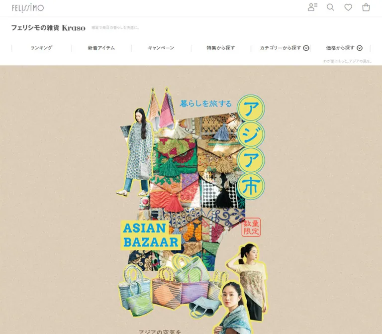
砂色のテクスチャに、色鮮やかな布や人物の切り抜きを重ねた雑貨特集。青と黄色の印象的な装飾、縦長の編集コンテンツ、白地の商品一覧を組み合わせています。
オリジナルサイトを見るFELISSIMO Kraso / Asian Bazaar — Style Reference
A textile-market scrapbook unfolding inside a practical Japanese shop.
Website: 暮らしを旅するアジア市 — FELISSIMO Kraso
Original URL: https://www.felissimo.co.jp/kraso/contents_kr/contentsevent2608_kr
Final URL: https://www.felissimo.co.jp/kraso/contents_kr/contentsevent2608_kr
Theme: light; white retail surfaces and a sand-colored editorial feature.
Inspected: supplied browser evidence captured September 12, 2026, at 05:50:32 JST; retrieval timestamp 2026-09-11T20:50:32.923Z.
Viewports: desktop 1440 × 1000 and mobile 390 × 844 CSS pixels.
Scope: the current shopping feature, including its retail header, opening collage, chapter and recipe structure, buyer commentary, product collection, catalog promotion, and footer. Visual captures cover the desktop opening, a desktop product-grid segment, the desktop footer, the mobile opening, and the mobile footer. Intermediate editorial sections are documented through supplied DOM text and geometry, with visual limitations identified below.
Asian Bazaar places a vivid collection of textiles, woven bags, clothing, and small objects on a softly textured beige field. Cutout figures, overlapping fabric photographs, yellow silhouette outlines, blue lettering, and a small red quantity stamp give the opening the character of a printed market poster. Four circular title medallions descend along the right side. The English title sits lower and to the left on two yellow strips, creating a diagonal reading path through the collage.
Two content widths define the page. The editorial artwork uses an approximately 585px centered composition on desktop, surrounded by broad textured margins. The surrounding shop uses a roughly 1170px content span. After the extended feature, the page returns to white, large product photographs, Japanese descriptions, prices, favorites, and ordinary shopping navigation. Preserve both scales when adapting this design: the narrow visual story and the wider comparison-oriented catalog are equally important.
How to Read This Reference
- Measured means a value explicitly present in the supplied rendered DOM or computed styles. Measurements describe the captured state, including elements that may not have been visibly painted.
- Calculated means arithmetic based on those measurements, such as the approximately two-thirds mobile artwork scale.
- Estimated means a visual approximation from the supplied screenshots. Estimated colors were not sampled with a pixel-analysis tool.
- Recommended means guidance for a new implementation. The CSS and prompts below are adaptations, not recovered source code.
- Token names introduced here are descriptive aliases. Source custom properties are named explicitly where relevant.
- Screenshots establish visible appearance. DOM text, nonzero rectangles, and declared font families alone do not establish that a menu, graphic, or offscreen element was visible.
- No additional browsing, commands, asset retrieval, or local-file inspection was performed.
Tokens — Colors
Feature and Retail Palette
| Name | Value | Suggested token | Evidence and role |
|---|---|---|---|
| Shop White | #ffffff |
--color-shop |
Measured body background; visible header, catalog, and footer surface |
| Retail Ink | #202020 |
--color-ink |
Measured body and navigation text |
| Bazaar Blue | #009fe8 |
--color-bazaar |
Measured buyer-comment heading and paragraph color; visually consistent with the opening blue graphics |
| Editorial Brown | #42210b |
--color-editorial |
Measured CONTENTS and recipe-heading color |
| Deep Brown | #231815 |
--color-deep |
Measured recipe support text and CHECK background; sampled controls were offscreen |
| Sand Reference | #e1d2be |
--color-sand |
Measured color on graphic-heading wrappers. Recommended flat approximation for the visible beige texture; the actual background declaration was not supplied |
| Market Yellow | approximately #f1e64d |
--color-yellow |
Estimated circular title fills, English-title backing, and cutout outlines |
| Quantity Red | approximately #ff493b |
--color-stamp |
Estimated thin red quantity stamp in the opening collage |
| Utility Gray | #777777 |
--color-icon |
Measured header icon color |
| Quiet Gray | #bbbbbb |
--color-muted-source |
Measured small page heading and brand-support copy |
| Light Rule | approximately #e7e7e7 |
--color-rule |
Estimated fine header and footer dividers |
| Footer Band | approximately #f6f5f4 |
--color-band |
Estimated breadcrumb and mobile back-to-top surfaces |
The sand field is visibly textured. A flat #e1d2be background gives a useful fallback but cannot reproduce its grain, tonal variation, or material quality. Keep texture behind the editorial composition; the photographed textiles supply their own much stronger pattern.
Bazaar Blue is an editorial identity color, not a universal shopping-button color. The product catalog largely returns to dark text and neutral controls. Its small italic New labels appear red; approximately #e5222c is a visual adaptation, not a measured label color.
Airmail Banner Accents
The overseas-customer banner has diagonal blue, red, and white edge stripes. Approximate values are #008de8, #ff4960, and white. These belong to the global retail banner and should remain separate from the feature's yellow-and-blue title treatment.
Source Variables and Their Limits
The supplied root properties include --color-primary: #00a1e0, --yellow: #ffc107, --color-grey2: #eee, and --color-red: #c00. These are declared site-wide values. They do not establish the exact colors of the feature's blue lettering, yellow circles, visible rules, or New labels.
Use the measured component color #009fe8 for the buyer section. Do not substitute a framework-level primary color simply because its name suggests importance. No alternate theme or theme-switching control was established.
Tokens — Typography
Japanese Retail Text
The measured body stack is:
font-family:
  '游ゴシック', 'Yu Gothic', YuGothic,
  'ヒラギノ角ゴ Pro W3', 'ヒラギノ角ゴ W3',
  'Hiragino Kaku Gothic ProN', 'Hiragino Kaku Gothic',
  'メイリオ', Meiryo, 'Noto Sans', 'Noto Sans CJK JP',
  system-ui, sans-serif;
The body uses 16px, weight 500, and 24px line height at both inspected widths. This supplies the straightforward retail voice around the artwork. Desktop primary navigation also uses 16px / 24px at weight 500.
Cormorant Garamond — Editorial Labels
- Measured family:
'Cormorant Garamond', Georgia, serif. - Confirmed roles:
CONTENTSand the recipe-relatedCHECKlinks. - Contents treatment: bold, compact uppercase lettering with
0.05emtracking. - Check treatment: weight
600, placed in a small dark pill according to computed styles.
These declarations establish the intended families. Successful font loading and the exact rendered fallback selection were not independently tested.
Arvo — Buyer Commentary Heading
BUYER'S COMMENT uses measured Arvo, serif, weight 700, 57px / 57px, and 2.85px tracking on desktop. Its 460px-wide heading box is 114px high, consistent with a two-line heading.
The opening ASIAN BAZAAR lettering has a similarly substantial slab-serif appearance, but its font was not included in the sampled text styles. Do not assign Arvo to that title as an observed fact. Retain the original lettering artwork when available.
Supporting and Menu Families
Recipe product-support copy declares 'Noto Sans JP', sans-serif. Mobile menu entries declare A1Gothic-Regular, while their group labels declare A1Gothic-Medium. These menu entries are present in the DOM, but the expanded menu was not shown in the mobile capture.
The root property --skin-header-font: 'Dosis' is also present. There is no evidence that Dosis renders the visible brand marks or feature titles.
Type Scale
| Role | Desktop | Mobile | Weight / tracking | Evidence |
|---|---|---|---|---|
| Body | 16px / 24px |
16px / 24px |
500, normal |
Measured |
| Overseas message | 20px / 24px |
13px / 15.6px |
700, normal |
Measured |
| Primary desktop navigation | 16px / 24px |
Collapsed in the visible layout | 500 |
Measured desktop; mobile screenshot |
Small page H1 |
12px / 14.4px |
11px / 15.4px |
500, normal |
Measured |
Main CONTENTS heading |
27px / 27px |
approximately 18px / 18px |
700, 0.05em |
Measured |
Chapter and BUY link elements |
18px / 27px |
14px / 21px |
500, normal |
Measured element styles; artwork may determine visible lettering |
| Recipe support copy | 13px / 20.8px |
approximately 8.666px / 13.865px |
400, normal |
Measured offscreen elements |
Recipe CHECK |
19px / 28.5px |
approximately 12.675px / 19.013px |
600, normal |
Measured offscreen elements |
| Buyer heading | 57px / 57px |
Not supplied | 700, 0.05em |
Measured desktop |
| Buyer paragraph | 16px / 28px |
Not supplied | 600, 0.05em |
Measured desktop |
| Sale-period note | 14px / 25.2px |
Not supplied | 500, 0.05em |
Measured desktop |
| Feature-navigation chips | 14px / 19.6px |
Not supplied | 500, normal |
Measured desktop |
| Product teaser / name | approximately 18px / 27px |
Not visually captured | Bold teaser; regular name | Screenshot estimate |
| Product price | approximately 16px / 24px |
Not visually captured | Bold | Screenshot estimate |
Product New label |
approximately 14px |
Not visually captured | Italic | Screenshot estimate |
Some empty heading wrappers report 32px or 28px even as their geometry scales between viewports. Those values are not reliable measures of the lettering inside graphic assets. Likewise, a 10px font on a logo wrapper does not describe the logo's apparent size.
Tokens — Spacing & Shapes
Two Independent Width Systems
| Element | Desktop | Mobile | Status |
|---|---|---|---|
| Retail content span | approximately 1170px, starting at x = 135px |
Varies by component; footer inset approximately 15px |
Desktop supported by navigation geometry and screenshots; mobile visual estimate |
| Editorial composition | approximately 585px, centered at x = 427.5px |
390px, starting at x = 0 |
Inferred from heading-wrapper width and repeated artwork coordinates |
| Buyer text block | approximately 460px |
Not sampled | Measured desktop |
| Feature section start | y = 313.391px |
y = 207.391px |
Measured |
| Feature section height | 14100.234px |
9399.25px |
Measured captured layout |
| Full document height | approximately 34869px |
approximately 26730px |
Supplied document measurement |
The artwork span is half the retail span at desktop: 585 / 1170 = 0.5. This relationship makes the opening feel like a tall printed insert within a larger shop.
Spacing Scale
| Use | Value | Evidence |
|---|---|---|
| Airmail frame thickness | 8px desktop; 6px mobile |
Calculated from the inner link bounds and visible outer banner |
| Desktop utility-control box | 58 × 52px |
Measured |
| Mobile search, favorite, and bag boxes | 42 × 48px |
Measured |
| Desktop navigation cell | 195 × 55px |
Measured; six equal divisions across 1170px |
| Feature top to first graphic-heading anchor | 68px desktop; approximately 48px mobile |
Calculated coordinate difference; not a recovered padding declaration |
| Chapter-label horizontal gap | approximately 25px desktop; 16.66px mobile |
Calculated from adjacent link rectangles |
| Product-grid horizontal gap | approximately 30px |
Desktop screenshot estimate |
| Product-image to text separation | approximately 10–14px |
Desktop screenshot estimate |
| Footer link row | approximately 60px desktop; 50px mobile |
Screenshot estimate |
| Feature chip padding | 8px 16px |
Measured |
Shapes
| Element | Geometry | Evidence |
|---|---|---|
| Main product photographs | Square corners | Visible |
| Editorial collage | Overlapping rectangles, cutout silhouettes, irregular photograph edges | Visible opening |
| Japanese title | Four stacked circular medallions with thin blue double outlines | Visible opening |
| Quantity mark | Small red outlined stamp with slightly rounded corners | Visible opening |
| Feature chips | 4px corner radius |
Measured |
Recipe CHECK |
125 × 40px, 40px radius on desktop |
Measured offscreen |
Recipe CHECK, mobile |
approximately 83.33 × 26.66px, 26.66px radius |
Measured offscreen |
Standard BUY link box |
127 × 42px desktop; approximately 84.33 × 27.66px mobile |
Measured; visible graphic treatment not supplied |
Main ALL ITEMS link box |
162 × 42px desktop; approximately 108 × 28px mobile |
Measured |
There is no visible general-purpose card-shadow system. Separation comes from photographic edges, whitespace, fine rules, and the shift between textured editorial and white retail surfaces.
Components
Overseas-Customer Banner
Role: a global route for international customers before the Japanese storefront navigation.
A broad white message panel sits inside an airmail border. An outlined airplane-and-postmark graphic appears at the left, the English message occupies the center, and a small chevron sits at the right.
At desktop, the banner occupies approximately 1170 × 100px. Its inner link is measured at 1154 × 84px. On mobile, it spans the full 390px width and is 80px tall, with a 378 × 68px inner link. The message decreases from 20px to 13px.
The mobile stamp and message are visually crowded. For an adaptation, reserve separate grid columns for the illustration and text and allow the message to wrap. The observed link points to FELISSIMO's international storefront; no resulting destination screen was inspected.
Retail Header
Role: maintain brand identity and shopping access throughout the feature's entry area.
The desktop header has three layers beneath the overseas banner:
- A 52px utility row with the FELISSIMO mark at left and account, search, favorite, and shopping-bag symbols at right.
- A brand row containing the Kraso identity and quiet supporting copy.
- A six-part navigation row with fine vertical separators and dropdown indicators on category and price entries.
The complete sampled header is 185px tall. Its icons are thin gray outlines without filled button backgrounds. Icon-library identity was not supplied.
On mobile, the header becomes 97px tall. The FELISSIMO mark is centered in the first row, the account symbol moves to the far left, and search, favorite, and bag remain at the right. The second row centers the Kraso mark and places a hamburger control at its right. The desktop navigation links have zero-height rectangles in this state and are absent from the screenshot.
The menu's underlying category and price content remains in the DOM. This does not demonstrate an opened drawer, dropdown animation, focus behavior, or menu-overlay design.
Small Page Heading
Role: identify the feature in the retail shell without competing with the graphic title.
The source H1, わが家にそっと、アジアの風を。, sits immediately above the beige feature. It is only 12px on desktop and 11px on mobile, in #bbbbbb. It appears right-aligned on desktop and left-aligned on mobile.
The much larger visual title belongs to the collage below. Preserve a semantic page heading when using graphic lettering, while improving its contrast if it is intended to be read as ordinary text.
Opening Collage
Role: establish the market, travel, and handmade-object theme.
The composition combines a large patchwork-textile photograph with smaller garment fragments, woven bags, and cutout models. The central textile image has an angled upper boundary. One full-length figure overlaps its left edge; additional figures and bags accumulate toward the lower right and bottom.
The four yellow medallions spelling アジア市 run down the right side. Their blue double outlines and irregular Japanese lettering feel printed and informal. A short blue introduction sits above the fabric photograph. The two-line ASIAN BAZAAR title occupies yellow strips lower on the left, while the red 数量限定 stamp balances it on the right.
At desktop, the collage stays narrow within a full-width texture field. At mobile, the same visual relationships fill the screen much more fully. The mobile opening reveals lower bags and figures that fall below the desktop screenshot's first fold; that difference follows the artwork scale and available viewport, not evidence of extra mobile-only content.
Implementation guidance: compose within one proportionally sized stage, preserving the artwork's overlap and negative space. Use an authorized combined graphic or separately positioned assets. The supplied evidence does not identify which pieces are separate source files.
Contents Index
Role: provide chapter access within a long editorial sequence.
The main index consists of a brown serif CONTENTS heading, five links associated with #cat01 through #cat05, and an ALL ITEMS link to #list-anchor.
Desktop link rectangles are approximately 21–42px wide and 177–253px tall. Their positions run from the first chapter on the right to the fifth on the left. This geometry is consistent with vertical graphic labels. Their exact image assets and writing-mode declarations were not provided.
The mobile rectangles preserve this arrangement at approximately two-thirds size. An additional contents block and another item shortcut appear in the desktop DOM at viewport-like coordinates, but neither is visibly established in the opening screenshot. Their visibility conditions and whether they become fixed during scrolling remain unverified.
For a reusable implementation, use real anchor links in logical chapter order. Vertical Japanese text is a reasonable accessible adaptation if the original label graphics are unavailable.
Editorial Product Spread
Role: connect featured objects to their shopping destinations while continuing the magazine composition.
The DOM shows individually sized product-image links interleaved with names, prices, and compact BUY links. The first chapter includes a patch case, a rally-quilt pouch, and a block-print quilting pouch. Later groups include woven bags, quilted cushions and mats, curtains, kitchen cloths, clothing, and a multi-use textile.
The first linked image measures 417 × 538.5px on desktop, positioned 71px from the inferred stage's left edge. The following image is 350 × 455px and begins farther right. The next is 311 × 459.5px and returns left. These varying widths and offsets establish an asymmetric sequence through geometry, even though corresponding intermediate screenshots were not supplied.
The BUY links point to product-detail URLs. They are navigation links, not evidence of immediate add-to-cart behavior. Preserve the relationship between photograph, description, price, and destination. Do not assign a button fill or icon treatment to these links from their computed transparent background alone: background artwork was not included in the evidence.
Recipe Interlude
Role: turn the product story into an at-home travel experience through food and everyday use.
Three recipe sections are present: Thai-style noodles, Taiwanese meatball soup, and a Filipino coconut-and-corn dessert. Each has an ASIAN RECIPE heading, introductory copy, ingredients and preparation text, and a related product reference ending in CHECK.
The recipe support controls declare a dark brown pill with white Cormorant Garamond lettering. However, their sampled horizontal coordinates are negative on both desktop and mobile. Several recipe-title rectangles also extend beyond the mobile right edge. These measurements establish styling and offscreen placement in the sampled state; they do not establish the final visible recipe composition or a reveal mechanism.
Recommended adaptation: keep ingredients and instructions as readable document content, place related merchandise in a compact adjacent or following block, and ensure every link remains reachable without animation. Exact recipe photography, crop choices, and reveal states require additional visual evidence.
Buyer Commentary and Sale Note
Role: give the selection a human editorial voice and state the selling period.
The desktop buyer block is approximately 460px wide. Its blue Arvo heading is followed by blue Japanese copy at 16px / 28px, weight 600, with 0.05em tracking. The paragraph includes a buyer signature in the source copy.
A later blue note uses 14px / 25.2px and describes limited-quantity sales through November 30, with a possible continuation depending on stock. Treat this as content captured on the inspection date, not an evergreen date or proof that the page later becomes unavailable.
The buyer signature is editorial content and does not establish a website designer or production credit.
Collection Navigation and Controls
Role: shift from curated storytelling to inventory browsing.
Following the editorial feature, the DOM contains a horizontal sequence of feature-category links. Sampled chips use a white background, 4px radius, 8px 16px padding, and 14px / 19.6px text. Later chip coordinates extend beyond the viewport, establishing a long horizontal sequence; drag, carousel, and keyboard behavior were not tested.
The collection reports 84件 見つかりました and includes 絞り込み, 切り替え, 並べ替え, and a selected-condition label. Their detailed appearance and opened states are not shown in the supplied product-grid screenshot.
Pagination includes page 1 and page 2. The observed second-page URL uses ?start=60#ancor. Its contents were not visited. Preserve the distinction between the editorial shortcut #list-anchor and this pagination fragment when interpreting the source.
Product Card and Desktop Grid
Role: make products easy to compare and open.
The supplied catalog screenshot shows three columns within an approximately 1170px span. Image left edges are near 135px, 535px, and 935px, producing approximately 370px-wide photographs with 30px gutters. The fully visible image row is about 445px high, close to a 5:6 portrait ratio.
Each card follows this anatomy:
- A large, square-cornered product or lifestyle photograph.
- A bold Japanese editorial teaser.
- A regular-weight product name on the next line or lines.
- An optional small italic red
Newlabel. - A bold yen price, with a light-gray outline heart toward the lower right.
The image and title destinations are represented separately in the link evidence. The favorite heart's active state and persistence were not exercised. The DOM also contains size labels and special statuses for some products, but their detailed visual treatments are outside the supplied grid segment.
Cards have no visible enclosing border, colored panel, shadow, or rounded image mask. Their typography aligns with the photograph's left edge. Allow metadata to grow naturally with Japanese wrapping. The screenshot does not establish a masonry layout or a universal fixed card height.
Catalog Promotion and Additional Merchandising
Role: extend browsing and offer a physical catalog before the footer.
The DOM contains recommended items, recently checked items, other features, campaigns, and category-based new products. Their existence is established, but their full layouts and any carousel behavior are not visually documented. Recently checked merchandise is contextual content and should not be treated as the feature's fixed editorial selection.
The visible catalog promotion returns to a narrow central composition on white. A portrait catalog cover sits above staggered lettering reading Get!free. Below and to the right is the underlined カタログ無料プレゼント link with a circled arrow.
The cover appears approximately 300px wide on desktop and 200px on mobile. The unusually spaced and tilted lettering is visible in the still captures; animation cannot be inferred from its irregular baseline. Retain its graphic character without inventing a typeface.
Breadcrumbs and Footer
Role: restore store navigation and support after the long feature and catalog.
A pale breadcrumb band precedes the directory. Its visible height is approximately 47px on desktop and 46px on mobile. The mobile breadcrumb continues beyond the right edge; whether the original permits horizontal scrolling was not tested.
The directory has an item-search heading followed by two links, then a support heading followed by four links. Desktop support links occupy four columns. Mobile changes them into two columns across two rows. Fine horizontal dividers and short vertical separators provide structure; chevrons sit at the far ends of link rows.
The back-to-top label is right-aligned on desktop. On mobile it becomes a centered, full-width pale strip approximately 49px tall. The legal links wrap into two centered lines on mobile, followed by a black FELISSIMO logo rectangle and small gray copyright text. The header is absent from these bottom captures; a continuously fixed global header is not established.
Tokens — Motion & Interaction
| Element | Supplied computed value or link evidence | What can be concluded |
|---|---|---|
| Global category and price links | opacity 0.38s cubic-bezier(0.165, 0.84, 0.44, 1) |
An opacity transition is declared; trigger and endpoint were not exercised |
Chapter links, many BUY links, main ALL ITEMS link |
background-image 0.3s |
A background-image change is declared; this does not prove a smooth fade |
| One editorial item shortcut | opacity 0.3s |
Declared transition only |
Recipe CHECK |
0.3s |
A transition is declared; affected state and visible result remain unverified |
| Feature-navigation chips | border 0.25s cubic-bezier(0.165, 0.84, 0.44, 1) |
Border feedback is defined; exact change is unknown |
| Chapter navigation | Links to #cat01–#cat05 |
In-page destinations exist; scroll duration and easing are unknown |
| Collection shortcut | Link to #list-anchor |
A route to the inventory section exists |
| Product navigation | Product-detail links | Navigation intent is established; purchase completion was not tested |
| Favorites, filters, sorting, hamburger | Visible controls or DOM labels | Opened, selected, and persisted states were not tested |
The inspection process waited for loading, image decoding, and sampled stability, and traversed intermediate scroll positions. It also temporarily paused perpetual animations during readiness checks. Those procedures are not evidence of a particular animation on this page.
Sampled elements report animation: none, but that does not establish that every descendant, pseudo-element, image, or script-driven effect is static. Do not specify parallax, automatic collage motion, a sticky chapter rail, recipe entrances, or looping catalog lettering as observed behavior.
For an adaptation, preserve the measured short transition durations where useful and keep feedback local. An opacity or border change is sufficient for a link. Add reduced-motion handling and make the complete content accessible in its resting state.
Surfaces
| Layer | Appearance | Function |
|---|---|---|
| Global retail shell | White with dark text and gray line icons | Familiar shopping navigation |
| Overseas banner | White center with diagonal airmail edge | Distinct international-shopping route |
| Editorial feature | Beige material texture | Continuous setting for the collage and story |
| Hero accents | Yellow circles and strips, blue lettering, red stamp | Strong visual identity within the artwork |
| Buyer commentary | Blue typography in a narrow text block | Editorial emphasis |
| Product catalog | White with unboxed portrait photographs | Comparison and browsing |
| Breadcrumb / mobile top link | Pale neutral band | Section separation and navigation |
| Footer identity | Compact black logo rectangle on white | Closing brand signature |
Use whitespace and changes of material to organize the page. The black footer logo is a contained identity mark, not a full dark footer theme.
Imagery
The opening's strongest visual material is actual textile detail: embroidery, tassels, block prints, stitching, and varied woven patterns. Preserve their irregularities and color differences. The photographs should feel like objects handled, worn, and gathered during travel.
Cutout models introduce scale and use. The yellow outline is a flat graphic edge around the silhouette, rather than a realistic shadow. In the visible opening it appears approximately 3–6px thick on desktop and 2–4px on mobile, depending on the subject and location. These are visual estimates.
The product grid uses more conventional photography. The supplied segment includes a person serving tea, a tabletop arrangement of small pins on round backing cards, and a model carrying a woven bag. Lighting is soft, with restrained backgrounds that let fabric color and product form dominate.
Observed Asset References
No image source URLs or asset filenames were included in the supplied evidence. The following inventory identifies visible subjects and their roles without inventing paths.
| Asset subject | Observed location | Preservation guidance |
|---|---|---|
| Airmail postmark and airplane | Overseas banner, both opening captures | Keep the fine gray outline and circular postal motif |
| FELISSIMO and Kraso marks | Header; FELISSIMO also in footer | Use approved brand assets; wrapper font sizes do not describe the marks |
| Patchwork and embroidered textiles | Main opening collage | Preserve pattern density, tassels, and angled composition |
| Garment and model cutouts | Opening collage | Retain silhouette edges, relative scale, and yellow outlines |
| Woven bags | Lower mobile opening and product grid | Preserve distinct weave, color combinations, and handles |
| Tea-serving lifestyle photograph | Desktop product-grid capture | Preserve the relationship between garment, hands, cup, and tray |
| Pin assortment photograph | Desktop product-grid capture | Keep the tabletop arrangement and repeated circular backing cards |
| Portrait catalog cover | Desktop and mobile bottom captures | Preserve proportions and printed cover composition |
Irregular Get!free lettering |
Catalog promotion | Preserve as artwork when available; motion is unverified |
Recipe imagery and intermediate editorial crops cannot be specified from the supplied screenshots. CSS can recreate the surrounding layout but cannot supply the identity carried by the feature artwork.
Layout & Responsive Behavior
Desktop
At 1440px wide, the shop content occupies roughly 1170px and leaves about 135px of margin on each side. The feature artwork occupies approximately 585px, leaving about 427.5px on either side while the beige background continues to the viewport edges.
The opening feature begins at 313.391px, after the overseas banner, utility row, brand row, navigation, and small page heading. The editorial sequence alone is about 14100px tall in the captured layout. Its chapter shortcuts are therefore structurally important.
The catalog widens to three approximately 370px photo columns. The footer returns to the same broad retail alignment.
Mobile
At 390px wide, the overseas banner remains full width. The header changes its arrangement and the feature begins at 207.391px. The editorial stage expands to the full viewport width relative to its surrounding shell, while its internal artwork becomes smaller than the desktop version.
Several measurements demonstrate the approximate scale factor:
| Element | Desktop | Mobile | Calculated relationship |
|---|---|---|---|
| Composition width | 585px |
390px |
0.6667× |
| First editorial image width | 417px |
277.984px |
approximately 0.6666× |
| First editorial image height | 538.5px |
358.969px |
approximately 0.6666× |
Main CONTENTS size |
27px |
17.9985px |
approximately 0.6666× |
Main ALL ITEMS width |
162px |
107.984px |
approximately 0.6666× |
| Feature section height | 14100.234px |
9399.25px |
approximately 0.6666× |
This is not a global page zoom: body text stays 16px, the retail header rearranges, and chapter-link text changes from 18px to 14px rather than exactly two-thirds. The measurements support proportional feature artwork with separate rules for retail UI and some text.
The mobile product-grid column count is not visible in the supplied screenshots, and corresponding card geometry was not supplied. The Quick Start recommends two columns at ordinary phone widths and one column at very narrow widths; that is a new implementation choice.
Breakpoints and Reachability
Declared root breakpoint values are 544px, 769px, 992px, and 1200px. Their presence does not prove which media query controls each component. The Quick Start uses 769px as a practical desktop transition, subject to testing.
Keep the article in ordinary document flow. Do not set its captured height as a fixed page height: inventory, fonts, recommendations, and text wrapping can change it. Test intermediate widths, text zoom, and the recipe sections' offscreen elements before implementing any reveal effect.
Do’s and Don’ts
Do
- Preserve the relationship between the narrow editorial composition and the wider shop catalog.
- Use material texture across the feature's background and retain white retail surfaces around it.
- Keep Bazaar Blue, yellow title shapes, and the small red stamp concentrated in the feature identity.
- Preserve textile detail, varied product scales, and cutout silhouettes.
- Retain the four stacked Japanese title circles and the offset two-line English title.
- Use Cormorant Garamond for the verified editorial labels and Arvo for the verified buyer heading when those fonts are available.
- Keep product photographs large, square-cornered, and unboxed.
- Preserve the teaser, product name, optional status, price, and favorite hierarchy.
- Provide chapter links and a direct route to all items.
- Reorganize the mobile header and footer independently from the proportional artwork.
Don't
- Don't stretch the 585px editorial composition across the entire desktop shop width.
- Don't apply the feature's approximately two-thirds scaling to all mobile body text and controls.
- Don't replace the dense textile collage with generic decorative shapes or unrelated stock photography.
- Don't introduce shadows and large rounded panels around every product.
- Don't turn every shopping control blue or yellow merely because those colors appear in the hero.
- Don't interpret empty graphic wrappers as ordinary 32px display headings.
- Don't assume a declared root font or color is actively used by the visible component.
- Don't infer open menus, favorite persistence, parallax, or looping movement from DOM presence or static artwork.
- Don't reproduce negative offscreen coordinates as the intended final placement of recipe links.
- Don't hardcode the captured inventory count, document height, buyer copy, or sale end date as reusable design tokens.
Recommended Implementation Additions
These are recommendations for a new implementation, not verified features of the source:
- Provide meaningful text alternatives for the graphic title and informative photography. Mark repeated purely decorative cutouts and flourishes as decorative when their meaning is already covered.
- Give icon-only account, search, menu, favorite, and bag controls accessible names. Keep product favorite buttons separate from product links.
- Expand compact graphic links to at least 44px touch targets without enlarging every visible graphic. The measured mobile
BUYandCHECKboxes are about 27px high. - Maintain readable mobile recipe text instead of copying the sampled approximately 8.7px support-copy size.
- Use dark text for essential small copy. The measured
#bbbbbbtext and bright editorial blue require contrast evaluation at their actual sizes and backgrounds. - Make chapter targets focusable or provide equivalent navigation context, and set scroll offsets if a header becomes sticky in the new implementation.
- Keep the full breadcrumb reachable on mobile through wrapping or a clearly usable horizontal region.
- Set intrinsic image dimensions and responsive image candidates. Prioritize the opening imagery and defer distant catalog images while reserving their space.
- Load fonts only when permitted and needed. Match fallback metrics to reduce shifts in the long editorial composition.
- Ensure reduced-motion mode shows all content immediately and does not leave recipe or navigation elements outside the reachable area.
Agent Prompt Guide
Quick Color Reference
- Retail background: measured
#ffffff. - Main retail text: measured
#202020. - Editorial blue: measured
#009fe8on buyer content. - Editorial brown: measured
#42210b. - Sand fallback:
#e1d2be; texture background match is approximate. - Hero yellow: approximately
#f1e64d. - Quantity stamp: approximately
#ff493b. - Utility icons: measured
#777777. - Structural separation: whitespace, photographic edges, and fine gray rules.
Overall Prompt
“Create a Japanese lifestyle shopping feature inspired by the supplied FELISSIMO Kraso Asian Bazaar page. Use a full-width sand-textured editorial background with an approximately 585px centered artwork stage on desktop, expanding to the phone width on mobile. Build the opening from richly patterned textile photography, woven bags, cutout clothing models with flat yellow outlines, four vertically stacked yellow title medallions with blue linework, and an offset two-line English title on yellow strips. Follow the visual story with chapter navigation, featured product links, three recipe interludes, and blue buyer commentary. Return to a roughly 1170px white retail catalog with three desktop photo columns, bold Japanese teasers, regular product names, small status labels, prices, and outline favorites. Keep the global retail header and footer responsive independently of the artwork. Treat unobserved motion and mobile catalog layout as implementation decisions.”
Example Component Prompts
- Opening collage: “Within a narrow portrait composition, overlap an angled textile photograph, garment fragments, a full-length figure on the left, and woven bags lower down. Add flat yellow silhouette outlines, four blue-outlined yellow title circles on the right, a small red quantity stamp, and a blue English title on two yellow strips. Preserve the supplied asset proportions and detailed fabric texture.”
- Contents index: “Create a brown Cormorant Garamond
CONTENTSheading above five narrow vertical Japanese chapter links, ordered visually from right to left, followed by anALL ITEMSanchor. Use real text and links as an accessible adaptation; keep touch areas larger than the visible lettering.” - Product card: “Use a square-cornered portrait lifestyle photograph above an approximately 18px bold Japanese teaser and regular product name. Place an optional small italic red
Newlabel above a bold yen price. Add a separate light-gray outline favorite control at the lower right. Leave the card unboxed on white.” - Buyer block: “Build a narrow editorial block with a two-line blue Arvo heading at 57px on desktop, followed by blue Japanese copy at 16px with 28px line height and 0.05em tracking. Adapt mobile type for readability while preserving the compact column.”
- Footer: “Place a pale breadcrumb strip above item-search and support link groups. Use two item-search columns and four desktop support columns, changing support links to a two-by-two arrangement on phones. Use thin rules, end-aligned chevrons, centered legal links, and a compact black brand mark.”
Quick Start
CSS Custom Properties
This adaptation reproduces the measured width relationship, verified font roles, and visible component hierarchy. It uses a conventional 16px root. Estimated colors, product-card typography, and the mobile catalog layout are explicitly adapted values.
Supply authorized artwork through ordinary image elements. Set --feature-texture to an approved texture image if available; the default below makes no request. No original asset paths are known. Font declarations require separately provisioned fonts and fall back safely.
:root {
  /* Measured colors */
  --color-shop: #ffffff;
  --color-ink: #202020;
  --color-bazaar: #009fe8;
  --color-editorial: #42210b;
  --color-deep: #231815;
  --color-icon: #777777;
  --color-muted-source: #bbbbbb;

  /* Visual approximations and adaptation values */
  --color-sand: #e1d2be;
  --color-yellow: #f1e64d;
  --color-stamp: #ff493b;
  --color-new: #e5222c;
  --color-rule: #e7e7e7;
  --color-band: #f6f5f4;
  --color-airmail-blue: #008de8;
  --color-airmail-red: #ff4960;
  --feature-texture: none;

  /* Verified family roles; fonts are not loaded by this snippet */
  --font-retail: 'Yu Gothic', YuGothic,
    'Hiragino Kaku Gothic ProN', 'Hiragino Kaku Gothic',
    Meiryo, 'Noto Sans', 'Noto Sans CJK JP', system-ui, sans-serif;
  --font-editorial: 'Cormorant Garamond', Georgia, serif;
  --font-buyer: Arvo, serif;
  --font-recipe: 'Noto Sans JP', sans-serif;

  /* Widths supported by supplied geometry */
  --shop-width: 1170px;
  --feature-width: 585px;
  --buyer-width: 460px;

  /* Reusable spacing; not a recovered source scale */
  --space-xs: 6px;
  --space-sm: 12px;
  --space-md: 16px;
  --space-lg: 24px;
  --space-xl: 30px;
  --space-section: 48px;
  --radius-chip: 4px;
  --touch-size: 44px;

  /* Measured transition timings */
  --motion-link: 380ms cubic-bezier(0.165, 0.84, 0.44, 1);
  --motion-chip: 250ms cubic-bezier(0.165, 0.84, 0.44, 1);
  --motion-feature: 300ms;
}

.asian-page,
.asian-page * {
  box-sizing: border-box;
}

.asian-page {
  margin: 0;
  color: var(--color-ink);
  background: var(--color-shop);
  font: 500 16px/1.5 var(--font-retail);
}

.asian-page img {
  display: block;
  max-width: 100%;
  height: auto;
}

.asian-page button {
  font: inherit;
}

.asian-page .shop-shell {
  width: min(var(--shop-width), calc(100% - 30px));
  margin-inline: auto;
}

/* Geometric stripe approximation for the global banner */
.asian-page .overseas-banner {
  width: min(var(--shop-width), 100%);
  margin-inline: auto;
  padding: 8px;
  background: repeating-linear-gradient(
    135deg,
    var(--color-airmail-red) 0 8px,
    white 8px 16px,
    var(--color-airmail-blue) 16px 24px,
    white 24px 32px
  );
}

.asian-page .overseas-banner > a {
  display: grid;
  grid-template-columns: 96px minmax(0, 1fr) 24px;
  align-items: center;
  gap: 12px;
  min-height: 84px;
  padding-inline: 24px;
  color: var(--color-ink);
  background: white;
  text-align: center;
  text-decoration: none;
  font-size: 20px;
  font-weight: 700;
  line-height: 1.2;
}

.asian-page .utility-row {
  position: relative;
  display: flex;
  align-items: center;
  justify-content: space-between;
  min-height: 52px;
}

.asian-page .utility-actions {
  display: flex;
  align-items: center;
  margin-left: auto;
}

.asian-page .utility-control {
  display: inline-flex;
  align-items: center;
  justify-content: center;
  width: 58px;
  min-height: 52px;
  padding: 0;
  border: 0;
  color: var(--color-icon);
  background: transparent;
}

.asian-page .primary-nav {
  display: grid;
  grid-template-columns: repeat(6, minmax(0, 1fr));
}

.asian-page .primary-nav > a {
  display: flex;
  align-items: center;
  justify-content: center;
  min-height: 55px;
  color: inherit;
  text-decoration: none;
  transition: opacity var(--motion-link);
}

.asian-page .mobile-menu-trigger {
  display: none;
}

.asian-page .feature {
  background-color: var(--color-sand);
  background-image: var(--feature-texture);
}

.asian-page .feature-stage {
  width: min(100%, var(--feature-width));
  margin-inline: auto;
  container-type: inline-size;
}

.asian-page .hero-art {
  padding-top: 68px;
}

.asian-page .hero-art > img {
  width: 100%;
  height: auto;
  object-fit: contain;
}

/* Recommended readable text treatment below the supplied artwork */
.asian-page .hero-copy {
  max-width: 22em;
  margin: 24px auto 48px;
  padding-inline: 16px;
  color: var(--color-editorial);
  font-size: 14px;
  line-height: 1.9;
  text-align: center;
}

.asian-page .contents {
  padding-block: 32px 48px;
  text-align: center;
}

.asian-page .contents-heading {
  margin: 0 0 32px;
  color: var(--color-editorial);
  font: 700 27px/1 var(--font-editorial);
  letter-spacing: 0.05em;
}

/* Accessible text adaptation of the vertical graphic-label layout */
.asian-page .contents-links {
  display: flex;
  flex-direction: row-reverse;
  justify-content: center;
  align-items: flex-start;
  gap: 25px;
  margin: 0 0 32px;
  padding: 0;
  list-style: none;
}

.asian-page .contents-links a {
  display: block;
  max-height: 253px;
  padding: 8px 4px;
  color: var(--color-ink);
  font-size: 18px;
  line-height: 1.5;
  writing-mode: vertical-rl;
  text-orientation: upright;
  text-underline-offset: 4px;
}

/* Underlined fallback; original link-background artwork is unavailable */
.asian-page .feature-link {
  display: inline-flex;
  align-items: center;
  justify-content: center;
  min-width: 127px;
  min-height: var(--touch-size);
  padding: 6px 12px;
  border-bottom: 1px solid currentColor;
  color: var(--color-ink);
  text-decoration: none;
  font-size: 18px;
}

.asian-page .feature-link--all {
  min-width: 162px;
}

/* Measured dark pill appearance with an expanded accessible target */
.asian-page .check-link {
  display: inline-flex;
  align-items: center;
  justify-content: center;
  min-width: 125px;
  min-height: var(--touch-size);
  padding: 6px 16px;
  border-radius: 40px;
  color: white;
  background: var(--color-deep);
  font: 600 19px/1.5 var(--font-editorial);
  text-decoration: none;
}

.asian-page .recipe-copy {
  padding-inline: 24px;
  color: var(--color-deep);
  font: 400 16px/1.8 var(--font-recipe);
}

.asian-page .buyer-note {
  width: min(var(--buyer-width), calc(100% - 48px));
  margin: 48px auto;
  color: var(--color-bazaar);
}

.asian-page .buyer-note h2 {
  margin: 0 0 15px;
  font: 700 57px/1 var(--font-buyer);
  letter-spacing: 0.05em;
}

.asian-page .buyer-note p {
  margin: 0;
  font-size: 16px;
  font-weight: 600;
  line-height: 1.75;
  letter-spacing: 0.05em;
}

.asian-page .feature-chip {
  display: inline-block;
  padding: 8px 16px;
  border: 1px solid var(--color-rule);
  border-radius: var(--radius-chip);
  color: var(--color-ink);
  background: white;
  font-size: 14px;
  line-height: 1.4;
  text-decoration: none;
  transition: border-color var(--motion-chip);
}

/* Desktop geometry follows the supplied catalog screenshot */
.asian-page .product-grid {
  display: grid;
  grid-template-columns: repeat(3, minmax(0, 1fr));
  gap: 36px 30px;
  margin: 0;
  padding: 0;
  list-style: none;
}

.asian-page .product-card {
  min-width: 0;
  background: white;
}

.asian-page .product-card a {
  color: inherit;
  text-decoration: none;
}

.asian-page .product-card__image {
  width: 100%;
  aspect-ratio: 5 / 6;
  object-fit: cover;
  border-radius: 0;
}

.asian-page .product-card__teaser {
  margin: 10px 0 0;
  font-size: 18px;
  font-weight: 700;
  line-height: 1.5;
}

.asian-page .product-card__name {
  margin: 0;
  font-size: 18px;
  font-weight: 500;
  line-height: 1.5;
}

.asian-page .product-card__new {
  display: block;
  margin-top: 4px;
  color: var(--color-new);
  font-size: 14px;
  font-style: italic;
}

.asian-page .product-card__bottom {
  display: flex;
  align-items: center;
  justify-content: space-between;
  gap: 12px;
}

.asian-page .product-card__price {
  margin: 0;
  font-size: 16px;
  font-weight: 700;
}

.asian-page .favorite-button {
  display: inline-flex;
  align-items: center;
  justify-content: center;
  width: var(--touch-size);
  height: var(--touch-size);
  padding: 0;
  border: 0;
  color: #bfbfbf;
  background: transparent;
}

.asian-page .favorite-button svg {
  width: 24px;
  height: 24px;
  fill: none;
  stroke: currentColor;
  stroke-width: 1.5;
}

.asian-page .catalog-promo {
  display: grid;
  width: min(585px, 100%);
  margin: 64px auto 48px;
  gap: 24px;
}

.asian-page .catalog-promo__cover {
  width: 52%;
  margin-inline: auto;
}

.asian-page .catalog-promo__link {
  justify-self: end;
  max-width: 100%;
  padding: 8px 12px;
  color: var(--color-ink);
  font-weight: 700;
  text-underline-offset: 6px;
}

/* Horizontal access is a recommendation for the clipped breadcrumb */
.asian-page .breadcrumbs {
  overflow-x: auto;
  padding: 14px 15px;
  background: var(--color-band);
  font-size: 13px;
  white-space: nowrap;
}

.asian-page .footer-links {
  display: grid;
  grid-template-columns: repeat(2, minmax(0, 1fr));
  border-top: 1px solid var(--color-rule);
}

.asian-page .footer-links--support {
  grid-template-columns: repeat(4, minmax(0, 1fr));
}

.asian-page .footer-links a {
  display: flex;
  align-items: center;
  justify-content: space-between;
  gap: 12px;
  min-height: 60px;
  padding: 12px 16px;
  border-bottom: 1px solid var(--color-rule);
  color: inherit;
  font-size: 14px;
  text-decoration: none;
}

.asian-page .back-to-top {
  display: block;
  padding: 18px 15px;
  color: inherit;
  text-align: right;
  text-decoration: none;
  font-size: 13px;
}

.asian-page :focus-visible {
  outline: 2px solid var(--color-deep);
  outline-offset: 4px;
}

/* Recommended endpoints; only transition timings were observed */
@media (hover: hover) {
  .asian-page .primary-nav > a:hover {
    opacity: 0.7;
  }

  .asian-page .feature-chip:hover {
    border-color: var(--color-ink);
  }
}

/* Practical breakpoint choice, not a recovered component query */
@media (max-width: 768px) {
  .asian-page .overseas-banner {
    padding: 6px;
  }

  .asian-page .overseas-banner > a {
    grid-template-columns: 42px minmax(0, 1fr) 16px;
    gap: 6px;
    min-height: 68px;
    padding-inline: 8px;
    font-size: 13px;
  }

  .asian-page .utility-row {
    min-height: 48px;
  }

  .asian-page .utility-control {
    width: 42px;
    min-height: 48px;
  }

  .asian-page .utility-brand {
    position: absolute;
    left: 50%;
    width: 98.5px;
    transform: translateX(-50%);
  }

  .asian-page .primary-nav {
    display: none;
  }

  .asian-page .mobile-menu-trigger {
    display: inline-flex;
    min-width: 44px;
    min-height: 48px;
  }

  .asian-page .hero-art {
    padding-top: 48px;
  }

  .asian-page .contents-heading {
    font-size: 18px;
  }

  .asian-page .contents-links {
    gap: 16px;
  }

  .asian-page .contents-links a {
    max-height: 180px;
    font-size: 14px;
  }

  .asian-page .buyer-note h2 {
    font-size: clamp(32px, 9.74cqw, 57px);
  }

  .asian-page .buyer-note p {
    font-size: 14px;
  }

  /* Recommended mobile catalog; not visible in supplied captures */
  .asian-page .product-grid {
    grid-template-columns: repeat(2, minmax(0, 1fr));
    gap: 28px 16px;
  }

  .asian-page .product-card__teaser,
  .asian-page .product-card__name {
    font-size: 14px;
  }

  .asian-page .footer-links--support {
    grid-template-columns: repeat(2, minmax(0, 1fr));
  }

  .asian-page .footer-links a {
    min-height: 50px;
    padding-inline: 10px;
  }

  .asian-page .back-to-top {
    background: var(--color-band);
    text-align: center;
  }
}

@media (max-width: 359px) {
  .asian-page .product-grid {
    grid-template-columns: minmax(0, 1fr);
  }
}

@media (prefers-reduced-motion: reduce) {
  .asian-page .primary-nav > a,
  .asian-page .feature-chip {
    transition: none;
  }

  .asian-page {
    scroll-behavior: auto;
  }
}
Use .asian-page on the page root, .shop-shell for the retail catalog and footer alignment, and .feature-stage inside .feature for the narrow editorial composition. Place .buyer-note inside that stage so its container-relative heading size follows the intended column.
The CSS does not implement menus, sorting, favorites, or image-based chapter artwork. Supply those behaviors separately, with real state and accessible semantics. Check individual image crops before applying the suggested 5:6 catalog ratio universally. The original product-image source dimensions were not provided.
Tailwind v4 Token Mapping
Optional aliases for a project already using Tailwind v4. Define the preceding custom properties first. This is not evidence that the original page uses Tailwind.
@theme inline {
  --color-shop: #ffffff;
  --color-retail-ink: #202020;
  --color-bazaar-blue: #009fe8;
  --color-editorial-brown: #42210b;
  --color-sand-paper: #e1d2be;
  --color-market-yellow: #f1e64d;

  --font-retail: 'Yu Gothic', YuGothic,
    'Hiragino Kaku Gothic ProN', Meiryo, sans-serif;
  --font-editorial: 'Cormorant Garamond', Georgia, serif;
  --font-buyer: Arvo, serif;

  --spacing-shop: 1170px;
  --spacing-feature: 585px;
  --spacing-buyer: 460px;
  --spacing-catalog-gap: 30px;
  --radius-feature-chip: 4px;
}
Sources & Evidence
- Original and final page: 暮らしを旅するアジア市 — FELISSIMO Kraso. The supplied browser report records HTTP
200and an unchanged final URL. - Capture timestamp:
2026-09-11T20:50:32.923Z, equivalent to September 12, 2026, at 05:50:32 JST. - Desktop evidence:
1440 × 1000screenshots of the opening, a product-grid segment, and the bottom of the page; DOM text, links, element rectangles, computed styles, root custom properties, and approximately 34869px document height. - Mobile evidence:
390 × 844screenshots of the opening and footer; DOM text, links, element rectangles, computed styles, root custom properties, and approximately 26730px document height. - Observed navigation evidence: chapter links to
#cat01–#cat05, inventory links to#list-anchor, product-detail links, and pagination using?start=60#ancor. These destinations were supplied as link evidence, not independently visited. - Inspection procedure: the supplied report describes at least five seconds of initial observation, waiting for loading, visible image decoding, finite-animation readiness, and sampled layout stability. Scrolling traversed intermediate positions. SharedWorkers and service workers were disabled.
- Limits: the supplied screenshots do not visually cover every intermediate chapter, recipe, collection-control state, or merchandising module. Image asset URLs, full source stylesheets, opened menus, hover endpoints, favorite state, sorting results, and detailed animation behavior were not supplied. Several recipe elements have offscreen rectangles, and duplicated navigation elements have uncertain visibility.
This reference describes the current captured page. Its exact tokens come from the supplied computed evidence; photographic interpretation comes from the supplied current-page screenshots. Visual approximations, responsive extrapolations, and implementation improvements are labeled separately.
# FELISSIMO Kraso / Asian Bazaar — Style Reference

> A textile-market scrapbook unfolding inside a practical Japanese shop.

**Website:** [暮らしを旅するアジア市 — FELISSIMO Kraso](https://www.felissimo.co.jp/kraso/contents_kr/contentsevent2608_kr)
**Original URL:** https://www.felissimo.co.jp/kraso/contents_kr/contentsevent2608_kr
**Final URL:** https://www.felissimo.co.jp/kraso/contents_kr/contentsevent2608_kr
**Theme:** light; white retail surfaces and a sand-colored editorial feature.
**Inspected:** supplied browser evidence captured September 12, 2026, at 05:50:32 JST; retrieval timestamp `2026-09-11T20:50:32.923Z`.
**Viewports:** desktop `1440 × 1000` and mobile `390 × 844` CSS pixels.
**Scope:** the current shopping feature, including its retail header, opening collage, chapter and recipe structure, buyer commentary, product collection, catalog promotion, and footer. Visual captures cover the desktop opening, a desktop product-grid segment, the desktop footer, the mobile opening, and the mobile footer. Intermediate editorial sections are documented through supplied DOM text and geometry, with visual limitations identified below.

Asian Bazaar places a vivid collection of textiles, woven bags, clothing, and small objects on a softly textured beige field. Cutout figures, overlapping fabric photographs, yellow silhouette outlines, blue lettering, and a small red quantity stamp give the opening the character of a printed market poster. Four circular title medallions descend along the right side. The English title sits lower and to the left on two yellow strips, creating a diagonal reading path through the collage.

Two content widths define the page. The editorial artwork uses an approximately 585px centered composition on desktop, surrounded by broad textured margins. The surrounding shop uses a roughly 1170px content span. After the extended feature, the page returns to white, large product photographs, Japanese descriptions, prices, favorites, and ordinary shopping navigation. Preserve both scales when adapting this design: the narrow visual story and the wider comparison-oriented catalog are equally important.

## How to Read This Reference

- **Measured** means a value explicitly present in the supplied rendered DOM or computed styles. Measurements describe the captured state, including elements that may not have been visibly painted.
- **Calculated** means arithmetic based on those measurements, such as the approximately two-thirds mobile artwork scale.
- **Estimated** means a visual approximation from the supplied screenshots. Estimated colors were not sampled with a pixel-analysis tool.
- **Recommended** means guidance for a new implementation. The CSS and prompts below are adaptations, not recovered source code.
- Token names introduced here are descriptive aliases. Source custom properties are named explicitly where relevant.
- Screenshots establish visible appearance. DOM text, nonzero rectangles, and declared font families alone do not establish that a menu, graphic, or offscreen element was visible.
- No additional browsing, commands, asset retrieval, or local-file inspection was performed.

## Tokens — Colors

### Feature and Retail Palette

| Name | Value | Suggested token | Evidence and role |
| --- | --- | --- | --- |
| Shop White | `#ffffff` | `--color-shop` | Measured body background; visible header, catalog, and footer surface |
| Retail Ink | `#202020` | `--color-ink` | Measured body and navigation text |
| Bazaar Blue | `#009fe8` | `--color-bazaar` | Measured buyer-comment heading and paragraph color; visually consistent with the opening blue graphics |
| Editorial Brown | `#42210b` | `--color-editorial` | Measured `CONTENTS` and recipe-heading color |
| Deep Brown | `#231815` | `--color-deep` | Measured recipe support text and `CHECK` background; sampled controls were offscreen |
| Sand Reference | `#e1d2be` | `--color-sand` | Measured color on graphic-heading wrappers. Recommended flat approximation for the visible beige texture; the actual background declaration was not supplied |
| Market Yellow | approximately `#f1e64d` | `--color-yellow` | Estimated circular title fills, English-title backing, and cutout outlines |
| Quantity Red | approximately `#ff493b` | `--color-stamp` | Estimated thin red quantity stamp in the opening collage |
| Utility Gray | `#777777` | `--color-icon` | Measured header icon color |
| Quiet Gray | `#bbbbbb` | `--color-muted-source` | Measured small page heading and brand-support copy |
| Light Rule | approximately `#e7e7e7` | `--color-rule` | Estimated fine header and footer dividers |
| Footer Band | approximately `#f6f5f4` | `--color-band` | Estimated breadcrumb and mobile back-to-top surfaces |

The sand field is visibly textured. A flat `#e1d2be` background gives a useful fallback but cannot reproduce its grain, tonal variation, or material quality. Keep texture behind the editorial composition; the photographed textiles supply their own much stronger pattern.

Bazaar Blue is an editorial identity color, not a universal shopping-button color. The product catalog largely returns to dark text and neutral controls. Its small italic `New` labels appear red; approximately `#e5222c` is a visual adaptation, not a measured label color.

### Airmail Banner Accents

The overseas-customer banner has diagonal blue, red, and white edge stripes. Approximate values are `#008de8`, `#ff4960`, and white. These belong to the global retail banner and should remain separate from the feature's yellow-and-blue title treatment.

### Source Variables and Their Limits

The supplied root properties include `--color-primary: #00a1e0`, `--yellow: #ffc107`, `--color-grey2: #eee`, and `--color-red: #c00`. These are declared site-wide values. They do not establish the exact colors of the feature's blue lettering, yellow circles, visible rules, or `New` labels.

Use the measured component color `#009fe8` for the buyer section. Do not substitute a framework-level primary color simply because its name suggests importance. No alternate theme or theme-switching control was established.

## Tokens — Typography

### Japanese Retail Text

The measured body stack is:

```css
font-family:
  '游ゴシック', 'Yu Gothic', YuGothic,
  'ヒラギノ角ゴ Pro W3', 'ヒラギノ角ゴ W3',
  'Hiragino Kaku Gothic ProN', 'Hiragino Kaku Gothic',
  'メイリオ', Meiryo, 'Noto Sans', 'Noto Sans CJK JP',
  system-ui, sans-serif;
```

The body uses `16px`, weight `500`, and `24px` line height at both inspected widths. This supplies the straightforward retail voice around the artwork. Desktop primary navigation also uses `16px / 24px` at weight `500`.

### Cormorant Garamond — Editorial Labels

- **Measured family:** `'Cormorant Garamond', Georgia, serif`.
- **Confirmed roles:** `CONTENTS` and the recipe-related `CHECK` links.
- **Contents treatment:** bold, compact uppercase lettering with `0.05em` tracking.
- **Check treatment:** weight `600`, placed in a small dark pill according to computed styles.

These declarations establish the intended families. Successful font loading and the exact rendered fallback selection were not independently tested.

### Arvo — Buyer Commentary Heading

`BUYER'S COMMENT` uses measured `Arvo, serif`, weight `700`, `57px / 57px`, and `2.85px` tracking on desktop. Its 460px-wide heading box is 114px high, consistent with a two-line heading.

The opening `ASIAN BAZAAR` lettering has a similarly substantial slab-serif appearance, but its font was not included in the sampled text styles. Do not assign Arvo to that title as an observed fact. Retain the original lettering artwork when available.

### Supporting and Menu Families

Recipe product-support copy declares `'Noto Sans JP', sans-serif`. Mobile menu entries declare `A1Gothic-Regular`, while their group labels declare `A1Gothic-Medium`. These menu entries are present in the DOM, but the expanded menu was not shown in the mobile capture.

The root property `--skin-header-font: 'Dosis'` is also present. There is no evidence that Dosis renders the visible brand marks or feature titles.

### Type Scale

| Role | Desktop | Mobile | Weight / tracking | Evidence |
| --- | --- | --- | --- | --- |
| Body | `16px / 24px` | `16px / 24px` | `500`, normal | Measured |
| Overseas message | `20px / 24px` | `13px / 15.6px` | `700`, normal | Measured |
| Primary desktop navigation | `16px / 24px` | Collapsed in the visible layout | `500` | Measured desktop; mobile screenshot |
| Small page `H1` | `12px / 14.4px` | `11px / 15.4px` | `500`, normal | Measured |
| Main `CONTENTS` heading | `27px / 27px` | approximately `18px / 18px` | `700`, `0.05em` | Measured |
| Chapter and `BUY` link elements | `18px / 27px` | `14px / 21px` | `500`, normal | Measured element styles; artwork may determine visible lettering |
| Recipe support copy | `13px / 20.8px` | approximately `8.666px / 13.865px` | `400`, normal | Measured offscreen elements |
| Recipe `CHECK` | `19px / 28.5px` | approximately `12.675px / 19.013px` | `600`, normal | Measured offscreen elements |
| Buyer heading | `57px / 57px` | Not supplied | `700`, `0.05em` | Measured desktop |
| Buyer paragraph | `16px / 28px` | Not supplied | `600`, `0.05em` | Measured desktop |
| Sale-period note | `14px / 25.2px` | Not supplied | `500`, `0.05em` | Measured desktop |
| Feature-navigation chips | `14px / 19.6px` | Not supplied | `500`, normal | Measured desktop |
| Product teaser / name | approximately `18px / 27px` | Not visually captured | Bold teaser; regular name | Screenshot estimate |
| Product price | approximately `16px / 24px` | Not visually captured | Bold | Screenshot estimate |
| Product `New` label | approximately `14px` | Not visually captured | Italic | Screenshot estimate |

Some empty heading wrappers report `32px` or `28px` even as their geometry scales between viewports. Those values are not reliable measures of the lettering inside graphic assets. Likewise, a 10px font on a logo wrapper does not describe the logo's apparent size.

## Tokens — Spacing & Shapes

### Two Independent Width Systems

| Element | Desktop | Mobile | Status |
| --- | --- | --- | --- |
| Retail content span | approximately `1170px`, starting at `x = 135px` | Varies by component; footer inset approximately `15px` | Desktop supported by navigation geometry and screenshots; mobile visual estimate |
| Editorial composition | approximately `585px`, centered at `x = 427.5px` | `390px`, starting at `x = 0` | Inferred from heading-wrapper width and repeated artwork coordinates |
| Buyer text block | approximately `460px` | Not sampled | Measured desktop |
| Feature section start | `y = 313.391px` | `y = 207.391px` | Measured |
| Feature section height | `14100.234px` | `9399.25px` | Measured captured layout |
| Full document height | approximately `34869px` | approximately `26730px` | Supplied document measurement |

The artwork span is half the retail span at desktop: `585 / 1170 = 0.5`. This relationship makes the opening feel like a tall printed insert within a larger shop.

### Spacing Scale

| Use | Value | Evidence |
| --- | --- | --- |
| Airmail frame thickness | `8px` desktop; `6px` mobile | Calculated from the inner link bounds and visible outer banner |
| Desktop utility-control box | `58 × 52px` | Measured |
| Mobile search, favorite, and bag boxes | `42 × 48px` | Measured |
| Desktop navigation cell | `195 × 55px` | Measured; six equal divisions across 1170px |
| Feature top to first graphic-heading anchor | `68px` desktop; approximately `48px` mobile | Calculated coordinate difference; not a recovered padding declaration |
| Chapter-label horizontal gap | approximately `25px` desktop; `16.66px` mobile | Calculated from adjacent link rectangles |
| Product-grid horizontal gap | approximately `30px` | Desktop screenshot estimate |
| Product-image to text separation | approximately `10–14px` | Desktop screenshot estimate |
| Footer link row | approximately `60px` desktop; `50px` mobile | Screenshot estimate |
| Feature chip padding | `8px 16px` | Measured |

### Shapes

| Element | Geometry | Evidence |
| --- | --- | --- |
| Main product photographs | Square corners | Visible |
| Editorial collage | Overlapping rectangles, cutout silhouettes, irregular photograph edges | Visible opening |
| Japanese title | Four stacked circular medallions with thin blue double outlines | Visible opening |
| Quantity mark | Small red outlined stamp with slightly rounded corners | Visible opening |
| Feature chips | `4px` corner radius | Measured |
| Recipe `CHECK` | `125 × 40px`, `40px` radius on desktop | Measured offscreen |
| Recipe `CHECK`, mobile | approximately `83.33 × 26.66px`, `26.66px` radius | Measured offscreen |
| Standard `BUY` link box | `127 × 42px` desktop; approximately `84.33 × 27.66px` mobile | Measured; visible graphic treatment not supplied |
| Main `ALL ITEMS` link box | `162 × 42px` desktop; approximately `108 × 28px` mobile | Measured |

There is no visible general-purpose card-shadow system. Separation comes from photographic edges, whitespace, fine rules, and the shift between textured editorial and white retail surfaces.

## Components

### Overseas-Customer Banner

**Role:** a global route for international customers before the Japanese storefront navigation.

A broad white message panel sits inside an airmail border. An outlined airplane-and-postmark graphic appears at the left, the English message occupies the center, and a small chevron sits at the right.

At desktop, the banner occupies approximately `1170 × 100px`. Its inner link is measured at `1154 × 84px`. On mobile, it spans the full 390px width and is 80px tall, with a `378 × 68px` inner link. The message decreases from 20px to 13px.

The mobile stamp and message are visually crowded. For an adaptation, reserve separate grid columns for the illustration and text and allow the message to wrap. The observed link points to FELISSIMO's international storefront; no resulting destination screen was inspected.

### Retail Header

**Role:** maintain brand identity and shopping access throughout the feature's entry area.

The desktop header has three layers beneath the overseas banner:

1. A 52px utility row with the FELISSIMO mark at left and account, search, favorite, and shopping-bag symbols at right.
2. A brand row containing the Kraso identity and quiet supporting copy.
3. A six-part navigation row with fine vertical separators and dropdown indicators on category and price entries.

The complete sampled header is 185px tall. Its icons are thin gray outlines without filled button backgrounds. Icon-library identity was not supplied.

On mobile, the header becomes 97px tall. The FELISSIMO mark is centered in the first row, the account symbol moves to the far left, and search, favorite, and bag remain at the right. The second row centers the Kraso mark and places a hamburger control at its right. The desktop navigation links have zero-height rectangles in this state and are absent from the screenshot.

The menu's underlying category and price content remains in the DOM. This does not demonstrate an opened drawer, dropdown animation, focus behavior, or menu-overlay design.

### Small Page Heading

**Role:** identify the feature in the retail shell without competing with the graphic title.

The source `H1`, `わが家にそっと、アジアの風を。`, sits immediately above the beige feature. It is only 12px on desktop and 11px on mobile, in `#bbbbbb`. It appears right-aligned on desktop and left-aligned on mobile.

The much larger visual title belongs to the collage below. Preserve a semantic page heading when using graphic lettering, while improving its contrast if it is intended to be read as ordinary text.

### Opening Collage

**Role:** establish the market, travel, and handmade-object theme.

The composition combines a large patchwork-textile photograph with smaller garment fragments, woven bags, and cutout models. The central textile image has an angled upper boundary. One full-length figure overlaps its left edge; additional figures and bags accumulate toward the lower right and bottom.

The four yellow medallions spelling `アジア市` run down the right side. Their blue double outlines and irregular Japanese lettering feel printed and informal. A short blue introduction sits above the fabric photograph. The two-line `ASIAN BAZAAR` title occupies yellow strips lower on the left, while the red `数量限定` stamp balances it on the right.

At desktop, the collage stays narrow within a full-width texture field. At mobile, the same visual relationships fill the screen much more fully. The mobile opening reveals lower bags and figures that fall below the desktop screenshot's first fold; that difference follows the artwork scale and available viewport, not evidence of extra mobile-only content.

**Implementation guidance:** compose within one proportionally sized stage, preserving the artwork's overlap and negative space. Use an authorized combined graphic or separately positioned assets. The supplied evidence does not identify which pieces are separate source files.

### Contents Index

**Role:** provide chapter access within a long editorial sequence.

The main index consists of a brown serif `CONTENTS` heading, five links associated with `#cat01` through `#cat05`, and an `ALL ITEMS` link to `#list-anchor`.

Desktop link rectangles are approximately 21–42px wide and 177–253px tall. Their positions run from the first chapter on the right to the fifth on the left. This geometry is consistent with vertical graphic labels. Their exact image assets and writing-mode declarations were not provided.

The mobile rectangles preserve this arrangement at approximately two-thirds size. An additional contents block and another item shortcut appear in the desktop DOM at viewport-like coordinates, but neither is visibly established in the opening screenshot. Their visibility conditions and whether they become fixed during scrolling remain unverified.

For a reusable implementation, use real anchor links in logical chapter order. Vertical Japanese text is a reasonable accessible adaptation if the original label graphics are unavailable.

### Editorial Product Spread

**Role:** connect featured objects to their shopping destinations while continuing the magazine composition.

The DOM shows individually sized product-image links interleaved with names, prices, and compact `BUY` links. The first chapter includes a patch case, a rally-quilt pouch, and a block-print quilting pouch. Later groups include woven bags, quilted cushions and mats, curtains, kitchen cloths, clothing, and a multi-use textile.

The first linked image measures `417 × 538.5px` on desktop, positioned 71px from the inferred stage's left edge. The following image is `350 × 455px` and begins farther right. The next is `311 × 459.5px` and returns left. These varying widths and offsets establish an asymmetric sequence through geometry, even though corresponding intermediate screenshots were not supplied.

The `BUY` links point to product-detail URLs. They are navigation links, not evidence of immediate add-to-cart behavior. Preserve the relationship between photograph, description, price, and destination. Do not assign a button fill or icon treatment to these links from their computed transparent background alone: background artwork was not included in the evidence.

### Recipe Interlude

**Role:** turn the product story into an at-home travel experience through food and everyday use.

Three recipe sections are present: Thai-style noodles, Taiwanese meatball soup, and a Filipino coconut-and-corn dessert. Each has an `ASIAN RECIPE` heading, introductory copy, ingredients and preparation text, and a related product reference ending in `CHECK`.

The recipe support controls declare a dark brown pill with white Cormorant Garamond lettering. However, their sampled horizontal coordinates are negative on both desktop and mobile. Several recipe-title rectangles also extend beyond the mobile right edge. These measurements establish styling and offscreen placement in the sampled state; they do not establish the final visible recipe composition or a reveal mechanism.

**Recommended adaptation:** keep ingredients and instructions as readable document content, place related merchandise in a compact adjacent or following block, and ensure every link remains reachable without animation. Exact recipe photography, crop choices, and reveal states require additional visual evidence.

### Buyer Commentary and Sale Note

**Role:** give the selection a human editorial voice and state the selling period.

The desktop buyer block is approximately 460px wide. Its blue Arvo heading is followed by blue Japanese copy at `16px / 28px`, weight `600`, with `0.05em` tracking. The paragraph includes a buyer signature in the source copy.

A later blue note uses `14px / 25.2px` and describes limited-quantity sales through November 30, with a possible continuation depending on stock. Treat this as content captured on the inspection date, not an evergreen date or proof that the page later becomes unavailable.

The buyer signature is editorial content and does not establish a website designer or production credit.

### Collection Navigation and Controls

**Role:** shift from curated storytelling to inventory browsing.

Following the editorial feature, the DOM contains a horizontal sequence of feature-category links. Sampled chips use a white background, `4px` radius, `8px 16px` padding, and `14px / 19.6px` text. Later chip coordinates extend beyond the viewport, establishing a long horizontal sequence; drag, carousel, and keyboard behavior were not tested.

The collection reports `84件 見つかりました` and includes `絞り込み`, `切り替え`, `並べ替え`, and a selected-condition label. Their detailed appearance and opened states are not shown in the supplied product-grid screenshot.

Pagination includes page 1 and page 2. The observed second-page URL uses `?start=60#ancor`. Its contents were not visited. Preserve the distinction between the editorial shortcut `#list-anchor` and this pagination fragment when interpreting the source.

### Product Card and Desktop Grid

**Role:** make products easy to compare and open.

The supplied catalog screenshot shows three columns within an approximately 1170px span. Image left edges are near `135px`, `535px`, and `935px`, producing approximately 370px-wide photographs with 30px gutters. The fully visible image row is about 445px high, close to a `5:6` portrait ratio.

Each card follows this anatomy:

1. A large, square-cornered product or lifestyle photograph.
2. A bold Japanese editorial teaser.
3. A regular-weight product name on the next line or lines.
4. An optional small italic red `New` label.
5. A bold yen price, with a light-gray outline heart toward the lower right.

The image and title destinations are represented separately in the link evidence. The favorite heart's active state and persistence were not exercised. The DOM also contains size labels and special statuses for some products, but their detailed visual treatments are outside the supplied grid segment.

Cards have no visible enclosing border, colored panel, shadow, or rounded image mask. Their typography aligns with the photograph's left edge. Allow metadata to grow naturally with Japanese wrapping. The screenshot does not establish a masonry layout or a universal fixed card height.

### Catalog Promotion and Additional Merchandising

**Role:** extend browsing and offer a physical catalog before the footer.

The DOM contains recommended items, recently checked items, other features, campaigns, and category-based new products. Their existence is established, but their full layouts and any carousel behavior are not visually documented. Recently checked merchandise is contextual content and should not be treated as the feature's fixed editorial selection.

The visible catalog promotion returns to a narrow central composition on white. A portrait catalog cover sits above staggered lettering reading `Get!free`. Below and to the right is the underlined `カタログ無料プレゼント` link with a circled arrow.

The cover appears approximately 300px wide on desktop and 200px on mobile. The unusually spaced and tilted lettering is visible in the still captures; animation cannot be inferred from its irregular baseline. Retain its graphic character without inventing a typeface.

### Breadcrumbs and Footer

**Role:** restore store navigation and support after the long feature and catalog.

A pale breadcrumb band precedes the directory. Its visible height is approximately 47px on desktop and 46px on mobile. The mobile breadcrumb continues beyond the right edge; whether the original permits horizontal scrolling was not tested.

The directory has an item-search heading followed by two links, then a support heading followed by four links. Desktop support links occupy four columns. Mobile changes them into two columns across two rows. Fine horizontal dividers and short vertical separators provide structure; chevrons sit at the far ends of link rows.

The back-to-top label is right-aligned on desktop. On mobile it becomes a centered, full-width pale strip approximately 49px tall. The legal links wrap into two centered lines on mobile, followed by a black FELISSIMO logo rectangle and small gray copyright text. The header is absent from these bottom captures; a continuously fixed global header is not established.

## Tokens — Motion & Interaction

| Element | Supplied computed value or link evidence | What can be concluded |
| --- | --- | --- |
| Global category and price links | `opacity 0.38s cubic-bezier(0.165, 0.84, 0.44, 1)` | An opacity transition is declared; trigger and endpoint were not exercised |
| Chapter links, many `BUY` links, main `ALL ITEMS` link | `background-image 0.3s` | A background-image change is declared; this does not prove a smooth fade |
| One editorial item shortcut | `opacity 0.3s` | Declared transition only |
| Recipe `CHECK` | `0.3s` | A transition is declared; affected state and visible result remain unverified |
| Feature-navigation chips | `border 0.25s cubic-bezier(0.165, 0.84, 0.44, 1)` | Border feedback is defined; exact change is unknown |
| Chapter navigation | Links to `#cat01`–`#cat05` | In-page destinations exist; scroll duration and easing are unknown |
| Collection shortcut | Link to `#list-anchor` | A route to the inventory section exists |
| Product navigation | Product-detail links | Navigation intent is established; purchase completion was not tested |
| Favorites, filters, sorting, hamburger | Visible controls or DOM labels | Opened, selected, and persisted states were not tested |

The inspection process waited for loading, image decoding, and sampled stability, and traversed intermediate scroll positions. It also temporarily paused perpetual animations during readiness checks. Those procedures are not evidence of a particular animation on this page.

Sampled elements report `animation: none`, but that does not establish that every descendant, pseudo-element, image, or script-driven effect is static. Do not specify parallax, automatic collage motion, a sticky chapter rail, recipe entrances, or looping catalog lettering as observed behavior.

For an adaptation, preserve the measured short transition durations where useful and keep feedback local. An opacity or border change is sufficient for a link. Add reduced-motion handling and make the complete content accessible in its resting state.

## Surfaces

| Layer | Appearance | Function |
| --- | --- | --- |
| Global retail shell | White with dark text and gray line icons | Familiar shopping navigation |
| Overseas banner | White center with diagonal airmail edge | Distinct international-shopping route |
| Editorial feature | Beige material texture | Continuous setting for the collage and story |
| Hero accents | Yellow circles and strips, blue lettering, red stamp | Strong visual identity within the artwork |
| Buyer commentary | Blue typography in a narrow text block | Editorial emphasis |
| Product catalog | White with unboxed portrait photographs | Comparison and browsing |
| Breadcrumb / mobile top link | Pale neutral band | Section separation and navigation |
| Footer identity | Compact black logo rectangle on white | Closing brand signature |

Use whitespace and changes of material to organize the page. The black footer logo is a contained identity mark, not a full dark footer theme.

## Imagery

The opening's strongest visual material is actual textile detail: embroidery, tassels, block prints, stitching, and varied woven patterns. Preserve their irregularities and color differences. The photographs should feel like objects handled, worn, and gathered during travel.

Cutout models introduce scale and use. The yellow outline is a flat graphic edge around the silhouette, rather than a realistic shadow. In the visible opening it appears approximately 3–6px thick on desktop and 2–4px on mobile, depending on the subject and location. These are visual estimates.

The product grid uses more conventional photography. The supplied segment includes a person serving tea, a tabletop arrangement of small pins on round backing cards, and a model carrying a woven bag. Lighting is soft, with restrained backgrounds that let fabric color and product form dominate.

### Observed Asset References

No image source URLs or asset filenames were included in the supplied evidence. The following inventory identifies visible subjects and their roles without inventing paths.

| Asset subject | Observed location | Preservation guidance |
| --- | --- | --- |
| Airmail postmark and airplane | Overseas banner, both opening captures | Keep the fine gray outline and circular postal motif |
| FELISSIMO and Kraso marks | Header; FELISSIMO also in footer | Use approved brand assets; wrapper font sizes do not describe the marks |
| Patchwork and embroidered textiles | Main opening collage | Preserve pattern density, tassels, and angled composition |
| Garment and model cutouts | Opening collage | Retain silhouette edges, relative scale, and yellow outlines |
| Woven bags | Lower mobile opening and product grid | Preserve distinct weave, color combinations, and handles |
| Tea-serving lifestyle photograph | Desktop product-grid capture | Preserve the relationship between garment, hands, cup, and tray |
| Pin assortment photograph | Desktop product-grid capture | Keep the tabletop arrangement and repeated circular backing cards |
| Portrait catalog cover | Desktop and mobile bottom captures | Preserve proportions and printed cover composition |
| Irregular `Get!free` lettering | Catalog promotion | Preserve as artwork when available; motion is unverified |

Recipe imagery and intermediate editorial crops cannot be specified from the supplied screenshots. CSS can recreate the surrounding layout but cannot supply the identity carried by the feature artwork.

## Layout & Responsive Behavior

### Desktop

At 1440px wide, the shop content occupies roughly 1170px and leaves about 135px of margin on each side. The feature artwork occupies approximately 585px, leaving about 427.5px on either side while the beige background continues to the viewport edges.

The opening feature begins at `313.391px`, after the overseas banner, utility row, brand row, navigation, and small page heading. The editorial sequence alone is about 14100px tall in the captured layout. Its chapter shortcuts are therefore structurally important.

The catalog widens to three approximately 370px photo columns. The footer returns to the same broad retail alignment.

### Mobile

At 390px wide, the overseas banner remains full width. The header changes its arrangement and the feature begins at `207.391px`. The editorial stage expands to the full viewport width relative to its surrounding shell, while its internal artwork becomes smaller than the desktop version.

Several measurements demonstrate the approximate scale factor:

| Element | Desktop | Mobile | Calculated relationship |
| --- | --- | --- | --- |
| Composition width | `585px` | `390px` | `0.6667×` |
| First editorial image width | `417px` | `277.984px` | approximately `0.6666×` |
| First editorial image height | `538.5px` | `358.969px` | approximately `0.6666×` |
| Main `CONTENTS` size | `27px` | `17.9985px` | approximately `0.6666×` |
| Main `ALL ITEMS` width | `162px` | `107.984px` | approximately `0.6666×` |
| Feature section height | `14100.234px` | `9399.25px` | approximately `0.6666×` |

This is not a global page zoom: body text stays 16px, the retail header rearranges, and chapter-link text changes from 18px to 14px rather than exactly two-thirds. The measurements support proportional feature artwork with separate rules for retail UI and some text.

The mobile product-grid column count is not visible in the supplied screenshots, and corresponding card geometry was not supplied. The Quick Start recommends two columns at ordinary phone widths and one column at very narrow widths; that is a new implementation choice.

### Breakpoints and Reachability

Declared root breakpoint values are `544px`, `769px`, `992px`, and `1200px`. Their presence does not prove which media query controls each component. The Quick Start uses 769px as a practical desktop transition, subject to testing.

Keep the article in ordinary document flow. Do not set its captured height as a fixed page height: inventory, fonts, recommendations, and text wrapping can change it. Test intermediate widths, text zoom, and the recipe sections' offscreen elements before implementing any reveal effect.

## Do’s and Don’ts

### Do

- Preserve the relationship between the narrow editorial composition and the wider shop catalog.
- Use material texture across the feature's background and retain white retail surfaces around it.
- Keep Bazaar Blue, yellow title shapes, and the small red stamp concentrated in the feature identity.
- Preserve textile detail, varied product scales, and cutout silhouettes.
- Retain the four stacked Japanese title circles and the offset two-line English title.
- Use Cormorant Garamond for the verified editorial labels and Arvo for the verified buyer heading when those fonts are available.
- Keep product photographs large, square-cornered, and unboxed.
- Preserve the teaser, product name, optional status, price, and favorite hierarchy.
- Provide chapter links and a direct route to all items.
- Reorganize the mobile header and footer independently from the proportional artwork.

### Don't

- Don't stretch the 585px editorial composition across the entire desktop shop width.
- Don't apply the feature's approximately two-thirds scaling to all mobile body text and controls.
- Don't replace the dense textile collage with generic decorative shapes or unrelated stock photography.
- Don't introduce shadows and large rounded panels around every product.
- Don't turn every shopping control blue or yellow merely because those colors appear in the hero.
- Don't interpret empty graphic wrappers as ordinary 32px display headings.
- Don't assume a declared root font or color is actively used by the visible component.
- Don't infer open menus, favorite persistence, parallax, or looping movement from DOM presence or static artwork.
- Don't reproduce negative offscreen coordinates as the intended final placement of recipe links.
- Don't hardcode the captured inventory count, document height, buyer copy, or sale end date as reusable design tokens.

## Recommended Implementation Additions

These are recommendations for a new implementation, not verified features of the source:

- Provide meaningful text alternatives for the graphic title and informative photography. Mark repeated purely decorative cutouts and flourishes as decorative when their meaning is already covered.
- Give icon-only account, search, menu, favorite, and bag controls accessible names. Keep product favorite buttons separate from product links.
- Expand compact graphic links to at least 44px touch targets without enlarging every visible graphic. The measured mobile `BUY` and `CHECK` boxes are about 27px high.
- Maintain readable mobile recipe text instead of copying the sampled approximately 8.7px support-copy size.
- Use dark text for essential small copy. The measured `#bbbbbb` text and bright editorial blue require contrast evaluation at their actual sizes and backgrounds.
- Make chapter targets focusable or provide equivalent navigation context, and set scroll offsets if a header becomes sticky in the new implementation.
- Keep the full breadcrumb reachable on mobile through wrapping or a clearly usable horizontal region.
- Set intrinsic image dimensions and responsive image candidates. Prioritize the opening imagery and defer distant catalog images while reserving their space.
- Load fonts only when permitted and needed. Match fallback metrics to reduce shifts in the long editorial composition.
- Ensure reduced-motion mode shows all content immediately and does not leave recipe or navigation elements outside the reachable area.

## Agent Prompt Guide

### Quick Color Reference

- Retail background: measured `#ffffff`.
- Main retail text: measured `#202020`.
- Editorial blue: measured `#009fe8` on buyer content.
- Editorial brown: measured `#42210b`.
- Sand fallback: `#e1d2be`; texture background match is approximate.
- Hero yellow: approximately `#f1e64d`.
- Quantity stamp: approximately `#ff493b`.
- Utility icons: measured `#777777`.
- Structural separation: whitespace, photographic edges, and fine gray rules.

### Overall Prompt

“Create a Japanese lifestyle shopping feature inspired by the supplied FELISSIMO Kraso Asian Bazaar page. Use a full-width sand-textured editorial background with an approximately 585px centered artwork stage on desktop, expanding to the phone width on mobile. Build the opening from richly patterned textile photography, woven bags, cutout clothing models with flat yellow outlines, four vertically stacked yellow title medallions with blue linework, and an offset two-line English title on yellow strips. Follow the visual story with chapter navigation, featured product links, three recipe interludes, and blue buyer commentary. Return to a roughly 1170px white retail catalog with three desktop photo columns, bold Japanese teasers, regular product names, small status labels, prices, and outline favorites. Keep the global retail header and footer responsive independently of the artwork. Treat unobserved motion and mobile catalog layout as implementation decisions.”

### Example Component Prompts

1. **Opening collage:** “Within a narrow portrait composition, overlap an angled textile photograph, garment fragments, a full-length figure on the left, and woven bags lower down. Add flat yellow silhouette outlines, four blue-outlined yellow title circles on the right, a small red quantity stamp, and a blue English title on two yellow strips. Preserve the supplied asset proportions and detailed fabric texture.”
2. **Contents index:** “Create a brown Cormorant Garamond `CONTENTS` heading above five narrow vertical Japanese chapter links, ordered visually from right to left, followed by an `ALL ITEMS` anchor. Use real text and links as an accessible adaptation; keep touch areas larger than the visible lettering.”
3. **Product card:** “Use a square-cornered portrait lifestyle photograph above an approximately 18px bold Japanese teaser and regular product name. Place an optional small italic red `New` label above a bold yen price. Add a separate light-gray outline favorite control at the lower right. Leave the card unboxed on white.”
4. **Buyer block:** “Build a narrow editorial block with a two-line blue Arvo heading at 57px on desktop, followed by blue Japanese copy at 16px with 28px line height and 0.05em tracking. Adapt mobile type for readability while preserving the compact column.”
5. **Footer:** “Place a pale breadcrumb strip above item-search and support link groups. Use two item-search columns and four desktop support columns, changing support links to a two-by-two arrangement on phones. Use thin rules, end-aligned chevrons, centered legal links, and a compact black brand mark.”

## Quick Start

### CSS Custom Properties

This adaptation reproduces the measured width relationship, verified font roles, and visible component hierarchy. It uses a conventional 16px root. Estimated colors, product-card typography, and the mobile catalog layout are explicitly adapted values.

Supply authorized artwork through ordinary image elements. Set `--feature-texture` to an approved texture image if available; the default below makes no request. No original asset paths are known. Font declarations require separately provisioned fonts and fall back safely.

```css
:root {
  /* Measured colors */
  --color-shop: #ffffff;
  --color-ink: #202020;
  --color-bazaar: #009fe8;
  --color-editorial: #42210b;
  --color-deep: #231815;
  --color-icon: #777777;
  --color-muted-source: #bbbbbb;

  /* Visual approximations and adaptation values */
  --color-sand: #e1d2be;
  --color-yellow: #f1e64d;
  --color-stamp: #ff493b;
  --color-new: #e5222c;
  --color-rule: #e7e7e7;
  --color-band: #f6f5f4;
  --color-airmail-blue: #008de8;
  --color-airmail-red: #ff4960;
  --feature-texture: none;

  /* Verified family roles; fonts are not loaded by this snippet */
  --font-retail: 'Yu Gothic', YuGothic,
    'Hiragino Kaku Gothic ProN', 'Hiragino Kaku Gothic',
    Meiryo, 'Noto Sans', 'Noto Sans CJK JP', system-ui, sans-serif;
  --font-editorial: 'Cormorant Garamond', Georgia, serif;
  --font-buyer: Arvo, serif;
  --font-recipe: 'Noto Sans JP', sans-serif;

  /* Widths supported by supplied geometry */
  --shop-width: 1170px;
  --feature-width: 585px;
  --buyer-width: 460px;

  /* Reusable spacing; not a recovered source scale */
  --space-xs: 6px;
  --space-sm: 12px;
  --space-md: 16px;
  --space-lg: 24px;
  --space-xl: 30px;
  --space-section: 48px;
  --radius-chip: 4px;
  --touch-size: 44px;

  /* Measured transition timings */
  --motion-link: 380ms cubic-bezier(0.165, 0.84, 0.44, 1);
  --motion-chip: 250ms cubic-bezier(0.165, 0.84, 0.44, 1);
  --motion-feature: 300ms;
}

.asian-page,
.asian-page * {
  box-sizing: border-box;
}

.asian-page {
  margin: 0;
  color: var(--color-ink);
  background: var(--color-shop);
  font: 500 16px/1.5 var(--font-retail);
}

.asian-page img {
  display: block;
  max-width: 100%;
  height: auto;
}

.asian-page button {
  font: inherit;
}

.asian-page .shop-shell {
  width: min(var(--shop-width), calc(100% - 30px));
  margin-inline: auto;
}

/* Geometric stripe approximation for the global banner */
.asian-page .overseas-banner {
  width: min(var(--shop-width), 100%);
  margin-inline: auto;
  padding: 8px;
  background: repeating-linear-gradient(
    135deg,
    var(--color-airmail-red) 0 8px,
    white 8px 16px,
    var(--color-airmail-blue) 16px 24px,
    white 24px 32px
  );
}

.asian-page .overseas-banner > a {
  display: grid;
  grid-template-columns: 96px minmax(0, 1fr) 24px;
  align-items: center;
  gap: 12px;
  min-height: 84px;
  padding-inline: 24px;
  color: var(--color-ink);
  background: white;
  text-align: center;
  text-decoration: none;
  font-size: 20px;
  font-weight: 700;
  line-height: 1.2;
}

.asian-page .utility-row {
  position: relative;
  display: flex;
  align-items: center;
  justify-content: space-between;
  min-height: 52px;
}

.asian-page .utility-actions {
  display: flex;
  align-items: center;
  margin-left: auto;
}

.asian-page .utility-control {
  display: inline-flex;
  align-items: center;
  justify-content: center;
  width: 58px;
  min-height: 52px;
  padding: 0;
  border: 0;
  color: var(--color-icon);
  background: transparent;
}

.asian-page .primary-nav {
  display: grid;
  grid-template-columns: repeat(6, minmax(0, 1fr));
}

.asian-page .primary-nav > a {
  display: flex;
  align-items: center;
  justify-content: center;
  min-height: 55px;
  color: inherit;
  text-decoration: none;
  transition: opacity var(--motion-link);
}

.asian-page .mobile-menu-trigger {
  display: none;
}

.asian-page .feature {
  background-color: var(--color-sand);
  background-image: var(--feature-texture);
}

.asian-page .feature-stage {
  width: min(100%, var(--feature-width));
  margin-inline: auto;
  container-type: inline-size;
}

.asian-page .hero-art {
  padding-top: 68px;
}

.asian-page .hero-art > img {
  width: 100%;
  height: auto;
  object-fit: contain;
}

/* Recommended readable text treatment below the supplied artwork */
.asian-page .hero-copy {
  max-width: 22em;
  margin: 24px auto 48px;
  padding-inline: 16px;
  color: var(--color-editorial);
  font-size: 14px;
  line-height: 1.9;
  text-align: center;
}

.asian-page .contents {
  padding-block: 32px 48px;
  text-align: center;
}

.asian-page .contents-heading {
  margin: 0 0 32px;
  color: var(--color-editorial);
  font: 700 27px/1 var(--font-editorial);
  letter-spacing: 0.05em;
}

/* Accessible text adaptation of the vertical graphic-label layout */
.asian-page .contents-links {
  display: flex;
  flex-direction: row-reverse;
  justify-content: center;
  align-items: flex-start;
  gap: 25px;
  margin: 0 0 32px;
  padding: 0;
  list-style: none;
}

.asian-page .contents-links a {
  display: block;
  max-height: 253px;
  padding: 8px 4px;
  color: var(--color-ink);
  font-size: 18px;
  line-height: 1.5;
  writing-mode: vertical-rl;
  text-orientation: upright;
  text-underline-offset: 4px;
}

/* Underlined fallback; original link-background artwork is unavailable */
.asian-page .feature-link {
  display: inline-flex;
  align-items: center;
  justify-content: center;
  min-width: 127px;
  min-height: var(--touch-size);
  padding: 6px 12px;
  border-bottom: 1px solid currentColor;
  color: var(--color-ink);
  text-decoration: none;
  font-size: 18px;
}

.asian-page .feature-link--all {
  min-width: 162px;
}

/* Measured dark pill appearance with an expanded accessible target */
.asian-page .check-link {
  display: inline-flex;
  align-items: center;
  justify-content: center;
  min-width: 125px;
  min-height: var(--touch-size);
  padding: 6px 16px;
  border-radius: 40px;
  color: white;
  background: var(--color-deep);
  font: 600 19px/1.5 var(--font-editorial);
  text-decoration: none;
}

.asian-page .recipe-copy {
  padding-inline: 24px;
  color: var(--color-deep);
  font: 400 16px/1.8 var(--font-recipe);
}

.asian-page .buyer-note {
  width: min(var(--buyer-width), calc(100% - 48px));
  margin: 48px auto;
  color: var(--color-bazaar);
}

.asian-page .buyer-note h2 {
  margin: 0 0 15px;
  font: 700 57px/1 var(--font-buyer);
  letter-spacing: 0.05em;
}

.asian-page .buyer-note p {
  margin: 0;
  font-size: 16px;
  font-weight: 600;
  line-height: 1.75;
  letter-spacing: 0.05em;
}

.asian-page .feature-chip {
  display: inline-block;
  padding: 8px 16px;
  border: 1px solid var(--color-rule);
  border-radius: var(--radius-chip);
  color: var(--color-ink);
  background: white;
  font-size: 14px;
  line-height: 1.4;
  text-decoration: none;
  transition: border-color var(--motion-chip);
}

/* Desktop geometry follows the supplied catalog screenshot */
.asian-page .product-grid {
  display: grid;
  grid-template-columns: repeat(3, minmax(0, 1fr));
  gap: 36px 30px;
  margin: 0;
  padding: 0;
  list-style: none;
}

.asian-page .product-card {
  min-width: 0;
  background: white;
}

.asian-page .product-card a {
  color: inherit;
  text-decoration: none;
}

.asian-page .product-card__image {
  width: 100%;
  aspect-ratio: 5 / 6;
  object-fit: cover;
  border-radius: 0;
}

.asian-page .product-card__teaser {
  margin: 10px 0 0;
  font-size: 18px;
  font-weight: 700;
  line-height: 1.5;
}

.asian-page .product-card__name {
  margin: 0;
  font-size: 18px;
  font-weight: 500;
  line-height: 1.5;
}

.asian-page .product-card__new {
  display: block;
  margin-top: 4px;
  color: var(--color-new);
  font-size: 14px;
  font-style: italic;
}

.asian-page .product-card__bottom {
  display: flex;
  align-items: center;
  justify-content: space-between;
  gap: 12px;
}

.asian-page .product-card__price {
  margin: 0;
  font-size: 16px;
  font-weight: 700;
}

.asian-page .favorite-button {
  display: inline-flex;
  align-items: center;
  justify-content: center;
  width: var(--touch-size);
  height: var(--touch-size);
  padding: 0;
  border: 0;
  color: #bfbfbf;
  background: transparent;
}

.asian-page .favorite-button svg {
  width: 24px;
  height: 24px;
  fill: none;
  stroke: currentColor;
  stroke-width: 1.5;
}

.asian-page .catalog-promo {
  display: grid;
  width: min(585px, 100%);
  margin: 64px auto 48px;
  gap: 24px;
}

.asian-page .catalog-promo__cover {
  width: 52%;
  margin-inline: auto;
}

.asian-page .catalog-promo__link {
  justify-self: end;
  max-width: 100%;
  padding: 8px 12px;
  color: var(--color-ink);
  font-weight: 700;
  text-underline-offset: 6px;
}

/* Horizontal access is a recommendation for the clipped breadcrumb */
.asian-page .breadcrumbs {
  overflow-x: auto;
  padding: 14px 15px;
  background: var(--color-band);
  font-size: 13px;
  white-space: nowrap;
}

.asian-page .footer-links {
  display: grid;
  grid-template-columns: repeat(2, minmax(0, 1fr));
  border-top: 1px solid var(--color-rule);
}

.asian-page .footer-links--support {
  grid-template-columns: repeat(4, minmax(0, 1fr));
}

.asian-page .footer-links a {
  display: flex;
  align-items: center;
  justify-content: space-between;
  gap: 12px;
  min-height: 60px;
  padding: 12px 16px;
  border-bottom: 1px solid var(--color-rule);
  color: inherit;
  font-size: 14px;
  text-decoration: none;
}

.asian-page .back-to-top {
  display: block;
  padding: 18px 15px;
  color: inherit;
  text-align: right;
  text-decoration: none;
  font-size: 13px;
}

.asian-page :focus-visible {
  outline: 2px solid var(--color-deep);
  outline-offset: 4px;
}

/* Recommended endpoints; only transition timings were observed */
@media (hover: hover) {
  .asian-page .primary-nav > a:hover {
    opacity: 0.7;
  }

  .asian-page .feature-chip:hover {
    border-color: var(--color-ink);
  }
}

/* Practical breakpoint choice, not a recovered component query */
@media (max-width: 768px) {
  .asian-page .overseas-banner {
    padding: 6px;
  }

  .asian-page .overseas-banner > a {
    grid-template-columns: 42px minmax(0, 1fr) 16px;
    gap: 6px;
    min-height: 68px;
    padding-inline: 8px;
    font-size: 13px;
  }

  .asian-page .utility-row {
    min-height: 48px;
  }

  .asian-page .utility-control {
    width: 42px;
    min-height: 48px;
  }

  .asian-page .utility-brand {
    position: absolute;
    left: 50%;
    width: 98.5px;
    transform: translateX(-50%);
  }

  .asian-page .primary-nav {
    display: none;
  }

  .asian-page .mobile-menu-trigger {
    display: inline-flex;
    min-width: 44px;
    min-height: 48px;
  }

  .asian-page .hero-art {
    padding-top: 48px;
  }

  .asian-page .contents-heading {
    font-size: 18px;
  }

  .asian-page .contents-links {
    gap: 16px;
  }

  .asian-page .contents-links a {
    max-height: 180px;
    font-size: 14px;
  }

  .asian-page .buyer-note h2 {
    font-size: clamp(32px, 9.74cqw, 57px);
  }

  .asian-page .buyer-note p {
    font-size: 14px;
  }

  /* Recommended mobile catalog; not visible in supplied captures */
  .asian-page .product-grid {
    grid-template-columns: repeat(2, minmax(0, 1fr));
    gap: 28px 16px;
  }

  .asian-page .product-card__teaser,
  .asian-page .product-card__name {
    font-size: 14px;
  }

  .asian-page .footer-links--support {
    grid-template-columns: repeat(2, minmax(0, 1fr));
  }

  .asian-page .footer-links a {
    min-height: 50px;
    padding-inline: 10px;
  }

  .asian-page .back-to-top {
    background: var(--color-band);
    text-align: center;
  }
}

@media (max-width: 359px) {
  .asian-page .product-grid {
    grid-template-columns: minmax(0, 1fr);
  }
}

@media (prefers-reduced-motion: reduce) {
  .asian-page .primary-nav > a,
  .asian-page .feature-chip {
    transition: none;
  }

  .asian-page {
    scroll-behavior: auto;
  }
}
```

Use `.asian-page` on the page root, `.shop-shell` for the retail catalog and footer alignment, and `.feature-stage` inside `.feature` for the narrow editorial composition. Place `.buyer-note` inside that stage so its container-relative heading size follows the intended column.

The CSS does not implement menus, sorting, favorites, or image-based chapter artwork. Supply those behaviors separately, with real state and accessible semantics. Check individual image crops before applying the suggested `5:6` catalog ratio universally. The original product-image source dimensions were not provided.

### Tailwind v4 Token Mapping

Optional aliases for a project already using Tailwind v4. Define the preceding custom properties first. This is not evidence that the original page uses Tailwind.

```css
@theme inline {
  --color-shop: #ffffff;
  --color-retail-ink: #202020;
  --color-bazaar-blue: #009fe8;
  --color-editorial-brown: #42210b;
  --color-sand-paper: #e1d2be;
  --color-market-yellow: #f1e64d;

  --font-retail: 'Yu Gothic', YuGothic,
    'Hiragino Kaku Gothic ProN', Meiryo, sans-serif;
  --font-editorial: 'Cormorant Garamond', Georgia, serif;
  --font-buyer: Arvo, serif;

  --spacing-shop: 1170px;
  --spacing-feature: 585px;
  --spacing-buyer: 460px;
  --spacing-catalog-gap: 30px;
  --radius-feature-chip: 4px;
}
```

## Sources & Evidence

- **Original and final page:** [暮らしを旅するアジア市 — FELISSIMO Kraso](https://www.felissimo.co.jp/kraso/contents_kr/contentsevent2608_kr). The supplied browser report records HTTP `200` and an unchanged final URL.
- **Capture timestamp:** `2026-09-11T20:50:32.923Z`, equivalent to September 12, 2026, at 05:50:32 JST.
- **Desktop evidence:** `1440 × 1000` screenshots of the opening, a product-grid segment, and the bottom of the page; DOM text, links, element rectangles, computed styles, root custom properties, and approximately 34869px document height.
- **Mobile evidence:** `390 × 844` screenshots of the opening and footer; DOM text, links, element rectangles, computed styles, root custom properties, and approximately 26730px document height.
- **Observed navigation evidence:** chapter links to `#cat01`–`#cat05`, inventory links to `#list-anchor`, product-detail links, and pagination using `?start=60#ancor`. These destinations were supplied as link evidence, not independently visited.
- **Inspection procedure:** the supplied report describes at least five seconds of initial observation, waiting for loading, visible image decoding, finite-animation readiness, and sampled layout stability. Scrolling traversed intermediate positions. SharedWorkers and service workers were disabled.
- **Limits:** the supplied screenshots do not visually cover every intermediate chapter, recipe, collection-control state, or merchandising module. Image asset URLs, full source stylesheets, opened menus, hover endpoints, favorite state, sorting results, and detailed animation behavior were not supplied. Several recipe elements have offscreen rectangles, and duplicated navigation elements have uncertain visibility.

This reference describes the current captured page. Its exact tokens come from the supplied computed evidence; photographic interpretation comes from the supplied current-page screenshots. Visual approximations, responsive extrapolations, and implementation improvements are labeled separately.