DESIGN REFERENCE
spicatoのしゃべくりダルマ2026|年賀サイト
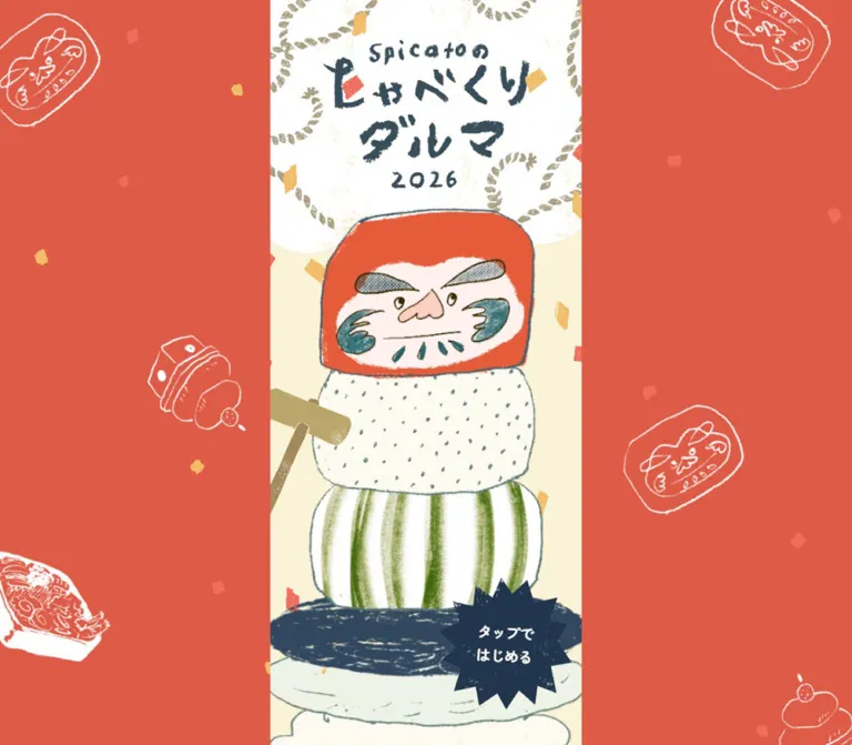
手描きのダルマと正月モチーフが彩る年賀サイト。朱赤の背景に細い縦長ステージを置き、筆文字、紙の質感、紺色の星形ボタンで親しみと遊び心を表現。
オリジナルサイトを見るspicato / Talking Daruma 2026 — Style Reference
A narrow New Year picture-book stage, framed by vermilion and brought to life through a talkative Daruma.
Website: spicato.com/daruma-otoshi-2026 Original URL: https://spicato.com/daruma-otoshi-2026/ Final URL: https://spicato.com/daruma-otoshi-2026/ Theme: a light illustrated stage with a vermilion desktop surround; no theme selector is evidenced. Inspected: September 12, 2026. Supplied retrieval timestamp: 12:24:35.189 UTC / 21:24:35.189 JST. Viewports: desktop 1440 × 1000 and mobile 390 × 844 CSS pixels. Scope: the current New Year greeting experience, with visual evidence of the opening screen and rendered DOM evidence for dialogue, discovery targets, results, menu, credits, and hints. Post-start scenes and open overlays were not visually verified.
The opening presents spicato’s New Year greeting as a handmade toy theatre. A red Daruma face sits above loosely drawn cylindrical blocks: one dotted, one vertically striped green, and another heavily scribbled in dark blue. A wooden mallet enters from the left. Brush lettering, rope-like loops, scattered confetti, and white line drawings of seasonal objects complete the composition.
Desktop space is used as decorative framing. The active-looking illustrated strip remains about 422px wide inside a 1440px viewport, leaving broad vermilion fields on both sides. On the inspected phone, that strip fills the entire 390px width. The resulting continuity is central to the design: the phone composition is preserved within a much wider desktop setting.
The primary action is a dark, irregular starburst carrying the two-line label “タップで / はじめる”. It overlaps the lower illustration instead of occupying a separate navigation or marketing region. The DOM contains a conversational greeting, a six-discovery system, and supporting overlays. Those structures establish the experience’s content, but their complete presentation and behavior remain untested.
How to Read This Reference
- Measured means supplied computed styles or element bounds. Values are rounded for readability unless precision helps explain scaling.
- Declared means a CSS custom property appears in the supplied evidence. Its presence does not prove that every similarly named element uses it.
- Calculated means arithmetic based on measured values or declared formulas. Recovered design-unit dimensions are identified as calculations.
- Estimated means a visual approximation from the original-page captures. Estimated colors were not obtained through pixel sampling.
- Recommended means guidance for a new implementation. The CSS scaffold includes explicitly identified adaptations.
- DOM-only content may be outside the viewport, covered, or inactive. A text entry or bounding rectangle is not proof that the user saw that element in the captured state.
The three desktop captures and two mobile captures show the opening composition. One desktop frame lacks the visible Start stamp; later supplied frames include it. Confetti positions also vary. These differences support a changing opening presentation, but do not establish animation timing, direction, or the exact reveal sequence.
Tokens — Colors
Default Palette
Token names in the implementation column are descriptive aliases unless a source variable is explicitly named.
| Name | Value | Evidence | Implementation token | Role |
|---|---|---|---|---|
| Warm Paper | #fbf3d7 |
Declared source --color-base |
--color-paper |
Cream field behind the central illustration |
| White | #ffffff |
Declared source --color-white; computed Start and credit text |
--color-white |
Reversed labels; visually, the upper paper area and background line drawings |
| Dialogue Black | #000000 |
Declared source --color-black; computed narrative text |
--color-text |
Conversation paragraphs and several secondary labels |
| Blue-gray Ink | #394e5b |
Computed menu credit and hint text | --color-ink |
Utility text; visually close to parts of the illustrated title and outlines |
| Celebration Orange | #e45c3a |
Computed anniversary-button and menu-instruction text | --color-accent |
Text that invites discovery or emphasizes celebration |
| Festival Vermilion | Approximately #dc5b45 |
Visual estimate | --color-festival |
Large desktop side fields |
| Stamp Navy | Approximately #20374b |
Visual estimate | --color-stamp |
Starburst Start action and the deepest illustrated blue areas |
| Muted Gold | Approximately #b6a46b |
Visual estimate | --color-gold |
Mallet and rope-like ornament |
| Moss Green | Approximately #809343 |
Visual estimate | --color-moss |
Uneven vertical stripes on a cylindrical block |
| Confetti Gold | Approximately #efbd61 |
Visual estimate | --color-confetti |
Small celebratory paper pieces |
The character’s red-orange paint, teal cheek marks, pink nose, and green stripes contain texture and tonal variation. They should remain artwork colors rather than becoming a large set of exact interface tokens.
Keep measured and illustrated colors distinct. The measured orange #e45c3a belongs to text in the supplied DOM. It does not establish the exact background color of the desktop surround. Similarly, computed blue-gray utility text does not establish the exact navy of the starburst artwork.
Theme Presets
Only the light opening treatment is evidenced. There is no verified dark mode, palette switcher, or alternate theme. White text in the credit content is a state-specific computed value; the corresponding overlay background was not supplied.
Tokens — Typography
Rounded Gothic — Dialogue and Interface
- Computed family:
'Zen Maru Gothic', sans-serifon the body and sampled interface elements. - Weights:
400on the body and many button shells;500on dialogue and secondary labels;700on the Start label and discovery captions. - Character: rounded Japanese Gothic, friendly and conversational, with much softer proportions than a severe geometric interface face.
- Body behavior: dialogue uses generous
1.9line height and approximately0.03emtracking. - Implementation alias:
--font-copy: 'Zen Maru Gothic', sans-serif.
The family declaration is verified. Font-file URLs, subset strategy, and the exact downloaded font resource are not included in the evidence.
Brush Lettering — Opening Identity
The visible title is irregular artwork lettering. Thick strokes have broken edges, variable widths, and a dry-brush texture. The small Latin brand line and the year share that handmade treatment.
The semantic H1 reads “スピッカートのしゃべくりダルマ 2026” and measures only 1 × 1px in both snapshots. Its computed 16px font size is therefore not the visible title’s display size. Preserve the illustrated title as artwork and retain a separate semantic heading. The source format of that artwork—raster image, vector, or another composition—is not reported.
Type Scale
Here, 1u means one source --px unit, not one CSS rem. At the inspected desktop width, 1u ≈ 1.05417px; on the inspected phone, 1u = 0.975px.
| Role | Calculated base size | Desktop size | Mobile size | Weight | Line height | Tracking |
|---|---|---|---|---|---|---|
| Dialogue paragraph | 16u |
16.8668px |
15.6px |
500 |
1.9 |
0.03em |
| Daruma exclamation | 16u |
16.8668px |
15.6px |
500 |
2.2 |
0.03em |
| Start label | 19u |
20.0293px |
18.525px |
700 |
1.6 |
-0.05em |
| Result thank-you heading | 15u |
15.8126px |
14.625px |
500 |
1.5 |
0.08em |
| Result discovery caption | 10u |
10.5417px |
9.75px |
700 |
1.8 |
0.03em |
| Result credit button | 12u |
12.6501px |
11.7px |
500 |
1.6 |
0.03em |
| Menu navigation text | 12u |
12.6501px |
11.7px |
500 |
2.2 |
Normal |
| Menu instruction | 10u |
10.5417px |
9.75px |
500 |
1.6 |
Normal |
| Hint button | 10u |
10.5417px |
9.75px |
500 |
1.6 |
0.03em |
| Credit provider links | 15u |
15.8126px |
14.625px |
500 |
1.4 |
0.03em |
| Special-thanks text | 15u |
15.8126px |
14.625px |
500 |
2 |
0.03em |
The anniversary button shell computes to 16px, weight 400, and normal line height at both widths. Do not automatically assign the paragraph’s computed typography to every button wrapper; nested text styling is not fully reported.
The root font size remains 16px. The Times family recorded on the HTML root is not the visible interface family and should not be adopted as a design font.
Tokens — Spacing & Shapes
Responsive Unit
The supplied desktop custom properties express:
/* Declared desktop formula, with the captured width substituted */
--scale: max(1, tan(atan2(1440px, 1px)) / 1366);
--px: calc(1px * max(1, tan(atan2(1440px, 1px)) / 1366));
--rem: calc(1rem * max(1, tan(atan2(1440px, 1px)) / 1366));
The mobile snapshot expresses:
/* Declared mobile formula, with the captured width substituted */
--scale: tan(atan2(390px, 1px)) / 400;
--px: calc(1px * tan(atan2(390px, 1px)) / 400);
--rem: calc(1rem * tan(atan2(390px, 1px)) / 400);
These simplify to a desktop scale of 1440 / 1366 ≈ 1.05417 and a mobile scale of 390 / 400 = 0.975. The stage bounds closely fit a 400-unit composition at both widths. This is a calculated relationship, not a supplied stage-width declaration.
The source declares breakpoints at 400, 576, 768, 960, 1488, and 1920px. The exact media query that switches between the two observed scaling formulas is not included. A declared --grid-columns value changes from 62 to 25, but no sampled grid layout establishes those as visible content columns.
Spacing and Geometry
| Use | Recovered or estimated size | Desktop equivalent | Mobile equivalent | Evidence |
|---|---|---|---|---|
| Small sampled button inset | 12u |
12.6501px |
11.7px |
Computed padding |
| Header control top inset | 15u |
15.8125px |
14.625px |
Measured bounds |
| Larger sampled button inset | 16u |
16.8668px |
15.6px |
Computed padding |
| Header control square | 40u |
42.1563px |
39px |
Measured bounds |
| Repeated stack-target vertical pitch | 148.5u |
About 156.54px |
144.7875px |
Calculated from adjacent bounds |
| Most dialogue-block start intervals | 165u |
About 173.94px |
160.875px |
Calculated from repeated paragraph positions |
| Start starburst size | About 170u |
About 179px |
About 166px |
Visual estimate |
| Repeated stack-target height | 180u |
189.7453px |
175.5px |
Measured bounds; base units calculated |
| Head-area target height | 220.5u |
232.4391px |
214.9875px |
Measured bounds; base units calculated |
| Head-area target width | 283.5u |
298.8562px |
276.4125px |
Measured bounds; base units calculated |
| Central stage width | About 400u |
421.6563px |
390px |
Measured stage-spanning target and matching capture edges |
| Repeated stack-target width | 427.5u |
450.6469px |
416.8125px |
Measured bounds; base units calculated |
The repeated stack targets are wider than the visible stage. On mobile they extend from approximately x = -13.41 to 403.41px. Their 175.5px height exceeds the 144.79px vertical pitch, producing overlapping rectangles. These are interaction bounds around layered artwork, not a conventional row-height or card-spacing system.
Border Radius and Edge Treatment
Sampled button elements generally have 0px border radius and transparent backgrounds. The visibly rounded blocks, scalloped white paper, and jagged Start stamp belong to the artwork or surrounding composition.
There is no evidenced general rounded-card system. Roundedness is irregular and object-specific: soft cylindrical blocks, an uneven face silhouette, rope loops, and a sharply pointed stamp. Keep rectangular hit areas and focus indicators independent from decorative artwork boundaries.
Components
Festival Surround
Role: extend the small illustrated world across a wide desktop viewport.
At 1440 × 1000, the central strip begins at approximately x = 509.17px and ends at 930.83px. Each side field is therefore about 509px wide. The vermilion surround contains sparse white line drawings of Daruma faces, stacked rice-cake ornaments, and food-box motifs, with small warm-colored confetti pieces between them.
Motifs vary in angle and are deliberately cut off by the viewport edges. Their distribution feels like wrapping paper seen through a window. Large areas of uninterrupted red keep them subordinate to the central illustration.
At 390 × 844, the central scene occupies the full width and the desktop surround is no longer visible. Keep these decorations separate from essential content so their disappearance does not remove information.
Opening Title Panel
Role: establish identity and the seasonal setting.
The upper region is white, with looping muted-gold ornament and an uneven lower edge against cream. The illustrated title is stacked: small brand line, two large Japanese title lines, then 2026. It is centrally aligned and tightly integrated with the Daruma head below.
The white-to-cream boundary reaches roughly 342px down the desktop capture and 316px down the phone capture near the sides. These are visual estimates, consistent with approximately 324u. The head overlaps this boundary, joining title and character into one composition.
Do not reproduce the logo by assigning a brush-like font to the hidden H1. The varied stroke shapes and grain are part of the artwork.
Daruma Character and Block Stack
Role: the main visual identity and a set of potential discovery targets.
The face combines a red-orange outer shape, cream facial area, heavily hatched eyebrows, small eyes, a pink nose, teal cheek marks, and short beard-like strokes. Its outline is slightly skewed and uneven. The result feels drawn and cut out by hand.
Below it, the first pale block carries small scattered blue-green marks. The next has broad, imperfect green stripes. A dark scribbled oval follows, with pale layers continuing below the captured edge. The marks differ across blocks while sharing the same dry, grainy material language.
Two sampled head-area buttons share the same bounds: approximately 298.86 × 232.44px on desktop and 276.41 × 214.99px on mobile. Their shared geometry suggests alternate or layered targets, but their separate roles were not exercised. Another larger target overlaps the upper body region. Do not infer exact visible silhouettes from these rectangular hitboxes.
Mallet
Role: introduce the Daruma-drop toy metaphor and create a diagonal interruption in the vertical stack.
A muted-gold mallet enters from the left, with its head crossing toward the dotted block and its handle continuing down-left beyond the stage edge. Its rough shading and blunt geometry match the illustrated blocks.
The captures establish its appearance. They do not establish whether the mallet follows the pointer, responds to dragging, or is independently clickable. For an adaptation, preserve the diagonal composition and document any new input behavior separately.
Start Starburst
Role: the dominant entry action.
The dark navy stamp overlaps the lower-right part of the stack. Uneven triangular points surround a compact two-line white label: “タップで / はじめる”. Grain and worn patches stop the filled shape from looking like a pristine vector badge.
The label is measured at 20.0293px desktop and 18.525px mobile, weight 700, with 1.6 line height and -0.05em tracking. The starburst’s approximately 170u diameter is a visual estimate; its full button bounds were not supplied.
The label center is approximately 75.25% across the stage at both widths. Its center also sits approximately 132u above the viewport bottom in both captures. This is a calculated fit to the two observed positions, not proof of the original positioning rule. It is useful for reproducing the relationship between the stamp and the lower viewport edge.
One desktop capture omits the visible stamp while later captures show it. Exact readiness criteria, reveal delay, hover behavior, and activation results are unverified.
Dialogue Beats
Role: carry the greeting in the character’s conversational voice.
The DOM contains short, manually broken Japanese passages: an introduction, New Year wishes, thanks, a reference to ten years since incorporation, company updates, and informal conversation. The line breaks make the text read as spoken beats rather than long editorial paragraphs.
Most sampled blocks are centered on the stage, with some illustration-related offsets. Paragraph widths vary with the text. The widest sampled passages are approximately 329.97px on desktop and 305.30px on mobile. The usual 165u interval between paragraph starts provides room for the surrounding scene, although the earliest spacing differs.
Computed text is black, medium-weight Zen Maru Gothic at 16u / 1.9, with 0.03em tracking. These values are verified in the DOM; the supplied opening screenshots do not visually expose the dialogue layout. Its actual progression mechanism—scrolling, timing, tapping, or a combination—was not established.
Anniversary Discovery Link
Role: place an interactive clue directly inside the conversation.
The actual button text is “spicatoは今年で法人化10年。” Its computed color is #e45c3a, and its background is transparent. It appears immediately after the paragraph about time passing, making the clue part of the sentence sequence.
The supplied hint text says pressing this phrase produces a celebratory atmosphere. No resulting effect was captured. Preserve the distinction between this understated inline target and the large opening Start stamp.
Discovery Targets and Hints
Role: encourage exploration of the illustrated scene.
The DOM includes a six-item discovery list and a “ヒントはこちら” control. These are content-supported interactions, not tested outcomes.
| Hint-described target | What the source text establishes | What remains unverified |
|---|---|---|
| Daruma head | An attempt to knock the character down prompts a reaction | Input gesture, animation, and response content |
| Lower blocks | An attempt to remove lower blocks has a response related to staying through the conversation | Ordering rules and any physics behavior |
| Anniversary sentence | Pressing the sentence creates a celebratory atmosphere | Exact visual or audio effect |
| Character entering from the left | Pressing it leads to something selected according to the Daruma’s mood | Selection logic and possible outcomes |
| Steam | Touching the steam triggers an appetizing-smell joke or response | Trigger geometry and presentation |
| Character arriving on a cloud | Pressing it relates to the Daruma’s interest in fashion | Specific costume or scene changes |
The repeated unlabeled button rectangles support the presence of multiple illustrated targets. Their complete accessible names, focus order, and hit-testing logic were not supplied. A six-discovery count does not establish a timed game, score multiplier, or win/lose system.
Result Summary
Role: acknowledge completion and summarize discoveries.
DOM-only content includes a thank-you heading, a found-discoveries caption, an initial full-width-digit count of “00”, six remaining discoveries, a Daruma comment label, a return link, and a credit button.
The thank-you heading uses 15u, weight 500, 1.5 line height, and 0.08em tracking. Small discovery labels use 10u; the credit action uses 12u. The unlabeled return link points to the original page URL.
The result’s surface, illustration, reveal behavior, and counter typography were not visually captured. Its sampled coordinates must not be interpreted as a result overlay visibly open over the title screen.
Header Utility and Menu
Role: provide supporting navigation and discovery information.
A header button is measured at about 42.16 × 42.16px on desktop and 39 × 39px on mobile. It sits near the viewport’s top-right corner: about 15u from the top and 12u from the right. Its icon and exact action are not established by the supplied captures.
The menu DOM contains “タイトル画面へ”, “クレジット”, discovery instructions, a found/total display, and “ヒントはこちら”. Its sampled navigation bounds lie beyond the right viewport edge: x ≈ 1493px on desktop and 439px on mobile. This supports an offscreen menu state, not a visually inspected open panel.
Navigation text uses 12u; instructions and hints use 10u. The declared menu and header layer tokens place these utilities above the opening and result layers. The panel’s material, entrance motion, and dismissal behavior remain unknown.
Credit Content
Role: identify the people and sound resources associated with the experience.
The original-page DOM independently includes the following credit text:
| Role | Original-page attribution |
|---|---|
| Director | 前川ひろみ |
| Planner, Designer, Illustrator, Writer | 竹内爽夏 |
| Developer | 金山裕紀 |
| Design support | 井上侑子 |
| Daruma voice | Identity displayed as “????” |
| Music | DOVA-SYNDROME, 魔王魂, 効果音ラボ |
| Special thanks | スピッカートメンバー |
The semantic “Credit” heading has a 1 × 1px rectangle, so its computed font size does not reveal the visible heading artwork. Provider links use white 15u medium-weight text with 1.4 line height and 0.03em tracking. Special-thanks paragraphs use the same size with 2 line height.
The credit panel was not opened in the supplied visual evidence. Its background color, borders, close-button artwork, focus behavior, and scrolling arrangement cannot be specified as observed.
Tokens — Motion & Interaction
Measured and Declared Motion
| Element or treatment | Supplied value | Evidence boundary |
|---|---|---|
| Header opacity | 0.3s cubic-bezier(.215, .61, .355, 1) |
Computed transition; trigger not exercised |
| One head-area layer’s opacity | 0.6s cubic-bezier(.215, .61, .355, 1) |
Computed transition; exact layer role unknown |
| Left-side illustrated buttons | rotate 1.6s and translate 1.6s with source --ease-spring-3 |
Computed transitions; positions and rotations after activation unverified |
| Opening confetti | Different positions across supplied frames | Visual state variation; duration and path unknown |
| Start stamp visibility | Absent in one desktop frame, present in others | Visual state variation; reveal timing unknown |
| Voice and music | Voice and music credits exist in the original DOM | Playback, mute controls, and synchronization untested |
The source’s spring curve reaches approximately 1.163 before settling to 1, giving a declared overshoot of about 16.3% for properties that use it. This supports a buoyant, settling character movement. It does not establish the distance or rotation angle of any particular animation.
Several additional easing curves are declared, including quadratic, cubic, quartic, quintic, circular, exponential, and five spring presets. Their availability is not evidence that every curve appears in the opening.
The sampled elements mostly report animation: none. That does not rule out animation in descendants, pseudo-elements, image assets, or JavaScript-driven updates.
Layer Ordering
These are declared source variables; complete element bindings were not supplied.
| Layer group | Source tokens | Values |
|---|---|---|
| Base and opening | --z-base, --z-opening |
1000, 1001 |
| Background through dialogue | --z-cloud-back, --z-fv, --z-bits, --z-shaberu |
1002–1005 |
| Character and face | --z-daruma, --z-daruma-face |
1006, 1007 |
| Discoveries and foreground effects | --z-gimmick, --z-cloud-front, --z-cracker |
1008–1010 |
| Start and result | --z-start, --z-result |
1011, 1012 |
| Menu and header | --z-menu, --z-header |
1013, 1014 |
| Credits and hints | --z-credit, --z-answer |
1015, 1016 |
For an adaptation, keep the foreground action above decorative confetti, and keep modal utilities above the scene. Decorative layers should not intercept pointer input. These are implementation recommendations, not verified pointer-event rules.
Surfaces
| Surface | Appearance | Evidence |
|---|---|---|
| Desktop surround | Flat vermilion with sparse white seasonal line drawings | Visually confirmed; exact red estimated |
| Main stage | Warm cream, visually continuous behind the stack | Visually confirmed; matching base token declared |
| Upper title region | White paper-like area with muted-gold loops and an irregular lower edge | Visually confirmed; exact edge geometry unmeasured |
| Character and blocks | Textured painted shapes with uneven outlines | Visually confirmed |
| Start action | Dark navy, jagged, worn-looking stamp with white text | Visually confirmed; navy and full bounds estimated |
| Narrative text regions | Transparent sampled element backgrounds | Computed; final scene layering unverified |
| Menu and result | Content exists; full surfaces not shown | DOM-only |
| Credits | White computed text; backing surface undetermined | DOM-only |
There is no visible card elevation or glass treatment in the opening. Depth comes from overlapping cutout-like shapes, curved illustrated forms, and dark scribbled regions. The broad dark oval is part of the drawing; it should not automatically become a reusable CSS drop shadow.
Imagery
The imagery combines dry brush, crayon-like rubbing, pencil outlines, and cut-paper composition. Imperfection is structural: the eyebrows are asymmetrical, the face outline wavers, green stripes vary in width, and filled dark areas retain visible gaps.
The central stack is the dense focal point. The surrounding motifs are much lighter: simple white outlines with minimal internal shading. Confetti adds small interruptions in warm red and gold. This contrast lets a detailed character coexist with a large decorative background without making the whole viewport equally busy.
No photography is visible in the supplied opening captures. Do not infer the absence of photography from uninspected later states.
Observed Asset References
No original image URLs, filenames, native dimensions, or sprite manifests were supplied. The following are visual asset groups, not invented source paths.
| Asset group | Observed use | Production guidance |
|---|---|---|
| Brush title and year | Opening identity | Preserve irregular lettering; pair with a semantic H1 |
| White title field and gold loops | Upper stage decoration | Retain the uneven boundary and partial ornament cropping |
| Daruma face and body parts | Central character | Keep texture and any independently animated layers |
| Patterned cylindrical blocks | Vertical toy stack | Use varied patterns within one consistent drawing style |
| Mallet | Left-side diagonal element | Preserve the offstage crop and rough material treatment |
| Starburst stamp | Start action | Keep a separate readable text layer and robust button hit area |
| Seasonal outline motifs | Desktop surround | Position independently from essential stage content |
| Confetti | Small celebratory accents | Preserve irregular shapes and avoid covering the main label |
| Cloud, steam, and secondary characters | Referenced in DOM and hints | Appearance not established by the supplied captures |
Use authorized artwork when available. For a new work, commission or create a coherent replacement set rather than mixing unrelated brush fonts, stock Daruma icons, and generic flat confetti.
Preserve fine texture with normal image rendering and sufficient source resolution. There is no evidence of deliberate pixel-art scaling; forcing image-rendering: pixelated would introduce a different visual language.
Layout & Responsive Behavior
Inspected Geometry
| Measurement | Desktop 1440 × 1000 | Mobile 390 × 844 |
|---|---|---|
| Central stage | x ≈ 509.17, width 421.66px |
x = 0, width 390px |
| Stage share of viewport width | About 29.28% |
100% |
| Visible side fields | About 509.17px each |
None |
| Head-area target | x ≈ 570.57, y ≈ 281.45 |
x ≈ 56.79, y ≈ 260.31 |
| Head-area target size | 298.86 × 232.44px |
276.41 × 214.99px |
| Start label bounds | x ≈ 786.81, y ≈ 826.87, 79.33 × 67.99px |
x ≈ 256.79, y ≈ 683.86, 73.38 × 62.88px |
| Reported document height | 1000px |
844px |
| BODY / MAIN bounding height | About 5583.91px |
About 5164.56px |
The desktop stage is only about 8.12% wider than the mobile stage despite the viewport being much wider. Many element sizes follow the same ratio. The composition therefore retains similar physical proportions while the desktop surround absorbs the additional space.
The head’s top position fits approximately 267u at both widths. Its horizontal center remains aligned with the stage. The lower stack continues beyond the viewport, particularly on mobile, rather than shrinking until every layer fits.
The Start label’s position follows a different relationship to viewport height than the top of the character. Its measured center is consistent with a bottom offset of 132u. A recreation should test this relationship explicitly instead of positioning the action at a fixed percentage of a very tall illustration.
Document Height Is Not a Reading-Mode Specification
The supplied documentHeight equals the viewport height, while BODY and MAIN have much taller bounds. In addition, many dialogue and stack-target rectangles extend far below the captured view. These measurements show that the opening and underlying content use different layout or visibility arrangements. They do not establish a freely scrollable 5584px desktop page.
The exact overflow rules, internal scroll containers, scene advancement, and scroll locking were not supplied. Do not turn the DOM text dump into a claimed screenshot of all later content.
Unverified Responsive Cases
Tablet widths, landscape phones, browser zoom, safe-area devices, and changes in mobile browser chrome were not separately captured. The source’s breakpoint variables do not establish the behavior at those sizes.
For a new implementation, use the observed 400-unit composition as a reference, then test short screens and enlarged text. Decorative clipping can remain intentional while controls, dialogue, and modal actions stay reachable.
Do’s and Don’ts
Do
- Preserve the narrow central stage and broad vermilion desktop framing.
- Use the measured cream base
#fbf3d7and keep estimated artwork colors explicitly separate. - Let the supplied hand lettering carry the opening identity.
- Use Zen Maru Gothic for live dialogue and interface labels.
- Keep the Daruma, patterned blocks, and left-entering mallet visually connected.
- Retain dry texture, uneven outlines, asymmetric details, and partial edge crops.
- Place the Start action as an overlapping navy starburst with a short two-line label.
- Keep discovery clues embedded in the conversation and illustrated objects.
- Preserve intentional text line breaks where they support the spoken rhythm.
- Treat menu, result, and credit styling as incompletely observed until those states are captured.
Don’t
- Don’t stretch the central illustration across the full desktop width.
- Don’t replace the experience with a conventional hero, feature-card grid, and conversion footer.
- Don’t turn every illustrated object into a rounded UI card.
- Don’t clean away the drawing’s grain or replace it with glossy gradients and soft shadows.
- Don’t infer the visible brush title’s font from the hidden H1.
- Don’t apply the measured orange text color to every red area as though all reds were identical.
- Don’t treat large transparent button bounds as the exact shape of the artwork.
- Don’t claim dragging, physics, sound autoplay, or a specific game progression without interaction evidence.
- Don’t assume DOM-resident results or credits were visible during the opening capture.
- Don’t copy the scaling formula while also changing the root font size; that would scale dimensions twice.
Recommended Implementation Additions
These are improvements for a new implementation, not verified features of the original:
- Make the Start action a native button with a clear accessible name and visible keyboard focus.
- Keep the focus outline outside the clipped starburst artwork; clipping the whole button can hide it.
- Provide accessible names for illustrated discovery targets. A blank text entry in the evidence does not establish whether the original already has such names.
- Keep inactive scenes and closed overlays out of the tab order with appropriate hidden or inert state management.
- Give menu, credits, and hints explicit close actions, focus restoration, and independently reachable content on short screens.
- Increase the practical hit area of small controls to at least
44 × 44px; the inspected mobile header target is39 × 39px. - Consider minimum readable sizes for captions that scale below
10px. Preserve the source proportions only where readability remains acceptable. - Offer reduced-motion handling for confetti and spring movement, while keeping the primary action available.
- If using voice or music, initiate audio through an explicit user action and provide an accessible sound control.
- Supply a readable dialogue transcript and a stable text equivalent for discovery progress.
- Use safe-area-aware positioning for the Start stamp and overlay controls, then verify it against the illustrated composition.
Agent Prompt Guide
Quick Color Reference
- Central paper: measured source token
#fbf3d7. - Live dialogue: measured
#000000. - Utility ink: measured
#394e5b. - Inline celebration clue: measured
#e45c3a. - Reversed labels: measured
#ffffff. - Desktop surround: visual approximation
#dc5b45. - Start stamp: visual approximation
#20374b. - Artwork accents: muted gold, moss green, teal, and soft pink with visible tonal variation.
Overall Prompt
“Create a New Year greeting experience organized around a 400-unit portrait illustration. At a 1440px desktop width, center a roughly 422px cream stage inside broad vermilion side fields; at a 390px phone width, let the stage fill the screen. Use a handmade Daruma character stacked on dotted, green-striped, and dark scribbled cylindrical blocks, with a muted-gold mallet entering from the left. Place irregular brush lettering and the year inside a white upper panel decorated with rope-like gold loops. Use sparse white seasonal line drawings in the desktop surround. Overlay a worn navy starburst near the lower-right of the stage with a two-line white Start label. Use Zen Maru Gothic for live text, generous dialogue line spacing, and small inline discovery clues. Preserve grain, asymmetry, and intentional cropping. Treat later scene behavior and overlays as separately designed states.”
Example Component Prompts
- Opening title: “A white paper-like upper panel with an uneven lower edge, muted-gold looping ornament, and stacked dry-brush title artwork. Keep the year compact below the title and let the Daruma head overlap the panel boundary. Include a separate semantic heading.”
- Character stack: “An expressive red Daruma with hatched eyebrows, teal cheek strokes, a pink nose, and a cream face. Stack it on softly drawn cylinders with dotted, moss-striped, and scribbled navy treatments. Preserve irregular outlines and paper-like grain.”
- Start action: “A roughly 170-unit navy starburst overlapping the lower-right illustration. Use white Zen Maru Gothic at 19 units, weight 700, line height 1.6, and slightly tight tracking. Keep the actual button rectangular and keyboard operable while the decorative fill has uneven points.”
- Desktop surround: “Broad vermilion fields on both sides of a narrow portrait stage. Scatter sparse white line drawings of seasonal ornaments and food boxes, with varied rotation and partial viewport crops. Leave generous uninterrupted red space.”
- Dialogue: “Short centered Japanese dialogue beats in medium-weight Zen Maru Gothic, 16 units with 1.9 line height and 0.03em tracking. Use deliberate line breaks and one orange inline clue. Keep the progression mechanism configurable because it was not verified in the reference.”
- Supporting overlays: “Design accessible menu, discovery hints, and credits using the established cream, blue-gray, orange, and white palette. Reuse the rounded Gothic typography. Treat panel shape, backdrop, and entrance behavior as new design decisions, not observed original details.”
Quick Start
CSS Custom Properties
This scaffold reproduces the observed stage proportions and live-text scale without changing the root font size. It uses a recommended 768px layout switch because the original switching query was not supplied. Both inspected widths match the observed scaling relationship.
The surround and stamp colors, title-panel curve, starburst polygon, and a few artwork positions are approximations. The scene requires authorized artwork inserted into the marked slots. Dialogue progression, discovery logic, audio, and overlays require a separate state controller.
:root {
  /* Measured or declared colors */
  --color-paper: #fbf3d7;
  --color-white: #ffffff;
  --color-text: #000000;
  --color-ink: #394e5b;
  --color-accent: #e45c3a;

  /* Visual approximations, not sampled source values */
  --color-festival: #dc5b45;
  --color-stamp: #20374b;
  --color-gold: #b6a46b;
  --color-confetti: #efbd61;

  /* Load the font separately; no font URL was supplied. */
  --font-copy: 'Zen Maru Gothic', sans-serif;
  --weight-regular: 400;
  --weight-medium: 500;
  --weight-bold: 700;

  /* Mobile scaling observed at 390px */
  --u: calc(100vw / 400);
  --stage-width: min(100vw, calc(400 * var(--u)));

  --text-caption: calc(10 * var(--u));
  --text-utility: calc(12 * var(--u));
  --text-secondary: calc(15 * var(--u));
  --text-dialogue: calc(16 * var(--u));
  --text-start: calc(19 * var(--u));
  --leading-dialogue: 1.9;
  --tracking-dialogue: 0.03em;

  --space-12: calc(12 * var(--u));
  --space-15: calc(15 * var(--u));
  --space-16: calc(16 * var(--u));
  --dialogue-pitch: calc(165 * var(--u));

  /* Recovered dimensions and visual approximations */
  --title-panel-height: calc(324 * var(--u));
  --character-top: calc(267 * var(--u));
  --start-size: calc(170 * var(--u));
  --start-right: calc(14 * var(--u));
  --start-bottom: calc(47 * var(--u));

  /* Measured transition values */
  --ease-out-cubic: cubic-bezier(.215, .61, .355, 1);
  --duration-header: 300ms;
  --duration-character-fade: 600ms;
  --duration-gimmick: 1600ms;
  --ease-spring-character: linear(
    0, .009, .035 2.1%, .141 4.4%, .723 12.9%,
    .938 16.7%, 1.017, 1.077, 1.121, 1.149 24.3%,
    1.159, 1.163, 1.161, 1.154 29.9%, 1.129 32.8%,
    1.051 39.6%, 1.017 43.1%, .991, .977 51%,
    .974 53.8%, .975 57.1%, .997 69.8%, 1.003 76.9%, 1
  );

  --safe-bottom: env(safe-area-inset-bottom, 0px);
}

/* Recommended switch; the original query is unverified. */
@media (min-width: 768px) {
  :root {
    --u: max(1px, calc(100vw / 1366));
  }
}

* {
  box-sizing: border-box;
}

body {
  margin: 0;
  color: var(--color-text);
  background: var(--color-festival);
  font-family: var(--font-copy);
  font-weight: var(--weight-regular);
}

button,
a {
  -webkit-tap-highlight-color: transparent;
}

button {
  font: inherit;
}

.daruma-shell {
  position: relative;
  min-height: 100vh;
  min-height: 100svh;
  overflow-x: clip;
  isolation: isolate;
}

.festival-backdrop {
  position: fixed;
  inset: 0;
  z-index: 0;
  overflow: hidden;
  background: var(--color-festival);
  pointer-events: none;
}

/* Supply position, size, and angle per authorized motif. */
.festival-motif {
  position: absolute;
  left: var(--motif-x, 0%);
  top: var(--motif-y, 0%);
  width: var(--motif-width, 140px);
  height: auto;
  transform: rotate(var(--motif-angle, 0deg));
}

.daruma-stage {
  position: relative;
  z-index: 1;
  width: var(--stage-width);
  min-height: 100vh;
  min-height: 100svh;
  margin-inline: auto;
  background: var(--color-paper);
}

.opening-scene {
  position: relative;
  height: 100vh;
  height: 100svh;
  overflow: hidden;
  isolation: isolate;
}

.title-panel {
  position: absolute;
  inset: 0 0 auto;
  z-index: 1;
  height: var(--title-panel-height);
  overflow: hidden;
  background: var(--color-white);
  /* Approximate fallback; artwork should supply the real edge. */
  border-radius: 0 0 15% 12% / 0 0 8% 7%;
}

.title-panel > img {
  display: block;
  width: 100%;
  height: auto;
}

/*
 * Insert a transparent 400-unit-wide composition whose top
 * begins at the Daruma head. Include the stack and mallet.
 */
.scene-art {
  position: absolute;
  top: var(--character-top);
  left: 0;
  z-index: 2;
  width: 100%;
  pointer-events: none;
}

.scene-art > img {
  display: block;
  width: 100%;
  height: auto;
  image-rendering: auto;
}

.start-action {
  position: absolute;
  right: var(--start-right);
  bottom: calc(var(--start-bottom) + var(--safe-bottom));
  z-index: 4;
  display: grid;
  place-items: center;
  width: var(--start-size);
  height: var(--start-size);
  padding: 0;
  border: 0;
  color: var(--color-white);
  background: transparent;
  cursor: pointer;
}

.start-action::before {
  content: '';
  position: absolute;
  inset: 0;
  background: var(--color-stamp);
  /* Approximate shape; use authorized stamp artwork for grain. */
  clip-path: polygon(
    50% 0%, 58% 13%, 72% 5%, 73% 20%,
    89% 16%, 85% 33%, 100% 39%, 88% 50%,
    98% 62%, 82% 67%, 87% 83%, 70% 81%,
    67% 97%, 54% 88%, 45% 100%, 37% 86%,
    22% 93%, 23% 77%, 7% 79%, 13% 63%,
    0% 56%, 13% 44%, 3% 32%, 19% 28%,
    15% 12%, 32% 17%, 36% 2%, 45% 15%
  );
}

.start-action__label {
  position: relative;
  z-index: 1;
  font-size: var(--text-start);
  font-weight: var(--weight-bold);
  line-height: 1.6;
  letter-spacing: -0.05em;
  text-align: center;
}

/* Optional static confetti fallback; dimensions are recommended. */
.confetti-piece {
  position: absolute;
  left: var(--confetti-x, 10%);
  top: var(--confetti-y, 20%);
  z-index: 3;
  width: calc(12 * var(--u));
  height: calc(20 * var(--u));
  background: var(--confetti-color, var(--color-confetti));
  clip-path: polygon(8% 0, 100% 8%, 90% 100%, 0 90%);
  transform: rotate(var(--confetti-angle, -18deg));
  pointer-events: none;
}

/*
 * Recommended readable dialogue fallback.
 * This does not reproduce an unverified progression mechanism.
 */
.story-flow {
  padding: calc(40 * var(--u));
  background: var(--color-paper);
}

.story-beat {
  width: fit-content;
  max-width: 100%;
  min-height: var(--dialogue-pitch);
  margin-inline: auto;
  color: var(--color-text);
  font-size: var(--text-dialogue);
  font-weight: var(--weight-medium);
  line-height: var(--leading-dialogue);
  letter-spacing: var(--tracking-dialogue);
  text-align: center;
}

.story-beat p {
  margin: 0;
}

.inline-discovery {
  padding: 0;
  border: 0;
  color: var(--color-accent);
  background: transparent;
  font: inherit;
  letter-spacing: inherit;
  cursor: pointer;
}

.gimmick-target {
  transition:
    rotate var(--duration-gimmick) var(--ease-spring-character),
    translate var(--duration-gimmick) var(--ease-spring-character);
}

.character-fade {
  transition:
    opacity var(--duration-character-fade) var(--ease-out-cubic);
}

/* Recommended accessibility additions */
.daruma-shell :focus-visible {
  outline: 3px solid var(--color-ink);
  outline-offset: 4px;
}

.sr-only {
  position: absolute;
  width: 1px;
  height: 1px;
  padding: 0;
  margin: -1px;
  overflow: hidden;
  clip-path: inset(50%);
  white-space: nowrap;
  border: 0;
}

[hidden] {
  display: none !important;
}

@media (prefers-reduced-motion: reduce) {
  .gimmick-target,
  .character-fade {
    transition: none;
  }

  .confetti-piece {
    animation: none;
  }
}
Suggested Markup
The artwork slots below are intentionally empty because no source asset URLs were supplied. Insert authorized images, then connect the Start button to the application’s state controller. This is an integration scaffold rather than a complete recreation.
<main class='daruma-shell'>
  <div class='festival-backdrop' aria-hidden='true'>
    <!-- Insert independently positioned seasonal motif images. -->
  </div>

  <section class='daruma-stage' aria-labelledby='daruma-title'>
    <h1 id='daruma-title' class='sr-only'>
      スピッカートのしゃべくりダルマ 2026
    </h1>

    <div class='opening-scene'>
      <div class='title-panel' aria-hidden='true'>
        <!-- Insert title and rope-ornament artwork. -->
      </div>

      <div class='scene-art' aria-hidden='true'>
        <!-- Insert character, stack, and mallet artwork. -->
      </div>

      <button class='start-action' type='button'>
        <span class='start-action__label'>
          タップで<br>はじめる
        </span>
      </button>
    </div>

    <div class='story-flow' hidden>
      <!-- Insert accessible dialogue and discovery controls. -->
    </div>
  </section>
</main>
Tailwind v4 Token Mapping
Optional aliases for a project already using Tailwind v4. They do not establish the original site’s framework. Define --u using the CSS above first.
@theme inline {
  --color-paper: #fbf3d7;
  --color-ink: #394e5b;
  --color-accent: #e45c3a;

  /* Visual approximations */
  --color-festival: #dc5b45;
  --color-stamp: #20374b;

  --font-rounded: 'Zen Maru Gothic', sans-serif;

  --text-caption: calc(10 * var(--u));
  --text-utility: calc(12 * var(--u));
  --text-dialogue: calc(16 * var(--u));
  --text-start: calc(19 * var(--u));

  --spacing-stage: calc(400 * var(--u));
  --spacing-dialogue-beat: calc(165 * var(--u));
  --spacing-start-stamp: calc(170 * var(--u));
}
Sources & Evidence
- Original and final website: spicato’s 2026 Daruma experience. The supplied record reports HTTP
200and the same original and final URL. - Capture record: September 12, 2026,
12:24:35.189 UTC/21:24:35.189 JST. Individual screenshots do not have separate supplied timestamps. - Visual evidence: three original-page desktop captures at
1440 × 1000and two original-page mobile captures at390 × 844. These establish the opening composition and visible differences between frames. - Rendered evidence: page title, Japanese dialogue and utility text, link destinations, element rectangles, computed typography and transitions, and declared CSS custom properties at both viewports.
- Readiness limitations: the supplied inspection waited for document load, image decoding, and sampled layout stability within bounded time limits. Perpetual animations were temporarily paused during readiness checks and resumed. These checks do not establish semantic completeness or a complete motion sequence.
- Interaction limitations: no supplied action log verifies Start activation, discovery outcomes, sound playback, dialogue advancement, or open menu, result, credit, and hint states. Their content is documented from the DOM without inventing unseen surface designs.
- Environment limitations: shared workers and service workers were disabled in the supplied inspection. Font files, image URLs, complete stylesheets, original selectors, and exact responsive switching queries were not provided. No additional browsing, command execution, or file access was used for this reference.
This document describes the current page evidenced by those captures. Calculated proportions, visual estimates, and recommended implementation choices are labeled separately from supplied measurements.
# spicato / Talking Daruma 2026 — Style Reference

> A narrow New Year picture-book stage, framed by vermilion and brought to life through a talkative Daruma.

**Website:** [spicato.com/daruma-otoshi-2026](https://spicato.com/daruma-otoshi-2026/)
**Original URL:** https://spicato.com/daruma-otoshi-2026/
**Final URL:** https://spicato.com/daruma-otoshi-2026/
**Theme:** a light illustrated stage with a vermilion desktop surround; no theme selector is evidenced.
**Inspected:** September 12, 2026. Supplied retrieval timestamp: 12:24:35.189 UTC / 21:24:35.189 JST.
**Viewports:** desktop 1440 × 1000 and mobile 390 × 844 CSS pixels.
**Scope:** the current New Year greeting experience, with visual evidence of the opening screen and rendered DOM evidence for dialogue, discovery targets, results, menu, credits, and hints. Post-start scenes and open overlays were not visually verified.

The opening presents spicato’s New Year greeting as a handmade toy theatre. A red Daruma face sits above loosely drawn cylindrical blocks: one dotted, one vertically striped green, and another heavily scribbled in dark blue. A wooden mallet enters from the left. Brush lettering, rope-like loops, scattered confetti, and white line drawings of seasonal objects complete the composition.

Desktop space is used as decorative framing. The active-looking illustrated strip remains about 422px wide inside a 1440px viewport, leaving broad vermilion fields on both sides. On the inspected phone, that strip fills the entire 390px width. The resulting continuity is central to the design: the phone composition is preserved within a much wider desktop setting.

The primary action is a dark, irregular starburst carrying the two-line label “タップで / はじめる”. It overlaps the lower illustration instead of occupying a separate navigation or marketing region. The DOM contains a conversational greeting, a six-discovery system, and supporting overlays. Those structures establish the experience’s content, but their complete presentation and behavior remain untested.

## How to Read This Reference

- **Measured** means supplied computed styles or element bounds. Values are rounded for readability unless precision helps explain scaling.
- **Declared** means a CSS custom property appears in the supplied evidence. Its presence does not prove that every similarly named element uses it.
- **Calculated** means arithmetic based on measured values or declared formulas. Recovered design-unit dimensions are identified as calculations.
- **Estimated** means a visual approximation from the original-page captures. Estimated colors were not obtained through pixel sampling.
- **Recommended** means guidance for a new implementation. The CSS scaffold includes explicitly identified adaptations.
- **DOM-only** content may be outside the viewport, covered, or inactive. A text entry or bounding rectangle is not proof that the user saw that element in the captured state.

The three desktop captures and two mobile captures show the opening composition. One desktop frame lacks the visible Start stamp; later supplied frames include it. Confetti positions also vary. These differences support a changing opening presentation, but do not establish animation timing, direction, or the exact reveal sequence.

## Tokens — Colors

### Default Palette

Token names in the implementation column are descriptive aliases unless a source variable is explicitly named.

| Name | Value | Evidence | Implementation token | Role |
| --- | --- | --- | --- | --- |
| Warm Paper | `#fbf3d7` | Declared source `--color-base` | `--color-paper` | Cream field behind the central illustration |
| White | `#ffffff` | Declared source `--color-white`; computed Start and credit text | `--color-white` | Reversed labels; visually, the upper paper area and background line drawings |
| Dialogue Black | `#000000` | Declared source `--color-black`; computed narrative text | `--color-text` | Conversation paragraphs and several secondary labels |
| Blue-gray Ink | `#394e5b` | Computed menu credit and hint text | `--color-ink` | Utility text; visually close to parts of the illustrated title and outlines |
| Celebration Orange | `#e45c3a` | Computed anniversary-button and menu-instruction text | `--color-accent` | Text that invites discovery or emphasizes celebration |
| Festival Vermilion | Approximately `#dc5b45` | Visual estimate | `--color-festival` | Large desktop side fields |
| Stamp Navy | Approximately `#20374b` | Visual estimate | `--color-stamp` | Starburst Start action and the deepest illustrated blue areas |
| Muted Gold | Approximately `#b6a46b` | Visual estimate | `--color-gold` | Mallet and rope-like ornament |
| Moss Green | Approximately `#809343` | Visual estimate | `--color-moss` | Uneven vertical stripes on a cylindrical block |
| Confetti Gold | Approximately `#efbd61` | Visual estimate | `--color-confetti` | Small celebratory paper pieces |

The character’s red-orange paint, teal cheek marks, pink nose, and green stripes contain texture and tonal variation. They should remain artwork colors rather than becoming a large set of exact interface tokens.

**Keep measured and illustrated colors distinct.** The measured orange `#e45c3a` belongs to text in the supplied DOM. It does not establish the exact background color of the desktop surround. Similarly, computed blue-gray utility text does not establish the exact navy of the starburst artwork.

### Theme Presets

Only the light opening treatment is evidenced. There is no verified dark mode, palette switcher, or alternate theme. White text in the credit content is a state-specific computed value; the corresponding overlay background was not supplied.

## Tokens — Typography

### Rounded Gothic — Dialogue and Interface

- **Computed family:** `'Zen Maru Gothic', sans-serif` on the body and sampled interface elements.
- **Weights:** `400` on the body and many button shells; `500` on dialogue and secondary labels; `700` on the Start label and discovery captions.
- **Character:** rounded Japanese Gothic, friendly and conversational, with much softer proportions than a severe geometric interface face.
- **Body behavior:** dialogue uses generous `1.9` line height and approximately `0.03em` tracking.
- **Implementation alias:** `--font-copy: 'Zen Maru Gothic', sans-serif`.

The family declaration is verified. Font-file URLs, subset strategy, and the exact downloaded font resource are not included in the evidence.

### Brush Lettering — Opening Identity

The visible title is irregular artwork lettering. Thick strokes have broken edges, variable widths, and a dry-brush texture. The small Latin brand line and the year share that handmade treatment.

The semantic H1 reads “スピッカートのしゃべくりダルマ 2026” and measures only `1 × 1px` in both snapshots. Its computed `16px` font size is therefore not the visible title’s display size. Preserve the illustrated title as artwork and retain a separate semantic heading. The source format of that artwork—raster image, vector, or another composition—is not reported.

### Type Scale

Here, **1u means one source `--px` unit**, not one CSS `rem`. At the inspected desktop width, `1u ≈ 1.05417px`; on the inspected phone, `1u = 0.975px`.

| Role | Calculated base size | Desktop size | Mobile size | Weight | Line height | Tracking |
| --- | --- | --- | --- | --- | --- | --- |
| Dialogue paragraph | `16u` | `16.8668px` | `15.6px` | `500` | `1.9` | `0.03em` |
| Daruma exclamation | `16u` | `16.8668px` | `15.6px` | `500` | `2.2` | `0.03em` |
| Start label | `19u` | `20.0293px` | `18.525px` | `700` | `1.6` | `-0.05em` |
| Result thank-you heading | `15u` | `15.8126px` | `14.625px` | `500` | `1.5` | `0.08em` |
| Result discovery caption | `10u` | `10.5417px` | `9.75px` | `700` | `1.8` | `0.03em` |
| Result credit button | `12u` | `12.6501px` | `11.7px` | `500` | `1.6` | `0.03em` |
| Menu navigation text | `12u` | `12.6501px` | `11.7px` | `500` | `2.2` | Normal |
| Menu instruction | `10u` | `10.5417px` | `9.75px` | `500` | `1.6` | Normal |
| Hint button | `10u` | `10.5417px` | `9.75px` | `500` | `1.6` | `0.03em` |
| Credit provider links | `15u` | `15.8126px` | `14.625px` | `500` | `1.4` | `0.03em` |
| Special-thanks text | `15u` | `15.8126px` | `14.625px` | `500` | `2` | `0.03em` |

The anniversary button shell computes to `16px`, weight `400`, and normal line height at both widths. Do not automatically assign the paragraph’s computed typography to every button wrapper; nested text styling is not fully reported.

The root font size remains `16px`. The `Times` family recorded on the HTML root is not the visible interface family and should not be adopted as a design font.

## Tokens — Spacing & Shapes

### Responsive Unit

The supplied desktop custom properties express:

```css
/* Declared desktop formula, with the captured width substituted */
--scale: max(1, tan(atan2(1440px, 1px)) / 1366);
--px: calc(1px * max(1, tan(atan2(1440px, 1px)) / 1366));
--rem: calc(1rem * max(1, tan(atan2(1440px, 1px)) / 1366));
```

The mobile snapshot expresses:

```css
/* Declared mobile formula, with the captured width substituted */
--scale: tan(atan2(390px, 1px)) / 400;
--px: calc(1px * tan(atan2(390px, 1px)) / 400);
--rem: calc(1rem * tan(atan2(390px, 1px)) / 400);
```

These simplify to a desktop scale of `1440 / 1366 ≈ 1.05417` and a mobile scale of `390 / 400 = 0.975`. The stage bounds closely fit a **400-unit composition** at both widths. This is a calculated relationship, not a supplied stage-width declaration.

The source declares breakpoints at `400`, `576`, `768`, `960`, `1488`, and `1920px`. The exact media query that switches between the two observed scaling formulas is not included. A declared `--grid-columns` value changes from `62` to `25`, but no sampled grid layout establishes those as visible content columns.

### Spacing and Geometry

| Use | Recovered or estimated size | Desktop equivalent | Mobile equivalent | Evidence |
| --- | --- | --- | --- | --- |
| Small sampled button inset | `12u` | `12.6501px` | `11.7px` | Computed padding |
| Header control top inset | `15u` | `15.8125px` | `14.625px` | Measured bounds |
| Larger sampled button inset | `16u` | `16.8668px` | `15.6px` | Computed padding |
| Header control square | `40u` | `42.1563px` | `39px` | Measured bounds |
| Repeated stack-target vertical pitch | `148.5u` | About `156.54px` | `144.7875px` | Calculated from adjacent bounds |
| Most dialogue-block start intervals | `165u` | About `173.94px` | `160.875px` | Calculated from repeated paragraph positions |
| Start starburst size | About `170u` | About `179px` | About `166px` | Visual estimate |
| Repeated stack-target height | `180u` | `189.7453px` | `175.5px` | Measured bounds; base units calculated |
| Head-area target height | `220.5u` | `232.4391px` | `214.9875px` | Measured bounds; base units calculated |
| Head-area target width | `283.5u` | `298.8562px` | `276.4125px` | Measured bounds; base units calculated |
| Central stage width | About `400u` | `421.6563px` | `390px` | Measured stage-spanning target and matching capture edges |
| Repeated stack-target width | `427.5u` | `450.6469px` | `416.8125px` | Measured bounds; base units calculated |

The repeated stack targets are wider than the visible stage. On mobile they extend from approximately `x = -13.41` to `403.41px`. Their `175.5px` height exceeds the `144.79px` vertical pitch, producing overlapping rectangles. These are interaction bounds around layered artwork, not a conventional row-height or card-spacing system.

### Border Radius and Edge Treatment

Sampled button elements generally have `0px` border radius and transparent backgrounds. The visibly rounded blocks, scalloped white paper, and jagged Start stamp belong to the artwork or surrounding composition.

There is no evidenced general rounded-card system. Roundedness is irregular and object-specific: soft cylindrical blocks, an uneven face silhouette, rope loops, and a sharply pointed stamp. Keep rectangular hit areas and focus indicators independent from decorative artwork boundaries.

## Components

### Festival Surround

**Role:** extend the small illustrated world across a wide desktop viewport.

At 1440 × 1000, the central strip begins at approximately `x = 509.17px` and ends at `930.83px`. Each side field is therefore about `509px` wide. The vermilion surround contains sparse white line drawings of Daruma faces, stacked rice-cake ornaments, and food-box motifs, with small warm-colored confetti pieces between them.

Motifs vary in angle and are deliberately cut off by the viewport edges. Their distribution feels like wrapping paper seen through a window. Large areas of uninterrupted red keep them subordinate to the central illustration.

At 390 × 844, the central scene occupies the full width and the desktop surround is no longer visible. Keep these decorations separate from essential content so their disappearance does not remove information.

### Opening Title Panel

**Role:** establish identity and the seasonal setting.

The upper region is white, with looping muted-gold ornament and an uneven lower edge against cream. The illustrated title is stacked: small brand line, two large Japanese title lines, then `2026`. It is centrally aligned and tightly integrated with the Daruma head below.

The white-to-cream boundary reaches roughly `342px` down the desktop capture and `316px` down the phone capture near the sides. These are visual estimates, consistent with approximately `324u`. The head overlaps this boundary, joining title and character into one composition.

Do not reproduce the logo by assigning a brush-like font to the hidden H1. The varied stroke shapes and grain are part of the artwork.

### Daruma Character and Block Stack

**Role:** the main visual identity and a set of potential discovery targets.

The face combines a red-orange outer shape, cream facial area, heavily hatched eyebrows, small eyes, a pink nose, teal cheek marks, and short beard-like strokes. Its outline is slightly skewed and uneven. The result feels drawn and cut out by hand.

Below it, the first pale block carries small scattered blue-green marks. The next has broad, imperfect green stripes. A dark scribbled oval follows, with pale layers continuing below the captured edge. The marks differ across blocks while sharing the same dry, grainy material language.

Two sampled head-area buttons share the same bounds: approximately `298.86 × 232.44px` on desktop and `276.41 × 214.99px` on mobile. Their shared geometry suggests alternate or layered targets, but their separate roles were not exercised. Another larger target overlaps the upper body region. Do not infer exact visible silhouettes from these rectangular hitboxes.

### Mallet

**Role:** introduce the Daruma-drop toy metaphor and create a diagonal interruption in the vertical stack.

A muted-gold mallet enters from the left, with its head crossing toward the dotted block and its handle continuing down-left beyond the stage edge. Its rough shading and blunt geometry match the illustrated blocks.

The captures establish its appearance. They do not establish whether the mallet follows the pointer, responds to dragging, or is independently clickable. For an adaptation, preserve the diagonal composition and document any new input behavior separately.

### Start Starburst

**Role:** the dominant entry action.

The dark navy stamp overlaps the lower-right part of the stack. Uneven triangular points surround a compact two-line white label: “タップで / はじめる”. Grain and worn patches stop the filled shape from looking like a pristine vector badge.

The label is measured at `20.0293px` desktop and `18.525px` mobile, weight `700`, with `1.6` line height and `-0.05em` tracking. The starburst’s approximately `170u` diameter is a visual estimate; its full button bounds were not supplied.

The label center is approximately `75.25%` across the stage at both widths. Its center also sits approximately `132u` above the viewport bottom in both captures. This is a calculated fit to the two observed positions, not proof of the original positioning rule. It is useful for reproducing the relationship between the stamp and the lower viewport edge.

One desktop capture omits the visible stamp while later captures show it. Exact readiness criteria, reveal delay, hover behavior, and activation results are unverified.

### Dialogue Beats

**Role:** carry the greeting in the character’s conversational voice.

The DOM contains short, manually broken Japanese passages: an introduction, New Year wishes, thanks, a reference to ten years since incorporation, company updates, and informal conversation. The line breaks make the text read as spoken beats rather than long editorial paragraphs.

Most sampled blocks are centered on the stage, with some illustration-related offsets. Paragraph widths vary with the text. The widest sampled passages are approximately `329.97px` on desktop and `305.30px` on mobile. The usual `165u` interval between paragraph starts provides room for the surrounding scene, although the earliest spacing differs.

Computed text is black, medium-weight Zen Maru Gothic at `16u / 1.9`, with `0.03em` tracking. These values are verified in the DOM; the supplied opening screenshots do not visually expose the dialogue layout. Its actual progression mechanism—scrolling, timing, tapping, or a combination—was not established.

### Anniversary Discovery Link

**Role:** place an interactive clue directly inside the conversation.

The actual button text is “spicatoは今年で法人化10年。” Its computed color is `#e45c3a`, and its background is transparent. It appears immediately after the paragraph about time passing, making the clue part of the sentence sequence.

The supplied hint text says pressing this phrase produces a celebratory atmosphere. No resulting effect was captured. Preserve the distinction between this understated inline target and the large opening Start stamp.

### Discovery Targets and Hints

**Role:** encourage exploration of the illustrated scene.

The DOM includes a six-item discovery list and a “ヒントはこちら” control. These are content-supported interactions, not tested outcomes.

| Hint-described target | What the source text establishes | What remains unverified |
| --- | --- | --- |
| Daruma head | An attempt to knock the character down prompts a reaction | Input gesture, animation, and response content |
| Lower blocks | An attempt to remove lower blocks has a response related to staying through the conversation | Ordering rules and any physics behavior |
| Anniversary sentence | Pressing the sentence creates a celebratory atmosphere | Exact visual or audio effect |
| Character entering from the left | Pressing it leads to something selected according to the Daruma’s mood | Selection logic and possible outcomes |
| Steam | Touching the steam triggers an appetizing-smell joke or response | Trigger geometry and presentation |
| Character arriving on a cloud | Pressing it relates to the Daruma’s interest in fashion | Specific costume or scene changes |

The repeated unlabeled button rectangles support the presence of multiple illustrated targets. Their complete accessible names, focus order, and hit-testing logic were not supplied. A six-discovery count does not establish a timed game, score multiplier, or win/lose system.

### Result Summary

**Role:** acknowledge completion and summarize discoveries.

DOM-only content includes a thank-you heading, a found-discoveries caption, an initial full-width-digit count of “00”, six remaining discoveries, a Daruma comment label, a return link, and a credit button.

The thank-you heading uses `15u`, weight `500`, `1.5` line height, and `0.08em` tracking. Small discovery labels use `10u`; the credit action uses `12u`. The unlabeled return link points to the original page URL.

The result’s surface, illustration, reveal behavior, and counter typography were not visually captured. Its sampled coordinates must not be interpreted as a result overlay visibly open over the title screen.

### Header Utility and Menu

**Role:** provide supporting navigation and discovery information.

A header button is measured at about `42.16 × 42.16px` on desktop and `39 × 39px` on mobile. It sits near the viewport’s top-right corner: about `15u` from the top and `12u` from the right. Its icon and exact action are not established by the supplied captures.

The menu DOM contains “タイトル画面へ”, “クレジット”, discovery instructions, a found/total display, and “ヒントはこちら”. Its sampled navigation bounds lie beyond the right viewport edge: `x ≈ 1493px` on desktop and `439px` on mobile. This supports an offscreen menu state, not a visually inspected open panel.

Navigation text uses `12u`; instructions and hints use `10u`. The declared menu and header layer tokens place these utilities above the opening and result layers. The panel’s material, entrance motion, and dismissal behavior remain unknown.

### Credit Content

**Role:** identify the people and sound resources associated with the experience.

The original-page DOM independently includes the following credit text:

| Role | Original-page attribution |
| --- | --- |
| Director | 前川ひろみ |
| Planner, Designer, Illustrator, Writer | 竹内爽夏 |
| Developer | 金山裕紀 |
| Design support | 井上侑子 |
| Daruma voice | Identity displayed as “????” |
| Music | DOVA-SYNDROME, 魔王魂, 効果音ラボ |
| Special thanks | スピッカートメンバー |

The semantic “Credit” heading has a `1 × 1px` rectangle, so its computed font size does not reveal the visible heading artwork. Provider links use white `15u` medium-weight text with `1.4` line height and `0.03em` tracking. Special-thanks paragraphs use the same size with `2` line height.

The credit panel was not opened in the supplied visual evidence. Its background color, borders, close-button artwork, focus behavior, and scrolling arrangement cannot be specified as observed.

## Tokens — Motion & Interaction

### Measured and Declared Motion

| Element or treatment | Supplied value | Evidence boundary |
| --- | --- | --- |
| Header opacity | `0.3s cubic-bezier(.215, .61, .355, 1)` | Computed transition; trigger not exercised |
| One head-area layer’s opacity | `0.6s cubic-bezier(.215, .61, .355, 1)` | Computed transition; exact layer role unknown |
| Left-side illustrated buttons | `rotate 1.6s` and `translate 1.6s` with source `--ease-spring-3` | Computed transitions; positions and rotations after activation unverified |
| Opening confetti | Different positions across supplied frames | Visual state variation; duration and path unknown |
| Start stamp visibility | Absent in one desktop frame, present in others | Visual state variation; reveal timing unknown |
| Voice and music | Voice and music credits exist in the original DOM | Playback, mute controls, and synchronization untested |

The source’s spring curve reaches approximately `1.163` before settling to `1`, giving a declared overshoot of about `16.3%` for properties that use it. This supports a buoyant, settling character movement. It does not establish the distance or rotation angle of any particular animation.

Several additional easing curves are declared, including quadratic, cubic, quartic, quintic, circular, exponential, and five spring presets. Their availability is not evidence that every curve appears in the opening.

The sampled elements mostly report `animation: none`. That does not rule out animation in descendants, pseudo-elements, image assets, or JavaScript-driven updates.

### Layer Ordering

These are declared source variables; complete element bindings were not supplied.

| Layer group | Source tokens | Values |
| --- | --- | --- |
| Base and opening | `--z-base`, `--z-opening` | `1000`, `1001` |
| Background through dialogue | `--z-cloud-back`, `--z-fv`, `--z-bits`, `--z-shaberu` | `1002–1005` |
| Character and face | `--z-daruma`, `--z-daruma-face` | `1006`, `1007` |
| Discoveries and foreground effects | `--z-gimmick`, `--z-cloud-front`, `--z-cracker` | `1008–1010` |
| Start and result | `--z-start`, `--z-result` | `1011`, `1012` |
| Menu and header | `--z-menu`, `--z-header` | `1013`, `1014` |
| Credits and hints | `--z-credit`, `--z-answer` | `1015`, `1016` |

For an adaptation, keep the foreground action above decorative confetti, and keep modal utilities above the scene. Decorative layers should not intercept pointer input. These are implementation recommendations, not verified pointer-event rules.

## Surfaces

| Surface | Appearance | Evidence |
| --- | --- | --- |
| Desktop surround | Flat vermilion with sparse white seasonal line drawings | Visually confirmed; exact red estimated |
| Main stage | Warm cream, visually continuous behind the stack | Visually confirmed; matching base token declared |
| Upper title region | White paper-like area with muted-gold loops and an irregular lower edge | Visually confirmed; exact edge geometry unmeasured |
| Character and blocks | Textured painted shapes with uneven outlines | Visually confirmed |
| Start action | Dark navy, jagged, worn-looking stamp with white text | Visually confirmed; navy and full bounds estimated |
| Narrative text regions | Transparent sampled element backgrounds | Computed; final scene layering unverified |
| Menu and result | Content exists; full surfaces not shown | DOM-only |
| Credits | White computed text; backing surface undetermined | DOM-only |

There is no visible card elevation or glass treatment in the opening. Depth comes from overlapping cutout-like shapes, curved illustrated forms, and dark scribbled regions. The broad dark oval is part of the drawing; it should not automatically become a reusable CSS drop shadow.

## Imagery

The imagery combines dry brush, crayon-like rubbing, pencil outlines, and cut-paper composition. Imperfection is structural: the eyebrows are asymmetrical, the face outline wavers, green stripes vary in width, and filled dark areas retain visible gaps.

The central stack is the dense focal point. The surrounding motifs are much lighter: simple white outlines with minimal internal shading. Confetti adds small interruptions in warm red and gold. This contrast lets a detailed character coexist with a large decorative background without making the whole viewport equally busy.

No photography is visible in the supplied opening captures. Do not infer the absence of photography from uninspected later states.

### Observed Asset References

No original image URLs, filenames, native dimensions, or sprite manifests were supplied. The following are visual asset groups, not invented source paths.

| Asset group | Observed use | Production guidance |
| --- | --- | --- |
| Brush title and year | Opening identity | Preserve irregular lettering; pair with a semantic H1 |
| White title field and gold loops | Upper stage decoration | Retain the uneven boundary and partial ornament cropping |
| Daruma face and body parts | Central character | Keep texture and any independently animated layers |
| Patterned cylindrical blocks | Vertical toy stack | Use varied patterns within one consistent drawing style |
| Mallet | Left-side diagonal element | Preserve the offstage crop and rough material treatment |
| Starburst stamp | Start action | Keep a separate readable text layer and robust button hit area |
| Seasonal outline motifs | Desktop surround | Position independently from essential stage content |
| Confetti | Small celebratory accents | Preserve irregular shapes and avoid covering the main label |
| Cloud, steam, and secondary characters | Referenced in DOM and hints | Appearance not established by the supplied captures |

Use authorized artwork when available. For a new work, commission or create a coherent replacement set rather than mixing unrelated brush fonts, stock Daruma icons, and generic flat confetti.

Preserve fine texture with normal image rendering and sufficient source resolution. There is no evidence of deliberate pixel-art scaling; forcing `image-rendering: pixelated` would introduce a different visual language.

## Layout & Responsive Behavior

### Inspected Geometry

| Measurement | Desktop 1440 × 1000 | Mobile 390 × 844 |
| --- | --- | --- |
| Central stage | `x ≈ 509.17`, width `421.66px` | `x = 0`, width `390px` |
| Stage share of viewport width | About `29.28%` | `100%` |
| Visible side fields | About `509.17px` each | None |
| Head-area target | `x ≈ 570.57`, `y ≈ 281.45` | `x ≈ 56.79`, `y ≈ 260.31` |
| Head-area target size | `298.86 × 232.44px` | `276.41 × 214.99px` |
| Start label bounds | `x ≈ 786.81`, `y ≈ 826.87`, `79.33 × 67.99px` | `x ≈ 256.79`, `y ≈ 683.86`, `73.38 × 62.88px` |
| Reported document height | `1000px` | `844px` |
| BODY / MAIN bounding height | About `5583.91px` | About `5164.56px` |

The desktop stage is only about `8.12%` wider than the mobile stage despite the viewport being much wider. Many element sizes follow the same ratio. The composition therefore retains similar physical proportions while the desktop surround absorbs the additional space.

The head’s top position fits approximately `267u` at both widths. Its horizontal center remains aligned with the stage. The lower stack continues beyond the viewport, particularly on mobile, rather than shrinking until every layer fits.

The Start label’s position follows a different relationship to viewport height than the top of the character. Its measured center is consistent with a bottom offset of `132u`. A recreation should test this relationship explicitly instead of positioning the action at a fixed percentage of a very tall illustration.

### Document Height Is Not a Reading-Mode Specification

The supplied `documentHeight` equals the viewport height, while BODY and MAIN have much taller bounds. In addition, many dialogue and stack-target rectangles extend far below the captured view. These measurements show that the opening and underlying content use different layout or visibility arrangements. They do not establish a freely scrollable 5584px desktop page.

The exact overflow rules, internal scroll containers, scene advancement, and scroll locking were not supplied. Do not turn the DOM text dump into a claimed screenshot of all later content.

### Unverified Responsive Cases

Tablet widths, landscape phones, browser zoom, safe-area devices, and changes in mobile browser chrome were not separately captured. The source’s breakpoint variables do not establish the behavior at those sizes.

For a new implementation, use the observed 400-unit composition as a reference, then test short screens and enlarged text. Decorative clipping can remain intentional while controls, dialogue, and modal actions stay reachable.

## Do’s and Don’ts

### Do

- Preserve the narrow central stage and broad vermilion desktop framing.
- Use the measured cream base `#fbf3d7` and keep estimated artwork colors explicitly separate.
- Let the supplied hand lettering carry the opening identity.
- Use Zen Maru Gothic for live dialogue and interface labels.
- Keep the Daruma, patterned blocks, and left-entering mallet visually connected.
- Retain dry texture, uneven outlines, asymmetric details, and partial edge crops.
- Place the Start action as an overlapping navy starburst with a short two-line label.
- Keep discovery clues embedded in the conversation and illustrated objects.
- Preserve intentional text line breaks where they support the spoken rhythm.
- Treat menu, result, and credit styling as incompletely observed until those states are captured.

### Don’t

- Don’t stretch the central illustration across the full desktop width.
- Don’t replace the experience with a conventional hero, feature-card grid, and conversion footer.
- Don’t turn every illustrated object into a rounded UI card.
- Don’t clean away the drawing’s grain or replace it with glossy gradients and soft shadows.
- Don’t infer the visible brush title’s font from the hidden H1.
- Don’t apply the measured orange text color to every red area as though all reds were identical.
- Don’t treat large transparent button bounds as the exact shape of the artwork.
- Don’t claim dragging, physics, sound autoplay, or a specific game progression without interaction evidence.
- Don’t assume DOM-resident results or credits were visible during the opening capture.
- Don’t copy the scaling formula while also changing the root font size; that would scale dimensions twice.

## Recommended Implementation Additions

These are improvements for a new implementation, not verified features of the original:

- Make the Start action a native button with a clear accessible name and visible keyboard focus.
- Keep the focus outline outside the clipped starburst artwork; clipping the whole button can hide it.
- Provide accessible names for illustrated discovery targets. A blank text entry in the evidence does not establish whether the original already has such names.
- Keep inactive scenes and closed overlays out of the tab order with appropriate hidden or inert state management.
- Give menu, credits, and hints explicit close actions, focus restoration, and independently reachable content on short screens.
- Increase the practical hit area of small controls to at least `44 × 44px`; the inspected mobile header target is `39 × 39px`.
- Consider minimum readable sizes for captions that scale below `10px`. Preserve the source proportions only where readability remains acceptable.
- Offer reduced-motion handling for confetti and spring movement, while keeping the primary action available.
- If using voice or music, initiate audio through an explicit user action and provide an accessible sound control.
- Supply a readable dialogue transcript and a stable text equivalent for discovery progress.
- Use safe-area-aware positioning for the Start stamp and overlay controls, then verify it against the illustrated composition.

## Agent Prompt Guide

### Quick Color Reference

- Central paper: measured source token `#fbf3d7`.
- Live dialogue: measured `#000000`.
- Utility ink: measured `#394e5b`.
- Inline celebration clue: measured `#e45c3a`.
- Reversed labels: measured `#ffffff`.
- Desktop surround: visual approximation `#dc5b45`.
- Start stamp: visual approximation `#20374b`.
- Artwork accents: muted gold, moss green, teal, and soft pink with visible tonal variation.

### Overall Prompt

“Create a New Year greeting experience organized around a 400-unit portrait illustration. At a 1440px desktop width, center a roughly 422px cream stage inside broad vermilion side fields; at a 390px phone width, let the stage fill the screen. Use a handmade Daruma character stacked on dotted, green-striped, and dark scribbled cylindrical blocks, with a muted-gold mallet entering from the left. Place irregular brush lettering and the year inside a white upper panel decorated with rope-like gold loops. Use sparse white seasonal line drawings in the desktop surround. Overlay a worn navy starburst near the lower-right of the stage with a two-line white Start label. Use Zen Maru Gothic for live text, generous dialogue line spacing, and small inline discovery clues. Preserve grain, asymmetry, and intentional cropping. Treat later scene behavior and overlays as separately designed states.”

### Example Component Prompts

1. **Opening title:** “A white paper-like upper panel with an uneven lower edge, muted-gold looping ornament, and stacked dry-brush title artwork. Keep the year compact below the title and let the Daruma head overlap the panel boundary. Include a separate semantic heading.”
2. **Character stack:** “An expressive red Daruma with hatched eyebrows, teal cheek strokes, a pink nose, and a cream face. Stack it on softly drawn cylinders with dotted, moss-striped, and scribbled navy treatments. Preserve irregular outlines and paper-like grain.”
3. **Start action:** “A roughly 170-unit navy starburst overlapping the lower-right illustration. Use white Zen Maru Gothic at 19 units, weight 700, line height 1.6, and slightly tight tracking. Keep the actual button rectangular and keyboard operable while the decorative fill has uneven points.”
4. **Desktop surround:** “Broad vermilion fields on both sides of a narrow portrait stage. Scatter sparse white line drawings of seasonal ornaments and food boxes, with varied rotation and partial viewport crops. Leave generous uninterrupted red space.”
5. **Dialogue:** “Short centered Japanese dialogue beats in medium-weight Zen Maru Gothic, 16 units with 1.9 line height and 0.03em tracking. Use deliberate line breaks and one orange inline clue. Keep the progression mechanism configurable because it was not verified in the reference.”
6. **Supporting overlays:** “Design accessible menu, discovery hints, and credits using the established cream, blue-gray, orange, and white palette. Reuse the rounded Gothic typography. Treat panel shape, backdrop, and entrance behavior as new design decisions, not observed original details.”

## Quick Start

### CSS Custom Properties

This scaffold reproduces the observed stage proportions and live-text scale without changing the root font size. It uses a **recommended 768px layout switch** because the original switching query was not supplied. Both inspected widths match the observed scaling relationship.

The surround and stamp colors, title-panel curve, starburst polygon, and a few artwork positions are approximations. The scene requires authorized artwork inserted into the marked slots. Dialogue progression, discovery logic, audio, and overlays require a separate state controller.

```css
:root {
  /* Measured or declared colors */
  --color-paper: #fbf3d7;
  --color-white: #ffffff;
  --color-text: #000000;
  --color-ink: #394e5b;
  --color-accent: #e45c3a;

  /* Visual approximations, not sampled source values */
  --color-festival: #dc5b45;
  --color-stamp: #20374b;
  --color-gold: #b6a46b;
  --color-confetti: #efbd61;

  /* Load the font separately; no font URL was supplied. */
  --font-copy: 'Zen Maru Gothic', sans-serif;
  --weight-regular: 400;
  --weight-medium: 500;
  --weight-bold: 700;

  /* Mobile scaling observed at 390px */
  --u: calc(100vw / 400);
  --stage-width: min(100vw, calc(400 * var(--u)));

  --text-caption: calc(10 * var(--u));
  --text-utility: calc(12 * var(--u));
  --text-secondary: calc(15 * var(--u));
  --text-dialogue: calc(16 * var(--u));
  --text-start: calc(19 * var(--u));
  --leading-dialogue: 1.9;
  --tracking-dialogue: 0.03em;

  --space-12: calc(12 * var(--u));
  --space-15: calc(15 * var(--u));
  --space-16: calc(16 * var(--u));
  --dialogue-pitch: calc(165 * var(--u));

  /* Recovered dimensions and visual approximations */
  --title-panel-height: calc(324 * var(--u));
  --character-top: calc(267 * var(--u));
  --start-size: calc(170 * var(--u));
  --start-right: calc(14 * var(--u));
  --start-bottom: calc(47 * var(--u));

  /* Measured transition values */
  --ease-out-cubic: cubic-bezier(.215, .61, .355, 1);
  --duration-header: 300ms;
  --duration-character-fade: 600ms;
  --duration-gimmick: 1600ms;
  --ease-spring-character: linear(
    0, .009, .035 2.1%, .141 4.4%, .723 12.9%,
    .938 16.7%, 1.017, 1.077, 1.121, 1.149 24.3%,
    1.159, 1.163, 1.161, 1.154 29.9%, 1.129 32.8%,
    1.051 39.6%, 1.017 43.1%, .991, .977 51%,
    .974 53.8%, .975 57.1%, .997 69.8%, 1.003 76.9%, 1
  );

  --safe-bottom: env(safe-area-inset-bottom, 0px);
}

/* Recommended switch; the original query is unverified. */
@media (min-width: 768px) {
  :root {
    --u: max(1px, calc(100vw / 1366));
  }
}

* {
  box-sizing: border-box;
}

body {
  margin: 0;
  color: var(--color-text);
  background: var(--color-festival);
  font-family: var(--font-copy);
  font-weight: var(--weight-regular);
}

button,
a {
  -webkit-tap-highlight-color: transparent;
}

button {
  font: inherit;
}

.daruma-shell {
  position: relative;
  min-height: 100vh;
  min-height: 100svh;
  overflow-x: clip;
  isolation: isolate;
}

.festival-backdrop {
  position: fixed;
  inset: 0;
  z-index: 0;
  overflow: hidden;
  background: var(--color-festival);
  pointer-events: none;
}

/* Supply position, size, and angle per authorized motif. */
.festival-motif {
  position: absolute;
  left: var(--motif-x, 0%);
  top: var(--motif-y, 0%);
  width: var(--motif-width, 140px);
  height: auto;
  transform: rotate(var(--motif-angle, 0deg));
}

.daruma-stage {
  position: relative;
  z-index: 1;
  width: var(--stage-width);
  min-height: 100vh;
  min-height: 100svh;
  margin-inline: auto;
  background: var(--color-paper);
}

.opening-scene {
  position: relative;
  height: 100vh;
  height: 100svh;
  overflow: hidden;
  isolation: isolate;
}

.title-panel {
  position: absolute;
  inset: 0 0 auto;
  z-index: 1;
  height: var(--title-panel-height);
  overflow: hidden;
  background: var(--color-white);
  /* Approximate fallback; artwork should supply the real edge. */
  border-radius: 0 0 15% 12% / 0 0 8% 7%;
}

.title-panel > img {
  display: block;
  width: 100%;
  height: auto;
}

/*
 * Insert a transparent 400-unit-wide composition whose top
 * begins at the Daruma head. Include the stack and mallet.
 */
.scene-art {
  position: absolute;
  top: var(--character-top);
  left: 0;
  z-index: 2;
  width: 100%;
  pointer-events: none;
}

.scene-art > img {
  display: block;
  width: 100%;
  height: auto;
  image-rendering: auto;
}

.start-action {
  position: absolute;
  right: var(--start-right);
  bottom: calc(var(--start-bottom) + var(--safe-bottom));
  z-index: 4;
  display: grid;
  place-items: center;
  width: var(--start-size);
  height: var(--start-size);
  padding: 0;
  border: 0;
  color: var(--color-white);
  background: transparent;
  cursor: pointer;
}

.start-action::before {
  content: '';
  position: absolute;
  inset: 0;
  background: var(--color-stamp);
  /* Approximate shape; use authorized stamp artwork for grain. */
  clip-path: polygon(
    50% 0%, 58% 13%, 72% 5%, 73% 20%,
    89% 16%, 85% 33%, 100% 39%, 88% 50%,
    98% 62%, 82% 67%, 87% 83%, 70% 81%,
    67% 97%, 54% 88%, 45% 100%, 37% 86%,
    22% 93%, 23% 77%, 7% 79%, 13% 63%,
    0% 56%, 13% 44%, 3% 32%, 19% 28%,
    15% 12%, 32% 17%, 36% 2%, 45% 15%
  );
}

.start-action__label {
  position: relative;
  z-index: 1;
  font-size: var(--text-start);
  font-weight: var(--weight-bold);
  line-height: 1.6;
  letter-spacing: -0.05em;
  text-align: center;
}

/* Optional static confetti fallback; dimensions are recommended. */
.confetti-piece {
  position: absolute;
  left: var(--confetti-x, 10%);
  top: var(--confetti-y, 20%);
  z-index: 3;
  width: calc(12 * var(--u));
  height: calc(20 * var(--u));
  background: var(--confetti-color, var(--color-confetti));
  clip-path: polygon(8% 0, 100% 8%, 90% 100%, 0 90%);
  transform: rotate(var(--confetti-angle, -18deg));
  pointer-events: none;
}

/*
 * Recommended readable dialogue fallback.
 * This does not reproduce an unverified progression mechanism.
 */
.story-flow {
  padding: calc(40 * var(--u));
  background: var(--color-paper);
}

.story-beat {
  width: fit-content;
  max-width: 100%;
  min-height: var(--dialogue-pitch);
  margin-inline: auto;
  color: var(--color-text);
  font-size: var(--text-dialogue);
  font-weight: var(--weight-medium);
  line-height: var(--leading-dialogue);
  letter-spacing: var(--tracking-dialogue);
  text-align: center;
}

.story-beat p {
  margin: 0;
}

.inline-discovery {
  padding: 0;
  border: 0;
  color: var(--color-accent);
  background: transparent;
  font: inherit;
  letter-spacing: inherit;
  cursor: pointer;
}

.gimmick-target {
  transition:
    rotate var(--duration-gimmick) var(--ease-spring-character),
    translate var(--duration-gimmick) var(--ease-spring-character);
}

.character-fade {
  transition:
    opacity var(--duration-character-fade) var(--ease-out-cubic);
}

/* Recommended accessibility additions */
.daruma-shell :focus-visible {
  outline: 3px solid var(--color-ink);
  outline-offset: 4px;
}

.sr-only {
  position: absolute;
  width: 1px;
  height: 1px;
  padding: 0;
  margin: -1px;
  overflow: hidden;
  clip-path: inset(50%);
  white-space: nowrap;
  border: 0;
}

[hidden] {
  display: none !important;
}

@media (prefers-reduced-motion: reduce) {
  .gimmick-target,
  .character-fade {
    transition: none;
  }

  .confetti-piece {
    animation: none;
  }
}
```

### Suggested Markup

The artwork slots below are intentionally empty because no source asset URLs were supplied. Insert authorized images, then connect the Start button to the application’s state controller. This is an integration scaffold rather than a complete recreation.

```html
<main class='daruma-shell'>
  <div class='festival-backdrop' aria-hidden='true'>
    <!-- Insert independently positioned seasonal motif images. -->
  </div>

  <section class='daruma-stage' aria-labelledby='daruma-title'>
    <h1 id='daruma-title' class='sr-only'>
      スピッカートのしゃべくりダルマ 2026
    </h1>

    <div class='opening-scene'>
      <div class='title-panel' aria-hidden='true'>
        <!-- Insert title and rope-ornament artwork. -->
      </div>

      <div class='scene-art' aria-hidden='true'>
        <!-- Insert character, stack, and mallet artwork. -->
      </div>

      <button class='start-action' type='button'>
        <span class='start-action__label'>
          タップで<br>はじめる
        </span>
      </button>
    </div>

    <div class='story-flow' hidden>
      <!-- Insert accessible dialogue and discovery controls. -->
    </div>
  </section>
</main>
```

### Tailwind v4 Token Mapping

Optional aliases for a project already using Tailwind v4. They do not establish the original site’s framework. Define `--u` using the CSS above first.

```css
@theme inline {
  --color-paper: #fbf3d7;
  --color-ink: #394e5b;
  --color-accent: #e45c3a;

  /* Visual approximations */
  --color-festival: #dc5b45;
  --color-stamp: #20374b;

  --font-rounded: 'Zen Maru Gothic', sans-serif;

  --text-caption: calc(10 * var(--u));
  --text-utility: calc(12 * var(--u));
  --text-dialogue: calc(16 * var(--u));
  --text-start: calc(19 * var(--u));

  --spacing-stage: calc(400 * var(--u));
  --spacing-dialogue-beat: calc(165 * var(--u));
  --spacing-start-stamp: calc(170 * var(--u));
}
```

## Sources & Evidence

- **Original and final website:** [spicato’s 2026 Daruma experience](https://spicato.com/daruma-otoshi-2026/). The supplied record reports HTTP `200` and the same original and final URL.
- **Capture record:** September 12, 2026, `12:24:35.189 UTC` / `21:24:35.189 JST`. Individual screenshots do not have separate supplied timestamps.
- **Visual evidence:** three original-page desktop captures at `1440 × 1000` and two original-page mobile captures at `390 × 844`. These establish the opening composition and visible differences between frames.
- **Rendered evidence:** page title, Japanese dialogue and utility text, link destinations, element rectangles, computed typography and transitions, and declared CSS custom properties at both viewports.
- **Readiness limitations:** the supplied inspection waited for document load, image decoding, and sampled layout stability within bounded time limits. Perpetual animations were temporarily paused during readiness checks and resumed. These checks do not establish semantic completeness or a complete motion sequence.
- **Interaction limitations:** no supplied action log verifies Start activation, discovery outcomes, sound playback, dialogue advancement, or open menu, result, credit, and hint states. Their content is documented from the DOM without inventing unseen surface designs.
- **Environment limitations:** shared workers and service workers were disabled in the supplied inspection. Font files, image URLs, complete stylesheets, original selectors, and exact responsive switching queries were not provided. No additional browsing, command execution, or file access was used for this reference.

This document describes the current page evidenced by those captures. Calculated proportions, visual estimates, and recommended implementation choices are labeled separately from supplied measurements.