DESIGN REFERENCE
やまうちの鶏
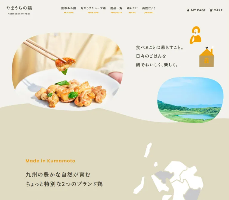
温かなベージュに明朝体、曲線で切り抜いた料理写真と素朴なイラストを組み合わせた鶏肉のブランド・通販サイト。商品、レシピ、地域の情報をゆったりとつなぐ構成。
オリジナルサイトを見るYamauchi no Tori — Style Reference
A welcoming food storefront, composed from warm paper, generous curves, home cooking, and small illustrated moments.
Website: yamauchinotori.jp Original URL: https://yamauchinotori.jp/ Final URL: https://yamauchinotori.jp/ Theme: light, with warm neutral backgrounds and category-specific accents. Inspected: September 12, 2026, through the supplied browser evidence; retrieval timestamp 06:59:22.825 UTC / 15:59:22.825 JST. Viewports: 1440 × 1000 desktop and 390 × 844 mobile, in CSS pixels. Scope: the current homepage: persistent navigation, introductory composition, two chicken-brand stories, two product rails, recipe feature, regional journal, and footer. Three desktop and two mobile captures supply visual evidence; rendered text and sampled element styles extend coverage through the intervening sections. Linked pages and transactional flows were not inspected.
The homepage connects the pleasure of a cooked meal with the products and place behind it. A large photograph of chicken lifted with chopsticks introduces the food; a smaller landscape photograph and golden illustrations introduce everyday life and regional character. The Japanese typography has distinctive Mincho forms and generous tracking. Poppins provides a quieter secondary voice for English labels and prices.
The page then moves through brand education, shopping, recipes, and regional updates. Cream and deeper beige alternate across broad sections. Product photographs receive regular rectangular frames, while the introductory and journal photographs use irregular rounded silhouettes. Shopping controls remain recognizable through white pill shapes, fine dashed outlines, and small arrow medallions. This is a complete brand storefront with editorial content and customer-service navigation.
How to Read This Reference
- Measured means a value appears in the supplied computed styles or element rectangles. Unless stated otherwise, dimensions are CSS pixels.
- Calculated means arithmetic applied to those measurements or supplied grid formulas.
- Estimated means a visual approximation from a supplied capture. Image boundaries, decorative contours, and footer geometry mostly belong here.
- Recommended means an implementation choice for a new project. The CSS starter includes such choices explicitly.
- Token names are descriptive aliases, except where a source custom property is identified.
- Evidence coverage varies: the hero, desktop herb-product rail, journal tail, and footer have screenshots. Several intervening components have rendered DOM evidence without corresponding visual captures.
Computed declarations need context. A hidden drawer can have measurable descendants without appearing on screen. A flex element can retain an inactive grid-template-columns declaration. Likewise, a link can report a zero border radius while its surrounding visual treatment is rounded. Final appearance and active layout take precedence over isolated inherited or unused values.
Tokens — Colors
Default Palette
| Name | Value | Evidence | Role |
|---|---|---|---|
| Warm Paper | #f2f2eb |
Measured; source --color-my-beige-light and body background |
Main canvas, product sections, journal, and open space around photographs |
| Oat Beige | #e0dac2 |
Measured as rgb(224, 218, 194) on story and recipe sections |
Broad alternating section fields; the footer appears in the same beige family |
| Brown Ink | #3e3b30 |
Measured; source --color-my-black |
Japanese text, utility icons, prices, and fine outlines |
| Saffron Label | #e59800 |
Measured as rgb(229, 152, 0) on English labels |
Navigation subtitles, section labels, and regional-journal dates visible in the capture |
| Herb Olive | #73871c |
Measured; source --color-my-green-dark |
Herb-brand subtitles, category pills, and active pagination |
| Aka Burgundy | #aa062a |
Measured as rgb(170, 6, 42) |
Aka-brand subtitles, category pills, and active pagination |
| Clean White | #ffffff |
Measured; source --color-my-white |
Archive-link fills and reversed category text; also visible in the company-logo tile |
| Muted Stock Text | #9f9c93 |
Measured as rgb(159, 156, 147) |
Price of the product marked SOLD OUT |
The golden diner and house illustrations appear brighter than the measured saffron text. Their precise asset colors were not extracted. For an approximation, a golden orange near #f5a100 is reasonable, but it is an estimate, not a measured site token.
The source also declares --color-my-red-light: #D80835. Its presence does not establish use in the captured components: the measured Aka-brand pill is the darker #aa062a. Numerous generic utility colors are present in the custom-property inventory and are excluded from this palette because visible usage was not established.
Color Relationships
Use warm paper for the majority of the page and deeper beige for spacious narrative sections. Keep ordinary text brown rather than pure black. Gold connects the navigation and section labels; burgundy and olive identify the two product families.
The sky blue, landscape green, raw-meat pink, and roasted-food orange come from photography. They enrich the palette without becoming additional interface accent colors. No alternate theme or dark-mode control is evidenced.
Tokens — Typography
Japanese Component Typography
- Measured family:
ten-mincho-antique, sans-serif. - Measured weight: predominantly
500. - Roles: navigation labels, hero copy, section headings, explanatory text, product names, category pills, and archive-link labels.
- Character: expressive Japanese forms, moderate visual weight, and conspicuous breathing room between characters.
- Common tracking:
0.1em.
Preserve the supplied family name exactly when the appropriate licensed font resources are available. The declared generic fallback is sans-serif; the computed family string alone does not independently verify font-file delivery or every rendered glyph.
Inherited Body Typography
The body declares ten-mincho-text, serif, weight 400. Its measured size is 25.6px on desktop and 24px on mobile, with line heights of 46.08px and 43.2px respectively. Most visible text components override this with the smaller Antique-family settings below.
Do not use the inherited body size as the default size for all paragraphs. The actual introductory copy is 16px, product names are 18px, and prices are 14px.
English Labels and Prices
- Measured family:
Poppins, sans-serif; also declared by source--font-type-en. - Measured weight:
500. - Common tracking:
0.08em. - Roles:
AKA DORI,HERB DORI,Lineup,Recipe,Made in Kumamoto, and product prices.
The small uppercase navigation translations are a distinct secondary line, not part of the Japanese label's line box.
Wordmarks and Utility Icons
The header identity is a graphic wordmark occupying 140 × 47.23px on desktop and 136 × 45.88px on mobile. The footer uses a separate company-logo graphic. Their lettering should not be reconstructed by typing the name in the body font.
The person, cart, hamburger, and arrow symbols are visually simple. An icon library or exact asset format was not identified. The utility captions appear around 16px in the screenshots; this is an estimate because their inner text spans were not included in the sampled styles.
Type Scale
Values below are measured unless marked otherwise. A size pair is desktop / mobile.
| Role | Size | Line height | Tracking | Weight |
|---|---|---|---|---|
| Japanese desktop navigation | 15px |
25.5px |
1.5px |
500 |
| English desktop navigation | 10px |
17px |
0.8px |
500 |
| Hero statement | 26.64 / 22.23px |
53.28 / 44.46px |
2.664 / 2.223px |
500 |
| English section label | 24 / 18px |
40.8 / 30.6px |
1.92 / 1.44px |
500 |
| Main story and lineup heading | 30 / 22px |
51 / 37.4px |
3 / 2.2px |
500 |
| Introductory paragraph | 16px |
38.4px |
1.6px |
500 |
| Brand-story heading | 30 / 22px |
51 / 37.4px |
3 / 2.2px |
500 |
| Brand-story English subtitle | 16px |
27.2px |
1.28px |
500 |
| Brand-story description | 16 / 15px |
30.4 / 28.5px |
1.6 / 1.5px |
500 |
| Product-category heading | 24 / 22px |
40.8 / 37.4px |
2.4 / 2.2px |
500 |
| Product-category English subtitle | 14px |
23.8px |
1.12px |
500 |
| Product name | 18px |
30.6px |
1.8px |
500 |
| Price | 14px |
23.8px |
1.12px |
500 |
| Category pill | 15px |
25.5px |
1.5px |
500 |
| Archive-link label | 16 / 15px |
27.2 / 25.5px |
1.6 / 1.5px |
500 |
| Featured recipe title | 24 / 22px |
40.8 / 37.4px |
2.4 / 2.2px |
500 |
| Featured recipe description | 14 / 13px |
26.6 / 24.7px |
1.4 / 1.3px |
500 |
The hero uses a line height of exactly twice its font size in both samples. Preserve this unusually relaxed rhythm. Its three lines are deliberate source copy: 食べることは暮らすこと。, 日々のごはんを, and 鶏でおいしく、楽しく。.
Tokens — Spacing & Shapes
Responsive Grid
The supplied desktop grid formulas use twelve columns:
/* Observed desktop formulas, simplified */
--outer: calc(100vw * 46 / 1440);
--gap: calc(100vw * 20 / 1440);
--column: calc((100vw - 2 * var(--outer) - 11 * var(--gap)) / 12);
At 1440px wide, the outer gutter is 46px, the gap is 20px, and each column is 94px. The usable width is 1348px.
The mobile custom properties switch to four columns, with both margin and gap following 100vw × 16 / 400. At 390px, those are 15.6px; each column is 78px, and the inner width is 358.8px.
These formulas describe the grid system, not every component. The mobile hero and several sections actively use block layout, and the product rail retains a separate 20px item gap.
Spacing Scale
| Use | Desktop | Mobile | Status |
|---|---|---|---|
| Header top / bottom padding | 32 / 16px |
32 / 16px |
Measured |
| General horizontal grid gutter | 46px |
15.6px |
Measured / formula-derived |
| Product-rail item gap | 20px |
20px |
Calculated from adjacent card rectangles |
| Product image to title | About 28px |
About 16px |
Derived using the estimated image boundary |
| Product title to price | 4px |
4px |
Calculated from text rectangles |
| Price to category pill | 16px |
12px |
Calculated |
| Category-pill padding | 4px 15px 6px |
Same | Measured |
| Rail cards to pagination | 48px |
32px |
Calculated from the tallest sampled card |
| Pagination to archive link | About 41px |
About 41px |
Calculated from sampled element boxes |
| Story section top / bottom padding | 208 / 136px |
104 / 64px |
Measured |
| Lineup section vertical padding | 120px |
104px |
Measured |
| Recipe inner section top / bottom padding | 60 / 120px |
64 / 64px |
Measured |
The spacing mixes compact retail metadata with substantial section-level breathing room. A single small spacing scale cannot describe the whole page; retain both the 4–32px component rhythm and the 64–208px narrative rhythm.
Border Radius and Contours
| Element | Treatment | Evidence |
|---|---|---|
| Introductory photographs | Different irregular rounded silhouettes | Visually observed; original mask geometry unavailable |
| Product photographs | Approximately 10px corner radius |
Screenshot estimate |
| Category pills | Fully rounded | Measured effectively unbounded radius |
| Pagination dots | 8 × 8px, circular |
Measured |
| Archive links | White capsule with a fine dashed brown perimeter | Visually observed; sampled inner anchor reports 0px radius |
| Arrow medallion | Small beige rounded shape, approximately 32px |
Screenshot estimate |
| Footer top corners | Approximately 80px desktop, 40px mobile |
Screenshot estimate |
| Footer logo tile | White rectangle with approximately 10px corners |
Screenshot estimate |
The archive-link silhouette must be reproduced from its visible construction. The supplied data does not identify which wrapper, pseudo-element, or graphic creates the capsule. A direct rounded border is a useful adaptation, not a recovered source implementation.
Layout Measurements
| Element | Desktop | Mobile | Evidence |
|---|---|---|---|
| Document height | 7909.89px |
7782.42px |
Measured |
| Header box | 1348 × 95.23px, starting at x 46 |
390 × 93.88px |
Measured |
| Hero section | y 143.23, height 619.19px |
y 84, height 751.23px |
Measured |
| Hero text box | x 844, y 250.61, width 296.59px |
x 44.84, y 373.41, width 329.56px |
Measured |
| Main food photograph | Approximately 694 × 486px, x 66, y 183 |
Approximately 328 × 230px, x 16, y 107 |
Screenshot estimate |
| Landscape photograph | Approximately 411 × 294px, x 993, y 463 |
Approximately 300 × 215px, x 85, y 620 |
Screenshot estimate |
| Story section height | 1490.39px |
1931.09px |
Measured |
| Product card | 435.98 × 446.88px |
294 × 330.25px for a one-line name |
Measured |
| Featured recipe image-link box | 664 × 531.19px |
265.19 × 212.14px |
Measured |
| Archive-link inner anchor | 318 × 75.20px |
318 × 69.50px |
Measured |
| Footer company-logo tile | Approximately 400 × 184px |
Approximately 310 × 142px |
Screenshot estimate |
The curved beige transition reaches upward into the hero. Consequently, the first visible beige pixels occur before the measured start of the following section. Do not treat that decorative boundary as the section's ordinary rectangular top edge.
Components
Persistent Header
Role: identity, browsing, account access, and cart access.
Desktop anatomy is a small logo at the left, five bilingual navigation links across the middle, and person/cart utilities at the right. Japanese labels sit above smaller gold English captions. The navigation items have approximately 30px between their measured boxes. There is no visible enclosing border or shadow.
On mobile, the logo remains nearly the same size. The visible utilities become the cart and a three-line menu icon; the five-link navigation and desktop account caption are absent from the closed header. Drawer-related account, cart, and navigation links exist in the DOM, but the expanded drawer was not captured.
The header remains at the top in the supplied scrolled views. Some underlying content is visible behind it, including an archive button and journal text. This establishes persistent, visually transparent navigation; the exact positioning declaration was not supplied. An opaque paper background after scrolling is a recommended legibility improvement.
Introductory Composition
Role: establish appetite, everyday use, and regional identity before the product selection.
Desktop anatomy has five distinct parts:
- A large, irregularly rounded food photograph on the left.
- A compact three-line Japanese statement beginning at grid column eight.
- A golden diner illustration above and to the right of the statement.
- A small house illustration farther right.
- A smaller landscape photograph below the statement, overlapping the beige section transition.
The main photograph shows cooked chicken on a white plate, green herbs, chopsticks lifting a bite, and a softly lit pale-yellow garment in the background. The crop keeps the lifted food and plate legible. The landscape is bright blue and green, with hills and water.
On mobile, the order becomes photograph, statement, and landscape. The diner overlaps the landscape's upper edge, and the house sits over its right side. This is a recomposed scene: shrinking the desktop coordinates would lose the intended spacing and overlap.
No large purchase button appears inside the captured introduction. The header provides the immediate shopping route.
Brand Story Section
Role: explain the two product families before presenting their catalog entries.
The measured section uses deeper beige. It opens with Made in Kumamoto, a two-line Japanese heading, and a relaxed explanatory paragraph. Desktop content starts at x 160, one grid column inward from the outer gutter.
Two brand blocks follow. Their desktop text boxes are approximately 502.41px wide and sit side by side. Each has a Japanese name, English subtitle, description, and もっと見る link. Burgundy identifies the Aka brand and olive identifies the Herb brand. The sampled detail links occupy 252 × 80px at both widths; their full visual treatment is outside the supplied captures.
Mobile stacks the brand blocks. Their text regions are approximately 319.8px wide at x 35.09. Heading size drops from 30px to 22px, while the English brand names remain 16px. The introductory paragraph gains a deliberate extra line break after 選んで食べる。.
The text and layout are directly evidenced. Imagery inside this middle section was not independently visible in the supplied screenshots and should not be invented as an observed asset.
Product-Category Heading
Role: introduce a recognizable product family within the lineup.
The desktop herb capture shows a centered circular emblem approximately 100px across: a white chicken silhouette against olive, with a small dark botanical motif. Beneath it sit the Japanese brand name and the tracked uppercase English subtitle.
The heading uses 24px Japanese text on desktop and 22px on mobile. The English subtitle remains 14px. There is 40px between the measured English subtitle's bottom and the desktop product links; the mobile gap is 32px.
Only the herb emblem is visually confirmed by the supplied lineup capture. Do not infer the exact artwork of the other emblem from the shared layout.
Product Card and Horizontal Rail
Role: make product type, quantity, price, and brand easy to scan.
Each product is a single anchor containing its image and metadata. The visible herb card anatomy is:
- A softly rounded landscape product photograph, approximately
436 × 309pxon desktop. - A thin white circular quantity marker near the upper-right corner; the
2kgexample also contains10%OFF. - A centered Japanese product name.
- A centered Poppins price.
- A compact olive category pill with white Japanese text.
The image shows raw chicken on a white plate against a pale textured tabletop, with a small green garnish. There is no separate white card panel around the metadata and no visible card shadow.
The first three herb products in the capture are thigh 1kg at ¥2,380, thigh 2kg at ¥4,284, and breast 1kg at ¥1,680. These are captured content values, not permanent pricing recommendations.
Desktop shows three complete cards with 20px gaps. Their width matches four grid columns: 4 × 94 + 3 × 20 = 436px. The DOM contains eight products per family, with later cards positioned horizontally outside the viewport.
Mobile retains the rail. The first card starts at x 48 and is 294px wide; the second starts at x 362. This leaves a 28px portion of the next card's bounding box within the 390px viewport, providing a continuation cue. Product names remain 18px. Longer herb-set names wrap to two lines and increase their card height to 360.84px; preserve this wrapping rather than reducing all mobile product text.
The Aka rail uses the same measured typography and card structure with burgundy pills. One Aka product is marked SOLD OUT; its price changes to muted gray. The product still has a link in the DOM, so unavailable stock should not automatically be interpreted as a disabled navigation target.
Pagination
Role: expose positions within each product rail.
Desktop has six 8px dot buttons at 20px center intervals; mobile has eight. The first uses the relevant brand color. Inactive dots look pale in the screenshot, although their computed background is brown ink, indicating additional compositing or opacity not included in the sampled fields.
Six positions for eight products with three visible is consistent with advancing one item at a time. That behavior was not activated during the supplied inspection, so treat it as an inference. The responsive count change is measured.
The source dot dimensions are visually restrained but small as interaction targets. A new implementation should enlarge the hit areas and allow the spacing to increase if necessary.
Archive and Business Links
Role: route visitors to complete collections, recipe archives, journal archives, and business information.
The visible pattern is a wide white capsule, a fine dashed brown perimeter, a left-aligned Japanese label, and a beige arrow medallion toward the right. Examples include 商品をすべて見る, 記事をすべて見る, and 企業・飲食店様へ.
Measured collection-link inner anchors are 318px wide. Their padding changes from 22px 32px 26px on desktop to 20px 32px 24px on mobile. The resulting inner heights are approximately 75.2px and 69.5px; the visible outer treatment can add to those dimensions.
The mobile footer business link adapts to its approximately 310px content column. Keep the arrow and text within one navigational target.
Recipe Feature
Role: connect product browsing with practical meal ideas.
The DOM establishes a beige section with the English label Recipe, Japanese heading, a conversational cooking prompt, a horizontal image sequence, previous/next controls, and a featured title, description, detail link, and archive link.
The centered desktop image-link box is 664px wide, equivalent to six grid columns, with a 5:4 aspect ratio. Neighboring entries extend to both sides. Mobile uses a centered 265.19px box, approximately 68% of the viewport, preserving the same ratio. Arrow buttons measure 62 × 60px on desktop and 42 × 40px on mobile; mobile arrows sit near the lower image edge in the supplied rectangles.
The recipe sequence contains repeated links, consistent with a looping carousel implementation. Desktop's featured text describes herb-and-salted-koji oven-baked chicken breast, while mobile's featured text is ごちそうとりすき. These samples show different selected entries; they do not prove a breakpoint-specific recipe choice or an autoplay interval.
The section has detailed DOM evidence but no corresponding screenshot in the supplied set. Image-link dimensions and text styles are confirmed; image masking, control artwork, and transition choreography remain unverified.
Regional Journal
Role: publish regional stories, food-related features, and operational notices.
The rendered content contains a Japanese title, Yamaga Journal, an introductory paragraph, three dated article links, and an archive link. The desktop tail capture shows a chicken photograph in an irregular rounded frame on the left, fine dashed article separators on the right, a gold date, and the white archive capsule.
The mobile Japanese heading has a measured 78 × 192.03px box, 32px text, and 6.4px tracking. These proportions suggest a vertical composition, but the supplied style fields do not include writing-mode; an exact vertical-setting implementation is therefore not confirmed.
Treat article dates and notices as dynamic editorial content. The captured notice wording is content evidence, not independent verification of the event it describes.
Footer
Role: close the page with company identity, practical shopping links, and a business-contact route.
A deeper beige field spans the viewport and has generously rounded upper corners. The desktop footer contains a white company-logo tile at approximately x 160, two link columns to its right, an address and telephone number beneath the logo, a business link below, and copyright aligned toward the lower right.
The original page visibly identifies the company brand as やまうちフード and shows its Yamaga address and telephone number. The telephone is a tel: link in the rendered evidence.
Mobile changes the visual order: the two navigation columns come first, then the logo tile, address, phone, business link, and centered copyright. The content sits within roughly 40px side margins. This mobile capture is the footer, not an expanded navigation drawer.
The link groups cover site browsing and contact on one side, and shopping guidance, legal information, account, FAQ, cart, and privacy on the other. Preserve this practical information architecture when reusing the visual system.
Dormant Commerce Notification
The DOM includes a cart-added heading, close button, カートを見る link, and continue-shopping control. These are not visibly open in the screenshots, and several sampled elements have negative vertical coordinates.
The cart link's measured style is white text on brown ink, 15px Japanese type, 4px radius, and a 0.3s color-related transition. This describes a dormant component's styling only. Its opening behavior, placement, announcement, and dismissal were not tested.
Tokens — Motion & Interaction
| Treatment | Supplied value or observation | Evidence limit |
|---|---|---|
| Product pagination | opacity 0.2s, transform 0.2s, background-color 0.2s |
Computed transition; dot activation was not exercised |
| Recipe title, description, and detail link | Opacity and transform, 0.8s cubic-bezier(0.13, 0.62, 0.41, 1.01) |
Computed transition; starting offset and trigger were not supplied |
| Mobile drawer navigation links | Transform, 0.72s cubic-bezier(0.16, 1.68, 0.32, 1) |
Measured on drawer descendants; expanded state unverified |
| Dormant cart link | Color-related properties, 0.3s cubic-bezier(0.4, 0, 0.2, 1) |
Component styling only |
| Continue-shopping text | text-decoration-color 0.3s |
Computed transition; interaction untested |
| Skip link | box-shadow 0.1s |
Link exists; keyboard activation not tested |
| Header persistence | Header remains at viewport top in scrolled captures | Exact fixed/sticky implementation unavailable |
| Product and recipe rails | Offscreen horizontal items and pagination/arrow controls | Dragging, swiping, keyboard behavior, and timing untested |
| Hero illustrations and smoke | Decorative assets visible in still captures | No verified motion path, duration, or looping behavior |
Many sampled text elements report animation: none. That does not establish that every image, pseudo-element, or script-driven component is static. Conversely, the presence of a transition declaration does not prove that its interaction occurred.
The capture procedure waited for document load, image decoding, and sampled layout/text stability within finite limits. Perpetual animations were paused during readiness checks and resumed afterward. Delayed content and unexercised interactions may still exist. Avoid assigning invented parallax, hover zoom, automatic slide intervals, or illustration loops to this reference.
Surfaces
| Layer | Appearance | Purpose |
|---|---|---|
| Main canvas | Flat warm paper | Connects the entire storefront |
| Story and recipe bands | Deeper beige with decorative curved boundaries | Gives narrative sections their own rhythm |
| Product content | Photograph above unboxed text on the page background | Keeps merchandise prominent without heavy card chrome |
| Category marker | Burgundy or olive capsule with white text | Identifies product family |
| Archive action | White capsule, dashed brown perimeter, beige arrow | Creates a gentle but recognizable action pattern |
| Company identity tile | White rounded rectangle | Gives the illustrated company logo a clean field |
| Footer field | Large beige surface with rounded top corners | Groups navigation, contact details, and business access |
There is no visible general elevation system. The page relies on background changes, curved silhouettes, image boundaries, typography, and fine dashed rules. Generic shadow-related custom properties in the source inventory are not evidence of visible card shadows.
Imagery
Three photographic roles are visible: an appetizing cooked meal, fresh raw-product presentations, and regional or farm-related imagery. Their treatments differ intentionally.
The cooked-food image feels close and domestic: a lifted bite, white ceramic plate, fresh herbs, and warm daylight. Product images are more controlled, using a pale textured backdrop and consistent plate placement. The landscape brings bright natural color into the composition, while the journal chicken photograph connects the food with its origin.
Illustrations use flat golden fills, white negative space, and a few dark details. The diner and house have a simple, personable character. The house includes a small chicken-like roof detail and white smoke. These assets should retain their own silhouettes; a generic stock icon set would not reproduce their role.
Use smooth, high-quality photographic rendering. Organic clipping applies to editorial images; the product photographs keep a consistent rectangular aspect ratio and small corner radius.
Observed Asset References
No original image src, SVG path, or asset manifest was supplied. The references below identify visible assets by placement rather than inventing download paths.
| Asset | Observed location | Reuse considerations |
|---|---|---|
| Shop wordmark | Desktop and mobile header | Preserve as artwork; measured widths 140px and 136px |
| Cooked-chicken photograph | Introductory composition | Keep the chopsticks, lifted bite, plate, and garnish in the crop |
| Regional landscape photograph | Lower-right hero region | Use its own organic silhouette and preserve the blue/green horizon |
| Diner and house illustrations | Hero, recomposed on mobile | Use separate transparent assets so responsive overlap can change |
| Herb chicken emblem | Desktop product-category heading | Approximately 100px circular composition |
| Raw chicken product photographs | Desktop herb rail | Consistent pale tabletop, white plate, and restrained garnish |
| Chicken photograph | Desktop journal tail | Irregular rounded crop |
| Company-logo graphic | Desktop and mobile footer | White supporting tile; do not redraw as ordinary text |
Use original assets only when authorized and available. Replacement photography and illustration should be commissioned or licensed with the same subject roles and crop requirements. The CSS below approximates framing; it does not supply these assets.
Layout & Responsive Behavior
Desktop organization follows a twelve-column system, but the composition repeatedly changes its span. Full-width product rails occupy the entire 1348px inner width. Narrative content steps inward to x 160. The recipe focus occupies a centered six-column width of 664px. These span changes create hierarchy without relying on very large headings.
At 390px, the page uses a four-column token system and substantially different component arrangements:
| Component | Desktop | Mobile |
|---|---|---|
| Navigation | Wordmark, five bilingual links, account, cart | Wordmark, cart, menu icon |
| Introductory scene | Large image left; text and smaller scene right | Image, text, then overlapping landscape and illustrations |
| Brand stories | Two parallel columns | Vertically stacked blocks |
| Product rail | Three complete cards | One centered card with a neighboring preview |
| Product text | 18px names, 14px prices |
Same sizes; longer names wrap |
| Product pagination | Six dots | Eight dots |
| Recipe focus | 664px image-link width |
Approximately 265px image-link width |
| Footer | Identity left, navigation right | Navigation first, identity and contact below |
The supplied embedded CSS hides header-drawer at min-width: 990px. This is evidence for that drawer rule, not proof that every layout change shares the same breakpoint. Intermediate widths, tablet orientation, and landscape phones were not captured.
The page remains a long document at both widths. Similar total heights do not imply identical section geometry: the mobile story grows through stacking while product and recipe presentation become shorter.
For a new implementation, preserve the header's visual persistence while preventing it from obscuring focused controls or article text. Scope horizontal overflow to the rails; offscreen carousel items should not create page-wide sideways scrolling.
Do’s and Don’ts
Do
- Keep the primary canvas
#f2f2eband ordinary text#3e3b30. - Alternate broad beige narrative sections with quieter paper-colored shopping and journal regions.
- Pair Japanese Mincho character with small tracked Poppins labels and prices.
- Preserve the hero's three-line statement and relaxed
2line-height ratio. - Give the food photograph, landscape, and illustrations distinct positions and silhouettes.
- Recompose those assets for mobile instead of proportionally shrinking the desktop scene.
- Keep raw-product images consistent and their metadata centered below the image.
- Retain olive and burgundy as product-family identifiers.
- Use white archive capsules, fine dashed outlines, and modest arrow medallions.
- Keep recipes, regional articles, shopping guidance, and business contact within the overall experience.
Don’t
- Do not replace the page's varied image treatments with identical rounded cards everywhere.
- Do not convert every action into a large solid orange button.
- Do not apply the inherited
25.6pxbody size to ordinary product or paragraph text. - Do not shrink mobile product names merely to keep every title on one line.
- Do not infer menu appearance from hidden descendants' narrow or offscreen rectangles.
- Do not copy generic theme variables when they conflict with the actual component appearance.
- Do not replace the small company and shop wordmarks with approximated typed logos.
- Do not introduce glossy shadows, glass blur, or saturated gradients into the observed flat surface system.
- Do not treat the captured stock state or prices as permanent content.
- Do not invent carousel timing, hover zoom, parallax, or illustration animation from static screenshots.
Recommended Implementation Additions
These are recommendations for a new implementation, not verified features of the original:
- Give the persistent header an opaque paper surface when needed for legibility, and set appropriate scroll offsets for focused or anchored content.
- Implement the menu as an accessible disclosure with an explicit name, expanded state, Escape handling, and predictable focus return. Keep closed content out of keyboard navigation.
- Enlarge pagination hit areas while retaining small visible dots. Provide explicit previous/next controls and meaningful position labels.
- Ensure product rails can be used with keyboard and touch. A native overflow-and-snap implementation is a practical baseline if exact original behavior is unnecessary.
- If a carousel advances automatically, add pause controls and disable automatic movement under reduced-motion preferences.
- Validate small gold text and white-on-olive badges for their actual sizes. Introduce darker text variants where necessary while retaining brighter colors for decoration.
- Give decorative illustrations empty alternatives and meaningful food/product images useful descriptions. Preserve quantity, price, and stock information as text rather than image-only data.
- Keep footer reading and keyboard order coherent with its mobile arrangement. Use real heading structure and semantic navigation groups.
- Load licensed fonts deliberately and test fallback wrapping, especially on long Japanese product names.
- Reserve image dimensions before loading; prioritize the first food photograph and defer below-the-fold imagery.
Agent Prompt Guide
Quick Color Reference
- Canvas: warm paper
#f2f2eb. - Narrative fields: oat beige
#e0dac2. - Text, outlines, and icons: brown ink
#3e3b30. - English labels: saffron
#e59800. - Herb family: olive
#73871c. - Aka family: burgundy
#aa062a. - Archive-link fills and reversed category text:
#ffffff. - Photography supplies blue, green, and food colors; do not turn them all into interface accents.
Overall Prompt
“Create a Japanese chicken-brand storefront inspired by Yamauchi no Tori. Use warm paper #f2f2eb, deeper beige #e0dac2, and brown text #3e3b30. Pair expressive Japanese Mincho typography with tracked Poppins English captions and prices. Begin with a large cooked-chicken photograph in an irregular rounded mask, a modest three-line Japanese statement, a smaller regional landscape, and flat golden diner and house illustrations. Continue with two brand stories, separate burgundy and olive product rails, a recipe feature, regional journal, and a rounded beige footer. Product cards use pale tabletop photography, centered names and prices, and small category pills. Archive links are white capsules with fine dashed brown outlines and beige arrow medallions. On mobile, recompose the hero, show one centered product with a neighboring preview, and move footer navigation above company details.”
Example Component Prompts
- Hero: “Arrange a wide organic-cropped food photograph on the left, three lines of tracked Japanese copy at the right, and a smaller blue-green landscape below. Add separate golden diner and house illustrations. On a 390px phone, stack photo and copy, then overlap the illustrations over the landscape. Keep the headline near 22px with twice-size line spacing.”
- Product rail: “Build an eight-product horizontal rail. At 1440px, show three approximately 436px cards with 20px gaps and 46px outer margins. At 390px, use 294px cards starting at x 48 with the next card partially visible. Place an 18px Japanese title, 14px price, and 15px olive category pill beneath each pale product photograph.”
- Archive link: “Create a roughly 320px white capsule with a one-pixel dashed brown outline. Place a Japanese label toward the left and a small beige arrow medallion toward the right. Use generous vertical padding and no elevation shadow.”
- Recipe feature: “Build a beige editorial section with a gold English label and Japanese heading. Center a 5:4 recipe image, with neighboring entries extending to the sides and previous/next controls near its edges. Put title, short description, detail link, and a separate archive capsule below. Treat slide behavior as an explicitly implemented feature, not an assumed animation.”
- Footer: “Use a full-width beige field with large rounded top corners. Desktop places a white company-logo tile and contact details left, two navigation columns right, and a business capsule below. Mobile places the two navigation columns first, then the logo, address, phone, business link, and centered copyright within approximately 40px side margins.”
Quick Start
CSS Custom Properties
This starter uses measured colors and component type sizes. Desktop grid arithmetic follows the supplied formulas. Organic masks, footer radii, and product-image ratio are visual approximations.
The 990px breakpoint is an adaptation informed by the supplied drawer rule; it is not a recovered breakpoint for every component. The starter also deliberately adds an opaque sticky header, native horizontal scrolling, larger pagination targets, visible focus, and reduced-motion handling. Classes are new implementation aliases, not original selectors.
Use the licensed wordmarks, photographs, and illustrations as separate images. Within a product link, use this order: media wrapper, product heading, price, then category pill. The quantity marker belongs inside the media wrapper. Archive links contain a text span and an arrow span marked aria-hidden="true".
:root {
  /* Measured palette */
  --yt-paper: #f2f2eb;
  --yt-beige: #e0dac2;
  --yt-ink: #3e3b30;
  --yt-gold: #e59800;
  --yt-herb: #73871c;
  --yt-aka: #aa062a;
  --yt-white: #ffffff;
  --yt-muted: #9f9c93;

  /* Observed family declarations; font resources are not bundled */
  --yt-font-jp: 'ten-mincho-antique', sans-serif;
  --yt-font-body: 'ten-mincho-text', serif;
  --yt-font-en: 'Poppins', sans-serif;
  --yt-tracking-jp: 0.1em;
  --yt-tracking-en: 0.08em;

  /* Source-derived desktop grid */
  --yt-outer: calc(100vw * 46 / 1440);
  --yt-gap: calc(100vw * 20 / 1440);
  --yt-column: calc(
    (100vw - 2 * var(--yt-outer) - 11 * var(--yt-gap)) / 12
  );

  --yt-section-title: 30px;
  --yt-section-label: 24px;
  --yt-hero-title: 26.64px;
  --yt-product-title: 18px;
  --yt-price: 14px;

  /* Estimated geometry, expressed directly for reuse */
  --yt-image-radius: 10px;
  --yt-footer-radius: 80px;
  --yt-pill-radius: 9999px;

  /* Measured transition durations and easing */
  --yt-dot-motion: 200ms ease;
  --yt-recipe-motion: 800ms cubic-bezier(0.13, 0.62, 0.41, 1.01);
  --yt-menu-motion: 720ms cubic-bezier(0.16, 1.68, 0.32, 1);
}

*, *::before, *::after { box-sizing: border-box; }

.yt {
  margin: 0;
  color: var(--yt-ink);
  background: var(--yt-paper);
  font: 500 16px / 1.9 var(--yt-font-jp);
  letter-spacing: var(--yt-tracking-jp);
}

.yt a { color: inherit; }
.yt button { font: inherit; color: inherit; }
.yt img { display: block; max-width: 100%; }
.yt h1, .yt h2, .yt h3, .yt p { margin: 0; }
.yt h1, .yt h2, .yt h3 { font-weight: 500; }
.yt [id] { scroll-margin-top: 112px; }

.yt-header {
  position: sticky;
  top: 0;
  z-index: 50;
  display: flex;
  align-items: center;
  justify-content: space-between;
  gap: 32px;
  min-height: 95.23px;
  padding: 32px var(--yt-outer) 16px;
  background: var(--yt-paper);
}

.yt-logo { flex: 0 0 140px; }
.yt-logo img { width: 140px; height: auto; }
.yt-nav, .yt-utilities { display: flex; align-items: center; }
.yt-nav { gap: 30px; }
.yt-utilities { gap: 20px; }
.yt-nav a { text-align: center; text-decoration: none; }
.yt-nav-ja { display: block; font-size: 15px; line-height: 1.7; }
.yt-nav-en {
  display: block;
  margin-top: 4px;
  color: var(--yt-gold);
  font: 500 10px / 1.7 var(--yt-font-en);
  letter-spacing: var(--yt-tracking-en);
}
.yt-menu-toggle { display: none; }

.yt-grid {
  display: grid;
  grid-template-columns: repeat(12, minmax(0, 1fr));
  gap: 0 var(--yt-gap);
  padding-inline: var(--yt-outer);
}

/* Approximate hero placement at the desktop reference width */
.yt-hero {
  position: relative;
  grid-template-rows: 319px 300px;
  margin-top: 48px;
}
.yt-hero-food {
  grid-column: 1 / 8;
  grid-row: 1 / 3;
  align-self: start;
  width: calc(100% - 84px);
  margin: 40px 0 0 20px;
  aspect-ratio: 10 / 7;
  object-fit: cover;
  border-radius: 44% 43% 44% 40% / 47% 40% 51% 46%;
}
.yt-hero-copy {
  grid-column: 8 / 12;
  grid-row: 1;
  align-self: start;
  margin-top: 107px !important;
  font-size: var(--yt-hero-title);
  line-height: 2;
}
.yt-hero-copy span { display: block; }
.yt-hero-landscape {
  grid-column: 9 / -1;
  grid-row: 2;
  justify-self: end;
  width: 411px;
  max-width: 100%;
  aspect-ratio: 1.4;
  object-fit: cover;
  border-radius: 45% 49% 46% 43% / 44% 49% 49% 43%;
}
.yt-hero-diner, .yt-hero-house {
  position: absolute;
  pointer-events: none;
}
.yt-hero-diner { width: 72px; top: 0; right: 12%; }
.yt-hero-house { width: 92px; top: 124px; right: 6.5%; }

.yt-story {
  position: relative;
  margin-top: -2px;
  padding: 208px var(--yt-outer) 136px;
  background: var(--yt-beige);
}
.yt-wave {
  position: absolute;
  inset-inline: 0;
  bottom: calc(100% - 1px);
  width: 100%;
  height: 140px;
  color: var(--yt-beige);
  pointer-events: none;
}
.yt-section-label {
  color: var(--yt-gold);
  font: 500 var(--yt-section-label) / 1.7 var(--yt-font-en);
  letter-spacing: var(--yt-tracking-en);
}
.yt-section-title { font-size: var(--yt-section-title); line-height: 1.7; }
.yt-intro-copy { font-size: 16px; line-height: 2.4; }
.yt-brand-grid {
  display: grid;
  grid-template-columns: repeat(2, minmax(0, 1fr));
  gap: 8vw;
  max-width: 1120px;
  margin: 80px auto 0;
  text-align: center;
}

.yt-lineup { padding: 120px var(--yt-outer); }
.yt-category-heading { margin-bottom: 40px; text-align: center; }
.yt-category-heading img { width: 100px; margin: 0 auto 20px; }
.yt-category-heading h3 { font-size: 24px; line-height: 1.7; }
.yt-category-heading p {
  margin-top: 12px;
  font: 500 14px / 1.7 var(--yt-font-en);
  letter-spacing: var(--yt-tracking-en);
}

/* Native scrolling is a recommended implementation choice */
.yt-rail {
  display: grid;
  grid-auto-flow: column;
  grid-auto-columns: calc((100% - 2 * var(--yt-gap)) / 3);
  gap: var(--yt-gap);
  align-items: start;
  overflow-x: auto;
  overscroll-behavior-x: contain;
  scroll-snap-type: x mandatory;
  padding-block: 4px 8px;
}
.yt-product {
  --yt-brand: var(--yt-herb);
  display: flex;
  flex-direction: column;
  align-items: center;
  min-width: 0;
  scroll-snap-align: start;
  text-align: center;
  text-decoration: none;
}
.yt-product[data-brand='aka'] { --yt-brand: var(--yt-aka); }
.yt-product-media { position: relative; width: 100%; }
.yt-product-image {
  width: 100%;
  aspect-ratio: 24 / 17;
  object-fit: cover;
  border-radius: var(--yt-image-radius);
}
.yt-quantity {
  position: absolute;
  top: 15px;
  right: 15px;
  display: grid;
  place-content: center;
  width: 70px;
  height: 70px;
  border: 1px solid var(--yt-white);
  border-radius: 50%;
  font: 500 18px / 1.3 var(--yt-font-en);
}
.yt-quantity small { font-size: 12px; }
.yt-product h3 {
  max-width: 100%;
  margin-top: 28px;
  font-size: var(--yt-product-title);
  line-height: 1.7;
  overflow-wrap: anywhere;
}
.yt-price {
  margin-top: 4px !important;
  font: 500 var(--yt-price) / 1.7 var(--yt-font-en);
  letter-spacing: var(--yt-tracking-en);
}
.yt-price[data-stock='out'] { color: var(--yt-muted); }
.yt-brand-pill {
  margin-top: 16px;
  padding: 4px 15px 6px;
  border-radius: var(--yt-pill-radius);
  background: var(--yt-brand);
  color: var(--yt-white);
  font-size: 15px;
  line-height: 1.7;
}

/* Larger hit areas are an accessibility adaptation */
.yt-dots {
  display: flex;
  justify-content: center;
  margin-top: 40px;
}
.yt-dot {
  display: grid;
  place-items: center;
  width: 24px;
  height: 24px;
  padding: 0;
  border: 0;
  background: transparent;
  cursor: pointer;
}
.yt-dot::before {
  content: '';
  width: 8px;
  height: 8px;
  border-radius: 50%;
  background: var(--yt-ink);
  opacity: 0.2;
  transition: opacity var(--yt-dot-motion),
    background-color var(--yt-dot-motion), transform var(--yt-dot-motion);
}
.yt-dot[aria-current='true']::before {
  background: var(--yt-brand, var(--yt-herb));
  opacity: 1;
}

/* Direct-border approximation of the observed capsule */
.yt-pill-link {
  display: flex;
  align-items: center;
  justify-content: space-between;
  gap: 24px;
  width: min(320px, 100%);
  padding: 22px 32px 26px;
  border: 1px dashed var(--yt-ink);
  border-radius: var(--yt-pill-radius);
  background: var(--yt-white);
  font-size: 16px;
  line-height: 1.7;
  text-decoration: none;
}
.yt-pill-arrow {
  display: grid;
  place-items: center;
  flex: 0 0 32px;
  height: 32px;
  border-radius: 46%;
  background: var(--yt-beige);
  line-height: 1;
}
.yt-archive { margin: 40px auto 0; }

.yt-recipe { padding: 60px var(--yt-outer) 120px; background: var(--yt-beige); }
.yt-recipe-focus { width: min(664px, 100%); margin-inline: auto; }
.yt-recipe-image { width: 100%; aspect-ratio: 5 / 4; object-fit: cover; }
.yt-recipe-copy {
  transition: opacity var(--yt-recipe-motion), transform var(--yt-recipe-motion);
}
.yt-recipe-copy h3 { margin-top: 8px; font-size: 24px; line-height: 1.7; }
.yt-recipe-copy p { margin-top: 12px; font-size: 14px; line-height: 1.9; }

.yt-footer {
  padding: 128px var(--yt-outer) 100px;
  border-radius: var(--yt-footer-radius) var(--yt-footer-radius) 0 0;
  background: var(--yt-beige);
}
.yt-footer-inner {
  display: grid;
  grid-template-columns: 400px minmax(0, 1fr);
  grid-template-areas: 'identity nav' 'business copyright';
  gap: 56px 170px;
  max-width: 1120px;
  margin-inline: auto;
}
.yt-footer-identity { grid-area: identity; }
.yt-footer-nav {
  grid-area: nav;
  display: grid;
  grid-template-columns: repeat(2, minmax(0, 1fr));
  gap: 24px;
  font-size: 15px;
}
.yt-footer-nav ul { margin: 0; padding: 0; list-style: none; }
.yt-footer-nav li + li { margin-top: 12px; }
.yt-footer-nav a { text-decoration: none; }
.yt-company-tile {
  display: grid;
  place-items: center;
  width: 100%;
  aspect-ratio: 400 / 184;
  padding: 32px;
  border-radius: 10px;
  background: var(--yt-white);
}
.yt-footer address { margin-top: 24px; font-size: 14px; font-style: normal; }
.yt-footer-business { grid-area: business; }
.yt-copyright { grid-area: copyright; align-self: end; text-align: right; font-size: 12px; }

/* Recommended focus treatment */
.yt :focus-visible { outline: 2px solid var(--yt-ink); outline-offset: 4px; }

@media (max-width: 989px) {
  :root {
    --yt-outer: calc(100vw * 16 / 400);
    --yt-gap: calc(100vw * 16 / 400);
    --yt-column: calc((100vw - 5 * var(--yt-outer)) / 4);
    --yt-section-title: 22px;
    --yt-section-label: 18px;
    --yt-hero-title: 22.23px;
    --yt-footer-radius: 40px;
  }
  .yt-header { min-height: 93.88px; gap: 16px; }
  .yt-logo { flex-basis: 136px; }
  .yt-logo img { width: 136px; }
  .yt-nav, .yt-account { display: none; }
  .yt-menu-toggle { display: inline-grid; place-items: center; min-width: 44px; min-height: 44px; }
  .yt-grid { grid-template-columns: repeat(4, minmax(0, 1fr)); }
  .yt-hero { display: flex; flex-direction: column; margin-top: 0; padding-top: 10px; }
  .yt-hero-food { width: 92%; max-width: 328px; margin: 0; }
  .yt-hero-copy { width: calc(100% - 29.25px); margin: 36px 0 0 29.25px !important; }
  .yt-hero-landscape { align-self: flex-end; width: 300px; max-width: calc(100% - 40px); margin: 113px -10px 0 0; }
  .yt-hero-diner { width: 70px; top: auto; bottom: 185px; right: 28%; }
  .yt-hero-house { width: 90px; top: auto; bottom: 76px; right: 8%; }
  .yt-story { padding: 104px var(--yt-outer) 64px; }
  .yt-wave { height: 36px; }
  .yt-brand-grid { grid-template-columns: 1fr; gap: 80px; }
  .yt-lineup { padding: 104px var(--yt-outer); }
  .yt-category-heading { margin-bottom: 32px; }
  .yt-category-heading h3 { font-size: 22px; }
  .yt-rail {
    width: 100vw;
    margin-inline: calc(-1 * var(--yt-outer));
    padding-inline: 48px;
    grid-auto-columns: calc(100vw - 96px);
    gap: 20px;
    scroll-padding-inline: 48px;
  }
  .yt-product h3 { margin-top: 16px; }
  .yt-brand-pill { margin-top: 12px; }
  .yt-dots { margin-top: 24px; }
  .yt-pill-link { padding: 20px 32px 24px; font-size: 15px; }
  .yt-recipe { padding: 64px 16px; }
  .yt-recipe-focus { width: 68vw; }
  .yt-recipe-copy h3 { font-size: 22px; }
  .yt-recipe-copy p { margin-top: 16px; font-size: 13px; }
  .yt-footer { padding: 80px 40px 72px; }
  .yt-footer-inner {
    grid-template-columns: minmax(0, 1fr);
    grid-template-areas: 'nav' 'identity' 'business' 'copyright';
    gap: 40px;
  }
  .yt-footer-nav { gap: 12px; }
  .yt-company-tile { padding: 24px; }
  .yt-copyright { margin-top: 20px !important; text-align: center; }
}

@media (prefers-reduced-motion: reduce) {
  .yt-recipe-copy, .yt-dot::before { transition: none; }
  .yt-rail { scroll-behavior: auto; }
}
The following optional wave is newly drawn approximation geometry. Place it as the first child of .yt-story; it is not an extracted original asset.
<svg class="yt-wave" viewBox="0 0 1440 140"
     preserveAspectRatio="none" aria-hidden="true" focusable="false">
  <path fill="currentColor"
        d="M0 40 C220 -18 410 12 590 34 C790 60 865 140 1130 126 C1280 118 1360 100 1440 108 L1440 140 L0 140 Z" />
</svg>
CSS supplies the visual shell and native rail scrolling. Menu state, previous/next controls, pagination synchronization, selected-recipe text updates, and any automatic advancement require explicit application logic. Do not render apparently active controls without connecting those behaviors.
Tailwind v4 Token Mapping
Optional mapping for a new project already using Tailwind v4. This does not establish the original website's framework or version. Define the properties above first.
@theme inline {
  --color-paper: var(--yt-paper);
  --color-oat: var(--yt-beige);
  --color-ink: var(--yt-ink);
  --color-saffron: var(--yt-gold);
  --color-herb: var(--yt-herb);
  --color-aka: var(--yt-aka);
  --font-japanese: var(--yt-font-jp);
  --font-english: var(--yt-font-en);
  --text-section: var(--yt-section-title);
  --text-product: var(--yt-product-title);
  --spacing-page-gutter: var(--yt-outer);
  --spacing-grid-gap: var(--yt-gap);
  --radius-product: var(--yt-image-radius);
  --radius-footer: var(--yt-footer-radius);
}
Sources & Evidence
- Inspected original and final website: Yamauchi no Tori. Both supplied URLs are identical; the supplied HTTP status is
200. - Capture record: September 12, 2026; retrieval timestamp
2026-09-12T06:59:22.825Z. Viewports were1440 × 1000and390 × 844CSS pixels. Individual screenshot timestamps and device-pixel ratios were not supplied. - Desktop visual evidence: opening composition, herb-product lineup, and journal tail/footer.
- Mobile visual evidence: opening composition and footer.
- Rendered evidence: page text, original-site link destinations, root custom properties, sampled computed typography, colors, spacing, element rectangles, and transition declarations. Document heights were approximately
7910pxdesktop and7782pxmobile. - Interaction coverage: the supplied collection traversed the page through scrolling and readiness checks. No menu opening, product selection, pagination click, recipe-arrow activation, account flow, checkout, or keyboard-navigation test is documented.
- Limitations: no original asset URLs, complete stylesheet, pseudo-element inspection, intermediate-width captures, motion recording, or font-resource verification was supplied. This reference was prepared from the supplied evidence without additional browsing or command execution.
This document describes the current homepage evidenced by those captures. Estimates and recommended implementation choices are labeled separately from measured site values.
# Yamauchi no Tori — Style Reference

> A welcoming food storefront, composed from warm paper, generous curves, home cooking, and small illustrated moments.

**Website:** [yamauchinotori.jp](https://yamauchinotori.jp/)
**Original URL:** https://yamauchinotori.jp/
**Final URL:** https://yamauchinotori.jp/
**Theme:** light, with warm neutral backgrounds and category-specific accents.
**Inspected:** September 12, 2026, through the supplied browser evidence; retrieval timestamp 06:59:22.825 UTC / 15:59:22.825 JST.
**Viewports:** 1440 × 1000 desktop and 390 × 844 mobile, in CSS pixels.
**Scope:** the current homepage: persistent navigation, introductory composition, two chicken-brand stories, two product rails, recipe feature, regional journal, and footer. Three desktop and two mobile captures supply visual evidence; rendered text and sampled element styles extend coverage through the intervening sections. Linked pages and transactional flows were not inspected.

The homepage connects the pleasure of a cooked meal with the products and place behind it. A large photograph of chicken lifted with chopsticks introduces the food; a smaller landscape photograph and golden illustrations introduce everyday life and regional character. The Japanese typography has distinctive Mincho forms and generous tracking. Poppins provides a quieter secondary voice for English labels and prices.

The page then moves through brand education, shopping, recipes, and regional updates. Cream and deeper beige alternate across broad sections. Product photographs receive regular rectangular frames, while the introductory and journal photographs use irregular rounded silhouettes. Shopping controls remain recognizable through white pill shapes, fine dashed outlines, and small arrow medallions. This is a complete brand storefront with editorial content and customer-service navigation.

## How to Read This Reference

- **Measured** means a value appears in the supplied computed styles or element rectangles. Unless stated otherwise, dimensions are CSS pixels.
- **Calculated** means arithmetic applied to those measurements or supplied grid formulas.
- **Estimated** means a visual approximation from a supplied capture. Image boundaries, decorative contours, and footer geometry mostly belong here.
- **Recommended** means an implementation choice for a new project. The CSS starter includes such choices explicitly.
- **Token names** are descriptive aliases, except where a source custom property is identified.
- **Evidence coverage varies:** the hero, desktop herb-product rail, journal tail, and footer have screenshots. Several intervening components have rendered DOM evidence without corresponding visual captures.

Computed declarations need context. A hidden drawer can have measurable descendants without appearing on screen. A flex element can retain an inactive `grid-template-columns` declaration. Likewise, a link can report a zero border radius while its surrounding visual treatment is rounded. Final appearance and active layout take precedence over isolated inherited or unused values.

## Tokens — Colors

### Default Palette

| Name | Value | Evidence | Role |
| --- | --- | --- | --- |
| Warm Paper | `#f2f2eb` | Measured; source `--color-my-beige-light` and body background | Main canvas, product sections, journal, and open space around photographs |
| Oat Beige | `#e0dac2` | Measured as `rgb(224, 218, 194)` on story and recipe sections | Broad alternating section fields; the footer appears in the same beige family |
| Brown Ink | `#3e3b30` | Measured; source `--color-my-black` | Japanese text, utility icons, prices, and fine outlines |
| Saffron Label | `#e59800` | Measured as `rgb(229, 152, 0)` on English labels | Navigation subtitles, section labels, and regional-journal dates visible in the capture |
| Herb Olive | `#73871c` | Measured; source `--color-my-green-dark` | Herb-brand subtitles, category pills, and active pagination |
| Aka Burgundy | `#aa062a` | Measured as `rgb(170, 6, 42)` | Aka-brand subtitles, category pills, and active pagination |
| Clean White | `#ffffff` | Measured; source `--color-my-white` | Archive-link fills and reversed category text; also visible in the company-logo tile |
| Muted Stock Text | `#9f9c93` | Measured as `rgb(159, 156, 147)` | Price of the product marked `SOLD OUT` |

The golden diner and house illustrations appear brighter than the measured saffron text. Their precise asset colors were not extracted. For an approximation, a golden orange near `#f5a100` is reasonable, but it is an **estimate**, not a measured site token.

The source also declares `--color-my-red-light: #D80835`. Its presence does not establish use in the captured components: the measured Aka-brand pill is the darker `#aa062a`. Numerous generic utility colors are present in the custom-property inventory and are excluded from this palette because visible usage was not established.

### Color Relationships

Use warm paper for the majority of the page and deeper beige for spacious narrative sections. Keep ordinary text brown rather than pure black. Gold connects the navigation and section labels; burgundy and olive identify the two product families.

The sky blue, landscape green, raw-meat pink, and roasted-food orange come from photography. They enrich the palette without becoming additional interface accent colors. No alternate theme or dark-mode control is evidenced.

## Tokens — Typography

### Japanese Component Typography

- **Measured family:** `ten-mincho-antique, sans-serif`.
- **Measured weight:** predominantly `500`.
- **Roles:** navigation labels, hero copy, section headings, explanatory text, product names, category pills, and archive-link labels.
- **Character:** expressive Japanese forms, moderate visual weight, and conspicuous breathing room between characters.
- **Common tracking:** `0.1em`.

Preserve the supplied family name exactly when the appropriate licensed font resources are available. The declared generic fallback is `sans-serif`; the computed family string alone does not independently verify font-file delivery or every rendered glyph.

### Inherited Body Typography

The body declares `ten-mincho-text, serif`, weight `400`. Its measured size is `25.6px` on desktop and `24px` on mobile, with line heights of `46.08px` and `43.2px` respectively. Most visible text components override this with the smaller Antique-family settings below.

Do not use the inherited body size as the default size for all paragraphs. The actual introductory copy is `16px`, product names are `18px`, and prices are `14px`.

### English Labels and Prices

- **Measured family:** `Poppins, sans-serif`; also declared by source `--font-type-en`.
- **Measured weight:** `500`.
- **Common tracking:** `0.08em`.
- **Roles:** `AKA DORI`, `HERB DORI`, `Lineup`, `Recipe`, `Made in Kumamoto`, and product prices.

The small uppercase navigation translations are a distinct secondary line, not part of the Japanese label's line box.

### Wordmarks and Utility Icons

The header identity is a graphic wordmark occupying `140 × 47.23px` on desktop and `136 × 45.88px` on mobile. The footer uses a separate company-logo graphic. Their lettering should not be reconstructed by typing the name in the body font.

The person, cart, hamburger, and arrow symbols are visually simple. An icon library or exact asset format was not identified. The utility captions appear around `16px` in the screenshots; this is an estimate because their inner text spans were not included in the sampled styles.

### Type Scale

Values below are measured unless marked otherwise. A size pair is desktop / mobile.

| Role | Size | Line height | Tracking | Weight |
| --- | --- | --- | --- | --- |
| Japanese desktop navigation | `15px` | `25.5px` | `1.5px` | `500` |
| English desktop navigation | `10px` | `17px` | `0.8px` | `500` |
| Hero statement | `26.64 / 22.23px` | `53.28 / 44.46px` | `2.664 / 2.223px` | `500` |
| English section label | `24 / 18px` | `40.8 / 30.6px` | `1.92 / 1.44px` | `500` |
| Main story and lineup heading | `30 / 22px` | `51 / 37.4px` | `3 / 2.2px` | `500` |
| Introductory paragraph | `16px` | `38.4px` | `1.6px` | `500` |
| Brand-story heading | `30 / 22px` | `51 / 37.4px` | `3 / 2.2px` | `500` |
| Brand-story English subtitle | `16px` | `27.2px` | `1.28px` | `500` |
| Brand-story description | `16 / 15px` | `30.4 / 28.5px` | `1.6 / 1.5px` | `500` |
| Product-category heading | `24 / 22px` | `40.8 / 37.4px` | `2.4 / 2.2px` | `500` |
| Product-category English subtitle | `14px` | `23.8px` | `1.12px` | `500` |
| Product name | `18px` | `30.6px` | `1.8px` | `500` |
| Price | `14px` | `23.8px` | `1.12px` | `500` |
| Category pill | `15px` | `25.5px` | `1.5px` | `500` |
| Archive-link label | `16 / 15px` | `27.2 / 25.5px` | `1.6 / 1.5px` | `500` |
| Featured recipe title | `24 / 22px` | `40.8 / 37.4px` | `2.4 / 2.2px` | `500` |
| Featured recipe description | `14 / 13px` | `26.6 / 24.7px` | `1.4 / 1.3px` | `500` |

The hero uses a line height of exactly twice its font size in both samples. Preserve this unusually relaxed rhythm. Its three lines are deliberate source copy: `食べることは暮らすこと。`, `日々のごはんを`, and `鶏でおいしく、楽しく。`.

## Tokens — Spacing & Shapes

### Responsive Grid

The supplied desktop grid formulas use twelve columns:

```css
/* Observed desktop formulas, simplified */
--outer: calc(100vw * 46 / 1440);
--gap: calc(100vw * 20 / 1440);
--column: calc((100vw - 2 * var(--outer) - 11 * var(--gap)) / 12);
```

At 1440px wide, the outer gutter is `46px`, the gap is `20px`, and each column is `94px`. The usable width is `1348px`.

The mobile custom properties switch to four columns, with both margin and gap following `100vw × 16 / 400`. At 390px, those are `15.6px`; each column is `78px`, and the inner width is `358.8px`.

These formulas describe the grid system, not every component. The mobile hero and several sections actively use block layout, and the product rail retains a separate `20px` item gap.

### Spacing Scale

| Use | Desktop | Mobile | Status |
| --- | --- | --- | --- |
| Header top / bottom padding | `32 / 16px` | `32 / 16px` | Measured |
| General horizontal grid gutter | `46px` | `15.6px` | Measured / formula-derived |
| Product-rail item gap | `20px` | `20px` | Calculated from adjacent card rectangles |
| Product image to title | About `28px` | About `16px` | Derived using the estimated image boundary |
| Product title to price | `4px` | `4px` | Calculated from text rectangles |
| Price to category pill | `16px` | `12px` | Calculated |
| Category-pill padding | `4px 15px 6px` | Same | Measured |
| Rail cards to pagination | `48px` | `32px` | Calculated from the tallest sampled card |
| Pagination to archive link | About `41px` | About `41px` | Calculated from sampled element boxes |
| Story section top / bottom padding | `208 / 136px` | `104 / 64px` | Measured |
| Lineup section vertical padding | `120px` | `104px` | Measured |
| Recipe inner section top / bottom padding | `60 / 120px` | `64 / 64px` | Measured |

The spacing mixes compact retail metadata with substantial section-level breathing room. A single small spacing scale cannot describe the whole page; retain both the `4–32px` component rhythm and the `64–208px` narrative rhythm.

### Border Radius and Contours

| Element | Treatment | Evidence |
| --- | --- | --- |
| Introductory photographs | Different irregular rounded silhouettes | Visually observed; original mask geometry unavailable |
| Product photographs | Approximately `10px` corner radius | Screenshot estimate |
| Category pills | Fully rounded | Measured effectively unbounded radius |
| Pagination dots | `8 × 8px`, circular | Measured |
| Archive links | White capsule with a fine dashed brown perimeter | Visually observed; sampled inner anchor reports `0px` radius |
| Arrow medallion | Small beige rounded shape, approximately `32px` | Screenshot estimate |
| Footer top corners | Approximately `80px` desktop, `40px` mobile | Screenshot estimate |
| Footer logo tile | White rectangle with approximately `10px` corners | Screenshot estimate |

The archive-link silhouette must be reproduced from its visible construction. The supplied data does not identify which wrapper, pseudo-element, or graphic creates the capsule. A direct rounded border is a useful adaptation, not a recovered source implementation.

### Layout Measurements

| Element | Desktop | Mobile | Evidence |
| --- | --- | --- | --- |
| Document height | `7909.89px` | `7782.42px` | Measured |
| Header box | `1348 × 95.23px`, starting at x `46` | `390 × 93.88px` | Measured |
| Hero section | y `143.23`, height `619.19px` | y `84`, height `751.23px` | Measured |
| Hero text box | x `844`, y `250.61`, width `296.59px` | x `44.84`, y `373.41`, width `329.56px` | Measured |
| Main food photograph | Approximately `694 × 486px`, x `66`, y `183` | Approximately `328 × 230px`, x `16`, y `107` | Screenshot estimate |
| Landscape photograph | Approximately `411 × 294px`, x `993`, y `463` | Approximately `300 × 215px`, x `85`, y `620` | Screenshot estimate |
| Story section height | `1490.39px` | `1931.09px` | Measured |
| Product card | `435.98 × 446.88px` | `294 × 330.25px` for a one-line name | Measured |
| Featured recipe image-link box | `664 × 531.19px` | `265.19 × 212.14px` | Measured |
| Archive-link inner anchor | `318 × 75.20px` | `318 × 69.50px` | Measured |
| Footer company-logo tile | Approximately `400 × 184px` | Approximately `310 × 142px` | Screenshot estimate |

The curved beige transition reaches upward into the hero. Consequently, the first visible beige pixels occur before the measured start of the following section. Do not treat that decorative boundary as the section's ordinary rectangular top edge.

## Components

### Persistent Header

**Role:** identity, browsing, account access, and cart access.

Desktop anatomy is a small logo at the left, five bilingual navigation links across the middle, and person/cart utilities at the right. Japanese labels sit above smaller gold English captions. The navigation items have approximately `30px` between their measured boxes. There is no visible enclosing border or shadow.

On mobile, the logo remains nearly the same size. The visible utilities become the cart and a three-line menu icon; the five-link navigation and desktop account caption are absent from the closed header. Drawer-related account, cart, and navigation links exist in the DOM, but the expanded drawer was not captured.

The header remains at the top in the supplied scrolled views. Some underlying content is visible behind it, including an archive button and journal text. This establishes persistent, visually transparent navigation; the exact positioning declaration was not supplied. An opaque paper background after scrolling is a recommended legibility improvement.

### Introductory Composition

**Role:** establish appetite, everyday use, and regional identity before the product selection.

Desktop anatomy has five distinct parts:

1. A large, irregularly rounded food photograph on the left.
2. A compact three-line Japanese statement beginning at grid column eight.
3. A golden diner illustration above and to the right of the statement.
4. A small house illustration farther right.
5. A smaller landscape photograph below the statement, overlapping the beige section transition.

The main photograph shows cooked chicken on a white plate, green herbs, chopsticks lifting a bite, and a softly lit pale-yellow garment in the background. The crop keeps the lifted food and plate legible. The landscape is bright blue and green, with hills and water.

On mobile, the order becomes photograph, statement, and landscape. The diner overlaps the landscape's upper edge, and the house sits over its right side. This is a recomposed scene: shrinking the desktop coordinates would lose the intended spacing and overlap.

No large purchase button appears inside the captured introduction. The header provides the immediate shopping route.

### Brand Story Section

**Role:** explain the two product families before presenting their catalog entries.

The measured section uses deeper beige. It opens with `Made in Kumamoto`, a two-line Japanese heading, and a relaxed explanatory paragraph. Desktop content starts at x `160`, one grid column inward from the outer gutter.

Two brand blocks follow. Their desktop text boxes are approximately `502.41px` wide and sit side by side. Each has a Japanese name, English subtitle, description, and `もっと見る` link. Burgundy identifies the Aka brand and olive identifies the Herb brand. The sampled detail links occupy `252 × 80px` at both widths; their full visual treatment is outside the supplied captures.

Mobile stacks the brand blocks. Their text regions are approximately `319.8px` wide at x `35.09`. Heading size drops from `30px` to `22px`, while the English brand names remain `16px`. The introductory paragraph gains a deliberate extra line break after `選んで食べる。`.

The text and layout are directly evidenced. Imagery inside this middle section was not independently visible in the supplied screenshots and should not be invented as an observed asset.

### Product-Category Heading

**Role:** introduce a recognizable product family within the lineup.

The desktop herb capture shows a centered circular emblem approximately `100px` across: a white chicken silhouette against olive, with a small dark botanical motif. Beneath it sit the Japanese brand name and the tracked uppercase English subtitle.

The heading uses `24px` Japanese text on desktop and `22px` on mobile. The English subtitle remains `14px`. There is `40px` between the measured English subtitle's bottom and the desktop product links; the mobile gap is `32px`.

Only the herb emblem is visually confirmed by the supplied lineup capture. Do not infer the exact artwork of the other emblem from the shared layout.

### Product Card and Horizontal Rail

**Role:** make product type, quantity, price, and brand easy to scan.

Each product is a single anchor containing its image and metadata. The visible herb card anatomy is:

1. A softly rounded landscape product photograph, approximately `436 × 309px` on desktop.
2. A thin white circular quantity marker near the upper-right corner; the `2kg` example also contains `10%OFF`.
3. A centered Japanese product name.
4. A centered Poppins price.
5. A compact olive category pill with white Japanese text.

The image shows raw chicken on a white plate against a pale textured tabletop, with a small green garnish. There is no separate white card panel around the metadata and no visible card shadow.

The first three herb products in the capture are thigh `1kg` at `¥2,380`, thigh `2kg` at `¥4,284`, and breast `1kg` at `¥1,680`. These are captured content values, not permanent pricing recommendations.

Desktop shows three complete cards with `20px` gaps. Their width matches four grid columns: `4 × 94 + 3 × 20 = 436px`. The DOM contains eight products per family, with later cards positioned horizontally outside the viewport.

Mobile retains the rail. The first card starts at x `48` and is `294px` wide; the second starts at x `362`. This leaves a `28px` portion of the next card's bounding box within the 390px viewport, providing a continuation cue. Product names remain `18px`. Longer herb-set names wrap to two lines and increase their card height to `360.84px`; preserve this wrapping rather than reducing all mobile product text.

The Aka rail uses the same measured typography and card structure with burgundy pills. One Aka product is marked `SOLD OUT`; its price changes to muted gray. The product still has a link in the DOM, so unavailable stock should not automatically be interpreted as a disabled navigation target.

### Pagination

**Role:** expose positions within each product rail.

Desktop has six `8px` dot buttons at `20px` center intervals; mobile has eight. The first uses the relevant brand color. Inactive dots look pale in the screenshot, although their computed background is brown ink, indicating additional compositing or opacity not included in the sampled fields.

Six positions for eight products with three visible is consistent with advancing one item at a time. That behavior was not activated during the supplied inspection, so treat it as an inference. The responsive count change is measured.

The source dot dimensions are visually restrained but small as interaction targets. A new implementation should enlarge the hit areas and allow the spacing to increase if necessary.

### Archive and Business Links

**Role:** route visitors to complete collections, recipe archives, journal archives, and business information.

The visible pattern is a wide white capsule, a fine dashed brown perimeter, a left-aligned Japanese label, and a beige arrow medallion toward the right. Examples include `商品をすべて見る`, `記事をすべて見る`, and `企業・飲食店様へ`.

Measured collection-link inner anchors are `318px` wide. Their padding changes from `22px 32px 26px` on desktop to `20px 32px 24px` on mobile. The resulting inner heights are approximately `75.2px` and `69.5px`; the visible outer treatment can add to those dimensions.

The mobile footer business link adapts to its approximately `310px` content column. Keep the arrow and text within one navigational target.

### Recipe Feature

**Role:** connect product browsing with practical meal ideas.

The DOM establishes a beige section with the English label `Recipe`, Japanese heading, a conversational cooking prompt, a horizontal image sequence, previous/next controls, and a featured title, description, detail link, and archive link.

The centered desktop image-link box is `664px` wide, equivalent to six grid columns, with a `5:4` aspect ratio. Neighboring entries extend to both sides. Mobile uses a centered `265.19px` box, approximately `68%` of the viewport, preserving the same ratio. Arrow buttons measure `62 × 60px` on desktop and `42 × 40px` on mobile; mobile arrows sit near the lower image edge in the supplied rectangles.

The recipe sequence contains repeated links, consistent with a looping carousel implementation. Desktop's featured text describes herb-and-salted-koji oven-baked chicken breast, while mobile's featured text is `ごちそうとりすき`. These samples show different selected entries; they do not prove a breakpoint-specific recipe choice or an autoplay interval.

The section has detailed DOM evidence but no corresponding screenshot in the supplied set. Image-link dimensions and text styles are confirmed; image masking, control artwork, and transition choreography remain unverified.

### Regional Journal

**Role:** publish regional stories, food-related features, and operational notices.

The rendered content contains a Japanese title, `Yamaga Journal`, an introductory paragraph, three dated article links, and an archive link. The desktop tail capture shows a chicken photograph in an irregular rounded frame on the left, fine dashed article separators on the right, a gold date, and the white archive capsule.

The mobile Japanese heading has a measured `78 × 192.03px` box, `32px` text, and `6.4px` tracking. These proportions suggest a vertical composition, but the supplied style fields do not include `writing-mode`; an exact vertical-setting implementation is therefore not confirmed.

Treat article dates and notices as dynamic editorial content. The captured notice wording is content evidence, not independent verification of the event it describes.

### Footer

**Role:** close the page with company identity, practical shopping links, and a business-contact route.

A deeper beige field spans the viewport and has generously rounded upper corners. The desktop footer contains a white company-logo tile at approximately x `160`, two link columns to its right, an address and telephone number beneath the logo, a business link below, and copyright aligned toward the lower right.

The original page visibly identifies the company brand as `やまうちフード` and shows its Yamaga address and telephone number. The telephone is a `tel:` link in the rendered evidence.

Mobile changes the visual order: the two navigation columns come first, then the logo tile, address, phone, business link, and centered copyright. The content sits within roughly `40px` side margins. This mobile capture is the footer, not an expanded navigation drawer.

The link groups cover site browsing and contact on one side, and shopping guidance, legal information, account, FAQ, cart, and privacy on the other. Preserve this practical information architecture when reusing the visual system.

### Dormant Commerce Notification

The DOM includes a cart-added heading, close button, `カートを見る` link, and continue-shopping control. These are not visibly open in the screenshots, and several sampled elements have negative vertical coordinates.

The cart link's measured style is white text on brown ink, `15px` Japanese type, `4px` radius, and a `0.3s` color-related transition. This describes a dormant component's styling only. Its opening behavior, placement, announcement, and dismissal were not tested.

## Tokens — Motion & Interaction

| Treatment | Supplied value or observation | Evidence limit |
| --- | --- | --- |
| Product pagination | `opacity 0.2s, transform 0.2s, background-color 0.2s` | Computed transition; dot activation was not exercised |
| Recipe title, description, and detail link | Opacity and transform, `0.8s cubic-bezier(0.13, 0.62, 0.41, 1.01)` | Computed transition; starting offset and trigger were not supplied |
| Mobile drawer navigation links | Transform, `0.72s cubic-bezier(0.16, 1.68, 0.32, 1)` | Measured on drawer descendants; expanded state unverified |
| Dormant cart link | Color-related properties, `0.3s cubic-bezier(0.4, 0, 0.2, 1)` | Component styling only |
| Continue-shopping text | `text-decoration-color 0.3s` | Computed transition; interaction untested |
| Skip link | `box-shadow 0.1s` | Link exists; keyboard activation not tested |
| Header persistence | Header remains at viewport top in scrolled captures | Exact fixed/sticky implementation unavailable |
| Product and recipe rails | Offscreen horizontal items and pagination/arrow controls | Dragging, swiping, keyboard behavior, and timing untested |
| Hero illustrations and smoke | Decorative assets visible in still captures | No verified motion path, duration, or looping behavior |

Many sampled text elements report `animation: none`. That does not establish that every image, pseudo-element, or script-driven component is static. Conversely, the presence of a transition declaration does not prove that its interaction occurred.

The capture procedure waited for document load, image decoding, and sampled layout/text stability within finite limits. Perpetual animations were paused during readiness checks and resumed afterward. Delayed content and unexercised interactions may still exist. Avoid assigning invented parallax, hover zoom, automatic slide intervals, or illustration loops to this reference.

## Surfaces

| Layer | Appearance | Purpose |
| --- | --- | --- |
| Main canvas | Flat warm paper | Connects the entire storefront |
| Story and recipe bands | Deeper beige with decorative curved boundaries | Gives narrative sections their own rhythm |
| Product content | Photograph above unboxed text on the page background | Keeps merchandise prominent without heavy card chrome |
| Category marker | Burgundy or olive capsule with white text | Identifies product family |
| Archive action | White capsule, dashed brown perimeter, beige arrow | Creates a gentle but recognizable action pattern |
| Company identity tile | White rounded rectangle | Gives the illustrated company logo a clean field |
| Footer field | Large beige surface with rounded top corners | Groups navigation, contact details, and business access |

There is no visible general elevation system. The page relies on background changes, curved silhouettes, image boundaries, typography, and fine dashed rules. Generic shadow-related custom properties in the source inventory are not evidence of visible card shadows.

## Imagery

Three photographic roles are visible: an appetizing cooked meal, fresh raw-product presentations, and regional or farm-related imagery. Their treatments differ intentionally.

The cooked-food image feels close and domestic: a lifted bite, white ceramic plate, fresh herbs, and warm daylight. Product images are more controlled, using a pale textured backdrop and consistent plate placement. The landscape brings bright natural color into the composition, while the journal chicken photograph connects the food with its origin.

Illustrations use flat golden fills, white negative space, and a few dark details. The diner and house have a simple, personable character. The house includes a small chicken-like roof detail and white smoke. These assets should retain their own silhouettes; a generic stock icon set would not reproduce their role.

Use smooth, high-quality photographic rendering. Organic clipping applies to editorial images; the product photographs keep a consistent rectangular aspect ratio and small corner radius.

### Observed Asset References

No original image `src`, SVG path, or asset manifest was supplied. The references below identify visible assets by placement rather than inventing download paths.

| Asset | Observed location | Reuse considerations |
| --- | --- | --- |
| Shop wordmark | Desktop and mobile header | Preserve as artwork; measured widths `140px` and `136px` |
| Cooked-chicken photograph | Introductory composition | Keep the chopsticks, lifted bite, plate, and garnish in the crop |
| Regional landscape photograph | Lower-right hero region | Use its own organic silhouette and preserve the blue/green horizon |
| Diner and house illustrations | Hero, recomposed on mobile | Use separate transparent assets so responsive overlap can change |
| Herb chicken emblem | Desktop product-category heading | Approximately `100px` circular composition |
| Raw chicken product photographs | Desktop herb rail | Consistent pale tabletop, white plate, and restrained garnish |
| Chicken photograph | Desktop journal tail | Irregular rounded crop |
| Company-logo graphic | Desktop and mobile footer | White supporting tile; do not redraw as ordinary text |

Use original assets only when authorized and available. Replacement photography and illustration should be commissioned or licensed with the same subject roles and crop requirements. The CSS below approximates framing; it does not supply these assets.

## Layout & Responsive Behavior

Desktop organization follows a twelve-column system, but the composition repeatedly changes its span. Full-width product rails occupy the entire `1348px` inner width. Narrative content steps inward to x `160`. The recipe focus occupies a centered six-column width of `664px`. These span changes create hierarchy without relying on very large headings.

At 390px, the page uses a four-column token system and substantially different component arrangements:

| Component | Desktop | Mobile |
| --- | --- | --- |
| Navigation | Wordmark, five bilingual links, account, cart | Wordmark, cart, menu icon |
| Introductory scene | Large image left; text and smaller scene right | Image, text, then overlapping landscape and illustrations |
| Brand stories | Two parallel columns | Vertically stacked blocks |
| Product rail | Three complete cards | One centered card with a neighboring preview |
| Product text | `18px` names, `14px` prices | Same sizes; longer names wrap |
| Product pagination | Six dots | Eight dots |
| Recipe focus | `664px` image-link width | Approximately `265px` image-link width |
| Footer | Identity left, navigation right | Navigation first, identity and contact below |

The supplied embedded CSS hides `header-drawer` at `min-width: 990px`. This is evidence for that drawer rule, not proof that every layout change shares the same breakpoint. Intermediate widths, tablet orientation, and landscape phones were not captured.

The page remains a long document at both widths. Similar total heights do not imply identical section geometry: the mobile story grows through stacking while product and recipe presentation become shorter.

For a new implementation, preserve the header's visual persistence while preventing it from obscuring focused controls or article text. Scope horizontal overflow to the rails; offscreen carousel items should not create page-wide sideways scrolling.

## Do’s and Don’ts

### Do

- Keep the primary canvas `#f2f2eb` and ordinary text `#3e3b30`.
- Alternate broad beige narrative sections with quieter paper-colored shopping and journal regions.
- Pair Japanese Mincho character with small tracked Poppins labels and prices.
- Preserve the hero's three-line statement and relaxed `2` line-height ratio.
- Give the food photograph, landscape, and illustrations distinct positions and silhouettes.
- Recompose those assets for mobile instead of proportionally shrinking the desktop scene.
- Keep raw-product images consistent and their metadata centered below the image.
- Retain olive and burgundy as product-family identifiers.
- Use white archive capsules, fine dashed outlines, and modest arrow medallions.
- Keep recipes, regional articles, shopping guidance, and business contact within the overall experience.

### Don’t

- Do not replace the page's varied image treatments with identical rounded cards everywhere.
- Do not convert every action into a large solid orange button.
- Do not apply the inherited `25.6px` body size to ordinary product or paragraph text.
- Do not shrink mobile product names merely to keep every title on one line.
- Do not infer menu appearance from hidden descendants' narrow or offscreen rectangles.
- Do not copy generic theme variables when they conflict with the actual component appearance.
- Do not replace the small company and shop wordmarks with approximated typed logos.
- Do not introduce glossy shadows, glass blur, or saturated gradients into the observed flat surface system.
- Do not treat the captured stock state or prices as permanent content.
- Do not invent carousel timing, hover zoom, parallax, or illustration animation from static screenshots.

## Recommended Implementation Additions

These are recommendations for a new implementation, not verified features of the original:

- Give the persistent header an opaque paper surface when needed for legibility, and set appropriate scroll offsets for focused or anchored content.
- Implement the menu as an accessible disclosure with an explicit name, expanded state, Escape handling, and predictable focus return. Keep closed content out of keyboard navigation.
- Enlarge pagination hit areas while retaining small visible dots. Provide explicit previous/next controls and meaningful position labels.
- Ensure product rails can be used with keyboard and touch. A native overflow-and-snap implementation is a practical baseline if exact original behavior is unnecessary.
- If a carousel advances automatically, add pause controls and disable automatic movement under reduced-motion preferences.
- Validate small gold text and white-on-olive badges for their actual sizes. Introduce darker text variants where necessary while retaining brighter colors for decoration.
- Give decorative illustrations empty alternatives and meaningful food/product images useful descriptions. Preserve quantity, price, and stock information as text rather than image-only data.
- Keep footer reading and keyboard order coherent with its mobile arrangement. Use real heading structure and semantic navigation groups.
- Load licensed fonts deliberately and test fallback wrapping, especially on long Japanese product names.
- Reserve image dimensions before loading; prioritize the first food photograph and defer below-the-fold imagery.

## Agent Prompt Guide

### Quick Color Reference

- Canvas: warm paper `#f2f2eb`.
- Narrative fields: oat beige `#e0dac2`.
- Text, outlines, and icons: brown ink `#3e3b30`.
- English labels: saffron `#e59800`.
- Herb family: olive `#73871c`.
- Aka family: burgundy `#aa062a`.
- Archive-link fills and reversed category text: `#ffffff`.
- Photography supplies blue, green, and food colors; do not turn them all into interface accents.

### Overall Prompt

“Create a Japanese chicken-brand storefront inspired by Yamauchi no Tori. Use warm paper `#f2f2eb`, deeper beige `#e0dac2`, and brown text `#3e3b30`. Pair expressive Japanese Mincho typography with tracked Poppins English captions and prices. Begin with a large cooked-chicken photograph in an irregular rounded mask, a modest three-line Japanese statement, a smaller regional landscape, and flat golden diner and house illustrations. Continue with two brand stories, separate burgundy and olive product rails, a recipe feature, regional journal, and a rounded beige footer. Product cards use pale tabletop photography, centered names and prices, and small category pills. Archive links are white capsules with fine dashed brown outlines and beige arrow medallions. On mobile, recompose the hero, show one centered product with a neighboring preview, and move footer navigation above company details.”

### Example Component Prompts

1. **Hero:** “Arrange a wide organic-cropped food photograph on the left, three lines of tracked Japanese copy at the right, and a smaller blue-green landscape below. Add separate golden diner and house illustrations. On a 390px phone, stack photo and copy, then overlap the illustrations over the landscape. Keep the headline near 22px with twice-size line spacing.”
2. **Product rail:** “Build an eight-product horizontal rail. At 1440px, show three approximately 436px cards with 20px gaps and 46px outer margins. At 390px, use 294px cards starting at x 48 with the next card partially visible. Place an 18px Japanese title, 14px price, and 15px olive category pill beneath each pale product photograph.”
3. **Archive link:** “Create a roughly 320px white capsule with a one-pixel dashed brown outline. Place a Japanese label toward the left and a small beige arrow medallion toward the right. Use generous vertical padding and no elevation shadow.”
4. **Recipe feature:** “Build a beige editorial section with a gold English label and Japanese heading. Center a 5:4 recipe image, with neighboring entries extending to the sides and previous/next controls near its edges. Put title, short description, detail link, and a separate archive capsule below. Treat slide behavior as an explicitly implemented feature, not an assumed animation.”
5. **Footer:** “Use a full-width beige field with large rounded top corners. Desktop places a white company-logo tile and contact details left, two navigation columns right, and a business capsule below. Mobile places the two navigation columns first, then the logo, address, phone, business link, and centered copyright within approximately 40px side margins.”

## Quick Start

### CSS Custom Properties

This starter uses measured colors and component type sizes. Desktop grid arithmetic follows the supplied formulas. Organic masks, footer radii, and product-image ratio are visual approximations.

The `990px` breakpoint is an adaptation informed by the supplied drawer rule; it is not a recovered breakpoint for every component. The starter also deliberately adds an opaque sticky header, native horizontal scrolling, larger pagination targets, visible focus, and reduced-motion handling. Classes are new implementation aliases, not original selectors.

Use the licensed wordmarks, photographs, and illustrations as separate images. Within a product link, use this order: media wrapper, product heading, price, then category pill. The quantity marker belongs inside the media wrapper. Archive links contain a text span and an arrow span marked `aria-hidden="true"`.

```css
:root {
  /* Measured palette */
  --yt-paper: #f2f2eb;
  --yt-beige: #e0dac2;
  --yt-ink: #3e3b30;
  --yt-gold: #e59800;
  --yt-herb: #73871c;
  --yt-aka: #aa062a;
  --yt-white: #ffffff;
  --yt-muted: #9f9c93;

  /* Observed family declarations; font resources are not bundled */
  --yt-font-jp: 'ten-mincho-antique', sans-serif;
  --yt-font-body: 'ten-mincho-text', serif;
  --yt-font-en: 'Poppins', sans-serif;
  --yt-tracking-jp: 0.1em;
  --yt-tracking-en: 0.08em;

  /* Source-derived desktop grid */
  --yt-outer: calc(100vw * 46 / 1440);
  --yt-gap: calc(100vw * 20 / 1440);
  --yt-column: calc(
    (100vw - 2 * var(--yt-outer) - 11 * var(--yt-gap)) / 12
  );

  --yt-section-title: 30px;
  --yt-section-label: 24px;
  --yt-hero-title: 26.64px;
  --yt-product-title: 18px;
  --yt-price: 14px;

  /* Estimated geometry, expressed directly for reuse */
  --yt-image-radius: 10px;
  --yt-footer-radius: 80px;
  --yt-pill-radius: 9999px;

  /* Measured transition durations and easing */
  --yt-dot-motion: 200ms ease;
  --yt-recipe-motion: 800ms cubic-bezier(0.13, 0.62, 0.41, 1.01);
  --yt-menu-motion: 720ms cubic-bezier(0.16, 1.68, 0.32, 1);
}

*, *::before, *::after { box-sizing: border-box; }

.yt {
  margin: 0;
  color: var(--yt-ink);
  background: var(--yt-paper);
  font: 500 16px / 1.9 var(--yt-font-jp);
  letter-spacing: var(--yt-tracking-jp);
}

.yt a { color: inherit; }
.yt button { font: inherit; color: inherit; }
.yt img { display: block; max-width: 100%; }
.yt h1, .yt h2, .yt h3, .yt p { margin: 0; }
.yt h1, .yt h2, .yt h3 { font-weight: 500; }
.yt [id] { scroll-margin-top: 112px; }

.yt-header {
  position: sticky;
  top: 0;
  z-index: 50;
  display: flex;
  align-items: center;
  justify-content: space-between;
  gap: 32px;
  min-height: 95.23px;
  padding: 32px var(--yt-outer) 16px;
  background: var(--yt-paper);
}

.yt-logo { flex: 0 0 140px; }
.yt-logo img { width: 140px; height: auto; }
.yt-nav, .yt-utilities { display: flex; align-items: center; }
.yt-nav { gap: 30px; }
.yt-utilities { gap: 20px; }
.yt-nav a { text-align: center; text-decoration: none; }
.yt-nav-ja { display: block; font-size: 15px; line-height: 1.7; }
.yt-nav-en {
  display: block;
  margin-top: 4px;
  color: var(--yt-gold);
  font: 500 10px / 1.7 var(--yt-font-en);
  letter-spacing: var(--yt-tracking-en);
}
.yt-menu-toggle { display: none; }

.yt-grid {
  display: grid;
  grid-template-columns: repeat(12, minmax(0, 1fr));
  gap: 0 var(--yt-gap);
  padding-inline: var(--yt-outer);
}

/* Approximate hero placement at the desktop reference width */
.yt-hero {
  position: relative;
  grid-template-rows: 319px 300px;
  margin-top: 48px;
}
.yt-hero-food {
  grid-column: 1 / 8;
  grid-row: 1 / 3;
  align-self: start;
  width: calc(100% - 84px);
  margin: 40px 0 0 20px;
  aspect-ratio: 10 / 7;
  object-fit: cover;
  border-radius: 44% 43% 44% 40% / 47% 40% 51% 46%;
}
.yt-hero-copy {
  grid-column: 8 / 12;
  grid-row: 1;
  align-self: start;
  margin-top: 107px !important;
  font-size: var(--yt-hero-title);
  line-height: 2;
}
.yt-hero-copy span { display: block; }
.yt-hero-landscape {
  grid-column: 9 / -1;
  grid-row: 2;
  justify-self: end;
  width: 411px;
  max-width: 100%;
  aspect-ratio: 1.4;
  object-fit: cover;
  border-radius: 45% 49% 46% 43% / 44% 49% 49% 43%;
}
.yt-hero-diner, .yt-hero-house {
  position: absolute;
  pointer-events: none;
}
.yt-hero-diner { width: 72px; top: 0; right: 12%; }
.yt-hero-house { width: 92px; top: 124px; right: 6.5%; }

.yt-story {
  position: relative;
  margin-top: -2px;
  padding: 208px var(--yt-outer) 136px;
  background: var(--yt-beige);
}
.yt-wave {
  position: absolute;
  inset-inline: 0;
  bottom: calc(100% - 1px);
  width: 100%;
  height: 140px;
  color: var(--yt-beige);
  pointer-events: none;
}
.yt-section-label {
  color: var(--yt-gold);
  font: 500 var(--yt-section-label) / 1.7 var(--yt-font-en);
  letter-spacing: var(--yt-tracking-en);
}
.yt-section-title { font-size: var(--yt-section-title); line-height: 1.7; }
.yt-intro-copy { font-size: 16px; line-height: 2.4; }
.yt-brand-grid {
  display: grid;
  grid-template-columns: repeat(2, minmax(0, 1fr));
  gap: 8vw;
  max-width: 1120px;
  margin: 80px auto 0;
  text-align: center;
}

.yt-lineup { padding: 120px var(--yt-outer); }
.yt-category-heading { margin-bottom: 40px; text-align: center; }
.yt-category-heading img { width: 100px; margin: 0 auto 20px; }
.yt-category-heading h3 { font-size: 24px; line-height: 1.7; }
.yt-category-heading p {
  margin-top: 12px;
  font: 500 14px / 1.7 var(--yt-font-en);
  letter-spacing: var(--yt-tracking-en);
}

/* Native scrolling is a recommended implementation choice */
.yt-rail {
  display: grid;
  grid-auto-flow: column;
  grid-auto-columns: calc((100% - 2 * var(--yt-gap)) / 3);
  gap: var(--yt-gap);
  align-items: start;
  overflow-x: auto;
  overscroll-behavior-x: contain;
  scroll-snap-type: x mandatory;
  padding-block: 4px 8px;
}
.yt-product {
  --yt-brand: var(--yt-herb);
  display: flex;
  flex-direction: column;
  align-items: center;
  min-width: 0;
  scroll-snap-align: start;
  text-align: center;
  text-decoration: none;
}
.yt-product[data-brand='aka'] { --yt-brand: var(--yt-aka); }
.yt-product-media { position: relative; width: 100%; }
.yt-product-image {
  width: 100%;
  aspect-ratio: 24 / 17;
  object-fit: cover;
  border-radius: var(--yt-image-radius);
}
.yt-quantity {
  position: absolute;
  top: 15px;
  right: 15px;
  display: grid;
  place-content: center;
  width: 70px;
  height: 70px;
  border: 1px solid var(--yt-white);
  border-radius: 50%;
  font: 500 18px / 1.3 var(--yt-font-en);
}
.yt-quantity small { font-size: 12px; }
.yt-product h3 {
  max-width: 100%;
  margin-top: 28px;
  font-size: var(--yt-product-title);
  line-height: 1.7;
  overflow-wrap: anywhere;
}
.yt-price {
  margin-top: 4px !important;
  font: 500 var(--yt-price) / 1.7 var(--yt-font-en);
  letter-spacing: var(--yt-tracking-en);
}
.yt-price[data-stock='out'] { color: var(--yt-muted); }
.yt-brand-pill {
  margin-top: 16px;
  padding: 4px 15px 6px;
  border-radius: var(--yt-pill-radius);
  background: var(--yt-brand);
  color: var(--yt-white);
  font-size: 15px;
  line-height: 1.7;
}

/* Larger hit areas are an accessibility adaptation */
.yt-dots {
  display: flex;
  justify-content: center;
  margin-top: 40px;
}
.yt-dot {
  display: grid;
  place-items: center;
  width: 24px;
  height: 24px;
  padding: 0;
  border: 0;
  background: transparent;
  cursor: pointer;
}
.yt-dot::before {
  content: '';
  width: 8px;
  height: 8px;
  border-radius: 50%;
  background: var(--yt-ink);
  opacity: 0.2;
  transition: opacity var(--yt-dot-motion),
    background-color var(--yt-dot-motion), transform var(--yt-dot-motion);
}
.yt-dot[aria-current='true']::before {
  background: var(--yt-brand, var(--yt-herb));
  opacity: 1;
}

/* Direct-border approximation of the observed capsule */
.yt-pill-link {
  display: flex;
  align-items: center;
  justify-content: space-between;
  gap: 24px;
  width: min(320px, 100%);
  padding: 22px 32px 26px;
  border: 1px dashed var(--yt-ink);
  border-radius: var(--yt-pill-radius);
  background: var(--yt-white);
  font-size: 16px;
  line-height: 1.7;
  text-decoration: none;
}
.yt-pill-arrow {
  display: grid;
  place-items: center;
  flex: 0 0 32px;
  height: 32px;
  border-radius: 46%;
  background: var(--yt-beige);
  line-height: 1;
}
.yt-archive { margin: 40px auto 0; }

.yt-recipe { padding: 60px var(--yt-outer) 120px; background: var(--yt-beige); }
.yt-recipe-focus { width: min(664px, 100%); margin-inline: auto; }
.yt-recipe-image { width: 100%; aspect-ratio: 5 / 4; object-fit: cover; }
.yt-recipe-copy {
  transition: opacity var(--yt-recipe-motion), transform var(--yt-recipe-motion);
}
.yt-recipe-copy h3 { margin-top: 8px; font-size: 24px; line-height: 1.7; }
.yt-recipe-copy p { margin-top: 12px; font-size: 14px; line-height: 1.9; }

.yt-footer {
  padding: 128px var(--yt-outer) 100px;
  border-radius: var(--yt-footer-radius) var(--yt-footer-radius) 0 0;
  background: var(--yt-beige);
}
.yt-footer-inner {
  display: grid;
  grid-template-columns: 400px minmax(0, 1fr);
  grid-template-areas: 'identity nav' 'business copyright';
  gap: 56px 170px;
  max-width: 1120px;
  margin-inline: auto;
}
.yt-footer-identity { grid-area: identity; }
.yt-footer-nav {
  grid-area: nav;
  display: grid;
  grid-template-columns: repeat(2, minmax(0, 1fr));
  gap: 24px;
  font-size: 15px;
}
.yt-footer-nav ul { margin: 0; padding: 0; list-style: none; }
.yt-footer-nav li + li { margin-top: 12px; }
.yt-footer-nav a { text-decoration: none; }
.yt-company-tile {
  display: grid;
  place-items: center;
  width: 100%;
  aspect-ratio: 400 / 184;
  padding: 32px;
  border-radius: 10px;
  background: var(--yt-white);
}
.yt-footer address { margin-top: 24px; font-size: 14px; font-style: normal; }
.yt-footer-business { grid-area: business; }
.yt-copyright { grid-area: copyright; align-self: end; text-align: right; font-size: 12px; }

/* Recommended focus treatment */
.yt :focus-visible { outline: 2px solid var(--yt-ink); outline-offset: 4px; }

@media (max-width: 989px) {
  :root {
    --yt-outer: calc(100vw * 16 / 400);
    --yt-gap: calc(100vw * 16 / 400);
    --yt-column: calc((100vw - 5 * var(--yt-outer)) / 4);
    --yt-section-title: 22px;
    --yt-section-label: 18px;
    --yt-hero-title: 22.23px;
    --yt-footer-radius: 40px;
  }
  .yt-header { min-height: 93.88px; gap: 16px; }
  .yt-logo { flex-basis: 136px; }
  .yt-logo img { width: 136px; }
  .yt-nav, .yt-account { display: none; }
  .yt-menu-toggle { display: inline-grid; place-items: center; min-width: 44px; min-height: 44px; }
  .yt-grid { grid-template-columns: repeat(4, minmax(0, 1fr)); }
  .yt-hero { display: flex; flex-direction: column; margin-top: 0; padding-top: 10px; }
  .yt-hero-food { width: 92%; max-width: 328px; margin: 0; }
  .yt-hero-copy { width: calc(100% - 29.25px); margin: 36px 0 0 29.25px !important; }
  .yt-hero-landscape { align-self: flex-end; width: 300px; max-width: calc(100% - 40px); margin: 113px -10px 0 0; }
  .yt-hero-diner { width: 70px; top: auto; bottom: 185px; right: 28%; }
  .yt-hero-house { width: 90px; top: auto; bottom: 76px; right: 8%; }
  .yt-story { padding: 104px var(--yt-outer) 64px; }
  .yt-wave { height: 36px; }
  .yt-brand-grid { grid-template-columns: 1fr; gap: 80px; }
  .yt-lineup { padding: 104px var(--yt-outer); }
  .yt-category-heading { margin-bottom: 32px; }
  .yt-category-heading h3 { font-size: 22px; }
  .yt-rail {
    width: 100vw;
    margin-inline: calc(-1 * var(--yt-outer));
    padding-inline: 48px;
    grid-auto-columns: calc(100vw - 96px);
    gap: 20px;
    scroll-padding-inline: 48px;
  }
  .yt-product h3 { margin-top: 16px; }
  .yt-brand-pill { margin-top: 12px; }
  .yt-dots { margin-top: 24px; }
  .yt-pill-link { padding: 20px 32px 24px; font-size: 15px; }
  .yt-recipe { padding: 64px 16px; }
  .yt-recipe-focus { width: 68vw; }
  .yt-recipe-copy h3 { font-size: 22px; }
  .yt-recipe-copy p { margin-top: 16px; font-size: 13px; }
  .yt-footer { padding: 80px 40px 72px; }
  .yt-footer-inner {
    grid-template-columns: minmax(0, 1fr);
    grid-template-areas: 'nav' 'identity' 'business' 'copyright';
    gap: 40px;
  }
  .yt-footer-nav { gap: 12px; }
  .yt-company-tile { padding: 24px; }
  .yt-copyright { margin-top: 20px !important; text-align: center; }
}

@media (prefers-reduced-motion: reduce) {
  .yt-recipe-copy, .yt-dot::before { transition: none; }
  .yt-rail { scroll-behavior: auto; }
}
```

The following optional wave is newly drawn approximation geometry. Place it as the first child of `.yt-story`; it is not an extracted original asset.

```html
<svg class="yt-wave" viewBox="0 0 1440 140"
     preserveAspectRatio="none" aria-hidden="true" focusable="false">
  <path fill="currentColor"
        d="M0 40 C220 -18 410 12 590 34 C790 60 865 140 1130 126 C1280 118 1360 100 1440 108 L1440 140 L0 140 Z" />
</svg>
```

CSS supplies the visual shell and native rail scrolling. Menu state, previous/next controls, pagination synchronization, selected-recipe text updates, and any automatic advancement require explicit application logic. Do not render apparently active controls without connecting those behaviors.

### Tailwind v4 Token Mapping

Optional mapping for a new project already using Tailwind v4. This does not establish the original website's framework or version. Define the properties above first.

```css
@theme inline {
  --color-paper: var(--yt-paper);
  --color-oat: var(--yt-beige);
  --color-ink: var(--yt-ink);
  --color-saffron: var(--yt-gold);
  --color-herb: var(--yt-herb);
  --color-aka: var(--yt-aka);
  --font-japanese: var(--yt-font-jp);
  --font-english: var(--yt-font-en);
  --text-section: var(--yt-section-title);
  --text-product: var(--yt-product-title);
  --spacing-page-gutter: var(--yt-outer);
  --spacing-grid-gap: var(--yt-gap);
  --radius-product: var(--yt-image-radius);
  --radius-footer: var(--yt-footer-radius);
}
```

## Sources & Evidence

- **Inspected original and final website:** [Yamauchi no Tori](https://yamauchinotori.jp/). Both supplied URLs are identical; the supplied HTTP status is `200`.
- **Capture record:** September 12, 2026; retrieval timestamp `2026-09-12T06:59:22.825Z`. Viewports were `1440 × 1000` and `390 × 844` CSS pixels. Individual screenshot timestamps and device-pixel ratios were not supplied.
- **Desktop visual evidence:** opening composition, herb-product lineup, and journal tail/footer.
- **Mobile visual evidence:** opening composition and footer.
- **Rendered evidence:** page text, original-site link destinations, root custom properties, sampled computed typography, colors, spacing, element rectangles, and transition declarations. Document heights were approximately `7910px` desktop and `7782px` mobile.
- **Interaction coverage:** the supplied collection traversed the page through scrolling and readiness checks. No menu opening, product selection, pagination click, recipe-arrow activation, account flow, checkout, or keyboard-navigation test is documented.
- **Limitations:** no original asset URLs, complete stylesheet, pseudo-element inspection, intermediate-width captures, motion recording, or font-resource verification was supplied. This reference was prepared from the supplied evidence without additional browsing or command execution.

This document describes the current homepage evidenced by those captures. Estimates and recommended implementation choices are labeled separately from measured site values.