DESIGN REFERENCE
太陽企画「うちで噂のNEW CREATORS 2025」
若手クリエイター14名を紹介する特設サイト。週刊誌風の人物ポスターを重ねたコラージュと、細い罫線の人物一覧、パステルカラー、多様な写真の切り抜きが特徴。
オリジナルサイトを見るTAIYO KIKAKU / NEW CREATORS 2025 — Style Reference
A creator directory presented as a colorful stack of tabloid covers.
Original URL: taiyokikaku.com/newcreators2025 Final URL: taiyokikaku.com/newcreators2025 Theme: white canvas, black typography and rules, pastel poster frames, and colorful photography. Inspected: September 12, 2026, at 13:12:59.131 UTC / 22:12:59.131 JST, through the supplied browser inspection. Viewports: desktop 1440 × 1000 and mobile 390 × 844 CSS pixels. Scope: the current index page: opening collage, introductory copy, fourteen-person directory, search-section markup, sharing controls, and footer. Desktop screenshots show the opening, part of the directory, and the footer; mobile screenshots show the opening and footer. Creator-menu and producer-result measurements are DOM evidence only. Individual profile pages and control activation were not inspected.
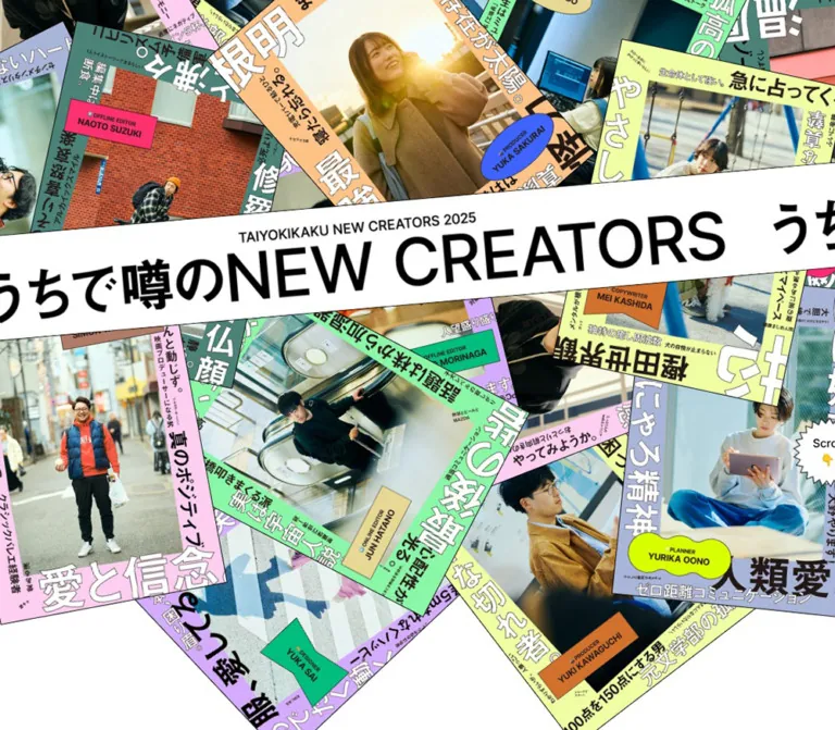
The page introduces fourteen young creators through the visual language of scoops, rumors, and personality profiles. Portrait photographs become magazine covers: pastel borders carry oversized Japanese headlines, small editorial annotations, and contrasting name stickers. Covers overlap at different angles, while a broad white title strip cuts diagonally across the opening composition.
The directory gives that exuberance a clear structure. Thin black rules divide white cells containing a compact professional role, an uppercase name, and an individually shaped portrait. Empty cells and cropped repetitions of SCOOP!!! keep the grid playful. A small floating navigation, large section labels, and a sparse sharing area complete the interface. Another poster pile closes the page, returning to its opening visual vocabulary.
How to Read This Reference
- Measured values come from the supplied rendered element bounds, computed styles, and custom properties. Dimensions are CSS pixels; some are rounded below for readability.
- Visual estimates describe geometry visible in the original-page screenshots, including poster angles, image-mask shapes, and border thickness. They are not recovered CSS declarations.
- Derived values are calculations from measured bounds, such as the directory width or the gap between sharing controls and the footer logo.
- Recommendations describe the reusable implementation, accessibility additions, and CSS below. They are not claims about existing site behavior.
- DOM presence and nonzero bounds do not establish visibility. Some menu and result elements have viewport-relative or offscreen coordinates without an accompanying open-state screenshot.
- Font families below are computed declarations. Font-file loading and individual glyph fallback were not independently verified.
Tokens — Colors
Default Palette
The first two colors are measured body styles. The remaining values are exact custom properties exposed at both inspected widths. Their visual roles describe the corresponding color vocabulary; the supplied evidence does not map every property to an individual poster layer.
| Name | Value | Source or implementation token | Role |
|---|---|---|---|
| White | #ffffff |
Recommended alias --color-paper |
Main canvas, directory cells, title strip, and scroll-burst interior |
| Black | #000000 |
Recommended alias --color-ink |
Interface text, rules, title lettering, and X sharing control |
| Mint | #8af7a7 |
Source --c-mint |
Bright green member-cover framing |
| Teal | #4a8378 |
Source --c-teal |
Darker green framing within the poster collage |
| Pink | #ffcef0 |
Source --c-pink |
Pale pink cover stock and editorial borders |
| Periwinkle | #a9b5d8 |
Source --c-periwinkle |
Blue-gray cover framing |
| Yellow | #f0ffa3 |
Source --c-yellow |
Pale yellow-green cover framing |
| Purple | #d4abff |
Source --c-purple |
Lavender cover framing |
| Orange | #ffc387 |
Source --c-orange |
Peach-orange cover framing |
| Facebook Blue | #3f63ff |
Source --c-facebook |
Measured Facebook sharing-button background |
White and black organize the page. The pastel palette is concentrated in the cover artwork, while photography supplies warm skin tones, blue clothing, brick red, and deep shadows. Small stickers introduce stronger lime, pink, blue, and orange accents. Exact sticker colors were not supplied as computed styles and should be taken from authorized artwork rather than guessed as additional UI tokens.
There is no verified theme selector. These colors form one composition, not a set of selectable page themes. A department-to-color mapping was not established.
Tokens — Typography
Latin Interface — Inter
- Computed family:
Inter, "Inter Fallback". - Roles: navigation, section headings, professional roles, creator names, result labels, and sharing controls.
- Measured weights:
400,500, and700, depending on the element. - Tracking:
normalon the sampled elements. - Character: clear sans-serif lettering with a strong uppercase editorial hierarchy.
Inter Fallback is the supplied fallback-family identifier, not a separately verified font asset. A new implementation should load Inter through its own authorized font setup and provide an available sans-serif fallback.
Japanese Introduction — Source Han Sans Japanese
- Computed family:
source-han-sans-japanese, sans-serif. - Weight:
700. - Desktop:
30px / 45px. - Mobile:
18.72px / 31.0752px, approximately1.66line height. - Role: the short narrative paragraphs beneath
SCOOP!andSEARCH!.
The mobile text introduces additional line breaks. For example, the search introduction changes from one line to two: 気になる噂ワードから followed by 人物を追跡!.
Cover Lettering and Opening Title
The covers mix very large Japanese characters, smaller vertical text, English role labels, and compact name stickers. Their composition behaves as artwork. The exact font families and division between image content and live text were not supplied.
The white opening strip contains the small line TAIYOKIKAKU NEW CREATORS 2025 above the much larger うちで噂のNEW CREATORS. Its heavy sans-serif appearance is visible, but no computed title font size was provided. Approximately 70–90px desktop and 40–48px mobile are useful visual starting ranges for an adaptation, not measured source values.
The HTML element's computed Times family does not describe the visible interface: the body and sampled content override it.
Type Scale
Values below are measured computed font sizes and line heights, not total element heights.
| Role | Desktop size / line height | Mobile size / line height | Weight |
|---|---|---|---|
| Body default | 16 / 24px |
16 / 24px |
400 |
| TOP / CREATORS navigation | 20 / 20px |
15.6 / 15.6px |
500 |
| SCOOP! / SEARCH! heading | 100 / 100px |
52 / 52px |
500 |
| Japanese introductory copy | 30 / 45px |
18.72 / 31.0752px |
700 |
| Directory role wrapper | 14 / 14px |
12.48 / 12.48px |
400 |
| Directory creator name | 28 / 28px |
17.472 / 17.472px |
500 |
| Creator-menu group label | 15 / 15px |
10.92 / 10.92px |
700 |
| Creator-menu name link | 19 / 19px |
13.832 / 13.832px |
400 |
| Producer-result heading | 50 / 50px |
31.2 / 31.2px |
500 |
| Producer-result name | 18 / 27px |
14.56 / 21.84px |
500 |
| SHARE! heading | 40 / 40px |
26 / 26px |
500 |
| X control | 40 / 60px |
24.96 / 37.44px |
500 |
| Facebook control | 30 / 45px |
18.72 / 28.08px |
500 |
| Scroll label | 15 / 22.5px |
15.6 / 23.4px |
400 |
The directory's visible role words appear bold and underlined in the desktop screenshot, while their sampled parent paragraphs compute to weight 400. The relevant child styles were not supplied. Preserve the visible hierarchy, but do not report the parent's weight as proof of the rendered word's weight.
The copyright line is visually small, approximately 10–11px in the supplied captures. Its own computed font size was not included.
Tokens — Spacing & Shapes
Density: tightly composed artwork and portrait cells, separated by generous white intervals around introductory and closing content.
Spacing Scale
| Use | Desktop | Mobile | Evidence |
|---|---|---|---|
| Header height | 64px |
54.05px |
Measured bounds |
| Header horizontal inset | 24px |
20.8px |
Computed padding |
| Gap between navigation controls | 27px |
16px |
Derived from bounds |
| Directory role bottom padding | 8px |
7.28px |
Computed padding |
| Directory name bottom padding | 13px |
7.28px |
Computed padding |
| Card top to role wrapper | 16px |
About 14.55px |
Derived from bounds |
| Intro/member section top padding | 133px |
140.4px |
Computed padding |
| Intro/member section bottom padding | 175px |
192.4px |
Computed padding |
| Introduction paragraph bottom padding | 78px |
141.44px |
Computed padding |
| Search section bottom padding | 132px |
117.52px |
Computed padding |
| SHARE! heading bottom padding | 25px |
14.56px |
Computed padding |
| Gap between sharing controls | 16px |
18.72px |
Derived from bounds |
| Sharing controls to footer logo | 78px |
About 119.59px |
Derived vertical gap |
The mobile spacing does not follow a uniform reduction of desktop dimensions. Some whitespace and the scroll cue become slightly larger.
Shapes and Edges
| Element | Treatment | Evidence |
|---|---|---|
| Main canvas and directory cells | Square, flat white surfaces | Visible screenshots |
| Directory rules | Approximately 1px, black |
Visual estimate |
| Poster covers | Sharp rectangular sheets with thin outlines and varied rotation | Visible screenshots |
| Opening title strip | Broad white rectangle, black edge, approximately −5° rotation |
Visual estimate |
| Portrait masks | Ovals, slanted quadrilaterals, irregular and pinched outlines | Visible desktop directory |
| Scroll cue | White jagged burst with thin black outline | Visible at both widths |
| X sharing control | Horizontal ellipse, border-radius: 50% |
Computed style and screenshot |
| Facebook sharing control | Square-cornered rectangle with a thin visible border | Computed radius and screenshot |
There is no prominent shadow-based elevation system in the supplied captures. Overlap, black rules, silhouette changes, and differences in scale provide separation.
Layout Measurements
| Element | Desktop | Mobile | Interpretation |
|---|---|---|---|
| Copy container | 1000px, starting at x = 220px |
390px, starting at x = 0 |
Desktop matches source --containerPC: 1000px |
| Directory content width | 1200px, x = 120–1320px |
Two measured 195.5px cells |
Desktop width derived from four columns |
| Directory card | 300 × 423px |
195.5 × 260px |
Measured link bounds |
| Scroll cue | 92 × 92px |
About 95.67 × 95.67px |
Measured link bounds |
| X control | 125 × 65px |
78 × 41.59px |
Measured bounds |
| Facebook control | 166 × 57px |
104 × 36.39px |
Measured bounds |
| Footer logo link | 204 × 17.39px |
212.16 × 18.09px |
Measured bounds |
The mobile directory's two measured cell widths total 391px. That one-pixel boundary discrepancy should not be interpreted as an intended horizontal browsing interface. The adaptation below keeps the functional grid within the viewport.
Components
Opening Poster Collage
Role: introduce the creators as personalities and establish the editorial premise immediately.
Build the visual as overlapping portrait covers. Each cover combines a photograph, a colored frame, large Japanese cover lines, small annotations, and a name/role sticker. Vary the angle, depth order, and amount visible. Several covers extend beyond the viewport. Individual rotations appear to range from modest tilts to approximately 45° in either direction; exact transforms were not supplied.
The title strip sits above the cover stack. At desktop, its visible thickness is approximately 138px, with its upper edge rising from about y = 323px at the left to y = 196px at the right. This supports an estimated rotation near −5°. On mobile, the strip is approximately 80px thick and retains a similar diagonal.
The collage occupies almost the entire desktop opening capture. The mobile version keeps large covers and crops them aggressively at both edges. It is a separately composed narrow view, not a complete miniature of the desktop arrangement.
The hero section measures 1018px high on desktop, including 20px bottom padding. On mobile it measures 931.73px, including 96.2px bottom padding. Subtracting that padding gives nominal inner heights of 998px and 835.53px; these are derived dimensions, not recovered image-stage declarations.
Repeated title fragments at the sides are visible. Repetition alone does not establish a moving marquee.
Scroll Burst
Role: a conspicuous invitation to continue into the directory.
A white starburst with a thin black outline contains Scroll and a downward pointing emoji on separate lines. The text remains upright while nearby covers rotate.
- Desktop bounds: x =
1213, y =547, size92 × 92px. - Mobile bounds: x ≈
283.94, y ≈737.94, size ≈95.67pxsquare. - Mobile clearance: approximately
10.4pxfrom the right and bottom edges of the captured viewport.
Its very different desktop and mobile position should be treated as part of the collage composition. A fixed bottom-right placement across all widths would not reproduce the observed desktop relationship.
The element is an anchor, but its extracted href is empty. The intended downward-navigation affordance is clear; its click destination and scrolling behavior were not verified.
Floating Navigation
Role: provide access to the index and the creator directory from deeper page positions.
Two compact controls sit at the upper left: an emoji followed by underlined TOP, and an emoji followed by underlined CREATORS. The header is transparent in the supplied styles, and underlying photographs remain visible around it in the directory capture.
TOP is a link to the index URL. CREATORS is a button. Preserve that semantic distinction.
The initial measured header sits exactly one header-height above the viewport: y = −64px on desktop and approximately −54.05px on mobile. It is absent from the opening screenshots and visible in the later directory/footer captures. The supplied transition is transform 0.3s ease-out. The trigger, scroll threshold, and directional logic were not supplied.
In the mobile footer capture, the navigation and the top of the sharing area occupy overlapping screen space. This is a capture-state observation; avoid generalizing it into an intentional overlay rule for every scroll position.
SCOOP! Introduction
Role: explain why the directory is framed around rumors and personal discovery.
A large SCOOP! heading leads a short bold Japanese introduction. The source copy includes 太陽パパラッチが本人に直撃!, reinforcing the interview and paparazzi premise.
The heading and paragraph use a 1000px desktop container, narrower than the 1200px member grid below. At mobile width, their measured wrappers span the viewport. The copy uses additional line breaks and a more open line-height ratio.
Preserve the substantial separation before the portraits. The paragraph's bottom padding rises from 78px on desktop to 141.44px on mobile. This is an intentional-looking pacing characteristic of the captured composition, although the source's responsive rule was not supplied.
Member Directory Grid
Role: provide a clear, navigable index of all fourteen creators.
The desktop grid has four 300px columns and 423px rows. Its content occupies x = 120–1320px at the inspected width. Thin rules extend the visual grid toward the viewport edges, where partial SCOOP!!! lettering appears.
The profile-link coordinates establish this arrangement:
| Row | Column 1 | Column 2 | Column 3 | Column 4 |
|---|---|---|---|---|
| 1 | YUKI KAWAGUCHI | YUKA SAKURAI | SIMON TAKENAKA | No profile link |
| 2 | MISUZU HORIUCHI | TOMOYA ITABASHI | NAOTO SUZUKI | JUN HATANO |
| 3 | MASATO MORINAGA | HIROKI MIURA | NANAMI KUBO | YURIKA OONO |
| 4 | No profile link | MEI KASHIDA | YUKA SAI | AKITO OZAKI |
A lower blank cell visibly contains SCOOP!!!. The exact decoration in the first row's fourth slot was not shown in the supplied directory screenshot.
On mobile, the fourteen profile links form seven consecutive two-column rows. Their order is preserved, and the desktop empty positions no longer interrupt the sequence. This is confirmed by the measured link coordinates; no mobile directory screenshot was supplied to verify its photograph crops.
Creator Card
Role: combine professional identity and a distinctive portrait into one profile link.
The entire measured card is an anchor. Its anatomy is:
- A centered role row, often preceded by an emoji, positioned about
16pxbelow the desktop cell top. - An uppercase creator name at
28px, weight500, with13pxbottom padding. - A large portrait with an individually chosen silhouette.
- A thin rule shared with adjacent cells.
The role is visually compact and underlined. Names remain outside the image, which keeps the directory readable even when portrait masks are playful.
The desktop image silhouettes occupy roughly 215–250px in width and 310–320px in height, depending on the shape. These are visual estimates. Examples include a slanted quadrilateral for MASATO MORINAGA, an upright oval for NANAMI KUBO, and a pinched, two-lobed outline for YURIKA OONO.
The cell itself stays square-cornered. The irregular geometry belongs to the photograph, not to a rounded card container.
Creator Menu — DOM Evidence Only
Role indicated by markup: provide profile links grouped by profession.
The extracted content groups producers, editors, and six other professional categories. Producers and editors each have four names. The directory cards distinguish online and offline editors, while the menu groups them under EDITOR.
Desktop menu-related bounds suggest four groups of columns with approximately 50px gaps. Group labels use 15px / 15px, weight 700; names use 19px / 19px with 8px vertical padding.
Mobile values shrink to 10.92px group labels and 13.832px names. One measured column begins beyond the viewport at x ≈ 409.78px. Without an open-state screenshot, this does not prove a visible overflow defect or a supported horizontal gesture.
An additional unlabeled button measures 51px square on desktop and about 53.03px square on mobile. Its purpose cannot be established from the supplied extraction. Opening behavior, backdrop, focus management, and dismissal remain unverified.
SEARCH! Section and Producer Results
Role indicated by source copy: discover creators through a rumor-related keyword.
The section has a SEARCH! heading and the explanatory line 気になる噂ワードから人物を追跡!. Its measured height is 832px on desktop and about 678.06px on mobile, including bottom padding.
The evidence also contains a separate PRODUCER result group with four profile links. Their layout changes from one desktop row to two mobile rows:
| Result-group measurement | Desktop | Mobile |
|---|---|---|
| Heading wrapper width | 813px |
About 317.28px |
| Individual result link | 185 × 266px |
About 157.64 × 190.89px |
| Columns indicated by bounds | Four | Two |
| Heading type | 50px |
31.2px |
| Name type | 18px |
14.56px |
These elements have coordinates inside the viewport while the main search section is much farther down the document. That is consistent with separately positioned content, but the visible presentation was not captured. Do not treat these bounds as proof that a modal was opened.
No text input, keyword selection sequence, filtering result, or search submission was verified. A faithful extension should establish the intended interaction before inventing a conventional search form.
Sharing Controls
Role: share the creator index through two named services.
An underlined SHARE! heading sits above a centered horizontal pair of controls. Their deliberately different silhouettes are part of the design:
- X: white lettering on a black ellipse,
125 × 65pxdesktop. - facebook: white lettering on a blue rectangle,
166 × 57pxdesktop.
The controls are vertically centered relative to one another. Their desktop horizontal gap is 16px; on mobile it is approximately 18.72px.
The links target the supplied Twitter share endpoint and Facebook sharer endpoint with the current index URL. Their destinations are verified from anchor markup; popup behavior and completed sharing were not tested.
Footer and Closing Collage
Role: identify the company and close with the same visual energy as the opening.
The company logo and a small copyright line are centered on white. The visible copyright names TAIYO KIKAKU Co., Ltd., and the logo links to the corporate homepage. The supplied index does not independently identify website production credits; featured creators' professional titles should not be treated as such credits.
Below the logo, the portrait covers rise from the bottom as another overlapping pile. Large white space above the covers lets the logo remain distinct. On mobile, the corporate mark is slightly wider than on desktop: approximately 212.16px versus 204px.
The closing artwork repeats the poster vocabulary, but no continuous scrolling loop or animated return to the hero was verified.
Tokens — Motion & Interaction
Measured Transition Declarations
| Element | Supplied value | Supported conclusion |
|---|---|---|
| Header | transform 0.3s ease-out |
A short positional transition is defined at both widths |
| Scroll cue | opacity 0.3s ease-out 0.1s |
A delayed opacity transition is defined |
| Japanese introductory paragraphs | opacity 0.3s ease-out 0.45s, transform 0.3s ease-out 0.45s |
Coordinated opacity and position transitions are defined |
| Producer-result links, desktop | opacity 0.3s ease-out |
Opacity feedback is available; its trigger and endpoint are unknown |
| Sharing links, desktop | opacity 0.3s ease-out |
Opacity feedback is available |
| Footer logo link, desktop | opacity 0.3s ease-out |
Opacity feedback is available |
Several mobile links report only all in the transition summary. That does not establish a meaningful animated duration. The sampled elements report animation: none; this does not rule out motion on unreported descendants, pseudo-elements, or JavaScript-controlled artwork.
The inspection waited at least five seconds initially and used animation, layout-stability, and image-readiness checks. Perpetual animations were temporarily paused during readiness checking and then resumed. The delivered screenshots are still images, not a motion recording.
Unverified: collage choreography, title-strip scrolling, parallax, entrance trajectories, hover endpoints, menu opening, search activation, scroll-cue activation, and reduced-motion handling.
For an adaptation, short 300ms ease-out opacity and position changes are consistent with the measured declarations. Keep the poster composition recognizable in its resting state. Do not introduce continuous spinning, bouncing, or a marquee and describe those as recovered source behavior.
Surfaces
| Layer | Appearance | Purpose |
|---|---|---|
| Page canvas | White | Shared background for all sections |
| Cover stack | Colored frames, photography, thin black edges | Personality and opening/closing spectacle |
| Title strip | White band with heavy black lettering | Strong foreground identity across the collage |
| Directory | White cells and thin black rules | Stable organization of creators |
| Portrait | Individually shaped photograph | Variation within the regular grid |
| Navigation | Transparent, black underlined labels, emoji | Lightweight page access |
| Scroll cue | White burst with black outline | Strong local affordance over busy imagery |
| Sharing controls | Black ellipse and blue rectangle | Distinct service links |
The source exposes these stacking variables: --z-header: 1000, --z-share: 1500, --z-menu: 2000, --z-modal: 3000, and --z-loading: 4000. Their presence establishes a named stacking scheme. It does not establish the appearance or successful activation of every named layer.
Imagery
The photography is candid and environmental: a camera held outdoors, a person on an escalator, a café table, a computer workstation, a motorcycle, and a sunlit portrait. Clothing, gestures, and locations help distinguish the creators. Warm backlight and cool interior light coexist naturally.
The magazine effect comes from the framing and typography. The visible photographs remain clear and full color; there is no consistent photocopy, halftone, or pixelated treatment. Avoid adding grain or distressed paper merely because the composition resembles a printed publication.
Two image treatments work together:
- Cover compositions: rectangular photographs embedded in dense, colored editorial artwork, then rotated and overlapped.
- Directory portraits: photographs isolated inside varied silhouettes, with their role and name presented as separate interface text.
Small emoji accompany navigation and many role labels. Their platform rendering may vary. No icon-library identity was supplied.
Observed Asset References
No image-file URLs, mask definitions, or native image dimensions were included in the evidence. The following is an inventory of observed artwork, not an invented file manifest.
| Artwork | Observed use | Implementation guidance |
|---|---|---|
| Creator cover compositions | Opening and footer collages | Use authorized full compositions or recreate their editorial layers deliberately |
| Environmental portraits | Directory cells | Preserve subject-specific framing and focal points |
| Irregular portrait silhouettes | Desktop directory | Use authored SVG/CSS masks or precomposed assets; original technique is unknown |
| Jagged burst outline | Scroll cue | Use a crisp white shape with a thin black perimeter |
| Company wordmark | Footer link | Use the authorized mark; do not typeset a substitute and call it the original |
Profile URLs such as /newcreators2025/morinaga/, /newcreators2025/kubo/, /newcreators2025/oono/, and /newcreators2025/sai/ are observed link destinations. They are not image paths, and their destination-page designs were not inspected.
Layout & Responsive Behavior
Page Structure
The page is a long scrolling creator showcase. The measured sections are:
| Region | Desktop document position / height | Mobile document position / height |
|---|---|---|
| Opening | y = 0, height 1018px |
y = 0, height 931.73px |
| Introduction and members | y = 1018, height 2484px |
y ≈ 931.73, height 2607.16px |
| Search | y = 3502, height 832px |
y ≈ 3538.89, height 678.06px |
| Sharing area to footer | y = 4334, derived height 214px |
y ≈ 4216.95, derived height 205.63px |
| Footer | y = 4548, height 748.39px |
y ≈ 4422.58, height 654.56px |
| Total document | About 5296.39px |
About 5077.14px |
The narrower page has a similar total length despite using seven directory rows. Smaller cards, shorter typography, and different section dimensions balance the extra rows.
Desktop
The opening artwork fills the width and reaches outside the viewport. The text introduction is constrained to 1000px, while the directory expands to 1200px. At 1440px, this leaves 220px copy margins and 120px directory margins.
The desktop directory keeps four columns and uses non-profile cells as part of its editorial arrangement. Border lines and cropped side lettering visually connect the central content to the edges of the screen.
Mobile
The opening retains large poster fragments, substantial overlap, and a clipped title strip. It does not expose every cover simultaneously. The scroll burst sits near the lower-right corner of the opening capture.
The directory becomes two columns with smaller role labels and names. All fourteen links remain present in a continuous sequence. The DOM confirms this reflow, but mobile portrait masks and image framing were not visually captured.
Sharing remains a horizontal pair. The logo is slightly larger, and the white interval before it is greater than on desktop. These details show why scaling the entire desktop page uniformly would be inaccurate.
Responsive Scaling Evidence
Many mobile values are consistent with a 375-unit design canvas scaled by 390 / 375 = 1.04:
| Candidate design value | At a 390px viewport | Observed value |
|---|---|---|
50 |
52px |
Section-heading size |
18 |
18.72px |
Japanese copy size |
15 |
15.6px |
Navigation size |
12 |
12.48px |
Directory role size |
250 |
260px |
Directory row height |
This is an inference from one mobile width, not a supplied source formula. The actual breakpoint, intermediate layouts, and minimum/maximum scaling limits are unknown. The Quick Start uses this relationship as an explicitly recommended adaptation.
Do’s and Don’ts
Do
- Preserve the contrast between the dense cover collage and the ordered white directory.
- Use the exact supplied pastel tokens as the starting palette for cover framing.
- Keep black text and thin rules as the primary interface structure.
- Give each portrait a deliberate focal point and silhouette.
- Keep names and professional roles outside the directory images.
- Preserve all fourteen profile links and their meaningful reading order.
- Keep the desktop copy container narrower than the member grid.
- Recompose the mobile collage with large cropped covers.
- Retain the distinct ellipse and rectangle of the sharing controls.
- Use the footer collage to echo the opening composition.
Don’t
- Don’t replace the directory with identical rounded cards and soft shadows.
- Don’t compress all whitespace into a uniformly dense page.
- Don’t scale the complete desktop collage down until every cover fits on a phone.
- Don’t use the pastel palette as an invented department-classification system.
- Don’t convert every irregular portrait into the same circular avatar.
- Don’t add a distressed print filter to the clean photography without a separate art-direction decision.
- Don’t assume repeated headline fragments prove marquee motion.
- Don’t turn DOM-only menu or result measurements into claims about tested dialogs.
- Don’t infer website production credits from featured creators' job titles.
Recommended Implementation Additions
These are recommendations for a new implementation, not verified features of the original:
- Provide a complete semantic page heading even when the decorative title strip is cropped. Hide duplicate title repetitions from assistive technology.
- Keep profile names and roles as accessible text. Give meaningful portrait alternatives, or empty alternatives when the adjacent link text already supplies the needed identity.
- Treat decorative emoji and repeated
SCOOP!!!lettering as decorative where appropriate. - Implement the creator toggle with
aria-expandedandaria-controls. If its eventual presentation is modal, add focus containment, Escape dismissal, and focus restoration. - Give the scroll cue a real section target and a clear accessible name.
- Preserve a visible focus ring around whole profile links and small navigation controls.
- Maintain touch targets of at least 44px where practical. The measured mobile sharing controls are shorter, so expand their interactive area without enlarging the visible artwork unnecessarily.
- Clip only decorative collage overflow. Keep names, menu content, and focus indicators reachable.
- Offer reduced-motion behavior and ensure all content is visible without entrance animation.
- Reserve image space and load appropriately sized assets. Prioritize visible opening artwork and defer below-the-fold portraits where practical.
Agent Prompt Guide
Quick Color Reference
- Canvas and title strip:
#ffffff. - Text, rules, and outlines:
#000000. - Cover palette: mint
#8af7a7, teal#4a8378, pink#ffcef0, periwinkle#a9b5d8, yellow#f0ffa3, purple#d4abff, and orange#ffc387. - Sharing: black ellipse for X;
#3f63ffrectangle for Facebook. - Photography: natural full color, with subject-specific warmth and contrast.
Overall Prompt
“Create a Japanese creative-company talent index inspired by an editorial scoop. Open with a dense collage of rotated portrait magazine covers: pastel frames, large Japanese cover lines, small name stickers, thin black edges, and candid environmental photography. Cross the composition with a white title strip tilted about five degrees upward to the right. Add a white jagged Scroll burst. Follow with large Inter section headings, bold Japanese introductory copy, and a ruled directory of fourteen creators. Each cell contains an underlined role, an uppercase name, and a differently masked portrait. Use four columns with editorial blank cells on desktop and seven consecutive two-column rows on mobile. Close with compact sharing controls, a centered company mark, and another cover pile. Keep motion restrained unless separately specified.”
Example Component Prompts
- Opening collage: “Build an edge-cropped arrangement of portrait covers on white. Mix pink, mint, lavender, yellow-green, teal, and peach frames. Use varied rotation and overlap, a broad diagonal white headline strip, and a small outlined starburst. Keep the phone composition large and cropped rather than shrinking every cover into view.”
- Creator card: “Create a flat white, thinly ruled directory cell. Center a small underlined professional role above a 28px uppercase Inter name. Place an environmental portrait below, using an oval, slanted quadrilateral, or authored organic mask. Keep the outer cell square and shadow-free.”
- Directory layout: “Arrange fourteen linked creator cells in a 1200px desktop grid with four 300px columns. Leave the first row's last slot and final row's first slot for decoration. Use seven two-column rows on mobile, preserving name order and removing those decorative slots.”
- Sharing footer: “Center an underlined SHARE! label above a black elliptical X control and a blue rectangular facebook control. Leave generous white space before a small company wordmark and copyright. Let colorful portrait covers rise into view below.”
- Navigation: “Place two compact, underlined controls at the upper left, each with an emoji: TOP as a link and CREATORS as a button. Use Inter medium, a transparent surface, and a short transform transition for an explicitly controlled visible state.”
Quick Start
CSS Custom Properties
This is a recommended CSS adaptation, not recovered source code. Exact source colors and measured desktop type sizes are retained. A proposed 767px breakpoint and a 375-unit mobile scale reproduce the supplied endpoint proportions; the source breakpoint was not available.
Load authorized Inter and Source Han Sans Japanese fonts separately. Poster images, exact silhouette artwork, complete collage placements, menu behavior, and search behavior require additional assets or implementation. The mobile portrait dimensions below are recommendations because the mobile directory was not visually captured. This CSS was not browser-tested during this analysis.
:root {
  /* Observed palette */
  --color-paper: #ffffff;
  --color-ink: #000000;
  --c-mint: #8af7a7;
  --c-teal: #4a8378;
  --c-pink: #ffcef0;
  --c-periwinkle: #a9b5d8;
  --c-yellow: #f0ffa3;
  --c-purple: #d4abff;
  --c-orange: #ffc387;
  --c-facebook: #3f63ff;

  /* Observed source stacking values */
  --z-header: 1000;
  --z-share: 1500;
  --z-menu: 2000;
  --z-modal: 3000;
  --z-loading: 4000;

  /* Implementation aliases */
  --font-latin: Inter, sans-serif;
  --font-japanese: 'source-han-sans-japanese', sans-serif;
  --containerPC: 1000px;
  --directory-width: 1200px;
  --card-height: 423px;
  --rule: 1px solid var(--color-ink);
  --header-height: 64px;
  --header-inset: 24px;
  --text-nav: 20px;
  --text-section: 100px;
  --text-copy: 30px;
  --text-role: 14px;
  --text-name: 28px;
  --leading-copy: 1.5;
  --motion-short: 300ms ease-out;

  /* Derived or estimated opening geometry */
  --hero-stage-height: 998px;
  --hero-bottom-space: 20px;
  --band-top: 260px;
  --band-height: 138px;
  --band-title-size: 80px;
  --band-kicker-size: 18px;

  /* Recommended approximation of the burst outline */
  --burst-shape: polygon(
    50% 0%, 55% 10%, 69% 4%, 70% 15%,
    85% 15%, 85% 30%, 96% 31%, 90% 45%,
    100% 50%, 90% 55%, 96% 69%, 85% 70%,
    85% 85%, 70% 85%, 69% 96%, 55% 90%,
    50% 100%, 45% 90%, 31% 96%, 30% 85%,
    15% 85%, 15% 70%, 4% 69%, 10% 55%,
    0% 50%, 10% 45%, 4% 31%, 15% 30%,
    15% 15%, 30% 15%, 31% 4%, 45% 10%
  );
}

* {
  box-sizing: border-box;
}

body {
  margin: 0;
  color: var(--color-ink);
  background: var(--color-paper);
  font-family: var(--font-latin);
  font-size: 16px;
  line-height: 1.5;
}

button,
a {
  -webkit-tap-highlight-color: transparent;
}

button {
  font: inherit;
}

.site-nav {
  position: fixed;
  inset: 0 0 auto;
  z-index: var(--z-header);
  display: flex;
  align-items: center;
  gap: 27px;
  height: var(--header-height);
  padding-inline: var(--header-inset);
  background: transparent;
  transition: transform var(--motion-short);
}

/* A behavior controller sets this state; no threshold is assumed. */
.site-nav[data-hidden='true'] {
  transform: translateY(-100%);
}

.site-nav__control {
  display: inline-flex;
  align-items: center;
  gap: 8px;
  padding: 0;
  border: 0;
  color: inherit;
  background: transparent;
  font-size: var(--text-nav);
  font-weight: 500;
  line-height: 1;
  text-decoration: none;
  cursor: pointer;
}

.site-nav__label {
  text-decoration: underline;
  text-underline-offset: 5px;
}

.press-hero {
  padding-bottom: var(--hero-bottom-space);
}

.collage-stage {
  position: relative;
  height: var(--hero-stage-height);
  overflow: clip;
  isolation: isolate;
}

/* Set placement properties per authorized cover composition. */
.cover-poster {
  position: absolute;
  left: var(--cover-x, 50%);
  top: var(--cover-y, 50%);
  z-index: var(--cover-layer, 1);
  display: block;
  width: var(--cover-width, 300px);
  height: auto;
  transform:
    translate(-50%, -50%)
    rotate(var(--cover-angle, 0deg));
}

.hero-band {
  position: absolute;
  top: var(--band-top);
  left: -15%;
  z-index: 40;
  display: flex;
  flex-direction: column;
  align-items: center;
  justify-content: center;
  width: 130%;
  min-height: var(--band-height);
  border-block: var(--rule);
  background: var(--color-paper);
  transform: rotate(-5deg);
}

.hero-band__kicker {
  margin: 0 0 6px;
  font-size: var(--band-kicker-size);
  font-weight: 500;
  line-height: 1;
  white-space: nowrap;
}

.hero-band__title {
  margin: 0;
  font-size: var(--band-title-size);
  font-weight: 700;
  line-height: 1;
  white-space: nowrap;
}

.scroll-cue {
  position: absolute;
  top: 547px;
  right: 135px;
  z-index: 50;
  display: grid;
  place-content: center;
  width: 92px;
  height: 92px;
  color: var(--color-ink);
  background: transparent;
  font-size: 15px;
  line-height: 1.5;
  text-align: center;
  text-decoration: none;
  isolation: isolate;
}

.scroll-cue::before,
.scroll-cue::after {
  position: absolute;
  content: '';
  clip-path: var(--burst-shape);
  pointer-events: none;
}

.scroll-cue::before {
  inset: 0;
  z-index: -2;
  background: var(--color-ink);
}

.scroll-cue::after {
  inset: 1px;
  z-index: -1;
  background: var(--color-paper);
}

.copy-container {
  width: min(100%, var(--containerPC));
  margin-inline: auto;
}

.scoop-section {
  padding-block: 133px 175px;
}

.section-heading {
  margin: 0;
  font-size: var(--text-section);
  font-weight: 500;
  line-height: 1;
}

.section-copy {
  margin: 30px 0 0;
  font-family: var(--font-japanese);
  font-size: var(--text-copy);
  font-weight: 700;
  line-height: var(--leading-copy);
}

.scoop-section .section-copy {
  padding-bottom: 78px;
}

.member-grid {
  display: grid;
  grid-template-columns: repeat(4, minmax(0, 1fr));
  width: min(100%, var(--directory-width));
  margin-inline: auto;
  border-top: var(--rule);
  border-left: var(--rule);
}

.member-card,
.scoop-tile {
  min-width: 0;
  min-height: var(--card-height);
  border-right: var(--rule);
  border-bottom: var(--rule);
  background: var(--color-paper);
}

.member-card {
  display: flex;
  flex-direction: column;
  align-items: center;
  padding: 16px 10px 20px;
  color: inherit;
  text-align: center;
  text-decoration: none;
}

.member-role {
  display: flex;
  align-items: flex-start;
  justify-content: center;
  gap: 4px;
  min-height: 24px;
  margin: 0;
  padding-bottom: 8px;
  font-size: var(--text-role);
  line-height: 1;
}

/* Recommended child weight matching the visible hierarchy. */
.member-role__label {
  font-weight: 700;
  text-decoration: underline;
  text-underline-offset: 2px;
}

.member-name {
  margin: 0;
  padding-bottom: 13px;
  font-size: var(--text-name);
  font-weight: 500;
  line-height: 1;
}

.member-portrait {
  display: block;
  width: min(100%, 250px);
  height: 320px;
  object-fit: cover;
  object-position: var(--portrait-position, center);
}

/* These mask approximations are not recovered source paths. */
.member-portrait--oval {
  border-radius: 50%;
}

.member-portrait--slanted {
  clip-path: polygon(0 5%, 91% 0, 100% 95%, 9% 100%);
}

.member-portrait--lobed {
  mask-image:
    radial-gradient(
      ellipse 50% 31% at 50% 31%,
      #000 99%, transparent 100%
    ),
    radial-gradient(
      ellipse 50% 31% at 50% 69%,
      #000 99%, transparent 100%
    );
  mask-repeat: no-repeat;
}

.scoop-tile {
  display: grid;
  place-items: center;
  font-size: 50px;
}

.scoop-tile span {
  transform: rotate(-5deg);
}

.share-section {
  padding-bottom: 78px;
  text-align: center;
}

.share-heading {
  min-height: 71px;
  margin: 0;
  padding-bottom: 25px;
  font-size: 40px;
  font-weight: 500;
  line-height: 1;
  text-decoration: underline;
  text-underline-offset: 8px;
}

.share-links {
  display: flex;
  align-items: center;
  justify-content: center;
  gap: 16px;
}

.share-link {
  display: flex;
  align-items: center;
  justify-content: center;
  color: var(--color-paper);
  font-weight: 500;
  text-decoration: none;
  transition: opacity var(--motion-short);
}

.share-link--x {
  width: 125px;
  height: 65px;
  border-radius: 50%;
  background: var(--color-ink);
  font-size: 40px;
}

.share-link--facebook {
  width: 166px;
  height: 57px;
  border: var(--rule);
  background: var(--c-facebook);
  font-size: 30px;
}

.site-footer {
  text-align: center;
}

.footer-logo {
  display: block;
  width: 204px;
  height: auto;
  margin-inline: auto;
}

/* Recommended value; the copyright size was not measured. */
.footer-copyright {
  margin: 8px 16px 0;
  font-size: 11px;
}

/* Recommended accessible interaction treatment. */
a:focus-visible,
button:focus-visible {
  outline: 2px solid var(--color-ink);
  outline-offset: 4px;
}

.member-card:focus-visible {
  outline-offset: -4px;
}

@media (max-width: 767px) {
  :root {
    /* Inferred endpoint scale, used here as a recommendation. */
    --sp: calc(100vw / 375);
    --header-height: calc(52 * var(--sp));
    --header-inset: calc(20 * var(--sp));
    --text-nav: calc(15 * var(--sp));
    --text-section: calc(50 * var(--sp));
    --text-copy: calc(18 * var(--sp));
    --text-role: calc(12 * var(--sp));
    --text-name: calc(16.8 * var(--sp));
    --leading-copy: 1.66;
    --card-height: calc(250 * var(--sp));
    --hero-stage-height: calc(803.4 * var(--sp));
    --hero-bottom-space: calc(92.5 * var(--sp));
    --band-top: calc(242 * var(--sp));
    --band-height: calc(78 * var(--sp));
    --band-title-size: calc(43 * var(--sp));
    --band-kicker-size: calc(11 * var(--sp));
  }

  .site-nav {
    gap: 16px;
  }

  .scroll-cue {
    top: auto;
    right: calc(10 * var(--sp));
    bottom: 2px;
    width: calc(92 * var(--sp));
    height: calc(92 * var(--sp));
    font-size: calc(15 * var(--sp));
  }

  .scoop-section {
    padding-block: calc(135 * var(--sp)) calc(185 * var(--sp));
  }

  .section-copy {
    margin-top: calc(23 * var(--sp));
  }

  .scoop-section .section-copy {
    padding-bottom: calc(136 * var(--sp));
  }

  .member-grid {
    grid-template-columns: repeat(2, minmax(0, 1fr));
  }

  .scoop-tile {
    display: none;
  }

  .member-card {
    padding: calc(14 * var(--sp)) 8px calc(8 * var(--sp));
  }

  .member-role {
    min-height: calc(20.48 * var(--sp));
    padding-bottom: calc(7 * var(--sp));
  }

  .member-name {
    padding-bottom: calc(7 * var(--sp));
  }

  .member-portrait {
    width: min(100%, calc(150 * var(--sp)));
    height: calc(180 * var(--sp));
  }

  .share-section {
    padding-bottom: calc(115 * var(--sp));
  }

  .share-heading {
    min-height: calc(42.73 * var(--sp));
    padding-bottom: calc(14 * var(--sp));
    font-size: calc(25 * var(--sp));
    text-underline-offset: 5px;
  }

  .share-links {
    gap: calc(18 * var(--sp));
  }

  .share-link--x {
    width: calc(75 * var(--sp));
    height: calc(40 * var(--sp));
    font-size: calc(24 * var(--sp));
  }

  .share-link--facebook {
    width: calc(100 * var(--sp));
    height: calc(35 * var(--sp));
    font-size: calc(18 * var(--sp));
  }

  .footer-logo {
    width: calc(204 * var(--sp));
  }
}

@media (prefers-reduced-motion: reduce) {
  .site-nav,
  .share-link {
    transition: none;
  }
}
Use .member-card on the fourteen profile anchors in their observed order. Insert decorative .scoop-tile elements after the third and eleventh creators; mark them aria-hidden='true'. They disappear at the proposed mobile breakpoint. The desktop side-rail lettering requires additional decorative markup outside the central grid.
For each .cover-poster, provide an authorized cover image and explicit --cover-x, --cover-y, --cover-width, --cover-angle, and --cover-layer values. Supply a separate mobile arrangement. The CSS deliberately leaves those art-direction choices explicit because the original transform data and asset boundaries were not supplied.
Tailwind v4 Token Mapping
Optional aliases for a project already using Tailwind v4. This is not evidence that the original website uses Tailwind. Define the custom properties above first.
@theme inline {
  --color-paper: var(--color-paper);
  --color-ink: var(--color-ink);
  --color-mint: var(--c-mint);
  --color-teal: var(--c-teal);
  --color-pink: var(--c-pink);
  --color-periwinkle: var(--c-periwinkle);
  --color-yellow: var(--c-yellow);
  --color-purple: var(--c-purple);
  --color-orange: var(--c-orange);
  --color-facebook: var(--c-facebook);

  --font-sans: var(--font-latin);
  --font-japanese: 'source-han-sans-japanese', sans-serif;

  --text-section: var(--text-section);
  --text-creator: var(--text-name);
  --text-role: var(--text-role);
  --text-navigation: var(--text-nav);

  --radius-square: 0px;
}
Sources & Evidence
- Inspected original and final page: TAIYO KIKAKU — NEW CREATORS 2025. The supplied retrieval reports HTTP
200and an unchanged final URL. - Capture date: September 12, 2026, retrieval timestamp
2026-09-12T13:12:59.131Z. - Desktop evidence: 1440 × 1000 opening, directory, and footer captures, plus rendered text, links, element bounds, computed styles, custom properties, and document height.
- Mobile evidence: 390 × 844 opening and footer captures, plus rendered text, links, element bounds, computed styles, custom properties, and document height. The directory's two-column arrangement is established by DOM geometry rather than a supplied mobile directory screenshot.
- Original-page identity evidence: the visible corporate mark, copyright naming TAIYO KIKAKU Co., Ltd., and the footer link to the corporate homepage. That destination was not separately inspected.
- Observed states: opening header translated above the viewport; navigation visible in later captures; desktop and mobile collage compositions; desktop directory imagery; responsive sharing controls. Anchor destinations were recorded, but their activation was not tested.
- Inspection limitations: no profile-page visits, open-menu capture, activated search capture, motion recording, hover/focus tests, font-file inventory, image URL inventory, or source breakpoint rules. Readiness checks reduce transient capture errors but do not establish semantic completeness or verify delayed and unexercised behavior.
This reference describes the current index shown in the supplied inspection. Measured styles, visual estimates, derived dimensions, and recommended implementation choices are identified separately throughout.
# TAIYO KIKAKU / NEW CREATORS 2025 — Style Reference

> A creator directory presented as a colorful stack of tabloid covers.

**Original URL:** [taiyokikaku.com/newcreators2025](https://www.taiyokikaku.com/newcreators2025/)
**Final URL:** [taiyokikaku.com/newcreators2025](https://www.taiyokikaku.com/newcreators2025/)
**Theme:** white canvas, black typography and rules, pastel poster frames, and colorful photography.
**Inspected:** September 12, 2026, at 13:12:59.131 UTC / 22:12:59.131 JST, through the supplied browser inspection.
**Viewports:** desktop 1440 × 1000 and mobile 390 × 844 CSS pixels.
**Scope:** the current index page: opening collage, introductory copy, fourteen-person directory, search-section markup, sharing controls, and footer. Desktop screenshots show the opening, part of the directory, and the footer; mobile screenshots show the opening and footer. Creator-menu and producer-result measurements are DOM evidence only. Individual profile pages and control activation were not inspected.

The page introduces fourteen young creators through the visual language of scoops, rumors, and personality profiles. Portrait photographs become magazine covers: pastel borders carry oversized Japanese headlines, small editorial annotations, and contrasting name stickers. Covers overlap at different angles, while a broad white title strip cuts diagonally across the opening composition.

The directory gives that exuberance a clear structure. Thin black rules divide white cells containing a compact professional role, an uppercase name, and an individually shaped portrait. Empty cells and cropped repetitions of `SCOOP!!!` keep the grid playful. A small floating navigation, large section labels, and a sparse sharing area complete the interface. Another poster pile closes the page, returning to its opening visual vocabulary.

## How to Read This Reference

- **Measured** values come from the supplied rendered element bounds, computed styles, and custom properties. Dimensions are CSS pixels; some are rounded below for readability.
- **Visual estimates** describe geometry visible in the original-page screenshots, including poster angles, image-mask shapes, and border thickness. They are not recovered CSS declarations.
- **Derived** values are calculations from measured bounds, such as the directory width or the gap between sharing controls and the footer logo.
- **Recommendations** describe the reusable implementation, accessibility additions, and CSS below. They are not claims about existing site behavior.
- DOM presence and nonzero bounds do not establish visibility. Some menu and result elements have viewport-relative or offscreen coordinates without an accompanying open-state screenshot.
- Font families below are computed declarations. Font-file loading and individual glyph fallback were not independently verified.

## Tokens — Colors

### Default Palette

The first two colors are measured body styles. The remaining values are exact custom properties exposed at both inspected widths. Their visual roles describe the corresponding color vocabulary; the supplied evidence does not map every property to an individual poster layer.

| Name | Value | Source or implementation token | Role |
| --- | --- | --- | --- |
| White | `#ffffff` | Recommended alias `--color-paper` | Main canvas, directory cells, title strip, and scroll-burst interior |
| Black | `#000000` | Recommended alias `--color-ink` | Interface text, rules, title lettering, and X sharing control |
| Mint | `#8af7a7` | Source `--c-mint` | Bright green member-cover framing |
| Teal | `#4a8378` | Source `--c-teal` | Darker green framing within the poster collage |
| Pink | `#ffcef0` | Source `--c-pink` | Pale pink cover stock and editorial borders |
| Periwinkle | `#a9b5d8` | Source `--c-periwinkle` | Blue-gray cover framing |
| Yellow | `#f0ffa3` | Source `--c-yellow` | Pale yellow-green cover framing |
| Purple | `#d4abff` | Source `--c-purple` | Lavender cover framing |
| Orange | `#ffc387` | Source `--c-orange` | Peach-orange cover framing |
| Facebook Blue | `#3f63ff` | Source `--c-facebook` | Measured Facebook sharing-button background |

White and black organize the page. The pastel palette is concentrated in the cover artwork, while photography supplies warm skin tones, blue clothing, brick red, and deep shadows. Small stickers introduce stronger lime, pink, blue, and orange accents. Exact sticker colors were not supplied as computed styles and should be taken from authorized artwork rather than guessed as additional UI tokens.

There is no verified theme selector. These colors form one composition, not a set of selectable page themes. A department-to-color mapping was not established.

## Tokens — Typography

### Latin Interface — Inter

- **Computed family:** `Inter, "Inter Fallback"`.
- **Roles:** navigation, section headings, professional roles, creator names, result labels, and sharing controls.
- **Measured weights:** `400`, `500`, and `700`, depending on the element.
- **Tracking:** `normal` on the sampled elements.
- **Character:** clear sans-serif lettering with a strong uppercase editorial hierarchy.

`Inter Fallback` is the supplied fallback-family identifier, not a separately verified font asset. A new implementation should load Inter through its own authorized font setup and provide an available sans-serif fallback.

### Japanese Introduction — Source Han Sans Japanese

- **Computed family:** `source-han-sans-japanese, sans-serif`.
- **Weight:** `700`.
- **Desktop:** `30px / 45px`.
- **Mobile:** `18.72px / 31.0752px`, approximately `1.66` line height.
- **Role:** the short narrative paragraphs beneath `SCOOP!` and `SEARCH!`.

The mobile text introduces additional line breaks. For example, the search introduction changes from one line to two: `気になる噂ワードから` followed by `人物を追跡!`.

### Cover Lettering and Opening Title

The covers mix very large Japanese characters, smaller vertical text, English role labels, and compact name stickers. Their composition behaves as artwork. The exact font families and division between image content and live text were not supplied.

The white opening strip contains the small line `TAIYOKIKAKU NEW CREATORS 2025` above the much larger `うちで噂のNEW CREATORS`. Its heavy sans-serif appearance is visible, but no computed title font size was provided. Approximately 70–90px desktop and 40–48px mobile are useful visual starting ranges for an adaptation, not measured source values.

The HTML element's computed `Times` family does not describe the visible interface: the body and sampled content override it.

### Type Scale

Values below are measured computed font sizes and line heights, not total element heights.

| Role | Desktop size / line height | Mobile size / line height | Weight |
| --- | --- | --- | --- |
| Body default | `16 / 24px` | `16 / 24px` | `400` |
| TOP / CREATORS navigation | `20 / 20px` | `15.6 / 15.6px` | `500` |
| SCOOP! / SEARCH! heading | `100 / 100px` | `52 / 52px` | `500` |
| Japanese introductory copy | `30 / 45px` | `18.72 / 31.0752px` | `700` |
| Directory role wrapper | `14 / 14px` | `12.48 / 12.48px` | `400` |
| Directory creator name | `28 / 28px` | `17.472 / 17.472px` | `500` |
| Creator-menu group label | `15 / 15px` | `10.92 / 10.92px` | `700` |
| Creator-menu name link | `19 / 19px` | `13.832 / 13.832px` | `400` |
| Producer-result heading | `50 / 50px` | `31.2 / 31.2px` | `500` |
| Producer-result name | `18 / 27px` | `14.56 / 21.84px` | `500` |
| SHARE! heading | `40 / 40px` | `26 / 26px` | `500` |
| X control | `40 / 60px` | `24.96 / 37.44px` | `500` |
| Facebook control | `30 / 45px` | `18.72 / 28.08px` | `500` |
| Scroll label | `15 / 22.5px` | `15.6 / 23.4px` | `400` |

The directory's visible role words appear bold and underlined in the desktop screenshot, while their sampled parent paragraphs compute to weight `400`. The relevant child styles were not supplied. Preserve the visible hierarchy, but do not report the parent's weight as proof of the rendered word's weight.

The copyright line is visually small, approximately 10–11px in the supplied captures. Its own computed font size was not included.

## Tokens — Spacing & Shapes

**Density:** tightly composed artwork and portrait cells, separated by generous white intervals around introductory and closing content.

### Spacing Scale

| Use | Desktop | Mobile | Evidence |
| --- | --- | --- | --- |
| Header height | `64px` | `54.05px` | Measured bounds |
| Header horizontal inset | `24px` | `20.8px` | Computed padding |
| Gap between navigation controls | `27px` | `16px` | Derived from bounds |
| Directory role bottom padding | `8px` | `7.28px` | Computed padding |
| Directory name bottom padding | `13px` | `7.28px` | Computed padding |
| Card top to role wrapper | `16px` | About `14.55px` | Derived from bounds |
| Intro/member section top padding | `133px` | `140.4px` | Computed padding |
| Intro/member section bottom padding | `175px` | `192.4px` | Computed padding |
| Introduction paragraph bottom padding | `78px` | `141.44px` | Computed padding |
| Search section bottom padding | `132px` | `117.52px` | Computed padding |
| SHARE! heading bottom padding | `25px` | `14.56px` | Computed padding |
| Gap between sharing controls | `16px` | `18.72px` | Derived from bounds |
| Sharing controls to footer logo | `78px` | About `119.59px` | Derived vertical gap |

The mobile spacing does not follow a uniform reduction of desktop dimensions. Some whitespace and the scroll cue become slightly larger.

### Shapes and Edges

| Element | Treatment | Evidence |
| --- | --- | --- |
| Main canvas and directory cells | Square, flat white surfaces | Visible screenshots |
| Directory rules | Approximately `1px`, black | Visual estimate |
| Poster covers | Sharp rectangular sheets with thin outlines and varied rotation | Visible screenshots |
| Opening title strip | Broad white rectangle, black edge, approximately `−5°` rotation | Visual estimate |
| Portrait masks | Ovals, slanted quadrilaterals, irregular and pinched outlines | Visible desktop directory |
| Scroll cue | White jagged burst with thin black outline | Visible at both widths |
| X sharing control | Horizontal ellipse, `border-radius: 50%` | Computed style and screenshot |
| Facebook sharing control | Square-cornered rectangle with a thin visible border | Computed radius and screenshot |

There is no prominent shadow-based elevation system in the supplied captures. Overlap, black rules, silhouette changes, and differences in scale provide separation.

### Layout Measurements

| Element | Desktop | Mobile | Interpretation |
| --- | --- | --- | --- |
| Copy container | `1000px`, starting at x = `220px` | `390px`, starting at x = `0` | Desktop matches source `--containerPC: 1000px` |
| Directory content width | `1200px`, x = `120–1320px` | Two measured `195.5px` cells | Desktop width derived from four columns |
| Directory card | `300 × 423px` | `195.5 × 260px` | Measured link bounds |
| Scroll cue | `92 × 92px` | About `95.67 × 95.67px` | Measured link bounds |
| X control | `125 × 65px` | `78 × 41.59px` | Measured bounds |
| Facebook control | `166 × 57px` | `104 × 36.39px` | Measured bounds |
| Footer logo link | `204 × 17.39px` | `212.16 × 18.09px` | Measured bounds |

The mobile directory's two measured cell widths total 391px. That one-pixel boundary discrepancy should not be interpreted as an intended horizontal browsing interface. The adaptation below keeps the functional grid within the viewport.

## Components

### Opening Poster Collage

**Role:** introduce the creators as personalities and establish the editorial premise immediately.

Build the visual as overlapping portrait covers. Each cover combines a photograph, a colored frame, large Japanese cover lines, small annotations, and a name/role sticker. Vary the angle, depth order, and amount visible. Several covers extend beyond the viewport. Individual rotations appear to range from modest tilts to approximately 45° in either direction; exact transforms were not supplied.

The title strip sits above the cover stack. At desktop, its visible thickness is approximately 138px, with its upper edge rising from about y = 323px at the left to y = 196px at the right. This supports an estimated rotation near `−5°`. On mobile, the strip is approximately 80px thick and retains a similar diagonal.

The collage occupies almost the entire desktop opening capture. The mobile version keeps large covers and crops them aggressively at both edges. It is a separately composed narrow view, not a complete miniature of the desktop arrangement.

The hero section measures `1018px` high on desktop, including `20px` bottom padding. On mobile it measures `931.73px`, including `96.2px` bottom padding. Subtracting that padding gives nominal inner heights of `998px` and `835.53px`; these are derived dimensions, not recovered image-stage declarations.

Repeated title fragments at the sides are visible. Repetition alone does not establish a moving marquee.

### Scroll Burst

**Role:** a conspicuous invitation to continue into the directory.

A white starburst with a thin black outline contains `Scroll` and a downward pointing emoji on separate lines. The text remains upright while nearby covers rotate.

- **Desktop bounds:** x = `1213`, y = `547`, size `92 × 92px`.
- **Mobile bounds:** x ≈ `283.94`, y ≈ `737.94`, size ≈ `95.67px` square.
- **Mobile clearance:** approximately `10.4px` from the right and bottom edges of the captured viewport.

Its very different desktop and mobile position should be treated as part of the collage composition. A fixed bottom-right placement across all widths would not reproduce the observed desktop relationship.

The element is an anchor, but its extracted `href` is empty. The intended downward-navigation affordance is clear; its click destination and scrolling behavior were not verified.

### Floating Navigation

**Role:** provide access to the index and the creator directory from deeper page positions.

Two compact controls sit at the upper left: an emoji followed by underlined `TOP`, and an emoji followed by underlined `CREATORS`. The header is transparent in the supplied styles, and underlying photographs remain visible around it in the directory capture.

`TOP` is a link to the index URL. `CREATORS` is a button. Preserve that semantic distinction.

The initial measured header sits exactly one header-height above the viewport: y = `−64px` on desktop and approximately `−54.05px` on mobile. It is absent from the opening screenshots and visible in the later directory/footer captures. The supplied transition is `transform 0.3s ease-out`. The trigger, scroll threshold, and directional logic were not supplied.

In the mobile footer capture, the navigation and the top of the sharing area occupy overlapping screen space. This is a capture-state observation; avoid generalizing it into an intentional overlay rule for every scroll position.

### SCOOP! Introduction

**Role:** explain why the directory is framed around rumors and personal discovery.

A large `SCOOP!` heading leads a short bold Japanese introduction. The source copy includes `太陽パパラッチが本人に直撃!`, reinforcing the interview and paparazzi premise.

The heading and paragraph use a `1000px` desktop container, narrower than the `1200px` member grid below. At mobile width, their measured wrappers span the viewport. The copy uses additional line breaks and a more open line-height ratio.

Preserve the substantial separation before the portraits. The paragraph's bottom padding rises from `78px` on desktop to `141.44px` on mobile. This is an intentional-looking pacing characteristic of the captured composition, although the source's responsive rule was not supplied.

### Member Directory Grid

**Role:** provide a clear, navigable index of all fourteen creators.

The desktop grid has four `300px` columns and `423px` rows. Its content occupies x = `120–1320px` at the inspected width. Thin rules extend the visual grid toward the viewport edges, where partial `SCOOP!!!` lettering appears.

The profile-link coordinates establish this arrangement:

| Row | Column 1 | Column 2 | Column 3 | Column 4 |
| --- | --- | --- | --- | --- |
| 1 | YUKI KAWAGUCHI | YUKA SAKURAI | SIMON TAKENAKA | No profile link |
| 2 | MISUZU HORIUCHI | TOMOYA ITABASHI | NAOTO SUZUKI | JUN HATANO |
| 3 | MASATO MORINAGA | HIROKI MIURA | NANAMI KUBO | YURIKA OONO |
| 4 | No profile link | MEI KASHIDA | YUKA SAI | AKITO OZAKI |

A lower blank cell visibly contains `SCOOP!!!`. The exact decoration in the first row's fourth slot was not shown in the supplied directory screenshot.

On mobile, the fourteen profile links form seven consecutive two-column rows. Their order is preserved, and the desktop empty positions no longer interrupt the sequence. This is confirmed by the measured link coordinates; no mobile directory screenshot was supplied to verify its photograph crops.

### Creator Card

**Role:** combine professional identity and a distinctive portrait into one profile link.

The entire measured card is an anchor. Its anatomy is:

1. A centered role row, often preceded by an emoji, positioned about `16px` below the desktop cell top.
2. An uppercase creator name at `28px`, weight `500`, with `13px` bottom padding.
3. A large portrait with an individually chosen silhouette.
4. A thin rule shared with adjacent cells.

The role is visually compact and underlined. Names remain outside the image, which keeps the directory readable even when portrait masks are playful.

The desktop image silhouettes occupy roughly 215–250px in width and 310–320px in height, depending on the shape. These are visual estimates. Examples include a slanted quadrilateral for MASATO MORINAGA, an upright oval for NANAMI KUBO, and a pinched, two-lobed outline for YURIKA OONO.

The cell itself stays square-cornered. The irregular geometry belongs to the photograph, not to a rounded card container.

### Creator Menu — DOM Evidence Only

**Role indicated by markup:** provide profile links grouped by profession.

The extracted content groups producers, editors, and six other professional categories. Producers and editors each have four names. The directory cards distinguish online and offline editors, while the menu groups them under `EDITOR`.

Desktop menu-related bounds suggest four groups of columns with approximately `50px` gaps. Group labels use `15px / 15px`, weight `700`; names use `19px / 19px` with `8px` vertical padding.

Mobile values shrink to `10.92px` group labels and `13.832px` names. One measured column begins beyond the viewport at x ≈ `409.78px`. Without an open-state screenshot, this does not prove a visible overflow defect or a supported horizontal gesture.

An additional unlabeled button measures `51px` square on desktop and about `53.03px` square on mobile. Its purpose cannot be established from the supplied extraction. Opening behavior, backdrop, focus management, and dismissal remain unverified.

### SEARCH! Section and Producer Results

**Role indicated by source copy:** discover creators through a rumor-related keyword.

The section has a `SEARCH!` heading and the explanatory line `気になる噂ワードから人物を追跡!`. Its measured height is `832px` on desktop and about `678.06px` on mobile, including bottom padding.

The evidence also contains a separate `PRODUCER` result group with four profile links. Their layout changes from one desktop row to two mobile rows:

| Result-group measurement | Desktop | Mobile |
| --- | --- | --- |
| Heading wrapper width | `813px` | About `317.28px` |
| Individual result link | `185 × 266px` | About `157.64 × 190.89px` |
| Columns indicated by bounds | Four | Two |
| Heading type | `50px` | `31.2px` |
| Name type | `18px` | `14.56px` |

These elements have coordinates inside the viewport while the main search section is much farther down the document. That is consistent with separately positioned content, but the visible presentation was not captured. Do not treat these bounds as proof that a modal was opened.

No text input, keyword selection sequence, filtering result, or search submission was verified. A faithful extension should establish the intended interaction before inventing a conventional search form.

### Sharing Controls

**Role:** share the creator index through two named services.

An underlined `SHARE!` heading sits above a centered horizontal pair of controls. Their deliberately different silhouettes are part of the design:

- **X:** white lettering on a black ellipse, `125 × 65px` desktop.
- **facebook:** white lettering on a blue rectangle, `166 × 57px` desktop.

The controls are vertically centered relative to one another. Their desktop horizontal gap is `16px`; on mobile it is approximately `18.72px`.

The links target the supplied Twitter share endpoint and Facebook sharer endpoint with the current index URL. Their destinations are verified from anchor markup; popup behavior and completed sharing were not tested.

### Footer and Closing Collage

**Role:** identify the company and close with the same visual energy as the opening.

The company logo and a small copyright line are centered on white. The visible copyright names `TAIYO KIKAKU Co., Ltd.`, and the logo links to the corporate homepage. The supplied index does not independently identify website production credits; featured creators' professional titles should not be treated as such credits.

Below the logo, the portrait covers rise from the bottom as another overlapping pile. Large white space above the covers lets the logo remain distinct. On mobile, the corporate mark is slightly wider than on desktop: approximately `212.16px` versus `204px`.

The closing artwork repeats the poster vocabulary, but no continuous scrolling loop or animated return to the hero was verified.

## Tokens — Motion & Interaction

### Measured Transition Declarations

| Element | Supplied value | Supported conclusion |
| --- | --- | --- |
| Header | `transform 0.3s ease-out` | A short positional transition is defined at both widths |
| Scroll cue | `opacity 0.3s ease-out 0.1s` | A delayed opacity transition is defined |
| Japanese introductory paragraphs | `opacity 0.3s ease-out 0.45s, transform 0.3s ease-out 0.45s` | Coordinated opacity and position transitions are defined |
| Producer-result links, desktop | `opacity 0.3s ease-out` | Opacity feedback is available; its trigger and endpoint are unknown |
| Sharing links, desktop | `opacity 0.3s ease-out` | Opacity feedback is available |
| Footer logo link, desktop | `opacity 0.3s ease-out` | Opacity feedback is available |

Several mobile links report only `all` in the transition summary. That does not establish a meaningful animated duration. The sampled elements report `animation: none`; this does not rule out motion on unreported descendants, pseudo-elements, or JavaScript-controlled artwork.

The inspection waited at least five seconds initially and used animation, layout-stability, and image-readiness checks. Perpetual animations were temporarily paused during readiness checking and then resumed. The delivered screenshots are still images, not a motion recording.

**Unverified:** collage choreography, title-strip scrolling, parallax, entrance trajectories, hover endpoints, menu opening, search activation, scroll-cue activation, and reduced-motion handling.

For an adaptation, short `300ms ease-out` opacity and position changes are consistent with the measured declarations. Keep the poster composition recognizable in its resting state. Do not introduce continuous spinning, bouncing, or a marquee and describe those as recovered source behavior.

## Surfaces

| Layer | Appearance | Purpose |
| --- | --- | --- |
| Page canvas | White | Shared background for all sections |
| Cover stack | Colored frames, photography, thin black edges | Personality and opening/closing spectacle |
| Title strip | White band with heavy black lettering | Strong foreground identity across the collage |
| Directory | White cells and thin black rules | Stable organization of creators |
| Portrait | Individually shaped photograph | Variation within the regular grid |
| Navigation | Transparent, black underlined labels, emoji | Lightweight page access |
| Scroll cue | White burst with black outline | Strong local affordance over busy imagery |
| Sharing controls | Black ellipse and blue rectangle | Distinct service links |

The source exposes these stacking variables: `--z-header: 1000`, `--z-share: 1500`, `--z-menu: 2000`, `--z-modal: 3000`, and `--z-loading: 4000`. Their presence establishes a named stacking scheme. It does not establish the appearance or successful activation of every named layer.

## Imagery

The photography is candid and environmental: a camera held outdoors, a person on an escalator, a café table, a computer workstation, a motorcycle, and a sunlit portrait. Clothing, gestures, and locations help distinguish the creators. Warm backlight and cool interior light coexist naturally.

The magazine effect comes from the framing and typography. The visible photographs remain clear and full color; there is no consistent photocopy, halftone, or pixelated treatment. Avoid adding grain or distressed paper merely because the composition resembles a printed publication.

Two image treatments work together:

- **Cover compositions:** rectangular photographs embedded in dense, colored editorial artwork, then rotated and overlapped.
- **Directory portraits:** photographs isolated inside varied silhouettes, with their role and name presented as separate interface text.

Small emoji accompany navigation and many role labels. Their platform rendering may vary. No icon-library identity was supplied.

### Observed Asset References

No image-file URLs, mask definitions, or native image dimensions were included in the evidence. The following is an inventory of observed artwork, not an invented file manifest.

| Artwork | Observed use | Implementation guidance |
| --- | --- | --- |
| Creator cover compositions | Opening and footer collages | Use authorized full compositions or recreate their editorial layers deliberately |
| Environmental portraits | Directory cells | Preserve subject-specific framing and focal points |
| Irregular portrait silhouettes | Desktop directory | Use authored SVG/CSS masks or precomposed assets; original technique is unknown |
| Jagged burst outline | Scroll cue | Use a crisp white shape with a thin black perimeter |
| Company wordmark | Footer link | Use the authorized mark; do not typeset a substitute and call it the original |

Profile URLs such as `/newcreators2025/morinaga/`, `/newcreators2025/kubo/`, `/newcreators2025/oono/`, and `/newcreators2025/sai/` are observed link destinations. They are not image paths, and their destination-page designs were not inspected.

## Layout & Responsive Behavior

### Page Structure

The page is a long scrolling creator showcase. The measured sections are:

| Region | Desktop document position / height | Mobile document position / height |
| --- | --- | --- |
| Opening | y = `0`, height `1018px` | y = `0`, height `931.73px` |
| Introduction and members | y = `1018`, height `2484px` | y ≈ `931.73`, height `2607.16px` |
| Search | y = `3502`, height `832px` | y ≈ `3538.89`, height `678.06px` |
| Sharing area to footer | y = `4334`, derived height `214px` | y ≈ `4216.95`, derived height `205.63px` |
| Footer | y = `4548`, height `748.39px` | y ≈ `4422.58`, height `654.56px` |
| Total document | About `5296.39px` | About `5077.14px` |

The narrower page has a similar total length despite using seven directory rows. Smaller cards, shorter typography, and different section dimensions balance the extra rows.

### Desktop

The opening artwork fills the width and reaches outside the viewport. The text introduction is constrained to `1000px`, while the directory expands to `1200px`. At 1440px, this leaves `220px` copy margins and `120px` directory margins.

The desktop directory keeps four columns and uses non-profile cells as part of its editorial arrangement. Border lines and cropped side lettering visually connect the central content to the edges of the screen.

### Mobile

The opening retains large poster fragments, substantial overlap, and a clipped title strip. It does not expose every cover simultaneously. The scroll burst sits near the lower-right corner of the opening capture.

The directory becomes two columns with smaller role labels and names. All fourteen links remain present in a continuous sequence. The DOM confirms this reflow, but mobile portrait masks and image framing were not visually captured.

Sharing remains a horizontal pair. The logo is slightly larger, and the white interval before it is greater than on desktop. These details show why scaling the entire desktop page uniformly would be inaccurate.

### Responsive Scaling Evidence

Many mobile values are consistent with a 375-unit design canvas scaled by `390 / 375 = 1.04`:

| Candidate design value | At a 390px viewport | Observed value |
| --- | --- | --- |
| `50` | `52px` | Section-heading size |
| `18` | `18.72px` | Japanese copy size |
| `15` | `15.6px` | Navigation size |
| `12` | `12.48px` | Directory role size |
| `250` | `260px` | Directory row height |

This is an inference from one mobile width, not a supplied source formula. The actual breakpoint, intermediate layouts, and minimum/maximum scaling limits are unknown. The Quick Start uses this relationship as an explicitly recommended adaptation.

## Do’s and Don’ts

### Do

- Preserve the contrast between the dense cover collage and the ordered white directory.
- Use the exact supplied pastel tokens as the starting palette for cover framing.
- Keep black text and thin rules as the primary interface structure.
- Give each portrait a deliberate focal point and silhouette.
- Keep names and professional roles outside the directory images.
- Preserve all fourteen profile links and their meaningful reading order.
- Keep the desktop copy container narrower than the member grid.
- Recompose the mobile collage with large cropped covers.
- Retain the distinct ellipse and rectangle of the sharing controls.
- Use the footer collage to echo the opening composition.

### Don’t

- Don’t replace the directory with identical rounded cards and soft shadows.
- Don’t compress all whitespace into a uniformly dense page.
- Don’t scale the complete desktop collage down until every cover fits on a phone.
- Don’t use the pastel palette as an invented department-classification system.
- Don’t convert every irregular portrait into the same circular avatar.
- Don’t add a distressed print filter to the clean photography without a separate art-direction decision.
- Don’t assume repeated headline fragments prove marquee motion.
- Don’t turn DOM-only menu or result measurements into claims about tested dialogs.
- Don’t infer website production credits from featured creators' job titles.

## Recommended Implementation Additions

These are recommendations for a new implementation, not verified features of the original:

- Provide a complete semantic page heading even when the decorative title strip is cropped. Hide duplicate title repetitions from assistive technology.
- Keep profile names and roles as accessible text. Give meaningful portrait alternatives, or empty alternatives when the adjacent link text already supplies the needed identity.
- Treat decorative emoji and repeated `SCOOP!!!` lettering as decorative where appropriate.
- Implement the creator toggle with `aria-expanded` and `aria-controls`. If its eventual presentation is modal, add focus containment, Escape dismissal, and focus restoration.
- Give the scroll cue a real section target and a clear accessible name.
- Preserve a visible focus ring around whole profile links and small navigation controls.
- Maintain touch targets of at least 44px where practical. The measured mobile sharing controls are shorter, so expand their interactive area without enlarging the visible artwork unnecessarily.
- Clip only decorative collage overflow. Keep names, menu content, and focus indicators reachable.
- Offer reduced-motion behavior and ensure all content is visible without entrance animation.
- Reserve image space and load appropriately sized assets. Prioritize visible opening artwork and defer below-the-fold portraits where practical.

## Agent Prompt Guide

### Quick Color Reference

- Canvas and title strip: `#ffffff`.
- Text, rules, and outlines: `#000000`.
- Cover palette: mint `#8af7a7`, teal `#4a8378`, pink `#ffcef0`, periwinkle `#a9b5d8`, yellow `#f0ffa3`, purple `#d4abff`, and orange `#ffc387`.
- Sharing: black ellipse for X; `#3f63ff` rectangle for Facebook.
- Photography: natural full color, with subject-specific warmth and contrast.

### Overall Prompt

“Create a Japanese creative-company talent index inspired by an editorial scoop. Open with a dense collage of rotated portrait magazine covers: pastel frames, large Japanese cover lines, small name stickers, thin black edges, and candid environmental photography. Cross the composition with a white title strip tilted about five degrees upward to the right. Add a white jagged Scroll burst. Follow with large Inter section headings, bold Japanese introductory copy, and a ruled directory of fourteen creators. Each cell contains an underlined role, an uppercase name, and a differently masked portrait. Use four columns with editorial blank cells on desktop and seven consecutive two-column rows on mobile. Close with compact sharing controls, a centered company mark, and another cover pile. Keep motion restrained unless separately specified.”

### Example Component Prompts

1. **Opening collage:** “Build an edge-cropped arrangement of portrait covers on white. Mix pink, mint, lavender, yellow-green, teal, and peach frames. Use varied rotation and overlap, a broad diagonal white headline strip, and a small outlined starburst. Keep the phone composition large and cropped rather than shrinking every cover into view.”
2. **Creator card:** “Create a flat white, thinly ruled directory cell. Center a small underlined professional role above a 28px uppercase Inter name. Place an environmental portrait below, using an oval, slanted quadrilateral, or authored organic mask. Keep the outer cell square and shadow-free.”
3. **Directory layout:** “Arrange fourteen linked creator cells in a 1200px desktop grid with four 300px columns. Leave the first row's last slot and final row's first slot for decoration. Use seven two-column rows on mobile, preserving name order and removing those decorative slots.”
4. **Sharing footer:** “Center an underlined SHARE! label above a black elliptical X control and a blue rectangular facebook control. Leave generous white space before a small company wordmark and copyright. Let colorful portrait covers rise into view below.”
5. **Navigation:** “Place two compact, underlined controls at the upper left, each with an emoji: TOP as a link and CREATORS as a button. Use Inter medium, a transparent surface, and a short transform transition for an explicitly controlled visible state.”

## Quick Start

### CSS Custom Properties

This is a recommended CSS adaptation, not recovered source code. Exact source colors and measured desktop type sizes are retained. A proposed `767px` breakpoint and a 375-unit mobile scale reproduce the supplied endpoint proportions; the source breakpoint was not available.

Load authorized Inter and Source Han Sans Japanese fonts separately. Poster images, exact silhouette artwork, complete collage placements, menu behavior, and search behavior require additional assets or implementation. The mobile portrait dimensions below are recommendations because the mobile directory was not visually captured. This CSS was not browser-tested during this analysis.

```css
:root {
  /* Observed palette */
  --color-paper: #ffffff;
  --color-ink: #000000;
  --c-mint: #8af7a7;
  --c-teal: #4a8378;
  --c-pink: #ffcef0;
  --c-periwinkle: #a9b5d8;
  --c-yellow: #f0ffa3;
  --c-purple: #d4abff;
  --c-orange: #ffc387;
  --c-facebook: #3f63ff;

  /* Observed source stacking values */
  --z-header: 1000;
  --z-share: 1500;
  --z-menu: 2000;
  --z-modal: 3000;
  --z-loading: 4000;

  /* Implementation aliases */
  --font-latin: Inter, sans-serif;
  --font-japanese: 'source-han-sans-japanese', sans-serif;
  --containerPC: 1000px;
  --directory-width: 1200px;
  --card-height: 423px;
  --rule: 1px solid var(--color-ink);
  --header-height: 64px;
  --header-inset: 24px;
  --text-nav: 20px;
  --text-section: 100px;
  --text-copy: 30px;
  --text-role: 14px;
  --text-name: 28px;
  --leading-copy: 1.5;
  --motion-short: 300ms ease-out;

  /* Derived or estimated opening geometry */
  --hero-stage-height: 998px;
  --hero-bottom-space: 20px;
  --band-top: 260px;
  --band-height: 138px;
  --band-title-size: 80px;
  --band-kicker-size: 18px;

  /* Recommended approximation of the burst outline */
  --burst-shape: polygon(
    50% 0%, 55% 10%, 69% 4%, 70% 15%,
    85% 15%, 85% 30%, 96% 31%, 90% 45%,
    100% 50%, 90% 55%, 96% 69%, 85% 70%,
    85% 85%, 70% 85%, 69% 96%, 55% 90%,
    50% 100%, 45% 90%, 31% 96%, 30% 85%,
    15% 85%, 15% 70%, 4% 69%, 10% 55%,
    0% 50%, 10% 45%, 4% 31%, 15% 30%,
    15% 15%, 30% 15%, 31% 4%, 45% 10%
  );
}

* {
  box-sizing: border-box;
}

body {
  margin: 0;
  color: var(--color-ink);
  background: var(--color-paper);
  font-family: var(--font-latin);
  font-size: 16px;
  line-height: 1.5;
}

button,
a {
  -webkit-tap-highlight-color: transparent;
}

button {
  font: inherit;
}

.site-nav {
  position: fixed;
  inset: 0 0 auto;
  z-index: var(--z-header);
  display: flex;
  align-items: center;
  gap: 27px;
  height: var(--header-height);
  padding-inline: var(--header-inset);
  background: transparent;
  transition: transform var(--motion-short);
}

/* A behavior controller sets this state; no threshold is assumed. */
.site-nav[data-hidden='true'] {
  transform: translateY(-100%);
}

.site-nav__control {
  display: inline-flex;
  align-items: center;
  gap: 8px;
  padding: 0;
  border: 0;
  color: inherit;
  background: transparent;
  font-size: var(--text-nav);
  font-weight: 500;
  line-height: 1;
  text-decoration: none;
  cursor: pointer;
}

.site-nav__label {
  text-decoration: underline;
  text-underline-offset: 5px;
}

.press-hero {
  padding-bottom: var(--hero-bottom-space);
}

.collage-stage {
  position: relative;
  height: var(--hero-stage-height);
  overflow: clip;
  isolation: isolate;
}

/* Set placement properties per authorized cover composition. */
.cover-poster {
  position: absolute;
  left: var(--cover-x, 50%);
  top: var(--cover-y, 50%);
  z-index: var(--cover-layer, 1);
  display: block;
  width: var(--cover-width, 300px);
  height: auto;
  transform:
    translate(-50%, -50%)
    rotate(var(--cover-angle, 0deg));
}

.hero-band {
  position: absolute;
  top: var(--band-top);
  left: -15%;
  z-index: 40;
  display: flex;
  flex-direction: column;
  align-items: center;
  justify-content: center;
  width: 130%;
  min-height: var(--band-height);
  border-block: var(--rule);
  background: var(--color-paper);
  transform: rotate(-5deg);
}

.hero-band__kicker {
  margin: 0 0 6px;
  font-size: var(--band-kicker-size);
  font-weight: 500;
  line-height: 1;
  white-space: nowrap;
}

.hero-band__title {
  margin: 0;
  font-size: var(--band-title-size);
  font-weight: 700;
  line-height: 1;
  white-space: nowrap;
}

.scroll-cue {
  position: absolute;
  top: 547px;
  right: 135px;
  z-index: 50;
  display: grid;
  place-content: center;
  width: 92px;
  height: 92px;
  color: var(--color-ink);
  background: transparent;
  font-size: 15px;
  line-height: 1.5;
  text-align: center;
  text-decoration: none;
  isolation: isolate;
}

.scroll-cue::before,
.scroll-cue::after {
  position: absolute;
  content: '';
  clip-path: var(--burst-shape);
  pointer-events: none;
}

.scroll-cue::before {
  inset: 0;
  z-index: -2;
  background: var(--color-ink);
}

.scroll-cue::after {
  inset: 1px;
  z-index: -1;
  background: var(--color-paper);
}

.copy-container {
  width: min(100%, var(--containerPC));
  margin-inline: auto;
}

.scoop-section {
  padding-block: 133px 175px;
}

.section-heading {
  margin: 0;
  font-size: var(--text-section);
  font-weight: 500;
  line-height: 1;
}

.section-copy {
  margin: 30px 0 0;
  font-family: var(--font-japanese);
  font-size: var(--text-copy);
  font-weight: 700;
  line-height: var(--leading-copy);
}

.scoop-section .section-copy {
  padding-bottom: 78px;
}

.member-grid {
  display: grid;
  grid-template-columns: repeat(4, minmax(0, 1fr));
  width: min(100%, var(--directory-width));
  margin-inline: auto;
  border-top: var(--rule);
  border-left: var(--rule);
}

.member-card,
.scoop-tile {
  min-width: 0;
  min-height: var(--card-height);
  border-right: var(--rule);
  border-bottom: var(--rule);
  background: var(--color-paper);
}

.member-card {
  display: flex;
  flex-direction: column;
  align-items: center;
  padding: 16px 10px 20px;
  color: inherit;
  text-align: center;
  text-decoration: none;
}

.member-role {
  display: flex;
  align-items: flex-start;
  justify-content: center;
  gap: 4px;
  min-height: 24px;
  margin: 0;
  padding-bottom: 8px;
  font-size: var(--text-role);
  line-height: 1;
}

/* Recommended child weight matching the visible hierarchy. */
.member-role__label {
  font-weight: 700;
  text-decoration: underline;
  text-underline-offset: 2px;
}

.member-name {
  margin: 0;
  padding-bottom: 13px;
  font-size: var(--text-name);
  font-weight: 500;
  line-height: 1;
}

.member-portrait {
  display: block;
  width: min(100%, 250px);
  height: 320px;
  object-fit: cover;
  object-position: var(--portrait-position, center);
}

/* These mask approximations are not recovered source paths. */
.member-portrait--oval {
  border-radius: 50%;
}

.member-portrait--slanted {
  clip-path: polygon(0 5%, 91% 0, 100% 95%, 9% 100%);
}

.member-portrait--lobed {
  mask-image:
    radial-gradient(
      ellipse 50% 31% at 50% 31%,
      #000 99%, transparent 100%
    ),
    radial-gradient(
      ellipse 50% 31% at 50% 69%,
      #000 99%, transparent 100%
    );
  mask-repeat: no-repeat;
}

.scoop-tile {
  display: grid;
  place-items: center;
  font-size: 50px;
}

.scoop-tile span {
  transform: rotate(-5deg);
}

.share-section {
  padding-bottom: 78px;
  text-align: center;
}

.share-heading {
  min-height: 71px;
  margin: 0;
  padding-bottom: 25px;
  font-size: 40px;
  font-weight: 500;
  line-height: 1;
  text-decoration: underline;
  text-underline-offset: 8px;
}

.share-links {
  display: flex;
  align-items: center;
  justify-content: center;
  gap: 16px;
}

.share-link {
  display: flex;
  align-items: center;
  justify-content: center;
  color: var(--color-paper);
  font-weight: 500;
  text-decoration: none;
  transition: opacity var(--motion-short);
}

.share-link--x {
  width: 125px;
  height: 65px;
  border-radius: 50%;
  background: var(--color-ink);
  font-size: 40px;
}

.share-link--facebook {
  width: 166px;
  height: 57px;
  border: var(--rule);
  background: var(--c-facebook);
  font-size: 30px;
}

.site-footer {
  text-align: center;
}

.footer-logo {
  display: block;
  width: 204px;
  height: auto;
  margin-inline: auto;
}

/* Recommended value; the copyright size was not measured. */
.footer-copyright {
  margin: 8px 16px 0;
  font-size: 11px;
}

/* Recommended accessible interaction treatment. */
a:focus-visible,
button:focus-visible {
  outline: 2px solid var(--color-ink);
  outline-offset: 4px;
}

.member-card:focus-visible {
  outline-offset: -4px;
}

@media (max-width: 767px) {
  :root {
    /* Inferred endpoint scale, used here as a recommendation. */
    --sp: calc(100vw / 375);
    --header-height: calc(52 * var(--sp));
    --header-inset: calc(20 * var(--sp));
    --text-nav: calc(15 * var(--sp));
    --text-section: calc(50 * var(--sp));
    --text-copy: calc(18 * var(--sp));
    --text-role: calc(12 * var(--sp));
    --text-name: calc(16.8 * var(--sp));
    --leading-copy: 1.66;
    --card-height: calc(250 * var(--sp));
    --hero-stage-height: calc(803.4 * var(--sp));
    --hero-bottom-space: calc(92.5 * var(--sp));
    --band-top: calc(242 * var(--sp));
    --band-height: calc(78 * var(--sp));
    --band-title-size: calc(43 * var(--sp));
    --band-kicker-size: calc(11 * var(--sp));
  }

  .site-nav {
    gap: 16px;
  }

  .scroll-cue {
    top: auto;
    right: calc(10 * var(--sp));
    bottom: 2px;
    width: calc(92 * var(--sp));
    height: calc(92 * var(--sp));
    font-size: calc(15 * var(--sp));
  }

  .scoop-section {
    padding-block: calc(135 * var(--sp)) calc(185 * var(--sp));
  }

  .section-copy {
    margin-top: calc(23 * var(--sp));
  }

  .scoop-section .section-copy {
    padding-bottom: calc(136 * var(--sp));
  }

  .member-grid {
    grid-template-columns: repeat(2, minmax(0, 1fr));
  }

  .scoop-tile {
    display: none;
  }

  .member-card {
    padding: calc(14 * var(--sp)) 8px calc(8 * var(--sp));
  }

  .member-role {
    min-height: calc(20.48 * var(--sp));
    padding-bottom: calc(7 * var(--sp));
  }

  .member-name {
    padding-bottom: calc(7 * var(--sp));
  }

  .member-portrait {
    width: min(100%, calc(150 * var(--sp)));
    height: calc(180 * var(--sp));
  }

  .share-section {
    padding-bottom: calc(115 * var(--sp));
  }

  .share-heading {
    min-height: calc(42.73 * var(--sp));
    padding-bottom: calc(14 * var(--sp));
    font-size: calc(25 * var(--sp));
    text-underline-offset: 5px;
  }

  .share-links {
    gap: calc(18 * var(--sp));
  }

  .share-link--x {
    width: calc(75 * var(--sp));
    height: calc(40 * var(--sp));
    font-size: calc(24 * var(--sp));
  }

  .share-link--facebook {
    width: calc(100 * var(--sp));
    height: calc(35 * var(--sp));
    font-size: calc(18 * var(--sp));
  }

  .footer-logo {
    width: calc(204 * var(--sp));
  }
}

@media (prefers-reduced-motion: reduce) {
  .site-nav,
  .share-link {
    transition: none;
  }
}
```

Use `.member-card` on the fourteen profile anchors in their observed order. Insert decorative `.scoop-tile` elements after the third and eleventh creators; mark them `aria-hidden='true'`. They disappear at the proposed mobile breakpoint. The desktop side-rail lettering requires additional decorative markup outside the central grid.

For each `.cover-poster`, provide an authorized cover image and explicit `--cover-x`, `--cover-y`, `--cover-width`, `--cover-angle`, and `--cover-layer` values. Supply a separate mobile arrangement. The CSS deliberately leaves those art-direction choices explicit because the original transform data and asset boundaries were not supplied.

### Tailwind v4 Token Mapping

Optional aliases for a project already using Tailwind v4. This is not evidence that the original website uses Tailwind. Define the custom properties above first.

```css
@theme inline {
  --color-paper: var(--color-paper);
  --color-ink: var(--color-ink);
  --color-mint: var(--c-mint);
  --color-teal: var(--c-teal);
  --color-pink: var(--c-pink);
  --color-periwinkle: var(--c-periwinkle);
  --color-yellow: var(--c-yellow);
  --color-purple: var(--c-purple);
  --color-orange: var(--c-orange);
  --color-facebook: var(--c-facebook);

  --font-sans: var(--font-latin);
  --font-japanese: 'source-han-sans-japanese', sans-serif;

  --text-section: var(--text-section);
  --text-creator: var(--text-name);
  --text-role: var(--text-role);
  --text-navigation: var(--text-nav);

  --radius-square: 0px;
}
```

## Sources & Evidence

- **Inspected original and final page:** [TAIYO KIKAKU — NEW CREATORS 2025](https://www.taiyokikaku.com/newcreators2025/). The supplied retrieval reports HTTP `200` and an unchanged final URL.
- **Capture date:** September 12, 2026, retrieval timestamp `2026-09-12T13:12:59.131Z`.
- **Desktop evidence:** 1440 × 1000 opening, directory, and footer captures, plus rendered text, links, element bounds, computed styles, custom properties, and document height.
- **Mobile evidence:** 390 × 844 opening and footer captures, plus rendered text, links, element bounds, computed styles, custom properties, and document height. The directory's two-column arrangement is established by DOM geometry rather than a supplied mobile directory screenshot.
- **Original-page identity evidence:** the visible corporate mark, copyright naming TAIYO KIKAKU Co., Ltd., and the footer link to [the corporate homepage](https://www.taiyokikaku.com/). That destination was not separately inspected.
- **Observed states:** opening header translated above the viewport; navigation visible in later captures; desktop and mobile collage compositions; desktop directory imagery; responsive sharing controls. Anchor destinations were recorded, but their activation was not tested.
- **Inspection limitations:** no profile-page visits, open-menu capture, activated search capture, motion recording, hover/focus tests, font-file inventory, image URL inventory, or source breakpoint rules. Readiness checks reduce transient capture errors but do not establish semantic completeness or verify delayed and unexercised behavior.

This reference describes the current index shown in the supplied inspection. Measured styles, visual estimates, derived dimensions, and recommended implementation choices are identified separately throughout.