DESIGN REFERENCE
ADAY(エーデイ)|カレンダーと写真アルバムのアプリ
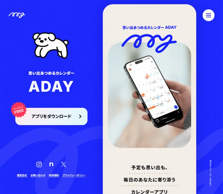
鮮やかな青と生成りの縦長カラムに、犬のイラストと日常写真を組み合わせた公式サイト。PCの固定ブランド領域と、スマートフォンの追従ダウンロードボタンが特徴。
オリジナルサイトを見るADAY — Style Reference
A warm paper story beside an electric-blue poster, with everyday photographs and a small illustrated dog.
Website: 1-365.me Original URL: https://1-365.me/ Final URL: https://1-365.me/ Theme: electric-blue surroundings, alternating warm light sections, and a black mobile utility footer Inspected: September 13, 2026, Japan Standard Time, using the supplied browser evidence Capture timestamp: September 12, 2026 at 19:56:23.549 UTC / September 13 at 04:56:23.549 JST Viewports: desktop 1440 × 1000 and mobile 390 × 844 CSS pixels Scope: the current Japanese ADAY product homepage, including its opening, introductory story, features, use cases, interview link, premium-plan introduction, FAQ, news, roadmap, contact link, download section, and footer. Visual captures cover desktop opening/middle/end and mobile opening/end. The remaining sections are documented through rendered DOM measurements. Open menus, expanded controls, and linked pages were not supplied.
ADAY presents its calendar and photo-album application through a strong contrast of scale. Desktop has a broad blue brand field with a white dog, a large ADAY name, and a persistent download link. Beside it, a 440px-wide column carries the detailed story. Fine grain softens the blue and cream surfaces. A looping handwritten logo, rounded photographic crops, dotted decorations, and slightly tilted black captions make the presentation feel personal.
The typography combines heavy Inter display text with regular and bold Japanese faces declared as Lineseedjp Otf Rg and Lineseedjp Otf Bd. English section headings are large; Japanese paragraphs are small, generously spaced, and confined to narrow measures. On mobile, the story becomes the page itself. The desktop poster disappears, social and legal links move to a black footer, and the download action becomes a black pill near the viewport bottom.
How to Read This Reference
- Measured means directly recorded in the supplied computed styles or element rectangles. Measurements are CSS pixels unless otherwise stated.
- Derived means calculated from those measurements, such as the difference between a column width and its text width.
- Estimated means visually assessed from the supplied current-page captures. Texture strength, some image masks, and the pink stamp color fall into this category.
- Recommended means an implementation choice for reuse. The CSS below is an adaptation, not recovered source code, and was not executed or browser-tested.
- Token names introduced here are descriptive aliases. Original custom-property identifiers are included where useful.
- DOM text presence does not establish visual visibility. In particular, feature descriptions and FAQ answers have recorded rectangles that overlap subsequent controls; clipping and expansion state were not captured sufficiently to reconstruct those states.
Tokens — Colors
Default Palette
| Name | Value | Suggested token / source | Role and evidence |
|---|---|---|---|
| Electric Blue | #1823ff |
--color-blue; source --s-color-b38d1ad1 |
Measured outer section background, blue narrative/download sections, headings, and hero tagline |
| Warm Paper | #f6efe9 |
--color-paper |
Measured hero, About, and News section backgrounds |
| Light Paper | #fbf7f4 |
--color-paper-light |
Measured use-case, FAQ, and roadmap backgrounds |
| Text Ink | #14191d |
--color-ink |
Measured Japanese text, CTA labels, and the filled News index link |
| White | #ffffff |
--color-white; source --s-color-75ba0cd0 |
Measured menu surface, news cards, supporting CTAs, and reversed text |
| Black | #000000 |
--color-black; source --s-color-468a121c |
Declared token; visually present in the mobile footer and download pill |
| Muted Date | rgba(20,25,29,0.4) |
--color-date |
Measured release-note dates |
| Reversed Fine Print | rgba(255,255,255,0.5) |
--color-reverse-muted |
Measured store trademark note and mobile copyright |
| Desktop Copyright | rgba(255,255,255,0.7) |
--color-reverse-secondary |
Measured small vertical copyright |
| Free Stamp Pink | Approximately #ff3366 |
--color-stamp |
Estimated from the serrated download stamp; its exact fill was not provided |
| Decorative Taupe | Approximately #d6cac1 |
--color-dots |
Estimated hero dotted rules; the winding use-case dots appear lighter |
The blue is a measured base color. Grain and large translucent artwork produce lighter-looking areas in the screenshots; those areas should not replace the base token.
The registry also contains #282d32 and #ada9a7. Their component assignments were not established. Use the measured #14191d for the sampled body and action text rather than substituting the registry's darker-gray token by assumption.
Supporting Status Colors
These are measured colors of the small roadmap status labels, not additional primary action colors.
| Source label | Value | Suggested token |
|---|---|---|
PLANNED |
#3c89fb |
--color-planned |
IN PROGRESS |
#ff7134 |
--color-progress |
RELEASED |
#52d067 |
--color-released |
Each status also has a Japanese label in dark ink. Preserve that textual distinction when adapting the component.
Gradient and Texture Boundaries
The source registry declares linear-gradient(#f6efe9ff, #f4f6f9ff) as --s-color-afa62516. The provided measurements do not establish exactly where this gradient is painted.
The desktop download button visibly shifts from a warm pale tint toward a cool pale tint. Its anchor itself computes as transparent, so the visible fill belongs to an unsampled child or decorative layer. A practical recommended approximation is linear-gradient(100deg, #fff0f3, #dff7ff). This is not an exact source declaration.
Use grain as a fine, low-contrast surface treatment. Keep the text and store artwork crisp, and avoid a visibly repeating dotted grid as a substitute for irregular noise.
Tokens — Typography
Inter — Display and Latin Text
Measured family: Inter for the large ADAY name, English section headings, feature eyebrows, roadmap status labels, and PAGE TOP.
The desktop ADAY name uses weight 800, a 70px size, and 4.2px tracking. Most English section headings use weight 800, 60px on desktop and 54px on mobile. Their large size remains inside the narrow story column; the layout does not expand into a conventional wide heading-and-image row.
Japanese Body and Bold Text
- Regular source stack:
Inter, 'Lineseedjp Otf Rg'. - Bold source stack:
Inter, 'Lineseedjp Otf Bd'. - Regular weight:
400. - Typical bold weight:
700. - Body treatment: 14px, usually 25.2px line height, and 0.84px tracking.
The regular and bold Japanese faces are separate declared family names. Preserve that distinction when configuring fonts. Font-file URLs were not fully supplied, so this reference does not invent loading paths.
Other Noto font stacks appear in the registry, but the sampled visible text primarily uses the Inter/LINE Seed combinations above. The root element's computed Times family is not representative of the visible page typography.
Lettering and Symbols
The looping ADAY logo is artwork. Its shape should not be reconstructed by choosing a script font. The small lettering inside the free-download stamp is also visually distinct from the ordinary UI; its font identity is unverified.
Social brand symbols, external-link marks, and the three-line menu icon form a separate utility layer. Font Awesome declarations exist in the supplied properties, but that alone does not identify the rendering method of every visible icon.
Type Scale
All values below are measured. Desktop/mobile entries refer to 1440px and 390px viewport widths respectively.
| Role | Desktop | Mobile | Weight | Tracking |
|---|---|---|---|---|
| Desktop ADAY name | 70px / 70px |
Hidden | 800 |
0.06em |
| Desktop poster tagline | 16px / 16px |
Hidden | 700 |
0.06em |
| Hero tagline | 16px / 24px |
Same | 700 |
0.02em |
| Three-line hero promise | 22px / 22px |
Same | 700 |
0.06em |
| English section heading | 60px / 60px |
54px / 54px |
800 |
0.04em |
| Roadmap heading | 58px / 58px |
48.75px / 48.75px |
800 |
0.02em |
| Japanese section eyebrow | 16px / 16px |
Same | 700 |
0.04em |
| Body paragraph | 14px / 25.2px |
Same | 400 |
0.06em |
| Feature eyebrow | 11px / 11px |
Same | 800 |
0.08em |
| Feature title | 20px / 20px |
18px / 18px |
700 |
0.04em |
| Photo caption | 18px / 18px |
16px / 16px |
700 |
0.04em |
| Interview subheading | 22px / 28.6px |
20px / 26px |
700 |
0.04em |
| Main download label | 20px / 20px |
16px / 16px |
700 |
0.04em |
| Supporting CTA label | 16px / 16px |
Same | 700 |
0.04em |
| FAQ question | 17px / 23.8px |
16px / 22.4px |
700 |
0.04em |
| FAQ answer | 14px / 25.2px |
14px / 23.8px |
400 |
0.06em |
| Small answer link | 13px / 13px |
Same | 400 |
0.06em |
| News title | 16px / 22.4px |
Same | 700 |
0.04em |
| News category | 12px / 12px |
Same | 800 |
0.09em |
| News date | 11px / 11px |
Same | 400 |
0.02em |
| Roadmap status | 10px / 10px |
Same | 800 |
0.08em |
| Roadmap item | 15px / 21px |
14px / 19.6px |
700 |
0.04em |
| Closing invitation | 24px / 24px |
19.5px / 19.5px |
700 |
0.04em |
| Store fine print | 10px / 14px |
Same | 400 |
0.06em |
| Footer links | 12px / 12px |
Same | 400 |
Desktop 0.04em; mobile normal |
| Page-top label | 14px / 14px |
Same | 600 |
Normal |
HOW TO USE occupies a two-line heading box: 120px high on desktop and 108px on mobile. Preserve room for that wrapping. The transformed photo-caption rectangles are taller than their 18px or 16px line boxes; use the computed line height rather than the rotated bounding-box height.
Tokens — Spacing & Shapes
Density: generous section spacing around narrow, relatively small text. Primary alignment system: 24px outer insets for broad components and 48px insets for narrative text and section headings.
Spacing Scale
| Use | Value | Evidence |
|---|---|---|
| Supporting CTA internal gap | 6px |
Measured |
| Social target separation | 8px |
Derived from 50px targets on 58px intervals |
| Store badge gap in hero | 10px |
Derived from measured link rectangles |
| Feature/news internal gap | 10px |
Measured |
| Section eyebrow to English heading | 14px |
Derived from text rectangles |
| Repeated news/feature row separation | 16px |
Derived from consecutive rectangles |
| Desktop story top clearance | 20px |
Measured |
| Broad component side inset | 24px |
Derived on both viewports |
| Desktop card inner side padding | 32px |
Measured |
| Narrative side inset | 48px |
Derived on both viewports |
| Section heading to introduction | 40px |
Derived |
| Hero top padding | Desktop 60px; mobile 120px |
Measured |
| Hero image to first promise line | Approximately 60px |
Estimated image edge plus measured text position |
| About section padding | 80px top, 90px bottom |
Measured |
| Hero bottom padding | 140px |
Measured |
| Roadmap bottom padding | 160px |
Measured |
The hero promise uses three separate lines at y=704, 762, and 820 in both opening measurements. That is a derived 58px line-to-line pitch, including the decorative dotted treatment and surrounding space, not a 58px text line height.
Border Radius and Outline
| Element | Value | Evidence |
|---|---|---|
| Desktop story upper corners | Approximately 50px |
Estimated from screenshot; enclosing wrapper not sampled |
| Hero photographic crop | Approximately 60–70px |
Estimated |
| Use-case photograph | Large capsule-like corners | Observed; exact mask unavailable |
| Supporting white CTA | 24px |
Measured |
| News card | 24px |
Measured |
| Small FAQ detail link | 30px |
Measured |
| News index button | 34px |
Measured |
| Menu | 128px source radius on a 56px square |
Measured; renders as a circle |
| Page-top link | 50% on 133 × 70px |
Measured; renders as an ellipse |
| Desktop download surface | Approximately 24px |
Estimated; anchor reports zero radius |
| Mobile download surface | Approximately 32px |
Estimated from its 64px height |
| Black photo-caption strips | Approximately 6px |
Estimated |
The sampled feature and FAQ buttons report a zero radius and transparent background. Their parent surface styling is not fully represented. Do not infer the shape of an entire disclosure container from the button alone.
Layout Measurements
| Element | Desktop 1440 × 1000 | Mobile 390 × 844 |
|---|---|---|
| Story column | x=827.20, width=440px |
x=0, width=390px |
| Space to story's right | 172.80px |
None |
| Narrative text width | 344px |
294px |
| Broad component width | 392px |
342px |
| Feature description width | 328px |
278px |
| Main download target | 340 × 82px at x=243.59, y=528.33 |
Wrapper 390 × 64px at y=768; 24px side padding |
| Visible mobile download pill | Not applicable | Derived width 342px; bottom clearance 12px |
| Menu target | 56 × 56px, top=44, right=40 |
Same size, top=16, right=24 |
| Corner logo link | 80 × 28.75px, x=40 |
60 × 21.81px, x=24 |
| Hero App Store target | 135 × 50px |
Same |
| Hero Google Play target | 169.16 × 50px |
Same |
| Closing store targets | Approximately 118.80 × 44px and 148.86 × 44px |
135 × 50px and 169.16 × 50px |
| Social targets | 50 × 50px, 12px padding |
Same |
| News card | 392 × 104.39px |
342 × 104.39px |
| Page-top target | 133 × 70px |
Same |
| Recorded document height | 10020.22px |
9886.11px |
Document heights belong to the recorded state. They are not implementation targets and may change with disclosure state, content updates, and late layout changes.
Components
Desktop Brand Panel
Role: maintain identity and a download route while the story moves.
The left composition centers around x≈413.6 in the desktop capture. A white dog with thick black outlines sits above a short white tagline, followed by the large ADAY name and a pale download surface. Social icons and five small underlined utility links form a separate group near the bottom.
The dog, name, CTA, and utility group remain in the same visible positions across the supplied desktop opening, use-case, and end captures. This establishes persistence during the captured scrolling sequence. The exact fixed versus sticky implementation was not supplied.
A very large, faint looping mark runs through the lower blue background. It acts as atmospheric artwork rather than readable content. Keep it behind the panel and story, with low contrast and no interaction target.
Corner Identity and Menu
Role: lightweight global identity and navigation access.
The desktop corner logo is white; the mobile opening logo is blue on paper. The menu is a white 56px circle containing three short blue horizontal strokes. Its outer circle stays the same size on both viewports.
On mobile, the menu is visible at the same upper-right position in both opening and end captures. The small corner logo is absent from the end capture. Preserve the menu's persistence without assuming the logo follows identical positioning rules.
No open-menu screenshot or activation result is available. Menu contents, overlay geometry, focus management, and closing animation remain unverified.
Hero Media and Promise
Role: introduce the application through everyday use and a concise emotional promise.
The story opens with the centered two-line label あなたのための / パーソナルカレンダー ADAY. Below it, the large blue looping logo overlaps the upper edge of a rounded portrait media area.
The desktop capture shows a hand holding a phone with a dark application screen. The mobile capture shows hands using a tablet calendar. These are current captured media appearances; the evidence does not determine whether the difference comes from responsive asset selection, a changing media sequence, or capture timing.
Estimated visible crop sizes are approximately 336 × 440px on desktop and 294 × 400px on mobile. Preserve the natural device perspective and hand gestures. The product image is a real-use scene, not a floating device render.
Under the image, three centered bold lines read 予定も思い出も、, 毎日のあなたに寄り添う, and カレンダーアプリ. Each receives a pale dotted underline. App Store and Google Play badges follow as a centered pair.
Primary Download Link and Free Stamp
Role: persistent access to the download section.
The measured destination is https://1-365.me/#download.
Desktop anatomy is a 340 × 82px link with a rounded pale surface, centered 20px bold Japanese label, and a pink serrated stamp overlapping the upper-left edge. The stamp reads Download FREE and is approximately 76px across.
Mobile anatomy changes to a 342 × 64px black pill inside a full-width wrapper with 24px side padding. The label becomes 16px and white. The smaller stamp is approximately 58px across and overlaps the left/top edge. At 844px viewport height, the link begins at y=768 and ends 12px above the bottom.
The mobile opening capture shows the fixed action covering part of the hero promise. Treat this as an observed overlap. A new implementation should provide adequate scroll clearance so focused content and final links can move above the control.
Bilingual Section Heading
Role: make a long, narrow page easy to scan.
Place a small blue Japanese eyebrow above a much larger blue English heading. The measured eyebrow-to-heading gap is 14px, and the following paragraph typically begins 40px after the heading box.
Examples include ADAYってなに? with ABOUT, みんなの使いかた with HOW TO USE, and よくある質問 with FAQ. The same structure continues through News and Roadmap.
Both elements align with the 48px narrative inset. Allow the English heading to wrap deliberately; HOW TO USE occupies two lines. Roadmap uses a slightly smaller and less widely tracked display size to accommodate its longer word.
Introductory Blue Story Section
Role: connect scheduling with daily experiences and memories.
The measured section following the hero reverses to blue with white 14px paragraphs. Text blocks use deliberately varied widths and horizontal placements. On mobile, the recorded blocks begin at x=32, x≈178, and x=64, rather than sharing one rigid left edge.
The section height measures approximately 1199px on desktop and 987px on mobile. This suggests a spacious editorial passage, but its complete imagery and motion are not visible in the supplied screenshots. Preserve the confirmed color reversal and varied text placement without inventing a parallax sequence or missing illustration arrangement.
Feature Control Rows
Role: organize the four application benefits.
The rendered page contains four button-based rows: DAILY PLANNING, AUTO PHOTO SYNC, SEAMLESS SHARING, and AESTHETIC DESIGN, each paired with a Japanese title and explanatory text.
Each measured button is 110px high, with 30px vertical and 32px horizontal padding. Width changes from 392px to 342px. The small English eyebrow remains 11px; the Japanese title changes from 20px to 18px. Consecutive button starts are 126px apart, yielding a 16px separation.
Descriptions use 14px text at 1.8 line height, with widths of 328px desktop and 278px mobile. Their extracted bounds overlap later controls, so the evidence does not establish that all descriptions are simultaneously exposed. A disclosure implementation is a reasonable adaptation, but the original expansion rules and selected state were not exercised.
Use-Case Photo Story
Role: explain benefits through recognizable situations.
Each story combines a broad rounded photograph, one or two dark caption strips overlapping its lower edge, and a narrower paragraph underneath. The photograph occupies the broader 24px-inset track; the body returns to the 48px-inset track.
The supplied middle capture shows people sharing coffee at a white table and a group carrying snowboards. The first emphasizes a relationship; the second emphasizes group planning. Photography retains natural colors and ordinary detail.
Caption strips carry white bold Japanese text and tilt slightly upward toward the right. Approximately −4 degrees is a useful estimated rotation for reuse. Two-line captions stagger the second strip to the right instead of forming a perfectly aligned rectangular block.
The desktop photo is approximately 392 × 228px. The surrounding light paper includes a faint dotted path that curves around the stories. Keep this decoration behind the images and text. The caption strips are content labels; their appearance alone does not establish click behavior.
Supporting CTAs and Premium Introduction
Role: offer optional depth without interrupting the main narrative.
The interview link, premium-details button, and contact link share large white rounded surfaces. The measured interview and contact targets are 344 × 78px desktop and 294 × 78px mobile, with a 24px radius and 6px internal gap. Their labels use 16px bold type.
The interview label is インタビュー記事を読む, with a recorded destination on the ADAY note account. The contact control pairs a small mailbox-like symbol with お問い合わせはこちら.
The premium introduction uses the same bilingual heading rhythm with ADAY+, a short paragraph, and ADAY+ の詳細をみる. The captured copy advertises a monthly price of 420 yen. Treat pricing as editable content, not a permanent design token.
Premium details are represented by buttons, not recorded destination links. A modal, sheet, or inline expansion cannot be claimed from the supplied evidence.
FAQ Question Rows
Role: answer practical questions about price, sharing, calendar integration, help, and Android availability.
Each question button starts with a blue Q. marker and a bold dark question. Desktop padding is 24px 32px; mobile padding is 20px 24px. Short rows measure 72px desktop and 64px mobile. Wrapped questions grow to approximately 95.6px and 84.8px respectively.
The question text is 17px desktop and 16px mobile, with a 1.4 line height. Answers use 14px regular text; their mobile line height tightens from 1.8 to 1.7. Some answers contain compact rounded help or detail links approximately 45px high.
Six question buttons and associated answer text are recorded. Open/closed appearance, indicator artwork, and whether multiple answers can remain open are unverified. For reuse, implement accessible disclosures with content-driven heights rather than copying the overlapping extracted positions.
Release-Note Card
Role: show that the product continues to evolve.
A white card with a 24px radius contains a compact category/date row and a bold release-note title. Desktop padding is 24px 32px; mobile padding is 24px on all sides. Both captured layouts measure approximately 104.4px high per card, with 16px between cards.
The UPDATE label uses 12px weight-800 text with 0.09em tracking. Its text is white; the precise containing badge fill was not included in the sample. Dates use 11px regular text at 40% ink opacity. Titles use 16px bold text with a 22.4px line height.
Three recorded cards link to release notes for versions 3.5.0, 3.4.0, and 3.3.0. A centered dark すべて見る link follows, measuring 200 × 57px with a 34px radius.
Roadmap Status Groups
Role: communicate planned, active, and completed work.
Three groups pair small colored English status labels with larger dark Japanese labels. Task text follows beneath each group. The status eyebrow is 10px, weight 800, with 0.08em tracking; the Japanese status is 18px bold.
The measured task text positions reveal horizontal arrangement: adjacent task text starts are 228px apart. On mobile, the second item starts at x=294 and extends beyond the 390px viewport. The desktop sample similarly extends beyond the story column.
This establishes an overflowing horizontal arrangement, but not its navigation mechanism. Swipe, drag, automatic movement, and scroll snapping are unverified. A recommended implementation uses a locally scrollable horizontal track and keeps every item keyboard-reachable. A 220px item width with an 8px gap is a useful inferred starting point, not a directly measured card width.
Download Endcap and Page Top
Role: conclude the story with direct installation choices.
The closing section is blue, with a broad curved transition from the preceding paper surface. It contains a white looping logo, a centered invitation, a dotted divider, store links, fine print, a small dog, and an outlined elliptical PAGE TOP control.
Desktop shows two white QR graphics above smaller 44px-high store badges. The mobile end capture shows the two larger 50px-high badges without visible QR graphics. QR destinations were not decoded, and their responsive hiding rule was not supplied.
The page-top target is consistently 133 × 70px, with a thin white outline, a small upward triangle, and 14px Inter text. The recorded link destination is the root URL, not a supplied #top anchor. Smooth scrolling or a JavaScript override was not verified.
Social and Legal Footer
Role: provide supporting destinations and ownership information.
Desktop places Instagram, note, and X icons in the persistent left panel. Their 50px-square link boxes have 12px padding and 8px separation. Five small underlined links sit beneath them in one row at the inspected width.
Mobile moves these elements into a black block after the blue download section. The utility links wrap into two centered rows: three links followed by two. White icons and links stand out against the black, while copyright uses 50% white.
The visible copyright is © hitotabi design. On desktop it is small and vertical near the right edge; on mobile it becomes centered horizontal text. The original page also includes an 運営会社 link to https://hitotabi.design/. These observations establish the displayed operator identity without establishing a website-production role.
Tokens — Motion & Interaction
Recorded Transition Values
These are measured CSS declarations. They do not prove which properties change during activation or what the resulting state looks like.
| Target | Recorded timing | Evidence limit |
|---|---|---|
| Body background | 500ms cubic-bezier(0.4,0.4,0,1) |
No theme or background-change action was exercised |
| Many links, labels, sections, and menu button | 300ms cubic-bezier(0.4,0.4,0,1) |
Broad transition declarations; endpoints unspecified |
| Feature and FAQ buttons | 400ms cubic-bezier(0.4,0.4,0,1) |
Expansion and hover behavior unverified |
| Main download anchor | 500ms cubic-bezier(0.4,0.4,0,1) |
Destination known; visual response unverified |
| Main download label | 600ms cubic-bezier(0.4,0.4,0,1) |
Separate text-layer timing |
| Supporting white CTAs | 300ms cubic-bezier(0.445,0.05,0.55,0.95) |
Activated appearance unavailable |
| News cards | 500ms cubic-bezier(0.445,0.05,0.55,0.95), 100ms delay |
Trigger and property changes unverified |
| About introduction | 300ms cubic-bezier(0.4,0.4,0,1), 100ms delay |
Does not establish a specific reveal direction |
| One introductory story paragraph | 800ms cubic-bezier(0.445,0.05,0.55,0.95) |
No complete motion sequence supplied |
| Page-top link | 200ms ease-in-out |
Control transition, not verified scroll duration |
| Mobile News index link | 200ms cubic-bezier(0.445,0.05,0.55,0.95) |
Desktop declaration is longer and delayed |
The sampled elements report animation: none. That does not rule out video, JavaScript animation, animated assets, or pseudo-element motion. The different hero images establish different captured appearances, not a verified carousel or video implementation.
Interaction Evidence
| Interaction | Established | Unverified |
|---|---|---|
| Vertical traversal | Supplied desktop captures retain the brand panel and menu while story content changes | Exact positioning implementation and scroll effects |
| Download link | Targets #download |
Smooth scrolling, offset, and focus transfer |
| Store badges | Apple App Store and Google Play URLs are present | Navigation result or device-specific routing |
| Menu | Native button exists and remains visible in captured scroll positions | Open state, contents, dismissal, and keyboard behavior |
| Features and FAQ | Native buttons and associated descriptive text exist | Expansion rules, indicators, and animation |
| Premium details | Buttons are present | Modal, sheet, inline expansion, or another action |
| Roadmap | Task content is arranged beyond the visible column width | Swipe, drag, snapping, or automatic movement |
| Page top | Link to the root URL exists | Reload versus scripted return-to-top behavior |
Recommended motion approach: use the recorded short easing curves for small color or opacity changes, explicitly name transitioned properties, and keep the page usable with motion disabled. Do not invent a continuously bouncing dog, moving grain, or scroll-scrubbed device sequence to fill gaps in the evidence.
Surfaces
| Layer | Appearance | Structural purpose |
|---|---|---|
| Desktop surroundings | Electric blue, fine grain, faint oversized looping mark | Persistent brand atmosphere |
| Main paper | Warm cream | Hero, About, and News |
| Alternate paper | Slightly lighter cream | Use cases, FAQ, and roadmap |
| Narrative/download reversal | Electric blue with white text | Major chapter changes |
| Supporting action | White fill, dark label, 24px radius | Optional detail or contact destination |
| News card | White fill, rounded corners | Group related release metadata |
| Photo caption | Dark strip, white type, slight rotation | Tie a benefit to a photographic situation |
| Mobile primary action | Black pill, white text, pink overlapping stamp | Persistent installation route |
| Mobile utility footer | Black field | Social, legal, and copyright information |
No prominent glass blur or shadow-based elevation system appears in the supplied visual captures. Separation comes from flat color changes, rounded silhouettes, whitespace, and typography. Shadows on unsupplied states cannot be assessed.
Imagery
Identity Artwork
The dog uses an irregular thick black contour, a white body, minimal facial marks, and rounded limbs. It appears large in the desktop brand panel and small near the page end. Keep its simple, friendly silhouette and ample surrounding space.
The looping logo has a continuous hand-drawn rhythm and appears in several roles: small corner identity, large blue hero overlay, white closing mark, and faint oversized background decoration. These are artwork placements, not interchangeable text styles.
The serrated pink free-download stamp adds a small concentrated accent. Preserve its overlap with the CTA and its compact scale rather than turning pink into the dominant button color.
Photography
Use natural light, believable hand positions, ordinary interiors, and social activities. The supplied current captures include:
- A phone held in one hand with the app visible.
- A tablet calendar being used with a keyboard and stylus.
- Hands and coffee cups around a white table.
- A group walking with snowboards in a snowy setting.
Keep the application screen recognizable when it is the subject. Maintain photographic color and detail; the cream/blue palette belongs primarily to the surrounding interface.
Crops and Decorative Paths
The hero is a tall rounded crop. Use-case images are broad capsules with captions crossing the lower boundary. Dotted paths meander through the surrounding paper, while the hero promise uses short straight dotted rules.
For reuse, an SVG path with round caps is a suitable recommended way to draw the winding decoration. Its exact original path and implementation are unknown.
Observed Asset References
The supplied DOM exposes truncated asset references but does not provide complete usable URLs for the logo, dog, hero media, texture, stamp, or use-case photographs. No filenames are reconstructed here.
| Asset role | Current evidence | Reuse requirement |
|---|---|---|
| Looping ADAY mark | Visible in opening, background, and closing compositions | Use authorized artwork with its original proportions |
| Dog illustration | Visible in desktop panel and page end | Preserve the supplied silhouette and line character |
| Hero media | Phone and tablet appearances in current captures | Supply authorized media and define its behavior separately |
| Use-case photos | Coffee and snowboard scenes visible | Retain the subject emphasis through responsive cropping |
| Free-download stamp | Visible on desktop/mobile primary action | Use supplied artwork or an explicitly new adaptation |
| Store badges | Visible; destination links recorded | Preserve official artwork proportions |
| QR graphics | Visible in desktop closing capture | Generate from verified destinations and test scanability |
| Grain and dotted paths | Visible surface/decorative treatment | Use a subtle static adaptation until exact assets are available |
Layout & Responsive Behavior
Desktop Composition
At 1440px wide, the story begins at x=827.20 and ends at x=1267.20. The remaining right gutter is 172.80px. These produce a derived single-viewport split of approximately 57.44% left field, 30.56% story, and 12% right gutter.
The story remains narrow throughout the captured page. Paragraphs use 344px of its 440px width; broad cards and photographs use a 392px track. The desktop panel is visually persistent, so a visitor retains identity and a download route while reading a long column.
Do not expand the story into a wide desktop grid merely because the viewport has unused space. That space is occupied compositionally by the persistent brand field.
Mobile Composition
At 390px, the story occupies the full viewport width with no blue side gutters. Its upper outer corners disappear into a full-width cream opening. The top padding increases from 60px inside the desktop hero to 120px on mobile, creating room for the corner logo and menu.
Most narrative insets remain 48px, leaving a 294px measure. Broad components retain 24px insets, leaving 342px. This is a restrained resize rather than a proportional shrinking of every element: body text remains 14px, hero promise remains 22px, and the menu remains 56px.
The primary download link moves from the desktop brand panel to a bottom-positioned black pill. Social/legal navigation becomes a normal-flow black footer. QR graphics are absent from the supplied mobile closing view, while store badges are larger than the closing desktop badges.
Responsive Limits
The provided source text includes a max-width: 1000px media rule for conditional line breaks. It does not establish that every layout switch occurs at that breakpoint. Only the 1440px and 390px layouts are directly documented.
The Quick Start adopts 1000px as a recommended desktop-panel breakpoint and a 12vw desktop right gutter to reproduce the measured desktop composition. Tablet, landscape, intermediate widths, safe-area devices, and enlarged text require separate testing.
For narrower phones, reduce narrative insets before reducing readable body type. Keep roadmap overflow local to its track and reserve bottom clearance for the persistent CTA.
Do’s and Don’ts
Do
- Anchor the composition in measured blue
#1823ffand warm paper#f6efe9. - Preserve the 440px desktop story and its persistent brand companion.
- Distinguish 24px broad-component insets from 48px narrative insets.
- Use Inter weight 800 for large Latin headings and the documented Japanese regular/bold stacks for copy.
- Keep the looping mark and dog as identity artwork.
- Pair natural photographs with rounded masks and small tilted caption strips.
- Use grain and dotted decorations quietly behind the content.
- Keep the pink stamp small and overlapping the primary action.
- Preserve the mobile black footer and bottom download pill.
- Keep status labels, dates, prices, and release notes editable as content.
- Label inferred responsive rules and untested interactions when handing off the design.
Don’t
- Don’t turn the narrow desktop story into a broad feature grid.
- Don’t replace the illustrated mark with an arbitrary script font.
- Don’t use the root element's
Timesdeclaration as the page font. - Don’t treat transparent link wrappers as proof that their visible surfaces are transparent.
- Don’t turn all sections into identical white rounded cards.
- Don’t add glossy device renders, heavy shadows, or glass panels.
- Don’t recolor the photographs into a strict two-color treatment.
- Don’t assume extracted FAQ answers are all visibly expanded.
- Don’t claim a hero carousel, video loop, menu overlay, or parallax effect without direct evidence.
- Don’t reproduce offscreen roadmap text as permanently inaccessible content.
- Don’t hardcode the recorded document height or absolute positions of every section.
Recommended Implementation Additions
These are recommendations for a new implementation, not verified features of the original:
- Provide accessible names for the logo, menu, social links, and image-only store links. Verify actual accessible names rather than relying on extracted text alone.
- Use one logical page heading and a consistent section hierarchy while preserving the visual heading sizes.
- Implement feature/FAQ disclosures with native
detailsor correctly connected buttons,aria-expanded, and answer panels. - Give links and controls a visible focus treatment that works on blue, paper, white, and black surfaces.
- Reserve safe-area-aware clearance for the fixed mobile CTA and prevent it from hiding focused content.
- Increase the contrast or size of small dates, legal copy, and colored roadmap eyebrows where necessary. Keep status names available as text.
- Make any horizontal roadmap track keyboard-accessible and visibly discoverable.
- Provide a stable media poster and reduced-motion alternative if changing hero media is implemented.
- Keep decoration out of the accessibility tree and prevent it from intercepting pointer input.
- Verify QR destinations and scanning behavior before release; do not use decorative pseudo-QR patterns.
Agent Prompt Guide
Quick Color Reference
- Brand field and major headings:
#1823ff. - Main paper:
#f6efe9. - Alternate paper:
#fbf7f4. - Body text:
#14191d. - Supporting cards and controls:
#ffffff. - Mobile footer and primary pill:
#000000. - Small free-download stamp: approximately
#ff3366, estimated. - Roadmap labels:
#3c89fb,#ff7134, and#52d067.
Overall Prompt
“Create a Japanese calendar-app product homepage using an electric-blue #1823ff desktop field and a narrow 440px story column positioned toward the right. Keep a persistent left brand composition with a white dog illustration, a short Japanese tagline, a 70px Inter weight-800 ADAY name, and a pale rounded download action with a small overlapping pink free stamp. Use warm cream sections, fine grain, a looping hand-drawn logo, natural photographs, dotted decorations, and large blue English section headings. Body copy is 14px with approximately 1.8 line height. On mobile, show the story at full width, retain the circular menu, move social/legal links into a black footer, and place a black download pill near the bottom. Treat unverified menu, disclosure, and media behavior as separate implementation decisions.”
Example Component Prompts
- Desktop brand panel: “Center a simple white dog with thick black outlines above a short white Japanese tagline and a large Inter ADAY name. Place a 340 × 82px pale rounded download action below, with a small serrated pink stamp overlapping its upper-left corner. Put three social symbols and compact underlined utility links near the bottom of the blue field.”
- Hero: “Within a warm cream column, center a two-line 16px blue tagline, then overlap a supplied looping blue logo over a tall rounded photograph of someone using a calendar app. Follow with three separate 22px bold Japanese promise lines and pale dotted underlines, then two store badges.”
- Use case: “Use a broad capsule crop of an ordinary shared activity. Overlap its lower edge with two slightly tilted black strips carrying white Japanese labels; indent the second strip. Place a 14px paragraph below on a narrower measure, with a faint winding dotted path in the paper background.”
- News card: “Create a white 24px-radius card in a narrow cream column. Stack a compact category/date row over a 16px bold release-note title. Use 24px vertical padding, 32px desktop side padding, and 16px separation between cards. Keep it flat and calm.”
- Mobile ending: “Close with a blue download section, white looping logo, centered invitation, paired official store badges, and a thin outlined elliptical page-top link. Let a small dog cross toward the black utility footer. Retain a black bottom download pill with a pink overlapping free stamp.”
Quick Start
CSS Custom Properties
This CSS preserves measured colors, type sizes, component widths, and inset relationships. Desktop positioning, media masks, texture opacity, caption rotation, hover feedback, and the breakpoint are explicit adaptations. Supply authorized artwork and font files separately.
Expected structure: .aday-page contains the corner identity, menu button, optional backdrop artwork, desktop brand panel, shared download CTA, and .story. Put the utility footer at the end of .story; the desktop CSS positions it in the left field. The optional disclosure styles below target native details/summary as a recommended implementation.
:root {
  /* Measured colors */
  --color-blue: #1823ff;
  --color-paper: #f6efe9;
  --color-paper-light: #fbf7f4;
  --color-ink: #14191d;
  --color-white: #fff;
  --color-black: #000;
  --color-date: rgb(20 25 29 / 40%);
  --color-reverse-muted: rgb(255 255 255 / 50%);
  --color-planned: #3c89fb;
  --color-progress: #ff7134;
  --color-released: #52d067;

  /* Estimated decoration and recommended CTA fill */
  --color-stamp: #ff3366;
  --color-dots: #d6cac1;
  --cta-fill: linear-gradient(100deg, #fff0f3, #dff7ff);
  --grain-image: none;

  /* Observed families; load authorized files separately */
  --font-body: Inter, 'Lineseedjp Otf Rg', sans-serif;
  --font-bold: Inter, 'Lineseedjp Otf Bd', sans-serif;
  --font-display: Inter, sans-serif;

  --text-body: 14px;
  --text-section: 54px;
  --leading-body: 1.8;
  --tracking-body: 0.06em;
  --tracking-label: 0.04em;

  --column-width: 440px;
  --copy-inset: 48px;
  --wide-inset: 24px;
  --radius-card: 24px;
  --menu-size: 56px;
  --safe-bottom: env(safe-area-inset-bottom, 0px);

  /* Measured curves; apply only to intentional properties */
  --ease-ui: cubic-bezier(0.4, 0.4, 0, 1);
  --ease-soft: cubic-bezier(0.445, 0.05, 0.55, 0.95);
}

* { box-sizing: border-box; }
body { margin: 0; }
button, summary { font: inherit; }
button, a, summary { -webkit-tap-highlight-color: transparent; }
img { display: block; max-width: 100%; }
a { color: inherit; }

.aday-page {
  min-height: 100vh;
  color: var(--color-ink);
  background: var(--color-blue);
  background-image: var(--grain-image);
  font-family: var(--font-body);
  font-size: var(--text-body);
  line-height: var(--leading-body);
  letter-spacing: var(--tracking-body);
}

.story {
  position: relative;
  width: 100%;
  background: var(--color-paper);
}

.copy-track {
  margin-inline: var(--copy-inset);
}

.wide-track {
  margin-inline: var(--wide-inset);
}

.brand-panel,
.backdrop-mark {
  display: none;
}

.site-mark {
  position: absolute;
  z-index: 20;
  top: 34px;
  left: 24px;
  width: 60px;
  color: var(--color-blue);
}

.site-mark img { width: 100%; height: auto; }

.menu-button {
  position: fixed;
  z-index: 30;
  top: calc(16px + env(safe-area-inset-top, 0px));
  right: 24px;
  display: grid;
  place-content: center;
  gap: 5px;
  width: var(--menu-size);
  height: var(--menu-size);
  padding: 0;
  border: 0;
  border-radius: 50%;
  color: var(--color-blue);
  background: var(--color-white);
  cursor: pointer;
}

.menu-button span {
  width: 20px;
  height: 3px;
  border-radius: 2px;
  background: currentColor;
}

.hero {
  padding: 120px 0 140px;
  text-align: center;
  background-color: var(--color-paper);
  background-image: var(--grain-image);
}

.hero-tagline {
  margin: 0;
  color: var(--color-blue);
  font-family: var(--font-bold);
  font-size: 16px;
  font-weight: 700;
  line-height: 24px;
  letter-spacing: 0.02em;
}

/* Media geometry is a screenshot-based approximation. */
.hero-media {
  position: relative;
  width: calc(100% - 96px);
  max-width: 336px;
  height: 400px;
  margin: 76px auto 0;
}

.hero-photo {
  width: 100%;
  height: 100%;
  object-fit: cover;
  border-radius: 64px;
}

.hero-loop {
  position: absolute;
  z-index: 1;
  top: -44px;
  left: 50%;
  width: 230px;
  max-width: 90%;
  height: auto;
  transform: translateX(-50%);
}

.hero-promise {
  display: grid;
  justify-items: center;
  gap: 15px;
  margin: 60px 24px 0;
}

/* 22px text + 21px decoration area + 15px gap = 58px pitch. */
.promise-line {
  max-width: 100%;
  margin: 0;
  padding: 0 12px 21px;
  background-image: radial-gradient(
    circle at 2.5px 2.5px,
    var(--color-dots) 2.5px,
    transparent 3px
  );
  background-position: left bottom;
  background-size: 12px 5px;
  background-repeat: repeat-x;
  font-family: var(--font-bold);
  font-size: 22px;
  font-weight: 700;
  line-height: 1;
  letter-spacing: 0.06em;
}

.store-links {
  display: flex;
  flex-wrap: wrap;
  justify-content: center;
  align-items: center;
  gap: 10px;
}

.hero .store-links { margin-top: 60px; }
.store-link img { width: auto; height: 50px; }

.download-cta {
  position: fixed;
  z-index: 25;
  right: 24px;
  bottom: calc(12px + var(--safe-bottom));
  left: 24px;
  display: flex;
  align-items: center;
  justify-content: center;
  min-height: 64px;
  padding: 18px 24px;
  border: 1px solid rgb(255 255 255 / 45%);
  border-radius: 32px;
  color: var(--color-white);
  background: var(--color-black);
  font-family: var(--font-bold);
  font-size: 16px;
  font-weight: 700;
  line-height: 1.3;
  letter-spacing: var(--tracking-label);
  text-align: center;
  text-decoration: none;
  transition: opacity 300ms var(--ease-ui);
}

.download-stamp {
  position: absolute;
  top: -20px;
  left: -8px;
  width: 58px;
  height: auto;
  pointer-events: none;
}

.section {
  padding-block: 80px 90px;
  background-color: var(--color-paper);
  background-image: var(--grain-image);
}

.section--light { background-color: var(--color-paper-light); }
.section--blue {
  color: var(--color-white);
  background-color: var(--color-blue);
}

.section-eyebrow {
  margin: 0 0 14px;
  color: var(--color-blue);
  font-family: var(--font-bold);
  font-size: 16px;
  font-weight: 700;
  line-height: 1.3;
  letter-spacing: 0.04em;
}

.section-title {
  margin: 0 0 40px;
  color: var(--color-blue);
  font-family: var(--font-display);
  font-size: var(--text-section);
  font-weight: 800;
  line-height: 1;
  letter-spacing: 0.04em;
  overflow-wrap: anywhere;
}

.section-title--roadmap {
  font-size: min(48.75px, 12.5vw);
  letter-spacing: 0.02em;
}

.support-cta {
  display: flex;
  align-items: center;
  justify-content: center;
  gap: 6px;
  width: 100%;
  min-height: 78px;
  padding: 20px 24px;
  border: 0;
  border-radius: var(--radius-card);
  color: var(--color-ink);
  background: var(--color-white);
  font-family: var(--font-bold);
  font-size: 16px;
  font-weight: 700;
  line-height: 1.4;
  letter-spacing: 0.04em;
  text-align: center;
  text-decoration: none;
}

.use-case { margin: 64px 24px; }
.use-case figure { position: relative; margin: 0; }
.use-case-photo {
  width: 100%;
  aspect-ratio: 392 / 228;
  object-fit: cover;
  border-radius: 120px;
}

.use-case-caption {
  position: absolute;
  right: 8px;
  bottom: -8px;
  left: 0;
  display: grid;
  justify-items: start;
  gap: 2px;
}

.use-case-caption span {
  max-width: 100%;
  padding: 6px 8px;
  border-radius: 6px;
  color: var(--color-white);
  background: var(--color-ink);
  font-family: var(--font-bold);
  font-size: 16px;
  font-weight: 700;
  line-height: 1.2;
  letter-spacing: 0.04em;
  transform: rotate(-4deg);
}

.use-case-caption span + span { margin-left: 70px; }
.use-case-copy { margin: 32px 24px 0; }

.news-list { display: grid; gap: 16px; }
.news-card {
  display: grid;
  gap: 10px;
  padding: 24px;
  border-radius: var(--radius-card);
  background: var(--color-white);
  text-decoration: none;
}

.news-meta { display: flex; align-items: center; gap: 6px; }
.news-date { color: var(--color-date); font-size: 11px; }
.news-title {
  margin: 0;
  font-family: var(--font-bold);
  font-size: 16px;
  font-weight: 700;
  line-height: 1.4;
  letter-spacing: 0.04em;
}

/* Recommended badge fill; source text color was measured. */
.news-category {
  padding: 5px 7px;
  border-radius: 4px;
  color: var(--color-white);
  background: var(--color-blue);
  font-size: 12px;
  font-weight: 800;
  line-height: 1;
  letter-spacing: 0.09em;
}

/* Recommended native disclosures; original state behavior is unknown. */
.faq-item + .faq-item { margin-top: 16px; }
.faq-question {
  display: flex;
  align-items: flex-start;
  gap: 10px;
  min-height: 64px;
  padding: 20px 24px;
  font-family: var(--font-bold);
  font-size: 16px;
  font-weight: 700;
  line-height: 1.4;
  letter-spacing: 0.04em;
  list-style: none;
  cursor: pointer;
}

.faq-question::-webkit-details-marker { display: none; }
.faq-question .q { color: var(--color-blue); font-size: 18px; }
.faq-question .question-text { flex: 1; }
.faq-question::after { content: '+'; color: var(--color-blue); }
.faq-item[open] > .faq-question::after { content: '−'; }
.faq-answer { margin: 0; padding: 0 24px 24px; line-height: 1.7; }

/* Recommended local scrolling for the observed horizontal arrangement. */
.roadmap-track {
  display: grid;
  grid-auto-flow: column;
  grid-auto-columns: 220px;
  gap: 8px;
  overflow-x: auto;
  padding: 12px 48px;
  scroll-padding-inline: 48px;
  overscroll-behavior-inline: contain;
}

.roadmap-item {
  margin: 0;
  padding: 20px 18px;
  font-family: var(--font-bold);
  font-size: 14px;
  font-weight: 700;
  line-height: 1.4;
}

.download-section {
  position: relative;
  padding: 120px 24px 30px;
  color: var(--color-white);
  background: var(--color-blue);
  background-image: var(--grain-image);
  text-align: center;
  scroll-margin-top: 96px;
}

/* Approximation of the broad curved paper-to-blue transition. */
.download-section::before {
  content: '';
  position: absolute;
  top: -60px;
  right: 0;
  left: 0;
  height: 120px;
  border-radius: 50% 50% 0 0;
  background: inherit;
  pointer-events: none;
}

.download-section > * { position: relative; }
.download-invitation {
  font-family: var(--font-bold);
  font-size: 19.5px;
  font-weight: 700;
  line-height: 1.3;
  letter-spacing: 0.04em;
}

.download-qr { display: none; }
.store-note {
  margin: 30px 12px 0;
  color: var(--color-reverse-muted);
  font-size: 10px;
  line-height: 1.4;
  text-align: left;
}

.page-top {
  display: flex;
  flex-direction: column;
  align-items: center;
  justify-content: center;
  gap: 6px;
  width: 133px;
  min-height: 70px;
  margin: 100px auto 0;
  padding-bottom: 6px;
  border: 1px solid currentColor;
  border-radius: 50%;
  font-family: var(--font-display);
  font-size: 14px;
  font-weight: 600;
  line-height: 1;
  letter-spacing: normal;
  text-decoration: none;
}

.site-footer {
  padding: 50px 24px calc(120px + var(--safe-bottom));
  color: var(--color-white);
  background: var(--color-black);
  text-align: center;
}

.social-links { display: flex; justify-content: center; gap: 8px; }
.social-links a { display: block; width: 50px; height: 50px; padding: 12px; }
.footer-links {
  display: flex;
  flex-wrap: wrap;
  justify-content: center;
  gap: 16px 20px;
  margin: 24px 0 0;
  font-size: 12px;
  line-height: 17px;
  letter-spacing: normal;
}

.footer-links a { text-underline-offset: 4px; }
.copyright {
  margin: 50px 0 0;
  color: var(--color-reverse-muted);
  font-family: var(--font-display);
  font-size: 12px;
  line-height: 1;
  letter-spacing: normal;
}

/* Recommended breakpoint and gutter formula, not recovered source rules. */
@media (min-width: 1001px) {
  :root {
    --text-section: 60px;
    --rail-width: calc(88vw - var(--column-width));
  }

  .story {
    width: var(--column-width);
    margin: 20px 12vw 20px auto;
    border-radius: 50px 50px 0 0;
    overflow: clip;
  }

  .brand-panel {
    position: fixed;
    inset: 0 auto 0 0;
    display: block;
    width: var(--rail-width);
    color: var(--color-white);
    text-align: center;
  }

  .brand-core { position: absolute; top: 17.5vh; width: 100%; }
  .brand-dog { width: 170px; height: auto; margin-inline: auto; }
  .brand-tagline {
    margin: 60px 24px 20px;
    font-family: var(--font-bold);
    font-size: 16px;
    font-weight: 700;
    line-height: 1;
  }
  .brand-name {
    margin: 0;
    font-family: var(--font-display);
    font-size: 70px;
    font-weight: 800;
    line-height: 1;
    letter-spacing: 0.06em;
  }

  .site-mark { position: fixed; top: 57.625px; left: 40px; width: 80px; }
  .menu-button { top: 44px; right: 40px; }
  .menu-button span { width: 24px; }
  .hero { padding-top: 60px; }
  .hero-media { width: 336px; height: 440px; }
  .hero-loop { width: 260px; }

  .download-cta {
    top: 52.8vh;
    right: auto;
    bottom: auto;
    left: calc(var(--rail-width) / 2);
    width: 340px;
    min-height: 82px;
    border: 0;
    border-radius: 24px;
    color: var(--color-ink);
    background: var(--cta-fill);
    font-size: 20px;
    transform: translateX(-50%);
  }
  .download-stamp { top: -28px; left: -22px; width: 76px; }
  .section-title--roadmap { font-size: 58px; }
  .use-case-caption { left: 24px; }
  .use-case-caption span { font-size: 18px; }
  .use-case-caption span + span { margin-left: 66px; }
  .news-card { padding-inline: 32px; }
  .faq-question { min-height: 72px; padding: 24px 32px; font-size: 17px; }
  .faq-question .q { font-size: 20px; }
  .faq-answer { padding-inline: 32px; line-height: 1.8; }
  .roadmap-item { padding-inline: 22px; font-size: 15px; }
  .download-invitation { font-size: 24px; }
  .download-qr { display: block; width: 84px; margin: 0 auto 24px; }
  .download-section .store-link img { height: 44px; }

  .site-footer {
    position: fixed;
    z-index: 10;
    bottom: 100px;
    left: 0;
    width: var(--rail-width);
    padding: 0 24px;
    background: transparent;
  }
  .footer-links { gap: 16px; margin-top: 20px; letter-spacing: 0.04em; }
  .copyright {
    position: fixed;
    right: 76px;
    bottom: 58px;
    margin: 0;
    color: rgb(255 255 255 / 70%);
    font-size: 10px;
    writing-mode: vertical-rl;
  }
}

/* Recommended narrow-phone adjustment. */
@media (max-width: 359px) {
  .story { --copy-inset: 32px; --text-section: 44px; }
  .use-case-caption span + span { margin-left: 32px; }
}

/* Recommended accessible focus and restrained hover feedback. */
.aday-page :is(a, button, summary):focus-visible {
  outline: 3px solid currentColor;
  outline-offset: 5px;
}

@media (hover: hover) {
  .download-cta:hover,
  .support-cta:hover,
  .news-card:hover { opacity: 0.88; }
}

@media (prefers-reduced-motion: reduce) {
  .aday-page *,
  .aday-page *::before,
  .aday-page *::after {
    animation: none !important;
    transition: none !important;
    scroll-behavior: auto !important;
  }
}
Use separate appropriately colored logo assets or a mask driven by currentColor for the corner identity. The CSS does not recolor an arbitrary bitmap automatically. The optional grain variable expects a supplied transparent texture tile; leaving it as none gives a clean fallback. Video playback, menu behavior, and any reveal system require separate implementation and reduced-motion handling.
Tailwind v4 Token Mapping
Optional aliases for a project already using Tailwind v4. This is not evidence that the original site uses Tailwind.
@theme inline {
  --color-aday-blue: var(--color-blue);
  --color-aday-paper: var(--color-paper);
  --color-aday-paper-light: var(--color-paper-light);
  --color-aday-ink: var(--color-ink);
  --color-aday-stamp: var(--color-stamp);

  --font-aday-body: var(--font-body);
  --font-aday-bold: var(--font-bold);
  --font-aday-display: var(--font-display);

  --text-aday-body: 14px;
  --text-aday-section: var(--text-section);
  --text-aday-brand: 70px;

  --spacing-aday-copy: var(--copy-inset);
  --spacing-aday-wide: var(--wide-inset);
  --spacing-aday-column: var(--column-width);
  --radius-aday-card: 24px;
}
Sources & Evidence
- ADAY — original and final homepage: supplied HTTP 200 result, rendered Japanese text, destination links, computed styles, custom properties, and element rectangles. The final URL equals the original URL.
- Capture timestamp:
2026-09-12T19:56:23.549Z, corresponding to September 13, 2026 at 04:56:23.549 JST. - Desktop visual evidence: three 1440 × 1000 captures showing the opening, use-case content, and download ending with the persistent surrounding composition.
- Mobile visual evidence: two 390 × 844 captures showing the opening and the download/footer ending.
- The supplied capture procedure includes at least five seconds of initial observation, waits for visible image decoding and finite layout motion, and traversal through intermediate scroll positions. Perpetual animations are paused during readiness checks and resumed afterward. These checks support settled screenshots but do not provide a complete animation timeline.
- No additional browsing, commands, file access, or interaction testing was performed for this reference. Menu activation, feature/FAQ expansion, premium details, roadmap navigation, QR decoding, and linked-page appearance remain unverified.
This reference describes the current supplied homepage evidence. Measurements are distinguished from screenshot estimates, derived relationships, and implementation recommendations throughout.
# ADAY — Style Reference

> A warm paper story beside an electric-blue poster, with everyday photographs and a small illustrated dog.

**Website:** [1-365.me](https://1-365.me/)
**Original URL:** https://1-365.me/
**Final URL:** https://1-365.me/
**Theme:** electric-blue surroundings, alternating warm light sections, and a black mobile utility footer
**Inspected:** September 13, 2026, Japan Standard Time, using the supplied browser evidence
**Capture timestamp:** September 12, 2026 at 19:56:23.549 UTC / September 13 at 04:56:23.549 JST
**Viewports:** desktop 1440 × 1000 and mobile 390 × 844 CSS pixels
**Scope:** the current Japanese ADAY product homepage, including its opening, introductory story, features, use cases, interview link, premium-plan introduction, FAQ, news, roadmap, contact link, download section, and footer. Visual captures cover desktop opening/middle/end and mobile opening/end. The remaining sections are documented through rendered DOM measurements. Open menus, expanded controls, and linked pages were not supplied.

ADAY presents its calendar and photo-album application through a strong contrast of scale. Desktop has a broad blue brand field with a white dog, a large ADAY name, and a persistent download link. Beside it, a 440px-wide column carries the detailed story. Fine grain softens the blue and cream surfaces. A looping handwritten logo, rounded photographic crops, dotted decorations, and slightly tilted black captions make the presentation feel personal.

The typography combines heavy Inter display text with regular and bold Japanese faces declared as `Lineseedjp Otf Rg` and `Lineseedjp Otf Bd`. English section headings are large; Japanese paragraphs are small, generously spaced, and confined to narrow measures. On mobile, the story becomes the page itself. The desktop poster disappears, social and legal links move to a black footer, and the download action becomes a black pill near the viewport bottom.

## How to Read This Reference

- **Measured** means directly recorded in the supplied computed styles or element rectangles. Measurements are CSS pixels unless otherwise stated.
- **Derived** means calculated from those measurements, such as the difference between a column width and its text width.
- **Estimated** means visually assessed from the supplied current-page captures. Texture strength, some image masks, and the pink stamp color fall into this category.
- **Recommended** means an implementation choice for reuse. The CSS below is an adaptation, not recovered source code, and was not executed or browser-tested.
- Token names introduced here are descriptive aliases. Original custom-property identifiers are included where useful.
- DOM text presence does not establish visual visibility. In particular, feature descriptions and FAQ answers have recorded rectangles that overlap subsequent controls; clipping and expansion state were not captured sufficiently to reconstruct those states.

## Tokens — Colors

### Default Palette

| Name | Value | Suggested token / source | Role and evidence |
| --- | --- | --- | --- |
| Electric Blue | `#1823ff` | `--color-blue`; source `--s-color-b38d1ad1` | Measured outer section background, blue narrative/download sections, headings, and hero tagline |
| Warm Paper | `#f6efe9` | `--color-paper` | Measured hero, About, and News section backgrounds |
| Light Paper | `#fbf7f4` | `--color-paper-light` | Measured use-case, FAQ, and roadmap backgrounds |
| Text Ink | `#14191d` | `--color-ink` | Measured Japanese text, CTA labels, and the filled News index link |
| White | `#ffffff` | `--color-white`; source `--s-color-75ba0cd0` | Measured menu surface, news cards, supporting CTAs, and reversed text |
| Black | `#000000` | `--color-black`; source `--s-color-468a121c` | Declared token; visually present in the mobile footer and download pill |
| Muted Date | `rgba(20,25,29,0.4)` | `--color-date` | Measured release-note dates |
| Reversed Fine Print | `rgba(255,255,255,0.5)` | `--color-reverse-muted` | Measured store trademark note and mobile copyright |
| Desktop Copyright | `rgba(255,255,255,0.7)` | `--color-reverse-secondary` | Measured small vertical copyright |
| Free Stamp Pink | Approximately `#ff3366` | `--color-stamp` | Estimated from the serrated download stamp; its exact fill was not provided |
| Decorative Taupe | Approximately `#d6cac1` | `--color-dots` | Estimated hero dotted rules; the winding use-case dots appear lighter |

The blue is a measured base color. Grain and large translucent artwork produce lighter-looking areas in the screenshots; those areas should not replace the base token.

The registry also contains `#282d32` and `#ada9a7`. Their component assignments were not established. Use the measured `#14191d` for the sampled body and action text rather than substituting the registry's darker-gray token by assumption.

### Supporting Status Colors

These are measured colors of the small roadmap status labels, not additional primary action colors.

| Source label | Value | Suggested token |
| --- | --- | --- |
| `PLANNED` | `#3c89fb` | `--color-planned` |
| `IN PROGRESS` | `#ff7134` | `--color-progress` |
| `RELEASED` | `#52d067` | `--color-released` |

Each status also has a Japanese label in dark ink. Preserve that textual distinction when adapting the component.

### Gradient and Texture Boundaries

The source registry declares `linear-gradient(#f6efe9ff, #f4f6f9ff)` as `--s-color-afa62516`. The provided measurements do not establish exactly where this gradient is painted.

The desktop download button visibly shifts from a warm pale tint toward a cool pale tint. Its anchor itself computes as transparent, so the visible fill belongs to an unsampled child or decorative layer. A practical **recommended approximation** is `linear-gradient(100deg, #fff0f3, #dff7ff)`. This is not an exact source declaration.

Use grain as a fine, low-contrast surface treatment. Keep the text and store artwork crisp, and avoid a visibly repeating dotted grid as a substitute for irregular noise.

## Tokens — Typography

### Inter — Display and Latin Text

**Measured family:** `Inter` for the large ADAY name, English section headings, feature eyebrows, roadmap status labels, and `PAGE TOP`.

The desktop ADAY name uses weight `800`, a 70px size, and 4.2px tracking. Most English section headings use weight `800`, 60px on desktop and 54px on mobile. Their large size remains inside the narrow story column; the layout does not expand into a conventional wide heading-and-image row.

### Japanese Body and Bold Text

- **Regular source stack:** `Inter, 'Lineseedjp Otf Rg'`.
- **Bold source stack:** `Inter, 'Lineseedjp Otf Bd'`.
- **Regular weight:** `400`.
- **Typical bold weight:** `700`.
- **Body treatment:** 14px, usually 25.2px line height, and 0.84px tracking.

The regular and bold Japanese faces are separate declared family names. Preserve that distinction when configuring fonts. Font-file URLs were not fully supplied, so this reference does not invent loading paths.

Other Noto font stacks appear in the registry, but the sampled visible text primarily uses the Inter/LINE Seed combinations above. The root element's computed `Times` family is not representative of the visible page typography.

### Lettering and Symbols

The looping ADAY logo is artwork. Its shape should not be reconstructed by choosing a script font. The small lettering inside the free-download stamp is also visually distinct from the ordinary UI; its font identity is unverified.

Social brand symbols, external-link marks, and the three-line menu icon form a separate utility layer. Font Awesome declarations exist in the supplied properties, but that alone does not identify the rendering method of every visible icon.

### Type Scale

All values below are measured. Desktop/mobile entries refer to 1440px and 390px viewport widths respectively.

| Role | Desktop | Mobile | Weight | Tracking |
| --- | --- | --- | --- | --- |
| Desktop ADAY name | `70px / 70px` | Hidden | `800` | `0.06em` |
| Desktop poster tagline | `16px / 16px` | Hidden | `700` | `0.06em` |
| Hero tagline | `16px / 24px` | Same | `700` | `0.02em` |
| Three-line hero promise | `22px / 22px` | Same | `700` | `0.06em` |
| English section heading | `60px / 60px` | `54px / 54px` | `800` | `0.04em` |
| Roadmap heading | `58px / 58px` | `48.75px / 48.75px` | `800` | `0.02em` |
| Japanese section eyebrow | `16px / 16px` | Same | `700` | `0.04em` |
| Body paragraph | `14px / 25.2px` | Same | `400` | `0.06em` |
| Feature eyebrow | `11px / 11px` | Same | `800` | `0.08em` |
| Feature title | `20px / 20px` | `18px / 18px` | `700` | `0.04em` |
| Photo caption | `18px / 18px` | `16px / 16px` | `700` | `0.04em` |
| Interview subheading | `22px / 28.6px` | `20px / 26px` | `700` | `0.04em` |
| Main download label | `20px / 20px` | `16px / 16px` | `700` | `0.04em` |
| Supporting CTA label | `16px / 16px` | Same | `700` | `0.04em` |
| FAQ question | `17px / 23.8px` | `16px / 22.4px` | `700` | `0.04em` |
| FAQ answer | `14px / 25.2px` | `14px / 23.8px` | `400` | `0.06em` |
| Small answer link | `13px / 13px` | Same | `400` | `0.06em` |
| News title | `16px / 22.4px` | Same | `700` | `0.04em` |
| News category | `12px / 12px` | Same | `800` | `0.09em` |
| News date | `11px / 11px` | Same | `400` | `0.02em` |
| Roadmap status | `10px / 10px` | Same | `800` | `0.08em` |
| Roadmap item | `15px / 21px` | `14px / 19.6px` | `700` | `0.04em` |
| Closing invitation | `24px / 24px` | `19.5px / 19.5px` | `700` | `0.04em` |
| Store fine print | `10px / 14px` | Same | `400` | `0.06em` |
| Footer links | `12px / 12px` | Same | `400` | Desktop `0.04em`; mobile normal |
| Page-top label | `14px / 14px` | Same | `600` | Normal |

`HOW TO USE` occupies a two-line heading box: 120px high on desktop and 108px on mobile. Preserve room for that wrapping. The transformed photo-caption rectangles are taller than their 18px or 16px line boxes; use the computed line height rather than the rotated bounding-box height.

## Tokens — Spacing & Shapes

**Density:** generous section spacing around narrow, relatively small text.
**Primary alignment system:** 24px outer insets for broad components and 48px insets for narrative text and section headings.

### Spacing Scale

| Use | Value | Evidence |
| --- | --- | --- |
| Supporting CTA internal gap | `6px` | Measured |
| Social target separation | `8px` | Derived from 50px targets on 58px intervals |
| Store badge gap in hero | `10px` | Derived from measured link rectangles |
| Feature/news internal gap | `10px` | Measured |
| Section eyebrow to English heading | `14px` | Derived from text rectangles |
| Repeated news/feature row separation | `16px` | Derived from consecutive rectangles |
| Desktop story top clearance | `20px` | Measured |
| Broad component side inset | `24px` | Derived on both viewports |
| Desktop card inner side padding | `32px` | Measured |
| Narrative side inset | `48px` | Derived on both viewports |
| Section heading to introduction | `40px` | Derived |
| Hero top padding | Desktop `60px`; mobile `120px` | Measured |
| Hero image to first promise line | Approximately `60px` | Estimated image edge plus measured text position |
| About section padding | `80px` top, `90px` bottom | Measured |
| Hero bottom padding | `140px` | Measured |
| Roadmap bottom padding | `160px` | Measured |

The hero promise uses three separate lines at y=704, 762, and 820 in both opening measurements. That is a **derived 58px line-to-line pitch**, including the decorative dotted treatment and surrounding space, not a 58px text line height.

### Border Radius and Outline

| Element | Value | Evidence |
| --- | --- | --- |
| Desktop story upper corners | Approximately `50px` | Estimated from screenshot; enclosing wrapper not sampled |
| Hero photographic crop | Approximately `60–70px` | Estimated |
| Use-case photograph | Large capsule-like corners | Observed; exact mask unavailable |
| Supporting white CTA | `24px` | Measured |
| News card | `24px` | Measured |
| Small FAQ detail link | `30px` | Measured |
| News index button | `34px` | Measured |
| Menu | `128px` source radius on a `56px` square | Measured; renders as a circle |
| Page-top link | `50%` on `133 × 70px` | Measured; renders as an ellipse |
| Desktop download surface | Approximately `24px` | Estimated; anchor reports zero radius |
| Mobile download surface | Approximately `32px` | Estimated from its 64px height |
| Black photo-caption strips | Approximately `6px` | Estimated |

The sampled feature and FAQ **buttons** report a zero radius and transparent background. Their parent surface styling is not fully represented. Do not infer the shape of an entire disclosure container from the button alone.

### Layout Measurements

| Element | Desktop 1440 × 1000 | Mobile 390 × 844 |
| --- | --- | --- |
| Story column | x=`827.20`, width=`440px` | x=`0`, width=`390px` |
| Space to story's right | `172.80px` | None |
| Narrative text width | `344px` | `294px` |
| Broad component width | `392px` | `342px` |
| Feature description width | `328px` | `278px` |
| Main download target | `340 × 82px` at x=`243.59`, y=`528.33` | Wrapper `390 × 64px` at y=`768`; 24px side padding |
| Visible mobile download pill | Not applicable | Derived width `342px`; bottom clearance `12px` |
| Menu target | `56 × 56px`, top=`44`, right=`40` | Same size, top=`16`, right=`24` |
| Corner logo link | `80 × 28.75px`, x=`40` | `60 × 21.81px`, x=`24` |
| Hero App Store target | `135 × 50px` | Same |
| Hero Google Play target | `169.16 × 50px` | Same |
| Closing store targets | Approximately `118.80 × 44px` and `148.86 × 44px` | `135 × 50px` and `169.16 × 50px` |
| Social targets | `50 × 50px`, 12px padding | Same |
| News card | `392 × 104.39px` | `342 × 104.39px` |
| Page-top target | `133 × 70px` | Same |
| Recorded document height | `10020.22px` | `9886.11px` |

Document heights belong to the recorded state. They are not implementation targets and may change with disclosure state, content updates, and late layout changes.

## Components

### Desktop Brand Panel

**Role:** maintain identity and a download route while the story moves.

The left composition centers around x≈413.6 in the desktop capture. A white dog with thick black outlines sits above a short white tagline, followed by the large ADAY name and a pale download surface. Social icons and five small underlined utility links form a separate group near the bottom.

The dog, name, CTA, and utility group remain in the same visible positions across the supplied desktop opening, use-case, and end captures. This establishes persistence during the captured scrolling sequence. The exact `fixed` versus `sticky` implementation was not supplied.

A very large, faint looping mark runs through the lower blue background. It acts as atmospheric artwork rather than readable content. Keep it behind the panel and story, with low contrast and no interaction target.

### Corner Identity and Menu

**Role:** lightweight global identity and navigation access.

The desktop corner logo is white; the mobile opening logo is blue on paper. The menu is a white 56px circle containing three short blue horizontal strokes. Its outer circle stays the same size on both viewports.

On mobile, the menu is visible at the same upper-right position in both opening and end captures. The small corner logo is absent from the end capture. Preserve the menu's persistence without assuming the logo follows identical positioning rules.

No open-menu screenshot or activation result is available. Menu contents, overlay geometry, focus management, and closing animation remain unverified.

### Hero Media and Promise

**Role:** introduce the application through everyday use and a concise emotional promise.

The story opens with the centered two-line label `あなたのための / パーソナルカレンダー ADAY`. Below it, the large blue looping logo overlaps the upper edge of a rounded portrait media area.

The desktop capture shows a hand holding a phone with a dark application screen. The mobile capture shows hands using a tablet calendar. These are current captured media appearances; the evidence does not determine whether the difference comes from responsive asset selection, a changing media sequence, or capture timing.

Estimated visible crop sizes are approximately 336 × 440px on desktop and 294 × 400px on mobile. Preserve the natural device perspective and hand gestures. The product image is a real-use scene, not a floating device render.

Under the image, three centered bold lines read `予定も思い出も、`, `毎日のあなたに寄り添う`, and `カレンダーアプリ`. Each receives a pale dotted underline. App Store and Google Play badges follow as a centered pair.

### Primary Download Link and Free Stamp

**Role:** persistent access to the download section.

The measured destination is `https://1-365.me/#download`.

Desktop anatomy is a 340 × 82px link with a rounded pale surface, centered 20px bold Japanese label, and a pink serrated stamp overlapping the upper-left edge. The stamp reads `Download FREE` and is approximately 76px across.

Mobile anatomy changes to a 342 × 64px black pill inside a full-width wrapper with 24px side padding. The label becomes 16px and white. The smaller stamp is approximately 58px across and overlaps the left/top edge. At 844px viewport height, the link begins at y=768 and ends 12px above the bottom.

The mobile opening capture shows the fixed action covering part of the hero promise. Treat this as an observed overlap. A new implementation should provide adequate scroll clearance so focused content and final links can move above the control.

### Bilingual Section Heading

**Role:** make a long, narrow page easy to scan.

Place a small blue Japanese eyebrow above a much larger blue English heading. The measured eyebrow-to-heading gap is 14px, and the following paragraph typically begins 40px after the heading box.

Examples include `ADAYってなに?` with `ABOUT`, `みんなの使いかた` with `HOW TO USE`, and `よくある質問` with `FAQ`. The same structure continues through News and Roadmap.

Both elements align with the 48px narrative inset. Allow the English heading to wrap deliberately; `HOW TO USE` occupies two lines. Roadmap uses a slightly smaller and less widely tracked display size to accommodate its longer word.

### Introductory Blue Story Section

**Role:** connect scheduling with daily experiences and memories.

The measured section following the hero reverses to blue with white 14px paragraphs. Text blocks use deliberately varied widths and horizontal placements. On mobile, the recorded blocks begin at x=32, x≈178, and x=64, rather than sharing one rigid left edge.

The section height measures approximately 1199px on desktop and 987px on mobile. This suggests a spacious editorial passage, but its complete imagery and motion are not visible in the supplied screenshots. Preserve the confirmed color reversal and varied text placement without inventing a parallax sequence or missing illustration arrangement.

### Feature Control Rows

**Role:** organize the four application benefits.

The rendered page contains four button-based rows: `DAILY PLANNING`, `AUTO PHOTO SYNC`, `SEAMLESS SHARING`, and `AESTHETIC DESIGN`, each paired with a Japanese title and explanatory text.

Each measured button is 110px high, with 30px vertical and 32px horizontal padding. Width changes from 392px to 342px. The small English eyebrow remains 11px; the Japanese title changes from 20px to 18px. Consecutive button starts are 126px apart, yielding a 16px separation.

Descriptions use 14px text at 1.8 line height, with widths of 328px desktop and 278px mobile. Their extracted bounds overlap later controls, so the evidence does not establish that all descriptions are simultaneously exposed. A disclosure implementation is a reasonable adaptation, but the original expansion rules and selected state were not exercised.

### Use-Case Photo Story

**Role:** explain benefits through recognizable situations.

Each story combines a broad rounded photograph, one or two dark caption strips overlapping its lower edge, and a narrower paragraph underneath. The photograph occupies the broader 24px-inset track; the body returns to the 48px-inset track.

The supplied middle capture shows people sharing coffee at a white table and a group carrying snowboards. The first emphasizes a relationship; the second emphasizes group planning. Photography retains natural colors and ordinary detail.

Caption strips carry white bold Japanese text and tilt slightly upward toward the right. Approximately **−4 degrees** is a useful estimated rotation for reuse. Two-line captions stagger the second strip to the right instead of forming a perfectly aligned rectangular block.

The desktop photo is approximately 392 × 228px. The surrounding light paper includes a faint dotted path that curves around the stories. Keep this decoration behind the images and text. The caption strips are content labels; their appearance alone does not establish click behavior.

### Supporting CTAs and Premium Introduction

**Role:** offer optional depth without interrupting the main narrative.

The interview link, premium-details button, and contact link share large white rounded surfaces. The measured interview and contact targets are 344 × 78px desktop and 294 × 78px mobile, with a 24px radius and 6px internal gap. Their labels use 16px bold type.

The interview label is `インタビュー記事を読む`, with a recorded destination on the ADAY note account. The contact control pairs a small mailbox-like symbol with `お問い合わせはこちら`.

The premium introduction uses the same bilingual heading rhythm with `ADAY+`, a short paragraph, and `ADAY+ の詳細をみる`. The captured copy advertises a monthly price of 420 yen. Treat pricing as editable content, not a permanent design token.

Premium details are represented by buttons, not recorded destination links. A modal, sheet, or inline expansion cannot be claimed from the supplied evidence.

### FAQ Question Rows

**Role:** answer practical questions about price, sharing, calendar integration, help, and Android availability.

Each question button starts with a blue `Q.` marker and a bold dark question. Desktop padding is 24px 32px; mobile padding is 20px 24px. Short rows measure 72px desktop and 64px mobile. Wrapped questions grow to approximately 95.6px and 84.8px respectively.

The question text is 17px desktop and 16px mobile, with a 1.4 line height. Answers use 14px regular text; their mobile line height tightens from 1.8 to 1.7. Some answers contain compact rounded help or detail links approximately 45px high.

Six question buttons and associated answer text are recorded. Open/closed appearance, indicator artwork, and whether multiple answers can remain open are unverified. For reuse, implement accessible disclosures with content-driven heights rather than copying the overlapping extracted positions.

### Release-Note Card

**Role:** show that the product continues to evolve.

A white card with a 24px radius contains a compact category/date row and a bold release-note title. Desktop padding is 24px 32px; mobile padding is 24px on all sides. Both captured layouts measure approximately 104.4px high per card, with 16px between cards.

The `UPDATE` label uses 12px weight-800 text with 0.09em tracking. Its text is white; the precise containing badge fill was not included in the sample. Dates use 11px regular text at 40% ink opacity. Titles use 16px bold text with a 22.4px line height.

Three recorded cards link to release notes for versions 3.5.0, 3.4.0, and 3.3.0. A centered dark `すべて見る` link follows, measuring 200 × 57px with a 34px radius.

### Roadmap Status Groups

**Role:** communicate planned, active, and completed work.

Three groups pair small colored English status labels with larger dark Japanese labels. Task text follows beneath each group. The status eyebrow is 10px, weight 800, with 0.08em tracking; the Japanese status is 18px bold.

The measured task text positions reveal horizontal arrangement: adjacent task text starts are 228px apart. On mobile, the second item starts at x=294 and extends beyond the 390px viewport. The desktop sample similarly extends beyond the story column.

This establishes an overflowing horizontal arrangement, but not its navigation mechanism. Swipe, drag, automatic movement, and scroll snapping are unverified. A recommended implementation uses a locally scrollable horizontal track and keeps every item keyboard-reachable. A 220px item width with an 8px gap is a useful inferred starting point, not a directly measured card width.

### Download Endcap and Page Top

**Role:** conclude the story with direct installation choices.

The closing section is blue, with a broad curved transition from the preceding paper surface. It contains a white looping logo, a centered invitation, a dotted divider, store links, fine print, a small dog, and an outlined elliptical `PAGE TOP` control.

Desktop shows two white QR graphics above smaller 44px-high store badges. The mobile end capture shows the two larger 50px-high badges without visible QR graphics. QR destinations were not decoded, and their responsive hiding rule was not supplied.

The page-top target is consistently 133 × 70px, with a thin white outline, a small upward triangle, and 14px Inter text. The recorded link destination is the root URL, not a supplied `#top` anchor. Smooth scrolling or a JavaScript override was not verified.

### Social and Legal Footer

**Role:** provide supporting destinations and ownership information.

Desktop places Instagram, note, and X icons in the persistent left panel. Their 50px-square link boxes have 12px padding and 8px separation. Five small underlined links sit beneath them in one row at the inspected width.

Mobile moves these elements into a black block after the blue download section. The utility links wrap into two centered rows: three links followed by two. White icons and links stand out against the black, while copyright uses 50% white.

The visible copyright is `© hitotabi design`. On desktop it is small and vertical near the right edge; on mobile it becomes centered horizontal text. The original page also includes an `運営会社` link to `https://hitotabi.design/`. These observations establish the displayed operator identity without establishing a website-production role.

## Tokens — Motion & Interaction

### Recorded Transition Values

These are measured CSS declarations. They do not prove which properties change during activation or what the resulting state looks like.

| Target | Recorded timing | Evidence limit |
| --- | --- | --- |
| Body background | `500ms cubic-bezier(0.4,0.4,0,1)` | No theme or background-change action was exercised |
| Many links, labels, sections, and menu button | `300ms cubic-bezier(0.4,0.4,0,1)` | Broad transition declarations; endpoints unspecified |
| Feature and FAQ buttons | `400ms cubic-bezier(0.4,0.4,0,1)` | Expansion and hover behavior unverified |
| Main download anchor | `500ms cubic-bezier(0.4,0.4,0,1)` | Destination known; visual response unverified |
| Main download label | `600ms cubic-bezier(0.4,0.4,0,1)` | Separate text-layer timing |
| Supporting white CTAs | `300ms cubic-bezier(0.445,0.05,0.55,0.95)` | Activated appearance unavailable |
| News cards | `500ms cubic-bezier(0.445,0.05,0.55,0.95)`, `100ms` delay | Trigger and property changes unverified |
| About introduction | `300ms cubic-bezier(0.4,0.4,0,1)`, `100ms` delay | Does not establish a specific reveal direction |
| One introductory story paragraph | `800ms cubic-bezier(0.445,0.05,0.55,0.95)` | No complete motion sequence supplied |
| Page-top link | `200ms ease-in-out` | Control transition, not verified scroll duration |
| Mobile News index link | `200ms cubic-bezier(0.445,0.05,0.55,0.95)` | Desktop declaration is longer and delayed |

The sampled elements report `animation: none`. That does not rule out video, JavaScript animation, animated assets, or pseudo-element motion. The different hero images establish different captured appearances, not a verified carousel or video implementation.

### Interaction Evidence

| Interaction | Established | Unverified |
| --- | --- | --- |
| Vertical traversal | Supplied desktop captures retain the brand panel and menu while story content changes | Exact positioning implementation and scroll effects |
| Download link | Targets `#download` | Smooth scrolling, offset, and focus transfer |
| Store badges | Apple App Store and Google Play URLs are present | Navigation result or device-specific routing |
| Menu | Native button exists and remains visible in captured scroll positions | Open state, contents, dismissal, and keyboard behavior |
| Features and FAQ | Native buttons and associated descriptive text exist | Expansion rules, indicators, and animation |
| Premium details | Buttons are present | Modal, sheet, inline expansion, or another action |
| Roadmap | Task content is arranged beyond the visible column width | Swipe, drag, snapping, or automatic movement |
| Page top | Link to the root URL exists | Reload versus scripted return-to-top behavior |

**Recommended motion approach:** use the recorded short easing curves for small color or opacity changes, explicitly name transitioned properties, and keep the page usable with motion disabled. Do not invent a continuously bouncing dog, moving grain, or scroll-scrubbed device sequence to fill gaps in the evidence.

## Surfaces

| Layer | Appearance | Structural purpose |
| --- | --- | --- |
| Desktop surroundings | Electric blue, fine grain, faint oversized looping mark | Persistent brand atmosphere |
| Main paper | Warm cream | Hero, About, and News |
| Alternate paper | Slightly lighter cream | Use cases, FAQ, and roadmap |
| Narrative/download reversal | Electric blue with white text | Major chapter changes |
| Supporting action | White fill, dark label, 24px radius | Optional detail or contact destination |
| News card | White fill, rounded corners | Group related release metadata |
| Photo caption | Dark strip, white type, slight rotation | Tie a benefit to a photographic situation |
| Mobile primary action | Black pill, white text, pink overlapping stamp | Persistent installation route |
| Mobile utility footer | Black field | Social, legal, and copyright information |

No prominent glass blur or shadow-based elevation system appears in the supplied visual captures. Separation comes from flat color changes, rounded silhouettes, whitespace, and typography. Shadows on unsupplied states cannot be assessed.

## Imagery

### Identity Artwork

The dog uses an irregular thick black contour, a white body, minimal facial marks, and rounded limbs. It appears large in the desktop brand panel and small near the page end. Keep its simple, friendly silhouette and ample surrounding space.

The looping logo has a continuous hand-drawn rhythm and appears in several roles: small corner identity, large blue hero overlay, white closing mark, and faint oversized background decoration. These are artwork placements, not interchangeable text styles.

The serrated pink free-download stamp adds a small concentrated accent. Preserve its overlap with the CTA and its compact scale rather than turning pink into the dominant button color.

### Photography

Use natural light, believable hand positions, ordinary interiors, and social activities. The supplied current captures include:

- A phone held in one hand with the app visible.
- A tablet calendar being used with a keyboard and stylus.
- Hands and coffee cups around a white table.
- A group walking with snowboards in a snowy setting.

Keep the application screen recognizable when it is the subject. Maintain photographic color and detail; the cream/blue palette belongs primarily to the surrounding interface.

### Crops and Decorative Paths

The hero is a tall rounded crop. Use-case images are broad capsules with captions crossing the lower boundary. Dotted paths meander through the surrounding paper, while the hero promise uses short straight dotted rules.

For reuse, an SVG path with round caps is a suitable **recommended** way to draw the winding decoration. Its exact original path and implementation are unknown.

### Observed Asset References

The supplied DOM exposes truncated asset references but does not provide complete usable URLs for the logo, dog, hero media, texture, stamp, or use-case photographs. No filenames are reconstructed here.

| Asset role | Current evidence | Reuse requirement |
| --- | --- | --- |
| Looping ADAY mark | Visible in opening, background, and closing compositions | Use authorized artwork with its original proportions |
| Dog illustration | Visible in desktop panel and page end | Preserve the supplied silhouette and line character |
| Hero media | Phone and tablet appearances in current captures | Supply authorized media and define its behavior separately |
| Use-case photos | Coffee and snowboard scenes visible | Retain the subject emphasis through responsive cropping |
| Free-download stamp | Visible on desktop/mobile primary action | Use supplied artwork or an explicitly new adaptation |
| Store badges | Visible; destination links recorded | Preserve official artwork proportions |
| QR graphics | Visible in desktop closing capture | Generate from verified destinations and test scanability |
| Grain and dotted paths | Visible surface/decorative treatment | Use a subtle static adaptation until exact assets are available |

## Layout & Responsive Behavior

### Desktop Composition

At 1440px wide, the story begins at x=827.20 and ends at x=1267.20. The remaining right gutter is 172.80px. These produce a **derived single-viewport split** of approximately 57.44% left field, 30.56% story, and 12% right gutter.

The story remains narrow throughout the captured page. Paragraphs use 344px of its 440px width; broad cards and photographs use a 392px track. The desktop panel is visually persistent, so a visitor retains identity and a download route while reading a long column.

Do not expand the story into a wide desktop grid merely because the viewport has unused space. That space is occupied compositionally by the persistent brand field.

### Mobile Composition

At 390px, the story occupies the full viewport width with no blue side gutters. Its upper outer corners disappear into a full-width cream opening. The top padding increases from 60px inside the desktop hero to 120px on mobile, creating room for the corner logo and menu.

Most narrative insets remain 48px, leaving a 294px measure. Broad components retain 24px insets, leaving 342px. This is a restrained resize rather than a proportional shrinking of every element: body text remains 14px, hero promise remains 22px, and the menu remains 56px.

The primary download link moves from the desktop brand panel to a bottom-positioned black pill. Social/legal navigation becomes a normal-flow black footer. QR graphics are absent from the supplied mobile closing view, while store badges are larger than the closing desktop badges.

### Responsive Limits

The provided source text includes a `max-width: 1000px` media rule for conditional line breaks. It does not establish that every layout switch occurs at that breakpoint. Only the 1440px and 390px layouts are directly documented.

The Quick Start adopts 1000px as a **recommended** desktop-panel breakpoint and a 12vw desktop right gutter to reproduce the measured desktop composition. Tablet, landscape, intermediate widths, safe-area devices, and enlarged text require separate testing.

For narrower phones, reduce narrative insets before reducing readable body type. Keep roadmap overflow local to its track and reserve bottom clearance for the persistent CTA.

## Do’s and Don’ts

### Do

- Anchor the composition in measured blue `#1823ff` and warm paper `#f6efe9`.
- Preserve the 440px desktop story and its persistent brand companion.
- Distinguish 24px broad-component insets from 48px narrative insets.
- Use Inter weight 800 for large Latin headings and the documented Japanese regular/bold stacks for copy.
- Keep the looping mark and dog as identity artwork.
- Pair natural photographs with rounded masks and small tilted caption strips.
- Use grain and dotted decorations quietly behind the content.
- Keep the pink stamp small and overlapping the primary action.
- Preserve the mobile black footer and bottom download pill.
- Keep status labels, dates, prices, and release notes editable as content.
- Label inferred responsive rules and untested interactions when handing off the design.

### Don’t

- Don’t turn the narrow desktop story into a broad feature grid.
- Don’t replace the illustrated mark with an arbitrary script font.
- Don’t use the root element's `Times` declaration as the page font.
- Don’t treat transparent link wrappers as proof that their visible surfaces are transparent.
- Don’t turn all sections into identical white rounded cards.
- Don’t add glossy device renders, heavy shadows, or glass panels.
- Don’t recolor the photographs into a strict two-color treatment.
- Don’t assume extracted FAQ answers are all visibly expanded.
- Don’t claim a hero carousel, video loop, menu overlay, or parallax effect without direct evidence.
- Don’t reproduce offscreen roadmap text as permanently inaccessible content.
- Don’t hardcode the recorded document height or absolute positions of every section.

## Recommended Implementation Additions

These are recommendations for a new implementation, not verified features of the original:

- Provide accessible names for the logo, menu, social links, and image-only store links. Verify actual accessible names rather than relying on extracted text alone.
- Use one logical page heading and a consistent section hierarchy while preserving the visual heading sizes.
- Implement feature/FAQ disclosures with native `details` or correctly connected buttons, `aria-expanded`, and answer panels.
- Give links and controls a visible focus treatment that works on blue, paper, white, and black surfaces.
- Reserve safe-area-aware clearance for the fixed mobile CTA and prevent it from hiding focused content.
- Increase the contrast or size of small dates, legal copy, and colored roadmap eyebrows where necessary. Keep status names available as text.
- Make any horizontal roadmap track keyboard-accessible and visibly discoverable.
- Provide a stable media poster and reduced-motion alternative if changing hero media is implemented.
- Keep decoration out of the accessibility tree and prevent it from intercepting pointer input.
- Verify QR destinations and scanning behavior before release; do not use decorative pseudo-QR patterns.

## Agent Prompt Guide

### Quick Color Reference

- Brand field and major headings: `#1823ff`.
- Main paper: `#f6efe9`.
- Alternate paper: `#fbf7f4`.
- Body text: `#14191d`.
- Supporting cards and controls: `#ffffff`.
- Mobile footer and primary pill: `#000000`.
- Small free-download stamp: approximately `#ff3366`, estimated.
- Roadmap labels: `#3c89fb`, `#ff7134`, and `#52d067`.

### Overall Prompt

“Create a Japanese calendar-app product homepage using an electric-blue `#1823ff` desktop field and a narrow 440px story column positioned toward the right. Keep a persistent left brand composition with a white dog illustration, a short Japanese tagline, a 70px Inter weight-800 ADAY name, and a pale rounded download action with a small overlapping pink free stamp. Use warm cream sections, fine grain, a looping hand-drawn logo, natural photographs, dotted decorations, and large blue English section headings. Body copy is 14px with approximately 1.8 line height. On mobile, show the story at full width, retain the circular menu, move social/legal links into a black footer, and place a black download pill near the bottom. Treat unverified menu, disclosure, and media behavior as separate implementation decisions.”

### Example Component Prompts

1. **Desktop brand panel:** “Center a simple white dog with thick black outlines above a short white Japanese tagline and a large Inter ADAY name. Place a 340 × 82px pale rounded download action below, with a small serrated pink stamp overlapping its upper-left corner. Put three social symbols and compact underlined utility links near the bottom of the blue field.”
2. **Hero:** “Within a warm cream column, center a two-line 16px blue tagline, then overlap a supplied looping blue logo over a tall rounded photograph of someone using a calendar app. Follow with three separate 22px bold Japanese promise lines and pale dotted underlines, then two store badges.”
3. **Use case:** “Use a broad capsule crop of an ordinary shared activity. Overlap its lower edge with two slightly tilted black strips carrying white Japanese labels; indent the second strip. Place a 14px paragraph below on a narrower measure, with a faint winding dotted path in the paper background.”
4. **News card:** “Create a white 24px-radius card in a narrow cream column. Stack a compact category/date row over a 16px bold release-note title. Use 24px vertical padding, 32px desktop side padding, and 16px separation between cards. Keep it flat and calm.”
5. **Mobile ending:** “Close with a blue download section, white looping logo, centered invitation, paired official store badges, and a thin outlined elliptical page-top link. Let a small dog cross toward the black utility footer. Retain a black bottom download pill with a pink overlapping free stamp.”

## Quick Start

### CSS Custom Properties

This CSS preserves measured colors, type sizes, component widths, and inset relationships. Desktop positioning, media masks, texture opacity, caption rotation, hover feedback, and the breakpoint are explicit adaptations. Supply authorized artwork and font files separately.

Expected structure: `.aday-page` contains the corner identity, menu button, optional backdrop artwork, desktop brand panel, shared download CTA, and `.story`. Put the utility footer at the end of `.story`; the desktop CSS positions it in the left field. The optional disclosure styles below target native `details`/`summary` as a recommended implementation.

```css
:root {
  /* Measured colors */
  --color-blue: #1823ff;
  --color-paper: #f6efe9;
  --color-paper-light: #fbf7f4;
  --color-ink: #14191d;
  --color-white: #fff;
  --color-black: #000;
  --color-date: rgb(20 25 29 / 40%);
  --color-reverse-muted: rgb(255 255 255 / 50%);
  --color-planned: #3c89fb;
  --color-progress: #ff7134;
  --color-released: #52d067;

  /* Estimated decoration and recommended CTA fill */
  --color-stamp: #ff3366;
  --color-dots: #d6cac1;
  --cta-fill: linear-gradient(100deg, #fff0f3, #dff7ff);
  --grain-image: none;

  /* Observed families; load authorized files separately */
  --font-body: Inter, 'Lineseedjp Otf Rg', sans-serif;
  --font-bold: Inter, 'Lineseedjp Otf Bd', sans-serif;
  --font-display: Inter, sans-serif;

  --text-body: 14px;
  --text-section: 54px;
  --leading-body: 1.8;
  --tracking-body: 0.06em;
  --tracking-label: 0.04em;

  --column-width: 440px;
  --copy-inset: 48px;
  --wide-inset: 24px;
  --radius-card: 24px;
  --menu-size: 56px;
  --safe-bottom: env(safe-area-inset-bottom, 0px);

  /* Measured curves; apply only to intentional properties */
  --ease-ui: cubic-bezier(0.4, 0.4, 0, 1);
  --ease-soft: cubic-bezier(0.445, 0.05, 0.55, 0.95);
}

* { box-sizing: border-box; }
body { margin: 0; }
button, summary { font: inherit; }
button, a, summary { -webkit-tap-highlight-color: transparent; }
img { display: block; max-width: 100%; }
a { color: inherit; }

.aday-page {
  min-height: 100vh;
  color: var(--color-ink);
  background: var(--color-blue);
  background-image: var(--grain-image);
  font-family: var(--font-body);
  font-size: var(--text-body);
  line-height: var(--leading-body);
  letter-spacing: var(--tracking-body);
}

.story {
  position: relative;
  width: 100%;
  background: var(--color-paper);
}

.copy-track {
  margin-inline: var(--copy-inset);
}

.wide-track {
  margin-inline: var(--wide-inset);
}

.brand-panel,
.backdrop-mark {
  display: none;
}

.site-mark {
  position: absolute;
  z-index: 20;
  top: 34px;
  left: 24px;
  width: 60px;
  color: var(--color-blue);
}

.site-mark img { width: 100%; height: auto; }

.menu-button {
  position: fixed;
  z-index: 30;
  top: calc(16px + env(safe-area-inset-top, 0px));
  right: 24px;
  display: grid;
  place-content: center;
  gap: 5px;
  width: var(--menu-size);
  height: var(--menu-size);
  padding: 0;
  border: 0;
  border-radius: 50%;
  color: var(--color-blue);
  background: var(--color-white);
  cursor: pointer;
}

.menu-button span {
  width: 20px;
  height: 3px;
  border-radius: 2px;
  background: currentColor;
}

.hero {
  padding: 120px 0 140px;
  text-align: center;
  background-color: var(--color-paper);
  background-image: var(--grain-image);
}

.hero-tagline {
  margin: 0;
  color: var(--color-blue);
  font-family: var(--font-bold);
  font-size: 16px;
  font-weight: 700;
  line-height: 24px;
  letter-spacing: 0.02em;
}

/* Media geometry is a screenshot-based approximation. */
.hero-media {
  position: relative;
  width: calc(100% - 96px);
  max-width: 336px;
  height: 400px;
  margin: 76px auto 0;
}

.hero-photo {
  width: 100%;
  height: 100%;
  object-fit: cover;
  border-radius: 64px;
}

.hero-loop {
  position: absolute;
  z-index: 1;
  top: -44px;
  left: 50%;
  width: 230px;
  max-width: 90%;
  height: auto;
  transform: translateX(-50%);
}

.hero-promise {
  display: grid;
  justify-items: center;
  gap: 15px;
  margin: 60px 24px 0;
}

/* 22px text + 21px decoration area + 15px gap = 58px pitch. */
.promise-line {
  max-width: 100%;
  margin: 0;
  padding: 0 12px 21px;
  background-image: radial-gradient(
    circle at 2.5px 2.5px,
    var(--color-dots) 2.5px,
    transparent 3px
  );
  background-position: left bottom;
  background-size: 12px 5px;
  background-repeat: repeat-x;
  font-family: var(--font-bold);
  font-size: 22px;
  font-weight: 700;
  line-height: 1;
  letter-spacing: 0.06em;
}

.store-links {
  display: flex;
  flex-wrap: wrap;
  justify-content: center;
  align-items: center;
  gap: 10px;
}

.hero .store-links { margin-top: 60px; }
.store-link img { width: auto; height: 50px; }

.download-cta {
  position: fixed;
  z-index: 25;
  right: 24px;
  bottom: calc(12px + var(--safe-bottom));
  left: 24px;
  display: flex;
  align-items: center;
  justify-content: center;
  min-height: 64px;
  padding: 18px 24px;
  border: 1px solid rgb(255 255 255 / 45%);
  border-radius: 32px;
  color: var(--color-white);
  background: var(--color-black);
  font-family: var(--font-bold);
  font-size: 16px;
  font-weight: 700;
  line-height: 1.3;
  letter-spacing: var(--tracking-label);
  text-align: center;
  text-decoration: none;
  transition: opacity 300ms var(--ease-ui);
}

.download-stamp {
  position: absolute;
  top: -20px;
  left: -8px;
  width: 58px;
  height: auto;
  pointer-events: none;
}

.section {
  padding-block: 80px 90px;
  background-color: var(--color-paper);
  background-image: var(--grain-image);
}

.section--light { background-color: var(--color-paper-light); }
.section--blue {
  color: var(--color-white);
  background-color: var(--color-blue);
}

.section-eyebrow {
  margin: 0 0 14px;
  color: var(--color-blue);
  font-family: var(--font-bold);
  font-size: 16px;
  font-weight: 700;
  line-height: 1.3;
  letter-spacing: 0.04em;
}

.section-title {
  margin: 0 0 40px;
  color: var(--color-blue);
  font-family: var(--font-display);
  font-size: var(--text-section);
  font-weight: 800;
  line-height: 1;
  letter-spacing: 0.04em;
  overflow-wrap: anywhere;
}

.section-title--roadmap {
  font-size: min(48.75px, 12.5vw);
  letter-spacing: 0.02em;
}

.support-cta {
  display: flex;
  align-items: center;
  justify-content: center;
  gap: 6px;
  width: 100%;
  min-height: 78px;
  padding: 20px 24px;
  border: 0;
  border-radius: var(--radius-card);
  color: var(--color-ink);
  background: var(--color-white);
  font-family: var(--font-bold);
  font-size: 16px;
  font-weight: 700;
  line-height: 1.4;
  letter-spacing: 0.04em;
  text-align: center;
  text-decoration: none;
}

.use-case { margin: 64px 24px; }
.use-case figure { position: relative; margin: 0; }
.use-case-photo {
  width: 100%;
  aspect-ratio: 392 / 228;
  object-fit: cover;
  border-radius: 120px;
}

.use-case-caption {
  position: absolute;
  right: 8px;
  bottom: -8px;
  left: 0;
  display: grid;
  justify-items: start;
  gap: 2px;
}

.use-case-caption span {
  max-width: 100%;
  padding: 6px 8px;
  border-radius: 6px;
  color: var(--color-white);
  background: var(--color-ink);
  font-family: var(--font-bold);
  font-size: 16px;
  font-weight: 700;
  line-height: 1.2;
  letter-spacing: 0.04em;
  transform: rotate(-4deg);
}

.use-case-caption span + span { margin-left: 70px; }
.use-case-copy { margin: 32px 24px 0; }

.news-list { display: grid; gap: 16px; }
.news-card {
  display: grid;
  gap: 10px;
  padding: 24px;
  border-radius: var(--radius-card);
  background: var(--color-white);
  text-decoration: none;
}

.news-meta { display: flex; align-items: center; gap: 6px; }
.news-date { color: var(--color-date); font-size: 11px; }
.news-title {
  margin: 0;
  font-family: var(--font-bold);
  font-size: 16px;
  font-weight: 700;
  line-height: 1.4;
  letter-spacing: 0.04em;
}

/* Recommended badge fill; source text color was measured. */
.news-category {
  padding: 5px 7px;
  border-radius: 4px;
  color: var(--color-white);
  background: var(--color-blue);
  font-size: 12px;
  font-weight: 800;
  line-height: 1;
  letter-spacing: 0.09em;
}

/* Recommended native disclosures; original state behavior is unknown. */
.faq-item + .faq-item { margin-top: 16px; }
.faq-question {
  display: flex;
  align-items: flex-start;
  gap: 10px;
  min-height: 64px;
  padding: 20px 24px;
  font-family: var(--font-bold);
  font-size: 16px;
  font-weight: 700;
  line-height: 1.4;
  letter-spacing: 0.04em;
  list-style: none;
  cursor: pointer;
}

.faq-question::-webkit-details-marker { display: none; }
.faq-question .q { color: var(--color-blue); font-size: 18px; }
.faq-question .question-text { flex: 1; }
.faq-question::after { content: '+'; color: var(--color-blue); }
.faq-item[open] > .faq-question::after { content: '−'; }
.faq-answer { margin: 0; padding: 0 24px 24px; line-height: 1.7; }

/* Recommended local scrolling for the observed horizontal arrangement. */
.roadmap-track {
  display: grid;
  grid-auto-flow: column;
  grid-auto-columns: 220px;
  gap: 8px;
  overflow-x: auto;
  padding: 12px 48px;
  scroll-padding-inline: 48px;
  overscroll-behavior-inline: contain;
}

.roadmap-item {
  margin: 0;
  padding: 20px 18px;
  font-family: var(--font-bold);
  font-size: 14px;
  font-weight: 700;
  line-height: 1.4;
}

.download-section {
  position: relative;
  padding: 120px 24px 30px;
  color: var(--color-white);
  background: var(--color-blue);
  background-image: var(--grain-image);
  text-align: center;
  scroll-margin-top: 96px;
}

/* Approximation of the broad curved paper-to-blue transition. */
.download-section::before {
  content: '';
  position: absolute;
  top: -60px;
  right: 0;
  left: 0;
  height: 120px;
  border-radius: 50% 50% 0 0;
  background: inherit;
  pointer-events: none;
}

.download-section > * { position: relative; }
.download-invitation {
  font-family: var(--font-bold);
  font-size: 19.5px;
  font-weight: 700;
  line-height: 1.3;
  letter-spacing: 0.04em;
}

.download-qr { display: none; }
.store-note {
  margin: 30px 12px 0;
  color: var(--color-reverse-muted);
  font-size: 10px;
  line-height: 1.4;
  text-align: left;
}

.page-top {
  display: flex;
  flex-direction: column;
  align-items: center;
  justify-content: center;
  gap: 6px;
  width: 133px;
  min-height: 70px;
  margin: 100px auto 0;
  padding-bottom: 6px;
  border: 1px solid currentColor;
  border-radius: 50%;
  font-family: var(--font-display);
  font-size: 14px;
  font-weight: 600;
  line-height: 1;
  letter-spacing: normal;
  text-decoration: none;
}

.site-footer {
  padding: 50px 24px calc(120px + var(--safe-bottom));
  color: var(--color-white);
  background: var(--color-black);
  text-align: center;
}

.social-links { display: flex; justify-content: center; gap: 8px; }
.social-links a { display: block; width: 50px; height: 50px; padding: 12px; }
.footer-links {
  display: flex;
  flex-wrap: wrap;
  justify-content: center;
  gap: 16px 20px;
  margin: 24px 0 0;
  font-size: 12px;
  line-height: 17px;
  letter-spacing: normal;
}

.footer-links a { text-underline-offset: 4px; }
.copyright {
  margin: 50px 0 0;
  color: var(--color-reverse-muted);
  font-family: var(--font-display);
  font-size: 12px;
  line-height: 1;
  letter-spacing: normal;
}

/* Recommended breakpoint and gutter formula, not recovered source rules. */
@media (min-width: 1001px) {
  :root {
    --text-section: 60px;
    --rail-width: calc(88vw - var(--column-width));
  }

  .story {
    width: var(--column-width);
    margin: 20px 12vw 20px auto;
    border-radius: 50px 50px 0 0;
    overflow: clip;
  }

  .brand-panel {
    position: fixed;
    inset: 0 auto 0 0;
    display: block;
    width: var(--rail-width);
    color: var(--color-white);
    text-align: center;
  }

  .brand-core { position: absolute; top: 17.5vh; width: 100%; }
  .brand-dog { width: 170px; height: auto; margin-inline: auto; }
  .brand-tagline {
    margin: 60px 24px 20px;
    font-family: var(--font-bold);
    font-size: 16px;
    font-weight: 700;
    line-height: 1;
  }
  .brand-name {
    margin: 0;
    font-family: var(--font-display);
    font-size: 70px;
    font-weight: 800;
    line-height: 1;
    letter-spacing: 0.06em;
  }

  .site-mark { position: fixed; top: 57.625px; left: 40px; width: 80px; }
  .menu-button { top: 44px; right: 40px; }
  .menu-button span { width: 24px; }
  .hero { padding-top: 60px; }
  .hero-media { width: 336px; height: 440px; }
  .hero-loop { width: 260px; }

  .download-cta {
    top: 52.8vh;
    right: auto;
    bottom: auto;
    left: calc(var(--rail-width) / 2);
    width: 340px;
    min-height: 82px;
    border: 0;
    border-radius: 24px;
    color: var(--color-ink);
    background: var(--cta-fill);
    font-size: 20px;
    transform: translateX(-50%);
  }
  .download-stamp { top: -28px; left: -22px; width: 76px; }
  .section-title--roadmap { font-size: 58px; }
  .use-case-caption { left: 24px; }
  .use-case-caption span { font-size: 18px; }
  .use-case-caption span + span { margin-left: 66px; }
  .news-card { padding-inline: 32px; }
  .faq-question { min-height: 72px; padding: 24px 32px; font-size: 17px; }
  .faq-question .q { font-size: 20px; }
  .faq-answer { padding-inline: 32px; line-height: 1.8; }
  .roadmap-item { padding-inline: 22px; font-size: 15px; }
  .download-invitation { font-size: 24px; }
  .download-qr { display: block; width: 84px; margin: 0 auto 24px; }
  .download-section .store-link img { height: 44px; }

  .site-footer {
    position: fixed;
    z-index: 10;
    bottom: 100px;
    left: 0;
    width: var(--rail-width);
    padding: 0 24px;
    background: transparent;
  }
  .footer-links { gap: 16px; margin-top: 20px; letter-spacing: 0.04em; }
  .copyright {
    position: fixed;
    right: 76px;
    bottom: 58px;
    margin: 0;
    color: rgb(255 255 255 / 70%);
    font-size: 10px;
    writing-mode: vertical-rl;
  }
}

/* Recommended narrow-phone adjustment. */
@media (max-width: 359px) {
  .story { --copy-inset: 32px; --text-section: 44px; }
  .use-case-caption span + span { margin-left: 32px; }
}

/* Recommended accessible focus and restrained hover feedback. */
.aday-page :is(a, button, summary):focus-visible {
  outline: 3px solid currentColor;
  outline-offset: 5px;
}

@media (hover: hover) {
  .download-cta:hover,
  .support-cta:hover,
  .news-card:hover { opacity: 0.88; }
}

@media (prefers-reduced-motion: reduce) {
  .aday-page *,
  .aday-page *::before,
  .aday-page *::after {
    animation: none !important;
    transition: none !important;
    scroll-behavior: auto !important;
  }
}
```

Use separate appropriately colored logo assets or a mask driven by `currentColor` for the corner identity. The CSS does not recolor an arbitrary bitmap automatically. The optional grain variable expects a supplied transparent texture tile; leaving it as `none` gives a clean fallback. Video playback, menu behavior, and any reveal system require separate implementation and reduced-motion handling.

### Tailwind v4 Token Mapping

Optional aliases for a project already using Tailwind v4. This is not evidence that the original site uses Tailwind.

```css
@theme inline {
  --color-aday-blue: var(--color-blue);
  --color-aday-paper: var(--color-paper);
  --color-aday-paper-light: var(--color-paper-light);
  --color-aday-ink: var(--color-ink);
  --color-aday-stamp: var(--color-stamp);

  --font-aday-body: var(--font-body);
  --font-aday-bold: var(--font-bold);
  --font-aday-display: var(--font-display);

  --text-aday-body: 14px;
  --text-aday-section: var(--text-section);
  --text-aday-brand: 70px;

  --spacing-aday-copy: var(--copy-inset);
  --spacing-aday-wide: var(--wide-inset);
  --spacing-aday-column: var(--column-width);
  --radius-aday-card: 24px;
}
```

## Sources & Evidence

- [ADAY — original and final homepage](https://1-365.me/): supplied HTTP 200 result, rendered Japanese text, destination links, computed styles, custom properties, and element rectangles. The final URL equals the original URL.
- Capture timestamp: `2026-09-12T19:56:23.549Z`, corresponding to September 13, 2026 at 04:56:23.549 JST.
- Desktop visual evidence: three 1440 × 1000 captures showing the opening, use-case content, and download ending with the persistent surrounding composition.
- Mobile visual evidence: two 390 × 844 captures showing the opening and the download/footer ending.
- The supplied capture procedure includes at least five seconds of initial observation, waits for visible image decoding and finite layout motion, and traversal through intermediate scroll positions. Perpetual animations are paused during readiness checks and resumed afterward. These checks support settled screenshots but do not provide a complete animation timeline.
- No additional browsing, commands, file access, or interaction testing was performed for this reference. Menu activation, feature/FAQ expansion, premium details, roadmap navigation, QR decoding, and linked-page appearance remain unverified.

This reference describes the current supplied homepage evidence. Measurements are distinguished from screenshot estimates, derived relationships, and implementation recommendations throughout.