DESIGN REFERENCE
ヒューマンライツ・ナウ|マンスリーサポーター募集
青のグラデーションに白い縦書きコピーと人物イラストを重ねた寄付募集ページ。極太の日本語書体、黄色の円形アクセント、活動紹介から支援申込へつなぐ長尺構成が特徴。
オリジナルサイトを見るHuman Rights Now / Monthly Supporter — Style Reference
An illustrated human-rights appeal built from expansive blue fields, emphatic Japanese type, and a recurring yellow invitation to participate.
Original URL: hrn.or.jp/monthly_supporter Final URL: hrn.or.jp/monthly_supporter Theme: light presentation with saturated blue sections, pale blue-gray supporting surfaces, white lettering, and yellow accents. Inspected: September 13, 2026, at 02:06 JST. The supplied capture record is dated September 12, 2026, at 17:06:11.485 UTC. Viewports: desktop 1440 × 1000 CSS pixels; mobile 390 × 844 CSS pixels. Scope: the current monthly-supporter page, including its opening composition, educational narrative, activities, evidence of impact, donation information, organization profile, questions, and footer. Visual evidence comprises three desktop excerpts and two mobile excerpts; rendered text and selected computed styles cover the longer document.
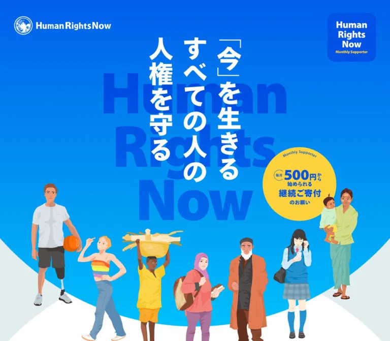
Human Rights Now presents recurring giving through a long explanatory page. The opening places a large white Japanese message in vertical columns over oversized blue English lettering. Illustrated people occupy the lower edge of a blue-to-cyan field, while a yellow circular badge emphasizes the starting donation amount. The visual tone is direct and energetic, with approachable illustrations carrying the human dimension of the subject.
The rest of the page alternates strong statements with explanations and institutional evidence. Heavy Japanese typography establishes urgency; regular text with generous line spacing handles more detailed reading. Rounded blue panels, circular chapter markers, repeated supporter graphics, and pill-shaped links provide continuity over a substantial scroll. The final donation module brings the same visual vocabulary into a quieter pale background before a solid blue contact footer.
How to Read This Reference
- Measured means a value appears in the supplied rendered DOM or computed-style evidence. Element rectangles are browser-reported bounds at the recorded capture state.
- Visual estimate means a dimension or appearance was estimated from the supplied original-page screenshots. These estimates are not recovered stylesheet declarations or programmatically sampled colors.
- Recommended means implementation guidance for a new adaptation. Proposed breakpoints, hover destinations, accessibility improvements, and CSS structures are not claims about the original implementation.
- Token names are descriptive aliases. The supplied custom-property inventory was empty, so no token below is presented as an original CSS variable.
- Font names are recorded computed family names. Individual glyph rendering, font-file completeness, and licensing were not independently tested.
- Coverage differs by section. The hero, desktop methods, closing donation block, and footer have direct visual evidence. Several intermediate sections are described primarily from their text, geometry, and computed styles.
Do not treat every reported parent rectangle as the visible size of its artwork or lettering. The hero H1 has empty extracted text, and several composite headings expose inherited 16px styles despite much larger visible lettering. Some desktop method-card descendants also report smaller bounds than their settled screenshot appearance. Use each measurement for the element it actually describes.
Tokens — Colors
Default Palette
| Name | Value | Suggested token | Evidence and role |
|---|---|---|---|
| Primary Blue | #0252e5 |
--color-blue |
Measured as rgb(2, 82, 229) on donation links, major text, the report panel, and footer background |
| Pale Ground | #e2edef |
--color-ground |
Measured body background; visible behind the closing donation module |
| White | #ffffff |
--color-white |
Measured reversed text and secondary-link fills; also visible in the curved introductory area |
| Chapter Yellow | #fdd23c |
--color-yellow |
Measured circular chapter backgrounds, activity labels, and selected headings |
| Reading Slate | #4c5d67 |
--color-text |
Measured body copy, payment captions, organization details, and question links |
| Link Cyan | #00b2ed |
--color-link |
Measured on the annual-report website link; not a verified gradient stop |
| Tax Notice Red | #eb001b |
--color-notice |
Measured tax-deduction copy and its secondary link |
Blue provides both identity and structure: it is used as text on pale surfaces and as a large filled surface behind white text. Yellow supplies a much smaller, repeated emphasis layer. Red is localized to the donation tax notice rather than used as the main action color.
Everyday-Issue Heading Colors
These values belong to the measured headings of the four educational examples. They should not automatically be assigned to the differently colored phrases in the opening narrative, whose individual span styles were not supplied.
| Example | Measured value | Suggested token |
|---|---|---|
| Social-media harm | #bc4f4f |
--color-issue-social |
| Fishing and supply chains | #22b5ae |
--color-issue-supply |
| Workplace harassment | #ee815c |
--color-issue-work |
| Public funding and conflict | #8b42b5 |
--color-issue-conflict |
Gradient Field
The opening screenshot visibly moves from a deeper blue at the top toward cyan lower down. The desktop methods excerpt also sits on a bright blue field with a subtle vertical change. The underlying background-image declaration and exact stops were not included.
Recommended approximation: linear-gradient(180deg, #0660e8 0%, #00b2ed 100%). The first stop is a visual approximation; the second reuses a measured link color as a convenient endpoint. Neither is asserted to be an original gradient stop.
The yellow inside the illustrated promotional graphics may differ from the measured HTML chapter yellow. Preserve original artwork colors when assets are available instead of recoloring every yellow region to one token.
Tokens — Typography
Japanese Reading and Display Families
The supplied computed styles identify three separate family names:
TazuganeGothicStdN-Regular, sans-serif: ordinary paragraphs, activity descriptions, and inherited page text.TazuganeGothicStdN-Bold, sans-serif: report links, organization values, question links, and supporting donation information.TazuganeGothicStdN-Black, sans-serif: large narrative statements, activity labels, donation appeals, and prominent headings.
Many elements using the Bold or Black family report font-weight: 400. Their visual weight is carried by the selected family. Some semantic headings additionally report 700. Do not replace the three source families with one regular face and assume numerical weight changes will reproduce their shapes.
Latin Numerals and Small English Text
MyriadPro-BlackSemiCn, sans-serifis measured on impact numerals, including the large 166 and 223 figures.MyriadPro-Semibold, sans-serifis measured on the copyright line.- The large background words and illustrated supporter lockups are not covered by a reliable text-style measurement. Their appearance should not be attributed to either family solely by visual similarity.
Root and Body Behavior
The HTML root is measured at 10px, while the body is 16px / 16px. The HTML element reports Times, but visible body content overrides it with the Japanese sans-serif family. Times is not part of the visible design direction.
The body’s tight inherited line height is also not representative of reading paragraphs. Actual explanatory copy uses much more generous line heights. The Quick Start retains a conventional root and uses explicit pixel values instead of copying source rem numbers.
Type Scale
Values below are measured unless marked as estimates. Size and line height are shown as size / line-height.
| Role | Desktop | Mobile | Family or qualification |
|---|---|---|---|
| Opening narrative | 50 / 75px |
25 / 35px |
Black; first desktop paragraph tracks at -1px; mobile narrative at -0.5px |
| Everyday-rights section headline | 65 / 79.95px |
30 / 36.9px |
Black |
| Everyday-rights introductory copy | 30 / 39.9px |
18 / 25.02px |
Black |
| Educational example heading | 30 / 30px |
21 / 27.93px |
Black; mobile wraps into several lines |
| Educational example body | 18 / 36px |
16 / 32px |
Regular |
| Methods introduction | 40 / 55.2px |
20 / 28px |
Black |
| Method verb label | 20 / 20px |
16 / 16px |
Black, yellow |
| Method Japanese display title | Approximately 34–36px |
Not independently measured | Desktop visual estimate; wrapper’s 16px value does not explain visible child lettering |
| Method description | 16 / 24.96px |
14 / 21px |
Regular |
| Explanatory impact paragraphs | 25 / 40px |
16 / 27.04px |
Black |
| Donation-module appeal | 21 / 37px |
16 / 24px |
Black; amount receives additional visible emphasis |
| Main donation link | 23 / 94px |
14 / 52px |
Black; measured boxes are 90px and 50px high |
| Payment caption | 16 / 16px |
12 / 12px |
Bold |
| Tax notice | 16 / 23.04px |
10 / 14.4px |
Bold |
| Report links | 20 / 25px |
16 / 20.96px |
Bold |
| Large impact numerals | 100 / 100px |
50 / 50px |
MyriadPro-BlackSemiCn |
| Secondary 33-count numerals | 60 / 60px |
50 / 50px |
MyriadPro-BlackSemiCn |
| Message paragraphs | 20 / 40px |
16 / 27.04px |
Bold |
| Organization values | 20 / 36px |
14 / 22.96px |
Bold |
| Question links | 20 / 30px |
14 / 22.96px |
Bold |
| Footer appeal | 25 / 35px |
16 / 24.96px |
Black |
| Copyright | 16 / 16px |
10 / 10px |
MyriadPro-Semibold |
The distinguishing typographic contrast is between large, tightly composed statements and slower, widely led explanatory paragraphs. Applying the display weight and size to every paragraph would erase that rhythm.
Tokens — Spacing & Shapes
Spacing Relationships
There is no verified universal spacing scale. The following recurring values form a useful implementation vocabulary without claiming an underlying source system.
| Use | Desktop evidence | Mobile evidence |
|---|---|---|
| Brand top offset | 50px |
15px |
| Main donation-link left padding | 30px |
20px |
| Main donation-link right reservation | 90px |
50px |
| Appeal-to-donation-link gap | 20px, calculated from bounds |
18px, calculated from bounds |
| Report-link vertical padding | 22px top, 18px bottom |
14px top, 12px bottom |
| Report panel vertical padding | 90px top, 100px bottom |
35px top, 40px bottom |
| Question text left reservation | 65px |
30px |
| Footer vertical padding | 90px top, 100px bottom |
40px top and bottom |
| Footer horizontal padding | 138.234px |
26.125px |
Border Radius
| Element | Value | Status |
|---|---|---|
| Donation and detail links | 9999px |
Measured pill radius |
| Circular chapter markers | 50% |
Measured |
| Recent-statements panel | 50px desktop; 25px mobile |
Measured |
| Desktop method cards | Approximately 50px |
Visual estimate |
| Large supporter tile | Approximately 50px desktop; 25px mobile |
Visual estimate |
| Opening supporter tile | Approximately 25px desktop; 12px mobile |
Visual estimate |
| Hero bottom boundary | Broad elliptical curve | Visually observed; construction not supplied |
Layout Measurements
| Element | Desktop at 1440 × 1000 | Mobile at 390 × 844 | Qualification |
|---|---|---|---|
| Full document | About 20,880px high |
About 15,831px high |
Measured current state; not a target height |
| Header element | 1400 × 1172px, x = 20px |
390 × 521.03px |
Does not define the full-bleed background’s exact bounds |
| Opening brand link | 300 × 57px |
160 × 30.53px |
Measured link bounds |
| Opening H1 container | 1400 × 524.84px, y = 132.42px |
390 × 231.22px, y = 121.91px |
Container bounds, not visible glyph width |
| Narrative column | 760px wide |
338.125px wide |
Measured |
| Educational body column | 540px wide |
285.859px wide |
Measured |
| Chapter circle | 196 × 196px |
80 × 80px |
Measured |
| Methods row | Three approximately 320 × 320px cards with 40px gaps |
Vertically sequenced content | Desktop silhouette from screenshot; mobile sequence from DOM |
| Methods explanation | 690px wide |
338.125px wide |
Measured |
| Donation text group | 530px wide |
280.797px wide |
Measured |
| Primary donation link | 470 × 90px |
270 × 50px |
Measured |
| Tax-details link | 185 × 40px |
90 × 20px |
Measured |
| Report panel | 1130px wide |
363.859px wide |
Measured |
| Report-link area | 900px wide |
322.516px wide |
Measured |
| Organization/question inner column | 800px |
312px |
Measured |
| Contact link | 320 × 60px |
210 × 40px |
Measured |
| Footer | 504px high |
285.406px high |
Measured |
The 338.125px mobile narrative column leaves approximately 25.94px on each side. The narrower educational copy leaves approximately 52.06px. Preserve these distinct reading widths rather than forcing every section into one identical container.
Components
Opening Identity and Illustrated Hero
Role: establish the organization, central message, and recurring-giving proposition immediately.
The white organization seal and wordmark sit at the upper left. A compact blue supporter tile sits at the upper right, with stacked white English lettering and a small yellow subtitle. No conventional navigation menu is visible in either supplied opening capture.
The central composition has three strong layers: oversized English words in blue, white Japanese vertical lettering in front, and illustrated people along the lower curve. A yellow donation disc overlaps the right side of the composition. The visible Japanese message reads 「『今』を生きる すべての人の 人権を守る」, with the source artwork using Japanese corner brackets around 「今」.
The yellow disc is approximately 266px across in the desktop excerpt and approximately 116px on mobile. These are visual estimates and describe the promotional graphic, not the smaller HTML chapter circles.
On mobile, the figures remain recognizable across the width instead of becoming an indiscriminate crop of the desktop center. The central figures extend below the blue boundary and overlap the light introductory area. The artwork therefore requires responsive composition or suitable alternative assets, not just a fixed desktop image with object-fit: cover.
The H1’s extracted text is empty. This supports treating the visible lettering as an artwork-dependent composition, but does not establish its asset format or accessible name. The top-right tile’s click behavior and scroll persistence were not verified.
Opening Narrative
Role: connect the illustrated people to the organization’s purpose.
Large, left-aligned paragraphs occupy a narrow centered column. The first paragraph changes color across phrases associated with the illustrated situations, then returns to strong blue. Later paragraphs retain the same substantial Black-family typography.
Desktop text uses 50px type with a 75px line height in a 760px column. Mobile uses 25px type with a 35px line height in a 338.125px column. This is a deliberate reading treatment, not small body copy placed below an oversized hero.
The first paragraph begins at document y = 1357px on desktop and approximately 584.94px on mobile. These positions document the captured flow; they should not become hardcoded top margins. Large gaps between later narrative blocks may include artwork or reveal staging that the selected DOM inventory does not fully describe.
Circular Chapter Markers and Bilingual Headings
Role: provide recognizable transitions through the long page.
Measured yellow circles introduce chapter-like labels including “Human Rights,” “since 2006,” and “Support us.” They shrink from 196px to 80px between the recorded desktop and mobile layouts.
Other sections use English headings paired with Japanese descriptors, including “Our Issues,” “Numbers,” “Message,” “About Us,” and “Q&A.” Their composite H2 wrappers often retain an inherited 16px style, so wrapper font size should not be mistaken for display-lettering size.
Reuse the relationship between a short English identity and a clear Japanese explanation. Exact artwork, child typography, and native asset sizes remain unverified for several of these headings.
Everyday Human-Rights Examples
Role: explain abstract issues through familiar situations.
Four entries discuss social media, tuna supply chains, workplace harassment, and public funding connected to conflict. Each combines an emphatic 「え!?」 introduction, a colored heading, and a substantial slate-colored paragraph.
Desktop text positions alternate between approximately x = 277.5px and x = 622.5px, with 540px body columns. This creates a staggered sequence. On mobile, body paragraphs share a centered 285.859px column and retain a spacious 32px line height.
The mobile heading layouts are individually composed. The supply-chain and conflict headings retain 122px of left padding, while the other sampled headings do not. This indicates reserved layout space, but the associated artwork arrangement is not visually documented in the supplied excerpts. Do not generalize every entry into an identical text-only card.
Our Issues Overview
Role: introduce the breadth of the organization’s work before explaining its methods.
The methods screenshot includes the lower edges of irregular colored issue shapes with small outlined labels above the main explanatory heading. The complete overview diagram is not shown.
The DOM identifies a dedicated “Our Issues” section with the Japanese heading 「私たちが取り組む人権問題」. Its sampled section box is approximately 898px high on desktop and 648px on mobile. Exact diagram contents, arrangement, illustration assets, and interaction behavior cannot be reconstructed from the partial view.
For an adaptation, preserve the separation between the overview of issues and the following three methods. Do not invent clickable geography or interactive filtering.
Three Methods
Role: explain how the organization acts: research, advocacy, and empowerment.
The desktop screenshot presents three equal blue rounded squares against a brighter blue background. A centered white introduction sits above them; a yellow underline emphasizes the three Japanese action verbs within the sentence.
Each card contains four levels:
- A small yellow verb: 「調べる」, 「発信する」, or 「支援する」.
- A large white Japanese method title.
- A yellow English translation: “Research,” “Advocacy,” or “Empowerment.”
- A short, centered white description near the bottom.
The visible cards are approximately 320px square, with 40px gaps and 50px corners. The longer empowerment heading wraps into two Japanese lines on desktop. The screenshot uses flat contrast without visible elevation shadows.
Mobile DOM positions establish a vertical sequence, with successive verb labels 222px apart. Descriptions become 14px / 21px. A mobile screenshot of this section was not supplied, so exact card boundaries and corner sizes there are not directly verified.
Some desktop descendants report 160px-wide bounds and a 10px rectangle height for a declared 20px line box. Those bounds do not reproduce the visible card silhouette. The supplied evidence does not resolve the responsible transform or capture phase, so no particular scale animation should be inferred.
Impact Explanation and 2023 Case Study
Role: connect the three methods to a concrete result.
Two Black-family paragraphs follow the methods in a 690px desktop column, using 25px / 40px white text. They explain the relationship between investigation, public advocacy, legal change, and support for affected people.
The subsequent case study introduces a 2023 legal change with a yellow heading and white explanatory paragraphs. Its wrapper is measured as a 1046px square on desktop. On mobile, the wrapper is 622px square and centered at x = -116px, while the readable paragraphs remain inside the 338.125px content column.
That geometry shows a wider decorative or compositional region around protected mobile text. The precise backdrop shape is not visible in the supplied screenshots. A square wrapper alone is not proof of a circular background.
Recent Statements and Research List
Role: supply documentary evidence through dated outbound links.
A blue panel with 50px desktop corners contains a yellow heading and six white link rows. Its desktop width is 1130px, with a 900px inner link region. Rows use Bold-family 20px text and reserve 40px at the right.
The rows combine a date with a statement or report title. Most desktop rows are 65px high; the long tuna-report row is 90px. Their measured positions imply roughly 1px separation between row boxes, although the actual border declaration was not supplied.
On mobile, the panel becomes approximately 364px wide with 25px corners. Link text is 16px / 20.96px, and row heights expand with wrapping. The longest entry reaches approximately 126px. Keep dates, long titles, and action space together without truncating the title into a short teaser.
The six supplied targets are PDF URLs on the organization’s domains. Those documents were not opened. The dates are content displayed by the page, not evidence that the page’s figures or reports were updated on the inspection date.
Numbers and Impact Metrics
Role: make the scale of past activity easy to scan.
The page labels the period explicitly as 2018–2023. It shows 166 statements or proposals, a nested count of 39 submitted to the UN, 223 events, 33 press conferences, and 33 investigations or reports.
Desktop geometry places the two larger totals in separate left and central groups, with the two smaller totals arranged toward the right. Large numerals use MyriadPro-BlackSemiCn at 100px; the smaller right-hand totals use 60px.
On mobile, the primary categories become a vertical sequence with labels toward the left and values aligned toward the right. Main values use 50px type, while the nested 39 count uses 30px. This is a rearranged information hierarchy, not a uniformly scaled desktop infographic.
No number-counting animation was recorded. Keep the stated historical period attached to the data.
Donation Outcomes and Supporter Benefits
Role: connect recurring amounts to concrete activities and explain ongoing communication with supporters.
Three scenarios describe what five people donating monthly for a year could support: an educational event, participation in a UN Human Rights Council meeting, or an investigation and published report. These are explanatory examples, not verified selectable pricing plans.
Desktop headings use 25px / 35px, with 16px / 26.08px descriptions. Mobile headings use 20px / 28px. The mobile descriptions occupy narrow right-side columns of approximately 146.8px, using 12px / 20.04px text. Their positions suggest a paired composition, but the artwork is not shown in the supplied excerpts.
The following benefits describe an annual report, a twice-yearly newsletter, and email updates. Desktop descriptions occupy three 270px columns. Mobile descriptions appear in successive right-side columns of approximately 161.6px. Preserve the difference between examples of impact and benefits of membership.
Repeated Donation Module
Role: provide a consistent point of action after explanation and reassurance.
Three full donation modules appear in the rendered link inventory. Each repeats the same destination and combines an illustrated supporter lockup with the following stack:
- A centered blue appeal beginning with the monthly starting amount.
- The blue pill link 「マンスリーサポーターに申し込む」.
- A payment caption with VISA and Mastercard marks.
- A subtle horizontal divider.
- Red tax-deduction information and a small white 「詳しくはこちら」 pill.
The desktop main link is 470 × 90px, with 23px Black-family lettering, 30px left padding, and 90px reserved at the right. A yellow circular inset carries a small blue chevron. The inset is visually about 60px across, with roughly 15px clearance from the button edge.
Mobile uses a 270 × 50px link with 14px type. The yellow circle is visually about 36px across. Payment information remains below the primary action instead of being separated into another section.
The closing supporter tile is visually about 326px square on desktop and 150px square on mobile. The headscarf-wearing figure overlaps the left of the desktop tile and the right of the mobile tile. This change is a clear example of responsive art direction.
Recorded destination: https://humanrightsnow.my.salesforce-sites.com/?dt=2&pt=0. The destination is present in the original page’s links; its form, payment flow, and confirmation behavior were not inspected.
The tax-information link points to https://hrn.or.jp/donation/kojyo/. Its destination was also not opened.
Message and Organization Profile
Role: establish accountable organizational identity after the giving proposition.
The desktop message uses a left-side identity area and a wider right-side text column. Measured paragraphs occupy approximately 719.7px and use 20px / 40px Bold-family text. The text identifies the secretary-general as 小川 隆太郎.
Mobile text moves into the familiar 338.125px column at 16px / 27.04px. A mobile-only 「全部読む」 link is recorded at 136 × 30px. This is evidence of a read-more control, not proof of its expansion mechanics. Some identity text reports 1 × 1px mobile bounds, so it should not be described as ordinary visible 10px text based on computed font size alone.
The organization profile uses desktop label/value pairs with a 125px label region and a 675px value region. Mobile stacks each label above its value in a 312px column. The profile names 特定非営利活動法人ヒューマンライツ・ナウ, independently supporting the page’s operator identity.
Questions and Auxiliary Document Controls
Role: address practical concerns before the final donation invitation.
Six question links cover changes to donations or personal information, receipts, payment timing, one-time giving, eligibility, and stopping support. Desktop links use 20px / 30px text with 65px reserved at the left. Mobile uses 14px / 22.96px with a 30px reservation.
The mobile closing screenshot shows the bottom of a white rounded question panel and a fine pale divider. The DOM contains answer text, while the question links target #. This supports a disclosure-like structure, but opening and closing behavior was not exercised.
The extraction also includes 「PDFダウンロード」 and 「閉じる」 links with partly negative coordinates. They do not establish that a document overlay was visibly open. Its trigger, backdrop, dimensions, focus behavior, and keyboard handling remain unverified.
Contact Footer
Role: end with a direct human-support route and organization identity.
A full-width Primary Blue surface contains white explanatory text, a thin white outlined contact pill, the white organization mark, and copyright. Content remains left aligned, leaving substantial empty blue space on desktop.
Desktop padding is approximately 90px top, 138.23px horizontally, and 100px bottom. The contact link is 320 × 60px. Mobile padding becomes 40px vertically and 26.125px horizontally; the link becomes 210 × 40px.
The visible footer logo is approximately 395–400px wide on desktop and approximately 200px on mobile. These are image estimates: the measured anchor spans a much wider content region. Do not use the anchor width as the logo width.
The contact destination is https://hrn.or.jp/contact/, and the logo links to https://hrn.or.jp/. Neither destination was independently inspected.
Tokens — Motion & Interaction
| Treatment | Recorded declaration or evidence | What is established | What remains unverified |
|---|---|---|---|
| Narrative and section reveals | opacity 1s, transform 1s, -webkit-transform 1s |
Several paragraphs and sections declare one-second opacity and transform transitions | Trigger, movement distance, easing, delay, replay behavior, and exact sequence |
| Main donation link | background-color 1s |
A one-second background transition is declared | Activated color, hover appearance, and pointer interaction result |
| Report, detail, and contact links | opacity 0.5s |
Half-second opacity transitions are declared | Target opacity and exact activation condition |
| Question links | color 0.5s |
Half-second text-color transitions are declared | Open-state color and answer animation |
| Mobile message control | 「全部読む」 link in mobile evidence | A read-more affordance exists | Expansion height, collapse behavior, and focus handling |
| Question answers | Answers occur in the section DOM | Answer content exists alongside question links | Whether multiple answers can open and how state is announced |
| Document controls | Download and close labels in the extraction | Auxiliary document-related controls exist | Whether they open a modal, lightbox, or another presentation |
The capture process included at least five seconds of initial observation and readiness checks for finite motion, image decoding, and layout stability. It traversed intermediate scroll positions. These checks support the supplied resting views but do not provide an interaction recording or a complete animation timeline.
Sampled elements report animation: none; that does not rule out animations on unsampled children or pseudo-elements. Likewise, an isolated transition: all entry without a supplied duration is not evidence of a meaningful animated transition.
For an adaptation, use restrained opacity and translation effects around the original one-second reveal duration. Keep content visible by default, and add any reveal state only after the enhancement is ready. Do not introduce parallax, looping character movement, bouncing donation badges, or animated counters as purported source behavior.
Surfaces
| Surface | Appearance | Purpose |
|---|---|---|
| Hero | Blue-to-cyan field with a broad curved lower boundary | Large illustrative opening composition |
| Narrative ground | White and pale blue-gray areas | Separation from the saturated hero and room for large blue text |
| Activity field | Bright blue background with white copy | Continuity across educational and organizational explanation |
| Method and report panels | Deeper blue fills with generous rounded corners | Internal grouping within the blue visual world |
| Chapter markers | Yellow circles with blue identity graphics | Short visual pauses between major sections |
| Closing donation area | Pale blue-gray with blue copy and a blue action pill | Calm, clear decision point |
| Questions | White rounded surface, pale rules, slate questions | Practical information with a quieter hierarchy |
| Footer | Solid blue with white text and outline control | Contact and identity closure |
The directly visible components do not establish a shadow-based elevation system. Separation comes from blue-on-blue contrast, pale versus saturated sections, rounded boundaries, and changes in text color. Avoid adding generic floating-card shadows throughout the page.
Imagery
The hero uses editorial character illustrations with recognizable clothing, poses, and objects. Broad color areas establish silhouettes; smaller shaded facets define faces, folds, hair, and accessories. Edges remain smooth rather than pixelated.
Visible figures include a basketball player with a prosthetic leg, a person in a rainbow-striped top, a child carrying a load, a headscarf-wearing reader, an older bearded person, a student using a phone, and an adult holding a child. The figures have different heights and baselines, creating an uneven human group across the curve.
The recurring supporter reader is reused as a visual link between the opening story and donation modules. The seal and organization wordmark provide institutional identity; VISA and Mastercard marks appear within the payment-information row. These marks should remain recognizable assets rather than approximations built from unrelated icons.
The selected excerpts do not establish the complete photographic inventory of the page. In particular, the message section should not be assigned an invented portrait or photographic treatment from its text layout alone.
Observed Asset References
No image-source URLs or native image dimensions were supplied. This inventory identifies observed visuals, not downloadable files.
| Visual | Original-page evidence | Implementation implication |
|---|---|---|
| Organization seal and wordmark | Desktop and mobile opening and footer screenshots | Preserve proportions; distinguish visible image dimensions from enclosing link bounds |
| Vertical hero message and large English lettering | Both opening screenshots; empty-text H1 wrapper | Use authorized artwork or carefully composed accessible typography; asset format is unknown |
| Hero character group | Desktop lower-hero excerpt and complete mobile group | Preserve the figures’ relationship to the curve and the smaller mobile composition |
| Yellow monthly-giving disc | Both opening screenshots | Treat as a distinct promotional graphic, not the 196px chapter-marker component |
| Supporter tile and reader | Closing donation screenshots | Support desktop-left and mobile-right illustration overlap |
| Payment marks | Closing donation screenshots | Keep the compact caption-and-marks row attached to the action |
| Issue shapes and outlined labels | Partial upper edge of the desktop methods excerpt | Full diagram cannot be reconstructed from the crop |
CSS can reproduce the layout, color structure, circles, rounded panels, and controls. The specific character illustrations and logo artwork carry a substantial part of the identity and require separate assets.
Layout & Responsive Behavior
The page is a long document, not a fixed-height application. Its measured height is approximately 20,880px on desktop and 15,831px on mobile. Mobile reflows many groups vertically yet remains shorter overall because display sizes, artwork regions, and several vertical gaps shrink substantially.
Verified Changes Between the Two Viewports
| Area | Desktop | Mobile |
|---|---|---|
| Opening brand | 300px wide, 50px from top | 160px wide, 15px from top |
| Hero header region | 1172px high | Approximately 521px high |
| Opening narrative | 760px column; 50px type | Approximately 338px column; 25px type |
| Educational entries | Alternating left/right text positions | Shared narrow body column with individually arranged headings |
| Method content | Three visible cards in one row | Three vertically sequenced groups in DOM |
| Chapter circles | 196px | 80px |
| Donation module | Art and information side by side | Art above centered information |
| Supporter illustration | Overlaps left of tile | Overlaps right of tile |
| Main action | 470 × 90px | 270 × 50px |
| Impact metrics | Several horizontal groups | Labels and right-aligned values in successive rows |
| Organization profile | Labels beside values | Labels above values |
| Message | Wide text column beside identity area | Narrow column with a recorded read-more control |
| Footer | Large inset and broad unused right side | Compact left-aligned stack |
The mobile donation text group is approximately 72% of the viewport width, calculated from 280.797 ÷ 390. The report panel occupies approximately 93.3%, while narrative text occupies approximately 86.7%. These are descriptive calculations at one width, not recovered CSS formulas.
The original breakpoint values were not supplied. A 1024px breakpoint in the Quick Start is a recommendation to allow wide donation and method groups to stack before becoming cramped. It is not a measured source breakpoint.
Protect the readable column independently from oversized decoration. The mobile case-study wrapper extends beyond both sides of the viewport while its paragraphs remain within the normal content width. Any clipping in a new implementation should apply to the decorative layer, with essential text and controls remaining reachable.
Do’s and Don’ts
Do
- Build the main identity around measured blue
#0252e5, pale ground#e2edef, white, and yellow#fdd23c. - Preserve the blue-to-cyan opening field and its broad curved boundary, while treating exact gradient stops as unresolved.
- Keep the large vertical Japanese message, background English words, and illustrated people as a composed hierarchy.
- Use the measured Japanese family roles and preserve the contrast between Black display copy and more relaxed reading paragraphs.
- Repeat the same donation-module anatomy after meaningful explanatory stages.
- Keep the yellow arrow disc inside the blue action pill.
- Recompose artwork and multi-column information for mobile.
- Retain historical period labels alongside the impact figures.
- Use wide line spacing for detailed explanations, especially the 16px / 32px mobile educational copy.
- Preserve the left-aligned, spacious contact footer.
Don’t
- Don’t reduce the entire document to a hero and three generic feature cards; its explanatory and evidentiary sequence matters.
- Don’t use the inherited H1 or H2 wrapper styles as measurements of illustrated display lettering.
- Don’t treat every yellow graphic as an exact match to the measured HTML yellow.
- Don’t crop away most of the character group to fill a mobile hero.
- Don’t turn the donation examples into selectable pricing tiers without a separate product requirement.
- Don’t replace the illustrated people with unrelated stock icons or uniformly styled avatar circles.
- Don’t add glossy shadows, glass blur, or a generic elevated-card system to the visible panels.
- Don’t present inferred hover colors, sticky behavior, FAQ transitions, or modal behavior as observed facts.
- Don’t hardcode the measured document height or absolute paragraph positions into a new implementation.
- Don’t assume DOM text outside a visible or clipped region was fully displayed in the captured state.
Recommended Implementation Additions
These are improvements for a new implementation, not verified features of the original page:
- Give an artwork-based hero message an equivalent accessible heading. Empty extracted H1 text does not establish whether the original already provides an alternative.
- Use native disclosure controls or buttons with explicit expanded state for questions. Preserve the source question wording while making keyboard behavior predictable.
- Provide an accessible expansion control for the mobile message and avoid losing reading position when it opens.
- Add visible focus indicators suited to both pale and blue backgrounds.
- Enlarge the mobile tax-details target beyond its measured 20px height. Keep the visual pill compact if desired while providing at least a 44px interaction area.
- Consider increasing the 10px tax notice and 12px impact descriptions where readability outweighs exact reproduction. Let the tax row stack if necessary.
- Respect reduced-motion preferences and ensure content remains readable when reveal scripting fails or is unavailable.
- Reserve image dimensions and use responsive artwork so the hero’s layered people do not cause layout shifts during loading.
- Check white-text contrast against the actual gradient used in implementation, especially near the brighter cyan region.
- Preserve semantic links for the donation form, contact page, and reports; do not substitute inert styled elements.
Agent Prompt Guide
Quick Color Reference
- Primary identity, action fills, and footer:
#0252e5. - Pale supporting ground:
#e2edef. - Reversed lettering and small secondary-link surfaces:
#ffffff. - HTML chapter and emphasis yellow:
#fdd23c. - Reading copy and payment captions:
#4c5d67. - Tax information:
#eb001b. - Measured inline-link cyan:
#00b2ed. - Suggested hero gradient only:
#0660e8to#00b2ed; original stops were not supplied.
Overall Prompt
“Create a Japanese monthly-supporter information page inspired by the current Human Rights Now reference. Use strong blue #0252e5, pale blue-gray #e2edef, white lettering, and localized yellow #fdd23c. Compose an opening blue-to-cyan field with a broad curved lower edge, oversized background English lettering, a white vertical Japanese message, and a varied group of editorial character illustrations. Continue through large narrative statements, everyday examples, three organizational methods, documentary links, dated impact metrics, giving examples, organization information, questions, and repeated donation modules. Use heavy Japanese sans-serif display text and generously led explanatory paragraphs. Keep controls flat, rounded, and clear. On mobile, recompose the artwork, stack the methods, align metric values to the right, and move the supporter reader from the left to the right side of its tile. Treat all unverified interactions as implementation decisions.”
Example Component Prompts
- Hero: “Compose a blue-to-cyan opening with a white organization mark at upper left, a compact supporter tile at upper right, centered vertical Japanese headline artwork, large blue English words behind it, and illustrated people crossing a curved lower edge. Place a yellow monthly-giving disc toward the right without covering the central message. Create a separate mobile composition that preserves the full group.”
- Methods: “Build three flat blue rounded cards, approximately 320px square on desktop with 40px gaps. Inside each, stack a small yellow Japanese verb, a large white Japanese title, a yellow English translation, and a short centered white explanation. Use a centered white section introduction with yellow emphasis. Stack the groups for narrow screens.”
- Donation module: “Place an illustrated blue supporter lockup beside a 530px information group. Add centered blue appeal copy, a 470 × 90px blue pill with white Japanese text and a yellow circular chevron inset, payment marks, and a red tax notice with a white details pill. On mobile, place the art above the copy and use a 270 × 50px main action.”
- Report list: “Create a deep-blue rounded panel with a yellow heading and six dated white document links. Use a 900px desktop inner measure, generous row padding, space for an action cue, and full title wrapping. On mobile, use 25px corners and 16px text; expand row height for long titles.”
- Footer: “Create a flat full-width blue footer with a left-aligned white support message, a thin white outlined contact pill, the organization’s white logo, and a small copyright line. Preserve broad empty space to the right on desktop and a compact stacked arrangement on mobile.”
Quick Start
CSS Custom Properties
This CSS is a recommended adaptation of the measured palette, reading widths, method grouping, donation controls, report panel, and footer. It retains a conventional root size. The hero curve, artwork placement, fallback behavior, breakpoint, and hover targets are implementation choices. It does not reproduce the complete scroll sequence or any unobserved overlay.
The named source fonts must be loaded separately when available for the project. No font files or image assets are included here. Generic sans-serif fallbacks remain usable but will change the typography.
:root {
  /* Measured original-page colors */
  --color-blue: #0252e5;
  --color-ground: #e2edef;
  --color-white: #ffffff;
  --color-yellow: #fdd23c;
  --color-text: #4c5d67;
  --color-link: #00b2ed;
  --color-notice: #eb001b;
  --color-issue-social: #bc4f4f;
  --color-issue-supply: #22b5ae;
  --color-issue-work: #ee815c;
  --color-issue-conflict: #8b42b5;

  /* Recommended gradient approximation and hover color */
  --hero-top: #0660e8;
  --hero-bottom: #00b2ed;
  --color-blue-hover: #0045c4;

  /* Recorded family names; load font assets separately */
  --font-reading: 'TazuganeGothicStdN-Regular', sans-serif;
  --font-strong: 'TazuganeGothicStdN-Bold', sans-serif;
  --font-display: 'TazuganeGothicStdN-Black', sans-serif;
  --font-number: 'MyriadPro-BlackSemiCn', sans-serif;
  --font-copyright: 'MyriadPro-Semibold', sans-serif;

  --measure-wide: 1300px;
  --measure-narrative: 760px;
  --measure-explanation: 690px;
  --measure-reports: 1130px;
  --gutter: 26px;
  --radius-panel: 50px;
  --radius-pill: 9999px;
  --chapter-size: 196px;
  --action-height: 90px;
  --action-disc: 60px;

  /* Durations recorded in computed styles */
  --duration-reveal: 1s;
  --duration-action: 1s;
  --duration-link: 0.5s;
}

* {
  box-sizing: border-box;
}

html {
  font-size: 100%;
}

body {
  margin: 0;
  color: var(--color-text);
  background: var(--color-ground);
  font: 400 16px / 1.69 var(--font-reading);
}

img {
  display: block;
  max-width: 100%;
  height: auto;
}

a {
  color: inherit;
}

.container {
  width: min(
    var(--measure-wide),
    calc(100% - 2 * var(--gutter))
  );
  margin-inline: auto;
}

.display-copy {
  font-family: var(--font-display);
  font-weight: 400;
}

.narrative {
  width: min(
    var(--measure-narrative),
    calc(100% - 2 * var(--gutter))
  );
  margin-inline: auto;
  color: var(--color-blue);
  font: 400 50px / 1.5 var(--font-display);
}

.narrative__opening {
  letter-spacing: -0.02em;
}

.reading-copy {
  font: 400 18px / 2 var(--font-reading);
}

/* Recommended hero shell; original artwork is supplied separately. */
.hero {
  position: relative;
  isolation: isolate;
  min-height: 1172px;
}

.hero::before {
  content: '';
  position: absolute;
  z-index: -1;
  inset: 0;
  background: linear-gradient(
    180deg,
    var(--hero-top),
    var(--hero-bottom)
  );
  border-radius: 0 0 50% 50% / 0 0 38% 38%;
}

.hero__frame {
  position: relative;
  width: min(1400px, 100%);
  min-height: inherit;
  margin-inline: auto;
}

.hero__brand {
  position: absolute;
  top: 50px;
  left: 3.6%;
  width: 300px;
}

.hero__supporter-mark {
  position: absolute;
  top: 40px;
  right: 3.6%;
  width: 150px;
}

/* Use responsive artwork for the central lettering and people. */
.hero__artwork {
  width: 100%;
  height: auto;
}

.chapter-marker {
  display: grid;
  place-items: center;
  width: var(--chapter-size);
  aspect-ratio: 1;
  margin-inline: auto;
  border-radius: 50%;
  color: var(--color-blue);
  background: var(--color-yellow);
}

.methods-section {
  padding-block: 80px;
  color: var(--color-white);
  background: linear-gradient(180deg, #0875ee, #008def);
}

.methods-heading {
  max-width: 1000px;
  margin: 0 auto 80px;
  text-align: center;
  font: 400 40px / 1.38 var(--font-display);
}

.methods-heading em {
  font-style: normal;
  text-decoration: underline;
  text-decoration-color: var(--color-yellow);
  text-decoration-thickness: 5px;
  text-underline-offset: 5px;
}

.methods-grid {
  display: grid;
  grid-template-columns: repeat(3, minmax(0, 1fr));
  gap: 40px;
  max-width: 1040px;
  margin-inline: auto;
}

.method-card {
  display: flex;
  flex-direction: column;
  align-items: center;
  min-height: 320px;
  padding: 38px 24px 42px;
  border-radius: var(--radius-panel);
  text-align: center;
  background: var(--color-blue);
}

.method-card__verb {
  margin: 0 0 28px;
  color: var(--color-yellow);
  font: 400 20px / 1 var(--font-display);
}

.method-card__title {
  margin: 0;
  font: 400 36px / 1.2 var(--font-display);
}

.method-card__english {
  margin-top: 6px;
  color: var(--color-yellow);
  font: 400 20px / 1.2 var(--font-strong);
}

.method-card__description {
  margin: auto 0 0;
  padding-top: 26px;
  font: 400 16px / 1.56 var(--font-reading);
}

.methods-explanation {
  max-width: var(--measure-explanation);
  margin: 70px auto 0;
  font: 400 25px / 1.6 var(--font-display);
}

.donation {
  display: grid;
  grid-template-columns: minmax(0, 1fr) minmax(0, 530px);
  align-items: center;
  gap: 60px;
  width: min(1040px, calc(100% - 52px));
  margin-inline: auto;
  padding-block: 75px;
}

/* Recommended slots for the tile and transparent reader asset. */
.supporter-art {
  position: relative;
  width: min(326px, 100%);
  aspect-ratio: 1;
  margin-inline: auto;
}

.supporter-art__tile {
  width: 100%;
  height: 100%;
  border-radius: 50px;
  background: var(--color-blue);
}

.supporter-art__person {
  position: absolute;
  bottom: -8px;
  left: -84px;
  width: 140px;
}

.donation__content {
  min-width: 0;
}

.donation__appeal {
  margin: 0 0 20px;
  color: var(--color-blue);
  text-align: center;
  font: 400 21px / 1.762 var(--font-display);
}

/* Amount size is an adaptation of the visible emphasis. */
.donation__amount {
  font-size: 34px;
}

.donation-link {
  position: relative;
  display: flex;
  align-items: center;
  width: min(470px, 100%);
  min-height: var(--action-height);
  margin-inline: auto;
  padding: 16px 90px 16px 30px;
  border-radius: var(--radius-pill);
  color: var(--color-white);
  background: var(--color-blue);
  text-decoration: none;
  font: 400 23px / 1.35 var(--font-display);
  transition: background-color var(--duration-action);
}

.donation-link__disc {
  position: absolute;
  top: 50%;
  right: 15px;
  display: grid;
  place-items: center;
  width: var(--action-disc);
  aspect-ratio: 1;
  transform: translateY(-50%);
  border-radius: 50%;
  color: var(--color-blue);
  background: var(--color-yellow);
}

.donation-link__disc::before {
  content: '';
  width: 7px;
  height: 7px;
  border-top: 1px solid currentColor;
  border-right: 1px solid currentColor;
  transform: rotate(45deg);
}

.payment-row {
  display: flex;
  flex-wrap: wrap;
  justify-content: center;
  align-items: center;
  gap: 12px;
  margin-top: 22px;
  font: 400 16px / 1.3 var(--font-strong);
}

.payment-row__marks {
  display: flex;
  align-items: center;
  gap: 12px;
}

.tax-row {
  display: flex;
  align-items: center;
  justify-content: space-between;
  gap: 20px;
  margin-top: 20px;
  padding-top: 18px;
  border-top: 1px solid rgb(76 93 103 / 12%);
  color: var(--color-notice);
}

.tax-row p {
  margin: 0;
  font: 400 16px / 1.44 var(--font-strong);
}

.tax-link {
  flex: 0 0 185px;
  display: grid;
  place-items: center;
  min-height: 40px;
  border-radius: var(--radius-pill);
  background: var(--color-white);
  text-decoration: none;
  font: 400 16px / 1.4 var(--font-strong);
  transition: opacity var(--duration-link);
}

.report-panel {
  width: min(var(--measure-reports), calc(100% - 26px));
  margin-inline: auto;
  padding: 90px 0 100px;
  border-radius: var(--radius-panel);
  color: var(--color-white);
  background: var(--color-blue);
}

.report-panel__heading {
  margin: 0 20px 20px;
  color: var(--color-yellow);
  text-align: center;
  font: 400 40px / 1.2 var(--font-display);
}

.report-list {
  width: min(900px, calc(100% - 42px));
  margin: 0 auto;
  padding: 0;
  list-style: none;
}

.report-link {
  display: grid;
  grid-template-columns: 110px minmax(0, 1fr);
  gap: 16px;
  padding: 22px 40px 18px 0;
  text-decoration: none;
  overflow-wrap: anywhere;
  font: 400 20px / 1.25 var(--font-strong);
  transition: opacity var(--duration-link);
}

/* Recommended rule treatment; exact source border was not supplied. */
.report-list li + li {
  border-top: 1px solid rgb(255 255 255 / 35%);
}

.site-footer {
  padding: 90px 9.6% 100px;
  color: var(--color-white);
  background: var(--color-blue);
}

.site-footer__message {
  margin: 0 0 28px;
  font: 400 25px / 1.4 var(--font-display);
}

.contact-link {
  display: grid;
  place-items: center;
  width: min(320px, 100%);
  min-height: 60px;
  border: 1px solid currentColor;
  border-radius: var(--radius-pill);
  text-decoration: none;
  font: 400 20px / 1.4 var(--font-strong);
  transition: opacity var(--duration-link);
}

.site-footer__logo {
  width: min(400px, 100%);
  margin-top: 40px;
}

.site-footer__copyright {
  margin: 25px 0 0;
  font: 400 16px / 1 var(--font-copyright);
}

/* Recommended interaction states, not observed hover endpoints. */
@media (hover: hover) {
  .donation-link:hover {
    background: var(--color-blue-hover);
  }

  .tax-link:hover,
  .report-link:hover,
  .contact-link:hover {
    opacity: 0.75;
  }
}

:where(a, button, summary):focus-visible {
  outline: 3px solid currentColor;
  outline-offset: 5px;
}

.donation-link:focus-visible {
  outline-color: var(--color-blue);
}

/* Recommended breakpoint; original media-query values are unknown. */
@media (max-width: 64rem) {
  :root {
    --radius-panel: 25px;
    --chapter-size: 80px;
    --action-height: 50px;
    --action-disc: 36px;
  }

  .hero {
    min-height: 521px;
  }

  .hero__brand {
    top: 15px;
    left: 4%;
    width: 160px;
  }

  .hero__supporter-mark {
    top: 15px;
    right: 4%;
    width: 72px;
  }

  .narrative {
    font-size: 25px;
    line-height: 1.4;
    letter-spacing: -0.02em;
  }

  .reading-copy {
    font-size: 16px;
    line-height: 2;
  }

  .methods-section {
    padding-block: 45px;
  }

  .methods-heading {
    margin-bottom: 40px;
    font-size: 20px;
    line-height: 1.4;
  }

  .methods-grid {
    grid-template-columns: minmax(0, 1fr);
    gap: 24px;
  }

  /* Mobile card geometry is recommended, not visually measured. */
  .method-card {
    min-height: 198px;
    padding: 25px 20px;
  }

  .method-card__verb {
    margin-bottom: 15px;
    font-size: 16px;
  }

  .method-card__title {
    font-size: 24px;
  }

  .method-card__english {
    font-size: 16px;
  }

  .method-card__description {
    padding-top: 20px;
    font-size: 14px;
    line-height: 1.5;
  }

  .methods-explanation {
    margin-top: 40px;
    font-size: 16px;
    line-height: 1.69;
  }

  .donation {
    width: 100%;
    grid-template-columns: minmax(0, 1fr);
    justify-items: center;
    gap: 25px;
    padding-block: 45px 30px;
  }

  .supporter-art {
    width: 150px;
  }

  .supporter-art__tile {
    border-radius: 25px;
  }

  .supporter-art__person {
    right: -63px;
    bottom: -25px;
    left: auto;
    width: 88px;
  }

  .donation__content {
    width: min(530px, 72%);
  }

  .donation__appeal {
    margin-bottom: 18px;
    font-size: 16px;
    line-height: 1.5;
  }

  .donation__amount {
    font-size: 25px;
  }

  .donation-link {
    width: min(270px, 100%);
    padding: 10px 50px 10px 20px;
    font-size: 14px;
  }

  .donation-link__disc {
    right: 6px;
  }

  .payment-row {
    gap: 8px;
    margin-top: 16px;
    font-size: 12px;
  }

  /* Accessibility adaptation: larger text and target than the source. */
  .tax-row {
    flex-wrap: wrap;
    gap: 8px;
    margin-top: 12px;
    padding-top: 10px;
  }

  .tax-row p {
    flex: 1 1 170px;
    font-size: 12px;
    line-height: 1.5;
  }

  .tax-link {
    flex-basis: 100px;
    min-height: 44px;
    font-size: 12px;
  }

  .report-panel {
    padding-block: 35px 40px;
  }

  .report-panel__heading {
    margin-bottom: 15px;
    font-size: 20px;
  }

  .report-link {
    grid-template-columns: minmax(0, 1fr);
    gap: 5px;
    padding: 14px 30px 12px 0;
    font-size: 16px;
    line-height: 1.31;
  }

  .site-footer {
    padding: 40px 6.7%;
  }

  .site-footer__message {
    margin-bottom: 12px;
    font-size: 16px;
    line-height: 1.56;
  }

  .contact-link {
    width: 210px;
    min-height: 44px;
    font-size: 13px;
  }

  .site-footer__logo {
    width: 200px;
    margin-top: 12px;
  }

  .site-footer__copyright {
    margin-top: 18px;
    font-size: 10px;
  }
}

/* Recommended opt-in reveal support; content stays visible by default. */
[data-reveal] {
  opacity: 1;
  transform: none;
  transition:
    opacity var(--duration-reveal),
    transform var(--duration-reveal);
}

@media (prefers-reduced-motion: reduce) {
  [data-reveal] {
    opacity: 1 !important;
    transform: none !important;
    transition: none !important;
  }

  .donation-link,
  .tax-link,
  .report-link,
  .contact-link {
    transition: none;
  }
}
Example Action Markup
This example uses the recorded donation destination. The arrow is decorative; the Japanese link text supplies the accessible action name. Place payment marks and tax information immediately after the link when assembling the full module.
<div class='donation__content' lang='ja'>
<p class='donation__appeal'>
月<span class='donation__amount'>500</span>円からの<br>
「マンスリーサポーター」になって<br>
ヒューマンライツ・ナウの活動を支えてください。
</p>
<a
class='donation-link'
href='https://humanrightsnow.my.salesforce-sites.com/?dt=2&pt=0'
>
<span>マンスリーサポーターに申し込む</span>
<span class='donation-link__disc' aria-hidden='true'></span>
</a>
<div class='tax-row'>
<p>
当団体へのご寄付は、税制上の寄付金控除
(優遇措置)の対象となります。
</p>
<a class='tax-link' href='https://hrn.or.jp/donation/kojyo/'>
詳しくはこちら
</a>
</div>
</div>
Tailwind v4 Token Mapping
Optional aliases for a project that already uses Tailwind v4. This does not imply that the original page uses Tailwind. Define the custom properties above first.
@theme inline {
  --color-hrn-blue: var(--color-blue);
  --color-hrn-ground: var(--color-ground);
  --color-hrn-yellow: var(--color-yellow);
  --color-hrn-text: var(--color-text);
  --color-hrn-notice: var(--color-notice);
  --color-hrn-link: var(--color-link);

  --font-hrn-reading: var(--font-reading);
  --font-hrn-strong: var(--font-strong);
  --font-hrn-display: var(--font-display);
  --font-hrn-number: var(--font-number);

  --radius-hrn-panel: var(--radius-panel);
  --radius-hrn-pill: var(--radius-pill);
  --spacing-hrn-gutter: var(--gutter);
  --spacing-hrn-chapter: var(--chapter-size);
}
Sources & Evidence
- Original and final page: Human Rights Now — Monthly Supporter. The supplied browser record reports HTTP 200 and identical original and final URLs.
- Capture date: September 12, 2026, 17:06:11.485 UTC, corresponding to September 13, 2026, 02:06:11.485 JST.
- Desktop evidence: 1440 × 1000 CSS-pixel viewport; opening, methods, and closing donation/footer excerpts; rendered document height approximately 20,880px.
- Mobile evidence: 390 × 844 CSS-pixel viewport; opening and closing donation/footer excerpts; rendered document height approximately 15,831px.
- Rendered DOM and computed styles: supplied text, links, selected element bounds, family names, font sizes, line heights, colors, padding, radii, display modes, and transition declarations at both viewports.
- Link evidence: donation, tax-information, report, annual-report, home, and contact targets were present in the rendered original-page inventory. Their destination contents were not inspected for this reference.
- Interaction coverage: readiness checks and scrolling were recorded, but no activated donation flow, FAQ answer, read-more state, hover state, or document overlay was supplied.
This reference describes the page served in the supplied current inspection. Exact image paths, gradient declarations, breakpoint rules, complete child typography, and unexercised interactions remain unresolved. Visual estimates and recommended implementation choices are identified throughout.
# Human Rights Now / Monthly Supporter — Style Reference
> An illustrated human-rights appeal built from expansive blue fields, emphatic Japanese type, and a recurring yellow invitation to participate.
**Original URL:** [hrn.or.jp/monthly_supporter](https://hrn.or.jp/monthly_supporter/)
**Final URL:** [hrn.or.jp/monthly_supporter](https://hrn.or.jp/monthly_supporter/)
**Theme:** light presentation with saturated blue sections, pale blue-gray supporting surfaces, white lettering, and yellow accents.
**Inspected:** September 13, 2026, at 02:06 JST. The supplied capture record is dated September 12, 2026, at 17:06:11.485 UTC.
**Viewports:** desktop 1440 × 1000 CSS pixels; mobile 390 × 844 CSS pixels.
**Scope:** the current monthly-supporter page, including its opening composition, educational narrative, activities, evidence of impact, donation information, organization profile, questions, and footer. Visual evidence comprises three desktop excerpts and two mobile excerpts; rendered text and selected computed styles cover the longer document.
Human Rights Now presents recurring giving through a long explanatory page. The opening places a large white Japanese message in vertical columns over oversized blue English lettering. Illustrated people occupy the lower edge of a blue-to-cyan field, while a yellow circular badge emphasizes the starting donation amount. The visual tone is direct and energetic, with approachable illustrations carrying the human dimension of the subject.
The rest of the page alternates strong statements with explanations and institutional evidence. Heavy Japanese typography establishes urgency; regular text with generous line spacing handles more detailed reading. Rounded blue panels, circular chapter markers, repeated supporter graphics, and pill-shaped links provide continuity over a substantial scroll. The final donation module brings the same visual vocabulary into a quieter pale background before a solid blue contact footer.
## How to Read This Reference
- **Measured** means a value appears in the supplied rendered DOM or computed-style evidence. Element rectangles are browser-reported bounds at the recorded capture state.
- **Visual estimate** means a dimension or appearance was estimated from the supplied original-page screenshots. These estimates are not recovered stylesheet declarations or programmatically sampled colors.
- **Recommended** means implementation guidance for a new adaptation. Proposed breakpoints, hover destinations, accessibility improvements, and CSS structures are not claims about the original implementation.
- **Token names** are descriptive aliases. The supplied custom-property inventory was empty, so no token below is presented as an original CSS variable.
- **Font names** are recorded computed family names. Individual glyph rendering, font-file completeness, and licensing were not independently tested.
- **Coverage differs by section.** The hero, desktop methods, closing donation block, and footer have direct visual evidence. Several intermediate sections are described primarily from their text, geometry, and computed styles.
Do not treat every reported parent rectangle as the visible size of its artwork or lettering. The hero H1 has empty extracted text, and several composite headings expose inherited 16px styles despite much larger visible lettering. Some desktop method-card descendants also report smaller bounds than their settled screenshot appearance. Use each measurement for the element it actually describes.
## Tokens — Colors
### Default Palette
| Name | Value | Suggested token | Evidence and role |
| --- | --- | --- | --- |
| Primary Blue | `#0252e5` | `--color-blue` | Measured as `rgb(2, 82, 229)` on donation links, major text, the report panel, and footer background |
| Pale Ground | `#e2edef` | `--color-ground` | Measured body background; visible behind the closing donation module |
| White | `#ffffff` | `--color-white` | Measured reversed text and secondary-link fills; also visible in the curved introductory area |
| Chapter Yellow | `#fdd23c` | `--color-yellow` | Measured circular chapter backgrounds, activity labels, and selected headings |
| Reading Slate | `#4c5d67` | `--color-text` | Measured body copy, payment captions, organization details, and question links |
| Link Cyan | `#00b2ed` | `--color-link` | Measured on the annual-report website link; not a verified gradient stop |
| Tax Notice Red | `#eb001b` | `--color-notice` | Measured tax-deduction copy and its secondary link |
Blue provides both identity and structure: it is used as text on pale surfaces and as a large filled surface behind white text. Yellow supplies a much smaller, repeated emphasis layer. Red is localized to the donation tax notice rather than used as the main action color.
### Everyday-Issue Heading Colors
These values belong to the measured headings of the four educational examples. They should not automatically be assigned to the differently colored phrases in the opening narrative, whose individual span styles were not supplied.
| Example | Measured value | Suggested token |
| --- | --- | --- |
| Social-media harm | `#bc4f4f` | `--color-issue-social` |
| Fishing and supply chains | `#22b5ae` | `--color-issue-supply` |
| Workplace harassment | `#ee815c` | `--color-issue-work` |
| Public funding and conflict | `#8b42b5` | `--color-issue-conflict` |
### Gradient Field
The opening screenshot visibly moves from a deeper blue at the top toward cyan lower down. The desktop methods excerpt also sits on a bright blue field with a subtle vertical change. The underlying background-image declaration and exact stops were not included.
**Recommended approximation:** `linear-gradient(180deg, #0660e8 0%, #00b2ed 100%)`. The first stop is a visual approximation; the second reuses a measured link color as a convenient endpoint. Neither is asserted to be an original gradient stop.
The yellow inside the illustrated promotional graphics may differ from the measured HTML chapter yellow. Preserve original artwork colors when assets are available instead of recoloring every yellow region to one token.
## Tokens — Typography
### Japanese Reading and Display Families
The supplied computed styles identify three separate family names:
- `TazuganeGothicStdN-Regular, sans-serif`: ordinary paragraphs, activity descriptions, and inherited page text.
- `TazuganeGothicStdN-Bold, sans-serif`: report links, organization values, question links, and supporting donation information.
- `TazuganeGothicStdN-Black, sans-serif`: large narrative statements, activity labels, donation appeals, and prominent headings.
Many elements using the Bold or Black family report `font-weight: 400`. Their visual weight is carried by the selected family. Some semantic headings additionally report `700`. Do not replace the three source families with one regular face and assume numerical weight changes will reproduce their shapes.
### Latin Numerals and Small English Text
- `MyriadPro-BlackSemiCn, sans-serif` is measured on impact numerals, including the large 166 and 223 figures.
- `MyriadPro-Semibold, sans-serif` is measured on the copyright line.
- The large background words and illustrated supporter lockups are not covered by a reliable text-style measurement. Their appearance should not be attributed to either family solely by visual similarity.
### Root and Body Behavior
The HTML root is measured at `10px`, while the body is `16px / 16px`. The HTML element reports Times, but visible body content overrides it with the Japanese sans-serif family. Times is not part of the visible design direction.
The body’s tight inherited line height is also not representative of reading paragraphs. Actual explanatory copy uses much more generous line heights. The Quick Start retains a conventional root and uses explicit pixel values instead of copying source rem numbers.
### Type Scale
Values below are measured unless marked as estimates. Size and line height are shown as `size / line-height`.
| Role | Desktop | Mobile | Family or qualification |
| --- | --- | --- | --- |
| Opening narrative | `50 / 75px` | `25 / 35px` | Black; first desktop paragraph tracks at `-1px`; mobile narrative at `-0.5px` |
| Everyday-rights section headline | `65 / 79.95px` | `30 / 36.9px` | Black |
| Everyday-rights introductory copy | `30 / 39.9px` | `18 / 25.02px` | Black |
| Educational example heading | `30 / 30px` | `21 / 27.93px` | Black; mobile wraps into several lines |
| Educational example body | `18 / 36px` | `16 / 32px` | Regular |
| Methods introduction | `40 / 55.2px` | `20 / 28px` | Black |
| Method verb label | `20 / 20px` | `16 / 16px` | Black, yellow |
| Method Japanese display title | Approximately `34–36px` | Not independently measured | Desktop visual estimate; wrapper’s 16px value does not explain visible child lettering |
| Method description | `16 / 24.96px` | `14 / 21px` | Regular |
| Explanatory impact paragraphs | `25 / 40px` | `16 / 27.04px` | Black |
| Donation-module appeal | `21 / 37px` | `16 / 24px` | Black; amount receives additional visible emphasis |
| Main donation link | `23 / 94px` | `14 / 52px` | Black; measured boxes are 90px and 50px high |
| Payment caption | `16 / 16px` | `12 / 12px` | Bold |
| Tax notice | `16 / 23.04px` | `10 / 14.4px` | Bold |
| Report links | `20 / 25px` | `16 / 20.96px` | Bold |
| Large impact numerals | `100 / 100px` | `50 / 50px` | MyriadPro-BlackSemiCn |
| Secondary 33-count numerals | `60 / 60px` | `50 / 50px` | MyriadPro-BlackSemiCn |
| Message paragraphs | `20 / 40px` | `16 / 27.04px` | Bold |
| Organization values | `20 / 36px` | `14 / 22.96px` | Bold |
| Question links | `20 / 30px` | `14 / 22.96px` | Bold |
| Footer appeal | `25 / 35px` | `16 / 24.96px` | Black |
| Copyright | `16 / 16px` | `10 / 10px` | MyriadPro-Semibold |
The distinguishing typographic contrast is between large, tightly composed statements and slower, widely led explanatory paragraphs. Applying the display weight and size to every paragraph would erase that rhythm.
## Tokens — Spacing & Shapes
### Spacing Relationships
There is no verified universal spacing scale. The following recurring values form a useful implementation vocabulary without claiming an underlying source system.
| Use | Desktop evidence | Mobile evidence |
| --- | --- | --- |
| Brand top offset | `50px` | `15px` |
| Main donation-link left padding | `30px` | `20px` |
| Main donation-link right reservation | `90px` | `50px` |
| Appeal-to-donation-link gap | `20px`, calculated from bounds | `18px`, calculated from bounds |
| Report-link vertical padding | `22px` top, `18px` bottom | `14px` top, `12px` bottom |
| Report panel vertical padding | `90px` top, `100px` bottom | `35px` top, `40px` bottom |
| Question text left reservation | `65px` | `30px` |
| Footer vertical padding | `90px` top, `100px` bottom | `40px` top and bottom |
| Footer horizontal padding | `138.234px` | `26.125px` |
### Border Radius
| Element | Value | Status |
| --- | --- | --- |
| Donation and detail links | `9999px` | Measured pill radius |
| Circular chapter markers | `50%` | Measured |
| Recent-statements panel | `50px` desktop; `25px` mobile | Measured |
| Desktop method cards | Approximately `50px` | Visual estimate |
| Large supporter tile | Approximately `50px` desktop; `25px` mobile | Visual estimate |
| Opening supporter tile | Approximately `25px` desktop; `12px` mobile | Visual estimate |
| Hero bottom boundary | Broad elliptical curve | Visually observed; construction not supplied |
### Layout Measurements
| Element | Desktop at 1440 × 1000 | Mobile at 390 × 844 | Qualification |
| --- | --- | --- | --- |
| Full document | About `20,880px` high | About `15,831px` high | Measured current state; not a target height |
| Header element | `1400 × 1172px`, x = `20px` | `390 × 521.03px` | Does not define the full-bleed background’s exact bounds |
| Opening brand link | `300 × 57px` | `160 × 30.53px` | Measured link bounds |
| Opening H1 container | `1400 × 524.84px`, y = `132.42px` | `390 × 231.22px`, y = `121.91px` | Container bounds, not visible glyph width |
| Narrative column | `760px` wide | `338.125px` wide | Measured |
| Educational body column | `540px` wide | `285.859px` wide | Measured |
| Chapter circle | `196 × 196px` | `80 × 80px` | Measured |
| Methods row | Three approximately `320 × 320px` cards with `40px` gaps | Vertically sequenced content | Desktop silhouette from screenshot; mobile sequence from DOM |
| Methods explanation | `690px` wide | `338.125px` wide | Measured |
| Donation text group | `530px` wide | `280.797px` wide | Measured |
| Primary donation link | `470 × 90px` | `270 × 50px` | Measured |
| Tax-details link | `185 × 40px` | `90 × 20px` | Measured |
| Report panel | `1130px` wide | `363.859px` wide | Measured |
| Report-link area | `900px` wide | `322.516px` wide | Measured |
| Organization/question inner column | `800px` | `312px` | Measured |
| Contact link | `320 × 60px` | `210 × 40px` | Measured |
| Footer | `504px` high | `285.406px` high | Measured |
The 338.125px mobile narrative column leaves approximately 25.94px on each side. The narrower educational copy leaves approximately 52.06px. Preserve these distinct reading widths rather than forcing every section into one identical container.
## Components
### Opening Identity and Illustrated Hero
**Role:** establish the organization, central message, and recurring-giving proposition immediately.
The white organization seal and wordmark sit at the upper left. A compact blue supporter tile sits at the upper right, with stacked white English lettering and a small yellow subtitle. No conventional navigation menu is visible in either supplied opening capture.
The central composition has three strong layers: oversized English words in blue, white Japanese vertical lettering in front, and illustrated people along the lower curve. A yellow donation disc overlaps the right side of the composition. The visible Japanese message reads 「『今』を生きる すべての人の 人権を守る」, with the source artwork using Japanese corner brackets around 「今」.
The yellow disc is approximately 266px across in the desktop excerpt and approximately 116px on mobile. These are visual estimates and describe the promotional graphic, not the smaller HTML chapter circles.
On mobile, the figures remain recognizable across the width instead of becoming an indiscriminate crop of the desktop center. The central figures extend below the blue boundary and overlap the light introductory area. The artwork therefore requires responsive composition or suitable alternative assets, not just a fixed desktop image with `object-fit: cover`.
The H1’s extracted text is empty. This supports treating the visible lettering as an artwork-dependent composition, but does not establish its asset format or accessible name. The top-right tile’s click behavior and scroll persistence were not verified.
### Opening Narrative
**Role:** connect the illustrated people to the organization’s purpose.
Large, left-aligned paragraphs occupy a narrow centered column. The first paragraph changes color across phrases associated with the illustrated situations, then returns to strong blue. Later paragraphs retain the same substantial Black-family typography.
Desktop text uses 50px type with a 75px line height in a 760px column. Mobile uses 25px type with a 35px line height in a 338.125px column. This is a deliberate reading treatment, not small body copy placed below an oversized hero.
The first paragraph begins at document y = 1357px on desktop and approximately 584.94px on mobile. These positions document the captured flow; they should not become hardcoded top margins. Large gaps between later narrative blocks may include artwork or reveal staging that the selected DOM inventory does not fully describe.
### Circular Chapter Markers and Bilingual Headings
**Role:** provide recognizable transitions through the long page.
Measured yellow circles introduce chapter-like labels including “Human Rights,” “since 2006,” and “Support us.” They shrink from 196px to 80px between the recorded desktop and mobile layouts.
Other sections use English headings paired with Japanese descriptors, including “Our Issues,” “Numbers,” “Message,” “About Us,” and “Q&A.” Their composite H2 wrappers often retain an inherited 16px style, so wrapper font size should not be mistaken for display-lettering size.
Reuse the relationship between a short English identity and a clear Japanese explanation. Exact artwork, child typography, and native asset sizes remain unverified for several of these headings.
### Everyday Human-Rights Examples
**Role:** explain abstract issues through familiar situations.
Four entries discuss social media, tuna supply chains, workplace harassment, and public funding connected to conflict. Each combines an emphatic 「え!?」 introduction, a colored heading, and a substantial slate-colored paragraph.
Desktop text positions alternate between approximately x = 277.5px and x = 622.5px, with 540px body columns. This creates a staggered sequence. On mobile, body paragraphs share a centered 285.859px column and retain a spacious 32px line height.
The mobile heading layouts are individually composed. The supply-chain and conflict headings retain 122px of left padding, while the other sampled headings do not. This indicates reserved layout space, but the associated artwork arrangement is not visually documented in the supplied excerpts. Do not generalize every entry into an identical text-only card.
### Our Issues Overview
**Role:** introduce the breadth of the organization’s work before explaining its methods.
The methods screenshot includes the lower edges of irregular colored issue shapes with small outlined labels above the main explanatory heading. The complete overview diagram is not shown.
The DOM identifies a dedicated “Our Issues” section with the Japanese heading 「私たちが取り組む人権問題」. Its sampled section box is approximately 898px high on desktop and 648px on mobile. Exact diagram contents, arrangement, illustration assets, and interaction behavior cannot be reconstructed from the partial view.
For an adaptation, preserve the separation between the overview of issues and the following three methods. Do not invent clickable geography or interactive filtering.
### Three Methods
**Role:** explain how the organization acts: research, advocacy, and empowerment.
The desktop screenshot presents three equal blue rounded squares against a brighter blue background. A centered white introduction sits above them; a yellow underline emphasizes the three Japanese action verbs within the sentence.
Each card contains four levels:
1. A small yellow verb: 「調べる」, 「発信する」, or 「支援する」.
2. A large white Japanese method title.
3. A yellow English translation: “Research,” “Advocacy,” or “Empowerment.”
4. A short, centered white description near the bottom.
The visible cards are approximately 320px square, with 40px gaps and 50px corners. The longer empowerment heading wraps into two Japanese lines on desktop. The screenshot uses flat contrast without visible elevation shadows.
Mobile DOM positions establish a vertical sequence, with successive verb labels 222px apart. Descriptions become 14px / 21px. A mobile screenshot of this section was not supplied, so exact card boundaries and corner sizes there are not directly verified.
Some desktop descendants report 160px-wide bounds and a 10px rectangle height for a declared 20px line box. Those bounds do not reproduce the visible card silhouette. The supplied evidence does not resolve the responsible transform or capture phase, so no particular scale animation should be inferred.
### Impact Explanation and 2023 Case Study
**Role:** connect the three methods to a concrete result.
Two Black-family paragraphs follow the methods in a 690px desktop column, using 25px / 40px white text. They explain the relationship between investigation, public advocacy, legal change, and support for affected people.
The subsequent case study introduces a 2023 legal change with a yellow heading and white explanatory paragraphs. Its wrapper is measured as a 1046px square on desktop. On mobile, the wrapper is 622px square and centered at x = -116px, while the readable paragraphs remain inside the 338.125px content column.
That geometry shows a wider decorative or compositional region around protected mobile text. The precise backdrop shape is not visible in the supplied screenshots. A square wrapper alone is not proof of a circular background.
### Recent Statements and Research List
**Role:** supply documentary evidence through dated outbound links.
A blue panel with 50px desktop corners contains a yellow heading and six white link rows. Its desktop width is 1130px, with a 900px inner link region. Rows use Bold-family 20px text and reserve 40px at the right.
The rows combine a date with a statement or report title. Most desktop rows are 65px high; the long tuna-report row is 90px. Their measured positions imply roughly 1px separation between row boxes, although the actual border declaration was not supplied.
On mobile, the panel becomes approximately 364px wide with 25px corners. Link text is 16px / 20.96px, and row heights expand with wrapping. The longest entry reaches approximately 126px. Keep dates, long titles, and action space together without truncating the title into a short teaser.
The six supplied targets are PDF URLs on the organization’s domains. Those documents were not opened. The dates are content displayed by the page, not evidence that the page’s figures or reports were updated on the inspection date.
### Numbers and Impact Metrics
**Role:** make the scale of past activity easy to scan.
The page labels the period explicitly as 2018–2023. It shows 166 statements or proposals, a nested count of 39 submitted to the UN, 223 events, 33 press conferences, and 33 investigations or reports.
Desktop geometry places the two larger totals in separate left and central groups, with the two smaller totals arranged toward the right. Large numerals use MyriadPro-BlackSemiCn at 100px; the smaller right-hand totals use 60px.
On mobile, the primary categories become a vertical sequence with labels toward the left and values aligned toward the right. Main values use 50px type, while the nested 39 count uses 30px. This is a rearranged information hierarchy, not a uniformly scaled desktop infographic.
No number-counting animation was recorded. Keep the stated historical period attached to the data.
### Donation Outcomes and Supporter Benefits
**Role:** connect recurring amounts to concrete activities and explain ongoing communication with supporters.
Three scenarios describe what five people donating monthly for a year could support: an educational event, participation in a UN Human Rights Council meeting, or an investigation and published report. These are explanatory examples, not verified selectable pricing plans.
Desktop headings use 25px / 35px, with 16px / 26.08px descriptions. Mobile headings use 20px / 28px. The mobile descriptions occupy narrow right-side columns of approximately 146.8px, using 12px / 20.04px text. Their positions suggest a paired composition, but the artwork is not shown in the supplied excerpts.
The following benefits describe an annual report, a twice-yearly newsletter, and email updates. Desktop descriptions occupy three 270px columns. Mobile descriptions appear in successive right-side columns of approximately 161.6px. Preserve the difference between examples of impact and benefits of membership.
### Repeated Donation Module
**Role:** provide a consistent point of action after explanation and reassurance.
Three full donation modules appear in the rendered link inventory. Each repeats the same destination and combines an illustrated supporter lockup with the following stack:
1. A centered blue appeal beginning with the monthly starting amount.
2. The blue pill link 「マンスリーサポーターに申し込む」.
3. A payment caption with VISA and Mastercard marks.
4. A subtle horizontal divider.
5. Red tax-deduction information and a small white 「詳しくはこちら」 pill.
The desktop main link is 470 × 90px, with 23px Black-family lettering, 30px left padding, and 90px reserved at the right. A yellow circular inset carries a small blue chevron. The inset is visually about 60px across, with roughly 15px clearance from the button edge.
Mobile uses a 270 × 50px link with 14px type. The yellow circle is visually about 36px across. Payment information remains below the primary action instead of being separated into another section.
The closing supporter tile is visually about 326px square on desktop and 150px square on mobile. The headscarf-wearing figure overlaps the left of the desktop tile and the right of the mobile tile. This change is a clear example of responsive art direction.
**Recorded destination:** `https://humanrightsnow.my.salesforce-sites.com/?dt=2&pt=0`. The destination is present in the original page’s links; its form, payment flow, and confirmation behavior were not inspected.
The tax-information link points to `https://hrn.or.jp/donation/kojyo/`. Its destination was also not opened.
### Message and Organization Profile
**Role:** establish accountable organizational identity after the giving proposition.
The desktop message uses a left-side identity area and a wider right-side text column. Measured paragraphs occupy approximately 719.7px and use 20px / 40px Bold-family text. The text identifies the secretary-general as 小川 隆太郎.
Mobile text moves into the familiar 338.125px column at 16px / 27.04px. A mobile-only 「全部読む」 link is recorded at 136 × 30px. This is evidence of a read-more control, not proof of its expansion mechanics. Some identity text reports 1 × 1px mobile bounds, so it should not be described as ordinary visible 10px text based on computed font size alone.
The organization profile uses desktop label/value pairs with a 125px label region and a 675px value region. Mobile stacks each label above its value in a 312px column. The profile names 特定非営利活動法人ヒューマンライツ・ナウ, independently supporting the page’s operator identity.
### Questions and Auxiliary Document Controls
**Role:** address practical concerns before the final donation invitation.
Six question links cover changes to donations or personal information, receipts, payment timing, one-time giving, eligibility, and stopping support. Desktop links use 20px / 30px text with 65px reserved at the left. Mobile uses 14px / 22.96px with a 30px reservation.
The mobile closing screenshot shows the bottom of a white rounded question panel and a fine pale divider. The DOM contains answer text, while the question links target `#`. This supports a disclosure-like structure, but opening and closing behavior was not exercised.
The extraction also includes 「PDFダウンロード」 and 「閉じる」 links with partly negative coordinates. They do not establish that a document overlay was visibly open. Its trigger, backdrop, dimensions, focus behavior, and keyboard handling remain unverified.
### Contact Footer
**Role:** end with a direct human-support route and organization identity.
A full-width Primary Blue surface contains white explanatory text, a thin white outlined contact pill, the white organization mark, and copyright. Content remains left aligned, leaving substantial empty blue space on desktop.
Desktop padding is approximately 90px top, 138.23px horizontally, and 100px bottom. The contact link is 320 × 60px. Mobile padding becomes 40px vertically and 26.125px horizontally; the link becomes 210 × 40px.
The visible footer logo is approximately 395–400px wide on desktop and approximately 200px on mobile. These are image estimates: the measured anchor spans a much wider content region. Do not use the anchor width as the logo width.
The contact destination is `https://hrn.or.jp/contact/`, and the logo links to `https://hrn.or.jp/`. Neither destination was independently inspected.
## Tokens — Motion & Interaction
| Treatment | Recorded declaration or evidence | What is established | What remains unverified |
| --- | --- | --- | --- |
| Narrative and section reveals | `opacity 1s, transform 1s, -webkit-transform 1s` | Several paragraphs and sections declare one-second opacity and transform transitions | Trigger, movement distance, easing, delay, replay behavior, and exact sequence |
| Main donation link | `background-color 1s` | A one-second background transition is declared | Activated color, hover appearance, and pointer interaction result |
| Report, detail, and contact links | `opacity 0.5s` | Half-second opacity transitions are declared | Target opacity and exact activation condition |
| Question links | `color 0.5s` | Half-second text-color transitions are declared | Open-state color and answer animation |
| Mobile message control | 「全部読む」 link in mobile evidence | A read-more affordance exists | Expansion height, collapse behavior, and focus handling |
| Question answers | Answers occur in the section DOM | Answer content exists alongside question links | Whether multiple answers can open and how state is announced |
| Document controls | Download and close labels in the extraction | Auxiliary document-related controls exist | Whether they open a modal, lightbox, or another presentation |
The capture process included at least five seconds of initial observation and readiness checks for finite motion, image decoding, and layout stability. It traversed intermediate scroll positions. These checks support the supplied resting views but do not provide an interaction recording or a complete animation timeline.
Sampled elements report `animation: none`; that does not rule out animations on unsampled children or pseudo-elements. Likewise, an isolated `transition: all` entry without a supplied duration is not evidence of a meaningful animated transition.
For an adaptation, use restrained opacity and translation effects around the original one-second reveal duration. Keep content visible by default, and add any reveal state only after the enhancement is ready. Do not introduce parallax, looping character movement, bouncing donation badges, or animated counters as purported source behavior.
## Surfaces
| Surface | Appearance | Purpose |
| --- | --- | --- |
| Hero | Blue-to-cyan field with a broad curved lower boundary | Large illustrative opening composition |
| Narrative ground | White and pale blue-gray areas | Separation from the saturated hero and room for large blue text |
| Activity field | Bright blue background with white copy | Continuity across educational and organizational explanation |
| Method and report panels | Deeper blue fills with generous rounded corners | Internal grouping within the blue visual world |
| Chapter markers | Yellow circles with blue identity graphics | Short visual pauses between major sections |
| Closing donation area | Pale blue-gray with blue copy and a blue action pill | Calm, clear decision point |
| Questions | White rounded surface, pale rules, slate questions | Practical information with a quieter hierarchy |
| Footer | Solid blue with white text and outline control | Contact and identity closure |
The directly visible components do not establish a shadow-based elevation system. Separation comes from blue-on-blue contrast, pale versus saturated sections, rounded boundaries, and changes in text color. Avoid adding generic floating-card shadows throughout the page.
## Imagery
The hero uses editorial character illustrations with recognizable clothing, poses, and objects. Broad color areas establish silhouettes; smaller shaded facets define faces, folds, hair, and accessories. Edges remain smooth rather than pixelated.
Visible figures include a basketball player with a prosthetic leg, a person in a rainbow-striped top, a child carrying a load, a headscarf-wearing reader, an older bearded person, a student using a phone, and an adult holding a child. The figures have different heights and baselines, creating an uneven human group across the curve.
The recurring supporter reader is reused as a visual link between the opening story and donation modules. The seal and organization wordmark provide institutional identity; VISA and Mastercard marks appear within the payment-information row. These marks should remain recognizable assets rather than approximations built from unrelated icons.
The selected excerpts do not establish the complete photographic inventory of the page. In particular, the message section should not be assigned an invented portrait or photographic treatment from its text layout alone.
### Observed Asset References
No image-source URLs or native image dimensions were supplied. This inventory identifies observed visuals, not downloadable files.
| Visual | Original-page evidence | Implementation implication |
| --- | --- | --- |
| Organization seal and wordmark | Desktop and mobile opening and footer screenshots | Preserve proportions; distinguish visible image dimensions from enclosing link bounds |
| Vertical hero message and large English lettering | Both opening screenshots; empty-text H1 wrapper | Use authorized artwork or carefully composed accessible typography; asset format is unknown |
| Hero character group | Desktop lower-hero excerpt and complete mobile group | Preserve the figures’ relationship to the curve and the smaller mobile composition |
| Yellow monthly-giving disc | Both opening screenshots | Treat as a distinct promotional graphic, not the 196px chapter-marker component |
| Supporter tile and reader | Closing donation screenshots | Support desktop-left and mobile-right illustration overlap |
| Payment marks | Closing donation screenshots | Keep the compact caption-and-marks row attached to the action |
| Issue shapes and outlined labels | Partial upper edge of the desktop methods excerpt | Full diagram cannot be reconstructed from the crop |
CSS can reproduce the layout, color structure, circles, rounded panels, and controls. The specific character illustrations and logo artwork carry a substantial part of the identity and require separate assets.
## Layout & Responsive Behavior
The page is a long document, not a fixed-height application. Its measured height is approximately 20,880px on desktop and 15,831px on mobile. Mobile reflows many groups vertically yet remains shorter overall because display sizes, artwork regions, and several vertical gaps shrink substantially.
### Verified Changes Between the Two Viewports
| Area | Desktop | Mobile |
| --- | --- | --- |
| Opening brand | 300px wide, 50px from top | 160px wide, 15px from top |
| Hero header region | 1172px high | Approximately 521px high |
| Opening narrative | 760px column; 50px type | Approximately 338px column; 25px type |
| Educational entries | Alternating left/right text positions | Shared narrow body column with individually arranged headings |
| Method content | Three visible cards in one row | Three vertically sequenced groups in DOM |
| Chapter circles | 196px | 80px |
| Donation module | Art and information side by side | Art above centered information |
| Supporter illustration | Overlaps left of tile | Overlaps right of tile |
| Main action | 470 × 90px | 270 × 50px |
| Impact metrics | Several horizontal groups | Labels and right-aligned values in successive rows |
| Organization profile | Labels beside values | Labels above values |
| Message | Wide text column beside identity area | Narrow column with a recorded read-more control |
| Footer | Large inset and broad unused right side | Compact left-aligned stack |
The mobile donation text group is approximately 72% of the viewport width, calculated from 280.797 ÷ 390. The report panel occupies approximately 93.3%, while narrative text occupies approximately 86.7%. These are descriptive calculations at one width, not recovered CSS formulas.
The original breakpoint values were not supplied. A 1024px breakpoint in the Quick Start is a recommendation to allow wide donation and method groups to stack before becoming cramped. It is not a measured source breakpoint.
Protect the readable column independently from oversized decoration. The mobile case-study wrapper extends beyond both sides of the viewport while its paragraphs remain within the normal content width. Any clipping in a new implementation should apply to the decorative layer, with essential text and controls remaining reachable.
## Do’s and Don’ts
### Do
- Build the main identity around measured blue `#0252e5`, pale ground `#e2edef`, white, and yellow `#fdd23c`.
- Preserve the blue-to-cyan opening field and its broad curved boundary, while treating exact gradient stops as unresolved.
- Keep the large vertical Japanese message, background English words, and illustrated people as a composed hierarchy.
- Use the measured Japanese family roles and preserve the contrast between Black display copy and more relaxed reading paragraphs.
- Repeat the same donation-module anatomy after meaningful explanatory stages.
- Keep the yellow arrow disc inside the blue action pill.
- Recompose artwork and multi-column information for mobile.
- Retain historical period labels alongside the impact figures.
- Use wide line spacing for detailed explanations, especially the 16px / 32px mobile educational copy.
- Preserve the left-aligned, spacious contact footer.
### Don’t
- Don’t reduce the entire document to a hero and three generic feature cards; its explanatory and evidentiary sequence matters.
- Don’t use the inherited H1 or H2 wrapper styles as measurements of illustrated display lettering.
- Don’t treat every yellow graphic as an exact match to the measured HTML yellow.
- Don’t crop away most of the character group to fill a mobile hero.
- Don’t turn the donation examples into selectable pricing tiers without a separate product requirement.
- Don’t replace the illustrated people with unrelated stock icons or uniformly styled avatar circles.
- Don’t add glossy shadows, glass blur, or a generic elevated-card system to the visible panels.
- Don’t present inferred hover colors, sticky behavior, FAQ transitions, or modal behavior as observed facts.
- Don’t hardcode the measured document height or absolute paragraph positions into a new implementation.
- Don’t assume DOM text outside a visible or clipped region was fully displayed in the captured state.
## Recommended Implementation Additions
These are improvements for a new implementation, not verified features of the original page:
- Give an artwork-based hero message an equivalent accessible heading. Empty extracted H1 text does not establish whether the original already provides an alternative.
- Use native disclosure controls or buttons with explicit expanded state for questions. Preserve the source question wording while making keyboard behavior predictable.
- Provide an accessible expansion control for the mobile message and avoid losing reading position when it opens.
- Add visible focus indicators suited to both pale and blue backgrounds.
- Enlarge the mobile tax-details target beyond its measured 20px height. Keep the visual pill compact if desired while providing at least a 44px interaction area.
- Consider increasing the 10px tax notice and 12px impact descriptions where readability outweighs exact reproduction. Let the tax row stack if necessary.
- Respect reduced-motion preferences and ensure content remains readable when reveal scripting fails or is unavailable.
- Reserve image dimensions and use responsive artwork so the hero’s layered people do not cause layout shifts during loading.
- Check white-text contrast against the actual gradient used in implementation, especially near the brighter cyan region.
- Preserve semantic links for the donation form, contact page, and reports; do not substitute inert styled elements.
## Agent Prompt Guide
### Quick Color Reference
- Primary identity, action fills, and footer: `#0252e5`.
- Pale supporting ground: `#e2edef`.
- Reversed lettering and small secondary-link surfaces: `#ffffff`.
- HTML chapter and emphasis yellow: `#fdd23c`.
- Reading copy and payment captions: `#4c5d67`.
- Tax information: `#eb001b`.
- Measured inline-link cyan: `#00b2ed`.
- Suggested hero gradient only: `#0660e8` to `#00b2ed`; original stops were not supplied.
### Overall Prompt
“Create a Japanese monthly-supporter information page inspired by the current Human Rights Now reference. Use strong blue `#0252e5`, pale blue-gray `#e2edef`, white lettering, and localized yellow `#fdd23c`. Compose an opening blue-to-cyan field with a broad curved lower edge, oversized background English lettering, a white vertical Japanese message, and a varied group of editorial character illustrations. Continue through large narrative statements, everyday examples, three organizational methods, documentary links, dated impact metrics, giving examples, organization information, questions, and repeated donation modules. Use heavy Japanese sans-serif display text and generously led explanatory paragraphs. Keep controls flat, rounded, and clear. On mobile, recompose the artwork, stack the methods, align metric values to the right, and move the supporter reader from the left to the right side of its tile. Treat all unverified interactions as implementation decisions.”
### Example Component Prompts
1. **Hero:** “Compose a blue-to-cyan opening with a white organization mark at upper left, a compact supporter tile at upper right, centered vertical Japanese headline artwork, large blue English words behind it, and illustrated people crossing a curved lower edge. Place a yellow monthly-giving disc toward the right without covering the central message. Create a separate mobile composition that preserves the full group.”
2. **Methods:** “Build three flat blue rounded cards, approximately 320px square on desktop with 40px gaps. Inside each, stack a small yellow Japanese verb, a large white Japanese title, a yellow English translation, and a short centered white explanation. Use a centered white section introduction with yellow emphasis. Stack the groups for narrow screens.”
3. **Donation module:** “Place an illustrated blue supporter lockup beside a 530px information group. Add centered blue appeal copy, a 470 × 90px blue pill with white Japanese text and a yellow circular chevron inset, payment marks, and a red tax notice with a white details pill. On mobile, place the art above the copy and use a 270 × 50px main action.”
4. **Report list:** “Create a deep-blue rounded panel with a yellow heading and six dated white document links. Use a 900px desktop inner measure, generous row padding, space for an action cue, and full title wrapping. On mobile, use 25px corners and 16px text; expand row height for long titles.”
5. **Footer:** “Create a flat full-width blue footer with a left-aligned white support message, a thin white outlined contact pill, the organization’s white logo, and a small copyright line. Preserve broad empty space to the right on desktop and a compact stacked arrangement on mobile.”
## Quick Start
### CSS Custom Properties
This CSS is a recommended adaptation of the measured palette, reading widths, method grouping, donation controls, report panel, and footer. It retains a conventional root size. The hero curve, artwork placement, fallback behavior, breakpoint, and hover targets are implementation choices. It does not reproduce the complete scroll sequence or any unobserved overlay.
The named source fonts must be loaded separately when available for the project. No font files or image assets are included here. Generic sans-serif fallbacks remain usable but will change the typography.
```css
:root {
/* Measured original-page colors */
--color-blue: #0252e5;
--color-ground: #e2edef;
--color-white: #ffffff;
--color-yellow: #fdd23c;
--color-text: #4c5d67;
--color-link: #00b2ed;
--color-notice: #eb001b;
--color-issue-social: #bc4f4f;
--color-issue-supply: #22b5ae;
--color-issue-work: #ee815c;
--color-issue-conflict: #8b42b5;
/* Recommended gradient approximation and hover color */
--hero-top: #0660e8;
--hero-bottom: #00b2ed;
--color-blue-hover: #0045c4;
/* Recorded family names; load font assets separately */
--font-reading: 'TazuganeGothicStdN-Regular', sans-serif;
--font-strong: 'TazuganeGothicStdN-Bold', sans-serif;
--font-display: 'TazuganeGothicStdN-Black', sans-serif;
--font-number: 'MyriadPro-BlackSemiCn', sans-serif;
--font-copyright: 'MyriadPro-Semibold', sans-serif;
--measure-wide: 1300px;
--measure-narrative: 760px;
--measure-explanation: 690px;
--measure-reports: 1130px;
--gutter: 26px;
--radius-panel: 50px;
--radius-pill: 9999px;
--chapter-size: 196px;
--action-height: 90px;
--action-disc: 60px;
/* Durations recorded in computed styles */
--duration-reveal: 1s;
--duration-action: 1s;
--duration-link: 0.5s;
}
* {
box-sizing: border-box;
}
html {
font-size: 100%;
}
body {
margin: 0;
color: var(--color-text);
background: var(--color-ground);
font: 400 16px / 1.69 var(--font-reading);
}
img {
display: block;
max-width: 100%;
height: auto;
}
a {
color: inherit;
}
.container {
width: min(
var(--measure-wide),
calc(100% - 2 * var(--gutter))
);
margin-inline: auto;
}
.display-copy {
font-family: var(--font-display);
font-weight: 400;
}
.narrative {
width: min(
var(--measure-narrative),
calc(100% - 2 * var(--gutter))
);
margin-inline: auto;
color: var(--color-blue);
font: 400 50px / 1.5 var(--font-display);
}
.narrative__opening {
letter-spacing: -0.02em;
}
.reading-copy {
font: 400 18px / 2 var(--font-reading);
}
/* Recommended hero shell; original artwork is supplied separately. */
.hero {
position: relative;
isolation: isolate;
min-height: 1172px;
}
.hero::before {
content: '';
position: absolute;
z-index: -1;
inset: 0;
background: linear-gradient(
180deg,
var(--hero-top),
var(--hero-bottom)
);
border-radius: 0 0 50% 50% / 0 0 38% 38%;
}
.hero__frame {
position: relative;
width: min(1400px, 100%);
min-height: inherit;
margin-inline: auto;
}
.hero__brand {
position: absolute;
top: 50px;
left: 3.6%;
width: 300px;
}
.hero__supporter-mark {
position: absolute;
top: 40px;
right: 3.6%;
width: 150px;
}
/* Use responsive artwork for the central lettering and people. */
.hero__artwork {
width: 100%;
height: auto;
}
.chapter-marker {
display: grid;
place-items: center;
width: var(--chapter-size);
aspect-ratio: 1;
margin-inline: auto;
border-radius: 50%;
color: var(--color-blue);
background: var(--color-yellow);
}
.methods-section {
padding-block: 80px;
color: var(--color-white);
background: linear-gradient(180deg, #0875ee, #008def);
}
.methods-heading {
max-width: 1000px;
margin: 0 auto 80px;
text-align: center;
font: 400 40px / 1.38 var(--font-display);
}
.methods-heading em {
font-style: normal;
text-decoration: underline;
text-decoration-color: var(--color-yellow);
text-decoration-thickness: 5px;
text-underline-offset: 5px;
}
.methods-grid {
display: grid;
grid-template-columns: repeat(3, minmax(0, 1fr));
gap: 40px;
max-width: 1040px;
margin-inline: auto;
}
.method-card {
display: flex;
flex-direction: column;
align-items: center;
min-height: 320px;
padding: 38px 24px 42px;
border-radius: var(--radius-panel);
text-align: center;
background: var(--color-blue);
}
.method-card__verb {
margin: 0 0 28px;
color: var(--color-yellow);
font: 400 20px / 1 var(--font-display);
}
.method-card__title {
margin: 0;
font: 400 36px / 1.2 var(--font-display);
}
.method-card__english {
margin-top: 6px;
color: var(--color-yellow);
font: 400 20px / 1.2 var(--font-strong);
}
.method-card__description {
margin: auto 0 0;
padding-top: 26px;
font: 400 16px / 1.56 var(--font-reading);
}
.methods-explanation {
max-width: var(--measure-explanation);
margin: 70px auto 0;
font: 400 25px / 1.6 var(--font-display);
}
.donation {
display: grid;
grid-template-columns: minmax(0, 1fr) minmax(0, 530px);
align-items: center;
gap: 60px;
width: min(1040px, calc(100% - 52px));
margin-inline: auto;
padding-block: 75px;
}
/* Recommended slots for the tile and transparent reader asset. */
.supporter-art {
position: relative;
width: min(326px, 100%);
aspect-ratio: 1;
margin-inline: auto;
}
.supporter-art__tile {
width: 100%;
height: 100%;
border-radius: 50px;
background: var(--color-blue);
}
.supporter-art__person {
position: absolute;
bottom: -8px;
left: -84px;
width: 140px;
}
.donation__content {
min-width: 0;
}
.donation__appeal {
margin: 0 0 20px;
color: var(--color-blue);
text-align: center;
font: 400 21px / 1.762 var(--font-display);
}
/* Amount size is an adaptation of the visible emphasis. */
.donation__amount {
font-size: 34px;
}
.donation-link {
position: relative;
display: flex;
align-items: center;
width: min(470px, 100%);
min-height: var(--action-height);
margin-inline: auto;
padding: 16px 90px 16px 30px;
border-radius: var(--radius-pill);
color: var(--color-white);
background: var(--color-blue);
text-decoration: none;
font: 400 23px / 1.35 var(--font-display);
transition: background-color var(--duration-action);
}
.donation-link__disc {
position: absolute;
top: 50%;
right: 15px;
display: grid;
place-items: center;
width: var(--action-disc);
aspect-ratio: 1;
transform: translateY(-50%);
border-radius: 50%;
color: var(--color-blue);
background: var(--color-yellow);
}
.donation-link__disc::before {
content: '';
width: 7px;
height: 7px;
border-top: 1px solid currentColor;
border-right: 1px solid currentColor;
transform: rotate(45deg);
}
.payment-row {
display: flex;
flex-wrap: wrap;
justify-content: center;
align-items: center;
gap: 12px;
margin-top: 22px;
font: 400 16px / 1.3 var(--font-strong);
}
.payment-row__marks {
display: flex;
align-items: center;
gap: 12px;
}
.tax-row {
display: flex;
align-items: center;
justify-content: space-between;
gap: 20px;
margin-top: 20px;
padding-top: 18px;
border-top: 1px solid rgb(76 93 103 / 12%);
color: var(--color-notice);
}
.tax-row p {
margin: 0;
font: 400 16px / 1.44 var(--font-strong);
}
.tax-link {
flex: 0 0 185px;
display: grid;
place-items: center;
min-height: 40px;
border-radius: var(--radius-pill);
background: var(--color-white);
text-decoration: none;
font: 400 16px / 1.4 var(--font-strong);
transition: opacity var(--duration-link);
}
.report-panel {
width: min(var(--measure-reports), calc(100% - 26px));
margin-inline: auto;
padding: 90px 0 100px;
border-radius: var(--radius-panel);
color: var(--color-white);
background: var(--color-blue);
}
.report-panel__heading {
margin: 0 20px 20px;
color: var(--color-yellow);
text-align: center;
font: 400 40px / 1.2 var(--font-display);
}
.report-list {
width: min(900px, calc(100% - 42px));
margin: 0 auto;
padding: 0;
list-style: none;
}
.report-link {
display: grid;
grid-template-columns: 110px minmax(0, 1fr);
gap: 16px;
padding: 22px 40px 18px 0;
text-decoration: none;
overflow-wrap: anywhere;
font: 400 20px / 1.25 var(--font-strong);
transition: opacity var(--duration-link);
}
/* Recommended rule treatment; exact source border was not supplied. */
.report-list li + li {
border-top: 1px solid rgb(255 255 255 / 35%);
}
.site-footer {
padding: 90px 9.6% 100px;
color: var(--color-white);
background: var(--color-blue);
}
.site-footer__message {
margin: 0 0 28px;
font: 400 25px / 1.4 var(--font-display);
}
.contact-link {
display: grid;
place-items: center;
width: min(320px, 100%);
min-height: 60px;
border: 1px solid currentColor;
border-radius: var(--radius-pill);
text-decoration: none;
font: 400 20px / 1.4 var(--font-strong);
transition: opacity var(--duration-link);
}
.site-footer__logo {
width: min(400px, 100%);
margin-top: 40px;
}
.site-footer__copyright {
margin: 25px 0 0;
font: 400 16px / 1 var(--font-copyright);
}
/* Recommended interaction states, not observed hover endpoints. */
@media (hover: hover) {
.donation-link:hover {
background: var(--color-blue-hover);
}
.tax-link:hover,
.report-link:hover,
.contact-link:hover {
opacity: 0.75;
}
}
:where(a, button, summary):focus-visible {
outline: 3px solid currentColor;
outline-offset: 5px;
}
.donation-link:focus-visible {
outline-color: var(--color-blue);
}
/* Recommended breakpoint; original media-query values are unknown. */
@media (max-width: 64rem) {
:root {
--radius-panel: 25px;
--chapter-size: 80px;
--action-height: 50px;
--action-disc: 36px;
}
.hero {
min-height: 521px;
}
.hero__brand {
top: 15px;
left: 4%;
width: 160px;
}
.hero__supporter-mark {
top: 15px;
right: 4%;
width: 72px;
}
.narrative {
font-size: 25px;
line-height: 1.4;
letter-spacing: -0.02em;
}
.reading-copy {
font-size: 16px;
line-height: 2;
}
.methods-section {
padding-block: 45px;
}
.methods-heading {
margin-bottom: 40px;
font-size: 20px;
line-height: 1.4;
}
.methods-grid {
grid-template-columns: minmax(0, 1fr);
gap: 24px;
}
/* Mobile card geometry is recommended, not visually measured. */
.method-card {
min-height: 198px;
padding: 25px 20px;
}
.method-card__verb {
margin-bottom: 15px;
font-size: 16px;
}
.method-card__title {
font-size: 24px;
}
.method-card__english {
font-size: 16px;
}
.method-card__description {
padding-top: 20px;
font-size: 14px;
line-height: 1.5;
}
.methods-explanation {
margin-top: 40px;
font-size: 16px;
line-height: 1.69;
}
.donation {
width: 100%;
grid-template-columns: minmax(0, 1fr);
justify-items: center;
gap: 25px;
padding-block: 45px 30px;
}
.supporter-art {
width: 150px;
}
.supporter-art__tile {
border-radius: 25px;
}
.supporter-art__person {
right: -63px;
bottom: -25px;
left: auto;
width: 88px;
}
.donation__content {
width: min(530px, 72%);
}
.donation__appeal {
margin-bottom: 18px;
font-size: 16px;
line-height: 1.5;
}
.donation__amount {
font-size: 25px;
}
.donation-link {
width: min(270px, 100%);
padding: 10px 50px 10px 20px;
font-size: 14px;
}
.donation-link__disc {
right: 6px;
}
.payment-row {
gap: 8px;
margin-top: 16px;
font-size: 12px;
}
/* Accessibility adaptation: larger text and target than the source. */
.tax-row {
flex-wrap: wrap;
gap: 8px;
margin-top: 12px;
padding-top: 10px;
}
.tax-row p {
flex: 1 1 170px;
font-size: 12px;
line-height: 1.5;
}
.tax-link {
flex-basis: 100px;
min-height: 44px;
font-size: 12px;
}
.report-panel {
padding-block: 35px 40px;
}
.report-panel__heading {
margin-bottom: 15px;
font-size: 20px;
}
.report-link {
grid-template-columns: minmax(0, 1fr);
gap: 5px;
padding: 14px 30px 12px 0;
font-size: 16px;
line-height: 1.31;
}
.site-footer {
padding: 40px 6.7%;
}
.site-footer__message {
margin-bottom: 12px;
font-size: 16px;
line-height: 1.56;
}
.contact-link {
width: 210px;
min-height: 44px;
font-size: 13px;
}
.site-footer__logo {
width: 200px;
margin-top: 12px;
}
.site-footer__copyright {
margin-top: 18px;
font-size: 10px;
}
}
/* Recommended opt-in reveal support; content stays visible by default. */
[data-reveal] {
opacity: 1;
transform: none;
transition:
opacity var(--duration-reveal),
transform var(--duration-reveal);
}
@media (prefers-reduced-motion: reduce) {
[data-reveal] {
opacity: 1 !important;
transform: none !important;
transition: none !important;
}
.donation-link,
.tax-link,
.report-link,
.contact-link {
transition: none;
}
}
```
### Example Action Markup
This example uses the recorded donation destination. The arrow is decorative; the Japanese link text supplies the accessible action name. Place payment marks and tax information immediately after the link when assembling the full module.
```html
<div class='donation__content' lang='ja'>
<p class='donation__appeal'>
月<span class='donation__amount'>500</span>円からの<br>
「マンスリーサポーター」になって<br>
ヒューマンライツ・ナウの活動を支えてください。
</p>
<a
class='donation-link'
href='https://humanrightsnow.my.salesforce-sites.com/?dt=2&pt=0'
>
<span>マンスリーサポーターに申し込む</span>
<span class='donation-link__disc' aria-hidden='true'></span>
</a>
<div class='tax-row'>
<p>
当団体へのご寄付は、税制上の寄付金控除
(優遇措置)の対象となります。
</p>
<a class='tax-link' href='https://hrn.or.jp/donation/kojyo/'>
詳しくはこちら
</a>
</div>
</div>
```
### Tailwind v4 Token Mapping
Optional aliases for a project that already uses Tailwind v4. This does not imply that the original page uses Tailwind. Define the custom properties above first.
```css
@theme inline {
--color-hrn-blue: var(--color-blue);
--color-hrn-ground: var(--color-ground);
--color-hrn-yellow: var(--color-yellow);
--color-hrn-text: var(--color-text);
--color-hrn-notice: var(--color-notice);
--color-hrn-link: var(--color-link);
--font-hrn-reading: var(--font-reading);
--font-hrn-strong: var(--font-strong);
--font-hrn-display: var(--font-display);
--font-hrn-number: var(--font-number);
--radius-hrn-panel: var(--radius-panel);
--radius-hrn-pill: var(--radius-pill);
--spacing-hrn-gutter: var(--gutter);
--spacing-hrn-chapter: var(--chapter-size);
}
```
## Sources & Evidence
- **Original and final page:** [Human Rights Now — Monthly Supporter](https://hrn.or.jp/monthly_supporter/). The supplied browser record reports HTTP 200 and identical original and final URLs.
- **Capture date:** September 12, 2026, 17:06:11.485 UTC, corresponding to September 13, 2026, 02:06:11.485 JST.
- **Desktop evidence:** 1440 × 1000 CSS-pixel viewport; opening, methods, and closing donation/footer excerpts; rendered document height approximately 20,880px.
- **Mobile evidence:** 390 × 844 CSS-pixel viewport; opening and closing donation/footer excerpts; rendered document height approximately 15,831px.
- **Rendered DOM and computed styles:** supplied text, links, selected element bounds, family names, font sizes, line heights, colors, padding, radii, display modes, and transition declarations at both viewports.
- **Link evidence:** donation, tax-information, report, annual-report, home, and contact targets were present in the rendered original-page inventory. Their destination contents were not inspected for this reference.
- **Interaction coverage:** readiness checks and scrolling were recorded, but no activated donation flow, FAQ answer, read-more state, hover state, or document overlay was supplied.
This reference describes the page served in the supplied current inspection. Exact image paths, gradient declarations, breakpoint rules, complete child typography, and unexercised interactions remain unresolved. Visual estimates and recommended implementation choices are identified throughout.