DESIGN REFERENCE
LQVE|問いから愛を生み出そう。
巨大なロゴと漫画調の人物イラストを重ねた、クリエイティブカンパニーの公式サイト。白黒の大胆な構図に小さなナビゲーションや音楽UIを添え、スマートフォンでは縦方向に再構成しています。
オリジナルサイトを見るLQVE — Style Reference
Monumental black lettering, delicate manga linework, and tiny controls on an open white canvas.
Original URL: https://lqve.jp/ Final URL: https://lqve.jp/ Theme: white canvas, black imagery and typography, gray utility controls, and a minute red accent. Inspected: September 13, 2026, around 03:26 JST. Supplied retrieval timestamp: September 12, 2026, 18:26:24.689 UTC. Viewports: desktop 1440 × 1000 CSS px; mobile 390 × 844 CSS px. Scope: the current corporate and creative-portfolio homepage. Five original-page captures show the opening screen: three desktop and two mobile. Rendered DOM evidence additionally records purpose, projects, working principles, awards, collaborations, services, and an About link. Those later sections were not visually captured in the supplied images.
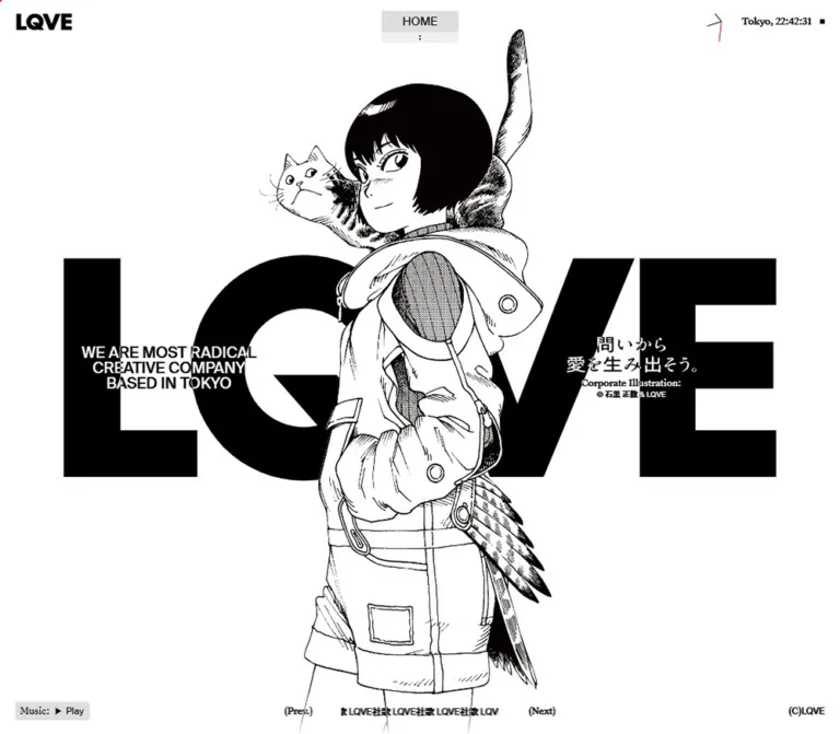
LQVE builds its opening identity from an extreme difference in scale. A huge black wordmark crosses the middle of the desktop screen. A finely drawn character and cat stand in front of it, with white interiors that interrupt the solid lettering. Short statements sit on either side, while navigation, a Tokyo clock, music controls, and copyright occupy the screen edges.
The mobile composition changes the relationship between these elements. The English introduction moves above the large wordmark, the Japanese statement and illustration credit sit directly below it, and the character begins underneath. The surrounding interface remains exceptionally small. The result is a vertical illustrated poster with utility controls laid over its edges.
The homepage also contains substantial company and portfolio content. Preserve that information architecture when extending the design; the opening image is one part of the site, rather than its entire content model.
How to Read This Reference
- Measured means a value appears in the supplied rendered DOM, computed-style record, or custom properties. Measurements refer to the two inspected viewports.
- Visual estimate means a dimension or appearance was assessed from the original-page screenshots. Artwork bounds are estimates because individual image-element measurements were not supplied.
- Calculated means arithmetic derived from measured values. A matching formula is not automatically the original stylesheet formula.
- DOM-only identifies content outside the photographed opening screen. Its text and recorded geometry are available; its final painted appearance and behavior are not verified.
- Recommended identifies implementation choices for a new site, including the Quick Start. Its breakpoints, accessible controls, and contrast technique are adaptations.
- Computed font-family declarations identify source stacks. Font files, licensing, and successful loading of every face were not independently inspected.
The source record reports a document height equal to the viewport, even though descendant coordinates extend far below it. This suggests a contained or transformed presentation, but does not establish its scrolling mechanism. Do not interpret the large section heights below as verified native scroll distances or animation durations.
Tokens — Colors
Default Palette
| Name | Value | Evidence / token | Role |
|---|---|---|---|
| Canvas White | #ffffff |
Measured source --c-bg: #fff; body and opening-section backgrounds |
Main background and open space |
| Ink Black | #000000 |
Measured source --c-text: #000; visually confirmed |
Wordmark, illustration linework, and ordinary text |
| Signal Red | #fe0015 |
Measured source --c-red |
Tiny accent associated visually with the clock-like corner graphic |
| Utility Gray | rgba(219, 219, 219, 0.9) |
Measured music-button background | Small filled playback control |
| Gray on White | Approximately #dfdfdf |
Calculated compositing of Utility Gray over white | Direct-color approximation for the music button |
| Menu Gray | Approximately #dddddd |
Visual estimate | Current HOME strip |
| Disclosure Gray | Approximately #f0f0f0 |
Visual estimate | Narrow strip beneath HOME |
| Authored Contrast White | #ffffff |
Measured text color on header, desktop side statements, and several footer elements | Input color for elements that render with contrasting black/white appearance |
Rendered contrast requires care. The header logo has a computed white color but appears black on the white screenshot. Desktop side text changes appearance against the black wordmark and white canvas. This is consistent with a compositing treatment, but the evidence does not include the responsible blend, filter, or ancestor styles.
Treat black-on-white and white-on-black as the observed result. Do not claim a particular source blend mode. The Quick Start offers mix-blend-mode: difference as a scoped implementation recommendation, with ordinary black text restored for the mobile statement stack.
No alternate color theme was demonstrated. Red should remain a very small detail; it does not function as a large action-button color in the captured screen.
Tokens — Typography
Display Identity
Measured family: 'The Future', sans-serif.
The small header wordmark uses weight 900. The DOM also assigns this family to the large Capabilities text and the final About link, both at weight 400. Preserve the distinction between a very heavy identity mark and lighter oversized display text elsewhere.
The central, enormous LQVE mark is visually confirmed, but its own font declaration or asset type is absent from the evidence. Treat it as brand artwork. The header font measurement does not prove how this larger mark was produced.
Main Text and Japanese Fallback
Measured stack: 'Suisse Intl', ten-mincho-antique, sans-serif.
This stack is used for navigation, the English opening statement, purpose copy, service descriptions, and capability lists. The record does not expose a separate measurement of which face rendered each Japanese glyph. Retain the declared stack when the fonts are available, without substituting an invented Japanese font identity.
Editorial and Utility Serif
Measured stack: 'Suisse Works', serif.
The serif appears in the Tokyo time label, the illustration label, previous/next controls, parenthesized section labels, award headings, and capability titles. Its small scale gives the interface a lightly editorial character around the much heavier visual identity.
The root element reports Times, but the body and relevant descendants override it. That root value is not evidence that Times is the primary site font.
Type Scale
Values below are font size / line height in CSS pixels. All are measured. Rows outside the opening interface are DOM-only.
| Role | Family | Desktop | Mobile | Weight / tracking |
|---|---|---|---|---|
| Header LQVE | The Future | 28 / 28 |
21 / 21 |
900; normal tracking |
| Navigation link | Suisse Intl stack | 15 / 15 |
13 / 13 |
400 |
| Body utility base | Suisse Intl stack | 12 / 12 |
10 / 10 |
400 |
| Opening English statement | Suisse Intl stack | 20 / 20 |
10 / 10 |
400 |
| Tokyo time | Suisse Works | 12 / 12 |
Not visibly displayed | 400 |
| Illustration label | Suisse Works | 12 / 12 |
10 / 10 |
400 |
| Illustration copyright | Suisse Intl stack | 10 / 10 |
10 / 10 |
400 |
| Previous / next | Suisse Works | 12 / 12 |
10 / 10 |
400 |
| Purpose section label | Suisse Works | 16 / 16 |
12 / 12 |
400; -0.03em |
| Purpose paragraph | Suisse Intl stack | 30 / 37.5 |
18 / 26.1 |
400; 0.02em |
| Awards section label | Suisse Works | 16 / 16 |
12 / 12 |
400; -0.03em |
| Award organization | Suisse Works | 16 / 24 |
13 / 19.5 |
400; -0.03em |
| Service English sentence | Suisse Intl stack | 12 / 12 |
11 / 11 |
400 |
| Service Japanese paragraph | Suisse Intl stack | 14 / 21 |
12 / 18 |
400; 0.04em |
| Capabilities display | The Future | 138 / 138 |
55.12 / 55.12 |
400 |
| Capability title | Suisse Works | 28 / 36.4 |
21 / 27.3 |
400; -0.03em |
| Capability list | Suisse Intl stack | 12 / 18 |
10 / 15 |
400 |
| Final About anchor | The Future | 96 / 86.4 |
40 / 36 |
400 |
The final anchor measurement applies to the anchor itself; its child text runs were not individually measured.
Visual estimates: the opening Japanese statement appears approximately 22–24px on desktop and 16–18px on mobile. Its font family and whether it is text or artwork are unverified. The central wordmark is better specified by its visible footprint than by a fabricated font size.
Tokens — Spacing & Shapes
Source Custom Properties
| Source variable | Desktop | Mobile | Interpretation |
|---|---|---|---|
--pad |
20px |
12px |
Confirmed header inset; also matches several content and footer edges |
--margin |
20px |
20px |
Separate layout token; does not shrink with mobile padding |
--gutter |
10px |
10px |
Recorded grid-related token |
--column |
107.5px |
20px |
Recorded column token |
--fs-heading |
16px |
12px |
Matches small section-label sizing |
--fs-text-min |
12px |
10px |
Matches utility base sizing |
--vw |
14.4px |
3.9px |
One percent of captured viewport width |
--vh |
10px |
8.44px |
One percent of captured viewport height |
--vmin |
10px |
3.9px |
One percent of the smaller captured dimension |
--vmax |
14.4px |
8.44px |
One percent of the larger captured dimension |
A twelve-column arithmetic model matches both sampled column values:
/* Calculated convention; the original formula was not supplied. */
--column: calc((100vw - 2 * var(--margin) - 11 * var(--gutter)) / 12);
This does not prove that the source uses CSS Grid. In particular, mobile content with 12px edge padding should not be forced onto a separate 20px margin simply because both tokens exist.
Control Geometry
| Element | Desktop | Mobile | Evidence |
|---|---|---|---|
| Header | 1440 × 56px |
390 × 56px |
Measured |
| Header wordmark box | 74.09 × 28px, at 20, 14 |
55.58 × 21px, at 12, 17.5 |
Measured H1 box |
| Current navigation row | 100 × 28px, at 670, 14 |
84 × 24px, at 153, 14 |
Measured link box |
| Lower navigation strip | About 14px high |
About 14px high |
Visual estimate |
| Music button | 97 × 24px, at 20, 956 |
83 × 24px, at 12, 808 |
Measured |
| Music-button padding | 0 6px |
0 6px |
Measured |
| Music-button radius | 4px |
4px |
Measured |
| Previous button | 36.53 × 24px |
30.44 × 24px |
Measured |
| Next button | 34.84 × 24px |
29.03 × 24px |
Measured |
| Footer bottom clearance | 20px |
12px |
Calculated from measured bounds |
| Corner square | About 6 × 6px |
About 6 × 6px |
Visual estimate |
The shape vocabulary is restrained: square artwork, unboxed text, one small rounded gray button, and a lightly rounded navigation block. No general shadow or elevated-card system is visible in the opening screen.
Opening Composition Measurements
| Element | Desktop | Mobile | Status |
|---|---|---|---|
| Opening section | 1440 × 1000px |
390 × 877.80px |
Measured |
| Giant wordmark visible bounds | Approximately x 109–1331, y 307–694 |
Approximately x 28–362, y 126–230 |
Visual estimate |
| Wordmark width share | Approximately 85% |
Approximately 86% |
Calculated from estimates |
| Character visible bounds | Approximately x 500–900, from y 40 to the lower crop |
Approximately x 76–318, from y 274 to the lower crop |
Visual estimate |
| English statement box | 227.5 × 60px, at 139.88, 470 |
390 × 30px, at 0, 65 |
Measured |
| Illustration-label box | 331 × 12px, at 969.13, 514 |
390 × 10px, at 0, 247.80 |
Measured |
| Illustration-credit box | 331 × 10px, at 969.13, 530 |
390 × 10px, at 0, 259.80 |
Measured |
Components
Viewport-Edge Header
Role: brand identity and location/time context.
The header is a transparent, 56px-high flex region with 20px desktop or 12px mobile horizontal padding. A heavy LQVE home link sits at the left. Desktop adds a delicate clock-like graphic, Tokyo, 03:26:20 time text, and a small square at the right.
On mobile, the text time disappears from the visible capture while the graphic and square remain. The brand shrinks from 28px to 21px, but the header height stays unchanged. This preserves a stable upper edge while reducing the visual weight of its contents.
The captures establish viewport-edge placement. Persistence during scrolling was not tested. Fixed positioning in the Quick Start is an implementation choice for reproducing the captured opening state.
Compact Central Navigation
Role: access to the main company sections.
The visible control consists of a gray HOME row and a paler, narrow strip with a tiny vertical dot mark beneath it. It is centered on the viewport, independently of the left brand and right clock.
The rendered DOM contains four links in this order:
HOME→/ABOUT→/about/PROJECT→/projects/CONTACT→/contact/
Their desktop boxes are 100 × 28px; mobile boxes are 84 × 24px. Although all four link rectangles are recorded, only HOME and the lower disclosure strip are visible in the supplied screenshots. Do not portray the other rows as an observed expanded menu.
Recommended implementation: retain a real home link and provide a separate keyboard-operable disclosure for the remaining links. Expanded appearance, trigger behavior, and closing logic are not established by the source evidence.
Layered Opening Identity
Role: the primary visual expression of the company.
The desktop anatomy has five layers:
- A plain white opening section.
- A nearly screen-wide black LQVE wordmark centered around the middle of the viewport.
- The character and cat in front of the wordmark.
- A three-line English statement on the left and a Japanese statement with illustration credit on the right.
- Small navigation and music utilities at the screen edges.
The English copy is exactly WE ARE MOST RADICAL / CREATIVE COMPANY / BASED IN TOKYO, using three 20px lines on desktop. Its box centers at approximately 17.6% of viewport width. The right credit group centers at approximately 78.8%.
The Japanese statement reads 問いから愛を生み出そう。 It occupies two lines on desktop and one line on mobile. Keep the LQVE spelling and distinctive Q intact; the oversized mark is an identity asset.
The figure is visually dominant through height and detail, while the wordmark dominates through solid area. Avoid adding a container border or background panel around either element.
Corporate Illustration and Credit
Role: introduce a distinctive authored character and acknowledge the artwork.
The illustration shows a short-haired character in a detailed utility coat, with a cat across the shoulders and its tail rising high above the head. Fine outlines, dark hair, fabric hatching, halftone patches, pockets, and feather-like details provide texture within the strict monochrome palette.
The credit is a two-part stack: a serif Corporate Illustration: label and a smaller © 石黒 正数 & LQVE line. This attribution is visible on the current original page. It supports an illustration credit; it does not establish responsibility for website design or development.
On desktop, the credit joins the right-side statement. On mobile, it forms a centered bridge between the wordmark and the character. Maintain that grouping when repositioning the artwork.
Bottom Music Controls
Role: expose the page's music feature and related controls.
The left control is a small rounded gray button reading Music:, a play symbol, and Play. The DOM also contains Stop, but the captured visible state is Play. Audible playback and state changes were not exercised.
The center contains repeated LQVE社歌 text and parenthesized (Prev.) and (Next) buttons. The repeated text is clipped into a short horizontal region. Desktop places the buttons on either side of this region in one row; mobile moves the text above the two buttons.
On desktop, the overall center group spans approximately 353px. The clipped text region appears about 210px wide. The same approximate text width is retained on mobile while the button pair becomes much narrower below it.
The previous/next labels indicate an affordance, but their exact target and the available music sequence were not verified. Do not claim a tested playlist or track transition.
Copyright Marker
Role: a small ownership sign at the bottom-right edge.
The DOM records (C) LQVE in a 24px-high box. Its type shrinks from 12px to 10px on mobile. It remains unboxed and aligned with the lower music-button row.
Purpose Statement — DOM-Only
Role: articulate the company's approach before the project sequence.
Desktop records a 674px-wide paragraph at x 383, using 30px / 37.5px type. Its section has 180px top and 280px bottom padding. Mobile expands the paragraph to the available 366px between 12px page insets, reduces it to 18px / 26.1px, and retains 180px bottom padding.
The parenthesized (Our purpose) label uses the smaller serif scale. Its reported rectangle overlaps the paragraph's vertical range and shares its left edge. The exact first-line arrangement cannot be reconstructed from these two boxes alone.
Recommended implementation: keep the label and paragraph in a common editorial block. The Quick Start places the label separately to provide a readable fallback without relying on unverified overlap behavior.
Project Sequence — DOM-Only
Role: present nine linked pieces of work.
The recorded titles are RADWIMPS 20TH ANNIVERSARY, FULL BLOOM, UNCOMFORTABLE BEERGLASS, DRAMATIC PHRASES, PALLAS’S CAT SONG, SHAKE HANDS WITH NATURE, KATARU HOTARU, SITUATION, and CHASE YOUR LIGHT.
Each primary project link has a viewport-sized box: 1440 × 1000px on desktop and 390 × 844px on mobile. Desktop also records a second set of links with 244 × 137px boxes near the right side, consistent with landscape preview geometry. That secondary set is absent from the mobile link evidence.
Several project boxes share coordinates. The project section is recorded as 8000px high on desktop and 9600px high on mobile. These values indicate a substantial staged region, but do not establish a visible vertical stack, a specific pinning effect, or an animation sequence.
VIEW PROJECT occurs in the desktop extracted text and is absent from the mobile extracted text. Project imagery, crops, transitions, hover effects, and playback are unverified.
Our Way — DOM-Only
Role: explain the working method through three numbered principles.
The structure contains an Our Way heading followed by:
01 — Find Core Question02 — Make Innovative Idea03 — Lead Bold Creation
Each principle includes Japanese explanatory copy. The section measures 3600px high on desktop and 4500px on mobile, but individual heading styles and visual states were not included. Preserve the three-step content hierarchy without inventing sticky panels or animated counters.
Awards and Collaborations — DOM-Only
Role: provide evidence of recognition and relationships.
The awards content is grouped by organization, with category, distinction, project, and desktop year information. Small serif headings establish the hierarchy: section labels are 16px desktop and 12px mobile; organization headings are 16px / 24px desktop and 13px / 19.5px mobile.
The mobile extracted text omits the years present in the desktop extraction. This is evidence of a responsive difference, but the responsible hiding or layout rule was not supplied.
The collaborations section is confirmed by its heading and section rectangle only. Partner identities, logo arrangement, image treatment, and interaction must remain unspecified.
Service Introduction — DOM-Only
Role: introduce the range of capabilities with an asymmetric editorial block.
Desktop places the introduction in the right half of the page, beginning at x 720. The Japanese paragraph has a 502px box including 86px left padding, with 14px / 21px type.
Mobile retains an offset block: 200px wide at x 178, ending at the 12px right inset. The Japanese paragraph uses 12px / 18px, and its left padding becomes zero. The English sentence uses 11px type across two recorded lines.
This is an important responsive detail: the introduction preserves asymmetry on the phone. It does not become a conventional full-width centered paragraph.
Capabilities List — DOM-Only
Role: turn a broad display heading into a precise service taxonomy.
The large Capabilities element uses The Future at 138px on desktop and 55.12px on mobile. The extracted page text renders it as CAPABILITIES.
Five numbered groups follow: Brand Core, Strategy, Communication, Experience, and Artist Collaboration. Each pairs a serif title with compact sans-serif lists.
Desktop list columns begin at x 192 and x 406, each 202px wide, producing a calculated 12px gap. Mobile stacks those text groups at x 42; their widths vary with content. Titles reduce from 28px to 21px, while list text reduces from 12px / 18px to 10px / 15px.
The desktop title-to-list gap is approximately 18px; mobile uses approximately 12px. Measured gaps from one group's final list line box to the next heading are approximately 96px desktop and 72px mobile.
Final About Link — DOM-Only
Role: continue from the homepage into the company profile.
The destination is /about/. Desktop extracted text reads VIEW MORE ABOUT LQVE; mobile reads ABOUT LQVE. The anchor uses The Future at 96px / 86.4px desktop and 40px / 36px mobile.
Its desktop box is approximately 618px wide and includes 14px bottom padding. The mobile box is approximately 289px wide and includes 33px left padding. No button fill or hover treatment was captured.
Tokens — Motion & Interaction
| Feature | Evidence | What remains unknown |
|---|---|---|
| Tokyo clock | Desktop captures show 03:26:20, 03:26:21, and 03:26:22 |
Update implementation and behavior when backgrounded |
| Corner hands | Small changes in the clock-like line graphic are visible between desktop frames | Exact geometry, rotation origin, and animation method |
| Repeated music label | Clipped text positions differ between desktop captures | Direction, loop duration, easing, and pause behavior |
| Main illustration | Same pose and composition throughout the supplied sequence | Any animation or later transformation |
| Navigation | HOME and a disclosure affordance are visible; four destinations exist in DOM |
Hover versus click trigger, expanded state, focus behavior |
| Music | Visible Play; Stop also exists in DOM |
Audio output, loading, persistence, and state transitions |
| Previous / next | Two buttons are present | Their tested effect and available sequence |
| Projects and Our Way | Tall regions and overlapping project coordinates appear in DOM | Scroll mapping, pinning, transitions, and intermediate states |
| CSS animation fields | Sampled elements report animation: none; transition summaries report all |
Descendant, pseudo-element, canvas, and JavaScript motion |
A transition-property value of all is not a measured transition duration. It does not justify assigning a particular easing or speed to the original site.
The collection reports at least five seconds of initial observation and readiness checks. That process does not demonstrate menu interaction, audio playback, or completion of delayed content. The supplied desktop still sequence directly demonstrates only a two-second interval.
Recommended motion policy: keep the central identity stable by default, update the time without layout shifts, and make decorative ticker movement pausable. Optional hover feedback can use a short 120–180ms color or opacity change; that range is guidance, not a source token. Reduced-motion users should receive a static readable track label.
Surfaces
| Layer | Appearance | Function |
|---|---|---|
| Page canvas | Solid white | Provides the dominant negative space |
| Giant mark | Solid black, with exact brand geometry | Creates mass behind the figure |
| Illustration | Black linework, white interiors, open exterior | Separates the character from the wordmark |
| Side statements | Contrasting black/white appearance without boxes | Connects text directly to the composition |
| Current navigation | Small gray rectangle | Makes the active destination easy to find |
| Disclosure strip | Paler gray, shallow height | Signals more navigation without a large menu bar |
| Music button | Translucent gray, 4px radius |
A distinct but modest interactive surface |
| Other utilities | Unboxed text and fine marks | Keeps the edges visually light |
| Later section backgrounds | White where recorded in DOM | Continues the monochrome base; full visual treatment unverified |
No opening-screen gradients, card shadows, glass blur, or broad colored panels are visible. Separation comes from solid area, overlap, contrast, and spacing.
Imagery
The opening illustration combines a strong silhouette with extremely fine internal detail. Large black hair and the cat's markings balance the broad black letters. Small fabric seams, stipple patches, and crosshatching reward closer inspection without adding color.
The white interior is structurally important. The coat and face conceal parts of the black wordmark. An adaptation needs an image with opaque white interior areas and an appropriate exterior cutout, or an equivalent masking arrangement. A completely transparent black-line drawing would allow the wordmark to show through the body and change the composition.
Use natural antialiasing and sufficient source resolution. Visible manga texture is not evidence of intentionally pixelated rendering. Do not apply image-rendering: pixelated to this artwork by default.
On desktop, the cat's raised tail nearly reaches the upper controls, and the figure extends toward the bottom edge. On mobile, the top of the figure begins below the credit and its lower portion continues beyond the captured screen. The framing should preserve the face, cat, and upper silhouette before deciding how much lower-body detail to show.
Observed Asset References
No original asset URLs, file formats, or native image dimensions were included in the supplied evidence.
| Asset role | What is established | Implementation guidance |
|---|---|---|
| Giant LQVE mark | Its visible geometry and placement | Use authorized brand artwork; do not infer a source filename or live-text implementation |
| Character and cat | Current original-page illustration and displayed credit | Preserve proportions, fine linework, and white knockout areas |
| Japanese statement | Visible wording and responsive line arrangement | Asset versus text implementation remains unknown |
| Corner clock graphic | Thin black/red line marks and a small square | A custom SVG is a reasonable adaptation, not an identified source asset |
| Project media | Project titles, links, and link geometry | Do not invent photography, video, or crops from titles alone |
| Collaboration media | Section presence only | Obtain verified content before specifying a logo system |
The CSS shell cannot replace the identity supplied by the illustration and wordmark. Use authorized assets or commission original equivalents for a new brand.
Layout & Responsive Behavior
Desktop: Overlapping Poster
At 1440 × 1000, the opening section fills the viewport. The large wordmark occupies approximately 85% of its width and sits across its vertical center. The character rises from this central band toward the top edge and continues toward the bottom.
The English statement and Japanese statement flank the character. Their small scale relative to the wordmark creates a deliberate hierarchy: brand shape first, character second, short messages third, utilities last.
The header is inset 20px. The navigation remains exactly centered. Music, track controls, and copyright share a bottom row with 20px lower clearance.
Mobile: Vertical Stack
At 390 × 844, the upper sequence is:
- Header within the first
56px. - Three-line English statement at
y 65–95. - Large wordmark at approximately
y 126–230. - One-line Japanese statement near the wordmark's lower edge.
- Illustration label at
y 247.80, followed by its credit aty 259.80. - Character beginning at approximately
y 274.
The opening section measures 877.80px, approximately 33.80px taller than the captured viewport. Its content therefore should not be forced into an exact 844px box.
The music label moves above the previous/next buttons. The music button and copyright remain at the lower corners with 12px edge clearance. These controls overlap the lower illustration region in the captured state.
Later Content: Measured Changes
| Region | Desktop | Mobile | Responsive implication |
|---|---|---|---|
| Purpose paragraph width | 674px |
366px |
Centered reading block becomes nearly full width |
| Purpose type | 30px / 37.5px |
18px / 26.1px |
Smaller type with proportionally looser leading |
| Project primary link | Full 1440 × 1000 viewport |
Full 390 × 844 viewport |
Viewport-scale project targets remain |
| Secondary project links | Additional 244 × 137px set |
Absent from supplied link list | Separate desktop presentation is indicated |
| Service introduction | Starts at half width | 200px block aligned 12px from right |
Asymmetry is retained |
| Capability lists | Two 202px columns |
Stacked text groups | Lists reflow without becoming cards |
| About anchor type | 96px |
40px |
Oversized link remains prominent |
Only two viewport widths were inspected. The exact breakpoint and intermediate fluid formulas are unknown. The Quick Start uses 767px as a recommended breakpoint and interpolates artwork positions from the captured geometry.
Scroll limitation: the last recorded content ends near coordinate 17059px on desktop and 18238px on mobile, while reported document heights remain 1000px and 844px. These coordinates should guide understanding of the recorded structure, not be copied into a native document as verified page heights. A new implementation should keep company content reachable with ordinary scrolling unless a tested alternative is deliberately built.
Do’s and Don’ts
Do
- Build the opening from white space, one massive black wordmark, and finely detailed monochrome artwork.
- Preserve the LQVE spelling and the distinctive Q geometry.
- Keep opaque white areas inside the foreground character so it convincingly overlaps the lettering.
- Pair heavy display identity with regular sans-serif copy and small serif utility text.
- Keep the desktop statements on opposite sides of the illustration.
- Recompose the mobile opening into a vertical sequence.
- Retain the centered navigation independently of the corner elements.
- Keep gray fills confined to compact utilities and red confined to tiny accents.
- Preserve the mobile service introduction's right-side alignment.
- Distinguish visually captured components from DOM-only sections.
- Maintain access to purpose, projects, methods, recognition, services, and company information.
Don’t
- Don’t turn the opening into a rounded image card or add a colored panel behind the character.
- Don’t replace the wordmark with generic
LOVEtext. - Don’t apply pixelated rendering merely because the illustration contains halftone texture.
- Don’t introduce a large promotional CTA into the captured opening composition.
- Don’t enlarge every utility to the same visual scale as the editorial copy.
- Don’t assume all mobile content becomes centered or full width.
- Don’t copy computed white text onto a white background without accounting for the rendered contrast result.
- Don’t expose every recorded navigation row by default just because its rectangle exists in the DOM.
- Don’t describe tall project regions as verified scroll animations.
- Don’t invent project imagery, partner logos, asset filenames, or font files.
- Don’t force the mobile character and credits into a one-screen crop that removes their observed spacing.
Recommended Implementation Additions
These are recommendations for a new implementation, not verified original features:
- Use a separate accessible disclosure control for navigation, with a meaningful name and an exposed expanded state.
- Keep the visible utility treatment compact while providing adequately separated touch targets. Where practical, target approximately
44pxinteractive dimensions without causing footer controls to overlap. - Preserve a visible keyboard focus indicator for navigation, audio controls, project links, and the About link.
- Give project links accessible names based on their titles; the supplied extraction contains empty link text and does not establish their complete accessible names.
- Require an explicit user action before audible playback and display a reliable play/stop state.
- Provide a static or pausable version of repeated track text, and avoid announcing the live clock every second to assistive technology.
- Include safe-area clearance for viewport-edge controls and enough document-bottom space for the final link to remain reachable.
- Keep essential body copy readable at zoomed and intermediate viewport sizes; several observed
10pxutility labels are very small. - Use a meaningful illustration alternative when the image conveys identity. If a giant wordmark duplicates an already accessible brand heading, it may be decorative.
- Load fonts and large artwork without causing visible shifts. Preserve an intentional fallback when licensed source faces are unavailable.
- Prefer native scrolling for the initial implementation. Add elaborate project transitions only after their content, keyboard access, and reduced-motion behavior are specified.
Agent Prompt Guide
Quick Color Reference
- Canvas:
#ffffff. - Main text and artwork:
#000000. - Tiny signal accent:
#fe0015. - Music-button fill:
rgba(219, 219, 219, 0.9). - Current navigation: approximately
#dddddd. - Lower disclosure strip: approximately
#f0f0f0. - Overlapping labels: reproduce readable black/white contrast; the original compositing implementation is unverified.
Overall Prompt
“Create a Japanese creative-company homepage with the visual hierarchy of an illustrated monochrome poster. Use a pure white canvas, a nearly screen-wide black brand wordmark, and a tall, finely drawn character illustration in front of it. Preserve opaque white areas inside the character. On desktop, place short statements to the left and right of the figure. Use a small heavy brand link at top left, a compact centered gray navigation disclosure, and a fine clock graphic at top right. Put a small music button at bottom left, a narrow track label and previous/next controls at bottom center, and copyright at bottom right. Pair a geometric display face with regular sans-serif text and small editorial serif labels. On mobile, stack the introduction, wordmark, statement, credit, and illustration. Continue into purpose, projects, working principles, awards, collaborations, and services without inventing unverified visual effects.”
Example Component Prompts
- Opening composition: “Build a white desktop opening screen with a black wordmark occupying approximately 85% of its width. Layer an authorized monochrome character illustration above it, keeping white garment interiors opaque. Place three small lines of English copy near 18% of screen width and a Japanese statement with a tiny illustration credit near 79%. Keep the edges open and unframed.”
- Mobile opening: “At a 390px reference width, place the header in a 56px region, the three-line introduction at about y=65px, the large wordmark near y=126px, and the centered statement and credit immediately below it. Begin the character near y=274px. Let the section exceed the viewport where needed.”
- Navigation: “Create a top-centered navigation control with a 100×28px gray HOME row on desktop and an 84×24px row on mobile. Add a shallow pale disclosure strip below it. Implement accessible access to ABOUT, PROJECT, and CONTACT, treating the expanded state as a new design decision.”
- Music controls: “Use a 24px-high gray music button with a 4px radius. Center a clipped company-song label between small serif previous and next buttons on desktop. On mobile, place the label above the button pair. Keep playback state explicit and provide adequate touch targets.”
- Capabilities: “Create a large regular-weight display heading, followed by numbered service groups with serif titles and compact sans-serif lists. At the desktop reference width, use two 202px list columns separated by 12px. On mobile, stack the lists along a left rail near 42px and retain generous gaps between groups.”
Quick Start
CSS Custom Properties
This is an adaptation, not recovered source CSS. Measured colors, type sizes, insets, and control dimensions are retained where practical. Artwork positioning is estimated from screenshots. The 767px breakpoint, scoped difference blending, native disclosure behavior, and ordinary document flow are recommendations.
Use authorized artwork with suitable intrinsic bounds. .opening-wordmark and .opening-figure below expect image elements; their actual assets are not bundled or identified here. Different transparent margins will require optical adjustment.
Suggested structure:
- Apply
.lqve-pageto the body. - Place
.site-header,.site-nav, the main content, and.bottom-uias siblings. - Within
.site-nav, use a.nav-currenthome link followed by a.nav-menudetails element containing a summary and.nav-links. - Within
.opening, include the wordmark image, figure image,.opening-intro, and.opening-copy. - Inside
.track-controls, use.track-prev,.track-label, and.track-nextin that order. - Add
.contrast-uionly to elements that need contrast across the poster layers. Keep filled gray controls outside a blended parent.
:root {
  /* Measured source colors and spacing tokens. */
  --c-bg: #fff;
  --c-text: #000;
  --c-red: #fe0015;
  --pad: 20px;
  --margin: 20px;
  --gutter: 10px;
  --fs-heading: 16px;
  --fs-text-min: 12px;

  /* Calculated grid convention, not recovered source CSS. */
  --column: calc((100vw - 2 * var(--margin) - 11 * var(--gutter)) / 12);

  /* Recorded font-family names; font files must be provided legally. */
  --font-display: 'The Future', sans-serif;
  --font-body: 'Suisse Intl', ten-mincho-antique, sans-serif;
  --font-editorial: 'Suisse Works', serif;
  --font-japanese: ten-mincho-antique, serif;

  --brand-size: 28px;
  --nav-width: 100px;
  --nav-row: 28px;
  --nav-size: 15px;
  --control-height: 24px;
  --control-radius: 4px;
  --control-fill: rgba(219, 219, 219, 0.9);

  /* Screenshot estimates. */
  --nav-fill: #ddd;
  --disclosure-fill: #f0f0f0;
  --safe-bottom: env(safe-area-inset-bottom, 0px);
}

* { box-sizing: border-box; }

.lqve-page {
  margin: 0;
  padding-bottom: calc(80px + var(--safe-bottom));
  color: var(--c-text);
  background: var(--c-bg);
  font-family: var(--font-body);
  font-size: var(--fs-text-min);
  font-weight: 400;
}

.lqve-page a { color: inherit; }
.lqve-page button { font: inherit; }

/* Recommended contrast approximation; source blend mode is unknown. */
.contrast-ui {
  color: #fff;
  mix-blend-mode: difference;
}

.site-header {
  position: fixed;
  inset: 0 0 auto;
  z-index: 40;
  height: 56px;
  display: flex;
  align-items: center;
  justify-content: space-between;
  padding-inline: var(--pad);
  pointer-events: none;
}

.brand {
  margin: 0;
  font: 900 var(--brand-size)/1 var(--font-display);
  text-decoration: none;
  pointer-events: auto;
}

.clock {
  display: flex;
  align-items: center;
  gap: 12px;
  font: 400 12px/1 var(--font-editorial);
}

.site-nav {
  position: fixed;
  top: 14px;
  left: 50%;
  z-index: 60;
  width: var(--nav-width);
  transform: translateX(-50%);
  color: var(--c-text);
  font-size: var(--nav-size);
  line-height: 1;
  text-align: center;
}

.nav-current,
.nav-links a {
  display: grid;
  place-items: center;
  min-height: var(--nav-row);
  text-decoration: none;
}

.nav-current {
  border-radius: 4px 4px 0 0;
  background: var(--nav-fill);
}

.nav-menu > summary {
  display: grid;
  place-items: center;
  height: 14px;
  border-radius: 0 0 3px 3px;
  background: var(--disclosure-fill);
  list-style: none;
  cursor: pointer;
}

.nav-menu > summary::-webkit-details-marker { display: none; }
.nav-menu[open] > summary { border-radius: 0; }
.nav-links { background: var(--disclosure-fill); }

.opening {
  position: relative;
  min-height: 100vh;
  min-height: 100svh;
  overflow: hidden;
  background: var(--c-bg);
}

.opening-wordmark {
  position: absolute;
  z-index: 0;
  top: 50%;
  left: 50%;
  display: block;
  width: 85%;
  height: auto;
  transform: translate(-50%, -50%);
}

.opening-figure {
  position: absolute;
  z-index: 1;
  top: 4svh;
  left: 49%;
  display: block;
  width: auto;
  height: 96svh;
  max-width: none;
  transform: translateX(-50%);
  image-rendering: auto;
}

.opening-intro {
  position: absolute;
  z-index: 2;
  top: 50%;
  left: 17.6%;
  width: 227.5px;
  margin: 0;
  transform: translate(-50%, -50%);
  font-size: 20px;
  line-height: 1;
  text-align: center;
}

.opening-copy {
  position: absolute;
  z-index: 2;
  top: 50%;
  left: 78.8%;
  width: 331px;
  transform: translate(-50%, -50%);
  text-align: center;
}

/* The tagline font and size are recommendations. */
.opening-tagline {
  margin: 0 0 6px;
  font: 400 24px/1.1 var(--font-japanese);
}

.illustration-label {
  margin: 0 0 4px;
  font: 400 12px/1 var(--font-editorial);
}

.illustration-credit {
  margin: 0;
  font-size: 10px;
  line-height: 1;
}

.bottom-ui {
  position: fixed;
  right: var(--pad);
  bottom: calc(var(--pad) + var(--safe-bottom));
  left: var(--pad);
  z-index: 40;
  display: grid;
  grid-template-columns: 1fr auto 1fr;
  align-items: end;
  pointer-events: none;
}

.bottom-ui button { pointer-events: auto; }

.music-toggle {
  justify-self: start;
  display: flex;
  align-items: center;
  gap: 4px;
  height: var(--control-height);
  padding: 0 6px;
  border: 0;
  border-radius: var(--control-radius);
  color: var(--c-text);
  background: var(--control-fill);
  cursor: pointer;
}

.track-controls {
  display: grid;
  grid-template-columns: auto 210px auto;
  align-items: center;
  gap: 36px;
  text-align: center;
}

.track-label {
  margin: 0;
  overflow: hidden;
  white-space: nowrap;
  line-height: 1;
}

.track-nav {
  min-height: 24px;
  padding: 0;
  border: 0;
  color: inherit;
  background: transparent;
  font-family: var(--font-editorial) !important;
  cursor: pointer;
}

.copyright {
  justify-self: end;
  margin: 0;
  line-height: 24px;
}

/* DOM-derived editorial proportions in ordinary document flow. */
.purpose { padding: 180px var(--pad) 280px; }
.purpose-inner { max-width: 674px; margin-inline: auto; }

.section-label {
  margin: 0 0 1rem;
  font: 400 var(--fs-heading)/1 var(--font-editorial);
  letter-spacing: -0.03em;
}

.purpose-copy {
  margin: 0;
  font-size: 30px;
  line-height: 1.25;
  letter-spacing: 0.02em;
}

.services { padding-top: 192px; }
.service-intro { width: 50%; margin-left: auto; }
.service-intro-en { font-size: 12px; line-height: 1; }

.service-intro-jp {
  width: min(502px, 100%);
  padding-left: 86px;
  font-size: 14px;
  line-height: 1.5;
  letter-spacing: 0.04em;
}

.capabilities-title {
  margin: 140px 0 0;
  font: 400 clamp(55.12px, 9.583vw, 138px)/1 var(--font-display);
  text-transform: uppercase;
}

.capability-list {
  width: min(416px, calc(100% - 2 * var(--pad)));
  margin: 270px 0 0 13.333%;
}

.capability-item + .capability-item { margin-top: 96px; }

.capability-title {
  margin: 0 0 18px;
  font: 400 28px/1.3 var(--font-editorial);
  letter-spacing: -0.03em;
}

.capability-details {
  display: grid;
  grid-template-columns: repeat(2, minmax(0, 1fr));
  gap: 12px;
}

.capability-details ul {
  margin: 0;
  padding: 0;
  list-style: none;
  font-size: 12px;
  line-height: 1.5;
}

.about-link {
  display: block;
  width: fit-content;
  max-width: calc(100% - 2 * var(--pad));
  margin: 180px auto 0;
  padding-bottom: 14px;
  font: 400 clamp(40px, 6.667vw, 96px)/0.9 var(--font-display);
  text-decoration: none;
}

.lqve-page :focus-visible {
  outline: 2px solid currentColor;
  outline-offset: 3px;
}

@media (hover: hover) {
  .nav-links a:hover,
  .about-link:hover { text-decoration: underline; }
}

/* Recommended breakpoint; only 390px and 1440px were inspected. */
@media (max-width: 767px) {
  :root {
    --pad: 12px;
    --fs-heading: 12px;
    --fs-text-min: 10px;
    --brand-size: 21px;
    --nav-width: 84px;
    --nav-row: 24px;
    --nav-size: 13px;
  }

  .clock-text { display: none; }

  /* Estimated fluid geometry matching the 390px capture. */
  .opening {
    min-height: max(100svh, 225.076vw);
    padding-top: 80px;
  }

  .opening-wordmark {
    top: 32.3vw;
    width: 86%;
    transform: translateX(-50%);
  }

  .opening-figure {
    top: 70.25vw;
    left: 50%;
    width: 64vw;
    height: auto;
  }

  .opening-intro {
    top: 65px;
    left: 0;
    width: 100%;
    transform: none;
    font-size: 10px;
  }

  .opening-copy {
    top: 58.2vw;
    left: 0;
    width: 100%;
    transform: none;
  }

  .opening-intro.contrast-ui,
  .opening-copy.contrast-ui {
    color: var(--c-text);
    mix-blend-mode: normal;
  }

  .opening-tagline { margin-bottom: 1px; font-size: 18px; }
  .desktop-break { display: none; }
  .illustration-label { margin-bottom: 2px; font-size: 10px; }

  .track-controls {
    width: 210px;
    grid-template-columns: 1fr 1fr;
    column-gap: 30px;
    row-gap: 12px;
  }

  .track-label { grid-column: 1 / -1; grid-row: 1; }
  .track-prev { grid-column: 1; grid-row: 2; justify-self: end; }
  .track-next { grid-column: 2; grid-row: 2; justify-self: start; }

  .purpose { margin-top: 60px; padding: 0 var(--pad) 180px; }
  .purpose-copy { font-size: 18px; line-height: 1.45; }
  .services { padding-top: 60px; }

  .service-intro {
    width: min(200px, calc(100% - 2 * var(--pad)));
    margin-right: var(--pad);
    margin-left: auto;
  }

  .service-intro-en { font-size: 11px; }
  .service-intro-jp { width: 100%; padding-left: 0; font-size: 12px; }

  .capabilities-title {
    margin-top: 115px;
    font-size: clamp(40px, 14.133vw, 72px);
  }

  .capability-list {
    width: calc(100% - 84px);
    margin: 158px 0 0 42px;
  }

  .capability-item + .capability-item { margin-top: 72px; }
  .capability-title { margin-bottom: 12px; font-size: 21px; }
  .capability-details { display: block; }
  .capability-details ul { font-size: 10px; }

  .about-link {
    margin-top: 96px;
    padding: 0 0 0 33px;
    font-size: 40px;
  }
}
The CSS deliberately leaves the track label static and does not simulate audio, the clock, or project transitions. Those features require behavior beyond layout styling. Control boxes reproduce the captured visual dimensions; a production implementation should additionally resolve touch-target size and spacing.
Validate the adaptation at both reference viewports, intermediate widths, browser zoom, and short landscape heights. Check figure masking, menu focus order, footer collisions, and access to content beneath the opening screen.
Tailwind v4 Token Mapping
Optional aliases for a project already using Tailwind v4. This does not imply that the original site uses Tailwind. Define the preceding root variables first.
@theme inline {
  --color-canvas: #fff;
  --color-ink: #000;
  --color-signal: #fe0015;
  --color-utility: rgba(219, 219, 219, 0.9);

  --font-display: 'The Future', sans-serif;
  --font-body: 'Suisse Intl', ten-mincho-antique, sans-serif;
  --font-editorial: 'Suisse Works', serif;

  --text-utility: var(--fs-text-min);
  --text-section: var(--fs-heading);
  --text-brand: var(--brand-size);

  --spacing-page: var(--pad);
  --spacing-gutter: var(--gutter);
  --radius-control: 4px;
}
Sources & Evidence
- LQVE — current original homepage: supplied original-page screenshots, rendered page text, destination links, element rectangles, computed styles, and custom properties. Original and final URLs are identical; the supplied response status is HTTP
200. - Capture metadata records retrieval at
2026-09-12T18:26:24.689Z, corresponding to September 13, 2026, 03:26:24.689 JST. Desktop clock displays span03:26:20–03:26:22in the three supplied desktop frames. - Visually inspected evidence consists of three
1440 × 1000desktop captures and two390 × 844mobile captures. All show the opening composition. - Later homepage sections are described from rendered DOM and computed measurements only. No later-section screenshot establishes their final imagery, overlap, reveal state, or motion.
- Navigation destinations are present in the original-page link evidence. The About, Projects, Contact, and individual project pages were not opened for this reference.
- Expanded navigation, hover states, keyboard behavior, audio playback, previous/next actions, and scrolling transitions were not exercised in the supplied evidence.
- No original image URLs, font resources, full stylesheet, or script implementation were supplied. The proposed CSS and responsive interpolation are implementation recommendations, not recovered source code.
This reference describes the current homepage represented by the supplied inspection. Its strongest visual authority is the opening screen at the two captured viewports; all broader structural findings retain their stated evidence limits.
# LQVE — Style Reference

> Monumental black lettering, delicate manga linework, and tiny controls on an open white canvas.

**Original URL:** [https://lqve.jp/](https://lqve.jp/)
**Final URL:** [https://lqve.jp/](https://lqve.jp/)
**Theme:** white canvas, black imagery and typography, gray utility controls, and a minute red accent.
**Inspected:** September 13, 2026, around 03:26 JST. Supplied retrieval timestamp: September 12, 2026, 18:26:24.689 UTC.
**Viewports:** desktop **1440 × 1000 CSS px**; mobile **390 × 844 CSS px**.
**Scope:** the current corporate and creative-portfolio homepage. Five original-page captures show the opening screen: three desktop and two mobile. Rendered DOM evidence additionally records purpose, projects, working principles, awards, collaborations, services, and an About link. Those later sections were not visually captured in the supplied images.

LQVE builds its opening identity from an extreme difference in scale. A huge black wordmark crosses the middle of the desktop screen. A finely drawn character and cat stand in front of it, with white interiors that interrupt the solid lettering. Short statements sit on either side, while navigation, a Tokyo clock, music controls, and copyright occupy the screen edges.

The mobile composition changes the relationship between these elements. The English introduction moves above the large wordmark, the Japanese statement and illustration credit sit directly below it, and the character begins underneath. The surrounding interface remains exceptionally small. The result is a vertical illustrated poster with utility controls laid over its edges.

The homepage also contains substantial company and portfolio content. Preserve that information architecture when extending the design; the opening image is one part of the site, rather than its entire content model.

## How to Read This Reference

- **Measured** means a value appears in the supplied rendered DOM, computed-style record, or custom properties. Measurements refer to the two inspected viewports.
- **Visual estimate** means a dimension or appearance was assessed from the original-page screenshots. Artwork bounds are estimates because individual image-element measurements were not supplied.
- **Calculated** means arithmetic derived from measured values. A matching formula is not automatically the original stylesheet formula.
- **DOM-only** identifies content outside the photographed opening screen. Its text and recorded geometry are available; its final painted appearance and behavior are not verified.
- **Recommended** identifies implementation choices for a new site, including the Quick Start. Its breakpoints, accessible controls, and contrast technique are adaptations.
- Computed font-family declarations identify source stacks. Font files, licensing, and successful loading of every face were not independently inspected.

The source record reports a document height equal to the viewport, even though descendant coordinates extend far below it. This suggests a contained or transformed presentation, but does not establish its scrolling mechanism. Do not interpret the large section heights below as verified native scroll distances or animation durations.

## Tokens — Colors

### Default Palette

| Name | Value | Evidence / token | Role |
| --- | --- | --- | --- |
| Canvas White | `#ffffff` | Measured source `--c-bg: #fff`; body and opening-section backgrounds | Main background and open space |
| Ink Black | `#000000` | Measured source `--c-text: #000`; visually confirmed | Wordmark, illustration linework, and ordinary text |
| Signal Red | `#fe0015` | Measured source `--c-red` | Tiny accent associated visually with the clock-like corner graphic |
| Utility Gray | `rgba(219, 219, 219, 0.9)` | Measured music-button background | Small filled playback control |
| Gray on White | Approximately `#dfdfdf` | Calculated compositing of Utility Gray over white | Direct-color approximation for the music button |
| Menu Gray | Approximately `#dddddd` | Visual estimate | Current `HOME` strip |
| Disclosure Gray | Approximately `#f0f0f0` | Visual estimate | Narrow strip beneath `HOME` |
| Authored Contrast White | `#ffffff` | Measured text color on header, desktop side statements, and several footer elements | Input color for elements that render with contrasting black/white appearance |

**Rendered contrast requires care.** The header logo has a computed white color but appears black on the white screenshot. Desktop side text changes appearance against the black wordmark and white canvas. This is consistent with a compositing treatment, but the evidence does not include the responsible blend, filter, or ancestor styles.

Treat black-on-white and white-on-black as the observed result. Do not claim a particular source blend mode. The Quick Start offers `mix-blend-mode: difference` as a scoped implementation recommendation, with ordinary black text restored for the mobile statement stack.

No alternate color theme was demonstrated. Red should remain a very small detail; it does not function as a large action-button color in the captured screen.

## Tokens — Typography

### Display Identity

**Measured family:** `'The Future', sans-serif`.

The small header wordmark uses weight `900`. The DOM also assigns this family to the large `Capabilities` text and the final About link, both at weight `400`. Preserve the distinction between a very heavy identity mark and lighter oversized display text elsewhere.

The central, enormous LQVE mark is visually confirmed, but its own font declaration or asset type is absent from the evidence. Treat it as brand artwork. The header font measurement does not prove how this larger mark was produced.

### Main Text and Japanese Fallback

**Measured stack:** `'Suisse Intl', ten-mincho-antique, sans-serif`.

This stack is used for navigation, the English opening statement, purpose copy, service descriptions, and capability lists. The record does not expose a separate measurement of which face rendered each Japanese glyph. Retain the declared stack when the fonts are available, without substituting an invented Japanese font identity.

### Editorial and Utility Serif

**Measured stack:** `'Suisse Works', serif`.

The serif appears in the Tokyo time label, the illustration label, previous/next controls, parenthesized section labels, award headings, and capability titles. Its small scale gives the interface a lightly editorial character around the much heavier visual identity.

The root element reports `Times`, but the body and relevant descendants override it. That root value is not evidence that Times is the primary site font.

### Type Scale

Values below are **font size / line height in CSS pixels**. All are measured. Rows outside the opening interface are DOM-only.

| Role | Family | Desktop | Mobile | Weight / tracking |
| --- | --- | --- | --- | --- |
| Header LQVE | The Future | `28 / 28` | `21 / 21` | `900`; normal tracking |
| Navigation link | Suisse Intl stack | `15 / 15` | `13 / 13` | `400` |
| Body utility base | Suisse Intl stack | `12 / 12` | `10 / 10` | `400` |
| Opening English statement | Suisse Intl stack | `20 / 20` | `10 / 10` | `400` |
| Tokyo time | Suisse Works | `12 / 12` | Not visibly displayed | `400` |
| Illustration label | Suisse Works | `12 / 12` | `10 / 10` | `400` |
| Illustration copyright | Suisse Intl stack | `10 / 10` | `10 / 10` | `400` |
| Previous / next | Suisse Works | `12 / 12` | `10 / 10` | `400` |
| Purpose section label | Suisse Works | `16 / 16` | `12 / 12` | `400`; `-0.03em` |
| Purpose paragraph | Suisse Intl stack | `30 / 37.5` | `18 / 26.1` | `400`; `0.02em` |
| Awards section label | Suisse Works | `16 / 16` | `12 / 12` | `400`; `-0.03em` |
| Award organization | Suisse Works | `16 / 24` | `13 / 19.5` | `400`; `-0.03em` |
| Service English sentence | Suisse Intl stack | `12 / 12` | `11 / 11` | `400` |
| Service Japanese paragraph | Suisse Intl stack | `14 / 21` | `12 / 18` | `400`; `0.04em` |
| Capabilities display | The Future | `138 / 138` | `55.12 / 55.12` | `400` |
| Capability title | Suisse Works | `28 / 36.4` | `21 / 27.3` | `400`; `-0.03em` |
| Capability list | Suisse Intl stack | `12 / 18` | `10 / 15` | `400` |
| Final About anchor | The Future | `96 / 86.4` | `40 / 36` | `400` |

The final anchor measurement applies to the anchor itself; its child text runs were not individually measured.

**Visual estimates:** the opening Japanese statement appears approximately `22–24px` on desktop and `16–18px` on mobile. Its font family and whether it is text or artwork are unverified. The central wordmark is better specified by its visible footprint than by a fabricated font size.

## Tokens — Spacing & Shapes

### Source Custom Properties

| Source variable | Desktop | Mobile | Interpretation |
| --- | --- | --- | --- |
| `--pad` | `20px` | `12px` | Confirmed header inset; also matches several content and footer edges |
| `--margin` | `20px` | `20px` | Separate layout token; does not shrink with mobile padding |
| `--gutter` | `10px` | `10px` | Recorded grid-related token |
| `--column` | `107.5px` | `20px` | Recorded column token |
| `--fs-heading` | `16px` | `12px` | Matches small section-label sizing |
| `--fs-text-min` | `12px` | `10px` | Matches utility base sizing |
| `--vw` | `14.4px` | `3.9px` | One percent of captured viewport width |
| `--vh` | `10px` | `8.44px` | One percent of captured viewport height |
| `--vmin` | `10px` | `3.9px` | One percent of the smaller captured dimension |
| `--vmax` | `14.4px` | `8.44px` | One percent of the larger captured dimension |

A twelve-column arithmetic model matches both sampled column values:

```css
/* Calculated convention; the original formula was not supplied. */
--column: calc((100vw - 2 * var(--margin) - 11 * var(--gutter)) / 12);
```

This does not prove that the source uses CSS Grid. In particular, mobile content with `12px` edge padding should not be forced onto a separate `20px` margin simply because both tokens exist.

### Control Geometry

| Element | Desktop | Mobile | Evidence |
| --- | --- | --- | --- |
| Header | `1440 × 56px` | `390 × 56px` | Measured |
| Header wordmark box | `74.09 × 28px`, at `20, 14` | `55.58 × 21px`, at `12, 17.5` | Measured H1 box |
| Current navigation row | `100 × 28px`, at `670, 14` | `84 × 24px`, at `153, 14` | Measured link box |
| Lower navigation strip | About `14px` high | About `14px` high | Visual estimate |
| Music button | `97 × 24px`, at `20, 956` | `83 × 24px`, at `12, 808` | Measured |
| Music-button padding | `0 6px` | `0 6px` | Measured |
| Music-button radius | `4px` | `4px` | Measured |
| Previous button | `36.53 × 24px` | `30.44 × 24px` | Measured |
| Next button | `34.84 × 24px` | `29.03 × 24px` | Measured |
| Footer bottom clearance | `20px` | `12px` | Calculated from measured bounds |
| Corner square | About `6 × 6px` | About `6 × 6px` | Visual estimate |

The shape vocabulary is restrained: square artwork, unboxed text, one small rounded gray button, and a lightly rounded navigation block. No general shadow or elevated-card system is visible in the opening screen.

### Opening Composition Measurements

| Element | Desktop | Mobile | Status |
| --- | --- | --- | --- |
| Opening section | `1440 × 1000px` | `390 × 877.80px` | Measured |
| Giant wordmark visible bounds | Approximately `x 109–1331`, `y 307–694` | Approximately `x 28–362`, `y 126–230` | Visual estimate |
| Wordmark width share | Approximately `85%` | Approximately `86%` | Calculated from estimates |
| Character visible bounds | Approximately `x 500–900`, from `y 40` to the lower crop | Approximately `x 76–318`, from `y 274` to the lower crop | Visual estimate |
| English statement box | `227.5 × 60px`, at `139.88, 470` | `390 × 30px`, at `0, 65` | Measured |
| Illustration-label box | `331 × 12px`, at `969.13, 514` | `390 × 10px`, at `0, 247.80` | Measured |
| Illustration-credit box | `331 × 10px`, at `969.13, 530` | `390 × 10px`, at `0, 259.80` | Measured |

## Components

### Viewport-Edge Header

**Role:** brand identity and location/time context.

The header is a transparent, `56px`-high flex region with `20px` desktop or `12px` mobile horizontal padding. A heavy LQVE home link sits at the left. Desktop adds a delicate clock-like graphic, `Tokyo, 03:26:20` time text, and a small square at the right.

On mobile, the text time disappears from the visible capture while the graphic and square remain. The brand shrinks from `28px` to `21px`, but the header height stays unchanged. This preserves a stable upper edge while reducing the visual weight of its contents.

The captures establish viewport-edge placement. Persistence during scrolling was not tested. Fixed positioning in the Quick Start is an implementation choice for reproducing the captured opening state.

### Compact Central Navigation

**Role:** access to the main company sections.

The visible control consists of a gray `HOME` row and a paler, narrow strip with a tiny vertical dot mark beneath it. It is centered on the viewport, independently of the left brand and right clock.

The rendered DOM contains four links in this order:

1. `HOME` → `/`
2. `ABOUT` → `/about/`
3. `PROJECT` → `/projects/`
4. `CONTACT` → `/contact/`

Their desktop boxes are `100 × 28px`; mobile boxes are `84 × 24px`. Although all four link rectangles are recorded, only `HOME` and the lower disclosure strip are visible in the supplied screenshots. Do not portray the other rows as an observed expanded menu.

**Recommended implementation:** retain a real home link and provide a separate keyboard-operable disclosure for the remaining links. Expanded appearance, trigger behavior, and closing logic are not established by the source evidence.

### Layered Opening Identity

**Role:** the primary visual expression of the company.

The desktop anatomy has five layers:

1. A plain white opening section.
2. A nearly screen-wide black LQVE wordmark centered around the middle of the viewport.
3. The character and cat in front of the wordmark.
4. A three-line English statement on the left and a Japanese statement with illustration credit on the right.
5. Small navigation and music utilities at the screen edges.

The English copy is exactly `WE ARE MOST RADICAL / CREATIVE COMPANY / BASED IN TOKYO`, using three `20px` lines on desktop. Its box centers at approximately `17.6%` of viewport width. The right credit group centers at approximately `78.8%`.

The Japanese statement reads `問いから愛を生み出そう。` It occupies two lines on desktop and one line on mobile. Keep the LQVE spelling and distinctive Q intact; the oversized mark is an identity asset.

The figure is visually dominant through height and detail, while the wordmark dominates through solid area. Avoid adding a container border or background panel around either element.

### Corporate Illustration and Credit

**Role:** introduce a distinctive authored character and acknowledge the artwork.

The illustration shows a short-haired character in a detailed utility coat, with a cat across the shoulders and its tail rising high above the head. Fine outlines, dark hair, fabric hatching, halftone patches, pockets, and feather-like details provide texture within the strict monochrome palette.

The credit is a two-part stack: a serif `Corporate Illustration:` label and a smaller `© 石黒 正数 & LQVE` line. This attribution is visible on the current original page. It supports an illustration credit; it does not establish responsibility for website design or development.

On desktop, the credit joins the right-side statement. On mobile, it forms a centered bridge between the wordmark and the character. Maintain that grouping when repositioning the artwork.

### Bottom Music Controls

**Role:** expose the page's music feature and related controls.

The left control is a small rounded gray button reading `Music:`, a play symbol, and `Play`. The DOM also contains `Stop`, but the captured visible state is `Play`. Audible playback and state changes were not exercised.

The center contains repeated `LQVE社歌` text and parenthesized `(Prev.)` and `(Next)` buttons. The repeated text is clipped into a short horizontal region. Desktop places the buttons on either side of this region in one row; mobile moves the text above the two buttons.

On desktop, the overall center group spans approximately `353px`. The clipped text region appears about `210px` wide. The same approximate text width is retained on mobile while the button pair becomes much narrower below it.

The previous/next labels indicate an affordance, but their exact target and the available music sequence were not verified. Do not claim a tested playlist or track transition.

### Copyright Marker

**Role:** a small ownership sign at the bottom-right edge.

The DOM records `(C) LQVE` in a `24px`-high box. Its type shrinks from `12px` to `10px` on mobile. It remains unboxed and aligned with the lower music-button row.

### Purpose Statement — DOM-Only

**Role:** articulate the company's approach before the project sequence.

Desktop records a `674px`-wide paragraph at `x 383`, using `30px / 37.5px` type. Its section has `180px` top and `280px` bottom padding. Mobile expands the paragraph to the available `366px` between `12px` page insets, reduces it to `18px / 26.1px`, and retains `180px` bottom padding.

The parenthesized `(Our purpose)` label uses the smaller serif scale. Its reported rectangle overlaps the paragraph's vertical range and shares its left edge. The exact first-line arrangement cannot be reconstructed from these two boxes alone.

**Recommended implementation:** keep the label and paragraph in a common editorial block. The Quick Start places the label separately to provide a readable fallback without relying on unverified overlap behavior.

### Project Sequence — DOM-Only

**Role:** present nine linked pieces of work.

The recorded titles are `RADWIMPS 20TH ANNIVERSARY`, `FULL BLOOM`, `UNCOMFORTABLE BEERGLASS`, `DRAMATIC PHRASES`, `PALLAS’S CAT SONG`, `SHAKE HANDS WITH NATURE`, `KATARU HOTARU`, `SITUATION`, and `CHASE YOUR LIGHT`.

Each primary project link has a viewport-sized box: `1440 × 1000px` on desktop and `390 × 844px` on mobile. Desktop also records a second set of links with `244 × 137px` boxes near the right side, consistent with landscape preview geometry. That secondary set is absent from the mobile link evidence.

Several project boxes share coordinates. The project section is recorded as `8000px` high on desktop and `9600px` high on mobile. These values indicate a substantial staged region, but do not establish a visible vertical stack, a specific pinning effect, or an animation sequence.

`VIEW PROJECT` occurs in the desktop extracted text and is absent from the mobile extracted text. Project imagery, crops, transitions, hover effects, and playback are unverified.

### Our Way — DOM-Only

**Role:** explain the working method through three numbered principles.

The structure contains an `Our Way` heading followed by:

1. `01 — Find Core Question`
2. `02 — Make Innovative Idea`
3. `03 — Lead Bold Creation`

Each principle includes Japanese explanatory copy. The section measures `3600px` high on desktop and `4500px` on mobile, but individual heading styles and visual states were not included. Preserve the three-step content hierarchy without inventing sticky panels or animated counters.

### Awards and Collaborations — DOM-Only

**Role:** provide evidence of recognition and relationships.

The awards content is grouped by organization, with category, distinction, project, and desktop year information. Small serif headings establish the hierarchy: section labels are `16px` desktop and `12px` mobile; organization headings are `16px / 24px` desktop and `13px / 19.5px` mobile.

The mobile extracted text omits the years present in the desktop extraction. This is evidence of a responsive difference, but the responsible hiding or layout rule was not supplied.

The collaborations section is confirmed by its heading and section rectangle only. Partner identities, logo arrangement, image treatment, and interaction must remain unspecified.

### Service Introduction — DOM-Only

**Role:** introduce the range of capabilities with an asymmetric editorial block.

Desktop places the introduction in the right half of the page, beginning at `x 720`. The Japanese paragraph has a `502px` box including `86px` left padding, with `14px / 21px` type.

Mobile retains an offset block: `200px` wide at `x 178`, ending at the `12px` right inset. The Japanese paragraph uses `12px / 18px`, and its left padding becomes zero. The English sentence uses `11px` type across two recorded lines.

This is an important responsive detail: the introduction preserves asymmetry on the phone. It does not become a conventional full-width centered paragraph.

### Capabilities List — DOM-Only

**Role:** turn a broad display heading into a precise service taxonomy.

The large `Capabilities` element uses The Future at `138px` on desktop and `55.12px` on mobile. The extracted page text renders it as `CAPABILITIES`.

Five numbered groups follow: `Brand Core`, `Strategy`, `Communication`, `Experience`, and `Artist Collaboration`. Each pairs a serif title with compact sans-serif lists.

Desktop list columns begin at `x 192` and `x 406`, each `202px` wide, producing a calculated `12px` gap. Mobile stacks those text groups at `x 42`; their widths vary with content. Titles reduce from `28px` to `21px`, while list text reduces from `12px / 18px` to `10px / 15px`.

The desktop title-to-list gap is approximately `18px`; mobile uses approximately `12px`. Measured gaps from one group's final list line box to the next heading are approximately `96px` desktop and `72px` mobile.

### Final About Link — DOM-Only

**Role:** continue from the homepage into the company profile.

The destination is `/about/`. Desktop extracted text reads `VIEW MORE ABOUT LQVE`; mobile reads `ABOUT LQVE`. The anchor uses The Future at `96px / 86.4px` desktop and `40px / 36px` mobile.

Its desktop box is approximately `618px` wide and includes `14px` bottom padding. The mobile box is approximately `289px` wide and includes `33px` left padding. No button fill or hover treatment was captured.

## Tokens — Motion & Interaction

| Feature | Evidence | What remains unknown |
| --- | --- | --- |
| Tokyo clock | Desktop captures show `03:26:20`, `03:26:21`, and `03:26:22` | Update implementation and behavior when backgrounded |
| Corner hands | Small changes in the clock-like line graphic are visible between desktop frames | Exact geometry, rotation origin, and animation method |
| Repeated music label | Clipped text positions differ between desktop captures | Direction, loop duration, easing, and pause behavior |
| Main illustration | Same pose and composition throughout the supplied sequence | Any animation or later transformation |
| Navigation | `HOME` and a disclosure affordance are visible; four destinations exist in DOM | Hover versus click trigger, expanded state, focus behavior |
| Music | Visible `Play`; `Stop` also exists in DOM | Audio output, loading, persistence, and state transitions |
| Previous / next | Two buttons are present | Their tested effect and available sequence |
| Projects and Our Way | Tall regions and overlapping project coordinates appear in DOM | Scroll mapping, pinning, transitions, and intermediate states |
| CSS animation fields | Sampled elements report `animation: none`; transition summaries report `all` | Descendant, pseudo-element, canvas, and JavaScript motion |

A transition-property value of `all` is not a measured transition duration. It does not justify assigning a particular easing or speed to the original site.

The collection reports at least five seconds of initial observation and readiness checks. That process does not demonstrate menu interaction, audio playback, or completion of delayed content. The supplied desktop still sequence directly demonstrates only a two-second interval.

**Recommended motion policy:** keep the central identity stable by default, update the time without layout shifts, and make decorative ticker movement pausable. Optional hover feedback can use a short `120–180ms` color or opacity change; that range is guidance, not a source token. Reduced-motion users should receive a static readable track label.

## Surfaces

| Layer | Appearance | Function |
| --- | --- | --- |
| Page canvas | Solid white | Provides the dominant negative space |
| Giant mark | Solid black, with exact brand geometry | Creates mass behind the figure |
| Illustration | Black linework, white interiors, open exterior | Separates the character from the wordmark |
| Side statements | Contrasting black/white appearance without boxes | Connects text directly to the composition |
| Current navigation | Small gray rectangle | Makes the active destination easy to find |
| Disclosure strip | Paler gray, shallow height | Signals more navigation without a large menu bar |
| Music button | Translucent gray, `4px` radius | A distinct but modest interactive surface |
| Other utilities | Unboxed text and fine marks | Keeps the edges visually light |
| Later section backgrounds | White where recorded in DOM | Continues the monochrome base; full visual treatment unverified |

No opening-screen gradients, card shadows, glass blur, or broad colored panels are visible. Separation comes from solid area, overlap, contrast, and spacing.

## Imagery

The opening illustration combines a strong silhouette with extremely fine internal detail. Large black hair and the cat's markings balance the broad black letters. Small fabric seams, stipple patches, and crosshatching reward closer inspection without adding color.

**The white interior is structurally important.** The coat and face conceal parts of the black wordmark. An adaptation needs an image with opaque white interior areas and an appropriate exterior cutout, or an equivalent masking arrangement. A completely transparent black-line drawing would allow the wordmark to show through the body and change the composition.

Use natural antialiasing and sufficient source resolution. Visible manga texture is not evidence of intentionally pixelated rendering. Do not apply `image-rendering: pixelated` to this artwork by default.

On desktop, the cat's raised tail nearly reaches the upper controls, and the figure extends toward the bottom edge. On mobile, the top of the figure begins below the credit and its lower portion continues beyond the captured screen. The framing should preserve the face, cat, and upper silhouette before deciding how much lower-body detail to show.

### Observed Asset References

No original asset URLs, file formats, or native image dimensions were included in the supplied evidence.

| Asset role | What is established | Implementation guidance |
| --- | --- | --- |
| Giant LQVE mark | Its visible geometry and placement | Use authorized brand artwork; do not infer a source filename or live-text implementation |
| Character and cat | Current original-page illustration and displayed credit | Preserve proportions, fine linework, and white knockout areas |
| Japanese statement | Visible wording and responsive line arrangement | Asset versus text implementation remains unknown |
| Corner clock graphic | Thin black/red line marks and a small square | A custom SVG is a reasonable adaptation, not an identified source asset |
| Project media | Project titles, links, and link geometry | Do not invent photography, video, or crops from titles alone |
| Collaboration media | Section presence only | Obtain verified content before specifying a logo system |

The CSS shell cannot replace the identity supplied by the illustration and wordmark. Use authorized assets or commission original equivalents for a new brand.

## Layout & Responsive Behavior

### Desktop: Overlapping Poster

At `1440 × 1000`, the opening section fills the viewport. The large wordmark occupies approximately `85%` of its width and sits across its vertical center. The character rises from this central band toward the top edge and continues toward the bottom.

The English statement and Japanese statement flank the character. Their small scale relative to the wordmark creates a deliberate hierarchy: brand shape first, character second, short messages third, utilities last.

The header is inset `20px`. The navigation remains exactly centered. Music, track controls, and copyright share a bottom row with `20px` lower clearance.

### Mobile: Vertical Stack

At `390 × 844`, the upper sequence is:

1. Header within the first `56px`.
2. Three-line English statement at `y 65–95`.
3. Large wordmark at approximately `y 126–230`.
4. One-line Japanese statement near the wordmark's lower edge.
5. Illustration label at `y 247.80`, followed by its credit at `y 259.80`.
6. Character beginning at approximately `y 274`.

The opening section measures `877.80px`, approximately `33.80px` taller than the captured viewport. Its content therefore should not be forced into an exact `844px` box.

The music label moves above the previous/next buttons. The music button and copyright remain at the lower corners with `12px` edge clearance. These controls overlap the lower illustration region in the captured state.

### Later Content: Measured Changes

| Region | Desktop | Mobile | Responsive implication |
| --- | --- | --- | --- |
| Purpose paragraph width | `674px` | `366px` | Centered reading block becomes nearly full width |
| Purpose type | `30px / 37.5px` | `18px / 26.1px` | Smaller type with proportionally looser leading |
| Project primary link | Full `1440 × 1000` viewport | Full `390 × 844` viewport | Viewport-scale project targets remain |
| Secondary project links | Additional `244 × 137px` set | Absent from supplied link list | Separate desktop presentation is indicated |
| Service introduction | Starts at half width | `200px` block aligned `12px` from right | Asymmetry is retained |
| Capability lists | Two `202px` columns | Stacked text groups | Lists reflow without becoming cards |
| About anchor type | `96px` | `40px` | Oversized link remains prominent |

Only two viewport widths were inspected. The exact breakpoint and intermediate fluid formulas are unknown. The Quick Start uses `767px` as a recommended breakpoint and interpolates artwork positions from the captured geometry.

**Scroll limitation:** the last recorded content ends near coordinate `17059px` on desktop and `18238px` on mobile, while reported document heights remain `1000px` and `844px`. These coordinates should guide understanding of the recorded structure, not be copied into a native document as verified page heights. A new implementation should keep company content reachable with ordinary scrolling unless a tested alternative is deliberately built.

## Do’s and Don’ts

### Do

- Build the opening from white space, one massive black wordmark, and finely detailed monochrome artwork.
- Preserve the LQVE spelling and the distinctive Q geometry.
- Keep opaque white areas inside the foreground character so it convincingly overlaps the lettering.
- Pair heavy display identity with regular sans-serif copy and small serif utility text.
- Keep the desktop statements on opposite sides of the illustration.
- Recompose the mobile opening into a vertical sequence.
- Retain the centered navigation independently of the corner elements.
- Keep gray fills confined to compact utilities and red confined to tiny accents.
- Preserve the mobile service introduction's right-side alignment.
- Distinguish visually captured components from DOM-only sections.
- Maintain access to purpose, projects, methods, recognition, services, and company information.

### Don’t

- Don’t turn the opening into a rounded image card or add a colored panel behind the character.
- Don’t replace the wordmark with generic `LOVE` text.
- Don’t apply pixelated rendering merely because the illustration contains halftone texture.
- Don’t introduce a large promotional CTA into the captured opening composition.
- Don’t enlarge every utility to the same visual scale as the editorial copy.
- Don’t assume all mobile content becomes centered or full width.
- Don’t copy computed white text onto a white background without accounting for the rendered contrast result.
- Don’t expose every recorded navigation row by default just because its rectangle exists in the DOM.
- Don’t describe tall project regions as verified scroll animations.
- Don’t invent project imagery, partner logos, asset filenames, or font files.
- Don’t force the mobile character and credits into a one-screen crop that removes their observed spacing.

## Recommended Implementation Additions

These are recommendations for a new implementation, not verified original features:

- Use a separate accessible disclosure control for navigation, with a meaningful name and an exposed expanded state.
- Keep the visible utility treatment compact while providing adequately separated touch targets. Where practical, target approximately `44px` interactive dimensions without causing footer controls to overlap.
- Preserve a visible keyboard focus indicator for navigation, audio controls, project links, and the About link.
- Give project links accessible names based on their titles; the supplied extraction contains empty link text and does not establish their complete accessible names.
- Require an explicit user action before audible playback and display a reliable play/stop state.
- Provide a static or pausable version of repeated track text, and avoid announcing the live clock every second to assistive technology.
- Include safe-area clearance for viewport-edge controls and enough document-bottom space for the final link to remain reachable.
- Keep essential body copy readable at zoomed and intermediate viewport sizes; several observed `10px` utility labels are very small.
- Use a meaningful illustration alternative when the image conveys identity. If a giant wordmark duplicates an already accessible brand heading, it may be decorative.
- Load fonts and large artwork without causing visible shifts. Preserve an intentional fallback when licensed source faces are unavailable.
- Prefer native scrolling for the initial implementation. Add elaborate project transitions only after their content, keyboard access, and reduced-motion behavior are specified.

## Agent Prompt Guide

### Quick Color Reference

- Canvas: `#ffffff`.
- Main text and artwork: `#000000`.
- Tiny signal accent: `#fe0015`.
- Music-button fill: `rgba(219, 219, 219, 0.9)`.
- Current navigation: approximately `#dddddd`.
- Lower disclosure strip: approximately `#f0f0f0`.
- Overlapping labels: reproduce readable black/white contrast; the original compositing implementation is unverified.

### Overall Prompt

“Create a Japanese creative-company homepage with the visual hierarchy of an illustrated monochrome poster. Use a pure white canvas, a nearly screen-wide black brand wordmark, and a tall, finely drawn character illustration in front of it. Preserve opaque white areas inside the character. On desktop, place short statements to the left and right of the figure. Use a small heavy brand link at top left, a compact centered gray navigation disclosure, and a fine clock graphic at top right. Put a small music button at bottom left, a narrow track label and previous/next controls at bottom center, and copyright at bottom right. Pair a geometric display face with regular sans-serif text and small editorial serif labels. On mobile, stack the introduction, wordmark, statement, credit, and illustration. Continue into purpose, projects, working principles, awards, collaborations, and services without inventing unverified visual effects.”

### Example Component Prompts

1. **Opening composition:** “Build a white desktop opening screen with a black wordmark occupying approximately 85% of its width. Layer an authorized monochrome character illustration above it, keeping white garment interiors opaque. Place three small lines of English copy near 18% of screen width and a Japanese statement with a tiny illustration credit near 79%. Keep the edges open and unframed.”
2. **Mobile opening:** “At a 390px reference width, place the header in a 56px region, the three-line introduction at about y=65px, the large wordmark near y=126px, and the centered statement and credit immediately below it. Begin the character near y=274px. Let the section exceed the viewport where needed.”
3. **Navigation:** “Create a top-centered navigation control with a 100×28px gray HOME row on desktop and an 84×24px row on mobile. Add a shallow pale disclosure strip below it. Implement accessible access to ABOUT, PROJECT, and CONTACT, treating the expanded state as a new design decision.”
4. **Music controls:** “Use a 24px-high gray music button with a 4px radius. Center a clipped company-song label between small serif previous and next buttons on desktop. On mobile, place the label above the button pair. Keep playback state explicit and provide adequate touch targets.”
5. **Capabilities:** “Create a large regular-weight display heading, followed by numbered service groups with serif titles and compact sans-serif lists. At the desktop reference width, use two 202px list columns separated by 12px. On mobile, stack the lists along a left rail near 42px and retain generous gaps between groups.”

## Quick Start

### CSS Custom Properties

This is an **adaptation**, not recovered source CSS. Measured colors, type sizes, insets, and control dimensions are retained where practical. Artwork positioning is estimated from screenshots. The `767px` breakpoint, scoped difference blending, native disclosure behavior, and ordinary document flow are recommendations.

Use authorized artwork with suitable intrinsic bounds. `.opening-wordmark` and `.opening-figure` below expect image elements; their actual assets are not bundled or identified here. Different transparent margins will require optical adjustment.

Suggested structure:

- Apply `.lqve-page` to the body.
- Place `.site-header`, `.site-nav`, the main content, and `.bottom-ui` as siblings.
- Within `.site-nav`, use a `.nav-current` home link followed by a `.nav-menu` details element containing a summary and `.nav-links`.
- Within `.opening`, include the wordmark image, figure image, `.opening-intro`, and `.opening-copy`.
- Inside `.track-controls`, use `.track-prev`, `.track-label`, and `.track-next` in that order.
- Add `.contrast-ui` only to elements that need contrast across the poster layers. Keep filled gray controls outside a blended parent.

```css
:root {
  /* Measured source colors and spacing tokens. */
  --c-bg: #fff;
  --c-text: #000;
  --c-red: #fe0015;
  --pad: 20px;
  --margin: 20px;
  --gutter: 10px;
  --fs-heading: 16px;
  --fs-text-min: 12px;

  /* Calculated grid convention, not recovered source CSS. */
  --column: calc((100vw - 2 * var(--margin) - 11 * var(--gutter)) / 12);

  /* Recorded font-family names; font files must be provided legally. */
  --font-display: 'The Future', sans-serif;
  --font-body: 'Suisse Intl', ten-mincho-antique, sans-serif;
  --font-editorial: 'Suisse Works', serif;
  --font-japanese: ten-mincho-antique, serif;

  --brand-size: 28px;
  --nav-width: 100px;
  --nav-row: 28px;
  --nav-size: 15px;
  --control-height: 24px;
  --control-radius: 4px;
  --control-fill: rgba(219, 219, 219, 0.9);

  /* Screenshot estimates. */
  --nav-fill: #ddd;
  --disclosure-fill: #f0f0f0;
  --safe-bottom: env(safe-area-inset-bottom, 0px);
}

* { box-sizing: border-box; }

.lqve-page {
  margin: 0;
  padding-bottom: calc(80px + var(--safe-bottom));
  color: var(--c-text);
  background: var(--c-bg);
  font-family: var(--font-body);
  font-size: var(--fs-text-min);
  font-weight: 400;
}

.lqve-page a { color: inherit; }
.lqve-page button { font: inherit; }

/* Recommended contrast approximation; source blend mode is unknown. */
.contrast-ui {
  color: #fff;
  mix-blend-mode: difference;
}

.site-header {
  position: fixed;
  inset: 0 0 auto;
  z-index: 40;
  height: 56px;
  display: flex;
  align-items: center;
  justify-content: space-between;
  padding-inline: var(--pad);
  pointer-events: none;
}

.brand {
  margin: 0;
  font: 900 var(--brand-size)/1 var(--font-display);
  text-decoration: none;
  pointer-events: auto;
}

.clock {
  display: flex;
  align-items: center;
  gap: 12px;
  font: 400 12px/1 var(--font-editorial);
}

.site-nav {
  position: fixed;
  top: 14px;
  left: 50%;
  z-index: 60;
  width: var(--nav-width);
  transform: translateX(-50%);
  color: var(--c-text);
  font-size: var(--nav-size);
  line-height: 1;
  text-align: center;
}

.nav-current,
.nav-links a {
  display: grid;
  place-items: center;
  min-height: var(--nav-row);
  text-decoration: none;
}

.nav-current {
  border-radius: 4px 4px 0 0;
  background: var(--nav-fill);
}

.nav-menu > summary {
  display: grid;
  place-items: center;
  height: 14px;
  border-radius: 0 0 3px 3px;
  background: var(--disclosure-fill);
  list-style: none;
  cursor: pointer;
}

.nav-menu > summary::-webkit-details-marker { display: none; }
.nav-menu[open] > summary { border-radius: 0; }
.nav-links { background: var(--disclosure-fill); }

.opening {
  position: relative;
  min-height: 100vh;
  min-height: 100svh;
  overflow: hidden;
  background: var(--c-bg);
}

.opening-wordmark {
  position: absolute;
  z-index: 0;
  top: 50%;
  left: 50%;
  display: block;
  width: 85%;
  height: auto;
  transform: translate(-50%, -50%);
}

.opening-figure {
  position: absolute;
  z-index: 1;
  top: 4svh;
  left: 49%;
  display: block;
  width: auto;
  height: 96svh;
  max-width: none;
  transform: translateX(-50%);
  image-rendering: auto;
}

.opening-intro {
  position: absolute;
  z-index: 2;
  top: 50%;
  left: 17.6%;
  width: 227.5px;
  margin: 0;
  transform: translate(-50%, -50%);
  font-size: 20px;
  line-height: 1;
  text-align: center;
}

.opening-copy {
  position: absolute;
  z-index: 2;
  top: 50%;
  left: 78.8%;
  width: 331px;
  transform: translate(-50%, -50%);
  text-align: center;
}

/* The tagline font and size are recommendations. */
.opening-tagline {
  margin: 0 0 6px;
  font: 400 24px/1.1 var(--font-japanese);
}

.illustration-label {
  margin: 0 0 4px;
  font: 400 12px/1 var(--font-editorial);
}

.illustration-credit {
  margin: 0;
  font-size: 10px;
  line-height: 1;
}

.bottom-ui {
  position: fixed;
  right: var(--pad);
  bottom: calc(var(--pad) + var(--safe-bottom));
  left: var(--pad);
  z-index: 40;
  display: grid;
  grid-template-columns: 1fr auto 1fr;
  align-items: end;
  pointer-events: none;
}

.bottom-ui button { pointer-events: auto; }

.music-toggle {
  justify-self: start;
  display: flex;
  align-items: center;
  gap: 4px;
  height: var(--control-height);
  padding: 0 6px;
  border: 0;
  border-radius: var(--control-radius);
  color: var(--c-text);
  background: var(--control-fill);
  cursor: pointer;
}

.track-controls {
  display: grid;
  grid-template-columns: auto 210px auto;
  align-items: center;
  gap: 36px;
  text-align: center;
}

.track-label {
  margin: 0;
  overflow: hidden;
  white-space: nowrap;
  line-height: 1;
}

.track-nav {
  min-height: 24px;
  padding: 0;
  border: 0;
  color: inherit;
  background: transparent;
  font-family: var(--font-editorial) !important;
  cursor: pointer;
}

.copyright {
  justify-self: end;
  margin: 0;
  line-height: 24px;
}

/* DOM-derived editorial proportions in ordinary document flow. */
.purpose { padding: 180px var(--pad) 280px; }
.purpose-inner { max-width: 674px; margin-inline: auto; }

.section-label {
  margin: 0 0 1rem;
  font: 400 var(--fs-heading)/1 var(--font-editorial);
  letter-spacing: -0.03em;
}

.purpose-copy {
  margin: 0;
  font-size: 30px;
  line-height: 1.25;
  letter-spacing: 0.02em;
}

.services { padding-top: 192px; }
.service-intro { width: 50%; margin-left: auto; }
.service-intro-en { font-size: 12px; line-height: 1; }

.service-intro-jp {
  width: min(502px, 100%);
  padding-left: 86px;
  font-size: 14px;
  line-height: 1.5;
  letter-spacing: 0.04em;
}

.capabilities-title {
  margin: 140px 0 0;
  font: 400 clamp(55.12px, 9.583vw, 138px)/1 var(--font-display);
  text-transform: uppercase;
}

.capability-list {
  width: min(416px, calc(100% - 2 * var(--pad)));
  margin: 270px 0 0 13.333%;
}

.capability-item + .capability-item { margin-top: 96px; }

.capability-title {
  margin: 0 0 18px;
  font: 400 28px/1.3 var(--font-editorial);
  letter-spacing: -0.03em;
}

.capability-details {
  display: grid;
  grid-template-columns: repeat(2, minmax(0, 1fr));
  gap: 12px;
}

.capability-details ul {
  margin: 0;
  padding: 0;
  list-style: none;
  font-size: 12px;
  line-height: 1.5;
}

.about-link {
  display: block;
  width: fit-content;
  max-width: calc(100% - 2 * var(--pad));
  margin: 180px auto 0;
  padding-bottom: 14px;
  font: 400 clamp(40px, 6.667vw, 96px)/0.9 var(--font-display);
  text-decoration: none;
}

.lqve-page :focus-visible {
  outline: 2px solid currentColor;
  outline-offset: 3px;
}

@media (hover: hover) {
  .nav-links a:hover,
  .about-link:hover { text-decoration: underline; }
}

/* Recommended breakpoint; only 390px and 1440px were inspected. */
@media (max-width: 767px) {
  :root {
    --pad: 12px;
    --fs-heading: 12px;
    --fs-text-min: 10px;
    --brand-size: 21px;
    --nav-width: 84px;
    --nav-row: 24px;
    --nav-size: 13px;
  }

  .clock-text { display: none; }

  /* Estimated fluid geometry matching the 390px capture. */
  .opening {
    min-height: max(100svh, 225.076vw);
    padding-top: 80px;
  }

  .opening-wordmark {
    top: 32.3vw;
    width: 86%;
    transform: translateX(-50%);
  }

  .opening-figure {
    top: 70.25vw;
    left: 50%;
    width: 64vw;
    height: auto;
  }

  .opening-intro {
    top: 65px;
    left: 0;
    width: 100%;
    transform: none;
    font-size: 10px;
  }

  .opening-copy {
    top: 58.2vw;
    left: 0;
    width: 100%;
    transform: none;
  }

  .opening-intro.contrast-ui,
  .opening-copy.contrast-ui {
    color: var(--c-text);
    mix-blend-mode: normal;
  }

  .opening-tagline { margin-bottom: 1px; font-size: 18px; }
  .desktop-break { display: none; }
  .illustration-label { margin-bottom: 2px; font-size: 10px; }

  .track-controls {
    width: 210px;
    grid-template-columns: 1fr 1fr;
    column-gap: 30px;
    row-gap: 12px;
  }

  .track-label { grid-column: 1 / -1; grid-row: 1; }
  .track-prev { grid-column: 1; grid-row: 2; justify-self: end; }
  .track-next { grid-column: 2; grid-row: 2; justify-self: start; }

  .purpose { margin-top: 60px; padding: 0 var(--pad) 180px; }
  .purpose-copy { font-size: 18px; line-height: 1.45; }
  .services { padding-top: 60px; }

  .service-intro {
    width: min(200px, calc(100% - 2 * var(--pad)));
    margin-right: var(--pad);
    margin-left: auto;
  }

  .service-intro-en { font-size: 11px; }
  .service-intro-jp { width: 100%; padding-left: 0; font-size: 12px; }

  .capabilities-title {
    margin-top: 115px;
    font-size: clamp(40px, 14.133vw, 72px);
  }

  .capability-list {
    width: calc(100% - 84px);
    margin: 158px 0 0 42px;
  }

  .capability-item + .capability-item { margin-top: 72px; }
  .capability-title { margin-bottom: 12px; font-size: 21px; }
  .capability-details { display: block; }
  .capability-details ul { font-size: 10px; }

  .about-link {
    margin-top: 96px;
    padding: 0 0 0 33px;
    font-size: 40px;
  }
}
```

The CSS deliberately leaves the track label static and does not simulate audio, the clock, or project transitions. Those features require behavior beyond layout styling. Control boxes reproduce the captured visual dimensions; a production implementation should additionally resolve touch-target size and spacing.

Validate the adaptation at both reference viewports, intermediate widths, browser zoom, and short landscape heights. Check figure masking, menu focus order, footer collisions, and access to content beneath the opening screen.

### Tailwind v4 Token Mapping

Optional aliases for a project already using Tailwind v4. This does not imply that the original site uses Tailwind. Define the preceding root variables first.

```css
@theme inline {
  --color-canvas: #fff;
  --color-ink: #000;
  --color-signal: #fe0015;
  --color-utility: rgba(219, 219, 219, 0.9);

  --font-display: 'The Future', sans-serif;
  --font-body: 'Suisse Intl', ten-mincho-antique, sans-serif;
  --font-editorial: 'Suisse Works', serif;

  --text-utility: var(--fs-text-min);
  --text-section: var(--fs-heading);
  --text-brand: var(--brand-size);

  --spacing-page: var(--pad);
  --spacing-gutter: var(--gutter);
  --radius-control: 4px;
}
```

## Sources & Evidence

- [LQVE — current original homepage](https://lqve.jp/): supplied original-page screenshots, rendered page text, destination links, element rectangles, computed styles, and custom properties. Original and final URLs are identical; the supplied response status is HTTP `200`.
- Capture metadata records retrieval at `2026-09-12T18:26:24.689Z`, corresponding to September 13, 2026, 03:26:24.689 JST. Desktop clock displays span `03:26:20–03:26:22` in the three supplied desktop frames.
- Visually inspected evidence consists of three `1440 × 1000` desktop captures and two `390 × 844` mobile captures. All show the opening composition.
- Later homepage sections are described from rendered DOM and computed measurements only. No later-section screenshot establishes their final imagery, overlap, reveal state, or motion.
- Navigation destinations are present in the original-page link evidence. The About, Projects, Contact, and individual project pages were not opened for this reference.
- Expanded navigation, hover states, keyboard behavior, audio playback, previous/next actions, and scrolling transitions were not exercised in the supplied evidence.
- No original image URLs, font resources, full stylesheet, or script implementation were supplied. The proposed CSS and responsive interpolation are implementation recommendations, not recovered source code.

This reference describes the current homepage represented by the supplied inspection. Its strongest visual authority is the opening screen at the two captured viewports; all broader structural findings retain their stated evidence limits.