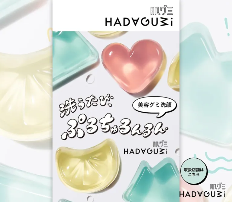
DESIGN REFERENCE
洗うたび、ぷるちゅるんるん|肌グミ|資生堂
透明感のあるグミ状洗顔料のビジュアルに、パステルカラー、手描き風文字、黒い縁取りを組み合わせた商品紹介サイト。PCでも幅600pxの縦長構成を保ち、鮮やかな黄色の購入導線へつなげています。
オリジナルサイトを見るHADAGUMI / Shiseido — Style Reference
A glossy gummy product poster framed by pastel color, playful lettering, and crisp black outlines.
Original URL: https://www.shiseido.co.jp/hadagumi/ Final URL: https://www.shiseido.co.jp/hadagumi/ HTTP status: 200 Theme: light; white content surfaces, pale mint section fields, coral accents, and yellow purchase signage Inspected: September 12, 2026, at 14:27:30 UTC / 23:27:30 JST, using the supplied browser inspection Viewports: desktop 1440 × 1000 CSS pixels; mobile 390 × 844 CSS pixels Scope: the current facial-cleanser product page, including its opening identity and hero, section navigation, product introduction, three benefits, product variants, usage instructions, FAQ text, purchase area, and corporate footer. Visual captures cover desktop opening, benefit, and purchase/footer positions, plus mobile opening and purchase/footer positions. Other sections are documented from the supplied rendered DOM and computed styles.
HADAGUMI makes the product’s unusual texture the center of the design. Translucent pink, yellow, and aqua forms sit on a pale photographic ground, with strong highlights, water droplets, and soft cast shadows. White-filled, dark-outlined Japanese lettering and a speech bubble add a playful voice. Ordinary explanatory text stays in a Japanese sans-serif stack, keeping product information readable beside the expressive artwork.
The defining layout is a narrow, continuous product story. On desktop, a 600px white column sits between oversized, low-contrast product imagery. On mobile, the same composition fills the 390px viewport and most campaign dimensions scale to approximately 65% of their desktop values. Mint sections organize navigation and instructions; yellow panels identify purchase destinations. This is a branded product page with retailer links, rather than an observed on-site checkout experience.
How to Read This Reference
- Measured means a value appears in the supplied rendered element bounds, computed styles, or custom properties. Measurements are CSS pixels and are rounded in tables.
- Visual estimate means an appearance or dimension was estimated from a current-page screenshot. Estimated hex colors are implementation starting points, not sampled or source-defined values.
- Derived means a ratio or relationship was calculated from the supplied measurements. A matching ratio does not establish the original CSS formula.
- Recommended means guidance for a new implementation. Recommended breakpoints, keyframes, semantic controls, and accessibility treatments are not claims about the original.
- Named tokens beginning with
--hg-are aliases introduced by this reference. Only explicitly identified source custom properties come from the inspected page. - Text extraction does not establish whether an FAQ answer is initially visible, whether an image has an accessible name, or whether a carousel supports a particular input method.
Tokens — Colors
Default Palette
| Name | Value | Token | Evidence and role |
|---|---|---|---|
| White | #ffffff |
--hg-white |
Measured header and navigation-card background; visually the main content surface |
| Black | #000000 |
--hg-ink |
Measured primary text; visually used for rules, icon linework, and action outlines |
| Pale Mint | #cce4dd |
--hg-mint |
Measured navigation and HOW TO USE / FAQ section background |
| Release Coral | #f4aea4 |
--hg-coral |
Measured release-date strip background |
| Purchase Yellow | approximately #ffeb00 |
--hg-yellow |
Visual estimate for retailer CTA fills and the highlighted retailer name |
| Soft Blush | approximately #fbe0de |
--hg-blush |
Visual estimate for rounded benefit labels and campaign artwork fields |
| Ring Aqua | approximately #00b6ad |
--hg-aqua |
Visual estimate for aqua segments around the cart control |
| Ring Gold | approximately #ffd166 |
--hg-ring-gold |
Visual estimate for warm yellow segments around the cart control |
| Ring Pink | approximately #ffaca4 |
--hg-ring-pink |
Visual estimate for pink segments around the cart control |
| Footer Text | #333333 |
--hg-footer-text |
Measured support and policy link color |
| Copyright Gray | #666666 |
--hg-muted |
Measured copyright color |
The product imagery contains continuous color and lighting variation. Its aqua and pink highlights should not be flattened into the interface’s solid mint and coral tokens. Likewise, the coral number graphics are visually related to the release strip, but their exact image colors were not supplied.
Color Hierarchy
White carries the long reading surface. Mint marks larger functional sections. Blush softens short product claims and campaign artwork. Black provides the structural contrast: lettering outlines, photo frames, dividers, and hard action shadows. Saturated yellow is concentrated around purchase and retailer information.
The side imagery is much paler than the central hero. Preserve that contrast hierarchy so the desktop background supports the content without becoming a second competing poster.
The source exposes --swiper-theme-color: #b2003b. Its use in visible controls was not established, so it is not included as an observed brand color. No alternative color theme or dark-mode state was supplied.
Tokens — Typography
Japanese Sans-Serif — Explanatory Interface
The computed campaign stack is:
font-family:
  'ヒラギノ角ゴ ProN', HiraKakuProN-W3,
  'ヒラギノ角ゴ Pro W3', HiraKakuPro-W3,
  'Noto Sans JP', 'メイリオ', Meiryo,
  'MS Pゴシック', 'MS Pgothic', Osaka, sans-serif;
This is the observed fallback stack, not confirmation that a particular downloadable font rendered. The appearance of Noto Sans JP in the stack does not prove it was loaded or selected.
The body computes to weight 300, while the sampled campaign sections and ordinary paragraphs generally compute to 400. Headings, variant names, and emphasized announcements use 700. Sampled letter spacing is normal; there is no evidence of a broad tracked-uppercase typography system.
Artwork Lettering and Wordmarks
The opening wordmark, the large phrase 洗うたび、ぷるちゅるんるん, the speech-bubble label 美容グミ洗顔, and numbered benefit graphics are visually distinct from ordinary text. Their containers have empty text in the supplied element dump, consistent with graphic-based content.
Preserve the irregular silhouettes, dark outlines, and white interiors of the hero lettering. Do not use the H1 container’s inherited 16px font size as a measurement of the wordmark, and do not assign a speculative display-font name to the artwork.
Corporate Footer
The footer uses a separate computed stack:
font-family:
  'ヒラギノ角ゴ Pro W3', 'Hiragino Kaku Gothic Pro',
  'メイリオ', Meiryo, 'MS Pゴシック', sans-serif;
Its utility sizes largely remain unchanged between desktop and mobile, unlike the campaign content above it.
Type Scale
| Role | Desktop | Mobile | Weight | Line height / qualification |
|---|---|---|---|---|
| HTML and BODY inherited size | 16px | 16px | BODY 300 | Does not describe every visible text element |
| Common campaign container size | 16px | 10.4px | Usually 400 | Local scaling; the root itself stays 16px |
| Product footnotes | 16px | 10.4px | 400 | One sampled block uses 28.8px / 18.72px leading |
| Purchase availability note | 19.2px | 12.48px | 400 | Normal |
| Variant descriptive text | 22.4px | 14.56px | 700 | Normal |
| Benefit body copy | 28.8px | 18.72px | 400 | 43.2px / 28.08px; ratio 1.5 |
| Purchase availability statement | 28.8px | 18.72px | 700 | Normal |
| Benefit heading base | 32px | 20.8px | 700 | 44.8px / 29.12px; ratio 1.4 |
| Release date | 40px | 26px | 700 | Normal |
| HOW TO USE, FAQ, purchase heading | 40px | 26px | 700 | Normal; measured heading boxes are 60px / 39px high |
| Time/value benefit heading | 40px | 26px | 700 | 56px / 36.4px; ratio 1.4 |
| Introductory H2 | 41.6px | 27.04px | 700 | 62.4px / 40.56px; ratio 1.5 |
| Variant name | 44.8px | 29.12px | 700 | Normal |
| Benefits section heading text | 48px | 31.2px | 700 | Normal |
| Footer support link | 12px | 12px | 400 | 12px |
| Footer policy links | 9px | 9px | 400 | 9px |
| Copyright | 7px | 7px | 400 | 13px |
The benefit screenshot shows larger emphasis within a heading whose parent computes to 32px. The nested emphasis size was not supplied. Navigation labels also appear bolder and larger than their anchor’s inherited size; their exact inner typography is unverified.
For a new implementation, approximately 28px desktop / 18.2px mobile is a reasonable visual starting point for navigation labels. This is a recommendation, not a measured source token.
Tokens — Spacing & Shapes
Responsive Unit
Most campaign measurements follow the ratio:
390 / 600 = 0.65
Examples include 40px headings becoming 26px, 28.8px body text becoming 18.72px, and a 318.02px wordmark becoming 206.72px wide.
The source exposes --vw as 14.4px desktop and 3.9px mobile, and --vh as 10px and 8.44px respectively. These describe the inspected viewport units. The exact rule connecting them to the 600px campaign column was not supplied.
A useful reconstruction is:
/* Derived adaptation, not an extracted source formula */
--hg-u: min(1px, calc(100vw / 600));
Under this adaptation, one unit equals 1px at the inspected desktop size and 0.65px at 390px. Keep it local to campaign dimensions. The footer and floating cart contain exceptions to uniform scaling.
Spacing Scale
| Use | Desktop | Mobile | Evidence |
|---|---|---|---|
| Adjacent variant text-box separation | 16px | 16px | Derived from neighboring horizontal bounds; remains fixed in both samples |
| Date-strip top / bottom padding | 18px / 10px | 11.7px / 6.5px | Measured |
| Navigation row gap | approximately 20.22px | approximately 13.14px | Derived from row bounds |
| Header wordmark top inset | 24px | 15.59px | Measured |
| Header wordmark right inset | 32px | 20.80px | Derived from bounds |
| Benefit copy side inset | 36px | approximately 23.4px | Derived from 528px / 343.19px text widths |
| Purchase banner side inset | approximately 38.8px | approximately 25.22px | Measured wrapper position |
| Common campaign inset | 40px | 26px | Observed on hero lettering and several text blocks |
| Navigation side inset | approximately 47.19px | approximately 30.67px | Measured |
| Feature graphic side inset | 52px | approximately 33.8px | Measured on the third benefit graphic |
| Gap before the next benefit number | 64px | approximately 41.6px | Derived after sampled benefit body copy |
| Usage-section top padding | approximately 115.19px | approximately 74.88px | Measured |
| Purchase-section top padding | approximately 190.39px | 123.75px | Measured |
| Variant-section top padding | 200px | approximately 129.98px | Measured |
The page combines small repeated intervals with very large section openings. Do not reduce every vertical gap to a compact card-layout rhythm: the long pauses contribute to the product-poster pacing.
Border Radius and Outlines
| Element | Treatment | Evidence |
|---|---|---|
| Main column and header | Square outer corners | Visible in captures |
| Navigation cards | 4px desktop / 2.6px mobile radius | Measured |
| Navigation-card edge | Approximately 2px desktop / 1px mobile | Inferred from outer and thumbnail bounds |
| Benefit photo frame | Approximately 3px black border with a small radius | Visual estimate |
| Blush benefit labels | Approximately 20–24px desktop radius | Visual estimate; broad rounded rectangles |
| Retailer and campaign panels | Small rounded corners, dark outline, hard lower-right shadow | Visual observation; may be embedded in artwork |
| Floating cart | Circular, outlined, segmented color ring | Visual observation |
| Mint-to-white section boundary | Irregular soft wave | Visible in mobile purchase capture |
The large organic shapes belong to product imagery and section decoration. Ordinary navigation and purchase panels remain almost rectangular.
Layout Measurements
| Element | Desktop 1440 × 1000 | Mobile 390 × 844 |
|---|---|---|
| Campaign column | 600px wide, x = 420px | 390px wide, x = 0 |
| Side space | 420px each side | None |
| Header | 600 × 148.36px | 390 × 96.42px |
| Header wordmark box | 318.02 × 100.36px | 206.72 × 65.23px |
| Hero section | 600 × 963.19px | 390 × 626.08px |
| Navigation section | 600 × 438.94px | 390 × 283.84px |
| Navigation card | 505.63 × 101.64px | 328.66 × 65.58px |
| Navigation thumbnail box | 180.58 × 97.64px | 117.59 × 63.58px |
| Benefit body width | 528px | 343.19px |
| Benefit-number graphic wrapper | 160 × 73px | 104 × 47.44px |
| Central variant text box | 457.84px wide | 296.30px wide |
| Retailer banner wrapper | 522.39 × 127.80px | 339.55 × 83.06px |
| Campaign banner wrapper | 522.39 × 319.98px | 339.55 × 207.98px |
| Floating cart wrapper | 130 × 130px | 70.72 × 70.72px |
| Corporate home-mark box | 150 × 26px | 150 × 26px |
| Document height | 12,918.34px | 8,398.42px |
Graphic wrapper dimensions can include transparent pixels or artwork padding. They should not be treated as the exact bounds of visible lettering or as proven clickable target dimensions.
Components
Desktop Product Stage
Role: extend the product world outside the narrow reading column.
Large, pale product forms fill the desktop margins: a yellow citrus-like shape on the left and an aqua angular shape on the right, with additional cropped forms entering the edges. The center column has a soft side shadow. A separate black HADAGUMI mark remains near the lower-right corner of the desktop captures.
The background and side mark appear stationary across the supplied desktop scroll positions. This supports a viewport-anchored visual treatment, but the actual positioning declarations were not supplied. No parallax movement was established.
On mobile, the content consumes the available width; the large side stage and separate desktop mark are not visible.
Brand Header
Role: establish the product identity before the photographic hero.
A plain white strip contains a black wordmark aligned toward the right. At desktop, the logo starts approximately 250px into the 600px column, leaving a conspicuously large empty region on the left. Its right inset is 32px and its top inset is 24px. The mobile header preserves those proportions.
There is no visible conventional global-navigation row in this header. The primary section navigation appears below the hero. The header does not appear in the supplied lower-page captures; a persistent sticky-header behavior is not established.
Layered Product Hero
Role: communicate texture, shape, and the central product phrase immediately.
The hero is a tall composition, approximately 1.605 times as high as it is wide. A large pink heart occupies the upper center-right. A yellow citrus form anchors the lower-left region, while aqua plant-like forms enter from the sides and lower edge. Water droplets and soft shadows reinforce the glossy material.
The overlay hierarchy is:
- A smaller handwritten introductory phrase at the left.
- A much larger irregular white-filled slogan across the middle.
- A white speech bubble with black edging and the label
美容グミ洗顔at the right. - A smaller black product wordmark below the main slogan.
Measured desktop graphic-container widths are approximately 261.59px for the introductory lettering, 507.19px for the main slogan, 211.19px for the speech bubble, and 204.80px for the lower wordmark. These are separate visual layers in the supplied evidence, rather than a single text heading.
At 390px, the hero ends at document y = 722.5px, allowing the mint navigation section to enter the opening viewport. At desktop, the hero continues beyond the first 1000px viewport. Do not force this composition into a 100vh hero.
Section Navigation Cards
Role: offer shortcuts to the benefits, variants, and instructions.
Three stacked cards sit on a mint field. The observed labels are やみつきポイント, 選べる3種類, and HOW TO USE & FAQ.
Each card has a white surface, a thin dark edge, small rounded corners, and a hard lower-right shadow visible in the mobile capture. A product thumbnail occupies approximately 36% of the card width on the left. Bold black text occupies the remaining area. The card group is inset more deeply than ordinary body copy.
The anchors use javascript:void(0);, and their computed transition is transform 0.15s. Their labels suggest section navigation, but click results, scroll destinations, and the transform endpoint were not recorded. A new implementation should use meaningful fragment links when the intended action is navigation within the page.
Product Introduction and Release Strip
Role: place the tactile product story alongside availability and practical product information.
A full-column coral strip displays the release date 2026年6月21日 in bold black text. Below it, the supplied DOM contains retailer availability, a price of 2,420円(税込), a 60g quantity, a usage estimate, and qualifying footnotes. These are observed page statements, not independently verified product claims.
The date strip is 88px high on desktop and approximately 57.19px on mobile. Its typography and padding scale with the campaign column. The larger introductory section also contains graphic containers and substantial vertical space; its complete visual composition was not included in the supplied screenshots.
Retain the distinction between the colorful announcement, the main product explanation, and smaller qualifications. Avoid giving all three the same weight or background treatment.
Numbered Benefit Block
Role: repeat a clear benefit-and-demonstration rhythm.
The visible second benefit establishes the anatomy:
- A centered coral number graphic with a dark outline.
- Thin black horizontal rules extending to either side.
- A centered bold headline with larger emphasis on part of the phrase.
- A wide framed demonstration image.
- One or more centered explanatory lines below.
The visible photo frame is approximately 496 × 279px, a screenshot estimate close to 16:9. It shows a person applying the pink heart-shaped product to the cheek against a pink background. Fine white circular annotations sit within the image. The media type was not supplied; this capture does not establish whether the frame is a still image or a video frame.
The first benefit’s ending includes two broad blush labels, including 美容液 + 洗浄&角質ケア成分 and フローラルサボンの香り. These are informational strips without visible action affordances.
The third benefit uses a wider, shallower graphic measured at 496 × 201.75px on desktop. Do not force every benefit into an identical photo aspect ratio when its actual content differs.
Product Variant Presentation
Role: explain the three forms and their ingredient associations.
| Source label | Product form | Content association in the rendered text |
|---|---|---|
ぴかぴか |
Yellow citrus-like form | Vitamin-C-related moisturizing ingredient |
ぷりぷり |
Pink heart | Peptide-related moisturizing ingredients |
そよそよ |
Aqua angular, plant-like form | CICA-related moisturizing ingredient |
Each variant group includes a bold name, a short form description, ingredient information, and qualifications. Variant names measure 44.8px desktop / 29.12px mobile; descriptive text measures 22.4px / 14.56px.
The DOM contains two sequences of these three names, with horizontally translated and offscreen element bounds. Together with the exposed Swiper variables, this supports a carousel-style presentation. In the recorded bounds, the central ぷりぷり text box sits at approximately x = 491.07px desktop and x = 46.80px mobile.
The repeated groups should not be interpreted as six distinct products. Exact slide controls, pagination appearance, autoplay, swipe gestures, and looping behavior were not exercised. Do not invent their styling or timing from the library variables alone.
HOW TO USE Section
Role: explain handling and storage in a visually distinct instructional region.
This section shares a measured mint background with the FAQ area. A bold centered HOW TO USE heading introduces instructions to lightly wet the face and product, move the product across the face, rinse, and use appropriate storage. An additional note describes an alternative light-lather method.
The section opens with approximately 115.19px of desktop top padding and 74.88px on mobile. The heading is 40px / 26px. A sampled instructional note uses 28.8px / 18.72px text.
The supplied screenshots do not show the individual instruction layouts or any instructional media controls. Preserve the confirmed color field, hierarchy, and content grouping without assuming a particular step-card or video-player design.
FAQ and Caution Content
Role: answer handling questions and preserve product-use information.
The extracted content contains five question-and-answer pairs covering cleanliness, storage, cleaning without lather, optional lathering, and grip. A ご注意 block follows with product-use cautions.
The FAQ heading is measured at 40px desktop / 26px mobile, on the mint parent section. Individual item bounds, disclosure icons, expanded states, and item backgrounds were not provided. An accordion interaction is therefore unverified.
For a new implementation, a readable question-and-answer list is the safest baseline. If disclosure is required, use keyboard-operable native disclosure elements or buttons with explicit expanded state. That is an implementation recommendation, not a reconstruction of a verified original interaction.
Purchase Section
Role: turn product interest into a clear retailer destination.
A wavy mint-to-white transition introduces a white purchase region. A centered ご購入はこちら heading is followed by a bold availability statement. The retailer name receives a narrow yellow highlight behind the lower portion of the text. Smaller left-aligned availability qualifications sit below.
The section then presents two different linked panels:
- An online-store banner with a white retailer-logo block on the left and a saturated yellow text block on the right.
- A store-limited campaign banner with blush artwork above a yellow details strip.
The store banner visually divides approximately 42% / 58%, with a black vertical separator. The yellow side contains two lines of text and a small external-destination symbol. Both banners have small rounded corners, black outlines, and hard lower-right shadows.
The upper link points to an external retailer campaign destination in the supplied DOM. The lower campaign link points to assets/pdf/shopList.pdf on the original site. These destinations were observed as links only; neither destination’s content nor new-tab behavior was inspected.
The campaign artwork includes the HADAGUMI and FRUBI names and the phrase 新習慣キャンペーン. Preserve these as supplied campaign artwork when authorized. The text-empty anchor records are consistent with image-based banners; they do not prove that the links lack accessible names.
There is generous white space after the campaign panel before the footer: approximately 158px desktop and 103px mobile, derived from the banner-wrapper and footer positions. This breathing room is part of the observed ending.
Floating Cart Control
Role: keep a purchase-related shortcut visible while reading.
The current control is a black line cart icon on a white circular center, surrounded by alternating aqua, warm yellow, and pink ring segments. A dark outer edge and offset black shadow make it read like a physical badge.
At desktop, its wrapper is 130px square at x = 1040px, y = 790px. This places it 20px outside the content column and 80px above the viewport bottom. It stays in the same visible position across the supplied desktop scroll captures.
At mobile opening, its wrapper is approximately 70.72px square, 15.09px from the right and 23.39px from the bottom. It overlaps the first navigation card. It is absent from the supplied mobile purchase/footer capture; the rule controlling this difference is unverified.
The anchor uses javascript:void(0);. The cart symbol establishes a purchase-related affordance, but no basket, checkout, or scroll action was exercised. Do not describe it as a working shopping cart without further evidence.
Corporate Footer
Role: provide support, policy links, and corporate identity.
The compact white footer has fine gray horizontal rules, a utility-link row, and a second row with a gray corporate home mark at the left and copyright at the right. The visible home label is 資生堂ホーム.
The supplied original-page text reads Copyright © Shiseido Japan Co.,Ltd. All Rights Reserved. It also contains support, terms, privacy, and corporate-home links. No production credit is present in the supplied original-page evidence.
The 150 × 26px home-mark box and 12px / 9px / 7px utility typography remain essentially fixed across the two viewports. This footer should not inherit the campaign’s uniform 0.65 scaling.
Tokens — Motion & Interaction
| Element or configuration | Recorded value | What is established | Limitation |
|---|---|---|---|
| Introductory hero lettering container | 2.5s 0.05s infinite anime1 |
Repeating named animation with a 50ms delay | Keyframe transforms and movement amplitude unavailable |
| Main hero slogan container | 2.5s infinite anime1 |
Same named repeating animation without the recorded delay | Exact visual deformation unavailable |
| Hero speech bubble | 2s ease-in-out infinite alternate-reverse floating-y |
Repeating alternating animation declaration | Travel distance and full trajectory not measured |
| Navigation anchors | transform 0.15s |
Short transform transition on both viewports | Trigger and final transform not supplied |
| Cart wrapper | opacity 0.35s |
Opacity transition declared | Visibility trigger and endpoint not established |
| Desktop image and utility links | opacity 0.3s |
Opacity transition declared on sampled links | Hover opacity value not supplied |
| Mobile counterparts of several links | all |
Transition-property information only | No nonzero duration established from this string |
| Variant presentation | Swiper variables and translated repeated content | Carousel-style structure supported | Input behavior, autoplay, speed, and controls unverified |
The source also exposes duration variables of 0.3s, 0.6s, 0.9s, and 1.2s through --mh--duration01 to --mh--duration04. Easing variables include ease and four cubic-bezier curves: (0.1,0.7,0.4,1), (0.03,0.9,0.15,1), (1,0,0.87,0.86), and (0.952,0.165,1,0.913). Their association with specific visible components was not supplied. They should not be turned into invented section-reveal behavior.
The initial observation lasted at least five seconds. The capture process waited for layout and image readiness, paused perpetual animations during readiness checks, and resumed them afterward. Consequently, the screenshots are settled views of a page with declared animation, not a recording of complete animation cycles.
Recommended motion direction: retain modest, localized movement around the hero artwork and short feedback on actionable panels. Use the observed cycle durations as references, but label any newly authored wobble, translation distance, or pressed state as an adaptation. Provide a static reduced-motion state.
Surfaces
| Layer | Appearance | Function |
|---|---|---|
| Desktop stage | Pale, oversized glossy product imagery | Extends the product identity into wide margins |
| Central column | White with soft side shadow | Defines the reading surface |
| Hero | Pale photographic ground with saturated translucent forms | Creates the strongest material impression |
| Navigation / instructions | Solid measured mint | Separates functional groups |
| Benefit callouts | Blush rounded rectangles | Groups short product attributes |
| Feature media | Thin black frame around photography or graphics | Gives demonstrations a clear boundary |
| Purchase panels | White, blush, and yellow with hard black edges and shadows | Gives retailer destinations the strongest action emphasis |
| Floating control | White disk, segmented pastel ring, black icon | Provides a persistent purchase-related affordance |
| Footer | White, gray rules, small gray text | Signals the quieter corporate utility layer |
Two shadow systems coexist: a soft atmospheric shadow beside the central column and crisp offset shadows on action panels. Avoid spreading either treatment indiscriminately across every section.
Imagery
The hero’s distinguishing quality is translucent material: clear edges, thick rounded forms, bright highlights, colored interiors, water droplets, and believable soft shadows. The pink heart, yellow citrus-like form, and aqua plant-like form should remain easy to recognize at mobile size.
The production technique is not established. Describe the imagery as glossy product imagery with a photographic or rendered appearance, without claiming that it was created using a particular 3D application or photographic process.
The central hero retains stronger color and contrast than the desktop stage. The benefit photograph introduces a close view of skin, a hand, and the product against a pink field. This makes the physical use of the object understandable after the abstract opening composition.
Wordmarks, hero lettering, numbered graphics, and campaign banners carry authored visual detail. Use authorized originals where available. Replacing them with generic rounded text or drawing all products as flat CSS blobs would lose much of the page’s identity.
Observed Asset References
The supplied evidence does not expose the image URLs or native image dimensions. The following identifies observed assets by role, without inventing filenames.
| Asset | Observed evidence | Implementation treatment |
|---|---|---|
| Header HADAGUMI wordmark | Current desktop and mobile opening captures; measured H1 box | Preserve aspect ratio and right alignment |
| Product hero composition | Current opening captures | Preserve the tall composition and recognizable product forms |
| Introductory and main slogan graphics | Empty-text graphic containers with animation declarations | Keep distinct from ordinary UI text |
| Speech-bubble graphic | Measured container and floating-y declaration |
Retain outlined bubble shape and legible source label |
| Lower hero wordmark | Measured graphic container | Preserve its subordinate scale |
| Product navigation thumbnails | Measured thumbnail boxes; mobile opening capture | Use a consistent left-hand image region |
| Benefit number graphics | Measured wrappers; visible second and third numbers | Preserve coral fill and irregular outlined character |
| Face/product demonstration media | Desktop benefit capture | Keep the wide framing and image annotations |
| Retailer and campaign banners | Current desktop and mobile purchase captures | Avoid duplicating borders or shadows already embedded in artwork |
| Cart graphic | Current opening and desktop scroll captures | Preserve the segmented ring and black icon |
| Corporate home mark | Current footer captures and measured box | Keep separate from the campaign wordmark |
The observed store-list PDF link is a document destination, not an image asset reference. Its contents were not inspected.
Layout & Responsive Behavior
The page preserves one continuous column at both inspected sizes. Desktop width is used for decorative context, not a second content column or a product grid. At 1440px, the 600px column occupies approximately 41.7% of the viewport. At 390px, it occupies the full width.
Most campaign sizes scale by the column-width ratio. This includes the header, hero, typography, banner artwork, and much of the spacing. Small differences arise from border rounding, text line boxes, and non-scaling elements. The document heights are therefore approximately proportional, not an exact multiplication of every pixel.
The most important exceptions are:
- The cart is 130px desktop and about 70.72px mobile; uniform 65% scaling would have produced 84.5px.
- Footer support, policy, and copyright text remain 12px, 9px, and 7px.
- The corporate home-mark box remains 150 × 26px.
- Adjacent variant text boxes retain an approximately 16px horizontal separation.
- The desktop side stage disappears from the visible mobile composition.
Both page flow and screen framing matter. The mobile opening shows the entire hero and the beginning of navigation, while desktop shows a taller crop of the hero. At the mobile bottom, the purchase heading, both destination panels, generous white space, and footer fit into the supplied 844px-tall capture.
The precise responsive breakpoint, intermediate tablet layout, landscape behavior, safe-area handling, and browser-zoom behavior were not supplied. A 600px maximum column is supported by the observed geometry; the breakpoint used to activate desktop decoration must be treated as an implementation choice.
Do’s and Don’ts
Do
- Keep the desktop content column close to the measured 600px width.
- Let the column fill the phone viewport while retaining its tall product-poster composition.
- Preserve white as the main reading surface and
#cce4ddas the functional section color. - Keep saturated yellow concentrated around retailer and purchase information.
- Pair translucent, glossy imagery with strong dark outlines in lettering and controls.
- Preserve the right-aligned header wordmark and the large empty area beside it.
- Use a repeatable number, headline, demonstration, and explanation sequence for benefits.
- Distinguish hard action shadows from the soft column-edge shadow.
- Keep the retailer’s identity visible inside the purchase destination panel.
- Preserve meaningful instructions, qualifications, and product-use information alongside the playful imagery.
- Document carousel and disclosure behavior only when it has been verified.
Don’t
- Don’t widen the central story into a conventional desktop feature grid.
- Don’t stretch the hero to fill the viewport width or force it to exactly one viewport height.
- Don’t substitute a guessed display font for the authored hero lettering.
- Don’t apply pink or mint text to pastel surfaces where the original uses high-contrast black.
- Don’t turn every section into a rounded, shadowed card.
- Don’t apply blur or glass effects to ordinary navigation and purchase panels.
- Don’t interpret the cart icon as proof of an on-site basket or checkout.
- Don’t interpret duplicated variant text as additional products.
- Don’t present the FAQ as a verified accordion or the variant rail as verified autoplay.
- Don’t add a second shadow around banner artwork that already contains one.
- Don’t scale the corporate footer with the campaign’s fluid typography formula.
Recommended Implementation Additions
These are recommendations for a new implementation, not verified original features:
- Use native fragment links for section shortcuts and the purchase shortcut when those are the intended destinations.
- Give image-based destination links descriptive accessible names. A text-empty DOM excerpt is insufficient to assess their current accessibility.
- Provide an accessible text equivalent for the main graphic phrase and product identity without visually duplicating the artwork.
- Keep decorative desktop imagery out of the accessibility tree and prevent it from intercepting pointer input.
- Add visible keyboard focus to navigation cards, purchase panels, and the cart control.
- Raise very small qualifications and footer text to a readable minimum. The measured mobile footnotes and copyright are visually compact but should not dictate minimum sizes for a new product.
- Keep the three product variants available when JavaScript fails. Add carousel controls and keyboard behavior if a carousel is implemented.
- Use a static hero under
prefers-reduced-motion: reduceand provide a way to stop persistent decorative motion where appropriate. - Check the mobile cart against all content states. The opening capture shows overlap with navigation; reserve room or adjust visibility so focused content remains readable.
- Preserve image aspect ratios and explicit dimensions to avoid layout shifts. Load below-the-fold media progressively while prioritizing the opening composition.
Agent Prompt Guide
Quick Color Reference
- Main surfaces: measured white
#ffffff. - Text and structural contrast: measured black
#000000. - Navigation and usage section fields: measured mint
#cce4dd. - Release strip: measured coral
#f4aea4. - Purchase fill and retailer-name highlight: approximately
#ffeb00. - Soft benefit and campaign fields: approximately
#fbe0de. - Cart ring: approximately aqua
#00b6ad, warm yellow#ffd166, and pink#ffaca4. - Product-image colors remain continuous photographic tones, not flat UI fills.
Overall Prompt
“Create a Japanese facial-cleanser product page with a 600px maximum central white column and a full-width mobile composition. Place pale, oversized translucent product imagery in the desktop margins. Use a right-aligned black wordmark above a tall hero featuring a glossy pink heart, yellow citrus form, aqua plant-like form, water droplets, and soft shadows. Overlay authored white-filled, dark-outlined Japanese lettering and a small speech bubble. Follow with mint-backed image-and-label navigation cards, numbered benefits with framed demonstration imagery, three product variants, a mint instructional section, and a white purchase area. Use crisp black outlines and offset shadows for actions, with bright yellow reserved for retailer links. Scale campaign typography and spacing with column width while keeping the corporate footer independently readable. Treat unknown carousel and FAQ behavior as implementation decisions.”
Example Component Prompts
- Hero: “Compose a tall product hero at approximately 600:963 proportions. Place a translucent pink heart above the central outlined slogan, a yellow citrus form below-left, and aqua angular forms entering the edges. Keep bright highlights and water droplets. Use separate authorized slogan and speech-bubble artwork so motion can remain localized.”
- Section shortcut: “Create a nearly rectangular white shortcut card on a pale mint field. Give approximately 36% of its width to a product thumbnail and the remainder to a bold black label such as
やみつきポイント. Use a thin black edge, small radius, and hard lower-right shadow. Implement it as a meaningful native link.” - Benefit block: “Place a coral outlined number between two thin black rules, then a centered bold Japanese heading, a wide thinly framed demonstration image, and centered body copy. Use approximately 28.8px body type at a 600px column and 18.72px at 390px. Keep numbered artwork separate from the text font.”
- Purchase panel: “Build a horizontal retailer sign with a white logo region occupying about 42% and a bright yellow text region occupying the rest. Use a black separator, small corner radius, and crisp offset black shadow. Keep the destination name legible and provide a descriptive link name.”
- Floating shortcut: “Create a circular purchase shortcut with a white center, black line cart icon, segmented aqua/yellow/pink ring, black perimeter, and offset shadow. Place it outside the 600px desktop column and near the mobile lower-right edge. Make overlap prevention and visibility behavior explicit implementation choices.”
- Instruction section: “Use a solid
#cce4ddfield, centered bold HOW TO USE and FAQ headings, readable Japanese instructions, and clear question-and-answer grouping. Do not invent the original page’s disclosure styling. Choose accessible static content or explicitly specified disclosure controls.”
Quick Start
CSS Custom Properties
This is a usable visual adaptation, not extracted source CSS. It fits the two inspected column widths, uses measured colors where available, and marks estimated colors. The 1000px stage breakpoint, hover endpoint, and 4-unit float distance are recommendations. Small text receives a readability floor.
Expected structure: .hadagumi-page contains the campaign; .brand-header wraps a wordmark image; .hero contains a base image and optional separate graphic overlays; .jump-card is an anchor containing an image and label; .cart-link contains .cart-face and an icon. Supply authorized artwork. No image filenames were exposed, so none are invented here.
If the hero is delivered as one complete composite, omit the separate overlay images. If a purchase banner already includes its border and shadow, use .purchase-artwork-link instead of rebuilding it with .retailer-link.
:root {
  /* Measured interface colors */
  --hg-white: #ffffff;
  --hg-ink: #000000;
  --hg-mint: #cce4dd;
  --hg-coral: #f4aea4;
  --hg-footer-text: #333333;
  --hg-muted: #666666;

  /* Visual estimates; confirm against authorized artwork */
  --hg-yellow: #ffeb00;
  --hg-blush: #fbe0de;
  --hg-aqua: #00b6ad;
  --hg-ring-gold: #ffd166;
  --hg-ring-pink: #ffaca4;

  --hg-font:
    'ヒラギノ角ゴ ProN', HiraKakuProN-W3,
    'ヒラギノ角ゴ Pro W3', HiraKakuPro-W3,
    'Noto Sans JP', 'メイリオ', Meiryo,
    'MS Pゴシック', 'MS Pgothic', Osaka, sans-serif;

  /* Derived scaling; the document root stays conventional */
  --hg-column: 600px;
  --hg-u: min(1px, calc(100vw / 600));
  --hg-body: calc(28.8 * var(--hg-u));
  --hg-heading: calc(40 * var(--hg-u));
  --hg-inset: calc(40 * var(--hg-u));
  --hg-rule: max(1px, calc(2 * var(--hg-u)));
  --hg-card-radius: calc(4 * var(--hg-u));
  --hg-hard-shadow:
    calc(6 * var(--hg-u)) calc(6 * var(--hg-u)) 0 var(--hg-ink);
}

* {
  box-sizing: border-box;
}

body {
  margin: 0;
  color: var(--hg-ink);
  background: var(--hg-white);
  font-family: var(--hg-font);
}

img {
  max-inline-size: 100%;
}

.stage-art {
  display: none;
  position: fixed;
  inset: 0;
  z-index: 0;
  pointer-events: none;
}

.stage-art img {
  display: block;
  inline-size: 100%;
  block-size: 100%;
  object-fit: cover;
}

.hadagumi-page {
  position: relative;
  z-index: 1;
  inline-size: min(100%, var(--hg-column));
  margin-inline: auto;
  background: var(--hg-white);
  font-size: calc(16 * var(--hg-u));
  font-weight: 400;
}

.brand-header {
  display: flex;
  justify-content: flex-end;
  padding: calc(24 * var(--hg-u)) calc(32 * var(--hg-u));
  background: var(--hg-white);
}

.brand-header img {
  display: block;
  inline-size: calc(318.02 * var(--hg-u));
  block-size: auto;
}

.hero {
  position: relative;
  aspect-ratio: 600 / 963.1875;
  overflow: hidden;
}

.hero-photo {
  display: block;
  inline-size: 100%;
  block-size: 100%;
  object-fit: cover;
}

.hero-layer {
  position: absolute;
  display: block;
  block-size: auto;
}

/* Approximate resting positions derived from measured bounds */
.hero-lead {
  inset-inline-start: 4.932%;
  inset-block-start: 30.731%;
  inline-size: 43.599%;
}

.hero-slogan {
  inset-inline-start: 6.667%;
  inset-block-start: 40.212%;
  inline-size: 84.531%;
}

.hero-bubble {
  inset-inline-start: 62.802%;
  inset-block-start: 30.874%;
  inline-size: 35.198%;
}

.hero-wordmark {
  inset-inline-start: 56.401%;
  inset-block-start: 53.738%;
  inline-size: 34.133%;
}

.jump-nav {
  padding-block: calc(50.4 * var(--hg-u)) calc(43.2 * var(--hg-u));
  background: var(--hg-mint);
}

.jump-list {
  display: grid;
  gap: calc(20.2 * var(--hg-u));
  inline-size: 84.271%;
  margin-inline: auto;
}

.jump-card {
  display: grid;
  grid-template-columns: 36% minmax(0, 1fr);
  align-items: stretch;
  min-block-size: calc(101.64 * var(--hg-u));
  overflow: hidden;
  border: var(--hg-rule) solid var(--hg-ink);
  border-radius: var(--hg-card-radius);
  color: var(--hg-ink);
  background: var(--hg-white);
  box-shadow: var(--hg-hard-shadow);
  text-decoration: none;
  transition: transform 150ms;
}

.jump-card img {
  display: block;
  inline-size: 100%;
  block-size: 100%;
  object-fit: cover;
}

.jump-label {
  display: grid;
  place-items: center;
  padding: calc(12 * var(--hg-u));
  font-size: max(16px, calc(28 * var(--hg-u)));
  font-weight: 700;
  line-height: 1.35;
  text-align: center;
}

.release-strip {
  margin: 0;
  padding-block: calc(18 * var(--hg-u)) calc(10 * var(--hg-u));
  background: var(--hg-coral);
  font-size: var(--hg-heading);
  font-weight: 700;
  line-height: 1.5;
  text-align: center;
}

.section-title {
  margin: 0 0 calc(40 * var(--hg-u));
  font-size: var(--hg-heading);
  font-weight: 700;
  line-height: 1.5;
  text-align: center;
}

.point {
  margin-block: calc(64 * var(--hg-u));
}

.point-index {
  display: grid;
  grid-template-columns: 1fr auto 1fr;
  align-items: center;
  inline-size: 86.667%;
  margin-inline: auto;
}

.point-index::before,
.point-index::after {
  content: '';
  block-size: var(--hg-rule);
  background: var(--hg-ink);
}

.point-index img {
  display: block;
  inline-size: calc(160 * var(--hg-u));
  block-size: auto;
}

.point-title {
  margin: calc(32 * var(--hg-u)) var(--hg-inset);
  font-size: calc(32 * var(--hg-u));
  font-weight: 700;
  line-height: 1.4;
  text-align: center;
}

.point-media {
  display: block;
  inline-size: 82.667%;
  block-size: auto;
  margin: calc(40 * var(--hg-u)) auto calc(28.8 * var(--hg-u));
  border: max(1px, calc(3 * var(--hg-u))) solid var(--hg-ink);
  border-radius: var(--hg-card-radius);
}

.point-copy {
  inline-size: 88%;
  margin-inline: auto;
  font-size: var(--hg-body);
  line-height: 1.5;
  text-align: center;
}

.benefit-label {
  inline-size: 86.667%;
  margin: calc(24 * var(--hg-u)) auto;
  padding: calc(20 * var(--hg-u));
  border-radius: calc(22 * var(--hg-u));
  background: var(--hg-blush);
  font-size: max(16px, calc(25.6 * var(--hg-u)));
  font-weight: 700;
  text-align: center;
}

.help-section {
  padding: calc(115.19 * var(--hg-u)) var(--hg-inset)
    calc(60 * var(--hg-u));
  background: var(--hg-mint);
  font-size: var(--hg-body);
  line-height: 1.5;
}

.purchase-section {
  padding-block: calc(190.4 * var(--hg-u)) calc(80 * var(--hg-u));
  background: var(--hg-white);
}

.purchase-copy {
  margin-inline: var(--hg-inset);
  font-size: var(--hg-body);
  font-weight: 700;
  line-height: 1.5;
  text-align: center;
}

.retailer-highlight {
  background: linear-gradient(transparent 64%, var(--hg-yellow) 64%);
}

.small-print {
  margin-inline: var(--hg-inset);
  font-size: max(12px, calc(16 * var(--hg-u)));
  line-height: 1.8;
}

/* Semantic reconstruction of the retailer sign */
.retailer-link {
  display: grid;
  grid-template-columns: 42% minmax(0, 1fr);
  inline-size: 87.065%;
  min-block-size: calc(120 * var(--hg-u));
  margin: calc(38.4 * var(--hg-u)) auto;
  overflow: hidden;
  border: var(--hg-rule) solid var(--hg-ink);
  border-radius: calc(6 * var(--hg-u));
  color: var(--hg-ink);
  background: var(--hg-yellow);
  box-shadow: var(--hg-hard-shadow);
  text-decoration: none;
}

.retailer-logo,
.retailer-label {
  display: grid;
  align-content: center;
  padding: calc(20 * var(--hg-u));
}

.retailer-logo {
  place-items: center;
  border-inline-end: var(--hg-rule) solid var(--hg-ink);
  background: var(--hg-white);
}

.retailer-label {
  font-size: max(16px, calc(28 * var(--hg-u)));
  font-weight: 700;
  line-height: 1.35;
}

/* Alternative for a complete banner with baked-in decoration */
.purchase-artwork-link {
  display: block;
  inline-size: 87.065%;
  margin-inline: auto;
}

.purchase-artwork-link img {
  display: block;
  inline-size: 100%;
  block-size: auto;
}

.purchase-ending {
  margin-block-end: calc(78.4 * var(--hg-u));
}

.cart-link {
  position: fixed;
  z-index: 5;
  inset-inline-end: 3.87vw;
  inset-block-end: max(6vw, calc(env(safe-area-inset-bottom, 0px) + 12px));
  display: grid;
  inline-size: clamp(56px, 18.133vw, 90px);
  aspect-ratio: 1;
  padding: 5px;
  border: 2px solid var(--hg-ink);
  border-radius: 50%;
  color: var(--hg-ink);
  background: repeating-conic-gradient(
    var(--hg-aqua) 0deg 30deg,
    var(--hg-ring-gold) 30deg 60deg,
    var(--hg-ring-pink) 60deg 90deg
  );
  box-shadow: 4px 5px 0 var(--hg-ink);
  text-decoration: none;
}

.cart-face {
  display: grid;
  place-items: center;
  inline-size: 100%;
  block-size: 100%;
  border-radius: 50%;
  background: var(--hg-white);
}

.cart-face :is(img, svg) {
  inline-size: 55%;
  block-size: 55%;
  object-fit: contain;
}

.cart-link[hidden] {
  display: none;
}

/* Readability adaptation: do not reproduce 7px copyright text */
.corporate-footer {
  padding: 12px 10px;
  border-block-start: 1px solid #cccccc;
  color: var(--hg-footer-text);
  background: var(--hg-white);
  font-size: 12px;
  line-height: 1.5;
}

.corporate-footer a {
  color: inherit;
}

.footer-bottom {
  display: flex;
  flex-wrap: wrap;
  align-items: flex-start;
  justify-content: space-between;
  gap: 12px;
  margin-block-start: 10px;
}

.footer-home-mark {
  inline-size: 150px;
  block-size: auto;
}

.copyright {
  margin: 0;
  color: var(--hg-muted);
  font-size: 11px;
}

/* Recommended stage breakpoint, not an observed source query */
@media (min-width: 1000px) {
  .stage-art {
    display: block;
  }

  .hadagumi-page {
    box-shadow: 0 0 20px rgb(0 0 0 / 20%);
  }

  .cart-link {
    inset-inline-start: calc(50% + 320px);
    inset-inline-end: auto;
    inset-block-end: 80px;
    inline-size: 130px;
    padding: 8px;
  }
}

/* Recommended hover endpoint; original endpoint was unavailable */
@media (hover: hover) {
  .jump-card:hover {
    transform: translate(
      calc(2 * var(--hg-u)),
      calc(2 * var(--hg-u))
    );
  }
}

/* Optional adaptation: source float distance was not supplied */
[data-hg-float] {
  animation: hg-float-adaptation 2s ease-in-out infinite alternate-reverse;
}

@keyframes hg-float-adaptation {
  from { transform: translateY(0); }
  to { transform: translateY(calc(-4 * var(--hg-u))); }
}

.hadagumi-page :focus-visible,
.cart-link:focus-visible {
  outline: 3px solid var(--hg-ink);
  outline-offset: 5px;
}

@media (prefers-reduced-motion: reduce) {
  [data-hg-float] {
    animation: none;
  }

  .jump-card {
    transition: none;
  }
}
The CSS does not implement an unverified carousel, FAQ disclosure, or cart visibility trigger. Add those behaviors only after deciding their intended interaction. A native fragment link to the purchase section is a usable starting point for a purchase shortcut, but is not a claim about the inspected JavaScript.
Tailwind v4 Token Mapping
Optional aliases for a project already using Tailwind v4. Define the custom properties above first. This is not evidence that the original page uses Tailwind.
@theme inline {
  --color-gummy-white: var(--hg-white);
  --color-gummy-ink: var(--hg-ink);
  --color-gummy-mint: var(--hg-mint);
  --color-gummy-coral: var(--hg-coral);
  --color-gummy-yellow: var(--hg-yellow);
  --color-gummy-blush: var(--hg-blush);

  --font-gummy: var(--hg-font);

  --text-gummy-body: var(--hg-body);
  --text-gummy-body--line-height: 1.5;
  --text-gummy-heading: var(--hg-heading);
  --text-gummy-heading--line-height: 1.5;
  --text-gummy-variant: calc(44.8 * var(--hg-u));

  --spacing-gummy-unit: var(--hg-u);
  --spacing-gummy-inset: var(--hg-inset);
  --radius-gummy-card: var(--hg-card-radius);
}
Sources & Evidence
- Inspected original and final page: HADAGUMI — Shiseido. Both URLs are identical, with reported HTTP status 200.
- Capture timestamp: September 12, 2026, 14:27:30.428 UTC / 23:27:30.428 JST.
- Desktop evidence: 1440 × 1000 CSS-pixel viewport; three supplied current-page captures covering the opening, a numbered benefit, and purchase/footer content. Measured document height: 12,918.34375px.
- Mobile evidence: 390 × 844 CSS-pixel viewport; two supplied current-page captures covering the opening and purchase/footer content. Measured document height: 8,398.421875px.
- Rendered evidence: page text, link destinations, selected element bounds, computed font stacks, sizes, weights, backgrounds, radii, transitions, animation declarations, and exposed custom properties at both viewports.
- Inspection conditions: at least five seconds of initial observation; readiness checks for layout stability, finite animations, and image decoding; scrolling through intermediate positions. Perpetual animations were paused during readiness checks and resumed. SharedWorkers and service workers were disabled.
- Limitations: no additional browsing or file inspection was performed for this reference. Source image URLs, complete stylesheets, keyframe definitions, resolved font files, interaction recordings, and intermediate viewport captures were not supplied. Retailer and store-list destinations were observed as links but not opened. Delayed content, unexercised interactions, and worker-dependent behavior remain unverified.
This reference describes the current page in the supplied inspection. Measured values, visual estimates, derived relationships, and recommended implementation behavior are identified separately throughout.
# HADAGUMI / Shiseido — Style Reference

> A glossy gummy product poster framed by pastel color, playful lettering, and crisp black outlines.

**Original URL:** [https://www.shiseido.co.jp/hadagumi/](https://www.shiseido.co.jp/hadagumi/)
**Final URL:** [https://www.shiseido.co.jp/hadagumi/](https://www.shiseido.co.jp/hadagumi/)
**HTTP status:** 200
**Theme:** light; white content surfaces, pale mint section fields, coral accents, and yellow purchase signage
**Inspected:** September 12, 2026, at 14:27:30 UTC / 23:27:30 JST, using the supplied browser inspection
**Viewports:** desktop 1440 × 1000 CSS pixels; mobile 390 × 844 CSS pixels
**Scope:** the current facial-cleanser product page, including its opening identity and hero, section navigation, product introduction, three benefits, product variants, usage instructions, FAQ text, purchase area, and corporate footer. Visual captures cover desktop opening, benefit, and purchase/footer positions, plus mobile opening and purchase/footer positions. Other sections are documented from the supplied rendered DOM and computed styles.

HADAGUMI makes the product’s unusual texture the center of the design. Translucent pink, yellow, and aqua forms sit on a pale photographic ground, with strong highlights, water droplets, and soft cast shadows. White-filled, dark-outlined Japanese lettering and a speech bubble add a playful voice. Ordinary explanatory text stays in a Japanese sans-serif stack, keeping product information readable beside the expressive artwork.

The defining layout is a narrow, continuous product story. On desktop, a 600px white column sits between oversized, low-contrast product imagery. On mobile, the same composition fills the 390px viewport and most campaign dimensions scale to approximately 65% of their desktop values. Mint sections organize navigation and instructions; yellow panels identify purchase destinations. This is a branded product page with retailer links, rather than an observed on-site checkout experience.

## How to Read This Reference

- **Measured** means a value appears in the supplied rendered element bounds, computed styles, or custom properties. Measurements are CSS pixels and are rounded in tables.
- **Visual estimate** means an appearance or dimension was estimated from a current-page screenshot. Estimated hex colors are implementation starting points, not sampled or source-defined values.
- **Derived** means a ratio or relationship was calculated from the supplied measurements. A matching ratio does not establish the original CSS formula.
- **Recommended** means guidance for a new implementation. Recommended breakpoints, keyframes, semantic controls, and accessibility treatments are not claims about the original.
- **Named tokens** beginning with `--hg-` are aliases introduced by this reference. Only explicitly identified source custom properties come from the inspected page.
- Text extraction does not establish whether an FAQ answer is initially visible, whether an image has an accessible name, or whether a carousel supports a particular input method.

## Tokens — Colors

### Default Palette

| Name | Value | Token | Evidence and role |
| --- | --- | --- | --- |
| White | `#ffffff` | `--hg-white` | Measured header and navigation-card background; visually the main content surface |
| Black | `#000000` | `--hg-ink` | Measured primary text; visually used for rules, icon linework, and action outlines |
| Pale Mint | `#cce4dd` | `--hg-mint` | Measured navigation and HOW TO USE / FAQ section background |
| Release Coral | `#f4aea4` | `--hg-coral` | Measured release-date strip background |
| Purchase Yellow | approximately `#ffeb00` | `--hg-yellow` | Visual estimate for retailer CTA fills and the highlighted retailer name |
| Soft Blush | approximately `#fbe0de` | `--hg-blush` | Visual estimate for rounded benefit labels and campaign artwork fields |
| Ring Aqua | approximately `#00b6ad` | `--hg-aqua` | Visual estimate for aqua segments around the cart control |
| Ring Gold | approximately `#ffd166` | `--hg-ring-gold` | Visual estimate for warm yellow segments around the cart control |
| Ring Pink | approximately `#ffaca4` | `--hg-ring-pink` | Visual estimate for pink segments around the cart control |
| Footer Text | `#333333` | `--hg-footer-text` | Measured support and policy link color |
| Copyright Gray | `#666666` | `--hg-muted` | Measured copyright color |

The product imagery contains continuous color and lighting variation. Its aqua and pink highlights should not be flattened into the interface’s solid mint and coral tokens. Likewise, the coral number graphics are visually related to the release strip, but their exact image colors were not supplied.

### Color Hierarchy

White carries the long reading surface. Mint marks larger functional sections. Blush softens short product claims and campaign artwork. Black provides the structural contrast: lettering outlines, photo frames, dividers, and hard action shadows. Saturated yellow is concentrated around purchase and retailer information.

The side imagery is much paler than the central hero. Preserve that contrast hierarchy so the desktop background supports the content without becoming a second competing poster.

The source exposes `--swiper-theme-color: #b2003b`. Its use in visible controls was not established, so it is not included as an observed brand color. No alternative color theme or dark-mode state was supplied.

## Tokens — Typography

### Japanese Sans-Serif — Explanatory Interface

The computed campaign stack is:

```css
font-family:
  'ヒラギノ角ゴ ProN', HiraKakuProN-W3,
  'ヒラギノ角ゴ Pro W3', HiraKakuPro-W3,
  'Noto Sans JP', 'メイリオ', Meiryo,
  'MS Pゴシック', 'MS Pgothic', Osaka, sans-serif;
```

This is the observed fallback stack, not confirmation that a particular downloadable font rendered. The appearance of `Noto Sans JP` in the stack does not prove it was loaded or selected.

The body computes to weight `300`, while the sampled campaign sections and ordinary paragraphs generally compute to `400`. Headings, variant names, and emphasized announcements use `700`. Sampled letter spacing is `normal`; there is no evidence of a broad tracked-uppercase typography system.

### Artwork Lettering and Wordmarks

The opening wordmark, the large phrase `洗うたび、ぷるちゅるんるん`, the speech-bubble label `美容グミ洗顔`, and numbered benefit graphics are visually distinct from ordinary text. Their containers have empty text in the supplied element dump, consistent with graphic-based content.

Preserve the irregular silhouettes, dark outlines, and white interiors of the hero lettering. Do not use the H1 container’s inherited 16px font size as a measurement of the wordmark, and do not assign a speculative display-font name to the artwork.

### Corporate Footer

The footer uses a separate computed stack:

```css
font-family:
  'ヒラギノ角ゴ Pro W3', 'Hiragino Kaku Gothic Pro',
  'メイリオ', Meiryo, 'MS Pゴシック', sans-serif;
```

Its utility sizes largely remain unchanged between desktop and mobile, unlike the campaign content above it.

### Type Scale

| Role | Desktop | Mobile | Weight | Line height / qualification |
| --- | --- | --- | --- | --- |
| HTML and BODY inherited size | 16px | 16px | BODY 300 | Does not describe every visible text element |
| Common campaign container size | 16px | 10.4px | Usually 400 | Local scaling; the root itself stays 16px |
| Product footnotes | 16px | 10.4px | 400 | One sampled block uses 28.8px / 18.72px leading |
| Purchase availability note | 19.2px | 12.48px | 400 | Normal |
| Variant descriptive text | 22.4px | 14.56px | 700 | Normal |
| Benefit body copy | 28.8px | 18.72px | 400 | 43.2px / 28.08px; ratio 1.5 |
| Purchase availability statement | 28.8px | 18.72px | 700 | Normal |
| Benefit heading base | 32px | 20.8px | 700 | 44.8px / 29.12px; ratio 1.4 |
| Release date | 40px | 26px | 700 | Normal |
| HOW TO USE, FAQ, purchase heading | 40px | 26px | 700 | Normal; measured heading boxes are 60px / 39px high |
| Time/value benefit heading | 40px | 26px | 700 | 56px / 36.4px; ratio 1.4 |
| Introductory H2 | 41.6px | 27.04px | 700 | 62.4px / 40.56px; ratio 1.5 |
| Variant name | 44.8px | 29.12px | 700 | Normal |
| Benefits section heading text | 48px | 31.2px | 700 | Normal |
| Footer support link | 12px | 12px | 400 | 12px |
| Footer policy links | 9px | 9px | 400 | 9px |
| Copyright | 7px | 7px | 400 | 13px |

The benefit screenshot shows larger emphasis within a heading whose parent computes to 32px. The nested emphasis size was not supplied. Navigation labels also appear bolder and larger than their anchor’s inherited size; their exact inner typography is unverified.

For a new implementation, approximately 28px desktop / 18.2px mobile is a reasonable visual starting point for navigation labels. This is a recommendation, not a measured source token.

## Tokens — Spacing & Shapes

### Responsive Unit

Most campaign measurements follow the ratio:

```text
390 / 600 = 0.65
```

Examples include 40px headings becoming 26px, 28.8px body text becoming 18.72px, and a 318.02px wordmark becoming 206.72px wide.

The source exposes `--vw` as 14.4px desktop and 3.9px mobile, and `--vh` as 10px and 8.44px respectively. These describe the inspected viewport units. The exact rule connecting them to the 600px campaign column was not supplied.

A useful reconstruction is:

```css
/* Derived adaptation, not an extracted source formula */
--hg-u: min(1px, calc(100vw / 600));
```

Under this adaptation, one unit equals 1px at the inspected desktop size and 0.65px at 390px. Keep it local to campaign dimensions. The footer and floating cart contain exceptions to uniform scaling.

### Spacing Scale

| Use | Desktop | Mobile | Evidence |
| --- | --- | --- | --- |
| Adjacent variant text-box separation | 16px | 16px | Derived from neighboring horizontal bounds; remains fixed in both samples |
| Date-strip top / bottom padding | 18px / 10px | 11.7px / 6.5px | Measured |
| Navigation row gap | approximately 20.22px | approximately 13.14px | Derived from row bounds |
| Header wordmark top inset | 24px | 15.59px | Measured |
| Header wordmark right inset | 32px | 20.80px | Derived from bounds |
| Benefit copy side inset | 36px | approximately 23.4px | Derived from 528px / 343.19px text widths |
| Purchase banner side inset | approximately 38.8px | approximately 25.22px | Measured wrapper position |
| Common campaign inset | 40px | 26px | Observed on hero lettering and several text blocks |
| Navigation side inset | approximately 47.19px | approximately 30.67px | Measured |
| Feature graphic side inset | 52px | approximately 33.8px | Measured on the third benefit graphic |
| Gap before the next benefit number | 64px | approximately 41.6px | Derived after sampled benefit body copy |
| Usage-section top padding | approximately 115.19px | approximately 74.88px | Measured |
| Purchase-section top padding | approximately 190.39px | 123.75px | Measured |
| Variant-section top padding | 200px | approximately 129.98px | Measured |

The page combines small repeated intervals with very large section openings. Do not reduce every vertical gap to a compact card-layout rhythm: the long pauses contribute to the product-poster pacing.

### Border Radius and Outlines

| Element | Treatment | Evidence |
| --- | --- | --- |
| Main column and header | Square outer corners | Visible in captures |
| Navigation cards | 4px desktop / 2.6px mobile radius | Measured |
| Navigation-card edge | Approximately 2px desktop / 1px mobile | Inferred from outer and thumbnail bounds |
| Benefit photo frame | Approximately 3px black border with a small radius | Visual estimate |
| Blush benefit labels | Approximately 20–24px desktop radius | Visual estimate; broad rounded rectangles |
| Retailer and campaign panels | Small rounded corners, dark outline, hard lower-right shadow | Visual observation; may be embedded in artwork |
| Floating cart | Circular, outlined, segmented color ring | Visual observation |
| Mint-to-white section boundary | Irregular soft wave | Visible in mobile purchase capture |

The large organic shapes belong to product imagery and section decoration. Ordinary navigation and purchase panels remain almost rectangular.

### Layout Measurements

| Element | Desktop 1440 × 1000 | Mobile 390 × 844 |
| --- | --- | --- |
| Campaign column | 600px wide, x = 420px | 390px wide, x = 0 |
| Side space | 420px each side | None |
| Header | 600 × 148.36px | 390 × 96.42px |
| Header wordmark box | 318.02 × 100.36px | 206.72 × 65.23px |
| Hero section | 600 × 963.19px | 390 × 626.08px |
| Navigation section | 600 × 438.94px | 390 × 283.84px |
| Navigation card | 505.63 × 101.64px | 328.66 × 65.58px |
| Navigation thumbnail box | 180.58 × 97.64px | 117.59 × 63.58px |
| Benefit body width | 528px | 343.19px |
| Benefit-number graphic wrapper | 160 × 73px | 104 × 47.44px |
| Central variant text box | 457.84px wide | 296.30px wide |
| Retailer banner wrapper | 522.39 × 127.80px | 339.55 × 83.06px |
| Campaign banner wrapper | 522.39 × 319.98px | 339.55 × 207.98px |
| Floating cart wrapper | 130 × 130px | 70.72 × 70.72px |
| Corporate home-mark box | 150 × 26px | 150 × 26px |
| Document height | 12,918.34px | 8,398.42px |

Graphic wrapper dimensions can include transparent pixels or artwork padding. They should not be treated as the exact bounds of visible lettering or as proven clickable target dimensions.

## Components

### Desktop Product Stage

**Role:** extend the product world outside the narrow reading column.

Large, pale product forms fill the desktop margins: a yellow citrus-like shape on the left and an aqua angular shape on the right, with additional cropped forms entering the edges. The center column has a soft side shadow. A separate black HADAGUMI mark remains near the lower-right corner of the desktop captures.

The background and side mark appear stationary across the supplied desktop scroll positions. This supports a viewport-anchored visual treatment, but the actual positioning declarations were not supplied. No parallax movement was established.

On mobile, the content consumes the available width; the large side stage and separate desktop mark are not visible.

### Brand Header

**Role:** establish the product identity before the photographic hero.

A plain white strip contains a black wordmark aligned toward the right. At desktop, the logo starts approximately 250px into the 600px column, leaving a conspicuously large empty region on the left. Its right inset is 32px and its top inset is 24px. The mobile header preserves those proportions.

There is no visible conventional global-navigation row in this header. The primary section navigation appears below the hero. The header does not appear in the supplied lower-page captures; a persistent sticky-header behavior is not established.

### Layered Product Hero

**Role:** communicate texture, shape, and the central product phrase immediately.

The hero is a tall composition, approximately 1.605 times as high as it is wide. A large pink heart occupies the upper center-right. A yellow citrus form anchors the lower-left region, while aqua plant-like forms enter from the sides and lower edge. Water droplets and soft shadows reinforce the glossy material.

The overlay hierarchy is:

1. A smaller handwritten introductory phrase at the left.
2. A much larger irregular white-filled slogan across the middle.
3. A white speech bubble with black edging and the label `美容グミ洗顔` at the right.
4. A smaller black product wordmark below the main slogan.

Measured desktop graphic-container widths are approximately 261.59px for the introductory lettering, 507.19px for the main slogan, 211.19px for the speech bubble, and 204.80px for the lower wordmark. These are separate visual layers in the supplied evidence, rather than a single text heading.

At 390px, the hero ends at document y = 722.5px, allowing the mint navigation section to enter the opening viewport. At desktop, the hero continues beyond the first 1000px viewport. Do not force this composition into a `100vh` hero.

### Section Navigation Cards

**Role:** offer shortcuts to the benefits, variants, and instructions.

Three stacked cards sit on a mint field. The observed labels are `やみつきポイント`, `選べる3種類`, and `HOW TO USE & FAQ`.

Each card has a white surface, a thin dark edge, small rounded corners, and a hard lower-right shadow visible in the mobile capture. A product thumbnail occupies approximately 36% of the card width on the left. Bold black text occupies the remaining area. The card group is inset more deeply than ordinary body copy.

The anchors use `javascript:void(0);`, and their computed transition is `transform 0.15s`. Their labels suggest section navigation, but click results, scroll destinations, and the transform endpoint were not recorded. A new implementation should use meaningful fragment links when the intended action is navigation within the page.

### Product Introduction and Release Strip

**Role:** place the tactile product story alongside availability and practical product information.

A full-column coral strip displays the release date `2026年6月21日` in bold black text. Below it, the supplied DOM contains retailer availability, a price of `2,420円(税込)`, a 60g quantity, a usage estimate, and qualifying footnotes. These are observed page statements, not independently verified product claims.

The date strip is 88px high on desktop and approximately 57.19px on mobile. Its typography and padding scale with the campaign column. The larger introductory section also contains graphic containers and substantial vertical space; its complete visual composition was not included in the supplied screenshots.

Retain the distinction between the colorful announcement, the main product explanation, and smaller qualifications. Avoid giving all three the same weight or background treatment.

### Numbered Benefit Block

**Role:** repeat a clear benefit-and-demonstration rhythm.

The visible second benefit establishes the anatomy:

- A centered coral number graphic with a dark outline.
- Thin black horizontal rules extending to either side.
- A centered bold headline with larger emphasis on part of the phrase.
- A wide framed demonstration image.
- One or more centered explanatory lines below.

The visible photo frame is approximately 496 × 279px, a screenshot estimate close to 16:9. It shows a person applying the pink heart-shaped product to the cheek against a pink background. Fine white circular annotations sit within the image. The media type was not supplied; this capture does not establish whether the frame is a still image or a video frame.

The first benefit’s ending includes two broad blush labels, including `美容液 + 洗浄&角質ケア成分` and `フローラルサボンの香り`. These are informational strips without visible action affordances.

The third benefit uses a wider, shallower graphic measured at 496 × 201.75px on desktop. Do not force every benefit into an identical photo aspect ratio when its actual content differs.

### Product Variant Presentation

**Role:** explain the three forms and their ingredient associations.

| Source label | Product form | Content association in the rendered text |
| --- | --- | --- |
| `ぴかぴか` | Yellow citrus-like form | Vitamin-C-related moisturizing ingredient |
| `ぷりぷり` | Pink heart | Peptide-related moisturizing ingredients |
| `そよそよ` | Aqua angular, plant-like form | CICA-related moisturizing ingredient |

Each variant group includes a bold name, a short form description, ingredient information, and qualifications. Variant names measure 44.8px desktop / 29.12px mobile; descriptive text measures 22.4px / 14.56px.

The DOM contains two sequences of these three names, with horizontally translated and offscreen element bounds. Together with the exposed Swiper variables, this supports a carousel-style presentation. In the recorded bounds, the central `ぷりぷり` text box sits at approximately x = 491.07px desktop and x = 46.80px mobile.

The repeated groups should not be interpreted as six distinct products. Exact slide controls, pagination appearance, autoplay, swipe gestures, and looping behavior were not exercised. Do not invent their styling or timing from the library variables alone.

### HOW TO USE Section

**Role:** explain handling and storage in a visually distinct instructional region.

This section shares a measured mint background with the FAQ area. A bold centered `HOW TO USE` heading introduces instructions to lightly wet the face and product, move the product across the face, rinse, and use appropriate storage. An additional note describes an alternative light-lather method.

The section opens with approximately 115.19px of desktop top padding and 74.88px on mobile. The heading is 40px / 26px. A sampled instructional note uses 28.8px / 18.72px text.

The supplied screenshots do not show the individual instruction layouts or any instructional media controls. Preserve the confirmed color field, hierarchy, and content grouping without assuming a particular step-card or video-player design.

### FAQ and Caution Content

**Role:** answer handling questions and preserve product-use information.

The extracted content contains five question-and-answer pairs covering cleanliness, storage, cleaning without lather, optional lathering, and grip. A `ご注意` block follows with product-use cautions.

The FAQ heading is measured at 40px desktop / 26px mobile, on the mint parent section. Individual item bounds, disclosure icons, expanded states, and item backgrounds were not provided. An accordion interaction is therefore unverified.

For a new implementation, a readable question-and-answer list is the safest baseline. If disclosure is required, use keyboard-operable native disclosure elements or buttons with explicit expanded state. That is an implementation recommendation, not a reconstruction of a verified original interaction.

### Purchase Section

**Role:** turn product interest into a clear retailer destination.

A wavy mint-to-white transition introduces a white purchase region. A centered `ご購入はこちら` heading is followed by a bold availability statement. The retailer name receives a narrow yellow highlight behind the lower portion of the text. Smaller left-aligned availability qualifications sit below.

The section then presents two different linked panels:

1. An online-store banner with a white retailer-logo block on the left and a saturated yellow text block on the right.
2. A store-limited campaign banner with blush artwork above a yellow details strip.

The store banner visually divides approximately 42% / 58%, with a black vertical separator. The yellow side contains two lines of text and a small external-destination symbol. Both banners have small rounded corners, black outlines, and hard lower-right shadows.

The upper link points to an external retailer campaign destination in the supplied DOM. The lower campaign link points to `assets/pdf/shopList.pdf` on the original site. These destinations were observed as links only; neither destination’s content nor new-tab behavior was inspected.

The campaign artwork includes the HADAGUMI and FRUBI names and the phrase `新習慣キャンペーン`. Preserve these as supplied campaign artwork when authorized. The text-empty anchor records are consistent with image-based banners; they do not prove that the links lack accessible names.

There is generous white space after the campaign panel before the footer: approximately 158px desktop and 103px mobile, derived from the banner-wrapper and footer positions. This breathing room is part of the observed ending.

### Floating Cart Control

**Role:** keep a purchase-related shortcut visible while reading.

The current control is a black line cart icon on a white circular center, surrounded by alternating aqua, warm yellow, and pink ring segments. A dark outer edge and offset black shadow make it read like a physical badge.

At desktop, its wrapper is 130px square at x = 1040px, y = 790px. This places it 20px outside the content column and 80px above the viewport bottom. It stays in the same visible position across the supplied desktop scroll captures.

At mobile opening, its wrapper is approximately 70.72px square, 15.09px from the right and 23.39px from the bottom. It overlaps the first navigation card. It is absent from the supplied mobile purchase/footer capture; the rule controlling this difference is unverified.

The anchor uses `javascript:void(0);`. The cart symbol establishes a purchase-related affordance, but no basket, checkout, or scroll action was exercised. Do not describe it as a working shopping cart without further evidence.

### Corporate Footer

**Role:** provide support, policy links, and corporate identity.

The compact white footer has fine gray horizontal rules, a utility-link row, and a second row with a gray corporate home mark at the left and copyright at the right. The visible home label is `資生堂ホーム`.

The supplied original-page text reads `Copyright © Shiseido Japan Co.,Ltd. All Rights Reserved.` It also contains support, terms, privacy, and corporate-home links. No production credit is present in the supplied original-page evidence.

The 150 × 26px home-mark box and 12px / 9px / 7px utility typography remain essentially fixed across the two viewports. This footer should not inherit the campaign’s uniform 0.65 scaling.

## Tokens — Motion & Interaction

| Element or configuration | Recorded value | What is established | Limitation |
| --- | --- | --- | --- |
| Introductory hero lettering container | `2.5s 0.05s infinite anime1` | Repeating named animation with a 50ms delay | Keyframe transforms and movement amplitude unavailable |
| Main hero slogan container | `2.5s infinite anime1` | Same named repeating animation without the recorded delay | Exact visual deformation unavailable |
| Hero speech bubble | `2s ease-in-out infinite alternate-reverse floating-y` | Repeating alternating animation declaration | Travel distance and full trajectory not measured |
| Navigation anchors | `transform 0.15s` | Short transform transition on both viewports | Trigger and final transform not supplied |
| Cart wrapper | `opacity 0.35s` | Opacity transition declared | Visibility trigger and endpoint not established |
| Desktop image and utility links | `opacity 0.3s` | Opacity transition declared on sampled links | Hover opacity value not supplied |
| Mobile counterparts of several links | `all` | Transition-property information only | No nonzero duration established from this string |
| Variant presentation | Swiper variables and translated repeated content | Carousel-style structure supported | Input behavior, autoplay, speed, and controls unverified |

The source also exposes duration variables of 0.3s, 0.6s, 0.9s, and 1.2s through `--mh--duration01` to `--mh--duration04`. Easing variables include `ease` and four cubic-bezier curves: `(0.1,0.7,0.4,1)`, `(0.03,0.9,0.15,1)`, `(1,0,0.87,0.86)`, and `(0.952,0.165,1,0.913)`. Their association with specific visible components was not supplied. They should not be turned into invented section-reveal behavior.

The initial observation lasted at least five seconds. The capture process waited for layout and image readiness, paused perpetual animations during readiness checks, and resumed them afterward. Consequently, the screenshots are settled views of a page with declared animation, not a recording of complete animation cycles.

**Recommended motion direction:** retain modest, localized movement around the hero artwork and short feedback on actionable panels. Use the observed cycle durations as references, but label any newly authored wobble, translation distance, or pressed state as an adaptation. Provide a static reduced-motion state.

## Surfaces

| Layer | Appearance | Function |
| --- | --- | --- |
| Desktop stage | Pale, oversized glossy product imagery | Extends the product identity into wide margins |
| Central column | White with soft side shadow | Defines the reading surface |
| Hero | Pale photographic ground with saturated translucent forms | Creates the strongest material impression |
| Navigation / instructions | Solid measured mint | Separates functional groups |
| Benefit callouts | Blush rounded rectangles | Groups short product attributes |
| Feature media | Thin black frame around photography or graphics | Gives demonstrations a clear boundary |
| Purchase panels | White, blush, and yellow with hard black edges and shadows | Gives retailer destinations the strongest action emphasis |
| Floating control | White disk, segmented pastel ring, black icon | Provides a persistent purchase-related affordance |
| Footer | White, gray rules, small gray text | Signals the quieter corporate utility layer |

Two shadow systems coexist: a soft atmospheric shadow beside the central column and crisp offset shadows on action panels. Avoid spreading either treatment indiscriminately across every section.

## Imagery

The hero’s distinguishing quality is translucent material: clear edges, thick rounded forms, bright highlights, colored interiors, water droplets, and believable soft shadows. The pink heart, yellow citrus-like form, and aqua plant-like form should remain easy to recognize at mobile size.

The production technique is not established. Describe the imagery as glossy product imagery with a photographic or rendered appearance, without claiming that it was created using a particular 3D application or photographic process.

The central hero retains stronger color and contrast than the desktop stage. The benefit photograph introduces a close view of skin, a hand, and the product against a pink field. This makes the physical use of the object understandable after the abstract opening composition.

Wordmarks, hero lettering, numbered graphics, and campaign banners carry authored visual detail. Use authorized originals where available. Replacing them with generic rounded text or drawing all products as flat CSS blobs would lose much of the page’s identity.

### Observed Asset References

The supplied evidence does not expose the image URLs or native image dimensions. The following identifies observed assets by role, without inventing filenames.

| Asset | Observed evidence | Implementation treatment |
| --- | --- | --- |
| Header HADAGUMI wordmark | Current desktop and mobile opening captures; measured H1 box | Preserve aspect ratio and right alignment |
| Product hero composition | Current opening captures | Preserve the tall composition and recognizable product forms |
| Introductory and main slogan graphics | Empty-text graphic containers with animation declarations | Keep distinct from ordinary UI text |
| Speech-bubble graphic | Measured container and `floating-y` declaration | Retain outlined bubble shape and legible source label |
| Lower hero wordmark | Measured graphic container | Preserve its subordinate scale |
| Product navigation thumbnails | Measured thumbnail boxes; mobile opening capture | Use a consistent left-hand image region |
| Benefit number graphics | Measured wrappers; visible second and third numbers | Preserve coral fill and irregular outlined character |
| Face/product demonstration media | Desktop benefit capture | Keep the wide framing and image annotations |
| Retailer and campaign banners | Current desktop and mobile purchase captures | Avoid duplicating borders or shadows already embedded in artwork |
| Cart graphic | Current opening and desktop scroll captures | Preserve the segmented ring and black icon |
| Corporate home mark | Current footer captures and measured box | Keep separate from the campaign wordmark |

The observed store-list PDF link is a document destination, not an image asset reference. Its contents were not inspected.

## Layout & Responsive Behavior

The page preserves one continuous column at both inspected sizes. Desktop width is used for decorative context, not a second content column or a product grid. At 1440px, the 600px column occupies approximately 41.7% of the viewport. At 390px, it occupies the full width.

Most campaign sizes scale by the column-width ratio. This includes the header, hero, typography, banner artwork, and much of the spacing. Small differences arise from border rounding, text line boxes, and non-scaling elements. The document heights are therefore approximately proportional, not an exact multiplication of every pixel.

The most important exceptions are:

- The cart is 130px desktop and about 70.72px mobile; uniform 65% scaling would have produced 84.5px.
- Footer support, policy, and copyright text remain 12px, 9px, and 7px.
- The corporate home-mark box remains 150 × 26px.
- Adjacent variant text boxes retain an approximately 16px horizontal separation.
- The desktop side stage disappears from the visible mobile composition.

Both page flow and screen framing matter. The mobile opening shows the entire hero and the beginning of navigation, while desktop shows a taller crop of the hero. At the mobile bottom, the purchase heading, both destination panels, generous white space, and footer fit into the supplied 844px-tall capture.

The precise responsive breakpoint, intermediate tablet layout, landscape behavior, safe-area handling, and browser-zoom behavior were not supplied. A 600px maximum column is supported by the observed geometry; the breakpoint used to activate desktop decoration must be treated as an implementation choice.

## Do’s and Don’ts

### Do

- Keep the desktop content column close to the measured 600px width.
- Let the column fill the phone viewport while retaining its tall product-poster composition.
- Preserve white as the main reading surface and `#cce4dd` as the functional section color.
- Keep saturated yellow concentrated around retailer and purchase information.
- Pair translucent, glossy imagery with strong dark outlines in lettering and controls.
- Preserve the right-aligned header wordmark and the large empty area beside it.
- Use a repeatable number, headline, demonstration, and explanation sequence for benefits.
- Distinguish hard action shadows from the soft column-edge shadow.
- Keep the retailer’s identity visible inside the purchase destination panel.
- Preserve meaningful instructions, qualifications, and product-use information alongside the playful imagery.
- Document carousel and disclosure behavior only when it has been verified.

### Don’t

- Don’t widen the central story into a conventional desktop feature grid.
- Don’t stretch the hero to fill the viewport width or force it to exactly one viewport height.
- Don’t substitute a guessed display font for the authored hero lettering.
- Don’t apply pink or mint text to pastel surfaces where the original uses high-contrast black.
- Don’t turn every section into a rounded, shadowed card.
- Don’t apply blur or glass effects to ordinary navigation and purchase panels.
- Don’t interpret the cart icon as proof of an on-site basket or checkout.
- Don’t interpret duplicated variant text as additional products.
- Don’t present the FAQ as a verified accordion or the variant rail as verified autoplay.
- Don’t add a second shadow around banner artwork that already contains one.
- Don’t scale the corporate footer with the campaign’s fluid typography formula.

## Recommended Implementation Additions

These are recommendations for a new implementation, not verified original features:

- Use native fragment links for section shortcuts and the purchase shortcut when those are the intended destinations.
- Give image-based destination links descriptive accessible names. A text-empty DOM excerpt is insufficient to assess their current accessibility.
- Provide an accessible text equivalent for the main graphic phrase and product identity without visually duplicating the artwork.
- Keep decorative desktop imagery out of the accessibility tree and prevent it from intercepting pointer input.
- Add visible keyboard focus to navigation cards, purchase panels, and the cart control.
- Raise very small qualifications and footer text to a readable minimum. The measured mobile footnotes and copyright are visually compact but should not dictate minimum sizes for a new product.
- Keep the three product variants available when JavaScript fails. Add carousel controls and keyboard behavior if a carousel is implemented.
- Use a static hero under `prefers-reduced-motion: reduce` and provide a way to stop persistent decorative motion where appropriate.
- Check the mobile cart against all content states. The opening capture shows overlap with navigation; reserve room or adjust visibility so focused content remains readable.
- Preserve image aspect ratios and explicit dimensions to avoid layout shifts. Load below-the-fold media progressively while prioritizing the opening composition.

## Agent Prompt Guide

### Quick Color Reference

- Main surfaces: measured white `#ffffff`.
- Text and structural contrast: measured black `#000000`.
- Navigation and usage section fields: measured mint `#cce4dd`.
- Release strip: measured coral `#f4aea4`.
- Purchase fill and retailer-name highlight: approximately `#ffeb00`.
- Soft benefit and campaign fields: approximately `#fbe0de`.
- Cart ring: approximately aqua `#00b6ad`, warm yellow `#ffd166`, and pink `#ffaca4`.
- Product-image colors remain continuous photographic tones, not flat UI fills.

### Overall Prompt

“Create a Japanese facial-cleanser product page with a 600px maximum central white column and a full-width mobile composition. Place pale, oversized translucent product imagery in the desktop margins. Use a right-aligned black wordmark above a tall hero featuring a glossy pink heart, yellow citrus form, aqua plant-like form, water droplets, and soft shadows. Overlay authored white-filled, dark-outlined Japanese lettering and a small speech bubble. Follow with mint-backed image-and-label navigation cards, numbered benefits with framed demonstration imagery, three product variants, a mint instructional section, and a white purchase area. Use crisp black outlines and offset shadows for actions, with bright yellow reserved for retailer links. Scale campaign typography and spacing with column width while keeping the corporate footer independently readable. Treat unknown carousel and FAQ behavior as implementation decisions.”

### Example Component Prompts

1. **Hero:** “Compose a tall product hero at approximately 600:963 proportions. Place a translucent pink heart above the central outlined slogan, a yellow citrus form below-left, and aqua angular forms entering the edges. Keep bright highlights and water droplets. Use separate authorized slogan and speech-bubble artwork so motion can remain localized.”
2. **Section shortcut:** “Create a nearly rectangular white shortcut card on a pale mint field. Give approximately 36% of its width to a product thumbnail and the remainder to a bold black label such as `やみつきポイント`. Use a thin black edge, small radius, and hard lower-right shadow. Implement it as a meaningful native link.”
3. **Benefit block:** “Place a coral outlined number between two thin black rules, then a centered bold Japanese heading, a wide thinly framed demonstration image, and centered body copy. Use approximately 28.8px body type at a 600px column and 18.72px at 390px. Keep numbered artwork separate from the text font.”
4. **Purchase panel:** “Build a horizontal retailer sign with a white logo region occupying about 42% and a bright yellow text region occupying the rest. Use a black separator, small corner radius, and crisp offset black shadow. Keep the destination name legible and provide a descriptive link name.”
5. **Floating shortcut:** “Create a circular purchase shortcut with a white center, black line cart icon, segmented aqua/yellow/pink ring, black perimeter, and offset shadow. Place it outside the 600px desktop column and near the mobile lower-right edge. Make overlap prevention and visibility behavior explicit implementation choices.”
6. **Instruction section:** “Use a solid `#cce4dd` field, centered bold HOW TO USE and FAQ headings, readable Japanese instructions, and clear question-and-answer grouping. Do not invent the original page’s disclosure styling. Choose accessible static content or explicitly specified disclosure controls.”

## Quick Start

### CSS Custom Properties

This is a usable visual adaptation, not extracted source CSS. It fits the two inspected column widths, uses measured colors where available, and marks estimated colors. The 1000px stage breakpoint, hover endpoint, and 4-unit float distance are recommendations. Small text receives a readability floor.

Expected structure: `.hadagumi-page` contains the campaign; `.brand-header` wraps a wordmark image; `.hero` contains a base image and optional separate graphic overlays; `.jump-card` is an anchor containing an image and label; `.cart-link` contains `.cart-face` and an icon. Supply authorized artwork. No image filenames were exposed, so none are invented here.

If the hero is delivered as one complete composite, omit the separate overlay images. If a purchase banner already includes its border and shadow, use `.purchase-artwork-link` instead of rebuilding it with `.retailer-link`.

```css
:root {
  /* Measured interface colors */
  --hg-white: #ffffff;
  --hg-ink: #000000;
  --hg-mint: #cce4dd;
  --hg-coral: #f4aea4;
  --hg-footer-text: #333333;
  --hg-muted: #666666;

  /* Visual estimates; confirm against authorized artwork */
  --hg-yellow: #ffeb00;
  --hg-blush: #fbe0de;
  --hg-aqua: #00b6ad;
  --hg-ring-gold: #ffd166;
  --hg-ring-pink: #ffaca4;

  --hg-font:
    'ヒラギノ角ゴ ProN', HiraKakuProN-W3,
    'ヒラギノ角ゴ Pro W3', HiraKakuPro-W3,
    'Noto Sans JP', 'メイリオ', Meiryo,
    'MS Pゴシック', 'MS Pgothic', Osaka, sans-serif;

  /* Derived scaling; the document root stays conventional */
  --hg-column: 600px;
  --hg-u: min(1px, calc(100vw / 600));
  --hg-body: calc(28.8 * var(--hg-u));
  --hg-heading: calc(40 * var(--hg-u));
  --hg-inset: calc(40 * var(--hg-u));
  --hg-rule: max(1px, calc(2 * var(--hg-u)));
  --hg-card-radius: calc(4 * var(--hg-u));
  --hg-hard-shadow:
    calc(6 * var(--hg-u)) calc(6 * var(--hg-u)) 0 var(--hg-ink);
}

* {
  box-sizing: border-box;
}

body {
  margin: 0;
  color: var(--hg-ink);
  background: var(--hg-white);
  font-family: var(--hg-font);
}

img {
  max-inline-size: 100%;
}

.stage-art {
  display: none;
  position: fixed;
  inset: 0;
  z-index: 0;
  pointer-events: none;
}

.stage-art img {
  display: block;
  inline-size: 100%;
  block-size: 100%;
  object-fit: cover;
}

.hadagumi-page {
  position: relative;
  z-index: 1;
  inline-size: min(100%, var(--hg-column));
  margin-inline: auto;
  background: var(--hg-white);
  font-size: calc(16 * var(--hg-u));
  font-weight: 400;
}

.brand-header {
  display: flex;
  justify-content: flex-end;
  padding: calc(24 * var(--hg-u)) calc(32 * var(--hg-u));
  background: var(--hg-white);
}

.brand-header img {
  display: block;
  inline-size: calc(318.02 * var(--hg-u));
  block-size: auto;
}

.hero {
  position: relative;
  aspect-ratio: 600 / 963.1875;
  overflow: hidden;
}

.hero-photo {
  display: block;
  inline-size: 100%;
  block-size: 100%;
  object-fit: cover;
}

.hero-layer {
  position: absolute;
  display: block;
  block-size: auto;
}

/* Approximate resting positions derived from measured bounds */
.hero-lead {
  inset-inline-start: 4.932%;
  inset-block-start: 30.731%;
  inline-size: 43.599%;
}

.hero-slogan {
  inset-inline-start: 6.667%;
  inset-block-start: 40.212%;
  inline-size: 84.531%;
}

.hero-bubble {
  inset-inline-start: 62.802%;
  inset-block-start: 30.874%;
  inline-size: 35.198%;
}

.hero-wordmark {
  inset-inline-start: 56.401%;
  inset-block-start: 53.738%;
  inline-size: 34.133%;
}

.jump-nav {
  padding-block: calc(50.4 * var(--hg-u)) calc(43.2 * var(--hg-u));
  background: var(--hg-mint);
}

.jump-list {
  display: grid;
  gap: calc(20.2 * var(--hg-u));
  inline-size: 84.271%;
  margin-inline: auto;
}

.jump-card {
  display: grid;
  grid-template-columns: 36% minmax(0, 1fr);
  align-items: stretch;
  min-block-size: calc(101.64 * var(--hg-u));
  overflow: hidden;
  border: var(--hg-rule) solid var(--hg-ink);
  border-radius: var(--hg-card-radius);
  color: var(--hg-ink);
  background: var(--hg-white);
  box-shadow: var(--hg-hard-shadow);
  text-decoration: none;
  transition: transform 150ms;
}

.jump-card img {
  display: block;
  inline-size: 100%;
  block-size: 100%;
  object-fit: cover;
}

.jump-label {
  display: grid;
  place-items: center;
  padding: calc(12 * var(--hg-u));
  font-size: max(16px, calc(28 * var(--hg-u)));
  font-weight: 700;
  line-height: 1.35;
  text-align: center;
}

.release-strip {
  margin: 0;
  padding-block: calc(18 * var(--hg-u)) calc(10 * var(--hg-u));
  background: var(--hg-coral);
  font-size: var(--hg-heading);
  font-weight: 700;
  line-height: 1.5;
  text-align: center;
}

.section-title {
  margin: 0 0 calc(40 * var(--hg-u));
  font-size: var(--hg-heading);
  font-weight: 700;
  line-height: 1.5;
  text-align: center;
}

.point {
  margin-block: calc(64 * var(--hg-u));
}

.point-index {
  display: grid;
  grid-template-columns: 1fr auto 1fr;
  align-items: center;
  inline-size: 86.667%;
  margin-inline: auto;
}

.point-index::before,
.point-index::after {
  content: '';
  block-size: var(--hg-rule);
  background: var(--hg-ink);
}

.point-index img {
  display: block;
  inline-size: calc(160 * var(--hg-u));
  block-size: auto;
}

.point-title {
  margin: calc(32 * var(--hg-u)) var(--hg-inset);
  font-size: calc(32 * var(--hg-u));
  font-weight: 700;
  line-height: 1.4;
  text-align: center;
}

.point-media {
  display: block;
  inline-size: 82.667%;
  block-size: auto;
  margin: calc(40 * var(--hg-u)) auto calc(28.8 * var(--hg-u));
  border: max(1px, calc(3 * var(--hg-u))) solid var(--hg-ink);
  border-radius: var(--hg-card-radius);
}

.point-copy {
  inline-size: 88%;
  margin-inline: auto;
  font-size: var(--hg-body);
  line-height: 1.5;
  text-align: center;
}

.benefit-label {
  inline-size: 86.667%;
  margin: calc(24 * var(--hg-u)) auto;
  padding: calc(20 * var(--hg-u));
  border-radius: calc(22 * var(--hg-u));
  background: var(--hg-blush);
  font-size: max(16px, calc(25.6 * var(--hg-u)));
  font-weight: 700;
  text-align: center;
}

.help-section {
  padding: calc(115.19 * var(--hg-u)) var(--hg-inset)
    calc(60 * var(--hg-u));
  background: var(--hg-mint);
  font-size: var(--hg-body);
  line-height: 1.5;
}

.purchase-section {
  padding-block: calc(190.4 * var(--hg-u)) calc(80 * var(--hg-u));
  background: var(--hg-white);
}

.purchase-copy {
  margin-inline: var(--hg-inset);
  font-size: var(--hg-body);
  font-weight: 700;
  line-height: 1.5;
  text-align: center;
}

.retailer-highlight {
  background: linear-gradient(transparent 64%, var(--hg-yellow) 64%);
}

.small-print {
  margin-inline: var(--hg-inset);
  font-size: max(12px, calc(16 * var(--hg-u)));
  line-height: 1.8;
}

/* Semantic reconstruction of the retailer sign */
.retailer-link {
  display: grid;
  grid-template-columns: 42% minmax(0, 1fr);
  inline-size: 87.065%;
  min-block-size: calc(120 * var(--hg-u));
  margin: calc(38.4 * var(--hg-u)) auto;
  overflow: hidden;
  border: var(--hg-rule) solid var(--hg-ink);
  border-radius: calc(6 * var(--hg-u));
  color: var(--hg-ink);
  background: var(--hg-yellow);
  box-shadow: var(--hg-hard-shadow);
  text-decoration: none;
}

.retailer-logo,
.retailer-label {
  display: grid;
  align-content: center;
  padding: calc(20 * var(--hg-u));
}

.retailer-logo {
  place-items: center;
  border-inline-end: var(--hg-rule) solid var(--hg-ink);
  background: var(--hg-white);
}

.retailer-label {
  font-size: max(16px, calc(28 * var(--hg-u)));
  font-weight: 700;
  line-height: 1.35;
}

/* Alternative for a complete banner with baked-in decoration */
.purchase-artwork-link {
  display: block;
  inline-size: 87.065%;
  margin-inline: auto;
}

.purchase-artwork-link img {
  display: block;
  inline-size: 100%;
  block-size: auto;
}

.purchase-ending {
  margin-block-end: calc(78.4 * var(--hg-u));
}

.cart-link {
  position: fixed;
  z-index: 5;
  inset-inline-end: 3.87vw;
  inset-block-end: max(6vw, calc(env(safe-area-inset-bottom, 0px) + 12px));
  display: grid;
  inline-size: clamp(56px, 18.133vw, 90px);
  aspect-ratio: 1;
  padding: 5px;
  border: 2px solid var(--hg-ink);
  border-radius: 50%;
  color: var(--hg-ink);
  background: repeating-conic-gradient(
    var(--hg-aqua) 0deg 30deg,
    var(--hg-ring-gold) 30deg 60deg,
    var(--hg-ring-pink) 60deg 90deg
  );
  box-shadow: 4px 5px 0 var(--hg-ink);
  text-decoration: none;
}

.cart-face {
  display: grid;
  place-items: center;
  inline-size: 100%;
  block-size: 100%;
  border-radius: 50%;
  background: var(--hg-white);
}

.cart-face :is(img, svg) {
  inline-size: 55%;
  block-size: 55%;
  object-fit: contain;
}

.cart-link[hidden] {
  display: none;
}

/* Readability adaptation: do not reproduce 7px copyright text */
.corporate-footer {
  padding: 12px 10px;
  border-block-start: 1px solid #cccccc;
  color: var(--hg-footer-text);
  background: var(--hg-white);
  font-size: 12px;
  line-height: 1.5;
}

.corporate-footer a {
  color: inherit;
}

.footer-bottom {
  display: flex;
  flex-wrap: wrap;
  align-items: flex-start;
  justify-content: space-between;
  gap: 12px;
  margin-block-start: 10px;
}

.footer-home-mark {
  inline-size: 150px;
  block-size: auto;
}

.copyright {
  margin: 0;
  color: var(--hg-muted);
  font-size: 11px;
}

/* Recommended stage breakpoint, not an observed source query */
@media (min-width: 1000px) {
  .stage-art {
    display: block;
  }

  .hadagumi-page {
    box-shadow: 0 0 20px rgb(0 0 0 / 20%);
  }

  .cart-link {
    inset-inline-start: calc(50% + 320px);
    inset-inline-end: auto;
    inset-block-end: 80px;
    inline-size: 130px;
    padding: 8px;
  }
}

/* Recommended hover endpoint; original endpoint was unavailable */
@media (hover: hover) {
  .jump-card:hover {
    transform: translate(
      calc(2 * var(--hg-u)),
      calc(2 * var(--hg-u))
    );
  }
}

/* Optional adaptation: source float distance was not supplied */
[data-hg-float] {
  animation: hg-float-adaptation 2s ease-in-out infinite alternate-reverse;
}

@keyframes hg-float-adaptation {
  from { transform: translateY(0); }
  to { transform: translateY(calc(-4 * var(--hg-u))); }
}

.hadagumi-page :focus-visible,
.cart-link:focus-visible {
  outline: 3px solid var(--hg-ink);
  outline-offset: 5px;
}

@media (prefers-reduced-motion: reduce) {
  [data-hg-float] {
    animation: none;
  }

  .jump-card {
    transition: none;
  }
}
```

The CSS does not implement an unverified carousel, FAQ disclosure, or cart visibility trigger. Add those behaviors only after deciding their intended interaction. A native fragment link to the purchase section is a usable starting point for a purchase shortcut, but is not a claim about the inspected JavaScript.

### Tailwind v4 Token Mapping

Optional aliases for a project already using Tailwind v4. Define the custom properties above first. This is not evidence that the original page uses Tailwind.

```css
@theme inline {
  --color-gummy-white: var(--hg-white);
  --color-gummy-ink: var(--hg-ink);
  --color-gummy-mint: var(--hg-mint);
  --color-gummy-coral: var(--hg-coral);
  --color-gummy-yellow: var(--hg-yellow);
  --color-gummy-blush: var(--hg-blush);

  --font-gummy: var(--hg-font);

  --text-gummy-body: var(--hg-body);
  --text-gummy-body--line-height: 1.5;
  --text-gummy-heading: var(--hg-heading);
  --text-gummy-heading--line-height: 1.5;
  --text-gummy-variant: calc(44.8 * var(--hg-u));

  --spacing-gummy-unit: var(--hg-u);
  --spacing-gummy-inset: var(--hg-inset);
  --radius-gummy-card: var(--hg-card-radius);
}
```

## Sources & Evidence

- **Inspected original and final page:** [HADAGUMI — Shiseido](https://www.shiseido.co.jp/hadagumi/). Both URLs are identical, with reported HTTP status 200.
- **Capture timestamp:** September 12, 2026, 14:27:30.428 UTC / 23:27:30.428 JST.
- **Desktop evidence:** 1440 × 1000 CSS-pixel viewport; three supplied current-page captures covering the opening, a numbered benefit, and purchase/footer content. Measured document height: 12,918.34375px.
- **Mobile evidence:** 390 × 844 CSS-pixel viewport; two supplied current-page captures covering the opening and purchase/footer content. Measured document height: 8,398.421875px.
- **Rendered evidence:** page text, link destinations, selected element bounds, computed font stacks, sizes, weights, backgrounds, radii, transitions, animation declarations, and exposed custom properties at both viewports.
- **Inspection conditions:** at least five seconds of initial observation; readiness checks for layout stability, finite animations, and image decoding; scrolling through intermediate positions. Perpetual animations were paused during readiness checks and resumed. SharedWorkers and service workers were disabled.
- **Limitations:** no additional browsing or file inspection was performed for this reference. Source image URLs, complete stylesheets, keyframe definitions, resolved font files, interaction recordings, and intermediate viewport captures were not supplied. Retailer and store-list destinations were observed as links but not opened. Delayed content, unexercised interactions, and worker-dependent behavior remain unverified.

This reference describes the current page in the supplied inspection. Measured values, visual estimates, derived relationships, and recommended implementation behavior are identified separately throughout.