
DESIGN REFERENCE
ペンギン・キャピタル|コーポレートサイト
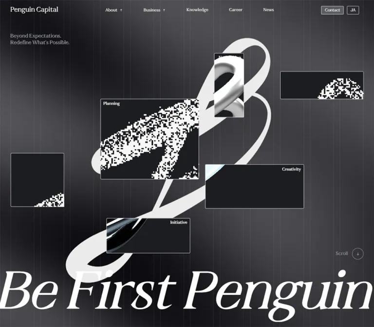
黒とグレーの背景、細い縦グリッド、巨大なセリフ体、ループ状の抽象グラフィックが特徴。不動産投資事業や企業情報を大胆なスケールと余白で展開するコーポレートサイト。
オリジナルサイトを見るPenguin Capital — Style Reference
A monumental white loop and sweeping serif typography suspended over a charcoal grid.
Website / Original URL: penguin-capital.co.jp/ja Final URL: penguin-capital.co.jp/ja Theme: dark, predominantly monochrome; smoky charcoal sections and a black closing screen. Inspected: September 12, 2026, at 07:10:51 UTC / 16:10:51 JST, using the supplied browser evidence. Viewports: 1440 × 1000 and 390 × 844 CSS pixels. The corresponding document widths are 1425px and 375px; the supplied images show those content widths without the 15px scrollbar strip. Scope: the current Japanese corporate homepage: opening composition, Brand Message, Approach, Business, Knowledge, three About Us modules, News, and footer. Visual captures cover the desktop opening, Knowledge region, and footer, plus the mobile opening and footer. Other component details come from rendered DOM and computed styles. Linked pages and expanded navigation states were not inspected.
Penguin Capital presents its real-estate investment business through an unusually expressive monochrome identity. A softly mottled charcoal field carries thin vertical grid lines. Over it, a large white loop stretches diagonally from lower left to upper right, while an italic-looking serif statement pushes beyond the desktop viewport. Small navigation labels and compact gray controls provide a precise counterweight to the oversized artwork.
The page is a long corporate homepage with service, editorial, company, and news content. Its measured document height is approximately 11,502px on desktop and 9,958px on mobile. The strongest reusable relationship is between a disciplined underlying grid, expressive foreground forms, restrained controls, and generous vertical space. The closing composition reduces the background to black and places contact and onward navigation within a largely empty screen.
How to Read This Reference
- Measured means supplied computed styles, custom properties, or element rectangles. Measurements describe the sampled state, including any active parent transforms.
- Observed means visible in an attached capture. Artwork dimensions and thin-rule appearances estimated from those captures are explicitly identified as estimates.
- Calculated means derived from measured values, such as the desktop column width or a rendered-to-computed size ratio.
- Recommended means guidance for a new implementation. Breakpoints, fallback fonts, accessible interaction behavior, and the static CSS background below belong to this category.
- Named tokens are implementation aliases unless a source custom-property name is given.
- A DOM rectangle does not establish visibility. Several navigation links have rectangles while their panels are closed, and some article text exists in the DOM but is absent from the corresponding screenshot.
- No additional browsing, file inspection, or interaction testing was performed for this reference.
Tokens — Colors
Default Palette
| Name | Value | Evidence / source token | Role |
|---|---|---|---|
| Void | #000000 |
Measured BODY background | Underlying page canvas; visibly dominant in the footer |
| Brand Charcoal | #1f2022 |
Declared --color-black |
Source dark token; distinct from the measured black BODY background |
| Chalk | #ebebeb |
--colo-white, --color-text-white; measured wordmark and navigation |
Main English navigation and identity text; the source spelling --colo-white is preserved here |
| White | #ffffff |
Measured hero statement and multiple content elements | Highest-contrast display type and content text |
| Control Gray | #5a5d64 |
Measured rgb(90, 93, 100) |
Contact, More Details, View More, and Knowledge index fills |
| Lead Gray | #9da1aa |
Measured hero statement | The two-line “Beyond Expectations” message |
| Editorial Gray | #a3a3a3 |
Measured Knowledge excerpts | Secondary Japanese article copy |
| About Gray | #b9b9b9 |
Measured About Us paragraphs | Supporting corporate copy |
| Dark Gray Text | #bebebe |
--color-gray-dark; measured Approach paragraph |
Secondary explanatory text |
| Pale Gray | #e7e8ea |
Declared --color-gray, --color-text-gray |
Available source text color; not established as a distinct large surface in the captures |
| Grid Rule | Approximately pale gray at 8–12% opacity | Visual estimate; exact stroke color not supplied | Fine vertical structure over the smoky background |
Color Behavior
The visible hero background is a spatial mixture of near-black and medium charcoal rather than a uniform application of --color-black. Its broad, soft changes in brightness remain behind both the thin grid and white artwork. Exact background stops, texture assets, and rendering parameters are unavailable.
The interface has no verified alternate color theme. JA, EN, and TC identify language options. The slight colored fringes in one mobile footer loop belong to the graphic treatment; they do not establish a colorful interface accent palette.
For a static adaptation, use black as the base, a few broad low-contrast gray gradients for atmosphere, and a separate grid layer. Keep buttons at #5a5d64 so that they remain recognizable against changing background luminance.
Tokens — Typography
English Display and Navigation
- Measured family:
ktflux2, "ktflux2 Fallback". - Source aliases:
--font-enand--font-flux2both declare this family pair. - Visual character: serif letterforms with substantial thick/thin contrast. The opening statement has a pronounced slant and long, expressive curves.
- Measured weights:
400on most English labels and display paragraphs;700on the wordmark and section headings. - Declared behavior: several elements transition
font-variation-settings. The supplied evidence does not identify available axes, their values, or the exact font file. - Recommended fallback: Georgia or a browser serif can support a prototype, but will change widths and the distinctive display silhouette. These are proposed fallbacks, not observed source families.
Do not infer the wordmark’s weight from its appearance alone: its computed weight is 700, even though it reads as relatively delicate in the capture. Likewise, the hero’s slanted appearance does not establish whether the source uses an italic face, a variation axis, or another mechanism.
Japanese Body Text
The measured default stack is:
"Hiragino Kaku Gothic ProN", "Hiragino Sans", "Helvetica Neue",
Arial, "Noto Sans JP", "Noto Sans TC", "Noto Sans SC", sans-serif
Japanese service and company paragraphs generally use weight 600, while Knowledge excerpts use 300. The site also declares a separate --font-noto-jp family pair, but that declaration alone does not establish which font rendered each Japanese glyph.
Service paragraphs combine compact sizes with approximately 1.65 line height and 0.1em tracking. About paragraphs use approximately 1.64 line height and 0.08em tracking. Knowledge excerpts are quieter, with 1.5 line height and normal tracking.
Utility Controls and Wrapper Styles
The JA button wrapper reports Arial at approximately 13.33px; the Contact wrapper reports the default sans-serif stack. Their visible labels may have nested styling that is not included in the sampled element list. Use the explicit English-family measurements for the wordmark, navigation, and named display elements; avoid assigning every painted glyph the wrapper’s family.
Type Scale
Here, 1u means one source rem. It equals 1px at the desktop viewport and 1.04px at the mobile viewport. This is not a conventional 16px rem system.
| Role | Desktop measured size / line height | Mobile measured size / line height | Weight / tracking |
|---|---|---|---|
| Wordmark | 26px / 26px |
22.88px / 22.88px |
700; normal tracking |
| Desktop navigation | 16px, mostly 16px line height |
Desktop row absent | 400; 0.02em |
| Navigation panel primary links | 24px / 24px |
24.96px / 24.96px |
400; panel visibility unverified |
| Navigation panel sublinks | 20px / 20px |
20.8px / 20.8px |
400; panel visibility unverified |
| Hero supporting statement | 20px / 25px |
16.64px / 20.8px |
400; normal tracking |
| Hero display statement | 205px / 205px |
83.2px / 83.2px |
400; -0.02em |
| Parenthesized section heading | 24px / 24px |
20.8px / 20.8px |
700; -0.02em |
| Brand Message paragraph container | 34px / 68px |
20.8px / 41.6px |
600; 0.08em; extracted text empty |
| Approach “Rebuild” | 104px / 104px |
74.88px / 74.88px |
400; normal tracking |
| Approach paragraph container | 16px / 33px |
14.56px / 30.03px |
600; extracted text empty |
| Business paragraph | 14px / 23.1px |
13.52px / 22.308px |
600; 0.1em |
| Service graphic label | 20px / 20px |
20.8px / 20.8px |
400 |
| Service number | 50px / 50px |
33.28px / 33.28px |
400 |
| Knowledge date | 18px / 18px |
18.72px / 18.72px |
400 |
| Knowledge title | 14px / 21px |
14.56px / 21.84px |
700; 0.05em |
| Knowledge excerpt | 14px / 21px |
14.56px / 21.84px |
300; normal tracking |
| About display title | 48px / 48px |
37.44px / 37.44px |
400; -0.03em |
| About paragraph | 14px / 23px |
14.56px / 23.92px |
600; 0.08em |
| Footer contact link | 100px / 100px |
41.6px / 41.6px |
400; mobile tracking -0.01em |
| Footer navigation | 18px |
15.6px |
400 |
About module rectangles are larger than these computed text sizes. For example, the desktop title has a 48px computed line height but an approximately 86.4px rectangle height, a calculated ratio of 1.8. The mobile counterpart shows the same approximate ratio. Treat this as evidence of a transformed sampled state, not an instruction to enlarge every About element permanently.
Tokens — Spacing & Shapes
Responsive Unit
The supplied custom properties and computed root sizes establish:
/* Observed desktop root formula */
--liquid-htmlroot: calc(100vw / 1440);

/* Observed mobile root formula */
--liquid-htmlroot: calc(100vw / 375);

/* Declared body scale */
--liquid-bodyroot: 16rem;
At 1440px viewport width, the HTML font size is 1px; at 390px, it is 1.04px. The content widths of 1425px and 375px do not replace the viewport widths in these calculations.
The evidence also includes 750-based mobile properties. They should not override the directly measured active root formula. Exact media-query thresholds were not supplied.
Spacing Scale
| Use | Measured or calculated value | Status |
|---|---|---|
| Fine visible outline | Approximately 1px |
Screenshot estimate; border-width declarations unavailable |
| Small control radius | Desktop 3px; mobile 3.12px |
Measured |
| Navigation label-to-arrow gap | 8px |
Measured desktop |
| Desktop Contact-to-language gap | 12px |
Calculated from rectangles |
| Business graphic inset | 16px |
Measured desktop |
| Knowledge internal grid gap | Desktop 16px; mobile 16.64px |
Measured |
| Knowledge date-to-title gap | Desktop 24px; mobile approximately 24.96px |
Calculated |
| Desktop Knowledge column gap | 24px |
Calculated from adjacent item rectangles |
| Desktop outer gutter | 40px |
Measured |
| Mobile outer gutter | Approximately 16.64px |
Measured |
| Mobile Knowledge item gap | Approximately 41.59px |
Calculated; consistent with 40u |
| Desktop final article-to-index gap | 48px |
Calculated |
| Desktop Business section padding | 300px top, 200px bottom |
Measured; sampled positions also include staged geometry |
Border Radius
| Element | Measured value | Interpretation |
|---|---|---|
| Contact and small detail links | 3px desktop, 3.12px mobile |
Nearly square, restrained rounding |
| Business graphic links | 8px desktop |
Larger radius confined to those objects |
| Footer language control | 100px desktop, 104px mobile |
Pill geometry on a roughly 47–49px-wide control |
| Article links and news rows | 0px |
Unboxed content structure |
| Scroll and directional rings | Circular, approximately 44–46px across | Visual estimate |
Desktop Grid Reconstruction
The source declares --grid-layout-column: 6.72% and --grid-layout-gap: 1.76%. Twelve columns and eleven gaps using those percentages sum to 100%.
A more precise reconstruction follows the measured content rectangles:
- Content width:
1425 - 40 - 40 = 1345px. - With twelve equal columns and eleven
24pxgaps, each column is approximately90.083px. - The resulting column pitch is approximately
114.083px. - Approach and Business copy begin at approximately
40 + 114.083 = 154.083px, matching the measured154.078px. - A Knowledge article spans three columns: approximately
318.25px. - The Knowledge index link spans four columns: approximately
432.33px, beginning near496.33px. - News begins at the sixth column, approximately
610.42px, and spans the remaining seven columns, approximately774.58px.
This calculated grid is a practical reconstruction, not a supplied stylesheet rule. Small differences reflect rounding.
Layout Measurements
| Element | Desktop | Mobile | Qualification |
|---|---|---|---|
| Document | 1425 × 11501.77px |
375 × 9957.98px |
Measured document rectangles |
| Header | 1440 × 78px |
390 × 56.14px |
Includes 15px right padding |
| Header wordmark position | x40, y26 |
x16.63, y29.11 |
Measured initial state |
| Main inset content width | 1345px |
341.72px |
Measured |
| Hero statement rectangle | x-60, y765, 1505 × 215px |
x0, y651.45, 375 × 176.8px |
Desktop overflow is visible |
| Knowledge item width | 318.25px |
341.72px |
Four desktop entries; two mobile entries in supplied DOM |
| Knowledge index link | 432.33 × 44px |
341.72 × 45.02px |
Measured |
| News row | Approximately 774.59 × 70px |
341.72 × 122.67px |
Measured |
| Footer | 1425 × 1000px |
375 × 844px |
Matches viewport height in both samples |
The declared --header-height: 80rem is not the same as the measured header height. Use the actual component measurements when matching these captures.
Components
Persistent Header
Role: corporate identity, section navigation, contact access, and language selection.
The desktop header is transparent over both the smoky opening and black footer. The wordmark sits 40px from the document’s left edge. A middle navigation group contains About, Business, Knowledge, Career, and News. About and Business are buttons with small upward-pointing arrow marks; their destinations are represented by subordinate links in the DOM.
The measured gap between consecutive primary navigation items is approximately 80px. At the right, Contact is a filled gray link measuring approximately 86.53 × 32px, followed by a 47 × 32px outlined JA button with a 12px gap. Both have 3px corner radii.
On mobile, the primary navigation and right-hand actions are absent from the visible header. A two-stroke menu button occupies a measured 62.39 × 31.19px box near the right edge. The upper visible stroke is longer than the lower one. The wordmark becomes 22.88px while retaining substantial top clearance.
The header remains visible in the supplied top, middle, and bottom captures. Fixed positioning is a suitable reproduction strategy, although the positioning declaration itself was not supplied.
Navigation Panels and Language Controls
Role: expose secondary company and service destinations without crowding the resting header.
The DOM contains three About destinations—Vision & Way, Team, Company—and three Business destinations—Asset Management, Brokerage, Advisory. Desktop submenu links measure 16px with 0.02em tracking. A separate navigation structure has 20px sublinks and 24px primary links, scaling to 20.8px and 24.96px on mobile.
These structures have measurable rectangles even though the captures show closed navigation. Their presence does not verify an opening animation, backdrop appearance, hover trigger, focus behavior, or dismissal mechanism.
Language links point to /en and /tc. The footer’s JA control is pill-shaped, while the desktop header version is a small rounded rectangle. Only JA is visibly exposed in the resting captures. Do not reproduce the overlapping EN/TC rectangles from the sampled closed state as an expanded menu layout.
Opening Composition
Role: establish the brand before the corporate content begins.
The opening has five principal layers:
- A dark, softly mottled background filling the screen.
- Fine vertical grid lines that remain visible through darker and lighter regions.
- A large white loop with varying stroke thickness, running diagonally across the composition.
- A small two-line statement at the upper left: “Beyond Expectations. / Redefine What’s Possible.”
- An oversized “Be First Penguin” statement anchored near the bottom, with a scroll label and circular outline at the right.
The desktop loop’s visible bounds are approximately x326–955, y116–863, estimated from the screenshot. Its lower sweep overlaps the large statement. The statement’s measured box starts at x-60px and exceeds the content width, creating deliberate edge cropping.
On mobile, the loop is approximately 296px wide and 353px high, beginning around x6, y229. The display statement wraps into two lines, visually reading “BeFirst” and “Penguin.” Keep the accessible phrase properly spaced even when display typography compresses the words.
The mobile layout preserves the statement near the lower edge rather than reducing the whole desktop composition proportionally. Its measured type size is 83.2px, approximately 41% of the desktop value despite a much narrower viewport.
Material Preview in the Mobile Opening
Role: introduce an alternate rendering of the loop inside a compact foreground object.
The mobile capture shows a roughly 246 × 246px near-black square centered around x65, y300. It has a fine pale outline, slight corner rounding, and a high-contrast pixelated loop fragment. “Planning” is placed near the lower-right corner at a measured 18.72px.
The DOM also contains Initiative, Negotiation, and Creativity. Their sampled positions are outside the mobile viewport and have different transformed bounds. This supports the presence of multiple arranged objects; it does not verify autoplay, dragging, a carousel control, or a specific sequence.
No corresponding square is visible in the desktop opening capture. Treat that difference as a captured-state observation rather than a confirmed rule that desktop always hides these objects.
Compact Gray Links
Role: repeat a quiet, recognizable action treatment throughout the page.
Use neutral gray fill, pale text, a fine visible outline where shown, and very small corner radii. The buttons are shallow rectangles rather than large pill CTAs.
| Variant | Measured anatomy |
|---|---|
| Header Contact | Approximately 86.53 × 32px; 3px 13px 0 padding; 3px radius |
| Desktop Business More Details | 165 × 32px; 16px English type; 8px 10px 6px padding |
| Mobile Business View More | 120 × 33.64px; 13.52px type, weight 600, 0.1em tracking; 3.12px radius |
| Desktop Knowledge All Index | 432.33 × 44px; centered 16px English label |
| Mobile Knowledge All Index | 341.72 × 45.02px; centered 14.56px label |
The About links have larger sampled rectangles because their surrounding modules are transformed. Their measured 243 × 57.6px desktop boxes should not become the default button size everywhere.
Brand Message and Approach
Role: provide a typographic bridge from the opening artwork to the business content.
The Brand Message region includes a broad Japanese paragraph container and a parenthesized section heading aligned near its lower-right side. The paragraph container measures 1345 × 408px on desktop and approximately 341.72 × 415.94px on mobile. Its extracted text is empty in the supplied evidence, so its wording and final visible treatment cannot be reconstructed.
Approach begins one desktop grid pitch inside the outer gutter, around x154px. Its visible DOM label is “Rebuild,” set at 104px on desktop and 74.88px on mobile. Supporting paragraph styles specify gray text and generous line height, but their extracted wording is also empty.
On mobile, the Approach content aligns to the normal 16.64px gutter. Preserve the contrast between the small parenthesized marker and the much larger English word. Use approved real copy in an implementation rather than treating the missing extraction as intentional blank content.
Business Sequence
Role: introduce Asset Management, Brokerage, and Advisory as distinct services.
The desktop Business section occupies approximately 2960px of sampled vertical space. It contains a section marker, a numbered Japanese service label, an English service title, a compact Japanese paragraph, a More Details link, and three separately positioned graphic links.
The first paragraph is approximately 546.41px wide, consistent with five columns of the reconstructed grid. The first two service graphic links measure 320 × 280px, have 16px padding and 8px radii, and carry 20px service labels with 50px numbers. The third has a larger rotated or otherwise transformed bounding rectangle. Some objects extend beyond the initial horizontal view.
These measurements support a staged composition with independently placed service objects. They do not support a conventional row of three equally positioned cards or establish the complete scroll choreography.
Mobile exposes all three service descriptions sequentially in the supplied text. Each pairs Japanese copy with a View More link, followed by its labeled graphic region. Body text is 13.52px / 22.308px; service numbers reduce to 33.28px. The sampled Business section is approximately 1993px tall on mobile.
Knowledge Articles
Role: provide an editorial preview of real-estate and investment expertise.
The desktop structure contains four article links in one row. Each is 318.25px wide, separated by 24px. Within an article, the first row groups a compact date block with a Japanese heading. A gray excerpt follows, then Read More. The internal grid gap is 16px. Some entries also contain category information; the mobile LEED entry exposes # ESG.
The date uses the English display family at 18px. The heading uses the default Japanese stack at 14px / 21px, weight 700, with 0.05em tracking. Excerpts use the same size and line height at weight 300, colored #a3a3a3.
The first desktop article rectangle is 227px tall; the other three are approximately 420.88px tall. Their different heights do not establish an image slot or a rule requiring equal-height cards. No article image paths were supplied.
On mobile, the provided DOM contains two vertically arranged entries, each 341.72px wide, separated by approximately 41.59px. Titles are present in the mobile extraction, including articles about hotel profitability and LEED strategy. All Index spans the inset content width.
Visibility limitation: the desktop Knowledge screenshot shows its heading overlapping the persistent header area and a centered All Index button, while the article content is not visibly rendered in the intervening space. The supplied DOM nevertheless contains article links and excerpts. Record this as an unresolved visibility state; do not turn that blank capture into the intended article layout.
About Us Modules
Role: lead into Vision & Way, Team, and Company.
Each module contains a compact introductory row, a larger repeated title, a Japanese description, More Details, and a large linked media region. The introductory row combines “About Us,” an English descriptor, and a two-digit number.
Desktop computed sizes are 20px for the label and number, 14px for the descriptor, and 48px for the larger title. The description is 14px / 23px, weight 600, with 0.08em tracking and #b9b9b9 color.
The sampled desktop media-link bounds are approximately 1296 × 658.27px, giving a calculated aspect ratio near 1.97:1. Mobile bounds are approximately 522.34 × 391.33px, near 4:3. These are link-frame ratios, not verified intrinsic image ratios or proof of any particular subject matter.
The mobile modules have negative left coordinates and widths exceeding the 375px document. Their text rectangles also show the approximate 1.8 size ratio described earlier. Preserve these as evidence of a sampled transform state. For an accessible static implementation, keep essential text and links inside the viewport and apply decorative scaling separately.
News List
Role: present dated corporate announcements in a compact list.
The desktop list occupies the rightmost seven columns of the reconstructed grid, beginning around x610.41px. A parenthesized News heading sits at the left of this region, with All Index at the right. Four announcement links follow.
Each desktop row measures approximately 774.59 × 70px, with 27px vertical padding. Consecutive row starts are approximately 71px apart, consistent with a fine separator or equivalent spacing. A specific border declaration was not supplied.
On mobile, the region uses the full inset width. Rows become approximately 122.67px tall, with 24.96px vertical padding and a 14.56px internal gap. Wrapping or stacking accounts for the taller presentation; the supplied styles do not include flex-direction, so an exact mobile date/title arrangement is not independently verified.
Contact Footer
Role: close the homepage with contact access and a route into the company’s core narrative.
The desktop capture is almost entirely black. The recurring two-line brand statement is centered near the top. A large underlined Contact us link dominates the middle at a measured 100px font size. Near the bottom, Back To Top, a thin circular mark containing opposing vertical arrows, and “Next Page [ Vision & Way ]” form a centered vertical sequence.
The JA pill sits at the lower left. The copyright runs vertically near the right edge. The persistent header remains visible above this closing composition.
The mobile footer shows three vertically staggered renderings of the loop: a soft mesh-like gray form, a grainy monochrome form, and a glossy form with restrained colored fringes. A short horizontal rule is visible near the center. Contact us exists in the mobile DOM at 41.6px, but its lettering is not readable in the supplied footer image. Its permanent omission on mobile is therefore unverified.
Footer element coordinates in the supplied DOM differ from the visible final capture and include controls below the viewport. Use the screenshot for the observed closing composition and the computed styles for typography; do not merge those coordinates into a single supposedly synchronized layout.
Tokens — Motion & Interaction
Measured Transition Declarations
| Element / treatment | Supplied computed value | Evidence boundary |
|---|---|---|
| Wordmark | font-variation-settings 1s ease-out, opacity 1s ease-out |
Axis values and trigger not supplied |
| Desktop primary navigation | font-variation-settings 0.8s ease-out |
No hover or focus state was exercised |
| Desktop submenu links | Font variation and color, 0.8s ease-out |
Expanded visual state not captured |
| Header Contact | Font variation and background color, 1.5s cubic-bezier(.16,1,.3,1) |
End-state values unavailable |
| Service graphic links | scale 1.2s cubic-bezier(.16,1,.3,1) |
Scale endpoints and trigger unavailable |
| Service graphic labels | Font variation, 1.2s cubic-bezier(.16,1,.3,1) |
Axis values unavailable |
| Language controls | Background color and scale, 0.3s ease-out |
Opening behavior not verified |
| Knowledge All Index | Font variation and background color, 1.5s with the source easing; opacity 0.6s ease-in-out |
Visibility state requires further verification |
| Footer Contact us | Color and font variation, 1.5s cubic-bezier(.16,1,.3,1) |
No verified interaction endpoint |
The source easing alias is --ease-expo-out: cubic-bezier(.16,1,.3,1). It suggests a quick initial response with a long settling tail. Use that measured curve for comparable emphasis transitions, while choosing explicit endpoints as implementation decisions.
Visual Motion Evidence and Limits
The captures show different background patterns, alternate loop materials, and transformed service/About geometry. They establish the visual ingredients and sampled states. They do not establish loop duration, continuous rotation, pointer following, drag behavior, scroll velocity coupling, or a complete reveal timeline.
Sampled elements report animation: none. This does not prove that the page is static: script-driven, canvas, ancestor, or other unsampled effects may still exist. Source layer variables explicitly include a WebGL-named layer, but no renderer implementation, shader, or model file was provided.
The supplied browser procedure waited for document readiness, visible image decoding, and finite animation/layout checks, with overall time limits. Perpetual animations were temporarily paused during readiness checks and resumed. Scrolling was performed between captures. These procedures do not prove semantic completeness or explain the missing article and footer text.
Recommended adaptation: begin with a complete static composition, then add restrained material changes or movement after the intended timing is verified. Animate only known font axes from an authorized font file. Keep content available when motion is reduced or rendering fails.
Surfaces
| Layer | Observed appearance | Purpose |
|---|---|---|
| Base canvas | Solid black | Reliable dark foundation |
| Atmospheric field | Broad, soft charcoal variation | Gives depth without a conventional photograph |
| Grid | Fine vertical pale rules | Connects expressive artwork to a rational layout |
| Main loop | Flat white in the desktop opening | Primary identity and scale contrast |
| Mobile material preview | Near-black square, pale outline, pixelated white artwork | A concentrated alternate material treatment |
| Action surface | #5a5d64, slight rounding |
Repeated compact navigation cue |
| Content modules | Mostly transparent surfaces | Keeps typography integrated with the page field |
| Footer | Black, sparse text and artwork | A quieter closing screen |
Declared Layer Order
| Source variable | Value |
|---|---|
--z-index-domLayer-back |
495 |
--z-index-webglLayer |
500 |
--z-index-domLayer-front |
505 |
--z-index-header |
9999 |
--z-index-menu |
10000 |
--z-index-menuButton |
10001 |
These declarations support a model with DOM content on either side of a graphics layer, followed by navigation. They do not identify every element’s actual stacking context. A new implementation can use smaller local values while preserving the same ordering.
There is no visible general-purpose shadow elevation system. Separation comes from darkness, outlines, composition, and the contrast between graphic and text layers.
Imagery
The central visual asset is a looping abstract mark with thick and thin sections, open counters, and a rising diagonal gesture. It reads as a continuous ribbon or calligraphic form. Its silhouette remains recognizable across flat white, pixelated, mesh-like, grainy, and glossy treatments.
The desktop opening uses a clean, nearly solid white version at monumental scale. The mobile opening places a pixelated fragment inside a bordered square over the larger flat mark. The mobile footer explores three material variations with generous black space between and around them.
Preserve the silhouette, its negative spaces, and the way it crosses the composition. Global pixelation would be inappropriate: the type and primary white loop remain smooth, while only selected material treatments have coarse raster edges.
Observed Asset References
No original image, video, model, shader, or font-file URLs were included in the supplied evidence. The following references identify visible content rather than downloadable assets.
| Visual | Evidence | Reuse guidance |
|---|---|---|
| Flat white loop | Desktop opening and mobile opening captures | Use an authorized asset with transparent surroundings; preserve its proportions |
| Smoky charcoal field | Desktop opening/Knowledge and mobile opening | A CSS gradient approximation is possible; exact rendering is unknown |
| Pixelated Planning preview | Mobile opening | Preserve hard-edged pixels within this localized treatment |
| Mesh-like loop | Upper mobile footer | Material appearance observed; animation and generation technique unknown |
| Grainy loop | Middle mobile footer | Preserve the sparse monochrome texture |
| Glossy loop with colored fringes | Lower mobile footer | Keep color confined to the object’s material response |
| About media regions | Linked DOM rectangles only | Subject matter, actual assets, and crop behavior unverified |
CSS can reproduce much of the framing, grid, typography hierarchy, and control treatment. The exact loop silhouette and material renderings require the appropriate artwork or a separately authored equivalent.
Layout & Responsive Behavior
The desktop composition uses a wide twelve-column framework beneath large graphics and independently positioned elements. Ordinary copy aligns to specific grid starts rather than a single centered narrow column: Approach and Business begin one column inward, Knowledge spans the main width, and News occupies the right-hand portion.
The mobile page changes content arrangement as well as scale. Its header collapses to wordmark and menu button, the opening statement wraps into two large lines, all three service descriptions appear in sequence, and Knowledge contains two stacked previews in the supplied DOM. The footer becomes a tall arrangement of three loop treatments around its navigation.
| Relationship | Desktop observation | Mobile observation |
|---|---|---|
| Navigation | Full horizontal row with Contact and JA | Wordmark and two-stroke menu button |
| Outer gutter | 40px |
Approximately 16.64px |
| Hero statement | Single oversized line with horizontal cropping | Two lines contained in the document width |
| Hero supporting statement | 20px near upper-left gutter |
16.64px, still separated from the header |
| Material preview | Not visible in supplied opening | Planning square visible over the loop |
| Business descriptions | Asset Management text exposed in supplied desktop extraction | All three service descriptions exposed |
| Knowledge | Four measured columns | Two measured entries stacked vertically |
| News | Right-aligned seven-column region | Full inset width and taller rows |
| Footer contact | Large visible underlined text | Anchor exists; lettering absent from captured frame |
| Footer artwork | No loops visible in supplied closing frame | Three material variants visible |
The mobile background visually suggests fewer, wider grid divisions than desktop. Approximately six columns with narrow paired gaps reproduce the screenshot well, but the exact mobile grid rule is not supplied.
Do not hardcode the inspection’s 15px scrollbar strip into a production layout. Likewise, the declared 375, 750, and 1440 design ratios are not proof of particular media-query thresholds. Test intermediate widths explicitly.
Source variables reference svh and lvh. A new implementation can use stable viewport units for the opening and closing compositions, but should keep the main document naturally scrollable and essential content reachable. The exact source scroll-pinning or footer-reveal architecture remains unverified.
Do’s and Don’ts
Do
- Preserve the relationship between the twelve-column desktop structure and the expressive foreground artwork.
- Use black, charcoal, white, and measured text grays as the core palette.
- Keep the white loop large enough to define the opening silhouette.
- Use the recorded English font family when the authorized font is available.
- Retain the extreme difference between compact navigation and the
205pxdesktop display statement. - Use parenthesized section labels and restrained numbered service/company entries.
- Keep gray action links shallow, with approximately 3px rounding.
- Give Japanese paragraphs their measured tracking and generous line height.
- Adapt content structure on mobile, including the stacked service descriptions and Knowledge previews.
- Separate decorative transforms from the accessibility and readability of content.
- Treat missing screenshot text as an inspection limitation until its intended visibility is verified.
Don’t
- Don’t replace the page with a generic hero, feature-card grid, and repeated oversized CTA buttons.
- Don’t flatten every dark region to the declared
#1f2022; the measured base is black and the atmospheric field varies. - Don’t replace the loop with an unrelated stock image or a literal animal icon.
- Don’t introduce a broad accent-color system based on the small iridescent footer highlights.
- Don’t apply pixelation to all typography or to the clean main loop.
- Don’t convert transformed About rectangles into fixed mobile widths that push content offscreen.
- Don’t reproduce the empty Knowledge capture as a deliberate content-free section.
- Don’t assume that hidden menu links were visibly expanded because their DOM rectangles exist.
- Don’t invent autoplay, pointer tracking, scroll-scrubbing, or font-axis endpoints.
- Don’t copy the numeric source rem values into a project with a 16px root.
Recommended Implementation Additions
These are proposed improvements for a new implementation, not verified features of the inspected site:
- Give the mobile menu an accessible name, expanded state, controlled panel relationship, keyboard dismissal, and appropriate focus handling.
- Implement About and Business as real disclosure controls, with their destinations remaining ordinary links.
- Keep contact, article titles, and service descriptions visible in the base HTML before decorative effects initialize.
- Provide meaningful accessible text for the main statement while marking duplicate decorative lettering and loop artwork appropriately.
- Increase practical pointer targets to at least 44px where possible, including compact language controls; the visible treatment can remain small.
- Check text contrast over the brightest parts of the atmospheric field. Add localized darkening if secondary gray text becomes difficult to read.
- Offer reduced-motion and static graphics fallbacks. Verify that context loss or delayed graphics loading does not conceal content.
- Keep transformed media clipped within decorative containers while allowing headings and actions to reflow normally.
- Use a comfortable mobile text floor when adapting the measured
13.52pxservice copy to other content. - Test intermediate widths, browser zoom, and the footer’s contact visibility independently of the captured endpoints.
Agent Prompt Guide
Quick Color Reference
- Canvas and footer:
#000000. - Source dark token:
#1f2022. - Wordmark and navigation:
#ebebeb. - Main display statement:
#ffffff. - Compact action fill:
#5a5d64. - Hero supporting statement:
#9da1aa. - Knowledge excerpts:
#a3a3a3. - Grid: very faint pale vertical rules; opacity is an approximation.
- Colored highlights: limited to an optional glossy loop material, not general controls.
Overall Prompt
“Create a Japanese real-estate investment corporate homepage inspired by the supplied Penguin Capital reference. Use a black foundation, broad smoky charcoal variation, thin vertical grid lines, and a monumental white abstract loop rising diagonally through the opening. Combine a delicate serif wordmark and compact navigation with a huge slanted serif statement that crops at the desktop edges and wraps into two lines on mobile. Use a twelve-column desktop grid with 40px outer gutters at a 1440px viewport, small parenthesized section markers, numbered services, Japanese sans-serif copy, and shallow gray rectangular links. Include Business, Knowledge, About, News, and a black contact footer. Keep essential content visible without animation. Treat any proposed motion and material rendering as an implementation choice unless separately verified.”
Example Component Prompts
- Header: “Create a transparent desktop header with a 26px serif wordmark at left, a widely spaced middle navigation group, and compact Contact and JA controls at right. Use
#ebebebtext,#5a5d64Contact fill, fine outlines, and 3px radii. On mobile, use a roughly 23px wordmark and a two-stroke menu icon with unequal stroke lengths.” - Opening: “Build a full-screen charcoal opening with a faint vertical grid and an authorized white looping mark. Place a muted two-line brand statement near the upper-left gutter, a 205px serif display line near the desktop bottom, and a small outlined scroll ring at the right. On mobile, use roughly 83px display type over two lines and preserve strong artwork scale.”
- Knowledge preview: “Create four transparent editorial article links across a twelve-column desktop grid. Give each a compact serif date block beside a bold Japanese title, a light gray excerpt at 14px/21px, and a quiet Read More label. Use 24px column gaps and a centered four-column gray All Index link. Stack two previews on mobile.”
- Business section: “Present three numbered services with Japanese introductory copy, English service names, compact gray detail links, and separately composed graphic objects. Preserve spacious vertical staging on desktop and expose all service descriptions sequentially on mobile. Keep graphic transforms separate from readable copy.”
- Footer: “Create a black, viewport-height closing section with a small centered brand statement, a large underlined Contact us link, vertical copyright at the right, a language pill at lower left, and centered Back To Top and Next Page navigation. Optional loop materials may surround this structure, but the contact link must remain readable.”
Quick Start
CSS Custom Properties
This is a recommended static adaptation, not the source stylesheet. It preserves key measurements at the inspected sizes while using a conventional document root. It adds capped scaling, a proposed 64rem desktop breakpoint, readable body-text floors, accessible focus styles, and reduced-motion handling.
The charcoal field and mobile six-column grid are approximations. Supply authorized artwork to .hero-art and, optionally, .material-preview img; no original asset paths were provided. The optional preview’s desktop hiding below matches the supplied opening snapshots, not a verified permanent source rule. Menu state, language disclosure, and Back To Top behavior require separate accessible implementation.
:root {
  /* Adaptation unit: 1.04px at a 390px viewport. */
  --u: clamp(0.9px, calc(100vw / 375), 1.1px);

  --color-canvas: #000000;
  --color-charcoal: #1f2022;
  --color-ink: #ebebeb;
  --color-display: #ffffff;
  --color-control: #5a5d64;
  --color-lead: #9da1aa;
  --color-editorial: #a3a3a3;
  --color-about: #b9b9b9;
  --color-rule: rgb(235 235 235 / 10%);

  /* Proposed fallbacks follow the recorded family name. */
  --font-en: 'ktflux2', Georgia, 'Times New Roman', serif;
  --font-body: 'Hiragino Kaku Gothic ProN', 'Hiragino Sans',
    'Helvetica Neue', Arial, 'Noto Sans JP',
    'Noto Sans TC', 'Noto Sans SC', sans-serif;

  --gutter: calc(16 * var(--u));
  --grid-columns: 6;
  --grid-gap: calc(9 * var(--u));
  --radius-control: calc(3 * var(--u));
  --radius-object: calc(8 * var(--u));

  --text-brand: calc(22 * var(--u));
  --text-hero: calc(80 * var(--u));
  --text-lead: calc(16 * var(--u));
  --text-kicker: calc(20 * var(--u));
  --text-approach: calc(72 * var(--u));
  --text-body: max(14px, calc(14 * var(--u)));
  --text-service: max(14px, calc(13 * var(--u)));
  --text-contact: calc(40 * var(--u));
  --text-utility: calc(15 * var(--u));

  --ease-brand: cubic-bezier(.16, 1, .3, 1);
  --duration-control: 1.5s;
  --footer-bottom: calc(16 * var(--u));
}

* {
  box-sizing: border-box;
}

html {
  background: var(--color-canvas);
  scroll-padding-top: 5rem;
}

body {
  margin: 0;
  color: var(--color-ink);
  background: var(--color-canvas);
  font-family: var(--font-body);
  font-size: 1rem;
  line-height: 1.5;
}

button,
a {
  -webkit-tap-highlight-color: transparent;
}

button {
  font: inherit;
}

button:not(:disabled),
a[href] {
  cursor: pointer;
}

img {
  display: block;
  max-width: 100%;
}

.site-header {
  position: fixed;
  inset: 0 0 auto;
  z-index: 30;
  display: flex;
  align-items: center;
  justify-content: space-between;
  padding: calc(24 * var(--u)) var(--gutter) 0;
  color: var(--color-ink);
}

.brand {
  margin: 0;
  color: inherit;
  font: 700 var(--text-brand) / 1 var(--font-en);
  text-decoration: none;
  white-space: nowrap;
}

.site-nav,
.header-actions {
  display: none;
}

.menu-toggle {
  position: relative;
  width: calc(60 * var(--u));
  height: calc(30 * var(--u));
  padding: 0;
  border: 0;
  color: inherit;
  background: transparent;
}

.menu-toggle::before,
.menu-toggle::after {
  content: '';
  position: absolute;
  right: 0;
  height: 1px;
  background: currentColor;
}

.menu-toggle::before {
  top: 38%;
  width: 100%;
}

.menu-toggle::after {
  top: 61%;
  width: 45%;
}

.stage {
  position: relative;
  isolation: isolate;
  overflow: clip;
  background: var(--color-canvas);
}

.stage::before,
.stage::after {
  content: '';
  position: absolute;
  pointer-events: none;
}

.stage::before {
  inset: 0;
  z-index: -2;
  /* Static approximation of the observed atmospheric field. */
  background:
    radial-gradient(ellipse at 85% 64%, #55565a 0, transparent 52%),
    radial-gradient(ellipse at 8% 34%, #4c4d50 0, transparent 45%),
    radial-gradient(ellipse at 48% 4%, #414245 0, transparent 46%),
    #101113;
}

.stage::after {
  inset: 0 var(--gutter);
  z-index: -1;
  background-image:
    linear-gradient(90deg, var(--color-rule) 1px, transparent 1px),
    linear-gradient(90deg, var(--color-rule) 1px, transparent 1px);
  background-size:
    calc((100% + var(--grid-gap)) / var(--grid-columns)) 100%;
  background-position: 0 0, calc(0px - var(--grid-gap)) 0;
}

.hero {
  min-height: 100svh;
}

.hero-lead {
  position: absolute;
  top: calc(125 * var(--u));
  left: var(--gutter);
  z-index: 2;
  margin: 0;
  color: var(--color-lead);
  font: 400 var(--text-lead) / 1.25 var(--font-en);
}

.hero-art {
  position: absolute;
  top: 27%;
  left: 1.6%;
  width: 79%;
  height: auto;
  aspect-ratio: 0.84;
  object-fit: contain;
  pointer-events: none;
}

.hero-title {
  position: absolute;
  right: 0;
  bottom: calc(16 * var(--u));
  left: 0;
  z-index: 2;
  margin: 0;
  padding-bottom: calc(10 * var(--u));
  color: var(--color-display);
  font: italic 400 var(--text-hero) / 1 var(--font-en);
  letter-spacing: -0.02em;
}

.hero-title .hero-line {
  display: block;
}

.material-preview {
  position: absolute;
  top: 35.55%;
  left: 50%;
  z-index: 3;
  width: 65.6%;
  aspect-ratio: 1;
  margin: 0;
  overflow: hidden;
  border: 1px solid var(--color-ink);
  border-radius: var(--radius-control);
  background: var(--color-charcoal);
  transform: translateX(-50%);
}

.material-preview img {
  width: 100%;
  height: 100%;
  object-fit: cover;
  image-rendering: pixelated;
}

.material-preview figcaption {
  position: absolute;
  right: calc(8 * var(--u));
  bottom: calc(8 * var(--u));
  font: 400 calc(18 * var(--u)) / 1 var(--font-en);
}

.scroll-cue {
  position: absolute;
  right: var(--gutter);
  bottom: calc(120 * var(--u));
  z-index: 3;
  display: grid;
  justify-items: center;
  gap: calc(8 * var(--u));
  color: var(--color-lead);
  font: 400 var(--text-utility) / 1 var(--font-en);
}

.circle-mark {
  display: grid;
  place-items: center;
  width: max(44px, calc(44 * var(--u)));
  aspect-ratio: 1;
  border: 1px solid var(--color-lead);
  border-radius: 50%;
}

.section-inner {
  margin-inline: var(--gutter);
}

.section-kicker {
  margin: 0;
  font: 700 var(--text-kicker) / 1 var(--font-en);
  letter-spacing: -0.02em;
}

.approach-title {
  margin: calc(72 * var(--u)) 0 calc(24 * var(--u));
  font: 400 var(--text-approach) / 1 var(--font-en);
}

.service-copy {
  font-size: var(--text-service);
  font-weight: 600;
  line-height: 1.65;
  letter-spacing: 0.1em;
}

.compact-link {
  display: inline-flex;
  align-items: center;
  justify-content: center;
  min-height: calc(32 * var(--u));
  padding: calc(3 * var(--u)) calc(13 * var(--u)) 0;
  border: 1px solid var(--color-ink);
  border-radius: var(--radius-control);
  color: var(--color-ink);
  background: var(--color-control);
  font: 400 calc(16 * var(--u)) / 1 var(--font-en);
  text-align: center;
  text-decoration: none;
  transition:
    background-color var(--duration-control) var(--ease-brand),
    color var(--duration-control) var(--ease-brand);
}

.knowledge-grid {
  display: grid;
  grid-template-columns: minmax(0, 1fr);
  align-items: start;
  gap: calc(40 * var(--u));
  margin-top: calc(50 * var(--u));
}

.article-link {
  display: grid;
  min-width: 0;
  gap: calc(16 * var(--u));
  color: var(--color-display);
  text-decoration: none;
}

.article-header {
  display: grid;
  grid-template-columns: max-content minmax(0, 1fr);
  align-items: start;
  gap: calc(24 * var(--u));
}

.article-date {
  font: 400 calc(18 * var(--u)) / 1 var(--font-en);
}

.article-title {
  margin: 0;
  font-size: var(--text-body);
  font-weight: 700;
  line-height: 1.5;
  letter-spacing: 0.05em;
}

.article-excerpt {
  margin: 0;
  color: var(--color-editorial);
  font-size: var(--text-body);
  font-weight: 300;
  line-height: 1.5;
}

.index-link {
  display: flex;
  width: 100%;
  min-height: calc(44 * var(--u));
  margin: calc(40 * var(--u)) auto 0;
  padding-block: calc(14 * var(--u)) calc(12 * var(--u));
}

.news-layout {
  display: grid;
  grid-template-columns: minmax(0, 1fr);
}

.news-heading {
  display: flex;
  align-items: center;
  justify-content: space-between;
  gap: 1rem;
}

.news-row {
  display: flex;
  flex-direction: column;
  gap: calc(14 * var(--u));
  padding-block: calc(24 * var(--u));
  border-bottom: 1px solid var(--color-rule);
  color: inherit;
  text-decoration: none;
}

.site-footer {
  position: relative;
  min-height: 100svh;
  overflow: clip;
  color: var(--color-ink);
  background: var(--color-canvas);
  text-align: center;
}

.footer-statement {
  position: absolute;
  inset: 12% var(--gutter) auto;
  margin: 0;
  font: 400 calc(16 * var(--u)) / 1.35 var(--font-en);
}

.contact-link {
  position: absolute;
  top: 50%;
  left: 50%;
  z-index: 2;
  color: inherit;
  font: 400 var(--text-contact) / 1 var(--font-en);
  text-decoration: underline;
  text-underline-offset: 0.04em;
  white-space: nowrap;
  transform: translate(-50%, -50%);
}

.footer-navigation {
  position: absolute;
  right: var(--gutter);
  bottom: var(--footer-bottom);
  left: var(--gutter);
  display: grid;
  justify-items: center;
  gap: calc(28 * var(--u));
  font: 400 var(--text-utility) / 1.4 var(--font-en);
}

.footer-navigation a,
.footer-navigation button {
  padding: 0;
  border: 0;
  color: inherit;
  background: transparent;
  font: inherit;
  text-decoration: none;
}

.footer-copyright {
  position: absolute;
  right: var(--gutter);
  bottom: var(--footer-bottom);
  margin: 0;
  writing-mode: vertical-rl;
  font: 400 calc(14 * var(--u)) / 1 var(--font-en);
}

/* Recommended focus treatment and hover endpoint. */
:where(a, button):focus-visible {
  outline: 2px solid var(--color-ink);
  outline-offset: 5px;
}

@media (hover: hover) {
  .compact-link:hover {
    background: color-mix(in srgb, var(--color-control), white 12%);
  }
}

/* Proposed breakpoint; the source threshold was not supplied. */
@media (min-width: 64rem) {
  :root {
    --u: clamp(0.82px, calc(100vw / 1440), 1.15px);
    --gutter: calc(40 * var(--u));
    --grid-columns: 12;
    --grid-gap: calc(24 * var(--u));
    --text-brand: calc(26 * var(--u));
    --text-hero: calc(205 * var(--u));
    --text-lead: calc(20 * var(--u));
    --text-kicker: calc(24 * var(--u));
    --text-approach: calc(104 * var(--u));
    --text-service: max(14px, calc(14 * var(--u)));
    --text-contact: calc(100 * var(--u));
    --text-utility: calc(18 * var(--u));
    --footer-bottom: calc(40 * var(--u));
  }

  .site-header {
    height: calc(78 * var(--u));
    padding: 0 var(--gutter);
  }

  .site-nav {
    display: flex;
    align-items: center;
    gap: calc(80 * var(--u));
    font: 400 calc(16 * var(--u)) / 1 var(--font-en);
    letter-spacing: 0.02em;
  }

  .site-nav a,
  .site-nav button {
    display: inline-flex;
    align-items: center;
    gap: calc(8 * var(--u));
    padding: 0;
    border: 0;
    color: inherit;
    background: transparent;
    font: inherit;
    text-decoration: none;
  }

  .header-actions {
    display: flex;
    align-items: center;
    gap: calc(12 * var(--u));
  }

  .menu-toggle,
  .material-preview {
    display: none;
  }

  .hero-art {
    top: 11.6%;
    left: 23%;
    width: 44%;
  }

  .hero-title {
    right: auto;
    bottom: calc(20 * var(--u));
    left: calc(-60 * var(--u));
    width: calc(100% + 80 * var(--u));
    white-space: nowrap;
  }

  .hero-title .hero-line {
    display: inline;
  }

  .scroll-cue {
    bottom: 26%;
    grid-auto-flow: column;
    align-items: center;
    gap: calc(16 * var(--u));
  }

  .knowledge-grid {
    grid-template-columns: repeat(4, minmax(0, 1fr));
    column-gap: var(--grid-gap);
  }

  .index-link {
    width: calc((100% - 2 * var(--grid-gap)) / 3);
    margin-top: calc(48 * var(--u));
  }

  .news-layout {
    grid-template-columns: repeat(12, minmax(0, 1fr));
    column-gap: var(--grid-gap);
  }

  .news-panel {
    grid-column: 6 / -1;
  }

  .news-row {
    flex-direction: row;
    align-items: baseline;
    padding-block: calc(27 * var(--u));
  }
}

/* Recommended static behavior for motion-sensitive users. */
@media (prefers-reduced-motion: reduce) {
  .stage *,
  .site-header *,
  .site-footer * {
    animation: none !important;
    transition: none !important;
  }
}
Use an actual link for every destination, a button for each disclosure or scroll action, and appropriate headings for content sections. The source’s brand is an H1 and its large opening statement is a paragraph; an adaptation should choose a coherent document outline rather than deriving semantics solely from visual size.
Tailwind v4 Token Mapping
Optional mapping for a project already using Tailwind v4. Define the custom properties above first. This is an implementation convenience, not evidence that the original site uses Tailwind.
@theme inline {
  --color-canvas: #000000;
  --color-charcoal: #1f2022;
  --color-ink: #ebebeb;
  --color-display: #ffffff;
  --color-control: #5a5d64;
  --color-lead: #9da1aa;
  --color-editorial: #a3a3a3;

  --font-editorial: var(--font-en);
  --font-content: var(--font-body);

  --text-brand: calc(22 * var(--u));
  --text-body: max(14px, calc(14 * var(--u)));

  --spacing-unit: var(--u);
  --spacing-page: var(--gutter);
  --spacing-grid: var(--grid-gap);

  --radius-control: calc(3 * var(--u));
  --radius-object: calc(8 * var(--u));

  --ease-brand: cubic-bezier(.16, 1, .3, 1);
}
Use the responsive component variables from the main CSS for the hero, contact link, and desktop wordmark; the simple mapping above does not independently reproduce their breakpoint changes.
Sources & Evidence
- Penguin Capital — Japanese homepage: supplied original-page evidence reports HTTP 200 with the original and final URL unchanged. Retrieval timestamp: September 12, 2026, 07:10:51.708 UTC.
- Desktop evidence: configured viewport
1440 × 1000; document width1425px; document height approximately11501.77px. Three supplied captures show the opening, Knowledge region, and closing footer. - Mobile evidence: configured viewport
390 × 844; document width375px; document height approximately9957.98px. Two supplied captures show the opening and closing footer. - Rendered DOM and computed styles: source custom properties, font families, font sizes, weights, line heights, tracking, colors, padding, gaps, radii, transitions, text, link destinations, and element rectangles at both viewports.
- Observed navigation evidence: links to company, service, Knowledge, Career, News, Contact, and language destinations exist on the inspected homepage. Their destination pages were not opened for this analysis.
- Inspection limits: captures and DOM measurements are not necessarily synchronized to identical graphic states. Article visibility, footer lettering on mobile, transformed About geometry, menu opening, language disclosure, hover endpoints, and motion timelines remain partly or wholly unverified. Some extracted text containers are empty. Original media and font-file URLs were not supplied.
This reference describes the current supplied homepage evidence. Its static CSS, fallback fonts, inferred grid reconstruction, and accessibility additions are explicitly proposed implementation choices.
# Penguin Capital — Style Reference

> A monumental white loop and sweeping serif typography suspended over a charcoal grid.

**Website / Original URL:** [penguin-capital.co.jp/ja](https://www.penguin-capital.co.jp/ja)
**Final URL:** [penguin-capital.co.jp/ja](https://www.penguin-capital.co.jp/ja)
**Theme:** dark, predominantly monochrome; smoky charcoal sections and a black closing screen.
**Inspected:** September 12, 2026, at 07:10:51 UTC / 16:10:51 JST, using the supplied browser evidence.
**Viewports:** 1440 × 1000 and 390 × 844 CSS pixels. The corresponding document widths are 1425px and 375px; the supplied images show those content widths without the 15px scrollbar strip.
**Scope:** the current Japanese corporate homepage: opening composition, Brand Message, Approach, Business, Knowledge, three About Us modules, News, and footer. Visual captures cover the desktop opening, Knowledge region, and footer, plus the mobile opening and footer. Other component details come from rendered DOM and computed styles. Linked pages and expanded navigation states were not inspected.

Penguin Capital presents its real-estate investment business through an unusually expressive monochrome identity. A softly mottled charcoal field carries thin vertical grid lines. Over it, a large white loop stretches diagonally from lower left to upper right, while an italic-looking serif statement pushes beyond the desktop viewport. Small navigation labels and compact gray controls provide a precise counterweight to the oversized artwork.

The page is a long corporate homepage with service, editorial, company, and news content. Its measured document height is approximately 11,502px on desktop and 9,958px on mobile. The strongest reusable relationship is between a disciplined underlying grid, expressive foreground forms, restrained controls, and generous vertical space. The closing composition reduces the background to black and places contact and onward navigation within a largely empty screen.

## How to Read This Reference

- **Measured** means supplied computed styles, custom properties, or element rectangles. Measurements describe the sampled state, including any active parent transforms.
- **Observed** means visible in an attached capture. Artwork dimensions and thin-rule appearances estimated from those captures are explicitly identified as estimates.
- **Calculated** means derived from measured values, such as the desktop column width or a rendered-to-computed size ratio.
- **Recommended** means guidance for a new implementation. Breakpoints, fallback fonts, accessible interaction behavior, and the static CSS background below belong to this category.
- **Named tokens** are implementation aliases unless a source custom-property name is given.
- A DOM rectangle does not establish visibility. Several navigation links have rectangles while their panels are closed, and some article text exists in the DOM but is absent from the corresponding screenshot.
- No additional browsing, file inspection, or interaction testing was performed for this reference.

## Tokens — Colors

### Default Palette

| Name | Value | Evidence / source token | Role |
| --- | --- | --- | --- |
| Void | `#000000` | Measured BODY background | Underlying page canvas; visibly dominant in the footer |
| Brand Charcoal | `#1f2022` | Declared `--color-black` | Source dark token; distinct from the measured black BODY background |
| Chalk | `#ebebeb` | `--colo-white`, `--color-text-white`; measured wordmark and navigation | Main English navigation and identity text; the source spelling `--colo-white` is preserved here |
| White | `#ffffff` | Measured hero statement and multiple content elements | Highest-contrast display type and content text |
| Control Gray | `#5a5d64` | Measured `rgb(90, 93, 100)` | Contact, More Details, View More, and Knowledge index fills |
| Lead Gray | `#9da1aa` | Measured hero statement | The two-line “Beyond Expectations” message |
| Editorial Gray | `#a3a3a3` | Measured Knowledge excerpts | Secondary Japanese article copy |
| About Gray | `#b9b9b9` | Measured About Us paragraphs | Supporting corporate copy |
| Dark Gray Text | `#bebebe` | `--color-gray-dark`; measured Approach paragraph | Secondary explanatory text |
| Pale Gray | `#e7e8ea` | Declared `--color-gray`, `--color-text-gray` | Available source text color; not established as a distinct large surface in the captures |
| Grid Rule | Approximately pale gray at 8–12% opacity | Visual estimate; exact stroke color not supplied | Fine vertical structure over the smoky background |

### Color Behavior

The visible hero background is a spatial mixture of near-black and medium charcoal rather than a uniform application of `--color-black`. Its broad, soft changes in brightness remain behind both the thin grid and white artwork. Exact background stops, texture assets, and rendering parameters are unavailable.

The interface has no verified alternate color theme. `JA`, `EN`, and `TC` identify language options. The slight colored fringes in one mobile footer loop belong to the graphic treatment; they do not establish a colorful interface accent palette.

For a static adaptation, use black as the base, a few broad low-contrast gray gradients for atmosphere, and a separate grid layer. Keep buttons at `#5a5d64` so that they remain recognizable against changing background luminance.

## Tokens — Typography

### English Display and Navigation

- **Measured family:** `ktflux2, "ktflux2 Fallback"`.
- **Source aliases:** `--font-en` and `--font-flux2` both declare this family pair.
- **Visual character:** serif letterforms with substantial thick/thin contrast. The opening statement has a pronounced slant and long, expressive curves.
- **Measured weights:** `400` on most English labels and display paragraphs; `700` on the wordmark and section headings.
- **Declared behavior:** several elements transition `font-variation-settings`. The supplied evidence does not identify available axes, their values, or the exact font file.
- **Recommended fallback:** Georgia or a browser serif can support a prototype, but will change widths and the distinctive display silhouette. These are proposed fallbacks, not observed source families.

Do not infer the wordmark’s weight from its appearance alone: its computed weight is `700`, even though it reads as relatively delicate in the capture. Likewise, the hero’s slanted appearance does not establish whether the source uses an italic face, a variation axis, or another mechanism.

### Japanese Body Text

The measured default stack is:

```css
"Hiragino Kaku Gothic ProN", "Hiragino Sans", "Helvetica Neue",
Arial, "Noto Sans JP", "Noto Sans TC", "Noto Sans SC", sans-serif
```

Japanese service and company paragraphs generally use weight `600`, while Knowledge excerpts use `300`. The site also declares a separate `--font-noto-jp` family pair, but that declaration alone does not establish which font rendered each Japanese glyph.

Service paragraphs combine compact sizes with approximately `1.65` line height and `0.1em` tracking. About paragraphs use approximately `1.64` line height and `0.08em` tracking. Knowledge excerpts are quieter, with `1.5` line height and normal tracking.

### Utility Controls and Wrapper Styles

The `JA` button wrapper reports Arial at approximately `13.33px`; the Contact wrapper reports the default sans-serif stack. Their visible labels may have nested styling that is not included in the sampled element list. Use the explicit English-family measurements for the wordmark, navigation, and named display elements; avoid assigning every painted glyph the wrapper’s family.

### Type Scale

Here, **1u means one source rem**. It equals **1px at the desktop viewport** and **1.04px at the mobile viewport**. This is not a conventional 16px rem system.

| Role | Desktop measured size / line height | Mobile measured size / line height | Weight / tracking |
| --- | --- | --- | --- |
| Wordmark | `26px / 26px` | `22.88px / 22.88px` | `700`; normal tracking |
| Desktop navigation | `16px`, mostly `16px` line height | Desktop row absent | `400`; `0.02em` |
| Navigation panel primary links | `24px / 24px` | `24.96px / 24.96px` | `400`; panel visibility unverified |
| Navigation panel sublinks | `20px / 20px` | `20.8px / 20.8px` | `400`; panel visibility unverified |
| Hero supporting statement | `20px / 25px` | `16.64px / 20.8px` | `400`; normal tracking |
| Hero display statement | `205px / 205px` | `83.2px / 83.2px` | `400`; `-0.02em` |
| Parenthesized section heading | `24px / 24px` | `20.8px / 20.8px` | `700`; `-0.02em` |
| Brand Message paragraph container | `34px / 68px` | `20.8px / 41.6px` | `600`; `0.08em`; extracted text empty |
| Approach “Rebuild” | `104px / 104px` | `74.88px / 74.88px` | `400`; normal tracking |
| Approach paragraph container | `16px / 33px` | `14.56px / 30.03px` | `600`; extracted text empty |
| Business paragraph | `14px / 23.1px` | `13.52px / 22.308px` | `600`; `0.1em` |
| Service graphic label | `20px / 20px` | `20.8px / 20.8px` | `400` |
| Service number | `50px / 50px` | `33.28px / 33.28px` | `400` |
| Knowledge date | `18px / 18px` | `18.72px / 18.72px` | `400` |
| Knowledge title | `14px / 21px` | `14.56px / 21.84px` | `700`; `0.05em` |
| Knowledge excerpt | `14px / 21px` | `14.56px / 21.84px` | `300`; normal tracking |
| About display title | `48px / 48px` | `37.44px / 37.44px` | `400`; `-0.03em` |
| About paragraph | `14px / 23px` | `14.56px / 23.92px` | `600`; `0.08em` |
| Footer contact link | `100px / 100px` | `41.6px / 41.6px` | `400`; mobile tracking `-0.01em` |
| Footer navigation | `18px` | `15.6px` | `400` |

About module rectangles are larger than these computed text sizes. For example, the desktop title has a `48px` computed line height but an approximately `86.4px` rectangle height, a calculated ratio of `1.8`. The mobile counterpart shows the same approximate ratio. Treat this as evidence of a transformed sampled state, not an instruction to enlarge every About element permanently.

## Tokens — Spacing & Shapes

### Responsive Unit

The supplied custom properties and computed root sizes establish:

```css
/* Observed desktop root formula */
--liquid-htmlroot: calc(100vw / 1440);

/* Observed mobile root formula */
--liquid-htmlroot: calc(100vw / 375);

/* Declared body scale */
--liquid-bodyroot: 16rem;
```

At 1440px viewport width, the HTML font size is `1px`; at 390px, it is `1.04px`. The content widths of 1425px and 375px do not replace the viewport widths in these calculations.

The evidence also includes 750-based mobile properties. They should not override the directly measured active root formula. Exact media-query thresholds were not supplied.

### Spacing Scale

| Use | Measured or calculated value | Status |
| --- | --- | --- |
| Fine visible outline | Approximately `1px` | Screenshot estimate; border-width declarations unavailable |
| Small control radius | Desktop `3px`; mobile `3.12px` | Measured |
| Navigation label-to-arrow gap | `8px` | Measured desktop |
| Desktop Contact-to-language gap | `12px` | Calculated from rectangles |
| Business graphic inset | `16px` | Measured desktop |
| Knowledge internal grid gap | Desktop `16px`; mobile `16.64px` | Measured |
| Knowledge date-to-title gap | Desktop `24px`; mobile approximately `24.96px` | Calculated |
| Desktop Knowledge column gap | `24px` | Calculated from adjacent item rectangles |
| Desktop outer gutter | `40px` | Measured |
| Mobile outer gutter | Approximately `16.64px` | Measured |
| Mobile Knowledge item gap | Approximately `41.59px` | Calculated; consistent with `40u` |
| Desktop final article-to-index gap | `48px` | Calculated |
| Desktop Business section padding | `300px` top, `200px` bottom | Measured; sampled positions also include staged geometry |

### Border Radius

| Element | Measured value | Interpretation |
| --- | --- | --- |
| Contact and small detail links | `3px` desktop, `3.12px` mobile | Nearly square, restrained rounding |
| Business graphic links | `8px` desktop | Larger radius confined to those objects |
| Footer language control | `100px` desktop, `104px` mobile | Pill geometry on a roughly 47–49px-wide control |
| Article links and news rows | `0px` | Unboxed content structure |
| Scroll and directional rings | Circular, approximately 44–46px across | Visual estimate |

### Desktop Grid Reconstruction

The source declares `--grid-layout-column: 6.72%` and `--grid-layout-gap: 1.76%`. Twelve columns and eleven gaps using those percentages sum to 100%.

A more precise reconstruction follows the measured content rectangles:

- Content width: `1425 - 40 - 40 = 1345px`.
- With twelve equal columns and eleven `24px` gaps, each column is approximately `90.083px`.
- The resulting column pitch is approximately `114.083px`.
- Approach and Business copy begin at approximately `40 + 114.083 = 154.083px`, matching the measured `154.078px`.
- A Knowledge article spans three columns: approximately `318.25px`.
- The Knowledge index link spans four columns: approximately `432.33px`, beginning near `496.33px`.
- News begins at the sixth column, approximately `610.42px`, and spans the remaining seven columns, approximately `774.58px`.

This calculated grid is a practical reconstruction, not a supplied stylesheet rule. Small differences reflect rounding.

### Layout Measurements

| Element | Desktop | Mobile | Qualification |
| --- | --- | --- | --- |
| Document | `1425 × 11501.77px` | `375 × 9957.98px` | Measured document rectangles |
| Header | `1440 × 78px` | `390 × 56.14px` | Includes `15px` right padding |
| Header wordmark position | `x40, y26` | `x16.63, y29.11` | Measured initial state |
| Main inset content width | `1345px` | `341.72px` | Measured |
| Hero statement rectangle | `x-60, y765`, `1505 × 215px` | `x0, y651.45`, `375 × 176.8px` | Desktop overflow is visible |
| Knowledge item width | `318.25px` | `341.72px` | Four desktop entries; two mobile entries in supplied DOM |
| Knowledge index link | `432.33 × 44px` | `341.72 × 45.02px` | Measured |
| News row | Approximately `774.59 × 70px` | `341.72 × 122.67px` | Measured |
| Footer | `1425 × 1000px` | `375 × 844px` | Matches viewport height in both samples |

The declared `--header-height: 80rem` is not the same as the measured header height. Use the actual component measurements when matching these captures.

## Components

### Persistent Header

**Role:** corporate identity, section navigation, contact access, and language selection.

The desktop header is transparent over both the smoky opening and black footer. The wordmark sits 40px from the document’s left edge. A middle navigation group contains About, Business, Knowledge, Career, and News. About and Business are buttons with small upward-pointing arrow marks; their destinations are represented by subordinate links in the DOM.

The measured gap between consecutive primary navigation items is approximately 80px. At the right, Contact is a filled gray link measuring approximately `86.53 × 32px`, followed by a `47 × 32px` outlined JA button with a 12px gap. Both have 3px corner radii.

On mobile, the primary navigation and right-hand actions are absent from the visible header. A two-stroke menu button occupies a measured `62.39 × 31.19px` box near the right edge. The upper visible stroke is longer than the lower one. The wordmark becomes `22.88px` while retaining substantial top clearance.

The header remains visible in the supplied top, middle, and bottom captures. Fixed positioning is a suitable reproduction strategy, although the positioning declaration itself was not supplied.

### Navigation Panels and Language Controls

**Role:** expose secondary company and service destinations without crowding the resting header.

The DOM contains three About destinations—Vision & Way, Team, Company—and three Business destinations—Asset Management, Brokerage, Advisory. Desktop submenu links measure `16px` with `0.02em` tracking. A separate navigation structure has `20px` sublinks and `24px` primary links, scaling to `20.8px` and `24.96px` on mobile.

These structures have measurable rectangles even though the captures show closed navigation. Their presence does not verify an opening animation, backdrop appearance, hover trigger, focus behavior, or dismissal mechanism.

Language links point to `/en` and `/tc`. The footer’s JA control is pill-shaped, while the desktop header version is a small rounded rectangle. Only JA is visibly exposed in the resting captures. Do not reproduce the overlapping EN/TC rectangles from the sampled closed state as an expanded menu layout.

### Opening Composition

**Role:** establish the brand before the corporate content begins.

The opening has five principal layers:

1. A dark, softly mottled background filling the screen.
2. Fine vertical grid lines that remain visible through darker and lighter regions.
3. A large white loop with varying stroke thickness, running diagonally across the composition.
4. A small two-line statement at the upper left: “Beyond Expectations. / Redefine What’s Possible.”
5. An oversized “Be First Penguin” statement anchored near the bottom, with a scroll label and circular outline at the right.

The desktop loop’s visible bounds are approximately `x326–955, y116–863`, estimated from the screenshot. Its lower sweep overlaps the large statement. The statement’s measured box starts at `x-60px` and exceeds the content width, creating deliberate edge cropping.

On mobile, the loop is approximately 296px wide and 353px high, beginning around `x6, y229`. The display statement wraps into two lines, visually reading “BeFirst” and “Penguin.” Keep the accessible phrase properly spaced even when display typography compresses the words.

The mobile layout preserves the statement near the lower edge rather than reducing the whole desktop composition proportionally. Its measured type size is `83.2px`, approximately 41% of the desktop value despite a much narrower viewport.

### Material Preview in the Mobile Opening

**Role:** introduce an alternate rendering of the loop inside a compact foreground object.

The mobile capture shows a roughly `246 × 246px` near-black square centered around `x65, y300`. It has a fine pale outline, slight corner rounding, and a high-contrast pixelated loop fragment. “Planning” is placed near the lower-right corner at a measured `18.72px`.

The DOM also contains Initiative, Negotiation, and Creativity. Their sampled positions are outside the mobile viewport and have different transformed bounds. This supports the presence of multiple arranged objects; it does not verify autoplay, dragging, a carousel control, or a specific sequence.

No corresponding square is visible in the desktop opening capture. Treat that difference as a captured-state observation rather than a confirmed rule that desktop always hides these objects.

### Compact Gray Links

**Role:** repeat a quiet, recognizable action treatment throughout the page.

Use neutral gray fill, pale text, a fine visible outline where shown, and very small corner radii. The buttons are shallow rectangles rather than large pill CTAs.

| Variant | Measured anatomy |
| --- | --- |
| Header Contact | Approximately `86.53 × 32px`; `3px 13px 0` padding; `3px` radius |
| Desktop Business More Details | `165 × 32px`; `16px` English type; `8px 10px 6px` padding |
| Mobile Business View More | `120 × 33.64px`; `13.52px` type, weight `600`, `0.1em` tracking; `3.12px` radius |
| Desktop Knowledge All Index | `432.33 × 44px`; centered `16px` English label |
| Mobile Knowledge All Index | `341.72 × 45.02px`; centered `14.56px` label |

The About links have larger sampled rectangles because their surrounding modules are transformed. Their measured `243 × 57.6px` desktop boxes should not become the default button size everywhere.

### Brand Message and Approach

**Role:** provide a typographic bridge from the opening artwork to the business content.

The Brand Message region includes a broad Japanese paragraph container and a parenthesized section heading aligned near its lower-right side. The paragraph container measures `1345 × 408px` on desktop and approximately `341.72 × 415.94px` on mobile. Its extracted text is empty in the supplied evidence, so its wording and final visible treatment cannot be reconstructed.

Approach begins one desktop grid pitch inside the outer gutter, around `x154px`. Its visible DOM label is “Rebuild,” set at `104px` on desktop and `74.88px` on mobile. Supporting paragraph styles specify gray text and generous line height, but their extracted wording is also empty.

On mobile, the Approach content aligns to the normal `16.64px` gutter. Preserve the contrast between the small parenthesized marker and the much larger English word. Use approved real copy in an implementation rather than treating the missing extraction as intentional blank content.

### Business Sequence

**Role:** introduce Asset Management, Brokerage, and Advisory as distinct services.

The desktop Business section occupies approximately 2960px of sampled vertical space. It contains a section marker, a numbered Japanese service label, an English service title, a compact Japanese paragraph, a More Details link, and three separately positioned graphic links.

The first paragraph is approximately `546.41px` wide, consistent with five columns of the reconstructed grid. The first two service graphic links measure `320 × 280px`, have `16px` padding and `8px` radii, and carry `20px` service labels with `50px` numbers. The third has a larger rotated or otherwise transformed bounding rectangle. Some objects extend beyond the initial horizontal view.

These measurements support a staged composition with independently placed service objects. They do not support a conventional row of three equally positioned cards or establish the complete scroll choreography.

Mobile exposes all three service descriptions sequentially in the supplied text. Each pairs Japanese copy with a View More link, followed by its labeled graphic region. Body text is `13.52px / 22.308px`; service numbers reduce to `33.28px`. The sampled Business section is approximately 1993px tall on mobile.

### Knowledge Articles

**Role:** provide an editorial preview of real-estate and investment expertise.

The desktop structure contains four article links in one row. Each is `318.25px` wide, separated by 24px. Within an article, the first row groups a compact date block with a Japanese heading. A gray excerpt follows, then Read More. The internal grid gap is 16px. Some entries also contain category information; the mobile LEED entry exposes `# ESG`.

The date uses the English display family at `18px`. The heading uses the default Japanese stack at `14px / 21px`, weight `700`, with `0.05em` tracking. Excerpts use the same size and line height at weight `300`, colored `#a3a3a3`.

The first desktop article rectangle is 227px tall; the other three are approximately 420.88px tall. Their different heights do not establish an image slot or a rule requiring equal-height cards. No article image paths were supplied.

On mobile, the provided DOM contains two vertically arranged entries, each `341.72px` wide, separated by approximately `41.59px`. Titles are present in the mobile extraction, including articles about hotel profitability and LEED strategy. All Index spans the inset content width.

**Visibility limitation:** the desktop Knowledge screenshot shows its heading overlapping the persistent header area and a centered All Index button, while the article content is not visibly rendered in the intervening space. The supplied DOM nevertheless contains article links and excerpts. Record this as an unresolved visibility state; do not turn that blank capture into the intended article layout.

### About Us Modules

**Role:** lead into Vision & Way, Team, and Company.

Each module contains a compact introductory row, a larger repeated title, a Japanese description, More Details, and a large linked media region. The introductory row combines “About Us,” an English descriptor, and a two-digit number.

Desktop computed sizes are `20px` for the label and number, `14px` for the descriptor, and `48px` for the larger title. The description is `14px / 23px`, weight `600`, with `0.08em` tracking and `#b9b9b9` color.

The sampled desktop media-link bounds are approximately `1296 × 658.27px`, giving a calculated aspect ratio near `1.97:1`. Mobile bounds are approximately `522.34 × 391.33px`, near `4:3`. These are link-frame ratios, not verified intrinsic image ratios or proof of any particular subject matter.

The mobile modules have negative left coordinates and widths exceeding the 375px document. Their text rectangles also show the approximate `1.8` size ratio described earlier. Preserve these as evidence of a sampled transform state. For an accessible static implementation, keep essential text and links inside the viewport and apply decorative scaling separately.

### News List

**Role:** present dated corporate announcements in a compact list.

The desktop list occupies the rightmost seven columns of the reconstructed grid, beginning around `x610.41px`. A parenthesized News heading sits at the left of this region, with All Index at the right. Four announcement links follow.

Each desktop row measures approximately `774.59 × 70px`, with `27px` vertical padding. Consecutive row starts are approximately 71px apart, consistent with a fine separator or equivalent spacing. A specific border declaration was not supplied.

On mobile, the region uses the full inset width. Rows become approximately `122.67px` tall, with `24.96px` vertical padding and a `14.56px` internal gap. Wrapping or stacking accounts for the taller presentation; the supplied styles do not include `flex-direction`, so an exact mobile date/title arrangement is not independently verified.

### Contact Footer

**Role:** close the homepage with contact access and a route into the company’s core narrative.

The desktop capture is almost entirely black. The recurring two-line brand statement is centered near the top. A large underlined Contact us link dominates the middle at a measured `100px` font size. Near the bottom, Back To Top, a thin circular mark containing opposing vertical arrows, and “Next Page [ Vision & Way ]” form a centered vertical sequence.

The JA pill sits at the lower left. The copyright runs vertically near the right edge. The persistent header remains visible above this closing composition.

The mobile footer shows three vertically staggered renderings of the loop: a soft mesh-like gray form, a grainy monochrome form, and a glossy form with restrained colored fringes. A short horizontal rule is visible near the center. Contact us exists in the mobile DOM at `41.6px`, but its lettering is not readable in the supplied footer image. Its permanent omission on mobile is therefore unverified.

Footer element coordinates in the supplied DOM differ from the visible final capture and include controls below the viewport. Use the screenshot for the observed closing composition and the computed styles for typography; do not merge those coordinates into a single supposedly synchronized layout.

## Tokens — Motion & Interaction

### Measured Transition Declarations

| Element / treatment | Supplied computed value | Evidence boundary |
| --- | --- | --- |
| Wordmark | `font-variation-settings 1s ease-out, opacity 1s ease-out` | Axis values and trigger not supplied |
| Desktop primary navigation | `font-variation-settings 0.8s ease-out` | No hover or focus state was exercised |
| Desktop submenu links | Font variation and color, `0.8s ease-out` | Expanded visual state not captured |
| Header Contact | Font variation and background color, `1.5s cubic-bezier(.16,1,.3,1)` | End-state values unavailable |
| Service graphic links | `scale 1.2s cubic-bezier(.16,1,.3,1)` | Scale endpoints and trigger unavailable |
| Service graphic labels | Font variation, `1.2s cubic-bezier(.16,1,.3,1)` | Axis values unavailable |
| Language controls | Background color and scale, `0.3s ease-out` | Opening behavior not verified |
| Knowledge All Index | Font variation and background color, `1.5s` with the source easing; opacity `0.6s ease-in-out` | Visibility state requires further verification |
| Footer Contact us | Color and font variation, `1.5s cubic-bezier(.16,1,.3,1)` | No verified interaction endpoint |

The source easing alias is `--ease-expo-out: cubic-bezier(.16,1,.3,1)`. It suggests a quick initial response with a long settling tail. Use that measured curve for comparable emphasis transitions, while choosing explicit endpoints as implementation decisions.

### Visual Motion Evidence and Limits

The captures show different background patterns, alternate loop materials, and transformed service/About geometry. They establish the visual ingredients and sampled states. They do not establish loop duration, continuous rotation, pointer following, drag behavior, scroll velocity coupling, or a complete reveal timeline.

Sampled elements report `animation: none`. This does not prove that the page is static: script-driven, canvas, ancestor, or other unsampled effects may still exist. Source layer variables explicitly include a WebGL-named layer, but no renderer implementation, shader, or model file was provided.

The supplied browser procedure waited for document readiness, visible image decoding, and finite animation/layout checks, with overall time limits. Perpetual animations were temporarily paused during readiness checks and resumed. Scrolling was performed between captures. These procedures do not prove semantic completeness or explain the missing article and footer text.

**Recommended adaptation:** begin with a complete static composition, then add restrained material changes or movement after the intended timing is verified. Animate only known font axes from an authorized font file. Keep content available when motion is reduced or rendering fails.

## Surfaces

| Layer | Observed appearance | Purpose |
| --- | --- | --- |
| Base canvas | Solid black | Reliable dark foundation |
| Atmospheric field | Broad, soft charcoal variation | Gives depth without a conventional photograph |
| Grid | Fine vertical pale rules | Connects expressive artwork to a rational layout |
| Main loop | Flat white in the desktop opening | Primary identity and scale contrast |
| Mobile material preview | Near-black square, pale outline, pixelated white artwork | A concentrated alternate material treatment |
| Action surface | `#5a5d64`, slight rounding | Repeated compact navigation cue |
| Content modules | Mostly transparent surfaces | Keeps typography integrated with the page field |
| Footer | Black, sparse text and artwork | A quieter closing screen |

### Declared Layer Order

| Source variable | Value |
| --- | --- |
| `--z-index-domLayer-back` | `495` |
| `--z-index-webglLayer` | `500` |
| `--z-index-domLayer-front` | `505` |
| `--z-index-header` | `9999` |
| `--z-index-menu` | `10000` |
| `--z-index-menuButton` | `10001` |

These declarations support a model with DOM content on either side of a graphics layer, followed by navigation. They do not identify every element’s actual stacking context. A new implementation can use smaller local values while preserving the same ordering.

There is no visible general-purpose shadow elevation system. Separation comes from darkness, outlines, composition, and the contrast between graphic and text layers.

## Imagery

The central visual asset is a looping abstract mark with thick and thin sections, open counters, and a rising diagonal gesture. It reads as a continuous ribbon or calligraphic form. Its silhouette remains recognizable across flat white, pixelated, mesh-like, grainy, and glossy treatments.

The desktop opening uses a clean, nearly solid white version at monumental scale. The mobile opening places a pixelated fragment inside a bordered square over the larger flat mark. The mobile footer explores three material variations with generous black space between and around them.

Preserve the silhouette, its negative spaces, and the way it crosses the composition. Global pixelation would be inappropriate: the type and primary white loop remain smooth, while only selected material treatments have coarse raster edges.

### Observed Asset References

No original image, video, model, shader, or font-file URLs were included in the supplied evidence. The following references identify visible content rather than downloadable assets.

| Visual | Evidence | Reuse guidance |
| --- | --- | --- |
| Flat white loop | Desktop opening and mobile opening captures | Use an authorized asset with transparent surroundings; preserve its proportions |
| Smoky charcoal field | Desktop opening/Knowledge and mobile opening | A CSS gradient approximation is possible; exact rendering is unknown |
| Pixelated Planning preview | Mobile opening | Preserve hard-edged pixels within this localized treatment |
| Mesh-like loop | Upper mobile footer | Material appearance observed; animation and generation technique unknown |
| Grainy loop | Middle mobile footer | Preserve the sparse monochrome texture |
| Glossy loop with colored fringes | Lower mobile footer | Keep color confined to the object’s material response |
| About media regions | Linked DOM rectangles only | Subject matter, actual assets, and crop behavior unverified |

CSS can reproduce much of the framing, grid, typography hierarchy, and control treatment. The exact loop silhouette and material renderings require the appropriate artwork or a separately authored equivalent.

## Layout & Responsive Behavior

The desktop composition uses a wide twelve-column framework beneath large graphics and independently positioned elements. Ordinary copy aligns to specific grid starts rather than a single centered narrow column: Approach and Business begin one column inward, Knowledge spans the main width, and News occupies the right-hand portion.

The mobile page changes content arrangement as well as scale. Its header collapses to wordmark and menu button, the opening statement wraps into two large lines, all three service descriptions appear in sequence, and Knowledge contains two stacked previews in the supplied DOM. The footer becomes a tall arrangement of three loop treatments around its navigation.

| Relationship | Desktop observation | Mobile observation |
| --- | --- | --- |
| Navigation | Full horizontal row with Contact and JA | Wordmark and two-stroke menu button |
| Outer gutter | `40px` | Approximately `16.64px` |
| Hero statement | Single oversized line with horizontal cropping | Two lines contained in the document width |
| Hero supporting statement | `20px` near upper-left gutter | `16.64px`, still separated from the header |
| Material preview | Not visible in supplied opening | Planning square visible over the loop |
| Business descriptions | Asset Management text exposed in supplied desktop extraction | All three service descriptions exposed |
| Knowledge | Four measured columns | Two measured entries stacked vertically |
| News | Right-aligned seven-column region | Full inset width and taller rows |
| Footer contact | Large visible underlined text | Anchor exists; lettering absent from captured frame |
| Footer artwork | No loops visible in supplied closing frame | Three material variants visible |

The mobile background visually suggests fewer, wider grid divisions than desktop. Approximately six columns with narrow paired gaps reproduce the screenshot well, but the exact mobile grid rule is not supplied.

Do not hardcode the inspection’s 15px scrollbar strip into a production layout. Likewise, the declared 375, 750, and 1440 design ratios are not proof of particular media-query thresholds. Test intermediate widths explicitly.

Source variables reference `svh` and `lvh`. A new implementation can use stable viewport units for the opening and closing compositions, but should keep the main document naturally scrollable and essential content reachable. The exact source scroll-pinning or footer-reveal architecture remains unverified.

## Do’s and Don’ts

### Do

- Preserve the relationship between the twelve-column desktop structure and the expressive foreground artwork.
- Use black, charcoal, white, and measured text grays as the core palette.
- Keep the white loop large enough to define the opening silhouette.
- Use the recorded English font family when the authorized font is available.
- Retain the extreme difference between compact navigation and the `205px` desktop display statement.
- Use parenthesized section labels and restrained numbered service/company entries.
- Keep gray action links shallow, with approximately 3px rounding.
- Give Japanese paragraphs their measured tracking and generous line height.
- Adapt content structure on mobile, including the stacked service descriptions and Knowledge previews.
- Separate decorative transforms from the accessibility and readability of content.
- Treat missing screenshot text as an inspection limitation until its intended visibility is verified.

### Don’t

- Don’t replace the page with a generic hero, feature-card grid, and repeated oversized CTA buttons.
- Don’t flatten every dark region to the declared `#1f2022`; the measured base is black and the atmospheric field varies.
- Don’t replace the loop with an unrelated stock image or a literal animal icon.
- Don’t introduce a broad accent-color system based on the small iridescent footer highlights.
- Don’t apply pixelation to all typography or to the clean main loop.
- Don’t convert transformed About rectangles into fixed mobile widths that push content offscreen.
- Don’t reproduce the empty Knowledge capture as a deliberate content-free section.
- Don’t assume that hidden menu links were visibly expanded because their DOM rectangles exist.
- Don’t invent autoplay, pointer tracking, scroll-scrubbing, or font-axis endpoints.
- Don’t copy the numeric source rem values into a project with a 16px root.

## Recommended Implementation Additions

These are proposed improvements for a new implementation, not verified features of the inspected site:

- Give the mobile menu an accessible name, expanded state, controlled panel relationship, keyboard dismissal, and appropriate focus handling.
- Implement About and Business as real disclosure controls, with their destinations remaining ordinary links.
- Keep contact, article titles, and service descriptions visible in the base HTML before decorative effects initialize.
- Provide meaningful accessible text for the main statement while marking duplicate decorative lettering and loop artwork appropriately.
- Increase practical pointer targets to at least 44px where possible, including compact language controls; the visible treatment can remain small.
- Check text contrast over the brightest parts of the atmospheric field. Add localized darkening if secondary gray text becomes difficult to read.
- Offer reduced-motion and static graphics fallbacks. Verify that context loss or delayed graphics loading does not conceal content.
- Keep transformed media clipped within decorative containers while allowing headings and actions to reflow normally.
- Use a comfortable mobile text floor when adapting the measured `13.52px` service copy to other content.
- Test intermediate widths, browser zoom, and the footer’s contact visibility independently of the captured endpoints.

## Agent Prompt Guide

### Quick Color Reference

- Canvas and footer: `#000000`.
- Source dark token: `#1f2022`.
- Wordmark and navigation: `#ebebeb`.
- Main display statement: `#ffffff`.
- Compact action fill: `#5a5d64`.
- Hero supporting statement: `#9da1aa`.
- Knowledge excerpts: `#a3a3a3`.
- Grid: very faint pale vertical rules; opacity is an approximation.
- Colored highlights: limited to an optional glossy loop material, not general controls.

### Overall Prompt

“Create a Japanese real-estate investment corporate homepage inspired by the supplied Penguin Capital reference. Use a black foundation, broad smoky charcoal variation, thin vertical grid lines, and a monumental white abstract loop rising diagonally through the opening. Combine a delicate serif wordmark and compact navigation with a huge slanted serif statement that crops at the desktop edges and wraps into two lines on mobile. Use a twelve-column desktop grid with 40px outer gutters at a 1440px viewport, small parenthesized section markers, numbered services, Japanese sans-serif copy, and shallow gray rectangular links. Include Business, Knowledge, About, News, and a black contact footer. Keep essential content visible without animation. Treat any proposed motion and material rendering as an implementation choice unless separately verified.”

### Example Component Prompts

1. **Header:** “Create a transparent desktop header with a 26px serif wordmark at left, a widely spaced middle navigation group, and compact Contact and JA controls at right. Use `#ebebeb` text, `#5a5d64` Contact fill, fine outlines, and 3px radii. On mobile, use a roughly 23px wordmark and a two-stroke menu icon with unequal stroke lengths.”
2. **Opening:** “Build a full-screen charcoal opening with a faint vertical grid and an authorized white looping mark. Place a muted two-line brand statement near the upper-left gutter, a 205px serif display line near the desktop bottom, and a small outlined scroll ring at the right. On mobile, use roughly 83px display type over two lines and preserve strong artwork scale.”
3. **Knowledge preview:** “Create four transparent editorial article links across a twelve-column desktop grid. Give each a compact serif date block beside a bold Japanese title, a light gray excerpt at 14px/21px, and a quiet Read More label. Use 24px column gaps and a centered four-column gray All Index link. Stack two previews on mobile.”
4. **Business section:** “Present three numbered services with Japanese introductory copy, English service names, compact gray detail links, and separately composed graphic objects. Preserve spacious vertical staging on desktop and expose all service descriptions sequentially on mobile. Keep graphic transforms separate from readable copy.”
5. **Footer:** “Create a black, viewport-height closing section with a small centered brand statement, a large underlined Contact us link, vertical copyright at the right, a language pill at lower left, and centered Back To Top and Next Page navigation. Optional loop materials may surround this structure, but the contact link must remain readable.”

## Quick Start

### CSS Custom Properties

This is a **recommended static adaptation**, not the source stylesheet. It preserves key measurements at the inspected sizes while using a conventional document root. It adds capped scaling, a proposed 64rem desktop breakpoint, readable body-text floors, accessible focus styles, and reduced-motion handling.

The charcoal field and mobile six-column grid are approximations. Supply authorized artwork to `.hero-art` and, optionally, `.material-preview img`; no original asset paths were provided. The optional preview’s desktop hiding below matches the supplied opening snapshots, not a verified permanent source rule. Menu state, language disclosure, and Back To Top behavior require separate accessible implementation.

```css
:root {
  /* Adaptation unit: 1.04px at a 390px viewport. */
  --u: clamp(0.9px, calc(100vw / 375), 1.1px);

  --color-canvas: #000000;
  --color-charcoal: #1f2022;
  --color-ink: #ebebeb;
  --color-display: #ffffff;
  --color-control: #5a5d64;
  --color-lead: #9da1aa;
  --color-editorial: #a3a3a3;
  --color-about: #b9b9b9;
  --color-rule: rgb(235 235 235 / 10%);

  /* Proposed fallbacks follow the recorded family name. */
  --font-en: 'ktflux2', Georgia, 'Times New Roman', serif;
  --font-body: 'Hiragino Kaku Gothic ProN', 'Hiragino Sans',
    'Helvetica Neue', Arial, 'Noto Sans JP',
    'Noto Sans TC', 'Noto Sans SC', sans-serif;

  --gutter: calc(16 * var(--u));
  --grid-columns: 6;
  --grid-gap: calc(9 * var(--u));
  --radius-control: calc(3 * var(--u));
  --radius-object: calc(8 * var(--u));

  --text-brand: calc(22 * var(--u));
  --text-hero: calc(80 * var(--u));
  --text-lead: calc(16 * var(--u));
  --text-kicker: calc(20 * var(--u));
  --text-approach: calc(72 * var(--u));
  --text-body: max(14px, calc(14 * var(--u)));
  --text-service: max(14px, calc(13 * var(--u)));
  --text-contact: calc(40 * var(--u));
  --text-utility: calc(15 * var(--u));

  --ease-brand: cubic-bezier(.16, 1, .3, 1);
  --duration-control: 1.5s;
  --footer-bottom: calc(16 * var(--u));
}

* {
  box-sizing: border-box;
}

html {
  background: var(--color-canvas);
  scroll-padding-top: 5rem;
}

body {
  margin: 0;
  color: var(--color-ink);
  background: var(--color-canvas);
  font-family: var(--font-body);
  font-size: 1rem;
  line-height: 1.5;
}

button,
a {
  -webkit-tap-highlight-color: transparent;
}

button {
  font: inherit;
}

button:not(:disabled),
a[href] {
  cursor: pointer;
}

img {
  display: block;
  max-width: 100%;
}

.site-header {
  position: fixed;
  inset: 0 0 auto;
  z-index: 30;
  display: flex;
  align-items: center;
  justify-content: space-between;
  padding: calc(24 * var(--u)) var(--gutter) 0;
  color: var(--color-ink);
}

.brand {
  margin: 0;
  color: inherit;
  font: 700 var(--text-brand) / 1 var(--font-en);
  text-decoration: none;
  white-space: nowrap;
}

.site-nav,
.header-actions {
  display: none;
}

.menu-toggle {
  position: relative;
  width: calc(60 * var(--u));
  height: calc(30 * var(--u));
  padding: 0;
  border: 0;
  color: inherit;
  background: transparent;
}

.menu-toggle::before,
.menu-toggle::after {
  content: '';
  position: absolute;
  right: 0;
  height: 1px;
  background: currentColor;
}

.menu-toggle::before {
  top: 38%;
  width: 100%;
}

.menu-toggle::after {
  top: 61%;
  width: 45%;
}

.stage {
  position: relative;
  isolation: isolate;
  overflow: clip;
  background: var(--color-canvas);
}

.stage::before,
.stage::after {
  content: '';
  position: absolute;
  pointer-events: none;
}

.stage::before {
  inset: 0;
  z-index: -2;
  /* Static approximation of the observed atmospheric field. */
  background:
    radial-gradient(ellipse at 85% 64%, #55565a 0, transparent 52%),
    radial-gradient(ellipse at 8% 34%, #4c4d50 0, transparent 45%),
    radial-gradient(ellipse at 48% 4%, #414245 0, transparent 46%),
    #101113;
}

.stage::after {
  inset: 0 var(--gutter);
  z-index: -1;
  background-image:
    linear-gradient(90deg, var(--color-rule) 1px, transparent 1px),
    linear-gradient(90deg, var(--color-rule) 1px, transparent 1px);
  background-size:
    calc((100% + var(--grid-gap)) / var(--grid-columns)) 100%;
  background-position: 0 0, calc(0px - var(--grid-gap)) 0;
}

.hero {
  min-height: 100svh;
}

.hero-lead {
  position: absolute;
  top: calc(125 * var(--u));
  left: var(--gutter);
  z-index: 2;
  margin: 0;
  color: var(--color-lead);
  font: 400 var(--text-lead) / 1.25 var(--font-en);
}

.hero-art {
  position: absolute;
  top: 27%;
  left: 1.6%;
  width: 79%;
  height: auto;
  aspect-ratio: 0.84;
  object-fit: contain;
  pointer-events: none;
}

.hero-title {
  position: absolute;
  right: 0;
  bottom: calc(16 * var(--u));
  left: 0;
  z-index: 2;
  margin: 0;
  padding-bottom: calc(10 * var(--u));
  color: var(--color-display);
  font: italic 400 var(--text-hero) / 1 var(--font-en);
  letter-spacing: -0.02em;
}

.hero-title .hero-line {
  display: block;
}

.material-preview {
  position: absolute;
  top: 35.55%;
  left: 50%;
  z-index: 3;
  width: 65.6%;
  aspect-ratio: 1;
  margin: 0;
  overflow: hidden;
  border: 1px solid var(--color-ink);
  border-radius: var(--radius-control);
  background: var(--color-charcoal);
  transform: translateX(-50%);
}

.material-preview img {
  width: 100%;
  height: 100%;
  object-fit: cover;
  image-rendering: pixelated;
}

.material-preview figcaption {
  position: absolute;
  right: calc(8 * var(--u));
  bottom: calc(8 * var(--u));
  font: 400 calc(18 * var(--u)) / 1 var(--font-en);
}

.scroll-cue {
  position: absolute;
  right: var(--gutter);
  bottom: calc(120 * var(--u));
  z-index: 3;
  display: grid;
  justify-items: center;
  gap: calc(8 * var(--u));
  color: var(--color-lead);
  font: 400 var(--text-utility) / 1 var(--font-en);
}

.circle-mark {
  display: grid;
  place-items: center;
  width: max(44px, calc(44 * var(--u)));
  aspect-ratio: 1;
  border: 1px solid var(--color-lead);
  border-radius: 50%;
}

.section-inner {
  margin-inline: var(--gutter);
}

.section-kicker {
  margin: 0;
  font: 700 var(--text-kicker) / 1 var(--font-en);
  letter-spacing: -0.02em;
}

.approach-title {
  margin: calc(72 * var(--u)) 0 calc(24 * var(--u));
  font: 400 var(--text-approach) / 1 var(--font-en);
}

.service-copy {
  font-size: var(--text-service);
  font-weight: 600;
  line-height: 1.65;
  letter-spacing: 0.1em;
}

.compact-link {
  display: inline-flex;
  align-items: center;
  justify-content: center;
  min-height: calc(32 * var(--u));
  padding: calc(3 * var(--u)) calc(13 * var(--u)) 0;
  border: 1px solid var(--color-ink);
  border-radius: var(--radius-control);
  color: var(--color-ink);
  background: var(--color-control);
  font: 400 calc(16 * var(--u)) / 1 var(--font-en);
  text-align: center;
  text-decoration: none;
  transition:
    background-color var(--duration-control) var(--ease-brand),
    color var(--duration-control) var(--ease-brand);
}

.knowledge-grid {
  display: grid;
  grid-template-columns: minmax(0, 1fr);
  align-items: start;
  gap: calc(40 * var(--u));
  margin-top: calc(50 * var(--u));
}

.article-link {
  display: grid;
  min-width: 0;
  gap: calc(16 * var(--u));
  color: var(--color-display);
  text-decoration: none;
}

.article-header {
  display: grid;
  grid-template-columns: max-content minmax(0, 1fr);
  align-items: start;
  gap: calc(24 * var(--u));
}

.article-date {
  font: 400 calc(18 * var(--u)) / 1 var(--font-en);
}

.article-title {
  margin: 0;
  font-size: var(--text-body);
  font-weight: 700;
  line-height: 1.5;
  letter-spacing: 0.05em;
}

.article-excerpt {
  margin: 0;
  color: var(--color-editorial);
  font-size: var(--text-body);
  font-weight: 300;
  line-height: 1.5;
}

.index-link {
  display: flex;
  width: 100%;
  min-height: calc(44 * var(--u));
  margin: calc(40 * var(--u)) auto 0;
  padding-block: calc(14 * var(--u)) calc(12 * var(--u));
}

.news-layout {
  display: grid;
  grid-template-columns: minmax(0, 1fr);
}

.news-heading {
  display: flex;
  align-items: center;
  justify-content: space-between;
  gap: 1rem;
}

.news-row {
  display: flex;
  flex-direction: column;
  gap: calc(14 * var(--u));
  padding-block: calc(24 * var(--u));
  border-bottom: 1px solid var(--color-rule);
  color: inherit;
  text-decoration: none;
}

.site-footer {
  position: relative;
  min-height: 100svh;
  overflow: clip;
  color: var(--color-ink);
  background: var(--color-canvas);
  text-align: center;
}

.footer-statement {
  position: absolute;
  inset: 12% var(--gutter) auto;
  margin: 0;
  font: 400 calc(16 * var(--u)) / 1.35 var(--font-en);
}

.contact-link {
  position: absolute;
  top: 50%;
  left: 50%;
  z-index: 2;
  color: inherit;
  font: 400 var(--text-contact) / 1 var(--font-en);
  text-decoration: underline;
  text-underline-offset: 0.04em;
  white-space: nowrap;
  transform: translate(-50%, -50%);
}

.footer-navigation {
  position: absolute;
  right: var(--gutter);
  bottom: var(--footer-bottom);
  left: var(--gutter);
  display: grid;
  justify-items: center;
  gap: calc(28 * var(--u));
  font: 400 var(--text-utility) / 1.4 var(--font-en);
}

.footer-navigation a,
.footer-navigation button {
  padding: 0;
  border: 0;
  color: inherit;
  background: transparent;
  font: inherit;
  text-decoration: none;
}

.footer-copyright {
  position: absolute;
  right: var(--gutter);
  bottom: var(--footer-bottom);
  margin: 0;
  writing-mode: vertical-rl;
  font: 400 calc(14 * var(--u)) / 1 var(--font-en);
}

/* Recommended focus treatment and hover endpoint. */
:where(a, button):focus-visible {
  outline: 2px solid var(--color-ink);
  outline-offset: 5px;
}

@media (hover: hover) {
  .compact-link:hover {
    background: color-mix(in srgb, var(--color-control), white 12%);
  }
}

/* Proposed breakpoint; the source threshold was not supplied. */
@media (min-width: 64rem) {
  :root {
    --u: clamp(0.82px, calc(100vw / 1440), 1.15px);
    --gutter: calc(40 * var(--u));
    --grid-columns: 12;
    --grid-gap: calc(24 * var(--u));
    --text-brand: calc(26 * var(--u));
    --text-hero: calc(205 * var(--u));
    --text-lead: calc(20 * var(--u));
    --text-kicker: calc(24 * var(--u));
    --text-approach: calc(104 * var(--u));
    --text-service: max(14px, calc(14 * var(--u)));
    --text-contact: calc(100 * var(--u));
    --text-utility: calc(18 * var(--u));
    --footer-bottom: calc(40 * var(--u));
  }

  .site-header {
    height: calc(78 * var(--u));
    padding: 0 var(--gutter);
  }

  .site-nav {
    display: flex;
    align-items: center;
    gap: calc(80 * var(--u));
    font: 400 calc(16 * var(--u)) / 1 var(--font-en);
    letter-spacing: 0.02em;
  }

  .site-nav a,
  .site-nav button {
    display: inline-flex;
    align-items: center;
    gap: calc(8 * var(--u));
    padding: 0;
    border: 0;
    color: inherit;
    background: transparent;
    font: inherit;
    text-decoration: none;
  }

  .header-actions {
    display: flex;
    align-items: center;
    gap: calc(12 * var(--u));
  }

  .menu-toggle,
  .material-preview {
    display: none;
  }

  .hero-art {
    top: 11.6%;
    left: 23%;
    width: 44%;
  }

  .hero-title {
    right: auto;
    bottom: calc(20 * var(--u));
    left: calc(-60 * var(--u));
    width: calc(100% + 80 * var(--u));
    white-space: nowrap;
  }

  .hero-title .hero-line {
    display: inline;
  }

  .scroll-cue {
    bottom: 26%;
    grid-auto-flow: column;
    align-items: center;
    gap: calc(16 * var(--u));
  }

  .knowledge-grid {
    grid-template-columns: repeat(4, minmax(0, 1fr));
    column-gap: var(--grid-gap);
  }

  .index-link {
    width: calc((100% - 2 * var(--grid-gap)) / 3);
    margin-top: calc(48 * var(--u));
  }

  .news-layout {
    grid-template-columns: repeat(12, minmax(0, 1fr));
    column-gap: var(--grid-gap);
  }

  .news-panel {
    grid-column: 6 / -1;
  }

  .news-row {
    flex-direction: row;
    align-items: baseline;
    padding-block: calc(27 * var(--u));
  }
}

/* Recommended static behavior for motion-sensitive users. */
@media (prefers-reduced-motion: reduce) {
  .stage *,
  .site-header *,
  .site-footer * {
    animation: none !important;
    transition: none !important;
  }
}
```

Use an actual link for every destination, a button for each disclosure or scroll action, and appropriate headings for content sections. The source’s brand is an H1 and its large opening statement is a paragraph; an adaptation should choose a coherent document outline rather than deriving semantics solely from visual size.

### Tailwind v4 Token Mapping

Optional mapping for a project already using Tailwind v4. Define the custom properties above first. This is an implementation convenience, not evidence that the original site uses Tailwind.

```css
@theme inline {
  --color-canvas: #000000;
  --color-charcoal: #1f2022;
  --color-ink: #ebebeb;
  --color-display: #ffffff;
  --color-control: #5a5d64;
  --color-lead: #9da1aa;
  --color-editorial: #a3a3a3;

  --font-editorial: var(--font-en);
  --font-content: var(--font-body);

  --text-brand: calc(22 * var(--u));
  --text-body: max(14px, calc(14 * var(--u)));

  --spacing-unit: var(--u);
  --spacing-page: var(--gutter);
  --spacing-grid: var(--grid-gap);

  --radius-control: calc(3 * var(--u));
  --radius-object: calc(8 * var(--u));

  --ease-brand: cubic-bezier(.16, 1, .3, 1);
}
```

Use the responsive component variables from the main CSS for the hero, contact link, and desktop wordmark; the simple mapping above does not independently reproduce their breakpoint changes.

## Sources & Evidence

- [Penguin Capital — Japanese homepage](https://www.penguin-capital.co.jp/ja): supplied original-page evidence reports HTTP 200 with the original and final URL unchanged. Retrieval timestamp: September 12, 2026, 07:10:51.708 UTC.
- **Desktop evidence:** configured viewport `1440 × 1000`; document width `1425px`; document height approximately `11501.77px`. Three supplied captures show the opening, Knowledge region, and closing footer.
- **Mobile evidence:** configured viewport `390 × 844`; document width `375px`; document height approximately `9957.98px`. Two supplied captures show the opening and closing footer.
- **Rendered DOM and computed styles:** source custom properties, font families, font sizes, weights, line heights, tracking, colors, padding, gaps, radii, transitions, text, link destinations, and element rectangles at both viewports.
- **Observed navigation evidence:** links to company, service, Knowledge, Career, News, Contact, and language destinations exist on the inspected homepage. Their destination pages were not opened for this analysis.
- **Inspection limits:** captures and DOM measurements are not necessarily synchronized to identical graphic states. Article visibility, footer lettering on mobile, transformed About geometry, menu opening, language disclosure, hover endpoints, and motion timelines remain partly or wholly unverified. Some extracted text containers are empty. Original media and font-file URLs were not supplied.

This reference describes the current supplied homepage evidence. Its static CSS, fallback fonts, inferred grid reconstruction, and accessibility additions are explicitly proposed implementation choices.