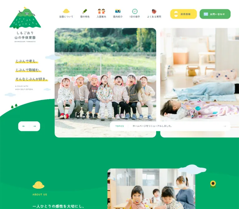
Shimogoori Yamanote Nursery — Style Reference
Everyday nursery life framed by green hills, yellow highlights, and a smiling mountain.
Website / original URL: oita-yamanote.com
Final URL: https://oita-yamanote.com/
Theme: a light canvas with substantial green, yellow, and muted gray sections.
Inspected: September 13, 2026, at 04:48 JST; supplied retrieval timestamp: September 12, 2026, 19:48:48.593 UTC.
Viewports: desktop 1440 × 1000 and mobile 390 × 844 CSS pixels.
Scope: the current nursery homepage: identity and navigation, photographic hero, Topics, About, Contents, recruitment, Instagram, news, contact invitation, and footer. Linked destinations were recorded but their page designs were not inspected.
The homepage serves prospective parents, existing families, and potential staff. Its structure supports browsing nursery information, understanding daily care, checking announcements, and making contact. It is an informational nursery website with several destinations and recurring content sections.
The visual identity combines generous photography with small, cheerful illustrations. White space keeps the upper desktop composition clear; a saturated green landscape connects the hero to the nursery introduction and returns around the contact area and footer. Yellow marks recruitment, selected English headings, the telephone number, and the three-line hero statement. Rounded Japanese lettering and widely tracked English labels soften the interface without making its information hierarchy complicated.
The mobile design changes the composition substantially. A single photograph fills the hero behind the logo and statement, white strips replace the desktop yellow text highlights, navigation collapses into a persistent menu button, and the content directory becomes a vertical sequence. Preserve these changes when adapting the design.
How to Read This Reference
- Measured values come from the supplied rendered element bounds and computed styles. Values are occasionally rounded to two decimal places for readability.
- Visual estimates come from the current desktop and mobile captures. They are explicitly identified, particularly for image corners, illustrated colors, and elements missing from the DOM sample.
- Calculated measurements are arithmetic derived from supplied bounds, such as gaps between adjacent cards. They do not establish the original CSS formula.
- Recommended values, breakpoints, accessibility behavior, and implementation code are adaptations for a new project.
- Token names in this document are descriptive aliases. No nursery-specific custom-property names were supplied.
- Parent typography does not establish the typography of an unsampled child. This matters for bilingual headings whose English word is visibly larger than the sampled heading container's font size.
- The captures show selected regions, while the DOM describes the full homepage. About, Instagram, and parts of the news section have less visual coverage than the hero, content cards, recruitment panel, and footer.
Tokens — Colors
Default Palette
| Name | Value | Suggested token | Evidence and role |
|---|---|---|---|
| Landscape Green | #00a469 |
--color-landscape |
Measured on the desktop About section and both footers. Visually continues through the hero hills and lower-page landscape. |
| Leaf Green | #54b565 |
--color-leaf |
Measured on header and footer contact links. The large contact panel visually uses the same green, although its inner background element was not sampled. |
| Sunshine Yellow | #ffe34d |
--color-sunshine |
Measured on recruitment links, About and Instagram headings, and the telephone link. The recruitment panel and hero highlights visually correspond to this color. |
| Slate Text | #51656f |
--color-ink |
Measured body text, navigation, hero statement, and recruitment copy. Softer than black while retaining clear structure on white. |
| White | #ffffff |
--color-white |
Measured page background, light buttons, and reversed text. Also visible in contact circles, mobile statement strips, and logo variants. |
| Social Gray | #8e9ba1 |
--color-social |
Measured background of the Instagram section at both viewports. |
| Cloud Blue | Approximately #ddf2fa |
--color-cloud |
Visual estimate for the pale illustrated clouds. No exact asset or computed fill was supplied. |
| Fine Divider | Approximately #e9edef |
--color-rule |
Visual estimate for light separators in the Topics and news treatments. |
The two greens have different jobs. Landscape Green carries the broad environment; Leaf Green creates a distinct contact surface within it. Yellow is a recurring accent with specific uses, rather than a universal button color. Recruitment links are yellow with slate lettering; contact links are leaf green with white lettering; secondary section links are white.
The supplied custom properties also contain generic WordPress colors, gradients, and shadows. Their presence does not demonstrate visible use. Do not add those preset colors to this site's palette or interpret their shadows as an elevation system.
Color Behavior
The site alternates white and colored sections instead of recoloring the entire interface through themes. No alternate theme selector or dark mode was evidenced. Reversed logo artwork and white navigation text adapt the identity to the green footer.
Broad fills remain flat. Illustrated curves, photography, and changes in background color provide depth; glossy gradients and translucent cards are not defining treatments.
Tokens — Typography
Rounded Japanese — Navigation and Personality
Measured stack: 'Zen Maru Gothic', serif.
The sampled navigation, hero statement, section-action links, and Japanese section headings declare this family at weight 500. Its rounded forms give short phrases and interface labels a friendly, deliberate rhythm. Preserve medium weight rather than replacing every label with a heavy display face.
The declared fallback is serif. The evidence identifies the computed stack, not the font file or download configuration.
Japanese Body — Practical Information
Measured stack: 'Hiragino Kaku Gothic ProN', 'ヒラギノ角ゴ ProN', sans-serif.
Body copy and news links use weight 400. Most body text is approximately 14px with a 28px line height at both inspected widths. This loose leading is central to the calm reading experience. The desktop About paragraph is slightly larger, approximately 15.70px / 33.14px.
Rounded English — Section Labels and Telephone
Measured stack: Quicksand, sans-serif, weight 500.
This stack is directly evidenced on ABOUT US, CONTENTS, INSTAGRAM, and the telephone number. English text relies on tracking rather than boldness: About and Contents use approximately 0.15em, Instagram uses 0.25em, and the telephone number uses 0.15em.
The large English words inside recruitment and contact headings are visible in the captures, but their child elements were not sampled. Using Quicksand there is a reasonable implementation recommendation, not an independently measured declaration.
Wordmark and Pictograms
The mountain logo and nursery wordmark are visual assets. Their appearance should not be reconstructed from an assumed font. Desktop uses a tall combined identity; mobile separates the mountain emblem and a compact centered wordmark. The footer uses a horizontal white-lettered variant.
Type Scale
| Role | Desktop measurement | Mobile measurement | Notes |
|---|---|---|---|
| Root font size | 8.72px |
10px |
Measured on HTML; the responsive formula was not supplied. |
| General body | 13.952px / 27.904px, weight 400 |
14px / 28px, weight 400 |
Hiragino stack. |
| Desktop navigation | 13.952px / 27.904px, weight 500 |
Not visible in the closed mobile state | Zen Maru Gothic; 0.6976px tracking, equivalent to 0.05em. |
| Header action labels | 14.824px / 27.904px, weight 500 |
Not visible as header pills | Tracking 0.7412px, or 0.05em. |
| Hero statement container | 20.928px / 55.808px, weight 500 |
17px / 28px, weight 500 |
Mobile tracking is 0.85px; separate white strips add their own visible spacing. |
| About English label | 14.824px / 27.904px |
13px / 22px |
Quicksand; tracking 0.15em. |
| About paragraph | 15.696px / 33.136px |
14px / 28px |
White text. |
| Contents English label | 15.696px / 27.904px |
14px / 28px |
Quicksand; tracking 0.15em. |
| Section-action label | 14.824px / 27.904px |
13px; measured line boxes vary by component |
Mobile About uses 28px leading; recruitment and social links use a 52px line box. |
| Instagram heading | 20.928px / 37.496px |
20px / 28px |
Tracking 5.232px desktop and 5px mobile. |
| News link | 13.952px / 27.904px |
14px / 28px |
Regular body stack. |
| Contact paragraph | 13.952px / 27.904px |
14px / 24px |
Mobile uses three visible lines instead of two. |
| Telephone | 20.928px / 27.904px |
20px / 28px |
Quicksand; yellow; tracking 0.15em. |
| Copyright | 10.464px / 27.904px |
10px / 28px |
Tracking 0.25em at both widths. |
Visual estimates: the large desktop RECRUIT and CONTACT words are approximately 32px; mobile CONTACT is approximately 24px. The hero's two-line English caption is approximately 9–10px. Vertical Japanese card labels appear approximately 19–21px on desktop. These child styles were not individually measured.
Do not copy the source's numeric rem values into a project with a conventional root. The Quick Start uses explicit pixel-based adaptation tokens and keeps ordinary body text near 14px.
Tokens — Spacing & Shapes
Spacing System
The measurements contain many multiples of the desktop 8.72px root: 17.44px, 26.16px, 34.88px, and 43.6px. This supports a coordinated scale, but does not prove the authored units or fluid formula. Mobile uses distinct values such as 20px, 30.61px, 40px, 50px, and 70px.
| Use | Desktop | Mobile | Evidence |
|---|---|---|---|
| Main reading-container width | 1081.27px |
328.77px |
Measured About, news-heading, and footer-related bounds. |
| Main reading-container left edge | 179.36px |
30.61px |
Measured; desktop and mobile use different proportional margins. |
| Content-directory outer width | Approximately 1182.89px |
328.77px per card |
Calculated from first and last card bounds. |
| Content-directory horizontal gap | 48.52px |
Single column | Calculated between measured card positions. |
| Content-directory vertical gap | 61.03px |
30px |
Calculated between card rows. |
| Large-panel side inset | 52.32px |
Contact: 20px |
Measured section padding. |
| Standard action left padding | 34.88px |
25px |
Measured links. |
| About section top padding | 115.10px |
95px |
Measured section padding; surrounding shapes and overlapping sections affect its apparent start. |
| Contents bottom padding | 161.32px |
80px |
Measured. |
| Footer vertical padding | 113.36px |
44px top, 70px bottom |
Measured. |
The desktop layout uses several container widths. Do not force the hero, content directory, recruitment panel, and footer into one universal narrow wrapper.
Border Radius
| Element | Value | Status |
|---|---|---|
| Desktop action links | 21.8px |
Measured on header, footer, and section actions. |
| Mobile section actions | 10px |
Measured. |
| Mobile Instagram post links | 6px |
Measured. |
| Desktop hero and directory photographs | Approximately 26–30px |
Visual estimate. |
| Desktop recruitment and contact panels | Approximately 26–30px |
Visual estimate. |
| Mobile Topics and contact panel | Approximately 10px |
Visual estimate. |
| Mobile menu button | Approximately 12px |
Visual estimate. |
| Main contact arrow | Circle | Visible; approximately 100px desktop and 60px mobile. |
The rounded rectangles retain noticeable straight edges. Most are not fully rounded capsules. Circles are reserved for directional actions and small graphic details.
Layout Measurements
| Element | Desktop | Mobile |
|---|---|---|
| Document height | 6382.39px |
5810.97px |
| Header box | 1440 × 174.39px |
390 × 100px, visually over the hero |
| Main identity | 197.06 × 220.61px at approximately (58.42, 41.84) |
Mountain 91 × 66px at (11, 19); separate wordmark 104 × 54px at (143, 26) |
| Hero section | 758.63px high, beginning at y = 174.39px |
560px high, beginning at y = 0 |
| Hero photo panel | Approximately 610 × 681px |
Full-width photographic region within the 390 × 560px hero |
| Topics surface | Approximately 750 × 62px |
Approximately 329 × 76px |
| Directory card link | 361.95 × 366.23px |
328.77 × 220px |
| Standard section action | 191.83 × 62.78px |
About 160 × 52px; recruitment and social 166 × 52px |
| Contact section, including top spacing | 541.95px high |
360px high |
| Mobile contact panel | — | Approximately 350 × 320px, consistent with section padding and capture |
| Footer | 599.03px high |
336.09px high |
Photo and Topics dimensions in this table are visual estimates; their corresponding image or surface elements were not included in the measured sample.
Components
Desktop Identity and Navigation
Role: communicate the nursery identity and make its main information areas immediately accessible.
The tall mountain-and-wordmark asset sits near the upper left and extends below the header's measured height. Six illustrated navigation links form a horizontal row to its right. Each combines a small colored pictogram above a Japanese label. The icon-to-text relationship is supported by a measured 34.88px top padding on these links.
The illustrated vocabulary is consistent: a yellow hat for About, a pencil for features, two children for admission information, a camera for the gallery, a clock for the daily schedule, and a ladybug for frequently asked questions.
Two larger rounded links complete the row:
採用情報: yellow fill, slate label, and a hatching-chick illustration. Measured size:165.67 × 61.53px.お問い合わせ: leaf-green fill, white label, and a pale-blue envelope. Measured size:191.83 × 61.53px.
These links are distinct destinations rather than competing versions of one action. Preserve their color and icon associations in the footer and section links.
Mobile Identity and Menu Button
Role: keep the identity visible while leaving most of the viewport to the photograph.
The mountain emblem moves to the top-left corner. A smaller, separate wordmark is centered near the top. A white menu control occupies approximately 60 × 60px, inset 20px from the top and right. It contains two thin green horizontal lines and a tiny MENU caption, with a subtle shadow visible against the page.
The control appears at the same viewport position in the hero and lower-page captures, supporting a visually persistent menu treatment. Its CSS positioning property was not sampled. The opened menu, focus handling, dismissal behavior, and navigation animation were not exercised.
Photographic Hero
Role: establish the nursery's atmosphere through real care and play.
Desktop uses an asymmetric composition: a white statement rail occupies roughly the first 340px, while large photographs begin at approximately x = 340px, y = 174px. The first image is fully visible; a second starts around x = 976px and continues beyond the right edge. The visible gap is approximately 26px.
The current photographs show children wearing yellow hats on outdoor play equipment and a toddler stepping over low indoor hurdles with staff nearby. Their scale makes facial expressions and staff involvement more important than decorative interface details. Frames have large rounded corners and substantial vertical depth.
The statement is split into three lines:
じぶんで考え、じぶんで取組む、そんなじぶんが好き。
On desktop, narrow yellow highlights sit behind the lower part of each phrase. A much smaller two-line English caption follows. Clouds interrupt the white space, while small trees sit on a broad green hill rising behind the lower composition.
On mobile, the photograph begins at the top of the page and fills the hero width. The statement moves over the image at approximately (40, 143). Each phrase receives its own white rounded backing, creating reliable separation from the photograph. This is a material styling change, not just a smaller version of the desktop rail.
A pair of left/right arrow controls appears in a shared white rounded container near the desktop hero's lower left. Their presence suggests a photo sequence; slide timing, wraparound, dragging, and autoplay were not verified.
Topics Announcement
Role: expose the latest announcement without creating a separate heavy section.
Desktop places a wide white rounded bar across the lower part of the photo area. Its anatomy is a small green TOPICS label, a fine vertical divider, one visible announcement, and a pale right arrow. The visible announcement is 事務員(パート)募集中!!, linked to its news article.
Mobile moves this surface below the main photographic area, overlapping the green landscape. The approximately 329 × 76px card has TOPICS above the announcement instead of beside it. Its left edge aligns with the main 30.61px reading inset, and the arrow remains at the right.
The DOM contains three copies of the same announcement. These should not be treated as three separate editorial items. A rotating or looping implementation is plausible, but its behavior was not independently observed.
About Section
Role: explain the nursery's approach and practical care offering.
Landscape Green carries white copy and a yellow ABOUT US label. The visible mobile opening includes a yellow hat, a small numbered flag, a sunflower, and trees. The central message emphasizes individual sensitivity, growth, and self-esteem.
The supplied text describes the nursery's April 2022 opening, care for ages zero through five, daily opening hours, year-round operation, and care for children recovering from illness. These details create an informational paragraph beneath the more expressive statement.
The white 詳しく見る link uses green text, a rounded rectangular shape, and an arrow treatment. It measures approximately 192 × 63px on desktop and 160 × 52px on mobile.
The DOM establishes the section's text, colors, spacing, and link. The supplied current captures do not establish the complete desktop image arrangement or lower About composition, so those details should remain flexible in an adaptation.
Contents Directory
Role: provide visual entry points into the nursery's main information pages.
Desktop forms a three-column, two-row composition. The CONTENTS heading occupies the first cell; five photographic links occupy the remaining cells. The second row is visible in the supplied capture, showing the gallery, daily schedule, and FAQ cards.
| Japanese label | Recorded English label | Destination |
|---|---|---|
園の特色 |
FEATURE |
/feature/ |
入園案内 |
FEATURE |
/guide/ |
園内紹介 |
INFORMATION |
/gallery/ |
1日の様子 |
SCHEDULE |
/schedule/ |
よくある質問 |
FAQ |
/faq/ |
The repeated FEATURE caption is present in the supplied text. It should not be used to infer that the two links share a destination.
The pictured cards combine a near-square rounded photograph with a white label tab attached to the upper-right area. The tab has a pronounced rounded lower-left corner, a pictogram at the top, a vertical Japanese label, and a much smaller sideways English label beside it. The photograph remains the dominant surface; there is no separate description block or elevated card body.
Current card photographs include children looking through a wooden playhouse window, children exercising in a room, and children eating at a low table with a staff member nearby.
At 390px, the five links stack in a single column. Each measured link is approximately 329 × 220px with a 30px gap. This changes the available photographic ratio from nearly square to approximately 1.49:1. The mobile card-label placement was not visually captured, so retaining or simplifying the vertical tabs is an implementation decision requiring verification.
Recruitment Panel
Role: invite staff applicants using the same care-centered identity as the family-facing content.
A broad yellow rounded panel is inset approximately 52px from the desktop viewport edges. The text group sits left of a photographic collage. A large hatching-chick illustration introduces the heading, where the English RECRUIT word and Japanese 採用情報 label sit across a white marker-like underline.
A short, two-line desktop paragraph describes growing alongside the children and colleagues. The white 詳しく見る link has slate text and a yellow circular arrow inset at its right.
The main staff photograph protrudes above the panel's upper edge. A smaller photograph overlaps below and to its left; pale clouds add a light foreground layer. The visible main photo shows a staff member leading an indoor activity. Preserve the relationship between text, overlapping frames, and empty yellow space.
Mobile measurements place a full-width reading text block above a centered 166 × 52px action. The section becomes approximately 658px tall. The supplied evidence does not show the mobile photo collage, so its exact stacking and cropping are unverified.
Instagram Section
Role: connect the homepage to an ongoing record of nursery life.
The measured background is Social Gray, with a yellow Quicksand heading, white supporting copy, and a white Follow us action. The link points to the nursery's Instagram profile.
Desktop post links occupy a horizontal sequence of approximately 314.55 × 313.91px boxes with calculated 17.44px gaps. Repeated post sets and negative horizontal coordinates are consistent with a looping rail, but they do not establish its movement or speed.
Mobile uses two measured columns of approximately 163.39 × 159px links, with roughly 2px horizontal and vertical gaps and 6px corner radii. Some later post bounds extend beyond the measured section boundary. The number of actually visible rows and the clipping behavior cannot be confirmed from the supplied captures. Do not recreate an apparent overflow solely from these extracted bounds.
News List
Role: provide dated updates in a restrained, scannable format.
Desktop places the bilingual section heading and 一覧を見る link in a left column, with three news rows to the right. The row links measure approximately 859.78px wide and 88–89px high. They use the regular body stack, leaving dates and titles visually quieter than the illustrated directory.
Mobile moves the heading and compact index link onto the same top row. News links extend across approximately the full viewport, while text retains an inner inset. Row heights are 77–78px for shorter items and 101px for the longer visit-information title. Fine horizontal rules separate entries; the visible longer title wraps naturally.
Contact Invitation
Role: turn the informational journey into a clear route for enrollment questions and consultation.
A large leaf-green rounded panel sits above and partly within the final green landscape. A white-bodied mountain mascot overlaps its upper edge. Inside, centered content stacks a yellow CONTACT heading, white お問い合わせ label, a short white paragraph, and a white circular arrow.
The panel's inner heading, paragraph, and action are part of a measured link to /contact/. The green outer surface and the link do not have identical measured bounds on desktop, so do not assume every background pixel was verified as clickable.
Mobile makes the composition especially explicit: a panel approximately 350 × 320px, 20px outer margins, a mascot roughly 110px wide, three lines of body copy, and an approximately 60px arrow circle. The panel's corners appear close to 10px.
Footer
Role: finish with identity, location, direct telephone contact, and navigation.
Landscape Green fills the entire footer. On desktop, a horizontal white-lettered nursery logo, the Oita City address, and the yellow telephone number share the upper row. A second row repeats the illustrated navigation and the recruitment/contact actions between fine translucent white rules. Small, widely tracked white copyright text follows.
The measured desktop logo heading is approximately 395 × 83px; the reading container is approximately 1081px wide. The telephone number uses Quicksand at 20.928px with 3.1392px tracking and is a real tel:097-568-3232 link.
Mobile centers a 320 × 67px logo, then stacks the address and telephone number. The repeated navigation is absent from the visible mobile footer, and the copyright text is shortened. Keep the direct contact details prominent even when the secondary navigation is hidden.
Tokens — Motion & Interaction
| Treatment | Evidence | What remains unverified |
|---|---|---|
| General links | Sampled anchors report a 0.5s transition. |
Affected properties, easing, and actual hover endpoints. |
| About heading reveal | Mobile ABOUT US reports 0.8s forwards fadeUpAnime. |
Keyframe distance, opacity values, trigger logic, and replay behavior. |
| Hero photo sequence | Two adjacent desktop image panels and previous/next arrows are visible. | Autoplay, duration, transition type, drag/swipe support, and control response. |
| Topics sequence | Three duplicate announcement links occur in the DOM; one is visible in the capture. | Rotation interval, direction, pause behavior, and transition. |
| Desktop social rail | Repeated horizontal post sets and offscreen bounds are recorded. | Whether it continuously moves, how fast, and whether hover pauses it. |
| Mobile menu | Menu control remains at the same viewport location in top and bottom captures. | Open state, overlay appearance, keyboard behavior, and animation. |
| Navigation and contact | Link destinations, including the telephone URI, are recorded. | Destination rendering and submission behavior. |
The observation process waited at least five seconds initially and attempted to settle finite motion and image decoding. Perpetual animations were temporarily paused during readiness checks and then resumed. A settled screenshot is not evidence that the interface has no motion.
Recommended adaptation: use restrained fades or short directional changes. A 500ms link transition can preserve the measured pacing, but its visual endpoint must be chosen explicitly. Keep any carousel independently operable and provide a static reduced-motion presentation. Do not invent bouncing mascots, parallax photography, or cloud animation as source behavior.
Surfaces
| Surface | Appearance | Purpose |
|---|---|---|
| Main canvas | Flat white | Breathing room around navigation, photographs, and news. |
| Landscape | Saturated green with broad curved boundaries | Connects the hero, About content, contact area, and footer. |
| Contact panel | Lighter green, rounded corners | Creates a distinct invitation inside the darker landscape. |
| Recruitment panel | Yellow, rounded corners | Gives recruitment a recognizable destination color. |
| Social section | Muted gray | Separates ongoing social content from the principal information areas. |
| Photo frame | Large image, rounded clipping, no visible heavy border | Makes actual nursery activity the main evidence. |
| Directory label tab | White with a rounded lower-left corner | Carries vertical bilingual labels over photography. |
| Utility/action surface | White rounded rectangle or circle | Provides legible, compact directional controls. |
| Mobile menu | White rounded square with a faint shadow | Keeps a persistent control distinguishable on photos and white content. |
There is no evidenced general card-elevation system. The mobile menu's subtle shadow is a local detail, not a reason to add shadows to every photograph and panel.
Imagery
Photography is natural, bright, and activity-based. The supplied current images show play, movement, meals, and staff participation. Warm wooden interiors and children's colorful hats complement the limited interface palette without requiring a uniform photographic color filter.
Use crops that retain the relationship between children, staff, and the activity. The desktop hero's tall frames and the mobile full-width crop require separate focal-point checks. A crop that works for a group on outdoor equipment may not work for a toddler taking a step beside a seated adult.
Illustrations are small, colorful, and slightly irregular: the smiling mountain with a tiny yellow bird, miniature trees, fluffy clouds, a sunflower, a flag, nursery objects, insects, and a chick emerging from an egg. They create a coherent nursery environment. Their identity depends on artwork; default platform emoji would vary across devices and may not reproduce the observed forms.
Observed Asset References
No image source URLs or asset filenames were included in the supplied original-page evidence. The references below identify visible roles without inventing paths.
| Asset group | Current observed use | Reuse guidance |
|---|---|---|
| Tall green mountain logo | Desktop upper-left identity | Preserve the full emblem/wordmark relationship. |
| Separate mobile emblem and wordmark | Mobile hero header | Use separate assets or an authorized responsive lockup. |
| White-bodied mountain and white wordmark | Contact overlap and footer | Preserve the contrasting variant on green. |
| Outdoor play photograph | First visible desktop hero panel | Retain children's faces, hats, and the play equipment. |
| Indoor stepping activity photograph | Second desktop panel and visible mobile hero | Set a deliberate mobile focal point around the child and nearby staff. |
| Playhouse, exercise, and meal photographs | Visible directory cards | Use cover crops that still explain the destination. |
| Staff activity photographs | Recruitment collage | Keep the overlap and mixed frame sizes. |
| Clouds, trees, sunflower, flag, and pictograms | Navigation and section decoration | Treat decorative artwork separately from meaningful labels. |
Use authorized nursery photography and identity assets where available. CSS can approximate containers and landscape curves; it cannot reproduce the specific character illustrations or replace the documentary value of the photographs.
Layout & Responsive Behavior
| Area | Desktop at 1440px |
Mobile at 390px |
|---|---|---|
| Header | Tall left logo; full illustrated navigation and two action pills | Small left emblem, centered wordmark, persistent menu square |
| Hero | White statement rail beside two large photographic panels | Full-width photograph behind statement and identity |
| Statement backing | Yellow marker-like highlights | Individual white rounded strips |
| Hero arrows | Visible near the lower-left corner | Not visible in the supplied mobile capture |
| Topics | Wide single-line bar over the photo area | Narrower two-line card below the main photograph |
| Main text | Approximately 1081px container |
Approximately 329px container |
| Directory | Heading plus five cards in a three-column composition | Heading followed by five single-column links |
| Recruitment | Text beside overlapping photographs | Text and centered action measured; full image arrangement unverified |
| Horizontal post sequence | Two-column post geometry | |
| News | Heading/index column beside rows | Heading and index above full-width rows |
| Contact | Wide panel with larger circular action | 350px panel and approximately 60px circular action |
| Footer | Identity/contact row plus repeated navigation | Centered identity, address, telephone, and copyright |
The mobile hero, Topics, and About section have overlapping measured boxes: the hero ends at y = 560px, Topics spans y = 522–648px, and About begins at y = 600px. The screenshots show a layered landscape around this junction. These bounds should not be converted into a rigid stack of unrelated rectangles.
Only two viewport widths were inspected. The exact navigation breakpoint, intermediate tablet layout, maximum desktop scale, and landscape-phone behavior are unknown. The Quick Start uses a recommended 80rem breakpoint to keep the dense desktop header from becoming crowded; this is not a recovered source breakpoint.
Keep clipped horizontal overflow local to photographic and social rails. Preserve ordinary vertical page scrolling and allow longer Japanese titles to wrap. The 6382px and 5811px document heights are capture measurements, not fixed implementation targets.
Do’s and Don’ts
Do
- Preserve the specific two-green relationship:
#00a469for landscape and#54b565for contact surfaces. - Use yellow for recruitment, selected labels, the telephone number, and small highlights.
- Keep slate text on white and yellow surfaces.
- Use Zen Maru Gothic for expressive Japanese labels, the Hiragino stack for body text, and Quicksand for evidenced English utility roles.
- Let photographs show recognizable nursery activities and staff involvement.
- Preserve the desktop hero's left statement rail and partially visible second photograph.
- Change the hero to an image-backed composition with white statement strips on mobile.
- Keep directory cards predominantly photographic, with compact illustrated label tabs.
- Use broad curves, a small number of overlapping images, and generous white space.
- Maintain the different container widths for reading text, directory cards, and broad panels.
- Keep recruitment and family contact as distinct routes.
- Preserve visible telephone access in the simplified mobile footer.
Don't
- Don't flatten the homepage into a single conversion funnel that removes information destinations, news, or social content.
- Don't replace the palette with unrelated pastel colors because the subject is childcare.
- Don't put every section inside an identical elevated card.
- Don't treat all rounded rectangles as fully pill-shaped controls.
- Don't replace the illustrated icon set with inconsistent platform emoji.
- Don't enlarge the hero statement into a huge headline that overwhelms the photographs.
- Don't keep the desktop navigation row squeezed into a phone viewport.
- Don't assume every duplicate DOM link should appear as a separate visible item.
- Don't infer animations from clouds, smiling characters, or offscreen carousel elements alone.
- Don't use generic WordPress presets as evidence for additional site colors or shadows.
- Don't invent original asset paths, unsampled font declarations, or production authorship.
Recommended Implementation Additions
These recommendations are for a new implementation; they are not verified features of the inspected website.
- Give the menu and carousel arrows accessible names. Use
aria-expandedandaria-controlsfor the menu, and provide keyboard access and predictable focus return. - Keep each directory card as one descriptive link. Hide decorative pictograms from assistive technology when the adjacent label supplies the meaning.
- Ensure the logo has an appropriate accessible name and the page has a meaningful heading hierarchy. An empty text field in the supplied logo-heading sample does not establish whether image alternative text exists.
- Prevent cloned carousel slides from creating repeated keyboard stops or duplicated announcements.
- Check text contrast at its actual size. Small white text on the two greens, and yellow text on green or gray, merit particular attention. Use adjusted text-bearing surfaces where needed while retaining the original colors in illustration and decoration.
- Provide reduced-motion behavior and a pause mechanism if ongoing automatic movement is implemented.
- Set responsive image sizes and explicit dimensions. Prioritize the initial hero image and defer below-the-fold photographs.
- Check focal points at both inspected widths; use per-image
object-positionvalues rather than one global crop rule. - Keep all social content reachable. The supplied extracted post bounds do not justify reproducing clipping that might conceal content.
- Give decorative clouds and landscape layers
pointer-events: noneso they cannot obstruct navigation.
Agent Prompt Guide
Quick Color Reference
- Landscape and footer:
#00a469. - Contact surface:
#54b565. - Recruitment and highlight accent:
#ffe34d. - Main text:
#51656f. - Page, light actions, and label tabs:
#ffffff. - Social section:
#8e9ba1. - Decorative cloud approximation:
#ddf2fa. - Core shape language: large rounded photo frames, small white tabs, circular arrows, and broad illustrated hills.
Overall Prompt
“Create a Japanese nursery homepage inspired by Shimogoori Yamanote Nursery. Use white, landscape green #00a469, leaf green #54b565, sunshine yellow #ffe34d, and slate text #51656f. Combine natural nursery photography with a consistent set of friendly mountain, tree, cloud, and nursery-object illustrations. On desktop, place a tall identity at the upper left, six pictogram-over-label navigation links across the top, and separate recruitment and contact buttons. Build a left-hand statement rail beside large rounded photographs, with a white Topics bar overlapping the lower photo area. Continue through a green About section, photographic directory, yellow recruitment panel, gray social section, restrained news list, green contact invitation, and illustrated footer. Use Zen Maru Gothic for short Japanese labels, the Hiragino body stack, and tracked Quicksand English labels. On mobile, use a full-width photographic hero, white statement strips, a persistent menu button, stacked directory cards, and a centered footer. Treat unverified motion and intermediate breakpoints as implementation decisions.”
Example Component Prompts
- Hero: “At a 1440px viewport, reserve roughly 340px at left for a three-line Japanese statement with narrow yellow highlights. Begin tall, rounded nursery photographs to its right, leaving the second image partially clipped. Add sparse pale clouds, a green hill behind the lower composition, small previous/next controls, and a white Topics bar across the photos.”
- Directory card: “Create a large rounded nursery photograph with a white tab attached at the upper right. Put a small colored pictogram above a vertical Japanese destination label, with a tiny sideways English caption alongside. Use slate lettering and no card shadow or description block.”
- Recruitment: “Build a broad yellow rounded panel with a chick illustration, a bilingual recruitment heading over a white marker line, a short paragraph, and a white action containing a yellow arrow circle. Overlap two rounded staff photographs on the right, allowing the larger one to protrude above the panel.”
- Contact and footer: “Center a leaf-green contact panel within a darker green landscape. Overlap a white-bodied mountain mascot above it. Stack a yellow CONTACT heading, white Japanese copy, and a white circular arrow. Below, show a horizontal white nursery identity, address, and widely tracked yellow telephone number.”
- Mobile adaptation: “At 390px, use a 560px photographic hero with a small emblem at the top left, a centered wordmark, and a 60px white menu square inset 20px at the top right. Position three separate white statement strips around x40/y143. Place a roughly 329px-wide Topics card below the photo and stack directory cards at approximately 329 by 220px with 30px gaps.”
Quick Start
CSS Custom Properties
This is a usable visual scaffold, not recovered source code. Colors and selected dimensions are measured; photograph radii, landscape contours, and unsampled child typography are approximations. The breakpoint, hover endpoint, focus treatment, and reduced-motion rules are recommendations. Keep a conventional root size and load authorized font and image assets separately.
The selectors assume semantic components such as .site-header, .hero, .topics, .content-grid, .recruit-panel, .social-feed, .news-list, .contact-panel, and .site-footer. Each .content-card contains a photograph and .content-tab; each .section-action contains a text label and .action-arrow. Menu and carousel functionality require a separate implementation.
:root {
  /* Measured colors */
  --color-landscape: #00a469;
  --color-leaf: #54b565;
  --color-sunshine: #ffe34d;
  --color-ink: #51656f;
  --color-white: #ffffff;
  --color-social: #8e9ba1;

  /* Visual approximations */
  --color-cloud: #ddf2fa;
  --color-rule: #e9edef;
  --radius-photo: 28px;

  /* Measured font stacks */
  --font-body: 'Hiragino Kaku Gothic ProN',
    'ヒラギノ角ゴ ProN', sans-serif;
  --font-rounded: 'Zen Maru Gothic', serif;
  --font-english: Quicksand, sans-serif;

  /* Adaptation tokens with a conventional root */
  --text-body: 14px;
  --leading-body: 2;
  --radius-action: 21.8px;
  --width-reading: 1081.27px;
  --width-directory: 1184px;
  --panel-inset: clamp(20px, 3.6333vw, 52.32px);
  --motion-link: 500ms;
}

* { box-sizing: border-box; }

body {
  margin: 0;
  color: var(--color-ink);
  background: var(--color-white);
  font: 400 var(--text-body) / var(--leading-body) var(--font-body);
}

img { display: block; max-width: 100%; }
button, a { -webkit-tap-highlight-color: transparent; }
button { font: inherit; }
a { color: inherit; }

.reading-shell {
  width: min(84.3%, var(--width-reading));
  margin-inline: auto;
}

.directory-shell {
  width: min(84.3%, var(--width-directory));
  margin-inline: auto;
}

.panel-shell { margin-inline: var(--panel-inset); }

.site-header {
  position: relative;
  z-index: 10;
  display: flex;
  align-items: center;
  height: 174.39px;
  padding-inline: 22.32vw var(--panel-inset);
}

.brand-desktop {
  position: absolute;
  top: 41.84px;
  left: 4.057vw;
  width: 197.06px;
}

.brand-mobile, .mobile-wordmark, .menu-button { display: none; }

.primary-nav, .nav-links, .header-actions {
  display: flex;
  align-items: center;
}

.primary-nav { width: 100%; gap: 3.9vw; }
.nav-links { flex: 1; justify-content: space-between; gap: 10px; }
.header-actions { gap: 17.44px; }

.nav-link {
  display: grid;
  justify-items: center;
  gap: 6px;
  white-space: nowrap;
  text-decoration: none;
  font: 500 13.952px / 2 var(--font-rounded);
  letter-spacing: 0.05em;
}

.nav-link img { width: 30px; height: 30px; object-fit: contain; }

.header-action {
  display: flex;
  align-items: center;
  justify-content: center;
  gap: 14px;
  min-height: 61.53px;
  padding-inline: 22px;
  border-radius: var(--radius-action);
  text-decoration: none;
  white-space: nowrap;
  font: 500 14.824px / 1.6 var(--font-rounded);
  letter-spacing: 0.05em;
}

.header-action img { width: 28px; height: 36px; object-fit: contain; }
.action-recruit { background: var(--color-sunshine); }
.action-contact { color: white; background: var(--color-leaf); }

.hero {
  position: relative;
  display: grid;
  grid-template-columns: 23.611% minmax(0, 1fr);
  padding-bottom: 78.48px;
}

/* Approximate landscape; use artwork for the original contour. */
.hero::before {
  content: '';
  position: absolute;
  inset: auto 0 0;
  height: 42%;
  border-radius: 65% 0 0 0 / 65% 0 0 0;
  background: var(--color-landscape);
  pointer-events: none;
}

.hero-copy {
  position: relative;
  z-index: 2;
  align-self: center;
  padding-left: 6.6vw;
}

.hero-title {
  margin: 0;
  font: 500 20.928px / 55.808px var(--font-rounded);
}

.hero-line {
  display: table;
  background: linear-gradient(
    transparent 72%, var(--color-sunshine) 72% 89%, transparent 89%
  );
}

.hero-caption {
  margin-top: 14px;
  font-size: 9px;
  line-height: 2.2;
  letter-spacing: 0.15em;
}

.hero-media {
  position: relative;
  z-index: 1;
  height: min(47.232vw, 680.14px);
  overflow: hidden;
}

.hero-track { display: flex; gap: 26.16px; height: 100%; }
.hero-frame { flex: 0 0 42.36vw; margin: 0; overflow: hidden; }
.hero-frame { border-radius: var(--radius-photo); }
.hero-frame img { width: 100%; height: 100%; object-fit: cover; }

.hero-controls {
  position: absolute;
  z-index: 3;
  bottom: 117.72px;
  left: 7.84vw;
  display: flex;
  width: 136px;
  height: 62px;
  padding: 18px 0;
  border-radius: 23px;
  background: white;
}

.hero-controls button {
  flex: 1;
  border: 0;
  color: var(--color-landscape);
  background: transparent;
  cursor: pointer;
}
.hero-controls button + button { border-left: 1px solid var(--color-rule); }

.topics {
  position: absolute;
  z-index: 4;
  right: var(--panel-inset);
  bottom: 117.72px;
  display: grid;
  grid-template-columns: 78px minmax(0, 1fr);
  align-items: center;
  gap: 28px;
  width: min(750px, 52.1%);
  min-height: 62px;
  padding: 15px 35px;
  border-radius: var(--radius-action);
  background: white;
}

.topics-label {
  color: var(--color-landscape);
  border-right: 1px solid var(--color-rule);
  font: 500 12px / 1.5 var(--font-english);
  letter-spacing: 0.12em;
}

.topics-link {
  display: flex;
  align-items: center;
  justify-content: space-between;
  gap: 16px;
  min-width: 0;
  text-decoration: none;
}

.about-section {
  padding: 115.1px 0 100px;
  color: white;
  background: var(--color-landscape);
}

.eyebrow {
  margin: 0 0 18px;
  font: 500 14.824px / 1.9 var(--font-english);
  letter-spacing: 0.15em;
}
.about-section .eyebrow { color: var(--color-sunshine); }
.about-copy { max-width: 42em; }
.about-copy p { font-size: 15.696px; line-height: 2.11; }

.section-action {
  display: flex;
  align-items: center;
  justify-content: space-between;
  width: 191.83px;
  min-height: 62.78px;
  padding: 10px 17.44px 10px 34.88px;
  border-radius: var(--radius-action);
  color: var(--color-ink);
  background: white;
  text-decoration: none;
  font: 500 14.824px / 1.6 var(--font-rounded);
}

.action-arrow {
  display: grid;
  place-items: center;
  flex: 0 0 31px;
  height: 31px;
  border-radius: 50%;
  background: var(--color-sunshine);
  transition: transform var(--motion-link);
}
.about-section .section-action { color: var(--color-landscape); }

.content-grid {
  display: grid;
  grid-template-columns: repeat(3, minmax(0, 1fr));
  gap: 61.04px 48.52px;
  align-items: center;
  padding-block: 160px;
}

.content-card {
  position: relative;
  display: block;
  height: 366.23px;
  text-decoration: none;
}

.content-card > img {
  width: 100%;
  height: 100%;
  border-radius: var(--radius-photo);
  object-fit: cover;
}

/* Tab offsets and child type are visual approximations. */
.content-tab {
  position: absolute;
  top: -24px;
  right: 0;
  display: grid;
  justify-items: center;
  gap: 10px;
  padding: 16px 16px 24px;
  border-bottom-left-radius: 28px;
  background: white;
}

.content-tab > img { width: 30px; height: 30px; object-fit: contain; }
.tab-labels { display: flex; align-items: flex-start; gap: 5px; }
.tab-japanese {
  writing-mode: vertical-rl;
  text-orientation: upright;
  font: 500 20px / 1.1 var(--font-rounded);
}
.tab-english {
  writing-mode: vertical-rl;
  color: var(--color-social);
  font: 500 9px / 1.2 var(--font-english);
  letter-spacing: 0.1em;
}

.recruit-panel {
  display: grid;
  grid-template-columns: 1.15fr 1fr;
  align-items: center;
  gap: 64px;
  padding: 90px 12%;
  border-radius: var(--radius-photo);
  background: var(--color-sunshine);
}

.section-heading { font: 500 14.824px / 1.8 var(--font-rounded); }
.section-heading .english {
  font: 500 32px / 1.2 var(--font-english);
  letter-spacing: 0.15em;
}

.recruit-media { position: relative; min-height: 340px; }
.recruit-photo {
  width: 88%;
  aspect-ratio: 1.12;
  border-radius: var(--radius-photo);
  object-fit: cover;
}
.recruit-photo-secondary {
  position: absolute;
  bottom: -45px;
  left: -18%;
  width: 64%;
}

.social-section {
  margin-top: 150px;
  padding-block: 165.68px;
  color: white;
  background: var(--color-social);
}
.social-section .eyebrow { color: var(--color-sunshine); font-size: 21px; }
.social-feed { display: flex; gap: 17.44px; margin-top: 40px; overflow: hidden; }
.social-post { flex: 0 0 314.55px; aspect-ratio: 1; }
.social-post img { width: 100%; height: 100%; object-fit: cover; }

.news-layout {
  display: grid;
  grid-template-columns: 170px minmax(0, 1fr);
  gap: 51.48px;
  padding-block: 150px 100px;
}
.news-list { margin: 0; padding: 0; list-style: none; }
.news-row {
  display: grid;
  grid-template-columns: 90px minmax(0, 1fr);
  align-items: center;
  gap: 24px;
  min-height: 88px;
  padding-block: 18px;
  border-bottom: 1px solid var(--color-rule);
  text-decoration: none;
}
.news-row time { font-size: 11px; color: var(--color-social); }

.contact-zone {
  padding-top: 40px;
  background: linear-gradient(white 50%, var(--color-landscape) 50%);
}
.contact-panel {
  position: relative;
  min-height: 501px;
  padding: 139px 24px 100px;
  border-radius: var(--radius-photo);
  color: white;
  background: var(--color-leaf);
  text-align: center;
}
.contact-mascot {
  position: absolute;
  top: -50px;
  left: 50%;
  width: 170px;
  transform: translateX(-50%);
}
.contact-link { display: block; color: inherit; text-decoration: none; }
.contact-panel .english { display: block; color: var(--color-sunshine); }
.contact-circle {
  display: grid;
  place-items: center;
  width: 100px;
  height: 100px;
  margin: 20px auto 0;
  border-radius: 50%;
  color: var(--color-landscape);
  background: white;
}

.site-footer { padding-block: 113.36px; color: white; background: var(--color-landscape); }
.footer-top { display: flex; align-items: center; justify-content: space-between; gap: 24px; }
.footer-logo { width: 395px; }
.footer-phone {
  color: var(--color-sunshine);
  text-decoration: none;
  white-space: nowrap;
  font: 500 20.928px / 1.4 var(--font-english);
  letter-spacing: 0.15em;
}
.footer-nav {
  margin-block: 54px;
  padding-block: 46px;
  border-block: 1px solid rgb(255 255 255 / 20%);
}
.copyright { font-size: 10.464px; letter-spacing: 0.25em; }

/* Recommended breakpoint; the source breakpoint was not supplied. */
@media (max-width: 79.99rem) {
  .site-header { position: absolute; inset: 0 0 auto; height: 100px; padding: 0; }
  .primary-nav, .brand-desktop { display: none; }
  .brand-mobile { display: block; position: absolute; top: 19px; left: 11px; width: 91px; }
  .mobile-wordmark { display: block; position: absolute; top: 26px; left: 50%; width: 104px; transform: translateX(-50%); }
  .menu-button {
    position: fixed;
    top: 20px;
    right: 20px;
    z-index: 30;
    display: grid;
    place-content: center;
    gap: 6px;
    width: 60px;
    height: 60px;
    border: 0;
    border-radius: 12px;
    color: var(--color-landscape);
    background: white;
    box-shadow: 0 4px 20px rgb(0 0 0 / 6%);
    cursor: pointer;
  }
  .menu-line { display: block; width: 27px; height: 1px; background: currentColor; }
  .menu-caption { font: 500 7px / 1.2 var(--font-english); letter-spacing: 0.1em; }

  .hero { display: block; height: 560px; padding: 0; }
  .hero-media { height: 560px; }
  .hero-frame { flex-basis: 100%; border-radius: 0; }
  .hero-copy { position: absolute; top: 143px; left: 40px; padding: 0; }
  .hero-title { font-size: 17px; line-height: 28px; letter-spacing: 0.05em; }
  .hero-line { margin-bottom: 12px; padding-inline: 8px; border-radius: 6px; background: white; }
  .hero-caption { margin-top: 6px; }
  .hero-controls { display: none; }
  .hero::before { z-index: 2; bottom: -40px; height: 78px; border-radius: 60% 45% 0 0 / 80% 60% 0 0; }
  .topics {
    top: 572px;
    bottom: auto;
    right: 7.85%;
    left: 7.85%;
    grid-template-columns: minmax(0, 1fr);
    gap: 0;
    width: auto;
    min-height: 76px;
    padding: 14px 20px;
    border-radius: 10px;
  }
  .topics-label { border: 0; }

  .about-section { padding: 135px 0 50px; }
  .about-copy p { font-size: 14px; line-height: 2; }
  .eyebrow { font-size: 13px; }
  .section-action { width: 166px; min-height: 52px; padding-left: 25px; border-radius: 10px; font-size: 13px; }
  .about-section .section-action { width: 160px; }
  .action-arrow { flex-basis: 27px; height: 27px; }

  .content-grid { grid-template-columns: minmax(0, 1fr); gap: 30px; padding-block: 70px 80px; }
  .contents-heading { text-align: center; }
  .content-card { height: 220px; }
  .recruit-panel { grid-template-columns: minmax(0, 1fr); gap: 36px; padding: 60px 20px; }
  .recruit-panel .section-action { margin-inline: auto; }
  .recruit-media { min-height: 260px; }
  .section-heading .english { font-size: 24px; }

  .social-section { margin-top: 100px; padding-block: 40px 50px; }
  .social-section .section-action { margin-inline: auto; }
  .social-feed { display: grid; grid-template-columns: repeat(2, minmax(0, 1fr)); gap: 2px; overflow: visible; }
  .social-post { min-width: 0; overflow: hidden; border-radius: 6px; }
  .news-layout { grid-template-columns: minmax(0, 1fr); gap: 15px; padding-block: 70px; }
  .news-row { grid-template-columns: minmax(0, 1fr); gap: 2px; min-height: 77px; padding-block: 14px; }

  .contact-panel { min-height: 320px; padding: 65px 16px 35px; border-radius: 10px; }
  .contact-panel p { line-height: 24px; }
  .contact-mascot { top: -40px; width: 110px; }
  .contact-circle { width: 60px; height: 60px; }
  .site-footer { padding-block: 44px 70px; }
  .footer-top { flex-direction: column; gap: 22px; text-align: center; }
  .footer-logo { width: 320px; max-width: 100%; }
  .footer-phone { font-size: 20px; }
  .footer-nav { display: none; }
  .copyright { margin-top: 44px; text-align: center; font-size: 10px; }
}

/* Recommended interaction endpoints and accessibility treatments. */
@media (hover: hover) {
  .section-action:hover .action-arrow { transform: translateX(3px); }
}

:focus-visible { outline: 2px solid var(--color-ink); outline-offset: 4px; }

@media (prefers-reduced-motion: reduce) {
  .hero-track, .social-feed, .action-arrow, .eyebrow {
    animation: none !important;
    transition: none !important;
    scroll-behavior: auto;
  }
}
The two-stop background on .contact-zone creates a flat white/green boundary behind the panel; it is not a decorative gradient effect. Replace the approximate hero curve and contact boundary with authorized landscape artwork when closer visual fidelity is required. JavaScript-driven movement must also respond to reduced-motion preferences; the CSS rule alone cannot stop it.
Tailwind v4 Token Mapping
Optional aliases for an existing Tailwind v4 project. This mapping does not imply that the original website uses Tailwind.
@theme inline {
  --color-landscape: #00a469;
  --color-leaf: #54b565;
  --color-sunshine: #ffe34d;
  --color-ink: #51656f;
  --color-social: #8e9ba1;
  --color-cloud: #ddf2fa;

  --font-body: 'Hiragino Kaku Gothic ProN', 'ヒラギノ角ゴ ProN', sans-serif;
  --font-rounded: 'Zen Maru Gothic', serif;
  --font-english: Quicksand, sans-serif;

  --radius-action: 21.8px;
  --radius-photo: 28px;
  --radius-mobile: 10px;
  --text-body: 14px;
  --text-hero: 20.928px;
  --text-mobile-hero: 17px;
}
Sources & Evidence
- Original and final website: https://oita-yamanote.com/. The supplied observation reports HTTP
200with no URL change. The homepage identity, visible footer, text, and links identify the nursery described here. - Capture date: supplied retrieval timestamp
2026-09-12T19:48:48.593Z, equivalent to September 13, 2026, at 04:48 JST. - Desktop evidence:
1440 × 1000CSS-pixel viewport; three supplied current-page captures covering the hero, directory/recruitment region, and contact/footer region. Rendered document height: approximately6382.39px. - Mobile evidence:
390 × 844CSS-pixel viewport; two supplied current-page captures covering the hero/About opening and news/contact/footer region. Rendered document height: approximately5810.97px. - DOM and computed styles: supplied element bounds, font-family declarations, sizes, colors, line heights, tracking, padding, border radii, transitions, one named reveal animation, and link destinations at both widths.
- Inspection procedure: the supplied browser observation waited for document load, visible image decoding, and sampled layout/text stability, with finite-animation readiness checks. Initial observation lasted at least five seconds. These checks do not prove that delayed content or all interactions were exercised.
- Limitations: no opened mobile menu, tested carousel controls, hover-state sequence, form flow, destination-page inspection, raw keyframes, complete stylesheet, or original asset paths were supplied. Some repeated/offscreen element bounds cannot establish what was visible through clipping. Image placement and child styles outside the supplied captures remain unverified.
This reference describes the current homepage supported by the supplied captures and rendered evidence. Estimates and implementation recommendations are separated from measurements throughout.
# Shimogoori Yamanote Nursery — Style Reference

> Everyday nursery life framed by green hills, yellow highlights, and a smiling mountain.

**Website / original URL:** [oita-yamanote.com](https://oita-yamanote.com/)
**Final URL:** [https://oita-yamanote.com/](https://oita-yamanote.com/)
**Theme:** a light canvas with substantial green, yellow, and muted gray sections.
**Inspected:** September 13, 2026, at 04:48 JST; supplied retrieval timestamp: September 12, 2026, `19:48:48.593 UTC`.
**Viewports:** desktop `1440 × 1000` and mobile `390 × 844` CSS pixels.
**Scope:** the current nursery homepage: identity and navigation, photographic hero, Topics, About, Contents, recruitment, Instagram, news, contact invitation, and footer. Linked destinations were recorded but their page designs were not inspected.

The homepage serves prospective parents, existing families, and potential staff. Its structure supports browsing nursery information, understanding daily care, checking announcements, and making contact. It is an informational nursery website with several destinations and recurring content sections.

The visual identity combines generous photography with small, cheerful illustrations. White space keeps the upper desktop composition clear; a saturated green landscape connects the hero to the nursery introduction and returns around the contact area and footer. Yellow marks recruitment, selected English headings, the telephone number, and the three-line hero statement. Rounded Japanese lettering and widely tracked English labels soften the interface without making its information hierarchy complicated.

The mobile design changes the composition substantially. A single photograph fills the hero behind the logo and statement, white strips replace the desktop yellow text highlights, navigation collapses into a persistent menu button, and the content directory becomes a vertical sequence. Preserve these changes when adapting the design.

## How to Read This Reference

- **Measured** values come from the supplied rendered element bounds and computed styles. Values are occasionally rounded to two decimal places for readability.
- **Visual estimates** come from the current desktop and mobile captures. They are explicitly identified, particularly for image corners, illustrated colors, and elements missing from the DOM sample.
- **Calculated** measurements are arithmetic derived from supplied bounds, such as gaps between adjacent cards. They do not establish the original CSS formula.
- **Recommended** values, breakpoints, accessibility behavior, and implementation code are adaptations for a new project.
- Token names in this document are descriptive aliases. No nursery-specific custom-property names were supplied.
- Parent typography does not establish the typography of an unsampled child. This matters for bilingual headings whose English word is visibly larger than the sampled heading container's font size.
- The captures show selected regions, while the DOM describes the full homepage. About, Instagram, and parts of the news section have less visual coverage than the hero, content cards, recruitment panel, and footer.

## Tokens — Colors

### Default Palette

| Name | Value | Suggested token | Evidence and role |
| --- | --- | --- | --- |
| Landscape Green | `#00a469` | `--color-landscape` | Measured on the desktop About section and both footers. Visually continues through the hero hills and lower-page landscape. |
| Leaf Green | `#54b565` | `--color-leaf` | Measured on header and footer contact links. The large contact panel visually uses the same green, although its inner background element was not sampled. |
| Sunshine Yellow | `#ffe34d` | `--color-sunshine` | Measured on recruitment links, About and Instagram headings, and the telephone link. The recruitment panel and hero highlights visually correspond to this color. |
| Slate Text | `#51656f` | `--color-ink` | Measured body text, navigation, hero statement, and recruitment copy. Softer than black while retaining clear structure on white. |
| White | `#ffffff` | `--color-white` | Measured page background, light buttons, and reversed text. Also visible in contact circles, mobile statement strips, and logo variants. |
| Social Gray | `#8e9ba1` | `--color-social` | Measured background of the Instagram section at both viewports. |
| Cloud Blue | Approximately `#ddf2fa` | `--color-cloud` | Visual estimate for the pale illustrated clouds. No exact asset or computed fill was supplied. |
| Fine Divider | Approximately `#e9edef` | `--color-rule` | Visual estimate for light separators in the Topics and news treatments. |

The two greens have different jobs. Landscape Green carries the broad environment; Leaf Green creates a distinct contact surface within it. Yellow is a recurring accent with specific uses, rather than a universal button color. Recruitment links are yellow with slate lettering; contact links are leaf green with white lettering; secondary section links are white.

The supplied custom properties also contain generic WordPress colors, gradients, and shadows. Their presence does not demonstrate visible use. Do not add those preset colors to this site's palette or interpret their shadows as an elevation system.

### Color Behavior

The site alternates white and colored sections instead of recoloring the entire interface through themes. No alternate theme selector or dark mode was evidenced. Reversed logo artwork and white navigation text adapt the identity to the green footer.

Broad fills remain flat. Illustrated curves, photography, and changes in background color provide depth; glossy gradients and translucent cards are not defining treatments.

## Tokens — Typography

### Rounded Japanese — Navigation and Personality

**Measured stack:** `'Zen Maru Gothic', serif`.

The sampled navigation, hero statement, section-action links, and Japanese section headings declare this family at weight `500`. Its rounded forms give short phrases and interface labels a friendly, deliberate rhythm. Preserve medium weight rather than replacing every label with a heavy display face.

The declared fallback is `serif`. The evidence identifies the computed stack, not the font file or download configuration.

### Japanese Body — Practical Information

**Measured stack:** `'Hiragino Kaku Gothic ProN', 'ヒラギノ角ゴ ProN', sans-serif`.

Body copy and news links use weight `400`. Most body text is approximately `14px` with a `28px` line height at both inspected widths. This loose leading is central to the calm reading experience. The desktop About paragraph is slightly larger, approximately `15.70px / 33.14px`.

### Rounded English — Section Labels and Telephone

**Measured stack:** `Quicksand, sans-serif`, weight `500`.

This stack is directly evidenced on `ABOUT US`, `CONTENTS`, `INSTAGRAM`, and the telephone number. English text relies on tracking rather than boldness: About and Contents use approximately `0.15em`, Instagram uses `0.25em`, and the telephone number uses `0.15em`.

The large English words inside recruitment and contact headings are visible in the captures, but their child elements were not sampled. Using Quicksand there is a reasonable implementation recommendation, not an independently measured declaration.

### Wordmark and Pictograms

The mountain logo and nursery wordmark are visual assets. Their appearance should not be reconstructed from an assumed font. Desktop uses a tall combined identity; mobile separates the mountain emblem and a compact centered wordmark. The footer uses a horizontal white-lettered variant.

### Type Scale

| Role | Desktop measurement | Mobile measurement | Notes |
| --- | --- | --- | --- |
| Root font size | `8.72px` | `10px` | Measured on HTML; the responsive formula was not supplied. |
| General body | `13.952px / 27.904px`, weight `400` | `14px / 28px`, weight `400` | Hiragino stack. |
| Desktop navigation | `13.952px / 27.904px`, weight `500` | Not visible in the closed mobile state | Zen Maru Gothic; `0.6976px` tracking, equivalent to `0.05em`. |
| Header action labels | `14.824px / 27.904px`, weight `500` | Not visible as header pills | Tracking `0.7412px`, or `0.05em`. |
| Hero statement container | `20.928px / 55.808px`, weight `500` | `17px / 28px`, weight `500` | Mobile tracking is `0.85px`; separate white strips add their own visible spacing. |
| About English label | `14.824px / 27.904px` | `13px / 22px` | Quicksand; tracking `0.15em`. |
| About paragraph | `15.696px / 33.136px` | `14px / 28px` | White text. |
| Contents English label | `15.696px / 27.904px` | `14px / 28px` | Quicksand; tracking `0.15em`. |
| Section-action label | `14.824px / 27.904px` | `13px`; measured line boxes vary by component | Mobile About uses `28px` leading; recruitment and social links use a `52px` line box. |
| Instagram heading | `20.928px / 37.496px` | `20px / 28px` | Tracking `5.232px` desktop and `5px` mobile. |
| News link | `13.952px / 27.904px` | `14px / 28px` | Regular body stack. |
| Contact paragraph | `13.952px / 27.904px` | `14px / 24px` | Mobile uses three visible lines instead of two. |
| Telephone | `20.928px / 27.904px` | `20px / 28px` | Quicksand; yellow; tracking `0.15em`. |
| Copyright | `10.464px / 27.904px` | `10px / 28px` | Tracking `0.25em` at both widths. |

**Visual estimates:** the large desktop `RECRUIT` and `CONTACT` words are approximately `32px`; mobile `CONTACT` is approximately `24px`. The hero's two-line English caption is approximately `9–10px`. Vertical Japanese card labels appear approximately `19–21px` on desktop. These child styles were not individually measured.

Do not copy the source's numeric rem values into a project with a conventional root. The Quick Start uses explicit pixel-based adaptation tokens and keeps ordinary body text near `14px`.

## Tokens — Spacing & Shapes

### Spacing System

The measurements contain many multiples of the desktop `8.72px` root: `17.44px`, `26.16px`, `34.88px`, and `43.6px`. This supports a coordinated scale, but does not prove the authored units or fluid formula. Mobile uses distinct values such as `20px`, `30.61px`, `40px`, `50px`, and `70px`.

| Use | Desktop | Mobile | Evidence |
| --- | --- | --- | --- |
| Main reading-container width | `1081.27px` | `328.77px` | Measured About, news-heading, and footer-related bounds. |
| Main reading-container left edge | `179.36px` | `30.61px` | Measured; desktop and mobile use different proportional margins. |
| Content-directory outer width | Approximately `1182.89px` | `328.77px` per card | Calculated from first and last card bounds. |
| Content-directory horizontal gap | `48.52px` | Single column | Calculated between measured card positions. |
| Content-directory vertical gap | `61.03px` | `30px` | Calculated between card rows. |
| Large-panel side inset | `52.32px` | Contact: `20px` | Measured section padding. |
| Standard action left padding | `34.88px` | `25px` | Measured links. |
| About section top padding | `115.10px` | `95px` | Measured section padding; surrounding shapes and overlapping sections affect its apparent start. |
| Contents bottom padding | `161.32px` | `80px` | Measured. |
| Footer vertical padding | `113.36px` | `44px` top, `70px` bottom | Measured. |

The desktop layout uses several container widths. Do not force the hero, content directory, recruitment panel, and footer into one universal narrow wrapper.

### Border Radius

| Element | Value | Status |
| --- | --- | --- |
| Desktop action links | `21.8px` | Measured on header, footer, and section actions. |
| Mobile section actions | `10px` | Measured. |
| Mobile Instagram post links | `6px` | Measured. |
| Desktop hero and directory photographs | Approximately `26–30px` | Visual estimate. |
| Desktop recruitment and contact panels | Approximately `26–30px` | Visual estimate. |
| Mobile Topics and contact panel | Approximately `10px` | Visual estimate. |
| Mobile menu button | Approximately `12px` | Visual estimate. |
| Main contact arrow | Circle | Visible; approximately `100px` desktop and `60px` mobile. |

The rounded rectangles retain noticeable straight edges. Most are not fully rounded capsules. Circles are reserved for directional actions and small graphic details.

### Layout Measurements

| Element | Desktop | Mobile |
| --- | --- | --- |
| Document height | `6382.39px` | `5810.97px` |
| Header box | `1440 × 174.39px` | `390 × 100px`, visually over the hero |
| Main identity | `197.06 × 220.61px` at approximately `(58.42, 41.84)` | Mountain `91 × 66px` at `(11, 19)`; separate wordmark `104 × 54px` at `(143, 26)` |
| Hero section | `758.63px` high, beginning at `y = 174.39px` | `560px` high, beginning at `y = 0` |
| Hero photo panel | Approximately `610 × 681px` | Full-width photographic region within the `390 × 560px` hero |
| Topics surface | Approximately `750 × 62px` | Approximately `329 × 76px` |
| Directory card link | `361.95 × 366.23px` | `328.77 × 220px` |
| Standard section action | `191.83 × 62.78px` | About `160 × 52px`; recruitment and social `166 × 52px` |
| Contact section, including top spacing | `541.95px` high | `360px` high |
| Mobile contact panel | — | Approximately `350 × 320px`, consistent with section padding and capture |
| Footer | `599.03px` high | `336.09px` high |

Photo and Topics dimensions in this table are visual estimates; their corresponding image or surface elements were not included in the measured sample.

## Components

### Desktop Identity and Navigation

**Role:** communicate the nursery identity and make its main information areas immediately accessible.

The tall mountain-and-wordmark asset sits near the upper left and extends below the header's measured height. Six illustrated navigation links form a horizontal row to its right. Each combines a small colored pictogram above a Japanese label. The icon-to-text relationship is supported by a measured `34.88px` top padding on these links.

The illustrated vocabulary is consistent: a yellow hat for About, a pencil for features, two children for admission information, a camera for the gallery, a clock for the daily schedule, and a ladybug for frequently asked questions.

Two larger rounded links complete the row:

- **`採用情報`:** yellow fill, slate label, and a hatching-chick illustration. Measured size: `165.67 × 61.53px`.
- **`お問い合わせ`:** leaf-green fill, white label, and a pale-blue envelope. Measured size: `191.83 × 61.53px`.

These links are distinct destinations rather than competing versions of one action. Preserve their color and icon associations in the footer and section links.

### Mobile Identity and Menu Button

**Role:** keep the identity visible while leaving most of the viewport to the photograph.

The mountain emblem moves to the top-left corner. A smaller, separate wordmark is centered near the top. A white menu control occupies approximately `60 × 60px`, inset `20px` from the top and right. It contains two thin green horizontal lines and a tiny `MENU` caption, with a subtle shadow visible against the page.

The control appears at the same viewport position in the hero and lower-page captures, supporting a visually persistent menu treatment. Its CSS positioning property was not sampled. The opened menu, focus handling, dismissal behavior, and navigation animation were not exercised.

### Photographic Hero

**Role:** establish the nursery's atmosphere through real care and play.

Desktop uses an asymmetric composition: a white statement rail occupies roughly the first `340px`, while large photographs begin at approximately `x = 340px`, `y = 174px`. The first image is fully visible; a second starts around `x = 976px` and continues beyond the right edge. The visible gap is approximately `26px`.

The current photographs show children wearing yellow hats on outdoor play equipment and a toddler stepping over low indoor hurdles with staff nearby. Their scale makes facial expressions and staff involvement more important than decorative interface details. Frames have large rounded corners and substantial vertical depth.

The statement is split into three lines:

- `じぶんで考え、`
- `じぶんで取組む、`
- `そんなじぶんが好き。`

On desktop, narrow yellow highlights sit behind the lower part of each phrase. A much smaller two-line English caption follows. Clouds interrupt the white space, while small trees sit on a broad green hill rising behind the lower composition.

On mobile, the photograph begins at the top of the page and fills the hero width. The statement moves over the image at approximately `(40, 143)`. Each phrase receives its own white rounded backing, creating reliable separation from the photograph. This is a material styling change, not just a smaller version of the desktop rail.

A pair of left/right arrow controls appears in a shared white rounded container near the desktop hero's lower left. Their presence suggests a photo sequence; slide timing, wraparound, dragging, and autoplay were not verified.

### Topics Announcement

**Role:** expose the latest announcement without creating a separate heavy section.

Desktop places a wide white rounded bar across the lower part of the photo area. Its anatomy is a small green `TOPICS` label, a fine vertical divider, one visible announcement, and a pale right arrow. The visible announcement is `事務員(パート)募集中!!`, linked to its news article.

Mobile moves this surface below the main photographic area, overlapping the green landscape. The approximately `329 × 76px` card has `TOPICS` above the announcement instead of beside it. Its left edge aligns with the main `30.61px` reading inset, and the arrow remains at the right.

The DOM contains three copies of the same announcement. These should not be treated as three separate editorial items. A rotating or looping implementation is plausible, but its behavior was not independently observed.

### About Section

**Role:** explain the nursery's approach and practical care offering.

Landscape Green carries white copy and a yellow `ABOUT US` label. The visible mobile opening includes a yellow hat, a small numbered flag, a sunflower, and trees. The central message emphasizes individual sensitivity, growth, and self-esteem.

The supplied text describes the nursery's April 2022 opening, care for ages zero through five, daily opening hours, year-round operation, and care for children recovering from illness. These details create an informational paragraph beneath the more expressive statement.

The white `詳しく見る` link uses green text, a rounded rectangular shape, and an arrow treatment. It measures approximately `192 × 63px` on desktop and `160 × 52px` on mobile.

The DOM establishes the section's text, colors, spacing, and link. The supplied current captures do not establish the complete desktop image arrangement or lower About composition, so those details should remain flexible in an adaptation.

### Contents Directory

**Role:** provide visual entry points into the nursery's main information pages.

Desktop forms a three-column, two-row composition. The `CONTENTS` heading occupies the first cell; five photographic links occupy the remaining cells. The second row is visible in the supplied capture, showing the gallery, daily schedule, and FAQ cards.

| Japanese label | Recorded English label | Destination |
| --- | --- | --- |
| `園の特色` | `FEATURE` | `/feature/` |
| `入園案内` | `FEATURE` | `/guide/` |
| `園内紹介` | `INFORMATION` | `/gallery/` |
| `1日の様子` | `SCHEDULE` | `/schedule/` |
| `よくある質問` | `FAQ` | `/faq/` |

The repeated `FEATURE` caption is present in the supplied text. It should not be used to infer that the two links share a destination.

The pictured cards combine a near-square rounded photograph with a white label tab attached to the upper-right area. The tab has a pronounced rounded lower-left corner, a pictogram at the top, a vertical Japanese label, and a much smaller sideways English label beside it. The photograph remains the dominant surface; there is no separate description block or elevated card body.

Current card photographs include children looking through a wooden playhouse window, children exercising in a room, and children eating at a low table with a staff member nearby.

At `390px`, the five links stack in a single column. Each measured link is approximately `329 × 220px` with a `30px` gap. This changes the available photographic ratio from nearly square to approximately `1.49:1`. The mobile card-label placement was not visually captured, so retaining or simplifying the vertical tabs is an implementation decision requiring verification.

### Recruitment Panel

**Role:** invite staff applicants using the same care-centered identity as the family-facing content.

A broad yellow rounded panel is inset approximately `52px` from the desktop viewport edges. The text group sits left of a photographic collage. A large hatching-chick illustration introduces the heading, where the English `RECRUIT` word and Japanese `採用情報` label sit across a white marker-like underline.

A short, two-line desktop paragraph describes growing alongside the children and colleagues. The white `詳しく見る` link has slate text and a yellow circular arrow inset at its right.

The main staff photograph protrudes above the panel's upper edge. A smaller photograph overlaps below and to its left; pale clouds add a light foreground layer. The visible main photo shows a staff member leading an indoor activity. Preserve the relationship between text, overlapping frames, and empty yellow space.

Mobile measurements place a full-width reading text block above a centered `166 × 52px` action. The section becomes approximately `658px` tall. The supplied evidence does not show the mobile photo collage, so its exact stacking and cropping are unverified.

### Instagram Section

**Role:** connect the homepage to an ongoing record of nursery life.

The measured background is Social Gray, with a yellow Quicksand heading, white supporting copy, and a white `Follow us` action. The link points to the nursery's Instagram profile.

Desktop post links occupy a horizontal sequence of approximately `314.55 × 313.91px` boxes with calculated `17.44px` gaps. Repeated post sets and negative horizontal coordinates are consistent with a looping rail, but they do not establish its movement or speed.

Mobile uses two measured columns of approximately `163.39 × 159px` links, with roughly `2px` horizontal and vertical gaps and `6px` corner radii. Some later post bounds extend beyond the measured section boundary. The number of actually visible rows and the clipping behavior cannot be confirmed from the supplied captures. Do not recreate an apparent overflow solely from these extracted bounds.

### News List

**Role:** provide dated updates in a restrained, scannable format.

Desktop places the bilingual section heading and `一覧を見る` link in a left column, with three news rows to the right. The row links measure approximately `859.78px` wide and `88–89px` high. They use the regular body stack, leaving dates and titles visually quieter than the illustrated directory.

Mobile moves the heading and compact index link onto the same top row. News links extend across approximately the full viewport, while text retains an inner inset. Row heights are `77–78px` for shorter items and `101px` for the longer visit-information title. Fine horizontal rules separate entries; the visible longer title wraps naturally.

### Contact Invitation

**Role:** turn the informational journey into a clear route for enrollment questions and consultation.

A large leaf-green rounded panel sits above and partly within the final green landscape. A white-bodied mountain mascot overlaps its upper edge. Inside, centered content stacks a yellow `CONTACT` heading, white `お問い合わせ` label, a short white paragraph, and a white circular arrow.

The panel's inner heading, paragraph, and action are part of a measured link to `/contact/`. The green outer surface and the link do not have identical measured bounds on desktop, so do not assume every background pixel was verified as clickable.

Mobile makes the composition especially explicit: a panel approximately `350 × 320px`, `20px` outer margins, a mascot roughly `110px` wide, three lines of body copy, and an approximately `60px` arrow circle. The panel's corners appear close to `10px`.

### Footer

**Role:** finish with identity, location, direct telephone contact, and navigation.

Landscape Green fills the entire footer. On desktop, a horizontal white-lettered nursery logo, the Oita City address, and the yellow telephone number share the upper row. A second row repeats the illustrated navigation and the recruitment/contact actions between fine translucent white rules. Small, widely tracked white copyright text follows.

The measured desktop logo heading is approximately `395 × 83px`; the reading container is approximately `1081px` wide. The telephone number uses Quicksand at `20.928px` with `3.1392px` tracking and is a real `tel:097-568-3232` link.

Mobile centers a `320 × 67px` logo, then stacks the address and telephone number. The repeated navigation is absent from the visible mobile footer, and the copyright text is shortened. Keep the direct contact details prominent even when the secondary navigation is hidden.

## Tokens — Motion & Interaction

| Treatment | Evidence | What remains unverified |
| --- | --- | --- |
| General links | Sampled anchors report a `0.5s` transition. | Affected properties, easing, and actual hover endpoints. |
| About heading reveal | Mobile `ABOUT US` reports `0.8s forwards fadeUpAnime`. | Keyframe distance, opacity values, trigger logic, and replay behavior. |
| Hero photo sequence | Two adjacent desktop image panels and previous/next arrows are visible. | Autoplay, duration, transition type, drag/swipe support, and control response. |
| Topics sequence | Three duplicate announcement links occur in the DOM; one is visible in the capture. | Rotation interval, direction, pause behavior, and transition. |
| Desktop social rail | Repeated horizontal post sets and offscreen bounds are recorded. | Whether it continuously moves, how fast, and whether hover pauses it. |
| Mobile menu | Menu control remains at the same viewport location in top and bottom captures. | Open state, overlay appearance, keyboard behavior, and animation. |
| Navigation and contact | Link destinations, including the telephone URI, are recorded. | Destination rendering and submission behavior. |

The observation process waited at least five seconds initially and attempted to settle finite motion and image decoding. Perpetual animations were temporarily paused during readiness checks and then resumed. A settled screenshot is not evidence that the interface has no motion.

**Recommended adaptation:** use restrained fades or short directional changes. A `500ms` link transition can preserve the measured pacing, but its visual endpoint must be chosen explicitly. Keep any carousel independently operable and provide a static reduced-motion presentation. Do not invent bouncing mascots, parallax photography, or cloud animation as source behavior.

## Surfaces

| Surface | Appearance | Purpose |
| --- | --- | --- |
| Main canvas | Flat white | Breathing room around navigation, photographs, and news. |
| Landscape | Saturated green with broad curved boundaries | Connects the hero, About content, contact area, and footer. |
| Contact panel | Lighter green, rounded corners | Creates a distinct invitation inside the darker landscape. |
| Recruitment panel | Yellow, rounded corners | Gives recruitment a recognizable destination color. |
| Social section | Muted gray | Separates ongoing social content from the principal information areas. |
| Photo frame | Large image, rounded clipping, no visible heavy border | Makes actual nursery activity the main evidence. |
| Directory label tab | White with a rounded lower-left corner | Carries vertical bilingual labels over photography. |
| Utility/action surface | White rounded rectangle or circle | Provides legible, compact directional controls. |
| Mobile menu | White rounded square with a faint shadow | Keeps a persistent control distinguishable on photos and white content. |

There is no evidenced general card-elevation system. The mobile menu's subtle shadow is a local detail, not a reason to add shadows to every photograph and panel.

## Imagery

Photography is natural, bright, and activity-based. The supplied current images show play, movement, meals, and staff participation. Warm wooden interiors and children's colorful hats complement the limited interface palette without requiring a uniform photographic color filter.

Use crops that retain the relationship between children, staff, and the activity. The desktop hero's tall frames and the mobile full-width crop require separate focal-point checks. A crop that works for a group on outdoor equipment may not work for a toddler taking a step beside a seated adult.

Illustrations are small, colorful, and slightly irregular: the smiling mountain with a tiny yellow bird, miniature trees, fluffy clouds, a sunflower, a flag, nursery objects, insects, and a chick emerging from an egg. They create a coherent nursery environment. Their identity depends on artwork; default platform emoji would vary across devices and may not reproduce the observed forms.

### Observed Asset References

No image source URLs or asset filenames were included in the supplied original-page evidence. The references below identify visible roles without inventing paths.

| Asset group | Current observed use | Reuse guidance |
| --- | --- | --- |
| Tall green mountain logo | Desktop upper-left identity | Preserve the full emblem/wordmark relationship. |
| Separate mobile emblem and wordmark | Mobile hero header | Use separate assets or an authorized responsive lockup. |
| White-bodied mountain and white wordmark | Contact overlap and footer | Preserve the contrasting variant on green. |
| Outdoor play photograph | First visible desktop hero panel | Retain children's faces, hats, and the play equipment. |
| Indoor stepping activity photograph | Second desktop panel and visible mobile hero | Set a deliberate mobile focal point around the child and nearby staff. |
| Playhouse, exercise, and meal photographs | Visible directory cards | Use cover crops that still explain the destination. |
| Staff activity photographs | Recruitment collage | Keep the overlap and mixed frame sizes. |
| Clouds, trees, sunflower, flag, and pictograms | Navigation and section decoration | Treat decorative artwork separately from meaningful labels. |

Use authorized nursery photography and identity assets where available. CSS can approximate containers and landscape curves; it cannot reproduce the specific character illustrations or replace the documentary value of the photographs.

## Layout & Responsive Behavior

| Area | Desktop at `1440px` | Mobile at `390px` |
| --- | --- | --- |
| Header | Tall left logo; full illustrated navigation and two action pills | Small left emblem, centered wordmark, persistent menu square |
| Hero | White statement rail beside two large photographic panels | Full-width photograph behind statement and identity |
| Statement backing | Yellow marker-like highlights | Individual white rounded strips |
| Hero arrows | Visible near the lower-left corner | Not visible in the supplied mobile capture |
| Topics | Wide single-line bar over the photo area | Narrower two-line card below the main photograph |
| Main text | Approximately `1081px` container | Approximately `329px` container |
| Directory | Heading plus five cards in a three-column composition | Heading followed by five single-column links |
| Recruitment | Text beside overlapping photographs | Text and centered action measured; full image arrangement unverified |
| Instagram | Horizontal post sequence | Two-column post geometry |
| News | Heading/index column beside rows | Heading and index above full-width rows |
| Contact | Wide panel with larger circular action | `350px` panel and approximately `60px` circular action |
| Footer | Identity/contact row plus repeated navigation | Centered identity, address, telephone, and copyright |

The mobile hero, Topics, and About section have overlapping measured boxes: the hero ends at `y = 560px`, Topics spans `y = 522–648px`, and About begins at `y = 600px`. The screenshots show a layered landscape around this junction. These bounds should not be converted into a rigid stack of unrelated rectangles.

Only two viewport widths were inspected. The exact navigation breakpoint, intermediate tablet layout, maximum desktop scale, and landscape-phone behavior are unknown. The Quick Start uses a recommended `80rem` breakpoint to keep the dense desktop header from becoming crowded; this is not a recovered source breakpoint.

Keep clipped horizontal overflow local to photographic and social rails. Preserve ordinary vertical page scrolling and allow longer Japanese titles to wrap. The `6382px` and `5811px` document heights are capture measurements, not fixed implementation targets.

## Do’s and Don’ts

### Do

- Preserve the specific two-green relationship: `#00a469` for landscape and `#54b565` for contact surfaces.
- Use yellow for recruitment, selected labels, the telephone number, and small highlights.
- Keep slate text on white and yellow surfaces.
- Use Zen Maru Gothic for expressive Japanese labels, the Hiragino stack for body text, and Quicksand for evidenced English utility roles.
- Let photographs show recognizable nursery activities and staff involvement.
- Preserve the desktop hero's left statement rail and partially visible second photograph.
- Change the hero to an image-backed composition with white statement strips on mobile.
- Keep directory cards predominantly photographic, with compact illustrated label tabs.
- Use broad curves, a small number of overlapping images, and generous white space.
- Maintain the different container widths for reading text, directory cards, and broad panels.
- Keep recruitment and family contact as distinct routes.
- Preserve visible telephone access in the simplified mobile footer.

### Don't

- Don't flatten the homepage into a single conversion funnel that removes information destinations, news, or social content.
- Don't replace the palette with unrelated pastel colors because the subject is childcare.
- Don't put every section inside an identical elevated card.
- Don't treat all rounded rectangles as fully pill-shaped controls.
- Don't replace the illustrated icon set with inconsistent platform emoji.
- Don't enlarge the hero statement into a huge headline that overwhelms the photographs.
- Don't keep the desktop navigation row squeezed into a phone viewport.
- Don't assume every duplicate DOM link should appear as a separate visible item.
- Don't infer animations from clouds, smiling characters, or offscreen carousel elements alone.
- Don't use generic WordPress presets as evidence for additional site colors or shadows.
- Don't invent original asset paths, unsampled font declarations, or production authorship.

## Recommended Implementation Additions

These recommendations are for a new implementation; they are not verified features of the inspected website.

- Give the menu and carousel arrows accessible names. Use `aria-expanded` and `aria-controls` for the menu, and provide keyboard access and predictable focus return.
- Keep each directory card as one descriptive link. Hide decorative pictograms from assistive technology when the adjacent label supplies the meaning.
- Ensure the logo has an appropriate accessible name and the page has a meaningful heading hierarchy. An empty text field in the supplied logo-heading sample does not establish whether image alternative text exists.
- Prevent cloned carousel slides from creating repeated keyboard stops or duplicated announcements.
- Check text contrast at its actual size. Small white text on the two greens, and yellow text on green or gray, merit particular attention. Use adjusted text-bearing surfaces where needed while retaining the original colors in illustration and decoration.
- Provide reduced-motion behavior and a pause mechanism if ongoing automatic movement is implemented.
- Set responsive image sizes and explicit dimensions. Prioritize the initial hero image and defer below-the-fold photographs.
- Check focal points at both inspected widths; use per-image `object-position` values rather than one global crop rule.
- Keep all social content reachable. The supplied extracted post bounds do not justify reproducing clipping that might conceal content.
- Give decorative clouds and landscape layers `pointer-events: none` so they cannot obstruct navigation.

## Agent Prompt Guide

### Quick Color Reference

- Landscape and footer: `#00a469`.
- Contact surface: `#54b565`.
- Recruitment and highlight accent: `#ffe34d`.
- Main text: `#51656f`.
- Page, light actions, and label tabs: `#ffffff`.
- Social section: `#8e9ba1`.
- Decorative cloud approximation: `#ddf2fa`.
- Core shape language: large rounded photo frames, small white tabs, circular arrows, and broad illustrated hills.

### Overall Prompt

“Create a Japanese nursery homepage inspired by Shimogoori Yamanote Nursery. Use white, landscape green `#00a469`, leaf green `#54b565`, sunshine yellow `#ffe34d`, and slate text `#51656f`. Combine natural nursery photography with a consistent set of friendly mountain, tree, cloud, and nursery-object illustrations. On desktop, place a tall identity at the upper left, six pictogram-over-label navigation links across the top, and separate recruitment and contact buttons. Build a left-hand statement rail beside large rounded photographs, with a white Topics bar overlapping the lower photo area. Continue through a green About section, photographic directory, yellow recruitment panel, gray social section, restrained news list, green contact invitation, and illustrated footer. Use Zen Maru Gothic for short Japanese labels, the Hiragino body stack, and tracked Quicksand English labels. On mobile, use a full-width photographic hero, white statement strips, a persistent menu button, stacked directory cards, and a centered footer. Treat unverified motion and intermediate breakpoints as implementation decisions.”

### Example Component Prompts

1. **Hero:** “At a 1440px viewport, reserve roughly 340px at left for a three-line Japanese statement with narrow yellow highlights. Begin tall, rounded nursery photographs to its right, leaving the second image partially clipped. Add sparse pale clouds, a green hill behind the lower composition, small previous/next controls, and a white Topics bar across the photos.”
2. **Directory card:** “Create a large rounded nursery photograph with a white tab attached at the upper right. Put a small colored pictogram above a vertical Japanese destination label, with a tiny sideways English caption alongside. Use slate lettering and no card shadow or description block.”
3. **Recruitment:** “Build a broad yellow rounded panel with a chick illustration, a bilingual recruitment heading over a white marker line, a short paragraph, and a white action containing a yellow arrow circle. Overlap two rounded staff photographs on the right, allowing the larger one to protrude above the panel.”
4. **Contact and footer:** “Center a leaf-green contact panel within a darker green landscape. Overlap a white-bodied mountain mascot above it. Stack a yellow CONTACT heading, white Japanese copy, and a white circular arrow. Below, show a horizontal white nursery identity, address, and widely tracked yellow telephone number.”
5. **Mobile adaptation:** “At 390px, use a 560px photographic hero with a small emblem at the top left, a centered wordmark, and a 60px white menu square inset 20px at the top right. Position three separate white statement strips around x40/y143. Place a roughly 329px-wide Topics card below the photo and stack directory cards at approximately 329 by 220px with 30px gaps.”

## Quick Start

### CSS Custom Properties

This is a usable visual scaffold, not recovered source code. Colors and selected dimensions are measured; photograph radii, landscape contours, and unsampled child typography are approximations. The breakpoint, hover endpoint, focus treatment, and reduced-motion rules are recommendations. Keep a conventional root size and load authorized font and image assets separately.

The selectors assume semantic components such as `.site-header`, `.hero`, `.topics`, `.content-grid`, `.recruit-panel`, `.social-feed`, `.news-list`, `.contact-panel`, and `.site-footer`. Each `.content-card` contains a photograph and `.content-tab`; each `.section-action` contains a text label and `.action-arrow`. Menu and carousel functionality require a separate implementation.

```css
:root {
  /* Measured colors */
  --color-landscape: #00a469;
  --color-leaf: #54b565;
  --color-sunshine: #ffe34d;
  --color-ink: #51656f;
  --color-white: #ffffff;
  --color-social: #8e9ba1;

  /* Visual approximations */
  --color-cloud: #ddf2fa;
  --color-rule: #e9edef;
  --radius-photo: 28px;

  /* Measured font stacks */
  --font-body: 'Hiragino Kaku Gothic ProN',
    'ヒラギノ角ゴ ProN', sans-serif;
  --font-rounded: 'Zen Maru Gothic', serif;
  --font-english: Quicksand, sans-serif;

  /* Adaptation tokens with a conventional root */
  --text-body: 14px;
  --leading-body: 2;
  --radius-action: 21.8px;
  --width-reading: 1081.27px;
  --width-directory: 1184px;
  --panel-inset: clamp(20px, 3.6333vw, 52.32px);
  --motion-link: 500ms;
}

* { box-sizing: border-box; }

body {
  margin: 0;
  color: var(--color-ink);
  background: var(--color-white);
  font: 400 var(--text-body) / var(--leading-body) var(--font-body);
}

img { display: block; max-width: 100%; }
button, a { -webkit-tap-highlight-color: transparent; }
button { font: inherit; }
a { color: inherit; }

.reading-shell {
  width: min(84.3%, var(--width-reading));
  margin-inline: auto;
}

.directory-shell {
  width: min(84.3%, var(--width-directory));
  margin-inline: auto;
}

.panel-shell { margin-inline: var(--panel-inset); }

.site-header {
  position: relative;
  z-index: 10;
  display: flex;
  align-items: center;
  height: 174.39px;
  padding-inline: 22.32vw var(--panel-inset);
}

.brand-desktop {
  position: absolute;
  top: 41.84px;
  left: 4.057vw;
  width: 197.06px;
}

.brand-mobile, .mobile-wordmark, .menu-button { display: none; }

.primary-nav, .nav-links, .header-actions {
  display: flex;
  align-items: center;
}

.primary-nav { width: 100%; gap: 3.9vw; }
.nav-links { flex: 1; justify-content: space-between; gap: 10px; }
.header-actions { gap: 17.44px; }

.nav-link {
  display: grid;
  justify-items: center;
  gap: 6px;
  white-space: nowrap;
  text-decoration: none;
  font: 500 13.952px / 2 var(--font-rounded);
  letter-spacing: 0.05em;
}

.nav-link img { width: 30px; height: 30px; object-fit: contain; }

.header-action {
  display: flex;
  align-items: center;
  justify-content: center;
  gap: 14px;
  min-height: 61.53px;
  padding-inline: 22px;
  border-radius: var(--radius-action);
  text-decoration: none;
  white-space: nowrap;
  font: 500 14.824px / 1.6 var(--font-rounded);
  letter-spacing: 0.05em;
}

.header-action img { width: 28px; height: 36px; object-fit: contain; }
.action-recruit { background: var(--color-sunshine); }
.action-contact { color: white; background: var(--color-leaf); }

.hero {
  position: relative;
  display: grid;
  grid-template-columns: 23.611% minmax(0, 1fr);
  padding-bottom: 78.48px;
}

/* Approximate landscape; use artwork for the original contour. */
.hero::before {
  content: '';
  position: absolute;
  inset: auto 0 0;
  height: 42%;
  border-radius: 65% 0 0 0 / 65% 0 0 0;
  background: var(--color-landscape);
  pointer-events: none;
}

.hero-copy {
  position: relative;
  z-index: 2;
  align-self: center;
  padding-left: 6.6vw;
}

.hero-title {
  margin: 0;
  font: 500 20.928px / 55.808px var(--font-rounded);
}

.hero-line {
  display: table;
  background: linear-gradient(
    transparent 72%, var(--color-sunshine) 72% 89%, transparent 89%
  );
}

.hero-caption {
  margin-top: 14px;
  font-size: 9px;
  line-height: 2.2;
  letter-spacing: 0.15em;
}

.hero-media {
  position: relative;
  z-index: 1;
  height: min(47.232vw, 680.14px);
  overflow: hidden;
}

.hero-track { display: flex; gap: 26.16px; height: 100%; }
.hero-frame { flex: 0 0 42.36vw; margin: 0; overflow: hidden; }
.hero-frame { border-radius: var(--radius-photo); }
.hero-frame img { width: 100%; height: 100%; object-fit: cover; }

.hero-controls {
  position: absolute;
  z-index: 3;
  bottom: 117.72px;
  left: 7.84vw;
  display: flex;
  width: 136px;
  height: 62px;
  padding: 18px 0;
  border-radius: 23px;
  background: white;
}

.hero-controls button {
  flex: 1;
  border: 0;
  color: var(--color-landscape);
  background: transparent;
  cursor: pointer;
}
.hero-controls button + button { border-left: 1px solid var(--color-rule); }

.topics {
  position: absolute;
  z-index: 4;
  right: var(--panel-inset);
  bottom: 117.72px;
  display: grid;
  grid-template-columns: 78px minmax(0, 1fr);
  align-items: center;
  gap: 28px;
  width: min(750px, 52.1%);
  min-height: 62px;
  padding: 15px 35px;
  border-radius: var(--radius-action);
  background: white;
}

.topics-label {
  color: var(--color-landscape);
  border-right: 1px solid var(--color-rule);
  font: 500 12px / 1.5 var(--font-english);
  letter-spacing: 0.12em;
}

.topics-link {
  display: flex;
  align-items: center;
  justify-content: space-between;
  gap: 16px;
  min-width: 0;
  text-decoration: none;
}

.about-section {
  padding: 115.1px 0 100px;
  color: white;
  background: var(--color-landscape);
}

.eyebrow {
  margin: 0 0 18px;
  font: 500 14.824px / 1.9 var(--font-english);
  letter-spacing: 0.15em;
}
.about-section .eyebrow { color: var(--color-sunshine); }
.about-copy { max-width: 42em; }
.about-copy p { font-size: 15.696px; line-height: 2.11; }

.section-action {
  display: flex;
  align-items: center;
  justify-content: space-between;
  width: 191.83px;
  min-height: 62.78px;
  padding: 10px 17.44px 10px 34.88px;
  border-radius: var(--radius-action);
  color: var(--color-ink);
  background: white;
  text-decoration: none;
  font: 500 14.824px / 1.6 var(--font-rounded);
}

.action-arrow {
  display: grid;
  place-items: center;
  flex: 0 0 31px;
  height: 31px;
  border-radius: 50%;
  background: var(--color-sunshine);
  transition: transform var(--motion-link);
}
.about-section .section-action { color: var(--color-landscape); }

.content-grid {
  display: grid;
  grid-template-columns: repeat(3, minmax(0, 1fr));
  gap: 61.04px 48.52px;
  align-items: center;
  padding-block: 160px;
}

.content-card {
  position: relative;
  display: block;
  height: 366.23px;
  text-decoration: none;
}

.content-card > img {
  width: 100%;
  height: 100%;
  border-radius: var(--radius-photo);
  object-fit: cover;
}

/* Tab offsets and child type are visual approximations. */
.content-tab {
  position: absolute;
  top: -24px;
  right: 0;
  display: grid;
  justify-items: center;
  gap: 10px;
  padding: 16px 16px 24px;
  border-bottom-left-radius: 28px;
  background: white;
}

.content-tab > img { width: 30px; height: 30px; object-fit: contain; }
.tab-labels { display: flex; align-items: flex-start; gap: 5px; }
.tab-japanese {
  writing-mode: vertical-rl;
  text-orientation: upright;
  font: 500 20px / 1.1 var(--font-rounded);
}
.tab-english {
  writing-mode: vertical-rl;
  color: var(--color-social);
  font: 500 9px / 1.2 var(--font-english);
  letter-spacing: 0.1em;
}

.recruit-panel {
  display: grid;
  grid-template-columns: 1.15fr 1fr;
  align-items: center;
  gap: 64px;
  padding: 90px 12%;
  border-radius: var(--radius-photo);
  background: var(--color-sunshine);
}

.section-heading { font: 500 14.824px / 1.8 var(--font-rounded); }
.section-heading .english {
  font: 500 32px / 1.2 var(--font-english);
  letter-spacing: 0.15em;
}

.recruit-media { position: relative; min-height: 340px; }
.recruit-photo {
  width: 88%;
  aspect-ratio: 1.12;
  border-radius: var(--radius-photo);
  object-fit: cover;
}
.recruit-photo-secondary {
  position: absolute;
  bottom: -45px;
  left: -18%;
  width: 64%;
}

.social-section {
  margin-top: 150px;
  padding-block: 165.68px;
  color: white;
  background: var(--color-social);
}
.social-section .eyebrow { color: var(--color-sunshine); font-size: 21px; }
.social-feed { display: flex; gap: 17.44px; margin-top: 40px; overflow: hidden; }
.social-post { flex: 0 0 314.55px; aspect-ratio: 1; }
.social-post img { width: 100%; height: 100%; object-fit: cover; }

.news-layout {
  display: grid;
  grid-template-columns: 170px minmax(0, 1fr);
  gap: 51.48px;
  padding-block: 150px 100px;
}
.news-list { margin: 0; padding: 0; list-style: none; }
.news-row {
  display: grid;
  grid-template-columns: 90px minmax(0, 1fr);
  align-items: center;
  gap: 24px;
  min-height: 88px;
  padding-block: 18px;
  border-bottom: 1px solid var(--color-rule);
  text-decoration: none;
}
.news-row time { font-size: 11px; color: var(--color-social); }

.contact-zone {
  padding-top: 40px;
  background: linear-gradient(white 50%, var(--color-landscape) 50%);
}
.contact-panel {
  position: relative;
  min-height: 501px;
  padding: 139px 24px 100px;
  border-radius: var(--radius-photo);
  color: white;
  background: var(--color-leaf);
  text-align: center;
}
.contact-mascot {
  position: absolute;
  top: -50px;
  left: 50%;
  width: 170px;
  transform: translateX(-50%);
}
.contact-link { display: block; color: inherit; text-decoration: none; }
.contact-panel .english { display: block; color: var(--color-sunshine); }
.contact-circle {
  display: grid;
  place-items: center;
  width: 100px;
  height: 100px;
  margin: 20px auto 0;
  border-radius: 50%;
  color: var(--color-landscape);
  background: white;
}

.site-footer { padding-block: 113.36px; color: white; background: var(--color-landscape); }
.footer-top { display: flex; align-items: center; justify-content: space-between; gap: 24px; }
.footer-logo { width: 395px; }
.footer-phone {
  color: var(--color-sunshine);
  text-decoration: none;
  white-space: nowrap;
  font: 500 20.928px / 1.4 var(--font-english);
  letter-spacing: 0.15em;
}
.footer-nav {
  margin-block: 54px;
  padding-block: 46px;
  border-block: 1px solid rgb(255 255 255 / 20%);
}
.copyright { font-size: 10.464px; letter-spacing: 0.25em; }

/* Recommended breakpoint; the source breakpoint was not supplied. */
@media (max-width: 79.99rem) {
  .site-header { position: absolute; inset: 0 0 auto; height: 100px; padding: 0; }
  .primary-nav, .brand-desktop { display: none; }
  .brand-mobile { display: block; position: absolute; top: 19px; left: 11px; width: 91px; }
  .mobile-wordmark { display: block; position: absolute; top: 26px; left: 50%; width: 104px; transform: translateX(-50%); }
  .menu-button {
    position: fixed;
    top: 20px;
    right: 20px;
    z-index: 30;
    display: grid;
    place-content: center;
    gap: 6px;
    width: 60px;
    height: 60px;
    border: 0;
    border-radius: 12px;
    color: var(--color-landscape);
    background: white;
    box-shadow: 0 4px 20px rgb(0 0 0 / 6%);
    cursor: pointer;
  }
  .menu-line { display: block; width: 27px; height: 1px; background: currentColor; }
  .menu-caption { font: 500 7px / 1.2 var(--font-english); letter-spacing: 0.1em; }

  .hero { display: block; height: 560px; padding: 0; }
  .hero-media { height: 560px; }
  .hero-frame { flex-basis: 100%; border-radius: 0; }
  .hero-copy { position: absolute; top: 143px; left: 40px; padding: 0; }
  .hero-title { font-size: 17px; line-height: 28px; letter-spacing: 0.05em; }
  .hero-line { margin-bottom: 12px; padding-inline: 8px; border-radius: 6px; background: white; }
  .hero-caption { margin-top: 6px; }
  .hero-controls { display: none; }
  .hero::before { z-index: 2; bottom: -40px; height: 78px; border-radius: 60% 45% 0 0 / 80% 60% 0 0; }
  .topics {
    top: 572px;
    bottom: auto;
    right: 7.85%;
    left: 7.85%;
    grid-template-columns: minmax(0, 1fr);
    gap: 0;
    width: auto;
    min-height: 76px;
    padding: 14px 20px;
    border-radius: 10px;
  }
  .topics-label { border: 0; }

  .about-section { padding: 135px 0 50px; }
  .about-copy p { font-size: 14px; line-height: 2; }
  .eyebrow { font-size: 13px; }
  .section-action { width: 166px; min-height: 52px; padding-left: 25px; border-radius: 10px; font-size: 13px; }
  .about-section .section-action { width: 160px; }
  .action-arrow { flex-basis: 27px; height: 27px; }

  .content-grid { grid-template-columns: minmax(0, 1fr); gap: 30px; padding-block: 70px 80px; }
  .contents-heading { text-align: center; }
  .content-card { height: 220px; }
  .recruit-panel { grid-template-columns: minmax(0, 1fr); gap: 36px; padding: 60px 20px; }
  .recruit-panel .section-action { margin-inline: auto; }
  .recruit-media { min-height: 260px; }
  .section-heading .english { font-size: 24px; }

  .social-section { margin-top: 100px; padding-block: 40px 50px; }
  .social-section .section-action { margin-inline: auto; }
  .social-feed { display: grid; grid-template-columns: repeat(2, minmax(0, 1fr)); gap: 2px; overflow: visible; }
  .social-post { min-width: 0; overflow: hidden; border-radius: 6px; }
  .news-layout { grid-template-columns: minmax(0, 1fr); gap: 15px; padding-block: 70px; }
  .news-row { grid-template-columns: minmax(0, 1fr); gap: 2px; min-height: 77px; padding-block: 14px; }

  .contact-panel { min-height: 320px; padding: 65px 16px 35px; border-radius: 10px; }
  .contact-panel p { line-height: 24px; }
  .contact-mascot { top: -40px; width: 110px; }
  .contact-circle { width: 60px; height: 60px; }
  .site-footer { padding-block: 44px 70px; }
  .footer-top { flex-direction: column; gap: 22px; text-align: center; }
  .footer-logo { width: 320px; max-width: 100%; }
  .footer-phone { font-size: 20px; }
  .footer-nav { display: none; }
  .copyright { margin-top: 44px; text-align: center; font-size: 10px; }
}

/* Recommended interaction endpoints and accessibility treatments. */
@media (hover: hover) {
  .section-action:hover .action-arrow { transform: translateX(3px); }
}

:focus-visible { outline: 2px solid var(--color-ink); outline-offset: 4px; }

@media (prefers-reduced-motion: reduce) {
  .hero-track, .social-feed, .action-arrow, .eyebrow {
    animation: none !important;
    transition: none !important;
    scroll-behavior: auto;
  }
}
```

The two-stop background on `.contact-zone` creates a flat white/green boundary behind the panel; it is not a decorative gradient effect. Replace the approximate hero curve and contact boundary with authorized landscape artwork when closer visual fidelity is required. JavaScript-driven movement must also respond to reduced-motion preferences; the CSS rule alone cannot stop it.

### Tailwind v4 Token Mapping

Optional aliases for an existing Tailwind v4 project. This mapping does not imply that the original website uses Tailwind.

```css
@theme inline {
  --color-landscape: #00a469;
  --color-leaf: #54b565;
  --color-sunshine: #ffe34d;
  --color-ink: #51656f;
  --color-social: #8e9ba1;
  --color-cloud: #ddf2fa;

  --font-body: 'Hiragino Kaku Gothic ProN', 'ヒラギノ角ゴ ProN', sans-serif;
  --font-rounded: 'Zen Maru Gothic', serif;
  --font-english: Quicksand, sans-serif;

  --radius-action: 21.8px;
  --radius-photo: 28px;
  --radius-mobile: 10px;
  --text-body: 14px;
  --text-hero: 20.928px;
  --text-mobile-hero: 17px;
}
```

## Sources & Evidence

- **Original and final website:** [https://oita-yamanote.com/](https://oita-yamanote.com/). The supplied observation reports HTTP `200` with no URL change. The homepage identity, visible footer, text, and links identify the nursery described here.
- **Capture date:** supplied retrieval timestamp `2026-09-12T19:48:48.593Z`, equivalent to September 13, 2026, at 04:48 JST.
- **Desktop evidence:** `1440 × 1000` CSS-pixel viewport; three supplied current-page captures covering the hero, directory/recruitment region, and contact/footer region. Rendered document height: approximately `6382.39px`.
- **Mobile evidence:** `390 × 844` CSS-pixel viewport; two supplied current-page captures covering the hero/About opening and news/contact/footer region. Rendered document height: approximately `5810.97px`.
- **DOM and computed styles:** supplied element bounds, font-family declarations, sizes, colors, line heights, tracking, padding, border radii, transitions, one named reveal animation, and link destinations at both widths.
- **Inspection procedure:** the supplied browser observation waited for document load, visible image decoding, and sampled layout/text stability, with finite-animation readiness checks. Initial observation lasted at least five seconds. These checks do not prove that delayed content or all interactions were exercised.
- **Limitations:** no opened mobile menu, tested carousel controls, hover-state sequence, form flow, destination-page inspection, raw keyframes, complete stylesheet, or original asset paths were supplied. Some repeated/offscreen element bounds cannot establish what was visible through clipping. Image placement and child styles outside the supplied captures remain unverified.

This reference describes the current homepage supported by the supplied captures and rendered evidence. Estimates and implementation recommendations are separated from measurements throughout.