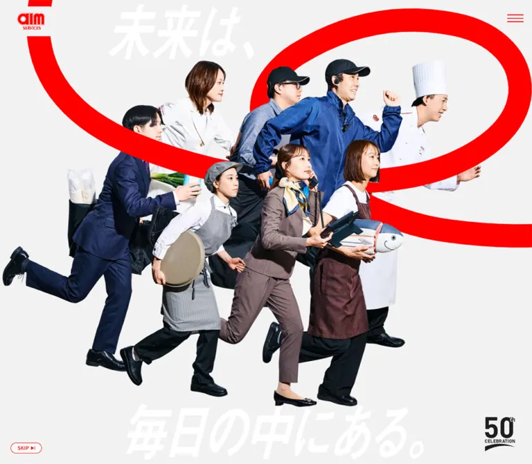
DESIGN REFERENCE
エームサービス50周年特設サイト
働く人々の切り抜き写真と赤い曲線、大胆な文字表現が印象的な周年サイト。長い導入演出から社員の声、トップメッセージ、未来への施策、沿革へと展開します。
オリジナルサイトを見るAIM Services / 50th Anniversary — Style Reference
A company anniversary told through people in motion, an oversized red curve, and the everyday tools of service.
Original URL: aimservices.co.jp/50th
Final URL: aimservices.co.jp/50th — unchanged; supplied HTTP status 200.
Theme: light gray canvas, vivid red accents, and a deeper red footer.
Inspected: September 12, 2026. Supplied capture record: 2026-09-12T07:25:23.035Z, or 16:25:23.035 JST.
Viewports: desktop 1440 × 1000; mobile 390 × 844 CSS pixels.
Scope: the current anniversary homepage. Five supplied screenshots show opening narrative states and the History-to-footer ending. Rendered DOM and selected computed styles additionally document the manifesto, staff rail, Voice, Message, and For Future sections. Linked detail pages and activated menu states were not inspected.
The central composition is a group of eight people in occupational clothing, photographed in forward-moving poses. A business suit, chef uniform, aprons, workwear, headset, tray, vegetables, telephone, frying pan, and fish-shaped prop make the company's breadth tangible. The cutouts occupy a pale, nearly uninterrupted stage. A thick red curve passes behind them; small workplace photographs and white-backed Japanese sentences populate the surrounding space.
Scale provides the hierarchy. The company logo and menu are small corner anchors, while the people, slogan, and historical dates become enormous. After the extended visual introduction, the homepage presents a manifesto and four editorial destinations: VOICE, MESSAGE, FOR FUTURE, and HISTORY. The ending reverses the palette into a deep red field with white navigation and the oversized statement “未来は、毎日の中にある。” This is a corporate anniversary homepage with its own narrative and content architecture.
How to Read This Reference
- Measured means a value appears in the supplied computed styles, custom properties, or element rectangles. Measurements are CSS pixels unless stated otherwise.
- Calculated means arithmetic derived from those measurements, such as the desktop content gutter or distance between adjacent cards.
- Estimated means a visual approximation from the supplied screenshots. Display-letter sizes, arrow geometry, and some artwork bounds fall into this category.
- Recommended means an implementation choice for a new project. The CSS class names, breakpoint, accessible controls, and static scene arrangement below are adaptations.
- Source font variables identify declared stacks. They do not independently prove that a particular font file loaded or that every unrecorded child element uses that stack.
- The screenshots capture different narrative moments. Differences in poses, translation, and visible copy should not all be interpreted as responsive changes.
- Intermediate sections have strong outer-layout evidence but limited visual evidence. Their unrecorded image crops, internal typography, and interactive states remain unspecified.
Tokens — Colors
Default Palette
| Name | Value | Source token / implementation alias | Evidence and role |
|---|---|---|---|
| Signal Red | #FF0000 |
--c-primary-1 / --color-red |
Measured source variable and CTA text color; visually matches the opening curve, menu strokes, and red logo treatment |
| Footer Red | #EC0000 |
--c-primary-2 / --color-red-deep |
Measured footer background; slightly deeper than the opening accent |
| Pale Canvas | #F2F2F2 |
--c-gray-1 / --color-canvas |
Measured HTML background; the continuous field behind the narrative and editorial content |
| White | #FFFFFF |
--color-white |
Measured CTA and card backgrounds, plus footer text; visible backing strips behind narrative copy |
| Main Ink | #1F1F1F |
--c-blk-1 / --color-ink |
Measured body and sampled content text; visible headings and dark anniversary mark |
| Quiet Gray | #DBDBDB |
--c-gray-2 / --color-quiet |
Measured variable; visually consistent with the oversized historical dates, whose own computed color was not supplied |
| Muted Gray | #8F8F8F |
--c-gray-3 / --color-muted |
Measured variable; visually consistent with the History supporting copy, although its sampled paragraph parent reports Main Ink |
The two reds should remain separate. The opening uses a bright, graphic accent; the footer uses a deeper red across a large surface. White cards and white narrative strips are also distinct from the #F2F2F2 canvas.
The supplied variables include --swiper-theme-color: #007aff. No corresponding blue interface treatment is established by the screenshots. Treat this as an unverified library default, not an additional brand color. Blues visible in clothing and photographs belong to the imagery.
Color Behavior
The footer is a section-level palette reversal, not evidence of a user-selectable theme. Its background is measured as #EC0000, with white text and artwork. The opening anniversary mark is dark, while its footer counterpart is white.
The pale dates and white opening slogan deliberately recede behind the photography. Their low contrast works as a graphic layer; essential reading copy needs a separate readable presentation. The later manifesto provides the narrative text again in a conventional content section.
Tokens — Typography
Japanese Text
Measured stack: "Noto Sans JP", sans-serif, exposed through --f-sans and recorded on body text, narrative paragraphs, buttons, and sampled heading containers.
The body uses medium weight rather than a light editorial weight. Narrative strips are bold, and the later manifesto is very heavy. This keeps the language forceful alongside the photographic composition.
English Display Families
Two source variables are supplied:
--f-en: "Gabarito", "Noto Sans JP", sans-serif--f-en2: "Fugaz One", "Noto Sans JP", sans-serif
The visible English navigation is bold and compact. Gabarito is a source-aligned starting point for recreating it, but the English child elements were not individually measured. Fugaz One is declared; its exact assignment is not established by this evidence.
The root element reports Times and a serif variable also exists. Neither establishes a serif body style: the body explicitly requests Noto Sans JP.
Slogan and Date Artwork
The Japanese slogan has a pronounced forward slant and very large, heavy strokes. It behaves visually like a graphic wordmark. The opening H1 contains no text in the supplied extraction, so its inherited 16px or 14px font size does not describe the visible lettering. Its asset format and font construction were not provided.
The historical years are tall, narrow, and pale. Use approved artwork when exact reproduction matters. A condensed-looking CSS treatment is only an approximation unless the actual font or graphic is available.
Type Scale
| Role | Desktop | Mobile | Weight / spacing | Status |
|---|---|---|---|---|
| Base body | 16px / 28.8px |
14px / 25.2px |
500; tracking 0.8px / 0.7px |
Measured; line height 1.8, tracking 0.05em |
| Section descriptions | 16px / 32px |
14px / 28px |
500; inherited tracking |
Measured; line height 2 |
| Moving narrative paragraphs | 24px / 24px |
17.903px / 17.903px |
700; tracking 0.8px / 0.7px |
Measured at the sampled narrative states |
| Manifesto paragraphs | 22px / 35.2px |
14px / 22.4px |
900; tracking 1.65px / 1.05px |
Measured; line height 1.6, tracking 0.075em |
VIEW ALL anchor |
16px / 24px |
14px / 21px |
700; tracking 0.8px / 0.7px |
Measured anchor style |
| Copyright | 12px / 18px |
12px / 18px |
500; tracking 0.8px / 0.7px |
Measured |
| Corporate-site link | 12px / 18px |
12px / 18px |
700 |
Measured |
| Large English section name | Approximately 96–104px |
Approximately 56–60px |
Heavy, compact sans-serif | Estimated; heading child styles unavailable |
| English footer navigation | Approximately 32px |
Approximately 24px |
Bold sans-serif | Estimated from screenshots and link-box dimensions |
| Japanese footer captions | Approximately 14px |
Approximately 12px |
Bold, smaller than English label | Estimated |
| Footer slogan | Approximately 150–170px visible letter height |
Approximately 40–46px per line |
Heavy and slanted | Visual estimate of artwork, not a recovered CSS font size |
| Historical year figures | Approximately 240–270px font-size equivalent |
Approximately 120–135px |
Tall, narrow figures | Visual estimate |
Narrative paragraph boxes are taller than their computed line-height alone would suggest. For example, two-line desktop passages occupy 72px despite a 24px line-height declaration. Additional inline layout or strip treatment contributes to the visible result; copying only that paragraph line height will not recreate the white-backed lines.
Tokens — Spacing & Shapes
Source Variables and Actual Application
| Source variable | Desktop | Mobile | Interpretation |
|---|---|---|---|
--header-h |
100px |
70px |
Matches measured header height |
--space-hor |
60px |
20px |
General horizontal spacing token; desktop content sections actually use 116px gutters |
--space-vrt |
80px |
40px |
Matches staff-rail vertical padding and the gap before the footer; major sections use larger padding |
--view |
1208px |
1208px |
Declared content-width reference; mobile content fits within 350px |
--vw |
1440px |
390px |
Recorded viewport-width variable |
At desktop width, (1440 − 1208) / 2 = 116px, matching the main section gutters. Keep the header, editorial container, and footer insets distinct: they are 40px, 116px, and 60px respectively at the inspected desktop size.
Spacing Scale
| Use | Desktop | Mobile | Evidence |
|---|---|---|---|
| Header padding | 5px 40px |
5px 25px |
Measured |
| Main section padding | 140px 116px |
80px 20px |
Measured on manifesto, Voice, Message, For Future, and History |
| Staff-rail section padding | 80px 0 |
40px 0 |
Measured |
| Bilingual heading gap | 10px |
5px |
Measured container gap |
| Standard heading-to-description clearance | 40px |
30px |
Calculated from Voice and History rectangles |
| History description-to-button clearance | 60px |
40px |
Calculated |
| Manifesto paragraph separation | 22px |
14px |
Calculated between successive paragraph rectangles |
| Staff-card horizontal gap | 50px |
25px |
Calculated |
| Staff-card alternating vertical offset | 50px |
20px |
Calculated |
| Article-card horizontal gap | 60px |
25px |
Calculated |
| Footer padding | 70px 60px 40px |
30px 20px 20px |
Measured |
| Footer navigation gap | 40px horizontally |
25px between rows; column starts 187.5px apart |
Calculated |
| Gap between main content and footer | 80px |
40px |
Calculated |
Border Radius and Rules
| Element | Desktop | Mobile | Notes |
|---|---|---|---|
VIEW ALL |
60px |
60px |
Measured declared radius; a 60px-high box renders as a full pill |
| Staff-link card | 20px |
20px |
Measured |
| Article card | 20px |
10px |
Measured responsive change |
| Footer and large section surfaces | 0 |
0 |
Measured |
| Narrative backing strip | Visually square | Visually square | Screenshot observation |
| CTA border | Approximately 2px |
Approximately 2px |
Screenshot estimate; border width was not included in the style extract |
| Menu strokes | Approximately 1–2px |
Approximately 1–2px |
Screenshot estimate |
Rounded shapes are used selectively: pills for destination links and rounded rectangles for content cards. The photography, slogan, and red curve supply most of the visual character.
Components
Persistent Header
Role: company identity and access to navigation throughout the long page.
The header is transparent and 100px high on desktop, reducing to 70px on mobile. The company-logo anchor measures 65 × 39.125px at approximately (40, 30.44) on desktop, and 50 × 30.094px at (25, 19.95) on mobile.
Three thin red menu strokes sit near the upper-right corner without a visible button surface. Their visible width is approximately 38px on desktop and 24px on mobile. The repeated corner positions across opening and ending screenshots support viewport-persistent positioning, although the position declaration itself was not included.
The desktop logo link has a measured opacity 0.2s transition. Its mobile sample does not provide the same timed transition. No hover endpoint was supplied.
Navigation Content
Role: four anniversary destinations plus the main corporate website.
Each destination pairs a large English label with a smaller Japanese caption:
VOICE/ “社員の声”MESSAGE/ “トップメッセージ”FOR FUTURE/ “未来への施策”HISTORY/ “エームサービスの沿革”
The supplied initial DOM positions these navigation links outside the viewport: desktop entries begin at x = 1560, and mobile entries at x = 430. Desktop link positions form two columns; mobile positions form a single vertical sequence. This supports off-canvas navigation content, but the opened panel was not captured.
White link text and internal gaps of 10px desktop / 5px mobile are measured. Panel fill, opening direction, close icon, focus behavior, and transition timing remain unverified.
Opening Narrative Stage
Role: establish the anniversary theme through a visual story before the editorial content.
The stage fills the supplied viewport. In the first desktop capture, the group occupies approximately x = 170–1155 and y = 108–905. Oversized white Japanese lettering sits behind the people, with the first part near the top and the rest near the bottom.
A later desktop state introduces a thick red curve on the right, small workplace photographs, and black Japanese text on white strips. People appear in different poses while the small logo, menu, Skip control, and anniversary badge maintain their corner roles.
Use the following visual hierarchy when adapting the scene:
- Pale canvas.
- Oversized slogan, red curve, and surrounding photographic fragments.
- Foreground group of sharply isolated people.
- White-backed narrative lines.
- Small navigation and anniversary controls.
This is a visual layering guide, not a recovered DOM or stacking-context specification. Some photographic fragments overlap the lower part of the group.
Narrative Copy Strips
Role: introduce short passages without losing them against photography.
The copy uses heavy black Japanese text with tight white rectangular backing. Multi-line passages can have staggered horizontal starts. In the second desktop capture, the passage “私たちは、人に寄り添い、時代の先を見据えながら、挑戦を重ねていく。” appears near the left edge over the stage.
The mobile capture shows text entering and leaving the viewport at both sides. Treat this clipping as part of the captured narrative moment, not as a general rule for article text. The later manifesto restores the message in a readable column.
For an adaptation, independently wrapped line spans or box-decoration-break: clone can create the strip treatment. That CSS mechanism was not verified on the original.
Skip Control and Anniversary Mark
Role: a compact escape from the introduction and a persistent anniversary identifier.
The visible SKIP pill is approximately 73 × 25px, positioned about 25px from the desktop left and bottom edges and 15px from the mobile left and bottom edges. It uses red text, a thin red outline, and a small triangle/bar symbol.
The opening anniversary graphic sits at the lower right and combines a large 50, a small ordinal, CELEBRATION, and a curved underline. Its visible footprint is approximately 70 × 80px on desktop and 45 × 52px on mobile. These are artwork estimates rather than measured element rectangles.
The Skip control was not activated. Its label suggests bypassing the introduction, but its destination, scroll behavior, and timeline effects are unverified.
Manifesto Section
Role: present the narrative as conventional readable content after the visual sequence.
Measured desktop padding is 140px 116px. A graphic heading occupies a 354 × 154.69px box toward the left, while the text column begins at x ≈ 665.58 and is approximately 604.42px wide. Paragraphs use 22px / 35.2px, weight 900, and 1.65px tracking.
On mobile, the heading becomes a 260 × 113.61px box at x = 20, followed by a 350px-wide paragraph column. The gap from heading bottom to the first paragraph is 35px. Text reduces to 14px / 22.4px, retaining weight 900 and 0.075em tracking.
This section is the main evidence for a desktop side-by-side composition becoming a mobile vertical stack.
Staff-Link Rail
Role: expose eight staff-related destinations in a broad horizontal sequence.
The DOM includes anchors targeting #staff_1 through #staff_8, followed by a repeated sequence. Each desktop anchor is a white 520 × 312px rounded rectangle with a 20px radius. The mobile equivalent is 340 × 204px, preserving the calculated 5:3 aspect ratio.
Adjacent cards are separated by 50px on desktop and 25px on mobile. Their vertical positions alternate by 50px and 20px respectively, introducing an irregular rhythm without rotating the cards.
The repeated content and offscreen positions are compatible with a looping rail. Autoplay, drag behavior, and the result of activating a staff anchor were not tested. Inner media bounds and any staff overlay were not supplied.
Bilingual Section Heading
Role: give each editorial destination a recognizable label.
VOICE and HISTORY use a large English name with a smaller Japanese subtitle below. Their measured heading boxes are approximately 148.39px high on desktop and 84.19px on mobile, with internal gaps of 10px and 5px.
The sampled H2 parent font sizes are only 16px and 14px; these do not describe the much larger English descendants. Use the visual scale estimates in the typography table until those child styles can be measured.
View All Link
Role: route visitors from a homepage preview to its dedicated content page.
Measured anatomy:
- White background and red text.
250 × 60pxon desktop;280 × 60pxon mobile.10px 30pxpadding and a declared60pxradius.- Inline flex layout, with a
16pxdesktop /14pxmobile gap. - Weight
700; desktop16px / 24px, mobile14px / 21px. background-color 0.2s, color 0.2stransition.
A thin horizontal arrow ending in a filled triangle sits toward the right edge. Its visible total length is approximately 30–32px. The screenshots support an approximately 2px red border.
The mobile button grows wider even as most typography and spacing shrink. Preserve this useful emphasis: at 390px, it occupies 280px of the 350px content width.
Voice Preview
Role: connect the anniversary story to employees' everyday experiences.
The section exposes short poems with workplace categories and contributor names. One quoted example is “毎日の / 小さな想いが / 未来になる”. Desktop heading and introduction content occupy a 350px-wide left column, with the destination link beneath.
The mobile text extraction places poem content before VIEW ALL, and the link appears substantially below the introduction. This supports a changed reading arrangement. Desktop and mobile extracts contain different numbers of poems, but that does not establish a fixed responsive item count; the samples may represent different rail states.
Poem-card appearance and internal typography were not captured visually. Do not invent their colors, illustrations, or transitions from the text alone.
Message Preview
Role: introduce the company president's anniversary statement.
The section includes MESSAGE, “トップメッセージ”, the headline “毎日の先にある、エームサービスの挑戦”, company identification, the president's name, and a VIEW ALL link.
Its measured outer height is 1080px on desktop and 616px on mobile. The desktop heading block begins at x = 294 within the wider section, while the mobile content begins at x = 20. The heading container uses weight 900 and a 40px desktop / 30px mobile internal gap.
No screenshot of this section was supplied. Any portrait placement, background artwork, or animation is therefore outside the verified visual scope.
For Future Article Rail
Role: connect future-facing messaging with current articles and announcements.
The section includes repeated FOR FUTURE text, a Japanese heading, an introductory paragraph, and three distinct article destinations duplicated in the DOM. The sampled heading container is red.
Measured outer card anatomy:
| Property | Desktop | Mobile |
|---|---|---|
| Width | 493.59px |
238.33px |
| Height | 426.86px |
262.06px |
| Background | White | White |
| Radius | 20px |
10px |
| Padding | 30px 30px 35px |
15px 15px 20px |
| Internal gap | 20px |
20px |
| Gap to next card | 60px |
25px |
Article text includes a category followed by a Japanese headline. Inner image rectangles and child typography were not recorded. An image/category/title stack is a reasonable adaptation, not a complete observation of the original card interior.
The third desktop card extends beyond the viewport. On mobile, one full card and part of the next occupy the visible width. The rail does not become a conventional full-width vertical list in the supplied measurements.
The desktop VIEW ALL link is right-aligned at x = 1074; on mobile it returns to the left gutter at x = 20.
History Preview
Role: close the main content with the company's fifty-year timeline.
The section combines HISTORY, “エームサービスの沿革”, a brief description, and a VIEW ALL link. Large pale 1976 and 2026 figures, joined visually by a vertical line, occupy the background/right side. The terminal desktop screenshot shows 2026; the mobile screenshot reveals parts of both dates.
The dates are deliberately oversized and cropped. The description and CTA remain within the normal content gutter. Desktop supporting copy spans two lines; mobile copy spans three lines at 14px / 28px.
At the captured ending position, the persistent header overlaps the partially scrolled heading. This is a scroll-state observation, not a combined logo-and-heading lockup.
Anniversary Footer
Role: provide a strong brand ending and repeat the four primary destinations.
The footer uses measured #EC0000 with white text. On desktop it is approximately 485.81px high, with a white company-logo anchor at the left and four bilingual navigation links arranged in a row at the right. The logo anchor measures 128 × 66.19px; the visible artwork need not share the anchor's exact bounds.
A very large white slogan spans almost the whole content width below the navigation. Copyright and the corporate-site link sit together near the lower left; a smaller anniversary mark occupies the lower right.
On mobile, the footer measures approximately 410.38px high. The separate footer logo is absent from both the visible capture and the mobile link list. Navigation becomes a two-column, two-row arrangement with column starts at 20px and 207.5px. The corporate-site link moves below navigation, the slogan becomes two lines at the lower left, and copyright centers at the bottom.
The global header logo remains visible above the footer region. Keep this distinct from the desktop-only footer logo.
Tokens — Motion & Interaction
| Treatment | Evidence | What can safely be concluded |
|---|---|---|
| Opening composition changes | Different desktop poses, red-curve visibility, photograph placement, and copy across captures | The opening has multiple visual states; exact sequencing and duration are unknown |
| Horizontal narrative staging | Paragraphs occupy widely separated horizontal coordinates, including negative and offscreen positions | Content is arranged along a translated horizontal composition; the exact relationship to time, scroll, or input is unverified |
| Long introduction | First manifesto section begins at y = 9640 desktop and y = 9484 mobile |
The introduction occupies a substantial document interval |
| Staff rail | Eight destinations repeat; cards extend far offscreen | Loop-compatible structure; autoplay and drag behavior are unverified |
| Article rail | Three article destinations repeat and extend beyond the viewport | Horizontal repeated structure; exact controls and movement are unverified |
Repeated FOR FUTURE lettering |
Repeated words in rendered text | Repetition exists; marquee motion is not independently established |
| CTA transition | background-color 0.2s, color 0.2s |
Measured transition properties and duration; hover endpoint was not supplied |
| Desktop header logo | opacity 0.2s |
Measured fade capability; endpoint and trigger were not supplied |
| Navigation | Offscreen link coordinates plus visible menu glyph | Hidden navigation content exists; opening animation was not inspected |
| Skip control | Visible SKIP label |
A bypass affordance exists; activation behavior is unverified |
Subtracting the viewport height from the manifesto start gives 8640px at both sampled sizes: 9640 − 1000 and 9484 − 844. This is a useful calculated relationship, not proof of the original timeline formula.
Many sampled elements report animation: none and a generic transition: all. This does not establish a static page: motion may involve transforms on other elements, script-driven updates, or media assets. Nor does transition: all alone establish a nonzero duration.
The capture process waited for loading and finite animation readiness and temporarily paused perpetual animation during checks. Those procedures are capture conditions, not the site's motion specification. No motion engine, easing curve, frame rate, video format, or input mapping can be recovered reliably from the supplied evidence.
For a new implementation, make the narrative timeline optional enhancement around a complete static reading order. Short 200ms color feedback is source-supported; any scene-transition timing should be chosen and labeled as new work.
Surfaces
| Layer | Appearance | Purpose and evidence |
|---|---|---|
| Main canvas | Flat #F2F2F2 |
Measured page background; carries both immersive and editorial sections |
| Narrative copy | White rectangular strips with dark text | Visible separation from the photographic scene |
| Narrative artwork | Cutout people, red curve, floating rectangular photographs | Main visual density and sense of movement |
| Staff links | White, 20px rounded rectangles |
Measured card containers; inner imagery not separately documented |
| Article links | White, 20px / 10px rounded rectangles |
Measured desktop/mobile card surfaces |
| Destination controls | White pills with red text and outline | Strong reusable link treatment |
| Historical backdrop | Very large pale dates | Visible graphic scale without competing with the main content |
| Footer | Solid #EC0000, white content |
Measured section-level reversal |
No elevation treatment is apparent in the supplied opening and footer screenshots. Card shadow declarations were not included in the evidence, so a universal claim of zero shadows would exceed the inspection. A flat, shadow-free adaptation fits the verified surfaces.
Some small opening photographs appear softened or blurred. This contributes depth within the imagery; it is not evidence of a glass-panel or backdrop-blur interface system.
Imagery
The photographic direction is energetic and specific to work. People lean forward or lift a leg as if advancing together, while their tools communicate different service roles. Preserve clean silhouette edges, believable clothing texture, and the layered overlap between bodies. The foreground group should read as one coordinated composition rather than eight unrelated portrait cards.
The background is deliberately quiet. Small workplace photographs vary in scale and sharpness around the group, leaving substantial pale space between them. In the mobile capture, a small photograph appears near the top and a larger workplace scene near the bottom right. Cropping and separation make the scene feel larger than the phone viewport.
Observed Asset Inventory
| Asset type | Observed use | Available detail |
|---|---|---|
| Company logo | Red in the header; white in the desktop footer | Anchor sizes measured; file paths and intrinsic image sizes unavailable |
| Group of eight people | Opening narrative foreground | Multiple photographic poses visible; delivery format and individual layer structure unknown |
| Workplace photographs | Small rectangular fragments around the group | Placement and varied sharpness visible; exact files unavailable |
| Japanese slogan | Opening and footer brand statement | Large slanted graphic appearance; typeface and asset format unknown |
| Anniversary mark | Lower-right opening and footer identifier | Dark and white treatments visible; exact vector or raster source unknown |
| Red curve | Large loop behind the people | Shape and approximate thickness visible; SVG, CSS, canvas, or media implementation unknown |
| Historical dates | Pale 1976 / 2026 backdrop |
Visible styling; no asset or descendant-font measurement supplied |
No image asset URLs were included in the original-page evidence. Do not invent filenames or treat related article URLs as image sources.
For authorized reuse, retain the supplied brand artwork. For a new brand, commission a coordinated photographic series with consistent lighting, perspective, and direction of movement. The interface shell alone will not reproduce the identity carried by these people and props.
Layout & Responsive Behavior
Measured Page Structure
| Region | Desktop height | Mobile height | Interpretation |
|---|---|---|---|
| Interval before manifesto | 9640px |
9484px |
Includes the extended opening narrative |
| Manifesto | 869.44px |
728.47px |
Desktop split composition becomes a mobile stack |
| Staff rail | 602px |
344px |
Smaller cards and reduced vertical offset on mobile |
| Voice | 690.89px |
725.89px |
Mobile region becomes slightly taller despite smaller type |
| Message | 1080px |
616px |
Substantial responsive reduction |
| For Future | 1106.86px |
870.06px |
Narrower article rail and wrapped introduction |
| History | 712.39px |
498.19px |
Same destination structure with cropped background dates |
| Pre-footer gap | 80px |
40px |
Additional separation after main content |
| Footer | 485.81px |
410.38px |
Row navigation becomes a two-column layout |
| Reported document height | 15267px |
13717px |
Rounded document totals from the capture |
These values document the sampled page, including animation-related space. They are not recommended fixed section heights. In particular, do not reproduce the introduction as thousands of pixels of empty padding without the corresponding narrative behavior.
Desktop Composition
At 1440px, editorial sections use a 1208px content region. The opening scene ignores that container and uses the full viewport. Horizontal staff and article rails also extend beyond the ordinary content column.
The footer uses a broader 1320px inner region through 60px side padding. Its navigation is pushed to the right of the logo, while the large slogan reunites the entire width below.
Mobile Composition
At 390px, ordinary content has 20px gutters and a 350px inner width. The header instead uses 25px side padding. The opening group remains an overlapping lateral composition, with some limbs and narrative copy outside the viewport. It is not reformatted as a series of small stacked portraits.
The article rail retains horizontal overflow, while the footer navigation becomes a true two-column arrangement. The manifesto changes to a vertical reading order. Buttons remain 60px high and increase from 250px to 280px wide.
Source breakpoints, intermediate tablet behavior, orientation changes, safe-area handling, and browser zoom behavior were not supplied. The 48rem breakpoint in the Quick Start is a recommendation chosen to reproduce the two documented modes, not a recovered original breakpoint.
Do’s and Don’ts
Do
- Preserve the distinction between bright
#FF0000accents and the deeper#EC0000footer. - Keep the pale gray canvas continuous through the narrative and main content.
- Make the coordinated photographic group the opening's dominant object.
- Use occupational props and natural photographic detail to communicate service breadth.
- Pair oversized graphic lettering with small, restrained corner controls.
- Use bold Japanese copy with tight white backing inside the opening scene.
- Provide the narrative again in a normal readable content section.
- Retain bilingual destination labels and the same four-part information architecture.
- Keep
VIEW ALLpills60pxhigh, including on mobile. - Preserve the staff rail's alternating vertical positions and the article rail's partial next-card visibility.
- Give the footer a decisive full-width red surface and a responsive slogan composition.
- Separate measured geometry from estimates when extending the reference.
Don’t
- Don't reduce the whole page to a single static hero and omit its editorial destinations.
- Don't force the opening group into separate portrait cards on mobile.
- Don't infer a specific animation library or autoplay behavior from duplicated DOM content.
- Don't use the inherited
H1orH2font size as the visible graphic title size. - Don't assign Fugaz One to the Japanese slogan merely because its variable exists.
- Don't add the unverified Swiper blue to the brand palette.
- Don't apply the same radius to narrative photographs, article cards, and controls.
- Don't convert the red curve into a generic gradient blob or glossy decorative object.
- Don't make pale decorative dates the only source of historical information.
- Don't hardcode the measured document height as empty space.
- Don't invent staff dialogs, menu transitions, or unseen Message-section imagery.
Recommended Implementation Additions
These are recommendations for a new implementation, not verified original features:
- Give the menu button a clear accessible name and a hit area of at least
44 × 44px, while retaining its small visible strokes. - Keep the Skip control visually compact but enlarge its interactive area. Make its target a stable, readable section after the introduction.
- Offer a reduced-motion mode that presents one composed opening image and the complete manifesto without requiring timeline progress.
- Keep duplicated rail items out of repeated keyboard and screen-reader navigation. Provide a unique semantic list of destinations.
- If rails move automatically, provide a pause mechanism and avoid making essential content depend on movement.
- Give repeated
VIEW ALLlinks destination-specific accessible names. - Mark purely decorative curves, duplicate slogans, and background years as decorative; provide a real text heading for the page.
- Add a visible keyboard focus indicator and enough scroll offset to clear the persistent header.
- Check small-text contrast. Calculated contrast for
#FF0000on white is approximately4.0:1; the deeper#EC0000is approximately4.6:1. Using the deeper red for small functional text is an accessible adaptation. - Reserve dimensions for photographic assets and load later content without shifting the scene or breaking the narrative's geometry.
Agent Prompt Guide
Quick Color Reference
- Canvas:
#F2F2F2. - Main text:
#1F1F1F. - Opening curve, outline controls, and menu:
#FF0000. - Footer field:
#EC0000. - Cards, copy strips, and reversed artwork:
#FFFFFF. - Decorative historical figures: use
#DBDBDBas a source-aligned approximation. - Muted supporting text:
#8F8F8Fis declared; verify contrast and actual application.
Overall Prompt
“Create a corporate anniversary homepage inspired by the current AIM Services 50th anniversary experience. Use a pale gray #F2F2F2 canvas, crisp cutout photography of a coordinated group of people in occupational clothing, a thick bright red curve behind them, small workplace photographs, and oversized slanted Japanese slogan artwork. Keep the company logo and three-line menu small at the upper corners. Introduce short bold Japanese passages on white rectangular strips. Follow the visual introduction with a readable manifesto and four editorial destinations: employee voices, leadership message, future initiatives, and company history. Use white pill links with red outlines, horizontal content rails, and a deep red #EC0000 footer with white bilingual navigation. On mobile, preserve the layered opening composition, stack the manifesto, and use a two-column footer. Treat animation timing and unobserved interactions as new implementation decisions.”
Example Component Prompts
- Opening stage: “A full-height pale gray stage with eight coordinated photographic cutouts moving toward the right. Layer work uniforms and props naturally. Place a thick red loop behind the group, a few isolated workplace photographs around it, and small red logo/menu controls at the upper corners. Keep depth inside the imagery rather than adding interface shadows.”
- Narrative strip: “Bold Japanese text on tight white rectangular line backings, with slightly staggered line starts. Use a
24pxdesktop text size as the measured reference and approximately18pxon the documented phone layout. Maintain a separate readable transcript outside the animated stage.” - Destination link: “A white
250 × 60pxdesktop pill with an approximately2pxbright red border, boldVIEW ALLtext at the left, and a thin line ending in a filled triangle at the right. Use30pxhorizontal padding. At mobile width, make it280 × 60px.” - Staff rail: “A horizontal sequence of white cards with a
5:3ratio and20pxcorners. Use520 × 312pxcards with50pxgaps and alternating50pxvertical offsets on desktop; use340 × 204px,25pxgaps, and20pxoffsets on mobile. Keep card activation behavior separate from this visual specification.” - History preview: “A large English
HISTORYheading with a smaller Japanese subtitle, restrained supporting copy, and a red-outlined pill link. Place oversized pale1976and2026figures with a vertical connector behind the right side. Crop decorative years at narrow widths while keeping the functional content readable.” - Footer: “A solid
#EC0000footer with white bilingual navigation. On desktop, place a white logo at the left and four links in a row at the right, then a very large slanted Japanese slogan across the width. On mobile, remove the separate footer logo, arrange navigation in two columns, put the corporate link underneath, and use a two-line slogan beside the anniversary mark.”
Quick Start
CSS Custom Properties
This is a static, responsive implementation scaffold. Exact colors and several component dimensions come from the supplied measurements. Display sizes, the 48rem breakpoint, arrow construction, scene positioning, and hover fill are adaptations. It does not recreate the original narrative timeline or supply photographic assets.
Load the declared fonts separately when authorized and available. The CSS does not download them. Slogan artwork should be supplied as an approved image or vector; the year treatment below is a typographic approximation.
:root {
  /* Measured palette */
  --color-canvas: #f2f2f2;
  --color-white: #fff;
  --color-ink: #1f1f1f;
  --color-red: #f00;
  --color-red-deep: #ec0000;
  --color-quiet: #dbdbdb;
  --color-muted: #8f8f8f;

  /* Declared source stacks; descendant assignments may vary */
  --font-sans: 'Noto Sans JP', sans-serif;
  --font-en: 'Gabarito', 'Noto Sans JP', sans-serif;
  --font-en-alt: 'Fugaz One', 'Noto Sans JP', sans-serif;

  /* Measured desktop geometry */
  --content-max: 1208px;
  --header-height: 100px;
  --header-inset: 40px;
  --outer-inset: 60px;
  --section-space: 140px;
  --rail-space: 80px;
  --body-size: 16px;
  --button-width: 250px;
  --button-height: 60px;
  --radius-pill: 60px;
  --radius-card: 20px;
  --staff-width: 520px;
  --staff-gap: 50px;
  --staff-offset: 50px;
  --news-width: 493.6px;
  --news-gap: 60px;
  --news-padding: 30px 30px 35px;

  /* Estimated display size and measured transition duration */
  --section-display: 100px;
  --motion-color: 200ms;
}

* {
  box-sizing: border-box;
}

html {
  background: var(--color-canvas);
  scroll-padding-top: calc(var(--header-height) + 16px);
}

body {
  margin: 0;
  color: var(--color-ink);
  background: var(--color-canvas);
  font: 500 var(--body-size) / 1.8 var(--font-sans);
  letter-spacing: 0.05em;
}

img {
  display: block;
  max-width: 100%;
}

button,
a {
  -webkit-tap-highlight-color: transparent;
}

button {
  font: inherit;
}

:focus-visible {
  outline: 3px solid currentColor;
  outline-offset: 5px;
}

.sr-only {
  position: absolute;
  width: 1px;
  height: 1px;
  padding: 0;
  overflow: hidden;
  clip-path: inset(50%);
  white-space: nowrap;
  border: 0;
}

.anniversary-header {
  position: fixed;
  z-index: 100;
  inset: 0 0 auto;
  display: flex;
  align-items: center;
  height: var(--header-height);
  padding: 5px var(--header-inset);
  pointer-events: none;
}

.anniversary-header > * {
  pointer-events: auto;
}

.header-brand {
  display: block;
  width: 65px;
  transition: opacity var(--motion-color);
}

/* Recommended hit area around the smaller visible glyph */
.menu-toggle {
  position: absolute;
  top: 20px;
  right: 12px;
  display: grid;
  place-content: center;
  gap: 7px;
  width: 52px;
  height: 48px;
  padding: 0;
  color: var(--color-red);
  background: transparent;
  border: 0;
  cursor: pointer;
}

.menu-toggle span {
  display: block;
  width: 38px;
  height: 1px;
  background: currentColor;
}

/* Recommended static scene; original timeline is not reconstructed */
.story-stage {
  position: relative;
  isolation: isolate;
  height: 100vh;
  height: 100svh;
  overflow: hidden;
}

.story-people {
  position: absolute;
  z-index: 2;
  left: 50%;
  top: 50%;
  width: min(72vw, 1040px);
  max-height: 82%;
  object-fit: contain;
  transform: translate(-50%, -50%);
}

/* Approximate curve geometry; replace with approved artwork if needed */
.story-ring {
  position: absolute;
  z-index: 0;
  top: -48%;
  right: 3%;
  width: 48%;
  height: 115%;
  border: 60px solid var(--color-red);
  border-radius: 50%;
  transform: rotate(-12deg);
}

.story-slogan {
  position: absolute;
  z-index: 1;
  inset: 10px auto;
  left: 50%;
  display: flex;
  flex-direction: column;
  justify-content: space-between;
  width: min(61vw, 876px);
  margin: 0;
  transform: translateX(-50%);
}

.story-slogan img {
  width: 100%;
}

.scene-photo {
  position: absolute;
  z-index: 1;
  width: var(--photo-width, 220px);
}

.scene-caption {
  position: absolute;
  z-index: 3;
  max-width: 620px;
  margin: 0;
  font-size: 24px;
  font-weight: 700;
  line-height: 1.5;
  letter-spacing: 0.8px;
}

/* A practical backing-strip adaptation */
.scene-caption span {
  padding: 0.05em 0.3em;
  color: var(--color-ink);
  background: var(--color-white);
  -webkit-box-decoration-break: clone;
  box-decoration-break: clone;
}

.skip-intro {
  position: absolute;
  z-index: 4;
  left: 25px;
  bottom: 25px;
  display: inline-flex;
  align-items: center;
  justify-content: center;
  min-width: 73px;
  height: 25px;
  padding-inline: 12px;
  color: var(--color-red);
  background: var(--color-white);
  border: 1px solid currentColor;
  border-radius: var(--radius-pill);
  font-size: 12px;
  line-height: 1;
  text-decoration: none;
}

.skip-intro::before {
  content: '';
  position: absolute;
  inset: -10px -5px;
}

.stage-mark {
  position: absolute;
  z-index: 4;
  right: 40px;
  bottom: 30px;
  width: 70px;
}

.page-section {
  padding-block: var(--section-space);
  padding-inline: max(
    var(--outer-inset),
    calc((100% - var(--content-max)) / 2)
  );
}

.section-title {
  display: flex;
  flex-direction: column;
  gap: 10px;
  margin: 0;
}

/* Display-child sizes are visual approximations */
.section-title-en {
  font-family: var(--font-en);
  font-size: var(--section-display);
  font-weight: 700;
  line-height: 1.05;
  letter-spacing: 0;
}

.section-title-ja {
  font-size: 24px;
  font-weight: 900;
  line-height: 1.4;
}

.section-lead {
  margin: 40px 0 0;
  font-size: var(--body-size);
  line-height: 2;
}

.view-all {
  display: inline-flex;
  align-items: center;
  justify-content: space-between;
  gap: 16px;
  width: min(100%, var(--button-width));
  min-height: var(--button-height);
  padding: 10px 30px;
  color: var(--color-red);
  background: var(--color-white);
  border: 2px solid var(--color-red);
  border-radius: var(--radius-pill);
  font-size: var(--body-size);
  font-weight: 700;
  line-height: 1.5;
  text-decoration: none;
  transition:
    background-color var(--motion-color),
    color var(--motion-color);
}

.view-all-arrow {
  position: relative;
  flex: 0 0 32px;
  height: 14px;
}

.view-all-arrow::before {
  content: '';
  position: absolute;
  top: 6px;
  left: 0;
  width: 25px;
  height: 1px;
  background: currentColor;
}

.view-all-arrow::after {
  content: '';
  position: absolute;
  right: 0;
  top: 1px;
  border-block: 6px solid transparent;
  border-left: 12px solid currentColor;
}

/* Recommended hover endpoint; the original endpoint was not supplied */
@media (hover: hover) {
  .view-all:hover {
    color: var(--color-white);
    background: var(--color-red-deep);
  }
}

.manifesto-layout {
  display: grid;
  grid-template-columns: minmax(0, 1fr) minmax(0, 604px);
  align-items: center;
  gap: 80px;
  max-width: 1100px;
  margin-inline: auto;
}

.manifesto-heading {
  width: 354px;
  max-width: 100%;
  margin: 0;
}

.manifesto-copy {
  font-size: 22px;
  font-weight: 900;
  line-height: 1.6;
  letter-spacing: 0.075em;
}

.manifesto-copy p {
  margin: 0;
}

.manifesto-copy p + p {
  margin-top: 1em;
}

/* Native horizontal scrolling is an adaptation, not a verified behavior */
.content-rail {
  display: flex;
  overflow-x: auto;
  overscroll-behavior-inline: contain;
  scroll-snap-type: x proximity;
}

.staff-rail {
  align-items: flex-start;
  gap: var(--staff-gap);
  padding-block: var(--rail-space);
}

.staff-card {
  flex: 0 0 min(var(--staff-width), calc(100vw - 50px));
  aspect-ratio: 5 / 3;
  overflow: hidden;
  border-radius: 20px;
  background: var(--color-white);
  scroll-snap-align: start;
}

.staff-card:nth-child(odd) {
  margin-top: var(--staff-offset);
}

.staff-card img {
  width: 100%;
  height: 100%;
  object-fit: cover;
}

.news-rail {
  gap: var(--news-gap);
  margin-top: 60px;
}

.news-card {
  display: flex;
  flex: 0 0 var(--news-width);
  flex-direction: column;
  gap: 20px;
  padding: var(--news-padding);
  color: inherit;
  background: var(--color-white);
  border-radius: var(--radius-card);
  text-decoration: none;
  scroll-snap-align: start;
}

.news-card h3,
.news-card p {
  margin: 0;
}

.history-section {
  position: relative;
  isolation: isolate;
  overflow: hidden;
}

.history-section > :not(.history-years) {
  position: relative;
  z-index: 1;
}

.history-section .view-all {
  margin-top: 60px;
}

/* Approximation of the pale date graphic */
.history-years {
  position: absolute;
  z-index: 0;
  top: 0;
  right: max(60px, calc((100% - var(--content-max)) / 2));
  display: grid;
  justify-items: center;
  color: var(--color-quiet);
  font: 700 260px / 0.95 var(--font-en);
  letter-spacing: -0.06em;
  pointer-events: none;
}

.history-years::after {
  content: '';
  grid-row: 2;
  width: 20px;
  height: 140px;
  margin-block: 16px;
  background: currentColor;
}

.anniversary-footer {
  position: relative;
  display: flex;
  flex-wrap: wrap;
  align-items: flex-start;
  column-gap: 30px;
  margin-top: 80px;
  padding: 70px 60px 40px;
  color: var(--color-white);
  background: var(--color-red-deep);
}

.footer-brand {
  width: 128px;
}

.footer-nav {
  display: flex;
  gap: 40px;
  margin-left: auto;
}

.footer-nav a {
  display: flex;
  flex-direction: column;
  gap: 10px;
  color: inherit;
  text-decoration: none;
}

.footer-nav-en {
  font: 700 32px / 1.2 var(--font-en);
  letter-spacing: 0;
}

.footer-nav-ja {
  font-size: 14px;
  font-weight: 700;
  line-height: 1.3;
}

.footer-slogan {
  flex: 0 0 100%;
  margin: 50px 0 30px;
}

.footer-slogan img {
  width: 100%;
}

.footer-copyright,
.corporate-link {
  margin: 0;
  font-size: 12px;
  line-height: 18px;
}

.corporate-link {
  color: inherit;
  font-weight: 700;
  text-decoration: none;
}

.footer-mark {
  position: absolute;
  right: 60px;
  bottom: 40px;
  width: 50px;
}

/* Recommended breakpoint reproducing the documented narrow mode */
@media (max-width: 48rem) {
  :root {
    --header-height: 70px;
    --header-inset: 25px;
    --outer-inset: 20px;
    --section-space: 80px;
    --rail-space: 40px;
    --body-size: 14px;
    --button-width: 280px;
    --radius-card: 10px;
    --staff-width: 340px;
    --staff-gap: 25px;
    --staff-offset: 20px;
    --news-width: 238.33px;
    --news-gap: 25px;
    --news-padding: 15px 15px 20px;
    --section-display: 56px;
  }

  .header-brand { width: 50px; }

  .menu-toggle {
    top: 12px;
    right: 10px;
    width: 44px;
    height: 44px;
    gap: 7px;
  }

  .menu-toggle span { width: 24px; }

  .story-people {
    top: 50%;
    width: 112vw;
    max-width: none;
    max-height: 56%;
  }

  .story-ring {
    top: 17%;
    right: -40%;
    width: 115%;
    height: 65%;
    border-width: 38px;
  }

  .story-slogan { width: calc(100% - 40px); }
  .scene-caption { font-size: 17.903px; letter-spacing: 0.7px; }
  .skip-intro { left: 15px; bottom: 15px; }
  .stage-mark { width: 45px; right: 20px; bottom: 20px; }
  .section-title { gap: 5px; }
  .section-title-en { line-height: 1.2; }
  .section-title-ja { font-size: 12px; line-height: 1; }
  .section-lead { margin-top: 30px; }
  .view-all { gap: 14px; }

  .manifesto-layout {
    grid-template-columns: minmax(0, 1fr);
    gap: 35px;
  }

  .manifesto-heading { width: 260px; }
  .manifesto-copy { font-size: 14px; }
  .news-rail { margin-top: 90px; }
  .history-section .view-all { margin-top: 40px; }

  .history-years {
    right: -30px;
    font-size: 130px;
  }

  .history-years::after {
    width: 10px;
    height: 90px;
    margin-block: 8px;
  }

  .anniversary-footer {
    margin-top: 40px;
    padding: 30px 20px 20px;
  }

  .footer-brand { display: none; }

  .footer-nav {
    order: 1;
    display: grid;
    grid-template-columns: repeat(2, minmax(0, 1fr));
    gap: 25px;
    width: 100%;
    margin: 0;
  }

  .footer-nav a { gap: 5px; }
  .footer-nav-en { font-size: 24px; }
  .footer-nav-ja { font-size: 12px; }

  .corporate-link {
    order: 2;
    margin-top: 30px;
  }

  .footer-slogan {
    order: 3;
    margin: 60px 0 20px;
  }

  .footer-slogan img { width: min(235px, 70%); }

  .footer-copyright {
    order: 4;
    width: 100%;
    text-align: center;
  }

  .footer-mark { right: 20px; bottom: 60px; }
}

/* Recommended motion policy; script timelines must also respect it */
@media (prefers-reduced-motion: reduce) {
  .header-brand,
  .view-all {
    transition: none;
  }

  .content-rail {
    scroll-behavior: auto;
    scroll-snap-type: none;
  }
}
Minimal Component Markup
This example uses a destination verified in the supplied homepage links. The accessible label and decorative-year semantics are recommended additions. It intentionally uses text for the date approximation rather than inventing an asset URL.
<section class="page-section history-section" aria-labelledby="history-title">
  <div class="history-years" aria-hidden="true">
    <span>1976</span>
    <span>2026</span>
  </div>

  <h2 class="section-title" id="history-title">
    <span class="section-title-en" lang="en">HISTORY</span>
    <span class="section-title-ja" lang="ja">エームサービスの沿革</span>
  </h2>

  <p class="section-lead" lang="ja">
    今日のエームサービスは、これまで積み重ねてきた多くの経験の上にあります。<br>
    50年の歩みを振り返ります。
  </p>

  <a class="view-all"
     href="https://www.aimservices.co.jp/50th/history/"
     aria-label="Explore company history">
    <span>VIEW ALL</span>
    <span class="view-all-arrow" aria-hidden="true"></span>
  </a>
</section>
Tailwind v4 Token Mapping
Optional aliases for a project already using Tailwind v4. Define the custom properties above first. This is not evidence that the original site uses Tailwind.
@theme inline {
  --color-canvas: #f2f2f2;
  --color-ink: #1f1f1f;
  --color-brand: #ff0000;
  --color-brand-deep: #ec0000;
  --color-quiet: #dbdbdb;
  --color-muted: #8f8f8f;
  --color-surface: #ffffff;

  --font-body: 'Noto Sans JP', sans-serif;
  --font-display: 'Gabarito', 'Noto Sans JP', sans-serif;

  --text-body: var(--body-size);
  --text-section: var(--section-display);
  --spacing-page: var(--outer-inset);
  --spacing-section: var(--section-space);
  --spacing-header: var(--header-height);
  --spacing-button: var(--button-height);
  --radius-pill: 60px;
  --radius-editorial: var(--radius-card);
  --radius-staff: 20px;
}
Sources & Evidence
- Inspected original and final page: AIM Services 50th Anniversary homepage. The supplied browser record reports HTTP
200, the unchanged final URL, and the title “TOP|エームサービス50周年特設サイト”. - Capture record: September 12, 2026,
07:25:23.035 UTC/16:25:23.035 JST. Desktop viewport1440 × 1000; mobile viewport390 × 844. - Visual evidence: three desktop screenshots showing two opening states and the History/footer ending; two mobile screenshots showing an opening state and the History/footer ending.
- Rendered evidence: extracted page text, destination URLs, custom properties, selected computed styles, and element rectangles at both viewports. Measured intermediate-section descriptions rely on this evidence rather than unavailable middle-page screenshots.
- Original-page identity: the Message section names AIM Services, and the footer contains “© AIM SERVICES CO.,LTD.” plus a link to the corporate website. That linked website was not separately inspected.
- Observed state changes: different opening poses and compositions, translated narrative coordinates, horizontal repeated rail structures, and the supplied scrolled ending states. No click-result inspection was supplied for navigation, Skip, staff anchors, or article controls.
- Capture limitations: readiness checks included loading, image decoding, sampled layout stability, and finite animation waits. Perpetual animations were paused during checks and resumed afterward. These checks do not establish semantic completeness, exact motion timing, or delayed content behavior. SharedWorkers and service workers were disabled.
- Unverified details: full stylesheet rules, image filenames and formats, font-file loading, unrecorded child styles, animation implementation, source breakpoints, device pixel ratio, safe-area behavior, hover endpoints, and linked-page designs.
This reference analyzes the supplied current-page evidence without an additional website visit. CSS scaffolding, accessibility additions, prompts, and explicitly estimated values are implementation guidance rather than recovered source code.
# AIM Services / 50th Anniversary — Style Reference

> A company anniversary told through people in motion, an oversized red curve, and the everyday tools of service.

**Original URL:** [aimservices.co.jp/50th](https://www.aimservices.co.jp/50th/)
**Final URL:** [aimservices.co.jp/50th](https://www.aimservices.co.jp/50th/) — unchanged; supplied HTTP status `200`.
**Theme:** light gray canvas, vivid red accents, and a deeper red footer.
**Inspected:** September 12, 2026. Supplied capture record: `2026-09-12T07:25:23.035Z`, or 16:25:23.035 JST.
**Viewports:** desktop `1440 × 1000`; mobile `390 × 844` CSS pixels.
**Scope:** the current anniversary homepage. Five supplied screenshots show opening narrative states and the History-to-footer ending. Rendered DOM and selected computed styles additionally document the manifesto, staff rail, Voice, Message, and For Future sections. Linked detail pages and activated menu states were not inspected.

The central composition is a group of eight people in occupational clothing, photographed in forward-moving poses. A business suit, chef uniform, aprons, workwear, headset, tray, vegetables, telephone, frying pan, and fish-shaped prop make the company's breadth tangible. The cutouts occupy a pale, nearly uninterrupted stage. A thick red curve passes behind them; small workplace photographs and white-backed Japanese sentences populate the surrounding space.

Scale provides the hierarchy. The company logo and menu are small corner anchors, while the people, slogan, and historical dates become enormous. After the extended visual introduction, the homepage presents a manifesto and four editorial destinations: `VOICE`, `MESSAGE`, `FOR FUTURE`, and `HISTORY`. The ending reverses the palette into a deep red field with white navigation and the oversized statement “未来は、毎日の中にある。” This is a corporate anniversary homepage with its own narrative and content architecture.

## How to Read This Reference

- **Measured** means a value appears in the supplied computed styles, custom properties, or element rectangles. Measurements are CSS pixels unless stated otherwise.
- **Calculated** means arithmetic derived from those measurements, such as the desktop content gutter or distance between adjacent cards.
- **Estimated** means a visual approximation from the supplied screenshots. Display-letter sizes, arrow geometry, and some artwork bounds fall into this category.
- **Recommended** means an implementation choice for a new project. The CSS class names, breakpoint, accessible controls, and static scene arrangement below are adaptations.
- Source font variables identify declared stacks. They do not independently prove that a particular font file loaded or that every unrecorded child element uses that stack.
- The screenshots capture different narrative moments. Differences in poses, translation, and visible copy should not all be interpreted as responsive changes.
- Intermediate sections have strong outer-layout evidence but limited visual evidence. Their unrecorded image crops, internal typography, and interactive states remain unspecified.

## Tokens — Colors

### Default Palette

| Name | Value | Source token / implementation alias | Evidence and role |
| --- | --- | --- | --- |
| Signal Red | `#FF0000` | `--c-primary-1` / `--color-red` | Measured source variable and CTA text color; visually matches the opening curve, menu strokes, and red logo treatment |
| Footer Red | `#EC0000` | `--c-primary-2` / `--color-red-deep` | Measured footer background; slightly deeper than the opening accent |
| Pale Canvas | `#F2F2F2` | `--c-gray-1` / `--color-canvas` | Measured HTML background; the continuous field behind the narrative and editorial content |
| White | `#FFFFFF` | `--color-white` | Measured CTA and card backgrounds, plus footer text; visible backing strips behind narrative copy |
| Main Ink | `#1F1F1F` | `--c-blk-1` / `--color-ink` | Measured body and sampled content text; visible headings and dark anniversary mark |
| Quiet Gray | `#DBDBDB` | `--c-gray-2` / `--color-quiet` | Measured variable; visually consistent with the oversized historical dates, whose own computed color was not supplied |
| Muted Gray | `#8F8F8F` | `--c-gray-3` / `--color-muted` | Measured variable; visually consistent with the History supporting copy, although its sampled paragraph parent reports Main Ink |

The two reds should remain separate. The opening uses a bright, graphic accent; the footer uses a deeper red across a large surface. White cards and white narrative strips are also distinct from the `#F2F2F2` canvas.

The supplied variables include `--swiper-theme-color: #007aff`. No corresponding blue interface treatment is established by the screenshots. Treat this as an unverified library default, not an additional brand color. Blues visible in clothing and photographs belong to the imagery.

### Color Behavior

The footer is a section-level palette reversal, not evidence of a user-selectable theme. Its background is measured as `#EC0000`, with white text and artwork. The opening anniversary mark is dark, while its footer counterpart is white.

The pale dates and white opening slogan deliberately recede behind the photography. Their low contrast works as a graphic layer; essential reading copy needs a separate readable presentation. The later manifesto provides the narrative text again in a conventional content section.

## Tokens — Typography

### Japanese Text

**Measured stack:** `"Noto Sans JP", sans-serif`, exposed through `--f-sans` and recorded on body text, narrative paragraphs, buttons, and sampled heading containers.

The body uses medium weight rather than a light editorial weight. Narrative strips are bold, and the later manifesto is very heavy. This keeps the language forceful alongside the photographic composition.

### English Display Families

Two source variables are supplied:

- `--f-en: "Gabarito", "Noto Sans JP", sans-serif`
- `--f-en2: "Fugaz One", "Noto Sans JP", sans-serif`

The visible English navigation is bold and compact. Gabarito is a source-aligned starting point for recreating it, but the English child elements were not individually measured. Fugaz One is declared; its exact assignment is not established by this evidence.

The root element reports Times and a `serif` variable also exists. Neither establishes a serif body style: the body explicitly requests Noto Sans JP.

### Slogan and Date Artwork

The Japanese slogan has a pronounced forward slant and very large, heavy strokes. It behaves visually like a graphic wordmark. The opening `H1` contains no text in the supplied extraction, so its inherited `16px` or `14px` font size does not describe the visible lettering. Its asset format and font construction were not provided.

The historical years are tall, narrow, and pale. Use approved artwork when exact reproduction matters. A condensed-looking CSS treatment is only an approximation unless the actual font or graphic is available.

### Type Scale

| Role | Desktop | Mobile | Weight / spacing | Status |
| --- | --- | --- | --- | --- |
| Base body | `16px / 28.8px` | `14px / 25.2px` | `500`; tracking `0.8px` / `0.7px` | Measured; line height `1.8`, tracking `0.05em` |
| Section descriptions | `16px / 32px` | `14px / 28px` | `500`; inherited tracking | Measured; line height `2` |
| Moving narrative paragraphs | `24px / 24px` | `17.903px / 17.903px` | `700`; tracking `0.8px` / `0.7px` | Measured at the sampled narrative states |
| Manifesto paragraphs | `22px / 35.2px` | `14px / 22.4px` | `900`; tracking `1.65px` / `1.05px` | Measured; line height `1.6`, tracking `0.075em` |
| `VIEW ALL` anchor | `16px / 24px` | `14px / 21px` | `700`; tracking `0.8px` / `0.7px` | Measured anchor style |
| Copyright | `12px / 18px` | `12px / 18px` | `500`; tracking `0.8px` / `0.7px` | Measured |
| Corporate-site link | `12px / 18px` | `12px / 18px` | `700` | Measured |
| Large English section name | Approximately `96–104px` | Approximately `56–60px` | Heavy, compact sans-serif | Estimated; heading child styles unavailable |
| English footer navigation | Approximately `32px` | Approximately `24px` | Bold sans-serif | Estimated from screenshots and link-box dimensions |
| Japanese footer captions | Approximately `14px` | Approximately `12px` | Bold, smaller than English label | Estimated |
| Footer slogan | Approximately `150–170px` visible letter height | Approximately `40–46px` per line | Heavy and slanted | Visual estimate of artwork, not a recovered CSS font size |
| Historical year figures | Approximately `240–270px` font-size equivalent | Approximately `120–135px` | Tall, narrow figures | Visual estimate |

Narrative paragraph boxes are taller than their computed line-height alone would suggest. For example, two-line desktop passages occupy `72px` despite a `24px` line-height declaration. Additional inline layout or strip treatment contributes to the visible result; copying only that paragraph line height will not recreate the white-backed lines.

## Tokens — Spacing & Shapes

### Source Variables and Actual Application

| Source variable | Desktop | Mobile | Interpretation |
| --- | --- | --- | --- |
| `--header-h` | `100px` | `70px` | Matches measured header height |
| `--space-hor` | `60px` | `20px` | General horizontal spacing token; desktop content sections actually use `116px` gutters |
| `--space-vrt` | `80px` | `40px` | Matches staff-rail vertical padding and the gap before the footer; major sections use larger padding |
| `--view` | `1208px` | `1208px` | Declared content-width reference; mobile content fits within `350px` |
| `--vw` | `1440px` | `390px` | Recorded viewport-width variable |

At desktop width, `(1440 − 1208) / 2 = 116px`, matching the main section gutters. Keep the header, editorial container, and footer insets distinct: they are `40px`, `116px`, and `60px` respectively at the inspected desktop size.

### Spacing Scale

| Use | Desktop | Mobile | Evidence |
| --- | --- | --- | --- |
| Header padding | `5px 40px` | `5px 25px` | Measured |
| Main section padding | `140px 116px` | `80px 20px` | Measured on manifesto, Voice, Message, For Future, and History |
| Staff-rail section padding | `80px 0` | `40px 0` | Measured |
| Bilingual heading gap | `10px` | `5px` | Measured container gap |
| Standard heading-to-description clearance | `40px` | `30px` | Calculated from Voice and History rectangles |
| History description-to-button clearance | `60px` | `40px` | Calculated |
| Manifesto paragraph separation | `22px` | `14px` | Calculated between successive paragraph rectangles |
| Staff-card horizontal gap | `50px` | `25px` | Calculated |
| Staff-card alternating vertical offset | `50px` | `20px` | Calculated |
| Article-card horizontal gap | `60px` | `25px` | Calculated |
| Footer padding | `70px 60px 40px` | `30px 20px 20px` | Measured |
| Footer navigation gap | `40px` horizontally | `25px` between rows; column starts `187.5px` apart | Calculated |
| Gap between main content and footer | `80px` | `40px` | Calculated |

### Border Radius and Rules

| Element | Desktop | Mobile | Notes |
| --- | --- | --- | --- |
| `VIEW ALL` | `60px` | `60px` | Measured declared radius; a `60px`-high box renders as a full pill |
| Staff-link card | `20px` | `20px` | Measured |
| Article card | `20px` | `10px` | Measured responsive change |
| Footer and large section surfaces | `0` | `0` | Measured |
| Narrative backing strip | Visually square | Visually square | Screenshot observation |
| CTA border | Approximately `2px` | Approximately `2px` | Screenshot estimate; border width was not included in the style extract |
| Menu strokes | Approximately `1–2px` | Approximately `1–2px` | Screenshot estimate |

Rounded shapes are used selectively: pills for destination links and rounded rectangles for content cards. The photography, slogan, and red curve supply most of the visual character.

## Components

### Persistent Header

**Role:** company identity and access to navigation throughout the long page.

The header is transparent and `100px` high on desktop, reducing to `70px` on mobile. The company-logo anchor measures `65 × 39.125px` at approximately `(40, 30.44)` on desktop, and `50 × 30.094px` at `(25, 19.95)` on mobile.

Three thin red menu strokes sit near the upper-right corner without a visible button surface. Their visible width is approximately `38px` on desktop and `24px` on mobile. The repeated corner positions across opening and ending screenshots support viewport-persistent positioning, although the `position` declaration itself was not included.

The desktop logo link has a measured `opacity 0.2s` transition. Its mobile sample does not provide the same timed transition. No hover endpoint was supplied.

### Navigation Content

**Role:** four anniversary destinations plus the main corporate website.

Each destination pairs a large English label with a smaller Japanese caption:

- `VOICE` / “社員の声”
- `MESSAGE` / “トップメッセージ”
- `FOR FUTURE` / “未来への施策”
- `HISTORY` / “エームサービスの沿革”

The supplied initial DOM positions these navigation links outside the viewport: desktop entries begin at `x = 1560`, and mobile entries at `x = 430`. Desktop link positions form two columns; mobile positions form a single vertical sequence. This supports off-canvas navigation content, but the opened panel was not captured.

White link text and internal gaps of `10px` desktop / `5px` mobile are measured. Panel fill, opening direction, close icon, focus behavior, and transition timing remain unverified.

### Opening Narrative Stage

**Role:** establish the anniversary theme through a visual story before the editorial content.

The stage fills the supplied viewport. In the first desktop capture, the group occupies approximately `x = 170–1155` and `y = 108–905`. Oversized white Japanese lettering sits behind the people, with the first part near the top and the rest near the bottom.

A later desktop state introduces a thick red curve on the right, small workplace photographs, and black Japanese text on white strips. People appear in different poses while the small logo, menu, Skip control, and anniversary badge maintain their corner roles.

Use the following visual hierarchy when adapting the scene:

1. Pale canvas.
2. Oversized slogan, red curve, and surrounding photographic fragments.
3. Foreground group of sharply isolated people.
4. White-backed narrative lines.
5. Small navigation and anniversary controls.

This is a visual layering guide, not a recovered DOM or stacking-context specification. Some photographic fragments overlap the lower part of the group.

### Narrative Copy Strips

**Role:** introduce short passages without losing them against photography.

The copy uses heavy black Japanese text with tight white rectangular backing. Multi-line passages can have staggered horizontal starts. In the second desktop capture, the passage “私たちは、人に寄り添い、時代の先を見据えながら、挑戦を重ねていく。” appears near the left edge over the stage.

The mobile capture shows text entering and leaving the viewport at both sides. Treat this clipping as part of the captured narrative moment, not as a general rule for article text. The later manifesto restores the message in a readable column.

For an adaptation, independently wrapped line spans or `box-decoration-break: clone` can create the strip treatment. That CSS mechanism was not verified on the original.

### Skip Control and Anniversary Mark

**Role:** a compact escape from the introduction and a persistent anniversary identifier.

The visible `SKIP` pill is approximately `73 × 25px`, positioned about `25px` from the desktop left and bottom edges and `15px` from the mobile left and bottom edges. It uses red text, a thin red outline, and a small triangle/bar symbol.

The opening anniversary graphic sits at the lower right and combines a large `50`, a small ordinal, `CELEBRATION`, and a curved underline. Its visible footprint is approximately `70 × 80px` on desktop and `45 × 52px` on mobile. These are artwork estimates rather than measured element rectangles.

The Skip control was not activated. Its label suggests bypassing the introduction, but its destination, scroll behavior, and timeline effects are unverified.

### Manifesto Section

**Role:** present the narrative as conventional readable content after the visual sequence.

Measured desktop padding is `140px 116px`. A graphic heading occupies a `354 × 154.69px` box toward the left, while the text column begins at `x ≈ 665.58` and is approximately `604.42px` wide. Paragraphs use `22px / 35.2px`, weight `900`, and `1.65px` tracking.

On mobile, the heading becomes a `260 × 113.61px` box at `x = 20`, followed by a `350px`-wide paragraph column. The gap from heading bottom to the first paragraph is `35px`. Text reduces to `14px / 22.4px`, retaining weight `900` and `0.075em` tracking.

This section is the main evidence for a desktop side-by-side composition becoming a mobile vertical stack.

### Staff-Link Rail

**Role:** expose eight staff-related destinations in a broad horizontal sequence.

The DOM includes anchors targeting `#staff_1` through `#staff_8`, followed by a repeated sequence. Each desktop anchor is a white `520 × 312px` rounded rectangle with a `20px` radius. The mobile equivalent is `340 × 204px`, preserving the calculated `5:3` aspect ratio.

Adjacent cards are separated by `50px` on desktop and `25px` on mobile. Their vertical positions alternate by `50px` and `20px` respectively, introducing an irregular rhythm without rotating the cards.

The repeated content and offscreen positions are compatible with a looping rail. Autoplay, drag behavior, and the result of activating a staff anchor were not tested. Inner media bounds and any staff overlay were not supplied.

### Bilingual Section Heading

**Role:** give each editorial destination a recognizable label.

`VOICE` and `HISTORY` use a large English name with a smaller Japanese subtitle below. Their measured heading boxes are approximately `148.39px` high on desktop and `84.19px` on mobile, with internal gaps of `10px` and `5px`.

The sampled `H2` parent font sizes are only `16px` and `14px`; these do not describe the much larger English descendants. Use the visual scale estimates in the typography table until those child styles can be measured.

### View All Link

**Role:** route visitors from a homepage preview to its dedicated content page.

Measured anatomy:

- White background and red text.
- `250 × 60px` on desktop; `280 × 60px` on mobile.
- `10px 30px` padding and a declared `60px` radius.
- Inline flex layout, with a `16px` desktop / `14px` mobile gap.
- Weight `700`; desktop `16px / 24px`, mobile `14px / 21px`.
- `background-color 0.2s, color 0.2s` transition.

A thin horizontal arrow ending in a filled triangle sits toward the right edge. Its visible total length is approximately `30–32px`. The screenshots support an approximately `2px` red border.

The mobile button grows wider even as most typography and spacing shrink. Preserve this useful emphasis: at `390px`, it occupies `280px` of the `350px` content width.

### Voice Preview

**Role:** connect the anniversary story to employees' everyday experiences.

The section exposes short poems with workplace categories and contributor names. One quoted example is “毎日の / 小さな想いが / 未来になる”. Desktop heading and introduction content occupy a `350px`-wide left column, with the destination link beneath.

The mobile text extraction places poem content before `VIEW ALL`, and the link appears substantially below the introduction. This supports a changed reading arrangement. Desktop and mobile extracts contain different numbers of poems, but that does not establish a fixed responsive item count; the samples may represent different rail states.

Poem-card appearance and internal typography were not captured visually. Do not invent their colors, illustrations, or transitions from the text alone.

### Message Preview

**Role:** introduce the company president's anniversary statement.

The section includes `MESSAGE`, “トップメッセージ”, the headline “毎日の先にある、エームサービスの挑戦”, company identification, the president's name, and a `VIEW ALL` link.

Its measured outer height is `1080px` on desktop and `616px` on mobile. The desktop heading block begins at `x = 294` within the wider section, while the mobile content begins at `x = 20`. The heading container uses weight `900` and a `40px` desktop / `30px` mobile internal gap.

No screenshot of this section was supplied. Any portrait placement, background artwork, or animation is therefore outside the verified visual scope.

### For Future Article Rail

**Role:** connect future-facing messaging with current articles and announcements.

The section includes repeated `FOR FUTURE` text, a Japanese heading, an introductory paragraph, and three distinct article destinations duplicated in the DOM. The sampled heading container is red.

Measured outer card anatomy:

| Property | Desktop | Mobile |
| --- | --- | --- |
| Width | `493.59px` | `238.33px` |
| Height | `426.86px` | `262.06px` |
| Background | White | White |
| Radius | `20px` | `10px` |
| Padding | `30px 30px 35px` | `15px 15px 20px` |
| Internal gap | `20px` | `20px` |
| Gap to next card | `60px` | `25px` |

Article text includes a category followed by a Japanese headline. Inner image rectangles and child typography were not recorded. An image/category/title stack is a reasonable adaptation, not a complete observation of the original card interior.

The third desktop card extends beyond the viewport. On mobile, one full card and part of the next occupy the visible width. The rail does not become a conventional full-width vertical list in the supplied measurements.

The desktop `VIEW ALL` link is right-aligned at `x = 1074`; on mobile it returns to the left gutter at `x = 20`.

### History Preview

**Role:** close the main content with the company's fifty-year timeline.

The section combines `HISTORY`, “エームサービスの沿革”, a brief description, and a `VIEW ALL` link. Large pale `1976` and `2026` figures, joined visually by a vertical line, occupy the background/right side. The terminal desktop screenshot shows `2026`; the mobile screenshot reveals parts of both dates.

The dates are deliberately oversized and cropped. The description and CTA remain within the normal content gutter. Desktop supporting copy spans two lines; mobile copy spans three lines at `14px / 28px`.

At the captured ending position, the persistent header overlaps the partially scrolled heading. This is a scroll-state observation, not a combined logo-and-heading lockup.

### Anniversary Footer

**Role:** provide a strong brand ending and repeat the four primary destinations.

The footer uses measured `#EC0000` with white text. On desktop it is approximately `485.81px` high, with a white company-logo anchor at the left and four bilingual navigation links arranged in a row at the right. The logo anchor measures `128 × 66.19px`; the visible artwork need not share the anchor's exact bounds.

A very large white slogan spans almost the whole content width below the navigation. Copyright and the corporate-site link sit together near the lower left; a smaller anniversary mark occupies the lower right.

On mobile, the footer measures approximately `410.38px` high. The separate footer logo is absent from both the visible capture and the mobile link list. Navigation becomes a two-column, two-row arrangement with column starts at `20px` and `207.5px`. The corporate-site link moves below navigation, the slogan becomes two lines at the lower left, and copyright centers at the bottom.

The global header logo remains visible above the footer region. Keep this distinct from the desktop-only footer logo.

## Tokens — Motion & Interaction

| Treatment | Evidence | What can safely be concluded |
| --- | --- | --- |
| Opening composition changes | Different desktop poses, red-curve visibility, photograph placement, and copy across captures | The opening has multiple visual states; exact sequencing and duration are unknown |
| Horizontal narrative staging | Paragraphs occupy widely separated horizontal coordinates, including negative and offscreen positions | Content is arranged along a translated horizontal composition; the exact relationship to time, scroll, or input is unverified |
| Long introduction | First manifesto section begins at `y = 9640` desktop and `y = 9484` mobile | The introduction occupies a substantial document interval |
| Staff rail | Eight destinations repeat; cards extend far offscreen | Loop-compatible structure; autoplay and drag behavior are unverified |
| Article rail | Three article destinations repeat and extend beyond the viewport | Horizontal repeated structure; exact controls and movement are unverified |
| Repeated `FOR FUTURE` lettering | Repeated words in rendered text | Repetition exists; marquee motion is not independently established |
| CTA transition | `background-color 0.2s, color 0.2s` | Measured transition properties and duration; hover endpoint was not supplied |
| Desktop header logo | `opacity 0.2s` | Measured fade capability; endpoint and trigger were not supplied |
| Navigation | Offscreen link coordinates plus visible menu glyph | Hidden navigation content exists; opening animation was not inspected |
| Skip control | Visible `SKIP` label | A bypass affordance exists; activation behavior is unverified |

Subtracting the viewport height from the manifesto start gives `8640px` at both sampled sizes: `9640 − 1000` and `9484 − 844`. This is a useful calculated relationship, not proof of the original timeline formula.

Many sampled elements report `animation: none` and a generic `transition: all`. This does not establish a static page: motion may involve transforms on other elements, script-driven updates, or media assets. Nor does `transition: all` alone establish a nonzero duration.

The capture process waited for loading and finite animation readiness and temporarily paused perpetual animation during checks. Those procedures are capture conditions, not the site's motion specification. No motion engine, easing curve, frame rate, video format, or input mapping can be recovered reliably from the supplied evidence.

For a new implementation, make the narrative timeline optional enhancement around a complete static reading order. Short `200ms` color feedback is source-supported; any scene-transition timing should be chosen and labeled as new work.

## Surfaces

| Layer | Appearance | Purpose and evidence |
| --- | --- | --- |
| Main canvas | Flat `#F2F2F2` | Measured page background; carries both immersive and editorial sections |
| Narrative copy | White rectangular strips with dark text | Visible separation from the photographic scene |
| Narrative artwork | Cutout people, red curve, floating rectangular photographs | Main visual density and sense of movement |
| Staff links | White, `20px` rounded rectangles | Measured card containers; inner imagery not separately documented |
| Article links | White, `20px` / `10px` rounded rectangles | Measured desktop/mobile card surfaces |
| Destination controls | White pills with red text and outline | Strong reusable link treatment |
| Historical backdrop | Very large pale dates | Visible graphic scale without competing with the main content |
| Footer | Solid `#EC0000`, white content | Measured section-level reversal |

No elevation treatment is apparent in the supplied opening and footer screenshots. Card shadow declarations were not included in the evidence, so a universal claim of zero shadows would exceed the inspection. A flat, shadow-free adaptation fits the verified surfaces.

Some small opening photographs appear softened or blurred. This contributes depth within the imagery; it is not evidence of a glass-panel or backdrop-blur interface system.

## Imagery

The photographic direction is energetic and specific to work. People lean forward or lift a leg as if advancing together, while their tools communicate different service roles. Preserve clean silhouette edges, believable clothing texture, and the layered overlap between bodies. The foreground group should read as one coordinated composition rather than eight unrelated portrait cards.

The background is deliberately quiet. Small workplace photographs vary in scale and sharpness around the group, leaving substantial pale space between them. In the mobile capture, a small photograph appears near the top and a larger workplace scene near the bottom right. Cropping and separation make the scene feel larger than the phone viewport.

### Observed Asset Inventory

| Asset type | Observed use | Available detail |
| --- | --- | --- |
| Company logo | Red in the header; white in the desktop footer | Anchor sizes measured; file paths and intrinsic image sizes unavailable |
| Group of eight people | Opening narrative foreground | Multiple photographic poses visible; delivery format and individual layer structure unknown |
| Workplace photographs | Small rectangular fragments around the group | Placement and varied sharpness visible; exact files unavailable |
| Japanese slogan | Opening and footer brand statement | Large slanted graphic appearance; typeface and asset format unknown |
| Anniversary mark | Lower-right opening and footer identifier | Dark and white treatments visible; exact vector or raster source unknown |
| Red curve | Large loop behind the people | Shape and approximate thickness visible; SVG, CSS, canvas, or media implementation unknown |
| Historical dates | Pale `1976` / `2026` backdrop | Visible styling; no asset or descendant-font measurement supplied |

No image asset URLs were included in the original-page evidence. Do not invent filenames or treat related article URLs as image sources.

For authorized reuse, retain the supplied brand artwork. For a new brand, commission a coordinated photographic series with consistent lighting, perspective, and direction of movement. The interface shell alone will not reproduce the identity carried by these people and props.

## Layout & Responsive Behavior

### Measured Page Structure

| Region | Desktop height | Mobile height | Interpretation |
| --- | --- | --- | --- |
| Interval before manifesto | `9640px` | `9484px` | Includes the extended opening narrative |
| Manifesto | `869.44px` | `728.47px` | Desktop split composition becomes a mobile stack |
| Staff rail | `602px` | `344px` | Smaller cards and reduced vertical offset on mobile |
| Voice | `690.89px` | `725.89px` | Mobile region becomes slightly taller despite smaller type |
| Message | `1080px` | `616px` | Substantial responsive reduction |
| For Future | `1106.86px` | `870.06px` | Narrower article rail and wrapped introduction |
| History | `712.39px` | `498.19px` | Same destination structure with cropped background dates |
| Pre-footer gap | `80px` | `40px` | Additional separation after main content |
| Footer | `485.81px` | `410.38px` | Row navigation becomes a two-column layout |
| Reported document height | `15267px` | `13717px` | Rounded document totals from the capture |

These values document the sampled page, including animation-related space. They are not recommended fixed section heights. In particular, do not reproduce the introduction as thousands of pixels of empty padding without the corresponding narrative behavior.

### Desktop Composition

At `1440px`, editorial sections use a `1208px` content region. The opening scene ignores that container and uses the full viewport. Horizontal staff and article rails also extend beyond the ordinary content column.

The footer uses a broader `1320px` inner region through `60px` side padding. Its navigation is pushed to the right of the logo, while the large slogan reunites the entire width below.

### Mobile Composition

At `390px`, ordinary content has `20px` gutters and a `350px` inner width. The header instead uses `25px` side padding. The opening group remains an overlapping lateral composition, with some limbs and narrative copy outside the viewport. It is not reformatted as a series of small stacked portraits.

The article rail retains horizontal overflow, while the footer navigation becomes a true two-column arrangement. The manifesto changes to a vertical reading order. Buttons remain `60px` high and increase from `250px` to `280px` wide.

Source breakpoints, intermediate tablet behavior, orientation changes, safe-area handling, and browser zoom behavior were not supplied. The `48rem` breakpoint in the Quick Start is a recommendation chosen to reproduce the two documented modes, not a recovered original breakpoint.

## Do’s and Don’ts

### Do

- Preserve the distinction between bright `#FF0000` accents and the deeper `#EC0000` footer.
- Keep the pale gray canvas continuous through the narrative and main content.
- Make the coordinated photographic group the opening's dominant object.
- Use occupational props and natural photographic detail to communicate service breadth.
- Pair oversized graphic lettering with small, restrained corner controls.
- Use bold Japanese copy with tight white backing inside the opening scene.
- Provide the narrative again in a normal readable content section.
- Retain bilingual destination labels and the same four-part information architecture.
- Keep `VIEW ALL` pills `60px` high, including on mobile.
- Preserve the staff rail's alternating vertical positions and the article rail's partial next-card visibility.
- Give the footer a decisive full-width red surface and a responsive slogan composition.
- Separate measured geometry from estimates when extending the reference.

### Don’t

- Don't reduce the whole page to a single static hero and omit its editorial destinations.
- Don't force the opening group into separate portrait cards on mobile.
- Don't infer a specific animation library or autoplay behavior from duplicated DOM content.
- Don't use the inherited `H1` or `H2` font size as the visible graphic title size.
- Don't assign Fugaz One to the Japanese slogan merely because its variable exists.
- Don't add the unverified Swiper blue to the brand palette.
- Don't apply the same radius to narrative photographs, article cards, and controls.
- Don't convert the red curve into a generic gradient blob or glossy decorative object.
- Don't make pale decorative dates the only source of historical information.
- Don't hardcode the measured document height as empty space.
- Don't invent staff dialogs, menu transitions, or unseen Message-section imagery.

## Recommended Implementation Additions

These are recommendations for a new implementation, not verified original features:

- Give the menu button a clear accessible name and a hit area of at least `44 × 44px`, while retaining its small visible strokes.
- Keep the Skip control visually compact but enlarge its interactive area. Make its target a stable, readable section after the introduction.
- Offer a reduced-motion mode that presents one composed opening image and the complete manifesto without requiring timeline progress.
- Keep duplicated rail items out of repeated keyboard and screen-reader navigation. Provide a unique semantic list of destinations.
- If rails move automatically, provide a pause mechanism and avoid making essential content depend on movement.
- Give repeated `VIEW ALL` links destination-specific accessible names.
- Mark purely decorative curves, duplicate slogans, and background years as decorative; provide a real text heading for the page.
- Add a visible keyboard focus indicator and enough scroll offset to clear the persistent header.
- Check small-text contrast. Calculated contrast for `#FF0000` on white is approximately `4.0:1`; the deeper `#EC0000` is approximately `4.6:1`. Using the deeper red for small functional text is an accessible adaptation.
- Reserve dimensions for photographic assets and load later content without shifting the scene or breaking the narrative's geometry.

## Agent Prompt Guide

### Quick Color Reference

- Canvas: `#F2F2F2`.
- Main text: `#1F1F1F`.
- Opening curve, outline controls, and menu: `#FF0000`.
- Footer field: `#EC0000`.
- Cards, copy strips, and reversed artwork: `#FFFFFF`.
- Decorative historical figures: use `#DBDBDB` as a source-aligned approximation.
- Muted supporting text: `#8F8F8F` is declared; verify contrast and actual application.

### Overall Prompt

“Create a corporate anniversary homepage inspired by the current AIM Services 50th anniversary experience. Use a pale gray `#F2F2F2` canvas, crisp cutout photography of a coordinated group of people in occupational clothing, a thick bright red curve behind them, small workplace photographs, and oversized slanted Japanese slogan artwork. Keep the company logo and three-line menu small at the upper corners. Introduce short bold Japanese passages on white rectangular strips. Follow the visual introduction with a readable manifesto and four editorial destinations: employee voices, leadership message, future initiatives, and company history. Use white pill links with red outlines, horizontal content rails, and a deep red `#EC0000` footer with white bilingual navigation. On mobile, preserve the layered opening composition, stack the manifesto, and use a two-column footer. Treat animation timing and unobserved interactions as new implementation decisions.”

### Example Component Prompts

1. **Opening stage:** “A full-height pale gray stage with eight coordinated photographic cutouts moving toward the right. Layer work uniforms and props naturally. Place a thick red loop behind the group, a few isolated workplace photographs around it, and small red logo/menu controls at the upper corners. Keep depth inside the imagery rather than adding interface shadows.”
2. **Narrative strip:** “Bold Japanese text on tight white rectangular line backings, with slightly staggered line starts. Use a `24px` desktop text size as the measured reference and approximately `18px` on the documented phone layout. Maintain a separate readable transcript outside the animated stage.”
3. **Destination link:** “A white `250 × 60px` desktop pill with an approximately `2px` bright red border, bold `VIEW ALL` text at the left, and a thin line ending in a filled triangle at the right. Use `30px` horizontal padding. At mobile width, make it `280 × 60px`.”
4. **Staff rail:** “A horizontal sequence of white cards with a `5:3` ratio and `20px` corners. Use `520 × 312px` cards with `50px` gaps and alternating `50px` vertical offsets on desktop; use `340 × 204px`, `25px` gaps, and `20px` offsets on mobile. Keep card activation behavior separate from this visual specification.”
5. **History preview:** “A large English `HISTORY` heading with a smaller Japanese subtitle, restrained supporting copy, and a red-outlined pill link. Place oversized pale `1976` and `2026` figures with a vertical connector behind the right side. Crop decorative years at narrow widths while keeping the functional content readable.”
6. **Footer:** “A solid `#EC0000` footer with white bilingual navigation. On desktop, place a white logo at the left and four links in a row at the right, then a very large slanted Japanese slogan across the width. On mobile, remove the separate footer logo, arrange navigation in two columns, put the corporate link underneath, and use a two-line slogan beside the anniversary mark.”

## Quick Start

### CSS Custom Properties

This is a static, responsive implementation scaffold. Exact colors and several component dimensions come from the supplied measurements. Display sizes, the `48rem` breakpoint, arrow construction, scene positioning, and hover fill are adaptations. It does not recreate the original narrative timeline or supply photographic assets.

Load the declared fonts separately when authorized and available. The CSS does not download them. Slogan artwork should be supplied as an approved image or vector; the year treatment below is a typographic approximation.

```css
:root {
  /* Measured palette */
  --color-canvas: #f2f2f2;
  --color-white: #fff;
  --color-ink: #1f1f1f;
  --color-red: #f00;
  --color-red-deep: #ec0000;
  --color-quiet: #dbdbdb;
  --color-muted: #8f8f8f;

  /* Declared source stacks; descendant assignments may vary */
  --font-sans: 'Noto Sans JP', sans-serif;
  --font-en: 'Gabarito', 'Noto Sans JP', sans-serif;
  --font-en-alt: 'Fugaz One', 'Noto Sans JP', sans-serif;

  /* Measured desktop geometry */
  --content-max: 1208px;
  --header-height: 100px;
  --header-inset: 40px;
  --outer-inset: 60px;
  --section-space: 140px;
  --rail-space: 80px;
  --body-size: 16px;
  --button-width: 250px;
  --button-height: 60px;
  --radius-pill: 60px;
  --radius-card: 20px;
  --staff-width: 520px;
  --staff-gap: 50px;
  --staff-offset: 50px;
  --news-width: 493.6px;
  --news-gap: 60px;
  --news-padding: 30px 30px 35px;

  /* Estimated display size and measured transition duration */
  --section-display: 100px;
  --motion-color: 200ms;
}

* {
  box-sizing: border-box;
}

html {
  background: var(--color-canvas);
  scroll-padding-top: calc(var(--header-height) + 16px);
}

body {
  margin: 0;
  color: var(--color-ink);
  background: var(--color-canvas);
  font: 500 var(--body-size) / 1.8 var(--font-sans);
  letter-spacing: 0.05em;
}

img {
  display: block;
  max-width: 100%;
}

button,
a {
  -webkit-tap-highlight-color: transparent;
}

button {
  font: inherit;
}

:focus-visible {
  outline: 3px solid currentColor;
  outline-offset: 5px;
}

.sr-only {
  position: absolute;
  width: 1px;
  height: 1px;
  padding: 0;
  overflow: hidden;
  clip-path: inset(50%);
  white-space: nowrap;
  border: 0;
}

.anniversary-header {
  position: fixed;
  z-index: 100;
  inset: 0 0 auto;
  display: flex;
  align-items: center;
  height: var(--header-height);
  padding: 5px var(--header-inset);
  pointer-events: none;
}

.anniversary-header > * {
  pointer-events: auto;
}

.header-brand {
  display: block;
  width: 65px;
  transition: opacity var(--motion-color);
}

/* Recommended hit area around the smaller visible glyph */
.menu-toggle {
  position: absolute;
  top: 20px;
  right: 12px;
  display: grid;
  place-content: center;
  gap: 7px;
  width: 52px;
  height: 48px;
  padding: 0;
  color: var(--color-red);
  background: transparent;
  border: 0;
  cursor: pointer;
}

.menu-toggle span {
  display: block;
  width: 38px;
  height: 1px;
  background: currentColor;
}

/* Recommended static scene; original timeline is not reconstructed */
.story-stage {
  position: relative;
  isolation: isolate;
  height: 100vh;
  height: 100svh;
  overflow: hidden;
}

.story-people {
  position: absolute;
  z-index: 2;
  left: 50%;
  top: 50%;
  width: min(72vw, 1040px);
  max-height: 82%;
  object-fit: contain;
  transform: translate(-50%, -50%);
}

/* Approximate curve geometry; replace with approved artwork if needed */
.story-ring {
  position: absolute;
  z-index: 0;
  top: -48%;
  right: 3%;
  width: 48%;
  height: 115%;
  border: 60px solid var(--color-red);
  border-radius: 50%;
  transform: rotate(-12deg);
}

.story-slogan {
  position: absolute;
  z-index: 1;
  inset: 10px auto;
  left: 50%;
  display: flex;
  flex-direction: column;
  justify-content: space-between;
  width: min(61vw, 876px);
  margin: 0;
  transform: translateX(-50%);
}

.story-slogan img {
  width: 100%;
}

.scene-photo {
  position: absolute;
  z-index: 1;
  width: var(--photo-width, 220px);
}

.scene-caption {
  position: absolute;
  z-index: 3;
  max-width: 620px;
  margin: 0;
  font-size: 24px;
  font-weight: 700;
  line-height: 1.5;
  letter-spacing: 0.8px;
}

/* A practical backing-strip adaptation */
.scene-caption span {
  padding: 0.05em 0.3em;
  color: var(--color-ink);
  background: var(--color-white);
  -webkit-box-decoration-break: clone;
  box-decoration-break: clone;
}

.skip-intro {
  position: absolute;
  z-index: 4;
  left: 25px;
  bottom: 25px;
  display: inline-flex;
  align-items: center;
  justify-content: center;
  min-width: 73px;
  height: 25px;
  padding-inline: 12px;
  color: var(--color-red);
  background: var(--color-white);
  border: 1px solid currentColor;
  border-radius: var(--radius-pill);
  font-size: 12px;
  line-height: 1;
  text-decoration: none;
}

.skip-intro::before {
  content: '';
  position: absolute;
  inset: -10px -5px;
}

.stage-mark {
  position: absolute;
  z-index: 4;
  right: 40px;
  bottom: 30px;
  width: 70px;
}

.page-section {
  padding-block: var(--section-space);
  padding-inline: max(
    var(--outer-inset),
    calc((100% - var(--content-max)) / 2)
  );
}

.section-title {
  display: flex;
  flex-direction: column;
  gap: 10px;
  margin: 0;
}

/* Display-child sizes are visual approximations */
.section-title-en {
  font-family: var(--font-en);
  font-size: var(--section-display);
  font-weight: 700;
  line-height: 1.05;
  letter-spacing: 0;
}

.section-title-ja {
  font-size: 24px;
  font-weight: 900;
  line-height: 1.4;
}

.section-lead {
  margin: 40px 0 0;
  font-size: var(--body-size);
  line-height: 2;
}

.view-all {
  display: inline-flex;
  align-items: center;
  justify-content: space-between;
  gap: 16px;
  width: min(100%, var(--button-width));
  min-height: var(--button-height);
  padding: 10px 30px;
  color: var(--color-red);
  background: var(--color-white);
  border: 2px solid var(--color-red);
  border-radius: var(--radius-pill);
  font-size: var(--body-size);
  font-weight: 700;
  line-height: 1.5;
  text-decoration: none;
  transition:
    background-color var(--motion-color),
    color var(--motion-color);
}

.view-all-arrow {
  position: relative;
  flex: 0 0 32px;
  height: 14px;
}

.view-all-arrow::before {
  content: '';
  position: absolute;
  top: 6px;
  left: 0;
  width: 25px;
  height: 1px;
  background: currentColor;
}

.view-all-arrow::after {
  content: '';
  position: absolute;
  right: 0;
  top: 1px;
  border-block: 6px solid transparent;
  border-left: 12px solid currentColor;
}

/* Recommended hover endpoint; the original endpoint was not supplied */
@media (hover: hover) {
  .view-all:hover {
    color: var(--color-white);
    background: var(--color-red-deep);
  }
}

.manifesto-layout {
  display: grid;
  grid-template-columns: minmax(0, 1fr) minmax(0, 604px);
  align-items: center;
  gap: 80px;
  max-width: 1100px;
  margin-inline: auto;
}

.manifesto-heading {
  width: 354px;
  max-width: 100%;
  margin: 0;
}

.manifesto-copy {
  font-size: 22px;
  font-weight: 900;
  line-height: 1.6;
  letter-spacing: 0.075em;
}

.manifesto-copy p {
  margin: 0;
}

.manifesto-copy p + p {
  margin-top: 1em;
}

/* Native horizontal scrolling is an adaptation, not a verified behavior */
.content-rail {
  display: flex;
  overflow-x: auto;
  overscroll-behavior-inline: contain;
  scroll-snap-type: x proximity;
}

.staff-rail {
  align-items: flex-start;
  gap: var(--staff-gap);
  padding-block: var(--rail-space);
}

.staff-card {
  flex: 0 0 min(var(--staff-width), calc(100vw - 50px));
  aspect-ratio: 5 / 3;
  overflow: hidden;
  border-radius: 20px;
  background: var(--color-white);
  scroll-snap-align: start;
}

.staff-card:nth-child(odd) {
  margin-top: var(--staff-offset);
}

.staff-card img {
  width: 100%;
  height: 100%;
  object-fit: cover;
}

.news-rail {
  gap: var(--news-gap);
  margin-top: 60px;
}

.news-card {
  display: flex;
  flex: 0 0 var(--news-width);
  flex-direction: column;
  gap: 20px;
  padding: var(--news-padding);
  color: inherit;
  background: var(--color-white);
  border-radius: var(--radius-card);
  text-decoration: none;
  scroll-snap-align: start;
}

.news-card h3,
.news-card p {
  margin: 0;
}

.history-section {
  position: relative;
  isolation: isolate;
  overflow: hidden;
}

.history-section > :not(.history-years) {
  position: relative;
  z-index: 1;
}

.history-section .view-all {
  margin-top: 60px;
}

/* Approximation of the pale date graphic */
.history-years {
  position: absolute;
  z-index: 0;
  top: 0;
  right: max(60px, calc((100% - var(--content-max)) / 2));
  display: grid;
  justify-items: center;
  color: var(--color-quiet);
  font: 700 260px / 0.95 var(--font-en);
  letter-spacing: -0.06em;
  pointer-events: none;
}

.history-years::after {
  content: '';
  grid-row: 2;
  width: 20px;
  height: 140px;
  margin-block: 16px;
  background: currentColor;
}

.anniversary-footer {
  position: relative;
  display: flex;
  flex-wrap: wrap;
  align-items: flex-start;
  column-gap: 30px;
  margin-top: 80px;
  padding: 70px 60px 40px;
  color: var(--color-white);
  background: var(--color-red-deep);
}

.footer-brand {
  width: 128px;
}

.footer-nav {
  display: flex;
  gap: 40px;
  margin-left: auto;
}

.footer-nav a {
  display: flex;
  flex-direction: column;
  gap: 10px;
  color: inherit;
  text-decoration: none;
}

.footer-nav-en {
  font: 700 32px / 1.2 var(--font-en);
  letter-spacing: 0;
}

.footer-nav-ja {
  font-size: 14px;
  font-weight: 700;
  line-height: 1.3;
}

.footer-slogan {
  flex: 0 0 100%;
  margin: 50px 0 30px;
}

.footer-slogan img {
  width: 100%;
}

.footer-copyright,
.corporate-link {
  margin: 0;
  font-size: 12px;
  line-height: 18px;
}

.corporate-link {
  color: inherit;
  font-weight: 700;
  text-decoration: none;
}

.footer-mark {
  position: absolute;
  right: 60px;
  bottom: 40px;
  width: 50px;
}

/* Recommended breakpoint reproducing the documented narrow mode */
@media (max-width: 48rem) {
  :root {
    --header-height: 70px;
    --header-inset: 25px;
    --outer-inset: 20px;
    --section-space: 80px;
    --rail-space: 40px;
    --body-size: 14px;
    --button-width: 280px;
    --radius-card: 10px;
    --staff-width: 340px;
    --staff-gap: 25px;
    --staff-offset: 20px;
    --news-width: 238.33px;
    --news-gap: 25px;
    --news-padding: 15px 15px 20px;
    --section-display: 56px;
  }

  .header-brand { width: 50px; }

  .menu-toggle {
    top: 12px;
    right: 10px;
    width: 44px;
    height: 44px;
    gap: 7px;
  }

  .menu-toggle span { width: 24px; }

  .story-people {
    top: 50%;
    width: 112vw;
    max-width: none;
    max-height: 56%;
  }

  .story-ring {
    top: 17%;
    right: -40%;
    width: 115%;
    height: 65%;
    border-width: 38px;
  }

  .story-slogan { width: calc(100% - 40px); }
  .scene-caption { font-size: 17.903px; letter-spacing: 0.7px; }
  .skip-intro { left: 15px; bottom: 15px; }
  .stage-mark { width: 45px; right: 20px; bottom: 20px; }
  .section-title { gap: 5px; }
  .section-title-en { line-height: 1.2; }
  .section-title-ja { font-size: 12px; line-height: 1; }
  .section-lead { margin-top: 30px; }
  .view-all { gap: 14px; }

  .manifesto-layout {
    grid-template-columns: minmax(0, 1fr);
    gap: 35px;
  }

  .manifesto-heading { width: 260px; }
  .manifesto-copy { font-size: 14px; }
  .news-rail { margin-top: 90px; }
  .history-section .view-all { margin-top: 40px; }

  .history-years {
    right: -30px;
    font-size: 130px;
  }

  .history-years::after {
    width: 10px;
    height: 90px;
    margin-block: 8px;
  }

  .anniversary-footer {
    margin-top: 40px;
    padding: 30px 20px 20px;
  }

  .footer-brand { display: none; }

  .footer-nav {
    order: 1;
    display: grid;
    grid-template-columns: repeat(2, minmax(0, 1fr));
    gap: 25px;
    width: 100%;
    margin: 0;
  }

  .footer-nav a { gap: 5px; }
  .footer-nav-en { font-size: 24px; }
  .footer-nav-ja { font-size: 12px; }

  .corporate-link {
    order: 2;
    margin-top: 30px;
  }

  .footer-slogan {
    order: 3;
    margin: 60px 0 20px;
  }

  .footer-slogan img { width: min(235px, 70%); }

  .footer-copyright {
    order: 4;
    width: 100%;
    text-align: center;
  }

  .footer-mark { right: 20px; bottom: 60px; }
}

/* Recommended motion policy; script timelines must also respect it */
@media (prefers-reduced-motion: reduce) {
  .header-brand,
  .view-all {
    transition: none;
  }

  .content-rail {
    scroll-behavior: auto;
    scroll-snap-type: none;
  }
}
```

### Minimal Component Markup

This example uses a destination verified in the supplied homepage links. The accessible label and decorative-year semantics are recommended additions. It intentionally uses text for the date approximation rather than inventing an asset URL.

```html
<section class="page-section history-section" aria-labelledby="history-title">
  <div class="history-years" aria-hidden="true">
    <span>1976</span>
    <span>2026</span>
  </div>

  <h2 class="section-title" id="history-title">
    <span class="section-title-en" lang="en">HISTORY</span>
    <span class="section-title-ja" lang="ja">エームサービスの沿革</span>
  </h2>

  <p class="section-lead" lang="ja">
    今日のエームサービスは、これまで積み重ねてきた多くの経験の上にあります。<br>
    50年の歩みを振り返ります。
  </p>

  <a class="view-all"
     href="https://www.aimservices.co.jp/50th/history/"
     aria-label="Explore company history">
    <span>VIEW ALL</span>
    <span class="view-all-arrow" aria-hidden="true"></span>
  </a>
</section>
```

### Tailwind v4 Token Mapping

Optional aliases for a project already using Tailwind v4. Define the custom properties above first. This is not evidence that the original site uses Tailwind.

```css
@theme inline {
  --color-canvas: #f2f2f2;
  --color-ink: #1f1f1f;
  --color-brand: #ff0000;
  --color-brand-deep: #ec0000;
  --color-quiet: #dbdbdb;
  --color-muted: #8f8f8f;
  --color-surface: #ffffff;

  --font-body: 'Noto Sans JP', sans-serif;
  --font-display: 'Gabarito', 'Noto Sans JP', sans-serif;

  --text-body: var(--body-size);
  --text-section: var(--section-display);
  --spacing-page: var(--outer-inset);
  --spacing-section: var(--section-space);
  --spacing-header: var(--header-height);
  --spacing-button: var(--button-height);
  --radius-pill: 60px;
  --radius-editorial: var(--radius-card);
  --radius-staff: 20px;
}
```

## Sources & Evidence

- **Inspected original and final page:** [AIM Services 50th Anniversary homepage](https://www.aimservices.co.jp/50th/). The supplied browser record reports HTTP `200`, the unchanged final URL, and the title “TOP|エームサービス50周年特設サイト”.
- **Capture record:** September 12, 2026, `07:25:23.035 UTC` / `16:25:23.035 JST`. Desktop viewport `1440 × 1000`; mobile viewport `390 × 844`.
- **Visual evidence:** three desktop screenshots showing two opening states and the History/footer ending; two mobile screenshots showing an opening state and the History/footer ending.
- **Rendered evidence:** extracted page text, destination URLs, custom properties, selected computed styles, and element rectangles at both viewports. Measured intermediate-section descriptions rely on this evidence rather than unavailable middle-page screenshots.
- **Original-page identity:** the Message section names AIM Services, and the footer contains “© AIM SERVICES CO.,LTD.” plus a link to [the corporate website](https://www.aimservices.co.jp/). That linked website was not separately inspected.
- **Observed state changes:** different opening poses and compositions, translated narrative coordinates, horizontal repeated rail structures, and the supplied scrolled ending states. No click-result inspection was supplied for navigation, Skip, staff anchors, or article controls.
- **Capture limitations:** readiness checks included loading, image decoding, sampled layout stability, and finite animation waits. Perpetual animations were paused during checks and resumed afterward. These checks do not establish semantic completeness, exact motion timing, or delayed content behavior. SharedWorkers and service workers were disabled.
- **Unverified details:** full stylesheet rules, image filenames and formats, font-file loading, unrecorded child styles, animation implementation, source breakpoints, device pixel ratio, safe-area behavior, hover endpoints, and linked-page designs.

This reference analyzes the supplied current-page evidence without an additional website visit. CSS scaffolding, accessibility additions, prompts, and explicitly estimated values are implementation guidance rather than recovered source code.