DESIGN REFERENCE
小田急ハウジング
青空と沿線の写真、ゆったりした余白、縦書きコピーで地域への親しみを伝える企業サイト。青いボタンと端正な文字組みで住宅関連の事業へ案内します。
オリジナルサイトを見るOdakyu Housing — Style Reference
A neighborhood story framed by open sky, railway photography, white space, and deep blue navigation.
Website: 小田急ハウジング
Original URL: https://www.odakyuhousing.co.jp/
Final URL: https://www.odakyuhousing.co.jp/
Theme: light in the supplied captures; no theme selector was observed.
Inspected: September 13, 2026, at 03:26:40 JST. The supplied retrieval timestamp is 2026-09-12T18:26:40.347Z.
Viewports: desktop 1440 × 1000 and mobile 390 × 844 CSS pixels.
Scope: the current corporate homepage. Visual evidence covers the desktop opening, a condominium-management section excerpt, the desktop footer, and the mobile opening and footer. Rendered DOM and computed-style evidence additionally cover the business introduction, three service narratives, customer testimonials, company introduction, news, editorial promotion, and service inquiry links. Linked destinations and open navigation states were not independently inspected.
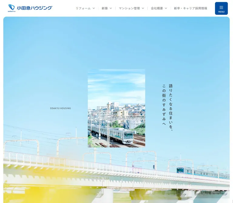
Odakyu Housing presents its business through the places and people along its railway corridor. The opening pairs an expansive photograph of sky and a railway bridge with a smaller portrait photograph placed over it. On desktop, a narrow vertical Japanese slogan balances the central image; a small English identifier sits on the opposite side. The surrounding interface remains quiet: a white header, gray Japanese navigation, and one compact blue menu control.
The homepage continues as a long corporate narrative with three distinct service routes: renovation, new construction, and condominium management. Generous image areas and measured reading columns create the rhythm. Blue pill links provide consistent navigation, while testimonials, company information, news, editorial content, and partner links give the page the depth of a corporate information hub.
The most reusable relationship is large contextual photography + smaller detailed photography + restrained typography + substantial white space. Rounded corners soften major panels and controls, while photographs within the compositions remain rectangular.
How to Read This Reference
- Measured values come from the supplied rendered DOM, computed styles, or custom properties. Tables round most measurements to two decimal places.
- Visual estimates come only from the supplied current-page screenshots. Image boundaries, photographic colors, and unmeasured slogan typography are identified accordingly.
- Calculated values are arithmetic relationships between supplied measurements, not recovered stylesheet formulas.
- Recommendations describe an adaptation, including the CSS Quick Start. Its class names, breakpoint, focus treatment, and layout formulas are implementation choices.
- Source variables retain their supplied names. Other token names are descriptive aliases.
- The DOM export includes navigation content that is not visible in the closed-header screenshots. Its nonzero or overlapping rectangles do not establish an open menu, visible overflow, or a tested interaction.
- Computed font-family declarations identify the requested families. The evidence does not include font-file inspection or per-glyph font verification.
Tokens — Colors
Core Interface Palette
| Name | Value | Suggested token | Evidence and role |
|---|---|---|---|
| Odakyu Blue | #004ea2 |
--color-brand |
Measured menu-button, service-link, and small circular-control background; also the selected desktop news-category text |
| White | #ffffff |
--color-page |
Measured body background, reversed button text, and white links in photographic sections |
| Reading Gray | #5d636f |
--color-text |
Measured body text, navigation, service labels, and utility links |
| Heading Charcoal | #2f3134 |
--color-heading |
Measured major Japanese headings and testimonial names |
| Pale Blue Gray | #f4f7fb |
--color-panel |
Measured customer-testimonial section background |
| Fine Border Gray | Approximately #dddddd |
--color-rule |
Visual estimate for partner-logo frames and the desktop footer divider; use as an adaptation token |
Blue is concentrated in actionable elements and the identity. Large areas of cyan, pale blue, yellow, and green belong to photographs. They should not become additional application colors merely because they occupy much of the opening screenshot.
The white header is visually opaque in the captures. Its sampled HEADER element itself has a transparent computed background, so the export does not establish which descendant or layer supplies the visible white surface.
Business Colors Present in the Source
| Business | Accent | Source variable | Companion surface variable | Evidence limit |
|---|---|---|---|---|
| Renovation | #cba452 |
--color-business-reform |
--color-business-reform03: #faf7f1 |
The accent is also measured on the corresponding submenu inquiry link |
| New construction | #67c5a3 |
--color-business-newconstruct |
--color-business-newconstruct03: #f6f9f9 |
The accent is also measured on the corresponding submenu inquiry link |
| Condominium management | #e45469 |
--color-business-apartment |
--color-business-apartment03: #f7f6f3 |
The accent is also measured on the corresponding submenu inquiry link |
These accents support service identity within the navigation data. The three large homepage service links are all measured in Odakyu Blue. The companion surface variables exist, but their application to visible homepage components was not established.
The export also contains generic CMS color, gradient, and shadow presets. Their availability is not evidence that this homepage uses them. They are excluded from the design palette.
Tokens — Typography
Japanese Interface and Reading Text
- Declared family:
'Zen Kaku Gothic Antique', sans-serif. - Measured default weight:
400. - Measured emphasis:
500on service names, introductory prose, selected navigation text, and some submenu links. - Body line height:
2at both inspected widths. - Body tracking:
0.05em, calculated from the supplied pixel values. - Character: open, restrained Japanese sans-serif text with generous line spacing. Headings gain presence primarily through size, spacing, and placement.
The logo is an inline SVG identity. Its lettering should not be recreated by typing the company name in the body font. The generic Times declaration on the root element does not describe the visible page typography.
English Labels and Editorial Display
- Declared family:
Barlow, sans-serifon the measured service translations, copyright text, and editorial title. - Service translations: small, regular-weight labels such as
Reform / RenovationandCondominium Management. - Editorial title: a much larger, light treatment with a reported weight of
250and tracking of-0.03em. - Editorial subtitle: reported weight
300. - Sampled copyright: reported weight
500.
The computed weight of 250 does not independently establish the font-file format or available font faces. Load an appropriate authorized face when reproducing this treatment.
Hero Slogan
The visible desktop slogan reads 語りたくなる住まいを、この街のすみずみへ across two vertical columns. The mobile version places the two phrases horizontally near the lower left of the photograph, in white.
Its exact font family, glyph dimensions, and implementation as live text or artwork are not supplied. Visually, the characters are approximately 20–23px with deliberate spacing. Those are estimates, not computed values. A live-text version using writing-mode: vertical-rl on desktop is an implementation recommendation.
Measured Type Scale
| Role | Desktop | Mobile | Weight | Line height / tracking |
|---|---|---|---|---|
| Body paragraph | 15.74px |
14.02px |
400 |
2; 0.05em |
| Introductory story paragraph | 15.61px |
14px |
500 |
2.4; inherited body tracking |
| Desktop primary navigation | 15.74px |
Not visible | 400 |
1; normal tracking |
| Mobile submenu link | Not applicable | 15px |
400 |
1; normal tracking |
| Small section label, such as business/company | 22.69px |
24px |
400 |
1.4; normal tracking |
| Business introduction statement | 37.91px |
24.20px |
400 |
1.7; 0.03em |
| Service name | 23.22px |
24px |
500 |
1; inherited body tracking |
| English service translation | 11.74px |
10.02px |
400 |
1; inherited pixel tracking |
| Testimonials/news section heading | 46.60px |
24.32px |
400 |
1.4; normal tracking |
| Testimonial name | 17.74px |
16.02px |
400 |
1; inherited body tracking |
| Testimonial service label | 11.74px |
10.02px |
400 |
1; inherited body tracking |
| Company statement | 30.96px |
24.10px |
400 |
1.7; 0.03em |
| News item title | 17.61px |
15.04px |
400 |
1.7; normal tracking |
| Editorial title | 75.82px |
48.39px |
250 |
1; -0.03em |
| Inquiry-card service name | 28.96px |
22.10px |
400 |
1.4; normal tracking |
| Inquiry-card supporting label | 17.48px |
14.05px |
400 |
1.75; normal tracking |
| Sampled copyright | 11.74px |
12px |
500 |
1; normal tracking |
Small section labels and service names do not simply shrink on mobile: some become slightly larger. Preserve that distinction instead of applying a universal desktop-to-mobile scale factor.
Tokens — Spacing & Shapes
Layout Measurements
| Element | Desktop | Mobile | Evidence |
|---|---|---|---|
| Header | 1440 × 88.03px |
390 × 75.17px |
Measured |
| Logo | 243.89 × 44.02px |
171.03 × 30.67px |
Measured |
| Logo position | x 46.08, y 22px |
x 20.36, y 22.25px |
Measured |
| Menu button | 68.03 × 68.03px |
55.17 × 55.17px |
Measured; y 10px at both widths |
| Main outer inset | 18.69px per side |
0px |
Measured |
| Main width | 1402.63px |
390px |
Measured |
| Standard editorial content | 1121.81px wide, starting at x 159.09 |
349.53px wide, starting at x 20.23 |
Measured |
| Opening story text region | 1121.81px wide |
309.53px wide, starting at x 40.23 |
Measured |
| Service paragraph column | 360.84px |
Approximately 350px |
Measured |
| Primary service link | 300 × 56.63px |
300 × 50.48px |
Measured |
| Company/editorial pill link | 230 × 56.63px |
230 × 50.48px |
Measured |
| Testimonial text region | 405.97px wide |
248.27px wide |
Measured text width, not a complete card boundary |
| Inquiry card | 407.84 × 436.45px |
348.78 × 352.52px |
Measured |
| Document height | 10611.08px |
9809.17px |
Measured for these captured states |
The desktop editorial region is approximately 80% of the inset main width. This is a calculated relationship at one viewport, not a recovered source rule. The mobile layout uses roughly 20px reading gutters, with an additional 20px inset for the opening story.
Spacing Rhythm
| Use | Measured or calculated value | Reusable interpretation |
|---|---|---|
| Menu control top clearance | 10px |
Keep the utility control visibly separated from the viewport edge |
| Mobile standard content gutter | About 20px |
Main reading alignment |
| Mobile opening-story gutter | About 40px |
A quieter, narrower narrative introduction |
| Primary-link label/icon gap | 7.87px desktop; 7.01px mobile |
Compact internal spacing |
| Service paragraph to link | 56.08px desktop; 30.36px mobile |
Calculated from paragraph bottom to anchor top |
| Inquiry-card column gap | 26.08px desktop |
Calculated from card bounds |
| Inquiry-card row gap | 20.11px mobile |
Calculated from stacked card bounds |
| Testimonial-panel top padding | 112.16px desktop; 60.73px mobile |
Measured |
| Testimonial-panel bottom padding | 121.51px desktop; 160px mobile |
Measured; mobile keeps substantial space below the text track |
| Gaps between several major sections | Roughly 106–136px desktop; 80–81px mobile |
Calculated examples, not one universal source variable |
| Mobile partner-link group gap | 30px |
Calculated from successive anchor bounds |
| Mobile footer utility-link interval | 42.08px |
Calculated top-to-top spacing |
A practical adaptation scale is 8 / 10 / 20 / 30 / 40 / 60 / 80 / 120px. This is a recommended consolidation of the observed rhythm, not an extracted spacing system.
Shapes
| Element | Value | Status |
|---|---|---|
| Menu button | 8px radius |
Measured |
| Testimonial section | 25px radius |
Measured at both widths |
| Inquiry anchors and many link boxes | 5px radius |
Measured; an invisible link box is not necessarily a visible card |
| Primary and secondary pill links | 1440px desktop; 844px mobile |
Measured computed radii; the visible result is fully rounded |
| Small blue controls | 30 × 30px, 50% radius |
Measured |
| Hero outer corners | Approximately 16–18px |
Visual estimate |
| Partner-logo frames | Approximately 8px |
Visual estimate |
| Layered photographic inserts | Square corners | Visually observed |
Use 999px or an equivalent pill radius in a new implementation. The large sampled radius values do not require copying viewport-sized numbers.
Components
Persistent Corporate Header
Role: maintain identity and access to the site's major businesses.
The desktop header contains a home-linked SVG logo on the left, five navigation groups toward the right, and a separate blue menu button at the far right. The visible groups are リフォーム, 新築, マンション管理, 会社概要, and 採用情報. Small downward chevrons accompany the groups; pale vertical separators give them structure without enclosing each item.
The logo and menu remain at the top of the scrolled screenshots. This establishes persistent header behavior, although the supplied style subset does not distinguish fixed from sticky positioning.
On mobile, the desktop navigation disappears. The logo reduces to approximately 171px wide and the menu button to approximately 55px square. Both remain comfortably separated across the white header.
The menu button combines a simple white line icon with the small visible label MENU. Its accessible name and expanded state were not supplied.
Navigation Content and Service Submenus
Role: expose the site's deeper information architecture.
The desktop DOM contains a menu structure with three large business links, additional corporate/topic links, utility links, a copyright line, and メニューを閉じる. The sampled large business-link rectangles are approximately 303 × 464px. Separate submenu structures contain service-specific links and inquiry buttons.
The mobile DOM represents the three businesses as buttons followed by link groups. Sampled business-button boxes are approximately 342 × 116px; subsidiary links have 61px row boxes with 15px text and 22.5px vertical padding.
These structures support a responsive navigation model, but the open appearance was not captured. Do not reproduce the exported overlapping or translated positions as an intended visible layout. Opening triggers, accordion behavior, focus handling, and dismissal remain unverified.
Layered Opening Scene
Role: establish the company's connection to its local area before introducing services.
The desktop scene begins directly below the header, inside the approximately 19px outer page margins. A sky-dominated photograph fills the large rounded frame. Railway infrastructure enters from the lower portion. A smaller, crisp portrait photograph shows a train passing through the neighborhood.
In the desktop opening screenshot, the portrait insert is approximately 346 × 475px, centered horizontally, with its top near screenshot coordinate y 307px. The small ODAKYU HOUSING identifier sits to its left. The two-column vertical slogan sits to its right, with ample sky separating the three elements.
The mobile scene fills the viewport width and ends near y 824px, making its visible height approximately 749px below the 75px header. Its portrait insert is approximately 212 × 286px, beginning around x 89, y 230px. The slogan moves below the insert and becomes two horizontal white lines near x 40px.
The mobile insert contains a translucent overlap of a staff member and railway imagery. This is consistent with an image transition, but a still capture does not establish the sequence or prove that double exposure is a permanent design treatment.
There is no prominent conversion button in the supplied opening scene. Its primary job is identity and atmosphere.
Opening Story
Role: connect the opening image to the company's service philosophy.
The introductory paragraphs begin with 小田急線が通るこの街で、今日も人と人が繋がっている。 and continue as a short relationship-focused narrative.
On desktop, the measured text is white, with approximately 15.61px type and 37.46px line height. On mobile, it becomes gray text with 14px type and 33.6px line height, in a narrower 309.53px region. Mobile copy uses more explicit line breaks.
The measured opening section includes both the photographic opening and these paragraphs: approximately 1709px tall on desktop and 1224px on mobile. Those numbers are not measurements of the initial image frame alone.
Business Introduction
Role: explain the relationship between the company's three businesses.
A small section heading, 私たちの事業, precedes a larger two-line statement and explanatory prose. On desktop, the statement occupies a left region approximately 411px wide while the paragraph sits in a right region approximately 558px wide. The two regions are offset slightly vertically rather than forced onto a rigid shared baseline.
On mobile, the heading, statement, and paragraph stack within the approximately 350px content width. The statement reduces from 37.91px to 24.20px, retaining its 1.7 line height and regular weight.
Service Narrative
Role: introduce each business and provide one clear onward route.
Each of the three narratives contains:
- A Japanese service name.
- A small English translation.
- A multi-line Japanese statement.
- A large visual area.
- A restrained explanatory paragraph.
- A blue pill link with a right-pointing arrow.
The desktop text regions share a left alignment near x 159px and a width of approximately 361px. The condominium-management screenshot shows the image area occupying the right side, beginning near x 636px and reaching the main frame's right edge.
That image composition combines a broad city panorama with a smaller foreground photograph of two people looking toward an apartment building. The foreground image has square corners and aligns with the bottom of the visible composition. Its visible width is approximately 398px within a contextual image region approximately 785px wide. These are screenshot estimates of the visible excerpt, not complete source-image dimensions.
The mobile DOM places the service name and English label well before the paragraph and action, leaving substantial intervening space for the statement and media. The supplied screenshots do not show these mobile media compositions, so their exact crops and layering are unverified.
Primary Pill Link
Role: provide predictable navigation from each service narrative.
The three links are リフォーム事業について, 新築事業について, and マンション管理事業について. Each is measured at 300px wide on both viewports. Height changes from approximately 56.63px to 50.48px.
The anchor uses a grid: a flexible label region followed by a compact arrow region. On desktop, the reported columns are approximately 232.33px and 15.47px, separated by 7.87px. The left and right padding are asymmetric, approximately 20px and 24.35px.
The fill is #004ea2, the text is white, and the sampled anchor weight is 400. Nested label styling was not included, so apparent text emphasis in the screenshot should not be converted into an assumed bold font weight.
The large computed padding and inherited line-height values do not independently explain the final anchor height; nested content contributes to the layout. The Quick Start reproduces the measured outer dimensions with a simpler internal arrangement.
Customer Testimonials
Role: show experience across all three service categories.
The section is a pale blue-gray panel with 25px corners. Its content includes ten testimonial entries, each with a quotation, customer identifier, and small service label. The current desktop excerpt also reveals a delicate blue line illustration of houses near the top of this panel.
The DOM positions entries along a horizontal track, including entries outside the viewport. Text widths are approximately 406px on desktop and 248px on mobile. Successive text-region starts are approximately 511px apart on desktop and 319px apart on mobile. Several desktop entries alternate vertically by approximately 61px; the mobile sample is almost level.
Two blue circular 30px buttons are present. Their exact actions and accessible labels were not supplied. The layout supports a carousel interpretation, but autoplay, direction, wrapping, drag gestures, and timing were not tested.
Company Introduction
Role: connect corporate purpose with company and recruitment information.
The DOM establishes white headings and body text, followed by two white pill links. The statement is “深く聴き、支え抜き、強く必要とされる人になる”.
Desktop places the heading and statement in a left column and supporting prose with two adjacent actions in a right column. The actions are each 230px wide with a 10px gap. Mobile stacks the text and then stacks the two actions with the same 10px gap.
The section's exact background image and its crop are not visible in the supplied screenshot excerpts. The white text establishes a reversed treatment, but the underlying visual should not be invented from that fact alone.
News List
Role: expose current corporate updates without overwhelming the page.
The desktop heading is approximately 46.60px. Three nearby category links are present: すべて, お知らせ, and ニュースリリース. The first is blue and weight 500. These are anchors to news/category URLs; in-place filtering was not demonstrated.
Each news entry is a large link containing date/category metadata and a title. Desktop rows use two columns, with an approximately 175–178px metadata region, a roughly 19px gap, and the remaining width for the title. Each sampled row is approximately 101px tall.
Mobile uses one column, placing metadata above the title. The longest sampled entry becomes approximately 151px tall; the shorter entries are approximately 127px. Category navigation is absent from the supplied mobile visible-text and link evidence.
The final お知らせ一覧 link aligns toward the right. Row-border styling is not included in the supplied measurements; a fine divider in the Quick Start is a recommended adaptation.
Editorial Promotion
Role: introduce practical housing and renovation content.
The section combines a large Barlow editorial title, Life&Idea,House,Reform, a short Japanese explanation, and a white 230px pill link labeled 住まいのコラム.
The desktop text region sits toward the right and is approximately 363px wide. On mobile, it moves into a roughly 310px region inside a panel with 20px outer padding, and the action is centered.
White typography is measured at both widths. The supplied excerpts do not establish the precise background artwork. Preserve the type hierarchy and spatial relationship while treating the imagery as an unresolved asset requirement.
Service Inquiry Cards
Role: repeat the three business routes near the end of the main content.
Three large white anchors contain a service name and the supporting label についての資料請求・お問い合わせ. Desktop uses three equal cards, approximately 408 × 436px, with approximately 26px gaps. Mobile stacks cards of approximately 349 × 353px, separated by approximately 20px.
Measured padding is approximately 47px at the top and 39px at the sides on desktop, reducing to approximately 30px on mobile. The anchor radius is 5px.
Despite their inquiry wording, the supplied href values point to the corresponding service root pages. Do not describe them as direct form links. Additional image or icon details inside these cards are not established by the supplied excerpts.
Corporate Footer and Partner Links
Role: close the narrative with practical navigation and group relationships.
Desktop uses a white footer with a narrow railway photograph at the left and site navigation to the right. The DOM identifies three groups: Service, Corporate, and Topics. Partner links sit below in framed logo blocks, with underlined text labels and small diagonal external-link arrows.
The visible partner links are 小田急不動産, 小田急グループ, and 株式会社リプレイス. Their logos retain their own identity colors within white, lightly bordered frames. Desktop shows two frames across and a third on the next row. Each visible frame is approximately 306 × 89px.
Mobile presents the partner links in one column. Each measured complete anchor, including its caption, is approximately 350 × 139px, with 30px between anchors. The desktop navigation columns are absent from the mobile visible-text evidence.
A fine desktop divider separates the footer utility row. On mobile, utility links stack with approximately 42px top-to-top intervals, followed by a generous gap before ©Odakyu Housing Co., Ltd..
Campaign Banner Rail
Role: provide secondary promotional and group-service destinations after the footer utilities.
The desktop screenshot shows a horizontal row of small, colorful campaign banners, approximately 240 × 115px each. Mobile measurements are 175.92 × 85.47px with approximately 15.05px gaps. The third mobile banner begins beyond the viewport at x 402px, confirming a horizontal track rather than a two-column wrapping grid.
The first two visible banners promote a seasonal renovation campaign and a housing-subsidy campaign. Other destinations are present in the DOM. The banners contain their own lettering and artwork; their colors are not general page tokens.
Manual scrolling, automatic advancement, and carousel controls were not verified.
Tokens — Motion & Interaction
Measured Transition Declarations
| Element or treatment | Supplied declaration | What it establishes |
|---|---|---|
| Header | opacity 0.4s, left 0.4s |
Opacity and horizontal-position transitions are defined; their triggers are unknown |
| Menu button | background-color 0.4s, border-color 0.4s |
Color feedback is defined; destination colors are not supplied |
| Many text links | color 0.4s |
A restrained text-color transition |
| Submenu top links | color 0.4s cubic-bezier(0.39, 0.575, 0.565, 1) |
One measured easing curve for navigation feedback |
| Service inquiry links in submenus | color 0.4s, background-color 0.4s |
Coordinated foreground/background changes are defined |
| Main pill links | 0.4s ease-in-out |
A 400ms transition is defined; the sampled shorthand does not identify a narrower property list |
| Small section headings | filter 0.8s, opacity 0.4s |
Filter and opacity transitions are available |
| Large narrative statements | filter 1.2s, opacity 0.8s |
Longer statement transitions are available |
| Opening and introductory paragraphs | translate 1.2s, opacity 0.8s |
Translation and opacity transitions are available |
The supplied declarations suggest gentle reveals and restrained navigation feedback. They do not expose the initial filter amount, translation distance, delay, scroll threshold, or complete easing configuration. Do not invent those as source values.
Visual Evidence and Limits
- The header remains at the top in scrolled captures.
- The mobile opening contains overlapping image content consistent with a dissolve. No image-transition duration or complete sequence is available.
- Testimonial entries are distributed horizontally, with offscreen entries and two small circular controls. Interaction behavior is unverified.
- The banner area is a horizontal track. Its advancement mechanism is unverified.
animation: noneon sampled elements does not rule out motion on descendants, pseudo-elements, or JavaScript-controlled layers.- A computed
transition: allwithout a supplied nonzero duration should not be interpreted as a measured animation effect.
For an adaptation, use 400ms for restrained interface feedback and the measured 800–1200ms durations as a reference for optional narrative reveals. Keep content visible by default, and introduce reveal motion only with a reduced-motion alternative.
Surfaces
| Layer | Appearance | Function |
|---|---|---|
| Page canvas | White | Keeps long-form corporate content light and readable |
| Header | Visually white | Stable identity and navigation surface |
| Opening scene | Rounded photographic field | Establishes location and atmosphere |
| Photographic insert | Crisp rectangle without visible elevation | Adds a specific human or neighborhood detail |
| Service body | White with broad open areas | Separates prose from large imagery |
| Testimonial panel | #f4f7fb, 25px corners |
Groups customer voices and line illustration |
| Primary action | Solid blue pill | Consistent onward navigation |
| Secondary action | White pill with gray text | Navigation within reversed content areas |
| Partner frame | White, fine gray outline | Holds externally branded logos consistently |
| Campaign banner | Self-contained graphic | Allows promotional variation near the page end |
No prominent shadow-based elevation system is visible in the supplied screenshots. Separation comes from white space, image edges, light borders, and changes between white and pale panel fills.
Imagery
Photography establishes both geography and trust. The opening uses blue sky, a railway bridge, neighborhood buildings, and a commuter train. The mobile crop includes bright, soft foreground foliage and flowers. The service excerpt combines a distant city view with people attending to an apartment building.
The repeated visual device is an image within an image. The larger photograph supplies setting; the smaller photograph supplies a more specific subject. Their rectangular relationship matters more than a decorative frame or shadow.
The testimonial excerpt adds a pale blue architectural line drawing. Its thin strokes and low contrast keep it subordinate to the prose and complement the photographed housing context.
Observed Asset References
The supplied evidence does not contain usable source image-file paths. This inventory identifies observed asset roles without inventing URLs.
| Asset role | Original-page evidence | Implementation guidance |
|---|---|---|
| Corporate logo | Header in desktop and mobile captures; inline SVG fragments in DOM | Use the authorized logo asset and preserve its proportions |
| Sky and railway-bridge background | Desktop and mobile opening captures | Choose crops that retain open sky above the railway |
| Neighborhood train portrait | Desktop opening and footer | Preserve a vertical crop and recognizable local context |
| Staff portrait | Translucent image within the mobile opening | Obtain the complete image sequence before reproducing its motion |
| City panorama | Desktop condominium-management excerpt | Use as the contextual image behind the detailed scene |
| People beside an apartment building | Desktop condominium-management excerpt | Preserve the relationship between the people, building, and greenery |
| Residential line illustration | Top of the testimonial panel in the desktop excerpt | Use delicate blue linework with generous surrounding space |
| Partner logos | Desktop and mobile footer | Contain within consistent white frames; do not recolor them |
| Campaign graphics | Desktop and mobile footer rail | Preserve their embedded text and aspect ratio |
The exact reform, new-construction, company-introduction, and editorial-promotion images are not visible in the supplied cuts. Their subjects and source filenames remain unverified.
Layout & Responsive Behavior
Page Sequence and Scale
| Section | Desktop height | Mobile height | Interpretation |
|---|---|---|---|
| Opening scene and story | 1709.17px |
1223.53px |
Includes more than the first-screen photograph |
| Business introduction and three services | 3474px |
3185.73px |
The central service narrative occupies substantial page depth |
| Testimonials | 789.50px |
566.33px |
Horizontal content remains a track at both widths |
| Company introduction | 1057.47px |
882.22px |
Actions move from adjacent to stacked |
| News | 566.45px |
561.13px |
Mobile title wrapping offsets the smaller typography |
| Editorial promotion | 498.67px |
646.28px |
The mobile composition becomes taller |
These are recorded section bounds, not recommended hardcoded heights. Content changes and different capture states can change them.
Desktop-to-Mobile Changes
| Feature | Desktop observation | Mobile observation |
|---|---|---|
| Header | Logo, five navigation groups, menu control | Logo and menu control |
| Main outer frame | Approximately 19px side margins |
Full viewport width |
| Hero slogan | Dark, vertically set, right of the image | White, horizontal, below the image |
| Hero English identifier | Visible left of the image | Absent from the supplied opening capture |
| Opening prose | White, wider text region | Gray, narrower text region with additional line breaks |
| Business introduction | Statement and prose in separate columns | Stacked statement and prose |
| Service reading column | Approximately 361px |
Approximately 350px |
| Primary service link | 300px wide |
Still 300px wide, shorter height |
| Company actions | Two 230px links side by side |
Two 230px links stacked |
| News categories | Three links visible | Absent from mobile visible evidence |
| News entry | Metadata beside title | Metadata above title |
| Inquiry cards | Three equal columns | One vertical stack |
| Partner links | Two-column arrangement | One-column arrangement |
| Footer utilities | Horizontal row | Vertical sequence |
| Campaign graphics | Horizontal track | Horizontal track, not a wrapping grid |
Only two responsive endpoints were inspected. The actual breakpoint values, intermediate layouts, landscape behavior, and browser-zoom behavior are not supplied. Use content fit to choose implementation breakpoints rather than presenting a guessed breakpoint as original CSS.
Do’s and Don’ts
Do
- Preserve the relationship between broad contextual photography and smaller rectangular photographic inserts.
- Keep the primary interface colors exact: blue
#004ea2, reading gray#5d636f, heading charcoal#2f3134, and white. - Use Zen Kaku Gothic Antique for the measured Japanese interface roles and Barlow for the measured English roles.
- Keep Japanese body text open, with approximately double line height and modest tracking.
- Retain the desktop vertical slogan and the distinct mobile horizontal composition.
- Treat renovation, new construction, and condominium management as parallel navigation routes.
- Maintain generous section spacing and a narrow desktop service-reading column beside large imagery.
- Keep blue pill links consistent across the three homepage service narratives.
- Use pale panels, fine borders, and image boundaries to organize surfaces.
- Preserve partner logos and campaign graphics as independent branded assets.
- Distinguish visible screenshots from closed-menu DOM content when reproducing components.
Don’t
- Do not reduce the corporate homepage to one campaign message or one conversion route.
- Do not replace the layered opening with a generic full-width stock photograph and oversized centered headline.
- Do not turn every section into a rounded card or add a general drop-shadow system.
- Do not promote photographic yellow, green, or cyan into unrelated interface action colors.
- Do not treat generic CMS gradients and shadow presets as observed design decisions.
- Do not copy the logo as ordinary text or assign an unverified font to the hero slogan.
- Do not keep the desktop vertical slogan unchanged on a narrow phone.
- Do not assume the banner rail wraps after two mobile items.
- Do not describe category links as tested client-side filters or inquiry cards as direct form links.
- Do not claim autoplay timing, parallax, hover destinations, or menu mechanics that were not demonstrated.
Recommended Implementation Additions
These are recommendations for a new implementation, not verified features of the original page.
- Give the menu trigger an accessible name,
aria-expanded, and an explicit relationship to its controlled navigation. Support Escape and restore focus on dismissal. - Ensure closed navigation content cannot receive focus. The exported geometry alone is insufficient to assess the original behavior.
- Preserve a visible focus indicator on blue pills, partner links, news rows, and campaign banners.
- Expand the hit area around small chevrons and
30pxcircular controls to at least44pxwhere practical, while retaining their visual scale. - Check the mobile white slogan against every image state. Adjust the crop or add a localized contrast treatment if required.
- Provide pause controls if image or testimonial sequences advance automatically. Under reduced motion, show a stable image and a manually navigable content list.
- Keep reveal content visible when JavaScript fails and when reduced motion is requested.
- Use meaningful image alternatives for informative photographs and campaign links. Decorative contextual photographs and line illustrations can use empty alternatives when nearby text supplies their meaning.
- Reserve image dimensions to prevent shifts, and load below-fold photography progressively while prioritizing the opening image.
- Keep footer and service navigation reachable on small screens even when desktop link groups are omitted visually.
Agent Prompt Guide
Quick Color Reference
- Page:
#ffffff. - Primary actions and menu control:
#004ea2with white text. - Reading text:
#5d636f. - Major headings:
#2f3134. - Testimonial panel:
#f4f7fb. - Fine rules: approximately
#dddddd, an adaptation estimate. - Service accents available in the source: renovation
#cba452, new construction#67c5a3, condominium management#e45469. - Sky, flowers, and greenery are photographic content rather than fixed UI colors.
Overall Prompt
“Create a Japanese housing-company homepage with a calm corporate structure and strong neighborhood photography. Use a white canvas, Odakyu-like blue #004ea2 for navigation, gray #5d636f for reading text, Zen Kaku Gothic Antique for Japanese text, and Barlow for small English labels. Place an expansive railway-and-sky photograph inside a softly rounded opening frame, then overlay a smaller square-cornered portrait photograph. Balance it with a small English identifier on the left and a two-column vertical Japanese slogan on the right. On mobile, move the slogan below the portrait and set it horizontally in white. Continue with three spacious service narratives, blue pill links, a pale testimonial panel, company information, a text-led news list, editorial promotion, service inquiry cards, and a practical white footer. Keep the photography specific, the headings restrained, and the desktop reading columns narrow.”
Example Component Prompts
- Header: “Build a persistent white corporate header with an authorized SVG logo on the left, five compact Japanese navigation groups with small chevrons on desktop, and a separate blue rounded-square MENU button. At 390px, show only the approximately 171px logo and 55px menu control inside a 75px header.”
- Opening scene: “Compose a wide railway-and-sky image with a centered portrait photograph around 346px wide at a 1440px viewport. Leave open sky around it. Position a small English identifier to the left and a narrow vertical Japanese slogan to the right. Recompose the mobile slogan as two white horizontal lines below a roughly 212px portrait insert.”
- Service narrative: “Introduce condominium management with a Japanese service name, a tiny Barlow English translation, a short multi-line statement, and a 361px reading column. Place a broad city panorama to the right with a smaller rectangular photograph of people beside an apartment building aligned toward its bottom. End the text with a 300px blue pill link and a separate right-arrow column.”
- Testimonials: “Use a
#f4f7fbpanel with 25px corners, a regular-weight Japanese heading, delicate blue residential linework, and horizontally arranged quotations with customer names and small service labels. Keep manual controls accessible. Treat autoplay as an optional feature requiring pause and reduced-motion behavior.” - News: “Create three spacious news links with date/category metadata to the left of regular-weight titles on desktop. Stack metadata above each title on mobile. Use gray text and restrained blue emphasis. Implement category destinations as links unless in-place filtering is explicitly required.”
- Footer: “Use a white footer with underlined utility links, framed partner logos, and a narrow railway photograph in the desktop layout. Stack partner links and legal links on mobile. Put small campaign graphics in a separate horizontal rail below the copyright, preserving their embedded artwork.”
Quick Start
CSS Custom Properties
This CSS is a reusable adaptation, not a recovered stylesheet. Exact colors and selected endpoint dimensions come from the measurements above. Fluid type formulas, the 75rem breakpoint, intermediate layouts, hover color, image-frame heights, and accessible focus styles are recommendations.
Use a conventional root font size. Load the declared fonts separately through an authorized source. Supply actual image assets to image elements; no original image-file URLs were available in the evidence.
Markup contract: .site-header contains .brand, .desktop-nav, and .menu-button. .hero-scene contains two image elements, .hero-background and .hero-portrait, followed by .hero-kicker and .hero-slogan. Place an explicit line break between the slogan's two phrases. Each .service contains .service-heading, .service-message, .service-media, .service-summary, and a .pill link. The media container holds .media-context and .media-detail images. Pill links contain a label and a separate decorative arrow.
:root {
  /* Measured interface colors */
  --color-brand: #004ea2;
  --color-page: #ffffff;
  --color-text: #5d636f;
  --color-heading: #2f3134;
  --color-panel: #f4f7fb;

  /* Estimated rule and recommended hover color */
  --color-rule: #dddddd;
  --color-brand-hover: #003d80;

  /* Source business colors */
  --color-reform: #cba452;
  --color-construction: #67c5a3;
  --color-management: #e45469;

  --font-jp: 'Zen Kaku Gothic Antique', sans-serif;
  --font-en: 'Barlow', sans-serif;

  /* Recommended interpolation between measured endpoints */
  --text-body: clamp(14.02px, calc(13.38px + 0.164vw), 15.74px);
  --text-heading: clamp(24.32px, calc(16.04px + 2.122vw), 46.6px);
  --text-statement: clamp(24.2px, calc(19.1px + 1.306vw), 37.91px);
  --text-caption: clamp(10.02px, calc(9.38px + 0.164vw), 11.74px);

  --header-height: 75.17px;
  --menu-size: 55.17px;
  --logo-width: 171.03px;
  --page-inset: 0px;
  --pill-height: 50.48px;
  --section-space: 80px;

  --radius-control: 8px;
  --radius-card: 5px;
  --radius-panel: 25px;
  --radius-hero: 17px;
  --radius-pill: 999px;

  --motion-ui: 400ms;
  --motion-copy: 800ms;
  --motion-translate: 1200ms;
}

* { box-sizing: border-box; }

body {
  margin: 0;
  color: var(--color-text);
  background: var(--color-page);
  font-family: var(--font-jp);
  font-size: var(--text-body);
  font-weight: 400;
  line-height: 2;
  letter-spacing: 0.05em;
}

img { display: block; max-width: 100%; }
button, a { -webkit-tap-highlight-color: transparent; }
a { color: inherit; }
button { font: inherit; }

.site-header {
  position: sticky;
  top: 0;
  z-index: 100;
  display: flex;
  align-items: center;
  justify-content: space-between;
  gap: 24px;
  height: var(--header-height);
  padding-inline: 20px;
  background: var(--color-page);
}

.brand { display: block; width: var(--logo-width); flex-shrink: 0; }
.brand svg, .brand img { display: block; width: 100%; height: auto; }
.desktop-nav { display: none; }

.menu-button {
  display: grid;
  place-content: center;
  justify-items: center;
  gap: 8px;
  width: var(--menu-size);
  height: var(--menu-size);
  padding: 0;
  flex-shrink: 0;
  border: 0;
  border-radius: var(--radius-control);
  color: white;
  background: var(--color-brand);
  cursor: pointer;
  transition: background-color var(--motion-ui);
}

.menu-lines { display: grid; gap: 4px; }
.menu-lines span { width: 18px; height: 2px; background: currentColor; }
.menu-caption { font: 500 10px/1 var(--font-en); letter-spacing: 0; }

.page-frame { margin-inline: var(--page-inset); }
.content { width: min(calc(100% - 40px), 1121.81px); margin-inline: auto; }
.section { margin-block: var(--section-space); }
.section-title {
  margin: 0;
  color: var(--color-heading);
  font-size: var(--text-heading);
  font-weight: 400;
  line-height: 1.4;
  letter-spacing: normal;
}

.hero-scene {
  position: relative;
  isolation: isolate;
  height: calc(100svh - var(--header-height) - 20px);
  min-height: 680px;
  overflow: hidden;
  border-radius: var(--radius-hero);
  background: var(--color-panel);
}

.hero-background {
  position: absolute;
  inset: 0;
  z-index: -1;
  width: 100%;
  height: 100%;
  object-fit: cover;
}

.hero-portrait {
  position: absolute;
  top: 155px;
  left: 50%;
  width: min(54.36%, 260px);
  aspect-ratio: 212 / 286;
  object-fit: cover;
  transform: translateX(-50%);
}

.hero-kicker { display: none; }
.hero-slogan {
  position: absolute;
  right: 24px;
  bottom: 84px;
  left: 40px;
  margin: 0;
  color: white;
  font-size: 20px;
  font-weight: 500;
  line-height: 1.8;
  letter-spacing: 0.18em;
}

/* Text adaptation; the original slogan's font was not measured. */
.opening-story {
  width: min(calc(100% - 80px), 1121.81px);
  margin: 76px auto 0;
  font-size: 14px;
  font-weight: 500;
  line-height: 2.4;
}
.opening-story p + p { margin-top: 30px; }

.business-intro { display: grid; gap: 40px; }
.business-statement {
  margin: 0;
  color: var(--color-heading);
  font-size: var(--text-statement);
  font-weight: 400;
  line-height: 1.7;
  letter-spacing: 0.03em;
}

.service {
  display: grid;
  grid-template-areas: 'heading' 'message' 'media' 'summary' 'action';
  gap: 24px;
  margin-block: 100px;
}
.service-heading { grid-area: heading; }
.service-message { grid-area: message; font-size: 28px; line-height: 1.7; }
.service-summary { grid-area: summary; }
.service > .pill { grid-area: action; margin-left: 20px; }
.service > :not(.service-media):not(.pill) {
  width: calc(100% - 40px);
  margin: 0 auto;
}
.service-heading h3 { margin: 0; font-size: 24px; font-weight: 500; line-height: 1; }
.service-heading p {
  margin: 17px 0 0;
  font: 400 var(--text-caption)/1 var(--font-en);
}

.service-media {
  grid-area: media;
  position: relative;
  min-height: 330px;
  margin-inline: 20px;
  overflow: hidden;
}
.media-context { width: 100%; height: 100%; object-fit: cover; }
.media-detail {
  position: absolute;
  bottom: 0;
  left: 17.5%;
  width: 65%;
  aspect-ratio: 1.27;
  object-fit: cover;
}

.pill {
  display: grid;
  grid-template-columns: minmax(0, 1fr) 16px;
  align-items: center;
  gap: 8px;
  width: min(300px, calc(100% - 40px));
  min-height: var(--pill-height);
  padding: 12px 24px 12px 20px;
  border: 0;
  border-radius: var(--radius-pill);
  color: white;
  background: var(--color-brand);
  font: inherit;
  line-height: 1.2;
  letter-spacing: normal;
  text-align: center;
  text-decoration: none;
  transition: color var(--motion-ui) ease-in-out,
              background-color var(--motion-ui) ease-in-out;
}
.pill--light { width: min(230px, 100%); color: var(--color-text); background: white; }

.voices {
  padding-block: 60.73px 160px;
  border-radius: var(--radius-panel);
  background: var(--color-panel);
}

/* Manual scrolling is an adaptation, not a verified source behavior. */
.voice-rail {
  display: flex;
  gap: 70.47px;
  overflow-x: auto;
  padding: 40px;
  scroll-snap-type: x proximity;
}
.voice-item { flex: 0 0 248.27px; margin: 0; scroll-snap-align: start; }
.voice-name { color: var(--color-heading); font-size: 16.02px; }
.voice-category { font-size: var(--text-caption); line-height: 1; }

.news-row {
  display: grid;
  gap: 10px;
  padding-block: 30px;
  border-bottom: 1px solid var(--color-rule);
  text-decoration: none;
}
.news-row h3 { margin: 0; font-size: 15.04px; font-weight: 400; line-height: 1.7; }

.contact-grid { display: grid; gap: 20px; }
.contact-card {
  min-height: 352.52px;
  padding: 30px;
  border: 1px solid var(--color-rule);
  border-radius: var(--radius-card);
  background: white;
  text-decoration: none;
}

.partner-grid { display: grid; gap: 30px; }
.partner-frame {
  display: grid;
  place-items: center;
  aspect-ratio: 3.45;
  border: 1px solid var(--color-rule);
  border-radius: 8px;
}
.partner-frame img { width: 75%; height: 70%; object-fit: contain; }
.legal-links { display: flex; flex-direction: column; align-items: start; gap: 28px; }
.legal-links a { text-underline-offset: 4px; }

.banner-rail { display: flex; gap: 15px; overflow-x: auto; padding-block: 8px; }
.banner-link { flex: 0 0 175.92px; border-radius: 5px; overflow: hidden; }
.banner-link img { width: 100%; aspect-ratio: 2.06; object-fit: contain; }

/* Recommended breakpoint selected for navigation and content fit. */
@media (min-width: 75rem) {
  :root {
    --header-height: 88.03px;
    --menu-size: 68.03px;
    --logo-width: 243.89px;
    --page-inset: 18.69px;
    --pill-height: 56.63px;
    --section-space: 132px;
  }

  .site-header { padding-inline: 46.08px 28.69px; }
  .desktop-nav { display: flex; align-items: center; gap: 24px; margin-left: auto; }
  .desktop-nav a { text-decoration: none; line-height: 1; letter-spacing: normal; }
  .menu-caption { font-size: 12px; }
  .content { width: min(80%, 1121.81px); }

  /* Recommended scene height; the source's full image-frame height is unknown. */
  .hero-scene { height: max(1000px, calc(100svh - var(--header-height))); }
  .hero-portrait { top: 219px; width: 346px; aspect-ratio: 346 / 475; }
  .hero-kicker {
    display: block;
    position: absolute;
    top: 444px;
    left: 22.2%;
    margin: 0;
    font: 400 11.74px/1 var(--font-en);
  }
  .hero-slogan {
    top: 312px;
    right: auto;
    bottom: auto;
    left: 70.3%;
    color: var(--color-heading);
    writing-mode: vertical-rl;
    white-space: nowrap;
    font-size: 22px;
    line-height: 1.7;
    letter-spacing: 0.1em;
  }

  .business-intro { grid-template-columns: 0.85fr 1.15fr; gap: 80px; }
  .service {
    grid-template-columns: 44% 56%;
    grid-template-areas: 'heading media' 'message media' 'summary media' 'action media';
    grid-template-rows: auto 1fr auto auto;
    column-gap: 0;
    row-gap: 28px;
    margin-block: 140px;
  }
  .service > :not(.service-media):not(.pill) { width: 360.84px; margin: 0 0 0 140.42px; }
  .service > .pill { margin-left: 140.42px; }
  .service-heading h3 { font-size: 23.22px; }
  .service-media { min-height: 700px; margin: 0; }
  .media-detail { left: 24.5%; width: 51%; }

  .voices { padding-block: 112.16px 121.51px; }
  .voice-rail { gap: 104.76px; padding-bottom: 105px; }
  .voice-item { flex-basis: 405.97px; }
  .voice-item:nth-child(even) { margin-top: 60.84px; }
  .voice-name { font-size: 17.74px; }

  .news-row { grid-template-columns: 180px minmax(0, 1fr); gap: 18.69px; padding-block: 34.35px; }
  .news-row h3 { font-size: 17.61px; }
  .contact-grid { grid-template-columns: repeat(3, minmax(0, 1fr)); gap: 26.08px; }
  .contact-card { min-height: 436.45px; padding: 47px 39px 39px; }
  .partner-grid { grid-template-columns: repeat(2, minmax(0, 306px)); gap: 24px; }
  .legal-links { flex-direction: row; flex-wrap: wrap; gap: 24px; }
  .banner-rail { gap: 20px; }
  .banner-link { flex-basis: 240px; }
}

/* Recommended feedback; original hover destination colors were not supplied. */
@media (hover: hover) {
  .menu-button:hover,
  .pill:not(.pill--light):hover { background: var(--color-brand-hover); }
  .pill--light:hover { color: var(--color-brand); background: var(--color-panel); }
}

a:focus-visible,
button:focus-visible,
[tabindex]:focus-visible {
  outline: 3px solid var(--color-brand);
  outline-offset: 4px;
}

@media (prefers-reduced-motion: reduce) {
  .menu-button, .pill { transition: none; }
  .voice-rail, .banner-rail { scroll-behavior: auto; }
}
The CSS intentionally leaves the opening story on a readable white surface. Reproducing its measured white desktop text requires the corresponding original photographic or colored backing, which is not fully visible in the supplied excerpts. Menu state management, image sequencing, testimonial controls, and optional reveals require separate behavior code.
Tailwind v4 Token Mapping
Optional aliases for a project that already uses Tailwind v4. This is not evidence that the original site uses Tailwind. Define the custom properties above first.
@theme inline {
  --color-odakyu: var(--color-brand);
  --color-reading: var(--color-text);
  --color-heading: #2f3134;
  --color-voices: var(--color-panel);
  --color-rule: #dddddd;

  --font-japanese: var(--font-jp);
  --font-latin: var(--font-en);

  --text-reading: var(--text-body);
  --text-section: var(--text-heading);
  --text-narrative: var(--text-statement);
  --text-utility: var(--text-caption);

  --radius-control: 8px;
  --radius-panel: 25px;
  --radius-pill: 999px;
  --spacing-page-gutter: 20px;
}
Sources & Evidence
- Original and final website: https://www.odakyuhousing.co.jp/. The supplied inspection reports HTTP
200and no URL change. - Capture time:
2026-09-12T18:26:40.347Z, equivalent to September 13, 2026, 03:26:40 JST. - Desktop evidence: three supplied current-page screenshots at
1440 × 1000, covering the opening, a service-section excerpt, and the footer; rendered DOM and computed styles for the wider homepage. - Mobile evidence: two supplied current-page screenshots at
390 × 844, covering the opening and footer; rendered DOM and computed styles for the wider homepage. - Measurement sources: element rectangles, declared font families, sizes, weights, line heights, tracking, colors, backgrounds, padding, gaps, radii, grid columns, transitions, and custom properties included in the supplied observation.
- Observed behavior: persistent header across scroll captures; responsive changes at the two supplied endpoints; horizontal positioning of testimonial and campaign content. No menu opening, hover sequence, category navigation, form submission, or carousel-control activation was supplied.
- Capture limitations: the supplied process waited at least five seconds initially and used bounded checks for document loading, visible image decoding, layout stability, and finite motion. Perpetual animations were paused during readiness checks and resumed afterward. Those checks do not prove that every delayed state was captured. SharedWorkers and service workers were disabled.
- Scope limitations: this reference analyzes the supplied evidence without additional browsing or file inspection. Full source stylesheets, image URLs, font files, intermediate responsive widths, and linked-page designs were not available. Values and assets outside those limits are explicitly marked as estimates, recommendations, or unverified.
# Odakyu Housing — Style Reference

> A neighborhood story framed by open sky, railway photography, white space, and deep blue navigation.

**Website:** [小田急ハウジング](https://www.odakyuhousing.co.jp/)
**Original URL:** https://www.odakyuhousing.co.jp/
**Final URL:** https://www.odakyuhousing.co.jp/
**Theme:** light in the supplied captures; no theme selector was observed.
**Inspected:** September 13, 2026, at 03:26:40 JST. The supplied retrieval timestamp is `2026-09-12T18:26:40.347Z`.
**Viewports:** desktop `1440 × 1000` and mobile `390 × 844` CSS pixels.
**Scope:** the current corporate homepage. Visual evidence covers the desktop opening, a condominium-management section excerpt, the desktop footer, and the mobile opening and footer. Rendered DOM and computed-style evidence additionally cover the business introduction, three service narratives, customer testimonials, company introduction, news, editorial promotion, and service inquiry links. Linked destinations and open navigation states were not independently inspected.

Odakyu Housing presents its business through the places and people along its railway corridor. The opening pairs an expansive photograph of sky and a railway bridge with a smaller portrait photograph placed over it. On desktop, a narrow vertical Japanese slogan balances the central image; a small English identifier sits on the opposite side. The surrounding interface remains quiet: a white header, gray Japanese navigation, and one compact blue menu control.

The homepage continues as a long corporate narrative with three distinct service routes: renovation, new construction, and condominium management. Generous image areas and measured reading columns create the rhythm. Blue pill links provide consistent navigation, while testimonials, company information, news, editorial content, and partner links give the page the depth of a corporate information hub.

The most reusable relationship is **large contextual photography + smaller detailed photography + restrained typography + substantial white space**. Rounded corners soften major panels and controls, while photographs within the compositions remain rectangular.

## How to Read This Reference

- **Measured** values come from the supplied rendered DOM, computed styles, or custom properties. Tables round most measurements to two decimal places.
- **Visual estimates** come only from the supplied current-page screenshots. Image boundaries, photographic colors, and unmeasured slogan typography are identified accordingly.
- **Calculated** values are arithmetic relationships between supplied measurements, not recovered stylesheet formulas.
- **Recommendations** describe an adaptation, including the CSS Quick Start. Its class names, breakpoint, focus treatment, and layout formulas are implementation choices.
- **Source variables** retain their supplied names. Other token names are descriptive aliases.
- The DOM export includes navigation content that is not visible in the closed-header screenshots. Its nonzero or overlapping rectangles do not establish an open menu, visible overflow, or a tested interaction.
- Computed font-family declarations identify the requested families. The evidence does not include font-file inspection or per-glyph font verification.

## Tokens — Colors

### Core Interface Palette

| Name | Value | Suggested token | Evidence and role |
| --- | --- | --- | --- |
| Odakyu Blue | `#004ea2` | `--color-brand` | Measured menu-button, service-link, and small circular-control background; also the selected desktop news-category text |
| White | `#ffffff` | `--color-page` | Measured body background, reversed button text, and white links in photographic sections |
| Reading Gray | `#5d636f` | `--color-text` | Measured body text, navigation, service labels, and utility links |
| Heading Charcoal | `#2f3134` | `--color-heading` | Measured major Japanese headings and testimonial names |
| Pale Blue Gray | `#f4f7fb` | `--color-panel` | Measured customer-testimonial section background |
| Fine Border Gray | Approximately `#dddddd` | `--color-rule` | Visual estimate for partner-logo frames and the desktop footer divider; use as an adaptation token |

Blue is concentrated in actionable elements and the identity. Large areas of cyan, pale blue, yellow, and green belong to photographs. They should not become additional application colors merely because they occupy much of the opening screenshot.

The white header is visually opaque in the captures. Its sampled `HEADER` element itself has a transparent computed background, so the export does not establish which descendant or layer supplies the visible white surface.

### Business Colors Present in the Source

| Business | Accent | Source variable | Companion surface variable | Evidence limit |
| --- | --- | --- | --- | --- |
| Renovation | `#cba452` | `--color-business-reform` | `--color-business-reform03: #faf7f1` | The accent is also measured on the corresponding submenu inquiry link |
| New construction | `#67c5a3` | `--color-business-newconstruct` | `--color-business-newconstruct03: #f6f9f9` | The accent is also measured on the corresponding submenu inquiry link |
| Condominium management | `#e45469` | `--color-business-apartment` | `--color-business-apartment03: #f7f6f3` | The accent is also measured on the corresponding submenu inquiry link |

These accents support service identity within the navigation data. The three large homepage service links are all measured in Odakyu Blue. The companion surface variables exist, but their application to visible homepage components was not established.

The export also contains generic CMS color, gradient, and shadow presets. Their availability is not evidence that this homepage uses them. They are excluded from the design palette.

## Tokens — Typography

### Japanese Interface and Reading Text

- **Declared family:** `'Zen Kaku Gothic Antique', sans-serif`.
- **Measured default weight:** `400`.
- **Measured emphasis:** `500` on service names, introductory prose, selected navigation text, and some submenu links.
- **Body line height:** `2` at both inspected widths.
- **Body tracking:** `0.05em`, calculated from the supplied pixel values.
- **Character:** open, restrained Japanese sans-serif text with generous line spacing. Headings gain presence primarily through size, spacing, and placement.

The logo is an inline SVG identity. Its lettering should not be recreated by typing the company name in the body font. The generic `Times` declaration on the root element does not describe the visible page typography.

### English Labels and Editorial Display

- **Declared family:** `Barlow, sans-serif` on the measured service translations, copyright text, and editorial title.
- **Service translations:** small, regular-weight labels such as `Reform / Renovation` and `Condominium Management`.
- **Editorial title:** a much larger, light treatment with a reported weight of `250` and tracking of `-0.03em`.
- **Editorial subtitle:** reported weight `300`.
- **Sampled copyright:** reported weight `500`.

The computed weight of `250` does not independently establish the font-file format or available font faces. Load an appropriate authorized face when reproducing this treatment.

### Hero Slogan

The visible desktop slogan reads `語りたくなる住まいを、この街のすみずみへ` across two vertical columns. The mobile version places the two phrases horizontally near the lower left of the photograph, in white.

Its exact font family, glyph dimensions, and implementation as live text or artwork are not supplied. Visually, the characters are approximately `20–23px` with deliberate spacing. Those are estimates, not computed values. A live-text version using `writing-mode: vertical-rl` on desktop is an implementation recommendation.

### Measured Type Scale

| Role | Desktop | Mobile | Weight | Line height / tracking |
| --- | --- | --- | --- | --- |
| Body paragraph | `15.74px` | `14.02px` | `400` | `2`; `0.05em` |
| Introductory story paragraph | `15.61px` | `14px` | `500` | `2.4`; inherited body tracking |
| Desktop primary navigation | `15.74px` | Not visible | `400` | `1`; normal tracking |
| Mobile submenu link | Not applicable | `15px` | `400` | `1`; normal tracking |
| Small section label, such as business/company | `22.69px` | `24px` | `400` | `1.4`; normal tracking |
| Business introduction statement | `37.91px` | `24.20px` | `400` | `1.7`; `0.03em` |
| Service name | `23.22px` | `24px` | `500` | `1`; inherited body tracking |
| English service translation | `11.74px` | `10.02px` | `400` | `1`; inherited pixel tracking |
| Testimonials/news section heading | `46.60px` | `24.32px` | `400` | `1.4`; normal tracking |
| Testimonial name | `17.74px` | `16.02px` | `400` | `1`; inherited body tracking |
| Testimonial service label | `11.74px` | `10.02px` | `400` | `1`; inherited body tracking |
| Company statement | `30.96px` | `24.10px` | `400` | `1.7`; `0.03em` |
| News item title | `17.61px` | `15.04px` | `400` | `1.7`; normal tracking |
| Editorial title | `75.82px` | `48.39px` | `250` | `1`; `-0.03em` |
| Inquiry-card service name | `28.96px` | `22.10px` | `400` | `1.4`; normal tracking |
| Inquiry-card supporting label | `17.48px` | `14.05px` | `400` | `1.75`; normal tracking |
| Sampled copyright | `11.74px` | `12px` | `500` | `1`; normal tracking |

Small section labels and service names do not simply shrink on mobile: some become slightly larger. Preserve that distinction instead of applying a universal desktop-to-mobile scale factor.

## Tokens — Spacing & Shapes

### Layout Measurements

| Element | Desktop | Mobile | Evidence |
| --- | --- | --- | --- |
| Header | `1440 × 88.03px` | `390 × 75.17px` | Measured |
| Logo | `243.89 × 44.02px` | `171.03 × 30.67px` | Measured |
| Logo position | `x 46.08`, `y 22px` | `x 20.36`, `y 22.25px` | Measured |
| Menu button | `68.03 × 68.03px` | `55.17 × 55.17px` | Measured; `y 10px` at both widths |
| Main outer inset | `18.69px` per side | `0px` | Measured |
| Main width | `1402.63px` | `390px` | Measured |
| Standard editorial content | `1121.81px` wide, starting at `x 159.09` | `349.53px` wide, starting at `x 20.23` | Measured |
| Opening story text region | `1121.81px` wide | `309.53px` wide, starting at `x 40.23` | Measured |
| Service paragraph column | `360.84px` | Approximately `350px` | Measured |
| Primary service link | `300 × 56.63px` | `300 × 50.48px` | Measured |
| Company/editorial pill link | `230 × 56.63px` | `230 × 50.48px` | Measured |
| Testimonial text region | `405.97px` wide | `248.27px` wide | Measured text width, not a complete card boundary |
| Inquiry card | `407.84 × 436.45px` | `348.78 × 352.52px` | Measured |
| Document height | `10611.08px` | `9809.17px` | Measured for these captured states |

The desktop editorial region is approximately `80%` of the inset main width. This is a calculated relationship at one viewport, not a recovered source rule. The mobile layout uses roughly `20px` reading gutters, with an additional `20px` inset for the opening story.

### Spacing Rhythm

| Use | Measured or calculated value | Reusable interpretation |
| --- | --- | --- |
| Menu control top clearance | `10px` | Keep the utility control visibly separated from the viewport edge |
| Mobile standard content gutter | About `20px` | Main reading alignment |
| Mobile opening-story gutter | About `40px` | A quieter, narrower narrative introduction |
| Primary-link label/icon gap | `7.87px` desktop; `7.01px` mobile | Compact internal spacing |
| Service paragraph to link | `56.08px` desktop; `30.36px` mobile | Calculated from paragraph bottom to anchor top |
| Inquiry-card column gap | `26.08px` desktop | Calculated from card bounds |
| Inquiry-card row gap | `20.11px` mobile | Calculated from stacked card bounds |
| Testimonial-panel top padding | `112.16px` desktop; `60.73px` mobile | Measured |
| Testimonial-panel bottom padding | `121.51px` desktop; `160px` mobile | Measured; mobile keeps substantial space below the text track |
| Gaps between several major sections | Roughly `106–136px` desktop; `80–81px` mobile | Calculated examples, not one universal source variable |
| Mobile partner-link group gap | `30px` | Calculated from successive anchor bounds |
| Mobile footer utility-link interval | `42.08px` | Calculated top-to-top spacing |

A practical adaptation scale is `8 / 10 / 20 / 30 / 40 / 60 / 80 / 120px`. This is a recommended consolidation of the observed rhythm, not an extracted spacing system.

### Shapes

| Element | Value | Status |
| --- | --- | --- |
| Menu button | `8px` radius | Measured |
| Testimonial section | `25px` radius | Measured at both widths |
| Inquiry anchors and many link boxes | `5px` radius | Measured; an invisible link box is not necessarily a visible card |
| Primary and secondary pill links | `1440px` desktop; `844px` mobile | Measured computed radii; the visible result is fully rounded |
| Small blue controls | `30 × 30px`, `50%` radius | Measured |
| Hero outer corners | Approximately `16–18px` | Visual estimate |
| Partner-logo frames | Approximately `8px` | Visual estimate |
| Layered photographic inserts | Square corners | Visually observed |

Use `999px` or an equivalent pill radius in a new implementation. The large sampled radius values do not require copying viewport-sized numbers.

## Components

### Persistent Corporate Header

**Role:** maintain identity and access to the site's major businesses.

The desktop header contains a home-linked SVG logo on the left, five navigation groups toward the right, and a separate blue menu button at the far right. The visible groups are `リフォーム`, `新築`, `マンション管理`, `会社概要`, and `採用情報`. Small downward chevrons accompany the groups; pale vertical separators give them structure without enclosing each item.

The logo and menu remain at the top of the scrolled screenshots. This establishes persistent header behavior, although the supplied style subset does not distinguish `fixed` from `sticky` positioning.

On mobile, the desktop navigation disappears. The logo reduces to approximately `171px` wide and the menu button to approximately `55px` square. Both remain comfortably separated across the white header.

The menu button combines a simple white line icon with the small visible label `MENU`. Its accessible name and expanded state were not supplied.

### Navigation Content and Service Submenus

**Role:** expose the site's deeper information architecture.

The desktop DOM contains a menu structure with three large business links, additional corporate/topic links, utility links, a copyright line, and `メニューを閉じる`. The sampled large business-link rectangles are approximately `303 × 464px`. Separate submenu structures contain service-specific links and inquiry buttons.

The mobile DOM represents the three businesses as buttons followed by link groups. Sampled business-button boxes are approximately `342 × 116px`; subsidiary links have `61px` row boxes with `15px` text and `22.5px` vertical padding.

These structures support a responsive navigation model, but the open appearance was not captured. Do not reproduce the exported overlapping or translated positions as an intended visible layout. Opening triggers, accordion behavior, focus handling, and dismissal remain unverified.

### Layered Opening Scene

**Role:** establish the company's connection to its local area before introducing services.

The desktop scene begins directly below the header, inside the approximately `19px` outer page margins. A sky-dominated photograph fills the large rounded frame. Railway infrastructure enters from the lower portion. A smaller, crisp portrait photograph shows a train passing through the neighborhood.

In the desktop opening screenshot, the portrait insert is approximately `346 × 475px`, centered horizontally, with its top near screenshot coordinate `y 307px`. The small `ODAKYU HOUSING` identifier sits to its left. The two-column vertical slogan sits to its right, with ample sky separating the three elements.

The mobile scene fills the viewport width and ends near `y 824px`, making its visible height approximately `749px` below the `75px` header. Its portrait insert is approximately `212 × 286px`, beginning around `x 89`, `y 230px`. The slogan moves below the insert and becomes two horizontal white lines near `x 40px`.

The mobile insert contains a translucent overlap of a staff member and railway imagery. This is consistent with an image transition, but a still capture does not establish the sequence or prove that double exposure is a permanent design treatment.

There is no prominent conversion button in the supplied opening scene. Its primary job is identity and atmosphere.

### Opening Story

**Role:** connect the opening image to the company's service philosophy.

The introductory paragraphs begin with `小田急線が通るこの街で、今日も人と人が繋がっている。` and continue as a short relationship-focused narrative.

On desktop, the measured text is white, with approximately `15.61px` type and `37.46px` line height. On mobile, it becomes gray text with `14px` type and `33.6px` line height, in a narrower `309.53px` region. Mobile copy uses more explicit line breaks.

The measured opening section includes both the photographic opening and these paragraphs: approximately `1709px` tall on desktop and `1224px` on mobile. Those numbers are not measurements of the initial image frame alone.

### Business Introduction

**Role:** explain the relationship between the company's three businesses.

A small section heading, `私たちの事業`, precedes a larger two-line statement and explanatory prose. On desktop, the statement occupies a left region approximately `411px` wide while the paragraph sits in a right region approximately `558px` wide. The two regions are offset slightly vertically rather than forced onto a rigid shared baseline.

On mobile, the heading, statement, and paragraph stack within the approximately `350px` content width. The statement reduces from `37.91px` to `24.20px`, retaining its `1.7` line height and regular weight.

### Service Narrative

**Role:** introduce each business and provide one clear onward route.

Each of the three narratives contains:

1. A Japanese service name.
2. A small English translation.
3. A multi-line Japanese statement.
4. A large visual area.
5. A restrained explanatory paragraph.
6. A blue pill link with a right-pointing arrow.

The desktop text regions share a left alignment near `x 159px` and a width of approximately `361px`. The condominium-management screenshot shows the image area occupying the right side, beginning near `x 636px` and reaching the main frame's right edge.

That image composition combines a broad city panorama with a smaller foreground photograph of two people looking toward an apartment building. The foreground image has square corners and aligns with the bottom of the visible composition. Its visible width is approximately `398px` within a contextual image region approximately `785px` wide. These are screenshot estimates of the visible excerpt, not complete source-image dimensions.

The mobile DOM places the service name and English label well before the paragraph and action, leaving substantial intervening space for the statement and media. The supplied screenshots do not show these mobile media compositions, so their exact crops and layering are unverified.

### Primary Pill Link

**Role:** provide predictable navigation from each service narrative.

The three links are `リフォーム事業について`, `新築事業について`, and `マンション管理事業について`. Each is measured at `300px` wide on both viewports. Height changes from approximately `56.63px` to `50.48px`.

The anchor uses a grid: a flexible label region followed by a compact arrow region. On desktop, the reported columns are approximately `232.33px` and `15.47px`, separated by `7.87px`. The left and right padding are asymmetric, approximately `20px` and `24.35px`.

The fill is `#004ea2`, the text is white, and the sampled anchor weight is `400`. Nested label styling was not included, so apparent text emphasis in the screenshot should not be converted into an assumed bold font weight.

The large computed padding and inherited line-height values do not independently explain the final anchor height; nested content contributes to the layout. The Quick Start reproduces the measured outer dimensions with a simpler internal arrangement.

### Customer Testimonials

**Role:** show experience across all three service categories.

The section is a pale blue-gray panel with `25px` corners. Its content includes ten testimonial entries, each with a quotation, customer identifier, and small service label. The current desktop excerpt also reveals a delicate blue line illustration of houses near the top of this panel.

The DOM positions entries along a horizontal track, including entries outside the viewport. Text widths are approximately `406px` on desktop and `248px` on mobile. Successive text-region starts are approximately `511px` apart on desktop and `319px` apart on mobile. Several desktop entries alternate vertically by approximately `61px`; the mobile sample is almost level.

Two blue circular `30px` buttons are present. Their exact actions and accessible labels were not supplied. The layout supports a carousel interpretation, but autoplay, direction, wrapping, drag gestures, and timing were not tested.

### Company Introduction

**Role:** connect corporate purpose with company and recruitment information.

The DOM establishes white headings and body text, followed by two white pill links. The statement is `“深く聴き、支え抜き、強く必要とされる人になる”`.

Desktop places the heading and statement in a left column and supporting prose with two adjacent actions in a right column. The actions are each `230px` wide with a `10px` gap. Mobile stacks the text and then stacks the two actions with the same `10px` gap.

The section's exact background image and its crop are not visible in the supplied screenshot excerpts. The white text establishes a reversed treatment, but the underlying visual should not be invented from that fact alone.

### News List

**Role:** expose current corporate updates without overwhelming the page.

The desktop heading is approximately `46.60px`. Three nearby category links are present: `すべて`, `お知らせ`, and `ニュースリリース`. The first is blue and weight `500`. These are anchors to news/category URLs; in-place filtering was not demonstrated.

Each news entry is a large link containing date/category metadata and a title. Desktop rows use two columns, with an approximately `175–178px` metadata region, a roughly `19px` gap, and the remaining width for the title. Each sampled row is approximately `101px` tall.

Mobile uses one column, placing metadata above the title. The longest sampled entry becomes approximately `151px` tall; the shorter entries are approximately `127px`. Category navigation is absent from the supplied mobile visible-text and link evidence.

The final `お知らせ一覧` link aligns toward the right. Row-border styling is not included in the supplied measurements; a fine divider in the Quick Start is a recommended adaptation.

### Editorial Promotion

**Role:** introduce practical housing and renovation content.

The section combines a large Barlow editorial title, `Life&Idea,House,Reform`, a short Japanese explanation, and a white `230px` pill link labeled `住まいのコラム`.

The desktop text region sits toward the right and is approximately `363px` wide. On mobile, it moves into a roughly `310px` region inside a panel with `20px` outer padding, and the action is centered.

White typography is measured at both widths. The supplied excerpts do not establish the precise background artwork. Preserve the type hierarchy and spatial relationship while treating the imagery as an unresolved asset requirement.

### Service Inquiry Cards

**Role:** repeat the three business routes near the end of the main content.

Three large white anchors contain a service name and the supporting label `についての資料請求・お問い合わせ`. Desktop uses three equal cards, approximately `408 × 436px`, with approximately `26px` gaps. Mobile stacks cards of approximately `349 × 353px`, separated by approximately `20px`.

Measured padding is approximately `47px` at the top and `39px` at the sides on desktop, reducing to approximately `30px` on mobile. The anchor radius is `5px`.

Despite their inquiry wording, the supplied `href` values point to the corresponding service root pages. Do not describe them as direct form links. Additional image or icon details inside these cards are not established by the supplied excerpts.

### Corporate Footer and Partner Links

**Role:** close the narrative with practical navigation and group relationships.

Desktop uses a white footer with a narrow railway photograph at the left and site navigation to the right. The DOM identifies three groups: `Service`, `Corporate`, and `Topics`. Partner links sit below in framed logo blocks, with underlined text labels and small diagonal external-link arrows.

The visible partner links are `小田急不動産`, `小田急グループ`, and `株式会社リプレイス`. Their logos retain their own identity colors within white, lightly bordered frames. Desktop shows two frames across and a third on the next row. Each visible frame is approximately `306 × 89px`.

Mobile presents the partner links in one column. Each measured complete anchor, including its caption, is approximately `350 × 139px`, with `30px` between anchors. The desktop navigation columns are absent from the mobile visible-text evidence.

A fine desktop divider separates the footer utility row. On mobile, utility links stack with approximately `42px` top-to-top intervals, followed by a generous gap before `©Odakyu Housing Co., Ltd.`.

### Campaign Banner Rail

**Role:** provide secondary promotional and group-service destinations after the footer utilities.

The desktop screenshot shows a horizontal row of small, colorful campaign banners, approximately `240 × 115px` each. Mobile measurements are `175.92 × 85.47px` with approximately `15.05px` gaps. The third mobile banner begins beyond the viewport at `x 402px`, confirming a horizontal track rather than a two-column wrapping grid.

The first two visible banners promote a seasonal renovation campaign and a housing-subsidy campaign. Other destinations are present in the DOM. The banners contain their own lettering and artwork; their colors are not general page tokens.

Manual scrolling, automatic advancement, and carousel controls were not verified.

## Tokens — Motion & Interaction

### Measured Transition Declarations

| Element or treatment | Supplied declaration | What it establishes |
| --- | --- | --- |
| Header | `opacity 0.4s, left 0.4s` | Opacity and horizontal-position transitions are defined; their triggers are unknown |
| Menu button | `background-color 0.4s, border-color 0.4s` | Color feedback is defined; destination colors are not supplied |
| Many text links | `color 0.4s` | A restrained text-color transition |
| Submenu top links | `color 0.4s cubic-bezier(0.39, 0.575, 0.565, 1)` | One measured easing curve for navigation feedback |
| Service inquiry links in submenus | `color 0.4s, background-color 0.4s` | Coordinated foreground/background changes are defined |
| Main pill links | `0.4s ease-in-out` | A 400ms transition is defined; the sampled shorthand does not identify a narrower property list |
| Small section headings | `filter 0.8s, opacity 0.4s` | Filter and opacity transitions are available |
| Large narrative statements | `filter 1.2s, opacity 0.8s` | Longer statement transitions are available |
| Opening and introductory paragraphs | `translate 1.2s, opacity 0.8s` | Translation and opacity transitions are available |

The supplied declarations suggest gentle reveals and restrained navigation feedback. They do not expose the initial filter amount, translation distance, delay, scroll threshold, or complete easing configuration. Do not invent those as source values.

### Visual Evidence and Limits

- The header remains at the top in scrolled captures.
- The mobile opening contains overlapping image content consistent with a dissolve. No image-transition duration or complete sequence is available.
- Testimonial entries are distributed horizontally, with offscreen entries and two small circular controls. Interaction behavior is unverified.
- The banner area is a horizontal track. Its advancement mechanism is unverified.
- `animation: none` on sampled elements does not rule out motion on descendants, pseudo-elements, or JavaScript-controlled layers.
- A computed `transition: all` without a supplied nonzero duration should not be interpreted as a measured animation effect.

For an adaptation, use `400ms` for restrained interface feedback and the measured `800–1200ms` durations as a reference for optional narrative reveals. Keep content visible by default, and introduce reveal motion only with a reduced-motion alternative.

## Surfaces

| Layer | Appearance | Function |
| --- | --- | --- |
| Page canvas | White | Keeps long-form corporate content light and readable |
| Header | Visually white | Stable identity and navigation surface |
| Opening scene | Rounded photographic field | Establishes location and atmosphere |
| Photographic insert | Crisp rectangle without visible elevation | Adds a specific human or neighborhood detail |
| Service body | White with broad open areas | Separates prose from large imagery |
| Testimonial panel | `#f4f7fb`, `25px` corners | Groups customer voices and line illustration |
| Primary action | Solid blue pill | Consistent onward navigation |
| Secondary action | White pill with gray text | Navigation within reversed content areas |
| Partner frame | White, fine gray outline | Holds externally branded logos consistently |
| Campaign banner | Self-contained graphic | Allows promotional variation near the page end |

No prominent shadow-based elevation system is visible in the supplied screenshots. Separation comes from white space, image edges, light borders, and changes between white and pale panel fills.

## Imagery

Photography establishes both geography and trust. The opening uses blue sky, a railway bridge, neighborhood buildings, and a commuter train. The mobile crop includes bright, soft foreground foliage and flowers. The service excerpt combines a distant city view with people attending to an apartment building.

The repeated visual device is an image within an image. The larger photograph supplies setting; the smaller photograph supplies a more specific subject. Their rectangular relationship matters more than a decorative frame or shadow.

The testimonial excerpt adds a pale blue architectural line drawing. Its thin strokes and low contrast keep it subordinate to the prose and complement the photographed housing context.

### Observed Asset References

The supplied evidence does not contain usable source image-file paths. This inventory identifies observed asset roles without inventing URLs.

| Asset role | Original-page evidence | Implementation guidance |
| --- | --- | --- |
| Corporate logo | Header in desktop and mobile captures; inline SVG fragments in DOM | Use the authorized logo asset and preserve its proportions |
| Sky and railway-bridge background | Desktop and mobile opening captures | Choose crops that retain open sky above the railway |
| Neighborhood train portrait | Desktop opening and footer | Preserve a vertical crop and recognizable local context |
| Staff portrait | Translucent image within the mobile opening | Obtain the complete image sequence before reproducing its motion |
| City panorama | Desktop condominium-management excerpt | Use as the contextual image behind the detailed scene |
| People beside an apartment building | Desktop condominium-management excerpt | Preserve the relationship between the people, building, and greenery |
| Residential line illustration | Top of the testimonial panel in the desktop excerpt | Use delicate blue linework with generous surrounding space |
| Partner logos | Desktop and mobile footer | Contain within consistent white frames; do not recolor them |
| Campaign graphics | Desktop and mobile footer rail | Preserve their embedded text and aspect ratio |

The exact reform, new-construction, company-introduction, and editorial-promotion images are not visible in the supplied cuts. Their subjects and source filenames remain unverified.

## Layout & Responsive Behavior

### Page Sequence and Scale

| Section | Desktop height | Mobile height | Interpretation |
| --- | --- | --- | --- |
| Opening scene and story | `1709.17px` | `1223.53px` | Includes more than the first-screen photograph |
| Business introduction and three services | `3474px` | `3185.73px` | The central service narrative occupies substantial page depth |
| Testimonials | `789.50px` | `566.33px` | Horizontal content remains a track at both widths |
| Company introduction | `1057.47px` | `882.22px` | Actions move from adjacent to stacked |
| News | `566.45px` | `561.13px` | Mobile title wrapping offsets the smaller typography |
| Editorial promotion | `498.67px` | `646.28px` | The mobile composition becomes taller |

These are recorded section bounds, not recommended hardcoded heights. Content changes and different capture states can change them.

### Desktop-to-Mobile Changes

| Feature | Desktop observation | Mobile observation |
| --- | --- | --- |
| Header | Logo, five navigation groups, menu control | Logo and menu control |
| Main outer frame | Approximately `19px` side margins | Full viewport width |
| Hero slogan | Dark, vertically set, right of the image | White, horizontal, below the image |
| Hero English identifier | Visible left of the image | Absent from the supplied opening capture |
| Opening prose | White, wider text region | Gray, narrower text region with additional line breaks |
| Business introduction | Statement and prose in separate columns | Stacked statement and prose |
| Service reading column | Approximately `361px` | Approximately `350px` |
| Primary service link | `300px` wide | Still `300px` wide, shorter height |
| Company actions | Two `230px` links side by side | Two `230px` links stacked |
| News categories | Three links visible | Absent from mobile visible evidence |
| News entry | Metadata beside title | Metadata above title |
| Inquiry cards | Three equal columns | One vertical stack |
| Partner links | Two-column arrangement | One-column arrangement |
| Footer utilities | Horizontal row | Vertical sequence |
| Campaign graphics | Horizontal track | Horizontal track, not a wrapping grid |

Only two responsive endpoints were inspected. The actual breakpoint values, intermediate layouts, landscape behavior, and browser-zoom behavior are not supplied. Use content fit to choose implementation breakpoints rather than presenting a guessed breakpoint as original CSS.

## Do’s and Don’ts

### Do

- Preserve the relationship between broad contextual photography and smaller rectangular photographic inserts.
- Keep the primary interface colors exact: blue `#004ea2`, reading gray `#5d636f`, heading charcoal `#2f3134`, and white.
- Use Zen Kaku Gothic Antique for the measured Japanese interface roles and Barlow for the measured English roles.
- Keep Japanese body text open, with approximately double line height and modest tracking.
- Retain the desktop vertical slogan and the distinct mobile horizontal composition.
- Treat renovation, new construction, and condominium management as parallel navigation routes.
- Maintain generous section spacing and a narrow desktop service-reading column beside large imagery.
- Keep blue pill links consistent across the three homepage service narratives.
- Use pale panels, fine borders, and image boundaries to organize surfaces.
- Preserve partner logos and campaign graphics as independent branded assets.
- Distinguish visible screenshots from closed-menu DOM content when reproducing components.

### Don’t

- Do not reduce the corporate homepage to one campaign message or one conversion route.
- Do not replace the layered opening with a generic full-width stock photograph and oversized centered headline.
- Do not turn every section into a rounded card or add a general drop-shadow system.
- Do not promote photographic yellow, green, or cyan into unrelated interface action colors.
- Do not treat generic CMS gradients and shadow presets as observed design decisions.
- Do not copy the logo as ordinary text or assign an unverified font to the hero slogan.
- Do not keep the desktop vertical slogan unchanged on a narrow phone.
- Do not assume the banner rail wraps after two mobile items.
- Do not describe category links as tested client-side filters or inquiry cards as direct form links.
- Do not claim autoplay timing, parallax, hover destinations, or menu mechanics that were not demonstrated.

## Recommended Implementation Additions

These are recommendations for a new implementation, not verified features of the original page.

- Give the menu trigger an accessible name, `aria-expanded`, and an explicit relationship to its controlled navigation. Support Escape and restore focus on dismissal.
- Ensure closed navigation content cannot receive focus. The exported geometry alone is insufficient to assess the original behavior.
- Preserve a visible focus indicator on blue pills, partner links, news rows, and campaign banners.
- Expand the hit area around small chevrons and `30px` circular controls to at least `44px` where practical, while retaining their visual scale.
- Check the mobile white slogan against every image state. Adjust the crop or add a localized contrast treatment if required.
- Provide pause controls if image or testimonial sequences advance automatically. Under reduced motion, show a stable image and a manually navigable content list.
- Keep reveal content visible when JavaScript fails and when reduced motion is requested.
- Use meaningful image alternatives for informative photographs and campaign links. Decorative contextual photographs and line illustrations can use empty alternatives when nearby text supplies their meaning.
- Reserve image dimensions to prevent shifts, and load below-fold photography progressively while prioritizing the opening image.
- Keep footer and service navigation reachable on small screens even when desktop link groups are omitted visually.

## Agent Prompt Guide

### Quick Color Reference

- Page: `#ffffff`.
- Primary actions and menu control: `#004ea2` with white text.
- Reading text: `#5d636f`.
- Major headings: `#2f3134`.
- Testimonial panel: `#f4f7fb`.
- Fine rules: approximately `#dddddd`, an adaptation estimate.
- Service accents available in the source: renovation `#cba452`, new construction `#67c5a3`, condominium management `#e45469`.
- Sky, flowers, and greenery are photographic content rather than fixed UI colors.

### Overall Prompt

“Create a Japanese housing-company homepage with a calm corporate structure and strong neighborhood photography. Use a white canvas, Odakyu-like blue `#004ea2` for navigation, gray `#5d636f` for reading text, Zen Kaku Gothic Antique for Japanese text, and Barlow for small English labels. Place an expansive railway-and-sky photograph inside a softly rounded opening frame, then overlay a smaller square-cornered portrait photograph. Balance it with a small English identifier on the left and a two-column vertical Japanese slogan on the right. On mobile, move the slogan below the portrait and set it horizontally in white. Continue with three spacious service narratives, blue pill links, a pale testimonial panel, company information, a text-led news list, editorial promotion, service inquiry cards, and a practical white footer. Keep the photography specific, the headings restrained, and the desktop reading columns narrow.”

### Example Component Prompts

1. **Header:** “Build a persistent white corporate header with an authorized SVG logo on the left, five compact Japanese navigation groups with small chevrons on desktop, and a separate blue rounded-square MENU button. At 390px, show only the approximately 171px logo and 55px menu control inside a 75px header.”
2. **Opening scene:** “Compose a wide railway-and-sky image with a centered portrait photograph around 346px wide at a 1440px viewport. Leave open sky around it. Position a small English identifier to the left and a narrow vertical Japanese slogan to the right. Recompose the mobile slogan as two white horizontal lines below a roughly 212px portrait insert.”
3. **Service narrative:** “Introduce condominium management with a Japanese service name, a tiny Barlow English translation, a short multi-line statement, and a 361px reading column. Place a broad city panorama to the right with a smaller rectangular photograph of people beside an apartment building aligned toward its bottom. End the text with a 300px blue pill link and a separate right-arrow column.”
4. **Testimonials:** “Use a `#f4f7fb` panel with 25px corners, a regular-weight Japanese heading, delicate blue residential linework, and horizontally arranged quotations with customer names and small service labels. Keep manual controls accessible. Treat autoplay as an optional feature requiring pause and reduced-motion behavior.”
5. **News:** “Create three spacious news links with date/category metadata to the left of regular-weight titles on desktop. Stack metadata above each title on mobile. Use gray text and restrained blue emphasis. Implement category destinations as links unless in-place filtering is explicitly required.”
6. **Footer:** “Use a white footer with underlined utility links, framed partner logos, and a narrow railway photograph in the desktop layout. Stack partner links and legal links on mobile. Put small campaign graphics in a separate horizontal rail below the copyright, preserving their embedded artwork.”

## Quick Start

### CSS Custom Properties

This CSS is a reusable adaptation, not a recovered stylesheet. Exact colors and selected endpoint dimensions come from the measurements above. Fluid type formulas, the `75rem` breakpoint, intermediate layouts, hover color, image-frame heights, and accessible focus styles are recommendations.

Use a conventional root font size. Load the declared fonts separately through an authorized source. Supply actual image assets to image elements; no original image-file URLs were available in the evidence.

**Markup contract:** `.site-header` contains `.brand`, `.desktop-nav`, and `.menu-button`. `.hero-scene` contains two image elements, `.hero-background` and `.hero-portrait`, followed by `.hero-kicker` and `.hero-slogan`. Place an explicit line break between the slogan's two phrases. Each `.service` contains `.service-heading`, `.service-message`, `.service-media`, `.service-summary`, and a `.pill` link. The media container holds `.media-context` and `.media-detail` images. Pill links contain a label and a separate decorative arrow.

```css
:root {
  /* Measured interface colors */
  --color-brand: #004ea2;
  --color-page: #ffffff;
  --color-text: #5d636f;
  --color-heading: #2f3134;
  --color-panel: #f4f7fb;

  /* Estimated rule and recommended hover color */
  --color-rule: #dddddd;
  --color-brand-hover: #003d80;

  /* Source business colors */
  --color-reform: #cba452;
  --color-construction: #67c5a3;
  --color-management: #e45469;

  --font-jp: 'Zen Kaku Gothic Antique', sans-serif;
  --font-en: 'Barlow', sans-serif;

  /* Recommended interpolation between measured endpoints */
  --text-body: clamp(14.02px, calc(13.38px + 0.164vw), 15.74px);
  --text-heading: clamp(24.32px, calc(16.04px + 2.122vw), 46.6px);
  --text-statement: clamp(24.2px, calc(19.1px + 1.306vw), 37.91px);
  --text-caption: clamp(10.02px, calc(9.38px + 0.164vw), 11.74px);

  --header-height: 75.17px;
  --menu-size: 55.17px;
  --logo-width: 171.03px;
  --page-inset: 0px;
  --pill-height: 50.48px;
  --section-space: 80px;

  --radius-control: 8px;
  --radius-card: 5px;
  --radius-panel: 25px;
  --radius-hero: 17px;
  --radius-pill: 999px;

  --motion-ui: 400ms;
  --motion-copy: 800ms;
  --motion-translate: 1200ms;
}

* { box-sizing: border-box; }

body {
  margin: 0;
  color: var(--color-text);
  background: var(--color-page);
  font-family: var(--font-jp);
  font-size: var(--text-body);
  font-weight: 400;
  line-height: 2;
  letter-spacing: 0.05em;
}

img { display: block; max-width: 100%; }
button, a { -webkit-tap-highlight-color: transparent; }
a { color: inherit; }
button { font: inherit; }

.site-header {
  position: sticky;
  top: 0;
  z-index: 100;
  display: flex;
  align-items: center;
  justify-content: space-between;
  gap: 24px;
  height: var(--header-height);
  padding-inline: 20px;
  background: var(--color-page);
}

.brand { display: block; width: var(--logo-width); flex-shrink: 0; }
.brand svg, .brand img { display: block; width: 100%; height: auto; }
.desktop-nav { display: none; }

.menu-button {
  display: grid;
  place-content: center;
  justify-items: center;
  gap: 8px;
  width: var(--menu-size);
  height: var(--menu-size);
  padding: 0;
  flex-shrink: 0;
  border: 0;
  border-radius: var(--radius-control);
  color: white;
  background: var(--color-brand);
  cursor: pointer;
  transition: background-color var(--motion-ui);
}

.menu-lines { display: grid; gap: 4px; }
.menu-lines span { width: 18px; height: 2px; background: currentColor; }
.menu-caption { font: 500 10px/1 var(--font-en); letter-spacing: 0; }

.page-frame { margin-inline: var(--page-inset); }
.content { width: min(calc(100% - 40px), 1121.81px); margin-inline: auto; }
.section { margin-block: var(--section-space); }
.section-title {
  margin: 0;
  color: var(--color-heading);
  font-size: var(--text-heading);
  font-weight: 400;
  line-height: 1.4;
  letter-spacing: normal;
}

.hero-scene {
  position: relative;
  isolation: isolate;
  height: calc(100svh - var(--header-height) - 20px);
  min-height: 680px;
  overflow: hidden;
  border-radius: var(--radius-hero);
  background: var(--color-panel);
}

.hero-background {
  position: absolute;
  inset: 0;
  z-index: -1;
  width: 100%;
  height: 100%;
  object-fit: cover;
}

.hero-portrait {
  position: absolute;
  top: 155px;
  left: 50%;
  width: min(54.36%, 260px);
  aspect-ratio: 212 / 286;
  object-fit: cover;
  transform: translateX(-50%);
}

.hero-kicker { display: none; }
.hero-slogan {
  position: absolute;
  right: 24px;
  bottom: 84px;
  left: 40px;
  margin: 0;
  color: white;
  font-size: 20px;
  font-weight: 500;
  line-height: 1.8;
  letter-spacing: 0.18em;
}

/* Text adaptation; the original slogan's font was not measured. */
.opening-story {
  width: min(calc(100% - 80px), 1121.81px);
  margin: 76px auto 0;
  font-size: 14px;
  font-weight: 500;
  line-height: 2.4;
}
.opening-story p + p { margin-top: 30px; }

.business-intro { display: grid; gap: 40px; }
.business-statement {
  margin: 0;
  color: var(--color-heading);
  font-size: var(--text-statement);
  font-weight: 400;
  line-height: 1.7;
  letter-spacing: 0.03em;
}

.service {
  display: grid;
  grid-template-areas: 'heading' 'message' 'media' 'summary' 'action';
  gap: 24px;
  margin-block: 100px;
}
.service-heading { grid-area: heading; }
.service-message { grid-area: message; font-size: 28px; line-height: 1.7; }
.service-summary { grid-area: summary; }
.service > .pill { grid-area: action; margin-left: 20px; }
.service > :not(.service-media):not(.pill) {
  width: calc(100% - 40px);
  margin: 0 auto;
}
.service-heading h3 { margin: 0; font-size: 24px; font-weight: 500; line-height: 1; }
.service-heading p {
  margin: 17px 0 0;
  font: 400 var(--text-caption)/1 var(--font-en);
}

.service-media {
  grid-area: media;
  position: relative;
  min-height: 330px;
  margin-inline: 20px;
  overflow: hidden;
}
.media-context { width: 100%; height: 100%; object-fit: cover; }
.media-detail {
  position: absolute;
  bottom: 0;
  left: 17.5%;
  width: 65%;
  aspect-ratio: 1.27;
  object-fit: cover;
}

.pill {
  display: grid;
  grid-template-columns: minmax(0, 1fr) 16px;
  align-items: center;
  gap: 8px;
  width: min(300px, calc(100% - 40px));
  min-height: var(--pill-height);
  padding: 12px 24px 12px 20px;
  border: 0;
  border-radius: var(--radius-pill);
  color: white;
  background: var(--color-brand);
  font: inherit;
  line-height: 1.2;
  letter-spacing: normal;
  text-align: center;
  text-decoration: none;
  transition: color var(--motion-ui) ease-in-out,
              background-color var(--motion-ui) ease-in-out;
}
.pill--light { width: min(230px, 100%); color: var(--color-text); background: white; }

.voices {
  padding-block: 60.73px 160px;
  border-radius: var(--radius-panel);
  background: var(--color-panel);
}

/* Manual scrolling is an adaptation, not a verified source behavior. */
.voice-rail {
  display: flex;
  gap: 70.47px;
  overflow-x: auto;
  padding: 40px;
  scroll-snap-type: x proximity;
}
.voice-item { flex: 0 0 248.27px; margin: 0; scroll-snap-align: start; }
.voice-name { color: var(--color-heading); font-size: 16.02px; }
.voice-category { font-size: var(--text-caption); line-height: 1; }

.news-row {
  display: grid;
  gap: 10px;
  padding-block: 30px;
  border-bottom: 1px solid var(--color-rule);
  text-decoration: none;
}
.news-row h3 { margin: 0; font-size: 15.04px; font-weight: 400; line-height: 1.7; }

.contact-grid { display: grid; gap: 20px; }
.contact-card {
  min-height: 352.52px;
  padding: 30px;
  border: 1px solid var(--color-rule);
  border-radius: var(--radius-card);
  background: white;
  text-decoration: none;
}

.partner-grid { display: grid; gap: 30px; }
.partner-frame {
  display: grid;
  place-items: center;
  aspect-ratio: 3.45;
  border: 1px solid var(--color-rule);
  border-radius: 8px;
}
.partner-frame img { width: 75%; height: 70%; object-fit: contain; }
.legal-links { display: flex; flex-direction: column; align-items: start; gap: 28px; }
.legal-links a { text-underline-offset: 4px; }

.banner-rail { display: flex; gap: 15px; overflow-x: auto; padding-block: 8px; }
.banner-link { flex: 0 0 175.92px; border-radius: 5px; overflow: hidden; }
.banner-link img { width: 100%; aspect-ratio: 2.06; object-fit: contain; }

/* Recommended breakpoint selected for navigation and content fit. */
@media (min-width: 75rem) {
  :root {
    --header-height: 88.03px;
    --menu-size: 68.03px;
    --logo-width: 243.89px;
    --page-inset: 18.69px;
    --pill-height: 56.63px;
    --section-space: 132px;
  }

  .site-header { padding-inline: 46.08px 28.69px; }
  .desktop-nav { display: flex; align-items: center; gap: 24px; margin-left: auto; }
  .desktop-nav a { text-decoration: none; line-height: 1; letter-spacing: normal; }
  .menu-caption { font-size: 12px; }
  .content { width: min(80%, 1121.81px); }

  /* Recommended scene height; the source's full image-frame height is unknown. */
  .hero-scene { height: max(1000px, calc(100svh - var(--header-height))); }
  .hero-portrait { top: 219px; width: 346px; aspect-ratio: 346 / 475; }
  .hero-kicker {
    display: block;
    position: absolute;
    top: 444px;
    left: 22.2%;
    margin: 0;
    font: 400 11.74px/1 var(--font-en);
  }
  .hero-slogan {
    top: 312px;
    right: auto;
    bottom: auto;
    left: 70.3%;
    color: var(--color-heading);
    writing-mode: vertical-rl;
    white-space: nowrap;
    font-size: 22px;
    line-height: 1.7;
    letter-spacing: 0.1em;
  }

  .business-intro { grid-template-columns: 0.85fr 1.15fr; gap: 80px; }
  .service {
    grid-template-columns: 44% 56%;
    grid-template-areas: 'heading media' 'message media' 'summary media' 'action media';
    grid-template-rows: auto 1fr auto auto;
    column-gap: 0;
    row-gap: 28px;
    margin-block: 140px;
  }
  .service > :not(.service-media):not(.pill) { width: 360.84px; margin: 0 0 0 140.42px; }
  .service > .pill { margin-left: 140.42px; }
  .service-heading h3 { font-size: 23.22px; }
  .service-media { min-height: 700px; margin: 0; }
  .media-detail { left: 24.5%; width: 51%; }

  .voices { padding-block: 112.16px 121.51px; }
  .voice-rail { gap: 104.76px; padding-bottom: 105px; }
  .voice-item { flex-basis: 405.97px; }
  .voice-item:nth-child(even) { margin-top: 60.84px; }
  .voice-name { font-size: 17.74px; }

  .news-row { grid-template-columns: 180px minmax(0, 1fr); gap: 18.69px; padding-block: 34.35px; }
  .news-row h3 { font-size: 17.61px; }
  .contact-grid { grid-template-columns: repeat(3, minmax(0, 1fr)); gap: 26.08px; }
  .contact-card { min-height: 436.45px; padding: 47px 39px 39px; }
  .partner-grid { grid-template-columns: repeat(2, minmax(0, 306px)); gap: 24px; }
  .legal-links { flex-direction: row; flex-wrap: wrap; gap: 24px; }
  .banner-rail { gap: 20px; }
  .banner-link { flex-basis: 240px; }
}

/* Recommended feedback; original hover destination colors were not supplied. */
@media (hover: hover) {
  .menu-button:hover,
  .pill:not(.pill--light):hover { background: var(--color-brand-hover); }
  .pill--light:hover { color: var(--color-brand); background: var(--color-panel); }
}

a:focus-visible,
button:focus-visible,
[tabindex]:focus-visible {
  outline: 3px solid var(--color-brand);
  outline-offset: 4px;
}

@media (prefers-reduced-motion: reduce) {
  .menu-button, .pill { transition: none; }
  .voice-rail, .banner-rail { scroll-behavior: auto; }
}
```

The CSS intentionally leaves the opening story on a readable white surface. Reproducing its measured white desktop text requires the corresponding original photographic or colored backing, which is not fully visible in the supplied excerpts. Menu state management, image sequencing, testimonial controls, and optional reveals require separate behavior code.

### Tailwind v4 Token Mapping

Optional aliases for a project that already uses Tailwind v4. This is not evidence that the original site uses Tailwind. Define the custom properties above first.

```css
@theme inline {
  --color-odakyu: var(--color-brand);
  --color-reading: var(--color-text);
  --color-heading: #2f3134;
  --color-voices: var(--color-panel);
  --color-rule: #dddddd;

  --font-japanese: var(--font-jp);
  --font-latin: var(--font-en);

  --text-reading: var(--text-body);
  --text-section: var(--text-heading);
  --text-narrative: var(--text-statement);
  --text-utility: var(--text-caption);

  --radius-control: 8px;
  --radius-panel: 25px;
  --radius-pill: 999px;
  --spacing-page-gutter: 20px;
}
```

## Sources & Evidence

- **Original and final website:** [https://www.odakyuhousing.co.jp/](https://www.odakyuhousing.co.jp/). The supplied inspection reports HTTP `200` and no URL change.
- **Capture time:** `2026-09-12T18:26:40.347Z`, equivalent to September 13, 2026, 03:26:40 JST.
- **Desktop evidence:** three supplied current-page screenshots at `1440 × 1000`, covering the opening, a service-section excerpt, and the footer; rendered DOM and computed styles for the wider homepage.
- **Mobile evidence:** two supplied current-page screenshots at `390 × 844`, covering the opening and footer; rendered DOM and computed styles for the wider homepage.
- **Measurement sources:** element rectangles, declared font families, sizes, weights, line heights, tracking, colors, backgrounds, padding, gaps, radii, grid columns, transitions, and custom properties included in the supplied observation.
- **Observed behavior:** persistent header across scroll captures; responsive changes at the two supplied endpoints; horizontal positioning of testimonial and campaign content. No menu opening, hover sequence, category navigation, form submission, or carousel-control activation was supplied.
- **Capture limitations:** the supplied process waited at least five seconds initially and used bounded checks for document loading, visible image decoding, layout stability, and finite motion. Perpetual animations were paused during readiness checks and resumed afterward. Those checks do not prove that every delayed state was captured. SharedWorkers and service workers were disabled.
- **Scope limitations:** this reference analyzes the supplied evidence without additional browsing or file inspection. Full source stylesheets, image URLs, font files, intermediate responsive widths, and linked-page designs were not available. Values and assets outside those limits are explicitly marked as estimates, recommendations, or unverified.