DESIGN REFERENCE
HUNTER×HUNTER シリーズ累計1億部突破記〝念〟サイト
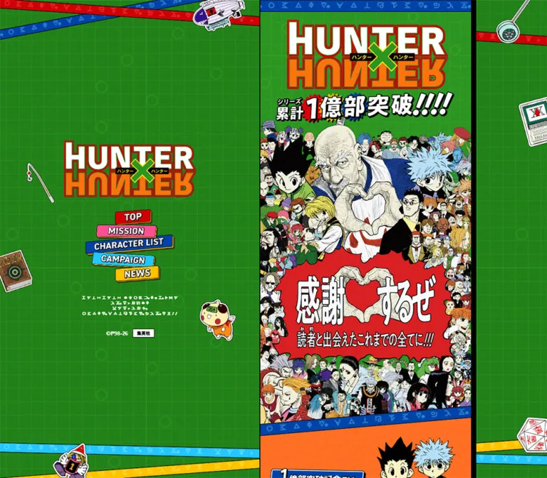
鮮やかな緑のグリッド背景に、赤い漫画風の吹き出し、白抜きの太字、原作イラストを重ねた記念サイト。幅480pxのコンテンツと、全員発見を祝う壁紙ダウンロードモーダルが特徴。
オリジナルサイトを見るHUNTER×HUNTER — 100 Million Copies Commemoration Style Reference
A manga victory announcement on a vivid green game board, framed by moving symbol ribbons.
Original URL: https://hunter-hunter-100million-cp.shonenjump.com/ Final URL: https://hunter-hunter-100million-cp.shonenjump.com/ Theme: saturated multicolor campaign graphics, with a green completion panel and a darkened desktop backdrop. Inspected: September 12, 2026, at 07:02:31 UTC / 16:02:31 JST, through the supplied browser evidence. Viewports: desktop 1440 × 1000 CSS pixels; mobile 390 × 844 CSS pixels. Scope: the currently displayed character-discovery completion overlay, its visible desktop surroundings, and the underlying page structure recorded in rendered DOM and computed styles. All five supplied captures retain the completion overlay. No unobscured lower-page screenshot or exercised control is included.
The current experience celebrates the discovery of all 115 characters. A tall green panel carries a jagged red announcement, enormous white lettering with black outlines, three centered lines of congratulations, a manga panel featuring Netero, and a red wallpaper-download button. Blue and yellow ribbons cross below the action, with illustrated game pieces overlapping their edges. A small copyright block completes the composition.
Its impact comes from a controlled combination of dense artwork and clear sequencing. The textured grid gives the page a game-board structure; irregular silhouettes and slanted ribbons disrupt that structure. Heavy outlines keep the lettering legible against saturated colors. The primary action is visually simple even though its surroundings are expressive.
Desktop uses two distinct alignments: the underlying 480px story column sits to the right, while the completion overlay is centered in the viewport. On mobile, the overlay occupies the full 390px width. Behind it, the DOM records a substantial campaign page with a commemorative video, mission information, character results, sharing campaign, news, and footer.
How to Read This Reference
- Measured means a value appears directly in the supplied computed styles or element rectangles. Values are rounded for readability where appropriate.
- Calculated means arithmetic derived from those measurements, such as the 480/390 scaling ratio or the character-grid gaps.
- Estimated means a visual approximation from the supplied screenshots. The main green, announcement red, artwork bounds, outline thickness, and backdrop opacity fall into this category.
- Recommended means guidance for a new implementation. The CSS Quick Start is an adaptation, not the original stylesheet.
- DOM-only observations describe elements recorded behind the open overlay. Their presence and sampled styles are supported; their unobscured appearance and behavior were not visually verified.
- Token names are descriptive aliases unless explicitly identified as source custom properties. No font files, illustration files, or complete keyframe definitions were supplied.
Tokens — Colors
Default Palette
The visible completion state is dominated by green, red, yellow, white, and black. These foreground colors must be distinguished from the underlying page's measured section colors.
| Name | Value | Suggested token | Evidence and role |
|---|---|---|---|
| Game-board Green | Approximately #2ba51b |
--hx-green |
Screenshot estimate of the bright textured panel; not a sampled source declaration |
| Announcement Red | Approximately #e00000 |
--hx-reward-red |
Screenshot estimate for the jagged headline field and download action |
| Lettering White | #ffffff |
--hx-white |
White is measured on ribbon text and character-section content; also visibly used in outlined foreground lettering |
| Outline Black | Approximately #000000 |
--hx-black |
Visual estimate for graphic outlines, manga linework, and hard button edges |
| Close Yellow | Approximately #ffd100 |
--hx-close-yellow |
Visual approximation for the yellow close cross and ribbon; this hex is independently measured on the NEWS section, not on the close artwork |
| Backdrop | Approximately rgb(0 0 0 / 0.90) |
--hx-scrim |
Visual estimate of the strong desktop dimming; opacity was not supplied |
| Source Foreground | #171717 |
Source --foreground |
Measured body text default; not the visible fill of every graphic label |
| Source Background | #ffffff |
Source --background |
Measured body background beneath the illustrated surfaces |
The green surface contains fine square rules, faint circular markings, and a grain-like texture. A single solid green swatch reproduces the color relationship but loses much of the material character.
Underlying Section Palette
These colors are directly measured on rendered elements behind the overlay. Their full visual compositions were not captured unobscured.
| Section or control | Measured value | Suggested token | Role |
|---|---|---|---|
| Commemorative PV section | #ff9248 |
--hx-orange |
Orange chapter surface |
| MISSION section | #ff7bac |
--hx-pink |
Pink mission surface |
| CHARACTER LIST section | #0070be |
--hx-blue |
Deep blue results surface, with white content |
| CAMPAIGN section | #48d4ff |
--hx-cyan |
Cyan campaign surface |
| NEWS section | #ffd100 |
--hx-yellow |
Yellow news surface |
| SHARE footer | #db0009 |
--hx-footer-red |
Red footer surface |
| Mobile TOP button | #59af45 |
--hx-nav-active |
Green fill on the sampled TOP control |
| Mission pagination buttons | #e6e1c3 |
--hx-pager |
Pale beige circular controls |
Do not substitute the measured TOP-button green for the textured panel green: they belong to different elements. Likewise, the transparent computed background on the wallpaper anchor does not mean the visible button is transparent. Its red face and outlined lettering belong to graphic or nested presentation that the sampled wrapper styles do not resolve.
No theme selector or user-controlled palette change is evidenced. The different colors organize page chapters.
Tokens — Typography
Higure Gothic — Interface Foundation
- Measured family:
"Higure Gothic", sans-serifon the body and many controls. - Measured body style:
16px, weight900, line height24px, normal letter spacing, at both viewports. - Measured character-card style:
14px, weight700, line height20px, at both viewports. - Character: compact, heavy Japanese lettering that supports the manga graphics.
- Limitation: the computed family identifies the declared stack. The evidence does not include font files, font-loading results, or a font-provider identity.
Hunter — Decorative Symbol Writing
- Measured family:
Hunteron repeated ribbon text and the desktop decorative inscription. - Ribbon weight:
900. - Main-column ribbon size:
15pxon mobile and approximately18.4615pxon desktop. - Ribbon tracking:
10.5pxon mobile and approximately12.9231pxon desktop, equivalent to0.7em. - Ribbon line height: equal to the font size.
The DOM contains Japanese phrases, while the screenshots show fictional-looking symbols. The custom font supplies this decorative transformation. Use it for atmospheric ribbons, not as the only readable form of instructions or navigation.
Graphic Lettering
The franchise wordmark and the completion announcement are artwork-driven display treatments. The announcement combines thick white glyphs, black outlines, irregular proportions, and a red burst silhouette. Several heading wrappers have empty sampled text and a computed 16px font size despite containing large visible graphics.
Do not use the wrapper's 16px value as the display-title size. The precise font or asset construction of the oversized lettering is not established. Preserve the original graphic composition when authorized assets are available.
Type Scale
| Role | Mobile | Desktop | Evidence |
|---|---|---|---|
| Body and many control wrappers | 16px / 24px, weight 900 |
Same | Measured; child artwork can look much larger |
| Character-card button text | 14px / 20px, weight 700 |
Same | Measured |
| Main-column and reward ribbons | 15px / 15px, tracking 10.5px |
18.4615px / 18.4615px, tracking 12.9231px |
Measured |
| Desktop background ribbons | Not present in the mobile sample | 16px / 16px, tracking 11.2px |
Measured |
| Desktop decorative inscription | Not present in the mobile sample | 13px / 15.6px, weight 400, tracking 2.6px |
Measured |
| Campaign product note | 9.4102px / 14.1153px |
11.5818px / 17.3727px |
Measured behind the overlay |
| Campaign eligibility notes | 9px / 13.5px |
Same | Measured behind the overlay |
| Completion supporting copy | Approximately 18px / 26px |
Approximately 22px / 32px |
Visual estimate; visible child styles were not supplied |
| Download-button lettering | Approximately 20px |
Approximately 24px |
Visual estimate, not the anchor's inherited font size |
| Completion copyright | Approximately 9–10px |
Approximately 9–10px |
Visual estimate |
The foreground copy uses white interiors and dark outlines. Keep that distinction explicit in an implementation; ordinary white text alone will look lighter and less integrated with the artwork.
Tokens — Spacing & Shapes
Responsive Unit
The source exposes both --max-content-width: 480px and --max-content-safe-width: 480px in both viewport samples.
Many measured dimensions follow a scale factor of:
480 / 390 = 1.230769…
Examples include the wallpaper button, standard pill heights, ribbon typography, and several section insets. This supports a reusable width-based unit, but the original CSS formula was not supplied.
Recommended adaptation: let 1u equal one pixel at a 390px content width and approximately 1.23077px at a 480px content width. Keep the application's root at a conventional size. Do not scale every control: several measured dimensions stay fixed.
Spacing Scale
| Use | Mobile | Desktop | Evidence |
|---|---|---|---|
| Close graphic top/right inset | 20px |
20px relative to the overlay |
Measured |
| Wallpaper-button side inset | 35px |
Approximately 43.08px |
Measured/calculated within the panel |
| Character-list side inset | 18px |
Approximately 22.16px |
Calculated from card rectangles |
| Character-grid horizontal and vertical gap | 16px |
16px |
Calculated from adjacent rectangles |
| Character-section top padding | 64px |
Approximately 78.77px |
Measured |
| Character-section bottom padding | 148px |
Approximately 182.14px |
Measured |
| PV top padding | Approximately 93.59px |
Approximately 115.19px |
Measured |
| Mobile navigation button horizontal padding | 10px |
Not applicable to the desktop graphic navigation | Measured |
| Mobile navigation button gap | 4px |
Not applicable | Calculated |
Border Radius and Edges
| Element | Geometry | Evidence |
|---|---|---|
| Completion panel | Tall rectangle with square corners | Screenshot observation |
| Completion headline | Irregular jagged burst with black outline | Screenshot observation; exact path unavailable |
| Manga frame | Square-cornered horizontal rectangle | Screenshot observation |
| Wallpaper and other pill controls | 9999px radius |
Measured wrapper style |
| Character-card buttons | 0 radius |
Measured wrapper style |
| Pagination and share control | Circular | Measured dimensions and radius |
| Download action edge | Approximately 3px white rim, black outer edge, short hard lower shadow | Visual estimate |
Layout Measurements
| Element | Desktop 1440 × 1000 | Mobile 390 × 844 | Evidence |
|---|---|---|---|
| Main story column | x = 760, width 480px |
x = 0, width 390px |
Measured on multiple sections |
| Completion panel | Approximately x = 480, width 480px, fills capture height |
Full 390px width and capture height |
Screenshot observation, consistent with control coordinates |
| Close button rectangle | x = 909, y = 20, 31 × 40px |
x = 339, y = 20, 31 × 40px |
Measured |
| Wallpaper anchor | x = 523.08, y = 648.41, 393.84 × 68.92px |
x = 35, y = 528, 320 × 56px |
Measured |
| Standard full-list link | 369.22 × 68.92px |
300 × 56px |
Measured behind overlay |
| Mission reward button | 344.61 × 68.92px |
280 × 56px |
Measured behind overlay |
| Character-card button | 209.84 × 189.53px |
169 × 153.16px |
Measured behind overlay |
| Mission arrow buttons | 49 × 41px |
Same | Measured behind overlay |
| Mission pagination buttons | 14 × 14px |
Same | Measured behind overlay |
| Footer share button | 118 × 118px |
Same | Measured behind overlay |
Components
Desktop Illustrated Stage
Role: surround the narrow story with franchise identity and navigation.
The desktop screenshot shows a green textured field, a large franchise logo on the left, five staggered navigation graphics beneath it, and a narrow illustrated story column to the right. Diagonal symbol ribbons extend across the outer stage. Isolated props, including a rod, cards, and game-like objects, occupy the margins.
The open overlay heavily darkens these surroundings. Their positions and broad silhouettes are visible; their undimmed color values cannot be recovered from these screenshots.
The left identity area and right story are compositionally separate. Avoid widening the story artwork to fill the whole desktop canvas.
Desktop Section Navigation
Role: expose the campaign's five main chapters.
The visible labels are TOP, MISSION, CHARACTER LIST, CAMPAIGN, and NEWS. They appear on colored, slightly tilted graphic plaques with dark outlines. Widths vary with the label and illustration, and the stack intentionally shifts left and right.
Measured button rectangles, from top to bottom, are approximately 108 × 49.28px, 180 × 44.88px, 261 × 62.89px, 189 × 49.5px, and 133.19 × 51.11px. The stack spans approximately y = 411–627 in the desktop capture.
The DOM identifies buttons, but no navigation click was exercised. Their labels support section-navigation intent; scroll behavior, easing, and active-state updates remain unverified.
Completion Overlay Shell
Role: announce the completed discovery mission and expose its reward.
A square-cornered green panel fills the viewport vertically. At desktop it is centered at x = 480–960, independently of the story column at x = 760–1240. Its surface is not dimmed; the rest of the page is strongly darkened.
On mobile, the panel fills the screen width and conceals both the story and its bottom navigation. The composition remains a single vertical stack rather than becoming a smaller floating card with outside margins.
The hierarchy is:
- Yellow close cross at the upper right.
- Large red burst with the announcement
キャラクター 全員発見!!. - Three centered lines of congratulatory copy.
- A manga illustration with speech bubbles and an overlapping portrait.
- The wallpaper-download pill.
- Crossing symbol ribbons with game-piece illustrations.
- Compact copyright text.
The visible green rectangle does not use a rounded-card elevation treatment. Separation comes from the full-screen scrim and the change from dim surroundings to saturated foreground.
Close Control
Role: visibly offer dismissal of the completion state.
The control is a chunky yellow cross with a black edge. The sampled button is 31 × 40px at a constant 20px top/right inset relative to the overlay. It does not scale with the 480/390 content ratio.
The extracted DOM includes three coincident button entries at the same coordinates. The screenshots show one visible cross; the duplicate records do not establish three visible controls.
Dismissal, Escape-key handling, backdrop clicking, focus restoration, and persistence across visits were not tested. A larger invisible target around the same graphic is recommended.
Completion Announcement
Role: make the result immediately recognizable.
A red burst occupies most of the panel width near the top. Its perimeter alternates between outward points and inward notches, with an irregular black contour. Two lines of white display lettering fill the center. The black outlines are substantial enough to separate the letters from the red field and from one another.
Estimated graphic bounds are roughly 330–340 × 210–215px on mobile and 410–420 × 260–265px on desktop. These are image-bound estimates, not source element measurements.
Keep the lettering and burst as a coordinated graphic. Replacing the silhouette with a rounded red box or setting the title in an ordinary bold system font would change the most recognizable component.
Congratulatory Copy
Role: explain the result in a short readable beat after the announcement.
The visible source copy is:
おめでとう!
みんなで力を合わせて
隠れたハンターを全員発見したぞ!
Each line is centered, white, and dark-outlined. The block occupies approximately y = 267–335 on mobile and y = 327–410 on desktop. These ranges describe visible lettering, not exact line boxes.
The three-line rhythm matters: a short greeting, a medium-length collective statement, and the longest result line. Preserve that hierarchy rather than allowing the entire message to wrap arbitrarily.
Manga Reward Illustration
Role: connect the completion message to the original work's visual language.
A wide yellow-and-white manga frame contains two speech bubbles and a portrait of Netero. The portrait extends beyond the rectangle at both the top and bottom, so the complete illustration is taller than the yellow panel.
On mobile, the rectangular panel is approximately 350 × 106px at x = 20, y = 380. The full composition extends roughly from y = 351 to 502. On desktop, the panel is approximately 430 × 130px, with the full composition extending roughly from y = 433 to 615.
Preserve the full composition, including the protruding hair and clothing. An object-fit: cover crop constrained to the rectangular panel would remove meaningful artwork. The evidence does not establish whether the overflow is assembled from separate image layers or baked into one asset.
Wallpaper Download Pill
Role: provide the primary reward action.
The anchor label is スペシャル壁紙ダウンロード. It links directly to a JPG resource. The measured button is 320 × 56px on mobile and approximately 393.84 × 68.92px on desktop.
Its anatomy is a red capsule, a white inset-looking rim, a thin dark outer edge, a short hard shadow below, centered white lettering with black outlines, and a compact downward-arrow graphic near the right. The arrow appears within a small white circular area and uses yellow as an accent.
The measured anchor wrapper itself has a transparent background and inherited 16px / 24px typography. Those wrapper styles do not account for the visible graphic treatment. Reproduce the rendered anatomy rather than copying the wrapper values alone.
The href was observed; the resource was not opened. Whether the browser downloads it, opens it in the current tab, or opens another tab is not established by the supplied evidence.
Crossing Symbol Ribbons
Role: carry movement and recurring franchise atmosphere between content groups.
Two narrow blue and yellow ribbons cross at shallow opposing angles below the download button. Widely tracked symbols run along them. Two brown game-piece illustrations overlap the ribbons and project into the green space above and below.
The visual strip thickness is approximately 20–25px, depending on viewport and angle. Do not copy the much taller transformed paragraph bounding rectangles as ribbon heights: rotated, long text runs produce large axis-aligned bounds.
The symbol positions differ slightly between supplied stills, consistent with the recorded looping animations. Use clipping to keep the long tracks from creating horizontal page overflow.
Completion Copyright Block
Role: retain the publication notice within the completion composition.
A compact centered block appears around y = 728–765 on mobile and y = 894–930 on desktop. It combines an English copyright line with Japanese rights text, rendered in small white lettering directly on green.
The visible line includes ©P98-26 © SHUEISHA Inc. All rights reserved. The original page title also includes 集英社. These are original-page identity observations; no production team is identified by the supplied original-page evidence.
Underlying Story Chapters
Role: organize the wider commemorative campaign.
The following content is recorded in the DOM but remains covered or offscreen in the supplied captures.
| Chapter | Recorded content | Supported component details | Limitation |
|---|---|---|---|
| Opening | Franchise identity and commemorative artwork | Heading wrapper spans the content width; about 390 × 128px mobile and 480 × 157.53px desktop |
Only part of the desktop artwork is visible through the scrim |
| PV | Commemorative video introduction | Orange surface; media button approximately 288.77 × 162.11px mobile and 355.44 × 199.55px desktop |
Playback and media presentation untested |
| MISSION | Discovery event, completion message, reward button, map content | Pink surface; arrow controls and three pagination dots are recorded | Slide contents and map behavior unverified |
| CHARACTER LIST | 115/115 found, ten preview entries, full-list link |
Blue surface, white content, two-column button geometry | Card imagery and detail states not visually inspected |
| CAMPAIGN | X sharing, prize details, application dates, follow link, conditions | Cyan section background and pill controls | Recorded parent/child geometry is inconsistent; final visible layout unknown |
| NEWS | Book-purchase link and limited free-reading announcement | Yellow surface and a wide pill link | Banner artwork and destination pages uninspected |
| SHARE | Share control, privacy link, copyright | Red surface; blue 118px circular share button |
Share action untested |
The event dates in the page are June 29–July 5, 2026. A news offer mentions July 19, 2026. The inspected September state reports all characters found and offers the completion reward. Reusable implementations should represent that completion state accurately rather than presenting the recorded dates as an upcoming event.
Character Preview Grid
Role: summarize discovered characters and their locations.
Ten button entries form two columns and five rows in the recorded geometry at both viewports. Each entry pairs a character name with an @ location line. Examples include ゴン at @渋谷センター街 YYボード and イルミ at @道玄坂通.
Mobile buttons are 169px wide, with 18px outer insets and a 16px gap. Desktop buttons are approximately 209.84px wide, with approximately 22.16px outer insets and the same 16px gap. Both use measured 14px / 20px, weight 700, white text, zero wrapper radius, and transparent wrapper backgrounds.
A completion count precedes the entries; 全キャラを見る follows them and links to /hunters. Neither that destination nor any card detail was inspected. Do not invent filters, pagination, image crops, or detail-dialog behavior.
Mobile Section Navigation
Role: retain chapter access within the narrow story layout.
The mobile DOM records the same five labels in a compact horizontal row at y = 787.5. Buttons are 26px high, separated by 4px gaps, with 10px horizontal padding and pill radii. The sampled TOP button has a green fill; the other sampled buttons have transparent backgrounds.
The entire row spans approximately x = 25.94–364.06. It is concealed by the completion overlay in both mobile screenshots. Its position is consistent with bottom navigation, but fixed positioning, sticky behavior, and active-section tracking were not verified.
Tokens — Motion & Interaction
Recorded Motion
| Target | Recorded value | What it establishes |
|---|---|---|
| Desktop outer symbol ribbons | 49s linear infinite both loop |
Long continuous loops on decorative text |
| Main header and PV divider ribbons | 24s linear infinite both loop |
Continuous ribbon motion |
| MISSION ribbon | 28s linear infinite both loop |
Section-specific loop duration |
| CHARACTER LIST ribbon | 27s linear infinite both loop |
Section-specific loop duration |
| CAMPAIGN ribbon | 26s linear infinite both loop |
Section-specific loop duration |
| NEWS ribbon | 20s linear infinite both loop |
Section-specific loop duration |
| SHARE ribbon | 16s linear infinite both loop |
Section-specific loop duration |
| Completion ribbons | 32s linear infinite both loop |
Continuous movement within the visible completion composition |
| Character-card transitions | 150ms cubic-bezier(0.4, 0, 0.2, 1) across multiple properties |
A transition definition; changed properties and triggered states were not observed |
| Mobile navigation transitions | 50ms cubic-bezier(0.4, 0, 0.2, 1) across multiple properties |
Very short defined feedback timing; exact state change untested |
A partial stylesheet fragment also names mission-card-enter-next. Its visible 30% keyframe includes translateZ(-110px) and rotateY(12deg), indicating an authored 3D card transition. The full path, duration, activation conditions, and actual playback are not available. Do not reconstruct a complete carousel animation from this fragment.
Interaction Evidence and Limits
- The completion overlay remains open throughout the supplied captures. Its opening transition, dismissal, and return behavior are unverified.
- The wallpaper anchor, character-list route, X profile link, purchase link, and privacy link have recorded destinations. Their resulting browser behavior was not exercised.
- Video, map, carousel, character-detail, conditions, and share controls are present in the DOM; no resulting state is demonstrated.
- A computed transition shorthand of
allon other elements does not establish a visible animation or a meaningful duration. - The capture process waited for finite animation and layout readiness and temporarily paused perpetual animation during readiness checks. These are settled stills, not a frame-by-frame motion recording.
For reuse, let the ribbons supply persistent movement while keeping the result message and action readable. A 32-second linear ribbon loop is supported; an elastic modal entrance or bouncing download button would be a new design choice.
Surfaces
| Layer | Appearance | Function |
|---|---|---|
| Desktop stage | Green patterned field with isolated props and long diagonal ribbons | Surrounds the narrow story with identity |
| Underlying story | Narrow sequence of saturated chapter surfaces | Organizes the campaign by content type |
| Backdrop | Strong near-black translucent veil | Separates the completion state from the underlying page |
| Completion panel | Green texture with fine grid and circular markings | Continuous foreground canvas |
| Announcement burst | Red graphic field with irregular black perimeter | Concentrates attention on the completed result |
| Manga illustration | Yellow frame, white speech bubbles, black linework, selective color | Connects the UI to the original work |
| Download action | Red capsule with white rim and hard dark edge | Makes the reward action unmistakable |
| Ribbon layer | Blue and yellow diagonal strips with pale symbols | Adds movement and bridges content groups |
The visible design does not use a general system of soft card shadows. Depth comes from dark outlines, overlapping cutouts, a hard button edge, and the strong backdrop.
Imagery
Use the relationship between original manga linework and bright campaign graphics as the central image principle. The completion panel combines a jagged title graphic, an uncropped character illustration, a rectangular comic frame, and small object cutouts. The desktop margins add more objects while the story column holds dense character artwork.
The grid and circular markings suggest a game field. Slight texture prevents the large green areas from becoming sterile. The blue and yellow symbol ribbons connect the foreground panel to the wider stage without introducing another card container.
Preserve black contour lines, speech-bubble typography, selective flat color, and transparent edges around protruding figures. The evidence does not establish low-resolution pixel art; do not apply image-rendering: pixelated by default. Asset formats, native resolutions, and whether particular graphics are raster or vector are unknown.
No foreground photography is visible in the completion captures. The character entries reference real locations, but their unseen image treatment must not be inferred from those labels.
Observed Asset References
| Asset or destination | Reference | Evidence and use |
|---|---|---|
| Special wallpaper | https://hxh-prod-497401-public.storage.googleapis.com/images/wallpaper_special.jpg | Exact href on the reward anchor; target image not opened or analyzed |
| Completion announcement | Asset URL not supplied | Visible red burst and graphic lettering |
| Manga reward illustration | Asset URL not supplied | Visible Netero composition with yellow panel and speech bubbles |
| Close and download graphics | Asset URLs not supplied | Visible yellow cross and arrow treatment |
| Grid texture, ribbons, and game pieces | Asset URLs not supplied | Visible decorative materials; ribbon font and animation styles are separately recorded |
| Franchise logo and opening illustration | Asset URLs not supplied | Partially visible behind the desktop backdrop |

Use authorized artwork when available. The CSS shell can reproduce proportions and hierarchy, but it cannot replace the identity carried by the manga illustrations and custom lettering.
Layout & Responsive Behavior
Two Horizontal Systems on Desktop
At 1440px viewport width, the underlying story occupies x = 760–1240. Its center is x = 1000. The completion panel occupies approximately x = 480–960, centered at x = 720, the viewport midpoint.
This difference is essential. Centering the overlay inside the right-hand story column would place the close control and reward action hundreds of pixels too far right. The overlay belongs to the viewport; the story belongs to the desktop stage composition.
Mobile Uses the Full Width
At 390px, both the underlying story and the completion panel use the full viewport width. The visible reward sequence remains intact: announcement, copy, manga, action, ribbons, copyright. The mobile state retains breathing room through artwork margins and vertical spacing rather than through an outside modal gutter.
The 480/390 ratio explains much of the artwork and pill sizing. It does not explain every measurement. Close controls, arrow controls, pagination dots, share-button diameter, card text, and grid gaps remain fixed in the supplied samples.
Underlying Page Height Is Not a One-Screen Layout
The observation reports documentHeight equal to the viewport height while the body rectangle extends to approximately 7693.58px on desktop and 6296.20px on mobile. This is consistent with a constrained or scroll-locked page under an overlay, but the relevant overflow styles were not supplied.
The CAMPAIGN section's sampled height also nearly equals its vertical padding, while several child rectangles extend far beyond it and overlap the recorded range of later sections. This could reflect hidden, transformed, or out-of-flow content. It is not sufficient evidence to diagnose a layout defect or prescribe those absolute positions.
Treat the lower-page rectangles as evidence of component presence, widths, and sampled styling. Do not hardcode the recorded body height or section y coordinates into a reconstruction.
Recommended Responsive Rules
- Cap the story and completion panel at 480px; let them fill narrower viewports.
- Center the completion panel against the viewport at every size.
- Introduce the desktop side-stage layout only when there is enough room for the identity area and 480px story. The exact source breakpoint is unknown.
- Scale artwork and large spacing with content width while retaining readable text and adequate interaction targets.
- Allow the completion panel to scroll on shorter screens and under text zoom. The supplied 844px-high phone capture does not establish landscape behavior.
- Keep the manga image uncropped and make decorative ribbons incapable of widening the document.
- Add safe-area allowances for new implementations; their presence in the original was not established.
Do’s and Don’ts
Do
- Keep the current completion result and wallpaper action central to the captured state.
- Preserve the bright green patterned canvas, jagged red announcement, white lettering, and dark outlines.
- Center the overlay in the viewport independently of the desktop story column.
- Retain the 480px content cap and full-width mobile presentation.
- Preserve the three-line congratulatory message and the clear pause before the manga illustration.
- Keep the portrait's protruding edges visible outside its rectangular panel.
- Use a red capsule with a white rim and hard black edge for the reward action.
- Let blue and yellow symbol ribbons supply the recurring decorative motion.
- Use measured section colors when implementing the underlying chapters.
- Preserve the distinction between readable interface text and decorative Hunter-font symbols.
- Keep fixed-size controls and text separate from width-scaled artwork.
Don’t
- Don't treat the darkened desktop screenshot as the site's normal dark theme.
- Don't widen the narrow story into a conventional full-width desktop hero.
- Don't replace the completion panel with a small rounded white dialog.
- Don't replace manga lettering with a generic oversized heading and claim an exact match.
- Don't crop the reward illustration to the yellow rectangle.
- Don't add glass blur, soft floating cards, or glossy gradients to the observed flat graphic system.
- Don't use transparent wrapper backgrounds or inherited 16px heading styles as the final visible design tokens.
- Don't turn transformed ribbon-text bounds into banner dimensions.
- Don't assume card hover effects, automatic carousels, or dialog transitions from unexercised controls.
- Don't reuse the recorded campaign dates as future-facing participation copy.
- Don't hardcode the anomalous lower-page geometry as the intended layout.
Recommended Implementation Additions
These are improvements for a new implementation, not verified original-site features:
- Implement the completion surface as an accessible modal dialog with a readable title, focus containment, Escape dismissal, and focus restoration.
- Enlarge the close target to at least 44 × 44px while retaining its visible 31 × 40px cross and approximately 20px visual inset.
- Prevent keyboard interaction with the underlying story while the modal is active.
- Provide accessible text equivalents for graphic headings and meaningful manga illustrations. Hide purely decorative repeated ribbon text from assistive technology.
- Preserve a clear focus indicator on red, green, blue, and yellow surfaces.
- Offer a reduced-motion mode that stops symbol loops and avoids 3D card movement.
- Let copyright and campaign conditions remain readable under zoom instead of scaling all text down with the artwork.
- Keep mobile section targets comfortably operable even if their visible plaques are only 26px high.
- Handle the wallpaper link as a real resource link and communicate its format where useful. Do not promise forced downloading without verifying browser and server behavior.
- Provide explicit completed/closed campaign messaging wherever historical application details remain visible.
Agent Prompt Guide
Quick Color Reference
- Completion canvas: approximately
#2ba51b, with fine grid, faint circles, and texture. - Completion burst and action: approximately
#e00000. - Graphic lettering: white with strong black outlines.
- Close cross and yellow ribbon: approximately
#ffd100. - Desktop backdrop: approximately 90% black, without an evidenced blur.
- Measured chapter colors: orange
#ff9248, pink#ff7bac, blue#0070be, cyan#48d4ff, yellow#ffd100, footer red#db0009. - Measured typography:
Higure Gothicfor interface text;Hunterfor decorative symbols.
Overall Prompt
“Create a manga campaign completion experience using a tall green panel capped at 480px. Center the panel in the viewport over a strongly darkened illustrated desktop stage; let it fill the phone width. Use a subtle square grid and faint circular markings on the green surface. Stack a large jagged red announcement with white black-outlined lettering, three centered lines of congratulations, an uncropped manga reward illustration, and a red capsule download link with a white rim and hard dark edge. Cross blue and yellow symbol ribbons below the action and overlap them with small illustrated game pieces. Put a yellow outlined close cross at the upper right. Preserve readable Japanese text and use authorized artwork for franchise-specific graphics. Treat supplied color estimates as approximations and retain the measured 480px cap and control proportions.”
Example Component Prompts
- Completion announcement: “Build a red irregular manga burst nearly as wide as a 390px panel. Place two lines of huge white lettering with black outlines inside it. Use the source UI label
キャラクター 全員発見!!. Keep the burst silhouette uneven and preserve the graphic's aspect ratio.” - Reward illustration: “Place a 350px-wide manga composition beneath centered congratulatory text. Use a yellow rectangular comic frame, speech bubbles, and a character portrait that protrudes above and below the frame. Preserve transparent margins and avoid cover cropping.”
- Download action: “Create a 320 × 56px red capsule for a 390px content width, scaling to about 394 × 69px at a 480px width. Add a white rim, thin black edge, hard lower shadow, white black-outlined Japanese lettering, and a small yellow downward-arrow graphic at the right.”
- Desktop composition: “At a 1440px viewport, place a 480px story column at x = 760 and a separate completion panel at x = 480. Keep franchise identity and staggered chapter plaques on the left. Dim the entire underlying stage while the completion panel remains saturated.”
- Ribbon decoration: “Cross narrow blue and yellow strips at shallow opposing angles. Add widely tracked decorative symbols and two overlapping object cutouts. Use a slow 32-second linear loop for the completion ribbons, with motion disabled when reduced motion is requested.”
- Character results: “Build a two-column preview with 18px side insets and a fixed 16px gap at 390px width. Pair each character name with its location, use white 14px/20px text on a blue chapter surface, and precede the list with the completion count
115/115. Do not invent card-detail behavior.”
Quick Start
CSS Custom Properties
This is a recommended implementation foundation. The width-based unit is calculated from the observed proportions; it is not a recovered source variable. Green, reward red, texture, outlines, and backdrop opacity are approximations. The 1100px desktop breakpoint is an implementation choice.
Load authorized font files separately if available. Supply full-bounds artwork for .hx-reward-title, .hx-reward-manga, and .hx-reward-decoration; no original asset paths for those images were provided. Use a native dialog.hx-reward, opened with showModal(), with an accessible title and a close button. CSS alone does not implement dismissal or focus restoration.
:root {
  /* Measured content cap; calculated adaptation unit. */
  --hx-content-width: min(100vw, 480px);
  --hx-u: calc(var(--hx-content-width) / 390);

  /* Screenshot approximations for the completion state. */
  --hx-green: #2ba51b;
  --hx-reward-red: #e00000;
  --hx-black: #000000;
  --hx-white: #ffffff;
  --hx-scrim: rgb(0 0 0 / 0.90);

  /* Measured underlying-page colors. */
  --hx-orange: #ff9248;
  --hx-pink: #ff7bac;
  --hx-blue: #0070be;
  --hx-cyan: #48d4ff;
  --hx-yellow: #ffd100;
  --hx-footer-red: #db0009;
  --hx-nav-active: #59af45;
  --hx-pager: #e6e1c3;
  --hx-foreground: #171717;

  /* Declared source families; font files are not supplied. */
  --hx-font-body: 'Higure Gothic', sans-serif;
  --hx-font-symbols: 'Hunter', sans-serif;
  --hx-weight-heavy: 900;
  --hx-weight-card: 700;

  --hx-grid-step: calc(20 * var(--hx-u));
  --hx-pill-height: calc(56 * var(--hx-u));
  --hx-pill-radius: 9999px;
  --hx-card-gap: 16px;
  --hx-card-inset: calc(18 * var(--hx-u));
  --hx-feedback: 150ms cubic-bezier(0.4, 0, 0.2, 1);
  --hx-ribbon-duration: 32s;
}

* {
  box-sizing: border-box;
}

body {
  margin: 0;
  color: var(--hx-foreground);
  font: var(--hx-weight-heavy) 16px/1.5 var(--hx-font-body);
}

/* Approximate grid fallback; original texture artwork is preferable. */
.hx-site,
.hx-reward {
  background-color: var(--hx-green);
  background-image:
    linear-gradient(rgb(255 255 255 / 0.075) 1px, transparent 1px),
    linear-gradient(90deg, rgb(255 255 255 / 0.075) 1px, transparent 1px),
    radial-gradient(
      circle,
      transparent 8px,
      rgb(255 255 255 / 0.07) 8px 9px,
      transparent 9px
    );
  background-size:
    var(--hx-grid-step) var(--hx-grid-step),
    var(--hx-grid-step) var(--hx-grid-step),
    calc(100 * var(--hx-u)) calc(120 * var(--hx-u));
}

.hx-site {
  position: relative;
  min-height: 100dvh;
  overflow-x: clip;
}

.hx-story {
  width: min(100%, 480px);
  margin-inline: auto;
}

.hx-desktop-identity {
  display: none;
}

/* Recommended breakpoint; reproduces the measured desktop x position. */
@media (min-width: 1100px) {
  .hx-story {
    margin-inline-start: calc(50% + 40px);
    margin-inline-end: 0;
  }

  .hx-desktop-identity {
    display: block;
    position: fixed;
    inset-block-start: 22vh;
    inset-inline-start: calc(50% - 525px);
    width: 370px;
  }
}

/* Native modal dialog: centered in the viewport, not in the story. */
.hx-reward {
  position: fixed;
  inset: 0;
  width: min(100%, 480px);
  max-width: none;
  height: 100dvh;
  max-height: none;
  margin: 0 auto;
  padding: 0;
  border: 0;
  border-radius: 0;
  color: var(--hx-white);
  overflow-x: hidden;
  overflow-y: auto;
  overscroll-behavior: contain;
}

.hx-reward::backdrop {
  background: var(--hx-scrim);
}

.hx-reward-content {
  min-height: 100%;
  padding-block-end: calc(60px + env(safe-area-inset-bottom, 0px));
  text-align: center;
}

/* Larger recommended target around an approximately 31 x 40px cross. */
.hx-close {
  position: absolute;
  z-index: 2;
  top: calc(18px + env(safe-area-inset-top, 0px));
  right: 13.5px;
  display: grid;
  place-items: center;
  width: 44px;
  height: 44px;
  padding: 0;
  border: 0;
  background: transparent;
  cursor: pointer;
}

/* CSS approximation; replace with authorized close artwork if available. */
.hx-close::before,
.hx-close::after {
  content: '';
  position: absolute;
  width: 9px;
  height: 40px;
  border: 1.5px solid var(--hx-black);
  background: var(--hx-yellow);
  transform: rotate(35deg);
}

.hx-close::after {
  transform: rotate(-35deg);
}

.hx-reward-title {
  display: block;
  width: calc(340 * var(--hx-u));
  max-width: 90%;
  height: auto;
  margin: calc(33 * var(--hx-u)) auto 0;
}

.hx-outlined {
  color: var(--hx-white);
  font-weight: var(--hx-weight-heavy);
  -webkit-text-stroke: 3px var(--hx-black);
  paint-order: stroke fill;
}

.hx-reward-copy {
  margin: calc(16 * var(--hx-u)) auto 0;
  padding-inline: calc(12 * var(--hx-u));
  font-size: max(16px, calc(18 * var(--hx-u)));
  line-height: 1.4;
}

.hx-reward-copy p {
  margin: 0;
}

/* Keep the entire illustration, including protruding portrait edges. */
.hx-reward-manga {
  display: block;
  width: calc(350 * var(--hx-u));
  max-width: 100%;
  height: auto;
  margin: calc(12 * var(--hx-u)) auto 0;
  image-rendering: auto;
}

.hx-reward-download {
  display: flex;
  align-items: center;
  justify-content: center;
  gap: calc(10 * var(--hx-u));
  width: calc(320 * var(--hx-u));
  max-width: calc(100% - 32px);
  min-height: var(--hx-pill-height);
  margin: calc(26 * var(--hx-u)) auto 0;
  padding: 8px 14px;
  border: 3px solid var(--hx-white);
  border-radius: var(--hx-pill-radius);
  background: var(--hx-reward-red);
  color: var(--hx-white);
  box-shadow:
    0 3px 0 1px var(--hx-black),
    0 0 0 1px var(--hx-black);
  font-size: max(16px, calc(20 * var(--hx-u)));
  font-weight: var(--hx-weight-heavy);
  line-height: 1.2;
  text-align: center;
  text-decoration: none;
}

.hx-reward-download-icon {
  flex: none;
  width: calc(22 * var(--hx-u));
  height: auto;
}

/* A full-bounds ribbon-and-game-piece composite can occupy this slot. */
.hx-reward-decoration {
  display: block;
  width: 100%;
  height: auto;
  margin-block-start: calc(27 * var(--hx-u));
}

.hx-reward-copyright {
  margin: calc(24 * var(--hx-u)) 0 0;
  padding-inline: 20px;
  font-size: 9px;
  line-height: 1.45;
  color: var(--hx-white);
}

/* Underlying chapter colors are measured; content remains in normal flow. */
.hx-pv { background: var(--hx-orange); }
.hx-mission { background: var(--hx-pink); }
.hx-characters { background: var(--hx-blue); color: var(--hx-white); }
.hx-campaign { background: var(--hx-cyan); }
.hx-news { background: var(--hx-yellow); }
.hx-share { background: var(--hx-footer-red); }

.hx-character-grid {
  display: grid;
  grid-template-columns: repeat(2, minmax(0, 1fr));
  gap: var(--hx-card-gap);
  padding-inline: var(--hx-card-inset);
}

.hx-character-card {
  min-width: 0;
  padding: 0;
  border: 0;
  border-radius: 0;
  color: var(--hx-white);
  background: transparent;
  font: var(--hx-weight-card) 14px/20px var(--hx-font-body);
  overflow-wrap: anywhere;
  cursor: pointer;
  transition:
    color var(--hx-feedback),
    opacity var(--hx-feedback);
}

/* Optional live ribbon adaptation: two identical groups inside one track. */
.hx-ribbon-window {
  overflow: hidden;
}

.hx-ribbon-track {
  display: flex;
  width: max-content;
  color: var(--hx-white);
  font: 900 calc(15 * var(--hx-u))/1 var(--hx-font-symbols);
  letter-spacing: 0.7em;
  animation: hx-ribbon-loop var(--hx-ribbon-duration) linear infinite;
}

.hx-ribbon-group {
  flex: none;
  white-space: nowrap;
}

/* Recommended seamless translation; original loop keyframes were not supplied. */
@keyframes hx-ribbon-loop {
  to { transform: translateX(-50%); }
}

.hx-site :focus-visible,
.hx-reward :focus-visible {
  outline: 3px solid var(--hx-yellow);
  outline-offset: 4px;
}

@media (prefers-reduced-motion: reduce) {
  .hx-ribbon-track {
    animation: none;
  }

  .hx-character-card {
    transition: none;
  }
}
The image proportions control the final vertical alignment. At the 390px baseline, a title asset around 340 × 215px, a full manga composition around 350 × 151px, and a decoration around 390 × 90px place the major groups close to the supplied mobile capture. These are estimated layout targets, not discovered native asset sizes. Keep content height flexible when replacing the artwork or enlarging text.
If the ribbon decoration is a static composite, do not also animate it as a text track. Use the live ribbon classes only when separately assembling the strips, repeated symbol groups, and object illustrations. Hide duplicated decorative groups from assistive technology.
Tailwind v4 Token Mapping
Optional mapping for an implementation that already uses Tailwind v4. This is not a claim about the original site's framework version. Define the properties above first.
@theme inline {
  --color-hx-green: var(--hx-green);
  --color-hx-reward-red: var(--hx-reward-red);
  --color-hx-orange: var(--hx-orange);
  --color-hx-pink: var(--hx-pink);
  --color-hx-blue: var(--hx-blue);
  --color-hx-cyan: var(--hx-cyan);
  --color-hx-yellow: var(--hx-yellow);
  --color-hx-footer-red: var(--hx-footer-red);

  --font-hx-body: var(--hx-font-body);
  --font-hx-symbols: var(--hx-font-symbols);

  --spacing-hx-unit: var(--hx-u);
  --spacing-hx-card-gap: 16px;
  --spacing-hx-card-inset: var(--hx-card-inset);
  --radius-hx-pill: 9999px;
}
Sources & Evidence
- Original and final website: https://hunter-hunter-100million-cp.shonenjump.com/. The supplied observation records HTTP 200 with no URL change and the page title
HUNTER×HUNTER シリーズ累計1億部突破記〝念〟サイト|集英社. - Capture timestamp: September 12, 2026, at
2026-09-12T07:02:31.497Z, equivalent to 16:02:31.497 JST. - Visual evidence: three desktop captures at 1440 × 1000 and two mobile captures at 390 × 844. All show the same completion overlay; the desktop surroundings remain heavily dimmed.
- Rendered DOM and computed styles: supplied snapshots establish the two 480px source width variables, font-family declarations, selected text metrics, section colors, control rectangles, character-grid geometry, link destinations, loop durations, and transition declarations.
- Observed resource reference: the wallpaper JPG URL is present as an anchor href on the original page. Its target contents and download behavior were not inspected.
- Inspection limits: no additional browsing, file inspection, command execution, or control activation was performed for this reference. Closing the overlay, lower-page appearance, linked routes, media playback, hover states, keyboard behavior, safe-area handling, and complete card animations remain unverified.
- Capture limitations: the supplied process waited for document readiness, finite animations, layout/text stability, and visible image decoding within stated time limits. Perpetual animations were paused during readiness checks and resumed. These checks do not establish delayed-content completeness. SharedWorkers and service workers were disabled during inspection.
This reference describes the current completed campaign state. Screenshot estimates, calculated responsive relationships, and recommended implementation additions are labeled separately from measured source values. The CSS Quick Start has not been executed or browser-tested.
# HUNTER×HUNTER — 100 Million Copies Commemoration Style Reference

> A manga victory announcement on a vivid green game board, framed by moving symbol ribbons.

**Original URL:** https://hunter-hunter-100million-cp.shonenjump.com/
**Final URL:** https://hunter-hunter-100million-cp.shonenjump.com/
**Theme:** saturated multicolor campaign graphics, with a green completion panel and a darkened desktop backdrop.
**Inspected:** September 12, 2026, at 07:02:31 UTC / 16:02:31 JST, through the supplied browser evidence.
**Viewports:** desktop 1440 × 1000 CSS pixels; mobile 390 × 844 CSS pixels.
**Scope:** the currently displayed character-discovery completion overlay, its visible desktop surroundings, and the underlying page structure recorded in rendered DOM and computed styles. All five supplied captures retain the completion overlay. No unobscured lower-page screenshot or exercised control is included.

The current experience celebrates the discovery of all 115 characters. A tall green panel carries a jagged red announcement, enormous white lettering with black outlines, three centered lines of congratulations, a manga panel featuring Netero, and a red wallpaper-download button. Blue and yellow ribbons cross below the action, with illustrated game pieces overlapping their edges. A small copyright block completes the composition.

Its impact comes from a controlled combination of dense artwork and clear sequencing. The textured grid gives the page a game-board structure; irregular silhouettes and slanted ribbons disrupt that structure. Heavy outlines keep the lettering legible against saturated colors. The primary action is visually simple even though its surroundings are expressive.

Desktop uses two distinct alignments: the underlying 480px story column sits to the right, while the completion overlay is centered in the viewport. On mobile, the overlay occupies the full 390px width. Behind it, the DOM records a substantial campaign page with a commemorative video, mission information, character results, sharing campaign, news, and footer.

## How to Read This Reference

- **Measured** means a value appears directly in the supplied computed styles or element rectangles. Values are rounded for readability where appropriate.
- **Calculated** means arithmetic derived from those measurements, such as the 480/390 scaling ratio or the character-grid gaps.
- **Estimated** means a visual approximation from the supplied screenshots. The main green, announcement red, artwork bounds, outline thickness, and backdrop opacity fall into this category.
- **Recommended** means guidance for a new implementation. The CSS Quick Start is an adaptation, not the original stylesheet.
- **DOM-only observations** describe elements recorded behind the open overlay. Their presence and sampled styles are supported; their unobscured appearance and behavior were not visually verified.
- Token names are descriptive aliases unless explicitly identified as source custom properties. No font files, illustration files, or complete keyframe definitions were supplied.

## Tokens — Colors

### Default Palette

The visible completion state is dominated by green, red, yellow, white, and black. These foreground colors must be distinguished from the underlying page's measured section colors.

| Name | Value | Suggested token | Evidence and role |
| --- | --- | --- | --- |
| Game-board Green | Approximately `#2ba51b` | `--hx-green` | Screenshot estimate of the bright textured panel; not a sampled source declaration |
| Announcement Red | Approximately `#e00000` | `--hx-reward-red` | Screenshot estimate for the jagged headline field and download action |
| Lettering White | `#ffffff` | `--hx-white` | White is measured on ribbon text and character-section content; also visibly used in outlined foreground lettering |
| Outline Black | Approximately `#000000` | `--hx-black` | Visual estimate for graphic outlines, manga linework, and hard button edges |
| Close Yellow | Approximately `#ffd100` | `--hx-close-yellow` | Visual approximation for the yellow close cross and ribbon; this hex is independently measured on the NEWS section, not on the close artwork |
| Backdrop | Approximately `rgb(0 0 0 / 0.90)` | `--hx-scrim` | Visual estimate of the strong desktop dimming; opacity was not supplied |
| Source Foreground | `#171717` | Source `--foreground` | Measured body text default; not the visible fill of every graphic label |
| Source Background | `#ffffff` | Source `--background` | Measured body background beneath the illustrated surfaces |

The green surface contains fine square rules, faint circular markings, and a grain-like texture. A single solid green swatch reproduces the color relationship but loses much of the material character.

### Underlying Section Palette

These colors are directly measured on rendered elements behind the overlay. Their full visual compositions were not captured unobscured.

| Section or control | Measured value | Suggested token | Role |
| --- | --- | --- | --- |
| Commemorative PV section | `#ff9248` | `--hx-orange` | Orange chapter surface |
| MISSION section | `#ff7bac` | `--hx-pink` | Pink mission surface |
| CHARACTER LIST section | `#0070be` | `--hx-blue` | Deep blue results surface, with white content |
| CAMPAIGN section | `#48d4ff` | `--hx-cyan` | Cyan campaign surface |
| NEWS section | `#ffd100` | `--hx-yellow` | Yellow news surface |
| SHARE footer | `#db0009` | `--hx-footer-red` | Red footer surface |
| Mobile TOP button | `#59af45` | `--hx-nav-active` | Green fill on the sampled TOP control |
| Mission pagination buttons | `#e6e1c3` | `--hx-pager` | Pale beige circular controls |

Do not substitute the measured TOP-button green for the textured panel green: they belong to different elements. Likewise, the transparent computed background on the wallpaper anchor does not mean the visible button is transparent. Its red face and outlined lettering belong to graphic or nested presentation that the sampled wrapper styles do not resolve.

No theme selector or user-controlled palette change is evidenced. The different colors organize page chapters.

## Tokens — Typography

### Higure Gothic — Interface Foundation

- **Measured family:** `"Higure Gothic", sans-serif` on the body and many controls.
- **Measured body style:** `16px`, weight `900`, line height `24px`, normal letter spacing, at both viewports.
- **Measured character-card style:** `14px`, weight `700`, line height `20px`, at both viewports.
- **Character:** compact, heavy Japanese lettering that supports the manga graphics.
- **Limitation:** the computed family identifies the declared stack. The evidence does not include font files, font-loading results, or a font-provider identity.

### Hunter — Decorative Symbol Writing

- **Measured family:** `Hunter` on repeated ribbon text and the desktop decorative inscription.
- **Ribbon weight:** `900`.
- **Main-column ribbon size:** `15px` on mobile and approximately `18.4615px` on desktop.
- **Ribbon tracking:** `10.5px` on mobile and approximately `12.9231px` on desktop, equivalent to `0.7em`.
- **Ribbon line height:** equal to the font size.

The DOM contains Japanese phrases, while the screenshots show fictional-looking symbols. The custom font supplies this decorative transformation. Use it for atmospheric ribbons, not as the only readable form of instructions or navigation.

### Graphic Lettering

The franchise wordmark and the completion announcement are artwork-driven display treatments. The announcement combines thick white glyphs, black outlines, irregular proportions, and a red burst silhouette. Several heading wrappers have empty sampled text and a computed `16px` font size despite containing large visible graphics.

Do not use the wrapper's `16px` value as the display-title size. The precise font or asset construction of the oversized lettering is not established. Preserve the original graphic composition when authorized assets are available.

### Type Scale

| Role | Mobile | Desktop | Evidence |
| --- | --- | --- | --- |
| Body and many control wrappers | `16px / 24px`, weight `900` | Same | Measured; child artwork can look much larger |
| Character-card button text | `14px / 20px`, weight `700` | Same | Measured |
| Main-column and reward ribbons | `15px / 15px`, tracking `10.5px` | `18.4615px / 18.4615px`, tracking `12.9231px` | Measured |
| Desktop background ribbons | Not present in the mobile sample | `16px / 16px`, tracking `11.2px` | Measured |
| Desktop decorative inscription | Not present in the mobile sample | `13px / 15.6px`, weight `400`, tracking `2.6px` | Measured |
| Campaign product note | `9.4102px / 14.1153px` | `11.5818px / 17.3727px` | Measured behind the overlay |
| Campaign eligibility notes | `9px / 13.5px` | Same | Measured behind the overlay |
| Completion supporting copy | Approximately `18px / 26px` | Approximately `22px / 32px` | Visual estimate; visible child styles were not supplied |
| Download-button lettering | Approximately `20px` | Approximately `24px` | Visual estimate, not the anchor's inherited font size |
| Completion copyright | Approximately `9–10px` | Approximately `9–10px` | Visual estimate |

The foreground copy uses white interiors and dark outlines. Keep that distinction explicit in an implementation; ordinary white text alone will look lighter and less integrated with the artwork.

## Tokens — Spacing & Shapes

### Responsive Unit

The source exposes both `--max-content-width: 480px` and `--max-content-safe-width: 480px` in both viewport samples.

Many measured dimensions follow a scale factor of:

`480 / 390 = 1.230769…`

Examples include the wallpaper button, standard pill heights, ribbon typography, and several section insets. This supports a reusable width-based unit, but the original CSS formula was not supplied.

**Recommended adaptation:** let `1u` equal one pixel at a 390px content width and approximately 1.23077px at a 480px content width. Keep the application's root at a conventional size. Do not scale every control: several measured dimensions stay fixed.

### Spacing Scale

| Use | Mobile | Desktop | Evidence |
| --- | --- | --- | --- |
| Close graphic top/right inset | `20px` | `20px` relative to the overlay | Measured |
| Wallpaper-button side inset | `35px` | Approximately `43.08px` | Measured/calculated within the panel |
| Character-list side inset | `18px` | Approximately `22.16px` | Calculated from card rectangles |
| Character-grid horizontal and vertical gap | `16px` | `16px` | Calculated from adjacent rectangles |
| Character-section top padding | `64px` | Approximately `78.77px` | Measured |
| Character-section bottom padding | `148px` | Approximately `182.14px` | Measured |
| PV top padding | Approximately `93.59px` | Approximately `115.19px` | Measured |
| Mobile navigation button horizontal padding | `10px` | Not applicable to the desktop graphic navigation | Measured |
| Mobile navigation button gap | `4px` | Not applicable | Calculated |

### Border Radius and Edges

| Element | Geometry | Evidence |
| --- | --- | --- |
| Completion panel | Tall rectangle with square corners | Screenshot observation |
| Completion headline | Irregular jagged burst with black outline | Screenshot observation; exact path unavailable |
| Manga frame | Square-cornered horizontal rectangle | Screenshot observation |
| Wallpaper and other pill controls | `9999px` radius | Measured wrapper style |
| Character-card buttons | `0` radius | Measured wrapper style |
| Pagination and share control | Circular | Measured dimensions and radius |
| Download action edge | Approximately 3px white rim, black outer edge, short hard lower shadow | Visual estimate |

### Layout Measurements

| Element | Desktop 1440 × 1000 | Mobile 390 × 844 | Evidence |
| --- | --- | --- | --- |
| Main story column | `x = 760`, width `480px` | `x = 0`, width `390px` | Measured on multiple sections |
| Completion panel | Approximately `x = 480`, width `480px`, fills capture height | Full `390px` width and capture height | Screenshot observation, consistent with control coordinates |
| Close button rectangle | `x = 909`, `y = 20`, `31 × 40px` | `x = 339`, `y = 20`, `31 × 40px` | Measured |
| Wallpaper anchor | `x = 523.08`, `y = 648.41`, `393.84 × 68.92px` | `x = 35`, `y = 528`, `320 × 56px` | Measured |
| Standard full-list link | `369.22 × 68.92px` | `300 × 56px` | Measured behind overlay |
| Mission reward button | `344.61 × 68.92px` | `280 × 56px` | Measured behind overlay |
| Character-card button | `209.84 × 189.53px` | `169 × 153.16px` | Measured behind overlay |
| Mission arrow buttons | `49 × 41px` | Same | Measured behind overlay |
| Mission pagination buttons | `14 × 14px` | Same | Measured behind overlay |
| Footer share button | `118 × 118px` | Same | Measured behind overlay |

## Components

### Desktop Illustrated Stage

**Role:** surround the narrow story with franchise identity and navigation.

The desktop screenshot shows a green textured field, a large franchise logo on the left, five staggered navigation graphics beneath it, and a narrow illustrated story column to the right. Diagonal symbol ribbons extend across the outer stage. Isolated props, including a rod, cards, and game-like objects, occupy the margins.

The open overlay heavily darkens these surroundings. Their positions and broad silhouettes are visible; their undimmed color values cannot be recovered from these screenshots.

The left identity area and right story are compositionally separate. Avoid widening the story artwork to fill the whole desktop canvas.

### Desktop Section Navigation

**Role:** expose the campaign's five main chapters.

The visible labels are `TOP`, `MISSION`, `CHARACTER LIST`, `CAMPAIGN`, and `NEWS`. They appear on colored, slightly tilted graphic plaques with dark outlines. Widths vary with the label and illustration, and the stack intentionally shifts left and right.

Measured button rectangles, from top to bottom, are approximately `108 × 49.28px`, `180 × 44.88px`, `261 × 62.89px`, `189 × 49.5px`, and `133.19 × 51.11px`. The stack spans approximately y = 411–627 in the desktop capture.

The DOM identifies buttons, but no navigation click was exercised. Their labels support section-navigation intent; scroll behavior, easing, and active-state updates remain unverified.

### Completion Overlay Shell

**Role:** announce the completed discovery mission and expose its reward.

A square-cornered green panel fills the viewport vertically. At desktop it is centered at x = 480–960, independently of the story column at x = 760–1240. Its surface is not dimmed; the rest of the page is strongly darkened.

On mobile, the panel fills the screen width and conceals both the story and its bottom navigation. The composition remains a single vertical stack rather than becoming a smaller floating card with outside margins.

The hierarchy is:

1. Yellow close cross at the upper right.
2. Large red burst with the announcement `キャラクター 全員発見!!`.
3. Three centered lines of congratulatory copy.
4. A manga illustration with speech bubbles and an overlapping portrait.
5. The wallpaper-download pill.
6. Crossing symbol ribbons with game-piece illustrations.
7. Compact copyright text.

The visible green rectangle does not use a rounded-card elevation treatment. Separation comes from the full-screen scrim and the change from dim surroundings to saturated foreground.

### Close Control

**Role:** visibly offer dismissal of the completion state.

The control is a chunky yellow cross with a black edge. The sampled button is `31 × 40px` at a constant 20px top/right inset relative to the overlay. It does not scale with the 480/390 content ratio.

The extracted DOM includes three coincident button entries at the same coordinates. The screenshots show one visible cross; the duplicate records do not establish three visible controls.

Dismissal, Escape-key handling, backdrop clicking, focus restoration, and persistence across visits were not tested. A larger invisible target around the same graphic is recommended.

### Completion Announcement

**Role:** make the result immediately recognizable.

A red burst occupies most of the panel width near the top. Its perimeter alternates between outward points and inward notches, with an irregular black contour. Two lines of white display lettering fill the center. The black outlines are substantial enough to separate the letters from the red field and from one another.

Estimated graphic bounds are roughly `330–340 × 210–215px` on mobile and `410–420 × 260–265px` on desktop. These are image-bound estimates, not source element measurements.

Keep the lettering and burst as a coordinated graphic. Replacing the silhouette with a rounded red box or setting the title in an ordinary bold system font would change the most recognizable component.

### Congratulatory Copy

**Role:** explain the result in a short readable beat after the announcement.

The visible source copy is:

> おめでとう!
> みんなで力を合わせて
> 隠れたハンターを全員発見したぞ!

Each line is centered, white, and dark-outlined. The block occupies approximately y = 267–335 on mobile and y = 327–410 on desktop. These ranges describe visible lettering, not exact line boxes.

The three-line rhythm matters: a short greeting, a medium-length collective statement, and the longest result line. Preserve that hierarchy rather than allowing the entire message to wrap arbitrarily.

### Manga Reward Illustration

**Role:** connect the completion message to the original work's visual language.

A wide yellow-and-white manga frame contains two speech bubbles and a portrait of Netero. The portrait extends beyond the rectangle at both the top and bottom, so the complete illustration is taller than the yellow panel.

On mobile, the rectangular panel is approximately `350 × 106px` at x = 20, y = 380. The full composition extends roughly from y = 351 to 502. On desktop, the panel is approximately `430 × 130px`, with the full composition extending roughly from y = 433 to 615.

Preserve the full composition, including the protruding hair and clothing. An `object-fit: cover` crop constrained to the rectangular panel would remove meaningful artwork. The evidence does not establish whether the overflow is assembled from separate image layers or baked into one asset.

### Wallpaper Download Pill

**Role:** provide the primary reward action.

The anchor label is `スペシャル壁紙ダウンロード`. It links directly to a JPG resource. The measured button is `320 × 56px` on mobile and approximately `393.84 × 68.92px` on desktop.

Its anatomy is a red capsule, a white inset-looking rim, a thin dark outer edge, a short hard shadow below, centered white lettering with black outlines, and a compact downward-arrow graphic near the right. The arrow appears within a small white circular area and uses yellow as an accent.

The measured anchor wrapper itself has a transparent background and inherited `16px / 24px` typography. Those wrapper styles do not account for the visible graphic treatment. Reproduce the rendered anatomy rather than copying the wrapper values alone.

The href was observed; the resource was not opened. Whether the browser downloads it, opens it in the current tab, or opens another tab is not established by the supplied evidence.

### Crossing Symbol Ribbons

**Role:** carry movement and recurring franchise atmosphere between content groups.

Two narrow blue and yellow ribbons cross at shallow opposing angles below the download button. Widely tracked symbols run along them. Two brown game-piece illustrations overlap the ribbons and project into the green space above and below.

The visual strip thickness is approximately 20–25px, depending on viewport and angle. Do not copy the much taller transformed paragraph bounding rectangles as ribbon heights: rotated, long text runs produce large axis-aligned bounds.

The symbol positions differ slightly between supplied stills, consistent with the recorded looping animations. Use clipping to keep the long tracks from creating horizontal page overflow.

### Completion Copyright Block

**Role:** retain the publication notice within the completion composition.

A compact centered block appears around y = 728–765 on mobile and y = 894–930 on desktop. It combines an English copyright line with Japanese rights text, rendered in small white lettering directly on green.

The visible line includes `©P98-26 © SHUEISHA Inc. All rights reserved.` The original page title also includes `集英社`. These are original-page identity observations; no production team is identified by the supplied original-page evidence.

### Underlying Story Chapters

**Role:** organize the wider commemorative campaign.

The following content is recorded in the DOM but remains covered or offscreen in the supplied captures.

| Chapter | Recorded content | Supported component details | Limitation |
| --- | --- | --- | --- |
| Opening | Franchise identity and commemorative artwork | Heading wrapper spans the content width; about `390 × 128px` mobile and `480 × 157.53px` desktop | Only part of the desktop artwork is visible through the scrim |
| PV | Commemorative video introduction | Orange surface; media button approximately `288.77 × 162.11px` mobile and `355.44 × 199.55px` desktop | Playback and media presentation untested |
| MISSION | Discovery event, completion message, reward button, map content | Pink surface; arrow controls and three pagination dots are recorded | Slide contents and map behavior unverified |
| CHARACTER LIST | `115/115` found, ten preview entries, full-list link | Blue surface, white content, two-column button geometry | Card imagery and detail states not visually inspected |
| CAMPAIGN | X sharing, prize details, application dates, follow link, conditions | Cyan section background and pill controls | Recorded parent/child geometry is inconsistent; final visible layout unknown |
| NEWS | Book-purchase link and limited free-reading announcement | Yellow surface and a wide pill link | Banner artwork and destination pages uninspected |
| SHARE | Share control, privacy link, copyright | Red surface; blue `118px` circular share button | Share action untested |

The event dates in the page are June 29–July 5, 2026. A news offer mentions July 19, 2026. The inspected September state reports all characters found and offers the completion reward. Reusable implementations should represent that completion state accurately rather than presenting the recorded dates as an upcoming event.

### Character Preview Grid

**Role:** summarize discovered characters and their locations.

Ten button entries form two columns and five rows in the recorded geometry at both viewports. Each entry pairs a character name with an `@` location line. Examples include `ゴン` at `@渋谷センター街 YYボード` and `イルミ` at `@道玄坂通`.

Mobile buttons are `169px` wide, with 18px outer insets and a 16px gap. Desktop buttons are approximately `209.84px` wide, with approximately 22.16px outer insets and the same 16px gap. Both use measured `14px / 20px`, weight `700`, white text, zero wrapper radius, and transparent wrapper backgrounds.

A completion count precedes the entries; `全キャラを見る` follows them and links to `/hunters`. Neither that destination nor any card detail was inspected. Do not invent filters, pagination, image crops, or detail-dialog behavior.

### Mobile Section Navigation

**Role:** retain chapter access within the narrow story layout.

The mobile DOM records the same five labels in a compact horizontal row at y = 787.5. Buttons are 26px high, separated by 4px gaps, with 10px horizontal padding and pill radii. The sampled TOP button has a green fill; the other sampled buttons have transparent backgrounds.

The entire row spans approximately x = 25.94–364.06. It is concealed by the completion overlay in both mobile screenshots. Its position is consistent with bottom navigation, but fixed positioning, sticky behavior, and active-section tracking were not verified.

## Tokens — Motion & Interaction

### Recorded Motion

| Target | Recorded value | What it establishes |
| --- | --- | --- |
| Desktop outer symbol ribbons | `49s linear infinite both loop` | Long continuous loops on decorative text |
| Main header and PV divider ribbons | `24s linear infinite both loop` | Continuous ribbon motion |
| MISSION ribbon | `28s linear infinite both loop` | Section-specific loop duration |
| CHARACTER LIST ribbon | `27s linear infinite both loop` | Section-specific loop duration |
| CAMPAIGN ribbon | `26s linear infinite both loop` | Section-specific loop duration |
| NEWS ribbon | `20s linear infinite both loop` | Section-specific loop duration |
| SHARE ribbon | `16s linear infinite both loop` | Section-specific loop duration |
| Completion ribbons | `32s linear infinite both loop` | Continuous movement within the visible completion composition |
| Character-card transitions | `150ms cubic-bezier(0.4, 0, 0.2, 1)` across multiple properties | A transition definition; changed properties and triggered states were not observed |
| Mobile navigation transitions | `50ms cubic-bezier(0.4, 0, 0.2, 1)` across multiple properties | Very short defined feedback timing; exact state change untested |

A partial stylesheet fragment also names `mission-card-enter-next`. Its visible 30% keyframe includes `translateZ(-110px)` and `rotateY(12deg)`, indicating an authored 3D card transition. The full path, duration, activation conditions, and actual playback are not available. Do not reconstruct a complete carousel animation from this fragment.

### Interaction Evidence and Limits

- The completion overlay remains open throughout the supplied captures. Its opening transition, dismissal, and return behavior are unverified.
- The wallpaper anchor, character-list route, X profile link, purchase link, and privacy link have recorded destinations. Their resulting browser behavior was not exercised.
- Video, map, carousel, character-detail, conditions, and share controls are present in the DOM; no resulting state is demonstrated.
- A computed transition shorthand of `all` on other elements does not establish a visible animation or a meaningful duration.
- The capture process waited for finite animation and layout readiness and temporarily paused perpetual animation during readiness checks. These are settled stills, not a frame-by-frame motion recording.

For reuse, let the ribbons supply persistent movement while keeping the result message and action readable. A 32-second linear ribbon loop is supported; an elastic modal entrance or bouncing download button would be a new design choice.

## Surfaces

| Layer | Appearance | Function |
| --- | --- | --- |
| Desktop stage | Green patterned field with isolated props and long diagonal ribbons | Surrounds the narrow story with identity |
| Underlying story | Narrow sequence of saturated chapter surfaces | Organizes the campaign by content type |
| Backdrop | Strong near-black translucent veil | Separates the completion state from the underlying page |
| Completion panel | Green texture with fine grid and circular markings | Continuous foreground canvas |
| Announcement burst | Red graphic field with irregular black perimeter | Concentrates attention on the completed result |
| Manga illustration | Yellow frame, white speech bubbles, black linework, selective color | Connects the UI to the original work |
| Download action | Red capsule with white rim and hard dark edge | Makes the reward action unmistakable |
| Ribbon layer | Blue and yellow diagonal strips with pale symbols | Adds movement and bridges content groups |

The visible design does not use a general system of soft card shadows. Depth comes from dark outlines, overlapping cutouts, a hard button edge, and the strong backdrop.

## Imagery

Use the relationship between original manga linework and bright campaign graphics as the central image principle. The completion panel combines a jagged title graphic, an uncropped character illustration, a rectangular comic frame, and small object cutouts. The desktop margins add more objects while the story column holds dense character artwork.

The grid and circular markings suggest a game field. Slight texture prevents the large green areas from becoming sterile. The blue and yellow symbol ribbons connect the foreground panel to the wider stage without introducing another card container.

Preserve black contour lines, speech-bubble typography, selective flat color, and transparent edges around protruding figures. The evidence does not establish low-resolution pixel art; do not apply `image-rendering: pixelated` by default. Asset formats, native resolutions, and whether particular graphics are raster or vector are unknown.

No foreground photography is visible in the completion captures. The character entries reference real locations, but their unseen image treatment must not be inferred from those labels.

### Observed Asset References

| Asset or destination | Reference | Evidence and use |
| --- | --- | --- |
| Special wallpaper | https://hxh-prod-497401-public.storage.googleapis.com/images/wallpaper_special.jpg | Exact href on the reward anchor; target image not opened or analyzed |
| Completion announcement | Asset URL not supplied | Visible red burst and graphic lettering |
| Manga reward illustration | Asset URL not supplied | Visible Netero composition with yellow panel and speech bubbles |
| Close and download graphics | Asset URLs not supplied | Visible yellow cross and arrow treatment |
| Grid texture, ribbons, and game pieces | Asset URLs not supplied | Visible decorative materials; ribbon font and animation styles are separately recorded |
| Franchise logo and opening illustration | Asset URLs not supplied | Partially visible behind the desktop backdrop |

Use authorized artwork when available. The CSS shell can reproduce proportions and hierarchy, but it cannot replace the identity carried by the manga illustrations and custom lettering.

## Layout & Responsive Behavior

### Two Horizontal Systems on Desktop

At 1440px viewport width, the underlying story occupies x = 760–1240. Its center is x = 1000. The completion panel occupies approximately x = 480–960, centered at x = 720, the viewport midpoint.

This difference is essential. Centering the overlay inside the right-hand story column would place the close control and reward action hundreds of pixels too far right. The overlay belongs to the viewport; the story belongs to the desktop stage composition.

### Mobile Uses the Full Width

At 390px, both the underlying story and the completion panel use the full viewport width. The visible reward sequence remains intact: announcement, copy, manga, action, ribbons, copyright. The mobile state retains breathing room through artwork margins and vertical spacing rather than through an outside modal gutter.

The 480/390 ratio explains much of the artwork and pill sizing. It does not explain every measurement. Close controls, arrow controls, pagination dots, share-button diameter, card text, and grid gaps remain fixed in the supplied samples.

### Underlying Page Height Is Not a One-Screen Layout

The observation reports `documentHeight` equal to the viewport height while the body rectangle extends to approximately 7693.58px on desktop and 6296.20px on mobile. This is consistent with a constrained or scroll-locked page under an overlay, but the relevant overflow styles were not supplied.

The CAMPAIGN section's sampled height also nearly equals its vertical padding, while several child rectangles extend far beyond it and overlap the recorded range of later sections. This could reflect hidden, transformed, or out-of-flow content. It is not sufficient evidence to diagnose a layout defect or prescribe those absolute positions.

Treat the lower-page rectangles as evidence of component presence, widths, and sampled styling. Do not hardcode the recorded body height or section y coordinates into a reconstruction.

### Recommended Responsive Rules

- Cap the story and completion panel at 480px; let them fill narrower viewports.
- Center the completion panel against the viewport at every size.
- Introduce the desktop side-stage layout only when there is enough room for the identity area and 480px story. The exact source breakpoint is unknown.
- Scale artwork and large spacing with content width while retaining readable text and adequate interaction targets.
- Allow the completion panel to scroll on shorter screens and under text zoom. The supplied 844px-high phone capture does not establish landscape behavior.
- Keep the manga image uncropped and make decorative ribbons incapable of widening the document.
- Add safe-area allowances for new implementations; their presence in the original was not established.

## Do’s and Don’ts

### Do

- Keep the current completion result and wallpaper action central to the captured state.
- Preserve the bright green patterned canvas, jagged red announcement, white lettering, and dark outlines.
- Center the overlay in the viewport independently of the desktop story column.
- Retain the 480px content cap and full-width mobile presentation.
- Preserve the three-line congratulatory message and the clear pause before the manga illustration.
- Keep the portrait's protruding edges visible outside its rectangular panel.
- Use a red capsule with a white rim and hard black edge for the reward action.
- Let blue and yellow symbol ribbons supply the recurring decorative motion.
- Use measured section colors when implementing the underlying chapters.
- Preserve the distinction between readable interface text and decorative Hunter-font symbols.
- Keep fixed-size controls and text separate from width-scaled artwork.

### Don’t

- Don't treat the darkened desktop screenshot as the site's normal dark theme.
- Don't widen the narrow story into a conventional full-width desktop hero.
- Don't replace the completion panel with a small rounded white dialog.
- Don't replace manga lettering with a generic oversized heading and claim an exact match.
- Don't crop the reward illustration to the yellow rectangle.
- Don't add glass blur, soft floating cards, or glossy gradients to the observed flat graphic system.
- Don't use transparent wrapper backgrounds or inherited 16px heading styles as the final visible design tokens.
- Don't turn transformed ribbon-text bounds into banner dimensions.
- Don't assume card hover effects, automatic carousels, or dialog transitions from unexercised controls.
- Don't reuse the recorded campaign dates as future-facing participation copy.
- Don't hardcode the anomalous lower-page geometry as the intended layout.

## Recommended Implementation Additions

These are improvements for a new implementation, not verified original-site features:

- Implement the completion surface as an accessible modal dialog with a readable title, focus containment, Escape dismissal, and focus restoration.
- Enlarge the close target to at least 44 × 44px while retaining its visible 31 × 40px cross and approximately 20px visual inset.
- Prevent keyboard interaction with the underlying story while the modal is active.
- Provide accessible text equivalents for graphic headings and meaningful manga illustrations. Hide purely decorative repeated ribbon text from assistive technology.
- Preserve a clear focus indicator on red, green, blue, and yellow surfaces.
- Offer a reduced-motion mode that stops symbol loops and avoids 3D card movement.
- Let copyright and campaign conditions remain readable under zoom instead of scaling all text down with the artwork.
- Keep mobile section targets comfortably operable even if their visible plaques are only 26px high.
- Handle the wallpaper link as a real resource link and communicate its format where useful. Do not promise forced downloading without verifying browser and server behavior.
- Provide explicit completed/closed campaign messaging wherever historical application details remain visible.

## Agent Prompt Guide

### Quick Color Reference

- Completion canvas: approximately `#2ba51b`, with fine grid, faint circles, and texture.
- Completion burst and action: approximately `#e00000`.
- Graphic lettering: white with strong black outlines.
- Close cross and yellow ribbon: approximately `#ffd100`.
- Desktop backdrop: approximately 90% black, without an evidenced blur.
- Measured chapter colors: orange `#ff9248`, pink `#ff7bac`, blue `#0070be`, cyan `#48d4ff`, yellow `#ffd100`, footer red `#db0009`.
- Measured typography: `Higure Gothic` for interface text; `Hunter` for decorative symbols.

### Overall Prompt

“Create a manga campaign completion experience using a tall green panel capped at 480px. Center the panel in the viewport over a strongly darkened illustrated desktop stage; let it fill the phone width. Use a subtle square grid and faint circular markings on the green surface. Stack a large jagged red announcement with white black-outlined lettering, three centered lines of congratulations, an uncropped manga reward illustration, and a red capsule download link with a white rim and hard dark edge. Cross blue and yellow symbol ribbons below the action and overlap them with small illustrated game pieces. Put a yellow outlined close cross at the upper right. Preserve readable Japanese text and use authorized artwork for franchise-specific graphics. Treat supplied color estimates as approximations and retain the measured 480px cap and control proportions.”

### Example Component Prompts

1. **Completion announcement:** “Build a red irregular manga burst nearly as wide as a 390px panel. Place two lines of huge white lettering with black outlines inside it. Use the source UI label `キャラクター 全員発見!!`. Keep the burst silhouette uneven and preserve the graphic's aspect ratio.”
2. **Reward illustration:** “Place a 350px-wide manga composition beneath centered congratulatory text. Use a yellow rectangular comic frame, speech bubbles, and a character portrait that protrudes above and below the frame. Preserve transparent margins and avoid cover cropping.”
3. **Download action:** “Create a 320 × 56px red capsule for a 390px content width, scaling to about 394 × 69px at a 480px width. Add a white rim, thin black edge, hard lower shadow, white black-outlined Japanese lettering, and a small yellow downward-arrow graphic at the right.”
4. **Desktop composition:** “At a 1440px viewport, place a 480px story column at x = 760 and a separate completion panel at x = 480. Keep franchise identity and staggered chapter plaques on the left. Dim the entire underlying stage while the completion panel remains saturated.”
5. **Ribbon decoration:** “Cross narrow blue and yellow strips at shallow opposing angles. Add widely tracked decorative symbols and two overlapping object cutouts. Use a slow 32-second linear loop for the completion ribbons, with motion disabled when reduced motion is requested.”
6. **Character results:** “Build a two-column preview with 18px side insets and a fixed 16px gap at 390px width. Pair each character name with its location, use white 14px/20px text on a blue chapter surface, and precede the list with the completion count `115/115`. Do not invent card-detail behavior.”

## Quick Start

### CSS Custom Properties

This is a recommended implementation foundation. The width-based unit is calculated from the observed proportions; it is not a recovered source variable. Green, reward red, texture, outlines, and backdrop opacity are approximations. The 1100px desktop breakpoint is an implementation choice.

Load authorized font files separately if available. Supply full-bounds artwork for `.hx-reward-title`, `.hx-reward-manga`, and `.hx-reward-decoration`; no original asset paths for those images were provided. Use a native `dialog.hx-reward`, opened with `showModal()`, with an accessible title and a close button. CSS alone does not implement dismissal or focus restoration.

```css
:root {
  /* Measured content cap; calculated adaptation unit. */
  --hx-content-width: min(100vw, 480px);
  --hx-u: calc(var(--hx-content-width) / 390);

  /* Screenshot approximations for the completion state. */
  --hx-green: #2ba51b;
  --hx-reward-red: #e00000;
  --hx-black: #000000;
  --hx-white: #ffffff;
  --hx-scrim: rgb(0 0 0 / 0.90);

  /* Measured underlying-page colors. */
  --hx-orange: #ff9248;
  --hx-pink: #ff7bac;
  --hx-blue: #0070be;
  --hx-cyan: #48d4ff;
  --hx-yellow: #ffd100;
  --hx-footer-red: #db0009;
  --hx-nav-active: #59af45;
  --hx-pager: #e6e1c3;
  --hx-foreground: #171717;

  /* Declared source families; font files are not supplied. */
  --hx-font-body: 'Higure Gothic', sans-serif;
  --hx-font-symbols: 'Hunter', sans-serif;
  --hx-weight-heavy: 900;
  --hx-weight-card: 700;

  --hx-grid-step: calc(20 * var(--hx-u));
  --hx-pill-height: calc(56 * var(--hx-u));
  --hx-pill-radius: 9999px;
  --hx-card-gap: 16px;
  --hx-card-inset: calc(18 * var(--hx-u));
  --hx-feedback: 150ms cubic-bezier(0.4, 0, 0.2, 1);
  --hx-ribbon-duration: 32s;
}

* {
  box-sizing: border-box;
}

body {
  margin: 0;
  color: var(--hx-foreground);
  font: var(--hx-weight-heavy) 16px/1.5 var(--hx-font-body);
}

/* Approximate grid fallback; original texture artwork is preferable. */
.hx-site,
.hx-reward {
  background-color: var(--hx-green);
  background-image:
    linear-gradient(rgb(255 255 255 / 0.075) 1px, transparent 1px),
    linear-gradient(90deg, rgb(255 255 255 / 0.075) 1px, transparent 1px),
    radial-gradient(
      circle,
      transparent 8px,
      rgb(255 255 255 / 0.07) 8px 9px,
      transparent 9px
    );
  background-size:
    var(--hx-grid-step) var(--hx-grid-step),
    var(--hx-grid-step) var(--hx-grid-step),
    calc(100 * var(--hx-u)) calc(120 * var(--hx-u));
}

.hx-site {
  position: relative;
  min-height: 100dvh;
  overflow-x: clip;
}

.hx-story {
  width: min(100%, 480px);
  margin-inline: auto;
}

.hx-desktop-identity {
  display: none;
}

/* Recommended breakpoint; reproduces the measured desktop x position. */
@media (min-width: 1100px) {
  .hx-story {
    margin-inline-start: calc(50% + 40px);
    margin-inline-end: 0;
  }

  .hx-desktop-identity {
    display: block;
    position: fixed;
    inset-block-start: 22vh;
    inset-inline-start: calc(50% - 525px);
    width: 370px;
  }
}

/* Native modal dialog: centered in the viewport, not in the story. */
.hx-reward {
  position: fixed;
  inset: 0;
  width: min(100%, 480px);
  max-width: none;
  height: 100dvh;
  max-height: none;
  margin: 0 auto;
  padding: 0;
  border: 0;
  border-radius: 0;
  color: var(--hx-white);
  overflow-x: hidden;
  overflow-y: auto;
  overscroll-behavior: contain;
}

.hx-reward::backdrop {
  background: var(--hx-scrim);
}

.hx-reward-content {
  min-height: 100%;
  padding-block-end: calc(60px + env(safe-area-inset-bottom, 0px));
  text-align: center;
}

/* Larger recommended target around an approximately 31 x 40px cross. */
.hx-close {
  position: absolute;
  z-index: 2;
  top: calc(18px + env(safe-area-inset-top, 0px));
  right: 13.5px;
  display: grid;
  place-items: center;
  width: 44px;
  height: 44px;
  padding: 0;
  border: 0;
  background: transparent;
  cursor: pointer;
}

/* CSS approximation; replace with authorized close artwork if available. */
.hx-close::before,
.hx-close::after {
  content: '';
  position: absolute;
  width: 9px;
  height: 40px;
  border: 1.5px solid var(--hx-black);
  background: var(--hx-yellow);
  transform: rotate(35deg);
}

.hx-close::after {
  transform: rotate(-35deg);
}

.hx-reward-title {
  display: block;
  width: calc(340 * var(--hx-u));
  max-width: 90%;
  height: auto;
  margin: calc(33 * var(--hx-u)) auto 0;
}

.hx-outlined {
  color: var(--hx-white);
  font-weight: var(--hx-weight-heavy);
  -webkit-text-stroke: 3px var(--hx-black);
  paint-order: stroke fill;
}

.hx-reward-copy {
  margin: calc(16 * var(--hx-u)) auto 0;
  padding-inline: calc(12 * var(--hx-u));
  font-size: max(16px, calc(18 * var(--hx-u)));
  line-height: 1.4;
}

.hx-reward-copy p {
  margin: 0;
}

/* Keep the entire illustration, including protruding portrait edges. */
.hx-reward-manga {
  display: block;
  width: calc(350 * var(--hx-u));
  max-width: 100%;
  height: auto;
  margin: calc(12 * var(--hx-u)) auto 0;
  image-rendering: auto;
}

.hx-reward-download {
  display: flex;
  align-items: center;
  justify-content: center;
  gap: calc(10 * var(--hx-u));
  width: calc(320 * var(--hx-u));
  max-width: calc(100% - 32px);
  min-height: var(--hx-pill-height);
  margin: calc(26 * var(--hx-u)) auto 0;
  padding: 8px 14px;
  border: 3px solid var(--hx-white);
  border-radius: var(--hx-pill-radius);
  background: var(--hx-reward-red);
  color: var(--hx-white);
  box-shadow:
    0 3px 0 1px var(--hx-black),
    0 0 0 1px var(--hx-black);
  font-size: max(16px, calc(20 * var(--hx-u)));
  font-weight: var(--hx-weight-heavy);
  line-height: 1.2;
  text-align: center;
  text-decoration: none;
}

.hx-reward-download-icon {
  flex: none;
  width: calc(22 * var(--hx-u));
  height: auto;
}

/* A full-bounds ribbon-and-game-piece composite can occupy this slot. */
.hx-reward-decoration {
  display: block;
  width: 100%;
  height: auto;
  margin-block-start: calc(27 * var(--hx-u));
}

.hx-reward-copyright {
  margin: calc(24 * var(--hx-u)) 0 0;
  padding-inline: 20px;
  font-size: 9px;
  line-height: 1.45;
  color: var(--hx-white);
}

/* Underlying chapter colors are measured; content remains in normal flow. */
.hx-pv { background: var(--hx-orange); }
.hx-mission { background: var(--hx-pink); }
.hx-characters { background: var(--hx-blue); color: var(--hx-white); }
.hx-campaign { background: var(--hx-cyan); }
.hx-news { background: var(--hx-yellow); }
.hx-share { background: var(--hx-footer-red); }

.hx-character-grid {
  display: grid;
  grid-template-columns: repeat(2, minmax(0, 1fr));
  gap: var(--hx-card-gap);
  padding-inline: var(--hx-card-inset);
}

.hx-character-card {
  min-width: 0;
  padding: 0;
  border: 0;
  border-radius: 0;
  color: var(--hx-white);
  background: transparent;
  font: var(--hx-weight-card) 14px/20px var(--hx-font-body);
  overflow-wrap: anywhere;
  cursor: pointer;
  transition:
    color var(--hx-feedback),
    opacity var(--hx-feedback);
}

/* Optional live ribbon adaptation: two identical groups inside one track. */
.hx-ribbon-window {
  overflow: hidden;
}

.hx-ribbon-track {
  display: flex;
  width: max-content;
  color: var(--hx-white);
  font: 900 calc(15 * var(--hx-u))/1 var(--hx-font-symbols);
  letter-spacing: 0.7em;
  animation: hx-ribbon-loop var(--hx-ribbon-duration) linear infinite;
}

.hx-ribbon-group {
  flex: none;
  white-space: nowrap;
}

/* Recommended seamless translation; original loop keyframes were not supplied. */
@keyframes hx-ribbon-loop {
  to { transform: translateX(-50%); }
}

.hx-site :focus-visible,
.hx-reward :focus-visible {
  outline: 3px solid var(--hx-yellow);
  outline-offset: 4px;
}

@media (prefers-reduced-motion: reduce) {
  .hx-ribbon-track {
    animation: none;
  }

  .hx-character-card {
    transition: none;
  }
}
```

The image proportions control the final vertical alignment. At the 390px baseline, a title asset around 340 × 215px, a full manga composition around 350 × 151px, and a decoration around 390 × 90px place the major groups close to the supplied mobile capture. These are estimated layout targets, not discovered native asset sizes. Keep content height flexible when replacing the artwork or enlarging text.

If the ribbon decoration is a static composite, do not also animate it as a text track. Use the live ribbon classes only when separately assembling the strips, repeated symbol groups, and object illustrations. Hide duplicated decorative groups from assistive technology.

### Tailwind v4 Token Mapping

Optional mapping for an implementation that already uses Tailwind v4. This is not a claim about the original site's framework version. Define the properties above first.

```css
@theme inline {
  --color-hx-green: var(--hx-green);
  --color-hx-reward-red: var(--hx-reward-red);
  --color-hx-orange: var(--hx-orange);
  --color-hx-pink: var(--hx-pink);
  --color-hx-blue: var(--hx-blue);
  --color-hx-cyan: var(--hx-cyan);
  --color-hx-yellow: var(--hx-yellow);
  --color-hx-footer-red: var(--hx-footer-red);

  --font-hx-body: var(--hx-font-body);
  --font-hx-symbols: var(--hx-font-symbols);

  --spacing-hx-unit: var(--hx-u);
  --spacing-hx-card-gap: 16px;
  --spacing-hx-card-inset: var(--hx-card-inset);
  --radius-hx-pill: 9999px;
}
```

## Sources & Evidence

- **Original and final website:** https://hunter-hunter-100million-cp.shonenjump.com/. The supplied observation records HTTP 200 with no URL change and the page title `HUNTER×HUNTER シリーズ累計1億部突破記〝念〟サイト|集英社`.
- **Capture timestamp:** September 12, 2026, at `2026-09-12T07:02:31.497Z`, equivalent to 16:02:31.497 JST.
- **Visual evidence:** three desktop captures at 1440 × 1000 and two mobile captures at 390 × 844. All show the same completion overlay; the desktop surroundings remain heavily dimmed.
- **Rendered DOM and computed styles:** supplied snapshots establish the two 480px source width variables, font-family declarations, selected text metrics, section colors, control rectangles, character-grid geometry, link destinations, loop durations, and transition declarations.
- **Observed resource reference:** the wallpaper JPG URL is present as an anchor href on the original page. Its target contents and download behavior were not inspected.
- **Inspection limits:** no additional browsing, file inspection, command execution, or control activation was performed for this reference. Closing the overlay, lower-page appearance, linked routes, media playback, hover states, keyboard behavior, safe-area handling, and complete card animations remain unverified.
- **Capture limitations:** the supplied process waited for document readiness, finite animations, layout/text stability, and visible image decoding within stated time limits. Perpetual animations were paused during readiness checks and resumed. These checks do not establish delayed-content completeness. SharedWorkers and service workers were disabled during inspection.

This reference describes the current completed campaign state. Screenshot estimates, calculated responsive relationships, and recommended implementation additions are labeled separately from measured source values. The CSS Quick Start has not been executed or browser-tested.