DESIGN REFERENCE
ステートメントムービー by TYO|経営に映像の力を
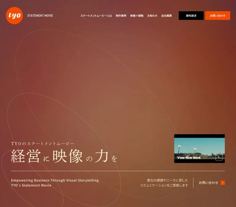
赤茶色のグラデーションと繊細な楕円の線、明朝体の大きなコピーが印象的な映像制作サービスサイト。広い余白、用途別イラスト、黒とオレンジの導線で構成。
オリジナルサイトを見るTYO Statement Movie — Style Reference
A spacious field of warm color and fine elliptical lines, grounded by editorial Japanese typography and decisive orange actions.
Original URL: statementmovie.tyo.co.jp
Final URL: statementmovie.tyo.co.jp
Theme: dark warm canvas, white and pale cream typography, orange accents, and a light contact panel.
Inspected: September 13, 2026, 00:07:35 JST; supplied retrieval timestamp: 2026-09-12T15:07:35.580Z.
Viewports: desktop 1440 × 1000 and mobile 390 × 844 CSS pixels.
Scope: the current service homepage, including its hero, news rail, editorial explanations, use cases, roadmap, strategy section, project links, contact panel, and footer. Three desktop and two mobile current-page captures accompany rendered text, link destinations, element rectangles, and selected computed styles. Linked detail pages and open navigation states were not inspected.
TYO presents its statement-movie service through a long editorial homepage within a broader service website. The page connects business communication needs to applications, a production process, examples, and inquiry routes. Its visual identity comes from the relationship between an unusually open first screen and the denser explanatory material below.
The hero places a delicate Japanese headline near the bottom of a warm gradient field. Large, thin elliptical outlines traverse the space above and behind it. A small sports-film preview provides concrete evidence of the service without dominating the composition. Farther down, flat illustrations and measured text columns make the offering understandable. A pale contact panel closes the page with two substantial actions: black for requesting materials and orange for making contact.
How to Read This Reference
- Measured values come from the supplied computed styles or element rectangles. Decimal measurements are rounded for readability.
- Derived values are arithmetic relationships between measured rectangles, such as column gaps and content widths.
- Estimated values describe the supplied screenshots visually. Background colors, line opacity, hero lettering sizes, and unrecorded image bounds were not sampled programmatically.
- Recommended values are implementation choices for a new build. The CSS breakpoints, gradient construction, fallback fonts, and accessible interaction additions are recommendations.
- All custom token names below are reference aliases. No site-specific semantic token definitions were supplied.
- A computed font family records the declared stack; it does not identify the font that rendered every individual glyph.
- DOM text and geometry can include closed navigation or other non-visible content. They do not establish that an overlay was open or that its interaction worked.
Tokens — Colors
Default Palette
| Name | Value | Token | Evidence | Role |
|---|---|---|---|---|
| Action Orange | #f04b00 |
--color-orange |
Measured | Header and footer inquiry-button fills |
| Action Black | #000000 |
--color-black |
Measured | Materials-request buttons, project-list action, contact-panel text |
| Interface White | #ffffff |
--color-white |
Measured | Navigation, body copy, card text, and reversed button text |
| Headline Cream | Approximately #fff0c6 |
--color-cream |
Estimated | Warm hero lettering and a useful approximation for highlighted headings |
| Muted Wine | Approximately #71383e |
--color-wine |
Estimated | Red-purple portions of the hero field |
| Earth Brown | Approximately #87583e |
--color-earth |
Estimated | Warm brown regions between the wine and amber areas |
| Deep Brown | Approximately #49231d |
--color-deep |
Estimated | Darker lower-page canvas |
| Contact Paper | Approximately #f1ece7 |
--color-paper |
Estimated | Large pale contact surface |
| Fine Cream Line | rgba(255, 240, 198, 0.4) |
--color-line |
Recommended approximation | Elliptical decoration and delicate separators |
The measured action orange takes precedence over its appearance in the screenshots. The page also exposes a generic #ff6900 orange preset, but that is not the measured inquiry-button fill.
Gradient and Paint Behavior
The visible background blends burgundy, burnt orange, brown, and a diffuse amber glow. Color transitions are broad and soft; there are no sharp gradient bands. The lower-page captures are darker and less saturated than the first screen.
The exact gradient stops, compositing layers, and relationship to scrolling or elapsed time were not supplied. Reproduce the broad distribution of color with layered gradients as an approximation, then tune against the current captures. Do not describe the background as an animated shader, video, or rotating gradient without further evidence.
Several headings report transparent text color while appearing warm-toned in a screenshot. The paint mechanism was not recorded. A clipped background or another text-paint layer could account for the appearance, but the evidence does not establish which. Keep a visible fallback color in a new implementation.
The desktop body reports a white background even though the visible page is predominantly brown. This demonstrates that the body declaration alone does not describe the final canvas. Likewise, the supplied generic CMS gradients, shadows, and carousel color variables are not evidence that those treatments appear in the design.
Tokens — Typography
Japanese Sans Serif — Navigation and Explanatory Copy
Measured source stack:
font-family: "Noto Sans JP", 游ゴシック体, "Yu Gothic", YuGothic,
  "ヒラギノ角ゴ ProN W3", "Hiragino Kaku Gothic ProN",
  メイリオ, Meiryo, sans-serif;
Regular weight 400 handles body copy and desktop navigation. Weight 500 appears in section labels and use-case titles. Most measured Japanese copy carries 0.3px tracking.
The body and root compute to 10px, but ordinary paragraphs explicitly use larger sizes. Do not mistake the inherited size of a link wrapper for the visible size of its child label.
Japanese Mincho — Editorial Statements and Roadmap Titles
Measured source stack: dnp-shuei-mincho-pr6, sans-serif.
This family is declared on the stakeholder-communication statement, the strategy statement, and roadmap titles. Desktop editorial statements use 35px type with approximately 49.7px leading. Mobile reduces them to 22px with approximately 31px leading.
The serif letterforms introduce a considered, literary register alongside practical sans-serif explanations. The source fallback is explicitly sans-serif. A Mincho or generic serif fallback in a new implementation is a recommendation, not the recorded source stack.
Latin Utility Type
The footer links declare tt-commons-pro, sans-serif, with 1px tracking. The screenshots also contain compact English labels and larger English section headings, including Contact us, Road Map, and Our Work.
Their individual computed styles were not supplied. Do not extend the footer's confirmed family declaration to every English heading as an established fact.
Hero Lettering
The visible headline is 経営に映像の力を, preceded by TYOのステートメントムービー. Large principal characters alternate with noticeably smaller connecting characters. Its pale color, light stroke contrast, and restrained placement are essential to the composition.
The headline is absent from the extracted text, and the sampled empty H1 wraps the brand link. The supplied evidence does not establish whether the hero lettering is an image, SVG, or separately styled text. Its exact family, font size, and semantic implementation remain unverified.
Type Scale
Values below are measured unless explicitly marked as estimates. Sizes describe font size and line height, not element bounding-box height.
| Role | Desktop | Mobile | Weight and tracking |
|---|---|---|---|
| Root / inherited wrapper size | 10px |
10px |
Not the general reading size |
| Desktop navigation / mobile menu-link structure | 15px / 22.5px |
16px / 16px |
400; desktop 0.5px tracking; mobile menu visibility unverified |
| Standard explanatory paragraph | 15px / 30px |
13px / 23.92px |
400, generally 0.3px tracking |
| Strategy paragraph | 16px / 32px |
13px / 26px |
400, 0.3px tracking |
| Introductory Japanese section label | 18px / 21.6px |
13px / 15.6px |
500 |
| Use-case section heading | 30px / 49.8px |
18px / 27px |
500 |
| Editorial Mincho statement | 35px / 49.7px |
22px / 31.02–31.24px |
400; tracking varies by section |
| Roadmap title | 19.94px / 29.91px |
16px / 24px |
500; tracking 0.3px desktop, 1.5px mobile |
| Roadmap description | 16.62px / 33.23px |
13px / 23.92px |
400 |
| Use-case title | 18px / 27px |
16px / 24.96px |
500, 0.3px tracking |
| Use-case description | 15px / 22.5px |
13px / 18.98px |
400 |
| Contact lead | 18px / 28.8px |
16px / 25.6px |
400 |
| Footer navigation | 15px / 27.9px |
13px / 24.18px |
400 desktop, 500 mobile; 1px tracking |
| Hero principal characters | Approximately 80–90px |
Approximately 38–42px |
Visual estimate; source typography unavailable |
| Hero connecting characters | Approximately 32–40px |
Approximately 17–20px |
Visual estimate |
| Contact action labels | Approximately 20–22px |
Approximately 16px |
Visual estimate; child label styles unavailable |
The design combines a large headline with modest reading text. Preserve that contrast without shrinking every mobile label in proportion to the desktop canvas.
Tokens — Spacing & Shapes
Density: very open in the hero and between major sections; compact inside navigation, project metadata, and use-case descriptions.
Scaling: measured desktop and mobile values demonstrate responsive changes, but the underlying formulas and breakpoints were not supplied. Avoid presenting an inferred viewport formula as source CSS.
Spacing Scale
| Use | Desktop | Mobile | Evidence |
|---|---|---|---|
| Header left inset | 60px |
12.98px |
Measured brand position |
| Header top inset | 32px |
13px |
Measured brand position |
| Main content side inset | About 66.5px |
Usually 26–27px |
Measured |
| Hero side inset | About 65–67px |
About 13px |
Screenshot estimate desktop; measured mobile alignment |
| Use-case column gap | 59.80px |
Single column | Derived |
| Use-case row gap | 60px |
39px |
Derived |
| Project column gap | 53.16px |
Single column | Derived |
| Project row gap | 42px |
40px |
Derived |
| Roadmap column gap | About 52.05px |
Single column | Derived |
| News image-to-copy gap | 20px |
13px |
Measured |
| Large contact action gap | 22.41px horizontally |
13px vertically |
Derived |
| Contact horizontal inner inset | About 110px |
About 26px |
Derived from inner positions and visually identified panel edges |
Border Radius
| Element | Desktop | Mobile | Evidence |
|---|---|---|---|
| Header action buttons | 3px |
Replaced by mobile navigation | Measured |
| Featured-work link | 3px |
3px |
Measured |
| Use-case link container | 0 |
0 |
Measured |
| Project link container | 3px |
3px |
Measured; media clipping not independently recorded |
| Project-list button | 3px |
3px |
Measured |
| Large contact actions | 7px |
3px |
Measured |
| Contact panel | Approximately 3px |
Approximately 3px |
Visual estimate |
| News rail outer surface | Approximately 10px |
Not visually established | Desktop visual estimate |
| Brand symbol | Circular | Circular | Observed |
Layout Measurements
| Element | Desktop at 1440 × 1000 | Mobile at 390 × 844 |
|---|---|---|
| Document height | 9941.45px |
10304.16px |
| Brand link | 218 × 79.70px |
143 × 52.28px |
| Header action | 150.64 × 53.16px |
Desktop actions absent from the closed header |
| First section | Starts at y=111.70px; height 857.34px |
Starts at y=0; height 844px |
| Featured-work link | 311.34 × 175.66px |
116.98 × 73px |
| General content width | Approximately 1307px |
338px for use cases and projects |
| Use-case link | Approximately 623.57 × 386.16px |
338px wide; about 249–252px high |
| Use-case illustration surface | Approximately 624 × 286px |
Image bounds not supplied |
| Roadmap text column | Approximately 287.73px wide |
336px wide |
| Project link | 626.89 × 472.77px |
338px wide; about 278–299px high |
| Large contact action | 532.63 × 96px |
312.02 × 65px |
| Project-list button | 280 × 65.02px |
274.63 × 65.02px |
Element coordinates in the rendered evidence describe document layout. Scrolled screenshots show those same elements at different viewport positions; do not use their screenshot positions as absolute page offsets.
Components
Persistent Brand Header
Role: identity, section access, and continuous access to the two commercial actions.
The desktop header has three main groups: the brand at left, navigation through the center, and two equal-width actions at right. The brand combines an orange circular tyo mark with a narrow white STATEMENT MOVIE wordmark. The complete brand link measures 218 × 79.70px.
The navigation labels are ステートメントムービーとは, 活用シーン, 制作事例, and お知らせ. The use-case label includes a small downward chevron. A black 資料請求 button precedes an orange お問い合わせ button, separated by approximately 7.75px.
The header remains at the top in supplied scrolled captures and has no opaque background plate. This supports a persistent, fixed-looking presentation; the actual positioning declaration was not included.
On mobile, the brand moves to 13px from the top and left and reduces to 143px wide. A compact MENU control occupies the upper right. The lower-page mobile capture also reveals a small stack of elliptical outlines above that label, echoing the hero decoration.
Navigation Disclosure Structure
Role: exposes the four service applications without crowding the main navigation.
The DOM contains links for investor communication, recruitment branding, employee engagement, and corporate branding. The desktop menu-associated link rectangles form a horizontal group. Mobile menu-associated rows use a 312px content width; top-level rows are approximately 64px high and application rows approximately 80px high.
These are structural measurements, not an inspected open-menu design. The current screenshots show the closed header. Both MENU and CLOSE occur in extracted text, but opening, closing, focus behavior, submenu triggers, and scroll locking were not exercised.
Hero Composition
Role: communicates the central promise and establishes the site's atmosphere.
The first screen leaves most of its upper area available to color and linework. The message sits low and left instead of filling the center. Thin tilted ellipses cross the canvas at different sizes, extending beyond the viewport edges.
The desktop lower composition contains:
- A small Japanese introductory line above the large Mincho-like statement.
- A featured-work preview aligned to the right of the headline region.
- A fine horizontal rule spanning nearly the full content width.
- Two English support lines at left below the rule.
- A short Japanese service description and compact contact link at right.
The mobile arrangement preserves the open upper field. The introductory line begins near y=598px, and the main lettering follows around y=622px, based on the screenshot. English support copy sits directly underneath. The rule appears around y=721px; below it, the summary and contact link occupy the left while the work preview sits at right.
Do not vertically center the hero message or enlarge the preview into a full-screen film. Those changes remove the measured relationship between empty space, headline, and evidence.
Featured-Work Preview
Role: gives immediate access to a recent film example.
The desktop link is positioned at approximately x=1062.17px, y=526.89px, with dimensions close to 16:9. The visible frame shows a sports ground, turquoise sky, and stadium lights, with black bands and a white View New Work label near its lower edge.
Mobile uses a smaller 116.98 × 73px link at x=259.98px, y=746px. Its container therefore does not have exactly the same aspect ratio as the desktop link. Preserve the compact framed treatment rather than stretching the thumbnail.
The recorded destination is /work/137/. A play-like symbol is visible, but the evidence establishes a link to a work page, not an inline player or modal. Playback, autoplay, audio, and moving preview frames are unverified.
News Rail
Role: introduces current activity between the atmospheric opening and the service explanation.
A pale horizontal surface enters the bottom of the desktop first-screen capture. Each item combines an image, date, and truncated Japanese headline. The desktop records six links, each 400 × 100px, with a 20px internal image-to-copy gap. Their starting positions advance by 430px, indicating 30px between items.
At mobile width, the item link is 316 × 80.23px, with a 13px internal gap. The first begins at x=37px, y=904px, placing it below the 844px hero. Additional items continue horizontally outside the viewport.
This supports a horizontal rail. It does not verify dragging, automatic advancement, looping, or the exact purpose of the desktop edge arrow. Preserve readable dates and restrained truncation; provide explicit navigation if implementing a carousel.
Editorial Explanation Sections
Role: explains the service and its business relevance before presenting applications.
The content progresses through the service definition, stakeholder communication, and the role of a statement movie. English headings accompany smaller Japanese labels, while selected Japanese statements use the measured Mincho family.
Desktop text is intentionally asymmetric. For example, the introductory paragraph begins around x=620px and occupies 753px, while the stakeholder explanation uses a right-side column beginning around x=724px. A later role paragraph occupies approximately 424px on the left beside a larger diagram region visible at the top of the mid-page capture.
Mobile reorganizes most reading material into columns around 335–336px wide. The introduction retains a distinctive inset: its paragraph begins around x=79px and is approximately 272px wide. Avoid flattening every mobile section into an identical full-width text block.
Rationale and company-related content also appear in the DOM. Its visibility state and any associated disclosure behavior were not established, so a specific accordion or modal anatomy cannot be documented.
Use-Case Card Grid
Role: connects business audiences to dedicated service pages.
The section title is 利用目的 / 活用シーン. Four linked entries cover investor communication, recruitment branding, employee engagement, and corporate branding.
Desktop uses two columns of approximately 623.57px with a 59.80px gap. Each entry contains a broad illustration surface, a title row with a small right-edge arrow square, and a compact description listing practical applications separated by slashes.
The visible image surfaces are flat, muted rectangles. The first illustration shows a presentation and business chart; the second shows a recruitment conversation across a table. The illustrations combine fine dark outlines with teal, blue, navy, gray, orange, and restrained skin tones. The text sits directly on the page background below the image surface, not inside an enclosing raised card.
Desktop image-to-title separation is approximately 20px by visual comparison with the measured title position. Descriptions follow the title with another clear gap. Use 18px medium-weight titles and 15px descriptions on desktop.
Mobile stacks all four entries at 338px wide with approximately 39px between links. Titles become 16px, descriptions 13px, and the small arrow remains a secondary cue within the larger link.
Four-Step Roadmap
Role: explains how the service moves from strategy to use.
The section pairs Road Map with ロードマップ, followed by an introductory paragraph and four numbered stages:
- Stakeholder communication strategy.
- Mission, vision, value, and statement development.
- Statement-movie production.
- Application planning and operational support.
Desktop places the four text columns side by side. Each column is approximately 287.73px wide, separated by 52.05px. The structure combines a Step 01-style label, a Mincho title, and a generous paragraph with approximately double leading.
Mobile stacks the stages at 336px wide. Titles reduce to 16px / 24px and retain deliberate line breaks. The third title fits on one line in the recorded mobile layout, while the others occupy two lines. Do not force equal title heights when natural wrapping makes the content clearer.
Step decorations and connectors were not shown in the supplied screenshots. The DOM confirms the textual order and geometry, not a particular progress-line illustration.
Movie & Strategy Section
Role: explains how the film connects with other communication methods.
The section uses the same English/Japanese heading pairing, followed by a three-line Japanese editorial statement. Desktop places the statement and supporting paragraph in a left column approximately 422px wide. The statement uses the measured 35px Mincho style; the paragraph uses 16px / 32px sans-serif.
Mobile uses a 336px reading column, a 22px statement, and 13px / 26px body copy. Preserve the distinction between the concise editorial statement and the explanatory paragraph.
The DOM establishes a substantial section around this content. Its complete visual asset composition was not captured, so additional imagery or interaction should not be invented as an original-page finding.
Project Grid
Role: demonstrates completed films and the range of clients served.
The DOM records four project links under Our Work, each combining a project title with Client and Industry information. The current entries include the Iwaki Sports Club film, NEC BluStellar, the NIPPAN GROUP ESG film, and the Suzu horse project.
Desktop uses two columns of 626.89px, a 53.16px horizontal gap, and 42px between rows. Mobile uses one 338px column with 40px gaps. The first mobile card is taller than the other three, consistent with additional title wrapping.
The supplied desktop lower-page capture shows the tail of the final row and its metadata. Full project-media crops were not visually inspected. Use the DOM to preserve grouping and rhythm; treat a 16:9 project-poster recommendation as an implementation choice rather than a measured asset ratio.
A black 制作事例をもっと見る action follows the grid. It is right aligned on desktop and centered on mobile. The recorded destination is /work/.
Client and Industry describe the featured films. They are not website-production credits.
Contact Panel
Role: turns the preceding explanation into two clear next steps.
A large pale rectangle provides the strongest surface change on the page. On desktop it spans approximately 1307px, with generous internal padding and very small corner rounding. Its upper content splits into two columns:
- Left:
Contact us, a two-line Japanese lead, and a supporting paragraph. - Right: three concerns, each preceded by a small orange outlined check circle.
The two large actions occupy a full-width row below. Each measures 532.63 × 96px, with 36px 40px padding and 7px corners. Text sits toward the left; a small white arrow square sits toward the right. Black denotes 資料請求はこちら; orange denotes お問い合わせはこちら.
Mobile changes to a single reading sequence: heading, lead, paragraph, concern list, black action, orange action. The outer panel is approximately 364px wide with 13px page margins. Its inner content is approximately 312px wide. Buttons become 65px high with 3px corners and a 13px vertical gap.
The supplied mobile footer capture begins partway through this panel, so its heading is above the visible crop. The DOM independently confirms the same contact content and button destinations.
Footer Navigation
Role: closes the page with secondary navigation and ownership information.
Desktop places All Rights Reserved © TYO Inc. at left and a horizontal navigation row at right. Links include home, use cases, work, news, company information, materials, and contact.
Mobile displays six links in a centered two-column, three-row arrangement. The home link is absent from the recorded mobile footer. Copyright moves below the links with substantial breathing room.
The footer remains on the dark brown canvas. There is no additional enclosing card, top shadow, or multicolumn corporate sitemap in the supplied captures.
Tokens — Motion & Interaction
| Treatment | Recorded evidence | What can be concluded |
|---|---|---|
| Header and large action color changes | background 0.5s cubic-bezier(0.36, 0.14, 0, 1), color 0.3s cubic-bezier(0.36, 0.14, 0, 1) |
A smooth background/text transition is declared; target colors were not supplied |
| Use-case link color changes | Same 0.5s background and 0.3s text transitions |
Shared action timing; exact hover appearance unverified |
| Rationale heading paint position | background-position 0.3s |
A paint-position transition exists; trigger and visual result unverified |
| Footer link animation | 0.5s cubic-bezier(0.16, 1, 0.3, 1) forwards hide-bg-line |
Named keyframe animation is recorded; keyframe geometry was not supplied |
| Persistent header | Same top placement across scrolled captures | Header persistence is visible; exact positioning and scroll logic unverified |
| News rail | Horizontally arranged links beyond viewport bounds | Horizontal content structure; autoplay and gesture behavior unverified |
| Mobile menu | MENU, CLOSE, and menu links present in DOM |
Disclosure structure exists; no open-state interaction was inspected |
| Featured-work preview | Play-like visual and link to /work/137/ |
Navigable work preview; inline playback unverified |
| Background and elliptical lines | Static captures at two viewport sizes | Shape and composition are observable; movement, speed, and timing are unknown |
The common computed value transition: all does not establish meaningful motion on its own. A duration and a state change are needed to describe an actual transition.
The capture process waited for initial loading, sampled layout stability, and visible finite animations, and temporarily paused perpetual animation during readiness checks. This improves capture reliability but does not replace an interaction recording. No basis is available for specifying continuous ellipse rotation, parallax, scroll scrubbing, animated counters, or video autoplay.
For an adaptation, reuse the measured 500ms background and 300ms text timing where appropriate. Keep the decorative background static until a purposeful motion design is specified. Provide reduced-motion behavior for any added animation.
Surfaces
| Layer | Appearance | Purpose |
|---|---|---|
| Main canvas | Warm, diffuse wine-to-brown color field | Establishes atmosphere across the long page |
| Header | Transparent, white labels, orange identity | Keeps navigation visually integrated with the canvas |
| Editorial content | Mostly transparent sections | Uses type, alignment, and spacing to establish hierarchy |
| Use-case image surface | Muted rectangular field behind flat illustrations | Gives illustrations a consistent frame |
| News surface | Pale, visually translucent desktop strip | Separates current updates from the hero |
| Contact panel | Opaque-looking warm off-white | Creates a strong closing change in contrast |
| Action surfaces | Solid black or measured orange | Distinguishes two recurring destinations |
| Fine decoration | Pale hairlines, outlined checks, small arrow squares | Adds detail without introducing elevation |
The page has no visible general-purpose shadow hierarchy. Slightly translucent-looking image mats should not be interpreted as backdrop blur. Structure comes from open space, contrasting fills, image rectangles, and typography.
Imagery
The hero's primary image is abstract: oversized overlapping elliptical outlines set against diffuse color. The lines feel precise and light, while the color feels soft and atmospheric. Their scale is architectural rather than icon-like; several extend far beyond the screen.
Photography appears in the compact work preview and the desktop news strip. The work preview has a recognizable sports setting and a large cyan sky, creating a cool counterpoint to the warm page. News imagery includes people, corporate marks, and an exhibition scene. These images retain their original colors instead of receiving a universal brown duotone treatment.
Use-case illustrations explain activities. The visible examples depict a presentation with charts and a recruitment conversation. They use simplified faces, ordinary business clothing, flat fills, fine outlines, and muted cool colors with small orange accents. Preserve their clear explanatory character; a glossy 3D mascot or highly decorative illustration system would change the tone.
Small interface graphics include directional chevrons, white arrow squares inside buttons, orange check circles, and the mobile menu's elliptical motif. No icon library was identified.
Observed Asset References
No image, font-file, SVG-file, or video-file URLs were included in the supplied evidence. The following are rendered references, not downloadable asset paths.
| Rendered reference | Confirmed context | Reuse guidance |
|---|---|---|
Circular tyo mark and service wordmark |
Header home link | Use authorized brand artwork; preserve the combined mark's proportions |
| Pale Japanese hero lettering | Current desktop and mobile first screens | Preserve the large/small character hierarchy; asset format and exact font are unknown |
| Elliptical line composition | Hero background and mobile menu detail | Build an original vector approximation if source artwork is unavailable |
| Sports-ground preview | Link to /work/137/ |
Supply authorized media and preserve the compact framed presentation |
| Business presentation illustration | Investor-communication use case | Keep the chart, people, muted fills, and thin-outline treatment |
| Recruitment conversation illustration | Recruitment-branding use case | Preserve the conversational scene and broad landscape frame |
| News thumbnails | Links to individual news articles | Use actual editorial images with stable image dimensions |
CSS can reproduce the layout and surface language. It cannot supply the original brand mark, film footage, or illustrations.
Layout & Responsive Behavior
Desktop Composition
The desktop page uses a broad content area approximately 1307px wide, framed by 66.5px side margins. Header edges sit slightly wider, at 60px. The hero's message remains near the bottom while the brand and navigation occupy the top edge.
The long page alternates among asymmetric text/image arrangements, two-column use cases, a four-column roadmap, and a two-column project grid. This creates variation without introducing a different visual system for each section.
The contact panel reverses the canvas-to-text relationship near the end. Its broad action row and generous padding make the final conversion area feel distinct from ordinary content cards.
Observed Mobile Changes
| Area | Observed change at 390 × 844 |
|---|---|
| Header | Smaller brand, MENU control, no desktop action pair in the closed header |
| Hero | Exactly one viewport high in the recorded layout; content remains low on the screen |
| Hero support | English copy moves beneath the headline; Japanese summary shares the lower row with the small work preview |
| Margins | About 13px for hero and contact panel; usually 26–27px for reading sections |
| News | One compact item occupies most of the rail width; subsequent items remain horizontally arranged |
| Editorial type | Large Mincho statements reduce from 35px to 22px |
| Use cases | Two desktop columns become one 338px column |
| Roadmap | Four desktop columns become a vertical sequence |
| Projects | Two desktop columns become one, with natural title wrapping |
| Contact | Copy, concerns, and actions stack in reading order |
| Footer | Horizontal links become a two-column grid; copyright follows below |
The mobile design is not simply a uniformly scaled desktop page. It changes content order, column count, margins, and line breaks while preserving the hero's empty upper field.
Only the two supplied widths were inspected. Tablet layouts, landscape phones, breakpoint locations, browser-chrome changes, and safe-area handling are unverified. Breakpoints in the Quick Start are recommended starting points.
Do’s and Don’ts
Do
- Preserve the warm wine, brown, and amber atmosphere with measured orange reserved for key actions.
- Keep the hero headline low in the viewport and retain generous space above it.
- Use fine, oversized elliptical lines that extend beyond the canvas.
- Pair Mincho editorial statements with restrained sans-serif reading text.
- Keep a small, concrete work preview beside the hero message.
- Use the black/orange action pair consistently across header and contact panel.
- Place use-case text beneath broad illustration surfaces without enclosing every item in a raised card.
- Preserve the different desktop structures: asymmetric editorial columns, two-column grids, and four roadmap stages.
- Stack mobile content in a deliberate reading order and retain the two mobile margin scales.
- Treat image crops, Japanese line breaks, and original brand artwork as part of the composition.
Don’t
- Do not center a large headline in the empty upper hero region.
- Do not replace the compact work preview with an assumed autoplay background film.
- Do not use the generic orange preset in place of the measured
#f04b00button fill. - Do not describe estimated background colors or reconstructed gradients as exact source tokens.
- Do not copy transparent heading text without a visible paint fallback.
- Do not turn flat illustration surfaces into glass panels, glossy cards, or floating shadow stacks.
- Do not apply the Mincho face to every paragraph or assume the footer font is used for all English text.
- Do not interpret menu links in the DOM as proof of an inspected open-menu state.
- Do not force equal mobile project heights when titles wrap differently.
- Do not infer website authorship from the client names attached to film examples.
Recommended Implementation Additions
These are recommendations for a new implementation, not verified features of the original page.
- Provide keyboard-operable navigation disclosures, explicit expanded states, Escape-to-close behavior, and appropriate focus management for an overlay menu.
- Account for the persistent header when scrolling to section anchors. Keep focused content visible beneath it.
- Improve header legibility over the pale contact panel. The mobile footer capture shows white header details crossing light content; a context-sensitive foreground or restrained backing surface can preserve contrast.
- Check small white labels on orange. The measured
#f04b00against white gives approximately3.7:1contrast. A darker button variant such as#c83e00can support small white text while the original orange remains available for larger brand areas. - Retain visible keyboard focus and enlarge the interaction area around small menu and arrow graphics. A decorative arrow inside a full-card link does not need a separate tiny target.
- Preserve zoom and consider
15–16pxmobile reading text for new long-form content. The source's13pxparagraphs reproduce its density but are not a requirement for an accessible adaptation. - Give the news rail accessible previous/next controls or an ordinary horizontal scrolling fallback. Do not make automatic movement the only way to reach an article.
- Use descriptive alternatives for informative diagrams and illustrations. Mark purely decorative ellipses as hidden from assistive technology.
- Reserve media dimensions to prevent layout shifts. Add user-controlled playback only when actual video functionality is implemented.
- Supply reduced-motion behavior for added line, gradient, or scroll animation.
Agent Prompt Guide
Quick Color Reference
- Inquiry action: measured
#f04b00. - Materials action and contact text: measured
#000000. - Main navigation and reading text: measured
#ffffff. - Hero headline approximation:
#fff0c6. - Background approximations: wine
#71383e, earth#87583e, deep brown#49231d. - Contact surface approximation:
#f1ece7. - Decoration: faint cream hairlines; avoid a shadow-based elevation system.
Overall Prompt
“Create a responsive Japanese service website for strategic corporate films, following the current TYO Statement Movie page's visual relationships. Use a broad wine-to-brown gradient field with diffuse amber areas and very thin oversized elliptical outlines. Keep the upper hero spacious. Place a pale Mincho-style Japanese statement near the bottom left, with larger principal characters and smaller connecting characters. Add a compact landscape work preview at the right, a fine full-width rule, and restrained bilingual support copy. Use white sans-serif navigation and consistent black materials-request and orange #f04b00 inquiry actions. Continue with asymmetric editorial sections, flat illustrated use cases, four numbered production stages, and a project grid. Finish with a pale contact panel and substantial paired actions. On mobile, preserve the low hero placement, use a compact menu, stack content grids, and retain approximately 13px outer and 26px reading margins. Treat background colors and unmeasured typography as approximations. Keep decoration static unless motion is separately specified.”
Example Component Prompts
- Hero: “Design a 390 × 844 mobile first screen with an orange circular brand at 13px from the upper left and a small menu control at the upper right. Leave most of the upper field open for faint overlapping ellipses. Place
経営に映像の力をnear the lower quarter, followed by two compact English lines, a thin rule, and a summary beside a roughly 117 × 73px work preview.” - Use-case card: “Create a flat service link with a wide muted illustration surface, simplified business figures, teal and navy fills, and fine outlines. Put an 18px medium-weight Japanese title below the image, a small dark arrow square at the far right, and a 15px description of practical applications. Use square outer geometry and no shadow.”
- Roadmap: “Build four evenly spaced desktop columns within a roughly 1307px content area. Each has a numbered Step label, a two-line Mincho title near 20px, and a generously led sans-serif paragraph. Stack the stages on mobile, with 16px titles and natural wrapping.”
- Contact panel: “Create a warm off-white panel on a deep brown canvas. Arrange a Contact us heading, Japanese lead, and paragraph at left, with three orange outlined check items at right. Place equal black and orange actions below, approximately 96px high on desktop. Stack everything on mobile with 65px-high buttons and a 13px gap.”
- Header: “Use an integrated transparent header with a combined circular logo and narrow wordmark, white Japanese navigation, and two approximately 151 × 53px actions at right. Keep the materials action black and inquiry action orange. On narrow screens replace the desktop groups with an accessible menu disclosure.”
- News rail: “Create a pale horizontal news strip with image-and-text items, visible dates, and restrained Japanese headline truncation. Use approximately 400 × 100px desktop links and 316 × 80px mobile links. Provide usable manual navigation; autoplay is not part of the verified reference.”
Quick Start
CSS Custom Properties
This is a practical adaptation, not a transcription of the original stylesheet. It keeps a conventional root size and uses explicit pixel values for measured typography. Gradient construction, hero sizing between viewports, fallback fonts, hover colors, and breakpoints are recommendations.
The hero grid expects .hero-title-group, .featured-work, .hero-rule, .hero-en, and .hero-support as direct children of .hero-inner. Inside the title, wrap smaller connecting characters in small. An optional decorative SVG uses .hero-orbits; supply your own ellipse paths and aria-hidden="true".
Load authorized fonts and media separately. Menu behavior, carousel controls, and playback require application logic.
:root {
  /* Measured interface colors */
  --color-orange: #f04b00;
  --color-black: #000;
  --color-white: #fff;

  /* Visual approximations */
  --color-cream: #fff0c6;
  --color-wine: #71383e;
  --color-earth: #87583e;
  --color-deep: #49231d;
  --color-paper: #f1ece7;
  --color-line: rgb(255 240 198 / 40%);

  --font-body: "Noto Sans JP", "Yu Gothic", YuGothic,
    "Hiragino Kaku Gothic ProN", Meiryo, sans-serif;
  /* Recommended serif fallback; the source declares sans-serif. */
  --font-editorial: dnp-shuei-mincho-pr6, "Yu Mincho", serif;
  --font-latin: tt-commons-pro, Arial, sans-serif;

  --text-body: 15px;
  --leading-body: 2;
  --text-card: 18px;
  --text-statement: 35px;
  --gutter: clamp(26px, 4.62vw, 66.5px);
  --header-gutter: clamp(26px, 4.167vw, 60px);
  --content-max: 1307px;
  --radius-small: 3px;
  --radius-action: 7px;
  --ease-action: cubic-bezier(0.36, 0.14, 0, 1);
}

* { box-sizing: border-box; }
body { margin: 0; }
button, input, textarea { font: inherit; }
img { display: block; max-width: 100%; }

.statement-site {
  position: relative;
  min-height: 100svh;
  color: var(--color-white);
  background: radial-gradient(ellipse at 52% 45%, #755346,
    var(--color-deep) 75%);
  font-family: var(--font-body);
  font-size: var(--text-body);
  line-height: var(--leading-body);
  letter-spacing: 0.3px;
}

.wrap {
  width: calc(100% - 2 * var(--gutter));
  max-width: var(--content-max);
  margin-inline: auto;
}

.site-header {
  position: fixed;
  z-index: 50;
  inset: 0 0 auto;
  display: flex;
  align-items: center;
  justify-content: space-between;
  gap: 24px;
  padding: 32px var(--header-gutter) 0;
}
.brand { display: block; flex: 0 0 218px; }
.brand img { width: 100%; height: auto; }
.desktop-nav, .header-actions { display: flex; align-items: center; }
.desktop-nav { gap: 33px; }
.desktop-nav a {
  padding-block: 14px;
  color: inherit;
  font-size: 15px;
  line-height: 1.5;
  letter-spacing: 0.5px;
  text-decoration: none;
}
.header-actions { gap: 8px; }
.header-actions .cta {
  width: 151px;
  min-height: 53px;
  justify-content: center;
  padding: 12px;
  border-radius: var(--radius-small);
  font-size: 15px;
}
.menu-toggle {
  display: none;
  min-width: 44px;
  min-height: 44px;
  border: 0;
  color: inherit;
  background: transparent;
  font-size: 11px;
  font-weight: 700;
}

.hero {
  position: relative;
  isolation: isolate;
  display: grid;
  align-items: end;
  min-height: 97svh;
  padding: 180px var(--gutter) 150px;
  overflow: hidden;
  background:
    radial-gradient(ellipse at 57% 63%, #a27b50 0, transparent 58%),
    radial-gradient(ellipse at 83% 20%, #8c341b 0, transparent 68%),
    linear-gradient(140deg, var(--color-wine), var(--color-earth));
}
.hero-orbits {
  position: absolute;
  z-index: -1;
  inset: 0;
  width: 100%;
  height: 100%;
  fill: none;
  stroke: var(--color-line);
  stroke-width: 1;
  pointer-events: none;
}
.hero-orbits ellipse { vector-effect: non-scaling-stroke; }
.hero-inner {
  display: grid;
  grid-template-columns: minmax(0, 1fr) minmax(0, 1fr) 311px;
  grid-template-areas:
    "title title work"
    "rule rule rule"
    "english support support";
  align-items: end;
  gap: 28px 30px;
  width: 100%;
  max-width: var(--content-max);
  margin-inline: auto;
}
.hero-title-group { grid-area: title; color: var(--color-cream); }
.hero-kicker {
  margin: 0 0 12px;
  font-family: var(--font-editorial);
  font-size: 24px;
  line-height: 1.4;
  letter-spacing: 0.15em;
}
.hero-title {
  margin: 0;
  font-family: var(--font-editorial);
  font-size: clamp(56px, 5.84vw, 84px);
  font-weight: 400;
  line-height: 1.15;
}
.hero-title small { font-size: 0.44em; font-weight: inherit; }
.hero-rule {
  grid-area: rule;
  width: 100%;
  margin: 0;
  border: 0;
  border-top: 1px solid var(--color-cream);
}
.hero-en {
  grid-area: english;
  align-self: start;
  margin: 0;
  color: var(--color-cream);
  font-family: var(--font-latin);
  font-size: 15px;
  line-height: 1.35;
  letter-spacing: 1px;
}
.hero-support {
  grid-area: support;
  display: flex;
  align-items: center;
  justify-content: flex-end;
  gap: 30px;
  color: var(--color-cream);
  line-height: 1.6;
}
.hero-support p { margin: 0; }
.hero-contact {
  flex: none;
  padding: 12px 0 12px 33px;
  border-left: 1px solid currentColor;
  color: inherit;
  text-decoration: none;
}
.featured-work {
  grid-area: work;
  position: relative;
  display: block;
  aspect-ratio: 311 / 176;
  overflow: hidden;
  border-radius: var(--radius-small);
  color: #fff;
  background: #000;
}
.featured-work img { width: 100%; height: 100%; object-fit: contain; }
.featured-work span {
  position: absolute;
  inset: auto 12px 10px;
  font-size: 14px;
  font-weight: 700;
  line-height: 1.2;
}

/* Manual scrolling is a recommended rail fallback. */
.news-rail {
  display: flex;
  gap: 30px;
  overflow-x: auto;
  padding: 30px 60px;
  border-radius: 10px;
  color: #000;
  background: rgb(241 236 231 / 85%);
  scroll-snap-type: x proximity;
}
.news-item {
  display: flex;
  flex: 0 0 400px;
  gap: 20px;
  min-height: 100px;
  color: inherit;
  text-decoration: none;
  scroll-snap-align: start;
}
.news-item img { width: 178px; aspect-ratio: 16 / 9; object-fit: cover; }

.content-section { padding-top: 170px; scroll-margin-top: 135px; }
.body-copy { margin: 0; font-size: var(--text-body); line-height: 2; }
.section-heading {
  margin: 0 0 44px;
  color: var(--color-cream);
  font-size: 30px;
  font-weight: 500;
  line-height: 1.66;
}
.editorial-statement {
  margin: 0 0 30px;
  font-family: var(--font-editorial);
  font-size: var(--text-statement);
  font-weight: 400;
  line-height: 1.42;
}
.editorial-grid {
  display: grid;
  grid-template-columns: minmax(0, 1fr) minmax(0, 1fr);
  gap: 60px;
}
.usecase-grid, .work-grid { display: grid; grid-template-columns: repeat(2, minmax(0, 1fr)); }
.usecase-grid { gap: 60px 59.8px; }
.work-grid { gap: 42px 53.16px; }
.usecase-card, .work-card { min-width: 0; color: inherit; text-decoration: none; }
.image-mat {
  display: grid;
  place-items: center;
  aspect-ratio: 624 / 286;
  background: rgb(241 236 231 / 13%);
}
.image-mat img { width: 70%; max-height: 85%; object-fit: contain; }
.card-title {
  display: flex;
  align-items: start;
  justify-content: space-between;
  gap: 20px;
  margin: 20px 0;
  font-size: var(--text-card);
  font-weight: 500;
  line-height: 1.5;
}
.card-description { margin: 0; font-size: 15px; line-height: 1.5; }
.step-grid { display: grid; grid-template-columns: repeat(4, minmax(0, 1fr)); gap: 52px; }
.step-title {
  font-family: var(--font-editorial);
  font-size: 19.94px;
  font-weight: 500;
  line-height: 1.5;
}
.step-copy { font-size: 16.62px; line-height: 2; }

.cta {
  display: flex;
  align-items: center;
  justify-content: space-between;
  gap: 24px;
  min-height: 96px;
  padding: 30px 40px;
  border-radius: var(--radius-action);
  color: #fff;
  font-size: 20px;
  font-weight: 500;
  line-height: 1.4;
  text-decoration: none;
  transition: background-color 500ms var(--ease-action),
    color 300ms var(--ease-action);
}
.cta--primary { background: var(--color-orange); }
.cta--secondary { background: var(--color-black); }
.cta-arrow {
  display: grid;
  flex: 0 0 20px;
  place-items: center;
  width: 20px;
  height: 20px;
  border-radius: 3px;
  color: #000;
  background: #fff;
  font-size: 13px;
}
.contact-panel {
  margin-top: 180px;
  padding: 80px 110px;
  border-radius: 3px;
  color: #000;
  background: var(--color-paper);
}
.contact-intro { display: grid; grid-template-columns: 0.9fr 1.1fr; gap: 80px; }
.contact-title {
  margin: 0 0 22px;
  font-family: var(--font-latin);
  font-size: 44px;
  line-height: 1.2;
}
.contact-lead { font-size: 18px; line-height: 1.6; }
.contact-checks { display: grid; align-content: start; gap: 20px; margin: 20px 0 0; padding: 0; list-style: none; }
.contact-checks li { display: grid; grid-template-columns: 18px 1fr; gap: 12px; }
.contact-checks li::before { content: '✓'; color: var(--color-orange); }
.contact-actions { display: grid; grid-template-columns: repeat(2, minmax(0, 1fr)); gap: 22.4px; margin-top: 48px; }
.footer-bottom { display: flex; align-items: center; justify-content: space-between; gap: 40px; padding-block: 60px; }
.footer-links { display: flex; flex-wrap: wrap; gap: 24px; }
.footer-links a { color: inherit; font-family: var(--font-latin); font-size: 15px; letter-spacing: 1px; text-decoration: none; }
.copyright { font-size: 11px; letter-spacing: 0.5px; }

/* Recommended states; original hover colors were not recorded. */
@media (hover: hover) {
  .cta--primary:hover { background: #c83e00; }
  .cta--secondary:hover { background: #382620; }
}
.statement-site :focus-visible { outline: 2px solid currentColor; outline-offset: 5px; }
.contact-panel .cta:focus-visible { outline-color: #000; }
.statement-site[data-enhanced-contrast='true'] .cta--primary { background: #c83e00; }

/* Recommended intermediate layout, not a measured breakpoint. */
@media (max-width: 1199px) {
  .desktop-nav, .header-actions { display: none; }
  .menu-toggle { display: block; }
  .step-grid { grid-template-columns: repeat(2, minmax(0, 1fr)); }
  .contact-panel { padding-inline: 50px; }
}

@media (max-width: 767px) {
  :root {
    --gutter: 26px;
    --header-gutter: 13px;
    --text-body: 13px;
    --text-card: 16px;
    --text-statement: 22px;
    --radius-action: 3px;
  }
  .site-header { padding: 13px 13px 0; align-items: start; }
  .brand { flex-basis: 143px; }
  .hero { min-height: 100svh; padding: 100px 13px 25px; }
  .hero-inner {
    grid-template-columns: minmax(0, 1fr) 117px;
    grid-template-areas: "title title" "english english" "rule rule" "support work";
    gap: 0 16px;
  }
  .hero-kicker { margin-bottom: 6px; font-size: 10px; line-height: 1.5; }
  .hero-title { font-size: clamp(32px, 10.25vw, 40px); }
  .hero-title-group { margin-bottom: 6px; }
  .hero-en { margin-bottom: 18px; font-size: 13px; line-height: 1.4; letter-spacing: 0.3px; }
  .hero-rule { margin-bottom: 24px; }
  .hero-support { display: block; font-size: 13px; line-height: 1.6; }
  .hero-contact { display: inline-block; margin-top: 6px; padding: 0; border: 0; line-height: 26px; }
  .featured-work { width: 117px; height: 73px; aspect-ratio: auto; }
  .featured-work span { inset: auto 8px 5px; font-size: 11px; }
  .news-rail { gap: 37px; padding: 24px; }
  .news-item { flex-basis: 316px; gap: 13px; min-height: 80px; }
  .news-item img { width: 130px; }
  .content-section { padding-top: 124px; scroll-margin-top: 85px; }
  .section-heading { margin-bottom: 38px; font-size: 18px; line-height: 1.5; }
  .body-copy { line-height: 1.84; }
  .editorial-grid, .usecase-grid, .work-grid, .step-grid { grid-template-columns: minmax(0, 1fr); }
  .editorial-grid, .step-grid { gap: 40px; }
  .usecase-grid { gap: 39px; }
  .work-grid { gap: 40px; }
  .card-title { margin: 20px 0 16px; line-height: 1.56; }
  .card-description { font-size: 13px; line-height: 1.46; }
  .step-title { font-size: 16px; letter-spacing: 1.5px; }
  .step-copy { font-size: 13px; line-height: 1.84; }
  .contact-panel { width: calc(100% - 26px); margin-top: 200px; padding: 39px 26px; }
  .contact-intro, .contact-actions { grid-template-columns: minmax(0, 1fr); }
  .contact-intro { gap: 24px; }
  .contact-title { font-size: 32px; }
  .contact-lead { font-size: 16px; }
  .contact-actions { gap: 13px; margin-top: 36px; }
  .cta { min-height: 65px; padding: 21px 24px; font-size: 16px; }
  .cta-arrow { flex-basis: 13px; width: 13px; height: 13px; font-size: 10px; }
  .footer-bottom { flex-direction: column; gap: 60px; padding-block: 60px 75px; }
  .footer-links { display: grid; grid-template-columns: repeat(2, 1fr); gap: 14px 60px; text-align: center; }
  .footer-links a { font-size: 13px; font-weight: 500; }
  .footer-home { display: none; }
  .copyright { order: 2; font-size: 10px; }
}

@media (prefers-reduced-motion: reduce) {
  .statement-site *, .statement-site *::before, .statement-site *::after {
    animation: none !important;
    transition: none !important;
    scroll-behavior: auto !important;
  }
}
The illustration sizing, news-image widths, contact-heading sizes, and desktop hero construction above are starting approximations. Replace those rules with measured asset behavior if additional evidence becomes available. The CSS intentionally does not reproduce unknown open-menu visuals or media behavior.
Tailwind v4 Token Mapping
Optional aliases for a project already using Tailwind v4. This is not evidence that the original website uses Tailwind. Define the custom properties above first.
@theme inline {
  --color-action-orange: var(--color-orange);
  --color-canvas-deep: var(--color-deep);
  --color-contact-paper: var(--color-paper);
  --color-heading-cream: var(--color-cream);

  --font-sans: var(--font-body);
  --font-display: var(--font-editorial);
  --font-utility: var(--font-latin);

  --text-reading: var(--text-body);
  --text-card-heading: var(--text-card);
  --text-editorial: var(--text-statement);

  --spacing-page: var(--gutter);
  --radius-control: var(--radius-small);
  --radius-large-action: var(--radius-action);
  --ease-action-color: var(--ease-action);
}
Sources & Evidence
- Current TYO Statement Movie homepage: original and final URL, reported HTTP
200, page title, rendered text, current desktop/mobile captures, link destinations, element rectangles, and selected computed styles. - Capture timestamp:
2026-09-12T15:07:35.580Z, corresponding to September 13, 2026, 00:07:35 JST. - Desktop evidence:
1440 × 1000CSS pixels; first screen, use-case region, and lower-page contact/footer captures; measured document height approximately9941.45px. - Mobile evidence:
390 × 844CSS pixels; first screen and lower-page contact/footer captures; measured document height approximately10304.16px. - Observed navigation destinations: the homepage's about and use-case anchors,
/ir/,/recruit/,/engagement/,/branding/,/work/,/news/,/download/, and/contact/. Destinations were recorded from the homepage; their pages were not independently inspected. - Observed featured-work destination: work entry 137, identified from the homepage link. This is evidence of navigation, not an inspected player.
- Identity evidence: the original page displays
All Rights Reserved © TYO Inc.and links to tyo.co.jp. No website-production credits were independently established from the supplied original-page evidence. - Inspection limitations: no open-menu screenshots, hover-state captures, keyboard tests, playback tests, carousel interaction traces, complete asset inventory, source gradient declarations, or intermediate viewport inspections were supplied. Readiness checks do not prove that delayed content or unexercised interactions were complete.
This reference describes the supplied current-page evidence. Measured values, visual approximations, and implementation recommendations are identified separately throughout.
# TYO Statement Movie — Style Reference

> A spacious field of warm color and fine elliptical lines, grounded by editorial Japanese typography and decisive orange actions.

**Original URL:** [statementmovie.tyo.co.jp](https://statementmovie.tyo.co.jp/)
**Final URL:** [statementmovie.tyo.co.jp](https://statementmovie.tyo.co.jp/)
**Theme:** dark warm canvas, white and pale cream typography, orange accents, and a light contact panel.
**Inspected:** September 13, 2026, 00:07:35 JST; supplied retrieval timestamp: `2026-09-12T15:07:35.580Z`.
**Viewports:** desktop `1440 × 1000` and mobile `390 × 844` CSS pixels.
**Scope:** the current service homepage, including its hero, news rail, editorial explanations, use cases, roadmap, strategy section, project links, contact panel, and footer. Three desktop and two mobile current-page captures accompany rendered text, link destinations, element rectangles, and selected computed styles. Linked detail pages and open navigation states were not inspected.

TYO presents its statement-movie service through a long editorial homepage within a broader service website. The page connects business communication needs to applications, a production process, examples, and inquiry routes. Its visual identity comes from the relationship between an unusually open first screen and the denser explanatory material below.

The hero places a delicate Japanese headline near the bottom of a warm gradient field. Large, thin elliptical outlines traverse the space above and behind it. A small sports-film preview provides concrete evidence of the service without dominating the composition. Farther down, flat illustrations and measured text columns make the offering understandable. A pale contact panel closes the page with two substantial actions: black for requesting materials and orange for making contact.

## How to Read This Reference

- **Measured** values come from the supplied computed styles or element rectangles. Decimal measurements are rounded for readability.
- **Derived** values are arithmetic relationships between measured rectangles, such as column gaps and content widths.
- **Estimated** values describe the supplied screenshots visually. Background colors, line opacity, hero lettering sizes, and unrecorded image bounds were not sampled programmatically.
- **Recommended** values are implementation choices for a new build. The CSS breakpoints, gradient construction, fallback fonts, and accessible interaction additions are recommendations.
- All custom token names below are reference aliases. No site-specific semantic token definitions were supplied.
- A computed font family records the declared stack; it does not identify the font that rendered every individual glyph.
- DOM text and geometry can include closed navigation or other non-visible content. They do not establish that an overlay was open or that its interaction worked.

## Tokens — Colors

### Default Palette

| Name | Value | Token | Evidence | Role |
| --- | --- | --- | --- | --- |
| Action Orange | `#f04b00` | `--color-orange` | Measured | Header and footer inquiry-button fills |
| Action Black | `#000000` | `--color-black` | Measured | Materials-request buttons, project-list action, contact-panel text |
| Interface White | `#ffffff` | `--color-white` | Measured | Navigation, body copy, card text, and reversed button text |
| Headline Cream | Approximately `#fff0c6` | `--color-cream` | Estimated | Warm hero lettering and a useful approximation for highlighted headings |
| Muted Wine | Approximately `#71383e` | `--color-wine` | Estimated | Red-purple portions of the hero field |
| Earth Brown | Approximately `#87583e` | `--color-earth` | Estimated | Warm brown regions between the wine and amber areas |
| Deep Brown | Approximately `#49231d` | `--color-deep` | Estimated | Darker lower-page canvas |
| Contact Paper | Approximately `#f1ece7` | `--color-paper` | Estimated | Large pale contact surface |
| Fine Cream Line | `rgba(255, 240, 198, 0.4)` | `--color-line` | Recommended approximation | Elliptical decoration and delicate separators |

The measured action orange takes precedence over its appearance in the screenshots. The page also exposes a generic `#ff6900` orange preset, but that is not the measured inquiry-button fill.

### Gradient and Paint Behavior

The visible background blends burgundy, burnt orange, brown, and a diffuse amber glow. Color transitions are broad and soft; there are no sharp gradient bands. The lower-page captures are darker and less saturated than the first screen.

The exact gradient stops, compositing layers, and relationship to scrolling or elapsed time were not supplied. Reproduce the broad distribution of color with layered gradients as an approximation, then tune against the current captures. Do not describe the background as an animated shader, video, or rotating gradient without further evidence.

Several headings report transparent text color while appearing warm-toned in a screenshot. The paint mechanism was not recorded. A clipped background or another text-paint layer could account for the appearance, but the evidence does not establish which. Keep a visible fallback color in a new implementation.

The desktop body reports a white background even though the visible page is predominantly brown. This demonstrates that the body declaration alone does not describe the final canvas. Likewise, the supplied generic CMS gradients, shadows, and carousel color variables are not evidence that those treatments appear in the design.

## Tokens — Typography

### Japanese Sans Serif — Navigation and Explanatory Copy

**Measured source stack:**

```css
font-family: "Noto Sans JP", 游ゴシック体, "Yu Gothic", YuGothic,
  "ヒラギノ角ゴ ProN W3", "Hiragino Kaku Gothic ProN",
  メイリオ, Meiryo, sans-serif;
```

Regular weight `400` handles body copy and desktop navigation. Weight `500` appears in section labels and use-case titles. Most measured Japanese copy carries `0.3px` tracking.

The body and root compute to `10px`, but ordinary paragraphs explicitly use larger sizes. Do not mistake the inherited size of a link wrapper for the visible size of its child label.

### Japanese Mincho — Editorial Statements and Roadmap Titles

**Measured source stack:** `dnp-shuei-mincho-pr6, sans-serif`.

This family is declared on the stakeholder-communication statement, the strategy statement, and roadmap titles. Desktop editorial statements use `35px` type with approximately `49.7px` leading. Mobile reduces them to `22px` with approximately `31px` leading.

The serif letterforms introduce a considered, literary register alongside practical sans-serif explanations. The source fallback is explicitly sans-serif. A Mincho or generic serif fallback in a new implementation is a recommendation, not the recorded source stack.

### Latin Utility Type

The footer links declare `tt-commons-pro, sans-serif`, with `1px` tracking. The screenshots also contain compact English labels and larger English section headings, including `Contact us`, `Road Map`, and `Our Work`.

Their individual computed styles were not supplied. Do not extend the footer's confirmed family declaration to every English heading as an established fact.

### Hero Lettering

The visible headline is `経営に映像の力を`, preceded by `TYOのステートメントムービー`. Large principal characters alternate with noticeably smaller connecting characters. Its pale color, light stroke contrast, and restrained placement are essential to the composition.

The headline is absent from the extracted text, and the sampled empty `H1` wraps the brand link. The supplied evidence does not establish whether the hero lettering is an image, SVG, or separately styled text. Its exact family, font size, and semantic implementation remain unverified.

### Type Scale

Values below are measured unless explicitly marked as estimates. Sizes describe font size and line height, not element bounding-box height.

| Role | Desktop | Mobile | Weight and tracking |
| --- | --- | --- | --- |
| Root / inherited wrapper size | `10px` | `10px` | Not the general reading size |
| Desktop navigation / mobile menu-link structure | `15px / 22.5px` | `16px / 16px` | `400`; desktop `0.5px` tracking; mobile menu visibility unverified |
| Standard explanatory paragraph | `15px / 30px` | `13px / 23.92px` | `400`, generally `0.3px` tracking |
| Strategy paragraph | `16px / 32px` | `13px / 26px` | `400`, `0.3px` tracking |
| Introductory Japanese section label | `18px / 21.6px` | `13px / 15.6px` | `500` |
| Use-case section heading | `30px / 49.8px` | `18px / 27px` | `500` |
| Editorial Mincho statement | `35px / 49.7px` | `22px / 31.02–31.24px` | `400`; tracking varies by section |
| Roadmap title | `19.94px / 29.91px` | `16px / 24px` | `500`; tracking `0.3px` desktop, `1.5px` mobile |
| Roadmap description | `16.62px / 33.23px` | `13px / 23.92px` | `400` |
| Use-case title | `18px / 27px` | `16px / 24.96px` | `500`, `0.3px` tracking |
| Use-case description | `15px / 22.5px` | `13px / 18.98px` | `400` |
| Contact lead | `18px / 28.8px` | `16px / 25.6px` | `400` |
| Footer navigation | `15px / 27.9px` | `13px / 24.18px` | `400` desktop, `500` mobile; `1px` tracking |
| Hero principal characters | Approximately `80–90px` | Approximately `38–42px` | Visual estimate; source typography unavailable |
| Hero connecting characters | Approximately `32–40px` | Approximately `17–20px` | Visual estimate |
| Contact action labels | Approximately `20–22px` | Approximately `16px` | Visual estimate; child label styles unavailable |

The design combines a large headline with modest reading text. Preserve that contrast without shrinking every mobile label in proportion to the desktop canvas.

## Tokens — Spacing & Shapes

**Density:** very open in the hero and between major sections; compact inside navigation, project metadata, and use-case descriptions.

**Scaling:** measured desktop and mobile values demonstrate responsive changes, but the underlying formulas and breakpoints were not supplied. Avoid presenting an inferred viewport formula as source CSS.

### Spacing Scale

| Use | Desktop | Mobile | Evidence |
| --- | --- | --- | --- |
| Header left inset | `60px` | `12.98px` | Measured brand position |
| Header top inset | `32px` | `13px` | Measured brand position |
| Main content side inset | About `66.5px` | Usually `26–27px` | Measured |
| Hero side inset | About `65–67px` | About `13px` | Screenshot estimate desktop; measured mobile alignment |
| Use-case column gap | `59.80px` | Single column | Derived |
| Use-case row gap | `60px` | `39px` | Derived |
| Project column gap | `53.16px` | Single column | Derived |
| Project row gap | `42px` | `40px` | Derived |
| Roadmap column gap | About `52.05px` | Single column | Derived |
| News image-to-copy gap | `20px` | `13px` | Measured |
| Large contact action gap | `22.41px` horizontally | `13px` vertically | Derived |
| Contact horizontal inner inset | About `110px` | About `26px` | Derived from inner positions and visually identified panel edges |

### Border Radius

| Element | Desktop | Mobile | Evidence |
| --- | --- | --- | --- |
| Header action buttons | `3px` | Replaced by mobile navigation | Measured |
| Featured-work link | `3px` | `3px` | Measured |
| Use-case link container | `0` | `0` | Measured |
| Project link container | `3px` | `3px` | Measured; media clipping not independently recorded |
| Project-list button | `3px` | `3px` | Measured |
| Large contact actions | `7px` | `3px` | Measured |
| Contact panel | Approximately `3px` | Approximately `3px` | Visual estimate |
| News rail outer surface | Approximately `10px` | Not visually established | Desktop visual estimate |
| Brand symbol | Circular | Circular | Observed |

### Layout Measurements

| Element | Desktop at 1440 × 1000 | Mobile at 390 × 844 |
| --- | --- | --- |
| Document height | `9941.45px` | `10304.16px` |
| Brand link | `218 × 79.70px` | `143 × 52.28px` |
| Header action | `150.64 × 53.16px` | Desktop actions absent from the closed header |
| First section | Starts at `y=111.70px`; height `857.34px` | Starts at `y=0`; height `844px` |
| Featured-work link | `311.34 × 175.66px` | `116.98 × 73px` |
| General content width | Approximately `1307px` | `338px` for use cases and projects |
| Use-case link | Approximately `623.57 × 386.16px` | `338px` wide; about `249–252px` high |
| Use-case illustration surface | Approximately `624 × 286px` | Image bounds not supplied |
| Roadmap text column | Approximately `287.73px` wide | `336px` wide |
| Project link | `626.89 × 472.77px` | `338px` wide; about `278–299px` high |
| Large contact action | `532.63 × 96px` | `312.02 × 65px` |
| Project-list button | `280 × 65.02px` | `274.63 × 65.02px` |

Element coordinates in the rendered evidence describe document layout. Scrolled screenshots show those same elements at different viewport positions; do not use their screenshot positions as absolute page offsets.

## Components

### Persistent Brand Header

**Role:** identity, section access, and continuous access to the two commercial actions.

The desktop header has three main groups: the brand at left, navigation through the center, and two equal-width actions at right. The brand combines an orange circular `tyo` mark with a narrow white `STATEMENT MOVIE` wordmark. The complete brand link measures `218 × 79.70px`.

The navigation labels are `ステートメントムービーとは`, `活用シーン`, `制作事例`, and `お知らせ`. The use-case label includes a small downward chevron. A black `資料請求` button precedes an orange `お問い合わせ` button, separated by approximately `7.75px`.

The header remains at the top in supplied scrolled captures and has no opaque background plate. This supports a persistent, fixed-looking presentation; the actual positioning declaration was not included.

On mobile, the brand moves to `13px` from the top and left and reduces to `143px` wide. A compact `MENU` control occupies the upper right. The lower-page mobile capture also reveals a small stack of elliptical outlines above that label, echoing the hero decoration.

### Navigation Disclosure Structure

**Role:** exposes the four service applications without crowding the main navigation.

The DOM contains links for investor communication, recruitment branding, employee engagement, and corporate branding. The desktop menu-associated link rectangles form a horizontal group. Mobile menu-associated rows use a `312px` content width; top-level rows are approximately `64px` high and application rows approximately `80px` high.

These are structural measurements, not an inspected open-menu design. The current screenshots show the closed header. Both `MENU` and `CLOSE` occur in extracted text, but opening, closing, focus behavior, submenu triggers, and scroll locking were not exercised.

### Hero Composition

**Role:** communicates the central promise and establishes the site's atmosphere.

The first screen leaves most of its upper area available to color and linework. The message sits low and left instead of filling the center. Thin tilted ellipses cross the canvas at different sizes, extending beyond the viewport edges.

The desktop lower composition contains:

1. A small Japanese introductory line above the large Mincho-like statement.
2. A featured-work preview aligned to the right of the headline region.
3. A fine horizontal rule spanning nearly the full content width.
4. Two English support lines at left below the rule.
5. A short Japanese service description and compact contact link at right.

The mobile arrangement preserves the open upper field. The introductory line begins near `y=598px`, and the main lettering follows around `y=622px`, based on the screenshot. English support copy sits directly underneath. The rule appears around `y=721px`; below it, the summary and contact link occupy the left while the work preview sits at right.

Do not vertically center the hero message or enlarge the preview into a full-screen film. Those changes remove the measured relationship between empty space, headline, and evidence.

### Featured-Work Preview

**Role:** gives immediate access to a recent film example.

The desktop link is positioned at approximately `x=1062.17px`, `y=526.89px`, with dimensions close to `16:9`. The visible frame shows a sports ground, turquoise sky, and stadium lights, with black bands and a white `View New Work` label near its lower edge.

Mobile uses a smaller `116.98 × 73px` link at `x=259.98px`, `y=746px`. Its container therefore does not have exactly the same aspect ratio as the desktop link. Preserve the compact framed treatment rather than stretching the thumbnail.

The recorded destination is `/work/137/`. A play-like symbol is visible, but the evidence establishes a link to a work page, not an inline player or modal. Playback, autoplay, audio, and moving preview frames are unverified.

### News Rail

**Role:** introduces current activity between the atmospheric opening and the service explanation.

A pale horizontal surface enters the bottom of the desktop first-screen capture. Each item combines an image, date, and truncated Japanese headline. The desktop records six links, each `400 × 100px`, with a `20px` internal image-to-copy gap. Their starting positions advance by `430px`, indicating `30px` between items.

At mobile width, the item link is `316 × 80.23px`, with a `13px` internal gap. The first begins at `x=37px`, `y=904px`, placing it below the `844px` hero. Additional items continue horizontally outside the viewport.

This supports a horizontal rail. It does not verify dragging, automatic advancement, looping, or the exact purpose of the desktop edge arrow. Preserve readable dates and restrained truncation; provide explicit navigation if implementing a carousel.

### Editorial Explanation Sections

**Role:** explains the service and its business relevance before presenting applications.

The content progresses through the service definition, stakeholder communication, and the role of a statement movie. English headings accompany smaller Japanese labels, while selected Japanese statements use the measured Mincho family.

Desktop text is intentionally asymmetric. For example, the introductory paragraph begins around `x=620px` and occupies `753px`, while the stakeholder explanation uses a right-side column beginning around `x=724px`. A later role paragraph occupies approximately `424px` on the left beside a larger diagram region visible at the top of the mid-page capture.

Mobile reorganizes most reading material into columns around `335–336px` wide. The introduction retains a distinctive inset: its paragraph begins around `x=79px` and is approximately `272px` wide. Avoid flattening every mobile section into an identical full-width text block.

Rationale and company-related content also appear in the DOM. Its visibility state and any associated disclosure behavior were not established, so a specific accordion or modal anatomy cannot be documented.

### Use-Case Card Grid

**Role:** connects business audiences to dedicated service pages.

The section title is `利用目的 / 活用シーン`. Four linked entries cover investor communication, recruitment branding, employee engagement, and corporate branding.

Desktop uses two columns of approximately `623.57px` with a `59.80px` gap. Each entry contains a broad illustration surface, a title row with a small right-edge arrow square, and a compact description listing practical applications separated by slashes.

The visible image surfaces are flat, muted rectangles. The first illustration shows a presentation and business chart; the second shows a recruitment conversation across a table. The illustrations combine fine dark outlines with teal, blue, navy, gray, orange, and restrained skin tones. The text sits directly on the page background below the image surface, not inside an enclosing raised card.

Desktop image-to-title separation is approximately `20px` by visual comparison with the measured title position. Descriptions follow the title with another clear gap. Use `18px` medium-weight titles and `15px` descriptions on desktop.

Mobile stacks all four entries at `338px` wide with approximately `39px` between links. Titles become `16px`, descriptions `13px`, and the small arrow remains a secondary cue within the larger link.

### Four-Step Roadmap

**Role:** explains how the service moves from strategy to use.

The section pairs `Road Map` with `ロードマップ`, followed by an introductory paragraph and four numbered stages:

1. Stakeholder communication strategy.
2. Mission, vision, value, and statement development.
3. Statement-movie production.
4. Application planning and operational support.

Desktop places the four text columns side by side. Each column is approximately `287.73px` wide, separated by `52.05px`. The structure combines a `Step 01`-style label, a Mincho title, and a generous paragraph with approximately double leading.

Mobile stacks the stages at `336px` wide. Titles reduce to `16px / 24px` and retain deliberate line breaks. The third title fits on one line in the recorded mobile layout, while the others occupy two lines. Do not force equal title heights when natural wrapping makes the content clearer.

Step decorations and connectors were not shown in the supplied screenshots. The DOM confirms the textual order and geometry, not a particular progress-line illustration.

### Movie & Strategy Section

**Role:** explains how the film connects with other communication methods.

The section uses the same English/Japanese heading pairing, followed by a three-line Japanese editorial statement. Desktop places the statement and supporting paragraph in a left column approximately `422px` wide. The statement uses the measured `35px` Mincho style; the paragraph uses `16px / 32px` sans-serif.

Mobile uses a `336px` reading column, a `22px` statement, and `13px / 26px` body copy. Preserve the distinction between the concise editorial statement and the explanatory paragraph.

The DOM establishes a substantial section around this content. Its complete visual asset composition was not captured, so additional imagery or interaction should not be invented as an original-page finding.

### Project Grid

**Role:** demonstrates completed films and the range of clients served.

The DOM records four project links under `Our Work`, each combining a project title with `Client` and `Industry` information. The current entries include the Iwaki Sports Club film, NEC BluStellar, the NIPPAN GROUP ESG film, and the Suzu horse project.

Desktop uses two columns of `626.89px`, a `53.16px` horizontal gap, and `42px` between rows. Mobile uses one `338px` column with `40px` gaps. The first mobile card is taller than the other three, consistent with additional title wrapping.

The supplied desktop lower-page capture shows the tail of the final row and its metadata. Full project-media crops were not visually inspected. Use the DOM to preserve grouping and rhythm; treat a `16:9` project-poster recommendation as an implementation choice rather than a measured asset ratio.

A black `制作事例をもっと見る` action follows the grid. It is right aligned on desktop and centered on mobile. The recorded destination is `/work/`.

`Client` and `Industry` describe the featured films. They are not website-production credits.

### Contact Panel

**Role:** turns the preceding explanation into two clear next steps.

A large pale rectangle provides the strongest surface change on the page. On desktop it spans approximately `1307px`, with generous internal padding and very small corner rounding. Its upper content splits into two columns:

- Left: `Contact us`, a two-line Japanese lead, and a supporting paragraph.
- Right: three concerns, each preceded by a small orange outlined check circle.

The two large actions occupy a full-width row below. Each measures `532.63 × 96px`, with `36px 40px` padding and `7px` corners. Text sits toward the left; a small white arrow square sits toward the right. Black denotes `資料請求はこちら`; orange denotes `お問い合わせはこちら`.

Mobile changes to a single reading sequence: heading, lead, paragraph, concern list, black action, orange action. The outer panel is approximately `364px` wide with `13px` page margins. Its inner content is approximately `312px` wide. Buttons become `65px` high with `3px` corners and a `13px` vertical gap.

The supplied mobile footer capture begins partway through this panel, so its heading is above the visible crop. The DOM independently confirms the same contact content and button destinations.

### Footer Navigation

**Role:** closes the page with secondary navigation and ownership information.

Desktop places `All Rights Reserved © TYO Inc.` at left and a horizontal navigation row at right. Links include home, use cases, work, news, company information, materials, and contact.

Mobile displays six links in a centered two-column, three-row arrangement. The home link is absent from the recorded mobile footer. Copyright moves below the links with substantial breathing room.

The footer remains on the dark brown canvas. There is no additional enclosing card, top shadow, or multicolumn corporate sitemap in the supplied captures.

## Tokens — Motion & Interaction

| Treatment | Recorded evidence | What can be concluded |
| --- | --- | --- |
| Header and large action color changes | `background 0.5s cubic-bezier(0.36, 0.14, 0, 1), color 0.3s cubic-bezier(0.36, 0.14, 0, 1)` | A smooth background/text transition is declared; target colors were not supplied |
| Use-case link color changes | Same `0.5s` background and `0.3s` text transitions | Shared action timing; exact hover appearance unverified |
| Rationale heading paint position | `background-position 0.3s` | A paint-position transition exists; trigger and visual result unverified |
| Footer link animation | `0.5s cubic-bezier(0.16, 1, 0.3, 1) forwards hide-bg-line` | Named keyframe animation is recorded; keyframe geometry was not supplied |
| Persistent header | Same top placement across scrolled captures | Header persistence is visible; exact positioning and scroll logic unverified |
| News rail | Horizontally arranged links beyond viewport bounds | Horizontal content structure; autoplay and gesture behavior unverified |
| Mobile menu | `MENU`, `CLOSE`, and menu links present in DOM | Disclosure structure exists; no open-state interaction was inspected |
| Featured-work preview | Play-like visual and link to `/work/137/` | Navigable work preview; inline playback unverified |
| Background and elliptical lines | Static captures at two viewport sizes | Shape and composition are observable; movement, speed, and timing are unknown |

The common computed value `transition: all` does not establish meaningful motion on its own. A duration and a state change are needed to describe an actual transition.

The capture process waited for initial loading, sampled layout stability, and visible finite animations, and temporarily paused perpetual animation during readiness checks. This improves capture reliability but does not replace an interaction recording. No basis is available for specifying continuous ellipse rotation, parallax, scroll scrubbing, animated counters, or video autoplay.

For an adaptation, reuse the measured `500ms` background and `300ms` text timing where appropriate. Keep the decorative background static until a purposeful motion design is specified. Provide reduced-motion behavior for any added animation.

## Surfaces

| Layer | Appearance | Purpose |
| --- | --- | --- |
| Main canvas | Warm, diffuse wine-to-brown color field | Establishes atmosphere across the long page |
| Header | Transparent, white labels, orange identity | Keeps navigation visually integrated with the canvas |
| Editorial content | Mostly transparent sections | Uses type, alignment, and spacing to establish hierarchy |
| Use-case image surface | Muted rectangular field behind flat illustrations | Gives illustrations a consistent frame |
| News surface | Pale, visually translucent desktop strip | Separates current updates from the hero |
| Contact panel | Opaque-looking warm off-white | Creates a strong closing change in contrast |
| Action surfaces | Solid black or measured orange | Distinguishes two recurring destinations |
| Fine decoration | Pale hairlines, outlined checks, small arrow squares | Adds detail without introducing elevation |

The page has no visible general-purpose shadow hierarchy. Slightly translucent-looking image mats should not be interpreted as backdrop blur. Structure comes from open space, contrasting fills, image rectangles, and typography.

## Imagery

The hero's primary image is abstract: oversized overlapping elliptical outlines set against diffuse color. The lines feel precise and light, while the color feels soft and atmospheric. Their scale is architectural rather than icon-like; several extend far beyond the screen.

Photography appears in the compact work preview and the desktop news strip. The work preview has a recognizable sports setting and a large cyan sky, creating a cool counterpoint to the warm page. News imagery includes people, corporate marks, and an exhibition scene. These images retain their original colors instead of receiving a universal brown duotone treatment.

Use-case illustrations explain activities. The visible examples depict a presentation with charts and a recruitment conversation. They use simplified faces, ordinary business clothing, flat fills, fine outlines, and muted cool colors with small orange accents. Preserve their clear explanatory character; a glossy 3D mascot or highly decorative illustration system would change the tone.

Small interface graphics include directional chevrons, white arrow squares inside buttons, orange check circles, and the mobile menu's elliptical motif. No icon library was identified.

### Observed Asset References

No image, font-file, SVG-file, or video-file URLs were included in the supplied evidence. The following are rendered references, not downloadable asset paths.

| Rendered reference | Confirmed context | Reuse guidance |
| --- | --- | --- |
| Circular `tyo` mark and service wordmark | Header home link | Use authorized brand artwork; preserve the combined mark's proportions |
| Pale Japanese hero lettering | Current desktop and mobile first screens | Preserve the large/small character hierarchy; asset format and exact font are unknown |
| Elliptical line composition | Hero background and mobile menu detail | Build an original vector approximation if source artwork is unavailable |
| Sports-ground preview | Link to `/work/137/` | Supply authorized media and preserve the compact framed presentation |
| Business presentation illustration | Investor-communication use case | Keep the chart, people, muted fills, and thin-outline treatment |
| Recruitment conversation illustration | Recruitment-branding use case | Preserve the conversational scene and broad landscape frame |
| News thumbnails | Links to individual news articles | Use actual editorial images with stable image dimensions |

CSS can reproduce the layout and surface language. It cannot supply the original brand mark, film footage, or illustrations.

## Layout & Responsive Behavior

### Desktop Composition

The desktop page uses a broad content area approximately `1307px` wide, framed by `66.5px` side margins. Header edges sit slightly wider, at `60px`. The hero's message remains near the bottom while the brand and navigation occupy the top edge.

The long page alternates among asymmetric text/image arrangements, two-column use cases, a four-column roadmap, and a two-column project grid. This creates variation without introducing a different visual system for each section.

The contact panel reverses the canvas-to-text relationship near the end. Its broad action row and generous padding make the final conversion area feel distinct from ordinary content cards.

### Observed Mobile Changes

| Area | Observed change at 390 × 844 |
| --- | --- |
| Header | Smaller brand, `MENU` control, no desktop action pair in the closed header |
| Hero | Exactly one viewport high in the recorded layout; content remains low on the screen |
| Hero support | English copy moves beneath the headline; Japanese summary shares the lower row with the small work preview |
| Margins | About `13px` for hero and contact panel; usually `26–27px` for reading sections |
| News | One compact item occupies most of the rail width; subsequent items remain horizontally arranged |
| Editorial type | Large Mincho statements reduce from `35px` to `22px` |
| Use cases | Two desktop columns become one `338px` column |
| Roadmap | Four desktop columns become a vertical sequence |
| Projects | Two desktop columns become one, with natural title wrapping |
| Contact | Copy, concerns, and actions stack in reading order |
| Footer | Horizontal links become a two-column grid; copyright follows below |

The mobile design is not simply a uniformly scaled desktop page. It changes content order, column count, margins, and line breaks while preserving the hero's empty upper field.

Only the two supplied widths were inspected. Tablet layouts, landscape phones, breakpoint locations, browser-chrome changes, and safe-area handling are unverified. Breakpoints in the Quick Start are recommended starting points.

## Do’s and Don’ts

### Do

- Preserve the warm wine, brown, and amber atmosphere with measured orange reserved for key actions.
- Keep the hero headline low in the viewport and retain generous space above it.
- Use fine, oversized elliptical lines that extend beyond the canvas.
- Pair Mincho editorial statements with restrained sans-serif reading text.
- Keep a small, concrete work preview beside the hero message.
- Use the black/orange action pair consistently across header and contact panel.
- Place use-case text beneath broad illustration surfaces without enclosing every item in a raised card.
- Preserve the different desktop structures: asymmetric editorial columns, two-column grids, and four roadmap stages.
- Stack mobile content in a deliberate reading order and retain the two mobile margin scales.
- Treat image crops, Japanese line breaks, and original brand artwork as part of the composition.

### Don’t

- Do not center a large headline in the empty upper hero region.
- Do not replace the compact work preview with an assumed autoplay background film.
- Do not use the generic orange preset in place of the measured `#f04b00` button fill.
- Do not describe estimated background colors or reconstructed gradients as exact source tokens.
- Do not copy transparent heading text without a visible paint fallback.
- Do not turn flat illustration surfaces into glass panels, glossy cards, or floating shadow stacks.
- Do not apply the Mincho face to every paragraph or assume the footer font is used for all English text.
- Do not interpret menu links in the DOM as proof of an inspected open-menu state.
- Do not force equal mobile project heights when titles wrap differently.
- Do not infer website authorship from the client names attached to film examples.

## Recommended Implementation Additions

These are recommendations for a new implementation, not verified features of the original page.

- Provide keyboard-operable navigation disclosures, explicit expanded states, Escape-to-close behavior, and appropriate focus management for an overlay menu.
- Account for the persistent header when scrolling to section anchors. Keep focused content visible beneath it.
- Improve header legibility over the pale contact panel. The mobile footer capture shows white header details crossing light content; a context-sensitive foreground or restrained backing surface can preserve contrast.
- Check small white labels on orange. The measured `#f04b00` against white gives approximately `3.7:1` contrast. A darker button variant such as `#c83e00` can support small white text while the original orange remains available for larger brand areas.
- Retain visible keyboard focus and enlarge the interaction area around small menu and arrow graphics. A decorative arrow inside a full-card link does not need a separate tiny target.
- Preserve zoom and consider `15–16px` mobile reading text for new long-form content. The source's `13px` paragraphs reproduce its density but are not a requirement for an accessible adaptation.
- Give the news rail accessible previous/next controls or an ordinary horizontal scrolling fallback. Do not make automatic movement the only way to reach an article.
- Use descriptive alternatives for informative diagrams and illustrations. Mark purely decorative ellipses as hidden from assistive technology.
- Reserve media dimensions to prevent layout shifts. Add user-controlled playback only when actual video functionality is implemented.
- Supply reduced-motion behavior for added line, gradient, or scroll animation.

## Agent Prompt Guide

### Quick Color Reference

- Inquiry action: measured `#f04b00`.
- Materials action and contact text: measured `#000000`.
- Main navigation and reading text: measured `#ffffff`.
- Hero headline approximation: `#fff0c6`.
- Background approximations: wine `#71383e`, earth `#87583e`, deep brown `#49231d`.
- Contact surface approximation: `#f1ece7`.
- Decoration: faint cream hairlines; avoid a shadow-based elevation system.

### Overall Prompt

“Create a responsive Japanese service website for strategic corporate films, following the current TYO Statement Movie page's visual relationships. Use a broad wine-to-brown gradient field with diffuse amber areas and very thin oversized elliptical outlines. Keep the upper hero spacious. Place a pale Mincho-style Japanese statement near the bottom left, with larger principal characters and smaller connecting characters. Add a compact landscape work preview at the right, a fine full-width rule, and restrained bilingual support copy. Use white sans-serif navigation and consistent black materials-request and orange `#f04b00` inquiry actions. Continue with asymmetric editorial sections, flat illustrated use cases, four numbered production stages, and a project grid. Finish with a pale contact panel and substantial paired actions. On mobile, preserve the low hero placement, use a compact menu, stack content grids, and retain approximately 13px outer and 26px reading margins. Treat background colors and unmeasured typography as approximations. Keep decoration static unless motion is separately specified.”

### Example Component Prompts

1. **Hero:** “Design a 390 × 844 mobile first screen with an orange circular brand at 13px from the upper left and a small menu control at the upper right. Leave most of the upper field open for faint overlapping ellipses. Place `経営に映像の力を` near the lower quarter, followed by two compact English lines, a thin rule, and a summary beside a roughly 117 × 73px work preview.”
2. **Use-case card:** “Create a flat service link with a wide muted illustration surface, simplified business figures, teal and navy fills, and fine outlines. Put an 18px medium-weight Japanese title below the image, a small dark arrow square at the far right, and a 15px description of practical applications. Use square outer geometry and no shadow.”
3. **Roadmap:** “Build four evenly spaced desktop columns within a roughly 1307px content area. Each has a numbered Step label, a two-line Mincho title near 20px, and a generously led sans-serif paragraph. Stack the stages on mobile, with 16px titles and natural wrapping.”
4. **Contact panel:** “Create a warm off-white panel on a deep brown canvas. Arrange a Contact us heading, Japanese lead, and paragraph at left, with three orange outlined check items at right. Place equal black and orange actions below, approximately 96px high on desktop. Stack everything on mobile with 65px-high buttons and a 13px gap.”
5. **Header:** “Use an integrated transparent header with a combined circular logo and narrow wordmark, white Japanese navigation, and two approximately 151 × 53px actions at right. Keep the materials action black and inquiry action orange. On narrow screens replace the desktop groups with an accessible menu disclosure.”
6. **News rail:** “Create a pale horizontal news strip with image-and-text items, visible dates, and restrained Japanese headline truncation. Use approximately 400 × 100px desktop links and 316 × 80px mobile links. Provide usable manual navigation; autoplay is not part of the verified reference.”

## Quick Start

### CSS Custom Properties

This is a practical adaptation, not a transcription of the original stylesheet. It keeps a conventional root size and uses explicit pixel values for measured typography. Gradient construction, hero sizing between viewports, fallback fonts, hover colors, and breakpoints are recommendations.

The hero grid expects `.hero-title-group`, `.featured-work`, `.hero-rule`, `.hero-en`, and `.hero-support` as direct children of `.hero-inner`. Inside the title, wrap smaller connecting characters in `small`. An optional decorative SVG uses `.hero-orbits`; supply your own ellipse paths and `aria-hidden="true"`.

Load authorized fonts and media separately. Menu behavior, carousel controls, and playback require application logic.

```css
:root {
  /* Measured interface colors */
  --color-orange: #f04b00;
  --color-black: #000;
  --color-white: #fff;

  /* Visual approximations */
  --color-cream: #fff0c6;
  --color-wine: #71383e;
  --color-earth: #87583e;
  --color-deep: #49231d;
  --color-paper: #f1ece7;
  --color-line: rgb(255 240 198 / 40%);

  --font-body: "Noto Sans JP", "Yu Gothic", YuGothic,
    "Hiragino Kaku Gothic ProN", Meiryo, sans-serif;
  /* Recommended serif fallback; the source declares sans-serif. */
  --font-editorial: dnp-shuei-mincho-pr6, "Yu Mincho", serif;
  --font-latin: tt-commons-pro, Arial, sans-serif;

  --text-body: 15px;
  --leading-body: 2;
  --text-card: 18px;
  --text-statement: 35px;
  --gutter: clamp(26px, 4.62vw, 66.5px);
  --header-gutter: clamp(26px, 4.167vw, 60px);
  --content-max: 1307px;
  --radius-small: 3px;
  --radius-action: 7px;
  --ease-action: cubic-bezier(0.36, 0.14, 0, 1);
}

* { box-sizing: border-box; }
body { margin: 0; }
button, input, textarea { font: inherit; }
img { display: block; max-width: 100%; }

.statement-site {
  position: relative;
  min-height: 100svh;
  color: var(--color-white);
  background: radial-gradient(ellipse at 52% 45%, #755346,
    var(--color-deep) 75%);
  font-family: var(--font-body);
  font-size: var(--text-body);
  line-height: var(--leading-body);
  letter-spacing: 0.3px;
}

.wrap {
  width: calc(100% - 2 * var(--gutter));
  max-width: var(--content-max);
  margin-inline: auto;
}

.site-header {
  position: fixed;
  z-index: 50;
  inset: 0 0 auto;
  display: flex;
  align-items: center;
  justify-content: space-between;
  gap: 24px;
  padding: 32px var(--header-gutter) 0;
}
.brand { display: block; flex: 0 0 218px; }
.brand img { width: 100%; height: auto; }
.desktop-nav, .header-actions { display: flex; align-items: center; }
.desktop-nav { gap: 33px; }
.desktop-nav a {
  padding-block: 14px;
  color: inherit;
  font-size: 15px;
  line-height: 1.5;
  letter-spacing: 0.5px;
  text-decoration: none;
}
.header-actions { gap: 8px; }
.header-actions .cta {
  width: 151px;
  min-height: 53px;
  justify-content: center;
  padding: 12px;
  border-radius: var(--radius-small);
  font-size: 15px;
}
.menu-toggle {
  display: none;
  min-width: 44px;
  min-height: 44px;
  border: 0;
  color: inherit;
  background: transparent;
  font-size: 11px;
  font-weight: 700;
}

.hero {
  position: relative;
  isolation: isolate;
  display: grid;
  align-items: end;
  min-height: 97svh;
  padding: 180px var(--gutter) 150px;
  overflow: hidden;
  background:
    radial-gradient(ellipse at 57% 63%, #a27b50 0, transparent 58%),
    radial-gradient(ellipse at 83% 20%, #8c341b 0, transparent 68%),
    linear-gradient(140deg, var(--color-wine), var(--color-earth));
}
.hero-orbits {
  position: absolute;
  z-index: -1;
  inset: 0;
  width: 100%;
  height: 100%;
  fill: none;
  stroke: var(--color-line);
  stroke-width: 1;
  pointer-events: none;
}
.hero-orbits ellipse { vector-effect: non-scaling-stroke; }
.hero-inner {
  display: grid;
  grid-template-columns: minmax(0, 1fr) minmax(0, 1fr) 311px;
  grid-template-areas:
    "title title work"
    "rule rule rule"
    "english support support";
  align-items: end;
  gap: 28px 30px;
  width: 100%;
  max-width: var(--content-max);
  margin-inline: auto;
}
.hero-title-group { grid-area: title; color: var(--color-cream); }
.hero-kicker {
  margin: 0 0 12px;
  font-family: var(--font-editorial);
  font-size: 24px;
  line-height: 1.4;
  letter-spacing: 0.15em;
}
.hero-title {
  margin: 0;
  font-family: var(--font-editorial);
  font-size: clamp(56px, 5.84vw, 84px);
  font-weight: 400;
  line-height: 1.15;
}
.hero-title small { font-size: 0.44em; font-weight: inherit; }
.hero-rule {
  grid-area: rule;
  width: 100%;
  margin: 0;
  border: 0;
  border-top: 1px solid var(--color-cream);
}
.hero-en {
  grid-area: english;
  align-self: start;
  margin: 0;
  color: var(--color-cream);
  font-family: var(--font-latin);
  font-size: 15px;
  line-height: 1.35;
  letter-spacing: 1px;
}
.hero-support {
  grid-area: support;
  display: flex;
  align-items: center;
  justify-content: flex-end;
  gap: 30px;
  color: var(--color-cream);
  line-height: 1.6;
}
.hero-support p { margin: 0; }
.hero-contact {
  flex: none;
  padding: 12px 0 12px 33px;
  border-left: 1px solid currentColor;
  color: inherit;
  text-decoration: none;
}
.featured-work {
  grid-area: work;
  position: relative;
  display: block;
  aspect-ratio: 311 / 176;
  overflow: hidden;
  border-radius: var(--radius-small);
  color: #fff;
  background: #000;
}
.featured-work img { width: 100%; height: 100%; object-fit: contain; }
.featured-work span {
  position: absolute;
  inset: auto 12px 10px;
  font-size: 14px;
  font-weight: 700;
  line-height: 1.2;
}

/* Manual scrolling is a recommended rail fallback. */
.news-rail {
  display: flex;
  gap: 30px;
  overflow-x: auto;
  padding: 30px 60px;
  border-radius: 10px;
  color: #000;
  background: rgb(241 236 231 / 85%);
  scroll-snap-type: x proximity;
}
.news-item {
  display: flex;
  flex: 0 0 400px;
  gap: 20px;
  min-height: 100px;
  color: inherit;
  text-decoration: none;
  scroll-snap-align: start;
}
.news-item img { width: 178px; aspect-ratio: 16 / 9; object-fit: cover; }

.content-section { padding-top: 170px; scroll-margin-top: 135px; }
.body-copy { margin: 0; font-size: var(--text-body); line-height: 2; }
.section-heading {
  margin: 0 0 44px;
  color: var(--color-cream);
  font-size: 30px;
  font-weight: 500;
  line-height: 1.66;
}
.editorial-statement {
  margin: 0 0 30px;
  font-family: var(--font-editorial);
  font-size: var(--text-statement);
  font-weight: 400;
  line-height: 1.42;
}
.editorial-grid {
  display: grid;
  grid-template-columns: minmax(0, 1fr) minmax(0, 1fr);
  gap: 60px;
}
.usecase-grid, .work-grid { display: grid; grid-template-columns: repeat(2, minmax(0, 1fr)); }
.usecase-grid { gap: 60px 59.8px; }
.work-grid { gap: 42px 53.16px; }
.usecase-card, .work-card { min-width: 0; color: inherit; text-decoration: none; }
.image-mat {
  display: grid;
  place-items: center;
  aspect-ratio: 624 / 286;
  background: rgb(241 236 231 / 13%);
}
.image-mat img { width: 70%; max-height: 85%; object-fit: contain; }
.card-title {
  display: flex;
  align-items: start;
  justify-content: space-between;
  gap: 20px;
  margin: 20px 0;
  font-size: var(--text-card);
  font-weight: 500;
  line-height: 1.5;
}
.card-description { margin: 0; font-size: 15px; line-height: 1.5; }
.step-grid { display: grid; grid-template-columns: repeat(4, minmax(0, 1fr)); gap: 52px; }
.step-title {
  font-family: var(--font-editorial);
  font-size: 19.94px;
  font-weight: 500;
  line-height: 1.5;
}
.step-copy { font-size: 16.62px; line-height: 2; }

.cta {
  display: flex;
  align-items: center;
  justify-content: space-between;
  gap: 24px;
  min-height: 96px;
  padding: 30px 40px;
  border-radius: var(--radius-action);
  color: #fff;
  font-size: 20px;
  font-weight: 500;
  line-height: 1.4;
  text-decoration: none;
  transition: background-color 500ms var(--ease-action),
    color 300ms var(--ease-action);
}
.cta--primary { background: var(--color-orange); }
.cta--secondary { background: var(--color-black); }
.cta-arrow {
  display: grid;
  flex: 0 0 20px;
  place-items: center;
  width: 20px;
  height: 20px;
  border-radius: 3px;
  color: #000;
  background: #fff;
  font-size: 13px;
}
.contact-panel {
  margin-top: 180px;
  padding: 80px 110px;
  border-radius: 3px;
  color: #000;
  background: var(--color-paper);
}
.contact-intro { display: grid; grid-template-columns: 0.9fr 1.1fr; gap: 80px; }
.contact-title {
  margin: 0 0 22px;
  font-family: var(--font-latin);
  font-size: 44px;
  line-height: 1.2;
}
.contact-lead { font-size: 18px; line-height: 1.6; }
.contact-checks { display: grid; align-content: start; gap: 20px; margin: 20px 0 0; padding: 0; list-style: none; }
.contact-checks li { display: grid; grid-template-columns: 18px 1fr; gap: 12px; }
.contact-checks li::before { content: '✓'; color: var(--color-orange); }
.contact-actions { display: grid; grid-template-columns: repeat(2, minmax(0, 1fr)); gap: 22.4px; margin-top: 48px; }
.footer-bottom { display: flex; align-items: center; justify-content: space-between; gap: 40px; padding-block: 60px; }
.footer-links { display: flex; flex-wrap: wrap; gap: 24px; }
.footer-links a { color: inherit; font-family: var(--font-latin); font-size: 15px; letter-spacing: 1px; text-decoration: none; }
.copyright { font-size: 11px; letter-spacing: 0.5px; }

/* Recommended states; original hover colors were not recorded. */
@media (hover: hover) {
  .cta--primary:hover { background: #c83e00; }
  .cta--secondary:hover { background: #382620; }
}
.statement-site :focus-visible { outline: 2px solid currentColor; outline-offset: 5px; }
.contact-panel .cta:focus-visible { outline-color: #000; }
.statement-site[data-enhanced-contrast='true'] .cta--primary { background: #c83e00; }

/* Recommended intermediate layout, not a measured breakpoint. */
@media (max-width: 1199px) {
  .desktop-nav, .header-actions { display: none; }
  .menu-toggle { display: block; }
  .step-grid { grid-template-columns: repeat(2, minmax(0, 1fr)); }
  .contact-panel { padding-inline: 50px; }
}

@media (max-width: 767px) {
  :root {
    --gutter: 26px;
    --header-gutter: 13px;
    --text-body: 13px;
    --text-card: 16px;
    --text-statement: 22px;
    --radius-action: 3px;
  }
  .site-header { padding: 13px 13px 0; align-items: start; }
  .brand { flex-basis: 143px; }
  .hero { min-height: 100svh; padding: 100px 13px 25px; }
  .hero-inner {
    grid-template-columns: minmax(0, 1fr) 117px;
    grid-template-areas: "title title" "english english" "rule rule" "support work";
    gap: 0 16px;
  }
  .hero-kicker { margin-bottom: 6px; font-size: 10px; line-height: 1.5; }
  .hero-title { font-size: clamp(32px, 10.25vw, 40px); }
  .hero-title-group { margin-bottom: 6px; }
  .hero-en { margin-bottom: 18px; font-size: 13px; line-height: 1.4; letter-spacing: 0.3px; }
  .hero-rule { margin-bottom: 24px; }
  .hero-support { display: block; font-size: 13px; line-height: 1.6; }
  .hero-contact { display: inline-block; margin-top: 6px; padding: 0; border: 0; line-height: 26px; }
  .featured-work { width: 117px; height: 73px; aspect-ratio: auto; }
  .featured-work span { inset: auto 8px 5px; font-size: 11px; }
  .news-rail { gap: 37px; padding: 24px; }
  .news-item { flex-basis: 316px; gap: 13px; min-height: 80px; }
  .news-item img { width: 130px; }
  .content-section { padding-top: 124px; scroll-margin-top: 85px; }
  .section-heading { margin-bottom: 38px; font-size: 18px; line-height: 1.5; }
  .body-copy { line-height: 1.84; }
  .editorial-grid, .usecase-grid, .work-grid, .step-grid { grid-template-columns: minmax(0, 1fr); }
  .editorial-grid, .step-grid { gap: 40px; }
  .usecase-grid { gap: 39px; }
  .work-grid { gap: 40px; }
  .card-title { margin: 20px 0 16px; line-height: 1.56; }
  .card-description { font-size: 13px; line-height: 1.46; }
  .step-title { font-size: 16px; letter-spacing: 1.5px; }
  .step-copy { font-size: 13px; line-height: 1.84; }
  .contact-panel { width: calc(100% - 26px); margin-top: 200px; padding: 39px 26px; }
  .contact-intro, .contact-actions { grid-template-columns: minmax(0, 1fr); }
  .contact-intro { gap: 24px; }
  .contact-title { font-size: 32px; }
  .contact-lead { font-size: 16px; }
  .contact-actions { gap: 13px; margin-top: 36px; }
  .cta { min-height: 65px; padding: 21px 24px; font-size: 16px; }
  .cta-arrow { flex-basis: 13px; width: 13px; height: 13px; font-size: 10px; }
  .footer-bottom { flex-direction: column; gap: 60px; padding-block: 60px 75px; }
  .footer-links { display: grid; grid-template-columns: repeat(2, 1fr); gap: 14px 60px; text-align: center; }
  .footer-links a { font-size: 13px; font-weight: 500; }
  .footer-home { display: none; }
  .copyright { order: 2; font-size: 10px; }
}

@media (prefers-reduced-motion: reduce) {
  .statement-site *, .statement-site *::before, .statement-site *::after {
    animation: none !important;
    transition: none !important;
    scroll-behavior: auto !important;
  }
}
```

The illustration sizing, news-image widths, contact-heading sizes, and desktop hero construction above are starting approximations. Replace those rules with measured asset behavior if additional evidence becomes available. The CSS intentionally does not reproduce unknown open-menu visuals or media behavior.

### Tailwind v4 Token Mapping

Optional aliases for a project already using Tailwind v4. This is not evidence that the original website uses Tailwind. Define the custom properties above first.

```css
@theme inline {
  --color-action-orange: var(--color-orange);
  --color-canvas-deep: var(--color-deep);
  --color-contact-paper: var(--color-paper);
  --color-heading-cream: var(--color-cream);

  --font-sans: var(--font-body);
  --font-display: var(--font-editorial);
  --font-utility: var(--font-latin);

  --text-reading: var(--text-body);
  --text-card-heading: var(--text-card);
  --text-editorial: var(--text-statement);

  --spacing-page: var(--gutter);
  --radius-control: var(--radius-small);
  --radius-large-action: var(--radius-action);
  --ease-action-color: var(--ease-action);
}
```

## Sources & Evidence

- [Current TYO Statement Movie homepage](https://statementmovie.tyo.co.jp/): original and final URL, reported HTTP `200`, page title, rendered text, current desktop/mobile captures, link destinations, element rectangles, and selected computed styles.
- **Capture timestamp:** `2026-09-12T15:07:35.580Z`, corresponding to September 13, 2026, 00:07:35 JST.
- **Desktop evidence:** `1440 × 1000` CSS pixels; first screen, use-case region, and lower-page contact/footer captures; measured document height approximately `9941.45px`.
- **Mobile evidence:** `390 × 844` CSS pixels; first screen and lower-page contact/footer captures; measured document height approximately `10304.16px`.
- **Observed navigation destinations:** the homepage's about and use-case anchors, `/ir/`, `/recruit/`, `/engagement/`, `/branding/`, `/work/`, `/news/`, `/download/`, and `/contact/`. Destinations were recorded from the homepage; their pages were not independently inspected.
- **Observed featured-work destination:** [work entry 137](https://statementmovie.tyo.co.jp/work/137/), identified from the homepage link. This is evidence of navigation, not an inspected player.
- **Identity evidence:** the original page displays `All Rights Reserved © TYO Inc.` and links to [tyo.co.jp](https://tyo.co.jp/). No website-production credits were independently established from the supplied original-page evidence.
- **Inspection limitations:** no open-menu screenshots, hover-state captures, keyboard tests, playback tests, carousel interaction traces, complete asset inventory, source gradient declarations, or intermediate viewport inspections were supplied. Readiness checks do not prove that delayed content or unexercised interactions were complete.

This reference describes the supplied current-page evidence. Measured values, visual approximations, and implementation recommendations are identified separately throughout.