DESIGN REFERENCE
awahi magazine(あわひ まがじん)|カルチャーメディアのデザイン
写真と大きな見出しを重ねた非対称の構成、縦の罫線、カテゴリーごとに異なる書体、淡い色面が特徴のウェブマガジン。モバイルでは余白と縦軸を残しながら記事を積み重ねます。
オリジナルサイトを見るawahi magazine — Style Reference
An editorial magazine arranged across pale paper, with photographs crossing the grid and typography giving each category its own voice.
Website: awahi-magazine.jp
Original URL: https://awahi-magazine.jp/
Final URL: https://awahi-magazine.jp/
Theme: light canvas with section-specific color fields; no user-selectable theme was verified.
Inspected: September 12, 2026. Supplied retrieval timestamp: 2026-09-12T08:22:32.145Z, equivalent to 17:22:32.145 JST.
Viewports: desktop 1440 × 1000 CSS pixels; mobile 390 × 844 CSS pixels.
Scope: the current magazine homepage, including pickup stories, latest articles, tags, interviews, series, features, dialogues, the About introduction, and footer. Five current-page captures provide visual evidence; the rendered DOM supplies additional measurements and menu content. Article destinations and the About page were not separately inspected.
awahi magazine uses the grammar of an editorial spread: broad margins, unequal photograph sizes, long Japanese headlines, and narrow vertical annotations. Pale gray supports most of the page. Cyan on pale yellow introduces the latest articles, while lavender and mint identify the two visible series panels. Black elliptical arrows provide a repeated navigation signature.
The layout is deliberately asymmetric. Photographs cross vertical guides, article groups alternate between different widths and arrangements, and the About text sits at different horizontal and vertical positions from its brand image. The page is a publication index with multiple paths into its content. Its identity depends on these relationships between stories, photographs, type, and empty space.
How to Read This Reference
- Measured means a value appears in the supplied computed styles or element rectangles. Measurements are CSS pixels unless stated otherwise.
- Visual estimate means a dimension or treatment was judged from a supplied current-page screenshot. It is not a retrieved CSS declaration or a programmatic pixel sample.
- Calculated means a result was derived from supplied measurements or custom-property formulas.
- Recommended means implementation guidance for a new build. It does not establish existing functionality.
- Token names introduced here are reusable aliases. Original custom-property names are identified explicitly.
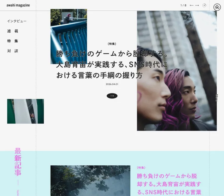
- The desktop pickup shows story
2 / 9; mobile shows3 / 9. Their photographs belong to different stories, so their exact image arrangements cannot be treated as a before-and-after comparison of one slide. - Menu descendants occur in the DOM, but no supplied screenshot shows the menu open. Their styles establish content and geometry, not a verified opening animation or backdrop appearance.
Tokens — Colors
Default Palette
| Name | Value | Source or reference token | Role and evidence |
|---|---|---|---|
| Page gray | #f5f5f5 |
Source --color-back; alias --aw-paper |
Measured body background; visible across the pickup, About area, and section spacing |
| Editorial ink | #222222 |
Source --color-black; alias --aw-ink |
Measured default text; visually matches navigation and oval arrow fills |
| White | #ffffff |
Source --color-white; alias --aw-white |
Measured footer and tag-link backgrounds; visible brand presentation panel |
| Pale yellow | #f0f2a7 |
Source --color-yellow; alias --aw-yellow |
Declared color consistent with the visible latest-articles band |
| Cyan | #00bbcb |
Source --color-emerald; alias --aw-cyan |
Measured latest-article text and vertical section label; the source calls this emerald, although its appearance is cyan |
| Lavender | #e6def5 |
Source --color-purple; alias --aw-lavender |
Declared color consistent with the left series panel |
| Lavender accent | #b190f3 |
Source --color-purple-dark; alias --aw-lavender-accent |
Declared color consistent with the left series article count |
| Mint | #c7ffd2 |
Source --color-light-green; alias --aw-mint |
Declared color consistent with the right series panel |
| Feature yellow | #fef263 |
Measured rgb(254, 242, 99); alias --aw-feature-ink |
Feature section heading, introduction, and article-link text; no corresponding source variable was supplied |
| Rule gray | #555555 |
Source --color-border |
Available structural line color |
| Translucent rule | #55555580 |
Source --color-border-50; alias --aw-rule |
Available half-opacity rule color; consistent with the restrained guides |
The visible latest-articles band is yellow, but the sampled section element itself computes to #f5f5f5. Similarly, the series link wrappers are transparent while their panels visibly carry pastel fills. The supplied element subset therefore does not identify every painting layer. A reconstruction can apply the visible fill directly to its section or panel, but should not describe that simplification as the original implementation.
Supporting Colors and Section Palettes
| Color or pairing | Status | Guidance |
|---|---|---|
#cccccc, source --color-gray |
Declared | A supporting neutral; its specific visible use was not isolated |
#ffd9ba, source --color-orange |
Declared | Do not assign it a section solely because it exists in the token set |
#ffffff80, source --color-white-50 |
Declared and reflected in menu label styles | Menu group labels compute to half-opacity white |
| Cyan on pale yellow | Current screenshots plus computed text color | Defines the visible latest-articles treatment |
| Lavender with purple count | Current series screenshot plus declared palette | Left series panel |
| Mint with a vivid green count | Current series screenshot | The count's exact green was not supplied; keep any replacement value labeled as an estimate |
| Yellow feature text over darker imagery | Computed text plus a narrow visible section edge | The complete feature background and any overlay treatment are not visually documented |
These are section treatments, not evidence of a theme selector. Colors inside photographs and series cover artwork should remain separate from interface tokens.
Tokens — Typography
Source Families
The site uses several explicitly named Japanese font families. Their distinct roles are a central part of its category system.
| Role | Measured family declaration | Character and implementation consequence |
|---|---|---|
| Japanese body | MFW-PShueiGoGinStdN-L with Japanese system sans-serif fallbacks |
Light, open text with generous leading and tracking |
| Article headlines and About heading | MFW-PShueiGoGinStdN-B, sans-serif |
Dense, visually bold headlines; the desktop face usually computes to weight 400 |
| Interview category | MFW-PIshiiGothicStdN-R, sans-serif |
Distinct category lettering used in navigation and section headings |
| Feature category | MFW-PIshiiGothicStdN-EB, sans-serif |
Heavy category lettering, also used for feature labels |
| Series category | MFW-PReimPr6N-Bold, serif |
A contrasting serif voice for the series navigation and heading |
| Dialogue category | MFW-PFolkProN-Medium, sans-serif |
A separate category voice for dialogues |
| Dates and sampled English utility labels | Satoshi, sans-serif |
Compact numerals and labels such as Update and Follow |
The supplied body fallback stack includes Hiragino Sans, ヒラギノ角ゴ ProN, Hiragino Kaku Gothic ProN, Hiragino Kaku Gothic Pro, Meiryo, and MS PGothic before generic sans-serif.
Weight requires care: the bold Japanese face is selected by family name. Its computed font-weight: 400 does not mean the displayed title is light. The mobile pickup headline additionally computes to 600. Do not replace all of these declarations with a single generic family and assume the same numeric weights will preserve the hierarchy.
The wordmark and circular brand symbol appear as artwork within home links. The links' inherited font declarations do not establish how that artwork was drawn. Reuse an authorized brand asset rather than guessing its font.
Type Scale
| Role | Desktop size / line height | Mobile size / line height | Tracking and notes |
|---|---|---|---|
| Body | 17 / 29.75px |
15 / 26.25px |
1.36px desktop; 1.2px mobile |
| Pickup headline | 40 / 60px |
22 / 33px |
Inherits the measured body tracking; mobile weight 600 |
| Main section heading | 40 / 70px |
26 / 45.5px |
Two-character category headings use tracking equal to their font size |
| Latest vertical heading | 40 / 70px |
20 / 35px |
Narrow, vertically arranged label crossing the section boundary |
| Lead latest-article title | 30 / 45px |
20 / 30px |
Bold Japanese family |
| Standard article title | 18 / 29.7px |
16 / 26.4px |
Used across latest and interview items |
| Feature dossier title | 30 / 45px |
20 / 30px |
Same headline family |
| Dialogue title | 30 / 45px |
20 / 30px |
Five desktop lines in the measured title box; four mobile lines |
| About heading | 22 / 35.2px |
18 / 28.8px |
Tracking 0.77px / 0.63px, equivalent to 0.035em |
| Pickup category | 15 / 26.25px |
15 / 26.25px |
Category-specific family |
| Small article category | 12 / 21px |
12 / 21px |
Parenthetical text, not a filled badge |
| Date | 12 / 20.4px |
12 / 20.4px |
Satoshi, weight 400, tracking 0.48px |
| Series vertical title | 14 / 24.5px |
13 / 22.75px |
Body family |
| Footer navigation | 13 / 19.89px |
13 / 19.89px |
Tracking remains inherited at 1.36px / 1.2px |
Follow label |
15 / 19.95px |
15 / 19.95px |
Satoshi, tracking 0.6px |
The continuation-link wrappers compute to 17px desktop and 15px mobile. The visible English lettering appears approximately 20px and 16px, respectively, but its inner text element was not separately measured. Do not present those visual estimates as retrieved child-font declarations.
Tracking detail: the body measurements correspond to 0.08em at the body size. Headline descendants retain the resolved 1.36px or 1.2px; setting every headline to 0.08em would make the larger titles substantially more spaced out than observed.
Tokens — Spacing & Shapes
Responsive Unit
The supplied custom properties normalize viewport width and root text size before applying a scale. With the observed 16px root, their behavior simplifies to:
/* Simplified explanation at the observed 16px root. */
/* scale = max(1, viewportWidth / 1440) */
/* source pixel unit = 1px * scale */
/* source rem unit = 1rem * scale */
At both inspected widths, the scale is 1. Mobile is therefore not a uniformly shrunken desktop composition: typography, spacing, and layout change separately.
The source --max-width evaluates to 1440px under these inspected conditions, but its formula scales beyond the desktop reference width. It should not be interpreted as proof of a permanently fixed 1440px cap.
Two fluid source spacing tokens calculate approximately as follows:
| Source token | At 1440px | At 390px | Evidence |
|---|---|---|---|
--spacing-40-20 |
40px |
20.29px |
Calculated from the supplied clamp formula |
--spacing-40-30 |
40px |
30.14px |
Calculated from the supplied clamp formula |
--controller-width |
188px |
0px |
Supplied custom-property values; zero does not mean the mobile controls disappear |
Spacing Scale
| Use | Desktop | Mobile | Status |
|---|---|---|---|
| Standard section horizontal inset | 40px |
20px |
Measured heading positions |
| Standard section vertical padding | 80px |
60px |
Measured on interviews, series, features, and dialogues |
| Pickup trailing space | 120px |
60px |
Measured outer-section padding |
| Interview image/text gap | 40px |
20px |
Measured link gap |
| Small title-to-date gap | 10px |
10px |
Calculated from element rectangles |
| Continuation label-to-arrow gap | 20px |
20px |
Measured link gap |
| Mobile article-row separation | — | 30px |
Calculated between measured rows |
| Feature article vertical padding | 40px |
30px |
Measured |
| Footer navigation gap | Approximately 20px |
Approximately 20px |
Calculated from successive link positions |
Border Radius
| Element | Treatment | Evidence |
|---|---|---|
| Photographs and series covers | Square corners | Current screenshots |
| Article link wrappers | 0 |
Computed styles |
| Series panel wrappers | 0 |
Computed styles |
| Tag links | 100% |
Computed styles; creates a full ellipse |
| Dialogue image link | 100% |
Computed styles; the image's final clipping was not separately captured |
| Continuation arrow | Approximately 60 × 30px desktop; 48 × 24px mobile |
Visual estimates of the filled ellipse |
| Pause symbol | Small outlined circle within a 30 × 30px control |
Screenshot plus measured button box |
Use true elliptical silhouettes where shown. A wide rectangle with mildly rounded corners does not produce the same shape.
Layout Measurements
| Element | Desktop | Mobile | Status |
|---|---|---|---|
| Document height | 6974.86px |
7587.13px |
Measured at the captured states |
| Masthead | 1360 × 60px |
390 × 60px |
Measured |
| Wordmark home-link box | 202 × 59px, at x = 0 |
202 × 59px, at x = 94 |
Measured; artwork is smaller than its link |
| Corner home-link box | 80 × 80px, at x = 1360 |
60 × 60px, at x = 0 |
Measured |
| Menu button | 80 × 1000px, at right edge |
70 × 60px, at top right |
Measured |
| Left vertical guide | Approximately x = 200px |
Approximately x = 60px |
Screenshot estimate |
| Pickup headline box | 720 × 180px |
350 × 99px |
Measured; different stories |
| Latest lead link | 1080px wide |
280px wide, at x = 90 |
Measured |
| Series panel | 720 × 480px |
390 × 284.59px |
Measured |
| Series cover artwork | Approximately 320 × 240px |
Not visually measured | Desktop screenshot estimate |
| Dialogue image-link box | 800 × 450px |
350 × 196.88px |
Measured, both 16:9 |
| Footer | 339.38px high |
619px high |
Measured |
The guides are visual reference lines, not hard content boundaries. The desktop pickup photograph crosses the left guide, another photograph crosses into the right rail, and mobile article rows can start at 20px while selected lead content starts at 90px.
Components
Masthead and Persistent Side Controls
Role: publication identity and access to navigation.
The desktop masthead is a 60px strip ending before the 80px right rail. The wordmark sits within its left 202px link box. A fine horizontal rule joins the vertical page structure, while the pickup counter and controls sit near the masthead's right end.
The right rail contains a circular home mark at the top and a vertical Menu label near the viewport center. The sampled menu button occupies the full rail height. Deep-page screenshots retain the corner mark and Menu label while the opening wordmark and pickup controls are absent. Preserve that distinction instead of making the entire initial masthead permanently visible.
On mobile, the circular home mark moves to the top-left 60px box, the wordmark centers across the viewport, and Menu occupies a 70px box at the top right. The left dotted guide continues at approximately x = 60px. There is no corresponding full-height right rail in the supplied phone captures.
Pickup Story Carousel
Role: a prominent editorial entry point into one of nine selected stories.
The desktop active story combines three independently placed photographs with a central linked text group. In the captured architecture story, the approximate image geometry is:
- A
400 × 600pxportrait atx = 160,y = 130. - A
240 × 320pxportrait atx = 880,y = 50. - A
240 × 160pxdetail atx = 1160,y = 621.
The text link measures 720 × 316.64px, begins at x = 360, y = 282.24, and overlaps the large photograph. Its anatomy is a centered category, a left-aligned three-line headline, a centered date, and a centered black oval arrow. Category-to-title and title-to-date gaps are 10px; the arrow follows the date by approximately 40px.
This overlap is a central visual feature. The photograph remains visible behind the title; no solid rectangular title card is visible in this desktop state. A subtle light edge appears around some overlapping glyphs, but the supplied styles do not establish whether that comes from a stroke, shadow, or another treatment.
On mobile, imagery precedes a full-width paper-backed text area. The selected music story shows two stacked landscape photographs within an approximately 234 × 351px image block, beginning at x = 78, y = 60. An additional image fragment appears at the right edge; its relationship to the active composition is not established by the still capture.
The mobile story link begins at y = 411, with 20px top and horizontal padding. Its title is 22px with 33px leading. Previous, counter, next, and pause controls move below the story text, with 30px button boxes starting near y = 636.64. The desktop's standalone oval story arrow is not visible in this mobile state.
Category Index
Role: direct access to the four editorial categories.
Desktop navigation starts at x = 40, y = 100, with 35px row boxes and 55px vertical increments. It lists インタビュー, 連載, 特集, and 対談. Each category uses its own measured family.
The two-character labels use 20px tracking at 20px type. This deliberately separates the characters. Counts occur in the DOM, although they are not clearly visible in the supplied initial screenshot; their reveal behavior is unverified.
This standalone category list is absent from the mobile initial view. Equivalent destinations remain available through the menu content and footer.
Oval Continuation Link
Role: a consistent invitation to continue browsing.
All Articles, All Interviews, All Series, All Features, All Dialogues, and View More repeat a label-plus-arrow pattern. The label is unboxed. A separate filled ellipse holds a fine right arrow, with a measured 20px gap between the two parts.
Most instances center within the viewport. The desktop feature continuation link instead aligns with its dossier text column at x = 600.
Treat the label and ellipse as one accessible link. The arrow is a supporting symbol, not a nested button. Preserve the ellipse's compact proportions and surrounding blank space.
Latest Articles
Role: makes recency legible while retaining an editorial composition.
A cyan vertical 最新記事 label protrudes 20px above the section's start. Its narrow column sits around x = 100 on desktop and x = 30 on mobile. Update and the current update date extend the annotation below it.
The desktop lead item spans a 1080px link region. Its text starts at x = 880, occupies 440px, and uses a 30px headline. Three supporting stories use smaller 18px titles in an asymmetric arrangement: a narrow item at the far right and two wider image/text groups below. The layout should not be regularized into four equal cards.
Mobile preserves the lead item's special status: it begins at x = 90 and is 280px wide, with image above text and a 20px title. Supporting rows span 350px from x = 20; their text begins around x = 166.75, with 16px titles. The visible section fill is pale yellow and measured article text is cyan.
Tag Index
Role: thematic browsing independent of the four main categories.
The DOM contains eight tag links plus All Tags. Each link has a white background and border-radius: 100%.
Measured desktop boxes are approximately 239.03 × 59.75px, arranged six across before wrapping. Mobile uses approximately 129.98 × 52.83px, producing three columns and three rows. This is a field of broad ellipses rather than small outlined chips.
A 400ms color transition is declared. The actual hover color and any associated movement were not supplied.
Interview Article Groups
Role: presents a selection of individual interview stories.
The section begins with its dedicated category typeface. Desktop items occupy unequal widths and leave an intentional gap after the first group: measured widths are 320px, then three 240px groups at x = 600, 880, and 1160.
Text and image placement also vary. The first measured title begins at the top of its link group, while subsequent titles appear below different amounts of image space. Link heights range from approximately 348px to 518px. The DOM supports an uneven composition; the exact image crops are outside the supplied screenshot coverage.
On mobile, all four links become 350px rows with a 20px internal gap. Subtracting the measured text width and gap gives an image-side width of approximately 126.47px. Text occupies approximately 203.53px. Keep natural row heights: one measured row is taller because its image region extends beyond the text.
Series Tile
Role: introduces an ongoing editorial series as its own graphic identity.
The desktop section presents two edge-to-edge 720px panels without a gutter. Lavender supports awahi的 BOOKSHELF; mint supports あの人の定番の手みやげ.
Each tile contains:
- A narrow title running vertically near the upper-left edge, inset 20px.
- Centered rectangular cover artwork, approximately
320 × 240pxin the desktop screenshot. - A large colored article count at the artwork's lower-right corner.
- A small
Articlescaption beneath the count.
The visible counts are 0 and 2. These are content values, not decorative constants. The count numeral is approximately 36px by visual estimate; its computed typography was not supplied.
On mobile, the panels stack vertically at full viewport width and each measures approximately 284.59px high. Their titles remain narrow vertical annotations. Preserve the cover artwork's own colors and lettering instead of rebuilding it as generic interface text.
Feature Dossier
Role: groups related articles under a shared editorial subject.
The current subject is 時間. The desktop text column is 640px wide at x = 600. A 30px subject title and introductory paragraph precede three article links. Those links have 40px vertical padding, and their title boxes reserve 50px at the right for the continuation treatment.
On mobile, the text column moves to x = 90 and becomes 280px wide. The subject title reduces to 20px. Article rows use 30px vertical padding and reserve 30px at the right.
Feature text computes to #fef263. Only a narrow edge of the section's darker imagery is visible in the supplied desktop series capture. Do not infer a video, parallax effect, exact image crop, or overlay opacity from that evidence.
Dialogue Feature
Role: gives one conversation a larger, distinct presentation.
The desktop text link is 440px wide at x = 40, paired with an 800 × 450px image-link box at x = 600. The text uses a 30px headline followed by a date. The image link computes to border-radius: 100%, identifying another use of the ellipse motif, although its final rendered clipping is not shown in the supplied captures.
Mobile puts the 350px text link before the 350 × 196.88px image-link box. Its title is 20px with 30px leading. The same article destination appears on both links.
A long literary passage also occurs in this section's DOM. Its visual placement and treatment were not captured, so it should not be reconstructed as a specific decorative background.
About Introduction
Role: explains the publication's interest in relationships, intersections, and overlapping ideas.
The desktop screenshot shows a white brand-artwork panel approximately 600 × 400px, beginning at x = 120. A 22px statement sits far to the right in a measured 344.42px-wide box at x = 975.58. The body paragraph begins lower down at x = 680 and spans approximately 448.80px, partly crossing the brand panel's horizontal extent.
This offset arrangement is more specific than a conventional image-left/text-right split. Preserve three distinct placements: brand panel, statement, and paragraph. View More sits centered below them.
The mobile DOM places the statement at x = 35 with an approximately 283.75px width, while the paragraph starts at x = 90 and spans 265px. The intervening artwork is not visible in the supplied mobile footer crop, so its phone dimensions remain unverified.
Footer
Role: secondary navigation, social links, and operator identification.
The footer switches from pale gray to white. Desktop padding is 80px 40px. A vertical social column centers near x = 100; the magazine home-link box is 160 × 40px at x = 260; navigation starts at x = 880; and the operator column starts at x = 1160.
The inspected original footer identifies giftee through the 運営会社 link to https://giftee.co.jp/ and the visible © giftee Inc. notice. Contact and privacy links use the same corporate domain. Small northeast arrows visually distinguish those external destinations; opening behavior was not tested.
Mobile makes the footer 619px high. Brand, publication navigation, operator logo, and corporate links stack at x = 90. Social links remain in the 60px left strip, and the vertical copyright moves into that strip near the bottom. The social link boxes measure 24 × 24px, with 46px vertical increments.
Menu Content — DOM Evidence Only
Role: a fuller index of categories, tags, social links, and publication information.
The measured desktop menu content has two 520px columns: Categories at x = 80 and Tags at x = 760. It contains category counts, eight tag counts, All Articles, All Tags, About, social links, and Close. Link text computes to white; group labels compute to half-opacity white.
On mobile, Categories and Tags stack within a 350px content area at x = 20. Tag links use two 155px columns. Later content extends below the 844px viewport, so an implementation must allow access to that overflow.
The open backdrop, transition, focus behavior, Escape handling, and scroll locking were not exercised. A dark navigation surface would be a reasonable implementation choice for the measured white text, but its exact appearance is not an observed finding.
Tokens — Motion & Interaction
| Treatment | Supplied evidence | What can be concluded |
|---|---|---|
| Shared transition duration | Source --transition-duration: .4s |
A 400ms transition token exists |
| Home and social links | opacity 0.4s cubic-bezier(0.19, 1, 0.22, 1) |
Opacity feedback is declared; target opacity was not supplied |
| Desktop previous/next buttons | Same 400ms opacity transition | The desktop controls share the link easing |
| Tag links | color 0.4s cubic-bezier(0.19, 1, 0.22, 1) |
Color feedback is declared; final hover color is unknown |
| Dialogue image link | border-color 0.4s cubic-bezier(0.19, 1, 0.22, 1) |
Border-color feedback is declared |
| Pickup state | 2 / 9 desktop and 3 / 9 mobile, with previous/next and pause symbols |
Multiple story states and playback-style controls exist |
| Accessible pickup status | Text identifies the current story out of nine | A textual status representation exists; live announcement behavior is unverified |
| Menu control | Menu and Close controls plus menu descendants | Menu content exists; opening and closing were not tested |
| Sampled animations | Many sampled nodes report animation: none |
This does not rule out JavaScript motion, child animations, or unsampled effects |
The capture procedure included an initial observation period of at least five seconds, readiness checks, and scroll traversal. Perpetual animations were temporarily paused during readiness checks and then resumed. Those procedures do not establish carousel timing, swipe support, easing between stories, hover endpoints, or scroll-linked animation.
For a new implementation, reuse the measured 400ms easing for modest link feedback. Define carousel timing and reduced-motion behavior separately and label them as implementation choices.
Surfaces
| Surface | Appearance | Structural purpose |
|---|---|---|
| Main page | Flat #f5f5f5 |
Continuous editorial canvas |
| Latest band | Visible pale yellow with cyan content | Introduces recency as a colored section |
| Series panels | Lavender and mint, edge to edge | Gives each series a recognizable field |
| Brand panel | White rectangle | Isolates the magazine identity within the About composition |
| Footer | Flat white | Separates utility content from editorial material |
| Tag links | White ellipses | Creates a thematic browsing pattern |
| Continuation arrows | Ink ellipses with light arrows | Repeated navigation punctuation |
| Guides | Fine, subdued vertical dashed lines | Maintains alignment references across changing compositions |
| Feature imagery | Darker visible section edge with yellow computed text | Full surface treatment remains insufficiently captured |
No general card-shadow system is visible. Separation comes from space, image boundaries, type, rules, and changes of background color.
Imagery
The current pickup photography is observational and specific to its subjects: a person in a book-filled timber interior, a standing portrait framed by planting and architecture, foliage details, and a musician photographed outdoors among trees. Natural greens, dark clothing, wood, and soft environmental light carry the photographic palette.
The images vary in scale and framing. A large environmental portrait anchors one composition while smaller portraits and details create secondary points of attention. Desktop text crosses the photographs. Mobile gives the active story's text a clearer paper-backed area below the image arrangement.
Series covers use graphic artwork with their own lettering and color systems. The bookshelf cover contains book-like planes and bold lettering; the gift-related cover has Japanese typography over a pale patterned field. These artworks should remain distinct from the site-wide font and color tokens.
The circular brand mark, wordmark, social symbols, fine directional arrows, and outlined pause circle stay visually restrained. There is no evidence for replacing them with a large general-purpose icon set.
Observed Asset References
| Asset group | Current evidence | Asset-path availability |
|---|---|---|
| Architecture pickup photographs | Desktop opening capture; associated story is the 石川初 feature | No image source URLs supplied |
| Music pickup photograph composition | Mobile opening capture; associated story is the 岡田拓郎 feature | No image source URLs supplied |
| Two series covers | Desktop series capture | No cover source URLs supplied |
| Magazine brand artwork | Masthead, corner mark, About panel, and footer | No artwork file path or format supplied |
| Operator and social marks | Desktop and mobile footer captures | No asset file paths supplied |
| Named typefaces | Computed font-family declarations | No font-file URLs or loading definitions supplied |
Article and series URLs in the DOM are navigation destinations, not image asset URLs. Use authorized editorial images and brand assets in a new implementation; do not invent an original asset directory or infer photographer credits from the article subjects.
Layout & Responsive Behavior
The homepage keeps the same content sequence at both inspected sizes: pickup, latest articles, tags, interviews, series, features, dialogues, About, and footer. It remains a document-scrolling page.
| Relationship | Desktop observation | Mobile observation |
|---|---|---|
| Primary guide | Left guide near 200px; right rail 80px wide | Left guide near 60px; no full-height right rail |
| Identity | Wordmark at left; circular mark at upper right | Wordmark centered; circular mark at upper left |
| Menu | Vertical label in right rail | Horizontal label at upper right |
| Pickup text | 720px wide, overlapping photographs | 350px inner width below imagery |
| Pickup controls | In the masthead region | Below title and date |
| Latest lead | Wide asymmetric image/text composition | 280px inset column at x = 90 |
| Supporting article links | Several widths and arrangements | 350px rows with image and text side by side |
| Tags | Six items across before wrapping | Three columns |
| Series | Two 720px panels side by side | Two full-width panels stacked |
| Feature text | 640px column at x = 600 |
280px column at x = 90 |
| Dialogue | Text beside a large image-link box | Text followed by the image-link box |
| Footer | Separated horizontal groups | One main stack plus the left social strip |
Measured section starts help locate the evidence within the long document:
| Section | Desktop document Y | Mobile document Y |
|---|---|---|
| Pickup | 60px |
60px |
| Latest articles | 941.14px |
726.64px |
| Interviews | 2099.72px |
2192.11px |
| Series | 3037.61px |
3176.34px |
| Features | 3938.61px |
4056.03px |
| Dialogues | 5174.48px |
5535.11px |
| About introduction | 5964.48px |
6212.16px |
| Footer | 6635.48px |
6968.13px |
These coordinates document the captured content and font state. They are not recommended absolute positions for entire sections.
The exact source breakpoints were not provided. A new implementation should choose breakpoints by testing headline wrapping, rail clearance, and photograph overlap. The Quick Start uses 64rem as an explicitly recommended adaptation boundary, not a recovered source value.
Do’s and Don’ts
Do
- Preserve the pale-gray canvas, dark ink, and restrained vertical guides.
- Give the four editorial categories distinct typographic voices.
- Keep headline tracking tied to the measured text system rather than enlarging it with every heading.
- Use unequal photograph sizes and intentional text/image overlap on wide screens.
- Maintain the difference between lead stories and supporting article groups.
- Retain vertical annotations for latest articles, series names, social navigation, and copyright where observed.
- Use square photographs alongside a limited set of true ellipses.
- Reposition controls and article groups for mobile while retaining the left guide.
- Keep dates small and consistent at 12px across the two observed viewports.
- Preserve series-specific artwork and content-dependent counts.
Don’t
- Don’t turn every article into the same rounded card.
- Don’t replace the publication's category structure with a generic conversion-page sequence.
- Don’t force photographs and text to remain inside every guide line.
- Don’t shrink the complete desktop layout proportionally to fit a phone.
- Don’t assign one font to all Japanese category headings.
- Don’t introduce gradients, glass effects, or soft elevation shadows into the observed flat surface system.
- Don’t treat every declared color as a visibly used section color.
- Don’t infer autoplay duration, swipe behavior, parallax, or menu choreography from still captures.
- Don’t hardcode one story's photo positions and counts as universal carousel content.
- Don’t assume blank text on an image link proves its accessible name is missing; the necessary accessibility attributes were not supplied.
Recommended Implementation Additions
These recommendations concern a new implementation and are not verified features of the original:
- Give previous, next, pause, Menu, Close, home, and social controls explicit accessible names. Keep the current story count synchronized with the displayed story.
- Enlarge small control hit areas to approximately 44px while retaining the observed compact arrow and pause artwork.
- If the carousel advances automatically, provide a working pause control, suspend advancement during relevant user interaction, and offer a reduced-motion mode.
- Make an opened menu keyboard-operable, manage focus appropriately, restore focus on close, and keep its longer mobile content scrollable.
- Check text contrast on the colored sections. The supplied cyan and pale-yellow tokens produce approximately
2:1contrast by calculation; actual compositing was not tested. Use dark ink for essential small text when adapting that pairing for accessible reading. - Give overlapping desktop headlines sufficient contrast against every story photograph. Use per-story placement or a restrained local backing when necessary.
- Preserve the natural reading order in HTML even when desktop CSS moves images and text into asymmetric positions.
- Load responsive image sizes and reserve their dimensions. Prioritize the active opening imagery and defer distant editorial images.
- Provide visible keyboard focus without adding permanent boxes or shadows to every link.
Agent Prompt Guide
Quick Color Reference
- Main canvas:
#f5f5f5. - Default text and arrow fill:
#222222. - Footer, brand panel, and tag ellipses:
#ffffff. - Latest section: pale yellow
#f0f2a7with cyan#00bbcb; verify text contrast in a new implementation. - Series panels: lavender
#e6def5and mint#c7ffd2. - Lavender count accent:
#b190f3. - Feature text: measured
#fef263; the complete underlying surface is unverified. - Structure: subdued fine rules, square photographs, and compact elliptical arrows.
Overall Prompt
“Create an editorial magazine homepage inspired by awahi magazine's current visual structure. Use a pale-gray canvas, dark Japanese headlines, fine vertical dashed guides, and environmental portrait photography in unequal sizes. On desktop, overlap a 720px-wide story title with a three-image composition and place a vertical Menu control in an 80px right rail. Give interviews, series, features, and dialogues distinct category typography. Build varied article arrangements, broad white elliptical tag links, and two adjoining lavender and mint series panels. Use small dates and compact black oval arrows. At phone widths, move the circular home mark to the upper left, center the wordmark, place Menu at the upper right, move pickup controls below the story, and stack article content while preserving a 60px left guide. Keep the page focused on browsing editorial stories.”
Example Component Prompts
- Pickup story: “Arrange one large environmental portrait, a smaller portrait, and a landscape detail across a pale-gray desktop canvas. Put a long, bold Japanese title across the central image boundary, with a centered parenthetical category above and a 12px date below. Add a 60 × 30px black ellipse containing a thin right arrow. On mobile, put the text on a clear paper surface below the image composition.”
- Series pair: “Create two adjoining full-width editorial panels, lavender on the left and mint on the right. Each has a vertical title near its upper-left edge, a centered 4:3 cover graphic, and a colored article count attached to the cover's lower-right corner. Stack the panels on mobile; retain square artwork and broad empty space.”
- Article row: “At 390px viewport width, create a 350px editorial link row with approximately 126px of image width, a 20px gap, and approximately 204px of text. Use a 16px Japanese title with 26.4px leading and a 12px date. Preserve the image's story-specific proportion and let row height follow the content.”
- Footer: “Build a white magazine footer with a narrow vertical Follow column, simple social marks, publication identity, category links, and a separate operator group. On desktop distribute these groups across the page; on mobile stack the main groups at a 90px left offset and retain a 60px social strip.”
- Interaction specification: “Use 400ms cubic-bezier(0.19, 1, 0.22, 1) feedback for restrained link transitions. Define carousel timing and menu behavior explicitly as new implementation decisions. Include keyboard focus, a pause action if automatic advancement is enabled, and reduced-motion behavior.”
Quick Start
CSS Custom Properties
This is a practical adaptation of the observed geometry, not extracted source code. It implements a static pickup composition, responsive article rows, series panels, tags, and the footer structure. Carousel state, menu behavior, editorial assets, and font loading require separate implementation.
The default type stacks use system fallbacks. Apply data-source-fonts only after the corresponding authorized font families have actually loaded. The 64rem breakpoint, capped content wrapper, hover opacity, and mint-count approximation are recommended adaptation choices.
The component structure is straightforward: .aw-pickup contains .aw-pickup-stage; its three .aw-photo elements are siblings of an .aw-pickup-copy link. The copy contains category, title, date, and an arrow span in that order. Article rows contain an image and a text group. Each series link contains its vertical label and a .aw-series-art wrapper with cover and count.
:root {
  /* Measured or declared source colors. */
  --aw-paper: #f5f5f5;
  --aw-ink: #222;
  --aw-white: #fff;
  --aw-yellow: #f0f2a7;
  --aw-cyan: #00bbcb;
  --aw-lavender: #e6def5;
  --aw-lavender-accent: #b190f3;
  --aw-mint: #c7ffd2;
  --aw-feature-ink: #fef263;
  --aw-rule: #55555580;

  /* Visual approximation, not a retrieved count color. */
  --aw-mint-count: #2edb67;

  /* System fallback defaults; no font files are imported here. */
  --aw-font-body: 'Hiragino Sans', Meiryo, sans-serif;
  --aw-font-title: 'Hiragino Sans', Meiryo, sans-serif;
  --aw-font-series: serif;
  --aw-font-latin: Satoshi, sans-serif;
  --aw-title-weight: 700;

  --aw-body-size: 17px;
  --aw-tracking: 1.36px;
  --aw-title-size: 40px;
  --aw-section-title-size: 40px;
  --aw-card-title-size: 18px;
  --aw-gutter: 40px;
  --aw-section-space: 80px;
  --aw-left-guide: 200px;
  --aw-right-rail: 80px;
  --aw-header-height: 60px;
  --aw-oval-width: 60px;
  --aw-oval-height: 30px;

  /* Measured transition values. */
  --aw-duration: 400ms;
  --aw-ease: cubic-bezier(0.19, 1, 0.22, 1);
}

.awahi,
.awahi * {
  box-sizing: border-box;
}

.awahi {
  position: relative;
  isolation: isolate;
  color: var(--aw-ink);
  background: var(--aw-paper);
  font-family: var(--aw-font-body);
  font-size: var(--aw-body-size);
  line-height: 1.75;
  letter-spacing: var(--aw-tracking);
}

.awahi[data-source-fonts] {
  --aw-font-body: 'MFW-PShueiGoGinStdN-L', sans-serif;
  --aw-font-title: 'MFW-PShueiGoGinStdN-B', sans-serif;
  --aw-font-series: 'MFW-PReimPr6N-Bold', serif;
  --aw-title-weight: 400;
}

.awahi::before,
.awahi::after {
  content: '';
  position: absolute;
  inset-block: 0;
  z-index: 1;
  width: 0;
  border-left: 1px dashed var(--aw-rule);
  pointer-events: none;
}

.awahi::before { left: var(--aw-left-guide); }
.awahi::after { right: var(--aw-right-rail); }

.awahi a {
  color: inherit;
  text-decoration: none;
}

.awahi img {
  display: block;
  max-width: 100%;
}

.awahi p,
.awahi h1,
.awahi h2,
.awahi h3,
.awahi figure {
  margin: 0;
}

/* The cap is an adaptation, not the source scaling formula. */
.aw-content {
  max-width: 1440px;
  margin-inline: auto;
}

.aw-masthead {
  position: relative;
  z-index: 5;
  display: flex;
  align-items: center;
  width: calc(100% - var(--aw-right-rail));
  height: var(--aw-header-height);
  background: var(--aw-paper);
  border-bottom: 1px solid var(--aw-rule);
}

.aw-brand-link {
  display: grid;
  place-items: center;
  width: 202px;
  height: 59px;
}

.aw-corner-home {
  position: fixed;
  z-index: 12;
  inset: 0 0 auto auto;
  display: grid;
  place-items: center;
  width: 80px;
  height: 80px;
}

.aw-corner-home img {
  width: 40px;
  height: 40px;
  object-fit: contain;
}

.aw-menu-toggle {
  position: fixed;
  z-index: 10;
  inset: 0 0 auto auto;
  display: grid;
  place-items: center;
  width: 80px;
  height: 100dvh;
  padding: 0;
  border: 0;
  color: inherit;
  background: transparent;
  font: 600 15px var(--aw-font-latin);
  cursor: pointer;
}

.aw-menu-toggle span { writing-mode: vertical-rl; }

.aw-pickup {
  position: relative;
  padding-bottom: 120px;
}

.aw-pickup-stage {
  position: relative;
  min-height: 761px;
}

.aw-photo {
  position: absolute;
  z-index: 2;
  overflow: hidden;
  border-radius: 0;
}

.aw-photo img {
  width: 100%;
  height: 100%;
  object-fit: cover;
}

/* Desktop coordinates approximate the captured architecture story. */
.aw-photo--main {
  top: 70px;
  left: 11.1111%;
  width: 27.7778%;
  aspect-ratio: 2 / 3;
}

.aw-photo--secondary {
  top: -10px;
  left: 61.1111%;
  width: 16.6667%;
  aspect-ratio: 3 / 4;
}

.aw-photo--detail {
  top: 561px;
  left: 80.5556%;
  width: 16.6667%;
  aspect-ratio: 3 / 2;
}

.aw-pickup-copy {
  position: absolute;
  z-index: 3;
  top: 222.24px;
  left: 25%;
  display: flex;
  flex-direction: column;
  align-items: center;
  width: 50%;
}

.aw-category {
  font-size: 15px;
  line-height: 1.75;
}

.aw-pickup-title {
  width: 100%;
  margin-top: 10px !important;
  font-family: var(--aw-font-title);
  font-size: var(--aw-title-size);
  font-weight: var(--aw-title-weight);
  line-height: 1.5;
  overflow-wrap: anywhere;
}

.aw-date {
  display: block;
  margin-top: 10px;
  font-family: var(--aw-font-latin);
  font-size: 12px;
  font-weight: 400;
  line-height: 1.7;
  letter-spacing: 0.04em;
}

.aw-oval-arrow {
  display: inline-grid;
  flex: 0 0 auto;
  place-items: center;
  width: var(--aw-oval-width);
  height: var(--aw-oval-height);
  border-radius: 50%;
  color: var(--aw-paper);
  background: var(--aw-ink);
  font: 20px / 1 sans-serif;
  letter-spacing: 0;
}

.aw-pickup-copy > .aw-oval-arrow { margin-top: 40px; }

.aw-continue {
  position: relative;
  z-index: 2;
  display: flex;
  align-items: center;
  justify-content: center;
  gap: 20px;
  width: fit-content;
  margin: var(--aw-section-space) auto 0;
  min-height: 44px;
}

/* The larger invisible hit area is a recommended addition. */
.aw-carousel-control {
  display: inline-grid;
  place-items: center;
  width: 44px;
  height: 44px;
  padding: 0;
  border: 0;
  color: inherit;
  background: transparent;
  cursor: pointer;
}

.aw-section { padding-block: var(--aw-section-space); }

.aw-section-title {
  padding-inline: var(--aw-gutter);
  font-size: var(--aw-section-title-size);
  font-weight: var(--aw-title-weight);
  line-height: 1.75;
}

.aw-section-title--spaced { letter-spacing: 1em; }
.aw-section-title--series { font-family: var(--aw-font-series); }

.awahi[data-source-fonts] .aw-category--interview {
  font-family: 'MFW-PIshiiGothicStdN-R', sans-serif;
}

.awahi[data-source-fonts] .aw-category--feature {
  font-family: 'MFW-PIshiiGothicStdN-EB', sans-serif;
}

.awahi[data-source-fonts] .aw-category--dialogue {
  font-family: 'MFW-PFolkProN-Medium', sans-serif;
}

.aw-latest {
  position: relative;
  background: var(--aw-yellow);
}

.aw-latest-label {
  position: absolute;
  z-index: 3;
  top: -20px;
  left: calc(var(--aw-left-guide) / 2);
  transform: translateX(-50%);
  color: var(--aw-cyan);
  writing-mode: vertical-rl;
  font-size: 40px;
}

/* Keep essential small text in dark ink in this adaptation. */
.aw-latest .aw-article { color: var(--aw-ink); }

.aw-article-list {
  display: grid;
  gap: 30px;
  padding-inline: var(--aw-gutter);
}

.aw-article {
  position: relative;
  z-index: 2;
  display: grid;
  grid-template-columns: minmax(0, 1fr) minmax(0, 1fr);
  align-items: start;
  gap: 40px;
}

.aw-article img {
  width: 100%;
  height: auto;
  border-radius: 0;
}

.aw-article-title {
  font-family: var(--aw-font-title);
  font-size: var(--aw-card-title-size);
  font-weight: var(--aw-title-weight);
  line-height: 1.65;
}

.aw-tags {
  display: grid;
  grid-template-columns: repeat(6, minmax(0, 1fr));
  padding-block: var(--aw-section-space);
}

.aw-tag {
  display: grid;
  place-items: center;
  min-height: 60px;
  padding: 8px;
  border-radius: 100%;
  background: var(--aw-white);
  transition: color var(--aw-duration) var(--aw-ease);
}

.aw-series-grid {
  display: grid;
  grid-template-columns: repeat(2, minmax(0, 1fr));
  margin-top: var(--aw-section-space);
}

.aw-series-tile {
  position: relative;
  display: grid;
  place-items: center;
  min-height: 480px;
  background: var(--aw-lavender);
}

.aw-series-tile--mint { background: var(--aw-mint); }

.aw-series-label {
  position: absolute;
  z-index: 2;
  top: 20px;
  left: 20px;
  writing-mode: vertical-rl;
  font-size: 14px;
  line-height: 1.75;
}

.aw-series-art {
  position: relative;
  z-index: 2;
  width: 320px;
  max-width: 65%;
}

.aw-series-art > img {
  width: 100%;
  aspect-ratio: 4 / 3;
  object-fit: contain;
}

.aw-series-count {
  position: absolute;
  top: calc(100% - 20px);
  right: -26px;
  width: 52px;
  text-align: center;
  color: var(--aw-lavender-accent);
  font: 36px / 1 var(--aw-font-latin);
  letter-spacing: 0;
}

.aw-series-count small {
  display: block;
  margin-top: 4px;
  color: var(--aw-ink);
  font-size: 14px;
  line-height: 1.4;
}

.aw-series-tile--mint .aw-series-count {
  color: var(--aw-mint-count);
}

.aw-footer {
  position: relative;
  padding: 80px 40px;
  background: var(--aw-white);
}

.aw-footer-main {
  display: grid;
  grid-template-columns: minmax(0, 1fr) 240px 160px;
  gap: 40px;
  margin-left: 220px;
  margin-right: 80px;
}

.aw-footer-brand {
  position: relative;
  z-index: 2;
  width: 160px;
  height: 40px;
}

.aw-footer-links {
  display: grid;
  align-content: start;
  gap: 20px;
  font-size: 13px;
  line-height: 1.53;
}

.aw-footer-company > .aw-footer-links { margin-top: 60px; }

.aw-follow {
  position: absolute;
  left: 88px;
  top: 80px;
  display: grid;
  justify-items: center;
  gap: 22px;
  width: 24px;
}

.aw-follow-label {
  writing-mode: vertical-rl;
  font: 15px / 1.33 var(--aw-font-latin);
  letter-spacing: 0.04em;
}

.aw-follow a {
  display: grid;
  place-items: center;
  width: 24px;
  height: 24px;
}

.aw-copyright {
  position: absolute;
  right: 30px;
  bottom: 30px;
  writing-mode: vertical-rl;
  font: 12px / 1.7 var(--aw-font-latin);
  letter-spacing: 0.04em;
}

/* Recommended feedback endpoint; only duration/easing were measured. */
@media (hover: hover) {
  .aw-brand-link,
  .aw-follow a,
  .aw-carousel-control {
    transition: opacity var(--aw-duration) var(--aw-ease);
  }

  .aw-brand-link:hover,
  .aw-follow a:hover,
  .aw-carousel-control:hover { opacity: 0.65; }
}

.awahi :focus-visible {
  outline: 2px solid currentColor;
  outline-offset: 5px;
}

/* Recommended breakpoint; source breakpoint was not supplied. */
@media (max-width: 64rem) {
  .awahi {
    --aw-body-size: 15px;
    --aw-tracking: 1.2px;
    --aw-title-size: 22px;
    --aw-section-title-size: 26px;
    --aw-card-title-size: 16px;
    --aw-gutter: 20px;
    --aw-section-space: 60px;
    --aw-left-guide: 60px;
    --aw-right-rail: 0px;
    --aw-oval-width: 48px;
    --aw-oval-height: 24px;
  }

  .awahi::after { display: none; }
  .aw-masthead { width: 100%; justify-content: center; }

  .aw-corner-home {
    left: 0;
    right: auto;
    width: 60px;
    height: 60px;
  }

  .aw-corner-home img { width: 30px; height: 30px; }
  .aw-menu-toggle { width: 70px; height: 60px; }
  .aw-menu-toggle span { writing-mode: horizontal-tb; }

  .aw-pickup { padding-bottom: 60px; }
  .aw-pickup-stage { min-height: 0; }

  .aw-photo--main {
    position: relative;
    top: auto;
    left: auto;
    width: 60%;
    margin-inline: auto;
  }

  /* This static starter hides secondary images on phones.
     Add per-story image arrangements for a closer recreation. */
  .aw-photo--secondary,
  .aw-photo--detail { display: none; }

  .aw-pickup-copy {
    position: relative;
    top: auto;
    left: auto;
    width: 100%;
    padding: 20px 20px 0;
    background: var(--aw-paper);
  }

  .awahi[data-source-fonts] .aw-pickup-title { font-weight: 600; }
  .aw-pickup-copy > .aw-oval-arrow { display: none; }
  .aw-latest-label { font-size: 20px; }

  .aw-article {
    grid-template-columns: minmax(0, 0.6214fr) minmax(0, 1fr);
    gap: 20px;
  }

  .aw-tags { grid-template-columns: repeat(3, minmax(0, 1fr)); }
  .aw-tag { min-height: 53px; }
  .aw-series-grid { grid-template-columns: 1fr; }
  .aw-series-tile { min-height: 285px; }
  .aw-series-label { font-size: 13px; }

  .aw-footer { padding: 60px 20px; }

  .aw-footer-main {
    grid-template-columns: minmax(0, 1fr);
    gap: 60px;
    margin-left: 70px;
    margin-right: 0;
  }

  .aw-footer-company > .aw-footer-links { margin-top: 40px; }
  .aw-follow { left: 18px; top: 30px; }
  .aw-copyright { left: 20px; right: auto; }
}

@media (prefers-reduced-motion: reduce) {
  .awahi a,
  .awahi button { transition: none; }
  /* Carousel JavaScript must also honor this preference. */
}
The starter intentionally uses natural document flow outside the selected desktop pickup composition. Populate the publication sections with their individual arrangements rather than applying the generic article-row class to every desktop story.
Tailwind v4 Token Mapping
Optional aliases for a project that already uses Tailwind v4. This does not establish that the original site uses Tailwind. Define the custom properties above first.
@theme inline {
  --color-paper: var(--aw-paper);
  --color-ink: var(--aw-ink);
  --color-editorial-white: var(--aw-white);
  --color-latest-yellow: var(--aw-yellow);
  --color-editorial-cyan: var(--aw-cyan);
  --color-series-lavender: var(--aw-lavender);
  --color-series-mint: var(--aw-mint);
  --color-feature-ink: var(--aw-feature-ink);
  --color-editorial-rule: var(--aw-rule);

  --font-editorial: var(--aw-font-body);
  --font-headline: var(--aw-font-title);
  --font-series: var(--aw-font-series);
  --font-utility: var(--aw-font-latin);

  --text-editorial-body: var(--aw-body-size);
  --text-pickup: var(--aw-title-size);
  --text-section-title: var(--aw-section-title-size);
  --text-article-title: var(--aw-card-title-size);
  --text-date: 12px;

  --spacing-editorial-gutter: var(--aw-gutter);
  --spacing-editorial-section: var(--aw-section-space);
  --spacing-editorial-rail: var(--aw-left-guide);

  --radius-editorial-ellipse: 50%;
  --ease-editorial: cubic-bezier(0.19, 1, 0.22, 1);
}
Sources & Evidence
- awahi magazine homepage: original and final inspected URL, HTTP 200, page title
awahi magazine. - Supplied retrieval timestamp:
2026-09-12T08:22:32.145Z, September 12, 2026. Individual screenshot timestamps were not separately provided. - Three current desktop captures at
1440 × 1000: opening pickup, series section, and About/footer area. - Two current mobile captures at
390 × 844: opening pickup/latest boundary and lower About/footer area. - Supplied rendered DOM evidence for both viewports: text, navigation destinations, element rectangles, computed font declarations, colors, spacing, radii, transition declarations, and custom properties.
- The homepage footer independently supplies the giftee operator link and copyright notice. Production credits were not established by the inspected original-page evidence.
No additional browsing, commands, asset retrieval, or local-file inspection was performed for this reference. Image source paths, font files, complete stylesheets, exact breakpoints, menu-open screenshots, hover endpoints, carousel timing, and gesture behavior were not supplied. Measurements describe the captured page states; screenshot estimates, calculated values, and proposed implementation behavior are labeled separately.
# awahi magazine — Style Reference

> An editorial magazine arranged across pale paper, with photographs crossing the grid and typography giving each category its own voice.

**Website:** [awahi-magazine.jp](https://awahi-magazine.jp/)
**Original URL:** https://awahi-magazine.jp/
**Final URL:** https://awahi-magazine.jp/
**Theme:** light canvas with section-specific color fields; no user-selectable theme was verified.
**Inspected:** September 12, 2026. Supplied retrieval timestamp: `2026-09-12T08:22:32.145Z`, equivalent to 17:22:32.145 JST.
**Viewports:** desktop `1440 × 1000` CSS pixels; mobile `390 × 844` CSS pixels.
**Scope:** the current magazine homepage, including pickup stories, latest articles, tags, interviews, series, features, dialogues, the About introduction, and footer. Five current-page captures provide visual evidence; the rendered DOM supplies additional measurements and menu content. Article destinations and the About page were not separately inspected.

awahi magazine uses the grammar of an editorial spread: broad margins, unequal photograph sizes, long Japanese headlines, and narrow vertical annotations. Pale gray supports most of the page. Cyan on pale yellow introduces the latest articles, while lavender and mint identify the two visible series panels. Black elliptical arrows provide a repeated navigation signature.

The layout is deliberately asymmetric. Photographs cross vertical guides, article groups alternate between different widths and arrangements, and the About text sits at different horizontal and vertical positions from its brand image. The page is a publication index with multiple paths into its content. Its identity depends on these relationships between stories, photographs, type, and empty space.

## How to Read This Reference

- **Measured** means a value appears in the supplied computed styles or element rectangles. Measurements are CSS pixels unless stated otherwise.
- **Visual estimate** means a dimension or treatment was judged from a supplied current-page screenshot. It is not a retrieved CSS declaration or a programmatic pixel sample.
- **Calculated** means a result was derived from supplied measurements or custom-property formulas.
- **Recommended** means implementation guidance for a new build. It does not establish existing functionality.
- Token names introduced here are reusable aliases. Original custom-property names are identified explicitly.
- The desktop pickup shows story `2 / 9`; mobile shows `3 / 9`. Their photographs belong to different stories, so their exact image arrangements cannot be treated as a before-and-after comparison of one slide.
- Menu descendants occur in the DOM, but no supplied screenshot shows the menu open. Their styles establish content and geometry, not a verified opening animation or backdrop appearance.

## Tokens — Colors

### Default Palette

| Name | Value | Source or reference token | Role and evidence |
| --- | --- | --- | --- |
| Page gray | `#f5f5f5` | Source `--color-back`; alias `--aw-paper` | Measured body background; visible across the pickup, About area, and section spacing |
| Editorial ink | `#222222` | Source `--color-black`; alias `--aw-ink` | Measured default text; visually matches navigation and oval arrow fills |
| White | `#ffffff` | Source `--color-white`; alias `--aw-white` | Measured footer and tag-link backgrounds; visible brand presentation panel |
| Pale yellow | `#f0f2a7` | Source `--color-yellow`; alias `--aw-yellow` | Declared color consistent with the visible latest-articles band |
| Cyan | `#00bbcb` | Source `--color-emerald`; alias `--aw-cyan` | Measured latest-article text and vertical section label; the source calls this emerald, although its appearance is cyan |
| Lavender | `#e6def5` | Source `--color-purple`; alias `--aw-lavender` | Declared color consistent with the left series panel |
| Lavender accent | `#b190f3` | Source `--color-purple-dark`; alias `--aw-lavender-accent` | Declared color consistent with the left series article count |
| Mint | `#c7ffd2` | Source `--color-light-green`; alias `--aw-mint` | Declared color consistent with the right series panel |
| Feature yellow | `#fef263` | Measured `rgb(254, 242, 99)`; alias `--aw-feature-ink` | Feature section heading, introduction, and article-link text; no corresponding source variable was supplied |
| Rule gray | `#555555` | Source `--color-border` | Available structural line color |
| Translucent rule | `#55555580` | Source `--color-border-50`; alias `--aw-rule` | Available half-opacity rule color; consistent with the restrained guides |

The visible latest-articles band is yellow, but the sampled section element itself computes to `#f5f5f5`. Similarly, the series link wrappers are transparent while their panels visibly carry pastel fills. The supplied element subset therefore does not identify every painting layer. A reconstruction can apply the visible fill directly to its section or panel, but should not describe that simplification as the original implementation.

### Supporting Colors and Section Palettes

| Color or pairing | Status | Guidance |
| --- | --- | --- |
| `#cccccc`, source `--color-gray` | Declared | A supporting neutral; its specific visible use was not isolated |
| `#ffd9ba`, source `--color-orange` | Declared | Do not assign it a section solely because it exists in the token set |
| `#ffffff80`, source `--color-white-50` | Declared and reflected in menu label styles | Menu group labels compute to half-opacity white |
| Cyan on pale yellow | Current screenshots plus computed text color | Defines the visible latest-articles treatment |
| Lavender with purple count | Current series screenshot plus declared palette | Left series panel |
| Mint with a vivid green count | Current series screenshot | The count's exact green was not supplied; keep any replacement value labeled as an estimate |
| Yellow feature text over darker imagery | Computed text plus a narrow visible section edge | The complete feature background and any overlay treatment are not visually documented |

These are section treatments, not evidence of a theme selector. Colors inside photographs and series cover artwork should remain separate from interface tokens.

## Tokens — Typography

### Source Families

The site uses several explicitly named Japanese font families. Their distinct roles are a central part of its category system.

| Role | Measured family declaration | Character and implementation consequence |
| --- | --- | --- |
| Japanese body | `MFW-PShueiGoGinStdN-L` with Japanese system sans-serif fallbacks | Light, open text with generous leading and tracking |
| Article headlines and About heading | `MFW-PShueiGoGinStdN-B, sans-serif` | Dense, visually bold headlines; the desktop face usually computes to weight `400` |
| Interview category | `MFW-PIshiiGothicStdN-R, sans-serif` | Distinct category lettering used in navigation and section headings |
| Feature category | `MFW-PIshiiGothicStdN-EB, sans-serif` | Heavy category lettering, also used for feature labels |
| Series category | `MFW-PReimPr6N-Bold, serif` | A contrasting serif voice for the series navigation and heading |
| Dialogue category | `MFW-PFolkProN-Medium, sans-serif` | A separate category voice for dialogues |
| Dates and sampled English utility labels | `Satoshi, sans-serif` | Compact numerals and labels such as `Update` and `Follow` |

The supplied body fallback stack includes `Hiragino Sans`, `ヒラギノ角ゴ ProN`, `Hiragino Kaku Gothic ProN`, `Hiragino Kaku Gothic Pro`, Meiryo, and MS PGothic before generic sans-serif.

**Weight requires care:** the bold Japanese face is selected by family name. Its computed `font-weight: 400` does not mean the displayed title is light. The mobile pickup headline additionally computes to `600`. Do not replace all of these declarations with a single generic family and assume the same numeric weights will preserve the hierarchy.

The wordmark and circular brand symbol appear as artwork within home links. The links' inherited font declarations do not establish how that artwork was drawn. Reuse an authorized brand asset rather than guessing its font.

### Type Scale

| Role | Desktop size / line height | Mobile size / line height | Tracking and notes |
| --- | --- | --- | --- |
| Body | `17 / 29.75px` | `15 / 26.25px` | `1.36px` desktop; `1.2px` mobile |
| Pickup headline | `40 / 60px` | `22 / 33px` | Inherits the measured body tracking; mobile weight `600` |
| Main section heading | `40 / 70px` | `26 / 45.5px` | Two-character category headings use tracking equal to their font size |
| Latest vertical heading | `40 / 70px` | `20 / 35px` | Narrow, vertically arranged label crossing the section boundary |
| Lead latest-article title | `30 / 45px` | `20 / 30px` | Bold Japanese family |
| Standard article title | `18 / 29.7px` | `16 / 26.4px` | Used across latest and interview items |
| Feature dossier title | `30 / 45px` | `20 / 30px` | Same headline family |
| Dialogue title | `30 / 45px` | `20 / 30px` | Five desktop lines in the measured title box; four mobile lines |
| About heading | `22 / 35.2px` | `18 / 28.8px` | Tracking `0.77px` / `0.63px`, equivalent to `0.035em` |
| Pickup category | `15 / 26.25px` | `15 / 26.25px` | Category-specific family |
| Small article category | `12 / 21px` | `12 / 21px` | Parenthetical text, not a filled badge |
| Date | `12 / 20.4px` | `12 / 20.4px` | Satoshi, weight `400`, tracking `0.48px` |
| Series vertical title | `14 / 24.5px` | `13 / 22.75px` | Body family |
| Footer navigation | `13 / 19.89px` | `13 / 19.89px` | Tracking remains inherited at `1.36px` / `1.2px` |
| `Follow` label | `15 / 19.95px` | `15 / 19.95px` | Satoshi, tracking `0.6px` |

The continuation-link wrappers compute to `17px` desktop and `15px` mobile. The visible English lettering appears approximately `20px` and `16px`, respectively, but its inner text element was not separately measured. Do not present those visual estimates as retrieved child-font declarations.

**Tracking detail:** the body measurements correspond to `0.08em` at the body size. Headline descendants retain the resolved `1.36px` or `1.2px`; setting every headline to `0.08em` would make the larger titles substantially more spaced out than observed.

## Tokens — Spacing & Shapes

### Responsive Unit

The supplied custom properties normalize viewport width and root text size before applying a scale. With the observed `16px` root, their behavior simplifies to:

```css
/* Simplified explanation at the observed 16px root. */
/* scale = max(1, viewportWidth / 1440) */
/* source pixel unit = 1px * scale */
/* source rem unit = 1rem * scale */
```

At both inspected widths, the scale is `1`. Mobile is therefore not a uniformly shrunken desktop composition: typography, spacing, and layout change separately.

The source `--max-width` evaluates to `1440px` under these inspected conditions, but its formula scales beyond the desktop reference width. It should not be interpreted as proof of a permanently fixed 1440px cap.

Two fluid source spacing tokens calculate approximately as follows:

| Source token | At 1440px | At 390px | Evidence |
| --- | --- | --- | --- |
| `--spacing-40-20` | `40px` | `20.29px` | Calculated from the supplied clamp formula |
| `--spacing-40-30` | `40px` | `30.14px` | Calculated from the supplied clamp formula |
| `--controller-width` | `188px` | `0px` | Supplied custom-property values; zero does not mean the mobile controls disappear |

### Spacing Scale

| Use | Desktop | Mobile | Status |
| --- | --- | --- | --- |
| Standard section horizontal inset | `40px` | `20px` | Measured heading positions |
| Standard section vertical padding | `80px` | `60px` | Measured on interviews, series, features, and dialogues |
| Pickup trailing space | `120px` | `60px` | Measured outer-section padding |
| Interview image/text gap | `40px` | `20px` | Measured link gap |
| Small title-to-date gap | `10px` | `10px` | Calculated from element rectangles |
| Continuation label-to-arrow gap | `20px` | `20px` | Measured link gap |
| Mobile article-row separation | — | `30px` | Calculated between measured rows |
| Feature article vertical padding | `40px` | `30px` | Measured |
| Footer navigation gap | Approximately `20px` | Approximately `20px` | Calculated from successive link positions |

### Border Radius

| Element | Treatment | Evidence |
| --- | --- | --- |
| Photographs and series covers | Square corners | Current screenshots |
| Article link wrappers | `0` | Computed styles |
| Series panel wrappers | `0` | Computed styles |
| Tag links | `100%` | Computed styles; creates a full ellipse |
| Dialogue image link | `100%` | Computed styles; the image's final clipping was not separately captured |
| Continuation arrow | Approximately `60 × 30px` desktop; `48 × 24px` mobile | Visual estimates of the filled ellipse |
| Pause symbol | Small outlined circle within a `30 × 30px` control | Screenshot plus measured button box |

Use true elliptical silhouettes where shown. A wide rectangle with mildly rounded corners does not produce the same shape.

### Layout Measurements

| Element | Desktop | Mobile | Status |
| --- | --- | --- | --- |
| Document height | `6974.86px` | `7587.13px` | Measured at the captured states |
| Masthead | `1360 × 60px` | `390 × 60px` | Measured |
| Wordmark home-link box | `202 × 59px`, at `x = 0` | `202 × 59px`, at `x = 94` | Measured; artwork is smaller than its link |
| Corner home-link box | `80 × 80px`, at `x = 1360` | `60 × 60px`, at `x = 0` | Measured |
| Menu button | `80 × 1000px`, at right edge | `70 × 60px`, at top right | Measured |
| Left vertical guide | Approximately `x = 200px` | Approximately `x = 60px` | Screenshot estimate |
| Pickup headline box | `720 × 180px` | `350 × 99px` | Measured; different stories |
| Latest lead link | `1080px` wide | `280px` wide, at `x = 90` | Measured |
| Series panel | `720 × 480px` | `390 × 284.59px` | Measured |
| Series cover artwork | Approximately `320 × 240px` | Not visually measured | Desktop screenshot estimate |
| Dialogue image-link box | `800 × 450px` | `350 × 196.88px` | Measured, both `16:9` |
| Footer | `339.38px` high | `619px` high | Measured |

The guides are visual reference lines, not hard content boundaries. The desktop pickup photograph crosses the left guide, another photograph crosses into the right rail, and mobile article rows can start at `20px` while selected lead content starts at `90px`.

## Components

### Masthead and Persistent Side Controls

**Role:** publication identity and access to navigation.

The desktop masthead is a 60px strip ending before the 80px right rail. The wordmark sits within its left 202px link box. A fine horizontal rule joins the vertical page structure, while the pickup counter and controls sit near the masthead's right end.

The right rail contains a circular home mark at the top and a vertical `Menu` label near the viewport center. The sampled menu button occupies the full rail height. Deep-page screenshots retain the corner mark and Menu label while the opening wordmark and pickup controls are absent. Preserve that distinction instead of making the entire initial masthead permanently visible.

On mobile, the circular home mark moves to the top-left 60px box, the wordmark centers across the viewport, and Menu occupies a 70px box at the top right. The left dotted guide continues at approximately `x = 60px`. There is no corresponding full-height right rail in the supplied phone captures.

### Pickup Story Carousel

**Role:** a prominent editorial entry point into one of nine selected stories.

The desktop active story combines three independently placed photographs with a central linked text group. In the captured architecture story, the approximate image geometry is:

- A `400 × 600px` portrait at `x = 160`, `y = 130`.
- A `240 × 320px` portrait at `x = 880`, `y = 50`.
- A `240 × 160px` detail at `x = 1160`, `y = 621`.

The text link measures `720 × 316.64px`, begins at `x = 360`, `y = 282.24`, and overlaps the large photograph. Its anatomy is a centered category, a left-aligned three-line headline, a centered date, and a centered black oval arrow. Category-to-title and title-to-date gaps are 10px; the arrow follows the date by approximately 40px.

This overlap is a central visual feature. The photograph remains visible behind the title; no solid rectangular title card is visible in this desktop state. A subtle light edge appears around some overlapping glyphs, but the supplied styles do not establish whether that comes from a stroke, shadow, or another treatment.

On mobile, imagery precedes a full-width paper-backed text area. The selected music story shows two stacked landscape photographs within an approximately `234 × 351px` image block, beginning at `x = 78`, `y = 60`. An additional image fragment appears at the right edge; its relationship to the active composition is not established by the still capture.

The mobile story link begins at `y = 411`, with `20px` top and horizontal padding. Its title is 22px with 33px leading. Previous, counter, next, and pause controls move below the story text, with 30px button boxes starting near `y = 636.64`. The desktop's standalone oval story arrow is not visible in this mobile state.

### Category Index

**Role:** direct access to the four editorial categories.

Desktop navigation starts at `x = 40`, `y = 100`, with 35px row boxes and 55px vertical increments. It lists `インタビュー`, `連載`, `特集`, and `対談`. Each category uses its own measured family.

The two-character labels use 20px tracking at 20px type. This deliberately separates the characters. Counts occur in the DOM, although they are not clearly visible in the supplied initial screenshot; their reveal behavior is unverified.

This standalone category list is absent from the mobile initial view. Equivalent destinations remain available through the menu content and footer.

### Oval Continuation Link

**Role:** a consistent invitation to continue browsing.

`All Articles`, `All Interviews`, `All Series`, `All Features`, `All Dialogues`, and `View More` repeat a label-plus-arrow pattern. The label is unboxed. A separate filled ellipse holds a fine right arrow, with a measured 20px gap between the two parts.

Most instances center within the viewport. The desktop feature continuation link instead aligns with its dossier text column at `x = 600`.

Treat the label and ellipse as one accessible link. The arrow is a supporting symbol, not a nested button. Preserve the ellipse's compact proportions and surrounding blank space.

### Latest Articles

**Role:** makes recency legible while retaining an editorial composition.

A cyan vertical `最新記事` label protrudes 20px above the section's start. Its narrow column sits around `x = 100` on desktop and `x = 30` on mobile. `Update` and the current update date extend the annotation below it.

The desktop lead item spans a 1080px link region. Its text starts at `x = 880`, occupies 440px, and uses a 30px headline. Three supporting stories use smaller 18px titles in an asymmetric arrangement: a narrow item at the far right and two wider image/text groups below. The layout should not be regularized into four equal cards.

Mobile preserves the lead item's special status: it begins at `x = 90` and is 280px wide, with image above text and a 20px title. Supporting rows span 350px from `x = 20`; their text begins around `x = 166.75`, with 16px titles. The visible section fill is pale yellow and measured article text is cyan.

### Tag Index

**Role:** thematic browsing independent of the four main categories.

The DOM contains eight tag links plus `All Tags`. Each link has a white background and `border-radius: 100%`.

Measured desktop boxes are approximately `239.03 × 59.75px`, arranged six across before wrapping. Mobile uses approximately `129.98 × 52.83px`, producing three columns and three rows. This is a field of broad ellipses rather than small outlined chips.

A 400ms color transition is declared. The actual hover color and any associated movement were not supplied.

### Interview Article Groups

**Role:** presents a selection of individual interview stories.

The section begins with its dedicated category typeface. Desktop items occupy unequal widths and leave an intentional gap after the first group: measured widths are 320px, then three 240px groups at `x = 600`, `880`, and `1160`.

Text and image placement also vary. The first measured title begins at the top of its link group, while subsequent titles appear below different amounts of image space. Link heights range from approximately 348px to 518px. The DOM supports an uneven composition; the exact image crops are outside the supplied screenshot coverage.

On mobile, all four links become 350px rows with a 20px internal gap. Subtracting the measured text width and gap gives an image-side width of approximately 126.47px. Text occupies approximately 203.53px. Keep natural row heights: one measured row is taller because its image region extends beyond the text.

### Series Tile

**Role:** introduces an ongoing editorial series as its own graphic identity.

The desktop section presents two edge-to-edge 720px panels without a gutter. Lavender supports `awahi的 BOOKSHELF`; mint supports `あの人の定番の手みやげ`.

Each tile contains:

1. A narrow title running vertically near the upper-left edge, inset 20px.
2. Centered rectangular cover artwork, approximately `320 × 240px` in the desktop screenshot.
3. A large colored article count at the artwork's lower-right corner.
4. A small `Articles` caption beneath the count.

The visible counts are `0` and `2`. These are content values, not decorative constants. The count numeral is approximately 36px by visual estimate; its computed typography was not supplied.

On mobile, the panels stack vertically at full viewport width and each measures approximately 284.59px high. Their titles remain narrow vertical annotations. Preserve the cover artwork's own colors and lettering instead of rebuilding it as generic interface text.

### Feature Dossier

**Role:** groups related articles under a shared editorial subject.

The current subject is `時間`. The desktop text column is 640px wide at `x = 600`. A 30px subject title and introductory paragraph precede three article links. Those links have 40px vertical padding, and their title boxes reserve 50px at the right for the continuation treatment.

On mobile, the text column moves to `x = 90` and becomes 280px wide. The subject title reduces to 20px. Article rows use 30px vertical padding and reserve 30px at the right.

Feature text computes to `#fef263`. Only a narrow edge of the section's darker imagery is visible in the supplied desktop series capture. Do not infer a video, parallax effect, exact image crop, or overlay opacity from that evidence.

### Dialogue Feature

**Role:** gives one conversation a larger, distinct presentation.

The desktop text link is 440px wide at `x = 40`, paired with an `800 × 450px` image-link box at `x = 600`. The text uses a 30px headline followed by a date. The image link computes to `border-radius: 100%`, identifying another use of the ellipse motif, although its final rendered clipping is not shown in the supplied captures.

Mobile puts the 350px text link before the `350 × 196.88px` image-link box. Its title is 20px with 30px leading. The same article destination appears on both links.

A long literary passage also occurs in this section's DOM. Its visual placement and treatment were not captured, so it should not be reconstructed as a specific decorative background.

### About Introduction

**Role:** explains the publication's interest in relationships, intersections, and overlapping ideas.

The desktop screenshot shows a white brand-artwork panel approximately `600 × 400px`, beginning at `x = 120`. A 22px statement sits far to the right in a measured 344.42px-wide box at `x = 975.58`. The body paragraph begins lower down at `x = 680` and spans approximately 448.80px, partly crossing the brand panel's horizontal extent.

This offset arrangement is more specific than a conventional image-left/text-right split. Preserve three distinct placements: brand panel, statement, and paragraph. `View More` sits centered below them.

The mobile DOM places the statement at `x = 35` with an approximately 283.75px width, while the paragraph starts at `x = 90` and spans 265px. The intervening artwork is not visible in the supplied mobile footer crop, so its phone dimensions remain unverified.

### Footer

**Role:** secondary navigation, social links, and operator identification.

The footer switches from pale gray to white. Desktop padding is `80px 40px`. A vertical social column centers near `x = 100`; the magazine home-link box is `160 × 40px` at `x = 260`; navigation starts at `x = 880`; and the operator column starts at `x = 1160`.

The inspected original footer identifies giftee through the `運営会社` link to `https://giftee.co.jp/` and the visible `© giftee Inc.` notice. Contact and privacy links use the same corporate domain. Small northeast arrows visually distinguish those external destinations; opening behavior was not tested.

Mobile makes the footer 619px high. Brand, publication navigation, operator logo, and corporate links stack at `x = 90`. Social links remain in the 60px left strip, and the vertical copyright moves into that strip near the bottom. The social link boxes measure `24 × 24px`, with 46px vertical increments.

### Menu Content — DOM Evidence Only

**Role:** a fuller index of categories, tags, social links, and publication information.

The measured desktop menu content has two 520px columns: Categories at `x = 80` and Tags at `x = 760`. It contains category counts, eight tag counts, `All Articles`, `All Tags`, About, social links, and Close. Link text computes to white; group labels compute to half-opacity white.

On mobile, Categories and Tags stack within a 350px content area at `x = 20`. Tag links use two 155px columns. Later content extends below the 844px viewport, so an implementation must allow access to that overflow.

The open backdrop, transition, focus behavior, Escape handling, and scroll locking were not exercised. A dark navigation surface would be a reasonable implementation choice for the measured white text, but its exact appearance is not an observed finding.

## Tokens — Motion & Interaction

| Treatment | Supplied evidence | What can be concluded |
| --- | --- | --- |
| Shared transition duration | Source `--transition-duration: .4s` | A 400ms transition token exists |
| Home and social links | `opacity 0.4s cubic-bezier(0.19, 1, 0.22, 1)` | Opacity feedback is declared; target opacity was not supplied |
| Desktop previous/next buttons | Same 400ms opacity transition | The desktop controls share the link easing |
| Tag links | `color 0.4s cubic-bezier(0.19, 1, 0.22, 1)` | Color feedback is declared; final hover color is unknown |
| Dialogue image link | `border-color 0.4s cubic-bezier(0.19, 1, 0.22, 1)` | Border-color feedback is declared |
| Pickup state | `2 / 9` desktop and `3 / 9` mobile, with previous/next and pause symbols | Multiple story states and playback-style controls exist |
| Accessible pickup status | Text identifies the current story out of nine | A textual status representation exists; live announcement behavior is unverified |
| Menu control | Menu and Close controls plus menu descendants | Menu content exists; opening and closing were not tested |
| Sampled animations | Many sampled nodes report `animation: none` | This does not rule out JavaScript motion, child animations, or unsampled effects |

The capture procedure included an initial observation period of at least five seconds, readiness checks, and scroll traversal. Perpetual animations were temporarily paused during readiness checks and then resumed. Those procedures do not establish carousel timing, swipe support, easing between stories, hover endpoints, or scroll-linked animation.

For a new implementation, reuse the measured 400ms easing for modest link feedback. Define carousel timing and reduced-motion behavior separately and label them as implementation choices.

## Surfaces

| Surface | Appearance | Structural purpose |
| --- | --- | --- |
| Main page | Flat `#f5f5f5` | Continuous editorial canvas |
| Latest band | Visible pale yellow with cyan content | Introduces recency as a colored section |
| Series panels | Lavender and mint, edge to edge | Gives each series a recognizable field |
| Brand panel | White rectangle | Isolates the magazine identity within the About composition |
| Footer | Flat white | Separates utility content from editorial material |
| Tag links | White ellipses | Creates a thematic browsing pattern |
| Continuation arrows | Ink ellipses with light arrows | Repeated navigation punctuation |
| Guides | Fine, subdued vertical dashed lines | Maintains alignment references across changing compositions |
| Feature imagery | Darker visible section edge with yellow computed text | Full surface treatment remains insufficiently captured |

No general card-shadow system is visible. Separation comes from space, image boundaries, type, rules, and changes of background color.

## Imagery

The current pickup photography is observational and specific to its subjects: a person in a book-filled timber interior, a standing portrait framed by planting and architecture, foliage details, and a musician photographed outdoors among trees. Natural greens, dark clothing, wood, and soft environmental light carry the photographic palette.

The images vary in scale and framing. A large environmental portrait anchors one composition while smaller portraits and details create secondary points of attention. Desktop text crosses the photographs. Mobile gives the active story's text a clearer paper-backed area below the image arrangement.

Series covers use graphic artwork with their own lettering and color systems. The bookshelf cover contains book-like planes and bold lettering; the gift-related cover has Japanese typography over a pale patterned field. These artworks should remain distinct from the site-wide font and color tokens.

The circular brand mark, wordmark, social symbols, fine directional arrows, and outlined pause circle stay visually restrained. There is no evidence for replacing them with a large general-purpose icon set.

### Observed Asset References

| Asset group | Current evidence | Asset-path availability |
| --- | --- | --- |
| Architecture pickup photographs | Desktop opening capture; associated story is the 石川初 feature | No image source URLs supplied |
| Music pickup photograph composition | Mobile opening capture; associated story is the 岡田拓郎 feature | No image source URLs supplied |
| Two series covers | Desktop series capture | No cover source URLs supplied |
| Magazine brand artwork | Masthead, corner mark, About panel, and footer | No artwork file path or format supplied |
| Operator and social marks | Desktop and mobile footer captures | No asset file paths supplied |
| Named typefaces | Computed font-family declarations | No font-file URLs or loading definitions supplied |

Article and series URLs in the DOM are navigation destinations, not image asset URLs. Use authorized editorial images and brand assets in a new implementation; do not invent an original asset directory or infer photographer credits from the article subjects.

## Layout & Responsive Behavior

The homepage keeps the same content sequence at both inspected sizes: pickup, latest articles, tags, interviews, series, features, dialogues, About, and footer. It remains a document-scrolling page.

| Relationship | Desktop observation | Mobile observation |
| --- | --- | --- |
| Primary guide | Left guide near 200px; right rail 80px wide | Left guide near 60px; no full-height right rail |
| Identity | Wordmark at left; circular mark at upper right | Wordmark centered; circular mark at upper left |
| Menu | Vertical label in right rail | Horizontal label at upper right |
| Pickup text | 720px wide, overlapping photographs | 350px inner width below imagery |
| Pickup controls | In the masthead region | Below title and date |
| Latest lead | Wide asymmetric image/text composition | 280px inset column at `x = 90` |
| Supporting article links | Several widths and arrangements | 350px rows with image and text side by side |
| Tags | Six items across before wrapping | Three columns |
| Series | Two 720px panels side by side | Two full-width panels stacked |
| Feature text | 640px column at `x = 600` | 280px column at `x = 90` |
| Dialogue | Text beside a large image-link box | Text followed by the image-link box |
| Footer | Separated horizontal groups | One main stack plus the left social strip |

Measured section starts help locate the evidence within the long document:

| Section | Desktop document Y | Mobile document Y |
| --- | --- | --- |
| Pickup | `60px` | `60px` |
| Latest articles | `941.14px` | `726.64px` |
| Interviews | `2099.72px` | `2192.11px` |
| Series | `3037.61px` | `3176.34px` |
| Features | `3938.61px` | `4056.03px` |
| Dialogues | `5174.48px` | `5535.11px` |
| About introduction | `5964.48px` | `6212.16px` |
| Footer | `6635.48px` | `6968.13px` |

These coordinates document the captured content and font state. They are not recommended absolute positions for entire sections.

The exact source breakpoints were not provided. A new implementation should choose breakpoints by testing headline wrapping, rail clearance, and photograph overlap. The Quick Start uses `64rem` as an explicitly recommended adaptation boundary, not a recovered source value.

## Do’s and Don’ts

### Do

- Preserve the pale-gray canvas, dark ink, and restrained vertical guides.
- Give the four editorial categories distinct typographic voices.
- Keep headline tracking tied to the measured text system rather than enlarging it with every heading.
- Use unequal photograph sizes and intentional text/image overlap on wide screens.
- Maintain the difference between lead stories and supporting article groups.
- Retain vertical annotations for latest articles, series names, social navigation, and copyright where observed.
- Use square photographs alongside a limited set of true ellipses.
- Reposition controls and article groups for mobile while retaining the left guide.
- Keep dates small and consistent at 12px across the two observed viewports.
- Preserve series-specific artwork and content-dependent counts.

### Don’t

- Don’t turn every article into the same rounded card.
- Don’t replace the publication's category structure with a generic conversion-page sequence.
- Don’t force photographs and text to remain inside every guide line.
- Don’t shrink the complete desktop layout proportionally to fit a phone.
- Don’t assign one font to all Japanese category headings.
- Don’t introduce gradients, glass effects, or soft elevation shadows into the observed flat surface system.
- Don’t treat every declared color as a visibly used section color.
- Don’t infer autoplay duration, swipe behavior, parallax, or menu choreography from still captures.
- Don’t hardcode one story's photo positions and counts as universal carousel content.
- Don’t assume blank text on an image link proves its accessible name is missing; the necessary accessibility attributes were not supplied.

## Recommended Implementation Additions

These recommendations concern a new implementation and are not verified features of the original:

- Give previous, next, pause, Menu, Close, home, and social controls explicit accessible names. Keep the current story count synchronized with the displayed story.
- Enlarge small control hit areas to approximately 44px while retaining the observed compact arrow and pause artwork.
- If the carousel advances automatically, provide a working pause control, suspend advancement during relevant user interaction, and offer a reduced-motion mode.
- Make an opened menu keyboard-operable, manage focus appropriately, restore focus on close, and keep its longer mobile content scrollable.
- Check text contrast on the colored sections. The supplied cyan and pale-yellow tokens produce approximately `2:1` contrast by calculation; actual compositing was not tested. Use dark ink for essential small text when adapting that pairing for accessible reading.
- Give overlapping desktop headlines sufficient contrast against every story photograph. Use per-story placement or a restrained local backing when necessary.
- Preserve the natural reading order in HTML even when desktop CSS moves images and text into asymmetric positions.
- Load responsive image sizes and reserve their dimensions. Prioritize the active opening imagery and defer distant editorial images.
- Provide visible keyboard focus without adding permanent boxes or shadows to every link.

## Agent Prompt Guide

### Quick Color Reference

- Main canvas: `#f5f5f5`.
- Default text and arrow fill: `#222222`.
- Footer, brand panel, and tag ellipses: `#ffffff`.
- Latest section: pale yellow `#f0f2a7` with cyan `#00bbcb`; verify text contrast in a new implementation.
- Series panels: lavender `#e6def5` and mint `#c7ffd2`.
- Lavender count accent: `#b190f3`.
- Feature text: measured `#fef263`; the complete underlying surface is unverified.
- Structure: subdued fine rules, square photographs, and compact elliptical arrows.

### Overall Prompt

“Create an editorial magazine homepage inspired by awahi magazine's current visual structure. Use a pale-gray canvas, dark Japanese headlines, fine vertical dashed guides, and environmental portrait photography in unequal sizes. On desktop, overlap a 720px-wide story title with a three-image composition and place a vertical Menu control in an 80px right rail. Give interviews, series, features, and dialogues distinct category typography. Build varied article arrangements, broad white elliptical tag links, and two adjoining lavender and mint series panels. Use small dates and compact black oval arrows. At phone widths, move the circular home mark to the upper left, center the wordmark, place Menu at the upper right, move pickup controls below the story, and stack article content while preserving a 60px left guide. Keep the page focused on browsing editorial stories.”

### Example Component Prompts

1. **Pickup story:** “Arrange one large environmental portrait, a smaller portrait, and a landscape detail across a pale-gray desktop canvas. Put a long, bold Japanese title across the central image boundary, with a centered parenthetical category above and a 12px date below. Add a 60 × 30px black ellipse containing a thin right arrow. On mobile, put the text on a clear paper surface below the image composition.”
2. **Series pair:** “Create two adjoining full-width editorial panels, lavender on the left and mint on the right. Each has a vertical title near its upper-left edge, a centered 4:3 cover graphic, and a colored article count attached to the cover's lower-right corner. Stack the panels on mobile; retain square artwork and broad empty space.”
3. **Article row:** “At 390px viewport width, create a 350px editorial link row with approximately 126px of image width, a 20px gap, and approximately 204px of text. Use a 16px Japanese title with 26.4px leading and a 12px date. Preserve the image's story-specific proportion and let row height follow the content.”
4. **Footer:** “Build a white magazine footer with a narrow vertical Follow column, simple social marks, publication identity, category links, and a separate operator group. On desktop distribute these groups across the page; on mobile stack the main groups at a 90px left offset and retain a 60px social strip.”
5. **Interaction specification:** “Use 400ms cubic-bezier(0.19, 1, 0.22, 1) feedback for restrained link transitions. Define carousel timing and menu behavior explicitly as new implementation decisions. Include keyboard focus, a pause action if automatic advancement is enabled, and reduced-motion behavior.”

## Quick Start

### CSS Custom Properties

This is a practical adaptation of the observed geometry, not extracted source code. It implements a static pickup composition, responsive article rows, series panels, tags, and the footer structure. Carousel state, menu behavior, editorial assets, and font loading require separate implementation.

The default type stacks use system fallbacks. Apply `data-source-fonts` only after the corresponding authorized font families have actually loaded. The `64rem` breakpoint, capped content wrapper, hover opacity, and mint-count approximation are recommended adaptation choices.

The component structure is straightforward: `.aw-pickup` contains `.aw-pickup-stage`; its three `.aw-photo` elements are siblings of an `.aw-pickup-copy` link. The copy contains category, title, date, and an arrow span in that order. Article rows contain an image and a text group. Each series link contains its vertical label and a `.aw-series-art` wrapper with cover and count.

```css
:root {
  /* Measured or declared source colors. */
  --aw-paper: #f5f5f5;
  --aw-ink: #222;
  --aw-white: #fff;
  --aw-yellow: #f0f2a7;
  --aw-cyan: #00bbcb;
  --aw-lavender: #e6def5;
  --aw-lavender-accent: #b190f3;
  --aw-mint: #c7ffd2;
  --aw-feature-ink: #fef263;
  --aw-rule: #55555580;

  /* Visual approximation, not a retrieved count color. */
  --aw-mint-count: #2edb67;

  /* System fallback defaults; no font files are imported here. */
  --aw-font-body: 'Hiragino Sans', Meiryo, sans-serif;
  --aw-font-title: 'Hiragino Sans', Meiryo, sans-serif;
  --aw-font-series: serif;
  --aw-font-latin: Satoshi, sans-serif;
  --aw-title-weight: 700;

  --aw-body-size: 17px;
  --aw-tracking: 1.36px;
  --aw-title-size: 40px;
  --aw-section-title-size: 40px;
  --aw-card-title-size: 18px;
  --aw-gutter: 40px;
  --aw-section-space: 80px;
  --aw-left-guide: 200px;
  --aw-right-rail: 80px;
  --aw-header-height: 60px;
  --aw-oval-width: 60px;
  --aw-oval-height: 30px;

  /* Measured transition values. */
  --aw-duration: 400ms;
  --aw-ease: cubic-bezier(0.19, 1, 0.22, 1);
}

.awahi,
.awahi * {
  box-sizing: border-box;
}

.awahi {
  position: relative;
  isolation: isolate;
  color: var(--aw-ink);
  background: var(--aw-paper);
  font-family: var(--aw-font-body);
  font-size: var(--aw-body-size);
  line-height: 1.75;
  letter-spacing: var(--aw-tracking);
}

.awahi[data-source-fonts] {
  --aw-font-body: 'MFW-PShueiGoGinStdN-L', sans-serif;
  --aw-font-title: 'MFW-PShueiGoGinStdN-B', sans-serif;
  --aw-font-series: 'MFW-PReimPr6N-Bold', serif;
  --aw-title-weight: 400;
}

.awahi::before,
.awahi::after {
  content: '';
  position: absolute;
  inset-block: 0;
  z-index: 1;
  width: 0;
  border-left: 1px dashed var(--aw-rule);
  pointer-events: none;
}

.awahi::before { left: var(--aw-left-guide); }
.awahi::after { right: var(--aw-right-rail); }

.awahi a {
  color: inherit;
  text-decoration: none;
}

.awahi img {
  display: block;
  max-width: 100%;
}

.awahi p,
.awahi h1,
.awahi h2,
.awahi h3,
.awahi figure {
  margin: 0;
}

/* The cap is an adaptation, not the source scaling formula. */
.aw-content {
  max-width: 1440px;
  margin-inline: auto;
}

.aw-masthead {
  position: relative;
  z-index: 5;
  display: flex;
  align-items: center;
  width: calc(100% - var(--aw-right-rail));
  height: var(--aw-header-height);
  background: var(--aw-paper);
  border-bottom: 1px solid var(--aw-rule);
}

.aw-brand-link {
  display: grid;
  place-items: center;
  width: 202px;
  height: 59px;
}

.aw-corner-home {
  position: fixed;
  z-index: 12;
  inset: 0 0 auto auto;
  display: grid;
  place-items: center;
  width: 80px;
  height: 80px;
}

.aw-corner-home img {
  width: 40px;
  height: 40px;
  object-fit: contain;
}

.aw-menu-toggle {
  position: fixed;
  z-index: 10;
  inset: 0 0 auto auto;
  display: grid;
  place-items: center;
  width: 80px;
  height: 100dvh;
  padding: 0;
  border: 0;
  color: inherit;
  background: transparent;
  font: 600 15px var(--aw-font-latin);
  cursor: pointer;
}

.aw-menu-toggle span { writing-mode: vertical-rl; }

.aw-pickup {
  position: relative;
  padding-bottom: 120px;
}

.aw-pickup-stage {
  position: relative;
  min-height: 761px;
}

.aw-photo {
  position: absolute;
  z-index: 2;
  overflow: hidden;
  border-radius: 0;
}

.aw-photo img {
  width: 100%;
  height: 100%;
  object-fit: cover;
}

/* Desktop coordinates approximate the captured architecture story. */
.aw-photo--main {
  top: 70px;
  left: 11.1111%;
  width: 27.7778%;
  aspect-ratio: 2 / 3;
}

.aw-photo--secondary {
  top: -10px;
  left: 61.1111%;
  width: 16.6667%;
  aspect-ratio: 3 / 4;
}

.aw-photo--detail {
  top: 561px;
  left: 80.5556%;
  width: 16.6667%;
  aspect-ratio: 3 / 2;
}

.aw-pickup-copy {
  position: absolute;
  z-index: 3;
  top: 222.24px;
  left: 25%;
  display: flex;
  flex-direction: column;
  align-items: center;
  width: 50%;
}

.aw-category {
  font-size: 15px;
  line-height: 1.75;
}

.aw-pickup-title {
  width: 100%;
  margin-top: 10px !important;
  font-family: var(--aw-font-title);
  font-size: var(--aw-title-size);
  font-weight: var(--aw-title-weight);
  line-height: 1.5;
  overflow-wrap: anywhere;
}

.aw-date {
  display: block;
  margin-top: 10px;
  font-family: var(--aw-font-latin);
  font-size: 12px;
  font-weight: 400;
  line-height: 1.7;
  letter-spacing: 0.04em;
}

.aw-oval-arrow {
  display: inline-grid;
  flex: 0 0 auto;
  place-items: center;
  width: var(--aw-oval-width);
  height: var(--aw-oval-height);
  border-radius: 50%;
  color: var(--aw-paper);
  background: var(--aw-ink);
  font: 20px / 1 sans-serif;
  letter-spacing: 0;
}

.aw-pickup-copy > .aw-oval-arrow { margin-top: 40px; }

.aw-continue {
  position: relative;
  z-index: 2;
  display: flex;
  align-items: center;
  justify-content: center;
  gap: 20px;
  width: fit-content;
  margin: var(--aw-section-space) auto 0;
  min-height: 44px;
}

/* The larger invisible hit area is a recommended addition. */
.aw-carousel-control {
  display: inline-grid;
  place-items: center;
  width: 44px;
  height: 44px;
  padding: 0;
  border: 0;
  color: inherit;
  background: transparent;
  cursor: pointer;
}

.aw-section { padding-block: var(--aw-section-space); }

.aw-section-title {
  padding-inline: var(--aw-gutter);
  font-size: var(--aw-section-title-size);
  font-weight: var(--aw-title-weight);
  line-height: 1.75;
}

.aw-section-title--spaced { letter-spacing: 1em; }
.aw-section-title--series { font-family: var(--aw-font-series); }

.awahi[data-source-fonts] .aw-category--interview {
  font-family: 'MFW-PIshiiGothicStdN-R', sans-serif;
}

.awahi[data-source-fonts] .aw-category--feature {
  font-family: 'MFW-PIshiiGothicStdN-EB', sans-serif;
}

.awahi[data-source-fonts] .aw-category--dialogue {
  font-family: 'MFW-PFolkProN-Medium', sans-serif;
}

.aw-latest {
  position: relative;
  background: var(--aw-yellow);
}

.aw-latest-label {
  position: absolute;
  z-index: 3;
  top: -20px;
  left: calc(var(--aw-left-guide) / 2);
  transform: translateX(-50%);
  color: var(--aw-cyan);
  writing-mode: vertical-rl;
  font-size: 40px;
}

/* Keep essential small text in dark ink in this adaptation. */
.aw-latest .aw-article { color: var(--aw-ink); }

.aw-article-list {
  display: grid;
  gap: 30px;
  padding-inline: var(--aw-gutter);
}

.aw-article {
  position: relative;
  z-index: 2;
  display: grid;
  grid-template-columns: minmax(0, 1fr) minmax(0, 1fr);
  align-items: start;
  gap: 40px;
}

.aw-article img {
  width: 100%;
  height: auto;
  border-radius: 0;
}

.aw-article-title {
  font-family: var(--aw-font-title);
  font-size: var(--aw-card-title-size);
  font-weight: var(--aw-title-weight);
  line-height: 1.65;
}

.aw-tags {
  display: grid;
  grid-template-columns: repeat(6, minmax(0, 1fr));
  padding-block: var(--aw-section-space);
}

.aw-tag {
  display: grid;
  place-items: center;
  min-height: 60px;
  padding: 8px;
  border-radius: 100%;
  background: var(--aw-white);
  transition: color var(--aw-duration) var(--aw-ease);
}

.aw-series-grid {
  display: grid;
  grid-template-columns: repeat(2, minmax(0, 1fr));
  margin-top: var(--aw-section-space);
}

.aw-series-tile {
  position: relative;
  display: grid;
  place-items: center;
  min-height: 480px;
  background: var(--aw-lavender);
}

.aw-series-tile--mint { background: var(--aw-mint); }

.aw-series-label {
  position: absolute;
  z-index: 2;
  top: 20px;
  left: 20px;
  writing-mode: vertical-rl;
  font-size: 14px;
  line-height: 1.75;
}

.aw-series-art {
  position: relative;
  z-index: 2;
  width: 320px;
  max-width: 65%;
}

.aw-series-art > img {
  width: 100%;
  aspect-ratio: 4 / 3;
  object-fit: contain;
}

.aw-series-count {
  position: absolute;
  top: calc(100% - 20px);
  right: -26px;
  width: 52px;
  text-align: center;
  color: var(--aw-lavender-accent);
  font: 36px / 1 var(--aw-font-latin);
  letter-spacing: 0;
}

.aw-series-count small {
  display: block;
  margin-top: 4px;
  color: var(--aw-ink);
  font-size: 14px;
  line-height: 1.4;
}

.aw-series-tile--mint .aw-series-count {
  color: var(--aw-mint-count);
}

.aw-footer {
  position: relative;
  padding: 80px 40px;
  background: var(--aw-white);
}

.aw-footer-main {
  display: grid;
  grid-template-columns: minmax(0, 1fr) 240px 160px;
  gap: 40px;
  margin-left: 220px;
  margin-right: 80px;
}

.aw-footer-brand {
  position: relative;
  z-index: 2;
  width: 160px;
  height: 40px;
}

.aw-footer-links {
  display: grid;
  align-content: start;
  gap: 20px;
  font-size: 13px;
  line-height: 1.53;
}

.aw-footer-company > .aw-footer-links { margin-top: 60px; }

.aw-follow {
  position: absolute;
  left: 88px;
  top: 80px;
  display: grid;
  justify-items: center;
  gap: 22px;
  width: 24px;
}

.aw-follow-label {
  writing-mode: vertical-rl;
  font: 15px / 1.33 var(--aw-font-latin);
  letter-spacing: 0.04em;
}

.aw-follow a {
  display: grid;
  place-items: center;
  width: 24px;
  height: 24px;
}

.aw-copyright {
  position: absolute;
  right: 30px;
  bottom: 30px;
  writing-mode: vertical-rl;
  font: 12px / 1.7 var(--aw-font-latin);
  letter-spacing: 0.04em;
}

/* Recommended feedback endpoint; only duration/easing were measured. */
@media (hover: hover) {
  .aw-brand-link,
  .aw-follow a,
  .aw-carousel-control {
    transition: opacity var(--aw-duration) var(--aw-ease);
  }

  .aw-brand-link:hover,
  .aw-follow a:hover,
  .aw-carousel-control:hover { opacity: 0.65; }
}

.awahi :focus-visible {
  outline: 2px solid currentColor;
  outline-offset: 5px;
}

/* Recommended breakpoint; source breakpoint was not supplied. */
@media (max-width: 64rem) {
  .awahi {
    --aw-body-size: 15px;
    --aw-tracking: 1.2px;
    --aw-title-size: 22px;
    --aw-section-title-size: 26px;
    --aw-card-title-size: 16px;
    --aw-gutter: 20px;
    --aw-section-space: 60px;
    --aw-left-guide: 60px;
    --aw-right-rail: 0px;
    --aw-oval-width: 48px;
    --aw-oval-height: 24px;
  }

  .awahi::after { display: none; }
  .aw-masthead { width: 100%; justify-content: center; }

  .aw-corner-home {
    left: 0;
    right: auto;
    width: 60px;
    height: 60px;
  }

  .aw-corner-home img { width: 30px; height: 30px; }
  .aw-menu-toggle { width: 70px; height: 60px; }
  .aw-menu-toggle span { writing-mode: horizontal-tb; }

  .aw-pickup { padding-bottom: 60px; }
  .aw-pickup-stage { min-height: 0; }

  .aw-photo--main {
    position: relative;
    top: auto;
    left: auto;
    width: 60%;
    margin-inline: auto;
  }

  /* This static starter hides secondary images on phones.
     Add per-story image arrangements for a closer recreation. */
  .aw-photo--secondary,
  .aw-photo--detail { display: none; }

  .aw-pickup-copy {
    position: relative;
    top: auto;
    left: auto;
    width: 100%;
    padding: 20px 20px 0;
    background: var(--aw-paper);
  }

  .awahi[data-source-fonts] .aw-pickup-title { font-weight: 600; }
  .aw-pickup-copy > .aw-oval-arrow { display: none; }
  .aw-latest-label { font-size: 20px; }

  .aw-article {
    grid-template-columns: minmax(0, 0.6214fr) minmax(0, 1fr);
    gap: 20px;
  }

  .aw-tags { grid-template-columns: repeat(3, minmax(0, 1fr)); }
  .aw-tag { min-height: 53px; }
  .aw-series-grid { grid-template-columns: 1fr; }
  .aw-series-tile { min-height: 285px; }
  .aw-series-label { font-size: 13px; }

  .aw-footer { padding: 60px 20px; }

  .aw-footer-main {
    grid-template-columns: minmax(0, 1fr);
    gap: 60px;
    margin-left: 70px;
    margin-right: 0;
  }

  .aw-footer-company > .aw-footer-links { margin-top: 40px; }
  .aw-follow { left: 18px; top: 30px; }
  .aw-copyright { left: 20px; right: auto; }
}

@media (prefers-reduced-motion: reduce) {
  .awahi a,
  .awahi button { transition: none; }
  /* Carousel JavaScript must also honor this preference. */
}
```

The starter intentionally uses natural document flow outside the selected desktop pickup composition. Populate the publication sections with their individual arrangements rather than applying the generic article-row class to every desktop story.

### Tailwind v4 Token Mapping

Optional aliases for a project that already uses Tailwind v4. This does not establish that the original site uses Tailwind. Define the custom properties above first.

```css
@theme inline {
  --color-paper: var(--aw-paper);
  --color-ink: var(--aw-ink);
  --color-editorial-white: var(--aw-white);
  --color-latest-yellow: var(--aw-yellow);
  --color-editorial-cyan: var(--aw-cyan);
  --color-series-lavender: var(--aw-lavender);
  --color-series-mint: var(--aw-mint);
  --color-feature-ink: var(--aw-feature-ink);
  --color-editorial-rule: var(--aw-rule);

  --font-editorial: var(--aw-font-body);
  --font-headline: var(--aw-font-title);
  --font-series: var(--aw-font-series);
  --font-utility: var(--aw-font-latin);

  --text-editorial-body: var(--aw-body-size);
  --text-pickup: var(--aw-title-size);
  --text-section-title: var(--aw-section-title-size);
  --text-article-title: var(--aw-card-title-size);
  --text-date: 12px;

  --spacing-editorial-gutter: var(--aw-gutter);
  --spacing-editorial-section: var(--aw-section-space);
  --spacing-editorial-rail: var(--aw-left-guide);

  --radius-editorial-ellipse: 50%;
  --ease-editorial: cubic-bezier(0.19, 1, 0.22, 1);
}
```

## Sources & Evidence

- [awahi magazine homepage](https://awahi-magazine.jp/): original and final inspected URL, HTTP 200, page title `awahi magazine`.
- Supplied retrieval timestamp: `2026-09-12T08:22:32.145Z`, September 12, 2026. Individual screenshot timestamps were not separately provided.
- Three current desktop captures at `1440 × 1000`: opening pickup, series section, and About/footer area.
- Two current mobile captures at `390 × 844`: opening pickup/latest boundary and lower About/footer area.
- Supplied rendered DOM evidence for both viewports: text, navigation destinations, element rectangles, computed font declarations, colors, spacing, radii, transition declarations, and custom properties.
- The homepage footer independently supplies the giftee operator link and copyright notice. Production credits were not established by the inspected original-page evidence.

No additional browsing, commands, asset retrieval, or local-file inspection was performed for this reference. Image source paths, font files, complete stylesheets, exact breakpoints, menu-open screenshots, hover endpoints, carousel timing, and gesture behavior were not supplied. Measurements describe the captured page states; screenshot estimates, calculated values, and proposed implementation behavior are labeled separately.