DESIGN REFERENCE
DAIKUHARA|金継ぎ・骨董・金継ぎ教室
オリーブ色の背景に欧文セリフ体と明朝体を組み合わせた、金継ぎと骨董の店舗サイト。大胆な余白と非対称の写真配置を生かし、デスクトップの横方向レイアウトをモバイルでは縦に再構成しています。
オリジナルサイトを見るDAIKUHARA Kintsugi & Antique — Style Reference
An exhibition of vessels, reflected light, and bilingual serif typography on an olive field.
Original URL: https://daikuhara.jp/ Final URL: https://daikuhara.jp/ Inspected: September 13, 2026, 01:37 JST; supplied capture timestamp: September 12, 2026, 16:37:02.708 UTC. Viewports: 1440 × 1000 desktop and 390 × 844 mobile, in CSS pixels. Theme: muted olive with near-black text, interrupted by dark olive sections with pale lettering. A user-selectable theme was not observed. Scope: the current home page for a Kintsugi and antique shop and classroom. Visual evidence covers the desktop opening, mobile opening, and mobile contact/footer region. Rendered DOM measurements additionally document the index, About Us, product previews, Kintsugi editorial content, profiles, and classroom information. Linked product and contact pages were not inspected.
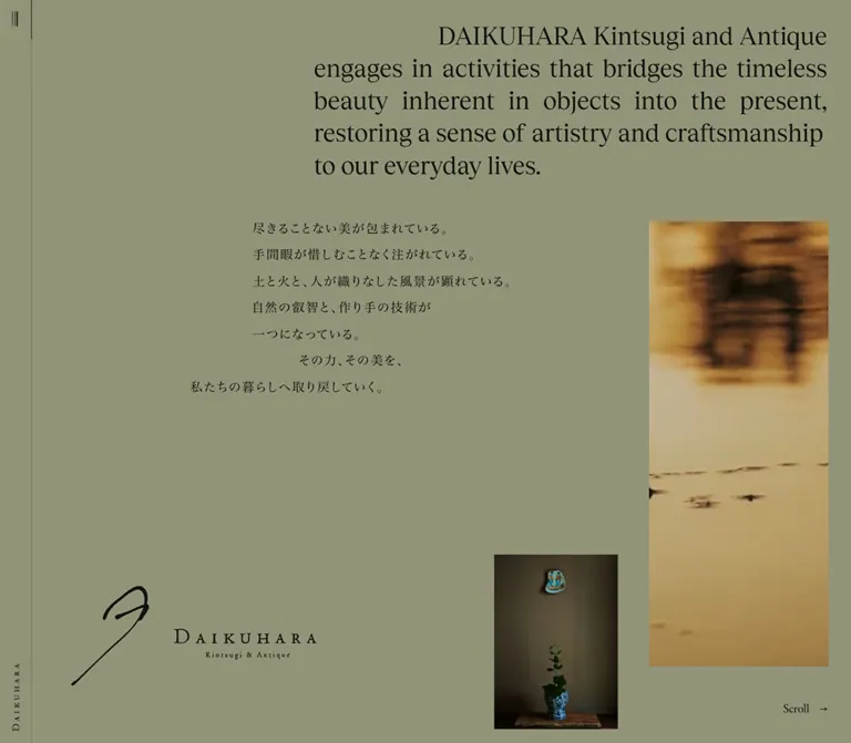
DAIKUHARA presents its objects and philosophy with the spacing of an exhibition catalogue. An earthy olive canvas connects dark interior photography, a narrow golden reflection, fine black lettering, and a large signature-like identity mark. English and Japanese appear together, each with its own typographic rhythm. English display text is relatively large and tightly composed; Japanese prose uses smaller Mincho lettering with deliberate tracking and generous leading.
The desktop composition extends horizontally through chapters of unequal width. Its opening places the statement high on the right, the Japanese text below and farther left, the identity low on the left, and two portrait images at different heights. Mobile changes the reading axis to a long vertical document and replaces the narrow left rail with a shallow top bar. Preserve this change of composition, the hierarchy of image sizes, and the space between independent elements when adapting the design.
How to Read This Reference
- Measured values come from the supplied rendered DOM, element rectangles, computed styles, or named custom properties. They describe the captured state, including elements outside the visible viewport.
- Estimated values come from the original-page screenshots. They are suitable starting points, not recovered CSS declarations.
- Derived values are arithmetic relationships between supplied measurements. They do not establish the original responsive formulas.
- Recommended values and implementation patterns are additions for reuse. The CSS starter is an adaptation, not recovered source code.
- Font names below are present in computed family declarations. Font-file loading, variable-font axes, and licensing were not independently inspected.
- Repeated headings and paragraphs in the extracted text are not evidence of repeated visible copy. The screenshot shows one readable instance. Layering, clipping, and animation-related duplication are possible explanations; the complete mechanism is unverified.
- Several desktop wrappers and hidden text elements report
1pxfont sizes. The HTML root reports16px; the body reports12px. Do not reinterpret the whole site as a one-pixel root system.
Tokens — Colors
Default Palette
All hexadecimal values in this table are measured source custom properties. Suggested aliases are for a new implementation.
| Name | Value | Source token | Suggested alias | Role and evidence |
|---|---|---|---|---|
| Olive Canvas | #929479 |
--base-bg, --color-gray |
--dk-canvas |
Computed body and opening background; visible across the initial desktop and mobile views |
| Body Ink | #12130F |
--base-text, --color-black |
--dk-text |
Main text, utility lettering, and default header foreground |
| Title Ink | #0C0C09 |
--base-title, --color-black-dark |
--dk-title |
English opening statement and measured editorial headings |
| Olive Rule | #727556 |
--base-bd, --color-gray-bd |
--dk-rule |
Declared default border color; exact border assignment is not included for every component |
| Muted Olive Text | #4D4F3B |
--color-gray-text |
--dk-muted |
Available secondary tone; its specific visible assignments were not established |
Inverse Palette
| Name | Value | Source token | Suggested alias | Role and evidence |
|---|---|---|---|---|
| Dark Olive Canvas | #2D2F26 |
--base-bg-rev, --color-black-lt |
--dk-dark |
Computed index background; visually corresponds to the mobile contact/footer field |
| Pale Title | #DDDFC5 |
--base-title-rev, --color-white-lt |
--dk-title-inverse |
Computed index headings and navigation lettering |
| Pale Body | #BABCA5 |
--base-text-rev, --color-white |
--dk-text-inverse |
Declared inverse body color; suitable for the subdued footer text treatment |
| Dark Olive Rule | #494A35 |
--base-bd-rev, --color-gray-dark |
--dk-rule-inverse |
Declared inverse border tone |
The inverse treatment belongs to sections of the page. There is no evidence of a theme picker. The mobile header changes from olive with dark lettering in the opening to dark olive with pale lettering at the footer; its state-selection mechanism was not supplied.
The golden water reflection and blue ceramic decoration are photographic colors, not measured UI accent tokens. Keep those colors inside the imagery. Source names such as --color-white are semantic labels: the actual value is a subdued greenish cream, not pure white.
Tokens — Typography
Tobias — English Display Text
- Measured family:
Tobias, serif. - Measured weight: predominantly
400. - Uses: opening statement, chapter titles, English subheadings, product names, profile names, and primary link labels.
- Character: fine, contrasting strokes and a literary tone. Hierarchy comes primarily from size, placement, and surrounding space.
- Tracking: chapter titles use
-0.01em; most other measured English display text has normal tracking.
TsukuMinPr6N-D — Japanese Text
- Measured stack:
TsukuMinPr6N-D, "Hiragino Mincho Pro", HiraMinProN-W3, "MS PMincho", "Yu Mincho", YuMincho, serif. - Measured weight:
400throughout the sampled Japanese content. - Uses: Japanese introductions, chapter subtitles, editorial paragraphs, product descriptions, and practical information.
- Tracking: commonly
0.1em; the opening uses0.12em. Desktop editorial subheadings reach0.14em. - Leading: long Japanese paragraphs are considerably more open than their English counterparts, usually a little over twice the font size.
Drummond Variable — English Reading Text and Numbers
- Measured family:
drummond-variable, serif. - Uses: English prose, provenance and dimension labels, chapter numbers, Roman numerals, and the desktop
Scrollcue. - Measured weights:
400for prose and small labels;300for the large product Roman numerals. - Limitation: the family name identifies a variable font, but no axis configuration was provided.
Identity Artwork
The large opening identity combines an elongated hand-drawn mark, a widely spaced DAIKUHARA wordmark, and a much smaller descriptor. The header contains a compact graphical wordmark with a separate text alternative. Do not derive its lettering from the hidden paragraph's computed font size or assume it is ordinary Tobias text. Treat the identity as supplied artwork when authorized.
Type Scale
Unless marked otherwise, values are measured. Each size pair is font size / line height in pixels.
| Role | Desktop | Mobile | Family and tracking |
|---|---|---|---|
| Opening English statement | 32 / 41.6 |
17 / 23.8 |
Tobias; normal tracking |
| Opening Japanese text | 16 / approximately 34 |
12 / 24 |
Mincho stack; 0.12em; desktop visible leading is estimated |
| Chapter title | 42 / 42 |
22 / 22 |
Tobias; -0.01em |
| Japanese chapter subtitle | 13 / 13 |
10 / 10 |
Mincho stack; 0.1em |
| Chapter number | 17 / 17 |
15 / 15 |
Drummond; weight 400 |
| Main index number | 17 / 18.7 |
14 / 15.4 |
Drummond |
| Main index English label | 20 / 22 |
15 / 16.5 |
Tobias |
| Main index Japanese label | 16 / 17.6 |
11 / 12.1 |
Mincho stack; 0.1em |
| English editorial subheading | 28 / 39.2 |
19 / 26.6 |
Tobias |
| Japanese editorial subheading | 23 / 36.8 |
16 / 28.8 |
Mincho stack; 0.14em desktop, 0.12em mobile |
| English editorial body | 18 / 27.9 |
16 / 24 |
Drummond |
| Japanese editorial body | 16 / 33.92–34.08 |
13 / 27.04 |
Mincho stack; usually 0.1em |
| Product index English label | 19 / 20.9 |
13 / 14.3 |
Tobias |
| Product index Japanese label | 15 / 16.5 |
11 / 12.1 |
Mincho stack; 0.1em |
| Large product Roman numeral | 100 / 80 |
70 / 56 |
Drummond; weight 300 |
| Product title | 28 / 42 |
16 / 24 |
Tobias |
| Japanese product title | 16 / 25.6 |
13 / 20.8 |
Mincho stack; 0.14em desktop, 0.12em mobile |
| English product facts | 18 / 19.8 |
15 / 16.5 |
Drummond |
| Japanese product facts | 15 / 16.5 |
12 / 13.2 |
Mincho stack; 0.1em |
View Detail |
20 / 20 |
16 / 16 |
Tobias |
詳しく見る |
14 / 14 |
10 / 10 |
Mincho stack; 0.1em |
Desktop Scroll cue |
16 / 16 |
Not shown | Drummond |
The desktop Japanese opening measurement comes from a paragraph with a 1 × 1px rectangle. Its declared size and tracking are useful evidence, but its 16px computed line height does not describe the visible seven-line composition. The visible line spacing is approximately 34px in the screenshots.
The measured hierarchy is deliberately uneven across languages. For example, mobile English body copy uses 16px, while Japanese body copy uses 13px with wider tracking and 27.04px leading. Preserve the distinct rhythms instead of assigning one shared body style.
Tokens — Spacing & Shapes
Density: sparse compositions surrounding relatively compact text. Geometry: square image edges, thin rules, and unboxed controls. Scaling: discrete measured desktop/mobile values; the original breakpoint and interpolation formulas were not provided.
Spacing Scale
| Use | Value | Evidence status |
|---|---|---|
| Mobile primary content inset | 22px |
Measured across opening and editorial content |
| Mobile chapter-heading inset | 32px from the viewport edge |
Measured; 10px farther inward than body copy |
| Mobile English opening left edge | 80px |
Measured; its right edge remains 22px from the viewport |
| Mobile opening English-to-Japanese gap | 31px |
Derived from the two measured paragraph rectangles |
| Mobile opening poem-to-still gap | Approximately 40px |
Estimated from the image and measured poem rectangle |
| Mobile English heading-to-body gap | 26–28px in sampled sections |
Derived from measured rectangles |
| Mobile Japanese heading-to-body gap | Approximately 20–25px |
Derived from sampled rectangles |
| Mobile language-block separation | Approximately 58–60px in sampled editorial sections |
Derived |
| Mobile section bottom padding | 80px |
Measured on About Us, Kintsugi, and Kintsugi Class |
| Mobile practical-information indent | 29px beyond the label edge |
Derived from labels at x=22 and values at x=51 |
| Desktop chapter-heading inset | 80px within the chapter |
Measured |
| Desktop editorial section side padding | 220px |
Measured on several sections; classroom right padding is 260px |
| Desktop About Us language-column gap | 140px |
Derived from the English column's right edge and Japanese column's left edge |
These values do not form a single conventional spacing scale. Reuse a small set of offsets for each component family rather than rounding every position to an eight-pixel grid.
Border Radius and Rules
| Element | Treatment | Evidence status |
|---|---|---|
| Sampled sections, links, and buttons | border-radius: 0px |
Measured |
| Opening and footer photographs | Square corners | Visually observed |
| Desktop rail edge | Approximately 1px vertical rule |
Screenshot estimate |
| Mobile header edge | Approximately 1px horizontal rule |
Screenshot estimate |
| Contact link separator | Approximately 1px horizontal rule |
Screenshot estimate |
| General elevation | No card shadows visible in the supplied captures | Visual observation, not a complete stylesheet audit |
Opening Layout Measurements
Positions below refer to the first desktop capture or the mobile opening capture. Image and logo bounds are estimates because corresponding media-element rectangles were not supplied.
| Element | Desktop: 1440 × 1000 | Mobile: 390 × 844 | Status |
|---|---|---|---|
| Header | 41 × 1000px, at the left edge |
390 × 42px, at the top |
Measured |
| Menu button | 40 × 51px, at x=1, y=0 |
68 × 40px, at x=322, y=0 |
Measured |
| Header wordmark link | 9 × 87px, at x=16, y=896 |
87 × 41px, at x=22, y=0 |
Measured |
| English opening block | 660 × 207.97px, at x=749, y=26 |
288 × 142.78px, at x=80, y=138 |
Measured |
| Japanese opening block | Staggered lines around x=590–1000, beginning near y=286 |
250.73 × 168px, at x=22, y=311.78 |
Desktop estimated; mobile measured |
| Small still-life photograph | Approximately 159 × 226px, at x=981, y=756 |
Approximately 80 × 113px, at x=155, y=520 |
Estimated |
| Tall reflection image | Approximately 230 × 610px, at x=1180, y=286 |
Not visible in the opening capture | Estimated; mobile location unverified |
| Large identity lockup | Approximately 416 × 168px, beginning at x=121, y=756 |
Approximately 228 × 92px, beginning at x=52, y=684 |
Estimated |
Components
Persistent Identity Rail and Mobile Bar
Role: a quiet, persistent point of orientation.
Desktop uses a 41px strip along the left edge. A tiny group of vertical strokes appears near the top, inside a much larger 40 × 51px menu button. The compact DAIKUHARA identity sits vertically near the bottom. A fine rule separates the rail from the content.
Mobile turns this into a 42px top bar. The wordmark begins at 22px; the menu button occupies the rightmost 68px. Its glyph is approximately 24px wide, with three fine horizontal strokes. The header remains at the top in both the opening and footer captures, supporting its treatment as persistent chrome; the exact positioning declaration was not included.
The home link and a button containing the text open menu are present in the rendered DOM. The opened menu, dismissal behavior, focus handling, and menu animation were not inspected. The separate Index chapter must not be mistaken for a verified menu overlay.
Opening Statement and Image Composition
Role: establishes the shop's philosophy before presenting its catalogue and services.
The English statement is a paragraph, while a separate H1 naming the site has a 1 × 1px rectangle positioned outside the visible origin. The visible statement uses Tobias, regular weight, with a strongly indented first line. In the desktop screenshot, subsequent lines span the right-hand text block with a justified-looking distribution. The exact text-align and text-indent declarations were not supplied.
Below it, Japanese text is arranged as seven lines. On desktop, the first five begin around the same inset, the sixth shifts right, and the final line extends left. This gives the short passage a composition of its own. On mobile, all seven lines start at 22px, and the stagger disappears.
The desktop images have different roles: a narrow golden reflection extends down the right side, while a much smaller still life sits near the lower edge. The large identity anchors the opposite corner. Nothing occupies the broad upper-left area. Mobile shows the statement, poem, small centered still life, and identity in sequence.
The measured opening section extends beyond the first viewport: 2880px wide on desktop and approximately 1344px high on mobile. The supplied opening screenshots do not show that entire section. In particular, the absence of the reflection from the mobile opening screenshot does not establish that it is hidden throughout the mobile page.
Chapter Heading
Role: provides a stable editorial label while the chapter's content takes its own position.
The recurring unit contains an English H2, a small Japanese subtitle, and a two-digit chapter number. Desktop chapter titles begin at local x=80, y=29. The Japanese subtitle begins around y=85; the number appears around y=175.
On mobile, this unit begins at local x=32, y=40. The title is 22px, the subtitle sits 8px below its line box, and the number starts around local y=125. The offset from the 22px body inset is intentional in the measured layout.
The document contains seven numbered destinations: About Us, Product, Kintsugi, Kintsugi Class, Shop, Latest Information, and Contact. The Index title itself is unnumbered.
Main Index Row
Role: links to the seven principal chapters.
Each link contains a number, an English label, and a Japanese label. Desktop links measure 664 × 50.47px, with 13.4px vertical padding. The number occupies a 67px column. English text begins immediately afterward, while Japanese labels occupy a 151px region near the right edge.
Mobile retains the three-part horizontal relationship. Links measure approximately 348 × 34.39px, starting at x=22. The number column is 23px; English begins at x=45; Japanese labels begin around x=267 and occupy approximately 103px. Padding is 9px above and 8px below.
The index has a measured dark olive background and pale title-colored text. Its anchor destinations are present in the DOM. Click outcomes and hover states were not tested, and the sample does not establish an index-row border treatment.
Bilingual Editorial Spread
Role: carries the philosophy, history, and teaching approach in both languages.
The desktop About Us section separates English and Japanese into independent columns at different vertical positions. Its English column is 380px wide, with a 28px heading above 18px / 27.9px body copy. The Japanese column is 522px wide, with a 23px heading and 16px / 33.92px paragraphs. Their horizontal gap is 140px.
Other chapters vary the column widths: measured English Kintsugi text includes 811px and 570px blocks, while Japanese blocks use 570px. This is a sequence of individually composed spreads, not one repeated equal-column template.
Mobile places the languages sequentially within a 346px content width. English headings and paragraphs come first in the sampled sections, followed by Japanese headings and paragraphs. The copy stays unboxed, with spacing carrying the hierarchy.
Product Index
Role: introduces three highlighted objects and links to their positions within the home page.
The listed objects are a French Delftware jug, a Delft syrup jar, and a Delft blue-and-white pancake plate. Their index markers are I, II, and III. Repeated numeral strings in the extraction should not be reproduced as literal interface content.
Desktop rows are approximately 744.56px wide and 50.67px high. A roughly 67px numeral column precedes the English title; Japanese labels occupy the right side.
Mobile changes this anatomy: the Roman numeral stays at the far left, while the English and Japanese names form a right-aligned two-line group. The row is 346px wide and approximately 56.59px high. English text uses 13px; Japanese uses 11px, separated from the English line by a visible vertical offset.
These are text navigation rows, not shopping cards. No price, cart, or purchase control appears in the supplied product-preview evidence.
Product Presentation
Role: treats each featured object as a catalogue entry with its own space.
DOM measurements show large Roman numerals, bilingual names, separate English and Japanese fact groups, and a View Detail link. The first two desktop product subsections are each 1440px wide; the third is 2664px wide. Their imagery was not captured in the supplied visual views, so exact image positions, crops, and transitions remain unverified.
The first desktop entry demonstrates the staggered text system:
- Roman numeral: local
x=80, y=33,100pxtype at weight300. - English title: local
x=160, y=206,28px / 42px. - Japanese title: local
x=160, y=254. - English facts: local
x=240, beginning aroundy=530. - Japanese facts: local
x=359, beginning aty=658. - Detail link: local
x=330, y=840, with a410 × 124pxhit region.
Mobile returns titles and facts to the 22px inset. Product subsections measure approximately 1207.72px high. The detail link is centered at x=80, measuring 230 × 62px, with English above Japanese.
The fact groups use labels such as Place, Period, and Dimensions. Those dimensions describe the antique object, not the interface. Detail links lead to separate product URLs; those destination pages are outside this reference's scope.
Profile Blocks
Role: introduces the people associated with the shop and craft practice.
The original-page DOM identifies Masanobu Daikuhara and Harumi Daikuhara, with bilingual role labels and biographies. These are page-content profiles, not website production credits.
Desktop biographies use 380px columns with staggered vertical starts. English names are Tobias at 24px; English role labels are 16px; English prose is Drummond at 17px / 26.01px. Japanese names are 22px, role labels 14px, and prose 15px / 31.2px.
On mobile, measured name and role rectangles are centered within the content area, while biography paragraphs span 346px from the 22px inset. Names reduce to 21px in English and 19px in Japanese. Portrait composition is not documented by the supplied screenshots.
Classroom Information
Role: combines the teaching philosophy with practical attendance information.
The section repeats the bilingual editorial pattern, then introduces fields including Venue and Schedule. Desktop venue labels and values are arranged laterally, with map links toward the far right of the information region.
Mobile stacks these fields. Bilingual labels begin at x=22, and their values and map links begin at x=51, producing a 29px hanging indent. English venue details use 16px / 22.4px; Japanese details use 13px / 18.2px.
Map destinations and text announcing a new tab are present in the link evidence. The external pages were not opened. Booking controls or a classroom reservation form were not inspected.
Editorial Links
Role: provide navigation without introducing a separate button aesthetic.
Labels such as View Detail, View More, and View Contact Form use regular serif typography with a smaller Japanese companion. On desktop, measured product links can place the two languages across a broad hit region. On mobile, the languages stack.
The visible contact link is particularly restrained: English text at the left, a small right arrow near the far edge, a Japanese caption underneath, and a fine rule across the bottom. It leads to /contact/; it is not an embedded form.
No hover inversion, underline animation, or arrow travel was demonstrated. Such effects should be treated as additions if implemented.
Contact and Footer
Role: closes the page with a route to enquiry and a concrete sense of place.
The supplied mobile footer capture uses the inverse palette. The contact link and its separator span approximately 346px, from x=22 to x=368. Its English label appears approximately 18px high in type size; this is a screenshot estimate because its computed style was not included.
Below the separator, an entrance photograph occupies a narrow right-aligned column. Estimated bounds are 202 × 287px, beginning at x=166, y=242 in this scrolled capture. The photograph shows a warmly lit plaster wall, a small identity sign, a dark slatted entrance, roof detail, and surrounding foliage.
English and Japanese address blocks follow the same left edge as the photograph. An underlined Instagram link sits below them. A small, faint copyright line returns to the 22px left inset near the bottom of the viewport.
The entrance image, address, and social link form one coherent column. The substantial empty area to their left is part of the composition, even on a phone. Desktop footer geometry was not supplied.
Tokens — Motion & Interaction
Measured Timing Declarations
| Element or token | Supplied value | What the evidence establishes |
|---|---|---|
| Base duration | --base-duration: 0.8s |
Available source timing token |
| Base easing | cubic-bezier(.16, 1, .3, 1) |
Available source easing token; explicitly used by the header |
| Slide easing | cubic-bezier(.33, 1, .68, 1) |
Available source easing token and sampled animation timing |
| Header palette transition | 0.8s cubic-bezier(.16, 1, .3, 1) |
Transitions declared for background, border, text, fill, and stroke colors |
| Body and several headings | 0.8s color-related transitions |
Transition declarations exist; the initiating state changes were not exercised |
| Menu-button entrance | 1.4s, base easing, 1.3s delay, both, name fadeIn |
A named entrance animation is declared; full keyframes were not supplied |
| Desktop scroll cue | 1.2s, slide easing, 2s delay, both, name fadeInSlide |
A named entrance animation is declared; displacement is unknown |
| Product-index Japanese captions | 1.2s, slide easing |
Delays are 0.2 / 0.3 / 0.4s on desktop and 0.4 / 0.5 / 0.6s on mobile; animation names are absent from the supplied strings |
| Sampled map links | 1.2s, slide easing |
Desktop delays include 0 / 0.08s; mobile includes 0.24 / 0.48s; complete keyframes are unverified |
The declared curves support an unhurried entrance style with a soft finish. They do not justify inventing spring motion, specific reveal distances, or a universal animation on every element.
Observed Differences and Limits
The three desktop images remain within the opening composition. Many content elements move upward by approximately 9px, then another 8px, while the rail remains stable. The recorded desktop document height is 1017px for a 1000px viewport, which is consistent with this small vertical displacement. These images do not prove a parallax effect or demonstrate travel through the horizontal chapters.
The reflected image also differs slightly between captures. Time-varying media is possible, but no media element, source URL, playback state, duration, loop setting, or sound behavior was supplied. A still poster is the defensible default for a reference implementation.
The very wide flex main establishes horizontal desktop geometry. It does not establish whether native horizontal scrolling, transformed content, wheel conversion, or another controller drives navigation. A generic scroll-snap utility variable alone is not proof of active snapping.
An embedded raster-mask custom property is present, but its target and visible effect are not established. Similarly, repeated DOM text is not sufficient evidence to describe a particular text-masking animation.
Surfaces
| Surface | Appearance | Structural purpose |
|---|---|---|
| Opening canvas | Flat olive #929479 |
Connects text, identity, and separated image fragments |
| Editorial chapters | Many sampled sections are transparent over the olive body | Gives independently positioned content a shared field |
| Index | Dark olive #2D2F26 with pale title text |
Marks a change from introduction to navigation |
| Header | Solid palette-aware strip with a fine edge | Maintains orientation at the viewport boundary |
| Mobile contact/footer | Dark olive with pale text and a narrow entrance photograph | Creates a quiet closing section |
| Link surfaces | Primarily transparent, square, text-led | Keep actions in the same editorial language |
| Photographic depth | Shadows and warm light inside the images | Supplies depth without UI elevation effects |
No overlay surface was visually inspected. Do not extend the dark index treatment into an assumed menu or modal design.
Imagery
The supplied original-page photographs emphasize atmosphere and placement. In the small still life, a blue-and-white vessel holding a plant stands on a wooden surface beneath a small wall-mounted ceramic object. The dark background and concentrated lighting make the photograph feel like a display within a room.
The larger opening image is a tall, narrow crop of golden reflected light with dark, soft horizontal forms. It provides warmth and visual movement without becoming a full-width banner. Its height contrasts with the much smaller still life.
The footer entrance photograph makes the shop tangible through a warm lamp, textured wall, dark joinery, and foliage. Both visible portrait photographs retain significant environmental context. Avoid cropping tightly to the ceramic or the sign when adapting their role.
Observed Asset References
Media URLs and filenames were not included in the supplied evidence. These references identify visible assets without inventing paths.
| Asset | Original-page visual reference | Estimated geometry | Reuse guidance |
|---|---|---|---|
| Main identity lockup | Lower-left desktop opening; lower mobile opening | Approximately 416 × 168px desktop and 228 × 92px mobile |
Use authorized artwork; preserve the long hand-drawn stroke and small descriptor |
| Compact wordmark | Desktop rail and mobile top bar | Graphic approximately 87px long |
Keep separate from the large identity composition |
| Ceramic still life | Near the lower-right desktop area; centered on mobile | Approximately 159:226 aspect ratio |
Retain dark room context, wooden base, and blue ceramic details |
| Golden reflection | Right side of desktop opening | Approximately 23:61 aspect ratio |
Preserve the exceptionally narrow crop; motion format is unknown |
| Shop entrance | Right-aligned mobile footer column | Approximately 202:287 aspect ratio |
Preserve warm lighting, wall texture, and architectural context |
The product names establish the subject matter of the catalogue, but the supplied visual captures do not document the individual catalogue image treatments. For new product photography, a restrained setting and honest material detail are recommendations, not observed properties of those unseen assets.
Layout & Responsive Behavior
Desktop: Unequal Horizontal Chapters
The measured main element is a flex container approximately 32583.70px wide and 1000px high. Sequential section rectangles begin at increasing horizontal coordinates with y=0. The recorded document height is only 1017px.
The section widths below are measured at this viewport, not universal sizing tokens.
| Section | Desktop width at 1440 × 1000 | Mobile height at 390 × 844 |
|---|---|---|
| Opening | 2880px |
1343.98px |
| Index | 1165px |
583.42px |
| About Us | 1989px |
1467.59px |
| Product | 8779.56px |
5037.94px |
| Kintsugi, including nested profiles | 4720px |
4820.91px |
| Kintsugi Class | 4394px |
3379.05px |
The opening happens to equal two desktop viewport widths. Subsequent chapters vary substantially. Avoid turning this into a carousel where every chapter is constrained to one identical slide.
Within the opening, the English text block occupies about 45.8% of the viewport width. Its right edge sits 31px from the viewport edge. The small still life and tall reflection have about 40px of horizontal space between them. The identity is independent of both the header and statement.
Mobile: Vertical Reading with Selective Asymmetry
The mobile main changes to display: block and measures 390px wide. The supplied documentHeight is 23074px; the main and body bounding height is approximately 23060.39px. These are different measurement types and should not be copied as fixed implementation heights.
The responsive change involves several specific transformations:
- The left rail becomes a top bar, and the menu strokes change orientation.
- The English opening statement retains a right-hand position, with
80pxleft and22pxright clearance. - Japanese opening lines lose their desktop stagger and align to the primary left inset.
- The small still life becomes centered and roughly half its desktop width.
- The main identity follows below the still life, offset slightly from the main left edge.
- Editorial language blocks become sequential, with a
346pxreading width. - Main index rows remain bilingual across one row, while product-index titles become a stacked group on the right.
- Product actions stack their two language labels in a centered
230pxlink region. - Venue values and maps gain a hanging indent beneath their labels.
- The footer preserves a narrow right-aligned photograph and address column rather than expanding everything to full width.
No intermediate-width or landscape-phone capture was supplied. The exact breakpoint, behavior under browser zoom, and short-desktop-height handling remain unverified. For a new implementation, choose breakpoints from content fit and allow a vertical fallback when the composed desktop stage becomes too short.
Do’s and Don’ts
Do
- Keep the olive canvas and dark inverse section palette faithful to the measured colors.
- Preserve regular-weight English serif headings and tracked Japanese Mincho text.
- Give English and Japanese separate type sizes and leading rules.
- Keep the desktop chapter widths and internal offsets varied according to their content.
- Maintain broad empty areas around the opening statement and identity.
- Preserve the difference in scale between the small still life and tall reflection.
- Keep the large identity distinct from the compact navigation wordmark.
- Use chapter numbers and product Roman numerals as editorial orientation devices.
- Retain the mobile footer's narrow right-aligned image and address column.
- Treat declared motion timings as evidence while keeping untested behavior explicitly unresolved.
Don’t
- Don’t replace the exhibition structure with a generic sales hero, feature cards, and a large filled CTA.
- Don’t make every desktop chapter an equal-width carousel slide.
- Don’t center every text block or force both languages onto identical columns.
- Don’t stretch the small still life into a dominant full-width image.
- Don’t add rounded cards, floating shadows, glossy gradients, or glass surfaces.
- Don’t turn the golden photographic reflection into a gold button palette.
- Don’t replace the identity artwork with loosely tracked body text and an improvised symbol.
- Don’t render duplicated extraction text as repeated visible content.
- Don’t set the document root to
1pxbecause some source wrappers report that size. - Don’t claim verified parallax, menu transitions, autoplay, or scroll snapping from these captures.
- Don’t infer that an image absent from the first mobile viewport is absent from the entire mobile page.
Recommended Implementation Additions
These are recommendations for a new implementation, not verified features of the original:
- Keep essential text and navigation visible without waiting for entrance animations.
- Use one accessible text instance for each paragraph or heading. Mark any decorative animation duplicates as hidden from assistive technology.
- Give the menu button an explicit accessible name, expanded state, and controlled-region relationship. If a menu is modal, implement focus containment, Escape dismissal, and focus return.
- Add visible keyboard focus using the active ink color. Preserve the footer link underlines.
- Consider larger mobile index hit areas and menu targets while retaining the fine visual glyphs. The measured index rows are only about
34pxhigh. - Make the horizontal experience reachable by keyboard and preserve meaningful fragment navigation. A native vertical fallback should remain usable when enhancements fail.
- Avoid fixed content heights that clip translations, browser-enlarged text, or longer product names.
- Review small
10–13pxlabels at actual device sizes. Increase size or contrast where needed without changing the serif character. - Make the faint footer copyright more readable when it carries information users need.
- If the reflection becomes video, provide a poster and reduced-motion behavior; keep sound and playback assumptions explicit.
- Use licensed font resources when available, with the observed serif fallbacks. Recheck wrapping after font substitution.
- Supply useful alternatives for object and entrance photography, and use empty alternatives for purely decorative reflection imagery when appropriate.
Agent Prompt Guide
Quick Color Reference
- Default canvas:
#929479. - Default body text:
#12130F. - Default headings:
#0C0C09. - Default fine rules:
#727556. - Inverse canvas:
#2D2F26. - Inverse headings and index links:
#DDDFC5. - Inverse body text:
#BABCA5. - Inverse fine rules:
#494A35. - Gold and ceramic blue belong to photography, not an additional UI color system.
Overall Prompt
“Create an editorial website for a Kintsugi and antique shop using an olive canvas #929479, near-black text, and dark olive inverse chapters. Use Tobias-style regular serif display text, a distinct serif face for English reading copy and numerals, and a Japanese Mincho stack with generous tracking and leading. On desktop, compose unequal horizontal chapters around a 41px identity rail. Place the opening statement high on the right, a seven-line Japanese passage below it, a large authorized identity mark low on the left, a small dark ceramic still life near the lower right, and a much taller narrow reflection image at the far right. On mobile, switch to a 42px top bar and vertical reading order while preserving selected offsets and a narrow right-aligned footer column. Keep images square-cornered and actions typographic. Clearly distinguish implemented motion from behavior that still needs validation.”
Example Component Prompts
- Opening: “At 1440 × 1000, place a 660px English serif statement 31px from the right edge and 26px from the top. Leave the upper-left field open. Add a smaller staggered Japanese passage beneath, a 159 × 226px still life near the lower edge, and a 230 × 610px golden reflection at the far right. Use authorized identity artwork at lower left. These media dimensions are screenshot estimates.”
- Mobile opening: “At 390px wide, use 22px outer insets and a 42px header. Place the English opening in a 288px block aligned right, followed by Japanese text aligned left at 12px with 24px leading. Center an 80px-wide portrait still life below the text, then place a 228px identity lockup slightly left of center. Do not assume that unseen portions of the introduction are empty.”
- Chapter index: “Build a dark olive index with seven bilingual links. Give each row a small Drummond-style number, a regular English serif label, and a tracked Japanese label. On mobile, use approximately 23px for the numeral column and 103px for the Japanese label region. Keep the row unboxed and add a clearly visible keyboard focus state.”
- Product entry: “Present one antique as a catalogue entry with a large light-weight Roman numeral, bilingual title, and separate English and Japanese Place, Period, and Dimensions groups. Use an unfilled bilingual View Detail link. Compose desktop text with staggered horizontal offsets; stack it on mobile. Treat image placement as a new design decision because its original geometry is not documented here.”
- Footer: “Create a dark olive mobile closing section with a full-width typographic contact link and a fine bottom rule. Below it, align a roughly 202px-wide portrait entrance photograph to the 22px right inset. Place bilingual address text and an underlined Instagram link directly beneath the image, leaving the left side largely empty.”
Quick Start
CSS Custom Properties
This starter implements the captured opening composition, identity chrome, recurring text styles, index rows, links, and mobile footer treatment. It uses measured colors and type sizes alongside explicitly estimated opening geometry.
The 75rem width and 44rem height thresholds are recommended breakpoints, not recovered source values. The optional horizontal container uses native overflow; it does not reproduce the original navigation controller. The opening starter covers only the first visible composition, not the uninspected remainder of the source opening section.
Use .opening-scene for a container holding .opening-statement, .opening-poem, .opening-still, .opening-water, .opening-brand, and .scroll-cue. Give the poem seven child spans in reading order. Supply authorized image and identity assets; no asset URLs are inferred here.
:root {
  /* Measured palette, exposed through implementation aliases. */
  --dk-canvas: #929479;
  --dk-text: #12130f;
  --dk-title: #0c0c09;
  --dk-rule: #727556;
  --dk-muted: #4d4f3b;
  --dk-dark: #2d2f26;
  --dk-text-inverse: #babca5;
  --dk-title-inverse: #dddfc5;
  --dk-rule-inverse: #494a35;

  /* Observed family declarations; load authorized fonts separately. */
  --font-title: Tobias, serif;
  --font-latin: 'drummond-variable', serif;
  --font-japanese: TsukuMinPr6N-D, 'Hiragino Mincho Pro',
    HiraMinProN-W3, 'MS PMincho', 'Yu Mincho', YuMincho, serif;

  --dk-opening-size: 17px;
  --dk-chapter-size: 22px;
  --dk-lead-size: 19px;
  --dk-number-size: 70px;
  --dk-gutter: 22px;
  --dk-rail: 41px;
  --dk-bar: 42px;
  --dk-duration: 800ms;
  --dk-ease: cubic-bezier(.16, 1, .3, 1);
  --dk-slide-ease: cubic-bezier(.33, 1, .68, 1);
}

* { box-sizing: border-box; }
html { font-size: 100%; }
body {
  margin: 0;
  color: var(--dk-text);
  background: var(--dk-canvas);
  font-family: var(--font-japanese);
  font-size: 12px;
  line-height: 1.5;
}
img { display: block; max-inline-size: 100%; }
a { color: inherit; }
button { font: inherit; }

.is-inverse {
  --dk-canvas: var(--dk-dark);
  --dk-text: var(--dk-text-inverse);
  --dk-title: var(--dk-title-inverse);
  --dk-rule: var(--dk-rule-inverse);
  color: var(--dk-text);
  background: var(--dk-canvas);
}

/* Persistent positioning is an implementation choice supported by captures. */
.identity-chrome {
  position: fixed;
  inset: 0 0 auto;
  z-index: 20;
  block-size: var(--dk-bar);
  color: var(--dk-text);
  background: var(--dk-canvas);
  border-block-end: 1px solid var(--dk-rule);
  transition:
    color var(--dk-duration) var(--dk-ease),
    background-color var(--dk-duration) var(--dk-ease),
    border-color var(--dk-duration) var(--dk-ease);
}
.chrome-brand {
  position: absolute;
  inset-inline-start: 22px;
  inset-block-start: 0;
  display: flex;
  align-items: center;
  inline-size: 87px;
  block-size: 41px;
}
.chrome-brand img { inline-size: 87px; max-inline-size: none; }
.chrome-menu {
  position: absolute;
  inset: 0 0 auto auto;
  display: grid;
  place-items: center;
  inline-size: 68px;
  block-size: 40px;
  padding: 0;
  color: inherit;
  background: transparent;
  border: 0;
  cursor: pointer;
}
.menu-glyph { display: flex; flex-direction: column; gap: 2px; }
.menu-glyph > span {
  display: block;
  inline-size: 24px;
  block-size: 1px;
  background: currentColor;
}

/* First mobile composition; later introductory content is not reconstructed. */
.opening-scene { padding: 138px 22px 68px; }
.opening-statement {
  inline-size: min(288px, 100%);
  margin: 0 0 0 auto;
  color: var(--dk-title);
  font: 400 var(--dk-opening-size)/1.4 var(--font-title);
  text-align: justify;
  text-indent: min(118px, 30vw); /* Visual approximation. */
}
.opening-poem {
  margin: 31px 0 0;
  font: 400 12px/24px var(--font-japanese);
  letter-spacing: .12em;
}
.opening-poem > span { display: block; }
.opening-still {
  inline-size: 80px;
  aspect-ratio: 159 / 226;
  object-fit: cover;
  margin: 40px auto 0;
}
.opening-brand {
  inline-size: min(228px, calc(100% - 30px));
  block-size: auto;
  margin: 50px 0 0 30px;
}
.opening-water, .scroll-cue { display: none; }

.chapter { padding: 40px var(--dk-gutter) 80px; }
.chapter-heading { margin-inline-start: 10px; }
.chapter-title {
  margin: 0;
  color: var(--dk-title);
  font: 400 var(--dk-chapter-size)/1 var(--font-title);
  letter-spacing: -.01em;
}
.chapter-subtitle {
  margin: 8px 0 0;
  font: 400 10px/1 var(--font-japanese);
  letter-spacing: .1em;
}
.chapter-number {
  margin: 45px 0 0;
  font: 400 15px/1 var(--font-latin);
}
.index-list { margin-block-start: 192px; }
.index-row {
  display: grid;
  grid-template-columns: 23px minmax(0, 1fr) 103px;
  align-items: baseline;
  padding: 9px 0 8px;
  color: var(--dk-title);
  text-decoration: none;
}
.index-number { font: 400 14px/1.1 var(--font-latin); }
.index-en { font: 400 15px/1.1 var(--font-title); }
.index-ja {
  font: 400 11px/1.1 var(--font-japanese);
  letter-spacing: .1em;
}

.bilingual-copy { display: grid; gap: 58px; }
.copy-en h3 {
  margin: 0 0 26px;
  color: var(--dk-title);
  font: 400 var(--dk-lead-size)/1.4 var(--font-title);
}
.copy-en p { margin: 0; font: 400 16px/1.5 var(--font-latin); }
.copy-ja h3 {
  margin: 0 0 24px;
  color: var(--dk-title);
  font: 400 16px/1.8 var(--font-japanese);
  letter-spacing: .12em;
}
.copy-ja p {
  margin: 0;
  font: 400 13px/2.08 var(--font-japanese);
  letter-spacing: .1em;
}
.product-number {
  margin: 0;
  font: 300 var(--dk-number-size)/.8 var(--font-latin);
}
.product-title {
  color: var(--dk-title);
  font: 400 16px/1.5 var(--font-title);
}

.editorial-link {
  display: grid;
  grid-template-columns: minmax(0, 1fr) auto;
  align-content: center;
  row-gap: 8px;
  inline-size: min(230px, 100%);
  min-block-size: 62px;
  margin-inline: auto;
  padding-block: 14px;
  text-decoration: none;
}
.link-en { color: var(--dk-title); font: 400 16px/1 var(--font-title); }
.link-ja {
  grid-column: 1;
  font: 400 10px/1 var(--font-japanese);
  letter-spacing: .1em;
}
.link-arrow { grid-column: 2; grid-row: 1; font: 400 16px/1 serif; }
.contact-link {
  inline-size: 100%;
  padding-block: 20px;
  border-block-end: 1px solid var(--dk-title);
}
.contact-link .link-en { font-size: 18px; } /* Screenshot estimate. */

/* Mobile footer geometry is estimated from the supplied closing view. */
.contact-footer { padding: 40px 22px 24px; }
.place-block {
  inline-size: min(202px, 100%);
  margin: 60px 0 0 auto;
}
.place-photo { inline-size: 100%; aspect-ratio: 202 / 287; object-fit: cover; }
.place-en { margin: 16px 0 0; font: 400 14px/1.5 var(--font-latin); }
.place-ja {
  margin: 16px 0 0;
  font: 400 12px/1.65 var(--font-japanese);
  letter-spacing: .06em;
}
.place-social { display: inline-block; margin-block-start: 16px; text-underline-offset: 2px; }
.footer-copyright { margin: 70px 0 0; font: 400 12px/1.5 var(--font-latin); }

/* Recommended focus treatment, independent of hover and animation. */
a:focus-visible, button:focus-visible {
  outline: 2px solid currentColor;
  outline-offset: 4px;
}
section[id] { scroll-margin-block-start: calc(var(--dk-bar) + 16px); }

/* Recommended thresholds; original breakpoint declarations were not supplied. */
@media (min-width: 75rem) and (min-height: 44rem) {
  :root {
    --dk-opening-size: 32px;
    --dk-chapter-size: 42px;
    --dk-lead-size: 28px;
    --dk-number-size: 100px;
  }
  .identity-chrome {
    inset: 0 auto 0 0;
    inline-size: var(--dk-rail);
    block-size: 100dvh;
    border-block-end: 0;
    border-inline-end: 1px solid var(--dk-rule);
  }
  .chrome-brand {
    inset: auto auto 17px 16px;
    justify-content: center;
    inline-size: 9px;
    block-size: 87px;
  }
  .chrome-brand img { transform: rotate(-90deg); }
  .chrome-menu { inline-size: 40px; block-size: 51px; }
  .menu-glyph { flex-direction: row; }
  .menu-glyph > span { inline-size: 1px; block-size: 19px; }

  /* Native-overflow adaptation; set chapter widths for actual content. */
  .exhibition--horizontal {
    display: flex;
    block-size: 100dvh;
    overflow: auto;
  }
  .exhibition--horizontal > .chapter {
    flex: 0 0 var(--chapter-width, 100vw);
    inline-size: var(--chapter-width, 100vw);
    block-size: 100%;
    overflow-y: auto;
  }
  .chapter { padding: 29px 80px 40px; }
  .chapter.opening { padding: 0; }
  .chapter-heading { margin-inline-start: 0; }
  .chapter-subtitle { margin-block-start: 14px; font-size: 13px; }
  .chapter-number { margin-block-start: 77px; font-size: 17px; }
  .index-chapter { --chapter-width: 1165px; display: flex; flex-direction: column; }
  .index-list { inline-size: min(664px, 100%); margin: auto 0 0 auto; }
  .index-row { grid-template-columns: 67px minmax(0, 1fr) 151px; padding-block: 13.4px; }
  .index-number { font-size: 17px; }
  .index-en { font-size: 20px; }
  .index-ja { font-size: 16px; }

  .opening-scene {
    position: relative;
    inline-size: 100vw;
    block-size: 100dvh;
    min-block-size: 700px;
    padding: 0;
  }
  .opening-statement {
    position: absolute;
    inset-block-start: 26px;
    inset-inline-end: 31px;
    inline-size: min(660px, 46vw);
    line-height: 1.3;
    text-indent: 160px; /* Visual approximation. */
  }
  .opening-poem {
    position: absolute;
    inset-block-start: 276px;
    inset-inline-start: calc(50% - 130px);
    margin: 0;
    font-size: 16px;
    line-height: 34px;
  }
  .opening-poem > span { padding-inline-start: 80px; }
  .opening-poem > span:nth-child(6) { padding-inline-start: 140px; }
  .opening-poem > span:last-child { padding-inline-start: 0; }
  .opening-still {
    position: absolute;
    inset-inline-end: 300px;
    inset-block-end: 18px;
    inline-size: 159px;
    margin: 0;
  }
  .opening-water {
    display: block;
    position: absolute;
    inset-block-start: 286px;
    inset-inline-end: 30px;
    inline-size: 230px;
    block-size: min(610px, calc(100dvh - 350px));
    object-fit: cover;
  }
  .opening-brand {
    position: absolute;
    inset-inline-start: 121px;
    inset-block-end: 76px;
    inline-size: 416px;
    margin: 0;
  }
  .scroll-cue {
    display: block;
    position: absolute;
    inset-inline-end: 30px;
    inset-block-end: 37px;
    margin: 0;
    font: 400 16px/1 var(--font-latin);
  }
  .copy-en p { font-size: 18px; line-height: 1.55; }
  .copy-ja h3 { font-size: 23px; line-height: 1.6; letter-spacing: .14em; }
  .copy-ja p { font-size: 16px; line-height: 2.12; }
  .product-title { font-size: 28px; }
  section[id] { scroll-margin-inline-start: calc(var(--dk-rail) + 16px); }
}

/* Optional entrance: the 12px distance is recommended, not measured. */
@keyframes gentle-reveal {
  from { opacity: 0; transform: translateY(12px); }
  to { opacity: 1; transform: translateY(0); }
}
.reveal-once { animation: gentle-reveal 1.2s var(--dk-slide-ease) both; }

@media (prefers-reduced-motion: reduce) {
  .identity-chrome { transition: none; }
  .reveal-once { animation: none; opacity: 1; transform: none; }
}
Use an actual button for .chrome-menu, and mark its three decorative stroke spans as hidden from assistive technology. Palette synchronization between the active chapter and header requires separate application logic. The starter does not implement the uninspected menu.
Example Link Anatomy
This is recommended semantic markup using an observed destination and source UI labels. It does not claim to reproduce the original element nesting.
<a class="editorial-link contact-link" href="https://daikuhara.jp/contact/">
  <span class="link-en" lang="en">View Contact Form</span>
  <span class="link-ja" lang="ja">お問い合わせフォームへ</span>
  <span class="link-arrow" aria-hidden="true">→</span>
</a>
Tailwind v4 Token Mapping
Optional aliases for a project already using Tailwind v4. This is not a claim about the original site's framework. Define the custom properties above first; inverse sections then update the mapped semantic colors through inheritance.
@theme inline {
  --color-canvas: var(--dk-canvas);
  --color-ink: var(--dk-text);
  --color-heading: var(--dk-title);
  --color-rule: var(--dk-rule);
  --font-display: var(--font-title);
  --font-reading: var(--font-latin);
  --font-mincho: var(--font-japanese);
  --text-opening: var(--dk-opening-size);
  --text-chapter: var(--dk-chapter-size);
  --text-editorial-lead: var(--dk-lead-size);
  --spacing-page-inset: var(--dk-gutter);
  --spacing-identity-rail: var(--dk-rail);
}
Sources & Evidence
- Inspected original and final page: DAIKUHARA Kintsugi & Antique. Both supplied URLs are identical; the recorded HTTP status is
200. - Capture time:
2026-09-12T16:37:02.708Z, equivalent to September 13, 2026, 01:37:02.708 JST. - Original-page visual evidence: three desktop opening captures at
1440 × 1000, one mobile opening capture at390 × 844, and one mobile contact/footer capture at390 × 844. The scrolled mobile capture's exact scroll offset was not supplied. - Rendered evidence: page title, extracted text, anchor destinations, custom properties, computed font and color declarations, element rectangles, display modes, padding, border radii, transitions, and animation strings at both viewport sizes.
- Interior-page scope: index, editorial chapters, products, profiles, and classroom details have DOM evidence. Their full visual appearance was not captured in the supplied screenshots. Shop and information destinations are documented by links; their detailed layouts are not established here.
- Observed navigation references: home-page chapter fragments, product detail and archive URLs,
/contact/, map links, and Instagram are present in the original page. Their destinations were not opened for this analysis. - Readiness limits: the supplied inspection waited for loading, sampled layout and text stability, finite animations, and visible image decoding under bounded timeouts. This improves capture reliability but does not prove that delayed content or all interactive states were inspected. Perpetual animation handling during readiness does not establish the identity or behavior of any particular media asset.
- Unverified behavior: opened navigation, hover and focus states, horizontal input handling, fragment-navigation outcomes, media playback, transition keyframes, intermediate responsive widths, and browser-zoom behavior.
All analysis uses the supplied current original-page captures and rendered evidence. The CSS and prompts are reusable recommendations and were not executed or browser-tested.
# DAIKUHARA Kintsugi & Antique — Style Reference

> An exhibition of vessels, reflected light, and bilingual serif typography on an olive field.

**Original URL:** [https://daikuhara.jp/](https://daikuhara.jp/)
**Final URL:** [https://daikuhara.jp/](https://daikuhara.jp/)
**Inspected:** September 13, 2026, 01:37 JST; supplied capture timestamp: September 12, 2026, 16:37:02.708 UTC.
**Viewports:** 1440 × 1000 desktop and 390 × 844 mobile, in CSS pixels.
**Theme:** muted olive with near-black text, interrupted by dark olive sections with pale lettering. A user-selectable theme was not observed.
**Scope:** the current home page for a Kintsugi and antique shop and classroom. Visual evidence covers the desktop opening, mobile opening, and mobile contact/footer region. Rendered DOM measurements additionally document the index, About Us, product previews, Kintsugi editorial content, profiles, and classroom information. Linked product and contact pages were not inspected.

DAIKUHARA presents its objects and philosophy with the spacing of an exhibition catalogue. An earthy olive canvas connects dark interior photography, a narrow golden reflection, fine black lettering, and a large signature-like identity mark. English and Japanese appear together, each with its own typographic rhythm. English display text is relatively large and tightly composed; Japanese prose uses smaller Mincho lettering with deliberate tracking and generous leading.

The desktop composition extends horizontally through chapters of unequal width. Its opening places the statement high on the right, the Japanese text below and farther left, the identity low on the left, and two portrait images at different heights. Mobile changes the reading axis to a long vertical document and replaces the narrow left rail with a shallow top bar. Preserve this change of composition, the hierarchy of image sizes, and the space between independent elements when adapting the design.

## How to Read This Reference

- **Measured** values come from the supplied rendered DOM, element rectangles, computed styles, or named custom properties. They describe the captured state, including elements outside the visible viewport.
- **Estimated** values come from the original-page screenshots. They are suitable starting points, not recovered CSS declarations.
- **Derived** values are arithmetic relationships between supplied measurements. They do not establish the original responsive formulas.
- **Recommended** values and implementation patterns are additions for reuse. The CSS starter is an adaptation, not recovered source code.
- Font names below are present in computed family declarations. Font-file loading, variable-font axes, and licensing were not independently inspected.
- Repeated headings and paragraphs in the extracted text are not evidence of repeated visible copy. The screenshot shows one readable instance. Layering, clipping, and animation-related duplication are possible explanations; the complete mechanism is unverified.
- Several desktop wrappers and hidden text elements report `1px` font sizes. The HTML root reports `16px`; the body reports `12px`. Do not reinterpret the whole site as a one-pixel root system.

## Tokens — Colors

### Default Palette

All hexadecimal values in this table are **measured source custom properties**. Suggested aliases are for a new implementation.

| Name | Value | Source token | Suggested alias | Role and evidence |
| --- | --- | --- | --- | --- |
| Olive Canvas | `#929479` | `--base-bg`, `--color-gray` | `--dk-canvas` | Computed body and opening background; visible across the initial desktop and mobile views |
| Body Ink | `#12130F` | `--base-text`, `--color-black` | `--dk-text` | Main text, utility lettering, and default header foreground |
| Title Ink | `#0C0C09` | `--base-title`, `--color-black-dark` | `--dk-title` | English opening statement and measured editorial headings |
| Olive Rule | `#727556` | `--base-bd`, `--color-gray-bd` | `--dk-rule` | Declared default border color; exact border assignment is not included for every component |
| Muted Olive Text | `#4D4F3B` | `--color-gray-text` | `--dk-muted` | Available secondary tone; its specific visible assignments were not established |

### Inverse Palette

| Name | Value | Source token | Suggested alias | Role and evidence |
| --- | --- | --- | --- | --- |
| Dark Olive Canvas | `#2D2F26` | `--base-bg-rev`, `--color-black-lt` | `--dk-dark` | Computed index background; visually corresponds to the mobile contact/footer field |
| Pale Title | `#DDDFC5` | `--base-title-rev`, `--color-white-lt` | `--dk-title-inverse` | Computed index headings and navigation lettering |
| Pale Body | `#BABCA5` | `--base-text-rev`, `--color-white` | `--dk-text-inverse` | Declared inverse body color; suitable for the subdued footer text treatment |
| Dark Olive Rule | `#494A35` | `--base-bd-rev`, `--color-gray-dark` | `--dk-rule-inverse` | Declared inverse border tone |

The inverse treatment belongs to sections of the page. There is no evidence of a theme picker. The mobile header changes from olive with dark lettering in the opening to dark olive with pale lettering at the footer; its state-selection mechanism was not supplied.

The golden water reflection and blue ceramic decoration are photographic colors, not measured UI accent tokens. Keep those colors inside the imagery. Source names such as `--color-white` are semantic labels: the actual value is a subdued greenish cream, not pure white.

## Tokens — Typography

### Tobias — English Display Text

- **Measured family:** `Tobias, serif`.
- **Measured weight:** predominantly `400`.
- **Uses:** opening statement, chapter titles, English subheadings, product names, profile names, and primary link labels.
- **Character:** fine, contrasting strokes and a literary tone. Hierarchy comes primarily from size, placement, and surrounding space.
- **Tracking:** chapter titles use `-0.01em`; most other measured English display text has normal tracking.

### TsukuMinPr6N-D — Japanese Text

- **Measured stack:** `TsukuMinPr6N-D, "Hiragino Mincho Pro", HiraMinProN-W3, "MS PMincho", "Yu Mincho", YuMincho, serif`.
- **Measured weight:** `400` throughout the sampled Japanese content.
- **Uses:** Japanese introductions, chapter subtitles, editorial paragraphs, product descriptions, and practical information.
- **Tracking:** commonly `0.1em`; the opening uses `0.12em`. Desktop editorial subheadings reach `0.14em`.
- **Leading:** long Japanese paragraphs are considerably more open than their English counterparts, usually a little over twice the font size.

### Drummond Variable — English Reading Text and Numbers

- **Measured family:** `drummond-variable, serif`.
- **Uses:** English prose, provenance and dimension labels, chapter numbers, Roman numerals, and the desktop `Scroll` cue.
- **Measured weights:** `400` for prose and small labels; `300` for the large product Roman numerals.
- **Limitation:** the family name identifies a variable font, but no axis configuration was provided.

### Identity Artwork

The large opening identity combines an elongated hand-drawn mark, a widely spaced DAIKUHARA wordmark, and a much smaller descriptor. The header contains a compact graphical wordmark with a separate text alternative. Do not derive its lettering from the hidden paragraph's computed font size or assume it is ordinary Tobias text. Treat the identity as supplied artwork when authorized.

### Type Scale

Unless marked otherwise, values are **measured**. Each size pair is **font size / line height in pixels**.

| Role | Desktop | Mobile | Family and tracking |
| --- | --- | --- | --- |
| Opening English statement | `32 / 41.6` | `17 / 23.8` | Tobias; normal tracking |
| Opening Japanese text | `16 / approximately 34` | `12 / 24` | Mincho stack; `0.12em`; desktop visible leading is estimated |
| Chapter title | `42 / 42` | `22 / 22` | Tobias; `-0.01em` |
| Japanese chapter subtitle | `13 / 13` | `10 / 10` | Mincho stack; `0.1em` |
| Chapter number | `17 / 17` | `15 / 15` | Drummond; weight `400` |
| Main index number | `17 / 18.7` | `14 / 15.4` | Drummond |
| Main index English label | `20 / 22` | `15 / 16.5` | Tobias |
| Main index Japanese label | `16 / 17.6` | `11 / 12.1` | Mincho stack; `0.1em` |
| English editorial subheading | `28 / 39.2` | `19 / 26.6` | Tobias |
| Japanese editorial subheading | `23 / 36.8` | `16 / 28.8` | Mincho stack; `0.14em` desktop, `0.12em` mobile |
| English editorial body | `18 / 27.9` | `16 / 24` | Drummond |
| Japanese editorial body | `16 / 33.92–34.08` | `13 / 27.04` | Mincho stack; usually `0.1em` |
| Product index English label | `19 / 20.9` | `13 / 14.3` | Tobias |
| Product index Japanese label | `15 / 16.5` | `11 / 12.1` | Mincho stack; `0.1em` |
| Large product Roman numeral | `100 / 80` | `70 / 56` | Drummond; weight `300` |
| Product title | `28 / 42` | `16 / 24` | Tobias |
| Japanese product title | `16 / 25.6` | `13 / 20.8` | Mincho stack; `0.14em` desktop, `0.12em` mobile |
| English product facts | `18 / 19.8` | `15 / 16.5` | Drummond |
| Japanese product facts | `15 / 16.5` | `12 / 13.2` | Mincho stack; `0.1em` |
| `View Detail` | `20 / 20` | `16 / 16` | Tobias |
| `詳しく見る` | `14 / 14` | `10 / 10` | Mincho stack; `0.1em` |
| Desktop `Scroll` cue | `16 / 16` | Not shown | Drummond |

The desktop Japanese opening measurement comes from a paragraph with a `1 × 1px` rectangle. Its declared size and tracking are useful evidence, but its `16px` computed line height does not describe the visible seven-line composition. The visible line spacing is approximately `34px` in the screenshots.

The measured hierarchy is deliberately uneven across languages. For example, mobile English body copy uses `16px`, while Japanese body copy uses `13px` with wider tracking and `27.04px` leading. Preserve the distinct rhythms instead of assigning one shared body style.

## Tokens — Spacing & Shapes

**Density:** sparse compositions surrounding relatively compact text.
**Geometry:** square image edges, thin rules, and unboxed controls.
**Scaling:** discrete measured desktop/mobile values; the original breakpoint and interpolation formulas were not provided.

### Spacing Scale

| Use | Value | Evidence status |
| --- | --- | --- |
| Mobile primary content inset | `22px` | Measured across opening and editorial content |
| Mobile chapter-heading inset | `32px` from the viewport edge | Measured; `10px` farther inward than body copy |
| Mobile English opening left edge | `80px` | Measured; its right edge remains `22px` from the viewport |
| Mobile opening English-to-Japanese gap | `31px` | Derived from the two measured paragraph rectangles |
| Mobile opening poem-to-still gap | Approximately `40px` | Estimated from the image and measured poem rectangle |
| Mobile English heading-to-body gap | `26–28px` in sampled sections | Derived from measured rectangles |
| Mobile Japanese heading-to-body gap | Approximately `20–25px` | Derived from sampled rectangles |
| Mobile language-block separation | Approximately `58–60px` in sampled editorial sections | Derived |
| Mobile section bottom padding | `80px` | Measured on About Us, Kintsugi, and Kintsugi Class |
| Mobile practical-information indent | `29px` beyond the label edge | Derived from labels at `x=22` and values at `x=51` |
| Desktop chapter-heading inset | `80px` within the chapter | Measured |
| Desktop editorial section side padding | `220px` | Measured on several sections; classroom right padding is `260px` |
| Desktop About Us language-column gap | `140px` | Derived from the English column's right edge and Japanese column's left edge |

These values do not form a single conventional spacing scale. Reuse a small set of offsets for each component family rather than rounding every position to an eight-pixel grid.

### Border Radius and Rules

| Element | Treatment | Evidence status |
| --- | --- | --- |
| Sampled sections, links, and buttons | `border-radius: 0px` | Measured |
| Opening and footer photographs | Square corners | Visually observed |
| Desktop rail edge | Approximately `1px` vertical rule | Screenshot estimate |
| Mobile header edge | Approximately `1px` horizontal rule | Screenshot estimate |
| Contact link separator | Approximately `1px` horizontal rule | Screenshot estimate |
| General elevation | No card shadows visible in the supplied captures | Visual observation, not a complete stylesheet audit |

### Opening Layout Measurements

Positions below refer to the first desktop capture or the mobile opening capture. Image and logo bounds are estimates because corresponding media-element rectangles were not supplied.

| Element | Desktop: 1440 × 1000 | Mobile: 390 × 844 | Status |
| --- | --- | --- | --- |
| Header | `41 × 1000px`, at the left edge | `390 × 42px`, at the top | Measured |
| Menu button | `40 × 51px`, at `x=1, y=0` | `68 × 40px`, at `x=322, y=0` | Measured |
| Header wordmark link | `9 × 87px`, at `x=16, y=896` | `87 × 41px`, at `x=22, y=0` | Measured |
| English opening block | `660 × 207.97px`, at `x=749, y=26` | `288 × 142.78px`, at `x=80, y=138` | Measured |
| Japanese opening block | Staggered lines around `x=590–1000`, beginning near `y=286` | `250.73 × 168px`, at `x=22, y=311.78` | Desktop estimated; mobile measured |
| Small still-life photograph | Approximately `159 × 226px`, at `x=981, y=756` | Approximately `80 × 113px`, at `x=155, y=520` | Estimated |
| Tall reflection image | Approximately `230 × 610px`, at `x=1180, y=286` | Not visible in the opening capture | Estimated; mobile location unverified |
| Large identity lockup | Approximately `416 × 168px`, beginning at `x=121, y=756` | Approximately `228 × 92px`, beginning at `x=52, y=684` | Estimated |

## Components

### Persistent Identity Rail and Mobile Bar

**Role:** a quiet, persistent point of orientation.

Desktop uses a `41px` strip along the left edge. A tiny group of vertical strokes appears near the top, inside a much larger `40 × 51px` menu button. The compact DAIKUHARA identity sits vertically near the bottom. A fine rule separates the rail from the content.

Mobile turns this into a `42px` top bar. The wordmark begins at `22px`; the menu button occupies the rightmost `68px`. Its glyph is approximately `24px` wide, with three fine horizontal strokes. The header remains at the top in both the opening and footer captures, supporting its treatment as persistent chrome; the exact positioning declaration was not included.

The home link and a button containing the text `open menu` are present in the rendered DOM. The opened menu, dismissal behavior, focus handling, and menu animation were not inspected. The separate Index chapter must not be mistaken for a verified menu overlay.

### Opening Statement and Image Composition

**Role:** establishes the shop's philosophy before presenting its catalogue and services.

The English statement is a paragraph, while a separate H1 naming the site has a `1 × 1px` rectangle positioned outside the visible origin. The visible statement uses Tobias, regular weight, with a strongly indented first line. In the desktop screenshot, subsequent lines span the right-hand text block with a justified-looking distribution. The exact `text-align` and `text-indent` declarations were not supplied.

Below it, Japanese text is arranged as seven lines. On desktop, the first five begin around the same inset, the sixth shifts right, and the final line extends left. This gives the short passage a composition of its own. On mobile, all seven lines start at `22px`, and the stagger disappears.

The desktop images have different roles: a narrow golden reflection extends down the right side, while a much smaller still life sits near the lower edge. The large identity anchors the opposite corner. Nothing occupies the broad upper-left area. Mobile shows the statement, poem, small centered still life, and identity in sequence.

The measured opening section extends beyond the first viewport: `2880px` wide on desktop and approximately `1344px` high on mobile. The supplied opening screenshots do not show that entire section. In particular, the absence of the reflection from the mobile opening screenshot does not establish that it is hidden throughout the mobile page.

### Chapter Heading

**Role:** provides a stable editorial label while the chapter's content takes its own position.

The recurring unit contains an English H2, a small Japanese subtitle, and a two-digit chapter number. Desktop chapter titles begin at local `x=80, y=29`. The Japanese subtitle begins around `y=85`; the number appears around `y=175`.

On mobile, this unit begins at local `x=32, y=40`. The title is `22px`, the subtitle sits `8px` below its line box, and the number starts around local `y=125`. The offset from the `22px` body inset is intentional in the measured layout.

The document contains seven numbered destinations: About Us, Product, Kintsugi, Kintsugi Class, Shop, Latest Information, and Contact. The Index title itself is unnumbered.

### Main Index Row

**Role:** links to the seven principal chapters.

Each link contains a number, an English label, and a Japanese label. Desktop links measure `664 × 50.47px`, with `13.4px` vertical padding. The number occupies a `67px` column. English text begins immediately afterward, while Japanese labels occupy a `151px` region near the right edge.

Mobile retains the three-part horizontal relationship. Links measure approximately `348 × 34.39px`, starting at `x=22`. The number column is `23px`; English begins at `x=45`; Japanese labels begin around `x=267` and occupy approximately `103px`. Padding is `9px` above and `8px` below.

The index has a measured dark olive background and pale title-colored text. Its anchor destinations are present in the DOM. Click outcomes and hover states were not tested, and the sample does not establish an index-row border treatment.

### Bilingual Editorial Spread

**Role:** carries the philosophy, history, and teaching approach in both languages.

The desktop About Us section separates English and Japanese into independent columns at different vertical positions. Its English column is `380px` wide, with a `28px` heading above `18px / 27.9px` body copy. The Japanese column is `522px` wide, with a `23px` heading and `16px / 33.92px` paragraphs. Their horizontal gap is `140px`.

Other chapters vary the column widths: measured English Kintsugi text includes `811px` and `570px` blocks, while Japanese blocks use `570px`. This is a sequence of individually composed spreads, not one repeated equal-column template.

Mobile places the languages sequentially within a `346px` content width. English headings and paragraphs come first in the sampled sections, followed by Japanese headings and paragraphs. The copy stays unboxed, with spacing carrying the hierarchy.

### Product Index

**Role:** introduces three highlighted objects and links to their positions within the home page.

The listed objects are a French Delftware jug, a Delft syrup jar, and a Delft blue-and-white pancake plate. Their index markers are I, II, and III. Repeated numeral strings in the extraction should not be reproduced as literal interface content.

Desktop rows are approximately `744.56px` wide and `50.67px` high. A roughly `67px` numeral column precedes the English title; Japanese labels occupy the right side.

Mobile changes this anatomy: the Roman numeral stays at the far left, while the English and Japanese names form a right-aligned two-line group. The row is `346px` wide and approximately `56.59px` high. English text uses `13px`; Japanese uses `11px`, separated from the English line by a visible vertical offset.

These are text navigation rows, not shopping cards. No price, cart, or purchase control appears in the supplied product-preview evidence.

### Product Presentation

**Role:** treats each featured object as a catalogue entry with its own space.

DOM measurements show large Roman numerals, bilingual names, separate English and Japanese fact groups, and a `View Detail` link. The first two desktop product subsections are each `1440px` wide; the third is `2664px` wide. Their imagery was not captured in the supplied visual views, so exact image positions, crops, and transitions remain unverified.

The first desktop entry demonstrates the staggered text system:

- Roman numeral: local `x=80, y=33`, `100px` type at weight `300`.
- English title: local `x=160, y=206`, `28px / 42px`.
- Japanese title: local `x=160, y=254`.
- English facts: local `x=240`, beginning around `y=530`.
- Japanese facts: local `x=359`, beginning at `y=658`.
- Detail link: local `x=330, y=840`, with a `410 × 124px` hit region.

Mobile returns titles and facts to the `22px` inset. Product subsections measure approximately `1207.72px` high. The detail link is centered at `x=80`, measuring `230 × 62px`, with English above Japanese.

The fact groups use labels such as `Place`, `Period`, and `Dimensions`. Those dimensions describe the antique object, not the interface. Detail links lead to separate product URLs; those destination pages are outside this reference's scope.

### Profile Blocks

**Role:** introduces the people associated with the shop and craft practice.

The original-page DOM identifies Masanobu Daikuhara and Harumi Daikuhara, with bilingual role labels and biographies. These are page-content profiles, not website production credits.

Desktop biographies use `380px` columns with staggered vertical starts. English names are Tobias at `24px`; English role labels are `16px`; English prose is Drummond at `17px / 26.01px`. Japanese names are `22px`, role labels `14px`, and prose `15px / 31.2px`.

On mobile, measured name and role rectangles are centered within the content area, while biography paragraphs span `346px` from the `22px` inset. Names reduce to `21px` in English and `19px` in Japanese. Portrait composition is not documented by the supplied screenshots.

### Classroom Information

**Role:** combines the teaching philosophy with practical attendance information.

The section repeats the bilingual editorial pattern, then introduces fields including `Venue` and `Schedule`. Desktop venue labels and values are arranged laterally, with map links toward the far right of the information region.

Mobile stacks these fields. Bilingual labels begin at `x=22`, and their values and map links begin at `x=51`, producing a `29px` hanging indent. English venue details use `16px / 22.4px`; Japanese details use `13px / 18.2px`.

Map destinations and text announcing a new tab are present in the link evidence. The external pages were not opened. Booking controls or a classroom reservation form were not inspected.

### Editorial Links

**Role:** provide navigation without introducing a separate button aesthetic.

Labels such as `View Detail`, `View More`, and `View Contact Form` use regular serif typography with a smaller Japanese companion. On desktop, measured product links can place the two languages across a broad hit region. On mobile, the languages stack.

The visible contact link is particularly restrained: English text at the left, a small right arrow near the far edge, a Japanese caption underneath, and a fine rule across the bottom. It leads to `/contact/`; it is not an embedded form.

No hover inversion, underline animation, or arrow travel was demonstrated. Such effects should be treated as additions if implemented.

### Contact and Footer

**Role:** closes the page with a route to enquiry and a concrete sense of place.

The supplied mobile footer capture uses the inverse palette. The contact link and its separator span approximately `346px`, from `x=22` to `x=368`. Its English label appears approximately `18px` high in type size; this is a screenshot estimate because its computed style was not included.

Below the separator, an entrance photograph occupies a narrow right-aligned column. Estimated bounds are `202 × 287px`, beginning at `x=166, y=242` in this scrolled capture. The photograph shows a warmly lit plaster wall, a small identity sign, a dark slatted entrance, roof detail, and surrounding foliage.

English and Japanese address blocks follow the same left edge as the photograph. An underlined Instagram link sits below them. A small, faint copyright line returns to the `22px` left inset near the bottom of the viewport.

The entrance image, address, and social link form one coherent column. The substantial empty area to their left is part of the composition, even on a phone. Desktop footer geometry was not supplied.

## Tokens — Motion & Interaction

### Measured Timing Declarations

| Element or token | Supplied value | What the evidence establishes |
| --- | --- | --- |
| Base duration | `--base-duration: 0.8s` | Available source timing token |
| Base easing | `cubic-bezier(.16, 1, .3, 1)` | Available source easing token; explicitly used by the header |
| Slide easing | `cubic-bezier(.33, 1, .68, 1)` | Available source easing token and sampled animation timing |
| Header palette transition | `0.8s cubic-bezier(.16, 1, .3, 1)` | Transitions declared for background, border, text, fill, and stroke colors |
| Body and several headings | `0.8s` color-related transitions | Transition declarations exist; the initiating state changes were not exercised |
| Menu-button entrance | `1.4s`, base easing, `1.3s` delay, `both`, name `fadeIn` | A named entrance animation is declared; full keyframes were not supplied |
| Desktop scroll cue | `1.2s`, slide easing, `2s` delay, `both`, name `fadeInSlide` | A named entrance animation is declared; displacement is unknown |
| Product-index Japanese captions | `1.2s`, slide easing | Delays are `0.2 / 0.3 / 0.4s` on desktop and `0.4 / 0.5 / 0.6s` on mobile; animation names are absent from the supplied strings |
| Sampled map links | `1.2s`, slide easing | Desktop delays include `0 / 0.08s`; mobile includes `0.24 / 0.48s`; complete keyframes are unverified |

The declared curves support an unhurried entrance style with a soft finish. They do not justify inventing spring motion, specific reveal distances, or a universal animation on every element.

### Observed Differences and Limits

The three desktop images remain within the opening composition. Many content elements move upward by approximately `9px`, then another `8px`, while the rail remains stable. The recorded desktop document height is `1017px` for a `1000px` viewport, which is consistent with this small vertical displacement. These images do not prove a parallax effect or demonstrate travel through the horizontal chapters.

The reflected image also differs slightly between captures. Time-varying media is possible, but no media element, source URL, playback state, duration, loop setting, or sound behavior was supplied. A still poster is the defensible default for a reference implementation.

The very wide flex main establishes horizontal desktop geometry. It does not establish whether native horizontal scrolling, transformed content, wheel conversion, or another controller drives navigation. A generic scroll-snap utility variable alone is not proof of active snapping.

An embedded raster-mask custom property is present, but its target and visible effect are not established. Similarly, repeated DOM text is not sufficient evidence to describe a particular text-masking animation.

## Surfaces

| Surface | Appearance | Structural purpose |
| --- | --- | --- |
| Opening canvas | Flat olive `#929479` | Connects text, identity, and separated image fragments |
| Editorial chapters | Many sampled sections are transparent over the olive body | Gives independently positioned content a shared field |
| Index | Dark olive `#2D2F26` with pale title text | Marks a change from introduction to navigation |
| Header | Solid palette-aware strip with a fine edge | Maintains orientation at the viewport boundary |
| Mobile contact/footer | Dark olive with pale text and a narrow entrance photograph | Creates a quiet closing section |
| Link surfaces | Primarily transparent, square, text-led | Keep actions in the same editorial language |
| Photographic depth | Shadows and warm light inside the images | Supplies depth without UI elevation effects |

No overlay surface was visually inspected. Do not extend the dark index treatment into an assumed menu or modal design.

## Imagery

The supplied original-page photographs emphasize atmosphere and placement. In the small still life, a blue-and-white vessel holding a plant stands on a wooden surface beneath a small wall-mounted ceramic object. The dark background and concentrated lighting make the photograph feel like a display within a room.

The larger opening image is a tall, narrow crop of golden reflected light with dark, soft horizontal forms. It provides warmth and visual movement without becoming a full-width banner. Its height contrasts with the much smaller still life.

The footer entrance photograph makes the shop tangible through a warm lamp, textured wall, dark joinery, and foliage. Both visible portrait photographs retain significant environmental context. Avoid cropping tightly to the ceramic or the sign when adapting their role.

### Observed Asset References

Media URLs and filenames were not included in the supplied evidence. These references identify visible assets without inventing paths.

| Asset | Original-page visual reference | Estimated geometry | Reuse guidance |
| --- | --- | --- | --- |
| Main identity lockup | Lower-left desktop opening; lower mobile opening | Approximately `416 × 168px` desktop and `228 × 92px` mobile | Use authorized artwork; preserve the long hand-drawn stroke and small descriptor |
| Compact wordmark | Desktop rail and mobile top bar | Graphic approximately `87px` long | Keep separate from the large identity composition |
| Ceramic still life | Near the lower-right desktop area; centered on mobile | Approximately `159:226` aspect ratio | Retain dark room context, wooden base, and blue ceramic details |
| Golden reflection | Right side of desktop opening | Approximately `23:61` aspect ratio | Preserve the exceptionally narrow crop; motion format is unknown |
| Shop entrance | Right-aligned mobile footer column | Approximately `202:287` aspect ratio | Preserve warm lighting, wall texture, and architectural context |

The product names establish the subject matter of the catalogue, but the supplied visual captures do not document the individual catalogue image treatments. For new product photography, a restrained setting and honest material detail are recommendations, not observed properties of those unseen assets.

## Layout & Responsive Behavior

### Desktop: Unequal Horizontal Chapters

The measured main element is a flex container approximately `32583.70px` wide and `1000px` high. Sequential section rectangles begin at increasing horizontal coordinates with `y=0`. The recorded document height is only `1017px`.

The section widths below are **measured at this viewport**, not universal sizing tokens.

| Section | Desktop width at 1440 × 1000 | Mobile height at 390 × 844 |
| --- | --- | --- |
| Opening | `2880px` | `1343.98px` |
| Index | `1165px` | `583.42px` |
| About Us | `1989px` | `1467.59px` |
| Product | `8779.56px` | `5037.94px` |
| Kintsugi, including nested profiles | `4720px` | `4820.91px` |
| Kintsugi Class | `4394px` | `3379.05px` |

The opening happens to equal two desktop viewport widths. Subsequent chapters vary substantially. Avoid turning this into a carousel where every chapter is constrained to one identical slide.

Within the opening, the English text block occupies about `45.8%` of the viewport width. Its right edge sits `31px` from the viewport edge. The small still life and tall reflection have about `40px` of horizontal space between them. The identity is independent of both the header and statement.

### Mobile: Vertical Reading with Selective Asymmetry

The mobile main changes to `display: block` and measures `390px` wide. The supplied `documentHeight` is `23074px`; the main and body bounding height is approximately `23060.39px`. These are different measurement types and should not be copied as fixed implementation heights.

The responsive change involves several specific transformations:

- The left rail becomes a top bar, and the menu strokes change orientation.
- The English opening statement retains a right-hand position, with `80px` left and `22px` right clearance.
- Japanese opening lines lose their desktop stagger and align to the primary left inset.
- The small still life becomes centered and roughly half its desktop width.
- The main identity follows below the still life, offset slightly from the main left edge.
- Editorial language blocks become sequential, with a `346px` reading width.
- Main index rows remain bilingual across one row, while product-index titles become a stacked group on the right.
- Product actions stack their two language labels in a centered `230px` link region.
- Venue values and maps gain a hanging indent beneath their labels.
- The footer preserves a narrow right-aligned photograph and address column rather than expanding everything to full width.

No intermediate-width or landscape-phone capture was supplied. The exact breakpoint, behavior under browser zoom, and short-desktop-height handling remain unverified. For a new implementation, choose breakpoints from content fit and allow a vertical fallback when the composed desktop stage becomes too short.

## Do’s and Don’ts

### Do

- Keep the olive canvas and dark inverse section palette faithful to the measured colors.
- Preserve regular-weight English serif headings and tracked Japanese Mincho text.
- Give English and Japanese separate type sizes and leading rules.
- Keep the desktop chapter widths and internal offsets varied according to their content.
- Maintain broad empty areas around the opening statement and identity.
- Preserve the difference in scale between the small still life and tall reflection.
- Keep the large identity distinct from the compact navigation wordmark.
- Use chapter numbers and product Roman numerals as editorial orientation devices.
- Retain the mobile footer's narrow right-aligned image and address column.
- Treat declared motion timings as evidence while keeping untested behavior explicitly unresolved.

### Don’t

- Don’t replace the exhibition structure with a generic sales hero, feature cards, and a large filled CTA.
- Don’t make every desktop chapter an equal-width carousel slide.
- Don’t center every text block or force both languages onto identical columns.
- Don’t stretch the small still life into a dominant full-width image.
- Don’t add rounded cards, floating shadows, glossy gradients, or glass surfaces.
- Don’t turn the golden photographic reflection into a gold button palette.
- Don’t replace the identity artwork with loosely tracked body text and an improvised symbol.
- Don’t render duplicated extraction text as repeated visible content.
- Don’t set the document root to `1px` because some source wrappers report that size.
- Don’t claim verified parallax, menu transitions, autoplay, or scroll snapping from these captures.
- Don’t infer that an image absent from the first mobile viewport is absent from the entire mobile page.

## Recommended Implementation Additions

These are recommendations for a new implementation, not verified features of the original:

- Keep essential text and navigation visible without waiting for entrance animations.
- Use one accessible text instance for each paragraph or heading. Mark any decorative animation duplicates as hidden from assistive technology.
- Give the menu button an explicit accessible name, expanded state, and controlled-region relationship. If a menu is modal, implement focus containment, Escape dismissal, and focus return.
- Add visible keyboard focus using the active ink color. Preserve the footer link underlines.
- Consider larger mobile index hit areas and menu targets while retaining the fine visual glyphs. The measured index rows are only about `34px` high.
- Make the horizontal experience reachable by keyboard and preserve meaningful fragment navigation. A native vertical fallback should remain usable when enhancements fail.
- Avoid fixed content heights that clip translations, browser-enlarged text, or longer product names.
- Review small `10–13px` labels at actual device sizes. Increase size or contrast where needed without changing the serif character.
- Make the faint footer copyright more readable when it carries information users need.
- If the reflection becomes video, provide a poster and reduced-motion behavior; keep sound and playback assumptions explicit.
- Use licensed font resources when available, with the observed serif fallbacks. Recheck wrapping after font substitution.
- Supply useful alternatives for object and entrance photography, and use empty alternatives for purely decorative reflection imagery when appropriate.

## Agent Prompt Guide

### Quick Color Reference

- Default canvas: `#929479`.
- Default body text: `#12130F`.
- Default headings: `#0C0C09`.
- Default fine rules: `#727556`.
- Inverse canvas: `#2D2F26`.
- Inverse headings and index links: `#DDDFC5`.
- Inverse body text: `#BABCA5`.
- Inverse fine rules: `#494A35`.
- Gold and ceramic blue belong to photography, not an additional UI color system.

### Overall Prompt

“Create an editorial website for a Kintsugi and antique shop using an olive canvas `#929479`, near-black text, and dark olive inverse chapters. Use Tobias-style regular serif display text, a distinct serif face for English reading copy and numerals, and a Japanese Mincho stack with generous tracking and leading. On desktop, compose unequal horizontal chapters around a 41px identity rail. Place the opening statement high on the right, a seven-line Japanese passage below it, a large authorized identity mark low on the left, a small dark ceramic still life near the lower right, and a much taller narrow reflection image at the far right. On mobile, switch to a 42px top bar and vertical reading order while preserving selected offsets and a narrow right-aligned footer column. Keep images square-cornered and actions typographic. Clearly distinguish implemented motion from behavior that still needs validation.”

### Example Component Prompts

1. **Opening:** “At 1440 × 1000, place a 660px English serif statement 31px from the right edge and 26px from the top. Leave the upper-left field open. Add a smaller staggered Japanese passage beneath, a 159 × 226px still life near the lower edge, and a 230 × 610px golden reflection at the far right. Use authorized identity artwork at lower left. These media dimensions are screenshot estimates.”
2. **Mobile opening:** “At 390px wide, use 22px outer insets and a 42px header. Place the English opening in a 288px block aligned right, followed by Japanese text aligned left at 12px with 24px leading. Center an 80px-wide portrait still life below the text, then place a 228px identity lockup slightly left of center. Do not assume that unseen portions of the introduction are empty.”
3. **Chapter index:** “Build a dark olive index with seven bilingual links. Give each row a small Drummond-style number, a regular English serif label, and a tracked Japanese label. On mobile, use approximately 23px for the numeral column and 103px for the Japanese label region. Keep the row unboxed and add a clearly visible keyboard focus state.”
4. **Product entry:** “Present one antique as a catalogue entry with a large light-weight Roman numeral, bilingual title, and separate English and Japanese Place, Period, and Dimensions groups. Use an unfilled bilingual View Detail link. Compose desktop text with staggered horizontal offsets; stack it on mobile. Treat image placement as a new design decision because its original geometry is not documented here.”
5. **Footer:** “Create a dark olive mobile closing section with a full-width typographic contact link and a fine bottom rule. Below it, align a roughly 202px-wide portrait entrance photograph to the 22px right inset. Place bilingual address text and an underlined Instagram link directly beneath the image, leaving the left side largely empty.”

## Quick Start

### CSS Custom Properties

This starter implements the captured opening composition, identity chrome, recurring text styles, index rows, links, and mobile footer treatment. It uses measured colors and type sizes alongside explicitly estimated opening geometry.

The `75rem` width and `44rem` height thresholds are **recommended breakpoints**, not recovered source values. The optional horizontal container uses native overflow; it does not reproduce the original navigation controller. The opening starter covers only the first visible composition, not the uninspected remainder of the source opening section.

Use `.opening-scene` for a container holding `.opening-statement`, `.opening-poem`, `.opening-still`, `.opening-water`, `.opening-brand`, and `.scroll-cue`. Give the poem seven child spans in reading order. Supply authorized image and identity assets; no asset URLs are inferred here.

```css
:root {
  /* Measured palette, exposed through implementation aliases. */
  --dk-canvas: #929479;
  --dk-text: #12130f;
  --dk-title: #0c0c09;
  --dk-rule: #727556;
  --dk-muted: #4d4f3b;
  --dk-dark: #2d2f26;
  --dk-text-inverse: #babca5;
  --dk-title-inverse: #dddfc5;
  --dk-rule-inverse: #494a35;

  /* Observed family declarations; load authorized fonts separately. */
  --font-title: Tobias, serif;
  --font-latin: 'drummond-variable', serif;
  --font-japanese: TsukuMinPr6N-D, 'Hiragino Mincho Pro',
    HiraMinProN-W3, 'MS PMincho', 'Yu Mincho', YuMincho, serif;

  --dk-opening-size: 17px;
  --dk-chapter-size: 22px;
  --dk-lead-size: 19px;
  --dk-number-size: 70px;
  --dk-gutter: 22px;
  --dk-rail: 41px;
  --dk-bar: 42px;
  --dk-duration: 800ms;
  --dk-ease: cubic-bezier(.16, 1, .3, 1);
  --dk-slide-ease: cubic-bezier(.33, 1, .68, 1);
}

* { box-sizing: border-box; }
html { font-size: 100%; }
body {
  margin: 0;
  color: var(--dk-text);
  background: var(--dk-canvas);
  font-family: var(--font-japanese);
  font-size: 12px;
  line-height: 1.5;
}
img { display: block; max-inline-size: 100%; }
a { color: inherit; }
button { font: inherit; }

.is-inverse {
  --dk-canvas: var(--dk-dark);
  --dk-text: var(--dk-text-inverse);
  --dk-title: var(--dk-title-inverse);
  --dk-rule: var(--dk-rule-inverse);
  color: var(--dk-text);
  background: var(--dk-canvas);
}

/* Persistent positioning is an implementation choice supported by captures. */
.identity-chrome {
  position: fixed;
  inset: 0 0 auto;
  z-index: 20;
  block-size: var(--dk-bar);
  color: var(--dk-text);
  background: var(--dk-canvas);
  border-block-end: 1px solid var(--dk-rule);
  transition:
    color var(--dk-duration) var(--dk-ease),
    background-color var(--dk-duration) var(--dk-ease),
    border-color var(--dk-duration) var(--dk-ease);
}
.chrome-brand {
  position: absolute;
  inset-inline-start: 22px;
  inset-block-start: 0;
  display: flex;
  align-items: center;
  inline-size: 87px;
  block-size: 41px;
}
.chrome-brand img { inline-size: 87px; max-inline-size: none; }
.chrome-menu {
  position: absolute;
  inset: 0 0 auto auto;
  display: grid;
  place-items: center;
  inline-size: 68px;
  block-size: 40px;
  padding: 0;
  color: inherit;
  background: transparent;
  border: 0;
  cursor: pointer;
}
.menu-glyph { display: flex; flex-direction: column; gap: 2px; }
.menu-glyph > span {
  display: block;
  inline-size: 24px;
  block-size: 1px;
  background: currentColor;
}

/* First mobile composition; later introductory content is not reconstructed. */
.opening-scene { padding: 138px 22px 68px; }
.opening-statement {
  inline-size: min(288px, 100%);
  margin: 0 0 0 auto;
  color: var(--dk-title);
  font: 400 var(--dk-opening-size)/1.4 var(--font-title);
  text-align: justify;
  text-indent: min(118px, 30vw); /* Visual approximation. */
}
.opening-poem {
  margin: 31px 0 0;
  font: 400 12px/24px var(--font-japanese);
  letter-spacing: .12em;
}
.opening-poem > span { display: block; }
.opening-still {
  inline-size: 80px;
  aspect-ratio: 159 / 226;
  object-fit: cover;
  margin: 40px auto 0;
}
.opening-brand {
  inline-size: min(228px, calc(100% - 30px));
  block-size: auto;
  margin: 50px 0 0 30px;
}
.opening-water, .scroll-cue { display: none; }

.chapter { padding: 40px var(--dk-gutter) 80px; }
.chapter-heading { margin-inline-start: 10px; }
.chapter-title {
  margin: 0;
  color: var(--dk-title);
  font: 400 var(--dk-chapter-size)/1 var(--font-title);
  letter-spacing: -.01em;
}
.chapter-subtitle {
  margin: 8px 0 0;
  font: 400 10px/1 var(--font-japanese);
  letter-spacing: .1em;
}
.chapter-number {
  margin: 45px 0 0;
  font: 400 15px/1 var(--font-latin);
}
.index-list { margin-block-start: 192px; }
.index-row {
  display: grid;
  grid-template-columns: 23px minmax(0, 1fr) 103px;
  align-items: baseline;
  padding: 9px 0 8px;
  color: var(--dk-title);
  text-decoration: none;
}
.index-number { font: 400 14px/1.1 var(--font-latin); }
.index-en { font: 400 15px/1.1 var(--font-title); }
.index-ja {
  font: 400 11px/1.1 var(--font-japanese);
  letter-spacing: .1em;
}

.bilingual-copy { display: grid; gap: 58px; }
.copy-en h3 {
  margin: 0 0 26px;
  color: var(--dk-title);
  font: 400 var(--dk-lead-size)/1.4 var(--font-title);
}
.copy-en p { margin: 0; font: 400 16px/1.5 var(--font-latin); }
.copy-ja h3 {
  margin: 0 0 24px;
  color: var(--dk-title);
  font: 400 16px/1.8 var(--font-japanese);
  letter-spacing: .12em;
}
.copy-ja p {
  margin: 0;
  font: 400 13px/2.08 var(--font-japanese);
  letter-spacing: .1em;
}
.product-number {
  margin: 0;
  font: 300 var(--dk-number-size)/.8 var(--font-latin);
}
.product-title {
  color: var(--dk-title);
  font: 400 16px/1.5 var(--font-title);
}

.editorial-link {
  display: grid;
  grid-template-columns: minmax(0, 1fr) auto;
  align-content: center;
  row-gap: 8px;
  inline-size: min(230px, 100%);
  min-block-size: 62px;
  margin-inline: auto;
  padding-block: 14px;
  text-decoration: none;
}
.link-en { color: var(--dk-title); font: 400 16px/1 var(--font-title); }
.link-ja {
  grid-column: 1;
  font: 400 10px/1 var(--font-japanese);
  letter-spacing: .1em;
}
.link-arrow { grid-column: 2; grid-row: 1; font: 400 16px/1 serif; }
.contact-link {
  inline-size: 100%;
  padding-block: 20px;
  border-block-end: 1px solid var(--dk-title);
}
.contact-link .link-en { font-size: 18px; } /* Screenshot estimate. */

/* Mobile footer geometry is estimated from the supplied closing view. */
.contact-footer { padding: 40px 22px 24px; }
.place-block {
  inline-size: min(202px, 100%);
  margin: 60px 0 0 auto;
}
.place-photo { inline-size: 100%; aspect-ratio: 202 / 287; object-fit: cover; }
.place-en { margin: 16px 0 0; font: 400 14px/1.5 var(--font-latin); }
.place-ja {
  margin: 16px 0 0;
  font: 400 12px/1.65 var(--font-japanese);
  letter-spacing: .06em;
}
.place-social { display: inline-block; margin-block-start: 16px; text-underline-offset: 2px; }
.footer-copyright { margin: 70px 0 0; font: 400 12px/1.5 var(--font-latin); }

/* Recommended focus treatment, independent of hover and animation. */
a:focus-visible, button:focus-visible {
  outline: 2px solid currentColor;
  outline-offset: 4px;
}
section[id] { scroll-margin-block-start: calc(var(--dk-bar) + 16px); }

/* Recommended thresholds; original breakpoint declarations were not supplied. */
@media (min-width: 75rem) and (min-height: 44rem) {
  :root {
    --dk-opening-size: 32px;
    --dk-chapter-size: 42px;
    --dk-lead-size: 28px;
    --dk-number-size: 100px;
  }
  .identity-chrome {
    inset: 0 auto 0 0;
    inline-size: var(--dk-rail);
    block-size: 100dvh;
    border-block-end: 0;
    border-inline-end: 1px solid var(--dk-rule);
  }
  .chrome-brand {
    inset: auto auto 17px 16px;
    justify-content: center;
    inline-size: 9px;
    block-size: 87px;
  }
  .chrome-brand img { transform: rotate(-90deg); }
  .chrome-menu { inline-size: 40px; block-size: 51px; }
  .menu-glyph { flex-direction: row; }
  .menu-glyph > span { inline-size: 1px; block-size: 19px; }

  /* Native-overflow adaptation; set chapter widths for actual content. */
  .exhibition--horizontal {
    display: flex;
    block-size: 100dvh;
    overflow: auto;
  }
  .exhibition--horizontal > .chapter {
    flex: 0 0 var(--chapter-width, 100vw);
    inline-size: var(--chapter-width, 100vw);
    block-size: 100%;
    overflow-y: auto;
  }
  .chapter { padding: 29px 80px 40px; }
  .chapter.opening { padding: 0; }
  .chapter-heading { margin-inline-start: 0; }
  .chapter-subtitle { margin-block-start: 14px; font-size: 13px; }
  .chapter-number { margin-block-start: 77px; font-size: 17px; }
  .index-chapter { --chapter-width: 1165px; display: flex; flex-direction: column; }
  .index-list { inline-size: min(664px, 100%); margin: auto 0 0 auto; }
  .index-row { grid-template-columns: 67px minmax(0, 1fr) 151px; padding-block: 13.4px; }
  .index-number { font-size: 17px; }
  .index-en { font-size: 20px; }
  .index-ja { font-size: 16px; }

  .opening-scene {
    position: relative;
    inline-size: 100vw;
    block-size: 100dvh;
    min-block-size: 700px;
    padding: 0;
  }
  .opening-statement {
    position: absolute;
    inset-block-start: 26px;
    inset-inline-end: 31px;
    inline-size: min(660px, 46vw);
    line-height: 1.3;
    text-indent: 160px; /* Visual approximation. */
  }
  .opening-poem {
    position: absolute;
    inset-block-start: 276px;
    inset-inline-start: calc(50% - 130px);
    margin: 0;
    font-size: 16px;
    line-height: 34px;
  }
  .opening-poem > span { padding-inline-start: 80px; }
  .opening-poem > span:nth-child(6) { padding-inline-start: 140px; }
  .opening-poem > span:last-child { padding-inline-start: 0; }
  .opening-still {
    position: absolute;
    inset-inline-end: 300px;
    inset-block-end: 18px;
    inline-size: 159px;
    margin: 0;
  }
  .opening-water {
    display: block;
    position: absolute;
    inset-block-start: 286px;
    inset-inline-end: 30px;
    inline-size: 230px;
    block-size: min(610px, calc(100dvh - 350px));
    object-fit: cover;
  }
  .opening-brand {
    position: absolute;
    inset-inline-start: 121px;
    inset-block-end: 76px;
    inline-size: 416px;
    margin: 0;
  }
  .scroll-cue {
    display: block;
    position: absolute;
    inset-inline-end: 30px;
    inset-block-end: 37px;
    margin: 0;
    font: 400 16px/1 var(--font-latin);
  }
  .copy-en p { font-size: 18px; line-height: 1.55; }
  .copy-ja h3 { font-size: 23px; line-height: 1.6; letter-spacing: .14em; }
  .copy-ja p { font-size: 16px; line-height: 2.12; }
  .product-title { font-size: 28px; }
  section[id] { scroll-margin-inline-start: calc(var(--dk-rail) + 16px); }
}

/* Optional entrance: the 12px distance is recommended, not measured. */
@keyframes gentle-reveal {
  from { opacity: 0; transform: translateY(12px); }
  to { opacity: 1; transform: translateY(0); }
}
.reveal-once { animation: gentle-reveal 1.2s var(--dk-slide-ease) both; }

@media (prefers-reduced-motion: reduce) {
  .identity-chrome { transition: none; }
  .reveal-once { animation: none; opacity: 1; transform: none; }
}
```

Use an actual button for `.chrome-menu`, and mark its three decorative stroke spans as hidden from assistive technology. Palette synchronization between the active chapter and header requires separate application logic. The starter does not implement the uninspected menu.

### Example Link Anatomy

This is recommended semantic markup using an observed destination and source UI labels. It does not claim to reproduce the original element nesting.

```html
<a class="editorial-link contact-link" href="https://daikuhara.jp/contact/">
  <span class="link-en" lang="en">View Contact Form</span>
  <span class="link-ja" lang="ja">お問い合わせフォームへ</span>
  <span class="link-arrow" aria-hidden="true">→</span>
</a>
```

### Tailwind v4 Token Mapping

Optional aliases for a project already using Tailwind v4. This is not a claim about the original site's framework. Define the custom properties above first; inverse sections then update the mapped semantic colors through inheritance.

```css
@theme inline {
  --color-canvas: var(--dk-canvas);
  --color-ink: var(--dk-text);
  --color-heading: var(--dk-title);
  --color-rule: var(--dk-rule);
  --font-display: var(--font-title);
  --font-reading: var(--font-latin);
  --font-mincho: var(--font-japanese);
  --text-opening: var(--dk-opening-size);
  --text-chapter: var(--dk-chapter-size);
  --text-editorial-lead: var(--dk-lead-size);
  --spacing-page-inset: var(--dk-gutter);
  --spacing-identity-rail: var(--dk-rail);
}
```

## Sources & Evidence

- **Inspected original and final page:** [DAIKUHARA Kintsugi & Antique](https://daikuhara.jp/). Both supplied URLs are identical; the recorded HTTP status is `200`.
- **Capture time:** `2026-09-12T16:37:02.708Z`, equivalent to September 13, 2026, 01:37:02.708 JST.
- **Original-page visual evidence:** three desktop opening captures at `1440 × 1000`, one mobile opening capture at `390 × 844`, and one mobile contact/footer capture at `390 × 844`. The scrolled mobile capture's exact scroll offset was not supplied.
- **Rendered evidence:** page title, extracted text, anchor destinations, custom properties, computed font and color declarations, element rectangles, display modes, padding, border radii, transitions, and animation strings at both viewport sizes.
- **Interior-page scope:** index, editorial chapters, products, profiles, and classroom details have DOM evidence. Their full visual appearance was not captured in the supplied screenshots. Shop and information destinations are documented by links; their detailed layouts are not established here.
- **Observed navigation references:** home-page chapter fragments, product detail and archive URLs, `/contact/`, map links, and Instagram are present in the original page. Their destinations were not opened for this analysis.
- **Readiness limits:** the supplied inspection waited for loading, sampled layout and text stability, finite animations, and visible image decoding under bounded timeouts. This improves capture reliability but does not prove that delayed content or all interactive states were inspected. Perpetual animation handling during readiness does not establish the identity or behavior of any particular media asset.
- **Unverified behavior:** opened navigation, hover and focus states, horizontal input handling, fragment-navigation outcomes, media playback, transition keyframes, intermediate responsive widths, and browser-zoom behavior.

All analysis uses the supplied current original-page captures and rendered evidence. The CSS and prompts are reusable recommendations and were not executed or browser-tested.