DESIGN REFERENCE
スプラトゥーン レイダース|任天堂
立体的なキャラクターと冒険の世界観を、古紙・設計図・看板のコラージュで展開する公式ゲームサイト。深緑と朱色を軸に、スマートフォンではヒーローや商品バナーを再構成している。
オリジナルサイトを見るSplatoon Raiders — Style Reference
A tropical salvage adventure assembled from cinematic characters, battered signs, and a mechanic’s paper workshop.
Website: Splatoon Raiders — Japanese official website Original URL: https://www.nintendo.com/jp/games/switch2/aadla/index.html Final URL: https://www.nintendo.com/jp/games/switch2/aadla/index.html Response: HTTP 200; the recorded URL did not change. Theme: dark scenic imagery alternating with light parchment, teal signage, and burnt-orange information panels. Inspected: September 12, 2026, at 07:16:39.630 UTC / 16:16:39.630 JST, according to the supplied capture record. Viewports: desktop 1440 × 1000 CSS pixels; mobile 390 × 844 CSS pixels. Scope: three desktop captures covering the opening, a gadget feature scene, and the page end; two mobile captures covering the opening and page end; rendered text, links, element rectangles, computed styles, and custom properties for both viewports. Linked pages and opened navigation, search, multiplayer, or playback states are outside the inspected scope.
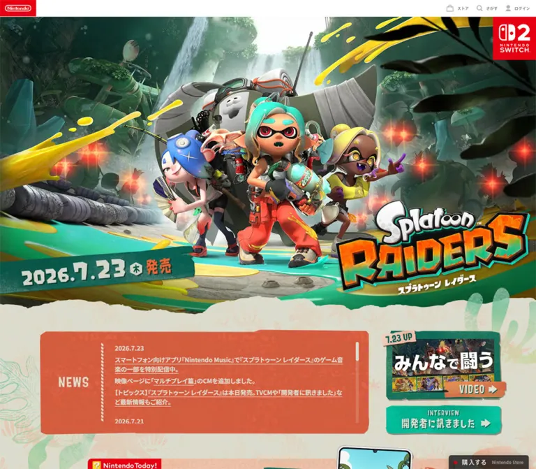
This is the main page of an official game website with linked feature pages, news, product information, and purchasing routes. Its structure supports both exploration and practical product lookup. The opening establishes the world through a large character ensemble in overgrown industrial ruins. Teal and yellow ink cut diagonally across the scene, while the game logo and release date sit on opposite sides of the desktop composition.
The campaign’s second visual language is physical assembly: torn paper, faded botanical prints, rust-colored boards, screws, hazard stripes, technical sketches, and overlapping cutouts. The gadget scene makes this especially explicit, arranging illustrated invention sheets behind a large teal title board and two dimensional equipment renders. At the end, the site returns to orderly product details and Nintendo’s clean white service footer.
The transferable design principle is the relationship between these layers: cinematic imagery creates excitement, distressed signage organizes the story, and restrained corporate utilities preserve familiarity. Mobile layouts actively rearrange that hierarchy instead of merely shrinking a desktop poster.
How to Read This Reference
- Measured means a value appears in the supplied computed styles, custom properties, or element rectangles. Decimal dimensions are CSS pixels and may include transforms.
- Visual estimate means a dimension, color, or appearance was judged from the supplied screenshots. These are not pixel-sampled measurements.
- Calculated means arithmetic derived from recorded measurements. It does not establish an underlying source CSS formula.
- Recommended means guidance for a new implementation. The Quick Start, accessibility additions, suggested breakpoint, and replacement texture techniques belong to this category.
- Token names are descriptive implementation aliases unless explicitly identified as source custom properties.
- Computed font-family declarations identify requested stacks, not proof that every named font file loaded or supplied every glyph.
- Some extracted content belongs to offscreen navigation or utility interfaces. Its presence in the DOM does not establish visibility in the captured state.
- Several image links have a measured height of only 24px because the sampled element is an inline anchor. That number must not be reused as the height of its visible banner artwork.
Tokens — Colors
Default Palette
| Name | Value | Suggested token | Evidence and role |
|---|---|---|---|
| Deep Teal | #006455 |
--color-ink |
Measured body background and product-information text; the campaign’s main structural color |
| Parchment | #dcdccd |
--color-paper |
Measured lower product-section background and news-link text; visible texture modifies its appearance |
| Warm Reversed Copy | #ebe6d9 |
--color-story-copy |
Measured narrative paragraph color |
| Burnt Orange | #d25b3c |
--color-orange |
Measured inline purchase-button fill; visually related to the textured news board |
| Forest Underlay | #355135 |
--color-forest |
Measured hero-section background beneath its imagery |
| Default Body Gray | #3c3c3c |
--color-body |
Measured inherited body text; many campaign components override it |
| Nintendo Red | #e60012 |
--color-brand-red |
Exact floating-purchase icon property; also visually identifies corporate branding and service tiles |
| Utility Wash | rgba(170,190,175,0.52) |
--color-utility-wash |
Measured download-guide background over the product surface |
| Floating Purchase Surface | rgba(6,8,10,0.75) |
--color-floating |
Source purchase property and measured mobile anchor background |
| Floating Purchase Text | #e1e1e1 |
--color-floating-text |
Source purchase text property |
| Footer Caption | #666666 |
--color-footer-caption |
Measured service-category captions |
| Footer Navigation | #555555 |
--color-footer-link |
Measured text within the footer’s secondary links |
| Service Name | #000000 |
--color-service-name |
Measured footer service-name text |
The footer appears white in both screenshots. Its sampled outer footer element has a transparent background, so the visible white belongs to another layer or descendant rather than that measured declaration. #ffffff is also explicitly present in the supplied inline-purchase icon and arrow properties.
Keep the two orange/red roles distinct. Burnt orange belongs to the adventure’s printed surfaces and main inline purchase action. Nintendo red identifies the corporate shell, platform branding, service icons, and the small floating-purchase marker.
Artwork Accents — Visual Estimates
| Appearance | Approximate reference | Use |
|---|---|---|
| Bright turquoise | Approximately #10c5ac |
Ink, character details, equipment, and promotional graphics |
| Ink yellow | Approximately #f2d52b |
Diagonal splashes, clothing, and hazard markings |
| Aged drawing paper | Approximately #b79b75 |
Gadget-scene sketch sheets; actual sheets contain broad tonal variation |
| Drawing ink | Approximately #352b1d |
Technical outlines, hatching, and handwritten annotations |
These accents largely belong to artwork. Do not turn every color in the character renders into an interface token.
The supplied properties also include --swiper-theme-color: #007aff. Its presence does not prove that blue is visible in the captured campaign UI, so it is excluded from the design palette.
Tokens — Typography
Campaign Copy — Desktop
The main desktop stack is:
YakuHanJPs, 'Noto Sans JP', sans-serif
News and some narrative elements reverse the first two entries:
'Noto Sans JP', YakuHanJPs, sans-serif
Campaign paragraphs, news, product names, and product facts typically use weight 700. The result is compact, substantial Japanese copy that can hold its own beside dense imagery. Narrative paragraphs have generous leading; news uses tighter leading to support scanning.
Campaign Copy — Mobile
The supplied mobile computed stack is:
YakuHanJPs, system-ui, -apple-system, 'system-ui', 'Segoe UI', sans-serif
Many campaign elements change to weight 800. Story and product text often gain 0.05em tracking. This is a recorded change in both typography and density; mobile is not simply the desktop font stack at a smaller size.
Corporate Utilities and Footer
The desktop body requests:
YakuHanJPs, Roboto, 'Hiragino Kaku Gothic ProN',
'ヒラギノ角ゴ ProN W3', Arial, nc3Jp, sans-serif
The desktop footer requests Roboto, YakuHanJPs, nc3Jp, sans-serif. The mobile footer uses the system stack listed above. Service categories are regular gray text; service names are black at weight 600.
The root font size is measured at 10px in both snapshots, while the body is 16px / 32px. The Quick Start uses explicit pixel tokens and does not depend on reproducing the original root size.
Graphic Lettering
The game logo, large release numerals, NEWS, and gadget signage use visually distinctive graphic lettering. The screenshots show chunky, irregular shapes, dimensional edges, and printed wear. No corresponding display-font family is established by the supplied text-element styles.
Treat these as artwork requirements. A system-font heading with a heavy weight will reproduce neither the game logo’s outlined depth nor the gadget board’s cut-paper letter shapes. Retain real semantic headings and text equivalents when using graphical titles.
Type Scale
All values below are measured. Sizes and line heights are shown as size / line-height.
| Role | Desktop | Mobile | Weight, desktop → mobile | Tracking notes |
|---|---|---|---|---|
| News links | 16.2 / 25.92px |
15.6 / 24.96px |
700 → 800 |
Normal |
| Introductory story paragraph | 18 / 36px |
13.52 / 27.04px |
700 → 800 |
Normal → 0.676px |
| Other sampled story paragraphs | 18 / 36px |
13.52 / 22.984px |
700 → 800 |
Normal → 0.676px |
| Product platform eyebrow | 18 / 25.2px |
12.48 / 12.48px |
700 → 800 |
0.32px → 0.624px |
| Product title | 32.4 / 48.6px |
18.72 / 18.72px |
700 → 800 |
0.32px → 0.936px |
| Edition and price text | 16.2 / 32.4px |
13.52 / 27.04px |
700 → 800 |
0.324px → 0.676px |
| Inline purchase label | 27 / 37.8px |
18.72 / 26.208px |
700 → 800 |
0.1em at both sizes |
| Product-information action | 21.6 / 30.24px |
16.64 / 23.296px |
700 → 800 |
0.12em at both sizes |
| Download-guide label | 14.4 / 20.16px |
12.48 / 17.472px |
500 → 600 |
0.04em at both sizes |
| Footer service category | 12 / 18px |
13 / 19.5px |
400 → 400 |
Normal |
| Footer service name | 14 / 21px |
14 / 21px |
600 → 600 |
Normal |
| Footer secondary navigation | 13 / 19.5px |
14 / 21px |
400 → 400 |
Normal |
The footer becomes slightly more readable on mobile while several campaign labels become smaller. Preserve this distinction when studying the original; a new implementation can deliberately increase small campaign copy as an accessibility adaptation.
Tokens — Spacing & Shapes
Spacing Scale
The evidence does not expose a complete source spacing system. Repeated measurements support component-specific scales rather than one universal grid.
| Use | Desktop | Mobile | Status |
|---|---|---|---|
| News-section top padding | 36px |
9.75px |
Measured section padding, not the full visual distance to the news board |
| Sampled action-section top padding | 90px |
52px |
Measured |
| Product-content side inset | Variable desktop composition | 26px |
Mobile value measured from the title and action rectangles |
| Footer side inset | 40px for secondary links |
24px |
Measured |
| Footer service-row top inset | 30px |
30px |
Calculated from footer and first-row coordinates |
| Service icon-to-copy gap | 10px |
15px |
Measured flex gap |
| Mobile service-row separation | — | 15px |
Calculated: 70px row pitch minus 55px row height |
| Mobile footer-link separation | — | 20px |
Calculated: 41px pitch minus 21px text-box height |
| Floating purchase edge clearance | Resting inset unresolved | 12px right and bottom |
Calculated from the mobile rectangle |
Several campaign values are consistent with separate design-canvas scales: 18px = 20 × 0.9 on desktop, and 13.52px = 13 × 1.04 on mobile. Those factors also equal 1440 / 1600 and 390 / 375. This is an arithmetic pattern, not a verified source formula. Footer measurements such as 55px service rows and 14px names do not follow a single global proportional scale.
Border Radius
| Element | Desktop | Mobile | Interpretation |
|---|---|---|---|
| Inline purchase action | 7.2px |
8.32px |
Measured |
| Product-information action | 7.2px |
5.2px |
Measured |
| Download-guide action | 5.4px |
5.2px |
Measured |
| Floating purchase anchor | Sampled anchor radius 0px |
Effectively a capsule | Desktop decoration is not fully described by the anchor; mobile has an extremely large computed radius |
| News and feature signs | Irregular cut corners and edges | Irregular cut corners and edges | Visual observation; not a conventional rounded-card system |
| Promotional banner bodies | Approximately 12–16px |
Approximately 10–12px |
Visual estimates; protruding artwork extends beyond the body |
| Menu badge | Octagonal | Octagonal | Graphic silhouette, not a border-radius token |
Layout Measurements
| Element | Desktop 1440 × 1000 | Mobile 390 × 844 |
|---|---|---|
| Full document height | 14,030.38px |
9,923.94px |
| Main-content starting y-coordinate | 39px |
43px |
| Corporate logo anchor | 84 × 37.80px |
93 × 41.84px |
| Hero section rectangle | 1440 × 923.39px |
390 × 530.39px |
| Platform badge | 100 × 100px, flush right at hero top |
50 × 50px, 6px from hero top and viewport right |
| News section starting y-coordinate | 741.89px |
573.39px |
| Lower promotional-banner link width | 990px |
338px |
| Inline purchase action | 351 × 81px |
338 × 67.59px |
| Product-information action | 351 × 54px |
338 × 46.80px |
| Download-guide action | 792 × 45.89px |
338 × 36.39px |
| Footer height | 200.5px |
554px |
| Footer service-row height | 55px |
55px |
Calculated desktop overlap: the hero rectangle ends at 962.39px, while the news section starts at 741.89px, producing a 220.5px overlap between those measured section boxes. The visible torn-paper boundary is irregular and does not coincide with either rectangle. On mobile, the news-section rectangle begins directly at the hero rectangle’s end.
Components
Corporate Header
Role: familiar Nintendo identity and global utilities.
Desktop uses a very shallow white bar with a red logo block at the far left. Store, search, and login controls sit at the far right, using subdued gray icons and small labels. The game’s main content begins at y = 39px.
Mobile changes the entire header to red. The white logo remains left; the utility controls retain their compact right-aligned arrangement. Main content begins at y = 43px. This is a color and proportion change, not merely a narrower white desktop header.
The expanded search content is present in the extracted DOM, including topic suggestions and related articles. It is not visible in the supplied opening screenshots. Its opening behavior and expanded visual design were not exercised.
Art-Directed Hero
Role: immediate recognition of the product, protagonists, and setting.
The desktop composition has several readable layers:
- A dark forest and ruined industrial environment, with waterfalls and atmospheric light near the center.
- A tightly grouped cast, with the main character nearest the viewer and larger mechanical forms behind.
- Yellow and turquoise ink strokes that lead diagonally through the foreground.
- A large outlined game logo at the lower right.
- A green release-date sign at the lower left.
- A red Nintendo Switch 2 badge at the upper right.
The logo occupies roughly the rightmost third of the opening image. The date sign balances it across the bottom. Both remain distinct from the small corporate header.
On mobile, the character group is enlarged relative to viewport width, the game logo moves to a broad centered position below the faces, and the release-date sign becomes a separate centered element beneath the scene. The resulting layout preserves faces, logo legibility, and release information despite the narrow frame.
Implementation guidance: use separate scene, logo, date, and platform layers, or explicitly art-directed desktop/mobile composites. A single flattened desktop image with object-fit: cover cannot reproduce all of the observed rearrangements.
Release-Date Sign
Role: a prominent factual marker integrated into the game world.
The sign uses chunky pale numerals, a distressed teal body, angled edges, and a small orange release label. The visible source date is 2026.7.23.
Desktop places the date on a long slanted board across the lower-left image. Mobile separates the orange 発売日 tab above a centered teal board. This creates a clear transition from the cinematic image into the paper-backed information area.
Use a text equivalent even if the visual numerals are artwork. Do not identify their display font from the live product-information type measurements.
News Board and Editorial Promotions
Role: current updates and routes into related content.
The news board has a worn orange surface, pale heavy text, and a rope-like divider. Its top edge and corners feel cut from a physical sign. On desktop, the NEWS label occupies a narrow left region separated from the update copy by a vertical divider. The first visible news link begins at x ≈ 304.66px.
Mobile moves NEWS to the top center and changes the divider to a horizontal line. The board is approximately 338px wide with 26px page margins; the first link starts at x ≈ 48.36px, leaving roughly 22px of inner clearance. Dates sit above linked descriptions, and the narrow column allows substantial wrapping.
Desktop editorial imagery sits to the right in a roughly 309px-wide area. The DOM includes video and interview destinations. Mobile versions of those link regions are approximately 340px wide, consistent with stacking beneath the news area.
The extracted news entries extend beyond the initially visible portion. The supplied record does not establish whether the complete feed uses internal scrolling, clipping, expansion, or another presentation mechanism. Do not reproduce the entire extraction as an always-visible list without checking the intended component behavior.
Narrative Feature Sections
Role: explain the setting, treasure-hunting loop, support characters, and gadget development.
The rendered text establishes a sequence about the island setting, hostile creatures, treasure hunting, assistance from the supporting cast, and equipment development. Desktop story paragraphs use warm reversed copy at 18px / 36px, weight 700. Mobile uses 13.52px, weight 800, with either 2.0 or 1.7 line-height ratios in the sampled paragraphs.
The measured desktop section rectangles are large and sometimes overlap. Text positions are intentionally asymmetric: one introductory paragraph sits toward the left, while later paragraphs occupy the right side. Mobile paragraphs move into narrower placements with changed line breaks.
Only the gadget scene has a supplied intermediate screenshot. The visual composition of the other narrative sections cannot be fully reconstructed from their text and rectangles alone. Their measured typography is reusable; their unseen artwork and motion are not established here.
Gadget Workshop Scene
Role: make equipment development feel tactile and inventive.
This is the clearest expression of the page’s collage language. Numerous aged drawing sheets overlap across nearly the full desktop frame. Each sheet contains dark technical linework: nozzles, containers, flexible tubes, mechanical arms, and other improvised devices. Paper edges are rough, with uneven staining and visible folds or wear.
The foreground assembly contains:
- A small orange tab carrying
特別な道具. - A large chipped teal board carrying
ガジェット. - A short yellow-and-dark hazard strip below the title board.
- A larger ochre backing plate carrying
ガラクタを集めてand開発 × 強化. - A turquoise funnel-like gadget overlapping the left edge.
- A jointed, lamp-like device overlapping the right edge.
The visible title board is approximately 630px wide in the desktop screenshot; the broader backing plate is approximately 750px wide. These are visual estimates, not DOM measurements. The equipment extends beyond the sign boundaries, creating depth through occlusion and cast shadows.
The scene is a composed illustrated environment. Avoid treating each background sketch as a separate navigable card. A mobile screenshot of this scene was not supplied, so its exact mobile layering remains unverified.
Gadget Media Track
Role: provide additional equipment demonstrations or media entries.
The DOM contains repeated button rectangles arranged horizontally, including offscreen instances. A central sampled button measures approximately 712.80 × 421.19px on desktop and 290.67 × 173.16px on mobile. The mobile instance starts at x ≈ 50.19px, nearly centering it in the 390px viewport.
This geometry supports a horizontal media-track interpretation. It does not verify dragging, autoplay, looping, playback, or the number of unique entries. Repeated offscreen instances may include duplicates. The supplied Swiper-related properties are supporting implementation clues, not evidence of any particular visible control scheme.
Local Menu Badge
Role: persistent access to the game’s internal navigation.
Scrolled screenshots show an orange-red octagonal badge near the upper right. A pale outer rim, darker edge shading, three horizontal bars, and the word MENU make it resemble a mounted metal sign.
The badge remains in the upper-right region in the supplied intermediate and page-end captures, consistent with a floating navigation control. The corporate bar is absent from those scrolled frames. The exact positioning rule and appearance threshold were not supplied.
The DOM includes offscreen links to the game home, introduction, game cycle, support, gadgets, videos, multiplayer information, purchase, and product information. Their offscreen coordinates are not a visual inspection of an open drawer. Do not infer its backdrop, opening direction, focus behavior, or complete layout from those coordinates alone.
Product Information and Inline Purchase
Role: consolidate release date, editions, prices, purchasing, and support information.
This component is described primarily from computed styles and DOM geometry; the supplied page-end images show its lower utility rows and promotions rather than the complete specification block.
The section uses parchment with deep teal text. A platform eyebrow precedes the product title. Desktop specification text occupies the middle area, while purchase and product-information actions form a 351px-wide column to its right.
The primary action has a burnt-orange fill, a 7.2px radius, and a two-level label: 購入する above the smaller Nintendo Store identifier. The sampled main label is 27px / 37.8px, weight 700, with 0.1em tracking. The secondary 商品情報 action is shorter and has a transparent measured background with teal text.
Mobile places the heading, facts, and actions in a 338px-wide column with 26px side margins. The purchase action becomes approximately 67.6px high. Rating and amiibo link graphics appear beside the release-information region according to their measured positions.
The inspected product facts are a July 23, 2026 release, a 6,480-yen download edition, and a 7,480-yen packaged edition, including tax. These are captured content values, not reusable design tokens.
Download, Online-Service, and Update Rows
Role: practical information immediately below the purchase block.
The download guide is a pale green translucent strip with centered teal copy and a small right-side arrow. Desktop width is 792px; mobile width is 338px.
The online-service notice is framed by thin teal rules. Desktop places the Nintendo Switch Online mark to the left of the sentence. Mobile centers the mark above a wrapped explanation. The linked service name remains part of the sentence rather than becoming a separate promotional button.
The update-data link is a quieter left-aligned row with a small circular arrow marker. Preserve this hierarchy: purchase first, product details second, operational guidance afterward.
Hardware Bundle and amiibo Banners
Role: related-product navigation at the end of the campaign content.
The two banners share a centered 990px desktop width and a 338px mobile width, but use different compositions.
The hardware bundle combines a teal upper field, an orange lower strip, a protruding retail-box image, a pale label strip, large white product lettering, release information, and price. The supplied mobile page-end capture shows only its lower portion, so the complete mobile composition is not established.
The amiibo banner is fully visible at both sizes. Desktop arranges figurines, the amiibo logo, and release information across one broad white body. The figurines protrude above that body. Mobile places figurines and logo across the top, then separates the release date into a lower full-width row with a diagonal striped rule.
These banners require art direction, not just proportional resizing. Keep logos and product figures uncropped; reserve object-fit: cover for scene imagery where cropping is intentional.
Floating Purchase Control
Role: a compact purchasing route during browsing.
The mobile control is a dark translucent capsule at the bottom right, measured at 128 × 43.98px, with 12px right and bottom clearances. It carries a red circular marker, pale purchase text, and a smaller Nintendo Store identifier.
The desktop sampled anchor is approximately 208.72 × 50.58px at x = 1212.31px and y = 964.16px. It extends below the 1000px viewport in that snapshot, matching its partial appearance at the screenshot edge. This does not establish a stable desktop bottom inset or intended resting position.
Source properties include nominal widths of 198, 192, and 156, plus aspect values. Those unitless declarations do not equal every measured rendered width. Use the recorded rectangles for the inspected state, and treat the width properties as source configuration rather than direct CSS-pixel dimensions.
The control is not visible in the supplied page-end screenshots. Its exact visibility condition was not exercised.
Corporate Footer
Role: transition from the game world into Nintendo’s wider services and navigation.
A clean white surface follows the patterned campaign background. Four service links use red square icons, gray category captions, and black semibold service names: Nintendo Today!, Nintendo Switch Online, Nintendo Music, and Nintendo Store.
Desktop places the services in one horizontal row. Each sampled row is 55px high, with a 10px icon-to-copy gap. Below a fine gray divider, secondary links align left and the copyright sits at the far right.
Mobile stacks the four services with 15px vertical gaps and a 15px icon-to-copy gap. The three secondary links become centered rows, followed by another divider and centered copyright. The footer grows from 200.5px to 554px high.
This footer intentionally has less texture, less typographic weight, and more regular alignment than the campaign above it.
Tokens — Motion & Interaction
The supplied record includes transition declarations and settled screenshots. It does not include a verified before-and-after interaction sequence for the local menu, gadget media, multiplayer view, or purchase controls.
| Target | Recorded declaration | What is established | What remains unverified |
|---|---|---|---|
| News links | 0.2s |
A transition duration is defined | Changed property, trigger, and visual endpoint |
| Corporate related-topic links | opacity 0.15s linear |
An opacity transition is defined | Hover opacity and actual exercised state |
| Sampled local navigation button | opacity 0.1s, visibility 0.3s, transform 0.45s, right 0.275s ease-in-out |
Multiple state-change properties are defined | Open/close sequence, transform distance, and scroll threshold |
| Desktop floating purchase anchor | transform 0.4s cubic-bezier(0.19, 1, 0.22, 1) |
A transform transition with strong easing is defined | Its trigger and resting transform |
| Mobile floating purchase anchor | none |
No transition on the sampled anchor | Possible child or script-driven effects |
| Inline purchase and product-information actions | 0.3s |
Transition duration is defined | Hover/pressed styling |
| Download-guide action | scale 0.2s |
Scale is the transitioning property | Target scale and trigger |
| Gadget media buttons | opacity 0.2s |
Opacity transition is defined | Playback, modal, or selection behavior |
The sampled elements report animation: none. This does not prove that the complete page is static: descendants, pseudo-elements, media, and script-driven animation are not comprehensively represented by the excerpt.
The capture process waited at least five seconds initially, checked layout and image readiness, and conservatively awaited finite motion within time limits. Perpetual animations were temporarily paused for readiness checks and then resumed. Therefore, the still captures are useful for settled composition, not for inventing animation timing or choreography.
Recommended adaptation: use short opacity and transform feedback for controls, preserve stable reading positions, and let the artwork carry most of the visual energy. Any parallax, automatic carousel advance, animated ink, or looping character motion would require additional evidence or an explicitly new creative decision.
Surfaces
| Layer | Appearance | Structural purpose |
|---|---|---|
| Scenic world | Dark forest, ruins, atmospheric light, vivid ink | Establishes scale and adventure |
| Paper canvas | Warm gray-beige with faded botanical and print textures | Connects news, practical information, and promotions |
| News board | Worn orange with pale text and rope-like rules | Makes updates feel like mounted notices |
| Feature signage | Teal and ochre boards, chipped edges, fasteners | Gives section headings a physical place in the world |
| Drawing sheets | Aged tan paper with technical linework | Makes gadget development visually understandable |
| Utility strip | Translucent muted green with modest rounding | Separates support information without competing with purchase |
| Floating purchase | Nearly black translucent capsule or compact panel | Remains readable over variable imagery |
| Corporate footer | White, fine gray rules, red service icons | Provides a calm and recognizable endpoint |
There is no evidence of a general soft-shadow card system. Depth comes mainly from rendered objects, overlapping paper, graphic bevels, and local cast shadows. The translucent purchase control is a simple dark overlay; a backdrop-blur treatment was not established.
Imagery
The opening depends on high-quality dimensional character and environment artwork. Faces and silhouettes remain readable against the dark forest. Bright ink provides directional movement, and small red enemy lights add points of tension behind the protagonists.
The paper sections introduce a different material scale: fibers, print wear, faded linework, torn edges, and stained drawing sheets. In the gadget scene, the contrast between monochrome technical sketches and fully colored equipment makes the inventions feel tangible.
Use ordinary smooth image rendering for the CG and product graphics. The texture is worn print and physical material, not deliberately pixelated bitmap art.
Observed Asset References
The supplied evidence does not include image resource URLs, intrinsic image dimensions, or a complete asset manifest. No filenames can be reliably specified.
| Asset group | Observed content | Reuse guidance |
|---|---|---|
| Hero scene | Character ensemble, forest ruins, waterfalls, colored ink | Supply desktop/mobile art direction with protected face and silhouette regions |
| Game logo | White outlined upper lettering and large dimensional orange/teal title | Preserve the authored logo and its clear silhouette |
| Release sign | Teal board, orange tab, pale numerals | Keep its mobile separation from the scene |
| Paper treatment | Torn boundary and faded botanical printing | Use low-contrast decorative layers behind readable content |
| Gadget background | Overlapping technical sketch sheets | Preserve variation in rotation, age, edge shape, and drawing density |
| Gadget foreground | Two dimensional devices, teal title board, ochre backing | Maintain overlap and local shadows |
| Product promotions | Hardware retail box, figurines, platform and amiibo branding | Preserve logos and object proportions; allow controlled protrusion |
| Corporate service icons | Four red square tiles with recognizable symbols | Keep the clean utility style separate from distressed campaign signs |
Use authorized artwork when available. CSS can reproduce the layout and simple surfaces, but cannot substitute for the character rendering, equipment drawings, or graphic title lettering.
Layout & Responsive Behavior
Desktop Composition
The page is approximately 14,030px tall at the inspected desktop viewport. Broad scene sections, overlapping boundaries, and large feature assemblies establish a long narrative rhythm. It is not organized as a repeated grid of uniform cards.
The opening balances the logo and release sign horizontally. The news area pairs a broad update board with narrower editorial imagery. Lower product details align specification text beside an action column, followed by centered promotional banners and a compact corporate footer.
Measured section overlaps should be interpreted alongside the artwork. A rectangular DOM box can extend behind the next section, while a torn edge, transparent cutout, or overlapping object determines the visible boundary.
Mobile Composition
At 390px wide, the document measures approximately 9,924px tall. The reduction in total height reflects responsive artwork and section sizing as well as text reflow; it does not establish a shorter content inventory.
| Component | Observed mobile change |
|---|---|
| Corporate header | White desktop bar becomes a full red strip |
| Hero | Characters occupy more of the width; logo becomes centered and broad |
| Release information | Date sign moves below the main scenic composition |
| News | Left-side title and vertical divider become a top title and horizontal divider |
| Campaign typography | System stack and heavier weights replace the sampled desktop campaign stack |
| Product block | Facts and actions use a 338px-wide column with 26px margins |
| Online-service notice | Brand mark stacks above wrapped copy |
| amiibo promotion | Single desktop row becomes an upper image/logo row and lower date row |
| Corporate footer | Four services stack; secondary navigation and copyright become centered |
| Floating purchase | Compact 128px-wide capsule with 12px edge clearances |
Only the 1440px and 390px widths were inspected. Tablet layouts, landscape phones, breakpoint values, and intermediate interpolation are not established. A 48rem breakpoint in the Quick Start is a recommendation, not a recovered source value.
Recommended implementation priorities are to preserve faces and logos during cropping, prevent decorative overlaps from blocking links, and keep fixed controls clear of safe areas and focused content. The complete gadget scene needs a separate mobile composition decision because its mobile visual state was not supplied.
Do’s and Don’ts
Do
- Build the campaign around deep teal
#006455, parchment#dcdccd, and burnt orange#d25b3c. - Give cinematic artwork enough scale to establish characters and setting immediately.
- Preserve independent scene, logo, release-sign, and platform-badge placement.
- Use worn boards, torn paper, technical sketches, and local overlaps to organize feature content.
- Keep ordinary Japanese campaign copy heavy and give narrative paragraphs generous leading.
- Recompose the mobile hero and promotional banners deliberately.
- Preserve real product facts and support links as readable text.
- Keep the white corporate footer visually calmer than the campaign.
- Distinguish measured transition declarations from demonstrated interaction behavior.
- Use semantic text alternatives for graphic lettering and image-based navigation.
Don’t
- Don’t replace the illustrated world with a generic headline-and-card layout.
- Don’t crop faces, product logos, figurines, or release information to force one image across all viewports.
- Don’t guess a display-font name from the logo or large gadget lettering.
- Don’t apply one proportional scale to every campaign and corporate component.
- Don’t turn background drawing sheets into unrelated interactive cards.
- Don’t add uniform rounded cards, glass blur, or broad soft shadows to every section.
- Don’t use the Swiper blue variable as a visible brand-color finding.
- Don’t treat 24px inline-anchor rectangles as banner-image heights.
- Don’t infer autoplay, parallax, looping, or a tested drawer interaction from still screenshots.
- Don’t reproduce the desktop purchase anchor’s partial clipping as an intentional resting layout.
Recommended Implementation Additions
These are recommendations for a new implementation, not verified features of the inspected website.
- Give graphical navigation and the menu control accessible names. Empty extracted text alone does not establish whether the original already has suitable accessible naming.
- Use real heading elements for section titles, even when their visible treatment is image-based.
- Preserve dates, prices, edition labels, and requirements as selectable text or equivalent accessible content.
- Test text contrast against the actual textured surfaces. Small pale text on orange may need a darker backing or a stronger solid action color;
#9e3924is one proposed alternative for compact action text. - Increase small campaign prose when necessary, especially the measured 13.52px mobile narrative copy. Preserve the original spacing character while improving readability.
- Give compact utility actions at least a 44px target height. The measured mobile download strip is only about 36.4px high.
- If implementing a drawer or modal, add keyboard operation, focus management, a clear close control, and correct background interaction handling.
- Keep persistent purchase controls within the viewport and clear of safe-area insets. Verify that they do not cover the final line of news or focused links.
- Provide reduced-motion behavior and explicit media controls for any newly implemented animation or video.
- Load the hero at high priority, reserve image dimensions to prevent layout shifts, and defer below-the-fold media where appropriate.
Agent Prompt Guide
Quick Color Reference
- Campaign structure and product text:
#006455. - Paper base and pale news copy:
#dcdccd. - Narrative copy over dark scenes:
#ebe6d9. - Main inline purchase fill:
#d25b3c. - Corporate and platform accents:
#e60012. - Floating purchase surface:
rgba(6,8,10,0.75)with#e1e1e1text. - Sketch-paper brown, bright turquoise, and ink yellow belong primarily to artwork; their reference values are estimates.
Overall Prompt
“Create a Japanese game-product website inspired by the inspected Splatoon Raiders page. Build a cinematic opening from authorized dimensional character artwork in overgrown industrial ruins, with diagonal turquoise and yellow ink, an independently positioned game logo, a teal release-date sign, and a red platform badge. Continue into warm parchment with faded botanical printing, a distressed burnt-orange news board, and large feature scenes assembled from technical sketches, worn teal signage, ochre backing plates, and overlapping equipment renders. Use deep teal #006455, parchment #dcdccd, orange #d25b3c, and heavy Japanese sans-serif copy. Recompose the hero, release sign, and product banners for mobile. End with practical product information and a clean white corporate service footer. Keep motion restrained unless specific behavior is separately provided.”
Example Component Prompts
- Hero: “Arrange a large character ensemble in a dark tropical industrial environment. On desktop, place a dimensional game logo at the lower right and a slanted teal release sign at the lower left. On mobile, enlarge the ensemble, center the logo below the faces, and move the release sign beneath the scenic frame. Protect all key faces and lettering from cropping.”
- News board: “Create a worn orange notice board with pale bold Japanese news text and dates. Desktop has a narrow
NEWSlabel region with a vertical rope-like divider; mobile places the label above a horizontal divider. Use clipped decorative corners while keeping link focus indicators visible.” - Gadget feature: “Build a mechanic’s workshop collage from aged technical drawing sheets. Place a chipped teal title board over an ochre backing plate, add a small orange category tab and hazard stripe, and overlap two dimensional equipment renders across the edges. Preserve monochrome sketch density behind the colorful foreground.”
- Purchase block: “Use parchment and deep teal for product facts, with edition prices and release information grouped clearly. Add a burnt-orange purchase action with a prominent
購入するlabel and smaller Nintendo Store line, followed by a quieter商品情報action and a pale green download-guide strip.” - amiibo-style promotion: “Create an uncropped product-figure banner on a white body. Desktop arranges figures, brand mark, and release information in one row. Mobile keeps figures and brand mark above a full-width date row separated by a diagonal printed rule.”
- Corporate footer: “Create a clean white footer with four service links, each combining a 55px red icon tile, gray category caption, and black semibold service name. Use one desktop row and a mobile stack, then thin gray dividers and restrained secondary navigation.”
Quick Start
CSS Custom Properties
This is an implementation adaptation, not recovered source CSS. It uses measured colors and endpoint typography, approximate component geometry, a recommended breakpoint, and a conventional root size. The hero’s independent artwork layers are essential. Texture properties default to none; assign actual project assets when available.
Use .game-page for the campaign wrapper. The hero expects .hero-scene, .hero-wordmark, .release-sign, and .platform-badge layers. The news area expects a .news-layout containing .news-sheet and a promotional column. Product, banner, and footer classes can be used independently.
:root {
  /* Measured campaign colors */
  --color-ink: #006455;
  --color-paper: #dcdccd;
  --color-story-copy: #ebe6d9;
  --color-orange: #d25b3c;
  --color-forest: #355135;
  --color-brand-red: #e60012;
  --color-utility-wash: rgba(170, 190, 175, 0.52);
  --color-floating: rgba(6, 8, 10, 0.75);
  --color-floating-text: #e1e1e1;

  /* Requested source stacks; font files are not bundled here */
  --font-game: YakuHanJPs, 'Noto Sans JP', sans-serif;
  --font-mobile: YakuHanJPs, system-ui, -apple-system,
    'Segoe UI', sans-serif;
  --font-corporate: Roboto, YakuHanJPs, nc3Jp, sans-serif;

  /* Measured desktop typography */
  --weight-game: 700;
  --size-news: 16.2px;
  --size-story: 18px;
  --leading-story: 2;
  --tracking-story: normal;
  --size-product-title: 32.4px;
  --size-purchase: 27px;

  /* Recommended layout aliases */
  --gutter: 26px;
  --content-wide: 1226px;
  --content-promos: 990px;
  --hero-overlap: 15.3125vw;
  --paper-texture: none;
  --orange-texture: none;
  --action-fill: var(--color-orange);

  /* Recorded desktop purchase transition */
  --motion-purchase: 400ms cubic-bezier(0.19, 1, 0.22, 1);
}

* {
  box-sizing: border-box;
}

body {
  margin: 0;
}

.game-page {
  color: var(--color-ink);
  background: var(--color-ink);
  font: 16px / 2 var(--font-game);
}

.game-page img {
  display: block;
  max-width: 100%;
}

.content-shell {
  width: min(calc(100% - 2 * var(--gutter)), var(--content-wide));
  margin-inline: auto;
}

/* Recommended shell matching the observed header proportions */
.corporate-header {
  position: relative;
  z-index: 10;
  display: flex;
  align-items: center;
  justify-content: space-between;
  min-height: 39px;
  background: #fff;
  color: #777;
  font-family: var(--font-corporate);
}

.corporate-logo {
  display: grid;
  place-items: center;
  width: 84px;
  min-height: 38px;
  background: var(--color-brand-red);
}

.corporate-utilities {
  display: flex;
  align-items: center;
  gap: 18px;
  padding-inline: 8px;
}

/* Scene artwork and graphic labels remain separate layers */
.campaign-hero {
  position: relative;
  aspect-ratio: 1440 / 923.39;
  background: var(--color-forest);
}

.hero-scene {
  position: absolute;
  inset: 0;
  overflow: hidden;
}

.hero-scene img {
  width: 100%;
  height: 100%;
  object-fit: cover;
  object-position: center;
}

.hero-wordmark,
.release-sign,
.platform-badge {
  position: absolute;
  z-index: 2;
}

.hero-wordmark {
  right: 2%;
  bottom: 20%;
  width: 36.5%;
}

.release-sign {
  left: 0;
  bottom: 20.4%;
  width: 36%;
}

.platform-badge {
  top: 0;
  right: 0;
  width: 100px;
}

/* Approximate overlap; the actual torn edge needs authored artwork */
.news-region {
  position: relative;
  z-index: 1;
  isolation: isolate;
  margin-top: calc(-1 * var(--hero-overlap));
  padding: 130px 0 60px;
}

.news-region::before {
  content: '';
  position: absolute;
  z-index: -1;
  inset: 0;
  background-color: var(--color-paper);
  background-image: var(--paper-texture);
  clip-path: polygon(
    0 58px, 8% 72px, 19% 49px, 31% 69px,
    43% 44px, 55% 66px, 68% 51px, 82% 70px,
    94% 45px, 100% 58px, 100% 100%, 0 100%
  );
}

.news-layout {
  display: grid;
  grid-template-columns: minmax(0, 1fr) 309px;
  align-items: start;
  gap: 48px;
}

.news-sheet {
  position: relative;
  isolation: isolate;
  display: grid;
  grid-template-columns: 116px minmax(0, 1fr);
  gap: 32px;
  padding: 36px 48px;
  color: var(--color-paper);
}

/* Clip only decoration so focus rings can remain visible */
.news-sheet::before {
  content: '';
  position: absolute;
  z-index: -1;
  inset: 0;
  background-color: var(--color-orange);
  background-image: var(--orange-texture);
  clip-path: polygon(
    12px 0, calc(100% - 8px) 0, 100% 10px,
    100% calc(100% - 12px), calc(100% - 14px) 100%,
    0 100%, 0 12px
  );
}

.news-heading {
  margin: 0;
  padding-right: 24px;
  border-right: 4px dashed currentColor;
  font-size: 26px;
  line-height: 1.2;
}

.news-items {
  margin: 0;
  padding: 0;
  list-style: none;
  font-size: var(--size-news);
  font-weight: var(--weight-game);
  line-height: 1.6;
}

.news-items li + li {
  margin-top: 24px;
}

.news-items time {
  display: block;
  margin-bottom: 4px;
}

.news-items a {
  color: inherit;
  text-underline-offset: 0.2em;
}

.story-copy {
  max-width: 32em;
  color: var(--color-story-copy);
  font-size: var(--size-story);
  font-weight: var(--weight-game);
  line-height: var(--leading-story);
  letter-spacing: var(--tracking-story);
}

.product-section {
  padding-block: 60px;
  background-color: var(--color-paper);
  background-image: var(--paper-texture);
}

/* Simplified reusable product grid, not the exact source alignment */
.product-details {
  display: grid;
  grid-template-columns: minmax(0, 1fr) 351px;
  gap: 36px 48px;
  width: min(calc(100% - 2 * var(--gutter)), 801px);
  margin-inline: auto;
}

.product-title {
  margin: 0 0 24px;
  font-size: var(--size-product-title);
  font-weight: var(--weight-game);
  line-height: 1.5;
}

.product-actions {
  display: grid;
  align-content: start;
  gap: 14.4px;
}

.purchase-inline,
.product-info-link,
.download-guide {
  display: flex;
  align-items: center;
  justify-content: center;
  width: 100%;
  text-align: center;
  text-decoration: none;
}

.purchase-inline {
  min-height: 81px;
  border-radius: 7.2px;
  color: var(--color-paper);
  background: var(--action-fill);
  font-size: var(--size-purchase);
  font-weight: var(--weight-game);
  line-height: 1.4;
  letter-spacing: 0.1em;
}

.purchase-inline small {
  display: block;
  font-size: 12px;
  letter-spacing: normal;
}

.product-info-link {
  min-height: 54px;
  border-radius: 7.2px;
  color: var(--color-ink);
  font-size: 21.6px;
  font-weight: var(--weight-game);
  letter-spacing: 0.12em;
}

.download-guide {
  grid-column: 1 / -1;
  min-height: 45.9px;
  border-radius: 5.4px;
  color: var(--color-ink);
  background: var(--color-utility-wash);
  font-size: 14.4px;
  font-weight: 500;
  line-height: 1.4;
  letter-spacing: 0.04em;
}

/* Optional stronger action fill for compact text */
.readable-actions {
  --action-fill: #9e3924;
}

.campaign-promos {
  display: grid;
  gap: 60px;
  width: min(calc(100% - 2 * var(--gutter)), var(--content-promos));
  margin: 60px auto 70px;
}

.promo img {
  width: 100%;
  height: auto;
}

/* Recommended resting position avoids the sampled desktop clipping */
.floating-purchase {
  position: fixed;
  z-index: 40;
  right: 18px;
  bottom: calc(18px + env(safe-area-inset-bottom, 0px));
  display: flex;
  align-items: center;
  justify-content: center;
  gap: 8px;
  width: 208.72px;
  min-height: 50.58px;
  border-radius: 6px;
  color: var(--color-floating-text);
  background: var(--color-floating);
  font: 700 14px / 1.2 var(--font-corporate);
  text-decoration: none;
  transition: transform var(--motion-purchase);
}

.corporate-footer {
  padding: 30px 40px;
  color: #555;
  background: #fff;
  font: 14px / 1.5 var(--font-corporate);
}

.service-grid {
  display: grid;
  grid-template-columns: repeat(4, minmax(0, 1fr));
  gap: 12px;
  max-width: 1212px;
  margin-inline: auto;
}

.service-link {
  display: flex;
  align-items: center;
  gap: 10px;
  min-height: 55px;
  color: inherit;
  text-decoration: none;
}

.service-icon {
  flex: 0 0 55px;
  width: 55px;
  height: 55px;
}

.service-category {
  margin: 0;
  color: #666;
  font-size: 12px;
  line-height: 1.5;
}

.service-name {
  margin: 0;
  color: #000;
  font-size: 14px;
  font-weight: 600;
  line-height: 1.5;
}

.footer-links {
  display: flex;
  flex-wrap: wrap;
  align-items: center;
  gap: 24px 40px;
  margin-top: 30px;
  padding-top: 32px;
  border-top: 1px solid #e9e9e9;
}

/* Recommended two-color focus treatment */
.game-page :focus-visible {
  outline: 3px solid #fff;
  outline-offset: 3px;
  box-shadow: 0 0 0 6px var(--color-ink);
}

/* Recommended breakpoint; only the endpoint views were inspected */
@media (max-width: 48rem) {
  :root {
    --font-game: var(--font-mobile);
    --font-corporate: var(--font-mobile);
    --weight-game: 800;
    --size-news: 15.6px;
    --size-story: 13.52px;
    --leading-story: 1.7;
    --tracking-story: 0.05em;
    --size-product-title: 18.72px;
    --size-purchase: 18.72px;
    --hero-overlap: 0px;
  }

  .corporate-header {
    min-height: 43px;
    color: #fff;
    background: var(--color-brand-red);
  }

  .corporate-logo {
    width: 93px;
    min-height: 42px;
  }

  .campaign-hero {
    aspect-ratio: 390 / 530.39;
  }

  .hero-wordmark {
    right: 7%;
    bottom: 1%;
    width: 86%;
  }

  .release-sign {
    left: 13.5%;
    bottom: -110px;
    width: 73%;
  }

  .platform-badge {
    top: 6px;
    right: 6px;
    width: 50px;
  }

  .news-region::before {
    clip-path: polygon(
      0 14px, 15% 24px, 32% 11px, 50% 22px,
      68% 12px, 85% 24px, 100% 13px,
      100% 100%, 0 100%
    );
  }

  .news-layout,
  .product-details {
    grid-template-columns: minmax(0, 1fr);
    gap: 24px;
  }

  .news-sheet {
    display: block;
    padding: 20px 22px;
  }

  .news-heading {
    margin-bottom: 14px;
    padding: 0 0 12px;
    border-right: 0;
    border-bottom: 4px dashed currentColor;
    text-align: center;
  }

  .story-copy--intro {
    line-height: 2;
  }

  .product-title {
    line-height: 1;
    letter-spacing: 0.05em;
  }

  .purchase-inline {
    min-height: 67.6px;
    border-radius: 8.32px;
  }

  .product-info-link {
    min-height: 46.8px;
    border-radius: 5.2px;
    font-size: 16.64px;
  }

  .download-guide {
    /* Recommended target size exceeds the measured 36.39px */
    min-height: 44px;
    border-radius: 5.2px;
    font-size: 12.48px;
    font-weight: 600;
  }

  .campaign-promos {
    gap: 36px;
    margin-block: 40px;
  }

  .floating-purchase {
    right: 12px;
    bottom: calc(12px + env(safe-area-inset-bottom, 0px));
    width: 128px;
    min-height: 44px;
    border-radius: 999px;
    transition: none;
  }

  .corporate-footer {
    padding-inline: 24px;
  }

  .service-grid {
    grid-template-columns: minmax(0, 1fr);
    gap: 15px;
  }

  .service-link {
    gap: 15px;
  }

  .service-category {
    font-size: 13px;
  }

  .footer-links {
    flex-direction: column;
    gap: 20px;
    text-align: center;
  }
}

/* Recommended fallback for CSS motion added to this adaptation */
@media (prefers-reduced-motion: reduce) {
  .game-page *,
  .game-page *::before,
  .game-page *::after {
    animation: none !important;
    transition: none !important;
    scroll-behavior: auto !important;
  }
}
The dashed news divider and polygon paper edges are structural placeholders. Replace them with suitable authored decorative assets for a closer material match. Navigation state, media controls, graphic heading alternatives, and any script-driven reduced-motion behavior require separate implementation. Test the hero layer placements against the actual assets rather than assuming identical transparent padding.
Tailwind v4 Token Mapping
Optional mapping for a project that already uses Tailwind v4. This does not imply that the inspected website uses Tailwind. Define the custom properties above first.
@theme inline {
  --color-campaign-ink: var(--color-ink);
  --color-campaign-paper: var(--color-paper);
  --color-campaign-orange: var(--color-orange);
  --color-campaign-copy: var(--color-story-copy);
  --color-platform-red: var(--color-brand-red);
  --color-purchase-overlay: var(--color-floating);

  --font-campaign: var(--font-game);
  --font-utility: var(--font-corporate);

  --text-news: var(--size-news);
  --text-story: var(--size-story);
  --text-product: var(--size-product-title);
  --text-purchase: var(--size-purchase);

  --spacing-page-gutter: var(--gutter);
  --spacing-service-icon: 55px;
  --radius-campaign-action: 8px;
}
Sources & Evidence
- Inspected original page: the supplied page title, rendered content, link destinations, computed styles, custom properties, and screenshots establish the design findings in this document. The recorded final URL is identical.
- Capture record: September 12, 2026,
2026-09-12T07:16:39.630Z; HTTP 200. This is the supplied retrieval timestamp, not an independently recorded timestamp for each image. - Desktop evidence: 1440 × 1000 CSS pixels; opening, gadget-scene, and page-end captures; recorded document height approximately 14,030px.
- Mobile evidence: 390 × 844 CSS pixels; opening and page-end captures; recorded document height approximately 9,924px.
- Original-page identity: the page title identifies Nintendo, the footer displays
©Nintendo, and the rendered page links to the Nintendo Japanese homepage. No web-production credit is established by the supplied original-page evidence. - Interaction scope: initial readiness observation and scroll traversal were recorded. No supplied action log verifies menu opening, expanded search, multiplayer presentation, video playback, gadget-track operation, or action hover endpoints.
- Inspection limitations: source stylesheets and image files were not independently opened. No additional browsing or file access was performed for this reference. Complete image resource URLs, exact breakpoints, full animation behavior, intermediate responsive layouts, and the mobile gadget-scene composition remain unverified. SharedWorkers and service workers were disabled during the supplied inspection.
This reference describes the current page represented by the supplied September 12, 2026 evidence. Measurements, screenshot estimates, and recommended implementation choices are identified separately throughout.
# Splatoon Raiders — Style Reference

> A tropical salvage adventure assembled from cinematic characters, battered signs, and a mechanic’s paper workshop.

**Website:** [Splatoon Raiders — Japanese official website](https://www.nintendo.com/jp/games/switch2/aadla/index.html)
**Original URL:** https://www.nintendo.com/jp/games/switch2/aadla/index.html
**Final URL:** https://www.nintendo.com/jp/games/switch2/aadla/index.html
**Response:** HTTP 200; the recorded URL did not change.
**Theme:** dark scenic imagery alternating with light parchment, teal signage, and burnt-orange information panels.
**Inspected:** September 12, 2026, at 07:16:39.630 UTC / 16:16:39.630 JST, according to the supplied capture record.
**Viewports:** desktop 1440 × 1000 CSS pixels; mobile 390 × 844 CSS pixels.
**Scope:** three desktop captures covering the opening, a gadget feature scene, and the page end; two mobile captures covering the opening and page end; rendered text, links, element rectangles, computed styles, and custom properties for both viewports. Linked pages and opened navigation, search, multiplayer, or playback states are outside the inspected scope.

This is the main page of an official game website with linked feature pages, news, product information, and purchasing routes. Its structure supports both exploration and practical product lookup. The opening establishes the world through a large character ensemble in overgrown industrial ruins. Teal and yellow ink cut diagonally across the scene, while the game logo and release date sit on opposite sides of the desktop composition.

The campaign’s second visual language is physical assembly: torn paper, faded botanical prints, rust-colored boards, screws, hazard stripes, technical sketches, and overlapping cutouts. The gadget scene makes this especially explicit, arranging illustrated invention sheets behind a large teal title board and two dimensional equipment renders. At the end, the site returns to orderly product details and Nintendo’s clean white service footer.

The transferable design principle is the relationship between these layers: cinematic imagery creates excitement, distressed signage organizes the story, and restrained corporate utilities preserve familiarity. Mobile layouts actively rearrange that hierarchy instead of merely shrinking a desktop poster.

## How to Read This Reference

- **Measured** means a value appears in the supplied computed styles, custom properties, or element rectangles. Decimal dimensions are CSS pixels and may include transforms.
- **Visual estimate** means a dimension, color, or appearance was judged from the supplied screenshots. These are not pixel-sampled measurements.
- **Calculated** means arithmetic derived from recorded measurements. It does not establish an underlying source CSS formula.
- **Recommended** means guidance for a new implementation. The Quick Start, accessibility additions, suggested breakpoint, and replacement texture techniques belong to this category.
- Token names are descriptive implementation aliases unless explicitly identified as source custom properties.
- Computed font-family declarations identify requested stacks, not proof that every named font file loaded or supplied every glyph.
- Some extracted content belongs to offscreen navigation or utility interfaces. Its presence in the DOM does not establish visibility in the captured state.
- Several image links have a measured height of only 24px because the sampled element is an inline anchor. That number must not be reused as the height of its visible banner artwork.

## Tokens — Colors

### Default Palette

| Name | Value | Suggested token | Evidence and role |
| --- | --- | --- | --- |
| Deep Teal | `#006455` | `--color-ink` | Measured body background and product-information text; the campaign’s main structural color |
| Parchment | `#dcdccd` | `--color-paper` | Measured lower product-section background and news-link text; visible texture modifies its appearance |
| Warm Reversed Copy | `#ebe6d9` | `--color-story-copy` | Measured narrative paragraph color |
| Burnt Orange | `#d25b3c` | `--color-orange` | Measured inline purchase-button fill; visually related to the textured news board |
| Forest Underlay | `#355135` | `--color-forest` | Measured hero-section background beneath its imagery |
| Default Body Gray | `#3c3c3c` | `--color-body` | Measured inherited body text; many campaign components override it |
| Nintendo Red | `#e60012` | `--color-brand-red` | Exact floating-purchase icon property; also visually identifies corporate branding and service tiles |
| Utility Wash | `rgba(170,190,175,0.52)` | `--color-utility-wash` | Measured download-guide background over the product surface |
| Floating Purchase Surface | `rgba(6,8,10,0.75)` | `--color-floating` | Source purchase property and measured mobile anchor background |
| Floating Purchase Text | `#e1e1e1` | `--color-floating-text` | Source purchase text property |
| Footer Caption | `#666666` | `--color-footer-caption` | Measured service-category captions |
| Footer Navigation | `#555555` | `--color-footer-link` | Measured text within the footer’s secondary links |
| Service Name | `#000000` | `--color-service-name` | Measured footer service-name text |

The footer appears white in both screenshots. Its sampled outer footer element has a transparent background, so the visible white belongs to another layer or descendant rather than that measured declaration. `#ffffff` is also explicitly present in the supplied inline-purchase icon and arrow properties.

Keep the two orange/red roles distinct. Burnt orange belongs to the adventure’s printed surfaces and main inline purchase action. Nintendo red identifies the corporate shell, platform branding, service icons, and the small floating-purchase marker.

### Artwork Accents — Visual Estimates

| Appearance | Approximate reference | Use |
| --- | --- | --- |
| Bright turquoise | Approximately `#10c5ac` | Ink, character details, equipment, and promotional graphics |
| Ink yellow | Approximately `#f2d52b` | Diagonal splashes, clothing, and hazard markings |
| Aged drawing paper | Approximately `#b79b75` | Gadget-scene sketch sheets; actual sheets contain broad tonal variation |
| Drawing ink | Approximately `#352b1d` | Technical outlines, hatching, and handwritten annotations |

These accents largely belong to artwork. Do not turn every color in the character renders into an interface token.

The supplied properties also include `--swiper-theme-color: #007aff`. Its presence does not prove that blue is visible in the captured campaign UI, so it is excluded from the design palette.

## Tokens — Typography

### Campaign Copy — Desktop

The main desktop stack is:

```css
YakuHanJPs, 'Noto Sans JP', sans-serif
```

News and some narrative elements reverse the first two entries:

```css
'Noto Sans JP', YakuHanJPs, sans-serif
```

Campaign paragraphs, news, product names, and product facts typically use weight `700`. The result is compact, substantial Japanese copy that can hold its own beside dense imagery. Narrative paragraphs have generous leading; news uses tighter leading to support scanning.

### Campaign Copy — Mobile

The supplied mobile computed stack is:

```css
YakuHanJPs, system-ui, -apple-system, 'system-ui', 'Segoe UI', sans-serif
```

Many campaign elements change to weight `800`. Story and product text often gain `0.05em` tracking. This is a recorded change in both typography and density; mobile is not simply the desktop font stack at a smaller size.

### Corporate Utilities and Footer

The desktop body requests:

```css
YakuHanJPs, Roboto, 'Hiragino Kaku Gothic ProN',
'ヒラギノ角ゴ ProN W3', Arial, nc3Jp, sans-serif
```

The desktop footer requests `Roboto, YakuHanJPs, nc3Jp, sans-serif`. The mobile footer uses the system stack listed above. Service categories are regular gray text; service names are black at weight `600`.

The root font size is measured at `10px` in both snapshots, while the body is `16px / 32px`. The Quick Start uses explicit pixel tokens and does not depend on reproducing the original root size.

### Graphic Lettering

The game logo, large release numerals, `NEWS`, and gadget signage use visually distinctive graphic lettering. The screenshots show chunky, irregular shapes, dimensional edges, and printed wear. No corresponding display-font family is established by the supplied text-element styles.

Treat these as artwork requirements. A system-font heading with a heavy weight will reproduce neither the game logo’s outlined depth nor the gadget board’s cut-paper letter shapes. Retain real semantic headings and text equivalents when using graphical titles.

### Type Scale

All values below are measured. Sizes and line heights are shown as `size / line-height`.

| Role | Desktop | Mobile | Weight, desktop → mobile | Tracking notes |
| --- | --- | --- | --- | --- |
| News links | `16.2 / 25.92px` | `15.6 / 24.96px` | `700 → 800` | Normal |
| Introductory story paragraph | `18 / 36px` | `13.52 / 27.04px` | `700 → 800` | Normal → `0.676px` |
| Other sampled story paragraphs | `18 / 36px` | `13.52 / 22.984px` | `700 → 800` | Normal → `0.676px` |
| Product platform eyebrow | `18 / 25.2px` | `12.48 / 12.48px` | `700 → 800` | `0.32px → 0.624px` |
| Product title | `32.4 / 48.6px` | `18.72 / 18.72px` | `700 → 800` | `0.32px → 0.936px` |
| Edition and price text | `16.2 / 32.4px` | `13.52 / 27.04px` | `700 → 800` | `0.324px → 0.676px` |
| Inline purchase label | `27 / 37.8px` | `18.72 / 26.208px` | `700 → 800` | `0.1em` at both sizes |
| Product-information action | `21.6 / 30.24px` | `16.64 / 23.296px` | `700 → 800` | `0.12em` at both sizes |
| Download-guide label | `14.4 / 20.16px` | `12.48 / 17.472px` | `500 → 600` | `0.04em` at both sizes |
| Footer service category | `12 / 18px` | `13 / 19.5px` | `400 → 400` | Normal |
| Footer service name | `14 / 21px` | `14 / 21px` | `600 → 600` | Normal |
| Footer secondary navigation | `13 / 19.5px` | `14 / 21px` | `400 → 400` | Normal |

The footer becomes slightly more readable on mobile while several campaign labels become smaller. Preserve this distinction when studying the original; a new implementation can deliberately increase small campaign copy as an accessibility adaptation.

## Tokens — Spacing & Shapes

### Spacing Scale

The evidence does not expose a complete source spacing system. Repeated measurements support component-specific scales rather than one universal grid.

| Use | Desktop | Mobile | Status |
| --- | --- | --- | --- |
| News-section top padding | `36px` | `9.75px` | Measured section padding, not the full visual distance to the news board |
| Sampled action-section top padding | `90px` | `52px` | Measured |
| Product-content side inset | Variable desktop composition | `26px` | Mobile value measured from the title and action rectangles |
| Footer side inset | `40px` for secondary links | `24px` | Measured |
| Footer service-row top inset | `30px` | `30px` | Calculated from footer and first-row coordinates |
| Service icon-to-copy gap | `10px` | `15px` | Measured flex gap |
| Mobile service-row separation | — | `15px` | Calculated: 70px row pitch minus 55px row height |
| Mobile footer-link separation | — | `20px` | Calculated: 41px pitch minus 21px text-box height |
| Floating purchase edge clearance | Resting inset unresolved | `12px` right and bottom | Calculated from the mobile rectangle |

Several campaign values are consistent with separate design-canvas scales: `18px = 20 × 0.9` on desktop, and `13.52px = 13 × 1.04` on mobile. Those factors also equal `1440 / 1600` and `390 / 375`. This is an arithmetic pattern, not a verified source formula. Footer measurements such as 55px service rows and 14px names do not follow a single global proportional scale.

### Border Radius

| Element | Desktop | Mobile | Interpretation |
| --- | --- | --- | --- |
| Inline purchase action | `7.2px` | `8.32px` | Measured |
| Product-information action | `7.2px` | `5.2px` | Measured |
| Download-guide action | `5.4px` | `5.2px` | Measured |
| Floating purchase anchor | Sampled anchor radius `0px` | Effectively a capsule | Desktop decoration is not fully described by the anchor; mobile has an extremely large computed radius |
| News and feature signs | Irregular cut corners and edges | Irregular cut corners and edges | Visual observation; not a conventional rounded-card system |
| Promotional banner bodies | Approximately `12–16px` | Approximately `10–12px` | Visual estimates; protruding artwork extends beyond the body |
| Menu badge | Octagonal | Octagonal | Graphic silhouette, not a border-radius token |

### Layout Measurements

| Element | Desktop 1440 × 1000 | Mobile 390 × 844 |
| --- | --- | --- |
| Full document height | `14,030.38px` | `9,923.94px` |
| Main-content starting y-coordinate | `39px` | `43px` |
| Corporate logo anchor | `84 × 37.80px` | `93 × 41.84px` |
| Hero section rectangle | `1440 × 923.39px` | `390 × 530.39px` |
| Platform badge | `100 × 100px`, flush right at hero top | `50 × 50px`, 6px from hero top and viewport right |
| News section starting y-coordinate | `741.89px` | `573.39px` |
| Lower promotional-banner link width | `990px` | `338px` |
| Inline purchase action | `351 × 81px` | `338 × 67.59px` |
| Product-information action | `351 × 54px` | `338 × 46.80px` |
| Download-guide action | `792 × 45.89px` | `338 × 36.39px` |
| Footer height | `200.5px` | `554px` |
| Footer service-row height | `55px` | `55px` |

**Calculated desktop overlap:** the hero rectangle ends at `962.39px`, while the news section starts at `741.89px`, producing a `220.5px` overlap between those measured section boxes. The visible torn-paper boundary is irregular and does not coincide with either rectangle. On mobile, the news-section rectangle begins directly at the hero rectangle’s end.

## Components

### Corporate Header

**Role:** familiar Nintendo identity and global utilities.

Desktop uses a very shallow white bar with a red logo block at the far left. Store, search, and login controls sit at the far right, using subdued gray icons and small labels. The game’s main content begins at y = 39px.

Mobile changes the entire header to red. The white logo remains left; the utility controls retain their compact right-aligned arrangement. Main content begins at y = 43px. This is a color and proportion change, not merely a narrower white desktop header.

The expanded search content is present in the extracted DOM, including topic suggestions and related articles. It is not visible in the supplied opening screenshots. Its opening behavior and expanded visual design were not exercised.

### Art-Directed Hero

**Role:** immediate recognition of the product, protagonists, and setting.

The desktop composition has several readable layers:

1. A dark forest and ruined industrial environment, with waterfalls and atmospheric light near the center.
2. A tightly grouped cast, with the main character nearest the viewer and larger mechanical forms behind.
3. Yellow and turquoise ink strokes that lead diagonally through the foreground.
4. A large outlined game logo at the lower right.
5. A green release-date sign at the lower left.
6. A red Nintendo Switch 2 badge at the upper right.

The logo occupies roughly the rightmost third of the opening image. The date sign balances it across the bottom. Both remain distinct from the small corporate header.

On mobile, the character group is enlarged relative to viewport width, the game logo moves to a broad centered position below the faces, and the release-date sign becomes a separate centered element beneath the scene. The resulting layout preserves faces, logo legibility, and release information despite the narrow frame.

**Implementation guidance:** use separate scene, logo, date, and platform layers, or explicitly art-directed desktop/mobile composites. A single flattened desktop image with `object-fit: cover` cannot reproduce all of the observed rearrangements.

### Release-Date Sign

**Role:** a prominent factual marker integrated into the game world.

The sign uses chunky pale numerals, a distressed teal body, angled edges, and a small orange release label. The visible source date is `2026.7.23`.

Desktop places the date on a long slanted board across the lower-left image. Mobile separates the orange `発売日` tab above a centered teal board. This creates a clear transition from the cinematic image into the paper-backed information area.

Use a text equivalent even if the visual numerals are artwork. Do not identify their display font from the live product-information type measurements.

### News Board and Editorial Promotions

**Role:** current updates and routes into related content.

The news board has a worn orange surface, pale heavy text, and a rope-like divider. Its top edge and corners feel cut from a physical sign. On desktop, the `NEWS` label occupies a narrow left region separated from the update copy by a vertical divider. The first visible news link begins at x ≈ 304.66px.

Mobile moves `NEWS` to the top center and changes the divider to a horizontal line. The board is approximately 338px wide with 26px page margins; the first link starts at x ≈ 48.36px, leaving roughly 22px of inner clearance. Dates sit above linked descriptions, and the narrow column allows substantial wrapping.

Desktop editorial imagery sits to the right in a roughly 309px-wide area. The DOM includes video and interview destinations. Mobile versions of those link regions are approximately 340px wide, consistent with stacking beneath the news area.

The extracted news entries extend beyond the initially visible portion. The supplied record does not establish whether the complete feed uses internal scrolling, clipping, expansion, or another presentation mechanism. Do not reproduce the entire extraction as an always-visible list without checking the intended component behavior.

### Narrative Feature Sections

**Role:** explain the setting, treasure-hunting loop, support characters, and gadget development.

The rendered text establishes a sequence about the island setting, hostile creatures, treasure hunting, assistance from the supporting cast, and equipment development. Desktop story paragraphs use warm reversed copy at `18px / 36px`, weight `700`. Mobile uses `13.52px`, weight `800`, with either 2.0 or 1.7 line-height ratios in the sampled paragraphs.

The measured desktop section rectangles are large and sometimes overlap. Text positions are intentionally asymmetric: one introductory paragraph sits toward the left, while later paragraphs occupy the right side. Mobile paragraphs move into narrower placements with changed line breaks.

Only the gadget scene has a supplied intermediate screenshot. The visual composition of the other narrative sections cannot be fully reconstructed from their text and rectangles alone. Their measured typography is reusable; their unseen artwork and motion are not established here.

### Gadget Workshop Scene

**Role:** make equipment development feel tactile and inventive.

This is the clearest expression of the page’s collage language. Numerous aged drawing sheets overlap across nearly the full desktop frame. Each sheet contains dark technical linework: nozzles, containers, flexible tubes, mechanical arms, and other improvised devices. Paper edges are rough, with uneven staining and visible folds or wear.

The foreground assembly contains:

- A small orange tab carrying `特別な道具`.
- A large chipped teal board carrying `ガジェット`.
- A short yellow-and-dark hazard strip below the title board.
- A larger ochre backing plate carrying `ガラクタを集めて` and `開発 × 強化`.
- A turquoise funnel-like gadget overlapping the left edge.
- A jointed, lamp-like device overlapping the right edge.

The visible title board is approximately 630px wide in the desktop screenshot; the broader backing plate is approximately 750px wide. These are visual estimates, not DOM measurements. The equipment extends beyond the sign boundaries, creating depth through occlusion and cast shadows.

The scene is a composed illustrated environment. Avoid treating each background sketch as a separate navigable card. A mobile screenshot of this scene was not supplied, so its exact mobile layering remains unverified.

### Gadget Media Track

**Role:** provide additional equipment demonstrations or media entries.

The DOM contains repeated button rectangles arranged horizontally, including offscreen instances. A central sampled button measures approximately `712.80 × 421.19px` on desktop and `290.67 × 173.16px` on mobile. The mobile instance starts at x ≈ 50.19px, nearly centering it in the 390px viewport.

This geometry supports a horizontal media-track interpretation. It does not verify dragging, autoplay, looping, playback, or the number of unique entries. Repeated offscreen instances may include duplicates. The supplied Swiper-related properties are supporting implementation clues, not evidence of any particular visible control scheme.

### Local Menu Badge

**Role:** persistent access to the game’s internal navigation.

Scrolled screenshots show an orange-red octagonal badge near the upper right. A pale outer rim, darker edge shading, three horizontal bars, and the word `MENU` make it resemble a mounted metal sign.

The badge remains in the upper-right region in the supplied intermediate and page-end captures, consistent with a floating navigation control. The corporate bar is absent from those scrolled frames. The exact positioning rule and appearance threshold were not supplied.

The DOM includes offscreen links to the game home, introduction, game cycle, support, gadgets, videos, multiplayer information, purchase, and product information. Their offscreen coordinates are not a visual inspection of an open drawer. Do not infer its backdrop, opening direction, focus behavior, or complete layout from those coordinates alone.

### Product Information and Inline Purchase

**Role:** consolidate release date, editions, prices, purchasing, and support information.

This component is described primarily from computed styles and DOM geometry; the supplied page-end images show its lower utility rows and promotions rather than the complete specification block.

The section uses parchment with deep teal text. A platform eyebrow precedes the product title. Desktop specification text occupies the middle area, while purchase and product-information actions form a 351px-wide column to its right.

The primary action has a burnt-orange fill, a 7.2px radius, and a two-level label: `購入する` above the smaller Nintendo Store identifier. The sampled main label is `27px / 37.8px`, weight `700`, with `0.1em` tracking. The secondary `商品情報` action is shorter and has a transparent measured background with teal text.

Mobile places the heading, facts, and actions in a 338px-wide column with 26px side margins. The purchase action becomes approximately 67.6px high. Rating and amiibo link graphics appear beside the release-information region according to their measured positions.

The inspected product facts are a July 23, 2026 release, a 6,480-yen download edition, and a 7,480-yen packaged edition, including tax. These are captured content values, not reusable design tokens.

### Download, Online-Service, and Update Rows

**Role:** practical information immediately below the purchase block.

The download guide is a pale green translucent strip with centered teal copy and a small right-side arrow. Desktop width is 792px; mobile width is 338px.

The online-service notice is framed by thin teal rules. Desktop places the Nintendo Switch Online mark to the left of the sentence. Mobile centers the mark above a wrapped explanation. The linked service name remains part of the sentence rather than becoming a separate promotional button.

The update-data link is a quieter left-aligned row with a small circular arrow marker. Preserve this hierarchy: purchase first, product details second, operational guidance afterward.

### Hardware Bundle and amiibo Banners

**Role:** related-product navigation at the end of the campaign content.

The two banners share a centered 990px desktop width and a 338px mobile width, but use different compositions.

The hardware bundle combines a teal upper field, an orange lower strip, a protruding retail-box image, a pale label strip, large white product lettering, release information, and price. The supplied mobile page-end capture shows only its lower portion, so the complete mobile composition is not established.

The amiibo banner is fully visible at both sizes. Desktop arranges figurines, the amiibo logo, and release information across one broad white body. The figurines protrude above that body. Mobile places figurines and logo across the top, then separates the release date into a lower full-width row with a diagonal striped rule.

These banners require art direction, not just proportional resizing. Keep logos and product figures uncropped; reserve `object-fit: cover` for scene imagery where cropping is intentional.

### Floating Purchase Control

**Role:** a compact purchasing route during browsing.

The mobile control is a dark translucent capsule at the bottom right, measured at `128 × 43.98px`, with 12px right and bottom clearances. It carries a red circular marker, pale purchase text, and a smaller Nintendo Store identifier.

The desktop sampled anchor is approximately `208.72 × 50.58px` at x = 1212.31px and y = 964.16px. It extends below the 1000px viewport in that snapshot, matching its partial appearance at the screenshot edge. This does not establish a stable desktop bottom inset or intended resting position.

Source properties include nominal widths of `198`, `192`, and `156`, plus aspect values. Those unitless declarations do not equal every measured rendered width. Use the recorded rectangles for the inspected state, and treat the width properties as source configuration rather than direct CSS-pixel dimensions.

The control is not visible in the supplied page-end screenshots. Its exact visibility condition was not exercised.

### Corporate Footer

**Role:** transition from the game world into Nintendo’s wider services and navigation.

A clean white surface follows the patterned campaign background. Four service links use red square icons, gray category captions, and black semibold service names: Nintendo Today!, Nintendo Switch Online, Nintendo Music, and Nintendo Store.

Desktop places the services in one horizontal row. Each sampled row is 55px high, with a 10px icon-to-copy gap. Below a fine gray divider, secondary links align left and the copyright sits at the far right.

Mobile stacks the four services with 15px vertical gaps and a 15px icon-to-copy gap. The three secondary links become centered rows, followed by another divider and centered copyright. The footer grows from 200.5px to 554px high.

This footer intentionally has less texture, less typographic weight, and more regular alignment than the campaign above it.

## Tokens — Motion & Interaction

The supplied record includes transition declarations and settled screenshots. It does not include a verified before-and-after interaction sequence for the local menu, gadget media, multiplayer view, or purchase controls.

| Target | Recorded declaration | What is established | What remains unverified |
| --- | --- | --- | --- |
| News links | `0.2s` | A transition duration is defined | Changed property, trigger, and visual endpoint |
| Corporate related-topic links | `opacity 0.15s linear` | An opacity transition is defined | Hover opacity and actual exercised state |
| Sampled local navigation button | `opacity 0.1s`, `visibility 0.3s`, `transform 0.45s`, `right 0.275s ease-in-out` | Multiple state-change properties are defined | Open/close sequence, transform distance, and scroll threshold |
| Desktop floating purchase anchor | `transform 0.4s cubic-bezier(0.19, 1, 0.22, 1)` | A transform transition with strong easing is defined | Its trigger and resting transform |
| Mobile floating purchase anchor | `none` | No transition on the sampled anchor | Possible child or script-driven effects |
| Inline purchase and product-information actions | `0.3s` | Transition duration is defined | Hover/pressed styling |
| Download-guide action | `scale 0.2s` | Scale is the transitioning property | Target scale and trigger |
| Gadget media buttons | `opacity 0.2s` | Opacity transition is defined | Playback, modal, or selection behavior |

The sampled elements report `animation: none`. This does not prove that the complete page is static: descendants, pseudo-elements, media, and script-driven animation are not comprehensively represented by the excerpt.

The capture process waited at least five seconds initially, checked layout and image readiness, and conservatively awaited finite motion within time limits. Perpetual animations were temporarily paused for readiness checks and then resumed. Therefore, the still captures are useful for settled composition, not for inventing animation timing or choreography.

**Recommended adaptation:** use short opacity and transform feedback for controls, preserve stable reading positions, and let the artwork carry most of the visual energy. Any parallax, automatic carousel advance, animated ink, or looping character motion would require additional evidence or an explicitly new creative decision.

## Surfaces

| Layer | Appearance | Structural purpose |
| --- | --- | --- |
| Scenic world | Dark forest, ruins, atmospheric light, vivid ink | Establishes scale and adventure |
| Paper canvas | Warm gray-beige with faded botanical and print textures | Connects news, practical information, and promotions |
| News board | Worn orange with pale text and rope-like rules | Makes updates feel like mounted notices |
| Feature signage | Teal and ochre boards, chipped edges, fasteners | Gives section headings a physical place in the world |
| Drawing sheets | Aged tan paper with technical linework | Makes gadget development visually understandable |
| Utility strip | Translucent muted green with modest rounding | Separates support information without competing with purchase |
| Floating purchase | Nearly black translucent capsule or compact panel | Remains readable over variable imagery |
| Corporate footer | White, fine gray rules, red service icons | Provides a calm and recognizable endpoint |

There is no evidence of a general soft-shadow card system. Depth comes mainly from rendered objects, overlapping paper, graphic bevels, and local cast shadows. The translucent purchase control is a simple dark overlay; a backdrop-blur treatment was not established.

## Imagery

The opening depends on high-quality dimensional character and environment artwork. Faces and silhouettes remain readable against the dark forest. Bright ink provides directional movement, and small red enemy lights add points of tension behind the protagonists.

The paper sections introduce a different material scale: fibers, print wear, faded linework, torn edges, and stained drawing sheets. In the gadget scene, the contrast between monochrome technical sketches and fully colored equipment makes the inventions feel tangible.

Use ordinary smooth image rendering for the CG and product graphics. The texture is worn print and physical material, not deliberately pixelated bitmap art.

### Observed Asset References

The supplied evidence does not include image resource URLs, intrinsic image dimensions, or a complete asset manifest. No filenames can be reliably specified.

| Asset group | Observed content | Reuse guidance |
| --- | --- | --- |
| Hero scene | Character ensemble, forest ruins, waterfalls, colored ink | Supply desktop/mobile art direction with protected face and silhouette regions |
| Game logo | White outlined upper lettering and large dimensional orange/teal title | Preserve the authored logo and its clear silhouette |
| Release sign | Teal board, orange tab, pale numerals | Keep its mobile separation from the scene |
| Paper treatment | Torn boundary and faded botanical printing | Use low-contrast decorative layers behind readable content |
| Gadget background | Overlapping technical sketch sheets | Preserve variation in rotation, age, edge shape, and drawing density |
| Gadget foreground | Two dimensional devices, teal title board, ochre backing | Maintain overlap and local shadows |
| Product promotions | Hardware retail box, figurines, platform and amiibo branding | Preserve logos and object proportions; allow controlled protrusion |
| Corporate service icons | Four red square tiles with recognizable symbols | Keep the clean utility style separate from distressed campaign signs |

Use authorized artwork when available. CSS can reproduce the layout and simple surfaces, but cannot substitute for the character rendering, equipment drawings, or graphic title lettering.

## Layout & Responsive Behavior

### Desktop Composition

The page is approximately 14,030px tall at the inspected desktop viewport. Broad scene sections, overlapping boundaries, and large feature assemblies establish a long narrative rhythm. It is not organized as a repeated grid of uniform cards.

The opening balances the logo and release sign horizontally. The news area pairs a broad update board with narrower editorial imagery. Lower product details align specification text beside an action column, followed by centered promotional banners and a compact corporate footer.

Measured section overlaps should be interpreted alongside the artwork. A rectangular DOM box can extend behind the next section, while a torn edge, transparent cutout, or overlapping object determines the visible boundary.

### Mobile Composition

At 390px wide, the document measures approximately 9,924px tall. The reduction in total height reflects responsive artwork and section sizing as well as text reflow; it does not establish a shorter content inventory.

| Component | Observed mobile change |
| --- | --- |
| Corporate header | White desktop bar becomes a full red strip |
| Hero | Characters occupy more of the width; logo becomes centered and broad |
| Release information | Date sign moves below the main scenic composition |
| News | Left-side title and vertical divider become a top title and horizontal divider |
| Campaign typography | System stack and heavier weights replace the sampled desktop campaign stack |
| Product block | Facts and actions use a 338px-wide column with 26px margins |
| Online-service notice | Brand mark stacks above wrapped copy |
| amiibo promotion | Single desktop row becomes an upper image/logo row and lower date row |
| Corporate footer | Four services stack; secondary navigation and copyright become centered |
| Floating purchase | Compact 128px-wide capsule with 12px edge clearances |

Only the 1440px and 390px widths were inspected. Tablet layouts, landscape phones, breakpoint values, and intermediate interpolation are not established. A `48rem` breakpoint in the Quick Start is a recommendation, not a recovered source value.

Recommended implementation priorities are to preserve faces and logos during cropping, prevent decorative overlaps from blocking links, and keep fixed controls clear of safe areas and focused content. The complete gadget scene needs a separate mobile composition decision because its mobile visual state was not supplied.

## Do’s and Don’ts

### Do

- Build the campaign around deep teal `#006455`, parchment `#dcdccd`, and burnt orange `#d25b3c`.
- Give cinematic artwork enough scale to establish characters and setting immediately.
- Preserve independent scene, logo, release-sign, and platform-badge placement.
- Use worn boards, torn paper, technical sketches, and local overlaps to organize feature content.
- Keep ordinary Japanese campaign copy heavy and give narrative paragraphs generous leading.
- Recompose the mobile hero and promotional banners deliberately.
- Preserve real product facts and support links as readable text.
- Keep the white corporate footer visually calmer than the campaign.
- Distinguish measured transition declarations from demonstrated interaction behavior.
- Use semantic text alternatives for graphic lettering and image-based navigation.

### Don’t

- Don’t replace the illustrated world with a generic headline-and-card layout.
- Don’t crop faces, product logos, figurines, or release information to force one image across all viewports.
- Don’t guess a display-font name from the logo or large gadget lettering.
- Don’t apply one proportional scale to every campaign and corporate component.
- Don’t turn background drawing sheets into unrelated interactive cards.
- Don’t add uniform rounded cards, glass blur, or broad soft shadows to every section.
- Don’t use the Swiper blue variable as a visible brand-color finding.
- Don’t treat 24px inline-anchor rectangles as banner-image heights.
- Don’t infer autoplay, parallax, looping, or a tested drawer interaction from still screenshots.
- Don’t reproduce the desktop purchase anchor’s partial clipping as an intentional resting layout.

## Recommended Implementation Additions

These are recommendations for a new implementation, not verified features of the inspected website.

- Give graphical navigation and the menu control accessible names. Empty extracted text alone does not establish whether the original already has suitable accessible naming.
- Use real heading elements for section titles, even when their visible treatment is image-based.
- Preserve dates, prices, edition labels, and requirements as selectable text or equivalent accessible content.
- Test text contrast against the actual textured surfaces. Small pale text on orange may need a darker backing or a stronger solid action color; `#9e3924` is one proposed alternative for compact action text.
- Increase small campaign prose when necessary, especially the measured 13.52px mobile narrative copy. Preserve the original spacing character while improving readability.
- Give compact utility actions at least a 44px target height. The measured mobile download strip is only about 36.4px high.
- If implementing a drawer or modal, add keyboard operation, focus management, a clear close control, and correct background interaction handling.
- Keep persistent purchase controls within the viewport and clear of safe-area insets. Verify that they do not cover the final line of news or focused links.
- Provide reduced-motion behavior and explicit media controls for any newly implemented animation or video.
- Load the hero at high priority, reserve image dimensions to prevent layout shifts, and defer below-the-fold media where appropriate.

## Agent Prompt Guide

### Quick Color Reference

- Campaign structure and product text: `#006455`.
- Paper base and pale news copy: `#dcdccd`.
- Narrative copy over dark scenes: `#ebe6d9`.
- Main inline purchase fill: `#d25b3c`.
- Corporate and platform accents: `#e60012`.
- Floating purchase surface: `rgba(6,8,10,0.75)` with `#e1e1e1` text.
- Sketch-paper brown, bright turquoise, and ink yellow belong primarily to artwork; their reference values are estimates.

### Overall Prompt

“Create a Japanese game-product website inspired by the inspected Splatoon Raiders page. Build a cinematic opening from authorized dimensional character artwork in overgrown industrial ruins, with diagonal turquoise and yellow ink, an independently positioned game logo, a teal release-date sign, and a red platform badge. Continue into warm parchment with faded botanical printing, a distressed burnt-orange news board, and large feature scenes assembled from technical sketches, worn teal signage, ochre backing plates, and overlapping equipment renders. Use deep teal `#006455`, parchment `#dcdccd`, orange `#d25b3c`, and heavy Japanese sans-serif copy. Recompose the hero, release sign, and product banners for mobile. End with practical product information and a clean white corporate service footer. Keep motion restrained unless specific behavior is separately provided.”

### Example Component Prompts

1. **Hero:** “Arrange a large character ensemble in a dark tropical industrial environment. On desktop, place a dimensional game logo at the lower right and a slanted teal release sign at the lower left. On mobile, enlarge the ensemble, center the logo below the faces, and move the release sign beneath the scenic frame. Protect all key faces and lettering from cropping.”
2. **News board:** “Create a worn orange notice board with pale bold Japanese news text and dates. Desktop has a narrow `NEWS` label region with a vertical rope-like divider; mobile places the label above a horizontal divider. Use clipped decorative corners while keeping link focus indicators visible.”
3. **Gadget feature:** “Build a mechanic’s workshop collage from aged technical drawing sheets. Place a chipped teal title board over an ochre backing plate, add a small orange category tab and hazard stripe, and overlap two dimensional equipment renders across the edges. Preserve monochrome sketch density behind the colorful foreground.”
4. **Purchase block:** “Use parchment and deep teal for product facts, with edition prices and release information grouped clearly. Add a burnt-orange purchase action with a prominent `購入する` label and smaller Nintendo Store line, followed by a quieter `商品情報` action and a pale green download-guide strip.”
5. **amiibo-style promotion:** “Create an uncropped product-figure banner on a white body. Desktop arranges figures, brand mark, and release information in one row. Mobile keeps figures and brand mark above a full-width date row separated by a diagonal printed rule.”
6. **Corporate footer:** “Create a clean white footer with four service links, each combining a 55px red icon tile, gray category caption, and black semibold service name. Use one desktop row and a mobile stack, then thin gray dividers and restrained secondary navigation.”

## Quick Start

### CSS Custom Properties

This is an implementation adaptation, not recovered source CSS. It uses measured colors and endpoint typography, approximate component geometry, a recommended breakpoint, and a conventional root size. The hero’s independent artwork layers are essential. Texture properties default to `none`; assign actual project assets when available.

Use `.game-page` for the campaign wrapper. The hero expects `.hero-scene`, `.hero-wordmark`, `.release-sign`, and `.platform-badge` layers. The news area expects a `.news-layout` containing `.news-sheet` and a promotional column. Product, banner, and footer classes can be used independently.

```css
:root {
  /* Measured campaign colors */
  --color-ink: #006455;
  --color-paper: #dcdccd;
  --color-story-copy: #ebe6d9;
  --color-orange: #d25b3c;
  --color-forest: #355135;
  --color-brand-red: #e60012;
  --color-utility-wash: rgba(170, 190, 175, 0.52);
  --color-floating: rgba(6, 8, 10, 0.75);
  --color-floating-text: #e1e1e1;

  /* Requested source stacks; font files are not bundled here */
  --font-game: YakuHanJPs, 'Noto Sans JP', sans-serif;
  --font-mobile: YakuHanJPs, system-ui, -apple-system,
    'Segoe UI', sans-serif;
  --font-corporate: Roboto, YakuHanJPs, nc3Jp, sans-serif;

  /* Measured desktop typography */
  --weight-game: 700;
  --size-news: 16.2px;
  --size-story: 18px;
  --leading-story: 2;
  --tracking-story: normal;
  --size-product-title: 32.4px;
  --size-purchase: 27px;

  /* Recommended layout aliases */
  --gutter: 26px;
  --content-wide: 1226px;
  --content-promos: 990px;
  --hero-overlap: 15.3125vw;
  --paper-texture: none;
  --orange-texture: none;
  --action-fill: var(--color-orange);

  /* Recorded desktop purchase transition */
  --motion-purchase: 400ms cubic-bezier(0.19, 1, 0.22, 1);
}

* {
  box-sizing: border-box;
}

body {
  margin: 0;
}

.game-page {
  color: var(--color-ink);
  background: var(--color-ink);
  font: 16px / 2 var(--font-game);
}

.game-page img {
  display: block;
  max-width: 100%;
}

.content-shell {
  width: min(calc(100% - 2 * var(--gutter)), var(--content-wide));
  margin-inline: auto;
}

/* Recommended shell matching the observed header proportions */
.corporate-header {
  position: relative;
  z-index: 10;
  display: flex;
  align-items: center;
  justify-content: space-between;
  min-height: 39px;
  background: #fff;
  color: #777;
  font-family: var(--font-corporate);
}

.corporate-logo {
  display: grid;
  place-items: center;
  width: 84px;
  min-height: 38px;
  background: var(--color-brand-red);
}

.corporate-utilities {
  display: flex;
  align-items: center;
  gap: 18px;
  padding-inline: 8px;
}

/* Scene artwork and graphic labels remain separate layers */
.campaign-hero {
  position: relative;
  aspect-ratio: 1440 / 923.39;
  background: var(--color-forest);
}

.hero-scene {
  position: absolute;
  inset: 0;
  overflow: hidden;
}

.hero-scene img {
  width: 100%;
  height: 100%;
  object-fit: cover;
  object-position: center;
}

.hero-wordmark,
.release-sign,
.platform-badge {
  position: absolute;
  z-index: 2;
}

.hero-wordmark {
  right: 2%;
  bottom: 20%;
  width: 36.5%;
}

.release-sign {
  left: 0;
  bottom: 20.4%;
  width: 36%;
}

.platform-badge {
  top: 0;
  right: 0;
  width: 100px;
}

/* Approximate overlap; the actual torn edge needs authored artwork */
.news-region {
  position: relative;
  z-index: 1;
  isolation: isolate;
  margin-top: calc(-1 * var(--hero-overlap));
  padding: 130px 0 60px;
}

.news-region::before {
  content: '';
  position: absolute;
  z-index: -1;
  inset: 0;
  background-color: var(--color-paper);
  background-image: var(--paper-texture);
  clip-path: polygon(
    0 58px, 8% 72px, 19% 49px, 31% 69px,
    43% 44px, 55% 66px, 68% 51px, 82% 70px,
    94% 45px, 100% 58px, 100% 100%, 0 100%
  );
}

.news-layout {
  display: grid;
  grid-template-columns: minmax(0, 1fr) 309px;
  align-items: start;
  gap: 48px;
}

.news-sheet {
  position: relative;
  isolation: isolate;
  display: grid;
  grid-template-columns: 116px minmax(0, 1fr);
  gap: 32px;
  padding: 36px 48px;
  color: var(--color-paper);
}

/* Clip only decoration so focus rings can remain visible */
.news-sheet::before {
  content: '';
  position: absolute;
  z-index: -1;
  inset: 0;
  background-color: var(--color-orange);
  background-image: var(--orange-texture);
  clip-path: polygon(
    12px 0, calc(100% - 8px) 0, 100% 10px,
    100% calc(100% - 12px), calc(100% - 14px) 100%,
    0 100%, 0 12px
  );
}

.news-heading {
  margin: 0;
  padding-right: 24px;
  border-right: 4px dashed currentColor;
  font-size: 26px;
  line-height: 1.2;
}

.news-items {
  margin: 0;
  padding: 0;
  list-style: none;
  font-size: var(--size-news);
  font-weight: var(--weight-game);
  line-height: 1.6;
}

.news-items li + li {
  margin-top: 24px;
}

.news-items time {
  display: block;
  margin-bottom: 4px;
}

.news-items a {
  color: inherit;
  text-underline-offset: 0.2em;
}

.story-copy {
  max-width: 32em;
  color: var(--color-story-copy);
  font-size: var(--size-story);
  font-weight: var(--weight-game);
  line-height: var(--leading-story);
  letter-spacing: var(--tracking-story);
}

.product-section {
  padding-block: 60px;
  background-color: var(--color-paper);
  background-image: var(--paper-texture);
}

/* Simplified reusable product grid, not the exact source alignment */
.product-details {
  display: grid;
  grid-template-columns: minmax(0, 1fr) 351px;
  gap: 36px 48px;
  width: min(calc(100% - 2 * var(--gutter)), 801px);
  margin-inline: auto;
}

.product-title {
  margin: 0 0 24px;
  font-size: var(--size-product-title);
  font-weight: var(--weight-game);
  line-height: 1.5;
}

.product-actions {
  display: grid;
  align-content: start;
  gap: 14.4px;
}

.purchase-inline,
.product-info-link,
.download-guide {
  display: flex;
  align-items: center;
  justify-content: center;
  width: 100%;
  text-align: center;
  text-decoration: none;
}

.purchase-inline {
  min-height: 81px;
  border-radius: 7.2px;
  color: var(--color-paper);
  background: var(--action-fill);
  font-size: var(--size-purchase);
  font-weight: var(--weight-game);
  line-height: 1.4;
  letter-spacing: 0.1em;
}

.purchase-inline small {
  display: block;
  font-size: 12px;
  letter-spacing: normal;
}

.product-info-link {
  min-height: 54px;
  border-radius: 7.2px;
  color: var(--color-ink);
  font-size: 21.6px;
  font-weight: var(--weight-game);
  letter-spacing: 0.12em;
}

.download-guide {
  grid-column: 1 / -1;
  min-height: 45.9px;
  border-radius: 5.4px;
  color: var(--color-ink);
  background: var(--color-utility-wash);
  font-size: 14.4px;
  font-weight: 500;
  line-height: 1.4;
  letter-spacing: 0.04em;
}

/* Optional stronger action fill for compact text */
.readable-actions {
  --action-fill: #9e3924;
}

.campaign-promos {
  display: grid;
  gap: 60px;
  width: min(calc(100% - 2 * var(--gutter)), var(--content-promos));
  margin: 60px auto 70px;
}

.promo img {
  width: 100%;
  height: auto;
}

/* Recommended resting position avoids the sampled desktop clipping */
.floating-purchase {
  position: fixed;
  z-index: 40;
  right: 18px;
  bottom: calc(18px + env(safe-area-inset-bottom, 0px));
  display: flex;
  align-items: center;
  justify-content: center;
  gap: 8px;
  width: 208.72px;
  min-height: 50.58px;
  border-radius: 6px;
  color: var(--color-floating-text);
  background: var(--color-floating);
  font: 700 14px / 1.2 var(--font-corporate);
  text-decoration: none;
  transition: transform var(--motion-purchase);
}

.corporate-footer {
  padding: 30px 40px;
  color: #555;
  background: #fff;
  font: 14px / 1.5 var(--font-corporate);
}

.service-grid {
  display: grid;
  grid-template-columns: repeat(4, minmax(0, 1fr));
  gap: 12px;
  max-width: 1212px;
  margin-inline: auto;
}

.service-link {
  display: flex;
  align-items: center;
  gap: 10px;
  min-height: 55px;
  color: inherit;
  text-decoration: none;
}

.service-icon {
  flex: 0 0 55px;
  width: 55px;
  height: 55px;
}

.service-category {
  margin: 0;
  color: #666;
  font-size: 12px;
  line-height: 1.5;
}

.service-name {
  margin: 0;
  color: #000;
  font-size: 14px;
  font-weight: 600;
  line-height: 1.5;
}

.footer-links {
  display: flex;
  flex-wrap: wrap;
  align-items: center;
  gap: 24px 40px;
  margin-top: 30px;
  padding-top: 32px;
  border-top: 1px solid #e9e9e9;
}

/* Recommended two-color focus treatment */
.game-page :focus-visible {
  outline: 3px solid #fff;
  outline-offset: 3px;
  box-shadow: 0 0 0 6px var(--color-ink);
}

/* Recommended breakpoint; only the endpoint views were inspected */
@media (max-width: 48rem) {
  :root {
    --font-game: var(--font-mobile);
    --font-corporate: var(--font-mobile);
    --weight-game: 800;
    --size-news: 15.6px;
    --size-story: 13.52px;
    --leading-story: 1.7;
    --tracking-story: 0.05em;
    --size-product-title: 18.72px;
    --size-purchase: 18.72px;
    --hero-overlap: 0px;
  }

  .corporate-header {
    min-height: 43px;
    color: #fff;
    background: var(--color-brand-red);
  }

  .corporate-logo {
    width: 93px;
    min-height: 42px;
  }

  .campaign-hero {
    aspect-ratio: 390 / 530.39;
  }

  .hero-wordmark {
    right: 7%;
    bottom: 1%;
    width: 86%;
  }

  .release-sign {
    left: 13.5%;
    bottom: -110px;
    width: 73%;
  }

  .platform-badge {
    top: 6px;
    right: 6px;
    width: 50px;
  }

  .news-region::before {
    clip-path: polygon(
      0 14px, 15% 24px, 32% 11px, 50% 22px,
      68% 12px, 85% 24px, 100% 13px,
      100% 100%, 0 100%
    );
  }

  .news-layout,
  .product-details {
    grid-template-columns: minmax(0, 1fr);
    gap: 24px;
  }

  .news-sheet {
    display: block;
    padding: 20px 22px;
  }

  .news-heading {
    margin-bottom: 14px;
    padding: 0 0 12px;
    border-right: 0;
    border-bottom: 4px dashed currentColor;
    text-align: center;
  }

  .story-copy--intro {
    line-height: 2;
  }

  .product-title {
    line-height: 1;
    letter-spacing: 0.05em;
  }

  .purchase-inline {
    min-height: 67.6px;
    border-radius: 8.32px;
  }

  .product-info-link {
    min-height: 46.8px;
    border-radius: 5.2px;
    font-size: 16.64px;
  }

  .download-guide {
    /* Recommended target size exceeds the measured 36.39px */
    min-height: 44px;
    border-radius: 5.2px;
    font-size: 12.48px;
    font-weight: 600;
  }

  .campaign-promos {
    gap: 36px;
    margin-block: 40px;
  }

  .floating-purchase {
    right: 12px;
    bottom: calc(12px + env(safe-area-inset-bottom, 0px));
    width: 128px;
    min-height: 44px;
    border-radius: 999px;
    transition: none;
  }

  .corporate-footer {
    padding-inline: 24px;
  }

  .service-grid {
    grid-template-columns: minmax(0, 1fr);
    gap: 15px;
  }

  .service-link {
    gap: 15px;
  }

  .service-category {
    font-size: 13px;
  }

  .footer-links {
    flex-direction: column;
    gap: 20px;
    text-align: center;
  }
}

/* Recommended fallback for CSS motion added to this adaptation */
@media (prefers-reduced-motion: reduce) {
  .game-page *,
  .game-page *::before,
  .game-page *::after {
    animation: none !important;
    transition: none !important;
    scroll-behavior: auto !important;
  }
}
```

The dashed news divider and polygon paper edges are structural placeholders. Replace them with suitable authored decorative assets for a closer material match. Navigation state, media controls, graphic heading alternatives, and any script-driven reduced-motion behavior require separate implementation. Test the hero layer placements against the actual assets rather than assuming identical transparent padding.

### Tailwind v4 Token Mapping

Optional mapping for a project that already uses Tailwind v4. This does not imply that the inspected website uses Tailwind. Define the custom properties above first.

```css
@theme inline {
  --color-campaign-ink: var(--color-ink);
  --color-campaign-paper: var(--color-paper);
  --color-campaign-orange: var(--color-orange);
  --color-campaign-copy: var(--color-story-copy);
  --color-platform-red: var(--color-brand-red);
  --color-purchase-overlay: var(--color-floating);

  --font-campaign: var(--font-game);
  --font-utility: var(--font-corporate);

  --text-news: var(--size-news);
  --text-story: var(--size-story);
  --text-product: var(--size-product-title);
  --text-purchase: var(--size-purchase);

  --spacing-page-gutter: var(--gutter);
  --spacing-service-icon: 55px;
  --radius-campaign-action: 8px;
}
```

## Sources & Evidence

- [Inspected original page](https://www.nintendo.com/jp/games/switch2/aadla/index.html): the supplied page title, rendered content, link destinations, computed styles, custom properties, and screenshots establish the design findings in this document. The recorded final URL is identical.
- **Capture record:** September 12, 2026, `2026-09-12T07:16:39.630Z`; HTTP 200. This is the supplied retrieval timestamp, not an independently recorded timestamp for each image.
- **Desktop evidence:** 1440 × 1000 CSS pixels; opening, gadget-scene, and page-end captures; recorded document height approximately 14,030px.
- **Mobile evidence:** 390 × 844 CSS pixels; opening and page-end captures; recorded document height approximately 9,924px.
- **Original-page identity:** the page title identifies Nintendo, the footer displays `©Nintendo`, and the rendered page links to the Nintendo Japanese homepage. No web-production credit is established by the supplied original-page evidence.
- **Interaction scope:** initial readiness observation and scroll traversal were recorded. No supplied action log verifies menu opening, expanded search, multiplayer presentation, video playback, gadget-track operation, or action hover endpoints.
- **Inspection limitations:** source stylesheets and image files were not independently opened. No additional browsing or file access was performed for this reference. Complete image resource URLs, exact breakpoints, full animation behavior, intermediate responsive layouts, and the mobile gadget-scene composition remain unverified. SharedWorkers and service workers were disabled during the supplied inspection.

This reference describes the current page represented by the supplied September 12, 2026 evidence. Measurements, screenshot estimates, and recommended implementation choices are identified separately throughout.