DESIGN REFERENCE
砥希 TOKI|富士山の天然水ブランドサイト
黒に近い背景に森林や富士山の写真を大きく配し、白い縦書きロゴと繊細な和欧文で構成。画面下部のナビゲーション、非対称な余白、多言語のブランドストーリーが特徴。
オリジナルサイトを見る砥希 TOKI — Style Reference
A quiet mineral-water brand expressed through dark forests, winter light, and a white vertical signature.
Website: toki-fuji.com Original URL: https://toki-fuji.com/ Final URL: https://toki-fuji.com/ Theme: a consistently dark canvas with white identity artwork and subdued gray text Inspected: September 13, 2026, 01:35 JST; supplied retrieval timestamp September 12, 2026, 16:35:47.393 UTC Viewports: 1440 × 1000 and 390 × 844 CSS pixels Scope: the current TOKI brand website. Visual evidence covers the desktop opening, a gallery position, the desktop contact/footer region, the mobile opening, and the mobile footer. Rendered DOM evidence additionally covers Concept, Movie, Product, Store Location, and their links. These additional sections were not all supplied as screenshots.
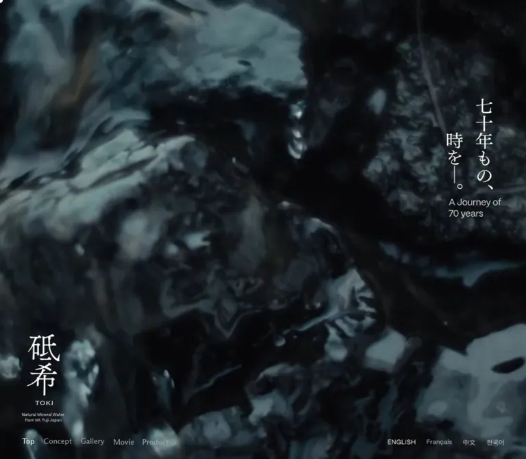
TOKI gives almost the entire opening viewport to a cool, dark forest. Its white identity sits low on the left, while a short vertical Japanese statement occupies the upper right. Desktop section links run close to the bottom edge, balanced by language controls at the opposite end. There is no large filled action competing with the landscape in the captured opening.
The same restraint continues through a snowy photographic gallery, small bilingual narrative columns, sparse store information, and a mountain-and-reflection contact scene. The near-black background connects these different images into one continuous environment. Typography distinguishes reflective storytelling from practical information: light serif paragraphs carry the narrative, while a compact sans serif handles addresses and utility links.
This is a long brand and product presentation with anchored sections, media, stockist information, and contact access. Its structure should be understood on those terms. The defining relationships are large imagery against small text, a persistent desktop identity against changing scenes, and carefully uneven horizontal placement.
How to Read This Reference
- Measured values come from the supplied rendered DOM and computed styles. Decimal values are rounded to practical CSS pixels unless precision explains a relationship.
- Visual estimates come from the five supplied original-page screenshots. They describe visible geometry, not recovered CSS declarations.
- Calculated values are arithmetic derived from those measurements, such as a column gap or distance from the viewport edge.
- Recommendations describe a new implementation. They are not claims about the original source code or untested interactions.
- Named tokens are implementation aliases. The supplied custom-property extraction was empty; no original token names were established.
- Transformed bounds need caution: several desktop Concept and Gallery elements had bounding rectangles beyond the viewport, including paragraph x-coordinates above 2300px. Those coordinates are not ordinary content margins and do not establish the site's scroll or animation mechanism.
- Graphical labels need separate treatment: the logo and several headings have empty extracted text, while navigation and language controls report
font-size: 0px. Their inheritedTimesvalue does not identify the visible lettering. Accessible names and underlying artwork formats were not exposed.
Tokens — Colors
Default Palette
| Name | Value | Suggested token | Evidence and role |
|---|---|---|---|
| Deep blue-black | #0A1014 |
--toki-canvas |
Measured body background at both viewports; the continuous ground beneath gallery, product, and footer content |
| Identity white | #FFFFFF |
--toki-white |
Measured foreground on the page shell and numerous controls; visually used by the logo, vertical statement, and emphasized navigation |
| Narrative gray | #D8D8D8 |
--toki-copy |
Measured English/Japanese paragraphs and Privacy Policy text |
| Quiet gray | #787C7E |
--toki-muted |
Measured store-address text at both viewports |
| Mobile link gray | #A4A4A4 |
--toki-link-muted |
Measured mobile Google Maps links; desktop equivalents are white |
| Translucent control fill | rgba(255,255,255,0.3) |
--toki-control-fill |
Measured background of the button in the Movie region; its final appearance depends on the content underneath |
Palette Behavior
Only one palette was captured. No theme selector or alternate light mode was established.
The forest and mountain imagery contribute cool gray, blue, and green variations. Those photographic colors are not additional interface tokens. Keep the underlying canvas exact and let the supplied imagery provide tonal variation.
Inactive desktop navigation and language labels appear dimmer than their emphasized counterparts. Their visible state may involve parent opacity or artwork styling not included in the element sample. Do not treat the sampled white foreground as proof that every label is displayed at full white opacity.
Fine gallery and button outlines appear pale and partially transparent. Their exact color and opacity were not measured. A white rule at approximately 30–45% opacity is a reasonable implementation starting point, explicitly as a recommendation.
Tokens — Typography
English Narrative — PP Eiko
- Measured family:
PP Eiko. - Measured weight:
300. - Use: English Concept and Product paragraphs.
- Character: a light serif voice with enough detail to feel editorial at a relatively small size.
- Scale: approximately 18px on desktop and 14px on mobile.
- Important distinction: this family is verified for narrative paragraphs, not for every heading or navigation label.
Japanese Narrative — FOT-筑紫Aオールド明朝 Pr6N L
- Measured stack:
'FOT-筑紫Aオールド明朝 Pr6N L', sans-serif. - Measured weight:
300. - Use: Japanese Concept and Product paragraphs.
- Character: fine Mincho strokes that support the quiet Japanese identity.
- Tracking: varies by section and viewport. The Concept uses negative tracking; desktop Product copy uses positive tracking before changing to negative tracking on mobile.
Preserve those section-specific differences when accuracy matters. A single global Japanese paragraph rule would erase measured distinctions.
Utility Text — PP Mori
- Measured family:
PP Mori. - Measured weight:
400. - Verified uses: store addresses, Google Maps links, the Contact link, and Privacy Policy.
- Character: compact, unobtrusive sans-serif text that stays subordinate to the imagery and brand artwork.
Identity and Graphic Labels
The tall Japanese wordmark, small TOKI lettering, and accompanying origin descriptor form a deliberately composed lockup. Preserve authorized identity artwork rather than rebuilding it with a guessed font.
The opening statement reads vertically, with the English phrase A Journey of 70 years beneath it. Section navigation visibly reads Top, Concept, Gallery, Movie, Product, and Store Location. Several of these labels are not ordinary extracted text. Their exact rendering method and font are unknown.
Type Scale
| Role | Desktop | Mobile | Tracking | Evidence |
|---|---|---|---|---|
| Root font size | Approximately 10px | Approximately 10px | Normal | Measured; the source formula is unavailable |
| Inherited body text | 16px / 18.4px | 16px / 18.4px | Normal | Measured fallback; not representative of all visible text |
| English Concept | 18px / 27px | 14px / 21px | 0.02em at both sizes |
Measured, PP Eiko 300 |
| Japanese Concept | 18px / 28.8px | 14px / 22.4px | -0.04em at both sizes |
Measured, Japanese narrative family 300 |
| English Product | 18px / 28.8px | 14px / 21px | Normal desktop; 0.02em mobile |
Measured, PP Eiko 300 |
| Japanese Product | 18px / 28.8px | 14px / 25.2px | 0.02em desktop; -0.04em mobile |
Measured, Japanese narrative family 300 |
| Store address | 15px / 21px | 16px / 22.4px | Normal | Measured, PP Mori 400 |
| Google Maps / Contact | 14px / 19.6px | 14px / 19.6px | Normal | Measured, PP Mori 400 |
| Privacy Policy | 12px / 16.8px | 12px / 16.8px | -0.02em |
Measured, PP Mori 400 |
| Opening Japanese statement | Approximately 34–36px visible glyph height | Approximately 24px | Unverified | Visual estimate; graphic typography |
| Opening English caption | Approximately 20px | Approximately 11–12px | Unverified | Visual estimate |
| Desktop section navigation | Approximately 14–16px visible lettering | Not visible in the closed mobile state | Unverified | Visual estimate; anchor font size is zero |
| Gallery title / subtitle | Approximately 21px / 14px | Not visually supplied | Unverified | Visual estimate |
The 10px root was measured at two widths. It does not establish a fluid scaling formula. The Quick Start uses a conventional 16px root and explicit values instead of copying unknown source rem rules.
Tokens — Spacing & Shapes
Density: broad image fields and generous empty space around compact labels. Geometry: square image boundaries, hairline accents, one small rounded mobile control, and a measured pill-shaped Movie-region button.
Spacing Scale
| Relationship | Desktop | Mobile | Status |
|---|---|---|---|
| Main identity left inset | 60px | 32px | Measured |
| Identity bottom clearance in opening | 99px | 48px | Calculated from H1 bounds |
| Section-link horizontal gap | 24px | Closed menu hides the row | Calculated from anchor bounds |
| Language-control horizontal gap | 23px | Vertical arrangement | Calculated desktop gap |
| Mobile language-control top | — | 48px | Measured first button content box |
| Mobile Concept paragraph inset | — | 90px left, 32px right | Measured |
| Mobile Concept paragraph separation | — | Approximately 14px | Calculated from paragraph bounds |
| Product paragraph separation | 18px | 18px | Calculated |
| Product English-to-Japanese separation | 120px | 64px | Calculated between language groups |
| Store-column gap | 40px | Vertical stack | Calculated |
| Map text-to-icon layout gap | 12px | 12px | Measured flex gap |
| Footer bottom padding | 115px | 142px | Measured |
These measurements do not reduce to one uniform spacing system. In particular, mobile Concept text, Product text, and Store information have different horizontal starting points.
Border Radius
| Element | Value | Status |
|---|---|---|
| Main sections and sampled headings | 0 |
Measured |
| Photographic panels | Visually square | Screenshot observation |
| Movie-region button | Approximately 17px |
Measured at both viewports |
| Mobile navigation control frame | Approximately 6px |
Visual estimate; the sampled button itself reports zero radius, so the frame may be drawn by another layer |
| Contact external-link frame | Small rounded outline | Visible; exact radius not measured |
There is no general system of elevated cards or large rounded containers in the supplied views.
Layout Measurements
| Element | Desktop, 1440 × 1000 | Mobile, 390 × 844 | Evidence |
|---|---|---|---|
| Opening section | 1440 × 1000px | 390 × 844px | Measured |
| Brand H1 bounds | x60, y663; 138 × 238px | x32, y589; 120 × 207px | Measured opening state |
| First desktop navigation link | x60, y948; 26 × 16px | Not visibly exposed | Measured |
| Desktop navigation extent | Approximately x60–512 | — | Calculated |
| Desktop language extent | Approximately x1138–1380 | — | Calculated |
| Mobile navigation button | — | x310, y754; approximately 41 × 41px | Measured button box; visible outline is slightly larger |
| Main gallery photograph, visible portion | x250–1190; approximately 940 × 560px | Not supplied | Visual estimate at the captured scroll position |
| Gallery title position | Approximately x229, y667 | Not supplied | Visual estimate |
| Gallery progress-like rule | Approximately 215px wide | Not supplied | Visual estimate; approximately 52px bright segment |
| Movie-region button | 196 × 34px | 196 × 34px | Measured |
| Product section heading group | Approximately 158 × 41px | Approximately 158 × 41px | Measured |
| English Product column | x903; 386px wide | x31; 327px wide | Measured |
| Japanese Product column | x903; 463px wide | x31; 327px wide | Measured |
| Store information columns | Three columns, approximately 215px each | One column, approximately 209px | Measured |
| Footer | Approximately 479px high | Approximately 721px high | Measured |
| Total document height | Approximately 15,257px | Approximately 12,851px | Measured |
The gallery photograph touches the top of its supplied screenshot. Its visible 940 × 560px region is not proof of the original image's aspect ratio or complete displayed height.
Components
Full-Viewport Opening
Role: establishes the water brand through landscape and a restrained identity composition.
A forest image fills the entire opening. It is dark, cool, and low in saturation, with pale foliage creating depth across the frame. The composition leaves the center almost entirely free of interface elements.
Place the brand at the lower left and a two-column vertical Japanese statement at the upper right. The English translation sits directly beneath the statement. In the desktop capture, this statement group begins around y206 and ends around y453. On mobile it occupies approximately y183–353, close to the right edge.
The visual message is small relative to the photograph. Reproducing the design does not require an oversized horizontal headline, a promotional badge, or an opening purchase button.
Media limitation: the supplied opening frames establish appearance and crop, but do not identify whether the source is an image, video, canvas, or another media implementation. Playback, audio, looping, and frame transitions were not demonstrated.
Brand Lockup
Role: keeps the product identity visible without a conventional top header.
The lockup combines the large vertically arranged Japanese name, a small tracked TOKI, and a two-line English origin descriptor. The desktop H1 occupies 138 × 238px; the mobile opening version occupies 120 × 207px.
In all three desktop screenshots, the lockup remains at approximately the same viewport coordinates, even as the content changes from opening to gallery to footer. This supports a persistent or pinned presentation. The exact positioning implementation was not included in the computed-style sample.
The mobile footer presents a smaller lockup near the top left of the footer, rather than retaining the large opening position. Its visible width is approximately 90px, estimated from the screenshot. The transition between these states was not recorded.
Desktop Section Navigation
Role: direct access to six sections of the same document.
The links appear in one unboxed row along the lower left edge: Top, Concept, Gallery, Movie, Product, and Store Location. Their verified destinations are #top, #concept, #gallery, #movie, #product, and #store.
The row starts at x60 with approximately 24px between link boxes. Visible lettering sits about 36–38px above the bottom edge. Top is emphasized in the opening, Gallery in the gallery capture, and Store Location in the footer capture. Emphasis is brighter text, with no large colored tab or underline visible.
The captures support section-related active states. They do not establish click timing, smooth scrolling, keyboard behavior, or the active-section detection algorithm.
Language Controls
Role: multilingual access within the brand experience.
The visible labels are ENGLISH, Français, 中文, and 한국어. Desktop places them in a right-aligned row near the lower edge. Mobile stacks them at the upper left, beginning around x32, y48.
The captured state emphasizes ENGLISH, while both English and Japanese narrative paragraphs appear in the DOM. The buttons have a measured opacity 0.5s ease-out transition. Their language-change results, URL behavior, and persistence were not exercised.
Do not replace these controls with flag icons when reproducing the observed language presentation.
Mobile Navigation Control
Role: compact access to the section navigation on narrow screens.
The closed control sits near the bottom right: approximately 39px from the right edge and 49px from the bottom according to its measured button box. Visually, it has a thin rounded square frame and a tiny grid of white squares inside.
The desktop section row is absent from the mobile screenshots. Its six anchors remain in the mobile DOM, with positions that could belong to a concealed navigation layout. Those rectangles do not constitute evidence of an opened menu.
Preserve the observed closed-state silhouette. An accessible disclosure panel, its layout, and its animation must be treated as new implementation work until separately inspected.
Concept Narrative
Role: introduces the brand's account of snowmelt, time, and natural filtration.
The rendered content contains four English paragraphs followed by four Japanese paragraphs. English uses PP Eiko; Japanese uses the measured Mincho stack. Both are light in weight and colored #D8D8D8.
On mobile, the text starts at x90 and extends to approximately x358, creating a narrow 268px column offset to the right. A section heading begins farther left, around x19. English and Japanese remain distinct groups, separated by approximately 64px.
Desktop sampled English and Japanese rectangles occupy separate horizontal positions, but both were outside the viewport. Preserve the bilingual grouping and typography; do not hardcode those offscreen coordinates or claim an exact horizontal-scroll system from them.
The source paragraphs declare opacity, transform, and filter transitions. Their final visible entry sequence was not supplied as a temporal recording.
Photographic Gallery
Role: expands the natural setting through large, quiet image compositions.
The desktop gallery capture shows a bright, misty snow-covered forest beginning about 250px from the left edge. It extends to x1190. An adjacent image is visible to the right, lower in the composition, showing a darker close view of foliage. The images share a lower alignment around y560 in this screenshot.
Below the images, a broad dark band holds a small dot, Gallery, and the subtitle A Journey of 70 years. The title group begins around x229. A thin horizontal rule sits farther right, with a short bright segment over a longer subdued line.
This reads visually as an image sequence with a progress-like indicator. The evidence does not establish dragging, autoplay, arrow navigation, slide count, or a specific relationship between the rule and scroll position.
A crop of reflective glass or bottle imagery begins below the band, near y911. Its full composition is not available in the supplied capture.
Movie Region
Role: a dedicated media section confirmed by the navigation and rendered DOM.
The sampled section contains a small heading and a button approximately 196 × 34px at both viewport sizes. The button has a 17px radius, a 30% white background, and a background 0.3s ease-out transition.
Its label was not present in the extracted text, and no screenshot of the complete control was supplied. Do not invent its visible wording, play icon, modal, player controls, or playback result.
For an adaptation, the measured pill is a useful secondary media-control shape. Give any implemented action explicit text and a real, keyboard-operable function.
Product Narrative
Role: describes the still/sparkling offering and water-source story.
The section heading group includes STILL/SPARKLING Water and measures approximately 158 × 41px. The desktop heading begins around x229, while the narrative sits much farther right at x903.
English Product text uses a 386px column. Japanese text uses a wider 463px column with the same left edge. A 120px interval separates the language groups. This variation in column width is intentional in the measured result and should not be flattened into one universal text measure.
On mobile, both groups become approximately 327px wide at x31. The language gap reduces to 64px. English changes to 14px/21px; Japanese uses a more open 14px/25.2px rhythm.
The supplied evidence does not establish a complete product-image arrangement, pricing, variant controls, or a purchasing flow.
Store Location Entries
Role: directs visitors to physical locations through concise address information and map links.
The DOM identifies two Tokyo entries and one Osaka entry. Visible address lines include Nissou Bldg. 1F, Ark Hills Annex, and Louis Vuitton Maison Osaka Midosuji 7F.
Desktop information appears in three approximately 215px columns beginning at x570, x825, and x1080, with 40px gaps. Each entry has a graphic heading, subdued address text, and a Google Maps link with a measured 12px internal gap.
Mobile stacks the entries in a 209px column beginning around x149. This retains a pronounced empty left region instead of expanding every entry across the phone. Address text increases from 15px to 16px, while the map link stays at 14px and changes from white to #A4A4A4.
The map destinations are present in the original-page evidence. Opening them was not part of the supplied interaction record.
Contact Scene
Role: provides a quiet contact destination at the end of the visual story.
The desktop bottom capture shows a dark mountain silhouette and its water reflection above the footer. A small centered Contact link combines text with an outlined external-link symbol. Its measured group is approximately 90 × 22px with 14px PP Mori text.
The verified destination is an external form at https://form.run/@toki-contact. The form itself was not inspected. Do not infer its fields, validation, or submission behavior.
Company Footer
Role: supplies business identity, office information, copyright, and privacy access.
The inspected footer names Kirala Co., Ltd. and lists a Head Office and Mt.Fuji Factory. This is direct original-page evidence for the displayed company identity. No production credits were established from the inspected page.
Desktop reserves the left side for the persistent brand. Footer content starts approximately 896px from the left, with measured padding of 164px top, 60px right, 115px bottom, and 896px left. Labels and address values are arranged side by side, while the copyright and Privacy Policy sit toward the right.
Mobile reflows the footer into one left-aligned stack. A small brand lockup appears above the company name. Office labels precede their multiline addresses, followed by the product descriptor, copyright, and Privacy Policy. Measured padding is approximately 280px top, 46px right, 142px bottom, and 32px left; the top allocation accommodates the separately positioned identity area.
The footer grows from approximately 479px to 721px tall. The mobile menu control remains near the lower right in the supplied bottom capture, while the opening language stack is no longer visible.
Tokens — Motion & Interaction
| Treatment | Measured declaration or visible evidence | What is established | What remains unverified |
|---|---|---|---|
| Language controls | opacity 0.5s ease-out |
A half-second opacity transition is declared | Trigger, changed-language result, selected-state persistence |
| Concept paragraphs | opacity 1s ease-out, transform 1s ease-out, filter 1s ease-out |
One-second transitions for three properties | Starting blur, distance, scale, delays, sequence, and scroll trigger |
| Movie-region button | background 0.3s ease-out |
Short background transition | Exact hover/focus colors and activation result |
| Desktop section emphasis | Different bright labels in opening, gallery, and footer screenshots | A section-related visual state | Whether it follows scrolling, clicks, or another timeline |
| Desktop identity/navigation placement | Consistent viewport placement across three screenshots | Persistent visual framing | Exact fixed/sticky/pinning implementation |
| Gallery rule | Short bright segment over a longer faint line | Progress-like visual treatment | Interactivity, timing, index mapping, and animation |
| Opening forest media | Still frames only | Image appearance and crop | Playback, looping, audio, and media implementation |
| Mobile navigation | Closed grid button visible | Closed-state appearance | Open panel, focus management, and transition |
Generic transition: all entries without an explicit nonzero duration do not establish a visible animation. Likewise, animation: none on sampled elements does not exclude video, canvas, JavaScript animation, or animation on unsampled descendants.
Recommended motion direction: keep changes slow enough to support the photographic pacing, using the measured 300ms, 500ms, and 1000ms durations as references. Any additional entrance distance, blur amount, or gallery behavior needs its own specification. Essential copy should remain visible if JavaScript fails or reduced motion is requested.
Surfaces
| Layer | Appearance | Function |
|---|---|---|
| Page canvas | Solid #0A1014 |
Connects scenes and supplies uninterrupted negative space |
| Opening media | Full-bleed dark forest | Establishes atmosphere and scale |
| Gallery imagery | Bright winter photograph beside darker foliage | Creates contrast without changing the interface palette |
| Narrative regions | Text directly on the dark ground | Keeps the experience editorial and unboxed |
| Persistent desktop interface | White and subdued labels over the current scene | Maintains orientation with minimal coverage |
| Movie control | Translucent white pill | A localized control surface rather than a general button system |
| Mobile navigation control | Thin outlined square with small corner radius | Compact utility access |
| Contact region | Dark mountain and reflection | A visual closing scene before company information |
| Footer | Same dark canvas as the page | Integrates legal and office information into the brand environment |
No card-shadow hierarchy, glass panel system, or colored conversion-button palette is visible in the supplied screenshots. The specific compositing or overlay method used to darken imagery was not exposed.
Imagery
The current screenshots establish three principal photographic treatments: a dark forest filling the opening, a luminous winter forest in the gallery, and a nearly monochrome mountain reflected in water near the footer. A neighboring gallery crop adds closer foliage detail. These changes in distance and brightness create variety while retaining a cool, restrained world.
The opening crop should remain dense enough to feel immersive. On mobile, it becomes a tall slice of the same forest scene; the identity and vertical statement remain legible without moving to a separate solid banner. The exact source crop coordinates are unknown.
The gallery's pale snow is a major contrast event. Preserve that brightness against the dark page instead of applying one heavy dark filter to every image. Keep image edges square and avoid decorative frames.
Observed Asset References
| Asset role | Original-page evidence | Implementation implication |
|---|---|---|
| Brand lockup | Desktop opening/gallery/footer and mobile opening/footer | Use authorized artwork at the observed proportions |
| Opening forest | Desktop and mobile opening captures | Prepare separate responsive crops or verify a suitable shared focal point |
| Snowy forest | Desktop gallery capture | Preserve fine branch detail and bright mist |
| Adjacent foliage | Right edge of the desktop gallery capture | Retain the sequence's variation in scale and tonal density |
| Reflective glass/bottle crop | Lower edge of the gallery capture | Full asset composition requires further evidence |
| Mountain and reflection | Desktop contact/footer capture and a small mobile crop | Preserve the dark silhouette and broad reflection |
| Grid and external-link symbols | Mobile control and desktop Contact link | Small, crisp geometry with minimal visual weight |
No original image URLs, video sources, poster paths, or SVG markup were included in the supplied evidence. Asset filenames and intrinsic dimensions therefore cannot be specified. The CSS below supplies a shell for authorized media; it does not provide replacement brand artwork.
Layout & Responsive Behavior
Desktop Composition
At 1440 × 1000, the opening is exactly one viewport high. The brand sits 60px from the left and ends about 99px above the bottom. Navigation is below it, with language controls balancing the opposite corner. This creates a low visual frame rather than a conventional top navigation bar.
Interior content does not share one centered container. The gallery photograph begins around x250, Product narrative around x903, Store entries around x570, and company details around x896. The result depends on these different alignments and their surrounding empty space.
The document is approximately 15,257px tall. Some desktop narrative elements have transformed offscreen bounds, so the recorded document and element geometry should not be used to reconstruct an unverified scroll timeline.
Mobile Composition
At 390 × 844, the opening remains exactly one viewport high. The brand shrinks modestly to 120px wide rather than scaling in proportion to the viewport width. Languages move to the top left; the vertical statement stays toward the upper right; section access becomes a small lower-right grid control.
The text layout changes by section:
| Region | Observed mobile arrangement |
|---|---|
| Concept | 268px text column with 90px left inset |
| Product | Approximately 327px text column with 31px left inset |
| Store entries | Approximately 209px column with 149px left inset |
| Footer | Approximately 32px left inset, stacked office information |
These offsets preserve the site's asymmetric character. A blanket 24px inset across all sections would produce a different composition.
Narrative copy reduces from 18px to 14px, but store addresses increase from 15px to 16px. The interface therefore adapts by role rather than by uniform scale. The mobile footer is substantially taller and shows a smaller brand instance above the company details.
Responsive Limits
Only the two listed viewport sizes were supplied. Tablet behavior, landscape phones, browser zoom, safe-area handling, and the original CSS breakpoints were not established. The 768px breakpoint in the Quick Start is a recommendation, not a recovered source value.
Mobile gallery composition and the opened mobile navigation were not visually supplied. Any responsive treatment for those states must be labeled as an adaptation.
Do’s and Don’ts
Do
- Keep the measured
#0A1014canvas continuous through the page. - Let large natural imagery carry the visual impact.
- Preserve the lower-left brand and lower-edge navigation relationship on desktop.
- Use the authorized vertical identity artwork at its composed proportions.
- Distinguish light serif storytelling from compact sans-serif utility information.
- Keep English and Japanese paragraphs as clearly separated groups.
- Preserve the different mobile insets for Concept, Product, Store, and Footer.
- Retain square image boundaries, small labels, and understated external links.
- Use brighter text as the main navigation emphasis.
- Treat the gallery's bright snow as an intentional change in luminance.
- Keep confirmed transition values separate from proposed animation behavior.
Don't
- Don't replace the opening composition with a large centered sales headline and a filled purchase button.
- Don't turn narrative or store information into generic rounded cards.
- Don't infer a visible font from zero-size navigation anchors or inherited
Timesdeclarations. - Don't rebuild the wordmark with an approximate text font.
- Don't use the desktop offscreen rectangles as static layout coordinates.
- Don't assume the gallery is draggable or automatically advancing.
- Don't claim a background video, parallax system, or cinematic transition sequence from still frames alone.
- Don't make every mobile section full width with identical gutters.
- Don't darken the bright gallery photograph until it loses its contrast with the page.
- Don't invent product controls, store logos, asset paths, or unseen menu states.
Recommended Implementation Additions
These are recommendations for a new implementation, not verified features of the original:
- Give the brand, graphic navigation labels, language controls, and menu trigger explicit accessible names. Empty extracted text alone does not prove that the original lacks them.
- Use native anchors for section and external destinations. Add
aria-currentfor section state and an appropriate selected-state attribute for language controls. - Make the mobile menu a real disclosure with
aria-expanded, focus management appropriate to its presentation, Escape handling where applicable, and a dependable close action. - Expand small control hit areas without overlapping neighboring controls. The measured mobile menu box is about 41px; a 44px target is a practical baseline. Language controls may require a looser mobile stack.
- Check text contrast against the brightest and darkest media regions, including future frames if motion media is used. Adjust crops or a subtle protective overlay as needed.
- Respect reduced motion and keep a static visual available. If video is introduced, specify its pause behavior and avoid making audible playback automatic.
- Provide equivalent translated content before activating language controls, and mark English and Japanese passages with appropriate
langattributes. - Load licensed fonts with robust fallbacks. Avoid hiding the entire page while a font service is pending.
- Keep narrative text in normal document flow as a reliable baseline. Add any scroll choreography as progressive enhancement.
- Validate the long page at intermediate widths, landscape orientation, and increased text size. Persistent controls must not obscure the final links.
Agent Prompt Guide
Quick Color Reference
- Canvas:
#0A1014. - Identity and emphasized labels:
#FFFFFF. - Narrative text and privacy link:
#D8D8D8. - Quiet store addresses:
#787C7E. - Mobile map links:
#A4A4A4. - Measured Movie-region control fill:
rgba(255,255,255,0.3). - Fine rules: pale white with low opacity; exact opacity is an implementation choice.
Overall Prompt
“Create a TOKI-inspired mineral-water brand website with a continuous blue-black canvas #0A1014, large cool forest and winter photographs, and a restrained white identity. At desktop, place an authorized vertical Japanese brand lockup at the lower left, a small vertical statement at the upper right, section links along the lower left edge, and language controls along the lower right. Use light serif English and Japanese narrative paragraphs, compact sans-serif utility text, square imagery, and generous asymmetric space. Continue through a bright photographic gallery, product storytelling, sparse store locations, a dark mountain-reflection contact scene, and a compact company footer. On mobile, place languages at the top left, retain the vertical statement at the right, expose a small outlined grid menu control at the lower right, and reflow text according to each section's distinct inset. Treat media playback and scroll choreography as separate specifications.”
Example Component Prompts
- Opening: “Build a full-viewport dark forest composition. Keep the center clear. Place a tall white brand lockup near the lower left and a compact vertical Japanese statement near the upper right, with a small English translation beneath it. Preserve the photograph's fine detail and cool palette.”
- Gallery: “Place a large bright snowy-forest photograph on a blue-black canvas, offset from the left. Let part of a darker neighboring image appear at the right, aligned lower. Beneath the images, use a tiny dot, a modest Gallery label, a muted subtitle, and a thin progress-like rule. Do not imply interactive behavior unless it is implemented.”
- Bilingual narrative: “Use light serif copy in
#D8D8D8, with English followed by Japanese. At 390px width, give the Concept text a 268px column starting 90px from the left. Use 14px English text with 21px leading and Japanese text with 22.4px leading. Separate the language groups by 64px.” - Store entries: “Create three unboxed desktop location columns approximately 215px wide with 40px gaps. Use subdued address text and a small Google Maps link. On a 390px phone, stack the entries in a 209px column aligned 32px from the right.”
- Footer: “Use the same dark canvas as the page. Reserve the desktop left side for the brand and place company information toward the right. On mobile, show a smaller brand above the company name, stack office labels and addresses, and keep copyright and Privacy Policy left aligned. Use no cards or shadows.”
Quick Start
CSS Custom Properties
This is an implementation adaptation based on measured styles and visible proportions. It keeps a standard root font size. The source fonts must be loaded separately under valid licenses; no font or media files are bundled here.
The CSS uses a static document-flow baseline for narrative content. Its desktop pinned brand, mobile in-flow opening identity, duplicated mobile footer identity, gallery sizing formulas, and 768px breakpoint are implementation choices that approximate the supplied states. They do not reconstruct the original animation system.
Suggested structure: put .brand, .hero__claim, and .language-switch inside .hero; place .section-nav and .menu-toggle outside the scrolling content; use separate English/Japanese containers inside .concept-copy and .product-copy; place a second .brand.brand--footer inside .site-footer. Supply authorized media inside .hero__media and the gallery frames. The CSS styles the closed mobile control only; its disclosure behavior requires implementation.
:root {
  /* Measured colors */
  --toki-canvas: #0a1014;
  --toki-white: #ffffff;
  --toki-copy: #d8d8d8;
  --toki-muted: #787c7e;
  --toki-link-muted: #a4a4a4;
  --toki-control-fill: rgb(255 255 255 / 30%);

  /* Verified family names; additional fallbacks are recommendations */
  --toki-font-story: 'PP Eiko', serif;
  --toki-font-jp: 'FOT-筑紫Aオールド明朝 Pr6N L', sans-serif;
  --toki-font-utility: 'PP Mori', Arial, sans-serif;
  --toki-text-story: 18px;
  --toki-text-utility: 14px;
  --toki-text-small: 12px;

  /* Recommended interpolation between measured endpoint gutters */
  --toki-gutter: clamp(32px, 4.166667vw, 60px);
  --toki-brand-width: 138px;
  --toki-language-gap: 120px;
  --toki-rule: rgb(255 255 255 / 35%);

  /* Measured transition durations */
  --toki-motion-control: 300ms ease-out;
  --toki-motion-language: 500ms ease-out;
  --toki-motion-copy: 1000ms ease-out;
}

* { box-sizing: border-box; }
html { font-size: 16px; }
body {
  margin: 0;
  color: var(--toki-white);
  background: var(--toki-canvas);
  font-family: var(--toki-font-utility);
}
button, a { -webkit-tap-highlight-color: transparent; }
button { font: inherit; }
a { color: inherit; }
img, video { display: block; max-width: 100%; }

.hero {
  position: relative;
  min-height: 100vh;
  min-height: 100svh;
  isolation: isolate;
  overflow: hidden;
}
.hero__media {
  position: absolute;
  inset: 0;
  z-index: -2;
  width: 100%;
  height: 100%;
  object-fit: cover;
}
.hero::after {
  /* Optional protective tint; not a measured source overlay */
  content: '';
  position: absolute;
  inset: 0;
  z-index: -1;
  background: rgb(10 16 20 / 15%);
  pointer-events: none;
}
.brand {
  position: fixed;
  z-index: 20;
  left: var(--toki-gutter);
  bottom: 99px;
  width: var(--toki-brand-width);
  margin: 0;
}
.brand img { width: 100%; height: auto; }
.brand--footer { display: none; }

.hero__claim {
  position: absolute;
  top: 20.6%;
  right: var(--toki-gutter);
  width: 110px;
}
.hero__claim-art { width: 100%; height: auto; }
.hero__claim-en {
  /* Visual approximation if the caption is implemented as text */
  margin: 14px 0 0;
  font-size: 20px;
  line-height: 1.2;
  color: var(--toki-copy);
}

.section-nav,
.language-switch {
  position: fixed;
  z-index: 30;
  bottom: 22px;
  display: flex;
  align-items: center;
}
.section-nav { left: var(--toki-gutter); gap: 24px; }
.language-switch { right: var(--toki-gutter); gap: 23px; }
.section-nav a,
.language-switch button {
  display: inline-flex;
  align-items: center;
  min-height: 44px;
  padding: 0;
  border: 0;
  color: var(--toki-white);
  background: transparent;
  text-decoration: none;
  cursor: pointer;
  opacity: 0.6;
}
.section-nav a {
  /* Text replacement for source labels whose font is unverified */
  font-size: 15px;
  line-height: 1;
}
.language-switch button {
  font-size: 14px;
  line-height: 1;
  transition: opacity var(--toki-motion-language);
}
.section-nav a[aria-current],
.language-switch button[aria-pressed='true'] { opacity: 1; }
.menu-toggle { display: none; }

.concept-copy {
  /* Static desktop adaptation; offscreen source transforms are omitted */
  display: grid;
  grid-template-columns: repeat(2, minmax(0, 1fr));
  gap: 80px;
  max-width: 900px;
  margin: 0 var(--toki-gutter) 0 auto;
  padding-block: 120px;
}
.concept-copy p,
.product-copy p {
  margin: 0 0 18px;
  color: var(--toki-copy);
  font-size: var(--toki-text-story);
  font-weight: 300;
}
.concept-copy p:last-child,
.product-copy p:last-child { margin-bottom: 0; }
.concept-copy__en {
  font-family: var(--toki-font-story);
  line-height: 1.5;
  letter-spacing: 0.02em;
}
.concept-copy__jp {
  font-family: var(--toki-font-jp);
  line-height: 1.6;
  letter-spacing: -0.04em;
}

.gallery { overflow: hidden; }
.gallery__rail {
  /* Ratios approximate the visible desktop composition */
  display: flex;
  align-items: flex-end;
  margin-left: 17.361111vw;
}
.gallery__frame {
  flex: 0 0 65.277778vw;
  margin: 0;
}
.gallery__frame--preview { flex-basis: 32vw; }
.gallery__frame img { width: 100%; height: auto; }
.gallery__meta {
  display: flex;
  align-items: center;
  justify-content: space-between;
  gap: 32px;
  width: 56.32vw;
  margin: 100px 0 200px 15.9vw;
}
.gallery__title { margin: 0; font-size: 21px; font-weight: 400; }
.gallery__subtitle {
  margin: 6px 0 0;
  color: var(--toki-muted);
  font-size: 14px;
}
.gallery__rule {
  position: relative;
  width: 215px;
  height: 1px;
  background: var(--toki-rule);
}
.gallery__rule::before {
  /* Static visual reference; no progress behavior is implied */
  content: '';
  position: absolute;
  inset: 0 auto 0 0;
  width: 24%;
  background: var(--toki-white);
}

.movie-control {
  display: inline-flex;
  align-items: center;
  justify-content: center;
  width: 196px;
  min-height: 34px;
  border: 0;
  border-radius: 17px;
  color: var(--toki-white);
  background: var(--toki-control-fill);
  transition: background var(--toki-motion-control);
}
.product-copy {
  width: 32.15%;
  max-width: 463px;
  margin-left: 62.68%;
}
.product-copy__en {
  max-width: 386px;
  font-family: var(--toki-font-story);
  line-height: 1.6;
}
.product-copy__jp {
  margin-top: var(--toki-language-gap);
  font-family: var(--toki-font-jp);
  line-height: 1.6;
  letter-spacing: 0.02em;
}

.store-grid {
  display: grid;
  grid-template-columns: repeat(3, minmax(0, 1fr));
  gap: 40px;
  max-width: 725px;
  margin: 0 10.07vw 0 auto;
}
.store-entry__address {
  margin: 14px 0 24px;
  color: var(--toki-muted);
  font-size: 15px;
  line-height: 1.4;
  font-style: normal;
}
.map-link,
.contact-link {
  display: inline-flex;
  align-items: center;
  gap: 12px;
  font-size: var(--toki-text-utility);
  line-height: 1.4;
  text-decoration: none;
}
.contact-scene {
  /* Scene height depends on the authorized imagery */
  position: relative;
  display: grid;
  place-items: center;
}

.site-footer {
  position: relative;
  min-height: 479px;
  padding: 164px 60px 115px 62.22%;
  color: var(--toki-copy);
  font-size: var(--toki-text-small);
  line-height: 1.4;
}
.site-footer__company {
  margin: 0 0 24px;
  font-size: 16px;
  font-weight: 400;
}
.office-row {
  display: grid;
  grid-template-columns: 90px minmax(0, 1fr);
  gap: 16px;
  margin-bottom: 14px;
}
.office-row address { font-style: normal; }
.footer-meta {
  display: flex;
  flex-wrap: wrap;
  justify-content: space-between;
  gap: 16px;
}
.privacy-link {
  display: block;
  margin-top: 12px;
  text-align: right;
  text-decoration: none;
  letter-spacing: -0.02em;
}

/* Recommended feedback; exact source hover states were not supplied */
@media (hover: hover) {
  .section-nav a:hover,
  .language-switch button:hover { opacity: 1; }
  .map-link:hover,
  .contact-link:hover,
  .privacy-link:hover { text-decoration: underline; }
}
:where(a, button):focus-visible {
  outline: 2px solid var(--toki-white);
  outline-offset: 5px;
}

@media (max-width: 767px) {
  :root {
    --toki-gutter: 32px;
    --toki-brand-width: 120px;
    --toki-text-story: 14px;
    --toki-language-gap: 64px;
  }
  .brand { position: absolute; bottom: 48px; }
  .hero__claim { top: 21.6%; right: 38px; width: 66px; }
  .hero__claim-en { margin-top: 10px; font-size: 12px; }
  .section-nav { display: none; }
  .language-switch {
    position: absolute;
    top: 32px;
    right: auto;
    bottom: auto;
    left: 32px;
    align-items: flex-start;
    flex-direction: column;
    gap: 0;
  }
  /* The 44px language targets produce a taller stack than the capture */
  .language-switch button { min-height: 44px; }
  .menu-toggle {
    position: fixed;
    z-index: 40;
    right: max(38px, env(safe-area-inset-right, 0px));
    bottom: calc(48px + env(safe-area-inset-bottom, 0px));
    display: grid;
    place-items: center;
    width: 44px;
    height: 44px;
    padding: 0;
    border: 1px solid rgb(255 255 255 / 45%);
    border-radius: 6px;
    color: var(--toki-white);
    background: transparent;
  }
  .menu-toggle__grid {
    display: grid;
    grid-template-columns: repeat(3, 2px);
    gap: 1px;
  }
  .menu-toggle__grid > span {
    width: 2px;
    height: 2px;
    background: currentColor;
  }
  .concept-copy {
    display: block;
    width: calc(100% - 122px);
    max-width: none;
    margin: 0 32px 0 90px;
    padding-block: 64px;
  }
  .concept-copy p { margin-bottom: 14px; }
  .concept-copy__jp { margin-top: 64px; }
  /* Recommended mobile gallery layout; no mobile gallery capture exists */
  .gallery__rail { margin-left: 32px; }
  .gallery__frame { flex-basis: 84vw; }
  .gallery__frame--preview { flex-basis: 42vw; }
  .gallery__meta { width: auto; margin: 64px 32px 96px; }
  .gallery__rule { width: 88px; flex-shrink: 0; }
  .product-copy {
    width: calc(100% - 64px);
    max-width: none;
    margin-inline: 32px;
  }
  .product-copy__en { line-height: 1.5; letter-spacing: 0.02em; }
  .product-copy__jp { line-height: 1.8; letter-spacing: -0.04em; }
  .store-grid {
    grid-template-columns: 1fr;
    gap: 74px;
    width: min(209px, calc(100% - 64px));
    margin: 0 32px 0 auto;
  }
  .store-entry__address { font-size: 16px; }
  .map-link { color: var(--toki-link-muted); }
  .site-footer { min-height: 721px; padding: 280px 46px 142px 32px; }
  .site-footer .brand--footer {
    display: block;
    top: 80px;
    bottom: auto;
    width: 90px;
  }
  .site-footer__company { margin-bottom: 32px; }
  .office-row { display: block; margin-bottom: 16px; }
  .office-row address { margin-top: 4px; }
  .footer-meta { display: block; }
  .footer-meta > * + * { margin-top: 16px; }
  .privacy-link { margin-top: 16px; text-align: left; }
}

@media (prefers-reduced-motion: reduce) {
  .language-switch button,
  .movie-control { transition: none; }
  .concept-copy p { opacity: 1; transform: none; filter: none; }
}
The grid icon expects nine decorative child spans. Give its button an accessible name and connect it to a functional menu before use. The reduced-motion rule covers the illustrated CSS shell; any added video or JavaScript animation needs its own reduced-motion handling.
Tailwind v4 Token Mapping
Optional mapping for an implementation already using Tailwind v4. These aliases reference the custom properties above and do not imply that the original site uses Tailwind.
@theme inline {
  --color-canvas: var(--toki-canvas);
  --color-identity: var(--toki-white);
  --color-copy: var(--toki-copy);
  --color-muted: var(--toki-muted);
  --color-link-muted: var(--toki-link-muted);

  --font-editorial: var(--toki-font-story);
  --font-japanese: var(--toki-font-jp);
  --font-utility: var(--toki-font-utility);

  --text-story: var(--toki-text-story);
  --text-utility: var(--toki-text-utility);
  --text-caption: var(--toki-text-small);

  --spacing-page: var(--toki-gutter);
  --spacing-brand: var(--toki-brand-width);
  --spacing-language: var(--toki-language-gap);

  --radius-media-control: 17px;
  --radius-menu-control: 6px;
}
Sources & Evidence
- Original and final page: 砥希 TOKI. The supplied browser record reports HTTP 200 and no URL change.
- Capture time: September 12, 2026, 16:35:47.393 UTC, equivalent to September 13, 2026, 01:35:47.393 JST.
- Desktop evidence: 1440 × 1000 CSS pixels; opening, gallery position, and contact/footer screenshots, plus rendered text, links, element bounds, and computed styles. Document height approximately 15,257px.
- Mobile evidence: 390 × 844 CSS pixels; opening and footer screenshots, plus rendered text, links, element bounds, and computed styles. Document height approximately 12,851px.
- Recorded destinations: six same-page section anchors, three Google Maps links, the external Contact form, and Privacy Policy. These destinations were identified in the rendered original-page evidence; their destination pages were not inspected for this reference.
- Capture procedure: the supplied record describes at least five seconds of initial observation, readiness checks for layout, text, visible image decoding, and finite animations, and traversal of intermediate scroll positions. Perpetual animations were paused during readiness checks and resumed afterward. Those procedures do not establish playback behavior or semantic completeness.
- Interaction limits: no documented language activation, opened mobile menu, gallery manipulation, Movie-button activation, form use, or link-following result was supplied. Exact hover/focus appearances and JavaScript timelines remain unverified.
- Source limits: no complete stylesheet, asset manifest, original media URLs, or responsive breakpoint declarations were supplied. Computed font families and transition values are reported only where explicitly present. Several desktop elements had transformed offscreen bounds.
This reference describes the current page represented by the supplied original-site evidence. Screenshot measurements are estimates where marked; CSS, accessibility additions, and unspecified responsive or interactive behavior are recommendations.
# 砥希 TOKI — Style Reference

> A quiet mineral-water brand expressed through dark forests, winter light, and a white vertical signature.

**Website:** [toki-fuji.com](https://toki-fuji.com/)
**Original URL:** https://toki-fuji.com/
**Final URL:** https://toki-fuji.com/
**Theme:** a consistently dark canvas with white identity artwork and subdued gray text
**Inspected:** September 13, 2026, 01:35 JST; supplied retrieval timestamp September 12, 2026, 16:35:47.393 UTC
**Viewports:** 1440 × 1000 and 390 × 844 CSS pixels
**Scope:** the current TOKI brand website. Visual evidence covers the desktop opening, a gallery position, the desktop contact/footer region, the mobile opening, and the mobile footer. Rendered DOM evidence additionally covers Concept, Movie, Product, Store Location, and their links. These additional sections were not all supplied as screenshots.

TOKI gives almost the entire opening viewport to a cool, dark forest. Its white identity sits low on the left, while a short vertical Japanese statement occupies the upper right. Desktop section links run close to the bottom edge, balanced by language controls at the opposite end. There is no large filled action competing with the landscape in the captured opening.

The same restraint continues through a snowy photographic gallery, small bilingual narrative columns, sparse store information, and a mountain-and-reflection contact scene. The near-black background connects these different images into one continuous environment. Typography distinguishes reflective storytelling from practical information: light serif paragraphs carry the narrative, while a compact sans serif handles addresses and utility links.

This is a long brand and product presentation with anchored sections, media, stockist information, and contact access. Its structure should be understood on those terms. The defining relationships are large imagery against small text, a persistent desktop identity against changing scenes, and carefully uneven horizontal placement.

## How to Read This Reference

- **Measured** values come from the supplied rendered DOM and computed styles. Decimal values are rounded to practical CSS pixels unless precision explains a relationship.
- **Visual estimates** come from the five supplied original-page screenshots. They describe visible geometry, not recovered CSS declarations.
- **Calculated** values are arithmetic derived from those measurements, such as a column gap or distance from the viewport edge.
- **Recommendations** describe a new implementation. They are not claims about the original source code or untested interactions.
- **Named tokens** are implementation aliases. The supplied custom-property extraction was empty; no original token names were established.
- **Transformed bounds need caution:** several desktop Concept and Gallery elements had bounding rectangles beyond the viewport, including paragraph x-coordinates above 2300px. Those coordinates are not ordinary content margins and do not establish the site's scroll or animation mechanism.
- **Graphical labels need separate treatment:** the logo and several headings have empty extracted text, while navigation and language controls report `font-size: 0px`. Their inherited `Times` value does not identify the visible lettering. Accessible names and underlying artwork formats were not exposed.

## Tokens — Colors

### Default Palette

| Name | Value | Suggested token | Evidence and role |
| --- | --- | --- | --- |
| Deep blue-black | `#0A1014` | `--toki-canvas` | Measured body background at both viewports; the continuous ground beneath gallery, product, and footer content |
| Identity white | `#FFFFFF` | `--toki-white` | Measured foreground on the page shell and numerous controls; visually used by the logo, vertical statement, and emphasized navigation |
| Narrative gray | `#D8D8D8` | `--toki-copy` | Measured English/Japanese paragraphs and Privacy Policy text |
| Quiet gray | `#787C7E` | `--toki-muted` | Measured store-address text at both viewports |
| Mobile link gray | `#A4A4A4` | `--toki-link-muted` | Measured mobile Google Maps links; desktop equivalents are white |
| Translucent control fill | `rgba(255,255,255,0.3)` | `--toki-control-fill` | Measured background of the button in the Movie region; its final appearance depends on the content underneath |

### Palette Behavior

Only one palette was captured. No theme selector or alternate light mode was established.

The forest and mountain imagery contribute cool gray, blue, and green variations. Those photographic colors are not additional interface tokens. Keep the underlying canvas exact and let the supplied imagery provide tonal variation.

Inactive desktop navigation and language labels appear dimmer than their emphasized counterparts. Their visible state may involve parent opacity or artwork styling not included in the element sample. Do not treat the sampled white foreground as proof that every label is displayed at full white opacity.

Fine gallery and button outlines appear pale and partially transparent. Their exact color and opacity were not measured. A white rule at approximately 30–45% opacity is a reasonable implementation starting point, explicitly as a recommendation.

## Tokens — Typography

### English Narrative — PP Eiko

- **Measured family:** `PP Eiko`.
- **Measured weight:** `300`.
- **Use:** English Concept and Product paragraphs.
- **Character:** a light serif voice with enough detail to feel editorial at a relatively small size.
- **Scale:** approximately 18px on desktop and 14px on mobile.
- **Important distinction:** this family is verified for narrative paragraphs, not for every heading or navigation label.

### Japanese Narrative — FOT-筑紫Aオールド明朝 Pr6N L

- **Measured stack:** `'FOT-筑紫Aオールド明朝 Pr6N L', sans-serif`.
- **Measured weight:** `300`.
- **Use:** Japanese Concept and Product paragraphs.
- **Character:** fine Mincho strokes that support the quiet Japanese identity.
- **Tracking:** varies by section and viewport. The Concept uses negative tracking; desktop Product copy uses positive tracking before changing to negative tracking on mobile.

Preserve those section-specific differences when accuracy matters. A single global Japanese paragraph rule would erase measured distinctions.

### Utility Text — PP Mori

- **Measured family:** `PP Mori`.
- **Measured weight:** `400`.
- **Verified uses:** store addresses, Google Maps links, the Contact link, and Privacy Policy.
- **Character:** compact, unobtrusive sans-serif text that stays subordinate to the imagery and brand artwork.

### Identity and Graphic Labels

The tall Japanese wordmark, small `TOKI` lettering, and accompanying origin descriptor form a deliberately composed lockup. Preserve authorized identity artwork rather than rebuilding it with a guessed font.

The opening statement reads vertically, with the English phrase `A Journey of 70 years` beneath it. Section navigation visibly reads `Top`, `Concept`, `Gallery`, `Movie`, `Product`, and `Store Location`. Several of these labels are not ordinary extracted text. Their exact rendering method and font are unknown.

### Type Scale

| Role | Desktop | Mobile | Tracking | Evidence |
| --- | --- | --- | --- | --- |
| Root font size | Approximately 10px | Approximately 10px | Normal | Measured; the source formula is unavailable |
| Inherited body text | 16px / 18.4px | 16px / 18.4px | Normal | Measured fallback; not representative of all visible text |
| English Concept | 18px / 27px | 14px / 21px | `0.02em` at both sizes | Measured, PP Eiko 300 |
| Japanese Concept | 18px / 28.8px | 14px / 22.4px | `-0.04em` at both sizes | Measured, Japanese narrative family 300 |
| English Product | 18px / 28.8px | 14px / 21px | Normal desktop; `0.02em` mobile | Measured, PP Eiko 300 |
| Japanese Product | 18px / 28.8px | 14px / 25.2px | `0.02em` desktop; `-0.04em` mobile | Measured, Japanese narrative family 300 |
| Store address | 15px / 21px | 16px / 22.4px | Normal | Measured, PP Mori 400 |
| Google Maps / Contact | 14px / 19.6px | 14px / 19.6px | Normal | Measured, PP Mori 400 |
| Privacy Policy | 12px / 16.8px | 12px / 16.8px | `-0.02em` | Measured, PP Mori 400 |
| Opening Japanese statement | Approximately 34–36px visible glyph height | Approximately 24px | Unverified | Visual estimate; graphic typography |
| Opening English caption | Approximately 20px | Approximately 11–12px | Unverified | Visual estimate |
| Desktop section navigation | Approximately 14–16px visible lettering | Not visible in the closed mobile state | Unverified | Visual estimate; anchor font size is zero |
| Gallery title / subtitle | Approximately 21px / 14px | Not visually supplied | Unverified | Visual estimate |

The 10px root was measured at two widths. It does not establish a fluid scaling formula. The Quick Start uses a conventional 16px root and explicit values instead of copying unknown source `rem` rules.

## Tokens — Spacing & Shapes

**Density:** broad image fields and generous empty space around compact labels.
**Geometry:** square image boundaries, hairline accents, one small rounded mobile control, and a measured pill-shaped Movie-region button.

### Spacing Scale

| Relationship | Desktop | Mobile | Status |
| --- | --- | --- | --- |
| Main identity left inset | 60px | 32px | Measured |
| Identity bottom clearance in opening | 99px | 48px | Calculated from H1 bounds |
| Section-link horizontal gap | 24px | Closed menu hides the row | Calculated from anchor bounds |
| Language-control horizontal gap | 23px | Vertical arrangement | Calculated desktop gap |
| Mobile language-control top | — | 48px | Measured first button content box |
| Mobile Concept paragraph inset | — | 90px left, 32px right | Measured |
| Mobile Concept paragraph separation | — | Approximately 14px | Calculated from paragraph bounds |
| Product paragraph separation | 18px | 18px | Calculated |
| Product English-to-Japanese separation | 120px | 64px | Calculated between language groups |
| Store-column gap | 40px | Vertical stack | Calculated |
| Map text-to-icon layout gap | 12px | 12px | Measured flex gap |
| Footer bottom padding | 115px | 142px | Measured |

These measurements do not reduce to one uniform spacing system. In particular, mobile Concept text, Product text, and Store information have different horizontal starting points.

### Border Radius

| Element | Value | Status |
| --- | --- | --- |
| Main sections and sampled headings | `0` | Measured |
| Photographic panels | Visually square | Screenshot observation |
| Movie-region button | Approximately `17px` | Measured at both viewports |
| Mobile navigation control frame | Approximately `6px` | Visual estimate; the sampled button itself reports zero radius, so the frame may be drawn by another layer |
| Contact external-link frame | Small rounded outline | Visible; exact radius not measured |

There is no general system of elevated cards or large rounded containers in the supplied views.

### Layout Measurements

| Element | Desktop, 1440 × 1000 | Mobile, 390 × 844 | Evidence |
| --- | --- | --- | --- |
| Opening section | 1440 × 1000px | 390 × 844px | Measured |
| Brand H1 bounds | x60, y663; 138 × 238px | x32, y589; 120 × 207px | Measured opening state |
| First desktop navigation link | x60, y948; 26 × 16px | Not visibly exposed | Measured |
| Desktop navigation extent | Approximately x60–512 | — | Calculated |
| Desktop language extent | Approximately x1138–1380 | — | Calculated |
| Mobile navigation button | — | x310, y754; approximately 41 × 41px | Measured button box; visible outline is slightly larger |
| Main gallery photograph, visible portion | x250–1190; approximately 940 × 560px | Not supplied | Visual estimate at the captured scroll position |
| Gallery title position | Approximately x229, y667 | Not supplied | Visual estimate |
| Gallery progress-like rule | Approximately 215px wide | Not supplied | Visual estimate; approximately 52px bright segment |
| Movie-region button | 196 × 34px | 196 × 34px | Measured |
| Product section heading group | Approximately 158 × 41px | Approximately 158 × 41px | Measured |
| English Product column | x903; 386px wide | x31; 327px wide | Measured |
| Japanese Product column | x903; 463px wide | x31; 327px wide | Measured |
| Store information columns | Three columns, approximately 215px each | One column, approximately 209px | Measured |
| Footer | Approximately 479px high | Approximately 721px high | Measured |
| Total document height | Approximately 15,257px | Approximately 12,851px | Measured |

The gallery photograph touches the top of its supplied screenshot. Its visible 940 × 560px region is not proof of the original image's aspect ratio or complete displayed height.

## Components

### Full-Viewport Opening

**Role:** establishes the water brand through landscape and a restrained identity composition.

A forest image fills the entire opening. It is dark, cool, and low in saturation, with pale foliage creating depth across the frame. The composition leaves the center almost entirely free of interface elements.

Place the brand at the lower left and a two-column vertical Japanese statement at the upper right. The English translation sits directly beneath the statement. In the desktop capture, this statement group begins around y206 and ends around y453. On mobile it occupies approximately y183–353, close to the right edge.

The visual message is small relative to the photograph. Reproducing the design does not require an oversized horizontal headline, a promotional badge, or an opening purchase button.

**Media limitation:** the supplied opening frames establish appearance and crop, but do not identify whether the source is an image, video, canvas, or another media implementation. Playback, audio, looping, and frame transitions were not demonstrated.

### Brand Lockup

**Role:** keeps the product identity visible without a conventional top header.

The lockup combines the large vertically arranged Japanese name, a small tracked `TOKI`, and a two-line English origin descriptor. The desktop H1 occupies 138 × 238px; the mobile opening version occupies 120 × 207px.

In all three desktop screenshots, the lockup remains at approximately the same viewport coordinates, even as the content changes from opening to gallery to footer. This supports a persistent or pinned presentation. The exact positioning implementation was not included in the computed-style sample.

The mobile footer presents a smaller lockup near the top left of the footer, rather than retaining the large opening position. Its visible width is approximately 90px, estimated from the screenshot. The transition between these states was not recorded.

### Desktop Section Navigation

**Role:** direct access to six sections of the same document.

The links appear in one unboxed row along the lower left edge: `Top`, `Concept`, `Gallery`, `Movie`, `Product`, and `Store Location`. Their verified destinations are `#top`, `#concept`, `#gallery`, `#movie`, `#product`, and `#store`.

The row starts at x60 with approximately 24px between link boxes. Visible lettering sits about 36–38px above the bottom edge. `Top` is emphasized in the opening, `Gallery` in the gallery capture, and `Store Location` in the footer capture. Emphasis is brighter text, with no large colored tab or underline visible.

The captures support section-related active states. They do not establish click timing, smooth scrolling, keyboard behavior, or the active-section detection algorithm.

### Language Controls

**Role:** multilingual access within the brand experience.

The visible labels are `ENGLISH`, `Français`, `中文`, and `한국어`. Desktop places them in a right-aligned row near the lower edge. Mobile stacks them at the upper left, beginning around x32, y48.

The captured state emphasizes `ENGLISH`, while both English and Japanese narrative paragraphs appear in the DOM. The buttons have a measured `opacity 0.5s ease-out` transition. Their language-change results, URL behavior, and persistence were not exercised.

Do not replace these controls with flag icons when reproducing the observed language presentation.

### Mobile Navigation Control

**Role:** compact access to the section navigation on narrow screens.

The closed control sits near the bottom right: approximately 39px from the right edge and 49px from the bottom according to its measured button box. Visually, it has a thin rounded square frame and a tiny grid of white squares inside.

The desktop section row is absent from the mobile screenshots. Its six anchors remain in the mobile DOM, with positions that could belong to a concealed navigation layout. Those rectangles do not constitute evidence of an opened menu.

Preserve the observed closed-state silhouette. An accessible disclosure panel, its layout, and its animation must be treated as new implementation work until separately inspected.

### Concept Narrative

**Role:** introduces the brand's account of snowmelt, time, and natural filtration.

The rendered content contains four English paragraphs followed by four Japanese paragraphs. English uses PP Eiko; Japanese uses the measured Mincho stack. Both are light in weight and colored `#D8D8D8`.

On mobile, the text starts at x90 and extends to approximately x358, creating a narrow 268px column offset to the right. A section heading begins farther left, around x19. English and Japanese remain distinct groups, separated by approximately 64px.

Desktop sampled English and Japanese rectangles occupy separate horizontal positions, but both were outside the viewport. Preserve the bilingual grouping and typography; do not hardcode those offscreen coordinates or claim an exact horizontal-scroll system from them.

The source paragraphs declare opacity, transform, and filter transitions. Their final visible entry sequence was not supplied as a temporal recording.

### Photographic Gallery

**Role:** expands the natural setting through large, quiet image compositions.

The desktop gallery capture shows a bright, misty snow-covered forest beginning about 250px from the left edge. It extends to x1190. An adjacent image is visible to the right, lower in the composition, showing a darker close view of foliage. The images share a lower alignment around y560 in this screenshot.

Below the images, a broad dark band holds a small dot, `Gallery`, and the subtitle `A Journey of 70 years.` The title group begins around x229. A thin horizontal rule sits farther right, with a short bright segment over a longer subdued line.

This reads visually as an image sequence with a progress-like indicator. The evidence does not establish dragging, autoplay, arrow navigation, slide count, or a specific relationship between the rule and scroll position.

A crop of reflective glass or bottle imagery begins below the band, near y911. Its full composition is not available in the supplied capture.

### Movie Region

**Role:** a dedicated media section confirmed by the navigation and rendered DOM.

The sampled section contains a small heading and a button approximately 196 × 34px at both viewport sizes. The button has a 17px radius, a 30% white background, and a `background 0.3s ease-out` transition.

Its label was not present in the extracted text, and no screenshot of the complete control was supplied. Do not invent its visible wording, play icon, modal, player controls, or playback result.

For an adaptation, the measured pill is a useful secondary media-control shape. Give any implemented action explicit text and a real, keyboard-operable function.

### Product Narrative

**Role:** describes the still/sparkling offering and water-source story.

The section heading group includes `STILL/SPARKLING Water` and measures approximately 158 × 41px. The desktop heading begins around x229, while the narrative sits much farther right at x903.

English Product text uses a 386px column. Japanese text uses a wider 463px column with the same left edge. A 120px interval separates the language groups. This variation in column width is intentional in the measured result and should not be flattened into one universal text measure.

On mobile, both groups become approximately 327px wide at x31. The language gap reduces to 64px. English changes to 14px/21px; Japanese uses a more open 14px/25.2px rhythm.

The supplied evidence does not establish a complete product-image arrangement, pricing, variant controls, or a purchasing flow.

### Store Location Entries

**Role:** directs visitors to physical locations through concise address information and map links.

The DOM identifies two Tokyo entries and one Osaka entry. Visible address lines include `Nissou Bldg. 1F`, `Ark Hills Annex`, and `Louis Vuitton Maison Osaka Midosuji 7F`.

Desktop information appears in three approximately 215px columns beginning at x570, x825, and x1080, with 40px gaps. Each entry has a graphic heading, subdued address text, and a `Google Maps` link with a measured 12px internal gap.

Mobile stacks the entries in a 209px column beginning around x149. This retains a pronounced empty left region instead of expanding every entry across the phone. Address text increases from 15px to 16px, while the map link stays at 14px and changes from white to `#A4A4A4`.

The map destinations are present in the original-page evidence. Opening them was not part of the supplied interaction record.

### Contact Scene

**Role:** provides a quiet contact destination at the end of the visual story.

The desktop bottom capture shows a dark mountain silhouette and its water reflection above the footer. A small centered `Contact` link combines text with an outlined external-link symbol. Its measured group is approximately 90 × 22px with 14px PP Mori text.

The verified destination is an external form at `https://form.run/@toki-contact`. The form itself was not inspected. Do not infer its fields, validation, or submission behavior.

### Company Footer

**Role:** supplies business identity, office information, copyright, and privacy access.

The inspected footer names `Kirala Co., Ltd.` and lists a Head Office and Mt.Fuji Factory. This is direct original-page evidence for the displayed company identity. No production credits were established from the inspected page.

Desktop reserves the left side for the persistent brand. Footer content starts approximately 896px from the left, with measured padding of 164px top, 60px right, 115px bottom, and 896px left. Labels and address values are arranged side by side, while the copyright and Privacy Policy sit toward the right.

Mobile reflows the footer into one left-aligned stack. A small brand lockup appears above the company name. Office labels precede their multiline addresses, followed by the product descriptor, copyright, and Privacy Policy. Measured padding is approximately 280px top, 46px right, 142px bottom, and 32px left; the top allocation accommodates the separately positioned identity area.

The footer grows from approximately 479px to 721px tall. The mobile menu control remains near the lower right in the supplied bottom capture, while the opening language stack is no longer visible.

## Tokens — Motion & Interaction

| Treatment | Measured declaration or visible evidence | What is established | What remains unverified |
| --- | --- | --- | --- |
| Language controls | `opacity 0.5s ease-out` | A half-second opacity transition is declared | Trigger, changed-language result, selected-state persistence |
| Concept paragraphs | `opacity 1s ease-out, transform 1s ease-out, filter 1s ease-out` | One-second transitions for three properties | Starting blur, distance, scale, delays, sequence, and scroll trigger |
| Movie-region button | `background 0.3s ease-out` | Short background transition | Exact hover/focus colors and activation result |
| Desktop section emphasis | Different bright labels in opening, gallery, and footer screenshots | A section-related visual state | Whether it follows scrolling, clicks, or another timeline |
| Desktop identity/navigation placement | Consistent viewport placement across three screenshots | Persistent visual framing | Exact fixed/sticky/pinning implementation |
| Gallery rule | Short bright segment over a longer faint line | Progress-like visual treatment | Interactivity, timing, index mapping, and animation |
| Opening forest media | Still frames only | Image appearance and crop | Playback, looping, audio, and media implementation |
| Mobile navigation | Closed grid button visible | Closed-state appearance | Open panel, focus management, and transition |

Generic `transition: all` entries without an explicit nonzero duration do not establish a visible animation. Likewise, `animation: none` on sampled elements does not exclude video, canvas, JavaScript animation, or animation on unsampled descendants.

**Recommended motion direction:** keep changes slow enough to support the photographic pacing, using the measured 300ms, 500ms, and 1000ms durations as references. Any additional entrance distance, blur amount, or gallery behavior needs its own specification. Essential copy should remain visible if JavaScript fails or reduced motion is requested.

## Surfaces

| Layer | Appearance | Function |
| --- | --- | --- |
| Page canvas | Solid `#0A1014` | Connects scenes and supplies uninterrupted negative space |
| Opening media | Full-bleed dark forest | Establishes atmosphere and scale |
| Gallery imagery | Bright winter photograph beside darker foliage | Creates contrast without changing the interface palette |
| Narrative regions | Text directly on the dark ground | Keeps the experience editorial and unboxed |
| Persistent desktop interface | White and subdued labels over the current scene | Maintains orientation with minimal coverage |
| Movie control | Translucent white pill | A localized control surface rather than a general button system |
| Mobile navigation control | Thin outlined square with small corner radius | Compact utility access |
| Contact region | Dark mountain and reflection | A visual closing scene before company information |
| Footer | Same dark canvas as the page | Integrates legal and office information into the brand environment |

No card-shadow hierarchy, glass panel system, or colored conversion-button palette is visible in the supplied screenshots. The specific compositing or overlay method used to darken imagery was not exposed.

## Imagery

The current screenshots establish three principal photographic treatments: a dark forest filling the opening, a luminous winter forest in the gallery, and a nearly monochrome mountain reflected in water near the footer. A neighboring gallery crop adds closer foliage detail. These changes in distance and brightness create variety while retaining a cool, restrained world.

The opening crop should remain dense enough to feel immersive. On mobile, it becomes a tall slice of the same forest scene; the identity and vertical statement remain legible without moving to a separate solid banner. The exact source crop coordinates are unknown.

The gallery's pale snow is a major contrast event. Preserve that brightness against the dark page instead of applying one heavy dark filter to every image. Keep image edges square and avoid decorative frames.

### Observed Asset References

| Asset role | Original-page evidence | Implementation implication |
| --- | --- | --- |
| Brand lockup | Desktop opening/gallery/footer and mobile opening/footer | Use authorized artwork at the observed proportions |
| Opening forest | Desktop and mobile opening captures | Prepare separate responsive crops or verify a suitable shared focal point |
| Snowy forest | Desktop gallery capture | Preserve fine branch detail and bright mist |
| Adjacent foliage | Right edge of the desktop gallery capture | Retain the sequence's variation in scale and tonal density |
| Reflective glass/bottle crop | Lower edge of the gallery capture | Full asset composition requires further evidence |
| Mountain and reflection | Desktop contact/footer capture and a small mobile crop | Preserve the dark silhouette and broad reflection |
| Grid and external-link symbols | Mobile control and desktop Contact link | Small, crisp geometry with minimal visual weight |

No original image URLs, video sources, poster paths, or SVG markup were included in the supplied evidence. Asset filenames and intrinsic dimensions therefore cannot be specified. The CSS below supplies a shell for authorized media; it does not provide replacement brand artwork.

## Layout & Responsive Behavior

### Desktop Composition

At 1440 × 1000, the opening is exactly one viewport high. The brand sits 60px from the left and ends about 99px above the bottom. Navigation is below it, with language controls balancing the opposite corner. This creates a low visual frame rather than a conventional top navigation bar.

Interior content does not share one centered container. The gallery photograph begins around x250, Product narrative around x903, Store entries around x570, and company details around x896. The result depends on these different alignments and their surrounding empty space.

The document is approximately 15,257px tall. Some desktop narrative elements have transformed offscreen bounds, so the recorded document and element geometry should not be used to reconstruct an unverified scroll timeline.

### Mobile Composition

At 390 × 844, the opening remains exactly one viewport high. The brand shrinks modestly to 120px wide rather than scaling in proportion to the viewport width. Languages move to the top left; the vertical statement stays toward the upper right; section access becomes a small lower-right grid control.

The text layout changes by section:

| Region | Observed mobile arrangement |
| --- | --- |
| Concept | 268px text column with 90px left inset |
| Product | Approximately 327px text column with 31px left inset |
| Store entries | Approximately 209px column with 149px left inset |
| Footer | Approximately 32px left inset, stacked office information |

These offsets preserve the site's asymmetric character. A blanket 24px inset across all sections would produce a different composition.

Narrative copy reduces from 18px to 14px, but store addresses increase from 15px to 16px. The interface therefore adapts by role rather than by uniform scale. The mobile footer is substantially taller and shows a smaller brand instance above the company details.

### Responsive Limits

Only the two listed viewport sizes were supplied. Tablet behavior, landscape phones, browser zoom, safe-area handling, and the original CSS breakpoints were not established. The 768px breakpoint in the Quick Start is a recommendation, not a recovered source value.

Mobile gallery composition and the opened mobile navigation were not visually supplied. Any responsive treatment for those states must be labeled as an adaptation.

## Do’s and Don’ts

### Do

- Keep the measured `#0A1014` canvas continuous through the page.
- Let large natural imagery carry the visual impact.
- Preserve the lower-left brand and lower-edge navigation relationship on desktop.
- Use the authorized vertical identity artwork at its composed proportions.
- Distinguish light serif storytelling from compact sans-serif utility information.
- Keep English and Japanese paragraphs as clearly separated groups.
- Preserve the different mobile insets for Concept, Product, Store, and Footer.
- Retain square image boundaries, small labels, and understated external links.
- Use brighter text as the main navigation emphasis.
- Treat the gallery's bright snow as an intentional change in luminance.
- Keep confirmed transition values separate from proposed animation behavior.

### Don't

- Don't replace the opening composition with a large centered sales headline and a filled purchase button.
- Don't turn narrative or store information into generic rounded cards.
- Don't infer a visible font from zero-size navigation anchors or inherited `Times` declarations.
- Don't rebuild the wordmark with an approximate text font.
- Don't use the desktop offscreen rectangles as static layout coordinates.
- Don't assume the gallery is draggable or automatically advancing.
- Don't claim a background video, parallax system, or cinematic transition sequence from still frames alone.
- Don't make every mobile section full width with identical gutters.
- Don't darken the bright gallery photograph until it loses its contrast with the page.
- Don't invent product controls, store logos, asset paths, or unseen menu states.

## Recommended Implementation Additions

These are recommendations for a new implementation, not verified features of the original:

- Give the brand, graphic navigation labels, language controls, and menu trigger explicit accessible names. Empty extracted text alone does not prove that the original lacks them.
- Use native anchors for section and external destinations. Add `aria-current` for section state and an appropriate selected-state attribute for language controls.
- Make the mobile menu a real disclosure with `aria-expanded`, focus management appropriate to its presentation, Escape handling where applicable, and a dependable close action.
- Expand small control hit areas without overlapping neighboring controls. The measured mobile menu box is about 41px; a 44px target is a practical baseline. Language controls may require a looser mobile stack.
- Check text contrast against the brightest and darkest media regions, including future frames if motion media is used. Adjust crops or a subtle protective overlay as needed.
- Respect reduced motion and keep a static visual available. If video is introduced, specify its pause behavior and avoid making audible playback automatic.
- Provide equivalent translated content before activating language controls, and mark English and Japanese passages with appropriate `lang` attributes.
- Load licensed fonts with robust fallbacks. Avoid hiding the entire page while a font service is pending.
- Keep narrative text in normal document flow as a reliable baseline. Add any scroll choreography as progressive enhancement.
- Validate the long page at intermediate widths, landscape orientation, and increased text size. Persistent controls must not obscure the final links.

## Agent Prompt Guide

### Quick Color Reference

- Canvas: `#0A1014`.
- Identity and emphasized labels: `#FFFFFF`.
- Narrative text and privacy link: `#D8D8D8`.
- Quiet store addresses: `#787C7E`.
- Mobile map links: `#A4A4A4`.
- Measured Movie-region control fill: `rgba(255,255,255,0.3)`.
- Fine rules: pale white with low opacity; exact opacity is an implementation choice.

### Overall Prompt

“Create a TOKI-inspired mineral-water brand website with a continuous blue-black canvas `#0A1014`, large cool forest and winter photographs, and a restrained white identity. At desktop, place an authorized vertical Japanese brand lockup at the lower left, a small vertical statement at the upper right, section links along the lower left edge, and language controls along the lower right. Use light serif English and Japanese narrative paragraphs, compact sans-serif utility text, square imagery, and generous asymmetric space. Continue through a bright photographic gallery, product storytelling, sparse store locations, a dark mountain-reflection contact scene, and a compact company footer. On mobile, place languages at the top left, retain the vertical statement at the right, expose a small outlined grid menu control at the lower right, and reflow text according to each section's distinct inset. Treat media playback and scroll choreography as separate specifications.”

### Example Component Prompts

1. **Opening:** “Build a full-viewport dark forest composition. Keep the center clear. Place a tall white brand lockup near the lower left and a compact vertical Japanese statement near the upper right, with a small English translation beneath it. Preserve the photograph's fine detail and cool palette.”
2. **Gallery:** “Place a large bright snowy-forest photograph on a blue-black canvas, offset from the left. Let part of a darker neighboring image appear at the right, aligned lower. Beneath the images, use a tiny dot, a modest Gallery label, a muted subtitle, and a thin progress-like rule. Do not imply interactive behavior unless it is implemented.”
3. **Bilingual narrative:** “Use light serif copy in `#D8D8D8`, with English followed by Japanese. At 390px width, give the Concept text a 268px column starting 90px from the left. Use 14px English text with 21px leading and Japanese text with 22.4px leading. Separate the language groups by 64px.”
4. **Store entries:** “Create three unboxed desktop location columns approximately 215px wide with 40px gaps. Use subdued address text and a small Google Maps link. On a 390px phone, stack the entries in a 209px column aligned 32px from the right.”
5. **Footer:** “Use the same dark canvas as the page. Reserve the desktop left side for the brand and place company information toward the right. On mobile, show a smaller brand above the company name, stack office labels and addresses, and keep copyright and Privacy Policy left aligned. Use no cards or shadows.”

## Quick Start

### CSS Custom Properties

This is an implementation adaptation based on measured styles and visible proportions. It keeps a standard root font size. The source fonts must be loaded separately under valid licenses; no font or media files are bundled here.

The CSS uses a static document-flow baseline for narrative content. Its desktop pinned brand, mobile in-flow opening identity, duplicated mobile footer identity, gallery sizing formulas, and 768px breakpoint are implementation choices that approximate the supplied states. They do not reconstruct the original animation system.

Suggested structure: put `.brand`, `.hero__claim`, and `.language-switch` inside `.hero`; place `.section-nav` and `.menu-toggle` outside the scrolling content; use separate English/Japanese containers inside `.concept-copy` and `.product-copy`; place a second `.brand.brand--footer` inside `.site-footer`. Supply authorized media inside `.hero__media` and the gallery frames. The CSS styles the closed mobile control only; its disclosure behavior requires implementation.

```css
:root {
  /* Measured colors */
  --toki-canvas: #0a1014;
  --toki-white: #ffffff;
  --toki-copy: #d8d8d8;
  --toki-muted: #787c7e;
  --toki-link-muted: #a4a4a4;
  --toki-control-fill: rgb(255 255 255 / 30%);

  /* Verified family names; additional fallbacks are recommendations */
  --toki-font-story: 'PP Eiko', serif;
  --toki-font-jp: 'FOT-筑紫Aオールド明朝 Pr6N L', sans-serif;
  --toki-font-utility: 'PP Mori', Arial, sans-serif;
  --toki-text-story: 18px;
  --toki-text-utility: 14px;
  --toki-text-small: 12px;

  /* Recommended interpolation between measured endpoint gutters */
  --toki-gutter: clamp(32px, 4.166667vw, 60px);
  --toki-brand-width: 138px;
  --toki-language-gap: 120px;
  --toki-rule: rgb(255 255 255 / 35%);

  /* Measured transition durations */
  --toki-motion-control: 300ms ease-out;
  --toki-motion-language: 500ms ease-out;
  --toki-motion-copy: 1000ms ease-out;
}

* { box-sizing: border-box; }
html { font-size: 16px; }
body {
  margin: 0;
  color: var(--toki-white);
  background: var(--toki-canvas);
  font-family: var(--toki-font-utility);
}
button, a { -webkit-tap-highlight-color: transparent; }
button { font: inherit; }
a { color: inherit; }
img, video { display: block; max-width: 100%; }

.hero {
  position: relative;
  min-height: 100vh;
  min-height: 100svh;
  isolation: isolate;
  overflow: hidden;
}
.hero__media {
  position: absolute;
  inset: 0;
  z-index: -2;
  width: 100%;
  height: 100%;
  object-fit: cover;
}
.hero::after {
  /* Optional protective tint; not a measured source overlay */
  content: '';
  position: absolute;
  inset: 0;
  z-index: -1;
  background: rgb(10 16 20 / 15%);
  pointer-events: none;
}
.brand {
  position: fixed;
  z-index: 20;
  left: var(--toki-gutter);
  bottom: 99px;
  width: var(--toki-brand-width);
  margin: 0;
}
.brand img { width: 100%; height: auto; }
.brand--footer { display: none; }

.hero__claim {
  position: absolute;
  top: 20.6%;
  right: var(--toki-gutter);
  width: 110px;
}
.hero__claim-art { width: 100%; height: auto; }
.hero__claim-en {
  /* Visual approximation if the caption is implemented as text */
  margin: 14px 0 0;
  font-size: 20px;
  line-height: 1.2;
  color: var(--toki-copy);
}

.section-nav,
.language-switch {
  position: fixed;
  z-index: 30;
  bottom: 22px;
  display: flex;
  align-items: center;
}
.section-nav { left: var(--toki-gutter); gap: 24px; }
.language-switch { right: var(--toki-gutter); gap: 23px; }
.section-nav a,
.language-switch button {
  display: inline-flex;
  align-items: center;
  min-height: 44px;
  padding: 0;
  border: 0;
  color: var(--toki-white);
  background: transparent;
  text-decoration: none;
  cursor: pointer;
  opacity: 0.6;
}
.section-nav a {
  /* Text replacement for source labels whose font is unverified */
  font-size: 15px;
  line-height: 1;
}
.language-switch button {
  font-size: 14px;
  line-height: 1;
  transition: opacity var(--toki-motion-language);
}
.section-nav a[aria-current],
.language-switch button[aria-pressed='true'] { opacity: 1; }
.menu-toggle { display: none; }

.concept-copy {
  /* Static desktop adaptation; offscreen source transforms are omitted */
  display: grid;
  grid-template-columns: repeat(2, minmax(0, 1fr));
  gap: 80px;
  max-width: 900px;
  margin: 0 var(--toki-gutter) 0 auto;
  padding-block: 120px;
}
.concept-copy p,
.product-copy p {
  margin: 0 0 18px;
  color: var(--toki-copy);
  font-size: var(--toki-text-story);
  font-weight: 300;
}
.concept-copy p:last-child,
.product-copy p:last-child { margin-bottom: 0; }
.concept-copy__en {
  font-family: var(--toki-font-story);
  line-height: 1.5;
  letter-spacing: 0.02em;
}
.concept-copy__jp {
  font-family: var(--toki-font-jp);
  line-height: 1.6;
  letter-spacing: -0.04em;
}

.gallery { overflow: hidden; }
.gallery__rail {
  /* Ratios approximate the visible desktop composition */
  display: flex;
  align-items: flex-end;
  margin-left: 17.361111vw;
}
.gallery__frame {
  flex: 0 0 65.277778vw;
  margin: 0;
}
.gallery__frame--preview { flex-basis: 32vw; }
.gallery__frame img { width: 100%; height: auto; }
.gallery__meta {
  display: flex;
  align-items: center;
  justify-content: space-between;
  gap: 32px;
  width: 56.32vw;
  margin: 100px 0 200px 15.9vw;
}
.gallery__title { margin: 0; font-size: 21px; font-weight: 400; }
.gallery__subtitle {
  margin: 6px 0 0;
  color: var(--toki-muted);
  font-size: 14px;
}
.gallery__rule {
  position: relative;
  width: 215px;
  height: 1px;
  background: var(--toki-rule);
}
.gallery__rule::before {
  /* Static visual reference; no progress behavior is implied */
  content: '';
  position: absolute;
  inset: 0 auto 0 0;
  width: 24%;
  background: var(--toki-white);
}

.movie-control {
  display: inline-flex;
  align-items: center;
  justify-content: center;
  width: 196px;
  min-height: 34px;
  border: 0;
  border-radius: 17px;
  color: var(--toki-white);
  background: var(--toki-control-fill);
  transition: background var(--toki-motion-control);
}
.product-copy {
  width: 32.15%;
  max-width: 463px;
  margin-left: 62.68%;
}
.product-copy__en {
  max-width: 386px;
  font-family: var(--toki-font-story);
  line-height: 1.6;
}
.product-copy__jp {
  margin-top: var(--toki-language-gap);
  font-family: var(--toki-font-jp);
  line-height: 1.6;
  letter-spacing: 0.02em;
}

.store-grid {
  display: grid;
  grid-template-columns: repeat(3, minmax(0, 1fr));
  gap: 40px;
  max-width: 725px;
  margin: 0 10.07vw 0 auto;
}
.store-entry__address {
  margin: 14px 0 24px;
  color: var(--toki-muted);
  font-size: 15px;
  line-height: 1.4;
  font-style: normal;
}
.map-link,
.contact-link {
  display: inline-flex;
  align-items: center;
  gap: 12px;
  font-size: var(--toki-text-utility);
  line-height: 1.4;
  text-decoration: none;
}
.contact-scene {
  /* Scene height depends on the authorized imagery */
  position: relative;
  display: grid;
  place-items: center;
}

.site-footer {
  position: relative;
  min-height: 479px;
  padding: 164px 60px 115px 62.22%;
  color: var(--toki-copy);
  font-size: var(--toki-text-small);
  line-height: 1.4;
}
.site-footer__company {
  margin: 0 0 24px;
  font-size: 16px;
  font-weight: 400;
}
.office-row {
  display: grid;
  grid-template-columns: 90px minmax(0, 1fr);
  gap: 16px;
  margin-bottom: 14px;
}
.office-row address { font-style: normal; }
.footer-meta {
  display: flex;
  flex-wrap: wrap;
  justify-content: space-between;
  gap: 16px;
}
.privacy-link {
  display: block;
  margin-top: 12px;
  text-align: right;
  text-decoration: none;
  letter-spacing: -0.02em;
}

/* Recommended feedback; exact source hover states were not supplied */
@media (hover: hover) {
  .section-nav a:hover,
  .language-switch button:hover { opacity: 1; }
  .map-link:hover,
  .contact-link:hover,
  .privacy-link:hover { text-decoration: underline; }
}
:where(a, button):focus-visible {
  outline: 2px solid var(--toki-white);
  outline-offset: 5px;
}

@media (max-width: 767px) {
  :root {
    --toki-gutter: 32px;
    --toki-brand-width: 120px;
    --toki-text-story: 14px;
    --toki-language-gap: 64px;
  }
  .brand { position: absolute; bottom: 48px; }
  .hero__claim { top: 21.6%; right: 38px; width: 66px; }
  .hero__claim-en { margin-top: 10px; font-size: 12px; }
  .section-nav { display: none; }
  .language-switch {
    position: absolute;
    top: 32px;
    right: auto;
    bottom: auto;
    left: 32px;
    align-items: flex-start;
    flex-direction: column;
    gap: 0;
  }
  /* The 44px language targets produce a taller stack than the capture */
  .language-switch button { min-height: 44px; }
  .menu-toggle {
    position: fixed;
    z-index: 40;
    right: max(38px, env(safe-area-inset-right, 0px));
    bottom: calc(48px + env(safe-area-inset-bottom, 0px));
    display: grid;
    place-items: center;
    width: 44px;
    height: 44px;
    padding: 0;
    border: 1px solid rgb(255 255 255 / 45%);
    border-radius: 6px;
    color: var(--toki-white);
    background: transparent;
  }
  .menu-toggle__grid {
    display: grid;
    grid-template-columns: repeat(3, 2px);
    gap: 1px;
  }
  .menu-toggle__grid > span {
    width: 2px;
    height: 2px;
    background: currentColor;
  }
  .concept-copy {
    display: block;
    width: calc(100% - 122px);
    max-width: none;
    margin: 0 32px 0 90px;
    padding-block: 64px;
  }
  .concept-copy p { margin-bottom: 14px; }
  .concept-copy__jp { margin-top: 64px; }
  /* Recommended mobile gallery layout; no mobile gallery capture exists */
  .gallery__rail { margin-left: 32px; }
  .gallery__frame { flex-basis: 84vw; }
  .gallery__frame--preview { flex-basis: 42vw; }
  .gallery__meta { width: auto; margin: 64px 32px 96px; }
  .gallery__rule { width: 88px; flex-shrink: 0; }
  .product-copy {
    width: calc(100% - 64px);
    max-width: none;
    margin-inline: 32px;
  }
  .product-copy__en { line-height: 1.5; letter-spacing: 0.02em; }
  .product-copy__jp { line-height: 1.8; letter-spacing: -0.04em; }
  .store-grid {
    grid-template-columns: 1fr;
    gap: 74px;
    width: min(209px, calc(100% - 64px));
    margin: 0 32px 0 auto;
  }
  .store-entry__address { font-size: 16px; }
  .map-link { color: var(--toki-link-muted); }
  .site-footer { min-height: 721px; padding: 280px 46px 142px 32px; }
  .site-footer .brand--footer {
    display: block;
    top: 80px;
    bottom: auto;
    width: 90px;
  }
  .site-footer__company { margin-bottom: 32px; }
  .office-row { display: block; margin-bottom: 16px; }
  .office-row address { margin-top: 4px; }
  .footer-meta { display: block; }
  .footer-meta > * + * { margin-top: 16px; }
  .privacy-link { margin-top: 16px; text-align: left; }
}

@media (prefers-reduced-motion: reduce) {
  .language-switch button,
  .movie-control { transition: none; }
  .concept-copy p { opacity: 1; transform: none; filter: none; }
}
```

The grid icon expects nine decorative child spans. Give its button an accessible name and connect it to a functional menu before use. The reduced-motion rule covers the illustrated CSS shell; any added video or JavaScript animation needs its own reduced-motion handling.

### Tailwind v4 Token Mapping

Optional mapping for an implementation already using Tailwind v4. These aliases reference the custom properties above and do not imply that the original site uses Tailwind.

```css
@theme inline {
  --color-canvas: var(--toki-canvas);
  --color-identity: var(--toki-white);
  --color-copy: var(--toki-copy);
  --color-muted: var(--toki-muted);
  --color-link-muted: var(--toki-link-muted);

  --font-editorial: var(--toki-font-story);
  --font-japanese: var(--toki-font-jp);
  --font-utility: var(--toki-font-utility);

  --text-story: var(--toki-text-story);
  --text-utility: var(--toki-text-utility);
  --text-caption: var(--toki-text-small);

  --spacing-page: var(--toki-gutter);
  --spacing-brand: var(--toki-brand-width);
  --spacing-language: var(--toki-language-gap);

  --radius-media-control: 17px;
  --radius-menu-control: 6px;
}
```

## Sources & Evidence

- **Original and final page:** [砥希 TOKI](https://toki-fuji.com/). The supplied browser record reports HTTP 200 and no URL change.
- **Capture time:** September 12, 2026, 16:35:47.393 UTC, equivalent to September 13, 2026, 01:35:47.393 JST.
- **Desktop evidence:** 1440 × 1000 CSS pixels; opening, gallery position, and contact/footer screenshots, plus rendered text, links, element bounds, and computed styles. Document height approximately 15,257px.
- **Mobile evidence:** 390 × 844 CSS pixels; opening and footer screenshots, plus rendered text, links, element bounds, and computed styles. Document height approximately 12,851px.
- **Recorded destinations:** six same-page section anchors, three Google Maps links, the external Contact form, and [Privacy Policy](https://toki-fuji.com/privacy/). These destinations were identified in the rendered original-page evidence; their destination pages were not inspected for this reference.
- **Capture procedure:** the supplied record describes at least five seconds of initial observation, readiness checks for layout, text, visible image decoding, and finite animations, and traversal of intermediate scroll positions. Perpetual animations were paused during readiness checks and resumed afterward. Those procedures do not establish playback behavior or semantic completeness.
- **Interaction limits:** no documented language activation, opened mobile menu, gallery manipulation, Movie-button activation, form use, or link-following result was supplied. Exact hover/focus appearances and JavaScript timelines remain unverified.
- **Source limits:** no complete stylesheet, asset manifest, original media URLs, or responsive breakpoint declarations were supplied. Computed font families and transition values are reported only where explicitly present. Several desktop elements had transformed offscreen bounds.

This reference describes the current page represented by the supplied original-site evidence. Screenshot measurements are estimates where marked; CSS, accessibility additions, and unspecified responsive or interactive behavior are recommendations.