DESIGN REFERENCE
佐賀市のあたりまえ観光
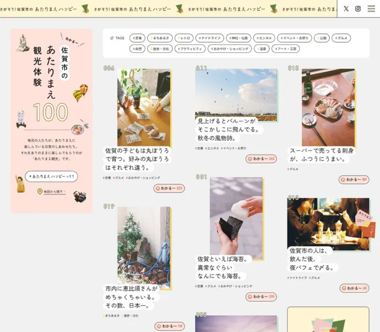
佐賀市の日常の魅力を紹介する観光情報サイト。縦書きの紹介パネル、写真と白い帯状見出しを組み合わせた記事一覧、住民インタビューを、柔らかな配色と写真コラージュで構成しています。
オリジナルサイトを見るSaga City / あたりまえ観光 — Style Reference
A local sightseeing scrapbook where ordinary pleasures become collectible stories.
Website: atarimae-kanko.com
Original URL: https://atarimae-kanko.com/
Final URL: https://atarimae-kanko.com/
Theme: light gray editorial canvas, pastel information panels, and a muted plum footer
Inspected: September 13, 2026, Japan Standard Time; supplied retrieval timestamp: 2026-09-12T16:52:50.256Z
Viewports: desktop 1440 × 1000 and mobile 390 × 844 CSS pixels
Scope: the current homepage: introduction, category controls, experience catalog, promotional and map tiles, section divider, interview previews, footer, campaign banner, and cookie notice. Desktop screenshots cover the opening and lower sections. Mobile screenshots show the introduction and footer; the supplied mobile DOM also measures the intervening catalog and interviews.
The page presents Saga City through the everyday experiences of its residents. Rounded Japanese typography, conversational headlines, numbered photographs, and small expressions of agreement make the catalog feel approachable. Pale peach, cream, and mint support the content without competing with the photography. Small photographic cutouts—balloons, food, statues, a mascot, and a resting cat—give the surrounding interface the character of a scrapbook.
The defining desktop composition is a tall illustrated introduction beside three independently packed article columns. Photographs retain different orientations. White rounded strips follow individual headline lines, while a small peach reaction button sits separately below each story. Farther down, wide interview photographs introduce people and suggested routes. Mobile turns the introductory rail into a substantial opening panel, then presents the experiences in one long column.
How to Read This Reference
- Measured values come from the supplied rendered element rectangles and computed styles. Decimal measurements are rounded for readability unless precision helps explain a relationship.
- Visual estimates describe details visible in the current screenshots whose elements were not individually sampled, such as yellow photo offsets and some lettering sizes.
- Derived values are calculations from measured rectangles. They do not establish the original CSS implementation.
- Recommended values and code are adaptations for a new implementation. Breakpoints, missing keyframes, and interaction outcomes are not reconstructed as source facts.
- Token names are descriptive aliases. The evidence contains WordPress preset variables, but those presets do not establish the site's active visual palette or spacing system.
- A sampled parent style does not necessarily describe nested lettering or embedded artwork. This matters particularly for the graphic headings and article titles.
Tokens — Colors
Default Palette
| Name | Value | Suggested token | Evidence and role |
|---|---|---|---|
| Page gray | #f1f1f1 |
--saga-canvas |
Measured body background; also measured on cookie decision links |
| Soft charcoal | #373334 |
--saga-ink |
Measured body text and many control wrappers |
| White | #ffffff |
--saga-white |
Measured link-panel surfaces; visibly used for headline strips and the tag panel |
| Peach | #ffe2da |
--saga-peach |
Measured reaction-button and offscreen navigation backgrounds; visually matches the introduction panel |
| Pale cream | #fff5d0 |
--saga-cream |
Measured inline project-information tile; a useful approximation of the visible header cream, whose own fill was not sampled |
| Mint | #e6f5ec |
--saga-mint |
Measured map-information tile |
| Muted plum | #63545c |
--saga-plum |
Measured footer background; cookie notice appears visually similar |
| Utility gray | #dcdcdc |
--saga-utility |
Measured fill of both main もっと見る buttons |
| Terracotta | #cf5738 |
--saga-terracotta |
Measured INTERVIEW label color; visually related to the interview companion panel |
| Navigation yellow | #fff1bb |
--saga-nav-yellow |
Measured About-link surface in the offscreen navigation; not an observed open-menu state |
Supporting Visual Accents
| Detail | Approximation | Status |
|---|---|---|
| Yellow offset behind photographs | #f6dd70 |
Visual estimate; exact declaration unavailable |
| Angular green brand fragment | #628348 |
Visual estimate from the current graphics |
| Ochre brand fragment | #c9994e |
Visual estimate from the current graphics |
| Warm reaction icon/count | Terracotta to orange-red | Visible accent; exact child-element color was not sampled |
Use the measured charcoal for ordinary text. Keep cream, mint, and peach as broad pale surfaces rather than assigning a different saturated fill to every category. The category hashtags introduce small colored marks while the words remain dark.
There is no observed theme selector or alternate color mode. The plum footer is a section treatment within the same page.
Tokens — Typography
Zen Maru Gothic — Main Editorial Voice
- Measured family:
"Zen Maru Gothic", serif. - Measured body:
16px, weight500, normal tracking. - Roles: introductory paragraphs, article-heading wrappers, reaction buttons, navigation wrappers, and much of the interface.
- Character: rounded, friendly Japanese lettering with moderate weight. The tone comes from the rounded forms and short conversational lines, rather than heavy display typography.
- Fallback limitation: the source stack ends in
serif. A new implementation must actually load the named font to obtain the intended rounded appearance.
Noto Sans JP — Explanatory and Utility Text
- Measured family:
"Noto Sans JP", sans-serif. - Roles: longer information-tile paragraphs, address details, privacy links, cookie text, and some interview metadata.
- Typical measured paragraph: desktop
14px / 25.2px, weight500; mobile14.56px / 26.208px. - Cookie controls:
13px, weight400; decision links use0.25pxtracking.
This second family gives longer explanations a more conventional reading texture while the rounded family carries the page's personality.
Comfortaa — Small English Labels
- Measured family:
Comfortaa, sans-serif. INTERVIEW: desktop12px / 13.2px, weight500; mobile12.48px / 13.728px.COURSE: desktop11px / 13.64px, weight400; mobile11.44px / 14.1856px.
The evidence does not establish that every English wordmark or outlined number uses Comfortaa.
Graphic Headings
The introduction combines vertical Japanese lettering, a stack of white shapes behind 佐賀市の, and a large outlined 100. Its sampled h1 has no text content and a graphic-sized rectangle. The visible lettering should therefore be treated as artwork whose exact construction is not supplied.
The h1 wrapper reports 32px; that is not a reliable font specification for the visible 100 or vertical lettering. The interview rail similarly contains a textless sampled h2 with a tall, narrow graphic footprint.
Type Scale
| Role | Desktop evidence | Mobile evidence | Interpretation |
|---|---|---|---|
| Base body | 16px, weight 500 |
16px, weight 500 |
Measured wrapper style |
| Introductory copy | 13px / 23.4px |
13.52px / 24.336px |
Measured; relaxed 1.8 leading |
| Information-tile copy | 14px / 25.2px |
14.56px / 26.208px |
Measured Noto Sans JP |
Article h3 wrapper |
18.72px, normal leading |
18.72px, normal leading |
Child lettering was not sampled |
| Three-line article-title box | 97.17px high |
101.02px high |
Measured geometry; about 32.39px and 33.67px per visible line |
| Visible article lettering | Approximately 22–24px |
Not separately shown in the mobile crops | Desktop visual estimate; do not substitute it for a measured font declaration |
| Map title | 20px / 20px |
20.8px / 20.8px |
Measured |
INTERVIEW |
12px / 13.2px |
12.48px / 13.728px |
Measured Comfortaa |
COURSE |
11px / 13.64px |
11.44px / 14.1856px |
Measured Comfortaa |
| Footer contact heading | 32px / 44.8px, weight 400 |
20.8px / 29.12px, weight 500 |
A deliberate responsive change |
| Footer address | 14px / 21px |
13.52px / 20.28px |
Measured Noto Sans JP |
| Cookie copy | 13px / 20px |
13px / 20px |
Remains fixed rather than following the other mobile scaling |
Preserve the rhythm of short editorial statements. The title treatment depends on individual lines with different widths, rather than one rectangular white heading panel.
Tokens — Spacing & Shapes
Density: generous between stories, compact within tags and reactions.
Geometry: square photographs; rounded information panels; strongly rounded headline strips and small buttons; fine outlines instead of soft elevation shadows.
Spacing Scale
| Use | Desktop | Mobile | Evidence |
|---|---|---|---|
| Main catalog outside inset | 40px |
20.8px |
Measured positions/padding |
| Interview/footer outside inset | 40px |
15.6px |
Measured padding |
| Rail-to-content gutter | 40px |
Stacked | Derived from desktop positions |
| Article column gutter | 40px |
One column | Derived from 310px cards starting at x = 390, 740, 1090 |
| Catalog link to reaction | 16px |
About 16.63px |
Derived from rectangles |
| Reaction to next ordinary story in the same column | 52px |
About 42px |
Derived from consecutive positions |
| Reaction internal gap | 4px |
4.16px |
Measured |
| Reaction padding | 8px |
8.32px |
Measured |
| Standard map-tile padding | 40px 32px 32px |
41.6px 33.28px 33.28px |
Measured |
| More-button vertical padding | 16px |
16.64px |
Measured |
| Desktop interview-row separation | 40px |
Content-dependent | Derived from link rectangles |
The inline promotional tile has different mobile padding from the map tile: 33.28px 24.96px 24.96px. Do not apply one universal information-card inset without checking content.
Border Radius and Edges
| Element | Value | Status |
|---|---|---|
| Information tiles and footer links | 12px desktop; 12.48px mobile |
Measured |
| Main more buttons | 8px desktop; 8.32px mobile |
Measured |
| About pill | 29px desktop; 30.16px mobile |
Measured |
| Reaction button | 30px desktop; 31.2px mobile |
Measured |
| Cookie decision links | 3px |
Measured |
| Headline strips and category chips | Capsule-like ends | Visual observation; exact radius unavailable |
| Photographs | Square corners | Visual observation |
| Photo offset | Approximately 6px right and down |
Visual estimate; hard yellow edge without blur |
| Fine outlines | Approximately 1px |
Visual estimate on tags, reactions, and map tile |
Layout Measurements
| Element | Desktop 1440 × 1000 |
Mobile 390 × 844 |
|---|---|---|
| Header | 1440 × 67px |
390 × 66.55px |
| Initial content top | 108px |
87.36px |
| Intro panel | Approximately 310 × 698px |
Approximately 348.4 × 610px |
| Intro heading graphic box | 138 × 289.39px |
143.52 × 300.95px |
| Main right-side content width | 1010px |
Catalog width 348.41px |
| Tag panel | Approximately 1010 × 111px |
Taller stacked region; complete panel rectangle unavailable |
| First article link | 310 × 420.17px, y = 259.19px |
348.41 × 505.98px, y = 1125.53px |
| Landscape article link, item 013 | 310 × 308.56px |
348.41 × 338.88px |
| Reaction button height | 33px |
34.22px |
| Catalog more button | 1010 × 59px |
348.41 × 62.25px |
| Interview main link | 800 × 574.63px |
358.81 × 229.63px |
| Footer partner link | Approximately 426.67 × 84px |
358.81 × 87.36px |
| Footer | 538.75px high |
999.89px high |
| Recorded document height | 5748.44px |
12610.17px |
Panel sizes marked approximate come from the screenshots. Measured anchor rectangles can include more than the underlying image, so they should not be treated as intrinsic asset dimensions.
Components
Persistent Header
Role: repeat the destination identity while keeping navigation available during the long page.
A pale cream strip spans the viewport with a fine dark bottom rule. The slogan さがそう!佐賀市の あたりまえハッピー repeats horizontally with small angular green-and-ochre graphics. The track is clipped at the viewport edges.
Desktop places X, Instagram, and the menu control in a white utility area at the right. The visible X and Instagram anchors measure approximately 19 × 28px and 20 × 28px. The sampled desktop menu button measures 26 × 24px.
On mobile, the visible social shortcuts disappear from the header and a roughly 65.55 × 64.55px menu button occupies the right edge. The repeated identity remains legible at essentially the same visual scale rather than shrinking to fit a whole phrase.
The header stays at the top across the supplied scrolled captures. Its persistent behavior is visible; the positioning declaration was not supplied.
Offscreen Navigation
Role: navigation and category access, evidenced by its rendered contents.
The initial DOM includes a panel immediately beyond the viewport's right edge: 375px wide on desktop and 390px wide on mobile. It contains home, categories, interview, About, project links, and social links. Peach, white, and pale yellow surfaces distinguish parts of the panel.
The panel was not opened. Do not infer its transition, backdrop, focus behavior, or final open-state layout. The repeated category text in the DOM partly comes from this offscreen navigation and does not mean two category panels are simultaneously visible.
Illustrated Introduction Panel
Role: establish the project's premise while remaining visually connected to the catalog.
The desktop panel sits at x = 40px, y = 108px, with a width of 310px. Its peach surface and approximately 12px corners frame a tall composition:
- Vertical title artwork and the outlined
100. - Small isolated photographs arranged around the title.
- A dotted horizontal divider.
- Four centered lines of explanatory copy.
- A white About pill labeled
#あたりまえハッピーって?. - An underlined
地図から探すlink with a yellow location pin and small outbound arrow.
The decorations include a statue, hot-air balloons, a mascot, food, and seaweed-wrapped rice. Their sizes and positions vary; they are not a uniform icon grid.
The rail remains beside later catalog content in the lower desktop capture and finishes near the catalog's end. This is consistent with section-bounded sticky positioning, although the exact sticky rule was not included.
Mobile gives the panel approximately 348.4px of width and places it before all category and article content. The graphic heading grows slightly, while the vertical gaps tighten. This is a rearranged composition rather than a scaled screenshot of the desktop rail.
Category Panel
Role: expose the breadth of the sightseeing collection.
The desktop panel is a white rounded rectangle above the three article columns. A small tag icon and TAGS label sit left of fifteen outlined category pills. The pills wrap over two rows in the current desktop capture.
Observed labels include 定番, まちあるき, レトロ, ナイトライフ, 神社・仏閣, グルメ, 自然, and 歴史・文化. A small colored hash introduces each label. The restrained outlines and white fill keep this region lighter than the photographic content below.
The screenshot suggests approximately 30–31px visible pill heights and small gaps. Those dimensions are visual estimates; individual chip styles were not sampled.
On mobile, the category region follows the introduction. Its TAGS label is recorded at y = 738.91px; the first story begins at y = 1125.53px. The cookie notice obscures this region in the opening mobile screenshot.
Filtering behavior, selected states, and whether multiple categories can be selected were not exercised.
Numbered Experience Story
Role: the primary editorial entry point.
An ordinary story has no enclosing white card or raised surface. Its anatomy is:
- A three-digit outlined identifier near the upper-left edge.
- A photograph, either narrow portrait or wider landscape.
- A hard yellow offset along the photograph's right and bottom edges.
- A heading made from separate rounded white line strips.
- Small inline category hashtags.
- A separate right-aligned reaction button below the article link.
The first desktop cards are numbered 085, 084, and 001. Identifiers appear twice in extracted text but once visually, consistent with layered visual treatment; they should not be rendered as two separate editorial numbers in an adaptation.
The portrait images in the first row appear approximately 200 × 310px, centered within 310px story widths. For the first card, the image starts about 55px to the right of the card edge. The headline begins at the card edge and overlaps the photograph's lower area by approximately 16px.
Landscape stories occupy more of the column width and have shorter overall link boxes. This difference creates the staggered rhythm farther down the catalog. The measured positions establish independent vertical packing; they do not identify whether the original uses a script, columns, or another layout technique.
Keep the small article category labels distinct from the outlined category controls above the collection.
Headline Line Strips
Role: make conversational Japanese copy readable while preserving the irregular silhouette of the composition.
Each short line has its own white background and rounded ends. The resulting outline changes width from line to line. The strips touch or nearly touch vertically, creating a soft stacked shape.
For example, the current seaweed story uses:
佐賀といえば海苔。異常なぐらいなんにでも海苔。
The title projects beyond the narrow photograph without requiring a solid rectangular text container. Preserve editorial line breaks for these short Japanese statements, while allowing longer or translated content to reflow safely.
Reaction Button
Role: invite recognition or agreement with a local observation.
A peach capsule combines a warm-colored outlined smile, わかる〜, and a numeric count. It has a fine dark border and a small light lower edge visible in the screenshots. Width changes with the count: sampled desktop examples range from about 111px to 122px, while height remains 33px.
The button is separate from the article anchor. Preserve this separation so reacting does not also navigate into the story.
Counts such as 94, 34, and 2012 are captured content values. No click was performed, so increment behavior, persistence, repeat-vote handling, and feedback animation remain unverified.
Inline Project and Map Tiles
Role: interrupt the photographic feed with context and practical planning information.
The project tile uses pale cream, branded artwork, a longer explanation, and a more-link treatment. Its desktop box measures 310 × 481.94px with 40px 32px 32px padding.
The map tile uses mint, a thin outline, rounded corners, a heading, paragraph, and underlined Google Map label with an outbound arrow. Its desktop box measures 310 × 313.75px.
These are larger informational anchors inserted into the same catalog flow. The map tile links to Google Maps; the inspected homepage does not show an embedded interactive map in this tile.
More Button
Role: continue an editorial collection.
A broad utility-gray button fills the available content width. It combines もっと見る with a small photographic cutout: a resting cat for the experience catalog and a plated dish near the interview collection.
The measured desktop button is 1010 × 59px, with 8px corners and 16px vertical padding. The muted fill is not evidence of a disabled state; the DOM identifies these elements as buttons. The loading or expansion outcome was not tested.
Full-width Editorial Divider
Role: provide breathing space between the experience catalog and interviews.
Large ATARIMAE HAPPY lettering repeats horizontally with isolated food, statue, and balloon photographs. Fine horizontal rules and broad gray space separate the sections without a large filled heading block.
The gap between the recorded catalog and interview section boxes is 286.39px on desktop and 239.5px on mobile. These are section-to-section measurements, not a separately sampled ticker height.
The repeating arrangement suggests a moving track, but its keyframes, speed, and direction are not available.
Interview Collection
Role: expand individual discoveries into routes guided by local people.
Desktop returns to a two-part composition: a white introductory rail at left and wide interview rows at right. Each row combines a large photographic link with a narrow terracotta companion panel. The photographic link measures 800 × 574.63px; the side panel appears approximately 200px wide.
The photo carries a white title near its lower-left corner. The companion panel contains a COURSE list, a small portrait, the person's name, and their years of connection to Saga City. Three interview previews are present in the supplied DOM.
On mobile, the main photo link becomes 358.81 × 229.63px. Course links and companion information move below it into neighboring left and right areas. They remain part of the same interview unit.
The longest mobile headline still has a recorded two-line heading box. The evidence does not establish whether its descendants wrap, clip, or use another size. A new implementation should explicitly test long titles rather than hardcoding an assumed two-line truncation policy.
Footer
Role: close the editorial experience with project identity, related destinations, and public contact details.
The full-width muted plum surface creates the page's strongest tonal shift. A centered brand graphic sits above a decorative area containing isolated local objects. Three white rounded destination links follow: the city-promotion project, the local-products project, and Saga City's official website.
Desktop places these links in one row with 40px gaps. Mobile stacks them with approximately 15.6px gaps. Their heights remain similar, while the footer grows from about 539px to 1000px overall.
The visible contact is Saga City Tourism Promotion Division, displayed as 佐賀市観光振興課. The footer provides a city-hall address, telephone link, privacy/terms link, social links, and Saga City copyright text. This identification is supported by the inspected homepage itself.
The desktop brand link is 336 × 89.95px; the mobile brand link is 214.23 × 129.83px. Their different proportions indicate a responsive composition change rather than uniform resizing.
Campaign Banner and Cookie Notice
Role: persistent campaign promotion and privacy choices.
The campaign banner links to /tsurekisei/. Its recorded desktop box is 468 × 152.31px, positioned 10px from the right and bottom viewport edges. It has bright blue and coral artwork and a separate circular close control visible in the screenshots.
The cookie notice forms a bottom strip with white Noto Sans JP text, an underlined privacy link, and two small light buttons: 同意する and 同意しない. The visible strip is approximately 61px high on desktop and 126px high on mobile. The decision links remain 30px high at both sizes.
On desktop the cookie strip overlaps the lower part of the campaign banner. On mobile the campaign anchor still exists at 332.8 × 108.7px, but its recorded position falls behind the cookie strip; only a small part of the close affordance is visible above it. Absence of visible banner artwork in the mobile screenshot does not establish that the banner is disabled on mobile.
Dismissal and preference persistence were not tested.
Tokens — Motion & Interaction
| Treatment | Evidence | Practical interpretation |
|---|---|---|
| Intro heading entrance | Measured animation: 1s cubic-bezier(0.34, 1.16, 0.64, 1) 0.25s forwards boyon |
A finite entrance is declared. The easing permits overshoot; transform keyframes are unavailable |
| Header repetition | Repeated clipped identity graphics with different positions across captures | Consistent with a looping track; timing and direction remain unverified |
| Editorial divider | Repeated words and cutout objects | Track-like composition is visible; no motion parameters were supplied |
| Decorative object positions | Different objects/positions appear in lower captures | Motion or responsive composition may contribute; trajectories cannot be recovered |
| Persistent header and overlays | Remain at viewport edges in scrolled captures | Persistence is observed; exact positioning and stacking declarations were not sampled |
| Desktop introductory rail | Remains beside later catalog content | Consistent with bounded sticky behavior; exact threshold unverified |
| Article navigation | Actual /taiken/…/ anchors are present |
Destinations are evidenced; destination pages were not inspected |
| Interview routes | Actual interview anchors and #spot_… links are present |
Route navigation is represented; scroll behavior at destinations untested |
| Menu, filters, reactions, more buttons, close controls | Controls or affordances are present | No activation outcomes, hover states, or persistence behavior were tested |
Many sampled elements report transition: all without a nonzero duration. This is not evidence of a timed transition system.
For a new implementation, a small title entrance and restrained horizontal decoration can support the friendly tone. Any replacement keyframes or durations must be treated as design choices. Provide a static reduced-motion state and avoid making every article animate independently.
Surfaces
| Layer | Appearance | Purpose |
|---|---|---|
| Page | Flat light gray | Shared space around editorial content |
| Introduction | Peach, rounded, illustrated | Establishes the project identity |
| Tag region | White rounded panel | Groups discovery controls |
| Ordinary story | Transparent background | Keeps photographs and irregular titles visually independent |
| Photo accent | Hard yellow offset | Adds a paper-like edge without elevation blur |
| Headline | Separate white capsule strips | Creates readable, uneven line silhouettes |
| Inline information | Cream or mint, rounded; map has a fine outline | Marks context and planning information |
| Reaction | Peach capsule with fine outline | Compact participation affordance |
| More control | Utility gray, softly rounded | Broad continuation target |
| Interview companion area | Terracotta with light lettering and labels | Groups route and person information |
| Footer | Muted plum with white destination panels | Creates a clear closing section |
| Cookie notice | Plum-like strip with light decision links | Persistent utility layer |
The site has no visible general-purpose elevation scale. Avoid converting the hard yellow image edge into a diffuse shadow or enclosing every story in a rounded card.
Imagery
The main photography records specific ordinary experiences: a statue associated with a local origin story, dictionary pages, hands wrapping rice in seaweed, balloon exhibits, a night-time parfait outing, monuments, and neighborhood scenes. Natural light, recognizable objects, and everyday human gestures carry the content.
Keep portrait and landscape images distinct. The narrow portrait photographs leave space around them, while landscape photographs can fill a story column. The title may extend beyond the image width.
Decorative cutouts form a second image system. They isolate local objects from their backgrounds and place them at playful scales around headings, buttons, dividers, and the footer. Preserve their photographic character and irregular silhouettes. They do not behave like a uniform family of vector icons.
The angular green, mint, peach, and ochre brand fragments provide a small geometric counterpoint. They should stay sparse enough that the photography remains dominant.
Observed Asset References
The following image URLs appear explicitly in the supplied rendered homepage evidence. They were not opened separately, and intrinsic dimensions were not supplied.
| Asset | Observed path relative to the original website | Homepage context |
|---|---|---|
| Interview 009 photograph | wp-content/uploads/2026/06/18000041.jpg |
First interview preview |
| Interview 008 photograph | wp-content/uploads/2026/05/3000019.jpg |
Second interview preview |
| Interview 007 photograph | wp-content/uploads/2025/10/14000037.jpg |
Third interview preview |
Exact paths for the introduction artwork, article photographs, decorative cutouts, wordmarks, and campaign banner were not supplied. Do not invent asset filenames or infer their file formats from appearance alone.
Use authorized original assets when available. Recreating the layout in CSS will not reproduce the identity carried by the photographs and custom title graphics.
Layout & Responsive Behavior
Desktop: A Rail Beside Three Staggered Columns
At 1440px, the main content spans x = 40px to x = 1400px, giving 1360px of usable width. The introduction takes 310px, followed by a 40px gutter and 1010px of editorial content. That content holds three 310px article columns separated by 40px.
The first three story links share y = 259.19px. Later positions diverge because landscape stories and information tiles have different heights. Do not force all subsequent stories into equal-height rows if reproducing the original rhythm.
The interview section reuses the rail/content relationship but changes the right-side content into broad photo-and-details rows.
Mobile: Introduction, Categories, Then One Feed
At 390px, the experience section uses approximately 20.8px side insets. The introduction occupies the first substantial screen area. Categories follow, then the first article begins at y = 1125.53px—below the initial viewport.
All sampled experience links share x = 20.80px and width 348.41px. The current content becomes a long single-column sequence, including the inline project and map tiles.
The interview and footer sections use slightly smaller 15.6px side insets, yielding 358.81px content widths. Interview route/person information moves below each photo, while footer destination links stack vertically.
Scaling Evidence and Limits
Many mobile values equal a desktop or base value multiplied by 1.04: 13 → 13.52, 14 → 14.56, 200 → 208, and 12 → 12.48. Since 390 / 375 = 1.04, these measurements are consistent with selected dimensions authored against a 375px mobile reference width.
This is an inference from matching values, not a recovered global CSS formula. The 16px body, 18.72px article-heading wrappers, and 13px cookie text demonstrate that not everything scales this way.
Only two viewport widths were supplied. Tablet columns, breakpoint locations, landscape behavior, and safe-area rules are unverified. The Quick Start uses explicit recommended breakpoints rather than claiming to reproduce the original ones.
Do’s and Don’ts
Do
- Preserve the desktop relationship between a tall introduction and three staggered article columns.
- Move the introduction before the feed on mobile and retain its illustrated composition.
- Use the measured light gray, charcoal, peach, cream, mint, and plum as the foundation.
- Load Zen Maru Gothic for the rounded editorial voice and Noto Sans JP for longer utility copy.
- Give individual headline lines their own rounded white backing.
- Keep narrow portrait images alongside wider landscape images.
- Retain the hard yellow photo offset and square image corners.
- Place reactions outside article links and align them to the right.
- Use local photographic cutouts sparingly around important transitions and controls.
- Preserve interview routes, local-person information, map access, and city contact details as substantive content.
Don’t
- Don’t flatten the collection into a generic hero, feature grid, and conversion button sequence.
- Don’t put every story inside an identical white rounded card.
- Don’t normalize all photographs to the same crop or all stories to the same height.
- Don’t replace the headline strips with one broad rectangular text panel.
- Don’t infer the graphic title's lettering from its parent
h1font size. - Don’t use every available WordPress preset as part of the active brand palette.
- Don’t treat muted more buttons as disabled without interaction evidence.
- Don’t claim that reactions increment, filters combine, or menus slide with a particular duration when those actions were not observed.
- Don’t remove the mobile campaign from the analysis merely because the cookie notice covers it.
- Don’t copy the overlay collision into a new implementation without assessing whether both elements remain usable.
Recommended Implementation Additions
These are recommendations for a new implementation, not verified features of the inspected site:
- Give the menu, social icons, banner close control, and graphic links meaningful accessible names. Avoid repeated focusable copies in a decorative identity track.
- Provide equivalent accessible text for the introduction and interview heading artwork.
- Use a semantic reading order for stories. A masonry layout should not create a confusing keyboard sequence or reshuffle content after images load.
- Reserve image dimensions and remeasure packed layouts after font and image changes.
- Keep the visible reaction capsule compact while providing an adequate touch target. The measured
33–34pxheight is smaller than a recommended44pxtarget. - Define visible focus and selected states for categories, then implement selection semantics according to the actual filtering model.
- Test long Japanese headlines, translations, and zoom without clipping white strips or interview titles.
- Coordinate the campaign banner with the actual cookie-notice height. Both close controls and privacy choices should remain reachable.
- Give the menu an explicit open/closed state and implement focus management if it behaves as a modal drawer.
- Provide reduced-motion behavior for looping decoration and any new heading entrance.
Agent Prompt Guide
Quick Color Reference
- Canvas:
#f1f1f1. - Main text and fine outlines:
#373334. - Introduction and reaction fill:
#ffe2da. - Headline strips, tag panel, footer links:
#ffffff. - Project tile:
#fff5d0. - Map tile:
#e6f5ec. - Footer:
#63545c. - More controls:
#dcdcdc. - Measured interview label:
#cf5738. - Approximate photograph offset:
#f6dd70.
Overall Prompt
“Create a Japanese local-tourism editorial homepage inspired by Saga City's あたりまえ観光. Use a light gray canvas, charcoal Zen Maru Gothic text, peach introduction panel, cream and mint information tiles, and a muted plum footer. At a 1440px viewport, place a 310px illustrated introduction rail beside three 310px story columns with 40px gutters. Mix narrow portrait photographs and full-column landscape photographs, each with a small hard yellow offset. Place conversational Japanese headlines on separate rounded white line strips overlapping the image bottom. Add small inline hashtags and a separate right-aligned peach agreement button. Continue into large interview previews with route and person details. On mobile, place the introduction first, then categories and a single story feed. Use local photographic cutouts as sparse decoration.”
Example Component Prompts
- Introduction: “A tall peach panel with vertical Japanese title artwork, white backing behind the place name, a large outlined 100, and small isolated photographs of balloons, food, a statue, and a mascot. Add a dotted divider, four centered lines of explanatory text, a white outlined About pill, and an underlined map link with a yellow location pin.”
- Experience story: “A transparent editorial card with a small outlined three-digit number, a centered narrow portrait photograph, a 6px hard yellow offset, three individually rounded white headline strips, small category hashtags, and a peach smile-and-count button aligned right below the link. Keep the photograph square-cornered.”
- Category panel: “A white rounded discovery panel with a small tag icon, TAGS label, and fifteen thin outlined category pills. Use dark rounded Japanese text with small colored hash marks. Let pills wrap naturally; do not make each category a saturated badge.”
- Interview preview: “A broad local-life photograph with a white title near its lower-left edge and a terracotta companion panel containing a compact route list, portrait, name, and years connected to the city. On mobile, move the route and person information beneath the photo into adjacent columns.”
- Footer: “A muted plum footer with a centered project mark, a spacious band of isolated local objects, three white rounded destination links, and clear city contact details. Stack the destination links on mobile and maintain adequate space above fixed utility notices.”
Quick Start
CSS Custom Properties
This is a recommended adaptation, not extracted source code. It uses measured colors and desktop dimensions, visually estimated title/photo details, and proposed breakpoints at 1100px and 768px. Named fonts must be loaded separately. The base grid works without JavaScript; the optional packing helper restores a staggered desktop layout.
:root {
  /* Measured palette */
  --saga-canvas: #f1f1f1;
  --saga-ink: #373334;
  --saga-white: #ffffff;
  --saga-peach: #ffe2da;
  --saga-cream: #fff5d0;
  --saga-mint: #e6f5ec;
  --saga-plum: #63545c;
  --saga-utility: #dcdcdc;
  --saga-terracotta: #cf5738;

  /* Visual approximation */
  --saga-photo-edge: #f6dd70;

  --font-rounded: 'Zen Maru Gothic', serif;
  --font-copy: 'Noto Sans JP', sans-serif;
  --font-label: Comfortaa, sans-serif;
  --header-height: 67px;
  --page-inset: 40px;
  --column-gap: 40px;
  --story-gap: 52px;
  --panel-radius: 12px;
  --photo-offset: 6px;
  --consent-height: 0px;
}

* { box-sizing: border-box; }

body.saga-page {
  margin: 0;
  color: var(--saga-ink);
  background: var(--saga-canvas);
  font: 500 16px var(--font-rounded);
}

.saga-page a { color: inherit; }
.saga-page button { font: inherit; cursor: pointer; }
.saga-page img { display: block; max-width: 100%; }

.site-header {
  position: fixed;
  inset: 0 0 auto;
  z-index: 30;
  display: flex;
  height: var(--header-height);
  border-bottom: 1px solid var(--saga-ink);
  background: var(--saga-cream);
}

.identity-window { flex: 1; min-width: 0; overflow: hidden; }
.identity-track { display: flex; align-items: center; height: 100%; gap: 20px; }
.identity-track > * { flex: 0 0 337px; }
.header-tools { display: flex; align-items: center; gap: 24px; padding: 0 20px; background: white; }
.menu-toggle { display: grid; place-items: center; min-width: 44px; min-height: 44px; border: 0; background: transparent; }

.page-section {
  width: calc(100% - 2 * var(--page-inset));
  max-width: 1360px;
  margin-inline: auto;
}

.experience-section { padding-top: 108px; }

.section-layout {
  display: grid;
  grid-template-columns: calc((100% - 120px) / 4) minmax(0, 1fr);
  align-items: start;
  gap: var(--column-gap);
}

.section-content { min-width: 0; }

.intro-panel {
  position: sticky;
  top: 108px;
  padding: 62px 0 67px;
  border-radius: var(--panel-radius);
  background: var(--saga-peach);
  text-align: center;
}

.intro-art { width: 138px; height: auto; margin-inline: auto; }
.intro-copy { margin: 62px 0 32px; font-size: 13px; line-height: 1.8; }

.about-pill {
  display: flex;
  align-items: center;
  justify-content: center;
  width: 200px;
  min-height: 42px;
  margin-inline: auto;
  border: 1px solid var(--saga-ink);
  border-radius: 29px;
  background: white;
  text-decoration: none;
}

.map-link { display: inline-flex; align-items: center; gap: 4px; margin-top: 24px; }

.filter-panel {
  display: flex;
  align-items: flex-start;
  gap: 20px;
  padding: 20px 24px;
  margin-bottom: 40px;
  border-radius: var(--panel-radius);
  background: white;
}

.filter-label { flex: none; margin: 0; font-size: 13px; line-height: 32px; }
.filter-list { display: flex; flex-wrap: wrap; gap: 8px; }

.tag-chip {
  min-height: 31px;
  padding: 5px 12px;
  border: 1px solid var(--saga-ink);
  border-radius: 999px;
  background: white;
  color: var(--saga-ink);
  font-size: 12px;
}

/* Recommended selected state; not an observed interaction. */
.tag-chip[aria-pressed='true'] { background: var(--saga-peach); }

.story-grid {
  display: grid;
  grid-template-columns: repeat(3, minmax(0, 1fr));
  align-items: start;
  gap: var(--story-gap) var(--column-gap);
}

.story { min-width: 0; }
.story-inner { position: relative; display: flow-root; }
.story-link { display: block; text-decoration: none; }

.story-number {
  position: absolute;
  top: -16px;
  left: 3px;
  z-index: 2;
  color: var(--saga-cream);
  font-size: 22px;
  letter-spacing: .08em;
  -webkit-text-stroke: .6px var(--saga-ink);
}

.story-media {
  margin: 0 auto;
  box-shadow: var(--photo-offset) var(--photo-offset) 0 var(--saga-photo-edge);
}

.story-media.is-portrait { width: min(100%, 200px); height: 310px; }
.story-media.is-landscape { width: 100%; aspect-ratio: 25 / 16; }
.story-media img { width: 100%; height: 100%; object-fit: cover; }

/* Estimated lettering size with a measured three-line rhythm. */
.story-title {
  position: relative;
  z-index: 1;
  display: flex;
  flex-direction: column;
  align-items: flex-start;
  margin: -16px 0 0;
  font-size: 22px;
  font-weight: 500;
  line-height: 1.4727;
}

.story-title > span {
  max-width: 100%;
  padding-inline: 10px;
  border-radius: 999px;
  background: white;
  overflow-wrap: anywhere;
}

.story-tags { margin: 12px 0 0; font-size: 12px; line-height: 17px; }
.story-tags .hash { color: var(--saga-terracotta); }

.reaction {
  display: flex;
  align-items: center;
  gap: 4px;
  min-height: 33px;
  margin: 16px 0 0 auto;
  padding: 8px;
  border: 1px solid var(--saga-ink);
  border-radius: 30px;
  background: var(--saga-peach);
  font-size: 14px;
  line-height: 15px;
  box-shadow: 0 3px 0 white;
}

.reaction-icon, .reaction-count { color: var(--saga-terracotta); }

.info-tile {
  display: block;
  padding: 40px 32px 32px;
  border: 1px solid var(--saga-ink);
  border-radius: var(--panel-radius);
  text-decoration: none;
}

.info-tile.is-project { background: var(--saga-cream); }
.info-tile.is-map { background: var(--saga-mint); }
.info-tile p { font: 500 14px/1.8 var(--font-copy); }

.more-button {
  display: flex;
  align-items: center;
  justify-content: center;
  gap: 16px;
  width: 100%;
  min-height: 59px;
  margin-top: 40px;
  padding: 16px;
  border: 0;
  border-radius: 8px;
  background: var(--saga-utility);
}

.more-button img { width: 80px; height: 36px; object-fit: contain; }

.editorial-divider {
  overflow: hidden;
  padding-block: 90px;
  margin-top: 60px;
  border-block: 1px solid #dedede;
}

.divider-track { display: flex; align-items: center; gap: 56px; width: max-content; }
.divider-track img { width: 80px; height: 80px; object-fit: contain; }
.divider-track span { font-size: 44px; white-space: nowrap; }

.interview-section { padding-block: 128px 40px; }
.interview-list { display: grid; gap: 40px; }
.interview-row { display: grid; grid-template-columns: minmax(0, 4fr) minmax(0, 1fr); }
.interview-photo { position: relative; overflow: hidden; border-radius: var(--panel-radius); }
.interview-photo img { width: 100%; height: 100%; object-fit: cover; }
.interview-title { position: absolute; inset: auto 60px 60px; margin: 0; color: white; font-size: 26px; }
.interview-details { display: grid; align-content: space-between; gap: 32px; padding: 40px 24px; border-radius: var(--panel-radius); background: var(--saga-terracotta); color: white; }
.english-label { font-family: var(--font-label); font-size: 12px; }

.site-footer { padding: 80px 40px 46px; background: var(--saga-plum); color: white; }
.footer-brand { display: block; width: 336px; margin-inline: auto; }
.footer-destinations { display: grid; grid-template-columns: repeat(3, minmax(0, 1fr)); gap: 40px; margin-top: 100px; }
.footer-destinations a { display: flex; align-items: center; justify-content: center; min-height: 84px; border-radius: 12px; background: white; color: var(--saga-ink); }
.footer-contact { margin-top: 40px; }
.footer-contact h2 { margin: 0 0 12px; font-size: 32px; font-weight: 400; }
.footer-contact p { font: 500 14px/1.5 var(--font-copy); }

.cookie-notice {
  position: fixed;
  inset: auto 0 0;
  z-index: 50;
  display: flex;
  align-items: center;
  justify-content: center;
  gap: 30px;
  padding: 15px 40px;
  background: var(--saga-plum);
  color: white;
  font: 400 13px/20px var(--font-copy);
}

.cookie-notice p { margin: 0; }
.cookie-actions { display: flex; flex: none; gap: 10px; }
.cookie-actions button { min-height: 30px; padding: 8px 10px; border: 0; border-radius: 3px; background: var(--saga-canvas); color: var(--saga-ink); font-size: 13px; }

/* Recommended stacking: keep campaign artwork above the notice. */
.campaign-banner { position: fixed; right: 10px; bottom: calc(var(--consent-height) + 12px); z-index: 40; width: min(468px, calc(100vw - 40px)); }

/* Enabled by the optional height-packing helper. */
.story-grid.is-packed { grid-auto-rows: 1px; row-gap: 0; }
.story-grid.is-packed .story-inner { padding-bottom: var(--story-gap); }
.story.is-note { --story-gap: 32px; }

.saga-page :focus-visible { outline: 2px solid var(--saga-ink); outline-offset: 4px; }
.site-footer :focus-visible, .cookie-notice :focus-visible { outline-color: white; }

@media (max-width: 1099px) {
  .section-layout { grid-template-columns: minmax(0, 1fr); }
  .intro-panel { position: static; width: min(100%, 380px); margin-inline: auto; }
  .story-grid { grid-template-columns: repeat(2, minmax(0, 1fr)); }
  .interview-row { grid-template-columns: minmax(0, 3fr) minmax(180px, 1fr); }
}

@media (max-width: 767px) {
  :root {
    /* Capped adaptation of the inferred 375px reference scale. */
    --m: min(1.2px, calc(100vw / 375));
    --header-height: 66.55px;
    --page-inset: calc(20 * var(--m));
    --story-gap: 42px;
    --panel-radius: calc(12 * var(--m));
  }

  .experience-section { padding-top: calc(84 * var(--m)); }
  .header-tools { padding: 0; }
  .header-social { display: none; }
  .menu-toggle { width: 66px; height: 65px; }
  .intro-panel { max-width: none; padding: calc(36 * var(--m)) 0 calc(40 * var(--m)); }
  .intro-art { width: calc(138 * var(--m)); }
  .intro-copy { margin: calc(34.4 * var(--m)) 0 calc(13 * var(--m)); font-size: calc(13 * var(--m)); }
  .about-pill { width: calc(200 * var(--m)); min-height: calc(41.7 * var(--m)); }
  .map-link { margin-top: calc(12 * var(--m)); }
  .filter-panel { flex-direction: column; gap: 12px; padding: 20px 24px; }
  .story-grid { grid-template-columns: minmax(0, 1fr); }

  /* Recommended mobile crop; image-element measurements were unavailable. */
  .story-media.is-portrait { width: min(75%, 260px); height: 390px; }
  .story-title { font-size: calc(22 * var(--m)); }
  .info-tile { padding: 32px 24px; }
  .more-button { min-height: 62px; }
  .interview-section { width: calc(100% - 30 * var(--m)); padding-top: calc(104 * var(--m)); }
  .interview-row { grid-template-columns: minmax(0, 1fr); }
  .interview-photo { aspect-ratio: 25 / 16; }
  .interview-title { inset: auto 32px 32px; font-size: 18px; line-height: 1.4; }
  .interview-details { grid-template-columns: minmax(0, 1fr) minmax(0, 1fr); gap: 20px; padding: 24px; }
  .site-footer { padding: calc(60 * var(--m)) calc(15 * var(--m)) 48px; }
  .footer-brand { width: 214px; }
  .footer-destinations { grid-template-columns: minmax(0, 1fr); gap: calc(15 * var(--m)); }
  .footer-destinations a { min-height: calc(84 * var(--m)); }
  .footer-contact h2 { font-size: calc(20 * var(--m)); font-weight: 500; }
  .cookie-notice { flex-direction: column; gap: 6px; padding: 15px 25px; }
  .campaign-banner { right: 50%; transform: translateX(50%); width: min(333px, calc(100vw - 40px)); }
}

@media (prefers-reduced-motion: reduce) {
  .identity-track, .divider-track, .intro-art { animation: none !important; transform: none !important; }
}
Minimal Story Markup
The photo URL below is an explicit placeholder. Replace it with an authorized asset. The example reproduces the observed content anatomy; it does not implement voting.
<article class="story">
  <div class="story-inner">
    <a class="story-link" href="https://atarimae-kanko.com/taiken/085/">
      <span class="story-number" aria-hidden="true">085</span>
      <figure class="story-media is-portrait">
        <img
          src="YOUR_AUTHORIZED_PHOTO_URL"
          width="200"
          height="310"
          alt="Statue holding a rectangular relief"
        >
      </figure>
      <h3 class="story-title">
        <span>あの「グリコ」は、</span>
        <span>実は佐賀市が起源。</span>
        <span>誕生秘話がおもしろい。</span>
      </h3>
      <p class="story-tags">
        <span class="hash">#</span>まちあるき
        <span class="hash">#</span>歴史・文化
      </p>
    </a>
    <button class="reaction" type="button">
      <span class="reaction-icon" aria-hidden="true">☺</span>
      <span>わかる〜</span>
      <span class="reaction-count">94</span>
    </button>
  </div>
</article>
Optional Layout Helpers
This recommended helper measures each story's inner content, including its bottom spacing, and assigns grid row spans. It preserves DOM order and avoids dense backfilling. Resize observation responds to image, font, and width changes. It is not a claim about the original layout engine.
The second helper measures the cookie notice so the campaign can sit above it. Connect actual consent and close behavior separately; these helpers only manage geometry.
const desktopPacking = window.matchMedia('(min-width: 768px)');

for (const grid of document.querySelectorAll('.story-grid')) {
  const inners = [...grid.querySelectorAll(':scope > .story > .story-inner')];
  let scheduled = false;

  const pack = () => {
    scheduled = false;
    const enabled = desktopPacking.matches;
    grid.classList.toggle('is-packed', enabled);

    for (const inner of inners) {
      inner.parentElement.style.gridRowEnd = enabled
        ? `span ${Math.max(1, Math.ceil(inner.getBoundingClientRect().height))}`
        : '';
    }
  };

  const schedule = () => {
    if (scheduled) return;
    scheduled = true;
    requestAnimationFrame(pack);
  };

  const observer = new ResizeObserver(schedule);
  inners.forEach(inner => observer.observe(inner));
  desktopPacking.addEventListener('change', schedule);
  pack();
}

const notice = document.querySelector('.cookie-notice');
if (notice) {
  const updateNoticeHeight = () => {
    document.documentElement.style.setProperty(
      '--consent-height',
      `${notice.getBoundingClientRect().height}px`
    );
  };
  new ResizeObserver(updateNoticeHeight).observe(notice);
  updateNoticeHeight();
}
For a dynamically expanded catalog, register newly inserted story elements with the layout observer. For a component-based application, disconnect observers when the corresponding component unmounts.
Tailwind v4 Token Mapping
Optional aliases for a project already using Tailwind v4. Define the CSS custom properties above first. This does not imply the original uses Tailwind.
@theme inline {
  --color-canvas: var(--saga-canvas);
  --color-ink: var(--saga-ink);
  --color-peach: var(--saga-peach);
  --color-cream: var(--saga-cream);
  --color-mint: var(--saga-mint);
  --color-plum: var(--saga-plum);
  --color-terracotta: var(--saga-terracotta);
  --color-photo-edge: var(--saga-photo-edge);
  --font-saga: var(--font-rounded);
  --font-reading: var(--font-copy);
  --font-label: Comfortaa, sans-serif;
  --radius-panel: var(--panel-radius);
  --spacing-column-gap: var(--column-gap);
}
Sources & Evidence
- Inspected original and final website: 佐賀市のあたりまえ観光. The supplied observation records HTTP
200with an unchanged final URL. - Capture time:
2026-09-12T16:52:50.256Z, equivalent to September 13, 2026 at 01:52:50.256 JST. - Desktop evidence: three current screenshot crops at
1440 × 1000, plus rendered text, links, element rectangles, and computed styles. Recorded document height:5748.4375px. - Mobile evidence: two current screenshot crops at
390 × 844, plus rendered text, links, element rectangles, and computed styles. Recorded document height:12610.171875px. - Observed scope: initial rendered state and scrolling through lower homepage sections. Header persistence, lower-page composition, and overlay overlap are visible. Mobile catalog and interview geometry also comes from DOM measurements beyond the supplied image crops.
- Capture limitations: readiness checks waited for load, visible images, finite animation settling, and sampled layout/text stability within time limits. Perpetual animations were paused during readiness checks and resumed afterward. These checks do not establish completeness of delayed content or reveal untested interaction states. SharedWorkers and service workers were disabled during inspection.
- Unverified behavior: menu opening, category filtering, reactions, more-button loading, link destinations after navigation, hover/focus styling, cookie persistence, campaign dismissal, full animation keyframes, and responsive behavior between the two measured widths.
- Analysis boundary: this reference uses only the supplied current-page screenshots and rendered evidence. No additional browsing, commands, asset retrieval, or file inspection was performed.
Measured declarations, derived relationships, visual estimates, and recommended implementation choices are distinguished throughout. The CSS and helpers provide a reusable adaptation; they are not a recovered copy of the original stylesheet or application behavior.
# Saga City / あたりまえ観光 — Style Reference

> A local sightseeing scrapbook where ordinary pleasures become collectible stories.

**Website:** [atarimae-kanko.com](https://atarimae-kanko.com/)
**Original URL:** https://atarimae-kanko.com/
**Final URL:** https://atarimae-kanko.com/
**Theme:** light gray editorial canvas, pastel information panels, and a muted plum footer
**Inspected:** September 13, 2026, Japan Standard Time; supplied retrieval timestamp: `2026-09-12T16:52:50.256Z`
**Viewports:** desktop `1440 × 1000` and mobile `390 × 844` CSS pixels
**Scope:** the current homepage: introduction, category controls, experience catalog, promotional and map tiles, section divider, interview previews, footer, campaign banner, and cookie notice. Desktop screenshots cover the opening and lower sections. Mobile screenshots show the introduction and footer; the supplied mobile DOM also measures the intervening catalog and interviews.

The page presents Saga City through the everyday experiences of its residents. Rounded Japanese typography, conversational headlines, numbered photographs, and small expressions of agreement make the catalog feel approachable. Pale peach, cream, and mint support the content without competing with the photography. Small photographic cutouts—balloons, food, statues, a mascot, and a resting cat—give the surrounding interface the character of a scrapbook.

The defining desktop composition is a tall illustrated introduction beside three independently packed article columns. Photographs retain different orientations. White rounded strips follow individual headline lines, while a small peach reaction button sits separately below each story. Farther down, wide interview photographs introduce people and suggested routes. Mobile turns the introductory rail into a substantial opening panel, then presents the experiences in one long column.

## How to Read This Reference

- **Measured** values come from the supplied rendered element rectangles and computed styles. Decimal measurements are rounded for readability unless precision helps explain a relationship.
- **Visual estimates** describe details visible in the current screenshots whose elements were not individually sampled, such as yellow photo offsets and some lettering sizes.
- **Derived** values are calculations from measured rectangles. They do not establish the original CSS implementation.
- **Recommended** values and code are adaptations for a new implementation. Breakpoints, missing keyframes, and interaction outcomes are not reconstructed as source facts.
- Token names are descriptive aliases. The evidence contains WordPress preset variables, but those presets do not establish the site's active visual palette or spacing system.
- A sampled parent style does not necessarily describe nested lettering or embedded artwork. This matters particularly for the graphic headings and article titles.

## Tokens — Colors

### Default Palette

| Name | Value | Suggested token | Evidence and role |
| --- | --- | --- | --- |
| Page gray | `#f1f1f1` | `--saga-canvas` | Measured body background; also measured on cookie decision links |
| Soft charcoal | `#373334` | `--saga-ink` | Measured body text and many control wrappers |
| White | `#ffffff` | `--saga-white` | Measured link-panel surfaces; visibly used for headline strips and the tag panel |
| Peach | `#ffe2da` | `--saga-peach` | Measured reaction-button and offscreen navigation backgrounds; visually matches the introduction panel |
| Pale cream | `#fff5d0` | `--saga-cream` | Measured inline project-information tile; a useful approximation of the visible header cream, whose own fill was not sampled |
| Mint | `#e6f5ec` | `--saga-mint` | Measured map-information tile |
| Muted plum | `#63545c` | `--saga-plum` | Measured footer background; cookie notice appears visually similar |
| Utility gray | `#dcdcdc` | `--saga-utility` | Measured fill of both main `もっと見る` buttons |
| Terracotta | `#cf5738` | `--saga-terracotta` | Measured `INTERVIEW` label color; visually related to the interview companion panel |
| Navigation yellow | `#fff1bb` | `--saga-nav-yellow` | Measured About-link surface in the offscreen navigation; not an observed open-menu state |

### Supporting Visual Accents

| Detail | Approximation | Status |
| --- | --- | --- |
| Yellow offset behind photographs | `#f6dd70` | Visual estimate; exact declaration unavailable |
| Angular green brand fragment | `#628348` | Visual estimate from the current graphics |
| Ochre brand fragment | `#c9994e` | Visual estimate from the current graphics |
| Warm reaction icon/count | Terracotta to orange-red | Visible accent; exact child-element color was not sampled |

Use the measured charcoal for ordinary text. Keep cream, mint, and peach as broad pale surfaces rather than assigning a different saturated fill to every category. The category hashtags introduce small colored marks while the words remain dark.

There is no observed theme selector or alternate color mode. The plum footer is a section treatment within the same page.

## Tokens — Typography

### Zen Maru Gothic — Main Editorial Voice

- **Measured family:** `"Zen Maru Gothic", serif`.
- **Measured body:** `16px`, weight `500`, normal tracking.
- **Roles:** introductory paragraphs, article-heading wrappers, reaction buttons, navigation wrappers, and much of the interface.
- **Character:** rounded, friendly Japanese lettering with moderate weight. The tone comes from the rounded forms and short conversational lines, rather than heavy display typography.
- **Fallback limitation:** the source stack ends in `serif`. A new implementation must actually load the named font to obtain the intended rounded appearance.

### Noto Sans JP — Explanatory and Utility Text

- **Measured family:** `"Noto Sans JP", sans-serif`.
- **Roles:** longer information-tile paragraphs, address details, privacy links, cookie text, and some interview metadata.
- **Typical measured paragraph:** desktop `14px / 25.2px`, weight `500`; mobile `14.56px / 26.208px`.
- **Cookie controls:** `13px`, weight `400`; decision links use `0.25px` tracking.

This second family gives longer explanations a more conventional reading texture while the rounded family carries the page's personality.

### Comfortaa — Small English Labels

- **Measured family:** `Comfortaa, sans-serif`.
- **`INTERVIEW`:** desktop `12px / 13.2px`, weight `500`; mobile `12.48px / 13.728px`.
- **`COURSE`:** desktop `11px / 13.64px`, weight `400`; mobile `11.44px / 14.1856px`.

The evidence does not establish that every English wordmark or outlined number uses Comfortaa.

### Graphic Headings

The introduction combines vertical Japanese lettering, a stack of white shapes behind `佐賀市の`, and a large outlined `100`. Its sampled `h1` has no text content and a graphic-sized rectangle. The visible lettering should therefore be treated as artwork whose exact construction is not supplied.

The `h1` wrapper reports `32px`; that is not a reliable font specification for the visible `100` or vertical lettering. The interview rail similarly contains a textless sampled `h2` with a tall, narrow graphic footprint.

### Type Scale

| Role | Desktop evidence | Mobile evidence | Interpretation |
| --- | --- | --- | --- |
| Base body | `16px`, weight `500` | `16px`, weight `500` | Measured wrapper style |
| Introductory copy | `13px / 23.4px` | `13.52px / 24.336px` | Measured; relaxed `1.8` leading |
| Information-tile copy | `14px / 25.2px` | `14.56px / 26.208px` | Measured Noto Sans JP |
| Article `h3` wrapper | `18.72px`, normal leading | `18.72px`, normal leading | Child lettering was not sampled |
| Three-line article-title box | `97.17px` high | `101.02px` high | Measured geometry; about `32.39px` and `33.67px` per visible line |
| Visible article lettering | Approximately `22–24px` | Not separately shown in the mobile crops | Desktop visual estimate; do not substitute it for a measured font declaration |
| Map title | `20px / 20px` | `20.8px / 20.8px` | Measured |
| `INTERVIEW` | `12px / 13.2px` | `12.48px / 13.728px` | Measured Comfortaa |
| `COURSE` | `11px / 13.64px` | `11.44px / 14.1856px` | Measured Comfortaa |
| Footer contact heading | `32px / 44.8px`, weight `400` | `20.8px / 29.12px`, weight `500` | A deliberate responsive change |
| Footer address | `14px / 21px` | `13.52px / 20.28px` | Measured Noto Sans JP |
| Cookie copy | `13px / 20px` | `13px / 20px` | Remains fixed rather than following the other mobile scaling |

Preserve the rhythm of short editorial statements. The title treatment depends on individual lines with different widths, rather than one rectangular white heading panel.

## Tokens — Spacing & Shapes

**Density:** generous between stories, compact within tags and reactions.

**Geometry:** square photographs; rounded information panels; strongly rounded headline strips and small buttons; fine outlines instead of soft elevation shadows.

### Spacing Scale

| Use | Desktop | Mobile | Evidence |
| --- | --- | --- | --- |
| Main catalog outside inset | `40px` | `20.8px` | Measured positions/padding |
| Interview/footer outside inset | `40px` | `15.6px` | Measured padding |
| Rail-to-content gutter | `40px` | Stacked | Derived from desktop positions |
| Article column gutter | `40px` | One column | Derived from `310px` cards starting at x = 390, 740, 1090 |
| Catalog link to reaction | `16px` | About `16.63px` | Derived from rectangles |
| Reaction to next ordinary story in the same column | `52px` | About `42px` | Derived from consecutive positions |
| Reaction internal gap | `4px` | `4.16px` | Measured |
| Reaction padding | `8px` | `8.32px` | Measured |
| Standard map-tile padding | `40px 32px 32px` | `41.6px 33.28px 33.28px` | Measured |
| More-button vertical padding | `16px` | `16.64px` | Measured |
| Desktop interview-row separation | `40px` | Content-dependent | Derived from link rectangles |

The inline promotional tile has different mobile padding from the map tile: `33.28px 24.96px 24.96px`. Do not apply one universal information-card inset without checking content.

### Border Radius and Edges

| Element | Value | Status |
| --- | --- | --- |
| Information tiles and footer links | `12px` desktop; `12.48px` mobile | Measured |
| Main more buttons | `8px` desktop; `8.32px` mobile | Measured |
| About pill | `29px` desktop; `30.16px` mobile | Measured |
| Reaction button | `30px` desktop; `31.2px` mobile | Measured |
| Cookie decision links | `3px` | Measured |
| Headline strips and category chips | Capsule-like ends | Visual observation; exact radius unavailable |
| Photographs | Square corners | Visual observation |
| Photo offset | Approximately `6px` right and down | Visual estimate; hard yellow edge without blur |
| Fine outlines | Approximately `1px` | Visual estimate on tags, reactions, and map tile |

### Layout Measurements

| Element | Desktop `1440 × 1000` | Mobile `390 × 844` |
| --- | --- | --- |
| Header | `1440 × 67px` | `390 × 66.55px` |
| Initial content top | `108px` | `87.36px` |
| Intro panel | Approximately `310 × 698px` | Approximately `348.4 × 610px` |
| Intro heading graphic box | `138 × 289.39px` | `143.52 × 300.95px` |
| Main right-side content width | `1010px` | Catalog width `348.41px` |
| Tag panel | Approximately `1010 × 111px` | Taller stacked region; complete panel rectangle unavailable |
| First article link | `310 × 420.17px`, y = `259.19px` | `348.41 × 505.98px`, y = `1125.53px` |
| Landscape article link, item 013 | `310 × 308.56px` | `348.41 × 338.88px` |
| Reaction button height | `33px` | `34.22px` |
| Catalog more button | `1010 × 59px` | `348.41 × 62.25px` |
| Interview main link | `800 × 574.63px` | `358.81 × 229.63px` |
| Footer partner link | Approximately `426.67 × 84px` | `358.81 × 87.36px` |
| Footer | `538.75px` high | `999.89px` high |
| Recorded document height | `5748.44px` | `12610.17px` |

Panel sizes marked approximate come from the screenshots. Measured anchor rectangles can include more than the underlying image, so they should not be treated as intrinsic asset dimensions.

## Components

### Persistent Header

**Role:** repeat the destination identity while keeping navigation available during the long page.

A pale cream strip spans the viewport with a fine dark bottom rule. The slogan `さがそう!佐賀市の あたりまえハッピー` repeats horizontally with small angular green-and-ochre graphics. The track is clipped at the viewport edges.

Desktop places X, Instagram, and the menu control in a white utility area at the right. The visible X and Instagram anchors measure approximately `19 × 28px` and `20 × 28px`. The sampled desktop menu button measures `26 × 24px`.

On mobile, the visible social shortcuts disappear from the header and a roughly `65.55 × 64.55px` menu button occupies the right edge. The repeated identity remains legible at essentially the same visual scale rather than shrinking to fit a whole phrase.

The header stays at the top across the supplied scrolled captures. Its persistent behavior is visible; the positioning declaration was not supplied.

### Offscreen Navigation

**Role:** navigation and category access, evidenced by its rendered contents.

The initial DOM includes a panel immediately beyond the viewport's right edge: `375px` wide on desktop and `390px` wide on mobile. It contains home, categories, interview, About, project links, and social links. Peach, white, and pale yellow surfaces distinguish parts of the panel.

The panel was not opened. Do not infer its transition, backdrop, focus behavior, or final open-state layout. The repeated category text in the DOM partly comes from this offscreen navigation and does not mean two category panels are simultaneously visible.

### Illustrated Introduction Panel

**Role:** establish the project's premise while remaining visually connected to the catalog.

The desktop panel sits at x = `40px`, y = `108px`, with a width of `310px`. Its peach surface and approximately `12px` corners frame a tall composition:

1. Vertical title artwork and the outlined `100`.
2. Small isolated photographs arranged around the title.
3. A dotted horizontal divider.
4. Four centered lines of explanatory copy.
5. A white About pill labeled `#あたりまえハッピーって?`.
6. An underlined `地図から探す` link with a yellow location pin and small outbound arrow.

The decorations include a statue, hot-air balloons, a mascot, food, and seaweed-wrapped rice. Their sizes and positions vary; they are not a uniform icon grid.

The rail remains beside later catalog content in the lower desktop capture and finishes near the catalog's end. This is consistent with section-bounded sticky positioning, although the exact sticky rule was not included.

Mobile gives the panel approximately `348.4px` of width and places it before all category and article content. The graphic heading grows slightly, while the vertical gaps tighten. This is a rearranged composition rather than a scaled screenshot of the desktop rail.

### Category Panel

**Role:** expose the breadth of the sightseeing collection.

The desktop panel is a white rounded rectangle above the three article columns. A small tag icon and `TAGS` label sit left of fifteen outlined category pills. The pills wrap over two rows in the current desktop capture.

Observed labels include `定番`, `まちあるき`, `レトロ`, `ナイトライフ`, `神社・仏閣`, `グルメ`, `自然`, and `歴史・文化`. A small colored hash introduces each label. The restrained outlines and white fill keep this region lighter than the photographic content below.

The screenshot suggests approximately `30–31px` visible pill heights and small gaps. Those dimensions are visual estimates; individual chip styles were not sampled.

On mobile, the category region follows the introduction. Its `TAGS` label is recorded at y = `738.91px`; the first story begins at y = `1125.53px`. The cookie notice obscures this region in the opening mobile screenshot.

Filtering behavior, selected states, and whether multiple categories can be selected were not exercised.

### Numbered Experience Story

**Role:** the primary editorial entry point.

An ordinary story has no enclosing white card or raised surface. Its anatomy is:

1. A three-digit outlined identifier near the upper-left edge.
2. A photograph, either narrow portrait or wider landscape.
3. A hard yellow offset along the photograph's right and bottom edges.
4. A heading made from separate rounded white line strips.
5. Small inline category hashtags.
6. A separate right-aligned reaction button below the article link.

The first desktop cards are numbered `085`, `084`, and `001`. Identifiers appear twice in extracted text but once visually, consistent with layered visual treatment; they should not be rendered as two separate editorial numbers in an adaptation.

The portrait images in the first row appear approximately `200 × 310px`, centered within `310px` story widths. For the first card, the image starts about `55px` to the right of the card edge. The headline begins at the card edge and overlaps the photograph's lower area by approximately `16px`.

Landscape stories occupy more of the column width and have shorter overall link boxes. This difference creates the staggered rhythm farther down the catalog. The measured positions establish independent vertical packing; they do not identify whether the original uses a script, columns, or another layout technique.

Keep the small article category labels distinct from the outlined category controls above the collection.

### Headline Line Strips

**Role:** make conversational Japanese copy readable while preserving the irregular silhouette of the composition.

Each short line has its own white background and rounded ends. The resulting outline changes width from line to line. The strips touch or nearly touch vertically, creating a soft stacked shape.

For example, the current seaweed story uses:

- `佐賀といえば海苔。`
- `異常なぐらい`
- `なんにでも海苔。`

The title projects beyond the narrow photograph without requiring a solid rectangular text container. Preserve editorial line breaks for these short Japanese statements, while allowing longer or translated content to reflow safely.

### Reaction Button

**Role:** invite recognition or agreement with a local observation.

A peach capsule combines a warm-colored outlined smile, `わかる〜`, and a numeric count. It has a fine dark border and a small light lower edge visible in the screenshots. Width changes with the count: sampled desktop examples range from about `111px` to `122px`, while height remains `33px`.

The button is separate from the article anchor. Preserve this separation so reacting does not also navigate into the story.

Counts such as `94`, `34`, and `2012` are captured content values. No click was performed, so increment behavior, persistence, repeat-vote handling, and feedback animation remain unverified.

### Inline Project and Map Tiles

**Role:** interrupt the photographic feed with context and practical planning information.

The project tile uses pale cream, branded artwork, a longer explanation, and a more-link treatment. Its desktop box measures `310 × 481.94px` with `40px 32px 32px` padding.

The map tile uses mint, a thin outline, rounded corners, a heading, paragraph, and underlined `Google Map` label with an outbound arrow. Its desktop box measures `310 × 313.75px`.

These are larger informational anchors inserted into the same catalog flow. The map tile links to Google Maps; the inspected homepage does not show an embedded interactive map in this tile.

### More Button

**Role:** continue an editorial collection.

A broad utility-gray button fills the available content width. It combines `もっと見る` with a small photographic cutout: a resting cat for the experience catalog and a plated dish near the interview collection.

The measured desktop button is `1010 × 59px`, with `8px` corners and `16px` vertical padding. The muted fill is not evidence of a disabled state; the DOM identifies these elements as buttons. The loading or expansion outcome was not tested.

### Full-width Editorial Divider

**Role:** provide breathing space between the experience catalog and interviews.

Large `ATARIMAE HAPPY` lettering repeats horizontally with isolated food, statue, and balloon photographs. Fine horizontal rules and broad gray space separate the sections without a large filled heading block.

The gap between the recorded catalog and interview section boxes is `286.39px` on desktop and `239.5px` on mobile. These are section-to-section measurements, not a separately sampled ticker height.

The repeating arrangement suggests a moving track, but its keyframes, speed, and direction are not available.

### Interview Collection

**Role:** expand individual discoveries into routes guided by local people.

Desktop returns to a two-part composition: a white introductory rail at left and wide interview rows at right. Each row combines a large photographic link with a narrow terracotta companion panel. The photographic link measures `800 × 574.63px`; the side panel appears approximately `200px` wide.

The photo carries a white title near its lower-left corner. The companion panel contains a `COURSE` list, a small portrait, the person's name, and their years of connection to Saga City. Three interview previews are present in the supplied DOM.

On mobile, the main photo link becomes `358.81 × 229.63px`. Course links and companion information move below it into neighboring left and right areas. They remain part of the same interview unit.

The longest mobile headline still has a recorded two-line heading box. The evidence does not establish whether its descendants wrap, clip, or use another size. A new implementation should explicitly test long titles rather than hardcoding an assumed two-line truncation policy.

### Footer

**Role:** close the editorial experience with project identity, related destinations, and public contact details.

The full-width muted plum surface creates the page's strongest tonal shift. A centered brand graphic sits above a decorative area containing isolated local objects. Three white rounded destination links follow: the city-promotion project, the local-products project, and Saga City's official website.

Desktop places these links in one row with `40px` gaps. Mobile stacks them with approximately `15.6px` gaps. Their heights remain similar, while the footer grows from about `539px` to `1000px` overall.

The visible contact is **Saga City Tourism Promotion Division**, displayed as `佐賀市観光振興課`. The footer provides a city-hall address, telephone link, privacy/terms link, social links, and Saga City copyright text. This identification is supported by the inspected homepage itself.

The desktop brand link is `336 × 89.95px`; the mobile brand link is `214.23 × 129.83px`. Their different proportions indicate a responsive composition change rather than uniform resizing.

### Campaign Banner and Cookie Notice

**Role:** persistent campaign promotion and privacy choices.

The campaign banner links to `/tsurekisei/`. Its recorded desktop box is `468 × 152.31px`, positioned `10px` from the right and bottom viewport edges. It has bright blue and coral artwork and a separate circular close control visible in the screenshots.

The cookie notice forms a bottom strip with white Noto Sans JP text, an underlined privacy link, and two small light buttons: `同意する` and `同意しない`. The visible strip is approximately `61px` high on desktop and `126px` high on mobile. The decision links remain `30px` high at both sizes.

On desktop the cookie strip overlaps the lower part of the campaign banner. On mobile the campaign anchor still exists at `332.8 × 108.7px`, but its recorded position falls behind the cookie strip; only a small part of the close affordance is visible above it. Absence of visible banner artwork in the mobile screenshot does not establish that the banner is disabled on mobile.

Dismissal and preference persistence were not tested.

## Tokens — Motion & Interaction

| Treatment | Evidence | Practical interpretation |
| --- | --- | --- |
| Intro heading entrance | Measured animation: `1s cubic-bezier(0.34, 1.16, 0.64, 1) 0.25s forwards boyon` | A finite entrance is declared. The easing permits overshoot; transform keyframes are unavailable |
| Header repetition | Repeated clipped identity graphics with different positions across captures | Consistent with a looping track; timing and direction remain unverified |
| Editorial divider | Repeated words and cutout objects | Track-like composition is visible; no motion parameters were supplied |
| Decorative object positions | Different objects/positions appear in lower captures | Motion or responsive composition may contribute; trajectories cannot be recovered |
| Persistent header and overlays | Remain at viewport edges in scrolled captures | Persistence is observed; exact positioning and stacking declarations were not sampled |
| Desktop introductory rail | Remains beside later catalog content | Consistent with bounded sticky behavior; exact threshold unverified |
| Article navigation | Actual `/taiken/…/` anchors are present | Destinations are evidenced; destination pages were not inspected |
| Interview routes | Actual interview anchors and `#spot_…` links are present | Route navigation is represented; scroll behavior at destinations untested |
| Menu, filters, reactions, more buttons, close controls | Controls or affordances are present | No activation outcomes, hover states, or persistence behavior were tested |

Many sampled elements report `transition: all` without a nonzero duration. This is not evidence of a timed transition system.

For a new implementation, a small title entrance and restrained horizontal decoration can support the friendly tone. Any replacement keyframes or durations must be treated as design choices. Provide a static reduced-motion state and avoid making every article animate independently.

## Surfaces

| Layer | Appearance | Purpose |
| --- | --- | --- |
| Page | Flat light gray | Shared space around editorial content |
| Introduction | Peach, rounded, illustrated | Establishes the project identity |
| Tag region | White rounded panel | Groups discovery controls |
| Ordinary story | Transparent background | Keeps photographs and irregular titles visually independent |
| Photo accent | Hard yellow offset | Adds a paper-like edge without elevation blur |
| Headline | Separate white capsule strips | Creates readable, uneven line silhouettes |
| Inline information | Cream or mint, rounded; map has a fine outline | Marks context and planning information |
| Reaction | Peach capsule with fine outline | Compact participation affordance |
| More control | Utility gray, softly rounded | Broad continuation target |
| Interview companion area | Terracotta with light lettering and labels | Groups route and person information |
| Footer | Muted plum with white destination panels | Creates a clear closing section |
| Cookie notice | Plum-like strip with light decision links | Persistent utility layer |

The site has no visible general-purpose elevation scale. Avoid converting the hard yellow image edge into a diffuse shadow or enclosing every story in a rounded card.

## Imagery

The main photography records specific ordinary experiences: a statue associated with a local origin story, dictionary pages, hands wrapping rice in seaweed, balloon exhibits, a night-time parfait outing, monuments, and neighborhood scenes. Natural light, recognizable objects, and everyday human gestures carry the content.

Keep portrait and landscape images distinct. The narrow portrait photographs leave space around them, while landscape photographs can fill a story column. The title may extend beyond the image width.

Decorative cutouts form a second image system. They isolate local objects from their backgrounds and place them at playful scales around headings, buttons, dividers, and the footer. Preserve their photographic character and irregular silhouettes. They do not behave like a uniform family of vector icons.

The angular green, mint, peach, and ochre brand fragments provide a small geometric counterpoint. They should stay sparse enough that the photography remains dominant.

### Observed Asset References

The following image URLs appear explicitly in the supplied rendered homepage evidence. They were not opened separately, and intrinsic dimensions were not supplied.

| Asset | Observed path relative to the original website | Homepage context |
| --- | --- | --- |
| Interview 009 photograph | `wp-content/uploads/2026/06/18000041.jpg` | First interview preview |
| Interview 008 photograph | `wp-content/uploads/2026/05/3000019.jpg` | Second interview preview |
| Interview 007 photograph | `wp-content/uploads/2025/10/14000037.jpg` | Third interview preview |

Exact paths for the introduction artwork, article photographs, decorative cutouts, wordmarks, and campaign banner were not supplied. Do not invent asset filenames or infer their file formats from appearance alone.

Use authorized original assets when available. Recreating the layout in CSS will not reproduce the identity carried by the photographs and custom title graphics.

## Layout & Responsive Behavior

### Desktop: A Rail Beside Three Staggered Columns

At `1440px`, the main content spans x = `40px` to x = `1400px`, giving `1360px` of usable width. The introduction takes `310px`, followed by a `40px` gutter and `1010px` of editorial content. That content holds three `310px` article columns separated by `40px`.

The first three story links share y = `259.19px`. Later positions diverge because landscape stories and information tiles have different heights. Do not force all subsequent stories into equal-height rows if reproducing the original rhythm.

The interview section reuses the rail/content relationship but changes the right-side content into broad photo-and-details rows.

### Mobile: Introduction, Categories, Then One Feed

At `390px`, the experience section uses approximately `20.8px` side insets. The introduction occupies the first substantial screen area. Categories follow, then the first article begins at y = `1125.53px`—below the initial viewport.

All sampled experience links share x = `20.80px` and width `348.41px`. The current content becomes a long single-column sequence, including the inline project and map tiles.

The interview and footer sections use slightly smaller `15.6px` side insets, yielding `358.81px` content widths. Interview route/person information moves below each photo, while footer destination links stack vertically.

### Scaling Evidence and Limits

Many mobile values equal a desktop or base value multiplied by `1.04`: `13 → 13.52`, `14 → 14.56`, `200 → 208`, and `12 → 12.48`. Since `390 / 375 = 1.04`, these measurements are consistent with selected dimensions authored against a `375px` mobile reference width.

This is an inference from matching values, not a recovered global CSS formula. The `16px` body, `18.72px` article-heading wrappers, and `13px` cookie text demonstrate that not everything scales this way.

Only two viewport widths were supplied. Tablet columns, breakpoint locations, landscape behavior, and safe-area rules are unverified. The Quick Start uses explicit recommended breakpoints rather than claiming to reproduce the original ones.

## Do’s and Don’ts

### Do

- Preserve the desktop relationship between a tall introduction and three staggered article columns.
- Move the introduction before the feed on mobile and retain its illustrated composition.
- Use the measured light gray, charcoal, peach, cream, mint, and plum as the foundation.
- Load Zen Maru Gothic for the rounded editorial voice and Noto Sans JP for longer utility copy.
- Give individual headline lines their own rounded white backing.
- Keep narrow portrait images alongside wider landscape images.
- Retain the hard yellow photo offset and square image corners.
- Place reactions outside article links and align them to the right.
- Use local photographic cutouts sparingly around important transitions and controls.
- Preserve interview routes, local-person information, map access, and city contact details as substantive content.

### Don’t

- Don’t flatten the collection into a generic hero, feature grid, and conversion button sequence.
- Don’t put every story inside an identical white rounded card.
- Don’t normalize all photographs to the same crop or all stories to the same height.
- Don’t replace the headline strips with one broad rectangular text panel.
- Don’t infer the graphic title's lettering from its parent `h1` font size.
- Don’t use every available WordPress preset as part of the active brand palette.
- Don’t treat muted more buttons as disabled without interaction evidence.
- Don’t claim that reactions increment, filters combine, or menus slide with a particular duration when those actions were not observed.
- Don’t remove the mobile campaign from the analysis merely because the cookie notice covers it.
- Don’t copy the overlay collision into a new implementation without assessing whether both elements remain usable.

## Recommended Implementation Additions

These are recommendations for a new implementation, not verified features of the inspected site:

- Give the menu, social icons, banner close control, and graphic links meaningful accessible names. Avoid repeated focusable copies in a decorative identity track.
- Provide equivalent accessible text for the introduction and interview heading artwork.
- Use a semantic reading order for stories. A masonry layout should not create a confusing keyboard sequence or reshuffle content after images load.
- Reserve image dimensions and remeasure packed layouts after font and image changes.
- Keep the visible reaction capsule compact while providing an adequate touch target. The measured `33–34px` height is smaller than a recommended `44px` target.
- Define visible focus and selected states for categories, then implement selection semantics according to the actual filtering model.
- Test long Japanese headlines, translations, and zoom without clipping white strips or interview titles.
- Coordinate the campaign banner with the actual cookie-notice height. Both close controls and privacy choices should remain reachable.
- Give the menu an explicit open/closed state and implement focus management if it behaves as a modal drawer.
- Provide reduced-motion behavior for looping decoration and any new heading entrance.

## Agent Prompt Guide

### Quick Color Reference

- Canvas: `#f1f1f1`.
- Main text and fine outlines: `#373334`.
- Introduction and reaction fill: `#ffe2da`.
- Headline strips, tag panel, footer links: `#ffffff`.
- Project tile: `#fff5d0`.
- Map tile: `#e6f5ec`.
- Footer: `#63545c`.
- More controls: `#dcdcdc`.
- Measured interview label: `#cf5738`.
- Approximate photograph offset: `#f6dd70`.

### Overall Prompt

“Create a Japanese local-tourism editorial homepage inspired by Saga City's あたりまえ観光. Use a light gray canvas, charcoal Zen Maru Gothic text, peach introduction panel, cream and mint information tiles, and a muted plum footer. At a 1440px viewport, place a 310px illustrated introduction rail beside three 310px story columns with 40px gutters. Mix narrow portrait photographs and full-column landscape photographs, each with a small hard yellow offset. Place conversational Japanese headlines on separate rounded white line strips overlapping the image bottom. Add small inline hashtags and a separate right-aligned peach agreement button. Continue into large interview previews with route and person details. On mobile, place the introduction first, then categories and a single story feed. Use local photographic cutouts as sparse decoration.”

### Example Component Prompts

1. **Introduction:** “A tall peach panel with vertical Japanese title artwork, white backing behind the place name, a large outlined 100, and small isolated photographs of balloons, food, a statue, and a mascot. Add a dotted divider, four centered lines of explanatory text, a white outlined About pill, and an underlined map link with a yellow location pin.”
2. **Experience story:** “A transparent editorial card with a small outlined three-digit number, a centered narrow portrait photograph, a 6px hard yellow offset, three individually rounded white headline strips, small category hashtags, and a peach smile-and-count button aligned right below the link. Keep the photograph square-cornered.”
3. **Category panel:** “A white rounded discovery panel with a small tag icon, TAGS label, and fifteen thin outlined category pills. Use dark rounded Japanese text with small colored hash marks. Let pills wrap naturally; do not make each category a saturated badge.”
4. **Interview preview:** “A broad local-life photograph with a white title near its lower-left edge and a terracotta companion panel containing a compact route list, portrait, name, and years connected to the city. On mobile, move the route and person information beneath the photo into adjacent columns.”
5. **Footer:** “A muted plum footer with a centered project mark, a spacious band of isolated local objects, three white rounded destination links, and clear city contact details. Stack the destination links on mobile and maintain adequate space above fixed utility notices.”

## Quick Start

### CSS Custom Properties

This is a recommended adaptation, not extracted source code. It uses measured colors and desktop dimensions, visually estimated title/photo details, and proposed breakpoints at `1100px` and `768px`. Named fonts must be loaded separately. The base grid works without JavaScript; the optional packing helper restores a staggered desktop layout.

```css
:root {
  /* Measured palette */
  --saga-canvas: #f1f1f1;
  --saga-ink: #373334;
  --saga-white: #ffffff;
  --saga-peach: #ffe2da;
  --saga-cream: #fff5d0;
  --saga-mint: #e6f5ec;
  --saga-plum: #63545c;
  --saga-utility: #dcdcdc;
  --saga-terracotta: #cf5738;

  /* Visual approximation */
  --saga-photo-edge: #f6dd70;

  --font-rounded: 'Zen Maru Gothic', serif;
  --font-copy: 'Noto Sans JP', sans-serif;
  --font-label: Comfortaa, sans-serif;
  --header-height: 67px;
  --page-inset: 40px;
  --column-gap: 40px;
  --story-gap: 52px;
  --panel-radius: 12px;
  --photo-offset: 6px;
  --consent-height: 0px;
}

* { box-sizing: border-box; }

body.saga-page {
  margin: 0;
  color: var(--saga-ink);
  background: var(--saga-canvas);
  font: 500 16px var(--font-rounded);
}

.saga-page a { color: inherit; }
.saga-page button { font: inherit; cursor: pointer; }
.saga-page img { display: block; max-width: 100%; }

.site-header {
  position: fixed;
  inset: 0 0 auto;
  z-index: 30;
  display: flex;
  height: var(--header-height);
  border-bottom: 1px solid var(--saga-ink);
  background: var(--saga-cream);
}

.identity-window { flex: 1; min-width: 0; overflow: hidden; }
.identity-track { display: flex; align-items: center; height: 100%; gap: 20px; }
.identity-track > * { flex: 0 0 337px; }
.header-tools { display: flex; align-items: center; gap: 24px; padding: 0 20px; background: white; }
.menu-toggle { display: grid; place-items: center; min-width: 44px; min-height: 44px; border: 0; background: transparent; }

.page-section {
  width: calc(100% - 2 * var(--page-inset));
  max-width: 1360px;
  margin-inline: auto;
}

.experience-section { padding-top: 108px; }

.section-layout {
  display: grid;
  grid-template-columns: calc((100% - 120px) / 4) minmax(0, 1fr);
  align-items: start;
  gap: var(--column-gap);
}

.section-content { min-width: 0; }

.intro-panel {
  position: sticky;
  top: 108px;
  padding: 62px 0 67px;
  border-radius: var(--panel-radius);
  background: var(--saga-peach);
  text-align: center;
}

.intro-art { width: 138px; height: auto; margin-inline: auto; }
.intro-copy { margin: 62px 0 32px; font-size: 13px; line-height: 1.8; }

.about-pill {
  display: flex;
  align-items: center;
  justify-content: center;
  width: 200px;
  min-height: 42px;
  margin-inline: auto;
  border: 1px solid var(--saga-ink);
  border-radius: 29px;
  background: white;
  text-decoration: none;
}

.map-link { display: inline-flex; align-items: center; gap: 4px; margin-top: 24px; }

.filter-panel {
  display: flex;
  align-items: flex-start;
  gap: 20px;
  padding: 20px 24px;
  margin-bottom: 40px;
  border-radius: var(--panel-radius);
  background: white;
}

.filter-label { flex: none; margin: 0; font-size: 13px; line-height: 32px; }
.filter-list { display: flex; flex-wrap: wrap; gap: 8px; }

.tag-chip {
  min-height: 31px;
  padding: 5px 12px;
  border: 1px solid var(--saga-ink);
  border-radius: 999px;
  background: white;
  color: var(--saga-ink);
  font-size: 12px;
}

/* Recommended selected state; not an observed interaction. */
.tag-chip[aria-pressed='true'] { background: var(--saga-peach); }

.story-grid {
  display: grid;
  grid-template-columns: repeat(3, minmax(0, 1fr));
  align-items: start;
  gap: var(--story-gap) var(--column-gap);
}

.story { min-width: 0; }
.story-inner { position: relative; display: flow-root; }
.story-link { display: block; text-decoration: none; }

.story-number {
  position: absolute;
  top: -16px;
  left: 3px;
  z-index: 2;
  color: var(--saga-cream);
  font-size: 22px;
  letter-spacing: .08em;
  -webkit-text-stroke: .6px var(--saga-ink);
}

.story-media {
  margin: 0 auto;
  box-shadow: var(--photo-offset) var(--photo-offset) 0 var(--saga-photo-edge);
}

.story-media.is-portrait { width: min(100%, 200px); height: 310px; }
.story-media.is-landscape { width: 100%; aspect-ratio: 25 / 16; }
.story-media img { width: 100%; height: 100%; object-fit: cover; }

/* Estimated lettering size with a measured three-line rhythm. */
.story-title {
  position: relative;
  z-index: 1;
  display: flex;
  flex-direction: column;
  align-items: flex-start;
  margin: -16px 0 0;
  font-size: 22px;
  font-weight: 500;
  line-height: 1.4727;
}

.story-title > span {
  max-width: 100%;
  padding-inline: 10px;
  border-radius: 999px;
  background: white;
  overflow-wrap: anywhere;
}

.story-tags { margin: 12px 0 0; font-size: 12px; line-height: 17px; }
.story-tags .hash { color: var(--saga-terracotta); }

.reaction {
  display: flex;
  align-items: center;
  gap: 4px;
  min-height: 33px;
  margin: 16px 0 0 auto;
  padding: 8px;
  border: 1px solid var(--saga-ink);
  border-radius: 30px;
  background: var(--saga-peach);
  font-size: 14px;
  line-height: 15px;
  box-shadow: 0 3px 0 white;
}

.reaction-icon, .reaction-count { color: var(--saga-terracotta); }

.info-tile {
  display: block;
  padding: 40px 32px 32px;
  border: 1px solid var(--saga-ink);
  border-radius: var(--panel-radius);
  text-decoration: none;
}

.info-tile.is-project { background: var(--saga-cream); }
.info-tile.is-map { background: var(--saga-mint); }
.info-tile p { font: 500 14px/1.8 var(--font-copy); }

.more-button {
  display: flex;
  align-items: center;
  justify-content: center;
  gap: 16px;
  width: 100%;
  min-height: 59px;
  margin-top: 40px;
  padding: 16px;
  border: 0;
  border-radius: 8px;
  background: var(--saga-utility);
}

.more-button img { width: 80px; height: 36px; object-fit: contain; }

.editorial-divider {
  overflow: hidden;
  padding-block: 90px;
  margin-top: 60px;
  border-block: 1px solid #dedede;
}

.divider-track { display: flex; align-items: center; gap: 56px; width: max-content; }
.divider-track img { width: 80px; height: 80px; object-fit: contain; }
.divider-track span { font-size: 44px; white-space: nowrap; }

.interview-section { padding-block: 128px 40px; }
.interview-list { display: grid; gap: 40px; }
.interview-row { display: grid; grid-template-columns: minmax(0, 4fr) minmax(0, 1fr); }
.interview-photo { position: relative; overflow: hidden; border-radius: var(--panel-radius); }
.interview-photo img { width: 100%; height: 100%; object-fit: cover; }
.interview-title { position: absolute; inset: auto 60px 60px; margin: 0; color: white; font-size: 26px; }
.interview-details { display: grid; align-content: space-between; gap: 32px; padding: 40px 24px; border-radius: var(--panel-radius); background: var(--saga-terracotta); color: white; }
.english-label { font-family: var(--font-label); font-size: 12px; }

.site-footer { padding: 80px 40px 46px; background: var(--saga-plum); color: white; }
.footer-brand { display: block; width: 336px; margin-inline: auto; }
.footer-destinations { display: grid; grid-template-columns: repeat(3, minmax(0, 1fr)); gap: 40px; margin-top: 100px; }
.footer-destinations a { display: flex; align-items: center; justify-content: center; min-height: 84px; border-radius: 12px; background: white; color: var(--saga-ink); }
.footer-contact { margin-top: 40px; }
.footer-contact h2 { margin: 0 0 12px; font-size: 32px; font-weight: 400; }
.footer-contact p { font: 500 14px/1.5 var(--font-copy); }

.cookie-notice {
  position: fixed;
  inset: auto 0 0;
  z-index: 50;
  display: flex;
  align-items: center;
  justify-content: center;
  gap: 30px;
  padding: 15px 40px;
  background: var(--saga-plum);
  color: white;
  font: 400 13px/20px var(--font-copy);
}

.cookie-notice p { margin: 0; }
.cookie-actions { display: flex; flex: none; gap: 10px; }
.cookie-actions button { min-height: 30px; padding: 8px 10px; border: 0; border-radius: 3px; background: var(--saga-canvas); color: var(--saga-ink); font-size: 13px; }

/* Recommended stacking: keep campaign artwork above the notice. */
.campaign-banner { position: fixed; right: 10px; bottom: calc(var(--consent-height) + 12px); z-index: 40; width: min(468px, calc(100vw - 40px)); }

/* Enabled by the optional height-packing helper. */
.story-grid.is-packed { grid-auto-rows: 1px; row-gap: 0; }
.story-grid.is-packed .story-inner { padding-bottom: var(--story-gap); }
.story.is-note { --story-gap: 32px; }

.saga-page :focus-visible { outline: 2px solid var(--saga-ink); outline-offset: 4px; }
.site-footer :focus-visible, .cookie-notice :focus-visible { outline-color: white; }

@media (max-width: 1099px) {
  .section-layout { grid-template-columns: minmax(0, 1fr); }
  .intro-panel { position: static; width: min(100%, 380px); margin-inline: auto; }
  .story-grid { grid-template-columns: repeat(2, minmax(0, 1fr)); }
  .interview-row { grid-template-columns: minmax(0, 3fr) minmax(180px, 1fr); }
}

@media (max-width: 767px) {
  :root {
    /* Capped adaptation of the inferred 375px reference scale. */
    --m: min(1.2px, calc(100vw / 375));
    --header-height: 66.55px;
    --page-inset: calc(20 * var(--m));
    --story-gap: 42px;
    --panel-radius: calc(12 * var(--m));
  }

  .experience-section { padding-top: calc(84 * var(--m)); }
  .header-tools { padding: 0; }
  .header-social { display: none; }
  .menu-toggle { width: 66px; height: 65px; }
  .intro-panel { max-width: none; padding: calc(36 * var(--m)) 0 calc(40 * var(--m)); }
  .intro-art { width: calc(138 * var(--m)); }
  .intro-copy { margin: calc(34.4 * var(--m)) 0 calc(13 * var(--m)); font-size: calc(13 * var(--m)); }
  .about-pill { width: calc(200 * var(--m)); min-height: calc(41.7 * var(--m)); }
  .map-link { margin-top: calc(12 * var(--m)); }
  .filter-panel { flex-direction: column; gap: 12px; padding: 20px 24px; }
  .story-grid { grid-template-columns: minmax(0, 1fr); }

  /* Recommended mobile crop; image-element measurements were unavailable. */
  .story-media.is-portrait { width: min(75%, 260px); height: 390px; }
  .story-title { font-size: calc(22 * var(--m)); }
  .info-tile { padding: 32px 24px; }
  .more-button { min-height: 62px; }
  .interview-section { width: calc(100% - 30 * var(--m)); padding-top: calc(104 * var(--m)); }
  .interview-row { grid-template-columns: minmax(0, 1fr); }
  .interview-photo { aspect-ratio: 25 / 16; }
  .interview-title { inset: auto 32px 32px; font-size: 18px; line-height: 1.4; }
  .interview-details { grid-template-columns: minmax(0, 1fr) minmax(0, 1fr); gap: 20px; padding: 24px; }
  .site-footer { padding: calc(60 * var(--m)) calc(15 * var(--m)) 48px; }
  .footer-brand { width: 214px; }
  .footer-destinations { grid-template-columns: minmax(0, 1fr); gap: calc(15 * var(--m)); }
  .footer-destinations a { min-height: calc(84 * var(--m)); }
  .footer-contact h2 { font-size: calc(20 * var(--m)); font-weight: 500; }
  .cookie-notice { flex-direction: column; gap: 6px; padding: 15px 25px; }
  .campaign-banner { right: 50%; transform: translateX(50%); width: min(333px, calc(100vw - 40px)); }
}

@media (prefers-reduced-motion: reduce) {
  .identity-track, .divider-track, .intro-art { animation: none !important; transform: none !important; }
}
```

### Minimal Story Markup

The photo URL below is an explicit placeholder. Replace it with an authorized asset. The example reproduces the observed content anatomy; it does not implement voting.

```html
<article class="story">
  <div class="story-inner">
    <a class="story-link" href="https://atarimae-kanko.com/taiken/085/">
      <span class="story-number" aria-hidden="true">085</span>
      <figure class="story-media is-portrait">
        <img
          src="YOUR_AUTHORIZED_PHOTO_URL"
          width="200"
          height="310"
          alt="Statue holding a rectangular relief"
        >
      </figure>
      <h3 class="story-title">
        <span>あの「グリコ」は、</span>
        <span>実は佐賀市が起源。</span>
        <span>誕生秘話がおもしろい。</span>
      </h3>
      <p class="story-tags">
        <span class="hash">#</span>まちあるき
        <span class="hash">#</span>歴史・文化
      </p>
    </a>
    <button class="reaction" type="button">
      <span class="reaction-icon" aria-hidden="true">☺</span>
      <span>わかる〜</span>
      <span class="reaction-count">94</span>
    </button>
  </div>
</article>
```

### Optional Layout Helpers

This recommended helper measures each story's inner content, including its bottom spacing, and assigns grid row spans. It preserves DOM order and avoids dense backfilling. Resize observation responds to image, font, and width changes. It is not a claim about the original layout engine.

The second helper measures the cookie notice so the campaign can sit above it. Connect actual consent and close behavior separately; these helpers only manage geometry.

```js
const desktopPacking = window.matchMedia('(min-width: 768px)');

for (const grid of document.querySelectorAll('.story-grid')) {
  const inners = [...grid.querySelectorAll(':scope > .story > .story-inner')];
  let scheduled = false;

  const pack = () => {
    scheduled = false;
    const enabled = desktopPacking.matches;
    grid.classList.toggle('is-packed', enabled);

    for (const inner of inners) {
      inner.parentElement.style.gridRowEnd = enabled
        ? `span ${Math.max(1, Math.ceil(inner.getBoundingClientRect().height))}`
        : '';
    }
  };

  const schedule = () => {
    if (scheduled) return;
    scheduled = true;
    requestAnimationFrame(pack);
  };

  const observer = new ResizeObserver(schedule);
  inners.forEach(inner => observer.observe(inner));
  desktopPacking.addEventListener('change', schedule);
  pack();
}

const notice = document.querySelector('.cookie-notice');
if (notice) {
  const updateNoticeHeight = () => {
    document.documentElement.style.setProperty(
      '--consent-height',
      `${notice.getBoundingClientRect().height}px`
    );
  };
  new ResizeObserver(updateNoticeHeight).observe(notice);
  updateNoticeHeight();
}
```

For a dynamically expanded catalog, register newly inserted story elements with the layout observer. For a component-based application, disconnect observers when the corresponding component unmounts.

### Tailwind v4 Token Mapping

Optional aliases for a project already using Tailwind v4. Define the CSS custom properties above first. This does not imply the original uses Tailwind.

```css
@theme inline {
  --color-canvas: var(--saga-canvas);
  --color-ink: var(--saga-ink);
  --color-peach: var(--saga-peach);
  --color-cream: var(--saga-cream);
  --color-mint: var(--saga-mint);
  --color-plum: var(--saga-plum);
  --color-terracotta: var(--saga-terracotta);
  --color-photo-edge: var(--saga-photo-edge);
  --font-saga: var(--font-rounded);
  --font-reading: var(--font-copy);
  --font-label: Comfortaa, sans-serif;
  --radius-panel: var(--panel-radius);
  --spacing-column-gap: var(--column-gap);
}
```

## Sources & Evidence

- **Inspected original and final website:** [佐賀市のあたりまえ観光](https://atarimae-kanko.com/). The supplied observation records HTTP `200` with an unchanged final URL.
- **Capture time:** `2026-09-12T16:52:50.256Z`, equivalent to September 13, 2026 at 01:52:50.256 JST.
- **Desktop evidence:** three current screenshot crops at `1440 × 1000`, plus rendered text, links, element rectangles, and computed styles. Recorded document height: `5748.4375px`.
- **Mobile evidence:** two current screenshot crops at `390 × 844`, plus rendered text, links, element rectangles, and computed styles. Recorded document height: `12610.171875px`.
- **Observed scope:** initial rendered state and scrolling through lower homepage sections. Header persistence, lower-page composition, and overlay overlap are visible. Mobile catalog and interview geometry also comes from DOM measurements beyond the supplied image crops.
- **Capture limitations:** readiness checks waited for load, visible images, finite animation settling, and sampled layout/text stability within time limits. Perpetual animations were paused during readiness checks and resumed afterward. These checks do not establish completeness of delayed content or reveal untested interaction states. SharedWorkers and service workers were disabled during inspection.
- **Unverified behavior:** menu opening, category filtering, reactions, more-button loading, link destinations after navigation, hover/focus styling, cookie persistence, campaign dismissal, full animation keyframes, and responsive behavior between the two measured widths.
- **Analysis boundary:** this reference uses only the supplied current-page screenshots and rendered evidence. No additional browsing, commands, asset retrieval, or file inspection was performed.

Measured declarations, derived relationships, visual estimates, and recommended implementation choices are distinguished throughout. The CSS and helpers provide a reusable adaptation; they are not a recovered copy of the original stylesheet or application behavior.