DESIGN REFERENCE
トヨタバッテリー株式会社|公式コーポレートサイト
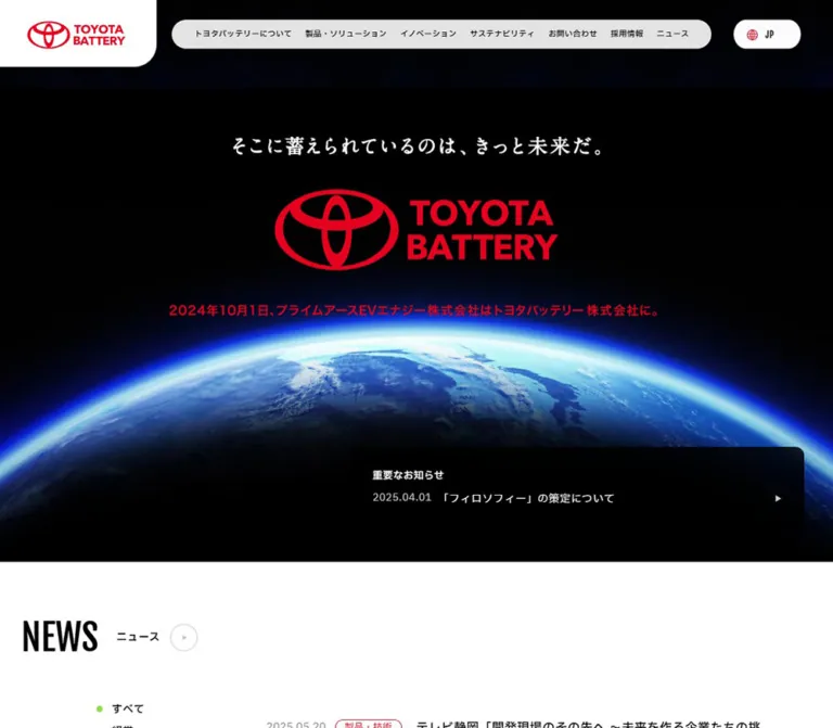
地球のビジュアルと赤いロゴを印象的に配置。白い余白、縦長の英字見出し、製品写真、ピル型ナビゲーションで構成された車載用バッテリーメーカーの企業サイト。
オリジナルサイトを見るToyota Battery — Style Reference
A red corporate identity above a blue planetary horizon, followed by spacious white information grids.
Website: toyota-battery.com/jp Original URL: https://www.toyota-battery.com/jp/ Final URL: https://www.toyota-battery.com/jp/ Theme: predominantly white, with a black opening hero and red identity accents; no theme selector was evidenced. Inspected: September 13, 2026, at 02:16 JST; supplied retrieval timestamp: September 12, 2026, 17:16:04.091 UTC. Viewports: 1440 × 1000 desktop and 390 × 844 mobile, in CSS pixels. Scope: the current Japanese corporate homepage. Visual captures show the opening hero, desktop Products area, Company Info cards, footer, mobile header, and persistent cookie notice. Rendered DOM and computed styles additionally document News, Magazine, manufacturing-process links, Innovation, and navigation contents. Linked pages and open-menu states were not independently inspected.
Toyota Battery combines a dramatic introduction with a practical corporate directory. The opening scene gives a red logo and a short white Japanese statement ample room against black space. Earth rises across the lower part of the composition. The rest of the page uses white backgrounds, black text, natural photography, and a deliberate alternation between broad editorial sections and compact information links.
Two typefaces establish a clear division of labor: Fjalla One supplies tall, condensed English section headings, while IBM Plex Sans JP carries Japanese navigation, descriptions, and article titles. A long pill-shaped desktop navigation bar floats beside an asymmetrical white logo panel. Farther down, product links remain open and rectangular, while the Company Info directory introduces rounded cards with subtle shadows and small circular arrows.
This is a multi-audience corporate homepage: news readers, customers, job applicants, and visitors seeking company information each receive a distinct route. Its reusable character comes from that hierarchy, the contrasting image scales, and the restraint of the interface around the photography.
How to Read This Reference
- Measured values come from the supplied rendered DOM, computed styles, and element rectangles. They are capture-specific CSS-pixel values, not a complete recovered stylesheet.
- Visual estimates describe screenshot geometry or appearance where the corresponding computed property was not supplied. They are explicitly identified.
- Derived values are arithmetic using measured rectangles, such as the gap between adjacent cards.
- Recommendations and Quick Start rules are implementation guidance. Breakpoints, image treatment, interaction handlers, and shadows in that code are adaptations unless stated otherwise.
- Source variables retain their recorded names. Other token names are descriptive aliases for this reference.
- DOM presence does not establish visibility. Closed navigation content has text and rectangles in the evidence. Those records do not prove that a menu was opened or that its appearance was visually verified.
- Coordinates describe sampled states. Desktop Company Info cards sit approximately 20px farther left in the screenshot than in the DOM sample. Their dimensions agree closely. Do not turn those absolute positions into a required transform or animation.
Tokens — Colors
Default Palette
| Name | Value | Evidence / suggested token | Role |
|---|---|---|---|
| White canvas | #ffffff |
Measured body and footer backgrounds; source --c-white |
Main page, white content regions, logo panel, reversed text |
| Black ink | #000000 |
Measured text; source --c-black |
Headings, body text, icons; the hero also appears black |
| Observed action red | #db0026 |
Measured rgb(219, 0, 38) on the consent button and H1; alias --color-action |
Filled consent action and computed hero foreground |
| Declared base red | #da1b32 |
Source --c-base-red |
Available brand-related token; not the measured consent-button fill |
| Base gray | #cacaca |
Source --c-base-gray |
Available neutral, visually consistent with delicate circular outlines; exact outline bindings were not supplied |
| Light gray | #f5f5f5 |
Source --c-light-gray |
Available pale surface token; individual uses were not exhaustively mapped |
| Secondary text | #585858 |
Measured rgb(88, 88, 88) on footer links; alias --color-muted |
Legal and utility navigation |
The logo artwork appears vivid red, but its internal fill was not separately extracted. The measured H1 and button red should not be presented as a sampled value for every logo pixel. Likewise, do not replace the observed #db0026 action fill with --c-base-red simply because that variable has a plausible name.
Declared Supporting Colors
| Source variable | Recorded value | Evidence boundary |
|---|---|---|
--c-dark-red |
#cc0707 |
Declared; a particular hover or selected state was not verified |
--c-light-red |
#faa, equivalent to #ffaaaa |
Declared; exact component use was not supplied |
--c-green |
#92de46 |
Declared; small indicators occur in the partially visible News area, but their exact token binding was not established |
These are supporting variables, not separate themes. Blue belongs primarily to the Earth imagery, and orange belongs to the photographed battery components. Neither should become a general interface action color merely because it occupies a large image area.
Screenshot-Only Surface Estimates
The desktop navigation looks pale gray over black imagery and nearly white over the page canvas. The cookie panel is a translucent light neutral through which underlying content remains faintly visible. Exact alpha values and backdrop-filter rules were not supplied. For an adaptation, rgba(255,255,255,.90) for navigation and rgba(232,232,232,.96) for the notice are reasonable starting points, not measured source colors.
Tokens — Typography
Japanese Interface — IBM Plex Sans JP
- Measured family:
"IBM Plex Sans JP", sans-serif. - Measured weights:
400for body copy,500for navigation and article titles, and600for Company Info card labels and the H1 container. - Declared font request: the supplied page evidence includes weights
400,500,600, and700. This does not mean that every weight is used in the inspected components. - Character: clear, moderately compact Japanese typography with generous line spacing in explanatory paragraphs.
- Suggested alias:
--font-body.
The body uses this sans-serif stack even though the HTML element itself reports Times. The HTML fallback is not evidence of a serif body design.
English Section Headings — Fjalla One
- Measured family:
"Fjalla One", sans-serif. - Source variable:
--f-en. - Measured weight:
400. - Roles: News, Magazine, Products, Innovation, Company Info, and sampled language links.
- Character: tall, narrow letters that produce strong section markers without occupying the horizontal space of a wide display face.
The screenshots show uppercase section headings. Extracted text sometimes contains title-case and duplicated versions. Reproduce one visible heading per section; the extraction does not justify printing duplicate words.
Hero Statement and Logo
The visible statement is “そこに蓄えられているのは、きっと未来だ。” It has a calligraphic or brush-like character distinct from ordinary interface text. Its font family and whether it is text or artwork were not separately established. Preserve an authorized original asset where available; do not invent a named font attribution.
The TOYOTA BATTERY wordmark is graphic identity, not an ordinary typeset headline. The H1 container reports 66.528px on desktop and 18.018px on mobile, but those computed values are not reliable measurements of the visible wordmark or statement. The extracted H1 text also differs from the visible statement, reinforcing the need to distinguish semantic content from rendered artwork.
Type Scale
| Role | Desktop measurement | Mobile measurement | Weight / tracking |
|---|---|---|---|
| Body baseline | 16px, normal line height |
16px, normal line height |
400 |
| Primary desktop navigation | 13.392px / 13.392px |
Replaced by a menu button | 500; 0.53568px, equivalent to 0.04em |
| News / Magazine / Company Info headings | 48px / 55.2px |
48.009px / 55.2103px |
Fjalla One 400 |
| Products / Innovation headings | 64px / 73.6px |
48.009px / 55.2103px |
Fjalla One 400 |
| News article titles | 16px / 28.8px |
15.99px / 23.985px |
500; approximately 0.04em |
| Magazine article titles | 16px / 28.8px |
14.001px / 25.2018px |
500; normal tracking |
| Feature-banner descriptions | 16px / 32px |
14.001px / 23.8017px |
400 |
| Product / Innovation descriptions | 16px / 32px |
12.987px / 25.974px |
400 |
| Manufacturing-process description | 14px / 28px |
12.012px / 20.4204px |
400 |
| Company Info card labels | 16px / 24px |
15.99px / 23.985px |
600; approximately 0.04em |
| Footer utility links | 14px / 14px |
12.012px / 12.012px |
500; approximately 0.04em |
| Cookie explanation | 13px / 19.5px |
13px / 19.5px |
400 |
| Cookie action | 14px / 14px |
14px / 14px |
400; 1.12px, equivalent to 0.08em |
| Sampled language links | 15.264px / 17.5536px |
14.001px / 16.1012px |
Fjalla One 400; 0.03em |
The language measurements come from menu links in the DOM, not a verified open dropdown. For reuse, round the fractional values to the nearby whole-pixel scale unless matching the original proportional sizing system is essential.
Tokens — Spacing & Shapes
Density: broad section separation, compact navigation, and roomy descriptions beneath large imagery.
The source exposes --vw: 14.4px, --vh: 10px, and --base-vw: 1512 on desktop. Mobile exposes --vw: 3.9px, --vh: 8.44px, and --base-vw: 390. These indicate viewport-aware sizing, but the complete calculation rules and breakpoint are not included. A single desktop-to-mobile scale factor would not reproduce the observed layout changes.
Spacing Scale
| Use | Desktop | Mobile | Evidence |
|---|---|---|---|
| Main horizontal gutter | 45.71875px |
15.984375px |
Measured section and card origins |
| Product-column gap | 45.640625px |
Approximately 56px between stacked product links |
Derived from link rectangles |
| Large section top padding | 152.352px |
99.996px |
Measured Products, Innovation, Company Info |
| Magazine top padding | 114.336px |
79.989px |
Measured section padding |
| Product-description horizontal inset | 38.15625px |
0px relative to the card |
Derived from paragraph and card origins |
| Desktop Company Info card gap | 21.015625px |
0px between measured card boxes |
Derived from adjacent rectangles |
| Company Info label inset | 16px |
Approximately 18.016px |
Derived from card and heading origins |
| Desktop navigation-link padding | 14.256px 11.376px |
Not applicable to the closed mobile header | Measured |
| Cookie text-to-action separation | 16px |
16px |
Derived from paragraph and action rectangles |
Use approximately 8, 16, 24, 32, 38, 46, 56, 80, 100, and 152px as descriptive spacing steps. These are convenient aliases, not proof of an original universal spacing scale.
Border Radius
| Element | Recorded or estimated geometry | Status |
|---|---|---|
| Desktop logo panel | Only lower-right corner rounded; 38.16px |
Measured |
| Desktop navigation / language capsule | Full pill, approximately 25px radius |
Visual estimate |
| Main product links | 0px |
Measured link boxes |
| Company Info cards | 9.504px desktop; 9.984px mobile |
Measured |
| Manufacturing-process link | 9.504px desktop; 0px mobile |
Measured |
| Cookie action | 8px |
Measured |
| Cookie close control | 50%, 20 × 20px |
Measured |
| Cookie panel | Approximately 16px at the exposed upper-right corner |
Visual estimate |
| Card arrows / back-to-top graphic | Circular | Visual observation; individual link boxes may report zero radius |
Do not give every component the same rounded-card treatment. Square product photography, pill navigation, rounded directory cards, and a single curved logo-panel corner are distinct parts of the hierarchy.
Layout Measurements
| Element | Desktop: 1440 × 1000 | Mobile: 390 × 844 |
|---|---|---|
| Document height | 6701.64px |
7486.42px |
| Header element bounds | 1440 × 148.59px |
390 × 79.98px |
| Header logo link | 266.69 × 114.33px, at the upper-left corner |
137 × 39px, at x:17, y:20 |
| Navigation capsule | Approximately 920 × 49px, at x:313, y:34 |
Not visible in the closed header |
| Language capsule | Approximately 114 × 49px, at x:1270, y:34 |
Language links belong to the menu DOM |
| Menu button | Not visible in desktop capture | 32.02 × 32.02px, at x:334, y:23.98 |
| Product link | 651.45 × 499.73px |
358.03 × 504.86px |
| Company Info card | 245.66 × 357.52px |
296.84 × 422.98px |
| Footer element | 332.88px high |
213.03px high |
| Back-to-top link | 49.53 × 49.53px |
35.98 × 35.98px |
| Cookie panel | Approximately 390 × 223px |
Approximately 390 × 211px |
The full desktop header bounds include transparent space; they are not the height of a solid white bar. Likewise, link rectangles containing logos can be larger than the visible artwork.
Components
Desktop Header
Role: persistent corporate identity and access to the site's major areas.
The left logo sits inside a white panel attached to the top and left viewport edges. Its large lower-right curve is the header's most distinctive shape. The visible logo artwork occupies approximately 170 × 48px inside the larger measured link panel.
A separate pill contains seven Japanese navigation links: company information, products and solutions, innovation, sustainability, contact, recruitment, and news. A third capsule holds a red globe symbol and JP. The major capsules share a top alignment near 34px, while the identity panel extends lower.
The header remains at the top of the supplied scrolled captures. This supports describing it as persistent; the sampled data does not include the exact position rule. Over white content, subtle shadowing helps separate the navigation from the canvas. Its exact shadow and transparency values are unmeasured.
The DOM includes substantial secondary navigation with text and image-linked items. Their presence supports the information architecture, but dropdown triggers, open-state geometry, keyboard behavior, and hover outcomes remain unverified.
Mobile Header and Menu Entry
Role: retain identity while reducing visible navigation to one control.
At 390px, the header becomes an approximately 80px pale strip. The logo is 137 × 39px at a 17px left inset. A 32px menu-button box sits 24px from the right edge and contains two thin horizontal black strokes. The source button text is “メニューを開く”.
The mobile menu DOM contains a language row, major section buttons, nested links, utilities, and a contact entry. Several of those hidden menu elements compute to white text. That is insufficient evidence to specify the menu background, expansion animation, or focus behavior. Only the closed header is visually documented.
Opening Hero
Role: establish brand recognition and the scale of the company's subject matter.
Three visual layers carry the composition: black space, centered white statement and red wordmark, and a photographic Earth horizon across the bottom. There is no large standalone conversion button in the supplied current opening captures.
On desktop, the statement begins near y:235; the visible wordmark is approximately 486 × 138px, centered near y:324. The Earth is broad enough for its horizon to extend past both edges. The visible dark composition ends around y:972.
On mobile, the header occupies the first 80px. The statement begins near y:208, and the wordmark is approximately 315 × 90px, with roughly 38px side margins. Earth remains a full-width horizon below the identity, while the visible dark area ends near y:612.
These are screenshot estimates, not a recovered hero-height formula. The mobile News section rectangle starts at y:576 and includes approximately 57px of top padding, while its heading starts around y:633. A section rectangle and the visible image boundary therefore should not be treated as interchangeable measurements.
Preserve the separation between statement, wordmark, and horizon. Earth cropping and artwork proportions matter more than reproducing the H1 container's computed font size.
Section Heading System
Role: make a long corporate page easy to scan.
News, Magazine, and Company Info use 48px condensed English headings. Products and Innovation use 64px white headings over large imagery on desktop and reduce to 48px on mobile.
News and Magazine pair the heading with a smaller Japanese destination link and a thin outlined circle containing a small right-pointing triangle. Company Info breaks into two lines, COMPANY and INFO.. Its desktop heading occupies a separate left column; on mobile it precedes the card rail.
The extracted DOM contains repeated heading text. The screenshots show a single readable visual heading. Any decorative duplicate needed for an implementation should be hidden from assistive technology and should not create a second visible title at rest.
News Filters and Article List
Role: provide dated corporate updates with category access.
Desktop uses a left filter area and a wider list beginning at approximately x:400.64. The six filter buttons are “すべて”, “経営”, “製品・技術”, “サステナビリティ”, “イベント”, and “その他”. Their measured vertical step is about 29.75px.
Each article is one link containing a date, category labels, and a medium-weight Japanese title. The sampled desktop links are about 993.63 × 111.58px, with approximately 41px top and bottom padding and a 22.9px internal gap. Titles use 16px / 28.8px. Three current article entries are represented in the evidence.
Mobile moves the category controls into one horizontal row. Later button rectangles extend beyond the 390px viewport, demonstrating an overflow arrangement; horizontal scrolling was not explicitly exercised. Article links become approximately 358px wide, with metadata above the title and roughly 24px between successive entries. Titles retain a 16px size but use a tighter 24px line height.
The filters are real buttons in the DOM, but no resulting filtered state was recorded. Do not claim an animation, selected-color rule, or client-side filtering implementation from their presence alone.
Magazine Articles
Role: surface six articles from the company's official note publication.
The desktop DOM records a three-column, two-row arrangement. Each link is approximately 449.52 × 378.5px, with 32.4px 30.528px 28.512px padding and a 22.896px gap. Titles use 16px / 28.8px at weight 500, followed by dates. The “公式note” destination appears beside the desktop section heading.
Mobile changes to six stacked rows rather than shrinking the desktop cards. Each row is approximately 358px wide and 172–181px high. A leading thumbnail area and a text column are separated by about 20px. The title column measures approximately 205px wide and uses 14px / 25.2px. The official-publication link moves below the list, toward the right.
This geometry is supported by the DOM. The supplied screenshots do not expose this section's complete photography or surface treatment, so do not assign it the Company Info shadows or invent particular article-image subjects.
Products Feature Banner
Role: introduce the battery product family with material detail.
A full-width photograph shows an opened vehicle battery assembly: silver metal housings, fasteners, dark cells and connectors, and prominent orange high-voltage components. The crop feels documentary and technical, with the equipment filling the frame.
The white PRODUCTS heading sits at the lower left, followed by two lines of Japanese copy. Desktop text starts at the main 45.72px gutter. The description is measured at 430px wide, with 16px / 32px typography.
The supplied scrolled screenshot contains approximately 553px of the banner before the white product area begins. This is a visible crop, not proof of the banner's complete height. It should not be hardcoded as a 553px banner based on this screenshot alone.
On mobile, the DOM records a 48px heading and a description approximately 263px wide at 14px / 23.8px. The actual mobile photo crop was not supplied.
Battery Product Links
Role: distinguish nickel-metal hydride and lithium-ion batteries and route visitors to their detail pages.
Desktop presents two equal columns. Each begins with a large rectangular product photograph; the supplied screenshot shows approximately 651 × 304px image areas with square corners. The products are isolated on a neutral gray floor with directional shadows. The surrounding photography emphasizes their actual industrial form.
Below each image, a Japanese product name is paired with a circular arrow, followed by explanatory copy. Descriptions are inset about 38px from the image edges on desktop and use 16px / 32px text. The whole grouping is an anchor, not a card containing a separate nested button.
Mobile stacks the links at 358px wide, separates them by about 56px, and removes the description's extra horizontal inset. Descriptions use approximately 13px / 26px. Mobile image-element dimensions were not included; a square crop in a new implementation is a recommendation to validate, not an observed requirement.
Manufacturing-Process Link
Role: offer a secondary route to how batteries are made.
The “電池ができるまで” link spans the desktop content width beneath the product pair. Its measured size is approximately 1348.55 × 175.23px, with two outer grid tracks of 302.828px and 1045.72px. The description occupies a narrower region within the second track and uses 14px / 28px text.
Mobile retains two outer tracks, approximately 93.984px and 264.047px, rather than becoming an ordinary full-width image card. The full link is about 219px high. Its 197px-wide description uses approximately 12px / 20.4px. The measured outer radius changes from about 9.5px to zero.
The complete visual content of the leading track was not supplied. Preserve the compact secondary-link hierarchy without inventing an illustration or icon.
Innovation Section
Role: explain technology and quality through two editorial destinations.
The DOM establishes the same large-section rhythm as Products: approximately 152px desktop top padding, an English heading with white supporting copy, then two 651.45px-wide links. The technology and quality descriptions use 16px / 32px, with approximately 38px horizontal insets.
On mobile, the links stack, the main heading becomes 48px, and descriptions use approximately 13px / 26px. The two link heights differ because their descriptions occupy different numbers of lines.
No supplied screenshot exposes the Innovation banner or card imagery. Its content roles and geometry are documented; its photographic subjects, crop, and motion are unverified.
Company Info Directory
Role: provide a final visual gateway to company information, sustainability, recruitment, and contact.
The desktop section places the two-line condensed heading on the left and four photographic cards on the right. Each card is about 245.66 × 357.52px, with a 9.5px radius, a soft visible shadow, an image above, and a white label area below.
The four visible subjects are a glass-fronted company building, a green coastal landscape with wind turbines, two people working together at laptops, and a close-up of someone using a phone. The image area is approximately 228.5px high, inferred from the visible boundary and label inset. It is nearly square, not a widescreen thumbnail.
The label area contains a 16px semibold Japanese title and a small circular arrow aligned at the bottom right. The first title deliberately occupies two lines: “トヨタバッテリーについて” and “企業情報”. A card remains one navigation link; the arrow is a directional cue inside that link.
Mobile enlarges each card to approximately 296.84 × 422.98px. The first begins at x:15.98, and the next begins at x:312.83, leaving a substantial partial preview at the right edge. Measured card boxes have no horizontal gap. The image is approximately 275px high, and the label area's horizontal inset grows to about 18px.
The DOM includes SWIPE, and the screenshot confirms a horizontal rail. Touch dragging, snap behavior, looping, autoplay, and arrow-driven advancement were not tested. Implementing a simple accessible horizontal scroller is a recommendation, not a claim about the original script.
Footer
Role: close the page with identity, legal links, social destinations, and return navigation.
Desktop uses a large white field. A red logo sits at the left; three gray utility links sit near the right; X, YouTube, and note symbols form a vertical group farther right. A thin horizontal rule separates the lower copyright area, with an outlined upward-arrow circle at the far right.
The footer link typography is 14px, weight 500, with 0.04em tracking. Social link boxes are 36 × 36px. The back-to-top link points to #top; smooth scrolling was not established.
Mobile keeps a smaller logo at the left, puts utility links at the right, and arranges social links horizontally beneath them. The utility type reduces to approximately 12px, social boxes to about 29px, and the return-to-top link to about 36px.
The page title, home-link label, and footer copyright independently identify Toyota Battery Co., Ltd. No production-credit claim is established by the supplied original-page evidence.
Cookie Notice
Role: present a persistent explanation with continuation, privacy details, and a close affordance.
The notice remains at the lower left throughout the supplied captures. On desktop it is approximately 390px wide and 223px high. On the 390px phone it spans the viewport and is approximately 211px high. Its light translucent surface visibly covers some underlying news and footer content.
Desktop content starts at x:32; mobile content starts at x:35. The paragraph remains 13px / 19.5px at both sizes. A 16px vertical gap separates it from the action row.
The “続行” button measures 100.25 × 30px, uses the measured #db0026 fill, white 14px text, 0.08em tracking, and an 8px radius. “詳細” is an underlined link to the privacy page. A black circular close button with a white cross measures 20 × 20px, positioned 10px from the top and right edges of the panel.
The continuation and close controls were not activated. Their storage effects, dismissal rules, and consent semantics are not verified. The notice should be documented as captured utility UI, not treated as a promotional call to action.
Tokens — Motion & Interaction
Recorded Transition Declarations
| Target | Recorded value | What the evidence establishes |
|---|---|---|
| Desktop primary navigation text | color 0.24s cubic-bezier(0.215, 0.61, 0.355, 1) |
A color transition is defined; destination color and trigger outcome were not sampled |
| Desktop logo-panel link | transform 0.4s cubic-bezier(0.39, 0.575, 0.565, 1) |
A transform transition is defined; displacement is unknown |
| H1 container | Transform and opacity, 0.24s, easing above, 0.16s delay |
Reveal-capable declaration; exact start state and trigger were not supplied |
| Mobile News destination link | Transform and opacity, 0.32s, 0.16s delay |
Recorded declaration, not a tested entrance sequence |
| Mobile official-publication link | Transform and opacity, 0.32s, 0.4s delay |
A longer delay is defined for this link |
| Mobile feature descriptions | Transform and opacity, 0.24s, 0.16s delay |
Recorded on Products and Innovation supporting copy |
| Desktop footer logo and social links | opacity 0.4s cubic-bezier(0.39, 0.575, 0.565, 1) |
Opacity transition declaration |
Source Easing and Layer Tokens
| Source token | Value | Interpretation |
|---|---|---|
--ease-out-3 |
cubic-bezier(0.215, 0.61, 0.355, 1) |
Used by sampled short text and reveal transitions |
--ease-out-sine |
cubic-bezier(0.39, 0.575, 0.565, 1) |
Used by sampled 400ms transform and opacity transitions |
--ease-pop |
cubic-bezier(0.44, 0, 0.21, 1.23) |
Available overshooting curve; no specific use established |
--z-base |
0 |
Declared base layer |
--z-menu |
101 |
Declared menu layer |
--z-header |
102 |
Declared header layer |
--z-modal |
103 |
Declared modal layer; the cookie notice's actual binding was not supplied |
The capture process waited for visible finite animations and sampled layout stability. Perpetual animations were temporarily paused during readiness checks and then resumed. This does not establish what animated media, if any, the hero uses.
No evidence confirms Earth rotation, video playback, parallax, auto-advancing cards, smooth anchor scrolling, or exact menu-opening motion. Numerous sampled elements report animation: none; that does not exclude animation in descendants, pseudo-elements, media, or JavaScript.
Recommended motion adaptation: use the recorded 240–400ms easing family for restrained hover and reveal effects. Keep content visible without JavaScript, and supply reduced-motion behavior. Do not build essential content around an unverified entrance animation.
Surfaces
| Layer | Observed appearance | Purpose / implementation boundary |
|---|---|---|
| Opening scene | Black field and luminous Earth imagery | High-contrast identity introduction |
| Main canvas | Solid white | News, editorial information, products, and directory content |
| Navigation | Pale pill-shaped surface; subtle separation over white | Persistent navigation; alpha and shadow unmeasured |
| Product imagery | Rectangular photographic fields | Material detail and product comparison |
| Company cards | White bodies, rounded corners, soft shadows | Distinct final directory destinations |
| Circular navigation cues | Thin pale outlines and small triangles | Quiet directional affordances |
| Footer | White surface, gray utility text, fine divider | Institutional closing information |
| Cookie notice | Translucent light gray | Persistent utility overlay with compact red action |
Elevation is selective. Company cards visibly lift from the canvas, while product links and Magazine link boxes have square measured geometry. A general shadow around every content block would weaken the distinction between these section types.
Imagery
The visual sequence moves from planetary scale to physical products and then to places and people. Earth supplies the dramatic opening. The battery banner shows real mechanical complexity. Product photographs isolate equipment against a neutral floor. Company cards use buildings, landscape, collaborative work, and personal-device imagery to make navigation recognizable.
Preserve natural color and material texture. The orange wiring and metallic housings are valuable subject details, not distractions to recolor red. The building and landscape images remain bright and open, balancing the dark hero.
Use sharp original assets at appropriate sizes, with responsive crops that protect important content. The product images need enough surrounding floor to retain their shadows and physical scale. Company cards can crop more tightly, but faces, the building facade, and the phone should remain legible in the nearly square image region.
Observed Asset References
Asset source URLs and file names were not included in the supplied evidence. The following inventory identifies visible assets without inventing downloadable paths.
| Asset | Observed use | Evidence boundary |
|---|---|---|
| TOYOTA BATTERY identity artwork | Header, hero, footer | Visible in desktop and mobile captures; internal file format not supplied |
| White Japanese hero statement | Above the central wordmark | Visible; font or artwork implementation unknown |
| Earth horizon | Lower opening hero | Visible at both sizes; still image versus moving media unknown |
| Opened battery assembly | Products feature banner | Desktop visual evidence |
| Nickel-metal hydride battery | First product photograph | Desktop visual evidence |
| Lithium-ion battery | Second product photograph | Desktop visual evidence |
| Glass-fronted building | Company information card | Desktop and mobile visual evidence |
| Coast, greenery, and wind turbines | Sustainability card | Desktop and partial mobile visual evidence |
| Two people at laptops | Recruitment card | Desktop visual evidence |
| Phone close-up | Contact card | Desktop visual evidence |
| Globe, arrows, social symbols, menu strokes | Navigation and utilities | Visible shapes; asset library or implementation format unknown |
The Magazine and Innovation image subjects cannot be established from the supplied screenshots. Their text and component geometry are documented separately.
Layout & Responsive Behavior
The current homepage follows this order: opening hero, News, Magazine, Products, a manufacturing-process link, Innovation, Company Info, and footer. The page remains a vertically scrolling document, with selected horizontal arrangements inside it.
| Area | Desktop observation | Mobile observation |
|---|---|---|
| Header | Separate identity panel, navigation pill, language pill | Approximately 80px header with logo and two-stroke menu icon |
| Hero | Broad Earth horizon and centered identity | Narrow composition preserves both statement and wordmark above Earth |
| Main gutter | Approximately 46px | Approximately 16px |
| News filters | Vertical list in a left region | Single horizontal row extending beyond the viewport |
| News entries | Date, category, title arranged across a row | Metadata above wrapped title |
| Magazine | Three columns, two rows | Six thumbnail-and-text rows |
| Magazine destination | Beside heading | Below the article list, toward the right |
| Product / Innovation links | Two equal columns | One stacked column |
| Manufacturing-process link | Two outer grid tracks | Still two outer tracks, with much narrower leading region |
| Company Info | Heading beside four cards | Heading above a horizontal rail with a partial next card |
| Footer socials | Vertical group | Horizontal group beneath utility links |
| Cookie notice | Bottom-left panel | Full viewport width at the bottom |
The company rail is a particularly useful mobile pattern: its cards grow from about 246px to 297px wide even as the viewport becomes much narrower. Readability and image presence are preserved by moving content offscreen horizontally.
The source breakpoint was not supplied. The Quick Start uses 1200px as a conservative recommended threshold for the dense seven-link header, with a separate intermediate arrangement for cards. Validate at tablet widths rather than assuming that the two inspected endpoints describe every intermediate state.
Do not hardcode the recorded document heights. They reflect the current content and capture state. Reserve image dimensions, keep page-level overflow contained, and allow only intended rails to scroll horizontally.
Do’s and Don’ts
Do
- Keep the black Earth hero, red identity, and broad white content canvas as the principal visual relationship.
- Use Fjalla One for condensed English section headings and IBM Plex Sans JP for Japanese interface text.
- Preserve the desktop header's asymmetrical logo panel and separate pill-shaped controls.
- Treat product photography as large editorial content with visible material detail.
- Keep News and Magazine structurally distinct: dated information rows versus publication articles.
- Use the measured two-column-to-one-column change for product and Innovation links.
- Reserve rounded, softly shadowed cards for the Company Info directory.
- Show a partial next company card on mobile to communicate horizontal continuation.
- Keep circular arrows small and secondary inside larger navigation targets.
- Maintain the distinction between measured action red and the separately declared base-red token.
- Let long Japanese descriptions wrap naturally with generous line height.
Don't
- Don't replace the corporate information hierarchy with a single campaign conversion funnel.
- Don't make every section a uniform grid of rounded cards.
- Don't set the visible hero logo or calligraphic statement using the H1 container's computed font size.
- Don't reproduce duplicated DOM heading strings as repeated visible titles.
- Don't make image-derived blue and orange into unrelated interface action colors.
- Don't crop product shadows away or stretch logos to fit arbitrary boxes.
- Don't infer an open menu's appearance from hidden DOM rectangles.
- Don't describe Earth motion, carousel autoplay, or parallax as observed behavior.
- Don't shrink the desktop navigation until it becomes unreadable on smaller screens.
- Don't treat the obstructing cookie notice as part of the page's promotional composition.
Recommended Implementation Additions
These are recommendations for a new implementation, not verified features of the original:
- Use semantic navigation landmarks and one accessible heading per section. Hide decorative duplicate text from assistive technology.
- Give the mobile menu button an explicit expanded state and controlled-panel reference. Manage focus and Escape behavior if the menu behaves as a modal overlay.
- Keep card arrows decorative when the enclosing card is already a named link; avoid nested interactive targets.
- Make horizontal rails keyboard-accessible and ensure focus brings offscreen links into view. A visible continuation cue should remain available without touch gestures.
- Increase the interactive area of the 20px close control and 30px consent button toward a 44px target while retaining compact visible artwork where possible.
- Add a strong focus outline. The pale circular outlines visible in the design should not be the sole keyboard-focus indicator.
- Check white banner text against every responsive image crop. Add a local dark gradient only where needed for legibility.
- Provide responsive image sources and explicit dimensions. Defer below-the-fold imagery while prioritizing the initial identity and hero media.
- Keep content visible when reveal scripting fails, and honor reduced-motion preferences.
- Use a reliably readable mobile copy size where practical. Increasing the observed 12–13px descriptions to 14px is an accessibility-oriented adaptation that will alter wrapping and section height.
- Implement consent choices and persistence deliberately; CSS alone does not provide consent behavior.
Agent Prompt Guide
Quick Color Reference
- Main canvas and card bodies:
#ffffff. - Primary text and hero field:
#000000. - Measured filled action:
#db0026. - Separately declared base red:
#da1b32. - Secondary footer text:
#585858. - Source neutral tokens:
#cacacaand#f5f5f5. - Earth blue and equipment orange belong to imagery.
- Navigation translucency and card shadows require visual tuning; exact source values were not supplied.
Overall Prompt
“Create a Japanese automotive-battery corporate homepage inspired by the observed Toyota Battery design. Use a black opening scene with a centered white Japanese statement, authorized red identity artwork, and a blue Earth horizon across the bottom. Continue into spacious white sections for News, a company publication, Products, Innovation, and Company Info. Use Fjalla One at 48–64px for condensed uppercase English section headings and IBM Plex Sans JP for Japanese content. Build a persistent desktop header with a white logo panel rounded only at its lower-right corner, a separate long navigation pill, and a language capsule. Use large technical photography, open two-column product links, and four rounded photographic directory cards near the footer. On mobile, replace desktop navigation with a two-stroke menu button, stack product links, turn publication cards into thumbnail rows, and show Company Info as a horizontal rail with a partial next card. Preserve broad whitespace and compact circular directional cues.”
Example Component Prompts
- Desktop header: “Create three separate pale header surfaces over photography: a 267 × 114px identity panel attached to the top-left with an approximately 38px lower-right curve, a long 49px-high navigation pill, and a small language pill. Use compact medium-weight Japanese labels with 0.04em tracking. Treat these dimensions as the 1440px desktop reference.”
- Products introduction: “Use a full-width documentary photograph of an opened battery assembly, retaining silver surfaces, orange electrical components, and mechanical detail. Place a 64px condensed white PRODUCTS heading near the lower-left gutter, with a restrained two-line Japanese description below. Continue into two equal product columns on white.”
- Company directory: “Create four white photographic navigation cards, approximately 246 × 358px on desktop, with 10px corners, subtle shadows, nearly square image regions, 16px semibold Japanese labels, and small outlined circular arrows at the lower right. On a 390px phone, use approximately 297px-wide cards in an adjacent horizontal rail beginning 16px from the left edge.”
- Magazine section: “Create six publication links in a three-column desktop grid with image, Japanese title, and date. Change to compact thumbnail-and-text rows on mobile, using a roughly 100px leading image column and 14px titles with generous line spacing. Move the publication destination link below the mobile list.”
- News list: “Create a white corporate-news section with a 48px condensed English heading, a Japanese archive link, six compact category buttons, and three dated article links. Put filters vertically at the left on desktop and in an overflow row on mobile. Keep metadata above the mobile title.”
- Motion: “Use restrained 240–400ms color, opacity, and transform transitions with cubic-bezier(0.215, 0.61, 0.355, 1) or cubic-bezier(0.39, 0.575, 0.565, 1). Keep all essential content visible by default. Add reduced-motion support. Do not add unverified Earth rotation or automatic card advancement.”
Quick Start
CSS Custom Properties
This is an implementation starter, not recovered source CSS. It preserves measured typography and major relationships while rounding small fractional differences. --du is a recommended approximation of the desktop proportions suggested by the 1512 reference width; its cap, the 1200px breakpoint, shadows, image ratios not directly measured, and hover outcomes are adaptation choices.
Load IBM Plex Sans JP and Fjalla One through your project's font pipeline. Supply authorized image assets in the indicated image elements. Menu toggling, news filtering, and consent persistence require separate behavior.
:root {
  /* Measured colors and recorded source colors */
  --color-canvas: #fff;
  --color-ink: #000;
  --color-action: #db0026;
  --color-source-red: #da1b32;
  --color-muted: #585858;
  --color-rule: #cacaca;
  --color-soft: #f5f5f5;
  --color-indicator: #92de46;

  /* Recommended approximations of translucent surfaces */
  --surface-nav: rgb(255 255 255 / 90%);
  --surface-cookie: rgb(232 232 232 / 96%);
  --shadow-card: 0 5px 24px rgb(0 0 0 / 7%);
  --shadow-nav: 0 3px 10px rgb(0 0 0 / 5%);

  /* Verified families; use a conventional root font size */
  --font-body: 'IBM Plex Sans JP', sans-serif;
  --font-display: 'Fjalla One', sans-serif;
  --text-section: 3rem;
  --text-feature: 4rem;
  --text-body: 1rem;
  --text-small: 0.875rem;
  --text-cookie: 0.8125rem;
  --leading-copy: 2;

  /* Recommended desktop proportional unit */
  --du: min(1px, 0.0661376vw);
  --gutter: calc(48 * var(--du));
  --section-space: calc(160 * var(--du));
  --column-gap: calc(48 * var(--du));
  --radius-card: 10px;
  --radius-action: 8px;

  /* Recorded easing curves */
  --ease-out: cubic-bezier(0.215, 0.61, 0.355, 1);
  --ease-sine: cubic-bezier(0.39, 0.575, 0.565, 1);
  --motion-short: 240ms;
  --motion-soft: 400ms;

  /* Recorded layer values; usage below is an adaptation */
  --z-menu: 101;
  --z-header: 102;
  --z-overlay: 103;
}

* { box-sizing: border-box; }

body {
  margin: 0;
  color: var(--color-ink);
  background: var(--color-canvas);
  font-family: var(--font-body);
  font-size: var(--text-body);
}

img { display: block; max-width: 100%; }
button, input, select { font: inherit; }
a { color: inherit; }
button { cursor: pointer; }
[hidden] { display: none !important; }

.container {
  width: calc(100% - 2 * var(--gutter));
  margin-inline: auto;
}

.section { padding-block-start: var(--section-space); }

.section-title {
  margin: 0;
  font-family: var(--font-display);
  font-size: var(--text-section);
  font-weight: 400;
  line-height: 1.15;
  text-transform: uppercase;
}

.section-head {
  display: flex;
  align-items: center;
  gap: 22px;
}

.section-link {
  display: inline-flex;
  align-items: center;
  gap: 16px;
  text-decoration: none;
}

.circle-arrow {
  display: inline-grid;
  place-items: center;
  flex: 0 0 auto;
  width: 38px;
  aspect-ratio: 1;
  border: 1px solid var(--color-rule);
  border-radius: 50%;
  color: var(--color-rule);
}

.circle-arrow::before {
  content: '';
  width: 0;
  height: 0;
  border-block: 3px solid transparent;
  border-left: 5px solid currentColor;
}

/* Persistent header approximation */
.site-header {
  position: fixed;
  inset: 0 0 auto;
  z-index: var(--z-header);
  height: calc(156 * var(--du));
  pointer-events: none;
}

.site-header a,
.site-header button { pointer-events: auto; }

.brand-panel {
  position: absolute;
  inset: 0 auto auto 0;
  display: grid;
  place-items: center;
  width: calc(280 * var(--du));
  height: calc(120 * var(--du));
  border-radius: 0 0 calc(40 * var(--du)) 0;
  background: #fff;
}

.brand-panel img { width: calc(178 * var(--du)); }

.primary-nav {
  position: absolute;
  top: calc(36 * var(--du));
  left: calc(328 * var(--du));
  right: calc(218 * var(--du));
  display: flex;
  align-items: center;
  justify-content: center;
  min-height: 49px;
  border-radius: 999px;
  background: var(--surface-nav);
  box-shadow: var(--shadow-nav);
}

.primary-nav a {
  padding: 14.25px 11.38px;
  font-size: 13.392px;
  font-weight: 500;
  line-height: 1;
  letter-spacing: 0.04em;
  white-space: nowrap;
  text-decoration: none;
  transition: color var(--motion-short) var(--ease-out);
}

.language-control {
  position: absolute;
  top: calc(36 * var(--du));
  right: calc(58 * var(--du));
  display: flex;
  align-items: center;
  justify-content: center;
  gap: 12px;
  width: calc(120 * var(--du));
  min-height: 49px;
  border: 0;
  border-radius: 999px;
  background: #fff;
  box-shadow: var(--shadow-nav);
  font-family: var(--font-display);
}

.menu-toggle { display: none; }

/* Approximate screenshot composition; tune to supplied artwork */
.hero {
  position: relative;
  isolation: isolate;
  min-height: min(67.5vw, 1080px);
  overflow: hidden;
  color: #fff;
  background: #000;
}

.hero__earth {
  position: absolute;
  inset: auto 0 0;
  z-index: -1;
  width: 100%;
  height: 55%;
  object-fit: cover;
  object-position: center bottom;
}

.hero__identity {
  display: grid;
  justify-items: center;
  gap: 54px;
  padding-top: clamp(208px, 16.25vw, 260px);
  text-align: center;
}

.hero__statement {
  width: min(630px, 90vw);
  margin: 0;
}

.hero__logo { width: min(33.75vw, 540px); }

/* Date, category, and title remain one article link */
.news-layout {
  display: grid;
  grid-template-columns: calc(325 * var(--du)) minmax(0, 1fr);
  gap: var(--column-gap);
  margin-top: 76px;
}

.news-filters {
  display: flex;
  flex-direction: column;
  align-items: flex-start;
  justify-self: center;
}

.news-filters button {
  min-height: 30px;
  padding: 3px 0 3px 20px;
  border: 0;
  color: inherit;
  background: transparent;
}

.news-row {
  display: flex;
  align-items: center;
  gap: 23px;
  min-height: 112px;
  padding: 41px 38px 42px 23px;
  text-decoration: none;
}

.news-meta {
  display: flex;
  flex: 0 0 auto;
  align-items: center;
  flex-wrap: wrap;
  gap: 16px;
}

.news-title {
  margin: 0;
  font-size: 1rem;
  font-weight: 500;
  line-height: 1.8;
  letter-spacing: 0.04em;
}

/* Thumbnail ratios below are recommended starting points */
.magazine-grid {
  display: grid;
  grid-template-columns: repeat(3, minmax(0, 1fr));
}

.magazine-card {
  display: flex;
  flex-direction: column;
  gap: 23px;
  padding: 32px 30px 28px;
  text-decoration: none;
}

.magazine-image {
  width: 100%;
  aspect-ratio: 1.91;
  object-fit: cover;
}

.magazine-title {
  margin: 0;
  font-size: 1rem;
  font-weight: 500;
  line-height: 1.8;
}

/* Full-width feature image with lower-left text */
.feature-banner {
  position: relative;
  isolation: isolate;
  display: flex;
  flex-direction: column;
  justify-content: flex-end;
  min-height: calc(720 * var(--du));
  padding: 48px var(--gutter) 20px;
  overflow: hidden;
  color: #fff;
  background: #222;
}

.feature-banner > img {
  position: absolute;
  inset: 0;
  z-index: -1;
  width: 100%;
  height: 100%;
  object-fit: cover;
}

.feature-banner .section-title {
  font-size: var(--text-feature);
}

.feature-banner p {
  max-width: 500px;
  margin: 18px 0 0;
  line-height: 2;
}

.products-banner p { max-width: 430px; }

.product-grid {
  display: grid;
  grid-template-columns: repeat(2, minmax(0, 1fr));
  gap: var(--column-gap);
  margin-top: 96px;
}

.product-card { text-decoration: none; }

.product-card > img {
  width: 100%;
  aspect-ratio: 651 / 304;
  object-fit: cover;
}

.product-card__body { padding: 32px 38px 0; }

.product-card__heading {
  display: flex;
  align-items: center;
  gap: 16px;
  margin: 0;
  font-size: 1.5rem;
  font-weight: 600;
}

.product-card p {
  margin: 24px 0 0;
  line-height: var(--leading-copy);
}

/* Company cards alone receive this elevation treatment */
.company-layout {
  display: grid;
  grid-template-columns: calc(267 * var(--du)) minmax(0, 1fr);
  gap: var(--column-gap);
}

.company-rail {
  display: grid;
  grid-template-columns: repeat(4, minmax(0, 1fr));
  gap: 21px;
  min-width: 0;
}

.company-card {
  display: flex;
  flex-direction: column;
  min-width: 0;
  overflow: hidden;
  border-radius: var(--radius-card);
  background: #fff;
  box-shadow: var(--shadow-card);
  text-decoration: none;
}

.company-card > img {
  width: 100%;
  aspect-ratio: 1.078;
  object-fit: cover;
}

.company-card__body {
  display: flex;
  flex-direction: column;
  min-height: 129px;
  padding: 16px;
}

.company-card h3 {
  margin: 0;
  font-size: 1rem;
  font-weight: 600;
  line-height: 1.5;
  letter-spacing: 0.04em;
}

.company-card .circle-arrow {
  align-self: flex-end;
  margin-top: auto;
}

.site-footer { margin-top: 190px; background: #fff; }

.footer-top {
  display: grid;
  grid-template-columns: 1fr auto auto;
  gap: 54px;
  min-height: 220px;
}

.footer-logo img { width: 215px; }

.footer-links {
  display: grid;
  align-content: start;
  gap: 0;
}

.footer-links a {
  padding-block: 8px;
  color: var(--color-muted);
  font-size: 14px;
  font-weight: 500;
  line-height: 1;
  letter-spacing: 0.04em;
  text-decoration: none;
}

.footer-socials { display: grid; align-content: start; gap: 8px; }
.footer-socials a { display: block; width: 36px; height: 36px; }

.footer-bottom {
  display: flex;
  align-items: center;
  justify-content: space-between;
  min-height: 112px;
  border-top: 1px solid var(--color-rule);
}

/* Captured notice geometry; behavior must be implemented separately */
.cookie-notice {
  position: fixed;
  inset: auto auto 0 0;
  z-index: var(--z-overlay);
  width: min(390px, 100%);
  padding: 30px 32px;
  border-radius: 0 16px 0 0;
  color: #000;
  background: var(--surface-cookie);
}

.cookie-notice p {
  margin: 0 0 16px;
  font-size: var(--text-cookie);
  line-height: 1.5;
}

.cookie-actions { display: flex; align-items: center; gap: 16px; }

.cookie-continue {
  padding: 8px 35px;
  border: 0;
  border-radius: var(--radius-action);
  color: #fff;
  background: var(--color-action);
  font-size: 14px;
  line-height: 1;
  letter-spacing: 0.08em;
}

.cookie-details { font-size: 14px; line-height: 1.5; }

.cookie-close {
  position: absolute;
  top: 10px;
  right: 10px;
  display: grid;
  place-items: center;
  width: 20px;
  height: 20px;
  padding: 0;
  border: 0;
  border-radius: 50%;
  color: #fff;
  background: #000;
}

/* Recommended interaction outcomes, not sampled source states */
@media (hover: hover) {
  .primary-nav a:hover { color: var(--color-action); }
  .footer-socials a:hover { opacity: 0.7; }
}

:where(a, button):focus-visible {
  outline: 2px solid var(--color-action);
  outline-offset: 4px;
}

:where(section, footer) { scroll-margin-top: 100px; }

/* Recommended tablet and compact-header breakpoint */
@media (max-width: 1199px) {
  :root { --gutter: 24px; --section-space: 100px; }

  .site-header { height: 80px; background: var(--surface-nav); }
  .brand-panel {
    inset: 20px auto auto 17px;
    width: 137px;
    height: 39px;
    border-radius: 0;
    background: transparent;
  }
  .brand-panel img { width: 137px; }
  .primary-nav, .language-control { display: none; }
  .menu-toggle {
    position: absolute;
    top: 24px;
    right: 24px;
    display: grid;
    place-content: center;
    gap: 8px;
    width: 32px;
    height: 32px;
    padding: 0;
    border: 0;
    background: transparent;
  }
  .menu-toggle::before,
  .menu-toggle::after {
    content: '';
    width: 32px;
    height: 2px;
    background: #000;
  }
  .hero { min-height: 720px; }
  .company-layout { grid-template-columns: 1fr; gap: 32px; }
  .company-rail { grid-template-columns: repeat(2, minmax(0, 1fr)); }
  .magazine-grid { grid-template-columns: repeat(2, minmax(0, 1fr)); }
}

@media (max-width: 767px) {
  :root { --gutter: 16px; --text-feature: 3rem; }

  .hero { min-height: 612px; }
  .hero__identity { gap: 32px; padding-top: 207px; }
  .hero__statement { width: 81%; }
  .hero__logo { width: min(315px, 81vw); }
  .hero__earth { height: 45%; }

  .news-layout { display: block; margin-top: 56px; }
  .news-filters {
    flex-direction: row;
    gap: 11px;
    overflow-x: auto;
    padding-block: 4px;
  }
  .news-filters button { flex: 0 0 auto; padding: 0 0 0 13px; }
  .news-list { margin-top: 48px; }
  .news-row {
    flex-direction: column;
    align-items: stretch;
    gap: 16px;
    min-height: 0;
    margin-bottom: 24px;
    padding: 0 16px 21px 0;
  }
  .news-title { font-size: 16px; line-height: 1.5; }

  .magazine-grid { grid-template-columns: 1fr; }
  .magazine-card {
    display: grid;
    grid-template-columns: 100px minmax(0, 1fr);
    gap: 20px;
    padding: 24px 16px 25px 17px;
  }
  .magazine-image { aspect-ratio: 1; }
  .magazine-title { font-size: 14px; line-height: 1.8; }

  .feature-banner { min-height: 584px; }
  .feature-banner p {
    max-width: 263px;
    margin-top: 8px;
    font-size: 14px;
    line-height: 1.7;
  }
  .product-grid { grid-template-columns: 1fr; gap: 56px; margin-top: 52px; }
  .product-card > img { aspect-ratio: 1; }
  .product-card__body { padding: 24px 0 0; }
  .product-card__heading { font-size: 20px; }
  .product-card p { font-size: 13px; line-height: 2; }

  .company-layout { width: 100%; }
  .company-layout > .section-title { padding-inline: 16px; }
  .company-rail {
    display: flex;
    gap: 0;
    overflow-x: auto;
    padding: 0 16px 24px;
    scroll-padding-inline: 16px;
    scroll-snap-type: x proximity;
  }
  .company-card {
    flex: 0 0 76.114vw;
    scroll-snap-align: start;
  }
  .company-card__body { min-height: 148px; padding: 18px; }

  .site-footer { margin-top: 76px; }
  .footer-top { grid-template-columns: 1fr auto; gap: 24px; min-height: 132px; }
  .footer-logo { grid-row: span 2; }
  .footer-logo img { width: 135px; }
  .footer-links { gap: 12px; }
  .footer-links a { padding: 0; font-size: 12px; }
  .footer-socials { grid-column: 2; display: flex; gap: 16px; }
  .footer-socials a { width: 29px; height: 29px; }
  .footer-bottom { min-height: 80px; }

  .cookie-notice { padding: 24px 35px; }
}

/* Recommended accessibility adaptation */
@media (prefers-reduced-motion: reduce) {
  .site-header a,
  .footer-socials a,
  [data-reveal] {
    animation: none;
    transition: none;
  }
  [data-reveal] { opacity: 1; transform: none; }
  html { scroll-behavior: auto; }
}
Use image elements for the hero statement if it is supplied as authorized artwork; the CSS intentionally does not invent a calligraphic font. Keep article image and text inside a single anchor. Place .circle-arrow inside that anchor with aria-hidden="true". The code's optional horizontal snapping and mobile square product crops need validation against the chosen assets.
The starter does not provide open-menu styling, filter logic, manufacturing-process artwork, or Innovation imagery because those details were not sufficiently documented. Its measured 30px consent action and 20px close artwork also need the larger hit areas recommended above for a production adaptation.
Tailwind v4 Token Mapping
Optional aliases for an implementation that already uses Tailwind v4. This does not imply that the original site uses Tailwind. Define the custom properties above first.
@theme inline {
  --color-canvas: #fff;
  --color-ink: #000;
  --color-action: #db0026;
  --color-muted: #585858;
  --color-rule: #cacaca;
  --color-soft: #f5f5f5;

  --font-body: 'IBM Plex Sans JP', sans-serif;
  --font-display: 'Fjalla One', sans-serif;

  --text-section: 3rem;
  --text-feature: 4rem;
  --text-copy: 1rem;
  --text-utility: 0.875rem;

  --spacing-page: var(--gutter);
  --spacing-section: var(--section-space);
  --spacing-column: var(--column-gap);

  --radius-card: 10px;
  --radius-action: 8px;
}
Sources & Evidence
- Original and final website: Toyota Battery Japanese homepage. Both supplied URLs are identical; the recorded response status is HTTP 200.
- Capture date: September 13, 2026, 02:16 JST, corresponding to the supplied timestamp
2026-09-12T17:16:04.091Z. - Desktop evidence: 1440 × 1000 CSS-pixel viewport; three supplied visual captures covering the opening, Products, and Company Info/footer regions; rendered document height approximately 6701.64px.
- Mobile evidence: 390 × 844 CSS-pixel viewport; two supplied visual captures covering the opening and Company Info/footer regions; rendered document height approximately 7486.42px.
- Computed evidence: rendered element rectangles, font families, sizes, weights, line heights, tracking, padding, gaps, radii, selected transition declarations, and root custom properties. Not every component's background, border, shadow, image source, or position property was included.
- Navigation evidence: original-page anchors establish product, company, sustainability, recruitment, news, privacy, publication, and social destinations. Their destination pages were not inspected for this reference.
- Observed state coverage: initial and scrolled page states with the cookie notice still visible. No menu opening, category change, consent action, card swipe, language selection, or social-link navigation outcome was recorded.
- Capture limitations: readiness checks waited for document loading, visible image decoding, finite animation settlement, and sampled layout/text stability within bounded time limits. Perpetual animation was temporarily paused during readiness checks. SharedWorkers and service workers were disabled. These measures do not establish semantic completeness or exclude delayed content and unexercised behavior.
This reference describes the current supplied homepage evidence. Values labeled as recommendations, estimates, or derived geometry should be validated in a new implementation, especially at tablet widths and in interaction states absent from the captures.
# Toyota Battery — Style Reference

> A red corporate identity above a blue planetary horizon, followed by spacious white information grids.

**Website:** [toyota-battery.com/jp](https://www.toyota-battery.com/jp/)
**Original URL:** https://www.toyota-battery.com/jp/
**Final URL:** https://www.toyota-battery.com/jp/
**Theme:** predominantly white, with a black opening hero and red identity accents; no theme selector was evidenced.
**Inspected:** September 13, 2026, at 02:16 JST; supplied retrieval timestamp: September 12, 2026, 17:16:04.091 UTC.
**Viewports:** 1440 × 1000 desktop and 390 × 844 mobile, in CSS pixels.
**Scope:** the current Japanese corporate homepage. Visual captures show the opening hero, desktop Products area, Company Info cards, footer, mobile header, and persistent cookie notice. Rendered DOM and computed styles additionally document News, Magazine, manufacturing-process links, Innovation, and navigation contents. Linked pages and open-menu states were not independently inspected.

Toyota Battery combines a dramatic introduction with a practical corporate directory. The opening scene gives a red logo and a short white Japanese statement ample room against black space. Earth rises across the lower part of the composition. The rest of the page uses white backgrounds, black text, natural photography, and a deliberate alternation between broad editorial sections and compact information links.

Two typefaces establish a clear division of labor: Fjalla One supplies tall, condensed English section headings, while IBM Plex Sans JP carries Japanese navigation, descriptions, and article titles. A long pill-shaped desktop navigation bar floats beside an asymmetrical white logo panel. Farther down, product links remain open and rectangular, while the Company Info directory introduces rounded cards with subtle shadows and small circular arrows.

This is a multi-audience corporate homepage: news readers, customers, job applicants, and visitors seeking company information each receive a distinct route. Its reusable character comes from that hierarchy, the contrasting image scales, and the restraint of the interface around the photography.

## How to Read This Reference

- **Measured** values come from the supplied rendered DOM, computed styles, and element rectangles. They are capture-specific CSS-pixel values, not a complete recovered stylesheet.
- **Visual estimates** describe screenshot geometry or appearance where the corresponding computed property was not supplied. They are explicitly identified.
- **Derived values** are arithmetic using measured rectangles, such as the gap between adjacent cards.
- **Recommendations** and Quick Start rules are implementation guidance. Breakpoints, image treatment, interaction handlers, and shadows in that code are adaptations unless stated otherwise.
- **Source variables** retain their recorded names. Other token names are descriptive aliases for this reference.
- **DOM presence does not establish visibility.** Closed navigation content has text and rectangles in the evidence. Those records do not prove that a menu was opened or that its appearance was visually verified.
- **Coordinates describe sampled states.** Desktop Company Info cards sit approximately 20px farther left in the screenshot than in the DOM sample. Their dimensions agree closely. Do not turn those absolute positions into a required transform or animation.

## Tokens — Colors

### Default Palette

| Name | Value | Evidence / suggested token | Role |
| --- | --- | --- | --- |
| White canvas | `#ffffff` | Measured body and footer backgrounds; source `--c-white` | Main page, white content regions, logo panel, reversed text |
| Black ink | `#000000` | Measured text; source `--c-black` | Headings, body text, icons; the hero also appears black |
| Observed action red | `#db0026` | Measured `rgb(219, 0, 38)` on the consent button and H1; alias `--color-action` | Filled consent action and computed hero foreground |
| Declared base red | `#da1b32` | Source `--c-base-red` | Available brand-related token; not the measured consent-button fill |
| Base gray | `#cacaca` | Source `--c-base-gray` | Available neutral, visually consistent with delicate circular outlines; exact outline bindings were not supplied |
| Light gray | `#f5f5f5` | Source `--c-light-gray` | Available pale surface token; individual uses were not exhaustively mapped |
| Secondary text | `#585858` | Measured `rgb(88, 88, 88)` on footer links; alias `--color-muted` | Legal and utility navigation |

The logo artwork appears vivid red, but its internal fill was not separately extracted. The measured H1 and button red should not be presented as a sampled value for every logo pixel. Likewise, do not replace the observed `#db0026` action fill with `--c-base-red` simply because that variable has a plausible name.

### Declared Supporting Colors

| Source variable | Recorded value | Evidence boundary |
| --- | --- | --- |
| `--c-dark-red` | `#cc0707` | Declared; a particular hover or selected state was not verified |
| `--c-light-red` | `#faa`, equivalent to `#ffaaaa` | Declared; exact component use was not supplied |
| `--c-green` | `#92de46` | Declared; small indicators occur in the partially visible News area, but their exact token binding was not established |

These are supporting variables, not separate themes. Blue belongs primarily to the Earth imagery, and orange belongs to the photographed battery components. Neither should become a general interface action color merely because it occupies a large image area.

### Screenshot-Only Surface Estimates

The desktop navigation looks pale gray over black imagery and nearly white over the page canvas. The cookie panel is a translucent light neutral through which underlying content remains faintly visible. Exact alpha values and backdrop-filter rules were not supplied. For an adaptation, `rgba(255,255,255,.90)` for navigation and `rgba(232,232,232,.96)` for the notice are reasonable starting points, not measured source colors.

## Tokens — Typography

### Japanese Interface — IBM Plex Sans JP

- **Measured family:** `"IBM Plex Sans JP", sans-serif`.
- **Measured weights:** `400` for body copy, `500` for navigation and article titles, and `600` for Company Info card labels and the H1 container.
- **Declared font request:** the supplied page evidence includes weights `400`, `500`, `600`, and `700`. This does not mean that every weight is used in the inspected components.
- **Character:** clear, moderately compact Japanese typography with generous line spacing in explanatory paragraphs.
- **Suggested alias:** `--font-body`.

The body uses this sans-serif stack even though the HTML element itself reports Times. The HTML fallback is not evidence of a serif body design.

### English Section Headings — Fjalla One

- **Measured family:** `"Fjalla One", sans-serif`.
- **Source variable:** `--f-en`.
- **Measured weight:** `400`.
- **Roles:** News, Magazine, Products, Innovation, Company Info, and sampled language links.
- **Character:** tall, narrow letters that produce strong section markers without occupying the horizontal space of a wide display face.

The screenshots show uppercase section headings. Extracted text sometimes contains title-case and duplicated versions. Reproduce one visible heading per section; the extraction does not justify printing duplicate words.

### Hero Statement and Logo

The visible statement is “そこに蓄えられているのは、きっと未来だ。” It has a calligraphic or brush-like character distinct from ordinary interface text. Its font family and whether it is text or artwork were not separately established. Preserve an authorized original asset where available; do not invent a named font attribution.

The TOYOTA BATTERY wordmark is graphic identity, not an ordinary typeset headline. The H1 container reports `66.528px` on desktop and `18.018px` on mobile, but those computed values are not reliable measurements of the visible wordmark or statement. The extracted H1 text also differs from the visible statement, reinforcing the need to distinguish semantic content from rendered artwork.

### Type Scale

| Role | Desktop measurement | Mobile measurement | Weight / tracking |
| --- | --- | --- | --- |
| Body baseline | `16px`, normal line height | `16px`, normal line height | `400` |
| Primary desktop navigation | `13.392px / 13.392px` | Replaced by a menu button | `500`; `0.53568px`, equivalent to `0.04em` |
| News / Magazine / Company Info headings | `48px / 55.2px` | `48.009px / 55.2103px` | Fjalla One `400` |
| Products / Innovation headings | `64px / 73.6px` | `48.009px / 55.2103px` | Fjalla One `400` |
| News article titles | `16px / 28.8px` | `15.99px / 23.985px` | `500`; approximately `0.04em` |
| Magazine article titles | `16px / 28.8px` | `14.001px / 25.2018px` | `500`; normal tracking |
| Feature-banner descriptions | `16px / 32px` | `14.001px / 23.8017px` | `400` |
| Product / Innovation descriptions | `16px / 32px` | `12.987px / 25.974px` | `400` |
| Manufacturing-process description | `14px / 28px` | `12.012px / 20.4204px` | `400` |
| Company Info card labels | `16px / 24px` | `15.99px / 23.985px` | `600`; approximately `0.04em` |
| Footer utility links | `14px / 14px` | `12.012px / 12.012px` | `500`; approximately `0.04em` |
| Cookie explanation | `13px / 19.5px` | `13px / 19.5px` | `400` |
| Cookie action | `14px / 14px` | `14px / 14px` | `400`; `1.12px`, equivalent to `0.08em` |
| Sampled language links | `15.264px / 17.5536px` | `14.001px / 16.1012px` | Fjalla One `400`; `0.03em` |

The language measurements come from menu links in the DOM, not a verified open dropdown. For reuse, round the fractional values to the nearby whole-pixel scale unless matching the original proportional sizing system is essential.

## Tokens — Spacing & Shapes

**Density:** broad section separation, compact navigation, and roomy descriptions beneath large imagery.

The source exposes `--vw: 14.4px`, `--vh: 10px`, and `--base-vw: 1512` on desktop. Mobile exposes `--vw: 3.9px`, `--vh: 8.44px`, and `--base-vw: 390`. These indicate viewport-aware sizing, but the complete calculation rules and breakpoint are not included. A single desktop-to-mobile scale factor would not reproduce the observed layout changes.

### Spacing Scale

| Use | Desktop | Mobile | Evidence |
| --- | --- | --- | --- |
| Main horizontal gutter | `45.71875px` | `15.984375px` | Measured section and card origins |
| Product-column gap | `45.640625px` | Approximately `56px` between stacked product links | Derived from link rectangles |
| Large section top padding | `152.352px` | `99.996px` | Measured Products, Innovation, Company Info |
| Magazine top padding | `114.336px` | `79.989px` | Measured section padding |
| Product-description horizontal inset | `38.15625px` | `0px` relative to the card | Derived from paragraph and card origins |
| Desktop Company Info card gap | `21.015625px` | `0px` between measured card boxes | Derived from adjacent rectangles |
| Company Info label inset | `16px` | Approximately `18.016px` | Derived from card and heading origins |
| Desktop navigation-link padding | `14.256px 11.376px` | Not applicable to the closed mobile header | Measured |
| Cookie text-to-action separation | `16px` | `16px` | Derived from paragraph and action rectangles |

Use approximately 8, 16, 24, 32, 38, 46, 56, 80, 100, and 152px as descriptive spacing steps. These are convenient aliases, not proof of an original universal spacing scale.

### Border Radius

| Element | Recorded or estimated geometry | Status |
| --- | --- | --- |
| Desktop logo panel | Only lower-right corner rounded; `38.16px` | Measured |
| Desktop navigation / language capsule | Full pill, approximately `25px` radius | Visual estimate |
| Main product links | `0px` | Measured link boxes |
| Company Info cards | `9.504px` desktop; `9.984px` mobile | Measured |
| Manufacturing-process link | `9.504px` desktop; `0px` mobile | Measured |
| Cookie action | `8px` | Measured |
| Cookie close control | `50%`, `20 × 20px` | Measured |
| Cookie panel | Approximately `16px` at the exposed upper-right corner | Visual estimate |
| Card arrows / back-to-top graphic | Circular | Visual observation; individual link boxes may report zero radius |

Do not give every component the same rounded-card treatment. Square product photography, pill navigation, rounded directory cards, and a single curved logo-panel corner are distinct parts of the hierarchy.

### Layout Measurements

| Element | Desktop: 1440 × 1000 | Mobile: 390 × 844 |
| --- | --- | --- |
| Document height | `6701.64px` | `7486.42px` |
| Header element bounds | `1440 × 148.59px` | `390 × 79.98px` |
| Header logo link | `266.69 × 114.33px`, at the upper-left corner | `137 × 39px`, at `x:17`, `y:20` |
| Navigation capsule | Approximately `920 × 49px`, at `x:313`, `y:34` | Not visible in the closed header |
| Language capsule | Approximately `114 × 49px`, at `x:1270`, `y:34` | Language links belong to the menu DOM |
| Menu button | Not visible in desktop capture | `32.02 × 32.02px`, at `x:334`, `y:23.98` |
| Product link | `651.45 × 499.73px` | `358.03 × 504.86px` |
| Company Info card | `245.66 × 357.52px` | `296.84 × 422.98px` |
| Footer element | `332.88px` high | `213.03px` high |
| Back-to-top link | `49.53 × 49.53px` | `35.98 × 35.98px` |
| Cookie panel | Approximately `390 × 223px` | Approximately `390 × 211px` |

The full desktop header bounds include transparent space; they are not the height of a solid white bar. Likewise, link rectangles containing logos can be larger than the visible artwork.

## Components

### Desktop Header

**Role:** persistent corporate identity and access to the site's major areas.

The left logo sits inside a white panel attached to the top and left viewport edges. Its large lower-right curve is the header's most distinctive shape. The visible logo artwork occupies approximately `170 × 48px` inside the larger measured link panel.

A separate pill contains seven Japanese navigation links: company information, products and solutions, innovation, sustainability, contact, recruitment, and news. A third capsule holds a red globe symbol and `JP`. The major capsules share a top alignment near 34px, while the identity panel extends lower.

The header remains at the top of the supplied scrolled captures. This supports describing it as persistent; the sampled data does not include the exact `position` rule. Over white content, subtle shadowing helps separate the navigation from the canvas. Its exact shadow and transparency values are unmeasured.

The DOM includes substantial secondary navigation with text and image-linked items. Their presence supports the information architecture, but dropdown triggers, open-state geometry, keyboard behavior, and hover outcomes remain unverified.

### Mobile Header and Menu Entry

**Role:** retain identity while reducing visible navigation to one control.

At 390px, the header becomes an approximately 80px pale strip. The logo is `137 × 39px` at a 17px left inset. A 32px menu-button box sits 24px from the right edge and contains two thin horizontal black strokes. The source button text is “メニューを開く”.

The mobile menu DOM contains a language row, major section buttons, nested links, utilities, and a contact entry. Several of those hidden menu elements compute to white text. That is insufficient evidence to specify the menu background, expansion animation, or focus behavior. Only the closed header is visually documented.

### Opening Hero

**Role:** establish brand recognition and the scale of the company's subject matter.

Three visual layers carry the composition: black space, centered white statement and red wordmark, and a photographic Earth horizon across the bottom. There is no large standalone conversion button in the supplied current opening captures.

On desktop, the statement begins near `y:235`; the visible wordmark is approximately `486 × 138px`, centered near `y:324`. The Earth is broad enough for its horizon to extend past both edges. The visible dark composition ends around `y:972`.

On mobile, the header occupies the first 80px. The statement begins near `y:208`, and the wordmark is approximately `315 × 90px`, with roughly 38px side margins. Earth remains a full-width horizon below the identity, while the visible dark area ends near `y:612`.

These are screenshot estimates, not a recovered hero-height formula. The mobile News section rectangle starts at `y:576` and includes approximately 57px of top padding, while its heading starts around `y:633`. A section rectangle and the visible image boundary therefore should not be treated as interchangeable measurements.

Preserve the separation between statement, wordmark, and horizon. Earth cropping and artwork proportions matter more than reproducing the H1 container's computed font size.

### Section Heading System

**Role:** make a long corporate page easy to scan.

News, Magazine, and Company Info use 48px condensed English headings. Products and Innovation use 64px white headings over large imagery on desktop and reduce to 48px on mobile.

News and Magazine pair the heading with a smaller Japanese destination link and a thin outlined circle containing a small right-pointing triangle. Company Info breaks into two lines, `COMPANY` and `INFO.`. Its desktop heading occupies a separate left column; on mobile it precedes the card rail.

The extracted DOM contains repeated heading text. The screenshots show a single readable visual heading. Any decorative duplicate needed for an implementation should be hidden from assistive technology and should not create a second visible title at rest.

### News Filters and Article List

**Role:** provide dated corporate updates with category access.

Desktop uses a left filter area and a wider list beginning at approximately `x:400.64`. The six filter buttons are “すべて”, “経営”, “製品・技術”, “サステナビリティ”, “イベント”, and “その他”. Their measured vertical step is about 29.75px.

Each article is one link containing a date, category labels, and a medium-weight Japanese title. The sampled desktop links are about `993.63 × 111.58px`, with approximately 41px top and bottom padding and a 22.9px internal gap. Titles use `16px / 28.8px`. Three current article entries are represented in the evidence.

Mobile moves the category controls into one horizontal row. Later button rectangles extend beyond the 390px viewport, demonstrating an overflow arrangement; horizontal scrolling was not explicitly exercised. Article links become approximately 358px wide, with metadata above the title and roughly 24px between successive entries. Titles retain a 16px size but use a tighter 24px line height.

The filters are real buttons in the DOM, but no resulting filtered state was recorded. Do not claim an animation, selected-color rule, or client-side filtering implementation from their presence alone.

### Magazine Articles

**Role:** surface six articles from the company's official note publication.

The desktop DOM records a three-column, two-row arrangement. Each link is approximately `449.52 × 378.5px`, with `32.4px 30.528px 28.512px` padding and a 22.896px gap. Titles use `16px / 28.8px` at weight 500, followed by dates. The “公式note” destination appears beside the desktop section heading.

Mobile changes to six stacked rows rather than shrinking the desktop cards. Each row is approximately 358px wide and 172–181px high. A leading thumbnail area and a text column are separated by about 20px. The title column measures approximately 205px wide and uses `14px / 25.2px`. The official-publication link moves below the list, toward the right.

This geometry is supported by the DOM. The supplied screenshots do not expose this section's complete photography or surface treatment, so do not assign it the Company Info shadows or invent particular article-image subjects.

### Products Feature Banner

**Role:** introduce the battery product family with material detail.

A full-width photograph shows an opened vehicle battery assembly: silver metal housings, fasteners, dark cells and connectors, and prominent orange high-voltage components. The crop feels documentary and technical, with the equipment filling the frame.

The white `PRODUCTS` heading sits at the lower left, followed by two lines of Japanese copy. Desktop text starts at the main 45.72px gutter. The description is measured at 430px wide, with `16px / 32px` typography.

The supplied scrolled screenshot contains approximately 553px of the banner before the white product area begins. This is a visible crop, not proof of the banner's complete height. It should not be hardcoded as a 553px banner based on this screenshot alone.

On mobile, the DOM records a 48px heading and a description approximately 263px wide at `14px / 23.8px`. The actual mobile photo crop was not supplied.

### Battery Product Links

**Role:** distinguish nickel-metal hydride and lithium-ion batteries and route visitors to their detail pages.

Desktop presents two equal columns. Each begins with a large rectangular product photograph; the supplied screenshot shows approximately `651 × 304px` image areas with square corners. The products are isolated on a neutral gray floor with directional shadows. The surrounding photography emphasizes their actual industrial form.

Below each image, a Japanese product name is paired with a circular arrow, followed by explanatory copy. Descriptions are inset about 38px from the image edges on desktop and use `16px / 32px` text. The whole grouping is an anchor, not a card containing a separate nested button.

Mobile stacks the links at 358px wide, separates them by about 56px, and removes the description's extra horizontal inset. Descriptions use approximately `13px / 26px`. Mobile image-element dimensions were not included; a square crop in a new implementation is a recommendation to validate, not an observed requirement.

### Manufacturing-Process Link

**Role:** offer a secondary route to how batteries are made.

The “電池ができるまで” link spans the desktop content width beneath the product pair. Its measured size is approximately `1348.55 × 175.23px`, with two outer grid tracks of `302.828px` and `1045.72px`. The description occupies a narrower region within the second track and uses `14px / 28px` text.

Mobile retains two outer tracks, approximately `93.984px` and `264.047px`, rather than becoming an ordinary full-width image card. The full link is about 219px high. Its 197px-wide description uses approximately `12px / 20.4px`. The measured outer radius changes from about 9.5px to zero.

The complete visual content of the leading track was not supplied. Preserve the compact secondary-link hierarchy without inventing an illustration or icon.

### Innovation Section

**Role:** explain technology and quality through two editorial destinations.

The DOM establishes the same large-section rhythm as Products: approximately 152px desktop top padding, an English heading with white supporting copy, then two `651.45px`-wide links. The technology and quality descriptions use `16px / 32px`, with approximately 38px horizontal insets.

On mobile, the links stack, the main heading becomes 48px, and descriptions use approximately `13px / 26px`. The two link heights differ because their descriptions occupy different numbers of lines.

No supplied screenshot exposes the Innovation banner or card imagery. Its content roles and geometry are documented; its photographic subjects, crop, and motion are unverified.

### Company Info Directory

**Role:** provide a final visual gateway to company information, sustainability, recruitment, and contact.

The desktop section places the two-line condensed heading on the left and four photographic cards on the right. Each card is about `245.66 × 357.52px`, with a 9.5px radius, a soft visible shadow, an image above, and a white label area below.

The four visible subjects are a glass-fronted company building, a green coastal landscape with wind turbines, two people working together at laptops, and a close-up of someone using a phone. The image area is approximately 228.5px high, inferred from the visible boundary and label inset. It is nearly square, not a widescreen thumbnail.

The label area contains a 16px semibold Japanese title and a small circular arrow aligned at the bottom right. The first title deliberately occupies two lines: “トヨタバッテリーについて” and “企業情報”. A card remains one navigation link; the arrow is a directional cue inside that link.

Mobile enlarges each card to approximately `296.84 × 422.98px`. The first begins at `x:15.98`, and the next begins at `x:312.83`, leaving a substantial partial preview at the right edge. Measured card boxes have no horizontal gap. The image is approximately 275px high, and the label area's horizontal inset grows to about 18px.

The DOM includes `SWIPE`, and the screenshot confirms a horizontal rail. Touch dragging, snap behavior, looping, autoplay, and arrow-driven advancement were not tested. Implementing a simple accessible horizontal scroller is a recommendation, not a claim about the original script.

### Footer

**Role:** close the page with identity, legal links, social destinations, and return navigation.

Desktop uses a large white field. A red logo sits at the left; three gray utility links sit near the right; X, YouTube, and note symbols form a vertical group farther right. A thin horizontal rule separates the lower copyright area, with an outlined upward-arrow circle at the far right.

The footer link typography is `14px`, weight 500, with `0.04em` tracking. Social link boxes are `36 × 36px`. The back-to-top link points to `#top`; smooth scrolling was not established.

Mobile keeps a smaller logo at the left, puts utility links at the right, and arranges social links horizontally beneath them. The utility type reduces to approximately 12px, social boxes to about 29px, and the return-to-top link to about 36px.

The page title, home-link label, and footer copyright independently identify Toyota Battery Co., Ltd. No production-credit claim is established by the supplied original-page evidence.

### Cookie Notice

**Role:** present a persistent explanation with continuation, privacy details, and a close affordance.

The notice remains at the lower left throughout the supplied captures. On desktop it is approximately 390px wide and 223px high. On the 390px phone it spans the viewport and is approximately 211px high. Its light translucent surface visibly covers some underlying news and footer content.

Desktop content starts at `x:32`; mobile content starts at `x:35`. The paragraph remains `13px / 19.5px` at both sizes. A 16px vertical gap separates it from the action row.

The “続行” button measures `100.25 × 30px`, uses the measured `#db0026` fill, white 14px text, `0.08em` tracking, and an 8px radius. “詳細” is an underlined link to the privacy page. A black circular close button with a white cross measures `20 × 20px`, positioned 10px from the top and right edges of the panel.

The continuation and close controls were not activated. Their storage effects, dismissal rules, and consent semantics are not verified. The notice should be documented as captured utility UI, not treated as a promotional call to action.

## Tokens — Motion & Interaction

### Recorded Transition Declarations

| Target | Recorded value | What the evidence establishes |
| --- | --- | --- |
| Desktop primary navigation text | `color 0.24s cubic-bezier(0.215, 0.61, 0.355, 1)` | A color transition is defined; destination color and trigger outcome were not sampled |
| Desktop logo-panel link | `transform 0.4s cubic-bezier(0.39, 0.575, 0.565, 1)` | A transform transition is defined; displacement is unknown |
| H1 container | Transform and opacity, `0.24s`, easing above, `0.16s` delay | Reveal-capable declaration; exact start state and trigger were not supplied |
| Mobile News destination link | Transform and opacity, `0.32s`, `0.16s` delay | Recorded declaration, not a tested entrance sequence |
| Mobile official-publication link | Transform and opacity, `0.32s`, `0.4s` delay | A longer delay is defined for this link |
| Mobile feature descriptions | Transform and opacity, `0.24s`, `0.16s` delay | Recorded on Products and Innovation supporting copy |
| Desktop footer logo and social links | `opacity 0.4s cubic-bezier(0.39, 0.575, 0.565, 1)` | Opacity transition declaration |

### Source Easing and Layer Tokens

| Source token | Value | Interpretation |
| --- | --- | --- |
| `--ease-out-3` | `cubic-bezier(0.215, 0.61, 0.355, 1)` | Used by sampled short text and reveal transitions |
| `--ease-out-sine` | `cubic-bezier(0.39, 0.575, 0.565, 1)` | Used by sampled 400ms transform and opacity transitions |
| `--ease-pop` | `cubic-bezier(0.44, 0, 0.21, 1.23)` | Available overshooting curve; no specific use established |
| `--z-base` | `0` | Declared base layer |
| `--z-menu` | `101` | Declared menu layer |
| `--z-header` | `102` | Declared header layer |
| `--z-modal` | `103` | Declared modal layer; the cookie notice's actual binding was not supplied |

The capture process waited for visible finite animations and sampled layout stability. Perpetual animations were temporarily paused during readiness checks and then resumed. This does not establish what animated media, if any, the hero uses.

No evidence confirms Earth rotation, video playback, parallax, auto-advancing cards, smooth anchor scrolling, or exact menu-opening motion. Numerous sampled elements report `animation: none`; that does not exclude animation in descendants, pseudo-elements, media, or JavaScript.

**Recommended motion adaptation:** use the recorded 240–400ms easing family for restrained hover and reveal effects. Keep content visible without JavaScript, and supply reduced-motion behavior. Do not build essential content around an unverified entrance animation.

## Surfaces

| Layer | Observed appearance | Purpose / implementation boundary |
| --- | --- | --- |
| Opening scene | Black field and luminous Earth imagery | High-contrast identity introduction |
| Main canvas | Solid white | News, editorial information, products, and directory content |
| Navigation | Pale pill-shaped surface; subtle separation over white | Persistent navigation; alpha and shadow unmeasured |
| Product imagery | Rectangular photographic fields | Material detail and product comparison |
| Company cards | White bodies, rounded corners, soft shadows | Distinct final directory destinations |
| Circular navigation cues | Thin pale outlines and small triangles | Quiet directional affordances |
| Footer | White surface, gray utility text, fine divider | Institutional closing information |
| Cookie notice | Translucent light gray | Persistent utility overlay with compact red action |

Elevation is selective. Company cards visibly lift from the canvas, while product links and Magazine link boxes have square measured geometry. A general shadow around every content block would weaken the distinction between these section types.

## Imagery

The visual sequence moves from planetary scale to physical products and then to places and people. Earth supplies the dramatic opening. The battery banner shows real mechanical complexity. Product photographs isolate equipment against a neutral floor. Company cards use buildings, landscape, collaborative work, and personal-device imagery to make navigation recognizable.

Preserve natural color and material texture. The orange wiring and metallic housings are valuable subject details, not distractions to recolor red. The building and landscape images remain bright and open, balancing the dark hero.

Use sharp original assets at appropriate sizes, with responsive crops that protect important content. The product images need enough surrounding floor to retain their shadows and physical scale. Company cards can crop more tightly, but faces, the building facade, and the phone should remain legible in the nearly square image region.

### Observed Asset References

Asset source URLs and file names were not included in the supplied evidence. The following inventory identifies visible assets without inventing downloadable paths.

| Asset | Observed use | Evidence boundary |
| --- | --- | --- |
| TOYOTA BATTERY identity artwork | Header, hero, footer | Visible in desktop and mobile captures; internal file format not supplied |
| White Japanese hero statement | Above the central wordmark | Visible; font or artwork implementation unknown |
| Earth horizon | Lower opening hero | Visible at both sizes; still image versus moving media unknown |
| Opened battery assembly | Products feature banner | Desktop visual evidence |
| Nickel-metal hydride battery | First product photograph | Desktop visual evidence |
| Lithium-ion battery | Second product photograph | Desktop visual evidence |
| Glass-fronted building | Company information card | Desktop and mobile visual evidence |
| Coast, greenery, and wind turbines | Sustainability card | Desktop and partial mobile visual evidence |
| Two people at laptops | Recruitment card | Desktop visual evidence |
| Phone close-up | Contact card | Desktop visual evidence |
| Globe, arrows, social symbols, menu strokes | Navigation and utilities | Visible shapes; asset library or implementation format unknown |

The Magazine and Innovation image subjects cannot be established from the supplied screenshots. Their text and component geometry are documented separately.

## Layout & Responsive Behavior

The current homepage follows this order: opening hero, News, Magazine, Products, a manufacturing-process link, Innovation, Company Info, and footer. The page remains a vertically scrolling document, with selected horizontal arrangements inside it.

| Area | Desktop observation | Mobile observation |
| --- | --- | --- |
| Header | Separate identity panel, navigation pill, language pill | Approximately 80px header with logo and two-stroke menu icon |
| Hero | Broad Earth horizon and centered identity | Narrow composition preserves both statement and wordmark above Earth |
| Main gutter | Approximately 46px | Approximately 16px |
| News filters | Vertical list in a left region | Single horizontal row extending beyond the viewport |
| News entries | Date, category, title arranged across a row | Metadata above wrapped title |
| Magazine | Three columns, two rows | Six thumbnail-and-text rows |
| Magazine destination | Beside heading | Below the article list, toward the right |
| Product / Innovation links | Two equal columns | One stacked column |
| Manufacturing-process link | Two outer grid tracks | Still two outer tracks, with much narrower leading region |
| Company Info | Heading beside four cards | Heading above a horizontal rail with a partial next card |
| Footer socials | Vertical group | Horizontal group beneath utility links |
| Cookie notice | Bottom-left panel | Full viewport width at the bottom |

The company rail is a particularly useful mobile pattern: its cards grow from about 246px to 297px wide even as the viewport becomes much narrower. Readability and image presence are preserved by moving content offscreen horizontally.

The source breakpoint was not supplied. The Quick Start uses 1200px as a conservative recommended threshold for the dense seven-link header, with a separate intermediate arrangement for cards. Validate at tablet widths rather than assuming that the two inspected endpoints describe every intermediate state.

Do not hardcode the recorded document heights. They reflect the current content and capture state. Reserve image dimensions, keep page-level overflow contained, and allow only intended rails to scroll horizontally.

## Do’s and Don’ts

### Do

- Keep the black Earth hero, red identity, and broad white content canvas as the principal visual relationship.
- Use Fjalla One for condensed English section headings and IBM Plex Sans JP for Japanese interface text.
- Preserve the desktop header's asymmetrical logo panel and separate pill-shaped controls.
- Treat product photography as large editorial content with visible material detail.
- Keep News and Magazine structurally distinct: dated information rows versus publication articles.
- Use the measured two-column-to-one-column change for product and Innovation links.
- Reserve rounded, softly shadowed cards for the Company Info directory.
- Show a partial next company card on mobile to communicate horizontal continuation.
- Keep circular arrows small and secondary inside larger navigation targets.
- Maintain the distinction between measured action red and the separately declared base-red token.
- Let long Japanese descriptions wrap naturally with generous line height.

### Don't

- Don't replace the corporate information hierarchy with a single campaign conversion funnel.
- Don't make every section a uniform grid of rounded cards.
- Don't set the visible hero logo or calligraphic statement using the H1 container's computed font size.
- Don't reproduce duplicated DOM heading strings as repeated visible titles.
- Don't make image-derived blue and orange into unrelated interface action colors.
- Don't crop product shadows away or stretch logos to fit arbitrary boxes.
- Don't infer an open menu's appearance from hidden DOM rectangles.
- Don't describe Earth motion, carousel autoplay, or parallax as observed behavior.
- Don't shrink the desktop navigation until it becomes unreadable on smaller screens.
- Don't treat the obstructing cookie notice as part of the page's promotional composition.

## Recommended Implementation Additions

These are recommendations for a new implementation, not verified features of the original:

- Use semantic navigation landmarks and one accessible heading per section. Hide decorative duplicate text from assistive technology.
- Give the mobile menu button an explicit expanded state and controlled-panel reference. Manage focus and Escape behavior if the menu behaves as a modal overlay.
- Keep card arrows decorative when the enclosing card is already a named link; avoid nested interactive targets.
- Make horizontal rails keyboard-accessible and ensure focus brings offscreen links into view. A visible continuation cue should remain available without touch gestures.
- Increase the interactive area of the 20px close control and 30px consent button toward a 44px target while retaining compact visible artwork where possible.
- Add a strong focus outline. The pale circular outlines visible in the design should not be the sole keyboard-focus indicator.
- Check white banner text against every responsive image crop. Add a local dark gradient only where needed for legibility.
- Provide responsive image sources and explicit dimensions. Defer below-the-fold imagery while prioritizing the initial identity and hero media.
- Keep content visible when reveal scripting fails, and honor reduced-motion preferences.
- Use a reliably readable mobile copy size where practical. Increasing the observed 12–13px descriptions to 14px is an accessibility-oriented adaptation that will alter wrapping and section height.
- Implement consent choices and persistence deliberately; CSS alone does not provide consent behavior.

## Agent Prompt Guide

### Quick Color Reference

- Main canvas and card bodies: `#ffffff`.
- Primary text and hero field: `#000000`.
- Measured filled action: `#db0026`.
- Separately declared base red: `#da1b32`.
- Secondary footer text: `#585858`.
- Source neutral tokens: `#cacaca` and `#f5f5f5`.
- Earth blue and equipment orange belong to imagery.
- Navigation translucency and card shadows require visual tuning; exact source values were not supplied.

### Overall Prompt

“Create a Japanese automotive-battery corporate homepage inspired by the observed Toyota Battery design. Use a black opening scene with a centered white Japanese statement, authorized red identity artwork, and a blue Earth horizon across the bottom. Continue into spacious white sections for News, a company publication, Products, Innovation, and Company Info. Use Fjalla One at 48–64px for condensed uppercase English section headings and IBM Plex Sans JP for Japanese content. Build a persistent desktop header with a white logo panel rounded only at its lower-right corner, a separate long navigation pill, and a language capsule. Use large technical photography, open two-column product links, and four rounded photographic directory cards near the footer. On mobile, replace desktop navigation with a two-stroke menu button, stack product links, turn publication cards into thumbnail rows, and show Company Info as a horizontal rail with a partial next card. Preserve broad whitespace and compact circular directional cues.”

### Example Component Prompts

1. **Desktop header:** “Create three separate pale header surfaces over photography: a 267 × 114px identity panel attached to the top-left with an approximately 38px lower-right curve, a long 49px-high navigation pill, and a small language pill. Use compact medium-weight Japanese labels with 0.04em tracking. Treat these dimensions as the 1440px desktop reference.”
2. **Products introduction:** “Use a full-width documentary photograph of an opened battery assembly, retaining silver surfaces, orange electrical components, and mechanical detail. Place a 64px condensed white PRODUCTS heading near the lower-left gutter, with a restrained two-line Japanese description below. Continue into two equal product columns on white.”
3. **Company directory:** “Create four white photographic navigation cards, approximately 246 × 358px on desktop, with 10px corners, subtle shadows, nearly square image regions, 16px semibold Japanese labels, and small outlined circular arrows at the lower right. On a 390px phone, use approximately 297px-wide cards in an adjacent horizontal rail beginning 16px from the left edge.”
4. **Magazine section:** “Create six publication links in a three-column desktop grid with image, Japanese title, and date. Change to compact thumbnail-and-text rows on mobile, using a roughly 100px leading image column and 14px titles with generous line spacing. Move the publication destination link below the mobile list.”
5. **News list:** “Create a white corporate-news section with a 48px condensed English heading, a Japanese archive link, six compact category buttons, and three dated article links. Put filters vertically at the left on desktop and in an overflow row on mobile. Keep metadata above the mobile title.”
6. **Motion:** “Use restrained 240–400ms color, opacity, and transform transitions with cubic-bezier(0.215, 0.61, 0.355, 1) or cubic-bezier(0.39, 0.575, 0.565, 1). Keep all essential content visible by default. Add reduced-motion support. Do not add unverified Earth rotation or automatic card advancement.”

## Quick Start

### CSS Custom Properties

This is an implementation starter, not recovered source CSS. It preserves measured typography and major relationships while rounding small fractional differences. `--du` is a recommended approximation of the desktop proportions suggested by the 1512 reference width; its cap, the 1200px breakpoint, shadows, image ratios not directly measured, and hover outcomes are adaptation choices.

Load IBM Plex Sans JP and Fjalla One through your project's font pipeline. Supply authorized image assets in the indicated image elements. Menu toggling, news filtering, and consent persistence require separate behavior.

```css
:root {
  /* Measured colors and recorded source colors */
  --color-canvas: #fff;
  --color-ink: #000;
  --color-action: #db0026;
  --color-source-red: #da1b32;
  --color-muted: #585858;
  --color-rule: #cacaca;
  --color-soft: #f5f5f5;
  --color-indicator: #92de46;

  /* Recommended approximations of translucent surfaces */
  --surface-nav: rgb(255 255 255 / 90%);
  --surface-cookie: rgb(232 232 232 / 96%);
  --shadow-card: 0 5px 24px rgb(0 0 0 / 7%);
  --shadow-nav: 0 3px 10px rgb(0 0 0 / 5%);

  /* Verified families; use a conventional root font size */
  --font-body: 'IBM Plex Sans JP', sans-serif;
  --font-display: 'Fjalla One', sans-serif;
  --text-section: 3rem;
  --text-feature: 4rem;
  --text-body: 1rem;
  --text-small: 0.875rem;
  --text-cookie: 0.8125rem;
  --leading-copy: 2;

  /* Recommended desktop proportional unit */
  --du: min(1px, 0.0661376vw);
  --gutter: calc(48 * var(--du));
  --section-space: calc(160 * var(--du));
  --column-gap: calc(48 * var(--du));
  --radius-card: 10px;
  --radius-action: 8px;

  /* Recorded easing curves */
  --ease-out: cubic-bezier(0.215, 0.61, 0.355, 1);
  --ease-sine: cubic-bezier(0.39, 0.575, 0.565, 1);
  --motion-short: 240ms;
  --motion-soft: 400ms;

  /* Recorded layer values; usage below is an adaptation */
  --z-menu: 101;
  --z-header: 102;
  --z-overlay: 103;
}

* { box-sizing: border-box; }

body {
  margin: 0;
  color: var(--color-ink);
  background: var(--color-canvas);
  font-family: var(--font-body);
  font-size: var(--text-body);
}

img { display: block; max-width: 100%; }
button, input, select { font: inherit; }
a { color: inherit; }
button { cursor: pointer; }
[hidden] { display: none !important; }

.container {
  width: calc(100% - 2 * var(--gutter));
  margin-inline: auto;
}

.section { padding-block-start: var(--section-space); }

.section-title {
  margin: 0;
  font-family: var(--font-display);
  font-size: var(--text-section);
  font-weight: 400;
  line-height: 1.15;
  text-transform: uppercase;
}

.section-head {
  display: flex;
  align-items: center;
  gap: 22px;
}

.section-link {
  display: inline-flex;
  align-items: center;
  gap: 16px;
  text-decoration: none;
}

.circle-arrow {
  display: inline-grid;
  place-items: center;
  flex: 0 0 auto;
  width: 38px;
  aspect-ratio: 1;
  border: 1px solid var(--color-rule);
  border-radius: 50%;
  color: var(--color-rule);
}

.circle-arrow::before {
  content: '';
  width: 0;
  height: 0;
  border-block: 3px solid transparent;
  border-left: 5px solid currentColor;
}

/* Persistent header approximation */
.site-header {
  position: fixed;
  inset: 0 0 auto;
  z-index: var(--z-header);
  height: calc(156 * var(--du));
  pointer-events: none;
}

.site-header a,
.site-header button { pointer-events: auto; }

.brand-panel {
  position: absolute;
  inset: 0 auto auto 0;
  display: grid;
  place-items: center;
  width: calc(280 * var(--du));
  height: calc(120 * var(--du));
  border-radius: 0 0 calc(40 * var(--du)) 0;
  background: #fff;
}

.brand-panel img { width: calc(178 * var(--du)); }

.primary-nav {
  position: absolute;
  top: calc(36 * var(--du));
  left: calc(328 * var(--du));
  right: calc(218 * var(--du));
  display: flex;
  align-items: center;
  justify-content: center;
  min-height: 49px;
  border-radius: 999px;
  background: var(--surface-nav);
  box-shadow: var(--shadow-nav);
}

.primary-nav a {
  padding: 14.25px 11.38px;
  font-size: 13.392px;
  font-weight: 500;
  line-height: 1;
  letter-spacing: 0.04em;
  white-space: nowrap;
  text-decoration: none;
  transition: color var(--motion-short) var(--ease-out);
}

.language-control {
  position: absolute;
  top: calc(36 * var(--du));
  right: calc(58 * var(--du));
  display: flex;
  align-items: center;
  justify-content: center;
  gap: 12px;
  width: calc(120 * var(--du));
  min-height: 49px;
  border: 0;
  border-radius: 999px;
  background: #fff;
  box-shadow: var(--shadow-nav);
  font-family: var(--font-display);
}

.menu-toggle { display: none; }

/* Approximate screenshot composition; tune to supplied artwork */
.hero {
  position: relative;
  isolation: isolate;
  min-height: min(67.5vw, 1080px);
  overflow: hidden;
  color: #fff;
  background: #000;
}

.hero__earth {
  position: absolute;
  inset: auto 0 0;
  z-index: -1;
  width: 100%;
  height: 55%;
  object-fit: cover;
  object-position: center bottom;
}

.hero__identity {
  display: grid;
  justify-items: center;
  gap: 54px;
  padding-top: clamp(208px, 16.25vw, 260px);
  text-align: center;
}

.hero__statement {
  width: min(630px, 90vw);
  margin: 0;
}

.hero__logo { width: min(33.75vw, 540px); }

/* Date, category, and title remain one article link */
.news-layout {
  display: grid;
  grid-template-columns: calc(325 * var(--du)) minmax(0, 1fr);
  gap: var(--column-gap);
  margin-top: 76px;
}

.news-filters {
  display: flex;
  flex-direction: column;
  align-items: flex-start;
  justify-self: center;
}

.news-filters button {
  min-height: 30px;
  padding: 3px 0 3px 20px;
  border: 0;
  color: inherit;
  background: transparent;
}

.news-row {
  display: flex;
  align-items: center;
  gap: 23px;
  min-height: 112px;
  padding: 41px 38px 42px 23px;
  text-decoration: none;
}

.news-meta {
  display: flex;
  flex: 0 0 auto;
  align-items: center;
  flex-wrap: wrap;
  gap: 16px;
}

.news-title {
  margin: 0;
  font-size: 1rem;
  font-weight: 500;
  line-height: 1.8;
  letter-spacing: 0.04em;
}

/* Thumbnail ratios below are recommended starting points */
.magazine-grid {
  display: grid;
  grid-template-columns: repeat(3, minmax(0, 1fr));
}

.magazine-card {
  display: flex;
  flex-direction: column;
  gap: 23px;
  padding: 32px 30px 28px;
  text-decoration: none;
}

.magazine-image {
  width: 100%;
  aspect-ratio: 1.91;
  object-fit: cover;
}

.magazine-title {
  margin: 0;
  font-size: 1rem;
  font-weight: 500;
  line-height: 1.8;
}

/* Full-width feature image with lower-left text */
.feature-banner {
  position: relative;
  isolation: isolate;
  display: flex;
  flex-direction: column;
  justify-content: flex-end;
  min-height: calc(720 * var(--du));
  padding: 48px var(--gutter) 20px;
  overflow: hidden;
  color: #fff;
  background: #222;
}

.feature-banner > img {
  position: absolute;
  inset: 0;
  z-index: -1;
  width: 100%;
  height: 100%;
  object-fit: cover;
}

.feature-banner .section-title {
  font-size: var(--text-feature);
}

.feature-banner p {
  max-width: 500px;
  margin: 18px 0 0;
  line-height: 2;
}

.products-banner p { max-width: 430px; }

.product-grid {
  display: grid;
  grid-template-columns: repeat(2, minmax(0, 1fr));
  gap: var(--column-gap);
  margin-top: 96px;
}

.product-card { text-decoration: none; }

.product-card > img {
  width: 100%;
  aspect-ratio: 651 / 304;
  object-fit: cover;
}

.product-card__body { padding: 32px 38px 0; }

.product-card__heading {
  display: flex;
  align-items: center;
  gap: 16px;
  margin: 0;
  font-size: 1.5rem;
  font-weight: 600;
}

.product-card p {
  margin: 24px 0 0;
  line-height: var(--leading-copy);
}

/* Company cards alone receive this elevation treatment */
.company-layout {
  display: grid;
  grid-template-columns: calc(267 * var(--du)) minmax(0, 1fr);
  gap: var(--column-gap);
}

.company-rail {
  display: grid;
  grid-template-columns: repeat(4, minmax(0, 1fr));
  gap: 21px;
  min-width: 0;
}

.company-card {
  display: flex;
  flex-direction: column;
  min-width: 0;
  overflow: hidden;
  border-radius: var(--radius-card);
  background: #fff;
  box-shadow: var(--shadow-card);
  text-decoration: none;
}

.company-card > img {
  width: 100%;
  aspect-ratio: 1.078;
  object-fit: cover;
}

.company-card__body {
  display: flex;
  flex-direction: column;
  min-height: 129px;
  padding: 16px;
}

.company-card h3 {
  margin: 0;
  font-size: 1rem;
  font-weight: 600;
  line-height: 1.5;
  letter-spacing: 0.04em;
}

.company-card .circle-arrow {
  align-self: flex-end;
  margin-top: auto;
}

.site-footer { margin-top: 190px; background: #fff; }

.footer-top {
  display: grid;
  grid-template-columns: 1fr auto auto;
  gap: 54px;
  min-height: 220px;
}

.footer-logo img { width: 215px; }

.footer-links {
  display: grid;
  align-content: start;
  gap: 0;
}

.footer-links a {
  padding-block: 8px;
  color: var(--color-muted);
  font-size: 14px;
  font-weight: 500;
  line-height: 1;
  letter-spacing: 0.04em;
  text-decoration: none;
}

.footer-socials { display: grid; align-content: start; gap: 8px; }
.footer-socials a { display: block; width: 36px; height: 36px; }

.footer-bottom {
  display: flex;
  align-items: center;
  justify-content: space-between;
  min-height: 112px;
  border-top: 1px solid var(--color-rule);
}

/* Captured notice geometry; behavior must be implemented separately */
.cookie-notice {
  position: fixed;
  inset: auto auto 0 0;
  z-index: var(--z-overlay);
  width: min(390px, 100%);
  padding: 30px 32px;
  border-radius: 0 16px 0 0;
  color: #000;
  background: var(--surface-cookie);
}

.cookie-notice p {
  margin: 0 0 16px;
  font-size: var(--text-cookie);
  line-height: 1.5;
}

.cookie-actions { display: flex; align-items: center; gap: 16px; }

.cookie-continue {
  padding: 8px 35px;
  border: 0;
  border-radius: var(--radius-action);
  color: #fff;
  background: var(--color-action);
  font-size: 14px;
  line-height: 1;
  letter-spacing: 0.08em;
}

.cookie-details { font-size: 14px; line-height: 1.5; }

.cookie-close {
  position: absolute;
  top: 10px;
  right: 10px;
  display: grid;
  place-items: center;
  width: 20px;
  height: 20px;
  padding: 0;
  border: 0;
  border-radius: 50%;
  color: #fff;
  background: #000;
}

/* Recommended interaction outcomes, not sampled source states */
@media (hover: hover) {
  .primary-nav a:hover { color: var(--color-action); }
  .footer-socials a:hover { opacity: 0.7; }
}

:where(a, button):focus-visible {
  outline: 2px solid var(--color-action);
  outline-offset: 4px;
}

:where(section, footer) { scroll-margin-top: 100px; }

/* Recommended tablet and compact-header breakpoint */
@media (max-width: 1199px) {
  :root { --gutter: 24px; --section-space: 100px; }

  .site-header { height: 80px; background: var(--surface-nav); }
  .brand-panel {
    inset: 20px auto auto 17px;
    width: 137px;
    height: 39px;
    border-radius: 0;
    background: transparent;
  }
  .brand-panel img { width: 137px; }
  .primary-nav, .language-control { display: none; }
  .menu-toggle {
    position: absolute;
    top: 24px;
    right: 24px;
    display: grid;
    place-content: center;
    gap: 8px;
    width: 32px;
    height: 32px;
    padding: 0;
    border: 0;
    background: transparent;
  }
  .menu-toggle::before,
  .menu-toggle::after {
    content: '';
    width: 32px;
    height: 2px;
    background: #000;
  }
  .hero { min-height: 720px; }
  .company-layout { grid-template-columns: 1fr; gap: 32px; }
  .company-rail { grid-template-columns: repeat(2, minmax(0, 1fr)); }
  .magazine-grid { grid-template-columns: repeat(2, minmax(0, 1fr)); }
}

@media (max-width: 767px) {
  :root { --gutter: 16px; --text-feature: 3rem; }

  .hero { min-height: 612px; }
  .hero__identity { gap: 32px; padding-top: 207px; }
  .hero__statement { width: 81%; }
  .hero__logo { width: min(315px, 81vw); }
  .hero__earth { height: 45%; }

  .news-layout { display: block; margin-top: 56px; }
  .news-filters {
    flex-direction: row;
    gap: 11px;
    overflow-x: auto;
    padding-block: 4px;
  }
  .news-filters button { flex: 0 0 auto; padding: 0 0 0 13px; }
  .news-list { margin-top: 48px; }
  .news-row {
    flex-direction: column;
    align-items: stretch;
    gap: 16px;
    min-height: 0;
    margin-bottom: 24px;
    padding: 0 16px 21px 0;
  }
  .news-title { font-size: 16px; line-height: 1.5; }

  .magazine-grid { grid-template-columns: 1fr; }
  .magazine-card {
    display: grid;
    grid-template-columns: 100px minmax(0, 1fr);
    gap: 20px;
    padding: 24px 16px 25px 17px;
  }
  .magazine-image { aspect-ratio: 1; }
  .magazine-title { font-size: 14px; line-height: 1.8; }

  .feature-banner { min-height: 584px; }
  .feature-banner p {
    max-width: 263px;
    margin-top: 8px;
    font-size: 14px;
    line-height: 1.7;
  }
  .product-grid { grid-template-columns: 1fr; gap: 56px; margin-top: 52px; }
  .product-card > img { aspect-ratio: 1; }
  .product-card__body { padding: 24px 0 0; }
  .product-card__heading { font-size: 20px; }
  .product-card p { font-size: 13px; line-height: 2; }

  .company-layout { width: 100%; }
  .company-layout > .section-title { padding-inline: 16px; }
  .company-rail {
    display: flex;
    gap: 0;
    overflow-x: auto;
    padding: 0 16px 24px;
    scroll-padding-inline: 16px;
    scroll-snap-type: x proximity;
  }
  .company-card {
    flex: 0 0 76.114vw;
    scroll-snap-align: start;
  }
  .company-card__body { min-height: 148px; padding: 18px; }

  .site-footer { margin-top: 76px; }
  .footer-top { grid-template-columns: 1fr auto; gap: 24px; min-height: 132px; }
  .footer-logo { grid-row: span 2; }
  .footer-logo img { width: 135px; }
  .footer-links { gap: 12px; }
  .footer-links a { padding: 0; font-size: 12px; }
  .footer-socials { grid-column: 2; display: flex; gap: 16px; }
  .footer-socials a { width: 29px; height: 29px; }
  .footer-bottom { min-height: 80px; }

  .cookie-notice { padding: 24px 35px; }
}

/* Recommended accessibility adaptation */
@media (prefers-reduced-motion: reduce) {
  .site-header a,
  .footer-socials a,
  [data-reveal] {
    animation: none;
    transition: none;
  }
  [data-reveal] { opacity: 1; transform: none; }
  html { scroll-behavior: auto; }
}
```

Use image elements for the hero statement if it is supplied as authorized artwork; the CSS intentionally does not invent a calligraphic font. Keep article image and text inside a single anchor. Place `.circle-arrow` inside that anchor with `aria-hidden="true"`. The code's optional horizontal snapping and mobile square product crops need validation against the chosen assets.

The starter does not provide open-menu styling, filter logic, manufacturing-process artwork, or Innovation imagery because those details were not sufficiently documented. Its measured 30px consent action and 20px close artwork also need the larger hit areas recommended above for a production adaptation.

### Tailwind v4 Token Mapping

Optional aliases for an implementation that already uses Tailwind v4. This does not imply that the original site uses Tailwind. Define the custom properties above first.

```css
@theme inline {
  --color-canvas: #fff;
  --color-ink: #000;
  --color-action: #db0026;
  --color-muted: #585858;
  --color-rule: #cacaca;
  --color-soft: #f5f5f5;

  --font-body: 'IBM Plex Sans JP', sans-serif;
  --font-display: 'Fjalla One', sans-serif;

  --text-section: 3rem;
  --text-feature: 4rem;
  --text-copy: 1rem;
  --text-utility: 0.875rem;

  --spacing-page: var(--gutter);
  --spacing-section: var(--section-space);
  --spacing-column: var(--column-gap);

  --radius-card: 10px;
  --radius-action: 8px;
}
```

## Sources & Evidence

- **Original and final website:** [Toyota Battery Japanese homepage](https://www.toyota-battery.com/jp/). Both supplied URLs are identical; the recorded response status is HTTP 200.
- **Capture date:** September 13, 2026, 02:16 JST, corresponding to the supplied timestamp `2026-09-12T17:16:04.091Z`.
- **Desktop evidence:** 1440 × 1000 CSS-pixel viewport; three supplied visual captures covering the opening, Products, and Company Info/footer regions; rendered document height approximately 6701.64px.
- **Mobile evidence:** 390 × 844 CSS-pixel viewport; two supplied visual captures covering the opening and Company Info/footer regions; rendered document height approximately 7486.42px.
- **Computed evidence:** rendered element rectangles, font families, sizes, weights, line heights, tracking, padding, gaps, radii, selected transition declarations, and root custom properties. Not every component's background, border, shadow, image source, or position property was included.
- **Navigation evidence:** original-page anchors establish product, company, sustainability, recruitment, news, privacy, publication, and social destinations. Their destination pages were not inspected for this reference.
- **Observed state coverage:** initial and scrolled page states with the cookie notice still visible. No menu opening, category change, consent action, card swipe, language selection, or social-link navigation outcome was recorded.
- **Capture limitations:** readiness checks waited for document loading, visible image decoding, finite animation settlement, and sampled layout/text stability within bounded time limits. Perpetual animation was temporarily paused during readiness checks. SharedWorkers and service workers were disabled. These measures do not establish semantic completeness or exclude delayed content and unexercised behavior.

This reference describes the current supplied homepage evidence. Values labeled as recommendations, estimates, or derived geometry should be validated in a new implementation, especially at tablet widths and in interaction states absent from the captures.