DESIGN REFERENCE
日本タイポグラフィ協会
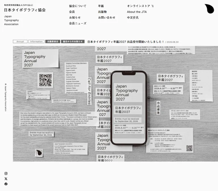
白に近い背景と黒い文字、広い余白、細い罫線で構成された協会サイト。年鑑の大型ビジュアルと会員ニューズの整然としたグリッドが、タイポグラフィ作品を引き立てます。
オリジナルサイトを見るJapan Typography Association — Style Reference
A spacious typographic bulletin board, with a black droplet mark and artwork supplying the color.
Website: Japan Typography Association Original URL: https://typography.or.jp/ Final URL: https://typography.or.jp/ Response: HTTP 200 Theme: a light neutral canvas; no alternate theme was demonstrated Inspected capture: September 12, 2026, 05:37 JST / September 11, 2026, 20:37 UTC Viewports: desktop 1440 × 1000 and mobile 390 × 844 CSS pixels Scope: the current association homepage, including its masthead, annual feature, announcements, member-news grid, member information, navigation evidence, and supplied symbol-only and mobile “Next” views. Detailed footer and mobile-menu information is supported by DOM evidence, with visual limitations described below.
The homepage presents a professional association through the visual language of an editorial index. Small, regular-weight Japanese and English text sits on an almost-white background. Fine rectangular category labels, pale rules, and unusually generous section spacing organize information without adding card containers. The large annual image and varied member posters provide the visual density.
Two structural details give the page its character. On desktop, a 48-column underlying grid produces a narrow left utility rail and an 82px inset for ordinary content. The annual image begins at that inset but continues to the right viewport edge. On mobile, the inset becomes 20px, the image moves above its caption, and a small black MENU capsule floats near the bottom of the viewport. Member news changes from four columns to two while retaining its image–title–author–metadata hierarchy.
How to Read This Reference
- Measured means a value reported in the supplied rendered DOM or computed styles.
- Calculated means arithmetic using measured rectangles, such as column gaps and section separation.
- Estimated means a visual approximation from the supplied captures. It is not a sampled computed value.
- Declared means a custom property or transition exists in the supplied styles. Its presence alone does not prove that a particular interaction occurred.
- Recommended means an implementation choice for reuse, including the Quick Start breakpoint and accessibility treatments.
- Token names introduced here are implementation aliases unless explicitly identified as source properties.
The inspection was supplied as evidence; no additional navigation, file inspection, or interaction testing was performed for this reference. The screenshots establish visible composition, while the DOM adds measurements and content beyond the photographed regions. A DOM rectangle does not establish that an element was visible: the mobile menu illustrates this distinction.
Tokens — Colors
Default Palette
| Name | Value | Suggested token | Evidence and role |
|---|---|---|---|
| Page White | #FAFAFA |
--canvas |
Measured body background at both viewports; also measured behind desktop navigation links |
| Black Ink | #000000 |
--ink |
Measured primary text and mobile MENU background; the visible identity mark is black |
| Secondary Gray | #666666 |
--muted |
Measured member-author text; also present as source --_light-color-text |
| Rule Gray | #CCCCCC |
--rule |
Declared source --c-gray-line; consistent with the pale announcement separators |
| Member Ink | #1F1A17 |
--member-ink |
Measured member-name and affiliation text in the horizontal member bands |
| White | #FFFFFF |
--reverse-ink |
Declared source --c-white; recommended direct value for the visibly light MENU and filled-label text, whose child styles were not sampled |
Filled committee labels visually use approximately #666666, with light lettering. Their exact child/background declarations were not included. Using the measured secondary gray for these labels is a close implementation approximation, not an independently measured badge color.
Palette Boundaries
The interface has no demonstrated accent-color system. Lavender, turquoise, coral, rainbow stripes, and gold occur inside member artwork. Preserve those individual images without promoting their colors into navigation, category badges, or page backgrounds.
The custom-property inventory includes numerous CMS color, gradient, and shadow presets. These declarations do not establish their use on the inspected homepage. The visible shell remains neutral and flat.
No dark mode, palette selector, or theme-switching behavior was supplied.
Tokens — Typography
Primary Japanese and Latin Stack
Measured stack: Inter, MFW-GothicBBBPr6N-Medium, sans-serif.
The principal interface uses a regular sans-serif treatment. Latin text is supported by Inter; the Japanese family identifier appears exactly as MFW-GothicBBBPr6N-Medium in computed styles. Preserve that identifier when reproducing an authorized font configuration. The word “Medium” inside the family name does not mean that the sampled CSS weight was 500: most inspected elements report font-weight: 400.
The original-page footer states “Fonts provided by Morisawa.” This supports font-provider attribution, but does not identify a website design or development team.
English Identity and Member Names
The English association name uses Inter, sans-serif, regular weight, a 1.6 line height, and 0.03em tracking. It occupies three lines on desktop and two on mobile.
Member names use Inter at weight 300. At 44px on desktop, they form the largest measured live-text treatment in the supplied evidence. They shrink to 22px on mobile. These names provide typographic emphasis within the directory; the homepage does not depend on an oversized promotional headline.
Type Scale
Values below describe the sampled element, not necessarily every descendant inside it.
| Role | Desktop | Mobile | Weight / tracking | Evidence note |
|---|---|---|---|---|
| Body inheritance | 20px, normal line height |
21px, normal line height |
400 |
Container default; most visible copy overrides it |
| Identity H1 container | 20px / 20px |
21px / 21px |
400 |
Contains differently sized legal and association-name text |
| English association name | 14px / 22.4px |
12px / 19.2px |
400, 0.03em |
Measured directly |
| Desktop navigation | 16px / 16px |
Not visible in the top mobile capture | 400, 0.03em |
Each link also has 2px vertical padding |
| Section heading | 22px, normal line height |
20px, normal line height |
400 |
Announcement and member-news heading boxes are 44px and 40px high |
| Archive link | 14px, normal line height |
12px, normal line height |
400 |
Plain inline link |
| Announcement title | 16px / 22.4px |
14px / 19.6px |
400, 0.03em |
Direct H3 measurement |
| Member-news title | 16px / 22.4px |
13px / 18.2px |
400, normal tracking |
Direct H3 measurement |
| Member-news author | 13px / 15.6px |
12px / 14.4px |
400, 0.03em |
Secondary gray |
| Member name | 44px / 44px |
22px / 22px |
300, 0.03em |
Inter; DOM-supported member bands |
| Member affiliation | 11.4286px / 11.4286px |
10px / 10px |
400, 0.03em |
Small text below names |
| Mobile-menu primary link | — | 18px / 27px |
400 |
DOM-supported; open-menu appearance not photographed |
| Mobile-menu secondary link | — | 16px / 28px |
400 |
DOM-supported |
| Featured H2 container | 20px / 28px |
21px / 21px |
400 |
Child headline/date sizes were not sampled |
Visual estimates: category labels and dates are approximately 12px; the MENU caption is approximately 11px; the legal identifier is approximately 10px. The visible annual headline reads at approximately 16px on desktop and 14px on mobile. The mobile association-name lettering looks smaller than its 21px parent declaration. Do not apply the parent H1, H2, or button font size indiscriminately to all their children.
Root-Unit Caution
The measured root font size is 0.952381px on desktop and 1px on mobile. The respective declared --base-vw values are 1512 and 390; these root sizes are consistent with 1440 / 1512 and 390 / 390.
The complete root sizing rule, caps, and breakpoint conditions were not supplied. Do not extrapolate an exact fluid formula from those two samples. The root's computed Times family is also not the visible page font: the body overrides it.
The Quick Start uses conventional CSS units and explicit component sizes. Copying this site's numeric source rem values into a normal 16px-root project would produce very different dimensions.
Tokens — Spacing & Shapes
Composition: large section intervals around compact type, labels, and image captions. Geometry: square media, unboxed content, thin rectangular stamps, and a few identity/control curves.
Spacing Scale
| Use | Desktop | Mobile | Status |
|---|---|---|---|
| Navigation link vertical padding | 2px |
— | Measured |
| Category-label separation | About 5px |
About 5px |
Estimated from captures |
| Announcement horizontal inset | 8px |
8px |
Measured |
| Member-card internal gap | 16px |
9px |
Measured |
| Featured anchor grid gap | 10px |
10px |
Measured; painted image-to-caption distance can include inline-image space |
| Member-grid column gap | 39.3125px |
12px |
Calculated from card positions |
| Member-grid row gap | About 60.94px |
20px |
Calculated from row rectangles |
| Header left inset | 24px |
20px |
Measured |
| Standard content side inset | 82px |
20px |
Measured |
| Announcement vertical padding | 77px |
20px |
Measured |
| Separation between main sections | 200px |
75px |
Calculated from section boundaries |
| Main bottom padding | 198.095px |
208px |
Measured |
Do not compress all desktop whitespace into a conventional small spacing scale. The 200px section intervals and tall announcement rows are a substantial part of the observed composition.
Border Radius
| Element | Treatment | Evidence |
|---|---|---|
| News cards and featured link | 0 |
Measured anchor radius |
| Image frames and category stamps | Square | Visible in captures |
| Mobile MENU control | 9999px |
Measured, producing a capsule |
| Mobile-menu close control | 50%, 48 × 48px |
DOM-supported; not shown in the closed-menu capture |
| Identity mark | Custom droplet/comma silhouette | Visible artwork; not a rounded CSS rectangle |
Layout Measurements
| Element | Desktop 1440 × 1000 | Mobile 390 × 844 |
|---|---|---|
| Document height | 5934.375px |
4220.75px |
| Header element box | 1440 × 77px |
390 × 63px |
| Main starts | y = 227px |
y = 183px |
| Featured anchor | x = 82px, width 1358px, height 806.875px |
x = 20px, width 370px, height 316.125px |
| Ordinary content width | 1276px |
350px |
| Member-news columns | Four | Two |
| Member-card width | 289.515625px |
169px |
| Member media frame | About 289.52 × 217.13px |
169 × 126.75px |
| First member-card row height | 346.109375px |
230.328125px |
| Later member-card row height | 368.5px |
248.515625px |
| First announcement row | 203.390625px |
125.59375px |
| MENU control | Not visible | 148 × 32px, at x = 121px, y = 780px |
Member-media heights are calculated from the card-to-title offsets minus the measured internal gap. They support a 4:3 frame. The mobile annual image is approximately 370 × 208px, supporting a 16:9 image area. Image-element source attributes and fit rules were not included.
Components
Masthead and Three-Column Navigation
Role: identify the association and expose its principal destinations.
The identity begins at (24, 24) on desktop and (20, 24) on mobile. Stack a small legal identifier, the Japanese association name, and an English name block. Preserve the separation between the compact Japanese identity and the looser English lines.
Desktop navigation has three vertical groups beginning at approximately x = 413.67, 588.75, and 763.83. Links begin at y = 24, then advance in 33px steps. Their line boxes are 20px high after padding.
The first group contains association information, members, announcements, and member news. The second contains the annual, publications, and contact. The third contains the online store and the English and Chinese association pages. The online-store entry has a small cart symbol. These are text links, without enclosing buttons or a header divider.
A black droplet/comma mark occupies the upper-right corner. Its painted footprint is approximately 54 × 54px on desktop and 40 × 40px on mobile. The sampled inline anchor rectangles are smaller than the painted mark and must not be used as its image dimensions.
The desktop header box is only 77px high even though its English text and navigation extend below it. Match the visible composition rather than assuming that the header's measured box encloses all its contents.
Desktop Utility Rail
Role: retain a small amount of identity and social navigation beside the scrolling content.
A narrow left rail contains vertically oriented copyright text around the viewport's middle and three black social symbols near the bottom. The same placements remain visible in the desktop top and member-news captures, supporting a persistent rail treatment. Its exact positioning declarations were not sampled.
The icons represent Instagram, X, and Facebook, with corresponding destinations in the DOM. Their visible marks are approximately 16px across. The rail is absent from the mobile top capture; equivalent social links exist in the mobile navigation DOM.
For reuse, reserve this strip outside the main content rather than overlapping it with images.
Annual Feature
Role: lead with the current annual's announcement and artwork.
The entire feature is an anchor to /news/19823/. Its desktop anatomy is a compact caption row followed by a large image. The caption contains two outlined labels, two filled committee/association labels, and a regular-weight headline with a smaller gray date. The labels begin at x = 82px; the H2 container begins at approximately x = 533px.
The image begins around y = 265px, aligns with the 82px content inset, and continues to the right viewport edge. It shows gray textured backing, multiple white typographic slips, QR codes, and a central phone photographed as part of the composition. The phone is artwork, not a separate interactive device mockup component.
On mobile, the image comes first at y = 183px, followed by wrapping labels and a two-line headline/date block. The image reaches the right viewport edge, but caption text returns to a 20px right inset. Preserve this image-versus-caption distinction.
The annual artwork contains extensive embedded lettering. Keep the actual article title and date in live HTML outside the image; do not depend on the tiny poster lettering for the announcement's accessible name.
Category and Committee Stamps
Role: provide compact editorial classification within article links.
Outlined stamps identify categories such as “Annual,” “Information,” “Event,” and “Award.” Filled gray stamps identify groups such as “出版委員会” and “協会からのお知らせ”. They are short horizontal rectangles with approximately 12px regular text and square corners.
In the desktop capture, common outlined labels are approximately 95 × 19px. The mobile feature's first labels are approximately 100 × 18px. Longer filled labels expand to fit their text. Gaps are approximately 5px.
These labels appear inside larger article anchors. There is no evidence that they function as filters or independent controls. Implement them as noninteractive spans unless a separate filtering behavior is intentionally added.
Section Heading and Archive Link
Role: give each collection a clear title and a restrained route to older entries.
The section heading sits at the standard left content inset. On desktop, the archive link begins at x = 720px, the midpoint of the ordinary content region, rather than at its far-right edge. This deliberate open space is visible in the member-news capture.
On mobile, the heading and archive link occupy opposite ends of the 350px content width. The archive label is “・バックナンバー 一覧”; its dot is part of the displayed text treatment. Use regular weight and no enclosing button.
For member news, the first card begins 94px below the heading's top on desktop and 70px below it on mobile. Those measurements include the heading's own line box and the following space.
Announcement List
Role: present short association updates as a text-led chronological list.
Each row is a full-width article anchor with a title, category/committee stamps, and date. Thin pale horizontal rules separate entries. There is no thumbnail in the inspected announcement rows.
Desktop rows use 77px 8px padding and are about 203.39px tall for the sampled entries. Mobile rows use 20px 8px padding. Their heights vary with title and metadata wrapping: approximately 85.59–125.59px in the supplied sample.
The mobile capture makes the anatomy particularly clear: a title at the top, outlined categories beneath it, a filled association label on another line when required, and a small gray date. Keep row height content-driven on narrow screens. The first row's additional metadata produces more height than several longer-titled entries.
Member-News Card
Role: showcase members' events, exhibitions, awards, and other updates.
Each card is a single anchor, with this reading order:
- A square-cornered
4:3media frame. - A regular-weight title.
- A muted author or organization name.
- A category stamp and publication date near the bottom.
Desktop card columns begin at x = 82, 410.83, 739.66, and 1068.48. They have no visible card background, border, shadow, or rounded enclosure. The canvas remains visible between every element.
Images carry different visual languages: a striped typographic poster, a pale illustration with a turquoise glass shape, lavender experimental branding, an award photograph, and event announcements. Preserve this diversity inside a consistent frame.
Internal gaps measure 16px on desktop and 9px on mobile. Titles can wrap, and second-row desktop cards are taller to accommodate longer headings. Metadata remains aligned near the bottom of each grid row; a flex-column card with an automatically pushed metadata block is a useful adaptation.
One desktop media slot is visually blank. The evidence does not identify whether this is intentional, unavailable media, or delayed rendering. Preserve the slot's geometry without inventing an image or classifying it as an animated skeleton.
Member Summary and Horizontal Name Bands
Role: communicate the association's membership and expose individual profiles.
The DOM reports 186 total members: 127 individual, 11 overseas, 12 corporate, and 36 OB members. These are captured content values, not permanent design tokens.
The heading and total begin on the same horizontal level on desktop. On mobile, the total begins below the heading. Below this summary, the DOM contains repeated groups of names and affiliations arranged across horizontal bands. Several items extend beyond either viewport edge, and some names are profile anchors while others are plain text.
The measured type is distinctive: 44px light Inter names with approximately 11.43px affiliations on desktop, and 22px names with 10px affiliations on mobile. Successive sampled bands are approximately 87–88px apart vertically.
Repetition and offscreen positioning are consistent with a looping-strip implementation, but movement, direction, speed, and pause behavior were not demonstrated. Do not count repeated DOM entries as additional members or present an invented marquee speed as source behavior.
Mobile MENU Control and Navigation Structure
Role: provide compact access to navigation while leaving the mobile masthead open.
The visible MENU button is a black capsule measuring 148 × 32px, centered horizontally and positioned 32px above the bottom of the 844px viewport. Its caption is small and light. The button's sampled parent text color is black, but the screenshot shows light child lettering; this is another case where a parent declaration does not describe the painted label.
The DOM also includes a menu-close button, grouped primary/secondary links, language links, social destinations, store/contact controls, and office information. Primary menu links measure 18px with 27px line height; secondary links measure 16px with 28px line height. Member-category links occupy two columns of 159px with a 32px gap within the 350px content width.
The close control measures 48 × 48px with a circular radius. Store/contact links have pill-shaped rectangles of 162.5 × 26px in the menu DOM. These are structural and computed-style findings: no supplied screenshot shows the menu open, and opening, closing, focus management, backdrop appearance, and scroll locking were not tested.
Symbol-Only and “Next” Views
Role: a sparse identity or progression composition whose exact trigger remains unverified.
One desktop capture contains only the black mark on the neutral canvas. The mark is horizontally centered and slightly below the viewport's vertical midpoint. The mobile counterpart shows “Next” above a roughly 54px mark, with extensive surrounding whitespace.
A trailing /about/ anchor is present in the DOM. This supports the presence of a route onward to association information, but does not establish the mark's complete hit area or prove automatic navigation.
The mobile document ends exactly 844px after the measured main element ends. This calculated remainder is consistent with a viewport-sized closing region. It does not prove a particular 100vh declaration, scroll-snap rule, or page-transition mechanism.
Treat these as supplied visual states. Do not relabel them as a loading screen, timeout, click animation, or scroll-triggered transition without further evidence. The mobile Next capture omits the MENU capsule; the condition controlling that visibility was not supplied.
Footer and Contact Information
Role: provide organizational identity, office details, policies, related publications, and social links.
Desktop rendered text includes a substantial footer with association/contact information, grouped navigation, English and Chinese links, publication destinations, policies, social links, and the Morisawa font credit. On mobile, corresponding information appears in the menu DOM, while the rendered page text ends with “Next”.
The footer was not available as an unobstructed content screenshot. Its exact visual column layout, spacing, and relationship to the symbol-only desktop state should remain unspecified. Use the verified information hierarchy when implementing an adaptation, and label any new footer layout as a recommendation.
Tokens — Motion & Interaction
| Treatment | Evidence | What can be concluded |
|---|---|---|
| Desktop navigation and English identity | font-size, letter-spacing, and clip-path, each 0.24s cubic-bezier(0.165, 0.84, 0.44, 1) |
These properties have declared transitions; their triggering states and end values were not demonstrated |
| Mobile-menu links | opacity 0.25s |
A short opacity transition is defined; menu-open behavior was not exercised |
| Mobile-menu social links | opacity 0.25s, transform 0.25s |
Both properties can transition; displacement and trigger remain unknown |
| Shared easing | Source --ease-out-quart: cubic-bezier(0.165, 0.84, 0.44, 1) |
Reusable declared easing |
| Page delay | Source --page-delay-duration: 500ms |
A delay variable exists; it is not evidence for a 500ms splash or full transition duration |
| General transition duration | Source --_global--transition-duration: .2s |
A generic declaration; do not apply it indiscriminately to all components |
| Member bands | Repeated entries and horizontal offscreen coordinates | Compatible with looping bands; no verified playback timing or direction |
| Symbol-only / Next compositions | Static captures and a trailing About link | Visual states and a possible onward destination; trigger and navigation behavior unverified |
The source also declares cursor and transition layer indices. These names alone do not establish a visible custom cursor or a specific transition implementation. Likewise, animation: none on sampled text nodes does not rule out motion on ancestors or motion driven by JavaScript.
The supplied capture process waited for document readiness, visible image decoding, and sampled layout/text stability, and handled finite and perpetual animations during readiness checks. Those safeguards do not provide a frame-by-frame recording or prove that every delayed state was observed.
Recommended motion approach: begin with a static, fully usable page. Add only short, restrained feedback where needed. If horizontal member movement is introduced, provide pause behavior and a reduced-motion alternative. Do not invent a mandatory animated opening merely to reproduce the sparse mark capture.
Surfaces
| Layer | Appearance | Purpose |
|---|---|---|
| Main canvas | Solid #FAFAFA |
Continuous neutral field across the homepage |
| Article and card content | Transparent over the canvas | Groups information through alignment and spacing |
| Announcement separators | Fine pale-gray rules | Distinguish rows without enclosing them |
| Category stamp | Canvas fill, thin gray edge | Compact editorial classification |
| Committee stamp | Estimated medium-gray fill, light text | Secondary organizational classification |
| MENU control | Black capsule, light caption | Concentrated mobile navigation affordance |
| Artwork frame | Square image boundary | Lets each work retain its own palette and composition |
| Sparse mark view | Canvas plus black silhouette | Concentrates attention on the identity mark |
There is no visible general elevation system. Shadows inside the annual's photographed slips and phone belong to the image; they are not evidence of CSS card shadows.
Imagery
The annual feature is a wide, mostly monochrome photographic composition. White paper labels, a textured gray ground, dense bilingual typography, and a dark phone create an exhibition-board feeling. Its numerous small type samples function as imagery at mobile size.
Member news behaves like a compact poster exhibition. The consistent frame is more important than making every artwork visually uniform. Retain vivid source colors, intentional whitespace, small lettering, and the different densities of illustration, branding, photography, and event posters.
The visible droplet/comma mark is the recurring identity asset: upper-right in the masthead and isolated in the sparse views. Preserve the supplied silhouette using an authorized asset. A generic teardrop, emoji, or border-radius approximation would alter the identity.
The screenshots show recognizable social and cart symbols, but the supplied evidence does not identify their asset format or icon library. Do not attribute an unverified icon package.
Observed Asset References
No image src URLs, asset filenames, or native image dimensions were supplied. The following are containing article destinations, not downloadable image paths; their destination pages were not separately inspected.
| Visible material | Containing destination | Observed use |
|---|---|---|
| Japan Typography Annual 2027 composition | Annual announcement | Large homepage feature |
| Multicolored vertical-typography poster | Member announcement | First member-news card |
| “Seasons” illustration | Member announcement | Second member-news card |
| Lavender experimental-branding graphic | Member announcement | Third member-news card |
| Award-related photograph and certificate | Member announcement | Second desktop row |
| “CREATORS MATCH FESTA 2025” artwork | Member announcement | Final displayed member-news card |
For a reusable implementation, begin with object-fit: contain when complete poster visibility matters, then select cropping per asset. That is a recommendation: the original image fit declarations were not sampled. Do not globally grayscale the member artwork or apply pixelated rendering.
Layout & Responsive Behavior
Desktop Grid
The sampled section grid contains a 24px outer track, 48 tracks of 29px, and a final 24px outer track:
24 + 48 × 29 + 24 = 1440px.
Ordinary content begins after two inner tracks:
24 + 2 × 29 = 82px.
It spans 44 inner tracks:
44 × 29 = 1276px.
This explains the relationship between the utility rail, content inset, and centered section collections. The annual feature shares the left content edge but extends to the right viewport boundary, giving it a width of 1440 − 82 = 1358px.
The archive link starts at the midpoint of the ordinary content width: 82 + 1276 / 2 = 720px. Member news subdivides the same region into four cards with approximately 39.31px column gaps.
Mobile Layout
The mobile section grid retains many narrow tracks between 20px outer gutters. Its serialized track sizes are approximately 7.28px; measured ordinary content is 350px wide. The useful implementation result is the measured 20px inset, rather than relying on rounding of each serialized track.
The member grid uses two 169px cards and a 12px gap:
169 + 12 + 169 = 350px.
The annual image occupies 370px because it bleeds through the right gutter. Its caption, announcements, and member cards remain within the normal 350px content width.
Observed Changes
| Element | Desktop | Mobile |
|---|---|---|
| English identity | Three lines | Two lines |
| Main navigation | Three exposed groups | Replaced visually by MENU capsule |
| Masthead mark | Approximately 54px | Approximately 40px |
| Annual ordering | Caption, then image | Image, then caption |
| Annual labels | One compact row alongside the title | Wrap above the headline |
| Archive link | Starts at content midpoint | Aligns to the content's right edge |
| Announcement padding | 77px vertically | 20px vertically |
| Member-news grid | Four columns, two rows | Two columns, four rows |
| Member-card title | 16px | 13px |
| Section intervals | 200px | 75px |
| Member-name type | 44px | 22px |
| Utility rail | Visible | Absent from the supplied top capture |
Only these two viewport sizes were supplied. Tablet behavior, landscape layouts, exact media-query thresholds, hover states, zoom handling, and orientation changes remain unverified. The Quick Start's 900px breakpoint is a recommendation, not a recovered source breakpoint.
Do’s and Don’ts
Do
- Keep the shell almost white, with black type and restrained gray metadata.
- Preserve regular-weight Japanese and Latin typography and the larger light-weight member names.
- Align desktop collections to the 82px inset at the inspected width.
- Let the annual image bleed right while keeping its mobile caption inside the regular gutters.
- Reorder the annual image and caption between desktop and mobile.
- Use square image frames and small rectangular classification stamps.
- Keep four member-news columns on desktop and two at the inspected phone width.
- Preserve generous section separation and the distinction between spacious announcement rows and compact card internals.
- Let individual artwork carry color, texture, and typographic experimentation.
- Reserve media geometry when an image is absent.
- Keep the identity mark accurate and visually isolated where shown.
Don’t
- Don't replace the association homepage with a generic sales funnel or a large conversion headline.
- Don't wrap each update in a rounded, elevated card.
- Don't turn Event and Award labels into brightly colored pills.
- Don't add gradients or shadows simply because generic CMS presets exist.
- Don't center every desktop section link or move every archive link to the far-right edge.
- Don't force the annual caption to remain above the image on mobile.
- Don't treat poster lettering, QR codes, or the photographed phone as separate UI controls.
- Don't interpret hidden menu rectangles as proof that the menu was opened.
- Don't infer marquee speed, cursor behavior, or automatic page advancement from variable names and repeated DOM nodes.
- Don't apply a conventional root font size while copying the original numeric
remvalues unchanged. - Don't promote member names or article authors into website production credits.
Recommended Implementation Additions
These are recommendations for a new implementation, not verified features of the original:
- Use a visible black focus outline and underline focused article titles. Preserve native anchors for article and profile navigation.
- Keep the MENU capsule's visual size if desired, while expanding its interactive target to at least 44–48px high.
- Implement mobile navigation with an accessible dialog or equivalent pattern, including an explicit accessible name, focus return, Escape handling, and appropriate background inertness.
- Give icon-only home and social controls meaningful names. Use the existing article title as the accessible name of the annual feature.
- Keep category stamps as noninteractive metadata inside article anchors. Avoid nested links or buttons.
- Supply meaningful image alternatives for artwork, and use empty alternative text only when an image is genuinely redundant with adjacent information.
- Do not require users to read small embedded poster text or scan an image QR code to reach essential content.
- Preserve image aspect ratios during loading and provide a deliberate fallback for missing artwork.
- If member bands move continuously, expose one accessible copy of each entry, exclude decorative duplicates from keyboard navigation, and provide pause and reduced-motion behavior.
- Make the Next destination an explicit operable link. Automatic progression should not be inferred from this reference.
- Test small gray metadata, text zoom, font-loading fallback, and control overlap at intermediate widths. The supplied captures do not establish accessibility compliance.
Agent Prompt Guide
Quick Color Reference
- Canvas:
#FAFAFA. - Primary text, identity mark, and mobile MENU fill:
#000000. - Secondary author text:
#666666. - Fine separators: source
#CCCCCC. - Member-name bands:
#1F1A17. - Filled-stamp background: approximately
#666666; light lettering. - Color belongs primarily to the individual artwork.
Overall Prompt
“Create an editorial homepage for a typography association. Use an almost-white #FAFAFA canvas, black regular-weight sans-serif text, small gray metadata, fine horizontal rules, and square image frames. At 1440px, align normal content 82px from either side and reserve a narrow left utility rail. Place a compact Japanese/English identity at the upper left, three groups of plain navigation links across the header, and a black droplet mark at the upper right. Lead with an annual announcement whose image extends to the right viewport edge. Follow it with spacious text announcements, a four-column member-news grid, and large light-weight member names. At 390px, use 20px gutters, move the annual image above its caption, use two member-news columns with a 12px gap, and show a small black MENU capsule near the bottom. Treat unverified menu and motion behavior as implementation decisions.”
Example Component Prompts
- Annual feature: “A large 16:9 editorial image of typographic paper slips and a photographed phone, aligned to the content's left inset and bleeding to the right viewport edge. Above it on desktop, place small outlined categories, gray committee stamps, and a modest headline/date. On mobile, place the image first and wrap the caption below within normal text gutters. Use live HTML for the headline.”
- Member-news card: “An unboxed article link on an almost-white canvas: square-cornered 4:3 artwork, a 16px regular title, a 13px gray author, and a small outlined category beside a date. Use a 16px internal gap and bottom-align metadata. On a 390px screen, make it 169px wide with 13px title text and 9px internal gaps.”
- Announcement list: “A text-led association bulletin with fine pale-gray separators, regular titles, compact outline and filled metadata stamps, and dates. Use unusually spacious 77px vertical desktop padding, reducing to 20px on mobile. Let metadata and Japanese titles wrap naturally.”
- Mobile navigation entry: “A centered black 148 × 32px MENU capsule, visually 32px above the viewport bottom. Use a small light caption and a larger invisible touch target. Implement an accessible dialog separately; its open appearance and transitions were not verified in the reference.”
- Member bands: “A typographic directory using 44px light Inter names with very small affiliations underneath, reduced to 22px names on mobile. Arrange entries in horizontal bands with generous vertical rhythm. Start with a static accessible version; add looping movement only as an explicit enhancement with pause controls.”
- Sparse onward view: “An almost-white viewport containing a small black identity silhouette and, on mobile, the word Next above it. Preserve the large empty field. Make any onward route explicit and keyboard-operable; do not invent automatic navigation.”
Quick Start
CSS Custom Properties
This is a reusable adaptation, not a recovered stylesheet. It uses a conventional root size, measured colors and component dimensions, and a recommended 900px breakpoint. The tall masthead reservation includes the original visual gap before main content, rather than copying the original short header box and positioned overflow.
Font files and image URLs were not provided. Load authorized font resources separately; the declared stack alone does not download them. The menu, member movement, and closing-state transitions require separate behavior. The CSS intentionally does not invent those interactions.
:root {
  /* Measured colors, with white used for reversed text. */
  --canvas: #fafafa;
  --ink: #000;
  --muted: #666;
  --rule: #ccc;
  --member-ink: #1f1a17;
  --reverse-ink: #fff;

  /* Source family identifiers; fonts must be supplied separately. */
  --font-ui: 'Inter', 'MFW-GothicBBBPr6N-Medium', sans-serif;
  --font-en: 'Inter', sans-serif;

  /* Mobile measurements. */
  --edge: 20px;
  --content-inset: 20px;
  --masthead-reserve: 183px;
  --section-space: 75px;
  --section-title: 20px;
  --archive-size: 12px;
  --news-title: 14px;
  --news-padding-y: 20px;
  --card-title: 13px;
  --card-author: 12px;
  --card-gap: 9px;
  --grid-gap-x: 12px;
  --grid-gap-y: 20px;
  --member-name: 22px;
  --member-affiliation: 10px;
  --main-bottom: 208px;

  /* Observed transition declarations; triggers are not reconstructed. */
  --ease-out-quart: cubic-bezier(0.165, 0.84, 0.44, 1);
  --nav-motion: 240ms var(--ease-out-quart);
  --menu-link-motion: 250ms ease;
  --safe-bottom: env(safe-area-inset-bottom, 0px);
}

* { box-sizing: border-box; }
html { font-size: 100%; }
body {
  margin: 0;
  color: var(--ink);
  background: var(--canvas);
  font-family: var(--font-ui);
  font-size: 16px;
  font-weight: 400;
}
button { font: inherit; }
a { color: inherit; }
img { max-inline-size: 100%; }
h1, h2, h3, p { margin: 0; }
h1, h2, h3 { font-weight: 400; }

.site-header {
  position: relative;
  min-block-size: var(--masthead-reserve);
}
.brand {
  position: absolute;
  inset-block-start: 24px;
  inset-inline-start: var(--edge);
}
.brand__legal {
  display: block;
  margin-block-end: 6px;
  font-size: 10px;
  line-height: 1;
}
.brand__name {
  display: block;
  font-size: 18px; /* Visual approximation of the child lettering. */
  line-height: 21px;
}
.brand__english {
  margin-block-start: 14px;
  font-family: var(--font-en);
  font-size: 12px;
  line-height: 1.6;
  letter-spacing: .03em;
}
.brand__english span:last-child { display: block; }
.brand-mark {
  position: absolute;
  inset-block-start: 23px;
  inset-inline-end: var(--edge);
  inline-size: 40px;
  block-size: 40px;
}
.brand-mark img {
  display: block;
  inline-size: 100%;
  block-size: 100%;
  object-fit: contain;
}
.site-nav, .utility-rail { display: none; }

.site-main { padding-block-end: var(--main-bottom); }
.content {
  margin-inline: var(--content-inset);
}
.section { margin-block-start: var(--section-space); }
.section-heading {
  display: flex;
  justify-content: space-between;
  align-items: center;
  min-block-size: 40px;
}
.section-heading h2 {
  font-size: var(--section-title);
}
.archive-link {
  font-size: var(--archive-size);
  text-decoration: none;
}

.annual-feature {
  display: flex;
  flex-direction: column;
  gap: 15px; /* Approximate painted image-to-caption separation. */
  margin-inline-start: var(--content-inset);
  text-decoration: none;
}
.feature-image {
  order: -1;
  display: block;
  inline-size: 100%;
  aspect-ratio: 16 / 9;
  object-fit: contain;
}
.feature-caption {
  display: flex;
  flex-direction: column;
  gap: 10px;
  margin-inline-end: var(--content-inset);
}
.feature-title {
  font-size: 14px; /* Approximate child text, not sampled H2 inheritance. */
  line-height: 21px;
}
.feature-title time, .metadata time {
  color: var(--muted);
  font-family: var(--font-en);
  font-size: 12px;
  letter-spacing: .03em;
}
.badge-group {
  display: flex;
  flex-wrap: wrap;
  gap: 5px;
}
.badge {
  display: inline-flex;
  align-items: center;
  justify-content: center;
  min-inline-size: 100px;
  block-size: 18px;
  padding-inline: 10px;
  border: 1px solid var(--muted);
  color: var(--muted);
  font-size: 12px;
  line-height: 1;
  letter-spacing: .03em;
  white-space: nowrap;
}
.badge--filled {
  color: var(--reverse-ink);
  background: var(--muted); /* Visual approximation. */
}

.news-list {
  margin-block-start: 30px;
  border-block-start: 1px solid var(--rule);
}
.news-row {
  display: flex;
  flex-direction: column;
  gap: 6px;
  padding: var(--news-padding-y) 8px;
  border-block-end: 1px solid var(--rule);
  text-decoration: none;
}
.news-row h3 {
  font-size: var(--news-title);
  line-height: 1.4;
  letter-spacing: .03em;
}
.metadata {
  display: flex;
  flex-wrap: wrap;
  align-items: center;
  gap: 5px;
}

.member-grid {
  display: grid;
  grid-template-columns: repeat(2, minmax(0, 1fr));
  gap: var(--grid-gap-y) var(--grid-gap-x);
  margin-block-start: 30px;
}
.member-card {
  display: flex;
  flex-direction: column;
  gap: var(--card-gap);
  min-inline-size: 0;
  text-decoration: none;
}
.member-media {
  aspect-ratio: 4 / 3;
  overflow: hidden;
}
.member-media img {
  display: block;
  inline-size: 100%;
  block-size: 100%;
  object-fit: contain; /* Recommended default; original fit is unknown. */
}
.member-card h3 {
  font-size: var(--card-title);
  line-height: 1.4;
}
.member-card__author {
  color: var(--muted);
  font-size: var(--card-author);
  line-height: 1.2;
  letter-spacing: .03em;
}
.member-card .metadata {
  margin-block-start: auto;
  padding-block-start: 28px;
}

/* Recommended static alternative to unverified member-band motion. */
.member-band {
  display: flex;
  align-items: center;
  gap: 28px;
  overflow-x: auto;
  padding: 12px var(--content-inset);
  color: var(--member-ink);
}
.member-entry { flex: 0 0 auto; text-decoration: none; }
.member-entry__name {
  font-family: var(--font-en);
  font-size: var(--member-name);
  font-weight: 300;
  line-height: 1;
  letter-spacing: .03em;
  white-space: nowrap;
}
.member-entry__affiliation {
  margin-block-start: 8px;
  font-family: var(--font-en);
  font-size: var(--member-affiliation);
  line-height: 1;
  letter-spacing: .03em;
}

/* Show in the regular content view; end-state visibility needs a controller. */
.menu-toggle {
  position: fixed;
  z-index: 100;
  inset-inline-start: 50%;
  inset-block-end: calc(32px + var(--safe-bottom));
  transform: translateX(-50%);
  display: grid;
  place-items: center;
  inline-size: 148px;
  block-size: 32px;
  padding: 0;
  border: 0;
  border-radius: 9999px;
  color: var(--reverse-ink);
  background: var(--ink);
  font-size: 11px;
  line-height: 1;
  text-transform: uppercase;
  cursor: pointer;
}
.menu-toggle::before {
  /* Recommended enlarged hit area, preserving the visible capsule. */
  content: '';
  position: absolute;
  inset: -8px 0;
}

/* Recommended static onward-link composition, without automatic navigation. */
.next-panel {
  display: flex;
  flex-direction: column;
  align-items: center;
  justify-content: center;
  gap: 48px;
  min-block-size: 100svh;
  font-size: 24px;
  text-decoration: none;
}
.next-panel img { inline-size: 54px; block-size: 54px; }

/* Recommended accessibility treatment. */
:where(a, button):focus-visible {
  outline: 2px solid var(--ink);
  outline-offset: 4px;
}
.member-card:focus-visible h3,
.news-row:focus-visible h3 { text-decoration: underline; }

/* Recommended breakpoint; the original threshold was not supplied. */
@media (min-width: 900px) {
  :root {
    --edge: 24px;
    --content-inset: calc(24px + (100vw - 48px) / 24);
    --masthead-reserve: 227px;
    --section-space: 200px;
    --section-title: 22px;
    --archive-size: 14px;
    --news-title: 16px;
    --news-padding-y: 77px;
    --card-title: 16px;
    --card-author: 13px;
    --card-gap: 16px;
    --grid-gap-x: 39.3125px;
    --grid-gap-y: 60.9375px;
    --member-name: 44px;
    --member-affiliation: 11.4286px;
    --main-bottom: 198.095px;
  }
  .brand__legal { margin-block-end: 8px; line-height: 12px; }
  .brand__name { font-size: 22px; line-height: 24px; }
  .brand__english { font-size: 14px; }
  .brand__english span { display: block; }
  .brand-mark { inline-size: 54px; block-size: 54px; }
  .site-nav {
    position: absolute;
    inset-block-start: 24px;
    inset-inline-start: 28.7272%;
    display: grid;
    grid-template-columns: repeat(3, max-content);
    column-gap: clamp(24px, 5.291vw, 76.19px);
  }
  .site-nav__group { display: grid; align-content: start; gap: 13px; }
  .site-nav a {
    padding-block: 2px;
    font-size: 16px;
    line-height: 16px;
    letter-spacing: .03em;
    text-decoration: none;
    transition: font-size var(--nav-motion),
      letter-spacing var(--nav-motion), clip-path var(--nav-motion);
  }
  .utility-rail {
    position: fixed;
    inset-block: 43% 32px;
    inset-inline-start: 24px;
    display: flex;
    flex-direction: column;
    justify-content: space-between;
    inline-size: 20px;
  }
  .utility-rail__copyright { writing-mode: vertical-rl; font-size: 10px; }
  .utility-rail__socials { display: grid; gap: 14px; }
  .section-heading {
    display: grid;
    grid-template-columns: 1fr 1fr;
    min-block-size: 44px;
  }
  .archive-link { justify-self: start; }
  .annual-feature { gap: 10px; }
  .feature-image { order: 0; }
  .feature-caption {
    flex-direction: row;
    align-items: flex-start;
    gap: 16px;
    min-block-size: 28px;
  }
  .feature-caption > .badge-group { flex: 0 0 auto; }
  .feature-title { font-size: 16px; line-height: 28px; }
  .badge { min-inline-size: 95px; block-size: 19px; }
  .member-grid {
    grid-template-columns: repeat(4, minmax(0, 1fr));
    margin-block-start: 50px;
  }
  .news-list { margin-block-start: 50px; }
  .member-card .metadata { padding-block-start: 27px; }
  .menu-toggle { display: none; }
}

@media (prefers-reduced-motion: reduce) {
  .site-nav a { transition: none; }
}
The desktop inset formula reproduces the measured 48-track relationship at 1440px. Its behavior at other desktop widths is an adaptation. The explicit card gaps likewise target the supplied desktop sample rather than claiming a recovered fluid-gap rule.
Component Markup
This example preserves the observed single-anchor anatomy. Insert an authorized artwork image inside the reserved media frame; no image URL was available in the evidence. Put a collection of these links inside .member-grid and its parent inside .content.
<a class="member-card" href="https://typography.or.jp/member-news/19879/">
  <div class="member-media">
    <!-- Insert an authorized image with an appropriate text alternative. -->
  </div>
  <h3>ハングルの縦組み</h3>
  <p class="member-card__author">徐 慧</p>
  <div class="metadata">
    <span class="badge">Event</span>
    <time datetime="2026-08-31">2026.08.31</time>
  </div>
</a>
Tailwind v4 Token Mapping
Optional aliases for a project already using Tailwind v4. This does not identify the original site's implementation framework. Define the custom properties above before using these mappings.
@theme inline {
  --color-jta-canvas: var(--canvas);
  --color-jta-ink: var(--ink);
  --color-jta-muted: var(--muted);
  --color-jta-rule: var(--rule);
  --color-jta-member: var(--member-ink);

  --font-jta: var(--font-ui);
  --font-jta-en: var(--font-en);

  --text-jta-section: var(--section-title);
  --text-jta-card: var(--card-title);
  --text-jta-author: var(--card-author);
  --text-jta-member: var(--member-name);

  --spacing-jta-inset: var(--content-inset);
  --spacing-jta-section: var(--section-space);
  --spacing-jta-card-gap: var(--card-gap);
  --radius-jta-menu: 9999px;
}
Sources & Evidence
- Original and final page: https://typography.or.jp/, reported HTTP 200. The supplied page identifies the Japan Typography Association through its title, masthead, organizational information, and copyright text.
- Capture timestamp:
2026-09-11T20:37:45.981Z, equivalent to September 12, 2026, 05:37:45.981 JST. - Desktop evidence: 1440 × 1000 CSS pixels; supplied top, member-news, and symbol-only captures, plus rendered text, links, computed styles, custom properties, and element rectangles. Measured document height: 5934.375px.
- Mobile evidence: 390 × 844 CSS pixels; supplied top and Next captures, plus rendered DOM and computed-style evidence. Measured document height: 4220.75px. The member-news layout and menu structure have DOM support beyond the photographed mobile top region.
- Original-page attribution: the footer text “Fonts provided by Morisawa.” and its Morisawa destination support font provision only. No website design/development team was identified in the supplied original-page evidence.
- Inspection limitations: no additional browsing or interaction tests were performed. Open-menu appearance, hover/focus states, exact breakpoints, member-band playback, transition triggers, and onward navigation were not verified. Image source URLs and native dimensions were not supplied. The sparse captures do not establish a loading sequence.
- Implementation status: CSS, markup, accessibility additions, and Tailwind aliases are proposed adaptations and were not executed or browser-tested during this analysis.
This reference describes the currently supplied homepage evidence. Measurements are tied to the two recorded viewports; content dates, member counts, and article artwork may change independently of the design system.
# Japan Typography Association — Style Reference

> A spacious typographic bulletin board, with a black droplet mark and artwork supplying the color.

**Website:** [Japan Typography Association](https://typography.or.jp/)
**Original URL:** https://typography.or.jp/
**Final URL:** https://typography.or.jp/
**Response:** HTTP 200
**Theme:** a light neutral canvas; no alternate theme was demonstrated
**Inspected capture:** September 12, 2026, 05:37 JST / September 11, 2026, 20:37 UTC
**Viewports:** desktop 1440 × 1000 and mobile 390 × 844 CSS pixels
**Scope:** the current association homepage, including its masthead, annual feature, announcements, member-news grid, member information, navigation evidence, and supplied symbol-only and mobile “Next” views. Detailed footer and mobile-menu information is supported by DOM evidence, with visual limitations described below.

The homepage presents a professional association through the visual language of an editorial index. Small, regular-weight Japanese and English text sits on an almost-white background. Fine rectangular category labels, pale rules, and unusually generous section spacing organize information without adding card containers. The large annual image and varied member posters provide the visual density.

Two structural details give the page its character. On desktop, a 48-column underlying grid produces a narrow left utility rail and an 82px inset for ordinary content. The annual image begins at that inset but continues to the right viewport edge. On mobile, the inset becomes 20px, the image moves above its caption, and a small black MENU capsule floats near the bottom of the viewport. Member news changes from four columns to two while retaining its image–title–author–metadata hierarchy.

## How to Read This Reference

- **Measured** means a value reported in the supplied rendered DOM or computed styles.
- **Calculated** means arithmetic using measured rectangles, such as column gaps and section separation.
- **Estimated** means a visual approximation from the supplied captures. It is not a sampled computed value.
- **Declared** means a custom property or transition exists in the supplied styles. Its presence alone does not prove that a particular interaction occurred.
- **Recommended** means an implementation choice for reuse, including the Quick Start breakpoint and accessibility treatments.
- Token names introduced here are implementation aliases unless explicitly identified as source properties.

The inspection was supplied as evidence; no additional navigation, file inspection, or interaction testing was performed for this reference. The screenshots establish visible composition, while the DOM adds measurements and content beyond the photographed regions. A DOM rectangle does not establish that an element was visible: the mobile menu illustrates this distinction.

## Tokens — Colors

### Default Palette

| Name | Value | Suggested token | Evidence and role |
| --- | --- | --- | --- |
| Page White | `#FAFAFA` | `--canvas` | Measured body background at both viewports; also measured behind desktop navigation links |
| Black Ink | `#000000` | `--ink` | Measured primary text and mobile MENU background; the visible identity mark is black |
| Secondary Gray | `#666666` | `--muted` | Measured member-author text; also present as source `--_light-color-text` |
| Rule Gray | `#CCCCCC` | `--rule` | Declared source `--c-gray-line`; consistent with the pale announcement separators |
| Member Ink | `#1F1A17` | `--member-ink` | Measured member-name and affiliation text in the horizontal member bands |
| White | `#FFFFFF` | `--reverse-ink` | Declared source `--c-white`; recommended direct value for the visibly light MENU and filled-label text, whose child styles were not sampled |

Filled committee labels visually use approximately `#666666`, with light lettering. Their exact child/background declarations were not included. Using the measured secondary gray for these labels is a close implementation approximation, not an independently measured badge color.

### Palette Boundaries

The interface has no demonstrated accent-color system. Lavender, turquoise, coral, rainbow stripes, and gold occur inside member artwork. Preserve those individual images without promoting their colors into navigation, category badges, or page backgrounds.

The custom-property inventory includes numerous CMS color, gradient, and shadow presets. These declarations do not establish their use on the inspected homepage. The visible shell remains neutral and flat.

No dark mode, palette selector, or theme-switching behavior was supplied.

## Tokens — Typography

### Primary Japanese and Latin Stack

**Measured stack:** `Inter, MFW-GothicBBBPr6N-Medium, sans-serif`.

The principal interface uses a regular sans-serif treatment. Latin text is supported by Inter; the Japanese family identifier appears exactly as `MFW-GothicBBBPr6N-Medium` in computed styles. Preserve that identifier when reproducing an authorized font configuration. The word “Medium” inside the family name does not mean that the sampled CSS weight was 500: most inspected elements report `font-weight: 400`.

The original-page footer states “Fonts provided by Morisawa.” This supports font-provider attribution, but does not identify a website design or development team.

### English Identity and Member Names

The English association name uses `Inter, sans-serif`, regular weight, a `1.6` line height, and `0.03em` tracking. It occupies three lines on desktop and two on mobile.

Member names use Inter at weight `300`. At 44px on desktop, they form the largest measured live-text treatment in the supplied evidence. They shrink to 22px on mobile. These names provide typographic emphasis within the directory; the homepage does not depend on an oversized promotional headline.

### Type Scale

Values below describe the sampled element, not necessarily every descendant inside it.

| Role | Desktop | Mobile | Weight / tracking | Evidence note |
| --- | --- | --- | --- | --- |
| Body inheritance | `20px`, normal line height | `21px`, normal line height | `400` | Container default; most visible copy overrides it |
| Identity H1 container | `20px / 20px` | `21px / 21px` | `400` | Contains differently sized legal and association-name text |
| English association name | `14px / 22.4px` | `12px / 19.2px` | `400`, `0.03em` | Measured directly |
| Desktop navigation | `16px / 16px` | Not visible in the top mobile capture | `400`, `0.03em` | Each link also has 2px vertical padding |
| Section heading | `22px`, normal line height | `20px`, normal line height | `400` | Announcement and member-news heading boxes are 44px and 40px high |
| Archive link | `14px`, normal line height | `12px`, normal line height | `400` | Plain inline link |
| Announcement title | `16px / 22.4px` | `14px / 19.6px` | `400`, `0.03em` | Direct H3 measurement |
| Member-news title | `16px / 22.4px` | `13px / 18.2px` | `400`, normal tracking | Direct H3 measurement |
| Member-news author | `13px / 15.6px` | `12px / 14.4px` | `400`, `0.03em` | Secondary gray |
| Member name | `44px / 44px` | `22px / 22px` | `300`, `0.03em` | Inter; DOM-supported member bands |
| Member affiliation | `11.4286px / 11.4286px` | `10px / 10px` | `400`, `0.03em` | Small text below names |
| Mobile-menu primary link | — | `18px / 27px` | `400` | DOM-supported; open-menu appearance not photographed |
| Mobile-menu secondary link | — | `16px / 28px` | `400` | DOM-supported |
| Featured H2 container | `20px / 28px` | `21px / 21px` | `400` | Child headline/date sizes were not sampled |

**Visual estimates:** category labels and dates are approximately 12px; the MENU caption is approximately 11px; the legal identifier is approximately 10px. The visible annual headline reads at approximately 16px on desktop and 14px on mobile. The mobile association-name lettering looks smaller than its 21px parent declaration. Do not apply the parent H1, H2, or button font size indiscriminately to all their children.

### Root-Unit Caution

The measured root font size is `0.952381px` on desktop and `1px` on mobile. The respective declared `--base-vw` values are `1512` and `390`; these root sizes are consistent with `1440 / 1512` and `390 / 390`.

The complete root sizing rule, caps, and breakpoint conditions were not supplied. Do not extrapolate an exact fluid formula from those two samples. The root's computed Times family is also not the visible page font: the body overrides it.

The Quick Start uses conventional CSS units and explicit component sizes. Copying this site's numeric source `rem` values into a normal 16px-root project would produce very different dimensions.

## Tokens — Spacing & Shapes

**Composition:** large section intervals around compact type, labels, and image captions.
**Geometry:** square media, unboxed content, thin rectangular stamps, and a few identity/control curves.

### Spacing Scale

| Use | Desktop | Mobile | Status |
| --- | --- | --- | --- |
| Navigation link vertical padding | `2px` | — | Measured |
| Category-label separation | About `5px` | About `5px` | Estimated from captures |
| Announcement horizontal inset | `8px` | `8px` | Measured |
| Member-card internal gap | `16px` | `9px` | Measured |
| Featured anchor grid gap | `10px` | `10px` | Measured; painted image-to-caption distance can include inline-image space |
| Member-grid column gap | `39.3125px` | `12px` | Calculated from card positions |
| Member-grid row gap | About `60.94px` | `20px` | Calculated from row rectangles |
| Header left inset | `24px` | `20px` | Measured |
| Standard content side inset | `82px` | `20px` | Measured |
| Announcement vertical padding | `77px` | `20px` | Measured |
| Separation between main sections | `200px` | `75px` | Calculated from section boundaries |
| Main bottom padding | `198.095px` | `208px` | Measured |

Do not compress all desktop whitespace into a conventional small spacing scale. The 200px section intervals and tall announcement rows are a substantial part of the observed composition.

### Border Radius

| Element | Treatment | Evidence |
| --- | --- | --- |
| News cards and featured link | `0` | Measured anchor radius |
| Image frames and category stamps | Square | Visible in captures |
| Mobile MENU control | `9999px` | Measured, producing a capsule |
| Mobile-menu close control | `50%`, 48 × 48px | DOM-supported; not shown in the closed-menu capture |
| Identity mark | Custom droplet/comma silhouette | Visible artwork; not a rounded CSS rectangle |

### Layout Measurements

| Element | Desktop 1440 × 1000 | Mobile 390 × 844 |
| --- | --- | --- |
| Document height | `5934.375px` | `4220.75px` |
| Header element box | `1440 × 77px` | `390 × 63px` |
| Main starts | `y = 227px` | `y = 183px` |
| Featured anchor | `x = 82px`, width `1358px`, height `806.875px` | `x = 20px`, width `370px`, height `316.125px` |
| Ordinary content width | `1276px` | `350px` |
| Member-news columns | Four | Two |
| Member-card width | `289.515625px` | `169px` |
| Member media frame | About `289.52 × 217.13px` | `169 × 126.75px` |
| First member-card row height | `346.109375px` | `230.328125px` |
| Later member-card row height | `368.5px` | `248.515625px` |
| First announcement row | `203.390625px` | `125.59375px` |
| MENU control | Not visible | `148 × 32px`, at `x = 121px`, `y = 780px` |

Member-media heights are calculated from the card-to-title offsets minus the measured internal gap. They support a `4:3` frame. The mobile annual image is approximately `370 × 208px`, supporting a `16:9` image area. Image-element source attributes and fit rules were not included.

## Components

### Masthead and Three-Column Navigation

**Role:** identify the association and expose its principal destinations.

The identity begins at `(24, 24)` on desktop and `(20, 24)` on mobile. Stack a small legal identifier, the Japanese association name, and an English name block. Preserve the separation between the compact Japanese identity and the looser English lines.

Desktop navigation has three vertical groups beginning at approximately `x = 413.67`, `588.75`, and `763.83`. Links begin at `y = 24`, then advance in 33px steps. Their line boxes are 20px high after padding.

The first group contains association information, members, announcements, and member news. The second contains the annual, publications, and contact. The third contains the online store and the English and Chinese association pages. The online-store entry has a small cart symbol. These are text links, without enclosing buttons or a header divider.

A black droplet/comma mark occupies the upper-right corner. Its painted footprint is approximately 54 × 54px on desktop and 40 × 40px on mobile. The sampled inline anchor rectangles are smaller than the painted mark and must not be used as its image dimensions.

The desktop header box is only 77px high even though its English text and navigation extend below it. Match the visible composition rather than assuming that the header's measured box encloses all its contents.

### Desktop Utility Rail

**Role:** retain a small amount of identity and social navigation beside the scrolling content.

A narrow left rail contains vertically oriented copyright text around the viewport's middle and three black social symbols near the bottom. The same placements remain visible in the desktop top and member-news captures, supporting a persistent rail treatment. Its exact positioning declarations were not sampled.

The icons represent Instagram, X, and Facebook, with corresponding destinations in the DOM. Their visible marks are approximately 16px across. The rail is absent from the mobile top capture; equivalent social links exist in the mobile navigation DOM.

For reuse, reserve this strip outside the main content rather than overlapping it with images.

### Annual Feature

**Role:** lead with the current annual's announcement and artwork.

The entire feature is an anchor to `/news/19823/`. Its desktop anatomy is a compact caption row followed by a large image. The caption contains two outlined labels, two filled committee/association labels, and a regular-weight headline with a smaller gray date. The labels begin at `x = 82px`; the H2 container begins at approximately `x = 533px`.

The image begins around `y = 265px`, aligns with the 82px content inset, and continues to the right viewport edge. It shows gray textured backing, multiple white typographic slips, QR codes, and a central phone photographed as part of the composition. The phone is artwork, not a separate interactive device mockup component.

On mobile, the image comes first at `y = 183px`, followed by wrapping labels and a two-line headline/date block. The image reaches the right viewport edge, but caption text returns to a 20px right inset. Preserve this image-versus-caption distinction.

The annual artwork contains extensive embedded lettering. Keep the actual article title and date in live HTML outside the image; do not depend on the tiny poster lettering for the announcement's accessible name.

### Category and Committee Stamps

**Role:** provide compact editorial classification within article links.

Outlined stamps identify categories such as “Annual,” “Information,” “Event,” and “Award.” Filled gray stamps identify groups such as “出版委員会” and “協会からのお知らせ”. They are short horizontal rectangles with approximately 12px regular text and square corners.

In the desktop capture, common outlined labels are approximately 95 × 19px. The mobile feature's first labels are approximately 100 × 18px. Longer filled labels expand to fit their text. Gaps are approximately 5px.

These labels appear inside larger article anchors. There is no evidence that they function as filters or independent controls. Implement them as noninteractive spans unless a separate filtering behavior is intentionally added.

### Section Heading and Archive Link

**Role:** give each collection a clear title and a restrained route to older entries.

The section heading sits at the standard left content inset. On desktop, the archive link begins at `x = 720px`, the midpoint of the ordinary content region, rather than at its far-right edge. This deliberate open space is visible in the member-news capture.

On mobile, the heading and archive link occupy opposite ends of the 350px content width. The archive label is “・バックナンバー 一覧”; its dot is part of the displayed text treatment. Use regular weight and no enclosing button.

For member news, the first card begins 94px below the heading's top on desktop and 70px below it on mobile. Those measurements include the heading's own line box and the following space.

### Announcement List

**Role:** present short association updates as a text-led chronological list.

Each row is a full-width article anchor with a title, category/committee stamps, and date. Thin pale horizontal rules separate entries. There is no thumbnail in the inspected announcement rows.

Desktop rows use `77px 8px` padding and are about 203.39px tall for the sampled entries. Mobile rows use `20px 8px` padding. Their heights vary with title and metadata wrapping: approximately 85.59–125.59px in the supplied sample.

The mobile capture makes the anatomy particularly clear: a title at the top, outlined categories beneath it, a filled association label on another line when required, and a small gray date. Keep row height content-driven on narrow screens. The first row's additional metadata produces more height than several longer-titled entries.

### Member-News Card

**Role:** showcase members' events, exhibitions, awards, and other updates.

Each card is a single anchor, with this reading order:

1. A square-cornered `4:3` media frame.
2. A regular-weight title.
3. A muted author or organization name.
4. A category stamp and publication date near the bottom.

Desktop card columns begin at `x = 82`, `410.83`, `739.66`, and `1068.48`. They have no visible card background, border, shadow, or rounded enclosure. The canvas remains visible between every element.

Images carry different visual languages: a striped typographic poster, a pale illustration with a turquoise glass shape, lavender experimental branding, an award photograph, and event announcements. Preserve this diversity inside a consistent frame.

Internal gaps measure 16px on desktop and 9px on mobile. Titles can wrap, and second-row desktop cards are taller to accommodate longer headings. Metadata remains aligned near the bottom of each grid row; a flex-column card with an automatically pushed metadata block is a useful adaptation.

One desktop media slot is visually blank. The evidence does not identify whether this is intentional, unavailable media, or delayed rendering. Preserve the slot's geometry without inventing an image or classifying it as an animated skeleton.

### Member Summary and Horizontal Name Bands

**Role:** communicate the association's membership and expose individual profiles.

The DOM reports 186 total members: 127 individual, 11 overseas, 12 corporate, and 36 OB members. These are captured content values, not permanent design tokens.

The heading and total begin on the same horizontal level on desktop. On mobile, the total begins below the heading. Below this summary, the DOM contains repeated groups of names and affiliations arranged across horizontal bands. Several items extend beyond either viewport edge, and some names are profile anchors while others are plain text.

The measured type is distinctive: 44px light Inter names with approximately 11.43px affiliations on desktop, and 22px names with 10px affiliations on mobile. Successive sampled bands are approximately 87–88px apart vertically.

Repetition and offscreen positioning are consistent with a looping-strip implementation, but movement, direction, speed, and pause behavior were not demonstrated. Do not count repeated DOM entries as additional members or present an invented marquee speed as source behavior.

### Mobile MENU Control and Navigation Structure

**Role:** provide compact access to navigation while leaving the mobile masthead open.

The visible MENU button is a black capsule measuring 148 × 32px, centered horizontally and positioned 32px above the bottom of the 844px viewport. Its caption is small and light. The button's sampled parent text color is black, but the screenshot shows light child lettering; this is another case where a parent declaration does not describe the painted label.

The DOM also includes a menu-close button, grouped primary/secondary links, language links, social destinations, store/contact controls, and office information. Primary menu links measure 18px with 27px line height; secondary links measure 16px with 28px line height. Member-category links occupy two columns of 159px with a 32px gap within the 350px content width.

The close control measures 48 × 48px with a circular radius. Store/contact links have pill-shaped rectangles of 162.5 × 26px in the menu DOM. These are structural and computed-style findings: no supplied screenshot shows the menu open, and opening, closing, focus management, backdrop appearance, and scroll locking were not tested.

### Symbol-Only and “Next” Views

**Role:** a sparse identity or progression composition whose exact trigger remains unverified.

One desktop capture contains only the black mark on the neutral canvas. The mark is horizontally centered and slightly below the viewport's vertical midpoint. The mobile counterpart shows “Next” above a roughly 54px mark, with extensive surrounding whitespace.

A trailing `/about/` anchor is present in the DOM. This supports the presence of a route onward to association information, but does not establish the mark's complete hit area or prove automatic navigation.

The mobile document ends exactly 844px after the measured main element ends. This calculated remainder is consistent with a viewport-sized closing region. It does not prove a particular `100vh` declaration, scroll-snap rule, or page-transition mechanism.

Treat these as supplied visual states. Do not relabel them as a loading screen, timeout, click animation, or scroll-triggered transition without further evidence. The mobile Next capture omits the MENU capsule; the condition controlling that visibility was not supplied.

### Footer and Contact Information

**Role:** provide organizational identity, office details, policies, related publications, and social links.

Desktop rendered text includes a substantial footer with association/contact information, grouped navigation, English and Chinese links, publication destinations, policies, social links, and the Morisawa font credit. On mobile, corresponding information appears in the menu DOM, while the rendered page text ends with “Next”.

The footer was not available as an unobstructed content screenshot. Its exact visual column layout, spacing, and relationship to the symbol-only desktop state should remain unspecified. Use the verified information hierarchy when implementing an adaptation, and label any new footer layout as a recommendation.

## Tokens — Motion & Interaction

| Treatment | Evidence | What can be concluded |
| --- | --- | --- |
| Desktop navigation and English identity | `font-size`, `letter-spacing`, and `clip-path`, each `0.24s cubic-bezier(0.165, 0.84, 0.44, 1)` | These properties have declared transitions; their triggering states and end values were not demonstrated |
| Mobile-menu links | `opacity 0.25s` | A short opacity transition is defined; menu-open behavior was not exercised |
| Mobile-menu social links | `opacity 0.25s, transform 0.25s` | Both properties can transition; displacement and trigger remain unknown |
| Shared easing | Source `--ease-out-quart: cubic-bezier(0.165, 0.84, 0.44, 1)` | Reusable declared easing |
| Page delay | Source `--page-delay-duration: 500ms` | A delay variable exists; it is not evidence for a 500ms splash or full transition duration |
| General transition duration | Source `--_global--transition-duration: .2s` | A generic declaration; do not apply it indiscriminately to all components |
| Member bands | Repeated entries and horizontal offscreen coordinates | Compatible with looping bands; no verified playback timing or direction |
| Symbol-only / Next compositions | Static captures and a trailing About link | Visual states and a possible onward destination; trigger and navigation behavior unverified |

The source also declares cursor and transition layer indices. These names alone do not establish a visible custom cursor or a specific transition implementation. Likewise, `animation: none` on sampled text nodes does not rule out motion on ancestors or motion driven by JavaScript.

The supplied capture process waited for document readiness, visible image decoding, and sampled layout/text stability, and handled finite and perpetual animations during readiness checks. Those safeguards do not provide a frame-by-frame recording or prove that every delayed state was observed.

**Recommended motion approach:** begin with a static, fully usable page. Add only short, restrained feedback where needed. If horizontal member movement is introduced, provide pause behavior and a reduced-motion alternative. Do not invent a mandatory animated opening merely to reproduce the sparse mark capture.

## Surfaces

| Layer | Appearance | Purpose |
| --- | --- | --- |
| Main canvas | Solid `#FAFAFA` | Continuous neutral field across the homepage |
| Article and card content | Transparent over the canvas | Groups information through alignment and spacing |
| Announcement separators | Fine pale-gray rules | Distinguish rows without enclosing them |
| Category stamp | Canvas fill, thin gray edge | Compact editorial classification |
| Committee stamp | Estimated medium-gray fill, light text | Secondary organizational classification |
| MENU control | Black capsule, light caption | Concentrated mobile navigation affordance |
| Artwork frame | Square image boundary | Lets each work retain its own palette and composition |
| Sparse mark view | Canvas plus black silhouette | Concentrates attention on the identity mark |

There is no visible general elevation system. Shadows inside the annual's photographed slips and phone belong to the image; they are not evidence of CSS card shadows.

## Imagery

The annual feature is a wide, mostly monochrome photographic composition. White paper labels, a textured gray ground, dense bilingual typography, and a dark phone create an exhibition-board feeling. Its numerous small type samples function as imagery at mobile size.

Member news behaves like a compact poster exhibition. The consistent frame is more important than making every artwork visually uniform. Retain vivid source colors, intentional whitespace, small lettering, and the different densities of illustration, branding, photography, and event posters.

The visible droplet/comma mark is the recurring identity asset: upper-right in the masthead and isolated in the sparse views. Preserve the supplied silhouette using an authorized asset. A generic teardrop, emoji, or border-radius approximation would alter the identity.

The screenshots show recognizable social and cart symbols, but the supplied evidence does not identify their asset format or icon library. Do not attribute an unverified icon package.

### Observed Asset References

No image `src` URLs, asset filenames, or native image dimensions were supplied. The following are **containing article destinations**, not downloadable image paths; their destination pages were not separately inspected.

| Visible material | Containing destination | Observed use |
| --- | --- | --- |
| Japan Typography Annual 2027 composition | [Annual announcement](https://typography.or.jp/news/19823/) | Large homepage feature |
| Multicolored vertical-typography poster | [Member announcement](https://typography.or.jp/member-news/19879/) | First member-news card |
| “Seasons” illustration | [Member announcement](https://typography.or.jp/member-news/19772/) | Second member-news card |
| Lavender experimental-branding graphic | [Member announcement](https://typography.or.jp/member-news/19649/) | Third member-news card |
| Award-related photograph and certificate | [Member announcement](https://typography.or.jp/member-news/18162/) | Second desktop row |
| “CREATORS MATCH FESTA 2025” artwork | [Member announcement](https://typography.or.jp/member-news/9678/) | Final displayed member-news card |

For a reusable implementation, begin with `object-fit: contain` when complete poster visibility matters, then select cropping per asset. That is a recommendation: the original image fit declarations were not sampled. Do not globally grayscale the member artwork or apply pixelated rendering.

## Layout & Responsive Behavior

### Desktop Grid

The sampled section grid contains a 24px outer track, 48 tracks of 29px, and a final 24px outer track:

`24 + 48 × 29 + 24 = 1440px`.

Ordinary content begins after two inner tracks:

`24 + 2 × 29 = 82px`.

It spans 44 inner tracks:

`44 × 29 = 1276px`.

This explains the relationship between the utility rail, content inset, and centered section collections. The annual feature shares the left content edge but extends to the right viewport boundary, giving it a width of `1440 − 82 = 1358px`.

The archive link starts at the midpoint of the ordinary content width: `82 + 1276 / 2 = 720px`. Member news subdivides the same region into four cards with approximately 39.31px column gaps.

### Mobile Layout

The mobile section grid retains many narrow tracks between 20px outer gutters. Its serialized track sizes are approximately 7.28px; measured ordinary content is 350px wide. The useful implementation result is the measured 20px inset, rather than relying on rounding of each serialized track.

The member grid uses two 169px cards and a 12px gap:

`169 + 12 + 169 = 350px`.

The annual image occupies 370px because it bleeds through the right gutter. Its caption, announcements, and member cards remain within the normal 350px content width.

### Observed Changes

| Element | Desktop | Mobile |
| --- | --- | --- |
| English identity | Three lines | Two lines |
| Main navigation | Three exposed groups | Replaced visually by MENU capsule |
| Masthead mark | Approximately 54px | Approximately 40px |
| Annual ordering | Caption, then image | Image, then caption |
| Annual labels | One compact row alongside the title | Wrap above the headline |
| Archive link | Starts at content midpoint | Aligns to the content's right edge |
| Announcement padding | 77px vertically | 20px vertically |
| Member-news grid | Four columns, two rows | Two columns, four rows |
| Member-card title | 16px | 13px |
| Section intervals | 200px | 75px |
| Member-name type | 44px | 22px |
| Utility rail | Visible | Absent from the supplied top capture |

Only these two viewport sizes were supplied. Tablet behavior, landscape layouts, exact media-query thresholds, hover states, zoom handling, and orientation changes remain unverified. The Quick Start's 900px breakpoint is a recommendation, not a recovered source breakpoint.

## Do’s and Don’ts

### Do

- Keep the shell almost white, with black type and restrained gray metadata.
- Preserve regular-weight Japanese and Latin typography and the larger light-weight member names.
- Align desktop collections to the 82px inset at the inspected width.
- Let the annual image bleed right while keeping its mobile caption inside the regular gutters.
- Reorder the annual image and caption between desktop and mobile.
- Use square image frames and small rectangular classification stamps.
- Keep four member-news columns on desktop and two at the inspected phone width.
- Preserve generous section separation and the distinction between spacious announcement rows and compact card internals.
- Let individual artwork carry color, texture, and typographic experimentation.
- Reserve media geometry when an image is absent.
- Keep the identity mark accurate and visually isolated where shown.

### Don’t

- Don't replace the association homepage with a generic sales funnel or a large conversion headline.
- Don't wrap each update in a rounded, elevated card.
- Don't turn Event and Award labels into brightly colored pills.
- Don't add gradients or shadows simply because generic CMS presets exist.
- Don't center every desktop section link or move every archive link to the far-right edge.
- Don't force the annual caption to remain above the image on mobile.
- Don't treat poster lettering, QR codes, or the photographed phone as separate UI controls.
- Don't interpret hidden menu rectangles as proof that the menu was opened.
- Don't infer marquee speed, cursor behavior, or automatic page advancement from variable names and repeated DOM nodes.
- Don't apply a conventional root font size while copying the original numeric `rem` values unchanged.
- Don't promote member names or article authors into website production credits.

## Recommended Implementation Additions

These are recommendations for a new implementation, not verified features of the original:

- Use a visible black focus outline and underline focused article titles. Preserve native anchors for article and profile navigation.
- Keep the MENU capsule's visual size if desired, while expanding its interactive target to at least 44–48px high.
- Implement mobile navigation with an accessible dialog or equivalent pattern, including an explicit accessible name, focus return, Escape handling, and appropriate background inertness.
- Give icon-only home and social controls meaningful names. Use the existing article title as the accessible name of the annual feature.
- Keep category stamps as noninteractive metadata inside article anchors. Avoid nested links or buttons.
- Supply meaningful image alternatives for artwork, and use empty alternative text only when an image is genuinely redundant with adjacent information.
- Do not require users to read small embedded poster text or scan an image QR code to reach essential content.
- Preserve image aspect ratios during loading and provide a deliberate fallback for missing artwork.
- If member bands move continuously, expose one accessible copy of each entry, exclude decorative duplicates from keyboard navigation, and provide pause and reduced-motion behavior.
- Make the Next destination an explicit operable link. Automatic progression should not be inferred from this reference.
- Test small gray metadata, text zoom, font-loading fallback, and control overlap at intermediate widths. The supplied captures do not establish accessibility compliance.

## Agent Prompt Guide

### Quick Color Reference

- Canvas: `#FAFAFA`.
- Primary text, identity mark, and mobile MENU fill: `#000000`.
- Secondary author text: `#666666`.
- Fine separators: source `#CCCCCC`.
- Member-name bands: `#1F1A17`.
- Filled-stamp background: approximately `#666666`; light lettering.
- Color belongs primarily to the individual artwork.

### Overall Prompt

“Create an editorial homepage for a typography association. Use an almost-white `#FAFAFA` canvas, black regular-weight sans-serif text, small gray metadata, fine horizontal rules, and square image frames. At 1440px, align normal content 82px from either side and reserve a narrow left utility rail. Place a compact Japanese/English identity at the upper left, three groups of plain navigation links across the header, and a black droplet mark at the upper right. Lead with an annual announcement whose image extends to the right viewport edge. Follow it with spacious text announcements, a four-column member-news grid, and large light-weight member names. At 390px, use 20px gutters, move the annual image above its caption, use two member-news columns with a 12px gap, and show a small black MENU capsule near the bottom. Treat unverified menu and motion behavior as implementation decisions.”

### Example Component Prompts

1. **Annual feature:** “A large 16:9 editorial image of typographic paper slips and a photographed phone, aligned to the content's left inset and bleeding to the right viewport edge. Above it on desktop, place small outlined categories, gray committee stamps, and a modest headline/date. On mobile, place the image first and wrap the caption below within normal text gutters. Use live HTML for the headline.”
2. **Member-news card:** “An unboxed article link on an almost-white canvas: square-cornered 4:3 artwork, a 16px regular title, a 13px gray author, and a small outlined category beside a date. Use a 16px internal gap and bottom-align metadata. On a 390px screen, make it 169px wide with 13px title text and 9px internal gaps.”
3. **Announcement list:** “A text-led association bulletin with fine pale-gray separators, regular titles, compact outline and filled metadata stamps, and dates. Use unusually spacious 77px vertical desktop padding, reducing to 20px on mobile. Let metadata and Japanese titles wrap naturally.”
4. **Mobile navigation entry:** “A centered black 148 × 32px MENU capsule, visually 32px above the viewport bottom. Use a small light caption and a larger invisible touch target. Implement an accessible dialog separately; its open appearance and transitions were not verified in the reference.”
5. **Member bands:** “A typographic directory using 44px light Inter names with very small affiliations underneath, reduced to 22px names on mobile. Arrange entries in horizontal bands with generous vertical rhythm. Start with a static accessible version; add looping movement only as an explicit enhancement with pause controls.”
6. **Sparse onward view:** “An almost-white viewport containing a small black identity silhouette and, on mobile, the word Next above it. Preserve the large empty field. Make any onward route explicit and keyboard-operable; do not invent automatic navigation.”

## Quick Start

### CSS Custom Properties

This is a reusable adaptation, not a recovered stylesheet. It uses a conventional root size, measured colors and component dimensions, and a recommended 900px breakpoint. The tall masthead reservation includes the original visual gap before main content, rather than copying the original short header box and positioned overflow.

Font files and image URLs were not provided. Load authorized font resources separately; the declared stack alone does not download them. The menu, member movement, and closing-state transitions require separate behavior. The CSS intentionally does not invent those interactions.

```css
:root {
  /* Measured colors, with white used for reversed text. */
  --canvas: #fafafa;
  --ink: #000;
  --muted: #666;
  --rule: #ccc;
  --member-ink: #1f1a17;
  --reverse-ink: #fff;

  /* Source family identifiers; fonts must be supplied separately. */
  --font-ui: 'Inter', 'MFW-GothicBBBPr6N-Medium', sans-serif;
  --font-en: 'Inter', sans-serif;

  /* Mobile measurements. */
  --edge: 20px;
  --content-inset: 20px;
  --masthead-reserve: 183px;
  --section-space: 75px;
  --section-title: 20px;
  --archive-size: 12px;
  --news-title: 14px;
  --news-padding-y: 20px;
  --card-title: 13px;
  --card-author: 12px;
  --card-gap: 9px;
  --grid-gap-x: 12px;
  --grid-gap-y: 20px;
  --member-name: 22px;
  --member-affiliation: 10px;
  --main-bottom: 208px;

  /* Observed transition declarations; triggers are not reconstructed. */
  --ease-out-quart: cubic-bezier(0.165, 0.84, 0.44, 1);
  --nav-motion: 240ms var(--ease-out-quart);
  --menu-link-motion: 250ms ease;
  --safe-bottom: env(safe-area-inset-bottom, 0px);
}

* { box-sizing: border-box; }
html { font-size: 100%; }
body {
  margin: 0;
  color: var(--ink);
  background: var(--canvas);
  font-family: var(--font-ui);
  font-size: 16px;
  font-weight: 400;
}
button { font: inherit; }
a { color: inherit; }
img { max-inline-size: 100%; }
h1, h2, h3, p { margin: 0; }
h1, h2, h3 { font-weight: 400; }

.site-header {
  position: relative;
  min-block-size: var(--masthead-reserve);
}
.brand {
  position: absolute;
  inset-block-start: 24px;
  inset-inline-start: var(--edge);
}
.brand__legal {
  display: block;
  margin-block-end: 6px;
  font-size: 10px;
  line-height: 1;
}
.brand__name {
  display: block;
  font-size: 18px; /* Visual approximation of the child lettering. */
  line-height: 21px;
}
.brand__english {
  margin-block-start: 14px;
  font-family: var(--font-en);
  font-size: 12px;
  line-height: 1.6;
  letter-spacing: .03em;
}
.brand__english span:last-child { display: block; }
.brand-mark {
  position: absolute;
  inset-block-start: 23px;
  inset-inline-end: var(--edge);
  inline-size: 40px;
  block-size: 40px;
}
.brand-mark img {
  display: block;
  inline-size: 100%;
  block-size: 100%;
  object-fit: contain;
}
.site-nav, .utility-rail { display: none; }

.site-main { padding-block-end: var(--main-bottom); }
.content {
  margin-inline: var(--content-inset);
}
.section { margin-block-start: var(--section-space); }
.section-heading {
  display: flex;
  justify-content: space-between;
  align-items: center;
  min-block-size: 40px;
}
.section-heading h2 {
  font-size: var(--section-title);
}
.archive-link {
  font-size: var(--archive-size);
  text-decoration: none;
}

.annual-feature {
  display: flex;
  flex-direction: column;
  gap: 15px; /* Approximate painted image-to-caption separation. */
  margin-inline-start: var(--content-inset);
  text-decoration: none;
}
.feature-image {
  order: -1;
  display: block;
  inline-size: 100%;
  aspect-ratio: 16 / 9;
  object-fit: contain;
}
.feature-caption {
  display: flex;
  flex-direction: column;
  gap: 10px;
  margin-inline-end: var(--content-inset);
}
.feature-title {
  font-size: 14px; /* Approximate child text, not sampled H2 inheritance. */
  line-height: 21px;
}
.feature-title time, .metadata time {
  color: var(--muted);
  font-family: var(--font-en);
  font-size: 12px;
  letter-spacing: .03em;
}
.badge-group {
  display: flex;
  flex-wrap: wrap;
  gap: 5px;
}
.badge {
  display: inline-flex;
  align-items: center;
  justify-content: center;
  min-inline-size: 100px;
  block-size: 18px;
  padding-inline: 10px;
  border: 1px solid var(--muted);
  color: var(--muted);
  font-size: 12px;
  line-height: 1;
  letter-spacing: .03em;
  white-space: nowrap;
}
.badge--filled {
  color: var(--reverse-ink);
  background: var(--muted); /* Visual approximation. */
}

.news-list {
  margin-block-start: 30px;
  border-block-start: 1px solid var(--rule);
}
.news-row {
  display: flex;
  flex-direction: column;
  gap: 6px;
  padding: var(--news-padding-y) 8px;
  border-block-end: 1px solid var(--rule);
  text-decoration: none;
}
.news-row h3 {
  font-size: var(--news-title);
  line-height: 1.4;
  letter-spacing: .03em;
}
.metadata {
  display: flex;
  flex-wrap: wrap;
  align-items: center;
  gap: 5px;
}

.member-grid {
  display: grid;
  grid-template-columns: repeat(2, minmax(0, 1fr));
  gap: var(--grid-gap-y) var(--grid-gap-x);
  margin-block-start: 30px;
}
.member-card {
  display: flex;
  flex-direction: column;
  gap: var(--card-gap);
  min-inline-size: 0;
  text-decoration: none;
}
.member-media {
  aspect-ratio: 4 / 3;
  overflow: hidden;
}
.member-media img {
  display: block;
  inline-size: 100%;
  block-size: 100%;
  object-fit: contain; /* Recommended default; original fit is unknown. */
}
.member-card h3 {
  font-size: var(--card-title);
  line-height: 1.4;
}
.member-card__author {
  color: var(--muted);
  font-size: var(--card-author);
  line-height: 1.2;
  letter-spacing: .03em;
}
.member-card .metadata {
  margin-block-start: auto;
  padding-block-start: 28px;
}

/* Recommended static alternative to unverified member-band motion. */
.member-band {
  display: flex;
  align-items: center;
  gap: 28px;
  overflow-x: auto;
  padding: 12px var(--content-inset);
  color: var(--member-ink);
}
.member-entry { flex: 0 0 auto; text-decoration: none; }
.member-entry__name {
  font-family: var(--font-en);
  font-size: var(--member-name);
  font-weight: 300;
  line-height: 1;
  letter-spacing: .03em;
  white-space: nowrap;
}
.member-entry__affiliation {
  margin-block-start: 8px;
  font-family: var(--font-en);
  font-size: var(--member-affiliation);
  line-height: 1;
  letter-spacing: .03em;
}

/* Show in the regular content view; end-state visibility needs a controller. */
.menu-toggle {
  position: fixed;
  z-index: 100;
  inset-inline-start: 50%;
  inset-block-end: calc(32px + var(--safe-bottom));
  transform: translateX(-50%);
  display: grid;
  place-items: center;
  inline-size: 148px;
  block-size: 32px;
  padding: 0;
  border: 0;
  border-radius: 9999px;
  color: var(--reverse-ink);
  background: var(--ink);
  font-size: 11px;
  line-height: 1;
  text-transform: uppercase;
  cursor: pointer;
}
.menu-toggle::before {
  /* Recommended enlarged hit area, preserving the visible capsule. */
  content: '';
  position: absolute;
  inset: -8px 0;
}

/* Recommended static onward-link composition, without automatic navigation. */
.next-panel {
  display: flex;
  flex-direction: column;
  align-items: center;
  justify-content: center;
  gap: 48px;
  min-block-size: 100svh;
  font-size: 24px;
  text-decoration: none;
}
.next-panel img { inline-size: 54px; block-size: 54px; }

/* Recommended accessibility treatment. */
:where(a, button):focus-visible {
  outline: 2px solid var(--ink);
  outline-offset: 4px;
}
.member-card:focus-visible h3,
.news-row:focus-visible h3 { text-decoration: underline; }

/* Recommended breakpoint; the original threshold was not supplied. */
@media (min-width: 900px) {
  :root {
    --edge: 24px;
    --content-inset: calc(24px + (100vw - 48px) / 24);
    --masthead-reserve: 227px;
    --section-space: 200px;
    --section-title: 22px;
    --archive-size: 14px;
    --news-title: 16px;
    --news-padding-y: 77px;
    --card-title: 16px;
    --card-author: 13px;
    --card-gap: 16px;
    --grid-gap-x: 39.3125px;
    --grid-gap-y: 60.9375px;
    --member-name: 44px;
    --member-affiliation: 11.4286px;
    --main-bottom: 198.095px;
  }
  .brand__legal { margin-block-end: 8px; line-height: 12px; }
  .brand__name { font-size: 22px; line-height: 24px; }
  .brand__english { font-size: 14px; }
  .brand__english span { display: block; }
  .brand-mark { inline-size: 54px; block-size: 54px; }
  .site-nav {
    position: absolute;
    inset-block-start: 24px;
    inset-inline-start: 28.7272%;
    display: grid;
    grid-template-columns: repeat(3, max-content);
    column-gap: clamp(24px, 5.291vw, 76.19px);
  }
  .site-nav__group { display: grid; align-content: start; gap: 13px; }
  .site-nav a {
    padding-block: 2px;
    font-size: 16px;
    line-height: 16px;
    letter-spacing: .03em;
    text-decoration: none;
    transition: font-size var(--nav-motion),
      letter-spacing var(--nav-motion), clip-path var(--nav-motion);
  }
  .utility-rail {
    position: fixed;
    inset-block: 43% 32px;
    inset-inline-start: 24px;
    display: flex;
    flex-direction: column;
    justify-content: space-between;
    inline-size: 20px;
  }
  .utility-rail__copyright { writing-mode: vertical-rl; font-size: 10px; }
  .utility-rail__socials { display: grid; gap: 14px; }
  .section-heading {
    display: grid;
    grid-template-columns: 1fr 1fr;
    min-block-size: 44px;
  }
  .archive-link { justify-self: start; }
  .annual-feature { gap: 10px; }
  .feature-image { order: 0; }
  .feature-caption {
    flex-direction: row;
    align-items: flex-start;
    gap: 16px;
    min-block-size: 28px;
  }
  .feature-caption > .badge-group { flex: 0 0 auto; }
  .feature-title { font-size: 16px; line-height: 28px; }
  .badge { min-inline-size: 95px; block-size: 19px; }
  .member-grid {
    grid-template-columns: repeat(4, minmax(0, 1fr));
    margin-block-start: 50px;
  }
  .news-list { margin-block-start: 50px; }
  .member-card .metadata { padding-block-start: 27px; }
  .menu-toggle { display: none; }
}

@media (prefers-reduced-motion: reduce) {
  .site-nav a { transition: none; }
}
```

The desktop inset formula reproduces the measured 48-track relationship at 1440px. Its behavior at other desktop widths is an adaptation. The explicit card gaps likewise target the supplied desktop sample rather than claiming a recovered fluid-gap rule.

### Component Markup

This example preserves the observed single-anchor anatomy. Insert an authorized artwork image inside the reserved media frame; no image URL was available in the evidence. Put a collection of these links inside `.member-grid` and its parent inside `.content`.

```html
<a class="member-card" href="https://typography.or.jp/member-news/19879/">
  <div class="member-media">
    <!-- Insert an authorized image with an appropriate text alternative. -->
  </div>
  <h3>ハングルの縦組み</h3>
  <p class="member-card__author">徐 慧</p>
  <div class="metadata">
    <span class="badge">Event</span>
    <time datetime="2026-08-31">2026.08.31</time>
  </div>
</a>
```

### Tailwind v4 Token Mapping

Optional aliases for a project already using Tailwind v4. This does not identify the original site's implementation framework. Define the custom properties above before using these mappings.

```css
@theme inline {
  --color-jta-canvas: var(--canvas);
  --color-jta-ink: var(--ink);
  --color-jta-muted: var(--muted);
  --color-jta-rule: var(--rule);
  --color-jta-member: var(--member-ink);

  --font-jta: var(--font-ui);
  --font-jta-en: var(--font-en);

  --text-jta-section: var(--section-title);
  --text-jta-card: var(--card-title);
  --text-jta-author: var(--card-author);
  --text-jta-member: var(--member-name);

  --spacing-jta-inset: var(--content-inset);
  --spacing-jta-section: var(--section-space);
  --spacing-jta-card-gap: var(--card-gap);
  --radius-jta-menu: 9999px;
}
```

## Sources & Evidence

- **Original and final page:** [https://typography.or.jp/](https://typography.or.jp/), reported HTTP 200. The supplied page identifies the Japan Typography Association through its title, masthead, organizational information, and copyright text.
- **Capture timestamp:** `2026-09-11T20:37:45.981Z`, equivalent to September 12, 2026, 05:37:45.981 JST.
- **Desktop evidence:** 1440 × 1000 CSS pixels; supplied top, member-news, and symbol-only captures, plus rendered text, links, computed styles, custom properties, and element rectangles. Measured document height: 5934.375px.
- **Mobile evidence:** 390 × 844 CSS pixels; supplied top and Next captures, plus rendered DOM and computed-style evidence. Measured document height: 4220.75px. The member-news layout and menu structure have DOM support beyond the photographed mobile top region.
- **Original-page attribution:** the footer text “Fonts provided by Morisawa.” and its [Morisawa destination](https://www.morisawa.co.jp/) support font provision only. No website design/development team was identified in the supplied original-page evidence.
- **Inspection limitations:** no additional browsing or interaction tests were performed. Open-menu appearance, hover/focus states, exact breakpoints, member-band playback, transition triggers, and onward navigation were not verified. Image source URLs and native dimensions were not supplied. The sparse captures do not establish a loading sequence.
- **Implementation status:** CSS, markup, accessibility additions, and Tailwind aliases are proposed adaptations and were not executed or browser-tested during this analysis.

This reference describes the currently supplied homepage evidence. Measurements are tied to the two recorded viewports; content dates, member counts, and article artwork may change independently of the design system.