DESIGN REFERENCE
株式会社住宅ファミリー社|曲面の写真帯と空色が印象的な企業サイト
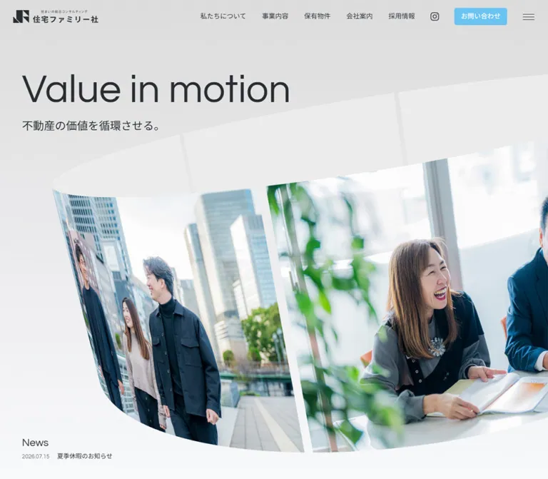
大きな欧文見出しと曲面状の写真帯で、不動産の価値の循環を表現。都市写真に重なる半透明の事業カード、空色の導線、黒いフッターが特徴のコーポレートサイト。
オリジナルサイトを見る住宅ファミリー社 / Value in motion — Style Reference
A pale architectural canvas wrapped in a curved ribbon of city life, with sky-blue actions and a deep-black corporate footer.
Original URL: https://www.jyuutaku-family.co.jp/
Final URL: https://www.jyuutaku-family.co.jp/
Response: HTTP 200; original and final URLs are identical.
Theme: light main content, photographic business scenes, a pale-blue contact area, and a near-black footer.
Inspected: September 12, 2026; supplied retrieval timestamp 2026-09-12T06:36:14.888Z, equivalent to 15:36:14.888 JST.
Viewports: desktop 1440 × 1000 and mobile 390 × 844, in CSS pixels.
Scope: the current corporate homepage. Five supplied captures show the desktop hero, desktop Business scene, desktop footer, mobile hero, and mobile contact/footer. Rendered text, links, custom properties, and element measurements cover additional homepage sections. Linked pages and the open menu were not inspected.
The homepage presents 株式会社住宅ファミリー社 as a real-estate company serving Osaka's Higashiyodogawa and Awaji area. Its information architecture connects company identity, four business areas, owned properties, recruitment, editorial content, and inquiries. It functions as a corporate gateway with several audiences and destinations.
The visual identity rests on three relationships: oversized regular-weight English against compact Japanese text; expansive architectural photography against quiet gray space; and small blue utilities against otherwise restrained surfaces. The hero's curved photographic ribbon gives physical form to the source message, “不動産の価値を循環させる。” The Business section continues the architectural setting with translucent cards over a bright city photograph. A spacious black sitemap gives the page a firm ending.
How to Read This Reference
- Measured means recorded in the supplied rendered DOM or computed-style evidence. Dimensions are CSS pixels unless stated otherwise.
- Calculated means arithmetic using those measurements, such as column gaps or relative proportions.
- Estimated means inferred visually from a supplied screenshot. Estimates do not establish original CSS declarations.
- Recommended means guidance for a new implementation. Proposed breakpoints, accessibility changes, static artwork handling, and the Quick Start are adaptations.
- Source variables retain their supplied names. Other token names are descriptive implementation aliases.
- Coverage varies by section. The hero, one Business scene, and footer have visual evidence. About, Our Property, Company, Recruit, and Blog have DOM measurements but no dedicated supplied visual crop.
- Coordinates describe captured states. Transforms and scroll-dependent positioning can affect element rectangles. Large document coordinates should not be copied into absolute-positioned layouts.
Tokens — Colors
Default Palette
| Name | Value | Source evidence | Role and certainty |
|---|---|---|---|
| Cool Canvas | #f8f9fb |
--color-bg, --background-color; computed body background |
Measured main page background |
| Charcoal Text | #292d33 |
--color; computed body and heading color |
Measured primary typography and header controls |
| Action Sky | #6ac3f1 |
--color-submit-bg, --link-color; computed CTA and badge fills |
Measured contact button, property tab, and blog category color |
| Footer Black | #0b0b0e |
--color-black-rgb: 11, 11, 14; computed footer background |
Measured full-width footer surface |
| White | #ffffff |
--color-white; computed reversed text |
Measured CTA labels, Business heading, and primary footer links |
| Secondary Footer White | rgba(255,255,255,.8) |
--color-white-80; computed footer sublinks |
Measured lower-level sitemap text |
| Hero Gray | #dcdcdc |
First stop of --gr-top |
Exact declared start of the hero's gray-to-canvas gradient |
| Pale Brand Blue | #a0cbe5 |
--color-primary-A0 |
Exact declared token; visually related to the contact field, whose own background declaration was not sampled |
Hero Gradient
The supplied source variable is:
--gr-top: linear-gradient(
  180deg,
  rgba(220, 220, 220, 1) 0%,
  rgba(248, 249, 251, 1) 100%
);
The captures show the same transition from gray near the header to a cooler, almost-white lower hero. This gradient helps the pale inner face of the ribbon remain visible without adding a hard outline.
Supporting Tokens and Surface Estimates
| Value | Evidence status | Practical interpretation |
|---|---|---|
rgba(41,45,51,.7) |
Declared as --color-base-70 |
Suitable source-family muted text color; assignment to the news date was not sampled |
#46505d |
Declared as --link-hover-color |
A defined link-hover color; individual hover endpoints were not exercised |
#22a3e5 |
Declared as --color-primary-22 |
Available stronger blue; no supplied capture establishes it as a dominant visible surface |
| White at roughly 80% opacity | Visual estimate for Business cards; matching white-alpha token exists | Retains visible building detail through the panel |
| White at roughly 40–50% opacity | Visual estimate for footer address details | Reproduces the subdued footer information hierarchy |
The contact field appears softly varied in blue, but its exact gradient stops and direction are unavailable. Use the declared pale-blue token as an approximation and verify against additional original-page evidence before claiming an exact match.
The supplied custom-property list also contains generic editor colors, gradients, and shadow presets. Their presence does not establish their use in this homepage. The visible palette remains gray, charcoal, sky blue, white, and black.
Tokens — Typography
Questrial — English Display and Utility Text
- Explicit source variable:
--ff-en: "Questrial", sans-serif. - Computed stack: begins with
Questrial, "Noto Sans JP", yakuhanjp, followed by system and Japanese sans-serif fallbacks. - Observed weight:
400throughout the sampled hero, navigation, section headings, body copy, and ordinary links. - Character: open, geometric, and light in texture. Large English text supplies emphasis through scale rather than heavy weight.
- Limitation: the evidence records computed family lists, not font-file loading results or per-glyph font selection.
The HTML element's default Times family is overridden on the body. It is not evidence for a serif component in the visible design.
Japanese Text
The computed stack includes Noto Sans JP, yakuhanjp, Hiragino, Yu Gothic, and other fallbacks. Preserve the regular-weight Japanese sans-serif texture and generous paragraph leading. The actual font used for each Japanese glyph was not independently identified.
Japanese body paragraphs in About and Recruit use a notably relaxed 2.2 line-height ratio. This keeps substantial corporate copy airy while the large photographic scenes carry visual density.
Type Scale
| Role | Desktop measurement | Mobile measurement | Notes |
|---|---|---|---|
| Body default | 16px / 25.6px, weight 400 |
Same | Base style; many components override it |
| Hero English | 108px / 108px |
51.675px / 51.675px |
Exact sampled “Value in motion” styles |
| Hero Japanese | 30px / 30px |
22.425px / 22.425px |
Exact sampled source message |
| Primary navigation | 15px / 24px |
Not visibly rendered | Desktop navigation is removed from the mobile header |
| Header contact | 15px / 15px |
13px / 13px |
Compact action label |
| News heading | 24px / 38.4px |
20px / 32px |
Regular English text |
| News article | 14px / 22.4px |
13px / 20.8px |
Date font size was not separately sampled |
| About and Recruit paragraphs | 15.6251px / 34.3753px |
14px / 30.8px |
Approximately 2.2 leading |
| Section-heading container | 24px / 24px |
20px / 20px |
Parent styles only; nested English and Japanese sizes are not individually supplied |
| Standard “View more” | 20px / 32px |
Same | Preserved across viewports |
| Company destination links | 19.6251px / 31.4002px |
18px / 28.8px |
Regular Japanese text |
| Blog article titles | 14px / 23.8px |
Same | Titles wrap more on mobile |
| Blog category labels | 12px / 19.2px |
Same | Blue filled labels |
| Contact-area main link | 30px / 48px |
Same | “Contact us” |
| Contact-area sentence | 14px / 22.4px |
13px / 20.8px |
White source text |
| Footer primary links | 20px / 32px |
Not visibly rendered | Desktop sitemap headings |
| Footer secondary links | 15px / 24px |
Not visibly rendered | White at 80% opacity |
| Footer utility links | 18px / 28.8px |
Not visibly rendered | Property and partner destinations |
| Privacy link | 14px / 22.4px |
Same | White on black |
| Floating property label | 14px / 14px |
12px / 12px |
1.2px letter spacing |
Composite Section Headings
The repeated section-heading block measures approximately 99.19px high on desktop and 74px on mobile, with a measured 15px flex gap. In the Business screenshot, the English word is visually dominant and the Japanese label is smaller beneath it.
The parent container's 24px or 20px font size does not describe the large English child. A practical reconstruction is approximately 69–70px English on desktop, 44px on mobile, and a 15px Japanese label. These child sizes are recommendations fitted to the available geometry, not recovered child declarations.
Weight and Tracking
Most sampled text uses regular weight and normal letter spacing. The source defines --font-bold: 600, and the skip link computes to 600, but the major visual headings remain 400. Avoid adding bold weight or widespread tracking to recreate hierarchy that the original achieves with size and whitespace.
Tokens — Spacing & Shapes
There is no established single spacing unit in the supplied evidence. Repeated fixed dimensions coexist with fluid section padding. Preserve their relationships rather than imposing an arbitrary grid on every measurement.
Spacing Scale
| Use | Desktop | Mobile | Status |
|---|---|---|---|
| Header horizontal inset | 50px |
16px |
Measured from logo/control positions |
| Hero copy left inset | 50px |
20px |
Measured |
| General content inset | Often 75px |
Often 20px |
Measured section and blog geometry |
| Special feature inset | Property content at 155px |
Property/contact content at 50px |
Measured; deeper than ordinary mobile text |
| English-to-Japanese hero gap | 25px |
15px |
Calculated from heading rectangles |
| Composite heading gap | 15px |
15px |
Computed flex gap |
| Link bottom padding | 10px |
10px |
Measured on “View more” and contact links |
| Blog column gap | 50px |
15px |
Calculated from column widths and positions |
| About top padding | 136.896px |
80px |
Computed |
| Company top padding | 140.672px |
100px |
Computed |
| Recruit vertical padding | 148.784px |
100px |
Computed |
| Footer top inset | 150px |
80px |
Calculated from footer and logo-wrapper rectangles |
The mobile About copy has a measured 40px gap below its heading block, 20px between paragraphs, and 40px before its final link. Recruit uses the same 20px paragraph separation and a 50px gap before its link.
Border Radius
| Element | Value | Evidence |
|---|---|---|
| Header contact button | 5px |
Computed |
| Floating property tab | 5px |
Computed |
| Blog category label | 5px |
Computed |
| Standard link container | 0 |
Computed |
| Business panel | Approximately 8px |
Screenshot estimate |
| Arrow capsule | Fully rounded; approximately 36 × 24px |
Screenshot estimate for ordinary links |
| Contact arrow capsule | Approximately 40 × 27px |
Mobile screenshot estimate |
| Hero ribbon | Large compound curves | Visible artwork geometry; not a conventional card radius |
Layout Measurements
| Element | Desktop | Mobile |
|---|---|---|
| Header | 1440 × 75px |
390 × 62px |
| Header logo box | 193 × 29px, at (50,23) |
120 × 18.02px, at approximately (16,21.98) |
| Header contact | 120 × 39.5px |
102 × 32px |
| Menu button rectangle | 28 × 28px |
28 × 62px |
| Hero English rectangle | (50,160), approximately 733.88 × 108px |
(20,125), approximately 351.11 × 51.67px |
| First section start | y = 1000px |
y = 844px |
| Standard “View more” | 197 × 43px |
197 × 43px |
| Business panel | Approximately 384 × 497px |
Panel bounds unavailable |
| Business panel photograph | Approximately 232 × 155px |
Image bounds unavailable |
| Blog column width | 285px |
167.5px |
| Floating property tab | 41.5 × 125.81px |
34 × 107.81px |
| Footer | Approximately 888.14px high |
Approximately 532.44px high |
| Rendered body height | Approximately 13,236.22px |
Approximately 12,283.39px |
The first section begins exactly one inspected viewport below the top at both sizes. This establishes the captured full-screen hero result, but not whether the original uses vh, svh, a script, or another sizing formula.
Components
Corporate Header
Role: maintain identity and direct access to major corporate destinations.
The transparent desktop header places a horizontal dark logo at the left and a single navigation row toward the right. The visible destinations are “私たちについて”, “事業内容”, “保有物件”, “会社案内”, and “採用情報”, followed by Instagram, a blue “お問い合わせ” button, and a three-line menu icon.
The contact button uses white text, a 5px radius, and asymmetric vertical padding of 12.5px above and 12px below, with 15px horizontal padding. The resulting measured box is 120 × 39.5px.
On mobile, the horizontal navigation and Instagram icon are not visibly rendered. The 120px logo, 102 × 32px contact button, and menu remain. Contact padding changes to 10px 12px 9px. The menu's icon remains narrow, while its sampled button rectangle extends through the 62px header height.
The header is visible over the hero and desktop Business scene, and over the mobile contact/footer capture. It is absent from the supplied desktop footer screenshot. A transform transition is recorded, but the show/hide trigger is unverified.
A skip link labeled “本文までスキップする” is present with a resting 1 × 1px rectangle. Its focused appearance was not exercised. The menu button has the source text “メニューを開閉する”; the open panel, focus management, and dismissal behavior are unknown.
Hero Copy and Curved Photo Ribbon
Role: establish the company's central idea before introducing its services.
“Value in motion” sits at the upper left in large regular-weight type. The Japanese statement appears directly beneath it. Both remain independent text in the DOM. The sampled document uses an image-based logo inside an H1, the Japanese statement as H2, and the English phrase as H3; that source structure should be distinguished from the visual hierarchy.
The dominant artwork resembles a wide photographic strip curving around a large open loop. Its pale interior face crosses the upper and middle hero; its outer face carries city buildings and people. Light separators divide the photographs. The lower edge bends into an arc, and the composition extends beyond the viewport on the right.
In the desktop capture, the ribbon's left bend begins around x = 310px, approximately 22% of the viewport width. Its lower photographic edge reaches roughly y = 945px. These are visual estimates. The artwork occupies much more space than a conventional rectangular hero photograph.
On mobile, the composition is strongly cropped across the full width. A document discussion becomes the dominant visible photograph, with pale ribbon structure above and a curved lower edge around y = 650px. The English heading remains a single line at the inspected width. Different photographs across the captures do not establish an autoplay interval or a particular animation mechanism.
Preserve the ribbon as a distinct art-directed composition. A flat building photograph inside a rounded rectangle cannot reproduce the visible perspective and curved image boundaries. A new implementation can use authorized precomposed artwork or a purpose-built graphics treatment; its rendering technology is not established by this evidence.
Hero News Teaser
Role: expose a current announcement without competing with the main concept.
A small “News” heading sits near the lower-left edge of the first viewport. Beneath it, a muted date and dark linked title share a horizontal line. The captured entry is dated 2026.07.15 and reads “夏季休暇のお知らせ”.
The desktop article begins 80px to the right of the block's left edge; mobile uses 70px. The article line ends about 40px above the desktop viewport bottom and 20px above the mobile bottom. These offsets are calculated from the supplied rectangles.
Keep this as an unboxed typographic teaser. Its spacing and subdued date maintain the hero's visual priority.
Bilingual Section Heading
Role: identify a section through a large English display word and a smaller Japanese label.
The repeated pairs are About, Business, Our Property, Company, Recruit, and Blog. Measured containers use flex layout and a 15px gap. The Business screenshot confirms centered English above Japanese with white text over photography. Other sections have different measured alignments and colors; centering should not be applied universally.
Dark section headings accompany About, Company, Recruit, and Blog. Business and Our Property have measured white foregrounds. Preserve the language pairing and regular weight while allowing placement to follow the section composition.
About Copy Block
Role: explain the breadth of the company's real-estate work and its approach to customers.
On desktop, the text block begins at approximately x = 728.28px and is 527.97px wide. It contains a heading, two paragraphs, and the standard underlined arrow link. Paragraphs use 15.6251px text with 34.3753px leading.
On mobile, the heading and copy span 350px between 20px margins. Copy becomes 14px / 30.8px, retaining the relaxed rhythm. The heading is substantially below the section's starting position; the supplied crops do not show the intervening content. Do not infer its artwork or exact arrangement from that gap alone.
Business Scene
Role: present four service areas within a shared architectural setting.
A bright photograph of office buildings and open sky fills the supplied scene. “Business” and its Japanese label sit centrally over the sky. Large translucent panels occupy alternating sides, allowing substantial background to remain exposed.
The four destinations are:
- “不動産流通事業” —
01 Distribution, linked to/business/distribution/. - “賃貸管理事業” —
02 Management, linked to/business/management/. - “開発事業” —
03 Development, linked to/business/development/. - “コンサルティング” —
04 Consulting, linked to/business/consulting/.
The section measures approximately 5454.81px high on desktop and 4929px on mobile. That is about 41% and 40% of the respective rendered body heights. Its long document span and the captured composition suggest staged presentation, but do not establish pinning, a scroll library, or a precise parallax relationship.
Business Service Panel
Role: turn each business area into a focused destination with its own photograph.
The visible Consulting panel has the following anatomy:
- A translucent white rounded panel, approximately
384 × 497px. - A centered, muted English number/name line near the top, visually about
14px. - A centered Japanese service title, visually about
28px. - A rectangular meeting photograph, approximately
232 × 155px. - A centered
197 × 43px“View more” link with a dark arrow capsule and fine underline.
The desktop panel starts at approximately x = 75px. The partial panel on the opposite side starts near x = 981px, leaving a large central opening. Building details remain visible through the white fill; the capture does not establish a blur filter or a shadow.
The measured service-link positions alternate between x = 1074.5px and x = 168.5px on desktop. Their successive vertical positions differ by 497px. On mobile, all four links begin at x = 96.5px, and successive positions differ by 547px. These are captured geometric relationships, not animation timings.
Underlined Arrow Link
Role: provide a consistent, restrained continuation action.
The standard link combines a left-aligned English label, a right-aligned arrow capsule, and a thin rule beneath the full link width. Its measured container is 197 × 43px, including 10px bottom padding, at both inspected widths. Type remains 20px / 32px.
On light surfaces, text and rule are dark, with a dark capsule and white arrow. On the black footer and blue contact field, the capsule reverses to white with a blue arrow. Capsule geometry is estimated from screenshots; the link container dimensions are measured.
This fixed-size link is an important responsive constant. Avoid scaling every control down in proportion to the viewport.
Owned-Property Feature
Role: direct visitors to information about company-owned properties.
The measured section has a white bilingual heading, a short white paragraph at 14px / 28px, and a white “View more” link to /property/. Its height is approximately 490.19px on desktop and 475px on mobile.
Desktop text starts at x = 155px. Mobile uses a deeper 50px inset and a 290px text width. The foreground is confirmed, but the underlying artwork or surface is outside the supplied visual crops. Do not invent a specific property photograph for this section as an observed fact.
Company Destination List
Role: provide direct access to the company's detailed information.
The source lists “代表あいさつ”, “経営理念”, “メンバー紹介”, “会社概要”, and “アクセス”, linking to anchors on /company/.
Desktop links occupy a right-hand column approximately 537.28px wide at x = 827.72px. Mobile links use the normal 350px content width at x = 20px. Successive link rectangles are approximately 92.39px apart on desktop and 89.80px apart on mobile.
This is a spacious vertical destination list. Decorative rules, companion imagery, and hover treatments for the list are not established by the supplied crops.
Recruit Section
Role: introduce the company's working culture and invite further exploration.
The rendered content includes a bilingual heading, two paragraphs, and a link to /recruit/. Desktop paragraphs occupy a 482.67px column beginning at x = 182.45px; the final link sits separately toward the right at x = 1060.55px.
On mobile, paragraphs and the final link align to x = 20px in a 350px column. The content uses the same 2.2 paragraph leading as About. The measured section contracts from approximately 1836.41px to 1127.58px high. Its imagery and detailed media arrangement are not visible in the supplied crops.
Blog Collection
Role: connect the corporate presentation to ongoing activity and useful real-estate articles.
Eight entries appear in the rendered text. Each includes a linked image area, date, one or more category links, and a linked title. Categories include “ブログ”, “スタッフ”, and “取り組み”.
Desktop column positions are 75, 410, 745, and 1080px, each with a measured width of 285px. This gives four columns with 50px gaps. Mobile uses two 167.5px columns at 20 and 202.5px, separated by 15px.
Category links use blue fills, white 12px text, 5px corners, and computed padding of 6px 8px. They are inline elements in the evidence; their recorded line rectangles should not be treated as fixed block heights. Titles retain 14px / 23.8px at both widths.
Vertical positions vary between entries. The evidence establishes column structure, but not a masonry implementation or a uniform thumbnail ratio. In particular, the sampled 16px height of an image link is an inline anchor rectangle, not the photograph's height.
Contact Band
Role: provide a calm, prominent inquiry destination before the footer.
The mobile capture shows a full-width pale-blue field with a short white invitation, “ご質問やご依頼など、お気軽にご相談ください。”, and a larger “Contact us” link. Oversized pale background lettering is partially cropped at the top; its complete wording and behavior are not established.
Desktop contact content is positioned toward the right at x = 1055px, with a 310px width. Mobile centers a 290px block between 50px margins. “Contact us” remains 30px / 48px; its link box is 59px high. A white underline and white capsule with a blue arrow complete the action.
Footer and Sitemap
Role: close the corporate story with identity, contact details, and a comprehensive route map.
A near-black surface contains a white, vertically arranged brand lockup, subdued address and business information, and a broad desktop sitemap. The first content row begins 150px below the footer's top. The visible logo artwork is approximately 150 × 105px; the sampled heading wrapper is wider than the artwork.
Desktop navigation has five groups to the right of the brand: About, Business, Company, Recruit, and a group of standalone destinations plus Instagram. Primary links are white at 20px; nested links are 15px at 80% white. The spacing is generous enough to keep the longest recruitment column readable.
Two underlined utility links, “物件情報” and “仲介業者様へ”, sit lower on the right. A full-width fine rule separates the legal row, where copyright is subdued on the left and “Privacy Policy” is white on the right.
On mobile, the sitemap and the two desktop utility links are absent from the visible text and link evidence. The footer retains the logo, address, hours, telephone/fax text, privacy link, and copyright. Its top inset becomes 80px, its horizontal inset becomes 20px, and its visible brand lockup is approximately 133 × 93px. Privacy appears above copyright in the legal area.
Floating Property Tab
Role: keep the separate property-information destination accessible during browsing.
A narrow sky-blue tab contains an outlined building symbol above the vertically arranged label “物件情報”. It links to the observed destination https://tsunagari.jyuutaku-family.co.jp/; that destination was not inspected.
The measured tab is approximately 41.5 × 125.81px on desktop and 34 × 107.81px on mobile, with 5px corners. Settled scrolled screenshots place it about 20px from the desktop right/bottom edges and 10px from the mobile edges.
The initial sampled rectangles extend slightly beyond the viewport bottom, while later screenshots show the complete tab. The initial hero screenshots do not visibly show it. Its reveal threshold and transition into position are unverified.
Tokens — Motion & Interaction
Recorded Transition Declarations
| Element | Measured declaration | What it establishes |
|---|---|---|
| Header | transform 0.8s cubic-bezier(.165,.84,.44,1) |
An eased transform transition is available; its trigger is unknown |
| Section headings and descriptive paragraphs | opacity 1.4s cubic-bezier(.165,.84,.44,1), transform 1.4s cubic-bezier(.165,.84,.44,1) |
Long eased changes in opacity and position are defined |
| Header contact button | Background and color, 0.3s cubic-bezier(.215,.61,.355,1) |
Short color feedback is defined |
| Floating property tab | Color and background, 0.4s cubic-bezier(.215,.61,.355,1) |
Tab color feedback is defined |
| News article link | Color and opacity, 0.4s cubic-bezier(.215,.61,.355,1) |
Subtle link feedback is defined |
| Blog category | Background, 0.4s cubic-bezier(.165,.84,.44,1) |
Category background feedback is defined |
| Blog title | Color, 0.4s cubic-bezier(.19,1,.22,1) |
A separate eased title-color transition is defined |
The source names the principal curves --easeOutQuart, --easeOutCubic, and --easeOutExpo. Their defined use supports soft deceleration. It does not establish initial offsets, reveal distances, stagger delays, or hover colors for every component.
Observed Limits
- The ribbon's shape implies circulation, but continuous rotation, autoplay speed, drag behavior, and rendering technology are unverified.
- The Business section is unusually tall and visually composed around a shared background. Exact sticky or pinned behavior is unverified.
- Repeated navigation text appears in the DOM while only one label is visible. This could support layered text effects, but a rolling-text hover was not demonstrated.
- No open-menu, focused-control, active-link, or form-submission capture is supplied.
- Sampled elements often report
animation: none. That does not rule out animation on other elements, pseudo-elements, or script-driven graphics. - The collection protocol temporarily pauses perpetual animations during readiness checks and resumes them afterward. Static images therefore cannot establish loop duration or motion continuity.
For a new implementation, reuse the measured easing and durations where appropriate, keep content visible without animation, and treat any additional arrow movement or entrance offset as a recommendation.
Surfaces
| Layer | Appearance | Evidence and purpose |
|---|---|---|
| Main canvas | Cool near-white | Measured body background; supports dark regular-weight text |
| Hero | Gray-to-near-white vertical gradient | Source gradient plus screenshot correspondence |
| Ribbon interior | Pale curved surfaces and separators | Screenshot evidence; creates depth through shape |
| Ribbon exterior | Architectural and people photography | Screenshot evidence; carries the main visual identity |
| Business background | Bright city buildings and blue sky | Desktop screenshot evidence |
| Business panels | Translucent white, modest corners | Screenshot estimate; keeps the city setting visible |
| Small actions | Solid sky-blue fill, 5px corners |
Computed contact, tab, and category styles |
| Contact area | Pale-blue field with white foreground | Screenshot evidence; exact fill treatment unavailable |
| Footer | #0b0b0e, white hierarchy, fine separator |
Computed background and text plus screenshots |
The visible design does not establish a general elevation system. Panel separation comes primarily from translucency, image placement, spacing, and color contrast. Generic shadow presets in the source variables should not be promoted into component styling without evidence of use.
Imagery
The photographs connect real estate to both buildings and human activity. Visible subjects include tall residential or office facades, city streets and waterside architecture, people outdoors, and people discussing documents at a table. Blue sky and cool daylight link the photographs to the interface palette.
The hero applies those photographs to a curved, perspective-like strip. The Business scene uses two image scales simultaneously: a broad environmental background and a smaller rectangular photograph inside each panel. Preserve that distinction. The panel image gives the service a focused subject; the background establishes the wider architectural setting.
The supplied captures do not identify the people shown. Avoid assigning names, job titles, or customer relationships from appearance alone.
Observed Asset References
Image source URLs, native resolutions, and media formats are absent from the supplied evidence. No asset filenames can be established.
| Asset role | Visible evidence | Reuse guidance |
|---|---|---|
| Horizontal header logo | Dark geometric emblem with Japanese wordmark and small descriptor | Use authorized brand artwork; preserve its wide proportions |
| Footer logo | White emblem above the Japanese wordmark | Preserve the distinct vertical arrangement |
| Hero ribbon | Curved sequence of architectural and people photographs | Requires an art-directed asset or custom graphics composition |
| Business background | Office buildings against a bright blue, cloudy sky | Retain open sky around the central heading |
| Consulting panel image | A small group discussing documents indoors | Preserve the focused rectangular crop and natural setting |
| Interface symbols | Instagram outline, menu lines, arrow capsules, building outline | Keep strokes simple and visually subordinate |
A new hero asset should contain artwork only, with headings and controls remaining real HTML. For a static fallback, prepare desktop and mobile compositions that reproduce the intended crop. The mobile capture's different dominant photograph should not be reproduced by blindly scaling the desktop image.
Layout & Responsive Behavior
Page Sequence
The rendered homepage follows this sequence: full-screen hero and News, About, Business, Our Property, Company, Recruit, Blog, Contact, and Footer. The total rendered height changes from approximately 13,236px to 12,283px between the supplied desktop and mobile states. These are capture measurements, not implementation height targets.
Responsive Changes Established by Evidence
| Relationship | Desktop | Mobile |
|---|---|---|
| Header information | Logo, five links, Instagram, contact, menu | Logo, contact, menu |
| Hero English size | 108px |
51.675px |
| Hero Japanese size | 30px |
22.425px |
| Hero artwork | Broad off-center loop extending right | Strong full-width crop with a meeting scene dominant |
| Main text width | Section-specific columns | Usually 350px with 20px side margins |
| Business actions | Alternating right/left positions | All centered at the same horizontal position |
| Standard continuation link | 197 × 43px |
Unchanged |
| Blog collection | Four columns, 50px gaps |
Two columns, 15px gap |
| Contact block | Right-aligned area, 310px wide |
Centered 290px area with 50px margins |
| Footer | Brand plus broad sitemap | Brand and business details without visible sitemap |
| Footer legal row | Copyright left, privacy right | Privacy above copyright |
| Property tab | Larger, about 20px edge clearance |
Smaller, about 10px edge clearance |
The mobile layout is selectively compressed. Display type shrinks substantially, Japanese hero copy shrinks less, paragraph leading remains generous, and the standard continuation link keeps its desktop dimensions. The Blog section retains two columns at 390px rather than becoming a single list.
Unknown Intermediate Behavior
Only two viewport sizes were supplied. Exact breakpoints, landscape behavior, tablet layouts, browser-chrome resizing, safe-area rules, and text-zoom behavior are unknown. The Quick Start uses explicit recommended breakpoints and safe-area handling for a new implementation.
The transparent header needs particular attention across changing backgrounds. Its visibility in several captures does not establish an always-visible state. Likewise, the floating tab's recorded initial position should not be copied as a permanent below-viewport offset.
Do’s and Don’ts
Do
- Build around cool canvas
#f8f9fb, charcoal#292d33, action blue#6ac3f1, and footer black#0b0b0e. - Use large regular-weight English and quieter Japanese text to create hierarchy.
- Preserve the hero's gray gradient, curved photo boundaries, pale interior face, and deliberate viewport crop.
- Keep the News teaser small and near the lower-left edge of the first screen.
- Give the Business background generous visible sky and alternate desktop service panels across the scene.
- Let architectural details remain visible through the Business panels.
- Reuse the
197 × 43pxunderlined arrow link across both inspected viewport sizes. - Retain relaxed
2.2leading for About and Recruit paragraphs. - Keep four Blog columns on desktop and two at the inspected mobile width.
- Preserve the deeper mobile inset for Contact and Our Property.
- Treat the footer's white vertical lockup and desktop sitemap as major compositional elements.
- Separate measured transition declarations from unverified animation behavior.
Don’t
- Do not replace the curved ribbon with a generic rounded hero card.
- Do not put the hero text inside a flattened screenshot asset.
- Do not introduce heavy bold headings, excessive tracking, or a serif style based on the HTML default font.
- Do not spread the blue accent across every text block or background.
- Do not infer a blur filter from a translucent white panel.
- Do not add stock elevation shadows because generic shadow tokens exist in the source.
- Do not turn the four Business destinations into a compact, uniformly aligned desktop grid when reproducing the captured composition.
- Do not use inline anchor heights as photograph dimensions.
- Do not assume unequal Blog positions prove masonry.
- Do not invent a menu overlay, hero autoplay interval, scroll direction rule, or animation library.
- Do not hardcode the measured document height or Business section height as empty space.
- Do not compress the desktop sitemap into illegibly small mobile columns.
Recommended Implementation Additions
These are recommendations for a new implementation, not verified original-site features:
- Provide descriptive accessible names for the brand links, Instagram, and building icon. The source menu already includes descriptive text; add and manage
aria-expandedandaria-controlswhen implementing its panel. - Make the skip link clearly visible on focus and verify that its destination receives useful focus or scroll placement.
- Give the narrow menu and property controls at least a
44pxeffective touch width through surrounding hit areas or revised geometry. - Improve small text contrast on blue actions. Calculated from the supplied colors, white on
#6ac3f1is approximately2.0:1; charcoal#292d33on that blue is approximately7.0:1. A dark-label variant preserves the blue fill while improving readability. - Test the white Business heading over the brightest sky regions. A local photographic grade or subtle backing treatment can protect contrast without changing the whole scene.
- Provide a static or paused ribbon presentation for reduced-motion preferences. Any future animation should leave the message, News, and service destinations usable independently.
- Keep content visible if reveal scripts fail. Avoid assigning initial opacity zero to essential content without a reliable enhancement path.
- Use real heading semantics for the company identity and main message while preserving the captured visual hierarchy.
- Verify 320px layouts and enlarged text. The measured mobile English headline already uses almost all the available width; allow wrapping when necessary.
- Reserve room around the floating property tab so it does not cover privacy text, article links, or form controls.
- Load responsive photography with known dimensions and suitable crops. Asset formats, resolutions, and loading priorities must be chosen during implementation because they were not supplied here.
Agent Prompt Guide
Quick Color Reference
- Main canvas:
#f8f9fb. - Hero gradient:
#dcdcdcat the top to#f8f9fbbelow. - Main typography and dark arrow capsules:
#292d33. - Contact button, property tab, and category labels:
#6ac3f1. - Pale-blue reference token:
#a0cbe5; the contact field's exact background is unverified. - Footer:
#0b0b0e, with white primary text and 80% white subnavigation. - Business panels: approximately 80% white, with restrained corners and no established blur.
Overall Prompt
“Create a Japanese real-estate corporate homepage inspired by the current 住宅ファミリー社 reference. Use a cool near-white canvas, charcoal regular-weight typography, Questrial for English where available, and a Japanese sans-serif stack. Begin with a full-screen gray-gradient hero containing a large ‘Value in motion’ heading and smaller ‘不動産の価値を循環させる。’ copy. Make a broad curved photographic ribbon the main artwork, combining city architecture and people discussing documents. Place a small News teaser at the lower left. Continue with bilingual corporate sections, a bright city-background Business scene with alternating translucent service panels, understated underlined arrow links, a four-column desktop/two-column mobile Blog collection, a pale-blue Contact area, and an expansive near-black footer. Retain a compact blue contact button and a narrow property-information tab. Treat the ribbon rendering and any scroll choreography as separate implementation work requiring verified behavior.”
Example Component Prompts
- Header: “Create a transparent 75px desktop corporate header with a 193px horizontal logo, five regular 15px navigation links, an Instagram outline, a small sky-blue contact button, and a three-line menu. At 390px, use a 62px header with a 120px logo, 102 × 32px contact button, and menu. Keep touch targets accessible without enlarging the visible line icon.”
- Hero: “Compose dark 108px regular English type above 30px Japanese copy on a gray-to-near-white gradient. Place a curved, segmented photographic ribbon below and behind the copy, extending beyond the right edge. Prepare a separate mobile crop with approximately 51.675px English and 22.425px Japanese at 390px. Keep a small unboxed News item near the bottom left.”
- Business panel: “Create an approximately 384 × 497px translucent white panel over a bright city photograph. Center a small ‘04 Consulting’ line, the Japanese title ‘コンサルティング’, a 232 × 155px meeting photograph, and a 197px underlined ‘View more’ link with a dark arrow capsule. Use modest 8px corners and leave the building visible through the fill.”
- Continuation link: “Create a 197 × 43px link with 20px regular text, a fine full-width underline, and a 36 × 24px arrow capsule on the right. Provide light-surface and reversed variants. Keep its size consistent on desktop and mobile.”
- Blog collection: “Build four 285px desktop columns with 50px gaps inside a 1290px content area. At 390px, use two 167.5px columns with a 15px gap and 20px outside margins. Each entry contains an image, date, small sky-blue category labels, and a regular 14px title with 1.7 line height. Do not assume a fixed image ratio from the evidence.”
- Footer: “Create a spacious #0b0b0e footer with a white vertical brand lockup, subdued business details, and five desktop navigation groups. Use 20px primary links and 15px secondary links at 80% white. Add two underlined utility links and a separate legal row. On mobile, retain brand and business information, then stack privacy above copyright.”
Quick Start
CSS Custom Properties
This is a recommended implementation baseline using measured colors, component sizes, and transition curves. Class names are new aliases. Heading-child sizes, panel opacity, breakpoints, and untested hover movement are adaptations.
The hero artwork slot expects an authorized, artwork-only composition prepared for the full hero coordinate space, with separate desktop and mobile crops. The CSS does not generate the original ribbon geometry. The Business layout provides ordinary document scrolling; any verified pinned sequence can be added progressively.
:root {
  /* Measured palette */
  --jf-canvas: #f8f9fb;
  --jf-ink: #292d33;
  --jf-blue: #6ac3f1;
  --jf-blue-soft: #a0cbe5;
  --jf-footer: #0b0b0e;
  --jf-white: #fff;
  --jf-muted: rgba(41, 45, 51, .7);
  --jf-footer-secondary: rgba(255, 255, 255, .8);
  --jf-hero-gradient: linear-gradient(180deg, #dcdcdc, #f8f9fb);

  /* Shortened adaptation of the measured family stack */
  --jf-font: 'Questrial', 'Noto Sans JP', yakuhanjp,
    -apple-system, BlinkMacSystemFont, 'Helvetica Neue',
    'Hiragino Sans', 'Yu Gothic', Meiryo, sans-serif;
  --jf-font-en: 'Questrial', sans-serif;
  --jf-weight: 400;
  --jf-copy-size: 15.625px;
  --jf-copy-leading: 2.2;

  /* Recommended formulas matching the inspected endpoints */
  --jf-hero-size: clamp(36px, 13.25vw, 108px);
  --jf-hero-subtitle: clamp(18px, 5.75vw, 30px);
  --jf-section-display: clamp(44px, 4.8vw, 70px);

  /* Measured desktop dimensions */
  --jf-header-height: 75px;
  --jf-header-inset: 50px;
  --jf-page-inset: 75px;
  --jf-link-width: 197px;
  --jf-radius-control: 5px;

  /* Visual estimates for unsampled panel properties */
  --jf-panel-fill: rgba(255, 255, 255, .8);
  --jf-radius-panel: 8px;

  /* Measured easing and durations */
  --jf-ease-quart: cubic-bezier(.165, .84, .44, 1);
  --jf-ease-cubic: cubic-bezier(.215, .61, .355, 1);
  --jf-ease-expo: cubic-bezier(.19, 1, .22, 1);
  --jf-feedback: 300ms var(--jf-ease-cubic);
  --jf-link-feedback: 400ms var(--jf-ease-cubic);
  --jf-reveal: 1400ms var(--jf-ease-quart);
}

* { box-sizing: border-box; }

body {
  margin: 0;
  color: var(--jf-ink);
  background: var(--jf-canvas);
  font-family: var(--jf-font);
  font-size: 16px;
  font-weight: var(--jf-weight);
  line-height: 1.6;
}

img { max-width: 100%; }
button, a { -webkit-tap-highlight-color: transparent; }
a { color: inherit; }
button { font: inherit; }

.page-inner {
  margin-inline: var(--jf-page-inset);
}

/* Persistent positioning is a baseline; source hide triggers are unknown. */
.site-header {
  position: fixed;
  inset: 0 0 auto;
  z-index: 50;
  display: flex;
  align-items: center;
  gap: 35px;
  height: var(--jf-header-height);
  padding-inline: var(--jf-header-inset);
  background: transparent;
  transition: transform 800ms var(--jf-ease-quart);
}

.header-brand {
  flex: 0 0 auto;
  width: 193px;
  margin-right: auto;
}
.header-brand img { display: block; width: 100%; height: auto; }

.primary-nav {
  display: flex;
  align-items: center;
  gap: 35.8px;
  font-size: 15px;
  line-height: 24px;
}
.primary-nav a { text-decoration: none; white-space: nowrap; }

.contact-button {
  flex: 0 0 auto;
  padding: 12.5px 15px 12px;
  border-radius: var(--jf-radius-control);
  color: var(--jf-white);
  background: var(--jf-blue);
  font-size: 15px;
  line-height: 15px;
  text-decoration: none;
  white-space: nowrap;
  transition: color var(--jf-feedback), background-color var(--jf-feedback);
}

.menu-toggle {
  position: relative;
  display: flex;
  flex: 0 0 28px;
  flex-direction: column;
  justify-content: center;
  gap: 5px;
  width: 28px;
  height: 28px;
  padding: 0;
  border: 0;
  color: inherit;
  background: transparent;
  cursor: pointer;
}
.menu-toggle span { width: 26px; height: 1px; background: currentColor; }
.menu-toggle::before { content: ''; position: absolute; inset: -8px; }

.hero {
  position: relative;
  isolation: isolate;
  min-height: 100svh;
  overflow: clip;
  background: var(--jf-hero-gradient);
}

/* Use a picture element with artwork-only, viewport-composed assets. */
.hero-art { position: absolute; inset: 0; z-index: 0; pointer-events: none; }
.hero-art img { display: block; width: 100%; height: 100%; object-fit: cover; }

.hero-copy {
  position: relative;
  z-index: 1;
  margin-inline: var(--jf-header-inset);
  padding-top: 160px;
}
.hero-title {
  margin: 0;
  font-family: var(--jf-font-en);
  font-size: var(--jf-hero-size);
  font-weight: 400;
  line-height: 1;
}
.hero-subtitle {
  margin: 25px 0 0;
  font-size: var(--jf-hero-subtitle);
  font-weight: 400;
  line-height: 1;
}

.hero-news {
  position: absolute;
  z-index: 2;
  left: var(--jf-header-inset);
  bottom: 40px;
  width: min(380px, calc(100% - 2 * var(--jf-header-inset)));
}
.hero-news h2 { margin: 0; font-size: 24px; font-weight: 400; line-height: 1.6; }
.news-line { display: grid; grid-template-columns: 60px minmax(0, 1fr); gap: 20px; }
.news-line time { color: var(--jf-muted); font-size: 12px; }
.news-line a { font-size: 14px; line-height: 1.6; text-decoration: none; }

.section-heading {
  display: flex;
  flex-direction: column;
  gap: 15px;
  margin: 0;
  font-weight: 400;
}
.section-heading .en {
  font-family: var(--jf-font-en);
  font-size: var(--jf-section-display);
  line-height: 1;
}
.section-heading .jp { font-size: 15px; line-height: 1; }

.copy-block { max-width: 528px; }
.copy-block p { margin: 0; font-size: var(--jf-copy-size); line-height: var(--jf-copy-leading); }
.copy-block p + p { margin-top: 20px; }
.copy-block .more-link { margin-top: 40px; }

.more-link {
  display: inline-flex;
  align-items: center;
  justify-content: space-between;
  width: var(--jf-link-width);
  max-width: 100%;
  min-height: 43px;
  padding-bottom: 10px;
  border-bottom: 1px solid currentColor;
  color: inherit;
  font-size: 20px;
  line-height: 32px;
  text-decoration: none;
}
.more-arrow {
  display: grid;
  flex: 0 0 auto;
  place-items: center;
  width: 36px;
  height: 24px;
  border-radius: 999px;
  color: var(--jf-arrow-color, #fff);
  background: var(--jf-arrow-bg, #292d33);
  line-height: 1;
  transition: transform var(--jf-link-feedback);
}
.on-dark {
  --jf-arrow-bg: #fff;
  --jf-arrow-color: #6ac3f1;
  color: #fff;
}

.business {
  padding: 100px var(--jf-page-inset);
  background-color: var(--jf-blue-soft);
  background-image: var(--jf-business-image, none);
  background-position: center;
  background-size: cover;
}
.business > .section-heading { margin-bottom: 80px; color: #fff; text-align: center; }
.service-list { display: grid; grid-template-columns: 1fr 1fr; column-gap: 50px; }
.service-card {
  width: min(384px, 100%);
  min-height: 497px;
  padding: 72px 32px;
  border-radius: var(--jf-radius-panel);
  background: var(--jf-panel-fill);
  text-align: center;
}
.service-card:nth-child(odd) { grid-column: 2; justify-self: end; }
.service-card:nth-child(even) { grid-column: 1; justify-self: start; }
.service-eyebrow { margin: 0; color: var(--jf-muted); font-size: 14px; line-height: 1.6; }
.service-title { margin: 12px 0 0; font-size: 28px; font-weight: 400; line-height: 1.4; }
.service-image {
  display: block;
  width: 232px;
  aspect-ratio: 3 / 2;
  margin: 36px auto 40px;
  object-fit: cover;
}

.blog-grid { display: grid; grid-template-columns: repeat(4, minmax(0, 1fr)); gap: 50px; }
.blog-image { display: block; width: 100%; height: auto; }
.blog-badge {
  display: inline;
  padding: 6px 8px;
  border-radius: 5px;
  color: #fff;
  background: var(--jf-blue);
  font-size: 12px;
  line-height: 1.6;
  text-decoration: none;
  transition: background 400ms var(--jf-ease-quart);
}
.blog-title { margin: 20px 0 0; font-size: 14px; font-weight: 400; line-height: 1.7; }
.blog-title a { text-decoration: none; transition: color 400ms var(--jf-ease-expo); }

/* A solid pale-blue fallback; the source contact gradient is unverified. */
.contact-band { padding: 120px var(--jf-page-inset); background: var(--jf-blue-soft); }
.contact-inner { width: min(310px, 100%); margin-left: auto; }
.contact-inner p { margin: 0 0 15px; font-size: 14px; line-height: 1.6; }
.contact-link { width: 100%; min-height: 59px; font-size: 30px; line-height: 48px; }
.contact-link .more-arrow { width: 40px; height: 27px; }

.site-footer { color: #fff; background: var(--jf-footer); }
.footer-main {
  display: grid;
  grid-template-columns: 1.7fr 1.35fr 1.1fr .95fr .95fr auto;
  gap: 150px 32px;
  padding: 150px var(--jf-page-inset) 100px;
}
.footer-brand { display: block; width: 150px; height: auto; }
.footer-details { margin-top: 35px; color: rgba(255, 255, 255, .5); font-size: 14px; }
.footer-details p { margin: 0; }
.footer-details p + p { margin-top: 16px; }
.footer-group h2 { margin: 0 0 24px; font-size: 20px; font-weight: 400; }
.footer-group ul { display: grid; gap: 16px; margin: 0; padding: 0; list-style: none; }
.footer-group li { color: var(--jf-footer-secondary); font-size: 15px; }
.footer-group a { text-decoration: none; }
.footer-utilities { grid-column: 1 / -1; display: flex; justify-self: end; gap: 40px; }
.footer-utilities .more-link { font-size: 18px; line-height: 28.8px; }
.footer-legal {
  display: flex;
  justify-content: space-between;
  gap: 20px;
  padding: 50px var(--jf-page-inset);
  border-top: 1px solid rgba(255, 255, 255, .4);
  font-size: 14px;
}
.footer-legal p { margin: 0; color: rgba(255, 255, 255, .35); }
.footer-legal a { text-decoration: none; }

.property-tab {
  position: fixed;
  z-index: 40;
  right: max(20px, env(safe-area-inset-right, 0px));
  bottom: calc(20px + env(safe-area-inset-bottom, 0px));
  display: flex;
  flex-direction: column;
  align-items: center;
  gap: 12px;
  width: 41.5px;
  min-height: 125.81px;
  padding: 15px 8px;
  border-radius: 5px;
  color: #fff;
  background: var(--jf-blue);
  font-size: 14px;
  line-height: 1;
  letter-spacing: 1.2px;
  text-decoration: none;
  transition: color var(--jf-link-feedback), background var(--jf-link-feedback);
}
.property-tab svg { flex: 0 0 auto; width: 20px; height: 20px; }
.property-tab-label { writing-mode: vertical-rl; }

/* Recommended feedback; the original hover displacement is unknown. */
@media (hover: hover) {
  .more-link:hover .more-arrow { transform: translateX(3px); }
}

/* Optional accessible contrast variant. */
.contrast-enhanced :is(.contact-button, .blog-badge, .property-tab) { color: var(--jf-ink); }
:focus-visible { outline: 2px solid var(--jf-ink); outline-offset: 5px; }
.site-footer :focus-visible { outline-color: #fff; }

/* Recommended breakpoints; only 1440px and 390px were inspected. */
@media (max-width: 1199px) {
  .primary-nav { display: none; }
  .footer-main { grid-template-columns: repeat(3, minmax(0, 1fr)); }
}

@media (max-width: 767px) {
  :root {
    --jf-header-height: 62px;
    --jf-header-inset: 16px;
    --jf-page-inset: 20px;
    --jf-copy-size: 14px;
  }
  .site-header { gap: 16px; }
  .header-brand { width: 120px; }
  .contact-button { padding: 10px 12px 9px; font-size: 13px; line-height: 13px; }
  .menu-toggle { height: 62px; }
  .menu-toggle::before { inset: 0 -8px; }
  .hero-copy { margin-inline: 20px; padding-top: 125px; }
  .hero-subtitle { margin-top: 15px; }
  .hero-news { bottom: 20px; }
  .hero-news h2 { font-size: 20px; }
  .news-line { gap: 10px; }
  .news-line time { font-size: 11px; }
  .news-line a { font-size: 13px; }
  .business { padding-block: 80px; }
  .service-list { grid-template-columns: 1fr; row-gap: 50px; }
  .service-card:nth-child(n) { grid-column: 1; justify-self: center; }
  .blog-grid { grid-template-columns: repeat(2, minmax(0, 1fr)); gap: 40px 15px; }
  .contact-band { padding: 100px 50px 120px; }
  .contact-inner { width: 100%; margin-inline: auto; }
  .contact-inner p { font-size: 13px; }
  .footer-main { display: block; padding: 80px 20px; }
  .footer-brand { width: 133px; }
  .footer-details { margin-top: 20px; }
  .footer-group, .footer-utilities { display: none; }
  .footer-legal { flex-direction: column; gap: 8px; padding: 40px 20px; padding-right: 60px; }
  .footer-legal a { order: -1; }
  .property-tab {
    right: max(10px, env(safe-area-inset-right, 0px));
    bottom: calc(10px + env(safe-area-inset-bottom, 0px));
    width: 34px;
    min-height: 107.81px;
    padding: 12px 7px;
    gap: 10px;
    font-size: 12px;
  }
  .property-tab svg { width: 18px; height: 18px; }
}

/* Keep essential content visible without a motion enhancement. */
[data-reveal] { transition: opacity var(--jf-reveal), transform var(--jf-reveal); }

@media (prefers-reduced-motion: reduce) {
  html { scroll-behavior: auto; }
  *, *::before, *::after { animation: none !important; transition: none !important; }
  [data-reveal] { opacity: 1 !important; transform: none !important; }
}
Implement the menu's state and keyboard behavior separately; the stylesheet only defines its closed button. If the ribbon uses script or canvas animation, reduced-motion handling must also stop that animation explicitly. The CSS media query alone cannot stop a script-driven render loop.
For the Business background, assign --jf-business-image to an authorized image URL in the consuming implementation. For Blog images, provide their actual intrinsic dimensions; the baseline intentionally leaves aspect ratio content-dependent.
Tailwind v4 Token Mapping
Optional aliases for an implementation that already uses Tailwind v4. This does not establish the original site's framework. Define the custom properties above first.
@theme inline {
  --color-canvas: var(--jf-canvas);
  --color-ink: var(--jf-ink);
  --color-action-sky: var(--jf-blue);
  --color-pale-blue: var(--jf-blue-soft);
  --color-footer: var(--jf-footer);

  --font-body: var(--jf-font);
  --font-display: var(--jf-font-en);

  --text-hero: var(--jf-hero-size);
  --text-hero-subtitle: var(--jf-hero-subtitle);
  --text-section-display: var(--jf-section-display);
  --text-copy: var(--jf-copy-size);
  --text-link: 20px;
  --text-category: 12px;

  --spacing-page-inset: var(--jf-page-inset);
  --spacing-header-inset: var(--jf-header-inset);
  --spacing-more-link: var(--jf-link-width);

  --radius-control: var(--jf-radius-control);
  --radius-panel: var(--jf-radius-panel);

  --ease-corporate: var(--jf-ease-quart);
  --ease-feedback: var(--jf-ease-cubic);
}
Sources & Evidence
- Current original and final homepage: supplied HTTP 200 result, page title, rendered text, destination links, custom properties, computed element styles, and element rectangles. Retrieval timestamp:
2026-09-12T06:36:14.888Z. - Desktop evidence,
1440 × 1000: supplied hero, Business-scene, and footer captures, plus rendered DOM measurements. Precise body rectangle height:13,236.21875px. - Mobile evidence,
390 × 844: supplied hero and contact/footer captures, plus rendered DOM measurements. Precise body rectangle height:12,283.390625px. - Collection conditions: the supplied browser process waited for document load, relevant finite animation completion, sampled layout/text stability, and visible image decoding within stated time limits. It traversed intermediate scroll positions. SharedWorkers and service workers were disabled.
- Inspection limitations: this reference analyzes the supplied evidence without an additional browser session. No image URLs or native asset dimensions were supplied. Linked pages, the open menu, hover/focus states, animation continuity, and intermediate viewport sizes were not independently inspected. Settled captures do not establish semantic completeness or all delayed content.
All design findings concern the current homepage represented by these captures and measurements. Estimates and recommended implementation choices are identified where the supplied evidence does not establish an exact value or behavior.
# 住宅ファミリー社 / Value in motion — Style Reference

> A pale architectural canvas wrapped in a curved ribbon of city life, with sky-blue actions and a deep-black corporate footer.

**Original URL:** [https://www.jyuutaku-family.co.jp/](https://www.jyuutaku-family.co.jp/)
**Final URL:** [https://www.jyuutaku-family.co.jp/](https://www.jyuutaku-family.co.jp/)
**Response:** HTTP 200; original and final URLs are identical.
**Theme:** light main content, photographic business scenes, a pale-blue contact area, and a near-black footer.
**Inspected:** September 12, 2026; supplied retrieval timestamp `2026-09-12T06:36:14.888Z`, equivalent to 15:36:14.888 JST.
**Viewports:** desktop `1440 × 1000` and mobile `390 × 844`, in CSS pixels.
**Scope:** the current corporate homepage. Five supplied captures show the desktop hero, desktop Business scene, desktop footer, mobile hero, and mobile contact/footer. Rendered text, links, custom properties, and element measurements cover additional homepage sections. Linked pages and the open menu were not inspected.

The homepage presents 株式会社住宅ファミリー社 as a real-estate company serving Osaka's Higashiyodogawa and Awaji area. Its information architecture connects company identity, four business areas, owned properties, recruitment, editorial content, and inquiries. It functions as a corporate gateway with several audiences and destinations.

The visual identity rests on three relationships: oversized regular-weight English against compact Japanese text; expansive architectural photography against quiet gray space; and small blue utilities against otherwise restrained surfaces. The hero's curved photographic ribbon gives physical form to the source message, “不動産の価値を循環させる。” The Business section continues the architectural setting with translucent cards over a bright city photograph. A spacious black sitemap gives the page a firm ending.

## How to Read This Reference

- **Measured** means recorded in the supplied rendered DOM or computed-style evidence. Dimensions are CSS pixels unless stated otherwise.
- **Calculated** means arithmetic using those measurements, such as column gaps or relative proportions.
- **Estimated** means inferred visually from a supplied screenshot. Estimates do not establish original CSS declarations.
- **Recommended** means guidance for a new implementation. Proposed breakpoints, accessibility changes, static artwork handling, and the Quick Start are adaptations.
- **Source variables** retain their supplied names. Other token names are descriptive implementation aliases.
- **Coverage varies by section.** The hero, one Business scene, and footer have visual evidence. About, Our Property, Company, Recruit, and Blog have DOM measurements but no dedicated supplied visual crop.
- **Coordinates describe captured states.** Transforms and scroll-dependent positioning can affect element rectangles. Large document coordinates should not be copied into absolute-positioned layouts.

## Tokens — Colors

### Default Palette

| Name | Value | Source evidence | Role and certainty |
| --- | --- | --- | --- |
| Cool Canvas | `#f8f9fb` | `--color-bg`, `--background-color`; computed body background | Measured main page background |
| Charcoal Text | `#292d33` | `--color`; computed body and heading color | Measured primary typography and header controls |
| Action Sky | `#6ac3f1` | `--color-submit-bg`, `--link-color`; computed CTA and badge fills | Measured contact button, property tab, and blog category color |
| Footer Black | `#0b0b0e` | `--color-black-rgb: 11, 11, 14`; computed footer background | Measured full-width footer surface |
| White | `#ffffff` | `--color-white`; computed reversed text | Measured CTA labels, Business heading, and primary footer links |
| Secondary Footer White | `rgba(255,255,255,.8)` | `--color-white-80`; computed footer sublinks | Measured lower-level sitemap text |
| Hero Gray | `#dcdcdc` | First stop of `--gr-top` | Exact declared start of the hero's gray-to-canvas gradient |
| Pale Brand Blue | `#a0cbe5` | `--color-primary-A0` | Exact declared token; visually related to the contact field, whose own background declaration was not sampled |

### Hero Gradient

The supplied source variable is:

```css
--gr-top: linear-gradient(
  180deg,
  rgba(220, 220, 220, 1) 0%,
  rgba(248, 249, 251, 1) 100%
);
```

The captures show the same transition from gray near the header to a cooler, almost-white lower hero. This gradient helps the pale inner face of the ribbon remain visible without adding a hard outline.

### Supporting Tokens and Surface Estimates

| Value | Evidence status | Practical interpretation |
| --- | --- | --- |
| `rgba(41,45,51,.7)` | Declared as `--color-base-70` | Suitable source-family muted text color; assignment to the news date was not sampled |
| `#46505d` | Declared as `--link-hover-color` | A defined link-hover color; individual hover endpoints were not exercised |
| `#22a3e5` | Declared as `--color-primary-22` | Available stronger blue; no supplied capture establishes it as a dominant visible surface |
| White at roughly 80% opacity | Visual estimate for Business cards; matching white-alpha token exists | Retains visible building detail through the panel |
| White at roughly 40–50% opacity | Visual estimate for footer address details | Reproduces the subdued footer information hierarchy |

The contact field appears softly varied in blue, but its exact gradient stops and direction are unavailable. Use the declared pale-blue token as an approximation and verify against additional original-page evidence before claiming an exact match.

The supplied custom-property list also contains generic editor colors, gradients, and shadow presets. Their presence does not establish their use in this homepage. The visible palette remains gray, charcoal, sky blue, white, and black.

## Tokens — Typography

### Questrial — English Display and Utility Text

- **Explicit source variable:** `--ff-en: "Questrial", sans-serif`.
- **Computed stack:** begins with `Questrial, "Noto Sans JP", yakuhanjp`, followed by system and Japanese sans-serif fallbacks.
- **Observed weight:** `400` throughout the sampled hero, navigation, section headings, body copy, and ordinary links.
- **Character:** open, geometric, and light in texture. Large English text supplies emphasis through scale rather than heavy weight.
- **Limitation:** the evidence records computed family lists, not font-file loading results or per-glyph font selection.

The HTML element's default Times family is overridden on the body. It is not evidence for a serif component in the visible design.

### Japanese Text

The computed stack includes `Noto Sans JP`, `yakuhanjp`, Hiragino, Yu Gothic, and other fallbacks. Preserve the regular-weight Japanese sans-serif texture and generous paragraph leading. The actual font used for each Japanese glyph was not independently identified.

Japanese body paragraphs in About and Recruit use a notably relaxed `2.2` line-height ratio. This keeps substantial corporate copy airy while the large photographic scenes carry visual density.

### Type Scale

| Role | Desktop measurement | Mobile measurement | Notes |
| --- | --- | --- | --- |
| Body default | `16px / 25.6px`, weight `400` | Same | Base style; many components override it |
| Hero English | `108px / 108px` | `51.675px / 51.675px` | Exact sampled “Value in motion” styles |
| Hero Japanese | `30px / 30px` | `22.425px / 22.425px` | Exact sampled source message |
| Primary navigation | `15px / 24px` | Not visibly rendered | Desktop navigation is removed from the mobile header |
| Header contact | `15px / 15px` | `13px / 13px` | Compact action label |
| News heading | `24px / 38.4px` | `20px / 32px` | Regular English text |
| News article | `14px / 22.4px` | `13px / 20.8px` | Date font size was not separately sampled |
| About and Recruit paragraphs | `15.6251px / 34.3753px` | `14px / 30.8px` | Approximately `2.2` leading |
| Section-heading container | `24px / 24px` | `20px / 20px` | Parent styles only; nested English and Japanese sizes are not individually supplied |
| Standard “View more” | `20px / 32px` | Same | Preserved across viewports |
| Company destination links | `19.6251px / 31.4002px` | `18px / 28.8px` | Regular Japanese text |
| Blog article titles | `14px / 23.8px` | Same | Titles wrap more on mobile |
| Blog category labels | `12px / 19.2px` | Same | Blue filled labels |
| Contact-area main link | `30px / 48px` | Same | “Contact us” |
| Contact-area sentence | `14px / 22.4px` | `13px / 20.8px` | White source text |
| Footer primary links | `20px / 32px` | Not visibly rendered | Desktop sitemap headings |
| Footer secondary links | `15px / 24px` | Not visibly rendered | White at 80% opacity |
| Footer utility links | `18px / 28.8px` | Not visibly rendered | Property and partner destinations |
| Privacy link | `14px / 22.4px` | Same | White on black |
| Floating property label | `14px / 14px` | `12px / 12px` | `1.2px` letter spacing |

### Composite Section Headings

The repeated section-heading block measures approximately `99.19px` high on desktop and `74px` on mobile, with a measured `15px` flex gap. In the Business screenshot, the English word is visually dominant and the Japanese label is smaller beneath it.

The parent container's `24px` or `20px` font size does not describe the large English child. A practical reconstruction is approximately `69–70px` English on desktop, `44px` on mobile, and a `15px` Japanese label. These child sizes are recommendations fitted to the available geometry, not recovered child declarations.

### Weight and Tracking

Most sampled text uses regular weight and normal letter spacing. The source defines `--font-bold: 600`, and the skip link computes to `600`, but the major visual headings remain `400`. Avoid adding bold weight or widespread tracking to recreate hierarchy that the original achieves with size and whitespace.

## Tokens — Spacing & Shapes

There is no established single spacing unit in the supplied evidence. Repeated fixed dimensions coexist with fluid section padding. Preserve their relationships rather than imposing an arbitrary grid on every measurement.

### Spacing Scale

| Use | Desktop | Mobile | Status |
| --- | --- | --- | --- |
| Header horizontal inset | `50px` | `16px` | Measured from logo/control positions |
| Hero copy left inset | `50px` | `20px` | Measured |
| General content inset | Often `75px` | Often `20px` | Measured section and blog geometry |
| Special feature inset | Property content at `155px` | Property/contact content at `50px` | Measured; deeper than ordinary mobile text |
| English-to-Japanese hero gap | `25px` | `15px` | Calculated from heading rectangles |
| Composite heading gap | `15px` | `15px` | Computed flex gap |
| Link bottom padding | `10px` | `10px` | Measured on “View more” and contact links |
| Blog column gap | `50px` | `15px` | Calculated from column widths and positions |
| About top padding | `136.896px` | `80px` | Computed |
| Company top padding | `140.672px` | `100px` | Computed |
| Recruit vertical padding | `148.784px` | `100px` | Computed |
| Footer top inset | `150px` | `80px` | Calculated from footer and logo-wrapper rectangles |

The mobile About copy has a measured `40px` gap below its heading block, `20px` between paragraphs, and `40px` before its final link. Recruit uses the same `20px` paragraph separation and a `50px` gap before its link.

### Border Radius

| Element | Value | Evidence |
| --- | --- | --- |
| Header contact button | `5px` | Computed |
| Floating property tab | `5px` | Computed |
| Blog category label | `5px` | Computed |
| Standard link container | `0` | Computed |
| Business panel | Approximately `8px` | Screenshot estimate |
| Arrow capsule | Fully rounded; approximately `36 × 24px` | Screenshot estimate for ordinary links |
| Contact arrow capsule | Approximately `40 × 27px` | Mobile screenshot estimate |
| Hero ribbon | Large compound curves | Visible artwork geometry; not a conventional card radius |

### Layout Measurements

| Element | Desktop | Mobile |
| --- | --- | --- |
| Header | `1440 × 75px` | `390 × 62px` |
| Header logo box | `193 × 29px`, at `(50,23)` | `120 × 18.02px`, at approximately `(16,21.98)` |
| Header contact | `120 × 39.5px` | `102 × 32px` |
| Menu button rectangle | `28 × 28px` | `28 × 62px` |
| Hero English rectangle | `(50,160)`, approximately `733.88 × 108px` | `(20,125)`, approximately `351.11 × 51.67px` |
| First section start | `y = 1000px` | `y = 844px` |
| Standard “View more” | `197 × 43px` | `197 × 43px` |
| Business panel | Approximately `384 × 497px` | Panel bounds unavailable |
| Business panel photograph | Approximately `232 × 155px` | Image bounds unavailable |
| Blog column width | `285px` | `167.5px` |
| Floating property tab | `41.5 × 125.81px` | `34 × 107.81px` |
| Footer | Approximately `888.14px` high | Approximately `532.44px` high |
| Rendered body height | Approximately `13,236.22px` | Approximately `12,283.39px` |

The first section begins exactly one inspected viewport below the top at both sizes. This establishes the captured full-screen hero result, but not whether the original uses `vh`, `svh`, a script, or another sizing formula.

## Components

### Corporate Header

**Role:** maintain identity and direct access to major corporate destinations.

The transparent desktop header places a horizontal dark logo at the left and a single navigation row toward the right. The visible destinations are “私たちについて”, “事業内容”, “保有物件”, “会社案内”, and “採用情報”, followed by Instagram, a blue “お問い合わせ” button, and a three-line menu icon.

The contact button uses white text, a `5px` radius, and asymmetric vertical padding of `12.5px` above and `12px` below, with `15px` horizontal padding. The resulting measured box is `120 × 39.5px`.

On mobile, the horizontal navigation and Instagram icon are not visibly rendered. The `120px` logo, `102 × 32px` contact button, and menu remain. Contact padding changes to `10px 12px 9px`. The menu's icon remains narrow, while its sampled button rectangle extends through the `62px` header height.

The header is visible over the hero and desktop Business scene, and over the mobile contact/footer capture. It is absent from the supplied desktop footer screenshot. A transform transition is recorded, but the show/hide trigger is unverified.

A skip link labeled “本文までスキップする” is present with a resting `1 × 1px` rectangle. Its focused appearance was not exercised. The menu button has the source text “メニューを開閉する”; the open panel, focus management, and dismissal behavior are unknown.

### Hero Copy and Curved Photo Ribbon

**Role:** establish the company's central idea before introducing its services.

“Value in motion” sits at the upper left in large regular-weight type. The Japanese statement appears directly beneath it. Both remain independent text in the DOM. The sampled document uses an image-based logo inside an H1, the Japanese statement as H2, and the English phrase as H3; that source structure should be distinguished from the visual hierarchy.

The dominant artwork resembles a wide photographic strip curving around a large open loop. Its pale interior face crosses the upper and middle hero; its outer face carries city buildings and people. Light separators divide the photographs. The lower edge bends into an arc, and the composition extends beyond the viewport on the right.

In the desktop capture, the ribbon's left bend begins around `x = 310px`, approximately 22% of the viewport width. Its lower photographic edge reaches roughly `y = 945px`. These are visual estimates. The artwork occupies much more space than a conventional rectangular hero photograph.

On mobile, the composition is strongly cropped across the full width. A document discussion becomes the dominant visible photograph, with pale ribbon structure above and a curved lower edge around `y = 650px`. The English heading remains a single line at the inspected width. Different photographs across the captures do not establish an autoplay interval or a particular animation mechanism.

Preserve the ribbon as a distinct art-directed composition. A flat building photograph inside a rounded rectangle cannot reproduce the visible perspective and curved image boundaries. A new implementation can use authorized precomposed artwork or a purpose-built graphics treatment; its rendering technology is not established by this evidence.

### Hero News Teaser

**Role:** expose a current announcement without competing with the main concept.

A small “News” heading sits near the lower-left edge of the first viewport. Beneath it, a muted date and dark linked title share a horizontal line. The captured entry is dated `2026.07.15` and reads “夏季休暇のお知らせ”.

The desktop article begins `80px` to the right of the block's left edge; mobile uses `70px`. The article line ends about `40px` above the desktop viewport bottom and `20px` above the mobile bottom. These offsets are calculated from the supplied rectangles.

Keep this as an unboxed typographic teaser. Its spacing and subdued date maintain the hero's visual priority.

### Bilingual Section Heading

**Role:** identify a section through a large English display word and a smaller Japanese label.

The repeated pairs are About, Business, Our Property, Company, Recruit, and Blog. Measured containers use flex layout and a `15px` gap. The Business screenshot confirms centered English above Japanese with white text over photography. Other sections have different measured alignments and colors; centering should not be applied universally.

Dark section headings accompany About, Company, Recruit, and Blog. Business and Our Property have measured white foregrounds. Preserve the language pairing and regular weight while allowing placement to follow the section composition.

### About Copy Block

**Role:** explain the breadth of the company's real-estate work and its approach to customers.

On desktop, the text block begins at approximately `x = 728.28px` and is `527.97px` wide. It contains a heading, two paragraphs, and the standard underlined arrow link. Paragraphs use `15.6251px` text with `34.3753px` leading.

On mobile, the heading and copy span `350px` between `20px` margins. Copy becomes `14px / 30.8px`, retaining the relaxed rhythm. The heading is substantially below the section's starting position; the supplied crops do not show the intervening content. Do not infer its artwork or exact arrangement from that gap alone.

### Business Scene

**Role:** present four service areas within a shared architectural setting.

A bright photograph of office buildings and open sky fills the supplied scene. “Business” and its Japanese label sit centrally over the sky. Large translucent panels occupy alternating sides, allowing substantial background to remain exposed.

The four destinations are:

1. “不動産流通事業” — `01 Distribution`, linked to `/business/distribution/`.
2. “賃貸管理事業” — `02 Management`, linked to `/business/management/`.
3. “開発事業” — `03 Development`, linked to `/business/development/`.
4. “コンサルティング” — `04 Consulting`, linked to `/business/consulting/`.

The section measures approximately `5454.81px` high on desktop and `4929px` on mobile. That is about 41% and 40% of the respective rendered body heights. Its long document span and the captured composition suggest staged presentation, but do not establish pinning, a scroll library, or a precise parallax relationship.

### Business Service Panel

**Role:** turn each business area into a focused destination with its own photograph.

The visible Consulting panel has the following anatomy:

- A translucent white rounded panel, approximately `384 × 497px`.
- A centered, muted English number/name line near the top, visually about `14px`.
- A centered Japanese service title, visually about `28px`.
- A rectangular meeting photograph, approximately `232 × 155px`.
- A centered `197 × 43px` “View more” link with a dark arrow capsule and fine underline.

The desktop panel starts at approximately `x = 75px`. The partial panel on the opposite side starts near `x = 981px`, leaving a large central opening. Building details remain visible through the white fill; the capture does not establish a blur filter or a shadow.

The measured service-link positions alternate between `x = 1074.5px` and `x = 168.5px` on desktop. Their successive vertical positions differ by `497px`. On mobile, all four links begin at `x = 96.5px`, and successive positions differ by `547px`. These are captured geometric relationships, not animation timings.

### Underlined Arrow Link

**Role:** provide a consistent, restrained continuation action.

The standard link combines a left-aligned English label, a right-aligned arrow capsule, and a thin rule beneath the full link width. Its measured container is `197 × 43px`, including `10px` bottom padding, at both inspected widths. Type remains `20px / 32px`.

On light surfaces, text and rule are dark, with a dark capsule and white arrow. On the black footer and blue contact field, the capsule reverses to white with a blue arrow. Capsule geometry is estimated from screenshots; the link container dimensions are measured.

This fixed-size link is an important responsive constant. Avoid scaling every control down in proportion to the viewport.

### Owned-Property Feature

**Role:** direct visitors to information about company-owned properties.

The measured section has a white bilingual heading, a short white paragraph at `14px / 28px`, and a white “View more” link to `/property/`. Its height is approximately `490.19px` on desktop and `475px` on mobile.

Desktop text starts at `x = 155px`. Mobile uses a deeper `50px` inset and a `290px` text width. The foreground is confirmed, but the underlying artwork or surface is outside the supplied visual crops. Do not invent a specific property photograph for this section as an observed fact.

### Company Destination List

**Role:** provide direct access to the company's detailed information.

The source lists “代表あいさつ”, “経営理念”, “メンバー紹介”, “会社概要”, and “アクセス”, linking to anchors on `/company/`.

Desktop links occupy a right-hand column approximately `537.28px` wide at `x = 827.72px`. Mobile links use the normal `350px` content width at `x = 20px`. Successive link rectangles are approximately `92.39px` apart on desktop and `89.80px` apart on mobile.

This is a spacious vertical destination list. Decorative rules, companion imagery, and hover treatments for the list are not established by the supplied crops.

### Recruit Section

**Role:** introduce the company's working culture and invite further exploration.

The rendered content includes a bilingual heading, two paragraphs, and a link to `/recruit/`. Desktop paragraphs occupy a `482.67px` column beginning at `x = 182.45px`; the final link sits separately toward the right at `x = 1060.55px`.

On mobile, paragraphs and the final link align to `x = 20px` in a `350px` column. The content uses the same `2.2` paragraph leading as About. The measured section contracts from approximately `1836.41px` to `1127.58px` high. Its imagery and detailed media arrangement are not visible in the supplied crops.

### Blog Collection

**Role:** connect the corporate presentation to ongoing activity and useful real-estate articles.

Eight entries appear in the rendered text. Each includes a linked image area, date, one or more category links, and a linked title. Categories include “ブログ”, “スタッフ”, and “取り組み”.

Desktop column positions are `75`, `410`, `745`, and `1080px`, each with a measured width of `285px`. This gives four columns with `50px` gaps. Mobile uses two `167.5px` columns at `20` and `202.5px`, separated by `15px`.

Category links use blue fills, white `12px` text, `5px` corners, and computed padding of `6px 8px`. They are inline elements in the evidence; their recorded line rectangles should not be treated as fixed block heights. Titles retain `14px / 23.8px` at both widths.

Vertical positions vary between entries. The evidence establishes column structure, but not a masonry implementation or a uniform thumbnail ratio. In particular, the sampled `16px` height of an image link is an inline anchor rectangle, not the photograph's height.

### Contact Band

**Role:** provide a calm, prominent inquiry destination before the footer.

The mobile capture shows a full-width pale-blue field with a short white invitation, “ご質問やご依頼など、お気軽にご相談ください。”, and a larger “Contact us” link. Oversized pale background lettering is partially cropped at the top; its complete wording and behavior are not established.

Desktop contact content is positioned toward the right at `x = 1055px`, with a `310px` width. Mobile centers a `290px` block between `50px` margins. “Contact us” remains `30px / 48px`; its link box is `59px` high. A white underline and white capsule with a blue arrow complete the action.

### Footer and Sitemap

**Role:** close the corporate story with identity, contact details, and a comprehensive route map.

A near-black surface contains a white, vertically arranged brand lockup, subdued address and business information, and a broad desktop sitemap. The first content row begins `150px` below the footer's top. The visible logo artwork is approximately `150 × 105px`; the sampled heading wrapper is wider than the artwork.

Desktop navigation has five groups to the right of the brand: About, Business, Company, Recruit, and a group of standalone destinations plus Instagram. Primary links are white at `20px`; nested links are `15px` at 80% white. The spacing is generous enough to keep the longest recruitment column readable.

Two underlined utility links, “物件情報” and “仲介業者様へ”, sit lower on the right. A full-width fine rule separates the legal row, where copyright is subdued on the left and “Privacy Policy” is white on the right.

On mobile, the sitemap and the two desktop utility links are absent from the visible text and link evidence. The footer retains the logo, address, hours, telephone/fax text, privacy link, and copyright. Its top inset becomes `80px`, its horizontal inset becomes `20px`, and its visible brand lockup is approximately `133 × 93px`. Privacy appears above copyright in the legal area.

### Floating Property Tab

**Role:** keep the separate property-information destination accessible during browsing.

A narrow sky-blue tab contains an outlined building symbol above the vertically arranged label “物件情報”. It links to the observed destination `https://tsunagari.jyuutaku-family.co.jp/`; that destination was not inspected.

The measured tab is approximately `41.5 × 125.81px` on desktop and `34 × 107.81px` on mobile, with `5px` corners. Settled scrolled screenshots place it about `20px` from the desktop right/bottom edges and `10px` from the mobile edges.

The initial sampled rectangles extend slightly beyond the viewport bottom, while later screenshots show the complete tab. The initial hero screenshots do not visibly show it. Its reveal threshold and transition into position are unverified.

## Tokens — Motion & Interaction

### Recorded Transition Declarations

| Element | Measured declaration | What it establishes |
| --- | --- | --- |
| Header | `transform 0.8s cubic-bezier(.165,.84,.44,1)` | An eased transform transition is available; its trigger is unknown |
| Section headings and descriptive paragraphs | `opacity 1.4s cubic-bezier(.165,.84,.44,1), transform 1.4s cubic-bezier(.165,.84,.44,1)` | Long eased changes in opacity and position are defined |
| Header contact button | Background and color, `0.3s cubic-bezier(.215,.61,.355,1)` | Short color feedback is defined |
| Floating property tab | Color and background, `0.4s cubic-bezier(.215,.61,.355,1)` | Tab color feedback is defined |
| News article link | Color and opacity, `0.4s cubic-bezier(.215,.61,.355,1)` | Subtle link feedback is defined |
| Blog category | Background, `0.4s cubic-bezier(.165,.84,.44,1)` | Category background feedback is defined |
| Blog title | Color, `0.4s cubic-bezier(.19,1,.22,1)` | A separate eased title-color transition is defined |

The source names the principal curves `--easeOutQuart`, `--easeOutCubic`, and `--easeOutExpo`. Their defined use supports soft deceleration. It does not establish initial offsets, reveal distances, stagger delays, or hover colors for every component.

### Observed Limits

- The ribbon's shape implies circulation, but continuous rotation, autoplay speed, drag behavior, and rendering technology are unverified.
- The Business section is unusually tall and visually composed around a shared background. Exact sticky or pinned behavior is unverified.
- Repeated navigation text appears in the DOM while only one label is visible. This could support layered text effects, but a rolling-text hover was not demonstrated.
- No open-menu, focused-control, active-link, or form-submission capture is supplied.
- Sampled elements often report `animation: none`. That does not rule out animation on other elements, pseudo-elements, or script-driven graphics.
- The collection protocol temporarily pauses perpetual animations during readiness checks and resumes them afterward. Static images therefore cannot establish loop duration or motion continuity.

For a new implementation, reuse the measured easing and durations where appropriate, keep content visible without animation, and treat any additional arrow movement or entrance offset as a recommendation.

## Surfaces

| Layer | Appearance | Evidence and purpose |
| --- | --- | --- |
| Main canvas | Cool near-white | Measured body background; supports dark regular-weight text |
| Hero | Gray-to-near-white vertical gradient | Source gradient plus screenshot correspondence |
| Ribbon interior | Pale curved surfaces and separators | Screenshot evidence; creates depth through shape |
| Ribbon exterior | Architectural and people photography | Screenshot evidence; carries the main visual identity |
| Business background | Bright city buildings and blue sky | Desktop screenshot evidence |
| Business panels | Translucent white, modest corners | Screenshot estimate; keeps the city setting visible |
| Small actions | Solid sky-blue fill, `5px` corners | Computed contact, tab, and category styles |
| Contact area | Pale-blue field with white foreground | Screenshot evidence; exact fill treatment unavailable |
| Footer | `#0b0b0e`, white hierarchy, fine separator | Computed background and text plus screenshots |

The visible design does not establish a general elevation system. Panel separation comes primarily from translucency, image placement, spacing, and color contrast. Generic shadow presets in the source variables should not be promoted into component styling without evidence of use.

## Imagery

The photographs connect real estate to both buildings and human activity. Visible subjects include tall residential or office facades, city streets and waterside architecture, people outdoors, and people discussing documents at a table. Blue sky and cool daylight link the photographs to the interface palette.

The hero applies those photographs to a curved, perspective-like strip. The Business scene uses two image scales simultaneously: a broad environmental background and a smaller rectangular photograph inside each panel. Preserve that distinction. The panel image gives the service a focused subject; the background establishes the wider architectural setting.

The supplied captures do not identify the people shown. Avoid assigning names, job titles, or customer relationships from appearance alone.

### Observed Asset References

Image source URLs, native resolutions, and media formats are absent from the supplied evidence. No asset filenames can be established.

| Asset role | Visible evidence | Reuse guidance |
| --- | --- | --- |
| Horizontal header logo | Dark geometric emblem with Japanese wordmark and small descriptor | Use authorized brand artwork; preserve its wide proportions |
| Footer logo | White emblem above the Japanese wordmark | Preserve the distinct vertical arrangement |
| Hero ribbon | Curved sequence of architectural and people photographs | Requires an art-directed asset or custom graphics composition |
| Business background | Office buildings against a bright blue, cloudy sky | Retain open sky around the central heading |
| Consulting panel image | A small group discussing documents indoors | Preserve the focused rectangular crop and natural setting |
| Interface symbols | Instagram outline, menu lines, arrow capsules, building outline | Keep strokes simple and visually subordinate |

A new hero asset should contain artwork only, with headings and controls remaining real HTML. For a static fallback, prepare desktop and mobile compositions that reproduce the intended crop. The mobile capture's different dominant photograph should not be reproduced by blindly scaling the desktop image.

## Layout & Responsive Behavior

### Page Sequence

The rendered homepage follows this sequence: full-screen hero and News, About, Business, Our Property, Company, Recruit, Blog, Contact, and Footer. The total rendered height changes from approximately `13,236px` to `12,283px` between the supplied desktop and mobile states. These are capture measurements, not implementation height targets.

### Responsive Changes Established by Evidence

| Relationship | Desktop | Mobile |
| --- | --- | --- |
| Header information | Logo, five links, Instagram, contact, menu | Logo, contact, menu |
| Hero English size | `108px` | `51.675px` |
| Hero Japanese size | `30px` | `22.425px` |
| Hero artwork | Broad off-center loop extending right | Strong full-width crop with a meeting scene dominant |
| Main text width | Section-specific columns | Usually `350px` with `20px` side margins |
| Business actions | Alternating right/left positions | All centered at the same horizontal position |
| Standard continuation link | `197 × 43px` | Unchanged |
| Blog collection | Four columns, `50px` gaps | Two columns, `15px` gap |
| Contact block | Right-aligned area, `310px` wide | Centered `290px` area with `50px` margins |
| Footer | Brand plus broad sitemap | Brand and business details without visible sitemap |
| Footer legal row | Copyright left, privacy right | Privacy above copyright |
| Property tab | Larger, about `20px` edge clearance | Smaller, about `10px` edge clearance |

The mobile layout is selectively compressed. Display type shrinks substantially, Japanese hero copy shrinks less, paragraph leading remains generous, and the standard continuation link keeps its desktop dimensions. The Blog section retains two columns at 390px rather than becoming a single list.

### Unknown Intermediate Behavior

Only two viewport sizes were supplied. Exact breakpoints, landscape behavior, tablet layouts, browser-chrome resizing, safe-area rules, and text-zoom behavior are unknown. The Quick Start uses explicit recommended breakpoints and safe-area handling for a new implementation.

The transparent header needs particular attention across changing backgrounds. Its visibility in several captures does not establish an always-visible state. Likewise, the floating tab's recorded initial position should not be copied as a permanent below-viewport offset.

## Do’s and Don’ts

### Do

- Build around cool canvas `#f8f9fb`, charcoal `#292d33`, action blue `#6ac3f1`, and footer black `#0b0b0e`.
- Use large regular-weight English and quieter Japanese text to create hierarchy.
- Preserve the hero's gray gradient, curved photo boundaries, pale interior face, and deliberate viewport crop.
- Keep the News teaser small and near the lower-left edge of the first screen.
- Give the Business background generous visible sky and alternate desktop service panels across the scene.
- Let architectural details remain visible through the Business panels.
- Reuse the `197 × 43px` underlined arrow link across both inspected viewport sizes.
- Retain relaxed `2.2` leading for About and Recruit paragraphs.
- Keep four Blog columns on desktop and two at the inspected mobile width.
- Preserve the deeper mobile inset for Contact and Our Property.
- Treat the footer's white vertical lockup and desktop sitemap as major compositional elements.
- Separate measured transition declarations from unverified animation behavior.

### Don’t

- Do not replace the curved ribbon with a generic rounded hero card.
- Do not put the hero text inside a flattened screenshot asset.
- Do not introduce heavy bold headings, excessive tracking, or a serif style based on the HTML default font.
- Do not spread the blue accent across every text block or background.
- Do not infer a blur filter from a translucent white panel.
- Do not add stock elevation shadows because generic shadow tokens exist in the source.
- Do not turn the four Business destinations into a compact, uniformly aligned desktop grid when reproducing the captured composition.
- Do not use inline anchor heights as photograph dimensions.
- Do not assume unequal Blog positions prove masonry.
- Do not invent a menu overlay, hero autoplay interval, scroll direction rule, or animation library.
- Do not hardcode the measured document height or Business section height as empty space.
- Do not compress the desktop sitemap into illegibly small mobile columns.

## Recommended Implementation Additions

These are recommendations for a new implementation, not verified original-site features:

- Provide descriptive accessible names for the brand links, Instagram, and building icon. The source menu already includes descriptive text; add and manage `aria-expanded` and `aria-controls` when implementing its panel.
- Make the skip link clearly visible on focus and verify that its destination receives useful focus or scroll placement.
- Give the narrow menu and property controls at least a `44px` effective touch width through surrounding hit areas or revised geometry.
- Improve small text contrast on blue actions. Calculated from the supplied colors, white on `#6ac3f1` is approximately `2.0:1`; charcoal `#292d33` on that blue is approximately `7.0:1`. A dark-label variant preserves the blue fill while improving readability.
- Test the white Business heading over the brightest sky regions. A local photographic grade or subtle backing treatment can protect contrast without changing the whole scene.
- Provide a static or paused ribbon presentation for reduced-motion preferences. Any future animation should leave the message, News, and service destinations usable independently.
- Keep content visible if reveal scripts fail. Avoid assigning initial opacity zero to essential content without a reliable enhancement path.
- Use real heading semantics for the company identity and main message while preserving the captured visual hierarchy.
- Verify 320px layouts and enlarged text. The measured mobile English headline already uses almost all the available width; allow wrapping when necessary.
- Reserve room around the floating property tab so it does not cover privacy text, article links, or form controls.
- Load responsive photography with known dimensions and suitable crops. Asset formats, resolutions, and loading priorities must be chosen during implementation because they were not supplied here.

## Agent Prompt Guide

### Quick Color Reference

- Main canvas: `#f8f9fb`.
- Hero gradient: `#dcdcdc` at the top to `#f8f9fb` below.
- Main typography and dark arrow capsules: `#292d33`.
- Contact button, property tab, and category labels: `#6ac3f1`.
- Pale-blue reference token: `#a0cbe5`; the contact field's exact background is unverified.
- Footer: `#0b0b0e`, with white primary text and 80% white subnavigation.
- Business panels: approximately 80% white, with restrained corners and no established blur.

### Overall Prompt

“Create a Japanese real-estate corporate homepage inspired by the current 住宅ファミリー社 reference. Use a cool near-white canvas, charcoal regular-weight typography, Questrial for English where available, and a Japanese sans-serif stack. Begin with a full-screen gray-gradient hero containing a large ‘Value in motion’ heading and smaller ‘不動産の価値を循環させる。’ copy. Make a broad curved photographic ribbon the main artwork, combining city architecture and people discussing documents. Place a small News teaser at the lower left. Continue with bilingual corporate sections, a bright city-background Business scene with alternating translucent service panels, understated underlined arrow links, a four-column desktop/two-column mobile Blog collection, a pale-blue Contact area, and an expansive near-black footer. Retain a compact blue contact button and a narrow property-information tab. Treat the ribbon rendering and any scroll choreography as separate implementation work requiring verified behavior.”

### Example Component Prompts

1. **Header:** “Create a transparent 75px desktop corporate header with a 193px horizontal logo, five regular 15px navigation links, an Instagram outline, a small sky-blue contact button, and a three-line menu. At 390px, use a 62px header with a 120px logo, 102 × 32px contact button, and menu. Keep touch targets accessible without enlarging the visible line icon.”
2. **Hero:** “Compose dark 108px regular English type above 30px Japanese copy on a gray-to-near-white gradient. Place a curved, segmented photographic ribbon below and behind the copy, extending beyond the right edge. Prepare a separate mobile crop with approximately 51.675px English and 22.425px Japanese at 390px. Keep a small unboxed News item near the bottom left.”
3. **Business panel:** “Create an approximately 384 × 497px translucent white panel over a bright city photograph. Center a small ‘04 Consulting’ line, the Japanese title ‘コンサルティング’, a 232 × 155px meeting photograph, and a 197px underlined ‘View more’ link with a dark arrow capsule. Use modest 8px corners and leave the building visible through the fill.”
4. **Continuation link:** “Create a 197 × 43px link with 20px regular text, a fine full-width underline, and a 36 × 24px arrow capsule on the right. Provide light-surface and reversed variants. Keep its size consistent on desktop and mobile.”
5. **Blog collection:** “Build four 285px desktop columns with 50px gaps inside a 1290px content area. At 390px, use two 167.5px columns with a 15px gap and 20px outside margins. Each entry contains an image, date, small sky-blue category labels, and a regular 14px title with 1.7 line height. Do not assume a fixed image ratio from the evidence.”
6. **Footer:** “Create a spacious #0b0b0e footer with a white vertical brand lockup, subdued business details, and five desktop navigation groups. Use 20px primary links and 15px secondary links at 80% white. Add two underlined utility links and a separate legal row. On mobile, retain brand and business information, then stack privacy above copyright.”

## Quick Start

### CSS Custom Properties

This is a recommended implementation baseline using measured colors, component sizes, and transition curves. Class names are new aliases. Heading-child sizes, panel opacity, breakpoints, and untested hover movement are adaptations.

The hero artwork slot expects an authorized, artwork-only composition prepared for the full hero coordinate space, with separate desktop and mobile crops. The CSS does not generate the original ribbon geometry. The Business layout provides ordinary document scrolling; any verified pinned sequence can be added progressively.

```css
:root {
  /* Measured palette */
  --jf-canvas: #f8f9fb;
  --jf-ink: #292d33;
  --jf-blue: #6ac3f1;
  --jf-blue-soft: #a0cbe5;
  --jf-footer: #0b0b0e;
  --jf-white: #fff;
  --jf-muted: rgba(41, 45, 51, .7);
  --jf-footer-secondary: rgba(255, 255, 255, .8);
  --jf-hero-gradient: linear-gradient(180deg, #dcdcdc, #f8f9fb);

  /* Shortened adaptation of the measured family stack */
  --jf-font: 'Questrial', 'Noto Sans JP', yakuhanjp,
    -apple-system, BlinkMacSystemFont, 'Helvetica Neue',
    'Hiragino Sans', 'Yu Gothic', Meiryo, sans-serif;
  --jf-font-en: 'Questrial', sans-serif;
  --jf-weight: 400;
  --jf-copy-size: 15.625px;
  --jf-copy-leading: 2.2;

  /* Recommended formulas matching the inspected endpoints */
  --jf-hero-size: clamp(36px, 13.25vw, 108px);
  --jf-hero-subtitle: clamp(18px, 5.75vw, 30px);
  --jf-section-display: clamp(44px, 4.8vw, 70px);

  /* Measured desktop dimensions */
  --jf-header-height: 75px;
  --jf-header-inset: 50px;
  --jf-page-inset: 75px;
  --jf-link-width: 197px;
  --jf-radius-control: 5px;

  /* Visual estimates for unsampled panel properties */
  --jf-panel-fill: rgba(255, 255, 255, .8);
  --jf-radius-panel: 8px;

  /* Measured easing and durations */
  --jf-ease-quart: cubic-bezier(.165, .84, .44, 1);
  --jf-ease-cubic: cubic-bezier(.215, .61, .355, 1);
  --jf-ease-expo: cubic-bezier(.19, 1, .22, 1);
  --jf-feedback: 300ms var(--jf-ease-cubic);
  --jf-link-feedback: 400ms var(--jf-ease-cubic);
  --jf-reveal: 1400ms var(--jf-ease-quart);
}

* { box-sizing: border-box; }

body {
  margin: 0;
  color: var(--jf-ink);
  background: var(--jf-canvas);
  font-family: var(--jf-font);
  font-size: 16px;
  font-weight: var(--jf-weight);
  line-height: 1.6;
}

img { max-width: 100%; }
button, a { -webkit-tap-highlight-color: transparent; }
a { color: inherit; }
button { font: inherit; }

.page-inner {
  margin-inline: var(--jf-page-inset);
}

/* Persistent positioning is a baseline; source hide triggers are unknown. */
.site-header {
  position: fixed;
  inset: 0 0 auto;
  z-index: 50;
  display: flex;
  align-items: center;
  gap: 35px;
  height: var(--jf-header-height);
  padding-inline: var(--jf-header-inset);
  background: transparent;
  transition: transform 800ms var(--jf-ease-quart);
}

.header-brand {
  flex: 0 0 auto;
  width: 193px;
  margin-right: auto;
}
.header-brand img { display: block; width: 100%; height: auto; }

.primary-nav {
  display: flex;
  align-items: center;
  gap: 35.8px;
  font-size: 15px;
  line-height: 24px;
}
.primary-nav a { text-decoration: none; white-space: nowrap; }

.contact-button {
  flex: 0 0 auto;
  padding: 12.5px 15px 12px;
  border-radius: var(--jf-radius-control);
  color: var(--jf-white);
  background: var(--jf-blue);
  font-size: 15px;
  line-height: 15px;
  text-decoration: none;
  white-space: nowrap;
  transition: color var(--jf-feedback), background-color var(--jf-feedback);
}

.menu-toggle {
  position: relative;
  display: flex;
  flex: 0 0 28px;
  flex-direction: column;
  justify-content: center;
  gap: 5px;
  width: 28px;
  height: 28px;
  padding: 0;
  border: 0;
  color: inherit;
  background: transparent;
  cursor: pointer;
}
.menu-toggle span { width: 26px; height: 1px; background: currentColor; }
.menu-toggle::before { content: ''; position: absolute; inset: -8px; }

.hero {
  position: relative;
  isolation: isolate;
  min-height: 100svh;
  overflow: clip;
  background: var(--jf-hero-gradient);
}

/* Use a picture element with artwork-only, viewport-composed assets. */
.hero-art { position: absolute; inset: 0; z-index: 0; pointer-events: none; }
.hero-art img { display: block; width: 100%; height: 100%; object-fit: cover; }

.hero-copy {
  position: relative;
  z-index: 1;
  margin-inline: var(--jf-header-inset);
  padding-top: 160px;
}
.hero-title {
  margin: 0;
  font-family: var(--jf-font-en);
  font-size: var(--jf-hero-size);
  font-weight: 400;
  line-height: 1;
}
.hero-subtitle {
  margin: 25px 0 0;
  font-size: var(--jf-hero-subtitle);
  font-weight: 400;
  line-height: 1;
}

.hero-news {
  position: absolute;
  z-index: 2;
  left: var(--jf-header-inset);
  bottom: 40px;
  width: min(380px, calc(100% - 2 * var(--jf-header-inset)));
}
.hero-news h2 { margin: 0; font-size: 24px; font-weight: 400; line-height: 1.6; }
.news-line { display: grid; grid-template-columns: 60px minmax(0, 1fr); gap: 20px; }
.news-line time { color: var(--jf-muted); font-size: 12px; }
.news-line a { font-size: 14px; line-height: 1.6; text-decoration: none; }

.section-heading {
  display: flex;
  flex-direction: column;
  gap: 15px;
  margin: 0;
  font-weight: 400;
}
.section-heading .en {
  font-family: var(--jf-font-en);
  font-size: var(--jf-section-display);
  line-height: 1;
}
.section-heading .jp { font-size: 15px; line-height: 1; }

.copy-block { max-width: 528px; }
.copy-block p { margin: 0; font-size: var(--jf-copy-size); line-height: var(--jf-copy-leading); }
.copy-block p + p { margin-top: 20px; }
.copy-block .more-link { margin-top: 40px; }

.more-link {
  display: inline-flex;
  align-items: center;
  justify-content: space-between;
  width: var(--jf-link-width);
  max-width: 100%;
  min-height: 43px;
  padding-bottom: 10px;
  border-bottom: 1px solid currentColor;
  color: inherit;
  font-size: 20px;
  line-height: 32px;
  text-decoration: none;
}
.more-arrow {
  display: grid;
  flex: 0 0 auto;
  place-items: center;
  width: 36px;
  height: 24px;
  border-radius: 999px;
  color: var(--jf-arrow-color, #fff);
  background: var(--jf-arrow-bg, #292d33);
  line-height: 1;
  transition: transform var(--jf-link-feedback);
}
.on-dark {
  --jf-arrow-bg: #fff;
  --jf-arrow-color: #6ac3f1;
  color: #fff;
}

.business {
  padding: 100px var(--jf-page-inset);
  background-color: var(--jf-blue-soft);
  background-image: var(--jf-business-image, none);
  background-position: center;
  background-size: cover;
}
.business > .section-heading { margin-bottom: 80px; color: #fff; text-align: center; }
.service-list { display: grid; grid-template-columns: 1fr 1fr; column-gap: 50px; }
.service-card {
  width: min(384px, 100%);
  min-height: 497px;
  padding: 72px 32px;
  border-radius: var(--jf-radius-panel);
  background: var(--jf-panel-fill);
  text-align: center;
}
.service-card:nth-child(odd) { grid-column: 2; justify-self: end; }
.service-card:nth-child(even) { grid-column: 1; justify-self: start; }
.service-eyebrow { margin: 0; color: var(--jf-muted); font-size: 14px; line-height: 1.6; }
.service-title { margin: 12px 0 0; font-size: 28px; font-weight: 400; line-height: 1.4; }
.service-image {
  display: block;
  width: 232px;
  aspect-ratio: 3 / 2;
  margin: 36px auto 40px;
  object-fit: cover;
}

.blog-grid { display: grid; grid-template-columns: repeat(4, minmax(0, 1fr)); gap: 50px; }
.blog-image { display: block; width: 100%; height: auto; }
.blog-badge {
  display: inline;
  padding: 6px 8px;
  border-radius: 5px;
  color: #fff;
  background: var(--jf-blue);
  font-size: 12px;
  line-height: 1.6;
  text-decoration: none;
  transition: background 400ms var(--jf-ease-quart);
}
.blog-title { margin: 20px 0 0; font-size: 14px; font-weight: 400; line-height: 1.7; }
.blog-title a { text-decoration: none; transition: color 400ms var(--jf-ease-expo); }

/* A solid pale-blue fallback; the source contact gradient is unverified. */
.contact-band { padding: 120px var(--jf-page-inset); background: var(--jf-blue-soft); }
.contact-inner { width: min(310px, 100%); margin-left: auto; }
.contact-inner p { margin: 0 0 15px; font-size: 14px; line-height: 1.6; }
.contact-link { width: 100%; min-height: 59px; font-size: 30px; line-height: 48px; }
.contact-link .more-arrow { width: 40px; height: 27px; }

.site-footer { color: #fff; background: var(--jf-footer); }
.footer-main {
  display: grid;
  grid-template-columns: 1.7fr 1.35fr 1.1fr .95fr .95fr auto;
  gap: 150px 32px;
  padding: 150px var(--jf-page-inset) 100px;
}
.footer-brand { display: block; width: 150px; height: auto; }
.footer-details { margin-top: 35px; color: rgba(255, 255, 255, .5); font-size: 14px; }
.footer-details p { margin: 0; }
.footer-details p + p { margin-top: 16px; }
.footer-group h2 { margin: 0 0 24px; font-size: 20px; font-weight: 400; }
.footer-group ul { display: grid; gap: 16px; margin: 0; padding: 0; list-style: none; }
.footer-group li { color: var(--jf-footer-secondary); font-size: 15px; }
.footer-group a { text-decoration: none; }
.footer-utilities { grid-column: 1 / -1; display: flex; justify-self: end; gap: 40px; }
.footer-utilities .more-link { font-size: 18px; line-height: 28.8px; }
.footer-legal {
  display: flex;
  justify-content: space-between;
  gap: 20px;
  padding: 50px var(--jf-page-inset);
  border-top: 1px solid rgba(255, 255, 255, .4);
  font-size: 14px;
}
.footer-legal p { margin: 0; color: rgba(255, 255, 255, .35); }
.footer-legal a { text-decoration: none; }

.property-tab {
  position: fixed;
  z-index: 40;
  right: max(20px, env(safe-area-inset-right, 0px));
  bottom: calc(20px + env(safe-area-inset-bottom, 0px));
  display: flex;
  flex-direction: column;
  align-items: center;
  gap: 12px;
  width: 41.5px;
  min-height: 125.81px;
  padding: 15px 8px;
  border-radius: 5px;
  color: #fff;
  background: var(--jf-blue);
  font-size: 14px;
  line-height: 1;
  letter-spacing: 1.2px;
  text-decoration: none;
  transition: color var(--jf-link-feedback), background var(--jf-link-feedback);
}
.property-tab svg { flex: 0 0 auto; width: 20px; height: 20px; }
.property-tab-label { writing-mode: vertical-rl; }

/* Recommended feedback; the original hover displacement is unknown. */
@media (hover: hover) {
  .more-link:hover .more-arrow { transform: translateX(3px); }
}

/* Optional accessible contrast variant. */
.contrast-enhanced :is(.contact-button, .blog-badge, .property-tab) { color: var(--jf-ink); }
:focus-visible { outline: 2px solid var(--jf-ink); outline-offset: 5px; }
.site-footer :focus-visible { outline-color: #fff; }

/* Recommended breakpoints; only 1440px and 390px were inspected. */
@media (max-width: 1199px) {
  .primary-nav { display: none; }
  .footer-main { grid-template-columns: repeat(3, minmax(0, 1fr)); }
}

@media (max-width: 767px) {
  :root {
    --jf-header-height: 62px;
    --jf-header-inset: 16px;
    --jf-page-inset: 20px;
    --jf-copy-size: 14px;
  }
  .site-header { gap: 16px; }
  .header-brand { width: 120px; }
  .contact-button { padding: 10px 12px 9px; font-size: 13px; line-height: 13px; }
  .menu-toggle { height: 62px; }
  .menu-toggle::before { inset: 0 -8px; }
  .hero-copy { margin-inline: 20px; padding-top: 125px; }
  .hero-subtitle { margin-top: 15px; }
  .hero-news { bottom: 20px; }
  .hero-news h2 { font-size: 20px; }
  .news-line { gap: 10px; }
  .news-line time { font-size: 11px; }
  .news-line a { font-size: 13px; }
  .business { padding-block: 80px; }
  .service-list { grid-template-columns: 1fr; row-gap: 50px; }
  .service-card:nth-child(n) { grid-column: 1; justify-self: center; }
  .blog-grid { grid-template-columns: repeat(2, minmax(0, 1fr)); gap: 40px 15px; }
  .contact-band { padding: 100px 50px 120px; }
  .contact-inner { width: 100%; margin-inline: auto; }
  .contact-inner p { font-size: 13px; }
  .footer-main { display: block; padding: 80px 20px; }
  .footer-brand { width: 133px; }
  .footer-details { margin-top: 20px; }
  .footer-group, .footer-utilities { display: none; }
  .footer-legal { flex-direction: column; gap: 8px; padding: 40px 20px; padding-right: 60px; }
  .footer-legal a { order: -1; }
  .property-tab {
    right: max(10px, env(safe-area-inset-right, 0px));
    bottom: calc(10px + env(safe-area-inset-bottom, 0px));
    width: 34px;
    min-height: 107.81px;
    padding: 12px 7px;
    gap: 10px;
    font-size: 12px;
  }
  .property-tab svg { width: 18px; height: 18px; }
}

/* Keep essential content visible without a motion enhancement. */
[data-reveal] { transition: opacity var(--jf-reveal), transform var(--jf-reveal); }

@media (prefers-reduced-motion: reduce) {
  html { scroll-behavior: auto; }
  *, *::before, *::after { animation: none !important; transition: none !important; }
  [data-reveal] { opacity: 1 !important; transform: none !important; }
}
```

Implement the menu's state and keyboard behavior separately; the stylesheet only defines its closed button. If the ribbon uses script or canvas animation, reduced-motion handling must also stop that animation explicitly. The CSS media query alone cannot stop a script-driven render loop.

For the Business background, assign `--jf-business-image` to an authorized image URL in the consuming implementation. For Blog images, provide their actual intrinsic dimensions; the baseline intentionally leaves aspect ratio content-dependent.

### Tailwind v4 Token Mapping

Optional aliases for an implementation that already uses Tailwind v4. This does not establish the original site's framework. Define the custom properties above first.

```css
@theme inline {
  --color-canvas: var(--jf-canvas);
  --color-ink: var(--jf-ink);
  --color-action-sky: var(--jf-blue);
  --color-pale-blue: var(--jf-blue-soft);
  --color-footer: var(--jf-footer);

  --font-body: var(--jf-font);
  --font-display: var(--jf-font-en);

  --text-hero: var(--jf-hero-size);
  --text-hero-subtitle: var(--jf-hero-subtitle);
  --text-section-display: var(--jf-section-display);
  --text-copy: var(--jf-copy-size);
  --text-link: 20px;
  --text-category: 12px;

  --spacing-page-inset: var(--jf-page-inset);
  --spacing-header-inset: var(--jf-header-inset);
  --spacing-more-link: var(--jf-link-width);

  --radius-control: var(--jf-radius-control);
  --radius-panel: var(--jf-radius-panel);

  --ease-corporate: var(--jf-ease-quart);
  --ease-feedback: var(--jf-ease-cubic);
}
```

## Sources & Evidence

- [Current original and final homepage](https://www.jyuutaku-family.co.jp/): supplied HTTP 200 result, page title, rendered text, destination links, custom properties, computed element styles, and element rectangles. Retrieval timestamp: `2026-09-12T06:36:14.888Z`.
- **Desktop evidence, `1440 × 1000`:** supplied hero, Business-scene, and footer captures, plus rendered DOM measurements. Precise body rectangle height: `13,236.21875px`.
- **Mobile evidence, `390 × 844`:** supplied hero and contact/footer captures, plus rendered DOM measurements. Precise body rectangle height: `12,283.390625px`.
- **Collection conditions:** the supplied browser process waited for document load, relevant finite animation completion, sampled layout/text stability, and visible image decoding within stated time limits. It traversed intermediate scroll positions. SharedWorkers and service workers were disabled.
- **Inspection limitations:** this reference analyzes the supplied evidence without an additional browser session. No image URLs or native asset dimensions were supplied. Linked pages, the open menu, hover/focus states, animation continuity, and intermediate viewport sizes were not independently inspected. Settled captures do not establish semantic completeness or all delayed content.

All design findings concern the current homepage represented by these captures and measurements. Estimates and recommended implementation choices are identified where the supplied evidence does not establish an exact value or behavior.