DESIGN REFERENCE
好都(Yoshito)|イラストレーションポートフォリオ
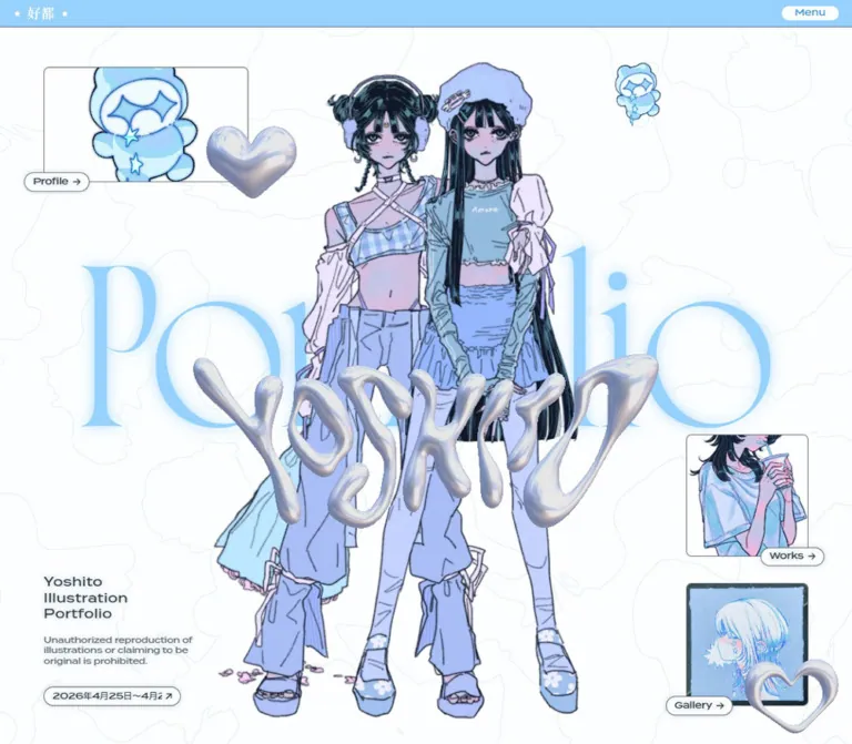
淡い水色と白の背景に、少女のイラスト、クローム調の立体ロゴ、繊細なセリフ体を重ねたポートフォリオ。小さな画像リンクとカプセル型ラベルを散りばめ、モバイルでも大胆な構図を保っています。
オリジナルサイトを見るYoshito Illustration Portfolio — Style Reference
An icy blue illustration world with chrome charms, enormous serif lettering, and tiny floating navigation labels.
Website: yoshito-illustration.com Original URL: https://yoshito-illustration.com/ Final URL: https://yoshito-illustration.com/ Theme: light; near-white canvas, pale blue identity color, dark blue-gray text Inspected: September 12, 2026, at 07:42:43.897 UTC / 16:42:43.897 JST, through the supplied browser evidence Viewports: 1440 × 1000 desktop and 390 × 844 mobile, in CSS pixels Scope: the current portfolio homepage: opening composition, Works/Gallery/Profile section structure, visible Gallery arrangement, and illustrated footer. Three desktop captures and two mobile captures were supplied. Linked destination pages and the open menu were not visually inspected.
Yoshito’s homepage presents illustration as a spatial composition. Large character cutouts overlap pale blue lettering; reflective silver hearts and a sculptural wordmark sit in the foreground. Fine wandering outlines extend across the near-white background. Small image links occupy the edges, each with an overlapping capsule label. The artwork supplies most of the visual density while the interface stays compact.
The page is a portfolio index with a substantial illustrated opening and closing scene. Between them, Works, Gallery, and Profile introduce the artist’s different kinds of content. Oversized editorial lettering, restrained explanatory copy, fine rules, and small page links provide continuity. The mobile captures retain this expressive overlap and cropping instead of reducing everything to a conventional stack of cards.
How to Read This Reference
- Measured means supplied custom properties, computed styles, or rendered element rectangles. Measurements are rounded to two decimals where appropriate.
- Observed means visible in the supplied captures. Image boundaries, shadows, and decorative details without element measurements are described as visual estimates.
- Calculated means arithmetic derived from measured values, such as an aspect ratio or available content width.
- Recommended means implementation guidance for a new build. Proposed breakpoints, CSS approximations, and accessibility additions are not claims about the original source.
- Font stacks are directly evidenced. The font files, display-lettering child styles, and exact variable-font axes were not supplied.
- DOM text includes repeated headings and menu content that are not simultaneously visible in the captures. Text extraction alone does not establish visibility or interaction behavior.
Tokens — Colors
Default Palette
| Name | Value | Source or implementation token | Role and evidence |
|---|---|---|---|
| Ice White | #fcfeff |
Source --color-bg |
Measured body background and Menu control background; the continuous page canvas |
| Sky Blue | #96d2fd |
Source --color-main |
Measured header fill; visually matches the large background lettering and recurring blue accents |
| Slate Ink | #2f3b41 |
Source --color-text |
Measured body text, captions, navigation labels, and copyright |
| Translucent Slate | rgb(47 59 65 / 70%) |
Source --color-border, expressed as rgb(from #2f3b41 r g b / .7) |
Declared border color; appropriate for the fine frame and rule treatment |
| White | #ffffff |
Source --color-white |
Measured home-link color; visible in the header identity and display-lettering highlights |
| Menu Blue | #379be3 |
Recommended alias --color-menu-text |
Converted from measured Menu text rgb(55, 155, 227) |
| Black | #000000 |
Source --color-black |
Declared utility color; does not replace the measured slate body-text color |
The canvas is slightly cooler than pure white. Keep #fcfeff distinct from #ffffff: this small difference supports the white rims and highlights without creating separate panel backgrounds.
Supporting Artwork Colors
These colors belong primarily to images, not to an independently measured UI palette.
| Family | Visual observation | Implementation guidance |
|---|---|---|
| Chrome silver | White highlights, blue-gray reflections, and lavender shadows | Preserve in supplied artwork; a single gray fill cannot reproduce the effect |
| Periwinkle and lilac | Clothing, skin shading, hair highlights, and painted portraits | Let the illustrations introduce these tones |
| Pale cyan and mint | Mascot details and some painting backgrounds | Keep secondary to the main blue |
| Soft pink and coral | Small character accessories and one Gallery painting background | Do not promote these incidental artwork colors into general CTA colors |
| Deep blue-black | Hair and illustration outlines | Provides image contrast while the interface remains lighter |
| Contour blue | Extremely faint irregular background linework | Exact color unavailable; #dfedf3 is a recommended starting approximation only |
Theme Presets
Only one light appearance is evidenced. No theme selector or alternate color scheme was exercised. The color changes between artworks do not demonstrate selectable interface themes.
Tokens — Typography
English Interface — Termina
- Declared source family:
terminathrough--font-en. - Computed general stack:
termina, 'M PLUS 1', sans-serif. - Computed identity stack:
termina, sans-serifin the opening title and reproduction notice. - Measured weight: predominantly
450. - Character: broad, geometric letters with a low, horizontal rhythm. Small controls remain visually recognizable because of their wide letterforms.
- Role: identity copy, navigation capsules, section captions, announcement, and social links.
Do not substitute bold geometric text everywhere. The measured medium weight and compact sizes leave the artwork dominant.
English Display — Declared Norman Variable
- Declared source family:
norman-variablethrough--font-en-display. - Visible character: extremely high-contrast serif lettering, with long thin strokes and large rounded forms.
- Role: the huge Portfolio background word and the expressive section-title treatment.
- Limit: the supplied H2 measurements describe wrapper elements. Their inherited
13.37pxdesktop font size is not the size of the visible large lettering. Exact display glyph sizes, axes, and child-layer styles were not captured.
The section labels appear to have pale blue areas, white edging, thin dark contours, and soft shadows. Their extracted text repeats three times. This supports a layered-lettering interpretation, but the exact construction remains unverified. A recreation should expose each section name only once to assistive technology.
Japanese Text — M PLUS 1
- Declared source family:
M PLUS 1through--font-ja. - Computed stack: follows Termina in the general body stack.
- Role: the announcement, artist name, occupation, and biography.
- Measured weight:
450on the sampled text elements.
The header’s white Japanese identity mark is visible as 好都, flanked by stars. Its exact rendering method and font are not established by the empty-text home-link rectangle.
Artwork Lettering
The reflective Yoshito wordmark is a sculptural graphic with irregular inflated strokes, not ordinary text with a silver CSS gradient. Treat it as an image or separately authored graphic. Its geometry and reflections are central to the opening composition.
Type Scale
All values below are measured computed sizes and line heights, except the final row.
| Role | Desktop size / line height | Mobile size / line height | Additional detail |
|---|---|---|---|
| General body | 13.37 / 20.06px |
13 / 19.5px |
Weight 450 |
| Opening three-line identity | 18.51 / 24.07px |
16 / 20.8px |
0.03em tracking |
| Footer three-line identity | 18.51 / 27.77px |
16 / 24px |
0.03em tracking; looser than the opening |
| Opening reproduction notice | 12.34 / 16.05px |
12 / 15.6px |
Compact three-line block in both captures |
| Footer reproduction notice | 12.34 / 18.51px |
12 / 18px |
More open leading |
| Section explanation | 12.34 / 18.51px |
12 / 18px |
Two short lines for Works and Gallery |
| Profile name | 16.46 / 24.69px |
15 / 22.5px |
Separate from the occupation |
| Profile occupation and biography | 13.37 / 20.06px |
12 / 18px |
Japanese text |
| Menu button | 13.37 / 20.06px |
12 / 18px |
Blue text on the pale capsule |
| Section-link anchor | 13.37 / 20.06px |
13 / 19.5px |
Descendant label styles were not separately sampled |
| Copyright and social links | 12.34 / 18.51px |
11 / 16.5px |
Smallest measured footer text |
| Large section-title wrapper | 514.28 × 214.28px |
350 × 145.83px |
Measured box, not a font-size declaration |
Tokens — Spacing & Shapes
Responsive Unit
The measured root font size is 16.4571px at 1440px wide and 16px at 390px wide. The underlying fluid-size formula and media-query thresholds were not supplied.
Several source variables use rem units and also change between the two viewports. Preserve these as separate facts: the desktop layout is not simply the mobile layout multiplied by the root-size ratio.
Spacing Scale
| Use | Source value or measurement | Desktop | Mobile |
|---|---|---|---|
| Header height | --header-height: 2.5rem / 2rem |
41.14px |
32px |
| Page side inset | --padding-side: 4rem / 1.25rem |
65.83px |
20px |
| Declared grid gap | --grid-gap: 2.5rem / 1.25rem |
41.14px calculated |
20px calculated |
| Header horizontal padding | Computed | 20.57px |
12px |
| Section top padding | Computed | 40.11px |
39px |
| Section bottom padding | Computed | 60.17px |
39px |
| Title wrapper to section caption | Calculated from rectangles | 40.11px |
29.25px |
| Caption to page-link capsule | Calculated from rectangles | 30.08px |
29.25px |
| Square image-link vertical gap | Calculated from rectangles | 40.11px |
19.5px |
| Opening title to reproduction notice | Calculated from rectangles | 20.05px |
9.75px |
The declared grid gap and the measured gap between image links differ slightly. Do not replace every observed gap with the same variable merely because the values are close.
Border Radius
| Element | Evidence | Reusable interpretation |
|---|---|---|
| Menu button | Computed radius 1000px desktop and 844px mobile |
Fully rounded capsule; use 999px in an adaptation |
| Image-link labels | Visually rounded ends | Capsule radius; exact descendant radius unavailable |
| Image-link frame | Approximately 6–8px desktop and 3–4px mobile by visual estimate |
Small corner radius, not a heavily rounded card |
| Gallery painting frames | Nearly square corners, with irregular physical texture | Preserve the frame within the image |
| Chrome hearts | Custom filled and hollow silhouettes | Authored imagery, not border-radius primitives |
Layout Measurements
| Element | Desktop: 1440 × 1000 | Mobile: 390 × 844 |
|---|---|---|
| Full document height | 4013.80px |
3850.42px |
| Content width between side insets | 1308.34px |
350px |
| Opening Profile image link | 308.56 × 173.56px at 65.83, 101.30 |
160 × 90px at 20, 51.5 |
| Opening Works image link | 185.14px square at 1189.03, 529.45 |
100px square at 270, 585.5 |
| Opening Gallery image link | 185.14px square at 1189.03, 754.70 |
100px square at 270, 705 |
| Opening identity width | 236.56px |
214.5px |
| Announcement anchor | 206.58 × 28.80px |
195.80 × 24px |
| Works section start / height | 1021.05 / 761.67px |
913.25 / 772.64px |
| Gallery section start / height | 1783.72 / 614.55px |
1686.89 / 761.83px |
| Profile section start / height | 2399.27 / 614.55px |
2449.72 / 642.70px |
| Footer start / height | 3013.81 / 999.98px |
3092.42 / 758px |
Positions in this table are document coordinates. The opening Profile image link has a calculated 16:9 aspect ratio at both sizes. The Works and Gallery image links remain square.
Components
Global Header
Role: persistent identity and menu access.
A narrow blue strip spans the viewport. The white home identity sits at the left and the pale Menu capsule sits at the right. The measured header uses flex layout and horizontal padding much smaller than the main content inset.
The desktop home-link box is 82.27 × 20.56px; mobile reduces it to 58 × 15px. The Menu button is 85.33 × 20.56px on desktop and 67.59 × 18px on mobile. A very fine lower edge is visible.
The header appears at the top in opening, middle, and footer captures, consistent with persistent positioning. Its exact positioning property was not supplied. A fixed header is a reasonable implementation recommendation. The source declares --z-index-global-header: 2000 and a transform transition, but the trigger for that transition is unverified.
Opening Illustration Stage
Role: establishes the artist’s identity before the work categories.
Build the composition as independently positioned layers:
- Near-white background with extremely pale irregular contours.
- Huge pale blue Portfolio lettering.
- A dominant character illustration with a transparent-looking outer silhouette.
- The reflective Yoshito wordmark overlapping the character.
- Small mascot and chrome-heart decorations.
- Edge-positioned navigation images and compact identity copy.
The desktop capture shows two standing figures, approximately centered, extending from near the upper tenth of the viewport almost to its bottom. The silver wordmark crosses their lower torsos. The upper-left Profile preview and lower-right Works/Gallery previews create a diagonal balance around the artwork.
The mobile capture shows a different, tightly cropped black-haired portrait. The silver wordmark crosses the face and neck area, while the large Portfolio word is clipped at the viewport edges. The difference in artwork is observed; it does not prove a responsive image swap, slideshow, or random-selection mechanism.
Keep the semantic H1 in the small identity block. Decorative lettering should not displace the readable page title or become multiple accessible headings.
Image Navigation Link
Role: gives each destination a recognizable visual handle.
The component consists of a linked image frame and a capsule label that overlaps its lower edge. The frame contains either a cropped digital illustration, an analog painting with its own dark frame, or the small blue mascot. Labels read Profile, Works, or Gallery and include a right arrow.
Desktop square links measure 185.14px; mobile links measure 100px. The opening Profile variant uses a wider 16:9 frame. Label alignment varies: some capsules protrude left, while others protrude right. This asymmetry is part of the composition.
Use a separate clipping wrapper for the image so the label can extend outside the frame. A parent with overflow: hidden would incorrectly cut off the capsule. The visible label treatment combines a thin slate outline, near-white fill, and a soft shallow shadow.
The DOM confirms actual anchors to /works/, /gallery/, and /profile/. Destination-page designs were not inspected.
Identity and Reproduction Notice
Role: supplies readable authorship and a short artwork-use statement.
The opening identity reads Yoshito / Illustration / Portfolio on three lines. It is a compact text block, not the largest visual headline. Below it, a smaller English reproduction notice wraps into three lines.
On desktop, this group occupies the lower-left opening area. Its H1 starts at y=740.59px. On mobile it starts at y=714.02px, below the main portrait and to the left of the image links.
The footer repeats the same content with more generous line height. Preserve the distinction between the opening and footer typography rather than assigning a single shared line-height value to both.
Announcement Capsule
Role: links a short visible excerpt of an announcement to the artist’s social account.
A narrow outlined capsule appears below the opening identity block. The full DOM text describes participation in an April 25–26, 2026 event, while the desktop screenshot shows only a clipped portion of the long announcement and an external-link arrow.
The anchor measures 206.58 × 28.80px on desktop and 195.80 × 24px on mobile. Its mobile top position is 862.19px, below the initial 844px capture. It is present in the mobile DOM even though it is outside that first screenshot.
Clipping is visible; a scrolling ticker or marquee is not verified. The event date precedes the inspection date, so describe it as the displayed announcement rather than an upcoming event.
Section Introduction
Role: introduces Works, Gallery, and Profile within the homepage.
Each section begins with a fine horizontal rule. Small four-point stars visually punctuate the rule ends. The section contains a large layered title, a compact text explanation or biography, a small page-link capsule, and supporting visual content where visible.
Desktop sections use measured display: flex; mobile sections use display: block. The desktop heading and caption wrappers are 514.28px wide. Mobile wrappers are 350px, matching the available content width.
The display-title wrapper has a calculated 12:5 aspect ratio at both viewports. The title artwork can extend slightly left of the normal text alignment: the desktop Gallery wrapper starts at x=60.91px, while its caption starts at 65.83px. This is optical adjustment, not a second page gutter.
Works Introduction
Role: routes visitors to commissioned and personal digital work.
The supplied DOM contains the Works title, a two-line explanation, and the Works Page link. Its desktop section is taller than Gallery and Profile at 761.67px.
The Gallery screenshot includes only a cropped fragment of preceding artwork above the divider. The full Works arrangement is not visible, so neither its item count nor its exact illustration layout can be established from these captures.
Preserve the evidenced introduction and destination link. Treat any proposed arrangement of digital works as a new implementation decision.
Gallery Introduction and Painting Arrangement
Role: previews analog drawings made for exhibitions.
This is the most fully visible middle-page component. A large Gallery title occupies the left, followed by the two-line explanation Analog drawings / for exhibitions. and a Gallery Page capsule. Three framed portraits form an irregular arrangement on the right.
The paintings are approximately 205–207px square in the desktop screenshot, estimated visually. One sits toward the upper left, a second higher on the right, and a third lower between them. Their backgrounds introduce muted peach, mint, and blue. The dark frames have visible material texture and should be retained as part of the photographs or scans.
Avoid turning this into three evenly spaced product cards. The unequal vertical positions and surrounding empty space make the section feel like a small exhibition wall.
The mobile DOM verifies the Gallery section and its stacked block layout, but no mobile Gallery screenshot was supplied. The painting arrangement at that width remains unverified.
Profile Introduction
Role: introduces the illustrator and the work’s artistic theme.
The DOM provides a Profile title, the name 好都 / Yoshito, an occupation line, a short Japanese biography, and a Profile Page link. The biography describes pastel colors, subdued expressions, and dreamlike sparkle. This content is consistent with the visible artwork.
The desktop biography is 411.42px wide within the larger left column; mobile uses the full 350px content width. The name is larger than the occupation and biography.
The complete Profile visual arrangement is not shown in the supplied screenshots. Do not invent an associated portrait, contact form, or production-credit block.
Illustrated Footer
Role: closes the page with another artwork composition and repeats the main destinations.
The desktop footer is almost exactly one viewport tall. Huge Portfolio lettering stretches across the upper-left area. A reclining character fills much of the lower-left and central space, with chrome-heart decorations near opposite corners. Works, Gallery, and Profile image links form a vertical rail on the right.
The identity block moves inward to x=853.02px, well away from its opening position. A thin star-ended rule separates the main composition from copyright at the lower left and a horizontal row of social links at the lower right.
The mobile footer is 758px tall. Its illustrated figure appears rotated, with the legs rising toward the upper left and the head toward the lower right. Image links remain a right-side rail of 100px squares. The identity returns to the left, and the social links stack vertically below the final rule.
The captures establish these different compositions, but not the transformation formula or whether every orientation difference is breakpoint-driven. The footer should be art-directed independently from the opening stage.
Menu Content — DOM Evidence Only
The supplied DOM contains Menu and Close labels, links for Home, Works, Gallery, and Profile, and a second set of copyright/social content. The large navigation labels are repeated in the text extraction, similar to the layered section titles.
The screenshots show the closed Menu control. They do not show an opened navigation surface. Its backdrop, focus management, transition sequence, and close behavior are unverified. Do not present the hidden link rectangles as the visible homepage layout.
Tokens — Motion & Interaction
| Treatment | Supplied value | What is established |
|---|---|---|
| General material duration | --duration-material-base: .4s |
Declared token |
| General material easing | --ease-material-base: ease-out |
Declared token |
| Transform duration | --duration-transform-base: .8s |
Declared token |
| Transform easing | cubic-bezier(.22, 1, .36, 1) |
Declared through transform and quint aliases |
| Exponential ease-out | cubic-bezier(.16, 1, .3, 1) |
Declared token; application not established |
| Hover material duration | --duration-material-hover: .1s |
Declared token |
| Header transform | transform .8s cubic-bezier(.22, 1, .36, 1) |
Computed transition; trigger and displacement unknown |
| Menu color and background | .1s ease-out |
Computed transitions; alternate colors not captured |
| Social-link color | .1s ease-out |
Computed transition; hover result not captured |
| Footer visibility | opacity .4s ease-out, visibility .4s ease-out |
Computed transitions; trigger unknown |
The observer waited at least five seconds initially and traversed intermediate scroll positions. Finite motion and image readiness were checked within stated limits; perpetual animations were temporarily paused during readiness checks and resumed afterward.
These procedures do not establish animation choreography. No menu opening, hover sequence, timed artwork cycle, drag interaction, or click-through was supplied. Sampled elements report animation: none, which does not rule out animated descendants, pseudo-elements, scripts, or media assets.
Use the declared timing tokens if implementing compatible motion. Treat any floating hearts, continuous rotation, parallax, or animated background contours as recommendations requiring separate design decisions, not observed behavior.
Surfaces
| Layer | Appearance | Function |
|---|---|---|
| Page canvas | Continuous #fcfeff with very faint wandering outlines |
Holds the whole portfolio together |
| Header strip | Flat #96d2fd |
Persistent identity and utility access |
| Decorative display lettering | Pale blue, white edges, thin contours, soft glow | Large-scale visual rhythm |
| Navigation image frame | Thin border, small radius, artwork inside | Recognizable destination preview |
| Navigation capsule | Near-white fill, slate border, shallow shadow | Compact clickable label |
| Analog artwork frame | Dark, textured physical border within imagery | Distinguishes exhibited works |
| Chrome ornaments | Reflective gradients embedded in artwork | Foreground depth and sparkle |
| Section separator | Fine slate line with four-point star ends | Quiet structural boundary |
There is no visible system of large filled content cards. Depth comes from overlapping imagery, subtle shadows, outlined lettering, and the reflective artwork. The page does not require a translucent glass panel treatment.
Imagery
The illustrations depict fashion-oriented characters with dark hair, subdued expressions, delicate linework, and cool pastel shading. Clothing, jewelry, hair accessories, and small mascot objects carry fine detail. Blue, lavender, and muted pink recur across the illustrations and connect them to the interface palette.
The chrome elements introduce a second material language: inflated irregular lettering, a solid heart, and a hollow heart with rounded reflective edges. Highlights remain soft and cool. These objects feel like charms placed above the artwork rather than generic metallic UI icons.
The faint background contours resemble irregular map or fluid outlines. Their exact medium and generation method are not established. Use restrained, large-scale linework with plenty of open space; dense texture would compete with hair and clothing detail.
Artwork is smoothly rendered in the captures. There is no evidence for deliberate nearest-neighbor scaling or a pixel-art presentation. Preserve antialiasing and image detail.
Observed Asset References
No image source URLs, filenames, intrinsic image dimensions, or font-file URLs were included in the supplied evidence. The following are visual asset roles, not downloadable references.
| Visible asset | Where evidenced | Handling guidance |
|---|---|---|
| Two standing characters | Desktop opening capture | Large layered illustration; preserve the silhouette |
| Black-haired portrait | Mobile opening capture | Tightly cropped composition; selection mechanism unknown |
| Chrome Yoshito lettering | Opening captures | Use authored graphic geometry |
| Blue mascot | Profile previews and small decorations | Retain the recurring character identity |
| Drink-holding character crop | Works navigation previews | Square crop with consistent visual identity |
| Three analog portraits | Desktop Gallery capture | Preserve physical frames and painting textures |
| Reclining character | Desktop and mobile footer captures | Prepare separate composition rules for each viewport |
| Solid and hollow chrome hearts | Opening and footer captures | Foreground ornaments with transparent surroundings |
| Pale contour background | All supplied captures | Exact source and repeat behavior unknown |
| Star-ended rules | Gallery and footer captures | Can be approximated with simple decorative elements |
Use suitable authorized artwork for a new implementation. The CSS shell can reproduce the relationships between layers, but cannot recreate these illustrations or the chrome lettering by itself.
Layout & Responsive Behavior
The homepage follows a long vertical sequence: opening composition, Works, Gallery, Profile, and illustrated footer. Desktop document height is approximately 4014px; mobile is approximately 3850px despite its much narrower width. This results from several different changes rather than uniform scaling.
| Relationship | Desktop observation | Mobile observation |
|---|---|---|
| Header | 41.14px tall |
32px tall |
| Main side inset | 65.83px |
20px |
| Opening Profile preview | Wide 308.56px image |
Wide 160px image |
| Square navigation images | 185.14px |
100px |
| Opening artwork | Two standing characters | Different close portrait; cause unverified |
| Section flow | Flex layout | Block layout |
| Section title wrapper | 514.28px wide |
Full 350px content width |
| Gallery section height | 614.55px |
761.83px, consistent with additional vertical stacking |
| Footer composition | Reclining figure across left/center | Rotated-looking figure within narrow canvas |
| Footer identity | Inward, near center-right | Left-aligned |
| Footer social links | Horizontal row | Right-aligned vertical list |
The mobile opening is longer than the initial viewport. Works begins at 913.25px, and the announcement appears below the initial fold. Do not compress all opening content into 844px merely to match the screenshot boundary.
Image-link rails remain on the right at both sizes. The layout therefore needs art direction, not just a breakpoint that stacks every item. Large decorative words can be intentionally clipped; readable copy, link labels, and keyboard focus indicators should remain reachable.
The exact source breakpoint is unknown. A breakpoint around 60rem is used in the Quick Start as a recommendation. Intermediate widths, landscape phones, browser zoom, and text enlargement were not captured and require testing.
Do’s and Don’ts
Do
- Preserve the exact canvas, blue, and ink colors:
#fcfeff,#96d2fd, and#2f3b41. - Let illustrations and display lettering occupy far more space than interface text.
- Keep the narrow blue header and compact white Menu capsule.
- Use the evidenced Termina/M PLUS 1 stack for interface text when available.
- Keep high-contrast serif display lettering separate from the geometric utility typography.
- Place capsule labels partly outside their image frames.
- Preserve irregular composition, optical title offsets, and broad empty areas.
- Keep the Gallery paintings staggered and retain their physical frames.
- Art-direct the opening and footer independently for mobile.
- Retain small reproduction, biography, and copyright text as real readable content.
Don't
- Don't turn the portfolio index into a sales page with a large conversion button and feature-card grid.
- Don't make every artwork preview identical in size or alignment.
- Don't replace the chrome wordmark with ordinary text and a simple gray gradient.
- Don't treat pale blue as the primary color for small paragraph text.
- Don't reproduce repeated DOM labels as three visible or accessible headings.
- Don't infer a slideshow, parallax system, or rotating animation from different still captures.
- Don't apply the H2 wrapper’s inherited body font size to the visible display lettering.
- Don't stretch or pixelate the illustrations.
- Don't hide the mobile announcement merely because it lies below the first capture.
- Don't invent the open-menu design or the layouts of linked pages.
Recommended Implementation Additions
These recommendations are not verified features of the original page.
- Give the home identity link an accessible name even if its artwork contains no extractable text.
- Expose one accessible label per image link. Hide duplicate decorative label layers and arrows from assistive technology.
- Keep the Menu control keyboard-operable with
aria-expandedand a relationship to its controlled navigation. Choose focus behavior appropriate to the eventual menu implementation. - Enlarge the effective hit areas of the small Menu and capsule controls toward
44pxwithout enlarging their visible pill shapes. Avoid overlapping neighboring hit areas. - Use a visible dark focus outline, including on the image-link frames.
- Mark hearts, contour lines, and redundant wordmarks as decorative. Provide descriptive alternatives for meaningful portfolio images.
- Provide reduced-motion behavior if continuous or transform-based effects are implemented.
- Maintain sufficient dark-text contrast; reserve the light blue for large lettering and decoration.
- Test absolute-positioned compositions at 200% text size and narrow intermediate widths. Allow the content region to grow when labels or biographies wrap.
- Supply responsive image sizes, reserve their layout dimensions, and prioritize the opening illustration. Defer lower-page images without removing their reserved space.
Agent Prompt Guide
Quick Color Reference
- Canvas:
#fcfeff. - Header and principal decorative blue:
#96d2fd. - Main text:
#2f3b41. - Fine borders:
rgb(47 59 65 / 70%). - Header identity and title highlights:
#ffffff. - Menu text:
#379be3. - Chrome, lavender, mint, and pink: primarily artwork colors.
- Contour line approximation:
#dfedf3, recommended rather than measured.
Overall Prompt
“Create an illustrator’s portfolio homepage with an icy near-white canvas, pale blue header, dark blue-gray utility text, and faint irregular contour lines. Use a narrow persistent header with a white identity mark and a small Menu capsule. Build the opening as an art-directed composition of oversized high-contrast serif lettering, a large character illustration, sculptural chrome lettering, silver heart ornaments, and small framed image links with overlapping pill labels. Follow with Works, Gallery, and Profile introductions using huge layered section labels, short explanations, fine star-ended rules, and compact page links. Finish with another large illustrated scene and repeated navigation. Keep the mobile composition expressive and cropped while preserving readable text and usable links. Do not invent unverified interactions.”
Example Component Prompts
- Image link: “Create a square illustration link with a thin slate outline and a small corner radius. Attach a near-white capsule label across its bottom edge, offset slightly to one side. Use dark geometric text, a right arrow, and a subtle shallow shadow. Target a 185px desktop frame and 100px phone frame.”
- Gallery section: “Place a large pale blue high-contrast serif Gallery label at left, with a white rim and subtle outline shadow. Below it place two short lines of small dark text and a compact Gallery Page capsule. Arrange three framed pastel portraits at unequal heights on the right, leaving generous open space.”
- Opening composition: “Layer a giant pale blue Portfolio word behind a detailed character illustration, then overlap the character with an authored chrome wordmark. Position a wide mascot Profile preview at the upper left and two small square destination previews at the lower right. Preserve the small three-line identity block near the lower left.”
- Footer: “Make an illustrated closing scene with huge blue serif lettering, a reclining character, silver heart ornaments, and a right-side rail of three image links. Use a fine star-ended rule above copyright and social links. On mobile, compose the figure diagonally, move the identity left, and stack social links at the lower right.”
- Responsive adaptation: “Use 20px phone gutters, a 32px blue header, 100px square image links, and readable 12–16px supporting text. Keep decorative lettering clipped where intentional. Recompose artwork separately from text instead of shrinking the desktop canvas as one image.”
Quick Start
CSS Custom Properties
This is a recommended implementation scaffold, not recovered source CSS. It uses a conventional root size, the measured palette and font stacks, and explicit desktop/mobile anchor values. The 60rem breakpoint, shadow recipe, title effects, and artwork positioning are approximations. Font files and image assets must be supplied separately.
Use an image-link anchor with a .portal-media clipping wrapper and a sibling .portal-label. A .section-intro contains the title, caption, and page link; .gallery-wall contains three framed artwork images. The stage artwork classes describe separate layers, so images can be recomposed without moving the readable copy.
:root {
  /* Measured source palette and font names */
  --color-bg: #fcfeff;
  --color-main: #96d2fd;
  --color-text: #2f3b41;
  --color-border: rgb(47 59 65 / 70%);
  --color-white: #fff;
  --color-menu-text: #379be3;
  --font-ui: 'termina', 'M PLUS 1', sans-serif;
  --font-display: 'norman-variable', 'Times New Roman', serif;

  /* Mobile anchors measured at 390 × 844 */
  --header-height: 32px;
  --header-inset: 12px;
  --page-inset: 20px;
  --portal-size: 100px;
  --portal-gap: 19.5px;
  --pill-height: 24px;
  --body-size: 13px;
  --caption-size: 12px;
  --identity-size: 16px;
  --section-top: 39px;
  --section-bottom: 39px;
  --caption-gap: 29.25px;
  --link-gap: 29.25px;

  /* Recommended visual approximations */
  --frame-radius: 4px;
  --shadow-small: 0 1px 7px rgb(47 59 65 / 24%);
  --contour-image: none;

  /* Source timing tokens */
  --duration-material: 400ms;
  --duration-transform: 800ms;
  --duration-hover: 100ms;
  --ease-material: ease-out;
  --ease-transform: cubic-bezier(.22, 1, .36, 1);
}

* { box-sizing: border-box; }

body {
  margin: 0;
  color: var(--color-text);
  background-color: var(--color-bg);
  background-image: var(--contour-image);
  font-family: var(--font-ui);
  font-size: var(--body-size);
  font-weight: 450;
  line-height: 1.5;
}

img { display: block; max-width: 100%; }
a { color: inherit; }
button { font: inherit; }

.site-header {
  position: fixed;
  inset: 0 0 auto;
  z-index: 2000;
  display: flex;
  align-items: center;
  justify-content: space-between;
  height: var(--header-height);
  padding-inline: var(--header-inset);
  background: var(--color-main);
  border-bottom: 1px solid var(--color-border);
  transition: transform var(--duration-transform) var(--ease-transform);
}

.site-brand { color: var(--color-white); }

.menu-button {
  border: 0;
  border-radius: 999px;
  padding: 0 12px;
  color: var(--color-menu-text);
  background: var(--color-bg);
  font-size: 12px;
  line-height: 18px;
  cursor: pointer;
  transition:
    color var(--duration-hover) var(--ease-material),
    background-color var(--duration-hover) var(--ease-material);
}

.pill {
  display: inline-flex;
  align-items: center;
  justify-content: center;
  gap: 6px;
  min-height: var(--pill-height);
  padding: 0 12px;
  border: 1px solid var(--color-border);
  border-radius: 999px;
  color: var(--color-text);
  background: var(--color-bg);
  box-shadow: var(--shadow-small);
  font-size: 13px;
  line-height: 1.3;
  text-decoration: none;
  white-space: nowrap;
}

.portal {
  position: relative;
  display: block;
  width: var(--portal-size);
  aspect-ratio: 1;
  text-decoration: none;
}

.portal--wide { width: 160px; aspect-ratio: 16 / 9; }

.portal-media {
  display: block;
  width: 100%;
  height: 100%;
  overflow: hidden;
  border: 1px solid var(--color-border);
  border-radius: var(--frame-radius);
  background: var(--color-bg);
}

.portal-media img {
  width: 100%;
  height: 100%;
  object-fit: cover;
}

.portal-label {
  position: absolute;
  z-index: 1;
  left: -12px;
  bottom: -12px;
}

.portal--label-right .portal-label { left: auto; right: -12px; }

.portfolio-stage {
  position: relative;
  isolation: isolate;
  min-height: max(913.25px, 100svh);
  overflow: clip;
}

/* Decorative layers need artwork-specific composition adjustments. */
.portfolio-word {
  position: absolute;
  z-index: 0;
  top: 290px;
  left: -8%;
  margin: 0;
  color: var(--color-main);
  font-family: var(--font-display);
  font-size: clamp(180px, 50vw, 420px);
  font-weight: 400;
  line-height: .9;
  white-space: nowrap;
  text-shadow: 0 0 12px rgb(150 210 253 / 45%);
  pointer-events: none;
}

.stage-art {
  position: absolute;
  z-index: 1;
  top: 210px;
  left: 0;
  width: 100%;
  pointer-events: none;
}

.chrome-wordmark {
  position: absolute;
  z-index: 2;
  top: 415px;
  left: 50%;
  width: min(90vw, 800px);
  transform: translateX(-50%);
  pointer-events: none;
}

.stage-profile {
  position: absolute;
  z-index: 3;
  top: 51.5px;
  left: var(--page-inset);
}

.stage-links,
.footer-links {
  position: absolute;
  z-index: 3;
  right: var(--page-inset);
  display: grid;
  gap: var(--portal-gap);
}

.stage-links { top: 585.5px; }

.hero-identity {
  position: absolute;
  z-index: 3;
  left: var(--page-inset);
  bottom: 80px;
  width: 214.5px;
}

.identity-title {
  margin: 0;
  font-size: var(--identity-size);
  font-weight: 450;
  line-height: 1.3;
  letter-spacing: .03em;
}

.identity-note {
  margin: 9.75px 0 0;
  font-size: var(--caption-size);
  line-height: 1.3;
}

.announcement {
  position: absolute;
  z-index: 3;
  left: var(--page-inset);
  bottom: 27px;
  width: 195.8px;
}

.announcement-text {
  min-width: 0;
  overflow: hidden;
  white-space: nowrap;
}

.portfolio-section {
  position: relative;
  margin-inline: var(--page-inset);
  padding-block: var(--section-top) var(--section-bottom);
  border-top: 1px solid var(--color-border);
}

/* Decorative rule endpoints; no semantic content. */
.portfolio-section::before,
.portfolio-section::after {
  content: '';
  position: absolute;
  top: -5px;
  width: 10px;
  height: 10px;
  background: var(--color-text);
  clip-path: polygon(50% 0, 62% 38%, 100% 50%, 62% 62%,
    50% 100%, 38% 62%, 0 50%, 38% 38%);
}

.portfolio-section::before { left: -15px; }
.portfolio-section::after { right: -15px; }

.section-title {
  display: flex;
  align-items: center;
  aspect-ratio: 12 / 5;
  margin: 0;
  color: var(--color-main);
  font-family: var(--font-display);
  font-size: clamp(100px, 37.4vw, 146px);
  font-weight: 400;
  line-height: 1;
  -webkit-text-stroke: .6px var(--color-border);
  text-shadow: 3px 0 #fff, -3px 0 #fff, 0 3px #fff, 0 -3px #fff;
  filter: drop-shadow(0 1px 5px rgb(47 59 65 / 20%));
}

.section-caption {
  margin: var(--caption-gap) 0 0;
  font-size: var(--caption-size);
  line-height: 1.5;
}

.section-link { margin-top: var(--link-gap); }

/* Mobile Gallery arrangement is recommended, not visually verified. */
.gallery-wall {
  position: relative;
  height: 380px;
  margin-top: 32px;
}

.gallery-wall img {
  position: absolute;
  width: 45%;
  height: auto;
  box-shadow: var(--shadow-small);
}

.gallery-wall img:nth-child(1) { left: 0; top: 42px; }
.gallery-wall img:nth-child(2) { right: 0; top: 0; }
.gallery-wall img:nth-child(3) { left: 25%; top: 56%; }

.portfolio-footer {
  position: relative;
  isolation: isolate;
  min-height: 758px;
  overflow: clip;
}

.footer-links { top: 32px; }

.footer-identity {
  position: absolute;
  z-index: 3;
  left: var(--page-inset);
  top: 468.5px;
  width: 230px;
}

.footer-identity .identity-title,
.footer-identity .identity-note { line-height: 1.5; }
.footer-identity .identity-note { margin-top: 19.5px; }

.footer-bottom {
  position: absolute;
  z-index: 3;
  left: var(--page-inset);
  right: var(--page-inset);
  bottom: 19.5px;
  display: flex;
  align-items: flex-end;
  justify-content: space-between;
  padding-top: 18px;
  border-top: 1px solid var(--color-border);
  font-size: 11px;
  line-height: 1.5;
}

.footer-bottom p { margin: 0; }
.footer-socials { display: flex; flex-direction: column; align-items: flex-end; }
.footer-socials a { text-decoration: none; }

/* Recommended breakpoint; the original threshold is unknown. */
@media (min-width: 60rem) {
  :root {
    --header-height: 41.14px;
    --header-inset: 20.57px;
    --page-inset: clamp(40px, 4.5714vw, 80px);
    --portal-size: 185.14px;
    --portal-gap: 40.11px;
    --pill-height: 28.8px;
    --body-size: 13.37px;
    --caption-size: 12.34px;
    --identity-size: 18.51px;
    --section-top: 40.11px;
    --section-bottom: 60.17px;
    --caption-gap: 40.11px;
    --link-gap: 30.08px;
    --frame-radius: 7px;
  }

  .menu-button { padding-inline: 18.51px; font-size: 13.37px; line-height: 20.57px; }
  .portfolio-stage { min-height: calc(100svh + 21.05px); }
  .portfolio-word { top: 29%; left: 9%; font-size: clamp(260px, 27.8vw, 460px); }
  .stage-art { top: 80px; left: 30%; width: 37%; }
  .chrome-wordmark { top: 44%; }
  .portal--wide { width: 308.56px; }
  .stage-profile { top: 101.3px; }
  .stage-links { top: 52.945svh; }
  .hero-identity { bottom: 140px; width: 236.56px; }
  .identity-note { margin-top: 20.05px; }
  .announcement { bottom: 81.2px; width: 206.58px; }

  .portfolio-section { display: flex; gap: 41.14px; }
  .section-intro { flex: 0 0 clamp(400px, 35.7143vw, 580px); }
  .section-title { font-size: clamp(170px, 14.88vw, 240px); }
  .gallery-wall { flex: 1; max-width: 455px; height: 514.28px; margin: 18px 20px 0 auto; }

  .portfolio-footer { min-height: 100svh; }
  .footer-links { top: 81.25px; }
  .footer-identity { top: 72.08svh; left: 59.237vw; width: 236.56px; }
  .footer-bottom { bottom: 20.64px; font-size: 12.34px; }
  .footer-socials { flex-direction: row; gap: 24.69px; }
}

/* Recommended accessibility additions */
:where(a, button):focus-visible {
  outline: 2px solid var(--color-text);
  outline-offset: 4px;
}

@media (prefers-reduced-motion: reduce) {
  .site-header,
  .menu-button,
  .portfolio-footer,
  .footer-socials a {
    transition: none;
  }
}
The stage positions intentionally provide only starting anchors. Adapt them to each supplied illustration’s silhouette and intrinsic ratio. Compose the footer artwork separately; do not reuse the opening artwork coordinates. Add responsive overflow and text-growth tests before treating this scaffold as production-ready.
Tailwind v4 Token Mapping
Optional aliases for a project already using Tailwind v4. This does not imply that the inspected site uses Tailwind. Define the variables above first.
@theme inline {
  --color-canvas: var(--color-bg);
  --color-sky: var(--color-main);
  --color-ink: var(--color-text);
  --color-rule: var(--color-border);
  --color-menu-blue: var(--color-menu-text);

  --font-interface: var(--font-ui);
  --font-editorial: var(--font-display);

  --text-body: var(--body-size);
  --text-caption: var(--caption-size);
  --text-identity: var(--identity-size);

  --spacing-page: var(--page-inset);
  --spacing-header: var(--header-height);
  --spacing-portal: var(--portal-size);
  --spacing-portal-gap: var(--portal-gap);

  --radius-frame: var(--frame-radius);
  --radius-capsule: 999px;
  --shadow-capsule: var(--shadow-small);
}
Sources & Evidence
- Yoshito Illustration Portfolio: supplied current original-page evidence. Original and final URLs are identical; reported HTTP status is
200. - Capture timestamp: September 12, 2026,
07:42:43.897 UTC, equivalent to16:42:43.897 JST. - Desktop evidence: 1440 × 1000 CSS-pixel viewport; opening, Gallery-region, and footer screenshots; rendered DOM, computed styles, custom properties, links, and element rectangles. Measured document height:
4013.80px. - Mobile evidence: 390 × 844 CSS-pixel viewport; opening and footer screenshots; rendered DOM, computed styles, custom properties, links, and element rectangles. Measured document height:
3850.42px. - Observed navigation destinations:
/works/,/gallery/, and/profile/on the original domain. These destinations were present as homepage links; their page designs were not inspected. - Inspection limits: the open menu, hover states, keyboard behavior, exact animation triggers, image URLs, display-lettering child styles, and source breakpoint formulas were not supplied. The complete Works and Profile visual arrangements and the mobile Gallery arrangement were not shown.
- Readiness limits: the supplied observer waited for load, bounded finite motion, sampled layout/text stability, and image decoding. These checks do not guarantee delayed content completeness. SharedWorkers and service workers were disabled during inspection.
This reference describes the current homepage evidenced by these captures. Visual estimates and recommended code are labeled separately from measured source values.
# Yoshito Illustration Portfolio — Style Reference

> An icy blue illustration world with chrome charms, enormous serif lettering, and tiny floating navigation labels.

**Website:** [yoshito-illustration.com](https://yoshito-illustration.com/)
**Original URL:** https://yoshito-illustration.com/
**Final URL:** https://yoshito-illustration.com/
**Theme:** light; near-white canvas, pale blue identity color, dark blue-gray text
**Inspected:** September 12, 2026, at 07:42:43.897 UTC / 16:42:43.897 JST, through the supplied browser evidence
**Viewports:** 1440 × 1000 desktop and 390 × 844 mobile, in CSS pixels
**Scope:** the current portfolio homepage: opening composition, Works/Gallery/Profile section structure, visible Gallery arrangement, and illustrated footer. Three desktop captures and two mobile captures were supplied. Linked destination pages and the open menu were not visually inspected.

Yoshito’s homepage presents illustration as a spatial composition. Large character cutouts overlap pale blue lettering; reflective silver hearts and a sculptural wordmark sit in the foreground. Fine wandering outlines extend across the near-white background. Small image links occupy the edges, each with an overlapping capsule label. The artwork supplies most of the visual density while the interface stays compact.

The page is a portfolio index with a substantial illustrated opening and closing scene. Between them, Works, Gallery, and Profile introduce the artist’s different kinds of content. Oversized editorial lettering, restrained explanatory copy, fine rules, and small page links provide continuity. The mobile captures retain this expressive overlap and cropping instead of reducing everything to a conventional stack of cards.

## How to Read This Reference

- **Measured** means supplied custom properties, computed styles, or rendered element rectangles. Measurements are rounded to two decimals where appropriate.
- **Observed** means visible in the supplied captures. Image boundaries, shadows, and decorative details without element measurements are described as visual estimates.
- **Calculated** means arithmetic derived from measured values, such as an aspect ratio or available content width.
- **Recommended** means implementation guidance for a new build. Proposed breakpoints, CSS approximations, and accessibility additions are not claims about the original source.
- Font stacks are directly evidenced. The font files, display-lettering child styles, and exact variable-font axes were not supplied.
- DOM text includes repeated headings and menu content that are not simultaneously visible in the captures. Text extraction alone does not establish visibility or interaction behavior.

## Tokens — Colors

### Default Palette

| Name | Value | Source or implementation token | Role and evidence |
| --- | --- | --- | --- |
| Ice White | `#fcfeff` | Source `--color-bg` | Measured body background and Menu control background; the continuous page canvas |
| Sky Blue | `#96d2fd` | Source `--color-main` | Measured header fill; visually matches the large background lettering and recurring blue accents |
| Slate Ink | `#2f3b41` | Source `--color-text` | Measured body text, captions, navigation labels, and copyright |
| Translucent Slate | `rgb(47 59 65 / 70%)` | Source `--color-border`, expressed as `rgb(from #2f3b41 r g b / .7)` | Declared border color; appropriate for the fine frame and rule treatment |
| White | `#ffffff` | Source `--color-white` | Measured home-link color; visible in the header identity and display-lettering highlights |
| Menu Blue | `#379be3` | Recommended alias `--color-menu-text` | Converted from measured Menu text `rgb(55, 155, 227)` |
| Black | `#000000` | Source `--color-black` | Declared utility color; does not replace the measured slate body-text color |

The canvas is slightly cooler than pure white. Keep `#fcfeff` distinct from `#ffffff`: this small difference supports the white rims and highlights without creating separate panel backgrounds.

### Supporting Artwork Colors

These colors belong primarily to images, not to an independently measured UI palette.

| Family | Visual observation | Implementation guidance |
| --- | --- | --- |
| Chrome silver | White highlights, blue-gray reflections, and lavender shadows | Preserve in supplied artwork; a single gray fill cannot reproduce the effect |
| Periwinkle and lilac | Clothing, skin shading, hair highlights, and painted portraits | Let the illustrations introduce these tones |
| Pale cyan and mint | Mascot details and some painting backgrounds | Keep secondary to the main blue |
| Soft pink and coral | Small character accessories and one Gallery painting background | Do not promote these incidental artwork colors into general CTA colors |
| Deep blue-black | Hair and illustration outlines | Provides image contrast while the interface remains lighter |
| Contour blue | Extremely faint irregular background linework | Exact color unavailable; `#dfedf3` is a recommended starting approximation only |

### Theme Presets

Only one light appearance is evidenced. No theme selector or alternate color scheme was exercised. The color changes between artworks do not demonstrate selectable interface themes.

## Tokens — Typography

### English Interface — Termina

- **Declared source family:** `termina` through `--font-en`.
- **Computed general stack:** `termina, 'M PLUS 1', sans-serif`.
- **Computed identity stack:** `termina, sans-serif` in the opening title and reproduction notice.
- **Measured weight:** predominantly `450`.
- **Character:** broad, geometric letters with a low, horizontal rhythm. Small controls remain visually recognizable because of their wide letterforms.
- **Role:** identity copy, navigation capsules, section captions, announcement, and social links.

Do not substitute bold geometric text everywhere. The measured medium weight and compact sizes leave the artwork dominant.

### English Display — Declared Norman Variable

- **Declared source family:** `norman-variable` through `--font-en-display`.
- **Visible character:** extremely high-contrast serif lettering, with long thin strokes and large rounded forms.
- **Role:** the huge Portfolio background word and the expressive section-title treatment.
- **Limit:** the supplied H2 measurements describe wrapper elements. Their inherited `13.37px` desktop font size is not the size of the visible large lettering. Exact display glyph sizes, axes, and child-layer styles were not captured.

The section labels appear to have pale blue areas, white edging, thin dark contours, and soft shadows. Their extracted text repeats three times. This supports a layered-lettering interpretation, but the exact construction remains unverified. A recreation should expose each section name only once to assistive technology.

### Japanese Text — M PLUS 1

- **Declared source family:** `M PLUS 1` through `--font-ja`.
- **Computed stack:** follows Termina in the general body stack.
- **Role:** the announcement, artist name, occupation, and biography.
- **Measured weight:** `450` on the sampled text elements.

The header’s white Japanese identity mark is visible as `好都`, flanked by stars. Its exact rendering method and font are not established by the empty-text home-link rectangle.

### Artwork Lettering

The reflective Yoshito wordmark is a sculptural graphic with irregular inflated strokes, not ordinary text with a silver CSS gradient. Treat it as an image or separately authored graphic. Its geometry and reflections are central to the opening composition.

### Type Scale

All values below are measured computed sizes and line heights, except the final row.

| Role | Desktop size / line height | Mobile size / line height | Additional detail |
| --- | --- | --- | --- |
| General body | `13.37 / 20.06px` | `13 / 19.5px` | Weight `450` |
| Opening three-line identity | `18.51 / 24.07px` | `16 / 20.8px` | `0.03em` tracking |
| Footer three-line identity | `18.51 / 27.77px` | `16 / 24px` | `0.03em` tracking; looser than the opening |
| Opening reproduction notice | `12.34 / 16.05px` | `12 / 15.6px` | Compact three-line block in both captures |
| Footer reproduction notice | `12.34 / 18.51px` | `12 / 18px` | More open leading |
| Section explanation | `12.34 / 18.51px` | `12 / 18px` | Two short lines for Works and Gallery |
| Profile name | `16.46 / 24.69px` | `15 / 22.5px` | Separate from the occupation |
| Profile occupation and biography | `13.37 / 20.06px` | `12 / 18px` | Japanese text |
| Menu button | `13.37 / 20.06px` | `12 / 18px` | Blue text on the pale capsule |
| Section-link anchor | `13.37 / 20.06px` | `13 / 19.5px` | Descendant label styles were not separately sampled |
| Copyright and social links | `12.34 / 18.51px` | `11 / 16.5px` | Smallest measured footer text |
| Large section-title wrapper | `514.28 × 214.28px` | `350 × 145.83px` | Measured box, not a font-size declaration |

## Tokens — Spacing & Shapes

### Responsive Unit

The measured root font size is `16.4571px` at 1440px wide and `16px` at 390px wide. The underlying fluid-size formula and media-query thresholds were not supplied.

Several source variables use rem units and also change between the two viewports. Preserve these as separate facts: the desktop layout is not simply the mobile layout multiplied by the root-size ratio.

### Spacing Scale

| Use | Source value or measurement | Desktop | Mobile |
| --- | --- | --- | --- |
| Header height | `--header-height: 2.5rem / 2rem` | `41.14px` | `32px` |
| Page side inset | `--padding-side: 4rem / 1.25rem` | `65.83px` | `20px` |
| Declared grid gap | `--grid-gap: 2.5rem / 1.25rem` | `41.14px` calculated | `20px` calculated |
| Header horizontal padding | Computed | `20.57px` | `12px` |
| Section top padding | Computed | `40.11px` | `39px` |
| Section bottom padding | Computed | `60.17px` | `39px` |
| Title wrapper to section caption | Calculated from rectangles | `40.11px` | `29.25px` |
| Caption to page-link capsule | Calculated from rectangles | `30.08px` | `29.25px` |
| Square image-link vertical gap | Calculated from rectangles | `40.11px` | `19.5px` |
| Opening title to reproduction notice | Calculated from rectangles | `20.05px` | `9.75px` |

The declared grid gap and the measured gap between image links differ slightly. Do not replace every observed gap with the same variable merely because the values are close.

### Border Radius

| Element | Evidence | Reusable interpretation |
| --- | --- | --- |
| Menu button | Computed radius `1000px` desktop and `844px` mobile | Fully rounded capsule; use `999px` in an adaptation |
| Image-link labels | Visually rounded ends | Capsule radius; exact descendant radius unavailable |
| Image-link frame | Approximately `6–8px` desktop and `3–4px` mobile by visual estimate | Small corner radius, not a heavily rounded card |
| Gallery painting frames | Nearly square corners, with irregular physical texture | Preserve the frame within the image |
| Chrome hearts | Custom filled and hollow silhouettes | Authored imagery, not border-radius primitives |

### Layout Measurements

| Element | Desktop: 1440 × 1000 | Mobile: 390 × 844 |
| --- | --- | --- |
| Full document height | `4013.80px` | `3850.42px` |
| Content width between side insets | `1308.34px` | `350px` |
| Opening Profile image link | `308.56 × 173.56px` at `65.83, 101.30` | `160 × 90px` at `20, 51.5` |
| Opening Works image link | `185.14px` square at `1189.03, 529.45` | `100px` square at `270, 585.5` |
| Opening Gallery image link | `185.14px` square at `1189.03, 754.70` | `100px` square at `270, 705` |
| Opening identity width | `236.56px` | `214.5px` |
| Announcement anchor | `206.58 × 28.80px` | `195.80 × 24px` |
| Works section start / height | `1021.05 / 761.67px` | `913.25 / 772.64px` |
| Gallery section start / height | `1783.72 / 614.55px` | `1686.89 / 761.83px` |
| Profile section start / height | `2399.27 / 614.55px` | `2449.72 / 642.70px` |
| Footer start / height | `3013.81 / 999.98px` | `3092.42 / 758px` |

Positions in this table are document coordinates. The opening Profile image link has a calculated `16:9` aspect ratio at both sizes. The Works and Gallery image links remain square.

## Components

### Global Header

**Role:** persistent identity and menu access.

A narrow blue strip spans the viewport. The white home identity sits at the left and the pale Menu capsule sits at the right. The measured header uses flex layout and horizontal padding much smaller than the main content inset.

The desktop home-link box is `82.27 × 20.56px`; mobile reduces it to `58 × 15px`. The Menu button is `85.33 × 20.56px` on desktop and `67.59 × 18px` on mobile. A very fine lower edge is visible.

The header appears at the top in opening, middle, and footer captures, consistent with persistent positioning. Its exact positioning property was not supplied. A fixed header is a reasonable implementation recommendation. The source declares `--z-index-global-header: 2000` and a transform transition, but the trigger for that transition is unverified.

### Opening Illustration Stage

**Role:** establishes the artist’s identity before the work categories.

Build the composition as independently positioned layers:

1. Near-white background with extremely pale irregular contours.
2. Huge pale blue Portfolio lettering.
3. A dominant character illustration with a transparent-looking outer silhouette.
4. The reflective Yoshito wordmark overlapping the character.
5. Small mascot and chrome-heart decorations.
6. Edge-positioned navigation images and compact identity copy.

The desktop capture shows two standing figures, approximately centered, extending from near the upper tenth of the viewport almost to its bottom. The silver wordmark crosses their lower torsos. The upper-left Profile preview and lower-right Works/Gallery previews create a diagonal balance around the artwork.

The mobile capture shows a different, tightly cropped black-haired portrait. The silver wordmark crosses the face and neck area, while the large Portfolio word is clipped at the viewport edges. The difference in artwork is observed; it does not prove a responsive image swap, slideshow, or random-selection mechanism.

Keep the semantic H1 in the small identity block. Decorative lettering should not displace the readable page title or become multiple accessible headings.

### Image Navigation Link

**Role:** gives each destination a recognizable visual handle.

The component consists of a linked image frame and a capsule label that overlaps its lower edge. The frame contains either a cropped digital illustration, an analog painting with its own dark frame, or the small blue mascot. Labels read Profile, Works, or Gallery and include a right arrow.

Desktop square links measure `185.14px`; mobile links measure `100px`. The opening Profile variant uses a wider `16:9` frame. Label alignment varies: some capsules protrude left, while others protrude right. This asymmetry is part of the composition.

Use a separate clipping wrapper for the image so the label can extend outside the frame. A parent with `overflow: hidden` would incorrectly cut off the capsule. The visible label treatment combines a thin slate outline, near-white fill, and a soft shallow shadow.

The DOM confirms actual anchors to `/works/`, `/gallery/`, and `/profile/`. Destination-page designs were not inspected.

### Identity and Reproduction Notice

**Role:** supplies readable authorship and a short artwork-use statement.

The opening identity reads Yoshito / Illustration / Portfolio on three lines. It is a compact text block, not the largest visual headline. Below it, a smaller English reproduction notice wraps into three lines.

On desktop, this group occupies the lower-left opening area. Its H1 starts at `y=740.59px`. On mobile it starts at `y=714.02px`, below the main portrait and to the left of the image links.

The footer repeats the same content with more generous line height. Preserve the distinction between the opening and footer typography rather than assigning a single shared line-height value to both.

### Announcement Capsule

**Role:** links a short visible excerpt of an announcement to the artist’s social account.

A narrow outlined capsule appears below the opening identity block. The full DOM text describes participation in an April 25–26, 2026 event, while the desktop screenshot shows only a clipped portion of the long announcement and an external-link arrow.

The anchor measures `206.58 × 28.80px` on desktop and `195.80 × 24px` on mobile. Its mobile top position is `862.19px`, below the initial 844px capture. It is present in the mobile DOM even though it is outside that first screenshot.

Clipping is visible; a scrolling ticker or marquee is not verified. The event date precedes the inspection date, so describe it as the displayed announcement rather than an upcoming event.

### Section Introduction

**Role:** introduces Works, Gallery, and Profile within the homepage.

Each section begins with a fine horizontal rule. Small four-point stars visually punctuate the rule ends. The section contains a large layered title, a compact text explanation or biography, a small page-link capsule, and supporting visual content where visible.

Desktop sections use measured `display: flex`; mobile sections use `display: block`. The desktop heading and caption wrappers are `514.28px` wide. Mobile wrappers are `350px`, matching the available content width.

The display-title wrapper has a calculated `12:5` aspect ratio at both viewports. The title artwork can extend slightly left of the normal text alignment: the desktop Gallery wrapper starts at `x=60.91px`, while its caption starts at `65.83px`. This is optical adjustment, not a second page gutter.

### Works Introduction

**Role:** routes visitors to commissioned and personal digital work.

The supplied DOM contains the Works title, a two-line explanation, and the Works Page link. Its desktop section is taller than Gallery and Profile at `761.67px`.

The Gallery screenshot includes only a cropped fragment of preceding artwork above the divider. The full Works arrangement is not visible, so neither its item count nor its exact illustration layout can be established from these captures.

Preserve the evidenced introduction and destination link. Treat any proposed arrangement of digital works as a new implementation decision.

### Gallery Introduction and Painting Arrangement

**Role:** previews analog drawings made for exhibitions.

This is the most fully visible middle-page component. A large Gallery title occupies the left, followed by the two-line explanation Analog drawings / for exhibitions. and a Gallery Page capsule. Three framed portraits form an irregular arrangement on the right.

The paintings are approximately `205–207px` square in the desktop screenshot, estimated visually. One sits toward the upper left, a second higher on the right, and a third lower between them. Their backgrounds introduce muted peach, mint, and blue. The dark frames have visible material texture and should be retained as part of the photographs or scans.

Avoid turning this into three evenly spaced product cards. The unequal vertical positions and surrounding empty space make the section feel like a small exhibition wall.

The mobile DOM verifies the Gallery section and its stacked block layout, but no mobile Gallery screenshot was supplied. The painting arrangement at that width remains unverified.

### Profile Introduction

**Role:** introduces the illustrator and the work’s artistic theme.

The DOM provides a Profile title, the name `好都 / Yoshito`, an occupation line, a short Japanese biography, and a Profile Page link. The biography describes pastel colors, subdued expressions, and dreamlike sparkle. This content is consistent with the visible artwork.

The desktop biography is `411.42px` wide within the larger left column; mobile uses the full `350px` content width. The name is larger than the occupation and biography.

The complete Profile visual arrangement is not shown in the supplied screenshots. Do not invent an associated portrait, contact form, or production-credit block.

### Illustrated Footer

**Role:** closes the page with another artwork composition and repeats the main destinations.

The desktop footer is almost exactly one viewport tall. Huge Portfolio lettering stretches across the upper-left area. A reclining character fills much of the lower-left and central space, with chrome-heart decorations near opposite corners. Works, Gallery, and Profile image links form a vertical rail on the right.

The identity block moves inward to `x=853.02px`, well away from its opening position. A thin star-ended rule separates the main composition from copyright at the lower left and a horizontal row of social links at the lower right.

The mobile footer is `758px` tall. Its illustrated figure appears rotated, with the legs rising toward the upper left and the head toward the lower right. Image links remain a right-side rail of `100px` squares. The identity returns to the left, and the social links stack vertically below the final rule.

The captures establish these different compositions, but not the transformation formula or whether every orientation difference is breakpoint-driven. The footer should be art-directed independently from the opening stage.

### Menu Content — DOM Evidence Only

The supplied DOM contains Menu and Close labels, links for Home, Works, Gallery, and Profile, and a second set of copyright/social content. The large navigation labels are repeated in the text extraction, similar to the layered section titles.

The screenshots show the closed Menu control. They do not show an opened navigation surface. Its backdrop, focus management, transition sequence, and close behavior are unverified. Do not present the hidden link rectangles as the visible homepage layout.

## Tokens — Motion & Interaction

| Treatment | Supplied value | What is established |
| --- | --- | --- |
| General material duration | `--duration-material-base: .4s` | Declared token |
| General material easing | `--ease-material-base: ease-out` | Declared token |
| Transform duration | `--duration-transform-base: .8s` | Declared token |
| Transform easing | `cubic-bezier(.22, 1, .36, 1)` | Declared through transform and quint aliases |
| Exponential ease-out | `cubic-bezier(.16, 1, .3, 1)` | Declared token; application not established |
| Hover material duration | `--duration-material-hover: .1s` | Declared token |
| Header transform | `transform .8s cubic-bezier(.22, 1, .36, 1)` | Computed transition; trigger and displacement unknown |
| Menu color and background | `.1s ease-out` | Computed transitions; alternate colors not captured |
| Social-link color | `.1s ease-out` | Computed transition; hover result not captured |
| Footer visibility | `opacity .4s ease-out, visibility .4s ease-out` | Computed transitions; trigger unknown |

The observer waited at least five seconds initially and traversed intermediate scroll positions. Finite motion and image readiness were checked within stated limits; perpetual animations were temporarily paused during readiness checks and resumed afterward.

These procedures do not establish animation choreography. No menu opening, hover sequence, timed artwork cycle, drag interaction, or click-through was supplied. Sampled elements report `animation: none`, which does not rule out animated descendants, pseudo-elements, scripts, or media assets.

Use the declared timing tokens if implementing compatible motion. Treat any floating hearts, continuous rotation, parallax, or animated background contours as recommendations requiring separate design decisions, not observed behavior.

## Surfaces

| Layer | Appearance | Function |
| --- | --- | --- |
| Page canvas | Continuous `#fcfeff` with very faint wandering outlines | Holds the whole portfolio together |
| Header strip | Flat `#96d2fd` | Persistent identity and utility access |
| Decorative display lettering | Pale blue, white edges, thin contours, soft glow | Large-scale visual rhythm |
| Navigation image frame | Thin border, small radius, artwork inside | Recognizable destination preview |
| Navigation capsule | Near-white fill, slate border, shallow shadow | Compact clickable label |
| Analog artwork frame | Dark, textured physical border within imagery | Distinguishes exhibited works |
| Chrome ornaments | Reflective gradients embedded in artwork | Foreground depth and sparkle |
| Section separator | Fine slate line with four-point star ends | Quiet structural boundary |

There is no visible system of large filled content cards. Depth comes from overlapping imagery, subtle shadows, outlined lettering, and the reflective artwork. The page does not require a translucent glass panel treatment.

## Imagery

The illustrations depict fashion-oriented characters with dark hair, subdued expressions, delicate linework, and cool pastel shading. Clothing, jewelry, hair accessories, and small mascot objects carry fine detail. Blue, lavender, and muted pink recur across the illustrations and connect them to the interface palette.

The chrome elements introduce a second material language: inflated irregular lettering, a solid heart, and a hollow heart with rounded reflective edges. Highlights remain soft and cool. These objects feel like charms placed above the artwork rather than generic metallic UI icons.

The faint background contours resemble irregular map or fluid outlines. Their exact medium and generation method are not established. Use restrained, large-scale linework with plenty of open space; dense texture would compete with hair and clothing detail.

Artwork is smoothly rendered in the captures. There is no evidence for deliberate nearest-neighbor scaling or a pixel-art presentation. Preserve antialiasing and image detail.

### Observed Asset References

No image source URLs, filenames, intrinsic image dimensions, or font-file URLs were included in the supplied evidence. The following are visual asset roles, not downloadable references.

| Visible asset | Where evidenced | Handling guidance |
| --- | --- | --- |
| Two standing characters | Desktop opening capture | Large layered illustration; preserve the silhouette |
| Black-haired portrait | Mobile opening capture | Tightly cropped composition; selection mechanism unknown |
| Chrome Yoshito lettering | Opening captures | Use authored graphic geometry |
| Blue mascot | Profile previews and small decorations | Retain the recurring character identity |
| Drink-holding character crop | Works navigation previews | Square crop with consistent visual identity |
| Three analog portraits | Desktop Gallery capture | Preserve physical frames and painting textures |
| Reclining character | Desktop and mobile footer captures | Prepare separate composition rules for each viewport |
| Solid and hollow chrome hearts | Opening and footer captures | Foreground ornaments with transparent surroundings |
| Pale contour background | All supplied captures | Exact source and repeat behavior unknown |
| Star-ended rules | Gallery and footer captures | Can be approximated with simple decorative elements |

Use suitable authorized artwork for a new implementation. The CSS shell can reproduce the relationships between layers, but cannot recreate these illustrations or the chrome lettering by itself.

## Layout & Responsive Behavior

The homepage follows a long vertical sequence: opening composition, Works, Gallery, Profile, and illustrated footer. Desktop document height is approximately `4014px`; mobile is approximately `3850px` despite its much narrower width. This results from several different changes rather than uniform scaling.

| Relationship | Desktop observation | Mobile observation |
| --- | --- | --- |
| Header | `41.14px` tall | `32px` tall |
| Main side inset | `65.83px` | `20px` |
| Opening Profile preview | Wide `308.56px` image | Wide `160px` image |
| Square navigation images | `185.14px` | `100px` |
| Opening artwork | Two standing characters | Different close portrait; cause unverified |
| Section flow | Flex layout | Block layout |
| Section title wrapper | `514.28px` wide | Full `350px` content width |
| Gallery section height | `614.55px` | `761.83px`, consistent with additional vertical stacking |
| Footer composition | Reclining figure across left/center | Rotated-looking figure within narrow canvas |
| Footer identity | Inward, near center-right | Left-aligned |
| Footer social links | Horizontal row | Right-aligned vertical list |

The mobile opening is longer than the initial viewport. Works begins at `913.25px`, and the announcement appears below the initial fold. Do not compress all opening content into 844px merely to match the screenshot boundary.

Image-link rails remain on the right at both sizes. The layout therefore needs art direction, not just a breakpoint that stacks every item. Large decorative words can be intentionally clipped; readable copy, link labels, and keyboard focus indicators should remain reachable.

The exact source breakpoint is unknown. A breakpoint around `60rem` is used in the Quick Start as a recommendation. Intermediate widths, landscape phones, browser zoom, and text enlargement were not captured and require testing.

## Do’s and Don’ts

### Do

- Preserve the exact canvas, blue, and ink colors: `#fcfeff`, `#96d2fd`, and `#2f3b41`.
- Let illustrations and display lettering occupy far more space than interface text.
- Keep the narrow blue header and compact white Menu capsule.
- Use the evidenced Termina/M PLUS 1 stack for interface text when available.
- Keep high-contrast serif display lettering separate from the geometric utility typography.
- Place capsule labels partly outside their image frames.
- Preserve irregular composition, optical title offsets, and broad empty areas.
- Keep the Gallery paintings staggered and retain their physical frames.
- Art-direct the opening and footer independently for mobile.
- Retain small reproduction, biography, and copyright text as real readable content.

### Don't

- Don't turn the portfolio index into a sales page with a large conversion button and feature-card grid.
- Don't make every artwork preview identical in size or alignment.
- Don't replace the chrome wordmark with ordinary text and a simple gray gradient.
- Don't treat pale blue as the primary color for small paragraph text.
- Don't reproduce repeated DOM labels as three visible or accessible headings.
- Don't infer a slideshow, parallax system, or rotating animation from different still captures.
- Don't apply the H2 wrapper’s inherited body font size to the visible display lettering.
- Don't stretch or pixelate the illustrations.
- Don't hide the mobile announcement merely because it lies below the first capture.
- Don't invent the open-menu design or the layouts of linked pages.

## Recommended Implementation Additions

These recommendations are not verified features of the original page.

- Give the home identity link an accessible name even if its artwork contains no extractable text.
- Expose one accessible label per image link. Hide duplicate decorative label layers and arrows from assistive technology.
- Keep the Menu control keyboard-operable with `aria-expanded` and a relationship to its controlled navigation. Choose focus behavior appropriate to the eventual menu implementation.
- Enlarge the effective hit areas of the small Menu and capsule controls toward `44px` without enlarging their visible pill shapes. Avoid overlapping neighboring hit areas.
- Use a visible dark focus outline, including on the image-link frames.
- Mark hearts, contour lines, and redundant wordmarks as decorative. Provide descriptive alternatives for meaningful portfolio images.
- Provide reduced-motion behavior if continuous or transform-based effects are implemented.
- Maintain sufficient dark-text contrast; reserve the light blue for large lettering and decoration.
- Test absolute-positioned compositions at 200% text size and narrow intermediate widths. Allow the content region to grow when labels or biographies wrap.
- Supply responsive image sizes, reserve their layout dimensions, and prioritize the opening illustration. Defer lower-page images without removing their reserved space.

## Agent Prompt Guide

### Quick Color Reference

- Canvas: `#fcfeff`.
- Header and principal decorative blue: `#96d2fd`.
- Main text: `#2f3b41`.
- Fine borders: `rgb(47 59 65 / 70%)`.
- Header identity and title highlights: `#ffffff`.
- Menu text: `#379be3`.
- Chrome, lavender, mint, and pink: primarily artwork colors.
- Contour line approximation: `#dfedf3`, recommended rather than measured.

### Overall Prompt

“Create an illustrator’s portfolio homepage with an icy near-white canvas, pale blue header, dark blue-gray utility text, and faint irregular contour lines. Use a narrow persistent header with a white identity mark and a small Menu capsule. Build the opening as an art-directed composition of oversized high-contrast serif lettering, a large character illustration, sculptural chrome lettering, silver heart ornaments, and small framed image links with overlapping pill labels. Follow with Works, Gallery, and Profile introductions using huge layered section labels, short explanations, fine star-ended rules, and compact page links. Finish with another large illustrated scene and repeated navigation. Keep the mobile composition expressive and cropped while preserving readable text and usable links. Do not invent unverified interactions.”

### Example Component Prompts

1. **Image link:** “Create a square illustration link with a thin slate outline and a small corner radius. Attach a near-white capsule label across its bottom edge, offset slightly to one side. Use dark geometric text, a right arrow, and a subtle shallow shadow. Target a 185px desktop frame and 100px phone frame.”
2. **Gallery section:** “Place a large pale blue high-contrast serif Gallery label at left, with a white rim and subtle outline shadow. Below it place two short lines of small dark text and a compact Gallery Page capsule. Arrange three framed pastel portraits at unequal heights on the right, leaving generous open space.”
3. **Opening composition:** “Layer a giant pale blue Portfolio word behind a detailed character illustration, then overlap the character with an authored chrome wordmark. Position a wide mascot Profile preview at the upper left and two small square destination previews at the lower right. Preserve the small three-line identity block near the lower left.”
4. **Footer:** “Make an illustrated closing scene with huge blue serif lettering, a reclining character, silver heart ornaments, and a right-side rail of three image links. Use a fine star-ended rule above copyright and social links. On mobile, compose the figure diagonally, move the identity left, and stack social links at the lower right.”
5. **Responsive adaptation:** “Use 20px phone gutters, a 32px blue header, 100px square image links, and readable 12–16px supporting text. Keep decorative lettering clipped where intentional. Recompose artwork separately from text instead of shrinking the desktop canvas as one image.”

## Quick Start

### CSS Custom Properties

This is a recommended implementation scaffold, not recovered source CSS. It uses a conventional root size, the measured palette and font stacks, and explicit desktop/mobile anchor values. The `60rem` breakpoint, shadow recipe, title effects, and artwork positioning are approximations. Font files and image assets must be supplied separately.

Use an image-link anchor with a `.portal-media` clipping wrapper and a sibling `.portal-label`. A `.section-intro` contains the title, caption, and page link; `.gallery-wall` contains three framed artwork images. The stage artwork classes describe separate layers, so images can be recomposed without moving the readable copy.

```css
:root {
  /* Measured source palette and font names */
  --color-bg: #fcfeff;
  --color-main: #96d2fd;
  --color-text: #2f3b41;
  --color-border: rgb(47 59 65 / 70%);
  --color-white: #fff;
  --color-menu-text: #379be3;
  --font-ui: 'termina', 'M PLUS 1', sans-serif;
  --font-display: 'norman-variable', 'Times New Roman', serif;

  /* Mobile anchors measured at 390 × 844 */
  --header-height: 32px;
  --header-inset: 12px;
  --page-inset: 20px;
  --portal-size: 100px;
  --portal-gap: 19.5px;
  --pill-height: 24px;
  --body-size: 13px;
  --caption-size: 12px;
  --identity-size: 16px;
  --section-top: 39px;
  --section-bottom: 39px;
  --caption-gap: 29.25px;
  --link-gap: 29.25px;

  /* Recommended visual approximations */
  --frame-radius: 4px;
  --shadow-small: 0 1px 7px rgb(47 59 65 / 24%);
  --contour-image: none;

  /* Source timing tokens */
  --duration-material: 400ms;
  --duration-transform: 800ms;
  --duration-hover: 100ms;
  --ease-material: ease-out;
  --ease-transform: cubic-bezier(.22, 1, .36, 1);
}

* { box-sizing: border-box; }

body {
  margin: 0;
  color: var(--color-text);
  background-color: var(--color-bg);
  background-image: var(--contour-image);
  font-family: var(--font-ui);
  font-size: var(--body-size);
  font-weight: 450;
  line-height: 1.5;
}

img { display: block; max-width: 100%; }
a { color: inherit; }
button { font: inherit; }

.site-header {
  position: fixed;
  inset: 0 0 auto;
  z-index: 2000;
  display: flex;
  align-items: center;
  justify-content: space-between;
  height: var(--header-height);
  padding-inline: var(--header-inset);
  background: var(--color-main);
  border-bottom: 1px solid var(--color-border);
  transition: transform var(--duration-transform) var(--ease-transform);
}

.site-brand { color: var(--color-white); }

.menu-button {
  border: 0;
  border-radius: 999px;
  padding: 0 12px;
  color: var(--color-menu-text);
  background: var(--color-bg);
  font-size: 12px;
  line-height: 18px;
  cursor: pointer;
  transition:
    color var(--duration-hover) var(--ease-material),
    background-color var(--duration-hover) var(--ease-material);
}

.pill {
  display: inline-flex;
  align-items: center;
  justify-content: center;
  gap: 6px;
  min-height: var(--pill-height);
  padding: 0 12px;
  border: 1px solid var(--color-border);
  border-radius: 999px;
  color: var(--color-text);
  background: var(--color-bg);
  box-shadow: var(--shadow-small);
  font-size: 13px;
  line-height: 1.3;
  text-decoration: none;
  white-space: nowrap;
}

.portal {
  position: relative;
  display: block;
  width: var(--portal-size);
  aspect-ratio: 1;
  text-decoration: none;
}

.portal--wide { width: 160px; aspect-ratio: 16 / 9; }

.portal-media {
  display: block;
  width: 100%;
  height: 100%;
  overflow: hidden;
  border: 1px solid var(--color-border);
  border-radius: var(--frame-radius);
  background: var(--color-bg);
}

.portal-media img {
  width: 100%;
  height: 100%;
  object-fit: cover;
}

.portal-label {
  position: absolute;
  z-index: 1;
  left: -12px;
  bottom: -12px;
}

.portal--label-right .portal-label { left: auto; right: -12px; }

.portfolio-stage {
  position: relative;
  isolation: isolate;
  min-height: max(913.25px, 100svh);
  overflow: clip;
}

/* Decorative layers need artwork-specific composition adjustments. */
.portfolio-word {
  position: absolute;
  z-index: 0;
  top: 290px;
  left: -8%;
  margin: 0;
  color: var(--color-main);
  font-family: var(--font-display);
  font-size: clamp(180px, 50vw, 420px);
  font-weight: 400;
  line-height: .9;
  white-space: nowrap;
  text-shadow: 0 0 12px rgb(150 210 253 / 45%);
  pointer-events: none;
}

.stage-art {
  position: absolute;
  z-index: 1;
  top: 210px;
  left: 0;
  width: 100%;
  pointer-events: none;
}

.chrome-wordmark {
  position: absolute;
  z-index: 2;
  top: 415px;
  left: 50%;
  width: min(90vw, 800px);
  transform: translateX(-50%);
  pointer-events: none;
}

.stage-profile {
  position: absolute;
  z-index: 3;
  top: 51.5px;
  left: var(--page-inset);
}

.stage-links,
.footer-links {
  position: absolute;
  z-index: 3;
  right: var(--page-inset);
  display: grid;
  gap: var(--portal-gap);
}

.stage-links { top: 585.5px; }

.hero-identity {
  position: absolute;
  z-index: 3;
  left: var(--page-inset);
  bottom: 80px;
  width: 214.5px;
}

.identity-title {
  margin: 0;
  font-size: var(--identity-size);
  font-weight: 450;
  line-height: 1.3;
  letter-spacing: .03em;
}

.identity-note {
  margin: 9.75px 0 0;
  font-size: var(--caption-size);
  line-height: 1.3;
}

.announcement {
  position: absolute;
  z-index: 3;
  left: var(--page-inset);
  bottom: 27px;
  width: 195.8px;
}

.announcement-text {
  min-width: 0;
  overflow: hidden;
  white-space: nowrap;
}

.portfolio-section {
  position: relative;
  margin-inline: var(--page-inset);
  padding-block: var(--section-top) var(--section-bottom);
  border-top: 1px solid var(--color-border);
}

/* Decorative rule endpoints; no semantic content. */
.portfolio-section::before,
.portfolio-section::after {
  content: '';
  position: absolute;
  top: -5px;
  width: 10px;
  height: 10px;
  background: var(--color-text);
  clip-path: polygon(50% 0, 62% 38%, 100% 50%, 62% 62%,
    50% 100%, 38% 62%, 0 50%, 38% 38%);
}

.portfolio-section::before { left: -15px; }
.portfolio-section::after { right: -15px; }

.section-title {
  display: flex;
  align-items: center;
  aspect-ratio: 12 / 5;
  margin: 0;
  color: var(--color-main);
  font-family: var(--font-display);
  font-size: clamp(100px, 37.4vw, 146px);
  font-weight: 400;
  line-height: 1;
  -webkit-text-stroke: .6px var(--color-border);
  text-shadow: 3px 0 #fff, -3px 0 #fff, 0 3px #fff, 0 -3px #fff;
  filter: drop-shadow(0 1px 5px rgb(47 59 65 / 20%));
}

.section-caption {
  margin: var(--caption-gap) 0 0;
  font-size: var(--caption-size);
  line-height: 1.5;
}

.section-link { margin-top: var(--link-gap); }

/* Mobile Gallery arrangement is recommended, not visually verified. */
.gallery-wall {
  position: relative;
  height: 380px;
  margin-top: 32px;
}

.gallery-wall img {
  position: absolute;
  width: 45%;
  height: auto;
  box-shadow: var(--shadow-small);
}

.gallery-wall img:nth-child(1) { left: 0; top: 42px; }
.gallery-wall img:nth-child(2) { right: 0; top: 0; }
.gallery-wall img:nth-child(3) { left: 25%; top: 56%; }

.portfolio-footer {
  position: relative;
  isolation: isolate;
  min-height: 758px;
  overflow: clip;
}

.footer-links { top: 32px; }

.footer-identity {
  position: absolute;
  z-index: 3;
  left: var(--page-inset);
  top: 468.5px;
  width: 230px;
}

.footer-identity .identity-title,
.footer-identity .identity-note { line-height: 1.5; }
.footer-identity .identity-note { margin-top: 19.5px; }

.footer-bottom {
  position: absolute;
  z-index: 3;
  left: var(--page-inset);
  right: var(--page-inset);
  bottom: 19.5px;
  display: flex;
  align-items: flex-end;
  justify-content: space-between;
  padding-top: 18px;
  border-top: 1px solid var(--color-border);
  font-size: 11px;
  line-height: 1.5;
}

.footer-bottom p { margin: 0; }
.footer-socials { display: flex; flex-direction: column; align-items: flex-end; }
.footer-socials a { text-decoration: none; }

/* Recommended breakpoint; the original threshold is unknown. */
@media (min-width: 60rem) {
  :root {
    --header-height: 41.14px;
    --header-inset: 20.57px;
    --page-inset: clamp(40px, 4.5714vw, 80px);
    --portal-size: 185.14px;
    --portal-gap: 40.11px;
    --pill-height: 28.8px;
    --body-size: 13.37px;
    --caption-size: 12.34px;
    --identity-size: 18.51px;
    --section-top: 40.11px;
    --section-bottom: 60.17px;
    --caption-gap: 40.11px;
    --link-gap: 30.08px;
    --frame-radius: 7px;
  }

  .menu-button { padding-inline: 18.51px; font-size: 13.37px; line-height: 20.57px; }
  .portfolio-stage { min-height: calc(100svh + 21.05px); }
  .portfolio-word { top: 29%; left: 9%; font-size: clamp(260px, 27.8vw, 460px); }
  .stage-art { top: 80px; left: 30%; width: 37%; }
  .chrome-wordmark { top: 44%; }
  .portal--wide { width: 308.56px; }
  .stage-profile { top: 101.3px; }
  .stage-links { top: 52.945svh; }
  .hero-identity { bottom: 140px; width: 236.56px; }
  .identity-note { margin-top: 20.05px; }
  .announcement { bottom: 81.2px; width: 206.58px; }

  .portfolio-section { display: flex; gap: 41.14px; }
  .section-intro { flex: 0 0 clamp(400px, 35.7143vw, 580px); }
  .section-title { font-size: clamp(170px, 14.88vw, 240px); }
  .gallery-wall { flex: 1; max-width: 455px; height: 514.28px; margin: 18px 20px 0 auto; }

  .portfolio-footer { min-height: 100svh; }
  .footer-links { top: 81.25px; }
  .footer-identity { top: 72.08svh; left: 59.237vw; width: 236.56px; }
  .footer-bottom { bottom: 20.64px; font-size: 12.34px; }
  .footer-socials { flex-direction: row; gap: 24.69px; }
}

/* Recommended accessibility additions */
:where(a, button):focus-visible {
  outline: 2px solid var(--color-text);
  outline-offset: 4px;
}

@media (prefers-reduced-motion: reduce) {
  .site-header,
  .menu-button,
  .portfolio-footer,
  .footer-socials a {
    transition: none;
  }
}
```

The stage positions intentionally provide only starting anchors. Adapt them to each supplied illustration’s silhouette and intrinsic ratio. Compose the footer artwork separately; do not reuse the opening artwork coordinates. Add responsive overflow and text-growth tests before treating this scaffold as production-ready.

### Tailwind v4 Token Mapping

Optional aliases for a project already using Tailwind v4. This does not imply that the inspected site uses Tailwind. Define the variables above first.

```css
@theme inline {
  --color-canvas: var(--color-bg);
  --color-sky: var(--color-main);
  --color-ink: var(--color-text);
  --color-rule: var(--color-border);
  --color-menu-blue: var(--color-menu-text);

  --font-interface: var(--font-ui);
  --font-editorial: var(--font-display);

  --text-body: var(--body-size);
  --text-caption: var(--caption-size);
  --text-identity: var(--identity-size);

  --spacing-page: var(--page-inset);
  --spacing-header: var(--header-height);
  --spacing-portal: var(--portal-size);
  --spacing-portal-gap: var(--portal-gap);

  --radius-frame: var(--frame-radius);
  --radius-capsule: 999px;
  --shadow-capsule: var(--shadow-small);
}
```

## Sources & Evidence

- [Yoshito Illustration Portfolio](https://yoshito-illustration.com/): supplied current original-page evidence. Original and final URLs are identical; reported HTTP status is `200`.
- **Capture timestamp:** September 12, 2026, `07:42:43.897 UTC`, equivalent to `16:42:43.897 JST`.
- **Desktop evidence:** 1440 × 1000 CSS-pixel viewport; opening, Gallery-region, and footer screenshots; rendered DOM, computed styles, custom properties, links, and element rectangles. Measured document height: `4013.80px`.
- **Mobile evidence:** 390 × 844 CSS-pixel viewport; opening and footer screenshots; rendered DOM, computed styles, custom properties, links, and element rectangles. Measured document height: `3850.42px`.
- **Observed navigation destinations:** `/works/`, `/gallery/`, and `/profile/` on the original domain. These destinations were present as homepage links; their page designs were not inspected.
- **Inspection limits:** the open menu, hover states, keyboard behavior, exact animation triggers, image URLs, display-lettering child styles, and source breakpoint formulas were not supplied. The complete Works and Profile visual arrangements and the mobile Gallery arrangement were not shown.
- **Readiness limits:** the supplied observer waited for load, bounded finite motion, sampled layout/text stability, and image decoding. These checks do not guarantee delayed content completeness. SharedWorkers and service workers were disabled during inspection.

This reference describes the current homepage evidenced by these captures. Visual estimates and recommended code are labeled separately from measured source values.