
DESIGN REFERENCE
EMS・UNIVERSE合同採用サイト
淡いミントと濃紺を基調に、角丸の階段状フレームで社員写真を見せる合同採用サイト。事業紹介や社員インタビューを大きな余白でつなぎ、採用導線を明快に配置。
オリジナルサイトを見るEMS & UNIVERSE Careers — Style Reference
A calm mint canvas where rounded architectural steps frame people, work, and the future of a business.
Website: careers.kk-ems.jp
Original URL: https://careers.kk-ems.jp/
Final URL: https://careers.kk-ems.jp/
Theme: light mint content canvas with a navy footer and turquoise recruitment accents; no alternate theme was verified.
Inspected: September 12, 2026. Supplied retrieval timestamp: 2026-09-12T11:30:24.471Z, equivalent to 20:30:24 JST.
Viewports: desktop 1440 × 1000 and mobile 390 × 844, in CSS pixels.
Scope: the current joint recruitment homepage. Visual evidence covers the desktop opening, Business-to-People transition, closing recruitment actions, and footer, plus the mobile opening and footer. Rendered text, link destinations, element bounds, and computed styles cover the homepage at both widths. Destination pages and external services were not inspected.
EMS & UNIVERSE presents environmental SaaS and environmental consulting through the people doing the work. The homepage introduces the companies, explains their complementary businesses, presents employee stories, outlines working conditions, points to a company presentation, and ends with recruitment actions. It functions as the entrance to a larger recruitment website.
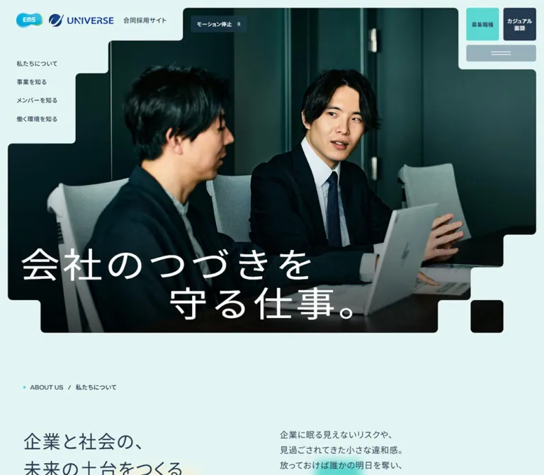
Its strongest visual signature is the relationship between photography and stepped negative space. The hero photograph advances around a logo shelf, navigation recesses, and a utility panel. Every major step is softened by a small radius. Similar tabs and blocks connect later sections, while blurred turquoise, blue, lime, and cream squares add depth to otherwise flat surfaces. Wide spacing, navy Japanese text, and compact bilingual section markers keep the result composed and readable.
How to Read This Reference
- Measured means a value is present in the supplied computed styles or element rectangles. Measurements below are rounded for readability.
- Source token means a named custom property appeared in the supplied original-page evidence. A token's existence does not prove that every similarly colored element uses it.
- Visual estimate means a dimension, crop, or treatment was assessed from an original-page capture without a matching element measurement.
- Calculated means a result was derived from the supplied formulas or colors under stated assumptions.
- Recommended means implementation guidance for a new build. Suggested breakpoints, accessible enhancements, sample masks, and unverified interaction endpoints belong to this category.
- Screenshot coordinates describe the relevant capture. DOM vertical coordinates describe positions in the full document; they should not be confused with viewport positions after scrolling.
- The evidence contains selected computed properties, not the complete stylesheet or interaction implementation. Child elements, pseudo-elements, masks, and layered rendering can explain differences between a parent's computed style and its visible appearance.
Tokens — Colors
Default Palette
| Name | Exact source value | Source token | Role and evidence |
|---|---|---|---|
| Mint Canvas | #e3f5f2 |
--color-bg |
Measured body background; dominant page canvas and visible negative space around the hero |
| Navy Ink | #253a4f |
--color-black, --color-foreground |
Measured body text, standard filled links, secondary recruitment action, and footer background |
| Recruitment Turquoise | #5cd7d1 |
--color-blue-green |
Measured large jobs-link fill; also appears among decorative squares |
| Pale Aqua | #d3f2f1 |
--color-light-blue-green |
Source palette color visually corresponding to the People section field and projecting tab |
| Slate Blue | #294e6b |
--color-blue-gray |
Base color of the translucent menu and motion-control surfaces |
| Editorial Teal | #2d8fa5 |
--color-green |
Measured Cross Talk title and vertical interview labels |
| Sky Blue | #90d4e7 |
--color-blue |
Decorative square accent visible between sections |
| Yellow Green | #b1e47d |
--color-yellow-green |
Decorative blocks, including the solid block above the People field |
| Soft Beige | #f4f2dc |
--color-beige |
Pale cream decorative square visible in the transition area |
| White | #ffffff |
--color-white |
Hero slogan, reversed controls, and footer text |
The source also declares --color-background: #fff, but the measured body background is Mint Canvas. Do not substitute that generic white declaration for the visible page background.
Translucent Colors and Compositing
| Treatment | Observed value | Interpretation |
|---|---|---|
| Menu and motion-control surface | Slate Blue at 40% opacity |
Its final color changes with the photograph or surface behind it |
| Subtle navy layers | Navy Ink at 5%, 10%, and 40% opacity |
Source utility colors for restrained tonal differentiation |
| Culture section surface | Mint Canvas at 40% opacity |
The section itself is translucent; its final appearance depends on underlying layers |
| Footer copyright | White at 40% opacity |
Intentionally quieter than the navigation text |
Calculated example: Slate Blue at 40% over a uniform Mint Canvas produces approximately #99b2bc using ordinary sRGB alpha compositing. This is an approximation for that particular background, not a universal solid-color replacement.
Several visible fills are not attached to the measured anchor or section itself. For example, the small desktop recruitment anchors have transparent computed backgrounds despite visibly filled tiles, and the measured People section is transparent despite its aqua field. Preserve the rendered appearance while allowing for child or pseudo-element layers.
Tokens — Typography
Japanese Text
The body and Japanese labels declare a stack beginning with Local Noto Sans JP, followed by Noto Sans JP, Hiragino Sans, additional Japanese system fallbacks, and sans-serif.
The measured design uses regular Japanese text for its most expressive statement: the large white hero slogan is weight 400. Content titles generally use 500; small Japanese section headings use 600. Avoid making every heading bold, since that removes the contrast between the open hero lettering and the denser navigation.
The supplied computed family identifies the declared stack. It does not independently establish which font file rendered each glyph or how the fonts were delivered.
English Titles and Labels
The English stack begins with Zalando Sans SemiExpanded, then falls back through the Japanese stack. It is explicitly measured on bilingual section labels, company pills, Cross Talk, vertical interview captions, and the recruitment heading.
English section labels use weight 500 and normal letter spacing. The closing WE ARE HIRING! heading uses weight 300, making its large scale feel light. Preserve these separate treatments instead of using the Japanese body stack and tracking for every Latin label.
Type Scale
Values are font size / line height, in CSS pixels. Both columns are measured.
| Role | Desktop, 1440px wide | Mobile, 390px wide | Weight | Tracking |
|---|---|---|---|---|
| Body | 15.00 / 30.00 |
14.01 / 28.03 |
400 |
0.05em |
| Hero slogan | 86.00 / 94.60 |
50.56 / 55.61 |
400 |
Desktop 0.08em; mobile 0.04em |
| About statement | 44.00 / 66.00 |
30.20 / 48.27 |
400 |
0.05em |
| About and recruitment prose | 20.00 / 36.00 |
16.06 / 28.91 |
400 |
0.05em |
| Business and Culture titles | 36.00 / 57.60 |
24.18 / 38.68 |
500 |
0.05em |
| Service summaries and feature-story title | 22.00 / 39.60 |
18.06 / 32.51 |
500 |
0.05em |
| Interview title | 18.00 / 32.40 |
16.03 / 28.86 |
500 |
0.05em |
| English section label | 14.00 / 16.80 |
12.03 / 14.44 |
500 |
Normal |
| Japanese section label | 14.00 / 21.00 |
12.03 / 18.05 |
600 |
0.05em |
| Company pill | 12.00 / 14.40 |
11.02 / 13.23 |
500 |
Normal |
| Interview role and entry year | 12.00 / 24.00 |
11.02 / 22.04 |
400 |
0.05em |
Cross Talk |
50.00 / 50.00 |
32.28 / 32.28 |
500 |
Normal |
| Recruitment heading | 100.00 / 110.00 |
60.58 / 66.64 |
300 |
Normal |
| Motion-control label | 12.00 / 20.40 |
11.02 / 18.74 |
500 |
0.05em |
| Desktop utility action labels | 12.00 / 15.60 |
Not visible in closed mobile header | 600 |
0.05em |
The standard filled-link anchor inherits the body size in the extracted styles. The large recruitment links also inherit body styles at the anchor level, although their visible inner labels appear larger. Their inner label sizes were not measured; approximately 24px desktop and 16px mobile are visual estimates.
Semantic and Visual Hierarchy
The observed H1 contains the linked identity lockup. The hero slogan is rendered in paragraph elements, including a transparent counterpart. The section H2 elements are the small Japanese labels, while larger statements may be paragraphs or H3 elements.
Reproduce the hierarchy visually without assuming that the source token --fz-h1 supplies the hero size. That generic token caps at 48px under the inspected desktop conditions, while the measured hero is 86px. For a new implementation, keep one meaningful accessible version of the slogan rather than copying duplicate visual layers unnecessarily.
Tokens — Spacing & Shapes
Scaling Model
The root element is measured at 16px. Body text is independently fluid. The source defines viewport-aware --px and --rem units, with a scaling factor that is 1 at both inspected widths and can increase above 1440px.
At the inspected 16px root and widths up to 1440px, several source formulas simplify to ordinary viewport interpolation. These simplified forms are useful for implementation, but they omit the source's additional large-screen scaling and root-size adjustment logic.
| Token | Simplified rule under those conditions | At 1440px | At 390px |
|---|---|---|---|
Content inset, --offset |
clamp(20px, 3.76vw + 5.915px, 60px) |
60px |
20.579px |
Grid gap, --gap |
clamp(15px, 2.35vw + 6.197px, 40px) |
40px |
15.362px |
Main radius, --radius-01 |
clamp(8px, 0.188vw + 7.296px, 10px) |
10px |
8.029px |
Small radius, --radius-02 |
5px |
5px |
5px |
Step size, --size-corner |
clamp(40px, 3.76vw + 25.915px, 80px) |
80px |
40.579px |
Large step size, --size-corner-l |
clamp(50px, 2.82vw + 39.437px, 80px) |
80px |
50.435px |
Large section spacing, --space-01 |
clamp(100px, 1.888vw + 92.96px, 120px) |
120px |
100.323px |
Secondary spacing, --space-02 |
clamp(60px, 1.888vw + 52.96px, 80px) |
80px |
60.323px |
Section tab height, --size-tab-block |
clamp(40px, 0.5648vw + 37.888px, 46px) |
46px |
40.091px |
Hero outside inset, --first-view-offset |
Fluid 10–20px value rounded down to whole pixels | 20px |
10px |
Shape Vocabulary
Use a small radius on a large rectilinear step. This is different from a large-radius card or an organic blob: the right-angle progression remains recognizable, while each turn is softened.
The source includes inline SVG masks named --mask-inverted-radius and --mask-inverted-radius-02, based on 10–11px geometry. These support the visible concave corner treatment. A plain polygon reproduces the stair outline but loses those rounded internal turns.
Company labels are the exception to the rectilinear system. They are shallow outlined pills with a fully rounded end cap; the measured radius is effectively unlimited. Large recruitment links and photographs use the main 8–10px radius. Small utility controls and standard section buttons use 5px.
Layout Measurements
| Element | Desktop measurement or estimate | Mobile measurement or estimate |
|---|---|---|
| Full document height | Measured 9147.45px |
Measured 9485.52px |
| Main content width | Measured 1320px between 60px insets |
Measured 348.84px between approximately 20.58px insets |
| Hero image envelope | Visual estimate 1400 × 770px, from (20, 20) |
Visual estimate 370 × 622px, from (10, 10) |
| Start of About section | Measured document y = 810px |
Measured document y = 642.16px |
| About section padding | Measured 100px 60px 120px |
Measured 80.32px 20.58px 100.32px |
| About columns | Measured 640px + 40px + 640px |
One measured 348.84px column |
| Standard filled link | Measured 240 × 60px |
Measured 200.58 × 50.14px |
| Large recruitment link | Measured 630 × 102px, two across |
Measured 328.56 × 60.58px, stacked |
| Footer | Measured 596.98px high |
Measured 568.28px high |
These document heights describe the captured content and state. They are not recommended fixed heights for a rebuild.
Components
Identity Lockup and Header Recess
Role: establish the two-company identity without placing a conventional full-width navigation bar above the hero.
The desktop lockup combines the EMS mark, UNIVERSE mark, and 合同採用サイト caption on the mint area at the upper left. Its linked rectangle is measured at approximately 370.17 × 38px, starting at (40, 31). The image's upper edge begins farther right, creating a shelf for the identity.
At 390px, the linked lockup measures approximately 222.55 × 22.13px, starting at (20.28, 19.22). The mint shelf becomes shallower and the left navigation disappears from the visible opening.
The measured header itself has zero height, consistent with its children overlaying the opening composition. Keep the media silhouette, identity, and controls as coordinated layers. Clipping the entire header with the image would cut off controls and focus indicators.
Desktop Intro Navigation
Role: expose the four principal areas immediately.
Four unboxed Japanese links sit inside the mint recess at the left of the photograph: 私たちについて, 事業を知る, メンバーを知る, and 働く環境を知る.
Their measured left edge is 40px. The first link begins around y = 144px, with successive links spaced approximately 43px apart. Type is 14px, weight 500, and line height 28px. A defined background-size transition suggests an underline-style treatment, but the hovered endpoint was not captured.
These links point to separate section pages. They are not merely anchors that scroll down the homepage.
Persistent Utility Cluster
Role: retain access to recruitment and navigation while the long homepage is explored.
On desktop, two 75 × 75px tiles sit at the upper right with a 10px gap. The jobs tile is turquoise with navy lettering. The casual-interview tile is navy with white lettering and a two-line label. A 160 × 40px menu button sits 10px beneath them, using a translucent slate surface and a white horizontal-line icon.
The cluster remains at the same viewport position in the supplied opening, middle, and footer captures. This supports a persistent placement treatment, although the position property itself was not included in the evidence.
On mobile, only the menu button is visible in the closed header. It measures 41.61 × 41.61px, 10px from the top and right edges. The desktop recruitment tiles are absent from the visible mobile header; the large closing actions remain available farther down the page.
The menu-open state, focus management, dismissal behavior, and expanded layout were not exercised.
Motion Control
Role: provide an explicit way to stop motion.
The visible button reads モーション停止 and includes a pause symbol. On desktop it measures 131.86 × 40px, with 4px 14px padding, a 10px gap, and 5px corners. It sits over the dark photograph at approximately (470.17, 39.5).
On mobile it moves beneath the logo shelf to (71, 70.58) and measures approximately 115.30 × 30.14px. Its white label and slate tint remain consistent.
Both play and pause SVG masks appear in the source tokens. The button's actual effect, alternate label, persistence, and relationship to individual animated elements were not tested.
Stepped Photographic Hero
Role: connect the companies' purpose with people collaborating at work.
The desktop capture shows a dark meeting-room scene with two people, a laptop, and a conference table. The image occupies nearly the full width, but its silhouette is carved around the header and left navigation. The lower right breaks into several descending steps and a detached photographic square. The lower left also steps inward before the bottom edge.
The slogan 会社のつづきを守る仕事。 sits in white across the lower photograph. Desktop type is 86px with 1.1 line height. It occupies two lines, with the second line strongly indented to the right. The visible text rectangle begins at (50, 570.81).
The mobile capture shows a different workplace frame: a standing person and seated colleagues in a brighter room. Its crop is vertical and keeps the standing person's face above the slogan. The text becomes three left-aligned lines: 会社の, つづきを, and 守る仕事。. Its measured starting position is (30.14, 394.19).
The different frames demonstrate that both compositions must be accommodated. They do not establish whether the underlying system is a video, a slideshow, separate breakpoint assets, or another media mechanism. Avoid prescribing an unverified playback format.
Bilingual Section Marker
Role: provide a repeatable waypoint throughout the long page.
The marker consists of a small turquoise dot, an uppercase English category, a slash, and a Japanese section heading. The English and Japanese labels use their respective font stacks and different line heights while remaining visually aligned.
On desktop, the marker's English text begins 16px to the right of the 60px content inset. Its slash gap is 10px. On mobile, the English text begins about 14px beyond the 20.58px inset, and the measured internal gap is approximately 8.03px.
Some markers sit on the open canvas. Others, including People and Deck, occupy a projecting tab above a larger section field. The visible People tab is approximately 46px high on desktop, matching the source tab token. It joins the larger field through rounded turns rather than a detached card border.
About Statement and Prose
Role: explain the purpose behind the work before introducing services.
The desktop section uses two equal 640px columns separated by 40px. The left contains a two-line statement, 企業と社会の、未来の土台をつくる, in regular 44px type. The right contains four separated prose groups in 20px / 36px type. Measured gaps between prose blocks are 40px.
The filled 私たちについて link sits at the right edge after the prose, rather than directly beneath the statement. This reinforces the relationship between reading and navigation.
On mobile, the statement and prose share the full content width and stack vertically. The measured statement-to-prose gap is approximately 40.31px; paragraph gaps are approximately 30.14px. The section action remains right aligned. Preserve the deliberate Japanese line breaks when the copy is reused, while allowing accessible text enlargement to reflow.
Standard Section Link and Inline Arrow Link
Role: distinguish section-level navigation from more specific content destinations.
The standard section link is a compact navy rectangle with white text, 5px corners, and a lighter square arrow compartment at the right. It measures 240 × 60px on desktop and approximately 200.58 × 50.14px on mobile. In the desktop Business capture, the arrow compartment is visually about 50 × 50px, inset 5px from the outer edge.
Inline links place their label beside a small outlined arrow box. Their measured gap is 10px desktop and approximately 8.03px mobile. They remain visually lighter than the filled section action.
The source provides a 10px directional-arrow mask. Internal links visibly use a right arrow; external destinations use an up-right indicator. Do not infer whether external links open a new tab from the icon alone.
Business Introduction and Service Panels
Role: explain the relationship between technology and specialist environmental knowledge.
The section begins with an introduction to both companies and their shared mission. Desktop text occupies a measured 504px column at the left. Subsequent EMS and UNIVERSE descriptions alternate sides: EMS text begins at x = 740px, while UNIVERSE text begins at x = 196px.
Each service description combines a company pill, a 36px title, a 22px summary, and a compact arrow link. The supplied transition capture shows the lower edge of the UNIVERSE panel: a muted surface, a photograph with small rounded corners, and a stepped panel outline.
At 390px, both service descriptions use approximately 288.56px of text width, inset around 30.14px inside the main content bounds. The measured sequence places the service summary above a substantial intervening region and the arrow link below it, consistent with a stacked media composition. Exact mobile image bounds and all panel layers were not supplied.
Use alternating, generously spaced service compositions on desktop and a clear stacked order on mobile. The evidence does not support inventing product dashboards or service illustrations to fill unobserved areas.
People Feature and Interview Rows
Role: give employee stories different levels of editorial emphasis.
A large Cross Talk feature occupies the left side of the desktop People section. The title is teal, 50px tall, and overlaps the top edge of a broad photograph of two colleagues talking near large windows. The linked feature region is measured at 640px wide. Company pills and a multi-line story title follow the photograph.
Two smaller interview rows sit to the right. Each combines a portrait, a vertical teal ( Interview ) label, a company pill, a story title, role, initials, and entry year. These are open compositions on the section field, not individually elevated white cards.
The interview anchor measures 504px wide. Its computed grid reports two 232px tracks with a 40px gap, but the captured portrait appears approximately 192 × 288px, and the measured text rectangle is 272px wide. The supplied child placement data is incomplete; do not equate the declared track width with the visible photograph width. The rendered composition is approximately 192px of portrait, 40px of separation, and 272px of text.
On mobile, the feature comes first, followed by the interview rows. The rows retain a portrait/text relationship rather than placing every item in a full-width vertical card. Their source grid has five tracks of approximately 57.48px with 15.36px gaps. Text begins at the third track and spans approximately 203.17px. The vertical interview label remains present at the left.
Wantedly Callout
Role: offer a secondary route to more employee and business stories.
The desktop DOM places the identity, explanatory text, and external link across one broad horizontal region. On mobile these are vertically arranged inside an inset region approximately 286.56px wide.
The supplied screenshots do not expose the complete callout surface, so its exact border, background, and logo asset construction remain unverified. Preserve the information hierarchy without inventing another dominant conversion panel.
Culture and Company Presentation
Role: continue from people to working conditions and detailed company information.
The Culture section contains a 36px desktop statement, body copy, a filled section link, and four topic links covering company numbers, benefits, evaluation, and a gallery. At mobile width the statement is approximately 24.18px, the filled link is right aligned, and the four topic links wrap into two rows.
The Deck section introduces company presentation material and provides an external Speaker Deck link. The page copy describes turning pages in an embedded presentation, but no successful page-turn interaction or complete embedded-player appearance was supplied. Keep the external route available and treat the player behavior as unverified.
Closing Recruitment Actions
Role: offer two clear next steps after the company introduction.
The recruitment section pairs a very large, light English heading with Japanese prose. Desktop measurements show a 640px left heading region and a 640px right prose region separated by 40px. On mobile these stack, and the English heading reduces from 100px to approximately 60.58px.
The action tray spans the content width and uses a muted slate surface. On desktop, approximately 20px of padding surrounds two 630 × 102px links with a 20px gap. The first is turquoise with navy text and a right arrow. The second is navy with white text and an up-right arrow. Each has a lighter square icon compartment inset at the right.
On mobile, the tray uses approximately 10.14px padding and gap. The links stack and measure 328.56 × 60.58px, with approximately 8.03px corners. The full tray is about 152px tall.
The jobs destination is /jobs/. The casual-interview destination is an external HERP page. These are two distinct choices with comparable prominence.
Footer
Role: close the page with a complete navigation map and corporate connections.
The desktop footer is a full-width navy field with white text. A reversed joint identity sits at the upper left; two corporate-site links sit at the upper right. A fine low-contrast rule separates this row from the sitemap.
The four sitemap groups form two columns and two rows. Each has a bilingual parent link and a smaller row of child links separated by faint vertical rules. A second horizontal rule separates the sitemap from policy links and a right-aligned copyright.
The mobile footer retains the identity and places the corporate-site links beneath it, aligned toward the right. After a horizontal rule, only the four main category links are visible, stacked approximately 52px apart. The desktop child-link rows are absent from the rendered mobile link list. Policy links sit together near the bottom, with copyright on its own line below.
This mobile state is a simplified sitemap. No accordion behavior was demonstrated.
Opening Splash
The rendered text includes a splash label and a completion status, and the source declares --duration-splash-fade-in: .8s. The supplied original-page captures show the settled homepage rather than the splash artwork. Its exact visual sequence, duration as a whole, and repeat-visit rules cannot be reconstructed from this evidence.
Tokens — Motion & Interaction
| Treatment | Evidence | What can be concluded |
|---|---|---|
| Navigation-link decoration | background-size 0.35s ease-out |
A defined decorative transition exists; the hovered endpoint was not captured |
| Standard section links | background-color 0.5s, color 0.5s |
Fill and text can transition over half a second; exact alternate colors were not supplied |
| Menu surface | background-color 0.5s |
A half-second surface-color transition is defined |
| Body and Business text | color 0.5s |
Color transitions exist; this does not prove a theme switch or a particular scroll-triggered inversion |
| Identity and motion control | opacity 1s 1s |
An opacity transition with a one-second delay is defined; its complete triggering sequence is unknown |
| Shared hover tokens | --duration-hover: .35s, --easing-hover: ease-out |
Source timing vocabulary |
| Shared inversion token | --duration-invert: .5s |
Source timing token, not proof of a specific interaction |
| Splash token | --duration-splash-fade-in: .8s |
A fade-in timing token exists; complete splash behavior remains unverified |
| Motion toggle | Visible pause icon and モーション停止; play and pause masks present |
A motion-control affordance exists; toggling was not tested |
| Hero media | Different workplace frames in desktop and mobile captures | Multiple compositions are represented; media type, sequence, and timing are unknown |
| Decorative squares | Soft blurred edges in the captures | Blur is visible; drift, parallax, and animation timing were not established |
Most sampled text elements report animation: none. That does not establish that the whole page is static: media, pseudo-elements, unsampled elements, or script-driven changes can exist outside this sample. Similarly, a computed transition shown only as all is not evidence of a meaningful nonzero animation duration.
The supplied collection process traversed the page and waited for layout, text, and visible images to settle. Perpetual animations were temporarily paused during readiness checks and then resumed. These precautions improve capture stability but do not verify menu operation, media controls, hover endpoints, keyboard behavior, or presentation navigation.
Surfaces
| Layer | Appearance | Design function |
|---|---|---|
| Page canvas | Flat pale mint | Gives the whole page a continuous, calm foundation |
| Hero media | Large workplace photograph inside rounded steps | Supplies the opening visual impact and human context |
| Header recesses | Canvas-colored negative space | Makes room for identity and navigation without a separate bar |
| Utility surfaces | Translucent slate with small corners | Keeps controls compact and visually connected to their backdrop |
| People field | Pale aqua with a projecting section tab | Marks an editorial chapter through a subtle color change |
| Business panel | Muted tinted field with stepped edges | Groups a service narrative and image |
| Decorative squares | Solid or softly blurred turquoise, blue, lime, and beige | Adds depth and rhythm in broad empty regions |
| Standard actions | Navy with a lighter inset arrow square | Provides a repeatable navigation signature |
| Recruitment tray | Muted slate around turquoise and navy actions | Groups the final pair of choices |
| Footer | Solid navy with white navigation and faint rules | Creates a strong visual endpoint |
There is no visible general-purpose shadow elevation system. Blur belongs to decorative background squares, not to floating cards or frosted panels. Keep content surfaces flat and let color, geometry, and spacing establish hierarchy.
Imagery
Photography shows people interacting in actual-looking workplace settings: conference rooms, shared tables, and bright window-lined offices. Clothing ranges from suits to relaxed office wear. The photographs support the recruitment narrative through conversation, listening, and collaboration.
The opening desktop frame is dark and cool, which gives the white slogan strong separation. The mobile frame is brighter and includes warm furniture, but its lower region remains sufficiently dark behind the slogan. Exposure treatment and exact overlay opacity were not measured. For new imagery, choose crops and any necessary scrim based on text contrast rather than applying a uniform decorative filter.
Keep faces away from the stepped cutouts and away from headline intersections. The mobile crop needs an independent focal-point decision: mechanically centering a wide desktop image would not reliably preserve the observed composition.
Observed Asset References
| Asset or asset family | Evidence available | Implementation guidance |
|---|---|---|
| EMS and UNIVERSE identity | Color lockup in the header and white lockup in the footer | Use authorized logo assets; exact source file URLs were not included |
| Hero workplace media | Two different captured frames | Asset URLs, format, source dimensions, and sequencing are unknown |
| Cross Talk photograph | Broad window-side conversation image | Preserve its editorial prominence and small rounded corners |
| Interview portrait | Vertical office portrait in the desktop capture | Use a portrait crop; visible desktop ratio is approximately 2:3 |
| Inverted-corner masks | Inline SVG data in --mask-inverted-radius and --mask-inverted-radius-02 |
Preserve concave rounded joins; these are not ordinary outer border radii |
| Arrow, play, pause, down, and circular masks | Inline SVG data in the corresponding source custom properties | Small geometric icons; no external icon-family attribution is necessary |
| Background blocks | Colored squares visible in page captures | CSS shapes are a reasonable adaptation; their original construction was not supplied |
No photograph filenames or downloadable asset paths were included in the evidence. The Quick Start therefore does not invent asset URLs.
Layout & Responsive Behavior
The homepage retains its content sequence across the two inspected widths: opening, About, Business, People, Culture, Deck, recruitment, and footer. Responsive work changes composition and hierarchy while keeping those destinations intact.
| Area | Observed desktop behavior | Observed mobile behavior |
|---|---|---|
| Opening navigation | Four text links in the left recess | Not visible in the closed opening |
| Utility area | Two recruitment tiles above a wide menu control | One compact menu control |
| Motion control | Beside the identity area over the photograph | Beneath the identity shelf |
| Hero slogan | Two lines with an indented second line | Three left-aligned lines and reduced tracking |
| Hero frame | Broad stepped silhouette with a detached lower-right square | Tall stepped silhouette with a narrower lower portion |
| About | Statement left, prose right | Statement followed by prose |
| Business | Alternating desktop text positions | Shared inset text column with stacked content |
| People | Large feature left, interview rows right | Feature above interview rows; rows keep portrait and text alongside each other |
| Wantedly | Identity, explanation, and link across a horizontal region | Stacked inside an inset region |
| Culture topic links | One measured row | Two measured rows |
| Recruitment actions | Two equal-width links side by side | Two full-width links stacked |
| Footer | Two-column sitemap with child links | Four parent links only, stacked vertically |
The exact breakpoint is not present in the supplied evidence. Any breakpoint between 390px and 1440px that reproduces the two states is a new implementation choice. The Quick Start uses 48rem as a recommended starting point, not as a recovered source value.
Above 1440px, source scaling can enlarge the interface. That behavior was not visually inspected. The example CSS instead caps its content area for a predictable starting implementation and explicitly does not reproduce that large-screen scaling.
Do’s and Don’ts
Do
- Preserve the exact mint, navy, and turquoise foundation.
- Build large stepped outlines with small rounded convex and concave corners.
- Make the hero silhouette accommodate the identity and navigation.
- Keep the Japanese hero slogan regular-weight, with desktop indentation and a distinct mobile wrap.
- Use the measured Japanese and English font stacks as separate roles.
- Maintain generous section spacing and relatively compact navigation controls.
- Give Cross Talk a larger editorial footprint than the individual interviews.
- Keep interview metadata quiet, consistently ordered, and adjacent to the portrait.
- Preserve the right-arrow versus external-arrow distinction.
- Keep the two closing recruitment actions clearly differentiated by color and destination.
- Simplify the mobile footer while preserving its primary routes.
- Treat the visible pause control as part of the design requirements when adding motion.
Don’t
- Don’t replace the distinctive media outline with one large rounded rectangle.
- Don’t put every content block into a white card with a shadow.
- Don’t treat the blurred squares as evidence for glass panels or mandatory parallax.
- Don’t make every heading bold or widely track the English section labels.
- Don’t assign the body font to English display roles without considering the declared English stack.
- Don’t crop faces beneath the headline or into the stepped recesses.
- Don’t shrink the whole desktop composition proportionally to create mobile.
- Don’t turn the compact mobile interview rows into unrelated full-width profile cards.
- Don’t interpret the reduced mobile footer as a verified accordion.
- Don’t infer video playback, slide intervals, menu transitions, or page-turn behavior from static frames and labels alone.
- Don’t copy duplicate transparent slogan layers into the accessible reading order.
- Don’t hardcode captured document heights as section-layout requirements.
Recommended Implementation Additions
These recommendations are additions for a new implementation, not verified features of the original homepage:
- Give the menu button an explicit accessible name and expanded state. If it opens an overlay, support keyboard navigation, Escape dismissal, and focus restoration.
- Keep a visible focus ring outside interactive bounds. Apply the photographic mask to media only so focus indicators are never clipped.
- Increase the effective mobile menu target to at least 44px while retaining a similarly compact visual footprint.
- Connect the motion control to all relevant decorative animation and moving media. Respect reduced-motion preferences and preserve a useful static frame.
- Mark decorative blocks and purely visual duplicate text as hidden from assistive technology.
- Use descriptive image alternatives when a photograph conveys information; use empty alternatives for imagery whose purpose is entirely decorative and already expressed by adjacent content.
- Verify headline contrast against every possible media frame. A dark opening frame alone is insufficient to validate an entire sequence.
- Provide a resilient presentation region with an accessible title and working external fallback even if the embedded service does not load.
- Test long Japanese titles, text zoom, keyboard focus, and narrow intermediate widths. Permit the display text to reflow rather than forcing overlap.
- Preserve meaningful footer text contrast. The original 40%-white copyright treatment should be checked before adopting it at a small size.
Agent Prompt Guide
Quick Color Reference
- Page canvas:
#e3f5f2. - Text, filled section links, and footer:
#253a4f. - Jobs action:
#5cd7d1with navy text. - People field:
#d3f2f1. - Editorial English accents:
#2d8fa5. - Translucent utility surface:
#294e6bat 40% opacity. - Decorative blocks: turquoise,
#90d4e7,#b1e47d, and#f4f2dc. - Shape language: small 5px utility corners, 8–10px image corners, and much larger 40–80px steps.
Overall Prompt
“Create a Japanese joint recruitment homepage for a technology company and an environmental consulting company. Use a pale mint #e3f5f2 canvas, navy #253a4f text, turquoise recruitment actions, and workplace photography. Frame the opening image with rounded architectural steps that leave a shelf for paired logos, a recess for desktop navigation, and a compact utility area at the upper right. Place a large regular-weight white Japanese slogan over the lower photograph. Use compact bilingual section markers, spacious editorial columns, alternating service compositions, one large conversation feature, and smaller portrait interview rows. Add a few softly blurred colored squares between sections. Close with two large recruitment links and a navy sitemap footer. Recompose the hero and simplify navigation on mobile.”
Example Component Prompts
- Hero: “Build a wide workplace photograph with several 80px steps and 10px rounded turns. Reserve mint negative space at the upper left for paired company logos and four small navigation links. Set
会社のつづきを守る仕事。in regular white Japanese sans-serif at about 86px, on two lines with the second line indented. At 390px, use a tall crop, about 50.6px type, three left-aligned lines, and a compact menu button.” - Section marker: “Create a compact horizontal marker: turquoise dot, uppercase English category in a semi-expanded sans-serif, slash, and a slightly heavier Japanese label. Use approximately 14px desktop text and 12px mobile text. For the People section, place it on a shallow aqua tab joined to the larger section field through rounded internal corners.”
- People section: “Use a pale aqua field. Put a large window-side conversation photograph on the left, with a 50px teal
Cross Talktitle overlapping its top edge. On the right, stack two open interview rows with 2:3 portraits, vertical teal captions, outlined company pills, navy titles, and small employment metadata. On mobile, move the feature above the rows while retaining portrait and text side by side.” - Recruitment tray: “Place two equal recruitment links inside a muted slate tray with 20px desktop padding and gap. Use turquoise with navy text for
募集職種, navy with white text forカジュアル面談, and lighter inset arrow squares. At phone width, stack the links with about 10px padding and gap and approximately 61px minimum height.” - Footer: “Create a navy footer with a white paired-company lockup, external corporate links, faint horizontal rules, and four bilingual sitemap groups in two columns. Keep child links small and separated by subtle vertical rules. On mobile, retain only the four parent navigation links in a vertical sequence, with corporate links above and policies below.”
Quick Start
CSS Custom Properties
This is a recommended adaptation, not the original stylesheet. Colors and several fluid text/spacing formulas come from the supplied source evidence. The hero proportions interpolate the captured states; the 48rem breakpoint, focus treatment, hover endpoints, capped content width, and reduced-motion rules are implementation recommendations.
The font stacks below are shortened adaptations of the declared stacks. They do not load font files. Supply permitted font assets or accept the fallbacks. Use real links for navigation and real buttons for controls.
:root {
  /* Source-derived palette */
  --color-canvas: #e3f5f2;
  --color-ink: #253a4f;
  --color-action: #5cd7d1;
  --color-people: #d3f2f1;
  --color-slate: #294e6b;
  --color-editorial: #2d8fa5;
  --color-sky: #90d4e7;
  --color-lime: #b1e47d;
  --color-beige: #f4f2dc;
  --color-white: #fff;
  --surface-control: rgb(41 78 107 / 40%);
  --rule-ink: rgb(37 58 79 / 10%);

  /* Declared family names; delivery must be supplied separately */
  --font-ja: 'Local Noto Sans JP', 'Noto Sans JP',
    'Hiragino Sans', 'Hiragino Kaku Gothic ProN',
    Meiryo, 'MS PGothic', sans-serif;
  --font-en: 'Zalando Sans SemiExpanded', var(--font-ja);

  /* Simplified source formulas at a conventional 16px root */
  --text-body: clamp(.875rem, calc(.853rem + .09392vw), .938rem);
  --text-small: clamp(.688rem, calc(.666rem + .09392vw), .75rem);
  --text-marker: clamp(.75rem, calc(.706rem + .1888vw), .875rem);
  --text-lead: clamp(1rem, calc(.912rem + .376vw), 1.25rem);
  --text-title: clamp(1.5rem, calc(1.236rem + 1.128vw), 2.25rem);
  --text-story: clamp(1.125rem, calc(1.037rem + .376vw), 1.375rem);
  --text-interview: clamp(1rem, calc(.956rem + .1888vw), 1.125rem);

  /* Recommended interpolation of measured display sizes */
  --text-hero: clamp(3.125rem, calc(2.337rem + 3.376vw), 5.375rem);
  --text-cross: clamp(2rem, calc(1.606rem + 1.688vw), 3.125rem);
  --text-hiring: clamp(3.75rem, calc(2.872rem + 3.754vw), 6.25rem);

  --gutter: clamp(20px, calc(3.76vw + 5.915px), 60px);
  --gap: clamp(15px, calc(2.35vw + 6.197px), 40px);
  --section-space: clamp(100px, calc(1.888vw + 92.96px), 120px);
  --section-space-small: clamp(60px, calc(1.888vw + 52.96px), 80px);
  --radius: clamp(8px, calc(.188vw + 7.296px), 10px);
  --radius-control: 5px;
  --step: clamp(40px, calc(3.76vw + 25.915px), 80px);
  --tab-height: clamp(40px, calc(.5648vw + 37.888px), 46px);
  --frame-inset: 20px;

  --duration-hover: 350ms;
  --duration-color: 500ms;
  --ease-hover: ease-out;
}

* { box-sizing: border-box; }

body {
  margin: 0;
  color: var(--color-ink);
  background: var(--color-canvas);
  font-family: var(--font-ja);
  font-size: var(--text-body);
  font-weight: 400;
  line-height: 2;
  letter-spacing: .05em;
}

img { display: block; max-width: 100%; }
button { font: inherit; }
a { color: inherit; }

.page-inner {
  width: min(100%, 1440px);
  margin-inline: auto;
  padding-inline: var(--gutter);
}

.page-section {
  position: relative;
  padding-block: var(--section-space);
}

.section-marker {
  display: flex;
  flex-wrap: wrap;
  align-items: center;
  gap: 10px;
  font-size: var(--text-marker);
}

.section-marker::before {
  content: '';
  flex: 0 0 6px;
  width: 6px;
  height: 6px;
  border-radius: 50%;
  background: var(--color-action);
}

.section-marker__en {
  font-family: var(--font-en);
  font-weight: 500;
  line-height: 1.2;
  letter-spacing: normal;
  text-transform: uppercase;
}

.section-marker h2 {
  margin: 0;
  font-size: inherit;
  font-weight: 600;
  line-height: 1.5;
}

.editorial-split,
.service-story,
.people-layout,
.hiring-intro {
  display: grid;
  grid-template-columns: repeat(2, minmax(0, 1fr));
  gap: var(--gap);
}

.editorial-split { margin-top: 80px; }

.about-statement {
  margin: 0;
  font-size: clamp(1.875rem, calc(1.57rem + 1.314vw), 2.75rem);
  font-weight: 400;
  line-height: 1.5;
}

.lead-copy {
  font-size: var(--text-lead);
  line-height: 1.8;
}

.lead-copy p { margin: 0; }
.lead-copy p + p { margin-top: 40px; }

.content-title {
  margin: 0 0 20px;
  font-size: var(--text-title);
  font-weight: 500;
  line-height: 1.6;
}

/* Mask only the media, never the controls or headline. */
.hero {
  position: relative;
  isolation: isolate;
  margin: var(--frame-inset);
  height: clamp(622px, calc(567.1px + 14.08vw), 770px);
}

.hero__media {
  position: absolute;
  inset: 0;
  overflow: hidden;
  border-radius: var(--radius);
  clip-path: url(#careers-hero-desktop);
  background: var(--color-ink);
}

.hero__media > :is(img, video, picture),
.hero__media picture img {
  width: 100%;
  height: 100%;
  object-fit: cover;
  object-position: var(--hero-focal-point, 50% 50%);
}

.hero__headline {
  position: absolute;
  z-index: 1;
  left: 30px;
  bottom: 30px;
  margin: 0;
  color: white;
  font-size: var(--text-hero);
  font-weight: 400;
  line-height: 1.1;
  letter-spacing: .08em;
}

.hero__line { display: block; }
.hero__line + .hero__line { padding-left: 420px; }
.hero__mobile-break { display: none; }

.hero__brand {
  position: absolute;
  top: 11px;
  left: 20px;
  z-index: 2;
  display: flex;
  align-items: center;
  gap: 24px;
  text-decoration: none;
}

.hero__brand img { width: 242px; height: auto; }
.hero__brand span { font-size: 15px; font-weight: 500; }

.hero__nav {
  position: absolute;
  top: 120px;
  left: 20px;
  z-index: 2;
  display: grid;
  gap: 15px;
  font-size: 14px;
  font-weight: 500;
}

.hero__nav a { text-decoration: none; }

.motion-control {
  position: absolute;
  top: 20px;
  left: 450px;
  z-index: 2;
  display: flex;
  align-items: center;
  gap: 10px;
  min-height: 40px;
  padding: 4px 14px;
  border: 0;
  border-radius: 5px;
  color: white;
  background: var(--surface-control);
  font-size: 12px;
  font-weight: 500;
  line-height: 1.7;
}

.site-utility {
  position: fixed;
  top: 20px;
  right: 20px;
  z-index: 20;
  display: grid;
  grid-template-columns: repeat(2, 75px);
  gap: 10px;
}

.utility-link {
  display: grid;
  place-items: center;
  min-height: 75px;
  padding: 4px;
  border-radius: 5px;
  color: var(--color-ink);
  background: var(--color-action);
  font-size: 12px;
  font-weight: 600;
  line-height: 1.3;
  text-align: center;
  text-decoration: none;
}

.utility-link--interview {
  color: white;
  background: var(--color-ink);
}

.menu-button {
  grid-column: 1 / -1;
  display: grid;
  place-content: center;
  gap: 5px;
  height: 40px;
  border: 0;
  border-radius: 5px;
  background: var(--surface-control);
}

.menu-button span {
  width: 44px;
  height: 1px;
  background: white;
}

.section-link {
  display: flex;
  align-items: center;
  justify-content: space-between;
  gap: 16px;
  width: min(240px, 100%);
  min-height: 60px;
  padding: 5px 5px 5px 20px;
  border-radius: 5px;
  color: white;
  background: var(--color-ink);
  text-decoration: none;
  transition: color var(--duration-color),
    background-color var(--duration-color);
}

.section-link__icon {
  display: grid;
  place-items: center;
  flex: 0 0 50px;
  align-self: stretch;
  border-radius: 3px;
  background: rgb(255 255 255 / 10%);
}

.inline-link {
  display: inline-flex;
  align-items: center;
  gap: 10px;
  text-decoration: none;
}

.inline-link__icon {
  display: grid;
  place-items: center;
  width: 30px;
  height: 30px;
  border: 1px solid rgb(37 58 79 / 40%);
  border-radius: 2px;
  font-size: 12px;
}

.company-pill {
  display: inline-flex;
  align-items: center;
  width: fit-content;
  padding: 2px 14px;
  border: 1px solid var(--rule-ink);
  border-radius: 999px;
  font-family: var(--font-en);
  font-size: var(--text-small);
  font-weight: 500;
  line-height: 1.2;
  letter-spacing: normal;
}

.people-section {
  position: relative;
  padding-block: 80px var(--section-space);
  background: var(--color-people);
}

.cross-talk { position: relative; }

.cross-talk__label {
  position: relative;
  z-index: 1;
  margin: -30px 0 -20px;
  color: var(--color-editorial);
  font-family: var(--font-en);
  font-size: var(--text-cross);
  font-weight: 500;
  line-height: 1;
  letter-spacing: normal;
}

.cross-talk img,
.interview-card__portrait img {
  width: 100%;
  border-radius: var(--radius);
  object-fit: cover;
}

.cross-talk__title {
  font-size: var(--text-story);
  font-weight: 500;
  line-height: 1.8;
}

.interview-list {
  display: grid;
  align-content: start;
  gap: 60px;
  margin-left: 136px;
}

/* Uses the visible portrait/text proportions, not recovered child CSS. */
.interview-card {
  position: relative;
  display: grid;
  grid-template-columns: minmax(0, 192fr) minmax(0, 272fr);
  gap: 40px;
  text-decoration: none;
}

.interview-card__portrait img { aspect-ratio: 2 / 3; }

.interview-card__caption {
  position: absolute;
  top: 0;
  left: -32px;
  color: var(--color-editorial);
  font-family: var(--font-en);
  font-size: var(--text-small);
  writing-mode: vertical-rl;
}

.interview-card__title {
  margin: 10px 0;
  font-size: var(--text-interview);
  font-weight: 500;
  line-height: 1.8;
}

.interview-card__meta {
  margin: 0;
  font-size: var(--text-small);
  line-height: 2;
}

.hiring-title {
  margin: 0;
  font-family: var(--font-en);
  font-size: var(--text-hiring);
  font-weight: 300;
  line-height: 1.1;
  letter-spacing: normal;
  text-transform: uppercase;
}

.hiring-actions {
  display: grid;
  grid-template-columns: repeat(2, minmax(0, 1fr));
  gap: 20px;
  margin-top: 120px;
  padding: 20px;
  border-radius: var(--radius);
  background: var(--surface-control);
}

.hiring-action {
  display: flex;
  align-items: center;
  justify-content: space-between;
  gap: 20px;
  min-height: 102px;
  padding: 10px 10px 10px 30px;
  border-radius: var(--radius);
  color: var(--color-ink);
  background: var(--color-action);
  font-size: 24px;
  font-weight: 500;
  line-height: 1.5;
  text-decoration: none;
}

.hiring-action--interview {
  color: white;
  background: var(--color-ink);
}

.hiring-action__icon {
  display: grid;
  place-items: center;
  flex: 0 0 82px;
  align-self: stretch;
  border-radius: 5px;
  background: rgb(255 255 255 / 35%);
}

.hiring-action--interview .hiring-action__icon {
  background: rgb(255 255 255 / 10%);
}

.site-footer {
  padding-block: 40px;
  color: white;
  background: var(--color-ink);
}

.footer-top,
.footer-bottom {
  display: flex;
  align-items: center;
  justify-content: space-between;
  gap: 24px;
}

.footer-top { padding-bottom: 40px; }

.footer-corporate-links {
  display: flex;
  flex-wrap: wrap;
  gap: 20px;
}

.footer-nav {
  display: grid;
  grid-template-columns: repeat(2, minmax(0, 1fr));
  gap: 60px 40px;
  padding-block: 80px;
  border-block: 1px solid rgb(255 255 255 / 12%);
}

.footer-nav a { text-decoration: none; }

.footer-subnav {
  display: flex;
  flex-wrap: wrap;
  gap: 16px 20px;
  margin-top: 30px;
  font-size: var(--text-small);
}

.footer-subnav a + a {
  padding-left: 20px;
  border-left: 1px solid rgb(255 255 255 / 12%);
}

.footer-bottom {
  padding-top: 40px;
  font-size: var(--text-small);
}

.footer-policies { display: flex; flex-wrap: wrap; gap: 20px; }
.footer-copyright { color: rgb(255 255 255 / 40%); }

/* Decorative placement and blur strength are recommendations. */
.decorative-square {
  position: absolute;
  width: var(--square-size, 120px);
  aspect-ratio: 1;
  border-radius: var(--radius);
  background: var(--square-color, var(--color-action));
  filter: blur(var(--square-blur, 10px));
  pointer-events: none;
}

/* Recommended interaction endpoints; not captured original states. */
@media (hover: hover) {
  .section-link:hover {
    color: var(--color-ink);
    background: var(--color-action);
  }
  .inline-link:hover { text-decoration: underline; }
}

:where(a, button):focus-visible {
  outline: 3px solid currentColor;
  outline-offset: 4px;
}

@media (max-width: 75rem) {
  .interview-list { margin-left: 0; }
  .interview-card { gap: var(--gap); }
  .hero__line + .hero__line { padding-left: 25vw; }
}

@media (max-width: 48rem) {
  :root { --frame-inset: 10px; }

  .editorial-split,
  .service-story,
  .people-layout,
  .hiring-intro {
    grid-template-columns: minmax(0, 1fr);
  }

  .editorial-split { margin-top: 60px; gap: 40px; }
  .about-statement { line-height: 1.6; }
  .lead-copy p + p { margin-top: 30px; }
  .content-title { margin-bottom: 10px; }

  .hero__media { clip-path: url(#careers-hero-mobile); }
  .hero__headline {
    left: 20px;
    bottom: 71px;
    letter-spacing: .04em;
  }
  .hero__line + .hero__line { padding-left: 0; }
  .hero__mobile-break { display: block; }
  .hero__brand { top: 9px; left: 10px; gap: 10px; }
  .hero__brand img { width: 136px; }
  .hero__brand span { font-size: 11px; }
  .hero__nav { display: none; }

  .motion-control {
    top: 60.58px;
    left: 61px;
    min-height: 30.14px;
    padding-inline: 9px;
    font-size: 11px;
  }

  .site-utility {
    top: 10px;
    right: 10px;
    grid-template-columns: 44px;
  }
  .utility-link { display: none; }
  .menu-button { height: 44px; }
  .menu-button span { width: 16px; }

  .section-marker,
  .inline-link { gap: 8px; }
  .section-link { width: min(201px, 100%); min-height: 50px; }
  .section-link__icon { flex-basis: 40px; }

  .people-section { padding-top: 60px; }
  .people-layout { gap: 60px; }
  .cross-talk__label { margin-top: -20px; margin-bottom: -12px; }
  .interview-card { grid-template-columns: repeat(5, minmax(0, 1fr)); }
  .interview-card__portrait { grid-column: 1 / span 2; margin-left: 24px; }
  .interview-card__body { grid-column: 3 / span 3; }
  .interview-card__caption { left: 0; }
  .interview-card__title { margin-block: 5px; }

  .hiring-intro { gap: 30px; }
  .hiring-actions { grid-template-columns: 1fr; padding: 10px; gap: 10px; margin-top: 100px; }
  .hiring-action { min-height: 61px; padding: 5px 5px 5px 20px; font-size: 16px; }
  .hiring-action__icon { flex-basis: 50px; }

  .footer-top { align-items: stretch; flex-direction: column; gap: 40px; }
  .footer-corporate-links { flex-direction: column; align-items: flex-end; gap: 15px; }
  .footer-nav { grid-template-columns: 1fr; gap: 30px; padding-block: 40px; border-bottom: 0; }
  .footer-subnav { display: none; }
  .footer-bottom { align-items: flex-start; flex-direction: column; gap: 20px; padding-top: 0; }
}

@media (prefers-reduced-motion: reduce) {
  :where(a, button) { transition: none !important; }
  .decorative-square { animation: none !important; }
  html { scroll-behavior: auto; }
}
The reduced-motion CSS does not pause a video or a JavaScript animation. Connect those behaviors to the motion-control implementation separately. Likewise, the menu styling supplies only a closed control, not an accessible expanded menu.
Rounded Hero Mask Scaffold
Include these definitions once in the document before the hero. The normalized paths are visual approximations derived from the supplied original-page captures, including rounded turns and the detached desktop square. They are not recovered source paths. Adjust the silhouette and media focal point together at intermediate widths.
<svg width="0" height="0" aria-hidden="true" focusable="false"
     style="position:absolute; overflow:hidden">
  <defs>
    <clipPath id="careers-hero-desktop" clipPathUnits="objectBoundingBox">
      <path d="M .3143 0 H .8643 Q .8714 0 .8714 .013
        V .1753 Q .8714 .1883 .8786 .1883
        H .9929 Q 1 .1883 1 .2013
        V .6753 Q 1 .6883 .9929 .6883
        H .9500 Q .9429 .6883 .9429 .7013
        V .7792 Q .9429 .7922 .9357 .7922
        H .8929 Q .8857 .7922 .8857 .8052
        V .8831 Q .8857 .8961 .8786 .8961
        H .8357 Q .8286 .8961 .8286 .9091
        V .987 Q .8286 1 .8214 1
        H .0643 Q .0571 1 .0571 .987
        V .9091 Q .0571 .8961 .0500 .8961
        H .0071 Q 0 .8961 0 .8831
        V .4312 Q 0 .4182 .0071 .4182
        H .1071 Q .1143 .4182 .1143 .4052
        V .2208 Q .1143 .2078 .1214 .2078
        H .1643 Q .1714 .2078 .1714 .1948
        V .1169 Q .1714 .1039 .1786 .1039
        H .3000 Q .3071 .1039 .3071 .0909
        V .013 Q .3071 0 .3143 0 Z" />
      <rect x=".8857" y=".8961" width=".0571" height=".1039"
            rx=".0071" ry=".013" />
    </clipPath>
    <clipPath id="careers-hero-mobile" clipPathUnits="objectBoundingBox">
      <path d="M .7054 0 H .8378 Q .8595 0 .8595 .0129
        V .0707 Q .8595 .0836 .8811 .0836
        H .9784 Q 1 .0836 1 .0965
        V .8229 Q 1 .8358 .9784 .8358
        H .8838 Q .8622 .8358 .8622 .8487
        V .9049 Q .8622 .9178 .8406 .9178
        H .7459 Q .7243 .9178 .7243 .9307
        V .9871 Q .7243 1 .7027 1
        H .1595 Q .1378 1 .1378 .9871
        V .9307 Q .1378 .9178 .1162 .9178
        H .0216 Q 0 .9178 0 .9049
        V .1769 Q 0 .164 .0216 .164
        H .1162 Q .1378 .164 .1378 .1511
        V .0965 Q .1378 .0836 .1595 .0836
        H .6622 Q .6838 .0836 .6838 .0707
        V .0129 Q .6838 0 .7054 0 Z" />
    </clipPath>
  </defs>
</svg>
Inside .hero, place authorized image or video content in .hero__media. Keep the brand, navigation, motion button, and headline as siblings above it. Place the persistent utility cluster outside any clipped ancestor. The following text markup supplies the observed line changes without duplicating the slogan:
<p class="hero__headline" lang="ja">
  <span class="hero__line">会社の<br class="hero__mobile-break">つづきを</span>
  <span class="hero__line">守る仕事。</span>
</p>
Tailwind v4 Token Mapping
Optional aliases for a project already using Tailwind v4. These do not imply that the inspected website uses Tailwind. Define the custom properties above first.
@theme inline {
  --color-canvas: #e3f5f2;
  --color-ink: #253a4f;
  --color-action: #5cd7d1;
  --color-people: #d3f2f1;
  --color-editorial: #2d8fa5;
  --color-sky: #90d4e7;
  --color-lime: #b1e47d;
  --color-beige: #f4f2dc;

  --font-japanese: var(--font-ja);
  --font-english: var(--font-en);

  --text-copy: var(--text-body);
  --text-caption: var(--text-small);
  --text-section-marker: var(--text-marker);
  --text-section-title: var(--text-title);
  --text-hero-display: var(--text-hero);
  --text-hiring-display: var(--text-hiring);

  --spacing-page-gutter: var(--gutter);
  --spacing-layout-gap: var(--gap);
  --spacing-section: var(--section-space);
  --spacing-step: var(--step);

  --radius-media: var(--radius);
  --radius-control: 5px;
}
Sources & Evidence
- EMS & UNIVERSE joint recruitment homepage: the inspected original and final URL. The supplied response status is
200, with no redirect recorded. - Capture date: September 12, 2026. Retrieval timestamp:
2026-09-12T11:30:24.471Z. Desktop viewport:1440 × 1000; mobile viewport:390 × 844. - Original-page visual evidence: three desktop captures covering the opening, Business-to-People transition, and closing/footer area; two mobile captures covering the opening and closing/footer area.
- Rendered evidence: homepage text, visible links, selected element rectangles, font declarations, line heights, tracking, padding, gaps, radii, backgrounds, transitions, and custom properties at both viewports.
- Homepage destinations were recorded, including About, Business, People, Culture, jobs, external recruitment, employee-story, presentation, corporate, and policy links. Those destination pages were not independently inspected.
- Inspection limitations: no verified menu-open state, motion-toggle result, hover endpoint, keyboard interaction, presentation page turn, complete splash sequence, or media playback timeline. Photograph URLs, complete child/pseudo-element styles, and production credits were not present in the inspected homepage evidence.
- Capture readiness included document loading, sampled text/layout stability, finite-animation settling, and visible-image decoding within bounded waits. Perpetual animations were paused during readiness checks and resumed afterward. SharedWorkers and service workers were disabled. These conditions do not establish semantic completeness or verify unexercised behavior.
This reference describes the current homepage represented by the supplied original-page evidence. The CSS and SVG scaffolds are practical adaptations with explicitly identified estimates and recommendations.
# EMS & UNIVERSE Careers — Style Reference

> A calm mint canvas where rounded architectural steps frame people, work, and the future of a business.

**Website:** [careers.kk-ems.jp](https://careers.kk-ems.jp/)
**Original URL:** https://careers.kk-ems.jp/
**Final URL:** https://careers.kk-ems.jp/
**Theme:** light mint content canvas with a navy footer and turquoise recruitment accents; no alternate theme was verified.
**Inspected:** September 12, 2026. Supplied retrieval timestamp: `2026-09-12T11:30:24.471Z`, equivalent to 20:30:24 JST.
**Viewports:** desktop `1440 × 1000` and mobile `390 × 844`, in CSS pixels.
**Scope:** the current joint recruitment homepage. Visual evidence covers the desktop opening, Business-to-People transition, closing recruitment actions, and footer, plus the mobile opening and footer. Rendered text, link destinations, element bounds, and computed styles cover the homepage at both widths. Destination pages and external services were not inspected.

EMS & UNIVERSE presents environmental SaaS and environmental consulting through the people doing the work. The homepage introduces the companies, explains their complementary businesses, presents employee stories, outlines working conditions, points to a company presentation, and ends with recruitment actions. It functions as the entrance to a larger recruitment website.

Its strongest visual signature is the relationship between photography and stepped negative space. The hero photograph advances around a logo shelf, navigation recesses, and a utility panel. Every major step is softened by a small radius. Similar tabs and blocks connect later sections, while blurred turquoise, blue, lime, and cream squares add depth to otherwise flat surfaces. Wide spacing, navy Japanese text, and compact bilingual section markers keep the result composed and readable.

## How to Read This Reference

- **Measured** means a value is present in the supplied computed styles or element rectangles. Measurements below are rounded for readability.
- **Source token** means a named custom property appeared in the supplied original-page evidence. A token's existence does not prove that every similarly colored element uses it.
- **Visual estimate** means a dimension, crop, or treatment was assessed from an original-page capture without a matching element measurement.
- **Calculated** means a result was derived from the supplied formulas or colors under stated assumptions.
- **Recommended** means implementation guidance for a new build. Suggested breakpoints, accessible enhancements, sample masks, and unverified interaction endpoints belong to this category.
- Screenshot coordinates describe the relevant capture. DOM vertical coordinates describe positions in the full document; they should not be confused with viewport positions after scrolling.
- The evidence contains selected computed properties, not the complete stylesheet or interaction implementation. Child elements, pseudo-elements, masks, and layered rendering can explain differences between a parent's computed style and its visible appearance.

## Tokens — Colors

### Default Palette

| Name | Exact source value | Source token | Role and evidence |
| --- | --- | --- | --- |
| Mint Canvas | `#e3f5f2` | `--color-bg` | Measured body background; dominant page canvas and visible negative space around the hero |
| Navy Ink | `#253a4f` | `--color-black`, `--color-foreground` | Measured body text, standard filled links, secondary recruitment action, and footer background |
| Recruitment Turquoise | `#5cd7d1` | `--color-blue-green` | Measured large jobs-link fill; also appears among decorative squares |
| Pale Aqua | `#d3f2f1` | `--color-light-blue-green` | Source palette color visually corresponding to the People section field and projecting tab |
| Slate Blue | `#294e6b` | `--color-blue-gray` | Base color of the translucent menu and motion-control surfaces |
| Editorial Teal | `#2d8fa5` | `--color-green` | Measured `Cross Talk` title and vertical interview labels |
| Sky Blue | `#90d4e7` | `--color-blue` | Decorative square accent visible between sections |
| Yellow Green | `#b1e47d` | `--color-yellow-green` | Decorative blocks, including the solid block above the People field |
| Soft Beige | `#f4f2dc` | `--color-beige` | Pale cream decorative square visible in the transition area |
| White | `#ffffff` | `--color-white` | Hero slogan, reversed controls, and footer text |

The source also declares `--color-background: #fff`, but the measured body background is Mint Canvas. Do not substitute that generic white declaration for the visible page background.

### Translucent Colors and Compositing

| Treatment | Observed value | Interpretation |
| --- | --- | --- |
| Menu and motion-control surface | Slate Blue at `40%` opacity | Its final color changes with the photograph or surface behind it |
| Subtle navy layers | Navy Ink at `5%`, `10%`, and `40%` opacity | Source utility colors for restrained tonal differentiation |
| Culture section surface | Mint Canvas at `40%` opacity | The section itself is translucent; its final appearance depends on underlying layers |
| Footer copyright | White at `40%` opacity | Intentionally quieter than the navigation text |

**Calculated example:** Slate Blue at 40% over a uniform Mint Canvas produces approximately `#99b2bc` using ordinary sRGB alpha compositing. This is an approximation for that particular background, not a universal solid-color replacement.

Several visible fills are not attached to the measured anchor or section itself. For example, the small desktop recruitment anchors have transparent computed backgrounds despite visibly filled tiles, and the measured People section is transparent despite its aqua field. Preserve the rendered appearance while allowing for child or pseudo-element layers.

## Tokens — Typography

### Japanese Text

The body and Japanese labels declare a stack beginning with `Local Noto Sans JP`, followed by `Noto Sans JP`, `Hiragino Sans`, additional Japanese system fallbacks, and `sans-serif`.

The measured design uses regular Japanese text for its most expressive statement: the large white hero slogan is weight `400`. Content titles generally use `500`; small Japanese section headings use `600`. Avoid making every heading bold, since that removes the contrast between the open hero lettering and the denser navigation.

The supplied computed family identifies the declared stack. It does not independently establish which font file rendered each glyph or how the fonts were delivered.

### English Titles and Labels

The English stack begins with `Zalando Sans SemiExpanded`, then falls back through the Japanese stack. It is explicitly measured on bilingual section labels, company pills, `Cross Talk`, vertical interview captions, and the recruitment heading.

English section labels use weight `500` and normal letter spacing. The closing `WE ARE HIRING!` heading uses weight `300`, making its large scale feel light. Preserve these separate treatments instead of using the Japanese body stack and tracking for every Latin label.

### Type Scale

Values are **font size / line height**, in CSS pixels. Both columns are measured.

| Role | Desktop, 1440px wide | Mobile, 390px wide | Weight | Tracking |
| --- | --- | --- | --- | --- |
| Body | `15.00 / 30.00` | `14.01 / 28.03` | `400` | `0.05em` |
| Hero slogan | `86.00 / 94.60` | `50.56 / 55.61` | `400` | Desktop `0.08em`; mobile `0.04em` |
| About statement | `44.00 / 66.00` | `30.20 / 48.27` | `400` | `0.05em` |
| About and recruitment prose | `20.00 / 36.00` | `16.06 / 28.91` | `400` | `0.05em` |
| Business and Culture titles | `36.00 / 57.60` | `24.18 / 38.68` | `500` | `0.05em` |
| Service summaries and feature-story title | `22.00 / 39.60` | `18.06 / 32.51` | `500` | `0.05em` |
| Interview title | `18.00 / 32.40` | `16.03 / 28.86` | `500` | `0.05em` |
| English section label | `14.00 / 16.80` | `12.03 / 14.44` | `500` | Normal |
| Japanese section label | `14.00 / 21.00` | `12.03 / 18.05` | `600` | `0.05em` |
| Company pill | `12.00 / 14.40` | `11.02 / 13.23` | `500` | Normal |
| Interview role and entry year | `12.00 / 24.00` | `11.02 / 22.04` | `400` | `0.05em` |
| `Cross Talk` | `50.00 / 50.00` | `32.28 / 32.28` | `500` | Normal |
| Recruitment heading | `100.00 / 110.00` | `60.58 / 66.64` | `300` | Normal |
| Motion-control label | `12.00 / 20.40` | `11.02 / 18.74` | `500` | `0.05em` |
| Desktop utility action labels | `12.00 / 15.60` | Not visible in closed mobile header | `600` | `0.05em` |

The standard filled-link anchor inherits the body size in the extracted styles. The large recruitment links also inherit body styles at the anchor level, although their visible inner labels appear larger. Their inner label sizes were not measured; approximately `24px` desktop and `16px` mobile are visual estimates.

### Semantic and Visual Hierarchy

The observed `H1` contains the linked identity lockup. The hero slogan is rendered in paragraph elements, including a transparent counterpart. The section `H2` elements are the small Japanese labels, while larger statements may be paragraphs or `H3` elements.

Reproduce the hierarchy visually without assuming that the source token `--fz-h1` supplies the hero size. That generic token caps at 48px under the inspected desktop conditions, while the measured hero is 86px. For a new implementation, keep one meaningful accessible version of the slogan rather than copying duplicate visual layers unnecessarily.

## Tokens — Spacing & Shapes

### Scaling Model

The root element is measured at `16px`. Body text is independently fluid. The source defines viewport-aware `--px` and `--rem` units, with a scaling factor that is `1` at both inspected widths and can increase above 1440px.

At the inspected 16px root and widths up to 1440px, several source formulas simplify to ordinary viewport interpolation. These simplified forms are useful for implementation, but they omit the source's additional large-screen scaling and root-size adjustment logic.

| Token | Simplified rule under those conditions | At 1440px | At 390px |
| --- | --- | --- | --- |
| Content inset, `--offset` | `clamp(20px, 3.76vw + 5.915px, 60px)` | `60px` | `20.579px` |
| Grid gap, `--gap` | `clamp(15px, 2.35vw + 6.197px, 40px)` | `40px` | `15.362px` |
| Main radius, `--radius-01` | `clamp(8px, 0.188vw + 7.296px, 10px)` | `10px` | `8.029px` |
| Small radius, `--radius-02` | `5px` | `5px` | `5px` |
| Step size, `--size-corner` | `clamp(40px, 3.76vw + 25.915px, 80px)` | `80px` | `40.579px` |
| Large step size, `--size-corner-l` | `clamp(50px, 2.82vw + 39.437px, 80px)` | `80px` | `50.435px` |
| Large section spacing, `--space-01` | `clamp(100px, 1.888vw + 92.96px, 120px)` | `120px` | `100.323px` |
| Secondary spacing, `--space-02` | `clamp(60px, 1.888vw + 52.96px, 80px)` | `80px` | `60.323px` |
| Section tab height, `--size-tab-block` | `clamp(40px, 0.5648vw + 37.888px, 46px)` | `46px` | `40.091px` |
| Hero outside inset, `--first-view-offset` | Fluid 10–20px value rounded down to whole pixels | `20px` | `10px` |

### Shape Vocabulary

Use a small radius on a large rectilinear step. This is different from a large-radius card or an organic blob: the right-angle progression remains recognizable, while each turn is softened.

The source includes inline SVG masks named `--mask-inverted-radius` and `--mask-inverted-radius-02`, based on 10–11px geometry. These support the visible concave corner treatment. A plain polygon reproduces the stair outline but loses those rounded internal turns.

Company labels are the exception to the rectilinear system. They are shallow outlined pills with a fully rounded end cap; the measured radius is effectively unlimited. Large recruitment links and photographs use the main 8–10px radius. Small utility controls and standard section buttons use 5px.

### Layout Measurements

| Element | Desktop measurement or estimate | Mobile measurement or estimate |
| --- | --- | --- |
| Full document height | Measured `9147.45px` | Measured `9485.52px` |
| Main content width | Measured `1320px` between 60px insets | Measured `348.84px` between approximately 20.58px insets |
| Hero image envelope | Visual estimate `1400 × 770px`, from `(20, 20)` | Visual estimate `370 × 622px`, from `(10, 10)` |
| Start of About section | Measured document `y = 810px` | Measured document `y = 642.16px` |
| About section padding | Measured `100px 60px 120px` | Measured `80.32px 20.58px 100.32px` |
| About columns | Measured `640px + 40px + 640px` | One measured `348.84px` column |
| Standard filled link | Measured `240 × 60px` | Measured `200.58 × 50.14px` |
| Large recruitment link | Measured `630 × 102px`, two across | Measured `328.56 × 60.58px`, stacked |
| Footer | Measured `596.98px` high | Measured `568.28px` high |

These document heights describe the captured content and state. They are not recommended fixed heights for a rebuild.

## Components

### Identity Lockup and Header Recess

**Role:** establish the two-company identity without placing a conventional full-width navigation bar above the hero.

The desktop lockup combines the EMS mark, UNIVERSE mark, and `合同採用サイト` caption on the mint area at the upper left. Its linked rectangle is measured at approximately `370.17 × 38px`, starting at `(40, 31)`. The image's upper edge begins farther right, creating a shelf for the identity.

At 390px, the linked lockup measures approximately `222.55 × 22.13px`, starting at `(20.28, 19.22)`. The mint shelf becomes shallower and the left navigation disappears from the visible opening.

The measured header itself has zero height, consistent with its children overlaying the opening composition. Keep the media silhouette, identity, and controls as coordinated layers. Clipping the entire header with the image would cut off controls and focus indicators.

### Desktop Intro Navigation

**Role:** expose the four principal areas immediately.

Four unboxed Japanese links sit inside the mint recess at the left of the photograph: `私たちについて`, `事業を知る`, `メンバーを知る`, and `働く環境を知る`.

Their measured left edge is 40px. The first link begins around `y = 144px`, with successive links spaced approximately 43px apart. Type is `14px`, weight `500`, and line height `28px`. A defined background-size transition suggests an underline-style treatment, but the hovered endpoint was not captured.

These links point to separate section pages. They are not merely anchors that scroll down the homepage.

### Persistent Utility Cluster

**Role:** retain access to recruitment and navigation while the long homepage is explored.

On desktop, two `75 × 75px` tiles sit at the upper right with a 10px gap. The jobs tile is turquoise with navy lettering. The casual-interview tile is navy with white lettering and a two-line label. A `160 × 40px` menu button sits 10px beneath them, using a translucent slate surface and a white horizontal-line icon.

The cluster remains at the same viewport position in the supplied opening, middle, and footer captures. This supports a persistent placement treatment, although the `position` property itself was not included in the evidence.

On mobile, only the menu button is visible in the closed header. It measures `41.61 × 41.61px`, 10px from the top and right edges. The desktop recruitment tiles are absent from the visible mobile header; the large closing actions remain available farther down the page.

The menu-open state, focus management, dismissal behavior, and expanded layout were not exercised.

### Motion Control

**Role:** provide an explicit way to stop motion.

The visible button reads `モーション停止` and includes a pause symbol. On desktop it measures `131.86 × 40px`, with `4px 14px` padding, a 10px gap, and 5px corners. It sits over the dark photograph at approximately `(470.17, 39.5)`.

On mobile it moves beneath the logo shelf to `(71, 70.58)` and measures approximately `115.30 × 30.14px`. Its white label and slate tint remain consistent.

Both play and pause SVG masks appear in the source tokens. The button's actual effect, alternate label, persistence, and relationship to individual animated elements were not tested.

### Stepped Photographic Hero

**Role:** connect the companies' purpose with people collaborating at work.

The desktop capture shows a dark meeting-room scene with two people, a laptop, and a conference table. The image occupies nearly the full width, but its silhouette is carved around the header and left navigation. The lower right breaks into several descending steps and a detached photographic square. The lower left also steps inward before the bottom edge.

The slogan `会社のつづきを守る仕事。` sits in white across the lower photograph. Desktop type is 86px with 1.1 line height. It occupies two lines, with the second line strongly indented to the right. The visible text rectangle begins at `(50, 570.81)`.

The mobile capture shows a different workplace frame: a standing person and seated colleagues in a brighter room. Its crop is vertical and keeps the standing person's face above the slogan. The text becomes three left-aligned lines: `会社の`, `つづきを`, and `守る仕事。`. Its measured starting position is `(30.14, 394.19)`.

The different frames demonstrate that both compositions must be accommodated. They do not establish whether the underlying system is a video, a slideshow, separate breakpoint assets, or another media mechanism. Avoid prescribing an unverified playback format.

### Bilingual Section Marker

**Role:** provide a repeatable waypoint throughout the long page.

The marker consists of a small turquoise dot, an uppercase English category, a slash, and a Japanese section heading. The English and Japanese labels use their respective font stacks and different line heights while remaining visually aligned.

On desktop, the marker's English text begins 16px to the right of the 60px content inset. Its slash gap is 10px. On mobile, the English text begins about 14px beyond the 20.58px inset, and the measured internal gap is approximately 8.03px.

Some markers sit on the open canvas. Others, including People and Deck, occupy a projecting tab above a larger section field. The visible People tab is approximately 46px high on desktop, matching the source tab token. It joins the larger field through rounded turns rather than a detached card border.

### About Statement and Prose

**Role:** explain the purpose behind the work before introducing services.

The desktop section uses two equal 640px columns separated by 40px. The left contains a two-line statement, `企業と社会の、未来の土台をつくる`, in regular 44px type. The right contains four separated prose groups in `20px / 36px` type. Measured gaps between prose blocks are 40px.

The filled `私たちについて` link sits at the right edge after the prose, rather than directly beneath the statement. This reinforces the relationship between reading and navigation.

On mobile, the statement and prose share the full content width and stack vertically. The measured statement-to-prose gap is approximately 40.31px; paragraph gaps are approximately 30.14px. The section action remains right aligned. Preserve the deliberate Japanese line breaks when the copy is reused, while allowing accessible text enlargement to reflow.

### Standard Section Link and Inline Arrow Link

**Role:** distinguish section-level navigation from more specific content destinations.

The standard section link is a compact navy rectangle with white text, 5px corners, and a lighter square arrow compartment at the right. It measures `240 × 60px` on desktop and approximately `200.58 × 50.14px` on mobile. In the desktop Business capture, the arrow compartment is visually about `50 × 50px`, inset 5px from the outer edge.

Inline links place their label beside a small outlined arrow box. Their measured gap is 10px desktop and approximately 8.03px mobile. They remain visually lighter than the filled section action.

The source provides a 10px directional-arrow mask. Internal links visibly use a right arrow; external destinations use an up-right indicator. Do not infer whether external links open a new tab from the icon alone.

### Business Introduction and Service Panels

**Role:** explain the relationship between technology and specialist environmental knowledge.

The section begins with an introduction to both companies and their shared mission. Desktop text occupies a measured 504px column at the left. Subsequent EMS and UNIVERSE descriptions alternate sides: EMS text begins at `x = 740px`, while UNIVERSE text begins at `x = 196px`.

Each service description combines a company pill, a 36px title, a 22px summary, and a compact arrow link. The supplied transition capture shows the lower edge of the UNIVERSE panel: a muted surface, a photograph with small rounded corners, and a stepped panel outline.

At 390px, both service descriptions use approximately `288.56px` of text width, inset around 30.14px inside the main content bounds. The measured sequence places the service summary above a substantial intervening region and the arrow link below it, consistent with a stacked media composition. Exact mobile image bounds and all panel layers were not supplied.

Use alternating, generously spaced service compositions on desktop and a clear stacked order on mobile. The evidence does not support inventing product dashboards or service illustrations to fill unobserved areas.

### People Feature and Interview Rows

**Role:** give employee stories different levels of editorial emphasis.

A large `Cross Talk` feature occupies the left side of the desktop People section. The title is teal, 50px tall, and overlaps the top edge of a broad photograph of two colleagues talking near large windows. The linked feature region is measured at 640px wide. Company pills and a multi-line story title follow the photograph.

Two smaller interview rows sit to the right. Each combines a portrait, a vertical teal `( Interview )` label, a company pill, a story title, role, initials, and entry year. These are open compositions on the section field, not individually elevated white cards.

The interview anchor measures 504px wide. Its computed grid reports two 232px tracks with a 40px gap, but the captured portrait appears approximately `192 × 288px`, and the measured text rectangle is 272px wide. The supplied child placement data is incomplete; do not equate the declared track width with the visible photograph width. The rendered composition is approximately 192px of portrait, 40px of separation, and 272px of text.

On mobile, the feature comes first, followed by the interview rows. The rows retain a portrait/text relationship rather than placing every item in a full-width vertical card. Their source grid has five tracks of approximately 57.48px with 15.36px gaps. Text begins at the third track and spans approximately 203.17px. The vertical interview label remains present at the left.

### Wantedly Callout

**Role:** offer a secondary route to more employee and business stories.

The desktop DOM places the identity, explanatory text, and external link across one broad horizontal region. On mobile these are vertically arranged inside an inset region approximately 286.56px wide.

The supplied screenshots do not expose the complete callout surface, so its exact border, background, and logo asset construction remain unverified. Preserve the information hierarchy without inventing another dominant conversion panel.

### Culture and Company Presentation

**Role:** continue from people to working conditions and detailed company information.

The Culture section contains a 36px desktop statement, body copy, a filled section link, and four topic links covering company numbers, benefits, evaluation, and a gallery. At mobile width the statement is approximately 24.18px, the filled link is right aligned, and the four topic links wrap into two rows.

The Deck section introduces company presentation material and provides an external Speaker Deck link. The page copy describes turning pages in an embedded presentation, but no successful page-turn interaction or complete embedded-player appearance was supplied. Keep the external route available and treat the player behavior as unverified.

### Closing Recruitment Actions

**Role:** offer two clear next steps after the company introduction.

The recruitment section pairs a very large, light English heading with Japanese prose. Desktop measurements show a 640px left heading region and a 640px right prose region separated by 40px. On mobile these stack, and the English heading reduces from 100px to approximately 60.58px.

The action tray spans the content width and uses a muted slate surface. On desktop, approximately 20px of padding surrounds two `630 × 102px` links with a 20px gap. The first is turquoise with navy text and a right arrow. The second is navy with white text and an up-right arrow. Each has a lighter square icon compartment inset at the right.

On mobile, the tray uses approximately 10.14px padding and gap. The links stack and measure `328.56 × 60.58px`, with approximately 8.03px corners. The full tray is about 152px tall.

The jobs destination is `/jobs/`. The casual-interview destination is an external HERP page. These are two distinct choices with comparable prominence.

### Footer

**Role:** close the page with a complete navigation map and corporate connections.

The desktop footer is a full-width navy field with white text. A reversed joint identity sits at the upper left; two corporate-site links sit at the upper right. A fine low-contrast rule separates this row from the sitemap.

The four sitemap groups form two columns and two rows. Each has a bilingual parent link and a smaller row of child links separated by faint vertical rules. A second horizontal rule separates the sitemap from policy links and a right-aligned copyright.

The mobile footer retains the identity and places the corporate-site links beneath it, aligned toward the right. After a horizontal rule, only the four main category links are visible, stacked approximately 52px apart. The desktop child-link rows are absent from the rendered mobile link list. Policy links sit together near the bottom, with copyright on its own line below.

This mobile state is a simplified sitemap. No accordion behavior was demonstrated.

### Opening Splash

The rendered text includes a splash label and a completion status, and the source declares `--duration-splash-fade-in: .8s`. The supplied original-page captures show the settled homepage rather than the splash artwork. Its exact visual sequence, duration as a whole, and repeat-visit rules cannot be reconstructed from this evidence.

## Tokens — Motion & Interaction

| Treatment | Evidence | What can be concluded |
| --- | --- | --- |
| Navigation-link decoration | `background-size 0.35s ease-out` | A defined decorative transition exists; the hovered endpoint was not captured |
| Standard section links | `background-color 0.5s, color 0.5s` | Fill and text can transition over half a second; exact alternate colors were not supplied |
| Menu surface | `background-color 0.5s` | A half-second surface-color transition is defined |
| Body and Business text | `color 0.5s` | Color transitions exist; this does not prove a theme switch or a particular scroll-triggered inversion |
| Identity and motion control | `opacity 1s 1s` | An opacity transition with a one-second delay is defined; its complete triggering sequence is unknown |
| Shared hover tokens | `--duration-hover: .35s`, `--easing-hover: ease-out` | Source timing vocabulary |
| Shared inversion token | `--duration-invert: .5s` | Source timing token, not proof of a specific interaction |
| Splash token | `--duration-splash-fade-in: .8s` | A fade-in timing token exists; complete splash behavior remains unverified |
| Motion toggle | Visible pause icon and `モーション停止`; play and pause masks present | A motion-control affordance exists; toggling was not tested |
| Hero media | Different workplace frames in desktop and mobile captures | Multiple compositions are represented; media type, sequence, and timing are unknown |
| Decorative squares | Soft blurred edges in the captures | Blur is visible; drift, parallax, and animation timing were not established |

Most sampled text elements report `animation: none`. That does not establish that the whole page is static: media, pseudo-elements, unsampled elements, or script-driven changes can exist outside this sample. Similarly, a computed transition shown only as `all` is not evidence of a meaningful nonzero animation duration.

The supplied collection process traversed the page and waited for layout, text, and visible images to settle. Perpetual animations were temporarily paused during readiness checks and then resumed. These precautions improve capture stability but do not verify menu operation, media controls, hover endpoints, keyboard behavior, or presentation navigation.

## Surfaces

| Layer | Appearance | Design function |
| --- | --- | --- |
| Page canvas | Flat pale mint | Gives the whole page a continuous, calm foundation |
| Hero media | Large workplace photograph inside rounded steps | Supplies the opening visual impact and human context |
| Header recesses | Canvas-colored negative space | Makes room for identity and navigation without a separate bar |
| Utility surfaces | Translucent slate with small corners | Keeps controls compact and visually connected to their backdrop |
| People field | Pale aqua with a projecting section tab | Marks an editorial chapter through a subtle color change |
| Business panel | Muted tinted field with stepped edges | Groups a service narrative and image |
| Decorative squares | Solid or softly blurred turquoise, blue, lime, and beige | Adds depth and rhythm in broad empty regions |
| Standard actions | Navy with a lighter inset arrow square | Provides a repeatable navigation signature |
| Recruitment tray | Muted slate around turquoise and navy actions | Groups the final pair of choices |
| Footer | Solid navy with white navigation and faint rules | Creates a strong visual endpoint |

There is no visible general-purpose shadow elevation system. Blur belongs to decorative background squares, not to floating cards or frosted panels. Keep content surfaces flat and let color, geometry, and spacing establish hierarchy.

## Imagery

Photography shows people interacting in actual-looking workplace settings: conference rooms, shared tables, and bright window-lined offices. Clothing ranges from suits to relaxed office wear. The photographs support the recruitment narrative through conversation, listening, and collaboration.

The opening desktop frame is dark and cool, which gives the white slogan strong separation. The mobile frame is brighter and includes warm furniture, but its lower region remains sufficiently dark behind the slogan. Exposure treatment and exact overlay opacity were not measured. For new imagery, choose crops and any necessary scrim based on text contrast rather than applying a uniform decorative filter.

Keep faces away from the stepped cutouts and away from headline intersections. The mobile crop needs an independent focal-point decision: mechanically centering a wide desktop image would not reliably preserve the observed composition.

### Observed Asset References

| Asset or asset family | Evidence available | Implementation guidance |
| --- | --- | --- |
| EMS and UNIVERSE identity | Color lockup in the header and white lockup in the footer | Use authorized logo assets; exact source file URLs were not included |
| Hero workplace media | Two different captured frames | Asset URLs, format, source dimensions, and sequencing are unknown |
| Cross Talk photograph | Broad window-side conversation image | Preserve its editorial prominence and small rounded corners |
| Interview portrait | Vertical office portrait in the desktop capture | Use a portrait crop; visible desktop ratio is approximately `2:3` |
| Inverted-corner masks | Inline SVG data in `--mask-inverted-radius` and `--mask-inverted-radius-02` | Preserve concave rounded joins; these are not ordinary outer border radii |
| Arrow, play, pause, down, and circular masks | Inline SVG data in the corresponding source custom properties | Small geometric icons; no external icon-family attribution is necessary |
| Background blocks | Colored squares visible in page captures | CSS shapes are a reasonable adaptation; their original construction was not supplied |

No photograph filenames or downloadable asset paths were included in the evidence. The Quick Start therefore does not invent asset URLs.

## Layout & Responsive Behavior

The homepage retains its content sequence across the two inspected widths: opening, About, Business, People, Culture, Deck, recruitment, and footer. Responsive work changes composition and hierarchy while keeping those destinations intact.

| Area | Observed desktop behavior | Observed mobile behavior |
| --- | --- | --- |
| Opening navigation | Four text links in the left recess | Not visible in the closed opening |
| Utility area | Two recruitment tiles above a wide menu control | One compact menu control |
| Motion control | Beside the identity area over the photograph | Beneath the identity shelf |
| Hero slogan | Two lines with an indented second line | Three left-aligned lines and reduced tracking |
| Hero frame | Broad stepped silhouette with a detached lower-right square | Tall stepped silhouette with a narrower lower portion |
| About | Statement left, prose right | Statement followed by prose |
| Business | Alternating desktop text positions | Shared inset text column with stacked content |
| People | Large feature left, interview rows right | Feature above interview rows; rows keep portrait and text alongside each other |
| Wantedly | Identity, explanation, and link across a horizontal region | Stacked inside an inset region |
| Culture topic links | One measured row | Two measured rows |
| Recruitment actions | Two equal-width links side by side | Two full-width links stacked |
| Footer | Two-column sitemap with child links | Four parent links only, stacked vertically |

The exact breakpoint is not present in the supplied evidence. Any breakpoint between 390px and 1440px that reproduces the two states is a new implementation choice. The Quick Start uses 48rem as a recommended starting point, not as a recovered source value.

Above 1440px, source scaling can enlarge the interface. That behavior was not visually inspected. The example CSS instead caps its content area for a predictable starting implementation and explicitly does not reproduce that large-screen scaling.

## Do’s and Don’ts

### Do

- Preserve the exact mint, navy, and turquoise foundation.
- Build large stepped outlines with small rounded convex and concave corners.
- Make the hero silhouette accommodate the identity and navigation.
- Keep the Japanese hero slogan regular-weight, with desktop indentation and a distinct mobile wrap.
- Use the measured Japanese and English font stacks as separate roles.
- Maintain generous section spacing and relatively compact navigation controls.
- Give Cross Talk a larger editorial footprint than the individual interviews.
- Keep interview metadata quiet, consistently ordered, and adjacent to the portrait.
- Preserve the right-arrow versus external-arrow distinction.
- Keep the two closing recruitment actions clearly differentiated by color and destination.
- Simplify the mobile footer while preserving its primary routes.
- Treat the visible pause control as part of the design requirements when adding motion.

### Don’t

- Don’t replace the distinctive media outline with one large rounded rectangle.
- Don’t put every content block into a white card with a shadow.
- Don’t treat the blurred squares as evidence for glass panels or mandatory parallax.
- Don’t make every heading bold or widely track the English section labels.
- Don’t assign the body font to English display roles without considering the declared English stack.
- Don’t crop faces beneath the headline or into the stepped recesses.
- Don’t shrink the whole desktop composition proportionally to create mobile.
- Don’t turn the compact mobile interview rows into unrelated full-width profile cards.
- Don’t interpret the reduced mobile footer as a verified accordion.
- Don’t infer video playback, slide intervals, menu transitions, or page-turn behavior from static frames and labels alone.
- Don’t copy duplicate transparent slogan layers into the accessible reading order.
- Don’t hardcode captured document heights as section-layout requirements.

## Recommended Implementation Additions

These recommendations are additions for a new implementation, not verified features of the original homepage:

- Give the menu button an explicit accessible name and expanded state. If it opens an overlay, support keyboard navigation, Escape dismissal, and focus restoration.
- Keep a visible focus ring outside interactive bounds. Apply the photographic mask to media only so focus indicators are never clipped.
- Increase the effective mobile menu target to at least 44px while retaining a similarly compact visual footprint.
- Connect the motion control to all relevant decorative animation and moving media. Respect reduced-motion preferences and preserve a useful static frame.
- Mark decorative blocks and purely visual duplicate text as hidden from assistive technology.
- Use descriptive image alternatives when a photograph conveys information; use empty alternatives for imagery whose purpose is entirely decorative and already expressed by adjacent content.
- Verify headline contrast against every possible media frame. A dark opening frame alone is insufficient to validate an entire sequence.
- Provide a resilient presentation region with an accessible title and working external fallback even if the embedded service does not load.
- Test long Japanese titles, text zoom, keyboard focus, and narrow intermediate widths. Permit the display text to reflow rather than forcing overlap.
- Preserve meaningful footer text contrast. The original 40%-white copyright treatment should be checked before adopting it at a small size.

## Agent Prompt Guide

### Quick Color Reference

- Page canvas: `#e3f5f2`.
- Text, filled section links, and footer: `#253a4f`.
- Jobs action: `#5cd7d1` with navy text.
- People field: `#d3f2f1`.
- Editorial English accents: `#2d8fa5`.
- Translucent utility surface: `#294e6b` at 40% opacity.
- Decorative blocks: turquoise, `#90d4e7`, `#b1e47d`, and `#f4f2dc`.
- Shape language: small 5px utility corners, 8–10px image corners, and much larger 40–80px steps.

### Overall Prompt

“Create a Japanese joint recruitment homepage for a technology company and an environmental consulting company. Use a pale mint `#e3f5f2` canvas, navy `#253a4f` text, turquoise recruitment actions, and workplace photography. Frame the opening image with rounded architectural steps that leave a shelf for paired logos, a recess for desktop navigation, and a compact utility area at the upper right. Place a large regular-weight white Japanese slogan over the lower photograph. Use compact bilingual section markers, spacious editorial columns, alternating service compositions, one large conversation feature, and smaller portrait interview rows. Add a few softly blurred colored squares between sections. Close with two large recruitment links and a navy sitemap footer. Recompose the hero and simplify navigation on mobile.”

### Example Component Prompts

1. **Hero:** “Build a wide workplace photograph with several 80px steps and 10px rounded turns. Reserve mint negative space at the upper left for paired company logos and four small navigation links. Set `会社のつづきを守る仕事。` in regular white Japanese sans-serif at about 86px, on two lines with the second line indented. At 390px, use a tall crop, about 50.6px type, three left-aligned lines, and a compact menu button.”
2. **Section marker:** “Create a compact horizontal marker: turquoise dot, uppercase English category in a semi-expanded sans-serif, slash, and a slightly heavier Japanese label. Use approximately 14px desktop text and 12px mobile text. For the People section, place it on a shallow aqua tab joined to the larger section field through rounded internal corners.”
3. **People section:** “Use a pale aqua field. Put a large window-side conversation photograph on the left, with a 50px teal `Cross Talk` title overlapping its top edge. On the right, stack two open interview rows with 2:3 portraits, vertical teal captions, outlined company pills, navy titles, and small employment metadata. On mobile, move the feature above the rows while retaining portrait and text side by side.”
4. **Recruitment tray:** “Place two equal recruitment links inside a muted slate tray with 20px desktop padding and gap. Use turquoise with navy text for `募集職種`, navy with white text for `カジュアル面談`, and lighter inset arrow squares. At phone width, stack the links with about 10px padding and gap and approximately 61px minimum height.”
5. **Footer:** “Create a navy footer with a white paired-company lockup, external corporate links, faint horizontal rules, and four bilingual sitemap groups in two columns. Keep child links small and separated by subtle vertical rules. On mobile, retain only the four parent navigation links in a vertical sequence, with corporate links above and policies below.”

## Quick Start

### CSS Custom Properties

This is a **recommended adaptation**, not the original stylesheet. Colors and several fluid text/spacing formulas come from the supplied source evidence. The hero proportions interpolate the captured states; the 48rem breakpoint, focus treatment, hover endpoints, capped content width, and reduced-motion rules are implementation recommendations.

The font stacks below are shortened adaptations of the declared stacks. They do not load font files. Supply permitted font assets or accept the fallbacks. Use real links for navigation and real buttons for controls.

```css
:root {
  /* Source-derived palette */
  --color-canvas: #e3f5f2;
  --color-ink: #253a4f;
  --color-action: #5cd7d1;
  --color-people: #d3f2f1;
  --color-slate: #294e6b;
  --color-editorial: #2d8fa5;
  --color-sky: #90d4e7;
  --color-lime: #b1e47d;
  --color-beige: #f4f2dc;
  --color-white: #fff;
  --surface-control: rgb(41 78 107 / 40%);
  --rule-ink: rgb(37 58 79 / 10%);

  /* Declared family names; delivery must be supplied separately */
  --font-ja: 'Local Noto Sans JP', 'Noto Sans JP',
    'Hiragino Sans', 'Hiragino Kaku Gothic ProN',
    Meiryo, 'MS PGothic', sans-serif;
  --font-en: 'Zalando Sans SemiExpanded', var(--font-ja);

  /* Simplified source formulas at a conventional 16px root */
  --text-body: clamp(.875rem, calc(.853rem + .09392vw), .938rem);
  --text-small: clamp(.688rem, calc(.666rem + .09392vw), .75rem);
  --text-marker: clamp(.75rem, calc(.706rem + .1888vw), .875rem);
  --text-lead: clamp(1rem, calc(.912rem + .376vw), 1.25rem);
  --text-title: clamp(1.5rem, calc(1.236rem + 1.128vw), 2.25rem);
  --text-story: clamp(1.125rem, calc(1.037rem + .376vw), 1.375rem);
  --text-interview: clamp(1rem, calc(.956rem + .1888vw), 1.125rem);

  /* Recommended interpolation of measured display sizes */
  --text-hero: clamp(3.125rem, calc(2.337rem + 3.376vw), 5.375rem);
  --text-cross: clamp(2rem, calc(1.606rem + 1.688vw), 3.125rem);
  --text-hiring: clamp(3.75rem, calc(2.872rem + 3.754vw), 6.25rem);

  --gutter: clamp(20px, calc(3.76vw + 5.915px), 60px);
  --gap: clamp(15px, calc(2.35vw + 6.197px), 40px);
  --section-space: clamp(100px, calc(1.888vw + 92.96px), 120px);
  --section-space-small: clamp(60px, calc(1.888vw + 52.96px), 80px);
  --radius: clamp(8px, calc(.188vw + 7.296px), 10px);
  --radius-control: 5px;
  --step: clamp(40px, calc(3.76vw + 25.915px), 80px);
  --tab-height: clamp(40px, calc(.5648vw + 37.888px), 46px);
  --frame-inset: 20px;

  --duration-hover: 350ms;
  --duration-color: 500ms;
  --ease-hover: ease-out;
}

* { box-sizing: border-box; }

body {
  margin: 0;
  color: var(--color-ink);
  background: var(--color-canvas);
  font-family: var(--font-ja);
  font-size: var(--text-body);
  font-weight: 400;
  line-height: 2;
  letter-spacing: .05em;
}

img { display: block; max-width: 100%; }
button { font: inherit; }
a { color: inherit; }

.page-inner {
  width: min(100%, 1440px);
  margin-inline: auto;
  padding-inline: var(--gutter);
}

.page-section {
  position: relative;
  padding-block: var(--section-space);
}

.section-marker {
  display: flex;
  flex-wrap: wrap;
  align-items: center;
  gap: 10px;
  font-size: var(--text-marker);
}

.section-marker::before {
  content: '';
  flex: 0 0 6px;
  width: 6px;
  height: 6px;
  border-radius: 50%;
  background: var(--color-action);
}

.section-marker__en {
  font-family: var(--font-en);
  font-weight: 500;
  line-height: 1.2;
  letter-spacing: normal;
  text-transform: uppercase;
}

.section-marker h2 {
  margin: 0;
  font-size: inherit;
  font-weight: 600;
  line-height: 1.5;
}

.editorial-split,
.service-story,
.people-layout,
.hiring-intro {
  display: grid;
  grid-template-columns: repeat(2, minmax(0, 1fr));
  gap: var(--gap);
}

.editorial-split { margin-top: 80px; }

.about-statement {
  margin: 0;
  font-size: clamp(1.875rem, calc(1.57rem + 1.314vw), 2.75rem);
  font-weight: 400;
  line-height: 1.5;
}

.lead-copy {
  font-size: var(--text-lead);
  line-height: 1.8;
}

.lead-copy p { margin: 0; }
.lead-copy p + p { margin-top: 40px; }

.content-title {
  margin: 0 0 20px;
  font-size: var(--text-title);
  font-weight: 500;
  line-height: 1.6;
}

/* Mask only the media, never the controls or headline. */
.hero {
  position: relative;
  isolation: isolate;
  margin: var(--frame-inset);
  height: clamp(622px, calc(567.1px + 14.08vw), 770px);
}

.hero__media {
  position: absolute;
  inset: 0;
  overflow: hidden;
  border-radius: var(--radius);
  clip-path: url(#careers-hero-desktop);
  background: var(--color-ink);
}

.hero__media > :is(img, video, picture),
.hero__media picture img {
  width: 100%;
  height: 100%;
  object-fit: cover;
  object-position: var(--hero-focal-point, 50% 50%);
}

.hero__headline {
  position: absolute;
  z-index: 1;
  left: 30px;
  bottom: 30px;
  margin: 0;
  color: white;
  font-size: var(--text-hero);
  font-weight: 400;
  line-height: 1.1;
  letter-spacing: .08em;
}

.hero__line { display: block; }
.hero__line + .hero__line { padding-left: 420px; }
.hero__mobile-break { display: none; }

.hero__brand {
  position: absolute;
  top: 11px;
  left: 20px;
  z-index: 2;
  display: flex;
  align-items: center;
  gap: 24px;
  text-decoration: none;
}

.hero__brand img { width: 242px; height: auto; }
.hero__brand span { font-size: 15px; font-weight: 500; }

.hero__nav {
  position: absolute;
  top: 120px;
  left: 20px;
  z-index: 2;
  display: grid;
  gap: 15px;
  font-size: 14px;
  font-weight: 500;
}

.hero__nav a { text-decoration: none; }

.motion-control {
  position: absolute;
  top: 20px;
  left: 450px;
  z-index: 2;
  display: flex;
  align-items: center;
  gap: 10px;
  min-height: 40px;
  padding: 4px 14px;
  border: 0;
  border-radius: 5px;
  color: white;
  background: var(--surface-control);
  font-size: 12px;
  font-weight: 500;
  line-height: 1.7;
}

.site-utility {
  position: fixed;
  top: 20px;
  right: 20px;
  z-index: 20;
  display: grid;
  grid-template-columns: repeat(2, 75px);
  gap: 10px;
}

.utility-link {
  display: grid;
  place-items: center;
  min-height: 75px;
  padding: 4px;
  border-radius: 5px;
  color: var(--color-ink);
  background: var(--color-action);
  font-size: 12px;
  font-weight: 600;
  line-height: 1.3;
  text-align: center;
  text-decoration: none;
}

.utility-link--interview {
  color: white;
  background: var(--color-ink);
}

.menu-button {
  grid-column: 1 / -1;
  display: grid;
  place-content: center;
  gap: 5px;
  height: 40px;
  border: 0;
  border-radius: 5px;
  background: var(--surface-control);
}

.menu-button span {
  width: 44px;
  height: 1px;
  background: white;
}

.section-link {
  display: flex;
  align-items: center;
  justify-content: space-between;
  gap: 16px;
  width: min(240px, 100%);
  min-height: 60px;
  padding: 5px 5px 5px 20px;
  border-radius: 5px;
  color: white;
  background: var(--color-ink);
  text-decoration: none;
  transition: color var(--duration-color),
    background-color var(--duration-color);
}

.section-link__icon {
  display: grid;
  place-items: center;
  flex: 0 0 50px;
  align-self: stretch;
  border-radius: 3px;
  background: rgb(255 255 255 / 10%);
}

.inline-link {
  display: inline-flex;
  align-items: center;
  gap: 10px;
  text-decoration: none;
}

.inline-link__icon {
  display: grid;
  place-items: center;
  width: 30px;
  height: 30px;
  border: 1px solid rgb(37 58 79 / 40%);
  border-radius: 2px;
  font-size: 12px;
}

.company-pill {
  display: inline-flex;
  align-items: center;
  width: fit-content;
  padding: 2px 14px;
  border: 1px solid var(--rule-ink);
  border-radius: 999px;
  font-family: var(--font-en);
  font-size: var(--text-small);
  font-weight: 500;
  line-height: 1.2;
  letter-spacing: normal;
}

.people-section {
  position: relative;
  padding-block: 80px var(--section-space);
  background: var(--color-people);
}

.cross-talk { position: relative; }

.cross-talk__label {
  position: relative;
  z-index: 1;
  margin: -30px 0 -20px;
  color: var(--color-editorial);
  font-family: var(--font-en);
  font-size: var(--text-cross);
  font-weight: 500;
  line-height: 1;
  letter-spacing: normal;
}

.cross-talk img,
.interview-card__portrait img {
  width: 100%;
  border-radius: var(--radius);
  object-fit: cover;
}

.cross-talk__title {
  font-size: var(--text-story);
  font-weight: 500;
  line-height: 1.8;
}

.interview-list {
  display: grid;
  align-content: start;
  gap: 60px;
  margin-left: 136px;
}

/* Uses the visible portrait/text proportions, not recovered child CSS. */
.interview-card {
  position: relative;
  display: grid;
  grid-template-columns: minmax(0, 192fr) minmax(0, 272fr);
  gap: 40px;
  text-decoration: none;
}

.interview-card__portrait img { aspect-ratio: 2 / 3; }

.interview-card__caption {
  position: absolute;
  top: 0;
  left: -32px;
  color: var(--color-editorial);
  font-family: var(--font-en);
  font-size: var(--text-small);
  writing-mode: vertical-rl;
}

.interview-card__title {
  margin: 10px 0;
  font-size: var(--text-interview);
  font-weight: 500;
  line-height: 1.8;
}

.interview-card__meta {
  margin: 0;
  font-size: var(--text-small);
  line-height: 2;
}

.hiring-title {
  margin: 0;
  font-family: var(--font-en);
  font-size: var(--text-hiring);
  font-weight: 300;
  line-height: 1.1;
  letter-spacing: normal;
  text-transform: uppercase;
}

.hiring-actions {
  display: grid;
  grid-template-columns: repeat(2, minmax(0, 1fr));
  gap: 20px;
  margin-top: 120px;
  padding: 20px;
  border-radius: var(--radius);
  background: var(--surface-control);
}

.hiring-action {
  display: flex;
  align-items: center;
  justify-content: space-between;
  gap: 20px;
  min-height: 102px;
  padding: 10px 10px 10px 30px;
  border-radius: var(--radius);
  color: var(--color-ink);
  background: var(--color-action);
  font-size: 24px;
  font-weight: 500;
  line-height: 1.5;
  text-decoration: none;
}

.hiring-action--interview {
  color: white;
  background: var(--color-ink);
}

.hiring-action__icon {
  display: grid;
  place-items: center;
  flex: 0 0 82px;
  align-self: stretch;
  border-radius: 5px;
  background: rgb(255 255 255 / 35%);
}

.hiring-action--interview .hiring-action__icon {
  background: rgb(255 255 255 / 10%);
}

.site-footer {
  padding-block: 40px;
  color: white;
  background: var(--color-ink);
}

.footer-top,
.footer-bottom {
  display: flex;
  align-items: center;
  justify-content: space-between;
  gap: 24px;
}

.footer-top { padding-bottom: 40px; }

.footer-corporate-links {
  display: flex;
  flex-wrap: wrap;
  gap: 20px;
}

.footer-nav {
  display: grid;
  grid-template-columns: repeat(2, minmax(0, 1fr));
  gap: 60px 40px;
  padding-block: 80px;
  border-block: 1px solid rgb(255 255 255 / 12%);
}

.footer-nav a { text-decoration: none; }

.footer-subnav {
  display: flex;
  flex-wrap: wrap;
  gap: 16px 20px;
  margin-top: 30px;
  font-size: var(--text-small);
}

.footer-subnav a + a {
  padding-left: 20px;
  border-left: 1px solid rgb(255 255 255 / 12%);
}

.footer-bottom {
  padding-top: 40px;
  font-size: var(--text-small);
}

.footer-policies { display: flex; flex-wrap: wrap; gap: 20px; }
.footer-copyright { color: rgb(255 255 255 / 40%); }

/* Decorative placement and blur strength are recommendations. */
.decorative-square {
  position: absolute;
  width: var(--square-size, 120px);
  aspect-ratio: 1;
  border-radius: var(--radius);
  background: var(--square-color, var(--color-action));
  filter: blur(var(--square-blur, 10px));
  pointer-events: none;
}

/* Recommended interaction endpoints; not captured original states. */
@media (hover: hover) {
  .section-link:hover {
    color: var(--color-ink);
    background: var(--color-action);
  }
  .inline-link:hover { text-decoration: underline; }
}

:where(a, button):focus-visible {
  outline: 3px solid currentColor;
  outline-offset: 4px;
}

@media (max-width: 75rem) {
  .interview-list { margin-left: 0; }
  .interview-card { gap: var(--gap); }
  .hero__line + .hero__line { padding-left: 25vw; }
}

@media (max-width: 48rem) {
  :root { --frame-inset: 10px; }

  .editorial-split,
  .service-story,
  .people-layout,
  .hiring-intro {
    grid-template-columns: minmax(0, 1fr);
  }

  .editorial-split { margin-top: 60px; gap: 40px; }
  .about-statement { line-height: 1.6; }
  .lead-copy p + p { margin-top: 30px; }
  .content-title { margin-bottom: 10px; }

  .hero__media { clip-path: url(#careers-hero-mobile); }
  .hero__headline {
    left: 20px;
    bottom: 71px;
    letter-spacing: .04em;
  }
  .hero__line + .hero__line { padding-left: 0; }
  .hero__mobile-break { display: block; }
  .hero__brand { top: 9px; left: 10px; gap: 10px; }
  .hero__brand img { width: 136px; }
  .hero__brand span { font-size: 11px; }
  .hero__nav { display: none; }

  .motion-control {
    top: 60.58px;
    left: 61px;
    min-height: 30.14px;
    padding-inline: 9px;
    font-size: 11px;
  }

  .site-utility {
    top: 10px;
    right: 10px;
    grid-template-columns: 44px;
  }
  .utility-link { display: none; }
  .menu-button { height: 44px; }
  .menu-button span { width: 16px; }

  .section-marker,
  .inline-link { gap: 8px; }
  .section-link { width: min(201px, 100%); min-height: 50px; }
  .section-link__icon { flex-basis: 40px; }

  .people-section { padding-top: 60px; }
  .people-layout { gap: 60px; }
  .cross-talk__label { margin-top: -20px; margin-bottom: -12px; }
  .interview-card { grid-template-columns: repeat(5, minmax(0, 1fr)); }
  .interview-card__portrait { grid-column: 1 / span 2; margin-left: 24px; }
  .interview-card__body { grid-column: 3 / span 3; }
  .interview-card__caption { left: 0; }
  .interview-card__title { margin-block: 5px; }

  .hiring-intro { gap: 30px; }
  .hiring-actions { grid-template-columns: 1fr; padding: 10px; gap: 10px; margin-top: 100px; }
  .hiring-action { min-height: 61px; padding: 5px 5px 5px 20px; font-size: 16px; }
  .hiring-action__icon { flex-basis: 50px; }

  .footer-top { align-items: stretch; flex-direction: column; gap: 40px; }
  .footer-corporate-links { flex-direction: column; align-items: flex-end; gap: 15px; }
  .footer-nav { grid-template-columns: 1fr; gap: 30px; padding-block: 40px; border-bottom: 0; }
  .footer-subnav { display: none; }
  .footer-bottom { align-items: flex-start; flex-direction: column; gap: 20px; padding-top: 0; }
}

@media (prefers-reduced-motion: reduce) {
  :where(a, button) { transition: none !important; }
  .decorative-square { animation: none !important; }
  html { scroll-behavior: auto; }
}
```

The reduced-motion CSS does not pause a video or a JavaScript animation. Connect those behaviors to the motion-control implementation separately. Likewise, the menu styling supplies only a closed control, not an accessible expanded menu.

### Rounded Hero Mask Scaffold

Include these definitions once in the document before the hero. The normalized paths are **visual approximations derived from the supplied original-page captures**, including rounded turns and the detached desktop square. They are not recovered source paths. Adjust the silhouette and media focal point together at intermediate widths.

```html
<svg width="0" height="0" aria-hidden="true" focusable="false"
     style="position:absolute; overflow:hidden">
  <defs>
    <clipPath id="careers-hero-desktop" clipPathUnits="objectBoundingBox">
      <path d="M .3143 0 H .8643 Q .8714 0 .8714 .013
        V .1753 Q .8714 .1883 .8786 .1883
        H .9929 Q 1 .1883 1 .2013
        V .6753 Q 1 .6883 .9929 .6883
        H .9500 Q .9429 .6883 .9429 .7013
        V .7792 Q .9429 .7922 .9357 .7922
        H .8929 Q .8857 .7922 .8857 .8052
        V .8831 Q .8857 .8961 .8786 .8961
        H .8357 Q .8286 .8961 .8286 .9091
        V .987 Q .8286 1 .8214 1
        H .0643 Q .0571 1 .0571 .987
        V .9091 Q .0571 .8961 .0500 .8961
        H .0071 Q 0 .8961 0 .8831
        V .4312 Q 0 .4182 .0071 .4182
        H .1071 Q .1143 .4182 .1143 .4052
        V .2208 Q .1143 .2078 .1214 .2078
        H .1643 Q .1714 .2078 .1714 .1948
        V .1169 Q .1714 .1039 .1786 .1039
        H .3000 Q .3071 .1039 .3071 .0909
        V .013 Q .3071 0 .3143 0 Z" />
      <rect x=".8857" y=".8961" width=".0571" height=".1039"
            rx=".0071" ry=".013" />
    </clipPath>
    <clipPath id="careers-hero-mobile" clipPathUnits="objectBoundingBox">
      <path d="M .7054 0 H .8378 Q .8595 0 .8595 .0129
        V .0707 Q .8595 .0836 .8811 .0836
        H .9784 Q 1 .0836 1 .0965
        V .8229 Q 1 .8358 .9784 .8358
        H .8838 Q .8622 .8358 .8622 .8487
        V .9049 Q .8622 .9178 .8406 .9178
        H .7459 Q .7243 .9178 .7243 .9307
        V .9871 Q .7243 1 .7027 1
        H .1595 Q .1378 1 .1378 .9871
        V .9307 Q .1378 .9178 .1162 .9178
        H .0216 Q 0 .9178 0 .9049
        V .1769 Q 0 .164 .0216 .164
        H .1162 Q .1378 .164 .1378 .1511
        V .0965 Q .1378 .0836 .1595 .0836
        H .6622 Q .6838 .0836 .6838 .0707
        V .0129 Q .6838 0 .7054 0 Z" />
    </clipPath>
  </defs>
</svg>
```

Inside `.hero`, place authorized image or video content in `.hero__media`. Keep the brand, navigation, motion button, and headline as siblings above it. Place the persistent utility cluster outside any clipped ancestor. The following text markup supplies the observed line changes without duplicating the slogan:

```html
<p class="hero__headline" lang="ja">
  <span class="hero__line">会社の<br class="hero__mobile-break">つづきを</span>
  <span class="hero__line">守る仕事。</span>
</p>
```

### Tailwind v4 Token Mapping

Optional aliases for a project already using Tailwind v4. These do not imply that the inspected website uses Tailwind. Define the custom properties above first.

```css
@theme inline {
  --color-canvas: #e3f5f2;
  --color-ink: #253a4f;
  --color-action: #5cd7d1;
  --color-people: #d3f2f1;
  --color-editorial: #2d8fa5;
  --color-sky: #90d4e7;
  --color-lime: #b1e47d;
  --color-beige: #f4f2dc;

  --font-japanese: var(--font-ja);
  --font-english: var(--font-en);

  --text-copy: var(--text-body);
  --text-caption: var(--text-small);
  --text-section-marker: var(--text-marker);
  --text-section-title: var(--text-title);
  --text-hero-display: var(--text-hero);
  --text-hiring-display: var(--text-hiring);

  --spacing-page-gutter: var(--gutter);
  --spacing-layout-gap: var(--gap);
  --spacing-section: var(--section-space);
  --spacing-step: var(--step);

  --radius-media: var(--radius);
  --radius-control: 5px;
}
```

## Sources & Evidence

- [EMS & UNIVERSE joint recruitment homepage](https://careers.kk-ems.jp/): the inspected original and final URL. The supplied response status is `200`, with no redirect recorded.
- Capture date: September 12, 2026. Retrieval timestamp: `2026-09-12T11:30:24.471Z`. Desktop viewport: `1440 × 1000`; mobile viewport: `390 × 844`.
- Original-page visual evidence: three desktop captures covering the opening, Business-to-People transition, and closing/footer area; two mobile captures covering the opening and closing/footer area.
- Rendered evidence: homepage text, visible links, selected element rectangles, font declarations, line heights, tracking, padding, gaps, radii, backgrounds, transitions, and custom properties at both viewports.
- Homepage destinations were recorded, including About, Business, People, Culture, jobs, external recruitment, employee-story, presentation, corporate, and policy links. Those destination pages were not independently inspected.
- Inspection limitations: no verified menu-open state, motion-toggle result, hover endpoint, keyboard interaction, presentation page turn, complete splash sequence, or media playback timeline. Photograph URLs, complete child/pseudo-element styles, and production credits were not present in the inspected homepage evidence.
- Capture readiness included document loading, sampled text/layout stability, finite-animation settling, and visible-image decoding within bounded waits. Perpetual animations were paused during readiness checks and resumed afterward. SharedWorkers and service workers were disabled. These conditions do not establish semantic completeness or verify unexercised behavior.

This reference describes the current homepage represented by the supplied original-page evidence. The CSS and SVG scaffolds are practical adaptations with explicitly identified estimates and recommendations.