DESIGN REFERENCE
株式会社ギフティ 採用サイト
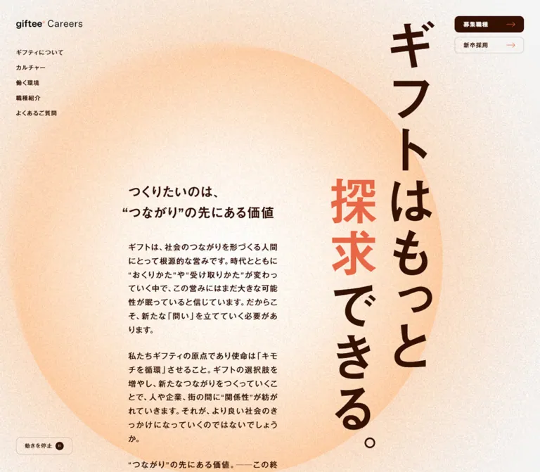
粒状のピーチ色背景と大きな縦書きコピーが印象的な採用サイト。セピア色の文字、コーラルの差し色、広い余白で企業文化や職種、働く環境を紹介しています。
オリジナルサイトを見るgiftee Careers — Style Reference
Sepia typography and a vast, grainy peach circle give a recruitment website the pace of a printed manifesto.
Website: careers.giftee.co.jp
Original URL: https://careers.giftee.co.jp/
Final URL: https://careers.giftee.co.jp/
Theme: light, with pale gray and white surfaces, sepia text, coral details, and a textured peach field.
Inspected: September 12, 2026; supplied retrieval timestamp 2026-09-12T08:22:22.808Z, equivalent to 17:22:22.808 JST.
Viewports: desktop 1440 × 1000 and mobile 390 × 844 CSS pixels.
Scope: the current recruitment homepage: opening manifesto, company and culture introductions, job families, working environment, graduate recruitment, editorial links, related resources, and footer. Visual evidence comprises desktop opening, middle, and footer captures plus mobile opening and footer captures. Rendered DOM measurements cover additional content at both widths. Linked pages and open-menu states were not inspected.
The page establishes its identity through an unusual balance of scale. A very large Japanese statement runs vertically down the right side, while a much narrower horizontal text column explains the company's purpose. A peach circle extends behind both, with dense, fine grain softening its gradients. Dark sepia supplies almost all readable text; coral emphasizes “探求” and small directional arrows.
This is a company recruitment homepage with several paths into a larger website. Its lower sections alternate broad editorial compositions, job cards, image-and-text links, and a spacious directory footer. The repeated actions “募集職種” and “新卒採用” remain easy to distinguish through filled and outlined treatments. Preserve this combination of expressive opening typography and practical navigation when extending the design.
How to Read This Reference
- Measured means a value reported by the supplied rendered DOM or computed styles. All dimensions are CSS pixels unless stated otherwise; tables round long decimals for readability.
- Source-defined means a custom property or transition declaration present in that evidence. A declared property does not prove that every visible element uses it.
- Visual estimate means a proportion, shape, or color inferred from an original-page capture without a corresponding computed measurement.
- Calculated means arithmetic derived from supplied measurements or formulas.
- Recommended means guidance for a new implementation. The Quick Start uses descriptive aliases and simplified CSS; these are not original class names.
- Computed font-family lists establish declared stacks, not proof of the font file used for every glyph. No font downloads or asset URLs were supplied.
- Some controls report transparent backgrounds and zero radius on their outer anchors despite visibly rounded painted surfaces. Their appearance may belong to nested elements or pseudo-elements; use the screenshots and computed records together.
- The working-environment section has coordinate records that differ from surrounding document-flow coordinates. Its exact positioning mechanism cannot be established from these records alone.
Tokens — Colors
Default Palette
| Name | Value | Source or suggested token | Role and evidence |
|---|---|---|---|
| Sepia | #341103 |
Source --color-sepia; alias --ink |
Measured body text color; visually the main filled-action color and dominant display ink |
| Coral | #e76746 |
Source --color-coral-web; alias --accent |
Accent associated with the highlighted display text and thin directional arrows |
| Pale Gray | #f5f5f5 |
Source --color-back; alias --page |
Measured body background and culture-section surface |
| White | #ffffff |
Source --color-white; alias --surface |
Measured footer background and white primary-action text |
| Sepia Rule | #34110333 |
Source --color-sepia-20; alias --rule |
Sepia at 20% opacity; suitable for the faint borders visible on cards and outlined controls |
| White Veil | #ffffff66 |
Source --color-white-40; alias --veil |
Measured 40%-opaque white on several sections and media links |
| Peach Approximation | approximately #ffd2ac |
Recommended --peach-approx |
Visual approximation for the large warm circular field; not a sampled or source-defined flat fill |
| Graph Coral | #f08b71 |
Source --color-graph-primary |
Declared graph token; its exact contribution to the visible textured ring is unverified |
| Muted Sepia | #766c69 |
Source --color-sepia-web |
Declared secondary color; use on this homepage was not established by the sampled elements |
| Slate | #757575 |
Source --color-slate-web |
Declared neutral; no specific visible use verified here |
The peach area is a composition of pale highlights, orange-peach edges, and grain. A single solid peach fill will reproduce its hue family but lose its atmosphere. Treat the approximation as a starting point for a layered background.
The 40% white surface also behaves differently over different backgrounds. Over flat #f5f5f5, it calculates to approximately #f9f9f9; over a peach field, warmth remains visible. Preserve transparency where the background is intended to show through.
Theme Behavior
Only one light theme is evidenced. The motion-stop button is not a theme selector. Additional --leva-* properties in the dump have no verified public-interface role and should not be interpreted as a dark theme, blue accent palette, or card-shadow system.
Tokens — Typography
Japanese Body Text
- Declared first family:
MFW-PGothicMB101Pr6N-Regular. - Following fallbacks:
Noto Sans JP,Segoe UI,Hiragino Sans, Japanese-named Hiragino alternatives,Hiragino Kaku Gothic ProN,Hiragino Kaku Gothic Pro, Meiryo alternatives,MS PGothic, andsans-serif. - Measured weight:
400. - Measured body line height:
1.9. - Measured body tracking:
0.085em, resolving to1.36pxon desktop and approximately1.277pxon mobile.
The body has generous line spacing and noticeable character spacing. Its calm, open texture is central to the page; replacing it with tightly set default system text changes the reading pace.
Headings
- Source variable:
--font-heading. - Declared opening stack:
Geist,MFW-MiGoMB1Std-DeBold,Noto Sans JP, followed by the shared system fallbacks. - Measured weight:
600on section headings, feature headings, and card titles. - Measured tracking:
0.04em. - Character: substantial Japanese gothic forms with clear, compact Latin headings.
The font-family name includes a weight descriptor, but the measured CSS weight still matters. Do not replace all heading styles with an assumed 700.
Lead Text and Navigation
- Source variable:
--font-lead. - Declared opening stack:
Geist,MFW-PGothicMB101Pr6N-Medium,Noto Sans JP, then the shared fallbacks. - Measured weight:
500for manifesto paragraphs, editorial titles, and footer navigation; the opening desktop navigation reports400while using this medium-family stack. - Manifesto line height:
1.8.
Manifesto paragraphs inherit the body's absolute tracking value: 1.36px on desktop, despite their larger 18px text. They are not simply body styles enlarged in every proportion.
Wordmark and Vertical Statement
The visible brand reads “giftee* Careers”. Its desktop home-link box measures 160 × 40; the mobile box measures approximately 120.58 × 30.14. The wordmark should be treated as a brand asset, not assigned an invented font.
The large statement reads “ギフトはもっと探求できる。” and is visually divided into two staggered vertical columns. The supplied element sample includes a separate 4 × 4 text paragraph containing the whole sentence and individually extracted characters elsewhere. That small paragraph is not a measurement of the visible display lettering.
Visual estimate: the large glyphs are roughly 95–105px on desktop and 40–44px on mobile. The exact visible-letter font size, font selection, and per-character transforms were not provided.
Type Scale
| Role | Desktop size / line height | Mobile size / line height | Weight | Evidence |
|---|---|---|---|---|
| Vertical statement | Approximately 100px; custom spacing |
Approximately 42px; custom spacing |
Visually heavy; unmeasured | Visual estimate |
| Main section title | 40 / 60px |
26.20 / 40.61px |
600 |
Measured; source --fz-h2-top |
| Manifesto introduction | 32 / 49.6px |
24.12 / 37.38px |
600 |
Measured |
| Working-environment heading | 32 / 49.6px |
24.12 / 37.38px |
600 |
Measured; source --fz-h3 |
| Card title | 20 / 34px |
17.06 / 29px |
600 |
Measured; matches source --fz-h6 |
| Manifesto paragraph | 18 / 32.4px |
16.03 / 28.86px |
500 |
Measured; source --fz-lead |
| General body | 16 / 30.4px |
15.02 / 28.54px |
400 |
Measured; source --fz-root |
| Job and resource description | 14 / 25.9px |
13.02 / 24.09px |
400 |
Measured |
| Editorial title | 16 / 30.4px |
15.02 / 28.54px |
500 |
Measured |
| Editorial date / graduate-card small copy | 12 / 22.2px |
11.02 / 20.39px |
400, or 500 for graduate labels |
Measured |
| Opening navigation | 13 / 19.994px |
Hidden in opening mobile state | 400 |
Measured |
| Footer navigation | 16 / 20px |
16 / 20px |
500 |
Measured |
| Legal links | 12 / 19.992px |
12 / 19.992px |
400 |
Measured |
| Motion-control caption | 12 / 19.992px |
10 / 10px |
400 |
Measured |
Header action anchors report a base font size of 16px on desktop, but the visible inner labels appear smaller. Their child-label styles are not included, so that inherited anchor value should not be presented as a measured painted-label size.
Tokens — Spacing & Shapes
Density: expansive section spacing with compact navigation, understated borders, and readable text blocks.
Recurring intervals: 10, 20, 30, 40, 80, and 120px, with several source-defined fluid interpolations.
Responsive Unit
At the inspected browser default of 1rem = 16px, the source's viewport normalization simplifies to:
W = viewport width in CSS pixels
scale = max(1, W / 1440)
source px unit = 1px × scale
source rem unit = 1rem × scale
Both inspected widths therefore use scale = 1. Separate clamped formulas still change fonts and spacing between mobile and desktop. The root HTML font remains 16px; the mobile body's 15.0223px font is a fluid body value, not a changed root rem.
For example, at these settings:
body size = 16 × clamp(0.938, 0.0000587 × W + 0.916, 1)
section title = 16 × clamp(1.625, 0.000822 × W + 1.317, 2.5)
gutter = clamp(20, 0.0188 × W + 12.958, 40) pixels
The original expressions additionally normalize for the root font size and scale above 1440px. Only the two supplied viewport configurations were inspected.
Spacing Scale
| Source token / use | At 1440px | At 390px | Evidence |
|---|---|---|---|
--space-10-20 |
20px |
10.14px |
Calculated from source formula |
--space-20-40, also --gap |
40px |
20.29px |
Source formula and measured layout |
--space-30-40 |
40px |
30.14px |
Source formula; measured job-card padding |
--space-40-60 |
60px |
40.29px |
Calculated from source formula |
--space-50-80 |
80px |
50.44px |
Calculated from source formula |
--space-50-120 |
120px |
51.01px |
Calculated from source formula |
--space-80-120 |
120px |
80.58px |
Source formula; measured standard section padding |
| Manifesto title-to-paragraph gap | 40px |
40px |
Calculated from measured bounds |
| Manifesto paragraph gap | 30px |
Approximately 20.14px |
Calculated from measured bounds |
| Mobile job-card row gap | — | 10px |
Calculated from successive card bounds |
Border Radius
| Element | Value | Evidence |
|---|---|---|
| Job-family cards | 10px |
Measured at both widths |
| Standard media-link cards | 10px |
Measured at both widths |
| Graduate cards | 10px |
Measured at both widths |
| Primary and secondary action silhouettes | Approximately 10px |
Visual estimate; outer anchor reports zero radius |
| Motion and menu control silhouettes | Approximately 10px |
Visual estimate |
| Job tags | Approximately 4px |
Visual estimate |
| Related-resource portraits | Circle | Visible clipping in desktop capture |
| Working-environment square media | Approximately 10px corners |
Visual estimate |
Thin card borders appear approximately 1px. The one-pixel difference between outer card padding coordinates and text coordinates also supports a one-pixel border, although border-width declarations were not included in the sampled fields.
Layout Measurements
| Element | Desktop | Mobile |
|---|---|---|
| Document height | 8918.41px |
10005.42px |
| Main content bounds | x = 40, width 1360px |
x ≈ 20.28, width 349.44px |
| Header padding | 40px 40px 0 |
Approximately 20.29px 20.29px 0 |
| Brand home-link box | 160 × 40px |
120.58 × 30.14px |
| Manifesto introduction origin | x = 340, y = 420 |
x ≈ 20.28, y = 420 |
| Manifesto text width | 400px |
226.19px |
| Opening section height | 1105.05px |
1246.92px |
| Job-family card width | Approximately 426.67px |
349.44px |
| Standard paired media-card width | 660px |
349.44px |
| General section action | 260 × 80px |
260 × 60.28px |
| Working-environment arrow action | 60 × 40px |
45.20 × 30.14px |
| Footer recruitment action | 310 × 120px |
349.44 × 90.42px |
| Footer total height | 590px |
1082.5px |
Desktop section layouts commonly divide the 1360px content width into halves, thirds, or quarters with 40px gaps. Mobile editorial rows explicitly expose six approximately 41.33px tracks with 20.29px gaps. Four of those tracks plus their internal gaps calculate to the approximately 226.2px copy width also seen in the opening manifesto.
Components
Opening Header and Navigation
Role: identify the site and provide immediate recruitment and information routes.
The opening desktop header is transparent over the textured background. Place the brand at (40, 40) inside a 160 × 40px link. Beneath it, five small navigation links begin at y = 120px and advance by approximately 35px: a 20px line box plus 15px of separation.
The links are “ギフティについて”, “カルチャー”, “働く環境”, “職種紹介”, and “よくあるご質問”. They lead to separate routes, rather than being evidenced as in-page section anchors.
At the upper right, stack two 160 × 40px actions with a 10px gap. “募集職種” uses a sepia surface and white label; “新卒採用” uses an outlined light surface. Both place a thin coral arrow near the right edge, with approximately 20px horizontal inset.
On mobile, the opening navigation and recruitment pair are absent from the visible header. The brand becomes approximately 121px wide, and the motion control and menu button occupy the right side. Avoid squeezing the desktop link list into a horizontal mobile row.
Compact Navigation State
Role: keep recruitment navigation available further down the page.
The desktop middle and footer captures show a compact group at the top right: two 160 × 30px recruitment actions followed by a 60 × 30px menu button. Their visible top edge is approximately 40px from the viewport top. The menu has a sepia rounded background and two fine white horizontal strokes.
The initial desktop DOM contains this compact group above the visible viewport at y = -32px, while the opening stacked pair is visible. This supports distinct navigation states. The precise scroll threshold, transition path, and implementation technique were not supplied.
The mobile menu remains visible near the upper-right corner in the footer capture. That capture shows the normal page footer, not an opened menu. No overlay design or menu contents can be inferred from it.
Recommended: ensure inactive navigation variants are removed from keyboard navigation, and provide an expanded state and controlled-panel relationship on the menu button.
Motion-Stop Control
Role: offer an explicit way to stop motion.
The label is “動きを停止”, accompanied by a small filled circular pause symbol. Its desktop box is 130 × 40px, located 40px from the left and bottom of the opening viewport. On mobile it becomes 90 × 30px at approximately (204, 20.28), between the brand and menu.
Use a transparent or lightly tinted surface, faint sepia outline, and compact text. This is a utility control, with much less visual weight than the recruitment actions.
The button's presence is verified. Its clicked state, changed label, persistence, and exact motion coverage are not. A reproduction must connect it to any active renderer or animation system before presenting it as functional.
Opening Manifesto
Role: express the company's purpose before introducing job information.
The background circle is enormous relative to the interface. In the desktop opening image, its visible outline suggests an approximately 1150px diameter, beginning around x = 30px, y = 120px and extending below the capture. These are visual estimates. Its interior is pale, with peach concentrated toward portions of the perimeter; fine grain appears across the wider opening background as well.
The two vertical text columns sit toward the right. The first contains “ギフトはもっと”; the second begins several characters lower and contains “探求できる。”. Highlight only “探求” in coral. Retain the large final punctuation and the stagger between columns.
The horizontal introduction begins at y = 420px at both inspected widths. Desktop uses two lines:
つくりたいのは、 “つながり”の先にある価値
Mobile uses three lines, splitting after ““つながり”の”. Its text block remains only approximately 226px wide even though the ordinary mobile content width is approximately 349px. This leaves room for the vertical statement and preserves the asymmetry.
Three paragraphs follow in the DOM. At the inspected height, some manifesto content continues below the first viewport. The opening is therefore not a fixed-height 100vh panel. Use content-driven height so that larger fonts and longer text remain reachable.
Section Introductions and Company Links
Role: introduce a topic, then provide several levels of entry into it.
Major titles use 40px type on desktop, aligned to the 40px page gutter. Most standard sections have 120px top and bottom padding. Introductory body text often occupies the right 660px half of the desktop grid, allowing title, media, and description to sit at different vertical levels.
The company section includes a distinct recruitment-message link. Its desktop grid has a 260px first column, 40px gap, and approximately 155px label column; the whole link is 160px high. On mobile the first column reduces to approximately 161.41px, the gap to 20.29px, and overall height to approximately 99.31px. The image subject is not visible in the supplied captures.
Two further links use the standard media-card family: “ギフティの事業” and “私たちが目指すこと”. Each desktop card is 660 × 200px, with a 160px media column, 340px text column, and 20px arrow column separated by 40px gaps. Padding is 20px 40px 20px 20px; the surface is 40% white.
On mobile, these cards stack at approximately 349.44 × 121.16px. Their media column becomes approximately 81.16px, while the trailing arrow column stays 20px. A centered 260px section action follows the content.
The culture section uses the same large title and generous body treatment. Its full media composition is not present in the supplied images; do not invent a collage or photographic subject from its reserved layout space.
Job-Family Cards
Role: help candidates explore disciplines before entering individual job-family pages.
Five cards represent business, product, engineering, design, and corporate functions. Desktop forms three columns on the first row and two on the second, leaving the final grid position empty. Each card is approximately 426.67px wide with 40px padding, a fine border, and 10px radius.
An entire card is one link. Its anatomy is:
- A
20px / 34px, weight-600 title. - A descriptive paragraph at
14px / 25.9px. - A wrapping cluster of small outlined discipline tags.
The vertical gap between the principal blocks is 20px. Tags are visually quiet: pale surfaces, fine sepia outlines, small corner radii, and no category-specific color coding. They describe the linked discipline; independent filtering behavior is not evidenced.
Mobile cards occupy the full 349.44px content width, use approximately 30.14px padding, and have 10px gaps between cards. Titles become approximately 17.06px; descriptions become approximately 13.02px. Heights vary from approximately 209px to 328px as copy and tags wrap. Preserve natural height rather than imposing one desktop height on all mobile cards.
Working-Environment Features
Role: present three paths into organizational information: numbers, benefits, and office environment.
The desktop middle capture pairs a square image at the left with a widely separated text group beginning at x = 740px. The first square is visually approximately 460 × 460px, at (40, 340) in that capture. It contains a pale peach ring, layered arc segments, and a centered giftee mark. Its proportions are illustrative; no numeric values or statistical ratios can be read from it.
The right group combines a 32px heading, a thin horizontal rule extending into the remaining space beside the heading, a body paragraph, and a 60 × 40px outlined arrow link. Approximately 40px separates its content blocks. The heading's painted text sits toward the right end of its measured region.
The next square begins approximately 40px below the first and shows wooden shelving, books, and a giftee office sign. Maintain the difference between abstract organizational imagery and tangible workplace photography.
Mobile DOM measurements show a specific rearrangement: feature headings occupy a right-hand region beginning around x = 205.16px, width 164.56px, above the full-width description. The first heading breaks into two lines. Descriptions and arrow links return to the left gutter; arrow boxes reduce to approximately 45.20 × 30.14px.
This is evidence for an offset mobile heading arrangement, not simply a universal image-heading-paragraph stack. Mobile image bounds and the section's scroll-positioning mechanism are unverified.
Graduate Recruitment
Role: provide a separate entry path for early-career candidates.
On desktop, business and engineering cards each measure 310 × 210px and sit together in the left half of the content grid. An interview media link occupies the right half at 660 × 210px.
The smaller cards contain a compact “新卒採用職種” label, a heading, and a short description. Small copy is 12px / 22.2px on desktop and approximately 11.02px / 20.39px on mobile. These measurements are unusually small for descriptive content; preserve them only if readability testing supports the choice.
On mobile, the two discipline cards stack at the full content width while retaining a measured 210px height. The interview link follows as a shorter media card, then a centered section action. The surrounding section imagery is not visually documented in the supplied captures.
Recruitment Editorial Cards
Role: connect candidates to recent stories and company perspectives.
Four article links appear in the supplied DOM, with dates in July 2026. Desktop places them in four 310px columns with 40px gaps. Each link contains a media region, a small date, and a medium-weight title. The first date begins approximately 183.34px below the link's top; image bounds and exact aspect ratios were not supplied.
Mobile converts each item into a horizontal editorial row. The measured six-track grid places approximately 102.95px of media space on the left and a 226.20px text region on the right, separated by 20.29px. The date sits above the title with a 10px gap. The sampled rows are approximately 115.92px high and are separated by approximately 20.29px.
The links point to articles on the company's recruitment publication. Only the link labels, dates, and homepage layout were inspected; article contents were not opened.
Related-Resource Cards
Role: provide substantial closing links to the technical blog and organizational content.
The desktop footer-adjacent capture shows two 660 × 202px outlined cards. Each uses a circular 160px image at left, a text group in the middle, and a thin coral arrow at right. The measured grid columns are 160px 338px 20px, with 40px horizontal gaps and padding 20px 40px 20px 20px.
The technical-blog image is a flat illustration of a person using a laptop, with small programming symbols around them. The organization image is a photograph of people in discussion around a table, clipped to a circle. Both images sit directly in the same restrained card system.
Titles use 20px / 34px, descriptions 14px / 25.9px, with approximately 20px between them. The technical-blog card uses a diagonal external-link arrow, while the organization link uses a rightward arrow.
On mobile, the cards stack. Their first row has an approximately 81.16px image column, 165.72px title column, and 20px arrow column. The description moves below that row and spans the approximately 307.44px inner width, with an additional 10px inline padding. Heights differ with copy: approximately 215.39px and 191.31px.
Footer Directory and Recruitment Actions
Role: end the page with complete navigation and prominent recruitment routes.
The footer changes to solid white. Desktop uses four 310px columns with 40px gaps: brand, primary navigation, organizational/publication links, and recruitment actions. The actions are stacked 310 × 120px blocks with a 10px gap. The primary remains sepia-filled; the secondary remains outlined.
Below the main directory, a thin full-width rule introduces a separate legal area. Four compact policy links sit at the left, while social icons and the “© giftee Inc.” mark sit at the right. Legal text is measured at 12px; the social-link boxes are 20 × 20px.
Mobile stacks the directory groups. The two recruitment actions become approximately 349.44 × 90.42px, followed by broad whitespace and the legal divider. Legal links form a vertical list with approximately 40px between their top edges. The final row puts the social icons at left and copyright at right.
The footer expands from 590px tall on desktop to 1082.5px on mobile. Its spaciousness is intentional; compressing every group into a dense list would remove an important part of the page's rhythm.
Tokens — Motion & Interaction
The evidence establishes declared entrance and transition timings, settled page states, and visible motion controls. It does not provide a recording of every animation or a tested sequence of clicks.
| Treatment | Supplied declaration | What can be concluded |
|---|---|---|
| Brand entrance | 1.2s cubic-bezier(0.39, 0.575, 0.565, 1), 0.1s delay, fade-in-opacity |
A source-defined opacity entrance |
| Opening navigation entrance | 1.7s cubic-bezier(0.19, 1, 0.22, 1) |
Source-defined staggered navigation animation |
| Navigation item delays | 0.2s, 0.3s, 0.4s, 0.5s, 0.6s |
A sequential stagger across five links |
| Manifesto introduction | Opacity and filter, 2.6s cubic-bezier(0.19, 1, 0.22, 1), 0.7s delay |
A long reveal is declared; starting filter value is unavailable |
| Manifesto paragraphs | Same 2.6s transition; delays 1s, 1.15s, 1.3s |
Paragraphs have staggered reveal timing |
| Recruitment and arrow-link text | Color, 0.4s cubic-bezier(0.075, 0.82, 0.165, 1) |
Color transition defined; destination state not tested |
| Opening navigation decoration | text-decoration-color 0.6s cubic-bezier(0.19, 1, 0.22, 1) |
Decoration transition defined; exact hover result unverified |
| Motion control | Opacity, 0.4s cubic-bezier(0.19, 1, 0.22, 1) |
Visibility transition defined |
| Main content | Opacity, 0.4s cubic-bezier(0.39, 0.575, 0.565, 1) |
A main-level opacity transition exists; trigger unverified |
| Base duration token | Source --duration-base: 1s |
A shared token exists; not every animation uses it |
The page's declared motion favors long, decelerating reveals with staggered timing. Do not substitute a universal spring or a fast fade on every element and describe it as the observed behavior.
The captures show the textured circle and staggered lettering in settled states. They do not establish whether grain changes frame by frame, whether the circle continuously deforms, or whether individual glyphs animate independently. No exact loop period, scroll scrub, parallax distance, or pinned-section duration can be specified.
A generic computed transition: all without an accompanying duration is not evidence that every property visibly animates. Likewise, the presence of a pause button does not prove the scope or persistence of its behavior.
Surfaces
| Layer | Appearance | Purpose |
|---|---|---|
| Base canvas | Solid #f5f5f5 |
Neutral foundation for a long recruitment homepage |
| Opening field | Pale peach gradients and dense fine grain | Establishes warmth and visual scale |
| Transparent editorial area | Text and media directly over the background | Preserves openness between major topics |
| White veil | rgba(255, 255, 255, 0.4) |
Softens selected sections without completely masking underlying color |
| Outlined card | Transparent or lightly veiled fill, fine sepia border, 10px radius |
Groups navigable content without elevation |
| Primary action | Sepia fill, white label, coral arrow | Gives job openings the strongest action emphasis |
| Secondary action | Light fill, faint outline, sepia label, coral arrow | Distinguishes graduate recruitment without competing with the primary |
| Footer | Solid white, large whitespace, thin divider | Provides a clear closing directory |
There is no visible general-purpose drop-shadow or glass-blur system. Texture belongs to the large background composition; text, arrows, borders, and footer remain comparatively crisp.
Imagery
The original-page captures combine three visual categories: abstract textured geometry, workplace photography, and a friendly flat illustration. They share pale surrounding surfaces and restrained framing, rather than identical processing.
| Visible image or graphic | Treatment | Geometry / limitation |
|---|---|---|
| Opening circular field | Peach perimeter, pale center, fine grain | Approximately 1150px diameter on desktop; visual estimate |
| Organizational ring | Layered peach arcs around a central giftee mark | Approximately 460px square container in desktop middle capture; visual estimate |
| Workplace shelving | Natural wood, books, visible office branding | Rounded rectangular crop; only the upper portion is visible |
| Technical-blog illustration | Person with laptop, coding symbols, pale pink circular setting | 160px desktop media slot; circular appearance verified |
| Organizational discussion | People seated around a table in a bright office | Circular crop inside the related-resource card |
| Header/footer identity | Black giftee wordmark, small coral asterisk, Careers label | Measured link boxes; underlying asset format and path unavailable |
No original image paths, SVG files, or font-file URLs were provided. Do not fabricate an asset inventory. The code below supplies an optional procedural grain approximation, but it does not recreate the exact original background or branded artwork.
For a new implementation, use authorized identity assets and relevant workplace photographs. Keep photographs naturally colored; do not apply a blanket sepia filter simply because the text is sepia. Preserve the illustration's lighter, approachable character within the same card geometry.
Layout & Responsive Behavior
Desktop Composition
The desktop content width is 1360px, inset 40px on each side. Two-column sections use 660px halves, job grids use approximately 426.67px thirds, and editorial/footer grids use 310px quarters. All share a 40px gap.
The opening intentionally departs from those simple divisions: the manifesto is 400px wide at x = 340px, while the much larger vertical statement occupies the right. The circle visually connects them across the otherwise open page.
Section titles start at the main left gutter, but paragraphs and actions can begin at x = 140px, 740px, or 1040px, depending on the section. These offsets create variation while preserving common alignment points.
Mobile Composition
The ordinary mobile content width is approximately 349.44px, leaving approximately 20.28px on either side. Section titles reduce to approximately 26.2px, but body text reduces only to approximately 15px; typography does not scale down in direct proportion to viewport width.
The opening retains its vertical statement on the right. Its circle is heavily cropped by the viewport, and the horizontal manifesto occupies only approximately 226.19px at the left. The unchanged 420px introduction offset creates a substantial opening interval even on a phone.
The rest of the page adapts by component:
| Component | Desktop | Mobile |
|---|---|---|
| Opening navigation | Visible left-hand link list and stacked recruitment pair | Brand, motion utility, and menu |
| Job families | Three-column grid with an incomplete second row | One column, 10px row gaps, variable heights |
| Company media links | Two cards side by side | Full-width stacked cards with smaller media slots |
| Working-environment features | Large image at left, text group at right | Right-offset heading above full-width description; media arrangement only partly evidenced |
| Graduate routes | Two small cards beside a wider interview link | Three sequential full-width links |
| Editorial articles | Four vertical cards | Horizontal media-and-text rows |
| Related resources | Two broad cards | Image/title row followed by a full-width description |
| Footer | Four-column directory and horizontal legal row | Stacked directory, large actions, vertical legal links |
Only the two stated viewports were inspected. Tablet behavior, landscape phones, browser zoom, and the exact media-query breakpoints are unknown. The Quick Start's 64rem breakpoint is a recommendation, not a recovered source value.
Do’s and Don’ts
Do
- Keep sepia
#341103as the principal ink and coral#e76746as a selective accent. - Preserve the oversized, staggered vertical statement and the narrower horizontal manifesto.
- Retain the mobile opening's asymmetry instead of making every text block full width.
- Use fine grain across the warm background field while keeping interface details sharp.
- Maintain generous body line heights, deliberate Japanese tracking, and medium-weight lead text.
- Align lower content to consistent half, third, and quarter divisions on desktop.
- Keep job tags quiet and allow their wrapping to determine card height.
- Adapt editorial and resource cards according to their own anatomy on mobile.
- Distinguish filled job-opening actions from outlined graduate-recruitment actions.
- Give the footer enough space to act as a complete directory.
Don't
- Don't turn the homepage into a single conversion panel or remove its multiple content routes.
- Don't replace the vertical statement with a conventional centered horizontal headline.
- Don't fill every surface with orange or use coral for all body text.
- Don't make the circle a flat, sharply colored disk and assume it reproduces the textured field.
- Don't add glossy shadows, heavy borders, or glass panels to the card system.
- Don't set every heading in an arbitrary bold sans-serif and claim the original typography was matched.
- Don't treat the small extracted text equivalent as the visible display-letter measurement.
- Don't infer statistical percentages from the decorative ring graphic.
- Don't interpret the mobile footer capture as an opened navigation overlay.
- Don't claim tested hover, pause, parallax, or menu behavior from declarations alone.
Recommended Implementation Additions
These are recommendations for a new implementation, not verified features of the original page:
- Give the vertical statement one coherent accessible reading order. If decorative copies are used, hide those copies from assistive technology while retaining one readable sentence.
- Use meaningful heading semantics. The sampled original H1 wraps the brand; a new implementation can give the manifesto statement the main content heading.
- Keep decorative grain and shapes non-interactive and outside the accessibility tree.
- Give arrow-only links contextual accessible names, and name social-icon links explicitly.
- Provide a visible sepia focus outline and ensure inactive navigation variants cannot receive focus.
- Increase the effective hit area of the approximately
30px-high mobile utilities to at least44pxwithout causing adjacent targets to overlap. - Review the approximately
11pxgraduate descriptions on real devices. A13–14pxminimum may improve reading while retaining the hierarchy. - Implement reduced-motion handling and a real pause mechanism covering CSS animation and any programmatic background renderer.
- Keep content visible when entrance animation is disabled or JavaScript fails.
- Test the vertical statement, narrow copy, and header utilities at narrower widths and increased text size. Change composition before allowing collisions or clipped prose.
- Verify text contrast against the lightest and darkest moving-background states; use coral primarily for large lettering and small non-text cues.
Agent Prompt Guide
Quick Color Reference
- Main ink and primary-action surface:
#341103. - Selective emphasis and arrows:
#e76746. - Base canvas:
#f5f5f5. - Footer and primary-action text:
#ffffff. - Faint rules:
#34110333. - Transparent light surfaces:
#ffffff66. - Approximate peach field:
#ffd2ac, blended with pale highlights and fine neutral grain; this is not an exact source fill.
Overall Prompt
“Create a Japanese company recruitment homepage with the visual character of giftee Careers. Use a pale gray canvas, deep sepia typography, coral arrows, and a very large peach circular field with fine grain. Place a two-column vertical Japanese statement toward the right, with its second column starting lower and one short phrase highlighted in coral. Offset a narrow horizontal manifesto to the left, leaving substantial opening space above it. Continue with generous editorial sections, outlined job-family cards, workplace features, graduate-recruitment routes, article cards, and a spacious white directory footer. On desktop use 40px gutters and gaps; on a 390px phone use approximately 20px gutters, keep the opening asymmetry, and adapt each card type deliberately. Treat animation as optional until real controls and reduced-motion behavior are implemented.”
Example Component Prompts
- Opening manifesto: “Compose a recruitment-site opening over a pale, grainy peach circle. Put ‘ギフトはもっと’ in a large vertical column at right and ‘探求できる。’ in a second column that starts lower. Color only ‘探求’ coral. Use a 400px horizontal manifesto at desktop, approximately 226px at a 390px viewport, with 1.8 line-height paragraphs and no fixed viewport-height clipping.”
- Job-family card: “Build a quiet outlined discipline card with a 10px radius, sepia heading, compact description, and wrapping outlined tags. Use 40px desktop padding and approximately 30px mobile padding. Make the whole card a single link and allow mobile height to follow its contents.”
- Related-resource card: “Create a 660px desktop resource link with a 160px circular image, text group, and a 20px coral arrow slot. On mobile, shrink the image to about 81px, retain the title beside it, and move the description into a full-width row below. Use a fine sepia border and no shadow.”
- Editorial row: “Present four editorial articles in 310px desktop columns. On mobile, switch to rows with approximately 103px media at left, a 20px gap, and 226px of date-and-title text at right. Keep dates small and titles medium weight; do not force the desktop card arrangement onto the phone.”
- Footer: “Build a white recruitment footer with separate brand, navigation, publication, and action groups. Use tall sepia-filled and outlined recruitment links, a faint full-width legal divider, small policy links, and a final social/copyright row. Stack the groups on mobile while preserving generous vertical space.”
Quick Start
CSS Custom Properties
This is a reusable static adaptation. The fluid font and spacing expressions reproduce the supplied formulas at a default 16px root within the inspected width range. The original's wider-screen and root-size normalization is simplified. Display-letter sizes, the peach background, grain generation, and the 64rem layout breakpoint are recommendations.
The font stacks below use observed family identifiers but do not supply font files. Use authorized font assets or accept the named fallbacks. The CSS provides appearances for controls; menu behavior, scroll-state changes, and motion pausing require application logic.
:root {
  /* Observed source colors */
  --page: #f5f5f5;
  --surface: #ffffff;
  --ink: #341103;
  --accent: #e76746;
  --rule: #34110333;
  --veil: #ffffff66;

  /* Visual approximation, not an exact source color */
  --peach-approx: #ffd2ac;

  /* Observed family identifiers with a shortened fallback stack */
  --font-body: 'MFW-PGothicMB101Pr6N-Regular', 'Noto Sans JP',
    'Segoe UI', 'Hiragino Sans', Meiryo, sans-serif;
  --font-heading: 'Geist', 'MFW-MiGoMB1Std-DeBold', 'Noto Sans JP',
    'Segoe UI', 'Hiragino Sans', Meiryo, sans-serif;
  --font-lead: 'Geist', 'MFW-PGothicMB101Pr6N-Medium', 'Noto Sans JP',
    'Segoe UI', 'Hiragino Sans', Meiryo, sans-serif;

  /* Simplified source-derived fluid values */
  --text-body: clamp(.938rem, calc(.916rem + .09392vw), 1rem);
  --text-small: clamp(.813rem, calc(.791rem + .09392vw), .875rem);
  --text-tiny: clamp(.688rem, calc(.666rem + .09392vw), .75rem);
  --text-lead: clamp(1rem, calc(.956rem + .1888vw), 1.125rem);
  --text-section: clamp(1.625rem, calc(1.317rem + 1.3152vw), 2.5rem);
  --text-feature: clamp(1.5rem, calc(1.324rem + .752vw), 2rem);
  --text-card: clamp(1.063rem, calc(.997rem + .2832vw), 1.25rem);
  --tracking-body: calc(var(--text-body) * .085);
  --gutter: clamp(20px, calc(12.958px + 1.88vw), 40px);
  --gap: var(--gutter);
  --card-inset: clamp(30px, calc(26.479px + .939vw), 40px);
  --section-space: clamp(80px, calc(65.915px + 3.76vw), 120px);
  --content-gap: clamp(50px, calc(39.437px + 2.82vw), 80px);
  --radius-card: 10px;

  /* Observed transition curves */
  --ease-reveal: cubic-bezier(.19, 1, .22, 1);
  --ease-action: cubic-bezier(.075, .82, .165, 1);
  --ease-opacity: cubic-bezier(.39, .575, .565, 1);
}

* { box-sizing: border-box; }

body {
  margin: 0;
  background: var(--page);
  color: var(--ink);
  font-family: var(--font-body);
  font-size: var(--text-body);
  font-weight: 400;
  line-height: 1.9;
  letter-spacing: var(--tracking-body);
}

button, input { font: inherit; }
a { color: inherit; }
img { display: block; max-width: 100%; }

.gf-container {
  width: calc(100% - 2 * var(--gutter));
  max-width: 1360px;
  margin-inline: auto;
}

.gf-section { padding-block: var(--section-space); }
.gf-section--veiled { background: var(--veil); }

.gf-section-title {
  margin: 0 0 var(--content-gap);
  font: 600 var(--text-section) / 1.5 var(--font-heading);
  letter-spacing: .04em;
}

.gf-intro {
  display: grid;
  grid-template-columns: repeat(2, minmax(0, 1fr));
  gap: var(--gap);
}

.gf-intro > p { grid-column: 2; margin: 0; }

/* Static opening composition */
.gf-hero {
  position: relative;
  isolation: isolate;
  overflow: hidden;
  padding-top: 420px;
  background: radial-gradient(ellipse at 42% 40%, #fff0e2, transparent 78%);
}

.gf-hero::before {
  content: '';
  position: absolute;
  z-index: -2;
  top: 120px;
  left: 2vw;
  width: min(80vw, 1152px);
  aspect-ratio: 1;
  border-radius: 50%;
  pointer-events: none;
  background: radial-gradient(circle at 49% 45%,
    #fffaf5 0%, #fff0e2 36%, var(--peach-approx) 78%, #ffd9b8 100%);
}

/* Procedural grain approximation; no original asset is implied */
.gf-hero::after {
  content: '';
  position: absolute;
  z-index: -1;
  inset: 0;
  opacity: .16;
  filter: grayscale(1);
  mix-blend-mode: multiply;
  pointer-events: none;
  background-image: url('data:image/svg+xml,%3Csvg xmlns=%22http://www.w3.org/2000/svg%22 width=%22160%22 height=%22160%22%3E%3Cfilter id=%22g%22%3E%3CfeTurbulence type=%22fractalNoise%22 baseFrequency=%22.85%22 numOctaves=%223%22 stitchTiles=%22stitch%22/%3E%3C/filter%3E%3Cpath filter=%22url(%23g)%22 d=%22M0 0h160v160H0z%22/%3E%3C/svg%3E');
}

.gf-manifesto {
  width: 400px;
  margin-left: clamp(40px, calc(50vw - 380px), 340px);
}

.gf-manifesto h2 {
  margin: 0 0 40px;
  font: 600 var(--text-feature) / 1.55 var(--font-heading);
  letter-spacing: .04em;
}

.gf-manifesto p {
  margin: 0;
  font: 500 var(--text-lead) / 1.8 var(--font-lead);
}

.gf-manifesto p + p { margin-top: 30px; }

.gf-hero-title {
  position: absolute;
  top: 40px;
  right: clamp(25px, 21.5vw, 310px);
  margin: 0;
  font: 600 100px / 1.12 var(--font-heading);
  letter-spacing: .08em;
}

.gf-hero-columns {
  display: flex;
  flex-direction: row-reverse;
  align-items: flex-start;
  gap: 12px;
}

.gf-hero-columns > span {
  writing-mode: vertical-rl;
  text-orientation: upright;
  white-space: nowrap;
}

.gf-hero-columns > span:last-child { margin-top: 3.3em; }
.gf-hero-columns em { color: var(--accent); font-style: normal; }
.gf-mobile-break { display: none; }

/* Action surfaces directly reproduce the visible treatment */
.gf-action {
  display: inline-flex;
  align-items: center;
  justify-content: space-between;
  gap: 20px;
  width: 260px;
  min-height: 80px;
  padding: 0 20px;
  border: 1px solid var(--rule);
  border-radius: 10px;
  background: transparent;
  color: var(--ink);
  text-decoration: none;
  transition: color .4s var(--ease-action);
}

.gf-action--primary {
  border-color: var(--ink);
  background: var(--ink);
  color: var(--surface);
}

.gf-action--header { width: 160px; min-height: 40px; font-size: 13px; }
.gf-action--arrow { width: 60px; min-height: 40px; justify-content: center; padding: 0; }
.gf-arrow { flex: none; color: var(--accent); letter-spacing: 0; }

.gf-masthead {
  position: absolute;
  z-index: 10;
  inset: var(--gutter) var(--gutter) auto;
  display: flex;
  justify-content: space-between;
  align-items: flex-start;
}

.gf-brand { display: block; width: 160px; height: 40px; }
.gf-top-actions { display: grid; gap: 10px; }

.gf-opening-nav {
  position: absolute;
  top: 80px;
  left: 0;
  display: grid;
  gap: 15px;
  font: 400 13px / 20px var(--font-lead);
}

.gf-opening-nav a { text-decoration: none; }

.gf-compact-nav {
  position: fixed;
  z-index: 20;
  top: var(--gutter);
  right: var(--gutter);
  display: none;
  align-items: center;
  gap: 10px;
}

/* Application logic must set this state; no threshold is assumed */
.gf-page[data-scrolled='true'] .gf-compact-nav { display: flex; }
.gf-compact-nav .gf-action { min-height: 30px; }

.gf-menu {
  display: grid;
  place-content: center;
  gap: 5px;
  width: 60px;
  height: 30px;
  margin-left: 10px;
  padding: 0;
  border: 0;
  border-radius: 10px;
  background: var(--ink);
  cursor: pointer;
}

.gf-menu::before, .gf-menu::after {
  content: '';
  width: 20px;
  height: 1px;
  background: var(--surface);
}

/* Job-family cards */
.gf-job-grid {
  display: grid;
  grid-template-columns: repeat(3, minmax(0, 1fr));
  gap: var(--gap);
}

.gf-job-card {
  display: flex;
  flex-direction: column;
  gap: 20px;
  padding: var(--card-inset);
  border: 1px solid var(--rule);
  border-radius: var(--radius-card);
  text-decoration: none;
}

.gf-job-card h3, .gf-media-card h3 {
  margin: 0;
  font: 600 var(--text-card) / 1.7 var(--font-heading);
  letter-spacing: .04em;
}

.gf-job-card p, .gf-media-card p {
  margin: 0;
  font-size: var(--text-small);
  line-height: 1.85;
}

.gf-tags {
  display: flex;
  flex-wrap: wrap;
  gap: 5px;
  margin: 0;
  padding: 0;
  list-style: none;
}

.gf-tags li {
  padding: 4px 10px;
  border: 1px solid var(--rule);
  border-radius: 4px;
  font-size: 11px;
  line-height: 1.7;
}

/* Related-resource cards with flat child elements */
.gf-media-grid {
  display: grid;
  grid-template-columns: repeat(2, minmax(0, 1fr));
  gap: var(--gap);
}

.gf-media-card {
  display: grid;
  grid-template-columns: 160px minmax(0, 1fr) 20px;
  gap: 20px 40px;
  align-content: center;
  align-items: center;
  padding: 20px 40px 20px 20px;
  border: 1px solid var(--rule);
  border-radius: var(--radius-card);
  text-decoration: none;
}

.gf-media-card > img {
  grid-column: 1;
  grid-row: 1 / span 2;
  width: 160px;
  aspect-ratio: 1;
  border-radius: 50%;
  object-fit: cover;
}

.gf-media-card > h3 { grid-column: 2; grid-row: 1; }
.gf-media-card > p { grid-column: 2; grid-row: 2; }
.gf-media-card > .gf-arrow { grid-column: 3; grid-row: 1 / span 2; }

/* Editorial links preserve natural image proportions */
.gf-articles {
  display: grid;
  grid-template-columns: repeat(4, minmax(0, 1fr));
  gap: var(--gap);
}

.gf-article { display: block; text-decoration: none; }
.gf-article img { width: 100%; height: auto; margin-bottom: 20px; }
.gf-article time { display: block; font-size: var(--text-tiny); line-height: 1.85; }
.gf-article h3 {
  margin: 10px 0 0;
  font: 500 var(--text-body) / 1.9 var(--font-lead);
}

/* Footer */
.gf-footer { background: var(--surface); }
.gf-footer-grid {
  display: grid;
  grid-template-columns: repeat(4, minmax(0, 1fr));
  gap: var(--gap);
  padding-block: 40px 120px;
}

.gf-footer-nav { display: grid; align-content: start; gap: 20px; }
.gf-footer-nav a { font: 500 16px / 20px var(--font-lead); text-decoration: none; }
.gf-footer-actions { display: grid; gap: 10px; }
.gf-footer-actions .gf-action { width: 100%; min-height: 120px; }
.gf-footer-legal { border-top: 1px solid var(--rule); }
.gf-footer-legal > .gf-container {
  display: flex;
  justify-content: space-between;
  gap: 40px;
  padding-block: 120px 40px;
}

.gf-policy-links { display: flex; flex-wrap: wrap; gap: 20px; }
.gf-policy-links a { font-size: 12px; line-height: 20px; text-decoration: none; }
.gf-footer-meta { display: flex; align-items: center; gap: 40px; }

/* Recommended accessible utilities */
.gf-page :focus-visible { outline: 2px solid var(--ink); outline-offset: 4px; }
.gf-sr-only {
  position: absolute;
  width: 1px;
  height: 1px;
  padding: 0;
  margin: -1px;
  overflow: hidden;
  clip-path: inset(50%);
  white-space: nowrap;
  border: 0;
}

/* Recommended breakpoint, not a recovered source query */
@media (max-width: 64rem) {
  .gf-section-title { line-height: 1.55; }
  .gf-intro, .gf-job-grid, .gf-media-grid, .gf-articles,
  .gf-footer-grid { grid-template-columns: minmax(0, 1fr); }
  .gf-intro > p { grid-column: 1; }
  .gf-job-grid, .gf-media-grid { gap: 10px; }

  .gf-brand { width: 120.58px; height: 30.14px; }
  .gf-opening-nav, .gf-top-actions { display: none; }
  .gf-compact-nav { display: flex; }
  .gf-compact-nav .gf-action { display: none; }
  .gf-menu { margin-left: 0; }

  .gf-hero::before { top: 90px; left: -235px; width: 580px; }
  .gf-hero-title { top: 115px; right: 25px; font-size: 42px; }
  .gf-hero-columns { gap: 10px; }
  .gf-hero-columns > span:last-child { margin-top: 3.25em; }
  .gf-manifesto {
    width: calc((100vw - 2 * var(--gutter)) * 2 / 3 - var(--gap) / 3);
    margin-left: var(--gutter);
  }
  .gf-manifesto p + p { margin-top: 20.14px; }
  .gf-mobile-break { display: block; }

  .gf-action { min-height: 60.28px; max-width: 100%; }
  .gf-action--arrow { width: 45.2px; min-height: 30.14px; }

  .gf-media-card {
    grid-template-columns: 81.16px minmax(0, 1fr) 20px;
    gap: 20px var(--gap);
    padding: 20px;
  }
  .gf-media-card > img { grid-row: 1; width: 81.16px; }
  .gf-media-card > .gf-arrow { grid-row: 1; }
  .gf-media-card > p { grid-column: 1 / -1; grid-row: 2; padding-inline: 10px; }

  .gf-article {
    display: grid;
    grid-template-columns: repeat(6, minmax(0, 1fr));
    gap: 10px var(--gap);
    align-content: start;
  }
  .gf-article img { grid-column: 1 / span 2; grid-row: 1 / span 2; margin: 0; }
  .gf-article time { grid-column: 3 / -1; grid-row: 1; }
  .gf-article h3 { grid-column: 3 / -1; grid-row: 2; margin: 0; }

  .gf-footer-grid { gap: 50px; padding-block: 50px; }
  .gf-footer-actions .gf-action { min-height: 90.42px; }
  .gf-footer-legal > .gf-container { display: block; padding-block: 50px; }
  .gf-policy-links { display: grid; gap: 20px; }
  .gf-footer-meta { justify-content: space-between; margin-top: 50px; }
}

/* Optional reveal: content is visible unless explicitly opted in */
@keyframes gf-fade-in {
  from { opacity: 0; }
  to { opacity: 1; }
}

.gf-reveal { animation: gf-fade-in 1.2s var(--ease-opacity) .1s both; }
.gf-page[data-motion='paused'] .gf-reveal { animation: none; opacity: 1; }

@media (prefers-reduced-motion: reduce) {
  .gf-page .gf-reveal { animation: none; opacity: 1; filter: none; }
  .gf-page .gf-action { transition: none; }
}
Example Markup
This example demonstrates the static opening and a single linked job card. It uses one accessible heading for the vertical statement. The split visual copy is decorative, and the sample Japanese wording is quoted from the supplied page.
<main class='gf-page'>
  <section class='gf-hero' aria-labelledby='manifesto-title'>
    <h1 class='gf-hero-title' id='manifesto-title'>
      <span class='gf-sr-only'>ギフトはもっと探求できる。</span>
      <span class='gf-hero-columns' aria-hidden='true'>
        <span>ギフトはもっと</span>
        <span><em>探求</em>できる。</span>
      </span>
    </h1>

    <div class='gf-manifesto'>
      <h2>つくりたいのは、<br>“つながり”の<br class='gf-mobile-break'>先にある価値</h2>
      <p>ギフトは、社会のつながりを形づくる人間にとって根源的な営みです。時代とともに“おくりかた”や“受け取りかた”が変わっていく中で、この営みにはまだ大きな可能性が眠っていると信じています。だからこそ、新たな「問い」を立てていく必要があります。</p>
      <p>私たちギフティの使命は「ギフトを起点に、体温が通った社会をつくる」こと。ギフトの選択肢を増やし、新たなつながりをつくっていくことで、人や企業、街の間に“関係性”が紡がれていきます。それが、より良い社会のきっかけになっていくのではないでしょうか。</p>
      <p>“つながり”の先にある価値。──この終わりのない問いに、私たちは向き合い続けていきます。</p>
    </div>
  </section>

  <section class='gf-section gf-section--veiled' aria-labelledby='jobs-title'>
    <div class='gf-container'>
      <h2 class='gf-section-title' id='jobs-title'>職種紹介</h2>
      <div class='gf-job-grid'>
        <a class='gf-job-card' href='https://careers.giftee.co.jp/jobs/design/'>
          <h3>デザイン <span class='gf-arrow' aria-hidden='true'>→</span></h3>
          <p>事業を横断しながら多様な職種と協業して、デザインを通じた本質的な課題解決と価値の最大化に取り組む</p>
          <ul class='gf-tags'>
            <li>コミュニケーションデザイン</li>
            <li>プロダクトデザイン</li>
          </ul>
        </a>
      </div>
    </div>
  </section>
</main>
For a different organization, replace the identity, copy, routes, and imagery. Recheck the vertical composition with the actual licensed font and content; the estimated display metrics are not a substitute for visual validation.
Tailwind v4 Token Mapping
Optional mapping for a project already using Tailwind v4. Define the custom properties above first. This is an implementation convenience, not evidence that the original website uses Tailwind.
@theme inline {
  --color-page: var(--page);
  --color-surface: var(--surface);
  --color-ink: var(--ink);
  --color-accent: var(--accent);
  --color-rule: var(--rule);
  --color-veil: var(--veil);
  --color-peach: var(--peach-approx);

  --font-copy: var(--font-body);
  --font-display: var(--font-heading);
  --font-intro: var(--font-lead);

  --text-copy: var(--text-body);
  --text-caption: var(--text-small);
  --text-date: var(--text-tiny);
  --text-intro: var(--text-lead);
  --text-section-heading: var(--text-section);
  --text-feature-heading: var(--text-feature);
  --text-card-heading: var(--text-card);

  --spacing-page-gutter: var(--gutter);
  --spacing-grid-gap: var(--gap);
  --spacing-card-inset: var(--card-inset);
  --spacing-section: var(--section-space);
  --radius-panel: var(--radius-card);
}
Sources & Evidence
- Inspected original and final page: giftee Careers. The supplied record reports HTTP
200with no URL change and the page title “株式会社ギフティ 採用サイト”. - Capture date: September 12, 2026, using the supplied retrieval timestamp
2026-09-12T08:22:22.808Z. - Desktop evidence:
1440 × 1000viewport; opening, working-environment, and footer captures; rendered DOM, custom properties, element bounds, font stacks, transitions, and link destinations. Document height approximately8918.41px. - Mobile evidence:
390 × 844viewport; opening and footer captures, plus rendered DOM and computed measurements across the page. Document height approximately10005.42px. - Observed state coverage: loaded opening states and settled scroll captures. Navigation variants are visible at different scroll positions. No supplied evidence records opening the menu, activating the motion control, hovering links, or entering a destination page.
- Capture limitations: the supplied process waited for document load, finite animations, sampled layout/text stability, and visible image decoding within bounded time limits. Perpetual animations were temporarily paused during readiness checks and resumed afterward. These procedures do not establish complete motion behavior, all delayed content, or semantic completeness. SharedWorkers and service workers were disabled during inspection.
- Analysis boundary: this reference uses only the supplied original-page captures and rendered evidence. No further browsing, command execution, file inspection, asset retrieval, or historical reconstruction was performed. Production credits are not established by the inspected homepage evidence.
Exact tokens and component measurements above are tied to the stated viewport evidence. Visual estimates and recommended CSS are labeled separately so they can be refined without being mistaken for recovered source values.
# giftee Careers — Style Reference

> Sepia typography and a vast, grainy peach circle give a recruitment website the pace of a printed manifesto.

**Website:** [careers.giftee.co.jp](https://careers.giftee.co.jp/)
**Original URL:** https://careers.giftee.co.jp/
**Final URL:** https://careers.giftee.co.jp/
**Theme:** light, with pale gray and white surfaces, sepia text, coral details, and a textured peach field.
**Inspected:** September 12, 2026; supplied retrieval timestamp `2026-09-12T08:22:22.808Z`, equivalent to 17:22:22.808 JST.
**Viewports:** desktop `1440 × 1000` and mobile `390 × 844` CSS pixels.
**Scope:** the current recruitment homepage: opening manifesto, company and culture introductions, job families, working environment, graduate recruitment, editorial links, related resources, and footer. Visual evidence comprises desktop opening, middle, and footer captures plus mobile opening and footer captures. Rendered DOM measurements cover additional content at both widths. Linked pages and open-menu states were not inspected.

The page establishes its identity through an unusual balance of scale. A very large Japanese statement runs vertically down the right side, while a much narrower horizontal text column explains the company's purpose. A peach circle extends behind both, with dense, fine grain softening its gradients. Dark sepia supplies almost all readable text; coral emphasizes “探求” and small directional arrows.

This is a company recruitment homepage with several paths into a larger website. Its lower sections alternate broad editorial compositions, job cards, image-and-text links, and a spacious directory footer. The repeated actions “募集職種” and “新卒採用” remain easy to distinguish through filled and outlined treatments. Preserve this combination of expressive opening typography and practical navigation when extending the design.

## How to Read This Reference

- **Measured** means a value reported by the supplied rendered DOM or computed styles. All dimensions are CSS pixels unless stated otherwise; tables round long decimals for readability.
- **Source-defined** means a custom property or transition declaration present in that evidence. A declared property does not prove that every visible element uses it.
- **Visual estimate** means a proportion, shape, or color inferred from an original-page capture without a corresponding computed measurement.
- **Calculated** means arithmetic derived from supplied measurements or formulas.
- **Recommended** means guidance for a new implementation. The Quick Start uses descriptive aliases and simplified CSS; these are not original class names.
- Computed font-family lists establish declared stacks, not proof of the font file used for every glyph. No font downloads or asset URLs were supplied.
- Some controls report transparent backgrounds and zero radius on their outer anchors despite visibly rounded painted surfaces. Their appearance may belong to nested elements or pseudo-elements; use the screenshots and computed records together.
- The working-environment section has coordinate records that differ from surrounding document-flow coordinates. Its exact positioning mechanism cannot be established from these records alone.

## Tokens — Colors

### Default Palette

| Name | Value | Source or suggested token | Role and evidence |
| --- | --- | --- | --- |
| Sepia | `#341103` | Source `--color-sepia`; alias `--ink` | Measured body text color; visually the main filled-action color and dominant display ink |
| Coral | `#e76746` | Source `--color-coral-web`; alias `--accent` | Accent associated with the highlighted display text and thin directional arrows |
| Pale Gray | `#f5f5f5` | Source `--color-back`; alias `--page` | Measured body background and culture-section surface |
| White | `#ffffff` | Source `--color-white`; alias `--surface` | Measured footer background and white primary-action text |
| Sepia Rule | `#34110333` | Source `--color-sepia-20`; alias `--rule` | Sepia at 20% opacity; suitable for the faint borders visible on cards and outlined controls |
| White Veil | `#ffffff66` | Source `--color-white-40`; alias `--veil` | Measured 40%-opaque white on several sections and media links |
| Peach Approximation | approximately `#ffd2ac` | Recommended `--peach-approx` | Visual approximation for the large warm circular field; not a sampled or source-defined flat fill |
| Graph Coral | `#f08b71` | Source `--color-graph-primary` | Declared graph token; its exact contribution to the visible textured ring is unverified |
| Muted Sepia | `#766c69` | Source `--color-sepia-web` | Declared secondary color; use on this homepage was not established by the sampled elements |
| Slate | `#757575` | Source `--color-slate-web` | Declared neutral; no specific visible use verified here |

The peach area is a composition of pale highlights, orange-peach edges, and grain. A single solid peach fill will reproduce its hue family but lose its atmosphere. Treat the approximation as a starting point for a layered background.

The 40% white surface also behaves differently over different backgrounds. Over flat `#f5f5f5`, it calculates to approximately `#f9f9f9`; over a peach field, warmth remains visible. Preserve transparency where the background is intended to show through.

### Theme Behavior

Only one light theme is evidenced. The motion-stop button is not a theme selector. Additional `--leva-*` properties in the dump have no verified public-interface role and should not be interpreted as a dark theme, blue accent palette, or card-shadow system.

## Tokens — Typography

### Japanese Body Text

- **Declared first family:** `MFW-PGothicMB101Pr6N-Regular`.
- **Following fallbacks:** `Noto Sans JP`, `Segoe UI`, `Hiragino Sans`, Japanese-named Hiragino alternatives, `Hiragino Kaku Gothic ProN`, `Hiragino Kaku Gothic Pro`, Meiryo alternatives, `MS PGothic`, and `sans-serif`.
- **Measured weight:** `400`.
- **Measured body line height:** `1.9`.
- **Measured body tracking:** `0.085em`, resolving to `1.36px` on desktop and approximately `1.277px` on mobile.

The body has generous line spacing and noticeable character spacing. Its calm, open texture is central to the page; replacing it with tightly set default system text changes the reading pace.

### Headings

- **Source variable:** `--font-heading`.
- **Declared opening stack:** `Geist`, `MFW-MiGoMB1Std-DeBold`, `Noto Sans JP`, followed by the shared system fallbacks.
- **Measured weight:** `600` on section headings, feature headings, and card titles.
- **Measured tracking:** `0.04em`.
- **Character:** substantial Japanese gothic forms with clear, compact Latin headings.

The font-family name includes a weight descriptor, but the measured CSS weight still matters. Do not replace all heading styles with an assumed `700`.

### Lead Text and Navigation

- **Source variable:** `--font-lead`.
- **Declared opening stack:** `Geist`, `MFW-PGothicMB101Pr6N-Medium`, `Noto Sans JP`, then the shared fallbacks.
- **Measured weight:** `500` for manifesto paragraphs, editorial titles, and footer navigation; the opening desktop navigation reports `400` while using this medium-family stack.
- **Manifesto line height:** `1.8`.

Manifesto paragraphs inherit the body's absolute tracking value: `1.36px` on desktop, despite their larger `18px` text. They are not simply body styles enlarged in every proportion.

### Wordmark and Vertical Statement

The visible brand reads “giftee* Careers”. Its desktop home-link box measures `160 × 40`; the mobile box measures approximately `120.58 × 30.14`. The wordmark should be treated as a brand asset, not assigned an invented font.

The large statement reads “ギフトはもっと探求できる。” and is visually divided into two staggered vertical columns. The supplied element sample includes a separate `4 × 4` text paragraph containing the whole sentence and individually extracted characters elsewhere. That small paragraph is not a measurement of the visible display lettering.

**Visual estimate:** the large glyphs are roughly `95–105px` on desktop and `40–44px` on mobile. The exact visible-letter font size, font selection, and per-character transforms were not provided.

### Type Scale

| Role | Desktop size / line height | Mobile size / line height | Weight | Evidence |
| --- | --- | --- | --- | --- |
| Vertical statement | Approximately `100px`; custom spacing | Approximately `42px`; custom spacing | Visually heavy; unmeasured | Visual estimate |
| Main section title | `40 / 60px` | `26.20 / 40.61px` | `600` | Measured; source `--fz-h2-top` |
| Manifesto introduction | `32 / 49.6px` | `24.12 / 37.38px` | `600` | Measured |
| Working-environment heading | `32 / 49.6px` | `24.12 / 37.38px` | `600` | Measured; source `--fz-h3` |
| Card title | `20 / 34px` | `17.06 / 29px` | `600` | Measured; matches source `--fz-h6` |
| Manifesto paragraph | `18 / 32.4px` | `16.03 / 28.86px` | `500` | Measured; source `--fz-lead` |
| General body | `16 / 30.4px` | `15.02 / 28.54px` | `400` | Measured; source `--fz-root` |
| Job and resource description | `14 / 25.9px` | `13.02 / 24.09px` | `400` | Measured |
| Editorial title | `16 / 30.4px` | `15.02 / 28.54px` | `500` | Measured |
| Editorial date / graduate-card small copy | `12 / 22.2px` | `11.02 / 20.39px` | `400`, or `500` for graduate labels | Measured |
| Opening navigation | `13 / 19.994px` | Hidden in opening mobile state | `400` | Measured |
| Footer navigation | `16 / 20px` | `16 / 20px` | `500` | Measured |
| Legal links | `12 / 19.992px` | `12 / 19.992px` | `400` | Measured |
| Motion-control caption | `12 / 19.992px` | `10 / 10px` | `400` | Measured |

Header action anchors report a base font size of `16px` on desktop, but the visible inner labels appear smaller. Their child-label styles are not included, so that inherited anchor value should not be presented as a measured painted-label size.

## Tokens — Spacing & Shapes

**Density:** expansive section spacing with compact navigation, understated borders, and readable text blocks.
**Recurring intervals:** `10`, `20`, `30`, `40`, `80`, and `120px`, with several source-defined fluid interpolations.

### Responsive Unit

At the inspected browser default of `1rem = 16px`, the source's viewport normalization simplifies to:

```text
W = viewport width in CSS pixels
scale = max(1, W / 1440)
source px unit = 1px × scale
source rem unit = 1rem × scale
```

Both inspected widths therefore use `scale = 1`. Separate clamped formulas still change fonts and spacing between mobile and desktop. The root HTML font remains `16px`; the mobile body's `15.0223px` font is a fluid body value, not a changed root rem.

For example, at these settings:

```text
body size = 16 × clamp(0.938, 0.0000587 × W + 0.916, 1)
section title = 16 × clamp(1.625, 0.000822 × W + 1.317, 2.5)
gutter = clamp(20, 0.0188 × W + 12.958, 40) pixels
```

The original expressions additionally normalize for the root font size and scale above `1440px`. Only the two supplied viewport configurations were inspected.

### Spacing Scale

| Source token / use | At 1440px | At 390px | Evidence |
| --- | --- | --- | --- |
| `--space-10-20` | `20px` | `10.14px` | Calculated from source formula |
| `--space-20-40`, also `--gap` | `40px` | `20.29px` | Source formula and measured layout |
| `--space-30-40` | `40px` | `30.14px` | Source formula; measured job-card padding |
| `--space-40-60` | `60px` | `40.29px` | Calculated from source formula |
| `--space-50-80` | `80px` | `50.44px` | Calculated from source formula |
| `--space-50-120` | `120px` | `51.01px` | Calculated from source formula |
| `--space-80-120` | `120px` | `80.58px` | Source formula; measured standard section padding |
| Manifesto title-to-paragraph gap | `40px` | `40px` | Calculated from measured bounds |
| Manifesto paragraph gap | `30px` | Approximately `20.14px` | Calculated from measured bounds |
| Mobile job-card row gap | — | `10px` | Calculated from successive card bounds |

### Border Radius

| Element | Value | Evidence |
| --- | --- | --- |
| Job-family cards | `10px` | Measured at both widths |
| Standard media-link cards | `10px` | Measured at both widths |
| Graduate cards | `10px` | Measured at both widths |
| Primary and secondary action silhouettes | Approximately `10px` | Visual estimate; outer anchor reports zero radius |
| Motion and menu control silhouettes | Approximately `10px` | Visual estimate |
| Job tags | Approximately `4px` | Visual estimate |
| Related-resource portraits | Circle | Visible clipping in desktop capture |
| Working-environment square media | Approximately `10px` corners | Visual estimate |

Thin card borders appear approximately `1px`. The one-pixel difference between outer card padding coordinates and text coordinates also supports a one-pixel border, although border-width declarations were not included in the sampled fields.

### Layout Measurements

| Element | Desktop | Mobile |
| --- | --- | --- |
| Document height | `8918.41px` | `10005.42px` |
| Main content bounds | `x = 40`, width `1360px` | `x ≈ 20.28`, width `349.44px` |
| Header padding | `40px 40px 0` | Approximately `20.29px 20.29px 0` |
| Brand home-link box | `160 × 40px` | `120.58 × 30.14px` |
| Manifesto introduction origin | `x = 340`, `y = 420` | `x ≈ 20.28`, `y = 420` |
| Manifesto text width | `400px` | `226.19px` |
| Opening section height | `1105.05px` | `1246.92px` |
| Job-family card width | Approximately `426.67px` | `349.44px` |
| Standard paired media-card width | `660px` | `349.44px` |
| General section action | `260 × 80px` | `260 × 60.28px` |
| Working-environment arrow action | `60 × 40px` | `45.20 × 30.14px` |
| Footer recruitment action | `310 × 120px` | `349.44 × 90.42px` |
| Footer total height | `590px` | `1082.5px` |

Desktop section layouts commonly divide the `1360px` content width into halves, thirds, or quarters with `40px` gaps. Mobile editorial rows explicitly expose six approximately `41.33px` tracks with `20.29px` gaps. Four of those tracks plus their internal gaps calculate to the approximately `226.2px` copy width also seen in the opening manifesto.

## Components

### Opening Header and Navigation

**Role:** identify the site and provide immediate recruitment and information routes.

The opening desktop header is transparent over the textured background. Place the brand at `(40, 40)` inside a `160 × 40px` link. Beneath it, five small navigation links begin at `y = 120px` and advance by approximately `35px`: a `20px` line box plus `15px` of separation.

The links are “ギフティについて”, “カルチャー”, “働く環境”, “職種紹介”, and “よくあるご質問”. They lead to separate routes, rather than being evidenced as in-page section anchors.

At the upper right, stack two `160 × 40px` actions with a `10px` gap. “募集職種” uses a sepia surface and white label; “新卒採用” uses an outlined light surface. Both place a thin coral arrow near the right edge, with approximately `20px` horizontal inset.

On mobile, the opening navigation and recruitment pair are absent from the visible header. The brand becomes approximately `121px` wide, and the motion control and menu button occupy the right side. Avoid squeezing the desktop link list into a horizontal mobile row.

### Compact Navigation State

**Role:** keep recruitment navigation available further down the page.

The desktop middle and footer captures show a compact group at the top right: two `160 × 30px` recruitment actions followed by a `60 × 30px` menu button. Their visible top edge is approximately `40px` from the viewport top. The menu has a sepia rounded background and two fine white horizontal strokes.

The initial desktop DOM contains this compact group above the visible viewport at `y = -32px`, while the opening stacked pair is visible. This supports distinct navigation states. The precise scroll threshold, transition path, and implementation technique were not supplied.

The mobile menu remains visible near the upper-right corner in the footer capture. That capture shows the normal page footer, not an opened menu. No overlay design or menu contents can be inferred from it.

**Recommended:** ensure inactive navigation variants are removed from keyboard navigation, and provide an expanded state and controlled-panel relationship on the menu button.

### Motion-Stop Control

**Role:** offer an explicit way to stop motion.

The label is “動きを停止”, accompanied by a small filled circular pause symbol. Its desktop box is `130 × 40px`, located `40px` from the left and bottom of the opening viewport. On mobile it becomes `90 × 30px` at approximately `(204, 20.28)`, between the brand and menu.

Use a transparent or lightly tinted surface, faint sepia outline, and compact text. This is a utility control, with much less visual weight than the recruitment actions.

The button's presence is verified. Its clicked state, changed label, persistence, and exact motion coverage are not. A reproduction must connect it to any active renderer or animation system before presenting it as functional.

### Opening Manifesto

**Role:** express the company's purpose before introducing job information.

The background circle is enormous relative to the interface. In the desktop opening image, its visible outline suggests an approximately `1150px` diameter, beginning around `x = 30px`, `y = 120px` and extending below the capture. These are visual estimates. Its interior is pale, with peach concentrated toward portions of the perimeter; fine grain appears across the wider opening background as well.

The two vertical text columns sit toward the right. The first contains “ギフトはもっと”; the second begins several characters lower and contains “探求できる。”. Highlight only “探求” in coral. Retain the large final punctuation and the stagger between columns.

The horizontal introduction begins at `y = 420px` at both inspected widths. Desktop uses two lines:

> つくりたいのは、
> “つながり”の先にある価値

Mobile uses three lines, splitting after ““つながり”の”. Its text block remains only approximately `226px` wide even though the ordinary mobile content width is approximately `349px`. This leaves room for the vertical statement and preserves the asymmetry.

Three paragraphs follow in the DOM. At the inspected height, some manifesto content continues below the first viewport. The opening is therefore not a fixed-height `100vh` panel. Use content-driven height so that larger fonts and longer text remain reachable.

### Section Introductions and Company Links

**Role:** introduce a topic, then provide several levels of entry into it.

Major titles use `40px` type on desktop, aligned to the `40px` page gutter. Most standard sections have `120px` top and bottom padding. Introductory body text often occupies the right `660px` half of the desktop grid, allowing title, media, and description to sit at different vertical levels.

The company section includes a distinct recruitment-message link. Its desktop grid has a `260px` first column, `40px` gap, and approximately `155px` label column; the whole link is `160px` high. On mobile the first column reduces to approximately `161.41px`, the gap to `20.29px`, and overall height to approximately `99.31px`. The image subject is not visible in the supplied captures.

Two further links use the standard media-card family: “ギフティの事業” and “私たちが目指すこと”. Each desktop card is `660 × 200px`, with a `160px` media column, `340px` text column, and `20px` arrow column separated by `40px` gaps. Padding is `20px 40px 20px 20px`; the surface is 40% white.

On mobile, these cards stack at approximately `349.44 × 121.16px`. Their media column becomes approximately `81.16px`, while the trailing arrow column stays `20px`. A centered `260px` section action follows the content.

The culture section uses the same large title and generous body treatment. Its full media composition is not present in the supplied images; do not invent a collage or photographic subject from its reserved layout space.

### Job-Family Cards

**Role:** help candidates explore disciplines before entering individual job-family pages.

Five cards represent business, product, engineering, design, and corporate functions. Desktop forms three columns on the first row and two on the second, leaving the final grid position empty. Each card is approximately `426.67px` wide with `40px` padding, a fine border, and `10px` radius.

An entire card is one link. Its anatomy is:

1. A `20px / 34px`, weight-600 title.
2. A descriptive paragraph at `14px / 25.9px`.
3. A wrapping cluster of small outlined discipline tags.

The vertical gap between the principal blocks is `20px`. Tags are visually quiet: pale surfaces, fine sepia outlines, small corner radii, and no category-specific color coding. They describe the linked discipline; independent filtering behavior is not evidenced.

Mobile cards occupy the full `349.44px` content width, use approximately `30.14px` padding, and have `10px` gaps between cards. Titles become approximately `17.06px`; descriptions become approximately `13.02px`. Heights vary from approximately `209px` to `328px` as copy and tags wrap. Preserve natural height rather than imposing one desktop height on all mobile cards.

### Working-Environment Features

**Role:** present three paths into organizational information: numbers, benefits, and office environment.

The desktop middle capture pairs a square image at the left with a widely separated text group beginning at `x = 740px`. The first square is visually approximately `460 × 460px`, at `(40, 340)` in that capture. It contains a pale peach ring, layered arc segments, and a centered giftee mark. Its proportions are illustrative; no numeric values or statistical ratios can be read from it.

The right group combines a `32px` heading, a thin horizontal rule extending into the remaining space beside the heading, a body paragraph, and a `60 × 40px` outlined arrow link. Approximately `40px` separates its content blocks. The heading's painted text sits toward the right end of its measured region.

The next square begins approximately `40px` below the first and shows wooden shelving, books, and a giftee office sign. Maintain the difference between abstract organizational imagery and tangible workplace photography.

Mobile DOM measurements show a specific rearrangement: feature headings occupy a right-hand region beginning around `x = 205.16px`, width `164.56px`, above the full-width description. The first heading breaks into two lines. Descriptions and arrow links return to the left gutter; arrow boxes reduce to approximately `45.20 × 30.14px`.

This is evidence for an offset mobile heading arrangement, not simply a universal image-heading-paragraph stack. Mobile image bounds and the section's scroll-positioning mechanism are unverified.

### Graduate Recruitment

**Role:** provide a separate entry path for early-career candidates.

On desktop, business and engineering cards each measure `310 × 210px` and sit together in the left half of the content grid. An interview media link occupies the right half at `660 × 210px`.

The smaller cards contain a compact “新卒採用職種” label, a heading, and a short description. Small copy is `12px / 22.2px` on desktop and approximately `11.02px / 20.39px` on mobile. These measurements are unusually small for descriptive content; preserve them only if readability testing supports the choice.

On mobile, the two discipline cards stack at the full content width while retaining a measured `210px` height. The interview link follows as a shorter media card, then a centered section action. The surrounding section imagery is not visually documented in the supplied captures.

### Recruitment Editorial Cards

**Role:** connect candidates to recent stories and company perspectives.

Four article links appear in the supplied DOM, with dates in July 2026. Desktop places them in four `310px` columns with `40px` gaps. Each link contains a media region, a small date, and a medium-weight title. The first date begins approximately `183.34px` below the link's top; image bounds and exact aspect ratios were not supplied.

Mobile converts each item into a horizontal editorial row. The measured six-track grid places approximately `102.95px` of media space on the left and a `226.20px` text region on the right, separated by `20.29px`. The date sits above the title with a `10px` gap. The sampled rows are approximately `115.92px` high and are separated by approximately `20.29px`.

The links point to articles on the company's recruitment publication. Only the link labels, dates, and homepage layout were inspected; article contents were not opened.

### Related-Resource Cards

**Role:** provide substantial closing links to the technical blog and organizational content.

The desktop footer-adjacent capture shows two `660 × 202px` outlined cards. Each uses a circular `160px` image at left, a text group in the middle, and a thin coral arrow at right. The measured grid columns are `160px 338px 20px`, with `40px` horizontal gaps and padding `20px 40px 20px 20px`.

The technical-blog image is a flat illustration of a person using a laptop, with small programming symbols around them. The organization image is a photograph of people in discussion around a table, clipped to a circle. Both images sit directly in the same restrained card system.

Titles use `20px / 34px`, descriptions `14px / 25.9px`, with approximately `20px` between them. The technical-blog card uses a diagonal external-link arrow, while the organization link uses a rightward arrow.

On mobile, the cards stack. Their first row has an approximately `81.16px` image column, `165.72px` title column, and `20px` arrow column. The description moves below that row and spans the approximately `307.44px` inner width, with an additional `10px` inline padding. Heights differ with copy: approximately `215.39px` and `191.31px`.

### Footer Directory and Recruitment Actions

**Role:** end the page with complete navigation and prominent recruitment routes.

The footer changes to solid white. Desktop uses four `310px` columns with `40px` gaps: brand, primary navigation, organizational/publication links, and recruitment actions. The actions are stacked `310 × 120px` blocks with a `10px` gap. The primary remains sepia-filled; the secondary remains outlined.

Below the main directory, a thin full-width rule introduces a separate legal area. Four compact policy links sit at the left, while social icons and the “© giftee Inc.” mark sit at the right. Legal text is measured at `12px`; the social-link boxes are `20 × 20px`.

Mobile stacks the directory groups. The two recruitment actions become approximately `349.44 × 90.42px`, followed by broad whitespace and the legal divider. Legal links form a vertical list with approximately `40px` between their top edges. The final row puts the social icons at left and copyright at right.

The footer expands from `590px` tall on desktop to `1082.5px` on mobile. Its spaciousness is intentional; compressing every group into a dense list would remove an important part of the page's rhythm.

## Tokens — Motion & Interaction

The evidence establishes declared entrance and transition timings, settled page states, and visible motion controls. It does not provide a recording of every animation or a tested sequence of clicks.

| Treatment | Supplied declaration | What can be concluded |
| --- | --- | --- |
| Brand entrance | `1.2s cubic-bezier(0.39, 0.575, 0.565, 1)`, `0.1s` delay, `fade-in-opacity` | A source-defined opacity entrance |
| Opening navigation entrance | `1.7s cubic-bezier(0.19, 1, 0.22, 1)` | Source-defined staggered navigation animation |
| Navigation item delays | `0.2s`, `0.3s`, `0.4s`, `0.5s`, `0.6s` | A sequential stagger across five links |
| Manifesto introduction | Opacity and filter, `2.6s cubic-bezier(0.19, 1, 0.22, 1)`, `0.7s` delay | A long reveal is declared; starting filter value is unavailable |
| Manifesto paragraphs | Same `2.6s` transition; delays `1s`, `1.15s`, `1.3s` | Paragraphs have staggered reveal timing |
| Recruitment and arrow-link text | Color, `0.4s cubic-bezier(0.075, 0.82, 0.165, 1)` | Color transition defined; destination state not tested |
| Opening navigation decoration | `text-decoration-color 0.6s cubic-bezier(0.19, 1, 0.22, 1)` | Decoration transition defined; exact hover result unverified |
| Motion control | Opacity, `0.4s cubic-bezier(0.19, 1, 0.22, 1)` | Visibility transition defined |
| Main content | Opacity, `0.4s cubic-bezier(0.39, 0.575, 0.565, 1)` | A main-level opacity transition exists; trigger unverified |
| Base duration token | Source `--duration-base: 1s` | A shared token exists; not every animation uses it |

The page's declared motion favors long, decelerating reveals with staggered timing. Do not substitute a universal spring or a fast fade on every element and describe it as the observed behavior.

The captures show the textured circle and staggered lettering in settled states. They do not establish whether grain changes frame by frame, whether the circle continuously deforms, or whether individual glyphs animate independently. No exact loop period, scroll scrub, parallax distance, or pinned-section duration can be specified.

A generic computed `transition: all` without an accompanying duration is not evidence that every property visibly animates. Likewise, the presence of a pause button does not prove the scope or persistence of its behavior.

## Surfaces

| Layer | Appearance | Purpose |
| --- | --- | --- |
| Base canvas | Solid `#f5f5f5` | Neutral foundation for a long recruitment homepage |
| Opening field | Pale peach gradients and dense fine grain | Establishes warmth and visual scale |
| Transparent editorial area | Text and media directly over the background | Preserves openness between major topics |
| White veil | `rgba(255, 255, 255, 0.4)` | Softens selected sections without completely masking underlying color |
| Outlined card | Transparent or lightly veiled fill, fine sepia border, `10px` radius | Groups navigable content without elevation |
| Primary action | Sepia fill, white label, coral arrow | Gives job openings the strongest action emphasis |
| Secondary action | Light fill, faint outline, sepia label, coral arrow | Distinguishes graduate recruitment without competing with the primary |
| Footer | Solid white, large whitespace, thin divider | Provides a clear closing directory |

There is no visible general-purpose drop-shadow or glass-blur system. Texture belongs to the large background composition; text, arrows, borders, and footer remain comparatively crisp.

## Imagery

The original-page captures combine three visual categories: abstract textured geometry, workplace photography, and a friendly flat illustration. They share pale surrounding surfaces and restrained framing, rather than identical processing.

| Visible image or graphic | Treatment | Geometry / limitation |
| --- | --- | --- |
| Opening circular field | Peach perimeter, pale center, fine grain | Approximately `1150px` diameter on desktop; visual estimate |
| Organizational ring | Layered peach arcs around a central giftee mark | Approximately `460px` square container in desktop middle capture; visual estimate |
| Workplace shelving | Natural wood, books, visible office branding | Rounded rectangular crop; only the upper portion is visible |
| Technical-blog illustration | Person with laptop, coding symbols, pale pink circular setting | `160px` desktop media slot; circular appearance verified |
| Organizational discussion | People seated around a table in a bright office | Circular crop inside the related-resource card |
| Header/footer identity | Black giftee wordmark, small coral asterisk, Careers label | Measured link boxes; underlying asset format and path unavailable |

No original image paths, SVG files, or font-file URLs were provided. Do not fabricate an asset inventory. The code below supplies an optional procedural grain approximation, but it does not recreate the exact original background or branded artwork.

For a new implementation, use authorized identity assets and relevant workplace photographs. Keep photographs naturally colored; do not apply a blanket sepia filter simply because the text is sepia. Preserve the illustration's lighter, approachable character within the same card geometry.

## Layout & Responsive Behavior

### Desktop Composition

The desktop content width is `1360px`, inset `40px` on each side. Two-column sections use `660px` halves, job grids use approximately `426.67px` thirds, and editorial/footer grids use `310px` quarters. All share a `40px` gap.

The opening intentionally departs from those simple divisions: the manifesto is `400px` wide at `x = 340px`, while the much larger vertical statement occupies the right. The circle visually connects them across the otherwise open page.

Section titles start at the main left gutter, but paragraphs and actions can begin at `x = 140px`, `740px`, or `1040px`, depending on the section. These offsets create variation while preserving common alignment points.

### Mobile Composition

The ordinary mobile content width is approximately `349.44px`, leaving approximately `20.28px` on either side. Section titles reduce to approximately `26.2px`, but body text reduces only to approximately `15px`; typography does not scale down in direct proportion to viewport width.

The opening retains its vertical statement on the right. Its circle is heavily cropped by the viewport, and the horizontal manifesto occupies only approximately `226.19px` at the left. The unchanged `420px` introduction offset creates a substantial opening interval even on a phone.

The rest of the page adapts by component:

| Component | Desktop | Mobile |
| --- | --- | --- |
| Opening navigation | Visible left-hand link list and stacked recruitment pair | Brand, motion utility, and menu |
| Job families | Three-column grid with an incomplete second row | One column, `10px` row gaps, variable heights |
| Company media links | Two cards side by side | Full-width stacked cards with smaller media slots |
| Working-environment features | Large image at left, text group at right | Right-offset heading above full-width description; media arrangement only partly evidenced |
| Graduate routes | Two small cards beside a wider interview link | Three sequential full-width links |
| Editorial articles | Four vertical cards | Horizontal media-and-text rows |
| Related resources | Two broad cards | Image/title row followed by a full-width description |
| Footer | Four-column directory and horizontal legal row | Stacked directory, large actions, vertical legal links |

Only the two stated viewports were inspected. Tablet behavior, landscape phones, browser zoom, and the exact media-query breakpoints are unknown. The Quick Start's `64rem` breakpoint is a recommendation, not a recovered source value.

## Do’s and Don’ts

### Do

- Keep sepia `#341103` as the principal ink and coral `#e76746` as a selective accent.
- Preserve the oversized, staggered vertical statement and the narrower horizontal manifesto.
- Retain the mobile opening's asymmetry instead of making every text block full width.
- Use fine grain across the warm background field while keeping interface details sharp.
- Maintain generous body line heights, deliberate Japanese tracking, and medium-weight lead text.
- Align lower content to consistent half, third, and quarter divisions on desktop.
- Keep job tags quiet and allow their wrapping to determine card height.
- Adapt editorial and resource cards according to their own anatomy on mobile.
- Distinguish filled job-opening actions from outlined graduate-recruitment actions.
- Give the footer enough space to act as a complete directory.

### Don't

- Don't turn the homepage into a single conversion panel or remove its multiple content routes.
- Don't replace the vertical statement with a conventional centered horizontal headline.
- Don't fill every surface with orange or use coral for all body text.
- Don't make the circle a flat, sharply colored disk and assume it reproduces the textured field.
- Don't add glossy shadows, heavy borders, or glass panels to the card system.
- Don't set every heading in an arbitrary bold sans-serif and claim the original typography was matched.
- Don't treat the small extracted text equivalent as the visible display-letter measurement.
- Don't infer statistical percentages from the decorative ring graphic.
- Don't interpret the mobile footer capture as an opened navigation overlay.
- Don't claim tested hover, pause, parallax, or menu behavior from declarations alone.

## Recommended Implementation Additions

These are recommendations for a new implementation, not verified features of the original page:

- Give the vertical statement one coherent accessible reading order. If decorative copies are used, hide those copies from assistive technology while retaining one readable sentence.
- Use meaningful heading semantics. The sampled original H1 wraps the brand; a new implementation can give the manifesto statement the main content heading.
- Keep decorative grain and shapes non-interactive and outside the accessibility tree.
- Give arrow-only links contextual accessible names, and name social-icon links explicitly.
- Provide a visible sepia focus outline and ensure inactive navigation variants cannot receive focus.
- Increase the effective hit area of the approximately `30px`-high mobile utilities to at least `44px` without causing adjacent targets to overlap.
- Review the approximately `11px` graduate descriptions on real devices. A `13–14px` minimum may improve reading while retaining the hierarchy.
- Implement reduced-motion handling and a real pause mechanism covering CSS animation and any programmatic background renderer.
- Keep content visible when entrance animation is disabled or JavaScript fails.
- Test the vertical statement, narrow copy, and header utilities at narrower widths and increased text size. Change composition before allowing collisions or clipped prose.
- Verify text contrast against the lightest and darkest moving-background states; use coral primarily for large lettering and small non-text cues.

## Agent Prompt Guide

### Quick Color Reference

- Main ink and primary-action surface: `#341103`.
- Selective emphasis and arrows: `#e76746`.
- Base canvas: `#f5f5f5`.
- Footer and primary-action text: `#ffffff`.
- Faint rules: `#34110333`.
- Transparent light surfaces: `#ffffff66`.
- Approximate peach field: `#ffd2ac`, blended with pale highlights and fine neutral grain; this is not an exact source fill.

### Overall Prompt

“Create a Japanese company recruitment homepage with the visual character of giftee Careers. Use a pale gray canvas, deep sepia typography, coral arrows, and a very large peach circular field with fine grain. Place a two-column vertical Japanese statement toward the right, with its second column starting lower and one short phrase highlighted in coral. Offset a narrow horizontal manifesto to the left, leaving substantial opening space above it. Continue with generous editorial sections, outlined job-family cards, workplace features, graduate-recruitment routes, article cards, and a spacious white directory footer. On desktop use 40px gutters and gaps; on a 390px phone use approximately 20px gutters, keep the opening asymmetry, and adapt each card type deliberately. Treat animation as optional until real controls and reduced-motion behavior are implemented.”

### Example Component Prompts

1. **Opening manifesto:** “Compose a recruitment-site opening over a pale, grainy peach circle. Put ‘ギフトはもっと’ in a large vertical column at right and ‘探求できる。’ in a second column that starts lower. Color only ‘探求’ coral. Use a 400px horizontal manifesto at desktop, approximately 226px at a 390px viewport, with 1.8 line-height paragraphs and no fixed viewport-height clipping.”
2. **Job-family card:** “Build a quiet outlined discipline card with a 10px radius, sepia heading, compact description, and wrapping outlined tags. Use 40px desktop padding and approximately 30px mobile padding. Make the whole card a single link and allow mobile height to follow its contents.”
3. **Related-resource card:** “Create a 660px desktop resource link with a 160px circular image, text group, and a 20px coral arrow slot. On mobile, shrink the image to about 81px, retain the title beside it, and move the description into a full-width row below. Use a fine sepia border and no shadow.”
4. **Editorial row:** “Present four editorial articles in 310px desktop columns. On mobile, switch to rows with approximately 103px media at left, a 20px gap, and 226px of date-and-title text at right. Keep dates small and titles medium weight; do not force the desktop card arrangement onto the phone.”
5. **Footer:** “Build a white recruitment footer with separate brand, navigation, publication, and action groups. Use tall sepia-filled and outlined recruitment links, a faint full-width legal divider, small policy links, and a final social/copyright row. Stack the groups on mobile while preserving generous vertical space.”

## Quick Start

### CSS Custom Properties

This is a reusable static adaptation. The fluid font and spacing expressions reproduce the supplied formulas at a default `16px` root within the inspected width range. The original's wider-screen and root-size normalization is simplified. Display-letter sizes, the peach background, grain generation, and the `64rem` layout breakpoint are recommendations.

The font stacks below use observed family identifiers but do not supply font files. Use authorized font assets or accept the named fallbacks. The CSS provides appearances for controls; menu behavior, scroll-state changes, and motion pausing require application logic.

```css
:root {
  /* Observed source colors */
  --page: #f5f5f5;
  --surface: #ffffff;
  --ink: #341103;
  --accent: #e76746;
  --rule: #34110333;
  --veil: #ffffff66;

  /* Visual approximation, not an exact source color */
  --peach-approx: #ffd2ac;

  /* Observed family identifiers with a shortened fallback stack */
  --font-body: 'MFW-PGothicMB101Pr6N-Regular', 'Noto Sans JP',
    'Segoe UI', 'Hiragino Sans', Meiryo, sans-serif;
  --font-heading: 'Geist', 'MFW-MiGoMB1Std-DeBold', 'Noto Sans JP',
    'Segoe UI', 'Hiragino Sans', Meiryo, sans-serif;
  --font-lead: 'Geist', 'MFW-PGothicMB101Pr6N-Medium', 'Noto Sans JP',
    'Segoe UI', 'Hiragino Sans', Meiryo, sans-serif;

  /* Simplified source-derived fluid values */
  --text-body: clamp(.938rem, calc(.916rem + .09392vw), 1rem);
  --text-small: clamp(.813rem, calc(.791rem + .09392vw), .875rem);
  --text-tiny: clamp(.688rem, calc(.666rem + .09392vw), .75rem);
  --text-lead: clamp(1rem, calc(.956rem + .1888vw), 1.125rem);
  --text-section: clamp(1.625rem, calc(1.317rem + 1.3152vw), 2.5rem);
  --text-feature: clamp(1.5rem, calc(1.324rem + .752vw), 2rem);
  --text-card: clamp(1.063rem, calc(.997rem + .2832vw), 1.25rem);
  --tracking-body: calc(var(--text-body) * .085);
  --gutter: clamp(20px, calc(12.958px + 1.88vw), 40px);
  --gap: var(--gutter);
  --card-inset: clamp(30px, calc(26.479px + .939vw), 40px);
  --section-space: clamp(80px, calc(65.915px + 3.76vw), 120px);
  --content-gap: clamp(50px, calc(39.437px + 2.82vw), 80px);
  --radius-card: 10px;

  /* Observed transition curves */
  --ease-reveal: cubic-bezier(.19, 1, .22, 1);
  --ease-action: cubic-bezier(.075, .82, .165, 1);
  --ease-opacity: cubic-bezier(.39, .575, .565, 1);
}

* { box-sizing: border-box; }

body {
  margin: 0;
  background: var(--page);
  color: var(--ink);
  font-family: var(--font-body);
  font-size: var(--text-body);
  font-weight: 400;
  line-height: 1.9;
  letter-spacing: var(--tracking-body);
}

button, input { font: inherit; }
a { color: inherit; }
img { display: block; max-width: 100%; }

.gf-container {
  width: calc(100% - 2 * var(--gutter));
  max-width: 1360px;
  margin-inline: auto;
}

.gf-section { padding-block: var(--section-space); }
.gf-section--veiled { background: var(--veil); }

.gf-section-title {
  margin: 0 0 var(--content-gap);
  font: 600 var(--text-section) / 1.5 var(--font-heading);
  letter-spacing: .04em;
}

.gf-intro {
  display: grid;
  grid-template-columns: repeat(2, minmax(0, 1fr));
  gap: var(--gap);
}

.gf-intro > p { grid-column: 2; margin: 0; }

/* Static opening composition */
.gf-hero {
  position: relative;
  isolation: isolate;
  overflow: hidden;
  padding-top: 420px;
  background: radial-gradient(ellipse at 42% 40%, #fff0e2, transparent 78%);
}

.gf-hero::before {
  content: '';
  position: absolute;
  z-index: -2;
  top: 120px;
  left: 2vw;
  width: min(80vw, 1152px);
  aspect-ratio: 1;
  border-radius: 50%;
  pointer-events: none;
  background: radial-gradient(circle at 49% 45%,
    #fffaf5 0%, #fff0e2 36%, var(--peach-approx) 78%, #ffd9b8 100%);
}

/* Procedural grain approximation; no original asset is implied */
.gf-hero::after {
  content: '';
  position: absolute;
  z-index: -1;
  inset: 0;
  opacity: .16;
  filter: grayscale(1);
  mix-blend-mode: multiply;
  pointer-events: none;
  background-image: url('data:image/svg+xml,%3Csvg xmlns=%22http://www.w3.org/2000/svg%22 width=%22160%22 height=%22160%22%3E%3Cfilter id=%22g%22%3E%3CfeTurbulence type=%22fractalNoise%22 baseFrequency=%22.85%22 numOctaves=%223%22 stitchTiles=%22stitch%22/%3E%3C/filter%3E%3Cpath filter=%22url(%23g)%22 d=%22M0 0h160v160H0z%22/%3E%3C/svg%3E');
}

.gf-manifesto {
  width: 400px;
  margin-left: clamp(40px, calc(50vw - 380px), 340px);
}

.gf-manifesto h2 {
  margin: 0 0 40px;
  font: 600 var(--text-feature) / 1.55 var(--font-heading);
  letter-spacing: .04em;
}

.gf-manifesto p {
  margin: 0;
  font: 500 var(--text-lead) / 1.8 var(--font-lead);
}

.gf-manifesto p + p { margin-top: 30px; }

.gf-hero-title {
  position: absolute;
  top: 40px;
  right: clamp(25px, 21.5vw, 310px);
  margin: 0;
  font: 600 100px / 1.12 var(--font-heading);
  letter-spacing: .08em;
}

.gf-hero-columns {
  display: flex;
  flex-direction: row-reverse;
  align-items: flex-start;
  gap: 12px;
}

.gf-hero-columns > span {
  writing-mode: vertical-rl;
  text-orientation: upright;
  white-space: nowrap;
}

.gf-hero-columns > span:last-child { margin-top: 3.3em; }
.gf-hero-columns em { color: var(--accent); font-style: normal; }
.gf-mobile-break { display: none; }

/* Action surfaces directly reproduce the visible treatment */
.gf-action {
  display: inline-flex;
  align-items: center;
  justify-content: space-between;
  gap: 20px;
  width: 260px;
  min-height: 80px;
  padding: 0 20px;
  border: 1px solid var(--rule);
  border-radius: 10px;
  background: transparent;
  color: var(--ink);
  text-decoration: none;
  transition: color .4s var(--ease-action);
}

.gf-action--primary {
  border-color: var(--ink);
  background: var(--ink);
  color: var(--surface);
}

.gf-action--header { width: 160px; min-height: 40px; font-size: 13px; }
.gf-action--arrow { width: 60px; min-height: 40px; justify-content: center; padding: 0; }
.gf-arrow { flex: none; color: var(--accent); letter-spacing: 0; }

.gf-masthead {
  position: absolute;
  z-index: 10;
  inset: var(--gutter) var(--gutter) auto;
  display: flex;
  justify-content: space-between;
  align-items: flex-start;
}

.gf-brand { display: block; width: 160px; height: 40px; }
.gf-top-actions { display: grid; gap: 10px; }

.gf-opening-nav {
  position: absolute;
  top: 80px;
  left: 0;
  display: grid;
  gap: 15px;
  font: 400 13px / 20px var(--font-lead);
}

.gf-opening-nav a { text-decoration: none; }

.gf-compact-nav {
  position: fixed;
  z-index: 20;
  top: var(--gutter);
  right: var(--gutter);
  display: none;
  align-items: center;
  gap: 10px;
}

/* Application logic must set this state; no threshold is assumed */
.gf-page[data-scrolled='true'] .gf-compact-nav { display: flex; }
.gf-compact-nav .gf-action { min-height: 30px; }

.gf-menu {
  display: grid;
  place-content: center;
  gap: 5px;
  width: 60px;
  height: 30px;
  margin-left: 10px;
  padding: 0;
  border: 0;
  border-radius: 10px;
  background: var(--ink);
  cursor: pointer;
}

.gf-menu::before, .gf-menu::after {
  content: '';
  width: 20px;
  height: 1px;
  background: var(--surface);
}

/* Job-family cards */
.gf-job-grid {
  display: grid;
  grid-template-columns: repeat(3, minmax(0, 1fr));
  gap: var(--gap);
}

.gf-job-card {
  display: flex;
  flex-direction: column;
  gap: 20px;
  padding: var(--card-inset);
  border: 1px solid var(--rule);
  border-radius: var(--radius-card);
  text-decoration: none;
}

.gf-job-card h3, .gf-media-card h3 {
  margin: 0;
  font: 600 var(--text-card) / 1.7 var(--font-heading);
  letter-spacing: .04em;
}

.gf-job-card p, .gf-media-card p {
  margin: 0;
  font-size: var(--text-small);
  line-height: 1.85;
}

.gf-tags {
  display: flex;
  flex-wrap: wrap;
  gap: 5px;
  margin: 0;
  padding: 0;
  list-style: none;
}

.gf-tags li {
  padding: 4px 10px;
  border: 1px solid var(--rule);
  border-radius: 4px;
  font-size: 11px;
  line-height: 1.7;
}

/* Related-resource cards with flat child elements */
.gf-media-grid {
  display: grid;
  grid-template-columns: repeat(2, minmax(0, 1fr));
  gap: var(--gap);
}

.gf-media-card {
  display: grid;
  grid-template-columns: 160px minmax(0, 1fr) 20px;
  gap: 20px 40px;
  align-content: center;
  align-items: center;
  padding: 20px 40px 20px 20px;
  border: 1px solid var(--rule);
  border-radius: var(--radius-card);
  text-decoration: none;
}

.gf-media-card > img {
  grid-column: 1;
  grid-row: 1 / span 2;
  width: 160px;
  aspect-ratio: 1;
  border-radius: 50%;
  object-fit: cover;
}

.gf-media-card > h3 { grid-column: 2; grid-row: 1; }
.gf-media-card > p { grid-column: 2; grid-row: 2; }
.gf-media-card > .gf-arrow { grid-column: 3; grid-row: 1 / span 2; }

/* Editorial links preserve natural image proportions */
.gf-articles {
  display: grid;
  grid-template-columns: repeat(4, minmax(0, 1fr));
  gap: var(--gap);
}

.gf-article { display: block; text-decoration: none; }
.gf-article img { width: 100%; height: auto; margin-bottom: 20px; }
.gf-article time { display: block; font-size: var(--text-tiny); line-height: 1.85; }
.gf-article h3 {
  margin: 10px 0 0;
  font: 500 var(--text-body) / 1.9 var(--font-lead);
}

/* Footer */
.gf-footer { background: var(--surface); }
.gf-footer-grid {
  display: grid;
  grid-template-columns: repeat(4, minmax(0, 1fr));
  gap: var(--gap);
  padding-block: 40px 120px;
}

.gf-footer-nav { display: grid; align-content: start; gap: 20px; }
.gf-footer-nav a { font: 500 16px / 20px var(--font-lead); text-decoration: none; }
.gf-footer-actions { display: grid; gap: 10px; }
.gf-footer-actions .gf-action { width: 100%; min-height: 120px; }
.gf-footer-legal { border-top: 1px solid var(--rule); }
.gf-footer-legal > .gf-container {
  display: flex;
  justify-content: space-between;
  gap: 40px;
  padding-block: 120px 40px;
}

.gf-policy-links { display: flex; flex-wrap: wrap; gap: 20px; }
.gf-policy-links a { font-size: 12px; line-height: 20px; text-decoration: none; }
.gf-footer-meta { display: flex; align-items: center; gap: 40px; }

/* Recommended accessible utilities */
.gf-page :focus-visible { outline: 2px solid var(--ink); outline-offset: 4px; }
.gf-sr-only {
  position: absolute;
  width: 1px;
  height: 1px;
  padding: 0;
  margin: -1px;
  overflow: hidden;
  clip-path: inset(50%);
  white-space: nowrap;
  border: 0;
}

/* Recommended breakpoint, not a recovered source query */
@media (max-width: 64rem) {
  .gf-section-title { line-height: 1.55; }
  .gf-intro, .gf-job-grid, .gf-media-grid, .gf-articles,
  .gf-footer-grid { grid-template-columns: minmax(0, 1fr); }
  .gf-intro > p { grid-column: 1; }
  .gf-job-grid, .gf-media-grid { gap: 10px; }

  .gf-brand { width: 120.58px; height: 30.14px; }
  .gf-opening-nav, .gf-top-actions { display: none; }
  .gf-compact-nav { display: flex; }
  .gf-compact-nav .gf-action { display: none; }
  .gf-menu { margin-left: 0; }

  .gf-hero::before { top: 90px; left: -235px; width: 580px; }
  .gf-hero-title { top: 115px; right: 25px; font-size: 42px; }
  .gf-hero-columns { gap: 10px; }
  .gf-hero-columns > span:last-child { margin-top: 3.25em; }
  .gf-manifesto {
    width: calc((100vw - 2 * var(--gutter)) * 2 / 3 - var(--gap) / 3);
    margin-left: var(--gutter);
  }
  .gf-manifesto p + p { margin-top: 20.14px; }
  .gf-mobile-break { display: block; }

  .gf-action { min-height: 60.28px; max-width: 100%; }
  .gf-action--arrow { width: 45.2px; min-height: 30.14px; }

  .gf-media-card {
    grid-template-columns: 81.16px minmax(0, 1fr) 20px;
    gap: 20px var(--gap);
    padding: 20px;
  }
  .gf-media-card > img { grid-row: 1; width: 81.16px; }
  .gf-media-card > .gf-arrow { grid-row: 1; }
  .gf-media-card > p { grid-column: 1 / -1; grid-row: 2; padding-inline: 10px; }

  .gf-article {
    display: grid;
    grid-template-columns: repeat(6, minmax(0, 1fr));
    gap: 10px var(--gap);
    align-content: start;
  }
  .gf-article img { grid-column: 1 / span 2; grid-row: 1 / span 2; margin: 0; }
  .gf-article time { grid-column: 3 / -1; grid-row: 1; }
  .gf-article h3 { grid-column: 3 / -1; grid-row: 2; margin: 0; }

  .gf-footer-grid { gap: 50px; padding-block: 50px; }
  .gf-footer-actions .gf-action { min-height: 90.42px; }
  .gf-footer-legal > .gf-container { display: block; padding-block: 50px; }
  .gf-policy-links { display: grid; gap: 20px; }
  .gf-footer-meta { justify-content: space-between; margin-top: 50px; }
}

/* Optional reveal: content is visible unless explicitly opted in */
@keyframes gf-fade-in {
  from { opacity: 0; }
  to { opacity: 1; }
}

.gf-reveal { animation: gf-fade-in 1.2s var(--ease-opacity) .1s both; }
.gf-page[data-motion='paused'] .gf-reveal { animation: none; opacity: 1; }

@media (prefers-reduced-motion: reduce) {
  .gf-page .gf-reveal { animation: none; opacity: 1; filter: none; }
  .gf-page .gf-action { transition: none; }
}
```

### Example Markup

This example demonstrates the static opening and a single linked job card. It uses one accessible heading for the vertical statement. The split visual copy is decorative, and the sample Japanese wording is quoted from the supplied page.

```html
<main class='gf-page'>
  <section class='gf-hero' aria-labelledby='manifesto-title'>
    <h1 class='gf-hero-title' id='manifesto-title'>
      <span class='gf-sr-only'>ギフトはもっと探求できる。</span>
      <span class='gf-hero-columns' aria-hidden='true'>
        <span>ギフトはもっと</span>
        <span><em>探求</em>できる。</span>
      </span>
    </h1>

    <div class='gf-manifesto'>
      <h2>つくりたいのは、<br>“つながり”の<br class='gf-mobile-break'>先にある価値</h2>
      <p>ギフトは、社会のつながりを形づくる人間にとって根源的な営みです。時代とともに“おくりかた”や“受け取りかた”が変わっていく中で、この営みにはまだ大きな可能性が眠っていると信じています。だからこそ、新たな「問い」を立てていく必要があります。</p>
      <p>私たちギフティの使命は「ギフトを起点に、体温が通った社会をつくる」こと。ギフトの選択肢を増やし、新たなつながりをつくっていくことで、人や企業、街の間に“関係性”が紡がれていきます。それが、より良い社会のきっかけになっていくのではないでしょうか。</p>
      <p>“つながり”の先にある価値。──この終わりのない問いに、私たちは向き合い続けていきます。</p>
    </div>
  </section>

  <section class='gf-section gf-section--veiled' aria-labelledby='jobs-title'>
    <div class='gf-container'>
      <h2 class='gf-section-title' id='jobs-title'>職種紹介</h2>
      <div class='gf-job-grid'>
        <a class='gf-job-card' href='https://careers.giftee.co.jp/jobs/design/'>
          <h3>デザイン <span class='gf-arrow' aria-hidden='true'>→</span></h3>
          <p>事業を横断しながら多様な職種と協業して、デザインを通じた本質的な課題解決と価値の最大化に取り組む</p>
          <ul class='gf-tags'>
            <li>コミュニケーションデザイン</li>
            <li>プロダクトデザイン</li>
          </ul>
        </a>
      </div>
    </div>
  </section>
</main>
```

For a different organization, replace the identity, copy, routes, and imagery. Recheck the vertical composition with the actual licensed font and content; the estimated display metrics are not a substitute for visual validation.

### Tailwind v4 Token Mapping

Optional mapping for a project already using Tailwind v4. Define the custom properties above first. This is an implementation convenience, not evidence that the original website uses Tailwind.

```css
@theme inline {
  --color-page: var(--page);
  --color-surface: var(--surface);
  --color-ink: var(--ink);
  --color-accent: var(--accent);
  --color-rule: var(--rule);
  --color-veil: var(--veil);
  --color-peach: var(--peach-approx);

  --font-copy: var(--font-body);
  --font-display: var(--font-heading);
  --font-intro: var(--font-lead);

  --text-copy: var(--text-body);
  --text-caption: var(--text-small);
  --text-date: var(--text-tiny);
  --text-intro: var(--text-lead);
  --text-section-heading: var(--text-section);
  --text-feature-heading: var(--text-feature);
  --text-card-heading: var(--text-card);

  --spacing-page-gutter: var(--gutter);
  --spacing-grid-gap: var(--gap);
  --spacing-card-inset: var(--card-inset);
  --spacing-section: var(--section-space);
  --radius-panel: var(--radius-card);
}
```

## Sources & Evidence

- **Inspected original and final page:** [giftee Careers](https://careers.giftee.co.jp/). The supplied record reports HTTP `200` with no URL change and the page title “株式会社ギフティ 採用サイト”.
- **Capture date:** September 12, 2026, using the supplied retrieval timestamp `2026-09-12T08:22:22.808Z`.
- **Desktop evidence:** `1440 × 1000` viewport; opening, working-environment, and footer captures; rendered DOM, custom properties, element bounds, font stacks, transitions, and link destinations. Document height approximately `8918.41px`.
- **Mobile evidence:** `390 × 844` viewport; opening and footer captures, plus rendered DOM and computed measurements across the page. Document height approximately `10005.42px`.
- **Observed state coverage:** loaded opening states and settled scroll captures. Navigation variants are visible at different scroll positions. No supplied evidence records opening the menu, activating the motion control, hovering links, or entering a destination page.
- **Capture limitations:** the supplied process waited for document load, finite animations, sampled layout/text stability, and visible image decoding within bounded time limits. Perpetual animations were temporarily paused during readiness checks and resumed afterward. These procedures do not establish complete motion behavior, all delayed content, or semantic completeness. SharedWorkers and service workers were disabled during inspection.
- **Analysis boundary:** this reference uses only the supplied original-page captures and rendered evidence. No further browsing, command execution, file inspection, asset retrieval, or historical reconstruction was performed. Production credits are not established by the inspected homepage evidence.

Exact tokens and component measurements above are tied to the stated viewport evidence. Visual estimates and recommended CSS are labeled separately so they can be refined without being mistaken for recovered source values.