DESIGN REFERENCE
株式会社日産クリエイティブサービス
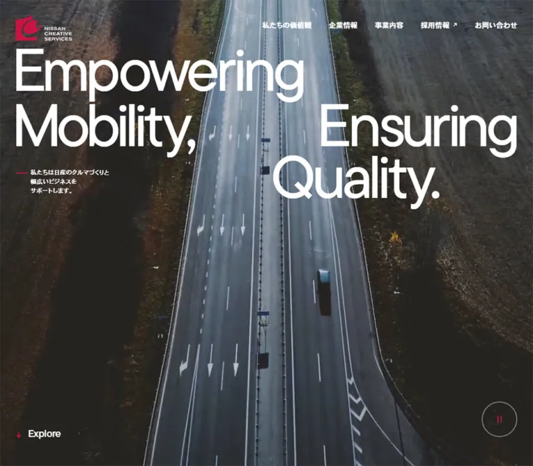
巨大な英語タイポグラフィと業務風景の動画を軸に、白い余白、非対称の情報配置、赤いアクセントで構成したコーポレートサイト。
オリジナルサイトを見るNissan Creative Services — Style Reference
Industrial work and human expertise framed by enormous English typography and precise white space.
Website: Nissan Creative Services
Original URL: https://www.nissan-nics.co.jp/
Final URL: https://www.nissan-nics.co.jp/ — HTTP 200; unchanged.
Theme: a predominantly white corporate website with dark photographic sections, charcoal text, crimson interaction details, and small category colors.
Inspected: September 13, 2026, at 04:57:39 JST; supplied retrieval timestamp: 2026-09-12T19:57:39.189Z.
Viewports: desktop 1440 × 1000 and mobile 390 × 844 CSS pixels.
Scope: the current corporate homepage. Supplied screenshots show the desktop hero, part of Company Information, the desktop footer, and the mobile hero and footer. Rendered DOM and computed styles additionally cover Corporate Philosophy, Our Business, Our Values, Recent News, Recruit, and navigation content. Linked detail pages and opened navigation states were not inspected.
Nissan Creative Services uses scale to make a broad corporate offering feel coherent. The English statement “Empowering Mobility, Ensuring Quality.” stretches across the opening media and returns at the bottom in black on white. Its deliberate line breaks and staggered alignment create a recognizable composition before the visitor reads any service description.
The quieter information system is equally specific: small English labels sit above bold Japanese titles, photographs occupy unequal columns, paragraphs often sit farther right than their headings, and thin rules divide linked rows. Large outlined capsules provide navigation without filling the page with solid action blocks. Rounded photographic frames soften the industrial subject matter while generous gaps keep the dense company information readable.
This is a multi-section corporate homepage serving company research, service discovery, news, and recruitment. Preserve those parallel purposes when adapting the design.
How to Read This Reference
- Measured means a value appears in the supplied computed styles or element rectangles. Dimensions are CSS pixels; most tables round geometry to two decimal places.
- Source-declared means a custom property or embedded SVG value is present. Its existence does not prove that every visually similar element uses it.
- Estimated means an approximate reading of the supplied current-page screenshots. Slogan typography, several image dimensions, and some visible borders fall into this category.
- Recommended means implementation guidance for a new project. Quick Start classes, intermediate responsive formulas, and the breakpoint are adaptations, not recovered source code.
- The recorded English and Japanese font stacks are known. Successful loading of each named webfont was not independently verified through a font-loading report.
- Nonzero DOM rectangles do not establish visibility. Navigation panels appear in the element inventory even though the screenshots do not show an opened panel.
- Document heights were approximately
15,497pxon desktop and10,245pxon mobile. These are capture results, not heights to hardcode.
Tokens — Colors
Default Palette
| Name | Value | Suggested token / source evidence | Role and confidence |
|---|---|---|---|
| White | #FFFFFF |
--color-paper; source --wp--preset--color--base |
Measured white Philosophy surface and reversed text; visually the main company and footer canvas. |
| Charcoal | #212121 |
--color-ink; source --wp--preset--color--contrast |
Measured body, heading, company-link, and footer text. |
| Action Crimson | #C71444 |
--color-action; embedded fills in --icon-arrow-active and --icon-select |
Exact source icon color. Visually similar red details appear in arrows, the Menu control, playback marks, and short statement rules; those individual fills were not all sampled. |
| Slate | #53595D |
--color-slate; source --wp--preset--color--gray |
Available source preset, visually consistent with the recruitment panel. That panel's actual background layer was not sampled. |
| Category Teal | #2DA4A2 |
--color-category-1; source --wp--preset--color--green |
Measured Engineering and first Values number chips, plus the Topics badge. |
| Category Orange | #DF772C |
--color-category-2; source --wp--preset--color--orange |
Measured Car Life Support and second Values chips. |
| Category Blue | #339BD5 |
--color-category-3; source --wp--preset--color--blue |
Measured Business Service and third Values chips. |
| Category Red | #D53333 |
--color-category-4; source --wp--preset--color--red |
Measured fourth Values chip; distinct from Action Crimson. |
| Pale Outline | Approximately #DEDEDE |
--color-outline |
Screenshot estimate for the light outlined View More capsule. Its border color was not included in the computed-style fields. |
White and charcoal carry most of the interface. Crimson is concentrated in small directional and brand details. Teal, orange, blue, and red identify numbered content; they do not form a general multicolor surface system.
The hero's steel-blue and gray appearance comes largely from the media frame and its darkening treatment. Neither the exact overlay color nor its opacity was supplied. Do not turn a sampled video-frame color into a universal background token.
Theme Presets
No user-selectable theme was shown or recorded. White content areas and dark media sections are simultaneous parts of the page, not separate themes.
The custom-property inventory also contains many generic color, gradient, and shadow presets. Their presence is not evidence that the current homepage visibly uses those effects. The reference therefore promotes only the colors tied to inspected content or clearly identified source icons.
Tokens — Typography
English Display and Labels
Measured element stack: tt-commons-pro, "Helvetica Neue", Helvetica, Arial, Avenir, Verdana, Roboto, sans-serif.
The source also declares --en-font and an English font-family preset with Avenir earlier in the fallback order. The measured element stack above is the closest reference for the sampled headings.
Large English section headings use weight 400, line height 0.9, and tracking -0.05em. They feel tightly assembled without becoming heavy. Smaller English labels generally use weight 500 and tracking around -0.04em. Numbers use weights 500–600.
The hero and footer slogans visually belong to this English type system, but their individual character spans were not included in the computed-element sample. Their exact size, weight, tracking, and font resolution remain unmeasured.
Japanese Headings and Body
Measured stack: heisei-kaku-gothic-std, "Hiragino Kaku Gothic ProN", "Hiragino Sans", "Noto Sans JP", Meiryo, "Yu Gothic", YuGothic, sans-serif.
Japanese titles are usually weight 700, with slight positive tracking of approximately 0.01em. Paragraphs use weight 400, substantial line spacing, and similarly modest tracking. The hero's three-line supporting statement uses weight 500 and 0.02em tracking.
English supplies the large visual architecture; Japanese carries the explanatory content and prominent service titles. Do not apply the English negative tracking to Japanese paragraphs.
Type Scale
Values below are measured unless explicitly marked as estimates. Size and line height are written as size / line-height.
| Role | Desktop | Mobile | Weight / tracking |
|---|---|---|---|
| Root element | 16px |
16px |
Normal root, not a custom miniature unit system. |
| Body default | 16 / 30.4px |
15 / 28.8px |
400; normal tracking. |
| Hero and footer slogan | Approximately 160px |
Approximately 70px |
Visual estimates; Quick Start proposes regular weight and tight tracking. |
| Major English H2 | 110 / 99px |
56 / 50.4px |
400; -0.05em. |
| Japanese section caption | 13 / 24.7px |
12 / 23.04px |
Usually 700; Recruit uses 400. |
| Desktop navigation | 14 / 25.2px |
Replaced by Menu | 700; 0.01em. |
| Mobile Menu | Not shown at desktop | 16 / 12.8px |
English stack, 500; -0.05em. |
| Business English label | 20 / 24px |
14 / 16.8px |
500; -0.04em. |
| Business Japanese H3 | 50 / 65px |
30 / 42px |
700; 0.01em. |
| Company Profile English label | 18 / 25.2px |
14 / 19.6px |
500; -0.04em. |
| Company Profile Japanese H3 | 38 / 53.2px |
26 / 36.4px |
700; 0.01em. |
| Company-row English label | 18 / 21.6px |
14 / 16.8px |
500; -0.04em. |
| Company-row Japanese H3 | 30 / 42px |
20 / 28px |
700; 0.01em. |
| Philosophy paragraph | 18 / 37.8px |
17 / 30.94px |
400; 0.01em. |
| Business paragraph | 18 / 32.4px |
17 / 30.6px |
400; 0.01em. |
| Company Profile paragraph | 15 / 28.5px |
14 / 26.88px |
400; 0.01em. |
| Values English H3 | 22 / 19.8px |
16 / 14.4px |
500; -0.04em. |
| Values paragraph | 16 / 28.8px |
14 / 25.2px |
400; 0.01em. |
| Regular news title | 16 / 28.8px |
15 / 22.5px |
500; 0.01em. |
| Hero supporting statement | 15.984 / 23.976px |
14 / 21px |
500; 0.02em. |
| Footer supporting statement | 13.968 / 20.952px |
13 / 19.5px |
500; 0.02em. |
| Explore | 20 / 16px |
16 / 12.8px |
English stack, 500; -0.02em. |
| Copyright | 12 / 8.4px |
12 / 8.4px |
English stack, 500; 0.01em. |
The sampled View More anchor inherits 16 / 22.4px on desktop and 15 / 21px on mobile. The visibly larger English label inside the desktop capsule appears approximately 22px, while its parenthetical Japanese qualifier is much smaller. Those inner spans were not measured; do not mistake the anchor's inherited size for a complete description of the label.
Several English utilities use line heights shorter than their font size. Preserve their compact visual rhythm, but verify wrapping and clipping with the actual loaded font. A safer line height for wrapped Values titles is a recommended adaptation, not an observed source value.
Tokens — Spacing & Shapes
Density: broad section spacing around tightly composed labels and controls. Geometry: mostly unboxed content, thin separators, softly rounded photographs, fully rounded action capsules, and circular media controls.
Spacing Scale
| Use | Desktop measurement | Mobile measurement |
|---|---|---|
| Standard company-section horizontal inset | 42.048px |
20.787px |
| Hero horizontal padding | 43.056px |
20.787px |
| Hero top padding | 97px |
77px |
| Company section top / bottom padding | 158 / 170px |
73 / 80px |
| Philosophy top / bottom padding | 158 / 120px |
73 / 80px |
| News top / bottom padding | 188 / 170px |
73 / 80px |
| Company-row top / bottom padding | 35 / 34px |
27 / 27px |
| Company-row image-to-copy gap | 5.1%, approximately 34.58px |
20.787px |
| View More left / right padding | 37 / 23px |
27 / 21px |
| View More gap on several variants | 40px |
20px |
| Philosophy paragraph-to-button gap | 48px |
31px |
| Mobile business block separation | Shared desktop stage geometry | 60px between measured blocks |
| Footer bottom padding | 40px |
20px |
The site does not use one universal section inset. Mobile Philosophy and Values outer wrappers use approximately 10.41px, while their inner text is inset farther. Recruit uses a narrower text column with approximately 55.1px horizontal section padding at the inspected phone width.
Source Responsive Tokens
These exact declarations are available in the supplied custom properties. Their names describe ranges; the original selector assignments were not supplied.
/* Source-declared values; not a complete stylesheet. */
--wp--preset--spacing--42-20:
  clamp(1.25rem, 0.766rem + 2.066vw, 2.625rem);
--wp--preset--spacing--170-80:
  clamp(5rem, -1.685rem + 13.678vw, 10.625rem);
--wp--preset--spacing--120-60:
  clamp(3.75rem, -0.707rem + 9.119vw, 7.5rem);
--wp--preset--font-size--50-30:
  clamp(1.875rem, 0.389rem + 3.04vw, 3.125rem);
--wp--preset--font-size--38-26:
  clamp(1.625rem, 0.734rem + 1.824vw, 2.375rem);
Use the measured endpoints to check an adaptation. The presence of these formulas does not establish the site's navigation breakpoint or the unmeasured slogan sizing formula.
Border Radius
| Element | Value | Evidence |
|---|---|---|
| Philosophy upper corners | 20px desktop; 10px mobile |
Computed section radius. |
| View More capsules | 9999px |
Computed anchor radius. |
| Number and Topics chips | 9999px |
Computed element radius. |
| Mobile Menu capsule | 9999px |
Computed button radius. |
| Company navigation rows | 0 |
Computed anchor radius. |
| Company thumbnails and footer image | Approximately 6–10px |
Screenshot estimate. |
| Recruitment outer panel | Approximately 20px desktop; 10px mobile |
Screenshot estimate. |
| Scrolled desktop header | Approximately 10–12px |
Screenshot estimate. |
| Playback control | Visually circular | The sampled button itself reports zero radius; the visible circle belongs to its rendered decoration or child. |
Layout Measurements
| Element | Desktop | Mobile |
|---|---|---|
| Hero section bounding height | 1020px |
854px |
| Following Philosophy section start | y = 1000px |
y = 844px |
| Standard content width | Approximately 1355.91px |
Approximately 348.44px |
| Initial logo link | 111 × 50px, at approximately (42, 30) |
89 × 40.08px, at (20, 15) |
| Menu button | Not present in desktop capture | 91 × 34px, at (279, 18) |
| Playback button | 70 × 70px, at approximately (1328, 873) |
50 × 50px, at approximately (319.22, 764) |
| Company link list | 677.95px wide, starting at x = 42.05px |
Full standard content width. |
| Company profile column | 564.86px wide, starting at x = 833.09px |
Full standard content width. |
| Profile paragraph box | 282px wide, aligned to the right |
348.44px box with 31.2px right padding. |
| Company row bounding height | 168.88px |
102.41px |
| Company row-to-row pitch | 169.88px |
103.41px |
| Standard company View More | 282 × 76px |
250 × 68px |
| Business number chip | 51 × 26px |
44 × 23px |
| Footer group-mark box | 159 × 34px |
110 × 28.8px |
The next section begins one viewport below the top while the hero extends another 20px on desktop and 10px on mobile. This measured overlap supports the rounded transition into the white Philosophy surface. It does not reveal the underlying viewport-unit formula.
The company layout is consistent with a twelve-part grid: six parts for the left list, one empty part, and five parts for the right profile. This is a useful geometric interpretation, not a recovered grid-template-columns declaration.
Components
Corporate Header
Role: identity and access to the site's main information areas.
The initial desktop header floats directly over the hero. Its logo is left aligned, while five navigation items occupy the right side: 私たちの価値観, 企業情報, 事業内容, 採用情報, and お問い合わせ. Text is white, bold, and compact. Recruitment includes a small diagonal arrow with a measured 7px label-to-icon gap.
The DOM distinguishes ordinary links from the 企業情報 and 事業内容 buttons. It also contains their associated destination inventories. Their opening trigger, keyboard handling, and expanded visual state were not exercised.
A later desktop screenshot shows a white header approximately 1420 × 80px, inset 10px from the top and sides, with a fine light border and rounded corners. Text and logo lettering become dark. The middle company screenshot does not show this bar, so the evidence does not establish a continuously visible header or a particular scroll-direction rule.
On mobile, the full navigation becomes the 91 × 34px Menu capsule. It combines a text label with an approximately 18px crimson circular mark. The initial capsule is transparent with a pale outline and white text. Near the footer, the same control is white with dark text; the logo is absent from that capture. The opened mobile menu is unverified.
Hero and Brand Slogan
Role: establish the company's industrial and service identity at viewport scale.
The hero uses full-bleed media behind white typography. The supplied desktop frame shows an employee presenting business data; the mobile frame shows close automotive machinery. A darkened treatment keeps the lettering legible while allowing the work itself to dominate the background.
The desktop composition has three visual rows:
- “Empowering” starts near the left edge.
- “Mobility,” remains left while “Ensuring” begins much farther right.
- “Quality.” begins near the horizontal midpoint.
The Japanese supporting statement sits under the left phrase, introduced by a short red rule. Its source copy is 私たちは日産のクルマづくりと / 幅広いビジネスを / サポートします。, arranged across three lines.
On mobile, the slogan becomes four rows. “Empowering” and “Mobility,” align left; “Ensuring” aligns toward the right; “Quality.” starts farther left than “Ensuring.” Preserve this stepped arrangement instead of centering all four lines.
The actual H1 is the company name in a 1 × 1px visually hidden box. The visible slogan is divided into individual characters in the DOM. That structure is compatible with animation, but it does not establish a particular letter-reveal sequence.
Hero Media Controls
Role: provide a visible media state and a cue to continue down the page.
A thin outlined circle contains the small crimson pause symbol. Its measured button is 70px square on desktop and 50px square on mobile. The DOM includes 動画を停止 and 動画を再生; the initial visible state presents the stop label and pause glyph. Actual pause/resume behavior was not tested.
Explore sits near the lower-left corner with a small downward red arrow. Its text uses the English family and a deliberately tight line height. The sampled element is a paragraph, so a click-to-scroll action must not be inferred from the label alone.
Bilingual Section Heading
Role: separate the homepage into clear corporate topics.
Use a large regular-weight English H2, often split into two lines, followed by a much smaller Japanese caption. Examples include Corporate Philosophy, Our Business, Company Information, Our Values, and Recent News.
The English title is 110px on desktop and 56px on mobile, with 0.9 line height and -0.05em tracking. The Japanese caption is 13px or 12px, usually bold. Large titles may extend a few pixels left of the nominal content inset through optical positioning; preserve the visual alignment rather than adding a box around them.
Corporate Philosophy
Role: introduce the company's principles before the service overview.
A white section with rounded upper corners overlaps the hero. The desktop heading occupies the left area, while the explanatory paragraph sits in the rightmost third: approximately 452px wide at x = 946px. A 299.19 × 76px View More link follows 48px below the paragraph.
On mobile, the paragraph spans approximately 348px and appears below a substantial media region. Its size remains generous at 17px, and the action becomes approximately 254.72 × 68px. The media subject and full composition are not visible in the supplied screenshots, so its artwork should remain an explicit asset requirement.
View More Capsule
Role: consistent navigation to deeper company content.
An outlined pill combines a prominent English “View More,” a smaller parenthetical Japanese destination label, and an arrow in a crimson circle. The company example is 282 × 76px; widths vary with destination text. Business and recruitment desktop variants measure 81px high. Mobile variants are 68px high and generally 250–276px wide.
The measured desktop anchor padding is 37px left and 23px right. Mobile padding becomes 27px and 21px. Several variants have a 40px desktop or 20px mobile internal gap. The outline in the supplied company screenshot appears approximately 3px thick and light gray; this is an estimate.
Use a single link for the whole capsule. Keep the arrow secondary to its label. The source declares color, background, border, fill, and stroke transitions, but no particular hover fill was captured.
Business Service Block
Role: explain three complementary service areas.
Each entry contains a colored number chip, a small English label, a larger bold Japanese H3, an explanatory paragraph, and a View More link. The entries are Engineering, Car Life Support, and Business Service, associated with teal, orange, and blue respectively.
Desktop information occupies a 564.86px column at approximately x = 833px. All three entries report coincident text coordinates inside a section over 4350px tall. This suggests a shared presentation stage or layered scroll treatment, but the exact visibility sequence, pinning, and transition mechanism are unverified.
Mobile geometry is unambiguous: three separate 348.44px-wide blocks, each approximately 652.08px tall, separated by 60px. Each has a substantial media area before the number and text. The Japanese service heading drops from 50px to 30px, while paragraph text only drops from 18px to 17px.
The section's computed foreground is white, but its section background is transparent. The underlying background/media layers were not sampled; do not invent an exact image or solid fill from that declaration.
Company Profile Feature
Role: give the company overview a larger editorial presence.
The desktop screenshot shows a large office-building photograph on the right, followed by “Company Profile” and the bold Japanese title 企業情報. The paragraph and View More capsule are inset into the right half of this already-right-hand column, creating a second level of asymmetry.
The profile column is approximately 565px wide, while its paragraph is 282px wide. This nested alignment is a defining detail: the heading and body do not share the same left edge.
On mobile, the image, bilingual heading, paragraph, and button form one column. The paragraph retains a small right inset. The three company navigation rows follow the profile content rather than remaining beside it.
Company Navigation Row
Role: direct access to Top Message, List of Locations, and Company Overview.
A row contains a small landscape photograph, stacked English and Japanese labels, and a fine crimson arrow at the far right. Thin charcoal rules run across the list. The row itself has no rounded container, background card, or visible shadow.
Desktop thumbnails are approximately 150 × 100px from the screenshot. The source gap and text position imply a thumbnail width near 62.4px on mobile; its exact mobile image height was not supplied. The English label shrinks from 18px to 14px; the Japanese title shrinks from 30px to 20px.
The observed images are specific to the destinations: a blue architectural detail for Top Message, a green-framed building entrance for Locations, and a close view of Nissan workwear for Company Overview.
Values Entry
Role: turn abstract company values into distinct, numbered explanations.
Four entries address safety and health, customer engagement, professional operations, and talent development. Each combines a colored number chip, English heading, Japanese statement, and explanatory paragraph. The fourth chip adds the category red #D53333.
Desktop text panels alternate between right and left positions. The recorded paragraph boxes are 505px wide with 20px inner horizontal padding. On mobile, all four align to a common centered position: 295px paragraph boxes with 10px inner padding.
The section begins with a white English heading over a darker visual region. Complete image frames and the styling of the Japanese value statements were not included in the visual sample. Their exact artwork, panel fills, and motion should not be reconstructed from the text inventory alone.
Recent News
Role: combine one emphasized topic with concise corporate updates.
The first linked item is a larger feature containing an index, media area, teal Topics capsule, date, and Japanese title. Its measured height is approximately 405.66px on desktop and 179.22px on mobile. The media's subject is not visible in the supplied screenshots.
The following three links are compact rows. Desktop rows are approximately 72.8px high, with the number and date toward the left and the title beginning near the page midpoint. On mobile, they become block layouts approximately 79.5px high, stacking the date above the title while keeping the number in a narrow left lane.
The first item is dated earlier than the subsequent updates. Treat its emphasis as an editorial feature distinction; do not assume the entire section is a single descending date list.
Recruitment Panel
Role: provide a prominent route into recruitment after the news.
The captured lower edge shows a slate-gray rounded panel populated by small employee photographs. The DOM places an English Recruit heading, Japanese caption, paragraph, and View More action within this area.
Desktop explanatory copy is approximately 340px wide and centered around the page midpoint. Mobile text is approximately 280px wide, narrower than standard content. The overall section measures about 834px high on desktop and 737px on mobile.
The link includes the source text 新しいタブで開く. Preserve that announced destination behavior if implementing a new-tab link. Actual navigation was not exercised, and no photograph movement was recorded.
Footer Brand Composition
Role: close with a full brand statement rather than a dense directory.
Three legal links precede the slogan. They align near the right edge on desktop and move to the left on mobile. The main statement repeats the hero's large typography in charcoal on white.
Desktop adds a short, rounded photograph of machined automotive components between “Mobility,” and “Ensuring.” The image is approximately 290 × 110px. On mobile, it becomes an approximately 348 × 109px full-content-width strip between the first and second halves of the statement. This relocation is central to the responsive composition.
A smaller three-line Japanese statement with a red rule sits below the left portion. Copyright anchors the lower left; the Nissan group mark anchors the lower right. Both remain on the bottom row in the inspected phone capture.
The footer contains a visually hidden complete English slogan in addition to the separated character markup. This is useful evidence for preserving a readable text equivalent, though the full accessibility tree was not supplied.
Tokens — Motion & Interaction
| Treatment | Recorded evidence | Interpretation and limitation |
|---|---|---|
| General interaction easing | cubic-bezier(0.16, 1, 0.3, 1) |
Repeated source easing with strong deceleration. |
| Logo transitions | 0.8s for opacity, transform, visibility, and background color |
Defined properties; exact trigger and transform distance unknown. |
| View More and several news links | 0.8s color, background, border, decoration, fill, and stroke transitions |
Supports a coordinated appearance change; endpoint colors were not captured. |
| Footer and secondary links | opacity 0.8s with the same easing |
Source-defined opacity feedback; final opacity unknown. |
| News index and date | transform 0.8s with the same easing |
Transform-capable detail; no observed direction or travel distance. |
| Mobile header visibility | opacity and visibility, 0.8s |
Does not establish a scroll threshold or direction rule. |
| Explore and playback entrance | 1.8s cubic-bezier(0.16, 1, 0.3, 1) both fadeIn |
Exact animation declaration. Keyframes and their initial values were not supplied. |
| Hero media | Pause glyph and stop/play labels | Video-oriented interface is evident; timing, audio, loop attributes, and functional playback changes are unverified. |
| Split-character slogans | Individual letters in the DOM | Animation-compatible markup; no measured stagger or letter trajectory. |
| Desktop business presentation | Shared element coordinates inside a tall section | Suggests staging; scroll scrubbing and pinning are not proven. |
The motion language supported by the declarations is measured and decelerating, with relatively long 800ms appearance transitions. There is no evidence for spring physics, continuous marquee text, or a specific parallax formula.
A computed shorthand of transition: all without a reported duration is not enough to claim a visible animation. Likewise, static screenshots cannot establish the temporal sequence of the media or the lettering.
Surfaces
| Layer | Appearance | Design purpose |
|---|---|---|
| Main information canvas | White with charcoal text | Makes large typography and industrial photography readable. |
| Hero | Full-bleed, darkened photographic media with white text | Establishes scale and the working environment. |
| Philosophy entrance | White surface with rounded upper corners | Creates a soft transition out of the hero. |
| Company links | Unboxed rows with fine horizontal rules | Provides structure with minimal visual weight. |
| View More | Transparent or white-looking interior, pale outline, small crimson arrow disc | Clear navigation without a large filled color block. |
| Scrolled desktop navigation | White floating rounded strip with a faint border | Restores navigation contrast over varied content. |
| Recruitment | Slate-looking rounded field with small photographic windows | Distinguishes the recruitment invitation from white information sections. |
| Business and Values visual regions | Reversed headings; underlying layers incompletely sampled | Preserve strong text contrast, but verify original media before reproducing their surfaces. |
No general elevation-shadow system is visible in the supplied captures. Separation comes from white space, rules, changes of foreground contrast, and a limited set of rounded frames.
Imagery
The current visual evidence combines people at work with the material details of automotive production. The desktop hero shows a workplace presentation. The phone hero and footer show machined metal, circular apertures, tooling, and industrial surfaces. Company imagery adds architecture, a planted entrance, and a close crop of branded workwear.
Use clear, credible operational photography with deliberate crops. Small images should still communicate a real subject at a glance. The large hero image can be immersive and cropped, while the footer image works as a short horizontal interruption inside the typography.
Rounded corners are restrained. Industrial texture should remain sharp and photographic; pixelation, illustration effects, and artificial grain are not part of the observed treatment.
Observed Asset References
No external image filenames or video source URLs were provided. The following references identify what was actually visible or source-declared without inventing paths.
| Asset | Evidence | Use |
|---|---|---|
| Nissan Creative Services logo | Current desktop and mobile screenshots; home-link text in DOM | Header identity, with white or dark lettering according to surface. |
| Workplace presentation media | Desktop hero screenshot | Full-bleed opening media frame. |
| Automotive machinery media | Mobile hero screenshot | Full-height mobile crop. |
| Company building photograph | Desktop company screenshot | Larger Company Profile feature. |
| Architecture, entrance, and workwear thumbnails | Desktop company screenshot | Three company navigation rows. |
| Machined-components photograph | Desktop and mobile footer screenshots | Image inserted into the brand statement. |
| Employee photographs | Partial recruitment panel in footer captures | Human context around recruitment content. |
| Nissan group mark | Desktop and mobile footer screenshots | Lower-right footer identity. |
| Active arrow SVG | Embedded in --icon-arrow-active; intrinsic 43 × 43 view box |
Crimson disc with a white directional arrow; displayed size can differ from intrinsic size. |
| Select SVG | Embedded in --icon-select; intrinsic 18 × 18 view box |
Crimson disc with a white downward chevron; its page placement was not established. |
Supply authorized assets separately. Reproducing the layout does not recover the media files, their crop focal points, or the original video editing.
Layout & Responsive Behavior
Page Sequence
The recorded homepage order is Hero → Corporate Philosophy → Our Business → Company Information → Our Values → Recent News → Recruit → Footer. All these sections remain represented in the mobile DOM.
Desktop Composition
At 1440px, the main content occupies approximately 1356px with 42px side insets. Headings span the available space, while detailed content frequently occupies only a third or five twelfths of it. Large empty areas are intentional parts of the composition.
Company Information provides the clearest example: a six-part link list sits left of a one-part gap and a five-part profile. The paragraph is then aligned inside the right half of the profile. Values alternate their text panels between sides. News uses a broad feature followed by much tighter rows.
Mobile Recomposition
At 390px, standard content width is approximately 348px. The design changes structure as well as scale:
- Full navigation becomes a small Menu capsule.
- The slogan changes from three staggered desktop rows to four mobile rows.
- Business content becomes three separate vertical blocks.
- Company Profile precedes the company navigation list.
- Values text panels share one centered position instead of alternating sides.
- Regular news dates and titles stack.
- Footer legal links move left.
- The footer photograph becomes a full-width strip between the slogan's two phrases.
The mobile page is substantially shorter despite containing the same major sections. The source geometry supports removal or compression of large desktop staging areas, but it does not identify a specific scrolling library.
Breakpoints and Overflow
Only two viewport sizes were inspected. The exact breakpoint, tablet behavior, landscape treatment, zoom behavior, and intermediate interpolation are unknown. Quick Start uses a recommended 60rem breakpoint and endpoint-based formulas.
Preserve the slogan's word boundaries while allowing the surrounding layout to adapt. For a new implementation, check the longest word against fallback-font widths at narrow sizes and increased text zoom. Avoid solving overflow by clipping the text.
Do’s and Don’ts
Do
- Repeat the distinctive slogan composition at both the opening and closing of the page.
- Use the recorded English and Japanese font stacks, with visibly different roles for each language.
- Keep English section headings regular, oversized, tightly tracked, and closely led.
- Preserve the asymmetry between company headings, image placement, and narrow explanatory paragraphs.
- Use white, charcoal, and small crimson details as the main interface palette.
- Reserve teal, orange, blue, and category red for the numbered content system.
- Build company links as ruled rows with small destination-specific photographs.
- Keep mobile body text comfortable even when headings shrink substantially.
- Recompose the footer image between the two slogan phrases on mobile.
- Treat media controls, Menu, and View More as distinct component types.
Don’t
- Don’t reduce the corporate homepage to one conversion action or omit its service, company, news, and recruitment routes.
- Don’t center every heading and paragraph; the unequal alignments carry much of the identity.
- Don’t replace the company list with an equal-width rounded-card grid.
- Don’t fill every action with crimson or use category colors as arbitrary section backgrounds.
- Don’t copy generic gradient and shadow presets merely because they appear in the custom-property inventory.
- Don’t treat transparent computed section backgrounds as proof of an empty white visual surface.
- Don’t invent hero font measurements from the surrounding body element.
- Don’t claim a working dropdown, carousel, parallax sequence, or letter stagger from static markup.
- Don’t assign a discovered-looking filename to an image whose URL was not supplied.
- Don’t shrink the entire desktop composition proportionally onto the phone.
Recommended Implementation Additions
These are recommendations for a new implementation, not verified features of the original site:
- Preserve the existing stop/play wording and update the accessible media-control name when playback changes. Offer a stable poster when motion is reduced or video cannot load.
- Make navigation buttons expose expanded state and their controlled panel. Add keyboard operation, Escape handling, and appropriate focus management for the chosen menu pattern.
- Expand the mobile Menu's effective target to at least
44pxhigh while retaining its visually compact34pxcapsule if desired. - Keep a single readable text equivalent for each split-character slogan and prevent decorative letters from being announced repeatedly.
- Test white hero text against several media frames, not just the supplied still. Use a consistent scrim where necessary.
- Provide visible focus indicators that appear immediately, even if decorative color changes retain the source's
800mseasing. - Increase line height for wrapped English Values headings and copyright text where the source's compressed line boxes become fragile.
- Ensure sequential service content remains available if a desktop presentation stage fails to initialize.
- Keep news dates as machine-readable time elements and preserve the editorial distinction of the featured topic.
- Reserve media dimensions to avoid layout shifts; load lower-page photography lazily while prioritizing the initial hero poster.
Agent Prompt Guide
Quick Color Reference
- Main page:
#FFFFFF. - Main text:
#212121. - Small directional accents:
#C71444. - Pale action outline: approximately
#DEDEDE. - Recruitment surface adaptation:
#53595D. - Numbered category sequence:
#2DA4A2,#DF772C,#339BD5,#D53333. - Hero: photographic media with white text; darkening opacity must be chosen against the actual media.
Overall Prompt
“Create a Japanese corporate homepage for a company supporting automotive engineering, vehicle-related services, and business operations. Use a white canvas, charcoal text, very large regular English typography, and bold Japanese content titles. Open with full-viewport workplace or automotive-production media. Arrange ‘Empowering Mobility, Ensuring Quality.’ in staggered lines, with a small three-line Japanese statement and a short crimson rule. Follow with bilingual section headings, asymmetric image-and-text layouts, three numbered service entries, a company profile beside thinly ruled navigation rows, four values, a featured news item with compact update rows, and a recruitment panel. Close by repeating the slogan in black, inserting a short factory photograph between its phrases. Use outlined View More capsules with small crimson arrow discs. Recompose the page for mobile rather than uniformly shrinking it.”
Example Component Prompts
- Hero: “Create a full-height photographic hero with a small logo at upper left and compact navigation at upper right. Use an approximately 160px desktop English slogan with ‘Empowering’ above left-aligned ‘Mobility,’ and right-positioned ‘Ensuring’ above ‘Quality.’ Add a restrained Japanese statement, bottom-left Explore cue, and bottom-right outlined pause circle. On a 390px phone, use approximately 70px type in four staggered rows and replace navigation with a Menu pill. Treat those slogan sizes as visual targets, not recovered source measurements.”
- Company section: “Use a twelve-part desktop composition: six parts for three thinly ruled photograph-and-label links, one empty part, and five parts for a large company photograph and profile heading. Align the profile paragraph and outlined action inside the right half of the profile column. Stack the profile before the links on mobile.”
- Service entry: “Combine a small colored number capsule, a 20px English label, a bold 50px Japanese title, spacious 18px Japanese copy, and an outlined View More link. Use white foreground over approved dark media. On mobile, render separate sequential sections with 30px Japanese titles and 17px body copy. Do not add unverified carousel controls.”
- Company navigation row: “Create an unboxed row with a small 3:2 architectural photograph, an English label above a bold Japanese title, a tiny crimson right arrow, and fine charcoal rules across the list. Use approximately 150 × 100px images and 169px rows on desktop, with smaller images and approximately 102px rows on mobile.”
- Footer: “On white, repeat the enormous staggered brand slogan in charcoal. Place a rounded industrial photograph between ‘Mobility,’ and ‘Ensuring’ on desktop. On mobile, make the photograph a full-width strip between the two phrase groups. Keep legal links above, a small Japanese statement with a crimson rule below, copyright at lower left, and the group mark at lower right.”
Quick Start
CSS Custom Properties
This is an unexecuted adaptation of the measured endpoints and visible composition. It is not a full reproduction of the original page. The slogan scale, outline color, media scrim, breakpoint, and intermediate layout formulas are recommendations. Load licensed fonts and supply authorized media separately.
The CSS uses a normal 16px root. It provides the main visual primitives; menu logic, media playback, and any desktop scroll staging require separate implementation.
:root {
  /* Exact source colors, except the estimated pale outline. */
  --color-paper: #fff;
  --color-ink: #212121;
  --color-action: #c71444;
  --color-slate: #53595d;
  --color-category-1: #2da4a2;
  --color-category-2: #df772c;
  --color-category-3: #339bd5;
  --color-category-4: #d53333;
  --color-outline: #dedede;

  /* Recorded computed font stacks; font files are not supplied. */
  --font-en: 'tt-commons-pro', 'Helvetica Neue', Helvetica,
    Arial, Avenir, Verdana, Roboto, sans-serif;
  --font-ja: 'heisei-kaku-gothic-std',
    'Hiragino Kaku Gothic ProN', 'Hiragino Sans',
    'Noto Sans JP', Meiryo, 'Yu Gothic', YuGothic, sans-serif;

  /* Recommended interpolation between observed endpoints. */
  --gutter: clamp(20.8px, 2.92vw, 42.05px);
  --frame-inset: clamp(10px, 1.389vw, 20px);
  --content-max: 1356px;
  --text-brand: clamp(100px, 11.111vw, 160px);
  --text-section: clamp(56px, 7.639vw, 110px);
  --text-service: clamp(1.875rem, 0.389rem + 3.04vw, 3.125rem);
  --text-profile: clamp(1.625rem, 0.734rem + 1.824vw, 2.375rem);
  --space-section: clamp(80px, 11.806vw, 170px);
  --radius-image: 8px;
  --radius-panel: 20px;
  --radius-pill: 9999px;
  --ease-out: cubic-bezier(0.16, 1, 0.3, 1);
  --duration-ui: 800ms;
}

* { box-sizing: border-box; }
html { font-size: 16px; }
body {
  margin: 0;
  color: var(--color-ink);
  background: var(--color-paper);
  font: 400 16px/1.9 var(--font-ja);
}
img { display: block; max-width: 100%; }
button, a { -webkit-tap-highlight-color: transparent; }
button { font: inherit; }

.content {
  width: min(calc(100% - 2 * var(--gutter)), var(--content-max));
  margin-inline: auto;
}
.section { padding-block: var(--space-section); }
.section-title {
  margin: 0;
  font: 400 var(--text-section)/0.9 var(--font-en);
  letter-spacing: -0.05em;
}
.section-caption {
  margin: 4px 0 0;
  font-size: 13px;
  font-weight: 700;
}
.english-label {
  margin: 0;
  font: 500 18px/1.4 var(--font-en);
  letter-spacing: -0.04em;
}
.japanese-title {
  margin: 12px 0 0;
  font-size: var(--text-profile);
  line-height: 1.4;
  letter-spacing: 0.01em;
}

/* State hooks model captured appearances; triggers are application logic. */
.site-header {
  position: fixed;
  z-index: 30;
  inset: 30px var(--gutter) auto;
  display: flex;
  align-items: center;
  justify-content: space-between;
  min-height: 50px;
  color: #fff;
}
.site-logo { display: block; width: 111px; }
.site-nav {
  display: flex;
  align-items: center;
  gap: clamp(28px, 5.42vw, 78px);
}
.site-nav a, .site-nav button {
  padding: 0;
  border: 0;
  color: inherit;
  background: transparent;
  text-decoration: none;
  font: 700 14px/1.8 var(--font-ja);
  letter-spacing: 0.01em;
}
.site-header.is-solid {
  inset: 10px 10px auto;
  min-height: 80px;
  padding-inline: 32px;
  border: 1px solid #eee;
  border-radius: 11px;
  color: var(--color-ink);
  background: #fff;
}
.site-header.is-solid .site-logo { width: 89px; }
.menu-trigger { display: none; }

.hero {
  position: relative;
  isolation: isolate;
  min-height: 100svh;
  padding: 97px var(--gutter) 140px;
  color: #fff;
  background: var(--color-slate);
}
.hero-media, .hero-scrim {
  position: absolute;
  z-index: -1;
  inset: 0;
  width: 100%;
  height: 100%;
}
.hero-media { object-fit: cover; }
.hero-scrim {
  /* Recommended starting point; tune against every media frame. */
  background: rgb(8 19 29 / 28%);
}
.brand-lockup {
  display: grid;
  grid-template-columns: 38% 23% 39%;
  font: 400 var(--text-brand)/0.9 var(--font-en);
  letter-spacing: -0.05em;
}
.brand-word { min-width: 0; white-space: nowrap; }
.brand-word--empowering { grid-area: 1 / 1 / 2 / 4; }
.brand-word--mobility { grid-area: 2 / 1 / 3 / 2; }
.brand-word--ensuring {
  grid-area: 2 / 3 / 3 / 4;
  justify-self: end;
}
.brand-word--quality {
  grid-area: 3 / 1 / 4 / 4;
  padding-inline-start: 50%;
}
.brand-media {
  grid-area: 2 / 2 / 3 / 3;
  align-self: center;
  width: calc(100% - 22px);
  height: 110px;
  border-radius: var(--radius-image);
  object-fit: cover;
}
.hero .brand-media { display: none; }
.brand-note {
  grid-area: 3 / 1 / 4 / 2;
  align-self: start;
  display: flex;
  gap: 6px;
  margin: 23px 0 0;
  font: 500 16px/1.5 var(--font-ja);
  letter-spacing: 0.02em;
}
.brand-note::before {
  content: '';
  flex: 0 0 30px;
  height: 2px;
  margin-top: 0.9em;
  background: var(--color-action);
}
.hero-explore {
  position: absolute;
  left: var(--gutter);
  bottom: 54px;
  display: flex;
  align-items: center;
  gap: 12px;
  margin: 0;
  font: 500 20px/0.8 var(--font-en);
  letter-spacing: -0.02em;
}
.hero-explore::before {
  content: '↓';
  color: var(--color-action);
}
.playback-button {
  position: absolute;
  right: var(--gutter);
  bottom: 57px;
  display: grid;
  place-items: center;
  width: 70px;
  height: 70px;
  padding: 0;
  border: 2px solid rgb(255 255 255 / 40%);
  border-radius: 50%;
  color: var(--color-action);
  background: transparent;
  cursor: pointer;
}

.more-link {
  display: inline-flex;
  align-items: center;
  justify-content: space-between;
  gap: 20px;
  width: 282px;
  max-width: 100%;
  min-height: 76px;
  padding: 12px 23px 12px 37px;
  border: 3px solid var(--color-outline);
  border-radius: var(--radius-pill);
  color: inherit;
  text-decoration: none;
  transition: border-color var(--duration-ui) var(--ease-out),
    color var(--duration-ui) var(--ease-out);
}
.more-link__label { display: flex; align-items: baseline; gap: 6px; }
.more-link__en {
  font: 500 22px/1 var(--font-en);
  letter-spacing: -0.04em;
}
.more-link__ja { font: 700 10px/1.4 var(--font-ja); }
.more-link__arrow {
  flex: 0 0 25px;
  display: grid;
  place-items: center;
  width: 25px;
  height: 25px;
  border-radius: 50%;
  color: #fff;
  background: var(--color-action);
  font: 400 15px/1 sans-serif;
}

/* Children: profile image, profile copy, then company links. */
.company-grid {
  display: grid;
  grid-template-columns: repeat(12, minmax(0, 1fr));
  row-gap: 36px;
  margin-top: 40px;
}
.profile-image {
  grid-area: 1 / 8 / 2 / 13;
  width: 100%;
  aspect-ratio: 3 / 2;
  border-radius: var(--radius-image);
  object-fit: cover;
}
.profile-copy { grid-area: 2 / 8 / 3 / 13; }
.profile-summary {
  width: 50%;
  margin: 38px 0 0 auto;
  font-size: 15px;
  line-height: 1.9;
  letter-spacing: 0.01em;
}
.profile-summary .more-link { margin-top: 40px; }
.company-links {
  grid-area: 2 / 1 / 3 / 7;
  align-self: start;
  border-top: 1px solid var(--color-ink);
}
.company-row {
  display: grid;
  grid-template-columns: 150px minmax(0, 1fr) 16px;
  align-items: center;
  column-gap: 34px;
  min-height: 170px;
  padding-block: 34px;
  border-bottom: 1px solid var(--color-ink);
  color: inherit;
  text-decoration: none;
}
.company-row img {
  width: 100%;
  aspect-ratio: 3 / 2;
  border-radius: var(--radius-image);
  object-fit: cover;
}
.company-row h3 {
  margin: 12px 0 0;
  font-size: 30px;
  line-height: 1.4;
  letter-spacing: 0.01em;
}
.company-row__arrow { color: var(--color-action); }
.number-chip {
  display: inline-grid;
  place-items: center;
  min-width: 51px;
  height: 26px;
  border-radius: var(--radius-pill);
  color: #fff;
  background: var(--category-color, var(--color-category-1));
  font: 600 16px/1 var(--font-en);
  letter-spacing: -0.02em;
}

.site-footer { padding: 30px var(--gutter) 40px; }
.footer-legal {
  display: grid;
  justify-content: end;
  font-size: 14px;
  line-height: 1.9;
}
.footer-legal a { color: inherit; text-decoration: none; }
.site-footer .brand-lockup { margin-top: 80px; }
.site-footer .brand-note { font-size: 14px; }
.footer-bottom {
  display: flex;
  justify-content: space-between;
  align-items: end;
  gap: 20px;
  margin-top: 32px;
}
.footer-copyright {
  margin: 0;
  font: 500 12px/1.2 var(--font-en);
  letter-spacing: 0.01em;
}
.footer-group-mark { width: 159px; }

/* Recommended feedback; these endpoints were not captured. */
@media (hover: hover) {
  .more-link:hover { border-color: var(--color-action); }
  .footer-legal a:hover { text-decoration: underline; }
}
:where(a, button):focus-visible {
  outline: 2px solid var(--color-action);
  outline-offset: 5px;
}
.visually-hidden {
  position: absolute;
  width: 1px;
  height: 1px;
  padding: 0;
  overflow: hidden;
  clip-path: inset(50%);
  white-space: nowrap;
  border: 0;
}

/* Recommended breakpoint; only the two endpoint viewports were observed. */
@media (max-width: 60rem) {
  :root {
    --text-brand: clamp(52px, 17.95vw, 70px);
    --radius-panel: 10px;
  }
  body { font-size: 15px; line-height: 1.92; }
  .section { padding-block: 73px 80px; }
  .section-caption { font-size: 12px; }
  .english-label { font-size: 14px; }
  .site-header {
    inset: 15px 20px auto;
    min-height: 40px;
  }
  .site-logo { width: 89px; }
  .site-nav { display: none; }
  .menu-trigger {
    position: relative;
    display: flex;
    align-items: center;
    justify-content: space-between;
    width: 91px;
    height: 34px;
    padding: 0 7px 0 16px;
    border: 1px solid rgb(255 255 255 / 50%);
    border-radius: var(--radius-pill);
    color: inherit;
    background: transparent;
    font: 500 16px/0.8 var(--font-en);
    letter-spacing: -0.05em;
  }
  .menu-trigger::before {
    content: '';
    position: absolute;
    inset: -5px 0;
  }
  .menu-trigger__mark {
    width: 18px;
    height: 18px;
    border-radius: 50%;
    background: var(--color-action);
  }
  .site-header.is-solid {
    inset: 15px 20px auto;
    min-height: 40px;
    padding: 0;
    border: 0;
    background: transparent;
  }
  .site-header.is-solid .site-logo { visibility: hidden; }
  .site-header.is-solid .menu-trigger {
    color: var(--color-ink);
    background: #fff;
  }
  .hero { padding: 77px var(--gutter) 120px; }
  .brand-lockup { display: flex; flex-direction: column; line-height: 0.95; }
  .brand-word--ensuring { align-self: flex-end; }
  .brand-word--quality { padding: 0; margin-left: 18.5%; }
  .brand-media { width: 100%; height: 110px; margin-block: 10px; }
  .brand-note { margin-top: 28px; font-size: 14px; }
  .brand-note::before { flex-basis: 20px; }
  .hero-explore { bottom: 30px; gap: 10px; font-size: 16px; }
  .playback-button { bottom: 30px; width: 50px; height: 50px; }
  .more-link { width: 250px; min-height: 68px; padding-inline: 27px 21px; }
  .company-grid { display: flex; flex-direction: column; gap: 24px; }
  .profile-summary { width: 100%; margin-top: 12px; font-size: 14px; }
  .profile-summary .more-link { margin-top: 23px; }
  .company-links { margin-top: 24px; }
  .company-row {
    grid-template-columns: 62px minmax(0, 1fr) 12px;
    column-gap: 20px;
    min-height: 103px;
    padding-block: 24px;
  }
  .company-row h3 { margin-top: 9px; font-size: 20px; }
  .number-chip { min-width: 44px; height: 23px; font-size: 15px; }
  .site-footer { padding-top: 20px; padding-bottom: 20px; }
  .footer-legal { justify-content: start; }
  .site-footer .brand-lockup { margin-top: 60px; }
  .site-footer .brand-note { margin-top: 36px; font-size: 13px; }
  .footer-bottom { margin-top: 60px; gap: 12px; }
  .footer-group-mark { width: 110px; }
}

/* This removes CSS motion; application code must also pause video. */
@media (prefers-reduced-motion: reduce) {
  *, *::before, *::after {
    animation: none !important;
    transition: none !important;
    scroll-behavior: auto !important;
  }
}
Shared Brand Markup
Use this structure inside the hero or footer. The image URL is an explicit placeholder for an authorized asset, not an observed source path. The hero CSS hides the inline image because its media lives behind the text.
<div class="brand-lockup">
  <p class="visually-hidden">Empowering Mobility, Ensuring Quality.</p>
  <span class="brand-word brand-word--empowering" aria-hidden="true">Empowering</span>
  <span class="brand-word brand-word--mobility" aria-hidden="true">Mobility,</span>
  <img class="brand-media" src="YOUR_FACTORY_IMAGE_URL" alt="" width="580" height="220">
  <span class="brand-word brand-word--ensuring" aria-hidden="true">Ensuring</span>
  <span class="brand-word brand-word--quality" aria-hidden="true">Quality.</span>
  <p class="brand-note">
    <span>私たちは日産のクルマづくりと<br>幅広いビジネスを<br>サポートします。</span>
  </p>
</div>
Tailwind v4 Token Mapping
Optional aliases for a project already using Tailwind v4. This mapping does not identify the original site's framework. Define the Quick Start properties first.
@theme inline {
  --color-paper: #fff;
  --color-ink: #212121;
  --color-action: #c71444;
  --color-slate: #53595d;
  --color-category-1: #2da4a2;
  --color-category-2: #df772c;
  --color-category-3: #339bd5;
  --color-category-4: #d53333;
  --font-english: var(--font-en);
  --font-japanese: var(--font-ja);
  --text-brand-display: var(--text-brand);
  --text-section-display: var(--text-section);
  --text-service-heading: var(--text-service);
  --spacing-page-inset: var(--gutter);
  --spacing-section-gap: var(--space-section);
  --radius-photo: var(--radius-image);
  --radius-capsule: 9999px;
  --ease-corporate: cubic-bezier(0.16, 1, 0.3, 1);
}
Sources & Evidence
- Original and final page: https://www.nissan-nics.co.jp/. The supplied inspection reports HTTP 200 with no URL change. The page title, company-name H1, home-link identity, and copyright identify Nissan Creative Services.
- Capture record:
2026-09-12T19:57:39.189Z, corresponding to September 13, 2026, 04:57:39 JST. The record contains desktop1440 × 1000and mobile390 × 844observations; separate per-screenshot timestamps were not supplied. - Visual evidence: three current desktop captures covering the hero, company-content detail, and footer; two current mobile captures covering the hero and footer. Other homepage sections are documented through the rendered text, links, element geometry, and computed styles rather than complete visual captures.
- Style evidence: sampled font stacks, sizes, weights, line heights, tracking, padding, radii, colors, transitions, animation declarations, source custom properties, and embedded icon SVG data. Media-element styles, slogan-letter styles, and most border properties were not included.
- Interaction evidence: initial observation and scroll traversal were part of capture collection. No explicit menu activation, hover comparison, playback toggle, keyboard session, or link-following result was provided. Navigation destinations are recorded targets, not separately inspected pages.
- Capture limitations: collection awaited document loading and bounded layout, text, animation, and image readiness checks. Perpetual animations were paused during readiness checks and resumed afterward. These checks do not prove that delayed content was complete or reveal the timing of unexercised interactions. SharedWorkers and service workers were disabled during inspection.
This reference describes the supplied current homepage evidence. Measurements are tied to the two inspected viewports; screenshot estimates and implementation recommendations are labeled separately.
# Nissan Creative Services — Style Reference

> Industrial work and human expertise framed by enormous English typography and precise white space.

**Website:** [Nissan Creative Services](https://www.nissan-nics.co.jp/)
**Original URL:** https://www.nissan-nics.co.jp/
**Final URL:** https://www.nissan-nics.co.jp/ — HTTP 200; unchanged.
**Theme:** a predominantly white corporate website with dark photographic sections, charcoal text, crimson interaction details, and small category colors.
**Inspected:** September 13, 2026, at 04:57:39 JST; supplied retrieval timestamp: `2026-09-12T19:57:39.189Z`.
**Viewports:** desktop `1440 × 1000` and mobile `390 × 844` CSS pixels.
**Scope:** the current corporate homepage. Supplied screenshots show the desktop hero, part of Company Information, the desktop footer, and the mobile hero and footer. Rendered DOM and computed styles additionally cover Corporate Philosophy, Our Business, Our Values, Recent News, Recruit, and navigation content. Linked detail pages and opened navigation states were not inspected.

Nissan Creative Services uses scale to make a broad corporate offering feel coherent. The English statement “Empowering Mobility, Ensuring Quality.” stretches across the opening media and returns at the bottom in black on white. Its deliberate line breaks and staggered alignment create a recognizable composition before the visitor reads any service description.

The quieter information system is equally specific: small English labels sit above bold Japanese titles, photographs occupy unequal columns, paragraphs often sit farther right than their headings, and thin rules divide linked rows. Large outlined capsules provide navigation without filling the page with solid action blocks. Rounded photographic frames soften the industrial subject matter while generous gaps keep the dense company information readable.

This is a multi-section corporate homepage serving company research, service discovery, news, and recruitment. Preserve those parallel purposes when adapting the design.

## How to Read This Reference

- **Measured** means a value appears in the supplied computed styles or element rectangles. Dimensions are CSS pixels; most tables round geometry to two decimal places.
- **Source-declared** means a custom property or embedded SVG value is present. Its existence does not prove that every visually similar element uses it.
- **Estimated** means an approximate reading of the supplied current-page screenshots. Slogan typography, several image dimensions, and some visible borders fall into this category.
- **Recommended** means implementation guidance for a new project. Quick Start classes, intermediate responsive formulas, and the breakpoint are adaptations, not recovered source code.
- The recorded English and Japanese font stacks are known. Successful loading of each named webfont was not independently verified through a font-loading report.
- Nonzero DOM rectangles do not establish visibility. Navigation panels appear in the element inventory even though the screenshots do not show an opened panel.
- Document heights were approximately `15,497px` on desktop and `10,245px` on mobile. These are capture results, not heights to hardcode.

## Tokens — Colors

### Default Palette

| Name | Value | Suggested token / source evidence | Role and confidence |
| --- | --- | --- | --- |
| White | `#FFFFFF` | `--color-paper`; source `--wp--preset--color--base` | Measured white Philosophy surface and reversed text; visually the main company and footer canvas. |
| Charcoal | `#212121` | `--color-ink`; source `--wp--preset--color--contrast` | Measured body, heading, company-link, and footer text. |
| Action Crimson | `#C71444` | `--color-action`; embedded fills in `--icon-arrow-active` and `--icon-select` | Exact source icon color. Visually similar red details appear in arrows, the Menu control, playback marks, and short statement rules; those individual fills were not all sampled. |
| Slate | `#53595D` | `--color-slate`; source `--wp--preset--color--gray` | Available source preset, visually consistent with the recruitment panel. That panel's actual background layer was not sampled. |
| Category Teal | `#2DA4A2` | `--color-category-1`; source `--wp--preset--color--green` | Measured Engineering and first Values number chips, plus the Topics badge. |
| Category Orange | `#DF772C` | `--color-category-2`; source `--wp--preset--color--orange` | Measured Car Life Support and second Values chips. |
| Category Blue | `#339BD5` | `--color-category-3`; source `--wp--preset--color--blue` | Measured Business Service and third Values chips. |
| Category Red | `#D53333` | `--color-category-4`; source `--wp--preset--color--red` | Measured fourth Values chip; distinct from Action Crimson. |
| Pale Outline | Approximately `#DEDEDE` | `--color-outline` | Screenshot estimate for the light outlined View More capsule. Its border color was not included in the computed-style fields. |

White and charcoal carry most of the interface. Crimson is concentrated in small directional and brand details. Teal, orange, blue, and red identify numbered content; they do not form a general multicolor surface system.

The hero's steel-blue and gray appearance comes largely from the media frame and its darkening treatment. Neither the exact overlay color nor its opacity was supplied. Do not turn a sampled video-frame color into a universal background token.

### Theme Presets

No user-selectable theme was shown or recorded. White content areas and dark media sections are simultaneous parts of the page, not separate themes.

The custom-property inventory also contains many generic color, gradient, and shadow presets. Their presence is not evidence that the current homepage visibly uses those effects. The reference therefore promotes only the colors tied to inspected content or clearly identified source icons.

## Tokens — Typography

### English Display and Labels

**Measured element stack:** `tt-commons-pro, "Helvetica Neue", Helvetica, Arial, Avenir, Verdana, Roboto, sans-serif`.

The source also declares `--en-font` and an English font-family preset with Avenir earlier in the fallback order. The measured element stack above is the closest reference for the sampled headings.

Large English section headings use weight `400`, line height `0.9`, and tracking `-0.05em`. They feel tightly assembled without becoming heavy. Smaller English labels generally use weight `500` and tracking around `-0.04em`. Numbers use weights `500–600`.

The hero and footer slogans visually belong to this English type system, but their individual character spans were not included in the computed-element sample. Their exact size, weight, tracking, and font resolution remain unmeasured.

### Japanese Headings and Body

**Measured stack:** `heisei-kaku-gothic-std, "Hiragino Kaku Gothic ProN", "Hiragino Sans", "Noto Sans JP", Meiryo, "Yu Gothic", YuGothic, sans-serif`.

Japanese titles are usually weight `700`, with slight positive tracking of approximately `0.01em`. Paragraphs use weight `400`, substantial line spacing, and similarly modest tracking. The hero's three-line supporting statement uses weight `500` and `0.02em` tracking.

English supplies the large visual architecture; Japanese carries the explanatory content and prominent service titles. Do not apply the English negative tracking to Japanese paragraphs.

### Type Scale

Values below are measured unless explicitly marked as estimates. Size and line height are written as `size / line-height`.

| Role | Desktop | Mobile | Weight / tracking |
| --- | --- | --- | --- |
| Root element | `16px` | `16px` | Normal root, not a custom miniature unit system. |
| Body default | `16 / 30.4px` | `15 / 28.8px` | `400`; normal tracking. |
| Hero and footer slogan | Approximately `160px` | Approximately `70px` | Visual estimates; Quick Start proposes regular weight and tight tracking. |
| Major English H2 | `110 / 99px` | `56 / 50.4px` | `400`; `-0.05em`. |
| Japanese section caption | `13 / 24.7px` | `12 / 23.04px` | Usually `700`; Recruit uses `400`. |
| Desktop navigation | `14 / 25.2px` | Replaced by Menu | `700`; `0.01em`. |
| Mobile Menu | Not shown at desktop | `16 / 12.8px` | English stack, `500`; `-0.05em`. |
| Business English label | `20 / 24px` | `14 / 16.8px` | `500`; `-0.04em`. |
| Business Japanese H3 | `50 / 65px` | `30 / 42px` | `700`; `0.01em`. |
| Company Profile English label | `18 / 25.2px` | `14 / 19.6px` | `500`; `-0.04em`. |
| Company Profile Japanese H3 | `38 / 53.2px` | `26 / 36.4px` | `700`; `0.01em`. |
| Company-row English label | `18 / 21.6px` | `14 / 16.8px` | `500`; `-0.04em`. |
| Company-row Japanese H3 | `30 / 42px` | `20 / 28px` | `700`; `0.01em`. |
| Philosophy paragraph | `18 / 37.8px` | `17 / 30.94px` | `400`; `0.01em`. |
| Business paragraph | `18 / 32.4px` | `17 / 30.6px` | `400`; `0.01em`. |
| Company Profile paragraph | `15 / 28.5px` | `14 / 26.88px` | `400`; `0.01em`. |
| Values English H3 | `22 / 19.8px` | `16 / 14.4px` | `500`; `-0.04em`. |
| Values paragraph | `16 / 28.8px` | `14 / 25.2px` | `400`; `0.01em`. |
| Regular news title | `16 / 28.8px` | `15 / 22.5px` | `500`; `0.01em`. |
| Hero supporting statement | `15.984 / 23.976px` | `14 / 21px` | `500`; `0.02em`. |
| Footer supporting statement | `13.968 / 20.952px` | `13 / 19.5px` | `500`; `0.02em`. |
| Explore | `20 / 16px` | `16 / 12.8px` | English stack, `500`; `-0.02em`. |
| Copyright | `12 / 8.4px` | `12 / 8.4px` | English stack, `500`; `0.01em`. |

The sampled View More anchor inherits `16 / 22.4px` on desktop and `15 / 21px` on mobile. The visibly larger English label inside the desktop capsule appears approximately `22px`, while its parenthetical Japanese qualifier is much smaller. Those inner spans were not measured; do not mistake the anchor's inherited size for a complete description of the label.

Several English utilities use line heights shorter than their font size. Preserve their compact visual rhythm, but verify wrapping and clipping with the actual loaded font. A safer line height for wrapped Values titles is a recommended adaptation, not an observed source value.

## Tokens — Spacing & Shapes

**Density:** broad section spacing around tightly composed labels and controls.
**Geometry:** mostly unboxed content, thin separators, softly rounded photographs, fully rounded action capsules, and circular media controls.

### Spacing Scale

| Use | Desktop measurement | Mobile measurement |
| --- | --- | --- |
| Standard company-section horizontal inset | `42.048px` | `20.787px` |
| Hero horizontal padding | `43.056px` | `20.787px` |
| Hero top padding | `97px` | `77px` |
| Company section top / bottom padding | `158 / 170px` | `73 / 80px` |
| Philosophy top / bottom padding | `158 / 120px` | `73 / 80px` |
| News top / bottom padding | `188 / 170px` | `73 / 80px` |
| Company-row top / bottom padding | `35 / 34px` | `27 / 27px` |
| Company-row image-to-copy gap | `5.1%`, approximately `34.58px` | `20.787px` |
| View More left / right padding | `37 / 23px` | `27 / 21px` |
| View More gap on several variants | `40px` | `20px` |
| Philosophy paragraph-to-button gap | `48px` | `31px` |
| Mobile business block separation | Shared desktop stage geometry | `60px` between measured blocks |
| Footer bottom padding | `40px` | `20px` |

The site does not use one universal section inset. Mobile Philosophy and Values outer wrappers use approximately `10.41px`, while their inner text is inset farther. Recruit uses a narrower text column with approximately `55.1px` horizontal section padding at the inspected phone width.

### Source Responsive Tokens

These exact declarations are available in the supplied custom properties. Their names describe ranges; the original selector assignments were not supplied.

```css
/* Source-declared values; not a complete stylesheet. */
--wp--preset--spacing--42-20:
  clamp(1.25rem, 0.766rem + 2.066vw, 2.625rem);
--wp--preset--spacing--170-80:
  clamp(5rem, -1.685rem + 13.678vw, 10.625rem);
--wp--preset--spacing--120-60:
  clamp(3.75rem, -0.707rem + 9.119vw, 7.5rem);
--wp--preset--font-size--50-30:
  clamp(1.875rem, 0.389rem + 3.04vw, 3.125rem);
--wp--preset--font-size--38-26:
  clamp(1.625rem, 0.734rem + 1.824vw, 2.375rem);
```

Use the measured endpoints to check an adaptation. The presence of these formulas does not establish the site's navigation breakpoint or the unmeasured slogan sizing formula.

### Border Radius

| Element | Value | Evidence |
| --- | --- | --- |
| Philosophy upper corners | `20px` desktop; `10px` mobile | Computed section radius. |
| View More capsules | `9999px` | Computed anchor radius. |
| Number and Topics chips | `9999px` | Computed element radius. |
| Mobile Menu capsule | `9999px` | Computed button radius. |
| Company navigation rows | `0` | Computed anchor radius. |
| Company thumbnails and footer image | Approximately `6–10px` | Screenshot estimate. |
| Recruitment outer panel | Approximately `20px` desktop; `10px` mobile | Screenshot estimate. |
| Scrolled desktop header | Approximately `10–12px` | Screenshot estimate. |
| Playback control | Visually circular | The sampled button itself reports zero radius; the visible circle belongs to its rendered decoration or child. |

### Layout Measurements

| Element | Desktop | Mobile |
| --- | --- | --- |
| Hero section bounding height | `1020px` | `854px` |
| Following Philosophy section start | `y = 1000px` | `y = 844px` |
| Standard content width | Approximately `1355.91px` | Approximately `348.44px` |
| Initial logo link | `111 × 50px`, at approximately `(42, 30)` | `89 × 40.08px`, at `(20, 15)` |
| Menu button | Not present in desktop capture | `91 × 34px`, at `(279, 18)` |
| Playback button | `70 × 70px`, at approximately `(1328, 873)` | `50 × 50px`, at approximately `(319.22, 764)` |
| Company link list | `677.95px` wide, starting at `x = 42.05px` | Full standard content width. |
| Company profile column | `564.86px` wide, starting at `x = 833.09px` | Full standard content width. |
| Profile paragraph box | `282px` wide, aligned to the right | `348.44px` box with `31.2px` right padding. |
| Company row bounding height | `168.88px` | `102.41px` |
| Company row-to-row pitch | `169.88px` | `103.41px` |
| Standard company View More | `282 × 76px` | `250 × 68px` |
| Business number chip | `51 × 26px` | `44 × 23px` |
| Footer group-mark box | `159 × 34px` | `110 × 28.8px` |

The next section begins one viewport below the top while the hero extends another `20px` on desktop and `10px` on mobile. This measured overlap supports the rounded transition into the white Philosophy surface. It does not reveal the underlying viewport-unit formula.

The company layout is consistent with a twelve-part grid: six parts for the left list, one empty part, and five parts for the right profile. This is a useful geometric interpretation, not a recovered `grid-template-columns` declaration.

## Components

### Corporate Header

**Role:** identity and access to the site's main information areas.

The initial desktop header floats directly over the hero. Its logo is left aligned, while five navigation items occupy the right side: `私たちの価値観`, `企業情報`, `事業内容`, `採用情報`, and `お問い合わせ`. Text is white, bold, and compact. Recruitment includes a small diagonal arrow with a measured `7px` label-to-icon gap.

The DOM distinguishes ordinary links from the `企業情報` and `事業内容` buttons. It also contains their associated destination inventories. Their opening trigger, keyboard handling, and expanded visual state were not exercised.

A later desktop screenshot shows a white header approximately `1420 × 80px`, inset `10px` from the top and sides, with a fine light border and rounded corners. Text and logo lettering become dark. The middle company screenshot does not show this bar, so the evidence does not establish a continuously visible header or a particular scroll-direction rule.

On mobile, the full navigation becomes the `91 × 34px` Menu capsule. It combines a text label with an approximately `18px` crimson circular mark. The initial capsule is transparent with a pale outline and white text. Near the footer, the same control is white with dark text; the logo is absent from that capture. The opened mobile menu is unverified.

### Hero and Brand Slogan

**Role:** establish the company's industrial and service identity at viewport scale.

The hero uses full-bleed media behind white typography. The supplied desktop frame shows an employee presenting business data; the mobile frame shows close automotive machinery. A darkened treatment keeps the lettering legible while allowing the work itself to dominate the background.

The desktop composition has three visual rows:

1. “Empowering” starts near the left edge.
2. “Mobility,” remains left while “Ensuring” begins much farther right.
3. “Quality.” begins near the horizontal midpoint.

The Japanese supporting statement sits under the left phrase, introduced by a short red rule. Its source copy is `私たちは日産のクルマづくりと / 幅広いビジネスを / サポートします。`, arranged across three lines.

On mobile, the slogan becomes four rows. “Empowering” and “Mobility,” align left; “Ensuring” aligns toward the right; “Quality.” starts farther left than “Ensuring.” Preserve this stepped arrangement instead of centering all four lines.

The actual H1 is the company name in a `1 × 1px` visually hidden box. The visible slogan is divided into individual characters in the DOM. That structure is compatible with animation, but it does not establish a particular letter-reveal sequence.

### Hero Media Controls

**Role:** provide a visible media state and a cue to continue down the page.

A thin outlined circle contains the small crimson pause symbol. Its measured button is `70px` square on desktop and `50px` square on mobile. The DOM includes `動画を停止` and `動画を再生`; the initial visible state presents the stop label and pause glyph. Actual pause/resume behavior was not tested.

Explore sits near the lower-left corner with a small downward red arrow. Its text uses the English family and a deliberately tight line height. The sampled element is a paragraph, so a click-to-scroll action must not be inferred from the label alone.

### Bilingual Section Heading

**Role:** separate the homepage into clear corporate topics.

Use a large regular-weight English H2, often split into two lines, followed by a much smaller Japanese caption. Examples include Corporate Philosophy, Our Business, Company Information, Our Values, and Recent News.

The English title is `110px` on desktop and `56px` on mobile, with `0.9` line height and `-0.05em` tracking. The Japanese caption is `13px` or `12px`, usually bold. Large titles may extend a few pixels left of the nominal content inset through optical positioning; preserve the visual alignment rather than adding a box around them.

### Corporate Philosophy

**Role:** introduce the company's principles before the service overview.

A white section with rounded upper corners overlaps the hero. The desktop heading occupies the left area, while the explanatory paragraph sits in the rightmost third: approximately `452px` wide at `x = 946px`. A `299.19 × 76px` View More link follows `48px` below the paragraph.

On mobile, the paragraph spans approximately `348px` and appears below a substantial media region. Its size remains generous at `17px`, and the action becomes approximately `254.72 × 68px`. The media subject and full composition are not visible in the supplied screenshots, so its artwork should remain an explicit asset requirement.

### View More Capsule

**Role:** consistent navigation to deeper company content.

An outlined pill combines a prominent English “View More,” a smaller parenthetical Japanese destination label, and an arrow in a crimson circle. The company example is `282 × 76px`; widths vary with destination text. Business and recruitment desktop variants measure `81px` high. Mobile variants are `68px` high and generally `250–276px` wide.

The measured desktop anchor padding is `37px` left and `23px` right. Mobile padding becomes `27px` and `21px`. Several variants have a `40px` desktop or `20px` mobile internal gap. The outline in the supplied company screenshot appears approximately `3px` thick and light gray; this is an estimate.

Use a single link for the whole capsule. Keep the arrow secondary to its label. The source declares color, background, border, fill, and stroke transitions, but no particular hover fill was captured.

### Business Service Block

**Role:** explain three complementary service areas.

Each entry contains a colored number chip, a small English label, a larger bold Japanese H3, an explanatory paragraph, and a View More link. The entries are Engineering, Car Life Support, and Business Service, associated with teal, orange, and blue respectively.

Desktop information occupies a `564.86px` column at approximately `x = 833px`. All three entries report coincident text coordinates inside a section over `4350px` tall. This suggests a shared presentation stage or layered scroll treatment, but the exact visibility sequence, pinning, and transition mechanism are unverified.

Mobile geometry is unambiguous: three separate `348.44px`-wide blocks, each approximately `652.08px` tall, separated by `60px`. Each has a substantial media area before the number and text. The Japanese service heading drops from `50px` to `30px`, while paragraph text only drops from `18px` to `17px`.

The section's computed foreground is white, but its section background is transparent. The underlying background/media layers were not sampled; do not invent an exact image or solid fill from that declaration.

### Company Profile Feature

**Role:** give the company overview a larger editorial presence.

The desktop screenshot shows a large office-building photograph on the right, followed by “Company Profile” and the bold Japanese title `企業情報`. The paragraph and View More capsule are inset into the right half of this already-right-hand column, creating a second level of asymmetry.

The profile column is approximately `565px` wide, while its paragraph is `282px` wide. This nested alignment is a defining detail: the heading and body do not share the same left edge.

On mobile, the image, bilingual heading, paragraph, and button form one column. The paragraph retains a small right inset. The three company navigation rows follow the profile content rather than remaining beside it.

### Company Navigation Row

**Role:** direct access to Top Message, List of Locations, and Company Overview.

A row contains a small landscape photograph, stacked English and Japanese labels, and a fine crimson arrow at the far right. Thin charcoal rules run across the list. The row itself has no rounded container, background card, or visible shadow.

Desktop thumbnails are approximately `150 × 100px` from the screenshot. The source gap and text position imply a thumbnail width near `62.4px` on mobile; its exact mobile image height was not supplied. The English label shrinks from `18px` to `14px`; the Japanese title shrinks from `30px` to `20px`.

The observed images are specific to the destinations: a blue architectural detail for Top Message, a green-framed building entrance for Locations, and a close view of Nissan workwear for Company Overview.

### Values Entry

**Role:** turn abstract company values into distinct, numbered explanations.

Four entries address safety and health, customer engagement, professional operations, and talent development. Each combines a colored number chip, English heading, Japanese statement, and explanatory paragraph. The fourth chip adds the category red `#D53333`.

Desktop text panels alternate between right and left positions. The recorded paragraph boxes are `505px` wide with `20px` inner horizontal padding. On mobile, all four align to a common centered position: `295px` paragraph boxes with `10px` inner padding.

The section begins with a white English heading over a darker visual region. Complete image frames and the styling of the Japanese value statements were not included in the visual sample. Their exact artwork, panel fills, and motion should not be reconstructed from the text inventory alone.

### Recent News

**Role:** combine one emphasized topic with concise corporate updates.

The first linked item is a larger feature containing an index, media area, teal Topics capsule, date, and Japanese title. Its measured height is approximately `405.66px` on desktop and `179.22px` on mobile. The media's subject is not visible in the supplied screenshots.

The following three links are compact rows. Desktop rows are approximately `72.8px` high, with the number and date toward the left and the title beginning near the page midpoint. On mobile, they become block layouts approximately `79.5px` high, stacking the date above the title while keeping the number in a narrow left lane.

The first item is dated earlier than the subsequent updates. Treat its emphasis as an editorial feature distinction; do not assume the entire section is a single descending date list.

### Recruitment Panel

**Role:** provide a prominent route into recruitment after the news.

The captured lower edge shows a slate-gray rounded panel populated by small employee photographs. The DOM places an English Recruit heading, Japanese caption, paragraph, and View More action within this area.

Desktop explanatory copy is approximately `340px` wide and centered around the page midpoint. Mobile text is approximately `280px` wide, narrower than standard content. The overall section measures about `834px` high on desktop and `737px` on mobile.

The link includes the source text `新しいタブで開く`. Preserve that announced destination behavior if implementing a new-tab link. Actual navigation was not exercised, and no photograph movement was recorded.

### Footer Brand Composition

**Role:** close with a full brand statement rather than a dense directory.

Three legal links precede the slogan. They align near the right edge on desktop and move to the left on mobile. The main statement repeats the hero's large typography in charcoal on white.

Desktop adds a short, rounded photograph of machined automotive components between “Mobility,” and “Ensuring.” The image is approximately `290 × 110px`. On mobile, it becomes an approximately `348 × 109px` full-content-width strip between the first and second halves of the statement. This relocation is central to the responsive composition.

A smaller three-line Japanese statement with a red rule sits below the left portion. Copyright anchors the lower left; the Nissan group mark anchors the lower right. Both remain on the bottom row in the inspected phone capture.

The footer contains a visually hidden complete English slogan in addition to the separated character markup. This is useful evidence for preserving a readable text equivalent, though the full accessibility tree was not supplied.

## Tokens — Motion & Interaction

| Treatment | Recorded evidence | Interpretation and limitation |
| --- | --- | --- |
| General interaction easing | `cubic-bezier(0.16, 1, 0.3, 1)` | Repeated source easing with strong deceleration. |
| Logo transitions | `0.8s` for opacity, transform, visibility, and background color | Defined properties; exact trigger and transform distance unknown. |
| View More and several news links | `0.8s` color, background, border, decoration, fill, and stroke transitions | Supports a coordinated appearance change; endpoint colors were not captured. |
| Footer and secondary links | `opacity 0.8s` with the same easing | Source-defined opacity feedback; final opacity unknown. |
| News index and date | `transform 0.8s` with the same easing | Transform-capable detail; no observed direction or travel distance. |
| Mobile header visibility | `opacity` and `visibility`, `0.8s` | Does not establish a scroll threshold or direction rule. |
| Explore and playback entrance | `1.8s cubic-bezier(0.16, 1, 0.3, 1) both fadeIn` | Exact animation declaration. Keyframes and their initial values were not supplied. |
| Hero media | Pause glyph and stop/play labels | Video-oriented interface is evident; timing, audio, loop attributes, and functional playback changes are unverified. |
| Split-character slogans | Individual letters in the DOM | Animation-compatible markup; no measured stagger or letter trajectory. |
| Desktop business presentation | Shared element coordinates inside a tall section | Suggests staging; scroll scrubbing and pinning are not proven. |

The motion language supported by the declarations is measured and decelerating, with relatively long `800ms` appearance transitions. There is no evidence for spring physics, continuous marquee text, or a specific parallax formula.

A computed shorthand of `transition: all` without a reported duration is not enough to claim a visible animation. Likewise, static screenshots cannot establish the temporal sequence of the media or the lettering.

## Surfaces

| Layer | Appearance | Design purpose |
| --- | --- | --- |
| Main information canvas | White with charcoal text | Makes large typography and industrial photography readable. |
| Hero | Full-bleed, darkened photographic media with white text | Establishes scale and the working environment. |
| Philosophy entrance | White surface with rounded upper corners | Creates a soft transition out of the hero. |
| Company links | Unboxed rows with fine horizontal rules | Provides structure with minimal visual weight. |
| View More | Transparent or white-looking interior, pale outline, small crimson arrow disc | Clear navigation without a large filled color block. |
| Scrolled desktop navigation | White floating rounded strip with a faint border | Restores navigation contrast over varied content. |
| Recruitment | Slate-looking rounded field with small photographic windows | Distinguishes the recruitment invitation from white information sections. |
| Business and Values visual regions | Reversed headings; underlying layers incompletely sampled | Preserve strong text contrast, but verify original media before reproducing their surfaces. |

No general elevation-shadow system is visible in the supplied captures. Separation comes from white space, rules, changes of foreground contrast, and a limited set of rounded frames.

## Imagery

The current visual evidence combines people at work with the material details of automotive production. The desktop hero shows a workplace presentation. The phone hero and footer show machined metal, circular apertures, tooling, and industrial surfaces. Company imagery adds architecture, a planted entrance, and a close crop of branded workwear.

Use clear, credible operational photography with deliberate crops. Small images should still communicate a real subject at a glance. The large hero image can be immersive and cropped, while the footer image works as a short horizontal interruption inside the typography.

Rounded corners are restrained. Industrial texture should remain sharp and photographic; pixelation, illustration effects, and artificial grain are not part of the observed treatment.

### Observed Asset References

No external image filenames or video source URLs were provided. The following references identify what was actually visible or source-declared without inventing paths.

| Asset | Evidence | Use |
| --- | --- | --- |
| Nissan Creative Services logo | Current desktop and mobile screenshots; home-link text in DOM | Header identity, with white or dark lettering according to surface. |
| Workplace presentation media | Desktop hero screenshot | Full-bleed opening media frame. |
| Automotive machinery media | Mobile hero screenshot | Full-height mobile crop. |
| Company building photograph | Desktop company screenshot | Larger Company Profile feature. |
| Architecture, entrance, and workwear thumbnails | Desktop company screenshot | Three company navigation rows. |
| Machined-components photograph | Desktop and mobile footer screenshots | Image inserted into the brand statement. |
| Employee photographs | Partial recruitment panel in footer captures | Human context around recruitment content. |
| Nissan group mark | Desktop and mobile footer screenshots | Lower-right footer identity. |
| Active arrow SVG | Embedded in `--icon-arrow-active`; intrinsic `43 × 43` view box | Crimson disc with a white directional arrow; displayed size can differ from intrinsic size. |
| Select SVG | Embedded in `--icon-select`; intrinsic `18 × 18` view box | Crimson disc with a white downward chevron; its page placement was not established. |

Supply authorized assets separately. Reproducing the layout does not recover the media files, their crop focal points, or the original video editing.

## Layout & Responsive Behavior

### Page Sequence

The recorded homepage order is Hero → Corporate Philosophy → Our Business → Company Information → Our Values → Recent News → Recruit → Footer. All these sections remain represented in the mobile DOM.

### Desktop Composition

At `1440px`, the main content occupies approximately `1356px` with `42px` side insets. Headings span the available space, while detailed content frequently occupies only a third or five twelfths of it. Large empty areas are intentional parts of the composition.

Company Information provides the clearest example: a six-part link list sits left of a one-part gap and a five-part profile. The paragraph is then aligned inside the right half of the profile. Values alternate their text panels between sides. News uses a broad feature followed by much tighter rows.

### Mobile Recomposition

At `390px`, standard content width is approximately `348px`. The design changes structure as well as scale:

- Full navigation becomes a small Menu capsule.
- The slogan changes from three staggered desktop rows to four mobile rows.
- Business content becomes three separate vertical blocks.
- Company Profile precedes the company navigation list.
- Values text panels share one centered position instead of alternating sides.
- Regular news dates and titles stack.
- Footer legal links move left.
- The footer photograph becomes a full-width strip between the slogan's two phrases.

The mobile page is substantially shorter despite containing the same major sections. The source geometry supports removal or compression of large desktop staging areas, but it does not identify a specific scrolling library.

### Breakpoints and Overflow

Only two viewport sizes were inspected. The exact breakpoint, tablet behavior, landscape treatment, zoom behavior, and intermediate interpolation are unknown. Quick Start uses a recommended `60rem` breakpoint and endpoint-based formulas.

Preserve the slogan's word boundaries while allowing the surrounding layout to adapt. For a new implementation, check the longest word against fallback-font widths at narrow sizes and increased text zoom. Avoid solving overflow by clipping the text.

## Do’s and Don’ts

### Do

- Repeat the distinctive slogan composition at both the opening and closing of the page.
- Use the recorded English and Japanese font stacks, with visibly different roles for each language.
- Keep English section headings regular, oversized, tightly tracked, and closely led.
- Preserve the asymmetry between company headings, image placement, and narrow explanatory paragraphs.
- Use white, charcoal, and small crimson details as the main interface palette.
- Reserve teal, orange, blue, and category red for the numbered content system.
- Build company links as ruled rows with small destination-specific photographs.
- Keep mobile body text comfortable even when headings shrink substantially.
- Recompose the footer image between the two slogan phrases on mobile.
- Treat media controls, Menu, and View More as distinct component types.

### Don’t

- Don’t reduce the corporate homepage to one conversion action or omit its service, company, news, and recruitment routes.
- Don’t center every heading and paragraph; the unequal alignments carry much of the identity.
- Don’t replace the company list with an equal-width rounded-card grid.
- Don’t fill every action with crimson or use category colors as arbitrary section backgrounds.
- Don’t copy generic gradient and shadow presets merely because they appear in the custom-property inventory.
- Don’t treat transparent computed section backgrounds as proof of an empty white visual surface.
- Don’t invent hero font measurements from the surrounding body element.
- Don’t claim a working dropdown, carousel, parallax sequence, or letter stagger from static markup.
- Don’t assign a discovered-looking filename to an image whose URL was not supplied.
- Don’t shrink the entire desktop composition proportionally onto the phone.

## Recommended Implementation Additions

These are recommendations for a new implementation, not verified features of the original site:

- Preserve the existing stop/play wording and update the accessible media-control name when playback changes. Offer a stable poster when motion is reduced or video cannot load.
- Make navigation buttons expose expanded state and their controlled panel. Add keyboard operation, Escape handling, and appropriate focus management for the chosen menu pattern.
- Expand the mobile Menu's effective target to at least `44px` high while retaining its visually compact `34px` capsule if desired.
- Keep a single readable text equivalent for each split-character slogan and prevent decorative letters from being announced repeatedly.
- Test white hero text against several media frames, not just the supplied still. Use a consistent scrim where necessary.
- Provide visible focus indicators that appear immediately, even if decorative color changes retain the source's `800ms` easing.
- Increase line height for wrapped English Values headings and copyright text where the source's compressed line boxes become fragile.
- Ensure sequential service content remains available if a desktop presentation stage fails to initialize.
- Keep news dates as machine-readable time elements and preserve the editorial distinction of the featured topic.
- Reserve media dimensions to avoid layout shifts; load lower-page photography lazily while prioritizing the initial hero poster.

## Agent Prompt Guide

### Quick Color Reference

- Main page: `#FFFFFF`.
- Main text: `#212121`.
- Small directional accents: `#C71444`.
- Pale action outline: approximately `#DEDEDE`.
- Recruitment surface adaptation: `#53595D`.
- Numbered category sequence: `#2DA4A2`, `#DF772C`, `#339BD5`, `#D53333`.
- Hero: photographic media with white text; darkening opacity must be chosen against the actual media.

### Overall Prompt

“Create a Japanese corporate homepage for a company supporting automotive engineering, vehicle-related services, and business operations. Use a white canvas, charcoal text, very large regular English typography, and bold Japanese content titles. Open with full-viewport workplace or automotive-production media. Arrange ‘Empowering Mobility, Ensuring Quality.’ in staggered lines, with a small three-line Japanese statement and a short crimson rule. Follow with bilingual section headings, asymmetric image-and-text layouts, three numbered service entries, a company profile beside thinly ruled navigation rows, four values, a featured news item with compact update rows, and a recruitment panel. Close by repeating the slogan in black, inserting a short factory photograph between its phrases. Use outlined View More capsules with small crimson arrow discs. Recompose the page for mobile rather than uniformly shrinking it.”

### Example Component Prompts

1. **Hero:** “Create a full-height photographic hero with a small logo at upper left and compact navigation at upper right. Use an approximately 160px desktop English slogan with ‘Empowering’ above left-aligned ‘Mobility,’ and right-positioned ‘Ensuring’ above ‘Quality.’ Add a restrained Japanese statement, bottom-left Explore cue, and bottom-right outlined pause circle. On a 390px phone, use approximately 70px type in four staggered rows and replace navigation with a Menu pill. Treat those slogan sizes as visual targets, not recovered source measurements.”
2. **Company section:** “Use a twelve-part desktop composition: six parts for three thinly ruled photograph-and-label links, one empty part, and five parts for a large company photograph and profile heading. Align the profile paragraph and outlined action inside the right half of the profile column. Stack the profile before the links on mobile.”
3. **Service entry:** “Combine a small colored number capsule, a 20px English label, a bold 50px Japanese title, spacious 18px Japanese copy, and an outlined View More link. Use white foreground over approved dark media. On mobile, render separate sequential sections with 30px Japanese titles and 17px body copy. Do not add unverified carousel controls.”
4. **Company navigation row:** “Create an unboxed row with a small 3:2 architectural photograph, an English label above a bold Japanese title, a tiny crimson right arrow, and fine charcoal rules across the list. Use approximately 150 × 100px images and 169px rows on desktop, with smaller images and approximately 102px rows on mobile.”
5. **Footer:** “On white, repeat the enormous staggered brand slogan in charcoal. Place a rounded industrial photograph between ‘Mobility,’ and ‘Ensuring’ on desktop. On mobile, make the photograph a full-width strip between the two phrase groups. Keep legal links above, a small Japanese statement with a crimson rule below, copyright at lower left, and the group mark at lower right.”

## Quick Start

### CSS Custom Properties

This is an unexecuted adaptation of the measured endpoints and visible composition. It is not a full reproduction of the original page. The slogan scale, outline color, media scrim, breakpoint, and intermediate layout formulas are recommendations. Load licensed fonts and supply authorized media separately.

The CSS uses a normal `16px` root. It provides the main visual primitives; menu logic, media playback, and any desktop scroll staging require separate implementation.

```css
:root {
  /* Exact source colors, except the estimated pale outline. */
  --color-paper: #fff;
  --color-ink: #212121;
  --color-action: #c71444;
  --color-slate: #53595d;
  --color-category-1: #2da4a2;
  --color-category-2: #df772c;
  --color-category-3: #339bd5;
  --color-category-4: #d53333;
  --color-outline: #dedede;

  /* Recorded computed font stacks; font files are not supplied. */
  --font-en: 'tt-commons-pro', 'Helvetica Neue', Helvetica,
    Arial, Avenir, Verdana, Roboto, sans-serif;
  --font-ja: 'heisei-kaku-gothic-std',
    'Hiragino Kaku Gothic ProN', 'Hiragino Sans',
    'Noto Sans JP', Meiryo, 'Yu Gothic', YuGothic, sans-serif;

  /* Recommended interpolation between observed endpoints. */
  --gutter: clamp(20.8px, 2.92vw, 42.05px);
  --frame-inset: clamp(10px, 1.389vw, 20px);
  --content-max: 1356px;
  --text-brand: clamp(100px, 11.111vw, 160px);
  --text-section: clamp(56px, 7.639vw, 110px);
  --text-service: clamp(1.875rem, 0.389rem + 3.04vw, 3.125rem);
  --text-profile: clamp(1.625rem, 0.734rem + 1.824vw, 2.375rem);
  --space-section: clamp(80px, 11.806vw, 170px);
  --radius-image: 8px;
  --radius-panel: 20px;
  --radius-pill: 9999px;
  --ease-out: cubic-bezier(0.16, 1, 0.3, 1);
  --duration-ui: 800ms;
}

* { box-sizing: border-box; }
html { font-size: 16px; }
body {
  margin: 0;
  color: var(--color-ink);
  background: var(--color-paper);
  font: 400 16px/1.9 var(--font-ja);
}
img { display: block; max-width: 100%; }
button, a { -webkit-tap-highlight-color: transparent; }
button { font: inherit; }

.content {
  width: min(calc(100% - 2 * var(--gutter)), var(--content-max));
  margin-inline: auto;
}
.section { padding-block: var(--space-section); }
.section-title {
  margin: 0;
  font: 400 var(--text-section)/0.9 var(--font-en);
  letter-spacing: -0.05em;
}
.section-caption {
  margin: 4px 0 0;
  font-size: 13px;
  font-weight: 700;
}
.english-label {
  margin: 0;
  font: 500 18px/1.4 var(--font-en);
  letter-spacing: -0.04em;
}
.japanese-title {
  margin: 12px 0 0;
  font-size: var(--text-profile);
  line-height: 1.4;
  letter-spacing: 0.01em;
}

/* State hooks model captured appearances; triggers are application logic. */
.site-header {
  position: fixed;
  z-index: 30;
  inset: 30px var(--gutter) auto;
  display: flex;
  align-items: center;
  justify-content: space-between;
  min-height: 50px;
  color: #fff;
}
.site-logo { display: block; width: 111px; }
.site-nav {
  display: flex;
  align-items: center;
  gap: clamp(28px, 5.42vw, 78px);
}
.site-nav a, .site-nav button {
  padding: 0;
  border: 0;
  color: inherit;
  background: transparent;
  text-decoration: none;
  font: 700 14px/1.8 var(--font-ja);
  letter-spacing: 0.01em;
}
.site-header.is-solid {
  inset: 10px 10px auto;
  min-height: 80px;
  padding-inline: 32px;
  border: 1px solid #eee;
  border-radius: 11px;
  color: var(--color-ink);
  background: #fff;
}
.site-header.is-solid .site-logo { width: 89px; }
.menu-trigger { display: none; }

.hero {
  position: relative;
  isolation: isolate;
  min-height: 100svh;
  padding: 97px var(--gutter) 140px;
  color: #fff;
  background: var(--color-slate);
}
.hero-media, .hero-scrim {
  position: absolute;
  z-index: -1;
  inset: 0;
  width: 100%;
  height: 100%;
}
.hero-media { object-fit: cover; }
.hero-scrim {
  /* Recommended starting point; tune against every media frame. */
  background: rgb(8 19 29 / 28%);
}
.brand-lockup {
  display: grid;
  grid-template-columns: 38% 23% 39%;
  font: 400 var(--text-brand)/0.9 var(--font-en);
  letter-spacing: -0.05em;
}
.brand-word { min-width: 0; white-space: nowrap; }
.brand-word--empowering { grid-area: 1 / 1 / 2 / 4; }
.brand-word--mobility { grid-area: 2 / 1 / 3 / 2; }
.brand-word--ensuring {
  grid-area: 2 / 3 / 3 / 4;
  justify-self: end;
}
.brand-word--quality {
  grid-area: 3 / 1 / 4 / 4;
  padding-inline-start: 50%;
}
.brand-media {
  grid-area: 2 / 2 / 3 / 3;
  align-self: center;
  width: calc(100% - 22px);
  height: 110px;
  border-radius: var(--radius-image);
  object-fit: cover;
}
.hero .brand-media { display: none; }
.brand-note {
  grid-area: 3 / 1 / 4 / 2;
  align-self: start;
  display: flex;
  gap: 6px;
  margin: 23px 0 0;
  font: 500 16px/1.5 var(--font-ja);
  letter-spacing: 0.02em;
}
.brand-note::before {
  content: '';
  flex: 0 0 30px;
  height: 2px;
  margin-top: 0.9em;
  background: var(--color-action);
}
.hero-explore {
  position: absolute;
  left: var(--gutter);
  bottom: 54px;
  display: flex;
  align-items: center;
  gap: 12px;
  margin: 0;
  font: 500 20px/0.8 var(--font-en);
  letter-spacing: -0.02em;
}
.hero-explore::before {
  content: '↓';
  color: var(--color-action);
}
.playback-button {
  position: absolute;
  right: var(--gutter);
  bottom: 57px;
  display: grid;
  place-items: center;
  width: 70px;
  height: 70px;
  padding: 0;
  border: 2px solid rgb(255 255 255 / 40%);
  border-radius: 50%;
  color: var(--color-action);
  background: transparent;
  cursor: pointer;
}

.more-link {
  display: inline-flex;
  align-items: center;
  justify-content: space-between;
  gap: 20px;
  width: 282px;
  max-width: 100%;
  min-height: 76px;
  padding: 12px 23px 12px 37px;
  border: 3px solid var(--color-outline);
  border-radius: var(--radius-pill);
  color: inherit;
  text-decoration: none;
  transition: border-color var(--duration-ui) var(--ease-out),
    color var(--duration-ui) var(--ease-out);
}
.more-link__label { display: flex; align-items: baseline; gap: 6px; }
.more-link__en {
  font: 500 22px/1 var(--font-en);
  letter-spacing: -0.04em;
}
.more-link__ja { font: 700 10px/1.4 var(--font-ja); }
.more-link__arrow {
  flex: 0 0 25px;
  display: grid;
  place-items: center;
  width: 25px;
  height: 25px;
  border-radius: 50%;
  color: #fff;
  background: var(--color-action);
  font: 400 15px/1 sans-serif;
}

/* Children: profile image, profile copy, then company links. */
.company-grid {
  display: grid;
  grid-template-columns: repeat(12, minmax(0, 1fr));
  row-gap: 36px;
  margin-top: 40px;
}
.profile-image {
  grid-area: 1 / 8 / 2 / 13;
  width: 100%;
  aspect-ratio: 3 / 2;
  border-radius: var(--radius-image);
  object-fit: cover;
}
.profile-copy { grid-area: 2 / 8 / 3 / 13; }
.profile-summary {
  width: 50%;
  margin: 38px 0 0 auto;
  font-size: 15px;
  line-height: 1.9;
  letter-spacing: 0.01em;
}
.profile-summary .more-link { margin-top: 40px; }
.company-links {
  grid-area: 2 / 1 / 3 / 7;
  align-self: start;
  border-top: 1px solid var(--color-ink);
}
.company-row {
  display: grid;
  grid-template-columns: 150px minmax(0, 1fr) 16px;
  align-items: center;
  column-gap: 34px;
  min-height: 170px;
  padding-block: 34px;
  border-bottom: 1px solid var(--color-ink);
  color: inherit;
  text-decoration: none;
}
.company-row img {
  width: 100%;
  aspect-ratio: 3 / 2;
  border-radius: var(--radius-image);
  object-fit: cover;
}
.company-row h3 {
  margin: 12px 0 0;
  font-size: 30px;
  line-height: 1.4;
  letter-spacing: 0.01em;
}
.company-row__arrow { color: var(--color-action); }
.number-chip {
  display: inline-grid;
  place-items: center;
  min-width: 51px;
  height: 26px;
  border-radius: var(--radius-pill);
  color: #fff;
  background: var(--category-color, var(--color-category-1));
  font: 600 16px/1 var(--font-en);
  letter-spacing: -0.02em;
}

.site-footer { padding: 30px var(--gutter) 40px; }
.footer-legal {
  display: grid;
  justify-content: end;
  font-size: 14px;
  line-height: 1.9;
}
.footer-legal a { color: inherit; text-decoration: none; }
.site-footer .brand-lockup { margin-top: 80px; }
.site-footer .brand-note { font-size: 14px; }
.footer-bottom {
  display: flex;
  justify-content: space-between;
  align-items: end;
  gap: 20px;
  margin-top: 32px;
}
.footer-copyright {
  margin: 0;
  font: 500 12px/1.2 var(--font-en);
  letter-spacing: 0.01em;
}
.footer-group-mark { width: 159px; }

/* Recommended feedback; these endpoints were not captured. */
@media (hover: hover) {
  .more-link:hover { border-color: var(--color-action); }
  .footer-legal a:hover { text-decoration: underline; }
}
:where(a, button):focus-visible {
  outline: 2px solid var(--color-action);
  outline-offset: 5px;
}
.visually-hidden {
  position: absolute;
  width: 1px;
  height: 1px;
  padding: 0;
  overflow: hidden;
  clip-path: inset(50%);
  white-space: nowrap;
  border: 0;
}

/* Recommended breakpoint; only the two endpoint viewports were observed. */
@media (max-width: 60rem) {
  :root {
    --text-brand: clamp(52px, 17.95vw, 70px);
    --radius-panel: 10px;
  }
  body { font-size: 15px; line-height: 1.92; }
  .section { padding-block: 73px 80px; }
  .section-caption { font-size: 12px; }
  .english-label { font-size: 14px; }
  .site-header {
    inset: 15px 20px auto;
    min-height: 40px;
  }
  .site-logo { width: 89px; }
  .site-nav { display: none; }
  .menu-trigger {
    position: relative;
    display: flex;
    align-items: center;
    justify-content: space-between;
    width: 91px;
    height: 34px;
    padding: 0 7px 0 16px;
    border: 1px solid rgb(255 255 255 / 50%);
    border-radius: var(--radius-pill);
    color: inherit;
    background: transparent;
    font: 500 16px/0.8 var(--font-en);
    letter-spacing: -0.05em;
  }
  .menu-trigger::before {
    content: '';
    position: absolute;
    inset: -5px 0;
  }
  .menu-trigger__mark {
    width: 18px;
    height: 18px;
    border-radius: 50%;
    background: var(--color-action);
  }
  .site-header.is-solid {
    inset: 15px 20px auto;
    min-height: 40px;
    padding: 0;
    border: 0;
    background: transparent;
  }
  .site-header.is-solid .site-logo { visibility: hidden; }
  .site-header.is-solid .menu-trigger {
    color: var(--color-ink);
    background: #fff;
  }
  .hero { padding: 77px var(--gutter) 120px; }
  .brand-lockup { display: flex; flex-direction: column; line-height: 0.95; }
  .brand-word--ensuring { align-self: flex-end; }
  .brand-word--quality { padding: 0; margin-left: 18.5%; }
  .brand-media { width: 100%; height: 110px; margin-block: 10px; }
  .brand-note { margin-top: 28px; font-size: 14px; }
  .brand-note::before { flex-basis: 20px; }
  .hero-explore { bottom: 30px; gap: 10px; font-size: 16px; }
  .playback-button { bottom: 30px; width: 50px; height: 50px; }
  .more-link { width: 250px; min-height: 68px; padding-inline: 27px 21px; }
  .company-grid { display: flex; flex-direction: column; gap: 24px; }
  .profile-summary { width: 100%; margin-top: 12px; font-size: 14px; }
  .profile-summary .more-link { margin-top: 23px; }
  .company-links { margin-top: 24px; }
  .company-row {
    grid-template-columns: 62px minmax(0, 1fr) 12px;
    column-gap: 20px;
    min-height: 103px;
    padding-block: 24px;
  }
  .company-row h3 { margin-top: 9px; font-size: 20px; }
  .number-chip { min-width: 44px; height: 23px; font-size: 15px; }
  .site-footer { padding-top: 20px; padding-bottom: 20px; }
  .footer-legal { justify-content: start; }
  .site-footer .brand-lockup { margin-top: 60px; }
  .site-footer .brand-note { margin-top: 36px; font-size: 13px; }
  .footer-bottom { margin-top: 60px; gap: 12px; }
  .footer-group-mark { width: 110px; }
}

/* This removes CSS motion; application code must also pause video. */
@media (prefers-reduced-motion: reduce) {
  *, *::before, *::after {
    animation: none !important;
    transition: none !important;
    scroll-behavior: auto !important;
  }
}
```

### Shared Brand Markup

Use this structure inside the hero or footer. The image URL is an explicit placeholder for an authorized asset, not an observed source path. The hero CSS hides the inline image because its media lives behind the text.

```html
<div class="brand-lockup">
  <p class="visually-hidden">Empowering Mobility, Ensuring Quality.</p>
  <span class="brand-word brand-word--empowering" aria-hidden="true">Empowering</span>
  <span class="brand-word brand-word--mobility" aria-hidden="true">Mobility,</span>
  <img class="brand-media" src="YOUR_FACTORY_IMAGE_URL" alt="" width="580" height="220">
  <span class="brand-word brand-word--ensuring" aria-hidden="true">Ensuring</span>
  <span class="brand-word brand-word--quality" aria-hidden="true">Quality.</span>
  <p class="brand-note">
    <span>私たちは日産のクルマづくりと<br>幅広いビジネスを<br>サポートします。</span>
  </p>
</div>
```

### Tailwind v4 Token Mapping

Optional aliases for a project already using Tailwind v4. This mapping does not identify the original site's framework. Define the Quick Start properties first.

```css
@theme inline {
  --color-paper: #fff;
  --color-ink: #212121;
  --color-action: #c71444;
  --color-slate: #53595d;
  --color-category-1: #2da4a2;
  --color-category-2: #df772c;
  --color-category-3: #339bd5;
  --color-category-4: #d53333;
  --font-english: var(--font-en);
  --font-japanese: var(--font-ja);
  --text-brand-display: var(--text-brand);
  --text-section-display: var(--text-section);
  --text-service-heading: var(--text-service);
  --spacing-page-inset: var(--gutter);
  --spacing-section-gap: var(--space-section);
  --radius-photo: var(--radius-image);
  --radius-capsule: 9999px;
  --ease-corporate: cubic-bezier(0.16, 1, 0.3, 1);
}
```

## Sources & Evidence

- **Original and final page:** [https://www.nissan-nics.co.jp/](https://www.nissan-nics.co.jp/). The supplied inspection reports HTTP 200 with no URL change. The page title, company-name H1, home-link identity, and copyright identify Nissan Creative Services.
- **Capture record:** `2026-09-12T19:57:39.189Z`, corresponding to September 13, 2026, 04:57:39 JST. The record contains desktop `1440 × 1000` and mobile `390 × 844` observations; separate per-screenshot timestamps were not supplied.
- **Visual evidence:** three current desktop captures covering the hero, company-content detail, and footer; two current mobile captures covering the hero and footer. Other homepage sections are documented through the rendered text, links, element geometry, and computed styles rather than complete visual captures.
- **Style evidence:** sampled font stacks, sizes, weights, line heights, tracking, padding, radii, colors, transitions, animation declarations, source custom properties, and embedded icon SVG data. Media-element styles, slogan-letter styles, and most border properties were not included.
- **Interaction evidence:** initial observation and scroll traversal were part of capture collection. No explicit menu activation, hover comparison, playback toggle, keyboard session, or link-following result was provided. Navigation destinations are recorded targets, not separately inspected pages.
- **Capture limitations:** collection awaited document loading and bounded layout, text, animation, and image readiness checks. Perpetual animations were paused during readiness checks and resumed afterward. These checks do not prove that delayed content was complete or reveal the timing of unexercised interactions. SharedWorkers and service workers were disabled during inspection.

This reference describes the supplied current homepage evidence. Measurements are tied to the two inspected viewports; screenshot estimates and implementation recommendations are labeled separately.