DESIGN REFERENCE
株式会社TeaRoom|対立のない優しい世界を目指して
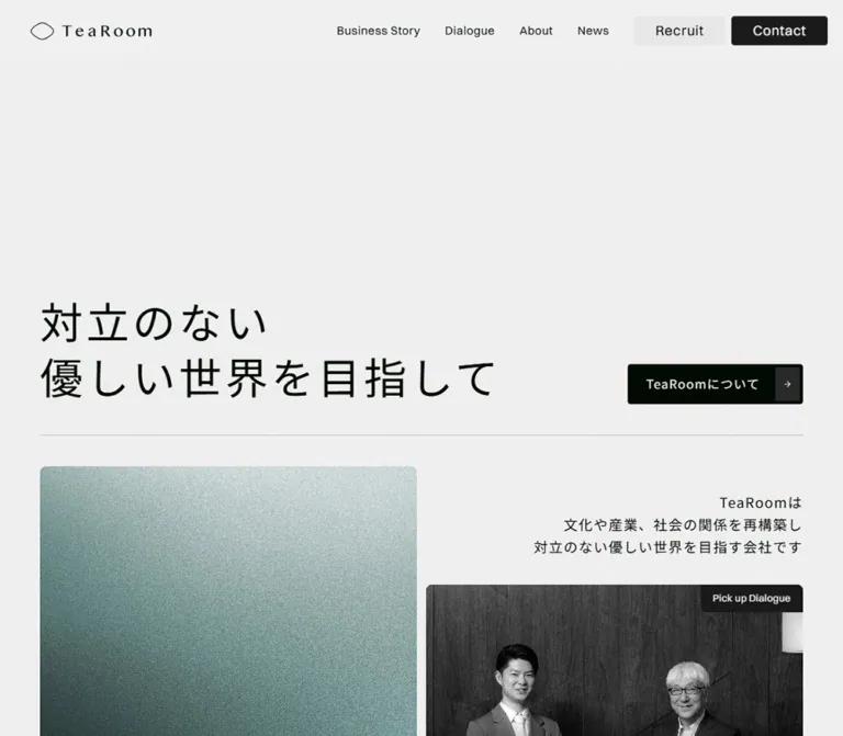
お茶を起点に文化・産業・社会をつなぐTeaRoomの企業サイト。淡いグレーと深い緑黒の面、大きな余白と文字組み、粒子感のあるビジュアルと対話写真が特徴。
オリジナルサイトを見るTeaRoom — Style Reference
A quiet corporate editorial system built from pale grain, deep green-black surfaces, and generous typography.
Website: tearoom.co.jp Original URL: https://tearoom.co.jp/ Final URL: https://tearoom.co.jp/ Theme: light opening and information sections, dark business and dialogue sections, and a green-black footer. No user-selectable theme was verified. Inspected: September 13, 2026, at 03:38 JST. The supplied retrieval timestamp is September 12, 2026, at 18:38:20.704 UTC. Viewports: 1440 × 1000 desktop and 390 × 844 mobile, in CSS pixels. Scope: the current corporate homepage: persistent navigation, opening statement, editorial entry cards, Philosophy, Business Story, Dialogue previews, Client containers, News, and footer. Visual evidence consists of three desktop captures and two mobile captures; the rendered DOM provides additional measurements for sections outside those screenshots. Linked destination pages were not inspected.
TeaRoom presents its identity through a large Japanese statement, an English navigation system, and an unusually spacious sequence of editorial sections. The opening uses a light gray canvas with fine visible grain. Japanese text is regular-weight Noto Sans JP; English navigation and display text use a Switzer stack. The logo supplies a separate, widely spaced serif character.
The page develops from pale introductory content into broad charcoal sections, then returns to light client and news areas before ending on green-black. Photography, a grainy green visual, restrained arrows, and thin horizontal rules provide structure. Buttons remain compact even beside large headings. The result feels like an extended corporate publication with multiple routes into its business and conversations.
How to Read This Reference
- Measured means a value appears in the supplied computed styles or element rectangles. Measurements belong to the recorded viewport and state.
- Visual estimate means a dimension, color relationship, or composition was read from an original-page screenshot without a corresponding computed property.
- Calculated means a value was derived from supplied measurements; the calculation is explained where relevant.
- Recommended means implementation guidance for a new build. Breakpoints, accessibility additions, and the Quick Start are adaptations unless explicitly identified as measured.
- Token names are descriptive aliases. The evidence does not expose a complete named source-token system.
- Computed typography and rendered rectangles sometimes differ. Several lower-page rectangles are also smaller than their apparent size in the later scrolled capture. Text fitting or ancestor transforms may contribute, but the relevant implementation was not exported. Do not convert every recorded rectangle into a permanent CSS size.
- DOM extraction includes navigation text that is absent from the closed mobile-menu screenshot. An element having a rectangle does not establish that it was visibly exposed to the user.
Tokens — Colors
Default Palette
| Name | Value | Suggested token | Role and evidence |
|---|---|---|---|
| Pale canvas | #f0f0f0 |
--color-paper |
Measured body and News-section background; also used for text on dark cards |
| Green-black | #000a02 |
--color-ink |
Measured Japanese text, navigation labels, primary buttons, department cards, and Dialogue-card backgrounds; visually consistent with the footer field |
| Charcoal | #1a1a1a |
--color-charcoal |
Measured opening-header Contact fill; visually matches the broad dark section and footer-card family |
| Raised dark control | #2e2e2e |
--color-control-dark |
Measured footer recruitment and contact button fill |
| Soft gray control | #e7e7e7 |
--color-control-light |
Measured opening-header Recruit fill |
| Cool white | #f6f7f8 |
--color-white |
Measured reversed Contact text, article metadata, and footer explanatory text |
| Warm button text | #f0f1ee |
--color-button-text |
Measured text in the arrow-ended Japanese action buttons |
| Secondary light text | #c5c5c5 |
--color-secondary-dark |
Measured Business Story body text |
| Muted gray | #808080 |
--color-muted |
Measured small section labels, article summaries, footer captions, and copyright |
| News date gray | #7f7f7f |
--color-date |
Measured dates in the main News list |
| News-row wash | rgba(197,197,197,0.1) |
--color-news-wash |
Measured background on each main News link |
The News-row wash over #f0f0f0 produces approximately #ececec, calculated by alpha compositing. Preserve the distinction between the translucent source declaration and its rendered result.
The grainy green Business Story image contributes a muted sage-to-dark-green range. Approximate #9eb7b2 and #41635e are useful visual-estimate starting points for replacement imagery, not measured brand colors or general interface accents.
Section Palette Changes
The page uses contrast to separate chapters. The opening and Philosophy content carry dark text on pale gray. Business Story and Dialogue use pale text over dark surfaces. Client and News return to a light field. The footer uses a green-black background with charcoal panels.
Desktop header colors differ across the supplied scroll positions: the logo and navigation become light, and Contact becomes a light-filled control. The mobile footer capture still shows the pale header. Preserve this viewport-specific observation; a universal automatic inversion rule is not established by the evidence.
Thin rules are visible in both light and dark sections. Their exact border colors were not exported. Use low-contrast ink on pale backgrounds and low-contrast white on dark backgrounds as a recommended approximation.
Tokens — Typography
English Navigation and Display Text
Measured stack: Switzer, "Switzer Placeholder", sans-serif.
Regular 400 supports navigation, utility headings, category labels, and footer text. Light 300 supports the large English section titles and opening editorial-card titles. English tracking commonly equals 0.04em; footer menu links increase to 0.08em.
The computed stack identifies the intended family. Font-file URLs and per-glyph font resolution were not supplied, so a new implementation must load appropriate font resources before assuming the same metrics.
Japanese Statements and Body Copy
Measured stack: "Noto Sans JP", "Noto Sans JP Placeholder", sans-serif.
The sampled Japanese text uses weight 400, including the large opening statement. Its presence comes from scale, tracking, and whitespace rather than bold weight. Tracking is commonly 0.08em, with the featured Dialogue title using 0.12em and some longer summaries using 0.05em.
Brand Artwork
The header combines a thin, enclosed leaf-like outline with a spaced TeaRoom wordmark. The footer enlarges the wordmark without the small outline symbol. Its serif appearance is visually evident, but its font or artwork format is not identified. Use supplied brand artwork when available; do not assign it an invented font family.
Type Scale
Values below are computed CSS values, not necessarily the final transformed glyph dimensions.
| Role | Desktop size / line height | Mobile size / line height | Weight | Tracking |
|---|---|---|---|---|
| Header text navigation | 15 / 18px |
Closed menu hides these links; extracted variant uses 28 / 33.6px |
400 | 0.04em |
| Header Recruit / Contact | 18 / 18px |
Extracted, unverified menu variant: 24 / 24px |
400 | 0.04em |
| Opening Japanese statement | 68 / 88.4px |
51.0221 / 66.3287px |
400 | 0.08em |
| Opening company explanation | 18 / 28.8px |
16.0087 / 25.614px |
400 | 0.08em |
| Japanese arrow-button label | 16 / 28.8px |
Same | 400 | 0.08em |
| Business Story entry title | 64 / 70.4px |
32 / 35.2px |
300 | 0.04em |
| Dialogue entry title | 64 / 64px |
32 / 32px |
300 | 0.04em |
| Featured Dialogue badge | 13 / 15.6px |
Same | 400 | 0.02em |
| Featured Dialogue title | 22 / 30.8px |
18 / 25.2px |
400 | 0.12em |
| Philosophy / Client / News label | 32 / 32px |
Same | 400 | 0.04em |
| Philosophy body | 22 / 44px |
16 / 28.8–32px |
400 | 0.08em |
| Main Business Story heading | 100 / 100px |
64 / 64px, on two lines |
300 | 0.04em |
| Main Dialogue heading | 100 / 100px |
64 / 70.4px |
300 | 0.04em |
| Business Story Japanese statement | 34.7575 / 55.6121px |
Same computed values, with smaller rendered bounds | 400 | 0.08em |
| Business Story body | 16 / 27.2px |
Same | 400 | 0.05em |
| Large Dialogue article title | 28 / 42px |
20 / 30px |
400 | 0.08em |
| Dialogue article summary | 14 / 21px |
Same | 400 | 0.05em |
| Main News headline | 16 / 25.6px |
Same | 400 | 0.08em |
| Main News date | 16 / 16px |
Same | 300 | 0.04em |
| Footer panel title | 32 / 32px |
26 / 26px |
400 | 0.04em |
| Footer panel explanation | 14 / 22.4px |
Same | 400 | 0.08em |
| Footer menu link | 16 / 22.4px |
Same | 400 | 0.08em |
| Footer caption | 12 / 14.4px |
Same | 400 | Normal |
| Copyright / privacy | 12 / 21.6px |
Same | 400 | 0.04em |
Text-fitting limitation: the desktop hero line rectangle is approximately 97.53px high despite a computed 88.4px line height. Mobile records approximately 61.44px against 66.33px. The Quick Start uses direct display-size approximations of 75px and 47.25px to approach the screenshots without reproducing an unknown fitting mechanism. These are adaptation values, not the source font sizes.
Tokens — Spacing & Shapes
Density: spacious at the chapter level, closely grouped within navigation, cards, and controls.
There is no proven universal spacing formula. Repeated values include 4, 8, 12, 16, 20, 24, 32, 40, 52, 64, 80, and 160px. Treat these as a practical vocabulary rather than an inferred source scale.
Spacing Scale
| Use | Desktop | Mobile | Evidence |
|---|---|---|---|
| Header height | About 80px |
About 64px |
Visual estimate from captures |
| Header brand left edge | 40px |
20px |
Measured |
| Main opening gutter | 52px |
24px |
Measured |
| Opening card gutter | 12px |
8px |
Calculated from adjacent rectangles |
| Large entry-card padding | 32px |
20px |
Measured |
| Featured Dialogue padding | 24px 26px |
18px 20px |
Measured |
| Department-card padding / gap | 8px / 8px |
Same | Measured CSS, before any ancestor scaling |
| Main News card padding | 32px |
24px |
Measured |
| Main News card gap | 16px |
16px |
Calculated from rectangles |
| News section padding | 160px 52px |
0 24px 160px |
Measured |
| Footer panel padding | About 40px |
About 24px |
Visual estimate, consistent with child positions |
| Footer panel gap | About 32px |
About 16px |
Visual estimate |
Border Radius
| Element | Measured value |
|---|---|
| Header filled links | 4px |
| Japanese arrow-ended buttons | 4px |
| Department cards | 4px |
| Opening media entry cards | 8px |
| Featured Dialogue card | 8px |
| Large Dialogue article cards | 8px |
| Main News links | 8px |
Footer panels visually belong to the same approximately 8px radius family. There is no visible pill-based button system or general shadow-elevation system.
Layout Measurements
| Element | Desktop measurement | Mobile measurement |
|---|---|---|
| Main opening content width | 1336px |
342px |
| Header brand link | 157 × 26px |
157 × 26px |
| About action | 227.69 × 52px |
Same |
| Business Story entry | 662 × 936.22px |
342 × 300px |
| Featured Dialogue entry | 662 × 360px |
342 × 260px |
| Dialogue entry | 662 × 723.61px |
342 × 300px |
| Opening News entry | 662 × 237.78px |
342 × 266.58px |
| Main News row | 922 × 115.19px |
342 × 204.38px for the first two items; third is shorter |
| Footer brand link | 400 × 50px |
200 × 25px |
| Recorded document height | 12315.20px |
11650.86px |
Document height describes the captured state. It is not a target height for a reconstruction, and unpictured intervals must not be interpreted as intentionally empty blocks.
Components
Persistent Site Header
Role: identity, four editorial destinations, recruitment, and contact.
The desktop header places the logo at the left and a compact navigation group at the right. Business Story, Dialogue, About, and News use unboxed English labels. Their measured horizontal separation is approximately 32px. Recruit and Contact form a closely paired group with an 8px gap.
Recruit is approximately 118.91 × 38px; Contact is approximately 124.97 × 38px. Both use 10px 28px padding and 4px corners. The opening Contact button is charcoal with light text, while Recruit is light gray with dark text.
On mobile, the same 157 × 26px brand link sits at x=20px. A two-line menu symbol appears at the right. Only the closed state was visually supplied. Extracted larger navigation labels do not prove the layout, animation, or focus behavior of an open menu.
The header remains at the top in the supplied scrolled screenshots. Exact fixed versus sticky positioning was not exported. A fixed header is a reasonable implementation choice, with matching document clearance.
Opening Statement
Role: introduce the company's central idea before the editorial navigation.
The desktop statement is deliberately low in the first viewport. Its first recorded line begins around y=354px, beneath an approximately 80px header. The two visible lines quote:
対立のない優しい世界を目指して
The About action sits at the far right, aligned with the bottom of the statement. A thin rule runs across the 1336px content width near y=589px. The first large media card begins at y=630px, leaving roughly 40px below that rule.
Mobile changes the composition substantially. The headline begins at y=130px and uses three lines: 対立のない, 優しい世界を, and 目指して. The button follows at y=354.34px, left aligned, with approximately 40px between the headline block and button. Another approximately 40px separates the button bottom from the rule.
Keep the statement regular-weight, widely tracked, and left aligned. Its scale and placement provide the emphasis.
Arrow-Ended Action
Role: a consistent route into company, business, news, recruitment, and contact pages.
The measured anatomy is unusually specific:
- A
4px-radius outer link. - Padding of
4px 4px 4px 24px. - A Japanese label at
16px / 28.8px, with0.08emtracking. - A
20pxgap after the label. - An inset dark arrow compartment at the right.
For the 227.69px About button, subtracting the measured padding, label width, and gap leaves a calculated 32px arrow compartment. Its visible height is approximately 44px inside the 52px button.
The arrow is part of the link, not a separately interactive button. Footer variants retain the geometry and change the outer fill to #2e2e2e. Shorter labels naturally produce narrower buttons: 一覧を見る and 採用サイト measure approximately 166.41px wide.
Opening Editorial Mosaic
Role: connect the statement to the site's main editorial routes.
Desktop uses two 662px columns with a 12px gutter. The left column contains a tall Business Story entry and a smaller News entry. The right column begins with a right-aligned company explanation, followed by a featured Dialogue card and a tall Dialogue entry.
The company explanation occupies approximately 350px at the right edge. Its three lines begin at y=662px, 32px below the top of the left card. The featured Dialogue card begins at y=784.39px, approximately 36px below the explanation.
The Business Story visual is grainy and green, with diffuse light toward its upper area and deep shadow below. Its English title sits near the lower-left corner on two lines. The separate Dialogue entry places its English label near the top-left. These different title positions contribute to the asymmetry.
On mobile, the visual order is:
- Right-aligned company explanation.
- Business Story entry.
- Featured Dialogue.
- Dialogue entry.
- News entry.
The first media card begins at y=588.34px. Business Story and Dialogue become 300px-high landscape-like tiles; the featured article is 260px high. Preserve this recomposition rather than simply shrinking the desktop card proportions.
Featured Dialogue Card
Role: surface one conversation prominently within the opening navigation.
The card combines a monochrome photograph, a dark ground, an upper-right Pick up Dialogue label, a Japanese article title, and the organization name. The supplied top screenshot shows two people against a dark architectural background. The article title and organization are supported by the DOM, including text below the screenshot's lower edge.
The badge uses 13px Switzer text. The Japanese title uses 22px / 30.8px on desktop and 18px / 25.2px on mobile, with relatively open 0.12em tracking. The organization line remains 13px / 18.2px.
The mobile extraction reports a 400px title box inside a 342px card. Its actual clipping or fitting is not shown in the supplied mobile screenshots. In a new implementation, constrain the title to the available inner width and verify wrapping instead of copying that overflow.
Philosophy Section
Role: provide a sustained reading interval explaining the company's purpose.
The desktop layout pairs a 32px English section label at the left with an approximately 802px Japanese text column beginning at x=586.41px. The body uses 22px regular text and a spacious 44px line height. Paragraph groups are separated by additional empty-line space. An About action follows the copy.
Mobile stacks the label above a roughly 310px text column. The label stays 32px, while the body reduces to 16px with recorded line heights between 28.8px and 32px. The copy has explicit shorter line groupings. The first body line begins approximately 100px below the top of the section label.
This section is supported by DOM measurements, not a dedicated supplied screenshot. Preserve its measured reading rhythm without inventing illustrations or reveal sequences.
Business Story Chapter
Role: describe the relationship between the business, culture, and society, then expose three business divisions.
The section uses a dark field, a small muted Japanese kicker, a large light-weight English title, a Japanese statement, explanatory body copy, and a compact detail link. Three department cards follow: Tea事業部, 文化事業部, and 海外事業部.
The supplied desktop middle capture shows a narrow card column on the left and a much larger, darkened foliage-like visual on the right. The cultural card depicts a tea setting; the overseas card depicts a gathering in a bright gallery-like interior. The large visual's media type and animation are not established.
Department cards combine an inset landscape image, a bottom label row, and a small arrow compartment. Computed padding and gap are both 8px; corner radius is 4px. The scrolled screenshot suggests cards around 384 × 228px, while the earlier DOM rectangles report approximately 364.8 × 216.6px. Treat that difference as state-dependent geometry, not a second fixed card specification.
A broad dark pause follows the cards before the next chapter rule. In the supplied middle screenshot, the last visible card ends near y=471px and the Dialogue divider appears near y=792px. This is a screenshot-specific spacing observation, not a verified scroll timeline.
Dialogue Chapter and Article Links
Role: present substantial conversations as large editorial destinations.
The chapter heading is right aligned beneath a fine rule, with a small Japanese kicker above a 100px light-weight English title on desktop. Mobile uses a 64px title.
Three large article links are present. Their metadata names Japan Tobacco, Tanseisha, and Tokyo Tatemono as the respective conversation organizations. These names describe article participants; they are not website-production credits.
The desktop extraction records approximately 1269 × 863px article rectangles, with title, organization, and summary grouped toward the lower-right. The text column is approximately 432px wide. The complete article imagery was not supplied as a dedicated screenshot, so a precise media split cannot be confirmed.
Mobile records approximately 333px-wide article rectangles, with heights around 591–631px. Titles reduce to 20px / 30px; summaries remain 14px / 21px. Text begins approximately 264px below each card's top, consistent with an upper media region, but its exact bounds were not exported. Let content determine mobile card height.
Client Area
Role: a client-related section identified by the Client heading.
The DOM records two text-empty flex containers below the 32px heading. Desktop containers are stacked and each measure 1336 × 182px. Mobile containers sit side by side and each measure 195 × 844px.
No dedicated screenshot or asset inventory establishes their contents. Do not infer a logo roster, logo count, marquee direction, or carousel behavior from these container measurements. The Quick Start intentionally does not reconstruct this area.
News List
Role: display dated corporate updates as readable links.
Desktop uses a left label column and a wider right list. The News label occupies a 334px region; an 80px gap separates it from the 922px list. Each observed row is a pale washed surface with 8px corners and 32px padding. Rows are separated by 16px.
Within each row, category, date, and Japanese title form horizontal groups. Categories use 14px Switzer; dates use 16px, weight 300; titles use 16px / 25.6px Noto Sans JP. Category labels remain neutral rather than acquiring distinct accent colors.
Mobile places News above the list with a 40px section gap. Each card uses 24px padding. The visible order derived from rectangles is category, headline, then date, even though extraction text lists the date earlier. Keep that reading order coherent in an accessible implementation.
The list ends with a right-aligned 一覧を見る action. The supplied links include external news destinations, but their destination behavior and pages were not tested.
Footer Recruitment and Contact Panels
Role: offer two clear next steps within the larger footer.
Desktop places two charcoal panels on the right, approximately 660px wide, with about 40px inner padding. Each contains an English title, a short Japanese subtitle, a thin divider, explanatory copy, and an arrow-ended action. The lower text and button share a row. The English heading is 32px.
Mobile moves these panels before the brand and navigation. Panels occupy the 342px content width with approximately 24px padding. Titles reduce to 26px. The explanation and button stack, with roughly 24px between them. The Contact panel in the supplied capture demonstrates the complete anatomy.
These panels are navigation gateways. No contact form fields or recruitment application interactions were inspected on this homepage.
Footer Identity, Navigation, and Legal Strip
Role: provide an institutional close and a complete route map.
On desktop, Menu and Social Media form adjacent vertical groups on the left. A large TeaRoom wordmark sits below them. Menu links use 16px Switzer with 0.08em tracking; social links use 14px with normal tracking. Captions use muted 12px type.
On mobile, the order becomes panels, wordmark, menu, social links, and legal strip. The wordmark link reduces from 400 × 50px to 200 × 25px. Menu links form two columns in row order: Top / Business Story, Dialogue / About, News / Shop. The social destinations form one horizontal row.
The final full-width rule separates copyright at the left from Privacy Policy at the right. The observed footer reads ©︎2025 TeaRoom Inc.; this supports the site's identity and is not the inspection date.
Tokens — Motion & Interaction
| Treatment | Evidence | Practical interpretation |
|---|---|---|
| Header persistence | Header remains at the top across supplied scroll positions | Preserve persistent access; exact positioning CSS is unknown |
| Desktop header palette changes | Opening and later screenshots show different text and control colors | Support light and dark header variants; trigger and transition are unverified |
| Duplicate navigation labels | Desktop label copies are vertically offset by 18px in the DOM |
Could support a text transition, but no hover result was supplied |
| Mobile menu | Two-line icon is visible; extracted navigation exists | Closed appearance is known; opening, closing, focus, and overlay behavior are unverified |
| Element fitting or scaling | Some rectangles disagree with nominal type metrics and later screenshots | Do not infer easing, duration, or exact transform matrices |
| Card and button destinations | Anchor URLs are present in rendered evidence | Link anatomy and destinations are known; click results were not inspected |
| Large media | Still frames show grain, photography, and darkened foliage | Video, looping, parallax, and playback controls are unverified |
| Sampled animation fields | Listed elements report animation: none and transition: all |
This does not establish a site-wide absence of animation or provide a transition duration |
The capture process waited for finite motion and layout stability within bounded time limits, and temporarily paused perpetual animation during readiness checks. It is not a motion recording. No measured duration or easing curve can be reproduced from this evidence.
For a new build, a restrained 140ms arrow-opacity change is a reasonable recommendation. Keep content readable without entrance animations. Do not describe a proposed reveal, menu slide, or scroll-linked transformation as an observed feature.
Surfaces
| Layer | Appearance | Purpose |
|---|---|---|
| Opening canvas | Pale gray with subtle visible grain | Quiet ground for the statement and asymmetric entry cards |
| Introductory media | Grainy green image and photographic panels | Establish atmosphere and distinguish editorial destinations |
| Dark chapter canvas | Broad charcoal field | Separate Business Story and Dialogue from the opening |
| Dark linked card | Green-black with pale text and small corners | Hold department or conversation content |
| Light News row | Very subtle gray wash over pale gray | Group dates and headlines without heavy borders |
| Footer canvas | Deep green-black | Close the page with a strong tonal field |
| Footer panel | Charcoal | Separate recruitment and contact from navigation |
| Control inset | Slightly contrasting dark rectangle | Make the small arrow legible within the action |
No general drop-shadow hierarchy is visible. Separation comes from surface contrast, whitespace, image edges, and hairline rules. The opening grain is a visual observation; its asset, opacity, and compositing implementation were not exported.
Imagery
Use the relationship between abstract atmosphere and documentary photography. The grainy green Business Story visual is soft and diffuse, with visible fine texture. The featured conversation image is monochrome. Department imagery retains subdued natural color and shows real cultural settings and human activity.
The foliage-like visual in the middle capture is dark and low contrast, allowing nearby labels and cards to remain legible. Avoid inferring its source medium from one frame.
Photography should retain natural proportions and meaningful subjects. Use cover cropping selectively, with a crop that keeps faces and actions visible. Do not apply pixelated image rendering: this is fine grain over continuous-tone imagery, not a low-resolution bitmap aesthetic.
Observed Asset References
No image URLs, font-file URLs, or local asset paths were exported. The following inventory describes original-page visual evidence without inventing filenames.
| Asset | Visible evidence | Placement |
|---|---|---|
| Header identity | Thin enclosed outline mark and spaced TeaRoom lettering | Desktop and mobile header |
| Footer wordmark | Enlarged TeaRoom lettering without the small mark | Footer identity block |
| Grainy green visual | Diffuse light, muted sage-green field, deep lower shadow | Business Story opening entry |
| Featured conversation photograph | Two people against a dark wall, monochrome treatment | Opening featured Dialogue card |
| Cultural setting photograph | Tea-related scene with a seated figure | Cultural department card in the middle desktop capture |
| Gallery gathering photograph | People seated in a bright exhibition-like room | Overseas department card |
| Large dark visual | Foliage-like texture with low-contrast overlapping imagery | Right side of the middle desktop capture |
Use appropriate original assets when available and authorized. A CSS gradient can establish the broad tone during implementation, but it cannot reproduce the supplied grain or photography by itself.
Layout & Responsive Behavior
The site changes composition rather than uniformly scaling desktop dimensions.
| Area | Desktop observation | Mobile observation |
|---|---|---|
| Header | Full horizontal navigation and two filled links | Brand and compact two-line menu symbol |
| Hero | Two lines, low placement, action at far right | Three lines, higher placement, action below at left |
| Main gutter | 52px |
24px |
| Opening explanation | At the top of the right column | Above all opening media cards, still right aligned |
| Opening entries | Two uneven vertical columns | One column with reordered content and 8px gaps |
| Philosophy | Label beside long text column | Label above shorter lines of body text |
| Business Story title | One large English line | Two English lines |
| Dialogue article text | Lower-right grouping in large cards | Narrower, stacked content with smaller titles |
| News rows | Category, date, and headline across the row | Category, headline, then date vertically |
| Footer | Navigation and wordmark left; panels right | Panels first, then wordmark, two-column menu, social row |
| Header over dark footer | Dark appearance in desktop capture | Pale appearance in mobile capture |
Only two viewport widths were supplied. The source breakpoint and intermediate tablet layouts are unknown. The Quick Start uses 900px as a recommended working breakpoint, to be adjusted after testing content fit.
Keep card dimensions content-aware. The tall desktop Business Story card becomes a 300px-high mobile tile, while long article cards vary with text length. Avoid fixed document heights and absolute positioning based on page-level Y coordinates.
Where visual order differs from extracted DOM order, implement a deliberate reading and keyboard order. Merely applying CSS order to a pre-existing desktop DOM can reproduce the picture while leaving navigation confusing.
Do’s and Don’ts
Do
- Anchor the palette in
#f0f0f0,#000a02, and#1a1a1a. - Pair regular Japanese typography with light English display headings.
- Preserve the distinction between the logo artwork and interface fonts.
- Give the opening statement substantial space above and around it.
- Keep the company explanation right aligned on both inspected viewport sizes.
- Maintain the asymmetric desktop entry composition and intentional mobile sequence.
- Reuse the
52pxarrow-ended action with its narrow inset compartment. - Use fine grain and documentary imagery as the main visual material.
- Alternate broad light and dark chapters instead of treating every section as a separate floating card.
- Preserve restrained radii, thin rules, and compact utility labels.
- Keep recruitment and contact prominent within the footer.
Don’t
- Don’t reduce the homepage to a single campaign CTA; it is a corporate and editorial navigation system.
- Don’t replace the regular Japanese statement with heavy bold typography.
- Don’t turn every control into a pill or add a bright conversion color.
- Don’t make all entry cards equal height or retain the tall desktop image ratio on mobile.
- Don’t center every heading and paragraph; left/right asymmetry is structural here.
- Don’t replace the grainy green image with a polished, textureless gradient in a finished design.
- Don’t add glossy shadows, glass panels, or decorative icon families.
- Don’t expose duplicate navigation labels as two visible text lines.
- Don’t copy the mobile featured-title overflow without checking its actual behavior.
- Don’t infer parallax, video playback, menu animation, or client-logo motion from still captures.
- Don’t treat transformed rectangles or captured document height as universal layout constants.
Recommended Implementation Additions
These are recommendations for a new implementation, not verified features of the original page:
- Use semantic headings for the page statement and chapter titles. Many sampled visual headings are paragraph elements in the supplied DOM.
- Give the mobile menu a clear accessible name,
aria-expanded, keyboard operation, and an explicit focus strategy for its implemented panel behavior. - Preserve an accessible name on logo links. Mark decorative arrows and duplicated transition text as hidden from assistive technology.
- Make each editorial card one coherent link and avoid nested interactive controls inside it.
- Provide visible keyboard focus on both pale and dark surfaces. Increase small navigation and social hit areas toward
44pxwithout enlarging their visual type. - Check muted text on pale surfaces. For example,
#7f7f7fagainst#f0f0f0is approximately3.5:1, calculated from the measured colors. A darker light-surface metadata color such as#666666is a practical adaptation for normal-size text. - Constrain titles to available card width and test Japanese wrapping, long English organization names, zoom, and narrow screens.
- Preserve meaningful DOM order when implementing the mobile entry and footer rearrangements.
- Reserve image dimensions to reduce layout shifts. Keep any grain layer decorative and non-interactive.
- Supply meaningful alt text for documentary images and reduced-motion behavior for any animation introduced in the new build.
Agent Prompt Guide
Quick Color Reference
- Pale canvas:
#f0f0f0. - Main ink and deepest dark field:
#000a02. - Broad dark section and panel family:
#1a1a1a. - Footer button fill:
#2e2e2e. - Light header Recruit fill:
#e7e7e7. - Reversed labels:
#f0f0f0,#f6f7f8, or button-specific#f0f1ee. - Secondary dark-section copy:
#c5c5c5. - Muted source metadata:
#808080; review contrast on pale surfaces. - Green belongs primarily to grainy imagery, rather than a separate bright UI accent.
Overall Prompt
“Create a responsive corporate editorial homepage inspired by TeaRoom. Use pale gray #f0f0f0, green-black #000a02, and charcoal #1a1a1a. Pair regular Noto Sans JP Japanese statements with Switzer English navigation and light-weight large section titles. Open with a spacious, left-aligned Japanese statement and a compact arrow-ended About link. Below a fine rule, build an asymmetric two-column editorial composition with a tall grainy green Business Story entry, a right-aligned company explanation, a monochrome conversation feature, a Dialogue entry, and a dated news item. Develop broad dark Business Story and Dialogue chapters, return to a light News area, and finish with a green-black footer containing charcoal recruitment and contact panels. On mobile, use 24px gutters, reorder the entry content, stack the panels before footer navigation, and retain restrained 4–8px radii. Treat animation as optional unless separately specified.”
Example Component Prompts
- Opening statement: “A pale gray, subtly grained corporate opening with a regular-weight Japanese headline. At 1440px, keep 52px side gutters, two headline lines, generous blank space above, and a dark 52px-high About action aligned to the lower right. At 390px, use 24px gutters, three headline lines, and the action below on the left.”
- Action link: “Build one green-black link with 4px corners, 24px left padding, a 16px Japanese label, a 20px gap, and a 32 × 44px inset arrow compartment. Keep the whole component around 52px high and make the arrow decorative.”
- Editorial entry group: “Use unequal desktop cards: a tall grainy sage-green Business Story image at left and a company explanation plus monochrome featured conversation at right. Use 12px desktop gutters and 8px mobile gaps. On mobile, place the explanation first, then Business Story, the featured conversation, Dialogue, and News.”
- News row: “A very lightly washed gray link card with 8px corners, a small neutral English category, a light-weight date, and a regular Japanese title. Use horizontal metadata groups and 32px padding on desktop; stack category, title, and date with 24px padding on mobile.”
- Footer: “A deep green-black footer with understated text navigation and a spaced brand wordmark. Place charcoal Recruit and Contact panels on the desktop right; each has an English title, Japanese subtitle, fine rule, explanation, and gray arrow-ended action. On mobile, put these panels before the wordmark and a two-column menu.”
Quick Start
CSS Custom Properties
This is a recommended static adaptation, not recovered source CSS. It uses a normal root font size, measured palette and component values, a proposed 900px breakpoint, and screenshot-oriented hero display sizes. It does not reproduce unknown text fitting, scroll transformations, menu behavior, or media animation.
Load the measured font families through suitable font resources. Supply logo and photographic assets separately. The optional image variables default to none; the green gradient is only a temporary visual approximation.
:root {
  /* Measured color aliases */
  --color-paper: #f0f0f0;
  --color-ink: #000a02;
  --color-charcoal: #1a1a1a;
  --color-control-dark: #2e2e2e;
  --color-control-light: #e7e7e7;
  --color-white: #f6f7f8;
  --color-button-text: #f0f1ee;
  --color-secondary-dark: #c5c5c5;
  --color-muted: #808080;
  --color-date: #7f7f7f;
  --color-news-wash: rgb(197 197 197 / 10%);

  /* Recommended rule and inset approximations */
  --rule-light: rgb(0 10 2 / 18%);
  --rule-dark: rgb(240 240 240 / 12%);
  --color-arrow-inset: #262626;

  --font-en: 'Switzer', 'Switzer Placeholder', sans-serif;
  --font-ja: 'Noto Sans JP', 'Noto Sans JP Placeholder', sans-serif;
  --tracking-en: 0.04em;
  --tracking-ja: 0.08em;
  --radius-control: 4px;
  --radius-card: 8px;
  --gutter: 52px;
  --header-height: 80px;
  --entry-gap: 12px;

  /* Display approximation; source nominal hero size is 68px */
  --text-hero: clamp(52px, 5.2083vw, 75px);
  --text-section: 100px;
  --text-entry: 64px;
  --text-label: 32px;

  /* Assign authorized image resources in the consuming project */
  --grain-image: none;
  --business-image: none;
}

* { box-sizing: border-box; }
html { scroll-padding-top: calc(var(--header-height) + 24px); }
body {
  margin: 0;
  padding-top: var(--header-height);
  color: var(--color-ink);
  background: var(--color-paper);
  font-family: var(--font-ja);
  font-weight: 400;
}
img { display: block; max-width: 100%; }
a { color: inherit; }
button { font: inherit; }
.container { margin-inline: var(--gutter); }

.site-header {
  position: fixed;
  inset: 0 0 auto;
  z-index: 50;
  height: var(--header-height);
  display: flex;
  align-items: center;
  justify-content: space-between;
  padding-inline: 40px 20px;
  background: var(--color-paper);
  border-bottom: 1px solid rgb(0 10 2 / 3%);
}
.site-logo { width: 157px; height: 26px; object-fit: contain; }
.header-nav, .header-actions {
  display: flex;
  align-items: center;
}
.header-nav { gap: 32px; }
.header-actions { gap: 8px; }
.header-nav a {
  font: 400 15px/18px var(--font-en);
  letter-spacing: var(--tracking-en);
  text-decoration: none;
}
.header-actions a {
  padding: 10px 28px;
  border-radius: var(--radius-control);
  font-size: 18px;
  line-height: 18px;
}
.header-recruit { background: var(--color-control-light); }
.header-contact {
  color: var(--color-white);
  background: var(--color-charcoal);
}
.menu-toggle {
  display: none;
  width: 44px;
  height: 44px;
  padding: 0;
  border: 0;
  color: inherit;
  background: transparent;
}
.menu-toggle span {
  display: block;
  width: 20px;
  height: 1px;
  margin: 7px auto;
  background: currentColor;
}

.hero {
  display: flex;
  align-items: flex-end;
  justify-content: space-between;
  flex-wrap: wrap;
  gap: 40px;
  padding-block: 274px 40px;
  border-bottom: 1px solid var(--rule-light);
}
.hero-title {
  margin: 0;
  font-size: var(--text-hero);
  font-weight: 400;
  line-height: 1.3;
  letter-spacing: var(--tracking-ja);
}
.hero-title > span { display: block; }
.mobile-break { display: none; }

.action {
  display: inline-flex;
  align-items: center;
  gap: 20px;
  width: fit-content;
  max-width: 100%;
  min-height: 52px;
  padding: 4px 4px 4px 24px;
  border-radius: var(--radius-control);
  color: var(--color-button-text);
  background: var(--color-ink);
  font: 400 16px/1.8 var(--font-ja);
  letter-spacing: var(--tracking-ja);
  text-decoration: none;
}
.action__arrow {
  display: grid;
  place-items: center;
  flex: 0 0 32px;
  align-self: stretch;
  min-height: 44px;
  border-radius: 2px;
  background: var(--color-arrow-inset);
  font: 400 14px/1 var(--font-en);
  transition: opacity 140ms ease-out;
}

/* Two desktop groups; mobile visual order is assigned below. */
.overview {
  display: grid;
  grid-template-columns: repeat(2, minmax(0, 1fr));
  align-items: start;
  gap: var(--entry-gap);
  margin-top: 40px;
}
.overview__intro {
  grid-area: 1 / 2 / 2 / 3;
  justify-self: end;
  max-width: 350px;
  margin: 32px 0 24px;
  text-align: right;
  font-size: 18px;
  line-height: 1.6;
  letter-spacing: var(--tracking-ja);
}
.overview__intro p { margin: 0; }
.overview__left {
  grid-area: 1 / 1 / 3 / 2;
}
.overview__right {
  grid-area: 2 / 2 / 3 / 3;
}
.overview__left, .overview__right {
  display: grid;
  gap: var(--entry-gap);
  min-width: 0;
}
.media-card {
  position: relative;
  display: flex;
  flex-direction: column;
  justify-content: flex-end;
  min-width: 0;
  padding: 32px;
  overflow: hidden;
  border-radius: var(--radius-card);
  color: var(--color-paper);
  background: var(--color-ink);
  text-decoration: none;
}
.business-card {
  aspect-ratio: 662 / 936.21875;
  background-image:
    var(--grain-image),
    var(--business-image),
    linear-gradient(145deg, #9eb7b2, #41635e 48%, #000a02);
  background-size: cover;
  background-position: center;
}
.entry-title {
  margin: 0;
  font: 300 var(--text-entry)/1.1 var(--font-en);
  letter-spacing: var(--tracking-en);
}
.pickup-card { min-height: 360px; padding: 24px 26px; }
.pickup-title {
  max-width: min(400px, 100%);
  margin: 0;
  font-size: 22px;
  font-weight: 400;
  line-height: 1.4;
  letter-spacing: 0.12em;
}
.pickup-badge {
  position: absolute;
  top: 0;
  right: 0;
  padding: 10px 16px;
  background: var(--color-charcoal);
  font: 400 13px/1.2 var(--font-en);
  letter-spacing: 0.02em;
}
.dialogue-entry {
  aspect-ratio: 662 / 723.609375;
  justify-content: flex-start;
}
.lead-news { min-height: 237.78px; padding: 20px; }

.chapter-dark {
  color: var(--color-paper);
  background: var(--color-charcoal);
}
.chapter-heading {
  margin: 0;
  font: 300 var(--text-section)/1 var(--font-en);
  letter-spacing: var(--tracking-en);
}
.chapter-heading--right { text-align: right; }
.section-label {
  margin: 0;
  font: 400 var(--text-label)/1 var(--font-en);
  letter-spacing: var(--tracking-en);
}

.news {
  display: grid;
  grid-template-columns: minmax(0, 1fr) minmax(0, 2.76fr);
  gap: 80px;
  padding: 160px var(--gutter);
}
.news-list { display: grid; gap: 16px; min-width: 0; }
.news-item {
  display: grid;
  grid-template-columns: 146px 146px minmax(0, 1fr);
  grid-template-areas: 'category date title';
  align-items: center;
  padding: 32px;
  border-radius: var(--radius-card);
  background: var(--color-news-wash);
  text-decoration: none;
}
.news-category {
  grid-area: category;
  padding-inline: 12px;
  font: 400 14px/1 var(--font-en);
  letter-spacing: var(--tracking-en);
}
.news-date {
  grid-area: date;
  color: #666666; /* Recommended light-surface contrast improvement */
  font: 300 16px/1 var(--font-en);
  letter-spacing: var(--tracking-en);
}
.news-title {
  grid-area: title;
  min-width: 0;
  margin: 0;
  font-size: 16px;
  font-weight: 400;
  line-height: 1.6;
  letter-spacing: var(--tracking-ja);
}
.news-more { justify-self: end; margin-top: 8px; }

.site-footer {
  color: var(--color-paper);
  background: var(--color-ink);
}
.footer-main {
  display: grid;
  grid-template-areas: 'identity actions';
  grid-template-columns: repeat(2, minmax(0, 1fr));
  gap: 40px;
  padding: 64px 40px 48px;
}
.footer-identity { grid-area: identity; padding-inline: 40px; }
.footer-actions { grid-area: actions; display: grid; gap: 32px; }
.footer-card {
  padding: 40px;
  border-radius: var(--radius-card);
  background: var(--color-charcoal);
}
.footer-card h2 {
  margin: 0 0 10px;
  font: 400 32px/1 var(--font-en);
  letter-spacing: var(--tracking-en);
}
.footer-card__body {
  display: flex;
  align-items: flex-end;
  justify-content: space-between;
  gap: 40px;
  margin-top: 20px;
  padding-top: 24px;
  border-top: 1px solid var(--rule-dark);
}
.footer-card__body p {
  flex: 1;
  margin: 0;
  font-size: 14px;
  line-height: 1.6;
  letter-spacing: var(--tracking-ja);
}
.footer-card .action {
  flex-shrink: 0;
  background: var(--color-control-dark);
}
.footer-wordmark { width: 400px; max-width: 100%; height: auto; }
.footer-menu {
  display: grid;
  gap: 8px;
  margin: 0;
  padding: 0;
  list-style: none;
}
.footer-menu a {
  display: block;
  padding-block: 8px;
  font: 400 16px/1.4 var(--font-en);
  letter-spacing: 0.08em;
  text-decoration: none;
}
.footer-legal {
  display: flex;
  justify-content: space-between;
  gap: 24px;
  padding: 24px 40px;
  border-top: 1px solid var(--rule-dark);
  color: var(--color-muted);
  font: 400 12px/1.8 var(--font-en);
  letter-spacing: var(--tracking-en);
}

/* Recommended focus and hover feedback */
:where(a, button):focus-visible {
  outline: 2px solid currentColor;
  outline-offset: 4px;
}
@media (hover: hover) {
  .action:hover .action__arrow { opacity: 0.72; }
}

/* Header variants require explicit state handling in the application. */
@media (min-width: 901px) {
  .site-header[data-surface='dark'] {
    color: var(--color-paper);
    background: var(--color-ink);
  }
  .site-header[data-surface='dark'] .header-recruit {
    background: var(--color-charcoal);
  }
  .site-header[data-surface='dark'] .header-contact {
    color: var(--color-ink);
    background: var(--color-control-light);
  }
}

@media (max-width: 900px) {
  :root {
    --gutter: 24px;
    --header-height: 64px;
    --entry-gap: 8px;
    --text-hero: clamp(32px, 12.1154vw, 47.25px);
    --text-section: 64px;
    --text-entry: 32px;
  }
  .site-header { padding-inline: 20px 10px; }
  .header-nav { display: none; }
  .menu-toggle { display: block; }
  .hero {
    flex-direction: column;
    align-items: flex-start;
    padding-block: 66px 40px;
  }
  .mobile-break { display: block; }
  .overview { grid-template-columns: minmax(0, 1fr); margin-top: 32px; }
  .overview__left, .overview__right { display: contents; }
  .overview__intro {
    grid-area: auto;
    order: 0;
    width: min(310px, 100%);
    margin: 0 0 24px;
    font-size: 16px;
  }
  .business-card { order: 1; }
  .pickup-card { order: 2; }
  .dialogue-entry { order: 3; }
  .lead-news { order: 4; }
  .media-card { padding: 20px; }
  .business-card, .dialogue-entry { aspect-ratio: auto; min-height: 300px; }
  .pickup-card { min-height: 260px; padding: 18px 20px; }
  .pickup-title { font-size: 18px; }
  .lead-news { min-height: 0; }
  .news { grid-template-columns: minmax(0, 1fr); gap: 40px; padding: 0 24px 160px; }
  .news-item {
    grid-template-columns: minmax(0, 1fr);
    grid-template-areas: 'category' 'title' 'date';
    gap: 12px;
    padding: 24px;
  }
  .footer-main {
    grid-template-columns: minmax(0, 1fr);
    grid-template-areas: 'actions' 'identity';
    gap: 56px;
    padding: 64px 24px 24px;
  }
  .footer-identity { padding-inline: 8px; }
  .footer-actions { gap: 16px; }
  .footer-card { padding: 24px; }
  .footer-card h2 { font-size: 26px; }
  .footer-card__body { flex-direction: column; align-items: flex-start; gap: 24px; }
  .footer-wordmark { width: 200px; }
  .footer-menu { grid-template-columns: repeat(2, minmax(0, 1fr)); }
  .footer-legal { padding-inline: 24px; }
}

@media (prefers-reduced-motion: reduce) {
  .action__arrow { transition: none; }
}
The overview grouping demonstrates visual placement. Before production, verify its actual DOM and keyboard order at both widths; the CSS alone does not resolve that accessibility requirement. The menu icon also needs application behavior before it is a functional control.
A minimal hero structure using the quoted source copy and one semantic heading:
<section class="hero container" aria-labelledby="page-title">
  <h1 class="hero-title" id="page-title">
    <span>対立のない</span>
    <span>優しい世界を<span class="mobile-break"></span>目指して</span>
  </h1>
  <a class="action" href="https://tearoom.co.jp/about">
    <span>TeaRoomについて</span>
    <span class="action__arrow" aria-hidden="true">→</span>
  </a>
</section>
Tailwind v4 Token Mapping
Optional aliases for a project already using Tailwind v4. This does not identify the original site's implementation framework. Define the custom properties above first.
@theme inline {
  --color-paper: var(--color-paper);
  --color-tea-ink: var(--color-ink);
  --color-tea-charcoal: var(--color-charcoal);
  --color-tea-control: var(--color-control-dark);
  --color-tea-muted: var(--color-muted);
  --font-editorial-en: var(--font-en);
  --font-editorial-ja: var(--font-ja);
  --text-hero: var(--text-hero);
  --text-chapter: var(--text-section);
  --text-entry: var(--text-entry);
  --spacing-page-gutter: var(--gutter);
  --radius-tea-control: var(--radius-control);
  --radius-tea-card: var(--radius-card);
}
Sources & Evidence
- TeaRoom current homepage: original and final URL, reported HTTP
200, page identity, rendered text, links, computed styles, and sampled element rectangles. - Capture timestamp:
2026-09-12T18:38:20.704Z, equivalent to September 13, 2026, at 03:38:20.704 JST. - Desktop:
1440 × 1000CSS pixels. Supplied original-page screenshots cover the opening, the lower Business Story / Dialogue transition, and the footer. Recorded document height is approximately12315.20px. - Mobile:
390 × 844CSS pixels. Supplied original-page screenshots cover the opening and footer. Recorded document height is approximately11650.86px. - Additional DOM scope: Philosophy, department links, three large Dialogue links, Client containers, and three main News entries. Their text and measurements provide more coverage than the screenshots, but do not establish unpictured imagery or interactions.
- Readiness limits: the supplied process included at least five seconds of initial observation, bounded document/layout/image checks, a fifteen-second overall readiness limit, a five-second pending-image limit, and bounded scroll-position settling. Perpetual animation was paused during readiness checks and resumed afterward. SharedWorkers and service workers were disabled.
- Interaction limits: scrolling is evidenced by the captures. Hover, menu activation, keyboard traversal, destination-page loading, form submission, video playback, and motion timing were not independently demonstrated.
- Measurement limits: no full stylesheet, transform matrices, image inventory, font-file references, or source breakpoint definitions were supplied. This reference uses only the provided original-page screenshots and rendered evidence; no additional browsing or file inspection was performed.
This document describes the current homepage at the inspected URL. Measured values, visual estimates, and recommended implementation choices are identified separately throughout.
# TeaRoom — Style Reference

> A quiet corporate editorial system built from pale grain, deep green-black surfaces, and generous typography.

**Website:** [tearoom.co.jp](https://tearoom.co.jp/)
**Original URL:** https://tearoom.co.jp/
**Final URL:** https://tearoom.co.jp/
**Theme:** light opening and information sections, dark business and dialogue sections, and a green-black footer. No user-selectable theme was verified.
**Inspected:** September 13, 2026, at 03:38 JST. The supplied retrieval timestamp is September 12, 2026, at 18:38:20.704 UTC.
**Viewports:** 1440 × 1000 desktop and 390 × 844 mobile, in CSS pixels.
**Scope:** the current corporate homepage: persistent navigation, opening statement, editorial entry cards, Philosophy, Business Story, Dialogue previews, Client containers, News, and footer. Visual evidence consists of three desktop captures and two mobile captures; the rendered DOM provides additional measurements for sections outside those screenshots. Linked destination pages were not inspected.

TeaRoom presents its identity through a large Japanese statement, an English navigation system, and an unusually spacious sequence of editorial sections. The opening uses a light gray canvas with fine visible grain. Japanese text is regular-weight Noto Sans JP; English navigation and display text use a Switzer stack. The logo supplies a separate, widely spaced serif character.

The page develops from pale introductory content into broad charcoal sections, then returns to light client and news areas before ending on green-black. Photography, a grainy green visual, restrained arrows, and thin horizontal rules provide structure. Buttons remain compact even beside large headings. The result feels like an extended corporate publication with multiple routes into its business and conversations.

## How to Read This Reference

- **Measured** means a value appears in the supplied computed styles or element rectangles. Measurements belong to the recorded viewport and state.
- **Visual estimate** means a dimension, color relationship, or composition was read from an original-page screenshot without a corresponding computed property.
- **Calculated** means a value was derived from supplied measurements; the calculation is explained where relevant.
- **Recommended** means implementation guidance for a new build. Breakpoints, accessibility additions, and the Quick Start are adaptations unless explicitly identified as measured.
- Token names are descriptive aliases. The evidence does not expose a complete named source-token system.
- Computed typography and rendered rectangles sometimes differ. Several lower-page rectangles are also smaller than their apparent size in the later scrolled capture. Text fitting or ancestor transforms may contribute, but the relevant implementation was not exported. Do not convert every recorded rectangle into a permanent CSS size.
- DOM extraction includes navigation text that is absent from the closed mobile-menu screenshot. An element having a rectangle does not establish that it was visibly exposed to the user.

## Tokens — Colors

### Default Palette

| Name | Value | Suggested token | Role and evidence |
| --- | --- | --- | --- |
| Pale canvas | `#f0f0f0` | `--color-paper` | Measured body and News-section background; also used for text on dark cards |
| Green-black | `#000a02` | `--color-ink` | Measured Japanese text, navigation labels, primary buttons, department cards, and Dialogue-card backgrounds; visually consistent with the footer field |
| Charcoal | `#1a1a1a` | `--color-charcoal` | Measured opening-header Contact fill; visually matches the broad dark section and footer-card family |
| Raised dark control | `#2e2e2e` | `--color-control-dark` | Measured footer recruitment and contact button fill |
| Soft gray control | `#e7e7e7` | `--color-control-light` | Measured opening-header Recruit fill |
| Cool white | `#f6f7f8` | `--color-white` | Measured reversed Contact text, article metadata, and footer explanatory text |
| Warm button text | `#f0f1ee` | `--color-button-text` | Measured text in the arrow-ended Japanese action buttons |
| Secondary light text | `#c5c5c5` | `--color-secondary-dark` | Measured Business Story body text |
| Muted gray | `#808080` | `--color-muted` | Measured small section labels, article summaries, footer captions, and copyright |
| News date gray | `#7f7f7f` | `--color-date` | Measured dates in the main News list |
| News-row wash | `rgba(197,197,197,0.1)` | `--color-news-wash` | Measured background on each main News link |

The News-row wash over `#f0f0f0` produces approximately `#ececec`, calculated by alpha compositing. Preserve the distinction between the translucent source declaration and its rendered result.

The grainy green Business Story image contributes a muted sage-to-dark-green range. Approximate `#9eb7b2` and `#41635e` are useful **visual-estimate starting points for replacement imagery**, not measured brand colors or general interface accents.

### Section Palette Changes

The page uses contrast to separate chapters. The opening and Philosophy content carry dark text on pale gray. Business Story and Dialogue use pale text over dark surfaces. Client and News return to a light field. The footer uses a green-black background with charcoal panels.

Desktop header colors differ across the supplied scroll positions: the logo and navigation become light, and Contact becomes a light-filled control. The mobile footer capture still shows the pale header. Preserve this viewport-specific observation; a universal automatic inversion rule is not established by the evidence.

Thin rules are visible in both light and dark sections. Their exact border colors were not exported. Use low-contrast ink on pale backgrounds and low-contrast white on dark backgrounds as a **recommended approximation**.

## Tokens — Typography

### English Navigation and Display Text

**Measured stack:** `Switzer, "Switzer Placeholder", sans-serif`.

Regular `400` supports navigation, utility headings, category labels, and footer text. Light `300` supports the large English section titles and opening editorial-card titles. English tracking commonly equals `0.04em`; footer menu links increase to `0.08em`.

The computed stack identifies the intended family. Font-file URLs and per-glyph font resolution were not supplied, so a new implementation must load appropriate font resources before assuming the same metrics.

### Japanese Statements and Body Copy

**Measured stack:** `"Noto Sans JP", "Noto Sans JP Placeholder", sans-serif`.

The sampled Japanese text uses weight `400`, including the large opening statement. Its presence comes from scale, tracking, and whitespace rather than bold weight. Tracking is commonly `0.08em`, with the featured Dialogue title using `0.12em` and some longer summaries using `0.05em`.

### Brand Artwork

The header combines a thin, enclosed leaf-like outline with a spaced TeaRoom wordmark. The footer enlarges the wordmark without the small outline symbol. Its serif appearance is visually evident, but its font or artwork format is not identified. Use supplied brand artwork when available; do not assign it an invented font family.

### Type Scale

Values below are **computed CSS values**, not necessarily the final transformed glyph dimensions.

| Role | Desktop size / line height | Mobile size / line height | Weight | Tracking |
| --- | --- | --- | --- | --- |
| Header text navigation | `15 / 18px` | Closed menu hides these links; extracted variant uses `28 / 33.6px` | 400 | `0.04em` |
| Header Recruit / Contact | `18 / 18px` | Extracted, unverified menu variant: `24 / 24px` | 400 | `0.04em` |
| Opening Japanese statement | `68 / 88.4px` | `51.0221 / 66.3287px` | 400 | `0.08em` |
| Opening company explanation | `18 / 28.8px` | `16.0087 / 25.614px` | 400 | `0.08em` |
| Japanese arrow-button label | `16 / 28.8px` | Same | 400 | `0.08em` |
| Business Story entry title | `64 / 70.4px` | `32 / 35.2px` | 300 | `0.04em` |
| Dialogue entry title | `64 / 64px` | `32 / 32px` | 300 | `0.04em` |
| Featured Dialogue badge | `13 / 15.6px` | Same | 400 | `0.02em` |
| Featured Dialogue title | `22 / 30.8px` | `18 / 25.2px` | 400 | `0.12em` |
| Philosophy / Client / News label | `32 / 32px` | Same | 400 | `0.04em` |
| Philosophy body | `22 / 44px` | `16 / 28.8–32px` | 400 | `0.08em` |
| Main Business Story heading | `100 / 100px` | `64 / 64px`, on two lines | 300 | `0.04em` |
| Main Dialogue heading | `100 / 100px` | `64 / 70.4px` | 300 | `0.04em` |
| Business Story Japanese statement | `34.7575 / 55.6121px` | Same computed values, with smaller rendered bounds | 400 | `0.08em` |
| Business Story body | `16 / 27.2px` | Same | 400 | `0.05em` |
| Large Dialogue article title | `28 / 42px` | `20 / 30px` | 400 | `0.08em` |
| Dialogue article summary | `14 / 21px` | Same | 400 | `0.05em` |
| Main News headline | `16 / 25.6px` | Same | 400 | `0.08em` |
| Main News date | `16 / 16px` | Same | 300 | `0.04em` |
| Footer panel title | `32 / 32px` | `26 / 26px` | 400 | `0.04em` |
| Footer panel explanation | `14 / 22.4px` | Same | 400 | `0.08em` |
| Footer menu link | `16 / 22.4px` | Same | 400 | `0.08em` |
| Footer caption | `12 / 14.4px` | Same | 400 | Normal |
| Copyright / privacy | `12 / 21.6px` | Same | 400 | `0.04em` |

**Text-fitting limitation:** the desktop hero line rectangle is approximately `97.53px` high despite a computed `88.4px` line height. Mobile records approximately `61.44px` against `66.33px`. The Quick Start uses direct display-size approximations of `75px` and `47.25px` to approach the screenshots without reproducing an unknown fitting mechanism. These are adaptation values, not the source font sizes.

## Tokens — Spacing & Shapes

**Density:** spacious at the chapter level, closely grouped within navigation, cards, and controls.

There is no proven universal spacing formula. Repeated values include `4`, `8`, `12`, `16`, `20`, `24`, `32`, `40`, `52`, `64`, `80`, and `160px`. Treat these as a practical vocabulary rather than an inferred source scale.

### Spacing Scale

| Use | Desktop | Mobile | Evidence |
| --- | --- | --- | --- |
| Header height | About `80px` | About `64px` | Visual estimate from captures |
| Header brand left edge | `40px` | `20px` | Measured |
| Main opening gutter | `52px` | `24px` | Measured |
| Opening card gutter | `12px` | `8px` | Calculated from adjacent rectangles |
| Large entry-card padding | `32px` | `20px` | Measured |
| Featured Dialogue padding | `24px 26px` | `18px 20px` | Measured |
| Department-card padding / gap | `8px / 8px` | Same | Measured CSS, before any ancestor scaling |
| Main News card padding | `32px` | `24px` | Measured |
| Main News card gap | `16px` | `16px` | Calculated from rectangles |
| News section padding | `160px 52px` | `0 24px 160px` | Measured |
| Footer panel padding | About `40px` | About `24px` | Visual estimate, consistent with child positions |
| Footer panel gap | About `32px` | About `16px` | Visual estimate |

### Border Radius

| Element | Measured value |
| --- | --- |
| Header filled links | `4px` |
| Japanese arrow-ended buttons | `4px` |
| Department cards | `4px` |
| Opening media entry cards | `8px` |
| Featured Dialogue card | `8px` |
| Large Dialogue article cards | `8px` |
| Main News links | `8px` |

Footer panels visually belong to the same approximately `8px` radius family. There is no visible pill-based button system or general shadow-elevation system.

### Layout Measurements

| Element | Desktop measurement | Mobile measurement |
| --- | --- | --- |
| Main opening content width | `1336px` | `342px` |
| Header brand link | `157 × 26px` | `157 × 26px` |
| About action | `227.69 × 52px` | Same |
| Business Story entry | `662 × 936.22px` | `342 × 300px` |
| Featured Dialogue entry | `662 × 360px` | `342 × 260px` |
| Dialogue entry | `662 × 723.61px` | `342 × 300px` |
| Opening News entry | `662 × 237.78px` | `342 × 266.58px` |
| Main News row | `922 × 115.19px` | `342 × 204.38px` for the first two items; third is shorter |
| Footer brand link | `400 × 50px` | `200 × 25px` |
| Recorded document height | `12315.20px` | `11650.86px` |

Document height describes the captured state. It is not a target height for a reconstruction, and unpictured intervals must not be interpreted as intentionally empty blocks.

## Components

### Persistent Site Header

**Role:** identity, four editorial destinations, recruitment, and contact.

The desktop header places the logo at the left and a compact navigation group at the right. Business Story, Dialogue, About, and News use unboxed English labels. Their measured horizontal separation is approximately `32px`. Recruit and Contact form a closely paired group with an `8px` gap.

Recruit is approximately `118.91 × 38px`; Contact is approximately `124.97 × 38px`. Both use `10px 28px` padding and `4px` corners. The opening Contact button is charcoal with light text, while Recruit is light gray with dark text.

On mobile, the same `157 × 26px` brand link sits at `x=20px`. A two-line menu symbol appears at the right. Only the closed state was visually supplied. Extracted larger navigation labels do not prove the layout, animation, or focus behavior of an open menu.

The header remains at the top in the supplied scrolled screenshots. Exact `fixed` versus `sticky` positioning was not exported. A fixed header is a reasonable implementation choice, with matching document clearance.

### Opening Statement

**Role:** introduce the company's central idea before the editorial navigation.

The desktop statement is deliberately low in the first viewport. Its first recorded line begins around `y=354px`, beneath an approximately `80px` header. The two visible lines quote:

- `対立のない`
- `優しい世界を目指して`

The About action sits at the far right, aligned with the bottom of the statement. A thin rule runs across the `1336px` content width near `y=589px`. The first large media card begins at `y=630px`, leaving roughly `40px` below that rule.

Mobile changes the composition substantially. The headline begins at `y=130px` and uses three lines: `対立のない`, `優しい世界を`, and `目指して`. The button follows at `y=354.34px`, left aligned, with approximately `40px` between the headline block and button. Another approximately `40px` separates the button bottom from the rule.

Keep the statement regular-weight, widely tracked, and left aligned. Its scale and placement provide the emphasis.

### Arrow-Ended Action

**Role:** a consistent route into company, business, news, recruitment, and contact pages.

The measured anatomy is unusually specific:

1. A `4px`-radius outer link.
2. Padding of `4px 4px 4px 24px`.
3. A Japanese label at `16px / 28.8px`, with `0.08em` tracking.
4. A `20px` gap after the label.
5. An inset dark arrow compartment at the right.

For the `227.69px` About button, subtracting the measured padding, label width, and gap leaves a **calculated `32px` arrow compartment**. Its visible height is approximately `44px` inside the `52px` button.

The arrow is part of the link, not a separately interactive button. Footer variants retain the geometry and change the outer fill to `#2e2e2e`. Shorter labels naturally produce narrower buttons: `一覧を見る` and `採用サイト` measure approximately `166.41px` wide.

### Opening Editorial Mosaic

**Role:** connect the statement to the site's main editorial routes.

Desktop uses two `662px` columns with a `12px` gutter. The left column contains a tall Business Story entry and a smaller News entry. The right column begins with a right-aligned company explanation, followed by a featured Dialogue card and a tall Dialogue entry.

The company explanation occupies approximately `350px` at the right edge. Its three lines begin at `y=662px`, `32px` below the top of the left card. The featured Dialogue card begins at `y=784.39px`, approximately `36px` below the explanation.

The Business Story visual is grainy and green, with diffuse light toward its upper area and deep shadow below. Its English title sits near the lower-left corner on two lines. The separate Dialogue entry places its English label near the top-left. These different title positions contribute to the asymmetry.

On mobile, the **visual order** is:

1. Right-aligned company explanation.
2. Business Story entry.
3. Featured Dialogue.
4. Dialogue entry.
5. News entry.

The first media card begins at `y=588.34px`. Business Story and Dialogue become `300px`-high landscape-like tiles; the featured article is `260px` high. Preserve this recomposition rather than simply shrinking the desktop card proportions.

### Featured Dialogue Card

**Role:** surface one conversation prominently within the opening navigation.

The card combines a monochrome photograph, a dark ground, an upper-right `Pick up Dialogue` label, a Japanese article title, and the organization name. The supplied top screenshot shows two people against a dark architectural background. The article title and organization are supported by the DOM, including text below the screenshot's lower edge.

The badge uses `13px` Switzer text. The Japanese title uses `22px / 30.8px` on desktop and `18px / 25.2px` on mobile, with relatively open `0.12em` tracking. The organization line remains `13px / 18.2px`.

The mobile extraction reports a `400px` title box inside a `342px` card. Its actual clipping or fitting is not shown in the supplied mobile screenshots. In a new implementation, constrain the title to the available inner width and verify wrapping instead of copying that overflow.

### Philosophy Section

**Role:** provide a sustained reading interval explaining the company's purpose.

The desktop layout pairs a `32px` English section label at the left with an approximately `802px` Japanese text column beginning at `x=586.41px`. The body uses `22px` regular text and a spacious `44px` line height. Paragraph groups are separated by additional empty-line space. An About action follows the copy.

Mobile stacks the label above a roughly `310px` text column. The label stays `32px`, while the body reduces to `16px` with recorded line heights between `28.8px` and `32px`. The copy has explicit shorter line groupings. The first body line begins approximately `100px` below the top of the section label.

This section is supported by DOM measurements, not a dedicated supplied screenshot. Preserve its measured reading rhythm without inventing illustrations or reveal sequences.

### Business Story Chapter

**Role:** describe the relationship between the business, culture, and society, then expose three business divisions.

The section uses a dark field, a small muted Japanese kicker, a large light-weight English title, a Japanese statement, explanatory body copy, and a compact detail link. Three department cards follow: `Tea事業部`, `文化事業部`, and `海外事業部`.

The supplied desktop middle capture shows a narrow card column on the left and a much larger, darkened foliage-like visual on the right. The cultural card depicts a tea setting; the overseas card depicts a gathering in a bright gallery-like interior. The large visual's media type and animation are not established.

Department cards combine an inset landscape image, a bottom label row, and a small arrow compartment. Computed padding and gap are both `8px`; corner radius is `4px`. The scrolled screenshot suggests cards around `384 × 228px`, while the earlier DOM rectangles report approximately `364.8 × 216.6px`. Treat that difference as state-dependent geometry, not a second fixed card specification.

A broad dark pause follows the cards before the next chapter rule. In the supplied middle screenshot, the last visible card ends near `y=471px` and the Dialogue divider appears near `y=792px`. This is a screenshot-specific spacing observation, not a verified scroll timeline.

### Dialogue Chapter and Article Links

**Role:** present substantial conversations as large editorial destinations.

The chapter heading is right aligned beneath a fine rule, with a small Japanese kicker above a `100px` light-weight English title on desktop. Mobile uses a `64px` title.

Three large article links are present. Their metadata names Japan Tobacco, Tanseisha, and Tokyo Tatemono as the respective conversation organizations. These names describe article participants; they are not website-production credits.

The desktop extraction records approximately `1269 × 863px` article rectangles, with title, organization, and summary grouped toward the lower-right. The text column is approximately `432px` wide. The complete article imagery was not supplied as a dedicated screenshot, so a precise media split cannot be confirmed.

Mobile records approximately `333px`-wide article rectangles, with heights around `591–631px`. Titles reduce to `20px / 30px`; summaries remain `14px / 21px`. Text begins approximately `264px` below each card's top, consistent with an upper media region, but its exact bounds were not exported. Let content determine mobile card height.

### Client Area

**Role:** a client-related section identified by the `Client` heading.

The DOM records two text-empty flex containers below the `32px` heading. Desktop containers are stacked and each measure `1336 × 182px`. Mobile containers sit side by side and each measure `195 × 844px`.

No dedicated screenshot or asset inventory establishes their contents. Do not infer a logo roster, logo count, marquee direction, or carousel behavior from these container measurements. The Quick Start intentionally does not reconstruct this area.

### News List

**Role:** display dated corporate updates as readable links.

Desktop uses a left label column and a wider right list. The `News` label occupies a `334px` region; an `80px` gap separates it from the `922px` list. Each observed row is a pale washed surface with `8px` corners and `32px` padding. Rows are separated by `16px`.

Within each row, category, date, and Japanese title form horizontal groups. Categories use `14px` Switzer; dates use `16px`, weight `300`; titles use `16px / 25.6px` Noto Sans JP. Category labels remain neutral rather than acquiring distinct accent colors.

Mobile places News above the list with a `40px` section gap. Each card uses `24px` padding. The visible order derived from rectangles is category, headline, then date, even though extraction text lists the date earlier. Keep that reading order coherent in an accessible implementation.

The list ends with a right-aligned `一覧を見る` action. The supplied links include external news destinations, but their destination behavior and pages were not tested.

### Footer Recruitment and Contact Panels

**Role:** offer two clear next steps within the larger footer.

Desktop places two charcoal panels on the right, approximately `660px` wide, with about `40px` inner padding. Each contains an English title, a short Japanese subtitle, a thin divider, explanatory copy, and an arrow-ended action. The lower text and button share a row. The English heading is `32px`.

Mobile moves these panels before the brand and navigation. Panels occupy the `342px` content width with approximately `24px` padding. Titles reduce to `26px`. The explanation and button stack, with roughly `24px` between them. The Contact panel in the supplied capture demonstrates the complete anatomy.

These panels are navigation gateways. No contact form fields or recruitment application interactions were inspected on this homepage.

### Footer Identity, Navigation, and Legal Strip

**Role:** provide an institutional close and a complete route map.

On desktop, Menu and Social Media form adjacent vertical groups on the left. A large TeaRoom wordmark sits below them. Menu links use `16px` Switzer with `0.08em` tracking; social links use `14px` with normal tracking. Captions use muted `12px` type.

On mobile, the order becomes panels, wordmark, menu, social links, and legal strip. The wordmark link reduces from `400 × 50px` to `200 × 25px`. Menu links form two columns in row order: Top / Business Story, Dialogue / About, News / Shop. The social destinations form one horizontal row.

The final full-width rule separates copyright at the left from Privacy Policy at the right. The observed footer reads `©︎2025 TeaRoom Inc.`; this supports the site's identity and is not the inspection date.

## Tokens — Motion & Interaction

| Treatment | Evidence | Practical interpretation |
| --- | --- | --- |
| Header persistence | Header remains at the top across supplied scroll positions | Preserve persistent access; exact positioning CSS is unknown |
| Desktop header palette changes | Opening and later screenshots show different text and control colors | Support light and dark header variants; trigger and transition are unverified |
| Duplicate navigation labels | Desktop label copies are vertically offset by `18px` in the DOM | Could support a text transition, but no hover result was supplied |
| Mobile menu | Two-line icon is visible; extracted navigation exists | Closed appearance is known; opening, closing, focus, and overlay behavior are unverified |
| Element fitting or scaling | Some rectangles disagree with nominal type metrics and later screenshots | Do not infer easing, duration, or exact transform matrices |
| Card and button destinations | Anchor URLs are present in rendered evidence | Link anatomy and destinations are known; click results were not inspected |
| Large media | Still frames show grain, photography, and darkened foliage | Video, looping, parallax, and playback controls are unverified |
| Sampled animation fields | Listed elements report `animation: none` and `transition: all` | This does not establish a site-wide absence of animation or provide a transition duration |

The capture process waited for finite motion and layout stability within bounded time limits, and temporarily paused perpetual animation during readiness checks. It is not a motion recording. No measured duration or easing curve can be reproduced from this evidence.

For a new build, a restrained `140ms` arrow-opacity change is a reasonable **recommendation**. Keep content readable without entrance animations. Do not describe a proposed reveal, menu slide, or scroll-linked transformation as an observed feature.

## Surfaces

| Layer | Appearance | Purpose |
| --- | --- | --- |
| Opening canvas | Pale gray with subtle visible grain | Quiet ground for the statement and asymmetric entry cards |
| Introductory media | Grainy green image and photographic panels | Establish atmosphere and distinguish editorial destinations |
| Dark chapter canvas | Broad charcoal field | Separate Business Story and Dialogue from the opening |
| Dark linked card | Green-black with pale text and small corners | Hold department or conversation content |
| Light News row | Very subtle gray wash over pale gray | Group dates and headlines without heavy borders |
| Footer canvas | Deep green-black | Close the page with a strong tonal field |
| Footer panel | Charcoal | Separate recruitment and contact from navigation |
| Control inset | Slightly contrasting dark rectangle | Make the small arrow legible within the action |

No general drop-shadow hierarchy is visible. Separation comes from surface contrast, whitespace, image edges, and hairline rules. The opening grain is a visual observation; its asset, opacity, and compositing implementation were not exported.

## Imagery

Use the relationship between abstract atmosphere and documentary photography. The grainy green Business Story visual is soft and diffuse, with visible fine texture. The featured conversation image is monochrome. Department imagery retains subdued natural color and shows real cultural settings and human activity.

The foliage-like visual in the middle capture is dark and low contrast, allowing nearby labels and cards to remain legible. Avoid inferring its source medium from one frame.

Photography should retain natural proportions and meaningful subjects. Use cover cropping selectively, with a crop that keeps faces and actions visible. Do not apply pixelated image rendering: this is fine grain over continuous-tone imagery, not a low-resolution bitmap aesthetic.

### Observed Asset References

No image URLs, font-file URLs, or local asset paths were exported. The following inventory describes original-page visual evidence without inventing filenames.

| Asset | Visible evidence | Placement |
| --- | --- | --- |
| Header identity | Thin enclosed outline mark and spaced TeaRoom lettering | Desktop and mobile header |
| Footer wordmark | Enlarged TeaRoom lettering without the small mark | Footer identity block |
| Grainy green visual | Diffuse light, muted sage-green field, deep lower shadow | Business Story opening entry |
| Featured conversation photograph | Two people against a dark wall, monochrome treatment | Opening featured Dialogue card |
| Cultural setting photograph | Tea-related scene with a seated figure | Cultural department card in the middle desktop capture |
| Gallery gathering photograph | People seated in a bright exhibition-like room | Overseas department card |
| Large dark visual | Foliage-like texture with low-contrast overlapping imagery | Right side of the middle desktop capture |

Use appropriate original assets when available and authorized. A CSS gradient can establish the broad tone during implementation, but it cannot reproduce the supplied grain or photography by itself.

## Layout & Responsive Behavior

The site changes composition rather than uniformly scaling desktop dimensions.

| Area | Desktop observation | Mobile observation |
| --- | --- | --- |
| Header | Full horizontal navigation and two filled links | Brand and compact two-line menu symbol |
| Hero | Two lines, low placement, action at far right | Three lines, higher placement, action below at left |
| Main gutter | `52px` | `24px` |
| Opening explanation | At the top of the right column | Above all opening media cards, still right aligned |
| Opening entries | Two uneven vertical columns | One column with reordered content and `8px` gaps |
| Philosophy | Label beside long text column | Label above shorter lines of body text |
| Business Story title | One large English line | Two English lines |
| Dialogue article text | Lower-right grouping in large cards | Narrower, stacked content with smaller titles |
| News rows | Category, date, and headline across the row | Category, headline, then date vertically |
| Footer | Navigation and wordmark left; panels right | Panels first, then wordmark, two-column menu, social row |
| Header over dark footer | Dark appearance in desktop capture | Pale appearance in mobile capture |

Only two viewport widths were supplied. The source breakpoint and intermediate tablet layouts are unknown. The Quick Start uses `900px` as a **recommended working breakpoint**, to be adjusted after testing content fit.

Keep card dimensions content-aware. The tall desktop Business Story card becomes a `300px`-high mobile tile, while long article cards vary with text length. Avoid fixed document heights and absolute positioning based on page-level Y coordinates.

Where visual order differs from extracted DOM order, implement a deliberate reading and keyboard order. Merely applying CSS `order` to a pre-existing desktop DOM can reproduce the picture while leaving navigation confusing.

## Do’s and Don’ts

### Do

- Anchor the palette in `#f0f0f0`, `#000a02`, and `#1a1a1a`.
- Pair regular Japanese typography with light English display headings.
- Preserve the distinction between the logo artwork and interface fonts.
- Give the opening statement substantial space above and around it.
- Keep the company explanation right aligned on both inspected viewport sizes.
- Maintain the asymmetric desktop entry composition and intentional mobile sequence.
- Reuse the `52px` arrow-ended action with its narrow inset compartment.
- Use fine grain and documentary imagery as the main visual material.
- Alternate broad light and dark chapters instead of treating every section as a separate floating card.
- Preserve restrained radii, thin rules, and compact utility labels.
- Keep recruitment and contact prominent within the footer.

### Don’t

- Don’t reduce the homepage to a single campaign CTA; it is a corporate and editorial navigation system.
- Don’t replace the regular Japanese statement with heavy bold typography.
- Don’t turn every control into a pill or add a bright conversion color.
- Don’t make all entry cards equal height or retain the tall desktop image ratio on mobile.
- Don’t center every heading and paragraph; left/right asymmetry is structural here.
- Don’t replace the grainy green image with a polished, textureless gradient in a finished design.
- Don’t add glossy shadows, glass panels, or decorative icon families.
- Don’t expose duplicate navigation labels as two visible text lines.
- Don’t copy the mobile featured-title overflow without checking its actual behavior.
- Don’t infer parallax, video playback, menu animation, or client-logo motion from still captures.
- Don’t treat transformed rectangles or captured document height as universal layout constants.

## Recommended Implementation Additions

These are recommendations for a new implementation, not verified features of the original page:

- Use semantic headings for the page statement and chapter titles. Many sampled visual headings are paragraph elements in the supplied DOM.
- Give the mobile menu a clear accessible name, `aria-expanded`, keyboard operation, and an explicit focus strategy for its implemented panel behavior.
- Preserve an accessible name on logo links. Mark decorative arrows and duplicated transition text as hidden from assistive technology.
- Make each editorial card one coherent link and avoid nested interactive controls inside it.
- Provide visible keyboard focus on both pale and dark surfaces. Increase small navigation and social hit areas toward `44px` without enlarging their visual type.
- Check muted text on pale surfaces. For example, `#7f7f7f` against `#f0f0f0` is approximately `3.5:1`, calculated from the measured colors. A darker light-surface metadata color such as `#666666` is a practical adaptation for normal-size text.
- Constrain titles to available card width and test Japanese wrapping, long English organization names, zoom, and narrow screens.
- Preserve meaningful DOM order when implementing the mobile entry and footer rearrangements.
- Reserve image dimensions to reduce layout shifts. Keep any grain layer decorative and non-interactive.
- Supply meaningful alt text for documentary images and reduced-motion behavior for any animation introduced in the new build.

## Agent Prompt Guide

### Quick Color Reference

- Pale canvas: `#f0f0f0`.
- Main ink and deepest dark field: `#000a02`.
- Broad dark section and panel family: `#1a1a1a`.
- Footer button fill: `#2e2e2e`.
- Light header Recruit fill: `#e7e7e7`.
- Reversed labels: `#f0f0f0`, `#f6f7f8`, or button-specific `#f0f1ee`.
- Secondary dark-section copy: `#c5c5c5`.
- Muted source metadata: `#808080`; review contrast on pale surfaces.
- Green belongs primarily to grainy imagery, rather than a separate bright UI accent.

### Overall Prompt

“Create a responsive corporate editorial homepage inspired by TeaRoom. Use pale gray `#f0f0f0`, green-black `#000a02`, and charcoal `#1a1a1a`. Pair regular Noto Sans JP Japanese statements with Switzer English navigation and light-weight large section titles. Open with a spacious, left-aligned Japanese statement and a compact arrow-ended About link. Below a fine rule, build an asymmetric two-column editorial composition with a tall grainy green Business Story entry, a right-aligned company explanation, a monochrome conversation feature, a Dialogue entry, and a dated news item. Develop broad dark Business Story and Dialogue chapters, return to a light News area, and finish with a green-black footer containing charcoal recruitment and contact panels. On mobile, use 24px gutters, reorder the entry content, stack the panels before footer navigation, and retain restrained 4–8px radii. Treat animation as optional unless separately specified.”

### Example Component Prompts

1. **Opening statement:** “A pale gray, subtly grained corporate opening with a regular-weight Japanese headline. At 1440px, keep 52px side gutters, two headline lines, generous blank space above, and a dark 52px-high About action aligned to the lower right. At 390px, use 24px gutters, three headline lines, and the action below on the left.”
2. **Action link:** “Build one green-black link with 4px corners, 24px left padding, a 16px Japanese label, a 20px gap, and a 32 × 44px inset arrow compartment. Keep the whole component around 52px high and make the arrow decorative.”
3. **Editorial entry group:** “Use unequal desktop cards: a tall grainy sage-green Business Story image at left and a company explanation plus monochrome featured conversation at right. Use 12px desktop gutters and 8px mobile gaps. On mobile, place the explanation first, then Business Story, the featured conversation, Dialogue, and News.”
4. **News row:** “A very lightly washed gray link card with 8px corners, a small neutral English category, a light-weight date, and a regular Japanese title. Use horizontal metadata groups and 32px padding on desktop; stack category, title, and date with 24px padding on mobile.”
5. **Footer:** “A deep green-black footer with understated text navigation and a spaced brand wordmark. Place charcoal Recruit and Contact panels on the desktop right; each has an English title, Japanese subtitle, fine rule, explanation, and gray arrow-ended action. On mobile, put these panels before the wordmark and a two-column menu.”

## Quick Start

### CSS Custom Properties

This is a **recommended static adaptation**, not recovered source CSS. It uses a normal root font size, measured palette and component values, a proposed `900px` breakpoint, and screenshot-oriented hero display sizes. It does not reproduce unknown text fitting, scroll transformations, menu behavior, or media animation.

Load the measured font families through suitable font resources. Supply logo and photographic assets separately. The optional image variables default to `none`; the green gradient is only a temporary visual approximation.

```css
:root {
  /* Measured color aliases */
  --color-paper: #f0f0f0;
  --color-ink: #000a02;
  --color-charcoal: #1a1a1a;
  --color-control-dark: #2e2e2e;
  --color-control-light: #e7e7e7;
  --color-white: #f6f7f8;
  --color-button-text: #f0f1ee;
  --color-secondary-dark: #c5c5c5;
  --color-muted: #808080;
  --color-date: #7f7f7f;
  --color-news-wash: rgb(197 197 197 / 10%);

  /* Recommended rule and inset approximations */
  --rule-light: rgb(0 10 2 / 18%);
  --rule-dark: rgb(240 240 240 / 12%);
  --color-arrow-inset: #262626;

  --font-en: 'Switzer', 'Switzer Placeholder', sans-serif;
  --font-ja: 'Noto Sans JP', 'Noto Sans JP Placeholder', sans-serif;
  --tracking-en: 0.04em;
  --tracking-ja: 0.08em;
  --radius-control: 4px;
  --radius-card: 8px;
  --gutter: 52px;
  --header-height: 80px;
  --entry-gap: 12px;

  /* Display approximation; source nominal hero size is 68px */
  --text-hero: clamp(52px, 5.2083vw, 75px);
  --text-section: 100px;
  --text-entry: 64px;
  --text-label: 32px;

  /* Assign authorized image resources in the consuming project */
  --grain-image: none;
  --business-image: none;
}

* { box-sizing: border-box; }
html { scroll-padding-top: calc(var(--header-height) + 24px); }
body {
  margin: 0;
  padding-top: var(--header-height);
  color: var(--color-ink);
  background: var(--color-paper);
  font-family: var(--font-ja);
  font-weight: 400;
}
img { display: block; max-width: 100%; }
a { color: inherit; }
button { font: inherit; }
.container { margin-inline: var(--gutter); }

.site-header {
  position: fixed;
  inset: 0 0 auto;
  z-index: 50;
  height: var(--header-height);
  display: flex;
  align-items: center;
  justify-content: space-between;
  padding-inline: 40px 20px;
  background: var(--color-paper);
  border-bottom: 1px solid rgb(0 10 2 / 3%);
}
.site-logo { width: 157px; height: 26px; object-fit: contain; }
.header-nav, .header-actions {
  display: flex;
  align-items: center;
}
.header-nav { gap: 32px; }
.header-actions { gap: 8px; }
.header-nav a {
  font: 400 15px/18px var(--font-en);
  letter-spacing: var(--tracking-en);
  text-decoration: none;
}
.header-actions a {
  padding: 10px 28px;
  border-radius: var(--radius-control);
  font-size: 18px;
  line-height: 18px;
}
.header-recruit { background: var(--color-control-light); }
.header-contact {
  color: var(--color-white);
  background: var(--color-charcoal);
}
.menu-toggle {
  display: none;
  width: 44px;
  height: 44px;
  padding: 0;
  border: 0;
  color: inherit;
  background: transparent;
}
.menu-toggle span {
  display: block;
  width: 20px;
  height: 1px;
  margin: 7px auto;
  background: currentColor;
}

.hero {
  display: flex;
  align-items: flex-end;
  justify-content: space-between;
  flex-wrap: wrap;
  gap: 40px;
  padding-block: 274px 40px;
  border-bottom: 1px solid var(--rule-light);
}
.hero-title {
  margin: 0;
  font-size: var(--text-hero);
  font-weight: 400;
  line-height: 1.3;
  letter-spacing: var(--tracking-ja);
}
.hero-title > span { display: block; }
.mobile-break { display: none; }

.action {
  display: inline-flex;
  align-items: center;
  gap: 20px;
  width: fit-content;
  max-width: 100%;
  min-height: 52px;
  padding: 4px 4px 4px 24px;
  border-radius: var(--radius-control);
  color: var(--color-button-text);
  background: var(--color-ink);
  font: 400 16px/1.8 var(--font-ja);
  letter-spacing: var(--tracking-ja);
  text-decoration: none;
}
.action__arrow {
  display: grid;
  place-items: center;
  flex: 0 0 32px;
  align-self: stretch;
  min-height: 44px;
  border-radius: 2px;
  background: var(--color-arrow-inset);
  font: 400 14px/1 var(--font-en);
  transition: opacity 140ms ease-out;
}

/* Two desktop groups; mobile visual order is assigned below. */
.overview {
  display: grid;
  grid-template-columns: repeat(2, minmax(0, 1fr));
  align-items: start;
  gap: var(--entry-gap);
  margin-top: 40px;
}
.overview__intro {
  grid-area: 1 / 2 / 2 / 3;
  justify-self: end;
  max-width: 350px;
  margin: 32px 0 24px;
  text-align: right;
  font-size: 18px;
  line-height: 1.6;
  letter-spacing: var(--tracking-ja);
}
.overview__intro p { margin: 0; }
.overview__left {
  grid-area: 1 / 1 / 3 / 2;
}
.overview__right {
  grid-area: 2 / 2 / 3 / 3;
}
.overview__left, .overview__right {
  display: grid;
  gap: var(--entry-gap);
  min-width: 0;
}
.media-card {
  position: relative;
  display: flex;
  flex-direction: column;
  justify-content: flex-end;
  min-width: 0;
  padding: 32px;
  overflow: hidden;
  border-radius: var(--radius-card);
  color: var(--color-paper);
  background: var(--color-ink);
  text-decoration: none;
}
.business-card {
  aspect-ratio: 662 / 936.21875;
  background-image:
    var(--grain-image),
    var(--business-image),
    linear-gradient(145deg, #9eb7b2, #41635e 48%, #000a02);
  background-size: cover;
  background-position: center;
}
.entry-title {
  margin: 0;
  font: 300 var(--text-entry)/1.1 var(--font-en);
  letter-spacing: var(--tracking-en);
}
.pickup-card { min-height: 360px; padding: 24px 26px; }
.pickup-title {
  max-width: min(400px, 100%);
  margin: 0;
  font-size: 22px;
  font-weight: 400;
  line-height: 1.4;
  letter-spacing: 0.12em;
}
.pickup-badge {
  position: absolute;
  top: 0;
  right: 0;
  padding: 10px 16px;
  background: var(--color-charcoal);
  font: 400 13px/1.2 var(--font-en);
  letter-spacing: 0.02em;
}
.dialogue-entry {
  aspect-ratio: 662 / 723.609375;
  justify-content: flex-start;
}
.lead-news { min-height: 237.78px; padding: 20px; }

.chapter-dark {
  color: var(--color-paper);
  background: var(--color-charcoal);
}
.chapter-heading {
  margin: 0;
  font: 300 var(--text-section)/1 var(--font-en);
  letter-spacing: var(--tracking-en);
}
.chapter-heading--right { text-align: right; }
.section-label {
  margin: 0;
  font: 400 var(--text-label)/1 var(--font-en);
  letter-spacing: var(--tracking-en);
}

.news {
  display: grid;
  grid-template-columns: minmax(0, 1fr) minmax(0, 2.76fr);
  gap: 80px;
  padding: 160px var(--gutter);
}
.news-list { display: grid; gap: 16px; min-width: 0; }
.news-item {
  display: grid;
  grid-template-columns: 146px 146px minmax(0, 1fr);
  grid-template-areas: 'category date title';
  align-items: center;
  padding: 32px;
  border-radius: var(--radius-card);
  background: var(--color-news-wash);
  text-decoration: none;
}
.news-category {
  grid-area: category;
  padding-inline: 12px;
  font: 400 14px/1 var(--font-en);
  letter-spacing: var(--tracking-en);
}
.news-date {
  grid-area: date;
  color: #666666; /* Recommended light-surface contrast improvement */
  font: 300 16px/1 var(--font-en);
  letter-spacing: var(--tracking-en);
}
.news-title {
  grid-area: title;
  min-width: 0;
  margin: 0;
  font-size: 16px;
  font-weight: 400;
  line-height: 1.6;
  letter-spacing: var(--tracking-ja);
}
.news-more { justify-self: end; margin-top: 8px; }

.site-footer {
  color: var(--color-paper);
  background: var(--color-ink);
}
.footer-main {
  display: grid;
  grid-template-areas: 'identity actions';
  grid-template-columns: repeat(2, minmax(0, 1fr));
  gap: 40px;
  padding: 64px 40px 48px;
}
.footer-identity { grid-area: identity; padding-inline: 40px; }
.footer-actions { grid-area: actions; display: grid; gap: 32px; }
.footer-card {
  padding: 40px;
  border-radius: var(--radius-card);
  background: var(--color-charcoal);
}
.footer-card h2 {
  margin: 0 0 10px;
  font: 400 32px/1 var(--font-en);
  letter-spacing: var(--tracking-en);
}
.footer-card__body {
  display: flex;
  align-items: flex-end;
  justify-content: space-between;
  gap: 40px;
  margin-top: 20px;
  padding-top: 24px;
  border-top: 1px solid var(--rule-dark);
}
.footer-card__body p {
  flex: 1;
  margin: 0;
  font-size: 14px;
  line-height: 1.6;
  letter-spacing: var(--tracking-ja);
}
.footer-card .action {
  flex-shrink: 0;
  background: var(--color-control-dark);
}
.footer-wordmark { width: 400px; max-width: 100%; height: auto; }
.footer-menu {
  display: grid;
  gap: 8px;
  margin: 0;
  padding: 0;
  list-style: none;
}
.footer-menu a {
  display: block;
  padding-block: 8px;
  font: 400 16px/1.4 var(--font-en);
  letter-spacing: 0.08em;
  text-decoration: none;
}
.footer-legal {
  display: flex;
  justify-content: space-between;
  gap: 24px;
  padding: 24px 40px;
  border-top: 1px solid var(--rule-dark);
  color: var(--color-muted);
  font: 400 12px/1.8 var(--font-en);
  letter-spacing: var(--tracking-en);
}

/* Recommended focus and hover feedback */
:where(a, button):focus-visible {
  outline: 2px solid currentColor;
  outline-offset: 4px;
}
@media (hover: hover) {
  .action:hover .action__arrow { opacity: 0.72; }
}

/* Header variants require explicit state handling in the application. */
@media (min-width: 901px) {
  .site-header[data-surface='dark'] {
    color: var(--color-paper);
    background: var(--color-ink);
  }
  .site-header[data-surface='dark'] .header-recruit {
    background: var(--color-charcoal);
  }
  .site-header[data-surface='dark'] .header-contact {
    color: var(--color-ink);
    background: var(--color-control-light);
  }
}

@media (max-width: 900px) {
  :root {
    --gutter: 24px;
    --header-height: 64px;
    --entry-gap: 8px;
    --text-hero: clamp(32px, 12.1154vw, 47.25px);
    --text-section: 64px;
    --text-entry: 32px;
  }
  .site-header { padding-inline: 20px 10px; }
  .header-nav { display: none; }
  .menu-toggle { display: block; }
  .hero {
    flex-direction: column;
    align-items: flex-start;
    padding-block: 66px 40px;
  }
  .mobile-break { display: block; }
  .overview { grid-template-columns: minmax(0, 1fr); margin-top: 32px; }
  .overview__left, .overview__right { display: contents; }
  .overview__intro {
    grid-area: auto;
    order: 0;
    width: min(310px, 100%);
    margin: 0 0 24px;
    font-size: 16px;
  }
  .business-card { order: 1; }
  .pickup-card { order: 2; }
  .dialogue-entry { order: 3; }
  .lead-news { order: 4; }
  .media-card { padding: 20px; }
  .business-card, .dialogue-entry { aspect-ratio: auto; min-height: 300px; }
  .pickup-card { min-height: 260px; padding: 18px 20px; }
  .pickup-title { font-size: 18px; }
  .lead-news { min-height: 0; }
  .news { grid-template-columns: minmax(0, 1fr); gap: 40px; padding: 0 24px 160px; }
  .news-item {
    grid-template-columns: minmax(0, 1fr);
    grid-template-areas: 'category' 'title' 'date';
    gap: 12px;
    padding: 24px;
  }
  .footer-main {
    grid-template-columns: minmax(0, 1fr);
    grid-template-areas: 'actions' 'identity';
    gap: 56px;
    padding: 64px 24px 24px;
  }
  .footer-identity { padding-inline: 8px; }
  .footer-actions { gap: 16px; }
  .footer-card { padding: 24px; }
  .footer-card h2 { font-size: 26px; }
  .footer-card__body { flex-direction: column; align-items: flex-start; gap: 24px; }
  .footer-wordmark { width: 200px; }
  .footer-menu { grid-template-columns: repeat(2, minmax(0, 1fr)); }
  .footer-legal { padding-inline: 24px; }
}

@media (prefers-reduced-motion: reduce) {
  .action__arrow { transition: none; }
}
```

The overview grouping demonstrates visual placement. Before production, verify its actual DOM and keyboard order at both widths; the CSS alone does not resolve that accessibility requirement. The menu icon also needs application behavior before it is a functional control.

A minimal hero structure using the quoted source copy and one semantic heading:

```html
<section class="hero container" aria-labelledby="page-title">
  <h1 class="hero-title" id="page-title">
    <span>対立のない</span>
    <span>優しい世界を<span class="mobile-break"></span>目指して</span>
  </h1>
  <a class="action" href="https://tearoom.co.jp/about">
    <span>TeaRoomについて</span>
    <span class="action__arrow" aria-hidden="true">→</span>
  </a>
</section>
```

### Tailwind v4 Token Mapping

Optional aliases for a project already using Tailwind v4. This does not identify the original site's implementation framework. Define the custom properties above first.

```css
@theme inline {
  --color-paper: var(--color-paper);
  --color-tea-ink: var(--color-ink);
  --color-tea-charcoal: var(--color-charcoal);
  --color-tea-control: var(--color-control-dark);
  --color-tea-muted: var(--color-muted);
  --font-editorial-en: var(--font-en);
  --font-editorial-ja: var(--font-ja);
  --text-hero: var(--text-hero);
  --text-chapter: var(--text-section);
  --text-entry: var(--text-entry);
  --spacing-page-gutter: var(--gutter);
  --radius-tea-control: var(--radius-control);
  --radius-tea-card: var(--radius-card);
}
```

## Sources & Evidence

- [TeaRoom current homepage](https://tearoom.co.jp/): original and final URL, reported HTTP `200`, page identity, rendered text, links, computed styles, and sampled element rectangles.
- **Capture timestamp:** `2026-09-12T18:38:20.704Z`, equivalent to September 13, 2026, at 03:38:20.704 JST.
- **Desktop:** `1440 × 1000` CSS pixels. Supplied original-page screenshots cover the opening, the lower Business Story / Dialogue transition, and the footer. Recorded document height is approximately `12315.20px`.
- **Mobile:** `390 × 844` CSS pixels. Supplied original-page screenshots cover the opening and footer. Recorded document height is approximately `11650.86px`.
- **Additional DOM scope:** Philosophy, department links, three large Dialogue links, Client containers, and three main News entries. Their text and measurements provide more coverage than the screenshots, but do not establish unpictured imagery or interactions.
- **Readiness limits:** the supplied process included at least five seconds of initial observation, bounded document/layout/image checks, a fifteen-second overall readiness limit, a five-second pending-image limit, and bounded scroll-position settling. Perpetual animation was paused during readiness checks and resumed afterward. SharedWorkers and service workers were disabled.
- **Interaction limits:** scrolling is evidenced by the captures. Hover, menu activation, keyboard traversal, destination-page loading, form submission, video playback, and motion timing were not independently demonstrated.
- **Measurement limits:** no full stylesheet, transform matrices, image inventory, font-file references, or source breakpoint definitions were supplied. This reference uses only the provided original-page screenshots and rendered evidence; no additional browsing or file inspection was performed.

This document describes the current homepage at the inspected URL. Measured values, visual estimates, and recommended implementation choices are identified separately throughout.