DESIGN REFERENCE
ベイジの採用情報|株式会社ベイジ
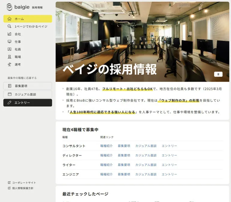
固定サイドバーと職種一覧を軸に、採用情報をコンパクトに整理したサイト。白とグレーの画面に鮮やかな黄色を効かせ、社員やオフィスの写真で職場の雰囲気を伝えています。
オリジナルサイトを見るbaigie Recruitment — Style Reference
A compact recruitment directory with fluorescent yellow wayfinding and a warm photographic record of working life.
Website: recruit.baigie.me
Original URL: https://recruit.baigie.me/
Final URL: https://recruit.baigie.me/
Theme: light in the supplied evidence; no theme selector was established.
Inspected: September 13, 2026, at 03:29 JST; recorded retrieval timestamp: 2026-09-12T18:29:46.260Z.
Viewports: desktop 1440 × 1000 and mobile 390 × 844 CSS pixels.
Scope: the current recruitment homepage, including its initial view, desktop navigation, mobile identity bar, employer summary, six-role directory, category links, publishing links, application cards, office gallery, footer, and visible cookie notice. Evidence consists of three desktop captures, two mobile captures, and supplied rendered DOM/computed styles. Linked pages and action outcomes were not inspected.
The page organizes recruitment as an information hub. A persistent desktop sidebar gives visitors several ways into the company, its work, people, workplace, and selection process. The main column places a concise employer summary and practical job directory before category navigation, external reading, three application routes, and a substantial photographic gallery.
Its identity comes from flat white panels on a pale gray canvas, dark warm charcoal, small Japanese sans-serif typography, thin outline icons, and tightly controlled yellow emphasis. Panel spacing is only 8px, while internal padding gives text room to breathe. Blue text identifies ordinary directory links; charcoal and yellow distinguish larger application choices. The photography introduces human expression, plants, wood, and daylight without changing the interface palette.
The current captures show a large pale hero field with a white title and no visible photographic background. Embedded CSS text references a hero background asset, but its painted content and playback behavior were not established. Treat the blank field as an observed capture state, with unresolved media visibility, rather than an intentional empty-hero specification.
How to Read This Reference
- Measured values come from supplied computed styles and element bounds. Coordinates refer to the initial layout unless a screenshot position is explicitly discussed.
- Derived values are arithmetic relationships between measured bounds, sometimes supported by the visible image arrangement.
- Estimated values describe screenshot details whose corresponding computed properties were not supplied, including some borders and image corner radii.
- Recommended values and behavior are implementation guidance. They do not establish features of the original page.
- Token names are reusable semantic aliases. The supplied source font variable is identified separately.
- The CSS Quick Start is an adaptation of the observed proportions, with explicit accessibility improvements. It was not executed or visually tested during this analysis.
Tokens — Colors
Default Palette
| Name | Value | Suggested token | Role and evidence |
|---|---|---|---|
| Canvas Gray | #f0f0f0 |
--color-canvas |
Measured body background and mobile header background |
| Panel White | #ffffff |
--color-surface |
Measured information panels; reversed text on dark actions |
| Warm Charcoal | #242422 |
--color-ink |
Measured primary text, sidebar entry fill, and dark application-card fills |
| Signal Yellow | #fefa32 |
--color-accent |
Measured active Home navigation background and application-card fill |
| Directory Blue | #3c73a9 |
--color-link |
Measured role introduction and recruitment-detail links |
| Category Mist | #f7f7f6 |
--color-subtle |
Measured category-link backgrounds |
| Summary Gray | #525252 |
--color-secondary |
Measured desktop job descriptions |
| Category Gray | #525454 |
--color-category-copy |
Measured category descriptions |
| Publishing Gray | #434646 |
--color-channel-copy |
Measured publishing-link descriptions |
| Utility Gray | #666666 |
--color-muted |
Measured sidebar application-group caption |
| Control Gray | #333333 |
--color-control-text |
Measured cookie rejection label; also present on generic wrappers |
| Policy Blue | #0000ee |
--color-policy-link |
Measured cookie-policy link; separate from Directory Blue |
| Fine Rule | approximately #e8e8e8 |
--color-rule |
Estimated light dividers; suggested implementation value, not a measured border color |
Yellow has three visible jobs: marking the current navigation item, emphasizing phrases in the employer summary, and drawing attention to the final application card. The summary marker's exact fill was not separately sampled. Reusing #fefa32 for it is a recommended consolidation, supported by the visual similarity rather than a measured equality.
The sidebar entry action remains charcoal even though the larger application card is yellow. Preserve this contextual hierarchy: every application link does not need the same fill.
The supplied custom properties include transparent gradient slots and loading-related colors. Their presence does not demonstrate a visible gradient treatment, loading screen, or selectable theme. The captured content surfaces are visually flat.
Tokens — Typography
Noto Sans JP — Main Interface
- Measured declaration:
'Noto Sans JP'on headings, navigation labels, descriptions, role links, and copyright text. - Source variable:
--s-font-fc823333: 'Noto Sans JP'. - Observed weights:
300for copyright,400for ordinary copy,500for intermediate labels, and700for headings. - Tracking: most utility text uses
0.05em; the desktop employer summary and application descriptions use0.1em. - Character: compact and orderly, with emphasis created by weight and alignment rather than several contrasting type families.
Generic container elements compute to sans-serif, while their visible child text explicitly declares Noto Sans JP. Use the child text measurements when reproducing the typography. The supplied declaration does not independently verify which font file rendered every glyph.
The baigie wordmark is visible as branding. Its lettering should not be assigned an inferred font family or recreated by typing the name in Noto Sans JP.
Type Scale
All values below are measured CSS declarations. A line box can differ slightly from the recorded element height because of layout and rounding.
| Role | Desktop size / line height | Mobile size / line height | Weight | Tracking |
|---|---|---|---|---|
| Hero title | 56px / 78.4px |
32px / 44.8px |
700 |
Normal |
| Standard section heading | 19px / 28.5px |
16px / 24px |
700 |
0.05em |
| Application-card heading | 19px / 19px |
16px / 16px |
700 |
0.05em |
| Employer-summary paragraph | 15px / 25.5px |
14px / 23.8px |
400 |
0.1em desktop; 0.05em mobile |
| Job title | 15px / 15px |
13px / 13px |
500 |
0.05em |
| Job description | 13px / 13px |
Not displayed | 400 |
0.05em |
| Job-directory link | 14px / 14px |
13px / 13px |
400 |
0.05em |
| Directory column heading | 12px / 12px |
11px / 11px |
400 |
0.05em |
| Category title | 15px / 21px |
13px / 18.2px |
500 |
Normal |
| Category description | 13px / 18.2px |
13px / 18.2px |
400 |
0.05em |
| Publishing-link title | 16px / 16px |
14px / 14px |
500 |
Normal |
| Publishing description | 13px / 19.5px |
12px / 18px |
400 |
0.05em |
| Application description | 14px / 25.2px |
14px / 25.2px |
400 |
0.1em |
| Application action phrase | 16px / 16px |
14px / 14px |
500 |
0.05em |
| Sidebar navigation label | 14px / 14px |
Sidebar absent | 400 |
0.05em |
| Sidebar utility caption | 12px / 12px |
Sidebar absent | 400 |
0.05em |
| Copyright | 11px / 11px |
9px / 9px |
300 |
0.05em |
The hero is the only large typographic gesture. Standard desktop headings are 19px, keeping the practical information prominent without producing an oversized marketing hierarchy.
Cookie Notice Typography
The notice uses a separate typography system:
- The desktop policy link computes to
Times,14px, with24pxline height. The surrounding message also appears serif in the screenshot, although its full text style was not separately sampled. - Desktop choices declare
ryo-gothic-plusn, followed by Japanese system fallbacks includingHiragino Kaku Gothic ProandMeiryo; they measure16px / 24px. - Mobile choices declare a Japanese system stack ending in
arial, at11px / 24px. - The mobile policy link measures
10px / 14pxin that system stack.
These are declared stacks, not confirmation that every named font loaded. A new implementation can unify the notice typography, but that would be a recommendation rather than a source-exact reproduction.
Tokens — Spacing & Shapes
Spacing character: narrow separation between modules, larger padding within modules.
Useful adaptation scale: 4, 8, 16, 20, 24, 32, 40, 60px.
This is not a universal 8px system. The source includes 6px radii, 19px headings, and component-specific gaps.
Spacing Scale
| Use | Desktop | Mobile | Evidence |
|---|---|---|---|
| Main panel separation | 8px |
8px |
Measured main-container gap and section positions |
| Main outside right margin | 8px |
8px on both sides |
Derived from viewport and main bounds |
| Standard panel horizontal padding | 32px |
16px |
Measured |
| Standard panel vertical padding | 24px |
20px |
Measured on jobs and publishing panels |
| Heading-to-content separation | 16px |
16px |
Derived from heading and content bounds |
| Employer-summary top padding | 20px |
20px |
Measured |
| Employer-summary bottom padding | 24px |
32px |
Measured |
| Space between summary paragraph boxes | 4px |
12px |
Derived; distinct from the outer section's declared gap |
| Category horizontal / vertical gap | 16px / 8px |
One column / 8px |
Derived from link bounds |
| Publishing icon-to-text gap | 16px |
16px |
Measured |
| Publishing item separation | 24px horizontally |
20px vertically |
Derived |
| Application-card padding | 32px 32px 40px |
20px 16px 28px |
Measured |
| Application-card internal gap | 16px |
8px |
Measured |
| Job-link horizontal gap | 24px |
16px |
Derived from adjacent link bounds |
| Gallery image gap within paired blocks | 8px |
4px |
Measured container gap and visible arrangement |
Border Radius
| Element | Value | Evidence |
|---|---|---|
| Sidebar navigation and action rows | 6px |
Measured |
| Main panels and application cards | 8px |
Measured |
| Category links | 8px |
Measured |
| Employer-summary panel | 0 0 8px 8px |
Measured; joins directly to the hero |
| Cookie choices | 4px |
Measured |
| Gallery photographs | About 6px desktop; 4px mobile |
Screenshot estimates |
Thin table rules and subtle category/control outlines organize the interface. No general drop-shadow elevation system is apparent. The cookie strip has a faint visual separation at its upper edge; its shadow parameters were not supplied.
Layout Measurements
| Element | Desktop 1440 × 1000 |
Mobile 390 × 844 |
|---|---|---|
| Desktop navigation header | 263 × 1000px |
Not displayed |
| Active sidebar row | 231 × 36px, at x=16 |
Not displayed |
| Mobile identity header | Not displayed | 390 × 60.92px |
| Mobile identity link | Not displayed | 200 × 40.92px, at x=95, y=10 |
| Main column | x=264, width 1168px |
x=8, width 374px |
| Main content start | y=8px |
y=60.92px |
| Hero region | 1168 × 380px |
374 × 280px |
| Hero-title inset | 32px left, 24px bottom |
16px left, 16px bottom |
| Employer-summary panel | 1168 × 128.5px |
374 × 290.17px |
| Jobs panel | 1168 × 387.5px |
374 × 374px |
| Directory row pitch | 45px, derived |
45px, derived |
| Category panel | Height 240.88px |
Height 530.44px |
| Typical category link | 357.28 × 66.19px |
342 × 65.38px |
| Publishing item | 540 × 72px |
342 × 79px |
| Application card | About 383.95 × 191.38px |
Width 374px; heights 146.38–152.38px |
| Gallery inner region | 1104 × 1382px |
342 × 1730px |
| Square photo size | 270px, derived |
169px, derived |
| Document height | 3082.25px |
4150.66px |
Components
Desktop Navigation Rail
Role: persistent orientation and direct access to recruitment tasks.
The desktop header occupies a 263px-wide rail at the left edge. It remains in the same viewport position across the supplied scroll captures, consistent with a fixed rail. The exact positioning declaration was not included in the evidence.
Its anatomy is:
- The baigie emblem and wordmark, followed by the small label
採用情報. - Seven 36px-high navigation rows:
ホーム,1ページでわかるベイジ,会社,仕事,社員,職場, and選考. - A muted application-group caption.
- Three compact actions: outlined
募集要項, outlinedカジュアル面談, and charcoalエントリー. - Small corporate-site and privacy links near the bottom.
The active Home row begins at x=16, y=71, has 9px 20px padding, and uses the measured yellow fill. Other navigation rows are transparent. Thin outline icons occupy a consistent left column, while text starts around x=70. Their visible forms include a house, buildings, a monitor, a person card, and a signpost. No icon-library identity was established.
The action rows begin at y=389, 429, and 469, leaving 4px between their 36px boxes. This creates a denser action cluster beneath the more spacious group caption.
The cookie strip overlays the lower part of the rail in the captures and obscures the privacy link. Keeping these utilities reachable above overlays is a recommended improvement.
Mobile Identity Bar
Role: compact branding at the beginning of the page.
The desktop navigation is absent at 390px. A gray header with 10px padding contains a centered, 200px-wide linked brand lockup. Its measured height is approximately 61px, after which the main column begins immediately.
No opened mobile navigation state was supplied. The lower gallery capture does not show the identity bar, so sticky behavior should not be assumed. A separate unlabeled 66 × 40px button is recorded near the lower-right viewport area, overlapping the cookie-notice region. Its purpose and visible icon cannot be established from this evidence; it should not be labeled as a menu or back-to-top control without further inspection.
Hero and Employer Summary
Role: identify the page and summarize the employer before detailed browsing.
The hero is 380px high on desktop and 280px high on mobile. The title ベイジの採用情報 sits at its lower-left corner, with measured white text and a 1.4 line-height ratio. The media background is not visible in either current initial capture. Although rendered CSS text contains a background-image reference, it does not establish the visible image, timing, or reason for the blank appearance.
Directly below, a white summary panel joins the hero without the normal 8px module gap. Its top corners are square; its bottom corners have an 8px radius.
Three bullet paragraphs provide:
- The current company tenure and employee count, plus remote/office flexibility.
- Its recruitment and BtoB-oriented web-production positioning.
- Its stated personnel-development theme.
The desktop paragraphs fit on single lines. Each becomes three lines in the measured mobile layout. Pale bullet dots sit outside the text column, and bold phrases receive a flat yellow marker band across the lower part of the lettering. For example, フルリモート・出社どちらもOK wraps naturally on mobile while retaining its emphasis.
Recommended implementation: use a real list, semantic emphasis, and an inline marker treatment that survives wrapping. Give the hero a readable text fallback when media is unavailable. The captured white-on-pale state should not become an intentional accessibility target.
Job Directory
Role: compare open roles and reach the appropriate information quickly.
A white rounded panel begins with 現在6職種で募集中. Below it, a restrained table-like layout uses three desktop columns: 職種, 概要, and 関連リンク. Thin horizontal rules separate the six rows; there are no filled column headers, alternating row colors, or individual job cards.
The role column occupies approximately 200px of content width. Descriptions have measured 400px text boxes. Related links start near x=934–937, with small row-specific variations. Role names use medium weight, summaries use smaller gray text, and action links use Directory Blue.
The link sets depend on the role:
| Role | Desktop links | Mobile links |
|---|---|---|
プロデューサー |
Introduction, requirements, casual meeting, entry | Introduction, requirements |
採用コンサルタント |
Requirements, entry | Requirements |
プロジェクトマネージャー |
Introduction, requirements, entry | Introduction, requirements |
コンテンツディレクター |
Introduction, requirements, casual meeting, entry | Introduction, requirements |
ウェブデザイナー |
Introduction, requirements, casual meeting, entry | Introduction, requirements |
ウェブエンジニア |
Introduction, requirements, entry | Introduction, requirements |
At 390px, descriptions and row-level meeting/entry links are not displayed. The layout retains two aligned columns, with approximately 170px for role text, a 16px separation, and 156px for links. It does not simply squeeze the entire desktop table into the phone width.
Visible labels and destination slugs are not always identical concepts. For example, the producer introduction points to /work/occupation/consultant, and its requirements point to /recruitment/consultant. Preserve the actual content mapping rather than generating destinations from labels.
The extracted directory content includes paragraph and anchor elements; semantic HTML table markup was not established. A real table with associated headers is recommended for an adaptation. Keep separate links inside each row instead of turning the whole row into one ambiguous target.
Category Directory
Role: expose the information architecture with explanatory labels.
The カテゴリー panel contains six pale links in a three-column, two-row desktop arrangement. Each link combines a small outline folder symbol, a medium-weight title, and a muted one-line description. The entire category item is an anchor.
Cards measure about 357 × 66px on desktop. Their text begins 52px from the card's left edge, leaving a consistent icon zone. The title and description are separated by approximately 3px.
On mobile, all six links form one vertical list inside a 342px-wide content area. Most measure about 65px high. The company card grows to approximately 84px because its description wraps onto two lines. Retain content-driven height; a rigid uniform height would clip that observed text.
The categories lead to /about, /company, /work, /interview, /workplace, and /selection. Their explanatory copy is central to the component: these are navigation choices with context, not decorative feature badges.
Publishing Links
Role: offer continuing evidence of the company's thinking and working methods.
The ベイジの情報発信 panel contains two substantial anchors: ベイジの日報 and ベイジの公式 X. Each has a charcoal square icon tile, a title with a small external-link symbol, and a short gray description.
On desktop, two 540px-wide items sit side by side with a 24px gap. The icon tile is visually 72px square, consistent with the measured item height and the text offset of 72 + 16px. On mobile, the items stack with 20px between them; the icon width derives to 60px from the 60 + 16px text offset.
The descriptions change from 13px / 19.5px to 12px / 18px. The source destinations are https://baigie.me/nippo/ and https://x.com/baigie_sns; their destination pages were not inspected.
Three Application Cards
Role: separate reviewing conditions, exploratory conversation, and applying.
Three full-card anchors form a horizontal strip on desktop. Their structure is consistent: an outline icon beside a bold heading, a two-line explanatory paragraph, and an underlined action phrase. Each card has an 8px radius and about 384px width.
| Card | Fill / text | Visible action phrase | Destination |
|---|---|---|---|
募集要項 |
Charcoal / white | 募集要項を見る |
/recruitment |
カジュアル面談 |
Charcoal / white | 面談を申し込む |
/casual |
応募はこちらから |
Yellow / charcoal | ベイジにエントリーする |
/entry |
The final card's color supplies emphasis without making it larger. Underlined action text reinforces the affordance within the larger anchor; it should not become a nested button inside that anchor.
On mobile, the cards stack at the full 374px panel width. Padding reduces to 20px 16px 28px, and internal gaps reduce to 8px. Descriptions and action phrases begin at x=50, 26px beyond the panel's normal inner left edge, aligning beneath the heading area rather than beneath its icon.
The application paragraph states a response expectation of two to three business days. This is displayed source copy, not a verified service outcome or a reusable promise for another organization.
Office Gallery
Role: make the workplace tangible after the practical recruitment routes.
The gallery occupies a white panel headed オフィスギャラリー. Photographs are square, closely spaced, lightly rounded, and presented without visible captions or text overlays. The desktop arrangement has four columns and five rows, consistent with 20 photographs and the measured 1104 × 1382px inner bounds.
The mobile arrangement has an important ordering detail. Its lower capture shows the desktop's right-hand pair of columns as five consecutive rows: shared-monitor work and a meeting; a seated colleague and note-taking; a sofa conversation and sticky notes; a desk scene and a smiling colleague; then a portrait and a two-person conversation.
This supports an inferred structure of two paired-column blocks: side by side on desktop, stacked on mobile. The measured geometry agrees:
- Desktop: each block is
(1104 − 8) / 2 = 548pxwide; each photograph is(548 − 8) / 2 = 270pxsquare. - Mobile: each block is
342pxwide; each photograph is(342 − 4) / 2 = 169pxsquare. - Five mobile rows per block occupy
5 × 169 + 4 × 4 = 861px. - Two blocks plus an 8px separation occupy
861 × 2 + 8 = 1730px, matching the supplied gallery height.
This internal grouping is derived, not directly exposed by a complete child-element inventory. It provides a stronger implementation model than a single flat grid that interleaves every desktop row on mobile.
No image-click, lightbox, zoom, or carousel behavior was demonstrated.
Cookie Notice and Footer
Role: present the visible cookie choice while retaining the page underneath.
A white strip sits across the viewport bottom in all current captures, covering both the main column and desktop rail. Its visible band is approximately 72px high at both supplied viewports.
Desktop content is centered across roughly 1200px. The message sits left, followed by two 180 × 48px choices separated by 8px. 同意しない has a white fill and light outline; 同意する has charcoal fill and white text.
Mobile keeps the message and both choices on the same horizontal strip. Buttons measure 70 × 44px, while the small message wraps at the left. This is a compact layout with notably small text. Both controls appear as anchors with empty destinations in the supplied extraction; their event handling and persistence were not tested.
The document ends with a small centered copyright line. Its font reduces from 11px to 9px on mobile. The notice overlaps page content in the captures, so an adaptation should reserve enough bottom clearance for the actual banner height.
Tokens — Motion & Interaction
Measured Transition Declarations
| Element or treatment | Supplied value | What can be concluded |
|---|---|---|
| Most navigation, panels, and text elements | 0.3s cubic-bezier(0.4, 0.4, 0, 1) with additional gradient-property transitions |
A common transition duration/easing is declared; triggers and endpoints were not sampled |
| Some application action phrases | 0.16s cubic-bezier(0.4, 0.4, 0, 1) |
Shorter transition declarations exist on meeting and entry phrases |
| Body background | background 0.5s cubic-bezier(0.4, 0.4, 0, 1) |
Background changes can transition; this does not establish a theme-switching feature |
| Cookie-choice text color | 0.1s cubic-bezier(0.215, 0.61, 0.355, 1) |
A separate notice-control timing is declared |
| Cookie-choice background | background-color 0.3s |
A background transition is declared; its resulting state was not exercised |
| Sampled element animations | none |
No named animation was reported for those sampled elements |
Observed Interaction Boundaries
- Scrolling reveals the subsequent panels and gallery while the desktop rail and cookie strip remain in their viewport positions.
- Category items, publishing items, and application cards have anchor destinations in the rendered evidence.
- Job rows contain multiple independently linked actions.
- The yellow Home state is visible; selection changes on other pages were not inspected.
- Hover appearance, focus appearance, cookie dismissal, application forms, and navigation transitions were not exercised.
- Hero autoplay, playback controls, and any image rotation remain unverified.
The collection process reports at least five seconds of initial observation and waits for document load, layout stability, eligible finite motion, and visible image decoding within stated limits. It also temporarily pauses perpetual animations during readiness checks. These procedures do not prove that every background asset, delayed interaction, or media frame was captured.
Recommended motion: retain short color and border transitions using the measured easing, applied only to relevant properties. Keep the directory and photo gallery immediately readable. Do not introduce scroll reveals, parallax, image zoom, or autoplay as though they were established source behavior.
Surfaces
| Layer | Appearance | Purpose |
|---|---|---|
| Page canvas | Pale gray | Connects the rail and the narrow channels between panels |
| Main information panels | Flat white, 8px corners | Groups jobs, categories, publishing links, and photographs |
| Category links | Slightly gray-white fill, subtle outline | Creates a nested navigation surface without strong elevation |
| Active navigation | Yellow with charcoal label and icon | Marks the current page |
| Secondary application choices | Charcoal with white content | Makes the action strip distinct from reference information |
| Final application choice | Yellow with charcoal content | Supplies the strongest conversion emphasis |
| Consent strip | Full-width white overlay | Keeps the cookie message and choices visible during scrolling |
Use background changes, fine rules, and consistent insets to separate levels. Broad shadows, translucent glass, and glossy fills would change the captured character.
Imagery
The visible imagery uses natural workplace photography. It alternates wide office context with tighter scenes of people discussing, writing, working at monitors, and meeting remotely. Plants, pale walls, wood tables, upholstered seating, and daylight give the gallery warmth. Navy clothing, light blue shirts, and dark monitors provide visual contrast within the photographs.
The subjects are shown in work-related situations: whiteboard discussion, screen sharing, note-taking, a remote meeting display, focused individual work, and informal conversation. Preserve that variety when commissioning or selecting replacements. No identities or individual roles should be inferred from appearance.
Square framing creates a consistent rhythm. The images appear cropped to fill those squares; object-fit: cover is the recommended implementation equivalent, not a supplied computed property. Choose focal positions per asset so faces, hands, and important work objects remain understandable.
The thin navigation and folder icons are quieter than the photographs. Publishing tiles reverse small white symbols onto charcoal. Keep their strokes restrained and their optical size consistent; no specific icon package was verified.
Observed Asset References
| Asset group | Established evidence | Limitation |
|---|---|---|
| Brand lockup | Visible baigie emblem, wordmark, and recruitment label; measured mobile link bounds | Complete asset URL and wordmark font were not supplied |
| Hero background | A background-image reference appears in embedded rendered CSS text | URL is truncated; painted imagery and playback were not established |
| Office photographs | Clearly visible in desktop and mobile captures | Complete filenames, native dimensions, and individual image metadata were not supplied |
| Navigation and utility symbols | Visible outline icons; some embedded asset references appear in the DOM text | Several references are truncated; no library identity was established |
Do not assemble asset URLs from incomplete fragments. Reuse authorized brand and photographic assets when available, or supply clearly designated replacements for a new implementation.
Layout & Responsive Behavior
The desktop page pairs a viewport-height navigation rail with a broad document column. At 1440px, the main column begins at x=264 and stops 8px before the right edge. Most information begins another 32px inside its panel, establishing the recurring x=296 alignment.
On mobile, the rail disappears and the centered identity bar precedes the content. The main column uses 8px outer margins, and panel padding reduces to 16px. This establishes a recurring x=24 alignment. The page remains a vertically scrolling document.
Observed Responsive Changes
| Component | Desktop | Mobile |
|---|---|---|
| Identity and navigation | Persistent left rail | Centered linked brand bar; opened navigation unverified |
| Hero | 380px high, 56px title | 280px high, 32px title |
| Summary | Three single-line paragraphs | Three multiline paragraphs with wider vertical separation |
| Jobs | Role, summary, and up to four links | Role and one or two information links |
| Categories | Three columns, two rows | One column, six rows |
| Publishing links | Two side-by-side items | Two stacked items |
| Application routes | Three equal-width cards | Three stacked cards |
| Gallery | Two paired blocks side by side | Paired blocks stacked; two visible columns |
| Consent choices | Two 180px-wide controls | Two 70px-wide controls beside the message |
Only the two supplied viewport sizes were inspected. The source excerpt includes a 1280px media query for line-break handling, but it does not establish the breakpoint for every layout transformation. Intermediate widths, landscape phones, text zoom, and safe-area behavior remain unverified.
The taller mobile document reflects content wrapping and stacking. It is not a uniform scaled-down desktop composition: application descriptions remain 14px, category descriptions remain 13px, and the directory actively removes secondary content.
Do’s and Don’ts
Do
- Preserve the recruitment-hub structure: practical roles, category browsing, further reading, application routes, and workplace photographs.
- Keep the main measured palette: pale gray, white,
#242422,#fefa32, and#3c73a9. - Use 8px separation between panels and larger internal padding to organize dense information.
- Keep the desktop rail compact, with a yellow current-page row and a distinct application group.
- Use Noto Sans JP declarations with clear weight differences and restrained heading sizes.
- Preserve role-specific link availability and verified destination mappings.
- Reduce the directory's visible columns and actions on mobile while retaining access through the larger cards.
- Let category cards grow when descriptions wrap.
- Preserve the gallery's apparent paired-block order when matching the supplied mobile composition.
- Use warm, varied workplace photography with consistent square framing.
- Distinguish the observed blank hero state from a recommended readable media fallback.
Don't
- Don't collapse the homepage into a single-purpose application funnel that loses its category structure.
- Don't replace every job row with a large, independently elevated card.
- Don't make all actions yellow; retain the difference between directory links, sidebar actions, and application cards.
- Don't turn summary emphasis into rounded badges that interrupt Japanese line wrapping.
- Don't infer hero photography, autoplay, or playback controls from an incomplete background reference.
- Don't describe generic transition declarations as verified hover animations.
- Don't invent a mobile drawer, gallery lightbox, or back-to-top behavior.
- Don't recreate the logo using an assumed font or improvised emblem.
- Don't add decorative gradients, oversized pills, or pervasive shadows.
- Don't permanently obscure footer utilities or focused controls behind a fixed notice.
Recommended Implementation Additions
These are improvements for an adaptation, not verified original-site features:
- Give the linked brand lockup an accessible name and decorative icons empty alternatives or
aria-hiddentreatment. - Mark the current navigation link with
aria-current='page'and provide a skip link to the main content. - Implement the job directory with semantic headers and maintain meaningful associations when the summary column is hidden.
- Include the job name in the accessible context of repeated links such as
募集要項. - Keep compact text while providing adequately sized interaction areas. The measured 13–14px link boxes are much smaller than the surrounding 45px row pitch.
- Preserve visible keyboard focus on white, yellow, and charcoal surfaces.
- Add a readable hero fallback. Switch to white overlay text only when a verified media treatment provides sufficient contrast.
- Give cookie actions real button semantics, implement both choices, and reserve space based on the rendered banner height. Recheck clearance when text wraps or the viewport changes.
- Avoid the captured 9–10px text sizes for essential information when accessibility requirements call for larger text.
- Provide appropriate image alternatives, explicit dimensions, and responsive image sources. Load lower gallery images progressively without changing the grid geometry.
- Respect reduced-motion preferences if transitions or media are added. Provide an explicit pause mechanism for any subsequently implemented perpetual media.
- Generate the displayed role count from the same data as the directory, and maintain date-sensitive company copy separately from layout tokens.
Agent Prompt Guide
Quick Color Reference
- Canvas:
#f0f0f0. - Main panels:
#ffffff. - Primary text and dark actions:
#242422. - Current navigation and final application card:
#fefa32. - Ordinary job links:
#3c73a9. - Nested category surfaces:
#f7f7f6. - Rules: very light neutral gray;
#e8e8e8is an estimated adaptation value. - Photography stays in natural full color.
Overall Prompt
“Create a Japanese recruitment information hub inspired by the supplied current baigie homepage. Use a pale gray canvas, flat white panels with 8px corners, 8px inter-panel gaps, compact Noto Sans JP typography, charcoal text, and a fluorescent yellow accent. On desktop, provide a roughly 263px persistent navigation rail and a broad content column with 32px panel insets. Start with a lower-left page title and a three-bullet employer summary, followed by a compact six-role directory with gray descriptions and blue links. Continue with six explanatory category links, two publishing links, three application cards in charcoal/charcoal/yellow, and a square workplace-photo gallery. At 390px, use a centered identity bar, 8px outer margins, 16px panel insets, a two-column job directory, stacked information cards, and two-column photo blocks. The supplied hero media is unresolved: implement a readable fallback and do not invent autoplay or a specific background image.”
Example Component Prompts
- Navigation rail: “Design a pale gray 263px desktop rail with a compact brand lockup, seven thin-icon navigation rows, and 14px Japanese labels. Give only the current Home row a
#fefa32fill and 6px corners. Below a muted caption, add two outlined recruitment actions and one charcoal entry action. Keep utilities reachable above any fixed overlay.” - Job directory: “Build a white 8px-radius recruitment panel with a small bold heading and six rows separated by faint rules. Use medium-weight role names, 13px gray summaries, and 14px blue links. Preserve different link sets per role. On mobile, remove summaries and row-level meeting/entry links, retaining aligned role and information-link columns.”
- Employer summary: “Create three Japanese bullet paragraphs on a white surface that joins the hero above it. Use 15px type with 1.7 line height on desktop and 14px on mobile. Highlight selected bold phrases with a narrow yellow marker band that follows wrapped text. Keep the top corners square and bottom corners rounded to 8px.”
- Application strip: “Create three equal desktop anchor cards for requirements, casual conversation, and applying. Use charcoal with white text for the first two and yellow with charcoal text for the third. Each card contains a small outline icon, a 19px heading, a short description, and an underlined action phrase. Stack them on mobile and reduce padding without shrinking the description below 14px.”
- Office gallery: “Arrange workplace photographs as two paired-column blocks, each containing five rows of square images. Place the blocks side by side on desktop for four columns. Stack the blocks on mobile while preserving their internal order. Use 8px desktop gaps, 4px mobile gaps within blocks, and 8px between blocks. Keep natural color and subtle corners; add no caption overlays or assumed lightbox behavior.”
Quick Start
CSS Custom Properties
The following adaptation uses conventional pixel/rem sizing and semantic class names. Measured colors and endpoint dimensions are retained where practical. Border colors and image radii are estimates. Breakpoints, focus indicators, readable hero fallback, wrapping safeguards, and overlay clearance are recommendations.
Expected structure: .recruit-shell contains .sidebar, .mobile-header, .content, and .site-footer. Within .content, group the hero and summary in .intro-group; use panels for the directory and informational sections. The gallery contains two .gallery-pair children, each holding ten images in the inferred paired order. Place .consent at the viewport bottom. Real assets, job data, and consent handlers must be supplied separately.
:root {
  /* Measured interface colors */
  --color-canvas: #f0f0f0;
  --color-surface: #ffffff;
  --color-ink: #242422;
  --color-accent: #fefa32;
  --color-link: #3c73a9;
  --color-subtle: #f7f7f6;
  --color-secondary: #525252;
  --color-category-copy: #525454;
  --color-channel-copy: #434646;
  --color-muted: #666666;
  --color-policy-link: #0000ee;

  /* Estimated border colors */
  --color-rule: #e8e8e8;
  --color-control-border: #d0d0d4;

  --font-ui: 'Noto Sans JP', sans-serif;
  --font-consent: 'Hiragino Kaku Gothic Pro', Meiryo, Arial, sans-serif;
  --weight-regular: 400;
  --weight-medium: 500;
  --weight-bold: 700;
  --text-hero: 56px;
  --text-heading: 19px;
  --text-summary: 15px;
  --text-role: 15px;
  --text-link: 14px;
  --text-small: 13px;
  --text-caption: 12px;
  --tracking-ui: 0.05em;
  --tracking-prose: 0.1em;

  --space-4: 4px;
  --space-8: 8px;
  --space-16: 16px;
  --space-20: 20px;
  --space-24: 24px;
  --space-32: 32px;
  --space-40: 40px;

  --rail-width: 263px;
  --content-offset: 264px;
  --panel-x: 32px;
  --panel-y: 24px;
  --radius-panel: 8px;
  --radius-nav: 6px;
  --radius-control: 4px;
  --radius-photo: 6px;
  --hero-height: 380px;
  --ease-ui: cubic-bezier(0.4, 0.4, 0, 1);
  --motion-ui: 300ms;
  --motion-text: 160ms;
}

* { box-sizing: border-box; }
body { margin: 0; }
button, a { -webkit-tap-highlight-color: transparent; }
img { max-width: 100%; }

.recruit-shell {
  /* Update this reserve to the actual notice height in application code. */
  --consent-reserve: 96px;
  min-height: 100dvh;
  padding-bottom: var(--consent-reserve);
  color: var(--color-ink);
  background: var(--color-canvas);
  font-family: var(--font-ui);
  font-weight: var(--weight-regular);
}

.recruit-shell[data-consent-visible='false'] {
  --consent-reserve: 0px;
}

.sidebar {
  position: fixed;
  inset: 0 auto 0 0;
  z-index: 20;
  display: flex;
  flex-direction: column;
  width: var(--rail-width);
  padding: 16px 16px max(60px, calc(var(--consent-reserve) + 12px));
  overflow-y: auto;
  background: var(--color-canvas);
}

.brand-lockup { display: block; width: 171px; margin-left: 16px; }
.primary-nav { display: grid; margin-top: 20px; }

.nav-link {
  display: flex;
  align-items: center;
  gap: 16px;
  min-height: 36px;
  padding: 9px 20px;
  border-radius: var(--radius-nav);
  color: var(--color-ink);
  font-size: 14px;
  line-height: 1;
  letter-spacing: var(--tracking-ui);
  text-decoration: none;
  transition: background-color var(--motion-ui) var(--ease-ui);
}

.nav-link[aria-current='page'] { background: var(--color-accent); }
.nav-icon { flex: 0 0 18px; width: 18px; height: 18px; }
.sidebar-actions { display: grid; gap: 4px; margin-top: 40px; }
.sidebar-caption { margin: 0 20px 10px; color: var(--color-muted); font-size: 12px; }
.nav-link--outlined { border: 1px solid var(--color-control-border); }
.nav-link--entry { color: white; background: var(--color-ink); }
.sidebar-utilities { display: grid; gap: 14px; margin-top: auto; padding: 32px 20px 0; }
.sidebar-utilities a { color: inherit; font-size: 12px; text-decoration: none; }
.mobile-header { display: none; }

.content {
  display: flex;
  flex-direction: column;
  gap: 8px;
  min-width: 0;
  margin-left: var(--content-offset);
  padding: 8px 8px 0 0;
}

.intro-group { min-width: 0; }

.hero {
  display: flex;
  align-items: flex-end;
  min-height: var(--hero-height);
  padding: 24px var(--panel-x);
  border-radius: var(--radius-panel);
  background: var(--color-canvas);
  /* Recommended readable fallback; the captured source title is white. */
  color: var(--color-ink);
}

.hero h1 {
  margin: 0;
  font-size: var(--text-hero);
  font-weight: var(--weight-bold);
  line-height: 1.4;
}

.summary {
  padding: 20px var(--panel-x) 24px;
  border-radius: 0 0 8px 8px;
  background: var(--color-surface);
}

.summary-list {
  display: grid;
  gap: 4px;
  margin: 0;
  padding-left: 18px;
  font-size: var(--text-summary);
  line-height: 1.7;
  letter-spacing: var(--tracking-prose);
}

.summary-list li::marker { color: #cccccc; }
.summary-list p { margin: 0; }

.marker {
  color: inherit;
  font-weight: var(--weight-bold);
  /* Recommended hard-edged approximation of the visible marker band. */
  background: linear-gradient(transparent 55%, var(--color-accent) 55%);
  -webkit-box-decoration-break: clone;
  box-decoration-break: clone;
}

.panel {
  min-width: 0;
  padding: var(--panel-y) var(--panel-x);
  border-radius: var(--radius-panel);
  background: var(--color-surface);
}

.section-title {
  margin: 0 0 16px;
  font-size: var(--text-heading);
  font-weight: var(--weight-bold);
  line-height: 1.5;
  letter-spacing: var(--tracking-ui);
}

.jobs-table { width: 100%; table-layout: fixed; border-collapse: collapse; }
.jobs-table .role-col { width: 208px; }
.jobs-table .overview-col { width: 430px; }
.jobs-table th, .jobs-table td { text-align: left; vertical-align: middle; }
.jobs-table thead th { padding: 0 0 12px; font-size: var(--text-caption); font-weight: 400; }
.jobs-table tr { border-bottom: 1px solid var(--color-rule); }
.jobs-table tbody tr { height: 45px; }
.jobs-table tbody th, .jobs-table tbody td { padding-block: 12px; }
.jobs-table th[scope='row'] { padding-right: 8px; font-size: var(--text-role); font-weight: 500; line-height: 1.3; }
.jobs-table .job-overview { padding-right: 30px; color: var(--color-secondary); font-size: 13px; line-height: 1.4; }
.job-links { display: flex; flex-wrap: wrap; gap: 12px 24px; }
.job-links a { color: var(--color-link); font-size: var(--text-link); line-height: 1.3; letter-spacing: 0.05em; text-decoration: none; }

.category-grid { display: grid; grid-template-columns: repeat(3, minmax(0, 1fr)); gap: 8px 16px; }
.category-card { display: flex; align-items: center; gap: 16px; min-width: 0; padding: 12px 16px; border: 1px solid var(--color-rule); border-radius: 8px; color: inherit; background: var(--color-subtle); text-decoration: none; }
.category-icon { flex: 0 0 20px; width: 20px; height: 20px; }
.category-title { display: block; font-size: 15px; font-weight: 500; line-height: 1.4; }
.category-copy { display: block; margin-top: 3px; color: var(--color-category-copy); font-size: 13px; line-height: 1.4; letter-spacing: 0.05em; }

.channel-grid { display: grid; grid-template-columns: repeat(2, minmax(0, 1fr)); gap: 24px; }
.channel-link { display: flex; align-items: flex-start; gap: 16px; min-width: 0; color: inherit; text-decoration: none; }
.channel-icon { display: grid; place-items: center; flex: 0 0 72px; width: 72px; height: 72px; border-radius: 4px; color: white; background: var(--color-ink); }
.channel-title { margin: 0 0 10px; font-size: 16px; font-weight: 500; line-height: 1.3; }
.channel-copy { margin: 0; color: var(--color-channel-copy); font-size: 13px; line-height: 1.5; letter-spacing: 0.05em; }

.cta-grid { display: grid; grid-template-columns: repeat(3, minmax(0, 1fr)); gap: 8px; }
.cta-card { display: flex; flex-direction: column; gap: 16px; min-width: 0; padding: 32px 32px 40px; border-radius: 8px; color: white; background: var(--color-ink); text-decoration: none; }
.cta-card--primary { color: var(--color-ink); background: var(--color-accent); }
.cta-heading { display: flex; align-items: center; gap: 12px; margin: 0; font-size: var(--text-heading); font-weight: 700; line-height: 1.3; letter-spacing: 0.05em; }
.cta-icon { flex: 0 0 20px; width: 20px; height: 20px; }
.cta-copy { margin: 0; font-size: 14px; line-height: 1.8; letter-spacing: 0.1em; }
.cta-label { font-size: 16px; font-weight: 500; line-height: 1.3; letter-spacing: 0.05em; text-decoration: underline; text-underline-offset: 3px; }

.gallery-panel { padding-bottom: 32px; }
.gallery { display: grid; grid-template-columns: repeat(2, minmax(0, 1fr)); gap: 8px; }
.gallery-pair { display: grid; grid-template-columns: repeat(2, minmax(0, 1fr)); gap: 8px; }
.gallery img { display: block; width: 100%; aspect-ratio: 1; object-fit: cover; border-radius: var(--radius-photo); }

.site-footer { margin-left: var(--content-offset); padding: 20px 20px 28px; text-align: center; font-size: 11px; font-weight: 300; line-height: 1; letter-spacing: 0.05em; }

.consent { position: fixed; inset: auto 0 0; z-index: 50; padding: 12px 24px calc(12px + env(safe-area-inset-bottom, 0px)); border-top: 1px solid var(--color-rule); color: var(--color-ink); background: white; }
.consent[hidden] { display: none; }
.consent-inner { display: grid; grid-template-columns: minmax(0, 1fr) 180px 180px; align-items: center; gap: 8px; max-width: 1200px; margin-inline: auto; }
.consent-message { margin: 0; font: 14px/24px Times, serif; }
.consent-message a { color: var(--color-policy-link); text-decoration: underline; }
.consent-choice { min-height: 48px; padding: 12px 0; border: 1px solid var(--color-rule); border-radius: 4px; color: #333333; background: white; font: 400 16px/24px var(--font-consent); cursor: pointer; }
.consent-choice--accept { border-color: var(--color-ink); color: white; background: var(--color-ink); }

/* Recommended intermediate layout; not a verified source breakpoint. */
@media (max-width: 1279px) {
  .jobs-table .overview-col,
  .jobs-table .job-overview { display: none; }
}

/* Recommended compact breakpoint; measured endpoints are 1440px and 390px. */
@media (max-width: 1023px) {
  :root {
    --panel-x: 16px;
    --panel-y: 20px;
    --hero-height: 280px;
    --text-hero: 32px;
    --text-heading: 16px;
    --text-summary: 14px;
    --text-role: 13px;
    --text-link: 13px;
    --text-caption: 11px;
    --radius-photo: 4px;
  }

  .sidebar { display: none; }
  .mobile-header { display: flex; justify-content: center; padding: 10px; }
  .mobile-header a { display: block; width: 200px; }
  .mobile-header img { display: block; width: 100%; height: auto; }
  .content { margin-left: 0; padding: 0 8px; }
  .hero { padding: 16px; }
  .summary { padding-bottom: 32px; }
  .summary-list { gap: 12px; padding-left: 14px; letter-spacing: 0.05em; }

  .jobs-table .role-col { width: 54.386%; }
  .jobs-table th[scope='row'] { padding-right: 16px; overflow-wrap: anywhere; }
  .job-links { gap: 12px 16px; }
  .job-links .job-extra { display: none; }

  .category-grid, .channel-grid, .cta-grid { grid-template-columns: minmax(0, 1fr); }
  .category-title { font-size: 13px; }
  .channel-grid { gap: 20px; }
  .channel-icon { flex-basis: 60px; width: 60px; height: 60px; }
  .channel-title { font-size: 14px; }
  .channel-copy { font-size: 12px; }

  .cta-card { gap: 8px; padding: 20px 16px 28px; }
  .cta-heading { gap: 10px; }
  .cta-copy, .cta-label { margin-left: 26px; }
  .cta-label { font-size: 14px; }

  .gallery { grid-template-columns: minmax(0, 1fr); }
  .gallery-pair { gap: 4px; }
  .gallery-panel { padding-bottom: 20px; }
  .site-footer { margin-left: 0; padding: 16px 20px; font-size: 9px; }
}

@media (max-width: 599px) {
  .consent { padding: 14px 24px calc(14px + env(safe-area-inset-bottom, 0px)); }
  .consent-inner { grid-template-columns: minmax(0, 1fr) 70px 70px; gap: 6px; }
  .consent-message { font: 10px/14px var(--font-consent); }
  .consent-choice { min-height: 44px; padding: 9px 4px; font-size: 11px; }
}

/* Recommended extra-small fallback: prioritize readable, reachable choices. */
@media (max-width: 359px) {
  .consent-inner { grid-template-columns: repeat(2, minmax(0, 1fr)); }
  .consent-message { grid-column: 1 / -1; font-size: 12px; line-height: 1.5; }
  .consent-choice { font-size: 12px; }
}

/* Recommended interaction states; source hover endpoints were not supplied. */
@media (hover: hover) {
  .job-links a:hover { text-decoration: underline; text-underline-offset: 3px; }
  .category-card:hover { border-color: var(--color-ink); }
}

.recruit-shell :focus-visible,
.consent :focus-visible {
  outline: 2px solid var(--color-ink);
  outline-offset: 3px;
}

.cta-card:focus-visible,
.nav-link--entry:focus-visible {
  outline-color: var(--color-accent);
}

@media (prefers-reduced-motion: reduce) {
  .recruit-shell *, .consent * {
    transition: none !important;
    scroll-behavior: auto !important;
  }
}
The directory line heights in this starter are slightly more forgiving than the measured single-line declarations, allowing longer content to wrap. The footer and notice retain compact reference sizing; enlarge them when adapting essential text. The notice reserve must follow its actual height, particularly below 360px or when text is enlarged. CSS alone does not implement consent decisions.
Tailwind v4 Token Mapping
Optional mapping for a project already using Tailwind v4. This does not imply that the original site uses Tailwind. Define the custom properties above first; the responsive heading and inset aliases then follow those properties.
@theme inline {
  --color-canvas: #f0f0f0;
  --color-surface: #ffffff;
  --color-ink: #242422;
  --color-accent: #fefa32;
  --color-directory-link: #3c73a9;
  --color-subtle: #f7f7f6;
  --color-secondary: #525252;
  --color-rule: #e8e8e8;

  --font-interface: 'Noto Sans JP', sans-serif;
  --text-page-title: var(--text-hero);
  --text-section: var(--text-heading);
  --text-summary-copy: var(--text-summary);
  --text-job-title: var(--text-role);
  --text-directory-action: var(--text-link);

  --spacing-panel-x: var(--panel-x);
  --spacing-panel-y: var(--panel-y);
  --spacing-module-gap: 8px;
  --spacing-navigation-rail: 263px;

  --radius-panel: 8px;
  --radius-navigation: 6px;
  --radius-control: 4px;
  --ease-interface: cubic-bezier(0.4, 0.4, 0, 1);
}
Sources & Evidence
- Inspected original and final page: baigie recruitment homepage. The supplied browser observation records HTTP
200with no URL change. - Recorded capture session:
2026-09-12T18:29:46.260Z, equivalent to September 13, 2026, 03:29:46 JST. Desktop viewport:1440 × 1000; mobile viewport:390 × 844CSS pixels. Individual screenshot timestamps and exact scroll offsets were not provided. - Visual evidence: three current desktop captures and two current mobile captures showing the opening content, application strip, and workplace gallery. These establish visible composition, photography, persistent desktop navigation, and the bottom cookie overlay.
- Rendered DOM and computed styles: supplied text, anchor destinations, element bounds, colors, font declarations, padding, gaps, corner radii, transitions, and sampled animation values. These are the authority for measurements labeled as measured.
- Page identity: the inspected title names
株式会社ベイジ; the footer displays© 2026 baigie Inc.; the homepage links tohttps://baigie.me/. No production-role claim is derived from those identity elements. - Inspection limitations: no additional browsing or commands were performed for this analysis. Linked pages, hover/focus states, cookie outcomes, form submissions, mobile navigation, gallery activation, and hero media behavior were not tested. Some embedded asset references are truncated. Service workers and SharedWorkers were disabled during the supplied inspection, which may limit conclusions about behavior dependent on them.
This reference describes the current homepage evidence at the recorded viewports. Derived gallery grouping, estimated visual details, and recommended implementation behavior are explicitly separated from measured source values.
# baigie Recruitment — Style Reference

> A compact recruitment directory with fluorescent yellow wayfinding and a warm photographic record of working life.

**Website:** [recruit.baigie.me](https://recruit.baigie.me/)
**Original URL:** https://recruit.baigie.me/
**Final URL:** https://recruit.baigie.me/
**Theme:** light in the supplied evidence; no theme selector was established.
**Inspected:** September 13, 2026, at 03:29 JST; recorded retrieval timestamp: `2026-09-12T18:29:46.260Z`.
**Viewports:** desktop `1440 × 1000` and mobile `390 × 844` CSS pixels.
**Scope:** the current recruitment homepage, including its initial view, desktop navigation, mobile identity bar, employer summary, six-role directory, category links, publishing links, application cards, office gallery, footer, and visible cookie notice. Evidence consists of three desktop captures, two mobile captures, and supplied rendered DOM/computed styles. Linked pages and action outcomes were not inspected.

The page organizes recruitment as an information hub. A persistent desktop sidebar gives visitors several ways into the company, its work, people, workplace, and selection process. The main column places a concise employer summary and practical job directory before category navigation, external reading, three application routes, and a substantial photographic gallery.

Its identity comes from flat white panels on a pale gray canvas, dark warm charcoal, small Japanese sans-serif typography, thin outline icons, and tightly controlled yellow emphasis. Panel spacing is only 8px, while internal padding gives text room to breathe. Blue text identifies ordinary directory links; charcoal and yellow distinguish larger application choices. The photography introduces human expression, plants, wood, and daylight without changing the interface palette.

The current captures show a large pale hero field with a white title and no visible photographic background. Embedded CSS text references a hero background asset, but its painted content and playback behavior were not established. Treat the blank field as an observed capture state, with unresolved media visibility, rather than an intentional empty-hero specification.

## How to Read This Reference

- **Measured** values come from supplied computed styles and element bounds. Coordinates refer to the initial layout unless a screenshot position is explicitly discussed.
- **Derived** values are arithmetic relationships between measured bounds, sometimes supported by the visible image arrangement.
- **Estimated** values describe screenshot details whose corresponding computed properties were not supplied, including some borders and image corner radii.
- **Recommended** values and behavior are implementation guidance. They do not establish features of the original page.
- Token names are reusable semantic aliases. The supplied source font variable is identified separately.
- The CSS Quick Start is an adaptation of the observed proportions, with explicit accessibility improvements. It was not executed or visually tested during this analysis.

## Tokens — Colors

### Default Palette

| Name | Value | Suggested token | Role and evidence |
| --- | --- | --- | --- |
| Canvas Gray | `#f0f0f0` | `--color-canvas` | Measured body background and mobile header background |
| Panel White | `#ffffff` | `--color-surface` | Measured information panels; reversed text on dark actions |
| Warm Charcoal | `#242422` | `--color-ink` | Measured primary text, sidebar entry fill, and dark application-card fills |
| Signal Yellow | `#fefa32` | `--color-accent` | Measured active Home navigation background and application-card fill |
| Directory Blue | `#3c73a9` | `--color-link` | Measured role introduction and recruitment-detail links |
| Category Mist | `#f7f7f6` | `--color-subtle` | Measured category-link backgrounds |
| Summary Gray | `#525252` | `--color-secondary` | Measured desktop job descriptions |
| Category Gray | `#525454` | `--color-category-copy` | Measured category descriptions |
| Publishing Gray | `#434646` | `--color-channel-copy` | Measured publishing-link descriptions |
| Utility Gray | `#666666` | `--color-muted` | Measured sidebar application-group caption |
| Control Gray | `#333333` | `--color-control-text` | Measured cookie rejection label; also present on generic wrappers |
| Policy Blue | `#0000ee` | `--color-policy-link` | Measured cookie-policy link; separate from Directory Blue |
| Fine Rule | approximately `#e8e8e8` | `--color-rule` | Estimated light dividers; suggested implementation value, not a measured border color |

Yellow has three visible jobs: marking the current navigation item, emphasizing phrases in the employer summary, and drawing attention to the final application card. The summary marker's exact fill was not separately sampled. Reusing `#fefa32` for it is a recommended consolidation, supported by the visual similarity rather than a measured equality.

The sidebar entry action remains charcoal even though the larger application card is yellow. Preserve this contextual hierarchy: every application link does not need the same fill.

The supplied custom properties include transparent gradient slots and loading-related colors. Their presence does not demonstrate a visible gradient treatment, loading screen, or selectable theme. The captured content surfaces are visually flat.

## Tokens — Typography

### Noto Sans JP — Main Interface

- **Measured declaration:** `'Noto Sans JP'` on headings, navigation labels, descriptions, role links, and copyright text.
- **Source variable:** `--s-font-fc823333: 'Noto Sans JP'`.
- **Observed weights:** `300` for copyright, `400` for ordinary copy, `500` for intermediate labels, and `700` for headings.
- **Tracking:** most utility text uses `0.05em`; the desktop employer summary and application descriptions use `0.1em`.
- **Character:** compact and orderly, with emphasis created by weight and alignment rather than several contrasting type families.

Generic container elements compute to `sans-serif`, while their visible child text explicitly declares Noto Sans JP. Use the child text measurements when reproducing the typography. The supplied declaration does not independently verify which font file rendered every glyph.

The baigie wordmark is visible as branding. Its lettering should not be assigned an inferred font family or recreated by typing the name in Noto Sans JP.

### Type Scale

All values below are measured CSS declarations. A line box can differ slightly from the recorded element height because of layout and rounding.

| Role | Desktop size / line height | Mobile size / line height | Weight | Tracking |
| --- | --- | --- | --- | --- |
| Hero title | `56px / 78.4px` | `32px / 44.8px` | `700` | Normal |
| Standard section heading | `19px / 28.5px` | `16px / 24px` | `700` | `0.05em` |
| Application-card heading | `19px / 19px` | `16px / 16px` | `700` | `0.05em` |
| Employer-summary paragraph | `15px / 25.5px` | `14px / 23.8px` | `400` | `0.1em` desktop; `0.05em` mobile |
| Job title | `15px / 15px` | `13px / 13px` | `500` | `0.05em` |
| Job description | `13px / 13px` | Not displayed | `400` | `0.05em` |
| Job-directory link | `14px / 14px` | `13px / 13px` | `400` | `0.05em` |
| Directory column heading | `12px / 12px` | `11px / 11px` | `400` | `0.05em` |
| Category title | `15px / 21px` | `13px / 18.2px` | `500` | Normal |
| Category description | `13px / 18.2px` | `13px / 18.2px` | `400` | `0.05em` |
| Publishing-link title | `16px / 16px` | `14px / 14px` | `500` | Normal |
| Publishing description | `13px / 19.5px` | `12px / 18px` | `400` | `0.05em` |
| Application description | `14px / 25.2px` | `14px / 25.2px` | `400` | `0.1em` |
| Application action phrase | `16px / 16px` | `14px / 14px` | `500` | `0.05em` |
| Sidebar navigation label | `14px / 14px` | Sidebar absent | `400` | `0.05em` |
| Sidebar utility caption | `12px / 12px` | Sidebar absent | `400` | `0.05em` |
| Copyright | `11px / 11px` | `9px / 9px` | `300` | `0.05em` |

The hero is the only large typographic gesture. Standard desktop headings are 19px, keeping the practical information prominent without producing an oversized marketing hierarchy.

### Cookie Notice Typography

The notice uses a separate typography system:

- The desktop policy link computes to `Times`, `14px`, with `24px` line height. The surrounding message also appears serif in the screenshot, although its full text style was not separately sampled.
- Desktop choices declare `ryo-gothic-plusn`, followed by Japanese system fallbacks including `Hiragino Kaku Gothic Pro` and `Meiryo`; they measure `16px / 24px`.
- Mobile choices declare a Japanese system stack ending in `arial`, at `11px / 24px`.
- The mobile policy link measures `10px / 14px` in that system stack.

These are declared stacks, not confirmation that every named font loaded. A new implementation can unify the notice typography, but that would be a recommendation rather than a source-exact reproduction.

## Tokens — Spacing & Shapes

**Spacing character:** narrow separation between modules, larger padding within modules.
**Useful adaptation scale:** `4, 8, 16, 20, 24, 32, 40, 60px`.

This is not a universal 8px system. The source includes 6px radii, 19px headings, and component-specific gaps.

### Spacing Scale

| Use | Desktop | Mobile | Evidence |
| --- | --- | --- | --- |
| Main panel separation | `8px` | `8px` | Measured main-container gap and section positions |
| Main outside right margin | `8px` | `8px` on both sides | Derived from viewport and main bounds |
| Standard panel horizontal padding | `32px` | `16px` | Measured |
| Standard panel vertical padding | `24px` | `20px` | Measured on jobs and publishing panels |
| Heading-to-content separation | `16px` | `16px` | Derived from heading and content bounds |
| Employer-summary top padding | `20px` | `20px` | Measured |
| Employer-summary bottom padding | `24px` | `32px` | Measured |
| Space between summary paragraph boxes | `4px` | `12px` | Derived; distinct from the outer section's declared gap |
| Category horizontal / vertical gap | `16px / 8px` | One column / `8px` | Derived from link bounds |
| Publishing icon-to-text gap | `16px` | `16px` | Measured |
| Publishing item separation | `24px` horizontally | `20px` vertically | Derived |
| Application-card padding | `32px 32px 40px` | `20px 16px 28px` | Measured |
| Application-card internal gap | `16px` | `8px` | Measured |
| Job-link horizontal gap | `24px` | `16px` | Derived from adjacent link bounds |
| Gallery image gap within paired blocks | `8px` | `4px` | Measured container gap and visible arrangement |

### Border Radius

| Element | Value | Evidence |
| --- | --- | --- |
| Sidebar navigation and action rows | `6px` | Measured |
| Main panels and application cards | `8px` | Measured |
| Category links | `8px` | Measured |
| Employer-summary panel | `0 0 8px 8px` | Measured; joins directly to the hero |
| Cookie choices | `4px` | Measured |
| Gallery photographs | About `6px` desktop; `4px` mobile | Screenshot estimates |

Thin table rules and subtle category/control outlines organize the interface. No general drop-shadow elevation system is apparent. The cookie strip has a faint visual separation at its upper edge; its shadow parameters were not supplied.

### Layout Measurements

| Element | Desktop `1440 × 1000` | Mobile `390 × 844` |
| --- | --- | --- |
| Desktop navigation header | `263 × 1000px` | Not displayed |
| Active sidebar row | `231 × 36px`, at `x=16` | Not displayed |
| Mobile identity header | Not displayed | `390 × 60.92px` |
| Mobile identity link | Not displayed | `200 × 40.92px`, at `x=95, y=10` |
| Main column | `x=264`, width `1168px` | `x=8`, width `374px` |
| Main content start | `y=8px` | `y=60.92px` |
| Hero region | `1168 × 380px` | `374 × 280px` |
| Hero-title inset | `32px` left, `24px` bottom | `16px` left, `16px` bottom |
| Employer-summary panel | `1168 × 128.5px` | `374 × 290.17px` |
| Jobs panel | `1168 × 387.5px` | `374 × 374px` |
| Directory row pitch | `45px`, derived | `45px`, derived |
| Category panel | Height `240.88px` | Height `530.44px` |
| Typical category link | `357.28 × 66.19px` | `342 × 65.38px` |
| Publishing item | `540 × 72px` | `342 × 79px` |
| Application card | About `383.95 × 191.38px` | Width `374px`; heights `146.38–152.38px` |
| Gallery inner region | `1104 × 1382px` | `342 × 1730px` |
| Square photo size | `270px`, derived | `169px`, derived |
| Document height | `3082.25px` | `4150.66px` |

## Components

### Desktop Navigation Rail

**Role:** persistent orientation and direct access to recruitment tasks.

The desktop header occupies a 263px-wide rail at the left edge. It remains in the same viewport position across the supplied scroll captures, consistent with a fixed rail. The exact positioning declaration was not included in the evidence.

Its anatomy is:

1. The baigie emblem and wordmark, followed by the small label `採用情報`.
2. Seven 36px-high navigation rows: `ホーム`, `1ページでわかるベイジ`, `会社`, `仕事`, `社員`, `職場`, and `選考`.
3. A muted application-group caption.
4. Three compact actions: outlined `募集要項`, outlined `カジュアル面談`, and charcoal `エントリー`.
5. Small corporate-site and privacy links near the bottom.

The active Home row begins at `x=16, y=71`, has `9px 20px` padding, and uses the measured yellow fill. Other navigation rows are transparent. Thin outline icons occupy a consistent left column, while text starts around `x=70`. Their visible forms include a house, buildings, a monitor, a person card, and a signpost. No icon-library identity was established.

The action rows begin at `y=389`, `429`, and `469`, leaving 4px between their 36px boxes. This creates a denser action cluster beneath the more spacious group caption.

The cookie strip overlays the lower part of the rail in the captures and obscures the privacy link. Keeping these utilities reachable above overlays is a recommended improvement.

### Mobile Identity Bar

**Role:** compact branding at the beginning of the page.

The desktop navigation is absent at 390px. A gray header with 10px padding contains a centered, 200px-wide linked brand lockup. Its measured height is approximately 61px, after which the main column begins immediately.

No opened mobile navigation state was supplied. The lower gallery capture does not show the identity bar, so sticky behavior should not be assumed. A separate unlabeled `66 × 40px` button is recorded near the lower-right viewport area, overlapping the cookie-notice region. Its purpose and visible icon cannot be established from this evidence; it should not be labeled as a menu or back-to-top control without further inspection.

### Hero and Employer Summary

**Role:** identify the page and summarize the employer before detailed browsing.

The hero is 380px high on desktop and 280px high on mobile. The title `ベイジの採用情報` sits at its lower-left corner, with measured white text and a `1.4` line-height ratio. The media background is not visible in either current initial capture. Although rendered CSS text contains a background-image reference, it does not establish the visible image, timing, or reason for the blank appearance.

Directly below, a white summary panel joins the hero without the normal 8px module gap. Its top corners are square; its bottom corners have an 8px radius.

Three bullet paragraphs provide:

- The current company tenure and employee count, plus remote/office flexibility.
- Its recruitment and BtoB-oriented web-production positioning.
- Its stated personnel-development theme.

The desktop paragraphs fit on single lines. Each becomes three lines in the measured mobile layout. Pale bullet dots sit outside the text column, and bold phrases receive a flat yellow marker band across the lower part of the lettering. For example, `フルリモート・出社どちらもOK` wraps naturally on mobile while retaining its emphasis.

**Recommended implementation:** use a real list, semantic emphasis, and an inline marker treatment that survives wrapping. Give the hero a readable text fallback when media is unavailable. The captured white-on-pale state should not become an intentional accessibility target.

### Job Directory

**Role:** compare open roles and reach the appropriate information quickly.

A white rounded panel begins with `現在6職種で募集中`. Below it, a restrained table-like layout uses three desktop columns: `職種`, `概要`, and `関連リンク`. Thin horizontal rules separate the six rows; there are no filled column headers, alternating row colors, or individual job cards.

The role column occupies approximately 200px of content width. Descriptions have measured 400px text boxes. Related links start near `x=934–937`, with small row-specific variations. Role names use medium weight, summaries use smaller gray text, and action links use Directory Blue.

The link sets depend on the role:

| Role | Desktop links | Mobile links |
| --- | --- | --- |
| `プロデューサー` | Introduction, requirements, casual meeting, entry | Introduction, requirements |
| `採用コンサルタント` | Requirements, entry | Requirements |
| `プロジェクトマネージャー` | Introduction, requirements, entry | Introduction, requirements |
| `コンテンツディレクター` | Introduction, requirements, casual meeting, entry | Introduction, requirements |
| `ウェブデザイナー` | Introduction, requirements, casual meeting, entry | Introduction, requirements |
| `ウェブエンジニア` | Introduction, requirements, entry | Introduction, requirements |

At 390px, descriptions and row-level meeting/entry links are not displayed. The layout retains two aligned columns, with approximately 170px for role text, a 16px separation, and 156px for links. It does not simply squeeze the entire desktop table into the phone width.

Visible labels and destination slugs are not always identical concepts. For example, the producer introduction points to `/work/occupation/consultant`, and its requirements point to `/recruitment/consultant`. Preserve the actual content mapping rather than generating destinations from labels.

The extracted directory content includes paragraph and anchor elements; semantic HTML table markup was not established. A real table with associated headers is recommended for an adaptation. Keep separate links inside each row instead of turning the whole row into one ambiguous target.

### Category Directory

**Role:** expose the information architecture with explanatory labels.

The `カテゴリー` panel contains six pale links in a three-column, two-row desktop arrangement. Each link combines a small outline folder symbol, a medium-weight title, and a muted one-line description. The entire category item is an anchor.

Cards measure about `357 × 66px` on desktop. Their text begins 52px from the card's left edge, leaving a consistent icon zone. The title and description are separated by approximately 3px.

On mobile, all six links form one vertical list inside a 342px-wide content area. Most measure about 65px high. The company card grows to approximately 84px because its description wraps onto two lines. Retain content-driven height; a rigid uniform height would clip that observed text.

The categories lead to `/about`, `/company`, `/work`, `/interview`, `/workplace`, and `/selection`. Their explanatory copy is central to the component: these are navigation choices with context, not decorative feature badges.

### Publishing Links

**Role:** offer continuing evidence of the company's thinking and working methods.

The `ベイジの情報発信` panel contains two substantial anchors: `ベイジの日報` and `ベイジの公式 X`. Each has a charcoal square icon tile, a title with a small external-link symbol, and a short gray description.

On desktop, two 540px-wide items sit side by side with a 24px gap. The icon tile is visually 72px square, consistent with the measured item height and the text offset of `72 + 16px`. On mobile, the items stack with 20px between them; the icon width derives to 60px from the `60 + 16px` text offset.

The descriptions change from `13px / 19.5px` to `12px / 18px`. The source destinations are `https://baigie.me/nippo/` and `https://x.com/baigie_sns`; their destination pages were not inspected.

### Three Application Cards

**Role:** separate reviewing conditions, exploratory conversation, and applying.

Three full-card anchors form a horizontal strip on desktop. Their structure is consistent: an outline icon beside a bold heading, a two-line explanatory paragraph, and an underlined action phrase. Each card has an 8px radius and about 384px width.

| Card | Fill / text | Visible action phrase | Destination |
| --- | --- | --- | --- |
| `募集要項` | Charcoal / white | `募集要項を見る` | `/recruitment` |
| `カジュアル面談` | Charcoal / white | `面談を申し込む` | `/casual` |
| `応募はこちらから` | Yellow / charcoal | `ベイジにエントリーする` | `/entry` |

The final card's color supplies emphasis without making it larger. Underlined action text reinforces the affordance within the larger anchor; it should not become a nested button inside that anchor.

On mobile, the cards stack at the full 374px panel width. Padding reduces to `20px 16px 28px`, and internal gaps reduce to 8px. Descriptions and action phrases begin at `x=50`, 26px beyond the panel's normal inner left edge, aligning beneath the heading area rather than beneath its icon.

The application paragraph states a response expectation of two to three business days. This is displayed source copy, not a verified service outcome or a reusable promise for another organization.

### Office Gallery

**Role:** make the workplace tangible after the practical recruitment routes.

The gallery occupies a white panel headed `オフィスギャラリー`. Photographs are square, closely spaced, lightly rounded, and presented without visible captions or text overlays. The desktop arrangement has four columns and five rows, consistent with 20 photographs and the measured `1104 × 1382px` inner bounds.

The mobile arrangement has an important ordering detail. Its lower capture shows the desktop's right-hand pair of columns as five consecutive rows: shared-monitor work and a meeting; a seated colleague and note-taking; a sofa conversation and sticky notes; a desk scene and a smiling colleague; then a portrait and a two-person conversation.

This supports an inferred structure of **two paired-column blocks**: side by side on desktop, stacked on mobile. The measured geometry agrees:

- Desktop: each block is `(1104 − 8) / 2 = 548px` wide; each photograph is `(548 − 8) / 2 = 270px` square.
- Mobile: each block is `342px` wide; each photograph is `(342 − 4) / 2 = 169px` square.
- Five mobile rows per block occupy `5 × 169 + 4 × 4 = 861px`.
- Two blocks plus an 8px separation occupy `861 × 2 + 8 = 1730px`, matching the supplied gallery height.

This internal grouping is derived, not directly exposed by a complete child-element inventory. It provides a stronger implementation model than a single flat grid that interleaves every desktop row on mobile.

No image-click, lightbox, zoom, or carousel behavior was demonstrated.

### Cookie Notice and Footer

**Role:** present the visible cookie choice while retaining the page underneath.

A white strip sits across the viewport bottom in all current captures, covering both the main column and desktop rail. Its visible band is approximately 72px high at both supplied viewports.

Desktop content is centered across roughly 1200px. The message sits left, followed by two `180 × 48px` choices separated by 8px. `同意しない` has a white fill and light outline; `同意する` has charcoal fill and white text.

Mobile keeps the message and both choices on the same horizontal strip. Buttons measure `70 × 44px`, while the small message wraps at the left. This is a compact layout with notably small text. Both controls appear as anchors with empty destinations in the supplied extraction; their event handling and persistence were not tested.

The document ends with a small centered copyright line. Its font reduces from 11px to 9px on mobile. The notice overlaps page content in the captures, so an adaptation should reserve enough bottom clearance for the actual banner height.

## Tokens — Motion & Interaction

### Measured Transition Declarations

| Element or treatment | Supplied value | What can be concluded |
| --- | --- | --- |
| Most navigation, panels, and text elements | `0.3s cubic-bezier(0.4, 0.4, 0, 1)` with additional gradient-property transitions | A common transition duration/easing is declared; triggers and endpoints were not sampled |
| Some application action phrases | `0.16s cubic-bezier(0.4, 0.4, 0, 1)` | Shorter transition declarations exist on meeting and entry phrases |
| Body background | `background 0.5s cubic-bezier(0.4, 0.4, 0, 1)` | Background changes can transition; this does not establish a theme-switching feature |
| Cookie-choice text color | `0.1s cubic-bezier(0.215, 0.61, 0.355, 1)` | A separate notice-control timing is declared |
| Cookie-choice background | `background-color 0.3s` | A background transition is declared; its resulting state was not exercised |
| Sampled element animations | `none` | No named animation was reported for those sampled elements |

### Observed Interaction Boundaries

- Scrolling reveals the subsequent panels and gallery while the desktop rail and cookie strip remain in their viewport positions.
- Category items, publishing items, and application cards have anchor destinations in the rendered evidence.
- Job rows contain multiple independently linked actions.
- The yellow Home state is visible; selection changes on other pages were not inspected.
- Hover appearance, focus appearance, cookie dismissal, application forms, and navigation transitions were not exercised.
- Hero autoplay, playback controls, and any image rotation remain unverified.

The collection process reports at least five seconds of initial observation and waits for document load, layout stability, eligible finite motion, and visible image decoding within stated limits. It also temporarily pauses perpetual animations during readiness checks. These procedures do not prove that every background asset, delayed interaction, or media frame was captured.

**Recommended motion:** retain short color and border transitions using the measured easing, applied only to relevant properties. Keep the directory and photo gallery immediately readable. Do not introduce scroll reveals, parallax, image zoom, or autoplay as though they were established source behavior.

## Surfaces

| Layer | Appearance | Purpose |
| --- | --- | --- |
| Page canvas | Pale gray | Connects the rail and the narrow channels between panels |
| Main information panels | Flat white, 8px corners | Groups jobs, categories, publishing links, and photographs |
| Category links | Slightly gray-white fill, subtle outline | Creates a nested navigation surface without strong elevation |
| Active navigation | Yellow with charcoal label and icon | Marks the current page |
| Secondary application choices | Charcoal with white content | Makes the action strip distinct from reference information |
| Final application choice | Yellow with charcoal content | Supplies the strongest conversion emphasis |
| Consent strip | Full-width white overlay | Keeps the cookie message and choices visible during scrolling |

Use background changes, fine rules, and consistent insets to separate levels. Broad shadows, translucent glass, and glossy fills would change the captured character.

## Imagery

The visible imagery uses natural workplace photography. It alternates wide office context with tighter scenes of people discussing, writing, working at monitors, and meeting remotely. Plants, pale walls, wood tables, upholstered seating, and daylight give the gallery warmth. Navy clothing, light blue shirts, and dark monitors provide visual contrast within the photographs.

The subjects are shown in work-related situations: whiteboard discussion, screen sharing, note-taking, a remote meeting display, focused individual work, and informal conversation. Preserve that variety when commissioning or selecting replacements. No identities or individual roles should be inferred from appearance.

Square framing creates a consistent rhythm. The images appear cropped to fill those squares; `object-fit: cover` is the recommended implementation equivalent, not a supplied computed property. Choose focal positions per asset so faces, hands, and important work objects remain understandable.

The thin navigation and folder icons are quieter than the photographs. Publishing tiles reverse small white symbols onto charcoal. Keep their strokes restrained and their optical size consistent; no specific icon package was verified.

### Observed Asset References

| Asset group | Established evidence | Limitation |
| --- | --- | --- |
| Brand lockup | Visible baigie emblem, wordmark, and recruitment label; measured mobile link bounds | Complete asset URL and wordmark font were not supplied |
| Hero background | A background-image reference appears in embedded rendered CSS text | URL is truncated; painted imagery and playback were not established |
| Office photographs | Clearly visible in desktop and mobile captures | Complete filenames, native dimensions, and individual image metadata were not supplied |
| Navigation and utility symbols | Visible outline icons; some embedded asset references appear in the DOM text | Several references are truncated; no library identity was established |

Do not assemble asset URLs from incomplete fragments. Reuse authorized brand and photographic assets when available, or supply clearly designated replacements for a new implementation.

## Layout & Responsive Behavior

The desktop page pairs a viewport-height navigation rail with a broad document column. At 1440px, the main column begins at `x=264` and stops 8px before the right edge. Most information begins another 32px inside its panel, establishing the recurring `x=296` alignment.

On mobile, the rail disappears and the centered identity bar precedes the content. The main column uses 8px outer margins, and panel padding reduces to 16px. This establishes a recurring `x=24` alignment. The page remains a vertically scrolling document.

### Observed Responsive Changes

| Component | Desktop | Mobile |
| --- | --- | --- |
| Identity and navigation | Persistent left rail | Centered linked brand bar; opened navigation unverified |
| Hero | 380px high, 56px title | 280px high, 32px title |
| Summary | Three single-line paragraphs | Three multiline paragraphs with wider vertical separation |
| Jobs | Role, summary, and up to four links | Role and one or two information links |
| Categories | Three columns, two rows | One column, six rows |
| Publishing links | Two side-by-side items | Two stacked items |
| Application routes | Three equal-width cards | Three stacked cards |
| Gallery | Two paired blocks side by side | Paired blocks stacked; two visible columns |
| Consent choices | Two 180px-wide controls | Two 70px-wide controls beside the message |

Only the two supplied viewport sizes were inspected. The source excerpt includes a 1280px media query for line-break handling, but it does not establish the breakpoint for every layout transformation. Intermediate widths, landscape phones, text zoom, and safe-area behavior remain unverified.

The taller mobile document reflects content wrapping and stacking. It is not a uniform scaled-down desktop composition: application descriptions remain 14px, category descriptions remain 13px, and the directory actively removes secondary content.

## Do’s and Don’ts

### Do

- Preserve the recruitment-hub structure: practical roles, category browsing, further reading, application routes, and workplace photographs.
- Keep the main measured palette: pale gray, white, `#242422`, `#fefa32`, and `#3c73a9`.
- Use 8px separation between panels and larger internal padding to organize dense information.
- Keep the desktop rail compact, with a yellow current-page row and a distinct application group.
- Use Noto Sans JP declarations with clear weight differences and restrained heading sizes.
- Preserve role-specific link availability and verified destination mappings.
- Reduce the directory's visible columns and actions on mobile while retaining access through the larger cards.
- Let category cards grow when descriptions wrap.
- Preserve the gallery's apparent paired-block order when matching the supplied mobile composition.
- Use warm, varied workplace photography with consistent square framing.
- Distinguish the observed blank hero state from a recommended readable media fallback.

### Don't

- Don't collapse the homepage into a single-purpose application funnel that loses its category structure.
- Don't replace every job row with a large, independently elevated card.
- Don't make all actions yellow; retain the difference between directory links, sidebar actions, and application cards.
- Don't turn summary emphasis into rounded badges that interrupt Japanese line wrapping.
- Don't infer hero photography, autoplay, or playback controls from an incomplete background reference.
- Don't describe generic transition declarations as verified hover animations.
- Don't invent a mobile drawer, gallery lightbox, or back-to-top behavior.
- Don't recreate the logo using an assumed font or improvised emblem.
- Don't add decorative gradients, oversized pills, or pervasive shadows.
- Don't permanently obscure footer utilities or focused controls behind a fixed notice.

## Recommended Implementation Additions

These are improvements for an adaptation, not verified original-site features:

- Give the linked brand lockup an accessible name and decorative icons empty alternatives or `aria-hidden` treatment.
- Mark the current navigation link with `aria-current='page'` and provide a skip link to the main content.
- Implement the job directory with semantic headers and maintain meaningful associations when the summary column is hidden.
- Include the job name in the accessible context of repeated links such as `募集要項`.
- Keep compact text while providing adequately sized interaction areas. The measured 13–14px link boxes are much smaller than the surrounding 45px row pitch.
- Preserve visible keyboard focus on white, yellow, and charcoal surfaces.
- Add a readable hero fallback. Switch to white overlay text only when a verified media treatment provides sufficient contrast.
- Give cookie actions real button semantics, implement both choices, and reserve space based on the rendered banner height. Recheck clearance when text wraps or the viewport changes.
- Avoid the captured 9–10px text sizes for essential information when accessibility requirements call for larger text.
- Provide appropriate image alternatives, explicit dimensions, and responsive image sources. Load lower gallery images progressively without changing the grid geometry.
- Respect reduced-motion preferences if transitions or media are added. Provide an explicit pause mechanism for any subsequently implemented perpetual media.
- Generate the displayed role count from the same data as the directory, and maintain date-sensitive company copy separately from layout tokens.

## Agent Prompt Guide

### Quick Color Reference

- Canvas: `#f0f0f0`.
- Main panels: `#ffffff`.
- Primary text and dark actions: `#242422`.
- Current navigation and final application card: `#fefa32`.
- Ordinary job links: `#3c73a9`.
- Nested category surfaces: `#f7f7f6`.
- Rules: very light neutral gray; `#e8e8e8` is an estimated adaptation value.
- Photography stays in natural full color.

### Overall Prompt

“Create a Japanese recruitment information hub inspired by the supplied current baigie homepage. Use a pale gray canvas, flat white panels with 8px corners, 8px inter-panel gaps, compact Noto Sans JP typography, charcoal text, and a fluorescent yellow accent. On desktop, provide a roughly 263px persistent navigation rail and a broad content column with 32px panel insets. Start with a lower-left page title and a three-bullet employer summary, followed by a compact six-role directory with gray descriptions and blue links. Continue with six explanatory category links, two publishing links, three application cards in charcoal/charcoal/yellow, and a square workplace-photo gallery. At 390px, use a centered identity bar, 8px outer margins, 16px panel insets, a two-column job directory, stacked information cards, and two-column photo blocks. The supplied hero media is unresolved: implement a readable fallback and do not invent autoplay or a specific background image.”

### Example Component Prompts

1. **Navigation rail:** “Design a pale gray 263px desktop rail with a compact brand lockup, seven thin-icon navigation rows, and 14px Japanese labels. Give only the current Home row a `#fefa32` fill and 6px corners. Below a muted caption, add two outlined recruitment actions and one charcoal entry action. Keep utilities reachable above any fixed overlay.”
2. **Job directory:** “Build a white 8px-radius recruitment panel with a small bold heading and six rows separated by faint rules. Use medium-weight role names, 13px gray summaries, and 14px blue links. Preserve different link sets per role. On mobile, remove summaries and row-level meeting/entry links, retaining aligned role and information-link columns.”
3. **Employer summary:** “Create three Japanese bullet paragraphs on a white surface that joins the hero above it. Use 15px type with 1.7 line height on desktop and 14px on mobile. Highlight selected bold phrases with a narrow yellow marker band that follows wrapped text. Keep the top corners square and bottom corners rounded to 8px.”
4. **Application strip:** “Create three equal desktop anchor cards for requirements, casual conversation, and applying. Use charcoal with white text for the first two and yellow with charcoal text for the third. Each card contains a small outline icon, a 19px heading, a short description, and an underlined action phrase. Stack them on mobile and reduce padding without shrinking the description below 14px.”
5. **Office gallery:** “Arrange workplace photographs as two paired-column blocks, each containing five rows of square images. Place the blocks side by side on desktop for four columns. Stack the blocks on mobile while preserving their internal order. Use 8px desktop gaps, 4px mobile gaps within blocks, and 8px between blocks. Keep natural color and subtle corners; add no caption overlays or assumed lightbox behavior.”

## Quick Start

### CSS Custom Properties

The following adaptation uses conventional pixel/rem sizing and semantic class names. Measured colors and endpoint dimensions are retained where practical. Border colors and image radii are estimates. Breakpoints, focus indicators, readable hero fallback, wrapping safeguards, and overlay clearance are recommendations.

Expected structure: `.recruit-shell` contains `.sidebar`, `.mobile-header`, `.content`, and `.site-footer`. Within `.content`, group the hero and summary in `.intro-group`; use panels for the directory and informational sections. The gallery contains two `.gallery-pair` children, each holding ten images in the inferred paired order. Place `.consent` at the viewport bottom. Real assets, job data, and consent handlers must be supplied separately.

```css
:root {
  /* Measured interface colors */
  --color-canvas: #f0f0f0;
  --color-surface: #ffffff;
  --color-ink: #242422;
  --color-accent: #fefa32;
  --color-link: #3c73a9;
  --color-subtle: #f7f7f6;
  --color-secondary: #525252;
  --color-category-copy: #525454;
  --color-channel-copy: #434646;
  --color-muted: #666666;
  --color-policy-link: #0000ee;

  /* Estimated border colors */
  --color-rule: #e8e8e8;
  --color-control-border: #d0d0d4;

  --font-ui: 'Noto Sans JP', sans-serif;
  --font-consent: 'Hiragino Kaku Gothic Pro', Meiryo, Arial, sans-serif;
  --weight-regular: 400;
  --weight-medium: 500;
  --weight-bold: 700;
  --text-hero: 56px;
  --text-heading: 19px;
  --text-summary: 15px;
  --text-role: 15px;
  --text-link: 14px;
  --text-small: 13px;
  --text-caption: 12px;
  --tracking-ui: 0.05em;
  --tracking-prose: 0.1em;

  --space-4: 4px;
  --space-8: 8px;
  --space-16: 16px;
  --space-20: 20px;
  --space-24: 24px;
  --space-32: 32px;
  --space-40: 40px;

  --rail-width: 263px;
  --content-offset: 264px;
  --panel-x: 32px;
  --panel-y: 24px;
  --radius-panel: 8px;
  --radius-nav: 6px;
  --radius-control: 4px;
  --radius-photo: 6px;
  --hero-height: 380px;
  --ease-ui: cubic-bezier(0.4, 0.4, 0, 1);
  --motion-ui: 300ms;
  --motion-text: 160ms;
}

* { box-sizing: border-box; }
body { margin: 0; }
button, a { -webkit-tap-highlight-color: transparent; }
img { max-width: 100%; }

.recruit-shell {
  /* Update this reserve to the actual notice height in application code. */
  --consent-reserve: 96px;
  min-height: 100dvh;
  padding-bottom: var(--consent-reserve);
  color: var(--color-ink);
  background: var(--color-canvas);
  font-family: var(--font-ui);
  font-weight: var(--weight-regular);
}

.recruit-shell[data-consent-visible='false'] {
  --consent-reserve: 0px;
}

.sidebar {
  position: fixed;
  inset: 0 auto 0 0;
  z-index: 20;
  display: flex;
  flex-direction: column;
  width: var(--rail-width);
  padding: 16px 16px max(60px, calc(var(--consent-reserve) + 12px));
  overflow-y: auto;
  background: var(--color-canvas);
}

.brand-lockup { display: block; width: 171px; margin-left: 16px; }
.primary-nav { display: grid; margin-top: 20px; }

.nav-link {
  display: flex;
  align-items: center;
  gap: 16px;
  min-height: 36px;
  padding: 9px 20px;
  border-radius: var(--radius-nav);
  color: var(--color-ink);
  font-size: 14px;
  line-height: 1;
  letter-spacing: var(--tracking-ui);
  text-decoration: none;
  transition: background-color var(--motion-ui) var(--ease-ui);
}

.nav-link[aria-current='page'] { background: var(--color-accent); }
.nav-icon { flex: 0 0 18px; width: 18px; height: 18px; }
.sidebar-actions { display: grid; gap: 4px; margin-top: 40px; }
.sidebar-caption { margin: 0 20px 10px; color: var(--color-muted); font-size: 12px; }
.nav-link--outlined { border: 1px solid var(--color-control-border); }
.nav-link--entry { color: white; background: var(--color-ink); }
.sidebar-utilities { display: grid; gap: 14px; margin-top: auto; padding: 32px 20px 0; }
.sidebar-utilities a { color: inherit; font-size: 12px; text-decoration: none; }
.mobile-header { display: none; }

.content {
  display: flex;
  flex-direction: column;
  gap: 8px;
  min-width: 0;
  margin-left: var(--content-offset);
  padding: 8px 8px 0 0;
}

.intro-group { min-width: 0; }

.hero {
  display: flex;
  align-items: flex-end;
  min-height: var(--hero-height);
  padding: 24px var(--panel-x);
  border-radius: var(--radius-panel);
  background: var(--color-canvas);
  /* Recommended readable fallback; the captured source title is white. */
  color: var(--color-ink);
}

.hero h1 {
  margin: 0;
  font-size: var(--text-hero);
  font-weight: var(--weight-bold);
  line-height: 1.4;
}

.summary {
  padding: 20px var(--panel-x) 24px;
  border-radius: 0 0 8px 8px;
  background: var(--color-surface);
}

.summary-list {
  display: grid;
  gap: 4px;
  margin: 0;
  padding-left: 18px;
  font-size: var(--text-summary);
  line-height: 1.7;
  letter-spacing: var(--tracking-prose);
}

.summary-list li::marker { color: #cccccc; }
.summary-list p { margin: 0; }

.marker {
  color: inherit;
  font-weight: var(--weight-bold);
  /* Recommended hard-edged approximation of the visible marker band. */
  background: linear-gradient(transparent 55%, var(--color-accent) 55%);
  -webkit-box-decoration-break: clone;
  box-decoration-break: clone;
}

.panel {
  min-width: 0;
  padding: var(--panel-y) var(--panel-x);
  border-radius: var(--radius-panel);
  background: var(--color-surface);
}

.section-title {
  margin: 0 0 16px;
  font-size: var(--text-heading);
  font-weight: var(--weight-bold);
  line-height: 1.5;
  letter-spacing: var(--tracking-ui);
}

.jobs-table { width: 100%; table-layout: fixed; border-collapse: collapse; }
.jobs-table .role-col { width: 208px; }
.jobs-table .overview-col { width: 430px; }
.jobs-table th, .jobs-table td { text-align: left; vertical-align: middle; }
.jobs-table thead th { padding: 0 0 12px; font-size: var(--text-caption); font-weight: 400; }
.jobs-table tr { border-bottom: 1px solid var(--color-rule); }
.jobs-table tbody tr { height: 45px; }
.jobs-table tbody th, .jobs-table tbody td { padding-block: 12px; }
.jobs-table th[scope='row'] { padding-right: 8px; font-size: var(--text-role); font-weight: 500; line-height: 1.3; }
.jobs-table .job-overview { padding-right: 30px; color: var(--color-secondary); font-size: 13px; line-height: 1.4; }
.job-links { display: flex; flex-wrap: wrap; gap: 12px 24px; }
.job-links a { color: var(--color-link); font-size: var(--text-link); line-height: 1.3; letter-spacing: 0.05em; text-decoration: none; }

.category-grid { display: grid; grid-template-columns: repeat(3, minmax(0, 1fr)); gap: 8px 16px; }
.category-card { display: flex; align-items: center; gap: 16px; min-width: 0; padding: 12px 16px; border: 1px solid var(--color-rule); border-radius: 8px; color: inherit; background: var(--color-subtle); text-decoration: none; }
.category-icon { flex: 0 0 20px; width: 20px; height: 20px; }
.category-title { display: block; font-size: 15px; font-weight: 500; line-height: 1.4; }
.category-copy { display: block; margin-top: 3px; color: var(--color-category-copy); font-size: 13px; line-height: 1.4; letter-spacing: 0.05em; }

.channel-grid { display: grid; grid-template-columns: repeat(2, minmax(0, 1fr)); gap: 24px; }
.channel-link { display: flex; align-items: flex-start; gap: 16px; min-width: 0; color: inherit; text-decoration: none; }
.channel-icon { display: grid; place-items: center; flex: 0 0 72px; width: 72px; height: 72px; border-radius: 4px; color: white; background: var(--color-ink); }
.channel-title { margin: 0 0 10px; font-size: 16px; font-weight: 500; line-height: 1.3; }
.channel-copy { margin: 0; color: var(--color-channel-copy); font-size: 13px; line-height: 1.5; letter-spacing: 0.05em; }

.cta-grid { display: grid; grid-template-columns: repeat(3, minmax(0, 1fr)); gap: 8px; }
.cta-card { display: flex; flex-direction: column; gap: 16px; min-width: 0; padding: 32px 32px 40px; border-radius: 8px; color: white; background: var(--color-ink); text-decoration: none; }
.cta-card--primary { color: var(--color-ink); background: var(--color-accent); }
.cta-heading { display: flex; align-items: center; gap: 12px; margin: 0; font-size: var(--text-heading); font-weight: 700; line-height: 1.3; letter-spacing: 0.05em; }
.cta-icon { flex: 0 0 20px; width: 20px; height: 20px; }
.cta-copy { margin: 0; font-size: 14px; line-height: 1.8; letter-spacing: 0.1em; }
.cta-label { font-size: 16px; font-weight: 500; line-height: 1.3; letter-spacing: 0.05em; text-decoration: underline; text-underline-offset: 3px; }

.gallery-panel { padding-bottom: 32px; }
.gallery { display: grid; grid-template-columns: repeat(2, minmax(0, 1fr)); gap: 8px; }
.gallery-pair { display: grid; grid-template-columns: repeat(2, minmax(0, 1fr)); gap: 8px; }
.gallery img { display: block; width: 100%; aspect-ratio: 1; object-fit: cover; border-radius: var(--radius-photo); }

.site-footer { margin-left: var(--content-offset); padding: 20px 20px 28px; text-align: center; font-size: 11px; font-weight: 300; line-height: 1; letter-spacing: 0.05em; }

.consent { position: fixed; inset: auto 0 0; z-index: 50; padding: 12px 24px calc(12px + env(safe-area-inset-bottom, 0px)); border-top: 1px solid var(--color-rule); color: var(--color-ink); background: white; }
.consent[hidden] { display: none; }
.consent-inner { display: grid; grid-template-columns: minmax(0, 1fr) 180px 180px; align-items: center; gap: 8px; max-width: 1200px; margin-inline: auto; }
.consent-message { margin: 0; font: 14px/24px Times, serif; }
.consent-message a { color: var(--color-policy-link); text-decoration: underline; }
.consent-choice { min-height: 48px; padding: 12px 0; border: 1px solid var(--color-rule); border-radius: 4px; color: #333333; background: white; font: 400 16px/24px var(--font-consent); cursor: pointer; }
.consent-choice--accept { border-color: var(--color-ink); color: white; background: var(--color-ink); }

/* Recommended intermediate layout; not a verified source breakpoint. */
@media (max-width: 1279px) {
  .jobs-table .overview-col,
  .jobs-table .job-overview { display: none; }
}

/* Recommended compact breakpoint; measured endpoints are 1440px and 390px. */
@media (max-width: 1023px) {
  :root {
    --panel-x: 16px;
    --panel-y: 20px;
    --hero-height: 280px;
    --text-hero: 32px;
    --text-heading: 16px;
    --text-summary: 14px;
    --text-role: 13px;
    --text-link: 13px;
    --text-caption: 11px;
    --radius-photo: 4px;
  }

  .sidebar { display: none; }
  .mobile-header { display: flex; justify-content: center; padding: 10px; }
  .mobile-header a { display: block; width: 200px; }
  .mobile-header img { display: block; width: 100%; height: auto; }
  .content { margin-left: 0; padding: 0 8px; }
  .hero { padding: 16px; }
  .summary { padding-bottom: 32px; }
  .summary-list { gap: 12px; padding-left: 14px; letter-spacing: 0.05em; }

  .jobs-table .role-col { width: 54.386%; }
  .jobs-table th[scope='row'] { padding-right: 16px; overflow-wrap: anywhere; }
  .job-links { gap: 12px 16px; }
  .job-links .job-extra { display: none; }

  .category-grid, .channel-grid, .cta-grid { grid-template-columns: minmax(0, 1fr); }
  .category-title { font-size: 13px; }
  .channel-grid { gap: 20px; }
  .channel-icon { flex-basis: 60px; width: 60px; height: 60px; }
  .channel-title { font-size: 14px; }
  .channel-copy { font-size: 12px; }

  .cta-card { gap: 8px; padding: 20px 16px 28px; }
  .cta-heading { gap: 10px; }
  .cta-copy, .cta-label { margin-left: 26px; }
  .cta-label { font-size: 14px; }

  .gallery { grid-template-columns: minmax(0, 1fr); }
  .gallery-pair { gap: 4px; }
  .gallery-panel { padding-bottom: 20px; }
  .site-footer { margin-left: 0; padding: 16px 20px; font-size: 9px; }
}

@media (max-width: 599px) {
  .consent { padding: 14px 24px calc(14px + env(safe-area-inset-bottom, 0px)); }
  .consent-inner { grid-template-columns: minmax(0, 1fr) 70px 70px; gap: 6px; }
  .consent-message { font: 10px/14px var(--font-consent); }
  .consent-choice { min-height: 44px; padding: 9px 4px; font-size: 11px; }
}

/* Recommended extra-small fallback: prioritize readable, reachable choices. */
@media (max-width: 359px) {
  .consent-inner { grid-template-columns: repeat(2, minmax(0, 1fr)); }
  .consent-message { grid-column: 1 / -1; font-size: 12px; line-height: 1.5; }
  .consent-choice { font-size: 12px; }
}

/* Recommended interaction states; source hover endpoints were not supplied. */
@media (hover: hover) {
  .job-links a:hover { text-decoration: underline; text-underline-offset: 3px; }
  .category-card:hover { border-color: var(--color-ink); }
}

.recruit-shell :focus-visible,
.consent :focus-visible {
  outline: 2px solid var(--color-ink);
  outline-offset: 3px;
}

.cta-card:focus-visible,
.nav-link--entry:focus-visible {
  outline-color: var(--color-accent);
}

@media (prefers-reduced-motion: reduce) {
  .recruit-shell *, .consent * {
    transition: none !important;
    scroll-behavior: auto !important;
  }
}
```

The directory line heights in this starter are slightly more forgiving than the measured single-line declarations, allowing longer content to wrap. The footer and notice retain compact reference sizing; enlarge them when adapting essential text. The notice reserve must follow its actual height, particularly below 360px or when text is enlarged. CSS alone does not implement consent decisions.

### Tailwind v4 Token Mapping

Optional mapping for a project already using Tailwind v4. This does not imply that the original site uses Tailwind. Define the custom properties above first; the responsive heading and inset aliases then follow those properties.

```css
@theme inline {
  --color-canvas: #f0f0f0;
  --color-surface: #ffffff;
  --color-ink: #242422;
  --color-accent: #fefa32;
  --color-directory-link: #3c73a9;
  --color-subtle: #f7f7f6;
  --color-secondary: #525252;
  --color-rule: #e8e8e8;

  --font-interface: 'Noto Sans JP', sans-serif;
  --text-page-title: var(--text-hero);
  --text-section: var(--text-heading);
  --text-summary-copy: var(--text-summary);
  --text-job-title: var(--text-role);
  --text-directory-action: var(--text-link);

  --spacing-panel-x: var(--panel-x);
  --spacing-panel-y: var(--panel-y);
  --spacing-module-gap: 8px;
  --spacing-navigation-rail: 263px;

  --radius-panel: 8px;
  --radius-navigation: 6px;
  --radius-control: 4px;
  --ease-interface: cubic-bezier(0.4, 0.4, 0, 1);
}
```

## Sources & Evidence

- **Inspected original and final page:** [baigie recruitment homepage](https://recruit.baigie.me/). The supplied browser observation records HTTP `200` with no URL change.
- **Recorded capture session:** `2026-09-12T18:29:46.260Z`, equivalent to September 13, 2026, 03:29:46 JST. Desktop viewport: `1440 × 1000`; mobile viewport: `390 × 844` CSS pixels. Individual screenshot timestamps and exact scroll offsets were not provided.
- **Visual evidence:** three current desktop captures and two current mobile captures showing the opening content, application strip, and workplace gallery. These establish visible composition, photography, persistent desktop navigation, and the bottom cookie overlay.
- **Rendered DOM and computed styles:** supplied text, anchor destinations, element bounds, colors, font declarations, padding, gaps, corner radii, transitions, and sampled animation values. These are the authority for measurements labeled as measured.
- **Page identity:** the inspected title names `株式会社ベイジ`; the footer displays `© 2026 baigie Inc.`; the homepage links to `https://baigie.me/`. No production-role claim is derived from those identity elements.
- **Inspection limitations:** no additional browsing or commands were performed for this analysis. Linked pages, hover/focus states, cookie outcomes, form submissions, mobile navigation, gallery activation, and hero media behavior were not tested. Some embedded asset references are truncated. Service workers and SharedWorkers were disabled during the supplied inspection, which may limit conclusions about behavior dependent on them.

This reference describes the current homepage evidence at the recorded viewports. Derived gallery grouping, estimated visual details, and recommended implementation behavior are explicitly separated from measured source values.