DESIGN REFERENCE
アルフレックス ジャパン|2025コレクション
家具と空間の大判写真を主役に、白いコピーと細い線のナビゲーションを重ねたコレクションサイト。アイボリーの商品一覧、チャコールのフッター、端正な欧文書体と広い余白が特徴です。
オリジナルサイトを見るarflex / 2025 Collection — Style Reference
A furniture collection presented through quiet interiors, generous photographic space, and precise, understated typography.
Website: arflex — 2025 Collection
Original URL: https://www.arflex.co.jp/2025collection/
Final URL: https://www.arflex.co.jp/2025collection/
Theme: photographic opening and scene sequence, warm ivory product index, charcoal footer, and a muted red band above the footer.
Inspected: September 13, 2026, 04:25 JST. The supplied capture record is timestamped 2026-09-12T19:25:36.528Z, September 12 in UTC.
Viewports: desktop 1440 × 1000 and mobile 390 × 844, in CSS pixels.
Scope: supplied desktop captures of the opening, SCENE 02, and terminal footer; mobile captures of the opening and terminal footer; rendered DOM and computed styles covering introductory copy, three scenes, twelve product entries, the environmental message, and header/footer navigation. Linked destinations and activated menu or product states were not inspected.
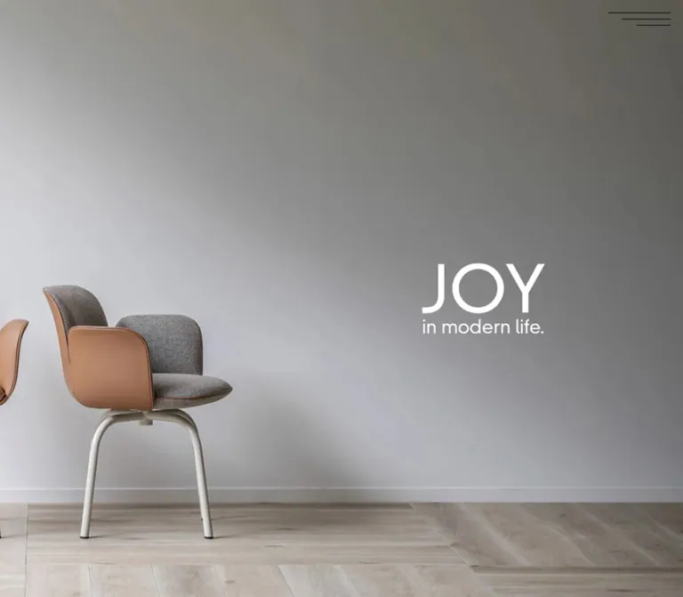
The opening gives almost the entire screen to a photograph of two chairs against a gray wall. White JOY in modern life. lettering occupies the empty wall, while three unequal black lines mark navigation at the upper right. Furniture materials provide most of the color: tan leather, gray upholstery, pale flooring, and warm timber. The interface adds very little visual noise.
The collection continues through spacious editorial content and furnished-room scenes before arriving at a compact product index. English product names and utility labels use a clean sans-serif; Japanese prose has unusually generous line spacing. The final charcoal navigation area turns the collection into an orderly directory of scenes, products, and related services.
This is a long collection presentation with product discovery and editorial content. Preserve its photographic pacing, modest controls, bilingual product hierarchy, and mobile art direction when reusing the design.
How to Read This Reference
- Measured means a value appears in the supplied computed styles or element rectangles. Dimensions derived by subtraction are identified as calculated.
- Estimated means a visual approximation from an original-page capture. Estimated colors and artwork bounds are not exact stylesheet values.
- Recommended means an implementation choice for a new project, including accessibility adjustments and the starter CSS.
- All custom-property names introduced here are implementation aliases. The supplied original custom properties concern Font Awesome; no original semantic color or spacing token system was provided.
- A DOM rectangle does not establish visibility. Header navigation links appear in the extracted DOM while the opening screenshots show only the menu mark.
- The dark navigation screenshots are terminal footer views. They do not demonstrate an opened menu overlay.
- Product layout and typography are supported by DOM measurements, but product imagery and activated product states are not shown in the supplied screenshots.
Tokens — Colors
Default Palette
| Name | Value | Suggested token | Role and evidence |
|---|---|---|---|
| Collection Ivory | #F5F4EE |
--paper |
Measured product-section background at both viewports. |
| Interface Black | #000000 |
--ink |
Measured body, product, and header-navigation text; visually consistent with the menu strokes. |
| Reversed White | #FFFFFF |
--reverse |
Measured footer and environmental-message text; visually consistent with the opening lettering and scene detail circle. |
| Category Gray | #AAAAAA |
--category-source |
Measured product-category labels, including Sofa, Chair, and Table. |
| Footer Charcoal | Approximately #3D3D3C |
--footer |
Estimated from the large flat footer surface. Its background declaration was not included in the sampled elements. |
| Closing Red | Approximately #8B2025 |
--closing-red |
Estimated from the 70px-high visible band above the desktop footer. The complete preceding panel was not captured. |
The gray wall and warm leather in the opening are photographic colors, not additional interface tokens. Their light-to-dark variation comes from the scene and lighting. A CSS gradient would only approximate the wall and would omit its relationship to the chairs and floor.
Color Application
Use ivory as one continuous catalog surface. Product buttons have transparent measured backgrounds and square corners, so their information belongs to the section rather than floating on separate white tiles.
Use white text over the charcoal footer. Preserve the strong distinction between this flat directory surface and the richly textured photographs above it. The red band is a closing accent; there is no evidence of a general red CTA system.
Recommended accessibility adaptation: use a darker category color such as #666666 when small labels must remain comfortably readable on ivory. Keep #AAAAAA documented as the source value. The starter makes this adjustment explicitly.
Tokens — Typography
Latin Interface and Product Names
- Measured stack:
area-normal, sans-serif. - Roles: navigation, product names, designer bylines, product categories, scene labels, the PRODUCTS heading, MORE INFO, and copyright.
- Weights: navigation and product names
400; category labels and scene markers600; PRODUCTS700. - Tracking:
normalon the sampled elements. - Character: open, geometric forms with regular-weight uppercase names and restrained utility text.
Keep regular-weight product titles distinct from the bold section heading. The hierarchy comes from size and placement more than widespread bold text or expanded tracking.
Japanese Body and Narrative Copy
- Measured stack:
dnp-shuei-gothic-kin-std, sans-serif. - Body:
16px / 24pxdesktop and14px / 21pxmobile, weight400. - Opening narrative: weight
600, with40pxdesktop line height and27.04pxmobile line height. - Environmental paragraph: regular weight with
38pxdesktop and28pxmobile line height.
The generous paragraph leading is a defining part of the editorial pacing. Maintain it around the compact product index instead of applying the same density everywhere.
Environmental Message Heading
- Measured stack:
yu-gothic-pr6n, sans-serif. - Weight:
500. - Desktop:
28px / 42px. - Mobile:
22px / 33px. - Observed label:
環境配慮への取り組みについて.
This is a separate measured family stack, not proof that the rest of the Japanese interface uses the same face.
Hero and Brand Artwork
The opening JOY in modern life. lockup and footer arflex wordmark are visible, but their specific DOM representation and computed font styles were not supplied. Treat them as artwork references. Do not identify their exact face from appearance alone.
The complete opening lockup occupies approximately 260–265 × 150px on desktop and 164 × 95px on mobile. These are estimated visible artwork bounds, not font sizes. The starter supports an authorized lockup image so its proportions can be preserved without inventing a display-font match.
Type Scale
| Role | Desktop | Mobile | Weight | Evidence |
|---|---|---|---|---|
| Default body | 16px / 24px |
14px / 21px |
400 |
Computed styles. |
| Navigation | 16px / 21px |
14px / 18.375px |
400 |
Computed Latin link styles. |
| Introductory statement | 16px / 40px |
13.52px / 27.04px |
600 |
Computed Japanese paragraphs. |
| PRODUCTS | 32px / 43px |
20px / 26.875px |
700 |
Computed heading. |
| Product name | 32px / 43px |
20px / 27px |
400 |
Computed English names. |
| Designer byline | 14px / 19px |
8px / 10px |
400 |
Mobile byline boxes are 20px high. |
| Product category | 14px / 19px |
10px / 13px |
600 |
Measured gray labels. |
| Vertical scene marker | 10px / 15px |
10px / 15px |
600 |
Computed scene labels. |
| Environmental heading | 28px / 42px |
22px / 33px |
500 |
Computed Japanese heading. |
| Environmental paragraph | 16px / 38px |
13px / 28px |
400 |
Computed Japanese paragraph. |
| MORE INFO | 14px / 21px |
13px / 19.5px |
600 |
Computed link. |
| Copyright | 10px / 15px |
10px / 15px |
400 |
Computed footer paragraph. |
The mobile byline/category rectangles intersect vertically: a byline occupies 20px, while its category starts 12px after the byline's top. This is an 8px bounding-box overlap in the supplied measurements. Without a product-region screenshot, visible glyph collision cannot be confirmed. A new implementation should allow content to flow naturally and avoid copying that overlap.
Font declarations identify the supplied stacks, but font files, licensing details, and resolved glyph-level fallback information were not provided. The starter assumes appropriately licensed fonts are loaded and supplies a generic sans-serif fallback.
Tokens — Spacing & Shapes
Density: expansive photographic scenes and narrative spacing, followed by a more compact product directory. Geometry: square section boundaries and product controls, thin linework, and one prominent circular detail affordance.
Measured and Calculated Spacing
| Element or relationship | Desktop | Mobile | Status |
|---|---|---|---|
| Opening section | 1440 × 1000px |
390 × 844px |
Measured; exactly one inspected viewport. |
| Menu button rectangle | 100 × 100px |
64 × 15px |
Measured; visible strokes and hit area should not be conflated. |
| Menu top/right inset | 20px / 20px |
13px / 13px |
Calculated from button rectangles. |
| Product-section padding | 266px 20px 200px |
70px 20px 120px |
Measured. |
| Product grid outer width | 1292px |
350px |
Calculated from card extents. |
| Product grid left edge | 74px |
20px |
Measured card positions. |
| Product column width | 636px |
172.5px |
Measured. |
| Product column gap | 20px |
5px |
Calculated. |
| Product row gap | 20px |
5px after the taller card |
Calculated from successive row positions. |
| Product-button padding | 18px 16px 14px |
4px 4px 28px |
Measured. |
| Product inner width | 604px |
164.5px |
Calculated from width and padding. |
| PRODUCTS-to-grid gap | 108px |
15px |
Calculated from heading bottom to first card top. |
| Grid-to-coordination link gap | 190px |
94px |
Calculated from final card bottom to link top. |
| Intro paragraph separation | 28px |
Approximately 20px |
Calculated. |
| Environmental text column | 608px wide |
312px wide |
Measured. |
| Environmental heading-to-body gap | 50px |
50px |
Calculated. |
| Footer product-link vertical step | 60px |
61px |
Calculated from link rectangles. |
These values do not imply a single global spacing unit. The page changes scale by component: the hero remains viewport-sized, catalog gutters compress sharply, and environmental prose retains generous leading.
Shapes and Fine Details
| Element | Treatment | Evidence |
|---|---|---|
| Product buttons | 0px radius; transparent background |
Computed styles. |
| Navigation links | Unboxed text | Screenshots and sampled backgrounds. |
| Menu mark | Three thin, right-aligned strokes | Visually observed. |
| Scene detail affordance | Approximately 162px diameter, white hairline circle |
Desktop screenshot estimate. |
| Scene marker | Small vertical text between short horizontal rules | Desktop screenshot. |
| Footer | Flat full-width charcoal plane | Desktop and mobile screenshots. |
Desktop menu strokes are approximately 100px, 78px, and 54px long; mobile strokes are approximately 64px, 50px, and 35px. Their vertical positions are about 10px apart. The mobile decoration visibly extends beyond the measured 15px-high button rectangle, so that rectangle alone does not establish its complete painted or interactive area.
Components
Full-Viewport Opening
Role: establish the collection's emotional and material character before presenting information.
The desktop composition places chairs in the lower-left area and the white two-line lockup on the open wall to the right. The lettering starts near x = 890px, roughly 62% of viewport width, and near y = 425px, roughly 43% of viewport height. Both coordinates are visual estimates.
On mobile, the lockup moves to the upper center, starting near y = 182px, about 22% of the viewport height. The chairs occupy the lower half, with the left chair seen from the front and the other entering from the right. The floor remains visible beneath their legs.
Anatomy: viewport-sized image field; independently positioned white collection lockup; persistent upper-right menu mark. The opening capture contains no additional visible header bar or primary CTA.
Reproduce the relationship between empty wall, lettering, and furniture. The portrait view needs deliberate image positioning or a separate crop. The evidence does not establish whether the source uses separate image files, background positioning, or another art-direction method.
Menu Toggle and Navigation Structure
Role: access the collection's scene, product, and utility navigation.
The toggle consists of three black horizontal lines, all aligned to the right, with each lower line shorter than the one above. It remains at the same upper-right location across the supplied page positions. This supports a persistent visual treatment; the exact positioning declaration was not supplied.
The header DOM contains TOP, three scene links, twelve product anchors, SHOP, News letter, and social links. Its desktop link columns begin at approximately 551px, 706px, 911px, and 1198px. Their presence in the DOM does not mean the full navigation is exposed over the opening image.
The mobile header navigation measurements use a compact arrangement: scene links in one row, products in two columns with a 36px vertical step, and SHOP/News letter side by side. The footer uses wider vertical spacing and stacked utility links. These are distinct measured arrangements.
Unverified: activation behavior, open-state background, close icon, transition direction, focus handling, scroll locking, and Escape-key support. The empty extracted button text does not establish whether an accessible name exists elsewhere.
Introductory Statement
Role: connect the furniture collection to individual choices and contemporary daily life.
Two Japanese paragraphs sit in a narrow text area with substantial surrounding space. On desktop, the first paragraph is 384px wide at x = 528px, with five 40px lines. The second follows after 28px and occupies two lines.
At 390px, the first paragraph is approximately 324.5px wide at x = 32.75px. Its font size becomes 13.52px with 27.04px leading; the paragraph gap becomes approximately 20px. This is selective type and width adjustment rather than uniform scaling of the page.
The source narrative section is 1000px high on desktop and approximately 1663.8px high on mobile. Its entire visual treatment was not captured. Preserve the measured reading rhythm without inventing the appearance or behavior of the surrounding unshown area.
Scene Presentation
Role: show the furniture within complete living spaces and provide a route toward coordination details.
The supplied SCENE 02 capture uses a full-width interior photograph: a large window and foliage on the left, a timber wall and artwork toward the right, a low sofa across the lower portion, and layered tables and objects in front. The architecture supplies a strong division between bright and dark areas.
A small vertical SCENE 02 label appears near the left edge, bracketed by thin horizontal rules. A white outlined circle appears on the right, approximately 162 × 162px, about 50px from the viewport edge. Its contents are See Detail and a short, delicate arrow underneath.
The next photograph is already entering at approximately y = 805px in this scrolled capture. That boundary is a partial viewport view, not evidence that every scene is 805px high.
The three scene-navigation links point to /2025collection/coordination/#scene1, #scene2, and #scene3. The separate circular affordance's destination and activated result were not recorded.
Product Index
Role: turn the photographed collection into an ordered set of identifiable products.
The section uses measured ivory #F5F4EE, a bold PRODUCTS heading, and twelve transparent, square-cornered product buttons. It retains two columns at both inspected widths.
| Row | Left product | Right product |
|---|---|---|
| 1 | SOFFIO — Sofa | VENDOME LOUNGE — Lounge chair |
| 2 | ALIA — Lounge chair | JOY — Chair |
| 3 | VENDOME — Chair | TROCADERO — Living table |
| 4 | KEYSTONE — Living table | ACCA — Table |
| 5 | DEW — Table | SLIM / SLIM+ — Table |
| 6 | KAMI — Table | WITCH HAT 35/50 — Light |
Anatomy: large upper media area; a design by byline; a muted category label; a larger regular-weight English product name; a Japanese rendering; and, for selected products, an (IMPORT) annotation.
The bylines concern furniture design. For example, the JOY entry states design by LucidiPevere. These are product metadata and do not identify the website's production team.
A square media slot is a strong geometric inference, not a directly measured image element. Desktop cards have 604px of inner width; their bylines begin 612px below the inner top, consistent with a 604px square and an 8px gap. Mobile measurements similarly fit a 164.5px square and a 3px gap. Native image dimensions, framing, and object-fit behavior were not supplied.
Desktop buttons measure 636 × 739px. Mobile widths become 172.5px, while heights vary from 276.5px to 303.5px. VENDOME LOUNGE and WITCH HAT 35/50 wrap to two English title lines. Subsequent rows align below the taller preceding card, supporting a row-based layout rather than independent masonry columns.
The source uses buttons for product entries. Their activated outcomes were not captured; do not assert a modal, carousel, image zoom, or product-page transition.
Coordination Link
Role: connect the product index to the separate coordination presentation.
See Coordination links to https://www.arflex.co.jp/2025collection/coordination/. Its measured flex wrapper is 1400 × 36px on desktop and 350 × 27px on mobile. Those dimensions describe the link container, not the text's visible width or a bordered button.
The large gap above it creates a clear pause after the final product row. The destination's appearance and interactions were not inspected.
Environmental Message
Role: close the collection narrative with material choices and the brand's approach to lasting furniture.
The DOM records MESSAGE, the Japanese heading 環境配慮への取り組みについて, a long Japanese paragraph, and MORE INFO. The text describes reused concrete material, plant-derived bio-urethane, and timber use that includes offcuts.
The main text column is centered at 608px wide on desktop, beginning at x = 416px. Mobile uses a 312px column with 39px side margins, exactly 80% of the viewport width. The paragraph changes from 16px / 38px to 13px / 28px and gains additional line breaks.
MORE INFO links to /about/activity/. Its measured box is 218 × 37px with 7px 15px padding on desktop, and 170 × 29.5px with 4px 16px padding on mobile. Its radius is zero. A full border declaration was not supplied.
White text is measured. The red strip visible immediately above the desktop footer may belong to this preceding region, but the full message background is not visually established. Applying the estimated red across the message panel in the starter is a recommended interpretation.
Collection Footer
Role: provide a comprehensive, calm directory at the end of the page.
The desktop capture shows a flat charcoal field beneath the red strip. The white arflex wordmark and small 2025 Collection legend sit toward the upper left. Across the remaining width are TOP, the three scene links, the twelve-product list, and SHOP/News letter/social utilities.
Measured desktop link starts are approximately 551px, 706px, 911px, and 1198px. The brand begins near 75px. Product links repeat every 60px, producing a tall, evenly paced directory with very little ornament.
Mobile rearranges the directory: scene links share one row; products form two columns starting at 20px and 215px; SHOP and News letter stack below; Instagram, Facebook, and YouTube marks share a horizontal row. Product links repeat every 61px. Copyright is centered within a 350px-wide region and remains 10px / 15px.
The mobile terminal capture begins around the scene row. TOP appears above it in the measured document and is outside this particular crop. Absence from the screenshot does not establish that TOP or the brand is removed on mobile.
SHOP and News letter have small outward-link marks in the screenshots. Their URLs are on the same website; the marks alone do not prove a new-tab behavior or an external domain.
Tokens — Motion & Interaction
| Treatment | Recorded evidence | What can be concluded |
|---|---|---|
| Body transition | opacity 0.4s at both widths |
An opacity transition is declared; trigger and endpoints are unverified. |
| Links and buttons | 0.3s transition serialization |
A 300ms transition is declared; the changed property and visible state treatment were not established. |
| Sampled animations | Most sampled nodes report animation: none |
No CSS animation is active on those sampled nodes at that moment; this does not exclude JavaScript or unsampled animation. |
| Menu placement | Same upper-right visual location across page captures | Persistent placement is visible; menu opening and closing were not exercised. |
| Scene marker positioning | Initial desktop DOM marker at x = -66px; later visible marker near x = 34px |
Initial geometry differs from a later visible state. The responsible transform, scroll logic, or trigger is unverified. |
| Product entries | Rendered as BUTTON elements | Interactive semantics exist; activated content is unknown. |
| Scene and product navigation | Explicit coordination URLs and product fragments | Destination references are known; smooth scrolling and transition behavior are not. |
The scene region measures 5250px on desktop and 4431px on mobile. Dividing by three yields 1750px and 1477px per scene interval, respectively—both exactly 1.75 times the inspected viewport height. This is a calculated spatial relationship, not an inspected CSS formula or proof of pinning, snapping, or parallax.
The supplied capture process waited for initial observation, finite motion, layout/text stability, and visible image decoding within time limits. It also traversed intermediate scroll positions. These checks improve the reliability of the stills but do not provide a motion recording or prove that delayed content and every interaction completed.
Recommended motion direction: keep added feedback restrained, such as short opacity or color changes. Preserve visible content when motion is disabled. Establish actual scroll timelines through additional testing before implementing elaborate scene pinning or image transitions.
Surfaces
| Surface | Appearance | Function and evidence |
|---|---|---|
| Opening | Full-bleed photograph with white lockup | Establishes furniture, materials, and atmosphere; visually captured at both widths. |
| Scene | Full-width room photography with minimal overlaid linework | Places the collection in living spaces; SCENE 02 visually captured on desktop. |
| Product section | Exact ivory #F5F4EE with black and gray typography |
Measured catalog surface. |
| Product button | Transparent, square-cornered | Keeps the catalog visually continuous; measured. |
| Environmental text | White heading and prose | Measured; complete background not captured. |
| Closing band | Muted red | Visible above the desktop footer; estimated color. |
| Footer | Charcoal with white links, wordmark, and social symbols | Visually captured at both widths. |
The observed design establishes hierarchy through image scale, whitespace, typography, and a few fine outlines. There is no visible general-purpose shadow or rounded-card elevation system in the supplied captures.
Imagery
The opening photograph is quiet and materially specific. Tan leather contrasts with gray fabric; curved chair shells sit on slender pale legs; broad wall space and lightly patterned flooring keep the composition spacious. Soft lighting and restrained saturation give the image its calmness without flattening the furniture's texture.
The room scene adds visual depth through large windows, trees outside, timber walls, framed artwork, upholstery, and overlapping furniture. The interface remains small enough that the room continues to read as a coherent interior.
Use photographs with planned negative space for text. On desktop, the opening needs usable wall space on the right. On mobile, it needs clear space above the furniture. Choose the crop while checking chair silhouettes, legs, floor contact, and the balance between the two objects.
Keep photographic gradients, grain, material detail, and soft shadows intact. Avoid recoloring the images into the interface palette or placing heavy default overlays over their entire area.
Observed Asset References
No native image, logo, SVG, or font-file URLs were supplied. The following inventory describes observed assets without inventing paths.
| Asset | Evidence | Reuse guidance |
|---|---|---|
| Two-chair opening photograph | Desktop and mobile opening captures | Supply authorized landscape and portrait compositions, or verified responsive crops. |
| JOY collection lockup | Both opening captures | Preserve its two-line geometry using authorized artwork when available. |
| SCENE 02 room photograph | Desktop scene capture | Maintain architectural composition and space for the detail circle. |
| arflex / 2025 Collection footer identity | Desktop footer capture | Use the actual brand asset when authorized; no asset URL is known. |
| Product media | Upper card-space geometry in DOM | Verify original imagery before deciding on crop or object-fit. |
| Social marks | Footer screenshots; Font Awesome custom properties in DOM | Recognizable brand symbols are present; individual icon classes were not supplied. |
The custom properties mention Font Awesome 6 Brands and Font Awesome 6 Free. This is evidence of available icon-family definitions, not proof that every visible mark comes from those families.
Layout & Responsive Behavior
Page Structure and Recorded Extents
| Region | Desktop record | Mobile record |
|---|---|---|
| Document height | 18,390px |
Approximately 17,539.8px |
| Opening | Starts at 0; height 1000px |
Starts at 0; height 844px |
| Narrative section | Starts at 1000; height 1000px |
Starts at 844; height approximately 1663.8px |
| Scene region | Starts at 6000; height 5250px |
Starts at 9164; height 4431px |
| Product section | Starts at 11,250; height 5377px |
Starts at 13,595; height approximately 2108.9px |
| Footer element, including message | Starts at 16,627; height 1763px |
Starts at approximately 15,703.9; height approximately 1835.9px |
These are captured document measurements, not recommended fixed heights. The large intervals before the scene region are not sufficiently described by the supplied element sample. Their exact visual content and scroll allocation should remain unspecified.
Desktop Composition
The hero, scenes, and footer span the viewport. The product grid is more contained, with 74px outer margins at 1440px. Environmental prose is narrower again at 608px. This nested width system gives the content different reading speeds without changing the overall visual language.
The product index uses six aligned rows of two items. Large media regions and 32px product names give individual furniture pieces room to register. The footer uses the desktop width to separate navigation categories into distinct vertical groups.
Mobile Composition
The opening receives a new composition: lettering above the chairs rather than beside them. The product grid remains two columns, reducing its gap to 5px and titles to 20px. Long names wrap, while Japanese names and import annotations add vertical information.
The footer's product list also becomes two columns, but with much wider separation than the product grid. This is a different component with different density: its column starts are 195px apart.
Japanese narrative and environmental copy retain ample leading. Mobile therefore changes image composition, spacing, type sizes, and directory organization independently; it is not a single scaled-down desktop layout.
Responsive Limits
Only 1440px and 390px widths were inspected. Exact breakpoints, intermediate tablet layouts, landscape behavior, safe-area rules, and browser-toolbar resizing behavior were not supplied. The 767px breakpoint and svh usage in the starter are recommendations.
Do’s and Don’ts
Do
- Give the opening photograph the full viewport and compose its empty space around the white lockup.
- Move the mobile lockup above the furniture and verify the crop at
390 × 844. - Preserve the unequal, right-aligned menu strokes.
- Use exact
#F5F4EEfor the product-section surface. - Pair regular Latin product names with small bylines, muted categories, and Japanese renderings.
- Retain the observed two-column product index at the inspected mobile width.
- Allow longer names and import annotations to determine card height.
- Use generous line spacing for the Japanese narrative and environmental text.
- Keep the circular detail affordance thin, transparent, and visually subordinate to the room.
- Distinguish header navigation measurements from the terminal footer layout.
- Preserve the footer's calm link spacing and two-column mobile product directory.
- Label image-slot inferences, estimated colors, and new interaction choices explicitly.
Don’t
- Don't replace the photographic opening with a dense text-and-button arrangement.
- Don't treat the wall's photographic lighting as a source CSS gradient.
- Don't give each product a separate rounded white card or heavy shadow.
- Don't use the closing red as an invented universal action color.
- Don't apply bold weight or wide tracking to every product name.
- Don't assume the mobile catalog collapses to one column.
- Don't shrink the desktop crop mechanically without checking both chairs and the title position.
- Don't describe the footer capture as an open menu.
- Don't infer a lightbox, carousel, sticky scene timeline, or hover effect from a button or transition declaration alone.
- Don't reproduce long document offsets as blank spacer sections.
- Don't identify furniture designers as website-production credits.
- Don't copy the 8px mobile bylines or overlapping text rectangles into a new implementation without a readability review.
Recommended Implementation Additions
These are recommendations for a new implementation, not verified original features:
- Give the menu button a clear accessible name, state, and an implemented navigation target. Enlarge the mobile hit area to at least 44px high while retaining the 64px-wide line mark.
- Provide visible focus indicators over photographs and dark surfaces. Use surface-aware control colors where necessary; the captured menu strokes remain black over the charcoal footer.
- Increase mobile designer bylines from the measured 8px to approximately 12px. Let byline, category, and title occupy independent flowing boxes.
- Darken small category labels from
#AAAAAAwhen needed for readable contrast on ivory. - Choose product-link or product-button semantics according to the implemented outcome. If buttons open dialogs, supply focus management, dismissal, and an accessible title.
- Provide an appropriate heading structure. The supplied PRODUCTS element is an H3; a new document should choose its heading level from the complete outline.
- Use meaningful image alternatives and avoid duplicating the collection lockup's wording in adjacent accessible text.
- Preserve normal page access with reduced motion and when optional animation code fails.
- Load the opening image promptly, reserve image dimensions, and defer lower-page media appropriately. These are performance recommendations, not inspected loading behavior.
Agent Prompt Guide
Quick Color Reference
- Product canvas: exact
#F5F4EE. - Main typography: exact
#000000. - Reversed text and scene outline:
#FFFFFF. - Source product categories: exact
#AAAAAA; recommended readable adaptation:#666666. - Footer: approximately
#3D3D3C. - Closing band: approximately
#8B2025. - Leather, timber, wall, and foliage colors belong to the photographs rather than a decorative UI palette.
Overall Prompt
“Create a contemporary furniture collection presentation inspired by the inspected arflex 2025 Collection. Begin with a full-viewport photograph of two sculptural chairs against a quiet gray wall, a white two-line collection lockup on the right, and three thin, unequal, right-aligned menu strokes in the upper-right corner. On mobile, move the lockup above the furniture and art-direct the portrait crop. Follow with spacious Japanese editorial copy, immersive furnished-room scenes, and a continuous ivory #F5F4EE product index. Keep two product columns at 390px, use regular Latin product names, small designer bylines, muted categories, and Japanese product labels. Finish with a charcoal directory footer that becomes a two-column product list on mobile. Use the supplied font stacks only when licensed and available. Treat unverified menu, product, and scroll behaviors as implementation decisions.”
Example Component Prompts
- Opening: “Design a 1440 × 1000 furniture opening with tan and gray chairs concentrated in the lower-left area, broad gray wall space, and a white collection lockup starting around 62% of the width and 43% of the height. Use a full-bleed photograph and a small three-stroke navigation mark.”
- Portrait opening: “Adapt the same opening to 390 × 844. Place the white lockup near the upper center at approximately 22% of the height. Keep the two chairs in the lower half with visible legs and floor contact. Select the image crop deliberately.”
- Scene: “Create a full-width living-room photograph with timber, natural light, and layered furniture. Add a 10px vertical scene marker near the left edge and a transparent white hairline circle about 162px across on the right, containing See Detail and a fine arrow.”
- Product index: “Create twelve square-cornered product entries on one ivory surface. At 1440px, use a 1292px-wide two-column grid with a 20px gap; at 390px, use 350px with a 5px gap. Place media above designer, category, English name, and Japanese label. Allow title wrapping. Use readable mobile bylines as an explicit accessibility adaptation.”
- Footer: “Create a charcoal collection directory with a white brand lockup at left and separate desktop columns for TOP, three scenes, twelve products, and utilities. Use 16px regular Latin links with a 60px vertical step. On mobile, use 14px links, one row of scenes, and two six-item product columns with a 61px step.”
Quick Start
CSS Custom Properties
This starter reproduces the documented visual relationships using new class names and semantic aliases. It is not extracted source CSS. Load authorized imagery, logo artwork, and licensed fonts separately.
Measured catalog dimensions and core type roles are retained. Deliberate recommendations include a 767px breakpoint, svh hero sizing, a square product-media slot, a 44px mobile menu hit area, readable 12px mobile bylines, darker category text, and normal-flow scene frames. The red message background and footer color are visual approximations.
Expected structure: .hero contains .hero-media and .hero-lockup; a .scene-frame contains .scene-media, .scene-marker, and .scene-detail; each .product-card contains media, designer, category, and a .product-heading grouping the English and Japanese names. Footer groups use the named classes below. Menu and product activation require separately implemented behavior.
:root {
  /* Measured colors */
  --paper: #f5f4ee;
  --ink: #000000;
  --reverse: #ffffff;
  --category-source: #aaaaaa;

  /* Visual estimates and a recommended contrast adjustment */
  --footer: #3d3d3c;
  --closing-red: #8b2025;
  --category-readable: #666666;

  /* Measured family declarations; load licensed fonts separately */
  --font-latin: 'area-normal', sans-serif;
  --font-body: 'dnp-shuei-gothic-kin-std', sans-serif;
  --font-message: 'yu-gothic-pr6n', sans-serif;

  --catalog-max: 1292px;
  --catalog-gap: 20px;
  --catalog-top: 266px;
  --catalog-bottom: 200px;
  --catalog-heading-gap: 108px;
  --catalog-link-gap: 190px;
  --product-padding: 18px 16px 14px;
  --text-product: 32px;
  --leading-product: 43px;
  --text-nav: 16px;
  --leading-nav: 21px;
  --message-width: 608px;
  --rule: 1px;
  --feedback-duration: 300ms;
}

* {
  box-sizing: border-box;
}

body {
  margin: 0;
  color: var(--ink);
  font: 400 16px/1.5 var(--font-body);
}

button,
a {
  -webkit-tap-highlight-color: transparent;
}

.hero {
  position: relative;
  height: 100vh;
  height: 100svh;
  overflow: hidden;
}

.hero-media,
.scene-media {
  position: absolute;
  inset: 0;
  display: block;
}

.hero-media img,
.scene-media img {
  display: block;
  width: 100%;
  height: 100%;
  object-fit: cover;
  object-position: var(--image-position, 50% 50%);
}

/* Estimated lockup placement; use authorized artwork. */
.hero-lockup {
  position: absolute;
  top: 42.5%;
  left: 61.7%;
  width: min(18.4%, 265px);
  margin: 0;
}

.hero-lockup img {
  display: block;
  width: 100%;
  height: auto;
}

.menu-toggle {
  position: fixed;
  z-index: 30;
  top: 20px;
  right: 20px;
  width: 100px;
  height: 100px;
  padding: 0;
  border: 0;
  border-radius: 0;
  color: var(--ink);
  background: transparent;
  cursor: pointer;
}

.menu-toggle span {
  position: absolute;
  right: 0;
  height: var(--rule);
  background: currentColor;
}

.menu-toggle span:nth-child(1) {
  top: 0;
  width: 100%;
}

.menu-toggle span:nth-child(2) {
  top: 10px;
  width: 78%;
}

.menu-toggle span:nth-child(3) {
  top: 20px;
  width: 54%;
}

/* Recommended optional contrast state, not an observed menu state. */
.menu-toggle[data-surface='dark'] {
  color: var(--reverse);
}

/* Normal-flow scene adaptation; no unverified scroll timeline. */
.scene-frame {
  position: relative;
  min-height: 100vh;
  min-height: 100svh;
  overflow: hidden;
}

.scene-marker {
  position: absolute;
  top: 50%;
  left: 34px;
  margin: 0;
  padding: 32px 4px;
  border-top: var(--rule) solid currentColor;
  border-bottom: var(--rule) solid currentColor;
  writing-mode: vertical-rl;
  transform: translateY(-50%);
  font: 600 10px/15px var(--font-latin);
}

.scene-detail {
  position: absolute;
  top: 50%;
  right: 50px;
  display: flex;
  flex-direction: column;
  align-items: center;
  justify-content: center;
  gap: 12px;
  width: 162px;
  aspect-ratio: 1;
  border: var(--rule) solid currentColor;
  border-radius: 50%;
  color: var(--reverse);
  background: transparent;
  transform: translateY(-50%);
  font: 400 14px/21px var(--font-latin);
  text-decoration: none;
}

.detail-arrow {
  position: relative;
  width: 24px;
  height: 1px;
  background: currentColor;
}

.detail-arrow::after {
  position: absolute;
  right: 0;
  bottom: 0;
  width: 5px;
  height: 5px;
  border-top: 1px solid currentColor;
  border-right: 1px solid currentColor;
  transform: translateY(2px) rotate(45deg);
  content: '';
}

.products {
  padding: var(--catalog-top) 20px var(--catalog-bottom);
  background: var(--paper);
}

.products-title {
  margin: 0;
  font: 700 32px/43px var(--font-latin);
}

.product-grid {
  display: grid;
  grid-template-columns: repeat(2, minmax(0, 1fr));
  align-items: start;
  gap: var(--catalog-gap);
  max-width: var(--catalog-max);
  margin: var(--catalog-heading-gap) auto 0;
}

.product-card {
  display: block;
  min-width: 0;
  width: 100%;
  padding: var(--product-padding);
  border: 0;
  border-radius: 0;
  color: var(--ink);
  background: transparent;
  font: inherit;
  text-align: left;
  text-decoration: none;
  cursor: pointer;
}

/* Square geometry is inferred; contain is a recommended media policy. */
.product-media {
  display: block;
  aspect-ratio: 1;
  margin-bottom: 8px;
}

.product-media img {
  display: block;
  width: 100%;
  height: 100%;
  object-fit: contain;
}

.product-designer {
  display: block;
  margin: 0 0 14px;
  font: 400 14px/19px var(--font-latin);
}

.product-category {
  display: block;
  margin: 0;
  color: var(--category-readable);
  font: 600 14px/19px var(--font-latin);
}

.product-heading {
  display: flex;
  flex-wrap: wrap;
  align-items: baseline;
  gap: 0 12px;
}

.product-name {
  margin: 0;
  font: 400 var(--text-product)/var(--leading-product)
    var(--font-latin);
  overflow-wrap: anywhere;
}

/* Japanese label sizing is an adaptation; source sizing was not sampled. */
.product-local-name {
  font: 400 12px/18px var(--font-body);
}

.coordination-link {
  display: flex;
  align-items: center;
  justify-content: center;
  gap: 12px;
  min-height: 36px;
  margin-top: var(--catalog-link-gap);
  color: inherit;
  text-decoration: none;
}

/* The complete red message fill is a recommended interpretation. */
.collection-message {
  padding: 120px 20px 145px;
  color: var(--reverse);
  background: var(--closing-red);
}

.message-content {
  width: 100%;
  max-width: var(--message-width);
  margin-inline: auto;
}

.message-heading {
  margin: 0;
  font: 500 28px/42px var(--font-message);
}

.message-copy {
  margin: 50px 0 44px;
  font: 400 16px/38px var(--font-body);
}

/* Thin border is an adaptation; source border style was not supplied. */
.more-info {
  display: block;
  width: 218px;
  padding: 7px 15px;
  border: 1px solid currentColor;
  color: inherit;
  font: 600 14px/21px var(--font-latin);
  text-decoration: none;
}

.collection-footer {
  display: grid;
  grid-template-columns: 37% 12% 16% 22% 13%;
  padding: 100px clamp(20px, 5.2083vw, 75px) 140px;
  color: var(--reverse);
  background: var(--footer);
  font: 400 var(--text-nav)/var(--leading-nav) var(--font-latin);
}

.collection-footer a {
  color: inherit;
  text-decoration: none;
}

.footer-brand,
.footer-top,
.footer-scenes,
.footer-products,
.footer-utilities,
.footer-copyright {
  grid-row: 1;
  min-width: 0;
}

.footer-brand,
.footer-copyright {
  grid-column: 1;
}

.footer-top { grid-column: 2; }
.footer-scenes { grid-column: 3; }
.footer-products { grid-column: 4; }
.footer-utilities { grid-column: 5; }

.footer-scenes,
.footer-products,
.footer-utilities {
  display: flex;
  flex-direction: column;
  align-items: flex-start;
  gap: 39px;
}

.footer-brand img {
  display: block;
  width: 125px;
  max-width: 100%;
  height: auto;
}

.footer-social {
  display: flex;
  align-items: center;
  gap: 34px;
}

.footer-copyright {
  align-self: end;
  margin: 0;
  font: 400 10px/15px var(--font-latin);
}

/* Recommended feedback; original hover endpoints were not captured. */
.collection-footer a,
.coordination-link,
.more-info {
  transition: opacity var(--feedback-duration);
}

@media (hover: hover) {
  .collection-footer a:hover,
  .coordination-link:hover,
  .more-info:hover {
    opacity: 0.7;
  }
}

:where(a, button):focus-visible {
  outline: 2px solid currentColor;
  outline-offset: 5px;
}

@media (max-width: 767px) {
  :root {
    --catalog-gap: 5px;
    --catalog-top: 70px;
    --catalog-bottom: 120px;
    --catalog-heading-gap: 15px;
    --catalog-link-gap: 94px;
    --product-padding: 4px 4px 28px;
    --text-product: 20px;
    --leading-product: 27px;
    --text-nav: 14px;
    --leading-nav: 18.375px;
  }

  body {
    font-size: 14px;
    line-height: 21px;
  }

  .hero-lockup {
    top: 21.5%;
    left: 50%;
    width: 164px;
    max-width: 60%;
    transform: translateX(-50%);
  }

  .menu-toggle {
    top: 13px;
    right: 13px;
    width: 64px;
    height: 44px;
  }

  .scene-marker {
    left: 20px;
    padding-inline: 2px;
  }

  /* Mobile detail size is a recommendation, not a captured measurement. */
  .scene-detail {
    right: 20px;
    width: 112px;
  }

  .products-title {
    font-size: 20px;
    line-height: 26.875px;
  }

  .product-media {
    margin-bottom: 3px;
  }

  /* Readability adaptation from the measured 8px / 10px byline. */
  .product-designer {
    margin-bottom: 8px;
    font-size: 12px;
    line-height: 16px;
  }

  .product-category {
    margin-bottom: 5px;
    font-size: 10px;
    line-height: 13px;
  }

  .product-heading {
    display: block;
  }

  .product-local-name {
    display: block;
  }

  .coordination-link {
    min-height: 27px;
  }

  .collection-message {
    padding: 60px 10% 120px;
  }

  .message-heading {
    font-size: 22px;
    line-height: 33px;
  }

  .message-copy {
    margin-bottom: 34px;
    font-size: 13px;
    line-height: 28px;
  }

  .more-info {
    width: 170px;
    padding: 4px 16px;
    font-size: 13px;
    line-height: 19.5px;
  }

  .collection-footer {
    grid-template-columns: minmax(0, 1fr);
    gap: 67.625px;
    padding: 80px 20px 100px;
  }

  .collection-footer > * {
    grid-column: 1;
    grid-row: auto;
  }

  .footer-scenes {
    flex-direction: row;
    flex-wrap: wrap;
    gap: 16px 40px;
  }

  .footer-products {
    display: grid;
    grid-template-columns: repeat(2, minmax(0, 1fr));
    grid-template-rows: repeat(6, auto);
    grid-auto-flow: column;
    column-gap: 40px;
    row-gap: 42.625px;
  }

  .footer-utilities {
    gap: 42.625px;
  }

  .footer-copyright {
    text-align: center;
  }
}

@media (prefers-reduced-motion: reduce) {
  .collection-footer a,
  .coordination-link,
  .more-info {
    transition: none;
  }
}
The mobile footer product grid assumes exactly twelve links ordered down the first column and then down the second. Change the row count when adapting the directory to a different collection.
For the hero, use a responsive <picture> or verified object-position values with the actual photography. The generic 50% 50% image position in this starter is a fallback, not a measured source crop. Product media, lockup artwork, navigation state, and product detail behavior require real assets and application logic before the implementation is complete.
Tailwind v4 Token Mapping
Optional aliases for a project already using Tailwind v4. This mapping does not identify the original site's framework. Define the custom properties above first.
@theme inline {
  --color-collection-paper: var(--paper);
  --color-collection-ink: var(--ink);
  --color-collection-reverse: var(--reverse);
  --color-collection-footer: var(--footer);
  --color-collection-red: var(--closing-red);
  --color-collection-category: var(--category-readable);

  --font-collection-latin: var(--font-latin);
  --font-collection-body: var(--font-body);
  --font-collection-message: var(--font-message);

  --text-collection-product: var(--text-product);
  --spacing-collection-gap: var(--catalog-gap);
  --radius-collection: 0px;
}
Sources & Evidence
- arflex — 2025 Collection: original and final URL in the supplied inspection record; HTTP
200; document titleJOY in modern life | 2025Collection | arflex (アルフレックス ジャパン). - Capture date:
2026-09-12T19:25:36.528Z, corresponding to September 13, 2026, 04:25 JST. The date describes the supplied capture record rather than an additional live visit. - Desktop evidence:
1440 × 1000opening, SCENE 02, and terminal footer captures, plus rendered DOM rectangles, link destinations, computed colors, font stacks, typography, padding, and transition declarations. - Mobile evidence:
390 × 844opening and terminal footer captures, plus equivalent rendered DOM and computed-style measurements throughout the document. - Observation limits: the capture process included an initial observation of at least five seconds and bounded readiness checks for layout, text, images, and finite motion. SharedWorkers and service workers were disabled. No click, hover, keyboard, open-menu, or activated-product results were supplied.
- Coverage limits: no original asset URLs, complete stylesheet, JavaScript timeline, intermediate-width capture, product-region screenshot, or complete environmental-panel screenshot was supplied. Linked coordination, shop, newsletter, activity, and social destinations were not inspected.
This reference describes the current page represented by those captures. Measured values, visual estimates, and recommended implementation choices remain separate throughout.
# arflex / 2025 Collection — Style Reference

> A furniture collection presented through quiet interiors, generous photographic space, and precise, understated typography.

**Website:** [arflex — 2025 Collection](https://www.arflex.co.jp/2025collection/)
**Original URL:** https://www.arflex.co.jp/2025collection/
**Final URL:** https://www.arflex.co.jp/2025collection/
**Theme:** photographic opening and scene sequence, warm ivory product index, charcoal footer, and a muted red band above the footer.
**Inspected:** September 13, 2026, 04:25 JST. The supplied capture record is timestamped `2026-09-12T19:25:36.528Z`, September 12 in UTC.
**Viewports:** desktop `1440 × 1000` and mobile `390 × 844`, in CSS pixels.
**Scope:** supplied desktop captures of the opening, SCENE 02, and terminal footer; mobile captures of the opening and terminal footer; rendered DOM and computed styles covering introductory copy, three scenes, twelve product entries, the environmental message, and header/footer navigation. Linked destinations and activated menu or product states were not inspected.

The opening gives almost the entire screen to a photograph of two chairs against a gray wall. White `JOY in modern life.` lettering occupies the empty wall, while three unequal black lines mark navigation at the upper right. Furniture materials provide most of the color: tan leather, gray upholstery, pale flooring, and warm timber. The interface adds very little visual noise.

The collection continues through spacious editorial content and furnished-room scenes before arriving at a compact product index. English product names and utility labels use a clean sans-serif; Japanese prose has unusually generous line spacing. The final charcoal navigation area turns the collection into an orderly directory of scenes, products, and related services.

This is a long collection presentation with product discovery and editorial content. Preserve its photographic pacing, modest controls, bilingual product hierarchy, and mobile art direction when reusing the design.

## How to Read This Reference

- **Measured** means a value appears in the supplied computed styles or element rectangles. Dimensions derived by subtraction are identified as calculated.
- **Estimated** means a visual approximation from an original-page capture. Estimated colors and artwork bounds are not exact stylesheet values.
- **Recommended** means an implementation choice for a new project, including accessibility adjustments and the starter CSS.
- All custom-property names introduced here are implementation aliases. The supplied original custom properties concern Font Awesome; no original semantic color or spacing token system was provided.
- A DOM rectangle does not establish visibility. Header navigation links appear in the extracted DOM while the opening screenshots show only the menu mark.
- The dark navigation screenshots are terminal footer views. They do not demonstrate an opened menu overlay.
- Product layout and typography are supported by DOM measurements, but product imagery and activated product states are not shown in the supplied screenshots.

## Tokens — Colors

### Default Palette

| Name | Value | Suggested token | Role and evidence |
| --- | --- | --- | --- |
| Collection Ivory | `#F5F4EE` | `--paper` | Measured product-section background at both viewports. |
| Interface Black | `#000000` | `--ink` | Measured body, product, and header-navigation text; visually consistent with the menu strokes. |
| Reversed White | `#FFFFFF` | `--reverse` | Measured footer and environmental-message text; visually consistent with the opening lettering and scene detail circle. |
| Category Gray | `#AAAAAA` | `--category-source` | Measured product-category labels, including Sofa, Chair, and Table. |
| Footer Charcoal | Approximately `#3D3D3C` | `--footer` | Estimated from the large flat footer surface. Its background declaration was not included in the sampled elements. |
| Closing Red | Approximately `#8B2025` | `--closing-red` | Estimated from the 70px-high visible band above the desktop footer. The complete preceding panel was not captured. |

The gray wall and warm leather in the opening are photographic colors, not additional interface tokens. Their light-to-dark variation comes from the scene and lighting. A CSS gradient would only approximate the wall and would omit its relationship to the chairs and floor.

### Color Application

Use ivory as one continuous catalog surface. Product buttons have transparent measured backgrounds and square corners, so their information belongs to the section rather than floating on separate white tiles.

Use white text over the charcoal footer. Preserve the strong distinction between this flat directory surface and the richly textured photographs above it. The red band is a closing accent; there is no evidence of a general red CTA system.

**Recommended accessibility adaptation:** use a darker category color such as `#666666` when small labels must remain comfortably readable on ivory. Keep `#AAAAAA` documented as the source value. The starter makes this adjustment explicitly.

## Tokens — Typography

### Latin Interface and Product Names

- **Measured stack:** `area-normal, sans-serif`.
- **Roles:** navigation, product names, designer bylines, product categories, scene labels, the PRODUCTS heading, MORE INFO, and copyright.
- **Weights:** navigation and product names `400`; category labels and scene markers `600`; PRODUCTS `700`.
- **Tracking:** `normal` on the sampled elements.
- **Character:** open, geometric forms with regular-weight uppercase names and restrained utility text.

Keep regular-weight product titles distinct from the bold section heading. The hierarchy comes from size and placement more than widespread bold text or expanded tracking.

### Japanese Body and Narrative Copy

- **Measured stack:** `dnp-shuei-gothic-kin-std, sans-serif`.
- **Body:** `16px / 24px` desktop and `14px / 21px` mobile, weight `400`.
- **Opening narrative:** weight `600`, with `40px` desktop line height and `27.04px` mobile line height.
- **Environmental paragraph:** regular weight with `38px` desktop and `28px` mobile line height.

The generous paragraph leading is a defining part of the editorial pacing. Maintain it around the compact product index instead of applying the same density everywhere.

### Environmental Message Heading

- **Measured stack:** `yu-gothic-pr6n, sans-serif`.
- **Weight:** `500`.
- **Desktop:** `28px / 42px`.
- **Mobile:** `22px / 33px`.
- **Observed label:** `環境配慮への取り組みについて`.

This is a separate measured family stack, not proof that the rest of the Japanese interface uses the same face.

### Hero and Brand Artwork

The opening `JOY in modern life.` lockup and footer arflex wordmark are visible, but their specific DOM representation and computed font styles were not supplied. Treat them as artwork references. Do not identify their exact face from appearance alone.

The complete opening lockup occupies approximately `260–265 × 150px` on desktop and `164 × 95px` on mobile. These are estimated visible artwork bounds, not font sizes. The starter supports an authorized lockup image so its proportions can be preserved without inventing a display-font match.

### Type Scale

| Role | Desktop | Mobile | Weight | Evidence |
| --- | --- | --- | --- | --- |
| Default body | `16px / 24px` | `14px / 21px` | `400` | Computed styles. |
| Navigation | `16px / 21px` | `14px / 18.375px` | `400` | Computed Latin link styles. |
| Introductory statement | `16px / 40px` | `13.52px / 27.04px` | `600` | Computed Japanese paragraphs. |
| PRODUCTS | `32px / 43px` | `20px / 26.875px` | `700` | Computed heading. |
| Product name | `32px / 43px` | `20px / 27px` | `400` | Computed English names. |
| Designer byline | `14px / 19px` | `8px / 10px` | `400` | Mobile byline boxes are 20px high. |
| Product category | `14px / 19px` | `10px / 13px` | `600` | Measured gray labels. |
| Vertical scene marker | `10px / 15px` | `10px / 15px` | `600` | Computed scene labels. |
| Environmental heading | `28px / 42px` | `22px / 33px` | `500` | Computed Japanese heading. |
| Environmental paragraph | `16px / 38px` | `13px / 28px` | `400` | Computed Japanese paragraph. |
| MORE INFO | `14px / 21px` | `13px / 19.5px` | `600` | Computed link. |
| Copyright | `10px / 15px` | `10px / 15px` | `400` | Computed footer paragraph. |

The mobile byline/category rectangles intersect vertically: a byline occupies 20px, while its category starts 12px after the byline's top. This is an 8px bounding-box overlap in the supplied measurements. Without a product-region screenshot, visible glyph collision cannot be confirmed. A new implementation should allow content to flow naturally and avoid copying that overlap.

Font declarations identify the supplied stacks, but font files, licensing details, and resolved glyph-level fallback information were not provided. The starter assumes appropriately licensed fonts are loaded and supplies a generic sans-serif fallback.

## Tokens — Spacing & Shapes

**Density:** expansive photographic scenes and narrative spacing, followed by a more compact product directory.
**Geometry:** square section boundaries and product controls, thin linework, and one prominent circular detail affordance.

### Measured and Calculated Spacing

| Element or relationship | Desktop | Mobile | Status |
| --- | --- | --- | --- |
| Opening section | `1440 × 1000px` | `390 × 844px` | Measured; exactly one inspected viewport. |
| Menu button rectangle | `100 × 100px` | `64 × 15px` | Measured; visible strokes and hit area should not be conflated. |
| Menu top/right inset | `20px / 20px` | `13px / 13px` | Calculated from button rectangles. |
| Product-section padding | `266px 20px 200px` | `70px 20px 120px` | Measured. |
| Product grid outer width | `1292px` | `350px` | Calculated from card extents. |
| Product grid left edge | `74px` | `20px` | Measured card positions. |
| Product column width | `636px` | `172.5px` | Measured. |
| Product column gap | `20px` | `5px` | Calculated. |
| Product row gap | `20px` | `5px` after the taller card | Calculated from successive row positions. |
| Product-button padding | `18px 16px 14px` | `4px 4px 28px` | Measured. |
| Product inner width | `604px` | `164.5px` | Calculated from width and padding. |
| PRODUCTS-to-grid gap | `108px` | `15px` | Calculated from heading bottom to first card top. |
| Grid-to-coordination link gap | `190px` | `94px` | Calculated from final card bottom to link top. |
| Intro paragraph separation | `28px` | Approximately `20px` | Calculated. |
| Environmental text column | `608px` wide | `312px` wide | Measured. |
| Environmental heading-to-body gap | `50px` | `50px` | Calculated. |
| Footer product-link vertical step | `60px` | `61px` | Calculated from link rectangles. |

These values do not imply a single global spacing unit. The page changes scale by component: the hero remains viewport-sized, catalog gutters compress sharply, and environmental prose retains generous leading.

### Shapes and Fine Details

| Element | Treatment | Evidence |
| --- | --- | --- |
| Product buttons | `0px` radius; transparent background | Computed styles. |
| Navigation links | Unboxed text | Screenshots and sampled backgrounds. |
| Menu mark | Three thin, right-aligned strokes | Visually observed. |
| Scene detail affordance | Approximately `162px` diameter, white hairline circle | Desktop screenshot estimate. |
| Scene marker | Small vertical text between short horizontal rules | Desktop screenshot. |
| Footer | Flat full-width charcoal plane | Desktop and mobile screenshots. |

Desktop menu strokes are approximately `100px`, `78px`, and `54px` long; mobile strokes are approximately `64px`, `50px`, and `35px`. Their vertical positions are about 10px apart. The mobile decoration visibly extends beyond the measured 15px-high button rectangle, so that rectangle alone does not establish its complete painted or interactive area.

## Components

### Full-Viewport Opening

**Role:** establish the collection's emotional and material character before presenting information.

The desktop composition places chairs in the lower-left area and the white two-line lockup on the open wall to the right. The lettering starts near `x = 890px`, roughly `62%` of viewport width, and near `y = 425px`, roughly `43%` of viewport height. Both coordinates are visual estimates.

On mobile, the lockup moves to the upper center, starting near `y = 182px`, about `22%` of the viewport height. The chairs occupy the lower half, with the left chair seen from the front and the other entering from the right. The floor remains visible beneath their legs.

**Anatomy:** viewport-sized image field; independently positioned white collection lockup; persistent upper-right menu mark. The opening capture contains no additional visible header bar or primary CTA.

Reproduce the relationship between empty wall, lettering, and furniture. The portrait view needs deliberate image positioning or a separate crop. The evidence does not establish whether the source uses separate image files, background positioning, or another art-direction method.

### Menu Toggle and Navigation Structure

**Role:** access the collection's scene, product, and utility navigation.

The toggle consists of three black horizontal lines, all aligned to the right, with each lower line shorter than the one above. It remains at the same upper-right location across the supplied page positions. This supports a persistent visual treatment; the exact positioning declaration was not supplied.

The header DOM contains TOP, three scene links, twelve product anchors, SHOP, News letter, and social links. Its desktop link columns begin at approximately `551px`, `706px`, `911px`, and `1198px`. Their presence in the DOM does not mean the full navigation is exposed over the opening image.

The mobile header navigation measurements use a compact arrangement: scene links in one row, products in two columns with a 36px vertical step, and SHOP/News letter side by side. The footer uses wider vertical spacing and stacked utility links. These are distinct measured arrangements.

**Unverified:** activation behavior, open-state background, close icon, transition direction, focus handling, scroll locking, and Escape-key support. The empty extracted button text does not establish whether an accessible name exists elsewhere.

### Introductory Statement

**Role:** connect the furniture collection to individual choices and contemporary daily life.

Two Japanese paragraphs sit in a narrow text area with substantial surrounding space. On desktop, the first paragraph is `384px` wide at `x = 528px`, with five 40px lines. The second follows after 28px and occupies two lines.

At 390px, the first paragraph is approximately `324.5px` wide at `x = 32.75px`. Its font size becomes `13.52px` with `27.04px` leading; the paragraph gap becomes approximately 20px. This is selective type and width adjustment rather than uniform scaling of the page.

The source narrative section is 1000px high on desktop and approximately 1663.8px high on mobile. Its entire visual treatment was not captured. Preserve the measured reading rhythm without inventing the appearance or behavior of the surrounding unshown area.

### Scene Presentation

**Role:** show the furniture within complete living spaces and provide a route toward coordination details.

The supplied SCENE 02 capture uses a full-width interior photograph: a large window and foliage on the left, a timber wall and artwork toward the right, a low sofa across the lower portion, and layered tables and objects in front. The architecture supplies a strong division between bright and dark areas.

A small vertical `SCENE 02` label appears near the left edge, bracketed by thin horizontal rules. A white outlined circle appears on the right, approximately `162 × 162px`, about 50px from the viewport edge. Its contents are `See Detail` and a short, delicate arrow underneath.

The next photograph is already entering at approximately `y = 805px` in this scrolled capture. That boundary is a partial viewport view, not evidence that every scene is 805px high.

The three scene-navigation links point to `/2025collection/coordination/#scene1`, `#scene2`, and `#scene3`. The separate circular affordance's destination and activated result were not recorded.

### Product Index

**Role:** turn the photographed collection into an ordered set of identifiable products.

The section uses measured ivory `#F5F4EE`, a bold PRODUCTS heading, and twelve transparent, square-cornered product buttons. It retains two columns at both inspected widths.

| Row | Left product | Right product |
| --- | --- | --- |
| 1 | SOFFIO — Sofa | VENDOME LOUNGE — Lounge chair |
| 2 | ALIA — Lounge chair | JOY — Chair |
| 3 | VENDOME — Chair | TROCADERO — Living table |
| 4 | KEYSTONE — Living table | ACCA — Table |
| 5 | DEW — Table | SLIM / SLIM+ — Table |
| 6 | KAMI — Table | WITCH HAT 35/50 — Light |

**Anatomy:** large upper media area; a `design by` byline; a muted category label; a larger regular-weight English product name; a Japanese rendering; and, for selected products, an `(IMPORT)` annotation.

The bylines concern furniture design. For example, the JOY entry states `design by LucidiPevere`. These are product metadata and do not identify the website's production team.

A square media slot is a strong geometric inference, not a directly measured image element. Desktop cards have 604px of inner width; their bylines begin 612px below the inner top, consistent with a 604px square and an 8px gap. Mobile measurements similarly fit a 164.5px square and a 3px gap. Native image dimensions, framing, and object-fit behavior were not supplied.

Desktop buttons measure `636 × 739px`. Mobile widths become `172.5px`, while heights vary from `276.5px` to `303.5px`. VENDOME LOUNGE and WITCH HAT 35/50 wrap to two English title lines. Subsequent rows align below the taller preceding card, supporting a row-based layout rather than independent masonry columns.

The source uses buttons for product entries. Their activated outcomes were not captured; do not assert a modal, carousel, image zoom, or product-page transition.

### Coordination Link

**Role:** connect the product index to the separate coordination presentation.

`See Coordination` links to `https://www.arflex.co.jp/2025collection/coordination/`. Its measured flex wrapper is `1400 × 36px` on desktop and `350 × 27px` on mobile. Those dimensions describe the link container, not the text's visible width or a bordered button.

The large gap above it creates a clear pause after the final product row. The destination's appearance and interactions were not inspected.

### Environmental Message

**Role:** close the collection narrative with material choices and the brand's approach to lasting furniture.

The DOM records MESSAGE, the Japanese heading `環境配慮への取り組みについて`, a long Japanese paragraph, and MORE INFO. The text describes reused concrete material, plant-derived bio-urethane, and timber use that includes offcuts.

The main text column is centered at `608px` wide on desktop, beginning at `x = 416px`. Mobile uses a `312px` column with 39px side margins, exactly 80% of the viewport width. The paragraph changes from `16px / 38px` to `13px / 28px` and gains additional line breaks.

MORE INFO links to `/about/activity/`. Its measured box is `218 × 37px` with `7px 15px` padding on desktop, and `170 × 29.5px` with `4px 16px` padding on mobile. Its radius is zero. A full border declaration was not supplied.

White text is measured. The red strip visible immediately above the desktop footer may belong to this preceding region, but the full message background is not visually established. Applying the estimated red across the message panel in the starter is a recommended interpretation.

### Collection Footer

**Role:** provide a comprehensive, calm directory at the end of the page.

The desktop capture shows a flat charcoal field beneath the red strip. The white arflex wordmark and small `2025 Collection` legend sit toward the upper left. Across the remaining width are TOP, the three scene links, the twelve-product list, and SHOP/News letter/social utilities.

Measured desktop link starts are approximately `551px`, `706px`, `911px`, and `1198px`. The brand begins near `75px`. Product links repeat every 60px, producing a tall, evenly paced directory with very little ornament.

Mobile rearranges the directory: scene links share one row; products form two columns starting at `20px` and `215px`; SHOP and News letter stack below; Instagram, Facebook, and YouTube marks share a horizontal row. Product links repeat every 61px. Copyright is centered within a 350px-wide region and remains `10px / 15px`.

The mobile terminal capture begins around the scene row. TOP appears above it in the measured document and is outside this particular crop. Absence from the screenshot does not establish that TOP or the brand is removed on mobile.

SHOP and News letter have small outward-link marks in the screenshots. Their URLs are on the same website; the marks alone do not prove a new-tab behavior or an external domain.

## Tokens — Motion & Interaction

| Treatment | Recorded evidence | What can be concluded |
| --- | --- | --- |
| Body transition | `opacity 0.4s` at both widths | An opacity transition is declared; trigger and endpoints are unverified. |
| Links and buttons | `0.3s` transition serialization | A 300ms transition is declared; the changed property and visible state treatment were not established. |
| Sampled animations | Most sampled nodes report `animation: none` | No CSS animation is active on those sampled nodes at that moment; this does not exclude JavaScript or unsampled animation. |
| Menu placement | Same upper-right visual location across page captures | Persistent placement is visible; menu opening and closing were not exercised. |
| Scene marker positioning | Initial desktop DOM marker at `x = -66px`; later visible marker near `x = 34px` | Initial geometry differs from a later visible state. The responsible transform, scroll logic, or trigger is unverified. |
| Product entries | Rendered as BUTTON elements | Interactive semantics exist; activated content is unknown. |
| Scene and product navigation | Explicit coordination URLs and product fragments | Destination references are known; smooth scrolling and transition behavior are not. |

The scene region measures 5250px on desktop and 4431px on mobile. Dividing by three yields 1750px and 1477px per scene interval, respectively—both exactly 1.75 times the inspected viewport height. This is a calculated spatial relationship, not an inspected CSS formula or proof of pinning, snapping, or parallax.

The supplied capture process waited for initial observation, finite motion, layout/text stability, and visible image decoding within time limits. It also traversed intermediate scroll positions. These checks improve the reliability of the stills but do not provide a motion recording or prove that delayed content and every interaction completed.

**Recommended motion direction:** keep added feedback restrained, such as short opacity or color changes. Preserve visible content when motion is disabled. Establish actual scroll timelines through additional testing before implementing elaborate scene pinning or image transitions.

## Surfaces

| Surface | Appearance | Function and evidence |
| --- | --- | --- |
| Opening | Full-bleed photograph with white lockup | Establishes furniture, materials, and atmosphere; visually captured at both widths. |
| Scene | Full-width room photography with minimal overlaid linework | Places the collection in living spaces; SCENE 02 visually captured on desktop. |
| Product section | Exact ivory `#F5F4EE` with black and gray typography | Measured catalog surface. |
| Product button | Transparent, square-cornered | Keeps the catalog visually continuous; measured. |
| Environmental text | White heading and prose | Measured; complete background not captured. |
| Closing band | Muted red | Visible above the desktop footer; estimated color. |
| Footer | Charcoal with white links, wordmark, and social symbols | Visually captured at both widths. |

The observed design establishes hierarchy through image scale, whitespace, typography, and a few fine outlines. There is no visible general-purpose shadow or rounded-card elevation system in the supplied captures.

## Imagery

The opening photograph is quiet and materially specific. Tan leather contrasts with gray fabric; curved chair shells sit on slender pale legs; broad wall space and lightly patterned flooring keep the composition spacious. Soft lighting and restrained saturation give the image its calmness without flattening the furniture's texture.

The room scene adds visual depth through large windows, trees outside, timber walls, framed artwork, upholstery, and overlapping furniture. The interface remains small enough that the room continues to read as a coherent interior.

Use photographs with planned negative space for text. On desktop, the opening needs usable wall space on the right. On mobile, it needs clear space above the furniture. Choose the crop while checking chair silhouettes, legs, floor contact, and the balance between the two objects.

Keep photographic gradients, grain, material detail, and soft shadows intact. Avoid recoloring the images into the interface palette or placing heavy default overlays over their entire area.

### Observed Asset References

No native image, logo, SVG, or font-file URLs were supplied. The following inventory describes observed assets without inventing paths.

| Asset | Evidence | Reuse guidance |
| --- | --- | --- |
| Two-chair opening photograph | Desktop and mobile opening captures | Supply authorized landscape and portrait compositions, or verified responsive crops. |
| JOY collection lockup | Both opening captures | Preserve its two-line geometry using authorized artwork when available. |
| SCENE 02 room photograph | Desktop scene capture | Maintain architectural composition and space for the detail circle. |
| arflex / 2025 Collection footer identity | Desktop footer capture | Use the actual brand asset when authorized; no asset URL is known. |
| Product media | Upper card-space geometry in DOM | Verify original imagery before deciding on crop or object-fit. |
| Social marks | Footer screenshots; Font Awesome custom properties in DOM | Recognizable brand symbols are present; individual icon classes were not supplied. |

The custom properties mention Font Awesome 6 Brands and Font Awesome 6 Free. This is evidence of available icon-family definitions, not proof that every visible mark comes from those families.

## Layout & Responsive Behavior

### Page Structure and Recorded Extents

| Region | Desktop record | Mobile record |
| --- | --- | --- |
| Document height | `18,390px` | Approximately `17,539.8px` |
| Opening | Starts at `0`; height `1000px` | Starts at `0`; height `844px` |
| Narrative section | Starts at `1000`; height `1000px` | Starts at `844`; height approximately `1663.8px` |
| Scene region | Starts at `6000`; height `5250px` | Starts at `9164`; height `4431px` |
| Product section | Starts at `11,250`; height `5377px` | Starts at `13,595`; height approximately `2108.9px` |
| Footer element, including message | Starts at `16,627`; height `1763px` | Starts at approximately `15,703.9`; height approximately `1835.9px` |

These are captured document measurements, not recommended fixed heights. The large intervals before the scene region are not sufficiently described by the supplied element sample. Their exact visual content and scroll allocation should remain unspecified.

### Desktop Composition

The hero, scenes, and footer span the viewport. The product grid is more contained, with 74px outer margins at 1440px. Environmental prose is narrower again at 608px. This nested width system gives the content different reading speeds without changing the overall visual language.

The product index uses six aligned rows of two items. Large media regions and 32px product names give individual furniture pieces room to register. The footer uses the desktop width to separate navigation categories into distinct vertical groups.

### Mobile Composition

The opening receives a new composition: lettering above the chairs rather than beside them. The product grid remains two columns, reducing its gap to 5px and titles to 20px. Long names wrap, while Japanese names and import annotations add vertical information.

The footer's product list also becomes two columns, but with much wider separation than the product grid. This is a different component with different density: its column starts are 195px apart.

Japanese narrative and environmental copy retain ample leading. Mobile therefore changes image composition, spacing, type sizes, and directory organization independently; it is not a single scaled-down desktop layout.

### Responsive Limits

Only 1440px and 390px widths were inspected. Exact breakpoints, intermediate tablet layouts, landscape behavior, safe-area rules, and browser-toolbar resizing behavior were not supplied. The 767px breakpoint and `svh` usage in the starter are recommendations.

## Do’s and Don’ts

### Do

- Give the opening photograph the full viewport and compose its empty space around the white lockup.
- Move the mobile lockup above the furniture and verify the crop at `390 × 844`.
- Preserve the unequal, right-aligned menu strokes.
- Use exact `#F5F4EE` for the product-section surface.
- Pair regular Latin product names with small bylines, muted categories, and Japanese renderings.
- Retain the observed two-column product index at the inspected mobile width.
- Allow longer names and import annotations to determine card height.
- Use generous line spacing for the Japanese narrative and environmental text.
- Keep the circular detail affordance thin, transparent, and visually subordinate to the room.
- Distinguish header navigation measurements from the terminal footer layout.
- Preserve the footer's calm link spacing and two-column mobile product directory.
- Label image-slot inferences, estimated colors, and new interaction choices explicitly.

### Don’t

- Don't replace the photographic opening with a dense text-and-button arrangement.
- Don't treat the wall's photographic lighting as a source CSS gradient.
- Don't give each product a separate rounded white card or heavy shadow.
- Don't use the closing red as an invented universal action color.
- Don't apply bold weight or wide tracking to every product name.
- Don't assume the mobile catalog collapses to one column.
- Don't shrink the desktop crop mechanically without checking both chairs and the title position.
- Don't describe the footer capture as an open menu.
- Don't infer a lightbox, carousel, sticky scene timeline, or hover effect from a button or transition declaration alone.
- Don't reproduce long document offsets as blank spacer sections.
- Don't identify furniture designers as website-production credits.
- Don't copy the 8px mobile bylines or overlapping text rectangles into a new implementation without a readability review.

## Recommended Implementation Additions

These are recommendations for a new implementation, not verified original features:

- Give the menu button a clear accessible name, state, and an implemented navigation target. Enlarge the mobile hit area to at least 44px high while retaining the 64px-wide line mark.
- Provide visible focus indicators over photographs and dark surfaces. Use surface-aware control colors where necessary; the captured menu strokes remain black over the charcoal footer.
- Increase mobile designer bylines from the measured 8px to approximately 12px. Let byline, category, and title occupy independent flowing boxes.
- Darken small category labels from `#AAAAAA` when needed for readable contrast on ivory.
- Choose product-link or product-button semantics according to the implemented outcome. If buttons open dialogs, supply focus management, dismissal, and an accessible title.
- Provide an appropriate heading structure. The supplied PRODUCTS element is an H3; a new document should choose its heading level from the complete outline.
- Use meaningful image alternatives and avoid duplicating the collection lockup's wording in adjacent accessible text.
- Preserve normal page access with reduced motion and when optional animation code fails.
- Load the opening image promptly, reserve image dimensions, and defer lower-page media appropriately. These are performance recommendations, not inspected loading behavior.

## Agent Prompt Guide

### Quick Color Reference

- Product canvas: exact `#F5F4EE`.
- Main typography: exact `#000000`.
- Reversed text and scene outline: `#FFFFFF`.
- Source product categories: exact `#AAAAAA`; recommended readable adaptation: `#666666`.
- Footer: approximately `#3D3D3C`.
- Closing band: approximately `#8B2025`.
- Leather, timber, wall, and foliage colors belong to the photographs rather than a decorative UI palette.

### Overall Prompt

“Create a contemporary furniture collection presentation inspired by the inspected arflex 2025 Collection. Begin with a full-viewport photograph of two sculptural chairs against a quiet gray wall, a white two-line collection lockup on the right, and three thin, unequal, right-aligned menu strokes in the upper-right corner. On mobile, move the lockup above the furniture and art-direct the portrait crop. Follow with spacious Japanese editorial copy, immersive furnished-room scenes, and a continuous ivory `#F5F4EE` product index. Keep two product columns at 390px, use regular Latin product names, small designer bylines, muted categories, and Japanese product labels. Finish with a charcoal directory footer that becomes a two-column product list on mobile. Use the supplied font stacks only when licensed and available. Treat unverified menu, product, and scroll behaviors as implementation decisions.”

### Example Component Prompts

1. **Opening:** “Design a 1440 × 1000 furniture opening with tan and gray chairs concentrated in the lower-left area, broad gray wall space, and a white collection lockup starting around 62% of the width and 43% of the height. Use a full-bleed photograph and a small three-stroke navigation mark.”
2. **Portrait opening:** “Adapt the same opening to 390 × 844. Place the white lockup near the upper center at approximately 22% of the height. Keep the two chairs in the lower half with visible legs and floor contact. Select the image crop deliberately.”
3. **Scene:** “Create a full-width living-room photograph with timber, natural light, and layered furniture. Add a 10px vertical scene marker near the left edge and a transparent white hairline circle about 162px across on the right, containing See Detail and a fine arrow.”
4. **Product index:** “Create twelve square-cornered product entries on one ivory surface. At 1440px, use a 1292px-wide two-column grid with a 20px gap; at 390px, use 350px with a 5px gap. Place media above designer, category, English name, and Japanese label. Allow title wrapping. Use readable mobile bylines as an explicit accessibility adaptation.”
5. **Footer:** “Create a charcoal collection directory with a white brand lockup at left and separate desktop columns for TOP, three scenes, twelve products, and utilities. Use 16px regular Latin links with a 60px vertical step. On mobile, use 14px links, one row of scenes, and two six-item product columns with a 61px step.”

## Quick Start

### CSS Custom Properties

This starter reproduces the documented visual relationships using new class names and semantic aliases. It is not extracted source CSS. Load authorized imagery, logo artwork, and licensed fonts separately.

Measured catalog dimensions and core type roles are retained. Deliberate recommendations include a 767px breakpoint, `svh` hero sizing, a square product-media slot, a 44px mobile menu hit area, readable 12px mobile bylines, darker category text, and normal-flow scene frames. The red message background and footer color are visual approximations.

Expected structure: `.hero` contains `.hero-media` and `.hero-lockup`; a `.scene-frame` contains `.scene-media`, `.scene-marker`, and `.scene-detail`; each `.product-card` contains media, designer, category, and a `.product-heading` grouping the English and Japanese names. Footer groups use the named classes below. Menu and product activation require separately implemented behavior.

```css
:root {
  /* Measured colors */
  --paper: #f5f4ee;
  --ink: #000000;
  --reverse: #ffffff;
  --category-source: #aaaaaa;

  /* Visual estimates and a recommended contrast adjustment */
  --footer: #3d3d3c;
  --closing-red: #8b2025;
  --category-readable: #666666;

  /* Measured family declarations; load licensed fonts separately */
  --font-latin: 'area-normal', sans-serif;
  --font-body: 'dnp-shuei-gothic-kin-std', sans-serif;
  --font-message: 'yu-gothic-pr6n', sans-serif;

  --catalog-max: 1292px;
  --catalog-gap: 20px;
  --catalog-top: 266px;
  --catalog-bottom: 200px;
  --catalog-heading-gap: 108px;
  --catalog-link-gap: 190px;
  --product-padding: 18px 16px 14px;
  --text-product: 32px;
  --leading-product: 43px;
  --text-nav: 16px;
  --leading-nav: 21px;
  --message-width: 608px;
  --rule: 1px;
  --feedback-duration: 300ms;
}

* {
  box-sizing: border-box;
}

body {
  margin: 0;
  color: var(--ink);
  font: 400 16px/1.5 var(--font-body);
}

button,
a {
  -webkit-tap-highlight-color: transparent;
}

.hero {
  position: relative;
  height: 100vh;
  height: 100svh;
  overflow: hidden;
}

.hero-media,
.scene-media {
  position: absolute;
  inset: 0;
  display: block;
}

.hero-media img,
.scene-media img {
  display: block;
  width: 100%;
  height: 100%;
  object-fit: cover;
  object-position: var(--image-position, 50% 50%);
}

/* Estimated lockup placement; use authorized artwork. */
.hero-lockup {
  position: absolute;
  top: 42.5%;
  left: 61.7%;
  width: min(18.4%, 265px);
  margin: 0;
}

.hero-lockup img {
  display: block;
  width: 100%;
  height: auto;
}

.menu-toggle {
  position: fixed;
  z-index: 30;
  top: 20px;
  right: 20px;
  width: 100px;
  height: 100px;
  padding: 0;
  border: 0;
  border-radius: 0;
  color: var(--ink);
  background: transparent;
  cursor: pointer;
}

.menu-toggle span {
  position: absolute;
  right: 0;
  height: var(--rule);
  background: currentColor;
}

.menu-toggle span:nth-child(1) {
  top: 0;
  width: 100%;
}

.menu-toggle span:nth-child(2) {
  top: 10px;
  width: 78%;
}

.menu-toggle span:nth-child(3) {
  top: 20px;
  width: 54%;
}

/* Recommended optional contrast state, not an observed menu state. */
.menu-toggle[data-surface='dark'] {
  color: var(--reverse);
}

/* Normal-flow scene adaptation; no unverified scroll timeline. */
.scene-frame {
  position: relative;
  min-height: 100vh;
  min-height: 100svh;
  overflow: hidden;
}

.scene-marker {
  position: absolute;
  top: 50%;
  left: 34px;
  margin: 0;
  padding: 32px 4px;
  border-top: var(--rule) solid currentColor;
  border-bottom: var(--rule) solid currentColor;
  writing-mode: vertical-rl;
  transform: translateY(-50%);
  font: 600 10px/15px var(--font-latin);
}

.scene-detail {
  position: absolute;
  top: 50%;
  right: 50px;
  display: flex;
  flex-direction: column;
  align-items: center;
  justify-content: center;
  gap: 12px;
  width: 162px;
  aspect-ratio: 1;
  border: var(--rule) solid currentColor;
  border-radius: 50%;
  color: var(--reverse);
  background: transparent;
  transform: translateY(-50%);
  font: 400 14px/21px var(--font-latin);
  text-decoration: none;
}

.detail-arrow {
  position: relative;
  width: 24px;
  height: 1px;
  background: currentColor;
}

.detail-arrow::after {
  position: absolute;
  right: 0;
  bottom: 0;
  width: 5px;
  height: 5px;
  border-top: 1px solid currentColor;
  border-right: 1px solid currentColor;
  transform: translateY(2px) rotate(45deg);
  content: '';
}

.products {
  padding: var(--catalog-top) 20px var(--catalog-bottom);
  background: var(--paper);
}

.products-title {
  margin: 0;
  font: 700 32px/43px var(--font-latin);
}

.product-grid {
  display: grid;
  grid-template-columns: repeat(2, minmax(0, 1fr));
  align-items: start;
  gap: var(--catalog-gap);
  max-width: var(--catalog-max);
  margin: var(--catalog-heading-gap) auto 0;
}

.product-card {
  display: block;
  min-width: 0;
  width: 100%;
  padding: var(--product-padding);
  border: 0;
  border-radius: 0;
  color: var(--ink);
  background: transparent;
  font: inherit;
  text-align: left;
  text-decoration: none;
  cursor: pointer;
}

/* Square geometry is inferred; contain is a recommended media policy. */
.product-media {
  display: block;
  aspect-ratio: 1;
  margin-bottom: 8px;
}

.product-media img {
  display: block;
  width: 100%;
  height: 100%;
  object-fit: contain;
}

.product-designer {
  display: block;
  margin: 0 0 14px;
  font: 400 14px/19px var(--font-latin);
}

.product-category {
  display: block;
  margin: 0;
  color: var(--category-readable);
  font: 600 14px/19px var(--font-latin);
}

.product-heading {
  display: flex;
  flex-wrap: wrap;
  align-items: baseline;
  gap: 0 12px;
}

.product-name {
  margin: 0;
  font: 400 var(--text-product)/var(--leading-product)
    var(--font-latin);
  overflow-wrap: anywhere;
}

/* Japanese label sizing is an adaptation; source sizing was not sampled. */
.product-local-name {
  font: 400 12px/18px var(--font-body);
}

.coordination-link {
  display: flex;
  align-items: center;
  justify-content: center;
  gap: 12px;
  min-height: 36px;
  margin-top: var(--catalog-link-gap);
  color: inherit;
  text-decoration: none;
}

/* The complete red message fill is a recommended interpretation. */
.collection-message {
  padding: 120px 20px 145px;
  color: var(--reverse);
  background: var(--closing-red);
}

.message-content {
  width: 100%;
  max-width: var(--message-width);
  margin-inline: auto;
}

.message-heading {
  margin: 0;
  font: 500 28px/42px var(--font-message);
}

.message-copy {
  margin: 50px 0 44px;
  font: 400 16px/38px var(--font-body);
}

/* Thin border is an adaptation; source border style was not supplied. */
.more-info {
  display: block;
  width: 218px;
  padding: 7px 15px;
  border: 1px solid currentColor;
  color: inherit;
  font: 600 14px/21px var(--font-latin);
  text-decoration: none;
}

.collection-footer {
  display: grid;
  grid-template-columns: 37% 12% 16% 22% 13%;
  padding: 100px clamp(20px, 5.2083vw, 75px) 140px;
  color: var(--reverse);
  background: var(--footer);
  font: 400 var(--text-nav)/var(--leading-nav) var(--font-latin);
}

.collection-footer a {
  color: inherit;
  text-decoration: none;
}

.footer-brand,
.footer-top,
.footer-scenes,
.footer-products,
.footer-utilities,
.footer-copyright {
  grid-row: 1;
  min-width: 0;
}

.footer-brand,
.footer-copyright {
  grid-column: 1;
}

.footer-top { grid-column: 2; }
.footer-scenes { grid-column: 3; }
.footer-products { grid-column: 4; }
.footer-utilities { grid-column: 5; }

.footer-scenes,
.footer-products,
.footer-utilities {
  display: flex;
  flex-direction: column;
  align-items: flex-start;
  gap: 39px;
}

.footer-brand img {
  display: block;
  width: 125px;
  max-width: 100%;
  height: auto;
}

.footer-social {
  display: flex;
  align-items: center;
  gap: 34px;
}

.footer-copyright {
  align-self: end;
  margin: 0;
  font: 400 10px/15px var(--font-latin);
}

/* Recommended feedback; original hover endpoints were not captured. */
.collection-footer a,
.coordination-link,
.more-info {
  transition: opacity var(--feedback-duration);
}

@media (hover: hover) {
  .collection-footer a:hover,
  .coordination-link:hover,
  .more-info:hover {
    opacity: 0.7;
  }
}

:where(a, button):focus-visible {
  outline: 2px solid currentColor;
  outline-offset: 5px;
}

@media (max-width: 767px) {
  :root {
    --catalog-gap: 5px;
    --catalog-top: 70px;
    --catalog-bottom: 120px;
    --catalog-heading-gap: 15px;
    --catalog-link-gap: 94px;
    --product-padding: 4px 4px 28px;
    --text-product: 20px;
    --leading-product: 27px;
    --text-nav: 14px;
    --leading-nav: 18.375px;
  }

  body {
    font-size: 14px;
    line-height: 21px;
  }

  .hero-lockup {
    top: 21.5%;
    left: 50%;
    width: 164px;
    max-width: 60%;
    transform: translateX(-50%);
  }

  .menu-toggle {
    top: 13px;
    right: 13px;
    width: 64px;
    height: 44px;
  }

  .scene-marker {
    left: 20px;
    padding-inline: 2px;
  }

  /* Mobile detail size is a recommendation, not a captured measurement. */
  .scene-detail {
    right: 20px;
    width: 112px;
  }

  .products-title {
    font-size: 20px;
    line-height: 26.875px;
  }

  .product-media {
    margin-bottom: 3px;
  }

  /* Readability adaptation from the measured 8px / 10px byline. */
  .product-designer {
    margin-bottom: 8px;
    font-size: 12px;
    line-height: 16px;
  }

  .product-category {
    margin-bottom: 5px;
    font-size: 10px;
    line-height: 13px;
  }

  .product-heading {
    display: block;
  }

  .product-local-name {
    display: block;
  }

  .coordination-link {
    min-height: 27px;
  }

  .collection-message {
    padding: 60px 10% 120px;
  }

  .message-heading {
    font-size: 22px;
    line-height: 33px;
  }

  .message-copy {
    margin-bottom: 34px;
    font-size: 13px;
    line-height: 28px;
  }

  .more-info {
    width: 170px;
    padding: 4px 16px;
    font-size: 13px;
    line-height: 19.5px;
  }

  .collection-footer {
    grid-template-columns: minmax(0, 1fr);
    gap: 67.625px;
    padding: 80px 20px 100px;
  }

  .collection-footer > * {
    grid-column: 1;
    grid-row: auto;
  }

  .footer-scenes {
    flex-direction: row;
    flex-wrap: wrap;
    gap: 16px 40px;
  }

  .footer-products {
    display: grid;
    grid-template-columns: repeat(2, minmax(0, 1fr));
    grid-template-rows: repeat(6, auto);
    grid-auto-flow: column;
    column-gap: 40px;
    row-gap: 42.625px;
  }

  .footer-utilities {
    gap: 42.625px;
  }

  .footer-copyright {
    text-align: center;
  }
}

@media (prefers-reduced-motion: reduce) {
  .collection-footer a,
  .coordination-link,
  .more-info {
    transition: none;
  }
}
```

The mobile footer product grid assumes exactly twelve links ordered down the first column and then down the second. Change the row count when adapting the directory to a different collection.

For the hero, use a responsive `<picture>` or verified `object-position` values with the actual photography. The generic `50% 50%` image position in this starter is a fallback, not a measured source crop. Product media, lockup artwork, navigation state, and product detail behavior require real assets and application logic before the implementation is complete.

### Tailwind v4 Token Mapping

Optional aliases for a project already using Tailwind v4. This mapping does not identify the original site's framework. Define the custom properties above first.

```css
@theme inline {
  --color-collection-paper: var(--paper);
  --color-collection-ink: var(--ink);
  --color-collection-reverse: var(--reverse);
  --color-collection-footer: var(--footer);
  --color-collection-red: var(--closing-red);
  --color-collection-category: var(--category-readable);

  --font-collection-latin: var(--font-latin);
  --font-collection-body: var(--font-body);
  --font-collection-message: var(--font-message);

  --text-collection-product: var(--text-product);
  --spacing-collection-gap: var(--catalog-gap);
  --radius-collection: 0px;
}
```

## Sources & Evidence

- [arflex — 2025 Collection](https://www.arflex.co.jp/2025collection/): original and final URL in the supplied inspection record; HTTP `200`; document title `JOY in modern life | 2025Collection | arflex (アルフレックス ジャパン)`.
- **Capture date:** `2026-09-12T19:25:36.528Z`, corresponding to September 13, 2026, 04:25 JST. The date describes the supplied capture record rather than an additional live visit.
- **Desktop evidence:** `1440 × 1000` opening, SCENE 02, and terminal footer captures, plus rendered DOM rectangles, link destinations, computed colors, font stacks, typography, padding, and transition declarations.
- **Mobile evidence:** `390 × 844` opening and terminal footer captures, plus equivalent rendered DOM and computed-style measurements throughout the document.
- **Observation limits:** the capture process included an initial observation of at least five seconds and bounded readiness checks for layout, text, images, and finite motion. SharedWorkers and service workers were disabled. No click, hover, keyboard, open-menu, or activated-product results were supplied.
- **Coverage limits:** no original asset URLs, complete stylesheet, JavaScript timeline, intermediate-width capture, product-region screenshot, or complete environmental-panel screenshot was supplied. Linked coordination, shop, newsletter, activity, and social destinations were not inspected.

This reference describes the current page represented by those captures. Measured values, visual estimates, and recommended implementation choices remain separate throughout.