
DESIGN REFERENCE
VISION to STRUCTURE|余白と縦書きで思想を伝える企業サイト
白地に縦書きのメッセージ、細い文字、幾何学図形を配し、広い余白で思想・サービス・実績を伝える経営コンサルティング企業のサイト。
オリジナルサイトを見るVISION to STRUCTURE — Style Reference
A white editorial canvas organized by vertical language, fine geometry, and unusually generous pauses.
Website / Original URL: www.vtos.jp
Final URL: https://www.vtos.jp/
Theme: white background with charcoal text; no alternate theme was verified.
Inspected: September 12, 2026. Supplied retrieval timestamp: 2026-09-12T12:29:31.747Z, or 21:29:31.747 JST.
Viewports: desktop 1440 × 1000 and mobile 390 × 844 CSS pixels.
Scope: the current corporate homepage: opening statement, introductory and Concept content, Service section, Works content recorded in the DOM, and footer. Visual evidence includes three desktop captures and two mobile captures. Linked subpages and activated control states were not inspected.
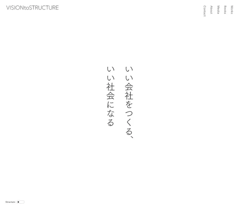
VISION to STRUCTURE presents management and branding consulting through a restrained editorial composition. The first screen contains a small wordmark, peripheral navigation, a two-column vertical Japanese statement, and a tiny utility switch. White space occupies most of the screen. Below it, long Mincho paragraphs alternate with light Gothic section labels, numbered services, project information, and a carefully arranged colophon.
The defining relationship is between open space and precise alignment. The opening statement is centered within the viewport, the Concept section creates a wide separation between prose and a vertical message, and the footer places geometric artwork above and to the left of the company information. The mobile version preserves the quiet opening while reorganizing the longer content into a readable single column.
How to Read This Reference
- Measured means a value is present in the supplied rendered DOM, computed styles, or element rectangles. Values below are usually rounded to two decimal places.
- Estimated means a dimension or color is inferred visually from an original-page capture. It is not a sampled CSS declaration.
- Calculated means arithmetic applied to measured values, such as column widths, centering, or spacing between repeated headings.
- Recommended means an implementation choice for reuse. The CSS starter is an adaptation, not recovered source code.
- Visibility matters: extracted text includes mobile navigation and detailed project content that are not shown in the supplied screenshots. Their presence and dimensions do not establish that they were visible or expanded.
- Graphic wrappers are not typography measurements: the wordmark, opening statement, and some controls have small inherited font sizes that do not explain their visible lettering. Their inner rendering mechanism was not supplied.
Tokens — Colors
Default Palette
| Name | Value | Suggested token | Evidence and role |
|---|---|---|---|
| White Canvas | #ffffff |
--color-paper |
Measured BODY background; also the measured mobile circular control background |
| Charcoal Ink | #262626 |
--color-ink |
Measured BODY and sampled content text color; the primary visible foreground |
| Medium Outline | approximately #9c9c9c |
--color-outline |
Visual estimate for the outlined View All pill; border color was not supplied |
| Soft Outline | approximately #d4d4d4 |
--color-outline-soft |
Visual estimate for the Structure track and mobile circle; border color was not supplied |
The page is neutral white, without a visible warm paper tint. Its darker text can appear gray because of thin strokes and antialiasing, but the sampled text color remains #262626. Do not replace that measured ink with pale gray merely to imitate a downscaled screenshot.
Dark service-frame edges and footer linework visually belong to the same charcoal family. Reusing --color-ink for those strokes is a practical recommendation; their exact stroke colors were not included in the evidence.
Theme Presets
No theme presets or alternate palette were verified. The control labeled Structure is visible, but its effect was not exercised. Its presence does not establish a dark mode, grid overlay, or any specific transformation.
Tokens — Typography
Light Gothic — Interface and Section Labels
- Measured family:
TsukuGoPr5-L. - Observed roles: BODY inheritance, section labels, service titles, footer heading, mobile navigation links, and desktop sharing text.
- Measured weight: predominantly
400. The footer heading and some graphic wrappers report700. - Character: fine, open strokes and restrained English lettering. Section labels use measurable tracking instead of heavy weight to establish hierarchy.
- Recommended fallback:
sans-serif. This preserves the category, not the original letterforms.
Light Mincho — Editorial Copy and Project Titles
- Measured family:
TsukuMinPr6-L. - Observed roles: introductory prose, Concept prose, service descriptions, project titles, category links, and mobile sharing text.
- Measured weight:
400. - Leading: ordinary paragraphs consistently use
2, providing substantial breathing room within dense Japanese copy. - Recommended fallback:
serif. Do not identify a particular system font as the original.
Wordmark and Vertical Statements
The opening wordmark and Japanese statement have thin, carefully controlled forms. However, their sampled wrappers inherit approximately 10px type while the visible artwork is much larger. The evidence does not identify whether the inner lettering is an image, vector, or separately styled child.
Use the original assets when available and authorized. A text reconstruction is an approximation and should be labeled accordingly. In particular, applying a bold 10px H2 style from the wrapper would be incorrect.
Type Scale
| Role | Desktop size / line height | Mobile size / line height | Tracking | Status |
|---|---|---|---|---|
| Root | 10.1767 / 10.1767px |
10.4 / 10.4px |
Normal | Measured; a layout scaling reference, not a body-copy size |
| Section label | 28.49 / 28.49px |
21.84 / 21.84px |
0.06em |
Measured |
| Introductory and Concept prose | 22.39 / 44.78px |
17.68 / 35.36px |
Normal | Measured |
| Service and Works body copy | 18.32 / 36.64px |
15.6 / 31.2px |
Normal | Measured |
| Service title | 26.46 / 26.46px |
19.76 / 19.76px |
Normal | Measured |
| Project title | 23.41 / 40.96px |
21.84 / 32.76px |
0.06em |
Measured |
| Category link | 16.28 / 16.28px |
14.56 / 14.56px |
0.06em |
Measured |
| Copy Link text | 16.28 / 16.28px |
14.56 / 14.56px |
Normal | Measured; Gothic on desktop, Mincho on mobile |
| Footer heading | 32.57 / 32.57px |
24.96 / 24.96px |
0.06em |
Measured; computed weight 700 |
| Mobile navigation link | Not applicable | 20.8 / 20.8px |
0.04em |
Measured DOM state; not visible in the supplied closed view |
| Vertical opening lettering | Approximately 48–52px |
Approximately 28–32px |
Unresolved | Visual estimate; inner styles unavailable |
| Footer credit text | Approximately 14px |
Approximately 12px |
Light tracking visible | Visual estimate |
| Structure caption | Approximately 12px |
Approximately 10px |
Light tracking visible | Visual estimate |
| View All lettering | Approximately 22–24px |
Not visually established | Unresolved | Desktop visual estimate; wrapper size is not the lettering size |
Although the footer heading reports weight 700, it remains visually delicate. Preserve the observed light appearance when adapting the design; avoid introducing a conventional heavy display heading through synthetic bolding.
Tokens — Spacing & Shapes
Density: very low at the opening and footer; more compact within prose and project information. Shape language: circles, narrow pills, square service frames, and fine geometric strokes.
Responsive Unit
The measured root is 10.1767px on desktop and 10.4px on mobile. Many dimensions are consistent with multiples of those roots:
- Desktop gutter:
73.2721px, approximately7.2root units. - Desktop grid gap:
36.636px, approximately3.6root units. - Desktop major spacing:
244.240px, approximately24root units. - Mobile content gutter:
20.8px, exactly2root units. - Mobile section spacing:
99.84px, exactly9.6root units.
These are calculated relationships, not recovered declarations. The source formula and breakpoints were not supplied. The slightly larger mobile root also shows why simply scaling every desktop measurement down would be inaccurate: individual role multipliers change.
The supplied custom properties are --app-inner-height: 1000px and --vh: 10px on desktop, changing to 844px and 8.44px on mobile. They record viewport-height values but do not establish every place those properties are used.
Spacing Scale
| Use | Desktop | Mobile | Evidence |
|---|---|---|---|
| Main content gutter | 73.27px |
20.8px |
Measured section padding |
| Main grid column gap | 36.64px |
No equivalent twelve-column layout | Measured |
| Opening statement column gap | 36.64px |
20.8px |
Measured H2 gap |
| Introductory prose offset below first viewport | 0px |
36.39px |
Calculated from paragraph top positions |
| Service/Works label bottom padding | 28.49px |
20.8px |
Measured |
| Concept top padding | 152.65px |
99.84px |
Measured |
| Concept bottom padding | 0px |
99.84px |
Measured; desktop following separation occurs outside it |
| Service bottom padding | 244.24px |
99.84px |
Measured |
| Service column separation | Approximately 73.25px |
Stacked | Calculated from content rectangles |
| Footer main flex gap | Not applicable | 124.8px |
Measured mobile FOOTER gap |
| Footer heading bottom padding | 36.64px |
37.44px |
Measured |
| Structure track bottom clearance | 32.56px |
20.80px |
Calculated from viewport rectangles |
Border Radius
| Element | Desktop | Mobile | Status |
|---|---|---|---|
| Structure track | 9.159px |
9.36px |
Measured |
| View All link | 23.406px |
20.28px |
Measured |
| Mobile circular control | Not present in the supplied desktop opening | 50% |
Measured |
| Service frames | Square corners | Not visually captured | Desktop observation |
| Number markers and footer circle | Circular | Footer circle remains circular | Visual observation |
Visible service-frame and geometric strokes are approximately 1px. Their exact border widths were not supplied. There is no visible shadow-based elevation system in the captured regions.
Layout Measurements
| Element | Desktop 1440 × 1000 |
Mobile 390 × 844 |
|---|---|---|
| Recorded document height | Approximately 7162px |
Approximately 6728px |
| Main content width | 1293.46px, calculated |
348.41px, measured |
| Twelve-column grid | Columns approximately 74.20px, gaps 36.64px |
Replaced by block/flex layouts in sampled sections |
| Opening H2 wrapper | 185.05 × 476.20px at (627.47, 261.89) |
101.89 × 287.73px at (144.05, 278.13) |
| Introductory prose | 850.11px wide, starting at x=294.94 |
348.41px wide, starting at x=20.80 |
| Concept prose | 739.25px wide, starting at x=73.27 |
348.41px wide |
| Service description column | 610.11px wide |
348.41px wide |
| Repeated Works title pitch | Approximately 148.53px |
Approximately 150.75px |
| Works control box | 54.95 × 54.95px |
41.59 × 41.59px |
| View All link | 128.22 × 46.81px |
100.88 × 40.55px |
| Structure track | 46.81 × 18.31px |
47.83 × 18.72px |
| Mobile circular control | Not applicable | 49.91 × 49.91px, right inset approximately 16.63px |
The opening H2 wrapper is centered at approximately (720, 500) and (195, 422). This is viewport centering, even though the opening section also contains prose below the first screen.
Components
Header and Desktop Navigation
Role: quiet identity and direct access to the site's main destinations.
The opening header places the wordmark near the upper-left corner and five narrow navigation labels at the upper right. In the screenshot, the wordmark's visible artwork is approximately 310 × 26px, inset roughly 39px horizontally and 33px vertically. Its measured desktop link wrapper is substantially larger, 387.72 × 90.56px; distinguish the visual mark from its enclosing element.
Desktop navigation runs from Works at the far right toward Contact on the left, with Books, Media, and About between them. Each English word reads downward as a rotated word. This differs from the upright Japanese characters in the central statement.
The link boxes are approximately 16.28px wide, begin at y=30.52px, and have a calculated horizontal pitch of 40.70px. Their recorded destinations are /works/, /books/, /media/, /about/, and /contact/.
The captures do not establish a sticky top header. The footer views show the bottom utilities but not the opening wordmark.
Opening Statement and Introduction
Role: establish the company's philosophy before presenting services.
The opening statement consists of two vertical columns. Read the right column first: いい会社をつくる、, followed by the left column, いい社会になる. Both begin at the same vertical position. Their unequal lengths create the lower silhouette without an additional illustration or CTA.
Center the entire two-column composition within the first viewport. Keep the phrase small relative to the available white area: the measured desktop wrapper occupies about 13% of the viewport width, while the mobile wrapper occupies about 26%.
The introductory paragraph begins below the opening screen. On desktop it spans eight grid columns and is centered at 850.11px wide. On mobile it begins about 36.4px below the first viewport and fills the 348.41px content width. Its larger editorial type and double leading distinguish it from later service descriptions.
Concept Composition
Role: explain the consulting method through a prose-and-statement arrangement.
The desktop section uses a left prose field approximately 739.25px wide and a far-right vertical statement, whose wrapper starts at x=1181.67px. The large separation between these regions is a defining part of the composition.
The source text includes 構想を構造に、 and 構造を競争力に。, along with an installation-related phrase. The supplied desktop section capture shows the lower part of this vertical message and the concluding prose. It does not show every graphic element in the Concept section.
On mobile the section becomes a block layout. Its statement wrapper changes from a narrow, tall desktop box to 348.41 × 101.81px, indicating a broad, shallow arrangement above the prose. The exact visual treatment of that mobile statement was not captured.
A separate section with no extracted text exists between the introduction and Concept. Its measured height is 1088.89px on desktop and 386.88px on mobile. No corresponding visual content or asset information was supplied. Do not interpret an empty text extraction as proof of an intentionally empty section.
Service Pair
Role: present two related consulting services with equal visual importance.
The section starts with the light Gothic label Service and a Mincho introduction. The desktop introduction is approximately 850.09px wide.
Below it, two equal service regions contain:
- A thin circular number marker, approximately
40pxin diameter in the screenshot. - A centered light Gothic service title.
- A large square-cornered outlined visual region.
- A Mincho explanatory paragraph.
The observed titles are コーポレートストラクチャー® and ブランディング. Each desktop description is 610.11px wide; the two regions are separated by approximately 73.25px. This separation is twice the general grid gap, so a simple six-column/six-column split with only one standard gap would produce the wrong proportions.
Only the upper edges of the large visual frames appear in the supplied section capture. Their full contents and exact aspect ratios are unverified. Preserve the measured title and prose relationships without inventing a diagram or filling the frame with unrelated stock imagery.
Mobile DOM measurements place the first service title at approximately y=3046px and the second at y=3941px. The services therefore stack, each retaining its own visual region and description. The mobile service section is about 2021px tall, compared with 1614px on desktop.
Works Index and Project Content
Role: connect the philosophy and services to specific projects.
The DOM records five project headings: 中川政七商店, PARaDE, アナザー・ジャパン, 堀内果実園, and マルヒロ. Their desktop positions form a repeated vertical sequence with approximately 148.53px between heading starts. The mobile interval remains similar at approximately 150.75px, despite the much narrower layout.
Project headings use Mincho rather than the Gothic section-label style. Each has a separate control box near the right content edge: approximately 54.95px square on desktop and 41.59px on mobile.
The extracted content contains project names, engagement types, vision statements, revenue classifications, long descriptions, category links, and sharing text. That information suggests an index with additional detail states, but the supplied captures do not demonstrate how those states open or close.
Several detail rectangles extend into regions occupied by later page content. This is a reason to avoid treating every extracted paragraph as simultaneously visible. Do not reconstruct the page as five fully expanded case studies solely from the text dump.
Project Categories and Sharing
Role: provide related-work navigation and a way to share a project.
Recorded category destinations use /works/?category=..., including vision, branding, regional_revitalization, education, and business_development. The labels are text links in the same charcoal palette.
Measured category links use Mincho type, 0.06em tracking, and approximately 16px horizontal padding. Their boxes are around 34px high. The mobile records show the categories wrapping onto a second row.
Sharing text includes Share:, Copy Link, and an extracted Copied state. No clipboard interaction was recorded. The existence of both strings does not establish that copying succeeded or reveal the feedback timing.
View All Link
Role: finish the homepage project selection and lead to the complete Works page.
This is a centered, white, outlined pill with the label View All. It links directly to https://www.vtos.jp/works/.
The measured desktop box is 128.22 × 46.81px with a 23.41px radius. Mobile reduces it to 100.88 × 40.55px with a 20.28px radius. Its outline is visually much lighter than the main text, and it has no visible shadow or solid accent fill.
Its small scale and isolation matter: it closes an editorial sequence without becoming a large promotional banner.
Structure Utility
Role: a persistent utility whose effect remains unverified.
The Structure caption and a narrow pill track appear at the lower left in both opening and footer captures. The resting appearance is a white track, faint outline, and a small charcoal dot toward the left.
On desktop, caption and track sit side by side, approximately 32.6px from the viewport's left and bottom edges. On mobile the caption sits above the track, which starts at approximately x=16.63px and ends 20.8px above the viewport bottom.
The visible track stays nearly the same size across devices. This utility is therefore not a uniformly scaled-down desktop component. Fixed positioning is a reasonable implementation adaptation based on its repeated corner location, although the source position property was not included.
Mobile Circular Control and Navigation
Role: a persistent mobile navigation affordance, with its activated state unverified.
A white outlined circle approximately 49.91px in diameter sits at the lower right. Its measured position is (323.47, 773.30) in the 390 × 844 viewport. The same circle appears in the footer capture.
No internal icon is legible in the supplied screenshots. Do not add a hamburger, plus, or arrow and describe it as observed.
The mobile DOM contains Home, Works, Books, Media, About, and Contact links in approximately 41.59px-high rows. They are absent from the captured resting view. Their presence supports navigation content, but opening behavior, overlay appearance, focus handling, and dismissal are unverified.
The mobile HEADER rectangle spans the viewport height because of its contents or layout. It should not be interpreted as a visible 844px-tall header bar.
Footer and Colophon
Role: conclude the page with a geometric brand signature, company identity, and production credits.
The desktop footer is intentionally staggered. A circle connected through crossing diagonals to a triangular lattice occupies the upper-left region. Its visible size is approximately 397 × 143px. The company heading starts much lower, at x=738.31px, with company information and credits beneath it. The copyright sits low in the left region.
The credits form aligned label/value columns. In the desktop capture, labels start around x=738px and names around x=960px. Avoid placing the artwork and company heading on one conventional top-aligned baseline; their vertical offset creates the footer's distinctive balance.
On mobile, the footer stacks the approximately 266 × 96px geometric mark, a centered brand heading, company details, credits, and centered copyright. A measured 124.8px flex gap separates its main groups. The credit labels and names remain in two columns. The company details align with the names column rather than with the left page edge.
The inspected footer identifies the operator as 株式会社 VISION to STRUCTURE and the representative as 中川淳. It independently displays these production credits:
| Source role label | Credited name |
|---|---|
| Logo Design | 水野学(good design company) |
| Web Direction/Design | 堅田佳一、中野浩明(L/O) |
| Web Development | 松本新 |
| Art Work | カワイハルナ |
| Motion Graphic | 大橋史 |
These claims are supported by the original homepage footer. The presence of a motion credit does not establish any particular animation behavior in the supplied capture sequence.
Tokens — Motion & Interaction
| Element | Supplied computed declaration or evidence | What it establishes | What remains unverified |
|---|---|---|---|
| Structure track | 0.3s cubic-bezier(0.19, 1, 0.22, 1) |
A short transition is declared | Trigger, changed properties, resulting page appearance |
| Works control | opacity 0.3s cubic-bezier(0.19, 1, 0.22, 1) |
Opacity can transition | Hover/activation appearance and control semantics |
| Desktop project title | flex 0.3s cubic-bezier(0.19, 1, 0.22, 1) |
A flex-related transition is declared | Actual expansion or reallocation behavior |
| Mobile project title | width 0.3s cubic-bezier(0.19, 1, 0.22, 1) |
A width transition is declared | Start/end widths and trigger |
| Copy Link | Both Copy Link and Copied strings occur | Feedback text exists in the DOM | Successful copying, timing, announcement behavior |
| Mobile navigation | Links and a circular control are recorded | Navigation content and resting control geometry exist | Opening, closing, motion, and focus behavior |
| Sampled elements | animation: none |
No named CSS animation is reported on those sampled elements | Descendant, vector, canvas, or script-driven motion |
The recurring 300ms curve is a useful source-backed motion token. It suggests a quick movement that settles gently, but no before/after interaction sequence was supplied.
Many other elements serialize their transition as all without a nonzero duration. Do not count that shorthand alone as evidence of animation. Likewise, the capture process waiting for finite animations does not prove the page's animated content has been fully documented.
Recommended adaptation: use the measured curve for small utility feedback where appropriate, restrict transitions to intended properties, and provide reduced-motion behavior. Do not invent parallax, looping geometric transformations, scroll-triggered typography, or page-wide Structure effects as original features.
Surfaces
| Layer | Appearance | Evidence boundary |
|---|---|---|
| Page canvas | Solid white | Measured BODY background |
| Prose and section regions | Same white canvas, separated by spacing | Visible captures and transparent sampled backgrounds |
| Service visual frames | Thin dark rectangular edge, square corners | Upper frame edges visible; full interiors not captured |
| View All | White interior with a light outline | Desktop screenshot and measured pill geometry |
| Structure track | White resting surface, faint outline, dark dot | Both desktop and mobile screenshots |
| Mobile circle | White fill with faint circular outline | Screenshot and measured background/radius |
| Footer | Continuous white field with charcoal typography and linework | Both viewport captures |
The captured design does not rely on colored section bands, raised cards, gradients, or drop shadows. Its hierarchy comes from type category, scale, position, and empty space.
Imagery
The opening is typographic. No photograph, product render, or full-bleed background image appears in either supplied opening capture.
The clearest observed illustration is the footer mark: an unfilled circle, two crossing diagonal connections, and a dense lattice of vertical and diagonal lines. It uses consistent fine strokes and generous surrounding white space. The contrast between the simple circle and the structured mesh can be read as a visual analogy for the brand's name; that interpretation is not an independently verified explanation of the logo.
Service graphics and the text-empty interstitial section cannot be characterized from the available captures. The absence of IMG entries in this selective element report does not establish that the site contains no images.
Observed Asset References
| Visual | Confirmed observation | Asset reference availability |
|---|---|---|
| Header wordmark | Thin horizontal brand lettering on desktop and mobile | No asset URL or inner implementation supplied |
| Opening statement | Two carefully proportioned vertical Japanese columns | No asset URL or inner implementation supplied |
| Footer geometric mark | Circle, crossing diagonals, and triangular lattice | No asset URL or format supplied |
| Service visual regions | Thin rectangular upper edges in the desktop section capture | Contents, dimensions, and asset URLs unavailable |
| Interstitial section | Separate measured region with no extracted text | Visual contents unavailable |
For reuse, retain authorized original assets when possible. If recreating the geometric style, use crisp scalable linework with controlled stroke widths. Do not add textures, shaded volumes, or generic illustrations to compensate for undocumented assets.
Layout & Responsive Behavior
Desktop
The principal sections use twelve equal columns within 73.27px side gutters and 36.64px gaps. This produces approximately 74.20px columns at 1440px wide. Different content types span different numbers of columns:
- Introductory prose occupies eight centered columns.
- Concept prose occupies seven columns at the left, while the narrow statement sits at the far right.
- Service and Works introductions occupy eight columns from the left.
- Service descriptions form two approximately
610pxcolumns with a wider central separation. - Footer information begins around the seventh main-grid column, with the geometric mark centered in the left region.
The desktop document is approximately 7162px tall in the recorded state. That height describes the observed page state, not a recommended hardcoded page size.
Mobile
The main content gutter changes to 20.8px, producing approximately 348.4px of usable width. Section labels reduce to 21.84px, ordinary prose to 15.6px, and larger introductory prose to 17.68px. Paragraph leading remains double the font size.
The opening statement remains vertical and centered within the full first viewport. Its wrapper becomes approximately 101.89 × 287.73px; it does not become a horizontal headline.
The desktop navigation labels disappear from the supplied resting view, while the lower-right circle appears. The Structure utility changes from a horizontal label/track arrangement to a vertical stack. The service columns stack, and the Concept statement adopts a broad, shallow wrapper according to DOM measurements.
The footer also stacks, but its credits retain two columns. Preserve that distinction: the major page layout becomes one column while the colophon's label/value relationship remains intact.
Responsive Limits
Only the two stated viewport sizes were inspected. The exact source breakpoint, intermediate tablet composition, landscape behavior, safe-area handling, text zoom, and open mobile navigation state are unverified.
The Quick Start uses a recommended 48rem breakpoint and a standard root font size. It reproduces selected endpoint proportions without claiming to reproduce the original responsive formula.
Do’s and Don’ts
Do
- Use measured white
#ffffffand charcoal#262626as the primary pair. - Center the opening statement within the first viewport, with the longer phrase on the right.
- Preserve substantial white space around the opening and footer geometry.
- Pair light Gothic labels with Mincho editorial paragraphs and project titles.
- Keep the measured double leading for Japanese prose.
- Distinguish the standard desktop grid gap from the wider service-column separation.
- Keep the View All action modest, outlined, and centered.
- Preserve the footer's staggered desktop arrangement and two-column mobile credits.
- Treat wrapper measurements and visible graphic lettering as separate evidence.
- Keep unknown visual assets and untested interactions explicitly unresolved.
Don't
- Don't convert the homepage into a generic conversion layout with a large filled CTA and feature-card grid.
- Don't replace the opening statement with a wide horizontal marketing headline.
- Don't make all typography bold sans-serif or use pale gray for the primary text.
- Don't add warm paper color, accent gradients, drop shadows, or rounded service cards.
- Don't infer a Structure mode's purpose from its label alone.
- Don't assume every project paragraph in the extraction is visible in the resting page.
- Don't hardcode the measured document height or offscreen detail coordinates.
- Don't shrink all desktop dimensions by one percentage to produce mobile.
- Don't invent image paths, font identities for graphic lettering, or missing menu icons.
Recommended Implementation Additions
These are recommendations for a new implementation, not verified original-site features:
- Give the Structure utility a semantic switch only after its actual behavior is defined. Keep its state and accessible name synchronized.
- Provide at least a
44 × 44pxinteraction area around the visually small track without enlarging the drawn pill unnecessarily. - Give the mobile circular control an explicit accessible name. If it opens navigation, implement keyboard access, state reporting, dismissal, and focus restoration.
- Keep hidden navigation and closed project details out of the focus order and accessibility tree until they are available.
- Preserve the logical reading order of the Japanese statement when using vertical writing or graphic assets.
- Add visible charcoal focus outlines and test the light control boundaries independently from text contrast.
- Permit credit names and long Japanese service titles to wrap without disrupting their associated labels.
- Test fallback fonts, narrow screens, and text zoom. Fine typography should remain readable when the original fonts are unavailable.
- Implement clipboard feedback only after a successful copy operation, and announce it accessibly.
- Provide static or reduced-motion alternatives for any artwork or interaction added later.
Agent Prompt Guide
Quick Color Reference
- Canvas and surfaces: measured
#ffffff. - Main text: measured
#262626. - Strong geometric linework: reuse charcoal as a recommended approximation.
- View All outline: approximately
#9c9c9c, estimated. - Structure and mobile-circle outlines: approximately
#d4d4d4, estimated. - No verified accent color or alternate theme.
Overall Prompt
“Create a Japanese corporate homepage inspired by VISION to STRUCTURE. Use a pure white canvas, charcoal text, delicate Gothic interface labels, and Mincho editorial paragraphs with double leading. Center a two-column vertical Japanese statement in the first viewport, with a small wordmark at the upper left and vertically oriented English navigation at the upper right. Build the desktop content around a twelve-column grid with approximately 73px outer gutters and 37px gaps at 1440px. Follow with a widely separated Concept composition, two numbered service regions, a restrained project index, and a small outlined View All link. Finish with fine circle-and-lattice geometry and a staggered company colophon. At 390px, use approximately 21px content gutters, stack services, retain the vertical opening statement, and keep footer credit labels and names in two columns. Treat unavailable artwork and unverified control behavior as separate implementation requirements.”
Example Component Prompts
- Opening: “At 1440 × 1000, center a roughly 185 × 476px composition containing the actual Japanese phrases
いい会社をつくる、andいい社会になる. Put the longer phrase in the right column and use a roughly 37px column gap. Keep the surrounding field white and largely empty. At 390 × 844, reduce the composition to roughly 102 × 288px with a 21px gap.” - Services: “Design two equal editorial service regions, approximately 610px wide with a 73px central separation at desktop. Each has a thin numbered circle, a centered light Gothic title, an authorized visual in a square-cornered frame, and Mincho copy at about 18px with 37px leading. Stack complete regions on mobile.”
- Works: “Create a text-led project index with Mincho titles, modest engagement metadata, and a right-edge control. Use approximately 149px vertical title intervals on desktop. Keep any detail disclosure behavior explicitly defined as a new implementation; do not assume an original expansion animation.”
- Footer: “Place fine circle-and-lattice artwork in the upper-left desktop footer, with the brand heading and company details lower on the right. Align English production roles with their credited names in two columns. On mobile, stack the mark, centered heading, details, and copyright while preserving the credit columns and generous group spacing.”
- Utilities: “Style a tiny white Structure track with a faint outline and left-positioned charcoal dot. Keep the label beside it on desktop and above it on mobile. Add a roughly 50px outlined mobile circle at the opposite bottom corner. Supply accessible names and tested behavior separately.”
Quick Start
CSS Custom Properties
This starter uses measured desktop and mobile endpoint values, estimated graphic typography and outline colors, and a recommended 48rem breakpoint. It leaves the surrounding application's root font size unchanged.
The classes describe a static shell. Load the named source fonts only through an authorized setup; otherwise the generic fallbacks will differ. The text-rendered opening is an approximation of the observed graphic treatment. Original artwork, the uncaptured interstitial, and control logic require separate implementation. This CSS has not been browser-tested in this analysis.
:root {
  /* Measured primary colors; estimated control outlines. */
  --color-paper: #ffffff;
  --color-ink: #262626;
  --color-outline: #9c9c9c;
  --color-outline-soft: #d4d4d4;

  /* Measured family names; generic fallbacks are recommendations. */
  --font-interface: 'TsukuGoPr5-L', sans-serif;
  --font-editorial: 'TsukuMinPr6-L', serif;

  --text-section: 28.4947px;
  --text-lead: 22.3887px;
  --text-body: 18.318px;
  --text-service: 26.4594px;
  --text-project: 23.4064px;
  --text-category: 16.2827px;
  --text-footer: 32.5654px;
  --tracking-label: 0.06em;

  --page-gutter: 73.2721px;
  --grid-gap: 36.636px;
  --section-space: 244.24px;
  --service-gap: 73.2721px;

  /* Measured opening wrapper geometry. */
  --hero-height: 476.203px;
  --hero-column: 74.205px;
  --hero-gap: 36.636px;
  /* Estimated lettering for a text-based approximation. */
  --hero-font: 50px;
  --hero-tracking: 2.91px;

  --switch-width: 46.813px;
  --switch-height: 18.313px;
  --view-all-width: 128.219px;
  --view-all-height: 46.813px;
  --motion-duration: 300ms;
  --motion-ease: cubic-bezier(0.19, 1, 0.22, 1);
}

* { box-sizing: border-box; }

.vtos {
  color: var(--color-ink);
  background: var(--color-paper);
  font-family: var(--font-interface);
  font-weight: 400;
  font-synthesis: none;
}

.vtos :where(h1, h2, h3, p, dl, dd) { margin: 0; }
.vtos a { color: inherit; }

.page-grid {
  display: grid;
  grid-template-columns: repeat(12, minmax(0, 1fr));
  column-gap: var(--grid-gap);
  padding-inline: var(--page-gutter);
}

.site-header {
  position: absolute;
  inset: 0 0 auto;
  z-index: 10;
  display: flex;
  align-items: flex-start;
  justify-content: space-between;
  padding: 30.52px 32.57px;
}

/* A supplied brand asset should keep its intrinsic proportions. */
.brand-asset { display: block; width: 310px; max-width: 100%; }
.brand-asset img { display: block; width: 100%; height: auto; }

.desktop-nav {
  display: flex;
  flex-direction: row-reverse;
  gap: 24.42px;
}

.desktop-nav a {
  writing-mode: vertical-rl;
  text-orientation: mixed;
  font-size: 16.2827px;
  line-height: 1;
  letter-spacing: var(--tracking-label);
  text-decoration: none;
}

.hero-stage {
  min-block-size: 100vh;
  min-block-size: 100svh;
  display: grid;
  place-items: center;
}

.hero-copy {
  display: flex;
  flex-direction: row-reverse;
  gap: var(--hero-gap);
  font-weight: 400;
}

.hero-copy > span {
  display: block;
  writing-mode: vertical-rl;
  text-orientation: mixed;
  inline-size: var(--hero-height);
  block-size: var(--hero-column);
  font-size: var(--hero-font);
  line-height: var(--hero-column);
  letter-spacing: var(--hero-tracking);
}

.body-copy {
  font-family: var(--font-editorial);
  font-size: var(--text-body);
  font-weight: 400;
  line-height: 2;
}

.lead-copy {
  font-family: var(--font-editorial);
  font-size: var(--text-lead);
  font-weight: 400;
  line-height: 2;
}

.introduction .lead-copy { grid-column: 3 / span 8; }
.section-intro { grid-column: 1 / span 8; }
.section-space { margin-block-start: var(--section-space); }

.section-title {
  margin-block-end: var(--text-section) !important;
  font-size: var(--text-section);
  font-weight: 400;
  line-height: 1;
  letter-spacing: var(--tracking-label);
}

/* The full Concept artwork is not reconstructed here. */
.concept-copy { grid-column: 1 / span 7; }
.concept-statement { grid-column: 11 / span 2; }

.service-pair {
  grid-column: 1 / -1;
  display: grid;
  grid-template-columns: repeat(2, minmax(0, 1fr));
  column-gap: var(--service-gap);
  margin-block-start: 124px; /* Estimated composition spacing. */
}

.service-number {
  display: grid;
  place-items: center;
  width: 40px;
  height: 40px;
  margin: 0 auto 36.64px;
  border: 1px solid var(--color-ink);
  border-radius: 50%;
  font-size: 18px;
}

.service-title {
  font-size: var(--text-service);
  font-weight: 400;
  line-height: 1.4;
  text-align: center;
}

/* Insert verified artwork; no undocumented aspect ratio is imposed. */
.service-art {
  margin-block: 61px 36.64px;
  border: 1px solid var(--color-ink);
}
.service-art img { display: block; width: 100%; height: auto; }

.works-row {
  display: grid;
  grid-template-columns: minmax(0, 295.89px) minmax(0, 1fr) 54.95px;
  align-items: center;
  min-height: 148.53px;
}

.project-title {
  font-family: var(--font-editorial);
  font-size: var(--text-project);
  font-weight: 400;
  line-height: 1.75;
  letter-spacing: var(--tracking-label);
}

.work-control {
  grid-column: -2 / -1;
  width: 54.95px;
  height: 54.95px;
  transition: opacity var(--motion-duration) var(--motion-ease);
}

.category-list { display: flex; flex-wrap: wrap; gap: 10px; }
.category-list a {
  display: flex;
  align-items: center;
  min-height: 34.63px;
  padding-inline: 16.28px;
  font-family: var(--font-editorial);
  font-size: var(--text-category);
  letter-spacing: var(--tracking-label);
}

.view-all {
  display: flex;
  align-items: center;
  justify-content: center;
  width: var(--view-all-width);
  min-height: var(--view-all-height);
  margin-inline: auto;
  border: 1px solid var(--color-outline);
  border-radius: 999px;
  background: var(--color-paper);
  font-size: 23px; /* Desktop visual estimate. */
  line-height: 1;
  text-decoration: none;
}

.structure-control {
  position: fixed;
  left: 32.57px;
  bottom: 32.57px;
  z-index: 20;
  display: flex;
  align-items: center;
  gap: 10px;
  font-size: 12px;
  letter-spacing: 0.04em;
}

/* Only the captured resting track is represented. */
.structure-track {
  position: relative;
  display: block;
  width: var(--switch-width);
  height: var(--switch-height);
  border: 1px solid var(--color-outline-soft);
  border-radius: 999px;
  background: var(--color-paper);
}

.structure-track::before {
  content: '';
  position: absolute;
  top: 50%;
  left: 6px;
  width: 8px;
  height: 8px;
  border-radius: 50%;
  background: var(--color-ink);
  transform: translateY(-50%);
}

/* Use a semantic, named control and implement its behavior separately. */
.mobile-menu-trigger {
  display: none;
  position: fixed;
  right: 16.64px;
  bottom: 20.8px;
  z-index: 20;
  width: 49.91px;
  height: 49.91px;
  padding: 0;
  border: 1px solid var(--color-outline-soft);
  border-radius: 50%;
  color: var(--color-ink);
  background: var(--color-paper);
}

.site-footer {
  display: grid;
  grid-template-columns: repeat(12, minmax(0, 1fr));
  column-gap: var(--grid-gap);
  padding: 55.97px var(--page-gutter) 61.06px;
}

.footer-mark {
  grid-column: 1 / span 5;
  grid-row: 1;
  width: min(397px, 100%);
  margin-inline: auto;
  align-self: start;
}
.footer-mark img { display: block; width: 100%; height: auto; }

.footer-information {
  grid-column: 7 / -1;
  grid-row: 1;
  margin-block-start: 235px; /* Approximate desktop visual stagger. */
}

.footer-brand {
  padding-block-end: 36.64px;
  font-size: var(--text-footer);
  font-weight: 700;
  line-height: 1;
  letter-spacing: var(--tracking-label);
}

.footer-company {
  margin-inline-start: 221.68px !important;
  font-size: 14px; /* Credit and company sizes are visual estimates. */
  line-height: 2;
}

.credits {
  display: grid;
  grid-template-columns: 185.05px minmax(0, 1fr);
  column-gap: 36.63px;
  margin-block-start: 40.7px !important;
  font-size: 14px;
  line-height: 2.035;
  letter-spacing: 0.04em;
}
.credits :where(dt, dd) { min-width: 0; overflow-wrap: anywhere; }

.copyright {
  grid-column: 1 / span 5;
  grid-row: 1;
  align-self: end;
  text-align: center;
  font-size: 14px;
  line-height: 1.5;
}

/* Recommended visible keyboard focus. */
.vtos :focus-visible {
  outline: 2px solid var(--color-ink);
  outline-offset: 4px;
}

/* Recommended breakpoint; the original breakpoint was not supplied. */
@media (max-width: 48rem) {
  :root {
    --page-gutter: 20.8px;
    --grid-gap: 20.8px;
    --section-space: 99.84px;
    --text-section: 21.84px;
    --text-lead: 17.68px;
    --text-body: 15.6px;
    --text-service: 19.76px;
    --text-project: 21.84px;
    --text-category: 14.56px;
    --text-footer: 24.96px;
    --hero-height: 287.734px;
    --hero-column: 40.547px;
    --hero-gap: 20.8px;
    --hero-font: 30px;
    --hero-tracking: 1.97px;
    --switch-width: 47.83px;
    --switch-height: 18.72px;
    --view-all-width: 100.88px;
    --view-all-height: 40.55px;
  }

  .page-grid { display: block; }
  .site-header { padding: 22.17px 16.64px; }
  .brand-asset { width: 238.16px; }
  .desktop-nav { display: none; }
  .mobile-menu-trigger { display: block; }

  .introduction { padding-block: 36.4px 49.92px; }
  .section-title { margin-block-end: 20.8px !important; }
  .service-pair { grid-template-columns: 1fr; row-gap: 99.84px; }

  .works-row {
    grid-template-columns: minmax(0, 1fr) 41.59px;
    column-gap: 20.8px;
    min-height: 150.75px;
  }
  .project-title { line-height: 1.5; }
  .work-control { width: 41.59px; height: 41.59px; }
  .view-all { font-size: 18px; /* Recommended mobile approximation. */ }

  .structure-control {
    left: 16.64px;
    bottom: 20.8px;
    flex-direction: column;
    align-items: flex-start;
    gap: 6px;
    font-size: 10px;
  }

  .site-footer {
    display: flex;
    flex-direction: column;
    gap: 124.8px;
    padding: 0 var(--page-gutter) 99.84px;
  }
  .footer-mark { width: min(266px, 100%); }
  .footer-information { margin-block-start: 0; }
  .footer-brand { padding-block-end: 37.44px; text-align: center; }
  .footer-company {
    margin-inline-start: calc((100% + 20.8px) / 2) !important;
    font-size: 12px;
    line-height: 1.82;
  }
  .credits {
    grid-template-columns: repeat(2, minmax(0, 1fr));
    column-gap: 20.8px;
    margin-block-start: 37.44px !important;
    font-size: 12px;
    line-height: 1.82;
  }
  .copyright { align-self: center; }
}

/* Recommended motion preference support for future interactions. */
@media (prefers-reduced-motion: reduce) {
  .vtos *, .vtos *::before, .vtos *::after {
    animation: none !important;
    transition: none !important;
  }
}
For the text approximation, preserve logical phrase order and let flexbox place the first phrase at the right:
<section class='opening' lang='ja'>
  <div class='hero-stage'>
    <h2 class='hero-copy'>
      <span>いい会社をつくる、</span>
      <span>いい社会になる</span>
    </h2>
  </div>
  <div class='page-grid introduction'>
    <p class='lead-copy'>
      <!-- Insert the approved introductory copy here. -->
    </p>
  </div>
</section>
Use ordinary document flow for prose, services, and the footer. Do not use the supplied document-coordinate values as absolute positioning instructions. The fixed corner utilities should have their own semantic controls and tested logic before they are exposed to users.
Tailwind v4 Token Mapping
Optional aliases for a project already using Tailwind v4. They do not identify the original implementation framework. Define the preceding properties first.
@theme inline {
  --color-vtos-paper: var(--color-paper);
  --color-vtos-ink: var(--color-ink);
  --color-vtos-outline: var(--color-outline);
  --color-vtos-outline-soft: var(--color-outline-soft);

  --font-vtos-interface: var(--font-interface);
  --font-vtos-editorial: var(--font-editorial);

  --text-section-heading: var(--text-section);
  --text-editorial-lead: var(--text-lead);
  --text-editorial-body: var(--text-body);
  --text-service-heading: var(--text-service);
  --text-project-heading: var(--text-project);
  --text-footer-heading: var(--text-footer);

  --spacing-page-gutter: var(--page-gutter);
  --spacing-column-gap: var(--grid-gap);
  --spacing-section-space: var(--section-space);
}
Sources & Evidence
- VISION to STRUCTURE — original and final homepage: supplied browser record reports HTTP
200, with the same original and final URL. - Capture record: September 12, 2026,
12:29:31.747 UTC; desktop1440 × 1000and mobile390 × 844CSS-pixel viewports. - Original-page screenshots: desktop opening, Concept-to-Service transition, and footer; mobile opening and footer. These establish the visible composition, persistent corner utilities, and footer content.
- Rendered DOM and computed styles: supplied text, links, element rectangles, font families, sizes, leading, tracking, grid columns, padding, gaps, radii, transition declarations, and viewport-height custom properties.
- Capture limitations: the initial observation lasted at least five seconds. Readiness checks used bounded waits for layout, text, images, and finite animation; perpetual animations were paused during checks and resumed. This is not a complete motion recording and does not prove that all delayed or interaction-dependent content was captured.
- Interaction limitations: no control activation, mobile-menu opening, project disclosure, clipboard test, hover sequence, or linked-subpage inspection is documented. Detailed extracted content must not be equated with visible expanded content.
- Implementation limitations: complete stylesheets, inner graphic markup, source asset URLs, exact responsive breakpoints, and JavaScript behavior were not supplied. Estimates and the reusable CSS remain explicitly separate from measured original-page values.
This reference describes the current homepage represented by the supplied original-page evidence. It does not reconstruct an earlier design.
# VISION to STRUCTURE — Style Reference

> A white editorial canvas organized by vertical language, fine geometry, and unusually generous pauses.

**Website / Original URL:** [www.vtos.jp](https://www.vtos.jp/)
**Final URL:** [https://www.vtos.jp/](https://www.vtos.jp/)
**Theme:** white background with charcoal text; no alternate theme was verified.
**Inspected:** September 12, 2026. Supplied retrieval timestamp: `2026-09-12T12:29:31.747Z`, or 21:29:31.747 JST.
**Viewports:** desktop `1440 × 1000` and mobile `390 × 844` CSS pixels.
**Scope:** the current corporate homepage: opening statement, introductory and Concept content, Service section, Works content recorded in the DOM, and footer. Visual evidence includes three desktop captures and two mobile captures. Linked subpages and activated control states were not inspected.

VISION to STRUCTURE presents management and branding consulting through a restrained editorial composition. The first screen contains a small wordmark, peripheral navigation, a two-column vertical Japanese statement, and a tiny utility switch. White space occupies most of the screen. Below it, long Mincho paragraphs alternate with light Gothic section labels, numbered services, project information, and a carefully arranged colophon.

The defining relationship is between open space and precise alignment. The opening statement is centered within the viewport, the Concept section creates a wide separation between prose and a vertical message, and the footer places geometric artwork above and to the left of the company information. The mobile version preserves the quiet opening while reorganizing the longer content into a readable single column.

## How to Read This Reference

- **Measured** means a value is present in the supplied rendered DOM, computed styles, or element rectangles. Values below are usually rounded to two decimal places.
- **Estimated** means a dimension or color is inferred visually from an original-page capture. It is not a sampled CSS declaration.
- **Calculated** means arithmetic applied to measured values, such as column widths, centering, or spacing between repeated headings.
- **Recommended** means an implementation choice for reuse. The CSS starter is an adaptation, not recovered source code.
- **Visibility matters:** extracted text includes mobile navigation and detailed project content that are not shown in the supplied screenshots. Their presence and dimensions do not establish that they were visible or expanded.
- **Graphic wrappers are not typography measurements:** the wordmark, opening statement, and some controls have small inherited font sizes that do not explain their visible lettering. Their inner rendering mechanism was not supplied.

## Tokens — Colors

### Default Palette

| Name | Value | Suggested token | Evidence and role |
| --- | --- | --- | --- |
| White Canvas | `#ffffff` | `--color-paper` | Measured BODY background; also the measured mobile circular control background |
| Charcoal Ink | `#262626` | `--color-ink` | Measured BODY and sampled content text color; the primary visible foreground |
| Medium Outline | approximately `#9c9c9c` | `--color-outline` | Visual estimate for the outlined View All pill; border color was not supplied |
| Soft Outline | approximately `#d4d4d4` | `--color-outline-soft` | Visual estimate for the Structure track and mobile circle; border color was not supplied |

The page is neutral white, without a visible warm paper tint. Its darker text can appear gray because of thin strokes and antialiasing, but the sampled text color remains `#262626`. Do not replace that measured ink with pale gray merely to imitate a downscaled screenshot.

Dark service-frame edges and footer linework visually belong to the same charcoal family. Reusing `--color-ink` for those strokes is a practical recommendation; their exact stroke colors were not included in the evidence.

### Theme Presets

No theme presets or alternate palette were verified. The control labeled `Structure` is visible, but its effect was not exercised. Its presence does not establish a dark mode, grid overlay, or any specific transformation.

## Tokens — Typography

### Light Gothic — Interface and Section Labels

- **Measured family:** `TsukuGoPr5-L`.
- **Observed roles:** BODY inheritance, section labels, service titles, footer heading, mobile navigation links, and desktop sharing text.
- **Measured weight:** predominantly `400`. The footer heading and some graphic wrappers report `700`.
- **Character:** fine, open strokes and restrained English lettering. Section labels use measurable tracking instead of heavy weight to establish hierarchy.
- **Recommended fallback:** `sans-serif`. This preserves the category, not the original letterforms.

### Light Mincho — Editorial Copy and Project Titles

- **Measured family:** `TsukuMinPr6-L`.
- **Observed roles:** introductory prose, Concept prose, service descriptions, project titles, category links, and mobile sharing text.
- **Measured weight:** `400`.
- **Leading:** ordinary paragraphs consistently use `2`, providing substantial breathing room within dense Japanese copy.
- **Recommended fallback:** `serif`. Do not identify a particular system font as the original.

### Wordmark and Vertical Statements

The opening wordmark and Japanese statement have thin, carefully controlled forms. However, their sampled wrappers inherit approximately 10px type while the visible artwork is much larger. The evidence does not identify whether the inner lettering is an image, vector, or separately styled child.

Use the original assets when available and authorized. A text reconstruction is an approximation and should be labeled accordingly. In particular, applying a bold 10px H2 style from the wrapper would be incorrect.

### Type Scale

| Role | Desktop size / line height | Mobile size / line height | Tracking | Status |
| --- | --- | --- | --- | --- |
| Root | `10.1767 / 10.1767px` | `10.4 / 10.4px` | Normal | Measured; a layout scaling reference, not a body-copy size |
| Section label | `28.49 / 28.49px` | `21.84 / 21.84px` | `0.06em` | Measured |
| Introductory and Concept prose | `22.39 / 44.78px` | `17.68 / 35.36px` | Normal | Measured |
| Service and Works body copy | `18.32 / 36.64px` | `15.6 / 31.2px` | Normal | Measured |
| Service title | `26.46 / 26.46px` | `19.76 / 19.76px` | Normal | Measured |
| Project title | `23.41 / 40.96px` | `21.84 / 32.76px` | `0.06em` | Measured |
| Category link | `16.28 / 16.28px` | `14.56 / 14.56px` | `0.06em` | Measured |
| Copy Link text | `16.28 / 16.28px` | `14.56 / 14.56px` | Normal | Measured; Gothic on desktop, Mincho on mobile |
| Footer heading | `32.57 / 32.57px` | `24.96 / 24.96px` | `0.06em` | Measured; computed weight `700` |
| Mobile navigation link | Not applicable | `20.8 / 20.8px` | `0.04em` | Measured DOM state; not visible in the supplied closed view |
| Vertical opening lettering | Approximately `48–52px` | Approximately `28–32px` | Unresolved | Visual estimate; inner styles unavailable |
| Footer credit text | Approximately `14px` | Approximately `12px` | Light tracking visible | Visual estimate |
| Structure caption | Approximately `12px` | Approximately `10px` | Light tracking visible | Visual estimate |
| View All lettering | Approximately `22–24px` | Not visually established | Unresolved | Desktop visual estimate; wrapper size is not the lettering size |

Although the footer heading reports weight `700`, it remains visually delicate. Preserve the observed light appearance when adapting the design; avoid introducing a conventional heavy display heading through synthetic bolding.

## Tokens — Spacing & Shapes

**Density:** very low at the opening and footer; more compact within prose and project information.
**Shape language:** circles, narrow pills, square service frames, and fine geometric strokes.

### Responsive Unit

The measured root is `10.1767px` on desktop and `10.4px` on mobile. Many dimensions are consistent with multiples of those roots:

- Desktop gutter: `73.2721px`, approximately `7.2` root units.
- Desktop grid gap: `36.636px`, approximately `3.6` root units.
- Desktop major spacing: `244.240px`, approximately `24` root units.
- Mobile content gutter: `20.8px`, exactly `2` root units.
- Mobile section spacing: `99.84px`, exactly `9.6` root units.

These are calculated relationships, not recovered declarations. The source formula and breakpoints were not supplied. The slightly larger mobile root also shows why simply scaling every desktop measurement down would be inaccurate: individual role multipliers change.

The supplied custom properties are `--app-inner-height: 1000px` and `--vh: 10px` on desktop, changing to `844px` and `8.44px` on mobile. They record viewport-height values but do not establish every place those properties are used.

### Spacing Scale

| Use | Desktop | Mobile | Evidence |
| --- | --- | --- | --- |
| Main content gutter | `73.27px` | `20.8px` | Measured section padding |
| Main grid column gap | `36.64px` | No equivalent twelve-column layout | Measured |
| Opening statement column gap | `36.64px` | `20.8px` | Measured H2 gap |
| Introductory prose offset below first viewport | `0px` | `36.39px` | Calculated from paragraph top positions |
| Service/Works label bottom padding | `28.49px` | `20.8px` | Measured |
| Concept top padding | `152.65px` | `99.84px` | Measured |
| Concept bottom padding | `0px` | `99.84px` | Measured; desktop following separation occurs outside it |
| Service bottom padding | `244.24px` | `99.84px` | Measured |
| Service column separation | Approximately `73.25px` | Stacked | Calculated from content rectangles |
| Footer main flex gap | Not applicable | `124.8px` | Measured mobile FOOTER gap |
| Footer heading bottom padding | `36.64px` | `37.44px` | Measured |
| Structure track bottom clearance | `32.56px` | `20.80px` | Calculated from viewport rectangles |

### Border Radius

| Element | Desktop | Mobile | Status |
| --- | --- | --- | --- |
| Structure track | `9.159px` | `9.36px` | Measured |
| View All link | `23.406px` | `20.28px` | Measured |
| Mobile circular control | Not present in the supplied desktop opening | `50%` | Measured |
| Service frames | Square corners | Not visually captured | Desktop observation |
| Number markers and footer circle | Circular | Footer circle remains circular | Visual observation |

Visible service-frame and geometric strokes are approximately 1px. Their exact border widths were not supplied. There is no visible shadow-based elevation system in the captured regions.

### Layout Measurements

| Element | Desktop `1440 × 1000` | Mobile `390 × 844` |
| --- | --- | --- |
| Recorded document height | Approximately `7162px` | Approximately `6728px` |
| Main content width | `1293.46px`, calculated | `348.41px`, measured |
| Twelve-column grid | Columns approximately `74.20px`, gaps `36.64px` | Replaced by block/flex layouts in sampled sections |
| Opening H2 wrapper | `185.05 × 476.20px` at `(627.47, 261.89)` | `101.89 × 287.73px` at `(144.05, 278.13)` |
| Introductory prose | `850.11px` wide, starting at `x=294.94` | `348.41px` wide, starting at `x=20.80` |
| Concept prose | `739.25px` wide, starting at `x=73.27` | `348.41px` wide |
| Service description column | `610.11px` wide | `348.41px` wide |
| Repeated Works title pitch | Approximately `148.53px` | Approximately `150.75px` |
| Works control box | `54.95 × 54.95px` | `41.59 × 41.59px` |
| View All link | `128.22 × 46.81px` | `100.88 × 40.55px` |
| Structure track | `46.81 × 18.31px` | `47.83 × 18.72px` |
| Mobile circular control | Not applicable | `49.91 × 49.91px`, right inset approximately `16.63px` |

The opening H2 wrapper is centered at approximately `(720, 500)` and `(195, 422)`. This is viewport centering, even though the opening section also contains prose below the first screen.

## Components

### Header and Desktop Navigation

**Role:** quiet identity and direct access to the site's main destinations.

The opening header places the wordmark near the upper-left corner and five narrow navigation labels at the upper right. In the screenshot, the wordmark's visible artwork is approximately `310 × 26px`, inset roughly `39px` horizontally and `33px` vertically. Its measured desktop link wrapper is substantially larger, `387.72 × 90.56px`; distinguish the visual mark from its enclosing element.

Desktop navigation runs from `Works` at the far right toward `Contact` on the left, with `Books`, `Media`, and `About` between them. Each English word reads downward as a rotated word. This differs from the upright Japanese characters in the central statement.

The link boxes are approximately `16.28px` wide, begin at `y=30.52px`, and have a calculated horizontal pitch of `40.70px`. Their recorded destinations are `/works/`, `/books/`, `/media/`, `/about/`, and `/contact/`.

The captures do not establish a sticky top header. The footer views show the bottom utilities but not the opening wordmark.

### Opening Statement and Introduction

**Role:** establish the company's philosophy before presenting services.

The opening statement consists of two vertical columns. Read the right column first: `いい会社をつくる、`, followed by the left column, `いい社会になる`. Both begin at the same vertical position. Their unequal lengths create the lower silhouette without an additional illustration or CTA.

Center the entire two-column composition within the first viewport. Keep the phrase small relative to the available white area: the measured desktop wrapper occupies about 13% of the viewport width, while the mobile wrapper occupies about 26%.

The introductory paragraph begins below the opening screen. On desktop it spans eight grid columns and is centered at `850.11px` wide. On mobile it begins about `36.4px` below the first viewport and fills the `348.41px` content width. Its larger editorial type and double leading distinguish it from later service descriptions.

### Concept Composition

**Role:** explain the consulting method through a prose-and-statement arrangement.

The desktop section uses a left prose field approximately `739.25px` wide and a far-right vertical statement, whose wrapper starts at `x=1181.67px`. The large separation between these regions is a defining part of the composition.

The source text includes `構想を構造に、` and `構造を競争力に。`, along with an installation-related phrase. The supplied desktop section capture shows the lower part of this vertical message and the concluding prose. It does not show every graphic element in the Concept section.

On mobile the section becomes a block layout. Its statement wrapper changes from a narrow, tall desktop box to `348.41 × 101.81px`, indicating a broad, shallow arrangement above the prose. The exact visual treatment of that mobile statement was not captured.

A separate section with no extracted text exists between the introduction and Concept. Its measured height is `1088.89px` on desktop and `386.88px` on mobile. No corresponding visual content or asset information was supplied. Do not interpret an empty text extraction as proof of an intentionally empty section.

### Service Pair

**Role:** present two related consulting services with equal visual importance.

The section starts with the light Gothic label `Service` and a Mincho introduction. The desktop introduction is approximately `850.09px` wide.

Below it, two equal service regions contain:

1. A thin circular number marker, approximately `40px` in diameter in the screenshot.
2. A centered light Gothic service title.
3. A large square-cornered outlined visual region.
4. A Mincho explanatory paragraph.

The observed titles are `コーポレートストラクチャー®` and `ブランディング`. Each desktop description is `610.11px` wide; the two regions are separated by approximately `73.25px`. This separation is twice the general grid gap, so a simple six-column/six-column split with only one standard gap would produce the wrong proportions.

Only the upper edges of the large visual frames appear in the supplied section capture. Their full contents and exact aspect ratios are unverified. Preserve the measured title and prose relationships without inventing a diagram or filling the frame with unrelated stock imagery.

Mobile DOM measurements place the first service title at approximately `y=3046px` and the second at `y=3941px`. The services therefore stack, each retaining its own visual region and description. The mobile service section is about `2021px` tall, compared with `1614px` on desktop.

### Works Index and Project Content

**Role:** connect the philosophy and services to specific projects.

The DOM records five project headings: `中川政七商店`, `PARaDE`, `アナザー・ジャパン`, `堀内果実園`, and `マルヒロ`. Their desktop positions form a repeated vertical sequence with approximately `148.53px` between heading starts. The mobile interval remains similar at approximately `150.75px`, despite the much narrower layout.

Project headings use Mincho rather than the Gothic section-label style. Each has a separate control box near the right content edge: approximately `54.95px` square on desktop and `41.59px` on mobile.

The extracted content contains project names, engagement types, vision statements, revenue classifications, long descriptions, category links, and sharing text. That information suggests an index with additional detail states, but the supplied captures do not demonstrate how those states open or close.

Several detail rectangles extend into regions occupied by later page content. This is a reason to avoid treating every extracted paragraph as simultaneously visible. Do not reconstruct the page as five fully expanded case studies solely from the text dump.

### Project Categories and Sharing

**Role:** provide related-work navigation and a way to share a project.

Recorded category destinations use `/works/?category=...`, including `vision`, `branding`, `regional_revitalization`, `education`, and `business_development`. The labels are text links in the same charcoal palette.

Measured category links use Mincho type, `0.06em` tracking, and approximately `16px` horizontal padding. Their boxes are around `34px` high. The mobile records show the categories wrapping onto a second row.

Sharing text includes `Share:`, `Copy Link`, and an extracted `Copied` state. No clipboard interaction was recorded. The existence of both strings does not establish that copying succeeded or reveal the feedback timing.

### View All Link

**Role:** finish the homepage project selection and lead to the complete Works page.

This is a centered, white, outlined pill with the label `View All`. It links directly to `https://www.vtos.jp/works/`.

The measured desktop box is `128.22 × 46.81px` with a `23.41px` radius. Mobile reduces it to `100.88 × 40.55px` with a `20.28px` radius. Its outline is visually much lighter than the main text, and it has no visible shadow or solid accent fill.

Its small scale and isolation matter: it closes an editorial sequence without becoming a large promotional banner.

### Structure Utility

**Role:** a persistent utility whose effect remains unverified.

The `Structure` caption and a narrow pill track appear at the lower left in both opening and footer captures. The resting appearance is a white track, faint outline, and a small charcoal dot toward the left.

On desktop, caption and track sit side by side, approximately `32.6px` from the viewport's left and bottom edges. On mobile the caption sits above the track, which starts at approximately `x=16.63px` and ends `20.8px` above the viewport bottom.

The visible track stays nearly the same size across devices. This utility is therefore not a uniformly scaled-down desktop component. Fixed positioning is a reasonable implementation adaptation based on its repeated corner location, although the source position property was not included.

### Mobile Circular Control and Navigation

**Role:** a persistent mobile navigation affordance, with its activated state unverified.

A white outlined circle approximately `49.91px` in diameter sits at the lower right. Its measured position is `(323.47, 773.30)` in the `390 × 844` viewport. The same circle appears in the footer capture.

No internal icon is legible in the supplied screenshots. Do not add a hamburger, plus, or arrow and describe it as observed.

The mobile DOM contains `Home`, `Works`, `Books`, `Media`, `About`, and `Contact` links in approximately `41.59px`-high rows. They are absent from the captured resting view. Their presence supports navigation content, but opening behavior, overlay appearance, focus handling, and dismissal are unverified.

The mobile HEADER rectangle spans the viewport height because of its contents or layout. It should not be interpreted as a visible 844px-tall header bar.

### Footer and Colophon

**Role:** conclude the page with a geometric brand signature, company identity, and production credits.

The desktop footer is intentionally staggered. A circle connected through crossing diagonals to a triangular lattice occupies the upper-left region. Its visible size is approximately `397 × 143px`. The company heading starts much lower, at `x=738.31px`, with company information and credits beneath it. The copyright sits low in the left region.

The credits form aligned label/value columns. In the desktop capture, labels start around `x=738px` and names around `x=960px`. Avoid placing the artwork and company heading on one conventional top-aligned baseline; their vertical offset creates the footer's distinctive balance.

On mobile, the footer stacks the approximately `266 × 96px` geometric mark, a centered brand heading, company details, credits, and centered copyright. A measured `124.8px` flex gap separates its main groups. The credit labels and names remain in two columns. The company details align with the names column rather than with the left page edge.

The inspected footer identifies the operator as `株式会社 VISION to STRUCTURE` and the representative as `中川淳`. It independently displays these production credits:

| Source role label | Credited name |
| --- | --- |
| Logo Design | 水野学(good design company) |
| Web Direction/Design | 堅田佳一、中野浩明(L/O) |
| Web Development | 松本新 |
| Art Work | カワイハルナ |
| Motion Graphic | 大橋史 |

These claims are supported by the original homepage footer. The presence of a motion credit does not establish any particular animation behavior in the supplied capture sequence.

## Tokens — Motion & Interaction

| Element | Supplied computed declaration or evidence | What it establishes | What remains unverified |
| --- | --- | --- | --- |
| Structure track | `0.3s cubic-bezier(0.19, 1, 0.22, 1)` | A short transition is declared | Trigger, changed properties, resulting page appearance |
| Works control | `opacity 0.3s cubic-bezier(0.19, 1, 0.22, 1)` | Opacity can transition | Hover/activation appearance and control semantics |
| Desktop project title | `flex 0.3s cubic-bezier(0.19, 1, 0.22, 1)` | A flex-related transition is declared | Actual expansion or reallocation behavior |
| Mobile project title | `width 0.3s cubic-bezier(0.19, 1, 0.22, 1)` | A width transition is declared | Start/end widths and trigger |
| Copy Link | Both Copy Link and Copied strings occur | Feedback text exists in the DOM | Successful copying, timing, announcement behavior |
| Mobile navigation | Links and a circular control are recorded | Navigation content and resting control geometry exist | Opening, closing, motion, and focus behavior |
| Sampled elements | `animation: none` | No named CSS animation is reported on those sampled elements | Descendant, vector, canvas, or script-driven motion |

The recurring `300ms` curve is a useful source-backed motion token. It suggests a quick movement that settles gently, but no before/after interaction sequence was supplied.

Many other elements serialize their transition as `all` without a nonzero duration. Do not count that shorthand alone as evidence of animation. Likewise, the capture process waiting for finite animations does not prove the page's animated content has been fully documented.

**Recommended adaptation:** use the measured curve for small utility feedback where appropriate, restrict transitions to intended properties, and provide reduced-motion behavior. Do not invent parallax, looping geometric transformations, scroll-triggered typography, or page-wide Structure effects as original features.

## Surfaces

| Layer | Appearance | Evidence boundary |
| --- | --- | --- |
| Page canvas | Solid white | Measured BODY background |
| Prose and section regions | Same white canvas, separated by spacing | Visible captures and transparent sampled backgrounds |
| Service visual frames | Thin dark rectangular edge, square corners | Upper frame edges visible; full interiors not captured |
| View All | White interior with a light outline | Desktop screenshot and measured pill geometry |
| Structure track | White resting surface, faint outline, dark dot | Both desktop and mobile screenshots |
| Mobile circle | White fill with faint circular outline | Screenshot and measured background/radius |
| Footer | Continuous white field with charcoal typography and linework | Both viewport captures |

The captured design does not rely on colored section bands, raised cards, gradients, or drop shadows. Its hierarchy comes from type category, scale, position, and empty space.

## Imagery

The opening is typographic. No photograph, product render, or full-bleed background image appears in either supplied opening capture.

The clearest observed illustration is the footer mark: an unfilled circle, two crossing diagonal connections, and a dense lattice of vertical and diagonal lines. It uses consistent fine strokes and generous surrounding white space. The contrast between the simple circle and the structured mesh can be read as a visual analogy for the brand's name; that interpretation is not an independently verified explanation of the logo.

Service graphics and the text-empty interstitial section cannot be characterized from the available captures. The absence of IMG entries in this selective element report does not establish that the site contains no images.

### Observed Asset References

| Visual | Confirmed observation | Asset reference availability |
| --- | --- | --- |
| Header wordmark | Thin horizontal brand lettering on desktop and mobile | No asset URL or inner implementation supplied |
| Opening statement | Two carefully proportioned vertical Japanese columns | No asset URL or inner implementation supplied |
| Footer geometric mark | Circle, crossing diagonals, and triangular lattice | No asset URL or format supplied |
| Service visual regions | Thin rectangular upper edges in the desktop section capture | Contents, dimensions, and asset URLs unavailable |
| Interstitial section | Separate measured region with no extracted text | Visual contents unavailable |

For reuse, retain authorized original assets when possible. If recreating the geometric style, use crisp scalable linework with controlled stroke widths. Do not add textures, shaded volumes, or generic illustrations to compensate for undocumented assets.

## Layout & Responsive Behavior

### Desktop

The principal sections use twelve equal columns within `73.27px` side gutters and `36.64px` gaps. This produces approximately `74.20px` columns at 1440px wide. Different content types span different numbers of columns:

- Introductory prose occupies eight centered columns.
- Concept prose occupies seven columns at the left, while the narrow statement sits at the far right.
- Service and Works introductions occupy eight columns from the left.
- Service descriptions form two approximately `610px` columns with a wider central separation.
- Footer information begins around the seventh main-grid column, with the geometric mark centered in the left region.

The desktop document is approximately 7162px tall in the recorded state. That height describes the observed page state, not a recommended hardcoded page size.

### Mobile

The main content gutter changes to `20.8px`, producing approximately `348.4px` of usable width. Section labels reduce to `21.84px`, ordinary prose to `15.6px`, and larger introductory prose to `17.68px`. Paragraph leading remains double the font size.

The opening statement remains vertical and centered within the full first viewport. Its wrapper becomes approximately `101.89 × 287.73px`; it does not become a horizontal headline.

The desktop navigation labels disappear from the supplied resting view, while the lower-right circle appears. The Structure utility changes from a horizontal label/track arrangement to a vertical stack. The service columns stack, and the Concept statement adopts a broad, shallow wrapper according to DOM measurements.

The footer also stacks, but its credits retain two columns. Preserve that distinction: the major page layout becomes one column while the colophon's label/value relationship remains intact.

### Responsive Limits

Only the two stated viewport sizes were inspected. The exact source breakpoint, intermediate tablet composition, landscape behavior, safe-area handling, text zoom, and open mobile navigation state are unverified.

The Quick Start uses a recommended `48rem` breakpoint and a standard root font size. It reproduces selected endpoint proportions without claiming to reproduce the original responsive formula.

## Do’s and Don’ts

### Do

- Use measured white `#ffffff` and charcoal `#262626` as the primary pair.
- Center the opening statement within the first viewport, with the longer phrase on the right.
- Preserve substantial white space around the opening and footer geometry.
- Pair light Gothic labels with Mincho editorial paragraphs and project titles.
- Keep the measured double leading for Japanese prose.
- Distinguish the standard desktop grid gap from the wider service-column separation.
- Keep the View All action modest, outlined, and centered.
- Preserve the footer's staggered desktop arrangement and two-column mobile credits.
- Treat wrapper measurements and visible graphic lettering as separate evidence.
- Keep unknown visual assets and untested interactions explicitly unresolved.

### Don't

- Don't convert the homepage into a generic conversion layout with a large filled CTA and feature-card grid.
- Don't replace the opening statement with a wide horizontal marketing headline.
- Don't make all typography bold sans-serif or use pale gray for the primary text.
- Don't add warm paper color, accent gradients, drop shadows, or rounded service cards.
- Don't infer a Structure mode's purpose from its label alone.
- Don't assume every project paragraph in the extraction is visible in the resting page.
- Don't hardcode the measured document height or offscreen detail coordinates.
- Don't shrink all desktop dimensions by one percentage to produce mobile.
- Don't invent image paths, font identities for graphic lettering, or missing menu icons.

## Recommended Implementation Additions

These are recommendations for a new implementation, not verified original-site features:

- Give the Structure utility a semantic switch only after its actual behavior is defined. Keep its state and accessible name synchronized.
- Provide at least a `44 × 44px` interaction area around the visually small track without enlarging the drawn pill unnecessarily.
- Give the mobile circular control an explicit accessible name. If it opens navigation, implement keyboard access, state reporting, dismissal, and focus restoration.
- Keep hidden navigation and closed project details out of the focus order and accessibility tree until they are available.
- Preserve the logical reading order of the Japanese statement when using vertical writing or graphic assets.
- Add visible charcoal focus outlines and test the light control boundaries independently from text contrast.
- Permit credit names and long Japanese service titles to wrap without disrupting their associated labels.
- Test fallback fonts, narrow screens, and text zoom. Fine typography should remain readable when the original fonts are unavailable.
- Implement clipboard feedback only after a successful copy operation, and announce it accessibly.
- Provide static or reduced-motion alternatives for any artwork or interaction added later.

## Agent Prompt Guide

### Quick Color Reference

- Canvas and surfaces: measured `#ffffff`.
- Main text: measured `#262626`.
- Strong geometric linework: reuse charcoal as a recommended approximation.
- View All outline: approximately `#9c9c9c`, estimated.
- Structure and mobile-circle outlines: approximately `#d4d4d4`, estimated.
- No verified accent color or alternate theme.

### Overall Prompt

“Create a Japanese corporate homepage inspired by VISION to STRUCTURE. Use a pure white canvas, charcoal text, delicate Gothic interface labels, and Mincho editorial paragraphs with double leading. Center a two-column vertical Japanese statement in the first viewport, with a small wordmark at the upper left and vertically oriented English navigation at the upper right. Build the desktop content around a twelve-column grid with approximately 73px outer gutters and 37px gaps at 1440px. Follow with a widely separated Concept composition, two numbered service regions, a restrained project index, and a small outlined View All link. Finish with fine circle-and-lattice geometry and a staggered company colophon. At 390px, use approximately 21px content gutters, stack services, retain the vertical opening statement, and keep footer credit labels and names in two columns. Treat unavailable artwork and unverified control behavior as separate implementation requirements.”

### Example Component Prompts

1. **Opening:** “At 1440 × 1000, center a roughly 185 × 476px composition containing the actual Japanese phrases `いい会社をつくる、` and `いい社会になる`. Put the longer phrase in the right column and use a roughly 37px column gap. Keep the surrounding field white and largely empty. At 390 × 844, reduce the composition to roughly 102 × 288px with a 21px gap.”
2. **Services:** “Design two equal editorial service regions, approximately 610px wide with a 73px central separation at desktop. Each has a thin numbered circle, a centered light Gothic title, an authorized visual in a square-cornered frame, and Mincho copy at about 18px with 37px leading. Stack complete regions on mobile.”
3. **Works:** “Create a text-led project index with Mincho titles, modest engagement metadata, and a right-edge control. Use approximately 149px vertical title intervals on desktop. Keep any detail disclosure behavior explicitly defined as a new implementation; do not assume an original expansion animation.”
4. **Footer:** “Place fine circle-and-lattice artwork in the upper-left desktop footer, with the brand heading and company details lower on the right. Align English production roles with their credited names in two columns. On mobile, stack the mark, centered heading, details, and copyright while preserving the credit columns and generous group spacing.”
5. **Utilities:** “Style a tiny white Structure track with a faint outline and left-positioned charcoal dot. Keep the label beside it on desktop and above it on mobile. Add a roughly 50px outlined mobile circle at the opposite bottom corner. Supply accessible names and tested behavior separately.”

## Quick Start

### CSS Custom Properties

This starter uses measured desktop and mobile endpoint values, estimated graphic typography and outline colors, and a recommended `48rem` breakpoint. It leaves the surrounding application's root font size unchanged.

The classes describe a static shell. Load the named source fonts only through an authorized setup; otherwise the generic fallbacks will differ. The text-rendered opening is an approximation of the observed graphic treatment. Original artwork, the uncaptured interstitial, and control logic require separate implementation. This CSS has not been browser-tested in this analysis.

```css
:root {
  /* Measured primary colors; estimated control outlines. */
  --color-paper: #ffffff;
  --color-ink: #262626;
  --color-outline: #9c9c9c;
  --color-outline-soft: #d4d4d4;

  /* Measured family names; generic fallbacks are recommendations. */
  --font-interface: 'TsukuGoPr5-L', sans-serif;
  --font-editorial: 'TsukuMinPr6-L', serif;

  --text-section: 28.4947px;
  --text-lead: 22.3887px;
  --text-body: 18.318px;
  --text-service: 26.4594px;
  --text-project: 23.4064px;
  --text-category: 16.2827px;
  --text-footer: 32.5654px;
  --tracking-label: 0.06em;

  --page-gutter: 73.2721px;
  --grid-gap: 36.636px;
  --section-space: 244.24px;
  --service-gap: 73.2721px;

  /* Measured opening wrapper geometry. */
  --hero-height: 476.203px;
  --hero-column: 74.205px;
  --hero-gap: 36.636px;
  /* Estimated lettering for a text-based approximation. */
  --hero-font: 50px;
  --hero-tracking: 2.91px;

  --switch-width: 46.813px;
  --switch-height: 18.313px;
  --view-all-width: 128.219px;
  --view-all-height: 46.813px;
  --motion-duration: 300ms;
  --motion-ease: cubic-bezier(0.19, 1, 0.22, 1);
}

* { box-sizing: border-box; }

.vtos {
  color: var(--color-ink);
  background: var(--color-paper);
  font-family: var(--font-interface);
  font-weight: 400;
  font-synthesis: none;
}

.vtos :where(h1, h2, h3, p, dl, dd) { margin: 0; }
.vtos a { color: inherit; }

.page-grid {
  display: grid;
  grid-template-columns: repeat(12, minmax(0, 1fr));
  column-gap: var(--grid-gap);
  padding-inline: var(--page-gutter);
}

.site-header {
  position: absolute;
  inset: 0 0 auto;
  z-index: 10;
  display: flex;
  align-items: flex-start;
  justify-content: space-between;
  padding: 30.52px 32.57px;
}

/* A supplied brand asset should keep its intrinsic proportions. */
.brand-asset { display: block; width: 310px; max-width: 100%; }
.brand-asset img { display: block; width: 100%; height: auto; }

.desktop-nav {
  display: flex;
  flex-direction: row-reverse;
  gap: 24.42px;
}

.desktop-nav a {
  writing-mode: vertical-rl;
  text-orientation: mixed;
  font-size: 16.2827px;
  line-height: 1;
  letter-spacing: var(--tracking-label);
  text-decoration: none;
}

.hero-stage {
  min-block-size: 100vh;
  min-block-size: 100svh;
  display: grid;
  place-items: center;
}

.hero-copy {
  display: flex;
  flex-direction: row-reverse;
  gap: var(--hero-gap);
  font-weight: 400;
}

.hero-copy > span {
  display: block;
  writing-mode: vertical-rl;
  text-orientation: mixed;
  inline-size: var(--hero-height);
  block-size: var(--hero-column);
  font-size: var(--hero-font);
  line-height: var(--hero-column);
  letter-spacing: var(--hero-tracking);
}

.body-copy {
  font-family: var(--font-editorial);
  font-size: var(--text-body);
  font-weight: 400;
  line-height: 2;
}

.lead-copy {
  font-family: var(--font-editorial);
  font-size: var(--text-lead);
  font-weight: 400;
  line-height: 2;
}

.introduction .lead-copy { grid-column: 3 / span 8; }
.section-intro { grid-column: 1 / span 8; }
.section-space { margin-block-start: var(--section-space); }

.section-title {
  margin-block-end: var(--text-section) !important;
  font-size: var(--text-section);
  font-weight: 400;
  line-height: 1;
  letter-spacing: var(--tracking-label);
}

/* The full Concept artwork is not reconstructed here. */
.concept-copy { grid-column: 1 / span 7; }
.concept-statement { grid-column: 11 / span 2; }

.service-pair {
  grid-column: 1 / -1;
  display: grid;
  grid-template-columns: repeat(2, minmax(0, 1fr));
  column-gap: var(--service-gap);
  margin-block-start: 124px; /* Estimated composition spacing. */
}

.service-number {
  display: grid;
  place-items: center;
  width: 40px;
  height: 40px;
  margin: 0 auto 36.64px;
  border: 1px solid var(--color-ink);
  border-radius: 50%;
  font-size: 18px;
}

.service-title {
  font-size: var(--text-service);
  font-weight: 400;
  line-height: 1.4;
  text-align: center;
}

/* Insert verified artwork; no undocumented aspect ratio is imposed. */
.service-art {
  margin-block: 61px 36.64px;
  border: 1px solid var(--color-ink);
}
.service-art img { display: block; width: 100%; height: auto; }

.works-row {
  display: grid;
  grid-template-columns: minmax(0, 295.89px) minmax(0, 1fr) 54.95px;
  align-items: center;
  min-height: 148.53px;
}

.project-title {
  font-family: var(--font-editorial);
  font-size: var(--text-project);
  font-weight: 400;
  line-height: 1.75;
  letter-spacing: var(--tracking-label);
}

.work-control {
  grid-column: -2 / -1;
  width: 54.95px;
  height: 54.95px;
  transition: opacity var(--motion-duration) var(--motion-ease);
}

.category-list { display: flex; flex-wrap: wrap; gap: 10px; }
.category-list a {
  display: flex;
  align-items: center;
  min-height: 34.63px;
  padding-inline: 16.28px;
  font-family: var(--font-editorial);
  font-size: var(--text-category);
  letter-spacing: var(--tracking-label);
}

.view-all {
  display: flex;
  align-items: center;
  justify-content: center;
  width: var(--view-all-width);
  min-height: var(--view-all-height);
  margin-inline: auto;
  border: 1px solid var(--color-outline);
  border-radius: 999px;
  background: var(--color-paper);
  font-size: 23px; /* Desktop visual estimate. */
  line-height: 1;
  text-decoration: none;
}

.structure-control {
  position: fixed;
  left: 32.57px;
  bottom: 32.57px;
  z-index: 20;
  display: flex;
  align-items: center;
  gap: 10px;
  font-size: 12px;
  letter-spacing: 0.04em;
}

/* Only the captured resting track is represented. */
.structure-track {
  position: relative;
  display: block;
  width: var(--switch-width);
  height: var(--switch-height);
  border: 1px solid var(--color-outline-soft);
  border-radius: 999px;
  background: var(--color-paper);
}

.structure-track::before {
  content: '';
  position: absolute;
  top: 50%;
  left: 6px;
  width: 8px;
  height: 8px;
  border-radius: 50%;
  background: var(--color-ink);
  transform: translateY(-50%);
}

/* Use a semantic, named control and implement its behavior separately. */
.mobile-menu-trigger {
  display: none;
  position: fixed;
  right: 16.64px;
  bottom: 20.8px;
  z-index: 20;
  width: 49.91px;
  height: 49.91px;
  padding: 0;
  border: 1px solid var(--color-outline-soft);
  border-radius: 50%;
  color: var(--color-ink);
  background: var(--color-paper);
}

.site-footer {
  display: grid;
  grid-template-columns: repeat(12, minmax(0, 1fr));
  column-gap: var(--grid-gap);
  padding: 55.97px var(--page-gutter) 61.06px;
}

.footer-mark {
  grid-column: 1 / span 5;
  grid-row: 1;
  width: min(397px, 100%);
  margin-inline: auto;
  align-self: start;
}
.footer-mark img { display: block; width: 100%; height: auto; }

.footer-information {
  grid-column: 7 / -1;
  grid-row: 1;
  margin-block-start: 235px; /* Approximate desktop visual stagger. */
}

.footer-brand {
  padding-block-end: 36.64px;
  font-size: var(--text-footer);
  font-weight: 700;
  line-height: 1;
  letter-spacing: var(--tracking-label);
}

.footer-company {
  margin-inline-start: 221.68px !important;
  font-size: 14px; /* Credit and company sizes are visual estimates. */
  line-height: 2;
}

.credits {
  display: grid;
  grid-template-columns: 185.05px minmax(0, 1fr);
  column-gap: 36.63px;
  margin-block-start: 40.7px !important;
  font-size: 14px;
  line-height: 2.035;
  letter-spacing: 0.04em;
}
.credits :where(dt, dd) { min-width: 0; overflow-wrap: anywhere; }

.copyright {
  grid-column: 1 / span 5;
  grid-row: 1;
  align-self: end;
  text-align: center;
  font-size: 14px;
  line-height: 1.5;
}

/* Recommended visible keyboard focus. */
.vtos :focus-visible {
  outline: 2px solid var(--color-ink);
  outline-offset: 4px;
}

/* Recommended breakpoint; the original breakpoint was not supplied. */
@media (max-width: 48rem) {
  :root {
    --page-gutter: 20.8px;
    --grid-gap: 20.8px;
    --section-space: 99.84px;
    --text-section: 21.84px;
    --text-lead: 17.68px;
    --text-body: 15.6px;
    --text-service: 19.76px;
    --text-project: 21.84px;
    --text-category: 14.56px;
    --text-footer: 24.96px;
    --hero-height: 287.734px;
    --hero-column: 40.547px;
    --hero-gap: 20.8px;
    --hero-font: 30px;
    --hero-tracking: 1.97px;
    --switch-width: 47.83px;
    --switch-height: 18.72px;
    --view-all-width: 100.88px;
    --view-all-height: 40.55px;
  }

  .page-grid { display: block; }
  .site-header { padding: 22.17px 16.64px; }
  .brand-asset { width: 238.16px; }
  .desktop-nav { display: none; }
  .mobile-menu-trigger { display: block; }

  .introduction { padding-block: 36.4px 49.92px; }
  .section-title { margin-block-end: 20.8px !important; }
  .service-pair { grid-template-columns: 1fr; row-gap: 99.84px; }

  .works-row {
    grid-template-columns: minmax(0, 1fr) 41.59px;
    column-gap: 20.8px;
    min-height: 150.75px;
  }
  .project-title { line-height: 1.5; }
  .work-control { width: 41.59px; height: 41.59px; }
  .view-all { font-size: 18px; /* Recommended mobile approximation. */ }

  .structure-control {
    left: 16.64px;
    bottom: 20.8px;
    flex-direction: column;
    align-items: flex-start;
    gap: 6px;
    font-size: 10px;
  }

  .site-footer {
    display: flex;
    flex-direction: column;
    gap: 124.8px;
    padding: 0 var(--page-gutter) 99.84px;
  }
  .footer-mark { width: min(266px, 100%); }
  .footer-information { margin-block-start: 0; }
  .footer-brand { padding-block-end: 37.44px; text-align: center; }
  .footer-company {
    margin-inline-start: calc((100% + 20.8px) / 2) !important;
    font-size: 12px;
    line-height: 1.82;
  }
  .credits {
    grid-template-columns: repeat(2, minmax(0, 1fr));
    column-gap: 20.8px;
    margin-block-start: 37.44px !important;
    font-size: 12px;
    line-height: 1.82;
  }
  .copyright { align-self: center; }
}

/* Recommended motion preference support for future interactions. */
@media (prefers-reduced-motion: reduce) {
  .vtos *, .vtos *::before, .vtos *::after {
    animation: none !important;
    transition: none !important;
  }
}
```

For the text approximation, preserve logical phrase order and let flexbox place the first phrase at the right:

```html
<section class='opening' lang='ja'>
  <div class='hero-stage'>
    <h2 class='hero-copy'>
      <span>いい会社をつくる、</span>
      <span>いい社会になる</span>
    </h2>
  </div>
  <div class='page-grid introduction'>
    <p class='lead-copy'>
      <!-- Insert the approved introductory copy here. -->
    </p>
  </div>
</section>
```

Use ordinary document flow for prose, services, and the footer. Do not use the supplied document-coordinate values as absolute positioning instructions. The fixed corner utilities should have their own semantic controls and tested logic before they are exposed to users.

### Tailwind v4 Token Mapping

Optional aliases for a project already using Tailwind v4. They do not identify the original implementation framework. Define the preceding properties first.

```css
@theme inline {
  --color-vtos-paper: var(--color-paper);
  --color-vtos-ink: var(--color-ink);
  --color-vtos-outline: var(--color-outline);
  --color-vtos-outline-soft: var(--color-outline-soft);

  --font-vtos-interface: var(--font-interface);
  --font-vtos-editorial: var(--font-editorial);

  --text-section-heading: var(--text-section);
  --text-editorial-lead: var(--text-lead);
  --text-editorial-body: var(--text-body);
  --text-service-heading: var(--text-service);
  --text-project-heading: var(--text-project);
  --text-footer-heading: var(--text-footer);

  --spacing-page-gutter: var(--page-gutter);
  --spacing-column-gap: var(--grid-gap);
  --spacing-section-space: var(--section-space);
}
```

## Sources & Evidence

- [VISION to STRUCTURE — original and final homepage](https://www.vtos.jp/): supplied browser record reports HTTP `200`, with the same original and final URL.
- **Capture record:** September 12, 2026, `12:29:31.747 UTC`; desktop `1440 × 1000` and mobile `390 × 844` CSS-pixel viewports.
- **Original-page screenshots:** desktop opening, Concept-to-Service transition, and footer; mobile opening and footer. These establish the visible composition, persistent corner utilities, and footer content.
- **Rendered DOM and computed styles:** supplied text, links, element rectangles, font families, sizes, leading, tracking, grid columns, padding, gaps, radii, transition declarations, and viewport-height custom properties.
- **Capture limitations:** the initial observation lasted at least five seconds. Readiness checks used bounded waits for layout, text, images, and finite animation; perpetual animations were paused during checks and resumed. This is not a complete motion recording and does not prove that all delayed or interaction-dependent content was captured.
- **Interaction limitations:** no control activation, mobile-menu opening, project disclosure, clipboard test, hover sequence, or linked-subpage inspection is documented. Detailed extracted content must not be equated with visible expanded content.
- **Implementation limitations:** complete stylesheets, inner graphic markup, source asset URLs, exact responsive breakpoints, and JavaScript behavior were not supplied. Estimates and the reusable CSS remain explicitly separate from measured original-page values.

This reference describes the current homepage represented by the supplied original-page evidence. It does not reconstruct an earlier design.