DESIGN REFERENCE
瀞|奈良県十津川村瀞峡
瀞峡の自然と文化を伝える観光サイト。深い青灰色、静かな自然写真、明朝体と欧文セリフ体、楕円形の音声選択ボタン、非対称な余白構成が特徴。
オリジナルサイトを見るTORO / Dorokyo — Style Reference
A quiet journey through a gorge, composed in slate, fine white ellipses, and widely spaced passages of text.
Website: dorokyo.info Original URL: https://dorokyo.info/ Final URL: https://dorokyo.info/ Theme: dark narrative and footer, light gray tour content, and white access information; no selectable color theme was verified. Inspected: September 13, 2026, 02:58:40 JST, from the supplied browser inspection. Recorded retrieval timestamp: September 12, 2026, 17:58:40.404 UTC. Viewports: 1440 × 1000 and 390 × 844 CSS pixels. Scope: the current Japanese home page, including its visible sound-choice state, natural imagery, destination overview, and footer. Rendered DOM and computed styles additionally document the narrative sequence, tour introduction, guide profiles, history rail, and access information. Linked pages and post-selection states were not inspected.
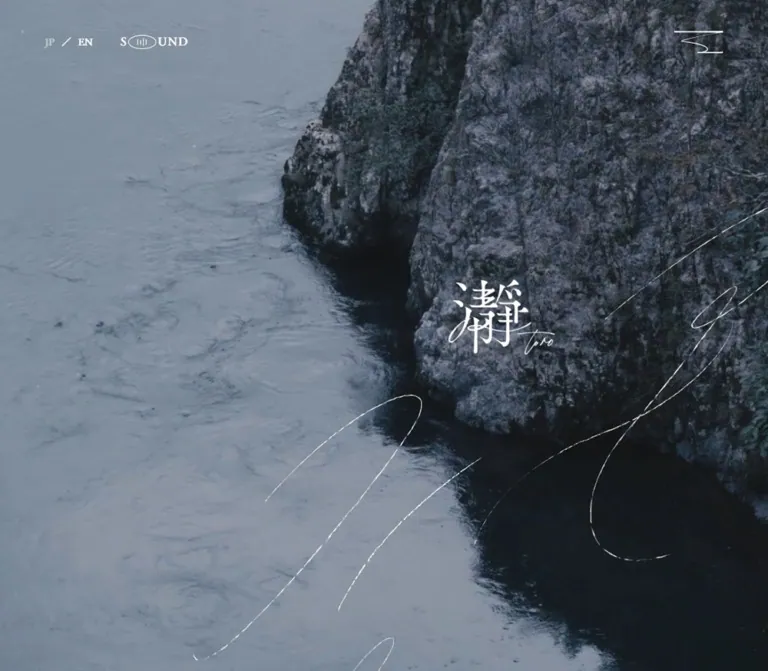
Dorokyo presents a destination through atmosphere and accumulated stories. Its dark sections use a cool slate canvas, white text, small reading blocks, and extensive empty space. The supplied opening captures show shaded rocks, running water, and fern foliage. A restrained sound prompt sits at the viewport center, with two evenly weighted elliptical choices. The footer combines a distinctive white Japanese mark and handwritten Latin signature with widely separated serif navigation.
The underlying document is a long destination website with practical tour and access content. Its computed styles introduce a pale gray tour chapter and a white access chapter, using dark ink in both. The organizing contrast is between spacious, contemplative storytelling and more concentrated visitor information.
The central inspection limitation is the persistent sound prompt. It remains visible over the opening, destination overview, and footer captures. Large slate bands also conceal portions of the page in these states. This reference records that appearance without assuming that the overlap or clipping continues after a sound choice.
How to Read This Reference
- Measured means supplied computed styles or rendered element rectangles. Rectangle values are in CSS pixels and are rounded where useful.
- Calculated means arithmetic from those measurements, such as the gap between buttons or the relationship between an inset and viewport width.
- Visual estimate means an approximation from the five original-page screenshots. Border thickness and some apparent muted colors fall into this category.
- Recommended means guidance for a new implementation. The CSS classes, semantic tokens, fallback fonts, hover feedback, and accessibility additions below are implementation proposals.
- A computed
font-familyestablishes the requested family, not independent confirmation of the font file or glyph face used. Font loading and fallback behavior were not separately inspected. - A rendered rectangle does not establish that an element is unobscured. This matters for the covered header, mobile profile details, and horizontally displaced history entries.
- Document positions describe the sampled state. They should not become absolute positioning instructions for a new page.
Tokens — Colors
Default Palette
These aliases describe the current page; they are not original source variable names.
| Name | Value | Suggested token | Role and evidence |
|---|---|---|---|
| Gorge Slate | #31383e |
--toro-slate |
Measured body and narrative-section background; also a secondary dark text color in the light tour chapter |
| Tour Gray | #d8d8d8 |
--toro-gray |
Measured background of the tour and guide wrapper at both viewport widths |
| Deep Ink | #1b1f24 |
--toro-ink |
Measured tour copy, guide information, access headings, and visitor information |
| White | #ffffff |
--toro-white |
Measured dark-section text and opening labels; also the measured access-section background |
| Muted White | rgb(255 255 255 / 0.5) |
--toro-muted |
Recommended approximation for subdued footer labels; exact compositing or ancestor opacity was not supplied |
| Fine White Rule | rgb(255 255 255 / 0.35) |
--toro-rule |
Recommended approximation for the footer divider; its exact source color was not measured |
The destination-overview screenshot contains a darker central field than the surrounding slate. Its final composited color is not established by the supplied styles. Treat it as an observed state appearance rather than introducing an exact additional background token.
The footer's Office label looks muted in the screenshot, although its sampled element color is white. Ancestor opacity or another compositing layer may account for the difference; the evidence does not identify the mechanism.
There is no verified bright accent color. Emphasis comes from white against slate, dark ink against light surfaces, changes in type size, and generous separation. The transparent --g-color-* properties in the supplied DOM are not evidence of a visible multicolor gradient system.
Tokens — Typography
Tsukushi A Old Mincho — Narrative and Utility Text
Measured family declaration: "Tsukushi A Old Mincho".
Source property: --s-font-7c84b0cc.
This family is requested for Japanese narrative text, the staggered destination characters, guide names and biographies, the tour title, language navigation, and the text inside the sound choices. Computed weights range from 200 in reflective prose to 500 in ON and OFF.
The supplied sound labels and Japanese overview text have a thin, relatively plain appearance. Preserve that screenshot evidence alongside the declared family; do not assume the complete font-loading pipeline was verified. A replacement implementation should compare its actual glyph rendering with the captures before declaring a match.
Playfair — Latin Editorial Labels
Measured family declaration: Playfair.
Source property: --s-font-cd8ada31.
Playfair is requested for Tour, Timeless-Being, Sense, Imagination,, Main Characters, Access, View More, history counters, footer navigation, and visitor-information labels. Most measured weights are 400 or 500; Address and Parking use 700.
Several words are split into separately styled fragments, with selective tracking adjustments. These fragments share a baseline in the measured layout. The extracted line breaks between fragments are not instructions to display broken words on separate lines.
The footer visibly mixes upright and slanted letterforms. Individual font-style values were not included, so a precise fragment-by-fragment italic recipe remains unverified.
Control Defaults and Other Declarations
Button containers commonly report Lato, 15px, weight 400, and 21px line height. Their visible child labels can override that completely: the opening choices use an 18px child in the Japanese text family. Style the visible label intentionally instead of copying the container's default font.
Other declared font properties include Inter, an Inter/Noto Sans JP stack, and a Japanese gothic family. The supplied component samples do not establish a principal visual role for them. They are not required additions to the reusable type system.
Type Scale
Values below are measured. Desktop and mobile columns use font-size / line-height.
| Role | Family | Desktop | Mobile | Weight | Tracking |
|---|---|---|---|---|---|
Language link EN |
Tsukushi A Old Mincho | 14 / 23.8px |
Same | 400 |
Normal |
SOUND of TORO |
Tsukushi A Old Mincho | 16 / 27.2px |
Same | 400 |
0.05em |
| Sound-choice labels | Tsukushi A Old Mincho | 18 / 18px |
Same | 500 |
0.05em |
| First narrative passage | Tsukushi A Old Mincho | 18 / 43.2px |
16 / 38.4px |
200 |
Normal |
| Concept essay | Tsukushi A Old Mincho | 16 / 33.6px |
14 / 29.4px |
200 |
Normal |
| Short narrative passages | Tsukushi A Old Mincho | 16 / 28px |
14 / 24.5px |
200 |
Normal |
| Small location label | Tsukushi A Old Mincho | 11 / 16.5px |
Same | 200 |
Normal |
| Destination characters | Tsukushi A Old Mincho | 64 / 76.8px |
50 / 50px |
300 |
Normal |
| Destination overview | Tsukushi A Old Mincho | 16 / 33.6px |
14 / 29.4px |
300 |
0.05em |
Small Tour label |
Playfair | 22 / 33px |
14 / 21px |
500 |
Normal |
Timeless-Being heading |
Playfair | 28 / 47.6px |
Same | 500 |
Normal |
| Tour introduction copy | Tsukushi A Old Mincho | 16 / 27.2px |
16 / 33.6px |
400 |
0.05em |
| Named tour title | Tsukushi A Old Mincho | 30 / 42px |
28 / 39.2px |
400 |
Normal |
| Named tour description | Tsukushi A Old Mincho | 16 / 27.2px |
16 / 28.8px |
300 |
0.05em |
| Tour duration and season | Tsukushi A Old Mincho | 14 / 21px |
13 / 19.5px |
200 |
Duration uses 0.05em; season is normal |
View More |
Playfair | 18 / 36px |
Same | 500 |
Normal |
Sense, Imagination, |
Playfair | 32 / 32px |
24 / 24px |
500 |
Selected fragments use -0.02em |
Main Characters |
Playfair | 32 / 48px |
38 / 57px |
500 |
Normal |
| Guide names | Tsukushi A Old Mincho | 24 / 36px |
20 / 30px |
400 |
0.05em |
| Romanized guide names | Tsukushi A Old Mincho | 12 / 24px |
12 / 21.6px |
400 |
Normal |
| Guide biography | Tsukushi A Old Mincho | 14 / 23.8px |
Same | 300 desktop; 200 mobile |
0.05em |
| History title | Tsukushi A Old Mincho | 24 / 40.8px |
Same | 400 |
Normal |
| History copy | Tsukushi A Old Mincho | 16 / 32px |
14 / 25.06px |
200 |
Normal |
| History counter | Playfair | 14 / 28px |
Same | 500 |
Normal |
Access heading |
Playfair | 54 / 81px |
44 / 66px |
500 |
Middle fragment uses -0.05em |
Address and Parking |
Playfair | 18 / 30.6px |
Same | 700 |
Normal |
| Footer navigation | Playfair | 24 / 36px |
22 / 37.4px |
400 |
Mostly normal |
The mobile hierarchy is deliberately selective. Main Characters grows from 32px to 38px, while the small Tour label shrinks substantially. A single global scaling factor would miss this behavior.
Tokens — Spacing & Shapes
The sampled root font size is a conventional 16px. There is no evidence of a special miniature rem system or a universal spacing unit. Reuse the measured relationships rather than inventing a rigid grid that explains every interval.
Spacing Scale
| Relationship | Desktop | Mobile | Evidence |
|---|---|---|---|
| Sound heading to choice row | 52px |
52px |
Calculated between element rectangles |
| Gap between sound choices | 64px |
32px |
Calculated between button rectangles |
| Sound-button padding | 15px |
15px |
Measured computed padding |
| Repeated main content inset | 144px |
20px |
Measured in tour, history, and access content |
| Concept-essay left position | 899px |
40px |
Measured; this essay does not share the same alignment on both viewports |
| Tour title to description | 32px |
20px |
Calculated from text rectangles |
| Tour description to metadata | 16px |
16px |
Calculated |
View More text to arrow box |
20px |
20px |
Calculated |
| History title to counter | 32px |
24px |
Calculated for the first entry |
| History title line box to body | About 27px |
About 19px |
Calculated |
| History previous/next gap | 48px |
48px |
Calculated |
| Footer logo to navigation | About 134.58px horizontally |
60px vertically |
Calculated |
Border Radius
| Element | Measured value | Interpretation |
|---|---|---|
| Opening choices | 50% |
True ellipse in a 106 × 66px rectangle |
| Header sound control | 50% |
Small 40 × 20px ellipse |
| Tour arrow control | 50% |
64 × 35px ellipse |
| History controls | 50% |
56 × 34px desktop; 64 × 38px mobile |
| Small mobile profile control | 4px |
Measured on a 24 × 24px button; appearance and action were not verified |
| Sampled sections and text containers | 0 |
Flat, square layout surfaces |
The opening outlines appear approximately 1px thick. Border width was not included in the computed-style evidence, so 1px is a visual estimate and a suitable implementation starting point.
Use border-radius: 50% for the distinctive ellipses. A large fixed radius creates a capsule with straight middle edges and a different silhouette.
Layout Measurements
| Element | At 1440 × 1000 | At 390 × 844 |
|---|---|---|
| Document height | 16434.25px |
14067.14px |
| First section rectangle | 1440 × 1100px |
390 × 675.19px |
| Sound heading rectangle | 147.48 × 27.19px, at (646.25, 427.41) |
Same size, at (121.25, 349.41) |
| Sound choices, combined width | 276px |
244px |
| Entire sound group height | About 145.19px |
Same |
| Sound-group center | (720, 500) |
(195, 422) |
| First narrative text width | 292.61px |
260.11px |
| Concept essay width | 363.75px |
297px |
| Destination overview width | 635.19px |
350px |
| Tour introduction width | 720px |
350px |
| Named tour text column | 382.39px |
350px |
| Guide biography width | 493.13px |
350px |
| History paragraph width | 576px |
350px |
| Footer logo link rectangle | 164.95 × 116.14px |
113.23 × 79.64px |
The sound group is centered as a complete composition, including the heading, gap, and buttons. Centering only the buttons would place the prompt too high.
Components
Opening Media and Sound Choice
Role: introduces the site's atmosphere and presents an explicit sound preference.
The visible anatomy is a natural-image field, a centered SOUND of TORO label, and a horizontal row containing ON and OFF. Both choices have the same dimensions, outline, color, and visual priority. Neither is visibly selected in the captures.
The desktop image shows dark rocks and a small stream. The mobile image shows fern foliage and a softly focused forest background. These are different subjects; the evidence does not establish whether the difference comes from responsive asset selection, media playback, or capture timing.
At desktop width, the visible image band extends approximately from y=240 to y=760. At mobile width, it extends approximately from y=169 to y=675. These screenshot boundaries are distinct from the first section's measured DOM height. They should not be treated as a confirmed universal hero aspect ratio.
The prompt occupies the same viewport-relative position over later content. Fixed foreground positioning is consistent with the captures, but its exact CSS positioning and dismissal lifecycle were not supplied. Neither sound choice was exercised, so playback, persistence, dismissal, and the resulting opening composition remain unverified.
Language and Sound Utilities
Role: provides language access and a compact sound control, as established by the DOM.
The language group includes JP, a slash, and an EN link to /en/top. Beside it, the sound word is constructed from S, a 40 × 20px button, and UND. The small ellipse occupies the position of the missing letter.
The EN link sits at x=114.39, y=48.09 on desktop and x=70.39, y=38.09 on mobile. The sound button moves from (187.75, 50) to (143.75, 40) without changing size. Duplicate sound nodes have identical bounds; this does not establish two separate controls for the user.
A graphic button at the top right measures 70 × 32px on both viewports. Its right inset changes from 64px to 20px. Its action was not established, so do not invent a menu panel or opening animation from this evidence.
These controls have rendered bounds but are not visible in the supplied opening screenshots. Their unobscured appearance needs a separate inspection.
Narrative Passages
Role: develops the relationship between landscape, time, and human activity before introducing the tour.
The first passage begins with the source copy 深く厚く。 and uses especially generous leading: 2.4 times the font size. Later narrative passages use 1.75 leading, while the longer concept essay uses 2.1.
Desktop passages occupy narrow blocks at different horizontal positions. Sampled left edges include approximately 862px, 899px, 812px, 743px, 605px, and finally 144px. This produces an editorial sequence of shifting alignments rather than one repeated centered text column.
Mobile reorganizes these positions. Several passages begin at 20px, the concept essay begins at 40px, and other passages remain offset toward the right. Preserve this controlled variation when adapting the design. Use normal document flow within individually composed sections, with content-dependent heights.
The source's broad section heights establish substantial narrative pacing. They do not establish parallax, scroll scrubbing, or a specific image-to-paragraph animation.
Destination Overview
Role: gives factual context after the reflective narrative.
The visible desktop composition pairs a small location label with two large Japanese characters, 瀞 and 峡, followed by a broad paragraph on the right. The characters descend in two steps, with the second shifted 48px to the right. Their measured size is 64px, weight 300, with a 76.8px line box.
The overview copy begins at x=660.81 and ends at x=1296. Its 16px / 33.6px typography and 0.05em tracking create an open texture despite the longer line length. The text describes the gorge's designation, river transport, and regional divisions.
On mobile, the title becomes a centered cluster of 50px characters, retaining the 48px horizontal offset. The location label remains 11px. The paragraph moves below the cluster, occupies 350px between 20px gutters, and uses 14px / 29.4px. Its top is 46px below the final character's box.
The desktop screenshot shows the sound controls overlapping this section. Keep the title-and-copy relationship as the reusable component; the unresolved foreground overlap is not a recommended content treatment.
Tour Introduction and Detail Link
Role: moves from destination identity to a specific guided experience.
The measured wrapper uses Tour Gray with Deep Ink text. It contains a small Tour label, a Timeless-Being heading, an introduction paragraph, and a named feature: The Timeless - Being Tour.
On desktop, the introduction starts at the repeated 144px inset and spans 720px. The named tour's text sits farther right, at x=913.59 in a 382.39px column. On mobile, both use the main 20px inset and a 350px width.
The feature anatomy is title, description, two small metadata rows, and a right-aligned View More link. The observed metadata reads 1 Day and June-July / October-April, each preceded by a minus-like marker. These are content values, not a guaranteed current booking calendar.
The detail link measures about 166.23 × 36px on both viewports. Its 18px Playfair label is separated by 20px from a 64 × 35px elliptical arrow control. The destination is /jp/FWrLtO1W/tour01; that page was not opened.
The supplied screenshots do not show the full tour composition. Image placement, image crops, and final composited treatments beyond the measured styles remain unverified.
Guide Profiles
Role: introduces the people involved in the destination experience.
The DOM contains three profiles under Main Characters and the source label 旅先案内人. Each includes a Japanese name, romanized name, role, short statement, supporting paragraph, and Profile biography. These are participants in the site's content, not website-production credits.
On desktop, the section heading begins at x=144 and profile text begins at x=676.41. Names use 24px text, with a smaller romanized name positioned beside them. Biography paragraphs are approximately 493px wide.
Mobile makes Main Characters larger, at 38px. Japanese names shrink to 20px and appear at x=230, with romanized names underneath. The longer statement and biography rectangles use the full 350px content width.
Mobile also introduces 350 × 24px button rows and 24 × 24px controls. Their position is consistent with disclosure affordances, but no expansion or collapse was exercised. Some detail rectangles overlap later profile summaries in the extracted geometry. Do not interpret this as proof that all biographies are visibly expanded at once.
Portrait appearance, cropping, disclosure symbols, and selected states are not established by the supplied screenshots.
History Rail
Role: presents three historical perspectives: the hotel, timber rafters, and visiting cultural figures.
Each entry consists of a 24px Japanese title, a small Playfair fraction such as 01 / 03, and explanatory copy. Desktop body text occupies 576px and uses 16px / 32px; mobile uses 350px and 14px / 25.06px.
The DOM contains repeated entries positioned at increments of 1440px on desktop and 390px on mobile. This geometry supports a horizontally arranged rail with duplicate entries. It does not prove autoplay, looping behavior, swipe support, or a particular transition duration.
Previous and next controls sit toward the right. Their boxes grow from 56 × 34px to 64 × 38px on mobile, while the gap stays 48px. The extracted strings keyboard_arrow_left and keyboard_arrow_right indicate arrow glyph content; the exact icon font was not supplied.
A reusable implementation should expose three unique stories and keep duplicate visual slides out of the accessibility tree.
Access Information
Role: makes the destination actionable through address, map links, driving directions, and parking guidance.
The measured access wrapper is white. Its large Playfair heading uses 54px on desktop and 44px on mobile, followed by the smaller source label アクセス. The practical labels Address and Parking are 18px and weight 700.
Desktop address and parking copy form a right-hand column beginning at x=950.39, approximately 345.59px wide. On mobile, the address becomes a label/value row: Address begins at x=20, and its text begins at x=114.20 in a 235.39px box. The map link aligns with the value column. Parking returns to a full-width block below.
The page directs visitors toward the hotel and identifies a municipal parking area 50m before it. Map search and driving links are present. No map interaction, route result, or embedded-map appearance was inspected.
Raw section text also contains nearby-place information that is absent from the main visible-text extraction. Its visibility and layout are unresolved; do not infer a visible nearby-attractions grid from it.
Footer
Role: closes the page with identity, section navigation, office details, contact information, and the operating organization.
The desktop footer places a white Japanese mark with a fine handwritten toro signature at x=144. Its link box is approximately 165 × 116px. To the right, Top, Introduction, Tour, and Access form a widely spaced horizontal navigation row starting at x=443.53.
Office, contact, and organization information sit underneath. A fine horizontal divider spans the right content region, with a small copyright line below and aligned right. The screenshot shows no card containers or elevation shadows.
On mobile, the logo becomes approximately 113 × 80px and is centered. Navigation moves below it with a 60px gap, becomes a vertical list, and begins at x=46. The office and contact groups also stack. This footer inset is larger than the 20px gutter used by the main content.
The original footer independently identifies the operator as 瀞峡ビジョンデザイン協議会, with the English copyright name Dorokyo Vision Design Council. No website-production credits were found in the supplied original-page evidence.
The visible email is dorokyovision@gmail.com, but its captured link targets mailto:info@example.com. Record this discrepancy as a functional issue; do not copy the placeholder destination into a new implementation.
Tokens — Motion & Interaction
Measured Transition Declarations
The recurring measured easing is cubic-bezier(0.4, 0.4, 0, 1).
| Target | Measured declaration | What it establishes |
|---|---|---|
| Body background | 0.5s with the recurring easing |
A background transition is defined; its triggering state was not tested |
| Most text and links | 0.3s with the recurring easing |
A common transition duration, without verified endpoints |
| Sound and arrow buttons | 0.4s with the recurring easing |
Shared control timing; exact hover or press feedback is unknown |
| First narrative passage, desktop | 0.3s, delay 0.5s |
A delayed transition declaration |
| Concept essay and overview, desktop | 1s, delay 0.4s |
Longer delayed transition declarations |
| Corresponding mobile text samples | 0.3s, no listed delay |
Different mobile timing in the sampled state |
| Small mobile profile controls | 1.2s with the recurring easing |
Longer control transitions; rotation or expansion was not verified |
All sampled animation values are none. This does not rule out JavaScript motion, media playback, or animations on unreported elements.
The repeated gradient-property transitions appear to be generated styling infrastructure. They do not demonstrate that every component visibly animates a gradient.
Interaction Evidence and Limits
| Control or behavior | Evidence | Unverified behavior |
|---|---|---|
| Opening sound choice | Visible ON and OFF buttons |
Audio playback, dismissal, preference storage, default sound state |
| Language switch | EN link to /en/top |
Resulting English-page design and navigation transition |
| Footer navigation | Links to /jp/top#top, #introduction, #tour, and #access |
Scroll animation and route handling |
| Tour detail | View More link with arrow control |
Destination-page content and interaction |
| History rail | Three unique stories, duplicate offscreen entries, arrow buttons | Swipe, autoplay, cycling, slide animation |
| Mobile profiles | Additional button rows and small controls | Disclosure state, activation, and keyboard behavior |
| Nature media | Different natural scenes in supplied captures | Video format, loop duration, frame rate, sound synchronization |
For a new implementation, use restrained transitions with the measured easing and prioritize readable resting states. Any proposed fade, hover inversion, or reveal offset should be labeled as an adaptation until independently verified.
Surfaces
| Surface | Appearance | Evidence and use |
|---|---|---|
| Narrative canvas | Solid #31383e |
Measured; supports white prose and broad empty areas |
| Natural-image field | Dark, cool, subdued photography | Visible in opening captures; processing method unknown |
| Sound-choice foreground | White text and transparent elliptical controls | Visible; exact surrounding layer construction unknown |
| Tour and guide chapter | #d8d8d8 with #1b1f24 text |
Measured DOM styles; full screenshot composition unavailable |
| Access chapter | White with dark ink | Measured DOM styles |
| Footer | Slate, white mark, subdued labels, fine rule | Visible in desktop and mobile captures |
There is no general shadow-based elevation system in the visible evidence. Separation is achieved through large color fields, spacing, text hierarchy, and fine outlines.
Imagery
The confirmed opening subjects are tactile and close to the ground: wet rocks, a small watercourse, fern leaves, and shaded woodland. The palette is cool and subdued. Natural texture supplies complexity while the UI remains sparse.
The desktop frame has sharper rock detail and deep recesses. The mobile frame emphasizes foliage and shallow-focus depth. Preserve image-specific composition instead of assuming that one wide photograph can be cropped indiscriminately into every viewport.
The footer mark combines dense Japanese lettering with a much thinner handwritten Latin signature. Treat it as distinctive artwork. An ordinary text character plus a generic script font would not reliably reproduce it.
The captures do not establish the appearance of tour imagery, guide portraits, historical photographs, or access maps. Those assets should remain unspecified until original-page evidence is available.
Observed Asset References
The original DOM includes asset references under https://storage.googleapis.com/studio-design-asset-files/projects/wQOVJ9MYOD/. The supplied strings are truncated, so the following are identifiers only, not complete downloadable URLs.
| Reference | Supplied identifier or evidence | Established use |
|---|---|---|
| Top-right graphic | Prefix s-140x64_webp_8a9cb… |
Pseudo-element image associated with the 70 × 32px button |
| First-section graphic | Prefix s-409x458_webp_064beabd-2c22-4eb1-8a85-b94f4dfda2e0.we… |
Pseudo-element image within the first section; exact graphic role unresolved |
| Map-link graphic | Prefix s-25x26_webp_fb1c77c0-66a6-4eea-… |
Small graphic associated with map and driving links |
| Opening nature imagery | Original-page captures | Rock-and-stream scene and fern scene; asset URLs unavailable |
| Footer identity mark | Original-page footer captures and link rectangles | White Japanese mark and handwritten Latin signature; asset URL unavailable |
Do not complete truncated filenames by guessing. Use authorized source assets when available, and preserve their natural detail without pixelation or artificial sharpening. No complete audio or video asset reference was supplied.
Layout & Responsive Behavior
The measured document is approximately 16,434px tall on desktop and 14,067px on mobile. Its length comes from a sequence of unusually spacious narrative sections followed by tour, people, history, and access content. The mobile page remains a long editorial experience.
Repeated desktop content edges at 144px and 1296px define an 1152px span, equivalent to 80% of the 1440px viewport. This is a calculated relationship at the inspected width, not proof of the exact source container formula. Mobile main content commonly uses 20px gutters and 350px-wide text regions.
The first section measures 1100px high on desktop and 675.19px on mobile, equivalent to approximately 110% and 80% of the respective viewport heights. The visible opening image occupies a smaller central band. Keep section geometry, media cropping, and foreground framing as separate concerns.
The sound-choice group retains its type sizes and 106 × 66px controls. Only the horizontal gap contracts from 64px to 32px. Its center follows the viewport midpoint exactly in both samples.
Narrative text is recomposed rather than merely narrowed. Right-side desktop passages often move to a 20px left inset on mobile, while selected passages retain asymmetrical placement. The destination title changes from a left-side companion to a centered cluster above the overview paragraph.
Tour copy retains a 16px size on mobile and gains leading in the introduction. Guide names shrink, while their section heading grows. Access information changes from a right-side column into a mixed mobile arrangement of label/value rows and full-width blocks. The footer adopts its own 46px left inset for stacked navigation.
A supplied CSS excerpt explicitly uses max-width: 840px to assign 100dvh to opening-related containers. Another excerpt includes a 1140px breakpoint for conditional line breaks. Neither excerpt establishes the complete responsive ruleset. The Quick Start uses 840px as an adaptation breakpoint; applying it to every component is a recommendation.
Mobile profile rectangles and the persistent foreground prompt create uncertainty about actual visible disclosure states and clipping. Resolve those states before attempting a pixel-exact reconstruction. Do not reproduce intersecting text or unreachable footer content as intended responsive behavior.
Do’s and Don’ts
Do
- Anchor the dark sections in the measured slate
#31383e. - Retain the light gray tour chapter and white access chapter documented by the DOM.
- Give natural texture more visual weight than interface decoration.
- Keep sound choices equal in size and emphasis, with true elliptical outlines.
- Center the complete sound composition, including its 52px internal gap.
- Use the measured Japanese-text and Playfair family declarations with verified font loading.
- Preserve narrow narrative passages, varied alignment, and generous leading.
- Retain the staggered destination characters and their 48px horizontal offset.
- Recompose mobile typography and alignment component by component.
- Keep the footer spacious, with an independent logo, navigation, information groups, and fine divider.
Don’t
- Don't reduce the website to a single promotional hero and a row of feature cards.
- Don't turn every paragraph into a full-width block or center all narrative text.
- Don't replace the elliptical controls with capsules or large filled conversion buttons.
- Don't add an unrelated bright accent palette, gradients, or decorative shadows.
- Don't treat the sound prompt's persistence over the footer as a desirable final state.
- Don't use the visible image band's proportions as proof of the underlying hero height.
- Don't turn extracted word fragments into visible line breaks or invent kinetic typography.
- Don't assert video playback, parallax, swipe, or profile expansion without interaction evidence.
- Don't count repeated history nodes as additional unique stories.
- Don't reproduce the placeholder email destination or assume map links have been validated.
Recommended Implementation Additions
These are recommendations for a new implementation, not verified original features.
- Make both sound choices keyboard operable and equally easy to dismiss. Let
OFFreach the main content without audio. Start audible playback only after an explicit user action. - Ensure the opening state releases any masking, scroll restrictions, or foreground layer when completed. Preserve readable page content if media or initialization fails.
- Verify licensed font availability and actual fallback rendering. Keep essential visitor information comfortably readable; consider 16px body text where the original uses very light 14px text.
- Provide visible focus indicators and target areas of at least 44px for small arrows, language links, and profile controls. The visible ellipse can remain smaller than its activation area.
- Use semantic headings for section titles. Keep fragmented display lettering under one coherent accessible name.
- If profiles are disclosures, provide named triggers,
aria-expanded, associated panels, and predictable document reflow. Render full biographies in a usable fallback when scripting is unavailable. - If the history rail is interactive, announce its position, expose three unique stories, and hide duplicate slides from assistive technology.
- Offer reduced-motion and static-media modes. CSS alone cannot pause an HTML video; integrate the preference into the media controller.
- Correct the mismatch between the displayed contact address and the
mailto:destination after confirming the intended mailbox. Validate the map URLs: captured parameters contain literal braces, and the driving URL introduces another question mark beforetravelmode. - Give meaningful images suitable alternatives and mark purely decorative graphics appropriately. Do not put a button inside a navigation link; use one link with a decorative arrow element.
Agent Prompt Guide
Quick Color Reference
- Narrative and footer canvas:
#31383e. - Text and control outlines on dark areas:
#ffffff. - Tour and guide chapter:
#d8d8d8. - Text on light chapters:
#1b1f24. - Access background:
#ffffff. - Muted footer text and rules: use tested translucent white as an adaptation; exact original opacity is unknown.
Overall Prompt
“Create a long destination website inspired by the inspected Dorokyo page. Use a cool slate #31383e narrative canvas, subdued photographs of shaded rocks, water, and fern foliage, and sparse white text. Compose narrow Japanese reading passages with varied horizontal alignment and generous leading. Request Tsukushi A Old Mincho for narrative text and Playfair for Latin editorial headings, with properly licensed font loading and tested fallbacks. Introduce a light gray #d8d8d8 tour and guide chapter and a white access chapter with #1b1f24 text. Use transparent elliptical sound choices measuring 106 × 66px, a staggered Japanese destination title, modest text-and-arrow links, and a spacious footer. Recompose the mobile layout with 20px main gutters and stacked footer navigation. Keep sound selection, media behavior, and accessible controls explicit.”
Example Component Prompts
- Sound choice: “Center the complete sound-preference group in an opening scene. Place a 16px label reading SOUND of TORO above two transparent 106 × 66px elliptical buttons with fine white outlines. Use 18px ON and OFF labels, 52px between the heading box and button row, and a button gap of 64px on desktop or 32px on mobile. Give both options equal visual priority.”
- Destination overview: “Create a dark editorial overview with a tiny location label and two Japanese place-name characters descending in a staggered arrangement. Use 64px characters on desktop and shift the second 48px right. Place a broad 16px paragraph to the right. On mobile, center the 50px title cluster and move a 14px paragraph below it inside 20px gutters.”
- Tour feature: “On pale gray, build a named-tour feature with a restrained title, description, small duration and season rows, and a right-aligned View More link. Pair an 18px Playfair label with a 64 × 35px elliptical arrow element and a 20px gap. Use dark ink, flat surfaces, and no card shadow. Choose imagery only from separately verified assets.”
- Footer: “Build a slate footer with an authorized white identity mark at left and a wide Playfair navigation row to its right. Below the navigation, arrange Office, Contact, and operating-organization information, followed by a fine rule and small right-aligned copyright. On a phone, center the smaller mark and stack navigation and information with a 46px content inset.”
- Responsive review: “Check at 1440 × 1000 and 390 × 844. Preserve the sound-button dimensions while halving their gap. Keep tour body copy at 16px, increase its mobile leading, and allow Main Characters to grow from 32px to 38px. Confirm that opening layers dismiss, biographies reflow, links have usable targets, and footer content stays reachable.”
Quick Start
CSS Custom Properties
This is a reusable adaptation, not extracted source CSS. Measured colors, type values, and control geometry are retained. Container formulas, section padding, image framing, hover feedback, muted colors, and accessibility treatments are recommendations.
The opening example deliberately confines the preference group to its own section. A separate implementation may use an overlay, but it must manage dismissal and focus explicitly. The image-band percentages reproduce the approximate first-capture framing only; they do not claim to reproduce the site's masking mechanism.
Load the named fonts through an authorized font service or local font files. No font URLs or complete media URLs were supplied. The fallback families below are implementation choices.
:root {
  /* Measured palette */
  --toro-slate: #31383e;
  --toro-gray: #d8d8d8;
  --toro-ink: #1b1f24;
  --toro-white: #ffffff;

  /* Recommended approximations for subdued footer details */
  --toro-muted: rgb(255 255 255 / 0.5);
  --toro-rule: rgb(255 255 255 / 0.35);

  /* Measured family names with recommended fallbacks */
  --toro-font-text: 'Tsukushi A Old Mincho', serif;
  --toro-font-latin: 'Playfair', serif;
  --toro-font-control: 'Lato', sans-serif;

  /* Measured desktop typography */
  --toro-text-narrative: 16px;
  --toro-text-lead: 18px;
  --toro-text-overview: 16px;
  --toro-text-place: 64px;
  --toro-leading-place: 1.2;
  --toro-text-tour-title: 30px;
  --toro-text-characters: 32px;
  --toro-text-access: 54px;
  --toro-text-footer-nav: 24px;
  --toro-leading-footer-nav: 1.5;
  --toro-leading-tour-intro: 1.7;
  --toro-tracking: 0.05em;

  /* Measured control geometry and calculated gaps */
  --toro-choice-width: 106px;
  --toro-choice-height: 66px;
  --toro-choice-gap: 64px;
  --toro-sound-stack-gap: 52px;
  --toro-arrow-width: 64px;
  --toro-arrow-height: 35px;
  --toro-place-offset: 48px;

  /* Border thickness is a visual estimate */
  --toro-line: 1px;
  --toro-radius-ellipse: 50%;

  /* Measured timing; effects using it below are adaptations */
  --toro-ease: cubic-bezier(0.4, 0.4, 0, 1);
  --toro-duration-text: 300ms;
  --toro-duration-control: 400ms;
}

* {
  box-sizing: border-box;
}

body {
  margin: 0;
  background: var(--toro-slate);
  color: var(--toro-white);
  font-family: var(--toro-font-text);
}

button,
a {
  -webkit-tap-highlight-color: transparent;
}

button {
  font: inherit;
}

.toro-container {
  /* Reproduces the repeated 144px inset at 1440px. */
  width: 80%;
  margin-inline: auto;
}

.toro-section {
  /* Recommended pacing; actual narrative sections vary greatly. */
  padding-block: clamp(80px, 12vw, 180px);
}

.toro-opening {
  position: relative;
  isolation: isolate;
  display: grid;
  place-items: center;
  min-height: 100vh;
  min-height: 100dvh;
  background: var(--toro-slate);
}

.toro-opening__media {
  /* Approximate framing of the first desktop capture. */
  position: absolute;
  inset: 24% 0;
  z-index: 0;
  width: 100%;
  height: 52%;
  object-fit: cover;
}

.toro-sound-choice {
  position: relative;
  z-index: 1;
  display: grid;
  justify-items: center;
  row-gap: var(--toro-sound-stack-gap);
  color: var(--toro-white);
}

.toro-sound-choice[hidden] {
  display: none;
}

.toro-sound-choice__label {
  margin: 0;
  font: 400 16px / 1.7 var(--toro-font-text);
  letter-spacing: var(--toro-tracking);
}

.toro-sound-choice__actions {
  display: flex;
  gap: var(--toro-choice-gap);
}

.toro-oval {
  display: grid;
  place-items: center;
  flex: none;
  width: var(--toro-choice-width);
  height: var(--toro-choice-height);
  padding: 15px;
  border: var(--toro-line) solid currentColor;
  border-radius: var(--toro-radius-ellipse);
  color: inherit;
  background: transparent;
  cursor: pointer;
  transition:
    color var(--toro-duration-control) var(--toro-ease),
    background-color var(--toro-duration-control) var(--toro-ease);
}

.toro-oval > span {
  font: 500 18px / 1 var(--toro-font-text);
  letter-spacing: var(--toro-tracking);
}

.toro-narrative {
  max-width: 364px;
  margin: 0;
  font-size: var(--toro-text-narrative);
  font-weight: 200;
  line-height: 1.75;
}

.toro-narrative--lead {
  max-width: 293px;
  font-size: var(--toro-text-lead);
  line-height: 2.4;
}

.toro-narrative--essay {
  line-height: 2.1;
}

.toro-overview {
  display: grid;
  grid-template-columns: 112px minmax(0, 635.19px);
  justify-content: end;
  column-gap: 140px;
  align-items: start;
}

.toro-place {
  width: calc(var(--toro-text-place) + var(--toro-place-offset));
}

.toro-place__location {
  margin: 0 0 16px auto;
  width: 33px;
  min-height: 44px;
  writing-mode: vertical-rl;
  font-size: 11px;
  font-weight: 200;
  line-height: 1.5;
}

.toro-place__name {
  margin: 0;
  font-size: var(--toro-text-place);
  font-weight: 300;
  line-height: var(--toro-leading-place);
}

.toro-place__name > span {
  display: block;
}

.toro-place__name > span + span {
  margin-inline-start: var(--toro-place-offset);
}

.toro-overview__copy {
  margin: 100px 0 0;
  font-size: var(--toro-text-overview);
  font-weight: 300;
  line-height: 2.1;
  letter-spacing: var(--toro-tracking);
}

.toro-tour {
  background: var(--toro-gray);
  color: var(--toro-ink);
}

.toro-tour__intro {
  max-width: 720px;
  font-size: 16px;
  line-height: var(--toro-leading-tour-intro);
  letter-spacing: var(--toro-tracking);
}

.toro-tour__title {
  margin: 0 0 32px;
  font-size: var(--toro-text-tour-title);
  font-weight: 400;
  line-height: 1.4;
}

.toro-detail-link {
  display: flex;
  align-items: center;
  gap: 20px;
  width: max-content;
  min-height: 44px;
  margin-inline-start: auto;
  color: inherit;
  font: 500 18px / 2 var(--toro-font-latin);
  text-decoration: none;
}

.toro-detail-link__arrow {
  /* Outline is a recommended extension of the observed ellipses. */
  display: grid;
  place-items: center;
  width: var(--toro-arrow-width);
  height: var(--toro-arrow-height);
  border: var(--toro-line) solid currentColor;
  border-radius: var(--toro-radius-ellipse);
}

.toro-characters-title {
  margin: 0;
  font: 500 var(--toro-text-characters) / 1.5 var(--toro-font-latin);
}

.toro-access {
  background: var(--toro-white);
  color: var(--toro-ink);
}

.toro-access__title {
  margin: 0;
  font: 500 var(--toro-text-access) / 1.5 var(--toro-font-latin);
}

.toro-access__label {
  margin: 0;
  font: 700 18px / 1.7 var(--toro-font-latin);
}

.toro-access__copy {
  margin: 6px 0 0;
  font-size: 14px;
  font-weight: 200;
  line-height: 1.7;
  letter-spacing: var(--toro-tracking);
}

.toro-footer {
  padding-block: 160px;
  background: var(--toro-slate);
  color: var(--toro-white);
}

.toro-footer__inner {
  display: grid;
  grid-template-columns: 14.32% minmax(0, 1fr);
  column-gap: 11.68%;
  align-items: start;
}

.toro-footer__brand img {
  display: block;
  width: 100%;
  height: auto;
}

.toro-footer__nav {
  display: flex;
  justify-content: space-between;
  flex-wrap: wrap;
  gap: 16px;
}

.toro-footer__nav a {
  color: inherit;
  font: 400 var(--toro-text-footer-nav) /
    var(--toro-leading-footer-nav) var(--toro-font-latin);
  text-decoration: none;
}

.toro-footer__details {
  display: grid;
  grid-template-columns: repeat(3, minmax(0, 1fr));
  gap: 32px;
  margin-top: 122px;
}

.toro-footer__details > div {
  min-width: 0;
}

.toro-footer__details dt {
  color: var(--toro-muted);
  font-family: var(--toro-font-latin);
}

.toro-footer__details dd {
  margin: 6px 0 0;
  line-height: 1.7;
  overflow-wrap: anywhere;
}

.toro-footer__details a {
  color: inherit;
  text-underline-offset: 0.2em;
}

.toro-footer__end {
  margin-top: 28px;
  padding-top: 24px;
  border-top: var(--toro-line) solid var(--toro-rule);
  color: var(--toro-muted);
  text-align: right;
}

/* Recommended feedback; original hover endpoints were not tested. */
@media (hover: hover) {
  .toro-oval:hover {
    color: var(--toro-slate);
    background: var(--toro-white);
  }

  .toro-detail-link:hover,
  .toro-footer__nav a:hover {
    text-decoration: underline;
    text-underline-offset: 0.25em;
  }
}

:where(a, button):focus-visible {
  outline: 2px solid currentColor;
  outline-offset: 5px;
}

@media (max-width: 840px) {
  :root {
    --toro-choice-gap: 32px;
    --toro-text-narrative: 14px;
    --toro-text-lead: 16px;
    --toro-text-overview: 14px;
    --toro-text-place: 50px;
    --toro-leading-place: 1;
    --toro-text-tour-title: 28px;
    --toro-text-characters: 38px;
    --toro-text-access: 44px;
    --toro-text-footer-nav: 22px;
    --toro-leading-footer-nav: 1.7;
    --toro-leading-tour-intro: 2.1;
  }

  .toro-container {
    width: calc(100% - 40px);
  }

  .toro-opening__media {
    inset-block: 20%;
    height: 60%;
  }

  .toro-narrative--lead {
    max-width: 260.11px;
  }

  .toro-overview {
    display: flex;
    flex-direction: column;
    align-items: center;
    gap: 46px;
  }

  .toro-place__location {
    margin-bottom: 0;
  }

  .toro-overview__copy {
    width: 100%;
    margin: 0;
  }

  .toro-tour__title {
    margin-bottom: 20px;
  }

  .toro-footer__inner {
    display: block;
    width: calc(100% - 92px);
  }

  .toro-footer__brand {
    display: block;
    width: 113.23px;
    margin-inline: auto;
  }

  .toro-footer__main {
    margin-top: 60px;
  }

  .toro-footer__nav {
    flex-direction: column;
    align-items: flex-start;
    gap: 0;
  }

  .toro-footer__nav a {
    /* Larger target than the measured 37.4px line box. */
    min-height: 44px;
  }

  .toro-footer__details {
    grid-template-columns: 1fr;
    margin-top: 72px;
  }

  .toro-footer__end {
    text-align: left;
  }
}

@media (prefers-reduced-motion: reduce) {
  .toro-oval {
    transition: none;
  }
}
A minimal structure for the sound group follows. Wire the data-sound choices to a media controller; the markup and CSS do not implement playback or dismissal.
<section class="toro-opening" aria-label="Dorokyo introduction">
  <!-- Add an authorized nature image with class toro-opening__media. -->
  <div class="toro-sound-choice"
       role="group"
       aria-labelledby="toro-sound-label">
    <p id="toro-sound-label" class="toro-sound-choice__label">
      SOUND of TORO
    </p>
    <div class="toro-sound-choice__actions">
      <button class="toro-oval" type="button" data-sound="on">
        <span>ON</span>
      </button>
      <button class="toro-oval" type="button" data-sound="off">
        <span>OFF</span>
      </button>
    </div>
  </div>
</section>
Tailwind v4 Token Mapping
Optional aliases for a project already using Tailwind v4. This does not identify the original site's implementation framework. Define the custom properties above first.
@theme inline {
  --color-gorge: var(--toro-slate);
  --color-tour: var(--toro-gray);
  --color-ink: var(--toro-ink);
  --color-paper: var(--toro-white);
  --color-muted: var(--toro-muted);

  --font-narrative: var(--toro-font-text);
  --font-editorial: var(--toro-font-latin);
  --font-control: var(--toro-font-control);

  --text-narrative: var(--toro-text-narrative);
  --text-lead: var(--toro-text-lead);
  --text-place: var(--toro-text-place);
  --text-characters: var(--toro-text-characters);
  --text-access: var(--toro-text-access);

  --spacing-choice-width: var(--toro-choice-width);
  --spacing-choice-height: var(--toro-choice-height);
  --spacing-choice-gap: var(--toro-choice-gap);
  --spacing-sound-gap: var(--toro-sound-stack-gap);
  --radius-ellipse: 50%;
}
Sources & Evidence
- Inspected original and final page: Dorokyo. The supplied browser record reports HTTP 200 with no URL change.
- Capture date: September 13, 2026, 02:58:40 JST; recorded retrieval timestamp
2026-09-12T17:58:40.404Z. - Original-page screenshots: three desktop captures at 1440 × 1000 and two mobile captures at 390 × 844. They show the opening sound prompt, natural imagery, a destination-overview segment, and footer content under the continuing foreground state.
- Rendered evidence: supplied page text, link destinations, custom properties, computed typography and colors, transition declarations, and element rectangles at both viewport widths.
- Recorded inspection procedure: initial observation lasted at least five seconds. Readiness checks awaited document load, relevant finite motion, sampled layout and text stability, and visible image decoding within stated time limits. Perpetual animations were temporarily paused during readiness checks and resumed. Scrolling traversed intermediate positions. SharedWorkers and service workers were disabled.
No additional browsing, commands, file inspection, link activation, or media interaction was performed for this reference. The English page, tour-detail page, map results, sound choices, graphic header button, profile controls, and history arrows remain unexercised.
The stable captures do not prove semantic completeness. Foreground persistence, masking, font-file resolution, mobile disclosure visibility, delayed content, media playback, and interaction endpoints remain limited or unverified. The CSS and prompts are practical adaptations of the supported current-page evidence, not claims of a complete behavioral reconstruction.
# TORO / Dorokyo — Style Reference

> A quiet journey through a gorge, composed in slate, fine white ellipses, and widely spaced passages of text.

**Website:** [dorokyo.info](https://dorokyo.info/)
**Original URL:** https://dorokyo.info/
**Final URL:** https://dorokyo.info/
**Theme:** dark narrative and footer, light gray tour content, and white access information; no selectable color theme was verified.
**Inspected:** September 13, 2026, 02:58:40 JST, from the supplied browser inspection. Recorded retrieval timestamp: September 12, 2026, 17:58:40.404 UTC.
**Viewports:** 1440 × 1000 and 390 × 844 CSS pixels.
**Scope:** the current Japanese home page, including its visible sound-choice state, natural imagery, destination overview, and footer. Rendered DOM and computed styles additionally document the narrative sequence, tour introduction, guide profiles, history rail, and access information. Linked pages and post-selection states were not inspected.

Dorokyo presents a destination through atmosphere and accumulated stories. Its dark sections use a cool slate canvas, white text, small reading blocks, and extensive empty space. The supplied opening captures show shaded rocks, running water, and fern foliage. A restrained sound prompt sits at the viewport center, with two evenly weighted elliptical choices. The footer combines a distinctive white Japanese mark and handwritten Latin signature with widely separated serif navigation.

The underlying document is a long destination website with practical tour and access content. Its computed styles introduce a pale gray tour chapter and a white access chapter, using dark ink in both. The organizing contrast is between spacious, contemplative storytelling and more concentrated visitor information.

**The central inspection limitation is the persistent sound prompt.** It remains visible over the opening, destination overview, and footer captures. Large slate bands also conceal portions of the page in these states. This reference records that appearance without assuming that the overlap or clipping continues after a sound choice.

## How to Read This Reference

- **Measured** means supplied computed styles or rendered element rectangles. Rectangle values are in CSS pixels and are rounded where useful.
- **Calculated** means arithmetic from those measurements, such as the gap between buttons or the relationship between an inset and viewport width.
- **Visual estimate** means an approximation from the five original-page screenshots. Border thickness and some apparent muted colors fall into this category.
- **Recommended** means guidance for a new implementation. The CSS classes, semantic tokens, fallback fonts, hover feedback, and accessibility additions below are implementation proposals.
- A computed `font-family` establishes the requested family, not independent confirmation of the font file or glyph face used. Font loading and fallback behavior were not separately inspected.
- A rendered rectangle does not establish that an element is unobscured. This matters for the covered header, mobile profile details, and horizontally displaced history entries.
- Document positions describe the sampled state. They should not become absolute positioning instructions for a new page.

## Tokens — Colors

### Default Palette

These aliases describe the current page; they are not original source variable names.

| Name | Value | Suggested token | Role and evidence |
| --- | --- | --- | --- |
| Gorge Slate | `#31383e` | `--toro-slate` | Measured body and narrative-section background; also a secondary dark text color in the light tour chapter |
| Tour Gray | `#d8d8d8` | `--toro-gray` | Measured background of the tour and guide wrapper at both viewport widths |
| Deep Ink | `#1b1f24` | `--toro-ink` | Measured tour copy, guide information, access headings, and visitor information |
| White | `#ffffff` | `--toro-white` | Measured dark-section text and opening labels; also the measured access-section background |
| Muted White | `rgb(255 255 255 / 0.5)` | `--toro-muted` | Recommended approximation for subdued footer labels; exact compositing or ancestor opacity was not supplied |
| Fine White Rule | `rgb(255 255 255 / 0.35)` | `--toro-rule` | Recommended approximation for the footer divider; its exact source color was not measured |

The destination-overview screenshot contains a darker central field than the surrounding slate. Its final composited color is not established by the supplied styles. Treat it as an observed state appearance rather than introducing an exact additional background token.

The footer's `Office` label looks muted in the screenshot, although its sampled element color is white. Ancestor opacity or another compositing layer may account for the difference; the evidence does not identify the mechanism.

There is no verified bright accent color. Emphasis comes from white against slate, dark ink against light surfaces, changes in type size, and generous separation. The transparent `--g-color-*` properties in the supplied DOM are not evidence of a visible multicolor gradient system.

## Tokens — Typography

### Tsukushi A Old Mincho — Narrative and Utility Text

**Measured family declaration:** `"Tsukushi A Old Mincho"`.
**Source property:** `--s-font-7c84b0cc`.

This family is requested for Japanese narrative text, the staggered destination characters, guide names and biographies, the tour title, language navigation, and the text inside the sound choices. Computed weights range from `200` in reflective prose to `500` in `ON` and `OFF`.

The supplied sound labels and Japanese overview text have a thin, relatively plain appearance. Preserve that screenshot evidence alongside the declared family; do not assume the complete font-loading pipeline was verified. A replacement implementation should compare its actual glyph rendering with the captures before declaring a match.

### Playfair — Latin Editorial Labels

**Measured family declaration:** `Playfair`.
**Source property:** `--s-font-cd8ada31`.

Playfair is requested for `Tour`, `Timeless-Being`, `Sense, Imagination,`, `Main Characters`, `Access`, `View More`, history counters, footer navigation, and visitor-information labels. Most measured weights are `400` or `500`; `Address` and `Parking` use `700`.

Several words are split into separately styled fragments, with selective tracking adjustments. These fragments share a baseline in the measured layout. The extracted line breaks between fragments are not instructions to display broken words on separate lines.

The footer visibly mixes upright and slanted letterforms. Individual `font-style` values were not included, so a precise fragment-by-fragment italic recipe remains unverified.

### Control Defaults and Other Declarations

Button containers commonly report `Lato`, `15px`, weight `400`, and `21px` line height. Their visible child labels can override that completely: the opening choices use an `18px` child in the Japanese text family. Style the visible label intentionally instead of copying the container's default font.

Other declared font properties include Inter, an Inter/Noto Sans JP stack, and a Japanese gothic family. The supplied component samples do not establish a principal visual role for them. They are not required additions to the reusable type system.

### Type Scale

Values below are measured. Desktop and mobile columns use `font-size / line-height`.

| Role | Family | Desktop | Mobile | Weight | Tracking |
| --- | --- | --- | --- | --- | --- |
| Language link `EN` | Tsukushi A Old Mincho | `14 / 23.8px` | Same | `400` | Normal |
| `SOUND of TORO` | Tsukushi A Old Mincho | `16 / 27.2px` | Same | `400` | `0.05em` |
| Sound-choice labels | Tsukushi A Old Mincho | `18 / 18px` | Same | `500` | `0.05em` |
| First narrative passage | Tsukushi A Old Mincho | `18 / 43.2px` | `16 / 38.4px` | `200` | Normal |
| Concept essay | Tsukushi A Old Mincho | `16 / 33.6px` | `14 / 29.4px` | `200` | Normal |
| Short narrative passages | Tsukushi A Old Mincho | `16 / 28px` | `14 / 24.5px` | `200` | Normal |
| Small location label | Tsukushi A Old Mincho | `11 / 16.5px` | Same | `200` | Normal |
| Destination characters | Tsukushi A Old Mincho | `64 / 76.8px` | `50 / 50px` | `300` | Normal |
| Destination overview | Tsukushi A Old Mincho | `16 / 33.6px` | `14 / 29.4px` | `300` | `0.05em` |
| Small `Tour` label | Playfair | `22 / 33px` | `14 / 21px` | `500` | Normal |
| `Timeless-Being` heading | Playfair | `28 / 47.6px` | Same | `500` | Normal |
| Tour introduction copy | Tsukushi A Old Mincho | `16 / 27.2px` | `16 / 33.6px` | `400` | `0.05em` |
| Named tour title | Tsukushi A Old Mincho | `30 / 42px` | `28 / 39.2px` | `400` | Normal |
| Named tour description | Tsukushi A Old Mincho | `16 / 27.2px` | `16 / 28.8px` | `300` | `0.05em` |
| Tour duration and season | Tsukushi A Old Mincho | `14 / 21px` | `13 / 19.5px` | `200` | Duration uses `0.05em`; season is normal |
| `View More` | Playfair | `18 / 36px` | Same | `500` | Normal |
| `Sense, Imagination,` | Playfair | `32 / 32px` | `24 / 24px` | `500` | Selected fragments use `-0.02em` |
| `Main Characters` | Playfair | `32 / 48px` | `38 / 57px` | `500` | Normal |
| Guide names | Tsukushi A Old Mincho | `24 / 36px` | `20 / 30px` | `400` | `0.05em` |
| Romanized guide names | Tsukushi A Old Mincho | `12 / 24px` | `12 / 21.6px` | `400` | Normal |
| Guide biography | Tsukushi A Old Mincho | `14 / 23.8px` | Same | `300` desktop; `200` mobile | `0.05em` |
| History title | Tsukushi A Old Mincho | `24 / 40.8px` | Same | `400` | Normal |
| History copy | Tsukushi A Old Mincho | `16 / 32px` | `14 / 25.06px` | `200` | Normal |
| History counter | Playfair | `14 / 28px` | Same | `500` | Normal |
| `Access` heading | Playfair | `54 / 81px` | `44 / 66px` | `500` | Middle fragment uses `-0.05em` |
| `Address` and `Parking` | Playfair | `18 / 30.6px` | Same | `700` | Normal |
| Footer navigation | Playfair | `24 / 36px` | `22 / 37.4px` | `400` | Mostly normal |

The mobile hierarchy is deliberately selective. `Main Characters` grows from 32px to 38px, while the small `Tour` label shrinks substantially. A single global scaling factor would miss this behavior.

## Tokens — Spacing & Shapes

The sampled root font size is a conventional `16px`. There is no evidence of a special miniature `rem` system or a universal spacing unit. Reuse the measured relationships rather than inventing a rigid grid that explains every interval.

### Spacing Scale

| Relationship | Desktop | Mobile | Evidence |
| --- | --- | --- | --- |
| Sound heading to choice row | `52px` | `52px` | Calculated between element rectangles |
| Gap between sound choices | `64px` | `32px` | Calculated between button rectangles |
| Sound-button padding | `15px` | `15px` | Measured computed padding |
| Repeated main content inset | `144px` | `20px` | Measured in tour, history, and access content |
| Concept-essay left position | `899px` | `40px` | Measured; this essay does not share the same alignment on both viewports |
| Tour title to description | `32px` | `20px` | Calculated from text rectangles |
| Tour description to metadata | `16px` | `16px` | Calculated |
| `View More` text to arrow box | `20px` | `20px` | Calculated |
| History title to counter | `32px` | `24px` | Calculated for the first entry |
| History title line box to body | About `27px` | About `19px` | Calculated |
| History previous/next gap | `48px` | `48px` | Calculated |
| Footer logo to navigation | About `134.58px` horizontally | `60px` vertically | Calculated |

### Border Radius

| Element | Measured value | Interpretation |
| --- | --- | --- |
| Opening choices | `50%` | True ellipse in a `106 × 66px` rectangle |
| Header sound control | `50%` | Small `40 × 20px` ellipse |
| Tour arrow control | `50%` | `64 × 35px` ellipse |
| History controls | `50%` | `56 × 34px` desktop; `64 × 38px` mobile |
| Small mobile profile control | `4px` | Measured on a `24 × 24px` button; appearance and action were not verified |
| Sampled sections and text containers | `0` | Flat, square layout surfaces |

The opening outlines appear approximately 1px thick. Border width was not included in the computed-style evidence, so `1px` is a visual estimate and a suitable implementation starting point.

Use `border-radius: 50%` for the distinctive ellipses. A large fixed radius creates a capsule with straight middle edges and a different silhouette.

### Layout Measurements

| Element | At 1440 × 1000 | At 390 × 844 |
| --- | --- | --- |
| Document height | `16434.25px` | `14067.14px` |
| First section rectangle | `1440 × 1100px` | `390 × 675.19px` |
| Sound heading rectangle | `147.48 × 27.19px`, at `(646.25, 427.41)` | Same size, at `(121.25, 349.41)` |
| Sound choices, combined width | `276px` | `244px` |
| Entire sound group height | About `145.19px` | Same |
| Sound-group center | `(720, 500)` | `(195, 422)` |
| First narrative text width | `292.61px` | `260.11px` |
| Concept essay width | `363.75px` | `297px` |
| Destination overview width | `635.19px` | `350px` |
| Tour introduction width | `720px` | `350px` |
| Named tour text column | `382.39px` | `350px` |
| Guide biography width | `493.13px` | `350px` |
| History paragraph width | `576px` | `350px` |
| Footer logo link rectangle | `164.95 × 116.14px` | `113.23 × 79.64px` |

The sound group is centered as a complete composition, including the heading, gap, and buttons. Centering only the buttons would place the prompt too high.

## Components

### Opening Media and Sound Choice

**Role:** introduces the site's atmosphere and presents an explicit sound preference.

The visible anatomy is a natural-image field, a centered `SOUND of TORO` label, and a horizontal row containing `ON` and `OFF`. Both choices have the same dimensions, outline, color, and visual priority. Neither is visibly selected in the captures.

The desktop image shows dark rocks and a small stream. The mobile image shows fern foliage and a softly focused forest background. These are different subjects; the evidence does not establish whether the difference comes from responsive asset selection, media playback, or capture timing.

At desktop width, the visible image band extends approximately from y=240 to y=760. At mobile width, it extends approximately from y=169 to y=675. These screenshot boundaries are distinct from the first section's measured DOM height. They should not be treated as a confirmed universal hero aspect ratio.

The prompt occupies the same viewport-relative position over later content. Fixed foreground positioning is consistent with the captures, but its exact CSS positioning and dismissal lifecycle were not supplied. Neither sound choice was exercised, so playback, persistence, dismissal, and the resulting opening composition remain unverified.

### Language and Sound Utilities

**Role:** provides language access and a compact sound control, as established by the DOM.

The language group includes `JP`, a slash, and an `EN` link to `/en/top`. Beside it, the sound word is constructed from `S`, a `40 × 20px` button, and `UND`. The small ellipse occupies the position of the missing letter.

The `EN` link sits at x=114.39, y=48.09 on desktop and x=70.39, y=38.09 on mobile. The sound button moves from `(187.75, 50)` to `(143.75, 40)` without changing size. Duplicate sound nodes have identical bounds; this does not establish two separate controls for the user.

A graphic button at the top right measures `70 × 32px` on both viewports. Its right inset changes from 64px to 20px. Its action was not established, so do not invent a menu panel or opening animation from this evidence.

These controls have rendered bounds but are not visible in the supplied opening screenshots. Their unobscured appearance needs a separate inspection.

### Narrative Passages

**Role:** develops the relationship between landscape, time, and human activity before introducing the tour.

The first passage begins with the source copy `深く厚く。` and uses especially generous leading: 2.4 times the font size. Later narrative passages use 1.75 leading, while the longer concept essay uses 2.1.

Desktop passages occupy narrow blocks at different horizontal positions. Sampled left edges include approximately 862px, 899px, 812px, 743px, 605px, and finally 144px. This produces an editorial sequence of shifting alignments rather than one repeated centered text column.

Mobile reorganizes these positions. Several passages begin at 20px, the concept essay begins at 40px, and other passages remain offset toward the right. Preserve this controlled variation when adapting the design. Use normal document flow within individually composed sections, with content-dependent heights.

The source's broad section heights establish substantial narrative pacing. They do not establish parallax, scroll scrubbing, or a specific image-to-paragraph animation.

### Destination Overview

**Role:** gives factual context after the reflective narrative.

The visible desktop composition pairs a small location label with two large Japanese characters, `瀞` and `峡`, followed by a broad paragraph on the right. The characters descend in two steps, with the second shifted 48px to the right. Their measured size is 64px, weight 300, with a 76.8px line box.

The overview copy begins at x=660.81 and ends at x=1296. Its `16px / 33.6px` typography and `0.05em` tracking create an open texture despite the longer line length. The text describes the gorge's designation, river transport, and regional divisions.

On mobile, the title becomes a centered cluster of 50px characters, retaining the 48px horizontal offset. The location label remains 11px. The paragraph moves below the cluster, occupies 350px between 20px gutters, and uses `14px / 29.4px`. Its top is 46px below the final character's box.

The desktop screenshot shows the sound controls overlapping this section. Keep the title-and-copy relationship as the reusable component; the unresolved foreground overlap is not a recommended content treatment.

### Tour Introduction and Detail Link

**Role:** moves from destination identity to a specific guided experience.

The measured wrapper uses Tour Gray with Deep Ink text. It contains a small `Tour` label, a `Timeless-Being` heading, an introduction paragraph, and a named feature: `The Timeless - Being Tour`.

On desktop, the introduction starts at the repeated 144px inset and spans 720px. The named tour's text sits farther right, at x=913.59 in a 382.39px column. On mobile, both use the main 20px inset and a 350px width.

The feature anatomy is title, description, two small metadata rows, and a right-aligned `View More` link. The observed metadata reads `1 Day` and `June-July / October-April`, each preceded by a minus-like marker. These are content values, not a guaranteed current booking calendar.

The detail link measures about `166.23 × 36px` on both viewports. Its 18px Playfair label is separated by 20px from a `64 × 35px` elliptical arrow control. The destination is `/jp/FWrLtO1W/tour01`; that page was not opened.

The supplied screenshots do not show the full tour composition. Image placement, image crops, and final composited treatments beyond the measured styles remain unverified.

### Guide Profiles

**Role:** introduces the people involved in the destination experience.

The DOM contains three profiles under `Main Characters` and the source label `旅先案内人`. Each includes a Japanese name, romanized name, role, short statement, supporting paragraph, and `Profile` biography. These are participants in the site's content, not website-production credits.

On desktop, the section heading begins at x=144 and profile text begins at x=676.41. Names use 24px text, with a smaller romanized name positioned beside them. Biography paragraphs are approximately 493px wide.

Mobile makes `Main Characters` larger, at 38px. Japanese names shrink to 20px and appear at x=230, with romanized names underneath. The longer statement and biography rectangles use the full 350px content width.

Mobile also introduces `350 × 24px` button rows and `24 × 24px` controls. Their position is consistent with disclosure affordances, but no expansion or collapse was exercised. Some detail rectangles overlap later profile summaries in the extracted geometry. Do not interpret this as proof that all biographies are visibly expanded at once.

Portrait appearance, cropping, disclosure symbols, and selected states are not established by the supplied screenshots.

### History Rail

**Role:** presents three historical perspectives: the hotel, timber rafters, and visiting cultural figures.

Each entry consists of a 24px Japanese title, a small Playfair fraction such as `01 / 03`, and explanatory copy. Desktop body text occupies 576px and uses `16px / 32px`; mobile uses 350px and `14px / 25.06px`.

The DOM contains repeated entries positioned at increments of 1440px on desktop and 390px on mobile. This geometry supports a horizontally arranged rail with duplicate entries. It does not prove autoplay, looping behavior, swipe support, or a particular transition duration.

Previous and next controls sit toward the right. Their boxes grow from `56 × 34px` to `64 × 38px` on mobile, while the gap stays 48px. The extracted strings `keyboard_arrow_left` and `keyboard_arrow_right` indicate arrow glyph content; the exact icon font was not supplied.

A reusable implementation should expose three unique stories and keep duplicate visual slides out of the accessibility tree.

### Access Information

**Role:** makes the destination actionable through address, map links, driving directions, and parking guidance.

The measured access wrapper is white. Its large Playfair heading uses 54px on desktop and 44px on mobile, followed by the smaller source label `アクセス`. The practical labels `Address` and `Parking` are 18px and weight 700.

Desktop address and parking copy form a right-hand column beginning at x=950.39, approximately 345.59px wide. On mobile, the address becomes a label/value row: `Address` begins at x=20, and its text begins at x=114.20 in a 235.39px box. The map link aligns with the value column. Parking returns to a full-width block below.

The page directs visitors toward the hotel and identifies a municipal parking area 50m before it. Map search and driving links are present. No map interaction, route result, or embedded-map appearance was inspected.

Raw section text also contains nearby-place information that is absent from the main visible-text extraction. Its visibility and layout are unresolved; do not infer a visible nearby-attractions grid from it.

### Footer

**Role:** closes the page with identity, section navigation, office details, contact information, and the operating organization.

The desktop footer places a white Japanese mark with a fine handwritten `toro` signature at x=144. Its link box is approximately `165 × 116px`. To the right, `Top`, `Introduction`, `Tour`, and `Access` form a widely spaced horizontal navigation row starting at x=443.53.

Office, contact, and organization information sit underneath. A fine horizontal divider spans the right content region, with a small copyright line below and aligned right. The screenshot shows no card containers or elevation shadows.

On mobile, the logo becomes approximately `113 × 80px` and is centered. Navigation moves below it with a 60px gap, becomes a vertical list, and begins at x=46. The office and contact groups also stack. This footer inset is larger than the 20px gutter used by the main content.

The original footer independently identifies the operator as `瀞峡ビジョンデザイン協議会`, with the English copyright name Dorokyo Vision Design Council. No website-production credits were found in the supplied original-page evidence.

The visible email is `dorokyovision@gmail.com`, but its captured link targets `mailto:info@example.com`. Record this discrepancy as a functional issue; do not copy the placeholder destination into a new implementation.

## Tokens — Motion & Interaction

### Measured Transition Declarations

The recurring measured easing is `cubic-bezier(0.4, 0.4, 0, 1)`.

| Target | Measured declaration | What it establishes |
| --- | --- | --- |
| Body background | `0.5s` with the recurring easing | A background transition is defined; its triggering state was not tested |
| Most text and links | `0.3s` with the recurring easing | A common transition duration, without verified endpoints |
| Sound and arrow buttons | `0.4s` with the recurring easing | Shared control timing; exact hover or press feedback is unknown |
| First narrative passage, desktop | `0.3s`, delay `0.5s` | A delayed transition declaration |
| Concept essay and overview, desktop | `1s`, delay `0.4s` | Longer delayed transition declarations |
| Corresponding mobile text samples | `0.3s`, no listed delay | Different mobile timing in the sampled state |
| Small mobile profile controls | `1.2s` with the recurring easing | Longer control transitions; rotation or expansion was not verified |

All sampled `animation` values are `none`. This does not rule out JavaScript motion, media playback, or animations on unreported elements.

The repeated gradient-property transitions appear to be generated styling infrastructure. They do not demonstrate that every component visibly animates a gradient.

### Interaction Evidence and Limits

| Control or behavior | Evidence | Unverified behavior |
| --- | --- | --- |
| Opening sound choice | Visible `ON` and `OFF` buttons | Audio playback, dismissal, preference storage, default sound state |
| Language switch | `EN` link to `/en/top` | Resulting English-page design and navigation transition |
| Footer navigation | Links to `/jp/top#top`, `#introduction`, `#tour`, and `#access` | Scroll animation and route handling |
| Tour detail | `View More` link with arrow control | Destination-page content and interaction |
| History rail | Three unique stories, duplicate offscreen entries, arrow buttons | Swipe, autoplay, cycling, slide animation |
| Mobile profiles | Additional button rows and small controls | Disclosure state, activation, and keyboard behavior |
| Nature media | Different natural scenes in supplied captures | Video format, loop duration, frame rate, sound synchronization |

For a new implementation, use restrained transitions with the measured easing and prioritize readable resting states. Any proposed fade, hover inversion, or reveal offset should be labeled as an adaptation until independently verified.

## Surfaces

| Surface | Appearance | Evidence and use |
| --- | --- | --- |
| Narrative canvas | Solid `#31383e` | Measured; supports white prose and broad empty areas |
| Natural-image field | Dark, cool, subdued photography | Visible in opening captures; processing method unknown |
| Sound-choice foreground | White text and transparent elliptical controls | Visible; exact surrounding layer construction unknown |
| Tour and guide chapter | `#d8d8d8` with `#1b1f24` text | Measured DOM styles; full screenshot composition unavailable |
| Access chapter | White with dark ink | Measured DOM styles |
| Footer | Slate, white mark, subdued labels, fine rule | Visible in desktop and mobile captures |

There is no general shadow-based elevation system in the visible evidence. Separation is achieved through large color fields, spacing, text hierarchy, and fine outlines.

## Imagery

The confirmed opening subjects are tactile and close to the ground: wet rocks, a small watercourse, fern leaves, and shaded woodland. The palette is cool and subdued. Natural texture supplies complexity while the UI remains sparse.

The desktop frame has sharper rock detail and deep recesses. The mobile frame emphasizes foliage and shallow-focus depth. Preserve image-specific composition instead of assuming that one wide photograph can be cropped indiscriminately into every viewport.

The footer mark combines dense Japanese lettering with a much thinner handwritten Latin signature. Treat it as distinctive artwork. An ordinary text character plus a generic script font would not reliably reproduce it.

The captures do not establish the appearance of tour imagery, guide portraits, historical photographs, or access maps. Those assets should remain unspecified until original-page evidence is available.

### Observed Asset References

The original DOM includes asset references under `https://storage.googleapis.com/studio-design-asset-files/projects/wQOVJ9MYOD/`. The supplied strings are truncated, so the following are identifiers only, not complete downloadable URLs.

| Reference | Supplied identifier or evidence | Established use |
| --- | --- | --- |
| Top-right graphic | Prefix `s-140x64_webp_8a9cb…` | Pseudo-element image associated with the `70 × 32px` button |
| First-section graphic | Prefix `s-409x458_webp_064beabd-2c22-4eb1-8a85-b94f4dfda2e0.we…` | Pseudo-element image within the first section; exact graphic role unresolved |
| Map-link graphic | Prefix `s-25x26_webp_fb1c77c0-66a6-4eea-…` | Small graphic associated with map and driving links |
| Opening nature imagery | Original-page captures | Rock-and-stream scene and fern scene; asset URLs unavailable |
| Footer identity mark | Original-page footer captures and link rectangles | White Japanese mark and handwritten Latin signature; asset URL unavailable |

Do not complete truncated filenames by guessing. Use authorized source assets when available, and preserve their natural detail without pixelation or artificial sharpening. No complete audio or video asset reference was supplied.

## Layout & Responsive Behavior

The measured document is approximately 16,434px tall on desktop and 14,067px on mobile. Its length comes from a sequence of unusually spacious narrative sections followed by tour, people, history, and access content. The mobile page remains a long editorial experience.

Repeated desktop content edges at 144px and 1296px define an 1152px span, equivalent to 80% of the 1440px viewport. This is a calculated relationship at the inspected width, not proof of the exact source container formula. Mobile main content commonly uses 20px gutters and 350px-wide text regions.

The first section measures 1100px high on desktop and 675.19px on mobile, equivalent to approximately 110% and 80% of the respective viewport heights. The visible opening image occupies a smaller central band. Keep section geometry, media cropping, and foreground framing as separate concerns.

The sound-choice group retains its type sizes and `106 × 66px` controls. Only the horizontal gap contracts from 64px to 32px. Its center follows the viewport midpoint exactly in both samples.

Narrative text is recomposed rather than merely narrowed. Right-side desktop passages often move to a 20px left inset on mobile, while selected passages retain asymmetrical placement. The destination title changes from a left-side companion to a centered cluster above the overview paragraph.

Tour copy retains a 16px size on mobile and gains leading in the introduction. Guide names shrink, while their section heading grows. Access information changes from a right-side column into a mixed mobile arrangement of label/value rows and full-width blocks. The footer adopts its own 46px left inset for stacked navigation.

A supplied CSS excerpt explicitly uses `max-width: 840px` to assign `100dvh` to opening-related containers. Another excerpt includes a `1140px` breakpoint for conditional line breaks. Neither excerpt establishes the complete responsive ruleset. The Quick Start uses 840px as an adaptation breakpoint; applying it to every component is a recommendation.

Mobile profile rectangles and the persistent foreground prompt create uncertainty about actual visible disclosure states and clipping. Resolve those states before attempting a pixel-exact reconstruction. Do not reproduce intersecting text or unreachable footer content as intended responsive behavior.

## Do’s and Don’ts

### Do

- Anchor the dark sections in the measured slate `#31383e`.
- Retain the light gray tour chapter and white access chapter documented by the DOM.
- Give natural texture more visual weight than interface decoration.
- Keep sound choices equal in size and emphasis, with true elliptical outlines.
- Center the complete sound composition, including its 52px internal gap.
- Use the measured Japanese-text and Playfair family declarations with verified font loading.
- Preserve narrow narrative passages, varied alignment, and generous leading.
- Retain the staggered destination characters and their 48px horizontal offset.
- Recompose mobile typography and alignment component by component.
- Keep the footer spacious, with an independent logo, navigation, information groups, and fine divider.

### Don’t

- Don't reduce the website to a single promotional hero and a row of feature cards.
- Don't turn every paragraph into a full-width block or center all narrative text.
- Don't replace the elliptical controls with capsules or large filled conversion buttons.
- Don't add an unrelated bright accent palette, gradients, or decorative shadows.
- Don't treat the sound prompt's persistence over the footer as a desirable final state.
- Don't use the visible image band's proportions as proof of the underlying hero height.
- Don't turn extracted word fragments into visible line breaks or invent kinetic typography.
- Don't assert video playback, parallax, swipe, or profile expansion without interaction evidence.
- Don't count repeated history nodes as additional unique stories.
- Don't reproduce the placeholder email destination or assume map links have been validated.

## Recommended Implementation Additions

These are recommendations for a new implementation, not verified original features.

- Make both sound choices keyboard operable and equally easy to dismiss. Let `OFF` reach the main content without audio. Start audible playback only after an explicit user action.
- Ensure the opening state releases any masking, scroll restrictions, or foreground layer when completed. Preserve readable page content if media or initialization fails.
- Verify licensed font availability and actual fallback rendering. Keep essential visitor information comfortably readable; consider 16px body text where the original uses very light 14px text.
- Provide visible focus indicators and target areas of at least 44px for small arrows, language links, and profile controls. The visible ellipse can remain smaller than its activation area.
- Use semantic headings for section titles. Keep fragmented display lettering under one coherent accessible name.
- If profiles are disclosures, provide named triggers, `aria-expanded`, associated panels, and predictable document reflow. Render full biographies in a usable fallback when scripting is unavailable.
- If the history rail is interactive, announce its position, expose three unique stories, and hide duplicate slides from assistive technology.
- Offer reduced-motion and static-media modes. CSS alone cannot pause an HTML video; integrate the preference into the media controller.
- Correct the mismatch between the displayed contact address and the `mailto:` destination after confirming the intended mailbox. Validate the map URLs: captured parameters contain literal braces, and the driving URL introduces another question mark before `travelmode`.
- Give meaningful images suitable alternatives and mark purely decorative graphics appropriately. Do not put a button inside a navigation link; use one link with a decorative arrow element.

## Agent Prompt Guide

### Quick Color Reference

- Narrative and footer canvas: `#31383e`.
- Text and control outlines on dark areas: `#ffffff`.
- Tour and guide chapter: `#d8d8d8`.
- Text on light chapters: `#1b1f24`.
- Access background: `#ffffff`.
- Muted footer text and rules: use tested translucent white as an adaptation; exact original opacity is unknown.

### Overall Prompt

“Create a long destination website inspired by the inspected Dorokyo page. Use a cool slate `#31383e` narrative canvas, subdued photographs of shaded rocks, water, and fern foliage, and sparse white text. Compose narrow Japanese reading passages with varied horizontal alignment and generous leading. Request Tsukushi A Old Mincho for narrative text and Playfair for Latin editorial headings, with properly licensed font loading and tested fallbacks. Introduce a light gray `#d8d8d8` tour and guide chapter and a white access chapter with `#1b1f24` text. Use transparent elliptical sound choices measuring 106 × 66px, a staggered Japanese destination title, modest text-and-arrow links, and a spacious footer. Recompose the mobile layout with 20px main gutters and stacked footer navigation. Keep sound selection, media behavior, and accessible controls explicit.”

### Example Component Prompts

1. **Sound choice:** “Center the complete sound-preference group in an opening scene. Place a 16px label reading SOUND of TORO above two transparent 106 × 66px elliptical buttons with fine white outlines. Use 18px ON and OFF labels, 52px between the heading box and button row, and a button gap of 64px on desktop or 32px on mobile. Give both options equal visual priority.”
2. **Destination overview:** “Create a dark editorial overview with a tiny location label and two Japanese place-name characters descending in a staggered arrangement. Use 64px characters on desktop and shift the second 48px right. Place a broad 16px paragraph to the right. On mobile, center the 50px title cluster and move a 14px paragraph below it inside 20px gutters.”
3. **Tour feature:** “On pale gray, build a named-tour feature with a restrained title, description, small duration and season rows, and a right-aligned View More link. Pair an 18px Playfair label with a 64 × 35px elliptical arrow element and a 20px gap. Use dark ink, flat surfaces, and no card shadow. Choose imagery only from separately verified assets.”
4. **Footer:** “Build a slate footer with an authorized white identity mark at left and a wide Playfair navigation row to its right. Below the navigation, arrange Office, Contact, and operating-organization information, followed by a fine rule and small right-aligned copyright. On a phone, center the smaller mark and stack navigation and information with a 46px content inset.”
5. **Responsive review:** “Check at 1440 × 1000 and 390 × 844. Preserve the sound-button dimensions while halving their gap. Keep tour body copy at 16px, increase its mobile leading, and allow Main Characters to grow from 32px to 38px. Confirm that opening layers dismiss, biographies reflow, links have usable targets, and footer content stays reachable.”

## Quick Start

### CSS Custom Properties

This is a reusable adaptation, not extracted source CSS. Measured colors, type values, and control geometry are retained. Container formulas, section padding, image framing, hover feedback, muted colors, and accessibility treatments are recommendations.

The opening example deliberately confines the preference group to its own section. A separate implementation may use an overlay, but it must manage dismissal and focus explicitly. The image-band percentages reproduce the approximate first-capture framing only; they do not claim to reproduce the site's masking mechanism.

Load the named fonts through an authorized font service or local font files. No font URLs or complete media URLs were supplied. The fallback families below are implementation choices.

```css
:root {
  /* Measured palette */
  --toro-slate: #31383e;
  --toro-gray: #d8d8d8;
  --toro-ink: #1b1f24;
  --toro-white: #ffffff;

  /* Recommended approximations for subdued footer details */
  --toro-muted: rgb(255 255 255 / 0.5);
  --toro-rule: rgb(255 255 255 / 0.35);

  /* Measured family names with recommended fallbacks */
  --toro-font-text: 'Tsukushi A Old Mincho', serif;
  --toro-font-latin: 'Playfair', serif;
  --toro-font-control: 'Lato', sans-serif;

  /* Measured desktop typography */
  --toro-text-narrative: 16px;
  --toro-text-lead: 18px;
  --toro-text-overview: 16px;
  --toro-text-place: 64px;
  --toro-leading-place: 1.2;
  --toro-text-tour-title: 30px;
  --toro-text-characters: 32px;
  --toro-text-access: 54px;
  --toro-text-footer-nav: 24px;
  --toro-leading-footer-nav: 1.5;
  --toro-leading-tour-intro: 1.7;
  --toro-tracking: 0.05em;

  /* Measured control geometry and calculated gaps */
  --toro-choice-width: 106px;
  --toro-choice-height: 66px;
  --toro-choice-gap: 64px;
  --toro-sound-stack-gap: 52px;
  --toro-arrow-width: 64px;
  --toro-arrow-height: 35px;
  --toro-place-offset: 48px;

  /* Border thickness is a visual estimate */
  --toro-line: 1px;
  --toro-radius-ellipse: 50%;

  /* Measured timing; effects using it below are adaptations */
  --toro-ease: cubic-bezier(0.4, 0.4, 0, 1);
  --toro-duration-text: 300ms;
  --toro-duration-control: 400ms;
}

* {
  box-sizing: border-box;
}

body {
  margin: 0;
  background: var(--toro-slate);
  color: var(--toro-white);
  font-family: var(--toro-font-text);
}

button,
a {
  -webkit-tap-highlight-color: transparent;
}

button {
  font: inherit;
}

.toro-container {
  /* Reproduces the repeated 144px inset at 1440px. */
  width: 80%;
  margin-inline: auto;
}

.toro-section {
  /* Recommended pacing; actual narrative sections vary greatly. */
  padding-block: clamp(80px, 12vw, 180px);
}

.toro-opening {
  position: relative;
  isolation: isolate;
  display: grid;
  place-items: center;
  min-height: 100vh;
  min-height: 100dvh;
  background: var(--toro-slate);
}

.toro-opening__media {
  /* Approximate framing of the first desktop capture. */
  position: absolute;
  inset: 24% 0;
  z-index: 0;
  width: 100%;
  height: 52%;
  object-fit: cover;
}

.toro-sound-choice {
  position: relative;
  z-index: 1;
  display: grid;
  justify-items: center;
  row-gap: var(--toro-sound-stack-gap);
  color: var(--toro-white);
}

.toro-sound-choice[hidden] {
  display: none;
}

.toro-sound-choice__label {
  margin: 0;
  font: 400 16px / 1.7 var(--toro-font-text);
  letter-spacing: var(--toro-tracking);
}

.toro-sound-choice__actions {
  display: flex;
  gap: var(--toro-choice-gap);
}

.toro-oval {
  display: grid;
  place-items: center;
  flex: none;
  width: var(--toro-choice-width);
  height: var(--toro-choice-height);
  padding: 15px;
  border: var(--toro-line) solid currentColor;
  border-radius: var(--toro-radius-ellipse);
  color: inherit;
  background: transparent;
  cursor: pointer;
  transition:
    color var(--toro-duration-control) var(--toro-ease),
    background-color var(--toro-duration-control) var(--toro-ease);
}

.toro-oval > span {
  font: 500 18px / 1 var(--toro-font-text);
  letter-spacing: var(--toro-tracking);
}

.toro-narrative {
  max-width: 364px;
  margin: 0;
  font-size: var(--toro-text-narrative);
  font-weight: 200;
  line-height: 1.75;
}

.toro-narrative--lead {
  max-width: 293px;
  font-size: var(--toro-text-lead);
  line-height: 2.4;
}

.toro-narrative--essay {
  line-height: 2.1;
}

.toro-overview {
  display: grid;
  grid-template-columns: 112px minmax(0, 635.19px);
  justify-content: end;
  column-gap: 140px;
  align-items: start;
}

.toro-place {
  width: calc(var(--toro-text-place) + var(--toro-place-offset));
}

.toro-place__location {
  margin: 0 0 16px auto;
  width: 33px;
  min-height: 44px;
  writing-mode: vertical-rl;
  font-size: 11px;
  font-weight: 200;
  line-height: 1.5;
}

.toro-place__name {
  margin: 0;
  font-size: var(--toro-text-place);
  font-weight: 300;
  line-height: var(--toro-leading-place);
}

.toro-place__name > span {
  display: block;
}

.toro-place__name > span + span {
  margin-inline-start: var(--toro-place-offset);
}

.toro-overview__copy {
  margin: 100px 0 0;
  font-size: var(--toro-text-overview);
  font-weight: 300;
  line-height: 2.1;
  letter-spacing: var(--toro-tracking);
}

.toro-tour {
  background: var(--toro-gray);
  color: var(--toro-ink);
}

.toro-tour__intro {
  max-width: 720px;
  font-size: 16px;
  line-height: var(--toro-leading-tour-intro);
  letter-spacing: var(--toro-tracking);
}

.toro-tour__title {
  margin: 0 0 32px;
  font-size: var(--toro-text-tour-title);
  font-weight: 400;
  line-height: 1.4;
}

.toro-detail-link {
  display: flex;
  align-items: center;
  gap: 20px;
  width: max-content;
  min-height: 44px;
  margin-inline-start: auto;
  color: inherit;
  font: 500 18px / 2 var(--toro-font-latin);
  text-decoration: none;
}

.toro-detail-link__arrow {
  /* Outline is a recommended extension of the observed ellipses. */
  display: grid;
  place-items: center;
  width: var(--toro-arrow-width);
  height: var(--toro-arrow-height);
  border: var(--toro-line) solid currentColor;
  border-radius: var(--toro-radius-ellipse);
}

.toro-characters-title {
  margin: 0;
  font: 500 var(--toro-text-characters) / 1.5 var(--toro-font-latin);
}

.toro-access {
  background: var(--toro-white);
  color: var(--toro-ink);
}

.toro-access__title {
  margin: 0;
  font: 500 var(--toro-text-access) / 1.5 var(--toro-font-latin);
}

.toro-access__label {
  margin: 0;
  font: 700 18px / 1.7 var(--toro-font-latin);
}

.toro-access__copy {
  margin: 6px 0 0;
  font-size: 14px;
  font-weight: 200;
  line-height: 1.7;
  letter-spacing: var(--toro-tracking);
}

.toro-footer {
  padding-block: 160px;
  background: var(--toro-slate);
  color: var(--toro-white);
}

.toro-footer__inner {
  display: grid;
  grid-template-columns: 14.32% minmax(0, 1fr);
  column-gap: 11.68%;
  align-items: start;
}

.toro-footer__brand img {
  display: block;
  width: 100%;
  height: auto;
}

.toro-footer__nav {
  display: flex;
  justify-content: space-between;
  flex-wrap: wrap;
  gap: 16px;
}

.toro-footer__nav a {
  color: inherit;
  font: 400 var(--toro-text-footer-nav) /
    var(--toro-leading-footer-nav) var(--toro-font-latin);
  text-decoration: none;
}

.toro-footer__details {
  display: grid;
  grid-template-columns: repeat(3, minmax(0, 1fr));
  gap: 32px;
  margin-top: 122px;
}

.toro-footer__details > div {
  min-width: 0;
}

.toro-footer__details dt {
  color: var(--toro-muted);
  font-family: var(--toro-font-latin);
}

.toro-footer__details dd {
  margin: 6px 0 0;
  line-height: 1.7;
  overflow-wrap: anywhere;
}

.toro-footer__details a {
  color: inherit;
  text-underline-offset: 0.2em;
}

.toro-footer__end {
  margin-top: 28px;
  padding-top: 24px;
  border-top: var(--toro-line) solid var(--toro-rule);
  color: var(--toro-muted);
  text-align: right;
}

/* Recommended feedback; original hover endpoints were not tested. */
@media (hover: hover) {
  .toro-oval:hover {
    color: var(--toro-slate);
    background: var(--toro-white);
  }

  .toro-detail-link:hover,
  .toro-footer__nav a:hover {
    text-decoration: underline;
    text-underline-offset: 0.25em;
  }
}

:where(a, button):focus-visible {
  outline: 2px solid currentColor;
  outline-offset: 5px;
}

@media (max-width: 840px) {
  :root {
    --toro-choice-gap: 32px;
    --toro-text-narrative: 14px;
    --toro-text-lead: 16px;
    --toro-text-overview: 14px;
    --toro-text-place: 50px;
    --toro-leading-place: 1;
    --toro-text-tour-title: 28px;
    --toro-text-characters: 38px;
    --toro-text-access: 44px;
    --toro-text-footer-nav: 22px;
    --toro-leading-footer-nav: 1.7;
    --toro-leading-tour-intro: 2.1;
  }

  .toro-container {
    width: calc(100% - 40px);
  }

  .toro-opening__media {
    inset-block: 20%;
    height: 60%;
  }

  .toro-narrative--lead {
    max-width: 260.11px;
  }

  .toro-overview {
    display: flex;
    flex-direction: column;
    align-items: center;
    gap: 46px;
  }

  .toro-place__location {
    margin-bottom: 0;
  }

  .toro-overview__copy {
    width: 100%;
    margin: 0;
  }

  .toro-tour__title {
    margin-bottom: 20px;
  }

  .toro-footer__inner {
    display: block;
    width: calc(100% - 92px);
  }

  .toro-footer__brand {
    display: block;
    width: 113.23px;
    margin-inline: auto;
  }

  .toro-footer__main {
    margin-top: 60px;
  }

  .toro-footer__nav {
    flex-direction: column;
    align-items: flex-start;
    gap: 0;
  }

  .toro-footer__nav a {
    /* Larger target than the measured 37.4px line box. */
    min-height: 44px;
  }

  .toro-footer__details {
    grid-template-columns: 1fr;
    margin-top: 72px;
  }

  .toro-footer__end {
    text-align: left;
  }
}

@media (prefers-reduced-motion: reduce) {
  .toro-oval {
    transition: none;
  }
}
```

A minimal structure for the sound group follows. Wire the `data-sound` choices to a media controller; the markup and CSS do not implement playback or dismissal.

```html
<section class="toro-opening" aria-label="Dorokyo introduction">
  <!-- Add an authorized nature image with class toro-opening__media. -->
  <div class="toro-sound-choice"
       role="group"
       aria-labelledby="toro-sound-label">
    <p id="toro-sound-label" class="toro-sound-choice__label">
      SOUND of TORO
    </p>
    <div class="toro-sound-choice__actions">
      <button class="toro-oval" type="button" data-sound="on">
        <span>ON</span>
      </button>
      <button class="toro-oval" type="button" data-sound="off">
        <span>OFF</span>
      </button>
    </div>
  </div>
</section>
```

### Tailwind v4 Token Mapping

Optional aliases for a project already using Tailwind v4. This does not identify the original site's implementation framework. Define the custom properties above first.

```css
@theme inline {
  --color-gorge: var(--toro-slate);
  --color-tour: var(--toro-gray);
  --color-ink: var(--toro-ink);
  --color-paper: var(--toro-white);
  --color-muted: var(--toro-muted);

  --font-narrative: var(--toro-font-text);
  --font-editorial: var(--toro-font-latin);
  --font-control: var(--toro-font-control);

  --text-narrative: var(--toro-text-narrative);
  --text-lead: var(--toro-text-lead);
  --text-place: var(--toro-text-place);
  --text-characters: var(--toro-text-characters);
  --text-access: var(--toro-text-access);

  --spacing-choice-width: var(--toro-choice-width);
  --spacing-choice-height: var(--toro-choice-height);
  --spacing-choice-gap: var(--toro-choice-gap);
  --spacing-sound-gap: var(--toro-sound-stack-gap);
  --radius-ellipse: 50%;
}
```

## Sources & Evidence

- **Inspected original and final page:** [Dorokyo](https://dorokyo.info/). The supplied browser record reports HTTP 200 with no URL change.
- **Capture date:** September 13, 2026, 02:58:40 JST; recorded retrieval timestamp `2026-09-12T17:58:40.404Z`.
- **Original-page screenshots:** three desktop captures at 1440 × 1000 and two mobile captures at 390 × 844. They show the opening sound prompt, natural imagery, a destination-overview segment, and footer content under the continuing foreground state.
- **Rendered evidence:** supplied page text, link destinations, custom properties, computed typography and colors, transition declarations, and element rectangles at both viewport widths.
- **Recorded inspection procedure:** initial observation lasted at least five seconds. Readiness checks awaited document load, relevant finite motion, sampled layout and text stability, and visible image decoding within stated time limits. Perpetual animations were temporarily paused during readiness checks and resumed. Scrolling traversed intermediate positions. SharedWorkers and service workers were disabled.

No additional browsing, commands, file inspection, link activation, or media interaction was performed for this reference. The English page, tour-detail page, map results, sound choices, graphic header button, profile controls, and history arrows remain unexercised.

The stable captures do not prove semantic completeness. Foreground persistence, masking, font-file resolution, mobile disclosure visibility, delayed content, media playback, and interaction endpoints remain limited or unverified. The CSS and prompts are practical adaptations of the supported current-page evidence, not claims of a complete behavioral reconstruction.