
DESIGN REFERENCE
SOURAの集い by 星野リゾート
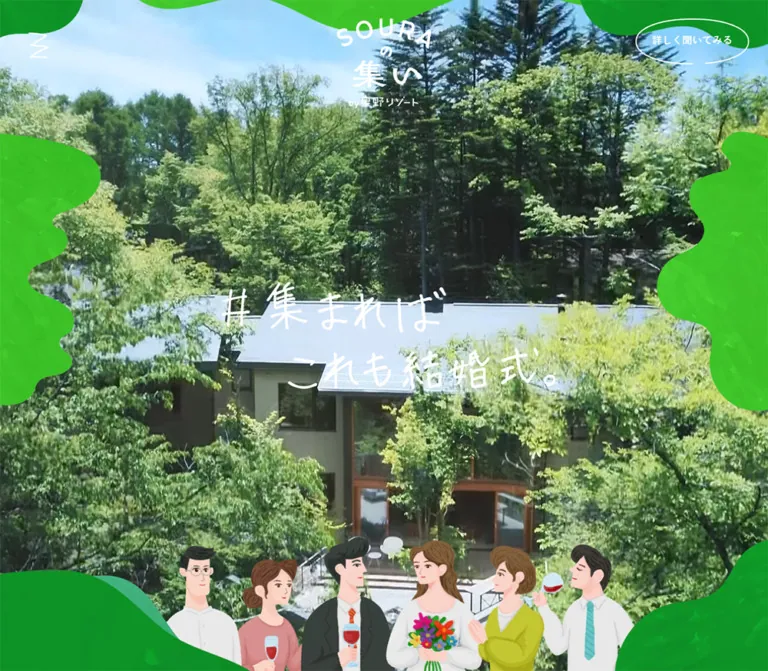
鮮やかな緑の有機的なシェイプに、自然体の写真と人物イラストを重ねたウェディングサービスサイト。手書き文字や写真コラージュで親しみを伝え、生成りの情報面と輪郭線の楕円ボタンで長いページをまとめています。
オリジナルサイトを見るSOURAの集い by 星野リゾート — Style Reference
A gathering in the forest, framed by flowing green shapes, candid photographs, and hand-drawn invitations.
Original URL: blestoncourt.com/wedding/soura_tsudoi/ Final URL: blestoncourt.com/wedding/soura_tsudoi/ Theme: warm cream information surfaces, saturated green presentation fields, white reversed graphics, and a black legal footer. Inspected: September 12, 2026; supplied browser retrieval at 07:01:20.751 UTC / 16:01:20.751 JST. Viewports: desktop 1440 × 1000 and mobile 390 × 844 CSS pixels. Scope: the current wedding-service presentation within the hotel website. Visual evidence covers the desktop opening, a photographic collage statement, the desktop contact/footer area, and mobile opening and contact/footer captures. Rendered text, links, element rectangles, and selected computed styles cover the longer page, including Concept, About, Location, Idea, Plan, Access, and FAQ. Consultation destinations were not inspected.
SOURAの集い presents a relaxed gathering around marriage through the visual language of friendship, travel, and shared time. Its strongest elements are oversized organic green silhouettes, informal handwritten campaign lettering, expressive group illustrations, and photographs of people enjoying a wooded villa. Cream sections provide room for the practical information that follows the emotional story.
The page alternates immersive compositions with quieter editorial layouts. A small upper-right consultation link stays visually present across the desktop captures. Larger consultation links recur within the story and culminate in two equally prominent choices at the bottom. Their thin, incomplete oval outlines are a distinctive invitation motif.
This is a long service presentation with section navigation and substantial explanatory content. Its identity depends on the relationship between the forest palette, custom artwork, photographic storytelling, and restrained information typography.
How to Read This Reference
- Measured means a value supplied in rendered DOM rectangles or computed styles. Measurements describe the sampled state, including elements that may be outside the visible viewport.
- Visual estimate means an approximation from an attached screenshot. Estimated colors are not pixel samples or recovered source declarations.
- Calculated means arithmetic based on supplied measurements. Matching proportions at two widths do not prove the original CSS formula.
- Recommended means implementation guidance for a new build. The CSS and interaction suggestions below are adaptations, not recovered source code.
- Token names are descriptive implementation aliases. The supplied source variables are discussed separately where relevant.
The screenshots are viewport crops rather than full-page images. The mobile opening is substantially obscured by green artwork in its captured state. That state is documented without assuming a completed reveal, a loading failure, or an intended permanent composition.
Tokens — Colors
Default Palette
| Name | Value | Suggested token | Evidence and role |
|---|---|---|---|
| Forest Green | #0d8e25 |
--color-green |
Measured as rgb(13, 142, 37) on section headings, hospitality heading, and access link text |
| Warm Cream | #f7f3ee |
--color-paper |
Measured body background and About section background |
| Main Charcoal | #212121 |
--color-ink |
Measured body and most explanatory text |
| Feature Charcoal | #232323 |
--color-feature-ink |
Measured on About feature paragraphs; a small local variation |
| Reversed White | #ffffff |
--color-white |
Measured on consultation links, photographic statements, room descriptions, and footer text |
| Bright Leaf | Approximately #42c51a |
--color-leaf |
Visual estimate for the vivid green organic fields; the visible texture produces many variations |
| Soft Teal Green | Approximately #40ae88 |
--color-teal |
Visual estimate for lighter overlapping shapes in the contact composition |
| Deep Woodland | Approximately #1a6044 |
--color-woodland |
Visual estimate for darker central shapes behind contact content |
| Legal Black | Approximately #000000 |
--color-legal |
The legal footer appears black; its computed background was not supplied |
Use the measured cream and forest green as stable interface colors. Treat the additional greens as an artwork palette: their boundaries are irregular, their coverage is broad, and their surfaces contain subtle texture. A plain two-stop gradient would lose this layered character.
The collage screenshot has a dark treatment over its photographs, allowing white branding and text to remain legible. Its opacity and implementation were not supplied. For a new implementation, a black scrim around 45% is a starting recommendation that must be checked against the actual photographs.
Color Roles and Source Variables
The header controls appear white over the opening and contact compositions, and green over the captured collage section. This establishes visible contextual color variation; the mechanism selecting those colors is unverified.
The rendered custom properties include --swiper-theme-color: #007aff and --swiper-navigation-size: 44px. These are not evidence of a blue brand accent or visible 44px controls. The sampled room buttons measure 30 × 30px. Keep library defaults separate from the visible design system.
The source also exposes --mask-level: 0%. Its name is consistent with masking, but no definition connects that value to a specific visible shape or animation state.
Tokens — Typography
Primary Text Family
The measured body family declaration is:
'Zen Kaku Gothic Antique', 游明朝, 'Yu Mincho', YuMincho,
'Hiragino Mincho ProN', 'Hiragino Mincho Pro', HGS明朝E,
メイリオ, Meiryo, serif
The declared primary family is Zen Kaku Gothic Antique. The remaining names are the supplied fallback stack. The evidence does not include font files, a font version, or a glyph-level record of which fallback rendered.
The body inherits weight 500, while the sampled explanatory paragraphs explicitly use 400. Section headings use 700; consultation links generally use 500. Although the screenshots can make compact white labels look heavier, use the measured weights when recreating their typography.
Wordmark and Handwritten Campaign Lettering
The wordmark combines an arc of spaced Latin capitals, a small Japanese connector, larger Japanese title characters, and a compact endorsement line. The opening uses a smaller wordmark; the collage and contact compositions use larger versions.
The hero slogan, quoted as #集まれば、これも結婚式。, has uneven handwritten strokes and a two-line composition. Its visible lettering should be treated as custom artwork. The sampled H1 contains no extracted text and has a nominal computed size of 10px; that does not describe the visible lettering scale or establish the heading's accessible name.
Do not assign an invented display-font name to the logo or slogan. Preserve authorized artwork, or commission a distinct custom treatment for a new identity.
Type Scale
All numerical values in this table are measured computed styles, except the artwork rows, which are measured element boxes.
| Role | Desktop | Mobile | Weight and tracking |
|---|---|---|---|
| HTML root | 10px |
10px |
Source sizing context, not the main reading size |
| Body default | 10px / 20px |
10px / 20px |
500; 0.3px tracking |
| Standard explanatory paragraph | 16px / 32px |
13px / 26px |
400; usually 0.3px tracking |
| Concept paragraph | 16px / 35.2px |
13px / 28.6px |
400; line height 2.2 |
| Compact introductory paragraph | 16px / 28.8px |
13px / 23.4px |
400; line height 1.8 |
| Japanese section subtitle, H2 | 24px / 36px |
15px / 22.5px |
700; 0.3px tracking |
| Room-detail heading | 24px / 36px |
18px / 27px |
700 |
| Hospitality heading | 24px / 36px |
20px / 30px |
700 |
| Process-step heading | 20px / 30px |
18px / 27px |
700 |
| Upper-right consultation link | 16px / 32px |
13px / 18.2px |
500 |
| Collage consultation link | 16px / 32px |
13px / 26px |
500 |
| Final consultation choices | 16px / 32px |
16px / 24px |
500; mobile retains the larger action size |
| Telephone number | 36px / 43.2px |
26px / 31.2px |
500; 3px tracking |
| Legal navigation | 16px / 32px |
13px / 26px |
500 |
| Hero H1 artwork box | 620 × 200px |
300 × 96.77px |
Geometry, not a font-size measurement |
Mobile room-detail paragraphs are a local exception: 13px / 23.4px with -0.39px tracking. Idea descriptions use normal tracking on mobile. Do not apply those exceptions to every paragraph.
The English section labels are present in the text evidence, but their individual computed font sizes were not supplied. The Japanese H2 measurements must not be presented as measurements of those English labels.
Tokens — Spacing & Shapes
Spacing Scale
The page has several distinct spacing systems: small text relationships, generous reading-section gaps, and very large presentation regions.
| Relationship | Desktop | Mobile | Evidence |
|---|---|---|---|
| Process heading to paragraph | 10px |
10px |
Calculated from measured heading and paragraph rectangles |
| Room heading to paragraph | 20px |
15px |
Calculated from measured rectangles |
| Hospitality heading to paragraph | 30px |
25px |
Calculated from measured rectangles |
| Final contact introduction to action boxes | 40px |
30px |
Calculated from measured rectangles |
| Gap between final consultation choices | 32px |
20px |
Calculated from measured anchor positions |
| Plan-to-Access and Access-to-FAQ gaps | 160px |
100px |
Calculated from section bounds |
| About section top padding | 328px |
130px |
Measured computed padding |
| Idea section top padding | 347.90px |
108px |
Measured computed padding |
| Idea section bottom padding | 0px |
89px |
Measured computed padding |
Use a practical adaptation scale such as 10, 15, 20, 25, 30, 40, 100, 160px, while allowing authored scene spacing to sit outside it. The original does not present evidence of a universal eight-point spacing system.
Border Radius and Outline Geometry
| Element | Observed treatment | Interpretation |
|---|---|---|
| About section | 100px computed radius on desktop; 0px on mobile |
A section-scale desktop shape, not a universal card radius |
| Access information link | 10px computed radius on both viewports |
A restrained rectangular utility treatment |
| Consultation anchors | 0px computed radius despite visible oval artwork |
Their visible ellipse is separate from a conventional rounded anchor box |
| Photographic collage | Square photograph corners with pale borders | Rotation and overlap provide the composition |
| Green decorative fields | Asymmetric, deeply lobed silhouettes | Require authored shape geometry for close fidelity |
| Mobile footer's upper crop | A white surface with rounded lower corners is visible above the green field | Its owning element is not identified; do not turn it into an assumed permanent header |
The oval consultation outline is approximately 1–2px thick visually, with a short opening along its lower edge. A normal pill border closes that opening and changes the character. An inline SVG path is a useful recommended implementation.
Layout Measurements
| Element | Desktop at 1440 × 1000 | Mobile at 390 × 844 |
|---|---|---|
| Document height | 33,123.67px |
25,170.89px |
| Opening section | 1440 × 1000px |
390 × 844px |
| Hero H1 position | x: 410px; y: 400px |
x: 45px; y: 373.62px |
| Upper-right CTA anchor | 185 × 74.78px |
95 × 62.97px |
| Upper-right CTA placement | 30px from top, approximately 35px from right |
12px from top, approximately 5px from right |
| Plan, Access, FAQ outer width | 1168.13px |
316.36px |
| Utility-section left inset | 135.94px |
36.81px |
| Typical storytelling H2 left inset | Approximately 108.86px |
Approximately 29.47px |
| About paragraph width | Approximately 280px |
Approximately 240px |
| Centered venue explanation | Approximately 489.88px |
Approximately 309.97px |
| Idea description width | 540px |
275.56px |
| Final consultation group | 498px wide |
332px wide |
| Individual final action anchor | 233 × 103.19px |
156 × 106.42px |
| Entire footer element | 1224px high |
874.27px high |
The utility-section width is approximately 81.12% of the viewport in both samples. The storytelling H2 inset is approximately 7.56% of viewport width. These are calculated relationships, not recovered source formulas or verified maximum-width rules.
The H1 boxes preserve an approximately 3.1:1 aspect ratio and are centered in the opening viewport at both sizes. On mobile, measured placement does not mean the slogan is visibly revealed in the supplied image.
Components
Overlaid Header and Section Navigation
Role: keep navigation and consultation available without introducing a solid navigation bar.
The visible header consists of a small irregular zigzag mark on the left and an outlined consultation link on the right. The mark is white over green imagery and green in the collage capture. The header element itself measures zero height, consistent with controls that do not reserve a normal horizontal bar in document flow.
The consultation label is 詳しく聞いてみる. It stays on one line in the desktop capture and breaks after 詳しく on mobile. The smaller mobile anchor becomes proportionally taller, preserving an oval around the two-line label.
Section navigation in the DOM contains eight bilingual entries, from TOP through FAQ. Its sampled desktop geometry forms two groups of four links: approximately 238px-wide entries beginning at x = 178px and x = 518px. On mobile, entries form one vertical sequence beginning near x = 30px, with approximately 280px-wide boxes.
An opened navigation state is not shown. The zigzag mark's activation behavior, menu backdrop, focus behavior, and transition are unverified. The link inventory and responsive geometry can be reused without inventing a demonstrated menu interaction.
Full-Viewport Opening
Role: establish the relaxed celebration concept immediately through people, custom lettering, and green framing.
The desktop opening has six visual layers:
- A full-bleed photographic scene showing a bouquet exchange and smiling participants.
- Large textured green shapes entering from the top, sides, and bottom.
- A compact white brand mark centered near the top.
- A broad two-line handwritten slogan centered in the viewport.
- A group of six illustrated people anchored along the bottom, including flowers and raised glasses.
- The independent navigation and consultation controls above the composition.
The framing is irregular and asymmetric. Green lobes interrupt the photograph at different depths instead of making a symmetrical rounded rectangle. The illustration overlaps the photographic world, with bodies cropped at the bottom edge. Its muted pink, yellow-green, gray, and dark clothing adds variety while keeping the large green fields dominant.
The opening wordmark is visually about 160px wide on desktop and 100px wide on mobile; these are estimates. The media's technical type is unverified: the capture could show a photograph or a video frame.
In the mobile opening, vivid green artwork covers most of the viewport, leaving small photographic openings and a partial illustration near the lower-right edge. The central slogan is not visible in that image. Treat this as a sampled state with incomplete reveal evidence. A new implementation should provide a readable static end state even if decorative motion is unavailable.
Concept and Conversation Narrative
Role: explain the service through a personal invitation rather than an immediate list of specifications.
The Concept section pairs an English signpost with a Japanese subtitle, a short statement broken into deliberate lines, and generous explanatory paragraphs. The Concept body uses the loosest measured leading: 2.2 at both viewports.
The subsequent text introduces friends from different parts of life, then presents an informal conversation. Messages include congratulations, questions about celebrating, emoji, a proposal to gather in a villa, and the campaign hashtag. This progression makes the service understandable through a plausible social exchange.
The conversation's text and sequence are verified in the DOM. Bubble fills, avatars, exact alignment, and message-by-message animation are not visible in the supplied screenshots. Preserve the conversational rhythm when adapting the content; do not claim an observed chat component skin.
Photographic Collage Statement
Role: bring the narrative back to the people and place, then offer a consultation route.
The supplied desktop collage uses overlapping, rotated photographs extending beyond all four viewport edges. Subjects include a wooded terrace, living spaces, flowers, a toast, food preparation, and shared activities. Pale borders separate photographs without turning them into isolated cards.
The central terrace photograph is the compositional anchor. Neighboring photographs use different rotations, roughly in the range of 8–20 degrees visually, with both clockwise and counterclockwise tilts. Border thickness is approximately 6–10px. These are estimates, not transform or border declarations.
A dark photographic treatment supports a large centered white wordmark, the sentence ホストもゲストもいない、みんなで作る特別な時間。, and a large open-oval CTA. The measured CTA anchor is 233 × 94.19px on desktop and 153 × 61.84px on mobile. The statement becomes two lines on mobile according to the rendered text.
The upper portion of the larger wordmark falls outside this particular desktop crop. Do not reproduce crop boundaries as intentional logo clipping.
Diagonal Celebration Ribbon
Role: provide a lively transition into the next information region.
Below the collage, a broad white strip crosses the warm cream field diagonally. It carries large green Japanese text and celebratory emoji. The DOM repeats the message four times with alternating emoji.
The screenshot supports a diagonal repeated-text treatment. It does not establish continuous marquee movement, direction, speed, or looping behavior. Repetition can be retained as a static decorative ribbon; animate it only as a separately specified enhancement.
About Feature Sequence
Role: explain four practical freedoms of the gathering.
The content covers preparing together, toasting whenever desired, extending the celebration beyond a fixed program, and spending on personally meaningful elements. Each feature has a short heading and a comparatively narrow explanatory paragraph.
Desktop paragraph boxes are approximately 280px wide and share the same horizontal origin with overlapping vertical ranges. The containing section is approximately 6093px tall. On mobile, four approximately 240px-wide paragraphs occupy distinct successive positions within a much shorter section of approximately 1530.5px.
This supports a responsive change in presentation and suggests staged desktop content. It does not prove a particular sticky or scroll-driven mechanism. The exported counters also contain state-dependent values, including an unexpected 04 / 04 near the first mobile feature. Do not hardcode that as its intended initial number.
For a new implementation, keep all four items readable in document order before introducing any staged presentation.
Location and Room Details
Role: connect the service to its wooded setting and explain how the villa is used.
The location introduction combines a short travel proposition with white explanatory text. On desktop, that paragraph is 400px wide and positioned toward the right. On mobile, it becomes a centered approximately 310px-wide block with 40px side insets.
A subsequent venue explanation uses dark text and a centered reading width of approximately 490px on desktop and 310px on mobile. This shift from scenic introduction to calmer explanation is useful to preserve.
Four room categories appear: Terrace, Living & Dining Room, Open kitchen, and Guest room. Their detail content combines an English label, a Japanese heading, and a paragraph in white. Desktop text boxes are 352px wide; mobile boxes are 300px wide.
Several room-detail elements share identical rectangles, and 30 × 30px button boxes accompany them. Mobile evidence includes buttons near both viewport edges. This suggests alternate detail states, but the evidence does not establish whether they are dialogs, sliders, or another panel system. Button glyphs and activation results were not supplied.
Hospitality Editorial Block
Role: reassure visitors about service quality after the more playful presentation.
The hospitality heading is green, followed by ordinary charcoal copy. Desktop text occupies an approximately 405px-wide region on the right; mobile text uses the approximately 310px central column.
Its heading decreases from 24px / 36px to 20px / 30px, remaining larger than the mobile section subtitles. Preserve that distinction: the local message is more prominent than its navigational section label.
Idea Rail
Role: offer five examples of shared time without prescribing a fixed itinerary.
The ideas cover an evening around a table, cycling, choosing flowers, visiting a hot spring or sauna, and stopping for something sweet. Each entry includes a heading, descriptive copy, and the recurring phrase ・・・ and more.
Measured descriptions form a horizontal sequence, including negative and offscreen x positions. Desktop items are 540px wide with approximately 86.38px between their text boxes. Mobile items are approximately 275.56px wide with 24px gaps. The third item is near the viewport center in the sampled geometry.
This establishes a horizontal rail arrangement rather than a conventional wrapping grid. It does not verify dragging, swipe gestures, autoplay, or arrow navigation. The recurring final phrase is not included in the supplied link inventory, so it should not automatically become a button.
A native horizontally scrollable rail with optional snap points is a practical recommended fallback.
Plan and Five-Step Process
Role: make the service concrete after the visual narrative.
The desktop utility section separates compact service information on the left from the process copy on the right. The measured left text region is approximately 322px wide, while process headings and paragraphs occupy approximately 573px. On mobile, process content follows the plan information in the same approximately 316px-wide outer column.
The observed plan lists capacity, starting price, inclusions, and qualifications. Its content states 10–20 participants and ¥650,000~ for ten participants, with venue, accommodation, food, and drinks included. These are captured service details, not reusable design constants.
The five process steps cover inquiry, provisional reservation, agreement, preparation, and the gathering itself. Each combines a STEP label, bold heading, and explanatory paragraph. The measured typography and generous separation provide hierarchy without needing oversized cards.
On mobile, the starting price and its qualification break onto separate lines. Preserve the relationship between the number and its conditions rather than shrinking the entire pricing block to fit one line.
Access Information
Role: resolve travel questions with a concise location block and a dedicated destination link.
Access uses the same outer utility width as Plan and FAQ. The content names the hotel and villa, supplies an address, and links to the hotel's access page.
The link 詳しいアクセス情報を見る differs from the open-oval consultation treatment. It has a measured 10px radius, green text, and padding of 10px 30px 10px 17px. Its box is approximately 301 × 46px on desktop and 295 × 41.5px on mobile.
The link's precise border or decorative icon cannot be recovered from the supplied viewports. Its utility role should remain visually quieter than consultation.
FAQ
Role: answer four remaining objections near the end of the page.
The rendered viewport text lists four questions marked with Q. The fuller section text also includes answer content that is absent from that viewport-text extraction. This is consistent with concealed answers, but no opening interaction was recorded.
Do not claim a tested accordion, an observed plus icon, or a particular expansion duration. A semantic disclosure component is recommended for a new implementation if answers are to be collapsed.
Contact Composition and Legal Footer
Role: offer two clear ways to inquire, then close with corporate utilities.
The contact area returns to the green artwork from the opening. Bright leaf, teal, and dark woodland shapes overlap behind a large white wordmark and centered text. The visible treatment has subtle texture; it is not a flat green rectangle.
The desktop wordmark is visually about 265px wide; the mobile version is about 210px wide. The introduction occupies two lines on desktop and three on mobile. Two equal open-oval links follow: オンラインで聞いてみる and 現地を見学してみる.
The actions remain side by side at 390px. Their combined measured width is 332px, consisting of two 156px anchors and a 20px gap. Mobile labels intentionally wrap onto two lines while retaining a 16px size. This is a stronger action hierarchy than the smaller 13px mobile header CTA.
A telephone invitation sits below, followed by the prominently tracked number and opening hours. The number is an actual tel: link. Its measured font family follows the main declaration; a monospaced font was not observed.
The final black strip contains three white legal/navigation links separated visually by vertical strokes. Desktop places these toward the left and the copyright toward the right. Mobile centers the links in one row and places the copyright beneath them. The original page's visible branding, copyright, and company-information link support its association with 星野リゾート.
Tokens — Motion & Interaction
No reliable animation duration or easing curve was supplied. Static element samples report animation: none and a generic transition value of all; these samples do not rule out JavaScript transforms, media playback, SVG animation, or pseudo-element effects.
| Treatment | Evidence | What remains unverified |
|---|---|---|
| Organic opening shapes | Desktop has a broad central opening; mobile capture has much greater coverage; --mask-level exists |
Reveal sequence, timing, easing, implementation, and final mobile state |
| Long narrative presentation | Large section heights and some overlapping content rectangles | Pinning, scroll scrubbing, trigger thresholds, or scroll interception |
| Diagonal text ribbon | Repeated text in DOM and a tilted strip in the desktop image | Whether it moves, loops, or responds to scrolling |
| About sequence | Four content groups; desktop overlapping geometry and mobile sequential positions | Counter updates and transition mechanics |
| Idea rail | Horizontal item positions on both viewports | Swipe, drag, autoplay, keyboard controls, and active-item behavior |
| Room details | Repeated detail positions and button boxes | Opening, closing, switching, and focus management |
| FAQ | Questions in viewport text; answers in fuller section text | Disclosure interaction and animation |
| Consultation actions | Destination hrefs present in rendered anchors | Destination-page content and completed consultation flows |
| Header color variation | White and green controls visible in different desktop captures | Whether driven by section state, intersection, or another mechanism |
The supplied browser process waited for initial rendering and performed scroll traversal. It also temporarily paused perpetual animation during readiness checks before resuming it. These procedures improve capture stability but do not establish a complete motion specification.
Recommended adaptation: start with a fully readable static layout. If adding an opening reveal, keep essential copy visible or independently accessible, end in a stable open composition, and provide a reduced-motion state. A restrained 160ms opacity response for link hover is a reasonable new interaction token; it is not a measured original value.
Surfaces
| Surface | Appearance | Purpose |
|---|---|---|
| Base document | Measured warm cream | Quiet continuity beneath the long page |
| Immersive scenes | Photographs with irregular green framing | Emotional introduction and visual storytelling |
| Collage statement | Overlapping pale-bordered photographs with dark treatment | Dense shared-memory composition supporting white text |
| Editorial sections | Cream with green headings and charcoal paragraphs | Features, plan information, access, and FAQ |
| Scenic/detail copy | White text over a darker context | Location and room descriptions; exact underlying layers not fully shown |
| Consultation field | Layered textured greens with white content | Final inquiry choices and telephone contact |
| Legal strip | Visually black with white text | Corporate utilities and copyright |
There is no visible general-purpose shadow elevation system in the supplied screenshots. Large shape boundaries, photographic borders, background changes, and typography do most of the organizational work.
Imagery
Photography is warm, social, and place-specific. Faces are expressive; flowers and drinks are held during real interactions; the villa's windows, timber, furniture, and forest establish the setting. The collage combines people, architecture, food, and details, allowing the venue to feel inhabited.
The illustrations use simplified but individually characterized people, softly modeled clothing and hair, and recognizable celebratory objects. They are more detailed than flat pictograms. The desktop group forms a social foreground across the bottom of the hero instead of sitting inside a separate illustration card.
The green artwork has large, smooth organic edges and a softly mottled interior texture. Preserve the difference between clean silhouette boundaries and textured fills. Photography should retain normal smooth rendering; there is no evidence of pixel-art scaling or deliberate raster stair-stepping.
Observed Asset References
No original asset filenames, image URLs, video URLs, or formats were included in the supplied evidence. The inventory below identifies visible artwork without inventing paths.
| Asset family | Where visible | Reuse guidance |
|---|---|---|
| Compact white wordmark | Desktop and mobile opening | Preserve the custom arc and stacked title arrangement |
| Large white wordmark | Desktop collage and both contact captures | Scale authorized artwork without replacing it with a guessed font |
| Handwritten campaign slogan | Desktop opening | Keep the irregular stroke rhythm and two-line silhouette |
| Celebration media | Desktop opening; fragments on mobile | Preserve faces, bouquet, and social context when cropping |
| Group illustration | Desktop opening; partial mobile fragment | Keep individual figures, muted clothing colors, and foreground overlap |
| Photographic collage | Desktop intermediate capture | Use multiple subjects, square photo edges, pale borders, and varied rotations |
| Textured green silhouettes | Opening and contact captures | Author separate desktop and mobile compositions where needed |
| Open-oval linework | Header, collage, and contact CTAs | Recreate with a scalable open path if original assets are unavailable |
Layout & Responsive Behavior
The two supplied viewports show substantial recomposition, not a uniformly scaled desktop canvas. Standard body copy decreases from 16px to 13px, section subtitles from 24px to 15px, and the opening slogan artwork from 620px to 300px wide. Contact actions are a deliberate exception: their labels remain 16px on mobile.
The utility sections retain approximately 81.12% viewport width in both samples, while changing their internal arrangement. Desktop plan information and process copy are separated horizontally; mobile places the process after the plan. Access and FAQ use the same outer alignment. Their vertical section gaps decrease from 160px to 100px.
Storytelling areas have their own insets and reading widths. Some mobile text uses 30px side margins, scenic and hospitality copy uses about 40px, and room details use 45px. About keeps a narrower approximately 240px paragraph column. A single universal mobile gutter would flatten these distinctions.
The Idea rail remains horizontal at both widths. The footer's two consultation choices also remain horizontal at 390px, with narrower and taller ovals. The legal footer changes from a distributed desktop row to centered stacked groups.
Document height decreases from approximately 33.1k to 25.2k pixels on mobile, even though some information stacks. That decrease cannot be explained solely by text wrapping; it reflects broader differences in layout or presentation space. Do not copy the captured document height or absolute section y positions into a new implementation.
No intermediate viewport, landscape phone, tablet, safe-area behavior, or exact breakpoint was supplied. The 767px breakpoint in the Quick Start is a recommendation for reproducing the two observed endpoints.
Do’s and Don’ts
Do
- Anchor readable interface surfaces in measured cream
#f7f3eeand green#0d8e25. - Use bright and dark green variations within large authored decorative shapes.
- Preserve the open lower edge of the thin oval consultation outline.
- Keep the hero's custom wordmark, handwritten slogan, and group illustration distinct from ordinary text.
- Choose photographs that show shared activities and the wooded villa setting.
- Alternate immersive imagery with calm, generously led explanatory copy.
- Keep the contact choices equal in size and side by side at the observed mobile width.
- Preserve different text-column widths for narrative, room detail, and practical information.
- Keep actual navigation and consultation destinations as semantic links.
- Separate measured behavior from optional animation enhancements.
Don’t
- Don't substitute a generic pill button for every outlined consultation link.
- Don't introduce unrelated blue accents from library defaults.
- Don't replace the photographic collage with a uniform card grid.
- Don't add glossy gradients, glass blur, or a general shadow system to the observed surfaces.
- Don't infer the visible slogan's font size from its 10px H1 computed style.
- Don't treat the obscured mobile opening as a verified finished design.
- Don't make staged storytelling the only way to access essential information.
- Don't assign unsupported swipe, autoplay, accordion, or modal behavior to untested controls.
- Don't reproduce captured absolute y coordinates as a page layout strategy.
- Don't shrink the final mobile action labels to match the smaller header label.
Recommended Implementation Additions
These are recommendations for a new implementation, not verified original features:
- Give the zigzag navigation control an explicit accessible name and expose its expanded state if it opens a menu.
- Verify the H1 and wordmark alternatives. Supply accessible campaign text even when the visual headline is artwork.
- Keep decorative shapes out of the accessibility tree and disable their pointer events.
- Maintain a visible, readable opening state when motion is reduced or presentation scripts fail.
- Test white text against the lightest moving or textured green regions; adjust local artwork or contrast support as needed.
- Enlarge the interactive hit area around any 30px room controls without requiring larger visible icons.
- Use semantic disclosures for collapsed FAQ answers and keyboard-operable controls for any horizontal rail.
- If room details become dialogs, provide focus containment, Escape dismissal, and focus restoration.
- Reassess 13px mobile body copy at zoom and with long content. Increasing it is an accessibility adaptation, not a source measurement.
- Load the opening media first and defer lower-page photography where appropriate; preserve dimensions to avoid disruptive layout shifts.
Agent Prompt Guide
Quick Color Reference
- Main canvas: measured cream
#f7f3ee. - Editorial headings and green utility text: measured
#0d8e25. - Body copy: measured
#212121; local feature variant#232323. - Reversed labels and artwork: measured white
#ffffff. - Decorative greens: approximate leaf
#42c51a, teal#40ae88, and woodland#1a6044. - Closing legal surface: visually black.
- Consultation treatment: transparent fill with a fine, incomplete oval outline in the current foreground color.
Overall Prompt
“Create a long Japanese wedding-service presentation inspired by the current SOURAの集い page. Use warm cream #f7f3ee, forest-green headings #0d8e25, generous Japanese body leading, and large textured organic green silhouettes. Open with a viewport-filling social photograph, a compact custom white wordmark, a two-line handwritten campaign graphic, and a foreground group illustration. Keep a small navigation mark at the upper left and an open-oval consultation link at the upper right. Alternate photographic storytelling, a rotated photo collage, restrained service information, and a horizontal idea rail. Finish with a layered green contact field containing two equal outlined oval choices and a black legal footer. Build a readable static experience first; keep animation requirements explicit.”
Example Component Prompts
- Opening scene: “Compose a full-viewport gathering scene with smiling people and a bouquet. Frame the photograph with asymmetric textured green lobes. Center a custom white wordmark near the top and a broad handwritten campaign graphic in the middle. Anchor six softly illustrated people along the bottom. Keep the content readable in the static mobile state.”
- Consultation link: “Create a transparent invitation link with a fine white oval path that remains open near its lower edge. Use a 233px-wide desktop body variant, a smaller 185px header variant, and a 156px-wide mobile contact variant with two-line 16px labels. Preserve the gap in the outline when the shape changes aspect ratio.”
- Collage statement: “Arrange villa, terrace, flowers, food, and friendship photographs as overlapping square-cornered prints with pale borders and varied rotations. Place a dark treatment over the photographic layer, then center the white identity, a short statement, and an open-oval action above it.”
- Practical information: “On warm cream, separate a compact service summary from a wider five-step process. Use green section subtitles, charcoal paragraphs, and generous spacing. At 390px, place the process after the summary within an approximately 316px-wide column.”
- Contact field: “Layer vivid leaf, teal, and deep woodland silhouettes behind a centered white identity. Place a short introduction above two equal oval consultation links. Keep both links side by side on a 390px viewport, then add a tracked telephone number and a centered black legal footer.”
Quick Start
CSS Custom Properties
This is a static implementation scaffold using measured pixel sizes and explicitly estimated artwork colors. It keeps a conventional root size rather than copying the source's 10px root. The breakpoint, interaction feedback, native rail behavior, and maximum-width caps are recommendations.
Supply authorized artwork for .scene__logo, .scene__slogan, .scene__people, and the decorative SVG layers. No original asset paths are assumed. The declared font must be made available separately; naming it in CSS does not load it.
:root {
  /* Measured interface colors */
  --color-paper: #f7f3ee;
  --color-green: #0d8e25;
  --color-ink: #212121;
  --color-feature-ink: #232323;
  --color-white: #ffffff;

  /* Visual approximations for artwork and the legal surface */
  --color-leaf: #42c51a;
  --color-teal: #40ae88;
  --color-woodland: #1a6044;
  --color-legal: #000000;

  --font-body: 'Zen Kaku Gothic Antique', 游明朝, 'Yu Mincho',
    YuMincho, 'Hiragino Mincho ProN', 'Hiragino Mincho Pro',
    HGS明朝E, メイリオ, Meiryo, serif;

  --text-body: 16px;
  --text-section: 24px;
  --text-detail: 24px;
  --text-step: 20px;
  --text-phone: 36px;
  --leading-body: 2;
  --leading-compact: 1.8;
  --leading-concept: 2.2;
  --tracking-body: 0.3px;
  --tracking-phone: 3px;

  --space-10: 10px;
  --space-15: 15px;
  --space-20: 20px;
  --space-30: 30px;
  --space-40: 40px;
  --section-gap: 160px;
  --radius-utility: 10px;

  /* Recommended feedback; no source timing was supplied */
  --motion-feedback: 160ms ease-out;
}

* {
  box-sizing: border-box;
}

body {
  margin: 0;
  background: var(--color-paper);
  color: var(--color-ink);
  font-family: var(--font-body);
  font-size: var(--text-body);
  font-weight: 400;
  line-height: var(--leading-body);
  letter-spacing: var(--tracking-body);
}

img,
svg {
  display: block;
  max-width: 100%;
}

button,
a {
  -webkit-tap-highlight-color: transparent;
}

button {
  font: inherit;
}

:where(a, button, summary):focus-visible {
  outline: 3px solid currentColor;
  outline-offset: 5px;
}

/* Recommended fixed placement matching the observed control positions */
.site-header {
  position: fixed;
  inset: 0 0 auto;
  height: 0;
  z-index: 50;
  color: var(--color-white);
  pointer-events: none;
}

.site-header > * {
  pointer-events: auto;
}

.site-header.is-green {
  color: var(--color-green);
}

.site-header__mark {
  position: absolute;
  top: 48px;
  left: 42px;
  display: grid;
  place-items: center;
  width: 44px;
  height: 52px;
  padding: 5px;
  border: 0;
  background: transparent;
  color: inherit;
}

.oval-link {
  position: relative;
  display: grid;
  place-items: center;
  width: 233px;
  min-height: 94.19px;
  padding: 14px 20px;
  color: inherit;
  font-size: 16px;
  font-weight: 500;
  line-height: 2;
  text-align: center;
  text-decoration: none;
  transition: opacity var(--motion-feedback);
}

.oval-link__outline {
  position: absolute;
  inset: 0;
  width: 100%;
  height: 100%;
  overflow: visible;
  pointer-events: none;
}

.oval-link__outline path {
  fill: none;
  stroke: currentColor;
  stroke-width: 1.5px;
  stroke-linecap: round;
  vector-effect: non-scaling-stroke;
}

.site-header .oval-link {
  position: absolute;
  top: 30px;
  right: 35px;
  width: 185px;
  min-height: 74.78px;
  padding: 8px 14px;
}

.mobile-break {
  display: none;
}

/* Artwork supplies the organic aperture; keep its center readable. */
.scene {
  position: relative;
  isolation: isolate;
  min-height: 100vh;
  min-height: 100svh;
  overflow: clip;
  background: var(--color-leaf);
  color: var(--color-white);
}

.scene__media {
  position: absolute;
  inset: 0;
  width: 100%;
  height: 100%;
  object-fit: cover;
}

.scene__art,
.contact__art {
  position: absolute;
  inset: 0;
  z-index: 1;
  width: 100%;
  height: 100%;
  pointer-events: none;
}

.scene__logo {
  position: absolute;
  top: 30px;
  left: 50%;
  z-index: 3;
  width: 160px;
  transform: translateX(-50%);
}

.scene__slogan {
  position: absolute;
  top: 50%;
  left: 50%;
  z-index: 2;
  width: min(620px, calc(100% - 90px));
  aspect-ratio: 31 / 10;
  margin: 0;
  transform: translate(-50%, -50%);
}

.scene__slogan img {
  width: 100%;
  height: 100%;
  object-fit: contain;
}

.scene__people {
  position: absolute;
  bottom: 0;
  left: 50%;
  z-index: 3;
  width: min(960px, 80vw);
  transform: translateX(-50%);
  pointer-events: none;
}

/* Width and desktop columns approximate the measured text regions. */
.utility-section {
  display: grid;
  grid-template-columns: 27.57% 49.02%;
  justify-content: space-between;
  width: 81.12%;
  max-width: 1168.13px;
  margin-inline: auto;
}

.utility-section + .utility-section {
  margin-top: var(--section-gap);
}

.section-title {
  margin: 0;
  color: var(--color-green);
  font-size: var(--text-section);
  font-weight: 700;
  line-height: 1.5;
}

.body-copy {
  margin: 0;
  font-size: var(--text-body);
  line-height: var(--leading-body);
}

.concept-copy {
  line-height: var(--leading-concept);
}

.compact-copy {
  line-height: var(--leading-compact);
}

.reading-column {
  width: min(489.88px, calc(100% - 80px));
  margin-inline: auto;
}

.process-step h3 {
  margin: 0 0 var(--space-10);
  font-size: var(--text-step);
  font-weight: 700;
  line-height: 1.5;
}

.process-step + .process-step {
  margin-top: var(--space-40);
}

.access-link {
  display: block;
  padding: 10px 30px 10px 17px;
  border-radius: var(--radius-utility);
  color: var(--color-green);
  font-size: var(--text-body);
  font-weight: 500;
  line-height: 1.5;
}

/* Recommended native-scroll alternative to the unverified rail behavior. */
.idea-rail {
  display: flex;
  gap: 6vw;
  overflow-x: auto;
  padding-inline: max(30px, calc((100% - 540px) / 2));
  scroll-snap-type: x proximity;
}

.idea-item {
  flex: 0 0 540px;
  color: var(--color-white);
  scroll-snap-align: center;
}

/* Supply individual placement variables for an authored collage. */
.collage {
  position: relative;
  isolation: isolate;
  min-height: 760px;
  overflow: clip;
  color: var(--color-white);
}

.collage__photo {
  position: absolute;
  top: var(--photo-y, 0);
  left: var(--photo-x, 0);
  width: var(--photo-width, 45%);
  margin: 0;
  border: 8px solid var(--color-white);
  transform: rotate(var(--photo-tilt, 10deg));
}

.collage__photo img {
  width: 100%;
}

.collage::after {
  content: '';
  position: absolute;
  inset: 0;
  z-index: 1;
  background: rgb(0 0 0 / 45%);
  pointer-events: none;
}

.collage__content {
  position: relative;
  z-index: 2;
  display: grid;
  justify-items: center;
  gap: 40px;
  padding: 80px 30px;
  text-align: center;
}

.contact {
  position: relative;
  isolation: isolate;
  overflow: clip;
  background: var(--color-green);
  color: var(--color-white);
}

.contact__inner {
  position: relative;
  z-index: 2;
  padding: 120px 0 260px;
  text-align: center;
}

.contact__logo {
  width: 265px;
  margin-inline: auto;
}

.contact__intro {
  margin: 40px 20px 0;
  font-size: var(--text-body);
  line-height: 2;
}

.contact__actions {
  display: grid;
  grid-template-columns: repeat(2, minmax(0, 1fr));
  gap: 32px;
  width: min(498px, calc(100% - 58px));
  margin: 40px auto 0;
}

.contact__actions .oval-link {
  width: 100%;
  min-height: 103.19px;
}

.contact__phone-group {
  margin-top: 40px;
}

.contact__phone-group p {
  margin: 0;
}

.contact__phone {
  display: inline-block;
  color: inherit;
  font-size: var(--text-phone);
  font-weight: 500;
  line-height: 1.2;
  letter-spacing: var(--tracking-phone);
  text-decoration: none;
  white-space: nowrap;
}

.legal-footer {
  display: flex;
  justify-content: space-between;
  align-items: center;
  gap: 24px;
  padding: 40px 50px;
  background: var(--color-legal);
  color: var(--color-white);
  font-size: var(--text-body);
  font-weight: 500;
}

.legal-footer nav {
  display: flex;
  flex-wrap: wrap;
  justify-content: center;
  gap: 16px;
}

.legal-footer a {
  color: inherit;
  text-decoration: none;
}

.legal-footer nav a + a::before {
  content: '|';
  margin-right: 16px;
}

.legal-footer p {
  margin: 0;
}

@media (hover: hover) {
  .oval-link:hover {
    opacity: 0.8;
  }
}

/* Recommended breakpoint matching the two inspected endpoints. */
@media (max-width: 767px) {
  :root {
    --text-body: 13px;
    --text-section: 15px;
    --text-detail: 18px;
    --text-step: 18px;
    --text-phone: 26px;
    --section-gap: 100px;
  }

  .site-header__mark {
    top: 14px;
    left: 16px;
    width: 44px;
    height: 44px;
  }

  .site-header .oval-link {
    top: 12px;
    right: 5px;
    width: 95px;
    min-height: 62.97px;
    padding: 8px;
    font-size: 13px;
    line-height: 1.4;
  }

  .mobile-break {
    display: initial;
  }

  .scene__logo {
    width: 100px;
  }

  .scene__slogan {
    width: min(300px, calc(100% - 60px));
  }

  /* Static fallback composition; the source's final mobile state is unknown. */
  .scene__people {
    width: 540px;
    max-width: none;
  }

  .utility-section {
    grid-template-columns: minmax(0, 1fr);
    row-gap: 80px;
  }

  .idea-rail {
    gap: 24px;
    padding-inline: 14.67vw;
  }

  .idea-item {
    flex-basis: 70.66vw;
  }

  .contact__inner {
    padding: 64px 0 72px;
  }

  .contact__logo {
    width: 210px;
  }

  .contact__actions {
    gap: 20px;
    margin-top: 30px;
  }

  .contact__actions .oval-link {
    min-height: 106.42px;
    padding: 14px;
    font-size: 16px;
    line-height: 1.5;
  }

  .legal-footer {
    flex-direction: column;
    gap: 16px;
    padding: 20px 24px;
    text-align: center;
  }
}

@media (prefers-reduced-motion: reduce) {
  .oval-link {
    transition: none;
  }

  .scene__art,
  .contact__art {
    animation: none;
  }

  .idea-rail {
    scroll-behavior: auto;
    scroll-snap-type: none;
  }
}
The oval path below is an original implementation approximation of the visible motif. Its outline stretches independently from its label. Reuse the same anatomy for each action and change the destination and label as appropriate.
<a
  class='oval-link'
  href='https://www.blestoncourt.com/wedding/soura_tsudoi/consults/#online'
>
  <svg
    class='oval-link__outline'
    viewBox='0 0 233 94'
    preserveAspectRatio='none'
    aria-hidden='true'
    focusable='false'
  >
    <path d='M116 92 C54 92 2 74 2 47 C2 20 53 2 116 2 C179 2 231 20 231 47 C231 72 190 88 143 92' />
  </svg>
  <span>オンラインで<br class='mobile-break'>聞いてみる</span>
</a>
The header color class requires an explicit application decision. The scaffold does not implement menu logic, media playback, scene reveals, room panels, or FAQ disclosure. Its static content should remain usable before those enhancements are added.
Tailwind v4 Token Mapping
Optional aliases for a project already using Tailwind v4. This is not evidence that the original page uses Tailwind. Define the preceding custom properties first.
@theme inline {
  --color-soura-paper: var(--color-paper);
  --color-soura-green: var(--color-green);
  --color-soura-ink: var(--color-ink);
  --color-soura-leaf: var(--color-leaf);
  --color-soura-teal: var(--color-teal);
  --color-soura-woodland: var(--color-woodland);

  --font-soura: var(--font-body);

  --text-soura-body: var(--text-body);
  --text-soura-section: var(--text-section);
  --text-soura-detail: var(--text-detail);
  --text-soura-step: var(--text-step);
  --text-soura-phone: var(--text-phone);

  --spacing-soura-section: var(--section-gap);
  --radius-soura-utility: var(--radius-utility);
}
Sources & Evidence
- Inspected original and final page: SOURAの集い by 星野リゾート. Both URLs are identical in the supplied browser evidence, with HTTP status 200.
- Capture date: September 12, 2026; retrieval timestamp
2026-09-12T07:01:20.751Z. - Desktop evidence: three supplied 1440 × 1000 captures showing the opening, an intermediate collage statement, and the contact/legal footer region; accompanying rendered text, link destinations, rectangles, and computed styles.
- Mobile evidence: two supplied 390 × 844 captures showing the partially obscured opening and the contact/legal footer region; accompanying rendered text, link destinations, rectangles, and computed styles.
- Observed traversal: the browser record describes initial readiness checks and intermediate scrolling. It does not supply a time-series motion recording or results from activating menu, room, FAQ, or rail controls.
- Verified destinations as links only: the page contains section anchors, consultation links including online and on-site fragments, a telephone link, and hotel access and corporate utility links. Those destination pages were not inspected for this reference.
- Inspection limits: the complete middle-page appearance, exact source breakpoints, font files, media formats, asset paths, animation definitions, hover/focus states, and completed mobile opening reveal are not established by the supplied material.
This reference describes the current evidence at the inspected URL. Numerical adaptations, estimated artwork colors, and the CSS scaffold are labeled separately from measured original-page values.
# SOURAの集い by 星野リゾート — Style Reference

> A gathering in the forest, framed by flowing green shapes, candid photographs, and hand-drawn invitations.

**Original URL:** [blestoncourt.com/wedding/soura_tsudoi/](https://www.blestoncourt.com/wedding/soura_tsudoi/)
**Final URL:** [blestoncourt.com/wedding/soura_tsudoi/](https://www.blestoncourt.com/wedding/soura_tsudoi/)
**Theme:** warm cream information surfaces, saturated green presentation fields, white reversed graphics, and a black legal footer.
**Inspected:** September 12, 2026; supplied browser retrieval at 07:01:20.751 UTC / 16:01:20.751 JST.
**Viewports:** desktop 1440 × 1000 and mobile 390 × 844 CSS pixels.
**Scope:** the current wedding-service presentation within the hotel website. Visual evidence covers the desktop opening, a photographic collage statement, the desktop contact/footer area, and mobile opening and contact/footer captures. Rendered text, links, element rectangles, and selected computed styles cover the longer page, including Concept, About, Location, Idea, Plan, Access, and FAQ. Consultation destinations were not inspected.

SOURAの集い presents a relaxed gathering around marriage through the visual language of friendship, travel, and shared time. Its strongest elements are oversized organic green silhouettes, informal handwritten campaign lettering, expressive group illustrations, and photographs of people enjoying a wooded villa. Cream sections provide room for the practical information that follows the emotional story.

The page alternates immersive compositions with quieter editorial layouts. A small upper-right consultation link stays visually present across the desktop captures. Larger consultation links recur within the story and culminate in two equally prominent choices at the bottom. Their thin, incomplete oval outlines are a distinctive invitation motif.

This is a long service presentation with section navigation and substantial explanatory content. Its identity depends on the relationship between the forest palette, custom artwork, photographic storytelling, and restrained information typography.

## How to Read This Reference

- **Measured** means a value supplied in rendered DOM rectangles or computed styles. Measurements describe the sampled state, including elements that may be outside the visible viewport.
- **Visual estimate** means an approximation from an attached screenshot. Estimated colors are not pixel samples or recovered source declarations.
- **Calculated** means arithmetic based on supplied measurements. Matching proportions at two widths do not prove the original CSS formula.
- **Recommended** means implementation guidance for a new build. The CSS and interaction suggestions below are adaptations, not recovered source code.
- Token names are descriptive implementation aliases. The supplied source variables are discussed separately where relevant.

The screenshots are viewport crops rather than full-page images. The mobile opening is substantially obscured by green artwork in its captured state. That state is documented without assuming a completed reveal, a loading failure, or an intended permanent composition.

## Tokens — Colors

### Default Palette

| Name | Value | Suggested token | Evidence and role |
| --- | --- | --- | --- |
| Forest Green | `#0d8e25` | `--color-green` | Measured as `rgb(13, 142, 37)` on section headings, hospitality heading, and access link text |
| Warm Cream | `#f7f3ee` | `--color-paper` | Measured body background and About section background |
| Main Charcoal | `#212121` | `--color-ink` | Measured body and most explanatory text |
| Feature Charcoal | `#232323` | `--color-feature-ink` | Measured on About feature paragraphs; a small local variation |
| Reversed White | `#ffffff` | `--color-white` | Measured on consultation links, photographic statements, room descriptions, and footer text |
| Bright Leaf | Approximately `#42c51a` | `--color-leaf` | Visual estimate for the vivid green organic fields; the visible texture produces many variations |
| Soft Teal Green | Approximately `#40ae88` | `--color-teal` | Visual estimate for lighter overlapping shapes in the contact composition |
| Deep Woodland | Approximately `#1a6044` | `--color-woodland` | Visual estimate for darker central shapes behind contact content |
| Legal Black | Approximately `#000000` | `--color-legal` | The legal footer appears black; its computed background was not supplied |

Use the measured cream and forest green as stable interface colors. Treat the additional greens as an artwork palette: their boundaries are irregular, their coverage is broad, and their surfaces contain subtle texture. A plain two-stop gradient would lose this layered character.

The collage screenshot has a dark treatment over its photographs, allowing white branding and text to remain legible. Its opacity and implementation were not supplied. For a new implementation, a black scrim around 45% is a starting recommendation that must be checked against the actual photographs.

### Color Roles and Source Variables

The header controls appear white over the opening and contact compositions, and green over the captured collage section. This establishes visible contextual color variation; the mechanism selecting those colors is unverified.

The rendered custom properties include `--swiper-theme-color: #007aff` and `--swiper-navigation-size: 44px`. These are not evidence of a blue brand accent or visible 44px controls. The sampled room buttons measure 30 × 30px. Keep library defaults separate from the visible design system.

The source also exposes `--mask-level: 0%`. Its name is consistent with masking, but no definition connects that value to a specific visible shape or animation state.

## Tokens — Typography

### Primary Text Family

The measured body family declaration is:

```css
'Zen Kaku Gothic Antique', 游明朝, 'Yu Mincho', YuMincho,
'Hiragino Mincho ProN', 'Hiragino Mincho Pro', HGS明朝E,
メイリオ, Meiryo, serif
```

The declared primary family is **Zen Kaku Gothic Antique**. The remaining names are the supplied fallback stack. The evidence does not include font files, a font version, or a glyph-level record of which fallback rendered.

The body inherits weight `500`, while the sampled explanatory paragraphs explicitly use `400`. Section headings use `700`; consultation links generally use `500`. Although the screenshots can make compact white labels look heavier, use the measured weights when recreating their typography.

### Wordmark and Handwritten Campaign Lettering

The wordmark combines an arc of spaced Latin capitals, a small Japanese connector, larger Japanese title characters, and a compact endorsement line. The opening uses a smaller wordmark; the collage and contact compositions use larger versions.

The hero slogan, quoted as `#集まれば、これも結婚式。`, has uneven handwritten strokes and a two-line composition. Its visible lettering should be treated as custom artwork. The sampled H1 contains no extracted text and has a nominal computed size of 10px; that does not describe the visible lettering scale or establish the heading's accessible name.

Do not assign an invented display-font name to the logo or slogan. Preserve authorized artwork, or commission a distinct custom treatment for a new identity.

### Type Scale

All numerical values in this table are measured computed styles, except the artwork rows, which are measured element boxes.

| Role | Desktop | Mobile | Weight and tracking |
| --- | --- | --- | --- |
| HTML root | `10px` | `10px` | Source sizing context, not the main reading size |
| Body default | `10px / 20px` | `10px / 20px` | `500`; `0.3px` tracking |
| Standard explanatory paragraph | `16px / 32px` | `13px / 26px` | `400`; usually `0.3px` tracking |
| Concept paragraph | `16px / 35.2px` | `13px / 28.6px` | `400`; line height `2.2` |
| Compact introductory paragraph | `16px / 28.8px` | `13px / 23.4px` | `400`; line height `1.8` |
| Japanese section subtitle, H2 | `24px / 36px` | `15px / 22.5px` | `700`; `0.3px` tracking |
| Room-detail heading | `24px / 36px` | `18px / 27px` | `700` |
| Hospitality heading | `24px / 36px` | `20px / 30px` | `700` |
| Process-step heading | `20px / 30px` | `18px / 27px` | `700` |
| Upper-right consultation link | `16px / 32px` | `13px / 18.2px` | `500` |
| Collage consultation link | `16px / 32px` | `13px / 26px` | `500` |
| Final consultation choices | `16px / 32px` | `16px / 24px` | `500`; mobile retains the larger action size |
| Telephone number | `36px / 43.2px` | `26px / 31.2px` | `500`; `3px` tracking |
| Legal navigation | `16px / 32px` | `13px / 26px` | `500` |
| Hero H1 artwork box | `620 × 200px` | `300 × 96.77px` | Geometry, not a font-size measurement |

Mobile room-detail paragraphs are a local exception: `13px / 23.4px` with `-0.39px` tracking. Idea descriptions use normal tracking on mobile. Do not apply those exceptions to every paragraph.

The English section labels are present in the text evidence, but their individual computed font sizes were not supplied. The Japanese H2 measurements must not be presented as measurements of those English labels.

## Tokens — Spacing & Shapes

### Spacing Scale

The page has several distinct spacing systems: small text relationships, generous reading-section gaps, and very large presentation regions.

| Relationship | Desktop | Mobile | Evidence |
| --- | --- | --- | --- |
| Process heading to paragraph | `10px` | `10px` | Calculated from measured heading and paragraph rectangles |
| Room heading to paragraph | `20px` | `15px` | Calculated from measured rectangles |
| Hospitality heading to paragraph | `30px` | `25px` | Calculated from measured rectangles |
| Final contact introduction to action boxes | `40px` | `30px` | Calculated from measured rectangles |
| Gap between final consultation choices | `32px` | `20px` | Calculated from measured anchor positions |
| Plan-to-Access and Access-to-FAQ gaps | `160px` | `100px` | Calculated from section bounds |
| About section top padding | `328px` | `130px` | Measured computed padding |
| Idea section top padding | `347.90px` | `108px` | Measured computed padding |
| Idea section bottom padding | `0px` | `89px` | Measured computed padding |

Use a practical adaptation scale such as `10, 15, 20, 25, 30, 40, 100, 160px`, while allowing authored scene spacing to sit outside it. The original does not present evidence of a universal eight-point spacing system.

### Border Radius and Outline Geometry

| Element | Observed treatment | Interpretation |
| --- | --- | --- |
| About section | `100px` computed radius on desktop; `0px` on mobile | A section-scale desktop shape, not a universal card radius |
| Access information link | `10px` computed radius on both viewports | A restrained rectangular utility treatment |
| Consultation anchors | `0px` computed radius despite visible oval artwork | Their visible ellipse is separate from a conventional rounded anchor box |
| Photographic collage | Square photograph corners with pale borders | Rotation and overlap provide the composition |
| Green decorative fields | Asymmetric, deeply lobed silhouettes | Require authored shape geometry for close fidelity |
| Mobile footer's upper crop | A white surface with rounded lower corners is visible above the green field | Its owning element is not identified; do not turn it into an assumed permanent header |

The oval consultation outline is approximately 1–2px thick visually, with a short opening along its lower edge. A normal pill border closes that opening and changes the character. An inline SVG path is a useful recommended implementation.

### Layout Measurements

| Element | Desktop at 1440 × 1000 | Mobile at 390 × 844 |
| --- | --- | --- |
| Document height | `33,123.67px` | `25,170.89px` |
| Opening section | `1440 × 1000px` | `390 × 844px` |
| Hero H1 position | `x: 410px; y: 400px` | `x: 45px; y: 373.62px` |
| Upper-right CTA anchor | `185 × 74.78px` | `95 × 62.97px` |
| Upper-right CTA placement | `30px` from top, approximately `35px` from right | `12px` from top, approximately `5px` from right |
| Plan, Access, FAQ outer width | `1168.13px` | `316.36px` |
| Utility-section left inset | `135.94px` | `36.81px` |
| Typical storytelling H2 left inset | Approximately `108.86px` | Approximately `29.47px` |
| About paragraph width | Approximately `280px` | Approximately `240px` |
| Centered venue explanation | Approximately `489.88px` | Approximately `309.97px` |
| Idea description width | `540px` | `275.56px` |
| Final consultation group | `498px` wide | `332px` wide |
| Individual final action anchor | `233 × 103.19px` | `156 × 106.42px` |
| Entire footer element | `1224px` high | `874.27px` high |

The utility-section width is approximately **81.12% of the viewport** in both samples. The storytelling H2 inset is approximately **7.56% of viewport width**. These are calculated relationships, not recovered source formulas or verified maximum-width rules.

The H1 boxes preserve an approximately `3.1:1` aspect ratio and are centered in the opening viewport at both sizes. On mobile, measured placement does not mean the slogan is visibly revealed in the supplied image.

## Components

### Overlaid Header and Section Navigation

**Role:** keep navigation and consultation available without introducing a solid navigation bar.

The visible header consists of a small irregular zigzag mark on the left and an outlined consultation link on the right. The mark is white over green imagery and green in the collage capture. The header element itself measures zero height, consistent with controls that do not reserve a normal horizontal bar in document flow.

The consultation label is `詳しく聞いてみる`. It stays on one line in the desktop capture and breaks after `詳しく` on mobile. The smaller mobile anchor becomes proportionally taller, preserving an oval around the two-line label.

Section navigation in the DOM contains eight bilingual entries, from TOP through FAQ. Its sampled desktop geometry forms two groups of four links: approximately 238px-wide entries beginning at x = 178px and x = 518px. On mobile, entries form one vertical sequence beginning near x = 30px, with approximately 280px-wide boxes.

An opened navigation state is not shown. The zigzag mark's activation behavior, menu backdrop, focus behavior, and transition are unverified. The link inventory and responsive geometry can be reused without inventing a demonstrated menu interaction.

### Full-Viewport Opening

**Role:** establish the relaxed celebration concept immediately through people, custom lettering, and green framing.

The desktop opening has six visual layers:

1. A full-bleed photographic scene showing a bouquet exchange and smiling participants.
2. Large textured green shapes entering from the top, sides, and bottom.
3. A compact white brand mark centered near the top.
4. A broad two-line handwritten slogan centered in the viewport.
5. A group of six illustrated people anchored along the bottom, including flowers and raised glasses.
6. The independent navigation and consultation controls above the composition.

The framing is irregular and asymmetric. Green lobes interrupt the photograph at different depths instead of making a symmetrical rounded rectangle. The illustration overlaps the photographic world, with bodies cropped at the bottom edge. Its muted pink, yellow-green, gray, and dark clothing adds variety while keeping the large green fields dominant.

The opening wordmark is visually about 160px wide on desktop and 100px wide on mobile; these are estimates. The media's technical type is unverified: the capture could show a photograph or a video frame.

In the mobile opening, vivid green artwork covers most of the viewport, leaving small photographic openings and a partial illustration near the lower-right edge. The central slogan is not visible in that image. Treat this as a sampled state with incomplete reveal evidence. A new implementation should provide a readable static end state even if decorative motion is unavailable.

### Concept and Conversation Narrative

**Role:** explain the service through a personal invitation rather than an immediate list of specifications.

The Concept section pairs an English signpost with a Japanese subtitle, a short statement broken into deliberate lines, and generous explanatory paragraphs. The Concept body uses the loosest measured leading: `2.2` at both viewports.

The subsequent text introduces friends from different parts of life, then presents an informal conversation. Messages include congratulations, questions about celebrating, emoji, a proposal to gather in a villa, and the campaign hashtag. This progression makes the service understandable through a plausible social exchange.

The conversation's text and sequence are verified in the DOM. Bubble fills, avatars, exact alignment, and message-by-message animation are not visible in the supplied screenshots. Preserve the conversational rhythm when adapting the content; do not claim an observed chat component skin.

### Photographic Collage Statement

**Role:** bring the narrative back to the people and place, then offer a consultation route.

The supplied desktop collage uses overlapping, rotated photographs extending beyond all four viewport edges. Subjects include a wooded terrace, living spaces, flowers, a toast, food preparation, and shared activities. Pale borders separate photographs without turning them into isolated cards.

The central terrace photograph is the compositional anchor. Neighboring photographs use different rotations, roughly in the range of 8–20 degrees visually, with both clockwise and counterclockwise tilts. Border thickness is approximately 6–10px. These are estimates, not transform or border declarations.

A dark photographic treatment supports a large centered white wordmark, the sentence `ホストもゲストもいない、みんなで作る特別な時間。`, and a large open-oval CTA. The measured CTA anchor is `233 × 94.19px` on desktop and `153 × 61.84px` on mobile. The statement becomes two lines on mobile according to the rendered text.

The upper portion of the larger wordmark falls outside this particular desktop crop. Do not reproduce crop boundaries as intentional logo clipping.

### Diagonal Celebration Ribbon

**Role:** provide a lively transition into the next information region.

Below the collage, a broad white strip crosses the warm cream field diagonally. It carries large green Japanese text and celebratory emoji. The DOM repeats the message four times with alternating emoji.

The screenshot supports a diagonal repeated-text treatment. It does not establish continuous marquee movement, direction, speed, or looping behavior. Repetition can be retained as a static decorative ribbon; animate it only as a separately specified enhancement.

### About Feature Sequence

**Role:** explain four practical freedoms of the gathering.

The content covers preparing together, toasting whenever desired, extending the celebration beyond a fixed program, and spending on personally meaningful elements. Each feature has a short heading and a comparatively narrow explanatory paragraph.

Desktop paragraph boxes are approximately 280px wide and share the same horizontal origin with overlapping vertical ranges. The containing section is approximately 6093px tall. On mobile, four approximately 240px-wide paragraphs occupy distinct successive positions within a much shorter section of approximately 1530.5px.

This supports a responsive change in presentation and suggests staged desktop content. It does not prove a particular sticky or scroll-driven mechanism. The exported counters also contain state-dependent values, including an unexpected `04 / 04` near the first mobile feature. Do not hardcode that as its intended initial number.

For a new implementation, keep all four items readable in document order before introducing any staged presentation.

### Location and Room Details

**Role:** connect the service to its wooded setting and explain how the villa is used.

The location introduction combines a short travel proposition with white explanatory text. On desktop, that paragraph is 400px wide and positioned toward the right. On mobile, it becomes a centered approximately 310px-wide block with 40px side insets.

A subsequent venue explanation uses dark text and a centered reading width of approximately 490px on desktop and 310px on mobile. This shift from scenic introduction to calmer explanation is useful to preserve.

Four room categories appear: Terrace, Living & Dining Room, Open kitchen, and Guest room. Their detail content combines an English label, a Japanese heading, and a paragraph in white. Desktop text boxes are 352px wide; mobile boxes are 300px wide.

Several room-detail elements share identical rectangles, and 30 × 30px button boxes accompany them. Mobile evidence includes buttons near both viewport edges. This suggests alternate detail states, but the evidence does not establish whether they are dialogs, sliders, or another panel system. Button glyphs and activation results were not supplied.

### Hospitality Editorial Block

**Role:** reassure visitors about service quality after the more playful presentation.

The hospitality heading is green, followed by ordinary charcoal copy. Desktop text occupies an approximately 405px-wide region on the right; mobile text uses the approximately 310px central column.

Its heading decreases from `24px / 36px` to `20px / 30px`, remaining larger than the mobile section subtitles. Preserve that distinction: the local message is more prominent than its navigational section label.

### Idea Rail

**Role:** offer five examples of shared time without prescribing a fixed itinerary.

The ideas cover an evening around a table, cycling, choosing flowers, visiting a hot spring or sauna, and stopping for something sweet. Each entry includes a heading, descriptive copy, and the recurring phrase `・・・ and more`.

Measured descriptions form a horizontal sequence, including negative and offscreen x positions. Desktop items are 540px wide with approximately 86.38px between their text boxes. Mobile items are approximately 275.56px wide with 24px gaps. The third item is near the viewport center in the sampled geometry.

This establishes a horizontal rail arrangement rather than a conventional wrapping grid. It does not verify dragging, swipe gestures, autoplay, or arrow navigation. The recurring final phrase is not included in the supplied link inventory, so it should not automatically become a button.

A native horizontally scrollable rail with optional snap points is a practical recommended fallback.

### Plan and Five-Step Process

**Role:** make the service concrete after the visual narrative.

The desktop utility section separates compact service information on the left from the process copy on the right. The measured left text region is approximately 322px wide, while process headings and paragraphs occupy approximately 573px. On mobile, process content follows the plan information in the same approximately 316px-wide outer column.

The observed plan lists capacity, starting price, inclusions, and qualifications. Its content states 10–20 participants and `¥650,000~` for ten participants, with venue, accommodation, food, and drinks included. These are captured service details, not reusable design constants.

The five process steps cover inquiry, provisional reservation, agreement, preparation, and the gathering itself. Each combines a STEP label, bold heading, and explanatory paragraph. The measured typography and generous separation provide hierarchy without needing oversized cards.

On mobile, the starting price and its qualification break onto separate lines. Preserve the relationship between the number and its conditions rather than shrinking the entire pricing block to fit one line.

### Access Information

**Role:** resolve travel questions with a concise location block and a dedicated destination link.

Access uses the same outer utility width as Plan and FAQ. The content names the hotel and villa, supplies an address, and links to the hotel's access page.

The link `詳しいアクセス情報を見る` differs from the open-oval consultation treatment. It has a measured 10px radius, green text, and padding of `10px 30px 10px 17px`. Its box is approximately `301 × 46px` on desktop and `295 × 41.5px` on mobile.

The link's precise border or decorative icon cannot be recovered from the supplied viewports. Its utility role should remain visually quieter than consultation.

### FAQ

**Role:** answer four remaining objections near the end of the page.

The rendered viewport text lists four questions marked with `Q`. The fuller section text also includes answer content that is absent from that viewport-text extraction. This is consistent with concealed answers, but no opening interaction was recorded.

Do not claim a tested accordion, an observed plus icon, or a particular expansion duration. A semantic disclosure component is recommended for a new implementation if answers are to be collapsed.

### Contact Composition and Legal Footer

**Role:** offer two clear ways to inquire, then close with corporate utilities.

The contact area returns to the green artwork from the opening. Bright leaf, teal, and dark woodland shapes overlap behind a large white wordmark and centered text. The visible treatment has subtle texture; it is not a flat green rectangle.

The desktop wordmark is visually about 265px wide; the mobile version is about 210px wide. The introduction occupies two lines on desktop and three on mobile. Two equal open-oval links follow: `オンラインで聞いてみる` and `現地を見学してみる`.

The actions remain side by side at 390px. Their combined measured width is 332px, consisting of two 156px anchors and a 20px gap. Mobile labels intentionally wrap onto two lines while retaining a 16px size. This is a stronger action hierarchy than the smaller 13px mobile header CTA.

A telephone invitation sits below, followed by the prominently tracked number and opening hours. The number is an actual `tel:` link. Its measured font family follows the main declaration; a monospaced font was not observed.

The final black strip contains three white legal/navigation links separated visually by vertical strokes. Desktop places these toward the left and the copyright toward the right. Mobile centers the links in one row and places the copyright beneath them. The original page's visible branding, copyright, and company-information link support its association with 星野リゾート.

## Tokens — Motion & Interaction

No reliable animation duration or easing curve was supplied. Static element samples report `animation: none` and a generic transition value of `all`; these samples do not rule out JavaScript transforms, media playback, SVG animation, or pseudo-element effects.

| Treatment | Evidence | What remains unverified |
| --- | --- | --- |
| Organic opening shapes | Desktop has a broad central opening; mobile capture has much greater coverage; `--mask-level` exists | Reveal sequence, timing, easing, implementation, and final mobile state |
| Long narrative presentation | Large section heights and some overlapping content rectangles | Pinning, scroll scrubbing, trigger thresholds, or scroll interception |
| Diagonal text ribbon | Repeated text in DOM and a tilted strip in the desktop image | Whether it moves, loops, or responds to scrolling |
| About sequence | Four content groups; desktop overlapping geometry and mobile sequential positions | Counter updates and transition mechanics |
| Idea rail | Horizontal item positions on both viewports | Swipe, drag, autoplay, keyboard controls, and active-item behavior |
| Room details | Repeated detail positions and button boxes | Opening, closing, switching, and focus management |
| FAQ | Questions in viewport text; answers in fuller section text | Disclosure interaction and animation |
| Consultation actions | Destination hrefs present in rendered anchors | Destination-page content and completed consultation flows |
| Header color variation | White and green controls visible in different desktop captures | Whether driven by section state, intersection, or another mechanism |

The supplied browser process waited for initial rendering and performed scroll traversal. It also temporarily paused perpetual animation during readiness checks before resuming it. These procedures improve capture stability but do not establish a complete motion specification.

**Recommended adaptation:** start with a fully readable static layout. If adding an opening reveal, keep essential copy visible or independently accessible, end in a stable open composition, and provide a reduced-motion state. A restrained 160ms opacity response for link hover is a reasonable new interaction token; it is not a measured original value.

## Surfaces

| Surface | Appearance | Purpose |
| --- | --- | --- |
| Base document | Measured warm cream | Quiet continuity beneath the long page |
| Immersive scenes | Photographs with irregular green framing | Emotional introduction and visual storytelling |
| Collage statement | Overlapping pale-bordered photographs with dark treatment | Dense shared-memory composition supporting white text |
| Editorial sections | Cream with green headings and charcoal paragraphs | Features, plan information, access, and FAQ |
| Scenic/detail copy | White text over a darker context | Location and room descriptions; exact underlying layers not fully shown |
| Consultation field | Layered textured greens with white content | Final inquiry choices and telephone contact |
| Legal strip | Visually black with white text | Corporate utilities and copyright |

There is no visible general-purpose shadow elevation system in the supplied screenshots. Large shape boundaries, photographic borders, background changes, and typography do most of the organizational work.

## Imagery

Photography is warm, social, and place-specific. Faces are expressive; flowers and drinks are held during real interactions; the villa's windows, timber, furniture, and forest establish the setting. The collage combines people, architecture, food, and details, allowing the venue to feel inhabited.

The illustrations use simplified but individually characterized people, softly modeled clothing and hair, and recognizable celebratory objects. They are more detailed than flat pictograms. The desktop group forms a social foreground across the bottom of the hero instead of sitting inside a separate illustration card.

The green artwork has large, smooth organic edges and a softly mottled interior texture. Preserve the difference between clean silhouette boundaries and textured fills. Photography should retain normal smooth rendering; there is no evidence of pixel-art scaling or deliberate raster stair-stepping.

### Observed Asset References

No original asset filenames, image URLs, video URLs, or formats were included in the supplied evidence. The inventory below identifies visible artwork without inventing paths.

| Asset family | Where visible | Reuse guidance |
| --- | --- | --- |
| Compact white wordmark | Desktop and mobile opening | Preserve the custom arc and stacked title arrangement |
| Large white wordmark | Desktop collage and both contact captures | Scale authorized artwork without replacing it with a guessed font |
| Handwritten campaign slogan | Desktop opening | Keep the irregular stroke rhythm and two-line silhouette |
| Celebration media | Desktop opening; fragments on mobile | Preserve faces, bouquet, and social context when cropping |
| Group illustration | Desktop opening; partial mobile fragment | Keep individual figures, muted clothing colors, and foreground overlap |
| Photographic collage | Desktop intermediate capture | Use multiple subjects, square photo edges, pale borders, and varied rotations |
| Textured green silhouettes | Opening and contact captures | Author separate desktop and mobile compositions where needed |
| Open-oval linework | Header, collage, and contact CTAs | Recreate with a scalable open path if original assets are unavailable |

## Layout & Responsive Behavior

The two supplied viewports show substantial recomposition, not a uniformly scaled desktop canvas. Standard body copy decreases from 16px to 13px, section subtitles from 24px to 15px, and the opening slogan artwork from 620px to 300px wide. Contact actions are a deliberate exception: their labels remain 16px on mobile.

The utility sections retain approximately 81.12% viewport width in both samples, while changing their internal arrangement. Desktop plan information and process copy are separated horizontally; mobile places the process after the plan. Access and FAQ use the same outer alignment. Their vertical section gaps decrease from 160px to 100px.

Storytelling areas have their own insets and reading widths. Some mobile text uses 30px side margins, scenic and hospitality copy uses about 40px, and room details use 45px. About keeps a narrower approximately 240px paragraph column. A single universal mobile gutter would flatten these distinctions.

The Idea rail remains horizontal at both widths. The footer's two consultation choices also remain horizontal at 390px, with narrower and taller ovals. The legal footer changes from a distributed desktop row to centered stacked groups.

Document height decreases from approximately 33.1k to 25.2k pixels on mobile, even though some information stacks. That decrease cannot be explained solely by text wrapping; it reflects broader differences in layout or presentation space. Do not copy the captured document height or absolute section y positions into a new implementation.

No intermediate viewport, landscape phone, tablet, safe-area behavior, or exact breakpoint was supplied. The 767px breakpoint in the Quick Start is a recommendation for reproducing the two observed endpoints.

## Do’s and Don’ts

### Do

- Anchor readable interface surfaces in measured cream `#f7f3ee` and green `#0d8e25`.
- Use bright and dark green variations within large authored decorative shapes.
- Preserve the open lower edge of the thin oval consultation outline.
- Keep the hero's custom wordmark, handwritten slogan, and group illustration distinct from ordinary text.
- Choose photographs that show shared activities and the wooded villa setting.
- Alternate immersive imagery with calm, generously led explanatory copy.
- Keep the contact choices equal in size and side by side at the observed mobile width.
- Preserve different text-column widths for narrative, room detail, and practical information.
- Keep actual navigation and consultation destinations as semantic links.
- Separate measured behavior from optional animation enhancements.

### Don’t

- Don't substitute a generic pill button for every outlined consultation link.
- Don't introduce unrelated blue accents from library defaults.
- Don't replace the photographic collage with a uniform card grid.
- Don't add glossy gradients, glass blur, or a general shadow system to the observed surfaces.
- Don't infer the visible slogan's font size from its 10px H1 computed style.
- Don't treat the obscured mobile opening as a verified finished design.
- Don't make staged storytelling the only way to access essential information.
- Don't assign unsupported swipe, autoplay, accordion, or modal behavior to untested controls.
- Don't reproduce captured absolute y coordinates as a page layout strategy.
- Don't shrink the final mobile action labels to match the smaller header label.

## Recommended Implementation Additions

These are recommendations for a new implementation, not verified original features:

- Give the zigzag navigation control an explicit accessible name and expose its expanded state if it opens a menu.
- Verify the H1 and wordmark alternatives. Supply accessible campaign text even when the visual headline is artwork.
- Keep decorative shapes out of the accessibility tree and disable their pointer events.
- Maintain a visible, readable opening state when motion is reduced or presentation scripts fail.
- Test white text against the lightest moving or textured green regions; adjust local artwork or contrast support as needed.
- Enlarge the interactive hit area around any 30px room controls without requiring larger visible icons.
- Use semantic disclosures for collapsed FAQ answers and keyboard-operable controls for any horizontal rail.
- If room details become dialogs, provide focus containment, Escape dismissal, and focus restoration.
- Reassess 13px mobile body copy at zoom and with long content. Increasing it is an accessibility adaptation, not a source measurement.
- Load the opening media first and defer lower-page photography where appropriate; preserve dimensions to avoid disruptive layout shifts.

## Agent Prompt Guide

### Quick Color Reference

- Main canvas: measured cream `#f7f3ee`.
- Editorial headings and green utility text: measured `#0d8e25`.
- Body copy: measured `#212121`; local feature variant `#232323`.
- Reversed labels and artwork: measured white `#ffffff`.
- Decorative greens: approximate leaf `#42c51a`, teal `#40ae88`, and woodland `#1a6044`.
- Closing legal surface: visually black.
- Consultation treatment: transparent fill with a fine, incomplete oval outline in the current foreground color.

### Overall Prompt

“Create a long Japanese wedding-service presentation inspired by the current SOURAの集い page. Use warm cream `#f7f3ee`, forest-green headings `#0d8e25`, generous Japanese body leading, and large textured organic green silhouettes. Open with a viewport-filling social photograph, a compact custom white wordmark, a two-line handwritten campaign graphic, and a foreground group illustration. Keep a small navigation mark at the upper left and an open-oval consultation link at the upper right. Alternate photographic storytelling, a rotated photo collage, restrained service information, and a horizontal idea rail. Finish with a layered green contact field containing two equal outlined oval choices and a black legal footer. Build a readable static experience first; keep animation requirements explicit.”

### Example Component Prompts

1. **Opening scene:** “Compose a full-viewport gathering scene with smiling people and a bouquet. Frame the photograph with asymmetric textured green lobes. Center a custom white wordmark near the top and a broad handwritten campaign graphic in the middle. Anchor six softly illustrated people along the bottom. Keep the content readable in the static mobile state.”
2. **Consultation link:** “Create a transparent invitation link with a fine white oval path that remains open near its lower edge. Use a 233px-wide desktop body variant, a smaller 185px header variant, and a 156px-wide mobile contact variant with two-line 16px labels. Preserve the gap in the outline when the shape changes aspect ratio.”
3. **Collage statement:** “Arrange villa, terrace, flowers, food, and friendship photographs as overlapping square-cornered prints with pale borders and varied rotations. Place a dark treatment over the photographic layer, then center the white identity, a short statement, and an open-oval action above it.”
4. **Practical information:** “On warm cream, separate a compact service summary from a wider five-step process. Use green section subtitles, charcoal paragraphs, and generous spacing. At 390px, place the process after the summary within an approximately 316px-wide column.”
5. **Contact field:** “Layer vivid leaf, teal, and deep woodland silhouettes behind a centered white identity. Place a short introduction above two equal oval consultation links. Keep both links side by side on a 390px viewport, then add a tracked telephone number and a centered black legal footer.”

## Quick Start

### CSS Custom Properties

This is a static implementation scaffold using measured pixel sizes and explicitly estimated artwork colors. It keeps a conventional root size rather than copying the source's 10px root. The breakpoint, interaction feedback, native rail behavior, and maximum-width caps are recommendations.

Supply authorized artwork for `.scene__logo`, `.scene__slogan`, `.scene__people`, and the decorative SVG layers. No original asset paths are assumed. The declared font must be made available separately; naming it in CSS does not load it.

```css
:root {
  /* Measured interface colors */
  --color-paper: #f7f3ee;
  --color-green: #0d8e25;
  --color-ink: #212121;
  --color-feature-ink: #232323;
  --color-white: #ffffff;

  /* Visual approximations for artwork and the legal surface */
  --color-leaf: #42c51a;
  --color-teal: #40ae88;
  --color-woodland: #1a6044;
  --color-legal: #000000;

  --font-body: 'Zen Kaku Gothic Antique', 游明朝, 'Yu Mincho',
    YuMincho, 'Hiragino Mincho ProN', 'Hiragino Mincho Pro',
    HGS明朝E, メイリオ, Meiryo, serif;

  --text-body: 16px;
  --text-section: 24px;
  --text-detail: 24px;
  --text-step: 20px;
  --text-phone: 36px;
  --leading-body: 2;
  --leading-compact: 1.8;
  --leading-concept: 2.2;
  --tracking-body: 0.3px;
  --tracking-phone: 3px;

  --space-10: 10px;
  --space-15: 15px;
  --space-20: 20px;
  --space-30: 30px;
  --space-40: 40px;
  --section-gap: 160px;
  --radius-utility: 10px;

  /* Recommended feedback; no source timing was supplied */
  --motion-feedback: 160ms ease-out;
}

* {
  box-sizing: border-box;
}

body {
  margin: 0;
  background: var(--color-paper);
  color: var(--color-ink);
  font-family: var(--font-body);
  font-size: var(--text-body);
  font-weight: 400;
  line-height: var(--leading-body);
  letter-spacing: var(--tracking-body);
}

img,
svg {
  display: block;
  max-width: 100%;
}

button,
a {
  -webkit-tap-highlight-color: transparent;
}

button {
  font: inherit;
}

:where(a, button, summary):focus-visible {
  outline: 3px solid currentColor;
  outline-offset: 5px;
}

/* Recommended fixed placement matching the observed control positions */
.site-header {
  position: fixed;
  inset: 0 0 auto;
  height: 0;
  z-index: 50;
  color: var(--color-white);
  pointer-events: none;
}

.site-header > * {
  pointer-events: auto;
}

.site-header.is-green {
  color: var(--color-green);
}

.site-header__mark {
  position: absolute;
  top: 48px;
  left: 42px;
  display: grid;
  place-items: center;
  width: 44px;
  height: 52px;
  padding: 5px;
  border: 0;
  background: transparent;
  color: inherit;
}

.oval-link {
  position: relative;
  display: grid;
  place-items: center;
  width: 233px;
  min-height: 94.19px;
  padding: 14px 20px;
  color: inherit;
  font-size: 16px;
  font-weight: 500;
  line-height: 2;
  text-align: center;
  text-decoration: none;
  transition: opacity var(--motion-feedback);
}

.oval-link__outline {
  position: absolute;
  inset: 0;
  width: 100%;
  height: 100%;
  overflow: visible;
  pointer-events: none;
}

.oval-link__outline path {
  fill: none;
  stroke: currentColor;
  stroke-width: 1.5px;
  stroke-linecap: round;
  vector-effect: non-scaling-stroke;
}

.site-header .oval-link {
  position: absolute;
  top: 30px;
  right: 35px;
  width: 185px;
  min-height: 74.78px;
  padding: 8px 14px;
}

.mobile-break {
  display: none;
}

/* Artwork supplies the organic aperture; keep its center readable. */
.scene {
  position: relative;
  isolation: isolate;
  min-height: 100vh;
  min-height: 100svh;
  overflow: clip;
  background: var(--color-leaf);
  color: var(--color-white);
}

.scene__media {
  position: absolute;
  inset: 0;
  width: 100%;
  height: 100%;
  object-fit: cover;
}

.scene__art,
.contact__art {
  position: absolute;
  inset: 0;
  z-index: 1;
  width: 100%;
  height: 100%;
  pointer-events: none;
}

.scene__logo {
  position: absolute;
  top: 30px;
  left: 50%;
  z-index: 3;
  width: 160px;
  transform: translateX(-50%);
}

.scene__slogan {
  position: absolute;
  top: 50%;
  left: 50%;
  z-index: 2;
  width: min(620px, calc(100% - 90px));
  aspect-ratio: 31 / 10;
  margin: 0;
  transform: translate(-50%, -50%);
}

.scene__slogan img {
  width: 100%;
  height: 100%;
  object-fit: contain;
}

.scene__people {
  position: absolute;
  bottom: 0;
  left: 50%;
  z-index: 3;
  width: min(960px, 80vw);
  transform: translateX(-50%);
  pointer-events: none;
}

/* Width and desktop columns approximate the measured text regions. */
.utility-section {
  display: grid;
  grid-template-columns: 27.57% 49.02%;
  justify-content: space-between;
  width: 81.12%;
  max-width: 1168.13px;
  margin-inline: auto;
}

.utility-section + .utility-section {
  margin-top: var(--section-gap);
}

.section-title {
  margin: 0;
  color: var(--color-green);
  font-size: var(--text-section);
  font-weight: 700;
  line-height: 1.5;
}

.body-copy {
  margin: 0;
  font-size: var(--text-body);
  line-height: var(--leading-body);
}

.concept-copy {
  line-height: var(--leading-concept);
}

.compact-copy {
  line-height: var(--leading-compact);
}

.reading-column {
  width: min(489.88px, calc(100% - 80px));
  margin-inline: auto;
}

.process-step h3 {
  margin: 0 0 var(--space-10);
  font-size: var(--text-step);
  font-weight: 700;
  line-height: 1.5;
}

.process-step + .process-step {
  margin-top: var(--space-40);
}

.access-link {
  display: block;
  padding: 10px 30px 10px 17px;
  border-radius: var(--radius-utility);
  color: var(--color-green);
  font-size: var(--text-body);
  font-weight: 500;
  line-height: 1.5;
}

/* Recommended native-scroll alternative to the unverified rail behavior. */
.idea-rail {
  display: flex;
  gap: 6vw;
  overflow-x: auto;
  padding-inline: max(30px, calc((100% - 540px) / 2));
  scroll-snap-type: x proximity;
}

.idea-item {
  flex: 0 0 540px;
  color: var(--color-white);
  scroll-snap-align: center;
}

/* Supply individual placement variables for an authored collage. */
.collage {
  position: relative;
  isolation: isolate;
  min-height: 760px;
  overflow: clip;
  color: var(--color-white);
}

.collage__photo {
  position: absolute;
  top: var(--photo-y, 0);
  left: var(--photo-x, 0);
  width: var(--photo-width, 45%);
  margin: 0;
  border: 8px solid var(--color-white);
  transform: rotate(var(--photo-tilt, 10deg));
}

.collage__photo img {
  width: 100%;
}

.collage::after {
  content: '';
  position: absolute;
  inset: 0;
  z-index: 1;
  background: rgb(0 0 0 / 45%);
  pointer-events: none;
}

.collage__content {
  position: relative;
  z-index: 2;
  display: grid;
  justify-items: center;
  gap: 40px;
  padding: 80px 30px;
  text-align: center;
}

.contact {
  position: relative;
  isolation: isolate;
  overflow: clip;
  background: var(--color-green);
  color: var(--color-white);
}

.contact__inner {
  position: relative;
  z-index: 2;
  padding: 120px 0 260px;
  text-align: center;
}

.contact__logo {
  width: 265px;
  margin-inline: auto;
}

.contact__intro {
  margin: 40px 20px 0;
  font-size: var(--text-body);
  line-height: 2;
}

.contact__actions {
  display: grid;
  grid-template-columns: repeat(2, minmax(0, 1fr));
  gap: 32px;
  width: min(498px, calc(100% - 58px));
  margin: 40px auto 0;
}

.contact__actions .oval-link {
  width: 100%;
  min-height: 103.19px;
}

.contact__phone-group {
  margin-top: 40px;
}

.contact__phone-group p {
  margin: 0;
}

.contact__phone {
  display: inline-block;
  color: inherit;
  font-size: var(--text-phone);
  font-weight: 500;
  line-height: 1.2;
  letter-spacing: var(--tracking-phone);
  text-decoration: none;
  white-space: nowrap;
}

.legal-footer {
  display: flex;
  justify-content: space-between;
  align-items: center;
  gap: 24px;
  padding: 40px 50px;
  background: var(--color-legal);
  color: var(--color-white);
  font-size: var(--text-body);
  font-weight: 500;
}

.legal-footer nav {
  display: flex;
  flex-wrap: wrap;
  justify-content: center;
  gap: 16px;
}

.legal-footer a {
  color: inherit;
  text-decoration: none;
}

.legal-footer nav a + a::before {
  content: '|';
  margin-right: 16px;
}

.legal-footer p {
  margin: 0;
}

@media (hover: hover) {
  .oval-link:hover {
    opacity: 0.8;
  }
}

/* Recommended breakpoint matching the two inspected endpoints. */
@media (max-width: 767px) {
  :root {
    --text-body: 13px;
    --text-section: 15px;
    --text-detail: 18px;
    --text-step: 18px;
    --text-phone: 26px;
    --section-gap: 100px;
  }

  .site-header__mark {
    top: 14px;
    left: 16px;
    width: 44px;
    height: 44px;
  }

  .site-header .oval-link {
    top: 12px;
    right: 5px;
    width: 95px;
    min-height: 62.97px;
    padding: 8px;
    font-size: 13px;
    line-height: 1.4;
  }

  .mobile-break {
    display: initial;
  }

  .scene__logo {
    width: 100px;
  }

  .scene__slogan {
    width: min(300px, calc(100% - 60px));
  }

  /* Static fallback composition; the source's final mobile state is unknown. */
  .scene__people {
    width: 540px;
    max-width: none;
  }

  .utility-section {
    grid-template-columns: minmax(0, 1fr);
    row-gap: 80px;
  }

  .idea-rail {
    gap: 24px;
    padding-inline: 14.67vw;
  }

  .idea-item {
    flex-basis: 70.66vw;
  }

  .contact__inner {
    padding: 64px 0 72px;
  }

  .contact__logo {
    width: 210px;
  }

  .contact__actions {
    gap: 20px;
    margin-top: 30px;
  }

  .contact__actions .oval-link {
    min-height: 106.42px;
    padding: 14px;
    font-size: 16px;
    line-height: 1.5;
  }

  .legal-footer {
    flex-direction: column;
    gap: 16px;
    padding: 20px 24px;
    text-align: center;
  }
}

@media (prefers-reduced-motion: reduce) {
  .oval-link {
    transition: none;
  }

  .scene__art,
  .contact__art {
    animation: none;
  }

  .idea-rail {
    scroll-behavior: auto;
    scroll-snap-type: none;
  }
}
```

The oval path below is an original implementation approximation of the visible motif. Its outline stretches independently from its label. Reuse the same anatomy for each action and change the destination and label as appropriate.

```html
<a
  class='oval-link'
  href='https://www.blestoncourt.com/wedding/soura_tsudoi/consults/#online'
>
  <svg
    class='oval-link__outline'
    viewBox='0 0 233 94'
    preserveAspectRatio='none'
    aria-hidden='true'
    focusable='false'
  >
    <path d='M116 92 C54 92 2 74 2 47 C2 20 53 2 116 2 C179 2 231 20 231 47 C231 72 190 88 143 92' />
  </svg>
  <span>オンラインで<br class='mobile-break'>聞いてみる</span>
</a>
```

The header color class requires an explicit application decision. The scaffold does not implement menu logic, media playback, scene reveals, room panels, or FAQ disclosure. Its static content should remain usable before those enhancements are added.

### Tailwind v4 Token Mapping

Optional aliases for a project already using Tailwind v4. This is not evidence that the original page uses Tailwind. Define the preceding custom properties first.

```css
@theme inline {
  --color-soura-paper: var(--color-paper);
  --color-soura-green: var(--color-green);
  --color-soura-ink: var(--color-ink);
  --color-soura-leaf: var(--color-leaf);
  --color-soura-teal: var(--color-teal);
  --color-soura-woodland: var(--color-woodland);

  --font-soura: var(--font-body);

  --text-soura-body: var(--text-body);
  --text-soura-section: var(--text-section);
  --text-soura-detail: var(--text-detail);
  --text-soura-step: var(--text-step);
  --text-soura-phone: var(--text-phone);

  --spacing-soura-section: var(--section-gap);
  --radius-soura-utility: var(--radius-utility);
}
```

## Sources & Evidence

- **Inspected original and final page:** [SOURAの集い by 星野リゾート](https://www.blestoncourt.com/wedding/soura_tsudoi/). Both URLs are identical in the supplied browser evidence, with HTTP status 200.
- **Capture date:** September 12, 2026; retrieval timestamp `2026-09-12T07:01:20.751Z`.
- **Desktop evidence:** three supplied 1440 × 1000 captures showing the opening, an intermediate collage statement, and the contact/legal footer region; accompanying rendered text, link destinations, rectangles, and computed styles.
- **Mobile evidence:** two supplied 390 × 844 captures showing the partially obscured opening and the contact/legal footer region; accompanying rendered text, link destinations, rectangles, and computed styles.
- **Observed traversal:** the browser record describes initial readiness checks and intermediate scrolling. It does not supply a time-series motion recording or results from activating menu, room, FAQ, or rail controls.
- **Verified destinations as links only:** the page contains section anchors, consultation links including online and on-site fragments, a telephone link, and hotel access and corporate utility links. Those destination pages were not inspected for this reference.
- **Inspection limits:** the complete middle-page appearance, exact source breakpoints, font files, media formats, asset paths, animation definitions, hover/focus states, and completed mobile opening reveal are not established by the supplied material.

This reference describes the current evidence at the inspected URL. Numerical adaptations, estimated artwork colors, and the CSS scaffold are labeled separately from measured original-page values.