DESIGN REFERENCE
新生電機|制御・電子機器等の専門商社
白い余白と鮮やかな青、斜めに折れるラインで構成した専門商社の企業サイト。人物・機械写真、大きな数値、英字見出し、濃紺の問い合わせエリアが特徴。
オリジナルサイトを見るShinsei Denki — Style Reference
An industrial trading company expressed through open white space, electric blue fields, and lines that turn like circuit traces.
Website: shinseidenki.co.jp
Original URL: https://www.shinseidenki.co.jp/
Final URL: https://www.shinseidenki.co.jp/
Theme: light opening and content areas, with saturated blue feature sections and a dark navy contact/footer area.
Inspected: September 13, 2026, at 01:48 JST. Supplied retrieval timestamp: 2026-09-12T16:48:32.676Z.
Viewports: desktop 1440 × 1000 and mobile 390 × 844 CSS pixels.
Scope: the current corporate homepage, including its opening, company metrics, introduction, services, location section, commercial promotion, news, contact area, footer, and sports-support strip. Visual evidence consists of three desktop captures and two mobile captures; rendered DOM and computed-style samples cover additional homepage content. Linked pages and interactive open states were not inspected.
Shinsei Denki combines Japanese corporate clarity with a stronger graphic identity than a conventional product directory. Large areas of near-white separate dark, bold Japanese statements from photography. Bright blue bands introduce angled changes in level; fine rules repeat the same horizontal–diagonal–horizontal geometry. Small circular markers and circular arrow controls soften those engineered lines without turning the page into a rounded-card interface.
Typography has two distinct jobs. Noto Sans JP carries the company message, descriptions, and navigation. Work Sans supplies oversized business figures, compact uppercase section labels, and prominent contact information. The page moves between expansive company storytelling and practical routes into products, manufacturers, solutions, company information, and inquiries.
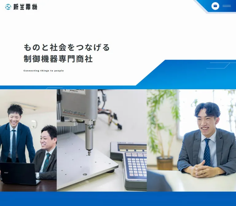
The desktop opening capture shows an almost empty pale canvas with a fine angled line. Its sampled H1 has transparent text. This is an incomplete visible state, not sufficient evidence of the finished desktop hero. The mobile opening clearly shows the logo, headline, corner controls, blue geometric band, machinery photograph, and commercial shortcut. Preserve that distinction throughout implementation.
How to Read This Reference
- Measured values come directly from supplied element rectangles or computed styles. Measurements describe the sampled state, not every possible state.
- Derived values are arithmetic relationships between measured rectangles, such as column gaps and container widths.
- Visual estimates describe visible imagery, gradients, fine borders, or decorations that lack computed-style samples. They were not obtained through pixel sampling.
- Recommendations are adaptation choices, including intermediate breakpoints, accessible interaction behavior, and parts of the CSS Quick Start.
- Token names in this document are implementation aliases. The evidence does not expose a complete authored brand-token system.
- DOM presence does not prove visibility. Offscreen navigation, privacy content, and duplicated metric items must not be treated as simultaneously visible homepage content.
Tokens — Colors
Default Palette
| Name | Value | Suggested token | Role and evidence |
|---|---|---|---|
| Near-white canvas | #fcfcfc |
--color-canvas |
Measured BODY background at both viewports |
| Charcoal text | #2f3639 |
--color-ink |
Measured body text, Japanese headings, and ordinary links |
| Brand cyan-blue | #008ddb |
--color-blue |
Measured SERVICE and TOPICS heading color |
| Deep action blue | #024aac |
--color-action |
Measured mobile contact-anchor background; nested icon artwork changes its visible face |
| Footer navy | #022a60 |
--color-navy |
Measured FOOTER background, clearly visible in both footer captures |
| Reversed near-white | #f8f9fa |
--color-on-blue |
Measured text in blue sections and the footer |
| Pure white | #ffffff |
--color-white |
Measured commercial text and floating commercial-link text |
| Pale control gray | #f2f2f2 |
--color-control |
Measured standard pill-link background and privacy subheading surface |
| Category gray | #dbdbdb |
--color-category |
Measured news-category badge background |
| Muted date ink | rgba(47,54,57,.43) |
--color-date |
Measured news dates; the final visible color depends on the surface behind them |
Graphic Blues and Rules
| Treatment | Approximation | Evidence status |
|---|---|---|
| LOCATION field | Deep royal blue, approximately #080690, moving toward a cooler blue lower down |
Visual estimate from the desktop location capture; exact gradient stops and direction were not supplied |
| Small location marker | Bright cyan, approximately #00d7ed |
Visual estimate of the hollow marker beside LOCATION |
| Rules on white | Approximately #d9d9d9 |
Visual estimate; several rules are extremely fine |
| Rules on navy | Translucent pale blue-white | Visually observed; opacity was not measured |
| Corner and arrow fills | Cyan-blue to deeper blue | Gradient appearance is visible; exact source declarations are unavailable |
Use the exact measured navy for the footer. Keep the more saturated LOCATION blue distinct from it. The visual sequence depends on that change in intensity.
The supplied custom properties include WordPress color, gradient, and shadow presets, plus Swiper defaults. Their existence does not demonstrate their use on visible components. In particular, do not import the preset rainbow gradients or shadow styles into this reference palette.
No selectable color theme was demonstrated.
Tokens — Typography
Noto Sans JP — Japanese Content and Navigation
Measured stack: "Noto Sans JP", sans-serif.
Body copy uses weight 500, 15px size, 30px line height, and 0.75px tracking. These values remain unchanged at the inspected mobile viewport. The airy two-times line height allows long business descriptions to remain calm even when the page becomes a single column.
Main Japanese statements use weight 700. Their scale decreases on mobile, while their generous line-height ratio stays almost constant. Navigation is slightly denser: desktop header links use 14px / 19.6px, weight 600, with normal tracking.
The company wordmark is graphic artwork. Do not attempt to reproduce its distinctive Japanese lettering by setting the company name in the body font.
Work Sans — English Labels, Figures, and Contact Information
Measured stack: "Work Sans", sans-serif.
Work Sans appears in the metrics, SERVICE / LOCATION / TOPICS labels, commercial label, news dates, PAGE TOP, CONTACT, CONTACT FORM, TEL, and the phone number. Metrics use medium weight and tight negative tracking. English contact headings use weight 600, while small section labels use 700.
The HTML element reports Times, but the BODY and relevant descendants override it. Times is not evidence of a visible serif design system.
Type Scale
All sizes below are measured unless explicitly marked as estimates. Size and line height are shown in pixels.
| Role | Desktop | Mobile | Weight | Tracking / notes |
|---|---|---|---|---|
| Japanese hero H1 | 45 / 69.3 |
26 / 42 |
700 |
Normal; desktop text was transparent in the sampled state |
| Major Japanese statement | 34 / 58 |
22 / 37.5294 |
700 |
1.7px desktop, 1.1px mobile; both equal 0.05em |
| Body copy | 15 / 30 |
15 / 30 |
500 |
0.75px, or 0.05em |
| Desktop header navigation | 14 / 19.6 |
— | 600 |
Normal |
| Offscreen mobile navigation | — | 15 / 21 |
600 |
DOM measurement only; menu opening was not tested |
| Metric label | 16 / 16 |
14 / 14 |
700 |
0.03em |
| Metric number | 128 / 128 |
80 / 80 |
500 |
-0.05em |
| Main section label | 16 / 16 |
14 / 14 |
700 |
0.75px at both sizes |
| Service selector | 15 / 15 |
14 / 18 |
700 |
0.05em; first two mobile labels wrap |
| Standard pill-link text | 15 / 30 |
15 / 30 |
700 |
0.75px |
| Commercial label | 13 / 13 |
13 / 13 |
700 |
Normal |
| Commercial headline | 24 / 36 |
20 / 30 |
700 |
Normal |
| Commercial body | 15 / 26.25 |
15 / 26.25 |
500 |
Normal |
| News title | 20 / 30 |
16 / 24 |
700 |
Normal |
| News date | 14 / 14 |
14 / 14 |
500 |
Work Sans, normal tracking |
| News category | 12 / 12 |
12 / 12 |
500 |
0.6px |
| CONTACT heading | 87 / 87 |
56 / 56 |
600 |
Work Sans |
| Footer CONTACT FORM | 48 / 48 |
32 / 32 |
600 |
Work Sans |
| Footer TEL label | 29 / 29 |
32 / 32 |
600 |
Mobile increases this label slightly |
| Footer phone number | 48 / 48 |
40 / 40 |
600 |
Work Sans |
| Footer address | 14 / 24.5 |
15 / 27 |
500 |
Mobile text increases rather than shrinking |
| Sports-support introduction | 14 / 24.5 |
14 / 24.5 |
500 |
0.75px |
| Sports-group caption | 14 / 28 |
14 / 28 |
500 |
0.75px |
The small English hero line, “Connecting things to people,” is visibly bold and widely tracked in the mobile capture. Approximately 11–12px with 0.2em tracking is a visual estimate, not a supplied computed value.
The oversized cropped English lettering in LOCATION is a separate display treatment. Its approximately 130px desktop scale is a visual estimate; it should not be confused with the measured 128px metric numerals.
Tokens — Spacing & Shapes
The page uses broad vertical intervals, compact controls, and a small number of repeatable geometric forms. There is no evidence of one universal spacing unit or a viewport-derived root-font formula.
Spacing Scale
| Use | Desktop | Mobile | Status |
|---|---|---|---|
| Main content side inset | 100px |
24px |
Measured |
| Main content width | 1240px |
342px |
Derived from measured content bounds |
| Header logo left inset | 52.8px |
24px |
Measured |
| Hero H1 left inset | 84.6px |
18px |
Measured; intentionally differs from the main content inset |
| Service section padding | 200px top, 236px bottom |
124px top and bottom |
Measured |
| Service heading-rule to lead copy | 140px |
64px |
Derived from sampled rectangles |
| Service lead-to-body vertical gap | Side-by-side composition | 40px |
Derived mobile gap |
| Selector-to-first-product gap | 75px |
52px |
Derived |
| Product column gap | 32px |
Single column | Derived |
| Product row gap | 60px |
32px |
Derived |
| Japanese statement-to-body gap | Commonly 58px |
Commonly 40px |
Derived from introduction and location samples |
| Location link gap | 32px |
24px |
Derived |
| Sports logos within a group | 31px |
31px |
Derived |
| Sports logo-to-caption gap | 10px |
10px |
Derived |
| Mobile sports-group gap | — | 25px |
Derived between a caption and the next logo row |
Border Radius
| Element | Observed radius | Interpretation |
|---|---|---|
| Product-link outer box | 0 |
Unboxed rectangular component; nested media radius was not sampled |
| Standard destination pill | 32px |
Desktop 246 × 64px; mobile 200 × 52px |
| Service selector | 27px desktop, 24px mobile |
Half of the measured control height |
| Compact news-list link | 22px |
178 × 44px |
| News-category badge | 11px |
22px overall height |
| Desktop header contact anchor | 50px |
184 × 44px pill |
| Mobile header contact anchor | 50px |
36 × 36px circular anchor |
| Location portrait | Approximately 8–10px |
Visual estimate on an approximately 190px square image |
| Footer arrow and mail/phone symbols | Circular | Visible geometry; complete nested dimensions were not supplied |
Layout Measurements
| Element | Desktop | Mobile |
|---|---|---|
| Document height | 9548.81px |
10513.42px |
| Hero section | 1440 × 1170px |
390 × 844px |
| Hero H1 rectangle | 765 × 184.48px, at approximately (84.6, 252) |
338 × 164px, at (18, 174) |
| Header logo link | 150 × 29.27px |
113 × 22.05px |
| Service selectors | Three 168 × 54px buttons, 8px gaps |
Three 100 × 48px buttons, 9.5px gaps |
| Product grid | Three columns, each 392px |
One 342px column |
| Product-link height | Approximately 489–519px |
Approximately 417–447px |
| LOCATION section | 1607.5px high |
1338.55px high |
| Commercial button | 1240 × 301.39px |
342 × 630.67px |
| News list | 892px wide, starting at x=448px |
342px wide, starting at x=24px |
| News item | 213px high |
Approximately 140–157px high |
| Footer contact-form anchor | 847 × 301px |
342 × 246px |
| Footer navigation | Four columns | Two 171px columns |
| Sports-logo link height | 84px |
84px |
These are rendered outcomes at two widths. A source max-width: 1240px declaration or exact breakpoint cannot be recovered from these rectangles alone. The Quick Start uses a 1240px container cap as a practical adaptation.
Components
Header and Corner Controls
Role: company identity and access to the wider corporate website.
The desktop DOM places a 150px logo toward the left and a compact horizontal navigation row around y=46px. A 184 × 44px contact pill sits at the right. The navigation includes company strengths, services, company information, support, recruitment, topics, an employee page, and the related company. The service group contains product, manufacturer, and solution destinations in the DOM; its opening behavior was not exercised.
On mobile, the visible logo sits at x=24px, y≈32px. The top-right corner becomes a blue geometric plate with a diagonal left edge, a circular envelope symbol, and two fine horizontal menu strokes. The contact anchor is 36 × 36px at (276, 10). The sampled menu button is only 38 × 11px at (328, 22); a larger hit target is recommended for a new implementation.
Mobile navigation content is measured beyond the right viewport edge, starting around x=414px. It contains two columns of links followed by contact and telephone information. This supports the presence of an offscreen menu structure, but not a claim about its open-state animation, focus handling, or backdrop.
Header child positioning is measured; persistent sticky or fixed behavior was not verified.
Hero and Angled Photo Boundary
Role: state the business clearly before introducing its people and equipment.
The visible mobile headline reads “ものと社会をつなげる / 制御機器・産業用ロボットの / 専門商社.” It is left aligned, dark charcoal, bold, and arranged across three lines. The small English line sits beneath it with conspicuously wide tracking.
Below the copy, a blue band runs horizontally and rises diagonally toward the right. In the mobile capture, its lower horizontal edge is around y=424px; the upper shape rises from approximately (213, 409) to (287, 345). These coordinates are visual estimates. The band separates the text area from a full-width photographic region.
The main visible photograph is a close view of industrial machinery and its controller. A narrow partial image of a suited person remains visible at the left. This is evidence of a horizontally cropped media composition; it does not establish slide timing, image order, or swipe support.
The desktop H1 is present in the DOM at 45px / 69.3px, but its color is transparent. The supplied opening image shows only a thin angled line. Do not reproduce the blank state as the intended hero or claim a completed desktop photo arrangement that was not visible.
Commercial Shortcut
Role: provide a direct route from the opening to the commercial section.
An angular blue strip sits at the bottom-right of the opening viewport. It contains the white label “TV CM放映中!動画はこちらから” and a circular downward indicator. The DOM confirms a link to /#tvcm.
Its desktop rectangle is approximately 353.47 × 56px, aligned to the right and bottom of the 1440 × 1000 viewport. Mobile uses approximately 285.48 × 46px, also aligned to the bottom-right. The label changes from 15px to 14px.
The element defines a transform 0.3s ease-out transition. Its complete scroll-dependent visibility behavior was not demonstrated.
Company Metrics and Introduction
Role: establish scale, geographic reach, and a relationship-oriented service model.
The DOM contains five metric types: manufacturer relationships, offices, prefectures with offices, company history, and annual customer visits. Captured figures include 500+, 12, 8, 62, and 120,000+. These are source content values, not independently verified business statistics. Do not recalculate the company-history figure from the inspection date.
Each item pairs a small Japanese label with a large Work Sans number. Number tracking is -0.05em, and the plus sign is separated within a flex layout by a measured 10px gap on desktop and 5px on mobile.
The metric sequence is duplicated in the DOM and extends beyond both viewport edges. This is consistent with a looping horizontal strip. Direction, speed, pointer behavior, and any tooltip mechanism remain unverified.
Below it, a three-line Japanese statement, a narrower explanatory paragraph, and a centered pale pill link introduce the company’s strengths. The paragraph is 540px wide on desktop and 342px on mobile. Reversed text is measured throughout this region; its complete background treatment is not shown in the supplied captures.
Circuit-Style Section Heading
Role: mark major content changes with a consistent technical graphic.
SERVICE, LOCATION, and TOPICS use small bold uppercase Work Sans labels. A hollow circular marker sits to the left. A fine horizontal rule below the label continues across the section, with a diagonal rise near the right side. In the location capture, the main rule also has a small filled endpoint.
The desktop label has 22px left padding and 20px bottom padding. Mobile reduces those to 16px each. Labels are blue on pale surfaces and near-white on the location field.
Some sampled heading rectangles extend beyond the main content width: desktop x=100px, width=1416px; mobile x=24px, width=366px. Keep this decorative extension separate from the width of readable text. A dedicated SVG rule is a useful implementation choice.
Destination Pill and Circular Arrow
Role: guide visitors to company strengths, product listings, company information, and office details.
Standard destination links use a pale gray fill, dark bold Japanese text, and a fully rounded silhouette. Desktop dimensions are 246 × 64px, with padding 0 64px 0 26px. Mobile dimensions are 200 × 52px, with padding 0 48px 0 23px. The asymmetric padding reserves room at the trailing end.
The footer uses a more emphatic arrow treatment: a blue circular face with a white right arrow, surrounded by separated pale arcs. Its visible diameter is approximately 70–76px, a visual estimate. The ring is present in a still capture; rotation was not observed.
Retain this hierarchy: pale pills for ordinary destinations and a larger blue arrow inside the expansive contact area.
Service Introduction and Selectors
Role: route visitors into products, manufacturers, and solutions.
Desktop places the large Japanese statement on the left and a 500px explanatory text column on the right. The statement begins at x=100px; the body begins at x=840px. On mobile, both become full 342px blocks separated by 40px.
A centered row contains three actual BUTTON elements: “取扱い商品群,” “取扱いメーカー,” and “ソリューション.” Desktop buttons are 168 × 54px; mobile buttons are 100 × 48px. The first two mobile labels wrap over two lines. The first selector has near-white text in the sampled state; the others have charcoal text.
All three define a 0.2s ease-in-out transition. Their exact background construction and selected-panel behavior were not supplied. Treat them as observed tab-like selectors, and implement actual tab semantics only when the corresponding panel behavior is built.
Product Category Link
Role: provide a direct path to a product group and explain its scope.
Six product links form a three-column desktop grid and a single mobile column. Categories cover control equipment, electrical equipment, electronic components, industrial robots, installation supplies / measurement / tools, and information / environment / building equipment.
Each outer link contains a leading media region, a Japanese/English title group, and a short explanatory paragraph. The outer link is unboxed, has 0 radius, and defines a 0.4s transition. Nested image styling was not included in the supplied samples.
The title group starts approximately 296.33px below the top of the desktop link and 252.78px below the top of the mobile link. These are measured offsets, not exact image heights. The text region is approximately 355.09px within the 392px desktop link and 309.69px within the 342px mobile link. The title wrapper has 17px left padding.
The repeated English subtitle “RELAY CONTROLLER” appears under multiple different categories in the supplied DOM. Do not infer category-specific translations that were not present. For a new site, accurate distinct subtitles are a recommended editorial improvement.
Location Field and Oversized Lettering
Role: communicate regional reach and ongoing expansion.
The desktop capture shows a saturated royal-blue field beginning with an angular upper edge. Its boundary stays horizontal before descending along a short diagonal and continuing at a lower level. The approximately 49px drop is a visual estimate.
Inside the field, a LOCATION marker and long pale rule precede oversized near-white English lettering. The visible fragment reads “AREA EXPANS…,” cropped by the viewport edges. An approximately 190 × 190px rounded photograph of a suited employee using a telephone interrupts the text band.
A bold Japanese statement follows, then a narrower description and two vertically stacked destination pills. Desktop description width is 425px. Mobile uses 342px and places the links much farther below the paragraph: about 336px separates the paragraph bottom from the first link. The content occupying that interval is not identified by the supplied text-element samples; do not invent a map or illustration.
Commercial Promotion
Role: introduce the company’s television commercial and provide a media action.
The main promotion is a BUTTON in the DOM. Desktop uses a 1240px two-column grid with approximately 360.48px and 655.42px tracks and a 43.2px column gap. Padding is 36px 130.5px 36px 50.4px.
Mobile changes to one 302px inner column inside a 342px button, with 40px 20px 75px padding. Its height grows from approximately 301px to 631px. The text group contains the small TV COMMERCIAL label, a bold broadcaster-related headline, and a paragraph.
Text is measured as white. The complete panel artwork and its playback state are not shown in the supplied captures. A player, modal, autoplay behavior, audio policy, and close interaction must remain unverified.
Topics Navigation and News Row
Role: expose current announcements without turning the homepage into an editorial grid.
Desktop uses category navigation on the left and a vertical list on the right. The list starts at x=448px and spans 892px; each sampled row is 213px high with 20px 38px padding.
Each row includes a leading media allocation and a text block containing a Work Sans date, gray capsule category, and bold Japanese title. The title starts at x=700px and has 552px available. Media assets themselves were not included in the evidence.
On mobile, rows are 342px wide. Their text begins at x=164px, leaving a derived 140px leading allocation from the row’s left edge. Titles use 16px / 24px. Date and category stay together when space permits; the longer campaign category wraps below its date.
Mobile category links form one horizontal sequence, with later links extending beyond the viewport. Horizontal overflow is evident, but swipe or keyboard scrolling was not exercised. Category controls are links to archive URLs, not evidence of instant in-place filtering. The “記事一覧を見る” link moves below the news list and aligns to the viewport’s right edge in the sampled layout.
Contact Area
Role: make form and telephone contact equally explicit at the end of the corporate story.
A dark navy field begins with PAGE TOP and a large centered CONTACT heading. The main desktop contact row divides into an approximately 847px form region and 393px telephone region, separated by thin pale vertical rules.
The form region combines a circular mail icon, a 48px Work Sans heading, two lines of Japanese response-time information, and a large circular arrow. The phone region combines a circular handset, TEL, a 48px number, and business hours. The phone number is a real tel: link; the form region links to /contact/.
On mobile, these regions stack. CONTACT becomes 56px, CONTACT FORM becomes 32px, and the phone number remains prominent at 40px. The form description narrows to 247px, leaving room for its trailing action and wrapping across three measured lines.
The contact surface is architectural: typography and rules organize it, with no floating card shadows.
Company Footer and Privacy Entry
Role: provide company details and durable navigation.
The desktop footer places a reversed 150px logo and company address at the left, with four columns of navigation on the right. The inspected footer independently identifies the operator as 新生電機株式会社.
Mobile uses a 120px footer logo, a four-line address block, and two navigation columns. Links begin at x=24px and x=195px, each with a 171px column box. Their vertical pitch increases from 37px on desktop to 45px on mobile.
A separate ruled strip contains “個人情報の取り扱いについて.” Privacy headings and paragraphs exist in the DOM, including pale-gray subheading bars at 28px / 39.2px on desktop and 20px / 30px on mobile. No open privacy state was visually inspected, so a specific modal layout or close-control behavior is not established.
Sports-Support Strip and Copyright
Role: connect the company’s business identity to regional community activity.
Below the navy footer, the page returns to a pale surface. A centered Japanese sentence introduces three groups of sports-team marks: three football logos, two basketball logos, and one three-player basketball logo. Each group has a centered league caption.
Desktop arranges the three groups horizontally. Mobile stacks them vertically while preserving the same 84px logo-link height and approximately the same logo widths. This is a meaningful responsive choice: logos remain legible instead of all six being compressed into a phone-width row.
The logos retain their original colors. They are not tinted blue or enclosed in individual cards. A fine horizontal rule separates this community block from the small centered copyright line.
Tokens — Motion & Interaction
| Element | Recorded value or state | What is established |
|---|---|---|
| Commercial shortcut | transform 0.3s ease-out |
A transform transition is defined; its full trigger behavior was not demonstrated |
| Mobile hero H1 | color 0.1s 0.8s |
A 100ms color transition with an 800ms delay is defined |
| Metric labels | color 0.2s ease-in-out |
Color can transition; the triggering interaction is unknown |
| Service selectors | 0.2s ease-in-out |
Transition timing exists; panel switching was not tested |
| Product links | 0.4s |
Transition duration exists; final hover appearance is unknown |
| News rows and titles | 0.4s |
Transition duration exists; transformed properties are not established |
| Compact news link and PAGE TOP | 0.4s |
Duration is recorded; smooth scrolling was not verified |
| Contact-form text | 0.4s |
A transition is defined, without a tested hover state |
| Metric strip | Duplicated content and offscreen positions | Loop-like structure; no verified speed or direction |
| Location lettering and arrow arcs | Visible in still captures | No verified continuous movement |
Most sampled elements report animation: none. This does not exclude JavaScript motion, animated ancestors, pseudo-elements, or motion in unsampled media. Likewise, a computed transition: all without a nonzero duration does not establish a visible animation.
The capture process waited for document load, sampled stability, finite animation readiness, and visible image decoding within bounded time limits. Perpetual animations were paused during readiness checks and resumed. These checks do not resolve the incomplete desktop opening or prove all delayed content appeared.
For a new implementation, keep essential content visible before any reveal script runs. Use brief feedback around 200–400ms where appropriate, and supply a static reduced-motion presentation. These are recommendations, not verified original features.
Surfaces
| Layer | Appearance | Structural purpose |
|---|---|---|
| Opening and ordinary content | Near-white with charcoal text | Breathing room around Japanese copy and photographs |
| Company introduction | Reversed text; full background not visually documented | Large-scale business figures and company statement |
| Location section | Saturated royal-blue field with an angled boundary | Strong visual emphasis on geographic reach |
| Destination controls | Pale-gray pills with dark labels | Compact routes into deeper content |
| Contact and company footer | Exact #022a60 navy with near-white text |
A stable, high-contrast closing section |
| Category badge | #dbdbdb capsule |
Quiet news classification |
| Community section | Pale canvas with original-color logos | A lighter final chapter after the navy footer |
Visible structure comes from section color, whitespace, fine rules, and image boundaries. No general shadow-elevation system is demonstrated.
Imagery
The visible photography is practical and human: industrial equipment at working distance, a control panel, a partial view of a suited person in the opening, and an employee handling a phone in LOCATION. Natural office and equipment colors remain visible. The imagery supports the relationship between technical products and personal service.
The mobile opening uses a tall crop that makes the machinery dominant. The location portrait is a small rounded square embedded in an oversized typographic band. These are different image roles and should not share one universal crop.
The company mark appears in a dark-on-light version near the opening and a reversed version in the footer. Partner-team marks retain their native proportions and colors. Contact icons use simple envelope, handset, arrow, and menu forms; no named icon library was established.
Observed Asset References
No image src values, downloadable asset URLs, or font-file URLs were supplied. The following inventory describes visible roles rather than invented paths.
| Asset role | Visible evidence | Reuse guidance |
|---|---|---|
| Company identity | Opening logo and reversed footer logo | Use approved brand artwork; preserve aspect ratio |
| Hero machinery | Mobile opening photograph | Preserve the machine and controller as the focal subject |
| Adjacent personnel image | Narrow crop at the mobile hero’s left edge | Do not infer the unseen complete composition |
| Location portrait | Employee using a phone, rounded square | Preserve the human action and modest corner radius |
| Product-category media | Leading space and text relationships in the DOM | Actual assets and detailed treatment require separate evidence |
| News media | Leading allocations in measured news rows | Do not invent article-specific images from titles |
| Sports-team marks | Six logos across three groups | Use authorized assets at intrinsic proportions, without recoloring |
Layout & Responsive Behavior
The homepage retains its content order across both inspected viewports. Its major change is the redistribution of width: service introductions stack, three product columns become one, the commercial panel becomes vertical, contact panels stack, footer navigation reduces to two columns, and sports groups become separate centered rows.
Body text remains 15px / 30px. Mobile readability comes from narrower measures and more wrapping rather than a global reduction in type. Major Japanese statements change from 34px to 22px; metric figures change from 128px to 80px. The footer address actually increases from 14px to 15px.
The main content inset changes from 100px to 24px, while the hero maintains a separate inset of approximately 84.6px desktop and 18px mobile. Avoid forcing the logo, hero, ordinary sections, and decorative overshoot onto one identical alignment line.
The service section expands from approximately 2244px to 3669px high because its six product groups stack. In contrast, the news section becomes shorter, from approximately 1478px to 1077px, because its rows and section spacing compress. Responsive behavior is therefore component-specific.
Only two viewport widths were supplied. Exact breakpoints, tablet arrangements, orientation changes, browser safe-area treatment, and zoom behavior remain unverified. The Quick Start introduces intermediate layouts as explicit recommendations.
Do’s and Don’ts
Do
- Use the exact near-white canvas, charcoal text, brand blue, and footer navy from the measured palette.
- Pair Noto Sans JP with Work Sans according to their observed roles.
- Keep body text at a readable size while adapting heading scale and column count.
- Repeat horizontal rules with short diagonal changes in level.
- Give major sections substantial vertical breathing room.
- Preserve the distinction between pale destination pills and large circular contact arrows.
- Keep product groups as clear linked media-and-text units.
- Use real equipment and workplace photography when authorized.
- Preserve original-color sports logos and their desktop/mobile grouping.
- Treat missing visible states and untested interactions as limitations.
Don’t
- Don’t reproduce the blank desktop opening as the finished design.
- Don’t make essential headlines dependent on a successful animation callback.
- Don’t use one navy value for every blue field; LOCATION has a visibly more saturated role.
- Don’t add generic shadows, glass surfaces, or a rainbow of category colors.
- Don’t turn all content into rounded cards merely because buttons are rounded.
- Don’t reduce the entire mobile page by a uniform scale factor.
- Don’t convert archive links into claimed instant filters without implementing that behavior.
- Don’t infer autoplay, parallax, menu transitions, or ring rotation from still images.
- Don’t shrink all partner logos into a single mobile row.
- Don’t invent media paths, font downloads, or production credits.
Recommended Implementation Additions
These are proposed improvements for a new implementation, not verified features of the original:
- Keep hero text visible in baseline HTML/CSS and make reveals progressive enhancements.
- Give the envelope and menu controls accessible names and at least a
44 × 44pxinteractive area. - If service selectors switch panels, implement selected state, keyboard navigation, and explicit panel relationships.
- Make an offscreen menu non-interactive while closed; handle focus, Escape, and focus restoration when opened.
- Keep all mobile news categories reachable by keyboard and touch, with a visible overflow affordance.
- Provide pause or static alternatives for any continuously moving metric or location strip.
- Preserve direct form and telephone links, including visible focus states against navy.
- Review the low-opacity news-date color for sufficient contrast at its small size.
- Use real headings for the information hierarchy; large decorative lettering can be hidden from assistive technology when redundant.
- Keep product translations and time-sensitive company statistics in editable content fields.
Agent Prompt Guide
Quick Color Reference
- Canvas:
#fcfcfc. - Japanese copy and ordinary links:
#2f3639. - Main section-label blue:
#008ddb. - Deeper action blue:
#024aac. - Contact and company footer:
#022a60. - Reversed text:
#f8f9fa. - Destination pills:
#f2f2f2. - Category capsules:
#dbdbdb. - LOCATION: a separate deep royal-blue field; exact gradient is unmeasured.
Overall Prompt
“Create a Japanese industrial trading-company homepage inspired by the inspected Shinsei Denki design. Use near-white #fcfcfc, charcoal #2f3639, bright blue #008ddb, and a dark navy #022a60 contact/footer area. Set Japanese content in Noto Sans JP and English labels, large business figures, and telephone details in Work Sans. Build generous white sections, fine circuit-like rules with short diagonal rises, angled blue section boundaries, workplace photography, compact pill links, and circular arrow actions. Use a three-column product directory on desktop and one column on mobile. Preserve 15px / 30px body copy at both widths. Keep the page’s corporate navigation, services, company information, news, contact details, and community-support footer.”
Example Component Prompts
- Mobile opening: “Place a small company logo at the upper left and envelope/menu controls inside a blue plate clipped diagonally at the upper right. Use the Japanese headline ‘ものと社会をつなげる / 制御機器・産業用ロボットの / 専門商社’ at
26px / 42px, then a small widely tracked English tagline. Separate the copy from a tall machinery photograph with a blue band that rises toward the right. Keep the headline visible without JavaScript.” - Section heading: “Create a small uppercase Work Sans section label with a hollow circular marker. Below it, run a thin rule across the content width, add a short diagonal branch near the right, and end the lower rule with a small dot. Use blue on white or pale text on a royal-blue field.”
- Product group: “Create an unboxed linked product unit with a leading image, Japanese title, small English subtitle, and
15px / 30pxdescription. Use three392pxcolumns with32pxgaps at a 1440px viewport and one342pxcolumn at 390px. Let height follow content.” - Location section: “Use a deep royal-blue section with an angled upper edge, a small LOCATION label, a long technical rule, oversized cropped English lettering, and a rounded square photograph of an employee assisting a customer by phone. Follow with a bold Japanese statement, narrow descriptive copy, and two stacked pale destination pills.”
- Contact area: “Create a full-width navy closing section with a large Work Sans CONTACT heading. Divide desktop contact information into a wider form panel and narrower telephone panel using fine pale rules. Use circular mail and phone symbols, large white labels, a blue circular arrow, and a prominent telephone link. Stack the panels on mobile.”
- Community strip: “Below the navy footer, return to a pale background. Center a short Japanese support statement above three groups of original-color team logos. Keep logo areas
84pxhigh. Arrange groups horizontally on desktop and vertically on mobile, with centered captions and a separate copyright rule.”
Quick Start
CSS Custom Properties
This is a usable adaptation, not an extracted stylesheet. Measured colors, type sizes, control sizes, and endpoint layouts are retained. Gradient stops, media ratios, intermediate breakpoints, and some decorative dimensions are recommendations. Load the two named fonts through an approved project setup; no original font-file URLs were supplied.
The CSS keeps content visible and supplies a static metric presentation. It does not implement an unverified carousel, navigation drawer, service-panel controller, or media dialog.
:root {
  /* Measured palette */
  --color-canvas: #fcfcfc;
  --color-ink: #2f3639;
  --color-blue: #008ddb;
  --color-action: #024aac;
  --color-navy: #022a60;
  --color-on-blue: #f8f9fa;
  --color-control: #f2f2f2;
  --color-category: #dbdbdb;
  --color-date: rgb(47 54 57 / 43%);

  /* Recommended approximations for unsampled decorations */
  --color-royal: #080690;
  --color-cyan: #00d7ed;
  --color-rule: #d9d9d9;
  --rule-on-dark: rgb(248 249 250 / 45%);
  --gradient-action: linear-gradient(135deg, #008ddb, #024aac);
  --gradient-location: linear-gradient(180deg, #080690, #06309b);

  --font-jp: 'Noto Sans JP', sans-serif;
  --font-latin: 'Work Sans', sans-serif;
  --text-body: 15px;
  --leading-body: 2;
  --tracking-body: 0.05em;
  --text-hero: 26px;
  --leading-hero: 42px;
  --text-statement: 22px;
  --leading-statement: 1.705882;
  --text-kicker: 14px;
  --text-metric: 80px;
  --text-contact: 56px;
  --text-contact-label: 32px;
  --text-phone: 40px;

  --content-max: 1240px;
  --gutter: 24px;
  --section-space: 124px;
  --pill-width: 200px;
  --pill-height: 52px;
  --pill-radius: 32px;
  --product-gap: 32px;
  --motion-feedback: 200ms ease-in-out;
}

* { box-sizing: border-box; }

body {
  margin: 0;
  color: var(--color-ink);
  background: var(--color-canvas);
  font: 500 var(--text-body) / var(--leading-body) var(--font-jp);
  letter-spacing: var(--tracking-body);
}

img { display: block; max-width: 100%; }
button, a { -webkit-tap-highlight-color: transparent; }
button { font: inherit; }
a { color: inherit; }

.wrap {
  width: min(var(--content-max), calc(100% - 2 * var(--gutter)));
  margin-inline: auto;
}

.section { padding-block: var(--section-space); }

.statement {
  margin: 0;
  font-size: var(--text-statement);
  font-weight: 700;
  line-height: var(--leading-statement);
  letter-spacing: 0.05em;
}

/* Mobile opening proportions; desktop media placement is an adaptation. */
.hero { padding-top: 174px; min-height: 100svh; }
.hero__copy { margin-inline: 18px; max-width: 765px; }
.hero__title {
  margin: 0;
  color: var(--color-ink);
  font-size: var(--text-hero);
  line-height: var(--leading-hero);
  font-weight: 700;
  letter-spacing: normal;
}
.hero__tagline {
  margin: 20px 0 9px;
  font: 700 11px / 1.5 var(--font-latin);
  letter-spacing: 0.2em;
}
.hero__band {
  height: 79px;
  background: var(--gradient-action);
  clip-path: polygon(0 81%, 54.6% 81%, 73.6% 0,
                     100% 0, 100% 100%, 0 100%);
}
.hero__media { height: 420px; overflow: hidden; }
.hero__media img { width: 100%; height: 100%; object-fit: cover; }

/* The SVG is decorative and should have aria-hidden="true". */
.section-kicker {
  position: relative;
  margin: 0;
  padding: 0 0 16px 16px;
  color: var(--color-blue);
  font: 700 var(--text-kicker) / 1 var(--font-latin);
  letter-spacing: 0.75px;
}
.section-kicker::before {
  content: '';
  position: absolute;
  left: 0;
  top: 2px;
  width: 9px;
  height: 9px;
  border: 2px solid currentColor;
  border-radius: 50%;
}
.circuit-rule {
  display: block;
  width: 100%;
  height: 36px;
  overflow: visible;
  color: var(--color-rule);
}
.circuit-rule path {
  fill: none;
  stroke: currentColor;
  stroke-width: 1;
  vector-effect: non-scaling-stroke;
}
.circuit-rule circle { fill: currentColor; }

.pill {
  display: inline-flex;
  align-items: center;
  justify-content: space-between;
  gap: 16px;
  width: var(--pill-width);
  min-height: var(--pill-height);
  padding: 0 23px;
  border-radius: var(--pill-radius);
  background: var(--color-control);
  color: var(--color-ink);
  font-weight: 700;
  text-decoration: none;
}
.arrow-circle {
  position: relative;
  display: inline-grid;
  place-items: center;
  flex: 0 0 auto;
  width: 56px;
  aspect-ratio: 1;
  border-radius: 50%;
  color: #fff;
  background: var(--gradient-action);
  font: 600 26px / 1 var(--font-latin);
}
.arrow-circle::after {
  content: '';
  position: absolute;
  inset: -4px;
  border: 1px solid #a6cee5;
  border-inline-color: transparent;
  border-radius: inherit;
  transform: rotate(20deg);
}

/* Static, scrollable fallback for the observed repeated metrics. */
.metrics-strip { overflow-x: auto; }
.metrics-track {
  display: flex;
  gap: 48px;
  width: max-content;
  padding: 24px;
}
.metric__label {
  margin: 0 0 8px;
  font-size: 14px;
  line-height: 1;
  font-weight: 700;
  letter-spacing: 0.03em;
}
.metric__value {
  margin: 0;
  font: 500 var(--text-metric) / 1 var(--font-latin);
  letter-spacing: -0.05em;
}

.service-intro { display: grid; gap: 40px; margin-top: 64px; }
.service-intro p { margin: 0; }
.service-tabs {
  display: flex;
  justify-content: center;
  gap: 9.5px;
  margin: 84px 0 52px;
}
.service-tab {
  width: 100px;
  min-height: 48px;
  padding: 4px;
  border: 0;
  border-radius: 24px;
  background: var(--color-control);
  color: var(--color-ink);
  font-size: 14px;
  line-height: 18px;
  font-weight: 700;
  letter-spacing: 0.05em;
  cursor: pointer;
  transition: color var(--motion-feedback),
              background-color var(--motion-feedback);
}
.service-tab[aria-selected='true'] {
  color: var(--color-on-blue);
  background: var(--gradient-action);
}
.product-grid {
  display: grid;
  grid-template-columns: minmax(0, 1fr);
  gap: var(--product-gap);
}
.product-link { display: block; text-decoration: none; }
.product-media {
  width: 100%;
  aspect-ratio: 4 / 3; /* Recommended ratio, not an image measurement. */
  object-fit: cover;
}
.product-copy { width: 90.6%; padding-top: 20px; }
.product-title { margin: 0; padding-left: 17px; }
.product-subtitle {
  display: block;
  font-family: var(--font-latin);
  font-size: 12px; /* Recommended nested subtitle size. */
}
.product-description { margin: 20px 0 0; }

.location {
  position: relative;
  padding-block: 152px;
  color: var(--color-on-blue);
  background: var(--gradient-location);
}
.location::before {
  content: '';
  position: absolute;
  inset: 0 0 auto;
  height: 50px;
  background: var(--color-canvas);
  clip-path: polygon(56% 0, 100% 0, 100% 100%, 60% 100%);
  pointer-events: none;
}
.location .section-kicker { color: var(--color-on-blue); }
.location .section-kicker::before { border-color: var(--color-cyan); }
.location .circuit-rule { color: var(--rule-on-dark); }
.location-banner { overflow: hidden; margin-block: 100px 64px; }
.location-banner__track {
  display: flex;
  align-items: center;
  gap: 80px;
  width: max-content;
  font: 600 clamp(72px, 9.2vw, 132px) / 1 var(--font-latin);
  letter-spacing: normal;
}
.location-banner img {
  width: 190px;
  aspect-ratio: 1;
  border-radius: 9px;
  object-fit: cover;
}
.location-copy { max-width: 425px; margin-top: 40px; }
.location-actions { display: grid; gap: 24px; margin-top: 48px; }

.topics-layout { margin-top: 64px; }
.topic-categories {
  display: flex;
  gap: 24px;
  overflow-x: auto;
  padding-bottom: 16px;
}
.topic-categories a { flex: 0 0 auto; text-decoration: none; }
.news-row {
  display: grid;
  grid-template-columns: 116px minmax(0, 1fr);
  gap: 24px;
  padding-block: 24px;
  border-bottom: 1px solid var(--color-rule);
  text-decoration: none;
}
.news-media { width: 100%; aspect-ratio: 4 / 3; object-fit: cover; }
.news-meta { display: flex; flex-wrap: wrap; align-items: center; gap: 12px; }
.news-date { color: var(--color-date); font: 500 14px / 1 var(--font-latin); }
.news-category {
  padding: 5px 9px;
  border-radius: 11px;
  background: var(--color-category);
  font-size: 12px;
  line-height: 12px;
  letter-spacing: 0.6px;
}
.news-title { margin: 12px 0 0; font-size: 16px; line-height: 1.5; }
.news-arrow { display: none; }

.contact { color: var(--color-on-blue); background: var(--color-navy); }
.contact-heading {
  margin: 0;
  padding-block: 80px 56px;
  text-align: center;
  font: 600 var(--text-contact) / 1 var(--font-latin);
  letter-spacing: normal;
}
.contact-grid { display: grid; border-top: 1px solid var(--rule-on-dark); }
.contact-card { padding: 32px 0; border-bottom: 1px solid var(--rule-on-dark); }
a.contact-card { color: inherit; text-decoration: none; }
.contact-card__inner { max-width: 636px; margin-inline: auto; }
.contact-card__heading {
  display: flex;
  align-items: center;
  gap: 12px;
  margin: 0;
  font: 600 var(--text-contact-label) / 1 var(--font-latin);
  letter-spacing: normal;
}
.contact-card__bottom {
  display: flex;
  align-items: center;
  justify-content: space-between;
  gap: 16px;
  margin-top: 56px;
}
.contact-card__body { max-width: 247px; margin: 0; }
.contact-phone {
  display: block;
  margin-top: 56px;
  font: 600 var(--text-phone) / 1 var(--font-latin);
  letter-spacing: normal;
  text-decoration: none;
  white-space: nowrap;
}
.contact-hours { margin: 6px 0 0; font-size: 16px; line-height: 1.4; }
.company-footer { display: grid; gap: 56px; padding-block: 48px; }
.footer-nav { display: grid; grid-template-columns: repeat(2, 1fr); gap: 24px 0; }
.footer-nav a { font-size: 15px; line-height: 21px; text-decoration: none; }

.community { padding: 32px 24px 40px; text-align: center; }
.community-intro { margin: 0 0 26px; font-size: 14px; line-height: 24.5px; }
.sponsor-groups { display: flex; flex-direction: column; align-items: center; gap: 25px; }
.sponsor-logos { display: flex; justify-content: center; gap: 31px; }
.sponsor-logos img { width: auto; height: 84px; object-fit: contain; }
.sponsor-caption { margin: 10px 0 0; font-size: 14px; line-height: 28px; }
.copyright { padding: 18px 24px; border-top: 1px solid var(--color-rule); text-align: center; }

/* Recommended intermediate layout; original breakpoint is unknown. */
@media (min-width: 768px) {
  .product-grid { grid-template-columns: repeat(2, minmax(0, 1fr)); }
}

/* Recommended desktop breakpoint, matching the supplied desktop endpoint. */
@media (min-width: 1200px) {
  :root {
    --text-hero: 45px;
    --leading-hero: 69.3px;
    --text-statement: 34px;
    --text-kicker: 16px;
    --text-metric: 128px;
    --text-contact: 87px;
    --text-contact-label: 48px;
    --text-phone: 48px;
    --section-space: 200px;
    --pill-width: 246px;
    --pill-height: 64px;
  }
  .hero { padding-top: 252px; min-height: 1170px; }
  .hero__copy { margin-inline-start: 5.875vw; }
  .hero__media { height: 646px; }
  .section-kicker { padding: 0 0 20px 22px; }
  .metric__label { font-size: 16px; }
  .service-intro { grid-template-columns: minmax(0, 1fr) 500px; gap: 80px; margin-top: 140px; }
  .service-intro > p:last-child { align-self: end; }
  .service-tabs { gap: 8px; margin: 130px 0 75px; }
  .service-tab { width: 168px; min-height: 54px; border-radius: 27px; font-size: 15px; }
  .product-grid { grid-template-columns: repeat(3, minmax(0, 1fr)); gap: 60px 32px; }
  .location { padding-block: 270px; }
  .location-copy { margin-top: 58px; }
  .location-actions { gap: 32px; }
  .topics-layout { display: grid; grid-template-columns: 248px minmax(0, 1fr); gap: 100px; }
  .topic-categories { flex-direction: column; }
  .news-row { grid-template-columns: 182px minmax(0, 1fr) 18px; gap: 32px; min-height: 213px; padding: 20px 38px; }
  .news-title { font-size: 20px; }
  .news-arrow { display: block; align-self: center; }
  .contact-grid { grid-template-columns: minmax(0, 847fr) minmax(0, 393fr); border-left: 1px solid var(--rule-on-dark); }
  .contact-card { min-height: 301px; padding: 48px 39px; border-right: 1px solid var(--rule-on-dark); }
  .contact-card__body { max-width: 331px; }
  .contact-card__bottom { margin-top: 79px; }
  .contact-card .arrow-circle { width: 70px; }
  .contact-card--phone .contact-card__heading { font-size: 29px; }
  .contact-phone { margin-top: 92px; }
  .company-footer { grid-template-columns: 1fr auto; padding-block: 65px; }
  .footer-nav { grid-template-columns: repeat(4, auto); gap: 16px 32px; }
  .community { padding-block: 48px; }
  .sponsor-groups { flex-direction: row; justify-content: center; align-items: start; gap: 72px; }
}

/* Recommended keyboard and reduced-motion support. */
:where(a, button):focus-visible { outline: 3px solid currentColor; outline-offset: 5px; }
@media (prefers-reduced-motion: reduce) {
  html { scroll-behavior: auto; }
  .service-tab, .pill, .arrow-circle { transition: none; animation: none; }
}
The rule component can use this small SVG. Its dimensions are an adaptation of the visible branching motif; it is not original artwork.
<div class="wrap">
  <h2 class="section-kicker">SERVICE</h2>
  <svg class="circuit-rule" viewBox="0 0 1240 36"
       preserveAspectRatio="none" aria-hidden="true" focusable="false">
    <path d="M0 35 H1232 M990 35 L1024 1 H1240" />
    <circle cx="1232" cy="35" r="3" />
  </svg>
</div>
Use semantic links for destination pills and product/news rows. If the service controls are implemented as tabs, provide matching role="tablist", role="tab", aria-controls, and tab panels with working keyboard behavior. The style selector alone does not implement those interactions.
Tailwind v4 Token Mapping
Optional aliases for projects already using Tailwind v4. This does not claim that the inspected site uses Tailwind. Define the custom properties above first.
@theme inline {
  --color-canvas: #fcfcfc;
  --color-ink: #2f3639;
  --color-blue: #008ddb;
  --color-action: #024aac;
  --color-navy: #022a60;
  --color-on-blue: #f8f9fa;
  --color-control: #f2f2f2;
  --color-category: #dbdbdb;

  --font-japanese: 'Noto Sans JP', sans-serif;
  --font-latin: 'Work Sans', sans-serif;

  --text-body: 15px;
  --text-body--line-height: 2;
  --text-body--letter-spacing: 0.05em;
  --text-statement: var(--text-statement-size, 22px);

  --spacing-page-inset: 24px;
  --spacing-product-gap: 32px;
  --spacing-logo-height: 84px;
  --radius-pill: 32px;
  --radius-category: 11px;
}
Sources & Evidence
- Inspected original and final homepage: the supplied browser report records HTTP
200with no URL change. The page title, company footer, navigation destinations, and content establish a current corporate homepage. - Capture timing: supplied batch retrieval timestamp
2026-09-12T16:48:32.676Z, equivalent to September 13, 2026, 01:48:32.676 JST. Individual frame timestamps were not supplied. - Desktop evidence:
1440 × 1000captures of the incomplete opening state, LOCATION area, and lower contact/footer/community area; rendered document height approximately9548.81px. - Mobile evidence:
390 × 844captures of the opening and lower footer/community area; rendered document height approximately10513.42px. - Computed evidence: supplied element rectangles, font stacks, sizes, weights, line heights, colors, backgrounds, radii, padding, grid tracks, transition declarations, and rendered link targets at both viewport sizes.
- Interaction scope: the supplied capture process traversed scroll positions. Menu opening, service selection, hover outcomes, media playback, privacy presentation, and linked-page navigation were not demonstrated.
- Limitations: the desktop opening remains visually incomplete; nested media styles, pseudo-element declarations, exact gradients, asset URLs, source breakpoints, and full motion behavior were not available. SharedWorkers and service workers were disabled during the supplied inspection. No additional browsing or file access was performed for this reference.
This reference describes the supplied current homepage evidence. Its reusable CSS and accessibility guidance are adaptations, not a verified reproduction of every original implementation detail.
# Shinsei Denki — Style Reference

> An industrial trading company expressed through open white space, electric blue fields, and lines that turn like circuit traces.

**Website:** [shinseidenki.co.jp](https://www.shinseidenki.co.jp/)
**Original URL:** https://www.shinseidenki.co.jp/
**Final URL:** https://www.shinseidenki.co.jp/
**Theme:** light opening and content areas, with saturated blue feature sections and a dark navy contact/footer area.
**Inspected:** September 13, 2026, at 01:48 JST. Supplied retrieval timestamp: `2026-09-12T16:48:32.676Z`.
**Viewports:** desktop `1440 × 1000` and mobile `390 × 844` CSS pixels.
**Scope:** the current corporate homepage, including its opening, company metrics, introduction, services, location section, commercial promotion, news, contact area, footer, and sports-support strip. Visual evidence consists of three desktop captures and two mobile captures; rendered DOM and computed-style samples cover additional homepage content. Linked pages and interactive open states were not inspected.

Shinsei Denki combines Japanese corporate clarity with a stronger graphic identity than a conventional product directory. Large areas of near-white separate dark, bold Japanese statements from photography. Bright blue bands introduce angled changes in level; fine rules repeat the same horizontal–diagonal–horizontal geometry. Small circular markers and circular arrow controls soften those engineered lines without turning the page into a rounded-card interface.

Typography has two distinct jobs. Noto Sans JP carries the company message, descriptions, and navigation. Work Sans supplies oversized business figures, compact uppercase section labels, and prominent contact information. The page moves between expansive company storytelling and practical routes into products, manufacturers, solutions, company information, and inquiries.

The desktop opening capture shows an almost empty pale canvas with a fine angled line. Its sampled H1 has transparent text. This is an incomplete visible state, not sufficient evidence of the finished desktop hero. The mobile opening clearly shows the logo, headline, corner controls, blue geometric band, machinery photograph, and commercial shortcut. Preserve that distinction throughout implementation.

## How to Read This Reference

- **Measured** values come directly from supplied element rectangles or computed styles. Measurements describe the sampled state, not every possible state.
- **Derived** values are arithmetic relationships between measured rectangles, such as column gaps and container widths.
- **Visual estimates** describe visible imagery, gradients, fine borders, or decorations that lack computed-style samples. They were not obtained through pixel sampling.
- **Recommendations** are adaptation choices, including intermediate breakpoints, accessible interaction behavior, and parts of the CSS Quick Start.
- Token names in this document are implementation aliases. The evidence does not expose a complete authored brand-token system.
- DOM presence does not prove visibility. Offscreen navigation, privacy content, and duplicated metric items must not be treated as simultaneously visible homepage content.

## Tokens — Colors

### Default Palette

| Name | Value | Suggested token | Role and evidence |
| --- | --- | --- | --- |
| Near-white canvas | `#fcfcfc` | `--color-canvas` | Measured BODY background at both viewports |
| Charcoal text | `#2f3639` | `--color-ink` | Measured body text, Japanese headings, and ordinary links |
| Brand cyan-blue | `#008ddb` | `--color-blue` | Measured SERVICE and TOPICS heading color |
| Deep action blue | `#024aac` | `--color-action` | Measured mobile contact-anchor background; nested icon artwork changes its visible face |
| Footer navy | `#022a60` | `--color-navy` | Measured FOOTER background, clearly visible in both footer captures |
| Reversed near-white | `#f8f9fa` | `--color-on-blue` | Measured text in blue sections and the footer |
| Pure white | `#ffffff` | `--color-white` | Measured commercial text and floating commercial-link text |
| Pale control gray | `#f2f2f2` | `--color-control` | Measured standard pill-link background and privacy subheading surface |
| Category gray | `#dbdbdb` | `--color-category` | Measured news-category badge background |
| Muted date ink | `rgba(47,54,57,.43)` | `--color-date` | Measured news dates; the final visible color depends on the surface behind them |

### Graphic Blues and Rules

| Treatment | Approximation | Evidence status |
| --- | --- | --- |
| LOCATION field | Deep royal blue, approximately `#080690`, moving toward a cooler blue lower down | Visual estimate from the desktop location capture; exact gradient stops and direction were not supplied |
| Small location marker | Bright cyan, approximately `#00d7ed` | Visual estimate of the hollow marker beside LOCATION |
| Rules on white | Approximately `#d9d9d9` | Visual estimate; several rules are extremely fine |
| Rules on navy | Translucent pale blue-white | Visually observed; opacity was not measured |
| Corner and arrow fills | Cyan-blue to deeper blue | Gradient appearance is visible; exact source declarations are unavailable |

Use the exact measured navy for the footer. Keep the more saturated LOCATION blue distinct from it. The visual sequence depends on that change in intensity.

The supplied custom properties include WordPress color, gradient, and shadow presets, plus Swiper defaults. Their existence does not demonstrate their use on visible components. In particular, do not import the preset rainbow gradients or shadow styles into this reference palette.

No selectable color theme was demonstrated.

## Tokens — Typography

### Noto Sans JP — Japanese Content and Navigation

**Measured stack:** `"Noto Sans JP", sans-serif`.

Body copy uses weight `500`, `15px` size, `30px` line height, and `0.75px` tracking. These values remain unchanged at the inspected mobile viewport. The airy two-times line height allows long business descriptions to remain calm even when the page becomes a single column.

Main Japanese statements use weight `700`. Their scale decreases on mobile, while their generous line-height ratio stays almost constant. Navigation is slightly denser: desktop header links use `14px / 19.6px`, weight `600`, with normal tracking.

The company wordmark is graphic artwork. Do not attempt to reproduce its distinctive Japanese lettering by setting the company name in the body font.

### Work Sans — English Labels, Figures, and Contact Information

**Measured stack:** `"Work Sans", sans-serif`.

Work Sans appears in the metrics, SERVICE / LOCATION / TOPICS labels, commercial label, news dates, PAGE TOP, CONTACT, CONTACT FORM, TEL, and the phone number. Metrics use medium weight and tight negative tracking. English contact headings use weight `600`, while small section labels use `700`.

The HTML element reports Times, but the BODY and relevant descendants override it. Times is not evidence of a visible serif design system.

### Type Scale

All sizes below are measured unless explicitly marked as estimates. Size and line height are shown in pixels.

| Role | Desktop | Mobile | Weight | Tracking / notes |
| --- | --- | --- | --- | --- |
| Japanese hero H1 | `45 / 69.3` | `26 / 42` | `700` | Normal; desktop text was transparent in the sampled state |
| Major Japanese statement | `34 / 58` | `22 / 37.5294` | `700` | `1.7px` desktop, `1.1px` mobile; both equal `0.05em` |
| Body copy | `15 / 30` | `15 / 30` | `500` | `0.75px`, or `0.05em` |
| Desktop header navigation | `14 / 19.6` | — | `600` | Normal |
| Offscreen mobile navigation | — | `15 / 21` | `600` | DOM measurement only; menu opening was not tested |
| Metric label | `16 / 16` | `14 / 14` | `700` | `0.03em` |
| Metric number | `128 / 128` | `80 / 80` | `500` | `-0.05em` |
| Main section label | `16 / 16` | `14 / 14` | `700` | `0.75px` at both sizes |
| Service selector | `15 / 15` | `14 / 18` | `700` | `0.05em`; first two mobile labels wrap |
| Standard pill-link text | `15 / 30` | `15 / 30` | `700` | `0.75px` |
| Commercial label | `13 / 13` | `13 / 13` | `700` | Normal |
| Commercial headline | `24 / 36` | `20 / 30` | `700` | Normal |
| Commercial body | `15 / 26.25` | `15 / 26.25` | `500` | Normal |
| News title | `20 / 30` | `16 / 24` | `700` | Normal |
| News date | `14 / 14` | `14 / 14` | `500` | Work Sans, normal tracking |
| News category | `12 / 12` | `12 / 12` | `500` | `0.6px` |
| CONTACT heading | `87 / 87` | `56 / 56` | `600` | Work Sans |
| Footer CONTACT FORM | `48 / 48` | `32 / 32` | `600` | Work Sans |
| Footer TEL label | `29 / 29` | `32 / 32` | `600` | Mobile increases this label slightly |
| Footer phone number | `48 / 48` | `40 / 40` | `600` | Work Sans |
| Footer address | `14 / 24.5` | `15 / 27` | `500` | Mobile text increases rather than shrinking |
| Sports-support introduction | `14 / 24.5` | `14 / 24.5` | `500` | `0.75px` |
| Sports-group caption | `14 / 28` | `14 / 28` | `500` | `0.75px` |

The small English hero line, “Connecting things to people,” is visibly bold and widely tracked in the mobile capture. Approximately `11–12px` with `0.2em` tracking is a visual estimate, not a supplied computed value.

The oversized cropped English lettering in LOCATION is a separate display treatment. Its approximately `130px` desktop scale is a visual estimate; it should not be confused with the measured `128px` metric numerals.

## Tokens — Spacing & Shapes

The page uses broad vertical intervals, compact controls, and a small number of repeatable geometric forms. There is no evidence of one universal spacing unit or a viewport-derived root-font formula.

### Spacing Scale

| Use | Desktop | Mobile | Status |
| --- | --- | --- | --- |
| Main content side inset | `100px` | `24px` | Measured |
| Main content width | `1240px` | `342px` | Derived from measured content bounds |
| Header logo left inset | `52.8px` | `24px` | Measured |
| Hero H1 left inset | `84.6px` | `18px` | Measured; intentionally differs from the main content inset |
| Service section padding | `200px` top, `236px` bottom | `124px` top and bottom | Measured |
| Service heading-rule to lead copy | `140px` | `64px` | Derived from sampled rectangles |
| Service lead-to-body vertical gap | Side-by-side composition | `40px` | Derived mobile gap |
| Selector-to-first-product gap | `75px` | `52px` | Derived |
| Product column gap | `32px` | Single column | Derived |
| Product row gap | `60px` | `32px` | Derived |
| Japanese statement-to-body gap | Commonly `58px` | Commonly `40px` | Derived from introduction and location samples |
| Location link gap | `32px` | `24px` | Derived |
| Sports logos within a group | `31px` | `31px` | Derived |
| Sports logo-to-caption gap | `10px` | `10px` | Derived |
| Mobile sports-group gap | — | `25px` | Derived between a caption and the next logo row |

### Border Radius

| Element | Observed radius | Interpretation |
| --- | --- | --- |
| Product-link outer box | `0` | Unboxed rectangular component; nested media radius was not sampled |
| Standard destination pill | `32px` | Desktop `246 × 64px`; mobile `200 × 52px` |
| Service selector | `27px` desktop, `24px` mobile | Half of the measured control height |
| Compact news-list link | `22px` | `178 × 44px` |
| News-category badge | `11px` | `22px` overall height |
| Desktop header contact anchor | `50px` | `184 × 44px` pill |
| Mobile header contact anchor | `50px` | `36 × 36px` circular anchor |
| Location portrait | Approximately `8–10px` | Visual estimate on an approximately `190px` square image |
| Footer arrow and mail/phone symbols | Circular | Visible geometry; complete nested dimensions were not supplied |

### Layout Measurements

| Element | Desktop | Mobile |
| --- | --- | --- |
| Document height | `9548.81px` | `10513.42px` |
| Hero section | `1440 × 1170px` | `390 × 844px` |
| Hero H1 rectangle | `765 × 184.48px`, at approximately `(84.6, 252)` | `338 × 164px`, at `(18, 174)` |
| Header logo link | `150 × 29.27px` | `113 × 22.05px` |
| Service selectors | Three `168 × 54px` buttons, `8px` gaps | Three `100 × 48px` buttons, `9.5px` gaps |
| Product grid | Three columns, each `392px` | One `342px` column |
| Product-link height | Approximately `489–519px` | Approximately `417–447px` |
| LOCATION section | `1607.5px` high | `1338.55px` high |
| Commercial button | `1240 × 301.39px` | `342 × 630.67px` |
| News list | `892px` wide, starting at x=`448px` | `342px` wide, starting at x=`24px` |
| News item | `213px` high | Approximately `140–157px` high |
| Footer contact-form anchor | `847 × 301px` | `342 × 246px` |
| Footer navigation | Four columns | Two `171px` columns |
| Sports-logo link height | `84px` | `84px` |

These are rendered outcomes at two widths. A source `max-width: 1240px` declaration or exact breakpoint cannot be recovered from these rectangles alone. The Quick Start uses a 1240px container cap as a practical adaptation.

## Components

### Header and Corner Controls

**Role:** company identity and access to the wider corporate website.

The desktop DOM places a 150px logo toward the left and a compact horizontal navigation row around y=`46px`. A `184 × 44px` contact pill sits at the right. The navigation includes company strengths, services, company information, support, recruitment, topics, an employee page, and the related company. The service group contains product, manufacturer, and solution destinations in the DOM; its opening behavior was not exercised.

On mobile, the visible logo sits at x=`24px`, y≈`32px`. The top-right corner becomes a blue geometric plate with a diagonal left edge, a circular envelope symbol, and two fine horizontal menu strokes. The contact anchor is `36 × 36px` at `(276, 10)`. The sampled menu button is only `38 × 11px` at `(328, 22)`; a larger hit target is recommended for a new implementation.

Mobile navigation content is measured beyond the right viewport edge, starting around x=`414px`. It contains two columns of links followed by contact and telephone information. This supports the presence of an offscreen menu structure, but not a claim about its open-state animation, focus handling, or backdrop.

Header child positioning is measured; persistent sticky or fixed behavior was not verified.

### Hero and Angled Photo Boundary

**Role:** state the business clearly before introducing its people and equipment.

The visible mobile headline reads “ものと社会をつなげる / 制御機器・産業用ロボットの / 専門商社.” It is left aligned, dark charcoal, bold, and arranged across three lines. The small English line sits beneath it with conspicuously wide tracking.

Below the copy, a blue band runs horizontally and rises diagonally toward the right. In the mobile capture, its lower horizontal edge is around y=`424px`; the upper shape rises from approximately `(213, 409)` to `(287, 345)`. These coordinates are visual estimates. The band separates the text area from a full-width photographic region.

The main visible photograph is a close view of industrial machinery and its controller. A narrow partial image of a suited person remains visible at the left. This is evidence of a horizontally cropped media composition; it does not establish slide timing, image order, or swipe support.

The desktop H1 is present in the DOM at `45px / 69.3px`, but its color is transparent. The supplied opening image shows only a thin angled line. Do not reproduce the blank state as the intended hero or claim a completed desktop photo arrangement that was not visible.

### Commercial Shortcut

**Role:** provide a direct route from the opening to the commercial section.

An angular blue strip sits at the bottom-right of the opening viewport. It contains the white label “TV CM放映中!動画はこちらから” and a circular downward indicator. The DOM confirms a link to `/#tvcm`.

Its desktop rectangle is approximately `353.47 × 56px`, aligned to the right and bottom of the `1440 × 1000` viewport. Mobile uses approximately `285.48 × 46px`, also aligned to the bottom-right. The label changes from `15px` to `14px`.

The element defines a `transform 0.3s ease-out` transition. Its complete scroll-dependent visibility behavior was not demonstrated.

### Company Metrics and Introduction

**Role:** establish scale, geographic reach, and a relationship-oriented service model.

The DOM contains five metric types: manufacturer relationships, offices, prefectures with offices, company history, and annual customer visits. Captured figures include `500+`, `12`, `8`, `62`, and `120,000+`. These are source content values, not independently verified business statistics. Do not recalculate the company-history figure from the inspection date.

Each item pairs a small Japanese label with a large Work Sans number. Number tracking is `-0.05em`, and the plus sign is separated within a flex layout by a measured `10px` gap on desktop and `5px` on mobile.

The metric sequence is duplicated in the DOM and extends beyond both viewport edges. This is consistent with a looping horizontal strip. Direction, speed, pointer behavior, and any tooltip mechanism remain unverified.

Below it, a three-line Japanese statement, a narrower explanatory paragraph, and a centered pale pill link introduce the company’s strengths. The paragraph is `540px` wide on desktop and `342px` on mobile. Reversed text is measured throughout this region; its complete background treatment is not shown in the supplied captures.

### Circuit-Style Section Heading

**Role:** mark major content changes with a consistent technical graphic.

SERVICE, LOCATION, and TOPICS use small bold uppercase Work Sans labels. A hollow circular marker sits to the left. A fine horizontal rule below the label continues across the section, with a diagonal rise near the right side. In the location capture, the main rule also has a small filled endpoint.

The desktop label has `22px` left padding and `20px` bottom padding. Mobile reduces those to `16px` each. Labels are blue on pale surfaces and near-white on the location field.

Some sampled heading rectangles extend beyond the main content width: desktop x=`100px`, width=`1416px`; mobile x=`24px`, width=`366px`. Keep this decorative extension separate from the width of readable text. A dedicated SVG rule is a useful implementation choice.

### Destination Pill and Circular Arrow

**Role:** guide visitors to company strengths, product listings, company information, and office details.

Standard destination links use a pale gray fill, dark bold Japanese text, and a fully rounded silhouette. Desktop dimensions are `246 × 64px`, with padding `0 64px 0 26px`. Mobile dimensions are `200 × 52px`, with padding `0 48px 0 23px`. The asymmetric padding reserves room at the trailing end.

The footer uses a more emphatic arrow treatment: a blue circular face with a white right arrow, surrounded by separated pale arcs. Its visible diameter is approximately `70–76px`, a visual estimate. The ring is present in a still capture; rotation was not observed.

Retain this hierarchy: pale pills for ordinary destinations and a larger blue arrow inside the expansive contact area.

### Service Introduction and Selectors

**Role:** route visitors into products, manufacturers, and solutions.

Desktop places the large Japanese statement on the left and a `500px` explanatory text column on the right. The statement begins at x=`100px`; the body begins at x=`840px`. On mobile, both become full `342px` blocks separated by `40px`.

A centered row contains three actual BUTTON elements: “取扱い商品群,” “取扱いメーカー,” and “ソリューション.” Desktop buttons are `168 × 54px`; mobile buttons are `100 × 48px`. The first two mobile labels wrap over two lines. The first selector has near-white text in the sampled state; the others have charcoal text.

All three define a `0.2s ease-in-out` transition. Their exact background construction and selected-panel behavior were not supplied. Treat them as observed tab-like selectors, and implement actual tab semantics only when the corresponding panel behavior is built.

### Product Category Link

**Role:** provide a direct path to a product group and explain its scope.

Six product links form a three-column desktop grid and a single mobile column. Categories cover control equipment, electrical equipment, electronic components, industrial robots, installation supplies / measurement / tools, and information / environment / building equipment.

Each outer link contains a leading media region, a Japanese/English title group, and a short explanatory paragraph. The outer link is unboxed, has `0` radius, and defines a `0.4s` transition. Nested image styling was not included in the supplied samples.

The title group starts approximately `296.33px` below the top of the desktop link and `252.78px` below the top of the mobile link. These are measured offsets, not exact image heights. The text region is approximately `355.09px` within the `392px` desktop link and `309.69px` within the `342px` mobile link. The title wrapper has `17px` left padding.

The repeated English subtitle “RELAY CONTROLLER” appears under multiple different categories in the supplied DOM. Do not infer category-specific translations that were not present. For a new site, accurate distinct subtitles are a recommended editorial improvement.

### Location Field and Oversized Lettering

**Role:** communicate regional reach and ongoing expansion.

The desktop capture shows a saturated royal-blue field beginning with an angular upper edge. Its boundary stays horizontal before descending along a short diagonal and continuing at a lower level. The approximately `49px` drop is a visual estimate.

Inside the field, a LOCATION marker and long pale rule precede oversized near-white English lettering. The visible fragment reads “AREA EXPANS…,” cropped by the viewport edges. An approximately `190 × 190px` rounded photograph of a suited employee using a telephone interrupts the text band.

A bold Japanese statement follows, then a narrower description and two vertically stacked destination pills. Desktop description width is `425px`. Mobile uses `342px` and places the links much farther below the paragraph: about `336px` separates the paragraph bottom from the first link. The content occupying that interval is not identified by the supplied text-element samples; do not invent a map or illustration.

### Commercial Promotion

**Role:** introduce the company’s television commercial and provide a media action.

The main promotion is a BUTTON in the DOM. Desktop uses a `1240px` two-column grid with approximately `360.48px` and `655.42px` tracks and a `43.2px` column gap. Padding is `36px 130.5px 36px 50.4px`.

Mobile changes to one `302px` inner column inside a `342px` button, with `40px 20px 75px` padding. Its height grows from approximately `301px` to `631px`. The text group contains the small TV COMMERCIAL label, a bold broadcaster-related headline, and a paragraph.

Text is measured as white. The complete panel artwork and its playback state are not shown in the supplied captures. A player, modal, autoplay behavior, audio policy, and close interaction must remain unverified.

### Topics Navigation and News Row

**Role:** expose current announcements without turning the homepage into an editorial grid.

Desktop uses category navigation on the left and a vertical list on the right. The list starts at x=`448px` and spans `892px`; each sampled row is `213px` high with `20px 38px` padding.

Each row includes a leading media allocation and a text block containing a Work Sans date, gray capsule category, and bold Japanese title. The title starts at x=`700px` and has `552px` available. Media assets themselves were not included in the evidence.

On mobile, rows are `342px` wide. Their text begins at x=`164px`, leaving a derived `140px` leading allocation from the row’s left edge. Titles use `16px / 24px`. Date and category stay together when space permits; the longer campaign category wraps below its date.

Mobile category links form one horizontal sequence, with later links extending beyond the viewport. Horizontal overflow is evident, but swipe or keyboard scrolling was not exercised. Category controls are links to archive URLs, not evidence of instant in-place filtering. The “記事一覧を見る” link moves below the news list and aligns to the viewport’s right edge in the sampled layout.

### Contact Area

**Role:** make form and telephone contact equally explicit at the end of the corporate story.

A dark navy field begins with PAGE TOP and a large centered CONTACT heading. The main desktop contact row divides into an approximately `847px` form region and `393px` telephone region, separated by thin pale vertical rules.

The form region combines a circular mail icon, a `48px` Work Sans heading, two lines of Japanese response-time information, and a large circular arrow. The phone region combines a circular handset, TEL, a `48px` number, and business hours. The phone number is a real `tel:` link; the form region links to `/contact/`.

On mobile, these regions stack. CONTACT becomes `56px`, CONTACT FORM becomes `32px`, and the phone number remains prominent at `40px`. The form description narrows to `247px`, leaving room for its trailing action and wrapping across three measured lines.

The contact surface is architectural: typography and rules organize it, with no floating card shadows.

### Company Footer and Privacy Entry

**Role:** provide company details and durable navigation.

The desktop footer places a reversed 150px logo and company address at the left, with four columns of navigation on the right. The inspected footer independently identifies the operator as 新生電機株式会社.

Mobile uses a 120px footer logo, a four-line address block, and two navigation columns. Links begin at x=`24px` and x=`195px`, each with a `171px` column box. Their vertical pitch increases from `37px` on desktop to `45px` on mobile.

A separate ruled strip contains “個人情報の取り扱いについて.” Privacy headings and paragraphs exist in the DOM, including pale-gray subheading bars at `28px / 39.2px` on desktop and `20px / 30px` on mobile. No open privacy state was visually inspected, so a specific modal layout or close-control behavior is not established.

### Sports-Support Strip and Copyright

**Role:** connect the company’s business identity to regional community activity.

Below the navy footer, the page returns to a pale surface. A centered Japanese sentence introduces three groups of sports-team marks: three football logos, two basketball logos, and one three-player basketball logo. Each group has a centered league caption.

Desktop arranges the three groups horizontally. Mobile stacks them vertically while preserving the same `84px` logo-link height and approximately the same logo widths. This is a meaningful responsive choice: logos remain legible instead of all six being compressed into a phone-width row.

The logos retain their original colors. They are not tinted blue or enclosed in individual cards. A fine horizontal rule separates this community block from the small centered copyright line.

## Tokens — Motion & Interaction

| Element | Recorded value or state | What is established |
| --- | --- | --- |
| Commercial shortcut | `transform 0.3s ease-out` | A transform transition is defined; its full trigger behavior was not demonstrated |
| Mobile hero H1 | `color 0.1s 0.8s` | A 100ms color transition with an 800ms delay is defined |
| Metric labels | `color 0.2s ease-in-out` | Color can transition; the triggering interaction is unknown |
| Service selectors | `0.2s ease-in-out` | Transition timing exists; panel switching was not tested |
| Product links | `0.4s` | Transition duration exists; final hover appearance is unknown |
| News rows and titles | `0.4s` | Transition duration exists; transformed properties are not established |
| Compact news link and PAGE TOP | `0.4s` | Duration is recorded; smooth scrolling was not verified |
| Contact-form text | `0.4s` | A transition is defined, without a tested hover state |
| Metric strip | Duplicated content and offscreen positions | Loop-like structure; no verified speed or direction |
| Location lettering and arrow arcs | Visible in still captures | No verified continuous movement |

Most sampled elements report `animation: none`. This does not exclude JavaScript motion, animated ancestors, pseudo-elements, or motion in unsampled media. Likewise, a computed `transition: all` without a nonzero duration does not establish a visible animation.

The capture process waited for document load, sampled stability, finite animation readiness, and visible image decoding within bounded time limits. Perpetual animations were paused during readiness checks and resumed. These checks do not resolve the incomplete desktop opening or prove all delayed content appeared.

For a new implementation, keep essential content visible before any reveal script runs. Use brief feedback around `200–400ms` where appropriate, and supply a static reduced-motion presentation. These are recommendations, not verified original features.

## Surfaces

| Layer | Appearance | Structural purpose |
| --- | --- | --- |
| Opening and ordinary content | Near-white with charcoal text | Breathing room around Japanese copy and photographs |
| Company introduction | Reversed text; full background not visually documented | Large-scale business figures and company statement |
| Location section | Saturated royal-blue field with an angled boundary | Strong visual emphasis on geographic reach |
| Destination controls | Pale-gray pills with dark labels | Compact routes into deeper content |
| Contact and company footer | Exact `#022a60` navy with near-white text | A stable, high-contrast closing section |
| Category badge | `#dbdbdb` capsule | Quiet news classification |
| Community section | Pale canvas with original-color logos | A lighter final chapter after the navy footer |

Visible structure comes from section color, whitespace, fine rules, and image boundaries. No general shadow-elevation system is demonstrated.

## Imagery

The visible photography is practical and human: industrial equipment at working distance, a control panel, a partial view of a suited person in the opening, and an employee handling a phone in LOCATION. Natural office and equipment colors remain visible. The imagery supports the relationship between technical products and personal service.

The mobile opening uses a tall crop that makes the machinery dominant. The location portrait is a small rounded square embedded in an oversized typographic band. These are different image roles and should not share one universal crop.

The company mark appears in a dark-on-light version near the opening and a reversed version in the footer. Partner-team marks retain their native proportions and colors. Contact icons use simple envelope, handset, arrow, and menu forms; no named icon library was established.

### Observed Asset References

No image `src` values, downloadable asset URLs, or font-file URLs were supplied. The following inventory describes visible roles rather than invented paths.

| Asset role | Visible evidence | Reuse guidance |
| --- | --- | --- |
| Company identity | Opening logo and reversed footer logo | Use approved brand artwork; preserve aspect ratio |
| Hero machinery | Mobile opening photograph | Preserve the machine and controller as the focal subject |
| Adjacent personnel image | Narrow crop at the mobile hero’s left edge | Do not infer the unseen complete composition |
| Location portrait | Employee using a phone, rounded square | Preserve the human action and modest corner radius |
| Product-category media | Leading space and text relationships in the DOM | Actual assets and detailed treatment require separate evidence |
| News media | Leading allocations in measured news rows | Do not invent article-specific images from titles |
| Sports-team marks | Six logos across three groups | Use authorized assets at intrinsic proportions, without recoloring |

## Layout & Responsive Behavior

The homepage retains its content order across both inspected viewports. Its major change is the redistribution of width: service introductions stack, three product columns become one, the commercial panel becomes vertical, contact panels stack, footer navigation reduces to two columns, and sports groups become separate centered rows.

Body text remains `15px / 30px`. Mobile readability comes from narrower measures and more wrapping rather than a global reduction in type. Major Japanese statements change from `34px` to `22px`; metric figures change from `128px` to `80px`. The footer address actually increases from `14px` to `15px`.

The main content inset changes from `100px` to `24px`, while the hero maintains a separate inset of approximately `84.6px` desktop and `18px` mobile. Avoid forcing the logo, hero, ordinary sections, and decorative overshoot onto one identical alignment line.

The service section expands from approximately `2244px` to `3669px` high because its six product groups stack. In contrast, the news section becomes shorter, from approximately `1478px` to `1077px`, because its rows and section spacing compress. Responsive behavior is therefore component-specific.

Only two viewport widths were supplied. Exact breakpoints, tablet arrangements, orientation changes, browser safe-area treatment, and zoom behavior remain unverified. The Quick Start introduces intermediate layouts as explicit recommendations.

## Do’s and Don’ts

### Do

- Use the exact near-white canvas, charcoal text, brand blue, and footer navy from the measured palette.
- Pair Noto Sans JP with Work Sans according to their observed roles.
- Keep body text at a readable size while adapting heading scale and column count.
- Repeat horizontal rules with short diagonal changes in level.
- Give major sections substantial vertical breathing room.
- Preserve the distinction between pale destination pills and large circular contact arrows.
- Keep product groups as clear linked media-and-text units.
- Use real equipment and workplace photography when authorized.
- Preserve original-color sports logos and their desktop/mobile grouping.
- Treat missing visible states and untested interactions as limitations.

### Don’t

- Don’t reproduce the blank desktop opening as the finished design.
- Don’t make essential headlines dependent on a successful animation callback.
- Don’t use one navy value for every blue field; LOCATION has a visibly more saturated role.
- Don’t add generic shadows, glass surfaces, or a rainbow of category colors.
- Don’t turn all content into rounded cards merely because buttons are rounded.
- Don’t reduce the entire mobile page by a uniform scale factor.
- Don’t convert archive links into claimed instant filters without implementing that behavior.
- Don’t infer autoplay, parallax, menu transitions, or ring rotation from still images.
- Don’t shrink all partner logos into a single mobile row.
- Don’t invent media paths, font downloads, or production credits.

## Recommended Implementation Additions

These are proposed improvements for a new implementation, not verified features of the original:

- Keep hero text visible in baseline HTML/CSS and make reveals progressive enhancements.
- Give the envelope and menu controls accessible names and at least a `44 × 44px` interactive area.
- If service selectors switch panels, implement selected state, keyboard navigation, and explicit panel relationships.
- Make an offscreen menu non-interactive while closed; handle focus, Escape, and focus restoration when opened.
- Keep all mobile news categories reachable by keyboard and touch, with a visible overflow affordance.
- Provide pause or static alternatives for any continuously moving metric or location strip.
- Preserve direct form and telephone links, including visible focus states against navy.
- Review the low-opacity news-date color for sufficient contrast at its small size.
- Use real headings for the information hierarchy; large decorative lettering can be hidden from assistive technology when redundant.
- Keep product translations and time-sensitive company statistics in editable content fields.

## Agent Prompt Guide

### Quick Color Reference

- Canvas: `#fcfcfc`.
- Japanese copy and ordinary links: `#2f3639`.
- Main section-label blue: `#008ddb`.
- Deeper action blue: `#024aac`.
- Contact and company footer: `#022a60`.
- Reversed text: `#f8f9fa`.
- Destination pills: `#f2f2f2`.
- Category capsules: `#dbdbdb`.
- LOCATION: a separate deep royal-blue field; exact gradient is unmeasured.

### Overall Prompt

“Create a Japanese industrial trading-company homepage inspired by the inspected Shinsei Denki design. Use near-white `#fcfcfc`, charcoal `#2f3639`, bright blue `#008ddb`, and a dark navy `#022a60` contact/footer area. Set Japanese content in Noto Sans JP and English labels, large business figures, and telephone details in Work Sans. Build generous white sections, fine circuit-like rules with short diagonal rises, angled blue section boundaries, workplace photography, compact pill links, and circular arrow actions. Use a three-column product directory on desktop and one column on mobile. Preserve `15px / 30px` body copy at both widths. Keep the page’s corporate navigation, services, company information, news, contact details, and community-support footer.”

### Example Component Prompts

1. **Mobile opening:** “Place a small company logo at the upper left and envelope/menu controls inside a blue plate clipped diagonally at the upper right. Use the Japanese headline ‘ものと社会をつなげる / 制御機器・産業用ロボットの / 専門商社’ at `26px / 42px`, then a small widely tracked English tagline. Separate the copy from a tall machinery photograph with a blue band that rises toward the right. Keep the headline visible without JavaScript.”
2. **Section heading:** “Create a small uppercase Work Sans section label with a hollow circular marker. Below it, run a thin rule across the content width, add a short diagonal branch near the right, and end the lower rule with a small dot. Use blue on white or pale text on a royal-blue field.”
3. **Product group:** “Create an unboxed linked product unit with a leading image, Japanese title, small English subtitle, and `15px / 30px` description. Use three `392px` columns with `32px` gaps at a 1440px viewport and one `342px` column at 390px. Let height follow content.”
4. **Location section:** “Use a deep royal-blue section with an angled upper edge, a small LOCATION label, a long technical rule, oversized cropped English lettering, and a rounded square photograph of an employee assisting a customer by phone. Follow with a bold Japanese statement, narrow descriptive copy, and two stacked pale destination pills.”
5. **Contact area:** “Create a full-width navy closing section with a large Work Sans CONTACT heading. Divide desktop contact information into a wider form panel and narrower telephone panel using fine pale rules. Use circular mail and phone symbols, large white labels, a blue circular arrow, and a prominent telephone link. Stack the panels on mobile.”
6. **Community strip:** “Below the navy footer, return to a pale background. Center a short Japanese support statement above three groups of original-color team logos. Keep logo areas `84px` high. Arrange groups horizontally on desktop and vertically on mobile, with centered captions and a separate copyright rule.”

## Quick Start

### CSS Custom Properties

This is a usable adaptation, not an extracted stylesheet. Measured colors, type sizes, control sizes, and endpoint layouts are retained. Gradient stops, media ratios, intermediate breakpoints, and some decorative dimensions are recommendations. Load the two named fonts through an approved project setup; no original font-file URLs were supplied.

The CSS keeps content visible and supplies a static metric presentation. It does not implement an unverified carousel, navigation drawer, service-panel controller, or media dialog.

```css
:root {
  /* Measured palette */
  --color-canvas: #fcfcfc;
  --color-ink: #2f3639;
  --color-blue: #008ddb;
  --color-action: #024aac;
  --color-navy: #022a60;
  --color-on-blue: #f8f9fa;
  --color-control: #f2f2f2;
  --color-category: #dbdbdb;
  --color-date: rgb(47 54 57 / 43%);

  /* Recommended approximations for unsampled decorations */
  --color-royal: #080690;
  --color-cyan: #00d7ed;
  --color-rule: #d9d9d9;
  --rule-on-dark: rgb(248 249 250 / 45%);
  --gradient-action: linear-gradient(135deg, #008ddb, #024aac);
  --gradient-location: linear-gradient(180deg, #080690, #06309b);

  --font-jp: 'Noto Sans JP', sans-serif;
  --font-latin: 'Work Sans', sans-serif;
  --text-body: 15px;
  --leading-body: 2;
  --tracking-body: 0.05em;
  --text-hero: 26px;
  --leading-hero: 42px;
  --text-statement: 22px;
  --leading-statement: 1.705882;
  --text-kicker: 14px;
  --text-metric: 80px;
  --text-contact: 56px;
  --text-contact-label: 32px;
  --text-phone: 40px;

  --content-max: 1240px;
  --gutter: 24px;
  --section-space: 124px;
  --pill-width: 200px;
  --pill-height: 52px;
  --pill-radius: 32px;
  --product-gap: 32px;
  --motion-feedback: 200ms ease-in-out;
}

* { box-sizing: border-box; }

body {
  margin: 0;
  color: var(--color-ink);
  background: var(--color-canvas);
  font: 500 var(--text-body) / var(--leading-body) var(--font-jp);
  letter-spacing: var(--tracking-body);
}

img { display: block; max-width: 100%; }
button, a { -webkit-tap-highlight-color: transparent; }
button { font: inherit; }
a { color: inherit; }

.wrap {
  width: min(var(--content-max), calc(100% - 2 * var(--gutter)));
  margin-inline: auto;
}

.section { padding-block: var(--section-space); }

.statement {
  margin: 0;
  font-size: var(--text-statement);
  font-weight: 700;
  line-height: var(--leading-statement);
  letter-spacing: 0.05em;
}

/* Mobile opening proportions; desktop media placement is an adaptation. */
.hero { padding-top: 174px; min-height: 100svh; }
.hero__copy { margin-inline: 18px; max-width: 765px; }
.hero__title {
  margin: 0;
  color: var(--color-ink);
  font-size: var(--text-hero);
  line-height: var(--leading-hero);
  font-weight: 700;
  letter-spacing: normal;
}
.hero__tagline {
  margin: 20px 0 9px;
  font: 700 11px / 1.5 var(--font-latin);
  letter-spacing: 0.2em;
}
.hero__band {
  height: 79px;
  background: var(--gradient-action);
  clip-path: polygon(0 81%, 54.6% 81%, 73.6% 0,
                     100% 0, 100% 100%, 0 100%);
}
.hero__media { height: 420px; overflow: hidden; }
.hero__media img { width: 100%; height: 100%; object-fit: cover; }

/* The SVG is decorative and should have aria-hidden="true". */
.section-kicker {
  position: relative;
  margin: 0;
  padding: 0 0 16px 16px;
  color: var(--color-blue);
  font: 700 var(--text-kicker) / 1 var(--font-latin);
  letter-spacing: 0.75px;
}
.section-kicker::before {
  content: '';
  position: absolute;
  left: 0;
  top: 2px;
  width: 9px;
  height: 9px;
  border: 2px solid currentColor;
  border-radius: 50%;
}
.circuit-rule {
  display: block;
  width: 100%;
  height: 36px;
  overflow: visible;
  color: var(--color-rule);
}
.circuit-rule path {
  fill: none;
  stroke: currentColor;
  stroke-width: 1;
  vector-effect: non-scaling-stroke;
}
.circuit-rule circle { fill: currentColor; }

.pill {
  display: inline-flex;
  align-items: center;
  justify-content: space-between;
  gap: 16px;
  width: var(--pill-width);
  min-height: var(--pill-height);
  padding: 0 23px;
  border-radius: var(--pill-radius);
  background: var(--color-control);
  color: var(--color-ink);
  font-weight: 700;
  text-decoration: none;
}
.arrow-circle {
  position: relative;
  display: inline-grid;
  place-items: center;
  flex: 0 0 auto;
  width: 56px;
  aspect-ratio: 1;
  border-radius: 50%;
  color: #fff;
  background: var(--gradient-action);
  font: 600 26px / 1 var(--font-latin);
}
.arrow-circle::after {
  content: '';
  position: absolute;
  inset: -4px;
  border: 1px solid #a6cee5;
  border-inline-color: transparent;
  border-radius: inherit;
  transform: rotate(20deg);
}

/* Static, scrollable fallback for the observed repeated metrics. */
.metrics-strip { overflow-x: auto; }
.metrics-track {
  display: flex;
  gap: 48px;
  width: max-content;
  padding: 24px;
}
.metric__label {
  margin: 0 0 8px;
  font-size: 14px;
  line-height: 1;
  font-weight: 700;
  letter-spacing: 0.03em;
}
.metric__value {
  margin: 0;
  font: 500 var(--text-metric) / 1 var(--font-latin);
  letter-spacing: -0.05em;
}

.service-intro { display: grid; gap: 40px; margin-top: 64px; }
.service-intro p { margin: 0; }
.service-tabs {
  display: flex;
  justify-content: center;
  gap: 9.5px;
  margin: 84px 0 52px;
}
.service-tab {
  width: 100px;
  min-height: 48px;
  padding: 4px;
  border: 0;
  border-radius: 24px;
  background: var(--color-control);
  color: var(--color-ink);
  font-size: 14px;
  line-height: 18px;
  font-weight: 700;
  letter-spacing: 0.05em;
  cursor: pointer;
  transition: color var(--motion-feedback),
              background-color var(--motion-feedback);
}
.service-tab[aria-selected='true'] {
  color: var(--color-on-blue);
  background: var(--gradient-action);
}
.product-grid {
  display: grid;
  grid-template-columns: minmax(0, 1fr);
  gap: var(--product-gap);
}
.product-link { display: block; text-decoration: none; }
.product-media {
  width: 100%;
  aspect-ratio: 4 / 3; /* Recommended ratio, not an image measurement. */
  object-fit: cover;
}
.product-copy { width: 90.6%; padding-top: 20px; }
.product-title { margin: 0; padding-left: 17px; }
.product-subtitle {
  display: block;
  font-family: var(--font-latin);
  font-size: 12px; /* Recommended nested subtitle size. */
}
.product-description { margin: 20px 0 0; }

.location {
  position: relative;
  padding-block: 152px;
  color: var(--color-on-blue);
  background: var(--gradient-location);
}
.location::before {
  content: '';
  position: absolute;
  inset: 0 0 auto;
  height: 50px;
  background: var(--color-canvas);
  clip-path: polygon(56% 0, 100% 0, 100% 100%, 60% 100%);
  pointer-events: none;
}
.location .section-kicker { color: var(--color-on-blue); }
.location .section-kicker::before { border-color: var(--color-cyan); }
.location .circuit-rule { color: var(--rule-on-dark); }
.location-banner { overflow: hidden; margin-block: 100px 64px; }
.location-banner__track {
  display: flex;
  align-items: center;
  gap: 80px;
  width: max-content;
  font: 600 clamp(72px, 9.2vw, 132px) / 1 var(--font-latin);
  letter-spacing: normal;
}
.location-banner img {
  width: 190px;
  aspect-ratio: 1;
  border-radius: 9px;
  object-fit: cover;
}
.location-copy { max-width: 425px; margin-top: 40px; }
.location-actions { display: grid; gap: 24px; margin-top: 48px; }

.topics-layout { margin-top: 64px; }
.topic-categories {
  display: flex;
  gap: 24px;
  overflow-x: auto;
  padding-bottom: 16px;
}
.topic-categories a { flex: 0 0 auto; text-decoration: none; }
.news-row {
  display: grid;
  grid-template-columns: 116px minmax(0, 1fr);
  gap: 24px;
  padding-block: 24px;
  border-bottom: 1px solid var(--color-rule);
  text-decoration: none;
}
.news-media { width: 100%; aspect-ratio: 4 / 3; object-fit: cover; }
.news-meta { display: flex; flex-wrap: wrap; align-items: center; gap: 12px; }
.news-date { color: var(--color-date); font: 500 14px / 1 var(--font-latin); }
.news-category {
  padding: 5px 9px;
  border-radius: 11px;
  background: var(--color-category);
  font-size: 12px;
  line-height: 12px;
  letter-spacing: 0.6px;
}
.news-title { margin: 12px 0 0; font-size: 16px; line-height: 1.5; }
.news-arrow { display: none; }

.contact { color: var(--color-on-blue); background: var(--color-navy); }
.contact-heading {
  margin: 0;
  padding-block: 80px 56px;
  text-align: center;
  font: 600 var(--text-contact) / 1 var(--font-latin);
  letter-spacing: normal;
}
.contact-grid { display: grid; border-top: 1px solid var(--rule-on-dark); }
.contact-card { padding: 32px 0; border-bottom: 1px solid var(--rule-on-dark); }
a.contact-card { color: inherit; text-decoration: none; }
.contact-card__inner { max-width: 636px; margin-inline: auto; }
.contact-card__heading {
  display: flex;
  align-items: center;
  gap: 12px;
  margin: 0;
  font: 600 var(--text-contact-label) / 1 var(--font-latin);
  letter-spacing: normal;
}
.contact-card__bottom {
  display: flex;
  align-items: center;
  justify-content: space-between;
  gap: 16px;
  margin-top: 56px;
}
.contact-card__body { max-width: 247px; margin: 0; }
.contact-phone {
  display: block;
  margin-top: 56px;
  font: 600 var(--text-phone) / 1 var(--font-latin);
  letter-spacing: normal;
  text-decoration: none;
  white-space: nowrap;
}
.contact-hours { margin: 6px 0 0; font-size: 16px; line-height: 1.4; }
.company-footer { display: grid; gap: 56px; padding-block: 48px; }
.footer-nav { display: grid; grid-template-columns: repeat(2, 1fr); gap: 24px 0; }
.footer-nav a { font-size: 15px; line-height: 21px; text-decoration: none; }

.community { padding: 32px 24px 40px; text-align: center; }
.community-intro { margin: 0 0 26px; font-size: 14px; line-height: 24.5px; }
.sponsor-groups { display: flex; flex-direction: column; align-items: center; gap: 25px; }
.sponsor-logos { display: flex; justify-content: center; gap: 31px; }
.sponsor-logos img { width: auto; height: 84px; object-fit: contain; }
.sponsor-caption { margin: 10px 0 0; font-size: 14px; line-height: 28px; }
.copyright { padding: 18px 24px; border-top: 1px solid var(--color-rule); text-align: center; }

/* Recommended intermediate layout; original breakpoint is unknown. */
@media (min-width: 768px) {
  .product-grid { grid-template-columns: repeat(2, minmax(0, 1fr)); }
}

/* Recommended desktop breakpoint, matching the supplied desktop endpoint. */
@media (min-width: 1200px) {
  :root {
    --text-hero: 45px;
    --leading-hero: 69.3px;
    --text-statement: 34px;
    --text-kicker: 16px;
    --text-metric: 128px;
    --text-contact: 87px;
    --text-contact-label: 48px;
    --text-phone: 48px;
    --section-space: 200px;
    --pill-width: 246px;
    --pill-height: 64px;
  }
  .hero { padding-top: 252px; min-height: 1170px; }
  .hero__copy { margin-inline-start: 5.875vw; }
  .hero__media { height: 646px; }
  .section-kicker { padding: 0 0 20px 22px; }
  .metric__label { font-size: 16px; }
  .service-intro { grid-template-columns: minmax(0, 1fr) 500px; gap: 80px; margin-top: 140px; }
  .service-intro > p:last-child { align-self: end; }
  .service-tabs { gap: 8px; margin: 130px 0 75px; }
  .service-tab { width: 168px; min-height: 54px; border-radius: 27px; font-size: 15px; }
  .product-grid { grid-template-columns: repeat(3, minmax(0, 1fr)); gap: 60px 32px; }
  .location { padding-block: 270px; }
  .location-copy { margin-top: 58px; }
  .location-actions { gap: 32px; }
  .topics-layout { display: grid; grid-template-columns: 248px minmax(0, 1fr); gap: 100px; }
  .topic-categories { flex-direction: column; }
  .news-row { grid-template-columns: 182px minmax(0, 1fr) 18px; gap: 32px; min-height: 213px; padding: 20px 38px; }
  .news-title { font-size: 20px; }
  .news-arrow { display: block; align-self: center; }
  .contact-grid { grid-template-columns: minmax(0, 847fr) minmax(0, 393fr); border-left: 1px solid var(--rule-on-dark); }
  .contact-card { min-height: 301px; padding: 48px 39px; border-right: 1px solid var(--rule-on-dark); }
  .contact-card__body { max-width: 331px; }
  .contact-card__bottom { margin-top: 79px; }
  .contact-card .arrow-circle { width: 70px; }
  .contact-card--phone .contact-card__heading { font-size: 29px; }
  .contact-phone { margin-top: 92px; }
  .company-footer { grid-template-columns: 1fr auto; padding-block: 65px; }
  .footer-nav { grid-template-columns: repeat(4, auto); gap: 16px 32px; }
  .community { padding-block: 48px; }
  .sponsor-groups { flex-direction: row; justify-content: center; align-items: start; gap: 72px; }
}

/* Recommended keyboard and reduced-motion support. */
:where(a, button):focus-visible { outline: 3px solid currentColor; outline-offset: 5px; }
@media (prefers-reduced-motion: reduce) {
  html { scroll-behavior: auto; }
  .service-tab, .pill, .arrow-circle { transition: none; animation: none; }
}
```

The rule component can use this small SVG. Its dimensions are an adaptation of the visible branching motif; it is not original artwork.

```html
<div class="wrap">
  <h2 class="section-kicker">SERVICE</h2>
  <svg class="circuit-rule" viewBox="0 0 1240 36"
       preserveAspectRatio="none" aria-hidden="true" focusable="false">
    <path d="M0 35 H1232 M990 35 L1024 1 H1240" />
    <circle cx="1232" cy="35" r="3" />
  </svg>
</div>
```

Use semantic links for destination pills and product/news rows. If the service controls are implemented as tabs, provide matching `role="tablist"`, `role="tab"`, `aria-controls`, and tab panels with working keyboard behavior. The style selector alone does not implement those interactions.

### Tailwind v4 Token Mapping

Optional aliases for projects already using Tailwind v4. This does not claim that the inspected site uses Tailwind. Define the custom properties above first.

```css
@theme inline {
  --color-canvas: #fcfcfc;
  --color-ink: #2f3639;
  --color-blue: #008ddb;
  --color-action: #024aac;
  --color-navy: #022a60;
  --color-on-blue: #f8f9fa;
  --color-control: #f2f2f2;
  --color-category: #dbdbdb;

  --font-japanese: 'Noto Sans JP', sans-serif;
  --font-latin: 'Work Sans', sans-serif;

  --text-body: 15px;
  --text-body--line-height: 2;
  --text-body--letter-spacing: 0.05em;
  --text-statement: var(--text-statement-size, 22px);

  --spacing-page-inset: 24px;
  --spacing-product-gap: 32px;
  --spacing-logo-height: 84px;
  --radius-pill: 32px;
  --radius-category: 11px;
}
```

## Sources & Evidence

- [Inspected original and final homepage](https://www.shinseidenki.co.jp/): the supplied browser report records HTTP `200` with no URL change. The page title, company footer, navigation destinations, and content establish a current corporate homepage.
- **Capture timing:** supplied batch retrieval timestamp `2026-09-12T16:48:32.676Z`, equivalent to September 13, 2026, 01:48:32.676 JST. Individual frame timestamps were not supplied.
- **Desktop evidence:** `1440 × 1000` captures of the incomplete opening state, LOCATION area, and lower contact/footer/community area; rendered document height approximately `9548.81px`.
- **Mobile evidence:** `390 × 844` captures of the opening and lower footer/community area; rendered document height approximately `10513.42px`.
- **Computed evidence:** supplied element rectangles, font stacks, sizes, weights, line heights, colors, backgrounds, radii, padding, grid tracks, transition declarations, and rendered link targets at both viewport sizes.
- **Interaction scope:** the supplied capture process traversed scroll positions. Menu opening, service selection, hover outcomes, media playback, privacy presentation, and linked-page navigation were not demonstrated.
- **Limitations:** the desktop opening remains visually incomplete; nested media styles, pseudo-element declarations, exact gradients, asset URLs, source breakpoints, and full motion behavior were not available. SharedWorkers and service workers were disabled during the supplied inspection. No additional browsing or file access was performed for this reference.

This reference describes the supplied current homepage evidence. Its reusable CSS and accessibility guidance are adaptations, not a verified reproduction of every original implementation detail.