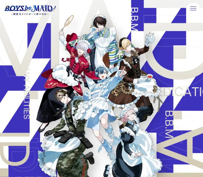
DESIGN REFERENCE
『BOYS be MAID!~御曹司メイドボーイ部の日日~』公式サイト
御曹司メイドボーイたちの物語を紹介する公式サイト。6人のキャラクターイラスト、巨大な欧文、青紫と白の幾何学模様を軸に、キャラクター紹介やニュース、映像、スタッフ情報を展開する。
オリジナルサイトを見るBOYS be MAID! — Style Reference
An elaborate character ensemble staged against enormous blue-violet letterforms and an airy white canvas.
Website: boysbemaid.jp Original URL: https://boysbemaid.jp/ Final URL: https://boysbemaid.jp/ — supplied HTTP status: 200 Theme: light, with white surroundings and a contrasting blue-violet news panel Inspected: September 13, 2026, at 03:33 JST; supplied retrieval timestamp: September 12, 2026, 18:33:44.646 UTC Viewports: desktop 1440 × 1000 and mobile 390 × 844 CSS pixels Scope: the current official character-project homepage: ensemble opening, story introduction, members, news, media frame, staff, illustrated locations, and footer. Visual evidence includes three desktop captures and two mobile captures. Additional navigation and overlay structures are documented from the supplied DOM, with their interaction limits stated below.
BOYS be MAID! presents a fictional school and its six maid-clad characters through a mixture of ornamental branding and precise graphic geometry. Detailed, colorful character illustrations sit in front of huge cropped letters, diagonal blue-violet planes, pale neutral forms, and fine outlines. The interface itself stays restrained: blue-violet text, compact English labels, narrow Japanese vertical lettering, and substantial white space.
This is an official content portal. Character profiles, news, movies, special content, an external novel publication, and merchandise destinations form its navigation. The homepage moves from a crowded ensemble image into slower narrative and editorial sections, then closes with another large character composition. Preserve that alternation between visual density and quiet space when extending the design.
How to Read This Reference
- Measured means a value supplied in rendered DOM rectangles or computed styles. Measurements describe the sampled element, which may be a wrapper rather than the visible artwork.
- Visual estimate means a proportion, color relationship, or shape inferred from the five original-page screenshots. These observations are not pixel samples or recovered CSS declarations.
- DOM-only evidence identifies structures whose text or styles were supplied without a corresponding visible, opened-state screenshot. A nonzero rectangle does not establish that an overlay was visible.
- Recommended identifies an implementation choice for a new site. The CSS aliases, breakpoint, accessibility additions, and fallback interactions are recommendations.
- Font-family declarations are recorded exactly where available. They do not independently prove font-file loading or identify the lettering embedded in graphics.
- No original asset URLs, complete stylesheets, JavaScript, or animation keyframe bodies were supplied. No additional browsing, commands, or file inspection were performed.
Tokens — Colors
Default Palette
The principal interface color is a saturated blue-violet. Warm gold supplies secondary text and the news panel's foreground; white carries most of the page.
| Name | Value | Suggested token | Evidence and role |
|---|---|---|---|
| Blue-Violet Ink | #3c32be |
--bbm-ink |
Measured as rgb(60, 50, 190) on body text, links, the news background, media control, and footer share button |
| White Canvas | #ffffff |
--bbm-paper |
Measured on the menu button and full-viewport layers; the screenshots show a white page canvas |
| Warm Gold | #bcad8a |
--bbm-gold |
Measured as rgb(188, 173, 138) on desktop member captions, news text, and terminal-like layer details |
| Warm Neutral | #eeeae2 |
--bbm-neutral |
Measured on auxiliary overlay controls; a useful visual approximation for portrait backdrops and the footer diagonal, whose individual fills were not measured |
| Logo Navy | Not measured | Keep within the logo asset | The ornamental header logo appears darker and bluer than the main interface ink |
| Costume Colors | Artwork-specific | No general UI tokens | Reds, greens, pale blues, browns, and dark navy belong primarily to the character illustrations |
The body background itself is recorded as transparent. White Canvas describes the rendered appearance and measured white interface surfaces, rather than a recovered white BODY declaration.
Gold is a subdued editorial accent, not a metallic gradient. The neutral backdrop is similarly flat. Let the illustration provide fabric highlights, shadows, and material variation.
Theme Presets
Only one light presentation is evidenced. No user-selectable color themes were verified.
The supplied custom properties include numerous WordPress preset colors, gradients, and shadows, plus Swiper defaults such as --swiper-theme-color: #007aff. Their presence does not establish visible use. They should not expand this page's palette into a rainbow or introduce a general shadow system.
Tokens — Typography
Japanese Body Copy
- Measured family:
"Noto Sans JP", sans-serif. - Base: 14px / 21px at desktop; 13px / 19.5px at mobile, weight 400.
- Story copy: weight 500, with substantially more generous leading than the base interface.
- Role: narrative text, Japanese news text, legal information, and utility links.
- Tracking: the sampled elements use
normal; broad letter spacing is not a universal text treatment.
Latin Navigation and Utilities
- Measured family:
indivisible, sans-serif. - Roles: navigation, NEWS and ALL labels, romanized member captions, OFFICIAL SNS, and desktop footer navigation.
- Weights: typically 500–600; the desktop navigation layer uses a notably lighter 300.
- Character: direct, geometric, and compact beside the more elaborate logo and Japanese display graphics.
The mobile navigation changes both size and weight. It is not simply a proportionally reduced desktop menu.
Ornamental Logo and Japanese Display Lettering
The header wordmark combines italic and decorative serif forms with navy coloring and gold flourishes. The large member heading, 香騎学園 メイドボーイ部, and the vertical Japanese names have a fine, high-contrast serif appearance.
These treatments are not identified by a verified live-text font declaration. Several relevant headings have empty text in the supplied element records while visibly containing graphic lettering. Their inherited 13–14px styles do not measure the apparent lettering size.
Use authorized logo and display assets when available. A generic serif fallback is an implementation approximation, not an identification of the original font.
Terminal-Like Layer — DOM Only
A separate layer declares source-code-pro, monospace. Its heading reads Knight Of the K Institution and uses warm-gold text. Desktop samples show a 13px, weight-700 heading and 12px, weight-600 body text with 30px leading. Mobile samples use 12px and 11px respectively, with 27.5px body leading.
Its activation and visible appearance were not demonstrated. This monospace treatment should not spread into the ordinary page typography.
Type Scale
All numeric entries below are measured computed values. A slash separates font size and line height.
| Role | Desktop | Mobile | Weight | Notes |
|---|---|---|---|---|
| Body default | 14 / 21px | 13 / 19.5px | 400 | Noto Sans JP |
| Story paragraph | 15.75 / 28px | 14.625 / 29.25px | 500 | Mobile leading increases despite a smaller font |
| Navigation-layer links | 61.25 / 61.25px | 23.4 / 23.4px | 300 desktop; 600 mobile | DOM-only menu state |
| NEWS heading | 28 / 42px | 20 / 30px | 600 | Indivisible |
| ALL link | 15.75 / 23.625px | 14 / 21px | 600 | Indivisible |
| News-link base | 14 / 21px | 13 / 19.5px | 400 | Descendant labels may have additional styling not supplied |
| Romanized member caption | 10.5 / 15.75px | Not present in mobile text extraction | 500 | Warm gold, Indivisible |
| OFFICIAL SNS | 14 / 21px | 16 / 24px | 600 | Larger on mobile |
| Desktop footer navigation | 18.375 / 18.375px | Not rendered in the mobile footer evidence | 600 | Indivisible |
| Guideline and contact links | 14.875 / 22.3125px | 15 / 22.5px | 700 | Noto Sans JP |
| Footer English statement | 8.75 / 15.75px | 9 / 16px | 600 | Deliberately small |
| Fiction disclaimer | 9.625 / 14.4375px | 10 / 15px | 500 | Noto Sans JP |
Visual estimates: the desktop Japanese member heading appears approximately 76–88px tall as lettering, with an English MEMBER subtitle around 26–28px. These are visual scale references, not computed font sizes.
The HTML root records Times, and icon-only buttons record Arial. Neither establishes the page's visible display typography. The body and Latin labels have the more specific families above.
Tokens — Spacing & Shapes
The page combines large composition-level distances with small utility details. There is no verified universal spacing formula. Fractional values are retained below because they are present in the rendered measurements.
Spacing Scale
| Use | Desktop measurement | Mobile measurement | Interpretation |
|---|---|---|---|
| Header logo inset | 26.25px top and left | 20px top and left | Identity stays close to the viewport corner |
| Menu outside inset | 17.5px top and right | 15px top and right | Separate from the logo's inset |
| Main footer text inset | 60px left | 29.25px left | The mobile inset is 7.5% of 390px |
| Mobile member grid inset | — | 39px each side | 10% of the viewport |
| Desktop member slot gap | 80px, calculated from slot positions | — | 380px pitch minus 300px slot width |
| Mobile member column gap | — | 20px, calculated | 166px pitch minus 146px width |
| Member control gap | 35px, calculated | Controls absent from mobile main-flow evidence | Four desktop controls span 385px |
| News panel padding | 52.5px vertical; 70px horizontal | 58.5px vertical; 29.25px horizontal | Mobile retains generous vertical padding |
| Story section top padding | 270px | 78px | A major responsive adjustment |
| Staff section top padding | 0px on sampled section | 80px | Internal content also changes arrangement |
Border Radius
| Element | Measured or estimated geometry | Treatment |
|---|---|---|
| Header menu | 78.75 × 63px, radius 80px desktop; 65 × 52px, radius 65px mobile | Horizontal oval, not a perfect circle |
| Desktop member controls | 70 × 56px, radius 70px | Fine outlined ovals |
| Media button | 105 × 84px, radius 105px desktop; 60 × 48px, radius 28px mobile | Filled oval |
| Footer share link | 60 × 60px desktop; 58.5 × 58.5px mobile; radius 50% | True circle |
| News panel | Radius 0 | Large square-cornered field |
| Location illustrations | Square corners in screenshots | Plain rectangular artwork |
| Portrait backdrop | Approximately 300 × 240px in desktop screenshot | Visually an oval or rounded well; its radius was not supplied |
Layout Measurements
| Element | Desktop at 1440 × 1000 | Mobile at 390 × 844 |
|---|---|---|
| Document height | 7043.19px | 6604.16px |
| Opening section box | 1440 × 1635.77px | 390 × 780.08px |
| Header logo wrapper | 297.5 × 62.05px | 175.5 × 36.59px |
| Member section box | 1440 × 725.31px | 390 × 868.06px |
| Member slot/link width | 300px in the horizontal rail | 146px in two columns |
| News panel | 980 × 627.83px, left edge 230px | 390 × 651.91px, full width |
| News inner width | 840px | 331.5px |
| Media section box | 980 × 552.13px | 390 × 219.38px |
| Footer box | 1440 × 600px | 390 × 1008.97px |
| Footer art region | 600 × 600px | 390 × 585px |
The desktop opening exceeds the height of the first screenshot. Do not force it into a conventional 100vh hero. On mobile, the first section begins at document y = 97.5px, but illustrated pixels appear closer to the header in the screenshot. Section rectangles do not fully describe transformed or overflowing artwork.
Components
Persistent Header
Role: maintain the project's identity and access to navigation while the page scrolls.
The decorative logo sits at the upper left. A white oval containing three fine blue-violet horizontal strokes sits at the upper right. There is no visible full-width header divider or permanent desktop navigation row.
The logo and menu retain their viewport positions in the supplied top and lower-page captures. This supports a persistent visual treatment; the actual position declaration was not included. The HEADER wrapper itself measures zero height at both widths.
The desktop logo is almost 300px wide, while the phone logo is 175.5px wide. The menu reduces much less dramatically, from 78.75 × 63px to 65 × 52px. Preserve that difference: the control remains comfortably prominent on the narrow screen.
Navigation Layer — DOM Evidence
Role: expose the site's eight primary destinations.
The supplied links are TOP, NEWS, MEMBER, INTRODUCTION, MOVIE, SPECIAL, NOVEL, and GOODS. MEMBER and INTRODUCTION target homepage anchors. NOVEL points to the project's external publication on note.com, while GOODS points to an external merchandise category.
Desktop link samples start at x = 120px and use 61.25px light Indivisible. Mobile samples start at x = 68.25px and use 23.4px semibold Indivisible. Their vertical positions form a list in both records.
No opened-menu screenshot or click result was supplied. Its backdrop, opening choreography, scroll locking, focus behavior, and close-button transformation remain unverified.
Typographic Ensemble Opening
Role: introduce the six characters and establish the visual identity before explanatory content.
The opening is a layered poster composition:
- A white foundation.
- Enormous cropped letters and geometric blue-violet fields.
- Pale neutral or gold letter fragments and thin outline shapes.
- Small directional annotations such as
B.B.Mand fragments of the project's English motto. - Six detailed character cutouts arranged as a connected ensemble.
- The persistent logo and menu above the composition.
The figures overlap each other with clear foreground and background relationships. Pale blue and white costumes connect the ensemble, while floral red, camouflage green, dark navy, and gear-covered brown distinguish individuals. The central blue-haired figure reaches outward; taller characters frame the upper composition.
Desktop shows an expansive poster extending below the first viewport. Mobile presents a tall, tightly framed arrangement that keeps all six characters recognizable and shows more of their full bodies within the narrow composition. Cropping is concentrated around the outer silhouette and background typography. Avoid cutting through the central faces or treating the image as an arbitrary centered cover crop.
The giant background lettering is decorative. It should not compete with the logo as another ordinary text heading or become a repeated screen-reader announcement.
Story Introduction
Role: explain the school, its concealed club, and the project's short voice-drama premise.
The desktop section has a measured 270px top inset, a centered heading wrapper approximately 819.52 × 77.11px, and two tall, narrow side-heading boxes. The narrative uses 15.75px medium Noto Sans JP with 28px leading.
Mobile restructures the graphic headings: the central heading wrapper becomes 195 × 70.45px, and a subsequent heading spans approximately 281.41 × 122.22px. Story text uses 14.625px with 29.25px leading. The extracted mobile text contains different line breaks, including shorter school-name and explanatory lines.
Preserve the deliberate paragraph pauses and the three motto terms: Many Abilities, Independence, and Dedication. A centered reading arrangement is a reasonable implementation recommendation, but the supplied paragraph records do not include text-align.
A small button appears near the end of the story section. Its action was not exercised and should not be assigned an invented function.
Member Heading and Geometric Boundary
Role: mark the transition from narrative to the cast.
The desktop capture centers the large Japanese heading 香騎学園 メイドボーイ部 above MEMBER. Blue-violet clusters of squares and diagonal half-squares occupy the outer edges. Above them, a thin ruled band forms a downward-pointing V through closely spaced vertical lines.
The triangle modules appear roughly 36–45px across in this screenshot; this is a visual estimate. Their scale and placement vary across the decorative clusters. They are accents at the section boundary, not a uniform wallpaper behind every component.
Allow ample white space between the heading and portraits. The restraint makes the small vertical names and warm-gold captions feel intentional.
Desktop Member Rail
Role: provide visually distinctive entrances to six character profiles.
Each member slot contains an illustrated bust over a warm neutral oval, a vertical Japanese name with a smaller CV label near the upper-left edge, and a small romanized name/CV caption underneath. The slot is 300px wide. Consecutive slots are positioned 380px apart, producing an 80px gap.
The captured rail shows three complete portraits at x = 190, 570, and 950px, with neighboring members cut off at both viewport edges. Those partial portraits communicate horizontal continuation.
Below the rail are four outlined oval buttons, each 70 × 56px, separated by 35px. Left and right arrows flank two additional pictograms. The middle controls' exact functions were not verified; do not label them as playback, relationship mapping, or a view switch without further evidence.
The profile links confirm six distinct characters. Additional desktop profile links also appear in a viewport-positioned three-column structure in the DOM. That is not evidence of a second ordinary homepage cast section or an opened panel.
Mobile Member Grid
Role: make the full cast available in a compact vertical sequence.
The mobile DOM establishes a two-column, three-row layout rather than the desktop rail. Links start at x = 39 and 205px, with 146px widths and a 20px column gap. Their measured heights are approximately 172–177px. Vertical gaps between the illustrated links are approximately 48.75px.
The observed order is Takashina Ranto and Kisaki Yoka, then Amaki Rou and Kiku Shumei, then Aimery Cénoir and Himeutsugi Rei.
The desktop romanized caption paragraphs and four rail controls are absent from the mobile main-flow evidence. The two supplied phone screenshots do not show this section, so its precise internal portrait masks and graphic-label treatment remain unverified. Reproduce the evidenced grid geometry without pretending that the desktop oval treatment was visually confirmed on mobile.
News Panel
Role: collect timely project information in a concentrated, contrasting surface.
A 980px-wide blue-violet rectangle sits centrally on desktop, with warm-gold text and square corners. Its measured padding is 52.5px vertically and 70px horizontally. NEWS sits at the upper left and ALL at the upper right.
Three linked entries combine a date, one or more category labels, and Japanese titles. The supplied entries cover an anniversary submission campaign, the first anniversary, and AnimeJapan 2026. Desktop link wrappers use flex layout; the first two measured row heights are 33.25px, and the longer third row is 42px.
At 390px, the panel spans the entire viewport. Padding becomes 58.5px vertically and 29.25px horizontally. Entry wrappers switch to block layout and become 63.5–83px tall as content wraps, including 10px bottom padding.
A linked merchandise graphic is also present within the panel. Its link width is 490px on desktop and 331.5px on mobile. The graphic's filename and intrinsic proportions were not supplied.
Media Frame — DOM Evidence
Role: present a prominent media entry beneath the news area.
The section measures approximately 16:9: 980 × 552.13px on desktop and exactly 390 × 219.375px on mobile. A centered blue-violet oval button measures 105 × 84px on desktop and 60 × 48px on mobile.
This supports a simple media-frame component with one central control. The supplied screenshots do not show its poster, and no playback was exercised. Its provider, player chrome, audio behavior, and any modal presentation remain unverified.
Staff and Illustrated Locations
Role: credit the project and extend the fictional setting beyond character portraits.
The rendered page lists these project staff credits:
| Original role label | Name as rendered |
|---|---|
| CharacterDesign | Ugonba |
| Main Scenario Writer | Inui Nire |
| Planning , Original | Takagi Ayumi |
| Production | Seed Project / ontembaar.Inc |
These are project creative and production credits. They do not independently identify the website's designer or developer.
The lower-page screenshot shows painted location artwork: a warm, wood-paneled living room and a blue nighttime building exterior. The rectangular images float in an asymmetric composition with large white gaps. Thin vertical Japanese captions sit beside them, including 部室棟リビング and 部室棟外観; the latter has the number 03 above it.
Measured desktop image wrappers include 450 × 253.125px and 570 × 320.625px, both 16:9. The living-room wrapper is positioned to the right at x = 780px; the exterior wrapper sits to the left at x = 60px farther down the page.
Mobile records include a 331.5 × 186.47px scene near the top of the section and two 292.5 × 164.53px scenes positioned at x = 68.25px. Narrow caption wrappers appear to their left. This retains asymmetry within a vertical layout rather than scaling down the desktop spread.
Editorial Footer
Role: close the page with navigation, official channels, practical links, and another character-led image.
On desktop, the footer is 600px tall. A clean BOYS be MAID! graphic and a tiny three-line English statement occupy the left column. OFFICIAL SNS and a row of X, TikTok, YouTube, and Lit.Link marks appear below. A middle region contains a three-column site map, guideline and contact links, the fiction disclaimer, and copyright.
The lower wordmark is visually simpler than the ornamental header logo. Its wrapper is approximately 299.94 × 31.06px on desktop and 234.45 × 24.28px on mobile; these are graphic-box measurements, not font sizes.
A 600 × 600px composition occupies the desktop footer's right edge. A pale diagonal rises toward the top-right corner. The blond character in a brown, gear-trimmed costume overlaps the diagonal, large blue-violet lettering, a small starburst, motto labels, and a vertical Japanese quotation.
On mobile, the footer grows to approximately 1009px tall. Social links, 二次創作ガイドライン, お問い合わせ, the disclaimer, and copyright stack above and alongside a 390 × 585px art region. The full desktop site map is absent from the mobile footer evidence, while primary navigation remains represented in the header menu DOM.
The illustration becomes the dominant closing image. Keep its vertical quotation and graphic fragments coordinated with the figure instead of treating the character as a small thumbnail below the legal text.
Footer Share Link
Role: share a prepared project message through X.
The filled blue-violet circle with a white X is a share link. Its DOM destination is a twitter.com/intent/tweet URL containing prepared text and the homepage address. It is not a close button or a back-to-top control.
The button is 60px square on desktop and 58.5px square on mobile. In the mobile record it sits 19.5px from the right and bottom edges of the closing composition. Its changing position between desktop and mobile reflects the art layout; there is no evidence that it is a globally fixed floating action.
No share action was executed.
Auxiliary Layers and Opening Logo — DOM Only
The supplied records also contain full-viewport white sections, a terminal-like layer, a six-member panel, and a centered opening logo. These were not shown as opened states in the screenshots.
The opening logo wrapper is 480 × 100.11px on desktop and 292.5 × 61px on mobile. It has a named animation declaration, described below. Preserve the distinction between this transient logo layer and the persistent illustrated opening section.
Do not build arbitrary hidden experiences from these fragments. Their triggers, content completeness, and navigation semantics require separate inspection.
Tokens — Motion & Interaction
The evidence supports specific transition declarations, but it does not supply a recording of their complete behavior.
| Element or treatment | Supplied declaration | Evidence limit |
|---|---|---|
| Desktop navigation links | color 0.2s cubic-bezier(0, 0.55, 0.45, 1) |
Target hover color and opened state were not captured |
| Desktop menu and member controls | 0.3s cubic-bezier(0, 0.55, 0.45, 1) |
Duration and easing known; transformed properties and resulting states unverified |
| Desktop news and footer links | color 0.3s cubic-bezier(0, 0.55, 0.45, 1) |
Declaration, not a demonstrated hover |
| Desktop merchandise link | opacity 0.3s cubic-bezier(0, 0.55, 0.45, 1) |
End opacity not supplied |
| A desktop auxiliary control | scale 0.3s cubic-bezier(0, 0.55, 0.45, 1) |
Scale endpoints and panel identity unverified |
| Mobile introduction graphics | clip-path 1s cubic-bezier(0.85, 0, 0.15, 1) |
Reveal declaration present; clipping endpoints unavailable |
| Terminal-like layer | opacity 0.3s, visibility 0.3s |
Activation not exercised |
| Other full-viewport layers | 0.5s |
Properties and visible transitions not demonstrated |
| Opening-logo layer | 1s 1.5s |
One-second transition with a 1.5-second delay; endpoints unspecified |
| Opening logo | 2s cubic-bezier(0.85, 0, 0.15, 1) forwards loaderLogoAnim |
Animation name and timing supplied; keyframe body unavailable |
The capture process waited for initial loading, visible images, finite animation readiness, and sampled layout/text stability. It traversed intermediate scroll positions. Perpetual animations were temporarily paused during readiness checks and then resumed.
These checks do not establish carousel autoplay, drag behavior, a marquee speed, scroll-linked parallax, audio playback, or the visual sequence of a reveal. Repeated BOYS be MAID! strings and Swiper custom properties are insufficient to prove any particular motion implementation.
Many mobile records show only transition: all, without a positive duration. Do not assign the desktop timings to mobile as if they were measured there.
Recommended motion vocabulary: brief control feedback, restrained graphic reveals, and explicit user-controlled navigation. Keep the artwork legible while it moves. Avoid adding continuous movement to every large letter or character merely because the composition is energetic.
Surfaces
| Surface | Appearance | Role |
|---|---|---|
| Main canvas | White, visually open | Separates large illustrated and editorial sections |
| Opening graphic field | Blue-violet, pale neutral, white, fine outlines | Provides scale and diagonal movement behind the cast |
| Portrait well | Warm pale oval, visually estimated | Unifies differently colored character busts |
| News field | Measured blue-violet with gold foreground; square corners | Concentrates dense information |
| Header control | White oval with blue-violet strokes | Keeps navigation visible over busy artwork |
| Member controls | Fine blue-violet outlines and simple pictograms | Light interface structure below portraits |
| Location artwork | Unframed rectangular painting | Adds atmosphere without introducing another UI surface |
| Footer art plane | Pale diagonal with oversized letters and a character cutout | Creates a composed visual ending |
| Share control | Blue-violet circle with white mark | Distinguishes the sharing action from surrounding art |
There is no evidenced general card-elevation system. Fine rules, strong color fields, image silhouettes, and negative space supply structure. Any soft tonal falloff around the characters belongs to the artwork or its immediate presentation; filter and shadow values were not supplied.
Imagery
The character artwork is the primary identity asset. It combines delicate facial rendering, dense costume detail, pale fabric highlights, expressive hands, and props such as a teapot, tray, fan, and sword. The six silhouettes should remain distinct even when tightly layered.
The costumes introduce multiple visual themes within a shared maid-uniform framework: floral red, striped pale blue and green, camouflage with harness details, gear-laden brown, pale blue, and dark navy with white trim. Those colors enrich the illustrations without becoming six competing interface themes.
Location images are painted settings rather than photography. The living room uses warm wood, red upholstery, and amber daylight; the exterior uses deep blue night tones and illuminated windows. Their atmosphere contrasts with the cool, bright website shell.
Use smooth, high-resolution artwork rendering. Pixelation, halftone conversion, duotone filters, or generic photo replacements would change the character of this page.
Observed Asset References
No image src URLs, source filenames, or intrinsic image dimensions were included in the supplied evidence. These records identify observed artwork and measured layout boxes, not downloadable asset paths.
| Asset | Evidence | Reuse guidance |
|---|---|---|
| Ornamental header logo | Desktop and mobile opening/footer captures | Preserve its complete navy-and-gold graphic treatment and proportions |
| Six-character opening composition | Desktop and mobile opening captures | Prepare intentional desktop and phone framing; retain foreground/background ordering |
| Member portraits and Japanese labels | Desktop member capture; desktop/mobile profile-link geometry | Keep original character identity; verify mobile graphic treatment separately |
| Geometric member boundary | Desktop member capture | Recreate simple rules and triangle modules in CSS or SVG if appropriate |
| Illustrated room and exterior | Desktop lower-page capture; responsive scene-wrapper measurements | Preserve rectangular 16:9 presentation and caption relationships |
| Simplified footer wordmark | Desktop footer capture and logo-wrapper records | Do not substitute the decorative header logo without checking the visual difference |
| Footer character composition | Desktop and mobile footer captures | Treat figure, quotation, letterforms, and diagonal as a coordinated composition |
| Official social marks | Desktop/mobile footer captures and link destinations | Use recognizable, accessible marks at their individual proportions |
CSS can reconstruct the surrounding geometry. It cannot reproduce the character identities or ornamental lettering. Use authorized assets and retain meaningful text alternatives where the graphic contains content.
Layout & Responsive Behavior
The homepage is a long scrolling document. It is not a fixed application shell, and the desktop opening is taller than the first viewport. The major sequence remains recognizable at both inspected widths, but individual sections change structure substantially.
| Area | Desktop observation | Mobile observation |
|---|---|---|
| Header | Large corner logo and oval menu over the artwork | Smaller logo, comparatively large menu, white clearance near the top |
| Opening | Wide layered poster extending below the viewport | Tall, tight composition with the six figures arranged for a narrow frame |
| Introduction | Wide heading and tall side graphics; 270px top inset | Stacked graphic headings; 78px top inset; shorter text lines |
| Members | Horizontal rail with three full portraits and clipped neighbors | Two-column, three-row arrangement in the DOM |
| News | Centered 980px panel; flex entry wrappers | Full-width panel; block entry wrappers and longer wrapping |
| Media | Centered approximately 16:9 frame | Full-width 16:9 frame |
| Scenery | Large alternating left/right placements | Smaller vertically arranged scenes retaining lateral offsets |
| Footer | Text/navigation regions beside a 600px square art composition | Stacked practical content and a 585px-tall art region; desktop footer site map absent |
The source breakpoint and interpolation formulas are unknown. Only 1440px and 390px widths were inspected. A 767px breakpoint in the Quick Start is a recommended implementation boundary, not recovered source CSS.
Avoid a single global scale factor. Body text changes only from 14 to 13px, the logo shrinks markedly, the menu changes modestly, OFFICIAL SNS becomes larger, and the member layout changes topology.
The phone footer screenshot places OFFICIAL SNS close to the persistent logo. This is a useful implementation test case: maintain clearance for sticky identity elements when revealing or linking to lower-page content. The evidence does not establish a universal overlap bug.
Do’s and Don’ts
Do
- Anchor the interface in exact blue-violet
#3c32be, white, and restrained warm gold#bcad8a. - Let full-color character art carry most of the visual complexity.
- Combine enormous cropped Latin letterforms with small, precise utility text.
- Preserve the distinction between the ornamental header logo and simpler footer wordmark.
- Use generous white space around the story, portraits, and illustrated settings.
- Keep desktop member slots 300px wide with clear neighboring previews and light oval controls.
- Switch to the evidenced two-column member arrangement on phones.
- Retain vertical Japanese labels and the asymmetric placement of location artwork.
- Give the news area one strong rectangular color field rather than separate elevated cards.
- Compose the mobile footer as a substantial final illustration with practical links kept readable.
Don't
- Don't reduce the homepage to a generic headline, conversion button, and feature-card sequence.
- Don't constrain the desktop opening to 100vh or crop character faces to make it fit.
- Don't shrink the desktop carousel and footer columns uniformly onto a phone.
- Don't treat the inherited 14px heading style as the size of graphic lettering.
- Don't invent a serif font name for the logo or Japanese display assets.
- Don't promote WordPress preset gradients, shadows, or Swiper's default blue into brand tokens.
- Don't add rounded cards, glass blur, or heavy UI shadows throughout the white sections.
- Don't recolor every illustration into the interface palette or apply pixelated rendering.
- Don't label the footer X share link as Close or Back to top.
- Don't claim autoplay, hover endpoints, modal behavior, or hidden interactions from CSS declarations alone.
Recommended Implementation Additions
These are recommendations for a new implementation, not verified features of the original page:
- Give the menu and all icon-only controls explicit accessible names. Connect menu state to
aria-expandedandaria-controls. - Give each member link a reliable text name even when the visible Japanese name is embedded in artwork. Avoid duplicate accessible links from hidden alternate layouts.
- Implement rail controls with keyboard support and predictable focus. If a dialog or alternate member panel is included, handle Escape, focus containment, and focus return.
- Preserve a visible focus indicator on both white and blue-violet surfaces.
- Review the contrast of gold microcopy on white and small gold news text on violet. Use violet for essential captions on white and white for essential small text on violet where needed.
- Offer a readable caption variant around 12px or larger. The measured 8.75–10.5px details document the source's appearance, not an accessibility target.
- Keep decorative letter fragments, triangle motifs, and repeated brand strings out of the accessibility tree. Use meaningful alternatives for narrative imagery and graphic headings.
- Under reduced motion, show reveal content immediately and provide a static opening without a blocking logo delay.
- Supply responsive image sources and intrinsic dimensions. Prioritize the visible opening artwork, then defer lower-page images without destabilizing layout.
- Test fixed-header clearance, footer stacking, and image/text overlap at intermediate widths, browser zoom, and narrow landscape sizes.
Agent Prompt Guide
Quick Color Reference
- Main ink, rules, and filled controls:
#3c32be. - Main canvas and menu surface:
#ffffff. - Member microcopy and original news foreground:
#bcad8a. - Pale portrait/footer approximation:
#eeeae2; those particular fills were not independently measured. - Costume colors remain within the supplied artwork.
- Shape language: oversized letter fragments, diagonal planes, small triangle clusters, oval controls, square scene images.
Overall Prompt
“Create an official character-project homepage inspired by BOYS be MAID!. Use a white canvas, exact blue-violet #3c32be, restrained warm gold #bcad8a, and detailed full-color character illustrations. Stage a six-person ensemble over enormous cropped Latin letterforms, diagonal blocks, pale neutral fragments, and fine outlines. Keep an ornamental logo at the upper left and a white oval hamburger control at the upper right. Follow the opening with spacious story content, a desktop member rail, a blue-violet news panel, a simple media frame, staff information, asymmetrically placed painted locations, and a large illustrated footer. Use Noto Sans JP for Japanese body copy and Indivisible where available for Latin utilities. Treat Japanese display lettering as supplied artwork unless its font is independently known. On mobile, use a two-column cast grid and a tall footer composition rather than shrinking desktop columns.”
Example Component Prompts
- Opening: “Build a layered character poster on white. Place six detailed cutout figures in a connected composition with distinct foreground and background positions. Behind them, use huge cropped blue-violet letters, pale neutral letter fragments, diagonal white cuts, and hairline circular outlines. Prepare deliberate narrow-screen framing and protect all faces.”
- Desktop members: “Create a full-width horizontal cast rail with 300px slots and 80px gaps. Use warm pale oval portrait backdrops, vertical blue-violet Japanese graphic names, tiny gold romanized captions, and partial neighboring portraits at the edges. Center four thin outlined 70 × 56px controls below. Do not assign unknown secondary-control functions.”
- Mobile members: “Arrange six profile links in two columns inside an 80%-width container. At 390px, use 146px columns, a 20px gap, and approximately 49px between illustrated rows. Keep names accessible and use mobile-specific graphic assets when available.”
- News: “Create one square-cornered blue-violet panel with warm-gold labels, NEWS at the left, ALL at the right, and three dated entries. Use 980px width and 70px horizontal padding on desktop. At 390px, expand to full width with 29.25px side padding and stack each entry's metadata and title.”
- Scenery: “Place 16:9 painted school-location images asymmetrically in broad white space. Pair them with narrow vertical blue-violet Japanese captions and small numeric identifiers. Keep square corners and avoid card framing.”
- Footer: “Build a quiet information footer that meets a large illustrated character composition. Use a pale diagonal plane, blue-violet oversized letters, small motto labels, a vertical Japanese quotation, and a brown gear-trimmed character. Keep social and legal links legible. On mobile, let the artwork occupy a 390 × 585px closing region with a 58.5px circular X share link.”
Quick Start
CSS Custom Properties
This is an adaptation for new semantic markup, not an extracted stylesheet. Measured values are used where available. The breakpoint, hero art fitting, fallback portrait treatment, hover endpoints, and accessible variants are recommendations. The CSS has not been browser-tested here.
Use a .bbm-page body, a header containing .site-logo and .menu-toggle, a hero containing a .hero__art picture, a member list with .member__item links, a news panel, a media frame, and footer content/art regions. Supply actual artwork through HTML images or pictures; no unverified asset paths are embedded below.
The desktop hero ratio approximates its measured section footprint. It is not a known source-image ratio. Adjust the image composition after loading authorized assets. The mobile member skin is a fallback because its internal artwork was not included in the phone screenshots.
:root {
  /* Measured interface colors; neutral art fills are approximations. */
  --bbm-ink: #3c32be;
  --bbm-paper: #ffffff;
  --bbm-gold: #bcad8a;
  --bbm-neutral: #eeeae2;

  /* Recorded families; loading licensed font files is separate. */
  --bbm-font-jp: 'Noto Sans JP', sans-serif;
  --bbm-font-latin: indivisible, sans-serif;
  --bbm-font-code: source-code-pro, monospace;

  /* Explicit pixels preserve samples with a conventional root size. */
  --bbm-body-size: 14px;
  --bbm-body-leading: 21px;
  --bbm-story-size: 15.75px;
  --bbm-story-leading: 28px;
  --bbm-caption-size: 10.5px;
  --bbm-caption-leading: 15.75px;
  --bbm-gutter: 60px;
  --bbm-content-width: 980px;
  --bbm-member-width: 300px;
  --bbm-member-gap: 80px;

  /* Measured transition timing; endpoints require implementation. */
  --bbm-ease: cubic-bezier(0, 0.55, 0.45, 1);
  --bbm-reveal-ease: cubic-bezier(0.85, 0, 0.15, 1);
  --bbm-control-motion: 300ms var(--bbm-ease);
}

.bbm-page,
.bbm-page * {
  box-sizing: border-box;
}

body.bbm-page {
  margin: 0;
  color: var(--bbm-ink);
  background: var(--bbm-paper);
  font-family: var(--bbm-font-jp);
  font-size: var(--bbm-body-size);
  line-height: var(--bbm-body-leading);
}

.bbm-page img {
  display: block;
  max-width: 100%;
  height: auto;
}

.bbm-page a {
  color: inherit;
}

.bbm-page button {
  font: inherit;
}

.site-header {
  position: fixed;
  inset: 0 0 auto;
  z-index: 20;
  height: 0;
  pointer-events: none;
}

.site-logo,
.menu-toggle {
  position: absolute;
  pointer-events: auto;
}

.site-logo {
  top: 26.25px;
  left: 26.25px;
  width: 297.5px;
}

.menu-toggle {
  top: 17.5px;
  right: 17.5px;
  display: grid;
  place-content: center;
  gap: 8px;
  width: 78.75px;
  height: 63px;
  padding: 0;
  border: 0;
  border-radius: 80px;
  color: var(--bbm-ink);
  background: var(--bbm-paper);
  cursor: pointer;
  transition:
    color var(--bbm-control-motion),
    background-color var(--bbm-control-motion);
}

/* Three decorative spans; give the button an accessible name. */
.menu-toggle span {
  width: 36px;
  height: 1.5px;
  background: currentColor;
}

.hero {
  position: relative;
  isolation: isolate;
  aspect-ratio: 1440 / 1636;
  overflow: hidden;
}

.hero__art {
  position: absolute;
  inset: 0;
  z-index: 2;
  display: block;
}

.hero__art img {
  width: 100%;
  height: 100%;
  object-fit: contain;
  object-position: center top;
}

/* Recommended decorative text fallback, not original lettering. */
.hero__type {
  position: absolute;
  top: -0.12em;
  left: -0.08em;
  z-index: 0;
  margin: 0;
  color: var(--bbm-ink);
  font-family: var(--bbm-font-latin);
  font-size: 74vw;
  font-weight: 600;
  line-height: 0.82;
  letter-spacing: -0.08em;
  pointer-events: none;
}

.hero__type--outline {
  color: transparent;
  -webkit-text-stroke: 1px var(--bbm-gold);
}

.story {
  padding: 270px var(--bbm-gutter) 120px;
}

.story__copy {
  max-width: 52em;
  margin-inline: auto;
  font-size: var(--bbm-story-size);
  font-weight: 500;
  line-height: var(--bbm-story-leading);
  text-align: center;
}

.vertical-label {
  writing-mode: vertical-rl;
  text-orientation: upright;
}

.member__heading {
  margin: 0;
  text-align: center;
}

/* Native scrolling is a recommended fallback, not verified source JS. */
.member__rail {
  display: flex;
  gap: var(--bbm-member-gap);
  margin: 0;
  padding: 150px max(30px, calc((100vw - 1060px) / 2)) 0;
  overflow-x: auto;
  list-style: none;
  scroll-snap-type: x proximity;
}

.member__item {
  position: relative;
  flex: 0 0 var(--bbm-member-width);
  min-width: 0;
  scroll-snap-align: center;
}

/* The 5:4 well is a visual approximation of the desktop portrait. */
.member__portrait {
  display: block;
  aspect-ratio: 5 / 4;
  overflow: hidden;
  border-radius: 50%;
  background: var(--bbm-neutral);
}

.member__portrait img {
  width: 100%;
  height: 100%;
  object-fit: contain;
  object-position: center bottom;
}

.member__caption {
  margin: 17.5px 0 0;
  color: var(--bbm-gold);
  font-family: var(--bbm-font-latin);
  font-size: var(--bbm-caption-size);
  font-weight: 500;
  line-height: var(--bbm-caption-leading);
  text-align: center;
}

.member__controls {
  display: flex;
  justify-content: center;
  gap: 35px;
  margin-top: 52.5px;
}

.pill-control {
  display: inline-grid;
  place-items: center;
  width: 70px;
  height: 56px;
  padding: 0;
  border: 1px solid currentColor;
  border-radius: 70px;
  color: var(--bbm-ink);
  background: transparent;
  cursor: pointer;
  transition:
    color var(--bbm-control-motion),
    background-color var(--bbm-control-motion);
}

.news-panel {
  width: min(var(--bbm-content-width), calc(100% - 2 * var(--bbm-gutter)));
  margin-inline: auto;
  padding: 52.5px 70px;
  border-radius: 0;
  color: var(--bbm-gold);
  background: var(--bbm-ink);
}

.news-panel__header {
  display: flex;
  align-items: center;
  justify-content: space-between;
  gap: 20px;
  margin-bottom: 35px;
}

.news-panel__heading {
  margin: 0;
  font-family: var(--bbm-font-latin);
  font-size: 28px;
  font-weight: 600;
  line-height: 42px;
}

.news-panel__all {
  font-family: var(--bbm-font-latin);
  font-size: 15.75px;
  font-weight: 600;
  line-height: 23.625px;
}

.news-list {
  display: grid;
  gap: 43.75px;
  margin: 0;
  padding: 0;
  list-style: none;
}

.news-row {
  display: flex;
  align-items: flex-start;
  gap: 20px;
  color: inherit;
  text-decoration: none;
  transition: color var(--bbm-control-motion);
}

.news-row__date,
.news-row__categories {
  flex: 0 0 auto;
}

.news-row__title {
  flex: 1;
  min-width: 0;
  margin: 0;
}

/* Optional readable variant; not the measured original foreground. */
.news-panel--readable .news-row {
  color: var(--bbm-paper);
}

.media-frame {
  position: relative;
  width: min(var(--bbm-content-width), calc(100% - 2 * var(--bbm-gutter)));
  aspect-ratio: 16 / 9;
  margin-inline: auto;
}

.media-frame__button {
  position: absolute;
  top: 50%;
  left: 50%;
  display: grid;
  place-items: center;
  width: 105px;
  height: 84px;
  padding: 0;
  border: 0;
  border-radius: 105px;
  color: var(--bbm-paper);
  background: var(--bbm-ink);
  transform: translate(-50%, -50%);
  cursor: pointer;
}

.scene-image {
  width: 100%;
  aspect-ratio: 16 / 9;
  object-fit: cover;
  border-radius: 0;
}

.site-footer {
  position: relative;
  isolation: isolate;
  min-height: 600px;
  padding: 280px var(--bbm-gutter) 70px;
}

.footer__content {
  position: relative;
  z-index: 2;
  display: grid;
  grid-template-columns: 300px 455px;
  gap: 75px;
}

.footer__nav {
  display: grid;
  grid-template-columns: 140px 140px minmax(0, 1fr);
  gap: 21px 0;
  font-family: var(--bbm-font-latin);
  font-size: 18.375px;
  font-weight: 600;
  line-height: 18.375px;
}

.footer__socials {
  display: flex;
  align-items: center;
  gap: 28px;
}

.footer__art {
  position: absolute;
  right: 0;
  bottom: 0;
  z-index: 1;
  width: 600px;
  aspect-ratio: 1;
}

.footer__art::before {
  position: absolute;
  inset: 0;
  z-index: -1;
  content: '';
  background: var(--bbm-neutral);
  clip-path: polygon(100% 0, 100% 100%, 0 100%);
}

/* Use a deliberately composed footer image or coordinated art layers. */
.footer__art > img {
  width: 100%;
  height: 100%;
  object-fit: contain;
  object-position: right bottom;
}

.footer__share {
  position: absolute;
  left: 136.5px;
  bottom: 125.25px;
  display: grid;
  place-items: center;
  width: 60px;
  height: 60px;
  border-radius: 50%;
  color: var(--bbm-paper);
  background: var(--bbm-ink);
  text-decoration: none;
}

/* Recommended feedback endpoints; original endpoints were not supplied. */
@media (hover: hover) {
  .menu-toggle:hover,
  .pill-control:hover {
    color: var(--bbm-paper);
    background: var(--bbm-ink);
  }

  .news-row:hover {
    color: var(--bbm-paper);
  }
}

.bbm-page :is(a, button):focus-visible {
  outline: 3px solid currentColor;
  outline-offset: 5px;
}

/* Recommended breakpoint; only 1440px and 390px were inspected. */
@media (max-width: 767px) {
  :root {
    --bbm-body-size: 13px;
    --bbm-body-leading: 19.5px;
    --bbm-story-size: 14.625px;
    --bbm-story-leading: 29.25px;
    --bbm-gutter: 7.5vw;
  }

  .site-logo {
    top: 20px;
    left: 20px;
    width: 175.5px;
    max-width: 45vw;
  }

  .menu-toggle {
    top: 15px;
    right: 15px;
    width: 65px;
    height: 52px;
    border-radius: 65px;
  }

  .menu-toggle span {
    width: 32px;
  }

  .hero {
    /* Recommended visible header clearance, not a recovered source rule. */
    margin-top: 72px;
    aspect-ratio: 1 / 2;
  }

  .hero__type {
    font-size: 160vw;
  }

  .story {
    padding-top: 78px;
    padding-bottom: 80px;
  }

  .member__rail {
    display: grid;
    grid-template-columns: repeat(2, minmax(0, 1fr));
    gap: 48.75px 20px;
    width: 80%;
    margin-inline: auto;
    padding: 39px 0 0;
    overflow: visible;
    scroll-snap-type: none;
  }

  .member__item {
    width: auto;
  }

  /* Use complete mobile portrait/name artwork if supplied. */
  .member__portrait {
    aspect-ratio: auto;
    overflow: visible;
    border-radius: 0;
    background: transparent;
  }

  .member__portrait img {
    height: auto;
  }

  /* Recommended readable fallback when separate captions are retained. */
  .member__caption {
    color: var(--bbm-ink);
    font-size: 12px;
    line-height: 18px;
  }

  .member__controls,
  .footer__nav {
    display: none;
  }

  .news-panel {
    width: 100%;
    padding: 58.5px var(--bbm-gutter);
  }

  .news-panel__header {
    margin-bottom: 32.5px;
  }

  .news-panel__heading {
    font-size: 20px;
    line-height: 30px;
  }

  .news-panel__all {
    font-size: 14px;
    line-height: 21px;
  }

  .news-list {
    gap: 40.625px;
  }

  .news-row {
    display: block;
    padding-bottom: 10px;
  }

  .news-row__title {
    margin-top: 10px;
  }

  .media-frame {
    width: 100%;
  }

  .media-frame__button {
    width: 60px;
    height: 48px;
    border-radius: 28px;
  }

  .site-footer {
    min-height: 0;
    padding: 80px 0 0;
  }

  .footer__content {
    display: block;
    margin-inline: var(--bbm-gutter);
  }

  .footer__socials {
    gap: 30px;
  }

  .footer__art {
    position: relative;
    width: 100%;
    aspect-ratio: 2 / 3;
    margin-top: 20px;
  }

  .footer__share {
    right: 19.5px;
    bottom: 19.5px;
    left: auto;
    width: 58.5px;
    height: 58.5px;
  }
}

/* Apply only to decorative reveals, not hidden menus or dialogs. */
@media (prefers-reduced-motion: reduce) {
  .bbm-page *,
  .bbm-page *::before,
  .bbm-page *::after {
    animation: none !important;
    transition: none !important;
    scroll-behavior: auto !important;
  }

  .decorative-reveal {
    clip-path: none !important;
    opacity: 1 !important;
    transform: none !important;
  }
}
The CSS supplies visual structure, not menu logic, carousel state, media playback, or share-message generation. Keep the share destination as a real link, keep profile destinations as real links, and implement control actions only when their intended behavior is established.
Tailwind v4 Token Mapping
Optional aliases for a project already using Tailwind v4. This does not claim the original site uses Tailwind. Define the custom properties above first.
@theme inline {
  --color-ink: var(--bbm-ink);
  --color-paper: var(--bbm-paper);
  --color-gold: var(--bbm-gold);
  --color-neutral-art: var(--bbm-neutral);

  --font-jp: var(--bbm-font-jp);
  --font-latin: var(--bbm-font-latin);
  --font-code: var(--bbm-font-code);

  --text-body: var(--bbm-body-size);
  --text-story: var(--bbm-story-size);
  --text-caption: var(--bbm-caption-size);

  --spacing-page: var(--bbm-gutter);
  --spacing-member: var(--bbm-member-width);
  --spacing-member-gap: var(--bbm-member-gap);

  --radius-control: 70px;
  --ease-control: var(--bbm-ease);
}
Sources & Evidence
- Original and final website: BOYS be MAID! official homepage. Both supplied URLs are identical and the response status is 200.
- Capture timestamp: September 12, 2026, 18:33:44.646 UTC, equivalent to September 13, 2026, 03:33:44.646 JST.
- Desktop evidence: three original-page screenshots at 1440 × 1000 CSS pixels, showing the opening ensemble, member rail, and lower scenery/footer. Supplied document height: 7043.1875px.
- Mobile evidence: two original-page screenshots at 390 × 844 CSS pixels, showing the opening and closing footer. Supplied document height: 6604.15625px. Member-grid and intermediate-section observations come from mobile DOM geometry rather than a supplied screenshot of those sections.
- Rendered DOM and computed styles: page title, narrative and staff text, link destinations, font declarations, colors, section/control rectangles, responsive display changes, transition declarations, and opening-logo animation metadata.
- Observed inspection behavior: initial waiting and automated scrolling through intermediate viewports, with readiness checks for loading, finite animations, decoded images, and sampled layout/text stability. These checks have finite time limits and do not establish semantic completeness.
- Unverified behavior and resources: menu opening, secondary member controls, auxiliary layers, hover endpoints, carousel autoplay or dragging, media playback, share completion, exact image URLs, intrinsic image dimensions, font-file loading, animation keyframes, and behavior at additional viewport widths. SharedWorkers and service workers were disabled during the supplied inspection.
This reference describes the current homepage represented by those captures and records. Measurements, visual estimates, and recommended implementation choices are identified separately throughout.
# BOYS be MAID! — Style Reference

> An elaborate character ensemble staged against enormous blue-violet letterforms and an airy white canvas.

**Website:** [boysbemaid.jp](https://boysbemaid.jp/)
**Original URL:** https://boysbemaid.jp/
**Final URL:** https://boysbemaid.jp/ — supplied HTTP status: 200
**Theme:** light, with white surroundings and a contrasting blue-violet news panel
**Inspected:** September 13, 2026, at 03:33 JST; supplied retrieval timestamp: September 12, 2026, 18:33:44.646 UTC
**Viewports:** desktop 1440 × 1000 and mobile 390 × 844 CSS pixels
**Scope:** the current official character-project homepage: ensemble opening, story introduction, members, news, media frame, staff, illustrated locations, and footer. Visual evidence includes three desktop captures and two mobile captures. Additional navigation and overlay structures are documented from the supplied DOM, with their interaction limits stated below.

BOYS be MAID! presents a fictional school and its six maid-clad characters through a mixture of ornamental branding and precise graphic geometry. Detailed, colorful character illustrations sit in front of huge cropped letters, diagonal blue-violet planes, pale neutral forms, and fine outlines. The interface itself stays restrained: blue-violet text, compact English labels, narrow Japanese vertical lettering, and substantial white space.

This is an official content portal. Character profiles, news, movies, special content, an external novel publication, and merchandise destinations form its navigation. The homepage moves from a crowded ensemble image into slower narrative and editorial sections, then closes with another large character composition. Preserve that alternation between visual density and quiet space when extending the design.

## How to Read This Reference

- **Measured** means a value supplied in rendered DOM rectangles or computed styles. Measurements describe the sampled element, which may be a wrapper rather than the visible artwork.
- **Visual estimate** means a proportion, color relationship, or shape inferred from the five original-page screenshots. These observations are not pixel samples or recovered CSS declarations.
- **DOM-only evidence** identifies structures whose text or styles were supplied without a corresponding visible, opened-state screenshot. A nonzero rectangle does not establish that an overlay was visible.
- **Recommended** identifies an implementation choice for a new site. The CSS aliases, breakpoint, accessibility additions, and fallback interactions are recommendations.
- Font-family declarations are recorded exactly where available. They do not independently prove font-file loading or identify the lettering embedded in graphics.
- No original asset URLs, complete stylesheets, JavaScript, or animation keyframe bodies were supplied. No additional browsing, commands, or file inspection were performed.

## Tokens — Colors

### Default Palette

The principal interface color is a saturated blue-violet. Warm gold supplies secondary text and the news panel's foreground; white carries most of the page.

| Name | Value | Suggested token | Evidence and role |
| --- | --- | --- | --- |
| Blue-Violet Ink | `#3c32be` | `--bbm-ink` | Measured as `rgb(60, 50, 190)` on body text, links, the news background, media control, and footer share button |
| White Canvas | `#ffffff` | `--bbm-paper` | Measured on the menu button and full-viewport layers; the screenshots show a white page canvas |
| Warm Gold | `#bcad8a` | `--bbm-gold` | Measured as `rgb(188, 173, 138)` on desktop member captions, news text, and terminal-like layer details |
| Warm Neutral | `#eeeae2` | `--bbm-neutral` | Measured on auxiliary overlay controls; a useful visual approximation for portrait backdrops and the footer diagonal, whose individual fills were not measured |
| Logo Navy | Not measured | Keep within the logo asset | The ornamental header logo appears darker and bluer than the main interface ink |
| Costume Colors | Artwork-specific | No general UI tokens | Reds, greens, pale blues, browns, and dark navy belong primarily to the character illustrations |

The body background itself is recorded as transparent. White Canvas describes the rendered appearance and measured white interface surfaces, rather than a recovered white BODY declaration.

Gold is a subdued editorial accent, not a metallic gradient. The neutral backdrop is similarly flat. Let the illustration provide fabric highlights, shadows, and material variation.

### Theme Presets

Only one light presentation is evidenced. No user-selectable color themes were verified.

The supplied custom properties include numerous WordPress preset colors, gradients, and shadows, plus Swiper defaults such as `--swiper-theme-color: #007aff`. Their presence does not establish visible use. They should not expand this page's palette into a rainbow or introduce a general shadow system.

## Tokens — Typography

### Japanese Body Copy

- **Measured family:** `"Noto Sans JP", sans-serif`.
- **Base:** 14px / 21px at desktop; 13px / 19.5px at mobile, weight 400.
- **Story copy:** weight 500, with substantially more generous leading than the base interface.
- **Role:** narrative text, Japanese news text, legal information, and utility links.
- **Tracking:** the sampled elements use `normal`; broad letter spacing is not a universal text treatment.

### Latin Navigation and Utilities

- **Measured family:** `indivisible, sans-serif`.
- **Roles:** navigation, NEWS and ALL labels, romanized member captions, OFFICIAL SNS, and desktop footer navigation.
- **Weights:** typically 500–600; the desktop navigation layer uses a notably lighter 300.
- **Character:** direct, geometric, and compact beside the more elaborate logo and Japanese display graphics.

The mobile navigation changes both size and weight. It is not simply a proportionally reduced desktop menu.

### Ornamental Logo and Japanese Display Lettering

The header wordmark combines italic and decorative serif forms with navy coloring and gold flourishes. The large member heading, `香騎学園 メイドボーイ部`, and the vertical Japanese names have a fine, high-contrast serif appearance.

These treatments are not identified by a verified live-text font declaration. Several relevant headings have empty text in the supplied element records while visibly containing graphic lettering. Their inherited 13–14px styles do not measure the apparent lettering size.

Use authorized logo and display assets when available. A generic serif fallback is an implementation approximation, not an identification of the original font.

### Terminal-Like Layer — DOM Only

A separate layer declares `source-code-pro, monospace`. Its heading reads `Knight Of the K Institution` and uses warm-gold text. Desktop samples show a 13px, weight-700 heading and 12px, weight-600 body text with 30px leading. Mobile samples use 12px and 11px respectively, with 27.5px body leading.

Its activation and visible appearance were not demonstrated. This monospace treatment should not spread into the ordinary page typography.

### Type Scale

All numeric entries below are measured computed values. A slash separates font size and line height.

| Role | Desktop | Mobile | Weight | Notes |
| --- | --- | --- | --- | --- |
| Body default | 14 / 21px | 13 / 19.5px | 400 | Noto Sans JP |
| Story paragraph | 15.75 / 28px | 14.625 / 29.25px | 500 | Mobile leading increases despite a smaller font |
| Navigation-layer links | 61.25 / 61.25px | 23.4 / 23.4px | 300 desktop; 600 mobile | DOM-only menu state |
| NEWS heading | 28 / 42px | 20 / 30px | 600 | Indivisible |
| ALL link | 15.75 / 23.625px | 14 / 21px | 600 | Indivisible |
| News-link base | 14 / 21px | 13 / 19.5px | 400 | Descendant labels may have additional styling not supplied |
| Romanized member caption | 10.5 / 15.75px | Not present in mobile text extraction | 500 | Warm gold, Indivisible |
| OFFICIAL SNS | 14 / 21px | 16 / 24px | 600 | Larger on mobile |
| Desktop footer navigation | 18.375 / 18.375px | Not rendered in the mobile footer evidence | 600 | Indivisible |
| Guideline and contact links | 14.875 / 22.3125px | 15 / 22.5px | 700 | Noto Sans JP |
| Footer English statement | 8.75 / 15.75px | 9 / 16px | 600 | Deliberately small |
| Fiction disclaimer | 9.625 / 14.4375px | 10 / 15px | 500 | Noto Sans JP |

**Visual estimates:** the desktop Japanese member heading appears approximately 76–88px tall as lettering, with an English MEMBER subtitle around 26–28px. These are visual scale references, not computed font sizes.

The HTML root records Times, and icon-only buttons record Arial. Neither establishes the page's visible display typography. The body and Latin labels have the more specific families above.

## Tokens — Spacing & Shapes

The page combines large composition-level distances with small utility details. There is no verified universal spacing formula. Fractional values are retained below because they are present in the rendered measurements.

### Spacing Scale

| Use | Desktop measurement | Mobile measurement | Interpretation |
| --- | --- | --- | --- |
| Header logo inset | 26.25px top and left | 20px top and left | Identity stays close to the viewport corner |
| Menu outside inset | 17.5px top and right | 15px top and right | Separate from the logo's inset |
| Main footer text inset | 60px left | 29.25px left | The mobile inset is 7.5% of 390px |
| Mobile member grid inset | — | 39px each side | 10% of the viewport |
| Desktop member slot gap | 80px, calculated from slot positions | — | 380px pitch minus 300px slot width |
| Mobile member column gap | — | 20px, calculated | 166px pitch minus 146px width |
| Member control gap | 35px, calculated | Controls absent from mobile main-flow evidence | Four desktop controls span 385px |
| News panel padding | 52.5px vertical; 70px horizontal | 58.5px vertical; 29.25px horizontal | Mobile retains generous vertical padding |
| Story section top padding | 270px | 78px | A major responsive adjustment |
| Staff section top padding | 0px on sampled section | 80px | Internal content also changes arrangement |

### Border Radius

| Element | Measured or estimated geometry | Treatment |
| --- | --- | --- |
| Header menu | 78.75 × 63px, radius 80px desktop; 65 × 52px, radius 65px mobile | Horizontal oval, not a perfect circle |
| Desktop member controls | 70 × 56px, radius 70px | Fine outlined ovals |
| Media button | 105 × 84px, radius 105px desktop; 60 × 48px, radius 28px mobile | Filled oval |
| Footer share link | 60 × 60px desktop; 58.5 × 58.5px mobile; radius 50% | True circle |
| News panel | Radius 0 | Large square-cornered field |
| Location illustrations | Square corners in screenshots | Plain rectangular artwork |
| Portrait backdrop | Approximately 300 × 240px in desktop screenshot | Visually an oval or rounded well; its radius was not supplied |

### Layout Measurements

| Element | Desktop at 1440 × 1000 | Mobile at 390 × 844 |
| --- | --- | --- |
| Document height | 7043.19px | 6604.16px |
| Opening section box | 1440 × 1635.77px | 390 × 780.08px |
| Header logo wrapper | 297.5 × 62.05px | 175.5 × 36.59px |
| Member section box | 1440 × 725.31px | 390 × 868.06px |
| Member slot/link width | 300px in the horizontal rail | 146px in two columns |
| News panel | 980 × 627.83px, left edge 230px | 390 × 651.91px, full width |
| News inner width | 840px | 331.5px |
| Media section box | 980 × 552.13px | 390 × 219.38px |
| Footer box | 1440 × 600px | 390 × 1008.97px |
| Footer art region | 600 × 600px | 390 × 585px |

The desktop opening exceeds the height of the first screenshot. Do not force it into a conventional 100vh hero. On mobile, the first section begins at document y = 97.5px, but illustrated pixels appear closer to the header in the screenshot. Section rectangles do not fully describe transformed or overflowing artwork.

## Components

### Persistent Header

**Role:** maintain the project's identity and access to navigation while the page scrolls.

The decorative logo sits at the upper left. A white oval containing three fine blue-violet horizontal strokes sits at the upper right. There is no visible full-width header divider or permanent desktop navigation row.

The logo and menu retain their viewport positions in the supplied top and lower-page captures. This supports a persistent visual treatment; the actual `position` declaration was not included. The HEADER wrapper itself measures zero height at both widths.

The desktop logo is almost 300px wide, while the phone logo is 175.5px wide. The menu reduces much less dramatically, from 78.75 × 63px to 65 × 52px. Preserve that difference: the control remains comfortably prominent on the narrow screen.

### Navigation Layer — DOM Evidence

**Role:** expose the site's eight primary destinations.

The supplied links are TOP, NEWS, MEMBER, INTRODUCTION, MOVIE, SPECIAL, NOVEL, and GOODS. MEMBER and INTRODUCTION target homepage anchors. NOVEL points to the project's external publication on note.com, while GOODS points to an external merchandise category.

Desktop link samples start at x = 120px and use 61.25px light Indivisible. Mobile samples start at x = 68.25px and use 23.4px semibold Indivisible. Their vertical positions form a list in both records.

No opened-menu screenshot or click result was supplied. Its backdrop, opening choreography, scroll locking, focus behavior, and close-button transformation remain unverified.

### Typographic Ensemble Opening

**Role:** introduce the six characters and establish the visual identity before explanatory content.

The opening is a layered poster composition:

1. A white foundation.
2. Enormous cropped letters and geometric blue-violet fields.
3. Pale neutral or gold letter fragments and thin outline shapes.
4. Small directional annotations such as `B.B.M` and fragments of the project's English motto.
5. Six detailed character cutouts arranged as a connected ensemble.
6. The persistent logo and menu above the composition.

The figures overlap each other with clear foreground and background relationships. Pale blue and white costumes connect the ensemble, while floral red, camouflage green, dark navy, and gear-covered brown distinguish individuals. The central blue-haired figure reaches outward; taller characters frame the upper composition.

Desktop shows an expansive poster extending below the first viewport. Mobile presents a tall, tightly framed arrangement that keeps all six characters recognizable and shows more of their full bodies within the narrow composition. Cropping is concentrated around the outer silhouette and background typography. Avoid cutting through the central faces or treating the image as an arbitrary centered cover crop.

The giant background lettering is decorative. It should not compete with the logo as another ordinary text heading or become a repeated screen-reader announcement.

### Story Introduction

**Role:** explain the school, its concealed club, and the project's short voice-drama premise.

The desktop section has a measured 270px top inset, a centered heading wrapper approximately 819.52 × 77.11px, and two tall, narrow side-heading boxes. The narrative uses 15.75px medium Noto Sans JP with 28px leading.

Mobile restructures the graphic headings: the central heading wrapper becomes 195 × 70.45px, and a subsequent heading spans approximately 281.41 × 122.22px. Story text uses 14.625px with 29.25px leading. The extracted mobile text contains different line breaks, including shorter school-name and explanatory lines.

Preserve the deliberate paragraph pauses and the three motto terms: Many Abilities, Independence, and Dedication. A centered reading arrangement is a reasonable implementation recommendation, but the supplied paragraph records do not include `text-align`.

A small button appears near the end of the story section. Its action was not exercised and should not be assigned an invented function.

### Member Heading and Geometric Boundary

**Role:** mark the transition from narrative to the cast.

The desktop capture centers the large Japanese heading `香騎学園 メイドボーイ部` above MEMBER. Blue-violet clusters of squares and diagonal half-squares occupy the outer edges. Above them, a thin ruled band forms a downward-pointing V through closely spaced vertical lines.

The triangle modules appear roughly 36–45px across in this screenshot; this is a visual estimate. Their scale and placement vary across the decorative clusters. They are accents at the section boundary, not a uniform wallpaper behind every component.

Allow ample white space between the heading and portraits. The restraint makes the small vertical names and warm-gold captions feel intentional.

### Desktop Member Rail

**Role:** provide visually distinctive entrances to six character profiles.

Each member slot contains an illustrated bust over a warm neutral oval, a vertical Japanese name with a smaller CV label near the upper-left edge, and a small romanized name/CV caption underneath. The slot is 300px wide. Consecutive slots are positioned 380px apart, producing an 80px gap.

The captured rail shows three complete portraits at x = 190, 570, and 950px, with neighboring members cut off at both viewport edges. Those partial portraits communicate horizontal continuation.

Below the rail are four outlined oval buttons, each 70 × 56px, separated by 35px. Left and right arrows flank two additional pictograms. The middle controls' exact functions were not verified; do not label them as playback, relationship mapping, or a view switch without further evidence.

The profile links confirm six distinct characters. Additional desktop profile links also appear in a viewport-positioned three-column structure in the DOM. That is not evidence of a second ordinary homepage cast section or an opened panel.

### Mobile Member Grid

**Role:** make the full cast available in a compact vertical sequence.

The mobile DOM establishes a two-column, three-row layout rather than the desktop rail. Links start at x = 39 and 205px, with 146px widths and a 20px column gap. Their measured heights are approximately 172–177px. Vertical gaps between the illustrated links are approximately 48.75px.

The observed order is Takashina Ranto and Kisaki Yoka, then Amaki Rou and Kiku Shumei, then Aimery Cénoir and Himeutsugi Rei.

The desktop romanized caption paragraphs and four rail controls are absent from the mobile main-flow evidence. The two supplied phone screenshots do not show this section, so its precise internal portrait masks and graphic-label treatment remain unverified. Reproduce the evidenced grid geometry without pretending that the desktop oval treatment was visually confirmed on mobile.

### News Panel

**Role:** collect timely project information in a concentrated, contrasting surface.

A 980px-wide blue-violet rectangle sits centrally on desktop, with warm-gold text and square corners. Its measured padding is 52.5px vertically and 70px horizontally. NEWS sits at the upper left and ALL at the upper right.

Three linked entries combine a date, one or more category labels, and Japanese titles. The supplied entries cover an anniversary submission campaign, the first anniversary, and AnimeJapan 2026. Desktop link wrappers use flex layout; the first two measured row heights are 33.25px, and the longer third row is 42px.

At 390px, the panel spans the entire viewport. Padding becomes 58.5px vertically and 29.25px horizontally. Entry wrappers switch to block layout and become 63.5–83px tall as content wraps, including 10px bottom padding.

A linked merchandise graphic is also present within the panel. Its link width is 490px on desktop and 331.5px on mobile. The graphic's filename and intrinsic proportions were not supplied.

### Media Frame — DOM Evidence

**Role:** present a prominent media entry beneath the news area.

The section measures approximately 16:9: 980 × 552.13px on desktop and exactly 390 × 219.375px on mobile. A centered blue-violet oval button measures 105 × 84px on desktop and 60 × 48px on mobile.

This supports a simple media-frame component with one central control. The supplied screenshots do not show its poster, and no playback was exercised. Its provider, player chrome, audio behavior, and any modal presentation remain unverified.

### Staff and Illustrated Locations

**Role:** credit the project and extend the fictional setting beyond character portraits.

The rendered page lists these project staff credits:

| Original role label | Name as rendered |
| --- | --- |
| CharacterDesign | Ugonba |
| Main Scenario Writer | Inui Nire |
| Planning , Original | Takagi Ayumi |
| Production | Seed Project / ontembaar.Inc |

These are project creative and production credits. They do not independently identify the website's designer or developer.

The lower-page screenshot shows painted location artwork: a warm, wood-paneled living room and a blue nighttime building exterior. The rectangular images float in an asymmetric composition with large white gaps. Thin vertical Japanese captions sit beside them, including `部室棟リビング` and `部室棟外観`; the latter has the number 03 above it.

Measured desktop image wrappers include 450 × 253.125px and 570 × 320.625px, both 16:9. The living-room wrapper is positioned to the right at x = 780px; the exterior wrapper sits to the left at x = 60px farther down the page.

Mobile records include a 331.5 × 186.47px scene near the top of the section and two 292.5 × 164.53px scenes positioned at x = 68.25px. Narrow caption wrappers appear to their left. This retains asymmetry within a vertical layout rather than scaling down the desktop spread.

### Editorial Footer

**Role:** close the page with navigation, official channels, practical links, and another character-led image.

On desktop, the footer is 600px tall. A clean BOYS be MAID! graphic and a tiny three-line English statement occupy the left column. OFFICIAL SNS and a row of X, TikTok, YouTube, and Lit.Link marks appear below. A middle region contains a three-column site map, guideline and contact links, the fiction disclaimer, and copyright.

The lower wordmark is visually simpler than the ornamental header logo. Its wrapper is approximately 299.94 × 31.06px on desktop and 234.45 × 24.28px on mobile; these are graphic-box measurements, not font sizes.

A 600 × 600px composition occupies the desktop footer's right edge. A pale diagonal rises toward the top-right corner. The blond character in a brown, gear-trimmed costume overlaps the diagonal, large blue-violet lettering, a small starburst, motto labels, and a vertical Japanese quotation.

On mobile, the footer grows to approximately 1009px tall. Social links, `二次創作ガイドライン`, `お問い合わせ`, the disclaimer, and copyright stack above and alongside a 390 × 585px art region. The full desktop site map is absent from the mobile footer evidence, while primary navigation remains represented in the header menu DOM.

The illustration becomes the dominant closing image. Keep its vertical quotation and graphic fragments coordinated with the figure instead of treating the character as a small thumbnail below the legal text.

### Footer Share Link

**Role:** share a prepared project message through X.

The filled blue-violet circle with a white X is a share link. Its DOM destination is a `twitter.com/intent/tweet` URL containing prepared text and the homepage address. It is not a close button or a back-to-top control.

The button is 60px square on desktop and 58.5px square on mobile. In the mobile record it sits 19.5px from the right and bottom edges of the closing composition. Its changing position between desktop and mobile reflects the art layout; there is no evidence that it is a globally fixed floating action.

No share action was executed.

### Auxiliary Layers and Opening Logo — DOM Only

The supplied records also contain full-viewport white sections, a terminal-like layer, a six-member panel, and a centered opening logo. These were not shown as opened states in the screenshots.

The opening logo wrapper is 480 × 100.11px on desktop and 292.5 × 61px on mobile. It has a named animation declaration, described below. Preserve the distinction between this transient logo layer and the persistent illustrated opening section.

Do not build arbitrary hidden experiences from these fragments. Their triggers, content completeness, and navigation semantics require separate inspection.

## Tokens — Motion & Interaction

The evidence supports specific transition declarations, but it does not supply a recording of their complete behavior.

| Element or treatment | Supplied declaration | Evidence limit |
| --- | --- | --- |
| Desktop navigation links | `color 0.2s cubic-bezier(0, 0.55, 0.45, 1)` | Target hover color and opened state were not captured |
| Desktop menu and member controls | `0.3s cubic-bezier(0, 0.55, 0.45, 1)` | Duration and easing known; transformed properties and resulting states unverified |
| Desktop news and footer links | `color 0.3s cubic-bezier(0, 0.55, 0.45, 1)` | Declaration, not a demonstrated hover |
| Desktop merchandise link | `opacity 0.3s cubic-bezier(0, 0.55, 0.45, 1)` | End opacity not supplied |
| A desktop auxiliary control | `scale 0.3s cubic-bezier(0, 0.55, 0.45, 1)` | Scale endpoints and panel identity unverified |
| Mobile introduction graphics | `clip-path 1s cubic-bezier(0.85, 0, 0.15, 1)` | Reveal declaration present; clipping endpoints unavailable |
| Terminal-like layer | `opacity 0.3s, visibility 0.3s` | Activation not exercised |
| Other full-viewport layers | `0.5s` | Properties and visible transitions not demonstrated |
| Opening-logo layer | `1s 1.5s` | One-second transition with a 1.5-second delay; endpoints unspecified |
| Opening logo | `2s cubic-bezier(0.85, 0, 0.15, 1) forwards loaderLogoAnim` | Animation name and timing supplied; keyframe body unavailable |

The capture process waited for initial loading, visible images, finite animation readiness, and sampled layout/text stability. It traversed intermediate scroll positions. Perpetual animations were temporarily paused during readiness checks and then resumed.

These checks do not establish carousel autoplay, drag behavior, a marquee speed, scroll-linked parallax, audio playback, or the visual sequence of a reveal. Repeated BOYS be MAID! strings and Swiper custom properties are insufficient to prove any particular motion implementation.

Many mobile records show only `transition: all`, without a positive duration. Do not assign the desktop timings to mobile as if they were measured there.

**Recommended motion vocabulary:** brief control feedback, restrained graphic reveals, and explicit user-controlled navigation. Keep the artwork legible while it moves. Avoid adding continuous movement to every large letter or character merely because the composition is energetic.

## Surfaces

| Surface | Appearance | Role |
| --- | --- | --- |
| Main canvas | White, visually open | Separates large illustrated and editorial sections |
| Opening graphic field | Blue-violet, pale neutral, white, fine outlines | Provides scale and diagonal movement behind the cast |
| Portrait well | Warm pale oval, visually estimated | Unifies differently colored character busts |
| News field | Measured blue-violet with gold foreground; square corners | Concentrates dense information |
| Header control | White oval with blue-violet strokes | Keeps navigation visible over busy artwork |
| Member controls | Fine blue-violet outlines and simple pictograms | Light interface structure below portraits |
| Location artwork | Unframed rectangular painting | Adds atmosphere without introducing another UI surface |
| Footer art plane | Pale diagonal with oversized letters and a character cutout | Creates a composed visual ending |
| Share control | Blue-violet circle with white mark | Distinguishes the sharing action from surrounding art |

There is no evidenced general card-elevation system. Fine rules, strong color fields, image silhouettes, and negative space supply structure. Any soft tonal falloff around the characters belongs to the artwork or its immediate presentation; filter and shadow values were not supplied.

## Imagery

The character artwork is the primary identity asset. It combines delicate facial rendering, dense costume detail, pale fabric highlights, expressive hands, and props such as a teapot, tray, fan, and sword. The six silhouettes should remain distinct even when tightly layered.

The costumes introduce multiple visual themes within a shared maid-uniform framework: floral red, striped pale blue and green, camouflage with harness details, gear-laden brown, pale blue, and dark navy with white trim. Those colors enrich the illustrations without becoming six competing interface themes.

Location images are painted settings rather than photography. The living room uses warm wood, red upholstery, and amber daylight; the exterior uses deep blue night tones and illuminated windows. Their atmosphere contrasts with the cool, bright website shell.

Use smooth, high-resolution artwork rendering. Pixelation, halftone conversion, duotone filters, or generic photo replacements would change the character of this page.

### Observed Asset References

No image `src` URLs, source filenames, or intrinsic image dimensions were included in the supplied evidence. These records identify observed artwork and measured layout boxes, not downloadable asset paths.

| Asset | Evidence | Reuse guidance |
| --- | --- | --- |
| Ornamental header logo | Desktop and mobile opening/footer captures | Preserve its complete navy-and-gold graphic treatment and proportions |
| Six-character opening composition | Desktop and mobile opening captures | Prepare intentional desktop and phone framing; retain foreground/background ordering |
| Member portraits and Japanese labels | Desktop member capture; desktop/mobile profile-link geometry | Keep original character identity; verify mobile graphic treatment separately |
| Geometric member boundary | Desktop member capture | Recreate simple rules and triangle modules in CSS or SVG if appropriate |
| Illustrated room and exterior | Desktop lower-page capture; responsive scene-wrapper measurements | Preserve rectangular 16:9 presentation and caption relationships |
| Simplified footer wordmark | Desktop footer capture and logo-wrapper records | Do not substitute the decorative header logo without checking the visual difference |
| Footer character composition | Desktop and mobile footer captures | Treat figure, quotation, letterforms, and diagonal as a coordinated composition |
| Official social marks | Desktop/mobile footer captures and link destinations | Use recognizable, accessible marks at their individual proportions |

CSS can reconstruct the surrounding geometry. It cannot reproduce the character identities or ornamental lettering. Use authorized assets and retain meaningful text alternatives where the graphic contains content.

## Layout & Responsive Behavior

The homepage is a long scrolling document. It is not a fixed application shell, and the desktop opening is taller than the first viewport. The major sequence remains recognizable at both inspected widths, but individual sections change structure substantially.

| Area | Desktop observation | Mobile observation |
| --- | --- | --- |
| Header | Large corner logo and oval menu over the artwork | Smaller logo, comparatively large menu, white clearance near the top |
| Opening | Wide layered poster extending below the viewport | Tall, tight composition with the six figures arranged for a narrow frame |
| Introduction | Wide heading and tall side graphics; 270px top inset | Stacked graphic headings; 78px top inset; shorter text lines |
| Members | Horizontal rail with three full portraits and clipped neighbors | Two-column, three-row arrangement in the DOM |
| News | Centered 980px panel; flex entry wrappers | Full-width panel; block entry wrappers and longer wrapping |
| Media | Centered approximately 16:9 frame | Full-width 16:9 frame |
| Scenery | Large alternating left/right placements | Smaller vertically arranged scenes retaining lateral offsets |
| Footer | Text/navigation regions beside a 600px square art composition | Stacked practical content and a 585px-tall art region; desktop footer site map absent |

The source breakpoint and interpolation formulas are unknown. Only 1440px and 390px widths were inspected. A 767px breakpoint in the Quick Start is a recommended implementation boundary, not recovered source CSS.

Avoid a single global scale factor. Body text changes only from 14 to 13px, the logo shrinks markedly, the menu changes modestly, OFFICIAL SNS becomes larger, and the member layout changes topology.

The phone footer screenshot places OFFICIAL SNS close to the persistent logo. This is a useful implementation test case: maintain clearance for sticky identity elements when revealing or linking to lower-page content. The evidence does not establish a universal overlap bug.

## Do’s and Don’ts

### Do

- Anchor the interface in exact blue-violet `#3c32be`, white, and restrained warm gold `#bcad8a`.
- Let full-color character art carry most of the visual complexity.
- Combine enormous cropped Latin letterforms with small, precise utility text.
- Preserve the distinction between the ornamental header logo and simpler footer wordmark.
- Use generous white space around the story, portraits, and illustrated settings.
- Keep desktop member slots 300px wide with clear neighboring previews and light oval controls.
- Switch to the evidenced two-column member arrangement on phones.
- Retain vertical Japanese labels and the asymmetric placement of location artwork.
- Give the news area one strong rectangular color field rather than separate elevated cards.
- Compose the mobile footer as a substantial final illustration with practical links kept readable.

### Don't

- Don't reduce the homepage to a generic headline, conversion button, and feature-card sequence.
- Don't constrain the desktop opening to 100vh or crop character faces to make it fit.
- Don't shrink the desktop carousel and footer columns uniformly onto a phone.
- Don't treat the inherited 14px heading style as the size of graphic lettering.
- Don't invent a serif font name for the logo or Japanese display assets.
- Don't promote WordPress preset gradients, shadows, or Swiper's default blue into brand tokens.
- Don't add rounded cards, glass blur, or heavy UI shadows throughout the white sections.
- Don't recolor every illustration into the interface palette or apply pixelated rendering.
- Don't label the footer X share link as Close or Back to top.
- Don't claim autoplay, hover endpoints, modal behavior, or hidden interactions from CSS declarations alone.

## Recommended Implementation Additions

These are recommendations for a new implementation, not verified features of the original page:

- Give the menu and all icon-only controls explicit accessible names. Connect menu state to `aria-expanded` and `aria-controls`.
- Give each member link a reliable text name even when the visible Japanese name is embedded in artwork. Avoid duplicate accessible links from hidden alternate layouts.
- Implement rail controls with keyboard support and predictable focus. If a dialog or alternate member panel is included, handle Escape, focus containment, and focus return.
- Preserve a visible focus indicator on both white and blue-violet surfaces.
- Review the contrast of gold microcopy on white and small gold news text on violet. Use violet for essential captions on white and white for essential small text on violet where needed.
- Offer a readable caption variant around 12px or larger. The measured 8.75–10.5px details document the source's appearance, not an accessibility target.
- Keep decorative letter fragments, triangle motifs, and repeated brand strings out of the accessibility tree. Use meaningful alternatives for narrative imagery and graphic headings.
- Under reduced motion, show reveal content immediately and provide a static opening without a blocking logo delay.
- Supply responsive image sources and intrinsic dimensions. Prioritize the visible opening artwork, then defer lower-page images without destabilizing layout.
- Test fixed-header clearance, footer stacking, and image/text overlap at intermediate widths, browser zoom, and narrow landscape sizes.

## Agent Prompt Guide

### Quick Color Reference

- Main ink, rules, and filled controls: `#3c32be`.
- Main canvas and menu surface: `#ffffff`.
- Member microcopy and original news foreground: `#bcad8a`.
- Pale portrait/footer approximation: `#eeeae2`; those particular fills were not independently measured.
- Costume colors remain within the supplied artwork.
- Shape language: oversized letter fragments, diagonal planes, small triangle clusters, oval controls, square scene images.

### Overall Prompt

“Create an official character-project homepage inspired by BOYS be MAID!. Use a white canvas, exact blue-violet `#3c32be`, restrained warm gold `#bcad8a`, and detailed full-color character illustrations. Stage a six-person ensemble over enormous cropped Latin letterforms, diagonal blocks, pale neutral fragments, and fine outlines. Keep an ornamental logo at the upper left and a white oval hamburger control at the upper right. Follow the opening with spacious story content, a desktop member rail, a blue-violet news panel, a simple media frame, staff information, asymmetrically placed painted locations, and a large illustrated footer. Use Noto Sans JP for Japanese body copy and Indivisible where available for Latin utilities. Treat Japanese display lettering as supplied artwork unless its font is independently known. On mobile, use a two-column cast grid and a tall footer composition rather than shrinking desktop columns.”

### Example Component Prompts

1. **Opening:** “Build a layered character poster on white. Place six detailed cutout figures in a connected composition with distinct foreground and background positions. Behind them, use huge cropped blue-violet letters, pale neutral letter fragments, diagonal white cuts, and hairline circular outlines. Prepare deliberate narrow-screen framing and protect all faces.”
2. **Desktop members:** “Create a full-width horizontal cast rail with 300px slots and 80px gaps. Use warm pale oval portrait backdrops, vertical blue-violet Japanese graphic names, tiny gold romanized captions, and partial neighboring portraits at the edges. Center four thin outlined 70 × 56px controls below. Do not assign unknown secondary-control functions.”
3. **Mobile members:** “Arrange six profile links in two columns inside an 80%-width container. At 390px, use 146px columns, a 20px gap, and approximately 49px between illustrated rows. Keep names accessible and use mobile-specific graphic assets when available.”
4. **News:** “Create one square-cornered blue-violet panel with warm-gold labels, NEWS at the left, ALL at the right, and three dated entries. Use 980px width and 70px horizontal padding on desktop. At 390px, expand to full width with 29.25px side padding and stack each entry's metadata and title.”
5. **Scenery:** “Place 16:9 painted school-location images asymmetrically in broad white space. Pair them with narrow vertical blue-violet Japanese captions and small numeric identifiers. Keep square corners and avoid card framing.”
6. **Footer:** “Build a quiet information footer that meets a large illustrated character composition. Use a pale diagonal plane, blue-violet oversized letters, small motto labels, a vertical Japanese quotation, and a brown gear-trimmed character. Keep social and legal links legible. On mobile, let the artwork occupy a 390 × 585px closing region with a 58.5px circular X share link.”

## Quick Start

### CSS Custom Properties

This is an adaptation for new semantic markup, not an extracted stylesheet. Measured values are used where available. The breakpoint, hero art fitting, fallback portrait treatment, hover endpoints, and accessible variants are recommendations. The CSS has not been browser-tested here.

Use a `.bbm-page` body, a header containing `.site-logo` and `.menu-toggle`, a hero containing a `.hero__art` picture, a member list with `.member__item` links, a news panel, a media frame, and footer content/art regions. Supply actual artwork through HTML images or pictures; no unverified asset paths are embedded below.

The desktop hero ratio approximates its measured section footprint. It is not a known source-image ratio. Adjust the image composition after loading authorized assets. The mobile member skin is a fallback because its internal artwork was not included in the phone screenshots.

```css
:root {
  /* Measured interface colors; neutral art fills are approximations. */
  --bbm-ink: #3c32be;
  --bbm-paper: #ffffff;
  --bbm-gold: #bcad8a;
  --bbm-neutral: #eeeae2;

  /* Recorded families; loading licensed font files is separate. */
  --bbm-font-jp: 'Noto Sans JP', sans-serif;
  --bbm-font-latin: indivisible, sans-serif;
  --bbm-font-code: source-code-pro, monospace;

  /* Explicit pixels preserve samples with a conventional root size. */
  --bbm-body-size: 14px;
  --bbm-body-leading: 21px;
  --bbm-story-size: 15.75px;
  --bbm-story-leading: 28px;
  --bbm-caption-size: 10.5px;
  --bbm-caption-leading: 15.75px;
  --bbm-gutter: 60px;
  --bbm-content-width: 980px;
  --bbm-member-width: 300px;
  --bbm-member-gap: 80px;

  /* Measured transition timing; endpoints require implementation. */
  --bbm-ease: cubic-bezier(0, 0.55, 0.45, 1);
  --bbm-reveal-ease: cubic-bezier(0.85, 0, 0.15, 1);
  --bbm-control-motion: 300ms var(--bbm-ease);
}

.bbm-page,
.bbm-page * {
  box-sizing: border-box;
}

body.bbm-page {
  margin: 0;
  color: var(--bbm-ink);
  background: var(--bbm-paper);
  font-family: var(--bbm-font-jp);
  font-size: var(--bbm-body-size);
  line-height: var(--bbm-body-leading);
}

.bbm-page img {
  display: block;
  max-width: 100%;
  height: auto;
}

.bbm-page a {
  color: inherit;
}

.bbm-page button {
  font: inherit;
}

.site-header {
  position: fixed;
  inset: 0 0 auto;
  z-index: 20;
  height: 0;
  pointer-events: none;
}

.site-logo,
.menu-toggle {
  position: absolute;
  pointer-events: auto;
}

.site-logo {
  top: 26.25px;
  left: 26.25px;
  width: 297.5px;
}

.menu-toggle {
  top: 17.5px;
  right: 17.5px;
  display: grid;
  place-content: center;
  gap: 8px;
  width: 78.75px;
  height: 63px;
  padding: 0;
  border: 0;
  border-radius: 80px;
  color: var(--bbm-ink);
  background: var(--bbm-paper);
  cursor: pointer;
  transition:
    color var(--bbm-control-motion),
    background-color var(--bbm-control-motion);
}

/* Three decorative spans; give the button an accessible name. */
.menu-toggle span {
  width: 36px;
  height: 1.5px;
  background: currentColor;
}

.hero {
  position: relative;
  isolation: isolate;
  aspect-ratio: 1440 / 1636;
  overflow: hidden;
}

.hero__art {
  position: absolute;
  inset: 0;
  z-index: 2;
  display: block;
}

.hero__art img {
  width: 100%;
  height: 100%;
  object-fit: contain;
  object-position: center top;
}

/* Recommended decorative text fallback, not original lettering. */
.hero__type {
  position: absolute;
  top: -0.12em;
  left: -0.08em;
  z-index: 0;
  margin: 0;
  color: var(--bbm-ink);
  font-family: var(--bbm-font-latin);
  font-size: 74vw;
  font-weight: 600;
  line-height: 0.82;
  letter-spacing: -0.08em;
  pointer-events: none;
}

.hero__type--outline {
  color: transparent;
  -webkit-text-stroke: 1px var(--bbm-gold);
}

.story {
  padding: 270px var(--bbm-gutter) 120px;
}

.story__copy {
  max-width: 52em;
  margin-inline: auto;
  font-size: var(--bbm-story-size);
  font-weight: 500;
  line-height: var(--bbm-story-leading);
  text-align: center;
}

.vertical-label {
  writing-mode: vertical-rl;
  text-orientation: upright;
}

.member__heading {
  margin: 0;
  text-align: center;
}

/* Native scrolling is a recommended fallback, not verified source JS. */
.member__rail {
  display: flex;
  gap: var(--bbm-member-gap);
  margin: 0;
  padding: 150px max(30px, calc((100vw - 1060px) / 2)) 0;
  overflow-x: auto;
  list-style: none;
  scroll-snap-type: x proximity;
}

.member__item {
  position: relative;
  flex: 0 0 var(--bbm-member-width);
  min-width: 0;
  scroll-snap-align: center;
}

/* The 5:4 well is a visual approximation of the desktop portrait. */
.member__portrait {
  display: block;
  aspect-ratio: 5 / 4;
  overflow: hidden;
  border-radius: 50%;
  background: var(--bbm-neutral);
}

.member__portrait img {
  width: 100%;
  height: 100%;
  object-fit: contain;
  object-position: center bottom;
}

.member__caption {
  margin: 17.5px 0 0;
  color: var(--bbm-gold);
  font-family: var(--bbm-font-latin);
  font-size: var(--bbm-caption-size);
  font-weight: 500;
  line-height: var(--bbm-caption-leading);
  text-align: center;
}

.member__controls {
  display: flex;
  justify-content: center;
  gap: 35px;
  margin-top: 52.5px;
}

.pill-control {
  display: inline-grid;
  place-items: center;
  width: 70px;
  height: 56px;
  padding: 0;
  border: 1px solid currentColor;
  border-radius: 70px;
  color: var(--bbm-ink);
  background: transparent;
  cursor: pointer;
  transition:
    color var(--bbm-control-motion),
    background-color var(--bbm-control-motion);
}

.news-panel {
  width: min(var(--bbm-content-width), calc(100% - 2 * var(--bbm-gutter)));
  margin-inline: auto;
  padding: 52.5px 70px;
  border-radius: 0;
  color: var(--bbm-gold);
  background: var(--bbm-ink);
}

.news-panel__header {
  display: flex;
  align-items: center;
  justify-content: space-between;
  gap: 20px;
  margin-bottom: 35px;
}

.news-panel__heading {
  margin: 0;
  font-family: var(--bbm-font-latin);
  font-size: 28px;
  font-weight: 600;
  line-height: 42px;
}

.news-panel__all {
  font-family: var(--bbm-font-latin);
  font-size: 15.75px;
  font-weight: 600;
  line-height: 23.625px;
}

.news-list {
  display: grid;
  gap: 43.75px;
  margin: 0;
  padding: 0;
  list-style: none;
}

.news-row {
  display: flex;
  align-items: flex-start;
  gap: 20px;
  color: inherit;
  text-decoration: none;
  transition: color var(--bbm-control-motion);
}

.news-row__date,
.news-row__categories {
  flex: 0 0 auto;
}

.news-row__title {
  flex: 1;
  min-width: 0;
  margin: 0;
}

/* Optional readable variant; not the measured original foreground. */
.news-panel--readable .news-row {
  color: var(--bbm-paper);
}

.media-frame {
  position: relative;
  width: min(var(--bbm-content-width), calc(100% - 2 * var(--bbm-gutter)));
  aspect-ratio: 16 / 9;
  margin-inline: auto;
}

.media-frame__button {
  position: absolute;
  top: 50%;
  left: 50%;
  display: grid;
  place-items: center;
  width: 105px;
  height: 84px;
  padding: 0;
  border: 0;
  border-radius: 105px;
  color: var(--bbm-paper);
  background: var(--bbm-ink);
  transform: translate(-50%, -50%);
  cursor: pointer;
}

.scene-image {
  width: 100%;
  aspect-ratio: 16 / 9;
  object-fit: cover;
  border-radius: 0;
}

.site-footer {
  position: relative;
  isolation: isolate;
  min-height: 600px;
  padding: 280px var(--bbm-gutter) 70px;
}

.footer__content {
  position: relative;
  z-index: 2;
  display: grid;
  grid-template-columns: 300px 455px;
  gap: 75px;
}

.footer__nav {
  display: grid;
  grid-template-columns: 140px 140px minmax(0, 1fr);
  gap: 21px 0;
  font-family: var(--bbm-font-latin);
  font-size: 18.375px;
  font-weight: 600;
  line-height: 18.375px;
}

.footer__socials {
  display: flex;
  align-items: center;
  gap: 28px;
}

.footer__art {
  position: absolute;
  right: 0;
  bottom: 0;
  z-index: 1;
  width: 600px;
  aspect-ratio: 1;
}

.footer__art::before {
  position: absolute;
  inset: 0;
  z-index: -1;
  content: '';
  background: var(--bbm-neutral);
  clip-path: polygon(100% 0, 100% 100%, 0 100%);
}

/* Use a deliberately composed footer image or coordinated art layers. */
.footer__art > img {
  width: 100%;
  height: 100%;
  object-fit: contain;
  object-position: right bottom;
}

.footer__share {
  position: absolute;
  left: 136.5px;
  bottom: 125.25px;
  display: grid;
  place-items: center;
  width: 60px;
  height: 60px;
  border-radius: 50%;
  color: var(--bbm-paper);
  background: var(--bbm-ink);
  text-decoration: none;
}

/* Recommended feedback endpoints; original endpoints were not supplied. */
@media (hover: hover) {
  .menu-toggle:hover,
  .pill-control:hover {
    color: var(--bbm-paper);
    background: var(--bbm-ink);
  }

  .news-row:hover {
    color: var(--bbm-paper);
  }
}

.bbm-page :is(a, button):focus-visible {
  outline: 3px solid currentColor;
  outline-offset: 5px;
}

/* Recommended breakpoint; only 1440px and 390px were inspected. */
@media (max-width: 767px) {
  :root {
    --bbm-body-size: 13px;
    --bbm-body-leading: 19.5px;
    --bbm-story-size: 14.625px;
    --bbm-story-leading: 29.25px;
    --bbm-gutter: 7.5vw;
  }

  .site-logo {
    top: 20px;
    left: 20px;
    width: 175.5px;
    max-width: 45vw;
  }

  .menu-toggle {
    top: 15px;
    right: 15px;
    width: 65px;
    height: 52px;
    border-radius: 65px;
  }

  .menu-toggle span {
    width: 32px;
  }

  .hero {
    /* Recommended visible header clearance, not a recovered source rule. */
    margin-top: 72px;
    aspect-ratio: 1 / 2;
  }

  .hero__type {
    font-size: 160vw;
  }

  .story {
    padding-top: 78px;
    padding-bottom: 80px;
  }

  .member__rail {
    display: grid;
    grid-template-columns: repeat(2, minmax(0, 1fr));
    gap: 48.75px 20px;
    width: 80%;
    margin-inline: auto;
    padding: 39px 0 0;
    overflow: visible;
    scroll-snap-type: none;
  }

  .member__item {
    width: auto;
  }

  /* Use complete mobile portrait/name artwork if supplied. */
  .member__portrait {
    aspect-ratio: auto;
    overflow: visible;
    border-radius: 0;
    background: transparent;
  }

  .member__portrait img {
    height: auto;
  }

  /* Recommended readable fallback when separate captions are retained. */
  .member__caption {
    color: var(--bbm-ink);
    font-size: 12px;
    line-height: 18px;
  }

  .member__controls,
  .footer__nav {
    display: none;
  }

  .news-panel {
    width: 100%;
    padding: 58.5px var(--bbm-gutter);
  }

  .news-panel__header {
    margin-bottom: 32.5px;
  }

  .news-panel__heading {
    font-size: 20px;
    line-height: 30px;
  }

  .news-panel__all {
    font-size: 14px;
    line-height: 21px;
  }

  .news-list {
    gap: 40.625px;
  }

  .news-row {
    display: block;
    padding-bottom: 10px;
  }

  .news-row__title {
    margin-top: 10px;
  }

  .media-frame {
    width: 100%;
  }

  .media-frame__button {
    width: 60px;
    height: 48px;
    border-radius: 28px;
  }

  .site-footer {
    min-height: 0;
    padding: 80px 0 0;
  }

  .footer__content {
    display: block;
    margin-inline: var(--bbm-gutter);
  }

  .footer__socials {
    gap: 30px;
  }

  .footer__art {
    position: relative;
    width: 100%;
    aspect-ratio: 2 / 3;
    margin-top: 20px;
  }

  .footer__share {
    right: 19.5px;
    bottom: 19.5px;
    left: auto;
    width: 58.5px;
    height: 58.5px;
  }
}

/* Apply only to decorative reveals, not hidden menus or dialogs. */
@media (prefers-reduced-motion: reduce) {
  .bbm-page *,
  .bbm-page *::before,
  .bbm-page *::after {
    animation: none !important;
    transition: none !important;
    scroll-behavior: auto !important;
  }

  .decorative-reveal {
    clip-path: none !important;
    opacity: 1 !important;
    transform: none !important;
  }
}
```

The CSS supplies visual structure, not menu logic, carousel state, media playback, or share-message generation. Keep the share destination as a real link, keep profile destinations as real links, and implement control actions only when their intended behavior is established.

### Tailwind v4 Token Mapping

Optional aliases for a project already using Tailwind v4. This does not claim the original site uses Tailwind. Define the custom properties above first.

```css
@theme inline {
  --color-ink: var(--bbm-ink);
  --color-paper: var(--bbm-paper);
  --color-gold: var(--bbm-gold);
  --color-neutral-art: var(--bbm-neutral);

  --font-jp: var(--bbm-font-jp);
  --font-latin: var(--bbm-font-latin);
  --font-code: var(--bbm-font-code);

  --text-body: var(--bbm-body-size);
  --text-story: var(--bbm-story-size);
  --text-caption: var(--bbm-caption-size);

  --spacing-page: var(--bbm-gutter);
  --spacing-member: var(--bbm-member-width);
  --spacing-member-gap: var(--bbm-member-gap);

  --radius-control: 70px;
  --ease-control: var(--bbm-ease);
}
```

## Sources & Evidence

- **Original and final website:** [BOYS be MAID! official homepage](https://boysbemaid.jp/). Both supplied URLs are identical and the response status is 200.
- **Capture timestamp:** September 12, 2026, 18:33:44.646 UTC, equivalent to September 13, 2026, 03:33:44.646 JST.
- **Desktop evidence:** three original-page screenshots at 1440 × 1000 CSS pixels, showing the opening ensemble, member rail, and lower scenery/footer. Supplied document height: 7043.1875px.
- **Mobile evidence:** two original-page screenshots at 390 × 844 CSS pixels, showing the opening and closing footer. Supplied document height: 6604.15625px. Member-grid and intermediate-section observations come from mobile DOM geometry rather than a supplied screenshot of those sections.
- **Rendered DOM and computed styles:** page title, narrative and staff text, link destinations, font declarations, colors, section/control rectangles, responsive display changes, transition declarations, and opening-logo animation metadata.
- **Observed inspection behavior:** initial waiting and automated scrolling through intermediate viewports, with readiness checks for loading, finite animations, decoded images, and sampled layout/text stability. These checks have finite time limits and do not establish semantic completeness.
- **Unverified behavior and resources:** menu opening, secondary member controls, auxiliary layers, hover endpoints, carousel autoplay or dragging, media playback, share completion, exact image URLs, intrinsic image dimensions, font-file loading, animation keyframes, and behavior at additional viewport widths. SharedWorkers and service workers were disabled during the supplied inspection.

This reference describes the current homepage represented by those captures and records. Measurements, visual estimates, and recommended implementation choices are identified separately throughout.