DESIGN REFERENCE
ASHIM FACTORY|デザインは、もっとあなたの味方になる。
空に浮かぶ工房の立体的なビジュアルと親しみやすい漫画を組み合わせたクリエイティブパートナーのサイト。青空から深いダークカラーへ展開し、縦書きの見出しと白いフレームで制作実績やサービスを紹介しています。
オリジナルサイトを見るASHIM FACTORY — Style Reference
A miniature creative workshop floating above the clouds, followed by a bold, manga-framed portfolio.
Original URL: https://ashimfactory.com/ Final URL: https://ashimfactory.com/ Theme: an atmospheric blue opening followed by predominantly dark content sections; no selectable theme was demonstrated. Inspected: September 13, 2026, at 04:45 JST. Supplied retrieval timestamp: September 12, 2026, at 19:45:10.387 UTC. Viewports: desktop 1440 × 1000 and mobile 390 × 844 CSS pixels. Recorded document widths were 1425px and 375px respectively. Scope: the current homepage, including its opening illustration, introduction, six service categories, recent work, process manga, About feature, manga and mentoring promotions, audio content, destination cards, contact invitation, and footer. Visual coverage comes from five supplied original-page captures; DOM and computed-style coverage varies by section. Linked destination pages were not inspected.
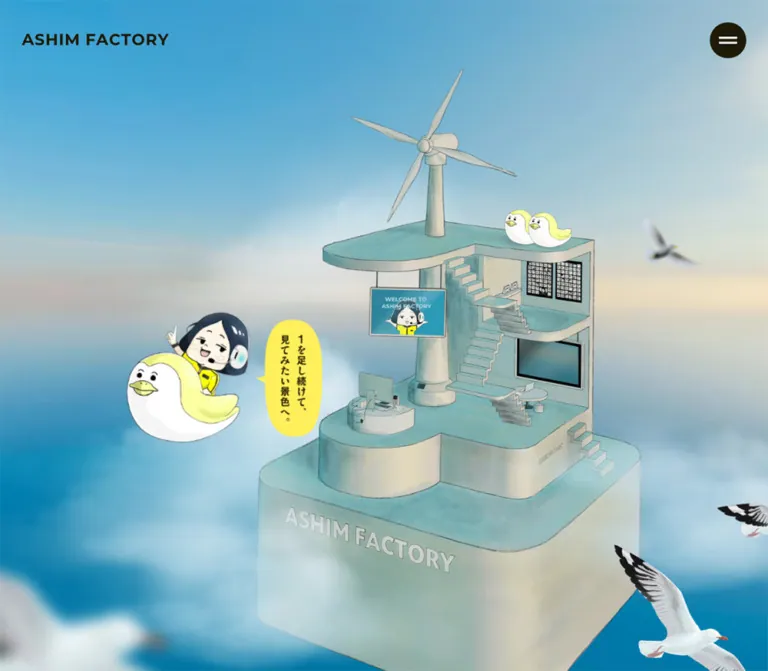
ASHIM FACTORY presents a creative practice through an imaginary workplace. Its opening scene combines a softly textured architectural model, an elevated wind turbine, exposed stairs, tiny workstations, birds, and a cartoon character wearing a headset. The blue sky gives the scene scale and breathing room. A small yellow speech balloon introduces the message without competing with the architecture.
Below this scene, the page becomes a dark exhibition space. White frames, vertical Japanese titles, speech bubbles, and strips of caption text make imagery feel like printed manga panels. Bold Japanese typography carries the introductory statements, while project titles and client information use quieter weights. The homepage supports several parallel journeys: commissioning design, viewing work, discovering manga, and joining a mentoring program.
Its most consequential responsive change is in recent work: desktop uses a horizontal carousel, while mobile lays out the ten projects vertically. Mobile also rearranges the opening composition and centers the footer rather than merely shrinking the desktop layout.
How to Read This Reference
- Measured means a value appears in the supplied rendered DOM, computed styles, or custom properties. Measurements are rounded to two decimals in tables unless greater precision is useful.
- Calculated means arithmetic derived from measured values, such as an image aspect ratio or distance between adjacent cards.
- Estimated means a visual approximation from an original-page screenshot. Footer geometry and artwork colors have this status where element measurements were not supplied.
- Recommended means an implementation choice for a new site. The CSS, breakpoint choices, accessibility additions, and suggested interaction handling are adaptations.
- Declared font families establish the source font stack, not independent confirmation that a particular font file rendered every glyph.
- Graphic lettering requires care. Several headings have empty extracted text despite visible artwork. Their wrapper typography does not reliably describe the lettering inside the graphic.
- Interaction evidence is limited. Navigation destinations and transition declarations are available, but menu activation, carousel clicks, playback, hover endpoints, and keyboard behavior were not demonstrated.
The 15px difference between reported viewport width and document width occurs in both captures. It is consistent with reserved browser scrollbar space. Treat it as capture geometry, not a white decorative stripe to reproduce.
Tokens — Colors
Core Palette
| Name | Value | Source token | Role and evidence |
|---|---|---|---|
| Warm Dark | #1e1a07 |
--color-dark, --base-color |
Measured dark section backgrounds, opening navigation text, filled contact control, and menu button. Its brown/olive undertone distinguishes it from neutral black. |
| Sky Blue | #0076a5 |
--color-sky |
Measured background of the opening section. It supports the illustrated sky and remains the deeper blue beneath the airy upper scene. |
| Speech Yellow | #fff05a |
--color-yellow |
Declared accent and fill in the speech-balloon SVG backgrounds. Also declared as the selection background. |
| White | #ffffff |
--base-background-color; element styles |
Measured reversed text and social control fills; visible manga frames, caption strips, and contact outlines. The HTML background is white, although the visible homepage is largely blue and dark. |
| Warm Grey | #b5b4ac |
--color-grey |
Declared supporting neutral. A specific visible component using this token was not established. |
Artwork Colors and Color Behavior
The sky is an image-rich field with cyan, pale blue, cloud white, and warm horizon tones. #0076a5 is its measured section background, not a replacement for the complete sky artwork.
The process manga uses a flatter light cyan, visually around #67b8d5. This is an estimate, not a sampled or declared token. The workshop contains subdued teal, grey, and cream tones with fine outlines and textured shading.
The mentor destination image has a more saturated yellow background, visually close to #ffff00. This is also an image-local estimate. Do not recolor that artwork automatically to the softer CSS accent #fff05a.
Color is organized by region rather than by a collection of multicolored UI badges:
- Blue establishes the opening world.
- Warm Dark provides continuity through the content and footer.
- White frames and typography organize information.
- Yellow draws attention to character-led messages and selected illustrations.
No global recoloring system or theme switch was established.
Tokens — Typography
Japanese Text
Declared stack: "Noto Sans JP", "Hiragino Sans", "Hiragino Kaku Gothic ProN", "BIZ UDPGothic", "Meiryo", sans-serif through --font-sans-ja.
The document root is a conventional 16px, with 24px line height and weight 400. Stronger weights are applied selectively:
900for introductory copy, major section headings, and service descriptions.700for navigation, many controls, dates, and category tags.500for recent-work titles and mobile service-category links.400for client names and the base document style.
The introductory prose is deliberately spacious despite its heavy weight. Desktop line height reaches approximately 2.25; mobile introduction copy uses 2. Tracking often reaches 0.1em. This makes short Japanese statements feel composed and emphatic rather than dense.
English Display and Wordmark
Declared English stack: "Montserrat", "Helvetica Neue", "Arial", system-ui, sans-serif through --font-sans-en.
The large brand-heading wrapper uses this stack at weight 700, with 0.025em tracking. Its computed size is 114.58px on desktop and 61.39px on mobile.
The smaller header identity is graphic-like in its measured proportions: its link is 221.22 × 17.84px on desktop and 184.52 × 14.89px on mobile, while its wrapper reports a 16px Japanese font stack. Preserve the actual wordmark asset when available. Treating that inherited 16px value as the logo's visual type size would produce the wrong result.
Artwork Lettering
The screenshots contain vertical titles, expressive manga lettering, and speech-bubble copy. Some lettering has a brush or printed-serif character, but no font family for that artwork was established.
Keep a distinction between:
- ordinary DOM text such as project titles and contact copy;
- graphic headings whose wrappers report typography;
- lettering embedded in illustration assets.
For a new component, real vertical Japanese text can use writing-mode: vertical-rl. This is a recommended implementation technique, not a verified source declaration for every visible vertical title.
Type Scale
All values below are measured computed styles. Size and line height are shown in pixels.
| Role | Desktop size / line height | Mobile size / line height | Weight | Tracking |
|---|---|---|---|---|
| Base document | 16 / 24 |
16 / 24 |
400 |
Normal |
| Desktop navigation | 15.38 / 23.07 |
Not shown in the mobile header | 700 |
0.05em |
| Alternate menu links | 24 / 36 |
20.15 / 30.23 |
700 |
0.1em |
| Large brand-heading wrapper | 114.58 / 143.23 |
61.39 / 76.74 |
700 |
0.025em |
| Opening introduction | 17.69 / 39.80 |
16 / 32 |
900 |
0.1em |
| Startup section heading | 29.51 / 51.65 |
24.08 / 42.14 |
900 |
0.1em |
| Startup section prose | 17.38 / 34.76 |
16.02 / 36.04 |
900 |
0.1em |
| Service-title wrapper | 25.38 / 38.07 |
24.02 / 36.03 |
700 |
Normal |
| Service description | 15.50 / 30.99 |
16.15 / 32.31 |
900 |
0.05em |
| Service-category link | 16 / 24 |
16 / 24 |
700 desktop; 500 mobile |
Normal |
| Recent-work section heading | 50.68 / 76.02 |
30.29 / 45.44 |
900 |
Normal |
| Project title | 18.76 / 28.14 |
16.04 / 24.06 |
500 |
0.075em |
| Client name | 13.38 / 20.07 |
12.02 / 18.03 |
400 |
0.05em |
| Project date | 13.38 / 26.76 |
12.02 / 24.04 |
700 |
0.1em |
| Category tag | 12.69 / 19.03 |
12.01 / 18.01 |
700 |
0.05em |
Alternate-menu measurements come from its DOM subtree; they do not establish that the menu was visibly open.
The source also declares generic size tokens: --font-2xs ≈ 10.67px, --font-xs = 12.8px, --font-sm ≈ 14.22px, --font-lg ≈ 18.29px, and --font-xl = 25.6px, calculated at the measured 16px root. These generic tokens are separate from the responsive component measurements above.
Footer estimates: the contact invitation appears around 24px / 42px on desktop and 20px / 35px on mobile. Footer brand lettering is approximately 30px in visual scale. These are screenshot estimates, not computed footer styles.
Tokens — Spacing & Shapes
Responsive Units
The source declares several viewport helpers. The selected --tovi changes between the two inspected layouts:
/* Observed desktop value */
--tovi: calc(100vi / 1500);

/* Observed mobile value */
--tovi: calc(100vi / 430);

/* Declared mixed rem and viewport helpers */
--toremvi-lg: calc((.0625rem * .5) + ((100vi / 1500) * .5));
--toremvi-sm: calc((.0625rem * .5) + ((100vi / 430) * .5));
At the reported viewport widths, these calculate to approximately 0.96px and 0.907px for --tovi, and 0.98px and 0.953px for the corresponding mixed helpers. The root font size remains 16px.
The 1500, 768, and 430 helper denominators are design reference widths. They do not establish the site's media-query breakpoints. The declared --min-viewport: 375 likewise does not prove a hard minimum document width.
Spacing Scale
| Use | Value | Status and interpretation |
|---|---|---|
| Small source spacing | 8px |
Calculated from --space-2xs: calc(8 * .0625rem) |
| Large source spacing | 104px |
Calculated from --space-xl: calc(8 * 13 * .0625rem) |
| Header horizontal inset | 2.8vw |
Declared --offset-sm; matches 40.32px desktop and 10.92px mobile padding |
| General outer inset | 5.5vw |
Declared --offset-md; matches approximately 79.2px desktop and 21.45px mobile in relevant regions |
| Larger text inset | 7.3vw |
Declared --offset-lg; mobile startup copy begins at approximately 28.47px |
| Service-caption inset | 14px |
Calculated from measured caption and card positions on both layouts |
| Desktop service-card gap | 39.56px |
Calculated from adjacent card positions |
| Mobile service-card gap | 40.61px |
Calculated between consecutive 372.13px-high service blocks |
| Desktop recent-work gap | 61.44px |
Calculated from the 708.70px item stride minus 647.27px item width |
| Project title-to-client gap | 10px |
Measured grid gap |
| Category-link icon gap | 12px |
Measured inline-grid gap |
| Social-control gap | 14px |
Calculated from measured 44px controls at a 58px stride in menu markup; also visually consistent with the footer |
| Recent-work top padding | 155.84px desktop; 150px mobile |
Measured section padding |
Spacing is not uniformly compact. Large transitions between illustrated chapters are part of the pacing. The process screenshot, for example, leaves a broad dark interval before the next architectural image.
Border Radius
| Element | Value | Evidence |
|---|---|---|
| Manga frames and destination cards | Square | Visible original-page screenshots |
| Header contact link | 40px |
Measured |
| Mobile work-index link | 40.05px |
Measured |
| Category tags | 5.08px desktop; 4.80px mobile |
Measured; do not infer a colored fill from the radius alone |
| Menu and social controls | 50% |
Measured |
| Generic source radii | 16px, 32px, 40px |
Calculated from --radius-sm, --radius-md, and --radius-lg; component usage varies |
| Speech balloon | Irregular tall oval with a separate curved tail | Geometry is embedded in declared SVG background tokens |
Roundness belongs mainly to controls and speech. It is not a general rounded-card system.
Layout Measurements
| Element | Desktop | Mobile | Status |
|---|---|---|---|
| Document width | 1425px |
375px |
Measured |
| Document height | 12619.39px |
18003px |
Measured |
| Header bounds | 1425 × 112.44px |
375 × 95.23px |
Measured |
| Header wordmark bounds | 221.22 × 17.84px |
184.52 × 14.89px |
Measured graphic/link bounds |
| Opening section including introduction | 2318.14px high |
1566.91px high |
Measured; this is larger than the initial illustrated scene |
| Hero speech-balloon wrapper | 106.50 × 216.63px |
81.36 × 164.56px |
Measured |
| Introductory text column | 524.25px |
316.50px |
Measured |
| Service-category block | 373.63 × 413.63px |
332.13 × 372.13px |
Measured |
| Recent-work image link | 647.27 × 443.83px |
332.13 × 227.73px |
Measured |
| Recent-work section | 986.38px high |
4829.17px high |
Measured |
| Desktop carousel arrows | 45.50 × 45.50px |
Absent from mobile text evidence | Measured desktop controls |
| Carousel dots | 8 × 8px |
Not established | Measured desktop controls |
| Visible mobile menu button | — | 40.22 × 40.22px |
Measured |
| Footer destination card | Approximately 348 × 349px |
Approximately 333px wide |
Screenshot estimates |
| Footer contact button | Approximately 295 × 60px |
Approximately 253 × 57px |
Screenshot estimates |
The main desktop service grid spans exactly 1200px between its outer card edges. A reusable container rule of min(1200px, 100% - 11vw) closely matches both inspected layouts. This formula is an adaptation supported by the measured geometry and declared container token, not a recovered source selector.
Components
Desktop Navigation
Role: expose the site's principal destinations while preserving an unobstructed opening scene.
The transparent header overlays the sky. The wordmark sits at the left, five text links occupy the right-center area, and a filled contact pill ends the row. There is no visible header panel, bottom divider, or shadow.
Observed labels are トップ, 制作実績, 1コマ漫画, メンタープラン, and ASHIM FACTORYについて. The contact label is お問い合わせ and links to /contact/.
The header uses flex layout and measured padding of 31.43px 40.32px on desktop. Navigation links use approximately 15.38px bold text and 0.05em tracking. Adjacent text links are separated by approximately 40px, calculated from their bounds.
The contact link measures 167.56 × 49.59px. It contains an 18px icon column, an approximately 8.79px gap, and the label. The fill is Warm Dark, the label is white, and the envelope symbol appears yellow in the screenshot.
Persistent Menu Button and Menu Content
Role: maintain compact access to navigation on small screens and in the supplied scrolled views.
Mobile shows a dark circle near the upper-right corner with two white horizontal strokes. Its measured bounds are 40.22px square at approximately x: 323.88px, y: 24.14px. A similar menu icon remains near the upper-right corner in the scrolled desktop and mobile captures. This establishes visual persistence, although the exact fixed/sticky implementation was not included in the measurements.
The alternate navigation subtree contains the five main destinations, four social links, and a contact link. Its links have generous block padding and centered positions. Mobile link rows measure approximately 66.36px high, with 20.15px bold text and 0.1em tracking.
The open state was not captured. Nonzero rectangles in hidden menu markup do not prove visible presentation. Do not infer its backdrop, entrance direction, focus behavior, or close-state icon from those rectangles.
The initial desktop menu-button rectangle is only 28.27px square while its transition includes scale and visibility. It is not a reliable measurement of the normal visible desktop hit target.
Illustrated Opening Scene
Role: make the creative practice memorable before introducing its services.
The desktop composition places the workshop largely to the right. A cartoon character riding a rounded yellow-and-white bird appears at the left of the architecture, with a narrow yellow speech balloon alongside. The factory includes multiple platforms, stair flights, small screens, a workstation, perched birds, and a tall wind turbine. Foreground birds and clouds interrupt the edges of the composition.
The lettering ASHIM FACTORY is integrated into the model's base. A separate large white brand heading appears farther down the blue opening section.
On mobile, the architecture moves toward the upper center and the character moves into the lower-left foreground. The yellow balloon occupies the lower-right area. The large white brand heading starts near y: 735px and breaks over two lines. On desktop its wrapper begins near y: 1361px, below the supplied first viewport.
The balloon contains the source message 1を足し続けて、見てみたい景色へ。. Its measured wrapper shrinks from about 106.50 × 216.63px to 81.36 × 164.56px. Keep its narrow vertical reading direction and asymmetrical tail.
Implementation implication: art direction is essential. Use separately composed desktop/mobile artwork or deliberately repositioned layers. A centered crop of the desktop screenshot will not preserve the mobile relationship between the building, character, and balloon.
Brand Statement and Introduction
Role: explain the partnership behind the illustrated world.
The opening blue region continues past the initial illustration into a large brand heading and a narrow statement column. Desktop introductory copy is centered within a 524.25px-wide column, beginning at x: 450.38px. Mobile uses a 316.5px-wide column with 29.25px side margins inside the 375px document.
The text asks about the client's uniqueness, strengths, and desired outcome, then describes design as a way to bring those qualities forward. Preserve the short paragraph grouping and generous line rhythm.
Measured desktop paragraphs use 17.69px, weight 900, line height 39.80px, and tracking 1.77px. Mobile uses 16px, weight 900, line height 32px, and tracking 1.6px.
This is editorial introduction copy. Keep its narrow measure even when other sections use wide image grids.
Service Category Cards
Role: connect six kinds of design support to corresponding project categories.
The observed categories cover logo design, printed graphics, website production, startup support, illustration/character creation, and social-media promotional tools.
Desktop places six service blocks in three columns and two rows. Each block measures 373.63 × 413.63px; columns are separated by approximately 39.56px. Mobile presents six consecutive blocks at 332.13 × 372.13px, separated by approximately 40.61px.
Measured anatomy includes:
- A linked visual area with a tall title wrapper aligned along its right edge.
- One or two lines of description inset 14px from the card's sides.
- A centered category link beneath, pairing its label with an approximately 19.19px arrow column and a 12px gap.
The overall block is consistently 40px taller than its width. This supports a square visual region followed by a 16px gap and a 24px category-link row; that decomposition is calculated, not a supplied image-element measurement.
The service cards themselves are not shown in the five visual captures. Their layout and typography are supported by DOM geometry; their exact illustration contents and internal frame construction should not be invented from other card types.
Recent Work — Desktop Carousel and Mobile List
Role: demonstrate current practice through projects, clients, categories, and dates.
The section heading is 最近の実績. The supplied content contains ten projects, with the latest dated July 5, 2026.
On desktop, project images occupy a horizontal sequence. The first image link begins at x: 112.5px, the second at x: 821.20px, and the third beyond the viewport at x: 1529.91px. Each image link is 647.27 × 443.83px, with approximately 61.44px between items. This geometry and the Prev/Next controls support the carousel interpretation.
Project anatomy is:
- A large rectangular image link.
- A metadata row with linked hashtag categories at the left and a date toward the right.
- A linked project title.
- A smaller client name, separated from the title by a measured 10px gap.
The image ratio calculates to approximately 1.458:1, close to 35:24, on both desktop and mobile. Use that ratio as an adaptation; do not force the work into square thumbnails.
Tags use transparent computed backgrounds, 2px 6px padding, and approximately 5px corner radii. Their presence does not justify introducing colored category pills. The date uses bold text with 0.1em tracking; titles are a quieter weight 500.
Desktop controls include 45.5px circular previous/next buttons and several 8px pagination dots. Movement distance, looping, autoplay, active-dot appearance, and swipe behavior were not tested.
On mobile, all ten works form a vertical list. The same image ratio remains, at 332.13 × 227.73px. Tags wrap into multiple rows while the date retains its own right-side area. The section expands from approximately 986px on desktop to 4829px on mobile. This is an intentional change in content presentation, not evidence of a mobile carousel with unusually tall slides.
Process Manga Grid
Role: explain the working process through character-led scenarios.
The supplied desktop process capture shows four panels arranged in two columns, with a large vertical white heading to their right. The upper row is partially outside the screenshot. The lower row is visible and includes a tennis-racket metaphor for discussion and a character examining a phone while reviewing social content.
Panels use white rectangular frames, flat blue illustration fields, vertical title strips, hand-drawn speech bubbles, and expressive cartoon poses. Visible panel copy includes 打ち合わせで壁打ちヒアリング! and あなたのSNSもめっちゃ見ます。.
The visible lower panels are approximately 486–487 × 354px, with roughly 23px between columns and approximately 14px framing. These are screenshot estimates. The large right-side heading is partly cropped, so its full text should not be reconstructed from the fragment.
Mobile DOM geometry places the four corresponding title groups successively down the document. This supports a stacked arrangement, although a mobile screenshot of this section was not supplied.
Keep speech and expressions inside the illustrated composition. A generic icon followed by a paragraph would lose the mechanism by which this section explains the process.
About and Media Feature
Role: connect the playful imagery with a statement about ongoing creative support.
The process capture leads into a wide architectural image. Another desktop capture shows the factory base as a muted backdrop with white text above the final destination cards. The image has a subdued, darkened appearance; the exact overlay color and opacity were not measured.
The rendered text includes a statement about supporting startup businesses and branding from planning through output, followed by the link ASHIM FACTORYについて to /about/.
A media-related control is labeled 再生 in the desktop text and 停止 in the mobile text. The mobile button measures approximately 22.17px square and declares opacity and scale transitions. These are different captured control states, not a demonstrated playback transition. The evidence does not establish the media format, autoplay policy, audio behavior, or successful control activation.
Manga, Mentoring, and Audio Content
Role: give the practice's additional activities substantial visibility.
Rendered content establishes:
- A manga destination for
やがて前向き名人, including the account label@yagate.mmand an internal detail link. - A mentoring promotion using the source phrase
デザインスキルUP + 独立ブランディング, followed by a link to/mentor/. - A stand.fm area with six episode entries, each exposing an episode title, a
再生label, a duration, and a date, followed by a channel link.
The five supplied screenshots do not show the complete styling of these intermediate sections, and their full computed component geometry is absent. Their content structure is established; exact player chrome, section backgrounds, hover treatments, and media loading behavior remain unverified.
For a new implementation, keep these as distinct destinations within the site hierarchy. Retain title, duration, date, and explicit playback affordance for audio entries, without inventing an observed custom player.
Three Destination Cards
Role: restate the three major onward journeys immediately before contact.
The desktop footer-area capture shows three square cards in a row: a design-work collage, an exhibition photograph for the manga activity, and the headset character on vivid yellow for mentoring.
Each card has approximately 14px of white outer framing. A white vertical title strip overlaps the upper-right side of the image. A small circled arrow sits beneath or at the end of the vertical label. At the bottom, bold dark captions sit on white strips that follow the lines of text, allowing parts of the underlying image to remain visible beside shorter lines.
Visible labels are デザインのお仕事, ひとコマ漫画制作, and メンタープラン. The corresponding original-page links lead to /works/, /yagatemaemuki/, and /mentor/.
Desktop cards are approximately 348–349px square, with roughly 41px gaps. The entire row is around 1127px wide. These measurements are visual estimates.
The mobile footer capture shows the mentor card at approximately 333px wide, with the same square frame, vertical label, character image, and caption-strip treatment. The preceding destination cards are outside that capture; a stacked mobile arrangement is consistent with the available width, but their complete mobile positions were not recorded.
A suitable reusable anatomy is one link containing an image, a vertical title, a decorative circled arrow, and a caption. Avoid nested links inside a fully clickable card.
Contact Invitation
Role: offer a shared contact route for design commissions, manga exhibitions, and mentoring inquiries.
The invitation is centered on Warm Dark and uses heavy white Japanese text. It occupies two lines in the desktop capture and four in the mobile capture. A generous gap separates it from the outlined お問い合わせはこちら button.
The button is a horizontal capsule with a white outline, bold white label, and a right-pointing chevron. Its screenshot dimensions are approximately 295 × 60px on desktop and 253 × 57px on mobile. The outline appears around 2–3px thick; its exact border width was not supplied.
Unlike the filled header contact pill, this lower action allows the dark section background to show through. Keep these two appearances as contextual variants of the same destination.
Footer and Social Links
Role: close with a clear identity and four external channels.
Desktop places the white wordmark at the lower left, copyright beneath, and four circular social controls at the right. Mobile changes the order visually: centered social controls, centered wordmark below, and then the copyright line.
The channels are Instagram, X, stand.fm, and note, supported by original-page link destinations. Controls have white circular fills and dark platform symbols. The menu subtree measures the same control family at 44px square with about 24px glyph boxes; the footer screenshots are visually consistent with those dimensions.
The four-circle group is approximately 218px wide, corresponding to four 44px circles and three 14px gaps. It remains compact rather than stretching across mobile width.
The visible copyright reads Copyright © 2025 ASHIM FACTORY. All Rights Reserved.. That is page content, not the inspection date or proof of when the current design was produced.
Tokens — Motion & Interaction
| Treatment | Supplied declaration or evidence | What can be concluded |
|---|---|---|
| Header entrance | opacity 1s cubic-bezier(.61, 1, .88, 1) 1s |
A one-second opacity transition with a one-second delay is declared. |
| Opening speech balloon | Scale and opacity, 0.3s cubic-bezier(.34, 1.56, .64, 1) 2s |
A short transition with an overshooting easing curve and two-second delay is declared. Start/end values were not supplied. |
| Later mobile speech balloon | Same 0.3s curve, 0.6s delay |
A shorter delayed reveal is declared for another callout. |
| Introduction and section content | opacity 1s cubic-bezier(.37, 0, .63, 1) |
Repeated fade declarations exist. Exact triggers were not tested. |
| Desktop menu button | Scale, opacity, and visibility over 0.3s with the overshooting curve |
The source defines a compact animated state change. Open/closed behavior was not demonstrated. |
| Alternate menu links | Color over 0.3s cubic-bezier(.61, 1, .88, 1) |
A color transition is declared; the destination color was not supplied. |
| Recent-work image links | Opacity over 0.3s cubic-bezier(.25, 1, .5, 1) |
Image-link fading is declared; hover endpoints are unverified. |
| Mobile media control | Opacity and scale over 0.3s cubic-bezier(.25, 1, .5, 1) |
Control-state animation is declared. Playback success is unverified. |
| General duration tokens | --duration-fast: .3s; --duration-slow: 1.6s |
Available source tokens; the slow duration was not tied to a specific inspected element. |
| Workshop, turbine, birds, and clouds | Still captures only | Their appearance is established. Rotation, parallax, looping, and pointer response are not established. |
Many sampled elements report animation: none. This does not establish that the entire site is static: child elements, video, canvas, and script-driven behavior were not exhaustively represented.
The supplied browser procedure waited for finite animation and layout stability and temporarily paused perpetual animations during readiness checks. It was not a frame-by-frame motion inspection.
Recommended motion approach: use gentle opacity reveals for content and short, lightly overshooting appearances for speech callouts. Keep decorative movement optional, preserve a readable static composition, and implement reduced-motion handling. Do not invent spinning turbine speeds or parallax amplitudes as source values.
Surfaces
| Layer | Appearance | Function |
|---|---|---|
| Opening environment | Textured sky over measured Sky Blue | Establishes the spatial, imaginative setting |
| Main content canvas | Solid Warm Dark | Provides continuity across services, work, and later content |
| Process panels | White frame around flat cyan manga artwork | Separates illustrated explanations |
| Destination cards | Square white frames, overlapping vertical labels, white caption strips | Turns images into clear navigation objects |
| Large architectural backdrop | Muted teal/grey image with a visibly subdued treatment | Reintroduces the workshop motif behind later content |
| Contact action | White outline over dark background | Creates a clear action without another filled card |
| Social controls | White circles with dark symbols | Keeps four external destinations visually consistent |
There is no visible general elevation system based on card shadows. Depth belongs mainly to the workshop image; the surrounding UI is flat and graphic. Preserve that distinction.
Imagery
The opening mixes three visual registers: a model-like building with soft texture, photographic or photoreal bird and cloud elements, and a flat cartoon mascot. Their coexistence is central to the page's personality. Do not homogenize them into a single generic illustration style.
The workshop should feel small enough to inspect yet large enough to inhabit. Exposed stairs, screens, desks, and the turbine make it a place of activity. Pale edges and restrained outlines keep the model soft against the sky.
The manga uses simpler fields of color, dark outlines, animated expressions, Japanese vertical copy, and speech bubbles. Its character appears in several roles, linking the opening, process explanation, and mentoring destination.
Photography is used as evidence of real activity, including the exhibition image in the final destination row. The work collage shows varied graphic output. These images retain their own colors rather than receiving a uniform monochrome filter.
Observed Asset References
No standalone image, video, font-file, or model URLs were provided in the rendered evidence. The following references identify observed asset roles, not recoverable file paths.
| Asset or graphic | Evidence | Reuse guidance |
|---|---|---|
| Floating workshop and sky composition | Original-page desktop and mobile opening captures | Obtain authorized desktop/mobile compositions or rebuild with deliberately arranged assets. Rendering technology is unknown. |
| Headset character riding a bird | Opening captures | Preserve the silhouette and its foreground relationship to the building. |
| Process manga panels | Desktop process capture | Preserve panel lettering and speech bubbles; avoid cropping essential text. |
| Work collage | Desktop destination-card capture | Keep recognizable variety and square framing. |
| Manga exhibition photograph | Desktop destination-card capture | Preserve the person-and-display relationship; the person's identity was not established. |
| Mentor character portrait | Desktop and mobile destination-card captures | Retain the high-visibility yellow image background. |
| Yellow speech-balloon body | --bg-quote-yellow embedded SVG |
Source SVG viewBox is 113.75 × 235.38; the body is an irregular tall oval. |
| Yellow speech-balloon tail | --bg-quote-arrow-yellow embedded SVG |
Source SVG viewBox is 14.52 × 13.37; the tail is separately defined. |
| Dark speech-balloon variants | --bg-quote-dark, --bg-quote-arrow-dark |
Declared alternatives; visible usage was not fully established. |
| Curved section-edge graphics | --balloon-white, --bg-balloon-white |
Embedded SVG geometry is declared; exact placement was not independently resolved. |
| Previous/next arrow shapes | --arrow-prev, --arrow-next |
Declared polygon silhouettes support the directional-control vocabulary. |
Use authorized assets when available. CSS can reproduce frames, layout, controls, and caption placement; it cannot supply the identity carried by the original workshop and manga illustrations.
Layout & Responsive Behavior
| Region | Desktop evidence | Mobile evidence | Practical implication |
|---|---|---|---|
| Header | Full text navigation and filled contact pill | Wordmark and circular menu button | Change navigation mode rather than compressing all links. |
| Opening art | Workshop to the right; mascot and balloon left of it | Workshop upper-center; mascot lower-left; balloon lower-right | Provide real art direction or separate layer positions. |
| Large brand heading | Begins below the first 1000px viewport | Begins around 735px and occupies two lines | Do not assume identical above-the-fold content. |
| Introduction | Narrow centered 524.25px column | 316.5px column with 29.25px side margins | Maintain readable statement length. |
| Six service categories | Three columns, two rows | Six stacked blocks | Preserve category order and substantial individual artwork. |
| Recent work | Horizontal sequence with previous/next controls | Ten-item vertical list | Remove the carousel dependency on mobile. |
| Work metadata | Tags fit more easily beside the date | Tags wrap while the date retains a separate area | Use flexible metadata layout with a nonwrapping date. |
| Process manga | Two-column panels beside a vertical heading | Successive panel-title positions in DOM | Stack the explanations; full mobile styling remains unverified. |
| Final destination cards | Three visible cards in one row | Full-width mentor card visible | Retain the frame and vertical-title language at smaller width. |
| Contact copy | Two centered lines | Four centered lines | Allow text wrapping and preserve generous line height. |
| Footer | Brand left, social links right | Social links above centered brand | Change alignment and ordering explicitly. |
The mobile document is approximately 43% taller than desktop. The expansion of recent work into a full list explains much of this difference. The opening section itself is shorter on mobile, so the height increase should not be attributed simply to a taller hero.
The exact transition widths are unknown. Any breakpoints in a reproduction must be labeled implementation choices. Test intermediate widths rather than assuming that the 768px helper denominator controls every layout change.
Do not hardcode the measured 375px mobile document width. Use the available inline width, let the browser manage scrollbar space, and allow text to reflow under zoom and font fallback.
Do’s and Don’ts
Do
- Preserve the relationship between airy blue opening imagery and the continuous Warm Dark content canvas.
- Use the exact measured core colors:
#1e1a07,#0076a5,#fff05a, and white. - Give the workshop composition enough scale for its small architectural details to matter.
- Rearrange the opening artwork for portrait screens.
- Keep the manga's white frames, vertical labels, speech bubbles, and expressive character poses.
- Use heavy Japanese type for statements and quieter medium-weight project titles.
- Preserve the recent-work image ratio near
35:24. - Present all ten recent works as a vertical mobile list when reproducing the observed behavior.
- Keep the three final destinations distinct: design work, manga, and mentoring.
- Retain the contrast between square image frames and circular or capsule-shaped controls.
- Keep observed measurements, visual estimates, and proposed implementation rules distinguishable.
Don't
- Don't reduce the homepage to a single campaign or contact-only page; it serves several content and service journeys.
- Don't replace the workshop with a generic blue gradient and assume the identity is preserved.
- Don't turn every content group into a rounded card with a shadow.
- Don't recolor the mentor image's vivid yellow solely to match the softer CSS accent.
- Don't stretch or crop manga panels so that embedded copy disappears.
- Don't treat a graphic heading's inherited font as proof of its lettering family.
- Don't keep the desktop work carousel as a required mobile interaction when matching the supplied layout.
- Don't infer successful playback or an open navigation state from control labels and hidden DOM rectangles.
- Don't prescribe unobserved turbine rotation, parallax, autoplay, or hover colors as original behavior.
- Don't reproduce the right-edge browser gutter as a design element.
Recommended Implementation Additions
These are recommendations for a new implementation, not verified features of the original page:
- Give the menu button an accessible name,
aria-expanded, and a relationship to the navigation panel. Hide closed navigation from both focus order and assistive technology. - If navigation opens as a modal, support Escape, manage focus, and restore focus to the trigger. A nonmodal implementation requires different focus handling.
- Keep icon-button hit targets at least 44px, even where the visible circle is about 40px or the media symbol is smaller.
- Provide visible focus indicators against both dark backgrounds and white cards.
- Give meaningful text alternatives to work images and manga. Decorative foreground birds can use empty alternative text when they add no information.
- Keep essential headings and link labels available as text, even when artwork supplies the visual lettering.
- Make desktop carousel controls keyboard operable and keep the mobile list usable without JavaScript.
- Offer pause controls for any continuing decorative media and honor reduced-motion preferences. Manage video or script-driven motion separately from CSS transitions.
- Load large hero artwork with correct dimensions and deliberate priority; defer below-the-fold imagery and media without hiding text behind loading effects.
- Reserve room for the persistent menu button so it does not cover vertical card labels, as it visually overlaps the upper-right card region in the supplied mobile footer crop.
- Test 200% zoom, long Japanese titles, font fallback, and wider text settings. The observed 12px metadata should not become an inflexible minimum for accessibility.
Agent Prompt Guide
Quick Color Reference
- Main dark canvas and opening dark text:
#1e1a07. - Opening section base:
#0076a5, supplemented by sky imagery. - Speech balloons and small UI accents:
#fff05a. - Manga frames, reversed copy, caption strips, social circles, and contact outlines:
#ffffff. - Flat cyan and vivid yellow inside artwork are image colors, not additional verified UI tokens.
- No general card-shadow or glass surface treatment.
Overall Prompt
“Create a Japanese creative-partner homepage and portfolio hub inspired by ASHIM FACTORY. Begin with a softly textured miniature workshop floating in a blue sky: exposed stairs, small workstations, screens, a wind turbine, birds, and a friendly headset-wearing cartoon character. Use a narrow yellow vertical speech balloon beside the character. Continue into a warm dark canvas using #1e1a07, bold Japanese statements, square white manga frames, vertical title strips, and white caption fragments over images. Include six service categories, recent work with project/client/tag/date metadata, process manga, and distinct destinations for design work, manga, and mentoring. Show recent work in a horizontal desktop track and a complete vertical mobile list. Close with three illustrated destination cards, a centered outlined contact capsule, and four white circular social links. Recompose the hero and center the footer on mobile. Use the declared Japanese and English font stacks where available, preserve artwork lettering, and keep unverified motion out of the specification.”
Example Component Prompts
- Opening scene: “Compose a spacious desktop sky scene with a pale teal miniature workshop on the right and a small cartoon rider with a yellow speech balloon on the left. Keep the header transparent. Produce a portrait arrangement that places the workshop above the rider and balloon; preserve the reading order and avoid cropping the message.”
- Destination card: “Build a square white-framed navigation card with a full-color image, an overlapping vertical Japanese title strip at the upper right, a small circled arrow, and bold dark caption text on separate white line backgrounds along the bottom. Use square corners and no shadow.”
- Recent-work item: “Create a project entry on #1e1a07 with a 35:24 image, small white hashtag links, a right-aligned tracked date, a medium-weight Japanese project title, and a smaller client name. Use approximately 647px-wide items in a desktop horizontal track and approximately 332px-wide items in a mobile vertical list.”
- Process explanation: “Arrange expressive manga panels in two desktop columns with a large vertical heading beside them. Use white frames, flat cyan artwork backgrounds, vertical Japanese captions, hand-drawn speech bubbles, and the same headset character explaining different stages of collaboration. Stack panels for narrow layouts.”
- Contact and footer: “On a warm nearly black background, center a heavy white Japanese invitation above a white-outlined contact capsule with a chevron. Place brand and copyright left and four 44px social circles right on desktop. On mobile, center the social row above the wordmark and copyright.”
Quick Start
CSS Custom Properties
This is a recommended adaptation, not recovered source CSS. It uses measured palette values, declared font stacks, and dimensions close to the inspected endpoints. The 75rem navigation breakpoint and 48rem content breakpoint are implementation choices.
The hero expects an authorized, art-directed <picture class='hero-art'> inside .hero-scene. No asset URLs are invented here. Text wordmarks are fallbacks; use authorized graphic marks when matching their precise appearance. The CSS does not implement media playback or menu/carousel state management.
:root {
  /* Measured source colors */
  --color-dark: #1e1a07;
  --color-sky: #0076a5;
  --color-yellow: #fff05a;
  --color-white: #ffffff;
  --color-grey: #b5b4ac;

  /* Declared source font stacks; load authorized font files separately */
  --font-ja: 'Noto Sans JP', 'Hiragino Sans',
    'Hiragino Kaku Gothic ProN', 'BIZ UDPGothic', 'Meiryo', sans-serif;
  --font-en: 'Montserrat', 'Helvetica Neue', 'Arial', system-ui, sans-serif;

  /* Recommended aliases based on measured geometry */
  --content-max: 75rem;
  --destination-max: 70.5rem;
  --page-gutter: 5.5vw;
  --header-gutter: 2.8vw;
  --frame: 14px;
  --card-gap: clamp(2rem, 2.75vw, 2.6rem);
  --space-small: 0.5rem;
  --space-medium: 1.5rem;
  --space-large: 3rem;
  --space-chapter: 6.5rem;

  --text-body: clamp(1rem, 1.23vw, 1.106rem);
  --text-section: clamp(1.893rem, 3.52vw, 3.168rem);
  --text-project: clamp(1rem, 1.303vw, 1.173rem);
  --text-meta: clamp(0.75rem, 0.93vw, 0.837rem);
  --radius-pill: 2.5rem;
  --radius-tag: 0.3rem;

  /* Observed transition curves */
  --ease-reveal: cubic-bezier(.37, 0, .63, 1);
  --ease-soft: cubic-bezier(.25, 1, .5, 1);
  --ease-pop: cubic-bezier(.34, 1.56, .64, 1);
  --duration-fast: 300ms;
}

* {
  box-sizing: border-box;
}

body {
  margin: 0;
  color: var(--color-white);
  background: var(--color-dark);
  font: 400 1rem / 1.5 var(--font-ja);
}

img {
  display: block;
  max-inline-size: 100%;
}

button,
a {
  -webkit-tap-highlight-color: transparent;
}

button {
  font: inherit;
}

a {
  color: inherit;
}

::selection {
  color: var(--color-dark);
  background: var(--color-yellow);
}

.container {
  inline-size: min(
    var(--content-max),
    calc(100% - var(--page-gutter) - var(--page-gutter))
  );
  margin-inline: auto;
}

.site-header {
  position: absolute;
  inset: 0 0 auto;
  z-index: 10;
  display: flex;
  align-items: center;
  justify-content: space-between;
  gap: 2rem;
  padding: 1.964rem var(--header-gutter);
  color: var(--color-dark);
}

.site-logo {
  flex: none;
  font: 700 1.4rem / 1 var(--font-en);
  letter-spacing: 0.025em;
  text-decoration: none;
}

.site-logo img {
  inline-size: clamp(184.52px, 15.363vw, 221.22px);
  block-size: auto;
}

.desktop-nav {
  display: flex;
  align-items: center;
  gap: 2.5rem;
  font-size: 0.961rem;
  font-weight: 700;
  letter-spacing: 0.05em;
}

.desktop-nav a {
  text-decoration: none;
}

.contact-link {
  display: inline-flex;
  align-items: center;
  justify-content: center;
  gap: 0.75rem;
  max-inline-size: 100%;
  min-block-size: 3.5rem;
  padding: 0.875rem 1.5rem;
  border: 3px solid currentColor;
  border-radius: var(--radius-pill);
  color: var(--color-white);
  background: transparent;
  font-weight: 900;
  letter-spacing: 0.1em;
  text-align: center;
  text-decoration: none;
  transition:
    color var(--duration-fast) var(--ease-soft),
    background-color var(--duration-fast) var(--ease-soft);
}

.contact-link--filled {
  min-block-size: 3.1rem;
  padding: 0.8rem 1.375rem;
  border: 0;
  color: var(--color-white);
  background: var(--color-dark);
  font-weight: 700;
  letter-spacing: 0.05em;
}

.contact-link__icon {
  flex: none;
  inline-size: 1.125rem;
  color: var(--color-yellow);
}

.contact-link__arrow {
  flex: none;
  inline-size: 0.55rem;
  block-size: 0.55rem;
  border-block-start: 3px solid currentColor;
  border-inline-end: 3px solid currentColor;
  transform: rotate(45deg);
}

/* Recommended 44px hit area around an approximately 40px circle */
.menu-toggle {
  position: fixed;
  inset-block-start: 1.5rem;
  inset-inline-end: var(--header-gutter);
  z-index: 30;
  display: none;
  place-content: center;
  gap: 5px;
  inline-size: 44px;
  block-size: 44px;
  padding: 0;
  border: 0;
  color: var(--color-white);
  background: transparent;
  cursor: pointer;
}

.menu-toggle::before {
  content: '';
  position: absolute;
  inset: 2px;
  border-radius: 50%;
  background: var(--color-dark);
}

.menu-toggle span {
  position: relative;
  inline-size: 20px;
  block-size: 2px;
  background: currentColor;
}

/* Application-managed state; the source trigger was not established */
.is-scrolled .menu-toggle {
  display: grid;
}

.hero {
  overflow: clip;
  color: var(--color-white);
  background: var(--color-sky);
}

.hero-scene {
  position: relative;
  block-size: clamp(56rem, 90vw, 90rem);
}

.hero-art {
  position: absolute;
  inset: 0;
  display: block;
}

.hero-art img {
  inline-size: 100%;
  block-size: 100%;
  object-fit: cover;
}

/* Text fallback for a graphic brand heading */
.hero-title {
  margin: 4rem auto 0;
  font-family: var(--font-en);
  font-size: clamp(3.5rem, calc(2.602rem + 5.066vw), 7.161rem);
  font-weight: 700;
  line-height: 1.05;
  letter-spacing: 0.025em;
  text-align: center;
}

.hero-intro {
  inline-size: min(32.766rem, calc(100% - 3.656rem));
  margin: 4rem auto 0;
  font-size: var(--text-body);
  font-weight: 900;
  line-height: 2.25;
  letter-spacing: 0.1em;
}

.hero-intro p {
  margin: 0 0 1em;
}

/* Approximate fallback shape; use the original SVG for exact contours */
.quote-bubble {
  position: relative;
  width: 6.656rem;
  min-height: 13.54rem;
  padding: 1.5rem;
  border-radius: 48% 52% 46% 54% / 38% 45% 55% 62%;
  color: var(--color-dark);
  background: var(--color-yellow);
  font-weight: 900;
  writing-mode: vertical-rl;
  text-orientation: upright;
}

.quote-bubble::before {
  content: '';
  position: absolute;
  top: 50%;
  left: -0.65rem;
  width: 0.8rem;
  height: 0.9rem;
  background: inherit;
  clip-path: polygon(100% 0, 100% 100%, 0 35%);
}

.section-heading {
  margin: 0 0 3rem;
  font-size: var(--text-section);
  font-weight: 900;
  line-height: 1.5;
}

.service-grid,
.destination-grid {
  display: grid;
  grid-template-columns: repeat(3, minmax(0, 1fr));
  gap: var(--card-gap);
}

.service-card {
  min-inline-size: 0;
}

.service-card__category {
  display: flex;
  justify-content: center;
  align-items: center;
  gap: 12px;
  margin-block-start: 16px;
  line-height: 24px;
}

.destination-grid {
  max-inline-size: var(--destination-max);
  margin-inline: auto;
}

.framed-tile {
  position: relative;
  display: block;
  aspect-ratio: 1;
  padding: var(--frame);
  color: var(--color-dark);
  background: var(--color-white);
  text-decoration: none;
}

.framed-tile__image {
  inline-size: 100%;
  block-size: 100%;
  object-fit: cover;
}

.framed-tile--illustration .framed-tile__image {
  object-fit: contain;
}

.framed-tile__label {
  position: absolute;
  inset-block-start: var(--frame);
  inset-inline-end: var(--frame);
  margin: 0;
  padding: 0.25rem 0.375rem 0.75rem;
  background: var(--color-white);
  font-size: 1.5rem;
  font-weight: 700;
  line-height: 1.35;
  writing-mode: vertical-rl;
}

.framed-tile__caption {
  position: absolute;
  inset: auto var(--frame) var(--frame);
  margin: 0;
  font-weight: 900;
  line-height: 2;
}

.framed-tile__caption span {
  padding: 0.15em 0.25em;
  background: var(--color-white);
  -webkit-box-decoration-break: clone;
  box-decoration-break: clone;
}

.recent-work {
  padding-block-start: 9.74rem;
}

.work-track {
  display: grid;
  grid-auto-flow: column;
  grid-auto-columns: min(45vw, 40.454rem);
  gap: clamp(2.5rem, 4.266vw, 3.84rem);
  overflow-x: auto;
  padding-block-end: 1rem;
  padding-inline: max(
    var(--page-gutter),
    calc((100% - var(--content-max)) / 2)
  );
  scroll-snap-type: x proximity;
}

.work-card {
  min-inline-size: 0;
  scroll-snap-align: start;
}

.work-card__image {
  display: block;
  aspect-ratio: 35 / 24;
}

.work-card__image img {
  inline-size: 100%;
  block-size: 100%;
  object-fit: cover;
}

.work-card__meta {
  display: grid;
  grid-template-columns: minmax(0, 1fr) auto;
  align-items: start;
  gap: 1rem;
  margin-block-start: 1rem;
}

.work-card__tags {
  display: flex;
  flex-wrap: wrap;
  gap: 0.5rem;
}

.work-tag {
  padding: 2px 6px;
  border-radius: var(--radius-tag);
  font-size: 0.75rem;
  font-weight: 700;
  letter-spacing: 0.05em;
  text-decoration: none;
}

.work-card time {
  font-size: var(--text-meta);
  font-weight: 700;
  line-height: 2;
  letter-spacing: 0.1em;
  white-space: nowrap;
}

.work-card__title {
  margin: 0.625rem 0;
  font-size: var(--text-project);
  font-weight: 500;
  line-height: 1.5;
  letter-spacing: 0.075em;
}

.work-card__client {
  margin: 0;
  font-size: var(--text-meta);
  letter-spacing: 0.05em;
}

.contact-block {
  padding-block: 3rem 4rem;
  text-align: center;
}

.contact-block__copy {
  max-inline-size: 48rem;
  margin: 0 auto 3.5rem;
  font-size: clamp(1.25rem, 1.667vw, 1.5rem);
  font-weight: 900;
  line-height: 1.75;
  text-wrap: balance;
}

.site-footer {
  display: grid;
  grid-template-columns: 1fr auto;
  align-items: start;
  gap: 1.5rem;
  padding: 0 var(--header-gutter) 4.5rem;
}

.footer-brand {
  margin: 0;
  font: 700 1.875rem / 1.2 var(--font-en);
  letter-spacing: 0.025em;
}

.footer-copyright {
  margin-block-start: 1.5rem;
  font-size: 0.75rem;
  font-weight: 700;
  letter-spacing: 0.025em;
}

.social-links {
  display: flex;
  gap: 14px;
}

.social-link {
  display: grid;
  place-items: center;
  inline-size: 44px;
  block-size: 44px;
  border-radius: 50%;
  color: var(--color-dark);
  background: var(--color-white);
}

.social-link svg {
  inline-size: 24px;
  block-size: 24px;
}

/* Recommended focus and hover feedback; not verified source states */
:where(a, button):focus-visible {
  outline: 3px solid var(--color-yellow);
  outline-offset: 5px;
}

.site-header :focus-visible,
.framed-tile:focus-visible {
  outline-color: var(--color-sky);
}

@media (hover: hover) {
  .contact-link:not(.contact-link--filled):hover {
    color: var(--color-dark);
    background: var(--color-white);
  }

  .work-card__image:hover {
    opacity: 0.85;
  }
}

@media (max-width: 75rem) {
  .desktop-nav {
    display: none;
  }

  .menu-toggle {
    display: grid;
  }
}

@media (max-width: 48rem) {
  .site-header {
    padding-block: 2.51rem;
  }

  .hero-scene {
    block-size: 182vw;
  }

  .hero-title {
    inline-size: calc(100% - 3.656rem);
    margin-block-start: 1.5rem;
    text-align: start;
  }

  .hero-title span {
    display: block;
  }

  .hero-intro {
    line-height: 2;
  }

  .quote-bubble {
    width: 5.085rem;
    min-height: 10.285rem;
    padding: 1.2rem;
  }

  .service-grid,
  .destination-grid {
    grid-template-columns: minmax(0, 1fr);
    gap: 2.54rem;
  }

  .recent-work {
    padding-block-start: 9.375rem;
  }

  .section-heading {
    text-align: center;
  }

  .work-track {
    grid-auto-flow: row;
    grid-auto-columns: auto;
    grid-template-columns: minmax(0, 1fr);
    gap: 4.5rem;
    overflow: visible;
    padding-inline: var(--page-gutter);
    scroll-snap-type: none;
  }

  .work-controls {
    display: none;
  }

  .contact-block {
    padding-block: 3rem 6.25rem;
  }

  .contact-block__copy {
    margin-block-end: 2.75rem;
  }

  .site-footer {
    grid-template-columns: minmax(0, 1fr);
    justify-items: center;
    gap: 2rem;
    text-align: center;
  }

  .social-links {
    grid-row: 1;
  }
}

@media (prefers-reduced-motion: reduce) {
  .contact-link,
  .menu-toggle,
  .work-card__image,
  [data-reveal] {
    transition: none;
    animation: none;
  }

  .work-track {
    scroll-behavior: auto;
  }
}
Use the CSS classes as component hooks rather than a requirement to reproduce the source DOM. In particular, .is-scrolled requires application logic, .work-controls requires real button handlers, and the menu needs a separately implemented accessible open state. The default content should remain visible if those enhancements fail.
Tailwind v4 Token Mapping
Optional mapping for a project already using Tailwind v4. This does not imply the inspected website uses Tailwind. Define the variables above first.
@theme inline {
  --color-factory-dark: var(--color-dark);
  --color-factory-sky: var(--color-sky);
  --color-factory-yellow: var(--color-yellow);
  --color-factory-white: var(--color-white);

  --font-japanese: var(--font-ja);
  --font-display: var(--font-en);

  --text-factory-body: var(--text-body);
  --text-factory-section: var(--text-section);
  --text-factory-project: var(--text-project);
  --text-factory-meta: var(--text-meta);

  --spacing-frame: var(--frame);
  --spacing-page-gutter: var(--page-gutter);
  --spacing-chapter: var(--space-chapter);

  --radius-factory-pill: var(--radius-pill);
  --radius-factory-tag: var(--radius-tag);
}
Sources & Evidence
- Inspected original and final website: ASHIM FACTORY. The supplied observation reports HTTP 200 and identical original/final URLs.
- Capture time: September 12, 2026, at
19:45:10.387 UTC, equivalent to September 13, 2026, at04:45:10.387 JST. This document analyzes that supplied capture batch; no new browsing was performed. - Original-page visual evidence: three desktop captures at 1440 × 1000, showing the opening, process manga, and closing destination/contact/footer area; two mobile captures at 390 × 844, showing the opening and footer area.
- Rendered evidence: page title, text, link destinations, custom properties, and selected element bounds/computed styles for both viewports. Desktop element detail extends through the recent-work controls; mobile detail extends through the About feature. Later sections also have rendered text/link evidence, with visual detail limited to the supplied captures.
- Observed responsive facts: navigation replacement, opening recomposition, three-column services becoming a vertical sequence, desktop recent-work track becoming a ten-item mobile list, and centered mobile footer composition.
- Inspection procedure: the supplied browser observation waited at least five seconds initially, checked document/image readiness and sampled layout stability, and traversed intermediate scroll positions. Perpetual animations were temporarily paused during readiness checks and resumed afterward. SharedWorkers and service workers were disabled.
- Limitations: no independent menu opening, hover test, carousel activation, media playback test, keyboard audit, exact breakpoint extraction, asset URL inventory, or comprehensive animation recording was supplied. Delayed content and unexercised states remain unverified. The CSS Quick Start is an unexecuted adaptation, not a tested reconstruction of the original implementation.
# ASHIM FACTORY — Style Reference

> A miniature creative workshop floating above the clouds, followed by a bold, manga-framed portfolio.

**Original URL:** [https://ashimfactory.com/](https://ashimfactory.com/)
**Final URL:** [https://ashimfactory.com/](https://ashimfactory.com/)
**Theme:** an atmospheric blue opening followed by predominantly dark content sections; no selectable theme was demonstrated.
**Inspected:** September 13, 2026, at 04:45 JST. Supplied retrieval timestamp: September 12, 2026, at 19:45:10.387 UTC.
**Viewports:** desktop 1440 × 1000 and mobile 390 × 844 CSS pixels. Recorded document widths were 1425px and 375px respectively.
**Scope:** the current homepage, including its opening illustration, introduction, six service categories, recent work, process manga, About feature, manga and mentoring promotions, audio content, destination cards, contact invitation, and footer. Visual coverage comes from five supplied original-page captures; DOM and computed-style coverage varies by section. Linked destination pages were not inspected.

ASHIM FACTORY presents a creative practice through an imaginary workplace. Its opening scene combines a softly textured architectural model, an elevated wind turbine, exposed stairs, tiny workstations, birds, and a cartoon character wearing a headset. The blue sky gives the scene scale and breathing room. A small yellow speech balloon introduces the message without competing with the architecture.

Below this scene, the page becomes a dark exhibition space. White frames, vertical Japanese titles, speech bubbles, and strips of caption text make imagery feel like printed manga panels. Bold Japanese typography carries the introductory statements, while project titles and client information use quieter weights. The homepage supports several parallel journeys: commissioning design, viewing work, discovering manga, and joining a mentoring program.

Its most consequential responsive change is in recent work: desktop uses a horizontal carousel, while mobile lays out the ten projects vertically. Mobile also rearranges the opening composition and centers the footer rather than merely shrinking the desktop layout.

## How to Read This Reference

- **Measured** means a value appears in the supplied rendered DOM, computed styles, or custom properties. Measurements are rounded to two decimals in tables unless greater precision is useful.
- **Calculated** means arithmetic derived from measured values, such as an image aspect ratio or distance between adjacent cards.
- **Estimated** means a visual approximation from an original-page screenshot. Footer geometry and artwork colors have this status where element measurements were not supplied.
- **Recommended** means an implementation choice for a new site. The CSS, breakpoint choices, accessibility additions, and suggested interaction handling are adaptations.
- **Declared font families** establish the source font stack, not independent confirmation that a particular font file rendered every glyph.
- **Graphic lettering requires care.** Several headings have empty extracted text despite visible artwork. Their wrapper typography does not reliably describe the lettering inside the graphic.
- **Interaction evidence is limited.** Navigation destinations and transition declarations are available, but menu activation, carousel clicks, playback, hover endpoints, and keyboard behavior were not demonstrated.

The 15px difference between reported viewport width and document width occurs in both captures. It is consistent with reserved browser scrollbar space. Treat it as capture geometry, not a white decorative stripe to reproduce.

## Tokens — Colors

### Core Palette

| Name | Value | Source token | Role and evidence |
| --- | --- | --- | --- |
| Warm Dark | `#1e1a07` | `--color-dark`, `--base-color` | Measured dark section backgrounds, opening navigation text, filled contact control, and menu button. Its brown/olive undertone distinguishes it from neutral black. |
| Sky Blue | `#0076a5` | `--color-sky` | Measured background of the opening section. It supports the illustrated sky and remains the deeper blue beneath the airy upper scene. |
| Speech Yellow | `#fff05a` | `--color-yellow` | Declared accent and fill in the speech-balloon SVG backgrounds. Also declared as the selection background. |
| White | `#ffffff` | `--base-background-color`; element styles | Measured reversed text and social control fills; visible manga frames, caption strips, and contact outlines. The HTML background is white, although the visible homepage is largely blue and dark. |
| Warm Grey | `#b5b4ac` | `--color-grey` | Declared supporting neutral. A specific visible component using this token was not established. |

### Artwork Colors and Color Behavior

The sky is an image-rich field with cyan, pale blue, cloud white, and warm horizon tones. `#0076a5` is its measured section background, not a replacement for the complete sky artwork.

The process manga uses a flatter light cyan, visually around `#67b8d5`. This is an **estimate**, not a sampled or declared token. The workshop contains subdued teal, grey, and cream tones with fine outlines and textured shading.

The mentor destination image has a more saturated yellow background, visually close to `#ffff00`. This is also an **image-local estimate**. Do not recolor that artwork automatically to the softer CSS accent `#fff05a`.

Color is organized by region rather than by a collection of multicolored UI badges:

- Blue establishes the opening world.
- Warm Dark provides continuity through the content and footer.
- White frames and typography organize information.
- Yellow draws attention to character-led messages and selected illustrations.

No global recoloring system or theme switch was established.

## Tokens — Typography

### Japanese Text

**Declared stack:** `"Noto Sans JP", "Hiragino Sans", "Hiragino Kaku Gothic ProN", "BIZ UDPGothic", "Meiryo", sans-serif` through `--font-sans-ja`.

The document root is a conventional `16px`, with `24px` line height and weight `400`. Stronger weights are applied selectively:

- `900` for introductory copy, major section headings, and service descriptions.
- `700` for navigation, many controls, dates, and category tags.
- `500` for recent-work titles and mobile service-category links.
- `400` for client names and the base document style.

The introductory prose is deliberately spacious despite its heavy weight. Desktop line height reaches approximately `2.25`; mobile introduction copy uses `2`. Tracking often reaches `0.1em`. This makes short Japanese statements feel composed and emphatic rather than dense.

### English Display and Wordmark

**Declared English stack:** `"Montserrat", "Helvetica Neue", "Arial", system-ui, sans-serif` through `--font-sans-en`.

The large brand-heading wrapper uses this stack at weight `700`, with `0.025em` tracking. Its computed size is `114.58px` on desktop and `61.39px` on mobile.

The smaller header identity is graphic-like in its measured proportions: its link is `221.22 × 17.84px` on desktop and `184.52 × 14.89px` on mobile, while its wrapper reports a `16px` Japanese font stack. Preserve the actual wordmark asset when available. Treating that inherited `16px` value as the logo's visual type size would produce the wrong result.

### Artwork Lettering

The screenshots contain vertical titles, expressive manga lettering, and speech-bubble copy. Some lettering has a brush or printed-serif character, but no font family for that artwork was established.

Keep a distinction between:

- ordinary DOM text such as project titles and contact copy;
- graphic headings whose wrappers report typography;
- lettering embedded in illustration assets.

For a new component, real vertical Japanese text can use `writing-mode: vertical-rl`. This is a recommended implementation technique, not a verified source declaration for every visible vertical title.

### Type Scale

All values below are **measured computed styles**. Size and line height are shown in pixels.

| Role | Desktop size / line height | Mobile size / line height | Weight | Tracking |
| --- | --- | --- | --- | --- |
| Base document | `16 / 24` | `16 / 24` | `400` | Normal |
| Desktop navigation | `15.38 / 23.07` | Not shown in the mobile header | `700` | `0.05em` |
| Alternate menu links | `24 / 36` | `20.15 / 30.23` | `700` | `0.1em` |
| Large brand-heading wrapper | `114.58 / 143.23` | `61.39 / 76.74` | `700` | `0.025em` |
| Opening introduction | `17.69 / 39.80` | `16 / 32` | `900` | `0.1em` |
| Startup section heading | `29.51 / 51.65` | `24.08 / 42.14` | `900` | `0.1em` |
| Startup section prose | `17.38 / 34.76` | `16.02 / 36.04` | `900` | `0.1em` |
| Service-title wrapper | `25.38 / 38.07` | `24.02 / 36.03` | `700` | Normal |
| Service description | `15.50 / 30.99` | `16.15 / 32.31` | `900` | `0.05em` |
| Service-category link | `16 / 24` | `16 / 24` | `700` desktop; `500` mobile | Normal |
| Recent-work section heading | `50.68 / 76.02` | `30.29 / 45.44` | `900` | Normal |
| Project title | `18.76 / 28.14` | `16.04 / 24.06` | `500` | `0.075em` |
| Client name | `13.38 / 20.07` | `12.02 / 18.03` | `400` | `0.05em` |
| Project date | `13.38 / 26.76` | `12.02 / 24.04` | `700` | `0.1em` |
| Category tag | `12.69 / 19.03` | `12.01 / 18.01` | `700` | `0.05em` |

Alternate-menu measurements come from its DOM subtree; they do not establish that the menu was visibly open.

The source also declares generic size tokens: `--font-2xs ≈ 10.67px`, `--font-xs = 12.8px`, `--font-sm ≈ 14.22px`, `--font-lg ≈ 18.29px`, and `--font-xl = 25.6px`, calculated at the measured 16px root. These generic tokens are separate from the responsive component measurements above.

**Footer estimates:** the contact invitation appears around `24px / 42px` on desktop and `20px / 35px` on mobile. Footer brand lettering is approximately 30px in visual scale. These are screenshot estimates, not computed footer styles.

## Tokens — Spacing & Shapes

### Responsive Units

The source declares several viewport helpers. The selected `--tovi` changes between the two inspected layouts:

```css
/* Observed desktop value */
--tovi: calc(100vi / 1500);

/* Observed mobile value */
--tovi: calc(100vi / 430);

/* Declared mixed rem and viewport helpers */
--toremvi-lg: calc((.0625rem * .5) + ((100vi / 1500) * .5));
--toremvi-sm: calc((.0625rem * .5) + ((100vi / 430) * .5));
```

At the reported viewport widths, these calculate to approximately `0.96px` and `0.907px` for `--tovi`, and `0.98px` and `0.953px` for the corresponding mixed helpers. The root font size remains 16px.

The `1500`, `768`, and `430` helper denominators are design reference widths. They do not establish the site's media-query breakpoints. The declared `--min-viewport: 375` likewise does not prove a hard minimum document width.

### Spacing Scale

| Use | Value | Status and interpretation |
| --- | --- | --- |
| Small source spacing | `8px` | Calculated from `--space-2xs: calc(8 * .0625rem)` |
| Large source spacing | `104px` | Calculated from `--space-xl: calc(8 * 13 * .0625rem)` |
| Header horizontal inset | `2.8vw` | Declared `--offset-sm`; matches `40.32px` desktop and `10.92px` mobile padding |
| General outer inset | `5.5vw` | Declared `--offset-md`; matches approximately `79.2px` desktop and `21.45px` mobile in relevant regions |
| Larger text inset | `7.3vw` | Declared `--offset-lg`; mobile startup copy begins at approximately `28.47px` |
| Service-caption inset | `14px` | Calculated from measured caption and card positions on both layouts |
| Desktop service-card gap | `39.56px` | Calculated from adjacent card positions |
| Mobile service-card gap | `40.61px` | Calculated between consecutive `372.13px`-high service blocks |
| Desktop recent-work gap | `61.44px` | Calculated from the `708.70px` item stride minus `647.27px` item width |
| Project title-to-client gap | `10px` | Measured grid gap |
| Category-link icon gap | `12px` | Measured inline-grid gap |
| Social-control gap | `14px` | Calculated from measured 44px controls at a 58px stride in menu markup; also visually consistent with the footer |
| Recent-work top padding | `155.84px` desktop; `150px` mobile | Measured section padding |

Spacing is not uniformly compact. Large transitions between illustrated chapters are part of the pacing. The process screenshot, for example, leaves a broad dark interval before the next architectural image.

### Border Radius

| Element | Value | Evidence |
| --- | --- | --- |
| Manga frames and destination cards | Square | Visible original-page screenshots |
| Header contact link | `40px` | Measured |
| Mobile work-index link | `40.05px` | Measured |
| Category tags | `5.08px` desktop; `4.80px` mobile | Measured; do not infer a colored fill from the radius alone |
| Menu and social controls | `50%` | Measured |
| Generic source radii | `16px`, `32px`, `40px` | Calculated from `--radius-sm`, `--radius-md`, and `--radius-lg`; component usage varies |
| Speech balloon | Irregular tall oval with a separate curved tail | Geometry is embedded in declared SVG background tokens |

Roundness belongs mainly to controls and speech. It is not a general rounded-card system.

### Layout Measurements

| Element | Desktop | Mobile | Status |
| --- | --- | --- | --- |
| Document width | `1425px` | `375px` | Measured |
| Document height | `12619.39px` | `18003px` | Measured |
| Header bounds | `1425 × 112.44px` | `375 × 95.23px` | Measured |
| Header wordmark bounds | `221.22 × 17.84px` | `184.52 × 14.89px` | Measured graphic/link bounds |
| Opening section including introduction | `2318.14px` high | `1566.91px` high | Measured; this is larger than the initial illustrated scene |
| Hero speech-balloon wrapper | `106.50 × 216.63px` | `81.36 × 164.56px` | Measured |
| Introductory text column | `524.25px` | `316.50px` | Measured |
| Service-category block | `373.63 × 413.63px` | `332.13 × 372.13px` | Measured |
| Recent-work image link | `647.27 × 443.83px` | `332.13 × 227.73px` | Measured |
| Recent-work section | `986.38px` high | `4829.17px` high | Measured |
| Desktop carousel arrows | `45.50 × 45.50px` | Absent from mobile text evidence | Measured desktop controls |
| Carousel dots | `8 × 8px` | Not established | Measured desktop controls |
| Visible mobile menu button | — | `40.22 × 40.22px` | Measured |
| Footer destination card | Approximately `348 × 349px` | Approximately `333px` wide | Screenshot estimates |
| Footer contact button | Approximately `295 × 60px` | Approximately `253 × 57px` | Screenshot estimates |

The main desktop service grid spans exactly 1200px between its outer card edges. A reusable container rule of `min(1200px, 100% - 11vw)` closely matches both inspected layouts. This formula is an adaptation supported by the measured geometry and declared container token, not a recovered source selector.

## Components

### Desktop Navigation

**Role:** expose the site's principal destinations while preserving an unobstructed opening scene.

The transparent header overlays the sky. The wordmark sits at the left, five text links occupy the right-center area, and a filled contact pill ends the row. There is no visible header panel, bottom divider, or shadow.

Observed labels are `トップ`, `制作実績`, `1コマ漫画`, `メンタープラン`, and `ASHIM FACTORYについて`. The contact label is `お問い合わせ` and links to `/contact/`.

The header uses flex layout and measured padding of `31.43px 40.32px` on desktop. Navigation links use approximately 15.38px bold text and 0.05em tracking. Adjacent text links are separated by approximately 40px, calculated from their bounds.

The contact link measures `167.56 × 49.59px`. It contains an 18px icon column, an approximately 8.79px gap, and the label. The fill is Warm Dark, the label is white, and the envelope symbol appears yellow in the screenshot.

### Persistent Menu Button and Menu Content

**Role:** maintain compact access to navigation on small screens and in the supplied scrolled views.

Mobile shows a dark circle near the upper-right corner with two white horizontal strokes. Its measured bounds are `40.22px` square at approximately `x: 323.88px`, `y: 24.14px`. A similar menu icon remains near the upper-right corner in the scrolled desktop and mobile captures. This establishes visual persistence, although the exact fixed/sticky implementation was not included in the measurements.

The alternate navigation subtree contains the five main destinations, four social links, and a contact link. Its links have generous block padding and centered positions. Mobile link rows measure approximately 66.36px high, with 20.15px bold text and 0.1em tracking.

The open state was not captured. Nonzero rectangles in hidden menu markup do not prove visible presentation. Do not infer its backdrop, entrance direction, focus behavior, or close-state icon from those rectangles.

The initial desktop menu-button rectangle is only 28.27px square while its transition includes scale and visibility. It is not a reliable measurement of the normal visible desktop hit target.

### Illustrated Opening Scene

**Role:** make the creative practice memorable before introducing its services.

The desktop composition places the workshop largely to the right. A cartoon character riding a rounded yellow-and-white bird appears at the left of the architecture, with a narrow yellow speech balloon alongside. The factory includes multiple platforms, stair flights, small screens, a workstation, perched birds, and a tall wind turbine. Foreground birds and clouds interrupt the edges of the composition.

The lettering `ASHIM FACTORY` is integrated into the model's base. A separate large white brand heading appears farther down the blue opening section.

On mobile, the architecture moves toward the upper center and the character moves into the lower-left foreground. The yellow balloon occupies the lower-right area. The large white brand heading starts near `y: 735px` and breaks over two lines. On desktop its wrapper begins near `y: 1361px`, below the supplied first viewport.

The balloon contains the source message `1を足し続けて、見てみたい景色へ。`. Its measured wrapper shrinks from about `106.50 × 216.63px` to `81.36 × 164.56px`. Keep its narrow vertical reading direction and asymmetrical tail.

**Implementation implication:** art direction is essential. Use separately composed desktop/mobile artwork or deliberately repositioned layers. A centered crop of the desktop screenshot will not preserve the mobile relationship between the building, character, and balloon.

### Brand Statement and Introduction

**Role:** explain the partnership behind the illustrated world.

The opening blue region continues past the initial illustration into a large brand heading and a narrow statement column. Desktop introductory copy is centered within a `524.25px`-wide column, beginning at `x: 450.38px`. Mobile uses a `316.5px`-wide column with `29.25px` side margins inside the 375px document.

The text asks about the client's uniqueness, strengths, and desired outcome, then describes design as a way to bring those qualities forward. Preserve the short paragraph grouping and generous line rhythm.

Measured desktop paragraphs use `17.69px`, weight `900`, line height `39.80px`, and tracking `1.77px`. Mobile uses `16px`, weight `900`, line height `32px`, and tracking `1.6px`.

This is editorial introduction copy. Keep its narrow measure even when other sections use wide image grids.

### Service Category Cards

**Role:** connect six kinds of design support to corresponding project categories.

The observed categories cover logo design, printed graphics, website production, startup support, illustration/character creation, and social-media promotional tools.

Desktop places six service blocks in three columns and two rows. Each block measures `373.63 × 413.63px`; columns are separated by approximately 39.56px. Mobile presents six consecutive blocks at `332.13 × 372.13px`, separated by approximately 40.61px.

Measured anatomy includes:

1. A linked visual area with a tall title wrapper aligned along its right edge.
2. One or two lines of description inset 14px from the card's sides.
3. A centered category link beneath, pairing its label with an approximately 19.19px arrow column and a 12px gap.

The overall block is consistently 40px taller than its width. This supports a square visual region followed by a 16px gap and a 24px category-link row; that decomposition is **calculated**, not a supplied image-element measurement.

The service cards themselves are not shown in the five visual captures. Their layout and typography are supported by DOM geometry; their exact illustration contents and internal frame construction should not be invented from other card types.

### Recent Work — Desktop Carousel and Mobile List

**Role:** demonstrate current practice through projects, clients, categories, and dates.

The section heading is `最近の実績`. The supplied content contains ten projects, with the latest dated July 5, 2026.

On desktop, project images occupy a horizontal sequence. The first image link begins at `x: 112.5px`, the second at `x: 821.20px`, and the third beyond the viewport at `x: 1529.91px`. Each image link is `647.27 × 443.83px`, with approximately 61.44px between items. This geometry and the `Prev`/`Next` controls support the carousel interpretation.

Project anatomy is:

1. A large rectangular image link.
2. A metadata row with linked hashtag categories at the left and a date toward the right.
3. A linked project title.
4. A smaller client name, separated from the title by a measured 10px gap.

The image ratio calculates to approximately `1.458:1`, close to `35:24`, on both desktop and mobile. Use that ratio as an adaptation; do not force the work into square thumbnails.

Tags use transparent computed backgrounds, `2px 6px` padding, and approximately 5px corner radii. Their presence does not justify introducing colored category pills. The date uses bold text with 0.1em tracking; titles are a quieter weight `500`.

Desktop controls include 45.5px circular previous/next buttons and several 8px pagination dots. Movement distance, looping, autoplay, active-dot appearance, and swipe behavior were not tested.

On mobile, all ten works form a vertical list. The same image ratio remains, at `332.13 × 227.73px`. Tags wrap into multiple rows while the date retains its own right-side area. The section expands from approximately 986px on desktop to 4829px on mobile. This is an intentional change in content presentation, not evidence of a mobile carousel with unusually tall slides.

### Process Manga Grid

**Role:** explain the working process through character-led scenarios.

The supplied desktop process capture shows four panels arranged in two columns, with a large vertical white heading to their right. The upper row is partially outside the screenshot. The lower row is visible and includes a tennis-racket metaphor for discussion and a character examining a phone while reviewing social content.

Panels use white rectangular frames, flat blue illustration fields, vertical title strips, hand-drawn speech bubbles, and expressive cartoon poses. Visible panel copy includes `打ち合わせで壁打ちヒアリング!` and `あなたのSNSもめっちゃ見ます。`.

The visible lower panels are approximately `486–487 × 354px`, with roughly 23px between columns and approximately 14px framing. These are **screenshot estimates**. The large right-side heading is partly cropped, so its full text should not be reconstructed from the fragment.

Mobile DOM geometry places the four corresponding title groups successively down the document. This supports a stacked arrangement, although a mobile screenshot of this section was not supplied.

Keep speech and expressions inside the illustrated composition. A generic icon followed by a paragraph would lose the mechanism by which this section explains the process.

### About and Media Feature

**Role:** connect the playful imagery with a statement about ongoing creative support.

The process capture leads into a wide architectural image. Another desktop capture shows the factory base as a muted backdrop with white text above the final destination cards. The image has a subdued, darkened appearance; the exact overlay color and opacity were not measured.

The rendered text includes a statement about supporting startup businesses and branding from planning through output, followed by the link `ASHIM FACTORYについて` to `/about/`.

A media-related control is labeled `再生` in the desktop text and `停止` in the mobile text. The mobile button measures approximately `22.17px` square and declares opacity and scale transitions. These are different captured control states, not a demonstrated playback transition. The evidence does not establish the media format, autoplay policy, audio behavior, or successful control activation.

### Manga, Mentoring, and Audio Content

**Role:** give the practice's additional activities substantial visibility.

Rendered content establishes:

- A manga destination for `やがて前向き名人`, including the account label `@yagate.mm` and an internal detail link.
- A mentoring promotion using the source phrase `デザインスキルUP + 独立ブランディング`, followed by a link to `/mentor/`.
- A stand.fm area with six episode entries, each exposing an episode title, a `再生` label, a duration, and a date, followed by a channel link.

The five supplied screenshots do not show the complete styling of these intermediate sections, and their full computed component geometry is absent. Their content structure is established; exact player chrome, section backgrounds, hover treatments, and media loading behavior remain unverified.

For a new implementation, keep these as distinct destinations within the site hierarchy. Retain title, duration, date, and explicit playback affordance for audio entries, without inventing an observed custom player.

### Three Destination Cards

**Role:** restate the three major onward journeys immediately before contact.

The desktop footer-area capture shows three square cards in a row: a design-work collage, an exhibition photograph for the manga activity, and the headset character on vivid yellow for mentoring.

Each card has approximately 14px of white outer framing. A white vertical title strip overlaps the upper-right side of the image. A small circled arrow sits beneath or at the end of the vertical label. At the bottom, bold dark captions sit on white strips that follow the lines of text, allowing parts of the underlying image to remain visible beside shorter lines.

Visible labels are `デザインのお仕事`, `ひとコマ漫画制作`, and `メンタープラン`. The corresponding original-page links lead to `/works/`, `/yagatemaemuki/`, and `/mentor/`.

Desktop cards are approximately 348–349px square, with roughly 41px gaps. The entire row is around 1127px wide. These measurements are **visual estimates**.

The mobile footer capture shows the mentor card at approximately 333px wide, with the same square frame, vertical label, character image, and caption-strip treatment. The preceding destination cards are outside that capture; a stacked mobile arrangement is consistent with the available width, but their complete mobile positions were not recorded.

A suitable reusable anatomy is one link containing an image, a vertical title, a decorative circled arrow, and a caption. Avoid nested links inside a fully clickable card.

### Contact Invitation

**Role:** offer a shared contact route for design commissions, manga exhibitions, and mentoring inquiries.

The invitation is centered on Warm Dark and uses heavy white Japanese text. It occupies two lines in the desktop capture and four in the mobile capture. A generous gap separates it from the outlined `お問い合わせはこちら` button.

The button is a horizontal capsule with a white outline, bold white label, and a right-pointing chevron. Its screenshot dimensions are approximately `295 × 60px` on desktop and `253 × 57px` on mobile. The outline appears around 2–3px thick; its exact border width was not supplied.

Unlike the filled header contact pill, this lower action allows the dark section background to show through. Keep these two appearances as contextual variants of the same destination.

### Footer and Social Links

**Role:** close with a clear identity and four external channels.

Desktop places the white wordmark at the lower left, copyright beneath, and four circular social controls at the right. Mobile changes the order visually: centered social controls, centered wordmark below, and then the copyright line.

The channels are Instagram, X, stand.fm, and note, supported by original-page link destinations. Controls have white circular fills and dark platform symbols. The menu subtree measures the same control family at 44px square with about 24px glyph boxes; the footer screenshots are visually consistent with those dimensions.

The four-circle group is approximately 218px wide, corresponding to four 44px circles and three 14px gaps. It remains compact rather than stretching across mobile width.

The visible copyright reads `Copyright © 2025 ASHIM FACTORY. All Rights Reserved.`. That is page content, not the inspection date or proof of when the current design was produced.

## Tokens — Motion & Interaction

| Treatment | Supplied declaration or evidence | What can be concluded |
| --- | --- | --- |
| Header entrance | `opacity 1s cubic-bezier(.61, 1, .88, 1) 1s` | A one-second opacity transition with a one-second delay is declared. |
| Opening speech balloon | Scale and opacity, `0.3s cubic-bezier(.34, 1.56, .64, 1) 2s` | A short transition with an overshooting easing curve and two-second delay is declared. Start/end values were not supplied. |
| Later mobile speech balloon | Same 0.3s curve, `0.6s` delay | A shorter delayed reveal is declared for another callout. |
| Introduction and section content | `opacity 1s cubic-bezier(.37, 0, .63, 1)` | Repeated fade declarations exist. Exact triggers were not tested. |
| Desktop menu button | Scale, opacity, and visibility over `0.3s` with the overshooting curve | The source defines a compact animated state change. Open/closed behavior was not demonstrated. |
| Alternate menu links | Color over `0.3s cubic-bezier(.61, 1, .88, 1)` | A color transition is declared; the destination color was not supplied. |
| Recent-work image links | Opacity over `0.3s cubic-bezier(.25, 1, .5, 1)` | Image-link fading is declared; hover endpoints are unverified. |
| Mobile media control | Opacity and scale over `0.3s cubic-bezier(.25, 1, .5, 1)` | Control-state animation is declared. Playback success is unverified. |
| General duration tokens | `--duration-fast: .3s`; `--duration-slow: 1.6s` | Available source tokens; the slow duration was not tied to a specific inspected element. |
| Workshop, turbine, birds, and clouds | Still captures only | Their appearance is established. Rotation, parallax, looping, and pointer response are not established. |

Many sampled elements report `animation: none`. This does not establish that the entire site is static: child elements, video, canvas, and script-driven behavior were not exhaustively represented.

The supplied browser procedure waited for finite animation and layout stability and temporarily paused perpetual animations during readiness checks. It was not a frame-by-frame motion inspection.

**Recommended motion approach:** use gentle opacity reveals for content and short, lightly overshooting appearances for speech callouts. Keep decorative movement optional, preserve a readable static composition, and implement reduced-motion handling. Do not invent spinning turbine speeds or parallax amplitudes as source values.

## Surfaces

| Layer | Appearance | Function |
| --- | --- | --- |
| Opening environment | Textured sky over measured Sky Blue | Establishes the spatial, imaginative setting |
| Main content canvas | Solid Warm Dark | Provides continuity across services, work, and later content |
| Process panels | White frame around flat cyan manga artwork | Separates illustrated explanations |
| Destination cards | Square white frames, overlapping vertical labels, white caption strips | Turns images into clear navigation objects |
| Large architectural backdrop | Muted teal/grey image with a visibly subdued treatment | Reintroduces the workshop motif behind later content |
| Contact action | White outline over dark background | Creates a clear action without another filled card |
| Social controls | White circles with dark symbols | Keeps four external destinations visually consistent |

There is no visible general elevation system based on card shadows. Depth belongs mainly to the workshop image; the surrounding UI is flat and graphic. Preserve that distinction.

## Imagery

The opening mixes three visual registers: a model-like building with soft texture, photographic or photoreal bird and cloud elements, and a flat cartoon mascot. Their coexistence is central to the page's personality. Do not homogenize them into a single generic illustration style.

The workshop should feel small enough to inspect yet large enough to inhabit. Exposed stairs, screens, desks, and the turbine make it a place of activity. Pale edges and restrained outlines keep the model soft against the sky.

The manga uses simpler fields of color, dark outlines, animated expressions, Japanese vertical copy, and speech bubbles. Its character appears in several roles, linking the opening, process explanation, and mentoring destination.

Photography is used as evidence of real activity, including the exhibition image in the final destination row. The work collage shows varied graphic output. These images retain their own colors rather than receiving a uniform monochrome filter.

### Observed Asset References

No standalone image, video, font-file, or model URLs were provided in the rendered evidence. The following references identify observed asset roles, not recoverable file paths.

| Asset or graphic | Evidence | Reuse guidance |
| --- | --- | --- |
| Floating workshop and sky composition | Original-page desktop and mobile opening captures | Obtain authorized desktop/mobile compositions or rebuild with deliberately arranged assets. Rendering technology is unknown. |
| Headset character riding a bird | Opening captures | Preserve the silhouette and its foreground relationship to the building. |
| Process manga panels | Desktop process capture | Preserve panel lettering and speech bubbles; avoid cropping essential text. |
| Work collage | Desktop destination-card capture | Keep recognizable variety and square framing. |
| Manga exhibition photograph | Desktop destination-card capture | Preserve the person-and-display relationship; the person's identity was not established. |
| Mentor character portrait | Desktop and mobile destination-card captures | Retain the high-visibility yellow image background. |
| Yellow speech-balloon body | `--bg-quote-yellow` embedded SVG | Source SVG viewBox is `113.75 × 235.38`; the body is an irregular tall oval. |
| Yellow speech-balloon tail | `--bg-quote-arrow-yellow` embedded SVG | Source SVG viewBox is `14.52 × 13.37`; the tail is separately defined. |
| Dark speech-balloon variants | `--bg-quote-dark`, `--bg-quote-arrow-dark` | Declared alternatives; visible usage was not fully established. |
| Curved section-edge graphics | `--balloon-white`, `--bg-balloon-white` | Embedded SVG geometry is declared; exact placement was not independently resolved. |
| Previous/next arrow shapes | `--arrow-prev`, `--arrow-next` | Declared polygon silhouettes support the directional-control vocabulary. |

Use authorized assets when available. CSS can reproduce frames, layout, controls, and caption placement; it cannot supply the identity carried by the original workshop and manga illustrations.

## Layout & Responsive Behavior

| Region | Desktop evidence | Mobile evidence | Practical implication |
| --- | --- | --- | --- |
| Header | Full text navigation and filled contact pill | Wordmark and circular menu button | Change navigation mode rather than compressing all links. |
| Opening art | Workshop to the right; mascot and balloon left of it | Workshop upper-center; mascot lower-left; balloon lower-right | Provide real art direction or separate layer positions. |
| Large brand heading | Begins below the first 1000px viewport | Begins around 735px and occupies two lines | Do not assume identical above-the-fold content. |
| Introduction | Narrow centered 524.25px column | 316.5px column with 29.25px side margins | Maintain readable statement length. |
| Six service categories | Three columns, two rows | Six stacked blocks | Preserve category order and substantial individual artwork. |
| Recent work | Horizontal sequence with previous/next controls | Ten-item vertical list | Remove the carousel dependency on mobile. |
| Work metadata | Tags fit more easily beside the date | Tags wrap while the date retains a separate area | Use flexible metadata layout with a nonwrapping date. |
| Process manga | Two-column panels beside a vertical heading | Successive panel-title positions in DOM | Stack the explanations; full mobile styling remains unverified. |
| Final destination cards | Three visible cards in one row | Full-width mentor card visible | Retain the frame and vertical-title language at smaller width. |
| Contact copy | Two centered lines | Four centered lines | Allow text wrapping and preserve generous line height. |
| Footer | Brand left, social links right | Social links above centered brand | Change alignment and ordering explicitly. |

The mobile document is approximately 43% taller than desktop. The expansion of recent work into a full list explains much of this difference. The opening section itself is shorter on mobile, so the height increase should not be attributed simply to a taller hero.

The exact transition widths are unknown. Any breakpoints in a reproduction must be labeled implementation choices. Test intermediate widths rather than assuming that the 768px helper denominator controls every layout change.

Do not hardcode the measured 375px mobile document width. Use the available inline width, let the browser manage scrollbar space, and allow text to reflow under zoom and font fallback.

## Do’s and Don’ts

### Do

- Preserve the relationship between airy blue opening imagery and the continuous Warm Dark content canvas.
- Use the exact measured core colors: `#1e1a07`, `#0076a5`, `#fff05a`, and white.
- Give the workshop composition enough scale for its small architectural details to matter.
- Rearrange the opening artwork for portrait screens.
- Keep the manga's white frames, vertical labels, speech bubbles, and expressive character poses.
- Use heavy Japanese type for statements and quieter medium-weight project titles.
- Preserve the recent-work image ratio near `35:24`.
- Present all ten recent works as a vertical mobile list when reproducing the observed behavior.
- Keep the three final destinations distinct: design work, manga, and mentoring.
- Retain the contrast between square image frames and circular or capsule-shaped controls.
- Keep observed measurements, visual estimates, and proposed implementation rules distinguishable.

### Don't

- Don't reduce the homepage to a single campaign or contact-only page; it serves several content and service journeys.
- Don't replace the workshop with a generic blue gradient and assume the identity is preserved.
- Don't turn every content group into a rounded card with a shadow.
- Don't recolor the mentor image's vivid yellow solely to match the softer CSS accent.
- Don't stretch or crop manga panels so that embedded copy disappears.
- Don't treat a graphic heading's inherited font as proof of its lettering family.
- Don't keep the desktop work carousel as a required mobile interaction when matching the supplied layout.
- Don't infer successful playback or an open navigation state from control labels and hidden DOM rectangles.
- Don't prescribe unobserved turbine rotation, parallax, autoplay, or hover colors as original behavior.
- Don't reproduce the right-edge browser gutter as a design element.

## Recommended Implementation Additions

These are recommendations for a new implementation, not verified features of the original page:

- Give the menu button an accessible name, `aria-expanded`, and a relationship to the navigation panel. Hide closed navigation from both focus order and assistive technology.
- If navigation opens as a modal, support Escape, manage focus, and restore focus to the trigger. A nonmodal implementation requires different focus handling.
- Keep icon-button hit targets at least 44px, even where the visible circle is about 40px or the media symbol is smaller.
- Provide visible focus indicators against both dark backgrounds and white cards.
- Give meaningful text alternatives to work images and manga. Decorative foreground birds can use empty alternative text when they add no information.
- Keep essential headings and link labels available as text, even when artwork supplies the visual lettering.
- Make desktop carousel controls keyboard operable and keep the mobile list usable without JavaScript.
- Offer pause controls for any continuing decorative media and honor reduced-motion preferences. Manage video or script-driven motion separately from CSS transitions.
- Load large hero artwork with correct dimensions and deliberate priority; defer below-the-fold imagery and media without hiding text behind loading effects.
- Reserve room for the persistent menu button so it does not cover vertical card labels, as it visually overlaps the upper-right card region in the supplied mobile footer crop.
- Test 200% zoom, long Japanese titles, font fallback, and wider text settings. The observed 12px metadata should not become an inflexible minimum for accessibility.

## Agent Prompt Guide

### Quick Color Reference

- Main dark canvas and opening dark text: `#1e1a07`.
- Opening section base: `#0076a5`, supplemented by sky imagery.
- Speech balloons and small UI accents: `#fff05a`.
- Manga frames, reversed copy, caption strips, social circles, and contact outlines: `#ffffff`.
- Flat cyan and vivid yellow inside artwork are image colors, not additional verified UI tokens.
- No general card-shadow or glass surface treatment.

### Overall Prompt

“Create a Japanese creative-partner homepage and portfolio hub inspired by ASHIM FACTORY. Begin with a softly textured miniature workshop floating in a blue sky: exposed stairs, small workstations, screens, a wind turbine, birds, and a friendly headset-wearing cartoon character. Use a narrow yellow vertical speech balloon beside the character. Continue into a warm dark canvas using #1e1a07, bold Japanese statements, square white manga frames, vertical title strips, and white caption fragments over images. Include six service categories, recent work with project/client/tag/date metadata, process manga, and distinct destinations for design work, manga, and mentoring. Show recent work in a horizontal desktop track and a complete vertical mobile list. Close with three illustrated destination cards, a centered outlined contact capsule, and four white circular social links. Recompose the hero and center the footer on mobile. Use the declared Japanese and English font stacks where available, preserve artwork lettering, and keep unverified motion out of the specification.”

### Example Component Prompts

1. **Opening scene:** “Compose a spacious desktop sky scene with a pale teal miniature workshop on the right and a small cartoon rider with a yellow speech balloon on the left. Keep the header transparent. Produce a portrait arrangement that places the workshop above the rider and balloon; preserve the reading order and avoid cropping the message.”
2. **Destination card:** “Build a square white-framed navigation card with a full-color image, an overlapping vertical Japanese title strip at the upper right, a small circled arrow, and bold dark caption text on separate white line backgrounds along the bottom. Use square corners and no shadow.”
3. **Recent-work item:** “Create a project entry on #1e1a07 with a 35:24 image, small white hashtag links, a right-aligned tracked date, a medium-weight Japanese project title, and a smaller client name. Use approximately 647px-wide items in a desktop horizontal track and approximately 332px-wide items in a mobile vertical list.”
4. **Process explanation:** “Arrange expressive manga panels in two desktop columns with a large vertical heading beside them. Use white frames, flat cyan artwork backgrounds, vertical Japanese captions, hand-drawn speech bubbles, and the same headset character explaining different stages of collaboration. Stack panels for narrow layouts.”
5. **Contact and footer:** “On a warm nearly black background, center a heavy white Japanese invitation above a white-outlined contact capsule with a chevron. Place brand and copyright left and four 44px social circles right on desktop. On mobile, center the social row above the wordmark and copyright.”

## Quick Start

### CSS Custom Properties

This is a **recommended adaptation**, not recovered source CSS. It uses measured palette values, declared font stacks, and dimensions close to the inspected endpoints. The 75rem navigation breakpoint and 48rem content breakpoint are implementation choices.

The hero expects an authorized, art-directed `<picture class='hero-art'>` inside `.hero-scene`. No asset URLs are invented here. Text wordmarks are fallbacks; use authorized graphic marks when matching their precise appearance. The CSS does not implement media playback or menu/carousel state management.

```css
:root {
  /* Measured source colors */
  --color-dark: #1e1a07;
  --color-sky: #0076a5;
  --color-yellow: #fff05a;
  --color-white: #ffffff;
  --color-grey: #b5b4ac;

  /* Declared source font stacks; load authorized font files separately */
  --font-ja: 'Noto Sans JP', 'Hiragino Sans',
    'Hiragino Kaku Gothic ProN', 'BIZ UDPGothic', 'Meiryo', sans-serif;
  --font-en: 'Montserrat', 'Helvetica Neue', 'Arial', system-ui, sans-serif;

  /* Recommended aliases based on measured geometry */
  --content-max: 75rem;
  --destination-max: 70.5rem;
  --page-gutter: 5.5vw;
  --header-gutter: 2.8vw;
  --frame: 14px;
  --card-gap: clamp(2rem, 2.75vw, 2.6rem);
  --space-small: 0.5rem;
  --space-medium: 1.5rem;
  --space-large: 3rem;
  --space-chapter: 6.5rem;

  --text-body: clamp(1rem, 1.23vw, 1.106rem);
  --text-section: clamp(1.893rem, 3.52vw, 3.168rem);
  --text-project: clamp(1rem, 1.303vw, 1.173rem);
  --text-meta: clamp(0.75rem, 0.93vw, 0.837rem);
  --radius-pill: 2.5rem;
  --radius-tag: 0.3rem;

  /* Observed transition curves */
  --ease-reveal: cubic-bezier(.37, 0, .63, 1);
  --ease-soft: cubic-bezier(.25, 1, .5, 1);
  --ease-pop: cubic-bezier(.34, 1.56, .64, 1);
  --duration-fast: 300ms;
}

* {
  box-sizing: border-box;
}

body {
  margin: 0;
  color: var(--color-white);
  background: var(--color-dark);
  font: 400 1rem / 1.5 var(--font-ja);
}

img {
  display: block;
  max-inline-size: 100%;
}

button,
a {
  -webkit-tap-highlight-color: transparent;
}

button {
  font: inherit;
}

a {
  color: inherit;
}

::selection {
  color: var(--color-dark);
  background: var(--color-yellow);
}

.container {
  inline-size: min(
    var(--content-max),
    calc(100% - var(--page-gutter) - var(--page-gutter))
  );
  margin-inline: auto;
}

.site-header {
  position: absolute;
  inset: 0 0 auto;
  z-index: 10;
  display: flex;
  align-items: center;
  justify-content: space-between;
  gap: 2rem;
  padding: 1.964rem var(--header-gutter);
  color: var(--color-dark);
}

.site-logo {
  flex: none;
  font: 700 1.4rem / 1 var(--font-en);
  letter-spacing: 0.025em;
  text-decoration: none;
}

.site-logo img {
  inline-size: clamp(184.52px, 15.363vw, 221.22px);
  block-size: auto;
}

.desktop-nav {
  display: flex;
  align-items: center;
  gap: 2.5rem;
  font-size: 0.961rem;
  font-weight: 700;
  letter-spacing: 0.05em;
}

.desktop-nav a {
  text-decoration: none;
}

.contact-link {
  display: inline-flex;
  align-items: center;
  justify-content: center;
  gap: 0.75rem;
  max-inline-size: 100%;
  min-block-size: 3.5rem;
  padding: 0.875rem 1.5rem;
  border: 3px solid currentColor;
  border-radius: var(--radius-pill);
  color: var(--color-white);
  background: transparent;
  font-weight: 900;
  letter-spacing: 0.1em;
  text-align: center;
  text-decoration: none;
  transition:
    color var(--duration-fast) var(--ease-soft),
    background-color var(--duration-fast) var(--ease-soft);
}

.contact-link--filled {
  min-block-size: 3.1rem;
  padding: 0.8rem 1.375rem;
  border: 0;
  color: var(--color-white);
  background: var(--color-dark);
  font-weight: 700;
  letter-spacing: 0.05em;
}

.contact-link__icon {
  flex: none;
  inline-size: 1.125rem;
  color: var(--color-yellow);
}

.contact-link__arrow {
  flex: none;
  inline-size: 0.55rem;
  block-size: 0.55rem;
  border-block-start: 3px solid currentColor;
  border-inline-end: 3px solid currentColor;
  transform: rotate(45deg);
}

/* Recommended 44px hit area around an approximately 40px circle */
.menu-toggle {
  position: fixed;
  inset-block-start: 1.5rem;
  inset-inline-end: var(--header-gutter);
  z-index: 30;
  display: none;
  place-content: center;
  gap: 5px;
  inline-size: 44px;
  block-size: 44px;
  padding: 0;
  border: 0;
  color: var(--color-white);
  background: transparent;
  cursor: pointer;
}

.menu-toggle::before {
  content: '';
  position: absolute;
  inset: 2px;
  border-radius: 50%;
  background: var(--color-dark);
}

.menu-toggle span {
  position: relative;
  inline-size: 20px;
  block-size: 2px;
  background: currentColor;
}

/* Application-managed state; the source trigger was not established */
.is-scrolled .menu-toggle {
  display: grid;
}

.hero {
  overflow: clip;
  color: var(--color-white);
  background: var(--color-sky);
}

.hero-scene {
  position: relative;
  block-size: clamp(56rem, 90vw, 90rem);
}

.hero-art {
  position: absolute;
  inset: 0;
  display: block;
}

.hero-art img {
  inline-size: 100%;
  block-size: 100%;
  object-fit: cover;
}

/* Text fallback for a graphic brand heading */
.hero-title {
  margin: 4rem auto 0;
  font-family: var(--font-en);
  font-size: clamp(3.5rem, calc(2.602rem + 5.066vw), 7.161rem);
  font-weight: 700;
  line-height: 1.05;
  letter-spacing: 0.025em;
  text-align: center;
}

.hero-intro {
  inline-size: min(32.766rem, calc(100% - 3.656rem));
  margin: 4rem auto 0;
  font-size: var(--text-body);
  font-weight: 900;
  line-height: 2.25;
  letter-spacing: 0.1em;
}

.hero-intro p {
  margin: 0 0 1em;
}

/* Approximate fallback shape; use the original SVG for exact contours */
.quote-bubble {
  position: relative;
  width: 6.656rem;
  min-height: 13.54rem;
  padding: 1.5rem;
  border-radius: 48% 52% 46% 54% / 38% 45% 55% 62%;
  color: var(--color-dark);
  background: var(--color-yellow);
  font-weight: 900;
  writing-mode: vertical-rl;
  text-orientation: upright;
}

.quote-bubble::before {
  content: '';
  position: absolute;
  top: 50%;
  left: -0.65rem;
  width: 0.8rem;
  height: 0.9rem;
  background: inherit;
  clip-path: polygon(100% 0, 100% 100%, 0 35%);
}

.section-heading {
  margin: 0 0 3rem;
  font-size: var(--text-section);
  font-weight: 900;
  line-height: 1.5;
}

.service-grid,
.destination-grid {
  display: grid;
  grid-template-columns: repeat(3, minmax(0, 1fr));
  gap: var(--card-gap);
}

.service-card {
  min-inline-size: 0;
}

.service-card__category {
  display: flex;
  justify-content: center;
  align-items: center;
  gap: 12px;
  margin-block-start: 16px;
  line-height: 24px;
}

.destination-grid {
  max-inline-size: var(--destination-max);
  margin-inline: auto;
}

.framed-tile {
  position: relative;
  display: block;
  aspect-ratio: 1;
  padding: var(--frame);
  color: var(--color-dark);
  background: var(--color-white);
  text-decoration: none;
}

.framed-tile__image {
  inline-size: 100%;
  block-size: 100%;
  object-fit: cover;
}

.framed-tile--illustration .framed-tile__image {
  object-fit: contain;
}

.framed-tile__label {
  position: absolute;
  inset-block-start: var(--frame);
  inset-inline-end: var(--frame);
  margin: 0;
  padding: 0.25rem 0.375rem 0.75rem;
  background: var(--color-white);
  font-size: 1.5rem;
  font-weight: 700;
  line-height: 1.35;
  writing-mode: vertical-rl;
}

.framed-tile__caption {
  position: absolute;
  inset: auto var(--frame) var(--frame);
  margin: 0;
  font-weight: 900;
  line-height: 2;
}

.framed-tile__caption span {
  padding: 0.15em 0.25em;
  background: var(--color-white);
  -webkit-box-decoration-break: clone;
  box-decoration-break: clone;
}

.recent-work {
  padding-block-start: 9.74rem;
}

.work-track {
  display: grid;
  grid-auto-flow: column;
  grid-auto-columns: min(45vw, 40.454rem);
  gap: clamp(2.5rem, 4.266vw, 3.84rem);
  overflow-x: auto;
  padding-block-end: 1rem;
  padding-inline: max(
    var(--page-gutter),
    calc((100% - var(--content-max)) / 2)
  );
  scroll-snap-type: x proximity;
}

.work-card {
  min-inline-size: 0;
  scroll-snap-align: start;
}

.work-card__image {
  display: block;
  aspect-ratio: 35 / 24;
}

.work-card__image img {
  inline-size: 100%;
  block-size: 100%;
  object-fit: cover;
}

.work-card__meta {
  display: grid;
  grid-template-columns: minmax(0, 1fr) auto;
  align-items: start;
  gap: 1rem;
  margin-block-start: 1rem;
}

.work-card__tags {
  display: flex;
  flex-wrap: wrap;
  gap: 0.5rem;
}

.work-tag {
  padding: 2px 6px;
  border-radius: var(--radius-tag);
  font-size: 0.75rem;
  font-weight: 700;
  letter-spacing: 0.05em;
  text-decoration: none;
}

.work-card time {
  font-size: var(--text-meta);
  font-weight: 700;
  line-height: 2;
  letter-spacing: 0.1em;
  white-space: nowrap;
}

.work-card__title {
  margin: 0.625rem 0;
  font-size: var(--text-project);
  font-weight: 500;
  line-height: 1.5;
  letter-spacing: 0.075em;
}

.work-card__client {
  margin: 0;
  font-size: var(--text-meta);
  letter-spacing: 0.05em;
}

.contact-block {
  padding-block: 3rem 4rem;
  text-align: center;
}

.contact-block__copy {
  max-inline-size: 48rem;
  margin: 0 auto 3.5rem;
  font-size: clamp(1.25rem, 1.667vw, 1.5rem);
  font-weight: 900;
  line-height: 1.75;
  text-wrap: balance;
}

.site-footer {
  display: grid;
  grid-template-columns: 1fr auto;
  align-items: start;
  gap: 1.5rem;
  padding: 0 var(--header-gutter) 4.5rem;
}

.footer-brand {
  margin: 0;
  font: 700 1.875rem / 1.2 var(--font-en);
  letter-spacing: 0.025em;
}

.footer-copyright {
  margin-block-start: 1.5rem;
  font-size: 0.75rem;
  font-weight: 700;
  letter-spacing: 0.025em;
}

.social-links {
  display: flex;
  gap: 14px;
}

.social-link {
  display: grid;
  place-items: center;
  inline-size: 44px;
  block-size: 44px;
  border-radius: 50%;
  color: var(--color-dark);
  background: var(--color-white);
}

.social-link svg {
  inline-size: 24px;
  block-size: 24px;
}

/* Recommended focus and hover feedback; not verified source states */
:where(a, button):focus-visible {
  outline: 3px solid var(--color-yellow);
  outline-offset: 5px;
}

.site-header :focus-visible,
.framed-tile:focus-visible {
  outline-color: var(--color-sky);
}

@media (hover: hover) {
  .contact-link:not(.contact-link--filled):hover {
    color: var(--color-dark);
    background: var(--color-white);
  }

  .work-card__image:hover {
    opacity: 0.85;
  }
}

@media (max-width: 75rem) {
  .desktop-nav {
    display: none;
  }

  .menu-toggle {
    display: grid;
  }
}

@media (max-width: 48rem) {
  .site-header {
    padding-block: 2.51rem;
  }

  .hero-scene {
    block-size: 182vw;
  }

  .hero-title {
    inline-size: calc(100% - 3.656rem);
    margin-block-start: 1.5rem;
    text-align: start;
  }

  .hero-title span {
    display: block;
  }

  .hero-intro {
    line-height: 2;
  }

  .quote-bubble {
    width: 5.085rem;
    min-height: 10.285rem;
    padding: 1.2rem;
  }

  .service-grid,
  .destination-grid {
    grid-template-columns: minmax(0, 1fr);
    gap: 2.54rem;
  }

  .recent-work {
    padding-block-start: 9.375rem;
  }

  .section-heading {
    text-align: center;
  }

  .work-track {
    grid-auto-flow: row;
    grid-auto-columns: auto;
    grid-template-columns: minmax(0, 1fr);
    gap: 4.5rem;
    overflow: visible;
    padding-inline: var(--page-gutter);
    scroll-snap-type: none;
  }

  .work-controls {
    display: none;
  }

  .contact-block {
    padding-block: 3rem 6.25rem;
  }

  .contact-block__copy {
    margin-block-end: 2.75rem;
  }

  .site-footer {
    grid-template-columns: minmax(0, 1fr);
    justify-items: center;
    gap: 2rem;
    text-align: center;
  }

  .social-links {
    grid-row: 1;
  }
}

@media (prefers-reduced-motion: reduce) {
  .contact-link,
  .menu-toggle,
  .work-card__image,
  [data-reveal] {
    transition: none;
    animation: none;
  }

  .work-track {
    scroll-behavior: auto;
  }
}
```

Use the CSS classes as component hooks rather than a requirement to reproduce the source DOM. In particular, `.is-scrolled` requires application logic, `.work-controls` requires real button handlers, and the menu needs a separately implemented accessible open state. The default content should remain visible if those enhancements fail.

### Tailwind v4 Token Mapping

Optional mapping for a project already using Tailwind v4. This does not imply the inspected website uses Tailwind. Define the variables above first.

```css
@theme inline {
  --color-factory-dark: var(--color-dark);
  --color-factory-sky: var(--color-sky);
  --color-factory-yellow: var(--color-yellow);
  --color-factory-white: var(--color-white);

  --font-japanese: var(--font-ja);
  --font-display: var(--font-en);

  --text-factory-body: var(--text-body);
  --text-factory-section: var(--text-section);
  --text-factory-project: var(--text-project);
  --text-factory-meta: var(--text-meta);

  --spacing-frame: var(--frame);
  --spacing-page-gutter: var(--page-gutter);
  --spacing-chapter: var(--space-chapter);

  --radius-factory-pill: var(--radius-pill);
  --radius-factory-tag: var(--radius-tag);
}
```

## Sources & Evidence

- **Inspected original and final website:** [ASHIM FACTORY](https://ashimfactory.com/). The supplied observation reports HTTP 200 and identical original/final URLs.
- **Capture time:** September 12, 2026, at `19:45:10.387 UTC`, equivalent to September 13, 2026, at `04:45:10.387 JST`. This document analyzes that supplied capture batch; no new browsing was performed.
- **Original-page visual evidence:** three desktop captures at 1440 × 1000, showing the opening, process manga, and closing destination/contact/footer area; two mobile captures at 390 × 844, showing the opening and footer area.
- **Rendered evidence:** page title, text, link destinations, custom properties, and selected element bounds/computed styles for both viewports. Desktop element detail extends through the recent-work controls; mobile detail extends through the About feature. Later sections also have rendered text/link evidence, with visual detail limited to the supplied captures.
- **Observed responsive facts:** navigation replacement, opening recomposition, three-column services becoming a vertical sequence, desktop recent-work track becoming a ten-item mobile list, and centered mobile footer composition.
- **Inspection procedure:** the supplied browser observation waited at least five seconds initially, checked document/image readiness and sampled layout stability, and traversed intermediate scroll positions. Perpetual animations were temporarily paused during readiness checks and resumed afterward. SharedWorkers and service workers were disabled.
- **Limitations:** no independent menu opening, hover test, carousel activation, media playback test, keyboard audit, exact breakpoint extraction, asset URL inventory, or comprehensive animation recording was supplied. Delayed content and unexercised states remain unverified. The CSS Quick Start is an unexecuted adaptation, not a tested reconstruction of the original implementation.