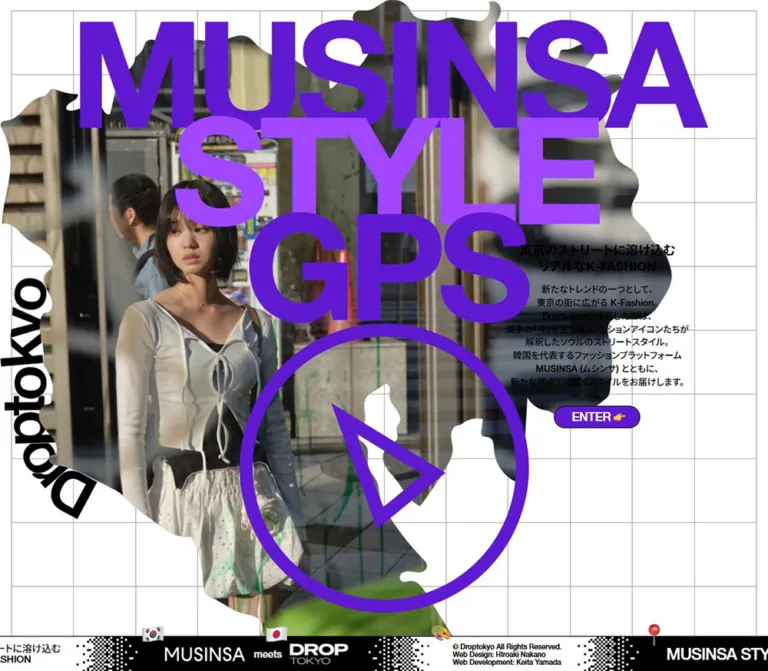
DESIGN REFERENCE
MUSINSA STYLE GPS|東京のKファッションを巡る特設サイト
紫の巨大タイポグラフィ、地図を思わせる写真の切り抜き、格子背景、流れるモノクロのフッターが特徴。東京のストリートスタイルを紹介するMUSINSAとDroptokyoの特設サイト。
オリジナルサイトを見るMUSINSA STYLE GPS — Style Reference
A Tokyo street-fashion editorial staged as oversized purple type, an irregular photographic silhouette, and a moving strip of monochrome credits.
Website / original URL: musinsa.droptokyo.com
Final URL: https://musinsa.droptokyo.com/
Theme: a white, graph-paper opening with two purples, black text, and alternating black-and-white footer panels.
Inspected: September 13, 2026, at approximately 01:59 JST; supplied retrieval timestamp: 2026-09-12T16:59:16.249Z.
Viewports: 1440 × 1000 and 390 × 844 CSS pixels.
Scope: the current opening screen, three desktop captures, two mobile captures, and the accompanying rendered DOM/computed-style observations. Map/list controls, location links, and an offscreen content region are documented only to the extent established by that DOM. No post-ENTER screen or model detail page was visually inspected.
MUSINSA STYLE GPS presents a fashion collaboration through the language of a poster and a location guide. Huge, tightly tracked words occupy the upper canvas. A street photograph retains buildings, cables, foliage, and clothing texture inside an irregular, map-like boundary. A thick purple compass symbol overlays this composition, while a small Japanese introduction and an ENTER button provide a clear reading and action point.
The tension between scale and restraint defines the page: 220px display lettering sits beside 13px explanatory copy on desktop. Thin gray grid lines remain visible across large empty areas. A narrow footer carries project identity, partnership marks, credits, emoji-like badges, and pixelated transitions between black and white. On mobile, the composition is deliberately rearranged: the lettering becomes right aligned, the photograph moves below its first line, and the introduction sits near the bottom after a substantial white interval.
The evidence supports an opening to a street-fashion browsing experience, with MAP VIEW, SNAP LIST, and 24 distinct model destinations present in the DOM. It does not establish the appearance or behavior of those experiences after entry.
How to Read This Reference
- Measured values come from the supplied element rectangles, computed styles, and custom properties. Dimensions are CSS pixels unless stated otherwise.
- Calculated values are arithmetic derived from those measurements, such as the negative overlap between title rows.
- Visual estimates describe screenshot geometry or color without an accompanying element measurement. These are explicitly labeled.
- Recommended values and code are implementation choices for a reusable adaptation. They are not recovered source rules.
- Source variables retain their original names. Other token names are descriptive aliases introduced here.
- Visible appearance and computed declarations are distinguished. The opening appears white even though the body computes to gray. Mobile introduction text appears black even though its sampled computed color is white. The supplied evidence does not identify the mechanism behind either difference.
- DOM presence does not establish visibility. Many location labels and controls have nonzero rectangles while the opening artwork covers their apparent positions. Their dimensions do not justify reconstructing an unseen screen.
Tokens — Colors
Default Palette
| Name | Value | Suggested token | Evidence and role |
|---|---|---|---|
| Opening White | #ffffff |
--color-paper |
Visually observed opening field and white footer panels; the opening layer's own background declaration was not supplied |
| GPS Purple | #5f1ad1 |
--color-purple / source --c-purple |
Exact source variable and computed color of MUSINSA, GPS, and the ENTER fill; visually matches the compass |
| Style Purple | #a047ff |
--color-purple-light / source --c-light-purple |
Exact source variable and computed color of STYLE |
| Editorial Black | #000000 |
--color-ink |
Exact desktop introduction color and black footer fills; also the visible mobile introduction color |
| Reverse White | #ffffff |
--color-on-dark |
Exact ENTER text color and reversed footer text |
| Grid Gray | Approximately #aaaaaa |
--color-grid |
Visual estimate for the fine background rules; use as an implementation starting point |
The two purples perform different jobs inside one wordmark. Keep the first and third lines dark purple and the middle line lighter purple. This is a flat, two-color arrangement; no gradient is visible in the title or button.
The photograph supplies additional blues, greens, skin tones, and dark neutrals. These belong to the image rather than to a general interface palette. Small multicolored footer badges remain isolated accents.
Source Colors Outside the Visible Opening
| Source value | Evidence | Interpretation limit |
|---|---|---|
--c-bg: #dddddf |
Both snapshots; body computes to rgb(221, 221, 223) |
An underlying page color, not the visible white opening field |
--c-bg-param: 221, 222, 223 |
Both snapshots | This tuple differs slightly from --c-bg; do not silently treat them as identical |
--c-green: #a0e52e |
Both snapshots; applied to large desktop location-name elements | Exists in the underlying interface; it is not a visible accent in the supplied opening captures |
Mobile introduction: rgb(255, 255, 255) |
Computed H1 and paragraph styles | Conflicts with their visibly black appearance; no blend mode or state explanation was supplied |
For a direct-color reproduction of the opening, use white for its canvas and black for its introduction at both inspected sizes. Do not copy the body gray or mobile white text into an otherwise plain white implementation. No theme switcher or alternate user-selectable palette was observed.
Tokens — Typography
Source Font Stack
The body and sampled interface elements declare:
font-family: helvetica-neue-lt-pro, 'Noto Sans JP', sans-serif;
The large Latin lettering has a compact, heavy sans-serif appearance. Japanese text uses the same declared stack. The evidence establishes the CSS family declaration, but does not independently identify the font file used for every glyph or verify its delivery method.
The root HTML element reports Times, but the body overrides it. That root fallback is not evidence of a visible serif design.
Use weight 700 for the opening wordmark and Japanese heading. The sampled body copy, buttons, location labels, and footer text use weight 500.
Display Lettering
The three words are separate paragraph elements in the original DOM. Their nominal line height is only 0.77 of their font size, and their rectangles overlap further through their vertical placement.
- Desktop font size: 220px; line height: 169.4px; tracking: −13.2px, equivalent to −0.06em.
- Mobile font size: 87.36px; line height: 67.2672px; tracking: −5.2416px, also −0.06em.
- Desktop row starts: 26px, 169px, 312px. Their 143px advance equals 0.65em.
- Mobile row starts: 14px, 63.796875px, 113.59375px. Their approximately 49.797px advance equals 0.57em.
A reusable equivalent is line-height: .77 with a negative top margin of -.12em between desktop rows and -.20em between mobile rows. This reproduces the measured row spacing, but the original layout declarations were not supplied.
Desktop words are visually centered within a shared block. Mobile words align visually toward the right edge. This alignment change creates the staggered silhouette of MUSINSA, STYLE, and GPS without requiring different font sizes for each word.
Type Scale
| Role | Desktop | Mobile | Weight | Tracking / notes |
|---|---|---|---|---|
| Opening title | 220px / 169.4px |
87.36px / 67.2672px |
700 |
−0.06em; overlapping rows |
| Japanese introduction heading | 18px / 22.5px |
17px / 21.25px |
700 |
Normal tracking; two lines |
| Introduction paragraph | 13px / 18.85px |
12px / 17.4px |
500 |
Line-height ratio 1.45 |
| ENTER label | 15px / 15px |
15px / 15px |
500 |
Normal tracking |
| Location marker labels, DOM only | 15px / 15px |
15px / 15px |
500 |
Not visually exposed in the opening |
| MAP VIEW / SNAP LIST, DOM only | 15px / 15px |
15px / 15px |
500 |
Small, uppercase utility text |
| Large location names, DOM only | 220px / 169.4px |
130px / 100.1px |
700 |
−0.06em; different geometry in each snapshot |
| Footer project title | 23px / 23px |
16px / 16px |
500 |
−0.03em |
| Footer Japanese statement | 14px / 15.4px |
10px / 11px |
500 |
Two compact lines |
| Footer credit/copyright text | 10px / 11px |
10px / 11px |
500 |
Three visible credit lines on desktop; copyright-only visible-text evidence on mobile |
Do not apply the title's negative tracking to Japanese body copy. The title behaves as graphic material; the introduction remains conventionally readable.
Tokens — Spacing & Shapes
There is no evidence of a single global spacing unit. The opening combines viewport-scale artwork, tightly controlled text geometry, small fixed button dimensions, and a separate footer system.
Spacing Scale
| Use | Desktop | Mobile | Evidence |
|---|---|---|---|
| Grid outer inset | About 16px |
About 12px |
Visual estimate |
Source --pad |
36px |
0px |
Exact custom property; not the visible grid inset |
| Introduction side inset | Right edge about 113px |
25px on both sides |
Derived from measured rectangles |
| Heading-to-paragraph gap | 12px |
8px |
Calculated from rectangles |
| Paragraph-to-button gap | 24px |
16px |
Calculated from rectangles |
| ENTER left/right padding | 24px / 20px |
24px / 20px |
Computed style |
| ENTER horizontal content gap | 4px |
4px |
Computed style |
| Footer panel left/right padding | 34px / 24px |
28px / 16px |
Sampled project-title and text panels |
| Footer project-title/icon gap | 10px |
6px |
Computed style |
| Introduction button to viewport bottom | About 368px |
65px |
Calculated; reflects different layouts |
Border Radius
| Element | Value | Evidence |
|---|---|---|
| ENTER button | 16px |
Measured; exactly half its 32px height |
| Underlying view switch | 9px |
Measured on a 32 × 18px button |
| Footer panels and grid field | Square | Visually observed |
| Compass outer boundary | Circle | Visually observed |
| Photographic silhouette | Irregular organic boundary | Visually observed; not a rounded rectangle |
The visible button has a thin dark outline, estimated at 1px. No raised card, soft shadow, or general elevation system is visible.
Layout Measurements
| Element | At 1440 × 1000 | At 390 × 844 | Status |
|---|---|---|---|
| Document height | 1000px |
844px |
Measured; matches viewport in both snapshots |
| Shared title row box | x 252.83, width 934.34px |
x 6, width 372px |
Measured; glyph ink can extend beyond nominal box edges |
| Introduction heading box | x 1066.45, y 368.13, 260.55 × 45px |
x 25, y 593.55, 340 × 42.5px |
Measured |
| Introduction paragraph box | 260.55 × 150.75px |
340 × 86.95px |
Measured |
| ENTER button | x 1135.34, y 599.88, 122.75 × 32px |
x 135.77, y 747, 118.47 × 32px |
Measured |
| Compass outer circle | About 430 × 430px, near x 505, y 482 |
About 180 × 180px, near x 204, y 180 |
Visual estimate |
| Compass stroke | About 20px |
About 8px |
Visual estimate |
| Photograph/silhouette envelope | Roughly 1000px wide; reaches the lower screen edge |
Roughly full width, from around y 94 to y 474 |
Visual estimate, not native image dimensions |
| Footer wrapper | y 928, height 72px |
y 796, height 48px |
Measured; includes protruding decorations |
| Footer panel body | y 950, height 50px |
y 812, height 32px |
Measured on project-title links |
Source --footerHeight |
51px |
33px |
Exact variable; distinct from wrapper height |
The desktop grid is visually about 16 columns, with approximately 88px horizontal and 90px vertical spacing. Mobile shows about 7 columns, with approximately 52px horizontal and 56px vertical spacing. These are screenshot estimates, not recovered grid formulas. The cells are close to square, but should not be described as precisely square.
Components
Opening Grid Field
Role: provides a technical, geographic framework behind the editorial composition.
A white field contains thin, continuous gray rules. A small outer inset creates a frame, while the grid remains visible behind empty areas around the collage and introduction. The large photograph and typography cross the grid freely; content is not boxed into its individual cells.
On desktop the grid has many columns and reads as a wide plotting surface. On mobile it becomes coarser, with seven visible columns. Its lines continue through the large white gap below the photograph, connecting the artwork to the lower introduction.
Implementation guidance: use two orthogonal 1px background gradients or a lightweight SVG grid. Keep this layer decorative and noninteractive. Match each inspected size before choosing interpolation rules.
Three-Line Project Wordmark
Role: establishes identity at poster scale.
Stack MUSINSA, STYLE, and GPS as independent live-text lines. Apply the same bold font size and tight tracking to all three. Use dark purple, light purple, then dark purple. Preserve the compact line advance and intentional overlap of their line boxes.
At desktop size, the shared block is horizontally centered on the viewport. The letterforms overlap the photograph and surrounding white canvas. At mobile size, the block starts close to the left edge but its words align right, placing the shorter GPS above the compass on the right.
The source uses paragraph elements for this lettering and an H1 for the Japanese introduction. A new implementation can improve the heading outline while retaining the appearance; semantic changes should not force a different visual arrangement.
Photographic Silhouette and Editorial Mark
Role: joins street photography with the page's location theme.
The current captures show a person with short dark hair, a textured blue-gray overshirt, a gray printed top, and a dark diagonal shoulder strap. The image also retains street architecture, overhead wires, and greenery. It is not merely a person isolated from the background.
An irregular, map-like outline removes portions of the photograph to expose the white grid behind it. Some inward cuts extend deeply into the image, producing a fragmented edge. A black Droptokyo wordmark curves along the left side and turns near the lower-left boundary.
Keep the photograph's street context and the asymmetric edge. A generic oval portrait, circular avatar, or rectangular cover would lose the relationship between fashion, place, and the GPS identity. No exact geographic identity of the silhouette, image URL, or mask implementation is established by the supplied evidence.
Compass Emblem
Role: reinforces the GPS concept as a large graphic sign.
A thick, unfilled purple circle surrounds an angular, outlined triangular pointer directed toward the upper left. White space and photography remain visible inside the ring and pointer. The circle is approximately 430px wide on desktop and 180px on mobile, with its stroke scaling proportionally.
On desktop it occupies the lower central portion of the composition. On mobile it moves to the right of the portrait, immediately below GPS. Its shape suggests navigation, but the evidence does not establish it as a clickable control. Do not automatically implement it as a play button or a geolocation permission trigger.
A simple SVG is suitable for a reusable equivalent. Treat its exact pointer coordinates as authored geometry unless an original asset becomes available.
Japanese Introduction
Role: explains the collaboration and the editorial subject.
The heading reads:
東京のストリートに溶け込む リアルなK-FASHION
On desktop, the heading and paragraph are centered within a narrow 260.55px column. The paragraph occupies eight lines, giving it the compact rhythm of a poster caption. The column sits around the right-hand vertical midpoint of the viewport.
On mobile, the column expands to 340px with 25px side margins. The heading remains centered, while the paragraph is visually left aligned and wraps into five lines. Desktop-specific paragraph breaks are absent from the mobile visible-text layout. Preserve this responsive change instead of shrinking the desktop paragraph as a single block.
The mobile copy begins well below the photographic silhouette. That white interval is an intentional part of the observed composition, not an empty slot that needs a card or secondary message.
ENTER Button
Role: the visible entry action.
A compact purple pill with white ENTER text and a small pointing-hand symbol. The measured height is 32px at both sizes, with a 16px radius. Its flex layout has a 4px horizontal gap and asymmetric left/right padding of 24px and 20px. The apparent 1px black outline keeps the pill crisp against the grid.
The button is centered under the introduction. Its measured width changes slightly between snapshots, so use content sizing rather than assuming a universal fixed width.
No supplied capture shows a click, hover, focus, loading state, or destination. The DOM confirms a button, but does not establish which state it opens or how it transitions.
Bottom Editorial Ribbon
Role: maintains project identity, partnership information, and credits along the viewport edge.
The ribbon alternates four content types:
- A black project-title panel with white
MUSINSA STYLE GPS, a small circular compass mark, and a red pin-like badge protruding above. - A white panel carrying the Japanese statement, with a small Tokyo-tower-like badge.
- A black partnership panel showing MUSINSA, a small
meets, and the DROP TOKYO mark, with Korean and Japanese flag badges. - A white copyright/credits panel with a painter's-palette-like badge.
Black-and-white pixel patterns break up the transitions between panels. Their density changes along the edge; this is closer to bitmap dithering than a soft gradient. Panel boundaries remain flat and square.
The desktop ribbon body is 50px high; mobile reduces it to 32px. Decorative badges extend above that body, explaining the larger measured footer wrapper. The MUSINSA link box scales from 114 × 20px to approximately 79.8 × 14px. The Droptokyo box scales from approximately 82.61 × 30px to 57.83 × 21px. Both are approximately 70% of their desktop dimensions.
Successive captures show the ribbon shifted horizontally while the opening remains unchanged. Three repeated project sequences also appear in the DOM. Equivalent project-title anchors are approximately 1443.89px apart on desktop and 1191.52px apart on mobile. These are measured repeat distances, not animation speeds.
The original page directly displays © Droptokyo All Rights Reserved., Web Design: HIroaki Nakano, and Web Development: Keita Yamada on desktop. The capitalization of the first name is reproduced as supplied. The page also includes By Droptokyo in its underlying identity text. These establish the displayed publisher identity and production credits, without identifying a separate legal entity.
Mobile visible-text evidence includes the copyright without the two production-credit lines, although those strings remain in the sampled node text. Their permanent removal cannot be inferred.
The recorded partnership destinations are the MUSINSA exhibition link and Droptokyo homepage. Those destinations were not opened during this analysis.
Underlying Location Navigation — DOM Evidence Only
Role indicated by labels: browsing street-fashion entries by place and switching between map and list representations.
The DOM contains 24 distinct /model/…/ destinations. Two different destinations use the label Shibuya; duplicated anchor sets do not represent additional editorial entries.
Measured structure includes:
- Location anchors with approximately 60 × 64px rectangles at both viewports.
- Location H3 labels at 15px / 15px, with a defined opacity transition.
MAP VIEWandSNAP LISTbuttons separated by a 32 × 18px purple switch with a 9px radius.- A desktop switch group near the horizontal center at approximately
y 46px; its mobile counterpart is neary 34px. - Two additional unnamed desktop buttons measuring 38 × 38px. Their purpose cannot be established from the evidence.
- An offscreen MAIN region measuring 430 × 949px at
x −430, y 0on desktop, and 390 × 844px atx 0, y 844on mobile.
These observations establish available markup and responsive geometry. They do not establish the visual appearance of an active map, marker artwork, selection states, panning, zooming, list transitions, or model-detail presentation. Some mobile location bounds extend outside the viewport, but this does not prove that the active navigation is inaccessible.
Tokens — Motion & Interaction
| Treatment | Evidence | What can safely be reused |
|---|---|---|
| Footer horizontal movement | Content positions change across the three desktop and two mobile captures | A moving ribbon is part of the observed design; duration, easing, and implementation are unknown |
| Location-label opacity | Computed opacity 0.2s cubic-bezier(0.3, 0.1, 0.1, 1) |
Exact transition definition; trigger and endpoint opacity were not exercised |
| Desktop location-link color | Computed color 0.3s cubic-bezier(0.3, 0.1, 0.1, 1) |
Exact transition definition; target colors and hover behavior remain unverified |
| Footer opacity | Computed opacity 0.6s cubic-bezier(0.3, 0.1, 0.1, 1) |
Exact transition definition; the event causing it was not observed |
| ENTER interaction | Button present; sampled transition reported only as all |
No usable animation duration or verified feedback state |
| Opening title and photograph | Same arrangement and photograph in the supplied current-page captures | No demonstrated slideshow, parallax, rotation, or automatic scene change |
| View switching and model navigation | Labels, buttons, and links present in DOM | Interaction outcomes and transition choreography remain unverified |
The inspection process included an initial observation of at least five seconds. It waited for finite animations and image decoding within bounded limits, temporarily paused perpetual animations during readiness checks, and resumed them for capture. This supports the visible settled opening, but does not prove all delayed or interactive states were reached.
Sampled elements often report animation: none. That does not contradict the observed ribbon movement: the supplied element list does not expose every descendant, pseudo-element, or possible script-driven transform. The movement mechanism should remain unspecified.
Recommended adaptation: keep the opening artwork static initially. If reproducing the moving ribbon, use a steady loop, offer a pause mechanism, pause while its links are focused, and provide reduced-motion behavior. Any chosen duration is a new implementation value.
Surfaces
| Layer | Visible treatment | Purpose |
|---|---|---|
| Opening field | White with fine gray grid | Establishes the spatial framework |
| Photographic layer | Full-color street image inside an irregular boundary | Supplies texture, place, and human presence |
| Display layer | Flat dark and light purple lettering | Dominant identity |
| Compass | Thick purple outline with transparent interior | Graphic reinforcement of the location concept |
| Introduction | Unboxed black text directly on the grid | Keeps information quiet and readable |
| Entry control | Purple pill, white text, fine dark outline | Concentrates the opening action |
| Footer panels | Alternating solid black and white, square edges | Carries identity and utility information |
| Footer transitions | Crisp black-and-white dither | Connects the panels with a raster texture |
There is no visible glass, blur, soft elevation, or general card surface. Depth comes from overlapping artwork and the footer badges protruding above the ribbon.
Imagery
The photograph is documentary in setting and editorial in styling. Keep natural clothing texture, the dark strap, facial detail, street cables, building surfaces, and plants. The city background is essential to the content's location premise.
The strongest image treatment is its irregular boundary. It cuts across both the person and the environment, leaving an asymmetric outer silhouette and deep white intrusions. Preserve its authored contours and transparent areas rather than approximating them with a few generic rounded corners.
Typography and compass graphics stay clean and vector-like. The footer transitions alone introduce conspicuous pixel texture. Do not apply image-rendering: pixelated to the fashion photograph or the whole page.
The curved Droptokyo mark is a distinctive piece of artwork. Its lettering follows a bend rather than reading as ordinary vertical text. Prefer an authored SVG or transparent asset for that treatment.
Observed Asset References
No original image, SVG, mask, or font-file URLs were included in the supplied evidence. The references below identify visual assets, not downloadable paths.
| Visual asset | Evidence | Implementation requirement |
|---|---|---|
| Current street photograph | All five current-page captures | Use the current composition when available, or commission a comparable street portrait for a new project |
| Irregular silhouette | All five current-page captures | Supply an authored mask or a transparent composition; exact path unknown |
| Curved Droptokyo mark | Left edge of desktop and mobile artwork | Preserve the curve with vector or transparent artwork |
| Large compass | Center/lower desktop and upper-right mobile | SVG equivalent is practical; exact original asset unknown |
| MUSINSA and DROP TOKYO marks | Footer captures and linked DOM boxes | Preserve brand proportions rather than treating both as generic body text |
| Flag, pin, tower, and palette badges | Footer captures | Small full-color symbols; asset format and rendering source unknown |
| Dither transitions | Footer panel boundaries | Use an authored density-changing pixel pattern for a close match |
Image subjects cannot be reliably associated with a specific model URL from this evidence alone. No identity is assigned to the photographed person here.
Layout & Responsive Behavior
Desktop: 1440 × 1000
The visible opening is a single viewport composition. The title block is centered at x 720px, while the photograph fills much of the left two-thirds. The compass is also approximately centered on x 720px, producing a vertical relationship between the wordmark and its symbol.
The introduction occupies a separate right-hand column. Its complete heading, paragraph, and button group spans approximately y 368.13–631.88px, placing the group around the viewport's vertical midpoint. The photograph can overlap the title area without covering the introduction's reading zone.
The footer body occupies the final 50px of the screen. Its decorative badges extend into the opening above it. The document height is exactly 1000px in the supplied snapshot; no longer page of revealed sections is demonstrated.
Mobile: 390 × 844
The wordmark starts near the top edge, with row boxes at x 6px and width 372px. The first word stretches almost the full screen width. Right alignment shifts the shorter words to the right, allowing the portrait to remain visually prominent on the left.
The photograph occupies roughly the region from y 94px to y 474px. The compass sits near x 204px, y 180px, alongside the portrait instead of below the entire title block.
The introduction heading begins at y 593.55px, leaving about 120px between the estimated photograph bottom and the measured heading top. The paragraph is wider than on desktop and becomes left aligned. ENTER remains a compact 32px-high pill rather than becoming full width.
The button ends at y 779px. The footer panel body begins at y 812px, leaving about 33px between them. The mobile document height remains 844px.
What Actually Changes
| Relationship | Desktop | Mobile |
|---|---|---|
| Title alignment | Centered words | Right-aligned words |
| Display size | 220px |
87.36px |
| Title row advance | 0.65em |
Approximately 0.57em |
| Introduction position | Right column, vertically centered | Lower full-width column with side margins |
| Paragraph alignment | Centered | Left aligned |
| Paragraph line count | Eight | Five |
| Compass placement | Large, lower center | Smaller, upper right beside the portrait |
| Grid density | Approximately 16 columns | Approximately 7 columns |
| Footer body height | 50px |
32px |
| ENTER height | 32px |
32px |
This is not a uniform scale reduction. The viewport width falls to approximately 27.1% of desktop width, but the title retains approximately 39.7% of its desktop size. Meanwhile, button height does not change.
At the measured mobile width, 87.36px is numerically equal to 22.4vw. That equivalence is useful for an adaptation, but does not establish the original responsive formula. The original breakpoint and behavior at tablet widths, short landscape sizes, browser zoom, or large accessibility text settings were not supplied.
Recommended: preserve the two demonstrated compositions, then test intermediate widths explicitly. Allow vertical scrolling when the collage and introduction no longer fit. Keep the entry action reachable above the footer, including device safe areas. Do not infer a universal overflow: hidden rule merely because these two documents fit their viewports.
Do’s and Don’ts
Do
- Preserve the exact two-purple sequence:
#5f1ad1,#a047ff,#5f1ad1. - Treat the project title as oversized live typography with
−0.06emtracking and deliberately overlapping rows. - Keep the fine grid visible through the white space around the collage.
- Retain street scenery within the photographic silhouette.
- Keep the subject's face readable while layering type and compass graphics around it.
- Use a heavy outlined compass, with open interiors that reveal the composition below.
- Maintain the small, unboxed introduction and compact ENTER pill.
- Change the mobile paragraph's wrapping and alignment instead of scaling the desktop copy block.
- Preserve the mobile white interval between image and introduction.
- Use square, alternating footer panels and crisp dithered transitions.
- Distinguish the footer's panel height from the taller wrapper containing its badges.
- Keep unseen map and model states explicitly outside a screenshot-faithful opening reference.
Don’t
- Don't replace the opening with a conventional navigation bar, centered marketing headline, and feature-card stack.
- Don't make the photograph a rounded rectangular card or an isolated studio portrait.
- Don't fill the compass or turn it into an assumed video control.
- Don't apply the underlying gray body color to the visible white opening.
- Don't reproduce white mobile copy on a plain white canvas merely because a sampled declaration reports white.
- Don't introduce lime green into the opening because it exists in hidden location-name styles.
- Don't add shadows, glass blur, glossy button gradients, or broad rounded surfaces.
- Don't pixelate the fashion photograph to imitate the footer's raster texture.
- Don't shrink the complete desktop composition uniformly for mobile.
- Don't infer image cycling, map gestures, geolocation, or transition effects from labels alone.
- Don't duplicate moving footer links into the accessibility tree without handling the repeated copies.
Recommended Implementation Additions
These are recommendations for a new implementation, not verified original features:
- Give the opening a coherent heading hierarchy. Avoid turning repeated footer identities into multiple primary headings.
- Keep background states out of keyboard navigation while the opening covers them. Restore their focusability when they become active.
- Give the entry button a visible focus outline and a target area of at least 44px, while retaining the observed 32px visual pill if desired.
- Name the view switch and any icon-only controls explicitly. Describe the current map/list state programmatically once that behavior is implemented.
- Differentiate entries that share a place label, such as the two Shibuya destinations, with meaningful accessible names.
- Provide a paused or static footer mode. Keep partnership links and credits accessible without requiring users to chase moving content.
- Mark purely repeated ribbon copies as hidden from assistive technology and noninteractive; provide one usable canonical set of links.
- Make small credits available in a legible static presentation. The observed 10px ribbon typography should not be the only way to read essential information.
- Preserve a useful photograph and text layout if custom fonts or masks are unavailable. Reserve image dimensions to prevent layout shifts.
- Allow scrolling on short screens and at increased text sizes, and account for bottom safe-area insets.
Agent Prompt Guide
Quick Color Reference
- Visible opening field: white,
#ffffff. - Main text and black footer panels:
#000000. MUSINSA,GPS, compass, and ENTER fill:#5f1ad1.STYLE:#a047ff.- Grid: approximately
#aaaaaa, a visual estimate. - Reverse labels: white.
- Full-color accents: limited to photography and small footer badges.
#dddddfand#a0e52e: underlying source values, not the visible opening palette.
Overall Prompt
“Create an opening screen for a Japanese street-fashion editorial with a location-guide identity. Use a white field with thin gray graph-paper lines, an oversized three-line sans-serif wordmark, and tightly overlapping letter rows. Color the first and third lines #5f1ad1 and the middle line #a047ff. Place a documentary street portrait, including its city background, inside an irregular map-like silhouette on the left. Add a curved black editorial mark along its edge and a large purple outlined compass. Keep the Japanese introduction small and unboxed, with a compact purple ENTER pill. Finish with a narrow black-and-white footer ribbon containing partnership marks, credits, small colorful badges, and pixelated transitions. On mobile, right-align the wordmark, place the smaller compass beside the portrait, and move the introduction below a generous white gap. Treat post-entry screens as a separate design task requiring their own evidence.”
Example Component Prompts
- Display title: “Build three live-text rows reading MUSINSA, STYLE, and GPS. Use the declared stack
helvetica-neue-lt-pro, 'Noto Sans JP', sans-serif, weight 700, tracking −0.06em, and line-height .77. At 1440px use 220px type with a .65em row advance; at the 390px reference use 87.36px type with a .57em advance. Center desktop words and right-align mobile words.” - Photographic composition: “Keep the subject and Tokyo street background together inside a deeply indented, asymmetric silhouette. Preserve clothing texture, cables, foliage, and building detail. Place a thick outlined purple compass over the composition without obscuring the face. Use authored transparent artwork rather than a rounded image card.”
- Introduction and entry: “Create a 260.55px-wide desktop caption column with an 18px bold two-line Japanese heading and centered 13px body text at 1.45 line-height. On mobile, use 25px side margins, a 17px centered heading, and left-aligned 12px body text. Center a 32px-high purple ENTER pill underneath.”
- Footer ribbon: “Create a viewport-bottom editorial ribbon with alternating square black and white panels, small partnership marks, a compact project title, and three-line desktop credits. Use 50px panel bodies on desktop and 32px on mobile, with small badges protruding above. Separate panels using crisp density-changing bitmap patterns. If animated, include reduced-motion and pause behavior; animation timing is an implementation choice.”
- Evidence boundary: “Use the supplied opening captures for visible design decisions. Record underlying MAP VIEW, SNAP LIST, and model links as available structure, but do not invent the map's visual styling, gestures, model drawer, or entry transition.”
Quick Start
CSS Custom Properties
The following is a recommended direct-color adaptation, calibrated to the two measured viewports. It keeps a conventional root font size. The 900px breakpoint, intermediate scaling, short-screen fallback, and optional 40-second ribbon loop are recommendations, not recovered source values.
Supply a square transparent collage containing the photograph, irregular boundary, and curved editorial mark. The example /assets/street-collage.webp path is a project-local placeholder, not an observed original URL. The compass SVG and checker separator are approximations; replace the checker with authored density-changing dither for a close match. Footer text placeholders should be replaced with appropriate brand artwork and project credits.
The markup intentionally does not guess what ENTER does. Wire it to the verified application state when implementing the actual browsing experience.
<main class='gps-opening'>
  <img
    class='gps-collage'
    src='/assets/street-collage.webp'
    width='1000'
    height='1000'
    alt='Street-fashion portrait with buildings, overhead wires, and greenery.'
  >

  <h1 class='gps-wordmark' aria-label='MUSINSA STYLE GPS'>
    <span>MUSINSA</span>
    <span>STYLE</span>
    <span>GPS</span>
  </h1>

  <svg class='gps-compass' viewBox='0 0 100 100' aria-hidden='true'>
    <circle cx='50' cy='50' r='47.5'></circle>
    <path d='M30 32 L69 50 L50 69 Z'></path>
  </svg>

  <section class='gps-intro' aria-labelledby='gps-intro-heading'>
    <h2 id='gps-intro-heading'>
      東京のストリートに溶け込む<br>リアルなK-FASHION
    </h2>
    <p>
      新たなトレンドの一つとして、<br class='desktop-break'>
      東京の街に広がる K-Fashion。<br class='desktop-break'>
      Droptokyoが注目したのは、<br class='desktop-break'>
      東京の「今」を生きるファッションアイコンたちが<br class='desktop-break'>
      解釈したソウルのストリートスタイル。<br class='desktop-break'>
      韓国を代表するファッションプラットフォーム<br class='desktop-break'>
      MUSINSA (ムシンサ) とともに、<br class='desktop-break'>
      新たな視点で紐解くスタイルをお届けします。
    </p>
    <button class='gps-enter' type='button'>
      <span>ENTER</span><span aria-hidden='true'>👉</span>
    </button>
  </section>
</main>

<footer class='gps-footer' aria-label='Project information'>
  <div class='gps-track'>
    <div class='gps-rail-group'>
      <div class='gps-panel gps-panel--dark'>
        <span class='gps-badge' aria-hidden='true'>📍</span>
        <a class='gps-footer-title' href='/'>MUSINSA STYLE GPS</a>
      </div>
      <span class='gps-separator' aria-hidden='true'></span>
      <div class='gps-panel gps-panel--pitch'>
        <span class='gps-badge' aria-hidden='true'>🗼</span>
        <p>東京のストリートに溶け込む<br>リアルなK-FASHION</p>
      </div>
      <span class='gps-separator' aria-hidden='true'></span>
      <div class='gps-panel gps-panel--dark gps-panel--partners'>
        <span>MUSINSA</span><small>meets</small><span>DROP TOKYO</span>
      </div>
      <span class='gps-separator' aria-hidden='true'></span>
      <div class='gps-panel gps-panel--credits'>
        <span class='gps-badge' aria-hidden='true'>🎨</span>
        <small>© Project name<br>Web Design: Your designer<br>Web Development: Your developer</small>
      </div>
      <span class='gps-separator' aria-hidden='true'></span>
    </div>
    <!-- For motion, repeat this group once with aria-hidden='true' and inert. -->
  </div>
</footer>
:root {
  /* Exact source colors and direct-color opening adaptation */
  --color-paper: #ffffff;
  --color-ink: #000000;
  --color-purple: #5f1ad1;
  --color-purple-light: #a047ff;
  --color-grid: #aaaaaa; /* Visual estimate */
  --color-underlay: #dddddf;

  --font-ui: helvetica-neue-lt-pro, 'Noto Sans JP', sans-serif;
  --weight-medium: 500;
  --weight-bold: 700;
  --text-body: 13px;
  --text-intro-heading: 18px;
  --text-control: 15px;
  --text-footer-title: 23px;
  --leading-copy: 1.45;
  --tracking-display: -0.06em;

  /* Fluid interpolation is recommended, not recovered source CSS. */
  --text-display: min(15.277778vw, 220px);
  --title-row-overlap: -0.12em;
  --grid-inset: 16px;
  --grid-columns: 16;
  --grid-row: 90px;
  --collage-width: min(69.444444vw, 1000px);
  --compass-width: min(29.861111vw, 430px);

  --intro-width: 260.55px;
  --intro-copy-gap: 12px;
  --intro-action-gap: 24px;
  --control-height: 32px;
  --radius-control: 16px;
  --rail-body: 50px;
  --rail-total: 51px;
  --rail-wrapper: 72px;
  --safe-bottom: env(safe-area-inset-bottom, 0px);

  /* Measured transition curve; loop duration is a recommendation. */
  --ease-source: cubic-bezier(0.3, 0.1, 0.1, 1);
  --motion-label: 200ms var(--ease-source);
  --motion-link: 300ms var(--ease-source);
  --motion-footer: 600ms var(--ease-source);
  --ribbon-duration: 40s;
}

* {
  box-sizing: border-box;
}

body {
  margin: 0;
  color: var(--color-ink);
  background: var(--color-paper);
  font-family: var(--font-ui);
  font-weight: var(--weight-medium);
}

.gps-opening {
  position: relative;
  isolation: isolate;
  min-height: 100vh;
  min-height: 100svh;
  overflow: hidden;
  background: var(--color-paper);
}

.gps-opening::before {
  content: '';
  position: absolute;
  z-index: 0;
  inset: var(--grid-inset) var(--grid-inset) 0;
  border: 1px solid var(--color-grid);
  background-image:
    linear-gradient(to right, var(--color-grid) 1px, transparent 1px),
    linear-gradient(to bottom, var(--color-grid) 1px, transparent 1px);
  background-size:
    calc(100% / var(--grid-columns)) var(--grid-row);
  pointer-events: none;
}

.gps-collage {
  position: absolute;
  z-index: 1;
  top: 0;
  left: 0;
  display: block;
  width: var(--collage-width);
  height: auto;
}

.gps-wordmark {
  position: absolute;
  z-index: 3;
  top: 26px;
  left: 50%;
  width: min(934.344px, calc(100% - 32px));
  margin: 0;
  transform: translateX(-50%);
  color: var(--color-purple);
  font-size: var(--text-display);
  font-weight: var(--weight-bold);
  line-height: 0.77;
  letter-spacing: var(--tracking-display);
  text-align: center;
}

.gps-wordmark span {
  display: block;
  white-space: nowrap;
}

.gps-wordmark span + span {
  margin-top: var(--title-row-overlap);
}

.gps-wordmark span:nth-child(2) {
  color: var(--color-purple-light);
}

.gps-compass {
  position: absolute;
  z-index: 2;
  top: 48.2svh;
  left: 50%;
  width: var(--compass-width);
  height: auto;
  transform: translateX(-50%);
  fill: none;
  stroke: var(--color-purple);
  stroke-width: 4.65;
  stroke-linejoin: miter;
  pointer-events: none;
}

.gps-intro {
  position: absolute;
  z-index: 4;
  top: 50svh;
  right: 7.847222vw;
  width: var(--intro-width);
  transform: translateY(-50%);
  color: var(--color-ink);
  text-align: center;
}

.gps-intro h2 {
  margin: 0;
  font-size: var(--text-intro-heading);
  font-weight: var(--weight-bold);
  line-height: 1.25;
}

.gps-intro p {
  margin: var(--intro-copy-gap) 0 0;
  font-size: var(--text-body);
  line-height: var(--leading-copy);
}

.gps-enter {
  position: relative;
  display: flex;
  align-items: center;
  justify-content: center;
  gap: 4px;
  min-height: var(--control-height);
  margin: var(--intro-action-gap) auto 0;
  padding: 0 20px 0 24px;
  border: 1px solid var(--color-ink);
  border-radius: var(--radius-control);
  color: var(--color-paper);
  background: var(--color-purple);
  font: var(--weight-medium) var(--text-control) / 1 var(--font-ui);
  cursor: pointer;
}

/* Recommended target expansion around the observed 32px visual pill. */
.gps-enter::before {
  content: '';
  position: absolute;
  inset: -6px 0;
}

.gps-footer {
  position: fixed;
  z-index: 10;
  inset: auto 0 0;
  height: calc(var(--rail-wrapper) + var(--safe-bottom));
  overflow-x: auto;
  overflow-y: hidden;
}

.gps-footer::before {
  content: '';
  position: absolute;
  inset: auto 0 0;
  height: calc(var(--rail-total) + var(--safe-bottom));
  border-top: 1px solid var(--color-ink);
  background: var(--color-paper);
}

.gps-track {
  position: relative;
  display: flex;
  width: max-content;
  height: var(--rail-body);
  margin-top: calc(var(--rail-wrapper) - var(--rail-body));
}

.gps-rail-group {
  display: flex;
  flex: none;
  height: 100%;
}

.gps-panel {
  position: relative;
  display: flex;
  flex: none;
  align-items: center;
  gap: 10px;
  padding: 0 24px 0 34px;
  color: var(--color-ink);
  background: var(--color-paper);
  white-space: nowrap;
}

.gps-panel--dark {
  color: var(--color-paper);
  background: var(--color-ink);
}

.gps-panel a {
  color: inherit;
  text-decoration: none;
}

.gps-footer-title {
  font-size: var(--text-footer-title);
  line-height: 1;
  letter-spacing: -0.03em;
}

.gps-panel--pitch p {
  margin: 0;
  font-size: 14px;
  line-height: 1.1;
}

.gps-panel--partners {
  font-size: 25px;
}

.gps-panel--partners small {
  font-size: 12px;
}

.gps-panel--credits small {
  font-size: 10px;
  line-height: 1.1;
}

.gps-badge {
  position: absolute;
  top: -20px;
  left: 12px;
  font-size: 25px;
  line-height: 1;
}

/* Checker fallback only; use authored dither for the observed density change. */
.gps-separator {
  flex: none;
  width: 90px;
  background: repeating-conic-gradient(#000 0% 25%, #fff 0% 50%);
  background-size: 4px 4px;
}

:where(.gps-opening, .gps-footer) :focus-visible {
  outline: 2px solid var(--color-purple);
  outline-offset: 4px;
}

.gps-panel--dark :focus-visible {
  outline-color: var(--color-paper);
}

/* Opt in only after adding one equal-width, inert duplicate rail group. */
.gps-footer[data-motion='on'] {
  overflow: hidden;
}

.gps-footer[data-motion='on'] .gps-track {
  animation: gps-ribbon var(--ribbon-duration) linear infinite;
}

.gps-footer:is(:hover, :focus-within) .gps-track,
.gps-footer[data-paused='true'] .gps-track {
  animation-play-state: paused;
}

@keyframes gps-ribbon {
  to { transform: translateX(-50%); }
}

@media (max-width: 900px) {
  :root {
    --text-display: 22.4vw;
    --title-row-overlap: -0.20em;
    --text-body: 12px;
    --text-intro-heading: 17px;
    --text-footer-title: 16px;
    --grid-inset: 12px;
    --grid-columns: 7;
    --grid-row: 55.7px;
    --collage-width: 100vw;
    --compass-width: 46.153846vw;
    --intro-width: calc(100% - 50px);
    --intro-copy-gap: 8px;
    --intro-action-gap: 16px;
    --rail-body: 32px;
    --rail-total: 33px;
    --rail-wrapper: 48px;
  }

  .gps-wordmark {
    top: 14px;
    left: 6px;
    width: calc(100% - 18px);
    transform: none;
    text-align: right;
  }

  .gps-collage {
    top: 21.538462vw;
  }

  .gps-compass {
    top: 46.153846vw;
    left: 52.307692vw;
    transform: none;
  }

  .gps-intro {
    top: auto;
    right: 25px;
    bottom: calc(var(--rail-total) + 32px + var(--safe-bottom));
    transform: none;
  }

  .gps-intro p {
    text-align: left;
  }

  .desktop-break {
    display: none;
  }

  .gps-panel {
    gap: 6px;
    padding-inline: 28px 16px;
  }

  .gps-panel--pitch p {
    font-size: 10px;
  }

  .gps-panel--partners {
    font-size: 18px;
  }

  .gps-badge {
    top: -14px;
    font-size: 19px;
  }
}

/* Recommended flow fallback when the mobile composition becomes too short. */
@media (max-width: 900px) and (max-height: 760px) {
  .gps-opening {
    padding-top: calc(121.54vw + 48px);
    padding-bottom: calc(var(--rail-wrapper) + 40px + var(--safe-bottom));
  }

  .gps-intro {
    position: relative;
    inset: auto;
    margin-inline: auto;
  }
}

@media (prefers-reduced-motion: reduce) {
  .gps-footer[data-motion='on'] {
    overflow-x: auto;
  }

  .gps-footer[data-motion='on'] .gps-track {
    animation: none;
    transform: none;
  }

  .gps-rail-group[aria-hidden='true'] {
    display: none;
  }
}
The code provides the visible composition and a static ribbon by default. Font metrics, the authored collage, brand assets, and actual text wrapping affect pixel correspondence. It has not been browser-tested in this analysis. Validate the two supplied viewport sizes first, then tune the recommended breakpoint and intermediate layouts.
Tailwind v4 Token Mapping
Optional aliases for a project already using Tailwind v4. This is not evidence that the original site uses Tailwind. Define the properties above first.
@theme inline {
  --color-paper: #ffffff;
  --color-ink: #000000;
  --color-gps-purple: #5f1ad1;
  --color-style-purple: #a047ff;
  --color-grid: #aaaaaa;

  --font-editorial: helvetica-neue-lt-pro, 'Noto Sans JP', sans-serif;
  --text-display: var(--text-display);
  --text-copy: var(--text-body);
  --text-intro: var(--text-intro-heading);
  --text-entry: 15px;

  --spacing-grid-inset: var(--grid-inset);
  --spacing-rail: var(--rail-total);
  --radius-entry: 16px;
}
For the display utility, avoid a self-referential custom property in an actual project: rename the base --text-display variable to --gps-display-size, then map --text-display: var(--gps-display-size). The opening CSS should use that renamed base variable consistently.
Sources & Evidence
- Original and final website: MUSINSA STYLE GPS. The supplied response reports HTTP 200 and no URL change.
- Capture time:
2026-09-12T16:59:16.249Z, equivalent to September 13, 2026, at 01:59:16.249 JST. - Visual evidence: three 1440 × 1000 desktop captures and two 390 × 844 mobile captures of the current opening. The repeated captures establish changing footer positions and the demonstrated responsive compositions.
- Rendered evidence: page text, link destinations, element rectangles, font declarations, color declarations, transitions, and custom properties supplied for both viewports. Values are labeled as measured, calculated, estimated, or recommended throughout this document.
- Original-page credits: the desktop footer directly supplies the Droptokyo copyright, Web Design credit, and Web Development credit documented above.
- Inspection boundaries: ENTER, MAP VIEW, SNAP LIST, unnamed buttons, location links, and external partnership destinations were not exercised in the supplied evidence. No model detail page, active map, or active list was visually inspected.
- Rendering limitations: the actual opening-layer background, mobile text compositing, image/mask URLs, font files, complete stylesheets, and animation implementation were not supplied. SharedWorkers and service workers were disabled during the browser inspection. Bounded readiness checks do not establish every delayed state.
This reference describes the current supplied opening and its accompanying DOM evidence. The reusable code is an adaptation, not a recovered implementation or a reconstruction of unobserved screens.
# MUSINSA STYLE GPS — Style Reference

> A Tokyo street-fashion editorial staged as oversized purple type, an irregular photographic silhouette, and a moving strip of monochrome credits.

**Website / original URL:** [musinsa.droptokyo.com](https://musinsa.droptokyo.com/)
**Final URL:** [https://musinsa.droptokyo.com/](https://musinsa.droptokyo.com/)
**Theme:** a white, graph-paper opening with two purples, black text, and alternating black-and-white footer panels.
**Inspected:** September 13, 2026, at approximately 01:59 JST; supplied retrieval timestamp: `2026-09-12T16:59:16.249Z`.
**Viewports:** 1440 × 1000 and 390 × 844 CSS pixels.
**Scope:** the current opening screen, three desktop captures, two mobile captures, and the accompanying rendered DOM/computed-style observations. Map/list controls, location links, and an offscreen content region are documented only to the extent established by that DOM. No post-ENTER screen or model detail page was visually inspected.

MUSINSA STYLE GPS presents a fashion collaboration through the language of a poster and a location guide. Huge, tightly tracked words occupy the upper canvas. A street photograph retains buildings, cables, foliage, and clothing texture inside an irregular, map-like boundary. A thick purple compass symbol overlays this composition, while a small Japanese introduction and an `ENTER` button provide a clear reading and action point.

The tension between scale and restraint defines the page: 220px display lettering sits beside 13px explanatory copy on desktop. Thin gray grid lines remain visible across large empty areas. A narrow footer carries project identity, partnership marks, credits, emoji-like badges, and pixelated transitions between black and white. On mobile, the composition is deliberately rearranged: the lettering becomes right aligned, the photograph moves below its first line, and the introduction sits near the bottom after a substantial white interval.

The evidence supports an opening to a street-fashion browsing experience, with `MAP VIEW`, `SNAP LIST`, and 24 distinct model destinations present in the DOM. It does not establish the appearance or behavior of those experiences after entry.

## How to Read This Reference

- **Measured** values come from the supplied element rectangles, computed styles, and custom properties. Dimensions are CSS pixels unless stated otherwise.
- **Calculated** values are arithmetic derived from those measurements, such as the negative overlap between title rows.
- **Visual estimates** describe screenshot geometry or color without an accompanying element measurement. These are explicitly labeled.
- **Recommended** values and code are implementation choices for a reusable adaptation. They are not recovered source rules.
- **Source variables** retain their original names. Other token names are descriptive aliases introduced here.
- **Visible appearance and computed declarations are distinguished.** The opening appears white even though the body computes to gray. Mobile introduction text appears black even though its sampled computed color is white. The supplied evidence does not identify the mechanism behind either difference.
- **DOM presence does not establish visibility.** Many location labels and controls have nonzero rectangles while the opening artwork covers their apparent positions. Their dimensions do not justify reconstructing an unseen screen.

## Tokens — Colors

### Default Palette

| Name | Value | Suggested token | Evidence and role |
| --- | --- | --- | --- |
| Opening White | `#ffffff` | `--color-paper` | Visually observed opening field and white footer panels; the opening layer's own background declaration was not supplied |
| GPS Purple | `#5f1ad1` | `--color-purple` / source `--c-purple` | Exact source variable and computed color of `MUSINSA`, `GPS`, and the ENTER fill; visually matches the compass |
| Style Purple | `#a047ff` | `--color-purple-light` / source `--c-light-purple` | Exact source variable and computed color of `STYLE` |
| Editorial Black | `#000000` | `--color-ink` | Exact desktop introduction color and black footer fills; also the visible mobile introduction color |
| Reverse White | `#ffffff` | `--color-on-dark` | Exact ENTER text color and reversed footer text |
| Grid Gray | Approximately `#aaaaaa` | `--color-grid` | Visual estimate for the fine background rules; use as an implementation starting point |

The two purples perform different jobs inside one wordmark. Keep the first and third lines dark purple and the middle line lighter purple. This is a flat, two-color arrangement; no gradient is visible in the title or button.

The photograph supplies additional blues, greens, skin tones, and dark neutrals. These belong to the image rather than to a general interface palette. Small multicolored footer badges remain isolated accents.

### Source Colors Outside the Visible Opening

| Source value | Evidence | Interpretation limit |
| --- | --- | --- |
| `--c-bg: #dddddf` | Both snapshots; body computes to `rgb(221, 221, 223)` | An underlying page color, not the visible white opening field |
| `--c-bg-param: 221, 222, 223` | Both snapshots | This tuple differs slightly from `--c-bg`; do not silently treat them as identical |
| `--c-green: #a0e52e` | Both snapshots; applied to large desktop location-name elements | Exists in the underlying interface; it is not a visible accent in the supplied opening captures |
| Mobile introduction: `rgb(255, 255, 255)` | Computed H1 and paragraph styles | Conflicts with their visibly black appearance; no blend mode or state explanation was supplied |

For a direct-color reproduction of the opening, use white for its canvas and black for its introduction at both inspected sizes. Do not copy the body gray or mobile white text into an otherwise plain white implementation. No theme switcher or alternate user-selectable palette was observed.

## Tokens — Typography

### Source Font Stack

The body and sampled interface elements declare:

```css
font-family: helvetica-neue-lt-pro, 'Noto Sans JP', sans-serif;
```

The large Latin lettering has a compact, heavy sans-serif appearance. Japanese text uses the same declared stack. The evidence establishes the CSS family declaration, but does not independently identify the font file used for every glyph or verify its delivery method.

The root HTML element reports `Times`, but the body overrides it. That root fallback is not evidence of a visible serif design.

Use weight `700` for the opening wordmark and Japanese heading. The sampled body copy, buttons, location labels, and footer text use weight `500`.

### Display Lettering

The three words are separate paragraph elements in the original DOM. Their nominal line height is only `0.77` of their font size, and their rectangles overlap further through their vertical placement.

- Desktop font size: **220px**; line height: **169.4px**; tracking: **−13.2px**, equivalent to **−0.06em**.
- Mobile font size: **87.36px**; line height: **67.2672px**; tracking: **−5.2416px**, also **−0.06em**.
- Desktop row starts: **26px, 169px, 312px**. Their 143px advance equals **0.65em**.
- Mobile row starts: **14px, 63.796875px, 113.59375px**. Their approximately 49.797px advance equals **0.57em**.

A reusable equivalent is `line-height: .77` with a negative top margin of `-.12em` between desktop rows and `-.20em` between mobile rows. This reproduces the measured row spacing, but the original layout declarations were not supplied.

Desktop words are visually centered within a shared block. Mobile words align visually toward the right edge. This alignment change creates the staggered silhouette of `MUSINSA`, `STYLE`, and `GPS` without requiring different font sizes for each word.

### Type Scale

| Role | Desktop | Mobile | Weight | Tracking / notes |
| --- | --- | --- | --- | --- |
| Opening title | `220px / 169.4px` | `87.36px / 67.2672px` | `700` | `−0.06em`; overlapping rows |
| Japanese introduction heading | `18px / 22.5px` | `17px / 21.25px` | `700` | Normal tracking; two lines |
| Introduction paragraph | `13px / 18.85px` | `12px / 17.4px` | `500` | Line-height ratio `1.45` |
| ENTER label | `15px / 15px` | `15px / 15px` | `500` | Normal tracking |
| Location marker labels, DOM only | `15px / 15px` | `15px / 15px` | `500` | Not visually exposed in the opening |
| MAP VIEW / SNAP LIST, DOM only | `15px / 15px` | `15px / 15px` | `500` | Small, uppercase utility text |
| Large location names, DOM only | `220px / 169.4px` | `130px / 100.1px` | `700` | `−0.06em`; different geometry in each snapshot |
| Footer project title | `23px / 23px` | `16px / 16px` | `500` | `−0.03em` |
| Footer Japanese statement | `14px / 15.4px` | `10px / 11px` | `500` | Two compact lines |
| Footer credit/copyright text | `10px / 11px` | `10px / 11px` | `500` | Three visible credit lines on desktop; copyright-only visible-text evidence on mobile |

Do not apply the title's negative tracking to Japanese body copy. The title behaves as graphic material; the introduction remains conventionally readable.

## Tokens — Spacing & Shapes

There is no evidence of a single global spacing unit. The opening combines viewport-scale artwork, tightly controlled text geometry, small fixed button dimensions, and a separate footer system.

### Spacing Scale

| Use | Desktop | Mobile | Evidence |
| --- | --- | --- | --- |
| Grid outer inset | About `16px` | About `12px` | Visual estimate |
| Source `--pad` | `36px` | `0px` | Exact custom property; not the visible grid inset |
| Introduction side inset | Right edge about `113px` | `25px` on both sides | Derived from measured rectangles |
| Heading-to-paragraph gap | `12px` | `8px` | Calculated from rectangles |
| Paragraph-to-button gap | `24px` | `16px` | Calculated from rectangles |
| ENTER left/right padding | `24px / 20px` | `24px / 20px` | Computed style |
| ENTER horizontal content gap | `4px` | `4px` | Computed style |
| Footer panel left/right padding | `34px / 24px` | `28px / 16px` | Sampled project-title and text panels |
| Footer project-title/icon gap | `10px` | `6px` | Computed style |
| Introduction button to viewport bottom | About `368px` | `65px` | Calculated; reflects different layouts |

### Border Radius

| Element | Value | Evidence |
| --- | --- | --- |
| ENTER button | `16px` | Measured; exactly half its 32px height |
| Underlying view switch | `9px` | Measured on a 32 × 18px button |
| Footer panels and grid field | Square | Visually observed |
| Compass outer boundary | Circle | Visually observed |
| Photographic silhouette | Irregular organic boundary | Visually observed; not a rounded rectangle |

The visible button has a thin dark outline, estimated at 1px. No raised card, soft shadow, or general elevation system is visible.

### Layout Measurements

| Element | At 1440 × 1000 | At 390 × 844 | Status |
| --- | --- | --- | --- |
| Document height | `1000px` | `844px` | Measured; matches viewport in both snapshots |
| Shared title row box | `x 252.83`, width `934.34px` | `x 6`, width `372px` | Measured; glyph ink can extend beyond nominal box edges |
| Introduction heading box | `x 1066.45`, `y 368.13`, `260.55 × 45px` | `x 25`, `y 593.55`, `340 × 42.5px` | Measured |
| Introduction paragraph box | `260.55 × 150.75px` | `340 × 86.95px` | Measured |
| ENTER button | `x 1135.34`, `y 599.88`, `122.75 × 32px` | `x 135.77`, `y 747`, `118.47 × 32px` | Measured |
| Compass outer circle | About `430 × 430px`, near `x 505`, `y 482` | About `180 × 180px`, near `x 204`, `y 180` | Visual estimate |
| Compass stroke | About `20px` | About `8px` | Visual estimate |
| Photograph/silhouette envelope | Roughly `1000px` wide; reaches the lower screen edge | Roughly full width, from around `y 94` to `y 474` | Visual estimate, not native image dimensions |
| Footer wrapper | `y 928`, height `72px` | `y 796`, height `48px` | Measured; includes protruding decorations |
| Footer panel body | `y 950`, height `50px` | `y 812`, height `32px` | Measured on project-title links |
| Source `--footerHeight` | `51px` | `33px` | Exact variable; distinct from wrapper height |

The desktop grid is visually about **16 columns**, with approximately **88px horizontal** and **90px vertical** spacing. Mobile shows about **7 columns**, with approximately **52px horizontal** and **56px vertical** spacing. These are screenshot estimates, not recovered grid formulas. The cells are close to square, but should not be described as precisely square.

## Components

### Opening Grid Field

**Role:** provides a technical, geographic framework behind the editorial composition.

A white field contains thin, continuous gray rules. A small outer inset creates a frame, while the grid remains visible behind empty areas around the collage and introduction. The large photograph and typography cross the grid freely; content is not boxed into its individual cells.

On desktop the grid has many columns and reads as a wide plotting surface. On mobile it becomes coarser, with seven visible columns. Its lines continue through the large white gap below the photograph, connecting the artwork to the lower introduction.

**Implementation guidance:** use two orthogonal 1px background gradients or a lightweight SVG grid. Keep this layer decorative and noninteractive. Match each inspected size before choosing interpolation rules.

### Three-Line Project Wordmark

**Role:** establishes identity at poster scale.

Stack `MUSINSA`, `STYLE`, and `GPS` as independent live-text lines. Apply the same bold font size and tight tracking to all three. Use dark purple, light purple, then dark purple. Preserve the compact line advance and intentional overlap of their line boxes.

At desktop size, the shared block is horizontally centered on the viewport. The letterforms overlap the photograph and surrounding white canvas. At mobile size, the block starts close to the left edge but its words align right, placing the shorter `GPS` above the compass on the right.

The source uses paragraph elements for this lettering and an H1 for the Japanese introduction. A new implementation can improve the heading outline while retaining the appearance; semantic changes should not force a different visual arrangement.

### Photographic Silhouette and Editorial Mark

**Role:** joins street photography with the page's location theme.

The current captures show a person with short dark hair, a textured blue-gray overshirt, a gray printed top, and a dark diagonal shoulder strap. The image also retains street architecture, overhead wires, and greenery. It is not merely a person isolated from the background.

An irregular, map-like outline removes portions of the photograph to expose the white grid behind it. Some inward cuts extend deeply into the image, producing a fragmented edge. A black Droptokyo wordmark curves along the left side and turns near the lower-left boundary.

Keep the photograph's street context and the asymmetric edge. A generic oval portrait, circular avatar, or rectangular cover would lose the relationship between fashion, place, and the GPS identity. No exact geographic identity of the silhouette, image URL, or mask implementation is established by the supplied evidence.

### Compass Emblem

**Role:** reinforces the GPS concept as a large graphic sign.

A thick, unfilled purple circle surrounds an angular, outlined triangular pointer directed toward the upper left. White space and photography remain visible inside the ring and pointer. The circle is approximately 430px wide on desktop and 180px on mobile, with its stroke scaling proportionally.

On desktop it occupies the lower central portion of the composition. On mobile it moves to the right of the portrait, immediately below `GPS`. Its shape suggests navigation, but the evidence does not establish it as a clickable control. Do not automatically implement it as a play button or a geolocation permission trigger.

A simple SVG is suitable for a reusable equivalent. Treat its exact pointer coordinates as authored geometry unless an original asset becomes available.

### Japanese Introduction

**Role:** explains the collaboration and the editorial subject.

The heading reads:

> 東京のストリートに溶け込む
> リアルなK-FASHION

On desktop, the heading and paragraph are centered within a narrow 260.55px column. The paragraph occupies eight lines, giving it the compact rhythm of a poster caption. The column sits around the right-hand vertical midpoint of the viewport.

On mobile, the column expands to 340px with 25px side margins. The heading remains centered, while the paragraph is visually left aligned and wraps into five lines. Desktop-specific paragraph breaks are absent from the mobile visible-text layout. Preserve this responsive change instead of shrinking the desktop paragraph as a single block.

The mobile copy begins well below the photographic silhouette. That white interval is an intentional part of the observed composition, not an empty slot that needs a card or secondary message.

### ENTER Button

**Role:** the visible entry action.

A compact purple pill with white `ENTER` text and a small pointing-hand symbol. The measured height is 32px at both sizes, with a 16px radius. Its flex layout has a 4px horizontal gap and asymmetric left/right padding of 24px and 20px. The apparent 1px black outline keeps the pill crisp against the grid.

The button is centered under the introduction. Its measured width changes slightly between snapshots, so use content sizing rather than assuming a universal fixed width.

No supplied capture shows a click, hover, focus, loading state, or destination. The DOM confirms a button, but does not establish which state it opens or how it transitions.

### Bottom Editorial Ribbon

**Role:** maintains project identity, partnership information, and credits along the viewport edge.

The ribbon alternates four content types:

1. A black project-title panel with white `MUSINSA STYLE GPS`, a small circular compass mark, and a red pin-like badge protruding above.
2. A white panel carrying the Japanese statement, with a small Tokyo-tower-like badge.
3. A black partnership panel showing MUSINSA, a small `meets`, and the DROP TOKYO mark, with Korean and Japanese flag badges.
4. A white copyright/credits panel with a painter's-palette-like badge.

Black-and-white pixel patterns break up the transitions between panels. Their density changes along the edge; this is closer to bitmap dithering than a soft gradient. Panel boundaries remain flat and square.

The desktop ribbon body is 50px high; mobile reduces it to 32px. Decorative badges extend above that body, explaining the larger measured footer wrapper. The MUSINSA link box scales from **114 × 20px** to approximately **79.8 × 14px**. The Droptokyo box scales from approximately **82.61 × 30px** to **57.83 × 21px**. Both are approximately 70% of their desktop dimensions.

Successive captures show the ribbon shifted horizontally while the opening remains unchanged. Three repeated project sequences also appear in the DOM. Equivalent project-title anchors are approximately **1443.89px apart on desktop** and **1191.52px apart on mobile**. These are measured repeat distances, not animation speeds.

The original page directly displays `© Droptokyo All Rights Reserved.`, `Web Design: HIroaki Nakano`, and `Web Development: Keita Yamada` on desktop. The capitalization of the first name is reproduced as supplied. The page also includes `By Droptokyo` in its underlying identity text. These establish the displayed publisher identity and production credits, without identifying a separate legal entity.

Mobile visible-text evidence includes the copyright without the two production-credit lines, although those strings remain in the sampled node text. Their permanent removal cannot be inferred.

The recorded partnership destinations are the MUSINSA exhibition link and Droptokyo homepage. Those destinations were not opened during this analysis.

### Underlying Location Navigation — DOM Evidence Only

**Role indicated by labels:** browsing street-fashion entries by place and switching between map and list representations.

The DOM contains 24 distinct `/model/…/` destinations. Two different destinations use the label `Shibuya`; duplicated anchor sets do not represent additional editorial entries.

Measured structure includes:

- Location anchors with approximately **60 × 64px** rectangles at both viewports.
- Location H3 labels at **15px / 15px**, with a defined opacity transition.
- `MAP VIEW` and `SNAP LIST` buttons separated by a **32 × 18px** purple switch with a **9px** radius.
- A desktop switch group near the horizontal center at approximately `y 46px`; its mobile counterpart is near `y 34px`.
- Two additional unnamed desktop buttons measuring **38 × 38px**. Their purpose cannot be established from the evidence.
- An offscreen MAIN region measuring **430 × 949px** at `x −430, y 0` on desktop, and **390 × 844px** at `x 0, y 844` on mobile.

These observations establish available markup and responsive geometry. They do not establish the visual appearance of an active map, marker artwork, selection states, panning, zooming, list transitions, or model-detail presentation. Some mobile location bounds extend outside the viewport, but this does not prove that the active navigation is inaccessible.

## Tokens — Motion & Interaction

| Treatment | Evidence | What can safely be reused |
| --- | --- | --- |
| Footer horizontal movement | Content positions change across the three desktop and two mobile captures | A moving ribbon is part of the observed design; duration, easing, and implementation are unknown |
| Location-label opacity | Computed `opacity 0.2s cubic-bezier(0.3, 0.1, 0.1, 1)` | Exact transition definition; trigger and endpoint opacity were not exercised |
| Desktop location-link color | Computed `color 0.3s cubic-bezier(0.3, 0.1, 0.1, 1)` | Exact transition definition; target colors and hover behavior remain unverified |
| Footer opacity | Computed `opacity 0.6s cubic-bezier(0.3, 0.1, 0.1, 1)` | Exact transition definition; the event causing it was not observed |
| ENTER interaction | Button present; sampled transition reported only as `all` | No usable animation duration or verified feedback state |
| Opening title and photograph | Same arrangement and photograph in the supplied current-page captures | No demonstrated slideshow, parallax, rotation, or automatic scene change |
| View switching and model navigation | Labels, buttons, and links present in DOM | Interaction outcomes and transition choreography remain unverified |

The inspection process included an initial observation of at least five seconds. It waited for finite animations and image decoding within bounded limits, temporarily paused perpetual animations during readiness checks, and resumed them for capture. This supports the visible settled opening, but does not prove all delayed or interactive states were reached.

Sampled elements often report `animation: none`. That does not contradict the observed ribbon movement: the supplied element list does not expose every descendant, pseudo-element, or possible script-driven transform. The movement mechanism should remain unspecified.

**Recommended adaptation:** keep the opening artwork static initially. If reproducing the moving ribbon, use a steady loop, offer a pause mechanism, pause while its links are focused, and provide reduced-motion behavior. Any chosen duration is a new implementation value.

## Surfaces

| Layer | Visible treatment | Purpose |
| --- | --- | --- |
| Opening field | White with fine gray grid | Establishes the spatial framework |
| Photographic layer | Full-color street image inside an irregular boundary | Supplies texture, place, and human presence |
| Display layer | Flat dark and light purple lettering | Dominant identity |
| Compass | Thick purple outline with transparent interior | Graphic reinforcement of the location concept |
| Introduction | Unboxed black text directly on the grid | Keeps information quiet and readable |
| Entry control | Purple pill, white text, fine dark outline | Concentrates the opening action |
| Footer panels | Alternating solid black and white, square edges | Carries identity and utility information |
| Footer transitions | Crisp black-and-white dither | Connects the panels with a raster texture |

There is no visible glass, blur, soft elevation, or general card surface. Depth comes from overlapping artwork and the footer badges protruding above the ribbon.

## Imagery

The photograph is documentary in setting and editorial in styling. Keep natural clothing texture, the dark strap, facial detail, street cables, building surfaces, and plants. The city background is essential to the content's location premise.

The strongest image treatment is its irregular boundary. It cuts across both the person and the environment, leaving an asymmetric outer silhouette and deep white intrusions. Preserve its authored contours and transparent areas rather than approximating them with a few generic rounded corners.

Typography and compass graphics stay clean and vector-like. The footer transitions alone introduce conspicuous pixel texture. Do not apply `image-rendering: pixelated` to the fashion photograph or the whole page.

The curved Droptokyo mark is a distinctive piece of artwork. Its lettering follows a bend rather than reading as ordinary vertical text. Prefer an authored SVG or transparent asset for that treatment.

### Observed Asset References

No original image, SVG, mask, or font-file URLs were included in the supplied evidence. The references below identify visual assets, not downloadable paths.

| Visual asset | Evidence | Implementation requirement |
| --- | --- | --- |
| Current street photograph | All five current-page captures | Use the current composition when available, or commission a comparable street portrait for a new project |
| Irregular silhouette | All five current-page captures | Supply an authored mask or a transparent composition; exact path unknown |
| Curved Droptokyo mark | Left edge of desktop and mobile artwork | Preserve the curve with vector or transparent artwork |
| Large compass | Center/lower desktop and upper-right mobile | SVG equivalent is practical; exact original asset unknown |
| MUSINSA and DROP TOKYO marks | Footer captures and linked DOM boxes | Preserve brand proportions rather than treating both as generic body text |
| Flag, pin, tower, and palette badges | Footer captures | Small full-color symbols; asset format and rendering source unknown |
| Dither transitions | Footer panel boundaries | Use an authored density-changing pixel pattern for a close match |

Image subjects cannot be reliably associated with a specific model URL from this evidence alone. No identity is assigned to the photographed person here.

## Layout & Responsive Behavior

### Desktop: 1440 × 1000

The visible opening is a single viewport composition. The title block is centered at `x 720px`, while the photograph fills much of the left two-thirds. The compass is also approximately centered on `x 720px`, producing a vertical relationship between the wordmark and its symbol.

The introduction occupies a separate right-hand column. Its complete heading, paragraph, and button group spans approximately `y 368.13–631.88px`, placing the group around the viewport's vertical midpoint. The photograph can overlap the title area without covering the introduction's reading zone.

The footer body occupies the final 50px of the screen. Its decorative badges extend into the opening above it. The document height is exactly 1000px in the supplied snapshot; no longer page of revealed sections is demonstrated.

### Mobile: 390 × 844

The wordmark starts near the top edge, with row boxes at `x 6px` and width `372px`. The first word stretches almost the full screen width. Right alignment shifts the shorter words to the right, allowing the portrait to remain visually prominent on the left.

The photograph occupies roughly the region from `y 94px` to `y 474px`. The compass sits near `x 204px, y 180px`, alongside the portrait instead of below the entire title block.

The introduction heading begins at `y 593.55px`, leaving about 120px between the estimated photograph bottom and the measured heading top. The paragraph is wider than on desktop and becomes left aligned. ENTER remains a compact 32px-high pill rather than becoming full width.

The button ends at `y 779px`. The footer panel body begins at `y 812px`, leaving about 33px between them. The mobile document height remains 844px.

### What Actually Changes

| Relationship | Desktop | Mobile |
| --- | --- | --- |
| Title alignment | Centered words | Right-aligned words |
| Display size | `220px` | `87.36px` |
| Title row advance | `0.65em` | Approximately `0.57em` |
| Introduction position | Right column, vertically centered | Lower full-width column with side margins |
| Paragraph alignment | Centered | Left aligned |
| Paragraph line count | Eight | Five |
| Compass placement | Large, lower center | Smaller, upper right beside the portrait |
| Grid density | Approximately 16 columns | Approximately 7 columns |
| Footer body height | `50px` | `32px` |
| ENTER height | `32px` | `32px` |

This is not a uniform scale reduction. The viewport width falls to approximately 27.1% of desktop width, but the title retains approximately 39.7% of its desktop size. Meanwhile, button height does not change.

At the measured mobile width, `87.36px` is numerically equal to `22.4vw`. That equivalence is useful for an adaptation, but does not establish the original responsive formula. The original breakpoint and behavior at tablet widths, short landscape sizes, browser zoom, or large accessibility text settings were not supplied.

**Recommended:** preserve the two demonstrated compositions, then test intermediate widths explicitly. Allow vertical scrolling when the collage and introduction no longer fit. Keep the entry action reachable above the footer, including device safe areas. Do not infer a universal `overflow: hidden` rule merely because these two documents fit their viewports.

## Do’s and Don’ts

### Do

- Preserve the exact two-purple sequence: `#5f1ad1`, `#a047ff`, `#5f1ad1`.
- Treat the project title as oversized live typography with `−0.06em` tracking and deliberately overlapping rows.
- Keep the fine grid visible through the white space around the collage.
- Retain street scenery within the photographic silhouette.
- Keep the subject's face readable while layering type and compass graphics around it.
- Use a heavy outlined compass, with open interiors that reveal the composition below.
- Maintain the small, unboxed introduction and compact ENTER pill.
- Change the mobile paragraph's wrapping and alignment instead of scaling the desktop copy block.
- Preserve the mobile white interval between image and introduction.
- Use square, alternating footer panels and crisp dithered transitions.
- Distinguish the footer's panel height from the taller wrapper containing its badges.
- Keep unseen map and model states explicitly outside a screenshot-faithful opening reference.

### Don’t

- Don't replace the opening with a conventional navigation bar, centered marketing headline, and feature-card stack.
- Don't make the photograph a rounded rectangular card or an isolated studio portrait.
- Don't fill the compass or turn it into an assumed video control.
- Don't apply the underlying gray body color to the visible white opening.
- Don't reproduce white mobile copy on a plain white canvas merely because a sampled declaration reports white.
- Don't introduce lime green into the opening because it exists in hidden location-name styles.
- Don't add shadows, glass blur, glossy button gradients, or broad rounded surfaces.
- Don't pixelate the fashion photograph to imitate the footer's raster texture.
- Don't shrink the complete desktop composition uniformly for mobile.
- Don't infer image cycling, map gestures, geolocation, or transition effects from labels alone.
- Don't duplicate moving footer links into the accessibility tree without handling the repeated copies.

## Recommended Implementation Additions

These are recommendations for a new implementation, not verified original features:

- Give the opening a coherent heading hierarchy. Avoid turning repeated footer identities into multiple primary headings.
- Keep background states out of keyboard navigation while the opening covers them. Restore their focusability when they become active.
- Give the entry button a visible focus outline and a target area of at least 44px, while retaining the observed 32px visual pill if desired.
- Name the view switch and any icon-only controls explicitly. Describe the current map/list state programmatically once that behavior is implemented.
- Differentiate entries that share a place label, such as the two Shibuya destinations, with meaningful accessible names.
- Provide a paused or static footer mode. Keep partnership links and credits accessible without requiring users to chase moving content.
- Mark purely repeated ribbon copies as hidden from assistive technology and noninteractive; provide one usable canonical set of links.
- Make small credits available in a legible static presentation. The observed 10px ribbon typography should not be the only way to read essential information.
- Preserve a useful photograph and text layout if custom fonts or masks are unavailable. Reserve image dimensions to prevent layout shifts.
- Allow scrolling on short screens and at increased text sizes, and account for bottom safe-area insets.

## Agent Prompt Guide

### Quick Color Reference

- Visible opening field: white, `#ffffff`.
- Main text and black footer panels: `#000000`.
- `MUSINSA`, `GPS`, compass, and ENTER fill: `#5f1ad1`.
- `STYLE`: `#a047ff`.
- Grid: approximately `#aaaaaa`, a visual estimate.
- Reverse labels: white.
- Full-color accents: limited to photography and small footer badges.
- `#dddddf` and `#a0e52e`: underlying source values, not the visible opening palette.

### Overall Prompt

“Create an opening screen for a Japanese street-fashion editorial with a location-guide identity. Use a white field with thin gray graph-paper lines, an oversized three-line sans-serif wordmark, and tightly overlapping letter rows. Color the first and third lines `#5f1ad1` and the middle line `#a047ff`. Place a documentary street portrait, including its city background, inside an irregular map-like silhouette on the left. Add a curved black editorial mark along its edge and a large purple outlined compass. Keep the Japanese introduction small and unboxed, with a compact purple ENTER pill. Finish with a narrow black-and-white footer ribbon containing partnership marks, credits, small colorful badges, and pixelated transitions. On mobile, right-align the wordmark, place the smaller compass beside the portrait, and move the introduction below a generous white gap. Treat post-entry screens as a separate design task requiring their own evidence.”

### Example Component Prompts

1. **Display title:** “Build three live-text rows reading MUSINSA, STYLE, and GPS. Use the declared stack `helvetica-neue-lt-pro, 'Noto Sans JP', sans-serif`, weight 700, tracking −0.06em, and line-height .77. At 1440px use 220px type with a .65em row advance; at the 390px reference use 87.36px type with a .57em advance. Center desktop words and right-align mobile words.”
2. **Photographic composition:** “Keep the subject and Tokyo street background together inside a deeply indented, asymmetric silhouette. Preserve clothing texture, cables, foliage, and building detail. Place a thick outlined purple compass over the composition without obscuring the face. Use authored transparent artwork rather than a rounded image card.”
3. **Introduction and entry:** “Create a 260.55px-wide desktop caption column with an 18px bold two-line Japanese heading and centered 13px body text at 1.45 line-height. On mobile, use 25px side margins, a 17px centered heading, and left-aligned 12px body text. Center a 32px-high purple ENTER pill underneath.”
4. **Footer ribbon:** “Create a viewport-bottom editorial ribbon with alternating square black and white panels, small partnership marks, a compact project title, and three-line desktop credits. Use 50px panel bodies on desktop and 32px on mobile, with small badges protruding above. Separate panels using crisp density-changing bitmap patterns. If animated, include reduced-motion and pause behavior; animation timing is an implementation choice.”
5. **Evidence boundary:** “Use the supplied opening captures for visible design decisions. Record underlying MAP VIEW, SNAP LIST, and model links as available structure, but do not invent the map's visual styling, gestures, model drawer, or entry transition.”

## Quick Start

### CSS Custom Properties

The following is a **recommended direct-color adaptation**, calibrated to the two measured viewports. It keeps a conventional root font size. The 900px breakpoint, intermediate scaling, short-screen fallback, and optional 40-second ribbon loop are recommendations, not recovered source values.

Supply a square transparent collage containing the photograph, irregular boundary, and curved editorial mark. The example `/assets/street-collage.webp` path is a project-local placeholder, not an observed original URL. The compass SVG and checker separator are approximations; replace the checker with authored density-changing dither for a close match. Footer text placeholders should be replaced with appropriate brand artwork and project credits.

The markup intentionally does not guess what ENTER does. Wire it to the verified application state when implementing the actual browsing experience.

```html
<main class='gps-opening'>
  <img
    class='gps-collage'
    src='/assets/street-collage.webp'
    width='1000'
    height='1000'
    alt='Street-fashion portrait with buildings, overhead wires, and greenery.'
  >

  <h1 class='gps-wordmark' aria-label='MUSINSA STYLE GPS'>
    <span>MUSINSA</span>
    <span>STYLE</span>
    <span>GPS</span>
  </h1>

  <svg class='gps-compass' viewBox='0 0 100 100' aria-hidden='true'>
    <circle cx='50' cy='50' r='47.5'></circle>
    <path d='M30 32 L69 50 L50 69 Z'></path>
  </svg>

  <section class='gps-intro' aria-labelledby='gps-intro-heading'>
    <h2 id='gps-intro-heading'>
      東京のストリートに溶け込む<br>リアルなK-FASHION
    </h2>
    <p>
      新たなトレンドの一つとして、<br class='desktop-break'>
      東京の街に広がる K-Fashion。<br class='desktop-break'>
      Droptokyoが注目したのは、<br class='desktop-break'>
      東京の「今」を生きるファッションアイコンたちが<br class='desktop-break'>
      解釈したソウルのストリートスタイル。<br class='desktop-break'>
      韓国を代表するファッションプラットフォーム<br class='desktop-break'>
      MUSINSA (ムシンサ) とともに、<br class='desktop-break'>
      新たな視点で紐解くスタイルをお届けします。
    </p>
    <button class='gps-enter' type='button'>
      <span>ENTER</span><span aria-hidden='true'>👉</span>
    </button>
  </section>
</main>

<footer class='gps-footer' aria-label='Project information'>
  <div class='gps-track'>
    <div class='gps-rail-group'>
      <div class='gps-panel gps-panel--dark'>
        <span class='gps-badge' aria-hidden='true'>📍</span>
        <a class='gps-footer-title' href='/'>MUSINSA STYLE GPS</a>
      </div>
      <span class='gps-separator' aria-hidden='true'></span>
      <div class='gps-panel gps-panel--pitch'>
        <span class='gps-badge' aria-hidden='true'>🗼</span>
        <p>東京のストリートに溶け込む<br>リアルなK-FASHION</p>
      </div>
      <span class='gps-separator' aria-hidden='true'></span>
      <div class='gps-panel gps-panel--dark gps-panel--partners'>
        <span>MUSINSA</span><small>meets</small><span>DROP TOKYO</span>
      </div>
      <span class='gps-separator' aria-hidden='true'></span>
      <div class='gps-panel gps-panel--credits'>
        <span class='gps-badge' aria-hidden='true'>🎨</span>
        <small>© Project name<br>Web Design: Your designer<br>Web Development: Your developer</small>
      </div>
      <span class='gps-separator' aria-hidden='true'></span>
    </div>
    <!-- For motion, repeat this group once with aria-hidden='true' and inert. -->
  </div>
</footer>
```

```css
:root {
  /* Exact source colors and direct-color opening adaptation */
  --color-paper: #ffffff;
  --color-ink: #000000;
  --color-purple: #5f1ad1;
  --color-purple-light: #a047ff;
  --color-grid: #aaaaaa; /* Visual estimate */
  --color-underlay: #dddddf;

  --font-ui: helvetica-neue-lt-pro, 'Noto Sans JP', sans-serif;
  --weight-medium: 500;
  --weight-bold: 700;
  --text-body: 13px;
  --text-intro-heading: 18px;
  --text-control: 15px;
  --text-footer-title: 23px;
  --leading-copy: 1.45;
  --tracking-display: -0.06em;

  /* Fluid interpolation is recommended, not recovered source CSS. */
  --text-display: min(15.277778vw, 220px);
  --title-row-overlap: -0.12em;
  --grid-inset: 16px;
  --grid-columns: 16;
  --grid-row: 90px;
  --collage-width: min(69.444444vw, 1000px);
  --compass-width: min(29.861111vw, 430px);

  --intro-width: 260.55px;
  --intro-copy-gap: 12px;
  --intro-action-gap: 24px;
  --control-height: 32px;
  --radius-control: 16px;
  --rail-body: 50px;
  --rail-total: 51px;
  --rail-wrapper: 72px;
  --safe-bottom: env(safe-area-inset-bottom, 0px);

  /* Measured transition curve; loop duration is a recommendation. */
  --ease-source: cubic-bezier(0.3, 0.1, 0.1, 1);
  --motion-label: 200ms var(--ease-source);
  --motion-link: 300ms var(--ease-source);
  --motion-footer: 600ms var(--ease-source);
  --ribbon-duration: 40s;
}

* {
  box-sizing: border-box;
}

body {
  margin: 0;
  color: var(--color-ink);
  background: var(--color-paper);
  font-family: var(--font-ui);
  font-weight: var(--weight-medium);
}

.gps-opening {
  position: relative;
  isolation: isolate;
  min-height: 100vh;
  min-height: 100svh;
  overflow: hidden;
  background: var(--color-paper);
}

.gps-opening::before {
  content: '';
  position: absolute;
  z-index: 0;
  inset: var(--grid-inset) var(--grid-inset) 0;
  border: 1px solid var(--color-grid);
  background-image:
    linear-gradient(to right, var(--color-grid) 1px, transparent 1px),
    linear-gradient(to bottom, var(--color-grid) 1px, transparent 1px);
  background-size:
    calc(100% / var(--grid-columns)) var(--grid-row);
  pointer-events: none;
}

.gps-collage {
  position: absolute;
  z-index: 1;
  top: 0;
  left: 0;
  display: block;
  width: var(--collage-width);
  height: auto;
}

.gps-wordmark {
  position: absolute;
  z-index: 3;
  top: 26px;
  left: 50%;
  width: min(934.344px, calc(100% - 32px));
  margin: 0;
  transform: translateX(-50%);
  color: var(--color-purple);
  font-size: var(--text-display);
  font-weight: var(--weight-bold);
  line-height: 0.77;
  letter-spacing: var(--tracking-display);
  text-align: center;
}

.gps-wordmark span {
  display: block;
  white-space: nowrap;
}

.gps-wordmark span + span {
  margin-top: var(--title-row-overlap);
}

.gps-wordmark span:nth-child(2) {
  color: var(--color-purple-light);
}

.gps-compass {
  position: absolute;
  z-index: 2;
  top: 48.2svh;
  left: 50%;
  width: var(--compass-width);
  height: auto;
  transform: translateX(-50%);
  fill: none;
  stroke: var(--color-purple);
  stroke-width: 4.65;
  stroke-linejoin: miter;
  pointer-events: none;
}

.gps-intro {
  position: absolute;
  z-index: 4;
  top: 50svh;
  right: 7.847222vw;
  width: var(--intro-width);
  transform: translateY(-50%);
  color: var(--color-ink);
  text-align: center;
}

.gps-intro h2 {
  margin: 0;
  font-size: var(--text-intro-heading);
  font-weight: var(--weight-bold);
  line-height: 1.25;
}

.gps-intro p {
  margin: var(--intro-copy-gap) 0 0;
  font-size: var(--text-body);
  line-height: var(--leading-copy);
}

.gps-enter {
  position: relative;
  display: flex;
  align-items: center;
  justify-content: center;
  gap: 4px;
  min-height: var(--control-height);
  margin: var(--intro-action-gap) auto 0;
  padding: 0 20px 0 24px;
  border: 1px solid var(--color-ink);
  border-radius: var(--radius-control);
  color: var(--color-paper);
  background: var(--color-purple);
  font: var(--weight-medium) var(--text-control) / 1 var(--font-ui);
  cursor: pointer;
}

/* Recommended target expansion around the observed 32px visual pill. */
.gps-enter::before {
  content: '';
  position: absolute;
  inset: -6px 0;
}

.gps-footer {
  position: fixed;
  z-index: 10;
  inset: auto 0 0;
  height: calc(var(--rail-wrapper) + var(--safe-bottom));
  overflow-x: auto;
  overflow-y: hidden;
}

.gps-footer::before {
  content: '';
  position: absolute;
  inset: auto 0 0;
  height: calc(var(--rail-total) + var(--safe-bottom));
  border-top: 1px solid var(--color-ink);
  background: var(--color-paper);
}

.gps-track {
  position: relative;
  display: flex;
  width: max-content;
  height: var(--rail-body);
  margin-top: calc(var(--rail-wrapper) - var(--rail-body));
}

.gps-rail-group {
  display: flex;
  flex: none;
  height: 100%;
}

.gps-panel {
  position: relative;
  display: flex;
  flex: none;
  align-items: center;
  gap: 10px;
  padding: 0 24px 0 34px;
  color: var(--color-ink);
  background: var(--color-paper);
  white-space: nowrap;
}

.gps-panel--dark {
  color: var(--color-paper);
  background: var(--color-ink);
}

.gps-panel a {
  color: inherit;
  text-decoration: none;
}

.gps-footer-title {
  font-size: var(--text-footer-title);
  line-height: 1;
  letter-spacing: -0.03em;
}

.gps-panel--pitch p {
  margin: 0;
  font-size: 14px;
  line-height: 1.1;
}

.gps-panel--partners {
  font-size: 25px;
}

.gps-panel--partners small {
  font-size: 12px;
}

.gps-panel--credits small {
  font-size: 10px;
  line-height: 1.1;
}

.gps-badge {
  position: absolute;
  top: -20px;
  left: 12px;
  font-size: 25px;
  line-height: 1;
}

/* Checker fallback only; use authored dither for the observed density change. */
.gps-separator {
  flex: none;
  width: 90px;
  background: repeating-conic-gradient(#000 0% 25%, #fff 0% 50%);
  background-size: 4px 4px;
}

:where(.gps-opening, .gps-footer) :focus-visible {
  outline: 2px solid var(--color-purple);
  outline-offset: 4px;
}

.gps-panel--dark :focus-visible {
  outline-color: var(--color-paper);
}

/* Opt in only after adding one equal-width, inert duplicate rail group. */
.gps-footer[data-motion='on'] {
  overflow: hidden;
}

.gps-footer[data-motion='on'] .gps-track {
  animation: gps-ribbon var(--ribbon-duration) linear infinite;
}

.gps-footer:is(:hover, :focus-within) .gps-track,
.gps-footer[data-paused='true'] .gps-track {
  animation-play-state: paused;
}

@keyframes gps-ribbon {
  to { transform: translateX(-50%); }
}

@media (max-width: 900px) {
  :root {
    --text-display: 22.4vw;
    --title-row-overlap: -0.20em;
    --text-body: 12px;
    --text-intro-heading: 17px;
    --text-footer-title: 16px;
    --grid-inset: 12px;
    --grid-columns: 7;
    --grid-row: 55.7px;
    --collage-width: 100vw;
    --compass-width: 46.153846vw;
    --intro-width: calc(100% - 50px);
    --intro-copy-gap: 8px;
    --intro-action-gap: 16px;
    --rail-body: 32px;
    --rail-total: 33px;
    --rail-wrapper: 48px;
  }

  .gps-wordmark {
    top: 14px;
    left: 6px;
    width: calc(100% - 18px);
    transform: none;
    text-align: right;
  }

  .gps-collage {
    top: 21.538462vw;
  }

  .gps-compass {
    top: 46.153846vw;
    left: 52.307692vw;
    transform: none;
  }

  .gps-intro {
    top: auto;
    right: 25px;
    bottom: calc(var(--rail-total) + 32px + var(--safe-bottom));
    transform: none;
  }

  .gps-intro p {
    text-align: left;
  }

  .desktop-break {
    display: none;
  }

  .gps-panel {
    gap: 6px;
    padding-inline: 28px 16px;
  }

  .gps-panel--pitch p {
    font-size: 10px;
  }

  .gps-panel--partners {
    font-size: 18px;
  }

  .gps-badge {
    top: -14px;
    font-size: 19px;
  }
}

/* Recommended flow fallback when the mobile composition becomes too short. */
@media (max-width: 900px) and (max-height: 760px) {
  .gps-opening {
    padding-top: calc(121.54vw + 48px);
    padding-bottom: calc(var(--rail-wrapper) + 40px + var(--safe-bottom));
  }

  .gps-intro {
    position: relative;
    inset: auto;
    margin-inline: auto;
  }
}

@media (prefers-reduced-motion: reduce) {
  .gps-footer[data-motion='on'] {
    overflow-x: auto;
  }

  .gps-footer[data-motion='on'] .gps-track {
    animation: none;
    transform: none;
  }

  .gps-rail-group[aria-hidden='true'] {
    display: none;
  }
}
```

The code provides the visible composition and a static ribbon by default. Font metrics, the authored collage, brand assets, and actual text wrapping affect pixel correspondence. It has not been browser-tested in this analysis. Validate the two supplied viewport sizes first, then tune the recommended breakpoint and intermediate layouts.

### Tailwind v4 Token Mapping

Optional aliases for a project already using Tailwind v4. This is not evidence that the original site uses Tailwind. Define the properties above first.

```css
@theme inline {
  --color-paper: #ffffff;
  --color-ink: #000000;
  --color-gps-purple: #5f1ad1;
  --color-style-purple: #a047ff;
  --color-grid: #aaaaaa;

  --font-editorial: helvetica-neue-lt-pro, 'Noto Sans JP', sans-serif;
  --text-display: var(--text-display);
  --text-copy: var(--text-body);
  --text-intro: var(--text-intro-heading);
  --text-entry: 15px;

  --spacing-grid-inset: var(--grid-inset);
  --spacing-rail: var(--rail-total);
  --radius-entry: 16px;
}
```

For the display utility, avoid a self-referential custom property in an actual project: rename the base `--text-display` variable to `--gps-display-size`, then map `--text-display: var(--gps-display-size)`. The opening CSS should use that renamed base variable consistently.

## Sources & Evidence

- **Original and final website:** [MUSINSA STYLE GPS](https://musinsa.droptokyo.com/). The supplied response reports HTTP 200 and no URL change.
- **Capture time:** `2026-09-12T16:59:16.249Z`, equivalent to September 13, 2026, at 01:59:16.249 JST.
- **Visual evidence:** three 1440 × 1000 desktop captures and two 390 × 844 mobile captures of the current opening. The repeated captures establish changing footer positions and the demonstrated responsive compositions.
- **Rendered evidence:** page text, link destinations, element rectangles, font declarations, color declarations, transitions, and custom properties supplied for both viewports. Values are labeled as measured, calculated, estimated, or recommended throughout this document.
- **Original-page credits:** the desktop footer directly supplies the Droptokyo copyright, Web Design credit, and Web Development credit documented above.
- **Inspection boundaries:** ENTER, MAP VIEW, SNAP LIST, unnamed buttons, location links, and external partnership destinations were not exercised in the supplied evidence. No model detail page, active map, or active list was visually inspected.
- **Rendering limitations:** the actual opening-layer background, mobile text compositing, image/mask URLs, font files, complete stylesheets, and animation implementation were not supplied. SharedWorkers and service workers were disabled during the browser inspection. Bounded readiness checks do not establish every delayed state.

This reference describes the current supplied opening and its accompanying DOM evidence. The reusable code is an adaptation, not a recovered implementation or a reconstruction of unobserved screens.