DESIGN REFERENCE
CurioUs|IHI 航空・宇宙・防衛事業領域 キャリア採用
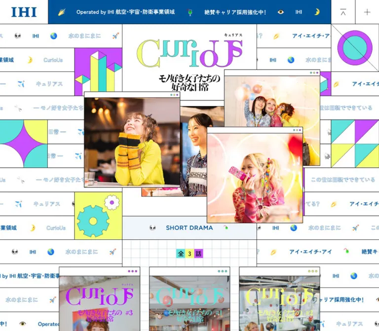
IHIのキャリア採用に向けたドラマと社員ドキュメンタリーの特設コンテンツ。白地の罫線グリッド、青・ターコイズ・黄緑・紫の幾何学模様、ブラウザ風の写真窓を細い中央カラムに組み合わせたデザイン。
オリジナルサイトを見るCurioUs / IHI Aerospace Career — Style Reference
A narrow story strip surrounded by scientific play: graph paper, bright geometry, and photographs inside miniature browser windows.
Website: CurioUs
Original URL: https://www.ihi.co.jp/recruit/career/aerospace/special-contents/curious/
Final URL: https://www.ihi.co.jp/recruit/career/aerospace/special-contents/curious/
Theme: white canvas, corporate blue, and three vivid decorative accents; no theme selector was verified.
Inspected: September 13, 2026, 01:36 JST; supplied retrieval timestamp: 2026-09-12T16:36:09.279Z.
Viewports: desktop 1440 × 1000 and mobile 390 × 844 CSS pixels. Recorded HTML widths were respectively 1425px and 375px.
Scope: supplied current-page screenshots at the opening, near the character section, and around recruitment/footer content, plus full-document rendered DOM measurements at both viewports. The cookie notice remains present in every supplied original-page capture. Menu opening, media playback, character changes, and consent dismissal were not exercised in the evidence.
CurioUs presents short drama and employee documentary content within IHI’s aerospace career-recruitment area. The inspected footer identifies IHI Corporation. Its defining composition is a centered, phone-like editorial column inside a much wider decorative scene. On desktop, the column stays only 450px wide while photographs and episode cards extend beyond it. Thin black rules connect the content strip to surrounding panels filled with repeating text, emoji-like symbols, rings, gears, cubes, and triangular color divisions.
The visual hierarchy mixes three distinct voices. Corporate blue provides the header, recruitment copy, and footer. Turquoise, yellow-green, and violet make curiosity feel playful. Warm photographs of the drama cast supply faces, texture, and emotional emphasis. The large CurioUs wordmark has contrasting serif forms and irregular letter placement; ordinary Japanese copy uses the computed Zen Kaku Gothic New stack.
This is a media-led recruitment content page. Its sequence moves through drama, introduction, characters, an employee documentary, and an invitation to explore careers. Preserve that editorial progression when adapting the design.
How to Read This Reference
- Measured means a value appears in the supplied rendered DOM or computed styles. Values are rounded for readability unless precision helps explain scaling.
- Visual estimate means a proportion, color, or treatment was judged from the original-page screenshots. It is not a sampled or recovered stylesheet value.
- Calculated means a relationship was derived from measured values. Two viewport samples do not establish the original responsive formula.
- Recommended means implementation guidance for a new build. The CSS below is an adaptation, not recovered source code.
- Token names are descriptive aliases. The only supplied source custom properties concern viewport units and Swiper defaults.
- Empty text on graphic headings and buttons does not establish their accessible names. The evidence does not include a complete accessibility-tree inspection.
Tokens — Colors
Core Palette
| Name | Value | Suggested token | Role and evidence |
|---|---|---|---|
| White Canvas | #ffffff |
--color-paper |
Measured body background, hero surface, media buttons, and recruitment link card. |
| IHI Blue | #00559a |
--color-blue |
Measured header background and recruitment/documentary text; also visibly anchors the footer. |
| Turquoise | #5fe1dc |
--color-teal |
Measured first character-button background; repeated visually in geometric artwork and lettering. |
| Yellow-Green | #f5ff78 |
--color-lime |
Measured second character-button background; repeated visually in decorative tiles. |
| Violet | #c850ff |
--color-violet |
Measured third character-button background and active episode-pagination dot. |
| Black | #000000 |
--color-ink |
Measured ordinary text; the thin panel and window outlines visually use black. |
| Neutral Gray | #ebebeb |
--color-neutral |
Measured fourth character-button background. |
| Pale Blue Wash | Approximately #f0f6fa |
--color-wash |
Visual estimate for section-label bands and pale editorial surfaces. |
| Graph Rule | Blue at approximately 18% opacity | --color-grid |
Recommended approximation for the fine blue graph-paper lines; exact source color was not supplied. |
Use white as the dominant area color. Blue carries identity and longer passages, while the three bright accents occupy bounded shapes, small markers, and selected graphic letters. This separation keeps a visually busy scene legible.
The geometric panels show different color assignments across captures. Those variations are visible evidence of changing states, but they do not establish a user-selectable palette system or an animation schedule.
Consent Interface Palette
| Name | Measured value | Role |
|---|---|---|
| Consent Blue | #1032cf |
Filled 許可する button and 詳細を表示 link. |
| Consent Text | #141414 |
Consent controls and utility text. |
| Consent Surface | White in the captures | Banner/panel surface. |
Consent Blue belongs to the embedded consent interface. Keep it separate from IHI Blue in a reusable token system.
Supplied Source Variables
The evidence reports --swiper-theme-color: #007aff and --swiper-navigation-size: 44px. These defaults do not establish a visible bright-blue arrow system: the measured active pagination dot is violet, and the observed dots are much smaller than 44px.
Tokens — Typography
Japanese Body and Utility Copy
Computed family: "Zen Kaku Gothic New", sans-serif.
This stack appears on the body, navigation elements, ordinary paragraphs, character controls, and footer links. The computed declaration identifies the requested family; the supplied evidence does not independently document font-file loading or fallback resolution.
Desktop body copy is 18px / 30px, weight 400, with 0.18px tracking. Mobile copy scales to approximately 12.8267px / 21.3778px, with 0.128267px tracking. Both tracking values equal approximately 0.01em.
Documentary paragraphs use a looser line height and blue text. The recruitment paragraph is black-independent blue copy inside the quieter lower-page composition. Its recorded weight changes from 400 on desktop to 500 on mobile.
Graphic Display Lettering
The CurioUs mark uses large, high-contrast serif letterforms with staggered positions and alternating accent colors. A small Japanese reading sits above it, and a compact black, two-line Japanese title appears below: モノ好き女子たちの好奇な日常.
Treat this lockup as supplied artwork. Its exact font, construction, and file format were not included. The title’s visual serif character should not be attributed to the body font or to the HTML element’s inherited font size.
Several section headings also have empty extracted text, despite visible labels such as SHORT DRAMA and CHARACTER. Their element bounds are measurable; their artwork’s type size is not. The zero-size h3 entries are evidence of graphic heading treatment, not a recommendation to hide semantic headings.
Consent Typography
The consent interface uses a separate computed sans-serif family. Desktop control labels are 15px, weight 600, with 24px line height. Mobile control labels are approximately 10.6889px, while their measured line height remains 24px.
Type Scale
| Role | Desktop measurement | Mobile measurement | Notes |
|---|---|---|---|
| HTML root | 10px |
7.12593px |
Scaling context; computed family is Times before the body overrides it. |
| Body copy | 18px / 30px, 400 |
12.8267px / 21.3778px, 400 |
Main live-text system. |
| Documentary copy | 18px / 34px, 400 |
12.8267px / 24.2281px, 400 |
Blue; more open vertical rhythm. |
| Recruitment copy | 18px / 30px, 400 |
12.8267px / 21.3778px, 500 |
Tracking approximately -0.02em. |
| Character description | 18px / 30px, 400 |
12.8267px / 21.3778px, 400 |
Tracking approximately -0.02em. |
| Drama disclaimer | 18px / 30px, 400 |
12.8267px / 21.3778px, 400 |
Tracking approximately -0.04em. |
| Footer policy links | 18px / 30px, 700 |
12.8267px / 21.3778px, 700 |
White against blue. |
| Copyright | 16px / 16px, 500 |
11.4015px / 11.4015px, 500 |
Compact single-line treatment. |
| Consent buttons | 15px / 24px, 600 |
10.6889px / 24px, 600 |
Independent utility typography. |
Recommended readability adjustment: a new implementation can raise mobile prose to 14–16px while retaining the narrow column and decorative scale. That change will alter wrapping and section heights; it should be treated as an intentional adaptation.
Tokens — Spacing & Shapes
Scaling Relationship
The mobile root is approximately 0.712593 times the desktop root. Many content measurements follow almost the same ratio: the main column changes from 450px to 320.656px, and a 90px character tile becomes 64.125px wide.
This is strong evidence of coordinated proportional scaling. It is not enough to reconstruct the original breakpoint or root-size formula. Header geometry and the hero also have separate mobile adjustments.
The Quick Start uses 1u = one desktop design pixel, with an adaptive mobile unit. This is an implementation alias, not the original site’s rem.
Spacing and Geometry
| Element or relationship | Desktop | Mobile | Evidence |
|---|---|---|---|
| Story/footer width | 450px |
320.656px |
Measured. |
| Story left edge | 487.5px |
27.172px |
Measured relative to recorded HTML bounds. |
| Header height | 80px |
52px |
Measured; separately responsive. |
| Header brand cell | 160 × 80px |
69.328 × 52px |
Measured. |
| Header logo | 85 × 31.984px |
40.25 × 15.141px |
Measured. |
| Section-title band | Approximately 80px high |
Approximately 57.016px high |
Measured heading boxes. |
| Common inner inset | 30px |
Approximately 21.378px |
Measured on footer link placement and media chrome. |
| Recruitment prose width | 330px |
235.156px |
Measured; approximately 60px desktop side insets. |
| Character tile | 90 × 91px |
64.125 × 64.484px |
Measured. |
| Gap before fourth character | Approximately 29.5px |
Approximately 20.75px |
Calculated from button bounds. |
| Episode card | 270 × 511px |
192.75 × 364.125px |
Measured carousel buttons. |
| Episode horizontal pitch | 300px |
Approximately 213.766px |
Calculated; gaps approximately 30px and 21.016px. |
| Pagination dot diameter | 10px |
7.125px |
Measured. |
| Pagination center pitch | 30px |
Approximately 21.375px |
Calculated. |
| Recruitment link card | 390 × 150px |
277.906 × 106.875px |
Measured. |
| Recruitment card radius | 18px |
12.8267px |
Measured. |
Rules, Grid, and Corners
- Panel rules: approximately
1pxblack strokes in the screenshots. Preserve their visual crispness independently of the shrinking type scale. - Outer desktop rhythm: approximately
80pxhorizontal rows, with several160pxsquare decorative panels. These are visual estimates, although the header establishes an exact80pxreference. - Inner graph paper: approximately
30pxdesktop squares and21pxmobile squares, visually estimated. - Media windows: square corners, a fine dark outline, and a shallow white title bar.
- Character controls: square corners; color blocks provide differentiation.
- Circular forms: pagination, window dots, geometric rings, and the recruitment card’s arrow medallion.
- Rounded exceptions: the recruitment link and the consent panel/buttons. Rounded cards are not the general content language.
Components
Persistent Header
Role: retain corporate identity, show the recruitment message, and expose top/navigation utilities.
The desktop header is an 80px strip. A white 160px brand cell sits at the left; a long blue message field occupies the middle; two white utility cells sit at the right. Fine black rules separate the cells. The IHI logo measures 85px wide inside its desktop cell.
The message field contains white recruitment/operating text and small pictorial symbols. Captures show different horizontal text positions, consistent with moving content, but no travel speed or direction is established.
The first utility links to #top and has extracted text Page top. Its visual mark resembles a thin upward chevron beneath a short bar. The second visible utility is a plus-shaped button. Its open state was not captured.
On mobile, the header becomes 52px high, the logo cell narrows to approximately 69.33px, and the logo becomes 40.25px wide. The blue field shows the compact recruitment message. Header visibility persists in the supplied scrolled captures; the underlying fixed/sticky implementation was not included.
Section Navigation
Role: navigate between the six document sections.
The rendered links target #top, #drama, #introduction, #character, #special, and #join.
Desktop link bounds place approximately 488 × 79px rows at the right of the main column. Mobile bounds become full-layout-width rows of approximately 375 × 68.33px below the header. These measurements describe the recorded elements, not a verified visible menu-open state. The screenshots show the normal page scene rather than an exercised navigation panel.
For an adaptation, keep the plus control and section list as one coherent navigation component, with explicit expanded state and keyboard behavior.
Geometric Surround and Text Rails
Role: make the narrow reading strip feel embedded in a larger world of curiosity.
Desktop margins are active visual space. Horizontal text rails repeat Japanese phrases, small IHI marks, and symbols associated with flight, space, science, and everyday objects. Some lettering is blue outline text; other phrases are solid blue. Rows are divided by black rules.
Solid geometric panels interrupt the rails: quarter-circle patterns, rings crossed by a diagonal, isometric bars, a small cube with marked vertices, gear silhouettes, and diagonally divided squares. Their white, turquoise, yellow-green, and violet regions stay flat and crisply bounded.
Mobile compresses this surround into narrow vertical edge rails with rotated/vertical text and small protruding tiles. Do not simply shrink the entire desktop background into an unreadable miniature.
Hero Title and Photo Windows
Role: introduce the drama through its cast and distinctive graphic identity.
The desktop hero occupies approximately 640px beneath the header. Its graphic heading group measures 450 × 210.875px; the mobile group measures approximately 320.656 × 165.828px.
In the desktop opening capture, four warm photographs overlap around the central column. They show the cast in yellow, blue-patterned, and pink clothing, including a group photograph. Their staggered edges create depth without a conventional card-shadow system.
The visible windows are approximately 320px wide, with roughly 20px white title bars and three tiny colored dots at the upper right. One yellow-clad portrait sits toward the lower left, a second portrait recedes behind it, the group image rises at the upper right, and the pink-clad portrait overlaps the lower foreground. The outermost windows extend well beyond the 450px content strip.
The mobile capture confirms the title and continuing window motif, but the consent panel obscures most of the collage. Exact mobile photo positions and any animated entry sequence remain unverified.
Section Label and Graph-Paper Heading
Role: mark the transition between chapters of the long page.
A pale blue full-column band carries a centered blue English section label, sometimes flanked by small pictorial symbols. The measured band height is approximately 80px desktop and 57px mobile.
Below it, a white graph-paper field contains compact Japanese heading graphics. In the drama area, 全3話 appears as three small colored blocks. Near the character section, 登場人物 is arranged as a staggered cluster of colored squares. These labels are graphic punctuation rather than oversized text headings.
Keep the black horizontal boundary between sections and the fine blue grid inside them. The two line systems have different roles and contrast levels.
Portrait Episode Carousel
Role: offer the three short-drama episodes.
The central portrait card measures 270 × 511px on desktop. Its white upper chrome uses approximately 30px of vertical space, followed by portrait imagery. The remaining proportions are consistent with roughly 9:16 media, but intrinsic asset dimensions were not supplied.
Cards sit on a horizontal track with a 300px desktop pitch and extend into the surrounding margins. On mobile, the center card is approximately 192.75px wide, with neighboring cards visibly clipped at either side of the layout. Preserve these partial neighbors as a visual cue that more media exists horizontally.
Three small circular pagination buttons sit below. The measured active dot is violet, while the others are white. The DOM contains seven repeated media buttons; the visible 全3話 label and three dots establish three episodes, not seven distinct works. The repetition suggests carousel duplication, but looping, autoplay, dragging, and playback behavior were not verified.
The drama disclaimer is a separate narrow paragraph below the media controls, measured at 328px wide on desktop. Preserve its supporting hierarchy and comfortable line height.
Introduction Collage and Floating Objects
Role: continue the fictional world between the media selection and character material.
The introduction is a tall, graphic-heavy section: approximately 1818.58px desktop and 1292.98px mobile. Several paragraph elements have no extracted text but substantial rendered bounds, so the DOM alone cannot recover the artwork or copy within them.
The desktop capture near its end shows a warm portrait overlapping an offset violet rectangle, with a large soft-edged red sphere in the foreground and a smaller bluish sphere near the next section boundary. These objects introduce photographic blur and depth into the otherwise flat geometry.
Keep that depth localized. The surrounding grid and windows remain sharp. The frames do not establish whether the objects float continuously, respond to scrolling, or use another animation mechanism.
Character Selector and Description
Role: introduce the drama’s personalities.
Four square portrait buttons appear in one row. The first three are contiguous and use turquoise, yellow-green, and violet. A deliberate gap precedes the fourth, neutral-gray tile. Desktop tiles are 90px wide; mobile tiles are approximately 64.125px wide.
In the supplied mid-page screenshot, the first portrait appears stronger while the remaining portraits look lighter. That is a visible state; selection semantics and the result of pressing a tile were not tested.
The measured description beneath the selector is approximately 331px wide on desktop and 235.86px on mobile. It uses ordinary black body copy with slightly tightened tracking. The captured text describes a character interested in space and science. Character names and performer credits should not be invented from the photographs.
Employee Documentary Section
Role: connect fictional curiosity with people working at IHI.
The section follows the character material. Its supplied text introduces employees discussing their past, present, and hoped-for future, with the heading copy 社員が語る、好奇心の原点と、その先.
Longer passages use IHI Blue, 18px desktop type, and 34px line height. Deliberate short line breaks create a paced editorial reading experience. A single centered portrait media button measures 270 × 510px on desktop and approximately 192.39 × 363.42px on mobile, retaining the episode-window family.
Playback controls, the media provider, audio behavior, and any modal presentation remain unverified.
Recruitment Story and Link Card
Role: conclude the narrative with a concrete career destination.
The recruitment material becomes quieter: an engineering photograph, pale blue surfaces, and blue live text replace much of the cast-led visual density. The original capture shows a person inspecting large mechanical equipment. This practical workplace image connects the earlier scientific imagery to the company’s work.
The closing paragraph sits in a 330px desktop text region. Beneath the story, a broad pale blue atmospheric area frames a white link card, 390 × 150px, inset 30px from the column edges. Its measured corner radius is 18px.
The card contains a two-line blue career-information label and a blue circular arrow medallion, visually about 60px across on desktop. The rendered destination is https://www.ihi.co.jp/recruit/career/aerospace/special-contents/. The arrow’s external-link appearance does not establish new-tab behavior.
Corporate Footer
Role: close the experience with clear ownership and policy links.
The footer remains the same width as the story column. Its upper recruitment-link region transitions into a solid blue lower field. The outer footer’s computed background is white, while the visible inner corporate field is blue; these are separate layers.
A centered white IHI mark measures approximately 106 × 40.20px desktop and 75.53 × 28.45px mobile. Three centered policy links follow in bold white text: 個人情報保護方針, サイトのご利用について, and ソーシャルメディアポリシー. A smaller copyright line ends the column.
Keep the surrounding decorative rails visible beside this footer. The blue field does not expand across the full desktop viewport.
Cookie Notice
Role: present consent information above the page.
This is a substantial part of the captured first-visit experience. On desktop, a white bottom banner occupies approximately the lower 215px of the 1000px screenshot. Branding occupies the left, the explanatory copy sits in the middle, and two stacked controls occupy the right. The measured buttons are 286 × 58px, with 3.75px corner radii.
On mobile, it becomes a centered white panel, visually approximately 359 × 363px, with a softly darkened surrounding page. Its header contains a small IHI mark, Cookiebot branding, and Close. Below are the explanatory copy, a separated details row, and two full-width buttons. The buttons measure approximately 337.625 × 49.375px, with 2.672px radii.
The labels are 詳細を表示, 許可する, and 設定. The supplied Close button bounds are 14 × 14px. The notice’s dismissal, settings view, focus behavior, and persistence were not tested. For a new implementation, integrate an actual consent system and enlarge the operable Close area without enlarging the visible glyph unnecessarily.
Tokens — Motion & Interaction
Measured Transition Declarations
| Target | Computed declaration | What is established |
|---|---|---|
| Header | translate 0.2s cubic-bezier(0.39, 0.575, 0.565, 1) |
A translation transition exists; its trigger and travel distance are unknown. |
| Corporate logo links | opacity 0.2s cubic-bezier(0.39, 0.575, 0.565, 1) |
Opacity is a defined transition property; target opacity was not supplied. |
| Page-top and section links | background-color 0.1s cubic-bezier(0.39, 0.575, 0.565, 1) |
Short background-color feedback is defined. |
| Visible header button | background-color 0.1s cubic-bezier(0.39, 0.575, 0.565, 1) |
Same quick feedback family. |
| Character buttons | opacity 0.1s cubic-bezier(0.39, 0.575, 0.565, 1) |
Quick opacity feedback is defined. |
| Footer policy links | opacity 0.2s cubic-bezier(0.39, 0.575, 0.565, 1) |
Consistent link-feedback timing. |
Visible States and Limits
| Treatment | Evidence | Limit |
|---|---|---|
| Persistent header | Present in opening and scrolled captures. | Exact positioning and show/hide rules were not supplied. |
| Changing decorative composition | Rail offsets and geometric color assignments differ between captures. | Direction, duration, sequence, and trigger cannot be recovered. |
| Floating spherical imagery | Soft, depth-bearing objects appear around the introduction/character boundary. | A static frame does not establish parallax or physics. |
| Episode carousel | Repeated horizontal card bounds, partial neighboring cards, and three pagination buttons. | Autoplay, looping, swipe, and button results were not exercised. |
| Character state | Four colored buttons and one exposed description. | No before/after selection evidence. |
| Media opening | Large media buttons exist. | Player, modal, loading, and audio states remain unknown. |
| Consent controls | Desktop banner and mobile panel are visible. | No accepted, closed, or settings state was captured. |
The supplied capture process temporarily paused perpetual animations during readiness checks and then resumed them. Sampled elements reporting animation: none do not prove that the whole page is static: descendants, pseudo-elements, or script-driven transforms may be responsible for visible changes.
Recommended motion approach: retain the measured 100–200ms utility feedback, and specify decorative animation separately after reviewing actual moving footage. A static version should still preserve the complete composition and content order.
Surfaces
| Layer | Appearance | Function |
|---|---|---|
| Outer canvas | White with black horizontal rules and repeated blue text | Holds the scientific/playful surround. |
| Story strip | Narrow white column with dark vertical boundaries | Provides a stable reading path. |
| Graph-paper field | Fine pale blue square grid on white | Connects headings, media, and character content. |
| Geometric tile | Flat bright fills with thin dark edges | Adds rhythm and bounded color. |
| Photo window | White chrome, tiny colored dots, square outline | Frames warm photographic content. |
| Editorial wash | Very pale blue, exact value unverified | Quietens labels and recruitment material. |
| Recruitment transition | Soft pale blue atmospheric treatment | Separates the final link from the story. |
| Corporate footer | Solid IHI Blue with white identity and text | Provides a firm ending. |
| Consent overlay | White, slightly rounded, visibly elevated on mobile | Separates consent from the underlying page. |
There is no general elevated-card system. Most depth comes from overlap, image content, and a few soft spherical decorations. The rounded recruitment card and elevated consent panel are specific exceptions.
Imagery
Use three coordinated image families:
- Drama photography: warm indoor light, expressive faces, colorful clothing, and close or medium crops. Yellow, pink, and patterned blue clothing visually connect people to the surrounding accent palette.
- Engineering photography: documentary workplace imagery showing people and substantial machinery. Keep recognizable equipment and working context visible.
- Graphic science play: outlined gears, isometric bars and cubes, rings, quarter circles, diagonal squares, and emoji-like space/flight symbols. Use crisp geometry around the softer photographs.
The high-contrast CurioUs lettering and compact Japanese graphic labels are central identity assets. Preserve their authored proportions and relationships. Replacing them with ordinary oversized body-font headings would substantially change the page.
Do not pixelate the photography. The crispness belongs to rules and geometry; the photos retain natural gradients and warm detail. Soft blur appears locally on floating objects and atmospheric areas, not as a full-page glass treatment.
Observed Asset References
No original image URLs, asset filenames, or intrinsic image dimensions were included in the supplied evidence. The following are visual inventory entries, not downloadable paths.
| Asset family | Observed use | Implementation guidance |
|---|---|---|
| Blue and white IHI marks | Header and footer | Use authorized brand artwork, retaining aspect ratio. |
| CurioUs title lockup | Opening hero | Preserve the full multicolor composition and Japanese subtitle. |
| Cast stills | Overlapping hero windows and introduction | Supply separate crops so faces survive responsive positioning. |
| Portrait episode artwork | Horizontal drama track | Retain the tall format and upper window chrome. |
| Character cutouts | Four colored square buttons | Use consistent baseline and portrait scale. |
| Documentary/engineering imagery | Employee and recruitment material | Keep the workplace context visible. |
| Geometric panels | Desktop margins and mobile edge rails | Recreate simple geometry in SVG or CSS when suitable. |
| Spherical decorations | Introduction transition | Preserve softness locally; original format is unknown. |
Layout & Responsive Behavior
Recorded Layouts
| Measurement | Desktop | Mobile |
|---|---|---|
| Capture viewport | 1440 × 1000px |
390 × 844px |
| HTML layout width | 1425px |
375px |
| Main column | 450px |
320.656px |
| Main column share of layout width | Approximately 31.58% |
Approximately 85.51% |
| Main left margin | 487.5px |
27.172px |
| Document height | Approximately 7353.86px |
Approximately 5294.45px |
| Header height | 80px |
52px |
| Hero height | Approximately 639.89px |
Approximately 514.48px |
Both captures have a 15px difference between reported viewport width and HTML bounds. Use the measured layout width for these relationships; do not hardcode a 15px mobile gutter into a new design.
Document Sequence
These are measured section heights, useful for understanding pacing rather than as fixed implementation targets.
| Section | Desktop height | Mobile height |
|---|---|---|
| Hero | 639.89px |
514.48px |
| Drama | 1099.58px |
784px |
| Introduction | 1818.58px |
1292.98px |
| Character | 978.61px |
697.23px |
| Employee documentary | 1348px |
960.42px |
| Recruitment story | 791px |
563.66px |
| Footer, including recruitment link region | 598.20px |
429.67px |
Desktop does not become a broad multi-column editorial layout. It retains the central strip and allocates extra width to scenery, photographic overlap, and the episode track. Mobile scales much of the internal composition together while separately simplifying the header and changing the surrounding text rails.
The hero has its own responsive proportions: its height does not simply follow the body’s approximately 0.713 scale factor. The full mobile collage is obscured, so reproducing it requires additional visual verification.
The consent interface changes structure rather than merely shrinking. Its desktop bottom banner becomes a centered mobile panel covering much of the story. Keep this overlay behavior separate from the underlying content’s responsive calculations.
Tablet, landscape-phone, ultrawide, keyboard-focus, and enlarged-text states were not supplied. Exact scroll offsets for the screenshots were also not recorded.
Do’s and Don’ts
Do
- Keep the desktop story column narrow and centered at the observed
450pxscale. - Give the surrounding margins an intentional geometric and textual composition.
- Use IHI Blue for identity, documentary/recruitment copy, and the footer.
- Confine turquoise, yellow-green, and violet to strong bounded accents and graphic lettering.
- Preserve fine dark rules, square media windows, and small colored chrome dots.
- Let photographs overlap the column where the composition calls for it.
- Keep the portrait episode track visibly horizontal, with partial neighbors on mobile.
- Preserve the unusual gap before the fourth character tile.
- Treat the CurioUs title and Japanese graphic labels as authored artwork.
- Retain the quiet transition from fictional cast imagery to real engineering work.
- Document the consent banner and panel as part of the captured first-visit experience.
Don’t
- Don’t expand every section to a conventional wide desktop content container.
- Don’t turn the geometric surround into a uniform dashboard or bento-card grid.
- Don’t round every card or add drop shadows to all photographs.
- Don’t replace the bright palette with generic corporate blue throughout.
- Don’t use the consent interface’s blue as the campaign’s main action color.
- Don’t interpret seven repeated carousel buttons as seven episodes.
- Don’t infer actual menu visibility from element bounds alone.
- Don’t invent animation timings, hover target colors, playback behavior, or character-switching effects.
- Don’t treat inherited heading font sizes as the dimensions of graphic lettering.
- Don’t manufacture asset paths, performer identities, or production credits.
Recommended Implementation Additions
These are recommendations for a new implementation, not verified features of the inspected page:
- Provide accessible text for graphic headings and meaningful labels for portrait media buttons.
- Keep decorative rails, repeated phrases, geometric tiles, and window dots out of the accessibility tree.
- Give the plus navigation control an accessible name, expanded state, and a relationship to its controlled region.
- If characters act as tabs, implement the full tab pattern; otherwise use labeled buttons with an explicit selected state.
- Retain small visible pagination dots while providing larger, clearly named hit targets.
- Use visible focus outlines that remain distinct against white and all three bright accents.
- Raise mobile prose and consent text where necessary for comfortable reading; verify the resulting reflow rather than preserving fixed section heights.
- Offer a reduced-motion/static scene that retains all essential imagery and navigation.
- Require an intentional action before audible media playback, and provide captions or transcripts.
- Make the consent panel usable with keyboard navigation and text enlargement; increase its Close target beyond the measured
14pxbounds. - Clip decorative overflow locally so the photo composition does not create accidental page-level horizontal scrolling.
Agent Prompt Guide
Quick Color Reference
- Canvas and photo chrome:
#ffffff. - Corporate identity and editorial blue:
#00559a. - Bright accents: turquoise
#5fe1dc, yellow-green#f5ff78, violet#c850ff. - Rules and ordinary copy:
#000000. - Neutral character tile:
#ebebeb. - Pale editorial wash: approximately
#f0f6fa; this is an adaptation value. - Consent action blue:
#1032cf, isolated from the campaign palette.
Overall Prompt
“Create a media-led Japanese recruitment content page inspired by the current CurioUs composition. Center a narrow 450px desktop story strip inside a white, black-ruled field of repeating blue text and scientific geometric motifs. Use IHI-like deep blue #00559a with turquoise #5fe1dc, yellow-green #f5ff78, and violet #c850ff. Place warm cast photography in overlapping square-cornered browser windows with thin outlines and three tiny colored dots. Follow with graph-paper section headings, a horizontal track of portrait episode cards, four colored character tiles, employee documentary copy, an engineering image, and a restrained rounded career link above a blue footer. On mobile, preserve the narrow story composition with slim decorative edge rails. Use authored title artwork and Zen Kaku Gothic New for ordinary copy. Treat unverified motion as a separate specification.”
Example Component Prompts
- Header: “An 80px desktop header with a white 160px brand cell, a long deep-blue recruitment-message field, and two square white utility cells separated by black hairlines. Use an upward top-link glyph and a thin plus icon. At the mobile reference size, reduce the strip to 52px and the logo cell to about 69px.”
- Hero collage: “A multicolor, high-contrast serif title lockup above four warm cast photographs in overlapping miniature browser windows. Keep the underlying reading strip narrow, but allow the photos to extend into desktop margins. Use flat white title bars, square corners, tiny turquoise/lime/violet dots, and crisp outlines.”
- Episode track: “Tall portrait video cards on a horizontal track over pale blue graph paper. Each card has white window chrome above the image. Center one card while revealing its neighbors; place three small outlined pagination dots below, with a violet current marker.”
- Character selector: “Four square portrait controls: turquoise, yellow-green, violet, then neutral gray. Join the first three edge to edge and leave a deliberate gap before the fourth. Place a compact staggered Japanese character-heading graphic above and narrow black descriptive copy below.”
- Recruitment ending: “A calm engineering photograph and short blue Japanese paragraphs inside the same narrow column. Follow with a pale atmospheric blue strip containing one white rounded career-information link and a blue circular arrow mark. End with a centered white brand logo and policy links on a solid blue footer.”
Quick Start
CSS Custom Properties
This CSS provides a reusable static shell and component vocabulary. It uses a normal document root and a local --u instead of shrinking the root font size.
Place .curious-site inside a .curious-page wrapper. Container units make --u approximately 0.712569px at a 375px available width and cap it at 1px on desktop. This interpolation and the 767px container breakpoint are recommended adaptations, not recovered source formulas.
Use .story and .site-footer as siblings after the header. Put three decorative .window-dot elements inside each .window-bar. Supply authorized artwork and photographs separately. Navigation state, media playback, carousel logic, and consent behavior require their own implementation.
:root {
  /* Measured colors */
  --color-paper: #ffffff;
  --color-blue: #00559a;
  --color-teal: #5fe1dc;
  --color-lime: #f5ff78;
  --color-violet: #c850ff;
  --color-ink: #000000;
  --color-neutral: #ebebeb;
  --color-consent: #1032cf;

  /* Visual approximations */
  --color-wash: #f0f6fa;
  --color-grid: rgb(0 85 154 / 18%);

  --font-copy: 'Zen Kaku Gothic New', sans-serif;
  --ease-ui: cubic-bezier(0.39, 0.575, 0.565, 1);
  --motion-fast: 100ms;
  --motion-link: 200ms;
  --rule: 1px solid var(--color-ink);
}

* { box-sizing: border-box; }

body {
  margin: 0;
  background: var(--color-paper);
}

.curious-page {
  container-type: inline-size;
  overflow: clip;
}

.curious-site {
  /* Recommended interpolation through the recorded content widths */
  --u: min(1px, 0.1900184cqw);
  --column: calc(450 * var(--u));
  --space-inset: calc(30 * var(--u));
  --space-copy: calc(60 * var(--u));
  --header-height: 80px;
  --brand-cell: 160px;
  --brand-width: 85px;
  --scene-row: 80px;

  position: relative;
  isolation: isolate;
  color: var(--color-ink);
  font-family: var(--font-copy);
  font-size: calc(18 * var(--u));
  font-weight: 400;
  line-height: calc(30 * var(--u));
  letter-spacing: 0.01em;
}

.site-header {
  position: sticky;
  top: 0;
  z-index: 20;
  display: grid;
  grid-template-columns:
    var(--brand-cell) minmax(0, 1fr)
    repeat(2, var(--header-height));
  height: var(--header-height);
  border-bottom: var(--rule);
  background: var(--color-blue);
  transition: translate var(--motion-link) var(--ease-ui);
}

.brand-cell,
.header-control {
  display: grid;
  place-items: center;
  min-width: 0;
  margin: 0;
  padding: 0;
  border: 0;
  border-right: var(--rule);
  background: var(--color-paper);
  color: var(--color-ink);
  text-decoration: none;
}

.brand-cell img {
  display: block;
  width: var(--brand-width);
  height: auto;
}

.header-message {
  display: flex;
  align-items: center;
  justify-content: center;
  overflow: hidden;
  padding-inline: 16px;
  color: white;
  font-size: 18px;
  font-weight: 700;
  white-space: nowrap;
}

.header-control {
  font: inherit;
  cursor: pointer;
  transition: background-color var(--motion-fast) var(--ease-ui);
}

.header-control svg {
  width: 24px;
  height: 24px;
  fill: none;
  stroke: currentColor;
  stroke-width: 1;
}

/* Static surround; repeat decorative text rows in the markup. */
.scenery {
  position: absolute;
  inset: var(--header-height) 0 0;
  z-index: 0;
  overflow: hidden;
  pointer-events: none;
  background: repeating-linear-gradient(
    to bottom,
    transparent 0 calc(var(--scene-row) - 1px),
    var(--color-ink) calc(var(--scene-row) - 1px) var(--scene-row)
  );
}

.scenery-row {
  display: flex;
  align-items: center;
  gap: 40px;
  height: var(--scene-row);
  color: var(--color-blue);
  white-space: nowrap;
}

.story,
.site-footer {
  position: relative;
  z-index: 1;
  width: var(--column);
  margin-inline: auto;
  border-inline: var(--rule);
  background: var(--color-paper);
}

.story section {
  scroll-margin-top: calc(var(--header-height) + 16px);
}

.section-label {
  display: flex;
  align-items: center;
  justify-content: center;
  gap: calc(50 * var(--u));
  min-height: calc(80 * var(--u));
  margin: 0;
  border-block: var(--rule);
  background: var(--color-wash);
  color: var(--color-blue);
  font-size: calc(20 * var(--u));
  font-weight: 700;
  line-height: 1;
}

.graph-panel {
  background-color: var(--color-paper);
  background-image:
    linear-gradient(var(--color-grid) 1px, transparent 1px),
    linear-gradient(90deg, var(--color-grid) 1px, transparent 1px);
  background-size:
    calc(30 * var(--u)) calc(30 * var(--u));
}

.photo-window,
.media-window {
  margin: 0;
  padding: 0;
  overflow: hidden;
  border: var(--rule);
  border-radius: 0;
  background: var(--color-paper);
  color: inherit;
  font: inherit;
}

.photo-window {
  width: calc(320 * var(--u));
}

.window-bar {
  display: flex;
  align-items: center;
  justify-content: flex-end;
  gap: calc(4 * var(--u));
  height: calc(20 * var(--u));
  padding-inline: calc(6 * var(--u));
  border-bottom: var(--rule);
  background: var(--color-paper);
}

.window-dot {
  width: max(3px, calc(5 * var(--u)));
  aspect-ratio: 1;
  border: 0.5px solid var(--color-ink);
  border-radius: 50%;
  background: var(--color-teal);
}

.window-dot:nth-child(2) { background: var(--color-lime); }
.window-dot:nth-child(3) { background: var(--color-violet); }

.photo-window img {
  display: block;
  width: 100%;
  aspect-ratio: 16 / 15;
  object-fit: cover;
}

/* A native scrolling fallback, not the original carousel logic. */
.episode-viewport {
  position: relative;
  left: 50%;
  width: 100cqw;
  transform: translateX(-50%);
  overflow-x: auto;
  scroll-snap-type: x mandatory;
}

.episode-track {
  display: flex;
  gap: var(--space-inset);
  width: max-content;
  padding: var(--space-inset)
    max(16px, calc((100cqw - 270 * var(--u)) / 2));
}

.media-window {
  flex: 0 0 calc(270 * var(--u));
  width: calc(270 * var(--u));
  scroll-snap-align: center;
  cursor: pointer;
}

.media-window .window-bar {
  height: var(--space-inset);
}

.media-window img {
  display: block;
  width: 100%;
  aspect-ratio: 9 / 16;
  object-fit: cover;
}

.pagination {
  display: flex;
  justify-content: center;
  gap: 2px;
}

/* Larger hit area with the small observed visual marker. */
.pagination button {
  display: grid;
  place-items: center;
  width: 44px;
  height: 44px;
  padding: 0;
  border: 0;
  background: transparent;
  cursor: pointer;
}

.pagination button::before {
  content: '';
  width: calc(10 * var(--u));
  aspect-ratio: 1;
  border: var(--rule);
  border-radius: 50%;
  background: var(--color-paper);
}

.pagination button[aria-current='true']::before {
  background: var(--color-violet);
}

.character-row {
  display: flex;
  margin: var(--space-inset);
}

.character-button {
  flex: 0 0 calc(90 * var(--u));
  width: calc(90 * var(--u));
  aspect-ratio: 1;
  padding: 0;
  border: var(--rule);
  border-radius: 0;
  background: var(--color-teal);
  cursor: pointer;
  transition: opacity var(--motion-fast) var(--ease-ui);
}

.character-button + .character-button {
  border-left: 0;
}

.character-button:nth-child(2) { background: var(--color-lime); }
.character-button:nth-child(3) { background: var(--color-violet); }
.character-button:nth-child(4) {
  margin-left: var(--space-inset);
  border-left: var(--rule);
  background: var(--color-neutral);
}

.character-button img {
  display: block;
  width: 100%;
  height: 100%;
  object-fit: contain;
  object-position: bottom;
}

.story-copy {
  margin-inline: var(--space-copy);
  letter-spacing: -0.02em;
}

.documentary-copy {
  color: var(--color-blue);
  line-height: calc(34 * var(--u));
  text-align: center;
}

.career-link-area {
  padding: var(--space-inset);
  background: linear-gradient(120deg, #f0f6fa, #99bad2);
}

.career-link {
  display: flex;
  align-items: center;
  justify-content: space-between;
  gap: calc(24 * var(--u));
  min-height: calc(150 * var(--u));
  padding: var(--space-inset);
  border-radius: calc(18 * var(--u));
  background: var(--color-paper);
  color: var(--color-blue);
  font-weight: 700;
  text-decoration: none;
}

.career-link-icon {
  display: grid;
  place-items: center;
  flex: 0 0 calc(60 * var(--u));
  aspect-ratio: 1;
  border-radius: 50%;
  background: var(--color-blue);
  color: white;
}

.footer-brand-field {
  padding: var(--space-copy) var(--space-inset);
  background: var(--color-blue);
  color: white;
  text-align: center;
}

.footer-brand-field img {
  display: block;
  width: calc(106 * var(--u));
  height: auto;
  margin: 0 auto var(--space-copy);
}

.footer-policy {
  display: block;
  color: inherit;
  font-weight: 700;
  text-decoration: none;
  transition: opacity var(--motion-link) var(--ease-ui);
}

.footer-copyright {
  margin: var(--space-copy) 0 0;
  font-size: calc(16 * var(--u));
  font-weight: 500;
  line-height: 1;
}

/* Optional readability adaptation; this changes measured wrapping. */
.readable-copy {
  font-size: max(14px, calc(18 * var(--u)));
  line-height: 1.67;
}

/* Recommended feedback targets; original target values are unknown. */
@media (hover: hover) {
  .header-control:hover { background: var(--color-wash); }
  .footer-policy:hover { opacity: 0.7; }
}

.curious-site :focus-visible {
  outline: 3px solid var(--color-blue);
  outline-offset: 4px;
}

.footer-brand-field :focus-visible {
  outline-color: white;
}

@container (max-width: 767px) {
  .curious-site {
    --header-height: 52px;
    --brand-cell: 69.333px;
    --brand-width: 40.25px;
    --scene-row: 34px;
  }

  .header-message {
    padding-inline: 8px;
    font-size: 14px;
  }

  /* Replace horizontal rail content with vertical edge artwork. */
  .scenery-row { display: none; }
}

@media (prefers-reduced-motion: reduce) {
  .curious-site *,
  .curious-site *::before,
  .curious-site *::after {
    animation: none !important;
    transition: none !important;
    scroll-behavior: auto !important;
  }
}
The section-label font size, graph colors, career gradient, hover targets, native carousel fallback, and larger pagination targets are adaptation choices. The code intentionally leaves hero choreography and mobile edge artwork to supplied assets and a separately verified composition. Script-driven animation must also respect reduced-motion preferences; CSS alone cannot stop every animation mechanism.
Tailwind v4 Token Mapping
Optional aliases for an existing Tailwind v4 project. This does not identify the original site’s framework. Define the custom properties above first and use scaled utilities within .curious-site.
@theme inline {
  --color-paper: #ffffff;
  --color-ihi: #00559a;
  --color-curious-teal: #5fe1dc;
  --color-curious-lime: #f5ff78;
  --color-curious-violet: #c850ff;
  --color-curious-ink: #000000;
  --color-curious-neutral: #ebebeb;
  --color-curious-wash: #f0f6fa;

  --font-curious: 'Zen Kaku Gothic New', sans-serif;
  --text-story: calc(18 * var(--u));
  --text-copyright: calc(16 * var(--u));

  --spacing-story: calc(450 * var(--u));
  --spacing-inset: calc(30 * var(--u));
  --spacing-copy-inset: calc(60 * var(--u));
  --spacing-episode: calc(270 * var(--u));
  --spacing-character: calc(90 * var(--u));
  --radius-career: calc(18 * var(--u));
}
Sources & Evidence
- Current CurioUs page: supplied HTTP
200record, identical original/final URL, rendered page title, visible copy, link destinations, element bounds, computed styles, and viewport custom properties. - Original-page captures: three desktop images at
1440 × 1000and two mobile images at390 × 844, covering opening, mid-page, and recruitment/footer views. Recorded HTML widths were1425pxand375px. - Capture date:
2026-09-12T16:36:09.279Z, equivalent to September 13, 2026, 01:36:09 JST. - Identity evidence: IHI branding, links to ihi.co.jp, and the inspected footer’s
Copyright © IHI Corporationtext support the operator identification. No production credits are established by the supplied original-page evidence. - Inspection limits: analysis used only the supplied captures and rendered observations. No additional browsing or file access was performed. Initial observation lasted at least five seconds and included automated readiness checks, but these do not prove completeness of delayed content or unexercised states. The consent interface obscures substantial areas, especially on mobile. Animation timing, media behavior, complete accessible naming, asset paths, and additional responsive breakpoints remain unverified.
This reference describes the current supplied page. Measured values, visual estimates, calculated relationships, and recommended implementation choices are identified separately throughout.
# CurioUs / IHI Aerospace Career — Style Reference

> A narrow story strip surrounded by scientific play: graph paper, bright geometry, and photographs inside miniature browser windows.

**Website:** [CurioUs](https://www.ihi.co.jp/recruit/career/aerospace/special-contents/curious/)
**Original URL:** https://www.ihi.co.jp/recruit/career/aerospace/special-contents/curious/
**Final URL:** https://www.ihi.co.jp/recruit/career/aerospace/special-contents/curious/
**Theme:** white canvas, corporate blue, and three vivid decorative accents; no theme selector was verified.
**Inspected:** September 13, 2026, 01:36 JST; supplied retrieval timestamp: `2026-09-12T16:36:09.279Z`.
**Viewports:** desktop `1440 × 1000` and mobile `390 × 844` CSS pixels. Recorded HTML widths were respectively `1425px` and `375px`.
**Scope:** supplied current-page screenshots at the opening, near the character section, and around recruitment/footer content, plus full-document rendered DOM measurements at both viewports. The cookie notice remains present in every supplied original-page capture. Menu opening, media playback, character changes, and consent dismissal were not exercised in the evidence.

CurioUs presents short drama and employee documentary content within IHI’s aerospace career-recruitment area. The inspected footer identifies IHI Corporation. Its defining composition is a centered, phone-like editorial column inside a much wider decorative scene. On desktop, the column stays only `450px` wide while photographs and episode cards extend beyond it. Thin black rules connect the content strip to surrounding panels filled with repeating text, emoji-like symbols, rings, gears, cubes, and triangular color divisions.

The visual hierarchy mixes three distinct voices. Corporate blue provides the header, recruitment copy, and footer. Turquoise, yellow-green, and violet make curiosity feel playful. Warm photographs of the drama cast supply faces, texture, and emotional emphasis. The large CurioUs wordmark has contrasting serif forms and irregular letter placement; ordinary Japanese copy uses the computed `Zen Kaku Gothic New` stack.

This is a media-led recruitment content page. Its sequence moves through drama, introduction, characters, an employee documentary, and an invitation to explore careers. Preserve that editorial progression when adapting the design.

## How to Read This Reference

- **Measured** means a value appears in the supplied rendered DOM or computed styles. Values are rounded for readability unless precision helps explain scaling.
- **Visual estimate** means a proportion, color, or treatment was judged from the original-page screenshots. It is not a sampled or recovered stylesheet value.
- **Calculated** means a relationship was derived from measured values. Two viewport samples do not establish the original responsive formula.
- **Recommended** means implementation guidance for a new build. The CSS below is an adaptation, not recovered source code.
- Token names are descriptive aliases. The only supplied source custom properties concern viewport units and Swiper defaults.
- Empty text on graphic headings and buttons does not establish their accessible names. The evidence does not include a complete accessibility-tree inspection.

## Tokens — Colors

### Core Palette

| Name | Value | Suggested token | Role and evidence |
| --- | --- | --- | --- |
| White Canvas | `#ffffff` | `--color-paper` | Measured body background, hero surface, media buttons, and recruitment link card. |
| IHI Blue | `#00559a` | `--color-blue` | Measured header background and recruitment/documentary text; also visibly anchors the footer. |
| Turquoise | `#5fe1dc` | `--color-teal` | Measured first character-button background; repeated visually in geometric artwork and lettering. |
| Yellow-Green | `#f5ff78` | `--color-lime` | Measured second character-button background; repeated visually in decorative tiles. |
| Violet | `#c850ff` | `--color-violet` | Measured third character-button background and active episode-pagination dot. |
| Black | `#000000` | `--color-ink` | Measured ordinary text; the thin panel and window outlines visually use black. |
| Neutral Gray | `#ebebeb` | `--color-neutral` | Measured fourth character-button background. |
| Pale Blue Wash | Approximately `#f0f6fa` | `--color-wash` | Visual estimate for section-label bands and pale editorial surfaces. |
| Graph Rule | Blue at approximately 18% opacity | `--color-grid` | Recommended approximation for the fine blue graph-paper lines; exact source color was not supplied. |

Use white as the dominant area color. Blue carries identity and longer passages, while the three bright accents occupy bounded shapes, small markers, and selected graphic letters. This separation keeps a visually busy scene legible.

The geometric panels show different color assignments across captures. Those variations are visible evidence of changing states, but they do not establish a user-selectable palette system or an animation schedule.

### Consent Interface Palette

| Name | Measured value | Role |
| --- | --- | --- |
| Consent Blue | `#1032cf` | Filled `許可する` button and `詳細を表示` link. |
| Consent Text | `#141414` | Consent controls and utility text. |
| Consent Surface | White in the captures | Banner/panel surface. |

Consent Blue belongs to the embedded consent interface. Keep it separate from IHI Blue in a reusable token system.

### Supplied Source Variables

The evidence reports `--swiper-theme-color: #007aff` and `--swiper-navigation-size: 44px`. These defaults do not establish a visible bright-blue arrow system: the measured active pagination dot is violet, and the observed dots are much smaller than `44px`.

## Tokens — Typography

### Japanese Body and Utility Copy

**Computed family:** `"Zen Kaku Gothic New", sans-serif`.

This stack appears on the body, navigation elements, ordinary paragraphs, character controls, and footer links. The computed declaration identifies the requested family; the supplied evidence does not independently document font-file loading or fallback resolution.

Desktop body copy is `18px / 30px`, weight `400`, with `0.18px` tracking. Mobile copy scales to approximately `12.8267px / 21.3778px`, with `0.128267px` tracking. Both tracking values equal approximately `0.01em`.

Documentary paragraphs use a looser line height and blue text. The recruitment paragraph is black-independent blue copy inside the quieter lower-page composition. Its recorded weight changes from `400` on desktop to `500` on mobile.

### Graphic Display Lettering

The CurioUs mark uses large, high-contrast serif letterforms with staggered positions and alternating accent colors. A small Japanese reading sits above it, and a compact black, two-line Japanese title appears below: `モノ好き女子たちの好奇な日常`.

Treat this lockup as supplied artwork. Its exact font, construction, and file format were not included. The title’s visual serif character should not be attributed to the body font or to the HTML element’s inherited font size.

Several section headings also have empty extracted text, despite visible labels such as `SHORT DRAMA` and `CHARACTER`. Their element bounds are measurable; their artwork’s type size is not. The zero-size `h3` entries are evidence of graphic heading treatment, not a recommendation to hide semantic headings.

### Consent Typography

The consent interface uses a separate computed `sans-serif` family. Desktop control labels are `15px`, weight `600`, with `24px` line height. Mobile control labels are approximately `10.6889px`, while their measured line height remains `24px`.

### Type Scale

| Role | Desktop measurement | Mobile measurement | Notes |
| --- | --- | --- | --- |
| HTML root | `10px` | `7.12593px` | Scaling context; computed family is Times before the body overrides it. |
| Body copy | `18px / 30px`, `400` | `12.8267px / 21.3778px`, `400` | Main live-text system. |
| Documentary copy | `18px / 34px`, `400` | `12.8267px / 24.2281px`, `400` | Blue; more open vertical rhythm. |
| Recruitment copy | `18px / 30px`, `400` | `12.8267px / 21.3778px`, `500` | Tracking approximately `-0.02em`. |
| Character description | `18px / 30px`, `400` | `12.8267px / 21.3778px`, `400` | Tracking approximately `-0.02em`. |
| Drama disclaimer | `18px / 30px`, `400` | `12.8267px / 21.3778px`, `400` | Tracking approximately `-0.04em`. |
| Footer policy links | `18px / 30px`, `700` | `12.8267px / 21.3778px`, `700` | White against blue. |
| Copyright | `16px / 16px`, `500` | `11.4015px / 11.4015px`, `500` | Compact single-line treatment. |
| Consent buttons | `15px / 24px`, `600` | `10.6889px / 24px`, `600` | Independent utility typography. |

**Recommended readability adjustment:** a new implementation can raise mobile prose to `14–16px` while retaining the narrow column and decorative scale. That change will alter wrapping and section heights; it should be treated as an intentional adaptation.

## Tokens — Spacing & Shapes

### Scaling Relationship

The mobile root is approximately `0.712593` times the desktop root. Many content measurements follow almost the same ratio: the main column changes from `450px` to `320.656px`, and a `90px` character tile becomes `64.125px` wide.

This is strong evidence of coordinated proportional scaling. It is not enough to reconstruct the original breakpoint or root-size formula. Header geometry and the hero also have separate mobile adjustments.

The Quick Start uses **1u = one desktop design pixel**, with an adaptive mobile unit. This is an implementation alias, not the original site’s `rem`.

### Spacing and Geometry

| Element or relationship | Desktop | Mobile | Evidence |
| --- | --- | --- | --- |
| Story/footer width | `450px` | `320.656px` | Measured. |
| Story left edge | `487.5px` | `27.172px` | Measured relative to recorded HTML bounds. |
| Header height | `80px` | `52px` | Measured; separately responsive. |
| Header brand cell | `160 × 80px` | `69.328 × 52px` | Measured. |
| Header logo | `85 × 31.984px` | `40.25 × 15.141px` | Measured. |
| Section-title band | Approximately `80px` high | Approximately `57.016px` high | Measured heading boxes. |
| Common inner inset | `30px` | Approximately `21.378px` | Measured on footer link placement and media chrome. |
| Recruitment prose width | `330px` | `235.156px` | Measured; approximately `60px` desktop side insets. |
| Character tile | `90 × 91px` | `64.125 × 64.484px` | Measured. |
| Gap before fourth character | Approximately `29.5px` | Approximately `20.75px` | Calculated from button bounds. |
| Episode card | `270 × 511px` | `192.75 × 364.125px` | Measured carousel buttons. |
| Episode horizontal pitch | `300px` | Approximately `213.766px` | Calculated; gaps approximately `30px` and `21.016px`. |
| Pagination dot diameter | `10px` | `7.125px` | Measured. |
| Pagination center pitch | `30px` | Approximately `21.375px` | Calculated. |
| Recruitment link card | `390 × 150px` | `277.906 × 106.875px` | Measured. |
| Recruitment card radius | `18px` | `12.8267px` | Measured. |

### Rules, Grid, and Corners

- **Panel rules:** approximately `1px` black strokes in the screenshots. Preserve their visual crispness independently of the shrinking type scale.
- **Outer desktop rhythm:** approximately `80px` horizontal rows, with several `160px` square decorative panels. These are visual estimates, although the header establishes an exact `80px` reference.
- **Inner graph paper:** approximately `30px` desktop squares and `21px` mobile squares, visually estimated.
- **Media windows:** square corners, a fine dark outline, and a shallow white title bar.
- **Character controls:** square corners; color blocks provide differentiation.
- **Circular forms:** pagination, window dots, geometric rings, and the recruitment card’s arrow medallion.
- **Rounded exceptions:** the recruitment link and the consent panel/buttons. Rounded cards are not the general content language.

## Components

### Persistent Header

**Role:** retain corporate identity, show the recruitment message, and expose top/navigation utilities.

The desktop header is an `80px` strip. A white `160px` brand cell sits at the left; a long blue message field occupies the middle; two white utility cells sit at the right. Fine black rules separate the cells. The IHI logo measures `85px` wide inside its desktop cell.

The message field contains white recruitment/operating text and small pictorial symbols. Captures show different horizontal text positions, consistent with moving content, but no travel speed or direction is established.

The first utility links to `#top` and has extracted text `Page top`. Its visual mark resembles a thin upward chevron beneath a short bar. The second visible utility is a plus-shaped button. Its open state was not captured.

On mobile, the header becomes `52px` high, the logo cell narrows to approximately `69.33px`, and the logo becomes `40.25px` wide. The blue field shows the compact recruitment message. Header visibility persists in the supplied scrolled captures; the underlying fixed/sticky implementation was not included.

### Section Navigation

**Role:** navigate between the six document sections.

The rendered links target `#top`, `#drama`, `#introduction`, `#character`, `#special`, and `#join`.

Desktop link bounds place approximately `488 × 79px` rows at the right of the main column. Mobile bounds become full-layout-width rows of approximately `375 × 68.33px` below the header. These measurements describe the recorded elements, not a verified visible menu-open state. The screenshots show the normal page scene rather than an exercised navigation panel.

For an adaptation, keep the plus control and section list as one coherent navigation component, with explicit expanded state and keyboard behavior.

### Geometric Surround and Text Rails

**Role:** make the narrow reading strip feel embedded in a larger world of curiosity.

Desktop margins are active visual space. Horizontal text rails repeat Japanese phrases, small IHI marks, and symbols associated with flight, space, science, and everyday objects. Some lettering is blue outline text; other phrases are solid blue. Rows are divided by black rules.

Solid geometric panels interrupt the rails: quarter-circle patterns, rings crossed by a diagonal, isometric bars, a small cube with marked vertices, gear silhouettes, and diagonally divided squares. Their white, turquoise, yellow-green, and violet regions stay flat and crisply bounded.

Mobile compresses this surround into narrow vertical edge rails with rotated/vertical text and small protruding tiles. Do not simply shrink the entire desktop background into an unreadable miniature.

### Hero Title and Photo Windows

**Role:** introduce the drama through its cast and distinctive graphic identity.

The desktop hero occupies approximately `640px` beneath the header. Its graphic heading group measures `450 × 210.875px`; the mobile group measures approximately `320.656 × 165.828px`.

In the desktop opening capture, four warm photographs overlap around the central column. They show the cast in yellow, blue-patterned, and pink clothing, including a group photograph. Their staggered edges create depth without a conventional card-shadow system.

The visible windows are approximately `320px` wide, with roughly `20px` white title bars and three tiny colored dots at the upper right. One yellow-clad portrait sits toward the lower left, a second portrait recedes behind it, the group image rises at the upper right, and the pink-clad portrait overlaps the lower foreground. The outermost windows extend well beyond the `450px` content strip.

The mobile capture confirms the title and continuing window motif, but the consent panel obscures most of the collage. Exact mobile photo positions and any animated entry sequence remain unverified.

### Section Label and Graph-Paper Heading

**Role:** mark the transition between chapters of the long page.

A pale blue full-column band carries a centered blue English section label, sometimes flanked by small pictorial symbols. The measured band height is approximately `80px` desktop and `57px` mobile.

Below it, a white graph-paper field contains compact Japanese heading graphics. In the drama area, `全3話` appears as three small colored blocks. Near the character section, `登場人物` is arranged as a staggered cluster of colored squares. These labels are graphic punctuation rather than oversized text headings.

Keep the black horizontal boundary between sections and the fine blue grid inside them. The two line systems have different roles and contrast levels.

### Portrait Episode Carousel

**Role:** offer the three short-drama episodes.

The central portrait card measures `270 × 511px` on desktop. Its white upper chrome uses approximately `30px` of vertical space, followed by portrait imagery. The remaining proportions are consistent with roughly `9:16` media, but intrinsic asset dimensions were not supplied.

Cards sit on a horizontal track with a `300px` desktop pitch and extend into the surrounding margins. On mobile, the center card is approximately `192.75px` wide, with neighboring cards visibly clipped at either side of the layout. Preserve these partial neighbors as a visual cue that more media exists horizontally.

Three small circular pagination buttons sit below. The measured active dot is violet, while the others are white. The DOM contains seven repeated media buttons; the visible `全3話` label and three dots establish three episodes, not seven distinct works. The repetition suggests carousel duplication, but looping, autoplay, dragging, and playback behavior were not verified.

The drama disclaimer is a separate narrow paragraph below the media controls, measured at `328px` wide on desktop. Preserve its supporting hierarchy and comfortable line height.

### Introduction Collage and Floating Objects

**Role:** continue the fictional world between the media selection and character material.

The introduction is a tall, graphic-heavy section: approximately `1818.58px` desktop and `1292.98px` mobile. Several paragraph elements have no extracted text but substantial rendered bounds, so the DOM alone cannot recover the artwork or copy within them.

The desktop capture near its end shows a warm portrait overlapping an offset violet rectangle, with a large soft-edged red sphere in the foreground and a smaller bluish sphere near the next section boundary. These objects introduce photographic blur and depth into the otherwise flat geometry.

Keep that depth localized. The surrounding grid and windows remain sharp. The frames do not establish whether the objects float continuously, respond to scrolling, or use another animation mechanism.

### Character Selector and Description

**Role:** introduce the drama’s personalities.

Four square portrait buttons appear in one row. The first three are contiguous and use turquoise, yellow-green, and violet. A deliberate gap precedes the fourth, neutral-gray tile. Desktop tiles are `90px` wide; mobile tiles are approximately `64.125px` wide.

In the supplied mid-page screenshot, the first portrait appears stronger while the remaining portraits look lighter. That is a visible state; selection semantics and the result of pressing a tile were not tested.

The measured description beneath the selector is approximately `331px` wide on desktop and `235.86px` on mobile. It uses ordinary black body copy with slightly tightened tracking. The captured text describes a character interested in space and science. Character names and performer credits should not be invented from the photographs.

### Employee Documentary Section

**Role:** connect fictional curiosity with people working at IHI.

The section follows the character material. Its supplied text introduces employees discussing their past, present, and hoped-for future, with the heading copy `社員が語る、好奇心の原点と、その先`.

Longer passages use IHI Blue, `18px` desktop type, and `34px` line height. Deliberate short line breaks create a paced editorial reading experience. A single centered portrait media button measures `270 × 510px` on desktop and approximately `192.39 × 363.42px` on mobile, retaining the episode-window family.

Playback controls, the media provider, audio behavior, and any modal presentation remain unverified.

### Recruitment Story and Link Card

**Role:** conclude the narrative with a concrete career destination.

The recruitment material becomes quieter: an engineering photograph, pale blue surfaces, and blue live text replace much of the cast-led visual density. The original capture shows a person inspecting large mechanical equipment. This practical workplace image connects the earlier scientific imagery to the company’s work.

The closing paragraph sits in a `330px` desktop text region. Beneath the story, a broad pale blue atmospheric area frames a white link card, `390 × 150px`, inset `30px` from the column edges. Its measured corner radius is `18px`.

The card contains a two-line blue career-information label and a blue circular arrow medallion, visually about `60px` across on desktop. The rendered destination is `https://www.ihi.co.jp/recruit/career/aerospace/special-contents/`. The arrow’s external-link appearance does not establish new-tab behavior.

### Corporate Footer

**Role:** close the experience with clear ownership and policy links.

The footer remains the same width as the story column. Its upper recruitment-link region transitions into a solid blue lower field. The outer footer’s computed background is white, while the visible inner corporate field is blue; these are separate layers.

A centered white IHI mark measures approximately `106 × 40.20px` desktop and `75.53 × 28.45px` mobile. Three centered policy links follow in bold white text: `個人情報保護方針`, `サイトのご利用について`, and `ソーシャルメディアポリシー`. A smaller copyright line ends the column.

Keep the surrounding decorative rails visible beside this footer. The blue field does not expand across the full desktop viewport.

### Cookie Notice

**Role:** present consent information above the page.

This is a substantial part of the captured first-visit experience. On desktop, a white bottom banner occupies approximately the lower `215px` of the `1000px` screenshot. Branding occupies the left, the explanatory copy sits in the middle, and two stacked controls occupy the right. The measured buttons are `286 × 58px`, with `3.75px` corner radii.

On mobile, it becomes a centered white panel, visually approximately `359 × 363px`, with a softly darkened surrounding page. Its header contains a small IHI mark, Cookiebot branding, and Close. Below are the explanatory copy, a separated details row, and two full-width buttons. The buttons measure approximately `337.625 × 49.375px`, with `2.672px` radii.

The labels are `詳細を表示`, `許可する`, and `設定`. The supplied Close button bounds are `14 × 14px`. The notice’s dismissal, settings view, focus behavior, and persistence were not tested. For a new implementation, integrate an actual consent system and enlarge the operable Close area without enlarging the visible glyph unnecessarily.

## Tokens — Motion & Interaction

### Measured Transition Declarations

| Target | Computed declaration | What is established |
| --- | --- | --- |
| Header | `translate 0.2s cubic-bezier(0.39, 0.575, 0.565, 1)` | A translation transition exists; its trigger and travel distance are unknown. |
| Corporate logo links | `opacity 0.2s cubic-bezier(0.39, 0.575, 0.565, 1)` | Opacity is a defined transition property; target opacity was not supplied. |
| Page-top and section links | `background-color 0.1s cubic-bezier(0.39, 0.575, 0.565, 1)` | Short background-color feedback is defined. |
| Visible header button | `background-color 0.1s cubic-bezier(0.39, 0.575, 0.565, 1)` | Same quick feedback family. |
| Character buttons | `opacity 0.1s cubic-bezier(0.39, 0.575, 0.565, 1)` | Quick opacity feedback is defined. |
| Footer policy links | `opacity 0.2s cubic-bezier(0.39, 0.575, 0.565, 1)` | Consistent link-feedback timing. |

### Visible States and Limits

| Treatment | Evidence | Limit |
| --- | --- | --- |
| Persistent header | Present in opening and scrolled captures. | Exact positioning and show/hide rules were not supplied. |
| Changing decorative composition | Rail offsets and geometric color assignments differ between captures. | Direction, duration, sequence, and trigger cannot be recovered. |
| Floating spherical imagery | Soft, depth-bearing objects appear around the introduction/character boundary. | A static frame does not establish parallax or physics. |
| Episode carousel | Repeated horizontal card bounds, partial neighboring cards, and three pagination buttons. | Autoplay, looping, swipe, and button results were not exercised. |
| Character state | Four colored buttons and one exposed description. | No before/after selection evidence. |
| Media opening | Large media buttons exist. | Player, modal, loading, and audio states remain unknown. |
| Consent controls | Desktop banner and mobile panel are visible. | No accepted, closed, or settings state was captured. |

The supplied capture process temporarily paused perpetual animations during readiness checks and then resumed them. Sampled elements reporting `animation: none` do not prove that the whole page is static: descendants, pseudo-elements, or script-driven transforms may be responsible for visible changes.

**Recommended motion approach:** retain the measured `100–200ms` utility feedback, and specify decorative animation separately after reviewing actual moving footage. A static version should still preserve the complete composition and content order.

## Surfaces

| Layer | Appearance | Function |
| --- | --- | --- |
| Outer canvas | White with black horizontal rules and repeated blue text | Holds the scientific/playful surround. |
| Story strip | Narrow white column with dark vertical boundaries | Provides a stable reading path. |
| Graph-paper field | Fine pale blue square grid on white | Connects headings, media, and character content. |
| Geometric tile | Flat bright fills with thin dark edges | Adds rhythm and bounded color. |
| Photo window | White chrome, tiny colored dots, square outline | Frames warm photographic content. |
| Editorial wash | Very pale blue, exact value unverified | Quietens labels and recruitment material. |
| Recruitment transition | Soft pale blue atmospheric treatment | Separates the final link from the story. |
| Corporate footer | Solid IHI Blue with white identity and text | Provides a firm ending. |
| Consent overlay | White, slightly rounded, visibly elevated on mobile | Separates consent from the underlying page. |

There is no general elevated-card system. Most depth comes from overlap, image content, and a few soft spherical decorations. The rounded recruitment card and elevated consent panel are specific exceptions.

## Imagery

Use three coordinated image families:

1. **Drama photography:** warm indoor light, expressive faces, colorful clothing, and close or medium crops. Yellow, pink, and patterned blue clothing visually connect people to the surrounding accent palette.
2. **Engineering photography:** documentary workplace imagery showing people and substantial machinery. Keep recognizable equipment and working context visible.
3. **Graphic science play:** outlined gears, isometric bars and cubes, rings, quarter circles, diagonal squares, and emoji-like space/flight symbols. Use crisp geometry around the softer photographs.

The high-contrast CurioUs lettering and compact Japanese graphic labels are central identity assets. Preserve their authored proportions and relationships. Replacing them with ordinary oversized body-font headings would substantially change the page.

Do not pixelate the photography. The crispness belongs to rules and geometry; the photos retain natural gradients and warm detail. Soft blur appears locally on floating objects and atmospheric areas, not as a full-page glass treatment.

### Observed Asset References

No original image URLs, asset filenames, or intrinsic image dimensions were included in the supplied evidence. The following are visual inventory entries, not downloadable paths.

| Asset family | Observed use | Implementation guidance |
| --- | --- | --- |
| Blue and white IHI marks | Header and footer | Use authorized brand artwork, retaining aspect ratio. |
| CurioUs title lockup | Opening hero | Preserve the full multicolor composition and Japanese subtitle. |
| Cast stills | Overlapping hero windows and introduction | Supply separate crops so faces survive responsive positioning. |
| Portrait episode artwork | Horizontal drama track | Retain the tall format and upper window chrome. |
| Character cutouts | Four colored square buttons | Use consistent baseline and portrait scale. |
| Documentary/engineering imagery | Employee and recruitment material | Keep the workplace context visible. |
| Geometric panels | Desktop margins and mobile edge rails | Recreate simple geometry in SVG or CSS when suitable. |
| Spherical decorations | Introduction transition | Preserve softness locally; original format is unknown. |

## Layout & Responsive Behavior

### Recorded Layouts

| Measurement | Desktop | Mobile |
| --- | --- | --- |
| Capture viewport | `1440 × 1000px` | `390 × 844px` |
| HTML layout width | `1425px` | `375px` |
| Main column | `450px` | `320.656px` |
| Main column share of layout width | Approximately `31.58%` | Approximately `85.51%` |
| Main left margin | `487.5px` | `27.172px` |
| Document height | Approximately `7353.86px` | Approximately `5294.45px` |
| Header height | `80px` | `52px` |
| Hero height | Approximately `639.89px` | Approximately `514.48px` |

Both captures have a `15px` difference between reported viewport width and HTML bounds. Use the measured layout width for these relationships; do not hardcode a `15px` mobile gutter into a new design.

### Document Sequence

These are measured section heights, useful for understanding pacing rather than as fixed implementation targets.

| Section | Desktop height | Mobile height |
| --- | --- | --- |
| Hero | `639.89px` | `514.48px` |
| Drama | `1099.58px` | `784px` |
| Introduction | `1818.58px` | `1292.98px` |
| Character | `978.61px` | `697.23px` |
| Employee documentary | `1348px` | `960.42px` |
| Recruitment story | `791px` | `563.66px` |
| Footer, including recruitment link region | `598.20px` | `429.67px` |

Desktop does not become a broad multi-column editorial layout. It retains the central strip and allocates extra width to scenery, photographic overlap, and the episode track. Mobile scales much of the internal composition together while separately simplifying the header and changing the surrounding text rails.

The hero has its own responsive proportions: its height does not simply follow the body’s approximately `0.713` scale factor. The full mobile collage is obscured, so reproducing it requires additional visual verification.

The consent interface changes structure rather than merely shrinking. Its desktop bottom banner becomes a centered mobile panel covering much of the story. Keep this overlay behavior separate from the underlying content’s responsive calculations.

Tablet, landscape-phone, ultrawide, keyboard-focus, and enlarged-text states were not supplied. Exact scroll offsets for the screenshots were also not recorded.

## Do’s and Don’ts

### Do

- Keep the desktop story column narrow and centered at the observed `450px` scale.
- Give the surrounding margins an intentional geometric and textual composition.
- Use IHI Blue for identity, documentary/recruitment copy, and the footer.
- Confine turquoise, yellow-green, and violet to strong bounded accents and graphic lettering.
- Preserve fine dark rules, square media windows, and small colored chrome dots.
- Let photographs overlap the column where the composition calls for it.
- Keep the portrait episode track visibly horizontal, with partial neighbors on mobile.
- Preserve the unusual gap before the fourth character tile.
- Treat the CurioUs title and Japanese graphic labels as authored artwork.
- Retain the quiet transition from fictional cast imagery to real engineering work.
- Document the consent banner and panel as part of the captured first-visit experience.

### Don’t

- Don’t expand every section to a conventional wide desktop content container.
- Don’t turn the geometric surround into a uniform dashboard or bento-card grid.
- Don’t round every card or add drop shadows to all photographs.
- Don’t replace the bright palette with generic corporate blue throughout.
- Don’t use the consent interface’s blue as the campaign’s main action color.
- Don’t interpret seven repeated carousel buttons as seven episodes.
- Don’t infer actual menu visibility from element bounds alone.
- Don’t invent animation timings, hover target colors, playback behavior, or character-switching effects.
- Don’t treat inherited heading font sizes as the dimensions of graphic lettering.
- Don’t manufacture asset paths, performer identities, or production credits.

## Recommended Implementation Additions

These are recommendations for a new implementation, not verified features of the inspected page:

- Provide accessible text for graphic headings and meaningful labels for portrait media buttons.
- Keep decorative rails, repeated phrases, geometric tiles, and window dots out of the accessibility tree.
- Give the plus navigation control an accessible name, expanded state, and a relationship to its controlled region.
- If characters act as tabs, implement the full tab pattern; otherwise use labeled buttons with an explicit selected state.
- Retain small visible pagination dots while providing larger, clearly named hit targets.
- Use visible focus outlines that remain distinct against white and all three bright accents.
- Raise mobile prose and consent text where necessary for comfortable reading; verify the resulting reflow rather than preserving fixed section heights.
- Offer a reduced-motion/static scene that retains all essential imagery and navigation.
- Require an intentional action before audible media playback, and provide captions or transcripts.
- Make the consent panel usable with keyboard navigation and text enlargement; increase its Close target beyond the measured `14px` bounds.
- Clip decorative overflow locally so the photo composition does not create accidental page-level horizontal scrolling.

## Agent Prompt Guide

### Quick Color Reference

- Canvas and photo chrome: `#ffffff`.
- Corporate identity and editorial blue: `#00559a`.
- Bright accents: turquoise `#5fe1dc`, yellow-green `#f5ff78`, violet `#c850ff`.
- Rules and ordinary copy: `#000000`.
- Neutral character tile: `#ebebeb`.
- Pale editorial wash: approximately `#f0f6fa`; this is an adaptation value.
- Consent action blue: `#1032cf`, isolated from the campaign palette.

### Overall Prompt

“Create a media-led Japanese recruitment content page inspired by the current CurioUs composition. Center a narrow 450px desktop story strip inside a white, black-ruled field of repeating blue text and scientific geometric motifs. Use IHI-like deep blue #00559a with turquoise #5fe1dc, yellow-green #f5ff78, and violet #c850ff. Place warm cast photography in overlapping square-cornered browser windows with thin outlines and three tiny colored dots. Follow with graph-paper section headings, a horizontal track of portrait episode cards, four colored character tiles, employee documentary copy, an engineering image, and a restrained rounded career link above a blue footer. On mobile, preserve the narrow story composition with slim decorative edge rails. Use authored title artwork and Zen Kaku Gothic New for ordinary copy. Treat unverified motion as a separate specification.”

### Example Component Prompts

1. **Header:** “An 80px desktop header with a white 160px brand cell, a long deep-blue recruitment-message field, and two square white utility cells separated by black hairlines. Use an upward top-link glyph and a thin plus icon. At the mobile reference size, reduce the strip to 52px and the logo cell to about 69px.”
2. **Hero collage:** “A multicolor, high-contrast serif title lockup above four warm cast photographs in overlapping miniature browser windows. Keep the underlying reading strip narrow, but allow the photos to extend into desktop margins. Use flat white title bars, square corners, tiny turquoise/lime/violet dots, and crisp outlines.”
3. **Episode track:** “Tall portrait video cards on a horizontal track over pale blue graph paper. Each card has white window chrome above the image. Center one card while revealing its neighbors; place three small outlined pagination dots below, with a violet current marker.”
4. **Character selector:** “Four square portrait controls: turquoise, yellow-green, violet, then neutral gray. Join the first three edge to edge and leave a deliberate gap before the fourth. Place a compact staggered Japanese character-heading graphic above and narrow black descriptive copy below.”
5. **Recruitment ending:** “A calm engineering photograph and short blue Japanese paragraphs inside the same narrow column. Follow with a pale atmospheric blue strip containing one white rounded career-information link and a blue circular arrow mark. End with a centered white brand logo and policy links on a solid blue footer.”

## Quick Start

### CSS Custom Properties

This CSS provides a reusable static shell and component vocabulary. It uses a normal document root and a local `--u` instead of shrinking the root font size.

Place `.curious-site` inside a `.curious-page` wrapper. Container units make `--u` approximately `0.712569px` at a `375px` available width and cap it at `1px` on desktop. This interpolation and the `767px` container breakpoint are **recommended adaptations**, not recovered source formulas.

Use `.story` and `.site-footer` as siblings after the header. Put three decorative `.window-dot` elements inside each `.window-bar`. Supply authorized artwork and photographs separately. Navigation state, media playback, carousel logic, and consent behavior require their own implementation.

```css
:root {
  /* Measured colors */
  --color-paper: #ffffff;
  --color-blue: #00559a;
  --color-teal: #5fe1dc;
  --color-lime: #f5ff78;
  --color-violet: #c850ff;
  --color-ink: #000000;
  --color-neutral: #ebebeb;
  --color-consent: #1032cf;

  /* Visual approximations */
  --color-wash: #f0f6fa;
  --color-grid: rgb(0 85 154 / 18%);

  --font-copy: 'Zen Kaku Gothic New', sans-serif;
  --ease-ui: cubic-bezier(0.39, 0.575, 0.565, 1);
  --motion-fast: 100ms;
  --motion-link: 200ms;
  --rule: 1px solid var(--color-ink);
}

* { box-sizing: border-box; }

body {
  margin: 0;
  background: var(--color-paper);
}

.curious-page {
  container-type: inline-size;
  overflow: clip;
}

.curious-site {
  /* Recommended interpolation through the recorded content widths */
  --u: min(1px, 0.1900184cqw);
  --column: calc(450 * var(--u));
  --space-inset: calc(30 * var(--u));
  --space-copy: calc(60 * var(--u));
  --header-height: 80px;
  --brand-cell: 160px;
  --brand-width: 85px;
  --scene-row: 80px;

  position: relative;
  isolation: isolate;
  color: var(--color-ink);
  font-family: var(--font-copy);
  font-size: calc(18 * var(--u));
  font-weight: 400;
  line-height: calc(30 * var(--u));
  letter-spacing: 0.01em;
}

.site-header {
  position: sticky;
  top: 0;
  z-index: 20;
  display: grid;
  grid-template-columns:
    var(--brand-cell) minmax(0, 1fr)
    repeat(2, var(--header-height));
  height: var(--header-height);
  border-bottom: var(--rule);
  background: var(--color-blue);
  transition: translate var(--motion-link) var(--ease-ui);
}

.brand-cell,
.header-control {
  display: grid;
  place-items: center;
  min-width: 0;
  margin: 0;
  padding: 0;
  border: 0;
  border-right: var(--rule);
  background: var(--color-paper);
  color: var(--color-ink);
  text-decoration: none;
}

.brand-cell img {
  display: block;
  width: var(--brand-width);
  height: auto;
}

.header-message {
  display: flex;
  align-items: center;
  justify-content: center;
  overflow: hidden;
  padding-inline: 16px;
  color: white;
  font-size: 18px;
  font-weight: 700;
  white-space: nowrap;
}

.header-control {
  font: inherit;
  cursor: pointer;
  transition: background-color var(--motion-fast) var(--ease-ui);
}

.header-control svg {
  width: 24px;
  height: 24px;
  fill: none;
  stroke: currentColor;
  stroke-width: 1;
}

/* Static surround; repeat decorative text rows in the markup. */
.scenery {
  position: absolute;
  inset: var(--header-height) 0 0;
  z-index: 0;
  overflow: hidden;
  pointer-events: none;
  background: repeating-linear-gradient(
    to bottom,
    transparent 0 calc(var(--scene-row) - 1px),
    var(--color-ink) calc(var(--scene-row) - 1px) var(--scene-row)
  );
}

.scenery-row {
  display: flex;
  align-items: center;
  gap: 40px;
  height: var(--scene-row);
  color: var(--color-blue);
  white-space: nowrap;
}

.story,
.site-footer {
  position: relative;
  z-index: 1;
  width: var(--column);
  margin-inline: auto;
  border-inline: var(--rule);
  background: var(--color-paper);
}

.story section {
  scroll-margin-top: calc(var(--header-height) + 16px);
}

.section-label {
  display: flex;
  align-items: center;
  justify-content: center;
  gap: calc(50 * var(--u));
  min-height: calc(80 * var(--u));
  margin: 0;
  border-block: var(--rule);
  background: var(--color-wash);
  color: var(--color-blue);
  font-size: calc(20 * var(--u));
  font-weight: 700;
  line-height: 1;
}

.graph-panel {
  background-color: var(--color-paper);
  background-image:
    linear-gradient(var(--color-grid) 1px, transparent 1px),
    linear-gradient(90deg, var(--color-grid) 1px, transparent 1px);
  background-size:
    calc(30 * var(--u)) calc(30 * var(--u));
}

.photo-window,
.media-window {
  margin: 0;
  padding: 0;
  overflow: hidden;
  border: var(--rule);
  border-radius: 0;
  background: var(--color-paper);
  color: inherit;
  font: inherit;
}

.photo-window {
  width: calc(320 * var(--u));
}

.window-bar {
  display: flex;
  align-items: center;
  justify-content: flex-end;
  gap: calc(4 * var(--u));
  height: calc(20 * var(--u));
  padding-inline: calc(6 * var(--u));
  border-bottom: var(--rule);
  background: var(--color-paper);
}

.window-dot {
  width: max(3px, calc(5 * var(--u)));
  aspect-ratio: 1;
  border: 0.5px solid var(--color-ink);
  border-radius: 50%;
  background: var(--color-teal);
}

.window-dot:nth-child(2) { background: var(--color-lime); }
.window-dot:nth-child(3) { background: var(--color-violet); }

.photo-window img {
  display: block;
  width: 100%;
  aspect-ratio: 16 / 15;
  object-fit: cover;
}

/* A native scrolling fallback, not the original carousel logic. */
.episode-viewport {
  position: relative;
  left: 50%;
  width: 100cqw;
  transform: translateX(-50%);
  overflow-x: auto;
  scroll-snap-type: x mandatory;
}

.episode-track {
  display: flex;
  gap: var(--space-inset);
  width: max-content;
  padding: var(--space-inset)
    max(16px, calc((100cqw - 270 * var(--u)) / 2));
}

.media-window {
  flex: 0 0 calc(270 * var(--u));
  width: calc(270 * var(--u));
  scroll-snap-align: center;
  cursor: pointer;
}

.media-window .window-bar {
  height: var(--space-inset);
}

.media-window img {
  display: block;
  width: 100%;
  aspect-ratio: 9 / 16;
  object-fit: cover;
}

.pagination {
  display: flex;
  justify-content: center;
  gap: 2px;
}

/* Larger hit area with the small observed visual marker. */
.pagination button {
  display: grid;
  place-items: center;
  width: 44px;
  height: 44px;
  padding: 0;
  border: 0;
  background: transparent;
  cursor: pointer;
}

.pagination button::before {
  content: '';
  width: calc(10 * var(--u));
  aspect-ratio: 1;
  border: var(--rule);
  border-radius: 50%;
  background: var(--color-paper);
}

.pagination button[aria-current='true']::before {
  background: var(--color-violet);
}

.character-row {
  display: flex;
  margin: var(--space-inset);
}

.character-button {
  flex: 0 0 calc(90 * var(--u));
  width: calc(90 * var(--u));
  aspect-ratio: 1;
  padding: 0;
  border: var(--rule);
  border-radius: 0;
  background: var(--color-teal);
  cursor: pointer;
  transition: opacity var(--motion-fast) var(--ease-ui);
}

.character-button + .character-button {
  border-left: 0;
}

.character-button:nth-child(2) { background: var(--color-lime); }
.character-button:nth-child(3) { background: var(--color-violet); }
.character-button:nth-child(4) {
  margin-left: var(--space-inset);
  border-left: var(--rule);
  background: var(--color-neutral);
}

.character-button img {
  display: block;
  width: 100%;
  height: 100%;
  object-fit: contain;
  object-position: bottom;
}

.story-copy {
  margin-inline: var(--space-copy);
  letter-spacing: -0.02em;
}

.documentary-copy {
  color: var(--color-blue);
  line-height: calc(34 * var(--u));
  text-align: center;
}

.career-link-area {
  padding: var(--space-inset);
  background: linear-gradient(120deg, #f0f6fa, #99bad2);
}

.career-link {
  display: flex;
  align-items: center;
  justify-content: space-between;
  gap: calc(24 * var(--u));
  min-height: calc(150 * var(--u));
  padding: var(--space-inset);
  border-radius: calc(18 * var(--u));
  background: var(--color-paper);
  color: var(--color-blue);
  font-weight: 700;
  text-decoration: none;
}

.career-link-icon {
  display: grid;
  place-items: center;
  flex: 0 0 calc(60 * var(--u));
  aspect-ratio: 1;
  border-radius: 50%;
  background: var(--color-blue);
  color: white;
}

.footer-brand-field {
  padding: var(--space-copy) var(--space-inset);
  background: var(--color-blue);
  color: white;
  text-align: center;
}

.footer-brand-field img {
  display: block;
  width: calc(106 * var(--u));
  height: auto;
  margin: 0 auto var(--space-copy);
}

.footer-policy {
  display: block;
  color: inherit;
  font-weight: 700;
  text-decoration: none;
  transition: opacity var(--motion-link) var(--ease-ui);
}

.footer-copyright {
  margin: var(--space-copy) 0 0;
  font-size: calc(16 * var(--u));
  font-weight: 500;
  line-height: 1;
}

/* Optional readability adaptation; this changes measured wrapping. */
.readable-copy {
  font-size: max(14px, calc(18 * var(--u)));
  line-height: 1.67;
}

/* Recommended feedback targets; original target values are unknown. */
@media (hover: hover) {
  .header-control:hover { background: var(--color-wash); }
  .footer-policy:hover { opacity: 0.7; }
}

.curious-site :focus-visible {
  outline: 3px solid var(--color-blue);
  outline-offset: 4px;
}

.footer-brand-field :focus-visible {
  outline-color: white;
}

@container (max-width: 767px) {
  .curious-site {
    --header-height: 52px;
    --brand-cell: 69.333px;
    --brand-width: 40.25px;
    --scene-row: 34px;
  }

  .header-message {
    padding-inline: 8px;
    font-size: 14px;
  }

  /* Replace horizontal rail content with vertical edge artwork. */
  .scenery-row { display: none; }
}

@media (prefers-reduced-motion: reduce) {
  .curious-site *,
  .curious-site *::before,
  .curious-site *::after {
    animation: none !important;
    transition: none !important;
    scroll-behavior: auto !important;
  }
}
```

The section-label font size, graph colors, career gradient, hover targets, native carousel fallback, and larger pagination targets are adaptation choices. The code intentionally leaves hero choreography and mobile edge artwork to supplied assets and a separately verified composition. Script-driven animation must also respect reduced-motion preferences; CSS alone cannot stop every animation mechanism.

### Tailwind v4 Token Mapping

Optional aliases for an existing Tailwind v4 project. This does not identify the original site’s framework. Define the custom properties above first and use scaled utilities within `.curious-site`.

```css
@theme inline {
  --color-paper: #ffffff;
  --color-ihi: #00559a;
  --color-curious-teal: #5fe1dc;
  --color-curious-lime: #f5ff78;
  --color-curious-violet: #c850ff;
  --color-curious-ink: #000000;
  --color-curious-neutral: #ebebeb;
  --color-curious-wash: #f0f6fa;

  --font-curious: 'Zen Kaku Gothic New', sans-serif;
  --text-story: calc(18 * var(--u));
  --text-copyright: calc(16 * var(--u));

  --spacing-story: calc(450 * var(--u));
  --spacing-inset: calc(30 * var(--u));
  --spacing-copy-inset: calc(60 * var(--u));
  --spacing-episode: calc(270 * var(--u));
  --spacing-character: calc(90 * var(--u));
  --radius-career: calc(18 * var(--u));
}
```

## Sources & Evidence

- [Current CurioUs page](https://www.ihi.co.jp/recruit/career/aerospace/special-contents/curious/): supplied HTTP `200` record, identical original/final URL, rendered page title, visible copy, link destinations, element bounds, computed styles, and viewport custom properties.
- **Original-page captures:** three desktop images at `1440 × 1000` and two mobile images at `390 × 844`, covering opening, mid-page, and recruitment/footer views. Recorded HTML widths were `1425px` and `375px`.
- **Capture date:** `2026-09-12T16:36:09.279Z`, equivalent to September 13, 2026, 01:36:09 JST.
- **Identity evidence:** IHI branding, links to [ihi.co.jp](https://www.ihi.co.jp/), and the inspected footer’s `Copyright © IHI Corporation` text support the operator identification. No production credits are established by the supplied original-page evidence.
- **Inspection limits:** analysis used only the supplied captures and rendered observations. No additional browsing or file access was performed. Initial observation lasted at least five seconds and included automated readiness checks, but these do not prove completeness of delayed content or unexercised states. The consent interface obscures substantial areas, especially on mobile. Animation timing, media behavior, complete accessible naming, asset paths, and additional responsive breakpoints remain unverified.

This reference describes the current supplied page. Measured values, visual estimates, calculated relationships, and recommended implementation choices are identified separately throughout.