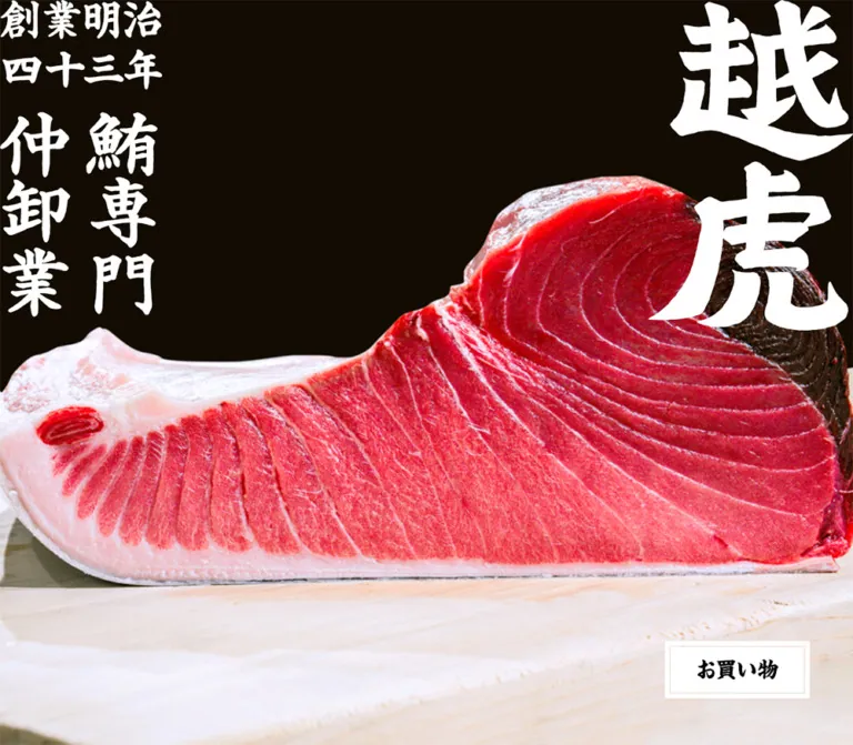
DESIGN REFERENCE
越虎|明治43年創業の鮪専門仲卸
豪快な筆文字と鮪の解体・市場写真を主役に、白地、明朝体、赤い魚型メニューで老舗の専門性を伝えるコーポレートサイト。
オリジナルサイトを見るEchitora — Style Reference
Monumental brush lettering, working-market photography, and generous white space for a specialist tuna wholesaler.
Original URL: https://echitora.jp/ Final URL: https://echitora.jp/ Page title: 越虎|明治43年創業の鮪専門仲卸 Theme: white canvas, black and warm-black lettering, a small red navigation accent, and full-color photography. Inspected: September 12, 2026, at 11:34:48.779 UTC / 20:34:48.779 JST, using the supplied browser observations. Viewports: desktop 1440 × 1000 CSS pixels; mobile 390 × 844 CSS pixels. Scope: the current corporate homepage: desktop opening, an About section crop, desktop and mobile footers, the mobile opening capture, and rendered DOM measurements covering the long homepage. Linked detail pages and the separate shop were not inspected.
Echitora presents its identity through the scale of its lettering and the physical work of handling tuna. The desktop opening fills the viewport with a close photograph of a worker cutting a large fish. White brush graphics occupy opposite edges: the vertically stacked brand at the right and the founding date and trade description at the left. A compact shopping link sits near the lower-right corner.
Below the opening, the page expands into a long sequence of introductory, product, company, and shopping sections. Oversized graphic headings, broad photography, and narrow blocks of bold Japanese serif text create a deliberate rhythm. The footer gives contact information substantial visual weight, pairing a large brand lockup with two phone groups, a navigation list, and broad outlined actions.
The mobile footer is clearly rendered and rearranges this information into a centered stack. The mobile opening is materially less complete: its supplied screenshot is white except for the shopping label, despite the DOM retaining hero graphic boxes. This reference records that discrepancy without inventing the missing mobile appearance or its cause.
How to Read This Reference
- Measured values come from the supplied rendered DOM and computed-style records. Decimal measurements are rounded for readability.
- Visual estimates describe features visible in the screenshots for which exact styles or asset measurements were not supplied.
- Calculated values are arithmetic relationships between measured rectangles and viewport dimensions. They do not establish the original CSS formulas.
- Recommendations describe a reusable implementation, including explicit improvements to the incomplete mobile opening and very small mobile contact text.
- Named tokens are implementation aliases introduced here. The observed page did not expose a dedicated Echitora token system in the supplied custom-property record.
- Graphic lettering and text are separate systems. Computed font sizes on empty heading elements do not measure the large brush artwork painted inside them.
- Only the supplied observations were analyzed. No additional pages, interactions, assets, or local files were accessed.
Tokens — Colors
Default Palette
| Name | Value | Suggested token | Role and evidence |
|---|---|---|---|
| White Canvas | #ffffff |
--color-paper |
Measured body background at both viewports; visible section and footer canvas |
| Text Black | #000000 |
--color-text |
Measured body and paragraph text; visually consistent with the large black section lettering |
| Warm Link Ink | #231815 |
--color-ink |
Measured anchor color, including phone numbers, footer navigation, and action labels |
| Reversed White | #ffffff |
--color-reverse |
Visually observed hero brand and heritage lettering; exact artwork color was not separately extracted |
| Fish Red | approximately #e02018 |
--color-menu |
Visual estimate for the fish-shaped menu graphic; its source fill was not supplied |
| Inner Frame Gray | approximately #c9c6bd |
--color-frame |
Visual estimate for the fine inner frame of the desktop hero shopping graphic |
The red fish is the principal interface accent. The worker's blue shirt, the tuna's red flesh, and the neutral market surfaces belong to the photography. They should not automatically become button, badge, or section-background colors.
The supplied custom properties contain many general WordPress preset colors, gradients, spacing values, and shadows. Their availability does not demonstrate their use in the visible design. The inspected page provides no visual basis for a gradient palette or a shadow-based elevation system.
No alternate theme or theme selector was observed.
Tokens — Typography
Shippori Mincho — Live Text
- Measured family:
"Shippori Mincho", serif. - Body default:
14px, weight700, line height21pxat both viewports. - Editorial paragraphs: weight
700, with a notably open2line-height ratio. - Contact details and footer navigation: weight
500. - Phone numbers and footer action labels: weight
600. - Measured tracking:
normalfor the sampled live text.
The combination of relatively heavy Mincho text and open line spacing supports the old-established specialist identity. The page's dramatic scale comes primarily from graphic lettering and photography, while the live text provides an orderly reading layer.
The supplied record identifies the computed family but does not provide font file URLs or confirm the font resource used for every rendered glyph. A new implementation must load the intended font separately; declaring its family name alone does not load it.
Brush Lettering — Identity and Section Graphics
The hero brand, heritage inscription, visible About heading, and footer brand use expressive brush lettering. The strokes have irregular edges, heavy pools of black or white, and clear differences in character width and mass.
Do not assign a speculative display-font name to these graphics. Their shapes should be preserved with authorized artwork. The hero H1 has a computed size of only 28px, while its measured box is approximately 302 × 496px; that CSS font size does not describe the visible brand lettering.
The footer also demonstrates a genuine composition change: its desktop brand graphic is tall and narrow, while the mobile lockup places the heritage text beside the stacked brand. Uniformly shrinking the desktop graphic would not produce the mobile result.
Small Utility Lettering
The MENU caption and copyright line appear visually sans-serif. Their actual lettering source was not established by the supplied element records. They may be embedded in graphics or use descendant styles that were not sampled.
A compact system sans-serif is a reasonable implementation fallback for these utilities, explicitly as a recommendation.
Type Scale
| Role | Desktop | Mobile | Weight | Status |
|---|---|---|---|---|
| Body default | 14px / 21px |
14px / 21px |
700 |
Measured |
| Main narrative paragraph | 27px / 54px |
14px / 28px |
700 |
Measured |
| Phone number | 38px / 57px |
19px / 28.5px |
600 |
Measured |
| Contact address and hours | 16px / 32px |
8px / 16px |
500 |
Measured |
| Footer navigation | 18px / 27px |
Not visible in the mobile footer | 500 |
Measured desktop; observed mobile omission |
| Footer action label | 25px / 37.5px |
12.5px / 18.75px |
600 |
Measured |
| Contact group heading | Approximately 26px |
Approximately 13px |
Visually bold | Screenshot estimate |
| H1 wrapper | 28px / 42px |
28px / 42px |
400 |
Measured wrapper; not artwork size |
| H2 wrappers | 21px / 31.5px |
21px / 31.5px |
400 |
Measured wrappers; not artwork size |
| H3 wrappers | 16.38px / 24.57px |
16.38px / 24.57px |
400 |
Measured wrappers; not artwork size |
The mobile contact details are actually measured at 8px. Preserve that finding in documentation, but use a more readable size in a new implementation and allow the footer to become taller.
Tokens — Spacing & Shapes
Spacing Character
The page alternates between edge-to-edge visual impact and deeply inset reading content. Its spacing is better understood through section proportions than through a conventional small-unit card grid.
Repeated narrative paragraphs occupy approximately 55% of the desktop viewport and 76% of the mobile viewport. Footer content occupies 76% of desktop width and 75% of mobile width. These proportions produce wide desktop margins while preserving a distinct inset on a phone.
Spacing Scale
| Relationship | Desktop | Mobile | Evidence |
|---|---|---|---|
| Narrative column side inset | 325.36px |
47.42px |
Measured paragraph x position |
| About section start to heading | 273.59px |
78px |
Calculated from section and H2 rectangles |
| Selection section start to heading | 158.39px |
78px |
Calculated; desktop opening differs from later sections |
| Graphic subheading to paragraph | 81px |
39.19px |
Calculated from repeated H3 and paragraph rectangles |
| Main content end to footer start | 259.19px |
70.19px |
Calculated; approximately 18vw in both samples |
| Gap between footer action boxes | 35.56px |
14.63px |
Calculated from anchor rectangles |
| Space below final desktop action | 216px |
Not the final mobile element | Calculated to the document bottom |
| Space below mobile copyright wrapper | Not the final desktop element | 35.09px |
Calculated to the document bottom |
These are observed relationships, not proof that every gap was authored in viewport units.
Border Radius and Rules
| Element | Treatment | Evidence |
|---|---|---|
| Footer action boxes | Square corners, approximately 1px dark outline |
Screenshot; sampled anchors have 0px radius |
| Hero shopping graphic | White rectangular plate with a fine inset frame | Screenshot estimate |
| Photographs | Rectangular, without visible rounded corners | Desktop screenshots |
| Fish menu control | Unboxed illustration and caption | Scrolled desktop and mobile screenshots |
| General content | No visible card elevation | Supplied captures |
The hero plate's two-frame appearance is a small local detail. It should not become a site-wide double-border system.
Layout Measurements
| Element | Desktop 1440 × 1000 | Mobile 390 × 844 | Qualification |
|---|---|---|---|
| Document height | 10460.50px |
5206.20px |
Measured |
| Opening region | 1000px high |
844px high |
Inferred from the first section's starting coordinate; matches viewport height |
| Hero brand wrapper | 302 × 496.30px, top right |
156 × 260.70px, top right |
Measured; mobile artwork not visibly rendered |
| Hero heritage wrapper | 239 × 472.03px, top left |
124.80 × 248.86px, bottom left |
Measured; mobile artwork not visibly rendered |
| Introductory H2 box | 835.19 × 1224.59px |
343.19 × 507.61px |
Measured non-text heading box; artwork not shown in the supplied crops |
| About heading box | 864 × 162.19px |
331.50 × 66.84px |
Measured; desktop lettering visible |
| Narrative paragraph column | 789.25px |
295.14px |
Measured |
| Repeated H3 graphic wrapper | Approximately 638.92 × 258.30px |
Approximately 295.14 × 122.31px |
Measured; graphic contents not shown in the supplied crops |
| Main shopping link | 789.25 × 113.80px |
295.14 × 70.50px |
Measured block anchor |
| Footer brand wrapper | 225 × 730.30px |
166.72 × 152.94px |
Measured and visually supported |
| Footer action box | 711.34 × 89.50px |
292.50 × 58.25px |
Measured |
Several graphic links are inline anchors. Their reported 20px height does not include the full painted extent of their image content. For example, the desktop shopping plate visibly occupies approximately 218 × 86px, while its anchor rectangle reports a height of 20px. Do not use that inline rectangle as the complete visible or interactive geometry.
Components
Photographic Opening
Role: establish the brand, its trade, and immediate access to shopping.
The visible desktop composition has four primary layers:
- A photograph covering the 1440 × 1000 opening viewport.
- White heritage lettering at the upper-left edge, including
創業明治 四十三年and鮪専門 仲卸業. - A large, vertically stacked white
越虎brand graphic at the upper-right edge. - The
お買い物graphic link near the lower-right corner.
The photograph is tightly framed around the worker's blue shirt, hands, blade, and tuna. It makes the work itself the central visual subject. The brand graphics are close to the viewport edges and occupy substantial area, with no conventional horizontal navigation bar above them.
The shopping plate is approximately 218px wide. Its visible right inset is about 72px, and its bottom inset is about 77px in the supplied desktop frame. The visible treatment uses a white outer plate, a fine inset gray frame, and dark brush lettering.
The opening link points to https://shop.echitora.jp/. Its destination is evidenced by the DOM; navigation into the shop was not tested.
The media implementation is unknown. A still capture does not establish whether the photograph belongs to a static image, slideshow, or video.
Introductory Graphic Section
Role: bridge the opening identity and the subsequent business story.
The rendered document contains a large non-text H2 between the hero and the selection section. Its desktop wrapper is about 835px wide and 1225px tall; the mobile wrapper is about 343px wide and 508px tall.
This confirms that the introduction occupies substantial space and scales differently from body text. Its graphic content is not visible in the supplied screenshot crops, so its wording, line arrangement, and illustration content cannot be specified reliably.
For reuse, retain a dedicated graphic introduction slot with intrinsic asset proportions. Populate it only with verified artwork rather than inventing a long calligraphic message from the surrounding prose.
Fish Menu Control
Role: provide a compact, recognizable navigation entry point while reading the page.
The visible control combines an upright red fish illustration with a small tracked MENU caption underneath. It has no surrounding card, filled square, or circular button surface.
In the scrolled desktop captures, the fish is approximately 65px wide and begins around 30px below the viewport top, with roughly 101px of right clearance. On the mobile footer capture, it is approximately 32px wide, also near 30px from the top, with about 23px of right clearance.
Its repeated viewport position supports a persistent scrolled-navigation treatment. The supplied styles do not establish the exact fixed or sticky implementation, scroll threshold, or relationship to the opening. The control is not visible in the supplied opening screenshots.
The header text contains labels including トップ, 越虎のまぐろ, 越虎について, まぐろ購入, お問い合わせ, and 卸売に関して. The menu was not opened, so its expanded layout, backdrop, focus behavior, and animation remain unverified.
Editorial Story Section
Role: explain tuna selection, company history, and access to products through a repeated visual rhythm.
The document shows three successive content themes: selection expertise, the company's history and Toyosu location, and shopping for home use. Their DOM structures repeat a large H2 graphic wrapper, a later H3 graphic wrapper, a narrative paragraph, and a destination link.
The desktop About screenshot directly confirms a huge centered brush heading, 越虎について, followed by an edge-to-edge photograph of the market workspace. The photograph begins around y = 440px within that screenshot. This is a capture coordinate, not the section's document coordinate.
The paragraph column is centered at 789.25px wide on desktop and 295.14px on mobile. Paragraphs use 27px / 54px desktop type and 14px / 28px mobile type. The supplied blocks occupy three desktop lines and four mobile lines, respectively.
For the selection and company sections, graphic destination links sit near the right edge of this reading column. Their measured inline widths are approximately 212.97px on desktop and 99.52px on mobile. Their actual graphic heights and hover states are not available.
Do not infer all intermediate photographs or H3 wording from this repeated structure. The supplied crops show the About photograph, while the DOM establishes the other sections' text and geometry.
Main Shopping Link
Role: connect the home-use product story to the separate online shop.
This anchor spans the narrative column rather than using the narrower right-aligned detail-link width. Its desktop box measures 789.25 × 113.80px, with 39.45px of top and bottom padding. The mobile box measures 295.14 × 70.50px, with 27.30px of vertical padding.
The larger width and generous preceding space distinguish it from the earlier detail links. The corresponding visual label and border are not directly shown in the supplied screenshot crops. The Quick Start uses the footer's outlined action language here as a recommended adaptation, not as a verified reconstruction of this link's complete artwork.
Footer Brand and Grid
Role: close the company narrative with strong identity and practical contact information.
The desktop footer occupies a centered region approximately 1094.4px wide, or 76% of the viewport. Its principal alignment points are:
- Brand at
x = 172.80px. - Contact groups and broad actions at
x = 555.84px. - Navigation at approximately
x = 1004px.
The tall brand graphic is approximately 225 × 730px. The two contact groups stack in the middle, while eight navigation links form a separate column on the right. Two broad outlined actions extend across the contact and navigation area below.
The mobile footer reorganizes the same identity and contact content into a centered column. Its brand changes to a compact 166.72 × 152.94px lockup. The navigation list is not visible in the mobile footer evidence, and the copyright line moves below the two actions.
Contact Group
Role: distinguish the store and office contact channels.
Each group combines a phone symbol and heading, a prominent linked number, and smaller opening-hours or address details. The store's visible heading is 店舗へのお問い合わせ; the office's is 事務所へのお問い合わせ.
The numbers receive clear hierarchy: 38px on desktop and 19px on mobile, both at weight 600. Supporting details use a two-times line-height ratio and are much smaller.
One functional inconsistency is directly evidenced: the office displays 03-6633-5786, but its link target is tel:0366335788, the same target used by the store number. This is not a design feature to reproduce. Verify the intended office destination before creating the corresponding link in a new implementation.
Footer Action Box
Role: provide explicit contact and shopping routes.
The two labels are お問い合わせ and オンラインショップ. Each sits with a simple dark outline icon—an envelope or a cart—inside a white rectangular box with a thin dark border.
Desktop boxes measure 711.34 × 89.50px; mobile boxes measure 292.50 × 58.25px. Labels use 25px desktop type and 12.5px mobile type. The icons appear to scale from roughly 45px to 22px, depending on the icon's intrinsic aspect ratio; those icon sizes are visual estimates.
Keep the silhouette flat and square. The desktop hero's decorative inner frame does not appear as a repeated double frame here.
Footer Navigation and Copyright
Role: expose business information and finish the page with a restrained utility line.
The desktop footer lists eight routes: home, tuna, handled tuna, representative message, company profile, contact, wholesale information, and the online shop. It uses 18px / 27px text at weight 500, with approximately 41.39px between successive link-top positions.
The visible copyright reads © Echitora All Right Reserved. It sits below the navigation on desktop and below the action boxes on mobile. Its graphic or descendant font styling was not identified in the supplied record.
Tokens — Motion & Interaction
| Treatment | Supplied evidence | What can be concluded |
|---|---|---|
| Introductory H2 entrance | Mobile record: 1s 0.5s fadeIn |
Reported duration 1s, delay 0.5s, animation name fadeIn |
| Footer entrance | Mobile record: 1s 0.5s fadeIn |
Same recorded duration, delay, and name |
| Selection, company, and shopping H2 entrances | Mobile records: 0.5s 0.5s fadeInUp |
Reported duration 0.5s, delay 0.5s, name fadeInUp |
| Corresponding desktop entrances | Duration and delay strings are present; names are omitted | Consistent timing evidence, incomplete animation identification |
| Sampled transitions | Recorded as all, without duration information |
No usable transition timing can be inferred |
| Menu activation | Closed control visible; no expanded capture | Opening behavior and animation unverified |
| Link activation | Destination attributes supplied | Targets known; resulting pages and feedback untested |
| Hero media changes | One current desktop opening frame supplied | Playback, cycling, and transition behavior unverified |
The animation names suggest fading and upward entrance, but the actual keyframes, travel distance, easing, trigger conditions, and replay behavior were not supplied. Do not invent a parallax system or a specific menu transition from these names.
The capture process waited for page load, sampled layout stability, visible images, and finite animations within time limits. It also temporarily paused perpetual animations during readiness checks. Those procedures do not establish that any particular visible element is animated, nor do they prove that the incomplete mobile opening finished rendering.
For a new implementation, keep essential content visible before enhancement. Apply optional entrance effects only after their trigger system is ready, and provide reduced-motion behavior. The Quick Start records the measured timing values without reconstructing unsupported keyframes.
Surfaces
| Surface | Appearance | Function |
|---|---|---|
| Main canvas | Solid white | Creates uninterrupted space around large lettering and photographs |
| Opening media | Full-color photograph across the viewport | Establishes the physical work and material scale |
| Hero lettering | White graphic shapes over photography | Strong identity at opposite viewport edges |
| Section heading band | White with large black brush lettering | Separates editorial chapters |
| Narrative area | White with bold black Mincho text | Provides readable business context |
| Menu | Red fish and small caption without a surrounding panel | Persistent navigation identity in scrolled captures |
| Footer actions | White, thin dark outline, square corners | Practical contact and shopping routes |
No overlay, modal, card-shadow, gradient, or selected-menu surface was visually inspected.
Imagery
The current desktop opening uses close documentary photography of tuna preparation. The worker's face, sleeves, hands, blade, and fish fill most of the frame. The composition is cropped by the viewport and leaves the brush identity graphics to occupy the edges.
The About image takes a wider view of the workplace. Lighting rails, hanging equipment, counters, and working staff communicate the environment. Keep these contextual details when selecting equivalent photography; they explain the business and provide scale.
The photographs retain their natural color and a slightly soft tonal appearance. No filter, grain layer, color-grading formula, or image-processing effect was identified. Do not fabricate a CSS treatment to explain the screenshot's texture.
The brush artwork supplies another kind of material character: dense, uneven strokes that resemble shop signage. Preserve stroke proportions and edge quality. Use normal high-quality image rendering for photography and lettering; there is no evidence for pixelated scaling.
Observed Asset References
No image src, srcset, background-image URL, or asset filename was supplied. These references identify visible roles, not downloadable paths.
| Asset role | Evidence | Implementation requirement |
|---|---|---|
| Tuna-preparation opening photograph | Desktop opening capture | Large authorized image with a controllable focal point |
| White stacked brand | Desktop opening capture | Transparent or otherwise compositable brand artwork |
| White heritage inscription | Desktop opening capture | Separate artwork whose position can change responsively |
| Black About heading | Desktop About capture | Intrinsic-ratio brush heading graphic |
| Market workspace photograph | Desktop About capture | Full-width contextual photography |
| Red fish menu mark | Desktop scrolled captures and mobile footer | Preserve the distinctive silhouette and small caption relationship |
| Desktop footer brand | Desktop footer capture | Tall brand composition |
| Mobile footer brand | Mobile footer capture | Separate compact composition, not a uniform scale-down |
| Envelope and cart symbols | Footer captures | Thin dark outline icons with their own aspect ratios |
Use verified, authorized assets when implementing this visual language. The CSS can reproduce the structural shell but cannot recreate the brand's brushwork accurately.
Layout & Responsive Behavior
Page Sequence
The following document coordinates establish the homepage's structure. They are measured positions, not screenshot scroll offsets.
| Region | Desktop vertical range | Mobile vertical range |
|---|---|---|
| Opening | 0–1000px |
0–844px |
| Introductory section | 1000–2598.98px |
844–1531px |
| Tuna selection section | 2598.98–4679.09px |
1531–2445.59px |
| Company story section | 4679.09–6874.84px |
2445.59–3360.17px |
| Shopping section | 6874.84–9248.91px |
3360.17–4417.47px |
| Gap before footer | 259.19px |
70.19px |
| Footer | 9508.09–10460.50px |
4487.66–5206.20px |
The desktop page is especially tall because the graphics, paragraphs, and section spacing are large. Mobile reduces these elements substantially while keeping a single editorial sequence.
Desktop Composition
The opening reaches both horizontal edges. The visible About photograph also spans the viewport. Graphic headings are centered above the reading column, which is considerably narrower than the photographs.
The footer introduces the main multi-column layout: identity at left, contact information in the center, and navigation at right. The action boxes bridge the two right-hand areas. This is a corporate homepage with multiple information routes and a separate commerce destination.
Confirmed Mobile Changes
- Narrative width changes from approximately
54.81vwto75.68vw. - Narrative type changes from
27pxto14px; its2line-height ratio is preserved. - The About heading wrapper changes from
60vwto85vw. - The footer changes from a multi-column composition to a centered stack.
- The footer brand is recomposed into a much wider aspect ratio.
- Phone numbers, contact details, and action text are approximately halved in size.
- The footer navigation list is absent from the supplied mobile rendering.
- The red fish mark becomes about half as wide, while remaining near the upper-right corner in the footer capture.
Mobile Opening Limitation
The mobile DOM positions the brand at the upper right with a 156px width and the heritage graphic at the lower left with a 124.80px width. The shopping anchor is near the upper left and measures 113.09px wide.
However, the screenshot shows only the お買い物 lettering on white. The photograph and brand graphics are not visibly painted. The evidence does not identify an intentional minimalist state, a failed media asset, or a delayed reveal as the cause.
A practical adaptation should retain the measured placement intent while supplying a visible static media fallback. That fallback is a recommendation and must not be described as the observed mobile opening.
Breakpoint and Scaling Limits
A script-text fragment in the supplied DOM compares the viewport width with 750. That is evidence of a desktop/mobile distinction in the page code, but it does not reveal the complete stylesheet or establish every breakpoint.
The Quick Start uses 750px as an adaptation breakpoint. Only the two supplied viewport sizes were visually inspected. Intermediate widths, landscape phones, browser zoom, safe-area handling, and widths above 1440px remain unverified.
Do’s and Don’ts
Do
- Keep the white canvas and measured warm-black link color
#231815. - Preserve the large brush artwork as a separate visual system from Shippori Mincho text.
- Give the opening photograph and the worker's actions substantial visual area.
- Maintain the relationship between edge-to-edge photographs and inset narrative paragraphs.
- Use bold Mincho body copy with generous line spacing.
- Keep the red fish a small, distinctive navigation accent.
- Preserve square outlined footer actions and simple dark line icons.
- Provide separate desktop and mobile brand compositions where the evidence shows rearrangement.
- Keep store and office contact information visibly distinct.
- Document the incomplete mobile opening and untested menu behavior explicitly.
Don’t
- Do not substitute a generic brush font and claim it is the original lettering.
- Do not use the H1's
28pxcomputed size as the visible logo size. - Do not convert every business section into a rounded card.
- Do not promote photographic blue and red into an unsupported interface palette.
- Do not apply gradients or shadows merely because WordPress preset variables are present.
- Do not treat inline anchor rectangles as the complete bounds of image-based controls.
- Do not infer a slideshow, video, parallax effect, or menu overlay from static captures.
- Do not reproduce the blank mobile opening as a confirmed design intention.
- Do not shrink the desktop footer logo uniformly to create the mobile lockup.
- Do not copy the office phone link mismatch into a new implementation.
Recommended Implementation Additions
These are recommendations for a new implementation, not verified features of the original page:
- Load a static opening image independently of optional animation or video. Give the hero a dark fallback surface so white identity artwork remains visible while media loads.
- Provide meaningful text alternatives for the brand and heading graphics. Decorative duplicate lettering and icons should not repeat accessible names.
- Implement the fish control as a keyboard-operable button with a descriptive name,
aria-expanded, andaria-controls. Define focus handling when an expanded menu is implemented. - Preserve a minimum practical hit area around the mobile fish mark; its visible
32pxwidth need not limit the interactive target. - Increase the mobile contact details from the observed
8pxto at least12px, and allow addresses and opening hours to wrap naturally. - Raise mobile action labels to approximately
14pxwhile retaining the observed broad button geometry. - Verify the office phone destination against authoritative business information before connecting the displayed number.
- Keep text and graphics visible if entrance-animation JavaScript fails, and respect reduced-motion preferences.
- Test hero crops and footer wrapping at intermediate widths rather than interpolating blindly between the two inspected sizes.
Agent Prompt Guide
Quick Color Reference
- Canvas and outlined-action fill:
#ffffff, measured. - Main live text:
#000000, measured. - Links, numbers, and action lettering:
#231815, measured. - Hero identity: white, visually observed.
- Fish menu: approximately
#e02018, a screenshot estimate. - Hero inset frame: approximately
#c9c6bd, a screenshot estimate. - Photographic colors remain part of the images rather than becoming general UI tokens.
Overall Prompt
“Create a Japanese corporate homepage for a specialist tuna wholesaler, using Echitora's observed visual relationships. Use a white canvas, black and warm-black ink, Shippori Mincho supporting text, and supplied oversized brush-lettering artwork. Open with full-viewport documentary photography of tuna preparation, white heritage lettering at the upper left, a large stacked brand at the upper right, and a framed shopping link near the lower right. Continue with widely spaced editorial sections, centered graphic headings, full-width workplace photography, and a narrower bold-serif reading column. Use a small red fish menu mark in the scrolled layout. End with a large brand lockup, two contact groups, desktop navigation, and square outlined contact and shop actions. Recompose the footer into a centered mobile stack. Provide a visible mobile hero fallback and label any interaction behavior that is newly designed.”
Example Component Prompts
- Opening: “Build a 1440 × 1000 photographic opening with a worker cutting tuna as the focal subject. Position authorized white brush identity graphics against the left and right edges. Place a roughly 218 × 86px white shopping plate near the lower right, using a fine inset frame and the label
お買い物. Preserve the photograph's natural colors.” - Editorial section: “Create a white company-story section with a centered brush heading reading
越虎について, approximately 864px wide at a 1440px viewport. Follow it with an edge-to-edge market photograph and a centered 789px reading column. Use Shippori Mincho at 27px, weight 700, with 54px line height. On a 390px phone, use a roughly 295px column with 14px / 28px text.” - Footer: “Create a white desktop footer with a tall brush brand at left, two phone-and-address groups in the center, and a plain navigation list at right. Put two 711 × 90px outlined actions below the right-hand content. On mobile, use the compact brand composition, center the contact groups, and stack 292.5 × 58px action boxes. Increase tiny contact text for readability.”
- Menu control: “Use an upright red fish illustration with a small tracked
MENUcaption, unboxed on white. Match an approximately 65px desktop mark and 32px mobile mark. Preserve a usable touch target. Treat the expanded navigation design as new work because its original appearance was not inspected.”
Quick Start
CSS Custom Properties
This is a usable structural adaptation, not an extracted stylesheet. It preserves the principal measured colors, widths, text sizes, and desktop footer alignments at the inspected sizes.
Supply authorized image assets through your markup. Use separate responsive footer lockups with a picture element or equivalent. The large brand and section graphics should be images with suitable text alternatives; the live-text shopping label below is only an approximation of its brush artwork.
The suggested DOM order is: hero, menu dock, introductory graphic, repeated story sections, then footer. Inside the footer grid, use brand, contacts, navigation, actions, and copyright in that order. Put the sticky menu dock in the long-page wrapper after the hero; its positioning approximates the scrolled captures because the original positioning rule was not supplied.
The mobile fallback surface, 12px contact details, 14px action labels, system-sans utility text, and focus treatment are recommended additions. Image crop positions, unsampled gaps, and behavior outside the inspected widths require project testing.
:root {
  /* Measured interface colors */
  --color-paper: #ffffff;
  --color-text: #000000;
  --color-ink: #231815;
  --color-reverse: #ffffff;

  /* Screenshot estimates */
  --color-menu: #e02018;
  --color-frame: #c9c6bd;

  /* Load the editorial font separately */
  --font-editorial: 'Shippori Mincho', serif;
  --font-utility: system-ui, sans-serif;
  --weight-copy: 700;
  --weight-detail: 500;
  --weight-action: 600;

  /* Ratios calculated at the inspected desktop width */
  --story-width: 54.81vw;
  --story-heading-width: 60vw;
  --footer-width: 76vw;
  --story-text-size: 27px;
  --story-leading: 2;
  --story-section-space: 19vw;

  --rule-width: 1px;
  --radius-control: 0;

  /* Recorded timings; no unsupported keyframes are supplied */
  --motion-section-duration: 500ms;
  --motion-large-duration: 1000ms;
  --motion-entrance-delay: 500ms;
}

* { box-sizing: border-box; }
body { margin: 0; }

.echitora {
  color: var(--color-text);
  background: var(--color-paper);
  font-family: var(--font-editorial);
  font-size: 14px;
  font-weight: var(--weight-copy);
  line-height: 1.5;
}

.echitora img {
  display: block;
  max-inline-size: 100%;
  block-size: auto;
}

.echitora a {
  color: var(--color-ink);
  text-decoration: none;
}

.hero {
  position: relative;
  min-block-size: 100vh;
  min-block-size: 100svh;
  overflow: hidden;
  /* Recommended fallback behind white identity graphics */
  background: var(--color-ink);
}

.hero .hero__photo {
  position: absolute;
  inset: 0;
  inline-size: 100%;
  block-size: 100%;
  object-fit: cover;
  /* Tune against the actual photograph */
  object-position: 50% 50%;
}

.hero__brand,
.hero__heritage {
  position: absolute;
  inset-block-start: 0;
  z-index: 1;
  margin: 0;
}

.hero__brand {
  inset-inline-end: 0;
  inline-size: 20.9722vw;
}

.hero__heritage {
  inset-inline-start: 0;
  inline-size: 16.5972vw;
}

.hero__brand img,
.hero__heritage img { inline-size: 100%; }

.hero__shop {
  position: absolute;
  z-index: 1;
  inset-inline-end: 5vw;
  inset-block-end: 7.7vh;
  display: grid;
  place-items: center;
  inline-size: 15.1389vw;
  min-block-size: 86px;
  padding: 12px;
  background: var(--color-paper);
  font-size: 32px;
  line-height: 1.2;
  text-align: center;
}

.hero__shop::before {
  content: '';
  position: absolute;
  inset: 7px;
  border: var(--rule-width) solid var(--color-frame);
  pointer-events: none;
}

/* Recommended sticky approximation of the scrolled menu */
.menu-dock {
  position: sticky;
  inset-block-start: 30px;
  z-index: 20;
  display: flex;
  justify-content: flex-end;
  block-size: 0;
  padding-inline-end: 7vw;
  pointer-events: none;
}

.menu-control {
  inline-size: 65px;
  flex: 0 0 auto;
  padding: 0;
  border: 0;
  background: transparent;
  color: var(--color-ink);
  font-family: var(--font-utility);
  font-size: 12px;
  font-weight: 700;
  line-height: 1;
  letter-spacing: 0.15em;
  text-align: center;
  cursor: pointer;
  pointer-events: auto;
}

.menu-control img { inline-size: 100%; }
.menu-control span { display: block; margin-block-start: 6px; }

.intro-graphic {
  inline-size: 58vw;
  margin: 15vw auto 11vw;
}

.story { padding-block: var(--story-section-space); }
.story--selection {
  --story-heading-width: 57vw;
  padding-block-start: 11vw;
}
.story--shop { --story-heading-width: 48vw; }

.story__heading {
  inline-size: var(--story-heading-width);
  margin: 0 auto 4vw;
}

.story__heading img,
.story__photo { inline-size: 100%; }

.story__body {
  inline-size: var(--story-width);
  margin: 4vw auto 0;
}

.story__subhead {
  inline-size: 80.95%;
  margin: 0 auto 81px;
}

.story__subhead img { inline-size: 100%; }

.story__copy {
  margin: 0;
  font-size: var(--story-text-size);
  font-weight: var(--weight-copy);
  line-height: var(--story-leading);
  overflow-wrap: anywhere;
}

.story__more {
  display: block;
  inline-size: 27%;
  margin: 32px 0 0 auto;
}

.story__more img { inline-size: 100%; }

/* The outline is an adaptation of the observed footer actions */
.shop-link {
  display: flex;
  align-items: center;
  justify-content: center;
  gap: 20px;
  min-block-size: 113.8px;
  margin-block-start: 9.57vw;
  padding: 20px;
  border: var(--rule-width) solid var(--color-text);
  border-radius: var(--radius-control);
  text-align: center;
}

.site-footer {
  margin-block-start: 18vw;
  padding-block-end: 15vw;
}

.footer-grid {
  display: grid;
  grid-template-columns: 35% 41% 24%;
  align-items: start;
  row-gap: 92px;
  inline-size: var(--footer-width);
  margin-inline: auto;
}

.footer-brand {
  grid-area: 1 / 1 / 3 / 2;
  inline-size: 58.74%;
}

.footer-brand img { inline-size: 100%; }

.footer-contacts {
  grid-area: 1 / 2;
  display: grid;
  gap: 50px;
  inline-size: 95.12%;
  min-inline-size: 0;
}

.contact-heading {
  margin: 0;
  font-size: 26px;
  line-height: 1.5;
}

.contact-number {
  display: block;
  font-size: 38px;
  font-weight: var(--weight-action);
  line-height: 1.5;
}

.contact-details {
  margin: 14px 0 0;
  font-size: 16px;
  font-weight: var(--weight-detail);
  line-height: 2;
  overflow-wrap: anywhere;
}

.footer-nav { grid-area: 1 / 3; }
.footer-nav ul {
  display: grid;
  gap: 14.4px;
  margin: 0;
  padding: 0;
  list-style: none;
  font-size: 18px;
  font-weight: var(--weight-detail);
  line-height: 27px;
}

.footer-actions {
  grid-area: 2 / 2 / 3 / 4;
  display: grid;
  gap: 35.56px;
}

.footer-action {
  display: flex;
  align-items: center;
  justify-content: center;
  gap: 20px;
  min-block-size: 89.5px;
  padding: 14px 20px;
  border: var(--rule-width) solid var(--color-text);
  border-radius: var(--radius-control);
  background: var(--color-paper);
  font-size: 25px;
  font-weight: var(--weight-action);
  line-height: 1.5;
  text-align: center;
}

.footer-action img {
  inline-size: 45px;
  flex: 0 0 auto;
}

.footer-copyright {
  grid-area: 1 / 3;
  align-self: start;
  margin: 408px 0 0;
  /* Recommended utility fallback, not an identified source font */
  font-family: var(--font-utility);
  font-size: 12px;
  line-height: 1.5;
}

.echitora :focus-visible {
  outline: 2px solid currentColor;
  outline-offset: 4px;
}

@media (max-width: 750px) {
  :root {
    --story-width: 75.677vw;
    --story-heading-width: 85vw;
    --footer-width: 75vw;
    --story-text-size: 14px;
    --story-section-space: 20vw;
  }

  /* DOM-derived placement with a recommended visible photo fallback */
  .hero__brand { inline-size: 40vw; }
  .hero__heritage {
    inset-block-start: auto;
    inset-block-end: 0;
    inline-size: 32vw;
  }
  .hero__shop {
    inset-inline: 5vw auto;
    inset-block: 5vw auto;
    inline-size: 29vw;
    min-block-size: 44.6px;
    padding: 10px;
    font-size: 16px;
  }
  .hero__shop::before { inset: 4px; }

  .menu-dock { padding-inline-end: 6vw; }
  .menu-control {
    position: relative;
    inline-size: 32px;
    font-size: 9px;
    letter-spacing: 0.12em;
  }
  .menu-control::before {
    content: '';
    position: absolute;
    inset: -6px;
    min-block-size: 44px;
  }

  .intro-graphic {
    inline-size: 88vw;
    margin: 26vw auto 20vw;
  }
  .story--selection {
    --story-heading-width: 81vw;
    padding-block-start: 20vw;
  }
  .story--shop { --story-heading-width: 68vw; }
  .story__heading { margin-block-end: 10vw; }
  .story__body { margin-block-start: 10vw; }
  .story__subhead {
    inline-size: 100%;
    margin-block-end: 39.2px;
  }
  .story__more {
    inline-size: 34%;
    margin-block-start: 20px;
  }
  .shop-link {
    min-block-size: 70.5px;
    margin-block-start: 30vw;
    gap: 10px;
  }

  .site-footer { padding-block-end: 9vw; }
  .footer-grid {
    display: flex;
    flex-direction: column;
    align-items: center;
    gap: 0;
    text-align: center;
  }
  .footer-brand {
    inline-size: 42.75vw;
    margin-block-end: 52px;
  }
  .footer-contacts {
    inline-size: 100%;
    gap: 40px;
  }
  .contact-heading { font-size: 13px; }
  .contact-number { font-size: 19px; }
  .contact-details {
    margin-block-start: 7px;
    /* Recommended increase from the observed 8px */
    font-size: 12px;
  }
  .footer-nav { display: none; }
  .footer-actions {
    inline-size: 100%;
    margin-block-start: 46.8px;
    gap: 14.625px;
  }
  .footer-action {
    min-block-size: 58.25px;
    gap: 10px;
    padding: 12px;
    /* Recommended increase from the observed 12.5px */
    font-size: 14px;
  }
  .footer-action img { inline-size: 22px; }
  .footer-copyright {
    align-self: center;
    margin: 46.8px 0 0;
    font-size: 10px;
  }
}

@media (prefers-reduced-motion: reduce) {
  /* Apply to any optional reveal enhancement added by the project */
  .echitora [data-reveal] {
    animation: none !important;
    transition: none !important;
    opacity: 1 !important;
    transform: none !important;
  }
}
The larger mobile detail text intentionally changes the footer height and may introduce additional lines. Do not force the observed 718.55px footer height after increasing readability. The original height is a measurement of its particular content and small type, not a universal component constraint.
Tailwind v4 Token Mapping
Optional aliases for a project already using Tailwind v4. This does not imply that the inspected site uses Tailwind. Define the custom properties above first.
@theme inline {
  --color-echitora-paper: var(--color-paper);
  --color-echitora-text: var(--color-text);
  --color-echitora-ink: var(--color-ink);
  --color-echitora-menu: var(--color-menu);
  --color-echitora-frame: var(--color-frame);

  --font-editorial: 'Shippori Mincho', serif;
  --font-utility: system-ui, sans-serif;

  --text-story: var(--story-text-size);
  --text-phone-desktop: 38px;
  --text-phone-mobile: 19px;
  --text-action-desktop: 25px;
  --text-action-mobile: 14px;

  --spacing-story-column: var(--story-width);
  --spacing-footer-column: var(--footer-width);
  --radius-echitora-control: 0px;
}
Sources & Evidence
- Inspected original and final page: https://echitora.jp/. The supplied browser record reports HTTP
200and an unchanged final URL. - Capture date: September 12, 2026,
2026-09-12T11:34:48.779Z, equivalent to 20:34:48.779 JST. - Desktop evidence: 1440 × 1000 CSS-pixel opening, About-section, and footer captures, together with rendered element rectangles, text, link destinations, computed typography, colors, and animation summaries.
- Mobile evidence: 390 × 844 CSS-pixel opening and footer captures, with corresponding rendered DOM and computed-style records. The opening screenshot contains only visible shopping lettering on white; the footer renders clearly.
- Document scope: measured homepage heights of
10460.50pxdesktop and5206.20pxmobile. Intermediate sections are partly supported by DOM geometry and copy rather than complete visual captures. - Link evidence: the homepage exposes routes for tuna, company information, contact, wholesale information, and the separate shop. These destinations were not opened during this analysis.
- Interaction limits: no expanded menu, hover state, keyboard sequence, link activation, or media-playback sequence was supplied. Animation names and timings are stylesheet observations rather than frame-by-frame verification.
- Resource limits: original image paths, font resources, full stylesheets, animation keyframes, and complete breakpoint rules were not supplied. No additional browsing or file inspection was performed.
This document describes the current homepage evidence. Its CSS and agent prompts distinguish measured appearance from practical implementation choices, especially where mobile rendering or interaction evidence is incomplete.
# Echitora — Style Reference

> Monumental brush lettering, working-market photography, and generous white space for a specialist tuna wholesaler.

**Original URL:** [https://echitora.jp/](https://echitora.jp/)
**Final URL:** [https://echitora.jp/](https://echitora.jp/)
**Page title:** 越虎|明治43年創業の鮪専門仲卸
**Theme:** white canvas, black and warm-black lettering, a small red navigation accent, and full-color photography.
**Inspected:** September 12, 2026, at 11:34:48.779 UTC / 20:34:48.779 JST, using the supplied browser observations.
**Viewports:** desktop 1440 × 1000 CSS pixels; mobile 390 × 844 CSS pixels.
**Scope:** the current corporate homepage: desktop opening, an About section crop, desktop and mobile footers, the mobile opening capture, and rendered DOM measurements covering the long homepage. Linked detail pages and the separate shop were not inspected.

Echitora presents its identity through the scale of its lettering and the physical work of handling tuna. The desktop opening fills the viewport with a close photograph of a worker cutting a large fish. White brush graphics occupy opposite edges: the vertically stacked brand at the right and the founding date and trade description at the left. A compact shopping link sits near the lower-right corner.

Below the opening, the page expands into a long sequence of introductory, product, company, and shopping sections. Oversized graphic headings, broad photography, and narrow blocks of bold Japanese serif text create a deliberate rhythm. The footer gives contact information substantial visual weight, pairing a large brand lockup with two phone groups, a navigation list, and broad outlined actions.

The mobile footer is clearly rendered and rearranges this information into a centered stack. The mobile opening is materially less complete: its supplied screenshot is white except for the shopping label, despite the DOM retaining hero graphic boxes. This reference records that discrepancy without inventing the missing mobile appearance or its cause.

## How to Read This Reference

- **Measured** values come from the supplied rendered DOM and computed-style records. Decimal measurements are rounded for readability.
- **Visual estimates** describe features visible in the screenshots for which exact styles or asset measurements were not supplied.
- **Calculated** values are arithmetic relationships between measured rectangles and viewport dimensions. They do not establish the original CSS formulas.
- **Recommendations** describe a reusable implementation, including explicit improvements to the incomplete mobile opening and very small mobile contact text.
- **Named tokens** are implementation aliases introduced here. The observed page did not expose a dedicated Echitora token system in the supplied custom-property record.
- **Graphic lettering and text are separate systems.** Computed font sizes on empty heading elements do not measure the large brush artwork painted inside them.
- Only the supplied observations were analyzed. No additional pages, interactions, assets, or local files were accessed.

## Tokens — Colors

### Default Palette

| Name | Value | Suggested token | Role and evidence |
| --- | --- | --- | --- |
| White Canvas | `#ffffff` | `--color-paper` | Measured body background at both viewports; visible section and footer canvas |
| Text Black | `#000000` | `--color-text` | Measured body and paragraph text; visually consistent with the large black section lettering |
| Warm Link Ink | `#231815` | `--color-ink` | Measured anchor color, including phone numbers, footer navigation, and action labels |
| Reversed White | `#ffffff` | `--color-reverse` | Visually observed hero brand and heritage lettering; exact artwork color was not separately extracted |
| Fish Red | approximately `#e02018` | `--color-menu` | Visual estimate for the fish-shaped menu graphic; its source fill was not supplied |
| Inner Frame Gray | approximately `#c9c6bd` | `--color-frame` | Visual estimate for the fine inner frame of the desktop hero shopping graphic |

The red fish is the principal interface accent. The worker's blue shirt, the tuna's red flesh, and the neutral market surfaces belong to the photography. They should not automatically become button, badge, or section-background colors.

The supplied custom properties contain many general WordPress preset colors, gradients, spacing values, and shadows. Their availability does not demonstrate their use in the visible design. The inspected page provides no visual basis for a gradient palette or a shadow-based elevation system.

No alternate theme or theme selector was observed.

## Tokens — Typography

### Shippori Mincho — Live Text

- **Measured family:** `"Shippori Mincho", serif`.
- **Body default:** `14px`, weight `700`, line height `21px` at both viewports.
- **Editorial paragraphs:** weight `700`, with a notably open `2` line-height ratio.
- **Contact details and footer navigation:** weight `500`.
- **Phone numbers and footer action labels:** weight `600`.
- **Measured tracking:** `normal` for the sampled live text.

The combination of relatively heavy Mincho text and open line spacing supports the old-established specialist identity. The page's dramatic scale comes primarily from graphic lettering and photography, while the live text provides an orderly reading layer.

The supplied record identifies the computed family but does not provide font file URLs or confirm the font resource used for every rendered glyph. A new implementation must load the intended font separately; declaring its family name alone does not load it.

### Brush Lettering — Identity and Section Graphics

The hero brand, heritage inscription, visible About heading, and footer brand use expressive brush lettering. The strokes have irregular edges, heavy pools of black or white, and clear differences in character width and mass.

Do not assign a speculative display-font name to these graphics. Their shapes should be preserved with authorized artwork. The hero H1 has a computed size of only `28px`, while its measured box is approximately `302 × 496px`; that CSS font size does not describe the visible brand lettering.

The footer also demonstrates a genuine composition change: its desktop brand graphic is tall and narrow, while the mobile lockup places the heritage text beside the stacked brand. Uniformly shrinking the desktop graphic would not produce the mobile result.

### Small Utility Lettering

The `MENU` caption and copyright line appear visually sans-serif. Their actual lettering source was not established by the supplied element records. They may be embedded in graphics or use descendant styles that were not sampled.

A compact system sans-serif is a reasonable implementation fallback for these utilities, explicitly as a recommendation.

### Type Scale

| Role | Desktop | Mobile | Weight | Status |
| --- | --- | --- | --- | --- |
| Body default | `14px / 21px` | `14px / 21px` | `700` | Measured |
| Main narrative paragraph | `27px / 54px` | `14px / 28px` | `700` | Measured |
| Phone number | `38px / 57px` | `19px / 28.5px` | `600` | Measured |
| Contact address and hours | `16px / 32px` | `8px / 16px` | `500` | Measured |
| Footer navigation | `18px / 27px` | Not visible in the mobile footer | `500` | Measured desktop; observed mobile omission |
| Footer action label | `25px / 37.5px` | `12.5px / 18.75px` | `600` | Measured |
| Contact group heading | Approximately `26px` | Approximately `13px` | Visually bold | Screenshot estimate |
| H1 wrapper | `28px / 42px` | `28px / 42px` | `400` | Measured wrapper; not artwork size |
| H2 wrappers | `21px / 31.5px` | `21px / 31.5px` | `400` | Measured wrappers; not artwork size |
| H3 wrappers | `16.38px / 24.57px` | `16.38px / 24.57px` | `400` | Measured wrappers; not artwork size |

The mobile contact details are actually measured at `8px`. Preserve that finding in documentation, but use a more readable size in a new implementation and allow the footer to become taller.

## Tokens — Spacing & Shapes

### Spacing Character

The page alternates between edge-to-edge visual impact and deeply inset reading content. Its spacing is better understood through section proportions than through a conventional small-unit card grid.

Repeated narrative paragraphs occupy approximately 55% of the desktop viewport and 76% of the mobile viewport. Footer content occupies 76% of desktop width and 75% of mobile width. These proportions produce wide desktop margins while preserving a distinct inset on a phone.

### Spacing Scale

| Relationship | Desktop | Mobile | Evidence |
| --- | --- | --- | --- |
| Narrative column side inset | `325.36px` | `47.42px` | Measured paragraph x position |
| About section start to heading | `273.59px` | `78px` | Calculated from section and H2 rectangles |
| Selection section start to heading | `158.39px` | `78px` | Calculated; desktop opening differs from later sections |
| Graphic subheading to paragraph | `81px` | `39.19px` | Calculated from repeated H3 and paragraph rectangles |
| Main content end to footer start | `259.19px` | `70.19px` | Calculated; approximately `18vw` in both samples |
| Gap between footer action boxes | `35.56px` | `14.63px` | Calculated from anchor rectangles |
| Space below final desktop action | `216px` | Not the final mobile element | Calculated to the document bottom |
| Space below mobile copyright wrapper | Not the final desktop element | `35.09px` | Calculated to the document bottom |

These are observed relationships, not proof that every gap was authored in viewport units.

### Border Radius and Rules

| Element | Treatment | Evidence |
| --- | --- | --- |
| Footer action boxes | Square corners, approximately `1px` dark outline | Screenshot; sampled anchors have `0px` radius |
| Hero shopping graphic | White rectangular plate with a fine inset frame | Screenshot estimate |
| Photographs | Rectangular, without visible rounded corners | Desktop screenshots |
| Fish menu control | Unboxed illustration and caption | Scrolled desktop and mobile screenshots |
| General content | No visible card elevation | Supplied captures |

The hero plate's two-frame appearance is a small local detail. It should not become a site-wide double-border system.

### Layout Measurements

| Element | Desktop 1440 × 1000 | Mobile 390 × 844 | Qualification |
| --- | --- | --- | --- |
| Document height | `10460.50px` | `5206.20px` | Measured |
| Opening region | `1000px` high | `844px` high | Inferred from the first section's starting coordinate; matches viewport height |
| Hero brand wrapper | `302 × 496.30px`, top right | `156 × 260.70px`, top right | Measured; mobile artwork not visibly rendered |
| Hero heritage wrapper | `239 × 472.03px`, top left | `124.80 × 248.86px`, bottom left | Measured; mobile artwork not visibly rendered |
| Introductory H2 box | `835.19 × 1224.59px` | `343.19 × 507.61px` | Measured non-text heading box; artwork not shown in the supplied crops |
| About heading box | `864 × 162.19px` | `331.50 × 66.84px` | Measured; desktop lettering visible |
| Narrative paragraph column | `789.25px` | `295.14px` | Measured |
| Repeated H3 graphic wrapper | Approximately `638.92 × 258.30px` | Approximately `295.14 × 122.31px` | Measured; graphic contents not shown in the supplied crops |
| Main shopping link | `789.25 × 113.80px` | `295.14 × 70.50px` | Measured block anchor |
| Footer brand wrapper | `225 × 730.30px` | `166.72 × 152.94px` | Measured and visually supported |
| Footer action box | `711.34 × 89.50px` | `292.50 × 58.25px` | Measured |

Several graphic links are inline anchors. Their reported `20px` height does not include the full painted extent of their image content. For example, the desktop shopping plate visibly occupies approximately `218 × 86px`, while its anchor rectangle reports a height of `20px`. Do not use that inline rectangle as the complete visible or interactive geometry.

## Components

### Photographic Opening

**Role:** establish the brand, its trade, and immediate access to shopping.

The visible desktop composition has four primary layers:

1. A photograph covering the 1440 × 1000 opening viewport.
2. White heritage lettering at the upper-left edge, including `創業明治 四十三年` and `鮪専門 仲卸業`.
3. A large, vertically stacked white `越虎` brand graphic at the upper-right edge.
4. The `お買い物` graphic link near the lower-right corner.

The photograph is tightly framed around the worker's blue shirt, hands, blade, and tuna. It makes the work itself the central visual subject. The brand graphics are close to the viewport edges and occupy substantial area, with no conventional horizontal navigation bar above them.

The shopping plate is approximately `218px` wide. Its visible right inset is about `72px`, and its bottom inset is about `77px` in the supplied desktop frame. The visible treatment uses a white outer plate, a fine inset gray frame, and dark brush lettering.

The opening link points to `https://shop.echitora.jp/`. Its destination is evidenced by the DOM; navigation into the shop was not tested.

The media implementation is unknown. A still capture does not establish whether the photograph belongs to a static image, slideshow, or video.

### Introductory Graphic Section

**Role:** bridge the opening identity and the subsequent business story.

The rendered document contains a large non-text H2 between the hero and the selection section. Its desktop wrapper is about `835px` wide and `1225px` tall; the mobile wrapper is about `343px` wide and `508px` tall.

This confirms that the introduction occupies substantial space and scales differently from body text. Its graphic content is not visible in the supplied screenshot crops, so its wording, line arrangement, and illustration content cannot be specified reliably.

For reuse, retain a dedicated graphic introduction slot with intrinsic asset proportions. Populate it only with verified artwork rather than inventing a long calligraphic message from the surrounding prose.

### Fish Menu Control

**Role:** provide a compact, recognizable navigation entry point while reading the page.

The visible control combines an upright red fish illustration with a small tracked `MENU` caption underneath. It has no surrounding card, filled square, or circular button surface.

In the scrolled desktop captures, the fish is approximately `65px` wide and begins around `30px` below the viewport top, with roughly `101px` of right clearance. On the mobile footer capture, it is approximately `32px` wide, also near `30px` from the top, with about `23px` of right clearance.

Its repeated viewport position supports a persistent scrolled-navigation treatment. The supplied styles do not establish the exact fixed or sticky implementation, scroll threshold, or relationship to the opening. The control is not visible in the supplied opening screenshots.

The header text contains labels including `トップ`, `越虎のまぐろ`, `越虎について`, `まぐろ購入`, `お問い合わせ`, and `卸売に関して`. The menu was not opened, so its expanded layout, backdrop, focus behavior, and animation remain unverified.

### Editorial Story Section

**Role:** explain tuna selection, company history, and access to products through a repeated visual rhythm.

The document shows three successive content themes: selection expertise, the company's history and Toyosu location, and shopping for home use. Their DOM structures repeat a large H2 graphic wrapper, a later H3 graphic wrapper, a narrative paragraph, and a destination link.

The desktop About screenshot directly confirms a huge centered brush heading, `越虎について`, followed by an edge-to-edge photograph of the market workspace. The photograph begins around `y = 440px` within that screenshot. This is a capture coordinate, not the section's document coordinate.

The paragraph column is centered at `789.25px` wide on desktop and `295.14px` on mobile. Paragraphs use `27px / 54px` desktop type and `14px / 28px` mobile type. The supplied blocks occupy three desktop lines and four mobile lines, respectively.

For the selection and company sections, graphic destination links sit near the right edge of this reading column. Their measured inline widths are approximately `212.97px` on desktop and `99.52px` on mobile. Their actual graphic heights and hover states are not available.

Do not infer all intermediate photographs or H3 wording from this repeated structure. The supplied crops show the About photograph, while the DOM establishes the other sections' text and geometry.

### Main Shopping Link

**Role:** connect the home-use product story to the separate online shop.

This anchor spans the narrative column rather than using the narrower right-aligned detail-link width. Its desktop box measures `789.25 × 113.80px`, with `39.45px` of top and bottom padding. The mobile box measures `295.14 × 70.50px`, with `27.30px` of vertical padding.

The larger width and generous preceding space distinguish it from the earlier detail links. The corresponding visual label and border are not directly shown in the supplied screenshot crops. The Quick Start uses the footer's outlined action language here as a recommended adaptation, not as a verified reconstruction of this link's complete artwork.

### Footer Brand and Grid

**Role:** close the company narrative with strong identity and practical contact information.

The desktop footer occupies a centered region approximately `1094.4px` wide, or 76% of the viewport. Its principal alignment points are:

- Brand at `x = 172.80px`.
- Contact groups and broad actions at `x = 555.84px`.
- Navigation at approximately `x = 1004px`.

The tall brand graphic is approximately `225 × 730px`. The two contact groups stack in the middle, while eight navigation links form a separate column on the right. Two broad outlined actions extend across the contact and navigation area below.

The mobile footer reorganizes the same identity and contact content into a centered column. Its brand changes to a compact `166.72 × 152.94px` lockup. The navigation list is not visible in the mobile footer evidence, and the copyright line moves below the two actions.

### Contact Group

**Role:** distinguish the store and office contact channels.

Each group combines a phone symbol and heading, a prominent linked number, and smaller opening-hours or address details. The store's visible heading is `店舗へのお問い合わせ`; the office's is `事務所へのお問い合わせ`.

The numbers receive clear hierarchy: `38px` on desktop and `19px` on mobile, both at weight `600`. Supporting details use a two-times line-height ratio and are much smaller.

One functional inconsistency is directly evidenced: the office displays `03-6633-5786`, but its link target is `tel:0366335788`, the same target used by the store number. This is not a design feature to reproduce. Verify the intended office destination before creating the corresponding link in a new implementation.

### Footer Action Box

**Role:** provide explicit contact and shopping routes.

The two labels are `お問い合わせ` and `オンラインショップ`. Each sits with a simple dark outline icon—an envelope or a cart—inside a white rectangular box with a thin dark border.

Desktop boxes measure `711.34 × 89.50px`; mobile boxes measure `292.50 × 58.25px`. Labels use `25px` desktop type and `12.5px` mobile type. The icons appear to scale from roughly `45px` to `22px`, depending on the icon's intrinsic aspect ratio; those icon sizes are visual estimates.

Keep the silhouette flat and square. The desktop hero's decorative inner frame does not appear as a repeated double frame here.

### Footer Navigation and Copyright

**Role:** expose business information and finish the page with a restrained utility line.

The desktop footer lists eight routes: home, tuna, handled tuna, representative message, company profile, contact, wholesale information, and the online shop. It uses `18px / 27px` text at weight `500`, with approximately `41.39px` between successive link-top positions.

The visible copyright reads `© Echitora All Right Reserved.` It sits below the navigation on desktop and below the action boxes on mobile. Its graphic or descendant font styling was not identified in the supplied record.

## Tokens — Motion & Interaction

| Treatment | Supplied evidence | What can be concluded |
| --- | --- | --- |
| Introductory H2 entrance | Mobile record: `1s 0.5s fadeIn` | Reported duration `1s`, delay `0.5s`, animation name `fadeIn` |
| Footer entrance | Mobile record: `1s 0.5s fadeIn` | Same recorded duration, delay, and name |
| Selection, company, and shopping H2 entrances | Mobile records: `0.5s 0.5s fadeInUp` | Reported duration `0.5s`, delay `0.5s`, name `fadeInUp` |
| Corresponding desktop entrances | Duration and delay strings are present; names are omitted | Consistent timing evidence, incomplete animation identification |
| Sampled transitions | Recorded as `all`, without duration information | No usable transition timing can be inferred |
| Menu activation | Closed control visible; no expanded capture | Opening behavior and animation unverified |
| Link activation | Destination attributes supplied | Targets known; resulting pages and feedback untested |
| Hero media changes | One current desktop opening frame supplied | Playback, cycling, and transition behavior unverified |

The animation names suggest fading and upward entrance, but the actual keyframes, travel distance, easing, trigger conditions, and replay behavior were not supplied. Do not invent a parallax system or a specific menu transition from these names.

The capture process waited for page load, sampled layout stability, visible images, and finite animations within time limits. It also temporarily paused perpetual animations during readiness checks. Those procedures do not establish that any particular visible element is animated, nor do they prove that the incomplete mobile opening finished rendering.

For a new implementation, keep essential content visible before enhancement. Apply optional entrance effects only after their trigger system is ready, and provide reduced-motion behavior. The Quick Start records the measured timing values without reconstructing unsupported keyframes.

## Surfaces

| Surface | Appearance | Function |
| --- | --- | --- |
| Main canvas | Solid white | Creates uninterrupted space around large lettering and photographs |
| Opening media | Full-color photograph across the viewport | Establishes the physical work and material scale |
| Hero lettering | White graphic shapes over photography | Strong identity at opposite viewport edges |
| Section heading band | White with large black brush lettering | Separates editorial chapters |
| Narrative area | White with bold black Mincho text | Provides readable business context |
| Menu | Red fish and small caption without a surrounding panel | Persistent navigation identity in scrolled captures |
| Footer actions | White, thin dark outline, square corners | Practical contact and shopping routes |

No overlay, modal, card-shadow, gradient, or selected-menu surface was visually inspected.

## Imagery

The current desktop opening uses close documentary photography of tuna preparation. The worker's face, sleeves, hands, blade, and fish fill most of the frame. The composition is cropped by the viewport and leaves the brush identity graphics to occupy the edges.

The About image takes a wider view of the workplace. Lighting rails, hanging equipment, counters, and working staff communicate the environment. Keep these contextual details when selecting equivalent photography; they explain the business and provide scale.

The photographs retain their natural color and a slightly soft tonal appearance. No filter, grain layer, color-grading formula, or image-processing effect was identified. Do not fabricate a CSS treatment to explain the screenshot's texture.

The brush artwork supplies another kind of material character: dense, uneven strokes that resemble shop signage. Preserve stroke proportions and edge quality. Use normal high-quality image rendering for photography and lettering; there is no evidence for pixelated scaling.

### Observed Asset References

No image `src`, `srcset`, background-image URL, or asset filename was supplied. These references identify visible roles, not downloadable paths.

| Asset role | Evidence | Implementation requirement |
| --- | --- | --- |
| Tuna-preparation opening photograph | Desktop opening capture | Large authorized image with a controllable focal point |
| White stacked brand | Desktop opening capture | Transparent or otherwise compositable brand artwork |
| White heritage inscription | Desktop opening capture | Separate artwork whose position can change responsively |
| Black About heading | Desktop About capture | Intrinsic-ratio brush heading graphic |
| Market workspace photograph | Desktop About capture | Full-width contextual photography |
| Red fish menu mark | Desktop scrolled captures and mobile footer | Preserve the distinctive silhouette and small caption relationship |
| Desktop footer brand | Desktop footer capture | Tall brand composition |
| Mobile footer brand | Mobile footer capture | Separate compact composition, not a uniform scale-down |
| Envelope and cart symbols | Footer captures | Thin dark outline icons with their own aspect ratios |

Use verified, authorized assets when implementing this visual language. The CSS can reproduce the structural shell but cannot recreate the brand's brushwork accurately.

## Layout & Responsive Behavior

### Page Sequence

The following document coordinates establish the homepage's structure. They are measured positions, not screenshot scroll offsets.

| Region | Desktop vertical range | Mobile vertical range |
| --- | --- | --- |
| Opening | `0–1000px` | `0–844px` |
| Introductory section | `1000–2598.98px` | `844–1531px` |
| Tuna selection section | `2598.98–4679.09px` | `1531–2445.59px` |
| Company story section | `4679.09–6874.84px` | `2445.59–3360.17px` |
| Shopping section | `6874.84–9248.91px` | `3360.17–4417.47px` |
| Gap before footer | `259.19px` | `70.19px` |
| Footer | `9508.09–10460.50px` | `4487.66–5206.20px` |

The desktop page is especially tall because the graphics, paragraphs, and section spacing are large. Mobile reduces these elements substantially while keeping a single editorial sequence.

### Desktop Composition

The opening reaches both horizontal edges. The visible About photograph also spans the viewport. Graphic headings are centered above the reading column, which is considerably narrower than the photographs.

The footer introduces the main multi-column layout: identity at left, contact information in the center, and navigation at right. The action boxes bridge the two right-hand areas. This is a corporate homepage with multiple information routes and a separate commerce destination.

### Confirmed Mobile Changes

- Narrative width changes from approximately `54.81vw` to `75.68vw`.
- Narrative type changes from `27px` to `14px`; its `2` line-height ratio is preserved.
- The About heading wrapper changes from `60vw` to `85vw`.
- The footer changes from a multi-column composition to a centered stack.
- The footer brand is recomposed into a much wider aspect ratio.
- Phone numbers, contact details, and action text are approximately halved in size.
- The footer navigation list is absent from the supplied mobile rendering.
- The red fish mark becomes about half as wide, while remaining near the upper-right corner in the footer capture.

### Mobile Opening Limitation

The mobile DOM positions the brand at the upper right with a `156px` width and the heritage graphic at the lower left with a `124.80px` width. The shopping anchor is near the upper left and measures `113.09px` wide.

However, the screenshot shows only the `お買い物` lettering on white. The photograph and brand graphics are not visibly painted. The evidence does not identify an intentional minimalist state, a failed media asset, or a delayed reveal as the cause.

A practical adaptation should retain the measured placement intent while supplying a visible static media fallback. That fallback is a recommendation and must not be described as the observed mobile opening.

### Breakpoint and Scaling Limits

A script-text fragment in the supplied DOM compares the viewport width with `750`. That is evidence of a desktop/mobile distinction in the page code, but it does not reveal the complete stylesheet or establish every breakpoint.

The Quick Start uses `750px` as an adaptation breakpoint. Only the two supplied viewport sizes were visually inspected. Intermediate widths, landscape phones, browser zoom, safe-area handling, and widths above 1440px remain unverified.

## Do’s and Don’ts

### Do

- Keep the white canvas and measured warm-black link color `#231815`.
- Preserve the large brush artwork as a separate visual system from Shippori Mincho text.
- Give the opening photograph and the worker's actions substantial visual area.
- Maintain the relationship between edge-to-edge photographs and inset narrative paragraphs.
- Use bold Mincho body copy with generous line spacing.
- Keep the red fish a small, distinctive navigation accent.
- Preserve square outlined footer actions and simple dark line icons.
- Provide separate desktop and mobile brand compositions where the evidence shows rearrangement.
- Keep store and office contact information visibly distinct.
- Document the incomplete mobile opening and untested menu behavior explicitly.

### Don’t

- Do not substitute a generic brush font and claim it is the original lettering.
- Do not use the H1's `28px` computed size as the visible logo size.
- Do not convert every business section into a rounded card.
- Do not promote photographic blue and red into an unsupported interface palette.
- Do not apply gradients or shadows merely because WordPress preset variables are present.
- Do not treat inline anchor rectangles as the complete bounds of image-based controls.
- Do not infer a slideshow, video, parallax effect, or menu overlay from static captures.
- Do not reproduce the blank mobile opening as a confirmed design intention.
- Do not shrink the desktop footer logo uniformly to create the mobile lockup.
- Do not copy the office phone link mismatch into a new implementation.

## Recommended Implementation Additions

These are recommendations for a new implementation, not verified features of the original page:

- Load a static opening image independently of optional animation or video. Give the hero a dark fallback surface so white identity artwork remains visible while media loads.
- Provide meaningful text alternatives for the brand and heading graphics. Decorative duplicate lettering and icons should not repeat accessible names.
- Implement the fish control as a keyboard-operable button with a descriptive name, `aria-expanded`, and `aria-controls`. Define focus handling when an expanded menu is implemented.
- Preserve a minimum practical hit area around the mobile fish mark; its visible `32px` width need not limit the interactive target.
- Increase the mobile contact details from the observed `8px` to at least `12px`, and allow addresses and opening hours to wrap naturally.
- Raise mobile action labels to approximately `14px` while retaining the observed broad button geometry.
- Verify the office phone destination against authoritative business information before connecting the displayed number.
- Keep text and graphics visible if entrance-animation JavaScript fails, and respect reduced-motion preferences.
- Test hero crops and footer wrapping at intermediate widths rather than interpolating blindly between the two inspected sizes.

## Agent Prompt Guide

### Quick Color Reference

- Canvas and outlined-action fill: `#ffffff`, measured.
- Main live text: `#000000`, measured.
- Links, numbers, and action lettering: `#231815`, measured.
- Hero identity: white, visually observed.
- Fish menu: approximately `#e02018`, a screenshot estimate.
- Hero inset frame: approximately `#c9c6bd`, a screenshot estimate.
- Photographic colors remain part of the images rather than becoming general UI tokens.

### Overall Prompt

“Create a Japanese corporate homepage for a specialist tuna wholesaler, using Echitora's observed visual relationships. Use a white canvas, black and warm-black ink, Shippori Mincho supporting text, and supplied oversized brush-lettering artwork. Open with full-viewport documentary photography of tuna preparation, white heritage lettering at the upper left, a large stacked brand at the upper right, and a framed shopping link near the lower right. Continue with widely spaced editorial sections, centered graphic headings, full-width workplace photography, and a narrower bold-serif reading column. Use a small red fish menu mark in the scrolled layout. End with a large brand lockup, two contact groups, desktop navigation, and square outlined contact and shop actions. Recompose the footer into a centered mobile stack. Provide a visible mobile hero fallback and label any interaction behavior that is newly designed.”

### Example Component Prompts

1. **Opening:** “Build a 1440 × 1000 photographic opening with a worker cutting tuna as the focal subject. Position authorized white brush identity graphics against the left and right edges. Place a roughly 218 × 86px white shopping plate near the lower right, using a fine inset frame and the label `お買い物`. Preserve the photograph's natural colors.”
2. **Editorial section:** “Create a white company-story section with a centered brush heading reading `越虎について`, approximately 864px wide at a 1440px viewport. Follow it with an edge-to-edge market photograph and a centered 789px reading column. Use Shippori Mincho at 27px, weight 700, with 54px line height. On a 390px phone, use a roughly 295px column with 14px / 28px text.”
3. **Footer:** “Create a white desktop footer with a tall brush brand at left, two phone-and-address groups in the center, and a plain navigation list at right. Put two 711 × 90px outlined actions below the right-hand content. On mobile, use the compact brand composition, center the contact groups, and stack 292.5 × 58px action boxes. Increase tiny contact text for readability.”
4. **Menu control:** “Use an upright red fish illustration with a small tracked `MENU` caption, unboxed on white. Match an approximately 65px desktop mark and 32px mobile mark. Preserve a usable touch target. Treat the expanded navigation design as new work because its original appearance was not inspected.”

## Quick Start

### CSS Custom Properties

This is a usable structural adaptation, not an extracted stylesheet. It preserves the principal measured colors, widths, text sizes, and desktop footer alignments at the inspected sizes.

Supply authorized image assets through your markup. Use separate responsive footer lockups with a `picture` element or equivalent. The large brand and section graphics should be images with suitable text alternatives; the live-text shopping label below is only an approximation of its brush artwork.

The suggested DOM order is: hero, menu dock, introductory graphic, repeated story sections, then footer. Inside the footer grid, use brand, contacts, navigation, actions, and copyright in that order. Put the sticky menu dock in the long-page wrapper after the hero; its positioning approximates the scrolled captures because the original positioning rule was not supplied.

The mobile fallback surface, `12px` contact details, `14px` action labels, system-sans utility text, and focus treatment are recommended additions. Image crop positions, unsampled gaps, and behavior outside the inspected widths require project testing.

```css
:root {
  /* Measured interface colors */
  --color-paper: #ffffff;
  --color-text: #000000;
  --color-ink: #231815;
  --color-reverse: #ffffff;

  /* Screenshot estimates */
  --color-menu: #e02018;
  --color-frame: #c9c6bd;

  /* Load the editorial font separately */
  --font-editorial: 'Shippori Mincho', serif;
  --font-utility: system-ui, sans-serif;
  --weight-copy: 700;
  --weight-detail: 500;
  --weight-action: 600;

  /* Ratios calculated at the inspected desktop width */
  --story-width: 54.81vw;
  --story-heading-width: 60vw;
  --footer-width: 76vw;
  --story-text-size: 27px;
  --story-leading: 2;
  --story-section-space: 19vw;

  --rule-width: 1px;
  --radius-control: 0;

  /* Recorded timings; no unsupported keyframes are supplied */
  --motion-section-duration: 500ms;
  --motion-large-duration: 1000ms;
  --motion-entrance-delay: 500ms;
}

* { box-sizing: border-box; }
body { margin: 0; }

.echitora {
  color: var(--color-text);
  background: var(--color-paper);
  font-family: var(--font-editorial);
  font-size: 14px;
  font-weight: var(--weight-copy);
  line-height: 1.5;
}

.echitora img {
  display: block;
  max-inline-size: 100%;
  block-size: auto;
}

.echitora a {
  color: var(--color-ink);
  text-decoration: none;
}

.hero {
  position: relative;
  min-block-size: 100vh;
  min-block-size: 100svh;
  overflow: hidden;
  /* Recommended fallback behind white identity graphics */
  background: var(--color-ink);
}

.hero .hero__photo {
  position: absolute;
  inset: 0;
  inline-size: 100%;
  block-size: 100%;
  object-fit: cover;
  /* Tune against the actual photograph */
  object-position: 50% 50%;
}

.hero__brand,
.hero__heritage {
  position: absolute;
  inset-block-start: 0;
  z-index: 1;
  margin: 0;
}

.hero__brand {
  inset-inline-end: 0;
  inline-size: 20.9722vw;
}

.hero__heritage {
  inset-inline-start: 0;
  inline-size: 16.5972vw;
}

.hero__brand img,
.hero__heritage img { inline-size: 100%; }

.hero__shop {
  position: absolute;
  z-index: 1;
  inset-inline-end: 5vw;
  inset-block-end: 7.7vh;
  display: grid;
  place-items: center;
  inline-size: 15.1389vw;
  min-block-size: 86px;
  padding: 12px;
  background: var(--color-paper);
  font-size: 32px;
  line-height: 1.2;
  text-align: center;
}

.hero__shop::before {
  content: '';
  position: absolute;
  inset: 7px;
  border: var(--rule-width) solid var(--color-frame);
  pointer-events: none;
}

/* Recommended sticky approximation of the scrolled menu */
.menu-dock {
  position: sticky;
  inset-block-start: 30px;
  z-index: 20;
  display: flex;
  justify-content: flex-end;
  block-size: 0;
  padding-inline-end: 7vw;
  pointer-events: none;
}

.menu-control {
  inline-size: 65px;
  flex: 0 0 auto;
  padding: 0;
  border: 0;
  background: transparent;
  color: var(--color-ink);
  font-family: var(--font-utility);
  font-size: 12px;
  font-weight: 700;
  line-height: 1;
  letter-spacing: 0.15em;
  text-align: center;
  cursor: pointer;
  pointer-events: auto;
}

.menu-control img { inline-size: 100%; }
.menu-control span { display: block; margin-block-start: 6px; }

.intro-graphic {
  inline-size: 58vw;
  margin: 15vw auto 11vw;
}

.story { padding-block: var(--story-section-space); }
.story--selection {
  --story-heading-width: 57vw;
  padding-block-start: 11vw;
}
.story--shop { --story-heading-width: 48vw; }

.story__heading {
  inline-size: var(--story-heading-width);
  margin: 0 auto 4vw;
}

.story__heading img,
.story__photo { inline-size: 100%; }

.story__body {
  inline-size: var(--story-width);
  margin: 4vw auto 0;
}

.story__subhead {
  inline-size: 80.95%;
  margin: 0 auto 81px;
}

.story__subhead img { inline-size: 100%; }

.story__copy {
  margin: 0;
  font-size: var(--story-text-size);
  font-weight: var(--weight-copy);
  line-height: var(--story-leading);
  overflow-wrap: anywhere;
}

.story__more {
  display: block;
  inline-size: 27%;
  margin: 32px 0 0 auto;
}

.story__more img { inline-size: 100%; }

/* The outline is an adaptation of the observed footer actions */
.shop-link {
  display: flex;
  align-items: center;
  justify-content: center;
  gap: 20px;
  min-block-size: 113.8px;
  margin-block-start: 9.57vw;
  padding: 20px;
  border: var(--rule-width) solid var(--color-text);
  border-radius: var(--radius-control);
  text-align: center;
}

.site-footer {
  margin-block-start: 18vw;
  padding-block-end: 15vw;
}

.footer-grid {
  display: grid;
  grid-template-columns: 35% 41% 24%;
  align-items: start;
  row-gap: 92px;
  inline-size: var(--footer-width);
  margin-inline: auto;
}

.footer-brand {
  grid-area: 1 / 1 / 3 / 2;
  inline-size: 58.74%;
}

.footer-brand img { inline-size: 100%; }

.footer-contacts {
  grid-area: 1 / 2;
  display: grid;
  gap: 50px;
  inline-size: 95.12%;
  min-inline-size: 0;
}

.contact-heading {
  margin: 0;
  font-size: 26px;
  line-height: 1.5;
}

.contact-number {
  display: block;
  font-size: 38px;
  font-weight: var(--weight-action);
  line-height: 1.5;
}

.contact-details {
  margin: 14px 0 0;
  font-size: 16px;
  font-weight: var(--weight-detail);
  line-height: 2;
  overflow-wrap: anywhere;
}

.footer-nav { grid-area: 1 / 3; }
.footer-nav ul {
  display: grid;
  gap: 14.4px;
  margin: 0;
  padding: 0;
  list-style: none;
  font-size: 18px;
  font-weight: var(--weight-detail);
  line-height: 27px;
}

.footer-actions {
  grid-area: 2 / 2 / 3 / 4;
  display: grid;
  gap: 35.56px;
}

.footer-action {
  display: flex;
  align-items: center;
  justify-content: center;
  gap: 20px;
  min-block-size: 89.5px;
  padding: 14px 20px;
  border: var(--rule-width) solid var(--color-text);
  border-radius: var(--radius-control);
  background: var(--color-paper);
  font-size: 25px;
  font-weight: var(--weight-action);
  line-height: 1.5;
  text-align: center;
}

.footer-action img {
  inline-size: 45px;
  flex: 0 0 auto;
}

.footer-copyright {
  grid-area: 1 / 3;
  align-self: start;
  margin: 408px 0 0;
  /* Recommended utility fallback, not an identified source font */
  font-family: var(--font-utility);
  font-size: 12px;
  line-height: 1.5;
}

.echitora :focus-visible {
  outline: 2px solid currentColor;
  outline-offset: 4px;
}

@media (max-width: 750px) {
  :root {
    --story-width: 75.677vw;
    --story-heading-width: 85vw;
    --footer-width: 75vw;
    --story-text-size: 14px;
    --story-section-space: 20vw;
  }

  /* DOM-derived placement with a recommended visible photo fallback */
  .hero__brand { inline-size: 40vw; }
  .hero__heritage {
    inset-block-start: auto;
    inset-block-end: 0;
    inline-size: 32vw;
  }
  .hero__shop {
    inset-inline: 5vw auto;
    inset-block: 5vw auto;
    inline-size: 29vw;
    min-block-size: 44.6px;
    padding: 10px;
    font-size: 16px;
  }
  .hero__shop::before { inset: 4px; }

  .menu-dock { padding-inline-end: 6vw; }
  .menu-control {
    position: relative;
    inline-size: 32px;
    font-size: 9px;
    letter-spacing: 0.12em;
  }
  .menu-control::before {
    content: '';
    position: absolute;
    inset: -6px;
    min-block-size: 44px;
  }

  .intro-graphic {
    inline-size: 88vw;
    margin: 26vw auto 20vw;
  }
  .story--selection {
    --story-heading-width: 81vw;
    padding-block-start: 20vw;
  }
  .story--shop { --story-heading-width: 68vw; }
  .story__heading { margin-block-end: 10vw; }
  .story__body { margin-block-start: 10vw; }
  .story__subhead {
    inline-size: 100%;
    margin-block-end: 39.2px;
  }
  .story__more {
    inline-size: 34%;
    margin-block-start: 20px;
  }
  .shop-link {
    min-block-size: 70.5px;
    margin-block-start: 30vw;
    gap: 10px;
  }

  .site-footer { padding-block-end: 9vw; }
  .footer-grid {
    display: flex;
    flex-direction: column;
    align-items: center;
    gap: 0;
    text-align: center;
  }
  .footer-brand {
    inline-size: 42.75vw;
    margin-block-end: 52px;
  }
  .footer-contacts {
    inline-size: 100%;
    gap: 40px;
  }
  .contact-heading { font-size: 13px; }
  .contact-number { font-size: 19px; }
  .contact-details {
    margin-block-start: 7px;
    /* Recommended increase from the observed 8px */
    font-size: 12px;
  }
  .footer-nav { display: none; }
  .footer-actions {
    inline-size: 100%;
    margin-block-start: 46.8px;
    gap: 14.625px;
  }
  .footer-action {
    min-block-size: 58.25px;
    gap: 10px;
    padding: 12px;
    /* Recommended increase from the observed 12.5px */
    font-size: 14px;
  }
  .footer-action img { inline-size: 22px; }
  .footer-copyright {
    align-self: center;
    margin: 46.8px 0 0;
    font-size: 10px;
  }
}

@media (prefers-reduced-motion: reduce) {
  /* Apply to any optional reveal enhancement added by the project */
  .echitora [data-reveal] {
    animation: none !important;
    transition: none !important;
    opacity: 1 !important;
    transform: none !important;
  }
}
```

The larger mobile detail text intentionally changes the footer height and may introduce additional lines. Do not force the observed `718.55px` footer height after increasing readability. The original height is a measurement of its particular content and small type, not a universal component constraint.

### Tailwind v4 Token Mapping

Optional aliases for a project already using Tailwind v4. This does not imply that the inspected site uses Tailwind. Define the custom properties above first.

```css
@theme inline {
  --color-echitora-paper: var(--color-paper);
  --color-echitora-text: var(--color-text);
  --color-echitora-ink: var(--color-ink);
  --color-echitora-menu: var(--color-menu);
  --color-echitora-frame: var(--color-frame);

  --font-editorial: 'Shippori Mincho', serif;
  --font-utility: system-ui, sans-serif;

  --text-story: var(--story-text-size);
  --text-phone-desktop: 38px;
  --text-phone-mobile: 19px;
  --text-action-desktop: 25px;
  --text-action-mobile: 14px;

  --spacing-story-column: var(--story-width);
  --spacing-footer-column: var(--footer-width);
  --radius-echitora-control: 0px;
}
```

## Sources & Evidence

- **Inspected original and final page:** [https://echitora.jp/](https://echitora.jp/). The supplied browser record reports HTTP `200` and an unchanged final URL.
- **Capture date:** September 12, 2026, `2026-09-12T11:34:48.779Z`, equivalent to 20:34:48.779 JST.
- **Desktop evidence:** 1440 × 1000 CSS-pixel opening, About-section, and footer captures, together with rendered element rectangles, text, link destinations, computed typography, colors, and animation summaries.
- **Mobile evidence:** 390 × 844 CSS-pixel opening and footer captures, with corresponding rendered DOM and computed-style records. The opening screenshot contains only visible shopping lettering on white; the footer renders clearly.
- **Document scope:** measured homepage heights of `10460.50px` desktop and `5206.20px` mobile. Intermediate sections are partly supported by DOM geometry and copy rather than complete visual captures.
- **Link evidence:** the homepage exposes routes for tuna, company information, contact, wholesale information, and the separate shop. These destinations were not opened during this analysis.
- **Interaction limits:** no expanded menu, hover state, keyboard sequence, link activation, or media-playback sequence was supplied. Animation names and timings are stylesheet observations rather than frame-by-frame verification.
- **Resource limits:** original image paths, font resources, full stylesheets, animation keyframes, and complete breakpoint rules were not supplied. No additional browsing or file inspection was performed.

This document describes the current homepage evidence. Its CSS and agent prompts distinguish measured appearance from practical implementation choices, especially where mobile rendering or interaction evidence is incomplete.