DESIGN REFERENCE
株式会社TriOrb 採用サイト
ロボットの工場ビジュアルと白黒のセクションを軸に、青い応募ボタン、大きな連番付き社員インタビュー、余白の広いレイアウトで構成された採用サイト。
オリジナルサイトを見るTriOrb Recruit — Style Reference
Silver robotics, electric blue accents, and expansive editorial space for the people building industrial mobility.
Website / Original URL: recruit.triorb.co.jp
Final URL: recruit.triorb.co.jp
Theme: alternating light and dark sections, with blue action controls and a navy-to-black closing composition; no user-selectable theme was evidenced.
Inspected: September 12, 2026. Supplied browser retrieval timestamp: 2026-09-12T07:44:36.219Z, equivalent to 16:44:36 JST.
Viewports: desktop 1440 × 1000 and mobile 390 × 844 CSS pixels.
Scope: the current recruitment homepage: opening visual, technology narrative, leadership message, employee introduction and six interview links, company progress, company information, vacancies, selection process, closing imagery, and footer. Visual captures cover the opening and footer at both sizes and the desktop interview list. Other sections are described from supplied rendered DOM and computed styles. Linked detail pages and open-menu states were not visually inspected.
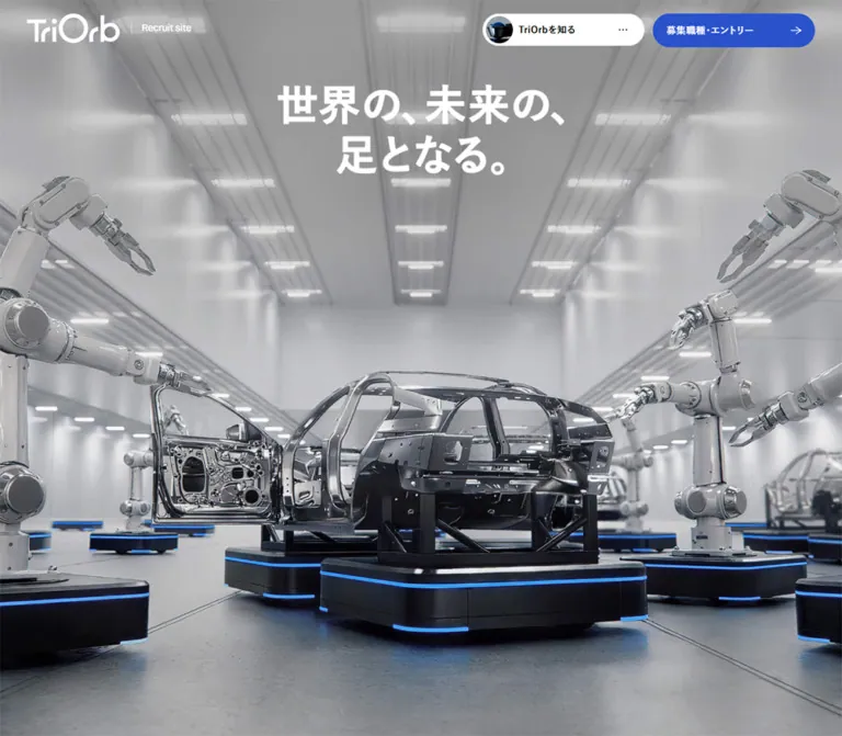
TriOrb presents recruitment through industrial ambition and employee stories. The opening fills the screen with a silvery factory scene: robotic arms and vehicle bodies stand on low mobile platforms edged with blue light. A large white Japanese statement sits above the machinery. The wordmark remains small relative to the scene, while two compact floating capsules provide navigation and entry access.
Below that opening, the page alternates substantial dark technology and business sections with white editorial sections. Large Japanese headings, restrained English labels, blue role descriptions, fine rules, and broad margins establish a consistent hierarchy. The interviews receive unusually generous horizontal rows: oversized pale numerals at left, substantial quotations in the middle, and wide photographs at right. The closing composition returns to imagery and dark blue atmosphere, then leaves considerable space around the footer navigation.
This is a long recruitment homepage with section navigation and dedicated interview and vacancy destinations. Its design depends on the relationship between cinematic imagery, readable editorial content, and persistent access to jobs.
How to Read This Reference
- Measured means a supplied element rectangle or computed style. Unless specified otherwise, dimensions are CSS pixels.
- Declared means a supplied CSS custom property. A declaration alone does not establish where a color, duration, or font is visibly used.
- Estimated means a visual approximation from the supplied screenshots. No pixel-sampling tool was used.
- Recommended means an implementation choice for a new build, including the CSS starter and its breakpoint.
- Descriptive aliases such as
--action-blueare introduced here. Original variable names are explicitly identified as source variables. - The captured page boxes are
1425pxand375pxwide within the requested1440pxand390pxviewports. The remaining15pxappears as the browser's vertical scrollbar allocation. Do not reproduce that strip as a designed page margin. - Some DOM rectangles belong to content not visible in the screenshots or to transformed sections. They establish sampled geometry, not necessarily a settled visible state.
Tokens — Colors
Default Palette
| Name | Value | Source / implementation alias | Evidence and role |
|---|---|---|---|
| Action Blue | #2952cc |
Source --color-primary02; alias --action-blue |
Measured fill of the persistent entry capsule; also measured on small editorial labels such as Leadership Message |
| Deep Brand Blue | #124099 |
Source --color-primary01; alias --brand-blue |
Measured employee-role text and the larger entry link within the navigation DOM |
| Black | #000000 |
Source --color-my-black; alias --ink |
Measured interview text and explicit leadership/current-status section backgrounds |
| White | #ffffff |
Source --color-my-white; alias --paper |
Measured people/company-information sections, navigation capsule, vacancy cards, and reversed labels |
| Main Gray | #667084 |
Source --color-gray-main01; alias --text-muted |
Measured body summaries in vacancy cards, light-section eyebrows, and secondary text |
| Pale Slate | #9099ab |
Source --color-gray-main02; alias --slate |
Measured inverse-section eyebrows and secondary labels; visually consistent with the large interview numerals, whose own computed color was not supplied |
| Light Rule | #dadde5 |
Source --color-gray-light02; alias --rule |
Declared neutral; a suitable approximation for the fine rules visible across interview and footer layouts |
| Light Surface | #edeef2 |
Source --color-gray-light03 |
Declared supporting neutral; exact component assignment was not supplied |
| Almost White Layer | Approximately #f7f8fa |
Recommended alias --layer-soft |
Visual estimate for the pale foreground layer in the desktop interview capture; not a measured source fill |
| Closing Navy | Approximately #00004b through near-black |
Recommended alias --closing-navy |
Visual approximation of the footer atmosphere; gradient stops and interpolation were not supplied |
The blue LEDs in the opening imagery are brighter than the interface button blue. They belong to the image's lighting and should not become an additional general-purpose UI accent.
Declared Supporting Neutrals
The source also declares #131314, #2b2e33, and #3c4047 as --color-gray-dark01, --color-gray-dark02, and --color-gray-dark03. Their visible assignments are not established by the supplied samples. Retain them as optional supporting neutrals rather than inventing a three-level card elevation system.
Generic framework and editor variables include other colors. Those declarations are not evidence of additional brand colors.
Color Behavior
The page changes its background by section. White interview layouts sit between darker business narratives, while the footer uses a broad blue/navy glow fading toward black. This is an authored sequence of surfaces, not an observed light/dark toggle.
Read descendant styling and screenshots together. For example, the hero H1 wrapper reports black text, although its visible lettering is white. Vacancy link wrappers report white foreground and white background, while their summary descendants explicitly use #667084. Copying wrapper colors indiscriminately would produce an incorrect result.
Tokens — Typography
Japanese Text
The supplied computed styles identify three Japanese font stacks:
- Regular:
'MFW-YuGoPr6N-Regular', 'Yu Gothic Pr6N', sans-serif, used by the body at weight400. The body sample appends a further generic serif fallback. - Demi:
'MFW-YuGoPr6N-Demi', 'Yu Gothic Pr6N', sans-serif, used at weight600for navigation, role/name metadata, and much of the explanatory copy. - Bold:
'MFW-YuGoPr6N-Bold', 'Yu Gothic Pr6N', sans-serif, used at weight700for section headings, interview statements, and department headings.
These are observed CSS family names. The evidence does not independently verify every font resource or the font actually selected for each glyph. A new implementation needs authorized font files or a tested fallback; a family declaration alone does not load a typeface.
The Japanese typography is substantial without being tightly compressed. Long interview statements use a 1.6 line height, while general explanatory copy uses 1.85. Small labels remain clearly subordinate through size and color rather than very light font weight.
English Labels and Numeric Data
The source stack is 'aktiv-grotesk', sans-serif. Measured examples include Recruit site, Leadership Message, Why Detroit?, and the funding figure. These examples use weight 500.
The oversized interview numbers have a thin grotesk appearance in the screenshot. Their exact family and weight were not included in the element samples. Using the observed English family with a lighter available weight is a recommendation, not a measured assignment.
Type Scale
All values in this table are measured except the final row.
| Role | Desktop size / line height | Mobile size / line height | Weight | Tracking |
|---|---|---|---|---|
| Root/body default | 16 / 24px |
16 / 24px |
400 |
Normal |
| Persistent control label | 14 / 22.4px |
14 / 22.4px |
600 |
0.04em |
| Recruitment brand caption | 14 / 16.8px |
12 / 14.4px |
500, English stack |
Normal |
| Section eyebrow | 18 / 25.2px |
16 / 22.4px |
700 |
0.03em |
| Main section statement | 44 / 63.8px |
30 / 43.5px |
700 |
0.03em |
| Interview statement | 28 / 44.8px |
22 / 35.2px |
700 |
0.03em |
| Vacancy department heading | 32 / 49.6px |
24 / 37.2px |
700 |
0.03em |
| Technical emphasis / selection-step heading | 20 / 32px |
18 / 28.8px |
700 |
0.03em |
| General explanatory copy | 15 / 27.75px |
14 / 25.9px |
600 |
0.04em |
| Employee metadata | 15 / 24px |
14 / 22.4px |
600 |
0.04em |
| Leadership paragraphs | 15 / 33.75px |
14 / 28px |
600 |
0.04em |
| IP detail text | 11 / 17.6px |
11 / 17.6px |
600 |
0.04em |
| Funding figure | 48 / 67.2px |
40 / 56px |
500, English stack |
-0.01em |
| Interview index | Approximately 120–128px |
Not visually established | Visually light | Not measured |
Hero Lettering
The visible opening statement is 世界の、未来の、足となる。.
- Desktop H1 rectangle:
490 × 155.08px, starting at approximatelyx: 467.5, y: 144. - Mobile H1 rectangle:
244.72 × 205.56px, starting at approximatelyx: 72.48, y: 156. - Desktop presentation uses two lines; mobile uses three:
世界の、/未来の、/足となる。.
The H1 wrapper's computed 16px size and regular weight do not explain the large visible lettering. Descendant or artwork styling is outside the supplied sample. Preserve the measured display bounds and line composition; do not describe the hero as a visible 16px heading or invent its font size.
Tokens — Spacing & Shapes
Grid System
The source declares a desktop design basis of 1440, 12 grid columns, 60 outer inset units, and 20 gutter units. At the mobile observation it switches to a design basis of 400, 4 global columns, 20 outer inset units, and 16 gutter units.
| Property | Desktop formula / result | Mobile formula / result |
|---|---|---|
| Outer content inset | 100vw × 60 / 1440 → 60px |
100vw × 20 / 400 → 19.5px |
| Global gutter token | 100vw × 20 / 1440 → 20px |
100vw × 16 / 400 → 15.6px |
| Available content width, measured | 1425 − 120 = 1305px |
375 − 39 = 336px |
| Nominal token-derived column width | Approximately 91.67px |
Approximately 76.05px |
| Interview grid track, measured | Approximately 90.41px, twelve tracks |
Approximately 9.66px, still twelve tracks with 20px gaps |
The nominal token calculations use viewport width, while actual containers lose the scrollbar allocation. Local component grids can also override the global grid. In particular, the mobile interview link still reports twelve narrow tracks even though its visible content has been rearranged into full-width blocks. Do not assume that every component automatically becomes a four-column grid.
Spacing Scale
| Use | Desktop | Mobile | Evidence |
|---|---|---|---|
| Floating controls, top offset | 20px |
20px |
Measured |
| Gap between floating capsules | 12px |
12px |
Calculated from measured rectangles |
| Header identity left inset | 40px |
19.5px |
Measured |
| Main content inset | 60px |
19.5px |
Measured |
| Interview row padding | 80px top and bottom |
48px top, 60px bottom |
Measured |
| Interview heading-to-metadata gap | 24px |
Content order changes | Calculated from desktop rectangles |
| Gap between role and name | 20px horizontally |
Approximately 4px vertically |
Measured/calculated |
| Vacancy card padding | 32px 104px 32px 32px |
32px 20px |
Measured |
| Vacancy card separation | 20px |
20px |
Calculated from adjacent rectangles |
| Department heading padding | 36px top and bottom |
36px top and bottom |
Measured |
| Major section spacing | Frequently 200px |
Frequently 140px; some 160px |
Measured, component-dependent |
| Footer top padding | 200px |
160px |
Measured |
The spacing is intentionally uneven in scale: small control details coexist with very large narrative gaps. Keep that contrast instead of applying one uniform spacing increment to every section.
Border Radius
| Element | Radius | Evidence |
|---|---|---|
| Navigation and entry capsules | Fully rounded | Computed radius approximately 33,554,400px; use 9999px in an adaptation |
| Vacancy cards | 8px |
Measured |
| Interview photographs | Approximately 10–12px |
Screenshot estimate |
| Interview row and main section surfaces | Square | Measured row radius 0px and visible section geometry |
| Small outlined interview arrow | Capsule | Screenshot estimate: approximately 64 × 32px |
Layout Measurements
| Element | Desktop | Mobile |
|---|---|---|
| Navigation trigger | 240 × 48px |
60 × 38px |
| Entry capsule | 240 × 50px |
Approximately 103.55 × 38px |
| Initial brand-link box | 243.28 × 43.67px |
116 × 64.38px |
| Opening outer section | 7000px high |
5908px high |
| Interview link | 1305px wide; usually 440.38px high |
336px wide; approximately 520–556px high |
| Interview title width | 499px |
336px |
| Interview photograph | Approximately 532 × 280px |
Image rectangle not supplied |
| Vacancy content column | 863.34px |
336px |
| Vacancy card height | Approximately 195–251px |
Approximately 363–470px |
| Footer box | 1425 × 557px |
375 × 768.36px |
| Total document height | 25,476.28px |
26,879.36px |
The opening outer section is exactly seven captured viewport heights at both sizes. Its first screenshot is a single full-screen composition. The full temporal or scroll-driven sequence was not supplied; these measurements do not justify creating six empty screens beneath a static hero.
Components
Floating Navigation and Entry Controls
Role: persistent orientation and access to vacancies throughout a very long page.
On desktop, two capsules sit at the upper right. The white navigation trigger contains a circular image thumbnail, a Japanese label, and a small ellipsis. Its measured padding is 0 24px 0 4px, with an 8px internal gap. The thumbnail appears approximately 40px in diameter. A thin pale outline separates the white capsule from light backgrounds.
The blue entry capsule uses #2952cc, a white label, a slim right arrow, and 20px horizontal padding. Its verified target is #guidelines.
In the interview screenshot, the white trigger shows TriOrbの「人」, a different thumbnail, and a thin blue line along part of its lower edge. At the opening and footer it shows TriOrbを知る. These captures establish a context-dependent presentation. The mechanism, thresholds, and meaning of the partial blue line are unverified.
On mobile, the white trigger becomes an ellipsis-only 60 × 38px capsule. The entry label shortens to エントリー; its arrow is absent from the visible capture. The type remains 14px, so compactness comes from removing secondary content rather than shrinking the label.
The controls remain at the same top position in opening, middle, and footer captures. A fixed-position implementation is a well-supported adaptation, although the supplied rectangle fields do not include the original position declaration.
Navigation Panel — DOM Evidence Only
The DOM contains navigation entries for technology, people, current status, company information, entry, the corporate site, and privacy. The three main thematic links measure 448 × 107px on desktop and 318 × 107px on mobile. Their text changes from 18px to 16px, while row height remains unchanged.
A larger deep-blue entry link measures approximately 448 × 74.19px on desktop and 318 × 71.39px on mobile. A separate 48px round button also appears in the header DOM, but its function is not established by the supplied visible captures.
No open-panel screenshot or button activation was supplied. Do not invent its backdrop, entrance direction, dismissal behavior, or focus handling. The closed white capsule is visually verified; the panel's content and sampled dimensions are DOM evidence only.
Recruitment Identity
Role: connects the recruitment experience to TriOrb without competing with the hero.
The desktop lockup places the white TriOrb wordmark beside a fine vertical separator and the small English label Recruit site. On mobile, the caption moves below the wordmark and the separator disappears. The mobile opening mark is smaller than the footer mark: the measured link boxes are 116px and 133px wide respectively.
The opening identity sits at the upper left. It does not remain visibly present at the upper left in the supplied scrolled captures. The footer repeats the lockup as a separate link to the recruitment homepage.
Preserve the actual wordmark artwork when available and authorized. Typing the company name in a generic sans-serif does not reproduce its distinctive circular letterforms.
Cinematic Opening
Role: makes industrial mobility tangible before the text-heavy recruitment content begins.
Use an edge-to-edge scene with a deep factory perspective, metallic robotic arms, unfinished vehicle bodies, and low black mobility platforms. Bright blue perimeter lighting connects the visual subject to the interface accent. The image is predominantly gray and silver, keeping the white statement and blue entry capsule legible as separate layers.
The desktop heading is centered in the upper portion of the scene. The vehicle body occupies the lower middle, framed by arms on both sides. Mobile substantially crops the lateral machinery while retaining the central vehicle and platform. The headline becomes taller rather than simply shrinking proportionally.
The background looks like a polished industrial visualization. Its production method and runtime rendering technology are not established. A static image, video frame, or rendered scene cannot be distinguished reliably from these captures alone.
Technology Narrative and Movie Link
Role: explains the movement mechanism and its industrial implications.
DOM samples establish large white 44px desktop headings, reduced to 30px on mobile, with slate section labels. The first technical explanation uses a broad left text region, approximately 642.5px wide. A later explanation is narrower and offset right, beginning near x: 823.34 with a width of 430px. Both become approximately 336px text blocks on mobile.
The IP portfolio is secondary information: a 15px desktop label, 14px count labels, and 11px detail text. On mobile the detailed patent breakdown wraps beneath its count. Keep this compact technical information separate from the large narrative statements.
The movie area includes the small blue label MOVIE, an explanatory title, and a rounded link labeled ムービーを見る. Its supplied destination is a YouTube URL. The mobile link measures 157 × 44px, with 4px padding and an 8px gap. Playback, an embedded player, and modal behavior were not tested.
Leadership Message
Role: introduces leadership perspective within the dark narrative sequence.
The section has a measured black background and white copy. On desktop, an English blue eyebrow and statement begin near x: 501.66; a separate text column begins near x: 943.33. Both text columns are approximately 421.67px wide. The paragraphs use a notably open 33.75px line height at 15px.
Mobile retains some asymmetry. The heading begins at the standard 19.5px inset, while the body paragraphs begin at 126.75px and are only 228.75px wide. This measured inset is a distinctive editorial decision; not every mobile passage becomes a full-width block.
The visible composition of any media in this section was not supplied. Avoid inventing a portrait crop or image placement from the text rectangles alone.
People Introduction
Role: transitions from technology and leadership to individual employee stories.
This section switches to white. On desktop, the label and large statement occupy the right side, beginning around x: 832.91 in a 532.08px region. The statement uses 44 / 63.8px, with compact explanatory paragraphs below.
On mobile, the label and statement use the full 336px content width. The DOM records a substantial interval between the heading and subsequent paragraphs, but the intervening media composition is not included in the supplied screenshots.
Interview Row
Role: provides a substantial editorial entry point to one employee interview.
The desktop anatomy is:
- A large pale two-digit index in the first two grid columns.
- A bold multi-line statement beginning in column three.
- A metadata line below the statement: role in deep blue, name in black.
- A small outlined arrow capsule toward the bottom of the text area.
- A wide, softly rounded employee photograph occupying the final five columns.
- A fine horizontal divider between rows.
The row itself is a link. At the captured width, its content starts at x: 60; the text starts near x: 280.83; and the image starts near x: 832.91. The row grid has twelve approximately 90.41px columns with 20px gaps. The text region spans five columns, but the measured title is narrower at 499px, leaving additional breathing room before the image.
The photographs show employees in actual office or workshop settings, with natural expressions, workwear, desks, and softly blurred backgrounds. The screenshot's wide crop is approximately 1.9:1. Keep the work environment present instead of isolating everyone into circular headshots.
The supplied desktop middle capture also shows pale inset layers behind interview 03, while interview 04 occupies a normal white row below. This establishes a layered captured state. It suggests a scroll-related stacking treatment, but does not establish its animation path or justify permanently cropping row content.
Mobile changes the information order. Role and name appear before the title in the measured layout; the title occupies the full 336px width at 22 / 35.2px. Row heights increase to roughly 520–556px. The exact mobile photograph placement and index treatment were not visually supplied, so their starter implementation below is explicitly an adaptation.
Current Status and Growth Information
Role: supports the recruitment narrative with company progress and expansion information.
The section has a measured black background. It uses the same slate eyebrow, white 44px desktop / 30px mobile statement, and demi-weight supporting copy as the technology narrative.
A funding figure uses the English stack at 48px on desktop and 40px on mobile, with slightly negative tracking. Location milestones and a Why Detroit? explanation form additional information groups. On mobile, some timeline copy begins around x: 117.39 in a 218.11px column, retaining a narrow left region for other timeline information.
No complete chart, map, or partner-logo capture was provided. Preserve the typography and information grouping without inventing chart styles or data visualizations.
Company Information
Role: offers a deeper company overview after the growth narrative.
This is a white section with measured 200px desktop and 140px mobile vertical padding. A muted eyebrow precedes a black 44px / 30px heading.
The DOM includes a materials-related content area and a list of topics separated by slashes. Its desktop supporting heading sits in a centered 874px region; mobile uses the standard 336px width. The actual viewer, media format, controls, and loading state were not established. Do not invent a carousel or document-download interaction.
Vacancy Navigation and Cards
Role: turns the narrative into a browsable set of jobs.
The supplied DOM contains fifteen distinct vacancy links across four departments: manufacturing, development, sales, and corporate. Repeated title strings in the extraction are not evidence of duplicate jobs.
Desktop uses a narrow left region for the section heading and department links, approximately 311.25px wide. The main list begins near x: 501.66 and measures 863.34px wide. Department headings use 32 / 49.6px and generous 36px vertical padding.
Each vacancy is a white block link with an 8px radius. Desktop padding reserves considerably more space on the right: 32px 104px 32px 32px. Summary text is explicitly #667084, 15 / 27.75px, demi weight. The title's own computed style was not included, so its starter typography is a recommendation.
Mobile moves the department navigation above the list. Cards remain full-width within the 336px content area and use 32px 20px padding. Their summaries measure 296px wide. Heights grow naturally from roughly 195–251px on desktop to 363–470px on mobile; do not force equal-height cards or truncate job descriptions.
The section foreground is white, but its sampled background is transparent. That supports an inverse surrounding context without identifying the exact inherited fill or gradient. The starter uses black as a conservative implementation choice. Card detail links are verified; application forms and submission behavior are outside this inspection.
Selection Process
Role: explains the path from application review to offer discussion.
The DOM lists four stages: 書類選考, メンバー面談(複数回), 最終面談, and オファー面談. Desktop places the large section heading in the left region and stage content in the larger right region. Mobile places the heading above the stages.
Stage headings use 20 / 32px on desktop and 18 / 28.8px on mobile. Their measured left padding is 30px, indicating space before the label, but the supplied evidence does not identify a particular marker or connector design. Use a semantic ordered list in an adaptation and avoid claiming an observed progress widget.
Closing Visual and Footer
Role: returns to the industrial and human imagery, then provides a spacious final navigation area.
The upper edge of the desktop footer capture includes angled, cropped workplace images and oversized white lettering from the preceding closing composition. Below them, a broad blue/navy field fades into black. There is a long stretch of open space before the footer identity and links.
Desktop places the recruitment lockup at the left and two navigation columns at the right. The first column contains four recruitment-section links; the second contains company information and entry. A fine rule separates this area from corporate/privacy links and the copyright line.
Mobile places the larger footer lockup above the same two-column navigation. Corporate and privacy links then stack below a separator, with a second rule above the copyright. External-link symbols remain small and subdued. The persistent top capsules are still visible over this closing region.
The footer's measured top padding is 200px on desktop and 160px on mobile. Preserve this breathing room; its spaciousness is part of the ending rather than unused space to eliminate.
Tokens — Motion & Interaction
| Treatment | Evidence | Interpretation |
|---|---|---|
| General motion duration | Source --animation-duration: .5s |
Declared default duration |
| Faster / later durations | Source .35s and .8s |
Declared tokens; specific visible uses not established |
| Common easing | cubic-bezier(.56,-.01,.32,.99) |
Measured on several color and opacity transitions |
| White navigation trigger | Background-color transition, 0.5s with common easing |
Defined feedback timing; hover result not supplied |
| Brand links | Opacity transition, 0.5s with common easing |
Defined feedback timing |
| Navigation-panel links | Color-related transitions, 0.5s with common easing |
DOM declaration; panel interaction not exercised |
| Mobile department links | Opacity transition, 0.3s cubic-bezier(.4,0,.2,1) |
Measured local exception |
| Contextual navigation label | Different label, thumbnail, and partial lower line across captures | State variation observed; activation logic unverified |
| Opening sequence | Outer section equals seven viewport heights | Extended scroll geometry measured; sequence and scrubbing behavior unverified |
| Interview layering | Inset pale layers in the desktop middle capture | Layered state observed; motion mechanism unverified |
Many sampled text elements report animation: none. This does not prove that the image scene, ancestors, canvas, video, or scroll-driven transforms are static. Likewise, a reported transition: all without a duration does not establish a visible transition.
Duplicated navigation and vacancy labels sometimes occupy identical rectangles. They may support layered visual treatments, but a rolling-label hover animation was not demonstrated. Render one accessible label in a new implementation and hide decorative duplicates from assistive technology.
Recommended motion approach: use the measured half-second easing for restrained opacity and color changes. Implement complex scroll choreography only after obtaining a motion recording or direct interaction evidence. Provide a complete static presentation before adding scroll-dependent reveals.
Surfaces
| Layer | Appearance | Evidence / purpose |
|---|---|---|
| Opening scene | Full-screen silver industrial imagery | Visually observed; carries the initial atmosphere |
| Editorial canvas | White, black typography, fine gray rules | Visually observed in interviews and measured in people/company sections |
| Interview layered state | Pale inset sheets behind the active region | Screenshot evidence; exact fills and transforms unavailable |
| Technical/business canvas | Black with white and slate text | Explicitly measured in leadership and current-status sections |
| Navigation trigger | White capsule with a fine pale edge | Screenshot and measured fill |
| Primary entry | Solid blue capsule with white content | Screenshot and measured fill |
| Vacancy card | White, 8px radius, muted summary text |
Computed-style evidence |
| Closing region | Blue/navy glow fading into black | Screenshot evidence; gradient formula unavailable |
There is no visually established general shadow-elevation system. Hierarchy comes from full-section contrast, whitespace, photographic boundaries, thin rules, and capsule geometry.
Imagery
The page combines two complementary image types: an idealized industrial future and recognizable working people.
The opening scene uses metallic surfaces, controlled perspective, clean factory architecture, large mechanical forms, and small blue light accents. Its wide composition must survive a portrait crop. Keep a central platform or machine legible on mobile rather than reducing the entire desktop scene until it becomes insignificant.
Employee imagery is more grounded: real workplace furniture, practical clothing, tools, and conversational portraits. Crops are wide and modestly rounded. Natural photographic color is retained; there is no evidence of applying a universal monochrome or blue filter to employee images.
The closing composition uses angled image fragments against a dark field. Those angles belong to the transition artwork, not to a general rule that every content card should be rotated.
Observed Asset References
No original image URLs, video-file URLs, or downloadable font paths were included in the supplied evidence. The identifiable visual assets are the TriOrb wordmark, factory opening scene, navigation thumbnails, employee photographs, and closing collage. Their filenames and formats must remain unspecified.
The observed movie destination is the technology-roadmap video. This is a link target from the homepage, not an independently inspected media source.
Use authorized supplied imagery where available. The CSS starter reproduces layout and appearance conventions; it does not contain replacement brand artwork or employee photographs.
Layout & Responsive Behavior
Desktop Composition
The 1305px content region begins 60px inside the measured page box. A twelve-column grid supports several asymmetric arrangements:
- Interview rows use approximately two columns for the index, five for text, and five for photography.
- Vacancy and selection sections use three columns for the left heading/navigation, leave an intervening column, and use eight columns for the main content.
- Leadership text uses two adjacent regions on the right, leaving a substantial left area outside the sampled text.
- The people introduction begins in the rightmost five-column region.
These are varied compositions within a shared grid. Replacing all of them with identical centered text blocks would remove much of the site's editorial character.
Mobile Composition
The measured main content width is 336px, with 19.5px side insets inside a 375px page box. Important changes include:
- Navigation loses its thumbnail and contextual text; entry uses the shorter
エントリーlabel. - The recruitment caption moves below the wordmark.
- The hero statement changes from two lines to three and occupies a taller display box.
- Main section headings reduce from
44pxto30px; interview statements reduce from28pxto22px. - General copy reduces only from
15pxto14px, retaining generous line height. - Interview role and name move before the statement and stack vertically.
- Department navigation moves above vacancy cards; cards expand vertically with their content.
- Some leadership and milestone copy remains deliberately inset rather than using the entire content width.
- Footer navigation retains two columns, while the identity and legal links stack vertically.
Responsive Calculations and Limits
The source switches global design variables between a 1440 desktop basis and a 400 mobile basis. The exact breakpoint was not included. The CSS starter uses 56rem as a recommended breakpoint because the desktop brand and two wide capsules require substantial horizontal space.
Some sampled rectangles extend beyond the viewport or overlap other sections. For example, the mobile technology introduction reports a 780px width and a negative x-coordinate, while the company-information section overlaps the sampled current-status region by one viewport height. These are not reliable normal-flow measurements for rebuilding the entire page. They may reflect transforms or scroll staging whose implementation was not supplied.
The measured document is approximately 25.5 desktop screens and 31.8 mobile screens long. Its extensive content makes reliable section anchors and persistent entry access structurally important. Avoid hardcoding the total height: vacancies, fonts, and text wrapping will change it.
Do’s and Don’ts
Do
- Preserve the exact interface blues:
#2952ccfor the main floating entry control and#124099for deeper blue text and actions. - Alternate substantial white and dark narrative sections.
- Keep the factory visual dominant in the opening, with the statement high in the frame.
- Use the supplied Japanese regular, demi, and bold font distinctions when authorized fonts are available.
- Retain broad desktop margins, large section spacing, and substantial interview rows.
- Pair blue employee roles with black names and bold statements.
- Keep employee photographs wide, natural, and connected to their workplace.
- Shorten mobile control content while preserving readable label sizes.
- Let vacancy cards grow with their summaries.
- Preserve the spacious dark footer and its two-column mobile navigation.
- Treat observed stacked layers as a state requiring further motion evidence.
Don’t
- Don’t reduce the homepage to a generic hero followed by interchangeable feature cards.
- Don’t turn the interview list into a tight three-column card gallery.
- Don’t substitute circular employee avatars for the large workplace photographs.
- Don’t use the hero wrapper's inherited
16pxdeclaration as the visible headline size. - Don’t force every mobile paragraph into the same width when the evidence shows intentional insets.
- Don’t make every surface blue, rounded, or shadowed.
- Don’t treat the imagery's luminous blue LEDs as a new UI color token.
- Don’t reproduce the browser's
15pxscrollbar allocation as a permanent white border. - Don’t render duplicate extracted labels as duplicate visible navigation items or jobs.
- Don’t create a seven-screen static spacer to imitate an unverified opening sequence.
- Don’t claim a particular 3D engine, media playback mode, or menu animation from still captures.
Recommended Implementation Additions
These recommendations are not verified features of the original site:
- Give the ellipsis button a clear accessible name,
aria-expanded, and a relationship to its controlled navigation region. - Provide keyboard navigation, visible focus, Escape dismissal, and focus restoration if implementing an overlay menu.
- Keep decorative duplicate labels and interview indices out of accessible names when they add no information.
- Preserve a single meaningful H1 even if the visible headline uses artwork.
- Give the mobile
38pxcapsules a touch target of at least44px, using additional hit-area space or a slightly taller accessible variant. - Add a skip link and anchor offsets so fixed controls do not obscure section headings.
- Test small muted text against its actual background, especially
11pxIP details and dark-section gray copy. - Ensure optional scroll effects have a reduced-motion and no-script presentation with all essential content visible.
- Reserve image space, provide responsive image sizes, prioritize the opening asset, and defer distant employee images.
- Use semantic links for interview and vacancy destinations, with no nested competing controls inside an entire linked row.
Agent Prompt Guide
Quick Color Reference
- Main entry capsule:
#2952cc, white text. - Employee-role text and deeper actions:
#124099. - Editorial canvas: white with black statements.
- Secondary copy:
#667084. - Inverse-section labels:
#9099ab. - Rules: use declared
#dadde5as an adaptation. - Closing atmosphere: estimated deep navy and blue fading into black; no exact source gradient is available.
Overall Prompt
“Create a Japanese recruitment homepage inspired by TriOrb's observed design. Begin with an edge-to-edge silver factory scene featuring robotic arms and a central mobile platform with blue perimeter lights. Place a large white Japanese statement high in the scene, a compact recruitment wordmark at upper left, and persistent white navigation and blue entry capsules at upper right. Alternate spacious black technology/business sections with white editorial sections. Use a twelve-column desktop grid, bold Japanese headings, demi-weight body copy, understated English labels, and large interview rows with pale indices, blue role metadata, and wide workplace photographs. On mobile, simplify the floating controls, change the hero statement to three lines, reorder interview metadata before the statement, and stack vacancy content without truncation. End with a navy-to-black visual composition and a spacious footer. Treat complex scroll choreography as optional until its behavior is specified.”
Example Component Prompts
- Floating controls: “Build two upper-right capsules separated by 12px: a white 240 × 48px navigation button containing a circular thumbnail, 14px Japanese label, and ellipsis; and a 240 × 50px blue entry link with white text and a slim arrow. At a recommended mobile breakpoint, reduce the navigation to a 60 × 38px ellipsis capsule and shorten entry to
エントリー. Preserve keyboard focus and clear accessible names.” - Interview row: “Create a white full-width editorial link on a twelve-column grid with 80px vertical padding. Put a large light slate index in the first two columns, a 28px bold Japanese statement and blue role metadata in the next five, and a wide rounded workplace portrait in the final five. Add a thin divider and a small outlined arrow capsule. Keep the title width near 499px at a 1440px viewport.”
- Vacancy list: “Build a desktop vacancy section with a narrow department index on the left and a broad white-card list on the right. Cards use an 8px radius, 32px padding with extra desktop space on the right, and 15px muted summaries at 1.85 line height. On mobile, place the department index above the cards, use 20px horizontal card padding, and allow full text to determine height.”
- Footer: “Create a spacious recruitment footer over an estimated deep navy-to-black gradient. Place the white brand lockup on the left and two navigation columns on the right. Add a fine separator above corporate/privacy links and copyright. On mobile, stack the lockup above a two-column navigation area, then stack the legal links and copyright between fine rules. Keep generous top padding.”
- Hero imagery: “Compose a polished industrial factory visualization with cool silver walls, long ceiling-light perspective, robotic arms framing a vehicle body, and black mobile platforms with restrained blue light strips. Leave quiet upper-center space for white Japanese lettering. Plan a portrait crop that preserves the central vehicle and platform. Do not add embedded interface text or logos to the image.”
Quick Start
CSS Custom Properties
This is an implementation starter, not recovered source code. It uses measured colors, type sizes, and major spacing while keeping a conventional root size. The breakpoint, gradient, mobile image/index arrangement, vacancy-title styling, and focus treatment are recommendations. Font files and original artwork must be supplied separately.
The hero styles expect display artwork inside .hero__headline, with an accessible H1 supplied by the surrounding markup. They intentionally use a single-screen static opening rather than reproducing an unverified seven-screen sequence.
:root {
  /* Measured colors and declared source neutrals */
  --paper: #ffffff;
  --ink: #000000;
  --action-blue: #2952cc;
  --brand-blue: #124099;
  --text-muted: #667084;
  --slate: #9099ab;
  --rule: #dadde5;
  --surface-light: #edeef2;

  /* Visual approximations, not extracted source fills */
  --layer-soft: #f7f8fa;
  --closing-navy: #00004b;

  /* Observed family declarations; font files are not included */
  --font-ja: 'MFW-YuGoPr6N-Regular', 'Yu Gothic Pr6N', sans-serif;
  --font-ja-demi: 'MFW-YuGoPr6N-Demi', 'Yu Gothic Pr6N', sans-serif;
  --font-ja-bold: 'MFW-YuGoPr6N-Bold', 'Yu Gothic Pr6N', sans-serif;
  --font-en: 'aktiv-grotesk', sans-serif;

  --text-body: 15px;
  --text-meta: 15px;
  --text-control: 14px;
  --text-eyebrow: 18px;
  --text-section: 44px;
  --text-interview: 28px;
  --text-department: 32px;
  --leading-body: 1.85;
  --leading-heading: 1.45;
  --tracking-body: 0.04em;
  --tracking-heading: 0.03em;

  /* Source-derived viewport formulas */
  --page-inset: calc(100vw * 60 / 1440);
  --grid-gap: calc(100vw * 20 / 1440);
  --section-space: 200px;
  --interview-padding: 80px;

  --radius-card: 8px;
  --radius-photo: 12px; /* Screenshot approximation */
  --radius-pill: 9999px;
  --motion-duration: 0.5s;
  --motion-fast: 0.35s;
  --motion-late: 0.8s;
  --motion-ease: cubic-bezier(0.56, -0.01, 0.32, 0.99);
}

* {
  box-sizing: border-box;
}

body {
  margin: 0;
  color: var(--ink);
  background: var(--paper);
  font-family: var(--font-ja);
  font-size: 16px;
  line-height: 1.5;
}

button,
a {
  -webkit-tap-highlight-color: transparent;
}

button {
  font: inherit;
}

img {
  display: block;
  max-width: 100%;
}

.container {
  margin-inline: var(--page-inset);
}

.grid-12 {
  display: grid;
  grid-template-columns: repeat(12, minmax(0, 1fr));
  column-gap: var(--grid-gap);
}

.section {
  padding-block: var(--section-space);
  scroll-margin-top: 90px; /* Recommended anchor clearance */
}

.section--dark {
  color: var(--paper);
  background: var(--ink);
}

.eyebrow {
  margin: 0 0 32px;
  color: var(--text-muted);
  font-family: var(--font-ja-bold);
  font-size: var(--text-eyebrow);
  font-weight: 700;
  line-height: 1.4;
  letter-spacing: var(--tracking-heading);
}

.section--dark .eyebrow {
  color: var(--slate);
}

.section-title {
  margin: 0;
  font-family: var(--font-ja-bold);
  font-size: var(--text-section);
  font-weight: 700;
  line-height: var(--leading-heading);
  letter-spacing: var(--tracking-heading);
}

.body-copy {
  font-family: var(--font-ja-demi);
  font-size: var(--text-body);
  font-weight: 600;
  line-height: var(--leading-body);
  letter-spacing: var(--tracking-body);
}

.english-label {
  font-family: var(--font-en);
  font-size: 15px;
  font-weight: 500;
  line-height: 1.6;
}

.floating-actions {
  position: fixed;
  z-index: 50;
  top: 20px;
  right: 40px;
  display: flex;
  align-items: flex-start;
  gap: 12px;
}

.nav-pill,
.entry-pill {
  position: relative;
  display: flex;
  align-items: center;
  gap: 8px;
  width: 240px;
  border-radius: var(--radius-pill);
  font-family: var(--font-ja-demi);
  font-size: var(--text-control);
  font-weight: 600;
  line-height: 1.6;
  letter-spacing: 0.04em;
  text-decoration: none;
  cursor: pointer;
}

.nav-pill {
  height: 48px;
  padding: 0 24px 0 4px;
  border: 1px solid var(--rule);
  color: var(--ink);
  background: var(--paper);
  transition: background-color var(--motion-duration) var(--motion-ease);
}

.nav-pill__avatar {
  flex: 0 0 40px;
  width: 40px;
  height: 40px;
  border-radius: 50%;
  object-fit: cover;
}

.nav-pill__ellipsis {
  margin-left: auto;
}

.entry-pill {
  justify-content: space-between;
  height: 50px;
  padding-inline: 20px;
  border: 0;
  color: var(--paper);
  background: var(--action-blue);
}

.entry-pill__mobile {
  display: none;
}

.brand {
  display: flex;
  align-items: center;
  gap: 16px;
  width: fit-content;
  color: var(--paper);
  text-decoration: none;
  transition: opacity var(--motion-duration) var(--motion-ease);
}

.brand__mark {
  width: 138px; /* Approximate visible artwork width */
  height: auto;
}

.brand__caption {
  padding-left: 16px;
  border-left: 1px solid rgb(255 255 255 / 45%);
  font-family: var(--font-en);
  font-size: 14px;
  font-weight: 500;
  line-height: 1.2;
}

.hero {
  position: relative;
  min-height: 100vh;
  min-height: 100svh;
  overflow: hidden;
  background: var(--slate);
}

.hero__media {
  position: absolute;
  inset: 0;
  width: 100%;
  height: 100%;
  object-fit: cover;
  object-position: 50% 50%; /* Recommended starting crop */
}

.hero__brand {
  position: absolute;
  z-index: 2;
  top: 20px;
  left: 40px;
}

.hero__headline {
  position: absolute;
  z-index: 1;
  top: 144px;
  left: 50%;
  width: min(490px, calc(100% - 40px));
  aspect-ratio: 490 / 155.078125;
  margin: 0;
  transform: translateX(-50%);
}

.hero__headline img,
.hero__headline svg {
  display: block;
  width: 100%;
  height: 100%;
  object-fit: contain;
}

.interview-row {
  display: grid;
  grid-template-columns: repeat(12, minmax(0, 1fr));
  column-gap: 20px;
  padding-block: var(--interview-padding);
  border-bottom: 1px solid var(--rule);
  color: var(--ink);
  text-decoration: none;
}

.interview__number {
  grid-column: 1 / span 2;
  color: var(--slate);
  font-family: var(--font-en); /* Recommended assignment */
  font-size: 128px; /* Screenshot approximation */
  font-weight: 300; /* Recommended available light weight */
  line-height: 1;
}

.interview__copy {
  grid-column: 3 / span 5;
  display: flex;
  flex-direction: column;
  min-width: 0;
}

.interview__title {
  max-width: 499px;
  margin: 0;
  font-family: var(--font-ja-bold);
  font-size: var(--text-interview);
  font-weight: 700;
  line-height: 1.6;
  letter-spacing: var(--tracking-heading);
}

.interview__meta {
  display: flex;
  flex-wrap: wrap;
  gap: 4px 20px;
  margin-top: 24px;
  font-family: var(--font-ja-demi);
  font-size: var(--text-meta);
  font-weight: 600;
  line-height: 1.6;
  letter-spacing: var(--tracking-body);
}

.interview__role {
  color: var(--brand-blue);
}

.interview__media {
  grid-column: 8 / span 5;
  width: 100%;
  aspect-ratio: 1.9;
  border-radius: var(--radius-photo);
  object-fit: cover;
}

.interview__arrow {
  display: grid;
  place-items: center;
  width: 64px;
  height: 32px;
  margin-top: auto;
  border: 1px solid currentColor;
  border-radius: var(--radius-pill);
}

.jobs__aside {
  grid-column: 1 / span 3;
}

.jobs__main {
  grid-column: 5 / -1;
  min-width: 0;
}

.department-nav {
  display: grid;
  gap: 16px;
  margin-top: 60px;
}

.department-nav a {
  color: inherit;
  font-family: var(--font-ja-demi);
  font-size: var(--text-meta);
  line-height: 1.6;
  text-decoration: none;
}

.department-title {
  margin: 0;
  padding-block: 36px;
  font-family: var(--font-ja-bold);
  font-size: var(--text-department);
  font-weight: 700;
  line-height: 1.55;
  letter-spacing: var(--tracking-heading);
}

.job-list {
  display: grid;
  gap: 20px;
}

.job-card {
  position: relative;
  display: block;
  padding: 32px 104px 32px 32px;
  border-radius: var(--radius-card);
  color: var(--ink);
  background: var(--paper);
  text-decoration: none;
}

.job-card__title {
  margin: 0 0 16px;
  font-family: var(--font-ja-bold);
  font-size: 20px; /* Recommended; title style was not sampled */
  font-weight: 700;
  line-height: 1.6;
}

.job-card__summary {
  margin: 0 20px 0 0;
  color: var(--text-muted);
  font-family: var(--font-ja-demi);
  font-size: var(--text-body);
  font-weight: 600;
  line-height: var(--leading-body);
  letter-spacing: var(--tracking-body);
}

/* Recommended cue placement, not a measured original control */
.job-card__cue {
  position: absolute;
  top: 50%;
  right: 32px;
  display: grid;
  place-items: center;
  width: 40px;
  height: 40px;
  color: var(--brand-blue);
  transform: translateY(-50%);
}

.site-footer {
  padding: 200px var(--page-inset) 0;
  color: var(--paper);
  /* Approximation of the captured closing atmosphere */
  background: radial-gradient(
    ellipse at top left,
    #05318a 0%,
    var(--closing-navy) 36%,
    #000020 60%,
    #000000 100%
  );
}

.site-footer__brand {
  grid-column: 1 / span 4;
  align-self: start;
}

.site-footer__nav {
  grid-column: 9 / -1;
  display: grid;
  grid-template-columns: repeat(2, minmax(0, 1fr));
}

.site-footer__nav ul {
  display: grid;
  align-content: start;
  gap: 32px;
  margin: 0;
  padding: 0;
  list-style: none;
}

.site-footer a {
  color: inherit;
  text-decoration: none;
}

.site-footer__meta {
  display: flex;
  align-items: center;
  gap: 32px;
  margin-top: 64px;
  padding-block: 36px 48px;
  border-top: 1px solid rgb(255 255 255 / 16%);
  font-size: 14px;
}

.site-footer__copyright {
  margin-left: auto;
  color: var(--slate);
  font-family: var(--font-en);
}

/* Recommended breakpoint; the source breakpoint was not supplied */
@media (max-width: 56rem) {
  :root {
    --page-inset: calc(100vw * 20 / 400);
    --grid-gap: calc(100vw * 16 / 400);
    --section-space: 140px;
    --text-body: 14px;
    --text-meta: 14px;
    --text-eyebrow: 16px;
    --text-section: 30px;
    --text-interview: 22px;
    --text-department: 24px;
  }

  .floating-actions {
    right: var(--page-inset);
  }

  .nav-pill {
    justify-content: center;
    width: 60px;
    height: 38px;
    padding: 0;
  }

  .nav-pill__avatar,
  .nav-pill__label,
  .entry-pill__desktop,
  .entry-pill__arrow {
    display: none;
  }

  .nav-pill__ellipsis {
    margin: 0;
  }

  .entry-pill {
    width: auto;
    min-width: 103.55px;
    height: 38px;
  }

  .entry-pill__mobile {
    display: inline;
  }

  .brand {
    flex-direction: column;
    align-items: flex-start;
    gap: 12px;
  }

  .brand__mark {
    width: 116px;
  }

  .brand__caption {
    padding: 0;
    border: 0;
    font-size: 12px;
  }

  .hero__brand {
    left: var(--page-inset);
  }

  .hero__headline {
    top: 156px;
    width: min(244.72px, calc(100% - 40px));
    aspect-ratio: 244.71875 / 205.5625;
  }

  /* Adaptation: metadata, image, then statement.
     Mobile numeral size and image position were not measured. */
  .interview-row {
    grid-template-columns: minmax(0, 1fr) 64px;
    gap: 24px 16px;
    padding-block: 48px 60px;
  }

  .interview__copy {
    display: contents;
  }

  .interview__number {
    grid-column: 2;
    grid-row: 1;
    font-size: 64px;
    text-align: right;
  }

  .interview__meta {
    grid-column: 1;
    grid-row: 1;
    align-self: center;
    flex-direction: column;
    gap: 4px;
    margin: 0;
  }

  .interview__media {
    grid-column: 1 / -1;
    grid-row: 2;
  }

  .interview__title {
    grid-column: 1 / -1;
    grid-row: 3;
    max-width: none;
  }

  .interview__arrow {
    grid-column: 1 / -1;
    grid-row: 4;
    margin: 0;
  }

  .jobs,
  .site-footer__top {
    display: block;
  }

  .department-nav {
    margin-block: 48px 80px;
  }

  .job-card {
    padding: 32px 20px;
  }

  .job-card__title {
    font-size: 18px; /* Recommended adaptation */
  }

  .job-card__summary {
    margin-right: 0;
  }

  .job-card__cue {
    position: static;
    margin: 32px 0 0 auto;
    transform: none;
  }

  .site-footer {
    padding-top: 160px;
    background: linear-gradient(135deg, #00004b, #000018);
  }

  .site-footer .brand__mark {
    width: 133px;
  }

  .site-footer__nav {
    margin-top: 60px;
  }

  .site-footer__meta {
    align-items: flex-start;
    flex-direction: column;
    margin-top: 64px;
    padding-block: 32px;
  }

  .site-footer__copyright {
    width: 100%;
    margin: 0;
    padding-top: 32px;
    border-top: 1px solid rgb(255 255 255 / 16%);
  }
}

/* Recommended visible focus with contrast on light and dark surfaces */
:where(a, button):focus-visible {
  outline: 3px solid var(--action-blue);
  outline-offset: 4px;
  box-shadow: 0 0 0 2px var(--paper);
}

/* Recommended support for this starter's nonessential transitions */
@media (prefers-reduced-motion: reduce) {
  .nav-pill,
  .brand,
  .department-nav a {
    transition: none;
  }
}
For the interview markup, place the heading, metadata, and decorative arrow inside .interview__copy, with the index and photograph as siblings inside the row link. For vacancies and the footer, combine .grid-12 with .jobs and .site-footer__top respectively. Supply one visible control label for each breakpoint and ensure its accessible name is not duplicated.
Tailwind v4 Token Mapping
Optional aliases for an implementation already using Tailwind v4. This mapping does not establish the original website's framework version. Define the custom properties above first.
@theme inline {
  --color-paper: var(--paper);
  --color-ink: var(--ink);
  --color-action: var(--action-blue);
  --color-brand: var(--brand-blue);
  --color-muted: var(--text-muted);
  --color-slate: var(--slate);
  --color-rule: var(--rule);

  --font-japanese: var(--font-ja);
  --font-japanese-demi: var(--font-ja-demi);
  --font-japanese-bold: var(--font-ja-bold);
  --font-english: var(--font-en);

  --text-copy: var(--text-body);
  --text-section-heading: var(--text-section);
  --text-interview-heading: var(--text-interview);
  --text-department-heading: var(--text-department);

  --spacing-page: var(--page-inset);
  --spacing-section: var(--section-space);
  --radius-vacancy: var(--radius-card);
  --radius-portrait: var(--radius-photo);
  --radius-capsule: var(--radius-pill);
}
Sources & Evidence
- Original and final page: TriOrb Recruit. The supplied browser observation reports HTTP
200, an unchanged final URL, the recruitment page title, branded content, and© TriOrb, Inc.. - Capture date: September 12, 2026, retrieval timestamp
2026-09-12T07:44:36.219Z. Both viewport records belong to this supplied inspection; separate per-image timestamps were not provided. - Desktop evidence:
1440 × 1000requested viewport;1425pxmeasured page width. Supplied screenshots show the opening, an intermediate interview state, and the footer. Rendered DOM and computed styles cover the broader homepage. - Mobile evidence:
390 × 844requested viewport;375pxmeasured page width. Supplied screenshots show the opening and footer. Rendered DOM supplies responsive typography, component rectangles, and content order elsewhere. - Navigation evidence: the homepage contains section anchors including
#technology,#interview,#current-status,#about, and#guidelines, six interview destinations, department anchors, and individual vacancy links. Destinations were recorded but not opened for this reference. - Readiness limits: the supplied collection process allowed initial observation, image decoding, layout/text stabilization, and finite animation settling within bounded timeouts. Perpetual animations were temporarily paused during readiness checks and resumed. Those checks do not prove the completeness of delayed or scroll-dependent states.
- Interaction limits: no direct menu activation, hover demonstration, keyboard navigation test, video playback, vacancy submission, or complete motion recording was supplied. Screenshot changes establish state differences, not exact interaction mechanics.
This reference describes the current homepage using the supplied original-page evidence. It does not reconstruct an earlier design. Measurements, visual estimates, and recommended implementation choices are identified separately throughout.
# TriOrb Recruit — Style Reference

> Silver robotics, electric blue accents, and expansive editorial space for the people building industrial mobility.

**Website / Original URL:** [recruit.triorb.co.jp](https://recruit.triorb.co.jp/)
**Final URL:** [recruit.triorb.co.jp](https://recruit.triorb.co.jp/)
**Theme:** alternating light and dark sections, with blue action controls and a navy-to-black closing composition; no user-selectable theme was evidenced.
**Inspected:** September 12, 2026. Supplied browser retrieval timestamp: `2026-09-12T07:44:36.219Z`, equivalent to 16:44:36 JST.
**Viewports:** desktop `1440 × 1000` and mobile `390 × 844` CSS pixels.
**Scope:** the current recruitment homepage: opening visual, technology narrative, leadership message, employee introduction and six interview links, company progress, company information, vacancies, selection process, closing imagery, and footer. Visual captures cover the opening and footer at both sizes and the desktop interview list. Other sections are described from supplied rendered DOM and computed styles. Linked detail pages and open-menu states were not visually inspected.

TriOrb presents recruitment through industrial ambition and employee stories. The opening fills the screen with a silvery factory scene: robotic arms and vehicle bodies stand on low mobile platforms edged with blue light. A large white Japanese statement sits above the machinery. The wordmark remains small relative to the scene, while two compact floating capsules provide navigation and entry access.

Below that opening, the page alternates substantial dark technology and business sections with white editorial sections. Large Japanese headings, restrained English labels, blue role descriptions, fine rules, and broad margins establish a consistent hierarchy. The interviews receive unusually generous horizontal rows: oversized pale numerals at left, substantial quotations in the middle, and wide photographs at right. The closing composition returns to imagery and dark blue atmosphere, then leaves considerable space around the footer navigation.

This is a long recruitment homepage with section navigation and dedicated interview and vacancy destinations. Its design depends on the relationship between cinematic imagery, readable editorial content, and persistent access to jobs.

## How to Read This Reference

- **Measured** means a supplied element rectangle or computed style. Unless specified otherwise, dimensions are CSS pixels.
- **Declared** means a supplied CSS custom property. A declaration alone does not establish where a color, duration, or font is visibly used.
- **Estimated** means a visual approximation from the supplied screenshots. No pixel-sampling tool was used.
- **Recommended** means an implementation choice for a new build, including the CSS starter and its breakpoint.
- Descriptive aliases such as `--action-blue` are introduced here. Original variable names are explicitly identified as source variables.
- The captured page boxes are `1425px` and `375px` wide within the requested `1440px` and `390px` viewports. The remaining `15px` appears as the browser's vertical scrollbar allocation. Do not reproduce that strip as a designed page margin.
- Some DOM rectangles belong to content not visible in the screenshots or to transformed sections. They establish sampled geometry, not necessarily a settled visible state.

## Tokens — Colors

### Default Palette

| Name | Value | Source / implementation alias | Evidence and role |
| --- | --- | --- | --- |
| Action Blue | `#2952cc` | Source `--color-primary02`; alias `--action-blue` | Measured fill of the persistent entry capsule; also measured on small editorial labels such as `Leadership Message` |
| Deep Brand Blue | `#124099` | Source `--color-primary01`; alias `--brand-blue` | Measured employee-role text and the larger entry link within the navigation DOM |
| Black | `#000000` | Source `--color-my-black`; alias `--ink` | Measured interview text and explicit leadership/current-status section backgrounds |
| White | `#ffffff` | Source `--color-my-white`; alias `--paper` | Measured people/company-information sections, navigation capsule, vacancy cards, and reversed labels |
| Main Gray | `#667084` | Source `--color-gray-main01`; alias `--text-muted` | Measured body summaries in vacancy cards, light-section eyebrows, and secondary text |
| Pale Slate | `#9099ab` | Source `--color-gray-main02`; alias `--slate` | Measured inverse-section eyebrows and secondary labels; visually consistent with the large interview numerals, whose own computed color was not supplied |
| Light Rule | `#dadde5` | Source `--color-gray-light02`; alias `--rule` | Declared neutral; a suitable approximation for the fine rules visible across interview and footer layouts |
| Light Surface | `#edeef2` | Source `--color-gray-light03` | Declared supporting neutral; exact component assignment was not supplied |
| Almost White Layer | Approximately `#f7f8fa` | Recommended alias `--layer-soft` | Visual estimate for the pale foreground layer in the desktop interview capture; not a measured source fill |
| Closing Navy | Approximately `#00004b` through near-black | Recommended alias `--closing-navy` | Visual approximation of the footer atmosphere; gradient stops and interpolation were not supplied |

The blue LEDs in the opening imagery are brighter than the interface button blue. They belong to the image's lighting and should not become an additional general-purpose UI accent.

### Declared Supporting Neutrals

The source also declares `#131314`, `#2b2e33`, and `#3c4047` as `--color-gray-dark01`, `--color-gray-dark02`, and `--color-gray-dark03`. Their visible assignments are not established by the supplied samples. Retain them as optional supporting neutrals rather than inventing a three-level card elevation system.

Generic framework and editor variables include other colors. Those declarations are not evidence of additional brand colors.

### Color Behavior

The page changes its background by section. White interview layouts sit between darker business narratives, while the footer uses a broad blue/navy glow fading toward black. This is an authored sequence of surfaces, not an observed light/dark toggle.

Read descendant styling and screenshots together. For example, the hero H1 wrapper reports black text, although its visible lettering is white. Vacancy link wrappers report white foreground and white background, while their summary descendants explicitly use `#667084`. Copying wrapper colors indiscriminately would produce an incorrect result.

## Tokens — Typography

### Japanese Text

The supplied computed styles identify three Japanese font stacks:

- **Regular:** `'MFW-YuGoPr6N-Regular', 'Yu Gothic Pr6N', sans-serif`, used by the body at weight `400`. The body sample appends a further generic serif fallback.
- **Demi:** `'MFW-YuGoPr6N-Demi', 'Yu Gothic Pr6N', sans-serif`, used at weight `600` for navigation, role/name metadata, and much of the explanatory copy.
- **Bold:** `'MFW-YuGoPr6N-Bold', 'Yu Gothic Pr6N', sans-serif`, used at weight `700` for section headings, interview statements, and department headings.

These are observed CSS family names. The evidence does not independently verify every font resource or the font actually selected for each glyph. A new implementation needs authorized font files or a tested fallback; a family declaration alone does not load a typeface.

The Japanese typography is substantial without being tightly compressed. Long interview statements use a `1.6` line height, while general explanatory copy uses `1.85`. Small labels remain clearly subordinate through size and color rather than very light font weight.

### English Labels and Numeric Data

The source stack is `'aktiv-grotesk', sans-serif`. Measured examples include `Recruit site`, `Leadership Message`, `Why Detroit?`, and the funding figure. These examples use weight `500`.

The oversized interview numbers have a thin grotesk appearance in the screenshot. Their exact family and weight were not included in the element samples. Using the observed English family with a lighter available weight is a recommendation, not a measured assignment.

### Type Scale

All values in this table are measured except the final row.

| Role | Desktop size / line height | Mobile size / line height | Weight | Tracking |
| --- | --- | --- | --- | --- |
| Root/body default | `16 / 24px` | `16 / 24px` | `400` | Normal |
| Persistent control label | `14 / 22.4px` | `14 / 22.4px` | `600` | `0.04em` |
| Recruitment brand caption | `14 / 16.8px` | `12 / 14.4px` | `500`, English stack | Normal |
| Section eyebrow | `18 / 25.2px` | `16 / 22.4px` | `700` | `0.03em` |
| Main section statement | `44 / 63.8px` | `30 / 43.5px` | `700` | `0.03em` |
| Interview statement | `28 / 44.8px` | `22 / 35.2px` | `700` | `0.03em` |
| Vacancy department heading | `32 / 49.6px` | `24 / 37.2px` | `700` | `0.03em` |
| Technical emphasis / selection-step heading | `20 / 32px` | `18 / 28.8px` | `700` | `0.03em` |
| General explanatory copy | `15 / 27.75px` | `14 / 25.9px` | `600` | `0.04em` |
| Employee metadata | `15 / 24px` | `14 / 22.4px` | `600` | `0.04em` |
| Leadership paragraphs | `15 / 33.75px` | `14 / 28px` | `600` | `0.04em` |
| IP detail text | `11 / 17.6px` | `11 / 17.6px` | `600` | `0.04em` |
| Funding figure | `48 / 67.2px` | `40 / 56px` | `500`, English stack | `-0.01em` |
| Interview index | Approximately `120–128px` | Not visually established | Visually light | Not measured |

### Hero Lettering

The visible opening statement is `世界の、未来の、足となる。`.

- Desktop H1 rectangle: `490 × 155.08px`, starting at approximately `x: 467.5, y: 144`.
- Mobile H1 rectangle: `244.72 × 205.56px`, starting at approximately `x: 72.48, y: 156`.
- Desktop presentation uses two lines; mobile uses three: `世界の、` / `未来の、` / `足となる。`.

The H1 wrapper's computed `16px` size and regular weight do not explain the large visible lettering. Descendant or artwork styling is outside the supplied sample. Preserve the measured display bounds and line composition; do not describe the hero as a visible 16px heading or invent its font size.

## Tokens — Spacing & Shapes

### Grid System

The source declares a desktop design basis of `1440`, `12` grid columns, `60` outer inset units, and `20` gutter units. At the mobile observation it switches to a design basis of `400`, `4` global columns, `20` outer inset units, and `16` gutter units.

| Property | Desktop formula / result | Mobile formula / result |
| --- | --- | --- |
| Outer content inset | `100vw × 60 / 1440` → `60px` | `100vw × 20 / 400` → `19.5px` |
| Global gutter token | `100vw × 20 / 1440` → `20px` | `100vw × 16 / 400` → `15.6px` |
| Available content width, measured | `1425 − 120 = 1305px` | `375 − 39 = 336px` |
| Nominal token-derived column width | Approximately `91.67px` | Approximately `76.05px` |
| Interview grid track, measured | Approximately `90.41px`, twelve tracks | Approximately `9.66px`, still twelve tracks with `20px` gaps |

The nominal token calculations use viewport width, while actual containers lose the scrollbar allocation. Local component grids can also override the global grid. In particular, the mobile interview link still reports twelve narrow tracks even though its visible content has been rearranged into full-width blocks. Do not assume that every component automatically becomes a four-column grid.

### Spacing Scale

| Use | Desktop | Mobile | Evidence |
| --- | --- | --- | --- |
| Floating controls, top offset | `20px` | `20px` | Measured |
| Gap between floating capsules | `12px` | `12px` | Calculated from measured rectangles |
| Header identity left inset | `40px` | `19.5px` | Measured |
| Main content inset | `60px` | `19.5px` | Measured |
| Interview row padding | `80px` top and bottom | `48px` top, `60px` bottom | Measured |
| Interview heading-to-metadata gap | `24px` | Content order changes | Calculated from desktop rectangles |
| Gap between role and name | `20px` horizontally | Approximately `4px` vertically | Measured/calculated |
| Vacancy card padding | `32px 104px 32px 32px` | `32px 20px` | Measured |
| Vacancy card separation | `20px` | `20px` | Calculated from adjacent rectangles |
| Department heading padding | `36px` top and bottom | `36px` top and bottom | Measured |
| Major section spacing | Frequently `200px` | Frequently `140px`; some `160px` | Measured, component-dependent |
| Footer top padding | `200px` | `160px` | Measured |

The spacing is intentionally uneven in scale: small control details coexist with very large narrative gaps. Keep that contrast instead of applying one uniform spacing increment to every section.

### Border Radius

| Element | Radius | Evidence |
| --- | --- | --- |
| Navigation and entry capsules | Fully rounded | Computed radius approximately `33,554,400px`; use `9999px` in an adaptation |
| Vacancy cards | `8px` | Measured |
| Interview photographs | Approximately `10–12px` | Screenshot estimate |
| Interview row and main section surfaces | Square | Measured row radius `0px` and visible section geometry |
| Small outlined interview arrow | Capsule | Screenshot estimate: approximately `64 × 32px` |

### Layout Measurements

| Element | Desktop | Mobile |
| --- | --- | --- |
| Navigation trigger | `240 × 48px` | `60 × 38px` |
| Entry capsule | `240 × 50px` | Approximately `103.55 × 38px` |
| Initial brand-link box | `243.28 × 43.67px` | `116 × 64.38px` |
| Opening outer section | `7000px` high | `5908px` high |
| Interview link | `1305px` wide; usually `440.38px` high | `336px` wide; approximately `520–556px` high |
| Interview title width | `499px` | `336px` |
| Interview photograph | Approximately `532 × 280px` | Image rectangle not supplied |
| Vacancy content column | `863.34px` | `336px` |
| Vacancy card height | Approximately `195–251px` | Approximately `363–470px` |
| Footer box | `1425 × 557px` | `375 × 768.36px` |
| Total document height | `25,476.28px` | `26,879.36px` |

The opening outer section is exactly seven captured viewport heights at both sizes. Its first screenshot is a single full-screen composition. The full temporal or scroll-driven sequence was not supplied; these measurements do not justify creating six empty screens beneath a static hero.

## Components

### Floating Navigation and Entry Controls

**Role:** persistent orientation and access to vacancies throughout a very long page.

On desktop, two capsules sit at the upper right. The white navigation trigger contains a circular image thumbnail, a Japanese label, and a small ellipsis. Its measured padding is `0 24px 0 4px`, with an `8px` internal gap. The thumbnail appears approximately `40px` in diameter. A thin pale outline separates the white capsule from light backgrounds.

The blue entry capsule uses `#2952cc`, a white label, a slim right arrow, and `20px` horizontal padding. Its verified target is `#guidelines`.

In the interview screenshot, the white trigger shows `TriOrbの「人」`, a different thumbnail, and a thin blue line along part of its lower edge. At the opening and footer it shows `TriOrbを知る`. These captures establish a context-dependent presentation. The mechanism, thresholds, and meaning of the partial blue line are unverified.

On mobile, the white trigger becomes an ellipsis-only `60 × 38px` capsule. The entry label shortens to `エントリー`; its arrow is absent from the visible capture. The type remains `14px`, so compactness comes from removing secondary content rather than shrinking the label.

The controls remain at the same top position in opening, middle, and footer captures. A fixed-position implementation is a well-supported adaptation, although the supplied rectangle fields do not include the original `position` declaration.

### Navigation Panel — DOM Evidence Only

The DOM contains navigation entries for technology, people, current status, company information, entry, the corporate site, and privacy. The three main thematic links measure `448 × 107px` on desktop and `318 × 107px` on mobile. Their text changes from `18px` to `16px`, while row height remains unchanged.

A larger deep-blue entry link measures approximately `448 × 74.19px` on desktop and `318 × 71.39px` on mobile. A separate `48px` round button also appears in the header DOM, but its function is not established by the supplied visible captures.

No open-panel screenshot or button activation was supplied. Do not invent its backdrop, entrance direction, dismissal behavior, or focus handling. The closed white capsule is visually verified; the panel's content and sampled dimensions are DOM evidence only.

### Recruitment Identity

**Role:** connects the recruitment experience to TriOrb without competing with the hero.

The desktop lockup places the white TriOrb wordmark beside a fine vertical separator and the small English label `Recruit site`. On mobile, the caption moves below the wordmark and the separator disappears. The mobile opening mark is smaller than the footer mark: the measured link boxes are `116px` and `133px` wide respectively.

The opening identity sits at the upper left. It does not remain visibly present at the upper left in the supplied scrolled captures. The footer repeats the lockup as a separate link to the recruitment homepage.

Preserve the actual wordmark artwork when available and authorized. Typing the company name in a generic sans-serif does not reproduce its distinctive circular letterforms.

### Cinematic Opening

**Role:** makes industrial mobility tangible before the text-heavy recruitment content begins.

Use an edge-to-edge scene with a deep factory perspective, metallic robotic arms, unfinished vehicle bodies, and low black mobility platforms. Bright blue perimeter lighting connects the visual subject to the interface accent. The image is predominantly gray and silver, keeping the white statement and blue entry capsule legible as separate layers.

The desktop heading is centered in the upper portion of the scene. The vehicle body occupies the lower middle, framed by arms on both sides. Mobile substantially crops the lateral machinery while retaining the central vehicle and platform. The headline becomes taller rather than simply shrinking proportionally.

The background looks like a polished industrial visualization. Its production method and runtime rendering technology are not established. A static image, video frame, or rendered scene cannot be distinguished reliably from these captures alone.

### Technology Narrative and Movie Link

**Role:** explains the movement mechanism and its industrial implications.

DOM samples establish large white `44px` desktop headings, reduced to `30px` on mobile, with slate section labels. The first technical explanation uses a broad left text region, approximately `642.5px` wide. A later explanation is narrower and offset right, beginning near `x: 823.34` with a width of `430px`. Both become approximately `336px` text blocks on mobile.

The IP portfolio is secondary information: a `15px` desktop label, `14px` count labels, and `11px` detail text. On mobile the detailed patent breakdown wraps beneath its count. Keep this compact technical information separate from the large narrative statements.

The movie area includes the small blue label `MOVIE`, an explanatory title, and a rounded link labeled `ムービーを見る`. Its supplied destination is a YouTube URL. The mobile link measures `157 × 44px`, with `4px` padding and an `8px` gap. Playback, an embedded player, and modal behavior were not tested.

### Leadership Message

**Role:** introduces leadership perspective within the dark narrative sequence.

The section has a measured black background and white copy. On desktop, an English blue eyebrow and statement begin near `x: 501.66`; a separate text column begins near `x: 943.33`. Both text columns are approximately `421.67px` wide. The paragraphs use a notably open `33.75px` line height at `15px`.

Mobile retains some asymmetry. The heading begins at the standard `19.5px` inset, while the body paragraphs begin at `126.75px` and are only `228.75px` wide. This measured inset is a distinctive editorial decision; not every mobile passage becomes a full-width block.

The visible composition of any media in this section was not supplied. Avoid inventing a portrait crop or image placement from the text rectangles alone.

### People Introduction

**Role:** transitions from technology and leadership to individual employee stories.

This section switches to white. On desktop, the label and large statement occupy the right side, beginning around `x: 832.91` in a `532.08px` region. The statement uses `44 / 63.8px`, with compact explanatory paragraphs below.

On mobile, the label and statement use the full `336px` content width. The DOM records a substantial interval between the heading and subsequent paragraphs, but the intervening media composition is not included in the supplied screenshots.

### Interview Row

**Role:** provides a substantial editorial entry point to one employee interview.

The desktop anatomy is:

1. A large pale two-digit index in the first two grid columns.
2. A bold multi-line statement beginning in column three.
3. A metadata line below the statement: role in deep blue, name in black.
4. A small outlined arrow capsule toward the bottom of the text area.
5. A wide, softly rounded employee photograph occupying the final five columns.
6. A fine horizontal divider between rows.

The row itself is a link. At the captured width, its content starts at `x: 60`; the text starts near `x: 280.83`; and the image starts near `x: 832.91`. The row grid has twelve approximately `90.41px` columns with `20px` gaps. The text region spans five columns, but the measured title is narrower at `499px`, leaving additional breathing room before the image.

The photographs show employees in actual office or workshop settings, with natural expressions, workwear, desks, and softly blurred backgrounds. The screenshot's wide crop is approximately `1.9:1`. Keep the work environment present instead of isolating everyone into circular headshots.

The supplied desktop middle capture also shows pale inset layers behind interview 03, while interview 04 occupies a normal white row below. This establishes a layered captured state. It suggests a scroll-related stacking treatment, but does not establish its animation path or justify permanently cropping row content.

Mobile changes the information order. Role and name appear before the title in the measured layout; the title occupies the full `336px` width at `22 / 35.2px`. Row heights increase to roughly `520–556px`. The exact mobile photograph placement and index treatment were not visually supplied, so their starter implementation below is explicitly an adaptation.

### Current Status and Growth Information

**Role:** supports the recruitment narrative with company progress and expansion information.

The section has a measured black background. It uses the same slate eyebrow, white `44px` desktop / `30px` mobile statement, and demi-weight supporting copy as the technology narrative.

A funding figure uses the English stack at `48px` on desktop and `40px` on mobile, with slightly negative tracking. Location milestones and a `Why Detroit?` explanation form additional information groups. On mobile, some timeline copy begins around `x: 117.39` in a `218.11px` column, retaining a narrow left region for other timeline information.

No complete chart, map, or partner-logo capture was provided. Preserve the typography and information grouping without inventing chart styles or data visualizations.

### Company Information

**Role:** offers a deeper company overview after the growth narrative.

This is a white section with measured `200px` desktop and `140px` mobile vertical padding. A muted eyebrow precedes a black `44px` / `30px` heading.

The DOM includes a materials-related content area and a list of topics separated by slashes. Its desktop supporting heading sits in a centered `874px` region; mobile uses the standard `336px` width. The actual viewer, media format, controls, and loading state were not established. Do not invent a carousel or document-download interaction.

### Vacancy Navigation and Cards

**Role:** turns the narrative into a browsable set of jobs.

The supplied DOM contains fifteen distinct vacancy links across four departments: manufacturing, development, sales, and corporate. Repeated title strings in the extraction are not evidence of duplicate jobs.

Desktop uses a narrow left region for the section heading and department links, approximately `311.25px` wide. The main list begins near `x: 501.66` and measures `863.34px` wide. Department headings use `32 / 49.6px` and generous `36px` vertical padding.

Each vacancy is a white block link with an `8px` radius. Desktop padding reserves considerably more space on the right: `32px 104px 32px 32px`. Summary text is explicitly `#667084`, `15 / 27.75px`, demi weight. The title's own computed style was not included, so its starter typography is a recommendation.

Mobile moves the department navigation above the list. Cards remain full-width within the `336px` content area and use `32px 20px` padding. Their summaries measure `296px` wide. Heights grow naturally from roughly `195–251px` on desktop to `363–470px` on mobile; do not force equal-height cards or truncate job descriptions.

The section foreground is white, but its sampled background is transparent. That supports an inverse surrounding context without identifying the exact inherited fill or gradient. The starter uses black as a conservative implementation choice. Card detail links are verified; application forms and submission behavior are outside this inspection.

### Selection Process

**Role:** explains the path from application review to offer discussion.

The DOM lists four stages: `書類選考`, `メンバー面談(複数回)`, `最終面談`, and `オファー面談`. Desktop places the large section heading in the left region and stage content in the larger right region. Mobile places the heading above the stages.

Stage headings use `20 / 32px` on desktop and `18 / 28.8px` on mobile. Their measured left padding is `30px`, indicating space before the label, but the supplied evidence does not identify a particular marker or connector design. Use a semantic ordered list in an adaptation and avoid claiming an observed progress widget.

### Closing Visual and Footer

**Role:** returns to the industrial and human imagery, then provides a spacious final navigation area.

The upper edge of the desktop footer capture includes angled, cropped workplace images and oversized white lettering from the preceding closing composition. Below them, a broad blue/navy field fades into black. There is a long stretch of open space before the footer identity and links.

Desktop places the recruitment lockup at the left and two navigation columns at the right. The first column contains four recruitment-section links; the second contains company information and entry. A fine rule separates this area from corporate/privacy links and the copyright line.

Mobile places the larger footer lockup above the same two-column navigation. Corporate and privacy links then stack below a separator, with a second rule above the copyright. External-link symbols remain small and subdued. The persistent top capsules are still visible over this closing region.

The footer's measured top padding is `200px` on desktop and `160px` on mobile. Preserve this breathing room; its spaciousness is part of the ending rather than unused space to eliminate.

## Tokens — Motion & Interaction

| Treatment | Evidence | Interpretation |
| --- | --- | --- |
| General motion duration | Source `--animation-duration: .5s` | Declared default duration |
| Faster / later durations | Source `.35s` and `.8s` | Declared tokens; specific visible uses not established |
| Common easing | `cubic-bezier(.56,-.01,.32,.99)` | Measured on several color and opacity transitions |
| White navigation trigger | Background-color transition, `0.5s` with common easing | Defined feedback timing; hover result not supplied |
| Brand links | Opacity transition, `0.5s` with common easing | Defined feedback timing |
| Navigation-panel links | Color-related transitions, `0.5s` with common easing | DOM declaration; panel interaction not exercised |
| Mobile department links | Opacity transition, `0.3s cubic-bezier(.4,0,.2,1)` | Measured local exception |
| Contextual navigation label | Different label, thumbnail, and partial lower line across captures | State variation observed; activation logic unverified |
| Opening sequence | Outer section equals seven viewport heights | Extended scroll geometry measured; sequence and scrubbing behavior unverified |
| Interview layering | Inset pale layers in the desktop middle capture | Layered state observed; motion mechanism unverified |

Many sampled text elements report `animation: none`. This does not prove that the image scene, ancestors, canvas, video, or scroll-driven transforms are static. Likewise, a reported `transition: all` without a duration does not establish a visible transition.

Duplicated navigation and vacancy labels sometimes occupy identical rectangles. They may support layered visual treatments, but a rolling-label hover animation was not demonstrated. Render one accessible label in a new implementation and hide decorative duplicates from assistive technology.

**Recommended motion approach:** use the measured half-second easing for restrained opacity and color changes. Implement complex scroll choreography only after obtaining a motion recording or direct interaction evidence. Provide a complete static presentation before adding scroll-dependent reveals.

## Surfaces

| Layer | Appearance | Evidence / purpose |
| --- | --- | --- |
| Opening scene | Full-screen silver industrial imagery | Visually observed; carries the initial atmosphere |
| Editorial canvas | White, black typography, fine gray rules | Visually observed in interviews and measured in people/company sections |
| Interview layered state | Pale inset sheets behind the active region | Screenshot evidence; exact fills and transforms unavailable |
| Technical/business canvas | Black with white and slate text | Explicitly measured in leadership and current-status sections |
| Navigation trigger | White capsule with a fine pale edge | Screenshot and measured fill |
| Primary entry | Solid blue capsule with white content | Screenshot and measured fill |
| Vacancy card | White, `8px` radius, muted summary text | Computed-style evidence |
| Closing region | Blue/navy glow fading into black | Screenshot evidence; gradient formula unavailable |

There is no visually established general shadow-elevation system. Hierarchy comes from full-section contrast, whitespace, photographic boundaries, thin rules, and capsule geometry.

## Imagery

The page combines two complementary image types: an idealized industrial future and recognizable working people.

The opening scene uses metallic surfaces, controlled perspective, clean factory architecture, large mechanical forms, and small blue light accents. Its wide composition must survive a portrait crop. Keep a central platform or machine legible on mobile rather than reducing the entire desktop scene until it becomes insignificant.

Employee imagery is more grounded: real workplace furniture, practical clothing, tools, and conversational portraits. Crops are wide and modestly rounded. Natural photographic color is retained; there is no evidence of applying a universal monochrome or blue filter to employee images.

The closing composition uses angled image fragments against a dark field. Those angles belong to the transition artwork, not to a general rule that every content card should be rotated.

### Observed Asset References

No original image URLs, video-file URLs, or downloadable font paths were included in the supplied evidence. The identifiable visual assets are the TriOrb wordmark, factory opening scene, navigation thumbnails, employee photographs, and closing collage. Their filenames and formats must remain unspecified.

The observed movie destination is [the technology-roadmap video](https://www.youtube.com/watch?v=hL__tcIBXiY). This is a link target from the homepage, not an independently inspected media source.

Use authorized supplied imagery where available. The CSS starter reproduces layout and appearance conventions; it does not contain replacement brand artwork or employee photographs.

## Layout & Responsive Behavior

### Desktop Composition

The `1305px` content region begins `60px` inside the measured page box. A twelve-column grid supports several asymmetric arrangements:

- Interview rows use approximately two columns for the index, five for text, and five for photography.
- Vacancy and selection sections use three columns for the left heading/navigation, leave an intervening column, and use eight columns for the main content.
- Leadership text uses two adjacent regions on the right, leaving a substantial left area outside the sampled text.
- The people introduction begins in the rightmost five-column region.

These are varied compositions within a shared grid. Replacing all of them with identical centered text blocks would remove much of the site's editorial character.

### Mobile Composition

The measured main content width is `336px`, with `19.5px` side insets inside a `375px` page box. Important changes include:

- Navigation loses its thumbnail and contextual text; entry uses the shorter `エントリー` label.
- The recruitment caption moves below the wordmark.
- The hero statement changes from two lines to three and occupies a taller display box.
- Main section headings reduce from `44px` to `30px`; interview statements reduce from `28px` to `22px`.
- General copy reduces only from `15px` to `14px`, retaining generous line height.
- Interview role and name move before the statement and stack vertically.
- Department navigation moves above vacancy cards; cards expand vertically with their content.
- Some leadership and milestone copy remains deliberately inset rather than using the entire content width.
- Footer navigation retains two columns, while the identity and legal links stack vertically.

### Responsive Calculations and Limits

The source switches global design variables between a `1440` desktop basis and a `400` mobile basis. The exact breakpoint was not included. The CSS starter uses `56rem` as a recommended breakpoint because the desktop brand and two wide capsules require substantial horizontal space.

Some sampled rectangles extend beyond the viewport or overlap other sections. For example, the mobile technology introduction reports a `780px` width and a negative x-coordinate, while the company-information section overlaps the sampled current-status region by one viewport height. These are not reliable normal-flow measurements for rebuilding the entire page. They may reflect transforms or scroll staging whose implementation was not supplied.

The measured document is approximately 25.5 desktop screens and 31.8 mobile screens long. Its extensive content makes reliable section anchors and persistent entry access structurally important. Avoid hardcoding the total height: vacancies, fonts, and text wrapping will change it.

## Do’s and Don’ts

### Do

- Preserve the exact interface blues: `#2952cc` for the main floating entry control and `#124099` for deeper blue text and actions.
- Alternate substantial white and dark narrative sections.
- Keep the factory visual dominant in the opening, with the statement high in the frame.
- Use the supplied Japanese regular, demi, and bold font distinctions when authorized fonts are available.
- Retain broad desktop margins, large section spacing, and substantial interview rows.
- Pair blue employee roles with black names and bold statements.
- Keep employee photographs wide, natural, and connected to their workplace.
- Shorten mobile control content while preserving readable label sizes.
- Let vacancy cards grow with their summaries.
- Preserve the spacious dark footer and its two-column mobile navigation.
- Treat observed stacked layers as a state requiring further motion evidence.

### Don’t

- Don’t reduce the homepage to a generic hero followed by interchangeable feature cards.
- Don’t turn the interview list into a tight three-column card gallery.
- Don’t substitute circular employee avatars for the large workplace photographs.
- Don’t use the hero wrapper's inherited `16px` declaration as the visible headline size.
- Don’t force every mobile paragraph into the same width when the evidence shows intentional insets.
- Don’t make every surface blue, rounded, or shadowed.
- Don’t treat the imagery's luminous blue LEDs as a new UI color token.
- Don’t reproduce the browser's `15px` scrollbar allocation as a permanent white border.
- Don’t render duplicate extracted labels as duplicate visible navigation items or jobs.
- Don’t create a seven-screen static spacer to imitate an unverified opening sequence.
- Don’t claim a particular 3D engine, media playback mode, or menu animation from still captures.

## Recommended Implementation Additions

These recommendations are not verified features of the original site:

- Give the ellipsis button a clear accessible name, `aria-expanded`, and a relationship to its controlled navigation region.
- Provide keyboard navigation, visible focus, Escape dismissal, and focus restoration if implementing an overlay menu.
- Keep decorative duplicate labels and interview indices out of accessible names when they add no information.
- Preserve a single meaningful H1 even if the visible headline uses artwork.
- Give the mobile `38px` capsules a touch target of at least `44px`, using additional hit-area space or a slightly taller accessible variant.
- Add a skip link and anchor offsets so fixed controls do not obscure section headings.
- Test small muted text against its actual background, especially `11px` IP details and dark-section gray copy.
- Ensure optional scroll effects have a reduced-motion and no-script presentation with all essential content visible.
- Reserve image space, provide responsive image sizes, prioritize the opening asset, and defer distant employee images.
- Use semantic links for interview and vacancy destinations, with no nested competing controls inside an entire linked row.

## Agent Prompt Guide

### Quick Color Reference

- Main entry capsule: `#2952cc`, white text.
- Employee-role text and deeper actions: `#124099`.
- Editorial canvas: white with black statements.
- Secondary copy: `#667084`.
- Inverse-section labels: `#9099ab`.
- Rules: use declared `#dadde5` as an adaptation.
- Closing atmosphere: estimated deep navy and blue fading into black; no exact source gradient is available.

### Overall Prompt

“Create a Japanese recruitment homepage inspired by TriOrb's observed design. Begin with an edge-to-edge silver factory scene featuring robotic arms and a central mobile platform with blue perimeter lights. Place a large white Japanese statement high in the scene, a compact recruitment wordmark at upper left, and persistent white navigation and blue entry capsules at upper right. Alternate spacious black technology/business sections with white editorial sections. Use a twelve-column desktop grid, bold Japanese headings, demi-weight body copy, understated English labels, and large interview rows with pale indices, blue role metadata, and wide workplace photographs. On mobile, simplify the floating controls, change the hero statement to three lines, reorder interview metadata before the statement, and stack vacancy content without truncation. End with a navy-to-black visual composition and a spacious footer. Treat complex scroll choreography as optional until its behavior is specified.”

### Example Component Prompts

1. **Floating controls:** “Build two upper-right capsules separated by 12px: a white 240 × 48px navigation button containing a circular thumbnail, 14px Japanese label, and ellipsis; and a 240 × 50px blue entry link with white text and a slim arrow. At a recommended mobile breakpoint, reduce the navigation to a 60 × 38px ellipsis capsule and shorten entry to `エントリー`. Preserve keyboard focus and clear accessible names.”
2. **Interview row:** “Create a white full-width editorial link on a twelve-column grid with 80px vertical padding. Put a large light slate index in the first two columns, a 28px bold Japanese statement and blue role metadata in the next five, and a wide rounded workplace portrait in the final five. Add a thin divider and a small outlined arrow capsule. Keep the title width near 499px at a 1440px viewport.”
3. **Vacancy list:** “Build a desktop vacancy section with a narrow department index on the left and a broad white-card list on the right. Cards use an 8px radius, 32px padding with extra desktop space on the right, and 15px muted summaries at 1.85 line height. On mobile, place the department index above the cards, use 20px horizontal card padding, and allow full text to determine height.”
4. **Footer:** “Create a spacious recruitment footer over an estimated deep navy-to-black gradient. Place the white brand lockup on the left and two navigation columns on the right. Add a fine separator above corporate/privacy links and copyright. On mobile, stack the lockup above a two-column navigation area, then stack the legal links and copyright between fine rules. Keep generous top padding.”
5. **Hero imagery:** “Compose a polished industrial factory visualization with cool silver walls, long ceiling-light perspective, robotic arms framing a vehicle body, and black mobile platforms with restrained blue light strips. Leave quiet upper-center space for white Japanese lettering. Plan a portrait crop that preserves the central vehicle and platform. Do not add embedded interface text or logos to the image.”

## Quick Start

### CSS Custom Properties

This is an implementation starter, not recovered source code. It uses measured colors, type sizes, and major spacing while keeping a conventional root size. The breakpoint, gradient, mobile image/index arrangement, vacancy-title styling, and focus treatment are recommendations. Font files and original artwork must be supplied separately.

The hero styles expect display artwork inside `.hero__headline`, with an accessible H1 supplied by the surrounding markup. They intentionally use a single-screen static opening rather than reproducing an unverified seven-screen sequence.

```css
:root {
  /* Measured colors and declared source neutrals */
  --paper: #ffffff;
  --ink: #000000;
  --action-blue: #2952cc;
  --brand-blue: #124099;
  --text-muted: #667084;
  --slate: #9099ab;
  --rule: #dadde5;
  --surface-light: #edeef2;

  /* Visual approximations, not extracted source fills */
  --layer-soft: #f7f8fa;
  --closing-navy: #00004b;

  /* Observed family declarations; font files are not included */
  --font-ja: 'MFW-YuGoPr6N-Regular', 'Yu Gothic Pr6N', sans-serif;
  --font-ja-demi: 'MFW-YuGoPr6N-Demi', 'Yu Gothic Pr6N', sans-serif;
  --font-ja-bold: 'MFW-YuGoPr6N-Bold', 'Yu Gothic Pr6N', sans-serif;
  --font-en: 'aktiv-grotesk', sans-serif;

  --text-body: 15px;
  --text-meta: 15px;
  --text-control: 14px;
  --text-eyebrow: 18px;
  --text-section: 44px;
  --text-interview: 28px;
  --text-department: 32px;
  --leading-body: 1.85;
  --leading-heading: 1.45;
  --tracking-body: 0.04em;
  --tracking-heading: 0.03em;

  /* Source-derived viewport formulas */
  --page-inset: calc(100vw * 60 / 1440);
  --grid-gap: calc(100vw * 20 / 1440);
  --section-space: 200px;
  --interview-padding: 80px;

  --radius-card: 8px;
  --radius-photo: 12px; /* Screenshot approximation */
  --radius-pill: 9999px;
  --motion-duration: 0.5s;
  --motion-fast: 0.35s;
  --motion-late: 0.8s;
  --motion-ease: cubic-bezier(0.56, -0.01, 0.32, 0.99);
}

* {
  box-sizing: border-box;
}

body {
  margin: 0;
  color: var(--ink);
  background: var(--paper);
  font-family: var(--font-ja);
  font-size: 16px;
  line-height: 1.5;
}

button,
a {
  -webkit-tap-highlight-color: transparent;
}

button {
  font: inherit;
}

img {
  display: block;
  max-width: 100%;
}

.container {
  margin-inline: var(--page-inset);
}

.grid-12 {
  display: grid;
  grid-template-columns: repeat(12, minmax(0, 1fr));
  column-gap: var(--grid-gap);
}

.section {
  padding-block: var(--section-space);
  scroll-margin-top: 90px; /* Recommended anchor clearance */
}

.section--dark {
  color: var(--paper);
  background: var(--ink);
}

.eyebrow {
  margin: 0 0 32px;
  color: var(--text-muted);
  font-family: var(--font-ja-bold);
  font-size: var(--text-eyebrow);
  font-weight: 700;
  line-height: 1.4;
  letter-spacing: var(--tracking-heading);
}

.section--dark .eyebrow {
  color: var(--slate);
}

.section-title {
  margin: 0;
  font-family: var(--font-ja-bold);
  font-size: var(--text-section);
  font-weight: 700;
  line-height: var(--leading-heading);
  letter-spacing: var(--tracking-heading);
}

.body-copy {
  font-family: var(--font-ja-demi);
  font-size: var(--text-body);
  font-weight: 600;
  line-height: var(--leading-body);
  letter-spacing: var(--tracking-body);
}

.english-label {
  font-family: var(--font-en);
  font-size: 15px;
  font-weight: 500;
  line-height: 1.6;
}

.floating-actions {
  position: fixed;
  z-index: 50;
  top: 20px;
  right: 40px;
  display: flex;
  align-items: flex-start;
  gap: 12px;
}

.nav-pill,
.entry-pill {
  position: relative;
  display: flex;
  align-items: center;
  gap: 8px;
  width: 240px;
  border-radius: var(--radius-pill);
  font-family: var(--font-ja-demi);
  font-size: var(--text-control);
  font-weight: 600;
  line-height: 1.6;
  letter-spacing: 0.04em;
  text-decoration: none;
  cursor: pointer;
}

.nav-pill {
  height: 48px;
  padding: 0 24px 0 4px;
  border: 1px solid var(--rule);
  color: var(--ink);
  background: var(--paper);
  transition: background-color var(--motion-duration) var(--motion-ease);
}

.nav-pill__avatar {
  flex: 0 0 40px;
  width: 40px;
  height: 40px;
  border-radius: 50%;
  object-fit: cover;
}

.nav-pill__ellipsis {
  margin-left: auto;
}

.entry-pill {
  justify-content: space-between;
  height: 50px;
  padding-inline: 20px;
  border: 0;
  color: var(--paper);
  background: var(--action-blue);
}

.entry-pill__mobile {
  display: none;
}

.brand {
  display: flex;
  align-items: center;
  gap: 16px;
  width: fit-content;
  color: var(--paper);
  text-decoration: none;
  transition: opacity var(--motion-duration) var(--motion-ease);
}

.brand__mark {
  width: 138px; /* Approximate visible artwork width */
  height: auto;
}

.brand__caption {
  padding-left: 16px;
  border-left: 1px solid rgb(255 255 255 / 45%);
  font-family: var(--font-en);
  font-size: 14px;
  font-weight: 500;
  line-height: 1.2;
}

.hero {
  position: relative;
  min-height: 100vh;
  min-height: 100svh;
  overflow: hidden;
  background: var(--slate);
}

.hero__media {
  position: absolute;
  inset: 0;
  width: 100%;
  height: 100%;
  object-fit: cover;
  object-position: 50% 50%; /* Recommended starting crop */
}

.hero__brand {
  position: absolute;
  z-index: 2;
  top: 20px;
  left: 40px;
}

.hero__headline {
  position: absolute;
  z-index: 1;
  top: 144px;
  left: 50%;
  width: min(490px, calc(100% - 40px));
  aspect-ratio: 490 / 155.078125;
  margin: 0;
  transform: translateX(-50%);
}

.hero__headline img,
.hero__headline svg {
  display: block;
  width: 100%;
  height: 100%;
  object-fit: contain;
}

.interview-row {
  display: grid;
  grid-template-columns: repeat(12, minmax(0, 1fr));
  column-gap: 20px;
  padding-block: var(--interview-padding);
  border-bottom: 1px solid var(--rule);
  color: var(--ink);
  text-decoration: none;
}

.interview__number {
  grid-column: 1 / span 2;
  color: var(--slate);
  font-family: var(--font-en); /* Recommended assignment */
  font-size: 128px; /* Screenshot approximation */
  font-weight: 300; /* Recommended available light weight */
  line-height: 1;
}

.interview__copy {
  grid-column: 3 / span 5;
  display: flex;
  flex-direction: column;
  min-width: 0;
}

.interview__title {
  max-width: 499px;
  margin: 0;
  font-family: var(--font-ja-bold);
  font-size: var(--text-interview);
  font-weight: 700;
  line-height: 1.6;
  letter-spacing: var(--tracking-heading);
}

.interview__meta {
  display: flex;
  flex-wrap: wrap;
  gap: 4px 20px;
  margin-top: 24px;
  font-family: var(--font-ja-demi);
  font-size: var(--text-meta);
  font-weight: 600;
  line-height: 1.6;
  letter-spacing: var(--tracking-body);
}

.interview__role {
  color: var(--brand-blue);
}

.interview__media {
  grid-column: 8 / span 5;
  width: 100%;
  aspect-ratio: 1.9;
  border-radius: var(--radius-photo);
  object-fit: cover;
}

.interview__arrow {
  display: grid;
  place-items: center;
  width: 64px;
  height: 32px;
  margin-top: auto;
  border: 1px solid currentColor;
  border-radius: var(--radius-pill);
}

.jobs__aside {
  grid-column: 1 / span 3;
}

.jobs__main {
  grid-column: 5 / -1;
  min-width: 0;
}

.department-nav {
  display: grid;
  gap: 16px;
  margin-top: 60px;
}

.department-nav a {
  color: inherit;
  font-family: var(--font-ja-demi);
  font-size: var(--text-meta);
  line-height: 1.6;
  text-decoration: none;
}

.department-title {
  margin: 0;
  padding-block: 36px;
  font-family: var(--font-ja-bold);
  font-size: var(--text-department);
  font-weight: 700;
  line-height: 1.55;
  letter-spacing: var(--tracking-heading);
}

.job-list {
  display: grid;
  gap: 20px;
}

.job-card {
  position: relative;
  display: block;
  padding: 32px 104px 32px 32px;
  border-radius: var(--radius-card);
  color: var(--ink);
  background: var(--paper);
  text-decoration: none;
}

.job-card__title {
  margin: 0 0 16px;
  font-family: var(--font-ja-bold);
  font-size: 20px; /* Recommended; title style was not sampled */
  font-weight: 700;
  line-height: 1.6;
}

.job-card__summary {
  margin: 0 20px 0 0;
  color: var(--text-muted);
  font-family: var(--font-ja-demi);
  font-size: var(--text-body);
  font-weight: 600;
  line-height: var(--leading-body);
  letter-spacing: var(--tracking-body);
}

/* Recommended cue placement, not a measured original control */
.job-card__cue {
  position: absolute;
  top: 50%;
  right: 32px;
  display: grid;
  place-items: center;
  width: 40px;
  height: 40px;
  color: var(--brand-blue);
  transform: translateY(-50%);
}

.site-footer {
  padding: 200px var(--page-inset) 0;
  color: var(--paper);
  /* Approximation of the captured closing atmosphere */
  background: radial-gradient(
    ellipse at top left,
    #05318a 0%,
    var(--closing-navy) 36%,
    #000020 60%,
    #000000 100%
  );
}

.site-footer__brand {
  grid-column: 1 / span 4;
  align-self: start;
}

.site-footer__nav {
  grid-column: 9 / -1;
  display: grid;
  grid-template-columns: repeat(2, minmax(0, 1fr));
}

.site-footer__nav ul {
  display: grid;
  align-content: start;
  gap: 32px;
  margin: 0;
  padding: 0;
  list-style: none;
}

.site-footer a {
  color: inherit;
  text-decoration: none;
}

.site-footer__meta {
  display: flex;
  align-items: center;
  gap: 32px;
  margin-top: 64px;
  padding-block: 36px 48px;
  border-top: 1px solid rgb(255 255 255 / 16%);
  font-size: 14px;
}

.site-footer__copyright {
  margin-left: auto;
  color: var(--slate);
  font-family: var(--font-en);
}

/* Recommended breakpoint; the source breakpoint was not supplied */
@media (max-width: 56rem) {
  :root {
    --page-inset: calc(100vw * 20 / 400);
    --grid-gap: calc(100vw * 16 / 400);
    --section-space: 140px;
    --text-body: 14px;
    --text-meta: 14px;
    --text-eyebrow: 16px;
    --text-section: 30px;
    --text-interview: 22px;
    --text-department: 24px;
  }

  .floating-actions {
    right: var(--page-inset);
  }

  .nav-pill {
    justify-content: center;
    width: 60px;
    height: 38px;
    padding: 0;
  }

  .nav-pill__avatar,
  .nav-pill__label,
  .entry-pill__desktop,
  .entry-pill__arrow {
    display: none;
  }

  .nav-pill__ellipsis {
    margin: 0;
  }

  .entry-pill {
    width: auto;
    min-width: 103.55px;
    height: 38px;
  }

  .entry-pill__mobile {
    display: inline;
  }

  .brand {
    flex-direction: column;
    align-items: flex-start;
    gap: 12px;
  }

  .brand__mark {
    width: 116px;
  }

  .brand__caption {
    padding: 0;
    border: 0;
    font-size: 12px;
  }

  .hero__brand {
    left: var(--page-inset);
  }

  .hero__headline {
    top: 156px;
    width: min(244.72px, calc(100% - 40px));
    aspect-ratio: 244.71875 / 205.5625;
  }

  /* Adaptation: metadata, image, then statement.
     Mobile numeral size and image position were not measured. */
  .interview-row {
    grid-template-columns: minmax(0, 1fr) 64px;
    gap: 24px 16px;
    padding-block: 48px 60px;
  }

  .interview__copy {
    display: contents;
  }

  .interview__number {
    grid-column: 2;
    grid-row: 1;
    font-size: 64px;
    text-align: right;
  }

  .interview__meta {
    grid-column: 1;
    grid-row: 1;
    align-self: center;
    flex-direction: column;
    gap: 4px;
    margin: 0;
  }

  .interview__media {
    grid-column: 1 / -1;
    grid-row: 2;
  }

  .interview__title {
    grid-column: 1 / -1;
    grid-row: 3;
    max-width: none;
  }

  .interview__arrow {
    grid-column: 1 / -1;
    grid-row: 4;
    margin: 0;
  }

  .jobs,
  .site-footer__top {
    display: block;
  }

  .department-nav {
    margin-block: 48px 80px;
  }

  .job-card {
    padding: 32px 20px;
  }

  .job-card__title {
    font-size: 18px; /* Recommended adaptation */
  }

  .job-card__summary {
    margin-right: 0;
  }

  .job-card__cue {
    position: static;
    margin: 32px 0 0 auto;
    transform: none;
  }

  .site-footer {
    padding-top: 160px;
    background: linear-gradient(135deg, #00004b, #000018);
  }

  .site-footer .brand__mark {
    width: 133px;
  }

  .site-footer__nav {
    margin-top: 60px;
  }

  .site-footer__meta {
    align-items: flex-start;
    flex-direction: column;
    margin-top: 64px;
    padding-block: 32px;
  }

  .site-footer__copyright {
    width: 100%;
    margin: 0;
    padding-top: 32px;
    border-top: 1px solid rgb(255 255 255 / 16%);
  }
}

/* Recommended visible focus with contrast on light and dark surfaces */
:where(a, button):focus-visible {
  outline: 3px solid var(--action-blue);
  outline-offset: 4px;
  box-shadow: 0 0 0 2px var(--paper);
}

/* Recommended support for this starter's nonessential transitions */
@media (prefers-reduced-motion: reduce) {
  .nav-pill,
  .brand,
  .department-nav a {
    transition: none;
  }
}
```

For the interview markup, place the heading, metadata, and decorative arrow inside `.interview__copy`, with the index and photograph as siblings inside the row link. For vacancies and the footer, combine `.grid-12` with `.jobs` and `.site-footer__top` respectively. Supply one visible control label for each breakpoint and ensure its accessible name is not duplicated.

### Tailwind v4 Token Mapping

Optional aliases for an implementation already using Tailwind v4. This mapping does not establish the original website's framework version. Define the custom properties above first.

```css
@theme inline {
  --color-paper: var(--paper);
  --color-ink: var(--ink);
  --color-action: var(--action-blue);
  --color-brand: var(--brand-blue);
  --color-muted: var(--text-muted);
  --color-slate: var(--slate);
  --color-rule: var(--rule);

  --font-japanese: var(--font-ja);
  --font-japanese-demi: var(--font-ja-demi);
  --font-japanese-bold: var(--font-ja-bold);
  --font-english: var(--font-en);

  --text-copy: var(--text-body);
  --text-section-heading: var(--text-section);
  --text-interview-heading: var(--text-interview);
  --text-department-heading: var(--text-department);

  --spacing-page: var(--page-inset);
  --spacing-section: var(--section-space);
  --radius-vacancy: var(--radius-card);
  --radius-portrait: var(--radius-photo);
  --radius-capsule: var(--radius-pill);
}
```

## Sources & Evidence

- **Original and final page:** [TriOrb Recruit](https://recruit.triorb.co.jp/). The supplied browser observation reports HTTP `200`, an unchanged final URL, the recruitment page title, branded content, and `© TriOrb, Inc.`.
- **Capture date:** September 12, 2026, retrieval timestamp `2026-09-12T07:44:36.219Z`. Both viewport records belong to this supplied inspection; separate per-image timestamps were not provided.
- **Desktop evidence:** `1440 × 1000` requested viewport; `1425px` measured page width. Supplied screenshots show the opening, an intermediate interview state, and the footer. Rendered DOM and computed styles cover the broader homepage.
- **Mobile evidence:** `390 × 844` requested viewport; `375px` measured page width. Supplied screenshots show the opening and footer. Rendered DOM supplies responsive typography, component rectangles, and content order elsewhere.
- **Navigation evidence:** the homepage contains section anchors including `#technology`, `#interview`, `#current-status`, `#about`, and `#guidelines`, six interview destinations, department anchors, and individual vacancy links. Destinations were recorded but not opened for this reference.
- **Readiness limits:** the supplied collection process allowed initial observation, image decoding, layout/text stabilization, and finite animation settling within bounded timeouts. Perpetual animations were temporarily paused during readiness checks and resumed. Those checks do not prove the completeness of delayed or scroll-dependent states.
- **Interaction limits:** no direct menu activation, hover demonstration, keyboard navigation test, video playback, vacancy submission, or complete motion recording was supplied. Screenshot changes establish state differences, not exact interaction mechanics.

This reference describes the current homepage using the supplied original-page evidence. It does not reconstruct an earlier design. Measurements, visual estimates, and recommended implementation choices are identified separately throughout.