
DESIGN REFERENCE
ツクリオ(Tsuklio)|手料理サブスクの公式サイト
家庭の食卓を映す大きなビジュアルと、オレンジ・白を基調とした親しみやすいデザイン。コンパクトな固定ヘッダー、料理写真によるプラン比較、食材の幾何学イラストが特徴。
オリジナルサイトを見るTsuklio — Style Reference
An everyday family table, framed by warm orange, compact rounded controls, and cheerful food illustrations.
Website: www.tsuklio.com
Original URL: https://www.tsuklio.com/
Final URL: https://www.tsuklio.com/
Theme: light; white and warm off-white surfaces with orange, yellow, and green accents
Inspected: September 12, 2026; supplied retrieval timestamp 2026-09-12T07:48:35.404Z, equivalent to 16:48:35.404 JST
Viewports: desktop 1440 × 1000 CSS pixels; mobile 390 × 844 CSS pixels
Scope: the current service homepage. Five supplied screenshots show the desktop hero, desktop pricing, desktop closing section and footer, mobile hero, and mobile footer. Rendered DOM measurements additionally cover the concept, service, menu, usage, story, and news sections. Linked destination pages and expanded interaction states were not independently inspected.
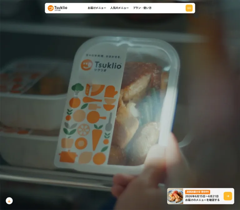
Tsuklio presents a prepared-meal subscription through the atmosphere of ordinary home life. The opening view is almost entirely photographic: a shared table on desktop and a person seated in a kitchen on mobile. A small white navigation capsule and a compact next-delivery card provide the visible interface. The captured hero leaves the central image free of a large marketing headline.
Below this opening, the homepage becomes a substantial service and editorial hub. Brand explanations lead into menus, service details, four subscription plans, usage examples, ordering steps, stories, company information, and news. Orange section backgrounds create large changes of rhythm; white pricing areas make portions and prices easy to compare. A green LINE signup panel appears near the end, followed by a substantial navigation footer.
The identity depends on three complementary image treatments: atmospheric domestic scenes, practical photographs of meal containers, and flat geometric food-and-kitchen illustrations. Keep their roles distinct. The first conveys everyday life, the second explains the product, and the third supplies a friendly graphic signature.
How to Read This Reference
- Measured means a value appears in the supplied rendered DOM, computed styles, or custom properties. Measurements are rounded where useful.
- Calculated means arithmetic based on those measurements, such as a gap between recorded card positions.
- Visual estimate means an approximate dimension or appearance read from a supplied screenshot; no pixel-sampling tool was used.
- Recommendation means a proposed implementation choice, including the Quick Start breakpoints, focus treatment, and hover displacement.
- Source variables retain their exported names. Other token names are descriptive implementation aliases.
- The screenshots establish visible appearance. A DOM rectangle alone does not establish visibility: the export includes navigation content absent from the captured closed-header state.
- Some screenshot and computed-style records disagree. Those differences are identified rather than silently reconciled.
Tokens — Colors
Core Palette
| Name | Value | Evidence / source token | Role |
|---|---|---|---|
| Service Orange | #f58220 |
Measured; --color-tsuklio-orange |
Menu and Story section backgrounds, delivery badges, policy links; visual reference for orange actions |
| Action Yellow | #ffb729 |
Declared; --color-tsuklio-yellow-01, visually consistent with controls |
Rounded hamburger tile and square arrow tiles |
| Leaf Green | #509146 |
Measured as rgb(80, 145, 70) |
Numerous English section labels and usage callouts in the DOM sample |
| LINE Green | #06c755 |
Measured / declared; --color-line-green |
LINE signup and social identity |
| Warm Surface | #f7f5f2 |
Measured as rgb(247, 245, 242) |
About, News, and closing-section surfaces; reversed text in orange sections |
| White | #ffffff |
Measured; --color-white |
Main canvas, header, footer, and shortcut cards |
| Text Black | #222222 |
Measured; --color-tsuklio-black |
Main Japanese text, navigation, plan prices |
| Muted Gray | #acabaa |
Measured legal-copy color | Small privacy explanations |
| Fine Rule | #ededed |
Declared; --c-border-line-01 |
Available divider token; application to the header border was not established |
| Soft Green | #e8eee5 |
Declared; --c-green-02 |
Supporting palette token; visible use not established by the supplied screenshots |
| Brown | #85775b |
Declared; --color-tsuklio-brown-01 |
Supporting palette token; visible use not established by the supplied screenshots |
The logo and decorative illustration contain their own orange, peach, green, and gray shapes. Do not assume every embedded orange is exactly the CSS Service Orange. The asset fills were not exported.
Palette Behavior and Evidence Conflicts
The pricing screenshot shows the English label Plan / Price in orange, while its sampled H2 reports Leaf Green. Its qualification and household notes look gray in the screenshot, while corresponding sampled paragraphs report Text Black. Preserve the screenshot appearance when reproducing that captured pricing view, but keep the conflicting computed values documented.
Several links have transparent computed backgrounds even though their captured appearance includes a colored button surface. The export does not identify the painting layer responsible. A wrapper or pseudo-element is possible, but neither was verified. The Quick Start uses direct background fills as an adaptation.
The hero is visibly darkened. Its exact overlay color, opacity, and relationship to the original media grading were not provided. An overlay opacity of 0.30 below is a starting recommendation, not a measurement.
Only the light presentation is evidenced. No theme selector or dark-mode behavior was inspected.
Tokens — Typography
Japanese Interface and Body Copy
Computed body stack: TazuganeGothicStdN-Medium, 'Tazugane Gothic StdN', 'Noto Sans JP', 'Helvetica Neue', Arial, 'Hiragino Sans', 'Hiragino Kaku Gothic ProN', 'BIZ UDPGothic', Meiryo, sans-serif.
Computed bold stack: the same fallback sequence, beginning with TazuganeGothicStdN-Bold. The exported --font-tgs-bold declares this stack.
The root and body use 16px, weight 500, and 25.6px line height at both inspected widths. Japanese display statements generally use the Bold face and weight 700. Their generous line height is important: much of the page feels calm because short phrases occupy clearly separated lines.
These are computed family declarations, not an independent audit of which font file supplied every glyph. Some sampled elements specify the Bold family with numeric weight 500; family selection and numeric weight must be recorded separately.
English Labels and Dates
Computed family: Figtree, sans-serif.
Small section labels such as Brand Concept, Service, and How to Use use weight 700. Larger orange-section headings such as Our Menu, Pick Up, and Story use weight 600. Story dates also use Figtree, at weight 700.
The header and footer wordmarks are graphic identities. Do not recreate their lettering by setting ordinary text in either body font.
Type Scale
All sizes below are measured unless marked as estimates. Values are font-size / line-height in CSS pixels.
| Role | Desktop | Mobile | Family / weight |
|---|---|---|---|
| Root body | 16 / 25.6 |
16 / 25.6 |
Japanese Medium, 500 |
| Visible desktop navigation | 14 / 22.4 |
Hidden in the captured header | Japanese Bold, 700 |
| Small English section label | 23.35 / 37.36 |
18 / 28.8 |
Figtree, 700 |
| Brand concept statement | 50.59 / 80.95 |
28 / 44.8 |
Japanese Bold, 700 |
| Brand concept body | 23.35 / 46.70 |
16 / 32 |
Japanese Medium, 500 |
| Service introduction statement | 38.92 / 58.38–62.27 |
26 / 41.6 |
Japanese Bold, 700 |
| Supporting service body | 19.46 / 35.03 |
14 / 25.2 |
Japanese Medium, 500 |
| Large English section heading | 48.65 / 58.38 |
44 / 52.8 |
Figtree, 600 |
| Pricing statement | 33.08 / 52.93 |
26 / 41.6 |
Japanese Bold, 700 |
| Per-meal headline | 27.24 / 43.59 |
22 / 35.2 |
Japanese Bold, 700 |
| Weekly price | 23.35 / 25.69 |
20 / 22 |
Japanese Bold, 700; 0.4px tracking |
| Price tax/shipping note | 14 / 14 |
12 / 12 |
Japanese Bold, 700; 0.4px tracking |
| Compact delivery badge | 12 / 19.2 |
12 / 19.2 |
Japanese Bold, 700 |
| Compact delivery date/action | 14 / 19.6 |
14 / 19.6 |
Japanese Bold, 700 |
| Standard text button | 14 / 22.4 |
14 / 22.4 |
Japanese Medium, 500 |
| Featured story title | 33.08 / 52.93 |
24 / 38.4 |
Japanese Bold, 700 |
| Other story titles | 19.46 / 31.14 |
18 / 28.8 |
Japanese Bold, 700 |
| Story date | 14 / 22.4 |
12 / 19.2 |
Figtree, 700 |
| Step title | 22 / 35.2 |
18 / 28.8 |
Japanese Medium, 500 |
| Privacy explanation | 12 / 19.2 |
12 / 19.2 |
Japanese Medium, 500 |
| Primary footer links | Approximately 18px |
Approximately 20px |
Bold appearance; screenshot estimates |
Most sampled text has normal tracking. Do not introduce widely spaced Japanese headings or tracked uppercase labels throughout the page.
Tokens — Spacing & Shapes
Source Scaling
The source uses a 1480 design-width divisor for many values. This is not evidence that 1480px is a responsive breakpoint.
For example, the exported spacing token is:
--s-more-24: max(calc(24 / 1480 * 100vw), 24px);
At both inspected widths, this resolves to the 24px minimum. Above the design width, it grows with the viewport.
Typography behaves differently. Desktop --text-more-24 is calc(24 / 1480 * 100vw), which evaluates to approximately 23.35px at 1440px. In the mobile export it becomes max(calc(24 / 1480 * 100vw), 1.5rem). Nevertheless, the mobile section labels actually measure 18px: components use additional role-specific styling.
Do not scale the whole desktop page by 390 / 1480. The mobile page contains deliberate changes in type, order, spacing, and overflow behavior.
Spacing Scale
| Use | Measured or calculated value | Notes |
|---|---|---|
| Header top clearance | Desktop 15px; mobile 10px |
Also visible in scrolled captures |
| Header inner padding | 0 12px 0 14px |
Measured; visible border adds to logo offset |
| Desktop header-link gap | Approximately 21px |
Calculated from link rectangles |
| Compact badge padding | 1.2px 7.2px |
Delivery teaser |
| Text-button padding | 10.5px 22.4px |
Produces approximately 43.39px height |
| Plan-grid gap | 20px |
Calculated from desktop plan positions |
| Secondary story-card gap | 30px |
Calculated from desktop columns |
| Desktop ordering-step gap | 80px |
320px cards, starting every 400px |
| Mobile ordering-step gap | 56px |
240px cards, starting every 296px |
| Mobile news-card gap | 16px |
234px cards, starting every 250px |
| Hero-to-concept clearance | Desktop 120px; mobile 50px |
Section start minus hero height |
| About Tsuklio section padding | Desktop 160px 0 100px; mobile 80px 0 60px |
Measured |
| Menu section padding | Desktop 100px 0; mobile 60px 0 |
Measured |
| Story section padding | Desktop 120px 0; mobile 70px 0 |
Measured |
Border Radius
| Element | Value | Evidence |
|---|---|---|
| Header capsule | 10px |
Measured at both widths |
| Compact delivery teaser | 10px |
Measured |
| Delivery status badge | 4px |
Measured |
| Standard text button | 10px |
Measured |
| Large weekly-menu card | 10px |
Measured |
| Menu section | Desktop 10px; mobile 6px |
Measured |
| Story section | Desktop 10px; mobile 8px |
Measured |
| Step strip | 2px |
Measured |
| Hero downward control | Circle, 36 × 36px |
Measured |
| Desktop pickup controls | Circles, 60 × 60px |
Measured |
| Plan photos and shortcut cards | Approximately 10px |
Screenshot estimate |
The rounded language is restrained. Most substantial rectangles have small corners, while circles are reserved for specific controls and graphic motifs.
Layout Measurements
| Element | Desktop 1440 × 1000 |
Mobile 390 × 844 |
|---|---|---|
| Document height | 12237.31px |
13959.69px |
| Hero | 1440 × 1000px |
390 × 844px |
| Header | 780 × 54px, at (330, 15) |
342 × 54px, at (24, 10) |
| Header logo link | 100.77 × 30.61px |
100 × 30.39px |
| Delivery teaser | 347.80 × 84px, at (1062.20, 886) |
342 × 84px, at (24, 740) |
| Teaser edge clearances | Right 30px, bottom 30px |
Left/right 24px, bottom 20px |
| Brand-concept container | 1320px, left 60px |
350px, left 20px |
| Concept columns | 554.53px 665.45px, gap 100px |
One 350px column |
| Desktop pricing width | 1240px, left 100px |
Household groups 342px, left 24px |
| Desktop pricing groups | Two 610px groups |
Groups stacked |
| Desktop plan photo | Approximately 295 × 198px |
Image bounds not exported |
| Featured story | 1240px; two 620px columns |
342px; block layout |
| Other story cards | Approximately 393.33px each |
342px each |
| Footer height | Approximately 458.61px |
Approximately 742.02px |
Footer heights are calculated from the end of the main element to the document end and agree with the broad proportions of the bottom captures. Screenshot coordinates inside scrolled images should not be treated as document coordinates.
Components
Floating Site Header
Role: persistent identity and access to the principal service destinations.
A centered white rectangle with a fine gray border, 10px corners, and 54px height. It remains at the same top inset in the hero, pricing, and footer screenshots. This supports reproducing it as a fixed header, although the export does not include its computed positioning property.
The anatomy is a logo link on the left, three desktop links around the center, and a yellow hamburger tile on the right. The observed labels are お届けメニュー, 人気のメニュー, and プラン・使い方. Links use 14px bold text, without individual button backgrounds.
The hamburger tile is approximately 36 × 36px with two short white horizontal strokes. On mobile, the three text links disappear while the logo, height, and control remain essentially unchanged. The capsule becomes 342px wide with 24px side margins.
Navigation Expansion — DOM Evidence Only
Additional navigation content appears before the main element in the export but is absent from the closed-header screenshots. Its desktop layout includes three large destination entries, a secondary two-column link area, a delivery card, signup content, and social links. Mobile destination entries measure 330 × 110.16px, followed by full-width secondary rows about 60.78px high.
This establishes available content and layout measurements, not a verified open-menu appearance. Opening behavior, backdrop, scroll locking, close animation, focus management, and keyboard operation were not tested. Do not render this entire export above the hero simply because it has measurable rectangles.
Full-Viewport Hero
Role: establish the service through an everyday dining scene.
The desktop frame shows a close view across a wooden table: bowls, rice, shared dishes, a hand using chopsticks, and softly blurred background details. The mobile frame shows a seated person from behind in a naturally lit kitchen. Both occupy the full viewport and carry a muted, darkened photographic treatment.
No large central title is visible. The page H1 exists as a 1 × 1px off-canvas element at (-1, -1). The subsequent Brand Concept section supplies the large visible brand statement.
On desktop, a small white circular downward control sits 30px from the left and bottom edges and links to #brand-message. The corresponding control is absent from the supplied mobile screenshot and mobile link list.
The two hero images could represent different media moments, different crops, or separately selected assets. Their relationship, media element type, autoplay, audio, and loop behavior were not supplied.
Next-Delivery Teaser
Role: make the next menu immediately accessible without dominating the hero.
The whole component is a link to the observed dated menu, /menu/20260921. Its compact horizontal anatomy is:
- A food photograph approximately
83pxwide, filling the card height and clipped at the left corners. - A text group with the orange badge
次回お届け分 受付中!above a date line and menu-action line. - A yellow rounded square containing a white right arrow, approximately
44 × 44px.
The card is 84px tall with a near-white background at approximately 95% opacity. The badge measures 130.05 × 21.56px, uses 12px bold type, and has 4px corners. The date and action use 14px / 19.6px bold type.
Its placement changes from the desktop lower-right corner to nearly full mobile width. It is not visible in the footer captures, so evidence does not support making this particular card permanently fixed throughout the page.
The exported mobile DOM also contains a green link to #before-footer-section. It is not visibly distinguishable in the supplied hero capture. Its reveal and visibility rules remain unverified; do not add it as a second always-visible hero action by default.
Brand Concept and Service Introductions
Role: explain the service after the immersive opening.
Brand Concept uses a two-column desktop grid with text in the wider right column. Its English label precedes the bold statement 日々の手料理、おまかせを。, followed by two spacious paragraphs. The concept paragraphs use an unusually open 2.0 line-height ratio.
On mobile the section becomes one column. The text starts at x = 46px within a broader 350px section beginning at x = 20px; this is an observed inset rather than a generic centered 24px gutter. Explicit line breaks change to shorter Japanese phrases.
About Tsuklio and Service continue the English-label/Japanese-statement hierarchy at smaller display sizes. In the exported DOM, many prominent Japanese statements are paragraphs following English H2 elements. A new implementation can improve heading semantics while preserving their appearance.
Menu Feature and Pick Up Rail
Role: connect appetite, variety, and the current delivery schedule.
The Menu section is a full-width orange block with subtly rounded outer corners. Desktop places a large warm-surface weekly-menu card on the left and explanatory copy on the right. The large card measures approximately 531.59 × 552.11px, with 20px top and side padding and 50px bottom padding.
On mobile, the explanatory copy comes first and the weekly-menu card follows at 342px width. Card padding becomes 10px 10px 30px. The section's internal vertical gap decreases from 120px to 50px.
Pick Up follows inside the same orange section. The export contains two copies of five dish entries and positions them along a horizontal track. Desktop item text boxes are approximately 316.80px wide with 30px gaps; mobile boxes are 296.39px wide with 20px gaps. At the recorded mobile position, the central item starts around x = 46.80px, with a neighboring entry partially inside the viewport.
Desktop circular controls measure 60px. This supports a carousel-like layout, but duplication and offscreen positions do not prove autoplay, dragging, looping behavior, or a particular carousel library.
Plan Comparison
Role: explain household size, weekly meal count, contents, and price together.
The pricing capture is deliberately open: a centered English label, a two-line Japanese heading, a per-meal starting price, and a qualification appear above four aligned meal photographs. There are no visible selected-plan states or separate purchase buttons on individual plan tiles.
Desktop uses two household groups. Each has a small right-aligned household explanation, a pale horizontal heading bar, an orange people pictogram projecting slightly above that bar, and two plan tiles below it. The two-person group appears on the left; the family group appears on the right.
Each plan tile contains a landscape photo of white meal containers on wood, orange and green content-count badges at the top-left, an orange plan name, and a dark weekly price with a smaller tax-and-shipping note. The photo is approximately 3:2. Tiles share the white page background rather than sitting inside elevated outer cards.
| Captured plan | Main / side dishes | Weekly price |
|---|---|---|
2人前×週3食プラン |
3 / 5 | 7,990円/週 |
2人前×週5食プラン |
5 / 6 | 11,990円/週 |
4人前×週3食プラン |
3 / 5 | 9,990円/週 |
4人前×週5食プラン |
5 / 6 | 15,960円/週 |
These are capture-date content values. They should not become immutable design tokens. The displayed 1食あたり798円〜 is qualified by the four-person, five-meal plan.
A single orange link, プランについて詳しく見る, appears below the comparison. It measures approximately 210.61 × 43.39px and links to /service/#plan.
Mobile changes both arrangement and reading order: the family three-meal and five-meal plans come first, followed by the two-person three-meal and five-meal plans. The four price rows occupy different vertical positions, confirming one plan after another rather than a compressed two-column phone grid.
How to Use Steps
Role: explain the LINE ordering process in three clear stages.
Each step has an orange strip containing a Figtree STEP label, an orange Japanese title, supporting text, and additional content below. The observed stages are 友だち追加, プラン選択, and 注文完了!.
Desktop step strips are 320px wide and aligned at x = 160, 560, and 960. Mobile strips are 240px wide at x = 30, 326, and 622, all at the same vertical position. Mobile therefore retains a horizontal sequence; it does not stack all three steps vertically.
The measured mobile geometry shows a partial next step. Horizontal overflow controls, swipe behavior, and snapping were not exercised. A new implementation should make every step reachable without causing the entire document to scroll sideways.
Story Feed
Role: maintain an editorial relationship with customers through dated meal stories.
The Story section uses an orange background with warm light text. A large English heading and Japanese introduction precede one featured story, then three smaller stories.
Desktop presents the feature in two equal 620px columns: image area on the left, title, summary, date, and category on the right. The right text starts 60px inside its half. The following three cards measure approximately 393.33px each, separated by 30px.
On mobile every story becomes a 342px block. The featured title decreases to 24px, while other titles use 18px. Dates remain compact and category labels retain 4px corners. Story cards stack vertically, unlike the horizontal mobile steps and news.
The feature includes a description, while the following cards expose title, date, and category. Preserve that hierarchy instead of giving all stories identical density.
About and News
Role: provide background information and operational updates below the service content.
Both sections use the measured warm background #f7f5f2. About includes an English label, Japanese title, explanatory text, a link, and a caption identifying a television commercial. Its playback interface was not inspected.
Desktop News separates the section label and index link from a list of three horizontal entries. Entries measure approximately 891.20 × 143.19px with 24px vertical gaps.
Mobile News changes to horizontal cards measuring 234 × 248.78px, positioned at x = 24, 274, and 524. The index link sits on the same header line as the section label. This is another case where stacking every mobile component would lose the observed layout.
Signup Panel and Shortcut Cards
Role: turn service understanding into a clear next action and provide alternative routes.
The desktop closing capture shows a large white signup panel on the left and a two-by-two set of white shortcut cards on the right, all on a warm background. The visible left panel is approximately 715px wide; the right tiles are approximately 248px wide with 15px gaps. The screenshot crops the upper portion of this section, so its complete desktop height is not established.
The signup panel contains graphic decoration, a service descriptor, a bold Japanese statement, explanatory copy, a bright LINE-green action, and a small privacy explanation. The visible green action is approximately 655 × 92px, with two lines of text and a light rounded icon tile at the right.
Shortcut cards represent Service, Plan/Price, Use Cases, and FAQ. Their anatomy is a small orange line icon and English label, a stronger Japanese title, a short explanation, and a yellow arrow tile aligned near the bottom-right. The fully visible lower tiles are approximately 270px tall.
The signup link points to the supplied LINE acquisition endpoint. The homepage text explains ordering through LINE; successful registration and the external ordering journey were not tested.
Site Footer
Role: provide a complete sitemap while ending with the brand's illustration system.
Desktop uses a white footer with generous margins. A large logo sits at the upper-left, primary site links begin around x = 720px, and smaller utility links begin around x = 1050px. A food-and-utensil illustration sits below the logo, with copyright beneath it. Social icons occupy the lower-right area.
The illustration combines carrots, a mushroom, fish, shrimp, vegetables, a pot, utensils, and leaves. Shapes are flat and geometric, with orange and peach providing the largest colored areas. The illustration is approximately 384 × 190px on desktop.
Mobile rearranges the footer rather than simply shrinking it. The logo sits above two link columns: larger primary navigation at the left and smaller utility/legal navigation at the right. Social icons appear beneath the utility links while the primary list continues alongside them. The illustration moves below both columns and spans approximately 326 × 161px within 32px side margins. Copyright sits below it toward the right.
Several utility links include a small external-link symbol. The footer exposes an operator link labeled 運営会社; its destination was recorded, but that destination page was not inspected. No production credits are asserted from the original-page evidence.
Tokens — Motion & Interaction
| Treatment | Supplied computed evidence | What is established |
|---|---|---|
| Navigation text | color 0.15s linear |
Color changes have a defined transition; target color and trigger were not exercised |
| Delivery cards and signup links | transform 0.35s with --easing-bounce01 |
A custom overshooting interpolation is defined; transform endpoints are unknown |
| Social links | opacity 0.2s linear |
Opacity transition exists; target opacity is unknown |
| Desktop downward control | background-color 0.3s linear |
Background transition exists; click result was not tested |
| Desktop pickup controls | 0.5s cubic-bezier(0.4, 0, 0.2, 1) |
A half-second control transition is declared; changed properties were not isolated |
| Mobile green in-page link | transform 0.5s, opacity 0.5s linear |
Transform and opacity can change; visibility trigger remains unknown |
| Hero media | Different photographic frames in the supplied captures | Playback, file type, duration, audio, and looping are unverified |
| Pickup track | Repeated entries and offscreen horizontal positions | A track structure is evidenced; autoplay and navigation behavior are unverified |
The exported bounce curve peaks at approximately 1.1241 around 56% of its duration before settling to 1. That is interpolation progress, not evidence that an element scales to 112.41%. Without the start and end transforms, physical displacement cannot be calculated.
Many sampled elements report animation: none. This does not rule out animation on ancestors, pseudo-elements, media, or JavaScript-controlled transforms.
The supplied capture process waited for finite animation and layout readiness, temporarily paused perpetual animations during checks, and resumed them afterward. It did not record a complete temporal sequence or exercise hover, menu opening, carousel controls, or video playback. Use short, restrained feedback in an adaptation; do not invent elaborate scroll choreography from static evidence.
Surfaces
| Layer | Appearance | Purpose |
|---|---|---|
| Hero | Darkened domestic photography | Emotional opening and context |
| Persistent header | White fill, fine border, small rounded corners | Maintain navigation legibility over changing content |
| Delivery teaser | Approximately 95% white surface | Keep a compact menu link legible over photography |
| Main service and pricing canvas | White | Clear explanations and comparison |
| Menu and Story sections | Solid orange, light text, subtly rounded section corners | Major visual changes of rhythm |
| About, News, closing section | Warm off-white | Softer supporting information area |
| Shortcut cards | Flat white rectangles | Group alternative destinations |
| Footer | White with large open areas | Sitemap and illustrated brand ending |
There is no prominent general card-shadow system in the supplied captures. Separation comes primarily from surface color, whitespace, image edges, typography, and modest corners. The hero's small downward control has a subtle visible shadow, but its CSS shadow value was not supplied.
Imagery
Domestic Photography
Use believable home environments, natural window light, warm wood, practical tableware, and people participating in a meal. The desktop hero includes a foreground hand and shallow focus; the phone hero gives more space to the room and the seated person. These compositions feel lived-in rather than staged as isolated product advertising.
The captured darkness is part of the opening's appearance. Preserve food texture and room detail when grading; a nearly black overlay would remove the service context.
Product Photography
Plan images explain quantity. White containers are arranged in visible rows on a wooden table, allowing viewers to compare the amount of food between plans. Keep the camera angle, background, scale, and lighting consistent across the comparison.
The teaser uses a tighter plated-food crop. It needs to remain recognizable at approximately 83px wide. Avoid replacing it with an intricate scene whose subject disappears at that size.
Graphic Illustration and Icons
The food illustration uses clean silhouettes, circles, wedges, rounded stems, and simple repeated forms. It is vector-like in appearance, although the asset format was not provided. It has no visible photographic texture, realistic shading, or dimensional rendering.
The people pictograms above the plan groups communicate household composition. Small utility icons use simple outlines. The smile logo is a separate branded asset and should retain its original proportions.
Observed Asset References
No image, illustration, font-file, or hero-media URLs were included in the supplied evidence. The following are visual asset references, not invented file paths.
| Asset reference | Evidence | Intended treatment |
|---|---|---|
| Horizontal Tsuklio logo | Header and footer screenshots | Preserve aspect ratio; use different display sizes |
| Domestic hero scene | Desktop and mobile hero screenshots | Full-viewport crop; responsive focal-point review required |
| Next-delivery food thumbnail | Both hero screenshots | Small crop filling the card height |
| Four plan photographs | Desktop pricing screenshot | Consistent approximately 3:2 landscape crops |
| Household pictograms | Desktop pricing screenshot | Orange silhouettes accompanying group labels |
| Food and kitchen illustration | Both footer screenshots and closing-section fragment | Scale proportionally without cropping the composition |
| LINE, Instagram, and X symbols | Footer screenshots and link evidence | Preserve recognizable service identities |
Use approved assets when available. Asset loading, font licensing, and media delivery are separate implementation tasks; the CSS scaffold does not provide those files.
Layout & Responsive Behavior
| Region | Desktop evidence | Mobile evidence |
|---|---|---|
| Header | Centered 780px capsule with three text links |
342px capsule; logo and hamburger only |
| Hero | Full viewport; delivery teaser lower-right | Full viewport; teaser spans width between 24px margins |
| Brand Concept | Two columns with 100px gap |
One column with shorter copy lines |
| Weekly-menu feature | Large card left, explanation right | Explanation before card |
| Pickup | Wide horizontal track with 60px controls |
Approximately 296px entries with partial neighbors |
| Plans | Two-person group left, family group right; four tiles across | Family group first; all four plans vertically sequential |
| Usage steps | Three 320px columns |
Horizontal 240px sequence with 56px gaps |
| Stories | Split feature followed by three columns | Single-column feed |
| News | Three horizontal rows | Horizontal 234px cards with 16px gaps |
| Footer | Brand/illustration left; two navigation areas right | Logo, two link columns, illustration, copyright |
Desktop margins vary by section: 60px, 100px, and 160px are all measured. Mobile also uses several real gutters: 20px, 24px, 30px, and 32px. A single universal container would flatten this deliberate variation.
The desktop and mobile exports also differ in custom-property definitions, but the exact media-query boundaries were not supplied. The 767px breakpoint used below is an implementation recommendation. Tablet layouts and widths between the two inspected endpoints remain unverified.
Keep horizontal rails locally scrollable. Their offscreen content is an intentional layout feature; it should not produce page-wide horizontal overflow. Similarly, desktop container formulas with large fixed minimum margins must be replaced on narrow screens rather than copied unchanged.
Do’s and Don’ts
Do
- Let domestic photography fill the opening viewport and keep the center visually quiet.
- Preserve the small floating header and compact dated menu teaser.
- Use white and warm off-white as distinct surfaces.
- Assign orange to service storytelling, yellow to compact directional controls, and LINE green to LINE actions.
- Pair strong Japanese statements with smaller Figtree section labels.
- Keep the open line spacing in the brand explanation.
- Show meal quantity through consistent container photography.
- Group plans by household size and retain the mobile family-first order.
- Preserve horizontal mobile steps and news alongside vertically stacked stories and plans.
- Give the geometric food illustration enough space to remain a recognizable composition.
- Treat dates, prices, menu names, and service claims as editable content.
- Record appearance conflicts and untested interaction states explicitly.
Don’t
- Do not replace the captured quiet hero with an invented oversized centered headline.
- Do not turn every homepage destination into a conversion button; this is also a menu and editorial hub.
- Do not collapse all orange, yellow, illustration, and LINE accents into one brand color.
- Do not give plan tiles heavy shadows, thick outer borders, or unobserved selected states.
- Do not shrink four pricing columns to fit a phone.
- Do not stack every mobile component; the steps and news retain horizontal layouts.
- Do not make the hero delivery card permanently fixed without additional evidence.
- Do not treat expanded-navigation DOM content as visible in the closed-header screenshot.
- Do not claim autoplay, smooth scrolling, hover endpoints, or menu animation from transition declarations alone.
- Do not fabricate asset paths, font downloads, or production attribution.
Recommended Implementation Additions
These are recommendations for a new implementation, not verified features of the original page.
- Give the hamburger, directional controls, and social links accessible names. Connect a working menu button to its panel with
aria-controlsand an accurate expanded state. - Preserve the visible
36pxhamburger tile while providing a larger effective touch target where practical. - Use a logical heading hierarchy for the Japanese content. English section labels can remain visual eyebrows rather than becoming the only meaningful headings.
- Make horizontal steps and news reachable by keyboard and touch. Keep focused items visible, and provide explicit controls if the interaction requires them.
- Keep meaningful price qualifications next to their prices and expose household size and dish counts as text, even when pictograms are present.
- Check contrast for small light text on orange or green, white arrow symbols on yellow, and muted privacy copy. The source palette is not an accessibility certification.
- Respect reduced-motion preferences. If moving hero media is implemented, provide an appropriate static alternative or pause behavior; CSS alone cannot stop video playback.
- Add safe-area clearance to controls near phone edges and account for the fixed header when navigating to page anchors.
- Provide descriptive alternatives for informative food imagery and empty alternatives for purely decorative illustration.
Agent Prompt Guide
Quick Color Reference
- Main canvas and footer:
#ffffff. - Supporting sections:
#f7f5f2. - Main text:
#222222. - Menu and Story section backgrounds:
#f58220. - Compact directional tiles:
#ffb729. - Secondary section-label color in DOM evidence:
#509146. - Pricing eyebrow in the supplied screenshot: orange; this differs from its sampled green value.
- LINE action:
#06c755. - Illustration: orange, peach, green, and gray; exact embedded fills unavailable.
Overall Prompt
“Create a Japanese prepared-meal subscription homepage inspired by the supplied Tsuklio reference. Open with full-viewport domestic dining photography, a small fixed white header with 10px corners, and an 84px-high next-delivery card near the bottom. Keep the image center free of large headline overlays. Follow with generous Japanese service explanations, Figtree English section labels, orange menu and story sections, white pricing comparisons, and warm off-white supporting information. Compare four plans using consistent photographs of white food containers on wood. Finish with a green LINE signup panel, white shortcut cards, and a large footer featuring flat geometric food illustrations. On mobile, prioritize family plans, stack stories and pricing, and preserve horizontal steps and news. Treat unspecified interactions as implementation decisions.”
Example Component Prompts
- Header: “Build a centered white navigation capsule, 780 × 54px on a 1440px desktop view, with a small logo left, three bold 14px Japanese links centrally, and a 36px yellow hamburger tile right. At 390px, use 24px side margins, retain the height, and hide the text navigation.”
- Delivery teaser: “Create an 84px-high near-white link card with a small food photo left, a 12px orange availability badge, two lines of 14px bold date/action text, and a yellow right-arrow tile. Place it 30px from the desktop hero's lower-right edges and 20px above the phone hero's bottom edge.”
- Pricing: “Use a white section with a centered heading and qualified starting price. Group four plans into two household categories, each with a pale heading bar and orange people pictogram. Use approximately 3:2 container-food photos, orange and green dish-count badges, orange names, and dark weekly prices. On phones, show family plans first in one vertical sequence.”
- Mobile steps: “Present three ordering steps as a local horizontal row of 240px cards separated by 56px. Use narrow orange STEP strips, orange Japanese titles, readable dark descriptions, and a partial next-card preview. Ensure all cards remain keyboard and touch reachable.”
- Footer: “Create a white footer with a large smile wordmark, strong primary links, smaller utility links, recognizable social icons, and an uncropped geometric arrangement of vegetables, fish, utensils, and a pot. On mobile, place the illustration below two navigation columns within 32px side margins.”
- Photography direction: “Photograph an ordinary family meal with natural window light, warm wooden furniture, practical bowls and plates, and relaxed human presence. Keep food recognizable and avoid exaggerated studio gloss. Produce separate wide and portrait compositions suitable for unobstructed interface areas.”
Quick Start
CSS Custom Properties
This is an implementation scaffold, not extracted source CSS. It preserves measured endpoint geometry where available. Responsive thresholds, font-size caps, hover displacement, the shortened bounce curve, and hero overlay opacity are recommendations. Supply approved images and fonts separately; the declared font stacks fall back normally when named faces are unavailable.
:root {
  /* Measured palette, with semantic implementation aliases. */
  --ts-white: #fff;
  --ts-warm: #f7f5f2;
  --ts-ink: #222;
  --ts-orange: #f58220;
  --ts-yellow: #ffb729;
  --ts-leaf: #509146;
  --ts-line: #06c755;
  --ts-muted-source: #acabaa;
  --ts-rule: #ededed;
  --ts-header-rule: #dedede; /* Visual approximation. */
  --ts-readable-muted: #666; /* Recommended alternative. */

  --ts-jp-fallback: 'Tazugane Gothic StdN', 'Noto Sans JP',
    'Helvetica Neue', Arial, 'Hiragino Sans',
    'Hiragino Kaku Gothic ProN', 'BIZ UDPGothic', Meiryo, sans-serif;
  --ts-font-jp: 'TazuganeGothicStdN-Medium', var(--ts-jp-fallback);
  --ts-font-bold: 'TazuganeGothicStdN-Bold', var(--ts-jp-fallback);
  --ts-font-en: Figtree, sans-serif;

  /* Desktop values follow the observed design-width proportions. */
  --ts-eyebrow: clamp(18px, calc(24 / 1480 * 100vw), 28px);
  --ts-display: clamp(28px, calc(52 / 1480 * 100vw), 64px);
  --ts-title: clamp(26px, calc(34 / 1480 * 100vw), 42px);
  --ts-band-title: clamp(44px, calc(50 / 1480 * 100vw), 60px);
  --ts-price: clamp(20px, calc(24 / 1480 * 100vw), 28px);
  --ts-gutter: max(100px, calc(100 / 1480 * 100vw));
  --ts-wide-gutter: max(60px, calc(60 / 1480 * 100vw));
  --ts-section-space: max(100px, calc(100 / 1480 * 100vw));
  --ts-radius: 10px;
  --ts-safe-top: env(safe-area-inset-top, 0px);
  --ts-safe-bottom: env(safe-area-inset-bottom, 0px);

  /* Reduced-point approximation of the exported interpolation. */
  --ts-bounce: linear(
    0, .4632 10%, .7599 20%, .9563 30%, 1.0701 40%,
    1.1187 50%, 1.1241 56%, 1.1179 60%, 1.0909 70%,
    1.058 80%, 1.0195 90%, 1
  );
}

.ts-site,
.ts-site *,
.ts-site *::before,
.ts-site *::after {
  box-sizing: border-box;
}

.ts-site {
  margin: 0;
  color: var(--ts-ink);
  background: var(--ts-white);
  font: 500 16px / 1.6 var(--ts-font-jp);
}

.ts-site img { display: block; max-width: 100%; }
.ts-site a { color: inherit; }
.ts-site button { font: inherit; cursor: pointer; }
.ts-site [id] { scroll-margin-top: 90px; }
.ts-container { margin-inline: var(--ts-gutter); }
.ts-wide { margin-inline: var(--ts-wide-gutter); }
.ts-section { padding-block: var(--ts-section-space); }

.ts-eyebrow {
  margin: 0 0 20px;
  color: var(--ts-leaf);
  font: 700 var(--ts-eyebrow) / 1.6 var(--ts-font-en);
}

.ts-title {
  margin: 0;
  font: 700 var(--ts-title) / 1.6 var(--ts-font-bold);
  text-wrap: balance;
}

.ts-band {
  border-radius: var(--ts-radius);
  color: var(--ts-warm);
  background: var(--ts-orange);
}

.ts-band-title {
  margin: 0;
  font: 600 var(--ts-band-title) / 1.2 var(--ts-font-en);
}

.ts-button {
  display: inline-flex;
  align-items: center;
  justify-content: center;
  min-height: 43.4px;
  padding: 10.5px 22.4px;
  border: 0;
  border-radius: var(--ts-radius);
  color: var(--ts-warm);
  background: var(--ts-orange);
  font-size: 14px;
  line-height: 1.6;
  text-decoration: none;
}

.ts-header {
  position: fixed;
  z-index: 50;
  top: max(15px, var(--ts-safe-top));
  left: 50%;
  transform: translateX(-50%);
  display: flex;
  align-items: center;
  width: min(780px, calc(100% - 48px));
  height: 54px;
  padding: 0 12px 0 14px;
  border: 1px solid var(--ts-header-rule);
  border-radius: var(--ts-radius);
  background: var(--ts-white);
}

.ts-header__logo { width: 100px; line-height: 0; }
.ts-header__logo img { width: 100%; height: auto; }

.ts-header__links {
  position: absolute;
  left: 50%;
  transform: translateX(-50%);
  display: flex;
  gap: 21px;
  white-space: nowrap;
}

.ts-header__links a {
  font: 700 14px / 1.6 var(--ts-font-bold);
  text-decoration: none;
  transition: color 150ms linear;
}

.ts-menu-toggle {
  position: relative;
  display: grid;
  place-content: center;
  gap: 5px;
  width: 36px;
  height: 36px;
  margin-left: auto;
  padding: 0;
  border: 0;
  border-radius: 10px;
  background: var(--ts-yellow);
}

/* Two decorative spans; name the button accessibly in markup. */
.ts-menu-toggle span { width: 20px; height: 1px; background: #fff; }
.ts-menu-toggle::before { content: ''; position: absolute; inset: -4px; }

.ts-hero {
  position: relative;
  isolation: isolate;
  height: 100vh;
  height: 100svh;
  overflow: hidden;
}

.ts-hero__media {
  position: absolute;
  inset: 0;
  z-index: -2;
  width: 100%;
  height: 100%;
  object-fit: cover;
  object-position: var(--hero-focus, 50% 50%);
}

.ts-hero::before {
  content: '';
  position: absolute;
  inset: 0;
  z-index: -1;
  background: rgb(0 0 0 / .30); /* Tune to approved media. */
}

.ts-delivery {
  position: absolute;
  right: 30px;
  bottom: max(30px, var(--ts-safe-bottom));
  display: flex;
  align-items: center;
  width: min(347.8px, calc(100% - 48px));
  min-height: 84px;
  padding-right: 10px;
  overflow: hidden;
  border-radius: 10px;
  color: var(--ts-ink);
  background: rgb(255 255 255 / .95);
  text-decoration: none;
  transition: transform 350ms ease-out;
  transition-timing-function: var(--ts-bounce);
}

.ts-delivery__photo {
  flex: 0 0 83px;
  width: 83px;
  height: 84px;
  margin-right: 10px;
  object-fit: cover;
}

.ts-delivery__copy { min-width: 0; }
.ts-delivery__badge {
  display: table;
  margin-bottom: 3px;
  padding: 1.2px 7.2px;
  border-radius: 4px;
  color: var(--ts-warm);
  background: var(--ts-orange);
  font: 700 12px / 1.6 var(--ts-font-bold);
}

.ts-delivery__text {
  margin: 0;
  font: 700 14px / 1.4 var(--ts-font-bold);
}

.ts-arrow-tile {
  flex: 0 0 44px;
  display: grid;
  place-items: center;
  width: 44px;
  height: 44px;
  margin-left: auto;
  border-radius: 11px;
  color: #fff;
  background: var(--ts-yellow);
}

.ts-concept {
  display: grid;
  grid-template-columns: 1fr 1.2fr;
  gap: 40px 100px;
  margin-top: 120px;
}

.ts-concept__title {
  font: 700 var(--ts-display) / 1.6 var(--ts-font-bold);
}
.ts-concept__body { font-size: var(--ts-eyebrow); line-height: 2; }

.ts-plans__heading { margin-bottom: 50px; text-align: center; }
.ts-plans__heading .ts-eyebrow { color: var(--ts-orange); }
.ts-plans__groups { display: grid; grid-template-columns: 1fr 1fr; gap: 20px; }
.ts-plan-group--duo { order: 1; }
.ts-plan-group--family { order: 2; }
.ts-plan-group__note { margin: 0; font-size: 12px; text-align: right; }

.ts-plan-group__bar {
  position: relative;
  display: flex;
  align-items: center;
  justify-content: center;
  min-height: 38px;
  margin: 6px 0 20px;
  background: var(--ts-warm);
  font: 700 18px / 1.4 var(--ts-font-bold);
}

.ts-plan-group__icon { position: absolute; left: 10px; bottom: 8px; height: 38px; }
.ts-plan-group__cards { display: grid; grid-template-columns: 1fr 1fr; gap: 20px; }
.ts-plan-card { min-width: 0; text-align: center; }
.ts-plan-card__media { position: relative; overflow: hidden; border-radius: 10px; }
.ts-plan-card__photo { width: 100%; aspect-ratio: 3 / 2; object-fit: cover; }
.ts-plan-card__badges { position: absolute; top: 10px; left: 10px; display: flex; gap: 4px; }

.ts-count {
  display: grid;
  place-content: center;
  width: 46px;
  height: 46px;
  border-radius: 6px;
  color: #fff;
  background: var(--ts-orange);
  font: 700 14px / 1.25 var(--ts-font-bold);
}
.ts-count--side { background: var(--ts-leaf); }

.ts-plan-card__name {
  margin: 10px 0 5px;
  color: var(--ts-orange);
  font: 700 24px / 1.4 var(--ts-font-bold);
}
.ts-plan-card__price {
  margin: 0;
  font: 700 var(--ts-price) / 1.1 var(--ts-font-bold);
  letter-spacing: .4px;
}
.ts-plan-card__price small { margin-left: 8px; font-size: 14px; }
.ts-plans__action { margin-top: 50px; text-align: center; }

.ts-story-feature { display: grid; grid-template-columns: 1fr 1fr; }
.ts-story-feature__copy { align-self: center; padding-left: 60px; }
.ts-story-grid { display: grid; grid-template-columns: repeat(3, minmax(0, 1fr)); gap: 30px; margin-top: 60px; }
.ts-story-grid a, .ts-story-feature { text-decoration: none; }

.ts-steps { display: grid; grid-template-columns: repeat(3, minmax(0, 1fr)); gap: 80px; }
.ts-step__label { padding: 6px 20px; border-radius: 2px; color: #fff; background: var(--ts-orange); font-family: var(--ts-font-en); }
.ts-news-list { display: grid; gap: 24px; }

.ts-closing { padding-block: 80px; background: var(--ts-warm); }
.ts-closing__grid { display: grid; grid-template-columns: 1.4fr 1fr; gap: 15px; }
.ts-signup, .ts-shortcut { padding: 30px; border-radius: 10px; background: #fff; }
.ts-shortcuts { display: grid; grid-template-columns: 1fr 1fr; gap: 15px; }
.ts-shortcut { display: flex; flex-direction: column; min-height: 270px; text-decoration: none; }
.ts-shortcut .ts-arrow-tile { margin-top: auto; }
.ts-line-action { display: flex; align-items: center; gap: 20px; padding: 20px 30px; border-radius: 10px; color: #fff; background: var(--ts-line); text-decoration: none; }
.ts-legal { color: var(--ts-readable-muted); font-size: 12px; line-height: 1.6; }
.ts-legal a { color: var(--ts-orange); text-decoration: underline; }

.ts-footer { padding: 60px var(--ts-wide-gutter) 30px; background: #fff; }
.ts-footer__grid {
  display: grid;
  grid-template-columns: 2fr 1fr 1fr;
  grid-template-areas: 'brand primary utility';
}
.ts-footer__brand { grid-area: brand; }
.ts-footer__primary { grid-area: primary; }
.ts-footer__utility { grid-area: utility; }
.ts-footer__logo { width: 240px; }
.ts-footer__art { width: 384px; height: auto; margin-top: 70px; }
.ts-footer__copyright { margin-top: 12px; font-size: 12px; }
.ts-footer__primary a { display: block; margin-bottom: 18px; font: 700 18px / 1.4 var(--ts-font-bold); text-decoration: none; }
.ts-footer__utility a { font-size: 14px; text-decoration: none; }

/* Interaction endpoints below are recommendations. */
@media (hover: hover) {
  .ts-header__links a:hover { color: var(--ts-leaf); }
  .ts-delivery:hover { transform: translateY(-2px); }
}
.ts-site :focus-visible { outline: 3px solid var(--ts-ink); outline-offset: 4px; }

/* Recommended breakpoint; the original boundary was not exported. */
@media (max-width: 767px) {
  :root {
    --ts-gutter: 24px;
    --ts-wide-gutter: 32px;
    --ts-section-space: 60px;
    --ts-eyebrow: 18px;
    --ts-display: 28px;
    --ts-title: 26px;
    --ts-band-title: 44px;
    --ts-price: 20px;
  }
  .ts-header { top: max(10px, var(--ts-safe-top)); }
  .ts-header__links { display: none; }
  .ts-delivery { right: 24px; bottom: max(20px, var(--ts-safe-bottom)); }
  .ts-concept { grid-template-columns: 1fr; gap: 40px; margin: 50px 20px 0; }
  .ts-concept__copy { padding-left: 26px; }
  .ts-concept__body { font-size: 16px; }
  .ts-plans__groups, .ts-plan-group__cards { grid-template-columns: 1fr; }
  .ts-plans__groups { gap: 60px; }
  .ts-plan-group__cards { gap: 40px; }
  .ts-plan-group--family { order: 1; }
  .ts-plan-group--duo { order: 2; }
  .ts-plan-card__name { font-size: 20px; }
  .ts-plan-card__price small { font-size: 12px; }
  .ts-story-feature, .ts-story-grid { display: block; }
  .ts-story-feature__copy { padding: 24px 0 0; }
  .ts-story-grid > * { display: block; margin-top: 50px; }
  .ts-steps, .ts-news-list {
    grid-template-columns: none;
    grid-auto-flow: column;
    overflow-x: auto;
    overscroll-behavior-x: contain;
    scroll-snap-type: x proximity;
  }
  .ts-steps { grid-auto-columns: 240px; gap: 56px; padding-inline: 30px; scroll-padding-inline: 30px; }
  .ts-news-list { grid-auto-columns: 234px; gap: 16px; padding-inline: 24px; scroll-padding-inline: 24px; }
  .ts-steps > *, .ts-news-list > * { scroll-snap-align: start; }
  .ts-closing__grid { grid-template-columns: 1fr; }
  .ts-signup { padding: 30px; }
  .ts-shortcut { min-height: 220px; padding: 20px; }
  .ts-line-action { padding: 15px; }
  .ts-footer__grid { grid-template-columns: 1fr 1fr; gap: 30px 16px; grid-template-areas: 'logo logo' 'primary utility' 'art art' 'copy copy'; }
  .ts-footer__brand { display: contents; }
  .ts-footer__logo { grid-area: logo; width: 184px; }
  .ts-footer__art { grid-area: art; width: 100%; margin-top: 40px; }
  .ts-footer__copyright { grid-area: copy; margin: 0; text-align: right; }
  .ts-footer__primary a { font-size: 20px; }
  .ts-footer__utility a { font-size: 12px; overflow-wrap: anywhere; }
}

@media (max-width: 359px) {
  .ts-delivery__photo { flex-basis: 60px; width: 60px; }
  .ts-delivery__text { font-size: 12px; }
  .ts-delivery__badge { font-size: 10px; }
  .ts-delivery .ts-arrow-tile { flex-basis: 36px; width: 36px; height: 36px; }
}

@media (prefers-reduced-motion: reduce) {
  .ts-site *, .ts-site *::before, .ts-site *::after {
    animation: none !important;
    transition: none !important;
    scroll-behavior: auto !important;
  }
  .ts-delivery:hover { transform: none; }
}
Component Markup Contract
- Apply
ts-siteto the body or a page wrapper. Placets-headeralongside the main content, with a home link,ts-header__linksnavigation, and a real menu button. - Place
ts-hero__mediaand thets-deliveryanchor insidets-hero. Inside the anchor, use a thumbnail, a copy wrapper containing the status badge and date/action text, and one decorative arrow tile. Avoid nested interactive elements. - Inside
ts-plans__groups, author the family group first in the DOM and the two-person group second. The desktop order rules reproduce the observed visual arrangement. Review keyboard order if adding interactive plan controls. - Each plan group contains a note, heading bar, and
ts-plan-group__cards. Each plan card contains its media wrapper and badges, name, and price. The supplied evidence supports informational tiles with a separate plan-details link. - Use an ordered list for steps and lists of links for stories and news. Reset list styling as appropriate in the host project.
- The footer brand wrapper contains its logo, illustration, and copyright. The mobile grid places those children around the two navigation columns. Keep social links inside the utility region for the observed mobile grouping.
Menu state, carousel controls, external signup behavior, and media playback require separate implementation and testing. The suggested narrow-screen shortcut arrangement is an adaptation because a complete mobile closing-section screenshot was not supplied.
Tailwind v4 Token Mapping
Optional aliases for a project already using Tailwind v4. This does not establish the original site's framework or build configuration. Define the custom properties above first.
@theme inline {
  --color-ts-white: var(--ts-white);
  --color-ts-warm: var(--ts-warm);
  --color-ts-ink: var(--ts-ink);
  --color-ts-orange: var(--ts-orange);
  --color-ts-yellow: var(--ts-yellow);
  --color-ts-leaf: var(--ts-leaf);
  --color-ts-line: var(--ts-line);
  --font-ts-jp: var(--ts-font-jp);
  --font-ts-bold: var(--ts-font-bold);
  --font-ts-en: var(--ts-font-en);
  --text-ts-eyebrow: var(--ts-eyebrow);
  --text-ts-display: var(--ts-display);
  --text-ts-title: var(--ts-title);
  --text-ts-price: var(--ts-price);
  --radius-ts-card: var(--ts-radius);
  --spacing-ts-gutter: var(--ts-gutter);
  --spacing-ts-section: var(--ts-section-space);
}
Sources & Evidence
- Tsuklio current homepage: original and final URL are identical; supplied HTTP status
200. This homepage is the authority for the design findings. - Supplied retrieval record: September 12, 2026,
07:48:35.404 UTC/16:48:35.404 JST. Individual screenshot timestamps were not separately provided. - Desktop evidence at
1440 × 1000: Image 1, hero; Image 2, pricing; Image 3, closing-section fragment and footer. Rendered document height approximately12237.31px. - Mobile evidence at
390 × 844: Image 4, hero; Image 5, footer. Rendered document height approximately13959.69px. - Supplied rendered DOM and computed styles: element bounds, font stacks, type sizes, colors, padding, gaps, radii, layout modes, custom properties, transition declarations, and link destinations at both widths.
- Homepage destinations referenced in this document include the captured delivery week, plan details, and usage examples. Their links were observed on the homepage; their destination designs were not inspected.
- Capture limitations: the supplied process waited for document, layout, animation, and image readiness within bounded time limits. SharedWorkers and service workers were disabled. These checks do not establish semantic completeness or verify delayed content and unexercised interactions.
- No additional browsing, file inspection, or command execution was performed for this reference. No hover states, expanded menu, carousel operation, signup completion, or media playback were independently tested. Asset URLs, exact responsive breakpoints, and hero-media timing were unavailable.
This document describes the current supplied homepage evidence. Visual estimates, screenshot/computed-style conflicts, and recommended implementation choices are marked explicitly.
# Tsuklio — Style Reference

> An everyday family table, framed by warm orange, compact rounded controls, and cheerful food illustrations.

**Website:** [www.tsuklio.com](https://www.tsuklio.com/)
**Original URL:** https://www.tsuklio.com/
**Final URL:** https://www.tsuklio.com/
**Theme:** light; white and warm off-white surfaces with orange, yellow, and green accents
**Inspected:** September 12, 2026; supplied retrieval timestamp `2026-09-12T07:48:35.404Z`, equivalent to 16:48:35.404 JST
**Viewports:** desktop `1440 × 1000` CSS pixels; mobile `390 × 844` CSS pixels
**Scope:** the current service homepage. Five supplied screenshots show the desktop hero, desktop pricing, desktop closing section and footer, mobile hero, and mobile footer. Rendered DOM measurements additionally cover the concept, service, menu, usage, story, and news sections. Linked destination pages and expanded interaction states were not independently inspected.

Tsuklio presents a prepared-meal subscription through the atmosphere of ordinary home life. The opening view is almost entirely photographic: a shared table on desktop and a person seated in a kitchen on mobile. A small white navigation capsule and a compact next-delivery card provide the visible interface. The captured hero leaves the central image free of a large marketing headline.

Below this opening, the homepage becomes a substantial service and editorial hub. Brand explanations lead into menus, service details, four subscription plans, usage examples, ordering steps, stories, company information, and news. Orange section backgrounds create large changes of rhythm; white pricing areas make portions and prices easy to compare. A green LINE signup panel appears near the end, followed by a substantial navigation footer.

The identity depends on three complementary image treatments: atmospheric domestic scenes, practical photographs of meal containers, and flat geometric food-and-kitchen illustrations. Keep their roles distinct. The first conveys everyday life, the second explains the product, and the third supplies a friendly graphic signature.

## How to Read This Reference

- **Measured** means a value appears in the supplied rendered DOM, computed styles, or custom properties. Measurements are rounded where useful.
- **Calculated** means arithmetic based on those measurements, such as a gap between recorded card positions.
- **Visual estimate** means an approximate dimension or appearance read from a supplied screenshot; no pixel-sampling tool was used.
- **Recommendation** means a proposed implementation choice, including the Quick Start breakpoints, focus treatment, and hover displacement.
- **Source variables** retain their exported names. Other token names are descriptive implementation aliases.
- The screenshots establish visible appearance. A DOM rectangle alone does not establish visibility: the export includes navigation content absent from the captured closed-header state.
- Some screenshot and computed-style records disagree. Those differences are identified rather than silently reconciled.

## Tokens — Colors

### Core Palette

| Name | Value | Evidence / source token | Role |
| --- | --- | --- | --- |
| Service Orange | `#f58220` | Measured; `--color-tsuklio-orange` | Menu and Story section backgrounds, delivery badges, policy links; visual reference for orange actions |
| Action Yellow | `#ffb729` | Declared; `--color-tsuklio-yellow-01`, visually consistent with controls | Rounded hamburger tile and square arrow tiles |
| Leaf Green | `#509146` | Measured as `rgb(80, 145, 70)` | Numerous English section labels and usage callouts in the DOM sample |
| LINE Green | `#06c755` | Measured / declared; `--color-line-green` | LINE signup and social identity |
| Warm Surface | `#f7f5f2` | Measured as `rgb(247, 245, 242)` | About, News, and closing-section surfaces; reversed text in orange sections |
| White | `#ffffff` | Measured; `--color-white` | Main canvas, header, footer, and shortcut cards |
| Text Black | `#222222` | Measured; `--color-tsuklio-black` | Main Japanese text, navigation, plan prices |
| Muted Gray | `#acabaa` | Measured legal-copy color | Small privacy explanations |
| Fine Rule | `#ededed` | Declared; `--c-border-line-01` | Available divider token; application to the header border was not established |
| Soft Green | `#e8eee5` | Declared; `--c-green-02` | Supporting palette token; visible use not established by the supplied screenshots |
| Brown | `#85775b` | Declared; `--color-tsuklio-brown-01` | Supporting palette token; visible use not established by the supplied screenshots |

The logo and decorative illustration contain their own orange, peach, green, and gray shapes. Do not assume every embedded orange is exactly the CSS Service Orange. The asset fills were not exported.

### Palette Behavior and Evidence Conflicts

The pricing screenshot shows the English label `Plan / Price` in orange, while its sampled H2 reports Leaf Green. Its qualification and household notes look gray in the screenshot, while corresponding sampled paragraphs report Text Black. Preserve the screenshot appearance when reproducing that captured pricing view, but keep the conflicting computed values documented.

Several links have transparent computed backgrounds even though their captured appearance includes a colored button surface. The export does not identify the painting layer responsible. A wrapper or pseudo-element is possible, but neither was verified. The Quick Start uses direct background fills as an adaptation.

The hero is visibly darkened. Its exact overlay color, opacity, and relationship to the original media grading were not provided. An overlay opacity of `0.30` below is a starting recommendation, not a measurement.

Only the light presentation is evidenced. No theme selector or dark-mode behavior was inspected.

## Tokens — Typography

### Japanese Interface and Body Copy

**Computed body stack:** `TazuganeGothicStdN-Medium, 'Tazugane Gothic StdN', 'Noto Sans JP', 'Helvetica Neue', Arial, 'Hiragino Sans', 'Hiragino Kaku Gothic ProN', 'BIZ UDPGothic', Meiryo, sans-serif`.

**Computed bold stack:** the same fallback sequence, beginning with `TazuganeGothicStdN-Bold`. The exported `--font-tgs-bold` declares this stack.

The root and body use `16px`, weight `500`, and `25.6px` line height at both inspected widths. Japanese display statements generally use the Bold face and weight `700`. Their generous line height is important: much of the page feels calm because short phrases occupy clearly separated lines.

These are computed family declarations, not an independent audit of which font file supplied every glyph. Some sampled elements specify the Bold family with numeric weight `500`; family selection and numeric weight must be recorded separately.

### English Labels and Dates

**Computed family:** `Figtree, sans-serif`.

Small section labels such as `Brand Concept`, `Service`, and `How to Use` use weight `700`. Larger orange-section headings such as `Our Menu`, `Pick Up`, and `Story` use weight `600`. Story dates also use Figtree, at weight `700`.

The header and footer wordmarks are graphic identities. Do not recreate their lettering by setting ordinary text in either body font.

### Type Scale

All sizes below are measured unless marked as estimates. Values are `font-size / line-height` in CSS pixels.

| Role | Desktop | Mobile | Family / weight |
| --- | --- | --- | --- |
| Root body | `16 / 25.6` | `16 / 25.6` | Japanese Medium, `500` |
| Visible desktop navigation | `14 / 22.4` | Hidden in the captured header | Japanese Bold, `700` |
| Small English section label | `23.35 / 37.36` | `18 / 28.8` | Figtree, `700` |
| Brand concept statement | `50.59 / 80.95` | `28 / 44.8` | Japanese Bold, `700` |
| Brand concept body | `23.35 / 46.70` | `16 / 32` | Japanese Medium, `500` |
| Service introduction statement | `38.92 / 58.38–62.27` | `26 / 41.6` | Japanese Bold, `700` |
| Supporting service body | `19.46 / 35.03` | `14 / 25.2` | Japanese Medium, `500` |
| Large English section heading | `48.65 / 58.38` | `44 / 52.8` | Figtree, `600` |
| Pricing statement | `33.08 / 52.93` | `26 / 41.6` | Japanese Bold, `700` |
| Per-meal headline | `27.24 / 43.59` | `22 / 35.2` | Japanese Bold, `700` |
| Weekly price | `23.35 / 25.69` | `20 / 22` | Japanese Bold, `700`; `0.4px` tracking |
| Price tax/shipping note | `14 / 14` | `12 / 12` | Japanese Bold, `700`; `0.4px` tracking |
| Compact delivery badge | `12 / 19.2` | `12 / 19.2` | Japanese Bold, `700` |
| Compact delivery date/action | `14 / 19.6` | `14 / 19.6` | Japanese Bold, `700` |
| Standard text button | `14 / 22.4` | `14 / 22.4` | Japanese Medium, `500` |
| Featured story title | `33.08 / 52.93` | `24 / 38.4` | Japanese Bold, `700` |
| Other story titles | `19.46 / 31.14` | `18 / 28.8` | Japanese Bold, `700` |
| Story date | `14 / 22.4` | `12 / 19.2` | Figtree, `700` |
| Step title | `22 / 35.2` | `18 / 28.8` | Japanese Medium, `500` |
| Privacy explanation | `12 / 19.2` | `12 / 19.2` | Japanese Medium, `500` |
| Primary footer links | Approximately `18px` | Approximately `20px` | Bold appearance; screenshot estimates |

Most sampled text has normal tracking. Do not introduce widely spaced Japanese headings or tracked uppercase labels throughout the page.

## Tokens — Spacing & Shapes

### Source Scaling

The source uses a `1480` design-width divisor for many values. This is not evidence that `1480px` is a responsive breakpoint.

For example, the exported spacing token is:

```css
--s-more-24: max(calc(24 / 1480 * 100vw), 24px);
```

At both inspected widths, this resolves to the `24px` minimum. Above the design width, it grows with the viewport.

Typography behaves differently. Desktop `--text-more-24` is `calc(24 / 1480 * 100vw)`, which evaluates to approximately `23.35px` at 1440px. In the mobile export it becomes `max(calc(24 / 1480 * 100vw), 1.5rem)`. Nevertheless, the mobile section labels actually measure `18px`: components use additional role-specific styling.

Do not scale the whole desktop page by `390 / 1480`. The mobile page contains deliberate changes in type, order, spacing, and overflow behavior.

### Spacing Scale

| Use | Measured or calculated value | Notes |
| --- | --- | --- |
| Header top clearance | Desktop `15px`; mobile `10px` | Also visible in scrolled captures |
| Header inner padding | `0 12px 0 14px` | Measured; visible border adds to logo offset |
| Desktop header-link gap | Approximately `21px` | Calculated from link rectangles |
| Compact badge padding | `1.2px 7.2px` | Delivery teaser |
| Text-button padding | `10.5px 22.4px` | Produces approximately `43.39px` height |
| Plan-grid gap | `20px` | Calculated from desktop plan positions |
| Secondary story-card gap | `30px` | Calculated from desktop columns |
| Desktop ordering-step gap | `80px` | `320px` cards, starting every `400px` |
| Mobile ordering-step gap | `56px` | `240px` cards, starting every `296px` |
| Mobile news-card gap | `16px` | `234px` cards, starting every `250px` |
| Hero-to-concept clearance | Desktop `120px`; mobile `50px` | Section start minus hero height |
| About Tsuklio section padding | Desktop `160px 0 100px`; mobile `80px 0 60px` | Measured |
| Menu section padding | Desktop `100px 0`; mobile `60px 0` | Measured |
| Story section padding | Desktop `120px 0`; mobile `70px 0` | Measured |

### Border Radius

| Element | Value | Evidence |
| --- | --- | --- |
| Header capsule | `10px` | Measured at both widths |
| Compact delivery teaser | `10px` | Measured |
| Delivery status badge | `4px` | Measured |
| Standard text button | `10px` | Measured |
| Large weekly-menu card | `10px` | Measured |
| Menu section | Desktop `10px`; mobile `6px` | Measured |
| Story section | Desktop `10px`; mobile `8px` | Measured |
| Step strip | `2px` | Measured |
| Hero downward control | Circle, `36 × 36px` | Measured |
| Desktop pickup controls | Circles, `60 × 60px` | Measured |
| Plan photos and shortcut cards | Approximately `10px` | Screenshot estimate |

The rounded language is restrained. Most substantial rectangles have small corners, while circles are reserved for specific controls and graphic motifs.

### Layout Measurements

| Element | Desktop `1440 × 1000` | Mobile `390 × 844` |
| --- | --- | --- |
| Document height | `12237.31px` | `13959.69px` |
| Hero | `1440 × 1000px` | `390 × 844px` |
| Header | `780 × 54px`, at `(330, 15)` | `342 × 54px`, at `(24, 10)` |
| Header logo link | `100.77 × 30.61px` | `100 × 30.39px` |
| Delivery teaser | `347.80 × 84px`, at `(1062.20, 886)` | `342 × 84px`, at `(24, 740)` |
| Teaser edge clearances | Right `30px`, bottom `30px` | Left/right `24px`, bottom `20px` |
| Brand-concept container | `1320px`, left `60px` | `350px`, left `20px` |
| Concept columns | `554.53px 665.45px`, gap `100px` | One `350px` column |
| Desktop pricing width | `1240px`, left `100px` | Household groups `342px`, left `24px` |
| Desktop pricing groups | Two `610px` groups | Groups stacked |
| Desktop plan photo | Approximately `295 × 198px` | Image bounds not exported |
| Featured story | `1240px`; two `620px` columns | `342px`; block layout |
| Other story cards | Approximately `393.33px` each | `342px` each |
| Footer height | Approximately `458.61px` | Approximately `742.02px` |

Footer heights are calculated from the end of the main element to the document end and agree with the broad proportions of the bottom captures. Screenshot coordinates inside scrolled images should not be treated as document coordinates.

## Components

### Floating Site Header

**Role:** persistent identity and access to the principal service destinations.

A centered white rectangle with a fine gray border, `10px` corners, and `54px` height. It remains at the same top inset in the hero, pricing, and footer screenshots. This supports reproducing it as a fixed header, although the export does not include its computed positioning property.

The anatomy is a logo link on the left, three desktop links around the center, and a yellow hamburger tile on the right. The observed labels are `お届けメニュー`, `人気のメニュー`, and `プラン・使い方`. Links use `14px` bold text, without individual button backgrounds.

The hamburger tile is approximately `36 × 36px` with two short white horizontal strokes. On mobile, the three text links disappear while the logo, height, and control remain essentially unchanged. The capsule becomes `342px` wide with `24px` side margins.

### Navigation Expansion — DOM Evidence Only

Additional navigation content appears before the main element in the export but is absent from the closed-header screenshots. Its desktop layout includes three large destination entries, a secondary two-column link area, a delivery card, signup content, and social links. Mobile destination entries measure `330 × 110.16px`, followed by full-width secondary rows about `60.78px` high.

This establishes available content and layout measurements, not a verified open-menu appearance. Opening behavior, backdrop, scroll locking, close animation, focus management, and keyboard operation were not tested. Do not render this entire export above the hero simply because it has measurable rectangles.

### Full-Viewport Hero

**Role:** establish the service through an everyday dining scene.

The desktop frame shows a close view across a wooden table: bowls, rice, shared dishes, a hand using chopsticks, and softly blurred background details. The mobile frame shows a seated person from behind in a naturally lit kitchen. Both occupy the full viewport and carry a muted, darkened photographic treatment.

No large central title is visible. The page H1 exists as a `1 × 1px` off-canvas element at `(-1, -1)`. The subsequent Brand Concept section supplies the large visible brand statement.

On desktop, a small white circular downward control sits `30px` from the left and bottom edges and links to `#brand-message`. The corresponding control is absent from the supplied mobile screenshot and mobile link list.

The two hero images could represent different media moments, different crops, or separately selected assets. Their relationship, media element type, autoplay, audio, and loop behavior were not supplied.

### Next-Delivery Teaser

**Role:** make the next menu immediately accessible without dominating the hero.

The whole component is a link to the observed dated menu, `/menu/20260921`. Its compact horizontal anatomy is:

1. A food photograph approximately `83px` wide, filling the card height and clipped at the left corners.
2. A text group with the orange badge `次回お届け分 受付中!` above a date line and menu-action line.
3. A yellow rounded square containing a white right arrow, approximately `44 × 44px`.

The card is `84px` tall with a near-white background at approximately `95%` opacity. The badge measures `130.05 × 21.56px`, uses `12px` bold type, and has `4px` corners. The date and action use `14px / 19.6px` bold type.

Its placement changes from the desktop lower-right corner to nearly full mobile width. It is not visible in the footer captures, so evidence does not support making this particular card permanently fixed throughout the page.

The exported mobile DOM also contains a green link to `#before-footer-section`. It is not visibly distinguishable in the supplied hero capture. Its reveal and visibility rules remain unverified; do not add it as a second always-visible hero action by default.

### Brand Concept and Service Introductions

**Role:** explain the service after the immersive opening.

Brand Concept uses a two-column desktop grid with text in the wider right column. Its English label precedes the bold statement `日々の手料理、おまかせを。`, followed by two spacious paragraphs. The concept paragraphs use an unusually open `2.0` line-height ratio.

On mobile the section becomes one column. The text starts at `x = 46px` within a broader `350px` section beginning at `x = 20px`; this is an observed inset rather than a generic centered `24px` gutter. Explicit line breaks change to shorter Japanese phrases.

About Tsuklio and Service continue the English-label/Japanese-statement hierarchy at smaller display sizes. In the exported DOM, many prominent Japanese statements are paragraphs following English H2 elements. A new implementation can improve heading semantics while preserving their appearance.

### Menu Feature and Pick Up Rail

**Role:** connect appetite, variety, and the current delivery schedule.

The Menu section is a full-width orange block with subtly rounded outer corners. Desktop places a large warm-surface weekly-menu card on the left and explanatory copy on the right. The large card measures approximately `531.59 × 552.11px`, with `20px` top and side padding and `50px` bottom padding.

On mobile, the explanatory copy comes first and the weekly-menu card follows at `342px` width. Card padding becomes `10px 10px 30px`. The section's internal vertical gap decreases from `120px` to `50px`.

Pick Up follows inside the same orange section. The export contains two copies of five dish entries and positions them along a horizontal track. Desktop item text boxes are approximately `316.80px` wide with `30px` gaps; mobile boxes are `296.39px` wide with `20px` gaps. At the recorded mobile position, the central item starts around `x = 46.80px`, with a neighboring entry partially inside the viewport.

Desktop circular controls measure `60px`. This supports a carousel-like layout, but duplication and offscreen positions do not prove autoplay, dragging, looping behavior, or a particular carousel library.

### Plan Comparison

**Role:** explain household size, weekly meal count, contents, and price together.

The pricing capture is deliberately open: a centered English label, a two-line Japanese heading, a per-meal starting price, and a qualification appear above four aligned meal photographs. There are no visible selected-plan states or separate purchase buttons on individual plan tiles.

Desktop uses two household groups. Each has a small right-aligned household explanation, a pale horizontal heading bar, an orange people pictogram projecting slightly above that bar, and two plan tiles below it. The two-person group appears on the left; the family group appears on the right.

Each plan tile contains a landscape photo of white meal containers on wood, orange and green content-count badges at the top-left, an orange plan name, and a dark weekly price with a smaller tax-and-shipping note. The photo is approximately `3:2`. Tiles share the white page background rather than sitting inside elevated outer cards.

| Captured plan | Main / side dishes | Weekly price |
| --- | --- | --- |
| `2人前×週3食プラン` | 3 / 5 | `7,990円/週` |
| `2人前×週5食プラン` | 5 / 6 | `11,990円/週` |
| `4人前×週3食プラン` | 3 / 5 | `9,990円/週` |
| `4人前×週5食プラン` | 5 / 6 | `15,960円/週` |

These are capture-date content values. They should not become immutable design tokens. The displayed `1食あたり798円〜` is qualified by the four-person, five-meal plan.

A single orange link, `プランについて詳しく見る`, appears below the comparison. It measures approximately `210.61 × 43.39px` and links to `/service/#plan`.

Mobile changes both arrangement and reading order: the family three-meal and five-meal plans come first, followed by the two-person three-meal and five-meal plans. The four price rows occupy different vertical positions, confirming one plan after another rather than a compressed two-column phone grid.

### How to Use Steps

**Role:** explain the LINE ordering process in three clear stages.

Each step has an orange strip containing a Figtree `STEP` label, an orange Japanese title, supporting text, and additional content below. The observed stages are `友だち追加`, `プラン選択`, and `注文完了!`.

Desktop step strips are `320px` wide and aligned at `x = 160`, `560`, and `960`. Mobile strips are `240px` wide at `x = 30`, `326`, and `622`, all at the same vertical position. Mobile therefore retains a horizontal sequence; it does not stack all three steps vertically.

The measured mobile geometry shows a partial next step. Horizontal overflow controls, swipe behavior, and snapping were not exercised. A new implementation should make every step reachable without causing the entire document to scroll sideways.

### Story Feed

**Role:** maintain an editorial relationship with customers through dated meal stories.

The Story section uses an orange background with warm light text. A large English heading and Japanese introduction precede one featured story, then three smaller stories.

Desktop presents the feature in two equal `620px` columns: image area on the left, title, summary, date, and category on the right. The right text starts `60px` inside its half. The following three cards measure approximately `393.33px` each, separated by `30px`.

On mobile every story becomes a `342px` block. The featured title decreases to `24px`, while other titles use `18px`. Dates remain compact and category labels retain `4px` corners. Story cards stack vertically, unlike the horizontal mobile steps and news.

The feature includes a description, while the following cards expose title, date, and category. Preserve that hierarchy instead of giving all stories identical density.

### About and News

**Role:** provide background information and operational updates below the service content.

Both sections use the measured warm background `#f7f5f2`. About includes an English label, Japanese title, explanatory text, a link, and a caption identifying a television commercial. Its playback interface was not inspected.

Desktop News separates the section label and index link from a list of three horizontal entries. Entries measure approximately `891.20 × 143.19px` with `24px` vertical gaps.

Mobile News changes to horizontal cards measuring `234 × 248.78px`, positioned at `x = 24`, `274`, and `524`. The index link sits on the same header line as the section label. This is another case where stacking every mobile component would lose the observed layout.

### Signup Panel and Shortcut Cards

**Role:** turn service understanding into a clear next action and provide alternative routes.

The desktop closing capture shows a large white signup panel on the left and a two-by-two set of white shortcut cards on the right, all on a warm background. The visible left panel is approximately `715px` wide; the right tiles are approximately `248px` wide with `15px` gaps. The screenshot crops the upper portion of this section, so its complete desktop height is not established.

The signup panel contains graphic decoration, a service descriptor, a bold Japanese statement, explanatory copy, a bright LINE-green action, and a small privacy explanation. The visible green action is approximately `655 × 92px`, with two lines of text and a light rounded icon tile at the right.

Shortcut cards represent Service, Plan/Price, Use Cases, and FAQ. Their anatomy is a small orange line icon and English label, a stronger Japanese title, a short explanation, and a yellow arrow tile aligned near the bottom-right. The fully visible lower tiles are approximately `270px` tall.

The signup link points to the supplied LINE acquisition endpoint. The homepage text explains ordering through LINE; successful registration and the external ordering journey were not tested.

### Site Footer

**Role:** provide a complete sitemap while ending with the brand's illustration system.

Desktop uses a white footer with generous margins. A large logo sits at the upper-left, primary site links begin around `x = 720px`, and smaller utility links begin around `x = 1050px`. A food-and-utensil illustration sits below the logo, with copyright beneath it. Social icons occupy the lower-right area.

The illustration combines carrots, a mushroom, fish, shrimp, vegetables, a pot, utensils, and leaves. Shapes are flat and geometric, with orange and peach providing the largest colored areas. The illustration is approximately `384 × 190px` on desktop.

Mobile rearranges the footer rather than simply shrinking it. The logo sits above two link columns: larger primary navigation at the left and smaller utility/legal navigation at the right. Social icons appear beneath the utility links while the primary list continues alongside them. The illustration moves below both columns and spans approximately `326 × 161px` within `32px` side margins. Copyright sits below it toward the right.

Several utility links include a small external-link symbol. The footer exposes an operator link labeled `運営会社`; its destination was recorded, but that destination page was not inspected. No production credits are asserted from the original-page evidence.

## Tokens — Motion & Interaction

| Treatment | Supplied computed evidence | What is established |
| --- | --- | --- |
| Navigation text | `color 0.15s linear` | Color changes have a defined transition; target color and trigger were not exercised |
| Delivery cards and signup links | `transform 0.35s` with `--easing-bounce01` | A custom overshooting interpolation is defined; transform endpoints are unknown |
| Social links | `opacity 0.2s linear` | Opacity transition exists; target opacity is unknown |
| Desktop downward control | `background-color 0.3s linear` | Background transition exists; click result was not tested |
| Desktop pickup controls | `0.5s cubic-bezier(0.4, 0, 0.2, 1)` | A half-second control transition is declared; changed properties were not isolated |
| Mobile green in-page link | `transform 0.5s, opacity 0.5s linear` | Transform and opacity can change; visibility trigger remains unknown |
| Hero media | Different photographic frames in the supplied captures | Playback, file type, duration, audio, and looping are unverified |
| Pickup track | Repeated entries and offscreen horizontal positions | A track structure is evidenced; autoplay and navigation behavior are unverified |

The exported bounce curve peaks at approximately `1.1241` around `56%` of its duration before settling to `1`. That is interpolation progress, not evidence that an element scales to `112.41%`. Without the start and end transforms, physical displacement cannot be calculated.

Many sampled elements report `animation: none`. This does not rule out animation on ancestors, pseudo-elements, media, or JavaScript-controlled transforms.

The supplied capture process waited for finite animation and layout readiness, temporarily paused perpetual animations during checks, and resumed them afterward. It did not record a complete temporal sequence or exercise hover, menu opening, carousel controls, or video playback. Use short, restrained feedback in an adaptation; do not invent elaborate scroll choreography from static evidence.

## Surfaces

| Layer | Appearance | Purpose |
| --- | --- | --- |
| Hero | Darkened domestic photography | Emotional opening and context |
| Persistent header | White fill, fine border, small rounded corners | Maintain navigation legibility over changing content |
| Delivery teaser | Approximately 95% white surface | Keep a compact menu link legible over photography |
| Main service and pricing canvas | White | Clear explanations and comparison |
| Menu and Story sections | Solid orange, light text, subtly rounded section corners | Major visual changes of rhythm |
| About, News, closing section | Warm off-white | Softer supporting information area |
| Shortcut cards | Flat white rectangles | Group alternative destinations |
| Footer | White with large open areas | Sitemap and illustrated brand ending |

There is no prominent general card-shadow system in the supplied captures. Separation comes primarily from surface color, whitespace, image edges, typography, and modest corners. The hero's small downward control has a subtle visible shadow, but its CSS shadow value was not supplied.

## Imagery

### Domestic Photography

Use believable home environments, natural window light, warm wood, practical tableware, and people participating in a meal. The desktop hero includes a foreground hand and shallow focus; the phone hero gives more space to the room and the seated person. These compositions feel lived-in rather than staged as isolated product advertising.

The captured darkness is part of the opening's appearance. Preserve food texture and room detail when grading; a nearly black overlay would remove the service context.

### Product Photography

Plan images explain quantity. White containers are arranged in visible rows on a wooden table, allowing viewers to compare the amount of food between plans. Keep the camera angle, background, scale, and lighting consistent across the comparison.

The teaser uses a tighter plated-food crop. It needs to remain recognizable at approximately `83px` wide. Avoid replacing it with an intricate scene whose subject disappears at that size.

### Graphic Illustration and Icons

The food illustration uses clean silhouettes, circles, wedges, rounded stems, and simple repeated forms. It is vector-like in appearance, although the asset format was not provided. It has no visible photographic texture, realistic shading, or dimensional rendering.

The people pictograms above the plan groups communicate household composition. Small utility icons use simple outlines. The smile logo is a separate branded asset and should retain its original proportions.

### Observed Asset References

No image, illustration, font-file, or hero-media URLs were included in the supplied evidence. The following are visual asset references, not invented file paths.

| Asset reference | Evidence | Intended treatment |
| --- | --- | --- |
| Horizontal Tsuklio logo | Header and footer screenshots | Preserve aspect ratio; use different display sizes |
| Domestic hero scene | Desktop and mobile hero screenshots | Full-viewport crop; responsive focal-point review required |
| Next-delivery food thumbnail | Both hero screenshots | Small crop filling the card height |
| Four plan photographs | Desktop pricing screenshot | Consistent approximately `3:2` landscape crops |
| Household pictograms | Desktop pricing screenshot | Orange silhouettes accompanying group labels |
| Food and kitchen illustration | Both footer screenshots and closing-section fragment | Scale proportionally without cropping the composition |
| LINE, Instagram, and X symbols | Footer screenshots and link evidence | Preserve recognizable service identities |

Use approved assets when available. Asset loading, font licensing, and media delivery are separate implementation tasks; the CSS scaffold does not provide those files.

## Layout & Responsive Behavior

| Region | Desktop evidence | Mobile evidence |
| --- | --- | --- |
| Header | Centered `780px` capsule with three text links | `342px` capsule; logo and hamburger only |
| Hero | Full viewport; delivery teaser lower-right | Full viewport; teaser spans width between `24px` margins |
| Brand Concept | Two columns with `100px` gap | One column with shorter copy lines |
| Weekly-menu feature | Large card left, explanation right | Explanation before card |
| Pickup | Wide horizontal track with `60px` controls | Approximately `296px` entries with partial neighbors |
| Plans | Two-person group left, family group right; four tiles across | Family group first; all four plans vertically sequential |
| Usage steps | Three `320px` columns | Horizontal `240px` sequence with `56px` gaps |
| Stories | Split feature followed by three columns | Single-column feed |
| News | Three horizontal rows | Horizontal `234px` cards with `16px` gaps |
| Footer | Brand/illustration left; two navigation areas right | Logo, two link columns, illustration, copyright |

Desktop margins vary by section: `60px`, `100px`, and `160px` are all measured. Mobile also uses several real gutters: `20px`, `24px`, `30px`, and `32px`. A single universal container would flatten this deliberate variation.

The desktop and mobile exports also differ in custom-property definitions, but the exact media-query boundaries were not supplied. The `767px` breakpoint used below is an implementation recommendation. Tablet layouts and widths between the two inspected endpoints remain unverified.

Keep horizontal rails locally scrollable. Their offscreen content is an intentional layout feature; it should not produce page-wide horizontal overflow. Similarly, desktop container formulas with large fixed minimum margins must be replaced on narrow screens rather than copied unchanged.

## Do’s and Don’ts

### Do

- Let domestic photography fill the opening viewport and keep the center visually quiet.
- Preserve the small floating header and compact dated menu teaser.
- Use white and warm off-white as distinct surfaces.
- Assign orange to service storytelling, yellow to compact directional controls, and LINE green to LINE actions.
- Pair strong Japanese statements with smaller Figtree section labels.
- Keep the open line spacing in the brand explanation.
- Show meal quantity through consistent container photography.
- Group plans by household size and retain the mobile family-first order.
- Preserve horizontal mobile steps and news alongside vertically stacked stories and plans.
- Give the geometric food illustration enough space to remain a recognizable composition.
- Treat dates, prices, menu names, and service claims as editable content.
- Record appearance conflicts and untested interaction states explicitly.

### Don’t

- Do not replace the captured quiet hero with an invented oversized centered headline.
- Do not turn every homepage destination into a conversion button; this is also a menu and editorial hub.
- Do not collapse all orange, yellow, illustration, and LINE accents into one brand color.
- Do not give plan tiles heavy shadows, thick outer borders, or unobserved selected states.
- Do not shrink four pricing columns to fit a phone.
- Do not stack every mobile component; the steps and news retain horizontal layouts.
- Do not make the hero delivery card permanently fixed without additional evidence.
- Do not treat expanded-navigation DOM content as visible in the closed-header screenshot.
- Do not claim autoplay, smooth scrolling, hover endpoints, or menu animation from transition declarations alone.
- Do not fabricate asset paths, font downloads, or production attribution.

## Recommended Implementation Additions

These are recommendations for a new implementation, not verified features of the original page.

- Give the hamburger, directional controls, and social links accessible names. Connect a working menu button to its panel with `aria-controls` and an accurate expanded state.
- Preserve the visible `36px` hamburger tile while providing a larger effective touch target where practical.
- Use a logical heading hierarchy for the Japanese content. English section labels can remain visual eyebrows rather than becoming the only meaningful headings.
- Make horizontal steps and news reachable by keyboard and touch. Keep focused items visible, and provide explicit controls if the interaction requires them.
- Keep meaningful price qualifications next to their prices and expose household size and dish counts as text, even when pictograms are present.
- Check contrast for small light text on orange or green, white arrow symbols on yellow, and muted privacy copy. The source palette is not an accessibility certification.
- Respect reduced-motion preferences. If moving hero media is implemented, provide an appropriate static alternative or pause behavior; CSS alone cannot stop video playback.
- Add safe-area clearance to controls near phone edges and account for the fixed header when navigating to page anchors.
- Provide descriptive alternatives for informative food imagery and empty alternatives for purely decorative illustration.

## Agent Prompt Guide

### Quick Color Reference

- Main canvas and footer: `#ffffff`.
- Supporting sections: `#f7f5f2`.
- Main text: `#222222`.
- Menu and Story section backgrounds: `#f58220`.
- Compact directional tiles: `#ffb729`.
- Secondary section-label color in DOM evidence: `#509146`.
- Pricing eyebrow in the supplied screenshot: orange; this differs from its sampled green value.
- LINE action: `#06c755`.
- Illustration: orange, peach, green, and gray; exact embedded fills unavailable.

### Overall Prompt

“Create a Japanese prepared-meal subscription homepage inspired by the supplied Tsuklio reference. Open with full-viewport domestic dining photography, a small fixed white header with 10px corners, and an 84px-high next-delivery card near the bottom. Keep the image center free of large headline overlays. Follow with generous Japanese service explanations, Figtree English section labels, orange menu and story sections, white pricing comparisons, and warm off-white supporting information. Compare four plans using consistent photographs of white food containers on wood. Finish with a green LINE signup panel, white shortcut cards, and a large footer featuring flat geometric food illustrations. On mobile, prioritize family plans, stack stories and pricing, and preserve horizontal steps and news. Treat unspecified interactions as implementation decisions.”

### Example Component Prompts

1. **Header:** “Build a centered white navigation capsule, 780 × 54px on a 1440px desktop view, with a small logo left, three bold 14px Japanese links centrally, and a 36px yellow hamburger tile right. At 390px, use 24px side margins, retain the height, and hide the text navigation.”
2. **Delivery teaser:** “Create an 84px-high near-white link card with a small food photo left, a 12px orange availability badge, two lines of 14px bold date/action text, and a yellow right-arrow tile. Place it 30px from the desktop hero's lower-right edges and 20px above the phone hero's bottom edge.”
3. **Pricing:** “Use a white section with a centered heading and qualified starting price. Group four plans into two household categories, each with a pale heading bar and orange people pictogram. Use approximately 3:2 container-food photos, orange and green dish-count badges, orange names, and dark weekly prices. On phones, show family plans first in one vertical sequence.”
4. **Mobile steps:** “Present three ordering steps as a local horizontal row of 240px cards separated by 56px. Use narrow orange STEP strips, orange Japanese titles, readable dark descriptions, and a partial next-card preview. Ensure all cards remain keyboard and touch reachable.”
5. **Footer:** “Create a white footer with a large smile wordmark, strong primary links, smaller utility links, recognizable social icons, and an uncropped geometric arrangement of vegetables, fish, utensils, and a pot. On mobile, place the illustration below two navigation columns within 32px side margins.”
6. **Photography direction:** “Photograph an ordinary family meal with natural window light, warm wooden furniture, practical bowls and plates, and relaxed human presence. Keep food recognizable and avoid exaggerated studio gloss. Produce separate wide and portrait compositions suitable for unobstructed interface areas.”

## Quick Start

### CSS Custom Properties

This is an implementation scaffold, not extracted source CSS. It preserves measured endpoint geometry where available. Responsive thresholds, font-size caps, hover displacement, the shortened bounce curve, and hero overlay opacity are recommendations. Supply approved images and fonts separately; the declared font stacks fall back normally when named faces are unavailable.

```css
:root {
  /* Measured palette, with semantic implementation aliases. */
  --ts-white: #fff;
  --ts-warm: #f7f5f2;
  --ts-ink: #222;
  --ts-orange: #f58220;
  --ts-yellow: #ffb729;
  --ts-leaf: #509146;
  --ts-line: #06c755;
  --ts-muted-source: #acabaa;
  --ts-rule: #ededed;
  --ts-header-rule: #dedede; /* Visual approximation. */
  --ts-readable-muted: #666; /* Recommended alternative. */

  --ts-jp-fallback: 'Tazugane Gothic StdN', 'Noto Sans JP',
    'Helvetica Neue', Arial, 'Hiragino Sans',
    'Hiragino Kaku Gothic ProN', 'BIZ UDPGothic', Meiryo, sans-serif;
  --ts-font-jp: 'TazuganeGothicStdN-Medium', var(--ts-jp-fallback);
  --ts-font-bold: 'TazuganeGothicStdN-Bold', var(--ts-jp-fallback);
  --ts-font-en: Figtree, sans-serif;

  /* Desktop values follow the observed design-width proportions. */
  --ts-eyebrow: clamp(18px, calc(24 / 1480 * 100vw), 28px);
  --ts-display: clamp(28px, calc(52 / 1480 * 100vw), 64px);
  --ts-title: clamp(26px, calc(34 / 1480 * 100vw), 42px);
  --ts-band-title: clamp(44px, calc(50 / 1480 * 100vw), 60px);
  --ts-price: clamp(20px, calc(24 / 1480 * 100vw), 28px);
  --ts-gutter: max(100px, calc(100 / 1480 * 100vw));
  --ts-wide-gutter: max(60px, calc(60 / 1480 * 100vw));
  --ts-section-space: max(100px, calc(100 / 1480 * 100vw));
  --ts-radius: 10px;
  --ts-safe-top: env(safe-area-inset-top, 0px);
  --ts-safe-bottom: env(safe-area-inset-bottom, 0px);

  /* Reduced-point approximation of the exported interpolation. */
  --ts-bounce: linear(
    0, .4632 10%, .7599 20%, .9563 30%, 1.0701 40%,
    1.1187 50%, 1.1241 56%, 1.1179 60%, 1.0909 70%,
    1.058 80%, 1.0195 90%, 1
  );
}

.ts-site,
.ts-site *,
.ts-site *::before,
.ts-site *::after {
  box-sizing: border-box;
}

.ts-site {
  margin: 0;
  color: var(--ts-ink);
  background: var(--ts-white);
  font: 500 16px / 1.6 var(--ts-font-jp);
}

.ts-site img { display: block; max-width: 100%; }
.ts-site a { color: inherit; }
.ts-site button { font: inherit; cursor: pointer; }
.ts-site [id] { scroll-margin-top: 90px; }
.ts-container { margin-inline: var(--ts-gutter); }
.ts-wide { margin-inline: var(--ts-wide-gutter); }
.ts-section { padding-block: var(--ts-section-space); }

.ts-eyebrow {
  margin: 0 0 20px;
  color: var(--ts-leaf);
  font: 700 var(--ts-eyebrow) / 1.6 var(--ts-font-en);
}

.ts-title {
  margin: 0;
  font: 700 var(--ts-title) / 1.6 var(--ts-font-bold);
  text-wrap: balance;
}

.ts-band {
  border-radius: var(--ts-radius);
  color: var(--ts-warm);
  background: var(--ts-orange);
}

.ts-band-title {
  margin: 0;
  font: 600 var(--ts-band-title) / 1.2 var(--ts-font-en);
}

.ts-button {
  display: inline-flex;
  align-items: center;
  justify-content: center;
  min-height: 43.4px;
  padding: 10.5px 22.4px;
  border: 0;
  border-radius: var(--ts-radius);
  color: var(--ts-warm);
  background: var(--ts-orange);
  font-size: 14px;
  line-height: 1.6;
  text-decoration: none;
}

.ts-header {
  position: fixed;
  z-index: 50;
  top: max(15px, var(--ts-safe-top));
  left: 50%;
  transform: translateX(-50%);
  display: flex;
  align-items: center;
  width: min(780px, calc(100% - 48px));
  height: 54px;
  padding: 0 12px 0 14px;
  border: 1px solid var(--ts-header-rule);
  border-radius: var(--ts-radius);
  background: var(--ts-white);
}

.ts-header__logo { width: 100px; line-height: 0; }
.ts-header__logo img { width: 100%; height: auto; }

.ts-header__links {
  position: absolute;
  left: 50%;
  transform: translateX(-50%);
  display: flex;
  gap: 21px;
  white-space: nowrap;
}

.ts-header__links a {
  font: 700 14px / 1.6 var(--ts-font-bold);
  text-decoration: none;
  transition: color 150ms linear;
}

.ts-menu-toggle {
  position: relative;
  display: grid;
  place-content: center;
  gap: 5px;
  width: 36px;
  height: 36px;
  margin-left: auto;
  padding: 0;
  border: 0;
  border-radius: 10px;
  background: var(--ts-yellow);
}

/* Two decorative spans; name the button accessibly in markup. */
.ts-menu-toggle span { width: 20px; height: 1px; background: #fff; }
.ts-menu-toggle::before { content: ''; position: absolute; inset: -4px; }

.ts-hero {
  position: relative;
  isolation: isolate;
  height: 100vh;
  height: 100svh;
  overflow: hidden;
}

.ts-hero__media {
  position: absolute;
  inset: 0;
  z-index: -2;
  width: 100%;
  height: 100%;
  object-fit: cover;
  object-position: var(--hero-focus, 50% 50%);
}

.ts-hero::before {
  content: '';
  position: absolute;
  inset: 0;
  z-index: -1;
  background: rgb(0 0 0 / .30); /* Tune to approved media. */
}

.ts-delivery {
  position: absolute;
  right: 30px;
  bottom: max(30px, var(--ts-safe-bottom));
  display: flex;
  align-items: center;
  width: min(347.8px, calc(100% - 48px));
  min-height: 84px;
  padding-right: 10px;
  overflow: hidden;
  border-radius: 10px;
  color: var(--ts-ink);
  background: rgb(255 255 255 / .95);
  text-decoration: none;
  transition: transform 350ms ease-out;
  transition-timing-function: var(--ts-bounce);
}

.ts-delivery__photo {
  flex: 0 0 83px;
  width: 83px;
  height: 84px;
  margin-right: 10px;
  object-fit: cover;
}

.ts-delivery__copy { min-width: 0; }
.ts-delivery__badge {
  display: table;
  margin-bottom: 3px;
  padding: 1.2px 7.2px;
  border-radius: 4px;
  color: var(--ts-warm);
  background: var(--ts-orange);
  font: 700 12px / 1.6 var(--ts-font-bold);
}

.ts-delivery__text {
  margin: 0;
  font: 700 14px / 1.4 var(--ts-font-bold);
}

.ts-arrow-tile {
  flex: 0 0 44px;
  display: grid;
  place-items: center;
  width: 44px;
  height: 44px;
  margin-left: auto;
  border-radius: 11px;
  color: #fff;
  background: var(--ts-yellow);
}

.ts-concept {
  display: grid;
  grid-template-columns: 1fr 1.2fr;
  gap: 40px 100px;
  margin-top: 120px;
}

.ts-concept__title {
  font: 700 var(--ts-display) / 1.6 var(--ts-font-bold);
}
.ts-concept__body { font-size: var(--ts-eyebrow); line-height: 2; }

.ts-plans__heading { margin-bottom: 50px; text-align: center; }
.ts-plans__heading .ts-eyebrow { color: var(--ts-orange); }
.ts-plans__groups { display: grid; grid-template-columns: 1fr 1fr; gap: 20px; }
.ts-plan-group--duo { order: 1; }
.ts-plan-group--family { order: 2; }
.ts-plan-group__note { margin: 0; font-size: 12px; text-align: right; }

.ts-plan-group__bar {
  position: relative;
  display: flex;
  align-items: center;
  justify-content: center;
  min-height: 38px;
  margin: 6px 0 20px;
  background: var(--ts-warm);
  font: 700 18px / 1.4 var(--ts-font-bold);
}

.ts-plan-group__icon { position: absolute; left: 10px; bottom: 8px; height: 38px; }
.ts-plan-group__cards { display: grid; grid-template-columns: 1fr 1fr; gap: 20px; }
.ts-plan-card { min-width: 0; text-align: center; }
.ts-plan-card__media { position: relative; overflow: hidden; border-radius: 10px; }
.ts-plan-card__photo { width: 100%; aspect-ratio: 3 / 2; object-fit: cover; }
.ts-plan-card__badges { position: absolute; top: 10px; left: 10px; display: flex; gap: 4px; }

.ts-count {
  display: grid;
  place-content: center;
  width: 46px;
  height: 46px;
  border-radius: 6px;
  color: #fff;
  background: var(--ts-orange);
  font: 700 14px / 1.25 var(--ts-font-bold);
}
.ts-count--side { background: var(--ts-leaf); }

.ts-plan-card__name {
  margin: 10px 0 5px;
  color: var(--ts-orange);
  font: 700 24px / 1.4 var(--ts-font-bold);
}
.ts-plan-card__price {
  margin: 0;
  font: 700 var(--ts-price) / 1.1 var(--ts-font-bold);
  letter-spacing: .4px;
}
.ts-plan-card__price small { margin-left: 8px; font-size: 14px; }
.ts-plans__action { margin-top: 50px; text-align: center; }

.ts-story-feature { display: grid; grid-template-columns: 1fr 1fr; }
.ts-story-feature__copy { align-self: center; padding-left: 60px; }
.ts-story-grid { display: grid; grid-template-columns: repeat(3, minmax(0, 1fr)); gap: 30px; margin-top: 60px; }
.ts-story-grid a, .ts-story-feature { text-decoration: none; }

.ts-steps { display: grid; grid-template-columns: repeat(3, minmax(0, 1fr)); gap: 80px; }
.ts-step__label { padding: 6px 20px; border-radius: 2px; color: #fff; background: var(--ts-orange); font-family: var(--ts-font-en); }
.ts-news-list { display: grid; gap: 24px; }

.ts-closing { padding-block: 80px; background: var(--ts-warm); }
.ts-closing__grid { display: grid; grid-template-columns: 1.4fr 1fr; gap: 15px; }
.ts-signup, .ts-shortcut { padding: 30px; border-radius: 10px; background: #fff; }
.ts-shortcuts { display: grid; grid-template-columns: 1fr 1fr; gap: 15px; }
.ts-shortcut { display: flex; flex-direction: column; min-height: 270px; text-decoration: none; }
.ts-shortcut .ts-arrow-tile { margin-top: auto; }
.ts-line-action { display: flex; align-items: center; gap: 20px; padding: 20px 30px; border-radius: 10px; color: #fff; background: var(--ts-line); text-decoration: none; }
.ts-legal { color: var(--ts-readable-muted); font-size: 12px; line-height: 1.6; }
.ts-legal a { color: var(--ts-orange); text-decoration: underline; }

.ts-footer { padding: 60px var(--ts-wide-gutter) 30px; background: #fff; }
.ts-footer__grid {
  display: grid;
  grid-template-columns: 2fr 1fr 1fr;
  grid-template-areas: 'brand primary utility';
}
.ts-footer__brand { grid-area: brand; }
.ts-footer__primary { grid-area: primary; }
.ts-footer__utility { grid-area: utility; }
.ts-footer__logo { width: 240px; }
.ts-footer__art { width: 384px; height: auto; margin-top: 70px; }
.ts-footer__copyright { margin-top: 12px; font-size: 12px; }
.ts-footer__primary a { display: block; margin-bottom: 18px; font: 700 18px / 1.4 var(--ts-font-bold); text-decoration: none; }
.ts-footer__utility a { font-size: 14px; text-decoration: none; }

/* Interaction endpoints below are recommendations. */
@media (hover: hover) {
  .ts-header__links a:hover { color: var(--ts-leaf); }
  .ts-delivery:hover { transform: translateY(-2px); }
}
.ts-site :focus-visible { outline: 3px solid var(--ts-ink); outline-offset: 4px; }

/* Recommended breakpoint; the original boundary was not exported. */
@media (max-width: 767px) {
  :root {
    --ts-gutter: 24px;
    --ts-wide-gutter: 32px;
    --ts-section-space: 60px;
    --ts-eyebrow: 18px;
    --ts-display: 28px;
    --ts-title: 26px;
    --ts-band-title: 44px;
    --ts-price: 20px;
  }
  .ts-header { top: max(10px, var(--ts-safe-top)); }
  .ts-header__links { display: none; }
  .ts-delivery { right: 24px; bottom: max(20px, var(--ts-safe-bottom)); }
  .ts-concept { grid-template-columns: 1fr; gap: 40px; margin: 50px 20px 0; }
  .ts-concept__copy { padding-left: 26px; }
  .ts-concept__body { font-size: 16px; }
  .ts-plans__groups, .ts-plan-group__cards { grid-template-columns: 1fr; }
  .ts-plans__groups { gap: 60px; }
  .ts-plan-group__cards { gap: 40px; }
  .ts-plan-group--family { order: 1; }
  .ts-plan-group--duo { order: 2; }
  .ts-plan-card__name { font-size: 20px; }
  .ts-plan-card__price small { font-size: 12px; }
  .ts-story-feature, .ts-story-grid { display: block; }
  .ts-story-feature__copy { padding: 24px 0 0; }
  .ts-story-grid > * { display: block; margin-top: 50px; }
  .ts-steps, .ts-news-list {
    grid-template-columns: none;
    grid-auto-flow: column;
    overflow-x: auto;
    overscroll-behavior-x: contain;
    scroll-snap-type: x proximity;
  }
  .ts-steps { grid-auto-columns: 240px; gap: 56px; padding-inline: 30px; scroll-padding-inline: 30px; }
  .ts-news-list { grid-auto-columns: 234px; gap: 16px; padding-inline: 24px; scroll-padding-inline: 24px; }
  .ts-steps > *, .ts-news-list > * { scroll-snap-align: start; }
  .ts-closing__grid { grid-template-columns: 1fr; }
  .ts-signup { padding: 30px; }
  .ts-shortcut { min-height: 220px; padding: 20px; }
  .ts-line-action { padding: 15px; }
  .ts-footer__grid { grid-template-columns: 1fr 1fr; gap: 30px 16px; grid-template-areas: 'logo logo' 'primary utility' 'art art' 'copy copy'; }
  .ts-footer__brand { display: contents; }
  .ts-footer__logo { grid-area: logo; width: 184px; }
  .ts-footer__art { grid-area: art; width: 100%; margin-top: 40px; }
  .ts-footer__copyright { grid-area: copy; margin: 0; text-align: right; }
  .ts-footer__primary a { font-size: 20px; }
  .ts-footer__utility a { font-size: 12px; overflow-wrap: anywhere; }
}

@media (max-width: 359px) {
  .ts-delivery__photo { flex-basis: 60px; width: 60px; }
  .ts-delivery__text { font-size: 12px; }
  .ts-delivery__badge { font-size: 10px; }
  .ts-delivery .ts-arrow-tile { flex-basis: 36px; width: 36px; height: 36px; }
}

@media (prefers-reduced-motion: reduce) {
  .ts-site *, .ts-site *::before, .ts-site *::after {
    animation: none !important;
    transition: none !important;
    scroll-behavior: auto !important;
  }
  .ts-delivery:hover { transform: none; }
}
```

### Component Markup Contract

- Apply `ts-site` to the body or a page wrapper. Place `ts-header` alongside the main content, with a home link, `ts-header__links` navigation, and a real menu button.
- Place `ts-hero__media` and the `ts-delivery` anchor inside `ts-hero`. Inside the anchor, use a thumbnail, a copy wrapper containing the status badge and date/action text, and one decorative arrow tile. Avoid nested interactive elements.
- Inside `ts-plans__groups`, author the family group first in the DOM and the two-person group second. The desktop order rules reproduce the observed visual arrangement. Review keyboard order if adding interactive plan controls.
- Each plan group contains a note, heading bar, and `ts-plan-group__cards`. Each plan card contains its media wrapper and badges, name, and price. The supplied evidence supports informational tiles with a separate plan-details link.
- Use an ordered list for steps and lists of links for stories and news. Reset list styling as appropriate in the host project.
- The footer brand wrapper contains its logo, illustration, and copyright. The mobile grid places those children around the two navigation columns. Keep social links inside the utility region for the observed mobile grouping.

Menu state, carousel controls, external signup behavior, and media playback require separate implementation and testing. The suggested narrow-screen shortcut arrangement is an adaptation because a complete mobile closing-section screenshot was not supplied.

### Tailwind v4 Token Mapping

Optional aliases for a project already using Tailwind v4. This does not establish the original site's framework or build configuration. Define the custom properties above first.

```css
@theme inline {
  --color-ts-white: var(--ts-white);
  --color-ts-warm: var(--ts-warm);
  --color-ts-ink: var(--ts-ink);
  --color-ts-orange: var(--ts-orange);
  --color-ts-yellow: var(--ts-yellow);
  --color-ts-leaf: var(--ts-leaf);
  --color-ts-line: var(--ts-line);
  --font-ts-jp: var(--ts-font-jp);
  --font-ts-bold: var(--ts-font-bold);
  --font-ts-en: var(--ts-font-en);
  --text-ts-eyebrow: var(--ts-eyebrow);
  --text-ts-display: var(--ts-display);
  --text-ts-title: var(--ts-title);
  --text-ts-price: var(--ts-price);
  --radius-ts-card: var(--ts-radius);
  --spacing-ts-gutter: var(--ts-gutter);
  --spacing-ts-section: var(--ts-section-space);
}
```

## Sources & Evidence

- [Tsuklio current homepage](https://www.tsuklio.com/): original and final URL are identical; supplied HTTP status `200`. This homepage is the authority for the design findings.
- Supplied retrieval record: September 12, 2026, `07:48:35.404 UTC` / `16:48:35.404 JST`. Individual screenshot timestamps were not separately provided.
- Desktop evidence at `1440 × 1000`: Image 1, hero; Image 2, pricing; Image 3, closing-section fragment and footer. Rendered document height approximately `12237.31px`.
- Mobile evidence at `390 × 844`: Image 4, hero; Image 5, footer. Rendered document height approximately `13959.69px`.
- Supplied rendered DOM and computed styles: element bounds, font stacks, type sizes, colors, padding, gaps, radii, layout modes, custom properties, transition declarations, and link destinations at both widths.
- Homepage destinations referenced in this document include [the captured delivery week](https://www.tsuklio.com/menu/20260921), [plan details](https://www.tsuklio.com/service/#plan), and [usage examples](https://www.tsuklio.com/service/#how-to). Their links were observed on the homepage; their destination designs were not inspected.
- Capture limitations: the supplied process waited for document, layout, animation, and image readiness within bounded time limits. SharedWorkers and service workers were disabled. These checks do not establish semantic completeness or verify delayed content and unexercised interactions.
- No additional browsing, file inspection, or command execution was performed for this reference. No hover states, expanded menu, carousel operation, signup completion, or media playback were independently tested. Asset URLs, exact responsive breakpoints, and hero-media timing were unavailable.

This document describes the current supplied homepage evidence. Visual estimates, screenshot/computed-style conflicts, and recommended implementation choices are marked explicitly.